Transcripts
1. Introduction: Hi guys, welcome to my first skill share class. Let me quickly introduce myself. My name is Ashley. I'm an odd number, odd indices. And, and I told her my favorite object to painters, aesthetic, abstract, minimalist works. I believe that everybody is an artist in their own unique way. I love painting for the process rather than the results. This class is ideal for those who was the basics of watercolors. But if you don't know, you get this sit back and enjoy the video. For today's session, we will be painting this beautiful aesthetic mountain scape as our final project. So without much delay, let's get started.
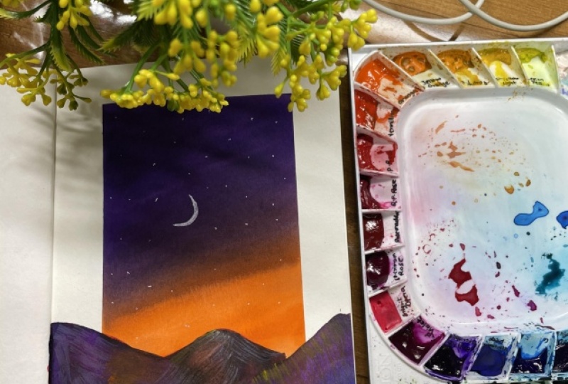
2. Art Materials: So for art materials, let me start with the people I'm using to draw Birdman punish people for this particular painting. So if you can see this has beautiful canvas, lake texture. I usually don't put up for this kind of people who landscapes and every other word, static, well, it works well. And for the crashes, I'm going to use a blender brush. This is of size two, air and down brash of size 10. So any brand, any brush will do. If you have a few, don't have a blender brush. You can substitute it with the flat brush as fan. With adding the paint, I am using my white ink. White guy knows this is my customized palette. So this art in a pan form. So if you do have a pan form, if you own, to fall like this, you can use that. So anyone has any brand will do. I'm not specific on the color panic, but we will be discussing on how to create your own color ballot. So that is fine. We the two jars of water, one might be wildly and one so colored. And one tissue paper, masking tape, white gel pen, and watercolor pencils. They are water-soluble pencils, but if you don't own them, that is also fine. So these are the median that is, that I use for this session.
3. Gradient using three different brushes : This session will focus on how to create a blend using a round brush. This is size two, L and a flat brush. This is a three flood size. It's like a medium. And a blender brush of size two n, c flat brush and blender brushes similar, but the hand is shorter in the blender brush. So let's see how these brushes work with that blending. For the first, I'm using a round brush and I'm applying to random colors. Just to show you how it works. The problem that down brush is that it does not provide much area compared to the flat brush and the blender brush, the brush strokes, you have to add lots of brushstrokes in order to create the perfect blend compared to other two. And if you have people like if your surface is a big one, the blending becomes a little bit harder with this round brush, but it is not impossible, just little harder. So just applying the other sheet from the top. You can see I am getting different. But a stroke, every time I apply from right to left, left to right. It doesn't give you a smooth transition. And the brushstrokes is little bit compared to either do brushes. So this is how you can work with the brush. Now, let us see how the flat brush works for blending. I'm just loading my brush with the lighter tone fullest and applying it. If you can see it covers a larger area. Compared to the round brush. The problem I faced with a flat brushes that sometimes you will not get a smooth blend order gradient by painting because of the head of the brush, it might be a little frizzy and little rigid. But compared to the round brush, the transition of the colors is little bit easier and little smoother. This is how we can combine two colors with the flat brush. Let's move on and see how the blender brush rugs with the gradient. So as the name suggests, this is specified for the purpose of blending. As an aesthetic artist, I was struggling too. We had a beautiful gradient for my paintings. But with this brush, I can create a Gideon's bit dark. Much effort. As you can see, the brush holds the correct consistency of paint and water. And it can create a beautiful transition of Kahlo's as well. Come back to that outgrow. It does covers a lot of area in one brush stroke. You don't have to pressurize the brush. You just have to gently shift your brush in a right to left, left to right movement. So whichever brush you have, you can build gradient and just telling my references here. So if you all don't brush or a flat brush or a blender brush, you can create these type of good or Europeans. Just make sure that you give more attention to the idea of where the two colors are changing. So that's how I cleared gradients at different types of brushes. Let's move on.
4. How to Creare Mountains: Let's learn how to paint mountains. So I'm just going to draw a small sketch here. I am planning to take the input portion for my mantissa. And so I'm starting from one side and the rest will be for sky. So I'm starting from the edge of the paper and I'm doing a rough sketch, I have divided the mountains into three parts. Actually. Two mountains will be 2s and one will be little frog from D, these two mountains. And these are the areas where I will be putting shadows and just drawing it so that you can get an idea how I do the shading. So if you can see I have given three types of different waves of shading here so that the mountains look a little bit aesthetic. Now, let's start painting. Usually for mung beans, I use a wet on dry technique. As the name suggests, my beam will be bad and my people will not have any water contained. This is the form where you will get that beautiful vibe didn't cheat. So as you can see, I'm just applying the random strokes. This not necessary that you should have a uniform notion. When you do these type of random strokes, you will get a little bit light tones and a little bit dark dunes where you are applying watercolors. If you have noticed, I have not used much water in my brush. This way you get these darker towards easily and just randomly filling those three mountains. But make sure that you don't leave any whitespace in between. So I have my mountains. Now. I am going to do that. I'm going to load my brush and then just apply a doc torn edge of the wound dance and then just use a dry brush technique to drag the themes like this. Let's do the shading. But this purpose, I'm going to use a brush like this, in which the head is a little bit dizzy. The more frizzy the brushes, the whole strokes you will get. And now I'm going to load my brush with the paint and I'm dabbing that. Take both fine brush and the pan. And then to drawing rough border and then just dragging the paint. I'm not using any actor leg on any other medium because it doesn't blend well with watercolors. Destroy absolutely be very visible. I don't want that sort of texture in my painting. I wonder a blended bushing. That's why I'm using the dark dawn of audience here. Even though it doesn't not that visible, it does give you a little bit of shadow. And I'm just dabbing the brush and dragging the beam like this. So if you have noticed, I am doing exactly as I have already sketched for you applying the beam that using a dry on dry technique. As the name suggests, my brush is also dry and my socials is also dry. This technique really works well if you wanted to create some textures to your painting. As you can see, I'm just randomly applying it, just dragging it to give a little bit more. Shadows here empty. So the shadow Pakistan.
5. Mountainscape Fun technique: Let me show you how you can shave your mounted in a different way. For this purpose, I'm using my white gel pen. As you can see, I have already painted my mobile games. And then what I'm gonna do is that once it's completely dry, I just simply apply random scroll to my mom dance like this with my white and pink. This is just put a fun technique. It does not like it when didn't. But if you are finding it difficult to do shaving with watercolors or anything, you can just try this ones. When I'm definitely not recommend you to do this because the strokes will be too visible. Too much. Can see M2 supplying the white gel pen and then just smudging that so that it blends well with the painting like this. So if you can see that the boy had some beautiful thick show and the fame will be fine for this kind of shadowing. It's fairly easy and it's fun.
6. Mountainscape shadows: Let us practice the first technique that we have learned on black mountains. For this purpose, I'm going to use my comb brush. If you don't honor code brush, you can use any old flat brushes where the head is little bit messy. So I'm loading my brush with yellow and then just applying the paint and dragging it. Here. I'm using a dry on dry technique, which means that my B and my brush doesn't have much water. I'm just applying and then just dragging the paint. I know that in watercolors we don't usually go for a light, don't lower the dark tones. But on the contrary, we can actually create amazing texture using this technique and using this property as well. But if you wanted to use acrylic, our gosh, you can actually try that mediums for putting shadows, but the strokes and little bit more evident when it comes to accurately get gosh. That is why I'm preferring watercolors, all those mediums. I like them blending rock material for the colors compared to other three mediums. So I'm just applying the paint and then just dragging it. I'm not using much water. You can just follow my brushstrokes. And it's very simple. And just much at the edge so that it blends really well with the background. In the previous session, we have seen how you can do the shadows and just following that pattern. Make sure that you do use much water to get that beautiful aesthetic theory. And if you want to check your water consistency, you can always have a small piece of paper next to you while painting. And just check the consistency there before applying it. So I am almost finished. So you can see I have created an amazing texture to my mountains. Let me quickly show you why I prefer them not finished paper. If you can see Matt punish people gives that beautiful texture to the mountains compared to the rough textured paper. But it is not that you have to use a matte finish paper only you can create the same with enough people as well.
7. Color Palatte: How do you choose your own color palette? Especially when you don't have any references while painting. When here is a small trick that I use to get good color combinations. So first what I do is whatever colors, watercolors or any colors that you own, ice fats them in a sheet of people, slashing as nothing, just applying the color to the paper. This process will enable you to see how the paint reacts to the VBA and for mixing color companies. And what I usually do is I pick totally random colors which attracts my eye and do a small gradient. So here I'm using to drop out Matt people in order to see how the paint reacts to the paper, as well as how the gradient will look. So I'm applying the yellow first and then I'm going to apply the blue. I'm not going to be specific on colors because I want you to experiment with whatever art materials you have. So few can see it. It really creates a beautiful Clarion and this combination really works. Now let us see a different combination here. I'm going to use a wide it and an orange. And see how these two combinations work. I'm going to lie the orange first. And then I'm going to the Lai De by a lead sheet to see how these two golden reacts. I think these colors reacts very well and it creates a beautiful gradient. Now let us make some adult Carlos That's mix this red and this blue and see how these two reacts. So I always loved to do a gradient where the end has a lighter don't. Then the dog, it gets DACA. Because venue or doing some elements like mountains or trees, if you have a light background, it wouldn't definitely give you a mode highlight. So let us do Different completion now. Let us take two dull colors. Let's take this green and gray. That is a dial, Carlos. If you can see they are called muddy colors or shabby colors. So usually in aesthetic works, it is always good that if you ignore the scholars because it doesn't give you that VIII pruned aesthetic field. These are used as a moody sheets. All you can use it in a very dusky combination, but it doesn't give you that beautiful, vibrant effect as the other companies. And you can see for yourself how the other competition works and this. So it's always better to avoid such dialogue colors in your aesthetic work. But here I'm going to combine these two color. One is a vibrant blue and the other one is yellow ocher. So yellow ocher is a little bit check shabby color compared to all other ear, nose. But letters experiment and see how these two completion works. So the key of getting a good color combination is how you experiment with them. Play along all the color combinations, you will definitely find something that is happening. So let us see a classic combination of yellow and red. Sometimes what happens is that when you select two colors, it might look good together, but when you're blending, it will not go smoothly. But these two colors works like magic. The yellow and degrade. It blends so easily and creates beautiful gradient. So whenever you are choosing two colors to choose wisely, experiment and find out up good combination for this project, I'm going to use this combination. So let's get started.
8. Class Project Masking the borders: Let us start. The final project for this I'm going to tape down, might be using masking T. P can see I'm applying the masking T of directly to the board instead of the paper. This is to avoid the excess gum. And the more she do. This glosses will enable you to get rid off the bed and Ted off to people while beaming. I'm just going to master borders. Here. I'm going to only three sides of the BBA. And I'm just pressing the more she did and then just removing it. And repeat the process so that I get that correct consistency of GMB. Make sure that you have enough gum in the ICT so that it sticks the beeper to the board perfectly. You can repeat the process if you think that your masking tape has a lot of gum. So according to your masking tape, you can in Greece the number of just applying the board and then just removing it. I'm just moldering three sides of the BBA. This process will enable you to get rid of the buckling while being and we are done. Let's get started.
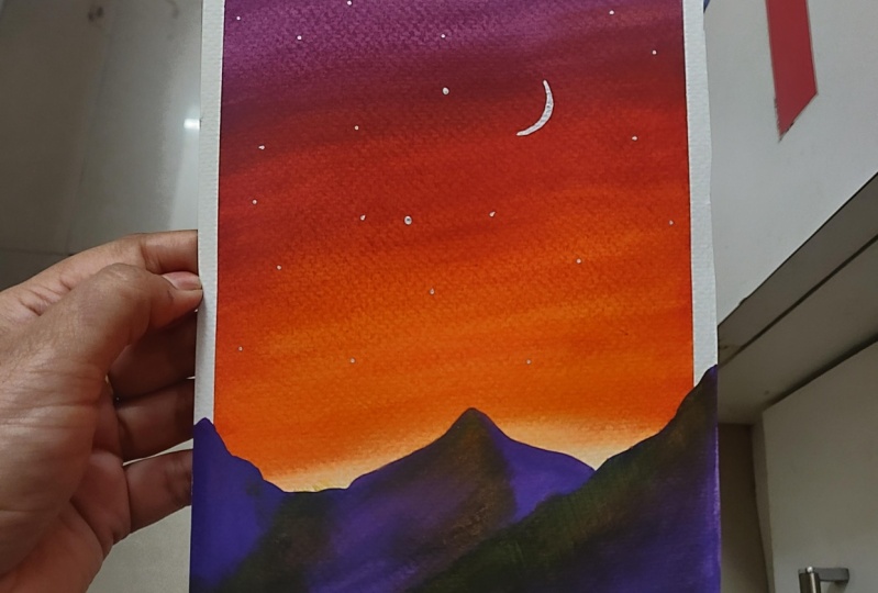
9. Class Project Gradient: Once the pipa is Steve Don, now let us choose a color palette for this project. I'm going to use this orange and this white it. I have kept the pants ready. Now let's start. I'm going to use my blender brush. I have loaded clean water to my brush and then I'm going to load my orange first. So I always start with the lighter tones, then move on to the darker dawns. You can see I'm loading the brush and both sites so that I can get a beautiful gradient. So I'm going to start from the Latin foot portion and then just apply the paint. Here. I'm using a wet-on-dry technique, which simply means that might be into wet and the pipa is dry. Can see I'm using a left to right, right to left brush movement to create a beautiful chord of B. And don't give much pressure to your hand on the head of the brush. Let it flow gently. I'm going to add one more chord. So at this, I'm loading my brush and then supplying it. Nodded, get a beautiful gloomy. And it is important that you have that beautiful transition of colors. So make sure that you even need to apply your paint. Now, I'm going to apply the violet, cleaning my brush. And then just noodle winning neck. And then just lying and from the dogs. And apply the violet and then Lyndon diagonal so that I can get a pure aesthetic feeders do my sky. These little things will make up huge difference on your painting. If you are not comfortable with the diag then but a stroke, you can always go with the horizontal strokes, which we have learned in the previous class. So apply it evenly. It didn't see the guard a beautiful transition of colors here. So apply it even mean, do you have noticed I haven't used much water. That that's why the colors are vibrant. Know, just applying. I'll clean CTO photo. And then no name my audience and then applying it. From the bottom. Those ADS will be colored with mountains. But it is always good that if you have a thin layer of beam, I'm applying the orange blending in with the white gouache. Once it's dry, let us remove the masking tape. Gen Z to remove the masking tape. Since my masking tape doesn't have much gum, it peeled off very easily if you can't see. And it didn't damage my people. So grading this ready.
10. Class Project Mountainscape: Once the gradient is completely dry, Let's mourn and paint a mountain. In order to pay the mountain, I am going to mix a color which is a bit darker tool of the white it I don't usually go with the black, but if you are struggling with the color palette, you can choose black. But I'm going to mix my violet and a little bit darker blue here, this portion view and create a darker tone of violet. I'm using a round brush. So I have created a beautiful dark violet shade. I'm loading it and my brush and then just applying directly. Here, I'm going to use the whiteboard portion and start from the edge of the B button so that it creates a 3D effect. But if you are struggling with composition, you can always use a pencil to sketch the moldings first and then just paint inside it. Here. I am directly applying the paint. We have seen Pew exact bones and the previous class how to create mountains. So just building the mountain. Again, I'm using a wet on dry technique. Might be but is completely dry and my paint is wet. It is okay if you don't even need your paint inside the mountains. As I said before, I like that little bit light and dark tones here and there. So just enjoy while painting the mountains. Who but make sure that you don't leave any white space behind. I don't advise you to use much water. And this sought of being tanks as the ADA still want that color more translucent. Take time. And then just being Jamal games, fill it up with dark dawn to violate. Play around with the colors. You don't have to be conscious of God. The brush stroke. You can randomly apply it. If you are struggling with the BBA, you get odd visa like a small piece of masking tape behind the BBA and stick it to the board. So begin, I already had a pure aesthetic. See it? No, I'm going to apply the violate here. In order to give a little bit extra to the mountain. You can see it blends really well and let it dry.
11. Class Project shading: Make sure that you are mountains are completely dry before starting. So here I'm going to take us b sub p. And I'm going to use my brush to do the shading of the mountains. So we have already discussed this technique in the previous sessions. So I'm just loading my brush with a lighter tone, heal and I'm going to use the orange. So here, as you can see, we have a lot of water in the brush. So I'm removing the excess water and then just doing a rough sketch on the extract heat first and then applying it to the painting. So the consistency is good. You can see and test applying it and dragging it, applying it and dragging it. So here I am doing our dry on dry technique where I make sure my brush is dry and holds the lease Bhutto CTO and more color. Now I'm applying yellow on top of the orange and then blending it very well. So just so again, C and I stopped him from the dopant then entered at the bottom. You can follow my brushstrokes. So it's always important to check your consistency before applying it to the painting. So all of these key but a rough be but yeah, by detect the consistency, then apply it. Do you notice I have only a live the orange to one off the mountain which is far from these two. All the neon ones, I am applying a low. This is to get a beautiful effect, sweat amount date. So I have created the deck shot.
12. Class Project Moon: Now let us create a mood for this. I'm going to just draw a crescent moon using my white gel pen. You can use any lids. But you can just draw a c, small c above them on Teams. If you want, you can create a full moon aspirin. Then add a little stars here and there. I'm not using any splattering technique because the area is too small. We can cover it with the white gel pen itself. But if you don't own YTM pen, you can use white quash has spent so on is created.
13. Class Project Extra effect: In order to make the painting little more interesting, I'm going to add a little bit more texture to the non dense. For this purpose, I'm going to use my water soluble benzenes. This is completely optional. This doesn't make a huge difference, but a minor one. So here I'm using yellow to create small strokes. I'm switching into orange and creating small, dressed like strokes in the mountains. It's totally random. There is no particular motion to follow. If you feel that the pencil strokes are more visible, you just much at with your hands. But you can use whatever. But I wouldn't prefer you to use the ydA because it will definitely affect the texture we have the dead before. So make sure you smudge it. This is absolutely random. Now, I'm going to add blue consists not exactly know why blue and just having fun with the condos. So I'm almost done. And that's it. We have completed the project.
14. Conclusion: Do only with your creativity, audio and imagination. None, techniques and create your own masterpieces. Thank you so much for taking this session. I hope you guys had a wonderful time.
 Aiswarya Sathyan, In love with the world of colors