Transcripts
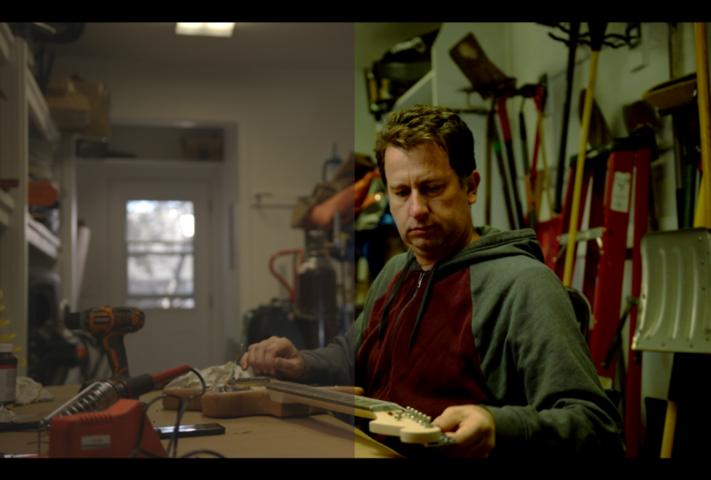
1. Intro: Hi, everyone. I'm Carson and
over the last five years, I've been working as a colorist and DP in the film industry. I've shot and graded
music videos, weddings, commercials, and short films, a little bit of everything. And in this course, I
want to share with you my advanced color correction
and color grading workflow so that
you can expertly tackle literally any project
that comes your way. Now like I said, this is
a more advanced course. So if you need a basic
intro to venture resolve and an overview of
the program and tools in it, then go ahead and check
out my other course, Color Correction and Color
Grading for Content Creators. And then you'll be prepared
to take this course.
2. Class Project: All right, so let's begin by talking about
what all of this leads up to in the very
end, the class project. Now what you're going to be
doing is you're going to be downloading a folder
called project Clips. In this folder you will
find three video clips. And you'll want to start
by color correcting and shot matching
each of those clips. And then you'll want to create a color grade that is consistent across those clips according to the following direction
from the client. We want a color grade that
is warm and cinematic, has soft contrasts, no
clipped highlights, or overly crushed shadows. We also want the final
project to be in 709 color space as it would
be distributed online. Now once you've color corrected shot match and graded each of the clips according to the information
given by the client. Then I want you to
go ahead and grab a screenshot of
each of your clips with your node structure and
each node clearly labeled. Then go ahead and upload
those screenshots and give us a description of how you
went about color correcting, shot matching, and grading
each of the clips. Any struggles you faced
and how you overcame them. This is valuable so
that we can each learn from each other and build
on each other's skill sets. Now that you know what
the class project is, let's go ahead and get started
with the first lesson.
3. Node Structure & Workflow: Everyone, welcome to the course, and in this first lesson
we'll be specifically talking about node
structure and workflow. These techniques will save you
a lot of time and headache later down the road when you're working on more
advanced projects. So even though some of
this may not seem super applicable to really short
small scale projects, this is super helpful
when you're working with multicam projects
and things that require a bit more work
for color correction. So let's go ahead and jump
into the computer and we'll take a look at node
structure and workflow. First, we're going to take a
look at order of operations. Now in previous courses, what I've done is
I've usually put my color space transform
at the very beginning. And then I've added a few nodes on top of that one
and then maybe one before it so that I can have any exposure adjustments
right here in the first node. Then I adjust my color
space transform, Then I start doing color
correction in a couple of nodes and then grading
on after that. While this general order of operations is good and
works for most projects, there are a few projects that require something a
bit more complex, and let's go ahead and
talk about that first, we're going to go
ahead and simplify. We're going to take out
this node right here, and then we're going
to add one at the end. Now we're also
going to go to our effects and we're going to drag another color space transform
at the end of our pipeline. We have one at the beginning
and we have one at the end. What this allows us to do is take our footage
from any log format, convert it into a
working color space, and then convert it from that working color space into our final delivery color space. For example, this was shot
in cannon log right here. What we can do is we've got our cannon settings right here. And then instead
of outputting to rec seven oh nine as
our distribution, we could go ahead and
come to Vinci wide gamut. And then we could set
our output gamma to either something like Vinci
intermediate or son film log. And then coming to our output
color space transform, we can set our
input settings for Vinci wide gamut
with son film log. And then our output settings
to our distribution setting, so either gamma 2.4 or re seven oh nine which is what
I'll choose in this case. So what we've done here is
we've created what's called an input device transform and
an output device transform. This gives us greater
flexibility with the nodes in between these
two color space transforms. This also makes it
easier if we're working with footage from multiple
different cameras. So that we could set our
camera settings here and then we would just need to adjust these settings as needed. And then our output
transform right here, we could either
keep this as Rec 79 or we could go ahead and
export to a different format, like Rec 2020 or some other color format
that our client requests. Whereas before, if
we wanted to change our output settings for
a different format, like from Rex seven oh
nine to HLG or P 360. It's going to change the look of all these other nodes and
we would have to recolor, correct, and regrade
the entire project. You can see that having an
input device transform and an output device
transform does give you more flexibility on
larger projects. But for most things that I do where things are
just being shot on one camera with a specific set of settings throughout
the entire video. This is usually the format that I go for in terms of a workflow. All right, now let's
go ahead and look at multiple levels at which you can make adjustments to your clips. Now in the other
courses, we've been specifically looking
at adjusting each of the clips in the
individual clip level that we would adjust this clip. Then we would move
on to this one, maybe copy the settings over, and then we would
repeat the process. But say you have two
clips where you want to apply the same color grade. Well, there's a
couple ways we can do this if you're switching
from premiere. The simplest way to do
this is to go back into your editing timeline and then create what's called
an adjustment clip. Right here, we're just going
to go into our effects, drag our adjustment clip
on top of our footage. Then everything underneath
this adjustment clip will have the exact same
settings applied to it. Then we'll come back
into our color page. And then we select our
adjustment clip right here. Then I can select one of
my lets that I've made for my footage and then I can choose which one I
want to place on there. Something like this
looks pretty good. Maybe I'll just the
contrast a little bit. Bring up some of those shadows, bring down those
highlights a little bit, and bring down that gamma,
something like that. Now, everything that's under this adjustment clip will have the exact same settings
applied to it. This is probably
the simplest way to adjust multiple clips at once. Just use the adjustment clip to adjust everything underneath it. But say you had several
clips spread throughout your project that you wanted to use the
same settings for. In this case, we're
going to go ahead and delete our adjustment clip. Come back to our color page. Let's say we want
to have this clip, this clip have the
exact same settings, but we don't want to just cut an adjustment clip and put
it on top of each of these. What we can do is we can add
these two clips to a group. We're going to go ahead and hold command or control
on our keyboard. Select both of the clips, right click, and add
them to a group. You can click Add
Into Current Group or Add into a new group. In this case, let's
create a new group. We'll call this one Group One. Now you can see there's
a little green chain that adds these both to a group. You'll notice if we adjust
the settings on one clip, it's not necessarily
reflected on the other clip. Why is this? This is because
we're using the clip mode. If we go ahead and come back
to this clip that we're adjusting, reset this first, we'll go ahead and adjust some contrasts on this
clip to work on it individually so that we can get it prepared to be
adjusted as a group. Then maybe also adjust some
contrasts on this one. Pull those shadows down
just a little bit. Then we want to adjust
both of these together. First, we've made a couple of individual adjustments
on these clips. Now we want to adjust them as a group instead of
being in the clip mode. We'll come up here to where
it says clip right click on the down arrow and then
select Group Post Clip. Now this is basically
adding a layer on top of all the clips in the same group that you can adjust at once. So we'll just come into our color wheels and
then let's say we want to just drag this all the way to the left to make it
just crazy warm. You'll see in both clips, this is being adjusted
at the same level. Anything in this group will be adjusted all the same at
the group post clip level. You can also do
this in the group pre clip level if
you would like. The reason why you would
have these three levels is because if you wanted to make your color space transform
on the group pre clip to adjust all your color
space transform settings. And then you could go in
and color correct each clip individually and then color grade them on the
group post clip. This gives you a
lot more options in terms of being able to
organize your workflow, especially if
you're working with multiple different cameras. You can assign the
different clips shot on different cameras
to different groups that you can then
adjust so that you have a more continuous workflow
throughout your project. Now, there's one
other option in here, it's called the timeline option. If we click on this, then
it basically puts all of the clips in the timeline into one group that you can
adjust altogether. But you'll notice that
there's no node in here. In this case, we're going to
go ahead and create a node. Click add node, corrector node, or really any node that
you're looking for. Make sure that you
adjust the input and output to their
proper boxes. And then from here,
you can go ahead and adjust any setting you want. And it'll apply to every
single clip in the timeline. Looking at other clips,
you can see we also have this blue purple cast
to every single clip. Because it's adjusting literally everything in the timeline. The reason why I would
use this level is if I wanted to apply a certain effect to all the clips at once. Whether it's film grain
sharpening or really anything that I want on
each clip in the timeline. So those are the different
levels that you can apply effects at using this
dropdown arrow up here. Then you can also just
remember to create different groups
for different clips shot on different cameras. And you can go ahead
and color grade those groups individually.
4. Color Space Conversion: Now in this lesson,
we'll be specifically talking about color
space conversion. You may have also heard
of color space transform and input lets or
conversion lots. These are basically
very similar things, not exactly the
same, and I'll point out some of the differences
as we go along. But in this lesson,
I want to show you guys how the Color
Space Transform Tool, Ind Vinci resolve works, how input or
conversion lets work. And I'll show you
guys the tools and techniques that I use to create color space conversion
presets that work with any camera
and color science. If you guys are ready,
let's get started. All right, so when we talk
about converting color space, the biggest idea here
is we want to take this log footage or whatever
format footage this is and turn it into
something that's actually used for
display and for output. So currently we have log footage right here and then some of these other clips we can tell are definitely more contrasty and have more of a wreck 709 color profile used. But in this particular clip
we know that this one is shot in log and this was
actually shot in cannon log. What we're going to do is
look at how color space transforms work and how
you can create your own. Now first let's
go ahead and drop a color space transform
onto our first node here. Then in this area right here, we've got our input color space, input gamma, output color
space, and output gamma. These are the basic settings
that we want to pay the most attention to
for input color space. Since we shot this in Cannon, Cinema Gamma at Cannon log. Then we're going to
choose Can Cinema Gamut. Then for input Gamma, this is the luminance and
contrast setting that we used in the camera
which was Canon log. So we're going to
select Cannon log. Next, we're going to look
at output color space to determine where this
is going to be displayed. For most projects
that I work on, they're displayed online for video ads and Youtube
videos, things like that. So our output color space is going to be rex
seven oh nine. We're going to go ahead and come down to rex seven oh nine. Then for output gamma, there's a couple of
things we can do here. We can set this to the most
common setting which is gamma 2.4 Or there's another setting called Rex, seven oh nine A. If we turn this off and
back on and you can see we have more natural
contrast in colors and exposure. Everything is looking a lot
better than the more flat, desaturated look of cannon log. Now if you don't like the way the color space transform and
Di Vinci resolve behaves. You can also go to your
cameras manufacturer website and then download conversion
lets from the developer. Let's go ahead and apply
some of those for this clip. Let's go ahead and add a new node and then
disable our first node. Then we are back to cannon log. And then I've already loaded in some lets directly from cannon. I'm going to select
the three D let folder 33 point grid let, and then back into this folder here for
these first two lets. These are specifically
for cannon log. I'm going to go ahead
and drag these onto our second node here
to see how they look. I'm liking the second let right here just because it
gives us more natural, pleasing skin tones and
some nice vibrant blues. But if we drag our first
cannon let onto here, we can see we get a little
bit more desaturated colors that give us a little bit
more leeway in color grading. And I might like the
look of this one as well if some of the colors in the
shot are already saturated. So you can go about this using a let from your manufacturer. That will just be a conversion
preset that you can apply to your footage in just about any video editing program. Or you can use Davinci resolves built in color space transform. But what if neither of these
options are available? Say the log profile for your
camera is not supported in resolve or you just don't know
what log profile is used. Well, you can go ahead
and play around with your color space
transform and see if there's a log
profile and a gamma that works specifically
with your camera. And see if you can find
something that looks right. But this can be iffy and
doesn't always work. In this case, if you're not
sure what settings were used, you can go ahead and experiment. Or you can develop your own color space conversion preset. Now, I did shoot this
clip in a log profile, but it was not cannon log. Let's go ahead and try guessing the log profile that was used. We can go ahead and look
at our input color space. Since we know that
this looks natural. I'm just going to
go ahead and set this to rex seven oh nine. Then for input gamma, let's try something
like sine on film log. Okay, now this is
really crushing our shadows and blowing
out those highlights. But let's hold on
for just 1 second. Let's go ahead and set
our output settings to rex seven oh
nine and we can try rec 79 A and gamma 2.4 and
see which one looks better. Okay, now let's try
gamma 2.4 Yeah, this is still not
quite looking right. What we can do is
we can either play around with these settings
more or do it ourselves. In this case, I want
to do it manually. So we're going to go ahead and reset all grades and nodes. And with this
particular log profile, it's not the most flat
profile I've ever used. But it does lift our shadows quite a bit off
that black point, and our highlights do retain
some more information. So what we're going to
do is we're going to go ahead and close
out of our effects. And we're going to
start by working on our white point
and our black point. Because these two aspects, the white point and black point, are super crucial when you're manually converting log footage, you want to make
sure that your black point is set properly. So if we look at our curves right here, our custom curves, we can go ahead and take
our y curve and drag it just until it barely hits this wall
of color right here, because right over here
is no information. But then this is when we start getting all our color
information in. And a lot of this should
be in those deep shadows. And so we're going to bring our black point up here properly. And then for our white point, we can go ahead and try
dragging it to the left. But in this case,
because we already have highlights just touching
our white point, I wouldn't drag
this any further to the left because I don't want to increase
our white point. In this case, I would
start working on contrast. Most log profiles store a lot of information
in the shadows. In this case, I'm
going to go ahead and add our editable
splines to our curve. And this will give us a couple of handles that we can use to really move this
curve around with a lot more fine tuned control. So I'm just going to go ahead
and drag this down into the shadows and start
pulling up some information somewhere right around there. Then I'm going to go ahead and bring our white point down, just until we recover some of that information
that was up there. And then we'll go ahead and
click on our black point, make sure it's set properly. And then we can play
around with the handle here a little bit
and see if there's any information that we
want to pull back up into those mid tones right here. We're actually
looking pretty good. Let's go ahead and turn
this off and back on. We've definitely
adjusted our black point and we've adjusted our
highlights in mid tones. We've pulled some of that
information out of the shadows, as most of that
information is stored in the shadows in a lot
of log profiles. But now we want to play around with the
saturation a little bit. We're going to come over into our primaries wheels and then we are going to adjust
our saturation. We'll go ahead and just gently bring this
up a little bit. We'll bring it up a
little too far and then we'll just dial it on back somewhere right around 55
to 60. Looks pretty good. Somewhere right around there. And then we'll go ahead and drag or Playhead through the clip to see how it looks right here. Maybe a little bit more
saturation, something like that. Maybe bring those shadows
back down a little bit more. This is the challenge
that you run into when working with log
footage and you don't know what settings
you're supposed to use is you really have to play throughout
the clip and then just adjust the colors around to make sure that your contrast exposure and colors look decent. So let's go ahead and
resize this back here. Come back to the
beginning of our clip, and I'm very happy with
our levels and our colors. And we can also apply this to this clip which was shot
using the same settings. So we're going to go
ahead and right click on this clip and
select Apply Grade. This will copy the same grade
over to this clip and boom, now we have our log footage
converted much more naturally to this more wreck
seven oh nine style image. Then we can go ahead and come back to our primaries wheels and come to our offset to bring down our exposure if we
feel like that's needed. But I think the color
space conversion that we developed
on this shot right here works fairly well on the other shots using
these settings. If you want to save
your adjustments as your own color
space conversion let, then you can come down to your media right click on the clip, hover over, generate let, and then select
33 point, be let. From here you'll
be able to apply this same preset and a lot of different video editors
so that you can properly convert your
footage every single time. Now that you're
more familiar with automatic and manual ways to
convert your color space, let's jump into the next lesson.
5. Noise Artifacts Banding: All right, so now
let's talk about tools and techniques
that you can reduce noise artifacting and
banding in your videos. So let's go ahead and fix
these issues. All right. So when we talk about noise
artifacts and banding, there is a limit to
what we can recover. However, in this
video, I'm going to give you all the
tools you'll need to recover most issues that
you'll find in your projects. First, we're going to go
ahead and look at banding, since this one is
relatively easy to cover, if we come into our curves
here on this image, I'm just going to
go ahead and create a really, really
aggressive curve, just to show you what we're
working with If we create this super aggressive
curve, something like that. Let me, that's a
little too aggressive. All right? Something like that. You can see we've
got this banding going on in the sky now, you don't have to
make a curve this aggressive to start
seeing this issue. Because in a lot
of flat gradients, this can come up just a much
more mild version of this. But just to show you, you've got these different
bands and it looks like almost like a cartoonified
version of the image. What we can do with this is
we can come into our effects. Let's create a new node first. If we go ahead and
type in banding, then you've got band, drag them onto your next clip. And you can see
already it's recovered quite a bit of that and
smooth out that gradient. We'll turn that off and back on, and you can see it's really
trying to recover that. Now let's go ahead
and turn this off. We'll give some nice
normal contrasts like we usually would
with this footage. Just bring down
those shadows a bit, maybe bring up those highlights,
something like that. Bring these a little bit
further in and then we'll go ahead and increase our
saturation. Something like that. Now if we go ahead
and make this 100% or even 200% you can
see we are getting a little bit of artifacts and noise and
banding in the sky. If we turn on the band feature, then you can see
it really clears a lot of that up, but
there's a problem. It also starts clearing up other areas that
we don't want to, other flat, more gradient type of areas like
this road here. If we turn this off and back on, you can see there's all this
detail in the road before. And then there's a bit
of noise in the sky and then to clear up that
banding and noise in the sky, it also does the exact
same thing to the road. We can go ahead and play with our edge threshold settings in the band feature and with the post refined settings,
things like that. But we're going to go ahead
and reset all of these. What we can do with
this if you don't want to impact other areas of
your image, just the sky. Then you can go
ahead and mask out this effect by coming to your windows here,
your power windows. And then you can use any
of these masks in here. In this case, probably
want to stick with something like the
rectangle mask here. Then we'll just drag this something like that over the sky and then we'll feather this out a little bit and then bring our horizon back
down right there. You can see now we're only impacting noise
and banding in the sky. This is super easy, super
dead simple way to do this. Let's go ahead and
copy these effects. Come to our next clip
here and then paste them. And then we'll go ahead and bring this down a
little bit here. Now you can see the
band feature is really working to make a much
smoother gradient in the sky. It does soften it
out quite a bit, but if you are running
into banding issues, then this can be a lifesaver
and you can also reduce the global blend if you feel like the effect
is too strong. Now, when we talk
about noise artifacts, let's come to this
other image here. Now, noise artifacts
are a bit more of a pesky problem that we see
in a lot of different clips. If we come to our curves first, we're going to go
ahead and brighten up this clip, something like that. Now if we go ahead
and zoom in to like 200% you can see we've
got all this blue, green, red noise going
on in the image here. We're going to go ahead
and create another node. Then we're going to come to our noise reduction tab right here. Now when we talk about noise, there are two main types of noise that we're
trying to fix. Luminous noise, chrominoise now, luminance noise is differences in brightness between
different pixels. Then chrominance noise is differences in more
of this flickering, blue, green, red
hue between pixels. We're seeing both in this case, but much more color noise
than luminance noise. If we go ahead and
unlink these two, and then we increase our
luminous noise reduction, we're sacrificing detail. If we go ahead and increase
our chrominoise reduction, we're sacrificing color and it becomes a bit more
gray and washed out. We've reduced quite a bit
of that splotchy colorness, but if we look at it, it just the colors are all
washed out and everything. And then again, luminance
doesn't work all that great, just makes the image
look real muddy. Now you can change
the mode to better, or enhanced to get
better results, but it doesn't always
work in every case. This is why one of my
favorite ways to reduce noise is to use temporal
noise reduction. Which this estimates differences
between frames of video, giving you a much higher quality version of noise reduction. If we come to our frames, the more frames we select, the more CPU intensive the
program is going to run. And you're going to need a
lot more power to run this. But this is a much higher quality noise
reduction algorithm. We're going to go ahead
and zoom back out to 100% on this clip, just so we can see what
we're working with. Then we're going
to set our noise reduction frames to two. We don't want to go
too high just because we don't want to bog down
our system too much. Then we can do motion
estimation type faster. Obviously you want to
choose better if you can, but faster is acceptable
if you absolutely have to. And if you can get away with it, then for noise reduction or
temporal threshold here, we can go ahead and
increase these, and you can see we're
getting rid of a lot of that noise without really
sacrificing too much detail. Turn this off. Back on, we're getting rid of
a lot of this noise. If we zoom way
back into 200% you can see there's just not that red, green, blue, spottiness. You're not getting these weird looking artifacts
and pixels here. We're getting a lot more
even colors throughout. Now when you are working with footage from cheaper cameras, there is again a limit
to how much you can reduce the noise without
destroying the footage. One easy way that you can
hide a lot of the artifacts and noise that comes from
these cheaper cameras is to add film grain. If we go ahead and
type in grain, drag that onto a new node here, then we can really hide a lot of these issues because
the grain will make it harder to tell
the differences between these
clusters of pixels, making it a lot more
pleasing on the eyes. Now let's tackle one more
issue, soft footage. If we go ahead and zoom
into 100% on this clip, you can see there's just
not very much detail here. Let's go into even 200% it's
just really blurry almost. Even though this is intact, sharp focus in camera, everything was set right, it's still soft because of the old camera that
was used to film it. It is filming in ten AP,
but this is a T three I. It's fairly soft. If we go ahead and we come to our sharpening
and blur tab here, we can try to sharpen it. And oftentimes I'll just rely on this tab a good bit and
I'll bring this down to like maybe 0.44 If
we come back out to 100% or even 75% you can see that we are getting a
bit sharper of an image, but sometimes this
doesn't work and it just makes it
look over sharpened. Again, if you want to create the illusion
of additional detail, you can add film
grain on a new node and that will greatly enhance the overall
aesthetic of the video. And then you can even go
further and play with some of the other sharpening
features in Vinci resolve. If we type in sharp, then we've got our normal
sharpened tool right here. We've got sharpened edges which prioritizes sharpening specific
edges within the image. So if you check this box
that says display edges, it'll show you the areas
that it's trying to sharpen. The reason why this
is important is because it's trying
to prioritize sharpening stronger edges
rather than sharpening every single pixel and actually
accentuating the noise, This will just sharpen the larger structures in the image. We'll go ahead and
take off this effect. Then there's also
soften and sharpen. Now by default,
this one's going to really soften your
image up quite a bit, but this gives you
greater control over whether you want to
sharpen the small textures, the medium textures,
or the large textures. You can go ahead and
play around with this, but sometimes I like to sharpen
the medium textures more, maybe a little bit of
the large textures, but not so much the small one, since that's typically
where a lot of noise is found there you
have it some ways to fix noise and banding
artifacts as well as how to work with
softer footage.
6. Clean Keys & Masks: All right, so now in
this lesson we'll be specifically talking
about how you can pull clean keys and masks
from your eight bit footage. Most videographers will
tell you that while you can make masks on
any kind of footage, you can't pull clean keys
from eight bit footage. They say that you need
to be shooting in ten bit in order to get any
sort of a clean selection. But this is actually not true. There is a way you can pull clean keys from eight
bit footage and the way you can select
specific tonal ranges to make your color adjustments. And on top of that,
we can refine the selection using masks. So let's jump into the
computer and check it out. All right, so if you've
been researching color grading for very long, you'll know that a lot of
people say that you just can't get clean keys on
eight bit footage. Today we're going to go
ahead and debunk that myth. The reason why it's not
entirely true is because you actually can get clean
keys most people when they're pulling keys
on pit footage like this. First let's just go
into our keying area right here or qualifiers, if we go ahead and just select your skin, something like that. And then we'll press Shift H on our keyboard just
to highlight it. You'll notice that we get this pixel a mess in
some areas right here. One issue that we run
into with pit footage, that gradation just
isn't very smooth, it's very harsh, and it's
roll off into other colors. You just have this really
messy looking image. Why does eight bit
footage do this, but ten footage or 422 footage
doesn't do this as easily? This is because we're selecting hue saturation and luminants. Now this can work with a
couple of setting adjustments, but there is a way to do this
that's a lot more reliable. First, we're going to try
to make this work here. Let's go ahead and reset it, and then we'll go ahead and
select your skin again. Something just like that. Okay, we're getting somewhere. Just select more of her skin until we feel like we have
enough of it selected. And something like that
looks pretty good, but we still get
this blotchy effect. What we can do is
we can come down to our blur radius and we
can just really punch this thing up and
really blur out those edges so that we don't
get that nasty gradation. And now it's a lot
smoother this way you can actually pull clean keys
from eight bit footage. If we go ahead and drag our
playhead through the video, we can see that there's still some flickering
going on though. Even if we've blurted
out quite a bit, there's still some
flickering going on. And we still get blurred edge
right here into other areas that maybe we don't
really want being affected. How do we fix this? Well, if we reset everything
in here and we turn off our heat and
saturation qualifiers and we just focus on luminants, then we can get a
more reliable key that doesn't flicker
nearly as much. If any, we can go ahead
and drag our low up real quick just to get rid of some of the low
end and the shadows. Something like that. And then we could pull down
our high if necessary. But because some
of our skin tones lie in those highlights, then we might not want to exclude some of
those higher ranges. But you'll see even if we
don't blur anything out, we still don't get
that flickery effect. This is because eight
bit 420 footage has the same amount of luminance data as eight bit 422 footage because
those first numbers, the fours, specifically
represent luminant data. Now we can go ahead and
turn on our saturation qualifier and start adjusting that if we feel like we need to. We can bring up our saturation
qualifier a little bit. Maybe bring down our
highs with 842 footage, we can actually pull just
as clean of a key as 8422 footage if we're using our luminant and
saturation qualifiers and not using our hue qualifier, whether you want to
use all three and then blur out your radius
a little bit so that you get a more clean key on
your skin or whether you just want to stick with the luminous or
saturation qualifiers. That'll give you a
much more clean key than if you include
the hue qualifier. Then my favorite way
to make selections on footage is just to use masks. If we just come over
to our power windows, then we can just draw
a mask around her and then just select her and
exclude the background. Or we can include the
background and exclude her. If we just want to adjust the background,
things like that. The mask that I use the most is the circle mask right here. Usually what I would
do if I just want to adjust her skin
tones on her face, which are the ones that are
probably going to be the most visible is I would just drag this on top of her face,
something like that. Blur out the selection
just a little bit, make it a bit smaller. And then I would just
press command or control on my keyboard to track that mask
throughout the shot. Press shift H on my keyboard
to remove our highlight. And then just see that that mask follows her face throughout. For me, this gives me
the cleanest selection. If I wanted to darken
some shadows on her face, brighten those highlights
and just create contrast or something
in a specific area. This is what gives me the
most control over that, rather than pulling keys in
my qualifier selection panel. But both of those
techniques work and you can also combine them in tandem to make specific
selections within your mask. For example, let's go ahead and turn off this curve right here, and we've created a
mask on her face. Let's go ahead and
press shift H on our keyboard again then if we wanted to select just our
highlights on her face. If we come into our qualifiers, we'll select those
highlights right here. Something like that. Turn
off our hue and saturation. And then we'll just
drag this on up. Now we're selecting
just the highlights. And then we'll feather this
out a little bit right here with our low soft,
something like that. Then we can go ahead and come back into our
primaries wheels and make some adjustments
to maybe the saturation. Maybe we could pull down some of those colors to bring back
some of those highlights. Something like that.
Press shift H, and you can see
that we've adjusted a specific range within this
mask that we've selected. We've just brought down
some of those highlights. Those are ways that you
can use these tools independently or combine
them for specific effects so that you can really fine
tune your footage and make very specific
selections and adjustments.
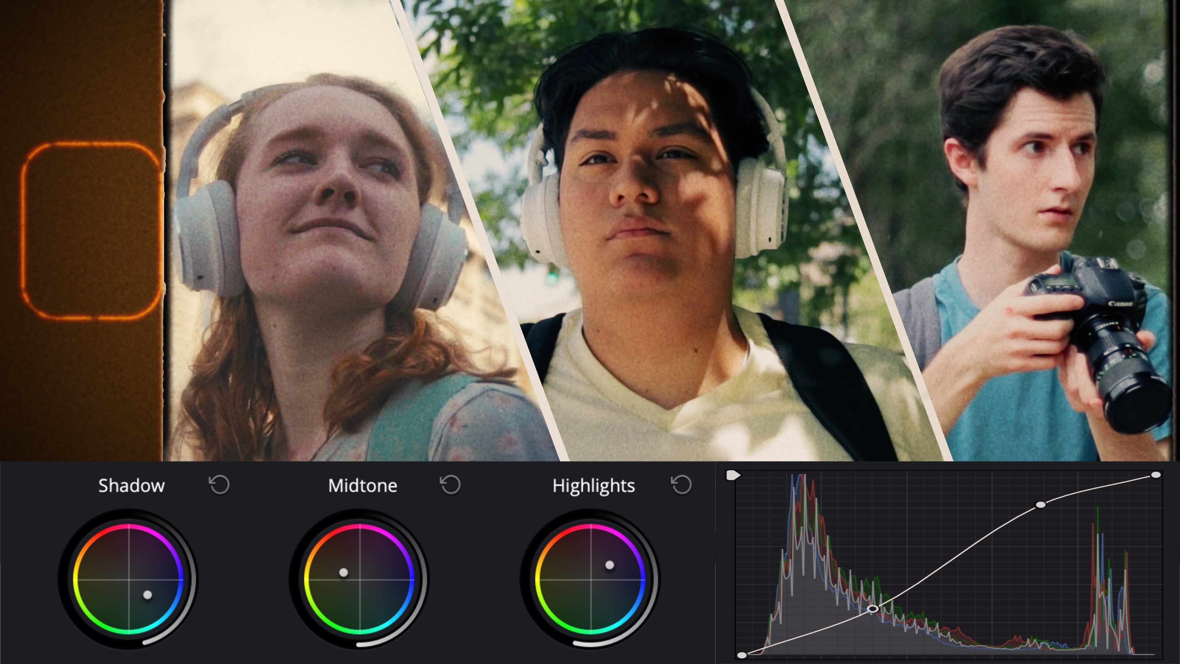
7. The Color Warper: All right, so now
let's talk about the color warper tool
in divinciate resolve. This color warper tool is
similar to HSL curves, but has major advantages that those features
just don't have. It consolidates multiple tools into an easy to use format with a lot of advantages including
Luma and chroma modes. And learning how to use the
color warper can speed up your color correction and color grading workflow immensely. So let's go ahead
and check it out. All right, so now let's look
at the color warper tool. So right now we're
in our primaries, and if you remember
on this clip earlier, we created our own
color space conversion. So what we're going
to do is we're going to go ahead and
create another node. And then we'll start looking at the color warper
on the color page. Over here at the color wiper. Right now we're working in
hue and saturation mode. There are other modes
for the color wiper. But first we'll look
at hue and saturation. Then you'll see that we have these little spokes
on this wheel. You'll notice that if we just start playing around
with these points, we can start changing
the hue and we can also increase or decrease saturation
of that specific hue. Now you may be asking, well, what's the difference between this and the hue
versus hue curves? Well, there's actually a
pretty big difference. If we come to the hue versus
hue curves right here, and we select a specific hue, and then bring all the others back down to the normal point. Then you'll notice
we just adjust all of the hue in that
one range, right? Then if we go to our hue
versus saturation curves, then we can adjust all
of the saturation, even the more saturated parts
and less saturated parts still get saturated altogether within that hue
that we selected. But if we reset this and come
back to our color warper, then we can actually saturate
the less saturated parts, which are closer to the
center of the circle, and then desaturate the
most saturated parts. Then we can choose how we're going to shift
these hues around. This does give us
a lot more control over the hue and saturation within our image than your traditional hue
versus saturation curves. If we want more control
than we get right here, we can go ahead and reset it. Then we can change the
number of dots we have here, the number of points, and we can also change the
number of spokes. What I prefer to do is change the number of spokes
on the wheel. We'll go ahead and
select maybe 12. Then this gives us
a lot more control over the different colors and different in between total ranges of these
different colors. On this wheel, we have a
lot of control using this. We can compress our colors by maybe saturating the
less saturated areas, and then desaturating those
more highly saturated areas. And then we can really
compress color that way. Now if you do go
too far with this, you can end up with some
weird color warping effects, like you see right here, where we've desaturated some of these areas and
resaturated some, and it creates this
rash looking effect. This is something you have to be aware of when you're
adjusting this. You don't want to go too far, as this does give you
a lot of control. There's also a lot more ways that you could
mess up with this. I prefer to just use
the least amount of spokes necessary and
the least amount of points necessary
to get the job done. Another way you can use
this if we set this to a lower number of
spokes on this wheel. I like to use eight spokes. And then we'll go ahead
and set this to fit again. Then like let's say we want to select this blue in his shirt. If we click in our viewer, you can see that we're
adjusting the hue as we drag left and
right on our wheel. Then we can also adjust
the saturation as we pull the colors further
out from the wheel. We can really have a
lot of control of this. Just start playing around
with the image and just really click point and
drag to color grade. This is one of the fastest
ways to color grade, if you're just trying to do this quickly, is to just go ahead, click and drag, And then you can create a unique look like
the one we have here. Very quick, very easy to use for just a click
and drag system. This is the tool for you. Now, there is another way we can use the color
warper as well. Let's go ahead and reset this. Then we can come to this
little box icon right here. And then this is what's
called chroma luma mode. This does look a little bit intimidating,
but don't worry. Here we have two grids
with our colors. This little white mountain in the center of it represents
the color within our image. Down here at the very bottom, we have our black
point on both of them. Up here at the top, we have our white
point on both of them. Then of course, we have our
mid tones in the center, like let's say we
wanted to bring our mid tones more towards
the warm side of things. We can go ahead and
drag that to the left. And then if we want to
brighten them, we could go up. Then we can go down to darken the same thing on
our other grid here. If we wanted to make them more
magenta, we could do that. We could also brighten
or darken them. Now, why is this useful? Well, this is useful because
if you wanted to operate in a specific color range,
you can do that. I'll explain what this means. We're going to go
ahead and reset this. Then we can choose the colors
that we want to operate on. I'm going to go ahead and take my axis angle and drag this
to the left and right. Now I'm primarily focusing
on the grid on the right. It doesn't really matter which
one you focus on too much, I just prefer to look at
the one on the right, since it's the
closest to my viewer. Then we've got Tal right
here and orange right here. Say I wanted to drag Teal
into the shadows, I could. I do want some more
options to work with. I'm going to create
a more detailed grid by setting this to eight. Then I want to drag my
shadows more towards teal. You can see we're really
cooling off those shadows. Then maybe I want to
take my highlights, not my white point, but
my highlights right here. A little bit more towards
orange, something like that. Maybe take our skin tones, drag that a little
more orange as well. Maybe I want to take
those same skin tones and make them a little
bit more green. I'm going to go ahead and
drag that a little left, not too far. Bring it back. Something right about
there. Now, this does require a lot
of fine tuning and there's still a
lot of work to do. But this is what will get you in the ballpark of the look
that you're going for. This is a really easy
tool that you can use, so you can shift colors
within specific color ranges. The reason why you
may want to use this over something like your
standard color wheels, whether it's your
primaries or your log is because right here you have a lot of colors you can select. But then with your color
warper in chromoluma mode, you're specifically
selecting two colors. You can shift those tunnel
ranges between one of those two colors or one
of these two colors. This just gives you
some guard rails and some really
finite ways you can adjust your image if you already have an idea of
what you want in mind. And then you can also adjust the luminous that you want
to operate on as well. If you want to adjust the chroma of a specific point
that you've selected, you can come over here and shift your chroma
around a little bit. And then if you want to
adjust the brightness or luminance of that specific
point that you have selected, you can also come over to
your luma and drag that up or down so that you are making a little bit more
fine tuned adjustments. Let's go ahead and
apply the color worper to another clip. Let's come to this
one where we have the squirrel walking
down the street. Come to our hero
shot right here. Let's go ahead and darken
this clip just a little bit. Somewhere right around there, maybe bring down
our white point, bring down those highlights,
something like that. Now we'll go ahead and
create another node. Then we can come to
our color worper. Now in here, again, we want to select which color range we
want to be working with. I really want to work in
that Telan orange range. I'm going to bring my axis
angle quite a bit to the left, and we've got back to
Telan orange right here. Then maybe I want to warm up those highlights,
something like that. Maybe cool off some of these lower mid tones
or warm those up, depending on what
we're going for. And then cool off those shadows. Maybe I want to add
a little bit of green into our mid
tones as well, to take some of that little purplish color out of the sky, warm up our highlights again. And then maybe add a
little bit more magenta back into those highlights. Something like that.
Then you could fine tune this really dial in the colors that
you're looking for. And then you can see that if we turn this off and back on, you can really change the
way that your image looks because you're operating within very specific color parameters. The way that I see the color
worper is that it provides some guardrails in place if you know the colors that you
want to be working with. It allows you to
very specifically adjust those colors
and takes a lot of the guesswork out of color
grading so that you can just focus on shifting hues towards those colors
that you wanted. Then with the hue
and saturation mode, then you can go ahead and
compress color shift hues around that already exists in the image, things like that. One other way that you can use the color warper is to
do some split toning. Let's come to this
image right here, let's create another node. And then say we want to split tone this image create another, a teal and orange look again. I'm going to drag my
axis angle to the left. Then we just want to
drag our highlights to the right and our shadows
down over toward the left. Then you can see we've
created a split tone look. The color warper makes
it easier to do this. A very simple way to do this, rather than using your
primaries wheels. It's just a lot easier
to do an effect like this in the color warper.
There you have it. An introduction to
the color warper and the way that I use
it in my projects. So that I can really
easily click and drag to color grade or start
working within the color range that I
intended for the shot.
8. Grading Phone Footage: All right. So we all
know how phones look. The video that comes from
them looks so digital. And the HDR effects
just really are dead giveaway that it's not shot on a professional
cinema camera. So today we're going to be
looking at how you can tackle your phone footage and make it look like it was shot on
a much higher end camera. All right, so jumping
into Da Vinci, resolve to fix phone footage. We've got two clips we're
going to be looking at today. This first one is going to
be outdoors and this is going to have some
more HDR problems. You'll see that
we've got this pasty look in the skin tones. This does look okay, but it doesn't look
all that natural. When it looks pink and
pasty, the shadows, you can see a lot of detail
in there like you would with phone footage because it has this HDR tone mapping going on, but it just doesn't
look natural. Doesn't have that natural
contrast and shadow roll off. We're going to go ahead
and fix that first. What we want to do
is we want to start by adjusting our contrast. What I'm going to do is
I'm going to come over to my curve so we have a little bit more control
over our contrast. I'm going to start by pulling our whites down a
little bit here, something just like that. Then I'm just going to make our generic S curve here
that we can do on pretty much any footage and start playing around
with these shadows. Bring that white point back up. Now we can see we're getting
some of this detail. The skin is looking
a bit more natural. We don't want to look so pasty, and that's why we're introducing
a bit more contrast. Then I'm also going
to go ahead and bring up my black point as well, not too high, just
a little bit all. Now what we're going to do is
we're going to fix some of these saturation issues
with phone footage. Often because of
the HDR processing going on, certain colors, especially blues in the sky, can get over saturated
very, very easily. We're going to go
ahead and come into our hue versus saturation
curves right here. And you can see that these
blues are just out of control. All the other colors have
more moderated tones, but the blue is just
spiking up like crazy. The first thing we're
going to do is add a couple of points
around the blue. Make sure we get these in about the right spot so that we don't really affect the
other colors too much. And then we'll go ahead and just start bringing down those blues somewhere right
around there to give a much more natural look. If we feel like we need to,
we can go ahead and try saturating our skin tones a little bit. Just
something like that. Maybe bring down the
saturation in the reds so the lips don't get
all weird overall. This is looking much, much better, much nicer. Maybe reduce some of the
saturation in those reds. Just a little bit
more, somewhere right around there is
looking pretty good. Now the other issues that
come with phone footage we're probably going
to have to fix in our color grading steps. You can see in my hair here. This is shot with like a
cinematic type of a mode where the background is
blurred out using software and it's not
an actual optical blur. You can see some of my
hairs here got caught in that the edge detection
is not perfect. There's a way we can
go ahead and fix that. We're going to go ahead
and create a new node by pressing option
S on our keyboard. If you're on Mac,
all Tess on Windows. And then on this new node we're going to come
to our primaries. Now when we fix this
edge detection a bit, we're also going to
be fixing the over sharpening that's happening
within the image. I'm going to go ahead
and zoom in to show you what I'm talking about on phone footage you can
see that there's this really over sharpened
a look that it has, especially with finer
textures like hair. We need to really reduce that. The first thing
that we can do to reduce the over sharpening is to take our midtone detail and just pull a little
bit of that out. Not too much, nothing
crazy. Just a little bit. Then we're going to go ahead and fix this edge detection here. If we drag our radius up,
we're blurring out the image. If we drag it down,
we're sharpening it. In this case, we're
going to go ahead and bring this up just a little bit. Nothing crazy somewhere
right around there. Just to soften up
the image enough, then maybe go a little bit more, maybe up to 2.55 Then
we're going to create another node after and we're going to go ahead and
resharpen the image. Nothing crazy. Just down
by about five points, maybe three point, something
like that already. We've taken away that over
sharpening and we've gone ahead and reduced a bit of
this edge detection mess. Now another thing that we can do is we can create another node, come to our effects
and look for grain. We'll go ahead and drag our
film grain onto the footage, and then select the
kind that you want. In this case, maybe
eight millimeter, 16 millimeter, 500
might look pretty good. 35 millimeter, 200. Just play around with
this a little bit. Figure out which one you like and then this
grain will add a bit more character and
artificial detail to your image. Now if we go ahead
and zoom back out, this is looking a whole lot
better than when we started. If we go ahead and
turn off all of our adjustments off and back on, you can see we've gone from this very artificial
phone footage to something that's
a bit more natural, something that you could start
color grading really well. Now, this next clip doesn't
suffer from the same over sharpening issues and things because there's
already a fair amount of, a little bit of blurring
that's happening because of the noise reduction
going on in this case. This pasty look again is a little bit different
than last time, but it's still prevalent. We're not going to
worry so much about the over sharpening
issues because of the noise reduction that
was happening in camera. What we're going to be
primarily focusing on in this one is getting rid
of this pasty look, not just in his skin tones, but other places in
the image as well, with an emphasis
on the skin tones. Then again, we're going to
come back to our contrast. Phone footage is
usually a little bit flat with those shadows containing quite a
bit of information. We want to bring down
those shadows just to make them a little bit
deeper, a little bit richer. Something like that, in this
case is looking pretty good. Let's go ahead and
add some grain again. Think we'll go 16
millimeter 500. Let's see how that looks. Zoom in to 100% here. Maybe change the grain, 200. That's looking pretty good. Turn that grain off, back on. We're adding that grain
in, which is making this look a lot more
natural already. And then we're going
to go ahead and just throw on a little lut here. Maybe throw on one of
these old luts I created. Bring down that opacity a little bit by bringing down
our key output. And then maybe even shift the colors a little
bit cooler here. Create a node before this one by pressing Shift on our keyboard. And then we'll decrease the warmth in the image
a little bit here. Maybe add just a tint of
green, something like that. Make this image fit again. And then we might just go ahead and start pushing
our color wheels just a little bit to create a little bit of a
color grade here. Just add some more of that
teal in those mid tones. Here we go, before and after. It starts out looking
fairly flat like phone footage with a lot of nice information
in the shadows, but because of the
pasty look in the skin, it's a dead giveaway.
That's phone footage. And then with
everything else that we've done by adding
some contrast, bringing down those shadows, which is a big deal with phones. Because if we go back
to this other clip, you can see that a lot of information is retained
in the shadows, not necessarily near
the black point, but definitely in the shadows. Tone mapping, it
tries to brighten those areas and then
darken the highlights. If we can reverse that, then we get something that
is a lot more natural, something that you
would typically see on a much nicer camera. Just replicating that in our phone footage
is going to go a long way to making it
look a lot better. Then we added some grain, went ahead and did a
little bit of color grading with our
primaries and added a final lot on top of it just to make it look
nice. And there you go. That is an easy way to
tackle phone footage so you can get to look more
natural, reduce the sharpening, reduce the HDR effects
in the tone mapping, and then reduce
some of those over saturated colors in
the sky sometimes.
9. Working with Difficult Footage: All right, so in this
lesson I'll be showing you guys how you can work
with difficult footage. So that you can color
grade any project, whether the camera was shot
with the wrong settings, poor white balance,
or if the footage just isn't high quality
enough for your project. I'll show you guys
how you can work with these kinds of
clips and how you can hide some of these issues in plain sight. So
let's get started. When we look at dealing
with challenging footage, there's a few things that are the most common issues
that we run into. Number one is poor
white balance. Number two is poor exposure. Then also, just like if
the codec for the video can't handle the amount of grading that we would
normally want to do, that can also pose a challenge. The first thing we're
going to be looking at is poor white balance
where the image was shifted a lot towards
the cooler side of things rather than
it being dead spot on. This is, as you can
see in this image, it's pretty much all blues and purples that are just cast
over the entire image. There are a few ways
we can address this. Number one, we can start
with our primary wheels. Then number two, we
can use our curves. Now, I do like to ease
my curves quite a bit. And we'll go ahead and
start with our curves, and then we'll move on
to our primary wheels, and I'll show you how
to do this both ways. First what we're going to do is unlink these
curves right here, and then we can see that we have too much blue. What do we do? We come to our blue
curve and we start pulling that blue out
of the mid tones. Now we're starting
to warm this up, but we're also getting a
little too much green as well. Now we're going to
go ahead and take our green curve and do
the exact same thing. Maybe not pull as much
green out, but just enough. Something just like that. And then we start looking
at other areas of the image that might need a
little bit of work as well. We can see that this
image is low contrasty. Now we know that this
image is shot in log, it's fairly low contrast. I'm going to go ahead and
add another node before this one pressing shift
S on my keyboard. And then I'm going
to go ahead and link these curves and just add a little bit of contrast
just so that we can start to see what
colors we're dealing with. Okay, now that we've
added some contrasts, and the saturation also
increases with contrast, in many cases, we can see that we're still a
little bit too cool. Coming back to our
second node here, we're going to come
back to our blue, and we'll start pulling
that out just a little bit more. Something just like that. Maybe pull out of those
shadows a little bit, come to our greens and
start just finessing this until we start evening out our skin tones and
things like that. Now that we've really
adjusted these curves, pulled a lot of that green
and blue out of the shadows, introduced a little
bit more red in the mid tones and
the highlights. We've got this not perfect by any means, but a lot closer. If we go ahead and turn off this node and then
turn it back on, we can see how much closer we've gotten to much more
neutral colors, Then looking down
here at our scopes, looking at specifically
our RGB parade, we can see that these colors
are a lot more even want to, we could start playing around
with our reds a little bit to try to even that out a little more in
those highlights, but then we start losing
some of those skin tones. It's just a game of
finessing this and making sure that we're
taking out the right colors, introducing the right colors, and just trying to balance
out the image overall. At this point, we can start color grading if we feel
comfortable with it. This makes it actually
a challenging image, even at this point
to color grade. The first thing that
I like to do is start looking through my
presets and things that I've made to see if there's any that immediately stand out as helpful and something that would bring this image in a direction that
we want to go. I'm just going to
go ahead and pull the intensity down
somewhere around halfway using our key
output. Something like that. Maybe try different,
let something else, maybe you can see we're already getting to a
much, much better point. This can pass as a color grade, a little bit more work, and
then you'll be just fine. Also, one thing you can
do is you can play into the images weaknesses
because if you can't quite recover the
detail that you want, you can apply some sort of
an overlay or something to give the effect of this being filmed on an older camera. What we can do is we can
play into its weaknesses. So I've selected a let that
I feel comfortable with, and then we can further
grade our footage by creating a really,
really strong look, if we just start shifting our midtones toward
blue a little bit, bringing our
highlights, or again, a little bit warmer,
something like that. And then bringing our lift
back down towards blue. And then encountering
that in our log to even out those black points
just a little bit. Something like that. Maybe bring those highlights
back a little bit. Now we've got this older film, teal and orange candle. Look with a golden hour sky. To make this sky a little
bit more believable, we could add something like glow and maybe
some Haalation. We'll go ahead and
add another node. Drop our glow on here. And then we will change the composite type to
screen something like that. And then maybe bring down the overall intensity under our global blend.
Something like that. And then we could even reduce the saturation in our
highlights a little bit. There's just a lot
we could do to make this more of
a stronger look. When you can't quite bring the colors back to a
completely neutral place, then you might just lean into the fact that it's
going to be a little bit off and just give it a more intense color grade
to sell the look. Now, looking at a clip that is shifting in the
opposite direction, we can go ahead and try
adjusting this first. I know that this is
also shot and log, so I'm going to go
ahead and correct our color space here. I'm going to go into the
lets provided by Canon. Since this was shot
in the Canon 100 Mark two in Canon log. I'm going to come to
our 33 point grid. Let then we're going to
look at these two options. First, I think I'll go
with the first option. This one looks a
bit more neutral. Okay, Then we're going to create a couple
more nodes after this. Then on this first one, we're going to go
ahead and select it. And then press shift
S on our keyboard, because we want to
adjust our exposure a little bit before our
color space transform. I'm going to come
into my primaries, then maybe bring down
that gain a little bit, bring up our gamma, that way we can pull a lot of that information back
out of those shadows. And maybe bring down our
lift just a little bit. Something like that gives us fairly neutral looking colors here or neutral contrast rather. And then on the node, after our color space
conversion lot, then we're going to start
working on the white balance. Now let's work with
our color wheels here. First, we're going
to go ahead and just take our offset
because we can see that this entire image is shifting a little
bit toward warm. And we're going to go ahead
and just try to pull that back a little bit
towards blue already. We're getting much, much more natural, neutral looking colors. One issue that we're seeing is that you can still
see that there is more warmth on the inside of this building that he's
in rather than the outside. The outside is still a bit cool. This is where we're going
to need to use some masks. Okay, on this next node, we're going to go ahead
and create a power window. And then we'll just adjust it to the size of the area
that we want to affect. Mostly just this
area by the door here where things are
looking a bit cooler. Then just feather this
thing out a bunch, that way we're not
getting a harsh, a roll off and really negatively impacting
the other colors. Then maybe bring this
a little bit out, since this light from the window is reflecting off of
the shelves here, then right here what we can
do is we can start adjusting the outside light to be a bit warmer so it's a little
bit more believable. We can go ahead and
take our Gamma and then we'll just shift
that a little bit towards something like that. Pull it back a little
bit, maybe take our gain, warm that up a little bit
too, nothing too crazy. Bring our gamma back, maybe add a little
bit of magenta, maybe reset that gamma actually, and then something like
that off and back on. You can see we've really
even this out and it's no longer such a big
difference in color. Okay? Create another node, and then from here we
can start working on the image as a whole again and we can start
color grading it. Now this one is easier to
work with than the last one since this footage is
going to hold up better. It is a stronger codec
than the last image. What we're going
to do now is we're going to start
looking to see how we want to color grade
this if we want to lean into the strengths
of this image. Now this image is a
little bit hard to work with because the colors
are all over the place. Right now, what we can
try doing is creating a little bit of a
teal and orange look. A couple ways we can do this. We can use our primaries
wheels and our log wheels. Or we can try using our curves, which I think I'll
try in this case. First, I think I want to pull
red out of these shadows. Okay, I'm coming
to my red curve, then I'm just going
to start pulling back on that red a little bit, then reintroduce it into those midtones that we maintain his skin
tones right here. And then introduce a little bit more because you can see
when this is pulled out, we're affecting more of the shadowy areas in his skin tones. If we can just bump this
up just a little bit, we're still maintaining
cooler shadows while retaining the nice rich
red in his skin tones. Bring that up just a little
bit, something like that. And then we might
even want to pull some red out of our highlights. Then we can go ahead
and take our green. I'm noticing that in
these shadows and things, when we add that more teal look, we are getting a little
bit too much green. I might just pull green out of the image as a whole.
Just a little bit. Come to our blue curve and then start playing
around with this to see if we want to add some
more blue into our shadows. Pull that out of those
midtones so that we're not getting a purple a look. Maybe pull that
back just a little bit, something like that. See if we want to bump
up the blue in any of the highlights and just
play around with the image. Just see what's starting to look the way that
you intended it to. If we turn this node
off and back on, you can see we're already creating a bit
more natural look. We can add another node. Play around with
some of the lots and presets that we have here. We're just going to play around
with some of these lots. See if we like the direction
any of them are going. I'm liking this one, so
what I'm going to do, it is a little bit
intense. I think. I'm just going to reduce the opacity of it
just about halfway. And then on the same node, I'm just going to
go ahead and bring up these shadows a little bit. Relink all of our curves, bring up those shadows
just enough to bring out a little bit more of that detail that was there
something like that. Now what we could
do is we could add a vignette or anything
else we wanted. But let's just go ahead and take a look at where we started. Here's what we did first, we went ahead and added our
color space conversion. Let then we noticed
our exposure was way off and our contrast
was a little too cunchy. We brought up our exposure a little bit using our primaries, and then we started to
tackle our white bounds. We used our primaries
wheels to affect the image overall to a much
more natural a look. And then we notice
that this area by the window was a
little bit too cool, so we warm that up in this next node using
a power window. Then we started to play
around of their curves to create a little bit
more of a look. And then we finalize that
by adding a lot on top of that to just bring in the
final touches to the image. Then after this, we could add grain halation vignettes.
Anything else? We want to really bring
this image into the colors that we're wanting to look
at. Just a quick recap. The biggest issue that
most people face in color correction and color
grading is poor white balance. But if you correct it
as much as you can, you lean into the
tools that you have. Then once you've corrected it, to the extent that's possible, you can lean into it and start creating a heavier look as
we did in this other image. And then once you create
that more heavy look, all of a sudden those
imperfections can disappear and they look more
like stylistic choices. I would encourage
you guys to use these same tools and
techniques and experiment so that you can take your
footage if it feels poorly white balanced,
or poorly exposed. I want you guys to use these and practice them so
that you guys can be prepared to tackle any
projects a client gives you.
10. Shot Matching: All right. So when I first
started color grading, shot matching was one of the
most difficult skills to learn and there just wasn't a ton of good advice out there. In this lesson, I'll be
showing you guys how shot match clips from different cameras shot
in different lighting. All right. So now we're
talking about shot matching. And there's a lot of different ways you
can go about this, but the way that I
find works the best in most cases is what I'm going
to show you in this video. First, we're looking
at this shot. This is one that we
worked on a little bit earlier when we were talking
about the color worper. What we're going to do
is we're going to go ahead and get rid
of our color grade. Right click on the
node reset node. And then what we want
to do is want to match this shot to this shot. Now you'll remember
that with this shot we had to do quite a bit
of color correction. And then we had to lean into some of the issues
with the image to give it a stronger color grade so that we could create
a more solid look. And so that we can hide some of the imperfections that
were in this image. What we can do is we
can take this image because it's shot well
and it's well exposed. The white balance looks
pretty good on this image. What we can do is we can take
this and we can match it to this shot much more easily than we could doing it
the other way around. First things first, what
colors do we need to match? While the most important
colors you're going to be matching are your skin tones, your shadows, and
your highlights. Right now, we're seeing
in this general warm cast to the image, this one. We can go ahead and start
by creating a warmer look. First, we're going to come
to our second node here. It's been reset, so there's
no adjustments on it. Then we'll come to our offset under our primaries color wheels and we'll go ahead and
just warm this thing up a bunch, not too much. Maybe add a little bit of
red, something like that. And then when we come
back to this image, what we're going to do is
we're going to right click on it and then grab a still. Then we're going to double click on the still from our gallery. Come back to our image, and now we can see
both side by side, so we can really start
matching these colors. Okay, what we're going to
do is we're going to take our Gamma and I'm going to just try to add a little
bit more red. Match those skin tones
a bit more closely. Something like that. Warm up our gain with a bit of yellow, and then pull in some teal with our lift.
Something like that. And then maybe introduce
a little bit more red into those skin tones. Now we'll go ahead and turn
off this little overlay here. We can see we've got
this, a very warm look. Turn it back on, and
you can see we're still missing a bit of that red. And also you can see
in his shirt here, it looks totally different
on both of these clips, one of the issues
that we're running into is an exposure problem. We can do is we can
come to our curves and start just pulling down
our midtones a bit here. Maybe make it a bit darker,
something like that. Then we could come to our
hue versus hue curves. Then we could take our blues
and see if we can match these blues just a
bit more closely. Maybe by pulling them
down a little bit, then bringing our other colors right back up to
where they should be, somewhere right around here. Let's go ahead and zero both
of these points out here. Now if we wipe back and forth, or if we turn our display off, back on, we are getting closer. His shirt is not
perfectly matched, neither of these shirts are. But there's a lot
more we can do. We can come back to
our primaries and start pushing these
around just a bit more. I'm going to see what
happens if I add a little bit more red
into those skin tones. Counter that a little bit more with a little
bit more teal, something just like that. This is getting us a lot closer. At this point we're to a point where we've
created a nice neutral, warm look on both that could
honestly be convincing. What we might try is
taking this other image and start shifting it
even closer to this one. We're going to go ahead and
actually turn this off. Grab a still from this clip. Double click it, and then come to the other clip
that we corrected. Then we can start coming back to our node right here where we had a lot of our color
grading adjustments. We can start seeing if
we can shift some of these colors a little bit
closer to this other one. We'll come to our curves, hue versus hue curves. And we'll just start
playing around and seeing what we can do here. If we bring the hue
on the blues up, bring everything else back
down just a little bit. Go ahead and zero out our other points so that we don't affect those
colors too much. Just focusing on the blues. Then we can also
desaturate the blues a bit as well,
something like that. Again, bring these other
points right back up to one and then start
finessing this because that blue I find is
the most clear giveaway. That these were shot with completely different
camera settings. Something right about
there looks pretty close. At this point, I'd be
comfortable using this. If we turn this off and back on, wipe it across,
you can see we've got fairly consistent colors. The only thing we might want to adjust now is the skin tones. I like the skin tones from
this other image better. On this first one,
we can go ahead and start playing with our
skin tones a little bit. Here we could try shifting them. Bit warmer, not quite green. I don't want that to be green. So I'll bring some of those
back up, something like that. If we bring these down too much, you'll see that they get
really green really fast. We just want to really
make gentle adjustments to our curve that we're not introducing too much
green into the image. Then coming back
to our primaries, see if maybe we can
add a little bit more red in here,
something like that. Maybe add a little bit
more green or even a little bit more red
into those mid tones. There have a look at our before. This is where we're
looking at the image. Now. This is looking a lot better. And then coming back
to our other image, This is a much closer match. Not perfect, but a lot closer. We're going to go ahead and
match another image here. Another way you can match colors is first we're going to go ahead and do a color space transformer color space conversion on
this image right here. We've got this guy
walking somewhere. And it goes along with this shot with the same guy
working in his workshop. Right on this first shot, what we're going to
do is we're going to go ahead and come to our lets and look for a
good let that will give us a good color
space conversion. I think I'm going to go with probably this first let,
since it's more neutral, create another node and
then right click on this clip and match
shot to this clip. All right, so that
we're trying to match those colors now
it's also going to match the contrast
and things like that. This is a solid way to do it. I'm like the colors and
contrast we're getting. I do feel like the shadows
are a bit crunchy, but if we look back and forth, the colors look fairly consistent along
with the contrast. This doesn't always work, but in this case, I think
it works pretty well. Now let's look at
another clip here. We've got this
clip right here of this girl who's like putting on her headphones and things. And then we've got
this clip of this Sky, this is all part of
the same commercial, these two clips are, they look very different because
they were different lighting. We're also working with
different skin tones. We want to try to make sure that these clips match as
closely as possible in a way that maintains
the authenticity of the subject that we're
filming and the environment. But we want to create
a consistent look. So how do we do
that? Well, first I'm going to go ahead and
start with this clip. Okay, I'm going to
start with my curves, just to bring out some of
the detail in those shadows. Since this was a
bit underexposed, I think what I'm going
to do is I'm going to actually head back to my
primaries real quick. Bring up our exposure
or our offset. Bring down that gain just a bit to not really blow
out those highlights. Then I'm going to
go ahead and bring down my shadows a
little bit here. Maybe bring down my black
point instead of my shadows, because all I'm trying to
do is recover the detail in the shadows without making
this image look low contrasty. Now we're going to also
add some saturation, since this is pretty muted, somewhere right around there. Then now we can go ahead and start trying to
create a look, right? Create another node. And then we'll start playing
around with our lift. Maybe add a little bit of
teal into the shadows. Add some warmth into
our gamma here, just to really bring out his skin tones and
make those pop. And then maybe warm
up our highlights a little bit,
something like that. Now we've got a fairly
warm, clean look. Maybe cool off those shadows
just a little bit more. And then we'll come
to this other clip. Now we're going to create a
similar level of contrast. We'll come to our curves, add some contrast here,
just like that. Come to our primaries, maybe you reduce the saturation a little bit in this case, because I want their skin
tones to seem fairly, even in terms of
saturation levels. Now the hue and
luminous values of their skin tones are
going to be different. But what I'm primarily concerned about is the environment
that they're in. As long as their skin tones look natural and as long as
the colors are accurate and these gray headphones are actually gray and not shifting towards blue or red or anything like that, then I
think we're good. It's the environment
that I really want to make look neutral and natural
between both of them. And you can see that on this one we've created this warm look. And with this one I'm going
to try the same thing. I'm going to go ahead and
warm this up using our Gamma. Don't want to introduce too much red into those skin tones. I might just go with my offset
to warm this whole thing up, something like that. And then bring this
back using my gamma. We'll introduce a bit more
red and then we'll bring our lift down towards teal a little bit just to neutralize that and balance that out. Then with our gain, we can introduce a little bit
more warmth as well, something like that, to bring our lift back
a little bit here. Now we're creating a nice
warm teal and orange look. We turn this off, back on, you can see we've
already gotten really close and now we've created a solid look
on both of these. We've experimented with both. And we've evaluated which ones we like overall
between these two. I do like the look
of this one better. It's got more teal
and orange tones, whereas this one is mostly on the warm side because the white balance was
set for the shadows. So I'm going to go ahead and try our other little trick again
where we're going to write, click on this other clip and then match
shot to this clip. Make sure to do this
on a separate node so that you don't affect
your other settings. Okay, that's looking good,
we can work with this. So now we're going to go
ahead, come to our curves. Bring that back up a little bit. Now remember that in this clip
he is going to be walking, the lighting will change
on him just a little bit. Right here, we're getting some more brightness
on his face. What I think I want to do is I want to warm this clip up a bit. Now I'm going to come
into my Primaries and use my temperature
slider to warm up this clip. And now we're getting
a nice teal and orange look on this clip that could flow well
with this clip, you wouldn't really
notice a huge difference between the two if they
played this in a commercial. So when we talk
about shot matching, there are times when
you want to match the colors exactly
as close as you can. But then there are other times
where you're just trying to match the overall style and apply appropriately
to the situation in the environment that
the character is in. The most important colors to consider are your skin tones, your shadows, and
your highlights. When you can balance
those out and you can make them consistent
across clips, even when you have
two different actors in two different environments, they can still cut together
in the same commercial. So it's more about creating consistency in the
tone rather than creating 100% identical
colors on every shot. Obviously, in an interview
type of a scenario, that's going to be different,
but you'd also likely be using the same camera with
the same camera settings. So there you have it, my simple workflow
for shot matching.
11. Final Thoughts: Art. You guys congratulations for making it to the
end of this course. I'm genuinely proud of
you and I hope that these skills that you've learned will be valuable in your career. I know they have been in mine. Now what I want you to
do is I want you to take these skills and apply
them to your projects. Go ahead and download the
sample footage provided, follow the project instructions, and I'm excited to see
what you guys create. And as always, thank you
for taking this course. It means the world to me. If you have any questions,
go ahead and reach out. I'm here to help. And I will see you guys
in the next course.
 Carson McKay, Colorist & DP