Transcripts
1. Introduction: Hi everyone, I'm Carson
with studio McKay. And in this course
we're going to be learning how to
color correct and color grade or digital video to make it look like it
was shot in film. This is really the
concept that we'll be talking about in this
course is film emulation. The characteristics
or qualities in the colors that you
get from film stock. We taking a deep
dive into how to recreate those for
your digital footage. Now in this course, you
will already need to have a basic knowledge of Davinci Resolve and the features and tools available there. So if you need to learn a little bit more about
Davinci Resolve, then I have another course, color correction and color
grading for content creators. You can check out
and it'll give you a basic intro to the things that we'll be
talking about in this course. So if you're ready to take
your color correction, your color grading
to the next level to make your videos look like film. Then let's get started.
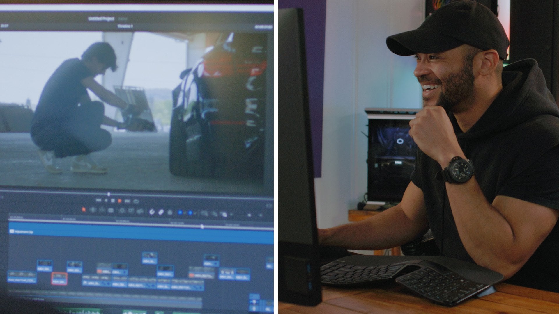
2. Davinci Resolve Overview: All right guys, welcome to
our color grading course. Now, in this course,
like I said, this is built on
the last course. So you will need to have
some understanding of Davinci Resolve in
order to follow along. But if you just need
a quick refresher of the color grading interface
within Davinci Resolve. Up here you have your viewer, then you have your gallery, your lats, your media pool, and you have the button
to share your clips. Down here. I'm gonna go ahead and
close the media pool. And then we have this
little button up here, this little magic
looking button. If you turn this off, Let's go to a clip dive graded. If you turn this
off and back on, you can see you're
turning off all of your nodes and
all of your effects, which we'll talk about
in just a second. So we're gonna go ahead and
come back to this clip. And then you can also use Shift D If you need to
turn them off and back on. That's the keyboard
shortcut for that. And then you have your quick
export, your timeline. If you want to open
up your timeline in your color Grading panel, you can close that by clicking that timeline button again. Then we have all of our
nodes right in here. If you need to open up
your effects panel, that's right up here
in the upper right, where you can search for any of the effects that you may need to drag onto a node if you
wanted to add a radial blur, simply drag that onto the node. And there you go. I'm gonna go ahead
and delete that by pressing all trash can button, close out of the effects by clicking the
effects button again. And then down here you've got the individual clips that
you'll be color grading. And then at the bottom, we've got all of our
color grading controls, as well as our panels. So right here where
you see keyframes, if you click on the little mountain range
button next to it, you can find your
scopes, your waveforms, RGB, Parade histograms, Vector
Scope, things like that. All the tools that
we're gonna be needing to judge our color. Then over here on
the left you've got your primaries Wheels,
your Log Wheels. Again, remember
that your primaries are very broad adjustments. They make a wide range of adjustments when you
adjust your lift, you're just seeing
the whole image but with an emphasis on the shadows. As you adjust your gain, you're adjusting
mainly or highlights, but it does bleed over into the rest of the image as well. And then with your
log, these are very, very specific adjustments as
you drag your Log Wheels, you're targeting a
very specific area, specifically your shadows,
mid tones and highlights. Let's go ahead and
reset all of these. Then you have your HDR wheels, which are even more precise
than your Log Wheels. So remember your
primaries, very broad. Log wheels are more specific. Hdr wheels are even more
targeted than your Log Wheels. Then we have some other
controls over here, which I don't really
get into that much. And then we have our
curves right here. You've got your main
tone curve right here, as well as your RGB
curves back in here. And then you have your
hue versus hue curves. So you can change the
hue within the image, or right here you have
your hue versus sat, where you can change
the saturation of specific cues within your image. Your hue versus luminance, where you can change
illuminance of specific hues. And they've got even
more options like saturation versus luminance
and things like that. Then you've got
your color whopper, which I don't use too much. I'm mainly just rely
on my primaries and Log Wheels and
then my curves. But if you feel like you want
to use the color whopper, this is similar to hue
and saturation curves, but with a little
bit more control. And then you've got your
qualifiers right here. Power windows right here, where this is basically
just your options to mask out certain
parts of the image. And then you've got more like
your trackers right here. And then you've got
your sharpening and blurring over here. And then your mat
controls over here. One other thing, you can
create more nodes by pressing Option S
or S on Windows. To create more nodes, you can delete
them, select them, press Delete or Backspace on your keyboard, and
you're good to go. There you go. That is a basic brief overview of
Davinci Resolve just to refresh the interface
for you if you need more information on the rest of this interface in
Davinci Resolve, then again, I recommend you
take my other course as that one gives you a much
more comprehensive overview, since it is for beginners, this is a more advanced
course where we will be diving deeper
into color grading. So if you're ready,
let's get started.
3. Preparing the Footage: So now here we are
in Davinci Resolve. And before we start
prepping the Footage, there is one thing
we need to do. You'll want to come up to your Davinci Resolve
preferences, makes sure that you
are in the system tab and come down to the
general section. Right here you'll see use Mac display color
profiles for viewers. You want to make sure
that this is selected. What this does is it'll
display your colors accurately the way that
there'll be exported. This means that when you export there'll be the same as when you saw them in the viewer when
you were color grading. This is crucial
because without this, we'll start to have kind of a gamma shift after you export, and it just won't look the same. So makes sure use Mac
display color profiles for viewers is selected. Go ahead and click Save. Since I have this setup the
way that I want, I'm gonna go ahead
and press Cancel. And then now we can
drag our footage into the timeline and start prepping it for the grading process. Now that the Footage
is in the timeline, we're gonna come over
to our Color tab here. Then we've got all of the
options available to us. So one thing that we wanna do is we want
to look through each of these clips kinda quickly
identify what are some the key things that we
want to fix these clips. Generally when we prep
the Footage for Grading, we're trying to aim for
correct but muted colors so that it gives a
nice natural look without any styling added to it. With a lot of these clips, I'm noticing that they do lean a little bit to the cool
side of the color spectrum. So for this first clip, what I'm going to do is
I'm gonna go ahead and warm this clip up a little bit. Somewhere right around
there. Looks good. And then maybe add a tiny bit of green that's
looking pretty good. Now we're gonna go
ahead and move on to our next clip here. Quickly identify any
issues with this clip. Overall, the balance of the colors is
looking fairly good, especially since we can
see in our RGB Parade, everything is
looking fairly even. So there's not really
anything we need to do to correct this clip with this one. Similar story. Not a lot except maybe again, warm it up just a little bit so that we
get those colors back. And then maybe add a little
bit of green, just a tiny, tiny amount, and then warm it up tiny bit more,
something like that. Now coming to our next clip, this one looks fairly
accurate to me. I don't think
there's anything we really need to do to this one. And then for this clip, this one is a little bit cool. We can see in the
fence right here, there is a little bit
blue and those whites. So let's go ahead and warm
that up just a little bit. That looks about
right, right there. Then again with this clip, again, looking a
little bit cool. So let's go ahead and warm
this up just a little bit. Somewhere right around
there. Looks pretty good. Alright, so we've
just gone through, you've corrected
each of the clips. Now we're gonna go
ahead and label each of these first few nodes that
we've used to correct, will label them
Color Correction. Alright, so now that
we've gone through and corrected any little issues
we saw with these clips, mostly white balance
adjustments. But since we've done that now, let's move on into the color grading process
and the next video
4. Modern Film Look: So now that we've gone through, uncorrected each
of these clips and prep them for the
grading process. It's time to start
color grading. Now this first Look
that we're gonna be re-creating is a
modern Film Look. This has soft contrast
lifted blacks color density, muted blues and reds Canvas, dual tone theme going on, and then lots of
healthy Film Grain. So this clip is
fairly neutral here, and we're going to be adding some color grading nodes after this color
correction node. But I'm not going to
label them just for the sake of simplicity
for this course. So I'm just going to keep our color correction node
up here and then bring all our color grading
nodes underneath it so that we know where
everything is at. So let's start on our
second node here. And we're going to go ahead and start by adding
some soft contrast. The way that we're
gonna do this is by going into our custom curves and making sure that we have
editable splines, selected. This at first it doesn't look
like anything's changed. But when you click on either your white point
or your black point, you get this little
handle that appears. This allows you to adjust the contrast and
very, very softly, making a smooth adjustment that kind of affects
the entire curve, instead of just making a
bunch of little points. So we're gonna go
ahead and reset that and start adjusting
our contrast. So I'm gonna go ahead and
bring up the highlights here. And then we'll also bring down our white point just to give a smoother
highlight roll-off. Now, if we disable this node, we can see that
there is a lot of clipping going on up
here in these clouds. But when we turn
this node back on, we can see a much smoother
highlight roll-off, giving the effect of
greater dynamic range. So let's go ahead and just bring these backup a little bit, and then we'll start
playing with our shadows. Will just start
bringing these down. I'm mostly looking
at her hair right now to make sure that
that's sitting at a healthy point somewhere right around here is
looking pretty good. Now, let's go ahead and
find her here a frame just to make sure that we're
grading this properly. And let's bring these shadows
back chest a little bit. Something like that
looks pretty good. The next thing we need
to add for this modern film-like is lifted blacks. We want to go ahead and take our black point and drag
this up just a little bit. That way we don't
have anything sitting at pure black film stock generally you don't
see much sitting at pure black in certain
types of film stock. So we're going to recreate that look by bringing
our black point up. And that's looking pretty good. Let's bring our shadows
back just a little bit, just so that we get
enough contrast without crunching our shadows. Somewhere right around
there looks pretty good. Next, we're going to work
on adding color density. This is a type of saturation that doesn't completely
destroy your image. So let's go to node three, and then I'm going to show
you what happens if we just add a bunch of
normal saturation. As you can see, as
we add saturation, certain parts of the image
are getting a little bit brighter and the colors
are getting out of control. So let's reset that. Now I want you to
pay attention to the waveform over here and change this from RGB
Parade to our waveform. And then when we go ahead
and adjust our saturation, you can see there colors are shifting all over
the place and in some ways it's getting lifted and exposure just a little bit, at least some of
these colors are, That's because when you start
amplifying the red, green, and blue channels altogether
in certain colors, they will appear to be brighter. What we wanna do is amplify
certain types of saturation without amplifying the luminance or the brightness
of specific colors. The way that we
can do this is by resetting this node
and then changing the color space to HSV or
hue saturation and value. Value is basically just a
fancy word for exposure. Then we want to
disable channels 1.3. Channel one is hue, channel two is saturation, and channel three is value. The only one we want to
work with is channel two, so that we only increase
our saturation. That way we're increasing
the saturation independent of our exposure or
the hue of the color. So now that we only have channel two selected and
we're in the HSV, not the HSL, the
HSV color space. Then we can go ahead
and take our game. We'll start cranking that up. Now. I'm going to crank
it up kinda crazy amount just going all the
way with this. You can see that we have a
very different result than if we had relied just on
the saturation slider. The exposure and the hue
isn't necessarily changing, but the amplification of the actual colorfulness
of the image itself is. So we're gonna go
ahead and reset this. And then we're gonna go
ahead and just introduce a little bit of this
subtractive saturation. That's the technical term
for what we're doing. Alright, so now that we've done our subtractive saturation, the next thing is we want to
start adjusting her skin. We can see it is
looking a little bit purple because we have
contrasting lighting. She was in the shadows And then there was
some stuff reflecting onto her face that made it
look a little bit purple. So what we're gonna do
is we're going to come into our fourth node here. And we're gonna go ahead
and take our Gamma. And let's start
shifting that a little bit towards the warmer, more yellow side of things. Maybe even add a little
bit green and red here, somewhere in that
yellow spectrum. Now let's take our gain. Let's, let's cool it
off just a little bit. Not too much. Bring that back a little bit. Take our gamma. Again. We're going to start
shifting this. And then now we want to take
our lift and we're going to counter that with a little
bit of teal in those shadows. We're trying to aim for
neutral colors here. We're just trying to fix some of this color shift that
we see in her skin. Now what we're gonna do is
we're going to come into our hue versus hue curves. Now we're gonna go ahead and select parts of her skin here. And then we're going to widen
out this adjustment range. We don't want anything
that is too narrow. That way we don't ruin the Footage that
we're working with. And we're just going to take
some of this purple range, drag it down more towards the
yellow side of things here. We can see that if we turn
this node off and back on, we really corrected some of the magenta shift that
we see in her skin. Now let's create another
node after this one. And we're gonna go to our Hue
Versus Saturation Curves. Now, what I wanna do here
is I want to saturate these blues in the sky
just a little bit more. So we're gonna go ahead and select this blue range up here. Again, this is Kevin
narrow selection area. So we're gonna go ahead
and widen this thing out. Then we're just
gonna go ahead and increase the saturation of the blues somewhere
right around there. Now what we're gonna
do is we're gonna go ahead and just create a really warm modern Film Look in
our primaries Color Wheels. What we're gonna do
is we're going to take our offset and we're just going to add a lot of
yellow into the image. Really warm this thing up. Make this look like a summer
sunset type of a feel. Now that we've done that, we're gonna go ahead and
come into our gamma, start playing around with this a little bit so that we make sure that the hues aren't
shifting too much in her skin. Again. Something like
that looks pretty good. Then we're gonna go ahead
and play with our gain. Now this gain control
is pretty wild. So we wanna go ahead and
make sure that we make very small adjustments with
our gain at this point. So I'm gonna go ahead and add
just a little bit of green. One thing that you'll
see in a lot of new movies like the Romans, as they generally have some
green in these highlights. Very warm, a little bit
green, very moderated Colors. And then we'll come
into our shadows and see if we can
neutralize those a little bit by adding a
little bit of teal, something. Just like that
looks pretty good. We just subtracted
0.01 from red. And now let's play with our
Gamma just a little bit more. See if we can neutralize
her skin just a bit more. Something like that
looks pretty good. Now let's just drag our
playhead through the clip, makes sure that the colors are consistent throughout
the grade here. This is actually looking
pretty good, Very, very nice, classic, modern,
clean filmic image. So now the final step here is we want to add a
little bit of grain, will add, another node, will drag this one below, since we are going to
add some effects to it, will come to our Effects
panel and type in grain, drag that onto our node here. And then you have
a lot of options. You can create your
own custom a grain, generally I like to stick
with eight millimeter 100 D. This adds quite
a bit of healthy grain. If we make this full screen, we can see there's quite
a bit of grain here. It looks pretty good at
kava healthy amount. And if we drag through the clip, this is looking actually
really, really good. Now, one other thing we can do, if you felt like her
skin was a little bit too much in the shade here, we could add a node
before our grain. We're going to press
Shift S on our keyboard. And we'll drag the node backup here with the other
color grading nodes. And now what we're gonna
do is we're gonna go ahead and qualify her skin. Now this is eight bit footage
and most colorists will tell you that you cannot
qualify, hey bit footage. That's actually not true. You can qualify 8-bit
footage when you're qualifying based
solely on luminance. So what we're gonna do is
we're gonna go ahead and turn off our hue and saturation qualifiers and
just rely on luminance. We're gonna go ahead
and press Shift H on our keyboards so that we can
see what we're qualifying. And then if we take our high
point and we drag this down, we can see the parts are in
color or the parts that are selected and the ones
that are turning gray are the ones that will be left
out of the selection. So we don't want to take
too much out of her skin. We just want to remove the sky and some of the
buildings behind her, since those are
significantly brighter. Now we're gonna go to
our high software H soft right here. And we're going to increase our feathering in our high range. And then we'll bring our
highs back just a little bit. Something right around here. Now we're going to keep
this qualified and we're going to
keep our selection or our highlighting on so that we can see what we're
doing with gestures skin. And we're going to
come to our curves. We're going to go
ahead and raise our highlights just
a little bit here. We're going to create some more contrast with our shadows, bring that down
just a little bit, and then maybe even increase
our gain a little bit. Now we're going to press Shift H again to see the
effect that we've had. And now let's turn off
this node back on. And you can see that we've
creates more contrast in her skin tones since she was
in the shade a little bit. So if you need to
qualify someone's skin, you can do it based
on luminance. And then you can
select those shadows if they're in the shadows or if they're in the highlights, you can select just
the highlights using the luminance qualifiers. Then we've added a little bit
more contrast to her skin. And overall, this is
a pretty solid grade, creating a nice modern Film Look with a little
bit of healthy grain
5. Bleach Bypass Look: So now let's go ahead and
create a bleach Bypass. Look, I'm gonna show you a couple of techniques
to do this. And then we'll do a
little bit color grading to this clip afterwards. So first let's go ahead
and create another node. Let's drag our color
correction node up here. Create a node after, drag that underneath, just
like we did last time. And this first method
is pretty simple. Again, we're going to have
editable splines turned on. And then by default, all of your color
curves are selected. They're linked together with
this whole chain link icon. So why RG and B are
all linked together? And if you start adjusting one, you start adjusting them
all simultaneously. If we drag our middle
point and down, we can see that we're
also increasing the saturation in
certain colors. But what we wanna
do is we want to create contrast without creating any changes in saturation or the luminance of
specific colors. So we're gonna go
ahead and reset that. And we're going to unlink are wide channel from
the rest of these. So click on the unlinked
button right here. And now we just have
RY channel selected. So this is our luminance
that we're working with now. Now what we're gonna do is
we're gonna go ahead and drag our highlights up
here just a bit. And then we're gonna
go ahead and create some more contrast
using our shadows. So we'll drag this down. And then you can see
that now we've added contrast without
adjusting saturation. And in fact, you can see in some of these
skin tones here, the colors are a bit muted. Even in these greens, they look very subdued. This is a very
quick and easy way to create contrast and create that bleach Bypass Look without much effort and without playing with a bunch
of other settings. Now a more advanced way to do this is what we're
going to show you now. To create a more advanced
version of the bleach Bypass. Look, we're gonna go ahead
and reset this node. We're gonna go ahead and
add another corrector node. Drag it just right here. And then we're going to
also add a layer mixer. Now what we're gonna do
is we're going to take our little cord from our output and drag that to
our Lear mixer right here. We can drag this output from our other node and drag it to the input on
our layer mixer. And then drag the output from the layer mixer to the
main output of our clip. And then we're going to take the output of our
correction node and drag that to the
input of our third node. So when we put these all
in kind of a string here, you'll be able to see the pipeline that
we're working with. We've got input, our Correction, and then we have two nodes
coming out of the Correction. And then all going into this layer mixer That's going to mix these two nodes together. It may seem a little
bit confusing at first, but it's okay once you
start working with this, it'll start to make sense. What we're gonna do
is we're gonna go to our layer mixer and
we are going to change the composite
mode to overlay. Now from here, we're
going to take one of these two nodes and
we're going to go ahead and D saturate this thing. So we'll just drag this
all the way down to zero. This is another way to create a more extreme version
of the bleach Bypass. Look, It's a little
bit more authentic, but it is a little
bit more work. And so now we've got an overlay of one node on top of another, and it's in the overlay
composite mode. Now what we can do is we can, Let's go ahead and just
drag these down here. For simplicity. Then we're gonna go ahead
and create another node by pressing Option
S on our keyboard. And let's start color
grading this thing. Well, let's play around
with a little bit. But I wanna do is I want
to warm up the skin tones, which are very clearly sitting in the
highlights of our image. So I'm gonna go ahead
and take our gain and just drag a little bit of
yellow into their perfect, something just like that. Then let's play
with our mid tones and our shadows. In our Gamma. We can go ahead
and cool that off. Maybe add a little
bit of teal green, counter that again with our
game by warming up some more. Then let's play with our lift. Let's try to add a little bit of a teal kind of
effect and our lift, maybe we'll just
neutralize a little bit, will just reset our lift
back to where it was. So now we've created kava Kevin extreme bleach
Bypass Look, right? And so even if we add a little bit more orange
into our highlights, we can see that this is overall kind of an extreme
look, but it works. So let's try the
same color grading. But if we used the other
bleach Bypass technique to see how they look, kinda how they compare. We're going to go
ahead and turn off this color grading
node right here, and then right here on node two, we're just going to
do the same thing with RY channel that
we did the first time. Add that nice crunchy contrast and create a more
gentle bleach Bypass. Look. There we go. Something just like that. And then let's turn
on node three. This is gonna be pretty extreme, but it actually works. I think I like this version
a little bit better. We can even come back into our node to desaturate
it a little bit, just to give it more of an authentic bleach
Bypass kind of a vibe. And then even cool off a bit. And still this looks
really, really good. Maybe add a little bit more
orange into those skin tones. Then we still have a pretty good kinda muted bleach Bypass. Look going on here. One common style that we see
with bleach Bypass Look is that the skin tones are
nice and kinda muted, but still have some
warmth to them. While the rest of the
image is kinda cooled off a little bit
towards blue and green, but mostly just
kinda desaturated. So now let's go ahead and
finish out the grade here. What I wanna do is I want
to create another node, and I'm going to add a power window right over
our subject right here. And then we'll drag this to the general shape
of the subject. Maybe make it a little
bit bigger here and then Feather these edges quite a bit, something like that
looks pretty good. And then we're gonna go ahead and invert our selection here. And then let's go ahead and just cool off the rest
of the image here. I'm going to do
that with my Gamma. I'm just going to pull
a little bit towards kinda teal range here. And then we'll go ahead
and take our power window. Bring that a little bit closer
end toward the subject. Something like that
looks pretty good. And then drag this
down a little bit. We want there to
be some overlap. That way we create a
nice natural feathering into the rest of the frame. Then we wanna make sure that we clean up our shadows here. So we're gonna go ahead
and counter that cool tone with a little bit of warmth
in those deeper shadows. And then we can create
another node after that one. Let's turn off node
four, and back on. We've cooled off the
rest of the frame. I might also want to desaturate that just
a little bit here. So take our saturation slider, bring that down a little bit, something just like that, and maybe even bring this power window in
just a little bit more. Come to our next node here. And we can see that we've
created a very nice kind of cool background with
a warmer subject. Now in this last node, we're gonna do is we're
gonna go ahead and add our classic film grain. So we're gonna go to our
effects at our film grain. And then again, Let's go
eight millimeter, 100 D. We can close out
of these effects, make our Grading full screen. And we can kinda
see we've got good, healthy Film Grain, cooled
off background, warmer, gentle skin tones with nice
soft contrast that you get with that bleach Bypass Look overall solid, solid
color grading. Here is the before before all of our Color Correction
and grading. And then we have the final look. Overall, very solid grade
6. Vintage Film Look: Alright, now let's get started with the
vintage Film Look. Now the vintage Film Look, this is gonna be a
little bit more pushed, have a more unique aesthetic than most other types of grades. With the vintage Film Look, we do get some soft
contrast lifted blacks, lots of color density, warm tones, things that we've seen in some
of our other grades, but we also get quite a bit of a highlight tend
to a warmer tint. Sometimes we even
get a little bit of magenta tint,
those highlights. Let's go ahead and reset
our magenta slider there. We also get some Revelation, some glow edge blurred toward these corners of the
frame since the lens is used on a lot of older
cameras aren't as clinically sharp as
most modern lenses. And then we also have
that vignette again because of some of
the imperfections in those vintage lenses. And then we also have grain as a final finishing touch
to our vintage look. Alright, so the first
thing that I'm gonna do is I'm going go ahead
and get started with the soft contrast
and adding some of that filmic color
tone that we see in a lot of vintage film stock. So we're going to start
out by making sure we have editable splines turned
on in our Curves panel. We're going to come up to
our white point and we're going to just drag that down. Nice right here. And then we are going to
bring our highlights up. And then looking
at our wave forms, I want this sitting
right around 900, somewhere right around
there looks pretty good. Okay. Then we're just
going to drag this thing way out, somewhere like that. Then we're gonna take our
black point and our shadows. We'll drag our shadows
down a little bit. We don't want to
crush them too much. We just want to create some
nice, healthy contrast. Something like that
looks pretty good. And then we'll drag our
black point up a little bit. Somewhere right around there
is looking pretty good. If we turn this off and back on, you can see that we've
gotten rid of some of this nasty jumps between our white
point and our highlights. We've brought those
together a little bit more, taken out some of the
contrast and highlights, but really created some
contrast in the mid tones. This is something
that you see in vintage film stock
where it's kinda muted and very software the highlights and
into the shadows. But the difference between
the highlights and the shadows is
fairly pronounced, but the difference
between the black point in the shadows
isn't as strong and the difference between
the highlights and the white point isn't as strong. We have more contrast
and our mid tones than we do in the lower or
higher ranges of our image. Alright, so now
let's go ahead and start adding some
of this color tint. I'm going to first start out
by taking my lift and bring that kind of towards
this teal range. Now, this is very, very strong. I wouldn't normally go this far except we have a trick that we can use to clean up some of this color pollution that
we see going on here. First, let's bring
our black point down chest a little bit. We don't want to lifted
quite as high as we have it. There we go,
something like that. Then we're gonna take our
gain and we're going to push our gain warmer more toward
that orange yellow range. And if we look at
the greens here, we're getting much better
greens than we had before. If we turn off our node, we can see we have these
very digital looking greens. Then in the skin
tones, everything just kinda looks clinically
clean and digital. Hawaii turn our grade on, we're starting to get somewhere. We're getting these very nice, natural cool greens, very
calm, muted skin tones. But we are seeing some issues with the color of
our image because we have a lot of color pollution in these darker
parts of the image. So what we're gonna
do is we're going to come into our log wheels. Now these are more
targeted adjustments and then our primaries wheels, but we are going to
use them to just introduce a little bit of
warmth into our shadows. Not so much to undo the
adjustments we made, just enough to
counteract some of the color pollution in the
black point and the image. Let's go ahead and bring
our lift down a little bit more towards teal,
something like that. And then we'll go
back to our log and then balance that out again using the orange range
of our shadow control. Something like that is
looking pretty good. Now, we're gonna go
back to our primaries. Let's play around with
our gamma a little bit, see if there's something
we want to push in here. Maybe warm up those mid
tones just a little bit. Something like that's
looking pretty good. Now if we turn our
node off and back on, you can see we've already
gotten a lot closer to the Film Look that
we are going after. We're going to create
another node on top of this one and we're
going to start doing our subtractive saturation
trick by changing the color space again
to HSV, not HSL. We want to work in
the hue saturation and value color space. Then we're going to go ahead
and disable channels 1.3, leaving only channel to so that we're just working
with our saturation. Now we're going
to take our game. And let's go ahead
and push this up to maybe 1.17 should be good. Add some nice color into
the image and look at this. This is just beautiful. The colors that
we're getting with our subtractors
saturation much better than if we just use the
normal saturation slider. Now the image is looking
fairly warm overall. So let's go ahead and
create another node. And this time I'm gonna
go into my HDR wheels We can adjust our temperature
using our primaries, and I do that quite often. But when we go into
our HDR wheels, we get a unique
temperature slider here that works a
bit differently. It has more of Kevin
natural effect. So we're just going
to pull this towards the cooler range a little bit just to take the edge off of
this yellow and the image. Now let's turn all our
adjustments off and back on. I'm liking where
we're getting so far. Though we've cooled off
the image a little bit. Let's cool it off even more. Because I want to add a
little bit more yellow into just the highlights or the gain range of our image
coming back to our primaries. Adding chest that little bit more yellow into
those highlights. Boom, something like that. Come back to our HDR wheels and then cooled off
a little bit more, will just come back to our firstNode and
then maybe even add a little bit more teal into those shadows using
our primaries wheels. Don't want to do
anything to extreme. Somewhere right around there. Looks pretty good. Now let's come back to
our node over here. And you can see, especially
looking at the skin tones and these greens and then
some of the blue in the sky. This is what is your key points to look at when creating
a unique Film Look, we want to look at the skin
which is more red tones. We want to look at the
greens of grass and trees, and the blue of the sky when you have these three
colors, correct. And they look natural than the rest of the grade
will fall into place. If one of these was off, the rest of it might feel
a little bit off as well. And so we want to get these
three colors looking natural. The three primary colors
of digital footage, which has red, green, and blue. Let's turn off our final
grade and turn it back on, looking really, really good. Now let's emulate the rest of these film-like
characteristics that we talked about
in the beginning, we want the revelation, glow, edge, blur,
vignette and grain. So let's create some
more nodes as create just a few more right here. We'll drag this
underneath these ones. And let's start
with our emulation. We're going to come
into our effects and type in hello relation. And then we'll drag that
onto our fourth node here. And we've got this nice
isolation effect going on. Now, I am going to reduce the
saturation of it since it is looking a little bit
strong in those skin tones, bring that down just a little
bit, something like that. And then with our fifth node, we're going to add
this edge blur effect. So we're going to create
a Power window here. And then we're going to
make this power window a bit bigger. We're going to feather
this thing out a lot. We want nice gentle
feathering going on and then make this a little bit
bigger, something like that. And we're going to drag
the radial blur effect onto this node with
the power window. Now at first you're
gonna see that it applies to the center portion. We need to invert
our power window. So we're going to press
that to invert it. And then we're going to bring
the strength of our blurred down a little bit here,
something like that. It's looking pretty good. Come back to our power
window controls. And then we're going to just make this a
little bit bigger. Something like that. There we go. Now, another thing we're gonna
do is we're going to add a vignette will come
into our curves panel. And we're just gonna
go ahead and take down the mid tone section
of these curves. And you can see it we're just affecting those
edges of the frame. So now for this one, we do want to turn off
editable spline since it is kinda messing up
the way that we're wanting to pull
down our mid tones. So turn editable splines off. And then now I can
just bring down those mid tones along with
the rest of the image, looking pretty good,
something just like that. And then let's add
some film grain. We're gonna go ahead and type
in grain in our effects, drag Film Grain onto
our sixth node. And then again, I like
eight millimeter, 100 D, a lot of nice, healthy natural film grain. And you can see if we
close out our effects, turn off our grade. We've gone from some very
digital looking footage and then turning
our grid back on, we have a very filmic
style kind of a clip. And then as we drag
through the clip here, we can see that the rest of the lighting just looks really, really Natural, very, very
film-like turn this off. You can see we've got this very digital blown out
highlights on his shirt. But when we turn it back on
because of the revelation, everything that we've added, we've really created this
nice glow with that relation. Added some vignette
on the sides here, created that Film Grain. Very nice natural
looking saturation. Now this might be a little
punchy for your taste. I like this. You can always bring back has saturation just a little bit. And even when we come into
these highlights right here, where we can see
part of his skin. Let's turn off our nodes. We can see his skin is very, very hot, very bright up here. And it's like very close
to being blown out, not quite blown out,
but very close. Turn our grade back on
and it looks natural, very filmic, very classic
looking kind of a grade here. So that is how you
recreate a classic, older, vintage film stock. Now if you wanted to create
a super eight film stock, you would add a lot more
magenta into our highlights. So let's come back to our firstNode and let's see
what that would look like. We're gonna go ahead
and add some of these magenta into
the highlights. This is something
that we see a lot in older Super eight film
stock will counter that with some green
in the mid tones here. Not too much, nothing too
extreme, something like that. And we're getting that kind of magenta tint to
those highlights. We can play around with our HSL curves to really bring his skin
back under control, get that more yellow
looking skin, something like that, correct? The rest of this make a
nice broad adjustment here. And overall, this is
looking very good. You can actually
manipulate this grade a lot to get to look like a
lot of different film stock. So this is just a nice
base grade to get you started creating
vintage film stock. And we've added a lot of
the imperfections that you would expect from
vintage lenses and cameras. Just a quick final
recap of our Look. Remember we added a lot of teal into these
shadows and then we countered that by neutralizing the shadows using
our log wheels. And then we move on into our subtractive saturation
and our second node. Then in our third node, we played with our
HDR wheels and HDR temperature control to
really cool off the image. And then went back to
our primaries to add a little bit more warmth
into our highlights, as you can see right here, and our gain control. And then we moved on
to our fourth node, where we added that emulation. And our fifth node, we added
our edge blur and vignette. And then in our sixth
note and our lastNode, we added the Film Grain. So very simple, very
clean node structure. You don't need a lot of nodes
to recreate a classic Film. Look. This is a very simple
and easy way to do that.
7. Three Secrets for Natural Colors: Alright, so now let's go
over three Secrets to make any color grade feel
natural and realistic. Three ways that you can
sell any color grade. And so looking at
the color grades that we've done so far, we can see that
in each of these, there are a couple
key things that make these grades
realistic and believable, even though these are
fairly strong color grades. Number one is that
our shadows and our darks are very, very clean. We've made sure that there's not too much color pollution
in these shadows. Let's add another
node real quick, just to show you what I mean, now, we're in our
primaries wheels. Let's go ahead and come into our Log Wheels and just try to pollute these
shadows a little bit. You can see as I drag
a bunch of blue into the shadows as
starting to look a lot less believable because there's so much color pollution and we would never
see this amount of blue in these parts
of the image. So if we bring that back, we can see that we've got very, very clean shadows,
very strong grade, but very clean shadows. This is one of the
keys to creating a solid color grade is to make
sure that your shadows and your darker tones
are accurate and believable even when the rest of the image has a very
strong color grade to it. Now let's come back to our
filmic color grade, right? Let's go ahead and turn off all our adjustments by pressing
Shift D on our keyboard. And you can see
that we started out with an image that was already
properly white balance. This is key. When you have images that are
improperly white balance, it throws off the entire grade. I'm going to show
you what I mean. I'm gonna go ahead and create a node before our firstNode. I'm going to just go ahead and mess up the white balance first, I'm going to disable all of our other nodes by
pressing Command D. And then let's turn on this firstNode and let's
mess up our white balance. If we had shot this
with white balance, that was just way too warm. So something like this. And then we turn on the rest of our nodes here one by one, we can see that the color
grade is just getting more and more distorted
because we weren't working with accurate
colors to begin with. Now this might be
the style you're going for, but it is much, much easier to start color
correcting and color grading when we have inaccurate
image to work with. So again, disable these. We can see that there
is a warm tent. When we turn our
other nodes back on, we can see that that
warm tint carries over. And so if we go
ahead and disable this node and we shot it
with good white balance, properly white balanced,
we can see we have much more neutral colors and more range to adjust our image. So making sure
that your image is properly white balanced
and that you've adjusted and color
corrected the image to fix any white balance errors
is gonna go a long way and making sure that
you have good place to start color grading and making your color grade much more cinematic and effective. And finally, for our third tip, looking back at this first
clip that we graded, let's come to our hero
frame right here. Let's disable our color grade. We can see that one of the big dead giveaways that this is digital footage is our
blown out highlights. Very strong contrast between our highlights and
our white point. What we've done and
the main trick here is to create a softer
highlight roll-off. Let's turn on grade back on. You can see that right
here in our curves, we brought our white
point down and we brought our highlights
up and creating nice, very soft contrast so that we're creating less contrast
in our highlights. Let's turn off our
grid and back on. You can see we've got
this strong contrast between our highlights
and our white point. Turn it back on a very, very smooth gradation in those brighter
tones of the image. This is crucial
because in films, we rarely see such
a strong contrast between our highlights
and our white point. Ban digital footage,
it's a dead giveaway. Make sure you have your
white points brought down, your highlights up a
little bit so that you can create less contrast and your highlights giving
the illusion of greater film-like dynamic range. So those are the
three Secrets that we've been applying
throughout all of our color grades that make these color grades
realistic and believable, making them look like
they're actually shot on authentic,
original film stock
8. Creating Presets: Alright, now let's talk
about how to create your own color grading presets. Where are we covering
two methods, power grades and lots. With power grades,
you're able to save all your adjustments
and all your changes, as well as your plugins as a preset so that you
can apply across different clips and change
your settings without any of the settings
being baked into it. Power grades allowed
to accommodate other cameras and other styles that you can change things up, add nodes in different parts of your pipeline if you need to. This flexibility is
why many colors prefer to use power grades over
other types of presets. But the biggest downside of power grades is that you
can't just apply them in Premiere Pro or Final Cut
if you want to be able to apply your color grading
to other programs as well, not just Davinci Resolve. And that's where let's come in. Let's, or Lookup Tables are basically instructions
and recipes that the computer follows to recreate specific looks on
different images. Let's are compatible across
many different programs, photo editors, Video
Editors, and more. But the biggest
challenge with bloods is that they only save hue, saturation and luminance data, meaning that if you add
film grain or emulation, that's not going to be
saved into the lot. The lot will only save the color information of the
adjustments that you made. Lots are great if
you're trying to create a specific color look. But if you're trying to
add specific qualities like film grain, edge blur vignettes,
things like that. You're not going to be able
to save that in a lot. And you'll have to recreate
that and other programs, which is really not
that hard to do as long as you know where all
the buttons and features are. So to save power grade, you're going to make
all of your adjustments onto your clip and
then right-click in the viewer and grab a still from that clip and then drag that still into your
Power grades folder. You can also export it as a separate file
that you can save other places and share with others if you want to
apply those same effects, to apply the effects
back onto another clip, you simply navigate to your gallery than
two power grades. Then click on the power grade
you want and drag it onto the clip to save a lot file, where you're gonna do is
you're going to right-click on the clip and go down to the lacZ option and
select 33 point cube. This type of file
saves in a lot of information and still maintains compatibility across a lot
of different programs. I prefer to use
the 33 point cube over the other options
in Davinci Resolve. One important thing to note is that when you are
saving your LUT, do not save your
color correction or your color space
transform as part of it. You want to remove
those that you're only saving the nodes that
used to color grade. This is important because
if you're working with other cameras and
other color profiles, then you want to make
sure that you're not copying that Color Space transform from a Canon camera and applying it to Sony footage, it just isn't gonna
work quite right. You wanna make sure that when
you're saving your life, you're only saving
your color grading information and not your
color correction data.
9. Final Thoughts & Class Project: All right guys, thank
you so much for taking this course now for
the class project, here's what I want
you guys to do. I want you to create your
own color grading preset, your own filmic preset, whether it's a lot
file or power grade. And I want you to grab a screenshot of the
original footage, as well as your color
grade version and upload those to the
class project section. Share your work
with others and be sure to comment on
each other's and give people helpful
feedback that will help them improve
their color grade. If you guys have any suggestions
or questions, go ahead, let me know and I'd be
happy to help and I will see you guys in the next course.
 Carson McKay, Colorist & DP