Transcripts
1. Intro: Have you ever been fascinated by the beauty of vintage doors, their rustic charms, weather textures, and
timeless stories. In this class, we will bring that beauty to life
through acrylic painting. We will start first
with a simple sketch and then basic acrylic
painting techniques, creating depth
texture, and weathered effect color blending
and layering techniques. How to create a
perfect rustic look adding florals and
abstract detail for a unique artistic touch, finishing touches that make
your painting stand out. So grab your paints, brushes and canvas and let's create something
beautiful together.
2. Materials Required: Welcome back. So let's discuss
about the materials first. So the base which I'm
using here is a canvas, which is of five is
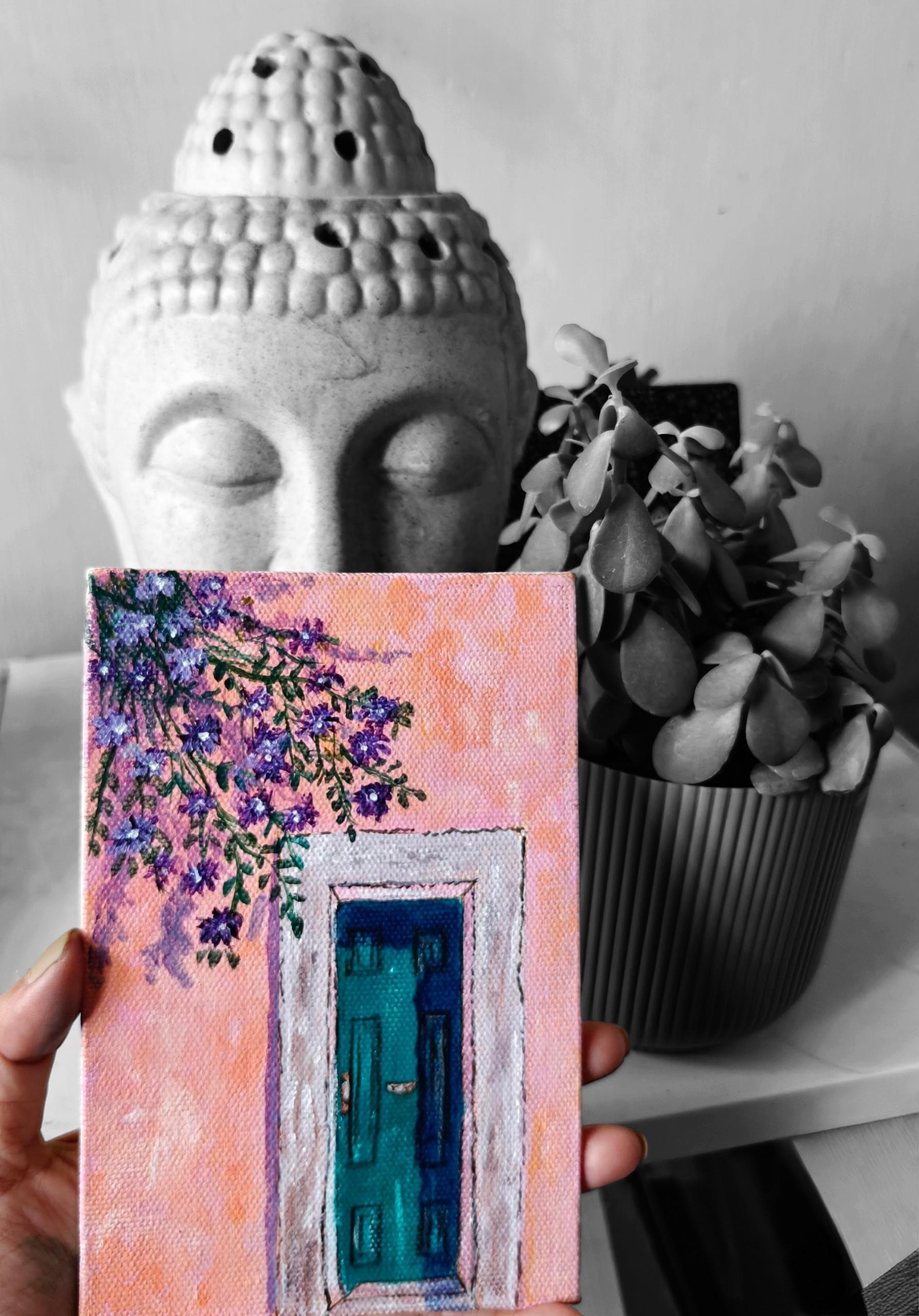
to seven inch canvas, which is from Brostro. It is a canvas board which I'm using here, as you can see. So this is the painting
which we will be learning. So let's first discuss about the colors which
we will be using. So the first color is
the permanent rose, which it will be the
whole background. Then a mix of permanent
rose and white. So I'll just push
it a little bit below so that you can
see the colors also. Another color is
orange with a mix of permanent rose and
cadmium yellow. So these are the
three colors which we will be using for
the background. So you can see this permanent
rose which is there. Then the white and the
rose mix, then the orange, which is, again, permanent
red and yellow mix. That is cadmium yellow. So all these
textures, we will be using all these colors
for the textures, and background will be
just rose and white color. Now comes the viridian color. This is a viridian mix of Prussian blue and viridian
and a little bit of white, which we will add
to the door part. So this is a color which we will be using for the door part. Then comes the edges of this is with the
Christian blue color. Then comes the the color, which is the color that is mix of this violet color,
which we will be using. This is a windsor violet, which we will be using
for the flowers. So this is, again, mix of this viridian, then cadmium yellow, a little bit Prussian
blue to create a nice dark greenish
color for the leaves. All these colors we
will be using for this. Then lastly, a little bit of
black and also burn sienna, which we will be using
in some of the places. So all these colors will be
required for a painting. Then come so this you can
see for the door knob, burn sienna now let's
discuss about the brushes. So these are the
brushes which we will be using flat round
and the rigor brush. So you can see there are two flat brushes which
I will be using, then some round brushes
and some rigor brushes. So all these brushes
we will be using. And some of the brands
which I will be using for this is the
Windsor Newton brand. Then comes the Montmarte brand, and also the Brostro brand. All these brands I will be
using for the painting. Then pencil, that is the
technical pencil which I will be using for drawing,
then the scale, all these things which we
will be needing for drawing, then the palette, you can use any palette,
whichever you have, then the container, all
these water container, then the tissue or
the tissue cloth, anything you can use. So let's start with this beautiful painting
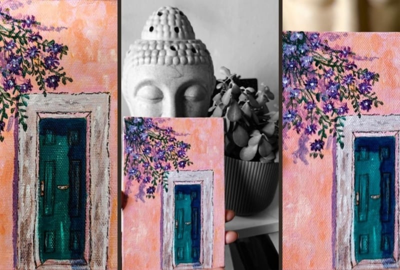
of the Vintage tour
3. Sketching And Underpainting: Welcome back. So
let's start with a new painting that
is Vintage Door. So first, we will do the drawing and we'll start with
the drawing part. So this is a canvas
which I'm using. It is a rectangle canvas. You can use any size canvas. This is five is to seven, which I'm using here. But you can use any size
canvas, whichever you want. I'm using my scale, and first, I will create the
door structure. So using my pencil, so this line which
I'm drawing here, it is not exactly in the center, and it is a little bit
side of the canvas, and I have kept it till the
middle part of the canvas. So this much straight and
vertical line I have drawn, and a little bit of one inches, you can see like 1 centimeter, you can see, I'll
keep it the borders. So everything depends upon
the size of your canvas. If your size of canvas is big, you have to use a
bigger size door. But if your canvas is small, you can make smaller doors. It's just a prox idea
which I'm giving here. So this is around 1 centimeter, which is the width
is and just drawing the lines on the top also
with a normal 1 centimeter. So we will also add the
details in the doors later on. First, we will add the
upper line which is there. That also you can keep it 1 centimeter so that
it looks like even. Now, if you're using
a bigger canvas, you can use a bigger value. Like I have used 1 centimeter, you can use two or
four centimeter also. It depends upon how the
size of your canvas is. So this is the door structure
which I have created. Now I will create a little
depth inside the door, a little edge, which
is going inward. Then the straight line
joining all these edges. Try to use the scale everywhere because
we will be needing this everywhere while drawing
the structure of the door. So this is how I have
just drawn the lines. On one side, I will draw a little narrow one
because on one side, it is a little deep
and the other side, it is a little narrow depth. So it's like that. After this, the design in the door, which is a rectangular design. Once we are done
with this design, we're almost done with
the painting drawing and rest we will do just
by using the colors. So just creating
equal size blocks. So just first drawing
the vertical line, and then similarly, I will
draw the horizontal lines. So whenever you are
drawing any blocks, try to make it even. Like, I'm just drawing
the lines first on both the sides with same size. So first one is 1 centimeter, then it is like 4 centimeters, then again, little one
centimeters again. So like that, I have
drawn the lines. Similarly, I will be doing on the other side
also the lines. And here also, I've just
drawn a little bit of, like, half centimeter lines
because there's a very small area.
It's not very big. Now, depending upon your
canvas or your paper, you have to decide the lines. Try to make it even
so that it looks like a similar and even
around the doors. It's not like you have to
also draw the three lines. You can draw two also, but try to make it even. Take your time and draw
the lines one by one. So here you can see I
have drawn two blocks. Try to make both the blocks similar so that it looks
very even and neat. Similarly, for the second block, which is in rectangle shape, it should be in same
line of the first block. Then only that will look like a uniform line which
is being formed here. So give time to your drawing
and just this much is there for the drawing
and rest we have to do with the colors. So you can see all even
all the two blocks, even and in the same line. It's a very simple and a very beautiful painting with a little
abstract touch to it. I've tried to make it a little bit more in the abstract form, which you will see in
the coming sections. A little door knob, which is in between the door and another door handle
which is in between. So this is it with
the drawing rest we will do with the colors, the whole drawing
which is there, we'll all do with colors. And this is the area which
is in the shadow area. That's what I'm
drawing the line here. So this will be in
the shadow region. So this we will do
with different color. So this is the
entire drawing and now we'll start with
the coloring part.
4. Wall Painting And Texture: Welcome back. So
let's start further. So now let's do the
background painting. These are the colors. The first color is rose, then cadmium yellow,
white, and burn sienna. So if you don't have
permanent rose, you can use Alazarin
crimson also. So first taking this burn sienna and applying to
the entire canvas. So this is just applying
to the entire painting, this thin coat watery
coat of burn sienna. So the reason behind applying this coat is like
when you will apply this coat and when you will apply the second layer of paint, the colors will get more
absorbed and more clear. You don't have to repeat the background painting
again and again like we do in canvas painting because canvas whenever we
do any canvas painting, we have to do at least
two to three coats. So in this while
applying this layer, you can just add two coats of it and that will be perfectly fine. So this will absorb all the colors which is there
and once it settles down, once it dries, then we
will apply the color. So you will see the
difference here when we are applying the colors. It will be more visible
and more clear. And also more opaque. So try to make it
as thin as possible so that you can see
whatever you have drawn. So don't bother about
the brush marks. It's perfectly fine if
there are brush marks. Once it dries, when you
will add the colors, everything will be gone. So we'll wait for
this to dry first. Once it has perfectly dried, just touch your hand and
check if it has dried or not. Once it has perfectly
dried, then again, we will use the same flat brush for filling the background. Now in this, I'm mixing
this rose color, the white color, and making
it very light pinkish color. So if you don't have
this rose color, you can use Azarin crimson also. Or you can use cadmium
red also or vermilion, any color, whichever color
you feel like you can use it. Now, you can see I'm applying the first coat on
top of this canvas, and you can see how thick
the color is coming. But it does not happen when you will apply directly
on the plain canvas. You'll see the difference when you will try it by yourself. So I'm just applying
an even coat all over this wall
which is there. So just filling the entire wall, leaving the door part. I will be applying
second coat to this also because
whenever we do, at least two coats are necessary for the background to make
it more smooth and clean. But here we are not
even bothered about the smooth background
because we have to create textures on the wall. That's what we have
to create here. So it's a little abstract type, so we have to create
textures on the wall. So even if there
are marks on this, don't worry about that. So this is the whole pink
color which I have done. So this is a one coat
which I have done, and I don't think I need to apply one more coat because
it is already very good. So I'm just making it orange
by mixing it with yellow, a very light pastel orange
I'm making and just adding more white and pink colour
and a little bit more of the whitish and yellowish color. So three colors I have
made, as you can see. One is dark orange
or light orange, and a little bit
more lighter pink. So using my brush, which is the round brush, I'm just applying it
randomly here and there. My brush is completely dry. It is not wet. It is damp
brush, which I'm using. And I'm just applying randomly the textures here and
there on the wall part. So, similarly, you
have to also do it, apply it randomly
here and there on the walls so that
these walls will look like there are some dust or something which is
there on the wall, and the wall is not clean. It's an old wall, just
to look like that. So somewhere I'm just applying
the light orange color, somewhere dark orange, somewhere more
light pinkish color with a white mixed to it. So just randomly fill
all these textures around so that it looks
like an abstract painting. So it's like an
abstract painting, which we have to apply all
these textures everywhere. So here, also, I'm applying
some darker orange shade. Just keep on filling the space, leaving some pink space also, not filling it entirely. You have to leave some
space of pink as well. So just randomly, I'm
filling it here and there. Now I'm taking just white and filling it here and there in some points just to show that that colors
are peeling off or the colors are coming out
and the wall is very old. So just fill it with some
white textures also. So this is almost
done the wall part, and now we will do the
details of the door. So try to play with the
colors and fill it here and there and try to use a damp
brush, not a wet brush. Otherwise, these dry
textures will not appear. The more and more you will add, the more it will look beautiful. And now we'll start with the
middle part, the door part, first the middle part,
then the side parts. M
5. Door Blocking: Welcome back. So
let's start further. So now we will do the door part. So for this, I have
taken three colors. That is the first color
is prescient blue. Then the radiant green
and black Prussian blue is not visible, but
prescient blue is there. So all these colors I will be using here for this painting. So first, I will mix the colors, and here I will use a
smaller size flat brush. So first, I will
wet my brush and take radian and a little
bit of black mix. And using my liner brush, first, I will outline all these blocks so that when we color
the entire thing, these blocks are still visible. So just outlining the blocks first with green and black mix. You can use any liner brush or rigor brush of size
zero or two by zero, whichever is
comfortable for you. You can also use round
brush of size zero. That will also work
for outlining. Try to make it as
thin as possible, and to make thin lines, you have to make
the color fluid. So try to use fluid color, not thick color for
creating the lines. Once we have drawn
all these lines, we'll start filling the colors. It is mostly like greenish
blue color which is there. So just first outlining the
middle lines which are there. And again, just taking green and black
mix and a little bit of this Prussian blue and white and a little bit more
white and Prussian blue. It should be a
bluish green color, which we will use for
painting this entire thing. So first I'm painting all
these blocks which are there, just making it a little
bit more lighter. So just filling all these
blocks which are there first. I'm still using my liner brush for filling all these up
because it's a very small area. You can use your
round brush also. And depending upon the size of canvas and the shape of this, you can choose your brush size. Do it slowly and
patiently one by one, each and every blocks. Take your time and do it slowly. The last two parts left. Now we will do the complete
tore, which is there. Now for filling the door part, you can use a bigger
size brush also. It's totally your choice
mixing Prussian blue and this viridian and white
mix. It's a similar color. It's just that I first block in these parts so that
the lines are visible. So I'm just filling this
entire portion which is there, which is the inside
portion with this color. You can use bigger
size brush also. It's totally your choice which brush size
you want to use. So slowly, slowly
with my liner brush, I'm trying to fill it up. Try to make your color a little fluid and try to fill it
up the entire section. So it's like a turquoise color. If you have turquoise, you
can use turquoise directly. It's a similar color. And if you don't have
viridiant green also, you can use any green, whichever green you
have, you can use it. Just mix it with Prussian
blue and you can make this beautiful
greenish blue color. So try to fill it
slowly one by one without disturbing the
lines, the black lines. It's okay to use smaller size brushes rather than using a bigger size brush. So you can see how slowly I'm
filling the entire thing, leaving that knob and the area which is there
where we have created the door knob and the handle that I will leave the section and
the rest of the area, I will just fill it
with this color. The more slowly and more
patiently you do any painting, the more beautiful
it will come up. So this is one of the
secret of painting. So try to fill it
slowly one by one, each and every area of
the middle section. So just try to cover the center rectangular
part which we have drawn, not the diagonal part, the
center part we have to cover, and just fill it up nicely, leaving those black
lines and just gradually fill it the lines. Once we have done
the filling part, then we will do the details of the knob and the side
part, everything. So slowly, I'm just
filling all the details, leaving the knob and
the handle part. So we're almost done with
this center door filling. Now, we'll start with filling
the rest of the parts. Be careful when you are
filling all these things. It should be in a line and at. And if you feel that there are some cracks which are coming
while you're filling this, try to add one
more coat on this. Try to add second coat only
when the first coat dries.
6. Door Edge Blocking: Welcome back. So
let's start further. So now we have filled
the middle part. Now we will do the side parts. So for the side parts, again, I'm using the same brush
that is the liner brush, mixing this rose color
and white color. So now my white has
already dried up, so I'll take a little
bit more white into it. And I'll just mix
more white amount and less of the pink color,
that is the rose color. And I'll just apply
it to the sides, which is the narrow
part of this door. Try to use the smaller
size brush like zero size or one size for
doing the side details, and just taking the color and
applying it to the sides. Water is only there on my brush. That much water
is only required, and rest are the colors. So we'll do all across the whole borderline which is there with this white color. So try to do it carefully inside the boundary line so
that it is clear and crisp. So two sides I
have already done. Now we'll do the third side. So this is how I have just done the part which is on the sides. Now we will do the outer part, which is the thicker
border part of this tote. So for this, you can use a bigger size brush also
because it is quite thick part. So instead of using the
smaller or liner brush, you can use thick brush also. But first, try to mix
the color and make the color mixing this
Prussian blue pink that is the rose color, little bit of black
and white color. First, I will just outline this whole area with this color. So just outlining
the border part, and then we'll fill the colors. So directly, I'm not
using black color. I'm just making it a
little grayish blue color, and I'm using it for the border, which is the thin border
which is outside. Also, you can see the lines
are also not very straight. It is a little crooked lines
which I am trying to create, like the walls which have the lines which
are not straight. So crooked lines are there. So like that, you
can make the border. Now we will do the filling of the part which is
there on this outer. Little bit textures, I'm
adding darker color textures. Some white textures also. Now we will start doing
the outer part of the door which is there, which is the thick borderline. So I'm using here
the round brush, taking white colour,
the rose color. Already, there is
Prussian blue mix in it. So just adding some more white and just applying
across this whole area. So it is a light,
bluish pinkish, like grayish pinkish
color which is there. So mostly it is white, very light color, so
applying it all across. So actually, the
wall is white only, but because of this dust and the old texture, it
has become like that. So that's what here my motive is for creating
the outside wall. So just filling it
with this color. So try to do it very carefully
within the boundary line. So once we have
done the filling, then we will add
some textures also, and also some lines or
textures all across. So just filling it carefully without disturbing
the inside portion. Also the lower part. So the door part is colored. Now we will add some textures
across this whole area. So again, using the same brush, that is the round brush mixing
rose and the white color, this has become a
little not straight. I'm just making it a little straight by just
adding the same color. So now we will add
some textures in it. So before adding the
textures, first, let's draw the outline, which is the outside
outline, which is there. Again, those outlines should
not be very straight line. It should be crooked lines. So just taking black and
making it a very thin color and just making it very thin and just
outlining the outside part. So some crooked lines
which are there, it's not a straight line. Remember you don't have
to create straight line. Then only that look will come, the vintage look, the
old look will come. So just leaving
some of the areas, also, I'm just drawing
the lines all over. This will make the look of
this old door more realistic. So just adding lines
across all the sides. So you can see how old it is looking when we are
creating some crooked lines. So more lines across
the inside part. The lower part also
just outlining it. And the line which is inside that also we have to outline it. Try to do it very carefully. Whenever you are
doing any outlining, use very thin colour, fluid color, not thick color. So this is done the
outlining part. Now we will add some
textures to it.
7. Door Detailing: Welcome back. So
let's start further. So now we will be doing the
details of the side parts. So just making some
light pinkish color and a little bit of black
also I'm adding to this. A little bit more of white and
just adding some textures. Try to make your brush damp. Try not to have
any water in this. You should have a damp brush. And just using the side
of my liner brush, I'm just adding some
textures all around just to show that there are some
old walls which are there, old pillars, which
are there where the colors have come out,
something like that. I'm trying to create all over. So all over, I will be adding
these types of textures, some white and
some light pinkish and with a mix of black to it. So just adding to all the sides, some pinkish color mixing with a little bit
of black into it, just to make some thing
look more raw and real. Again, I'll take the colors
and I'll add some more below, little bit black
and more of this. So Again, a little bit of this burns and so you can add
different different colors. You can just make it just to
make the wall look more old. So this is the outer part, which we have done
with textures, like we did the walls also. Again, I'm taking my flat brush and creating some more textures. So just taking some
more textures all around with a burn si
and a touch to it. This thing you can
do it randomly. There is no rule in this. Whatever you feel like, how you want to create the
textures you can create. Now, just taking a
little bit more of white and adding to the sides. The more and more textures and variations of colours
you will add, the more it will look like raw and rusty look it will give. So you can see, I have
added all around now, it is looking very different from the one which we have
done just the painting, and now there are lots
of textures in it. So now we will do the
middle part also, which is the knob
part that is there, also some shadow part. So now, again, I'm
taking my rigor brush and just creating
some nice white lines across in some areas, not everywhere in
some of the areas. Just to highlight some
areas with white color, there are some
portions of white, which is left A taking some Prussian
blue pink mix. I should look like a purplish
color and just creating some shadow lines which
are there on one side. There's one shadow
which is there of the walls on one
side, just adding that. Just to give a little
more depth to the lines. So a little thicker line
and just making it. And again, the crooked lines, these are not very
straight lines. So a little crooked, you have to make the lines. Now there is the
knob which is there. So for that also we
will be using first, we will fill the colors
with a mix of green, black and white together. And again, we will
apply the colors because at least two coats
of color should be there if you are applying on the canvas, especially the middle part. So just taking again my
round brush and filling this entire portion again with the same color which
we used earlier also, Same color mixing this
blue, black, white, and this radiant green and
applying it all over just to make the whole thing look
more neat and more clean. Little bit of color
variations will be there, so don't worry about that. That is perfectly fine. If you don't have
this type of green, you can use any green, whichever green you
have, you can use that. Even you can make
this green by mixing this Prussian blue
and yellow mix, and you'll get this green and a little bit of white
also you can add to it. So any type of green you
can use, there is no rule, but this green is looking
more like bluish green, bluish, little greenish green, so it's looking different. So I'm just applying it all
over with the second coat. This time, I've used a little thinner color,
not very thick. Otherwise, the line would have been not visible because whenever you are
doing second code, you can use a little
thinner color. Now, again, the liner brush and taking the mix
of burnt sienna and white and applying a little
bit of yellow to it just to make it a little orangy and
coloring the door knobs. Try to use smaller brush size, then only you'll be able to
do the perfect detail of it. So this is whole door part. We will add some more
details to it because still little bit
details are left of the shadow and of
the door details. So again, I'm taking
that purplish color and adding to one side of it, which is the narrow
part inside part of it, adding some of these colors. Now we will just
take a little bit of white and add some more white to the side parts of the wall. Some thick color
without any water. So we'll wait for
this whole part to dry and then we'll start
doing more details to it.
8. Shadow Painting: Welcome back. So
let's start further. So now we will do a
little bit of the above the part where the
whole flower will be. So I'm just mixing
Prussian blue, pink, and a little
bit of white also. So just making a little more purplish, pinkish
purplish color. So something like
this type of color. So with this purplish color, I will be adding
the back shadow of the leaves and the trees
which are on the top. So we'll not be showing
the entire tree just a part of the tree. So same color is there, that is the purplish color. And I'm just adding some
background textures using my round brush. So it's better to rotate it
so that it looks more clear. So I've just rotate the canvas, and here I will just be
adding onto all the sides. Or instead, you can do it like this also instead
of rotating it. Just apply and fill
the above part and just some branches or some branches which are coming
out a little thicker form. So just adding more and
more branches shapes. So now I will use my
rigor brush and I'll create some form of branches
which are going down. So this will act as a reflection of the main branches
which we will make. So just adding a few textures
with the same rigor brush. So this is just the background
detail which we will add. The front will be a
different variations with green and some
dark green branches. So you can see, I'm just adding some shapes
of the branches, which will act as a
background shadow of all the branches and the
stems which are coming out. Once we are done with this, then we'll actually add the main flowers and the
branches, everything. Keep the color fluid
so that you can easily draw the lines
and the textures. Now the above shadow
part is done. Now we will also add the
shadow to the door part. So I'm using, again,
the Prussian blue, which is a very
watery Prussian blue which I will use here, and I will just put this
on the entire section, the half section, which
is under the shadow part. So I'm using my flat
brush and just creating a nice thin color like a shadow, which will act like a shadow. So try not to use thick colour. It should be a very thin
color which will appear like a glazing effect
on top of green. So just the Prussian
blue. That's it. Once we have done
with the shadow part, then we will create some lines of the center blocks
which we have created. So this is it for
the shadow part. Now I'll just take my brush, which is the liner brush, and I'll create some
textures because the shadow is also
not very straight. It's like a crooked
shadow texture which I want to create here. So that's why I have used
this brush, and again, I'm just using the same color and filling it with this color. So this is the shadow
part which is there. After the shadow,
we will be creating the door shapes and the
door knob which is there. So go one by one at a time and do it slowly
and take your time. It's perfectly fine. If you're not able to
finish it in one go, you should always take
break and then do it. Now I'm again taking
black color and I'm just outlining it the all
blocks which we have made. Use thin color for making
all these outlines. If you're not confident enough
to make with the brush, you can also use
your technical pen to create all these lines. So very simple lines which we
have already drawn earlier. You just have to outline it. So when you will outline on the darker part that is on
the Prussian blue part, take more of black so
that it is visible. So just drawing the
blocks all over. And now taking
white and black mix and just adding some
highlights to these blocks. Simple highlights, simple lines. So this is it for
the above part. If you feel in some area you
want to remove that texture, you can always fill
that green color. So this is how we have
to do the whole part. Now we will add the details of the trees
which I have made on the top. Currently, we have just made
the shadow. It's still left. The flowers and the leaves and the branches which are
coming out is still left. So again, I will take
the Prussian blue color because I feel that
color is very light. So I will just take one
more thin colour and I'll just put it on top of
that, again, the color, same color I'm using, same brush and just making it thin and just applying one
more coat on top of it. Just to make it look more visible and just
taking the color, which is the green color and little bit of blue
mix and just applying same color which
we have used for the background and just
applying it everywhere. This is a thin color, so
lines will be visible. If it is not visible, we will again do
the lining part. So this is how we have to repeat the process until unless it looks like properly
clean and beautiful. Making this line more
crisp and clear.
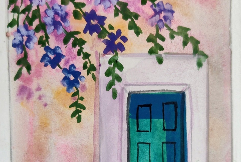
9. Floral Painting: Welcome back. So
let's start further. So now we will start creating
some lines on the top, some branches and the stems
which are going downward. So again, I will be
using my rigor brush, taking this green and little bit of black mixed
to it just to make it a dark green color
and a little bit yellow to make it
more, more greenish. So you can use your sabgreen also for creating these lines. So I'm just creating
some thin lines which are going in the
downward directions. So try to make it as thin as possible and use a fluid
color, thin color. Then only you will be
able to create the lines. You can see I'm
creating the lines in between the shadows so that it will look like these
shadows are of these lines. So just creating some random
lines here and there, just like stems and
substems are there of the flower which is blooming, covering the above
part with more stems. So do it slowly, carefully one by one, these stems and make your
color a little darker. You can also add Prussian
blue to make it more greener. So by adding Prussian blue, it will become more greener. So some of the lines
I've also created just going towards the door also. So try to make as many
lines as possible, and then we'll start
creating the flowers. Especially, I'm
covering the above area where the roots are coming. So this is how we have
to create the lines. Once the lining part is done, now we will add this
blue and white mix where we want to
create the flowers. So a little bit of
this rose color also, I will add to it to make
it a lavender color. And wherever I want to
create the flowers, I will just make a circle
over there, small circles. Using my round brush. Just small circles,
I'm just locating where I will be
creating the floral. So this time the floral
will be with violet colors, so dark violety color. Just adding all these circles everywhere where I want
to create the flowers. Now I will start creating the
flowers using violet color. So instead of making violet, you can directly use violet. So just taking first, again, this blue colour and
just making the circles. So you can see I filled these small, small circles everywhere. Now we will start creating
the flowers and the leaves, which will add more
beauty to our painting. So this is a violet color which I have taken out from
Windsor and Newton. So this is Windsor violet,
which I'm using here, and I am directly using
that violet color to create a nice floral texture. So in all the directions, I will be creating
the flower effect, just small textured flowers. It is not a perfect
flower like you see. It's more like an abstract form. So I will just rotate this
thing so that it will be more easy for me to
create the florals. So again, taking this violet
color and creating small, small flowers wherever I've
created those circles, small, small textured flowers
just with my liner brush. So I'm not using a
very big size brush, just creating some
flowery textures. Everywhere, wherever I have
created those circles. So what I'm doing here
is I'm just drawing the lines from all the sides so that it looks like a flower. Don't worry about the
proper shape of the flower, add those in random
circular textures, and automatically, it
will look like floral. Since we are not going
towards the realism, we are doing a little
abstract form. So just adding everywhere wherever I've created
those circles, So just do it
randomly everywhere, wherever you feel like. It's not like
whatever I have done, you have to also
do the same thing. You can create your own
pattern of flowers. It's just that it
should look like, full of flowers and leaves. It should look like loaded
with flowers and leaves. You can add as many
flowers as you want. There is no rule in this. You can change the
flower color also. If you want, you can
change it to blue, you can change it to red,
whatever you feel like. I'm just giving you an idea
that how to create this. Even sometimes those random
dots also acts like a flower. So you can see I have created
the flowers everywhere. So just enjoy the process
of creating these small, small flowers, and then
we'll create the leaves. So just mixing some
white in this violet and adding some
textures of light. Just adding some dots, also, you can add in the center just to make it
look more visible. So just making here the
lighter flowers little bit. So if it is a mix of this
light and dark color, it will look more beautiful. So just random dots and lights. I'm just adding. So this is
it with the flower part. You can also add small dot
of white in the center. That also we can too. So this is it for
the whole flowers. Now we will start
adding the leaves.
10. Final Details: Welcome back. So
let's start with the last part of a
painting which is left. So first, we will add the leaves all around
just by taking green Priscian blue mix and
a little bit of white also, and a little bit of
this cadmium yellow, just to make it more greener. And with my round brush, I will start adding small, small leaves just with
the tip of my brush. Try not to use the
complete brush. Just use the tip of your brush. You can use any size brush, either two, four, six, any size. But if you're using
the tip of your brush, you can easily create
the small leaves. Try to make sure that your
round brush is quite pointed, then only you will
be able to create nice and crisp leaves. Now, the leaves which I'm
creating here is at an angle. As you can see, it is going
downward at an angle. But when you will rotate it, you will see it is going down. Currently, it is upward, but when you will
rotate the image, it will appear like it is
in the downward direction. So it is easy to rotate your page or your canvas to
create such type of leaves. It becomes more
easier, actually, instead of keeping it
at the same angle. So try to fill
each and every gap with these small, small leaves. It should look like it is
filled with leaves and flowers. This is such type
of painting that you can arrange it
on your own also. The flowers also
you can arrange. The flowers color you
can make changes. In fact, the leaves also you can add of different versions, some light green, some dark
green, anything you can do. Now, just taking again
the shadow color which we have made by mixing the
Prussian blue and pink and just adding
some shadow parts below a little more shadow
below and to the sides. So this is about
the shadow part. Now we will just rotate the canvas and we'll
see how it looks. So you can see how
beautiful it is looking filled with
flowers and leaves. Now, again, we'll
start a little bit of more details of this door, the center door which is there. So again, taking Christian
blue with my liner brush, I'm just giving a little
more crisp shape to it. A little bit shape
and then again, taking green and white mix. Green and white mix and giving some textures to these
blocks which are there. Since we are creating
a vintage look door, so a little bit of
abstract textures you can add into these
blocks which are there. Some textures I've
just added and filled with my liner brush
and just again, making the lines
straight and clear. So a little bit of final details are left and the
knob part is left, and then we are done
with this painting. So just taking black color. And again, I'm just outlining
whatever is left out. So first outlining the part
which is the corner part. Make sure that your
color is fluid, A outlining these
blocks which are there. Little bit lines inside also I'm creating, not proper lines, just some few lines in
between these blocks. So adding the lines properly. So we are almost done
with this painting. It's just the few finishing
part which is left. So just taking some
more white color with a mix of black and adding
some more textures inside. Some more lines. This is it for the blocks part. Now we will do the door
knob, which is there. There are two knobs
which you can see. One is vertical and
one is horizontal. Before that, let's make a little bit more textures inside this door
little bit textures. I'm just adding with
light greenish color with a mix of white to it. So just dry brush effect. I'm adding inside
this whole door part. So this is it with a texture. Take very less
color when you are doing this texture part.
Don't take it too much. If by mistakes, you
have taken too much, just fill it with
the same color. In acrylics, you can always cover your mistakes
by just putting the same color onto it
once the color dries up. Now taking burn sienna and white mix and just
covering this part, which is there and just adding
a little bit more of white to it and a little
bit more white color. And the burn sienna color, I'm just filling it up. And with some white texture and a little bit of
black mixed to it, I will first outline
the entire section. Once we have done the outlining, then I'll just add a little
bit of details to this part. Try to make the lines
as thin as possible. And just taking a little bit of white and adding a small.in the center just to add more brightness and more texture to it, like a shine to it. Again, taking a little bit of Prussian color and just outlining the edges of this
reflection which is there. A little bit, you
can push it down also to the stairs,
which is below. So you can see how abstract this painting is looking
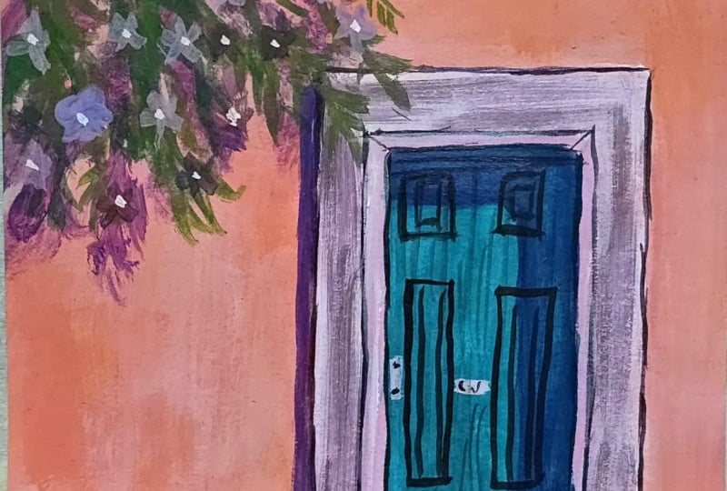
with a vintage look to it. To try it out, and I'm sure you will also
love while doing this. You just have to play
with the colors, the dry textures, and
just try to make it. Just adding small dots in the
center, just taking white. This will add more
beauty to the flowers. So do try it out this painting, and I am sure that
you will love doing this painting because it is very beautiful and
very different. Just some final touch
with the lines. Some black lines below. Whenever you end any painting, there is always a final touch. But if you're fine with it, no need to do any
more detailing. You can just mark
it as complete. So this is the entire painting, and do try it out and
share your project works. You can also tag me on Instagram that is
Mohini Art Gallery. I would love to
reshare your projects. And try to do this painting
slowly and take your time. Don't do it in a hurry. Whenever you are
adding textures, don't take too much color, take very less color for
adding the textures. Then only that texture will look more beautiful and more subtle. So you have to give a subtle
look to your textures also. So just do it slowly. Take your time and see where
you can add the textures, where you can add the details. It's just you have to play
with textures and colors. So this is it with
the entire painting, and thank you so
much for watching.
 Mohini Sinha, Acrylic and Gouache Artist- Nature Lover