Transcripts
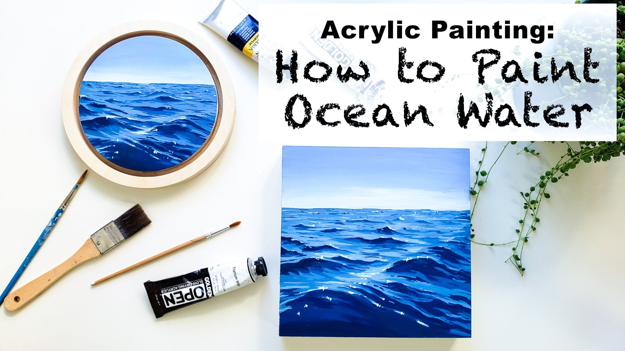
1. Introduction: Hi everyone, My name's event and I am a fine artists based on the central coast of California. Welcome to my Skillshare class. In this class today I'm going to be teaching you guys how to paint a beautiful beach scape seascape painting. This one right here. So I'll be going over how to paint clouds, how to paint waves, how to do sea foam and sand. And so much more. This is an acrylic painting class, so I will be using acrylic paints and showing you guys every step from mixing my colors to how I apply the paint smoothly, to how I move my brush to get a certain texture or movement in the final product. I am so excited to share every day I've learned in my many years of professional painting with you guys. So let's jump right into the class.
2. Materials: Hello everyone and welcome to my Skillshare class. In today's class, I'm going to be teaching you guys all about how to create a beautiful lavender sunset and ocean escape. I'm going to be starting out this class by telling you all the materials that I'll be using and that I recommend for you. So to start out, we have all different brands of acrylic paints here. I really recommend this, Winsor and Newton Galleria acrylic. It's a student grade acrylic, which means it's a lot more affordable and you can find it really easily at like any craft store around you. I picked up this set of about six colors at Michael's for about $20. I think it can be really helpful to start out with more affordable paints because then you're not afraid to use them and practice. And I really like these. I actually still use them in my professional practice alongside higher-quality paints today, if you're looking for something a little bit more high-quality, then golden artist acrylics are my absolute favorite. They come in a huge birth of colors, as well as different types of acrylic paints. So this is a heavy body acrylic. Just, just your standard thick paint, just like the student ons. But they also offer these fluid acrylics, which you'll see that I use. And there are a lot more liquidity, but they still have lots of rich color. So I really liked playing with these. It's fun to try out new kinds of paint if you're interested in not at all. I do recommend using a nicer white if you're going to upgrade just one color of your kit, I would say go for a wait. You mix titanium white in almost every color you use while painting. So it kind of brings up the quality of all of your paints just by introducing a higher-quality white. So for the colors we'll be using today, I will be using mostly the set from Winsor and Newton, which came with a Winsor blue, which is also commonly known as the low blue. So you have that color than just that in for this color. Burnt umber, cadmium red, and cadmium yellow. This also came with a white, but I'm going to be using our golden acrylics white. And then additional colors for this project that can be really helpful are having an ultramarine blue, which is just a different kind of blue then our Winsor blue, it's more warm toned. You'll see a pretty good difference if you ever swatch them side-by-side. This is more of a green, blue, and this is more of a lavender blue. And then I also really recommend getting a purple because although you can certainly mix of purple with cadmium red and one of your blues. It won't be quite as saturated. It will be more of a desaturated purple. So I think it can be really fun to get a red, violet, or purple color to add into your repertoire. Sometimes our desaturated purple looks really good, looks really realistic. So that's what you wanna do. You totally can, but I think it's a little bit easier to have your own purple premixed. Lastly, we have Payne's gray. This is one of my favorite colors. A lot of kits or beginners choose to get a black paint for their darkest darks. But I really recommend getting Payne's gray because it has a lot more dimension. And when you mix it with other colors, it doesn't drill it down as much as black paint will. So I really recommend exchanging your black paint in your kit and getting a Payne's gray instead. Next time, you will definitely need some different paint brushes for this project. I always use really affordable ones. I get kits of them at craft stores with a whole bunch of options. But I really recommend having 1.5 about flat brush. So smaller flat brush and larger flat brush, that's maybe an inch or three fourths of an inch or bigger washes. And then I recommend having a couple of different smaller brushes. One with a really good point for fine detail or you need it. And then one that's just a little bit bigger, that you can do smaller details but still get lots of paint onto your canvas. Lastly, some bits and bobs you will need are some painters tape to help us get a really clean horizon line. Some water you can use a jar. Something I like to recommend to people is to get two jars of water or a container that has two sides like this so that you can have cleaner water longer as you're working. And then you'll also need a paper towel to dry off your brushes after you clean them. And you'll also need something to mix your paint on. I really always recommend a glass palette just because it's so easy to clean up. You do an initial investment to get the pallet and then you never have to buy palette paper or anything else. You can just scrape it off, clean it up, and then grow the paint away so nothing's going down your sink. It's a very clean and minimal way to mix your paints and then dispose of them easily. And I'll show you guys how I use and how I clean this palette really easily in the video as well. So now that we've gone over all the supplies I recommend for this class, Let's go ahead and jump into the next step.
3. How to Prepare Surfaces for Acrylics: So I want to show you guys how to prepare any surface for painting with acrylic paints. You can use this method for Canvas, wood, paper, or pretty much anything else that you want to apply. Acrylic paints too. So this is just 0, which is what we use to prime the surface of anything we're going to paint. If you buy canvases from any craft store that are white, they're usually pre-programmed, which means they already have lay egg layer or two of gesso on them. But I think it can be really helpful to add another one. This is actually already prepared. But I'm going to go ahead and add another layer of DSO because it helps the paint sit really beautifully and kind of brings the quality of a cheap canvas up. So it feels nicer to paint on. If you're painting on wood or paper, I really recommend using DSO. It's not as important if your canvas is already pre-programmed. Because if you don't prime your surface, you'll end up losing a lot of paint that just soaks into the wood and having to do a lot more layers to get your painting to look good. If you don't have just so and you are painting on paper or wood, you can still do it. It won't damage your painting. It'll just take a lot more layers. Like I said, just doing a super easy, we're just going to apply a bit of the white paint right onto our surface and just cover the whole thing. And that's pretty much all there is to it. It's just like adding a layer of white paint to whatever you're painting on as a base. And then once you're done covering the surface with Jessica, just let it dry for about 10 to 20 minutes. Make sure it's fully dry before you start your painting.
4. Sky Base Layer: Now that the DSO is nice and dry and we're ready to get started. I'm gonna go ahead and set up my palette. And I'm just going to be adding the colors that I'll be using for the sky to start out with. So for this project, I'm gonna go ahead and tape off the horizon line using painter's tape so that we can get a nice crisp, clean line. So the reference photo is available in the student project section. So make sure to check that out so that you can see what photo I'm using for this painting and you can interpret it in your own way as well as follow along with me. So when looking at the reference photo, I can see that the horizon line is about 1 third of the way down the painting. That's where I'm gonna go ahead and tape it off. Doesn't have to be exactly precise, just an approximate measure map. And then I like to go ahead and use a ruler just to make sure that my tape is pretty straight. Sometimes it's hard to have it not be crooked and we don't want our crooked horizon line. And then I'm gonna go ahead and pull the tape extra behind the paintings. It's not stuck and I can move it as I work. So I'm going to start off by using our bigger three-fourths or one-inch brush, whatever you have. And I'm just going to mix up some white, some ultramarine blue, and some blue are Winsor blue depending on what is called in your kit. I'm going to make this a pretty nice light color. And then go ahead and start applying that to the top of our painting. Now I'm gonna do about half of the sky in this nice code. And then you can add just a little bit of white into that and kinda blended up from the bottom. This is just a small detail, doesn't make a huge difference, but it has a little bit to the realism other piece. And then the next thing I'm gonna do is make some little bit of our purple into that and a little bit more ultramarine blue until we get a nice blue, cool toned purple. And then I'm gonna go ahead and apply that on the bottom half of the sky. This is kind of a big base of our clouds. And you can see that they kind of come up. And then I'm gonna go ahead and mix up a little bit more of that color with a little bit of a darker blue. And start to add some details to the top of that cloud. So we can see that there are some clouds that come up. I'm just using the corner of my brush and some paint and a little bit of water to swirl in these clouds to give it lots of texture. And it's kinda helps that have the right shape. And then we've got some more kinda coming up, especially on this side. And then kinda the top of the cloud bank there, which we can fill in a little bit more. And then we can see that there's kind of just so different swirly tops to this all the way up to about here. So we'll just add in these little details and they don't have to be too precise. That's why I like to use the corner of a big brush. I think it gives it a good texture without having to be too exact. Okay, I carry that over to here.
5. Cloud Composition: And I'm going to go ahead and mix a little more blue into that to get a little bit of a darker color. And start to add in little bit more on this side of the cloud bank and blend it down. And then we can see that there's kind of like a straight line, a straight streaky clouds over here that actually come all the way over and through these clouds here. And same with over here we have some of these longer streaky threads that come through. And these are really great because they add a lot of really nice contrast to our fluffy clouds. And then I'm gonna go ahead and use this darker color and add in some definitions so we can see if this little bank of clouds, he's kinda like its own little entity. And there's lots of shadows, so you can start adding in shadows wherever you think that they fit. And then we kinda have a big bank here of clouds as well. Kinda more centered this big cloud right here. I'm going to switch to a smaller brush at this point. I'm just a smaller round brush. So I can get a little more details. We'll mix up a little more of that color. I'm going to add a little more purples as time. Because I like to add lots of different tones of that purple color in the painting. So it makes it a little bit more with the reddish purple and get a more saturated lilac. And then I'm gonna go ahead and certainly some different spots around the piece as well. I like to add a little bit of water to my paint. I think it helps it to apply things going smoothly. And I'm just going ahead and darkening up some different areas of the clouds here, adding little bits of detail. This side of the card, things pretty dark coming down. And then we'll have actually lighter clouds towards the bottom. So I'm just kinda start getting it and adding that in. And same over here. When you continue to build up the shadows.
6. Cloud Details pt 1: So what I'm doing with this piece is the light is coming from this side behind the clouds. So making sure that when I add shadow, I'm adding them on this side of the cloud and then keeping the light part towards the other side. And I want to keep that consistent across the whole piece so that the light source is really convincing. So I'm just coming in to the backs of all these clouds, like I was saying, keeping it to the side. Okay, no blending it down into this cloud bank we created here. And a little bit of white into this to get kind of a mid-tone color. Then we can start blending it out a little bit more. Why? That kind of mid tone, a little bit more purple to warm it up and start to transition these shadows into a lighter parts of the clouds. And then I'm mixing it into a lighter color so we can start to kind of blend out this cloud bank and all the darkness over into the rest of the piece without it looking too harsh or jar. Then I'm mixing a little more purple and blue. This is really fun. You get to just play with different shades of purple and different likenesses and different works. Can you just add lots of dimension that way through it? Do you want those things to be pretty smooth? So that's why I'm going ahead and adding a second layer to kind of join it all together. And then we'll add in some detail over top. But I like for the base to be pretty smooth that out. And then I'm mixing up a nice really light lavender. And I'm going to go ahead and start adding that into some of these clouds and adding highlights to the ones we've already script in. And even with this brush, I'm still just using kind of a circular motion like this to get lots of little textures and little bits. So it has that nice organic shape that we want.
7. Cloud Details pt 2: And I'm mixing a little bit more of our purple in there. And I'll go in with that as well. And sometimes what I like to do is kinda coming in to the cloud, I'll add a little bit on the outside RAM and keep the lightest part right in the center. You may think it's this more bright red color, reddish purple, I suppose that gives it a really dry pastel look to it. I'm carrying this work on the shadow over there as well, carried back down. Bring this over to continue this shadow area. And then you can see that this is kinda like one big bank clouds here on another layer to the darks. Over in this area. I really like to build up lots of layers with acrylic paints as it covers up the canvas thoughts. It looks more and more high-quality, finished. So again, I'm just kind of building up these transition layers. Moving back and director to redefine the base of this cloud being here. And they kind of connect like that's not the same exact, but the shadows kind of merge and blend together here in the middle as well. I'm going to take some of that darker blue and start adding in some details over here we have some different little lines, little streaks that kind of build their way up into this upper, larger cloud. And then we can mix up a nice light lavender color. Again. It's a little bit more cool tone. I'm going to start to add in some clouds down here. You can see in the reference photo that there's different layers of clouds. We have some data in this area, as well as a few down under here. I really like the look of having these lighter crowds in the darker areas of the piece. I think it adds so much texture and it's like another layer of space. These are in front of those clouds in a different way. You build up all these different layers of them which had just love to do a little more white to that for these ones over here so they stand out just a little bit more. You can add some of that up in these clients as well. Anywhere that you want your lightest lights to be. And I want to add a little bit more of a warm purple into our peace signs. Gonna go ahead and take that. Building up some of these areas was kind of a midtone warmer purple. I'm going to add a little bit more blue and purple together to get a little bit of a darker version of that dreamy purple. Kind of pull down. Attach this one. And I'm just gonna go ahead and add in some little details into the scribes. Well flops. In some areas as well. I think I want to add a little bit more dark and it's under here. So there's kind of a divide in the middle and it'll help these stand out if we put darkness behind them or underneath. And then you just want to work back and forth until you're happy and everything's gone at least two layers on it is what I'd recommend so that it has a nice opacity. And then we're going to start on the next part of the sky, which is we're gonna be adding in some little light streaks down in here that show the sun coming through. But first I'm just finishing up all these little details and having things wherever I see. And I think they might look nice.
8. Adding Light: Pink Sky : For mixing up the little lights in here. We're going to add some yellow to our mix up a nice pinky, peachy color. So I'm going to be taking a little bit more on the pinky side. And it's very light because it is sunshine coming. And we're just going to add a few little lines there in the painting. And I don't want all of these lines to connect. You can see I've got little dots and spaces in between because it's just showing where there would be little holes in the Cloud thinks that are letting the sun shine through. So it might be areas that clouds are blocking just part of it. And I like to add just lots of little barbs and textures. And then you're gonna wanna make sure to add a few different layers to this section so it's really opaque and clean. I'm going to mix a little bit more pink into that. So we get a little bit of a richer pink color and add that in as well. Maybe alongside the edges that were a little light. Adding different colors like this kinda helps it to feel three-dimensional. All right, so once you're feeling like you're done with your sky, you're comfortable and happy with how it looks. Again, feel free to take your time, pause this class, and go back and add more details or blend or clean things up by R3 you want to. But I do recommend once you're feeling close to being done taking off the tape, it's kinda the most fun part about these paintings. And it will really help you to see how it will work with your painting. Once it's got that nice clean line. Sometimes I think the whole thing looks messy until he thought the tape and then you're like, Wow, it's there. So I do recommend play off the tape once you're sure that you're at least done with the horizon line section of your screen.
9. How to Clean a Glass Palette: So now that we're finished with the sky, I'll show you guys how I clean off my palette. I just use a spray bottle filled with water. And I just spray down the palette. And then you can use a scraper or a razor blade to super easily remove any dried paint that you're not going to be using anymore. And then you just take a paper towel, then you can wipe it all off. And if the paint's really drawing, this is even easier. You don't have to do as much scrubbing. But either way it's super. Which is why I recommend glass taught so much.
10. Sketching Composition: So now I'm gonna go ahead and add the colors that I'm going to be using for the rest of the piece onto my palette. So I left the Winsor blue because we'll definitely continue to use that. And then I'm going to add some Payne's gray and some fresh white, yellow. And those are pretty much the colors that I'll be using for the ocean section, and we'll add more for the sand as well. So I like to start out by using a little bit of Payne's gray, maybe a little bit of white, and a little bit of water to get a really liquidity watercolor type of feeling. And then I will just sketch out the composition of the wave so that I have a good idea of where everything is going to sit in the painting. So you can see that the wave is not just straight, it has lots of curves on the top curve. So I do recommend looking at the reference photo and thinking about that because that'll help to add a lot of movement into your piece. We can see it comes down the street here and some, he's going basically just drawing this out very loosely. See that the top of our food and carries over here. We have it coming up again and splashing. I'd like to draw the inside as well. And then we have the waves coming down into it there. And then I'll go ahead and draw it. Just like a little bit of the peach sign as well.
11. Ocean Layer 1: Now that you have kind of a rough outline, I'm going to go ahead and start up here filling in the ocean by using a mixture of Payne's gray, the Winsor blue, phthalo blue, with the yellow and quite a bit of white. And I like to use a mixture of the fluid acrylic white. And I mentioned fluid acrylics materials section on regular. So same color, It's just a little more liquidity. And I'll just mix that up until I get a nice blue gray color. And then I'll go ahead and start adding that in as a base layer right along the horizon line. I'd like to just go carefully and slowly with the horizon line on this side of the painting rather than tape off the sky again. Because I don't want to risk pulling up any paint with a tape. But because you already have a clean line, it's much easier to match it on this side, but I recommend taking your time and know that if you mess up and you go into the clouds, you can always fix it with just a little bit of paint because you can do lots of layers with acrylics very quickly because they dry so quickly. I'll just add a little more way is I carry it down so it's a little bit lighter. Oh, then once that's all mixed up, I'm going to add a little bit more of our Payne's gray, yellow and create a bit of a darker, darker version. Based on the horizon line. As we can see that there's more shadow on this side of the piece. I'm going to keep it mostly over here. You can see that the darkness, there's light coming in here from the sun just same reasonably had the light on the side of the cloud. So light's coming this way and so this side of the piece isn't fair amount darker than that side. And because the paint is still wet, it's easy to kind of blend it out. A little bit of water if you need to. These nice color transitions.
12. Sketching in Our Wave: Once you have the background, laden is a base, we're going to go ahead and start working on the wave a little bit. And I'm going to mix up a good amount of our Payne's gray, blue and the yellow, and a lot with Payne's gray. So you don't want it to be too great, but we are trying to create a nice green blue dark color that you can see if you look at the reference photo. I will add a little bit of weight to it. It's just we can see the color better. Little bit more blue and dark gray. This is kind of a dark teal colors. I'm actually once you have a color you like, you can start going ahead and laying it in. And the dirtiest areas of the painting, we can see we have quite a bit in this area and also along the top of the wave. And again, if you want to look at the reference photo, that's really helpful because this is not just exactly one straight line across the top. There's lots of curves and even this dark part gets thinner and thicker in certain parts. It really helps to show the movement of the water. Okay. You can see that it kind of continues along in here. And then I'll go ahead and start filling in this area inside of the leaf as well. And we're actually going to add a little bit more blue to some of us to show her the translucency of the water out a little bit more of a fluid or an external little bit more weight. And this is just a slight shift. It'll be a little bit more saturated. Darker paint will do the same thing over here. We can see a little bit later in this corner. And I'm also going to take this darker color and underline, all the area underneath the wave connecting to these areas. And again, this isn't exactly a straight line either. They'll be some up and down. So you can follow what I'm doing at the reference photo. I think I can really help you learn about how to paint.
13. Adding Light and Movement: I'm also going to take this darker color and underline. All the area underneath the wave where it's dark and connecting to these areas. And again, this isn't exactly a straight line either. They'll be some areas where it's up and down. And so you can follow kinda what I'm doing or look at the reference photo. I think I can really help you learn about how to paint. And I'm just kinda seeing some of that movement down into this area. You can see that it drags down over here. And I'm not going to get too much into the details of the phone right now, but it helps me sometimes to add a few marks just to see how it's going to look as we progress. The next thing I'm doing is mixing some white into this same type of color. And we're gonna go ahead and start adding in wash of a lighter color. And what that is in a wave is actually air that is inside the water, diluting it and a lightening it to the air. So that pretty much just follows right along under our dark area. It's not a perfect line either like I've been saying, Be sure to vary a little bit thinner or thicker. And then you can see some of it down here as well. So this whole kind of areas going to be a little bit lighter, the color will continue. And over here as well. I like to use a downward movement when I'm doing this, not just a line across because the water is moving that way and I think it helps to portray that better. If I also do it. I did my brush back into the darker paint and then the white that's already on my brush, we'll dilute it, but that's perfect. We want to start to kind of blend these over here. And we'll go back to our lighter color. Then I'm mixing up an even lighter color to kind of go around these edges. This isn't pure white, It's still like a nice minty green, but I want to use a nice light color. And then this is kinda splashing up. So we'll go ahead and just mark that in. Really simply. I will come back in and add lots of details. So I'm gonna go ahead and go back into our dark color that we still have some mixed up and add in some little streaks down in this area. You can see that some of the darkness comes through the air. So we're just adding that in here. I'm going to add a little bit of here just to add some detail to this shape, you can see kind of some flicks, some splatter motion. So having that in mind, same with over here kinda carries down and you can see the dark through the water. Many conflicts with kind of a middle ground color and start to right along the top of our light color. Because gives it just a little bit of the transition into that dark. As to the three-dimensionality of the wave.
14. Wave Sea Foam: And then I'm gonna dip back into our minty color and start just filling in this area with like old white out a little bit of Payne's gray, so it's a little bit different. And start filling that in as well. This is where all of our thumb and I'm just trying to kind of fill it in with base layers at this point in time. You want to conquer it most of the canvas. So that way you can get a good idea of what to do next. It's easiest to work when you can't see too much Canvas in the way. Great. Similar to the one over there, we have dark. A little bit more. Darkness. Continue to add that down here. We'll also add some right down here because like the other side that we've got some of the darkness coming underneath our strip of life. As we go back. I'm just going to fill in.
15. Wave Details pt 1: I'm just kinda move it around, adding shadows and where do we see? So what I wanna do once we have this going is come back in here. Go away areas around the sections that we fill in dark and I want to use kinda like this. Use paint out a little bit of water so it's easy to move and kinda of a swishing up and down movement. And then on this area I'm not going to cover all of it will have some of the lines come down and so gorgeous be part of the way. And we'll mix up the color a little bit darker and kind of do the same things will swish and again, over these darker bits, cover up any last bits of white. And then kinda emphasize the contrast between this area and the area that will be formed so we can see what we're doing. And then we're going to do the same thing on this side, Canada, lines coming down swooshing. And I'm going to make some more of that darker color and kind of fill us in a little bit more. I feel like because a little bit needs another layer and add a little bit more dimension in between that light streak and the dark and stir. And we can also go ahead and add in some of this light mint over the top of this wave. And this should be a bit lighter than the background so you can see it. And we're gonna kinda drag it down because you can see that there's little bubbles of air going all the way through the wave in some spots. So I'm not going to do it like everywhere. But in some spots on it, add these little lines and kind of all along the back of the wave. And I'll end up using a bit of a lighter color for the leaves. So when you're lining this whole area that's almost white. But then I'm going to use a little bit of a darker color when I'm carrying my lines into the painting. So this area is that our lightest light and then I'm actually a little bit darker meant for the part where I pull it into the picture. When I do recommend using a pretty small brush for this and just taking your time. I like to have a lot of little bits right at the top. And then they only carry one's down and all the way through. Not quite as often. Go back into our light-like color and finish line, back into a little bit darker in color to continue giving it this texture. And this helps to really show that the weight is going to go into that really light color again and start to kind of build it up right here. Colors over there. And I'll take our white and just add in some highlights at the tips of the foam so we can differentiate between them. And then we'll come back and add more shadows as well.
16. Wave Details pt 2: Working all around the piece. That's highly to do it. So you can see as you go kind of what needs to change and build it all at once. So I'm gonna go ahead and use that darker color that we keep mixing up and fill in this little area over here as well. Mix a little bit of weight into it and blend it out a little bit. And now I'm going to mix some Payne's gray and white together so that it's not the same minty color, but it's just more of a neutral gray. And then we'll go ahead and start to build up the shadows and all the phone. And by using a neutral gray, we're able to differentiate between different sections of the paintings. It's not all exactly one town. Definitely want to add this shadow along the bottoms of these foams. And then also if you look at the reference photo, you can see different areas that are a little bit more shadowy than others. And we can see these kinda come up here showing the shapes. A little more white into that. So we get a little bit of a lighter version of the same color. And we'll start blending it out a little bit. Then we'll use a really light color, mostly white, and start to add in some of the highlight to the areas. I like to do lots a little will come in and add more texture at the end. But what's a little flicking motions in that circular kind of function we use for the clouds works well in this area as well. We can use some pure way up in this area. Because I had all these little splashes. Same with over here. And this is after be too precise, I just kinda nice little jabs and flicks and give it lots of texture and splash work. And then I'll kind of go back and think what I wanna do is add some movement into this area, a little bit. More of these lines coming through it. Mix it to emphasize it.
17. Base Layer: Sand: And now at this point we've got most of our wave down. So I'm gonna go ahead and start working on the bottom of the painting before we come back and do the final details on the wave at the very end. So now we're going to be using some of the burnt umber. So I'm going to go ahead and squeeze a bunch of that out onto your palette. We're also going to be using a little bit of red probably to warm it up, a little bit of that so it's ready to go if we needed it. I favorite combination of colors for sand and general, kind of definitely burnt umber. And then a little bit of Payne's gray and sometimes some red and yellow. And then obviously quite a bit of weight to bring it up to the color that it is in our reference photo. So for this painting, It's kinda pinkish color almost a little bit out, but it's going to be pretty warm. And I'll just go ahead and first starting out. Mix up a little more of that same colors when I'm getting my second coat and it'll be really nice and even I'm not bringing it all the way up because I'm actually going to add just a little bit more of our Payne's gray. A little bit more of a blue tone because it's actually what Sam, so it's reflecting the sky and the water. Then the rest of it is going to blend. It doesn't look too harsh.
18. Sea Foam Layer 1: Now, the base of our beaches in, I'm gonna go ahead and mix up a similar color to the same that we used, but a little bit darker. So we'll still be using the same combination of colors, brown, Payne's gray, and a little bit of red. But we want use quite as much weight in the mixture. And then we'll go ahead and lay that in. And feel free to change your colors as you're mixing, appealing it down and it doesn't look quite how you want it to look. Just keep adding and going over to about here, which is a little strip for us to be able to blend the blue. And I'm going to bring this all the way down to the sand. And then we'll actually mix up some of that blue color we were using for the wave to blend the two together. So this is a little bit later. The darkest color we used the same term. And then I'll blend that right into our brown. We're going to be adding a lot of foam on top of this little look really good when it's all done. I'll look really seamless. And then I'm going to go back into our brown mix that color up again because like I said, I really like to work in layers for this kind of painting so that we don't have too much canvas showing through. We'll go ahead and mix up some more of that. And then I'm gonna go back to our brown really quick and just use what's left of that blend.
19. Sea Foam Layer 2: And I'm going to go ahead and clean my room. And we're going to be switching back to our smaller brush so that we can do a really nice job on the phone. So to start out, I'm going to so to start out I'm going to make some white and some Payne's gray and teeniest bit of brown just to warm it up and start laying in the very edge of our phone later in this photo at the top. So I'm just gonna go ahead and blend that out as we work together. I'll go ahead and add in more detail as we go as always. And then we've got to show really thin line on this side. So not to add too much to it, just like a gray line. We can see. So now that we're going to start, we're going to see that this comes up and around. And then there's like a big kind of swoosh here. Circles. We can have this circle. And then all of this area is very dense. So I think I'll start there. And what I like to do for this kinda dense bone is mix up a color. It's a little bit darker. Then first color we used. And I just kind of starts whooshing very fast. Scribbly lines can be created with a limp, some textures all over the place. So it's kinda of like if you took a ballpoint pen and you would just scribbling around, that's kinda the motion. But I'm going for, for this technique. And then as we get over here becomes even denser. So kind of spaces in between.
20. Sea Foam Layer 3: I'll just kinda continue to bring this over. Scribbly marks. You can see a little bit of weight to that in a little bit lighter. And I'll start to emphasize this. And this really shows how the water's moving, swooshing around and then coming into these straight lines. So I like to kind of connect it all. And then inside here we just have some different lines. I'm going to emphasize the moves that I'm going to mix up a little bit of a darker brown in it this time. It's not quite as contrasted in this area. And we'll just kind of add a little squigglies. And the same kind of technique in here. A little bit of white and a little bit more brown. So given a warmer and kind of go in and around all these ones again, There's a little less detail in this area, but it is a little bit lighter, so it's easy to just kinda scrub in some different shapes and textures to give the illusion of all the movement that's going on. And then you can just mix up a lighter color and do just a few key areas. I'm going to mix up a white and Payne's gray, so it's a little bit more of a neutral gray, less brown in it. And it will start to sum it up foam all the way up to the wave up here. And I find with foam, it's kinda the best way to do it is to move quickly and then we'll use lots of different shades as well. So I'm starting with this kinda neutral, darker gray, but we'll come back in on top with even more colors. And then you also just want to look at your reference photo to get an idea for the movement and shapes. You don't have to be precise to the reference photo, but it really helps if you can get some areas that follow the movement or follow the pattern of the same thing. Over here we have a good patch of dark flange. There's not a lot of phone there. But then we will bring the phone up and around the wave. Okay.
21. Sea Foam Layer 4: Organic. It's part of why I like to go fast and scribbly motions. I'll create a little loops and such, but you don't want it to all look to much the same. I'm going to make a nice warm dark brown. And then that way we can add a texture right here. So I'm adding little dots together. I'm a little bit of weight and do that. So we have different cool tones of it and I'll go over it again. Kinda blends out and still gives a lot of texture in that same movement without it looking too strange. Kinda go back and forth between them. And I'll use the same color, just a little bit of gray in it and kinda start to outline very gently around the foam where it meets the beach. There's just the tiniest bit of shadow there. But it really helps to make it look three-dimensional when you add it in. And at this point I'm going to mix up a little bit of a lighter color, white and gray, a little bit lighter than the color we've been using for the phone so far. And I'll go back in and start to work on top of it. And by adding in these different shades, I feel like you really can get the three-dimensionality of the foam easier. Then zooming in and doing each little part individually. So I like to kinda work in layers. I'll do a darker layer and then a lighter layer. For part C, you really want to stand out, you'll use with your lightest color. It's basically a pure what I'll be using over here. And a little bit as well. And to really kinda highlight these areas right here, it's curving round coming in to the rest of it. We'll do a little bit of a lighter color in here as well. And so a lot of this is just kind of moving around out in different tones. They can also be helpful to use some different amounts of brown and your mixture. If you add just a little bit of brown to Payne's gray, you'll get a very neutral gray. Whereas if you have just Payne's gray and wait, it's a little bit more blue. And using both of them, just want a dimension to your work. And then I'm actually going to mix up a little bit of our Payne's gray and blue to get kind of a minty mixture. So a little bit darker. This is going to be any bits that are going up into the wave because that would be shattered.
22. Ocean Details: For our last little bits, we're going to add in some details to the back here. So we can use that same kind of blue-gray we just mixed up and start to add in just some little lines that show texture on the water in the background. So again, I recommend adding a little bit of water to your paint and using a small brush so that it's nice and thin. And you can kind of follow some of these shadows. We already added too many details out here in the water that is far away so you wouldn't see it exactly too precise, but it's good to just adding little bit of texture.
23. Make a Splash!: And then we'll go with our pure white. If you're using regular way, I definitely recommend adding some water to it. And that's why I use the fluid weight for this. And I'm actually just going to take it and splattered onto the painting. So you take it on your brush and then you just flick your brush back and forth. And you can use your hand or a piece of paper to keep it from going places you don't want it too. And I also recommend holding it pretty close to the canvas to keep it in a generalized area that you want it to be. And this really helps with the texture of the waves and the realism of it. Because waves are just so organic and there's so many little splatters that would be hard to replicate with just your brush. This is kind of the most fun part right at the end. And you don't need to overdo it. Just a few. Definitely on these areas can use lots of it and then just a little bit on these fluffy foam areas. And you can add a little bit more of your brightest white wherever you feel like maybe you might want to. I'm just taking that more of the phone. Now that you've added the splatters onto your painting, you are finished. So of course you can go back and keep working on it if you want to. But that's it for this painting. I hope you guys enjoyed it. And if you have any questions for me, please feel free to ask them in the discussion section. And I'm so excited to see your guises projects and the student project area so I can celebrate you and your work. And if you enjoyed this class, please leave me a review because it really helps a lot. So thank you for taking my class and I hope you guys how to find that above all else.
 Yvette Lab, Fine artist in Portland OR