Transcripts
1. Introduction Sweet Treats: Hi everyone, My name is L. And this class will be painting a series of sweet treats with acrylic paint. I have this five by eight inch mixed media sketchbook that I'm using, as well as an each B pencil. You'll also need some small and medium paint brushes palette to mix your paint and water and paper towels for clean up. I am using golden fluid acrylic paints, but please feel free to use whatever paint you have on hand. When you don't have a lot of time to paint, creating a series of small studies as a great way to practice. Creating small paintings can help build your competence. And because it feels more like practice, you might feel more inclined to experiment with things like brushwork, color, and composition. I will list all of the paint colors and supplies I use in this class and the projects and resources tab below that video. For your class project, I would love to see one or more of your sweet treats. You can click the Create Project button to upload a photo of your work. All right, let's get started.
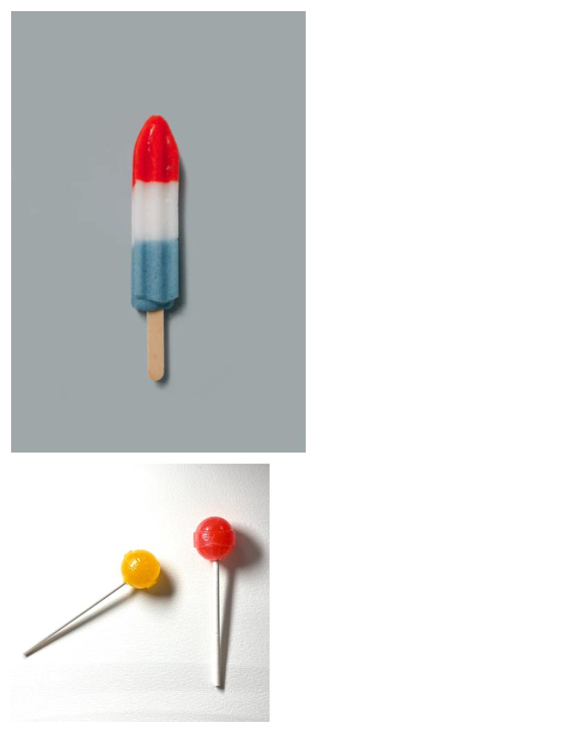
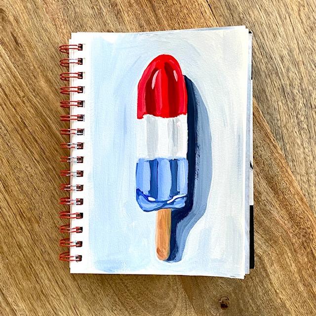
2. Bomb Pop demo: All right, This page is going to be a Bomb Pop. I'm going to sketch with my pencil first. Top is kind of angled, and then it straightens. So I need three sections, red, white, blue. And then at the bottom of the popsicle There's kind of like a lip. Sort of like that. Doesn't have to be too accurate. And then the popsicle stick, three somewhat equal parts. We have a cast shadow, pretty dark shadow coming off the side. I'm probably going to extend the shadow just because I like big shadows. All right. What I'm looking for in my reference photo is the dark areas, the medium, medium areas, and the highlighted areas. So I'm going to start with pyrrole red, which is kind of a warm red. We try to paint all my medium values and first and then the shadows and the highlights. I'm using a break brush size three, painted a little thick hair, so I'm wet my brush. I'm going I'm just painting and the top. Just with my payroll, read my middle value, my medium value. And I'm not trying to make straight lines or anything because if you look at an actual Bomb Pop, they're never really straight lines. There's always colors bleeding into the next one. And then four. Just going to put them in water. For my blue, I'm going to use ultramarine blue, which is probably more than, probably definitely brighter than the Bomb Pop, might turn it down a tiny bit. So I have some yellow ocher and some black, and I'm probably going to need some white, put tiny bit of yellow ocher and a tiny bit of red in there. Because orange is the compliment of blue and it should tone it down a little bit for me. And we're going to see, Yeah, I like that better. All right, so I want to make a kind of a middle value. Still pretty bright. And you think this will be good though? Yeah, like that. I'm not worried about having clean edges because I'm going to go around with a background color and clean everything up. There's also good amount of this color below, say a little lip, a little bit right there. And then it gets, there's a shadow cast on the bottom of the popsicle. Shall paint in leader. To use the same brush. I'm just going to orange. Pretty good. It's okay if there's a little bit of blue on their stone. I'm going to mix some gray. It's maybe too dark, but I think it's all right. Don't want to go in here with white because I still want to add highlights and my highlights will be white. And then on the gray, they'll really stand out a lot more tiny bit of white on the lip down here that I'm painting in. And I'm going to use Payne's gray for my shadow with a little bit of this white that's already on my palette. And then I'm going to add just a little bit more weight and have the shadow will sort of fade out. So it's darkest, closest to the Bomb Pop. And then it fades as it goes out. I'll use this Payne's gray for my background color as well, and I'll just use a much lighter version of it. Hurry it. And let's see. If it still has a little Payne's gray on it. I have some yellow ocher on my palette and I'm adding some burnt sienna. This will be for my popsicle stick. That's a little too dark, so I'm going to mix it with the yellow ocher. Still a little dark to scoop down a little bit of white. That was already on my palette. And I like that color better. And I just made that way too big. Sorry. I'm going to let it dry. A little bit of brown down at the bottom of the popsicle stick here. And I also see little bit of a highlight. And I'm not going to paint every detail and the popsicle stick because this is just a sketch that you can add a little color in just so it isn't so flat looking. I'm going to rinse my brush and just fix that shadow. All right. Now since I have Payne's gray on my brush, I think I'm going to put in the darker blue shadows first, mixing a little bit of carbon black. And I'm going to scoop up a little bit of this white. I want this to lean a little more gray. And I'm putting in, I'm looking for the shapes, the darker shapes, the two stripes that are in shadow. And I'm painting those in, I think I painted them to light. I'm adding a little more of my ultramarine blue. I'm going up to the edge of the white and it's okay if it goes over a little. I think that's good. And then with the same color, I'm putting in that shadow. On the bottom part of the popsicle. There's a little bit of white on there and then the rest is mostly in shadow. Maybe it needs a lot more black. There's also a little bit of a shadow under the popsicle. And I'm going to paint in. I'm just trying to get the shape roughly. And I'm just wiping my brush on the paper towel. I'm going to mix some white into this area here. That's too much. And these are going to be the lighter stripes that I see on the reference photo. And then I'm going to do the same thing that I did. The darker, the medium and the light on each of these. And I'm going to take and just start with some pure white on my brush has a little dirty, so won't be pure white, but it'll be closer. And I'm going to match up the, where the stripes are light on the blue. So three stripes. And this is going to help read with shadows and highlights. And you'll get some nice depth in the middle if you have your shaded color. All somewhat lining up. So I'm going to dark. Shadows here a little bit. So my darkest gray lines up with my darkest shadowed blue. Go right up to the red here. And I'm going to take a tiny bit of that carbon black, mix it into my red to make my shadowed, cooler red color. And these lines don't go all the way to the top. If you look at the photo and they kinda curve a little bit. I do want them to mostly match up with the gray lines that I painted until the white. I just wiped off my brush and mix some lighter, some weight into the red. And give this a little bit more dimension. By lightening up the values, having a few different values. And I wiped my brush. I'm gonna take some white and I'm going to put in those really bright highlights that I see. I should have been white, but that's okay. All right. Do you think it looks good if you want to add in anymore variations? If you see any other colors, maybe you're using a different reference photo. And I think my balloon pump is done. And I'm going to take a flat brush size four. And I'm gonna do a really light Payne's gray backgrounds just to clean up my edges. So that is still wet on my palate. That's a little darker than I wanted. Clean up the shadows and clean up the Bomb Pop. I love smoothing out the edges. I think it makes the painting look so much better. And try to get in nice and close scope pretty slow. They made that shadow come up too high. I'm just trying to smooth that out. I have to flip around. It easier for me to paint like this. I'm just going to round this out here on the bottom and then I'm going to be finished. If you make your own Bomb Pop painting, I would love to see it. You can take a photo and upload it to the Projects and Resources tab, which should be located below the video. Not sure if you can see projects and resources, if you're using an app, the Skillshare app. But if you use the browser or you use a computer, you should be able to see it. Alright, finished, I hope you like it.
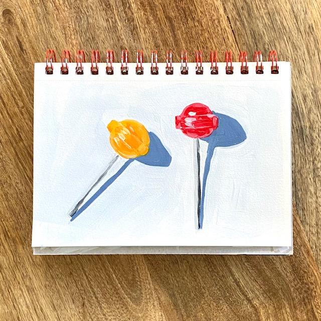
3. Lollipops part 1: On this page, I'm going to paint some little lollipops. I took this reference photo myself because I couldn't find any good pictures online. So since I have a whole bag of them now, I feel like I'll be painting them whole lot. I took the photo using a lamp and I just put the lamp rate on. I put the lollipops on the sketchbook and then I and I put the lamp over to the left to cast a shadow. So if you're interested in making your own reference photos, It's pretty easy to do. You could just do it outside in direct sunlight. Or you can cheat like I did, and just use a lamp. Trying to get the shape of the shadow right? It's more of an oval. And then I am, I have another one here. I'm leaving enough space for the shadow here because I don't want it to touch the other lollipop. And you could probably use a ruler or something to make your lines street. Or if I were doing this on Canvas, I might do that, but where it's just in my sketchbook and I'm just kinda practicing. I'm just gonna do everything free hand. And one thing I'm gonna do that I don't usually is I'm going to put a little bit of the background color in first because it's really hard to paint in here in between the two, the stick and the shadow at the end. I struggle with that. So I'm going to put a little bit of color in there. And I have a little bit of Payne's gray on my palette. I have, I'm using the pyridine read, which makes a nice pink color. So I think it'll come pretty close to this once I put some white in. And I'm using CAD, cadmium yellow medium, which I'll put it like the tiniest dot of red in there to make the the yellow color which leans a little orange, least on this side of the lollipop. And then I have a touch of Carbon Black. And of course, my titanium white. And I'm going to take pressures are alterity. I'm going to take a little bit of the Payne's gray, mix it into my way. I'm using a round brush, which I don't use a lot. And I'm using it because the lollipops are so small. And you can really get in there with the point. In this way, I don't have to be too accurate with my brushstrokes. Worried about like messing up my lollipop sticks. So I'll definitely touch up the shadows in the middle here if I need to. Actually, while I have this wet on my palette, I'm going to I'm going to grab my filbert number two. And I'm just going to paint in the shadows, some already working on them. And I'll definitely have to clean up the edge of that. I'll try to be a little straighter with this one. So I have less to clean up the end. And I want to just try to straighten this and that'll help me out so I can clean up this side. But the middle will be fairly straight already, hopefully. All right. I think that's good. Or the lollipops. I am going to use the round brushes. I'm going to actually spritz my and I'm going to grab some clean round brushes using a number 2 round brush to start. And when you're painting lollipops like this, you have to her, I have to anyway, really zoom in on them to see the different shifts and value. The only way these are going to look dimensional is if you can find a few different values. So look for your darkest color, a medium color, and then your highlights. And if you can find even to medium colors are too light colors so that you have four or five different colors on your lollipop is going to make it look that much more dimensional. So I think my paint is a little darker than the lollipop, but that's okay. This will be one of my values. And I think it's going to be easiest if I put down a layer of paint and then I go over it to lighten things up and to darken things up. So you can see one color. Everything is pretty flat. I'm going to just wipe the brush a little. And I'm going to next grab just some street, read the pyrrole Ren. And I'm going to put it in the areas where I see the darkest colors. You don't really have to be exact with this, but as long as it's in the general area, it should work. And then if I start to add more white to this, so this is going to give me a third shade of pink. And wherever I see some kind of subtle highlights, not my brightest brights, where I see some shifts and color. I'm adding this paint. And then I'm going to lighten it a little bit more because this side of the lollipop is even that much lighter. And then I'll just touch up my darks again a little bit. I'm going to really layer this one pretty good.
4. Lollipops part 2: I just wiped my brush on my paper towel and I'm going to take a little bit of very light pink. And I'm going to just kind of suggest where the ridge of the lollipop is. You don't have to paint your line. The ridge line dark or all the way across. And it'll still read. Okay. And if you do it a little too much, you can always go back in and do a little clean up. And then when you add more of that, like more pure white, I think it starts to make things really pop. It would be fun to do this a lot bigger. And then you could really work on all the different variations. And you can even use the tip of your brush to make some and just like thick little marks. All right, I'm not going to focus on this because it's just my sketchbook. And I was too much. I think I need alone pink over there. All right. With my same brush which I'm just wiping off on the paper towel. I'm going to make an orange here, the very yellowy orange. And I'm going to paint in the full shape. If you're using the fluid acrylics like I am, you might need a couple of layers to cover your pencil lines, or you might want to erase some of your pencil lines before you paint. Which I would have done if I was painting on canvas. And I'm going to take just want some pure white. And I'm going to start to mix a little bit lighter. I'm some yellow here. And start to put it on where I see my medium values. And probably get most of my pencil lines covered up. I think you can get more variation in this one because of making like an orange red, I'm sorry, in orange, yellow and then a regular yellow and then adding white. The whole center of the lollipop. To me looks a little more orange. And then highlights around the edge. I'm going to suggest that ridge. I make sure I have that lighter value in here. And I think that's good. I'm going to add my lightest highlights. I feel like this part is what really makes it come together. I'm still going to use this number to round because it's the smallest one I have near me right now. And when I look at the lollipop sticks, I see, I really see three values on the stack. I see like a white or gray and a dark gray. I think I might just do two values. I'm using the carbon black. So cooler black. And I want it to be different than the Payne's gray that I used. So the darker shadowed side of the lollipop stick is more toward the right. And so I did rarely put two values in there, but I think it'll look better that way. I'm gonna do the medium and dark. And I'm gonna give my brush a pretty good, I'm going to try to pick up some white, but it'll be at a pretty light gray. This is good practice that keeping your hand of study, which I need a lot of practice. I think that's good. For now. I'm going to take my flat brush, size four. And I'm gonna do my background color. Tiny, tiny bit of Payne's gray into my wages to kinda tinted a little bit, maybe a tiny bit more. I really want the shadows and the lollipop to stand out. I don't really want the background color to be something that grabs here. I for some reason it's easier for me to clean up my edges with the background than it is to be careful in the beginning. My hand seems to be a little steadier and can reshape your shadow if you need to. It's not really that straight. Not going to fuss. Sketchbook practice. I think if you really want to improve your paintings skills, something like this, that's a little shiny. That has a lot of subtle variation, is a good thing to paint. Just like fruit. I think fruit is a really good way to improve your paintings skills. Just because there are so many small variations in that one small subject. When I get in a little closer, pretty much finished. Once I finish cleaning this up. If you paint some lollipops, I would love to see what you paint. If you don't mind taking a photo and adding it to the Projects and Resources tab. I would really like that. You can also tag me on Instagram at L buyers art. I'll put that in the description below. Yeah, I think I am calling this one finished.
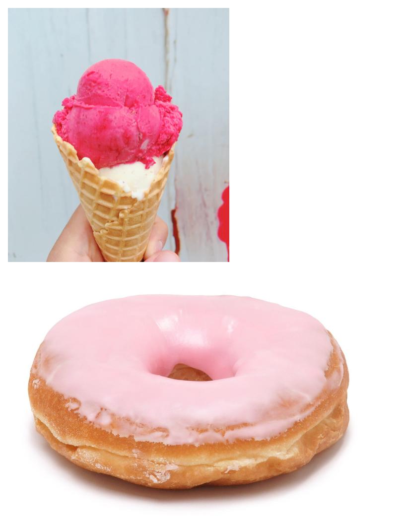
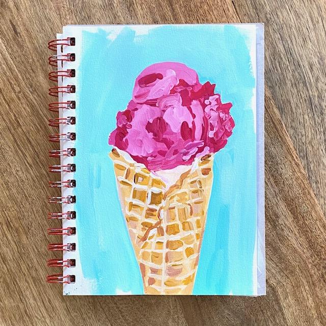
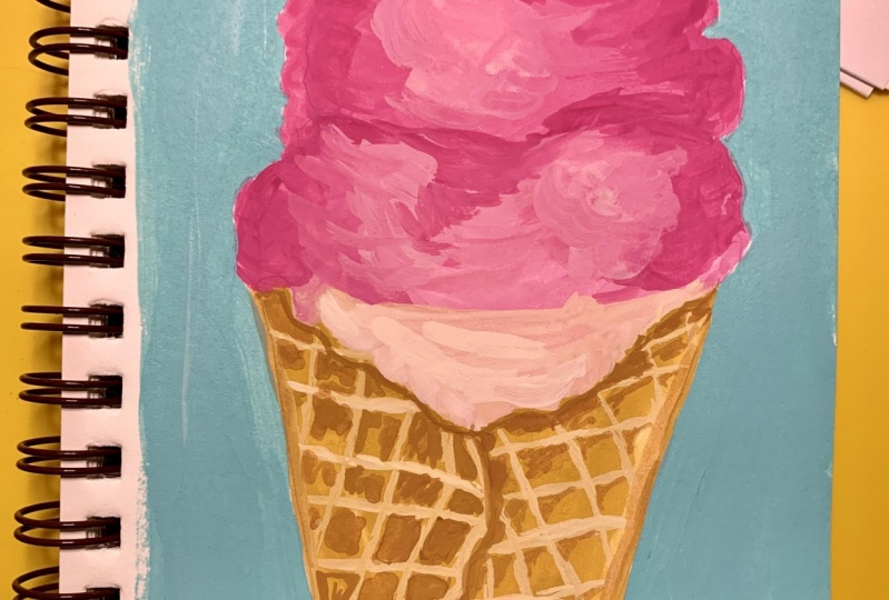
5. Ice Cream Part 1: Okay, I'm going to paint an ice cream cone on this page. This is going to be a fun one. You can make it as detailed or as simple as you want, as long as you just pay attention to your values. So the cone is kinda jag, it doesn't have to really be exact. And then I'm gonna get fold of the cone in like that. I have got some vanilla ice cream. And then I have, I guess, I don't know if sorbet or a raspberry ice cream kinda comes up. And there is a definite line where there is a scoop. The same over here is where we're going to add some darker values to create shadows. And then the scoop on top and then maybe a mid dot, a little too big. Okay, to get started, I'm going to try to keep this simple and I'm going to make a wash over the cone with some yellow ocher. And then I'll add in some highlights and shadows. I'm using a wet brush. My brain size four. And my cone is a little darker in this area here. And then a little here. And I'm going to add a dot of white just to give the background a little variation. And then I'm going to make my background layers work for me as part of the under painting. I have my highlighted area. That's a good example of adding too much water and having your paint break down on you. So if I weren't doing a wash right now, I would have probably had to add more paint to that to fix it to make it a little thicker. But hang this will be fine. And I'm just going to rinse my brush. I'm going to try to mix something close to what I'm seeing. I have my quinacridone, magenta and some white. And I think that's a little bit too purple. I'm going to try to add some cadmium red and just play around with a little swatch here. And I think I think that's a little closer. So quinacridone, magenta, cadmium red medium, seems to be pretty good. I'm going to try to mix more of the middle value. And then I'll go back in with highlights and shadows. I'm going to wet my brush a little. And I'm going to just try to wash this in. Maybe I'll add a little variation because I do see some lighter area here and a little lighter here. And over here as well. And just the way that that dries kinda like a little with a little or no, What you call it a little mixed. Well variation. I'll just add some nice details. I want to keep this a jagged edge of the cone. And I wiped my brush on my paper towel. My, I still have a little magenta on here. The vanilla is not pure white. I think it has like a peachy sort of tint to it. I'm going to play that up just so that it stands out from the cone and from the raspberry ice cream. And I think. That's a good start. Already have a bit of variation. I'm going to switch my brush. Choose something a little thinner. Guess I'll go with maybe a round brush. This is around number 2. And I want, I guess a lighter version of the yellow ocher to start making some of the texture on the cone. And I'm trying to just sort of follow the lines. They're not actually that straight away. Just keep glancing at the photo. If you are taking your time with us and using a canvas, you might want to add a little more variation to the cone. And I really just want this to be about a 20 to 30 minutes sketch. The lines toward the bottom of the cone seem to curve a little and I think that's going to help with perspective. So I would pay attention to that. And I think I'm got too much white in here. And then I'm trying to pay attention to the direction on this side of the cone. Actually that one starts to change direction. To touch this up. Kind of get rid of that line a little bit. And along the edge, the crack of the cone here we have some highlights and gets a little bit darker. And I'm just gonna do this in a few of the squares, but I think I'm going to darken up in the reference photo or a see some areas that are just a little bit darker. I'm just glancing back and forth at the photo. You can kind of be as loose or as careful as you want with this step. And I'm just trying to keep things pretty loose. I'm going to cover my pencil lines a little bit. And there's a little bit of shadow. And that correct area of the cone. I'm putting a little burnt sienna on my palette because I think I need a little bit of shadow under some of these highlights to help them read a little better.
6. Ice Cream Part 2: All right. I'm going to stop fussing with us only because I don't want us to turn into an hour long sketch. But you could you could spend a lot of time meticulously looking for the highlights and shadows and most of the the cone if you really wanted to. And you definitely get a more realistic looking comb if that's your goal. Okay. I'm going to switch the ice cream. I'm using my round brush still. I need some darker marks where there are crevices. So wherever the ice cream scoop marks are, I need some areas that read a little darker than the paint that I already put down. So here's one of them. That's a little darker and I've got some darker here over here near the base of the cone. And then definitely on this side of the ice cream. And then I'm going to add a little bit of white paint and start to look for more of the highlights and shadows. Actually see some more shadowy area over here. And I'm not trying to be exact with my brush strokes. I'm just putting light and dark where I see it. In the general shape and in the general area. Think it would be a good idea to step back from your painting every once in a while, all the time. But especially with something was a lot of details like this. If you're painting really close to your work, like my face is only about 12 or 18 inches from the sketchbook. Makes it a little harder to really read the details. I just wiped my brush and I'm going to go in now with some highlighted color. So on the top and then on this side. And then you can see I'm not painting like this. I'm kind of kinda just washing my brush down and letting the paint just kinda do what it wants to do. I feel like if I tried to be too exact with this, I'll probably end up just making a bunch of weird looking stripes. And I, I like that right there. I can already tell. So I'm going to try to leave that alone and a lightened this a little bit. And I'm going to just kinda taught my brush a little more. I see the highlights hitting over here. I think the more color, variation and values you can find, just like any painting, any subject. The better year. Ice cream is going to read. I'm going to put down just a few more dots of color. And then I'm gonna do my background. I feel like an ice cream cone could be a full painting lesson, not just a quick sketch. So feel free to take your time and really search for all the details. I feel like I might be starting to just overdo it. I'm going to touch up the vanilla just so it looks a little different than the cone. With a little bit tripping over. I think I made it too small, but that's okay. I got some yellow ocher in there, so I'm going to just touch that up. I feel like I didn't need to do that, but a couple highlights. And I think this needs a nice blue teal background. So I'm going to use my teal paint, some white. And I'm going to grab a flat brush, mix a little of my til. This is going to make the raspberry really pop. 20. Keep my ice cream kind of jagged. That's it. I hope you enjoyed the ice cream painting tutorial. As always, I would love to see what you paint. You can take a picture if you'd like, and add it to the Projects and Resources tab located below the video. Calling this one finished.
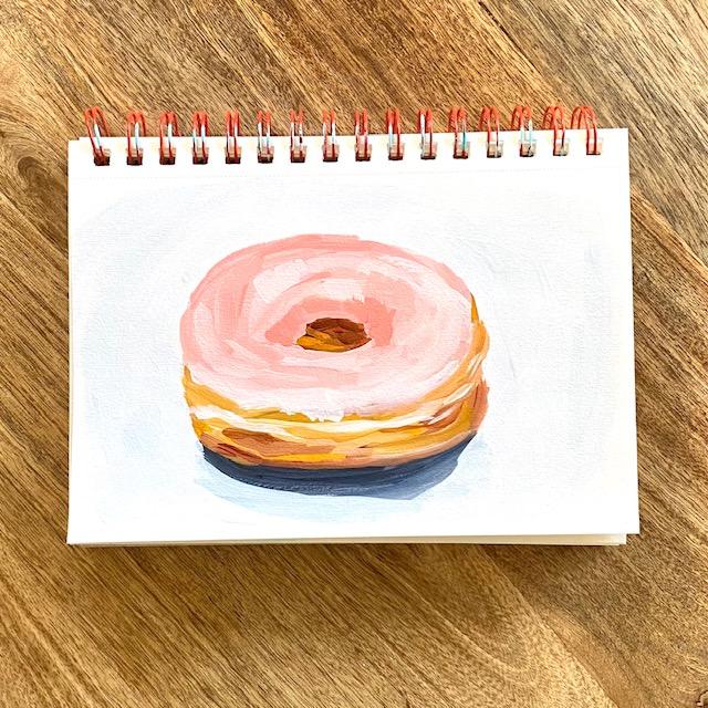
7. Donut Demo: Next is going to be a glazed doughnut. Going to try to move quick on this one because I'm losing my daylight. So the donuts not going to be completely round because of the angle that I'm looking at it. I would say maybe it's probably a little off-center, but I would do the whole that doughnut hole here. And there's a little bit of a ridge. Maybe this is a little bit bigger. On my frosting. I would say comes down like this. And maybe this is that how a wider area in the cake. And then I think the sun is coming from this direction because I'm seeing my drop shadow across the bottom. Maybe that could be a little bigger. I'm going to use some yellow ocher and burnt sienna with cad red medium, cad yellow medium and ultramarine blue. And of course my white. I'm going to start with my shadow of Payne's gray. It's pretty dark right up underneath the very bottom of the doughnut. And see you a little bit of brown and the shadow as it fades out. As I'm just putting a little of that in on time. Shadows have some unexpected colors. No clean the edge of that up. At the end. When I put in my background color, I'm just going to have it fade out a little bit. And I'm just wiping my brush. It's okay if I get a little Payne's gray in the doughnut, I use my yellow ocher first, furthermore, Golden areas of the donor. And then I'll mix a little Burnt Sienna. I need to wet my brush. And maybe how little too much Payne's gray on my brush. So I just wiped it on my paper towel. These lines that I'm painting, you'll notice they're not perfectly straight because the donor is not like the big part of it, the actual cake part. None of those lines are straight. So I'm not trying to mimic the lines exactly, but I know that I don't want them to be super street looking. I'm going to put a little of the burnt sienna down here where it looks a little bit darker to meme. See a couple of little shadowed areas. Probably exaggerated them a little too much. And don't really want to get a little bit lighter. And then I'll clean that up at the end as well. I think my angles a little harsh there. Oh, and then also I almost forgot the middle. A hole here is little more in shadow. So I'm using the arch. No, yeah, the raw raw sienna, burnt sienna. And then a little up the yellow ocher in here. And I'm going to take a clean brush now. This is my number 4, bright. I'm going to use some red and a little yellow and a lot of white. I'm going to store it. So what I'm going to pay attention to here is it's all pink, the frosting, but you need to pay attention to these highlighted areas that are here. And then it's darker here, right? So we wanna make sure we get these values show ofs, it's a little bit lighter here. Okay, so try to mix at least three different sheets of the pink, a darker, a medium, and a light, so that you get some dimension in your frosting. That's going to help the donor read a little better. It won't be flat. I'm going to mix in a little of this burnt sienna. To sort of just desaturate the color a little bit. And I'm going to use it for my more shadowed area. I also just mixed in a little yellow ocher. It's going to be the area around the donut hole. And I think that's probably the darkest. It might be a little dark right here, maybe a little here. And then the rest looks more medium and light to name. So I'm going to mix in a little bit more of this white and start to create more of these shifts in color. Hopefully you can see that this, and this are basically different shades of the same color. I'm going to paint over those highlights just because it's easier to paint the whole thing and then add them back in. And I'm going to just try to play with this pink color. I'm not trying to really blend. I'm just trying to layer. It's fine to say, to still see the brush strokes. I kinda like that look that painterly type of look. And along the front, I'm just going to use a bit of a lighter pink and kinda just drag my brush a little to get that. That look where the frosting is not quite smooth and not quite covering the whole, entire Dona. And so I probably have 1234 different shades of pink or so right now. You could definitely add even more shades of pink if you wanted to really spend some time doing this on Canvas. I think I just need a little bit over this dark just to give it a little bit more depth. Sort of overdo it right there. And that's pretty much how you paint a donor. And it's pretty easy. There's lots of great doughnut references online. Unsplash has some good resources. Lots with like more toppings and sprinkles and other things that look like they would be really fun to paint. And just touch up the sides here. Play up. This highlights a little more. I'll put a little more yellow ocher just to do a little more of this golden color. And the last thing I'm gonna do is spleen little bit. And I'm going to, since I have all this Payne's gray on my palette already, I'm going to use that for my my background color. I'm going to mix just a little of it, just to get a really pale blue gray. And then I'm going to clean up the edges of my doughnut. It's not a perfect circle. So you can you can be jagged with your brushstrokes around the edges. Right? That makes it look a little more real than having it be a perfect oval. If you paint a doughnut, whether you use this reference photo or any others, I would love to see a picture of it. You can upload that to the projects and resources tab, which is below the video. And also feel free to tag me on Instagram at L buyers are at. And any of your paintings that are inspired by any of my classes. I always love to see those. You made my shadow a little too big. There. And there we have our glazed doughnut. Thanks for watching.
8. Skittles Demo: I'm going to paint some skittles on this page and make them a little bigger. I'm gonna do three different colors trying to make my pencil lines pretty light. Because I don't want them to show through, especially on the yellow and I'll probably show through a little. So I would go really light with the pencil marks and then these will be the shadows. This could be M and M's. They could be Skittles. You could do this with rants, really any type of solid color candy that has light shining on it would work. It would really even be the same process for painting, even an apple where you're looking for a highlight, right? So the sun is coming from this direction. I actually took this photo myself and I used a lamp to cast a shadow. And so on. Each part of the candy, There's a dark area here. And then it's medium in the middle. And then it's a bit brighter here with a highlight. So that's how I'm going to paint it. Using Payne's gray for my shadow, which I like a lot. Because it's a nice cool blue gray and it helps your eye see the shadow recede. So I've said this before in some other painting demos, the cooler, darker colors, like the blues and grays, black will recede. And then the warmer colors will come forward. Even if you had two blues next to each other, the warmer blue would come forward and the cooler blue would reseed. So I tried to use cooler colors for my shadows. If you're not sure if a color is warm or cool, You can just Google it whenever brand new you're using of paint. I know Golden paints has some like PDFs on the Internet that tell you all their colors and whether they're warm or cool colors. That could be helpful. Especially if you're new to painting. I'm going to use my colors that I usually used for flowers, Hansa, Yellow, Medium, quinacridone, red, and turquoise case the load. I have my turquoise here from the last painting I did. So I'm going to leave that I don't need anymore right now. I'm going to grab a small filbert brush, this one size too. Flat or round brush would work for those as well. I'm going to start with my yellow. And I'm putting just my medium value. Down on the paper first. And then I'm going to add the highlighted side and the shadow side. So I'm going to take tiny dot of the Payne's gray and mix it into some yellow, which is darker than I wanted. So I'm going to just wipe my brush a little bit. Take a little bit of this. There's lots of ways you can desaturated color. So I used Payne's gray because it's a cooler blue gray color. You could use yellows compliment, which is purple to D saturate the yellow. You could use a little bit of black. There's really not one way to make a color. And as that dries, I'm going to darken that up a little bit. Just rinse my brush and I'm going to mix some orange. I'm going to put down all of my colors and then go back and do the highlights and shadows. So everything has a minute to dry and between breathing should dry pretty quick on the sketch book. If you're using paper, depending on the paper, this is just a mixed media paper and the paint really soaks into it. It's good for layering. My brush. I don't want any orange, light green. D saturate my green on me. So I'm going to mix a pretty vibrant green with my Hansa yellow and a little tiny bit of turquoise, create a super vibrant green just like the scuttle. If you use a warmer green like an ultra marine, you're gonna get a, you're gonna get a very desaturated green. So I like the cool turquoise for making a really vibrant color. I probably made that a little too big, but that's okay. All right. I want to use the same brush. I just wiped it off a little. And now I'm going to take my yellow here again. This won't be the shadow side of my yellow scuttle. Looks kind of ugly going on, but it should work for a good shadow color. I'm going to rinse that off. Clearly not using enough yellow here. And I go over the middle part again. I had a little bit of white. And I'm trying to make scuttle little bit brighter. The side where the light is shining on it. So I'm adding a lot more weight on one side. And then I'm going to take some weight and do my little tiny highlights that I'm seeing. I think the yellow is the hardest just because it's so light. And then we're going to do the same for my orange lighten. One side here. We have a middle value. And then I'm going to put tiny bit of that Payne's gray to create the shadowed side of the orange. And I'll rinse my brush over the medium color and then add a bunch more white to really make this one shown over here. And I'm not really worried about losing the shape because I will, I'll always smooth out my edges at the undo with my background color. And I'm just mixing more of the medium color again. I'm wrong color in the dark. And then my highlights with my weight. It's a little bit of a highlight down here. Rinse my brush and I'm going to mix some white into the screen or the lighter side. And then a little Payne's gray for the shadow. Think that mix needed to be a little bit darker. I think that works much better. Mix my middle value again, I'm making a mess on my palette. There we go, nice and bright. Highlighted side. And then a little bat. Hello highlight down here. And over here. Only because I'm being a little picky, I'm going to make my orange one a little bit bigger. I don't know what color that was. And I think for the last step for my background, I'm going to use some turquoise and white little bit of turquoise to make a really very light turquoise. And I'm going to clean up the edges. Try to smooth everything out. Probably go over these shadows a couple of times if you really want to. Maybe if you're doing this on Canvas and you really want to cover it good. And just considering this to be practice, I would have made that yellow scuttle a little bigger. If I was actually painting this on a canvas that I was planning to sell. But I think it's fine for practice. I really wanted to just work on the shadow and the values more so than having an accurate drawing. Sometimes a quirky drawing is what makes the painting. Q. So don't worry if your drawing skills are not fantastic. And that's it. We have our skills painting. If you paint any candy or sweet treats, please upload a photo to the projects and resources tab below the video so I can see your work. All right, that's it. Thanks for watching.
 Elle Byers, Artist and Teacher