Transcripts
1. Introduction to Fruit Studies: Hi everyone, My name is L. This class is a series of fruit studies that I am doing in my sketchbook with acrylic paint. I have this 5.5 by 8.5 inch mixed media sketchbook that I'm using, as well as an HB pencil. You'll also need some small and medium paint brushes, a pallet to mix your paint, some water to clean your brushes, and some paper towels for clean up. I am using golden fluid acrylic paints, but feel free to use whatever you have. I chose to do a series of sketchbook paintings for this class. Because I think doing small quick studies in a sketchbook is a great way to learn the fundamentals of acrylic painting. Creating a lot of small paintings can help to build your competence. And because it feels like practice, you're more inclined to experiment with brushwork and color and composition. And just pushing the boundaries of painting and general. I will list all of the pink colors and supplies I used for this class and the projects and resources tab below the video. For your class project, I would love to see one or more of your fruit studies. You can click the Create Project button to upload a photo of your work. All right, let's get started painting and avocado.
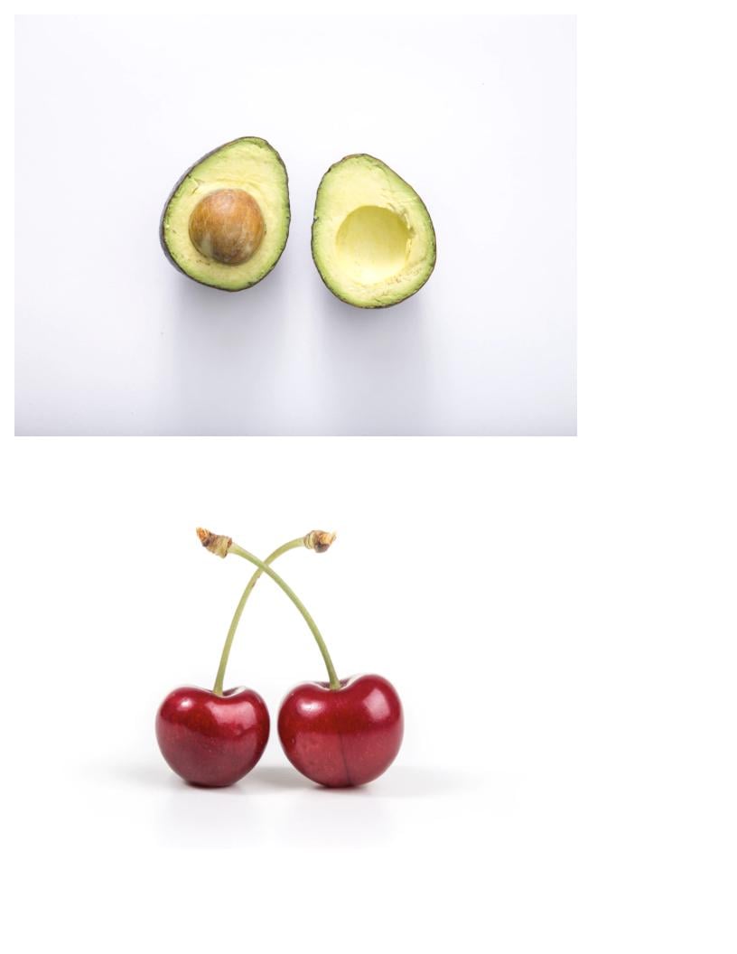
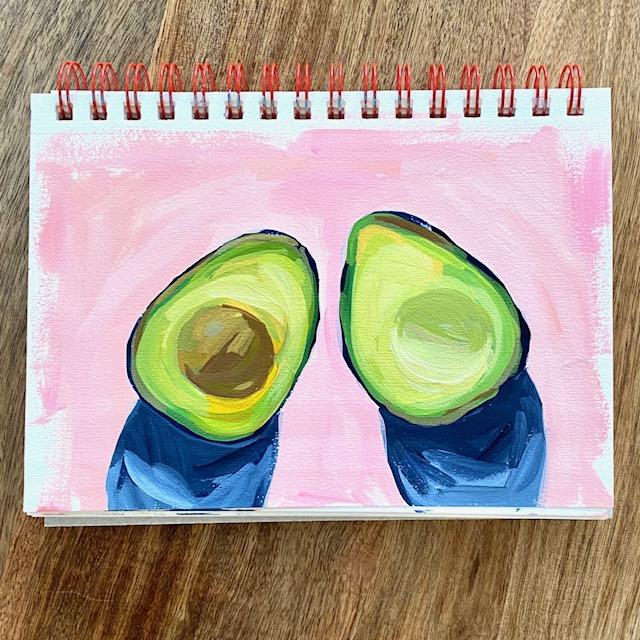
2. Avocado Study Part 1: My first sketch books study for this class is going to be avocado halfs. First thing I'm going to do is draw with my HB pencil, my avocados, just a quick sketch, an outline, and then having one angled this way and 1.5 angled that way. I drew the diagonal lines because it helps me to sketch more accurately. I would say that drawing is not one of my strengths, but I hope it's something I can improve. Just keep your lines really light and then you don't have to worry about erasing them. And you can go over your sketch a bunch of times. I picked an avocado for the first study because they think there's a lot of fundamentals you can learn when you paint an avocado, and specifically how light and shadows work. So I'm going to be talking about that during this painting. All right, so on this, I'm Ricardo, I'm going to have my pit. And this half is going to have empty hole or the pit used to be. I am noticing and my reference photo that the light appears to be coming in this direction. So what I want to pay attention to is where the light is hitting the avocado and where the shadows are. If I look at the pit, I can see a bit of a highlight in this area and more of a shadow in this area. So when I'm painting the pit, in order to make it more dimensional, I want to make sure that I have a highlight, mid-tone, and a shadow. The same thing where the hole is. It is still green, but you'll notice a large portion of the interior here is shaded. So we're going to make sure that we use a more shaded or desaturated green in the pit. And then this part, I'm in the hole and then this part is more and highlight. And then I'm paying attention to my cast shadow, which starts about here on this half. And here. And the shadow is going to be darker, closest to the avocado. And this one here, shadow comes down this way. And here again, the shadow will be darker here. Okay, So if you pay attention to the light and the shadows, and you mix your paint according to that, you're going to get a more dimensional looking of condom. First. Color I'm going to use is Payne's gray, which is going to be my darkest value. And when I say the word value, I basically just mean how light or dark a color is on a scale of one to 10, with black being a one and 10 being a white. So if I look at my value finder, um, I would say this Payne's gray is a one or two, probably a one. And so what I want to look for, and my painting, in addition to the light and shadows, are the shifts in value color. And I'll talk more about that as I go along. I'm using a filbert brush. Number 2. A flat brush would work just as well for the surround brush too. I'm just making a thin outline around the outside of my condo. And the dark is a little thicker. This half away, the avocado was leaning. So I'm going to put that in and it's pretty thin the rest of the way around. While I have this Payne's gray on my palette, I'm going to mix my shadow color. Payne's gray is a cool gray, blue. A cool color, when you look at it, will show depth or well appear deeper, and a warm color will come forward. So cool colors recede, warm colors come forward. So when we paint our pit here, this is going to be a warm brown. The shadow is going to be a cool green. And my shadow here under the avocado is going to be a cool gray blue. And this Trying to be too exact with my brush strokes. You don't have to be super exact. But I would say try to have the shadow closest to the avocado a little bit darker than the rest of the shadow. And if you want clean edges, I'm going to go around at the end and clean up my edges with a background color. And I'm just wiping my brush on a paper towel it off. I'm going to keep using the same brush. And I'm going to mix my green colors. I have my yellow and my turquoise, which make a really vibrant green. You could also use the Payne's gray to mix a green. It's going to give you a very different green. Then the turquoise. So that's the Payne's gray. But the green, which is very dark, that could be a nice color if you are painting the outside of an avocado. Compared to a really vibrant green that you get with the turquoise, which is not a good color for an avocado. That if you mix in a little bit of red, using my quinacridone red, you could use a, just a touch of red. I'm gonna do a little more yellow. And you can see that it's the red starts to desaturate the green. Because it is red and green are complimentary colors. I want this to read a little more yellow. And I'm going to use this color for that inner green that I see, an inner green ring. And I'm going to mix all my greens really from the same mixture here. Maybe I'll dip into this a little bit. What I want to pay attention to now in the flush of the cargo is any slight shifts and value. So if you really zoom in and look at the flesh of an avocado, even though it is kind of a light yellow, green. And some areas it has a little more white. In some areas. Almost looks a little pink to me, like underneath here. That's what I want to pay attention to. And so I'm going to try to have some value shifts. As I'm painting the light yellow, green. If I just took this one color and painted everything inside here the same color, my avocado is going to look a little flat. So I want to, I want to use a variety of greens loosely based on what I'm seeing and the reference photo. I'm going to mix a little red. And you can see that's really desaturating. And I'm looking at a photo and seeing where I might be able to use a little bit of this color tone here. And I'm just going to keep adding in different amounts of yellow, turquoise, red, and white to get all the different shades of green. Hopefully you can see the slight shifts in color as I'm painting. If you get too much paint on your brush, you can just kind of wipe some of it off.
3. Avocado Study Part 2: And I'm going to just put maybe a few more brushstrokes down. Then I'm going to move on to painting the pit. And the hole or the pit use to be. Right, we just sketchbook paintings so I wouldn't get too caught up in the details. Just make sure you have value shifts, color shifts, variety of greens and the flush. You're going to just wipe my brush on my paper towel over here. And using the same colors, I'm going to mix a brown color for the pit, need more yellow for this. And I'm using the same brush, It's just wiped off. I am going to mix an orange color. On the compliment of orange is blue. So if I mix some blue into my orange, It's going to D saturate it. If you're using a phthalo blue or a yellow turquoise who just need a little bit and your orange, because the, the lows are really, they have a lot of pigment and it will really overpower some of the other colors fast. Okay, So that made him brown color, kind of a medium brown. I think I want it a little more red. So I'm putting a little red back in. And I want to remember to pay attention to the highlighted side and the shadowed side. So I'm going to add a highlight to that in a minute. But before I do that, I'm going to add some more blue to my brown to get a much darker brown for the shadow side of the pit. And just wait to my brush on my paper towel again. If your paints are starting to dry up on to water. And I'm going to add some more value shifts. And here I'm putting in a little bit of yellow. I think I'll put in a little bit of white. And then I really want to lighten a little spot for the highlight. So this side is more highlighted two mean. So now I have a lighter area, some medium and dark. And hopefully that will read as a 3D effect. I'm just wiping my brush a little. And I'm just going to touch up a little bit around the avocado. And you know what, I'm going to take a little bit of the brown because I see little spots of brown around the edges and some spots. Right, that's shifting color is going to help read more like dimensional rather than flat. Okay? White my brush, I'm going to now mix desaturated green and then highlighted yellow green. To make this part of the avocado appear to recede a bit. And I'm going to use, I'll make it green first. Going to add in a bunch of red. I'm going to do a little more white. You could even try to add an a dot of your Payne's gray if you want. I hope to gray it down. Cool it off. And I want to pay attention to the area that is in shadow. In the area that is more highlighted. Is more in shadow. And then it's much brighter right here. I'm just going to go over the highlight again. Hopefully that reads like a shadow the way I'm looking down at it, it's hard for me to tell. If I were painting this and I wasn't doing it, I would probably have my my sketch book propped up. I think it's easier to see what you're doing that way. Okay. I think that's good. I'm just going to add in a background color. I always feel the need to keep going, which I'm going to try to not do that in that video, this video. Okay. Last thing, I'm going to grab a new brush. And for my background color, I'm going to go with something that complements the yellow or green and the avocado. You could probably do a purple, which would be a nice complement to the yellowy green. A pink or a peach, because red and green are complements. So I think that would look good as well. I think that's what I'm gonna do to make a nice bright background. A little bit of my read, a tiny bit of yellow, so that it's not pink, pink, it's more of a peachy pink. You can kind of test your color. I don't usually paint the whole page. I just go around the edges of my objects that I painted to clean up the edges. And if you want to reshape your shadow at all or smooth the edges of your shadow. Now would be the time to do that. We didn't make some paint. I'm using a flat brush for this size four. And that's not the same color, but I don't mind. I am going to flip my sketchbook because I can paint better from the right side. I can be smoother. And that's it. This is how you paint an avocado. It's really going to be the process for everything. We paint all the different fruit, paying attention to the highlights and shadows and shifts in value. You can clean this up as much or as little as you want. We're going to leave mine like this. If you paint an avocado or any other fruit, I would love to see what you paint. You can upload a photo of your painting in the projects tab, which is below the video. If you click Projects and Resources, you'll see all the supplies and colors I used for this painting, as well as the reference photo that I used. To upload a photo of your painting. You click on Create, project and upload a photo of your work. All right, onto our next truth.
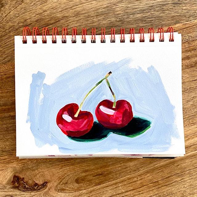
4. Cherries Study Part 1: My next fruit, and it's going to be cherries. Just drawing a little line for them to sit on so I know. So I can get them roughly next to each other. So I'm going to have two cherries and the stems crisscrossing and draw them first. Cherries are almost like drawing a heart. Come down on a more fixed my line. And then I think the side of the other Cherry will be about there. Don't worry too much about you're drawing. It doesn't need to be perfect. Okay, I'm looking at the shadows next, just like I did with the avocado. I have a cast shadow and that looks like it might be coming from above. I think I think it's coming from above. Maybe it might be coming in this direction. I see a shadow here, and then a shadow here, darkest right underneath the cherry. And the stems. Stem kinda comes out and over. And then I don't know what this is called on the end of the stem. I'm gonna just draw that in. As long as they criss cross here. I'm not worried about getting the angle accurate. And I think that's a good start. Next thing I'm gonna do is look for the highlights and shadows, just like I did with my avocado. So I'm looking for at least three different values in side the cherries. I'm going to have my highlights. So I see a highlight here. I highlight here. I've got one here. And then over here. So these spots are going to be the lightest value on my cherry. Actually, it looks like a little highlighted near the top as well. These values are pretty light. And then for my darkest value on this cherry, there seems to be, if you look close, this area looks dark, and I would say this area looks more medium. And then on this cherry, I would say dark again up here. And more of a medium toward the bottom. But it does have a dark area again at the bottom. Okay, so just keep that in mind as you're painting, you want to try to have at least three different values, if not more, in side of cherries for them to read dimensionally. And then the stem we'll just do green and yellow and brown and maybe a little bit of red. I'm going to use my seam colors, my turquoise, my yellow, hansa yellow. My chronic or Joan read, to blebs of red and some white. And I'm going to mix my darkest value first. I'm gonna do that by mixing some green into red. So I'm going to mix a green. Green and red are complimentary colors. So if I mix a little bit of this, and so the red, it's going to desaturate it and darken it a little bit and just go a little at a time. And you can already see how that's giving me a much deeper the saturated red color to start with. So this is my dark value. I think the street read it might be my medium value and then I'll mix maybe pink and white to go with my lightest. Okay, so where do I see dark? We see at the bottom of both cherries. I see dark along the side of this one. And I'm going to paint over where I drew the highlights. And it'll be easier to put them back in. I see pretty dark in this area here. And maybe a little bit toward the top. And then I see dark. It looks dark down the side here. I'm going behind. The stomach gets a little dark as well. And I'm going to just wipe my brush. And I think I'm going to add just a touch of white to lighten it up. Give me more of a value shift. And I'm going to start to add in some medium values where where I see them on the reference. If you see more than one medium shade. And you can always add that in and get more of a shift. It'll make your cherries more dimensional. But if this is your first time painting them, then it's okay to just go with three values to start. And as you get more experienced and you look at more pictures of cherries, you'll start to notice more subtle variations in the colors. And I just keep glancing up at the reference photo and seeing what I can add. I'm gonna do the stems next. Hopefully they always look to mention, I think I think I could use a little more medium value.
5. Cherries Study Part 2: All right, with my same brush, I'm gonna go back and mix some green for the stems. Stems are pretty light, having more than one color. And the stem is going to also makes a stone where dimensional. Anything you do in just one color will read flat. So I would say just using a little green, using a yellow green, maybe a little white, maybe a little brown. And the thing, the little knobby thing on the end of the stem. And you really just need to suggest it without painting it in exact detail. I know it'll be okay. All right. So I just mixed a brown color because I think I see a couple of spots on my stem that have a little brown and l'm just a touch. And these are not super straight Ernie thing, but it'll be okay when I clean it up with the with the background color at the end, a cherry stem. I wanted to come right down into the cherry. And I'm going to use a clean brush now. I'm going to put a little more of this red and some spots on the cherries. I probably have 1234, but four different colors on the cherries right now. And I'm going to add more with my highlights. So if you just painted these all read, they would be very flat. Hopefully they're starting to look a little more dimensional. I think when we add the shadows and the background color and then the highlights on the cherries has should be even more dimensional. So mixing pink first and I'm going to put in the area of the highlights and then I'll put some weight on top of it. If you make it too big, you can always cut in a little with your red. I'm going to go over my dark spots one more time. I'm going to take a little of this brown, put it into the red. Think it should be a little dark around the stem. A little bit around the top. Hey, wiping off my brush. And I'm going to put on some pops of white here for my absolute lightest spots right next to my shadow. Which I'm going to use. This start with a dark green, I think. Darken up the darkest spots with a little bit of turquoise. And think I will use my Payne's gray with a lot of white mixed in for the background color. I'm using a flat brush, brush, brush size four. Might use a smaller one as I get closer to the Cherry is I'm going to just switch to a smaller brush so I can get more detail and get closer to the more T2. Just smoothing out the edges of my cherries. Clean it up. If you made your stems too big, which is easy to do. Well, you can fix the size of them. Now. Going over some of the stem. I just went over a little too much of a sketchbook practice. I'm going to need to flip this around so I can paint it from a better angle. There goes my sunlight. And that's it. That's pretty much how you paint cherries. You can really play with the different colors and values. And you can even push them a little purple if you wanted to. Play with the shapes. If you paint some cherries or any other fruit from this class, you can post a picture of it and the Projects tab, which is below the video. And if you have any questions, feel free to post them in the discussion below the video. I try to check the discussion at least once a day. I'll be happy to answer any questions that I can. All right, cherries are finished onto our next fruit.
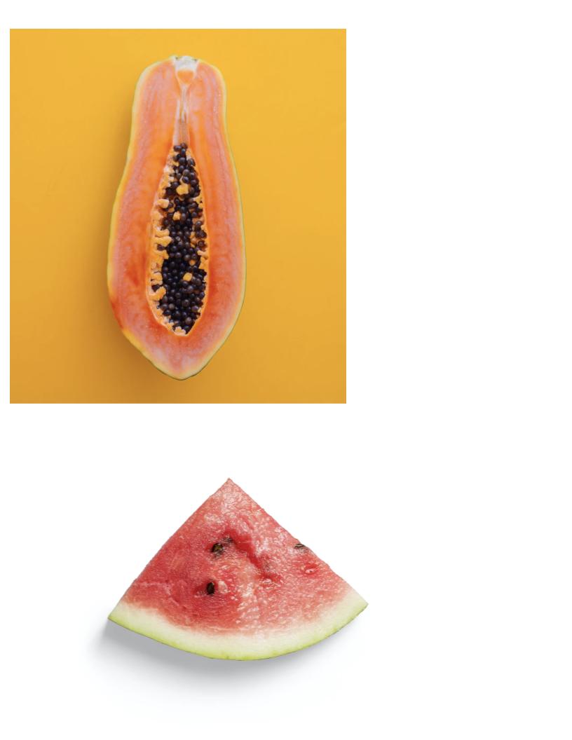
6. Watermelon Study: Next I'm going to paint a slice of watermelon. I have the same palette that I use for the cherries since it's still wet and I'm going to be using the same colors. Quinacridone, red, titanium, white, Hansa, yellow, medium, and turquoise. I'm going to draw my watermelon slice. I'm going to make it a little bit lower. And I'm just going to print, sorry, but I have some wines theorems going to paint over them. And so I guess I could use this line as the watermelon rind. Anyway, I'm going to have a thin strip of darker green. My shadow appears to be coming from this direction. It's kind of a hard shadow that stops, it gets thinner and it stops around that point. And I think the seats and this are what is going to make it look cute. So here are a few seats that I see, but I'm probably going to add in a couple more of my own as I go along. Watermelon, it can be fun, can be a little tricky if you're not really comfortable seeing the different colors yet. So you might want to zoom way in on a slice of watermelon and try to look for the different variations that you see. In my reference photo on this side. And toward the top, I'm seeing lighter colors, pinks, maybe some peach over in this area here. And this area here. It looks a little darker, pink watermelon color over here. So I'm going to try to really play up those values as I'm painting. It's always okay to exaggerate your values and your colors. If you can't, if you don't see the colors that you want and you don't think you're going to get your desired effect, then definitely play with the colors. Especially if you're just using a sketchbook, right? Low pressure, no pressure painting, this is just play. That's just practice. Okay, So I didn't my Hansa yellow and turquoise mixed to make the outer edge of my watermelon. And then I'm going to use more yellow in the rind. And this rind almost looks white, but I think it leans a little gray. So I'm not going to make it pure white. Actually, I should use this since it's on my palette. This is the Payne's gray that I use for the background of the cherries. Using my dirty brush to mix in a little bit more weight. This may be a little darker than I wanted, but I'm just going to leave it for now and then maybe go over it with some weight. Because remember as a more values we can add more dimensional or watermelon is going to look. All right, and I'm going over the lines here so I can clean this up later with my with my background color. Because I'm using Payne's gray. I'll make my shadow of the watermelon a Payne's gray. And I'm going to just darken up the rind. There we go and leave that for now. And I'm going to put that brush and my water and I'm going to get a new clean brush. This one is bright size four, and I'm going to try to mix some watermelon color. So my Kronecker don't read is makes too bright of a, of a red. All right, so I just did an experiment there. I put a little of my weight and Payne's gray into this orange color that I mixed. And I like that a lot. And I see this color in my watermelon more and the middle areas. So I'm gonna go with that. That's why you should always play with the colors you have on your palette. And Makita mixing things up. Usually you make colors that you never even thought. You could mix. This part of my watermelon and the top of my water melon are definitely more pink and white. I think what I'm going to do is leave a lot of brush marks showing and mix the paint like this. So it's leave it streaky. So put colors on my brush and then let them somewhat mix right on the sketchbook. To try to achieve that more like Diebold effects that I'm seeing. My reference photo. All right, I'm getting low on paint here, so going to do more red, more yellow, and I have some white to yellow. I see some darker red areas over here. And I'm trying to just look for different values. I'm going to exaggerate this orange a little bit. And hopefully it's looking a little more dimensional. It's not going to be photorealistic. But hopefully I'll have some, some nice dimension. You can also really experiment with here. Brushstrokes on the watermelon. Maybe try to move your brush just in different ways than you normally move it to get some of those interesting lines. I'm going to try and add a little more orangey pH. Some deeper red. I'm just waiting my brush and picking up a little bit more. So I can put it in the middle where I see those darker values of red. I could try to dark and my rant a little. What some green, but I don't think that I, well, I want everything to stay more saturated with this painting. While that's drying a little bit, I'm going to add my background color, which I'm going to use turquoise case. Since it's on my palette already. And I need to use a lot of weight with that. I don't want it super great. Well, it's pretty brave. I like it with the pinks. And I think once I put the watermelon seeds on, it's going to be a lot cuter. And clean up the edges. This is a fun little painting. Super Bray, I love bright colors. I'm trying to look at my shadow. Doesn't quite go to the edge of the watermelon. It might darken that up a little too. Now I'm just going to have fun and play with some details. Let me grab a brush that had some green on it. It's going to break that up a little bit of weight and have the urge to dark in my shadow. And the last thing I'm going to do and a weight my brush pretty good. I'm going to add my seeds, so I'm using a two flat. And you're going to put in a couple of marks for C, it's going in different directions. Sometimes just half the seed is sticking out. I think that is pretty much finished. Could probably on a couple of white highlights if you want to, or really light pink highlights. I don't really want to read it at this point. I could go a little brighter. And some spots. If you paint a watermelon, I would love to see it. You can post a picture of your watermelon slice or any other fruit from this video to the Projects tab, which is located below the video projects and resources. That's where you'll find reference photos and all the materials that I use for this class. And the watermelon is finished.
7. Papaya Study : The next fruit I'm going to paint is a papaya, which I have never actually painted before. So I'm gonna do my best to talk you through my process of trying to simplify the shapes as I paint my sketches already a little wonky. Think it just needs to be a little thicker. And that is going to be the basic outside shape. And then this will be the inside. Or the dark ceded area is kind of like k. So I'm going to need a lot of different sheets of orange, men, maybe reds. I'm going to mix a little bit. First. I think I'll use turquoise for my for the outline. And I'm just using the what am I using? Hair of filbert? I'm just using the tip. I want to go pretty thin. I guess it'll help to have a wet brush because my sketchbook paper is really absorbent. If you're using heavy body acrylics, you probably need a lot more water or medium when you're painting in your sketchbook. So everything isn't super dry on you. I could get that drag in. Your paint just won't flow across the canvas. All right, so that is going to be the outside. I am. I'm going to put a little turquoise in here because I feel like, and I'll add and mention later when I'm painting in the darker ceded area. And then what I see next, just kind of like my avocado. I'm outlining the inside of the fruit with a little yellow green. And I need a clean brush now. I'm going to talk a little bit bigger of a brooch resize for great. And I'm going to mix up a shade of orange. Going to start with a vibrant orange. And then I'll lighten as I go along. So I'm looking at my papaya. It's very mixed and color, but I want to just simplify that. So I'm going to put just brushstrokes of the dark orange along the areas where I see it in the reference photo. I'm not going to do try to get like a dabbled look or anything with it the way that it really is in the the picture, it's best to try to simplify your shapes rather than getting caught up in all the small details right at the beginning. Save the small details for the, and. All right, so that's a good start. Now I need a shift in color and value. You need to lighten things up a little. And where I see more of this medium orange. I'm just going to go It's okay if you go over some of the darker. Probably should have put a lot more yellow on my palette. And I'm also just like with the watermelon, I'm okay with colors being streaky. I think that just going to add dimension here. And then I want to go with a lot more yellow for my next pass. Yellow and wait. I'm going to try to cover most of the paper with this pass. All right, So far so good. And I think I'll even go in with a lighter pass in a little bit. But first. Next, I want to do a little of the inside. And I'm going to go a little bit closer so that my seats aren't laying on any white. I just want to fill this all in. And then I'm going to put my I think what I'm gonna do is put some Payne's gray. So where I see like this area here on the photo, think needs to just be lightened up a little there and, uh, put my brush in water and grab my Payne's gray, which is my darkest value. I'm grabbing a little bit bigger. Let's see what does this some bright 3. Or maybe I'll go with my bright for on this one a little bit bigger. I'm not trying to paint in every little seed. I'm going to clump some of them together. You can have some individual ones. But it's best I think, to simplify. And there's a lot of them in here. Not making circles, just making some brush marks kind of what the side of my brush. And you can see now why I put the turquoise underneath there when I'm painting something like this that has space in between, I try to consider what is behind it before I start to to paint. Like if you are going to paint a tree and it had space in between some of the leaves. You might want to consider what is in the background before you start to paint the leaves. I think that looks good so far, I'm going to put a background color on this while the seats are drying. And then I'm going to go in and add some, some more details and highlights. Since I have Payne's Grey already on my palette and on my brush. Let's kinda go to background color for me lately. Clean up my edges. I'm going to get a little closer. Clean up some of that turquoise. I want to Turkey race to be a little bit smaller. So I'm going slow. And I need to flip mine peptide. I definitely want to go over that light green with another passive, maybe more yellow. And add some highlights and the seeds and a few more details into the flesh of the fruit. And then I think we'll be good. I can tell that my Payne's gray in the middle is still a little wet. So I think what I'll do next, because work on the flesh of the fruit. I switched brushes back to my number 4 flat. I'm going to mix a little white into my yellow here. Fresh might be too wet. And I'm gonna do, I'm gonna do a pass light yellow. Give it more dimension or value. And I'm just using the side of my brush. And I think that's why I like flat brushes so much because not only do you can use the flat side, but you can make nice thin lines with them. I'm gonna do the same with some of my orange here. I'm going to have a bunch of paint on my brush so that the colors I'll kind of blend rate on the read on the sketch book. Hopefully that reads this dimensional. And touch up some of the more orangey areas with a lot of red. There's kind of an area here where the stem was going to use a clean brush. This is number 2 flat. In a minute. A few highlights to some of the seeds. Think my papaya came on a little darker than in the reference photo. But that's okay. It's just a sketch book drawing. Can always try again sketchbook painting. And then I see him for details next to the seeds. There's some of this orange fleshy pieces of the fruit. Was even some in the middle. And if yours is dark like mine, you can always take this lighter color if you want and do another pass around the flesh of the fruit. Or you can leave it. I read papaya is different, some are dark, some are light. If you paint your own papaya fruit, you can post a picture of it in the projects tab below the video. If you click on projects and resources, I will have I0 copy of my reference photo as well as a supply list. And that's where you can upload a photo of any of your fruit that you painted. All right, papayas finished.
8. Citrus Study: My next fruit is going to be a piece of citrus that's cut halfway. The reference photos says it's a lemon, but it looks more like an orange. I'm just going to call it citrus. And what I'm noticing about the photo for highlights and shadows, the image is face up so everything appears to be in direct sunlight and it has a cast shadow in this directions. That's where I'm going to paint my shadow. There, sort of a gradient in the fruit. Draw in the rind. I am going to attempt to paint this one a little differently. Instead of going in with each individual segment, I am going to, within the circle here, mix some some orange and some yellows. Roughly in the areas that I see, orange and yellow in the reference photo. It's probably a little too much red. Wet my brush a little so my paint flows and is kinda thin. And then it sort of blending here right on the paper and wet my brush again. I'm going to use this as the starting point for the citrus. And then I'm going to put the white on top of it with a smaller brush. So I tried to follow the value shifts roughly from the red to waltz, not random calling it read the darker orange to more yellow, orange to more yellow. Aim. I'm going to paint the background early on this one, which is something different. So I'm trying a different approach to this fruit because I think I think it would be take a long time to paint each individual segment. And I just want this to be more of a quick sketch and take some of this white. You should definitely try different approaches, two different subjects. If you look at something that has a lot of small pieces, like when I look at this piece of Ceteris and I don't know exactly where to start. And I don't want to paint a whole bunch of little pieces. I tried to think of the little pieces as a whole. And then how can I paint them as a whole, but then carve them out? So instead of painting them in, I'm going to try carving them out. I hope that makes sense. And then my shadow, I'm going to use the Payne's gray. It just wiped off my brush and there. And so now I'm going to take a smaller brush. I think that the very outside of the fruit appears to be the darkest. Think I'm going to use a dark orange, red for that. I'm really going to push the colors in this painting a little different than what they are. Just because I feel like it, I feel like those citrus can be something fun to paint. And this is definitely one where you can push the color boundaries. I'm going to grab a very similar brush to that small one. And I think my rind is not quite white. It's not flat way. I'm going to start with a little Payne's gray in there. A little green might be good to be. Q, the green next to the orange. And then now I'm going to carve out the segments. I'm just guessing at the size. They're not going to be perfectly symmetrical. And they're a little curved at the bottom. So I think this is where I'll take a little bit of time to shape some. I'm going to have to shift my book as I work. I can see my pencil line. And this one, if you're using heavy body paint, it might be better for the citrus because the yellow can be a little translucent with the fluid acrylics. I think my gray I don't know. It's a little too late. I'm making like a green gray. I'm going to go around like that better than the white caret because that green with the red and the orange, I think it compliments a little bit more. It might be a little too much. And then anywhere you want to make touch things up. Now I think it's a little bit easier. If you want to put a little more color and reshaped some of these segments. And because that underpainting this there, you don't necessarily have to cover each one. Here's a really loud bird outside my window. I'm guessing you can hear that. That is not a pet bird. I think the citrus was really fun and a little different than the other fruits. And I enjoyed it pushing the color boundaries on this. You might even put a couple of seeds trying not to get too carried away. And I'm going to keep reminding myself, sketchbook painting, keep it simple. Color gradient a little bit on the outside just for fun. And if you don't have to have a solid color, then I say don't want to add some seeds. Seeds and then I'm calling my centrists finished. And then it makes some brown. A little red and orange, or red, yellow, blue. That's coming out a little purple, even though I'm trying to make brown. I think I like it. And say, yeah, that works for me. Right there. You guys should always try to mix the colors on your palette and see what you get. In some way. Surprises. Sometimes it works, sometimes it doesn't. I didn't gain to do that. Just going to grab a clean brush. This one's bothering me a little. And remember if you paint your own citrus painting, I would love to see a photo. You can upload a picture to the Projects tab, which is located below the video. And never stop even in my sketchbook. And I always say I'm done and I keep going. This is certainly a lime color. I kinda like it. And there's my wacky searchers painting. Thanks for watching.
9. Apple Study: On this page of my sketchbook, I'm going to paint an apple that's been cut in half. And I just do it right in the middle of the page. I'm just trying to loosely sketch the shape. And I'm going to make a little bit bigger. And since it's cut in half, you see the stem will come out from right here in the middle and kind of go off to the side. I think it should be a little wider to make it more of an apple shape there. Okay, I'm going to fix this line. This is my apple. And I'm going to outline my apple in red. And there's some green and I can see yellow and green in the behind where the stone is located. So I'm going to grab a small paintbrush. Sure, it's dry a little bit. And I'm going to outline my apple. This may be a little too bright. Tone it down. With a touch of green. Painting. The inside of an apple is fun because it requires you to look for really study subtle value, shades and differences which you know by now that I really like. So I think there should be a little bit of greenish, yellow, green. And part of my apple there. Just because I feel like pushing the color a little. I'm going to put some there as well. There's a bit of a cast shadow that I forgot to draw. And I'm going to actually make my own shadow as if the light were coming in from this direction. So I'm going to have lighter values and maybe some darker values. As I go along. I'm going to need a lot of white. And I'm going to attempt to mix what I see here. So I see grays and yellows and beige, right? And some colors that are hard to name. So peach, maybe that was just on my brush. I'm going to start with this peachy color. I'm going to put some down inside my apple where I think it looks a little peach. And the reference photo. And my red outline should be super thin. So as I go around, I'm going to try to carve into that red line so that it's just a very faint outline. I don't, I think I see some peach up here. I'm going to add a little bit of yellow to that. Just for a subtle value shift. And I see some yellow in this area, maybe even a little green. And I'm being very subtle with my colors. I said this side would be a little lighter, leaving a little more of the red showing on this side because that's what I see in my photo. And I can still use that green over here. It's just that I'm using it with more white mixed in. And then I would say over here, maybe outgo even push the green a little more. Is too bright. And so green needs red to be toned down. Compliments, sorry, anytime you have something too bright or remember to put in the compliment, that's too dark and further flesh, but I think it might work for this back part of the Apple. Along with a little bit yellow, green. And took too much of the red out. I know I'm fussing with the apple and I should just leave that alone. Okay. Wiping a lot of the color off on my paper towel, but I'm leaving that gray on the brush. And I'm going to mix a little bit in and put a little bit more on the light side, and then a little bit of the darker gray on the darker side. Over near the side where I see that there's a little bit darker of a value and the reference photo. And this is how you can paint something that you would say, oh, the core of an apple is just white or yellow. But if you really look at it, squint your eyes, pay attention real close to the colors. You can see a lot of very subtle colors in there. I'm putting a little pit ran into that gray. And I definitely have pushed the colors. But you really should try to do that. The more you do it, the more comfortable you'll get with it. Just making up your own colors. As long as your values are correct, the colors are a little less important. Okay, What is this? That's turquoise. I'm going to mix and you use that turquoise, yellow to mix some of my Stem color, which will be kind of a brown. So I'm putting a little red light, so dark green brown. I need a little bit red to do you saturate it a little further. And that's kind of a very deep green. But I'm going to use this anyway to start on my stem. And to make it a little more dimensional, going to add some ship sun color and a little bit of yellow, a little bit of white. I think it probably needs to be a little more brown. So I'm going to go orange. Parody had a dirty brush. So it's already pushing it brown forming a little bit better. And then what I have not done yet is put in the marks for the seed and the core of the apple, which I'm going to do with my Ks gray. I'm actually going to mix a little of Payne's gray into the brown, adding a little white. I don't want the whole core to be super dark. It is a little more green up in that area. I'm going to put in the green and white my brush and then take some Payne's gray and put in that seed that I see in some of the darker marks here. I think I'm going to use a little bit of this on the stem of this. And the apple. And I like what I have so far. For my cast shadow. Going with my Payne's gray, one of my favorite shadow colors right now. I think I may keep going with the Payne's gray for the brushes to be way too watery. So let's try this again. A little bit of Payne's gray. And I can clean up the apple. Trying to go close. I need a little more white and then I'm going to flip my sketchbook. I didn't cover it at my apple a little too much. Try to wait that off. My shadows a little wild. You said to be a little more like that. And that's pretty much it. I'm going to touch up my apple a little. I hope you have a chance to paint an apple are at least another piece of fruit from my class today. Oh, that's too dark. If you do, you can upload a photo of your paintings from your sketchbook to the Projects tab, which is located below the video. It should say Projects and Resources. That's where all the supplies will be listed as well as reference photos for you to use and any other important information. And I'm calling my apple study finished.
 Elle Byers, Artist and Teacher