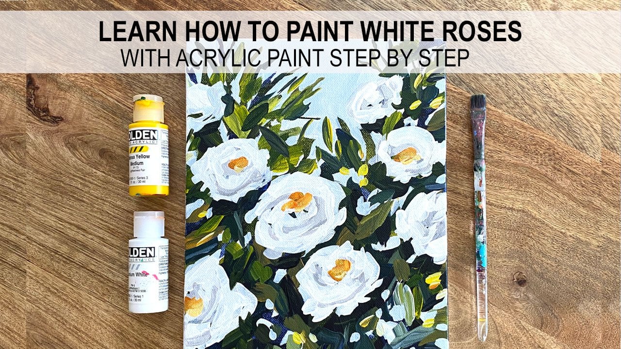
Transcripts
1. Introduction: Hi everyone. I'm Mel buyers. Welcome to my cactus painting class. In this class I'm going to teach you how I painted a series of four different cacti paintings using a reference photo. I'll show you every part of my process from start to finish, including how a tone my Canvas, outline my composition block in my colors and layer my paintings. I'm using golden fluid acrylic paints, but feel free to use whatever paints you have on hand. You don't need the same paint or paint colors I'm using to achieve a similar result, I will list all of my pink colors and the supplies I used for these paintings. In the About section below the video, the projects and resources tab, you'll find the reference photos I used as well as pictures of my finished paintings. Feel free to use those as a reference for your own paintings. For your class project, I would love to see your version of these cacti paintings. You can click on the Create Project tab to upload a photo of your work. Okay, Let's jump right into our first painting.
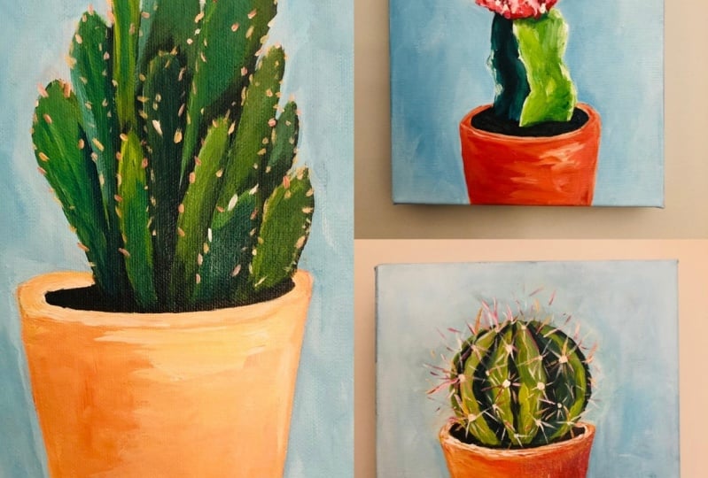
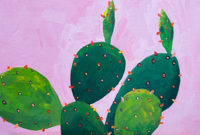
2. Bunny Ear Cactus: I am going to paint a thick, it's a bunny ear cactus. I'm going to turn my canvas with a dark pink so that it'll help my green cactus to stand out. I'm using quinacridone red, which is a cool red similar to a primary magenta. And I'm going to add a little titanium white. Wet my brush and just put down a thin layer of pink paint. So use whatever color you want. You don't have to use pink. I would use something that either is neutral if you don't want the funky color and the background, or you could use anything that looks good with green. You could do purple, yellow, pink. Lots of options. So this is just to tone the canvas. I'll go over this a second time, enlightened enough, but I'll leave little pops of this bright pink showing. You'll see what I mean in a little bit. It's going to get it completely covered. And then I'm going to let this dry before I start to sketch my composition. Now that this is dry, I'm going to sketch my composition onto my canvas. The reference photo is pretty bright and fun, so I'm going to stick to really bright and fun colors for this one. Sticking with my quinacridone red, I'm using turquoise phthalo and titanium white to start. Also going to add some Hansa yellow medium. And just helped me dark and my greens a little. I'm going to use some burnt sienna as well. You can sketch your composition with a pencil or you can just go right in with your paint. I am going to go in with my paint. I mix kinda of an orangey color, light orange so that you can see what I'm doing. Doesn't really matter what color you choose because most of this is going to get covered up anyway. And you just wanna kind of sketchy or shapes in. If you make a mistake, you can just let it dry. And then you can use another color so that you know which one you're following. They're a little bit more like balloon shapes rather than circles. I made that too big, but actually I think I made both of these two big. I made everything too big. All right. So this is fixable. I think these sizes are okay. I made this one a little bit too tall. So I'm going to stick with the blue line for this. Same thing here. I just made it a little too tall. So one can be a little slimmer. With something like this type of painting. You don't need your drawing to be super accurate. It's not like it's a somebody's face where it has to be recognizable. All right, so I want to make sure that when I'm blocking these colors in that I'm using, I'm following the blue lines. I'm going to grab a bigger brush. And start mixing my greens. This one is abrade number 8, going to make a brighter green first with just a tiny bit of turquoise case. My Hansa yellow. This one here is pretty bright. It does get a little darker towards the bottom. I just want to kind of put two values in here to a star and a lighter one and a more medium one. It's also pretty bright up in this little area here. So I'm just going to put in some gray paint to start just to block it in. And then I'll add my details as I go along. The other one that is pretty bright but a little bit darker. This, this little one off to the side. Again, two values in here just to get started. So I don't have one solid color. One solid color is going to look a little flat. So you want to have a little bit of a highlight in a little bit of a shadow, some contrast in here. And then I'm going to just add a little bit of that burnt sienna to start to darken this up. Change the hue. I'm actually going to add a little bit more blue. We want it to look different than the two that I have already mixed. Going a little bit less saturated over here. But also a little bit of contrast. Mixing in a little pink. Just to lighten it up a little. Adding some more yellow and weight to my palette. And go with a darker hue. Want to muddier and buy more of that burnt sienna. Little more blue. That's a mistake, but that's okay. I can just paint over that Leader. Going to add a little bit more of the turquoise just to get my contrast and here. And then a little bit of white. Always try to start with at least two values. And then you can add more contrast if you need to as you go along. Something like this, you don't need a ton of contrast. You could do as much or as little as you want. And just kinda touching things up. These are going to need a second coat for sure. But I think I need to let them dry a little bit. So while they are drying, I'm going to I'm going to choose a background color and I'm going to go over it exists really bright pink with something a little lighter because I don't want the background to be competing with the cactus. And then just add a little more white to my palette and more yellow and red. I'm going to just mix a small amount of red, tiny bit of yellow. Try to get a pink or a peach color for my background. I'm just thinking in terms of complimentary colors. So red, green, or compliments, but you don't have to have bright red, bright green all the time. You can use a soft pink also to compliment the green of soft orange would also be q. Right now this looks really light. I'm going to just go with it. And if I want to add a little bit more color, I can always go over it another second time. So I'm just putting in loose background for eight now, leaving little bit of those pops of color for my draw lines showing. You don't have to do that. That is just a stylistic choice. I like that to show through. Some people don't. There's really no right or wrong way to do it. Just whatever you like. Now's a good time if you need anything too big or too wonky, you can clean up your edges. I need to reshape this little piece here should have a little bit more of a point at the top. I'll just keep working that as I go along. I'm using a size 12 bright brush, which is kind of big. So I have lots of loose edges, but that's what I like. We want everything to be a lot tighter. You can use a smaller brush and kinda get some more fine detail in there. I think I'll probably do another coat on the background. I say that now, but it might, I might think differently once I get a little more detail on here. Okay, so I'm gonna switch, I'm going to put this in water and switch back to my greens, which look like they're almost dry now. Switching to a clean brush, this one is a flat number 5. And I'm going to mix similar colors to what I already have down here. But it's okay if they're a little bit different than the originals. That'll just add to the complexity of the cactus. Let's start with this bright one. I'm trying to resist the urge to just smooth everything out and leave those brushing marks.
3. Bunny Ear Continued: All right, I'm going to leave that one a try to do the same thing over here and leaves some of my Borussia, your marks showing we have the urge sometimes to smooth everything out. But I always tend to like those weird marks. So I tried to leave thumb, even though it's not always easy, your brain wants to just kind of make everything perfectly smooth. Like I just tried to do right there because I wasn't thinking. I was just kinda talking and not paying attention. Right. And my brain's trying to just go in and smooth everything out. Okay? And I just kinda wiped my brush a little. And now I'm going to mix my muddier greens. I'm actually an undo. I'm going to do a lot of turquoise. And this one up here on the right. And then I'll have my other to be a little bit muddier. Trying to make sure I have some nice contrast. And try to make this a little bit brighter up here at the top. And so really start to come together a lot more once we start to add those little spiky red details. So I'm going to try to leave those nice and bright. A little bit too dark, but sorry, contrast is good. And now I can add a little bit more of my burnt sienna and yellow out, a little turquoise and a bit more burnt sienna mixed kind of a brownish green, a little more earthy. We want to get a little contrast. Leave some nice brush marks showing shrine to make sure my shapes are pretty much okay. I think I have enough contrast in each one. And I definitely want to go over that background one more time. You might not want to on yours, but I can see some of the little mistakes that I made pumping through in mind still like right here. So I think that needs one more layer of paint. And while I'm doing that, the green will be drying and then I'll be ready for my final details. If you're using the heavy body paints, you probably don't need to go over your background again, I find with the fluid acrylics, I need more layers than when I'm using heavy body. And colors. Not quite the same, but I think I like it a little better. It's a little. Warmer pink, put a little extra yellow in there. And this is a cleaning it up. I'm still trying to leave those bright pops of pink showing not too many of them, but just enough to add a little bit of interest. We're going to paint those little spiky things on the edges of some of these. So if you go into a little bit too far with your paint, you don't have to worry about that because you can cover it up with the details at the end. Everything can always be fixed. This brush is a flat brush, number 8. All right, I think everything is covered. Going to now add the final details, the fun part. This is where the painting really starts to come together. So if you look closely at just the cactus, especially those little spikes, you'll notice that there is mostly a shadow underneath each of them. Alright, there's like a dark ring and then a little bit of red or orange and then a little bit later on like a pink or white. So in order to have those read with a little bit of dimension, I'm going to add some of those, those shadow marks. And I'm just mixing a little turquoise and a little burnt. See it, this is going to work for my darker, the darker parts of the cactus here. I'll make them a little bit later on, the lighter leaves. And I'm not trying to put every single one that I see in the photo. I'm just trying to put them down randomly and trying to make them different sizes. Not really make a pattern. Can even put a couple. And then I'm going to put some down here. So some of them are on the sides. Some of them are facing towards us. And this will also get some darker ones. Then I'm going to just grab a little bit of white and yellow. And that's a little too late. Want to make sure I get some spots on here for a few. My shadows. I'm going to let these dry for just a minute so that when I layers are red and white paint on, it's going to go on strong. Not I'm not get to blended in with the dark colors because they want the red and the white to really stand out. I'm just adding a second layer on to some of these just to give them a little bit more complexity. Yeah, I'm a couple minutes to dry and we'll do the final step. I think it's mostly dry. It's okay if it's a little tacky as long as your paint is kind of sticking to the canvas and not a lending. And what the blues and greens you should be fine. I'm going to use a little red and a little pink and a little white. My round brush number 2. And I'm just trying to follow where the ones that are facing me are kinda like little dots. And then the one sticking off the edge are little kinda spikes is kinda use on the tip of my brush. I'm going to try not to overdo it with these and put in a couple of yellow just for a little interest. And if you add a little dark and you get that a little bit more dimension, anytime you have contrast, you're adding dimension. So if you put a little bit of light pink or weight on some of them, they'll give it that 3D effect. Space, some a little bit randomly. Trying not to make a pattern. This one has more spikes. Because if the angle of it, I'm just trying to use the tip of my brush kinda gently. Pumping a little bit of contrast. If you paint this, I would love to see it. If you're watching on Skillshare, you can click it, click the Create Project button below the video. And that's where you can upload a photo of your work. I hope you enjoyed the painting demo. I'm going to call this one finished. Thanks for watching.
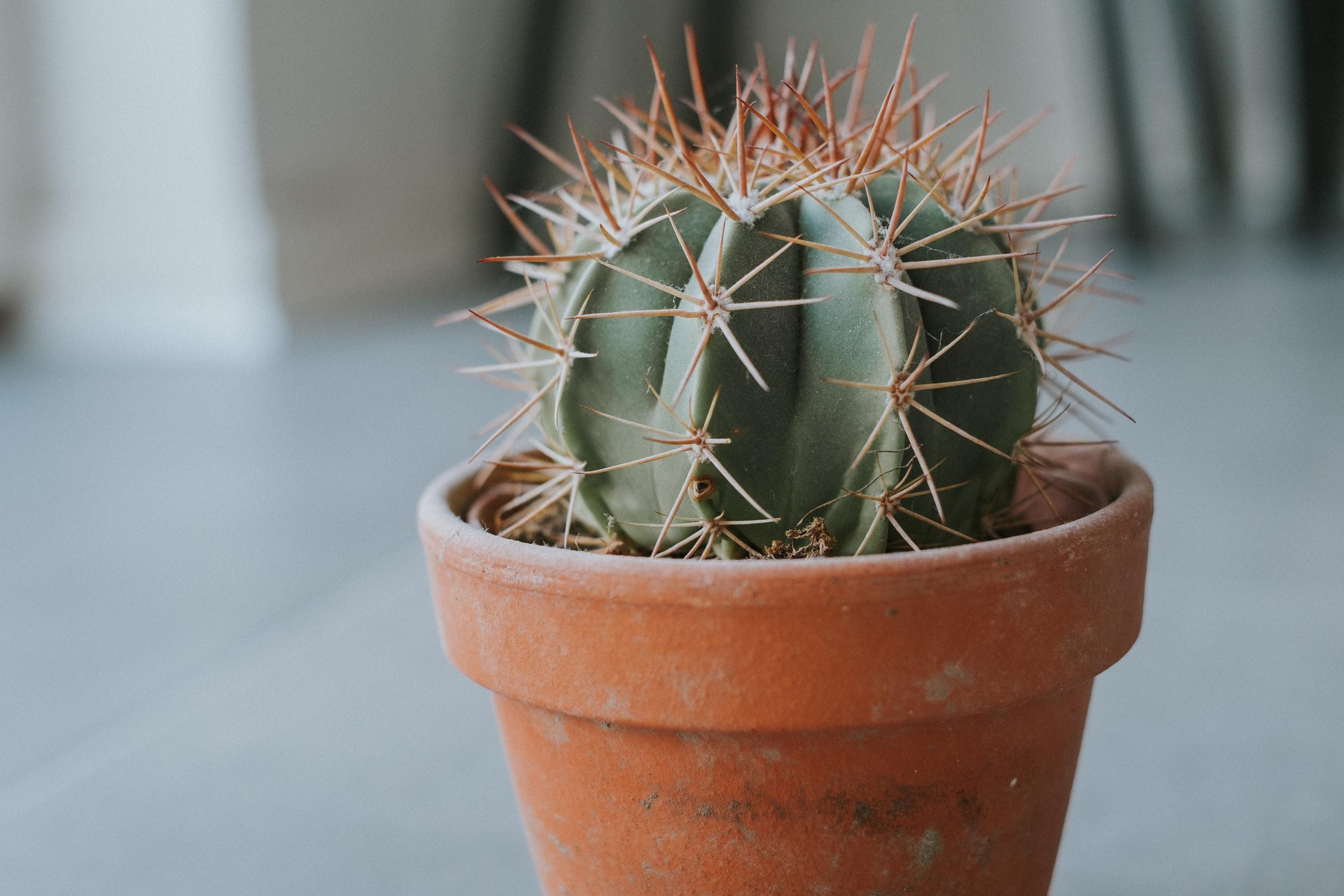
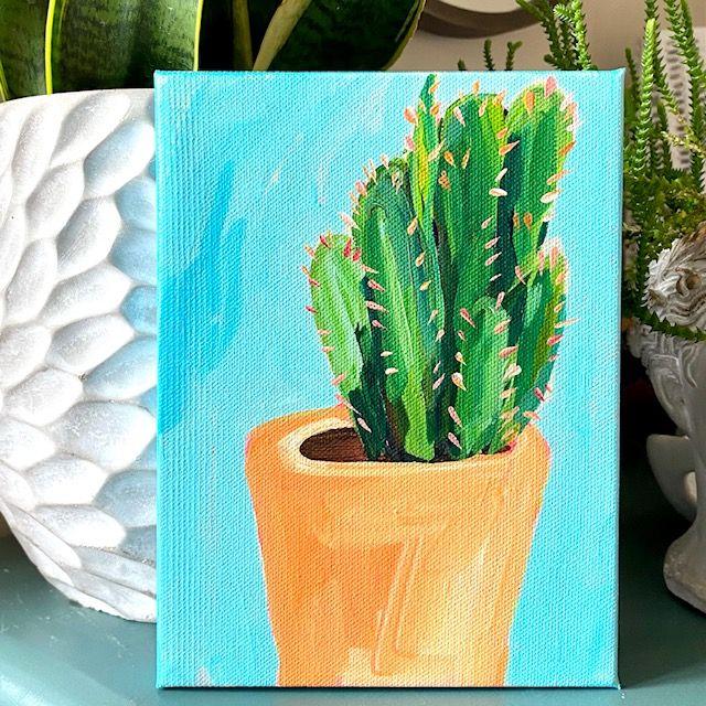
4. Golden Barrel Cactus: I have a six-by-six inch canvas for this painting. And I'm going to paint a golden barrel cactus. It's a cute little round cactus with lots of little spikes. And in the reference photo it's in terracotta planter. So I am going to paint it just as it is. I'm using Indian yellow hue for my background because my painting is going to be mostly oranges and greens. And I think this will be a good color to coordinate with those. So I'm going to let this dry and then get right into sketching my composition. I'm going to use my HB pencil to sketch this one. I want the top of the cactus to come new higher than right about here. Because of all those little spikes. Want to make sure that I have enough space to get those into the composition, is that's what I think makes this really cute. Just trying to make it big enough, but not too big to little off-center, but I think that's okay. I'll go over it with paint. So you can see what I'm doing here. And I have the top of my planter be about right here. It's a little bit angled and it just goes around the back a little bit. And that should be pretty good. So I'm going to use two different yellows. I'm gonna use my Indian yellow, nice warm yellow. And I'm going to use my Hansa yellow, which is cooler than the Indian yellow. We also have some burnt sienna and quinacridone red, which is a cool red. It's similar to the primary magenta that I usually use, but I'm all out of primary magenta, so I'm going to use this. And then I have my titanium white. And the only other color that I'm going to use is turquoise. So I'll just use these six colors for the whole painting. And just so you can see what I did here, it's gonna kinda go over this with paint. My little cactus will sit in here, I guess let me get a little smaller because it's smaller than the planter. And I am going to actually going to grab a portraits a little bit bigger. Use my number eight flat brush to start. And I'm just going to block in my colors. One thing that I noticed before I started to do any painting is that the sunlight appears to be coming in from the upper left because this left side of the plantar and the cactus is a little brighter and the right side is a little darker. So when I just first start to block in my colors here, I'm going to block it in just thinking shadow and highlight. So the side on the right has a little bit more red. And then the side on the left, we'll have a little bit more yellow. And I'll brighten it up a little bit with some white. And I'm going to leave those brushy marks showing because I like at painterly style and my paintings, how it could probably go up a little bit higher. But that's okay. I am going to mix my burnt sienna and my turquoise to get that dark dirt shadow that's inside a planter. And then I'm going to add some white to this mixture. And a little bit more of my yellows here. And I'm gonna get kind of a medium green value. And I'm going to just block in the cactus in one flat media mish color here. That's a little too much blue. Just wanted to be medium green. This is just the block end stage. So don't worry about contrast yet. We'll be adding contrast in the next layer. And then further background. I'm going to use. I'm going to use the turquoise. And a little bit more. It's kind of a blue-gray background in the photo. So I'm just gonna go with that. I'm just going to loosely go around the edges. It's okay if I leave a little bit of my under painting showing. I'm going to smooth out my planter little bit. I didn't quite shape it right in the beginning. Anything that doesn't look right to you just let it dry paint right over it. So I love acrylic paints so much. If you can get your painting to this stage where everything is blocked in and these large areas of flat color, you're in good shape is from this point on, it's just building up the details slowly. The drawing at the beginning a lot of times is the hardest part. So as long as you draw everything out, get your proportions the way that you want them. You're going to be good to go whether you're painting a still life or a landscape or flowers. All right, so in the next stage will start to add layers and dimension and we'll add in different values. But I'm going to let this dry for a few minutes. And then I'll come back and start to build up my details. I'm going to use my number eight brush and I'm gonna go back to the planter and just work in the same order that I did the first time around. I have to clean up the plant or a little bit. So I have my Indian yellow and I'm going to put in some more red and a little Hansa yellow. I'm actually going to add a little of burnt sienna for that darker shadowed side of the planter. You know what, I'm actually going to add a little bit of white right now because I had my dirt come out a little bit too far. And that red is pretty translucent and it won't cover the dark. So I'm going to use a mixture that has a little bit of white in it to clean up this top area here. Then I'll go over it again. Once it dries a little bit with the colors that I actually want it to be. And I'm going to fix my little drawing error on the side of the planter and kinda straighten it out a little. I'm just fixing the shape. So anything that you need to cover up, you can usually do it with white, let that dry. And then paint over it with a more translucent color. So while that's drying, I am going to just going to put a couple of like brown spots in the dirt area was that turquoise mixture. And then I'm going to work on the cactus. So I'm mixing burnt sienna and my turquoise. I'm going to grab some Hansa yellow. If you look at the reference photo, you'll notice that there are a couple of shadowed areas. And that helps to create depths that draws your eye in. So we need a range of value. We need contrast in order to make an object look dimensional. So I have this dark color that I mixed with my burnt sienna, my turquoise, and my Hansa, yellow. And I'm glancing at the reference photo and I see a shadow right here in the middle. Over toward the right. I have even more of a shadow because that is the side that's getting blocked by the light. And then a very thin one over on the side. I'm going to grab a little bit more yellow here, tiny bit of white. The shadow on the left. It's a little bit lighter, but it's still there. And then I have some local shadows over on the side. And it's okay if they're not all one flat color as long as they're dark, you don't need them to be one flat color. Actually more colors will help it to read more dimensionally. And then with the same brush, I'm going to grab a bunch of white, little more yellow to warm it up. A little burnt sienna. And I'm going to put in some of the light areas and that's not light enough. I want contrast, so I want to make sure I have something that's a lot lighter than the shadow. So that is much better. Going to mix a little bit of red in it just to desaturate the color a bit.
5. Golden Barrel Continued: And I'm adding some lighter green tones. And I'm gonna go even a little bit lighter over here where the sunlight is hitting. And I have a nice variety of greens now, so I have dark values and light values and that's exactly what I wanted. So just make sure you have the cactus, the shapes that you want it to be. And we're going to let this green part dry so that we can add the little spiky areas on top. I'm going to add in a little bit more dark so I can't add the spikes and till that dries. My background is a little bit darker than I wanted it to be. So I'm going to go over that one more time. Same brush and put a little bit more turquoise. And what I'm going to have it be a little bit lighter this time, a little bit more vibrant. And I think that will really make that orange look a little bit brighter. You might not need to do this step. It's totally up to you if you like your background color. And I would just leave it only put on a second layer if you think you absolutely need it. And now the terracotta pots should be dry enough that I should be able to layer rate over that, that white that I put down. I'm getting some green for some reason on here. So I'm just going to blend that in. And I'm going to grab a clean brush. This is another flat brush. This one's a number five. Now, this weight should be dry enough that I can paint or eight or I need more yellow on my palette. Start with red. And again, Yellow, Hansa, yellow. Group a little bit away and get a nice orange red color. Ci compete or a rate over that area. Now that it's dry. I like to leave a lot of my brushstrokes showing because I really like that painterly feel. So I'm not going to over blend anything. I want it to be lighter on the left, darker on the rate. Something that I can add. Is this lighter highlight that goes around the edge of the planter. And that's going to help give the plant or a little form. A little dimension. Could be a little later. Rethink. All right, that's good. I'm not going to fuss with it too much. And I can see that this part of the cactus is a little wet still. I'm gonna give it a minute to dry so that I can paint those spikes on top. If I don't let it dry, It's going to smudge green into all my cute little spikes and I don't want that to happen, so I'm going to give it abode another five minutes. And then I'm going to grab a really small brush and show you how I paint the little spikes. Hey, this is the best part. I am going to grab two small brushes. One, this one is just to put the little white spots where the spikes are coming out of. It's the number two rounds you can use anything you have that small. And then I have this short handled brush. It's a bright size three. So you can see that the sizes are different between the long handle on the short handle. So the Size 3 in the short handle is actually smaller than the two and the long handle. Just something to know for when you're picking out brushes, looking for different sizes. Just taking a tiny bit of that burnt sienna. And I'm putting just a few of those later marks where the spikes are coming out of. Just need a few. And you can't really see them at the top because they're kinda covered up with all the spikes. And I'm gonna take my real small brush. And I'm going to just use yellow and white and whatever colors I can scrape up here on my palette. I'm actually probably going to need to add a little bit more paint through these last steps. I'm going to hold my paintbrush pretty loose and I'm going to try to barely touch it down on the canvas because I don't want lines like this. Hopefully you can see that. I don't want lines like this. I want little thin lines. All right, I need a little bit more paint here. And I'm gonna do some white, some yellow, and some red. I almost a little too big and it's probably okay. If you make a mistake, like if you go way too sick by accident, you can always let it dry and then just put a couple of dots of green paint on top of it and you won't even notice it and hope that one was way too big, I might put a dot of green paint on it and a try. It's a mess. But that's all right. I'll just let it dry and I'll paint over it and hopefully you won't even know that it was there. Sure. To have them going in all different directions. Going to add some red and do some pink ones. So lot more at the top, a lot more red ones at the top. So I'm going to put in a few more. There. You have to go a little lighter with my brush and making some of them too thick. I do just a couple more, I think. See if I have any green paint that I can scrape up here. Pinup paint over that little area. Going to have to mix some. I think It's even find out the color doesn't match exactly. Just going to wait for my brush a little and then I can put some little spikes right over it. Then you won't even know it was my mistake. Do a couple more. Just because I'm being nitpicky. I'm going to add a little bit more later yellow paint to this side of the planter. I thought it was too much like the other side. I think maybe starting to put too many. So I'm going to stop. Hope you enjoyed this one. Thanks for watching.
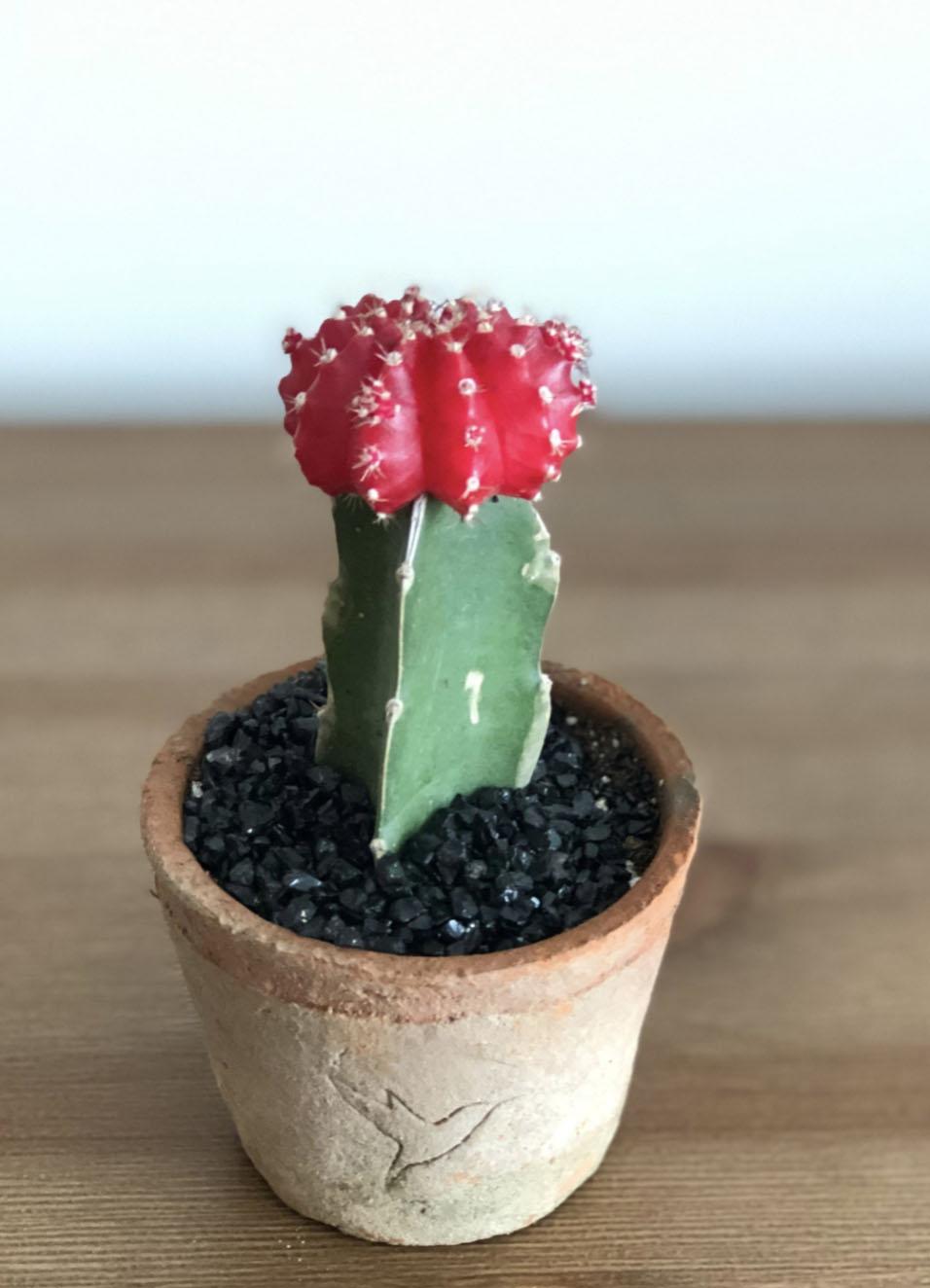
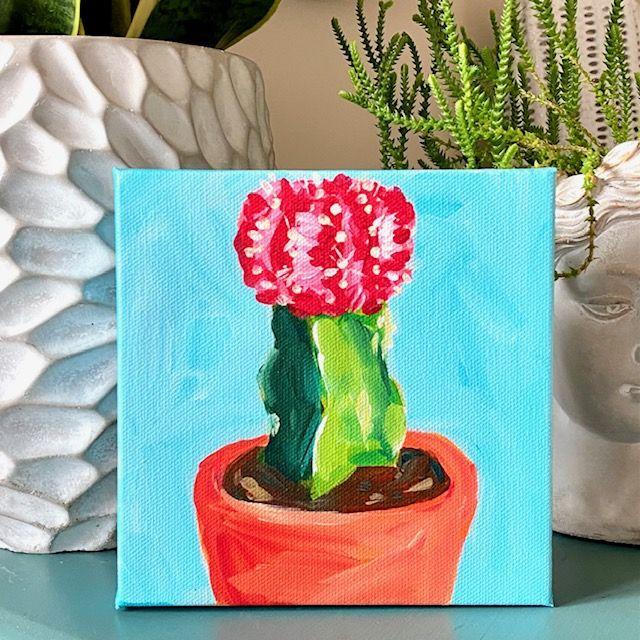
6. Moon Cactus: My next painting is going to be a moon cactus. I'm going to use a wet brush. This is my Indian yellow. I know what I'm going to put a little red on this one too. Just to change things up. One, drop a read. This one has a red flower and the cactus is green. And I'm going to make the planter lettering that looks like a combination of terracotta and stone. Just because I know the terracotta looks good with the green, orange and green. I am going to have it be more like a terracotta plant than a stone plant. I used way too much water, but that's okay. I'm going to let this dry and then get started. I am going to sketch my composition with my pencil. I have more success that way. I'm also altering the reference photo a little bit. I'm going to have the the plants are here coming sitting below. I this is a six-by-six inch canvas. I originally was going to use a six by eight so I could fit the plantar and the cactus. But I thought the whole thing might be just kinda weird and skinny on a big canvas like this. And because I like to have things hitting the edge of the canvas, I find that it makes the painting more interesting. Not all of the time, but with flowers and plants and whatnot. Either I like to have flowers hanging over or the vase hanging over. So I'm going to do that with this. And so I'm making kinda small because I do want the cactus to be more of the focal point. And I'm just trying to get this mostly in the center. And then I'm going to draw this a little bigger. I'm going to go over this with paints so that you can see what I did because I have a and a lot of light pencil lines happening here. So it's easy for me, easier to start with the bottom of the cactus and then work my way up and draw the little shapes. If I started at the top, I would probably have the proportions all wrong. So just take it one shape at a time. Here's my cactus and then you'll see that it's sitting angled toward us. And that angle is not in the middle. It's a little bit off to the left. And so we wanna make sure I do that. And then the flowery top, which I guess that's why this is called a moon cactus. I'm gonna make this nice and big, so it really stands out. Probably a little bit too tall. I don't want that also hanging off the edge. I kinda want to end it right about here. I'm going to grab the CME six colors I used in the last painting. My titanium white, Indian yellow, hansa yellow, burnt sienna, quinacridone, red, and my turquoise. I'll just do a little outline in pink so you can see my drawing lines. You don't need to do this on your IS unless you want to, unless it helps you to see things a little better. So my planter, the bottom of the canvas. And this will be red flower on the top. Since I have this pink on my brush already, the first thing I'm going to do is block in the flower at the top with a medium pink color. That way I can go lighter and I can go darker on this. Blocking everything in right now, mostly just in flat color. And then I'll add different values and different colors as I go along to build up the composition and to make my painting more dimensional. I'm going to use the same brush. I just wiped it off a little bit. And I'm going to stay in the same color family here and do my yellows. And I'm going to keep the planter pretty simple. And sort of a terracotta color. Just really flat color for right now I know this looks like the sun is shining from probably the upper right, because this side of the cactus seems to be lit and the left side is in shadow. So when I'm adding my details, I will add more light and shadow so that I can get more dimension. And then I'll just keep going with this same brush. There. There seems to be some kind of dark rocks inside the planter. I'm just going to fill it in with a dark color. I mixed my turquoise and burnt sienna. I'm not going to get caught up in all of those details. Dark will just serve as a shadow. And then wait my brush. And I'm going to mix two different color greens right now. The green on the right is lit, it's lighter and has more yellow. And the green on the left is in shadow, so it has more blue. So I'm gonna do the lighter green first. Not going to worry about those little white details yet. Just blocking in the flat color. And white my brush. And I want a darker value, green for the shadow side. And then we'll play with that as we go along, see if we can find a few more values. And the value is just how light or dark a color is. So a darker value green and a lighter value green. And the more values you can find and an object, the more dimensional your painting is going to read. All right, So far so good. And next, I'm going to mix a color for the background. For the background, I'm gonna go with blue just because I'm familiar with the color wheel and I've already, I'm using red for the flower. I'm using orange for the Terracotta pot. And then I'm going to have green here and the cactus. And so this tetrad color combination, I know it'll work together. So if you don't have a color wheel, these are really good to keep on hand if you don't know what color to choose. Like if I chose purple, I don't know. It might look okay, but I think the blue green and the red orange. Definitely going to work together. And so that's why I'm choosing that color. I'm going to use my turquoise. And I'm just going to start to loosely block around. We made anything too big. You can meet your Terracotta pot too big or the cactus to big. Use the background color too. Reshape. Anything that needs to be reshaped. That's the beauty of acrylic paint. If you make a mistake, just let it dry. Go ahead and paint right over it. You can paint over things as many times as you want. The only thing that happens is you might build up a lot of texture on your painting, but there's nothing wrong with that. So if I went over this flower five times, that would be totally fine. You don't have to throw your canvas away. I'm going to just fix the plant or on this side a little bit. I'll put a little paint on the sides. And I'm going to let this dry for a few minutes and I'm going to go back in with layer number 2. And this is where I'm going to start to add variations of color and start to add different values to try to get my cactus to read a little more dimensionally. It seems mostly dry now. I'm going to try to work in the same order that I did last time. Now, I'm going to start with the red up here, and I want to start to look at bigger details in this red area. So I see that there is shadow and there are highlights almost in segments, kind of like round. The golden round character gives pretty similar shape here. So I'm putting in those dark shadows. You don't have to put them in exactly, just put them in roughly where you see them. And then I also see some areas that are lighter. So I'm gonna take a little bit more white. Try to mix a lighter pink. And I think that's probably not light enough because it's not really standing out. And I see some, some reflections that I'm painting in.
7. Moon Cactus Continued: When I'm painting them, putting, using my brush in the direction that I see the reflections. So they're, they're horizontal in some areas and vertical and some other areas. Try to go even a little bit lighter on some of them to get more variety. It's trying to get a little bit better of a shape here too. It's a little more jag it, then I painted it in. And if you read, it's not dark enough. You can always add in a little bit of your burnt sienna and get those shadows even a little darker. Just kinda glance at the reference photo and paint what you see. I'm going to take my round brush, pick up a little bit more white. I'm going to put a little bit of Indian yellow into it. And I see these dots, which will add some detail. There's a lot of them at the top. And there's even some little spiky prickly areas, which I'll add later, do that at the very end. So I think that's enough detail on that part for right now. Next, I will do the area that has that dirt. Just mixing a dark dark value. You can put in a couple of, if you want a couple of little flecks of highlight. If you want it more like what it's showing in the image, that's up to you. You don't have to do that. You could just leave thumb, leave him all dark. It's not really an area with your fussing over an area. And it's not an area that is part of the focal point of the painting. Drone won't even bother fussing over it because nobody's really going to look at most people are going to look at the cactus, they're going to look and the red, the bright area. So if you find yourself focusing on minor details, I would just try to move on to a different area. If it's still bothering you later, you can always come back and adjust it. Next I'm going to do green. Now grab a clean brush for this. Because I want a nice break green. My brush was a bit dirty. A little bit more blue, little bit more white. So I want to also start to look for different values in this herd of the cactus. So it's, it's subtle. But if you really look, you can see that there are a few areas that are a little bit darker than the rest. And there's even a little bit of a shadow right under where the flower is. Over on this side there seems to be a tiny bit of a shadow. So I'm just trying to paint that in me, even going to go a little bit brighter than it is. I tried to make my brighter areas a little brighter and my darker areas a little darker. That's should be. Okay. I'm gonna move on to the other side and mix a much darker green. This site has a lot more blue in it. There's not a ton of variation because it's mostly in shadow. But any subtleties that you can find an ad, you should try to do that. You can always paint anything out later. Remember, let it dry. If you don't like it, you can always go back and adjust. And you feel like it didn't go late enough on this side? All right. I'm just going to leave that for a minute because I feel like I'm overworking it, so I'm just going to let it dry a tiny bit. I'm going to wait my brush and pick up this white and add a couple of those little weight, highly details that I see. There are little darker, more subtle over on the left. If you make them too big, just go over them with a touch of green. Kinda just push them back a little bit. All right. And I don't want green and my orange, so grab a clean brush. I do read Indian yellow. Some clean white. Leave a lot of my brushy marks showing what my planter a little bit later over on the right where there is more sunlight. Once a little better for you. Just work it until I feel like it looks okay. I think that's going to be okay. I'm just going to let it dry and if I don't like it. Always a little bit more color. There's a little bit of a highlight here. So I'm just going to paint that in kind of subtly. All right, next, I'm going to go where that background one more time. And then just any tiny little final details. And then this will be finished. And I flip my palette paper around so I can use these clean bits over here. They're a little closer to me. And I'm going to grab my number eight, brush. Some weight. I like to leave my background a little streaky sometimes. That's just totally a stylistic choice. You don't have to do that. You can make it one flat color. You could make a table. So lots of different options. I'm trying to go close, but not not all the way up to the edge because I don't want to accidentally paint over my cactus. Unless you needed to reshape something like if you're a planter is way off. Go in real close and just touch that up. All right. If at this point you don't feel like you at your painting has enough dimension. It's looking, your cactus is looking flat urine, I want to go back in and do some lightening and darkening. So you wanna make sure that anything that is supposed to be in shadow is a darker color and anything that is supposed to be highlighted is a lighter color. So the more contrast you have, the more dimensional your cactus is going to be. So if your two colors here are too similar, you might not be getting that three-dimensional effect. All right, last thing I'm going to do, that's this small brush and we're going to take a really tiny brush. So I have my number three bright brush, the short handle one. And I'm going to grab some paint that's almost white to scrape it out here on my palette. And I want to just do a couple more details up here in the cactus. So I'm gonna put in some of those little spiky areas. Just very subtly. Good. I'll just add a little bit more detail. In trying to barely touch the canvas. I'm trying to try not to overdo it. And just add a couple more white highlights to really make it pop. Darken up a little bit of these reds. This one was fun. I loved this cactus series. I hope you have enjoyed it. Please either send me your photos, post them to Instagram and tag me. Use the hashtag, pain with OWL. Posterior paintings into the Facebook group. You can click on the projects and resources tab below the video and then you can upload a photo of your work. You just click, I believe it says Create Project. All right. I'm calling this one finished. Thanks for watching.
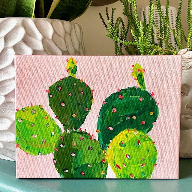
8. Skinny Cactus: For my last painting in this series, I'm going to use a pink background using my quinacridone red and Indian yellow here. And a little bit of white. And wet my brush. Just using a little bit of yellow to warm up that red. I like a nice warm pink with the green of the cactus. A little bit lighter than that. It's trying to get the canvas mostly covered. This will be good enough because I'm going to paint over it later. As long as I get a thin coat, mostly in the middle, it should be fine. And as usual, I'm going to let this dry and then draw my composition with my pencil. And use my pencil to sketch some really thin ellipse on this one on the planter. So there's not going to be a whole lot of that dirt or anything showing me a six by eight inch canvas. And I'm going to have the planter just come off the bottom with this one, not going to try to draw every single part of the cactus. I'm going to get the main ones in. And notice that it sits, the cactus sits over to the right and there is some negative space over here in the planter. Going to try to get that to that accurately because I liked the composition of that. There is so much green in this one right next to it, All right, next to each other. The key with this one is going to be to get shadows in between each part of the cactus. And that way the greens are separated by shadows. Otherwise you're just going to have one big green blob. These come right down into the dirt. It looks like the sunlight is coming from maybe the front because there's a lot of shadow down in here and it seems like the ones that are up high and closer to the front or catching the most light. So I have several of them in there. And if I need to, I'll add more as I go along, but I don't want to overwhelm myself either. Going to grab a small brush. And I'm actually going to outline these in a dark color so that I can start to get my shadows in here. I'm going to use the same palette that I've been using. My red Hansa, yellow. And turquoise, little burnt sienna, little endian yellow, and my titanium white. I have a number for flat brush. Just going to mix some burnt sienna and with my turquoise and darken that up. And I think laying in the shadows first on this one is going to be the way to go. Just kind of glancing at the photo and anywhere that one part of the cactus such as another part and putting in a bit of a shadow where they touch. That way. When I go in and paint the green, I can leave the shadow showing and that will separate one from another. This one might take a little practice. And I'm going to just take a little bit of brown put in the dirt part. And the planter looks white, but maybe is leaning a little bit toward the peach color. Peach tone. So I'm going to, I'm going to do that. I'm going to make it peach or be a little darker than the photo. I'm gonna do that with my quinacridone red and Indian yellow. And I'm just going to start to block this in. And the background also looks white, but it looks white. That might be leaning a little bit toward a minty color. So that is what I am going to do. Grabbing a clean brush is what it a tiny bit. So I'm going to start with turquoise, little bit of Hansa, yellow, really, really green. And I'm going to put a touch of red in there to study, saturate it a little bit more white. One, it really light. I think I'm going to actually leave little bits of the pink under painting showing, at least for right now. I might leave the backgrounds like this just for something a little different. Not sure yet as the painting progresses, I'll I'll probably change my mind. We'll see.
9. Skinny Cactus Continued: I'm going to grab a clean brush. This is a number five. I'm going to start to mix some lighter greens. And I'm going to start to fill some of these in a trying to leave some of the shadow showing, especially where it's touching another part of the cactus. And I'm trying to just mix different shades of green by mixing in different yellows, YE, little bit of red, you can mix in a little of your burnt sienna, just so everything is not the same exact color. Since this one's not touching another one. On the left. I'm going to bring the green color all the way over. And I'm going to leave this shadow in here and darken it up a little bit. And I'm just going to darken up a couple of these shadows here in between. Even though it's still wet, it's fine and we'll just kind of blend in and just be a little bigger. I think my background should be a little more blue. It's the greens are going to have competing with the cactus. So I'm going to just do a little turquoise already like that better. Still trying to leave a little bit of that pink showing. And I'm just gonna do a little bit of layering. I'm going to darken up or go over the dark areas. Right? The shadowed areas. There's a lot of shadow in the middle toward the bottom. And I'm going to start to go over those greens. And some are yellow. I'm just giving some of these a little more form, little more shape by going over them again with a slightly different value. So trying to lighten some of them up while keeping those shadows established. All right. So I'm kinda fussing with this one a lot. I think I need to just leave it and start to put in the little prickly marks, which I think will help to bring the whole thing together. I have to let that green dry first. What I'm going to do is touch up the color right here. I've made it a little bit too vibrant for what I wanted. Needed a little bit of weight. I did a little bit more with the Indian yellow this time. Going to have the right side be a little bit lighter to mimic the sunlight. So the light side and a shadow side. And I'm going to leave those pops of pink showing a little bit of a lip to the planter here to give it a little bit of form. I feel like these are not really super accurate. But at the same time I feel like they'll be fine. So I'm just going to leave it. I'm going to leave my whole painting for a couple of minutes, let everything dry, and then just put some finishing touches on it. I think this one for me anyway, is the most challenging of the four. I would say just try to get a few. A few of the different cactus leaves showing maybe overlap one or two in the front. Make sure you have some shadows and let it dry for a couple of minutes. And then once you put the little spike psalm, any lines that you think were not the most accurate? I would start in here with the spikes right is covered up. I read something recently that said something like painting is just putting down for strokes and then immediately correcting what you just put down. And I think that is a super, super accurate statement about painting. Trying to put a lot of these around the edges to define the edges. A little bit more. I'm using white, Indian yellow, and a little bit of red, trying to make them different colors. If you paint any of these cacti, cactus plants from any, any part of the class, I would love to see what you created. You can upload a photo of your painting to the projects and resources tab, which is located below the video. You just click on that and then you click Create Project. And that's where you upload a photo of your work. And if you post to your painting to Instagram, you can tag me and use the hashtag paint with L so that I can easily find your work and share it and my stories. I am going to call this painting finished. Thank you so much for watching.
 Elle Byers, Artist and Teacher