Transcripts
1. Introduction: Hey, everyone. My name
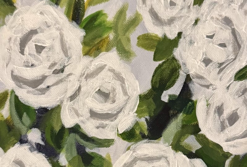
is L. In this class, I'm going to teach you how I painted white roses
using a reference photo. You will need a small canvas
and some acrylic paint. I am using golden paints. I have Hansa yellow medium, titanium white,
ultramarine blue, pains gray, Indian yellow hue, and I have neutral
gray number eight and neutral gray number five. I also have some flat and
round paint brushes that I'm using and some palette paper
to mix my paint colors. I will list all of the
exact paint colors and supplies that I used for this class in the a
section below the video, but feel free to use whatever size canvas and whatever paint colors
you have on hand. For your class project, I would love to see your
version of white roses. I have attached a
reference photo. Feel free to use that or use
your own You can simply take a picture of your
finished painting and upload it to the
projects and resources tab, which is located
below the video. Ready. Let's get started. Okay.
2. Block in Color: I am going to start
with my pains gray and some handsome yellow medium and some ultramarine blue. And I'm going to create just a rough blocking of my painting. My paint brush is pretty wet. I want to just do some really thin paint
at the beginning. I'm looking glancing at
the reference photo. And I'm kind of just
loosely blocking in the shapes in
a simplified way. So I see some stems. So leaves. And then there's much more darkness
toward the bottom. So just trying to simplify
what I see in the photo. My paint is so thin that I can see the texture
of the canvas. I'm doing that intentionally because I like how that looks when parts of the canvas
that thin paint in the end. Okay. I'm going to add a little
yellow now and I'm going to wet my brush
again just so I can continue with my
really thin paint. I'm using fluid acrylic paint. If you're using heavy body, you might need to add
a lot more water. I'm just going to
do a slow block. This is just the first layer, so don't worry about mistakes. Everything can be
covered up later. You can layer over it, you can completely cover it up with a totally
different color. Just start to block
in simple shapes. You're going to layer some
green on top of the blue. And then I'll just wipe
my brush a little. Just to get a different
shade of green and blue. I'm going to use a little bit
of this ultramarine blue. Get a nice variety
of greens going on. Okay. So just mimic some
branch and leaf shapes very loosely with
the paint brash. And then I'm going to let this and then I'll start
to block in my sky. I'm just going to
give this a couple of minutes so that I don't get too much green
mixed in with my sky. I won't mind if a little
bit gets mixed in, but I don't want to turn
my sky completely green. So I'm going to give my
painting about 5 minutes or so. And then we'll layer in the
rest of the underpainting. It's not completely
dry, but it's enough. I think most of the
edges are dry anyway. And I have a 1 ", same brush, cleaned it. And I'm going to use pains gray. Okay. Okay.
3. Layer the Leaves: I'm going to switch now to a brush that's a
little bit smaller. This is a bright number eight. And I think my paint is still
a little sports with water. I'll probably have
to add more paint. And I'm going to start to add leaf shapes to the greenery. Organic looking shapes. Nothing too perfect. And I'm going to vary the
size and vary the color. I want to pay attention to areas that are
supposed to be really dark and areas that are a
little bit lighter down here, I know you can't really
see the exact shape. But it's just going to help to create a sense of
depth and give you that more three dimensional Look if you have a bunch of areas
that are really dark Okay. And some handsy yellow. And then I'm going to add some leaf shapes going
in different directions. Make sure they're not all
the exact same color. Try to get a mix of light
and dark and try to vary the shape and then also overlap some of
them because that's how they look in nature.
They're overlapped. Okay. Is. Work on the leaves for a little bit different
directions, different sizes. Some of them don't even have to be fully formed leaves
can just be little blobs. Most of them will just blend
into the background anyway. Just keep thinking variety. It's a good idea to step back
every once in a while and you can get a
different perspective and see what's going
on in the painting. When I feel like I have a
decent amount of them on here, I'm going to let
everything dry and then I'll start to
add in some flowers. I will go back and forth
with my leaves and flowers at least twice so that everything
is layered together. I don't want it to appear that the flowers
are just sitting on top of the branches, I want everything to look
like it's all mixed together. I want to add more
variety my colors. So I'm thinking about maybe introducing a different yellow. I like how I have some warmer leaves in the top and cooler
leaves and the bottom. I'm also just making some marks, and you can also do some
little lines for branches. You can layer over the
sky holes partially, but make sure you leave
some of the sky showing. Okay. I think I have some have some yellow
ocher here that I'm going to put on my palette. Just to get a little
more variety. I'll create a different
sheet of green. Okay. And I think I'll just do a few more dark
ones on the bottom, and then I'm going to let everything and work on my
first layer of flowers. So this is just still
using the same brush. And I'm intentionally leaving some of that original
layer showing. I don't want every single inch of my canvas to be
completely covered. I always like to
leave a little bit of each layer showing. Okay. That's almost like a brown green, but it works. All right. I like where this
one is right now. I'm going to give it
about 5 minutes to dry and then I'm going to grab some white paint
and some gray paint, and I'm going to start
to layers in here.
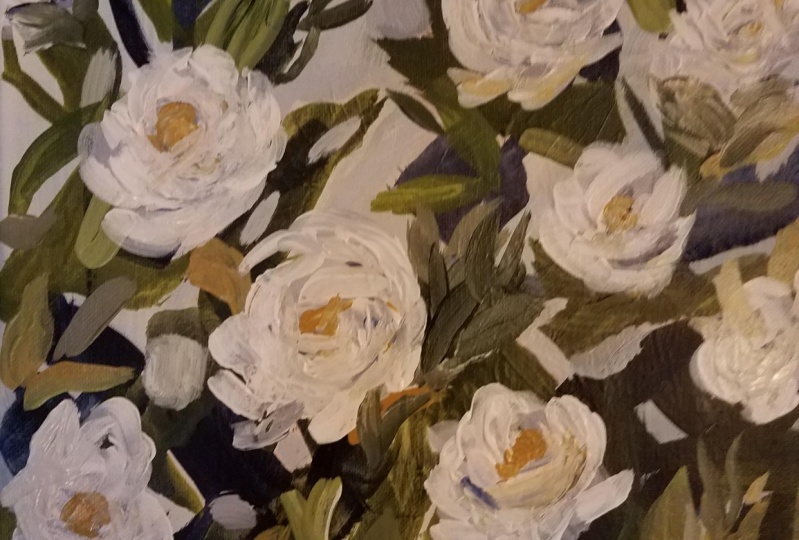
4. Add Flowers: Now that my painting
is completely dry, I'm going to I'm just going
to flip my palette paper so that I can use that clean
side closest to me. I am going to use some light colors and
I don't want it to get mixed up in there with
the greens and blues. I want my flowers
to be pretty white. But if I just paint
white flowers, they're going to
look really flat. Flowers need some shadow. Any objects in order
for them to look more dimensional need some
highlight and shadow. I'm going to use neutral gray. This one is number eight. This one's number five. The number five
might be too dark, but I'm going to put a little
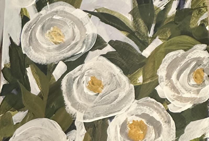
bit on my palette just in case may not use it. We'll see. And I also need white. In my photo, The center of
the flowers they're darker. Maybe that's where I'll
use my number five gray. But also, there's a
little bit of pink. I don't really want to use pink. I love this color Indian
yellow hue by golden. I'm going to put a little
bit of this on my palette. This is the color
that I used here. I think that I'll just make everything a little
bit more cohesive. Okay. So I switched out
my larger brushes for a little bit
smaller brushes. I have a bright size four. I have a fillbrt and
a round brush here. I'll probably use these. Also, this is heavy
body acrylic. You can see how thick it is compared to the fluid acrylic. I'm going to thin it out
with a little bit of water. You could also use a flow medium if you
have one available. This is thicker paint
than I normally use. So when I do use it, I thin it down pretty good. I haven't seen the neutral
gray by golden in the fluid, so I still use the heavy body. I'm not sure right now if I'm going to paint all
of the flowers. But I'm going to do the one
that's closer to the bottom. And then the one that's
more in the middle. I would call that the
focal point flower. I'm going to just put some
gray might be hard to see. I'm basically doing
something like that. And then I will fill in
some white around it, some darker in the middle. And then a little touch
of yellow, I think. Going to do the flower
over here on the left. Okay. And I like the one
that's going off the side. So I have one, two,
three, four here, and I think I'll do a couple of the smaller
ones on this side. I like the one that's coming up. In this area, I'm going
to do one right here, probably instead of two. I have that one. Then I think I will do the
ones on this side going off. I'm going to take
a little bit of the darker gray and mix
it in a little bit. I wet my brush again. Okay. I'm going to go in with a bit darker paint flowers are going to need to be layered. Don't worry if your gray
is too light right now. When you put white next to it, the gray will stand
out a little more. If it doesn't, you
can always darken it. If you don't have gray paint, just use one of your
black paints and put a tiny dot into your white
and just make your own gray. I am going to just wipe the excess paint
on my paper towel. I'm going to use the same brush. I'm going to start to
layer the flowers here. I'm going to mo go
around the gray area. But it's okay if you
overlap a little bit. And I don't want
to make circles. The the shape of the
roses is very organic. It's not the outer
edge is not smooth. I think you're my hand anyway, and my brain try to make everything
perfectly symmetrical, and I have to fight that urge. It's better to go a little bit smaller to start
with your flowers. It's a lot easier to make them bigger than it is to
make them smaller. You can do it. You can
make them smaller, but you're going to
have to go back in with your dark colors and color
blue and green over the edges, and it would be a
process of layering. I'm trying to roughly pay attention to the direction
that the flowers are facing. This flower seems
to be facing up. This one here is facing a little bit
down and to the right, and this one is facing up and these are
pretty much facing up. And so I'm to get my
flowers to read that way. When you put that dark
spot in the center, and not necessarily in the
center, but with this one, it's off center
and that will help the flower to read that it's
facing a little bit down. I'm going to add more
shadow in this one too, because in this area
here in the photo, it's a lot more shadowed. And then these
ones just going to do simply because they
are a bit smaller. I'm debating whether
to add one here. There's one kind of
coming off the side, and there's another one here. I'm going to add a little bit. I think that might be enough. I don't want to overdo it
with the flowers too much. I'm happy with my first layer. I'm going to go back now to my greens and add in some
more leaf shapes. Okay.
5. Add New Layers to the Leaves: I am going to use
that same brush. I just rinsed it a little bit, my number four bright brush just to keep the white
and gray a little wet, I'm going to spritz my
palette with water. I am going to make
leaves one more time. I'm going to overlap ones
that are here and make some new ones in spaces that
look a little bit too empty. I'm going to push back some
of these air holes, I think. And I want some of the leaves to be
overlapping with the flowers. So like I said before, so that it doesn't look
like the flowers are just floating on top of the
canvas on top of the leaves. So I'm going to
add more paint to my palette to do my paints gray, and my ultramarine blue. And then I have my
hands yellow Okay. And I'll probably use a
little bit more white. I don't want to
muddy this one up. I'm going to go first with the ultramarine blue and yellow. Okay. I'm just going to look
for areas that are a little empty looking or
that need a something. And I'm going to
add some leaves. I'm going to try to go a little bit smaller with some of them. And they don't all have
to be leaf shapes. You certainly can just
add some other shapes, some dots of color. I'm going to add just enough so that I think
they look like leaves. And then I'll just
also add some dots. If you think you made
your flowers too big, you can get your dark
paint and go right over the side and
push them back. I do like to have
some dark paint. Next to or under the flowers to create
the sense of depth. Okay. I want to create a
variety of greens. You can even do more
branches, Okay. If you have too many leaves that are all going in
the same direction, I would I would intentionally make some in
the opposite direction. So I have more yellow going on in the top and I think more. I like the darker look
closer to the bottom. Get right in there and cut right into the sides
of some of the flowers. And I'm going to grab some of that ingean yellow that
I was using earlier. Put some of that back in here just for a little
bit more variety. I would say at this stage, just keep working the leaves until you feel like you
have good enough coverage. I'm intentionally leaving the
spots that look like this. I'm leaving some of them
because I think they add a really nice texture to the painting. All right. I think I probably
have enough leaves. I'm going to clean this brush or maybe I'll switch brushes. That'll be easier. T. I'll use maybe the round and
the fill bert here. And then I think my
flowers definitely need one more layer and I might layer over the sky a bit more just to give it a
little bit more color. Okay.
6. Add Final Layers and Details: I'm going to go
with a round brush. This one's a size three. And I want to layer
over the white. I might do this a
couple of times. Just so that my white
really stands out. Okay. And you don't have to layer over every
single brush stroke that you made. Some of them can be a little
bit more translucent. If you want to be loser, hold your paint
brush to the end. And then you'll get more
organic shapes that way. I'm going to go back
in here with the gray. I'm going to wet my brush, loosen up this
paint a little bit. I'm just going to do a
little back and forth with the gray and the white. You can do this part as
many times as you need to. I'm not trying to put in
every shadow that I see. Just the main ones. You have to always try to just
simplify your shapes. Okay. I've got the two different
grays going on in here. I'm going to grab a little bit more of that Indian yellow. And I'm just wiping a little bit of the gray off of my brush, but I'm using the same one. Okay. And I'm adding just a bit too where the center
of the flower should be. Some of them, you can't
really see the center. I'm going to put a little bit of lighter yellow in there too
gives it a something extra. Layer everything. That's
my. That's what I do. It's my motto. Layer everything. Then I'm just going
to grab a clean brush and do white one more time. This is a bright
brush number three, but really the shape doesn't
matter too much to me. I use a lot of bright brushes, but sometimes I use
round and fiber. It's more the size of the
brush that I'm looking for, not necessarily the shape. Yeah. I think that's pretty good. I am going to use
the same brush. I think I already have
enough pains gray. And I'm going to just touch
up the sky a little bit. I wanted to make some of these branches a
little more jagged. And so by touching up
the sky and cutting in with the panes gray
and white, I can do that. Can push areas that I
wanted to just touch up. And then anywhere
that you wanted to have a little bit more of
the sky coming through? I can touch that up as well. I have a little more
down in this area. I've kind of like
those little pops. Just have to be careful to not overdo it so you don't have, like, poke it dots
all over the place. To put a little bit more
gray into this flower here. Then if you want to
add any final pups of color with some yellow
or any other colors. Just for a few little details make everything a
little bit brighter. But I'm going to try
not to overdo it. Okay. I think I'm finished. I hope you enjoyed this
painting tutorial. If you paint your own Rose
Bush, I would love to see it. You can post a photo
to the projects and resources tab that's
located below the video. You can also tag me on
Instagram at El Byers Art. I would love to see your work. All right. I'm calling this one finished.
Thanks for watching.
 Elle Byers, Artist and Teacher