Transcripts
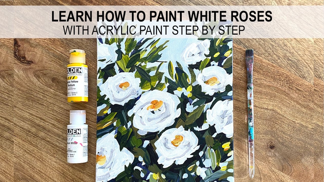
1. Introduction: Hi everyone, My name is L. In this class I'm going to teach you how to paint wild flowers with acrylic paint. I am using golden fluid acrylic paint, but feel free to use whatever paint you already have on hand. My canvas size is 11 by 14. I have some flat paint brushes, palette paper and water and paper towels for cleanup. I'm going to start this class by teaching you how to turn your Canvas with multiple shades of blue and green. And then how to slowly build up your layers to create a painting that has lots of depth and dimension. I listed all of the exact materials that I used in the About section below the video. I also attached to reference photo as well as a copy of my finished painting in the projects and resources tab, feel free to use those as a reference for your own painting or your class project. I would love to see your version of wild flowers. You can click on the Create Project button to upload a photo of your work if you would like to be notified every time I post a new Skillshare class, click the follow button next to my name and you'll receive an email notification every time a new class has posted. All right, let's get started on our wild flowers.
2. Tone the Canvas: I am going to start using some dark colors that I already have, like Payne's gray. And I'm also going to mix some dark colors. So I'll use a mix of burnt sienna and ultramarine blue to make another variation of a dark color, something maybe closer to black. Now also just add a little yellow and red to my palette. Just so that I can get some variety in my dark colors. I'm not using one color for the background like I normally do. I want to mix a variety of dark colors so I get some complexity in the background before I even start to layer anything on top like my stems are my flowers. Managers wet my brush a tiny bit. I'm gonna do a couple of layers on my background. Again, just for complexity variation. You could just use a blackout of the tube, but it's going to be a very flat color. If you do use black, you might want to maybe add in a little blue or red or something to give it a little bit more dimension. And I mix these two together. Same brush. You can see I'm getting another dark color in here. Slightly different than my Payne's gray. If you don't have these colors, you don't have the burnt sienna or the ultramarine blue. Just try mixing your three primary colors together and create a dark color. So by mixing red, yellow, and blue, you should be able to get some really dark values depending on how much of each you mix in. And if you do red and yellow to make an orange and then add in a little bit of blue. You'll get more of a brown. Adding all three together. In more equal quantities, you should get a gray or something closer to a black pen, a little bit of yellow in this to push it green. Really muddy green. I want it to be nice and dark. Blaring at right end to this wet paint. If your paint is really sick, you might want to add a little bit of water. To get a nice smooth background. I'm going to let this first layer dry, and then I'm going to put out a second layer. Maybe slightly different colors, and I'll darken things up. I'll add a few more different values and colors to the background.
3. Add Another Layer to the Toned Canvas: That's pretty much dry. I'm going to repeat the process, maybe slight variations in color. So this time I'll add a little of burnt sienna to my Payne's Gray. Putting it on again so that some of the background shows through. And you'll get a nice layered, complex background to get started on. You want these slight variations in color, but in a little red this time. But it's also okay if you have some brush marks showing I'm leaving some areas that look more blue, some that look more green, some that look more brown. We'll just do a little bit more to break up some of the spots that maybe a little too flat read. So between once we start to layer the flowers and stems on, then these different dark colors will pop through. And it'll look really nice. Alright, I think, I think I have some good coverage here. Now I'm going to let this dry completely. And then I'm going to start to add some lighter values in my stems.
4. Create Stems & Leaves: When your canvas is mostly dry, mix a green or another dark color. See, from the same palette, same colors. Maybe add a little more yellow. Then you did last time. That a little bit of white. We want to mix some colors that are a little lighter. And what we already put down. And take a small brush doesn't matter if it's a filbert or around. Take something that you can use the tip or the edge to make some stems. And I'm just going to put mine on randomly. I'm going to try to vary the colors slightly. In the back. I'm going to make them a little bit smaller. And the front I'm going to make more marks that are a little bit bigger. So I'm doing them in different colors. Again. Variety, complexity, overlap. And I want them to be so bright that they're really standing out. I do want to be able to see them, but I don't want to put so much white in them that they're like super vibrant. And just loosely holding my brush, trying to put them down pretty randomly and add some little branches to some of them. Definitely overlapped them. Overlapping is going to be key to getting the painting to look like the flowers and the flowers and are just sitting on top of the branches are going to do a couple of layers, so everything is all mixed and overlapping. I think this is a good start. And a mix a little bit more dark and I'm going to press a little harder with my brush now and kind of make some, a few bigger marks that might look a little like leaves. Not too many. So I'm really pushing down with my brush and then moving it. And so that's creating a thicker marks and just my branch. That might have been a little too light but that's okay. Can layer over it later. So just pushing down. And then moving the brush like an upwards, sideways and I guess a diagonal motion. Remember, we're putting flowers on these so they don't have to be perfect. Repeat, go to light, just grabbed some darker paint and layer right over it. And I'm just scraping up now anything that's still in my palette. And once you feel like you have a good amount of these leaves and branches, let it dry. And then we'll put on our first layer of flowers and go back and forth a couple of times until we have until we have enough leaves and flowers overlapping. This is where I'm going to stop. I'm gonna give my painting about five minutes to dry. It really depends on how humid it is, where you are, how warm out it is. If your paint went on really sick, it might take a little bit longer to dry and I put mine on pretty thin, so it should take about five minutes or so. And then we'll work on flowers.
5. Add the First Layer of Flowers: All right, This is the fun part now and start to add the first layer of flowers. I'm just putting reds and yellows and why it a little off my ultramarine blues so I can make a little bit of a purple. And I'm just going to squint at the reference photo and look at the big clumps of flowers and paint them like clumps of flowers. I'm not going to get into painting every little tiny piece and a little bit of red. So I'm going to start with darker colors and then layer some lighter colors on top to add a little bit of dimension. If you want to get the perspectives that's in the reference photo, the flowers are smaller the further away they are in the distance. And they're larger the closer they are to you. Not by a lot, but I can see it in the photo, so I'm gonna do that a little bit. I know that I'm going to add a bunch of layers. If you're using a thicker paint, your paint probably looks better than mine because right now I'm using a fluid paints, so I'm going to need to add a few layers to cover up. This dark paint. Could also add in a little bit of white to get more, more of an opaque color. So I just kind of glands do. And I was looking where I see reds and putting on red. And it makes a little ultramarine blue and two is red that I put down earlier. Push it a little bit more toward the purple. Going to add in a tiny bit of white to, so it's a little bit lighter of a value then my red that I put down. And I'm just kind of glance saying, where do I see purple? There's so many flowers in the photo, I'm definitely not going to put them all in. I do want to leave large spots of the greenery showing in between a lot of the flowers. I'm trying to be mindful of that and not overdo it. And I know that a lot of the purple flowers are lighter than what I'm putting down. But I'm going to layer, layer these flowers. I'm going to try to get at least one dark, one medium and one light value on each flower to make it look more dimensional. And you can see I'm not painting flowers at all. Just kinda going back and forth a little bit with my brush to get these big clumps of flowers. Going to get some more red so I can do orange. Just waving a little of that purple off my brush. And put some of my orange and purple are going to look nice near each other. So I'm going to try to put some near the purple. And also of course, where I see a little bit of orange, the reference photo. And then just for variety, I'm going to add in some two different yellows. I have my Indian yellow hue. I'm gonna put a little white in here so it stands out a little bit more like some areas, they're a little more clustered together. I'm just putting some loose shapes on site didn't mean to some marine and there are few pops of yellow. Trying to make them different sizes in. It's a good idea to try to have them lean in different directions if you can. You don't want them all to be perfectly street in facing the same way. Just kinda push your brush down to get some more organic shapes. You might want to stand back from your canvas and see if you have enough or if you think you need to add a little bit more, I'm going to just keep going. I know that everything isn't completely dry yet. That's okay. I'm going to stick with the same warm colors. And so if they mix together a little bit, I don't mind that some taking red, I'm going to mix in a little bit of white now to get a bit of a lighter value and start to layer it next to and on top of, overlapping a little bit with some of the reds that I already put down. But you can also make some new flowers that are just pink. Can even put a little bit on the purples. That leaves some of that original red showing when you layer or some of the original purple. Just wiping my brush a little bit on a paper towel. And I'm going to pick up just the colors that I still have here that are wet. And use those to layer. Mimics a little bit more on that in a little bit more weight to get a lighter value on my orange flowers. And I don't know about you, but I feel very calm doing this. I'm not really looking too closely at the reference photo anymore. I'm just trying to looking at the painting and seeing where where it needs a little more color, where I need to layer a little bit more. Actually going to add some white. I didn't put any white flowers and at the beginning just kinda wiped my brush so it is turning a little bit pH, but that's okay. Most of my flowers seem like they're standing up straight to me, so I want to put some in that you're kind of leaning at an angle. I think a lot of them are too spread out, so I'm going to add in just some little dots of flowers and kind of cluster some of them together. So over here I want them clustered and then I think I'll leave some negative space and then maybe cluster more over on the left again. And I really like those pops of white. Nice contrast. I think I'm going to let this dry and I'm going to go back in with my stems and layer over stems and leaves on parts of the flowers so that everything looks kinda mixed because right now it looks like the flowers are just floating on top of the green background. So I'll do that and then I'll come back to my flowers a second time.
7. Final Layers & Details: I just cleaned my number five flat brush that I had been using. I have blue, I have a little bit of Indian yellow. I'm going to put my Hansa yellow and a little bit more white. I'm going to go dark, medium light. Again. I'm going to start with purple. So that's ultramarine blue and my quinacridone red, nice deep purple. And it's even a little darker this time. So I think that adds some nice dimension to my flowers. I like this color a lot. Especially next to the orange, which I know I said earlier. I'm gonna put a couple of pops a little bit more. Some I may layer over and some I might not any spot that looks empty. It is. Just put a couple of dots of color. I'm going to intentionally leave this side a little bit empty. Then I'm gonna put a little bit of white, darken it up a little bit and put some of this or medium value on here. Middle value. And a little bit more weight in late gives some light spots on some of these. Ms. adding a little red on a few of them. Just for even more dimension. Just another subtle shift in value and will help bring your flowers to life. I'm not going to put it on all of them. Make it a little thicker there in the middle. And so I just kinda wait to my brush, but I'm going to keep using the same one. I like the number five flat for flowers. And I mix up some orange. I'm going to layer it where I already put my orange mix in a little white. Try to turn this a little bit more peach. We Indian yellow isn't really showing up that well, but that's okay. I'll just keep using, I'm going to use whatever is left on my palette here and then use a little bit more of the hansa yellow, which will show up a little bit better. A little bit of weight in the hansa yellow. Lighten up that value a little bit. I think. Just add a little bit more red and maybe then touch up the white. And I think I'll be finished. You can feel myself adding too many flowers. So I know for me, that means I'm going to start to overdo it soon. You feel like you're overdoing it. Just step back and look at it from a distance. Not always gives you a better perspective. We hope you enjoy painting these wild flowers. If you have any questions, there's a discussion tab below, or you can ask questions. You can always message me on Instagram at outliers are I posted a picture of this reference photo as well as a picture of my completed painting in the projects and resources tab, which is located below the video. If you paint this or something similar, I would love to see it. You can take a picture of your painting. You click on Projects and Resources, and then you click on Create Project. And that's where you can upload a photo of your work. And of course it'll have a list of all of the supplies and pink colors that I used, but feel free to use your own colors. You really just need primary colors. Maybe a brown, like a burnt sienna if you wanted to, and some white. You should be able to get a similar result with different colors. So hard for me to finish. I just want to keep going. I'm going to stop myself here. Hope you enjoyed. Thanks for watching.
 Elle Byers, Artist and Teacher