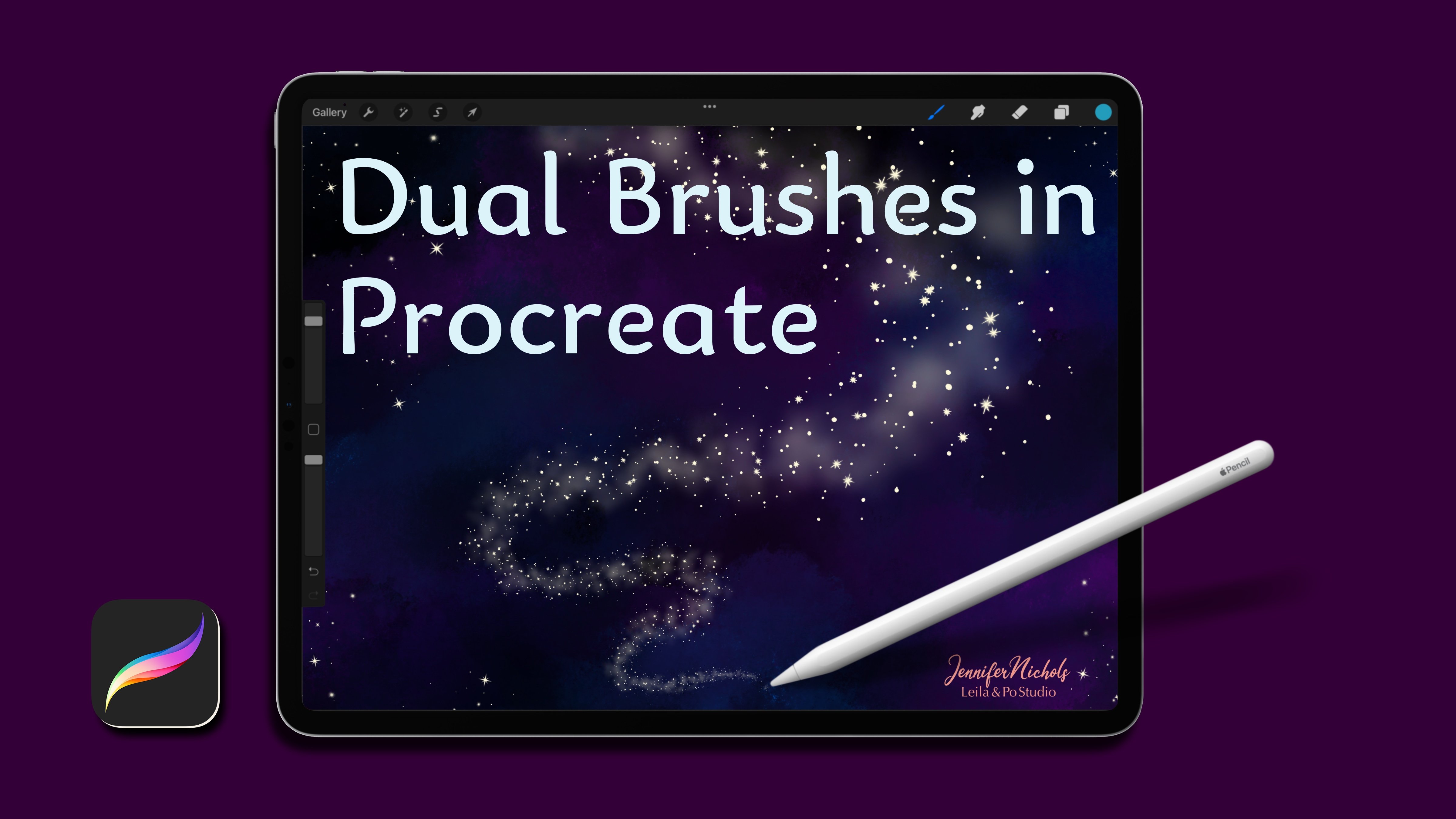
Transcripts
1. Introduction: Hello, my name is
Jennifer Nichols of Layla and Po studio. I'm an artist at teacher
and a fabric designer. And I absolutely loved the Procreate app and
teaching everything. I know. If you're familiar with my work, you might know that
I love realism, but I actually prefer more stylized illustrations
lately and for years I've had to actually actively practice
not doing realism. Part of that journey
has led me to practicing abstract
painting in procreate. And I love it. In this class, I'm
actually going to do an entire painting you
can follow along with, or you can watch it, learn some skills, and
then do your own thing. I have made 42 new
brushes for this class. I went a little crazy because
I did a lot of research and watched a lot of traditional abstract
painting lessons. And I wanted to get a lot of the different looks that you can get with traditional painting. I made a lot of brushes. I'm also giving you several pallets is to
work from and showing you how to create a
wonderful canvas texture before you get started, a lot of this class
actually is playing with brushes and getting to know everything that you can
do with these brushes. Of course, you're not restricted to the brushes I provide. But I've provided some really
great charts for you to keep track of the
brushes as well as practicing your mark-making. Be sure to head to my Skillshare
profile where you can find all the links to where
you can find me online, join my Facebook group, follow me on
Instagram and head to my website for lots
more freebies. Let's get started.
I'll see you in class.
2. Why Abstract Painting?: I thought it was going to
try to answer the question, why do abstract art? But I realized that I can't actually
answer that question. I found a couple of articles. They're linked in
the projects and resources in the
project description. And this is one of the articles and I think it gets
some great information. And I wanted to just give
those to you so that you can decide why you are doing abstract painting for yourself. I know I'm doing it
because I like to practice being a little bit more
loose and free with my art. When you post your
class project, let me know what you think
of these articles and why you chose to do
some abstract painting. All right, let's get started.
3. Reorganizing Brushes & Making Palettes: In this lesson,
we're going to talk about downloading resources and a quick overview of posting a class project on Skillshare. Go to the class, go to the
Projects and Resources tab, and make sure you're in a
browser in landscape mode. In order to be able to see
this column over here. I don't believe it works
in the Skillshare app. If you have troubles, make sure you try
different browsers. I do get a lot of people
who have troubles that end up switching into
Safari and then they're fine. So be sure to check on
that type of stuff. If things don't seem to
be downloading properly, there's usually a
See More option which will expose
more of the list. I think this is the last
one on our list though. Yeah. I do have
besides our downloads, I have a couple of links here. I have a Pinterest
board and then I have two articles
that I thought were interesting and I wanted to make sure that you see those. And a little description
of the class project, but we'll talk about
that in class as well. The Pinterest board mostly has Laura horn and Luis
Fletcher, Alice Sheridan. And some Laura horn does
do some more botanicals. And she does a lot that are
not botanicals as well. But this is a nice
little inspiration board for you to check out and definitely look
around for more inspiration. We're not going to be
doing abstract florals and things like
that in this class, this is more about a color
shape and mark-making, but you can definitely add
things like that on your own. Over here at the downloads, all we need to do is tap on
things and tap download. You'll be able to see them
downloading right there. Then just keep tapping. I had to split my
brush set into two because it was too big of
a file for Skillshare. I'm just going through
and tapping on every single thing
and tapping download. It had tap on this arrow and
you can see that your list is ready to go by
tapping on one of those. It'll pop over to
your files app, and it'll be here in
the download section. You can organize your
files differently. So minor alphabetized. If you don't remember the name of the thing that
you're downloading it, you can just go to recent. There'll be right
up here at the top. Let's go ahead and well,
anything that's zipped, once you tap it to unzip bit, you're going to end
up popping back down to the Downloads here. You need to remember
the name of it. Let's remember texture
picks and tap that. Now we're down here at downloads and we're in alphabetical order. And what you see is you
still see the zipped folder, but then you see a blue
folder next to it. Sometimes if in this case I
had a folder that was zipped, if I just had a brush set that was zipped
or something like that, you would just see
the brush set itself. Whatever is in that
zipped folder is going to pop up nearby. Unfortunately,
sometimes it pops up of certain things pop
up on that side and certain things
pop up on that side. So it seems a
little weird to me. But there it is right
there, blue folder. And these are just some images. You'll use these images
potentially in your work later. So you might want to save
them to your camera roll. You can tap on this little
up arrow and tap Save Image. Then it'll be in
your camera roll. You can do that for
all three of those. Now let's go back to
recent and tap pallets. Now we have palettes. I've done this twice, so there's two here. There's a couple more here, but I'm just going to tap
on this first blue folder. And now you can see I
have those three pallets. I'm gonna split screen
with Procreate loops. If I go into a canvas, I'm just going to go into, let's do this one. I can then just tap
on these palettes. They're Dots, Swatches,
those are palettes. And they just import
right over to there. And then I'm going to keep that open and I'm going to keep going over to get the rest
of my downloads. I'm going to go up
to recent again. And now I have those
palettes that I just did have that
zipped palette, that zip texture,
I'm done with those. Here is a procreate canvas. I'm just going to tap on that
and it's going to import. Here is the one of
the brush sets Jens to abstract brush sets a
tap on that and it imports. Here's a, another
procreate file. So tap on that. Then the geons, one abstract
brush set tap on that. And then you've got it all. I know that was a lot. So just make sure
you got each thing. Now let me show you where
you can find them all that to procreate files are gonna be in the top of your gallery. Let's go ahead and go into
when the brush sets are gonna be at the top of
your list of brushes here. And the palettes
for some reason, if you go to
Palettes right here, they are at the very, very, very, very, very,
very, very bottom. These three pallets right here, blue abstract, bright
abstract, muted abstract. You can drag these around and
reorder them how you wish. Another fun way to
create palettes is to find beautiful
things that you love. The things that you
find beautiful, you're attracted
to those colors, maybe those shapes,
there's something about those things
that are beautiful. I just used unsplash.com, which is of course
a free use website. So you can use these photos and create palettes from
them if you want. I was thinking about
things to search. You could really search
anything at all. I searched tourism because I know that there's so
many beautiful photos of beautiful places and the
colors do not disappoint. You can definitely
look at this one. Definitely save a photo that you love and bring it
into procreate. So let's do that. So I'm just going to tap
and hold add to photo. Let's go ahead and just start
a quick ten by ten Canvas. You have to be in a canvas
in order to do this part. And I'm going to
tap the wrench tool and insert photo. That photo. There we go, has to be de-selected in order
to create a palette. And I know there is a way to drag and drop photos
into the pallets. It's not working for me today, so I'm not sure what's
going on with that. But I can just tap
the plus sign, create new pallet,
and then I have a nice blank one right here. Now, I can come
through tap and hold, and grab colors and add
them right over here. That beautiful magenta,
this deep purple, this kind of mixture between
pink and purple here. Some of these oranges. And you can come through and add any of the colors that
are inspiring to you. Make sure you grab some really
dark colors all the way up to some really light colors and you don't need a million. Maybe just grab fate, your favorite 567,
something like that. And then know that
you can also do tints and shades of those
colors as well. So that's a super
fun way to create your own palette really quickly. Let's go ahead and combine
our two brush sets. Let's tap on Jen's two
abstracts and then just make sure at the top
of the list and swipe right on every single one. Then we're going
to hold and drag, get them right out of their
tap on Jen's one abstracts. And let's drag it and let's try to get them to go underneath. We do it. Yes, we did it. So I will drag them
to the very bottom. If it doesn't work, it might just be an
alignment thing. You might end up dragging them right above this paint flicks brush and you can just reorder
things anyway, you wish. Now I have the Jens to the I no longer need so
I can delete that. I can change the
name of the Jens one so that it just
says Jens abstracts. Now you have them
all in one folder. We'll take a look
at these two files in a different lesson. To create a class project, go to the Projects
and Resources tab and just tap class product
or Create Project. This Upload button is for
the cover image only, and it needs to be eight
megabytes or smaller. If you save your work as a JPEG, then when you upload an image, you'll have an option
to change the size of it so you can tap on it if you're doing it
from your IPad. This one as an example. This says it's 7.6 megabytes, so it's technically small enough to use it as the cover image. But because I saved
it as a JPEG, I can tap that little
bar down here and I have these smaller
sizes to choose from. So pick one of those
and then tap, use. The cover photo will
crop to a rectangle. If you have something that's not a rectangle and just
don't worry about that. Then fill out your project. But then this image
button here adds images to your main
body of your project. So that's the more
important one. And it really,
they don't seem to care about the size
of that image. And you don't need to
worry about that as much. And then tap Publish. That's a great way for
us all to be able to see your work for
your class project, all you need to do is follow along with me in class or create one entirely of your own and post it to the class projects. Then please go to
the review section and leave me a review
so I can read it. Unfortunately, I can't
reply to those reviews that I love to read reviews and
see what you think of class. All right, so now you have all your downloads and
you're ready to go.
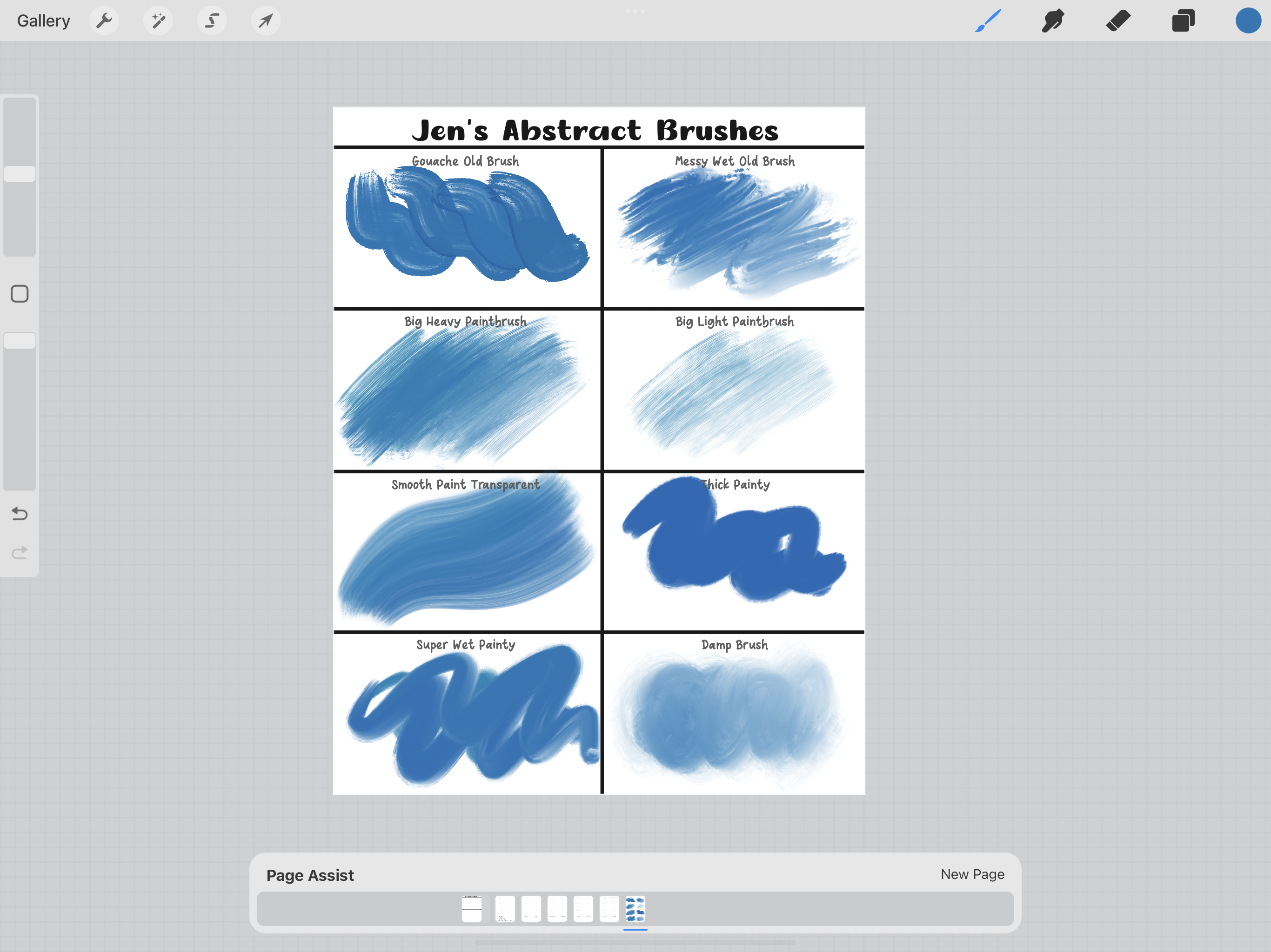
4. Get To Know Your Brushes: Alright, I'm gonna
show you about this abstract brushes chart. I set it up with page assist. That just means that as you toggle through
these different groups, you're gonna see
each section change. You can also change
pages down here. They're in groups because
there is one layer that has the names of brushes and
then a paint here layer. You're going to go
ahead and it's really important in this class to really get to know your brushes. And of course, you're
not limited to the brushes that I provided. But for this chart, let's go ahead and
play around with the brushes from our group. We're gonna do it on
the paint layer here. And then this will be a
nice little reference chart to look back on
when you're done. I'm not sure you'll
need it once you really experiment with brushes
and get to know them, you'll remember or you can just experiment right on the canvas that you're working on as well. But just get to know
them by doing this. And then that will help you when you're kind of have an idea
in your mind of white, look you want to
have on your art. You'll pick, oh, that one brush. I can go get that big paintbrush and that should give me
the look that I went. Alright, so I'm going to
just pick a middle blue here and start with
gouache, old brush. What I like to do,
some of these, there'll be too big to do this. I like to see what
it looks like. Big versus small versus tiny. I like to over lap some strokes. You can see the overlapping on these is a really cool look. I went to also experiment
with some smudging. I'm going to put
another dark stroke and tap and hold
the smudge brush so that that same brush is now selected and do some smudging. I'm not sure I like this
merging with this brush. That's good to know. Messy wet, old brush. I'm gonna go back to my blue. This one gets way too big. So let's just do I
like that stroke. I have some color changing
in several of these brushes. I just spotted it there. This brush. This brush is really fun for blending even just
on the brush mode. It's not giving a
whole lot of color. Every time. I really like the blob
of paint it initially puts down. That's nice. Maybe add some white on top so that one can
be a lot of fun. I know I'm acting
like I've never seen these brushes before. I've probably seen
them away too much because I play with them so
much before I put them out. Big heavy paintbrush. This is important
for me to show you a problem with
Procreate right now. This is a great brush
with a problem. And that is if you tap on it and you see
the shape source, that shape source is getting put down on the page just like that. At the very start
of every stroke. You can see it right here. I believe that's a glitch
in Procreate right now. It's never been a perfect
situation in Procreate, but you used to be able to
get around it by doing kind of moving your hand before the pencil stroke,
taps the page. But now you can't,
it's always there. So hopefully that
will get fixed. But in the meantime, I think it's okay too. You know, just covered
up workaround. It started off the page of
an enter the page like that. This is a super fun brush
for blending with it. Tap and hold. You can get some
really cool blending. It's kind of like a
dry, big paintbrush. And it's called
heavy because it has more color than the next one, which is the same
brush but lighter. Let's see, I never checked
the size for small. It looks good. I
like that a lot. Alright. Then the
light is similar. Just not quite as much color. Smooth paint transparent. This one is a very well
smooth brush and just like it says, it's pressure sensitive. Let's see how it blends. It's so smooth and yummy. All right, so I'm
not going to go through every single
brush with you, but I do really encourage
you to do this. For every single brush. I'm gonna show you the super wet paint brush really quick. When of my favorites, this one is pressure sensitive and just this yummy,
yummy texture. You can see the two hues of
blue are slightly different. If you have color changing in any brush that
you're not happy with, just tap on the brush, go to Color dynamics
and then find whatever isn't set to
0 and turn it to 0. And then tap Done. This brush picks up the colors
that are underneath it. Smears together. Very nice. Damp brush is an
older brush of mine. And it is a nice blending brush. You can see if I blend
some of this over here. You can also get some good color down on it, some nice texture. All right, so then once
you're done with one, you can go ahead and
reduce that group again. I know I didn't do that one. And then go to the next one. Once you tap on the paint here, it's going to open up
the next group here and have all the new names of
the next set of brushes. So definitely go
through fill this out, play with smudging,
play with size. I am going to have another
lesson that we're going to really play with brushes
on a bigger section. These little tiny sections
don't really work for that, but definitely spend
some time doing this before you move on. I do want to show you the
Canvas texture layer. The canvas texture layer
has the masking tape brush, which I'll show you in class. I'm just giving
them masking tape look around your canvas. But it also has the four
texture brushes for Canvas textures that we're
going to use in class. We do I. The way I do it is on a multiply layer and
a Color Burn layer. And then we paint
underneath those layers. So you can go ahead and pick
a gray straight across. Sometimes it's a little lighter, sometimes it's a little darker. You'll need to experiment. I think the watercolor brush is better if it's a
tiny bit darker. But I'm just gonna go
straight across and pick our rough wall, adjust our size and
put a blob there. I think my opacity
is already way down. I was experimenting earlier. We're going to change
the opacity later. Put a blob there on the multiply layer and
on the Color Burn layer. Go to the watercolor paper. Put one on the Color Burn
layer and then multiply layer, whoops, I just tap twice. You're going to want to fill the whole canvas without
lifting your pencil. But I talked about
that layer later. Canvas when multiply
layer, Color Burn layer. This to Multiply
layer or I guess it's Color Burn layer
and multiply layer. And then the paint here layer, just pick some colors and a brush that
has a lot of color. Maybe the thick paint brush, and get some colors down in
each of these sections that are very different
from each other. Like maybe a bright yellow
color changing brush. So this yellows did
not turn out the same. Maybe a bright red. And then we're just
going to play with the opacity of those two layers. Multiply is what's giving
you more of the gray look. But it's also what's
giving the texture on the lighter colors
like the white, this super light tan. Let's go to the
Color Burn layer. It's really just a
matter of preference and how dark you want your
textures to look. If I zoom in on one of these, I can see the texture
on all of the colors, and it's not super-duper
gray on the white. That works. Here's the
directions right here, and we'll talk about it
later in class as well. Alright, finished playing with all of these layers
and then you'll, all you'll have to do is toggle through the
pages down here to find your brushes and what they look
like very quickly. Next, we'll look at mark-making.
5. More Good Brush Info: After playing around
with the brushes on the grid and getting to
know what they can do. I recommend practicing with just getting some really
cool blend looks. So on a bigger canvas, I'm just going to
show you a couple of things and then I'm also
going to show you how to make some changes to brushes
for your specific needs. And you probably won't know what those needs are until you start playing around and
experimenting even more. Let's go to this
blotchy paintbrush. This is just a
really fun brush to give a really cool
painting look. Definitely have lots
of fun figuring out all the different things that the brushes can do
on a bigger area. Changing the size,
playing with pressure, even erasing with them, and getting some blackness
with erasing, smudging. Experimenting with these brushes is a great way for
you to be able to get ideas and then
you can roll with them. This grunge, major grunge. It is, it is a
really grungy brush. It's got a little
bit of texture of the canvas texture as well. And it's just so much fun to play with mixing colors with it. Tap and hold this smudge brush. It's fun to not only
just use directly, but also to blend with. And if you press harder, it does fill in all
of those little gaps, which is maybe not ideal
in some situations. If you just want to do
a little bit at a time, you can keep picking up your pencil and putting
it back down again. So these are the types of
little experiments that you really should
spend some time doing. One of my favorite brushes
is the widest streak brush. You can easily get started. This isn't how we're gonna
start our project today, but you can really easily
get started on Canvas by just picking a palette
and getting some colors on. Swirl them around. This one seems
really dark mixture, you have some contrast. So maybe go back to that purple
and brighten it a little. Back to that teal and
brighten it a little, get some contrast and then
smudge with the same brush. Then it's just
like you're taking a flat scraper and
scraping paint around. I did try to get some really good traditional
looks with the brushes. This is beautiful. This is a really great start. And I would just keep adding
layers and layers and layers and they would just
get more and more depth. While I did try to make these
brushes resemble a lot of the looks that you get out
there with traditional paint. And procreate doesn't do certain types of traditional
looks very well. So there's limitations, but but I get pretty close
with this paint brush. You can it fades out like the paint is running
off the brush. Even when you're
smudging with it. It runs out of steam. See that? That can give, give some
really cool looks as well. And you can see right under it. And it's not smudging the
layer under because we can pretend that
that's dry paint by going to a new layer and only smudging the stuff
that's on this layer, I would focus on contrast. So you have a lot
of dark, not a lot, but he has some dark,
some really light. And then of course
I'll in-between. The other thing I
want to show you is some changes that you can make to some
of these brushes. The dip pen, start with heavy pressure and
then lighten it up. It gets really, really thin. The painting circle
brush has a little bit of color variation as well
as transparency variation. I don't know if you can tell that some of these
are a little more transparent and there's a
teeny tiny size variation. So you can see
this one is pretty big compared to this
one right here. If you don't like those things, you can tap on the circle, tap on the brush
and go to dynamics. The opacity and the size changes
are adjusted right here. If you want smaller
to bigger circles, you can raise the size. Then Color dynamics is
where you would adjust that and just put them down
to 0 if you want them all to be identical in color. And the color dynamics goes for all of the brushes
that you find have some color changing ability
and you don't want that just go in and turn all
the color dynamics to 0. The other thing I
wanted to show you is with the pattern brushes. We're going to do a whole lesson on using these as stencils. But I want to show you how
you can make them bigger. On the very biggest size, this pattern brush is like that. If you want a bigger stencil, think of a piece of plastic. They has the shape on it and you're laying it down
so you can paint. Then you can tap on the brush. There's two ways you
can make it bigger. You can go into Properties and
make it bigger right here. If that's still not
big enough for you, I'm changing that also changed the previous size because
it's all about percentages. If that's still not big enough, you can go to grain and
you can bump up the scale. I'll just bump it up to about 50 to show you
the difference cells. Slide this one over here and
try another one right here. You can see the difference
there, pretty significant. You could go even bigger. I wouldn't go too crazy though. Once you get a brush
set to how you like it, if you want it to stay that way, you can create a
new reset point. If you end up not liking
what you've changed, you can go back to the way I had it by tapping reset brush. Once you create a
new reset point, then you won't be able to go
back to the way I said it. Let's go to Properties
and you can go to preview right here
and bump that up. Preview is this right here. And that will get
changed depending on the sizes that you
have here at all. So if you change this
previous heights right here, that also changes
this right here. All right, so that's what you can do to those pattern brushes. And then I just
wanted to talk about the watercolor
stamps really quick. I don't do a lot of
watercolor in procreate, but I did make these
real watercolor blushes and turn them into brushes so that you have
the ability at least to do some stamping
with these shapes. You can duplicate it if you want a more saturated spot there. And then the two watercolor
brushes are just like super-duper,
watery paint brushes. This one has gotten more color. It does fade. And then this one
fades really fast. That kinda gives a cool, watery, faded look there. Another one of my favorites is the gouache old brush
where you can just really get some
nice panty streaks. This one, you have to be a
little careful to press. Pressing too hard gives
a bit of a jagged edge. And then have fun smudgy and you can smudge
in so many ways. So how about the damp brush? You can choose to leave some of that paint texture there and only smudge a
certain amount. I'm barely pressing
on here at all. Ended up smudging all of the
texture right off of there. Get some lighter color
on there and see if that There's so much you
can do the classes already, almost two hours long. I can't go into all the different things that you can do
with these brushes. I just really, really, really encourage you to spend quite a bit of time
smudging and plane. There's a couple of
things you can do. You can just follow along and
do maybe different colors, but do a similar
look to what I do in class to learn some
more techniques. Or you can spend
a whole bunch of time playing around before you start and then do your own
entire look as we go along. And the choice is yours. Just have lots of fun.
This is so much fun. Just smudging brushes around and picking your favorite colors and not really having a plan. See you in the next lesson.
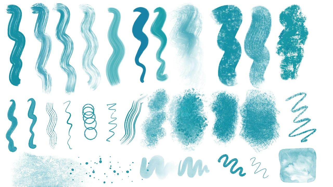
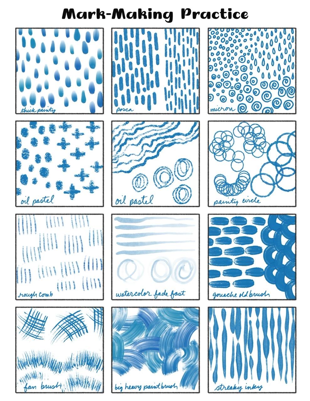
6. Mark-Making Practice: All right, let's tap our
mark-making Canvas there. This is just an example layer. You can keep it or delete it, but I wanted to show
you what I did. I just added a little note about what brush I used in the section so that I
could come back and go, Oh, okay, that's that brush and that's the look that I'll
get with that brush. And making that mark. Obviously the possibilities
are endless here. You can turn on this layer
down here to see what the marks look like on
dark compared to light. Then you can just toggle
one off and go to a new layer to make
your own Marx and your own notes and have this wonderful
reference to come back to when you're out of ideas
or just to keep on hand. I went to Pinterest and I
searched abstract mark-making. There's a lot of
ways you can search. And this is just showing some really great ideas that you could test out
up. That's a video. There's concentric circles. We have a pen that does that
actually we have the STP inky and the when
writing nearby that one, I can't remember the name of it. All these different marks. She's using a micron
marker, a micron pen, which we have a micron pen, and then there's a
Posca pen there. You can see all those
different marks that she's doing there
just as examples. This ones can offend. Having all these kind
of wavy half circles. They're looking like a scallop. All of this, we have a sponge brush that
could give this look. Posca marker would
give this look. This one's also really
fun with some lines that end up forming
really cool shapes that still very abstract. I don't see anything
botanical about it. Sometimes they might
end up looking like waves or leaves or flowers. But this one looks
pretty abstract. Still. Definitely go through and
get some inspiration. Take some photos. When you come across
to something in real life that you
are inspired by. So that you can then come
back to your iPad and make notes in your market-making
practice sheet. Here's another big set. I wouldn't make sure these
are just for inspiration. You're not copying anything. Very thin. There's
lots of these. I could look at this
for a long time. You can use any color
you want, of course, and have fun practicing
lots of marks in this class we're gonna be doing painting,
smudging, and mark-making. If that mark-making chart
is a little bit too rigid for you and you want something
a little more organic. I'm just get some color down on the page,
gets some blobs. I used the watercolor
stamps here and the old gouache brush here. And then on another
layer on top of that, start playing around with the
different ways you can make marks that way and
then make notes. I can show you what I did. I made the notes on
a separate layer entirely to show
which markers I used, which brushes I used. And then I made the marks on
a separate layer as well. But I also used a layer mask
for these scribbles here. I was testing sort of
that wax resist look. Instead of erasing,
I used a layer mask. If you're not familiar
with a Layer Mask, you just tap on the layer
and tap mask. Let's see. I'll do a new layer here. Tap on the layer and
tap mask right there. And a layer mask attaches to it. When you use black
on that layer mask, it's sort of makes it
look like you're erasing from what's on that
layer underneath. If you use white, It's like you're
filling back in. Then I can give that
erased look without actually erasing
that color itself. I could have also probably
just drawn on that with white, but play around with
different techniques. This was another fun
way to make some marks. And then you can just
keep these groups, turn it off and start another layer and do
a whole nother group. And then you'll have all sorts
of things to come back to, to take a look at just exactly how things look
dark with light on top, light with dark on
top, and so on. Practice, practice,
practice gets some favorite marks going
and you'll need them later, you'll need some ideas. So definitely practice
lots of different marks.
7. Prepping Your Canvas: All right, are we ready
to start painting? Let's go ahead and tap the plus sign and
the plus sign again. Now, dimensions and DPI, I would always do 300 DPI or hire 300 is high-res,
that's great. Then I choose inches. If you're used to
other dimensions, you choose what's
comfortable for you. Pick a size that's a common
print size where your friend, I like to go with
bigger sizes so that I can print
them big or small. If you make a small canvas, then you can't print
it on a big print. I'm going to do width, 14 inches, height, 11 inches. That's a pretty common
print size here. But I have an iPad
that has a lot of RAM and that does give
me a lot of layers. These three things go into creating the number of layers that you're
going to be allowed. So if you need to go to a smaller size
ticket, I don't know, maybe about 20 layers then do that and
then color profile. I always stick with
this very first sRGB. It's a pretty good
print profile, even though it's not CMYK. I don't want to go
into those details because I'm not a professional. And that P3 Display, P3 is really bright, really saturated, and really
only for viewing online. And I've heard it's mostly for
viewing on Apple products, but I'm not quite
sure about that. You can go through
other settings, but I'm just going
to tap Create. Here we have it. So the first thing
we want to do is use our Canvas textures and fill
our whole canvas with them. Here's a little chart
that I made just to kind of see what using R for Canvas textures when overlapping two
different textures, what they might look like. So this one's kind of interesting during
the two Canvas wins. This isn't the greatest
chart because it can't show these two overlapping or
these two overlapping. But you get the idea. Play around whatever you do. If you do more than
when a texture brush, you need to do a
multiply layer and a Color Burn layer
for each brush. We're just going to
stick with when. Pick your favorite. Let's see, I'm going to put
muted abstract as my palette. I might change that later. I like to keep with
this disk view though, so I'm going to pick a gray that straight across just like we did before and go to our
Canvas textures. I've been really enjoying this canvas when I think
I'm going to do that, I'm going to play around
with grain size a little bit and whatever you
do for green size, what you need to do is
make sure you've covered the whole canvas in one stroke. If you have to pick up your pencil and put
it back down again, you can see it leaves
a darker area. So make sure you
get it all covered. Then you can just duplicate it. Then we're going to turn
one it to multiply and tap on the end and
turn the other one to color burn. Play around. Again, this is all
experimenting. These are the blend modes
that I have found and the color that I have found
that works best for me. I like the colors that I
choose to be fairly accurate in certain blend modes
will make colors very different from
what you expect. This is just what works for me. So I encourage everyone
to experiment. I'm gonna go ahead
and turn the opacity of the multiply layer down. But I'm looking and I have
this white canvas and I can see that I'm not
seeing a ton of gray. I'm at 43%. I must
have chosen a slightly lighter gray than we did
in the previous lesson. So let's see, then
let's the camp, the color burn is probably okay. I can tell based on the white background and the fact that I'm not
seeing a ton of gray, that we might be okay. I'm gonna go ahead and add a
layer and drag it beneath. We always draw underneath
these two layers. So I'm going to,
I'm gonna go ahead. I don't name my layers, but if you want to name your
layers, name your layers. And I'm going to
group them though. I've selected my
two texture layers and I'm just going
to group them. And maybe I'll name that group. Can this one I think was it? Yes, Canvas one. Then I'm just going to make a few layers down
here underneath. If you want, you can test out some colors before
you get started. I'm going to choose
thickened painting again. That's really nice. So you can see here, the texture shows up really well on all three
of these colors. How about bright red? Shows up on bright red. How about dark gray? Now, obviously if
you go to black, it's going to not
show the texture, but that's to be expected. Dark gray still
shows the texture. How about a super light pink? I was pretty confident that the pink was still going to show the texture because the white
is showing the texture. I think we're good to go. Now I'm going to clear that. Now if you want to have a nice, pretty time-lapse
video in the end, go into the wrench
tool and go to video and tap this time-lapse
recording to toggle it off, purge, and then
toggle it back on. And your video, we'll
start fresh right now. And it won't have all that
experimenting in the video. So if you noticed we have
this brush down here, the masking tape brush, that is to give a photo masking tape look
around your image. And we'll do that later. For now, we're
just going to fill the whole canvas and now
we're ready to paint.
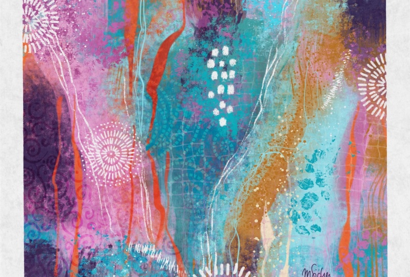
8. Let's Paint! Getting Started: All right, I've switched over to the bright abstract palette. I'm going to clear my history and I need to think about
which one I want to do. I think I'm going to use this very first
palette right here. If you're having a
bit of fear about this big blank canvas that
is very understandable. And let's just get some marks
down and go from there. Let's, let's see, let's
choose something. How about the Posca marker? And I'm going to choose
a nice dark color here. So some techniques
would just simply be, let's see, I'm on a middle
layer, doesn't really matter. You can move things
around later. Simply be just making
some marks like that. Just get started. And something that I've
found is going to more paint brush like maybe
this squash brush, gouache, old brush. And marking off some quadrants doesn't have to be
straight up and down, but just get something down. It's going to be covered up. So it's okay. Gosh, it's so pretty I'm not sure I've
used this palette yet. All right, so get a couple
of marks on the page and then you should have experimented with
your brushes by now. You can decide if you want
to have a starting color. For example, if you prep your canvas by painting
the whole thing, a certain color, now would be a good time to start
with a starting color, maybe a dark color. But I can tell you that the wet I'm about to
show you is going to fill a lot of it's going to block that
background color anyways. So you might not need to
worry too much about it. I do like to know if I'm
starting light or starting dark. So you might want to pick
at least dark or light. Now I'm going to switch. I particularly love
this wide streak brush. I'm gonna switch to
a lighter color. And I'm on a pretty big size. I'm on the same layer. I have not planned this out. I've practiced a lot, but I've not planned this out
for this lesson right now. So this is all going to
be new to me as well. So I'm going to
get that color in a couple of places
on the canvas. I'm leaving some of
this little piece here, but it's probably going
to get covered up. And how about this dark teal? Maybe a pop of orange
here and there. I don't need orange and
all of those quadrants. One thing that is also fun
with this brush tap and hold the smudge brush is a
lightly smudging with it. This is probably
my favorite part. And you might cover up
one color completely. I've almost completely
covered the pink over here. I'm not going to
overwork this layer, but I am going to
go to a new layer and just keep layering. I'm going to go to that teal, but go nice and dark. I'm going to stick with this
brush that I'm on already. Just get some of this. This is such a forgiving
way to do art. I'm not trying to make
it sound like it's easy. I know that the true
abstract artists pour their hearts and
souls into this work. And it's Scott,
major challenges. Major challenges, challenges
mostly with conveying an emotion using proper colors so that it's pretty in the end. I'll all sorts of things. So my main goal with this
class is to show you some techniques for doing some
abstract art in procreate. I'm not a professional
abstract artist. If you're familiar with me, you know that I actually come
from a realism background. So this was actually
really, really, really challenging
for me and I have had so much fun and I
hope you do too. I'm going to keep
layering because this is really all
about layering. If you think of the layers as letting the paint dry before you paint on
top of it some more. That's a good way
to think about. Moving up to the next layer, when you want to stay
on the same layer, you can then smudge those colors together where you can't if you're separating your layers. And so those are things
to think about as you're deciding
on whether or not to switch to new layers, I'm gonna go back
down to this brick, really dark brick color. I'm on this thick paint. I think I might go up to
the old gouache brush. I'm going to kind of
reinforce my, my lines here. Just a little. I don't know if I
want to keep them super obvious and then
it go a little darker. Now, I'm going to press
a little instructor. I mean, lighter. Get a little bit more
streakiness there. I have a lot of dark, I have
a couple of bright spots, but I went to get some contrast. So I'm gonna get some
very light colors. I can choose a color and then bump it up
to light as well. I think I'm going to go to
this big heavy paint brush. I'm on a super light pink. Gets some paint
strokes down here. I can tap and hold that
brush to smudge with it to that kind of smudged those
paint strokes right out. So I'm going to undo that. We can take advantage of that ability that we
have in Procreate. Nothing wrong with that. You don't get some
brightness at here. You might find it surprising
where each brush can end up looking like once
you smudged some with it, it won't look anything like the original brush strokes
that you are getting. This is another reason to
do different layers is I can now go to the erase brush. And one of the reasons I made this toothpick scraper
so that I can, I can do some scraping of layers because that pink is on its own layer above the other
two layers that we did. I can scrape, it's
erasing, of course, in Procreate, I can tap and hold this smudge brush
and show you what smudging looks like
with that brush. You can do smudging and erasing. The comb, the fan brush and
the comb brush also smudging. Here's the rough comb brush. When you smudge, if you want to smudge to expose some of the
color that's underneath, start from an area that doesn't have that
pink color on it. And you're dragging kind of no color into that pink color, if that makes sense,
You can do it. I think you can do it
from the outside now, the outside kinda just brings the pink smudges
the pink around. If you came out from
over here and go in, then you're going
to get that smudge through the paint more. I was pressing harder though. If you press lighter, it's nice and pale. You can have the
dark lines here. I can smudge Ds over. Hopefully you can see that
wherever the brush starts, that's the color
that's going to drag. Whereas with the eraser, it doesn't matter whatever
you're doing, it's erasing. That's pressing lightly
and then more firmly. I'm really enjoying this so far. I'm not too concerned
with how my pink is here and how smudgy and
messy I'm gonna make it look because I'm
pretty sure I'm gonna cover most of it anyways. I think I'm gonna keep
going into a new layer. Bring in some that teal again. Actually let's get some
pops of red in there. One of my favorite brushes is
this super wet paint brush. Switch to maybe this light
pink that we just did. You can see it smears together. Maybe all the way white. Beautiful brush. Love it. I'm not sure I loved this
stroke suggest made, but just to show you how
that brush can look, just wanted to show that to you. Now, I might do some
light streaks alone. This Let's try this blotchy paintbrush. I'm going to stay on this layer. That's going to make it seem
like my paint is still wet. And my new paint is going
to affect that layer, that those same everything
that's on that layer, right now only the
white is on that layer. I might merge those two
layers so that the pink and the dark maroon here and the white are
now all one layer. I'm gonna stay on
that layer now with my blotchy brush on
a bright orange. And it's going to
affect that layer will get a totally
different look than if we were on a new layer. I can tap two fingers to undo. If I'm not happy with that. I'm changing my pressure. As I paint with this. It's a really fantastic brush for making some
really cool looks. It does pull up color. One thing I've been
attempting to do is kind of do things in
at least three areas to tie things together. I think it's time to check out one of our
pattern brushes. I think I'm gonna choose this super messy
abstract splatter brush. But I'm tempted actually to use this square Warp brush as well. Got this kind of grid look here. Let's do that. I'm going to do this square and I'm going to
go to a new layer, but I might rearrange the
order of that layer later. I think I want it to be dark. So I'm going to go to that
teal and maybe go even darker. Let's see what size. Well, if that's really small, bigger size, that's a
good size like that. This pain some here and there. Then I think I'm actually
going to warp this. Let's do it with
the Liquify tool. So if you go to the little magic one adjustments menu
and go to liquefy, I'm on push, momentum and distortion or low
pressures, high. Then size is this
kind of medium. And then I can distort
this grid brush even more. The other thing I want to
do is erase some of it. I'm gonna go to the
eraser and I'm gonna look at some of my
grungy or brushes. Definitely play with
the smudging and the erasing with this
grunge Canvas smear. This is very pressure
sensitive as well. If you can see here what
it did was it erased some texture that's
like a Canvas texture. I might go over a lot of
that actually and start removing some of that
very solid line grid. My major grunge brush
is pretty major. It might erase a
little bit too much. Definitely make sure you've
tested out these brushes so that you know that
crazy messy bold is, is actually not super bold. It's more bold than a
different brush that's similar to this from
a different class. So it kind of gave
it a similar name. I'm going to tap and
erase some of that grid. Maybe my waxy crumble brush, just make sure my edges of that grid brush are
where I want them to be. Some kind of making sure I
don't have any hard edges. Basically. I don't care if it goes off the edge
in a very solidly. But like these ends, I might want to fade them out a little bit more like that. Totally up to you. This one coming over my white, I think I might just erase
a little bit of that. This is intended to look
like it's blending in, maybe in the background, maybe you used a stencil. All of these pattern brushes, you can pretend you're using
them as stencils as well. So I'm going to stop here and pick this back up
in the next video. And I'll show you exactly
what I mean by using these pattern
brushes as stencils. But first I want to rearrange the layer of this and
see if I like it better. That one hid under
the pink over here. I think I like it
better up here on top. And then of course,
you can play with blend modes as well. Which will be super fan
depending on the color choices. That add blend mode. Lightened it. Very cold. Look. Definitely experiment. All right, I'll see you
in the next lesson.
9. A Closer Look at "Stencil" Patterns: I'm gonna go ahead and group
all views, layers like this. I can turn them off really quick and I'm just going to
go to a new layer and I'm going to show you
what I mean by using the pattern brushes as stencils. So if you're not familiar with using stencils for an
abstract painting, I'm just going to show you with this very circular
line bubble brush. Right now. You might have a piece of
plastic that has shapes on it. And he would lay it down on your work and he would
paint on top of it. And then he would
peel that plastic up. And all the areas of paint would be around where
the plastic lists. You can use the brush just like this and use the brush itself. Or you can use it in a way
that gives that stencil look. Paint your brush
down just like this, and then turn it off. Then tap the layer
and tap Select. You can't see it
very well because the lines for my mask
visibility or low, you can go to the wrench
tool and go to prefs. And down here, selection
mask visibility. You raise it up. You can see now
that all the areas around this mask is
able to be blocked off. Now I can paint right on. So here's there's
two things I can do. I can paint right on where my, my brush strokes are already
laid down on the paper. But on a new layer. For example, pick a paintbrush. Let's see you are
a spongy brush. How about this
sponge paintbrush? And just expunge paint. You can switch colors and you
can spend paint, de-select. And there you have your sponge
painted stencil pattern. Or you can tap, select, Invert. And now your selection
is the shape itself. And you can paint around it. That would be more like
using it as a stencil. So this is my stencil. I've laid it down on my canvas. Now I'm going to a new layer and I'm using my
spongy paint again. And I'm sponge painting. So much fun. I actually had a hard time recording
this class because I had too much fun playing
and making brushes. Now de-select. And then it's like you've
peeled up your stencil. And the sponge painting that you just did is the only
thing that's showing. Now if you had something like this and it was on top
of other painting, it would give a much
more dramatic look. Love it, love, love, love. Alright, so that's
what I mean by using those pattern brushes
like stencils. We have two different looks
here we can do when we're, we've used the pattern itself. But instead of just
making a solid pattern and then removing parts of it like we did with
this grid pattern. We've made the solid pattern, turned it off and
just added however much color and blackness and opacity and
everything that we want. You could fill the whole page and then turn the layer off. And I mean, really the endless possibilities
with these pattern brushes. If you, if you're used
to taking my classes, you'll know that I gave
away a lot of brushes. I have a lot of pattern
brushes out there. So if these particular brushes
aren't speaking to you, definitely go find some
pattern brushes that you love and use this technique. All right, let's keep
going in the next lesson.
10. Finishing The Base Layers: I was going to erase what I did in the stencil
lesson before this, but I really like it. So I'm going to go
ahead and just move this around a little bit because we can do
whenever we want, since it's on its own layer, we could rotate it even. Let's see, do I want to move? Let's go ahead and
open our group and we can move it into her group, maybe move it down a layer. No, I like it up the layer. Whoops. I think I like it over here. No, I like it over here. This class is gonna be so long. So many decisions to make. Try not to get bogged down
with all these decisions. Alright, let's see
what about this other one that we made? I also like that one. I might just use a
little bit of that one. Yes, I like that.
I like that a lot. All right. I'm gonna go ahead and
merge those two layers. So I'm going to drag
that into our group. Whoops, I just made another
little subgroup out of it. Drag that in her group and
merge those two layers. And now I can do some erasing just all at
once here. I'm on. Sometimes I'm not too
fussy about what brush I use to erase them on
this waxy crumble brush. And I'm just gonna get
some edges he raised, make sure it's placed where
I want it to be placed. I'm okay with it overlapping this dark line and
the white lines a little bit, but not a ton. I still don't know if these are going to end up showing
up at the very end. But I really like
where it is right now, even this grid in
the background, I know it changed
the color blend mode here and it made it lighter. I like it later. So you can either
change it by changing a blend mode or you
can just go to normal and alpha locket either by tapping and tapping
Alpha lock or you can two fingers swipe to the right to Alpha lock and
reality lock something. Then once you do that, you can fill the
layer so you can, Let's see if I want
a light color. I'm just going to go to white. I can tap Fill. Or let's go to, let's undo that so you
can see what other, what other thing you can
do once it's alpha locked. I can go to here, I'm on my sponge brush. I can sponge on some color, and the color is only
going to go where the pixels are already on the layer because
it's alpha locked. This is a nice way to just
get a bit more variety here. So instead of just making
the whole thing white, now I still have
some of the dark, but now I have some
white as well. That's just went option. Actually think I like this
part over here to be darker. Actually, I think I'm
going to erase that part. It gets a little too busy
over here with the circles. Everything else I like. I'm feeling like these two areas are looking good and this
is a little bit plane. This is a small area, so I'm okay with it being
like a little bit plane. But I want to keep going. And I just keep
going until I feel like I'm ready to stop. You don't need to go back and
erase layers if you decide, well, there's way
too much orange. You can just add more on top. So don't be afraid to just keep layering and layering
and layering. By this point, I can
probably safely merge if you're looking at not
having enough layers, you can merge some of
the earlier layers. I can delete this stencil
layer that we used. That one's alpha locked, but I don't need to
keep it alpha locked. I can still paint on that layer. There's a lot of ways
to manage your layers, but I'm gonna go to a fresh
layer on top of this. I'm just going to keep playing. I don't know what
I'm gonna do yet. Let's see. I think I want some more
of this grunge Canvas. Go to a light color because our, our canvas texture that we added on our Canvas
layers is the dark. If I go with a light color, I can get some cool. Oops, I might need
to go with white. I can get some cool
grungy canvas texture on there in light,
a light color. Maybe in my darker areas. This, I definitely made
this brush so it's subtle. So you have to press, you have to press and smudge, and then you can blend it even. Awesome, I love it. The color does not
spread very far. So you can have DAB and smear. Dab and smear. I'm not sure you can
see that very well. A video, so I'm not gonna
keep going with that. This grunge major
grunge texture. I'm just gonna go
ahead and stay on this layer even though
I probably shouldn't. And I'm going to show
you something really fun with this brush
which is smudging. I'm just going to add
a bunch of light down here and then maybe some dark
to move that's too dark. How about this pink? Then I'm going to tap and hold the smudge brush and
smudge with that as well. I don't know. Maybe I'm just a texture Hound. I love this so much. Alright, so start
looking at contrast. Do you have some dark areas? Some light areas? Is it sort of all, kind of even? One way to test that is
to add a black layer. We can add a layer away on top, tap down here on
black and fill it. Then go to the blend mode
and go down to Color. When you add it. The blend mode on color, what you're going to see is your entire piece
in black and white. So you can really see if you have very much contrast
and I really don't. I mean, yes, my dark center lines that we started out
with this so dark or dark? Yes. The light is
very light in there. But all of our quadrants
are just kind of gray. That's good to know. We can keep that layer there
and just turn it off and start thinking
about some more contrast. I'm going to come back
down to the layer where we just did all of this. I think I might just go back
to this dark brick red, but I think I might
even do some black. Let's get some contrast. I'm going to get
some up here to some black and some smudging
with that same brush. And don't forget, we still
have mark-making to-do. I'm going to get this part
a little darker as well. And maybe some darkness
may bring my size down. Smudge that around a little. That's looking really
cool with this stencil. Look here. I'm going to bring
that darkness up, who I like that smudge
look going up there. I'm not sure. I like the orange
and black here. It's a little too
Halloween, Amy. I might come over with
some dark teal over here. Okay. I'm getting
a lot of texture. I have a lot of design
elements in the background. I need to have more marks. So it's time to think
about some mark-making. We can check our There's quite
a bit more contrast here. We have darkness here and here that made a big difference. There's a lot of light here, but I can add some
mark-making to change that and get some
more contrast here. You want to have areas
where your eye can rest, so don't have the whole
thing be too busy. This is unlike any
that I've done so far. So just experimenting along the way has been super helpful. I'm not enjoying this paint, blackness on top of
my streaks here. And I know they're
on the same layer. I'm gonna go to that layer
and I might add more streaks. I'm not sure I want to
keep them white though. Maybe. Let's do white and then that was the super wet paint brush. You can definitely do
a different brush. You don't have to
stick with that brush. Oops, I don't want to
turn with that brush. I have this texture over here is on a different layer and
it's on top of that. So I don't want that there. I can go find that layer. I can just smudge it similar and do something with that until
I'm happy with it. Alright, in the next lesson, I think we'll move
on to mark-making, but we might come back
and play with the base colors some more as well.
11. Start Making Your Marks: Let's go ahead and
add a layer to the top for mark-making lead. Say that we have some oil pastels and
some acrylic paints and posca pens and things that
we're adding to a dry Canvas. If you haven't played with
the posca pens before, they're pretty fun to play with. So hopefully you've done
some mark-making practice and played around with
all these brushes so that you get an idea
of what they can do. And of course, we
have to splatter paint everywhere as well. We'll do that as well. I did order these
brushes sort of in a bit of a sequential order, thinking about more painting
things going down first, going down to some more
mark-making brushes, and then also sort of crumbly dry wax resist looking
brushes as well. So the wax crumble
is a great one. If you want to get
a wax resist lick, you can simply erase
some of a layer with it. So let's see if I go to this layer that has
all this dark on it. I can tap and hold
so that that wax crumble is on that eraser. And then I can do some erasing. Go to a smaller size here. You can erase. And if you don't know
what rack wax resist is, it's when you draw
with wax paint, like a more of a
watercolor paint on top, then it doesn't absorb into the paper in the places where
your wax is on the paper. So the color is
added all around it, but not on the wax itself. And it's usually pretty
textured looking. Here's a great example of what a wax resist crayon
might look like. Part of abstract painting
is adding paint. Preventing paint like
with the rack wax resist, and also removing paint. And it's a perk of
Procreate to easily be able to remove paint by having
paint on different layers. And so you can think of this
as not only wax resist, but also of taking
some sort of tool. Tools can be anything around your house to scratch paint off, whether it's wet
paint or dry paint. You can use the all these
brushes as erasers in so many ways to pretend
that you're using tools. That's why I have
the comb brush. You can just pretend
your scratch and paint with a comb,
things like that. And of course, the
toothpick scraper. Alright, so let's go back
to the layer on top of all the others and
do some mark making. I know I want to do some
posca at the very end, but I really like
this fan brush. It's pretty bold though, so I'm going to press lightly. I'm varying the pressure. I am intentionally not making it super
straight and smooth. If you were holding your
paintbrush really loosely. That would be one way to
get nice organic strokes. Another thing that
this brush is fun for is making short little strokes. Showed you an example of this without showing
you how to do it. This just is not planning this. I've just having fun taking this across the
page does have fun. If you think it looks good, if it's drawing your eye
where you want it to dry. Just have fun. I loved that. I'm going to finish this. I think I dropped my size
here from this stroke here. So that brushes just, I don't know, I could
use that brush all day. It's similar to
Procreate native brush. Let's see which one is it a painting inking
this thylacine brush. So it's similar to this brush. Let's check our black layer. You can see with
contrast, I don't know, It's just way more exciting
to look at than it was when we first initially
added our black layer. Awesome. All right, I'm gonna
add a new layer for more marks just in case I
need to smudge or erase. And I don't want to mess with
the ones that I just did. I think I'm going to
switch to a dark color. I want to get some pops
of red on there too, but I think I'm not
ready for that. I think I'm going to switch to teal and maybe go down pretty dark and get the oil pastel. The oil pastel is, it's good for a very
typical mark-making. Where you take the whole
kind of blunt end of the pastel and make marks
like little dots and things have been a fill in
this circle right here. That's fun. Maybe a smaller size
for this other circle. That can address
our eye to that. Those circles little bit more. They were a little kind
of hiding over here. I don't know if I like that one. There we go. Another thing this particular brush is good
for is on a smaller size. Think about an oil pastel pencil and think about wedding
to have it as a pointy, sharper look and then
also a wider look. Play around with
your pencil making marks that kind of do that. Pressure, harder
pressure, lighter pressure to wobbly lines, wider lines with the
higher pressure. Not paying a lot of attention to how the lines looking exactly. Because if you do, you might actually make
it look too planned. By moving your
pencil around a lot. You're getting a much more
organic look that way. I might do that
same thing up here. I'm gonna go to a new
layer and I think I want white paint
for my splatter. My paint flat flicks. I made these so that
there aren't a lot of flicks each time you tap. And I did that so that you
have more control over where you want heavy amounts
of flicks versus not. If you just went a couple of little flicks of
paint over here, you can just tap a few times. If you want a lot. You can really just go crazy
adding a lot, a lot, a lot. You can drag the brush around
to have lines of paint. This is where I
start to wonder if I'm going a little overboard. This one might be going
a little overboard. I'm not sure. I think something needs to
happen right here. I'm gonna go back down to the dark layer and
see if I can get some pops of red
with oil pastel. Let's see. Not sure how well it's
going to show up. It doesn't show up
too well there. She does a pretty good there. Do some circles. I'm pressing really lightly. I tend to be drawn two circles. I have, I don't know
if you've noticed. I know I did an example of some really abstract
scratchy lines earlier. But I really, I tend
to have a hard time knowing what makes a good
abstract mark when it's, I don't want to say
the word scribbly. But when it's not shape, like not a circle shape
or a wavy line shape. And what I mean by that is if I turn this off and
go to a new layer, one of the dip pen, that's a good example here. If I use black on the dip pen. This one, if you
start with a lot of pressure and then lighten up, it gets really thin, which is kind of
what a dependence. So there's a lot of
mark-making in abstract paint. Painting. That's a lot of
not shape shapes. I can't even make them. I feel like that's something
that I don't know how to do. I love the look of it. I mean, they go back to the Pinterest board and show
you what I'm talking about. I mean, there's a
million examples. Here's one, here's a
fairly simple example which is just this over here. I'm not very good at
figuring out how to do that. How to just make marks like
this that aren't shapes. I don't know if I'm
explaining that well. I'm not a very good person
to try to teach that. I encourage you to experiment with mark-making in
that way as well, not just circles and dots and
lines and things like that. Hopefully, you'll be posting
some class projects that will maybe some comments in your class projects that tell
me how you figured it out. How did you figure out how
to make those types of marks look awesome like
this looks awesome. I can definitely do these
longer drawn out marks. But these smaller marks in
here, scratching paint off. These sort of just seemingly random even though
I know they're not random. Marks. I can't help you there. Have fun, have fun. Got some red circles. Let's check our black here. That red did not, it did not help
with our contrast. Can you see that it
just blend in, right? And you can see that it doesn't, it stands out because it's red, but it really doesn't pop. Interesting. But our dark lines and our dark dots and
our white splatters, that really added
a lot of contrast. As you can see, you can really
just go on and on and on. I'm gonna go ahead and show you some more examples
in the next lesson. I'll see you there.
12. Adding a Masking Tape Look: Ticket the masking tape. Look, if you have enough layers, I would well, actually it doesn't matter
if you have enough layers. If you do have enough layers, you can duplicate
this whole group. I ended up grouping
everything here. You can duplicate
the whole group and keep your original
and just turn it off. And then we can
play with this set. If you don't have enough
layers to do that, you can just duplicate the
whole canvas right here. Then keep one as your full-page original and do what we're about to do
with your duplicate. And what we're about to do is shrink everything
in a little bit. I have my group that
was our originals. You can name it if you want. And I have R group, that is our duplicate. And I'm going to select
the whole group. And I'm just going to bring
it in and bring it in. Think about how big you
want your border to be. The only reason I'm
doing this first, even though my paint this isn't, this isn't how we
create that edge because this edge
is a super crisp, super crisp edge and that's not the type of edge you would
get if you used masking tape. But starting like this. So that I'm not painting
right over the top of my painting of my image with
the masking tape brush. Instead, I'm just going to have my masking tape brush overlap
the edge a little bit. Then I'm just painting
over a little bit. Let's go in and go to a
layer on top of everything. I can't quite tell if there's
something on that layer. So I'm just going to
go to a new layer and I'm going to go to white. If you had a colorful
canvas and you want that color to
be your border too. Because it technically it
would be if you've painted your whole canvas
and then if you started with a colored
paper or whatever, black or dark gray, and then he taped it down than when you peel the tape off, it would be the black or dark
gray showing right here. So for me it's white. So I'm just going to
stick with white. And I'm going to go down
to the masking tape brush. We did this in the
negative painting class. So you might be
familiar with this, although I'm gonna
do one more thing to make it even easier. Go to the wrench tool, go to Canvas, tap the Drawing
Guide to toggle that on. And then it automatically
goes to the 2D grid, which is what we want. Then we can tap the layer
and turn drawing assist on. And now we can only
paint straight lines. That's awesome. Alright, what size? I'm gonna make it approximately
the size that I need. And I can see I'm overlapping
quite a bit there. I'm going to undo and just
try to overlap a little bit. So what you can see right
away is we no longer have that super
crisp straight edge, which was basically a duplicate
of this outer edge here. I'm just going to
rotate my canvas. I don't really need to, but I kind of did a little
blurb bright there. That border wasn't quite as wide as this border over here. Make it a little lighter. I am pressing little
firmly with this brush. This brush is a little
bit see-through. If you don't press firmly. In turn the grid
off. There we go. So you can see it's like the
masking tape had been there. Little bit of pink bled
under the edge of it. And then when you peel it off, It's nice, rough edge. And that's it. Now you have some flexibility with that
because it's on its own layer. Your indefinitely making
sure that layer is under your Canvas textures so that the canvas texture is
still showing up here. I went to kind of bring
this out a little bit, even an EPA little
something like that. I just need to make
sure I still haven't exposed that crisp edge. Alright, good. You definitely want to
sign your work. For me. I like to use my stamp brush, not at that size, on a new layer so
I could turn it on and off whenever I went to. And that's it.
13. Minor Adjustments that Matter!: All right, here is a
very quick video to show you about some
changes that I can make. And I also forgot to
use the Posca pen. I actually forgot to
use quite a few of my favorite brushes
like the streaky inky. But I added some black
Posca here, here and here. I wanted to show you that
if there's certain colors, certain layers that you're just not quite happy with the color. You can go to the layer and change it with
hue, saturation, brightness, and have
better luck possibly. So I'm going to show
you how to do that with our layer that has
the stencil lean on it. As I was looking at it, I decided I'm gonna see how that looks darker and lighter. Let's go to that layer
and then just go to the adjustments
little Magic Wand, Hue, Saturation, Brightness. I'm going to zoom
in so you can see. And I'm going to turn down the brightness instantly
like this side, much better. When it's darker, I'm not sure I like it when it's lighter. That's about 38%.
Like that a lot. I don't think I want it more
saturated or less saturated. That went, I'll keep at 50%. Then that's good. I can commit to that
just by exiting. All right? If you're in hue
saturation brightness and you make a change and you
decide you don't like it. You can tap on the
screen and tap reset. If you make a change and you're trying to decide
between the two, tap on the screen. And you can tap this preview. And it toggles back and forth between what it was and what
the current setting is. And you can decide which
one you like best. Alright, so there's
hue, saturation, brightness, some Posca markers. And then I decided I wanted these super dark blue patches
to be a lighter color. I'm going to find those, that layer is right there. I'm just going to
alpha lock that layer. I'm on a different
palette. I may just tap, double-tap there for white. And you could use
multiple brushes. I'm just going to
go ahead and use the oil pastel brush that we use to for those. And because it's on Alpha lock, you can just color
right on top of it. And it will only color what's
currently on the page, which is also these
little red marks. So be careful not to accidentally
color something else. So I decided this needed less
brachii red colors in it. And I changed a lot of
it to this bright teal. Just to give it a little pop. Dismiss fiduciary
you that real quick. I'm not sure which I prefer. I did like those dark, but I really like the
bright colors as well. The possibilities are endless. Those are some of the
changes that I just wanted to show you
really quickly.
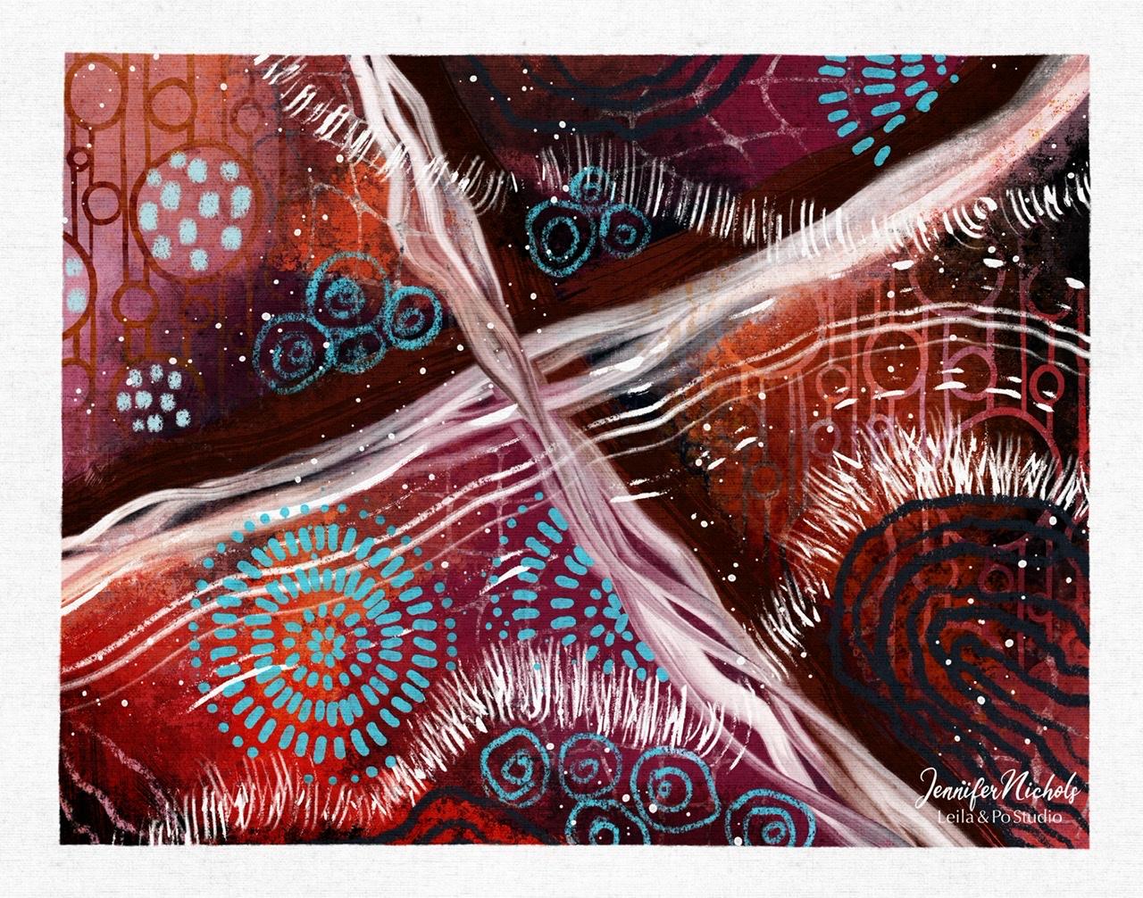
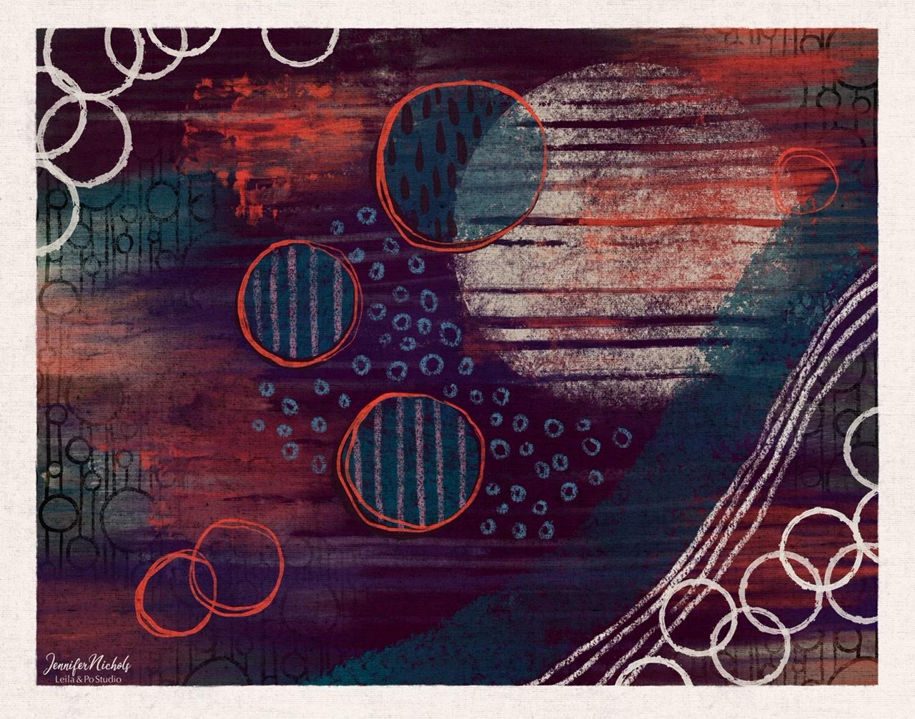
14. Examining Some Example Paintings: This is one of my favorites. I don't remember what
palette I started out with. I don't think it
was this palette, even though it looks like it. I started out with
these purples and this dark maroon being
brown and weird purple. And I ended up really
not liking it. I like Brown in a lot of things. I have a hard time using brown. So I tried to use brown and I ended up just
go into hue saturation, brightness and changing things so that they were
not brown anymore. And then I really started
to enjoy this painting. You can see I used
the pattern brush. This is a brush we didn't
use in the last lesson, which is just the
circle stamp brush. These are done. Oh, we didn't use these brushes, these wet ink, transparent and streaky inky. They're amazing. They're similar to brushes
I've given in the past, but also very different. So they're very
pressure sensitive. So this is just very
light pressure, but you can press harder
to get a thicker look. I believe this blotch of paint here was the messy,
wet old brush. Here I used oh my goodness. I can't remember what
texture brush I used. I used a texture brush and
doesn't made a full circle. I erased with the fan brush. I added some grunge with that grungy canvas brush and
just went crazy on that. I love how you can see-through. I think I erased with the canvas brush so
it wouldn't smear. Then it erased. You can see some of this red through here because
of the erasing. Here's that seem
painting but with the masking tape look
around it. Here's the land. I intentionally just
made too busy for me. You know, it's
experimenting with brushes, trying to be more playful. I knew right away it
wasn't going anywhere in my type of abstract preferences. That's a good way to phrase it. I just bailed on it and I
kept it to show you that, you know, you're
not gonna be happy with everything you do. Here's one where I just got started and I haven't
continued with it and I did it mostly
with these big, heavy and big light
paint brushes. I really like the Paint
Texture, paintbrush texture. It's kind of like a dry brush, not super saturated with paint. Here is an example
of starting out. The white streaky brush. The one we use,
wide street brush, starting out with colors that I will I thought it
was going okay. Got Maddie over here. I went ahead and added another
layer that was exciting, uh, basically covered at the entire first
layer, but not quite. Just keep going sometimes, sometimes, you know,
okay, that's not working. I need to start over. Added a third layer. And I really, really
like this right now. I did this without dividing
anything into quadrants. So I know that's how
we did our lesson, but it's not necessarily
how you have to start. That's just one way of
just getting started. Getting some lines on the page. This is one I really love. It is one that I started with. The quadrants. I enter that kind of covering up a lot of that instead of
keeping it in the forefront. I just loved this one. I'm not super happy
with this upper corner. I might come back to it. This is some of the
painting brushes up here. Thick paint or
super wet painting. Again, I mean,
there's so much with these brushes that I can't show you everything
that they can do. That's why I encourage
you to experiment and play and get to know
what your brushes can do. This one's definitely the
super wet paint brush handy. I can see I did some
mark-making done here. I did some of the DIP. What's it called? What I
call it the dip pen brush. Streaky lines in here. Oh, we didn't use much of
the old gouache brush, but the blue back here is
that old gouache brush. The very first brush,
gouache, old brush. A nice painterly look. This one was super fun. This is the old
gouache brush squash, old brush and some of
the stencil look here, send that they're
super wet painting. This is posca right here. The fan brush, of course. This is another one of
the pattern brushes. This splatter a look back here. This was one of my first ones. I loved dragging the
toothpick scraper through here and just
smearing that blue right out. This is all posca pen. These are the stream streaky, inky, more posca pen. You can see all this
texture in the background similar to what we
did on our lesson. In this one, I broke up this big dark blue patch
with the light blue dots. I broke up this big orange
area with my circle stamp. I dragged a comb through here. Here's some more backgrounds
that I played with, with some of the palettes
that I provided. Just getting started with those. This is when I was playing
with more recently. I feel like this one
might be too busy for me, but also surprisingly, I'm not super happy
with this palette. Maybe it's just really busy with this flattery stencil
brush. I'm not sure.
15. Thank You!: Thank you so much
for taking my class. I can't wait to see
what everybody makes. Feel free to head to my website, Layla and Poe Dot studio. You'll find some more lessons, links to my YouTube, free brushes, my newsletter,
sign-up newsletters. A great way to keep in
touch and keep up to date. I have some exciting stuff
that I'm announcing soon. And I also give away lots
of really awesome freebies. I promise I won't
fill your inbox only one or two
e-mails per month and I keep them short and sweet. See you next time.
 Jennifer Nichols, Artist & Teacher, Procreate