Transcripts
1. What's This Class About?: Hello, my name is
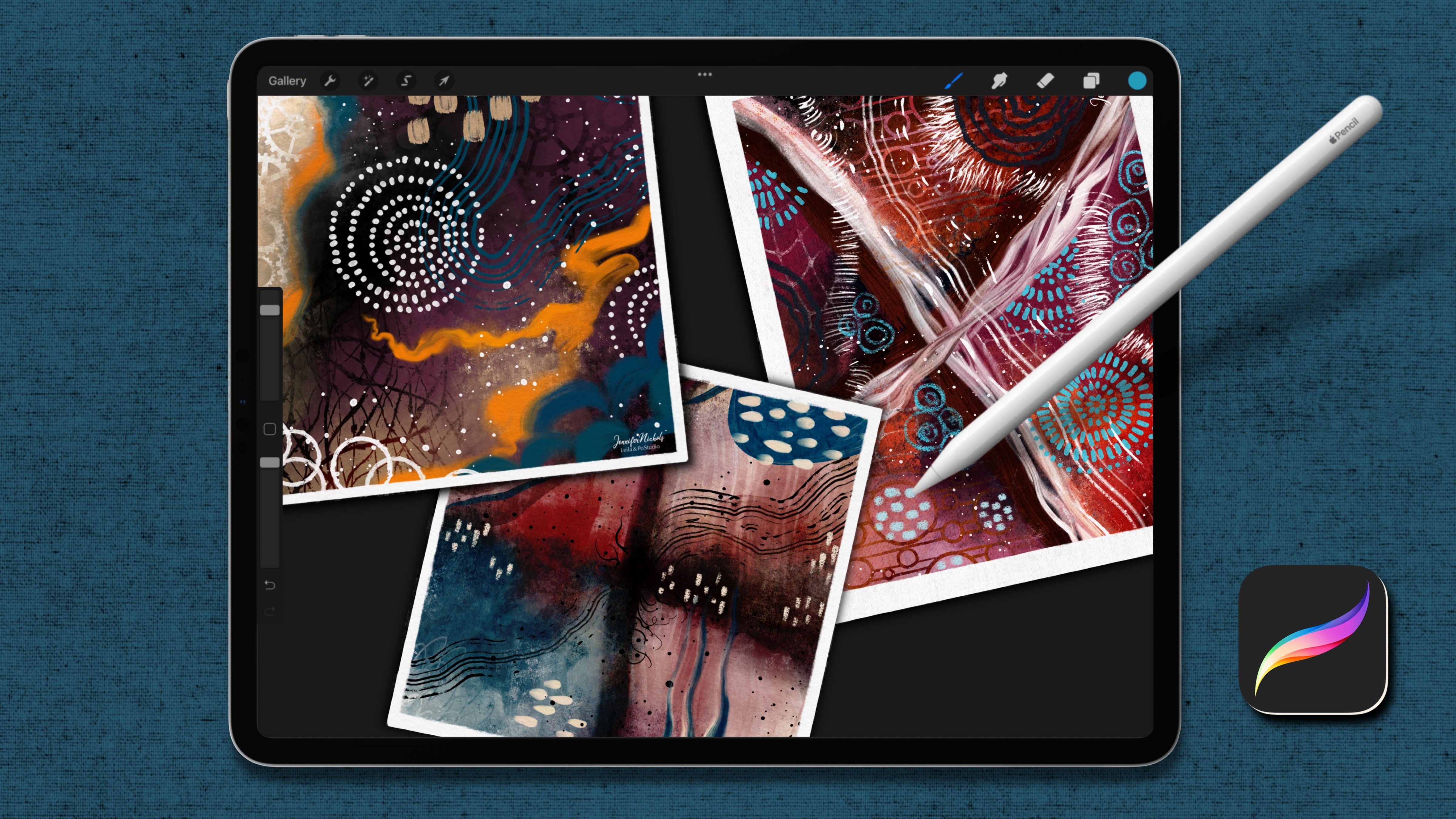
Jennifer Nichols. I'm an artist and teacher
and a fabric designer. I've been using Procreate
for a few years now. And I have about 40 classes on Skillshare, all on Procreate. One of my favorite
things to do in procreate is make brushes. I also love to make
repeat patterns, which actually helps
with making brushes and creating children's
book type illustrations with a less digital look. I absolute, if we love
creating brushes though and giving away those
brushes in my classes, so that each class can have
a different look and you don't have to buy any of the brushes in order
to achieve that look, not only is Procreate brush
making a really fun hobby, I think it's also a money saver. You won't have to
buy brushes anymore. Something that finally
got me interested in learning how to
make dual brushes in procreate is an image I saw
from robin davis studio. Her links are in the class description as well
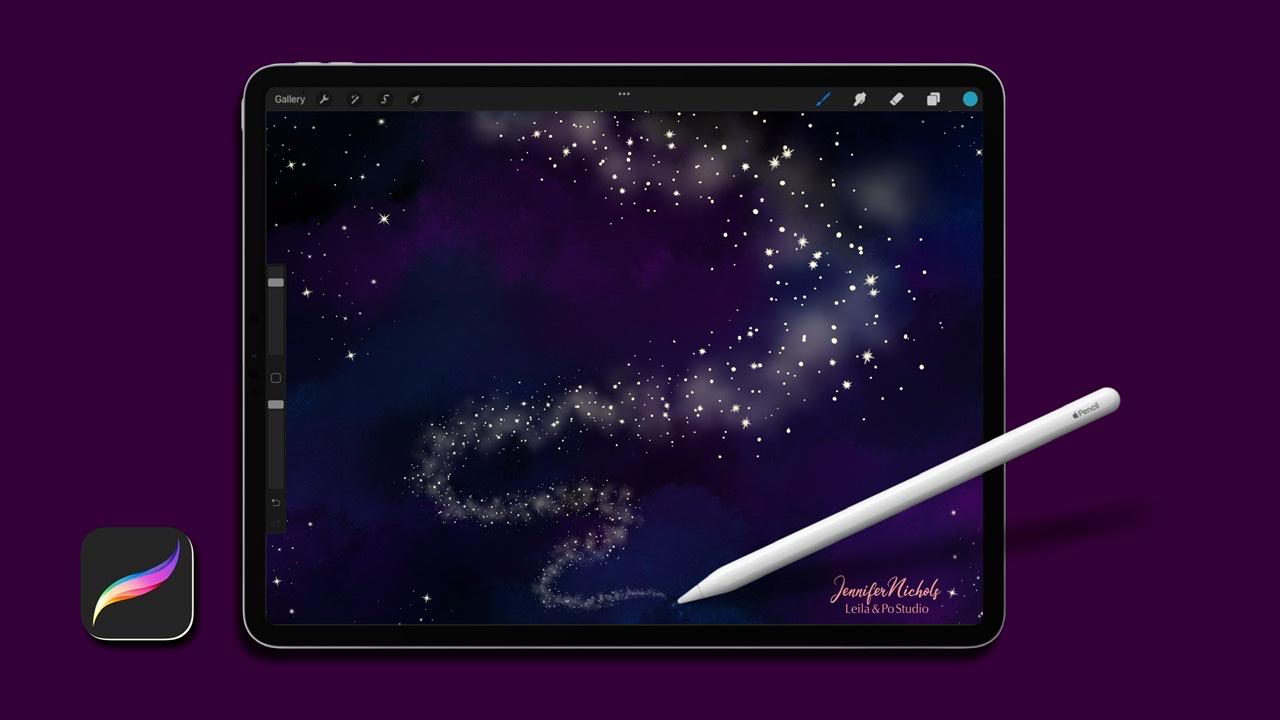
as the resources section. Definitely go check those out. A couple of her posts had a very sparkly wispy swoosh in them that lead your eye up
to the sky like moonlight. And I knew she didn't
use Procreate. So I thought, oh boy, I need to figure out how to make a brush that does
that in Procreate. And that's what got me started learning how to
make dual brushes. There's not a lot of
information out there. So I thought I would make this class and let
you know everything that I learned about making dual brushes so that you
might make some yourself. In this class, I'll show
you what adore brushes, but also we'll be using some procreate native
brushes to make a couple of different dual brushes and
learn about some of the experimenting that you can do and some of the settings
that are important. And then we're going to
custom make from scratch a dual brush that
will give us this magical, starry, wispy look. That was what inspired
all of us to begin with. I can't wait to show you.
2. Your Class Project: For your class project, I'd like you to
follow along in class making the brushes that
we make in class today. And then also make your own brushes and make it a little page like this to show us some of the looks
that you achieved combining your own
different ideas for different brushes and post it in the class project section so we can all see what
everybody makes. To create a class project. Go to the Projects and Resources tab and tap on class project. This first button is for the cover image only and it
will crop to a rectangle, so just don't even
worry about it. And then down here,
this image button, ad's images to the main
body of the class project. And you can add as
many as you want. And there'll be full-size. I can't wait to
see what you make.
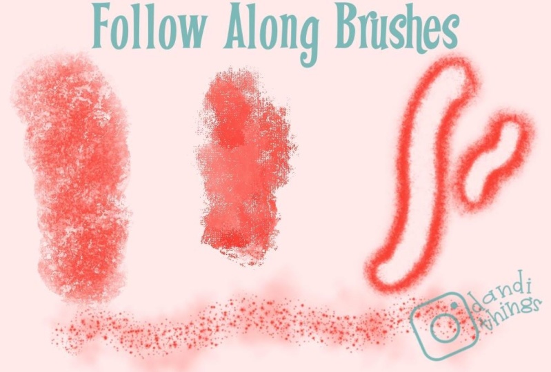
3. Dual Brushes and Prepping to Create One!: What's a dual brush? Door brushes are where two brushes are combined
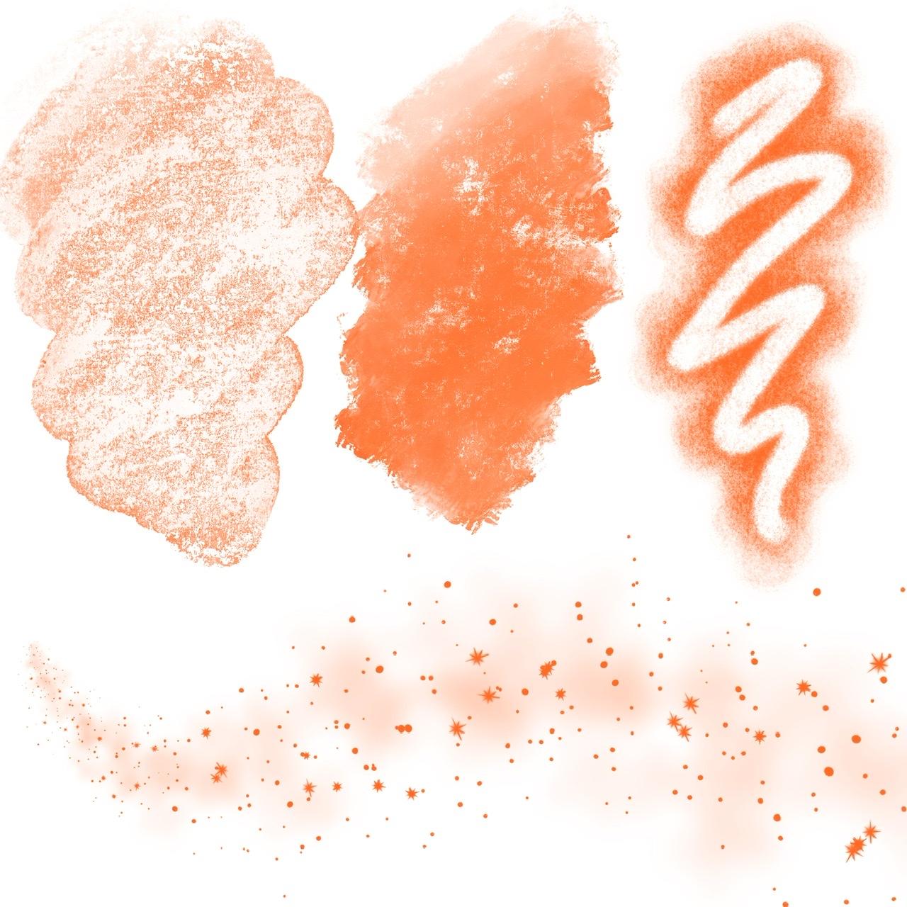
into one brush. Here's some examples of some
dual brushes that I made. And where you can see
it the easiest is this brush right here with the very creamy background
and the stars on top. Then some of them
aren't as obvious. This one right
here has this band through the middle
with all the stars. And these have these cloudy, faint, cloudy backgrounds
with the speckles on top. There's other types of dual brushes that
come with procreate. So if you go down into the native brushes and just
go to the artistic section, for example, you can tap on a brush and tap again to
open the brush studio. And anything that has two brushes listed right
here is a dual brush. Dual brushes can't be
combined with other brushes. So we do need to watch for that. But you can see if you play
around with this brush, you can see some
speckled textures that are probably
from this brush. And then if I press harder, I can see this much
more bold texture that's probably from this brush. And then you can
change the settings in different ways to get
different effects. And there's not a lot of
information about how to try to achieve a specific effect that
you're looking for. So a lot of it is
experimentation. I'm going to show you how
to start playing around in which settings I use
to experiment with. And then I'm going to
show you exactly how to make some of those
sparkly type of brushes. The first thing we're gonna
do is go ahead and open a ten inch by ten inch canvas. So tap the plus sign
and the plus sign again and go to inches. And width is ten inches, height is ten inches in dpi 300. And that's just the
size that I use for making brush sources. And we're gonna be
doing some of that. So we'll get started with that size canvas and tap Create. One of the things that you
have to do to mix brushes and combine them is have them
in the same brush set. So let's go to the top and pull down until you
can see that plus sign. Sometimes it doesn't
want to show up, tap the plus sign and that
starts a new brush category. And we can call that dual brushes or whatever
you want to return. And now we have an
empty set right here. And for this lesson, we're just going to pull
some native brushes into that category. So let's go to sketching
and grab the artist crayon. Any native brush is, you're able to just
pull it out like this. It looks like you're
pulling it right out and getting it
out of that category, but it is going to
still be there. Tap the dual and
drop that right in. Let me show you if you go
back down to sketching, Artist Crayon is still there. I don't know why
they make it look like you're taking
it out of there. You cannot remove native
brushes from their categories. What it does when it looks
like you're removing it is just removing a duplicate. So it saves you the step of
having to duplicate first. Alright, let's go into
the painting section. I think in most of these are, oh, we forgot to
check artists crayon. I already knew that it was
not already a do dual brush, but tap on when and look over here and if you see
two brushes up here, then you can't use that to
create another dual brushes. So we wouldn't want to take that and put it in
our dual category. Let's go ahead. I think most of these
are single brushes because they're older brushes. The dual brushes have only
been around for a short time. So there are some of
the crazier brushes like in the artistic section. A lot of these, I think
Laura Puna is good. It's a single brush
so we can grab Laura Puna to bring it
up to dual, drop it in. This is just from experimenting. You can definitely spend hours experimenting and finding
other brushes to play with. I'm just trying to
get a range here. Go to the charcoals section
and grab one of these. I'll just grab vine. Go back up, tap dual
and drop that in. If you're grabbing from some other brushes
that you've imported, you do need to duplicate
before you pull them out. If you are grabbing multiple
brushes from one category, Let's go to painting,
for example. And grab, gosh, Let's grab a streaky brush and
crazy fresco brush. So you can swipe to
the right to grab multiple brushes and then
drag them out like this. Tap dual and drop them right in. All right, so now we
have a category where we have some brushes that we
want to play around with. We can double-check and
make sure that none of them are dual brushes already. I didn't check that
ahead of time. In the next lesson,
I'll show you how to experiment playing around with making dual brushes with pre-existing brushes.
4. Let's Make One!: Now we have just a variety of
brushes to experiment with. This really can be anything
you want it to be. So go through and just if
something looks curious to you, just start grab it, put it in here so you can
play around with it later. And we're just going
to play actually with a couple of these. But one of the things you can do is to start looking at brushes. Go to a brush category like the artistic section and find a brush that's
a dual brush. Actually look at multiple
brushes and just start looking at their settings and what
their brushes look like. And to try to get a feel for
how they got a certain look. For example, this one has this very brushy looking brush and this very textured
looking brush. And if you look at it
closely, you can see both. You can see that
texture in here and that brush stroke being the
dominant shape going on. And we're gonna go ahead
and combine a couple of brushes and just play
around with those as well. So the first brush you
choose is going to be the primary brush
that's going to be on top. And then you can swipe to
the right on a second brush. That's going to be
your secondary brush. You'll want to experiment
with doing things in reverse. So I would recommend duplicating your brushes
first before you combine, suggest,
duplicate, duplicate. And now I have Artist
Crayon and Laura Puna. The little one shows that
it's a duplicate there. And once you have two
brushes selected, the combine option shows up
there so you can tap combine. It's going to keep the
name of the primary brush. Right now the look of that
brush as well is the same. But as soon as you close
this and open it again, you can see the combination. You can see Laura Puna is
teeny-tiny writing there. And that's because Artist Crayon actually gets really big. So let's go ahead and
make a little swatch over here of both of these brushes
in their original form. This one is almost like
you're taking a crayon and rubbing it on a paper
that's on a rough surface. And Laura Puna is
very in creamy. It's blending. If you just press lightly, you can tap and in a
lot of color with it or press firmly and get
a lot of color with it. But then you can lighten up again and just blend it around. Absolutely love this brush. Actually have a lot of versions
of this brush as well. Alright, so now let's look at the combined brush with
artist crayon on top. Oh wow, that's crazy. Alright, so we need to
make some changes to that brush that's doing something really
weird in the middle. That probably has
to do with some of the settings that Laura
Puna AS or something. I'm not sure. We can go into that brush. We might want to go
ahead and change the name if we think
we're gonna keep it. But you might not want
to take that step until you get to a brush
that you're pretty sure you're gonna keep tapping on it and just
going down to about this brush and tapping on the name appear is how you
would change that name. Your name here, a little
tiny sort of signature. I wouldn't do your
true signature there. Adding a photo that is
representative of you, maybe it's just a logo or just a simple name of
yours that's in edit JPEG, your camera roll,
and just add it here and then tap
Create reset point. And that's what really locks
in your name to your brush. The photo does. If you just changed this, this and this, someone can come in if they get their
hands on your brush, if you'd give it
away or sell it, they can change the
entire thing and change your name because you
haven't added your photo. So I have a lot of brushes
out there that are like that because that isn't very clear in the directions that are out there
for Procreate. So I sent a lot of brushes
into the world without having that locked into my
name, suggest know that. But let's go ahead and look at some settings that we can do. You can see here the
blue bar indicates the when you're
currently editing, you can tap on the other
when to switch to that. You don't have as many options. You don't have color dynamics
on the secondary brush. You don't have materials
and you don't have wet mix. I think that's all it's missing. One of the things I
know for sure is I want to bring them
closer to the same size. The other thing you
can change is if you tap on them a couple of times. You can bring up a blend mode. You can get a stripe over here. I don't know why
that one went away. And then look at Blend Modes, tap on this and just start
playing with them really. For now, I'm going
to leave it on normal so I can really see the two brushes and then we're gonna play with
that a little bit. So there's not a lot of
information out there about how these blend
modes work in brushes. But there is a section in the Procreate Handbook that talks about blend
modes in general, when you're applying
them to layers. If you go to procreate dot art and then you
go to the support tab. You can view the
handbook from there. And then you can go to
Layers and blend modes. Then you can read up all
about the blend modes right here and see
how they work. For me, I like to experiment. Let's go ahead and
just make a stripe. I'm going to bring
this size outlet. That stripe keeps going away. I'm going to bring the size of the artist crayon brush down
and the Laura Puna brush up. So let's go to properties. So we're on the artist crayon, and I'm just going to
bring the size down. Let's go to lacunae. Make another stripe. Look at properties again. And you can see that
the size is maxed. But if you put in
stroke path and you increase the spacing a tiny bit, I just went from 3% to 5%. Then when you come back
down to Properties, you now have more space
to increase the size. All right, We're getting closer. I'm going to go back to properties of the
artist's crayon. And bringing that artists
crayon down in size. I'm just kind of making
them similar in size. Now, I went to three fingers scrub to clear this and you
can also clear it right here. I'm going to choose a color. I'm gonna play with blend modes. Let's do that again
and that again. It seems to disappear
when I switch from one to another brush. Alright, let's play
with blend modes. That doesn't really give us much of an interesting look that I can see this Mirre
Laura Puna under there. So that's lighten. Difference, that
looks interesting. Let's try a difference. And what I want to
do is tap Done. Then come here and try it here. I still see a big
difference in their size. I want to go back
in and try to bring their size closer to one another by making an artist
crayon even smaller. Oh wow, that's pretty cool. Actually. Let me zoom in so
you can see that. I don't know if you can tell. It's almost like
rubbing a liquid on a bumpy surface and
smearing it around. That's actually pretty cool. Then when I go over the top
of it with another color, It's not taking off that blue. It's just adding on top. It's not removing from the layer under is
just adding more. That could be a fun one
to play around with. When you find some that you think you want to keep
and play around with, I would just go
ahead and rename it. You can say artist. You can say, I would
say gems, artist, CRAN. This is so creative by just
calling them what they are. Just kidding. The gems Artist
Crayon Laura Puna. I hate naming brushes, so then I at least
remember what that is. And if this image is too
big, That's the preview. You can go to Properties and
decrease the previous size. Tap Done. Now it's fitting in that window
a little bit better. And we have a pretty
cool combo dual brush. Now, I'm going to
duplicate that because I actually really
like this brush. I'm gonna play
around with it more so I'm going to duplicate it. And I'm going to take one of the duplicates and
show you a couple of more changes and
then also how to uncombined the brushes
if you change your mind. So if you tap on it again, one of the things that I liked to play around
with is rendering. So definitely have a look at the rendering modes for
each of the brushes. Will go into that a
little bit more when we make our star Desk brush. For now, I really like this
brush has a lot of potential. Although I like texture. So that's why if that's
too much texture for you, that looks like the
artist crayon texture. I'm on the artist crayon brush right now and I can go to Grain, and that's the texture
you can play with. I would actually play
with the brightness and contrast and watch what
happens over here. You can play around with
these things and try to adjust the texture
to your liking. That's pretty cool. You can actually
play around with pressure settings as well. We're gonna do that when we
make a brush from scratch. Finally, if you want
to uncombined a brush, you just tried all
these settings. You don't think it's
gonna work out. You just tap on it
and come over here, tap on them a couple of times. And it usually works to
tap on the bottom one. You can tap and combine. And combine. And there they are. Now they are not in their original form
that they were when you combine them because
you made changes to them. You might want to just
delete them at that point. Now I have the one we made and we still have
these two that we duplicated so that we still have those to play with
for a future brush.
5. Now Let's Make Its Opposite!: We've combined the artist
crayon and Laura Puna with Laura artist crayon on top and Laura
Puna on the bottom. So primary and secondary, Let's see what happens
when we reverse that. We have Laura Puna right here and an artist
crayon right here. I'm gonna go ahead and make
a duplicate of each one. This one is a duplicate, but it looks like
it's been altered, so I'm not going to use
that one. This time. I'm going to put
Laura Puna on top, swipe on artist cram second as the secondary
one and combine. All right, let's see
what we have here. Wow, that's a completely
different look. That's light pressure
and heavier pressure. It's behaving more
like the Laura Puna, but with the artist crayon
texture in the background. Let's do a few
little edits here. Here is what we have. Let's play with blend
modes. On multiply. Color Burn looks interesting. Let's see what normal does. I think Laura Puna has some
settings that make it give this kind of crazy look that
we saw at the beginning of the last brush
combination as well. That's interesting. Let's see. I'm going to go
back to color burn. That is great. Look at this. We're getting more of the
creaminess that Laura Puna has. Still with that
really awesome grain of the artist crayon. Let's see how it blends
smudges, I should say. One thing I'm
noticing is I can't fill in the green CDC
here, this grain. When I go over and
over and over it, I can't fill it in. I'm not sure where
that's coming from. Let's check the green source. This is set to texturize, so I'm less familiar with
the settings in this. But if it were on moving, you'd have this offset jitter. That would stop that
from happening. So that's interesting and I can't tell if it's coming from. Here's the offset jitter. I can't tell if
our green issue is coming from this one or not. Offset jitter being
on is what is supposed to prevent this so that you would be able
to fill it in if you like everything about the brush except for something like that. And you just can't
figure out how to change the settings to fix that. See how I can I can
go, go, go, go. And it doesn't matter. I can't fill in those pieces. Oh, it's filling in a tiny bit. One thing that you can do
is just rotate your canvas. If there's, if there's a
lot of texture that you really like and you just love how it
looks just like this, but you want to fill in
this one little spot, just rotate your canvas a little bit and fill it in like that. And that should be fine. I really like this brush. I really like both
of the brushes we've made with this combination. I might play around more with this settings, with
the rendering. So again, when we're
time, if we go in, some of the, the
rendering settings might be fun to change. And I think for this one, we're good on a lot of
these other settings because I think that the
grain is coming through. It's mostly Laura Puna. It's Laura Puna in size instead of that huge Artist Crayon size. And it's the artist crayon. Just the texture. It's almost like we're using Laura Puna on top of a clipping mask of an artist crayon texture
or something like that. It's this lovely combination. Alright. I think I
like this better than the other way we combined the artist's crayon on
top with the Laura Puna. They are completely
different looks though. Here's that other one. This one is still feels
like like an acid washed chemical liquid
on top of a surface. It's kinda cool. Um, it might not look
as cool and video, you'll have to make it and play with it and
see what I mean. All right. That's that I just
wanted to show you both ways to do this soap
now I need to find that one. I think it was this
one right here. Yeah. So let's go ahead
and change the name. That's Jens. Laura Puna, Artist Crayon. Then of course,
changing the photo, the name, signature and
tap Create reset point. And that will lock
it in the photo, will lock it in for sure. Light pressure,
heavier pressure. The Laura Puna. The Laura
Puna does this nice colorful. When you tap it adds
a lot of color, still not filling in some
of these grains though. So that's really interesting. I love texture, so
I really like this. If you like smoother looks, you could definitely go
into the grain sources, change the brightness
and contrast things like that to get a different
look to your grain. All right, enjoy experimenting.
6. Using a Single Brush to Make a Dual Brush!: Alright, I'm gonna combine the vine charcoal brush with
the vine charcoal brush. Let's duplicate that two times. So we have two duplicates and we can leave this one alone. It doesn't matter what
order we select them in. Just select two of
them and combine them. All right, tap on it to edit. And I'm going to make when
bigger and one smaller. So let's go ahead. This top one is
going to be bigger. So we go to Properties,
we make it bigger. And we go to the
next one and go to Properties and we
make it smaller. And you can see right there. Then we're going to tap
and get to the blend mode. And we're gonna go to subtract, and it subtracts this one right from the center of this one. But that's a textured brush. So it's still leaving
some texture in there. Let's tap Done and see
what that looks like. This is a really fun brush. And as long as you
keep your pencil down, when you overlap your path, it cuts right through it. Once you pick your pencil up. When you overlap, it doesn't
have that same effect, but you can probably erase, manually erase these
little overlap edges where you want them to be gone. That's a fun brush. I see it's thicker and thinner on the thicker side here and
the thinner side up there. So we can go back in and I think that might be
if we go to Shape. Yeah, let's turn on
rotation all the way up to follow stroke
for both brushes, shape all the way up
to follow stroke. Let's see if that helped. I think that helped. Now it's still thicker on one
side than the other side. Go in again. I'm trying to think about
what might fix that. There's usually an Apple
Pencil Tilt thing. Oh yeah. There we go. We can turn
tilt settings to 0. Did you see that
fixed it over there. See you that tap Done. Now. It's basically the same on
the left and the right. Even with my pencil
being tipped. That works. I wanted a little
fuzzier on the outside. I'm going to go back in. And on this top brush, Let's make a stroke. Lips. My didn't it work? There we go. Stroke
down the middle. Still a little
thicker and thinner. Maybe the pencil is needing
to be straight up and down. Maybe I need to turn that off. Let's check that one now. It's not working. We need
to do it to both Brushes. Both brushes. There we go. Now when I'm at an angle,
it doesn't matter. It's not going to do
that thick fin thing. But I want to go
back in and make this top brush like fuzzier
around the outer edges. So I'm going to make
some changes to that. So if I make a stroke
like this and go to Stroke path, I can jitter. So I can make the shape kind of go from side
to side a little bit. Like that. Spacing is probably okay. I can go to shape and I can
scatter it a little bit more. It's pretty scattered already. Yeah, I think that's
good. Tap Done. Now, we have this stroke with much more
fluff on the edges. If you don't want the faded
part at the beginning, you'd go back in and
go to Apple Pencil. Usually anything
that's got to do with the pressure is in this
Apple pencil setting, not all the things. And turn pressure to 0. And let's see, oh,
we got to do it to both brushes. Pressure to 0. Now, yes. The cool thing about
this brushes you can you can fill
in a whole space and it will keep the center cleared and put all that
flew for him edges. I don't know what
else to call that. You can do that with any brush. You can use that subtract
blend mode and erase the the secondary brush right out of the center of
the primary brush. That's pretty cool.
Hopefully you can see that texture
is still in there. I've seen this done with some calligraphy brushes and you get a cool outline brush. If you want to keep that brush, then you go in and do all
your things here as well. Once you've been playing
around for awhile, definitely go back in. It helps to look at the start. And then also after
you've experimented, to go back in and look at other brushes that
are dual brushes. Look at the settings. This wildlife brush,
this is kind of a crazy brush with
this pressure. It gets this thinner and it has this texture that's got
this canvas texture on it. Go into the settings and see what's the blend
mode on that brush. Oh, it's subtract,
which is unexpected. I used subtract
to subtract right out from the primary brush. But you still have primary
brush showing on this one. So I don't know
how they do that. You can go through look at rendering this secondary
brushes on intense. And the primary brush
is on uniform glaze. You can probably play around. That's pretty cool. Play around with these and
get different looks entirely. Now I didn't duplicate that
brush before I played, so I'm going to want
to duplicate it now. This is now going
to be the one that I consider myself to have adjusted and this one
I can always reset. So I can just swipe and reset
any Procreate native brush. It'll let you do whatever
you went to a duplicate. So if you tap on it, you can now combine because
it's a duplicate. Next step, we're going to make our own brush from scratch.
7. Making a Brush from Scratch: Brush 1: As I said in the intro, the image that really
inspired me to try to figure out dual brushes with this image at this and one
more that was posted around the same time from
robin davis studios. And I knew that she sets up these miniature scenes
and photographs them. And then she adds effects. After that. I know she doesn't
use Procreate. And so I know that this
wasn't a Procreate brush. And I was thinking, oh no, now I can't ask her where
she got that brush. I'm going to need to make one. I want to show you really
close up what I'm seeing. I'm seeing this faint cloud. Look, it's Blache and it's scattered and it's
not just a stripe. I That's one thing I know
I can make that brush. And then what I'm seeing for this Sparkles is
the second brush. What I see in those is a
lot of little tiny dots. So that's primarily what that second brushes
is, little tiny dots. Then there's a random
star that's this shape, and a random star
that's that shape. What do we need to do is we
need to make a cloudy brush. We need to make
that sparkly brush. And we also need to
make them so they go thin to thick to thin. So that's gonna be some
pressure settings. All right, So we're
gonna make brushes from scratch to make
that type of brush. And to do that, That's why we made a
10-inch Canvas and we need to use black on white. You can also use white on black. So I'm gonna go to inking
and go to dry ink. Go to black. Just add a couple of layers because
that's how I do things. We're gonna make a shape
source in all brushes. If you tap on it, you have shaped source
in grain source. And those are the primary
shapes that you can control for how that
brush is going to look. We're not worrying about
grain source in this, either of these brushes. I have a whole class on texture brushes where we
focus on grain source. I have a whole class on
shape stamp brushes, where we focus on shape source. Then I also have a class
on pattern brushes, which is also mostly
shaped source, but it's repeat patterns
and making cool designs. Definitely check out
those classes if you want to learn more details. And then my boost your
brush making skills class really goes into details
on all of the settings. We're not going to go into
all those sorts of details. I'm just going to
kind of talk you through this particular brush. You'll definitely
still learn a lot. For Dry Ink. I'm gonna make my shape source. That shape source. We're going to start
with the sparkly brush. It's going to have a lot of the little dots and
a few of the stars. If you go to illuminance, you have a flare brush here. You have a glitter brush here. Actually, I used this to, I went to the maximum size
and I tapped really hard. That doesn't seem black. I think that has a
colored change to it. I tapped really hard
and I just grabbed one, the blackest one. And I did cut and paste. And now it's on his own layer
and it can clear the rest. That's one way you can upscale. Can upscale that a tiny bit. Maybe turn it out
a little angle. Alright. There's other
brushes that you can use to make your designs. And I am just going to use the dry ink because I think that also hand-drawn starters
and shapes has a nice term. So that's what I'm gonna do. I'm gonna go ahead
and clear that. And I'm going to go ahead and
start on a bit of a star. And to do this, I do want some of
that blurred look. I'm going to do another one on another layer or I can just
duplicate this one too. And I'm going to blur when suddenly an attempt
the magic wand and go to Gaussian
blur and blur. I need more blur than that. I'm gonna go to another
layer and I am going to put a little center
spot there and blur that. I like that. All right. I think I'm gonna go ahead and combine those
three and those are one star now, that's a star. And then I can just keep going with some of
my smaller ones. Kind of a variety and I'm
gonna fill kind of a circle. I'm not filling
the whole square, but I'm also not making
a circle shape either. That's it. So we're just kinda making adjustments to this. That's gonna be when stamp. It might be even to many
of the little dots, but we can come
back and adjust it. So part of the nice
thing about making your own shapes source
is you can edit that and change it in your brush later at
any point in time. I'm gonna go ahead
and three finger swipe down and copy all. Now I have that copied. I can turn that off, go to a new layer
to test it later, and then we'll go from there. Let's go back to
our dual brushes. And we're going to
add a brand new brush with this plus
sign right here. We're going to go to
Shape Source here, tap, Edit, Import and paste. You need it to be black
on the background. So as you can see,
I just tapped once, which got rid of that
menu and then you need to two-finger tap to
invert and tap Done. Now your shape source
is your little design. Now all a brush is, is a whole bunch of shapes. Sources lie in that
really close together. We don't want them lined
up that close together. So we're going to go ahead to the Stroke Path and bump
up the spacing a lot. I am also going to go to
the drawing pad and bump up the preview size so
we can see this better. I don't want those. Those are like do, do, do, do, do, do, do site, and they're all
perfectly in line. I don't want them
perfectly in line. So we're gonna go
to the Shape Source and we're going to
scatter the shape, which just means it's going
to be scattered in this way, not all over the board itself. Watch what happens over here. So each one is scattered
in a different position. I am going to put rotation
all the way up to following, which means if you had a
stripy brush, it would follow. Those stripes would follow like, like you were painting
with a brush. Follow this stroke. Count is how many stamps are going to stamp
every time you, your pencil once to stamp one of these source shape sources. If when is enough, then just keep it at one. Play around with
going up to two, you can three fingers
scrub on this as well. Going up to two is kind of cool. I still think now I have, I think we have scattered
turned up too high. We have a lot of swirly looking things
going on right now, but we have some more changes to make we're doing okay Still, you could randomize, which means it's
going to be flipping it here and there each time
it's putting a stamp on. Then you can also go back to stroke path and
bump the jitter up. What the jitter is going to
do is along your stroke path. It is going to make them
go a little bit over here, a little bit over there,
a little bit over here. And if you want them
a lot over here, a lot over there, then you
turn it up even higher. So let's bump that up. You can see him
start to scatter. Might be a little too much. This is all totally up to you, but I just want
them to bounce it around a little
bit on both sides. Alright, so I have my, I'm going to say 50% for spacing and twenty-five
percent for Jitter. We don't need taper. We did shape with the
grain is going to default to the blank,
which is fine. Rendering we're
going to play with after we turn it
into a dual brush. Can you see how it's
faded at the start? Your stroke? That is going to be played
around with, in Apple Pencil. Sometimes it's flow
right here in rendering, but our flow is on max. If we jump all the way
down to Apple Pencil and change the opacity so that the pressure is not affected. I mean, the opacity is not affected by the Apple
Pencil pressure. You can turn it all the
way down and then there's no change in opacity
as you press. If you want there to be a
change in opacity as you press, then you can adjust that. And then the flow is also sort
of affecting that as well. It's kind of hard to explain. It's where you get a lot of experimenting that
needs to happen. Use do an example with
light to heavy pressure. Even though you can't
see a difference at this moment when you're adjusting
your pressure settings. If you have an example
over here where you actually used a variety of
pressure in that stroke, then you can see exactly
what it's gonna do. If I turn flow up. You can see that it is
faded at the start. With light pressure. It is similar to opacity being faded at the
start with light pressure. And experiment is gonna be
how you really start to get a feel for what the true
difference is with these, with Flow, you can
go negative as well. Now it's fading off at the end. Alright, so for
right now we're just going to leave those. And let's come back
up here to dynamics. We have this really cool brush, but it is just kind of uniform. We can change the size
with the size will jitter, which means every
time shape source is put down on the page, it will be something random between small and a larger size. If you have the jitter being
a low number, then that the, the range of smaller to
larger is a smaller range. So they're not very
different from each other. If you go up bigger
than they are very different from each other because the range is bigger. So the smaller one is way smaller than the bigger
one is way bigger. We don't want that
quite drastic, but we will on the cloudy brush. All right, You can play with opacity changes for
the stamps as well. The other thing
that we're gonna do back in Apple Pencil is make the size change a
lot with pressure. We're going to do
that right here. Sometimes people think that
that's more with the taper. But this is where you really
see a big difference. Let's tap Done and
see where we're at. I see our overall size
is quite small tube, if you look over here, the stamp is showing
up really small. I'm going all the
way up to max and I'm going light pressure, heavier pressure,
light pressure. That's pretty small. But it's doing what
we want it to do. Let's go make it bigger. So tap on it again. Go to Properties and look how
small our maximum size is. Let's play with that and
bump that up quite a bit. Small to big into, and I should say light pressure, heavy pressure to
light pressure. And I made a big change
in pressure right there. You might not want
such a drastic change. So that's where you
come back in to Apple Pencil and play
with this setting. One thing to watch out for
with this setting is you won't get a teeny tiny
size at the very start. If you're number isn't pretty
high at this right here. This part takes a
little practice. You have to start to swoosh before your
pencil touches the page. We're going to go back in
and go to stabilization. I didn't find a lot
of documentation on all of the differences
specifically in this area. But this has changed. It used to just be streamlined. If you do amount, let's, let's do a
stroke over here. The streamline helps you
have a less wobbly stroke, but it gets weird If any of these numbers
are really high. I think the pressure
streamline is going to help with having a less noticeable jump from these tinier sizes
to these bigger sizes. And just by accidentally being a lightening up your
pressure too quickly, it kind of smooths the
transition out a little bit. So let's do pressure up. So I've got this one on
14 and this one on 26. Just an experiment tap done. And let me see if
that helps at all. These brushes are way funner to look at with a dark background, but I think we're close. I think we're gonna be
good on that brush. In the next lesson, I'll show you the cloudy brush that goes with it and
we'll combine them.
8. Making a Brush from Scratch: Brush 2: Alright, so we're going to
add in brand new brush. Tap Done, There's your
brush right there. I forgot to make the
shape source for it. We're gonna make a really
faint blotchy piece of cloud. So I'm just going to go to
the airbrush, soft brush. I'm on black still going to make an irregular shape that's sort of darker in the center
and fades as it goes out. Don't touch the
edges with anything. Sure, that looks good. I might want it a little
darker in the center, but we can come back to that three fingers swipe
down and copy all. Turn that layer off. And come over here to a brand new layer so we
can experiment with it. And I just realized that I
didn't show you something. Go to dual brush. Go to that brand new
brush, go to shape. And we're going to Edit,
Import, and paste. One thing, one tap to
get rid of that menu, two-finger tap to invert
that and tap Done. Let's tap down again. One thing I didn't show you with the star brush is if
you decide that there's too many of these
little tiny dots or you went another
one of these big dots. All you need to do
is come back to this layer, make your changes. Three fingers swipe down, copy all, and go back
into that brush. Go to shape and do your
paste it into there. Then save it and you'll be good. All right, so let's go back to our brush that we
just started making. We have a nice brush, so we're going to turn
into our cloud brush. Let's go to Stroke Path
and spread it out. Let's go to jitter there
and spread it out as well. I definitely went properties
and make it bigger. I want dynamics to make the size jitter much higher
than the other brush. So we have lots of variety. They're all lined
up in the same way. So I'm gonna go to
shape and I'm going to get them all rotating. Let's get a fresh
stroke over here. It's not working. All right, Well to have clear Let's see. That's good. I can need to have the count turned
up a little bit. And I need to go rendering. And I am going to put
it on light glaze. I can't tell maybe
heavy glaze and turn the flow way down so
they're very faint. I'm still not getting the look. I want, I do want to go to Apple Pencil and
decrease the opacity and increase the size so that I can change
the size with pressure. I went to go back
to stroke path. And I have these gaps
that I don't like. If I make a stroke like that, I think I might want to bring
them in closer together. Maybe increase the Jitter. It's getting there. I think I actually
need to go back down to dynamics and decrease the jitter for the size so that there's not
such a variety. All right, let's test that. I can't really get
it to go very small. So I'm going to tap on it again, go to Apple Pencil and bump that size up so that
the starting number, number, the starting size
can be much smaller. There's still these random gaps, but I think that's okay. I think I'm going to
stabilize this one as well, so I'm just going
to bump up pressure and amount. Tap done. Come on three fingers scrub. Three fingers swipe down. Pet, There we go. That works. We have it starting out
tiny, getting bigger. I like it. Let's go ahead and
combine these. But before we do,
let's name them. Let's go ahead. I'm just
gonna name cloudy, tap Done. And starry. Starry with one R. I don't remember. I'm going to duplicate them
before I combine them. Now I'm going to go
ahead and start with a story on top and
cloudy on the bottom. And combine. Let's clear this. Let's turn our
background dark and turn our brush to a light
blue or white or yellow. Let's see. Well, it's pretty good. I wanted to show you something. This is all I just discovered
this through experimenting. I knew that it wasn't
going to work to do stars first in clouds, second. I don't know why, but it gives this weird halo and it doesn't do it
when you reverse it. Let's leave one here
so we can compare it. And uncombined these. I even played with blend modes. One of the things that
I also definitely play with is the
rendering for each brush. But I swear he checked all the combos and
while not all of them, but I tried a lot of them, I couldn't figure it out. But if I did uncombined, I did the Cloud on top and the stars as the secondary
brush and combine. They work. See that? I don't know. Here's the difference. Hopefully you can
see it on cameras. Got this weird halo
rounded on this one. And not on this one. It's pixelated because
we're zoomed so close in, but that's just because
it's a raster image. Here's two side-by-side. This is obviously the effect
that we're looking for, but now the Cloud
is much stronger. Let's make a change to that. Let's go to Cloud which is already selected and rendering. Maybe change that
to light glaze. I liked. I'm going to leave
it on intense glaze, but turn down the flow. That's getting there though
it's a lighter Cloud. I think the cloud is still
wider than the stars. This is where you're just
going to start going in and adjusting the brushes. So I can go to the
heroine and go to Properties and
bump the size app. I can go to the Cloud one
and bump the flow down. Let's go ahead and oh, I cleared it yay. And try again. So that's great, that
stars are bigger, the Cloud is more faded. I personally think that
the bigger stars that we made for this brush
are a little too big. So what I would do is
I would go back in. I need to turn this
back to white. Go back into this selected. If you want to keep this
for some other reason, you can duplicate
it and turn one off and then make
adjustments to this one. I would decrease the
size of these two. And three fingers
swipe down, copy, all. Go back in just to
the combo brush. Go back into the
star brush here. And to shape source, you don't have to
uncombined and change it and paste that right in
depth, done, tap, Done. Let's go ahead and
turn that off. You would be wise to change
the name of your layers. I am not that wise. And go to a new layer that's turned on and try this again. That's really nice for what
I was thinking in my head. That's just a personal
preference than those stars aren't so bold. I think that there could be more of the stamps
for the star brush. So let's go back to that
and it were on shape. Maybe bump the
count up to three. Tap Done. Let's move this guy over. That's a little bit
more specially. Yes, so that is how you make your own stardust brush from scratch once
you're happy with it. And I mean, honestly,
let's face it, I'm not sure wherever truly happy once we really
start using something, we go, Oh, I'm going to tweak this and we're gonna tweak that. But here's where you
could name your brush. Pixie dust start us cosmic. Thus, subatomic particles. Dreamscape, if we're talking about pocket and
his little dream, that is the brush that
I was hoping to make. If you go to light, light to heavier
to lighter again, you can see it's pretty similar. Might need more cloudiness
back here, more blotches. But it's pretty similar to the brush that we
were inspired by, that I was inspired by. That is one way to make
a brush from scratch.
9. Recap!: Here we have the brushes
that we made in this class. The artist crayon is
the primary brush, Laura Puna as secondary. Laura Puna as primary artists
crammed as secondary. I think we changed the
blend modes for sure. This one is the
two vine brushes, one bigger than the other, and the subtract
blend mode to get that to erase from the center. And then of course, the brush
that we made from scratch. As you can see, it takes a lot of experimenting and plane. Remember to put your
brushes all in the same if brush set in order
to be able to combine, choose the primary brush
first and then swipe on the secondary brush second
before you can combine. If you have a combined
brush that you end up just thinking it's not going to work out and you
want to combine it, tap on the secondary
brush two times, tap on it again,
uncombined right there. Remember the blend
modes for the brushes are also access to that way. And that the blue bar on this side is the brush that
you're currently editing. The top brush, the primary
brush has more editing power. It is the only
brush where you can edit the color dynamics, I think the wet mix
and the materials. And then also within
the settings, some of them have
fewer settings. You can see on this secondary
brush in rendering, you only have the flow here. And in the primary brush in rendering you have more options. There are some
differences for sure between the primary
and secondary. Don't forget to add
your class project like a screenshot of some of the brushes
that you made and let us know a
little bit about them.
10. Thank You!: Thank you so much for
taking this class. I hope you enjoyed
learning about dual brushes in Procreate. Remember that in the
About section and the resources section are the links to see
Robin Davis's work. You'll also find
links to sign up for my newsletter if you
aren't already subscribed. I sent out freebies quite often, including recently
a wonderful set of dual brushes inspired
by robin davis studio. If you're just now joining, you still get access to all the freebies that
you've missed in the past. So no worries about that. And a quick reminder, I have four other
brush making classes. They all teach different skills. So if this is something
that's interesting, it definitely check
those out as well. Be sure to follow
me on Skillshare so you get notified of my classes. We may get published and
go to my profile where you can find my links to all
the places I am online. See you next time.
 Jennifer Nichols, Artist & Teacher, Procreate