Transcripts
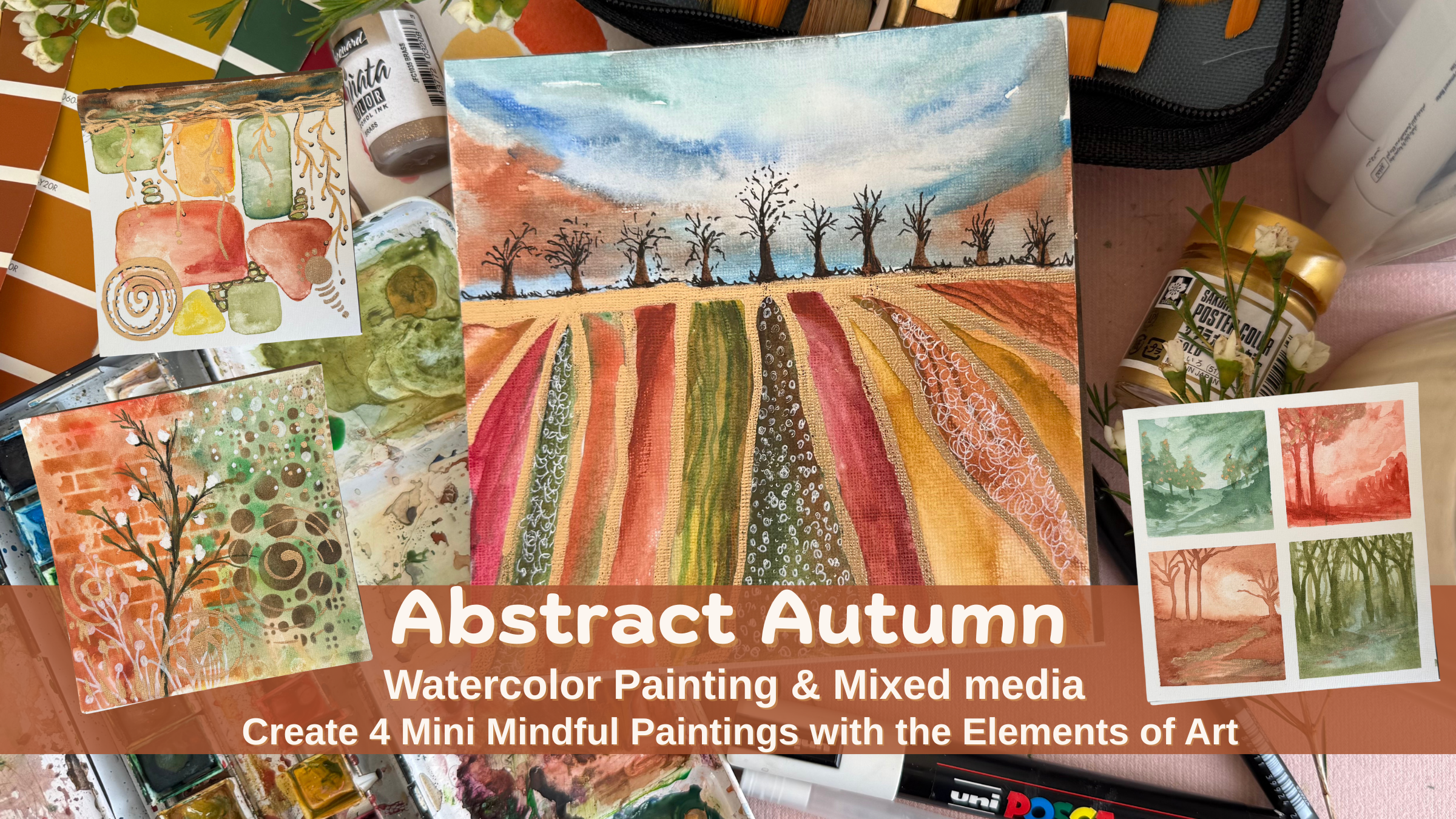
1. Welcome Introduction : Welcome to Abstract Autumn. Explore the elements of
art with many paintings. Hi, I'm Sana Asad, founder of Wild About Art
Studio based in Bahrain, artist, art educator, and holistic art
therapy practitioner. In this class, we
will slow down, breathe and explore
four elements of art. In this mini course, you will learn how to create autumn mode
colors with watercolor, get inspired by
different shade cards and explore four
elements which are line, shape, texture, and value through calming abstract
inspired paintings. These paintings are
small but powerful. Each one will be mindful
reflection of how you feel. By the end, you will
have a collection of four pieces that captures
your inner autumn landscapes. Gather your paint, pick your favorite fall
color, and let's begin.
2. Material (1): For this class, all you
need is inspiration. In the next video,
you will be learning how to create the
mood for Autumn. I already have this shade card from wall paint,
which I'm using. You can also use acrylic paint
paper or watercolor paper. I'm using acrylic
paper, square size. It's a small nice size
for me to complete the painting fast and
show you the process. Brushes of different sizes depending on the
medium you are using. If you're using acrylic paint, go with acrylic brushes or water paint for
watercolor brushes. Watercolors pascaPen
gel pen markers, if you have, grab some color
pencils, black marker. Don't strick yourself with the materials I'm showing
you in this class. Explore the materials
what you already have. This class is open
for you to enjoy the material and don't restrict yourself
for what I am using. This one is essential if you
have or if you can invest, this is an acrylic ink, gold pigment and
this really helps me to fasten my process because I don't need to wait for
the paint to get dry and I really get a very nice
rich gold in my paintings, watercolor palette
according to what you have. Grab your material
and let's begin to create our mode of colors. In next video, I'll
show you how you can pick your colors and
make your color chart.
3. Color chart : Before we start painting, let's create a autumn
wood color chart. This will be your guide
to choosing colors that feels both seasonal
and personal to you. Think about autumn,
falling leaves, golden sunlight, cozy evening, earthy soil, fading skies. Notice the color
that comes to mind. For me, it's warm oranges, deep green, rusty
red, and soft browns. On a sheet of watercolor paper, create a simple grid
of squares or circles, pick five to seven
autumn inspired color, mix them lightly and swash
them into your chart. Let each one shows its pure tones as well as
the watered down version. Next, let's explore mode. Choose one color
that feels calming, one that feels energizing, and one that feels grounding. Making your mode color chart
is completely personal. Go with the colors which
you Watch those he the reference at the bottom of to around you or on
a separate paper. These are your
emotional anchors. Now mix them to mix two colors together
to see what happens, for example, orange plus
green, red, and brown. These mixes often create the most natural
earthy tones that remind us of autumn,
forest, and sunsets. You can also water
down to see the values of color by adding lots of water and a little bit of black to create the
shade of that color. Look at your chart
and ask yourself, which color feels like today? Which color feels like comfort? Which color feels like change? Write those words next to your swatches or
pick another paper. This chart will be your
companion throughout the class. Whenever you feel
stuck or overwhelmed, return to your Autumn ballet. Let the color
remind you of calm, warmth and grounding. But
4. Class project : Your class project is
to create a five part Autumn Abstract Collection
with your mood color chart, mini painting of line, shape, texture, and value. Take picture of
all your artworks and upload in Project Gallery. You can also write a reflection which color become your
Autumn mode chart. I can't wait to see your
Autumn Abstract Collection in the project gallery. Sharing your project not only
celebrates your journey, but inspire the whole
class community.
5. Line: Ine are the most
basic element of art, and yet they can tell us
so much about how we feel. A line can be calm restless, bold, or delicate, just
like our emotions. Take your paper and begin by
breathing with your lines. Inhale deeply and
as you breathe in, draw a line upward, exhale slowly as
you breathe out, draw a line downward. Repeat this few times, letting your pen or pencil
or brush flow your breath. This is a way of calming your nervous system and connecting with your
present moment. Now let's play with
a quality of lines. Try soft delicate lines that
feels light and gentle. Once you are happy with your
lines, grab your medium. It can be cold paint. I'm using ink. You
can use marker, color pencil and
outline your lines. You can also go with
the paint directly. Once you fill these
lines, bold, thin, thick Notice how each line changes the feeling
on your page. Now we'll bring our
autumn palette. Once your paint and
outlining is dry completely, take a moment to breathe and bring the colors of
autumn onto your paper. I am taking some
inspiration from my mood board, my color chart, and I really want to go
with all earthy orange, green, red tones, and I
will go with a pattern. Before I'll do anything else, I'll begin with painting my background with
a shade of blue, a little bit of browns
and trust your intuition, go with the way you
want to do your sky. Now let's play with pattern. Try repeating parallel lines
with different colors. As you repeat them, notice how the act of pattern making
become meditative. The repetition helps
your brain settle, just like listening to
music with a steady beat. Choosing two colors or three colors from your
Autumn mood chart, use them to layer your
lines into pattern. One line orange, next yellow. The next one can be green or combination of
green and brown. The rhythm of colors add energy and emotions while
still keeping you calm. Notice how these colors begin
to form a visual language. For example, warm tones might
tells a story of release, while cooler tones
feel like rest. Now, ask yourself if
these lines were a story, what would they be saying? Maybe your lines are steady like a quiet walk or restless
like waves of sea. You can even create sections of your page that represent
different feelings, calm lines in one corner, more energetic
patterns in another. Together, they create
your emotional map. Step back and look at your page. Which part of pattern
feels soothing? Which part feels alive? Write a short line of text on your page or
take a separate page. Something like today my line we study or my line carried
my worries away. This way, your lines and colors become not just
an abstract design, but a story of how you
felt in this moment. Once I'm done with
my pattern making, I'm adding few trees on
the horizon with paint first and then making
more shadow and depth, I'm adding black marker lines. This step is
completely optional. If you just want to keep
lines on your page, you can just let it be. I do like to have
something on my horizon. That's why I'm adding some
trees and after that, I'm going to take
my gel pen and add few texture in
different sections of my lines just to create a little rhythm and my
emotions and worries. Each of the line represent
different mode of my emotions. This is your safe space to create and bring your
energy on the paper. This way, your
line lesson become mindful breathing is equals
to calming the body. Pattern repetition,
meditative practice, Color rhythm,
emotional expression, story reflection plus meaning. Here we are done with our
first element of art line with an abstract impression
of autumn landscape. See you in the next class.
6. Shapes: Shapes may look simple, but they carry deep meaning. A circle can feel
safe, square strong, a triangle sharp, and organic shapes feel
free and flowing. In our art, shapes can also represent the
responsibilities, relationships, and
roles we hold in life. Today we'll use shapes to
reflect on our own balance. Let's begin by filling
our page with shapes. Don't plan too much. Just let your brush or pen add circles, ovals, rectangles
or irregular form. Place them randomly, letting them overlap or
float on the page. As you work, think of each
shape as a piece of your life, a role, a responsibility, or an energy you carry. Take a pause and try to
see if you wish to add few more responsibilities or reflect your life
into more shapes. Just like life, our
responsibilities overlap. You can also overlap
shapes once they are dry. One role resting on another. So shapes might take more space, other might shrink back. Notice which one feels heavy or which one
feels light to you. Once I'm done with my shapes, I try to wait for a few minutes, but I'm a little anxious to
just dry this and work on this one and complete
this because I really want to see how
this will come up. Here I use tissue and soap most of the pigments and my
color become really light, which I like it, but I feel I can add a little more extra
layers on top of it. Here I'm just adding
extra few dabs of color to make the edges
more crisp and bright. Now let's connect these shapes
using a gold pen or paint, add lines or branches that
reaches out across the page. For me, these branches represent the way I
spread into the world. As a mother, a daughter, a wife, an entrepreneur,
and an artist. Each branch connect me
to different people. Here I'm using my ink, gold pigmented ink because this is really easy and
dries really fast. You can use marker
or pen or pencil. When I'm adding these branches, the branch connects me to different people roles
and responsibilities. Sometimes it feels beautiful, like growing into the world. Sometimes it feels heavy, like stretching too far. But art helped me
find balance again. There are moments when
I feel burned out from carrying so
many roles at once. But when I return to my art, layering shapes and connecting
them with these branches, I see the reflection
of myself, complex, connected, sometimes tired, but always finding
balance again. Shapes remind me that I can hold many things
at once and still be whole here I'm using
poster paint, gold color. This is really highly pigmented. I prefer to add water and mix it well so I can
smoothly move my brush. These steps are completely
optional and intuitional. I want you to connect
with yourself. Try to add what you want to add. What shape connect with you, what symbol you want to add, how I add spiral as the
healing and growth symbol and you can add leaves or
maybe a pumpkin or a cat. I can add so much more. As you continue, try using
shapes to different sizes. Larger shapes can represent bigger responsibilities
or strong energy. Smaller shapes may represent lighter roles or personal space. Ask yourself, what shapes
feel like my family? What shapes feel like my career? What shape feel
like my self care? For me, the smallest
one is my self care, and the biggest
one is my family. Place them on your page in a
way that feels true to you. Step back and look at your page. Which shape take
up the most space? Which feels squeezed in? Write few words if you want in a corner of the page or
take a separate paper. Today, my shapes showed me
maybe you'll write about growth or imbalance or gratitude for the
way things connect. Whatever it is, it becomes
your story in shape and color. Shapes are more than
form on a page. They are reflection of our life, our balance, our
responsibilities, and the way we grow
into the world. When you feel overwhelmed, try this exercise again. Let shapes hold your role for you so your heart and
mind can breathe. With this flow,
your shape lesson has practical technique, layering shapes
in autumn colors, therapeutic practice, which is mapping roles plus
responsibilities. You also have a story to
tell branches and gold, your life expansion
and reflection. Reflect how you feel. This is how simple elements of art can become your
mindful art exercises, exploring shapes connecting with our inner self and can't wait to see your
projects in class projects. Don't forget to take a
picture and upload there. Our next lesson will
be all about texture. You may have noticed
that I add black marker, and now I'm going to add a little bit gold
ink on top of it. Black will represent as a shadow underneath the
gold because just gold on white is not giving me that brightness and it's
not very noticeable also. I want to add that shadow and then on top of it, the gold. It can represent
my inner self as a black and what
I show the world as a gold shining
star all the time. Till next lesson, enjoy the process and reflect
and don't forget to share, see you in the next class.
7. Texture : Texture is how life
feels smooth and rough, soft and hard, flowing
and structured. When we add texture to our art, we give it depth
layers and story, just like our lives. Let's begin with
simple autumn wash with colors resonates
with your moat today. Keep it loose, maybe
a warm orange, blend with early browns greens. This is your foundation. The first layer, just like
the base of our daily life. Now, here I am using
stencil stemps. If you don't have
this, you can just use collage newspapers
to add layers, or if you have stencils, but you don't have stamps, you can use paint and
card to give a texture. Now I'm using my stencils. I really like the brick texture. It creates a nice
wall effect and using the rustic brown color
to add the stencils, just to add the stamping
colors on top of it. Stencils are something
which I really love adding especially in
my mixed media projects. So here my texture is done and whenever I add
textures like this, it reminds me of my own life. The soft circle
pattern remind me of community connections
and circles that repeat. The brick remind
me of structure, the responsibilities
and boundaries. Now it's time to
add another layer. Right now, because just
next to this artwork, I was having this beautiful
branch with white flowers, this become my inspiration. You can also look around and see what can be
your inspiration. Here I'm just trying to see
how it looks and I think it will be a beautiful addition, maybe in black or dark green. So here I'm taking my pencil, going to the loose sketch, and try to replicate
similar what I can see. This time, I'm going
slightly darker by change the colour,
but also over Once I'm done with my branch, it's time for me to add
those tiny white flowers. For that, I'm trying with posca. Let's see
if it would work. Otherwise, I might add acrylic
paint or maybe add two, three different layers of white. So just adding few dots of posca and going to also
add a little bit of branches. Like whatever comes
in your mind. Trust me, when you are in
this creative process, you will have loads of ideas and you will see
inspiration around you, maybe from a magazine,
from your wall, a painting on your wall or
the colors of your couch, the color and texture
of your wall. This is how you
will get inspired and keeping layers
as second and third, some part may feel
busy, others calm. That's okay. That's the
story of life's layer. Once you are done, step back
and look at your textures. Which part of the page
feels soft to you? Which part feels
structured or heavy? For me, both the sides
are heavy right now. The bricks, what I added, I just realized that my
wall in front of me is having bricks and I just notice now and this is the beauty. Texture is a way to
see and feel depth, not only in art, but in ourself. Through circles, bricks,
patterns, and layers, we remember that life is
both rough and smooth. And both are part of our story. Whenever you feel pulled in many directions, try
layering textures. Let the page remind
you that your depth comes from both
strength and softness. In this lesson, we
combine our stencils, no. First, we start
with a wet on wet, light wash, then stencils, then symbol of
circles and element, what you can observe around you and bring it to your paper. And this is how I created my third element of art
texture with stencils. I'm very excited to
also know and see how you will use this
element into your art. See you in the next lesson.
8. Value : Value is a range
of light to dark. It's what gives depth
and dimension to art, and it's also what gives
depth to your life. Today we'll explore
value through four small watercolor
landscapes and use them as a beautiful mindful
practice to reflect on our own balance
of light and shadow. I'm still using that small
square card and just using mounting tape and going to
make small four sections. In art, value means how light
or dark a color appears. A color in its lightest
wash feels soft and airy. While the same color in its darkest tone feels
heavy and intense, I'll begin with light wash
as wet on wet and choose the colors which
resonates with my mode today and fill them all at once. Value help us see form, create mode, and add depth. Just like in life, we need both light and shadow
for the full picture. In each square, we'll paint a small abstract landscapes exploring a different
balance of value. I'll work together while I'll wait for one layer to get dry. I'll start working
in the next box, and that will help me to complete all four
paintings together. In this square,
you can start with a light wash and then
begin with a little dark. As you can see, I'm adding a shade darker without
adding any other color. It's still same but
more pigmented. You can trust your intuition, open any reference, or just
go the way you want it. I don't have any
picture in front of me, just my own
visualization of how I am looking at the landscapes or where I feel I want to be. I just remove some of the paint from that to
create a beautiful, small, glowy mon still using
the same colors, adding horizon and few
layers of horizon. Trees and bushes
move horizontal way, and if you wish to add tree, you can definitely go for it. Just trying to make my
moon slightly bigger. This lesson and this video will be more on self reflection. So When I create these landscapes, I see them as reflection of
my own emotional landscape. Sometimes I feel
like that light, airy wash, soft and open. Other days, life feels
darker and heavier. But when I put
them all together, I see the beauty
in the contrast. Value remind us that light is more precious because shadow exists and shadow feels less heavy when I know the
light will return. Exactly the same. The forest begin
with a light and now the shadows are coming to
bring depth in the forest. Keep adding little by
little, and in watercolor, Always remember to use water
to lighten up the color, more water, less value of color. More color means lots
of pigments are there. Automatically, the color will
be brighter and you can add a tiny dot of black to
create more shadow. Look at all four mini
landscapes side by side. Which square feel
most like you today? Which one feels the
most challenging? Write down one short
line in your journal. Today, I feel like and connected to one
of your value studies. This is how your art become a
mirror of your inner state. We See At last, to add all my four
paintings in a series, I am still adding gold in
these mini landscapes, using the gold ink
with a brush and just highlighting few
spots in this one, I'm creating the Golden Lake. And in the other one, few strokes of gold, a little bit of dots around, and that's how it
will create a series of elements of art
with strokes of gold. Here we complete all
our four mini artwork inspired by elements of art, line, shape, value, and texture. I hope you enjoy this course, can't see your projects
in the class projects.
9. Thank you : Thank you so much for joining me for this autumn exploration. I hope you enjoy this class and will get some time
to create your own. Don't forget to upload your class project in the
class project section. Also, don't hesitate to ask any questions
and discussions. Till next time, take
care of yourself.
 Sana Asad, Inspiring Self-Discovery Through Art