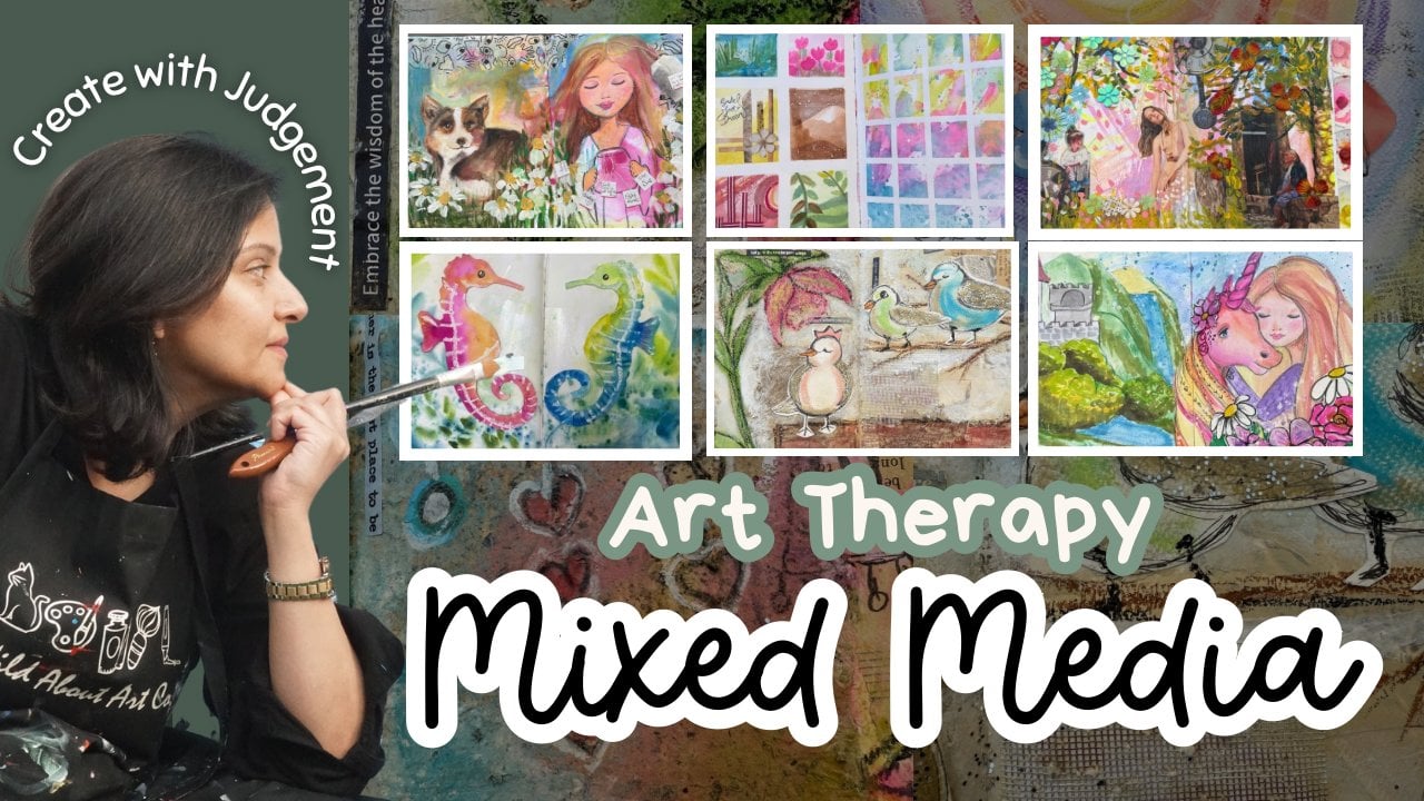
Transcripts
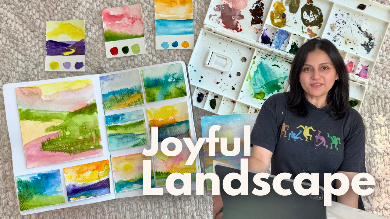
1. INTRO : Have you ever wished you
could turn off the noise, slow your thoughts, and
reconnect with yourself? Just for a little while. In this class, you won't need any fancy skills or
perfect drawings. You'll simply need curiosity, some watercolors and a
few quiet minutes to create joyful mini landscapes
that come from your heart. Hi, I'm Sana Asad artist, art educator and holistic
art therapy practitioner. Over the years, I've
learned that art doesn't have to be realistic or
perfect to be healing. I just need to be honest. Together we will learn the basics of
landscape composition, explore calming color theory with the focus of
complementary colors, and paint tiny intuitive
landscapes that help the mind slow down
and the spirit breathe. You'll walk away
with a handful of joyful mini paintings and a deeper correction to
your inner creative voice. Let's begin gently and joyfully.
2. Material : Hey, everyone. In this video, I'm going to show
you what material you exactly need for this class. Watercolor paper or
any thick paper. I prefer watercolor paper, 300 GSM, cold press. A basic color palette will work. You can use Du pines or palette, washy tape to make a nice
border for a crisp edges. Here I have some water based
oil pastels, paint brushes. You can cut the watercolor
paper into small card size. This is according
to your own choice, how small you wish to do it. Watercolor brushes, again, it's your choice and the size depend on the size
of your paper. First of all, try to
see what material you already have it
to begin the class. Once you feel confident, then invest in your material. All you need to do is just
start, create for yourself.
3. Class Project 1 : For the class project, first complete the full
course, and once you do, you will feel confident
and you will be able to create your own personalized
joyful landscapes. You can download the guide, paint your mini landscapes, cut them out, and arrange
them in your journal. You can also use the
prompts I have shared in the PDF and don't forget to share and upload your
project in the gallery. I would love to see your
wonderful creations.
4. Landscape composition : Before we dive into color, let's take a moment to
understand how landscape work. On a mini card, draw a
simple horizontal line. That's your horizon. Now imagine the space
in three parts, foreground, middle
ground, and background. In real landscapes,
objects closer to us appear larger
and more detailed. While those farther away
are smaller and lighter, you can suggest that just by adjusting scale and contrast. Want to add depth, try one point perspective. Just place a dot on a horizon and draw lines
that vanish into it. That could be a path, a river, or just
energy flowing inward. This gentle structure
help your brain feel anchored like giving
your creativity a soft place to land. Understanding structure
can help calm anxiety. When we break big ideas
into small parts, the mind feel less overwhelmed and more
empowered to begin. Try to repeat these
steps few times, make mani cards as
many as you want. Try to explore your
own imagination, if you wish you can
always get some help from different photographs and
pictures of the landscape. But I encourage you
to go intuitionally. Don't see any
reference or picture, feel it where and how you
want to see your landscape. This is your imagination. This is where you want to be. This is something you want to create out of your imagination, out of your feelings, out of how you feel. And
5. Watercolor landscape 1 : Welcome back. And in this class, I'm going to show you
how you can start painting with a
simple techniques wet on wet, nothing much fancy. I'm using my journal and
going to start adding tape. You can use regular paper tape or washy tape,
whatever you have. Or if you don't have,
you can just simply draw boxes or you
can use the cards. After completing
all these boxes, I need to think about how I
want to see my landscapes. I will try to add all in which I can see something far from me,
something near to me, one point perspective,
and something just come right away without
looking at any picture. The tip here is after
you complete your pencil sketch and before
starting watercolor, try to use kneaded eraser or just the regular eraser and
erase the pencil lines. You should only see your
impression of the lines, not a very dark pencil line. I did not erase completely
because I want you to see the division
between my horizon, ocean beach and the mountain. I will tell you why
I ask you to erase all the pencil lines at the end of the video. Let's follow. You can also sketch all
your landscape and then begin your painting or
you can do it one each. I am going to start
with one box at a time. Begin with any color, spread it with a line, a dark pigmented line, and then use water to blend. For this guy, I'm
adding wet on wet. These landscapes are not
a hyperrealistic one, but more flowy,
abstract, and intuitive. Feel free to use the colors
what you want to do it, what feels good to you. Right now I'm in a
mood to do blues, so I'm spreading
blue everywhere, and wherever I feel I need
to see more highlights, I can just add some water, lift the color or use
tissue, and just soak it. Sand with brown, you
can notice I always add high pigments and then spread them water with a
circling motion. Wait for the layers
to get dry before you add the second layer or if
you wish to do the dark ones. If you are happy with
your first layer, you can just leave this and
move it to the next box. And if you want to have
more brighter colors, then wait for the layer to
dry and then start adding. Like over here, I want to make
my horizon bit more dark, so the beach will
start creating depth, adding a little
bit more extra in my mountains and little
bit more ripples around. Just feel free to bring your own imagination
into this landscape. Now it's time for the next box. And for the next box, you can follow along exactly. So this video you can follow
with me step by step, and try to take
another page and then recreate the similar landscape
into your own style, into your own colors. This way, you will be able to practice as well as get
master in this skill. After completing two boxes, now I feel that I need
to add more depth, and the depth will come
with one point perspective, in which I'm going to add, like, a path, and then both
the sides will be land or maybe a grassfeld. So let's see where my
brush will take me. Start with your one
point perspective and lighten up all
the pencil lines, so you will not be seeing
very dark pencil line, as you can notice in my
other previous two boxes, you can see the pencil lines. This is the reason
I was encouraging you to erase the pencil line. I'm starting with the purple,
and if you can notice, you will see I use
little pigment and then take lots of water to spread the color mixing purple
and blue together and leaving a little bit space to add the highlight of the sky. Last box, and let's play
with the lines and color. Here I'm creating a sea curve, which is a very nice deep curve. I want to I feel that I want to create a lake with a
little bit of height. So for this box, I am starting with a big f curve and then using my brush in
horizontal movement and adding the brush in the
right direction is the key to achieve the realistic look or to get the feeling
of the landscape. Remember, when you
want to make the land, you need to make sure that the direction of
the brush is going horizontal and you can see when I will start giving
the depth of the height, my direction will
change to vertical. So you can pause the video here. And follow along with me to
achieve the same result. I want to create more
drama in this box. I'm using a pink
color for the sky, which will give me a
nice feminine feeling. For the lake, for the water, I am adding blue
with lots of water, and you will see the difference it start
giving when I will change the direction of my brush in vertical strokes to create
the height over here. This is what I mean. Because the paper is completely
damp, it is dissolving. It's just flowing in its own and creating the shadows and
reflection in the water. If you're an absolute beginner, I would suggest you to
practice at least two, three time on a different sizes, maybe one full A
four size paper, one small, maybe half of the
A four and then mini card. Little by little, slowly you will be able to
achieve the same results. I'm adding a little
bit more extra pink to make my clouds effect
and adding some yellow. Again, lots of drama in the landscapes we will be
creating in the next video. Do practice, keep practicing and come back again to follow along.
6. Complementary Colors : Hey, everyone. Welcome back with another very easy and
simple color composition, which is complementary colors. In this lesson, we'll
explore complementary colors opposite on the color wheel that brings each other to life. Red and green, blue and
orange, yellow and purple. When placed side by side, these colors create
vibrant energy. In this video, I'm going to
show you how you can use just two colors to make
amazing landscapes. You don't need so many colors or you don't need
fancy materials. You can even use
watercolor pencils or oil pastels or acrylic paint
to follow along with me. To begin, I want to add
the color swatches. I'm adding a tape and leaving just a one
finger or two finger space. These are mini cards, and the first color composition
is orange and blue. As you know, when you
mix both of the colors, you will turn the color
palette into brown. So if you don't have brown, you can always mix them. I'm using lots of water to make the shades light and dark, but only going to use
these two colors. So let's start. Start with the horizon.
In this lesson, I'm not going to use any pencil. All the landscapes will be
just with a paint brush. On the surface, they
might seem contrast, but when paired with intention, they create a powerful
visual balance. Why does this matter? Because your brain
craves harmony, complementary colors stimulate different parts of the eye, and when placed side by side, they create a sense
of wholeness. Instead of overwhelming us, these opposite can
actually feel soothing. It's like witnessing
balance being restored visually
and emotionally. Now it's time for
yellow and purple. Yellow is a color of light,
clarity, and optimism. It uplifts the spirit, like sunshine warming the skin. It can help shift mood, boost energy, and
awaken creativity. Purple on other hand, is the color of intuition, stillness, and spiritual depth. It encourages reflection,
connection to your inner world, and calming the nervous system. When these two come together, yellow and purple, they
balance each other out. One activates, the other soothes one opens the eye and others
soften the heart. In these mini cards, you will be able to
bring the balance. Don't rush. Observe how your body feels as
the colors interact. You might notice a
quiet tension at first. That's natural when opposites
meet, but stay with it. Let the brush settle
the conversation. This is not just color theory. This is color therapy, a gentle reminder that
light and shadow, activity, and rest, joy, and quiet can all exist
in the same place. Now let's explore color
pair that's bold, emotional, and surprisingly
grounding, red and green. These are complementary colors, direct opposite on
the color wheel. Yet when they meet,
something powerful happens. Red is a color of passion,
energy, movement. It's the beating heart that sparks the fire, red stimulate. I remind us we are alive. Green by contrast
is the color of nature, rest and renewable. It brings us back to Earth. It soothes the eyes, lower the pulse, and offer
calm after intensity. When you place red
and green together, you are painting a dialogue
between action and rest, between courage and peace. You may notice
memories, emotions, or even tension arise
as the colors meet. That's okay. Again, let your brush hold
space for all of it.
7. Lesson Part-1: In this lesson, we begin the most soulful part of our journey,
intuitive landscapes. You warmed up your colors, explored balance, and sketched
a few guiding shapes. Now we begin to let go, let go of control, of pressure, of ding
things to be certain way. Start by dividing your
watercolor paper, 300 GSM or journal
page into small boxes, six, eight, maybe ten. These are tiny window
into your inner world. Take a moment to breathe. What do you need today? Calm, joy, focus, maybe
a little release. That becomes your intention. The quiet thread that
guide your brush, you don't have to write it down, but hold it softly
in your heart. Now dip your brush into
water and paint freely. Start with a single color, let it move across a box. Then let another color meet it. Maybe a curve become a hill, a splatter become a tree, or maybe it stays abstract,
rhythm and light. In these boxes, I will
encourage you not to use any pencil, just your brush. Wait for the layers to get dry and keep working in each
box separately or together. In this lesson, I'm going
to work together because I want to wait for the layers to get dry in my other boxes. As you may have noticed, I had just the first layer
of blue on my horizon. In the next box, I'm
starting with the sky. These tiny landscapes are
not meant to be real places. They are emotional
spaces, memories, moods, whispers, or
somewhere inside you. Let each box be a new moment, a breath, a shift, a gentle exploration
of color and feeling. Now I'm done with all my boxes, and this is the time for me to add just a little
bit more details. This is completely optional. I'm using the water
based crayons. These are also
called neo colors, or you can use the water
based oil pastels. Color pencil will work as well. I have two different boxes. One is the matte finish and
one is the metallic finish. If you have these, that's great. If not, then just simply use color pencils or oil pastels. I'm using these to just
enhance my horizon. Water based crayons help you to not have a very solid color, so I'm just going
to dip in water and just simply use
it as a pencil. If the color looks really
bright and dark and stiff, then I can use my brush
to dissolve the color. These are the final details
I will be adding in this. Again, you don't need to do it if you don't
have this material. You might be thinking
why I divide the paper into so
many small boxes? Why not just one large paper. By breaking a large page into smaller sections, we
reduce overwhelm. Each mini painting
become a safe space, a tiny act of completion. This structure is soothing to the nervous system and
build creative confidence. After completing the detail, I will see you in the next
part of the same lesson and will show you how you can
go with little bigger size.
8. Lesson Part-2 : In the last lesson, you painted small
moments of emotions. In this one, we
expand that practice. I'm going to use the
same three larger boxes. You can choose a separate
paper, however you want to. Begin the same way
with an intention. I want to express calm. I want to feel connected. I want to let go tightness. As you paint, listen
to your breath. Let the brush lead. Try wetting the paper first, then adding pigments
and letting it spread. See how the water
decide for you. These larger pieces
invite you to move with your whole arm to connect more with the
physical motion of painting. Use white strokes, dabs
wet tissue, flick water. Maybe a storm of purple, blue sky appears or
a soft glowing sun. This space is just for you. No judgment, no audience,
color and presence. Try lifting color
with a dry brush or tissue or adding a second
wash with a new feeling. Maybe the second layer brings hope or clarity or softness. There's something magical about
revisiting a painting you thought was done and
realizing it had more to say. Let the painting change
as your mood changes. Let it mirror your inner weather and if nothing
beautiful appears, remind yourself beauty
is not the goal. Connection is when you
create from intention, when your color comes
from inside you, what you make is
already meaningful. So keep going, keep flowing, keep painting like
no one's watching you because this moment
is your gift to yourself. As you finish your final intuitive landscape
of this session, take a moment to look at
what you have created. Not just the shapes or colors, but the feelings behind them. The small decision you made without overthinking,
the moment, the mood, the quiet courage it took to stay present
with your brush. These paintings hold
more than color. They hold your energy. They reflect your
willingness to slow down, to listen inward, and to let go. There is no right or wrong here, just a rhythm that
comes from within. So let's get ready to arrange all these mini intuitive landscapes
into our journal. You can also frame them or
display in your journal, as well as you can keep them
separate or just like this.
9. Lesson Part-3: Now that all your
landscapes are dry, this final step is
about honoring what you've created and
giving it a home. Slowly gather all your
small and medium paintings, lay them out in front of
you like quiet moments. I'm here adding a
little bit more extra just to add final touches, bringing the color
more bright because after once they get dry, I feel they need a little
bit more extra vibrancy in the colors,
adding few strokes, going vertical direction
to show the depth as a green grass in
my beautiful field. If you wish to do
something extra, do it now before you
remove the tape. Begin to cut them
either with scissor or by tearing softly
with your finger. Don't worry about straight
lines or perfect shapes. Let the purpose feel organic. Trust your intuition. Arrange your paintings
in your journal. You might cluster warm colors together or group soft skies. You might pair
contrast with calm. There is no rules. Just what feel right to your
eye and heart. As you place them, you might
begin to see a story emerge, a journey from one
feeling to another, a shift in light, a
quiet transformation. Once they are arranged,
glue or tape them down, let this feeling
like an act of care, not just for the page, but for yourself before I plan to leave
that white border, but then I feel, no, I
don't need any border. I'm good in its own. I don't need any
supportive white border. So here I am with all the small mini paintings and taking my journal and going to display proudly in my journal. I will be using
double side tape, and let's see how
many mini paintings will fit in my journal. Collaging your work like this
can be deeply grounding. It tells your brain,
this is complete. This mattered. I'm holding
space for what I felt. It brings closure, clarity, and a sense of wholeness. You are giving
yourself a mirror, one painting in your own colors. If you feel called right
underneath each painting, a title, a word, a mood, or simply the date, or maybe no words at all, white space to breathe. What would you call
this Journal page? This final spread
is not the end. It's an anchor,
something you can return to when you need
to feel scented again. Because painting like
this without pressure, without intention
is not just art. It's a form of
gentle resistance, a way of saying, I
choose peace today. I choose presents. I choose joy, even
in small ways. Thank you for making
this with me. I hope you'll return to this process again
and again to pause, to paint, to reconnect with
your landscapes inside you.
 Sana Asad, Inspiring Self-Discovery Through Art