Transcripts
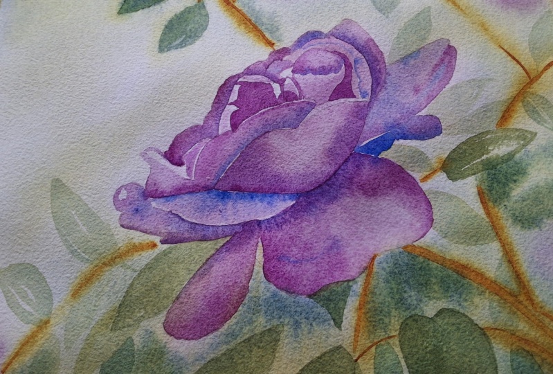
1. Introduction: Hi, welcome to my studio. My name's Chris. In this Skillshare class, I'm going to show you step-by-step how I painted this painting of a wild rose in watercolor. We'll start out by going over all the supplies and the color palette for the painting. Then I'll begin by showing you how I prepare the paper. Then we'll start with the first wash, both the background and the flower. Next, I'll show you how I use negative painting techniques to add depth to the subject matter. And finally, I'll show you how to use glazing techniques to add form and warmth to the flower. I have two main objectives in this class. Number 1 is to show you how to paint a floral subject using layered techniques. I use glazing to apply layers of transparent color that give real warmth, translucence, and depth to the painting. The second objective is to show you how to use negative painting in the background to add depth to the overall composition. If this sounds good to you, Let's get started.
2. Supplies & Painting Setup: Okay, Let's talk about the supplies you'll need for completing this project and the setup that I use when painting. Starting here with the easel, I like to stand when I paint, I have an easel. My paper is here on a masonite board, has been taped down to that, it's ready to go. I just used regular painter's tape like this to adhere it to the board. You'll need possibly pencil, maybe eraser there for transferring your image to your paper. I have my paints here and a circular palette. This is the Stephen quill or porcelain palette. I love this palette. I will provide links to that in my supply list. And in addition to that, of course, you need a water container. I like this water container has three sections to it allows me to have lots of clean water whenever I'm painting. The three brushes which are listed in the supply list are here. There's more information about those in the supply list, like to have sponge and a small spray bottle as well, that I can apply additional water to my paper at different times in the painting process. When I'm painting, I like to have a, either a sponge or a piece of towel like this that I can use to remove excess water and paint on painting. So I'll just often dab the paint or the brush there during the painting process. And like to have that nearby. Of course, I also have paper towel, usually have some of that available as well. And this is my setup. I'm right handed, so everything is on the right side of my easel. And the waters in real close proximity to the palette as I go back and forth there between the palate and the water. So this is how I set up my, my area or one other thing. I also like to have a piece of watercolor paper here so that as I'm painting, if I want to just test out the relative strength of some paper or some paint when I'm painting, I can go ahead and paint that on there and just see what it's gonna look like on my paper. So I recommend having that as well. In addition to these supplies, of course, you'll also need the paint in the palette. I have another video following this one that outlines the four colors that I use in this particular painting project. So watch that video for a bit more information about my paint.
3. The Color Palette: Before I get started painting, I need to decide what my color palette is going to be. And so obviously the color of the rows is very, very pink and vibrant lilac color. And I just happened to have a Daniel Smith color on my palette, which is called quinacridone lilac. And so that is going to be a primate color for, for the wild rose in this lesson. And quinacridone lilac by Daniel Smith again is what that is. I can get a real dark lilac, pink, deep, deep pink color. And if I apply that real thin, then I can also get a real pink color, which is what I want. I'm also going to use a French ultra marine. And now there isn't too much blue in this painting, but I'm going to use that to mix with the lilac to get a dark purple and to get into the shadow areas of the painting. So ultra marine, sorry, french ultramarine, can't remember what I said earlier. It's French ultramarine by Daniel Smith. And again, I need primary color, so I've got my blue, I've got my reddish color, and now I need a yellow color. And so I'm going to go with nickel quinacridone, nickel quinacridone, gold. This is actually a Daniel Smith color that I have on my palette, as you can see here, beautiful golden yellow color on the palette. And that's going to be my third part of the triad of the primary colors. And again, there's going to be places where I might use this color. All right, out of the tube like that. In terms of some of the golden highlights in the leaves in the background. But mostly, I'm going to use this color along with my french ultramarine to create my greens. Anywhere from a real light green to a much darker green where I bring in bluish-green, where I bring in a lot of the French ultramarine. And that will be in the shadow areas there of a background. Okay, so you can see with these three colors as primary set, I can go, I can get my deep, deep reddish pink, my light pink. I can get shadow areas with the blue mixed in to that. I can get the background all the way from a golden color to a light green to dark green. And that's really all I need, as you can see from the reference image here. Those are the colors that I need for this painting. And of course, I'll leave some of the papers shining through and some of the highlight areas.
4. Reference Image and Contour Drawing: I was out for a walk near my home and found this bush of wild roses. This is going to be the subject matter for this lesson. You will find this reference image as well as a contour drawing that looks something like this. I took a black and white image of the reference image, traced the edges, the contours with a dark pen that allowed me then to transfer that image to my watercolor paper. You can do it either way. You can either draw it freehand using the reference image or use a tracing method like I've shown here. You can see the image is traced onto my 140 pound cold press Arches paper. And we're ready to go. And in case you're wondering, this is an eight by 10 piece of watercolor paper.
5. Prepare the Paper: The first thing I'm going to do is wet both the front and the back of this piece of watercolor paper with a nice wet, juicy wet sponge. I like to keep a sponge-like this in my studio and use it again, both the front and the back of this paper should be thoroughly wet. Once you've wet both the front and back of the paper using a sponge, you should see slight shimmer to the paper when it's held to the light, but it shouldn't have any pooling water on it. Then I allow the paper to sit for about two minutes just to let that water soak in.
6. The First Wash: Background: I played water to both sides of the paper previously, and I've allowed it to sit for a few minutes to soak in. And so now it's feels damp still there is moisture in the paper, but it's not got any sheen to the paper. Okay. So it's that in-between stage. So what I wanna do now is I want to take a really soft a squirrel hair brush. This is a Princeton Neptune. This is a mixture between squirrel hair and synthetic. And I'm going to take this nice soft brush though is the point. And I want to apply some water over most of the paper, except for I'm going to leave I'm not going to apply the water everywhere as is clear water. And I'm going to leave some areas of highlights that I see in the background and that I see on the flower. But I am, I'm applying water to everything goes belt background and to the flower. Just, I'm just carefully studying my reference images. I do that. And I'm maintaining the highlights where I see them. White areas or very, very light areas in the painting. Now most of the background is going to be darker. I'm going to come in with some real dark bluish green at the end I think, and really get a dark contrast between the flower and the background. But for right now I just want to create, I just want some puddles or rural wet areas, both on the flower and the background where I can come in in a moment and apply my undertones, my first wash. And I just want a few areas, most of that again, most of that paper will be wet, but I do want to have a few areas that retain their white highlights so I'm not letting those get wet. Okay. I've mixed up a pretty big pool of my green color are fairly light green. This is the French ultramarine and nickel quinacridone gold. And so now I'm going to go ahead and apply this pretty much over the whole background. There's not really any highlights back in there. Right over the stem up there. Again, this is going to dry much lighter. Then what I'm seeing right now. So you do want it to look, don't worry about it looking too dark at this point. Now there's a fair bit of highlights back in here. And so there were areas that I kept dry. So some of these leaves back here still wet or still white. So I'm just gonna do that. Some of those. But this area down in here is all all green. All green, all green except for a little bit of light on that stem there. Ok, and there we go. Now let's go back over to this side. And because I have gotten the paper wet prior to doing this both on the front and back and let it soak in a bit. I feel like I get a little bit more control over my washes at this point, not as many problems with blooms. All right, that's enough on the background. And let me actually take while I've got that going, let me take some of my darker. Let's just take a little drop some of the blue in there and come in. And I've put some more of the French ultramarine into that green mixture to darken it. And then coming back in and dropping that into some of these areas. I think this bottom left corners to be a little darker overall. I often like to make the corners of my painting a little bit darker, seems to draw the tension in towards the center of the painting. In that way. There is another rows in that corner, but I'm not going to paint that. And that they're just all green. And there you go. Like that. There we go. Now I have a bit more variety going on in that background. I think that's going to look lovely.
7. The First Wash: The Flower: Alright, now I'm ready to switch over to my, the color of the rose. Again, this is quinacridone lilac by Daniel Smith. Clean up my palette a bit. And again, the paper is still quite wet, both from its initial word, initial soaking with water than with a little bit of water I put on top here. Now there are areas that are dry and those are the white highlights in the rows. So I do want to be careful, but for the most part, I'm not super worried about details or anything he had. Only thing I'm worried about at this point is just maintaining those areas that were white. And I don't know if I did a perfect job of putting those highlights exactly the right place, but I think I did. Okay. And like this, and again, this color now is going to it's going to blend out into that background in places. And that's okay. Because that's what watercolor does. We shouldn't be worried about that It's too dark. This is all There's no highlights in here really? No, really any back in here. And this is quite dark in here, so we can just paint over all of this here. This back or bottom. Petal can be quite darks or just maybe even emphasize some of that darkness already by putting some more of that real nice thick lilac, Daniel Smith lilac on the brush. And do that. And there. I'm just wanting to be really loose here and not worried about a lot of details, but just getting the general sense of where some of the darker areas are. Just a little petal that comes out here, one down here, bit more over here. And now it's a little bit lighter up and up in here. Like that. That again, trying to retain some of the highlight areas. As I can see them here, as I'm trying to move fairly quick. Something like that. Go doesn't have to be perfect. Something like that. There you go. I love it. So again, the Laila, the highlight areas are primarily in here because that's the part of the flower that's facing the sunlight. And sunlight is coming from the upper left corner. And so those are the areas I want to be particularly light retaining highlights and then these areas that are underneath in here can be much darker. And right now while it's still wet, is really the time to apply some of that extra pigment. There you go. There's my Wild Rose. The initial wash. I think a few more things I could do. I could take my one thing, I didn't mention this earlier, but one thing about this nickel quinacridone gold is that it's almost got a brownie tone to it. So I can take it as a pure pigment here on my brush and get a bit of it. And this is pretty, pretty thick mixture of the paint here. More like half and half as they like to say. And now I can find this stem and just do a quick stroke and here, and a stroke up here and a stroke this way. And that almost gives me the kind of golden brown, golden color anyways, that I see in those areas. And there's a bit more of that going on in here. Just anywhere I see the stamp. I'm just going to go ahead and put that in like that. And again, because this is still wet in the background, that's just going to spread out to the background, but that's going to keep it really soft and not, not really draw too much attention to the stems. They're not the main subject of the painting there, just background. So doing it that way in keeping it soft will help, will keep you from having your eye drawn to that area. The soft edges track less attention than the hard edges. All right. I'm now going to let this dry. This is my first wash all complete.
8. Adding Background Details: Now that the painting has dried, we can see how much lighter the values are and that's great, that's what we wanted. We have a nice undertone. First wash has established our values in the middle, tones and light areas. And so now we're going to come back and just systematically go around and paint in some detail. Just, just to give the impression of a leaf or a stem. Now I'm going to put a lot of detail on the back. I'm just going to bring out a couple of believes. The ones that I drew in here, just so you know, there's leaves there. And instead of just a mass of green and then leave the rest and then come in and do the same with the flower. Adding details into the petals to give a sense of shape to the, to the shadows, to the leaves or the petals. So let's start with the leaves in the background, and we'll start there and move forward. So I need to mix up some of my green, which would be my french ultramarine again, and my nickel quinacridone gold. And I want a nice, fairly thick application of that. Now what I want to do is I'm going to take my brush with just clean water on it and find the areas that I want to work with where I want to paint. And I'm going to actually just put down some wet, some clear water and this leaf and this leaf here. And kind of in that area so that when I come in here, I can just drop in some of this color and this way get a fuzzy look to it. Not too hard edge. I want some hard edges to differentiate. Leave from the background, but I don't want it to be too sharp. Because again, wherever I see sharp edges, I'm going to draw my eye to that area. And this is just, this is just background. Can repeat this process multiple times here. Got a little bit of a shadow, I think being cast on this. I'm not going to put the white edge. There's I'm not going to put the water on that leaf as much because it's a pretty hard edge. So I'm think I'm going to let that remain a hard edge down to here as much as possible. You really want to create a combination of soft and hard edges in your painting. You don't want it all to be soft, you don't want them all to be hard. Contrast, also a contrast with values. Of course, some of these leaves need to be a little darker. That'll cause them to come forward. Lighter values will recede. And there we go. A sense of leaves in a few places here. And that's going to work well. And another one here, maybe another one here. Things going on down here. And I'm also going to mix up a bit of my, the nickel quinacridone to create a bit more of a rich brown. And again, this, now this area is wet on dry, I'm going to do a bit more of a hard edge for this stem. Here and here and here. Just enough detail to give the impression of what we're looking at, but don't overdo it. In the next step, we'll go to the wild rose and do similar technique of adding some shape to the petals by adding some shadow and dark areas to create form.
9. Add Shading to the Flower: Now in this step we're going to emphasize the shape of the petals of the Wild Rose. And I'm going to kinda work from the left towards the right. And this is all dry in here, completely dry. And so I can, in places where I want to kinda create gradual changes in the color, I'm just going to put down some clear water and then take my my color and just drop it in there and let it create some beautiful gradations of color. And I guess blooms or your ear letting it charge in. And in other places I might put down paint without having water out wet on wet on dry. But then come in and take the brush and just drag that out across the petal area to kinda create softer edge or gradual change in color. When we're working together with alcohol. A little bit more attention to detail here now that we have up to this point, but we need to give shape to our rows. And shape is really most effectively conveyed through the use of shadow. Shadow brings out the shape. So we left putting our medium tone and then left our highlights and previous steps. And now we're coming in and adding a little bit darker shapes, especially to the undersides of these various petals. I see here. This one. I'll put down some water so I can get a ton of gradual change of color on this one. A little bit of a hard edge there. So that's dry. Your eye will be drawn to the areas of greatest contrasts. So you definitely want to leave some very nice sharp edges between light and dark areas. And you can see just this gradual process of going through each of these various petals. Sometimes painting wet on wet, sometimes painting wet on dry. Creating a contrast of both hard and soft edges. Big area like this. And I see, well, I want to have some nice soft color change in there. I'll just wet it all down like that. Come in, grab the color I want. Start on the edge where it's the darkest down, the darkest application of the color here. And then gradually mix that bull ended this way. And I'm still using the same three colors that I started out with. This painting. I'm told from marine, connect it to lilac. And nickel, quinacridone, gold. Not really using that right now too much and just focusing on the red and the blue color, mixing them together to get my purple. I do see some areas that look a little bit orange. And so it's not super obvious, but I'm going to mix up just a bit of this, combining my goal and my lilac and just kinda come in here and give that a little bit. It's kind of picking up the the glow of sunlight there off of that. This is a repetitive process on the speed this up a little bit. Playback. Let you watch the process.
10. Add a Warm Glaze: Okay, I just want to head and dried the painting completely and evaluating the painting so far. And what I see is that all the reds in the flower are very cool reds. That's because I used a lilac, which is a cool color as well as I brought in the blue and cool it down even more. I feel like it needs a little bit of glow of a warm glow. And so I've decided to add one more color to the painting, to the mix, and that is going to be my pyrrole red. This is an M Graham color. And so I'm leaving my Daniel Smith colors here and introducing another color, pyrrole red. But I am Graeme, and I feel like there's some areas, especially in the under on the right side of the rows in here and underneath. In some of these areas that are more in shade, there's a real reddish glow. If you can look at the reference image, you'll see that. And I feel like it will add some interests if I if I bring that in. So I'm, I'm bringing my mixing in. Maybe add just a little of the lilac to it so it's not too crazy read. And yes, squinting, looking at the image is and this is glazing now because I'm going over a dry area that's already been painted and I'm adding another glaze of color over that. And I don't want to spend too much time messing around with it. So I'm going to try to do it in big brush strokes like I just did there. And then I'm gonna do that same thing here. And I think you're gonna see that by adding this glaze over these, this warm red over the cool reds that are already there. You're going to see that it adds kind of an interesting look to it, makes it look like it's glowing a bit more. And that contrast, a warm and cool is, is important. And I didn't have it yet in the painting. And I had tried to add the orange of this pedal. I like the look of it, so I'm kind of going over that with this glaze of red. Now. I think that is helping warm it up a bit. And again, don't want to overdo it. And so I'm gonna go ahead and let this dry.
11. Background: Negative Painting: All right, In this next step, what I wanna do is do some negative painting and bring out some negative painting with a real dark green. So I'm going to take and mix up a green using my golden, my blue, and really dark. And now I'm just going to paint wet on dry and distills a negative painting around these petals. You don't have to follow right along the edge, the contour, those petals. In fact, sometimes it's good to have some areas that don't quite follow the lines perfectly. And so again, I'm negative painting around both the edge of the petal, but also some of these leaves that are in the background like this. And that's gonna give me a sense for some of the shape of some of these items, these leaves and on the back, which will be helpful. And whenever you do this negative painting as such, really fun and really make some of these things you've painted earlier and makes them where they pop off of the paper. Sometimes you want a little bit of a NAS, not always hard edges. So me soften up some of these. Here we go. Just looking at my reference image and deciding what should these objects I want to paint around. That works good. Gets really dark in this lower, lower-right corner. And I want to emphasize some of those shapes, even some shapes that I never drew in to start with. That's okay. I'm just gonna kinda create them now. I like to paint with the edge of my brush a bit more to get some interesting shapes and, and all that way. And opened here, I'm just gonna kinda let that blur off into the background and not create too many harsh shapes up there. Because that's way off in the background and more interested in creating these strong shapes more in the foreground that in the background. And so I've got 0, not really liking that white area that was left in there. So I'm going to fill that in with this blue, sorry, green. Lost and found images might work as well here it kinda starts, stop. Some of these shapes. A hard edge along the edge of the flower petal. But then just gradually blend this into the areas in the background already there and maybe a little bit darker up in here as well to create a little contrast with this part of the flower. So again, we're not wanting to draw every, every leaf for every petal or outline everything. But we're trying to get a sense that there is a collection of leaves and all in the background here. And we want to give some definition to them, but not too much. I think we're getting close to being done. I'm going go ahead and let this dry and then add my signature.
12. Add Your Signature: All right, I've mixed up a really nice mixture of the gold and blue. And I'm going to come in and add my my signature. There you go, we're done. It's a wild pink rose. I hope you enjoyed this process and I hope to see you in another class real soon.
13. Reflection: Congratulations, you finished your Wild Rose. I really believe that every time you finish a painting, it's really important that you go through a process of reflection. I do that in three steps. Number 1, see the good. What do I mean by that? Find something you really like about the painting and even say it out loud. This process can help us from becoming too negative upon our work and really see the good things that other CNET number to set a goal, we can always get better. So set a goal for your next painting. Something that maybe didn't quite work in this painting, but you want to improve the next time. And number 3, share with others, I think it's really important that we share our work with the world. That can be anything from giving the painting away to somebody or posting it on Instagram, sharing it on Facebook, something like that. It's really important that we take what we learn and what we experience and pass it on to somebody else. Again, thank you for taking this class. I hope you've enjoyed it. Take a look at my other classes here on Skillshare, and I look forward to seeing you in class again soon. Thanks, Goodbye.
 Kris DeBruine, Watercolor Artist & Educator