Transcripts
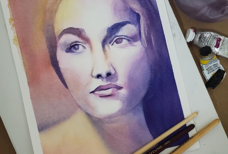
1. Course Introduction and Overview: Hi, welcome to my Studio. My name is Kris. In this class, you're going to learn how to paint this colorful and vibrant portrait in watercolor. We're going to learn to focus on values more than colors and create essentially a value study of this reference image. If this sounds good to you, then let's get started. Most people are afraid to paint people. "People are so hard to paint" They say, however, I believe that when you learn to see as an artist, when you learn to see shapes rather than things, when you learn to really see values and reproduce them faithfully. Painting people is just like painting anything else. In this class, we'll go over the various materials you will need to paint this painting. I have provided some files that you can download. They include a reference image, a contour line drawing of the subject. The final painting that I painted, as well as a supply list. I have provided everything you need to succeed in this class. I've divided the painting process into three steps. In step 1, we'll do the first light wash. We'll create undertones of soft color that will shine through the later layers. I'll show you a few techniques for achieving a loose and impressionistic style in your paintings, which is my favorite way of painting. In step two, we'll focus on glazing and adding medium values to the painting. The features of the face will begin to emerge on the paper at this stage. Finally, in step three, we will focus on details and we'll add the darkest values. Throughout this video, I will demonstrate watercolor techniques such as wet on wet, charging in, wet on dry, glazing, lifting, how to retain highlights, "lost and found edges" and much more. To get started, please find the reference image and the contour drawing on the class info page. Transfer the contour drawing to your watercolor paper, gather your materials, and we'll get started.
2. Materials: The materials you'll need for this project includes some watercolor brushes. I have a collection of quill brushes. These types of brushes have large bodies, nice good points. They hold a lot of water and pigment. I'm using the OOKU brand. This is the number six. OOKU . As well as the Dugato brands as the number 4 Dugato, I have the number six OOKU And number two Dugato and a number one OOKU. Just a nice variety of sizes as you can see here. And then I also have a small Silver Black Velvet number one script. That's just what I use to put on my signature. And I like to have a synthetic brush. This is a golden taklon synthetic angle brush, and it's really great for scrubbing out areas if you need to lift some paint on your painting. In addition to the brushes, of course, you'll need some paper. I highly recommend that you use 100% cotton paper. I use Arches, 140 pound. This is rough texture paper, cold press would also work great. I can't emphasize enough how important it is to paint on cotton paper. It makes such a difference in the results that you get. So if you're going to spend money anywhere, I highly recommend that you spend some money on good paper. Of course, you'll need your paints. I have my paints in this Stephen Quiller porcelain palette, which I absolutely love. It's best if you have a palette that has a white surface on it so that you can faithfully see the colors of your paint here in the mixing area. For this particular painting, I'm using just three colors. French ultramarine, quinacridone lilac and Azo yellow, and just a little bit of dioxazine purple. Of course, you'll also need water. I use this really nice three container water container, that works great. And I also suggest that you have a spray bottle for spritzing water onto your painting. In the course information page for this course, you'll also find links to a few files. I've provided for you. The reference image, which is a grayscale image of this young woman, and a contour drawing that I created that you can use to transfer the image to your watercolor paper. Okay, Now that you have your materials, let's get started painting people in water color and learning to master the values.
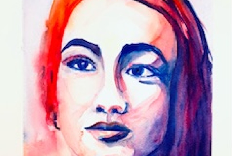
3. The First Wash: Establish Undertones: Hey everybody, In this first video, I'm going to be doing the first wash. And right now I'm just kinda mixing up my colors, the colors I'm using in this painting. I'm keeping it as simple palette of French Ultramarine and a little bit of dioxazine purple and Azo yellow - M Graham for that color. And the red I'm using is quinacridone lilac. I'm painting wet on dry here. And again, I'm really not paying realistic colors at all in this painting. As you'll see as we go along. I'm going to be doing this portrait and just this lilac or magenta color, blue and yellow. And really just looking at the reference picture, which you can see here. And interpreting the values really doesn't matter what colors you use. And again, part of this exercise is to show you that as long as you get the proper values, you already can use any color you want. And that can be somewhat freeing. And we can, it can result in a very vibrant, colorful painting. And this is a pretty popular style of portraiture. The main thing here when doing this first wash is to really keep all, I'm not really looking to paint any of the darkest value areas. I want to try to keep all of the tones are values that I laid out at this point to be very light. Anywhere from lightest values down to medium values, but nothing darker than that. Again, watercolors will always dry a little lighter than what you see. So there's some areas here that look a little darker but they will lighten up. I'm putting in these colors against, It's a combination of those three colors I already mentioned. French ultramarine, Guernica, don't lie luck as all yellow. And three beautiful primaries, a triad. I'm getting a little bit of areas that have kind of a natural flesh tone. But again, I'm not really trying to replicate authentic or realistic colors, really interested in the values. And also an interesting composition. A juxtaposition of colors look good together. Okay, at this point, I am aware that I'm wanting to retain the highlights. So if you can look again, once again in the reference image here you can see where the areas of greatest highlight are on the forehead, the bridge of the nose, down the nose and on the two cheeks. And there's a few areas in the eyes, the whites of the eyes that are also quite light. And so as with as, as always with watercolor, you need to retain your highlights. The light is coming from the upper left corner of this reference image. And so the right side of the picture is darkest. And so I'm using my Quinacridone lilac here and applying a little bit darker values there on the right side of the cheek, the right cheek, and the right side of the nose. Also the right side of this right eye is darker, so I'm just painting right over that. Now up to this point, I've been painting wet on dry and I've been carefully coming back and softening edges because when you paint wet on dry, of course, you can get hard edges. Now to soften everything up, I've just taken my spray bottle and I'm spraying lightly over the entire painting. And now you can see the colors just begin to loosen up, begin to flow into one another. I've got the painting surface at a slight angle, 30 degrees. And so the paints are kind of gravity is pulling the paints it down a little bit. Now I'm going to take my brush and it's a clean, slightly damp brush and I'm lifting paint colors the pigment off of certain areas where I don't I want to retain the highlights and so I don't want there to be painted in those areas. And this is a great opportunity to ensure that you have your highlights where you want them. Now I'm going to mix up a real light mixture of my french ultramarine. And I'm just going to apply that along the eyebrows, areas which are quite dark in the reference image. The right side of the nose, underneath the nose, just anywhere where I see strong shadow areas. And the eye socket on the right side is quite dark. The pupils on the eyes both quite dark. There's creases above each eye that are dark. The side of the face on the right is also quite dark. But again, and I have to remember I'm in the first wash at this point and I'm not, I really shouldn't get bogged down in the details of the painting. I'm really just dropping some of this cool color into these areas. But this is very impressionistic at this point. Not worried about details. I'm just trying to put a undertone of colors that will shine through as I go back with my glazes. And the next step.
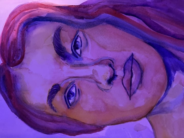
4. Glazing: Adding Medium Values: I've allowed the painting to dry completely since the last step. I just walked away and let it sit for about an hour and it dried, completely dry. Now we're coming into the second step which is glazing, where we're going to focus on adding the medium values. Again, this is largely a value study where we're learning to paint and focus not so much on color but on value. And so in that first wash, we put down the very lightest of value areas, really some undertones of color, and didn't worry too much about detail. Now we're going to be looking at our reference image, which I'm showing you again here. And really focusing on those areas that are medium to darkest in value. And this is where we're really going to start to establish the shape and details of our subject. I'm going to start from this upper left area. I've applied some of the lilac. We're not going on lilac, blue, lying them to mingle and mix creating a beautiful violet color. I've also noticed that the sunlight is coming from the upper left corner. So I decided to just put some of the azo yellow there in the hair in the upper-left to replicate this idea of the glowing of the light. And now I'm going to move over to the right side of the hair where it's really quite a bit darker because this is the area of the face that is in darkest shade. And so I'm going to just kinda build up the values here. You'll notice that I'm using a pretty large brush at this point. This is my o Cu number 6 quill brush. And I always encourage my students to use the largest brush, brush that they can get away with at anytime. In other words, the largest brush for the areas of the painting you're trying to paint. And I'm painting fairly large areas here, so I'm using a large quill brush holds a lot of water, a lot of pigment, and allows you to work fairly quickly. I'm applying very rich, deep colors here again, this is the darkest part of the of the painting as far as values are concerned. I've, since I've already painted over this area, it's now wet on wet. And so my colors are flowing into one another, charging into one another. I'm going to now emphasize the dark values on the eyebrows. And I've already painted there again in the first wash with that blue, but now using the quinacridone violet or quinacridone lilac over that, I'll be able to glazing one color on the other, which will create a role beautiful combination of colors. One of the other techniques that I use often when I'm painting at this stage in a painting is refocus our force myself to look and see shapes and not actual facial features. In other words, don't look at your painting, your reference and see you and I, but rather see the various shapes that make up that eye, that triangular shape at the corner, the oval shape in the center. And as you paint those, try to emphasize how one shape is connected to the next. And just allow as you paint each of those shapes just basically create great lines or connect those shapes with the paint on the paper. As you can see, I'm doing there from the nose, I go down and connect it to the top of the lip. And then from there through the line, through the center of the ellipse. And again, refocusing on the shapes and not on the mouth itself. Don't think, oh, I'm painting a mouth here because then you will have a tendency to not paint what you see, but what you think you should be painting. Kind of those, oh, references or symbols that we have in our mind for what a mouth looks like or what an eye looks like. And you will have very difficult time painting and rendering your subject realistically in a believable way if you focus on those symbols that you have in your mind and rather paint shapes. Okay, so I've, again, I'm pulling back over some of the areas I paint verse with the lilac now going back with the French ultramarine and allowing that blue to charge into the areas I painted previously. I just like this. I love this beautiful mingling of the colors. And the watercolor really will kinda create its own beauty. As you allow the pigments to mix on the paper. I'm going to go ahead and speed up this portion of the video as it's somewhat repetitious and it takes me a while to go around and paint all these areas. So I will continue to darken areas and emphasize the shadow and shade areas, especially on the right side of the face here, along the cheek bone. It's very dark on this side of the base and below the chin, on the right side of the mouth. It's helpful to have the reference image, like you see here, always in front of you. Make sure you squint as you look at the reference image will help to diminish the details and help you to focus just on values. I'm also taking my brush here again, the O COO, Quill, number 6. And I'm with water, clean water, I'm softening some of the edges as well. Now coming back with the French ultramarine and darkening these areas below the chin, blending both the blue and the red colors wind to also just emphasize the sense that this is hair on the side. So I'm kind of putting in some streaks of color that represent the texture of the hair. Okay, We're just about done with this second step in the painting. Establishing medium values with glazing. We're going to eliminate, let this dry completely before I come back and start adding a little bit more details. And the most important parts of the painting.
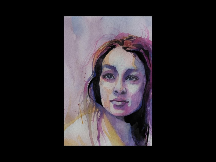
5. Adding Details: The Darkest Values: Now that we've started to establish more of the medium tones, we can start to see the image of this young lady emerge from the paper. It's quite exciting is that begins to happen. So now in this next step, we're going to focus on details. The most important details are going to be in the eyes, and the mouth, and the nose. For the most part, these three primary and most important facial features are really where our eyes as a viewer go when we look at another person, particularly the eyes. So the I on the right is in shadow, quite a bit in shadow. And a little later on in this video, we'll kinda emphasize that. But we want to again, just carefully refer to our reference image and try to identify the shapes and the correct values. The, there's quite a dark shadow on the right side of the face. So I am grabbing my dioxazine purple and painting that they're underneath the chin. Now back to the top, to the right of the forehead. Painting some with the lilac color there and softening the edge where there's a gradation from dark value towards the middle of the forehead words lighter. You want to also attempt to create what are called Lost and Found edges in your painting where if you are creating a line that represents some edge, you can kinda paint along that edge but then kind of break the line and then pick it up again a little later. And this kind of gives the, you are a hint as to what the Edge is, where it goes, but it doesn't really spell everything out completely. And that allows the user to interact more with your image. Kind of filling in the holes, so to speak. And this makes the painting and the image more engaging. We really aren't in painting. We really aren't trying to create a photorealistic representation of the image that we're looking at. If we wanted that, I think really we could grab a digital camera and take a quick picture. But I think instead, we're trying to develop the techniques, in this case in watercolor that recreate engaging representations of the image without necessarily being photorealistic. I prefer impressionistic and loose adaptations are representations of a subject as opposed to a hyper realism. Of course, everybody is different. Everybody has their own preference and that's fine. But you'll find if you follow me in my classes here on Skillshare, that you will see primarily a effort or a leaning towards impressionism, which is a style of painting. I just love the style of portraiture with the real vivid bright colors that are not photorealistic or even. Representational of true skin values and things like that. As another example of an impressionistic style. We're not focused and worried about perfect color representation. Rather, we're just trying to evoke a feeling about this person and using a vivid in a variety of colors to do that. At this point I'm using my photo, I think number 4 brush, which is a little bit smaller than the brush I was using before. So as you begin to move more and more towards the finer details of your painting, you typically will pick up smaller brush. And I really like these quill brushes because they have a big body in the brush that holds a lot of water. And the advantage of that water and pigment, the advantage of that is that you can, as you can see I'm doing here, you just kinda keep painting and painting and painting for quite a while before you have to go back to the palette, pick up more water and paint. And that allows you to just paint larger, larger areas more quickly. It allows you to kind of continue. You're always kind of in a race against the clock and watercolor because your, your paper is drying. And so you need to move fairly quickly. And so if you can just keep on painting without having to go back and pick up more pigment and water, then that's a real advantage. And these quill brushes, which I have reviewed those in my materials video at the beginning of this lesson, are I really like them. They're great brush and not too expensive to purchase, so highly recommend them. So now again, we're trying to add another layer of glazing here to the shadow on the right side of the face. We once previously I had put in the lilac color in that area and to darken it a bit, but now, of course, needs to be dark and even more so I'm coming in with a mixture of the blue and lilac, creating kind of a violet. And I put that there now, also a little bit more detail in the hair along the side of the face there. You don't want to attempt to paint every every line in the texture of the hair that would get too busy and really wouldn't look good. So we just we just again give a suggestion of the hair by putting in a few lines that represent that texture. The whites of the eyes are not always completely white. In fact, they tend to be white closest to the iris. And then in the corners there's more of a little bit darker value there. And it helps to render, give the eye more of a three-dimensional quality. If you can put a little bit of a gray color or a medium value there and the corners of the eyes, the eye sockets tend to cast a pretty significant shadow over the eyes and underneath the eyebrows. And so I'm doing that here again with the French ultramarine color. Okay, Now I'm gonna go ahead and speed up the video a little bit. For these last few details. You will find that as you progress with your paintings, you will quite typically come back to areas several times to glaze over the paint drying. Quite a bit lighter than when you first put it on. And as you are continually evaluating the values in an all, you can just start to see where you need to darken some areas. However, having said that, you do need to be careful not to glaze over an area too many times. The more pigment you put on the paper, the more you start to diminish the brilliant white ness of the paper that is really part of the life of the watercolor. That light comes from the paper and it needs to be able to shine through the pigment, too many layers of pigment kindle the picture. Okay, we are just about done with this painting. I'm happy with the value that I have achieved from the darkest darks and lightest areas. I'm going to go ahead and and sign my work here in the lower right. Encourage you to do that as well with your painting, will come back in the next step and just reflect on what we've created and what we've learned.
6. People Painting Challenge: Are you intimidated by the idea of painting people? Would you like to improve your skills in portraiture, but you don't know how. I meet a lot of watercolor artists who feel that way and I used to feel that way too. One thing I did to overcome my lack of confidence and improve my skills is to embark on a "people painting challenge." I painted a portrait every day for 30 days. I learned so much in this time, I developed confidence. I picked up some new skills and techniques and I began to see the human face in a new way as I focused on values and proper proportions. If this sounds interesting to you, I encourage you to finish this course. Then go online and collect some copyright free images. I use Unsplash.com for great reference images for my paintings. Try to complete a painting every day. If you miss a day, no problem, just pick up where you left off the next day. Trust me, if you complete this challenge, you will see your skills improve. I would love to see your progress and your work. So if you complete any portraits in this challenge, please post them to this class on Skillshare.
7. Reflection: In the final step of this class, I like to bring my students through a reflection process. I asked them to consider three statements. First of all, to see the good. Take a look at your painting and find out what you really like about it. I think we tend to be our worst critic very often, especially with our artwork. I think it's very important to really notice and even say out loud the things you like about your painting. Possibly it's the granulating or the color mixture you see in some part of the painting. Maybe it's the way you rendered the eye or the nose, the mouth. Maybe it's the kind of the first wash, the real soft light in the skin in here. Whatever it is, I'd like you to state what you like about your painting. If you can find three things you really like and see the good. The second step is to set a goal. I think we should look at our painting, looked at our creative work, and decide what we want to work on for the next time. Maybe you want to study the anatomy of the human face and get better at rendering the right proportions of a face. Maybe you want to continue to work on your color mixing. Maybe you want to try this over again, but just with a different set of colors, whatever it is, set a goal for your next creative work. And the last step is to share your work. A few years ago I started posting my work on social media and it was the best thing I could have done at that point in my creative journey. I've got so much feedback from so many people, so much encouragement to keep on painting. People wanted me to paint things for them. I really encourage you to share your work with the world. Social media is one way, but you can also simply pass on what you've learned to someone else who's also learning to paint in watercolor, or maybe give away your paintings. Maybe share the things you make with others in small ways. I don't enrich your life, and it will make your creative process that much more enjoyable. So in closing, thank you for being a part of this class. I hope you've had a good time. I encourage you to leave a comment in the comment section of the class and moles and definitely post your project. If you've finished this painting, please post it for everyone else to see. And if you do, I promise I will lead feedback. Thanks for being a part of this class. I hope you join us for another class real soon. I have new classes in the works, so stay tuned. See you next time.
 Kris DeBruine, Watercolor Artist & Educator