Transcripts
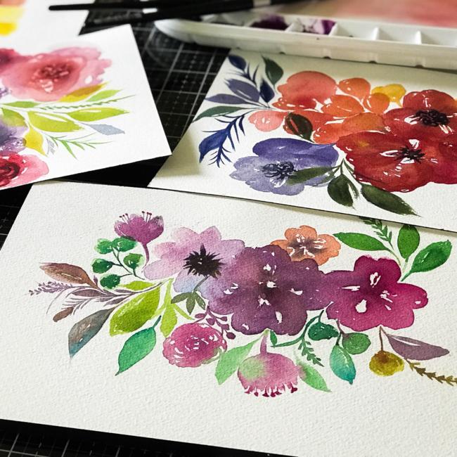
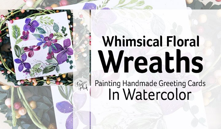
1. Introduction: Hi friends. It's Lisa Hetrick. Welcome to going with the flow painting. Flowy, flowy florals in watercolor. I'm so grateful you're here. I'm super excited. We're going to have so much fun together. Painting flowy florals, Abra Kind. In this class, you will learn how to paint Slowey for Lowy. Florals with watercolor will take a deeper dive together into the different kinds of water color paint, paper palettes and brushes. And in this class, I'm going to cover color mixing color theory and help you get started on building your water color palette. I'll de mystify and teach you many watercolor techniques that are super flowy and super juicy. That will help you create more flow in your florals. We'll walk through each technique step by step with project handouts before we start painting the final project. Together, you can paint beautiful, flowy, flowy flowers that air radiant with color, whimsy and fun. Watercolor is my favorite medium to work with, and I know it can sometimes feel challenging to work with it. I'm here to help you and achieve mawr Joy with watercolor. May you find pause from the hustle, pure joy and inspiration here, Welcome and let's get started and have some fun
2. Choosing Your Watercolor: Okay, so we're going to get started by talking about the different kinds of water color paint that are available to you. So we're going to start off with the first in the three p's and that is paint. So I am going to share a lot of different paints with you in this session to talk about what they do. Some of the differences, and also the differences between artists. Grade quality, paint versus student grade, quality pain. So here I'm sharing a bunch of different tube paints, so we're going to go ahead and start out by talking about two paints for water color. I really enjoy the versatility of two paints because you can use them right out of the tube in a plate. Or you can use them in a palette, which I'm going to share in a little bit. Who paints come in different sizes with different fluid ounces and some to paints come in. Starter kits and mostly all to paints are available in open stock, which means you can just buy the colors that you want and or need. So here is just a sampling of the kinds of two paints and brands that I use. And as I share before two paints are really versatile. You can put them in hands and put them in a travel kit like this, and or you can just use them on a plate and some other palettes and that we're going to go through. We've got so many pallets we're gonna talk about. So the beautiful thing about two colors is like a set in open stock. You can buy them so you can really select some of the colors and the brands that you want to experiment with without buying a really large set of colors. So I just kind of have them stored. Here. Here is Hansa Yellow from M. Graham. Now I love em grand paints because they are so super juicy, juicy, juicy for florals. And I have them in this majella bullet per bulletproof. Excuse me, and it's not really bulletproof. They just call it that glass palette. So this is the palette that I squeeze out the paints onto this palette and I have them in a specific order. Did I enjoy a specific color order and we're going to get into that? So this palette has a lots of open spaces, toe add colors to It also has a really large mixing area, and the reason why I love this palette is because painting flowy florals, you need lots of mixing space, so it's kind of a big pallet. It takes up a little bit of space, but it does store every single color I have from the tube paints for M. Graham. So I also have some of the pallets that have the paint in it, so this is a different palette. This is more of a travel palette, and these are pans, so you could take your two paints and you can put them in the pans. You can also buy watercolors in the pan sets, so sometimes that's a really great way to get started when you're buying your watercolors. So one of the other things I want to share about the tube paints is that on the back of the two pain, there's lots of information regarding the light, Fastness and the pigment information within the colors. Andi one yellow from one brand hansa, yellow medium from core can be slightly different from the Hansa Yellow That's it from M. Graham, and they all may or may not use the same pigment information have the same pigments in them . This has P Y. 73 it's right on the back of the core tube. So it tells you that this is a single pigment color now on the back of the Hansa yellow. It's also pigment. Um, it's P Why three? So the difference is, um, Hansa. Yellow medium is P Y 73 then Hansa yellow over on the M. Graham is a different pigment now. Each company uses their pigments in different ways, and they use a binder toe hold together the pigments. So for core, they have their own binder called aqua zawl. And for Renaissance here they use gum Arabic, and they use honey. And, um, Daniel Smith uses a different. They use gum Arabic as their binder toe hold their pigments together. But M. Graham uses honey as well. Honey and gum Arabic. And all of this information is on back of the tube, so it's really, really helpful to you when you're deciding which colors you want to buy. The light fast information is back there, and it's important for light Fastness for your colors. Two If you're going to have your painting in the direct sunlight and behind glass, you really want your your colors to stay vibrant and your paints not to fade. If you're using them for paper, crafting it's a little bit of a different story. So here's the Windsor Newton Cotman Water Colors, which this is a tube paint that's in the artist grade line for Windsor Newton. I'm not a huge fan of this particular line. The reason why is that the pigments kind of granulated a little bit, and they they're not as vibrant. But I do have them. They're fantastic for my paper crafting projects, so there's a little bit of a difference between, um artist, grade quality and student grade. However, getting started with any kind of watercolor with ease with the techniques that were going to be doing in this class is totally fine. So whatever you have in your stash, you can totally use and apply to the techniques. I'm just sharing lots of information with you about pigments and the different kinds of brands of water colors, so that you can become more educated and make a different decision. If you decide to change up your watercolors, that air in your stash. So we've talked a lot about the tube watercolor. So let's move on to talking about hand watercolors. And there are lots of different brands on the market, and it can be quite confusing. So I'm just going to share here the two different, um, brands that I have that are in these travel pallets. This is the Cinelli, a brand, um, a quarrel. Extra fine. It is a French artist watercolor. It's sort of what has been described as the French version of the M. Graham paints because it is bound with honey. It has. Honey is the binder. So what that means is the M. Graham paints in the Cinelli a paints because they have that binder of honey. It re wets. They re wet. The paints re went really easily become really juicy and vibrant for you. So here's another brand. This is by prima marketing, and this is their confections line, and I'll be honest. I have the entire line. I do enjoy them very much. There isn't a lot of information about them is a pigments, Um, but I do use them a lot for my paper crafting projects, and they're perfect. Get started with some of these flowy florals. Same thing with the Jane Davenport line that comes in these tiny travel pallets. The reason why these pallets are in my stash is because they are a new four double option. They're great for traveling. They give you great results, and they work very, very well. But whenever I'm working on ah, painting that I'm going to be scanning for my prince or I'm going to be giving it to someone as a gift, or it's a commission I'm using artists grade paints. So here is another example of a smaller travel palette that has the Cinelli a line and a lot of the artist great quality paints will take and put the name and the pigment number on the side of the pan in your travel kit. So when you run out of the paint, you know how to refill it, and you can easily buy the pan separately. Mostly every brand out there sells the refills of the bridge of the pans, or you can get the to paint and refill, so it really depends on your budget and what you want to spend if there's colors that you know you're going to be using quite a bit of, um, you're going Teoh. You know, it might be a good idea to invest in the tube versus the pan. So here is another really large pans that that I have. This is a German paint brand called Shrinky Horsch. Minka. Um, if I want to get the German pronunciation correct, these this pan set is another 10. It's quite heavy. Um, I have traveled with it, but it is a little bit makes me a little bit grumpy because it is a little bit heavier than that smaller Cinelli a one that I shared. This pan set comes with a Swatch card and all of the information about its light Fastness the pigment information. So it's a valuable little swatch card that comes with the set. This is a set of 48. You don't need this many colors to get started in watercolor to and even paint juicy, juicy florals. Um, but this is a great set. I've had it for many, many years, and the pigment information is on the pans and up underneath, and you can see that this is well loved. It has lots of mixing space. Um, I tend to use this on smaller projects that are less juicy with my florals. I tend to use the two paints and maybe mixed them with some of the pans here. But this sh minka set is absolutely beautiful. And it is an artist grade palette. So it is a perfect little set. Um, if you want to get started with on artist grade set Okay, So this is a newer set out from core watercolors. I've been using core for about maybe four or five years now, from the tube and the core water colors are beautiful and really high high vibrancy. They have recently brought this new pan set out that's hand poured, and it's in this small little 10. So I have this. This is a great little set. It's a great little price point if he gets around $30. Um, all of the information about all of these products paint products that I'm sharing is also in the download for that comes along with this class. So the information is there for you as well, with the reason why I really like this core, Pan said. is because right on the back they have all of the cup names of the colors, and they have all of the pigment information as well as the light, fast information. And again, that's really important to know and understand the light fast information because a pigment , a pigmented paint that is doesn't have really good light. Fastness means that when it's exposed to light, it's going to fade. So it's called a fugitive color. Um, which is kind of interesting term took to call it that, But you really wanna work with, um, Pete's that have good light, fast ratings? And the beautiful thing about this said, is that they're super vibrant because most of them are single pigments, Which means that doesn't take a lot of pigments to make up the colors. And that set. Okay, here is another small pallet set that's made by Mission Gold, and they have a set of 12 and a set of 24. And the reason why I really like the Mission Gold brand is because they come in tubes. Um, there really, really vibrant. They re wet very, very well. They're pigment and light. Fast information makes them, um on artist grade quality product. I have painted with the mission Gold Line in tubes and this pan set for quite some time now , and I really enjoy the vibrancy of this color. It's very, very impressive line for a pretty low price point for artists, great paints. So when you compare this pan set with a pan set that is from the confections line or a traditional pan set, there's definitely a difference in size. The mission. Water color charts give you all of their pigment information and all of their light fast information, letting you know, um, if it's extremely light, fast to less light fast. I really enjoy that from this product, and they give you all of the pigment information as well. Most of their sets the 12 and the 24 set will give you Pete's that air, primarily single pigments. I think there's one or two colors that might just be more than one pigment to make up the color. And again, single pigment colors are fantastic to color Max West, so I want to show you a little bit about their pan sets. Their pants sets are really different, its unique. They're probably two sizes bigger than a normal pan set, and they they tell you that in their in their for sure as well. But when the pan said is empty, you could just easily refill it with your tubes. And they also sell them, um, in single pans. So that makes it pretty convenient when you use up all the colors and I'll be honest with flowy flow of florals. You're using a lot of paint because we're mixing big areas of peat and we're using. You're not going to use up a whole pan in one sitting, and it's going to take some time, but you are using a lot of pain. So here's an example of all of the colors that can be made with just the 12 colors from the mission goal can set. Now we're going to talk about color mixing, and I'm gonna talk about how to make one of these charts in an upcoming video as part of this class. But right now I'm just going through the Pedes and just kind of showing you the different palates and how I use thumb. So here is the mission gold set of 24 so I'm just showing you this one. I talked a lot about Mission Gold already, but I'm just showing you this pan set up against the traditional, um pan set for 24 colors. And in that Cinelli, a set that comes in the metal 10. So there is a big difference between the two, and you do get more paint in this mission gold set. So I really enjoy these two pan sets because the actual pan set the packaging is made from that bullet proof glass palate from the jump Majel. Oh, and again, it's not glass, it's plastic. But that mixing area is a very large mixing area, and it works really, really well. When you're mixing your colors, it's very clear and very vibrant. This set is probably feels about the same weight as the Cinelli I, but I really, really enjoy it. So here is E student grade. Um, hand sat from Windsor Newton, and this is a cotton set. Cotman sets are readily available easily, easy to find. You could find him in your local hobby shop. Um, they do have the information on the side of the pans. All of the information comes with the set This is a great starter set, and this is I've had this one for many, many years. One of my big, bigger issues with the Cotman brand as a peed is that it takes a lot more water to re wet the pans. So it's difficult for me to paint juicy, juicy florals with this brand because it's hard to get the paint activated. Okay, here is a coy watercolor set, and this is a pocket field sketch box. And again, this set is another great little set. It's easily found in, um, online and in your local craft and hobby stores. There are lots of different colored paints in here, and this is a set of 24. They have lots of different mixing areas, and it also comes with a little bit little water brush. And I really do enjoy the colors that are in this set. There's lots of wells of color, and there's lots of mixing space to work with. The colors do come out, and these are really refillable pans. They're sort of like cakes that are inside of this set. So it's, um, This paint, though, is a little bit more on the opaque side, so it's really hard to get a vibrant, vibrant, washy floral from it. But I do enjoy this set very, very much. Okay, so this set right here is from Prang, and we all know this set from probably elementary school or this particular brand from elementary school. So if you're just getting started in watercolors and you really want to learn some techniques and just start to play around and begin to understand the flow of water color, this is a great little set that you can pick up at your local store. Sometimes they're in grocery stores. They're definitely in your craft and hobby stores, but they're also in most big box stores, and they're really inexpensive. And and the palate is, um, very easy to work with, and the colors are a little on the opaque side, but you really can get a big brush in there, and you can really get a lot of colors out to work with. So here is another Cotman set. This is a student grade set, but it's a great little travel set with some interesting little mixing wells. The information for the colors and the pigment information is on the actual pan, and these little pans fit into that well, so this is a great long travel set. Even if you used up all of the pans, you could easily fill up that extra little well. That is part of this set, with some to paint. And it also comes with, Ah, a little water brush. That's kind of makes it convenient. This is another great little set to get started with, um, as I shared before with the Windsor Newton brand. The biggest issue I have with it is getting them to re wet. Um, it takes a little longer to get some juicy color from it, so but it's really great for some smaller projects. So it's a really great little set, so I'm pulling out the difference between the two Windsor Newtons. One had 18 colors and one had 12 colors, so they're great little starter sets with price points that don't break the budget. Same thing with the koi watercolors and the prank. So this set here these colors, these watercolor sets are really on the, um, student grade side of color. So I would say that these are really, really good thing good colors good watercolors to start with. And now these sets that have become really, really popular in the craft and hobby industry. The Jane Davenport line, the prima marketing line. There are several sets of watercolors that have come out. Our Tessa has one, um, alter new has won lots of different paper crafting companies have come out with the sets. They're great sets the tins air Fantastic. I would say that these would be kind of a next level up from, ah, student grade set. So when I say good thes air better, there's some information that's a little more difficult to find about the pigments. Um, but the colors generally get juicy, and they're easy to rework. These little travel sets make it easy for you to travel with them. And I'm sharing my big Big 10 here of all of the other confections prima colors, so you can see that I have them in this. I took them all out of the smaller travel kit and put them into this larger 10. So these colors, um, I've worked with them quite a bit. I use them quite a bit on my paper, crafting projects. I don't tend to use them on projects that I know I'm going to be creating products with or creating prince or works that are going to be framed because I can't validate the pigment information. So and I don't want my work to fade. But they're perfect, cute, great, budget friendly sets to work with. And as I share before, here's a newer one that's come out. This is from our Tessa and the This Artaza set works quite a bit. The pigments, the color, the vibrancy works very much, a lot like the prima. So if you already own some of these other sets out a share of like the prima, the Jane Davenport line, um, you wouldn't need to get the artist because they're pretty much the same. Okay, so we're kind of wrapping up on my discussion here about watercolor and the difference between the pans and the tubes and artists. Great quality versus student grade. And here's what I'm going to say by the paints that fits your budget. We're going to talk a little bit about paper next, and paper is really, really important. I would say that if you have more budget for your paper, spend that on your paper because you're going to get better results with good, good paper. You can always add Pete's to the mix when your budget is available to do so. My favorite favorite colors and brands to use for flowy, flowy, flowy florals. Our June paints because I can control how much I'm getting on my brush. I use them in the pallets that I have shared along the way in this video, and I can add more as needed. So if I'm going on the go, I have a lot of these tube eight brands in smaller pans, Um, so that I can be on the go and work with them outside of my studio space. So I'm going to talk a lot in the next video about paper and how paper matters with the different paints that you might be working with. So let's go ahead and move on to the next lesson and talk a little bit more about paper
3. Choosing Your Watercolor Paper: Okay, Now that we know a lot about paint, it's time to move to talking a little bit about paper. And I have quite a bit of samples of different kinds of watercolor papers here that are my personal favorites, and I'm going to share them with you and talk a little bit about the differences between these different papers and give you some options and things to think about. Remember, we're painting super duper, flowy, flowy, wet florals. So the paper that I'm sharing here are It is the kind of paper that's going to work well with that style of painting. So let's get started with this 1st 1 and this is from B paper company. This is a beautiful watercolor. Paper comes in six by nine. It's 100% cotton, and it's £140. I enjoy this paper very, very much. It is a great paper for the price, and it's also really great for my P pick paper crafting projects. It's a really nice paper. It is a thirsty paper, and you're going to hear me talk about thirsty papers throughout this lesson. Papers that are 100% cotton are very thirsty. Now it's a thirsty paper, but not as thirsty as I would like it to be. Four flowy florals. So here's an example of why, even though it is 100% cotton, it doesn't really take washy washy washes as well as I would like it to. You can see on the left. This is an arch is paper and we're gonna talk about that in a little bit. And there's a lot of water that that paper contain a cake. The B paper can't really take it. It's it's kind of blew me. So Okay, so I'm moving on to the Strathmore Warm water color cold press paper again. All of the papers are going to be sharing our cold press. For now, this paper comes in a pad. It also comes on a block. It is a really nice 100% cotton paper, £140. It's a really, really great paper to work with. It's in their 400 Siri's. It's pretty affordable in your big box craft stores or online. I do enjoy this paper very, very much when you're using this paper from a tablet like this, Um, your paper can get a little bit worked. I'm gonna talk a little bit more about that as well. Okay, Skansen. This skansen acro watercolor X l paper is a fantastic paper. It's a nice, bright white. It comes on a, um, a pad of paper. It's very affordable paper. It's cold press. It's a great paper to get started with. My largest issue with this paper is that it's made from a wood pulp versus 100% cotton, so it makes it a little bit less of a thirsty paper. So the water color kind of sits on top a little bit and doesn't go into the fibers of the paper and spread like it would with 100% cotton paper. So it makes the results come out a little bit different. However, you can get this paper and work with this paper and make the techniques work for you. And then you can try out different papers. Um, so this isn't This is a good option and an affordable one. This is, um, a watercolor block from our cious, and it is now. I believe it used to be made by cancer, but now it is Ah, French paper So the difference between the Kansan versus the arches is that the cancer is going to get a little bit buckled when you paint on it. When it comes out of the pad like that, when you're using a block, everything just stays within the bloc when you're working with it and the water gets absorbed into the 100% shot cotton paper and it's a really gives you really, really vibrant effects with the piece. The kinds of paints that we talked about in the last lesson. I really enjoy the texture of this paper. It's a cold press paper, but it has some texture to it, so that does translate over into your work. And here is a sheet of cancer so you can see the difference in the texture. The cancer in is a little last texture, then the arches paper. Um, so I really, really enjoy using this particular brand, Um, for my flowy, flowy, washy watercolor work. The two paints that I work with seemed to work really super well. It comes in a lot of different sizes, and this is one of my favorite sizes. This is a 7.9 by 7.9. And I really like this square format kind of hooked on it when I'm creating these washing, washing florals. Arses also has, um, a hot pressed paper. So this is an example of that, and it is got a lot more texture to it. So the way they differentiate their their brand is that the green is the cold press. The peak that I'm sharing right here is the hot press, which is a smoother kind of feel. I don't generally use this smooth paper for washy washy florals, but you can It can hold a lot of water again. It's 100% cotton. This is just a really nice option. Um, and often thes papers go on a really fantastic sale online or it's your favorite art supply store. So you could stock up a lot of times they go on a buy one, get one, which is kind of nice, but the arches paper is the one that I'm gonna be using for the lessons primarily. So here's an example of all of the different kinds of papers, and I also have some of this ready cut watercolor here for Strathmore. So some of the big differences in watercolor paper are there on a pad, their loose or they're on a block. So here's an example of the B watercolor paper, and you can see that I've taken some of the tube watercolor and I've put it at full strength on that paper. And it's beautiful. So the papers fantastic for full strength watercolor. It's just not as great with washy, washy, lots of water, kinds of watercolor, it kind of blooms, and it makes a little harder to work with. So here's an example of the RCIs paper, and you can see that the vibrancy of colors there there's a lot of saturation of the color . It's just absolutely beautiful. So when you compare the two papers, the left would be the B from B paper company, which I love for my paper crafting projects. But not so much. Four. Doing flowy, flowy, washy, washy florals. So really paper kind of matters with this particular technique, and you will get good results from all of these papers. It's just a matter of practicing and trying them out at getting a good feel off the flow of the water color paint that you're using and you'll be able to tell right away if you're getting the results that you want. So my opinion about paper is in my budget. I spend just a little bit more on my paper and I stick with the Arches paper because it is something that I can watch out for a sail. And it's something that I can use very, very well with these techniques. So let's move on to the next lesson, and I'm going to be talking about water color palettes.
4. Creating a Home for Your Paint: Palettes + More: Now it's time to have a little discussion about creating a home for your paint pallets, pallets, more pallets. So I'm going to talk a little bit about the different palette strategies that I use when I'm painting these flowing florals. So I'm just gonna walk through some of the different options for pallets and talk a little bit about pans as well. Um, 42 paints. So I have several different to paints here that I'm going to talk about and a bunch of different pallets that are my preferred palettes. But remember there so many different ways to do this. I'm just going to talk about some things that might be helpful to you. So right here are some porcelain plates, and I love using these for my two paints and painting, so I will take a little bit of the to Pete and I'll put them out onto the plate, and I'll just use the colors that I want to use for the project that I'm working on. These plates are very inexpensive. You can pick them up at a target. You can pick them up at a store, really an extensive a dollar store even and the plates. The reason why I love the porcelain plates. Or you could use a ceramic plate. Is that the colors? When you put the colors on the plate, they are very, very vibrant and easy to move and clean so you can see the actual color, the beauty of the color. And it's super super clean. So porcelain plates are really, really easy to work with. This plate right here, I just kind of have out all the time. This has a little bit of core watercolors on it and just a little got as you can see on the plate. Um, and that watercolor has lasted for months months, because you need very, very little. So the plates can be a little bit heavy. And you could see this plate was from, I believe, bed bath and beyond. It was like a dollar 90 night or pretty. Inexpensive. Um, you could also pull a plate from your kitchen because we all have plates like this. I like the square format plates. Um, they and I have them in various sizes. So when I want to use a lot of paint, I grabbed one of my bigger ones when I want to use a little bit of paint on a project that grabbed one of my smaller ones. The other thing about the plates is sometimes I won't necessarily use them. Four putting my pain on like this pallet right here. I will use them in conjunction with a larger palette. And I've shared this Majel Oh, um, bulletproof glass palette. This is my M. Graham one. So I have m. Graham paints in here. And while this palette is really large and juicy, and it carries a lot of pain on the inside of this palette and there's a lot of mixing space on the inside of this palette, I will sometimes grab my porcelain pot palette and put it alongside this one. And I will take some of the paint from the wells, and I will mix it up within the porcelain palate because it makes it. I can use a lot of different mixing areas while I'm working with it. So for my tube paints, I have these pallets where I have taken the tubes and I have squirt them out into the wells , and this is the home that I have created for this brand of paint. So this is the home that I have for my M. Graham Pete's and I have them swatch doubt. So I know what colors air in there, and I've also included in your downloads some of the different swatches that I have for the different paints that I have so that you can see the different colors that are in my palette. And that might be helpful to you when you are selecting some colors for your palate if you go the toupee route for your colors. Okay, so I also have one of these pallets for my mission gold paint. And I kind of separate my brands because each one of these brands behave a little differently. So, like I said, this is my M grand palette, and I also have another one of these for my mission. Gold. So when I opened up the Mission Gold here, there are quite a few more colors in this power. There's 36 in here, so I do have a swatch card in here is well with the name of the colors. So this is the home for all of my mission. Gold pain and there's lots of mixing space within this area for Mission Gold. But I also will pull porcelain palette in a porcelain plate in when I'm working with this with this palette so that I can mix up different color combinations as well. Now, I know I've shared this before, but I really like this palette because there's lots of mixing sees and the when I mixed colors within that mixing space. They are very, very true to their color and very, very vibrant. So I really do enjoy this palette. It's not a travel palate. It's really a permanent palette that stays in my studio space. Okay, here is another, um, palette home for some of my mission Gold Pete's. And this is a set of 36 from Mission Golden. This is a majella palette. This palette is a great starter palette. It is available on Amazon, and there are 36 colors that come in the tube, and the pallet comes with it, and this is a set that is frequently reduced and costs on Amazon, so it makes it a really great way to start out with some artists, grade quality teens and also get the home the palate for it. and I do enjoy this one very much, and I bring this one out a lot when I'm working on my paper crafting projects because it has just enough paint in there to work on smaller card projects. So I want to share another pallet that I have here, and this one is a little bit of this is a great option. This is another pilot from Majella Andi. It is available in many large craft stores, and you can see that this one is well loved. It has a lot of pain, also has some pots of paint in in inside of it. It is an air tight palette, so it is a nice home for your pains. It also travels a little bit better than the other pallets that have shared previously here because it's smaller and this is an 18 well, palate and this one. I just love it. It's got some some colors that I really enjoy working with, and I will dig it out. It's a little messy. Those mixing well areas you can clean. I just haven't and you can see that it's airtight and well loved, but it is a easily and readily available in a lot of big box stores. Okay, here is another small pallet that is also easily and readily available. It's made by low Cornell. It is a small, smaller plastic pallet, and often I will use a palette like this, even though I'm not a huge fan of these kinds of plastic pallets, because the colors the water colors tend to beat up in the mixing area, and you can see that's kind of beating up a little bit. But I will use these pallets with a limited number of colors if I'm working on a specific project and I'm also transporting that project around kind of working it into my life. And, you know, I might be working on in the car or waiting for my Children, um, to come out of their events and things like that. So this is a great little travel pal. It's very lightweight. It's easily read readily and easily available in most big box stores and online. Now this is the Mac daddy of pallets, and this is not something that you need to get to start out with. But this is a palate, a porcelain palette. It is very heavy this stays in my space. It is a permanent palette. This pallet is has a mix of Mission Gold, Daniel Smith and M. Graham paints, and I have this palette set up in the color wheel fashion, with some extra colors out on the edges that I'd like to use that are don't necessarily fit into the color wheel that are different mixes. I love working with this palette. I tend to work with this palette when I'm working on a larger project within my studio space. Porcelain pallets are really fantastic toe work with. Here are the colors that air within this palette. You can see that they're in the color wheel, and it comes with this lid just to kind of protect your Pete from getting dust an extra stuff in it. So porcelain palette like this is a really great option, and it is an investment, and it is very heavy, So it is something you might want to think about down the road. If you like to create. If you like to be able to set up your palate in the color wheel, there are other options that are in the hand out. I've supplied them in the supply handout download that aren't porcelain that are plastic that air fantastic as well to just get you started. So here's just a sampling of all the different homes I have for my watercolor paints, and you really a don't need this many homes for your watercolor paints be. You can start off with a small palette of colors and even the travel pallets that I have shared in the very first video where we were looking at paint. You can start out with a small travel palette of pan colors to do the techniques that were going to be doing in this class. I just thought it might be valuable to you to share some of the different options and the different homes for paint that is in a tube. So again you can start out with a porcelain plate and you can just put a little tiny bit a little dab of the colors that were working with on the plate. And you can work with that or you can use the watercolor pan sets that we've been talking about and again, this is my Cinelli a set, and I love it, and I do break it out when I'm using it for florals. And they're great to transport around from room to room space to space. So again you can. This is a great home for your pans and for your to color Pete's. So whatever palette you choose, you just make it something that you're comfortable with. Okay, so we're going to go ahead and move on to the next lesson and talk all about the brushes.
5. Choosing Your Brushes: So now it's time to talk about your watercolor brushes. So I have a great sampling of different kinds of brushes here for the flowing, flowing florals. We're gonna be focusing on the rounds, and I'm going to talk a little bit more about them in a bit. But I thought it would be helpful to you to share some of the different kinds of brushes that are available to you that you can use with this technique and other watercolor techniques. Now brushes come in all different kinds of sizes, and they come in different kinds of grades. And my theory on brushes is to give it a go at the budget and the price point that you can afford right now. And then you could always upgrade your brushes. Now, these two sets this set of brushes right here are rounds, and they're a craft smart brands, so they're easily and readily available in your craft store. This is a Cotman brand brush. Now, brushes are made with different summer synthetic. Some have squirrel hair, some are sable. Some have different kinds of, um, hairs in them. This is a Princeton Neptune, and so are these two Princeton Neptune rounds, so brushes are like any tool in your arsenal. The slightly more expensive brush may give you better results. I'm going to talk about silver brushes because they're my favorite. But these through these brushes that I'm sharing here, um, are all different kind of grades of brushed. So with pain to have one artist grade and a student quality grade with brushes. It's kind of the scene, and the difference is the brush holds more paint or holds more water. So here's an example of a brush from a local art supply shop called Plaza Art Supplies. So I'm always encouraging people to don't negate the fact that the store brand is not a good brand. It often is a very, very good brand. And this is an aqua, not brand, that is also very good. Russia's well, I've tried out lots of different brushes, and I pick up different rushes for different things. My favorite brushes are these black velvet silver brushes there, the 3000 series and I love the rounds. Now I have several brushes from this brand. I love them because yes, there a bit of an investment, but they are a tool that has been with me over and over for many years, and they performed very, very well. I love the rounds, so I have 868 10 and 12 and I also have a four here for painting washy washy florals. I predominantly use a 68 know in 8 10 and 12 brushed, and you'll see that more when we start to paint the techniques. But here are some of the other silver brushes, thes air, the wash brushes, so there's different sizes of thes as well. Um, this brand of brush is just holds water holds Pete really, really well, so you're not constantly dipping your brush back into the paint to get more paint. So again, there are varying degrees of quality in your brushes, but it's not to discourage you. It's to tell you to get out there and experiment with different brushes and see which one fits you and fits your budget and fits the kind of work that you want to dio. So here are just a few more of the silver brushes, and because these are a nen vestment and they're a tool, I just find myself going to these brushes all the time. So I'm not running out and buying more brushes and more brushes and spending a little bit more money in the long run. So I keep these brushes in this little case and this case is from prima marketing, Um, that I picked up online, and I just you could use any kind of case, or you could even keep your brushes in a jar on your desk. You just want to keep them in a place, especially for transporting. So I use this a lot for transporting. You just want to keep him in a place where they're safe and the bristles aren't going to get messed with too much or just, um, buggered up in any way. I also have a couple other brushes in here that are from the Silver Line that are dagger brushes, which is like a triangle brush. And that is something those brushes air fantastic for creating different techniques for florals. We're not going to be using dagger brushes with this technique. We're gonna be focusing on the rounds that I'm showing here and again. Just find a brush that you're comfortable with. If you want to start out with the craft brushes and see how the technique goes. You'll be good to go. And over time, as you want to progress in your work and what you want to do, you can invest in brushes and a different quality of brush. Um, as your budget fits, so okay, a couple other things, All their little tools that I have when I'm water coloring, This is a micro fiber cloth. I have, um, some clear jars that I use thes air, just mason jars left over from spaghetti sauce. So I'll use two of these. And I also have this water bucket. This is from a Jell O. You can pick this up, um, online or at your local craft store, and it has three different wells. So I'll fill all three wells up so that I can keep my dirty water and my clean water separated. Same thing with the jar. You could just use a jar or mug or a cup. I will always have two of them sitting on my desk, one with clean water, one with, um, the dirty water. And this bucket is kind of fun because it also has a little ridges toe. Hold your brush. Now the micro fiber cloth keeps me from using too many paper towels, so it's easy to use and I can wash them up, Um, and use them again. Okay, so now it's time to move on to the next video about the practice handouts.
6. Using the Practice Handouts: Okay, so I have shared practice handouts for you within the class downloads for you to download all of these handouts, and I'll be working through these pieces along the way to help teach you techniques. So there are several pages here of handouts, from color palette to the color mixing palette to some of the techniques for creating value charts and the color wheel. And there's several different pages to help do the individual floral techniques that we're going to do to create the flowy florals. So these downloads are here for you and available for you to download. You can just put put some watercolor paper in your printer and print everything out. I also have the full color versions of the practice handouts scanned for you and available for download A swell, but we will be walking through each one of these downloads as part of the techniques we're going to be learning how to create a color mixing chart that's similar to this chart. I'm going to teach you how to do that so that you can get the most out of a limited palette of colors. We're going to talk about two color mixing, creating values of color and some coat basic color theory, along with going through the's washy, washy watercolor techniques before we get to the specific techniques related to creating the flowy florals. So again, all of these practice handouts are available to you in the handout section, along with this section of the video and all of my, um, templates from my pal. It's all of the different color names of the different color. Palettes that I have are also scanned and available to you as well, so that you can get a sense of the names of colors and what paints are called so that you could help build your own palette. Okay, so let's go ahead and let's get started. We're gonna take a deeper dive into water color and start our tutorials.
7. Selecting Colors for Painting: Now it's time to talk about selecting colors for your flow if laurels. So I'm going to go through the different palates in the exact names and brands of colors that I'm using. Now the names might be extremely helpful for two for you. When you're gathering your watercolors, Teoh, create your palate for these flowy florals. So I also have this in a hand out for you, um, in the downloads, where you can see the exact names and the exact colors. So I'm going to start off with my M. Graham Pete's and I share this when we were talking about two paints in the very first video, Um, the M. Graham is one of my favorite brands, and I have several colors within their palette of colors that I use four thes flowy florals so you can see in the hand out. I've broken down the M Graham palette, the mission gold palette and the Daniel Smith palette. I'll be using M. Graham for most of the techniques on the project that I'm sharing with you in this class, but that does not mean you have to use em, Graham paints, but knowing what the's colors are and the combinations of colors can be very helpful to you when you're gathering your supplies. So I'm going to start with the M grand palette. So I'm gonna break these colors out and just kind of show you what's in the palate and how I've selected them, um, to work with these flowing florals. So I'm just gonna put them out here in the yellows and the reds and the blues and the greens, the violet on the neutral and just kind of walk through and explain to you the names of these and why they're on my palette for florals. And again, the names of the colors can be very helpful to you. And I've swatch them out here and have also provided this swatch to you. If you have thes colors, you can swatch them out. Or you can swatch out the ones that you do that fit within this kind of color range. And don't worry. If you don't have the exact same colors as I have listed here, um, you are going to be able to work with what you have. Okay, so the first color I have in my palette here is a cool yellow and it's Hansa Yellow by M. Graham and all of like a share before all of the light, Fast information and all of the pigment information is on the back. And then the next color I have in the palate is a warm yellow. And this is gambo sh I really love that color and mixes so well. The next color hat is a warm red. It's scar Scarlett pyre all. Then another warm red I have is pyro red and I love love that color now moving over into the crimson color. I have a permanent Alice here in crimson that you can see is well loved and has a lot of stuff all over the tube and my cool reds. I have to cool ranch here, a quint quinacrine own rose and a quinacrine tone read, so I will use both in this floaty floral class. The warm blue on my palate is ultra marine blue, and that's from M. Graham and I want to share a little bit about ultra marine blue. I've swatch doubt several different brands of ultra marine blue here, and you can see some of the student great quality is over on the left like the prang in the koi. And here is the M. Graham. So you can see that the names of this color ultra marine blue in all of these different brands look different. Even from the mission to the core to the shrink from Cinelli a, um, and even the liquid watercolors and even the Daniel Smith. I prefer the M grand version of ultra marine blue because it is really, really vibrant. And you can see over on the left, the Windsor Newton and the koi and the Prang ultra marine blue are very opaque, so they're not very transparent at all. They're fine watercolors to work with. But the vibrancy on this M. Graham is just top notch, and I just love it. But this is just, um, something to share with you to show that even the names of your watercolors are not consistent across brands. So it might be called ultra marine blue in the M grand brand. It might be called something different in a koi or Windsor Newton. Generally, ultra marine blue tends to have the same name across brands. It might be called something a little bit different, but you can see that it does look different and it totally can look completely different. And ultra marine blue is a really great blue because it's a great mixing color. Okay, so I also have a cool blue, and that's a cobalt blue that I just shared. And now I'm going to show you the mixing greens that I use and because we're doing florals . The greens are kind of important. So I have, um three mixing greens that I use, And I'm also going to show some violets and some pinks to kind of round out this palette a little bit. So the three mixing greens that are my favorite are also green sap, green and cobalt green. These three greens I use also green a lot, and I use saccharine a lot. You can see they're kind of a little bit well loved on these tubes, but these air three great mixing greens and these greens could be mixed with any of the other colors I've already shared to create a whole different color, and I absolutely love that. But these three greens are great for the flowy florals and working with them for, um, for flowers and leaves and all of the beautiful greenery. So I also use turquoise. And here I have used Turkle is a lot with my mixing greens, and here I'm sharing the cobalt teal, and there's also turquoise in the M grand palette. So I use both and now for my violence and my pinks, which I kind of used together. And these are just gorgeous colors From M. Graham. I use mineral violet in the violets I really love. This color has a great light fast rating, and it is a single single pigment, which is lovely, and I also use a cobalt violet, which has a nice, like fast rating as well. And I also have an ultra marine pink here. Now this pink is just lovely. It's got a nice mix of violet and pink in it, and I just love it. And then I also have a Quinn acrid own violet here and I. This is a recent addition to my palette. I do love that color. It is a deep, rich color. I also have a neutral on my palette, and I use Payne's gray. I love this neutral. It is a great color to mix, um, with my other colors to create a shadow color. It's just a fantastic version of Payne's Gray by M. Graham. Okay, so I also wanted to share on my M grand palate. You can see that the majority of the colors that we've talked about are up on the top portion of the palate. My Payne's gray is always on the lower right hand portion of the palate, and I have a couple other colors, the kind of mixed in here that aren't really, um, on the handout. But I just wanted to share that. I do have yellow like Hansa. Yellow is on there a couple times in my palette in a couple different places, and they also have some neutrals on that pallet as well. But the colors that we've talked about so far are great. Start for just getting going with some floral combinations for your paintings. Also on the handout, I've shared my mission gold palette and the colors within the palette that have shared along the way here. I kind of given you the names of those colors on the handout that coincide with the names of the colors that are on the M grand palette so I have broken down the cool yellow, the warm yellow, the warm rad, the crimson, the cool read the mixing greens so they are a little bit difference. But what you're going to see on that handout is that even though the names of the colors are different, the colors you can no matter what brand paint you're working with, you can pull a palette of cool yellow, warm yellow, warm red and all of the colors. You can pull a palette of colors together that a work very, very nicely with the florals. And here's an example of a small Daniel Smith set that is sold like this in two paints. But really, it's a mixing color set so all of these colors can be used to mix up like any color you can possibly think of. So on the handout. I have used some of these colors to give you a sense of what the Daniel Smith. If you have Daniel Smith colors what a nice palate of colors would look like. Four. Painting flowy florals. So I have broken down. All the different names that are are Daniel Smith names and also through a ah three wildcard colors in here that I love. That Daniel Smith has a moon glow a row tonight, genuine and an opera pink. I love those three cool pinks that are in the Daniel Smith palette. Now, if you are using pan sets, just remember that these colors that I'm sharing from the tubes will translate over to many of the common colors that are used in the pan sets. So if you have a pan set or travel peon set, you will be able to use those colors and assemble them into a beautiful palate for florals . Okay, so hopefully this has been helpful to you to understand, like the names of colors with different brands and taking a look at the water colors you haven't assembling a nice palate of colors that you can use for your flowy florals. In the next lesson, I'm going to be talking about color mixing and color theory and demystifying it so you could really get started and get the most out of your watercolors.
8. Color Theory Basics: So in this next lesson, we're going to cover some color theory basics, and we're going to talk about mixing colors now. Watercolors. There are so many watercolors on the market, and most brands will have, like 144 colors or 50 colors. You see like a massive amount of colors, so you don't need all the colors, even though all the colors air absolutely luscious and yummy and juicy. There's a lot that you can do with a very limited palette. So and I always say, If you understand the water colors you have, how they work, how they mixed together to create other colors. As you see here, you'll be more armed with the information that you need to make selections of colors that you want to add to your palate. So we're going to talk a little bit about, um, watercolor mixing and learning how to create a water color mixing chart. We're gonna talk about the values of color and the color wheel basics, and we're also going to do a little bit of two color mixing so in your hand outs and your downloadable handouts, I have thes watercolor mixing charts. Four sets of 12 sets of six and sets of eight watercolors. So I think that creating these charts is very handy. It could be very tedious, but it is also meditative and a little bit gives you a lot of insight into what your colors conduce. Oh, and how many different colors you can mix with the colors that you do have. So what I'm sharing here is my M Graham, and that's the palette that I have shared is my favorite floral palette that we talk index about in the last lesson. So this is my M. Graham 12 color mixing chart, and I've provided a mixing chart here for you, and I'm going to walk you through how to create one. So with those 12 colors that I have in the palate, I can make it a lot of colors here. So here's how it's done. So I've got the different Um, I've got the hand out here for you with the mixing chart. So what I'm doing here is I'm taking the colors and I'm starting with Hansa Yellow, and I'm writing Hansa Yellow Gambo Scarlett Pyro as a green. The list of colors that I have in my palette. I'm writing them down the lefty inside off the columns here, aligned with the squares, and then I'm taking them and writing them at the top as well. So how does a yellow Gambo Scarlett payroll and also green? And I'm going to write them across now? I'm just going to do a handful of these to give you a sense of how to create this color mixing chart. And then you can finish out the chart with the colors that you own. But you really, really give you a sense of how to create one of he's now. The reason why we're going through this and creating it is because you will really get to understand and learn the colors that you do have a little bit more, and you will be able to mix up colors that you don't have in your palette to create different kinds of colors. And that's what I find fascinating about color mixing charts. So to get started here, I'm taking Hansa Yellow, and I am putting pools of it out on my, uh, porcelain palette plate here, and I'm just taking the Hansa yellow and putting it in that first square. So it's Hansa Yellow Hansa yellow. So this is the first square of color, and it's a pure pigment of the color. So now I'm going to go back and dip my brush. I clean my brush and then dip my brush into the next color, which is gambo sh. And I'm going to put a little bit of gambo goes into the Hansa yellow. Then take that color that's on my paint brush and paint it into the next square. So, basically, as we're going along the squares, Hansa yellow is the base color and we're adding the next color to it. So the next color I'm going to add is Scarlett Tyrell, which I love that color. It is just a beautiful like orangy red. I'm going to take a little bit of that color, and I'm going to mix it in with the Hansa yellow, and I'm going to create a different color with that. So I'm also adding the scarlet pirouette and the ISO green down the left hand side, too. So it's the same order that I have going up in the upper part of the mixing chart. I have it going down on the left hand side. So I'm dipping, not cleaning my brush. Now you want to clean your brush in between because you want the pure pigment to be in the brush and not what was left over from the last time. So I'm dipping my brush into the scarlet Parro and I just drop it into that pole Auf hansa yellow. And now I'm cleaning my brush again. And I'm going to mix that color up and just take that color and paint it right. And I'm just adding a little bit more because I kind of diluted it a little bit with water . So be careful with the amount of water that you're adding to this mix. You really want it to be the pure pigments you really want it to be. Not a lot of water, but mawr on the pigment heavy on the pigment side. So I've added that Scarlett peril to the Hansa yellow and now I've just added it in to their and you can start to see the change in Hansa Yellow as we're adding different pigments to it. Okay, so I'm going to create another pool of Hansa yellow on my porcelain plate and you you could go out and put a bunch of pools out there and just add colors in. I kind of like to do it one at a time, just so I can really see my mixes and not get confused. So I added some also green to the brush, and I'm just using a wash it brush a flat wash brush. You could really use any brush that you want to do these swatches. So I've dropped in a little bit also green, and I'm gonna go ahead and mix that up with this Hansa yellow and oh, it's such a really juicy, beautiful green color. Oslo green is a really nice olive e darker all of color. When you add Hansa yellow to it, it becomes a little bit more of a yellow green, and it's just so pretty. So to finish out that row, I would take Hansa Yellow, make pools of hostile yellow all over my palette here, and then I would take the next color in the line, which would be my sap green. And then I went at it to it, and then we just finish out that row. But I'm gonna go ahead and move on to the next row with Ambos to kind of show you how Jambos, once it's mixed with these colors, comes out so that you start to move to filling out this color chart. So I've added some campos to my brush, and I'm adding it to the second square over because that's where the GAM bows from the top and the GAM bows from the left from the top of the left meat. So when you go to do when I go to do the scarlet parole, you can see that I'm adding it in the square that coordinates with the square over on the left as well. So you're really going to go down your chart in a diagonal as you add your colors in. So I'm adding also green in here, and it's on the diagonal, and that is at full strength. So that means Gambo Jambos Full strength. Carol Scott skirt, Scarlett Peril. Excuse me at full strength and also green at full strength so that when you're looking at your color chart, you know that those air at full strength and they weren't mixed with one of the other colors. So I'm just going to speed this up just a little bit, so that you can see. So I'm going to start with the gambo sh and add the GAM bows into my pallet and add that color at a couple wells of this color, and then I'm going to add some Hansa yellow to it. Then I would add thescore lit pyre a And then I'm gonna add also green. And I'm gonna paint this whole, um, color mixing chart out starting with this line of gambo so that you can see how GAM bows once it's mixed with the Hansa Yellow Scarlet parole in the as a green how the colors change. So you're able to do quite a bit of mixing with just a limited palette of colors. And yes, you could get all of the colors in a brand If you wanted Teoh, um, or you could get a key set of colors of 12 and really learn how they work and begin to mix them together to create different color combinations. And I find that these charts are really, really handy. So if you create one of these charts for one brand, you can kind of take a peek at it for different brands. So, for example, if I didn't create one of these mixing charts for every single one of my brands, I could potentially look at this chart and get an idea of how those two colors might work in another brand. They would probably be similar, or maybe just a little bit different. But I could get a sense of how to mix the colors from another brand. I do make these mixing charts not with every single thing that every brand that I have. But I find that it's very helpful to do this with the brand of watercolor that you're using the most and kind of keep it handy. So I have color mixing charts for Mission Gold for Daniel Smith for M. Graham. And I've also scanned these for you, and they are available in the download for this section, so you can also get a sense. If you have some of these colors and you haven't made a mixing chart for yourself, you can get a sense of how these colors will mix just becomes a really handy resource for you. So look at all these beautiful colors in this palette and just this palette of yellows and greens with the GAM bows in that upper left hand quadrant, just some beautiful, beautiful oranges that you could get. Now. You could buy every single one of those colors, or you could really learn how to use the water colors you have and mix them up. So here's an example of the Mission Gold 12 pan set that I shared in a previous video, so creating this little mixing chart is just kind of helpful. If I want to create a coral or a peachy color, I kind of know how to do it. And I kind of know which colors at the quick I can use to create that color. Okay, so I'm going to go ahead and move on to the next water color chart, and this is the watercolor value chart, and what I want to share about this is that it's a really easy way to see the values for any color that you have by painting them light to dark. So the more water you add to your color, you can create different values of that color by simply adding more water and working darker to light. So it really is another way to extend the amount of values in the colors that you do have. And I have supplied these charts for you to download. And it's You can make a watercolor value chart for every single color you have, so you can get a sense of how your watercolor works. But I'm gonna give you an example. Here I've got quinacrine own violet, which I love now creating the perfect lilac for florals. Yes, there are some lilac colors, like in the Daniel Smith brand and a couple other brands. But if you take a quinacrine own violet and you water it down and create some values of the quinacrine violet, you can create some lilac colors and some different kinds of light, lighter values of that violet that are just beautiful. So this is all about learning how to control, how much water you add to your color to create different values of the color working light to dark. So here's the quinacrine and violet. Um, just's watched out at full strength. Now I'm going to make another puddle of that juicy, juicy quinacrine and violet on my porcelain plate, and I'm going toe, add a little bit more water to it and water it down a little bit. Now you can see I'm just kind of spreading it out, and I'm watering it down, adding a little bit more water, and I'm going to paint it. Just watch it right into this area and with the addition of water. And I've had quite a bit of water here so that you can see a little bit of a difference here. This is a really, really pretty lilac color that I can create just by adding more water to the paint. It's still beautiful and juicy, but it is definitely, um, a way for you to extend the life of the colors that you do have and creating more colors without actually doing any mixing. So all you're really doing is adding more water to the color. So I'm going to take it another step further and you could see him just pushing that color out on that porcelain plate a little bit more and I'm adding more water and I'm just gonna go ahead and swatch that value of color in and it's even lighter and it's just as I grade eighth ease colors. These colors graduate a little bit more down onto the paper they get later and later. And they're just such a beautiful way to get a beautiful lilac color. So you can see the great Asian of color from light to dark simply by adding war water to the pigment. The more water you add to the pigment, the lighter you can get the value of the color. So I've got this great sample here, and then I'm going to show it to you again in the next column where I'm really just controlling how much water I add it. So in the left hand side, I added quite a bit of water and I kind of diluted it right out of the gate. In that second pass in the second swatch, This one, I'm just going to add a little bit less water so you can see a difference in how much darker I can get the colors. Okay, so I'm making a puddle of the Conacher done violet, and I'm going to add some water. But I'm adding a lot less water than I did over on the left hand side. So I'm even taking off a little bit of that water, so just adding a little bit of water. I'm able to dilute that pigment a little bit more, but getting a different value of the color. So again, the more water you add the, the more the pigment breaks down and becomes a lot later here in this second column, I haven't added as much water as I did in the first column, and you get a whole new set of colors and it's just absolutely beautiful. And this is really getting into the mind off watercolor and the pigment and really working out all of the different values of the color that you can achieve by just adding water. So it's a brilliant and I just love doing it because it really helps you learn how your colors work and how to extend the life of the colors that you do have to create different colors just by adding water. It's so simple, so I'm going to show you again just on a bigger scale, this quinacrine and violet. So I'm making a couple puddles of the color in my palette, and the one on the left is super super full strength not a lot of water. It's really, really dark. Um, the one in the middle. I've added just a little bit of water just to kind of get it going and get it flowing down the pallet and the one on the far right. The 3rd 1 I've added some water, getting it wet and juicy. Now the one on the bottom. I'm adding a lot of water, a lot more water, and I'm really diluting it down. And then I'm gonna paint these out and show you how the amount of water you add to your pain really can affect the look and feel off the pain and the values and the colors. So here is a stripe made full strength, full strength, not a lot of water, my brushes wet but not terribly wet. And then here is the next line where I'm adding just a little bit of water, really breaking down that pigment. Here's the third line where I've got a lot more water going here and you can see that the values air changing, working light to dark. The more water you add, the less pigments. The pigment gets broken down a little bit and it gives you a different value of color. So here is wedding my brush and dipping it in that pool of paint and really just adding it to the paper and watering it down. You get such a beautiful great Asian of color, and I can go back in. I could add more water can at make that color disperse even mawr on the paper, and you could see that I dip my brush into the the full strength stripe of color, and I used it to paint with again. So you get quite a range of values in one color just by adding water. It's just brilliant. It's really, really getting into the mind of how watercolor works. Okay, this is one of my favorite things to do, and this is a mixing color chart for mixing two colors already. I'm getting super excited. Here is where color mixing gets to be so much fun and super, super juicy. So I'm got the hand out here for you, and I've got lots of different to color, mixing charts on there for you, for you to download. She contest different water color combinations, but I'm going to share a comment one of my favorite combinations for creating floral beautiful colors. So I have ultra marine blue here and quinacrine own red, and I've got ultra Marine on the blue and quinacrine in red on the right, and I have watched them on this watercolor paper at full strength with not a lot of water, just a wet brush and more pigment. So I'm going to take the ultra Marine blue and I've got and just puts three puddles of that color on my palette on my little porcelain palette plate here. And then I'm taking the quinacrine own red, and I'm doing the same thing on the other side, and I'm going to start from left to right. So I'm dipping. My brush with just in my clinic adorn red and adding it to the ultra marine blue that I'm grabbing without cleaning my brush in between of grabbing Mawr more of the corn aka John Red and adding it to that second puddle and then again getting mawr quinacrine and red, not cleaning my brush in between and adding it to that third puddle of color. Now I'm going to do the same thing on the other side, but in reverse. So in my quinacrine don't read puddles. I take a little bit of the ultra marine blue added to that first puddle. Don't clean my brush in between, Take a little bit more off the ultra marine blue and added to that puddle. And then for the third puddled, do it again and at a lot more to that third puddle. Now, you can see that there are six different distinct colors here. Aw, made and mixed with ultra marine blue and quinacrine own red. So I am just dipping my brush cleaning in between dipping my brush into the puddle of color and that I'm just painting them out in between the ultra marine blue and the quinacrine red , and you could begin to see how the colors mixed with each other and when you're using one dominating over another and look at that beautiful mix of colors that are absolutely gorgeous, juicy and perfect for florals. Now you could use the hand out here and you could swatch them out in this handout, and they will be really pretty in the boxes. But I really wanted you to see that this is a quick and easy way for you to do it on a piece of watercolor paper and you'll be able to see. And these were just floral beauties. Beautiful, juicy colors mixed with just two colors from the palette. Colors are just gorgeous, and I just really love being able to create so many colors just from two. Okay, so we all know about the color wheel. Many of us know about it. We learned it in our very early early days of learning about colors when we broke open our first box of Crayolas. But I'm just going to spend a few minutes to talk about the color wheel basics and talk about warm primaries and cool primaries. Just if again, it's about getting into the mind of watercolor and understanding it a whole lot more. And the color wheel is a great visual starting point for you to learn any kind of basics of color mixing. So what I'm doing here is I'm taking the colors from my M grand palette, and I am writing them in around the color wheel. So for my warm primaries, I'm looking at my warm colors in my palette. Now I'm showing Daniel Smith here because it's ah really great visual for you to see, but I have gambo sh ultra Marine Blue Empire Or read that air from the Daniel Smith set. Now the red, the blue and the yellow are in pretty much every set that you have. So I have gambo sh ultra marine blue and pyre all red. And those are my three colors that I am going to use to mix up a every color around the color wheel. So I've added the ultra Marine blue, the pyro run, and I'm now adding the gambo sh at full strength so that you'll be able to see them on the color wheel and then the next thing that I'm going to do and I'm using my porcelain plate. But you could do this if you wanted to mix it right on the paper. I'm I'm taking my pyre all red and my ultra marine blue, and I'm just gonna mix it right up on the porcelain plate. And then I'm gonna paint it right in two the circle, because I've just made of really beautiful violet color and then I'm going to do the same thing, working my way around the color wheel by mixing the pyre all red, and the GAM bows together to create that beautiful, beautiful saturated orange color. And I just love that orange color. So if you think like Halloween and just a traditional orange, you can create that with a GAM bows and a pirate red or hunts of yellow and a pie role road , and you can create just again taking those two colors and making another color. So now I'm taking the Gambo sh and the ultra Marine blue, and I am creating this green now. I love this green. This is a green mix that's perfect for flowy Phil Oe florals. So that's why I like to use gambo Show an ultra marine blue versus like a hansa yellow or a lemon yellow with ultra marine blue, Because I really want more of an olive e like color. Now when I take that olive light color that I've created, and I mix it again with the ultra marine blue, I'm able to get that green turquoise that I'm looking for, And then I take that gambo sh and the I'll live like color that I created and mix it together, and I'm able to get even more like diluted, warm olive color. And these greens are like my mixing greens to create florals. And I just love the combination of color when you mix that orange and the GAM bows together and you get undiluted like peachy orange, which is just gorgeous. And then the same thing happens with the PIRA all red and the orange. You get more of a diluted, um, orangey red that can kind of skew on a PT side. And it is just a gorgeous set of warm primaries. By doing this and taking the pyre all red and mixing it with the violet that I created, I'm able to create more of a red violet, which, of course, you can buy a red violet and I have them in my palette. But if you can create it and learn how to work with the colors you have, you can get some really great results. Okay, so this is a set of warm primaries now underneath it, I created the same color wheel, but using the cool primaries that are in my palette. So I'm using mawr of my Hansa yellows and my cool colors from my palette to create that, um, look and feel so you can get a warm look and you can get a cool look. And so understanding the colors that you have in your palate and how they work on the color wheel is a great way to get a visual starting point for the basics of color mixing. So now it's time to move on to the flowy, flowy watercolor techniques in the next lesson.
9. Washy Washy Watercolor Techniques: So now it's time to have some fun. We're going to start to walk through the washy, washy, flowy, flowy watercolor techniques. And here is the handout that supplied for you Toe walk through these techniques together and I'm gonna walk through each one and talk a little bit about the nuances of watercolor and how these flowy, flowy wet techniques are going to really help create the watercolor, flowy, flowy florals. So we're going to get started with blending and shading and blending and shading is one of the easy techniques to kind of get started on understanding the flow of water color. So I'm just getting my brush nice and juicy and wet, and I'm just going to pick up some color here from the palate and create a nice little puddle of color here on my surface. And I'm just painting a circle here and using just getting a lot of paint down and using some water from my brush just to kind of get a nice mix of color here so that I can really explain, um, how some blending and shading is going to work with this. So I've cleaned off my brush and I'm going back in, and I'm just adding a little bit of water to the edges to show you how easily you can fade out your edges of your watercolor projects You. But just by blending those lines out and it really does create a softness and you're able to disperse that watercolor even further across your page, you could also lift it up and away so that it disappears. But you can see that harsh line at the top. And now I'm going to go into that harsh line and just taking my watercolor brush. That's just has water. No, no additional paint and just kind of blending that out. So this is the really fun thing about watercolor is that you can just take a wet brush and you can soften the edge off pretty much anything that you paint. So now we're going to move on to the wet on wet technique, and this is a Superfund super juicy, super flowy technique that is super simple. So you're going to take your brush and you're going to add a lot of water to the paper. And so this is the wet on wet part and then take some color and grab it. Just rob it right into the water and you can see that with these M graham colors, how quickly they disperse. And then if you add a little bit more color on top of it, it will disperse as well. So this wet on wet technique is really useful for flowy, flowy florals because the colors will disperse and bleed into each other. You can kind of go in. You can touch him up a little bit, but it's a really great technique to get that flowy flowy. Look, now I want to show you a little bit of a difference here. I've got the Cotman watercolors out, and I'm just getting them juiced up with some water. This is a student grade set, and I've taken my brush and I've gotten water down on the paper, and now I'm trying to get these two colors to mix and within the wet on wet, and you can see that they're not really moving and dispersing together. So this is one of the differences between artists, grade paints and student great paints. Getting these wet on wet, really getting them to disperse techniques don't really work with that kind of paint. Okay, so we're moving on to the wet on dry. And this technique is also very useful for the flowy florals because we can do quite a bit of color mixing on the paper. So we're really relying on our brush, having a lot of water in it. So I've gotten a lot of water, and I'm dipped into this. Quinn Ah, Crotone. Violet making a big pool of color. And I'm going to just go ahead and pin it down on that paper so the paper is wet, but I did not Prewett it so you can see that it's wet. The brush definitely helped us first the color and it's definitely wet. So So I'm gonna go ahead and get my brush nice and wet again and just dip it into a different color. This is clinic or dune ruse and just apply it to the paper so you can see that it's really wet. But the paper is dry, and it's really eat. Gives me the ability to add more color and keep layering on top, and it's just so pretty and is very, very useful for water color. Watercolor washing florals. Okay, So now we're going to move into bleeding colors into each other. So this is a wet on dry technique. The brush is wet and the paper is dry, and I'm really loading up my brush with a lot of pigment. So the whole process is really, really wet, but it's only wet because of the brush in the amount of pigment that I've put on the brush . So now I'm just cleaned off my brush, and I'm going to add a little bit of Hansa yellow from the left hand side and bleed that color into the corn acrid in violet and where the two colors meat, we get another color. So when you're bleeding two colors together and we're gonna be doing this a lot with the flowy, flowy blooms that we're going to be doing in the next section, so bleeding these two colors together you end up with to a different color in the middle, and it creates a lot of gorgeous, beautiful, dense, flowy, flowy floral color that's just so fun to create. Okay, so now we're moving on to charging colors into each other, and this is a super wet on wet technique. I'm going to wet the paper, get it nice and juicy and wet. And right now it's just a lot of water. And then I'm going to take my colors and I'm going to disperse them randomly in the water, and you can see how this M grand Pete just disperses. It just kind of flows. It goes where the water is, and that's what the charging colors is all about. If I can, I can make colors charge into each other because the pigments want to go where the water is , and you can kind of help this along if you want to pick up the paper and kind of moving around. But it's with really good paints. You will see them just bursts and charge into each other with this technique, and you can see I'm lifting up the paper and I'm just kind of moving them around, and this could be a really, really fun technique with florals. It can also be a really Superfund technique to create backgrounds in the different areas of your florals. I just love how it can charge two colors together with water and get a different color or create a whole different kind of organic look to it. So it's super fun, really easy to do. The paper just needs to be wet, and you could see where I'm moving it and notice how the colors won't go outside of where the water is. Watercolor wants to go with the flow. Watercolor wants to go where the water is, so to get it to go outside of those boundaries, you really kind of have to coax it out with your brush, push it out and make it happen that way. But it's so super fun to kind of do this and noodle with your paper and move your paper around so you can see that I'm coaxing it out a little bit just by doing a little bit of blending and taking out those hard lines. Okay, so we're going to move on to talking about glazing, which is another way of saying layering. So with glazing on flowy, flowy florals, we're going to work light to dark. So the first layer of color that you're putting down is sort of washed down in its value. So you have a lot more water added to the color to the pigment, and you get a later version of that color and you're gonna lay that down on the paper. So we've got a nice little light lilac e version of this quinacrine down violet, and what you want to do is really let these layers dry in between before you add the next layer, and this technique is called glazing. When you let that layer dry in between and you add another layer on top of it, it really jacks up the vibrancy and the transparency of the color, and watercolor wants to have fun together. They want Teoh be layered together, whether it's with its same pigment or with another pigment. And the glazing technique is very, very useful with the flowy florals, because we can add a little bit more density to the colors by adding layers and layers. And we can get really, really rich hues of color as we go along. So I'm gonna show you a little bit more about glazing over here. So I've got a nice, nice layer of color over here on the side, and I can lift out the color, too, So I'm really just getting it to flow with my brush. So I'm just trying to get a nice, even flow of color. And when I clean my brush off and just kind of get it cleaned off, I'm able to go back in and lift some of that color out. So I've lifted quite a bit of that pigment out, and I'm just kind of dabbing it back in around the edge and just creating that layered look of color. So you just keep you have a lot of flexibility with your brush and a lot of flexibility with your color. The watercolor wants to go where the water is. It wants to go with the flow. But you can also use your brush to lift it up and out and away from the project. Okay, so now we're going to move on to a little bonus thing here. I want to talk a little bit about creating opaque colors with titanium white that might you might have a white or Chinese white in your palate. Um, I also have some other whites I'm going to share, but creating some opaque colors now. I love the transparent colors of watercolor, but creating opaque sometimes can be really fun and give you a different kind of rich and vibrant, um, color that is completely opaque. So I just shared some of the some of the acrylic thanks that you can use a swell, but more often than not, you probably have a white in your palate, but you need to came with your palate or you have purchased it. And you can see here where I've taken some of the titanium white, and I've added it to the Quran, acrid and violent to get that rich lilac color that is completely opaque so you can see the quinacrine violet in the middle. That's full strength. The one on the left is with more water water down, and the one on the right has the titanium white in it and creates more of a no opaque version of the color. So feel free to use the hand out toe walk through the techniques that we've done. In this lesson, these techniques are going to be foundational for creating the super duper, flowy florals that we're going to start in the next lesson.
10. Part One: Flowers, Blooms, Daisies and Leaves: Now it's time to get started on learning all of the different brush techniques that we're going to do to create our flowy floral composition. So I have in the handouts different spots for you to practise the techniques that were going to walk through to create these flowy, flowy florals and all of the different components that were going to do to build our floral composition. But right now I'm gonna show you a couple samples off the different kinds of flowy florals and the techniques that were going to walk through. We're definitely going to be working through different brush techniques and talking a lot about the round brushes to create the different fillers and the flowy florals and all of the other components used to make up a really fun, flowy floral composition. So this is gonna be a lot of fun. And here's a bunch of different samples and different color combinations. Um, that I am sharing here, but we're definitely going to be creating blooms that have a lot more flow to them. Okay, so let's talk about the different brushes and paints that I'm going to be using. I have my round brushes here I have the 68 10 and 12 probably won't be using the six that much, but I am definitely going to be using my round rushes throughout this whole section with all of the techniques that were going to go through. And there are several different techniques. I got that little six brush just in case. I want to do some detail work. I have a porcelain plate here that I've got alongside of my M. Graham palette, and I'm going to be mixing colors on this pallet and also the porcelain plate. So let's get moving on to the beginning. Brush techniques with the round brush is one of the fundamental things I want to share. In this section is all of the different ways we can make. The round brushes work to create different pedals and leaves and different sizes of pedals and leaves, so I'm going to be sharing all of the different sizes that we can get from the 8 10 and 12 round brush. So right here I have the size eight, and with the round brush you have, it comes to a really sharp point, so you have the opportunity to put more pressure on the brush and get different line weights and different sizes of the pedals so you can see in the 1st 1 I put just a little bit of pressure on the brush, and I got a smaller effect. And in the 2nd 1 I've got more pressure. I put more pressure on the brush, so I'm able to get a bigger leaf like image. So in this 3rd 1 I'm going to show you how I come in out. This brush gets super, super juicy. I love the black velvet brushes. Now look at all the pressure I can make their. So I've made a lot of pressure taking this brush and leaned it down onto its side, who create that teardrop, which can also be a leaf. And it can also be a pedal. So we're really just using the brush to create the elements to build our floral. And it's so super easy to just add in a little bit more color and just drop color into this because the brushes wet. There's lots of Pete on the brush, and we have lots of opportunity to get different colors going. So I'm mixing up. I've got my number 10 round now, and I'm mixing up some color. You can see that brushes super, juicy, super wet. And it is a number 10 and I'm going to show you how you can get a super thin line and then another little thicker line. And depending upon the pressure you put on the round brush, you can get different kinds of line weights so you can see me here putting a lot more pressure so I can go from that smaller line weight to a little bit more of a medium sized pedal and then even more pressure on the brush. I get mawr of a larger teardrop or paddle or paddle for daisy or a flower. And because everything is still super wet and super juicy, I'm able to just dip into another color and top that right in and get a lot of different flow going with the water color. And this is just so super simple. One of the things I think that people find challenging about watercolor is getting the effects that you want to get. But really, if you put some of the energy into what you can do with the brushes you have, you can create a lot of different effects, and that's why we're spending quite a bit of time top in the beginning here, talking about the different brush techniques that we can do with the eight in the 10 and the 12 round brush. Now look at those colors, and I'm just kind of mixing them around on the paper so you could really get a whole lot of flow going with these juicy, juicy brushes with lots of lots of color. Okay, so now let's move on to the 12. And this is the larger brush in the combination of the 8 10 and 12 and I'm getting. It's super juicy with that violet color, and you could see him just dipping it in there and it's getting It's wet, the brush is very wet, and I'm adding a lot of pigment to my brush because I want a nice, flowy solid that I can add a lot of water and add some other color, too. So this is a much larger barrel, and you can see that round comes to a really nice point, though, and you can get a really medium to thin line with that so you do have a lot of opportunity to get in with the number 12 brush and create some really tight areas with it. But you can also create these medium to larger pedals with it just by varying the pressure that you're putting on your brush and look at that pedal. Oh, that pedal is so juicy. It's big. You can see from small to medium to large, and these techniques are going to be really valuable as we move along into the other, creating the flowy florals and also building and creating the pedals, the fillers and the daisy. So just remember, all of these different puddles were created with just different sizes of the round brushes the eight, the 10 in the 12. So, using different pressures on the brush, you're able to create different pedal sizes. And when we nest those pedal sizes together we can begin to create different floral combinations, and I love that 12. So I'm going to show a couple other things that we can do with that size 12 round, and when you're looking for a brush that is in the round around brush, you really are looking for a brush that will come to a nice tip so you can see that I dipped that brush into the violets, the quinacrine own violet, and then I also at the very last second, I tipped it into my hansa yellow just so I could do a little bit of color mixing on my brush that transferred over into the technique so this you could definitely just kind of create that leave shape and color it in. But it's so much more organic and more flowy when you take your brush and vary the pressure that you're putting on your brush to create the leaves and the petal shapes. It's just so juicy, so all of that water is still on there and you can see I've just added some color and a mixing it together right on the paper just by lifting up the paper and flowing it around. Okay, so next we're going to move to the cornerstone floral. That is all about this flowy florals and these flowy blooms. So we're going to focus on our focal point right now and learning how to use our brushes and our brush techniques to create our focal point flowers. But in three varying sizes from an eight to a 10 toe a 12 round. So we're going to start working on our flowy, flowy blooms. So I've got my 8 10 and 12 brush round brush, and we're going to walk through, creating the blooms with all three of these brushes so that you can see the different sizes off blooms that you can create for your floral composition. This next section is a pretty big one and pretty comprehensive, so I'm gonna walk you through each step of creating these flowy flowy blooms. So right now I'm dipping my number eight brush in my water, and I'm getting some color and transferring it over to my palette, and you can see that everything is super juicy. So I'm constantly dipping back in the water, cleaning my brush and adding more and more color to my palette, and I'm going to play a little bit here. So I've got some Payne's gray. I have some Hansa yellow. I have some permanent Eliza ring crimson. I have some leftover violet here, and I'm going to put some ultra marine blue down on my palette here because I'm going to mix, use ultra marine blue to kind of mix with these other colors to create some pinks and some violets. And I'm gonna use that Payne's gray that I have there to create a little bit more density in the centers of the floral. So I'm taking my ultra marine blue here and just coaxing it over into the center so that I can mix some of the permanent Salazar and Crimson and some of the clinic rhythm violet and some of the ultra marine blue together. So this combination of three colors is going to give me some really interesting violet shades that are going to be kind of interesting for these floaty florals. Okay, so we're starting out with the number eight, and I'm getting my making sure my brushes, nice and good and juicy and wet and has lots of pigment. So I have a jar of water here. This is the clean water, and I have another jar that's the dirty water. So I'm constantly going back and forth between the clean and the dirty when I change over colors and you really want to do something like that so that you can keep your colors very transparent and very clean while you're painting. So this brush is nice and super juicy, and I'm kind of tilted it to the light so that you can see it's it's very, very wet. And we're starting with the number eight brush, and I'm going to be dipping it into the water color, and then we're going to start to create our first part of the bloom. So I'm picking up some of the the violet color that I've created with my mix, and I'm rolling that brush around cause I really want to get ah lot of pigment on that brush. Now, these silver velvet brushes really hold a lot of water and a lot of pigment. So I'm going to go ahead and just create a line three lines here and thes become my anchor points that I'm gonna tell my brush and move it to the center, and then I'm gonna do it from the other anchor point till my brush and move it to the center. And I've created this Bloom that has an anchoring point from the center. Now I'm going to go ahead and do this again and do those three little lines, and I've made three little lines over on the other side. I'm going to put some pressure on that brush and move it to the center, put pressure on the other side and move it to the center. So I'm bending the tip of the brush, putting pressure, and then I'm gonna go ahead and do it again here, pressure, pressure to create that pedal. And then I'm gonna go ahead and do it again. So I keep going back and dipping into some of the color mix that I have. So I'm going to create this float. Now you can see that this brush is very wet and there's lots of color and there's a mix of different colors going on in this number eight bloom. So I'm gonna take and I'm gonna add a little bit more to the center. And because the brush is wet because the bloom is soppy Sochi wet, I'm Now is the time to drop color in to create that flow that we want to create with our flowy flowing florals. Now it kind of looks like a hot mess because there's color flowing. There's no real hard lines happening here, but when it dries, it becomes so, so yummy and beautiful. So I'm picking up some of that permanent those or in crimson again. And I'm gonna drop some of that into this balloon as well, just to kind of add a little bit of extra color and just shape up that one side of the bloom. You can see that I'm ending my brush and coaxing. It's sort of like a crescent moon into the center of the other side, so it's meat it, making your blooms by using your brush and bending the tip of your brush to create that brush technique. Now, while the bloom is really still super wet, I'm dipping my brush into the Paynes grey. You can see how I've added it here to that flower. When I dip it in and then watch it disperse, it is finding where the water is and it is dispersing out. You can see that balloon is super super wet. Now I love using the Paynes grey and dropping it in because it adds a little bit extra depth to the center of the flower. So this is what the number eight round bloom is not the number six. It's the number eight round bloom, You could see me correcting myself here. Okay, So now what I want to dio is slow this down a little bit and show you the foundation of making that pedal. Because once you learn how to create that one pedal, you can create any size bloom. So here we got. I've got three lines here that are my anchor points. I'm bending the tip of the number eight brush and sliding it into the middle, so just kind of pushing it over into the middle. If I need add a little bit of water or a little bit more pigment, this now is the time. So it gets a little bit more wet, keeps things flowing. So I'm gonna add a little bit more that violent color that I've got going there. And I am doing this in super slow mo so that you can get the feel of this technique, especially if you're following the law. So I'm been the tip of the brush and I move, it's over into the center, so kind of dragging it into the middle. And now you've got all this water and this movement going on. So now is the time to like take the brush and dip in and add a little bit of color. But you get this pedal that is a really nice organic shape, almost kind of like a heart. But really, depending upon the size of your brush, you can really vary the way this pedal looks. So once you learn how to create this one pedal and look at that flow, it's already it's wet. It's nice and juicy, so I'm dropping a little bit of Payne's gray in there, and it's just super flowy and super, super juicy. Okay, so now I'm moving on to the size 10 brush and re creating this technique with the number 10 brush so that we can see the difference between the brushes. The brush size is their tips and the different kinds of blooms that you can create with those three sizes. So we're on the number ton, and I'm getting this nice and juicy and adding a lot more pop permanent. Eliza ring crimson to my palette, getting my brush nice and wet, adding some more, um, ultra marine blue, and I am going to mix those two colors again. So in between mixing I am putting the brush and cleaning it out. So I'm grabbing some of that color, pulling it out, grabbing some of that blue and pulling it out so that I can create that beautiful violet purple color adding a little bit more. And this is this is just playing. There's no right or wrong formula for this. In my opinion, this is just getting to know your paints, adding the color, getting your paintbrush nice and wet and getting a lot of good pigment on there. So now I'm gonna go ahead. I am going to paint out my anchor points for this bloom with the number ton, so I'm gonna create those three lines 123 and then I'm going to bend the tip of that brush and move it to the center and the tip of the brush and drag it to the center, and you can see that the bloom within the center is still very wet. I still have lots of opportunity to add different colors to it, but I'm gonna work my way around the bloom, doing the same thing three anchor points than adding bending the tip of the brush and swooshing it towards the centre, bending the tip of the brush and swooshing it towards us towards the center. And you can see that the two blooms air starting to bleed together. And that's kind of fun. And that's going to be a big part of our creating our composition when you get those colors to bleed together, when your nesting those blooms so closely together, so changing up the colors along the way, keeping this very wet along the way. There's so much water here, there's a lot of pigment going on, so I'm going to dip in again and then at the very tip of my brush. I'm just adding a little bit of that Hansa yellow and I'm doing some color mixing right on the within the brush and write on the paper. And it creates just some fun, multi colored looking feel, and you can see the pools of color that air in this bloom. That's what makes it so much fun. This brought this is a very wet technique, and we're just adding color in here. I'm just adding a little bit of color and doing a little bit of extra axial wet that bloom is when it dries all of those pools of color. And I'm just kind of moving it around a little bit here to just let those colors mix right on the paper. Because, remember, watercolor goes, it wants to flow where the water is. So it's kind of fun to get it all pulled up on your project and move your paper around to just kind of get different effects. So I'm just adding a little bit more here and there, just kind of tidying up some of my edges, but generally don't like to make the edges really super blended and shaped. Because I like that kind of organic look and feel so you can get a sense of Here's the number eight round and then here is the number 10 round bloom. It's a little bit bigger. So, like a medium bloom and I'm dip my brush into the Payne's gray, and I'm just adding that Payne's gray to the center and you can see that it's flowing where the water flows and I just love that look. Okay, so we're moving onto the number 12 brush, and now we're going to get our larger bloom we're gonna use the same technique that we've done for the eight and the ton. But that larger bloom with the number 12 is a really great focal point. Bloom, I painted this one in all number 12. So we have lots of huge big honkin blooms all over this painting, which I kind of love because you can vary the different colors and create. Instead of varying your sizes, you can vary your colors. Okay, so again, I'm mixing up some of my permanent littering crimson with some ultra marine blue here in the center and just kind of varying that a little bit. And you can see me dip my brush back and forth into my palate toe. Add more pigment, use your paints, use them, okay the big anchor points and then taking the big number 12 brush and bending it at the tip and swooshing it to the middle and then adding my next set of anchor points. And I'm going to do this all the way around the painting all the way around the bloom here and you can see that this technique is super super wet. I'm keeping my brush a very juicy and the beautiful thing about thes brush. Silver bell that brushes, is it? They stay very juicy. So you want to look for a brush that's thirsty. That will hold a lot of water. Okay, so I'm working my way around here, ending the tip of the brush from my anchor points using this anchor points to help me create that beginning point to create that pedal. And now I'm adding a little bit of color to the center, and I'm gonna let the water and the flow do its thing. It's adding lots of different color, and you could see all three of thes. So we have a small bloom, a medium bloom and a larger bloom, and they have a different shape and a different look and feel. But we did the same brush technique with all three, so it really does very in depend on the kind of pressure you're putting on your brush. So I've got the Paynes grey here, and I've just dabbing it in and letting it flow where the water flows. Now that we've got kind of our first layer of color down and the 1st 2 blooms air really starting to dry. Now we wanna ADM or color and do some layering so that we can jack up the vibrancy of these blooms now they're really beautiful. Now, um, I really want to add a little bit more color. So this technique that we're doing right here is called brush dancing. I don't know if it's a technical term. It is the term that I give to this technique because we're really just jockeying between the color, the pigment water, keeping the brush wet and just dancing around the blooms and adding mawr color and just layering it in. And you could see that I just kind of dance around the blooms here to give it a nice to get some coats and puddles and pools of color in different areas where I really want to jack up the vibrancy. And yes, I called this brush dancing, so it also makes it kind of fun while you're painting, if you know that you're dancing your brush along the watercolor paper. So I'm just adding a little bit of this Hansa yellow and some of the gold ish colors in here and just adding a little bit more in the center. And as as thes colors begin to dry really does jack up that vibrancy because the M. Graham paints are really super transparent so we can see all those different layers kind of coming through. And it's just so beautiful. And sometimes I'm right here. I'm just doing a little bit of shading, blending and shading around the edges and kind of softening those lines a little bit. The brushes super clean and just going around the edges and softening those edges a little bit just to get a little bit more of a flowy look. Okay, so now it's time to move on to one of the filler flowers, and that is the flowy, flowy rosette for these filler flowers. I am going to be using the eight and the 10 in the 12 so you can see the difference between these puffy ball flowers. And if you took my painting whimsical Ah, flowers class. I also talked about Rose That's in that class, but more defined and mawr graphic in this class. We're focusing on creating these flowy rosettes to give us a little bit more of a dreary puff, all kind of filler flower. So I've got the number eight brush and I'm taking, and I'm focusing on creating the center of the flower. So I'm doing a little bit of brush dancing around the paper with little tiny like crescent sees to create the center of the flower. I'm getting my brush really, really nice and juicy, and I'm kind of alternating and dipping between the yellow and the Eliza in crimson. My brush is very, very wet, has a little bit of pigment on a but not a lot, because we're going to use the pigment that's already on the paper that's in the center of the flower. Just I keep getting my brush kind of cleaned off and a little bit more water on it so that I can, ah, blend out these edges of this flowy rose up and kind of make them get really dreamy and faint on the outside. And then you can go back into the centers and add the Paynes grey and add a little bit more of the graphic larger sees with the crescent kind of shape that we're gonna make with the brush you can see here. These are more of flowy, puff, all kind of rosettes. So that's what the number eight looks like, and I'm gonna go in here and do this again with the number 10 and now my crescent Cesaire a lot bigger and I'm brushed dancing around. I'm going a little bit wider than I did with the number eight brush, and I'm kind of adding a little bit of color in the centres along the way. So because this is a wet technique and this whole classes about water and flow, you can totally do that. So I'm using the center, the center pigments that have created here, and I'm just flowing them out to the outer edges and my brushes clean, clean my brush, I dip my brush and P. And I'm just kind of moving this color all around to the outer edges to create this kind of big, flowy puff, all kind of filler flower that helps round out some of the, um, organic shape from the other flowers that we have just learned and just created. So you can get really wild and happy with this little rose out, you can add lots of color. You can keep dipping into color, and you can easily over work this. But you can see I'm adding a lot of color, not taking away a lot. I'm blending out those edges, and I just keep adding a little bit more color and letting all of that water and that flow move. Now I've got the clean brush and I'm going back and lifting some of that color out so you can get a little bit less puddles of color. But you can get a variation of tones and values spread taking a little bit of that brush with wet, wet water and blending it out. And I'm kind of going over. Blend this a little bit so that you can see how far out you can go with this dreamy, dreamy, flowy roseate. I can take all of those edges and just flow them out, too, to faint faint color. And that's just one of the techniques that we learned in the very beginning, when we learned about blending and taking our harsh lines, adding water to the edge of the water color paper where the bloom is and just let that color fade away in value. Okay, so now I'm moving on to the number 12 bloom, and my my center of my bloom is going to be a lot bigger and my crescent sees or a lot bigger. But I'm really using the brush the chip of this brush to kind of create this all of a flower. And you can see here that it is bleeding a little bit into the water that I already have here. And that's okay, so I'm just doing it again so you can see with the number 12. If you're that number 12 brush comes to a point for the brush that you're using. You're going to be able to get really fine. Look to your centers of your flowers or a really big look like the one I'm working on right here. So that's really cool. Really loved that about this, these brushes so you can see that I'm using the pigments and the colors that were already in the center and just kind of pulling them out and creating this flowy huffy rosette of of a floral, adding a little bit of Payne's gray in here to the center on the adding a little bit of yellow and brush dancing all of these colors in and letting them go where the water flow is so Here's the number eight, the number ton and the number 12 flowy roseate. And I really loved the variation that you can get with these three different brushes. And once they're dry, you can see me going back in here and brush dancing again and creating these like circle half moons, but at full strength with the paint. So this is the way you could go back in when it's dry and you can add a little bit more graphic texture to the center of these rosettes. But I really love the dreamy quality of thes. And in the overall composition, there are great great filler flower. Okay, so now we're going to get moving on into the next section, creating the flowy flowy fillers.
11. Part Two: Flowers, Blooms, Daisies and Leaves: welcome back. So we're going to continue to work on our washy, washy, flowy techniques starting out with the flowy fillers. Oh, these flowy fillers are so much fun. And I've got space on the handout for you to practice them. We're gonna practice three different kinds of fillers that you can use to help us create the final composition together between leaves and fillers and rosettes and the larger bloom . All of these different techniques are building up to creating a variety in the composition that we're gonna create. So we're going to start with the three different flowy fillers here, and the 1st 1 is buried and the 2nd 1 is prickly. I call it a prickly filler, and the third filler that we're going to work on together is called 1/2 bloom, which is sort of like our rogue bloom that's not quite completely open, but definitely a lot of fun to create. So I'm going to be using again the 8 10 and 12 brushes, and I'm just gonna play around. You can also throw in number six, brush in here if you want to do smaller, different blooms. So I've got the number eight here and we're gonna start with the berry, and I'm just going to add some color. I've got a nice mix keeping the brush wet, so I'm dipping it into my water, getting it super wet, and then I'm gonna add it to my pain. And I'm bringing in another palette here where I have some violets and some purples here. And this was the palette that we did when we were creating different color mixes. So I'm just kept it off to the side. We're going to go ahead in here and do this, Barry. So I'm just adding a little bit more color. You can see me getting a loading, that brush with a lot of pigment. I'm using the very tip of my number eight brush just creating a line and flicking it at the end. So creating these little shoots, these little flicks, they're going to come off the edge of the larger line that goes down the center and then using that same technique we used for the florals. Except this one is not going to have an anchor point, though there really isn't an anchor point other than the little flicked lines that we've created from the center line. Now you can create different sizes of Berries. I like this organic look instead of a circular looking very by just putting different levels of pressure on your brush. So you can see I've got about a lot of pressure on that number eight. And I got a really big honkin Barry in that, lower on that lower tendrils. And then I added a little bit more as I'm going up and just, um, making must my pressure on my brush in my circles a lot smaller. So I'm really only using the tip of that brush to create this kind of very look. So again, back to the brush techniques that we talked about in the beginning and really controlling the level of pressure we put on the tip of the brush to create different size Berries. And it's just so much fun, and you're doing this all with one brush. So as we vary the sizes of an eight and a 10 and the number 12 brush, you're going to get different kinds of sizes of Berries that you can create. Kate building off of those techniques were going to work on the prickly. So using that brush, I can addicted in a couple different colors. And we're doing this flicking motion so coming up from the center and flicking out to the left and then coming up from the center and flicking out to the right to kind of create this shape, this cone like shape. And then I'm able to go in the center portion and kind of connect the two by flicking different lines of color to create this really pretty filler glowy filler. But it's kind of prickly looking, so I'm gonna go ahead and show it again. I'm just getting my brush. Ah, nice and juicy and pigment it up and I've got my brush here and I'm just going to flick just a gentle flick away from you and then flicking out to the side. You're bending the brush and you're lifting it up towards the outer edge. And then as I flick to the other side, so flick and this is just a practice. You're bending the brush and you're flicking it out and it gets. It's pretty heavy in the middle, but much lighter at the top, and you can create a nice variation of color by just dipping the tip of the brush into the paint. But having the barrel of the brush, um, have a lot of the other color. So and then filling in between the two flicks with some more just flicks flicking away from each other, you're going to create this kind of prickly little flowy filler. Okay, so now we're moving on to the half bloom, which is really a filler flowy, filler, bloom that is a flower that isn't open all the way. So I cotton, I'm using the number eight brush, and I'm ending the tip here to get that leaf over on the left hand side. And then I'm bending the tip of my brush again to get another leaf. So this is beautiful in itself and makes a perfect filler again creating that kind of cone shape. And then I'm going to go ahead and create another one right in the center that begins to create, um, the ground, the base of what my half bloom is going to look like. And this is gonna look a little bit like a hot mess because we've got a lot of water going . Ah, lot of pigment at the same time. But then I'm going to do the same technique with the brush by coming around the outer edge and in the middle in the middle and the outer edge and kind of nesting around those two leafy blooms that I created. But the pigment is very watered down and that I'm just using the tip of the brush to kind of go in and do some loopy loops to add a little bit of graphic look and feel on top. And all of the colors are kind of bleeding together, and we're creating this look and feel of this bloom. But we only see a portion of it because it isn't wide open yet. And now we're going to go back in with a little bit more green and just kind of play with the, um, the base of that bloom Again. I'm layering some more green on top of that to get a little bit more definition of the bud . Ah, the base of the bud. So this is very flowy. There's lots of water going here, but you can see with the brush, and I'm bending the tip of the brush and letting the brush. Help me to create the pedals around the base of this balloon so we can see the bloom in the bud and we can see the flowers kind of coming out of the top of it. So it becomes 1/2 bloom. And it's not, um, completely open yet. And this makes the perfect filler flower to go along with her overall composition. So I'm adding a little bit of Payne's gray down at the base of this because that creates a really nice and deep shadow. And then I'm gonna go in and adding a little bit more of that permanent Eliza in crimson and I'm doing brush dancing again. But I'm creating let like little loop de loop dancing with the brush to get a little bit more density of color back in there, adding my values back in and creating a little bit more of a graphic filler flower. You're just gonna add and brush dance in a little bit of color and just kind of pull away some of the color when it all in these big puddles of color when they dry or just gonna help to create that filler Lowy. But that you see here in the, um, composition that I have going here. So it's just a great filler flour and really easy to do a nice compliment to the larger flowers. OK, so we're moving on to creating the flowy leaves. And just like with all of the other things that we've done so far, the flowing leaves can be different sizes based on the size of the brush that we're working with. So again, I have the eat the 10 and the 12 and we're just going to walk through how all three of these different size brushes can be used to create different size leaves and greenery, toe help, round out the composition for the flowers and just kind of be supporting elements for the flowers. So I'm mixing up a bunch of different colors here, So I have some Hansa yellow and I have some green goal, and I've got quite a bit of oranges here because we're going to be varying the different colors in these leaves, just for different textures and different values of color. So just like we did in the beginning, with the brush techniques, you take the number a brush and you're dipping it in a messing with the two different colors here and just varying the weight and the pressure that I've put on the brush to get that leaf image. And because we're varying the different sizes, you're going to be able to control your line weights. So I've got some thick lines here that I'm flicking in some thinner lines that are coming out. And with this one brush, you can get varying, different sizes of line weights that helped create the leaves and the different foliage pieces to create some variety that goes along with the flowers. And you can see I'm playing with the brush here and right out of the gate with the number eight brush. I've got four different pedal sizes here with this number eight round, and we've got with leaves for these flowy florals your along gating it a little bit to create a really big, organic, beautiful leaf. So I'm moving on to the number eight brush and created a much larger leaf element here, and it's super super wet, so I'm able to drop in some extra color here and there to create some variety and the color values and with the number eight brush. You can get different varying weights, just like the number six, 8 10 and 12. And I'm playing with it here so that you can see just by putting different levels of pressure on this number eight brush you're going to get you can get different sizes of the leaves that you can create and varying these different sizes helped create a much more interesting composition in your painting. Okay, so here I'm moving on to the 12. And yes, this is going to give us the Mac Daddy size of leaves. Not the biggest size that you can get, but you can see them starting with a pretty thin line and using all of that pressure in bending the tip of that brush, I'm able to get a pretty significantly large leaf element, so it varying these different sizes of the leaves give you a lot of extra dimension and texture and variety and flow in as fillers within your whole floral composition. And you're really creating all of the's different variation of lengths and sizes with the different brush brush is that you're using and the different brush sizes. So you're letting the brush do all of the work. You're controlling the color by putting it in where the water is and letting it go because watercolor goes and flows where the water is. So I'm just playing here, and I'm showing you the different kinds of sizes for the filler leaves and the different sizes that we can get. And I'm adding, like just by adding little tips of the brush, you can create a whole new kind of look and a new piece of greenery. And these were just super easy to dio at a lot of extra fun to your project. And here are the different sizes of lease that I can get with the number 12 and they're just gorgeous right there when they kind of blend themselves together. Now you can pull the brush away from your or you can pull it toward you to get different sizes. So much fun. OK, so we're going to use this brush technique again and creating these puddles to create some flowy flowy daisies. And these daisies are just created with three varying sizes from the ate the 10 and the 12 brush, and it's just so easy. Okay, some dipping. My number 12 Russian, starting with the largest brush first. And I'm gonna work my way down to the smaller brush and again using the brush, the whole head of the brush and creating these little pedals. I'm mixing a lot of different colors together to play with this, and I'm going to go around the whole composition here, going to turn my paper and I'm creating different pedals that are nesting together to create a whole flower. And I kind of got a little bit of a hot mess of color over here. But all of these colors are gonna work so well together. I've got some violets, some ultra marine blue, and I'm just mixing the colors together so that I can get a variety of different shades and , um, around this daisy and the brush is super wet. You can see that there's pools and puddles of color here. And this flower alone by itself is just beautiful. So you could just stop right here and use this as a filler flower. Let some of that color flow around in the pools of water that air there, or you can grab you number eight brush and I'm dipping. It right in here in the permanent littering crimson, and I'm getting it nice and juicy and adding a lot of pigment and a lot of water. And I'm going to work my way around this flower again by creating a smaller pedal in between the other pedals. And as I'm working my way around, this star shape is also being created in the center. That just creates another level of flow and dimension there. That's just super pretty. And you can start to see that we're getting varying degrees of these petals coming together , but also that the colors are kind of bleeding together a little bit, which makes makes it a whole lot more interesting. And you can coax some of those pedals of water around by just going in with a much smaller brush. Get senior, adding a little bit of yellow to the outer edges. Just beef up that luminosity in the colors and all of my pedals air kind of starting to bleed together so they're losing their definition around their edges. But that's okay, because this is a flowy daisy. People, right? We're super flowing, so I'm dipping my brush into some of the Prussian blue love this color. It's a nice deep blue, but it has its cues on the purple side. So it's kind of fun, and I'm going to create again go in again with another layer of pedals. I'm just dipping off some of that extra water that I have at the base of my brush, and I'm going to go in between the pedals and go around again and just add another dimension of pedal. But with this different color and there's a lot of water going, and I didn't really let this dry in between. If you let it dry in between, you're going to get much more definition between the layers of petals that you've created. But if you don't let it dry like this, you're going to get that feeling that there's definition there, but in a much mawr Phil Oe way. And that's the whole point of this class learning how to use the paint and use the water to create that illusion of a lot of extra dimension, texture and death. And I'm just I'm kind of cleaning up the edges a little bit here, um, to kind of make them a little bit more defined, but not really. Your composition can have a really defined daisy, or it could just be a little bit more flowing. Okay, so now we're just going to do a quick review because this part of the class is pretty intense. There was a lot of different things we walk through. So at the beginning here we went through a lot of different brush techniques and all of the different things that we could do with the number eight number 10 and number 12 round brush getting used to how it works and then getting used to how to make them work over here to create the flowy blooms and then creating the brushes using the brushes to create the flowy rosettes. And I just love how dreamy these rosettes look. And then we worked on creating some flowy leaves, and we also did our flowy, flowy daisies. So the combination off all of these different techniques that we've done in this part of the lesson is going to help us create the whole floral composition that we're going to do in the next lesson. So this course is progressive. We learn all the techniques and then we're going to use them to apply to our final composition. So let's take all of the techniques we've learned and put them together and create our final flowy floral.
12. Class Project: Painting the Flowy Florals : Okay, we're here. It's time to paint the flowy florals. I'm so excited. It's been so much fun. We've gone through so many techniques, all of these techniques here, all of these foundational, flowy, flowy techniques to get us going on creating the composition. So we're going to get started on the composition. We're going to go through all of these techniques, but not in that order. And I'm going to talk a little bit in this final video and also share some music so that we can paint together. So here's an example of one of the flowy florals, and it's exciting. So I'm going to go through the supplies that I'm using to create my composition. You're going to gather the supplies that you have. I have my M Graham palette, the large big honkin palette. I'm only going to be using, like, three or four colors from this palette, and I'm going to be putting them on to the porcelain plate, and I will talk you through those colors so that you kind of have a sense of the different colors that I'm mixing with, and I'm also going to be. I'm also going to be sharing the brushes, of course, but we've been talking about the round Russia's along the way. I am using my arches block here at 7.9 by 7.9, and I do have the 8 10 and 12 round brushes that I'm going to be working with. And yes, I am gonna work on this watercolor block. Now you can use whatever you want as far as your watercolor paper. We've talked about watercolor paper in the previous lesson. You might also be doing this in your art journal, so that's totally cool. But I love using these watercolor blocks because while I'm working and making a wet, wet, flowy mass, everything just kind of stays in place and it's small, and it's really easy to achieve a P Jiaying relatively quickly. Okay, so here are some other examples of some watercolor paper that you might be working on. You might be working on a larger piece from a pad, which is fine, and here's a smaller piece from the B paper company. You know I love that paper, so if you are working with a smaller sheet of paper, you might want to tape it down onto the surface while you're working, but you don't have to. Okay, so let's paint the flow ease. Okay, so I'm going to get started, and I'm gonna talk a little bit about the colors that I'm using to get started. So I'm going to get started by grabbing some paint from my palate and putting it on my porcelain palette. So I'm starting out with some corn acronym Violet, and then I'm adding in some quinacrine own rose. These are great colors for florals and from mixing, and I'm grabbing some pyre. Allred. It's a really nice red that has a little bit of orangey, and it's a little bit. It's just so nice. And I'm grabbing some gambo jai because that's a really great yellow kind excuse warm and I do love it, love it, love it. And I'm also grabbing over here a little bit of ultra marine pink, and I'm just kind of mixing it up with some cobalt violet and some ultra marine blue to create this really deep, rich violet. These are the colors that I'm starting out with. I probably will add along the way of definitely going to be adding when I start to create the leaves and the flowy fillers. So here we go. Let's get started. And I'm going to start the entire composition with the grounding flour, which is the big, flowy floral that's going to be in the middle. So I'm starting out with my number 12 brush and painting that flowy Floro, creating my anchor points and just starting to paint. Um, so I'm gonna go ahead and turn the music on so that we can paint together and feel free to stop the video at any time or slow it down if you want to see me painting the actual flower . But remember, we can always go back and play it over and over again and get the feel of what's happening . So I'm gonna turn the music on and they don't pop back in. - Okay , so I'm popping back in because we now have the basis of our beginning composition and the three flowers air in, and I've added some details and we are going to go back and add some more. But we're going to go move on now. While this part of the composition is drying, we're going to start to move on to the flowy fillers. Now you don't have to do them in the order in which we learned them in the lessons. I'm mixing up some green here, and I'm crabbing some of my sap green and adding it over on to my palette and kind of dip in my brush into multiple colors because we're going to create the first filler, and I'm going to do a prickly So I'm gonna add this prickly in here, and then I'm gonna go ahead and turn on the music so that we can be skin to add our fillers . Now, when you're adding the fillers, you might want to use a smaller brush amusing the number eight here. And I'm gonna work my way around the composition and have the fillers kind of coming out from the flowers and just beginning to continue to create working around the flowers. So let's go ahead and turn the music on and paint some flowy fillers, right? Uh, okay, so I'm popping back in, and I've got the big honkin brush, and I'm going to create a really large leaf filler here, and I'm using some ultra marine blue and you can see I'm backing that color that ultra marine blue and that cobalt blue into the violet floral there. I don't kind of creating. I'm doing some color mixing right on on the paper s so I'm creating those Berries kind of getting a different kind of very going here a little bit bigger. So now we're gonna move into creating some more details into the painting and a mixing up some colors here and just kind of adding some more pools of Pete. I've got my smaller brush. So I've got sap green and cobalt green, and I'm kind of playing here just flipping my composition around to figure out what I wanted to do. So you can see I've got a big, little bit of a color, um, mixing going on here, and I'm adding in some more fillers and more details, so I'm gonna go ahead, turn the music on. You're going to see me rotating this project around so that we can start to fill it out a little bit more and have more fun. Okay, turning music on and I'll pop back in. - Uh uh , Okay, I'm popping back in because I'm going to create some wonky Berries here and I kind of want to talk you through this a little bit. When we talked about creating Berries, we talked in the previous lessons. We talked about creating different size Berries that were a little bit more organically shape. So you can see here that I'm using the brush and I'm using my small brush. I have the number eight here, and I am dipping my colors in, and I'm doing some color mixing right on the paper, so creating those Berries, they're really kind of super wet. As I've created them, the brush is wet, there's lots of pigment, so it gives me lots of opportunity to add extra pigment in, and that color is going to go with the flow right? It's gonna go where the water is. Now. These wonky Berries kind of add a little bit extra texture and dimension to the overall composition. Kind of dial up the whimsy a little bit and give it a little bit of extra of look and feel for the whole entire composition. So take a look at that. Oh, so fun. Those walkie Berries. Okay, so now we're going to add even more details to this project and again. We're just filling out the entire composition. Right now. It's a little bit top heavy, so we're gonna bring some of those details and bring them down towards the bottom of the composition. And I'm just gonna mix up some more paint, adding a little bit more paint to my palette, and I want to talk about the palate a little bit. You can see that the colors are kind of blending together, Um, and that's OK, because it creates a really nice palette of colors that you can work with. Okay, so I'm moving on to painting the daisies, and I'm going to use a variation of color here. And I'm also going to use different brushes, some of the daisies air going to be layered, and some of them are just going to look like daisies. So I've got a lot of pigment on my brush in him adding a lot of color here, and I'm going to go ahead and turn the music back on, creates and daisies and start filling out the composition here with some more details on some more fillers, and I'm gonna backfill you're going to see me doing a little bit of back filling here, but I call back Philly. The composition is still very wet in places from adding some Payne's gray and some other colors to create more value in what we've got going on here. Okay, so I'm going to turn the music on and we're going to paint some more and then I'll pop back in. Yeah. - Are you having fun yet? I just love this part of the composition when we start adding more details and layers and more colors and just kind of having a lot of fun and dialing up the whimsy. Okay, so we're going to be moving on to the finishing touches of the composition now that we've kind of filled it out a little bit here on our water colored paper. And I'm starting with the centers of the flowers by adding some Payne's gray. Now the flowers, your three original flowers that you started with are probably pretty Durai right now, so we're adding a little bit more color and adding, ah, lot more water to pop the vibrancy of the center of those flowers. So I'm gonna go ahead and turn the music on. You're going to see me adding some color, some Payne's gray and some different pools of water in different parts of this composition . And really, this is just about adding more vibrancy to the composition that we've already created and popping color in different areas. Now the transparency of the water color is there going to shine through. So we get this nice layer to look in the final piece. But we're also adding some more color in different areas just to deepen the values and really, really just make this whole flowy floro more vibrant. So I'm going to turn the music on, gonna add some more pops of color, and then I'm gonna pop in in the end and will move to final thoughts for the class. - Uh , wow. Look at all that detail in that daisy and it's just kind of wonky and fun loving it. Okay, so you painted a flowy. How do you feel? I am digging the composition of this. Follow a floral that we created together today. I'm loving it. It's got a lot of movement. It's got some organic look and shape and feel, and look at the depths of those colors and the transparency, letting the water color flow, letting it go where it wanted to go. It has just been so much fun painting along with you and paging this flowy. In the next video, I'm going to share some final thoughts about our time together painting flowy florals.
13. Thank YOU + Final Thoughts: hi friends. So we've come to the end of class and I'm so grateful you join me for the going with the flow painting flowy, florals, class. I hope that this experience has been really, really good for you. Brought you great joy and that you learned quite a bit. Along the way, this class was chock full of techniques and lots of different color theory and color mixing and lots of different things that I shared in this class. And it is my hope that it was very, very valuable to you. His share is that lots of different things that you can do with your final work. You might be working on your flowy florals in your art journals, and that's fantastic. I love to work in my art journals, kind of at other things to it. Practice in my art journals, and I would really encourage that for you. Um, the best thing about getting better with watercolor is practicing with your paints, so use the paints, use all the colors and have so much fun with them. You. I have stacks and stacks and stacks of paintings because I practice every day and sometimes I'm painting these four people or for prints in my shop or for other products that I'm going to design and create with them. So there's lots of different things you can do with them. Like I said, you could put them in your art journal. You could frame your work. This is the piece that we did for our project in class. You can frame your work. You could cut the pieces up and use them in your paper crafting projects. You could scan this so that you have, um, a copy of it. And then you could do something different with the original, Um, so many things that you can dio. But the important thing is to just get comfortable with your watercolor paints. Enjoy the process. It can be a very meditative one. You'll feel stress. Just melt away when you start to pee. So I hope you really, really enjoy this class. And I am so excited and cannot wait to see what you've created. If you post your projects in your social media feeds, be sure to tag craft your joy. Because I look at that hashtag all the time for people who are creating things in my classes so that I can go look at your work and comment and share it with everyone else. Because sharing just brings Mawr and Mawr joy to the process. Thanks so much for joining me for this class and I'll see you in the next class.
 Lisa Hetrick, Watercolor Artist + Surface Designer