Transcripts
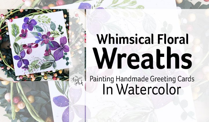
1. Introduction + Welcome: Hi friends. It's Lisa Hetrick. Welcome to my skill share classroom and welcome to blobs to blooms. In this class, you will learn how to turn watercolor blobs into beautiful viola blooms will take a deeper dive into watercolor paints, papers, brushes and supplies, simple shapes and design composition for beautiful bouquets. We'll also talk about working with a limited number of watercolors, and I'm going to take a deeper dive into how the water color pigments work and flow. We'll cover four essential techniques that will help your paintings glow. We're going to cover wet and wet watercolor blob in layering and glazing techniques to get the glow in your paintings. Old toe blend to bleed technique, which is one of my super favorite techniques, and we'll finish up with texture and finishing techniques to polish off the whole design composition. I'll de mystify and walk you through each technique step by step. Before we start painting the final project. Together, you can paint beautiful viola bouquets that flow and glow. Watercolor is my favorite medium, and I know it can be challenging, sometimes toe work with it. I'm here to help you have more fun and experience more joy with watercolor. May you find pause from the hustle, pure joy and inspiration here. Welcome. Let's get started and have some fun.
2. Inspiration + Supplies: Okay, let's dive in and talk about inspiration and supplies for the class I wanted to share that . I have a Pinterest inspiration boards, specifically just for pansy is M viola inspiration, so you could head on over to Pinterest dot com slash lisa Hetrick Art. You can take a look at all of my pincher sports. I have a ton, but I have a brand new one that I have been collecting really great inspiration for V Ola's and panties, and you can see that there's a lot of color inspiration here. There's a lot of shape and flower inspiration here, a swell so you can head on over to that and take a peek. Now I'm going to share a personal story. And what inspired this class? The spring after my father passed away, he passed away. In the summer, a beautiful field of the Ola's showed up in my front yard, and every year since his passing, it has grown exponentially. The viola, as are such a beautiful and happy flower, and I enjoy this time every year. When it happens, I go out there, I'm so inspired, I feel meditative, and I also feel my father and it's a gift from him to me every year. And whenever I'm feeling sad or I'm really, really missing him, I look at these photos, I start to paint the V Ola's, and I know that spring is coming, and I hope that my field will be even bigger and bigger every year. And it brings me great joy. So let's go ahead and dive in to the paint brushes and watercolor that I'll be using. In this course. I'm going to start out by talking a little bit about watercolor pans versus tubes, and you can use either or for this class watercolor from the tube or watercolor from pans. I'm going to be using watercolor from tubes, and I'll explain why it doesn't matter which one you use. You're gonna use what you have and use what you're comfortable with. I'm using tubes because I'm mixing up my brands and I'm using two different brands for this project. Now what I'm showing here is my Daniel Smith tubes and some Daniel Smith hands again. You can use any kind of watercolor that you have for this project. I'm just using those. Okay, so I have watercolor tubes here, and I have some Daniel Smith and I also have some Cinelli A. And I have made a selection of eight colors and I'm going to be using for this project. And when we get into the next module, I'm going to share a little bit about the color palette and why I selected them for this project. So I'm using tubes that I have poured out or just squeezed out into the palate that I just showed you. And you can use any kind of palate. You can use a plate. You can use your favorite watercolor palette. Whatever you're most comfortable with. I'm going to be working with the Daniel Smith brand and the Cinelli a brand, and they are considered artist grade watercolors, so they're a little more pigmented, and they have a lot more information with them, as I work with, um, but I wanted to share that you could use any water colors that you have, including student quality pan sets, and I've just got to pan sets here that I'm showing Ah Cotman set from Windsor Newton and Heaven ar Tez a set and I will have a list. There's a complete list of supplies in the handouts, with some varieties that you can consider if you're just getting started and you're not sure where to get started with watercolor, I have a list for you, including the differences between the professional watercolors and the student grade and again, those air pan sets and I'm gonna be using to watercolors in the class. Now let's talk about paper because to me paint you can get a lot of different kinds of paints and you can try a little a lot of different kinds of paints. But paper is everything, and high quality paper can really give you good results. I use 100% cotton watercolor paper. I'm showing here the be creative aqua be brand in a sketchbook. This is 100% cotton £140.300 GSM paper, and it is 100% cotton. If you're working in a sketchbook, I just recommend trying to find 100% cotton. Here's the B paper company watercolor paper that's also 100% cotton, and here are two other brands. This is a newer brand to me. The cancer in Heritage Brand, which is a cold pressed 100% cotton paper. I love it, I'm digging it. I've been practicing and playing with it for about a year now, but my favorite 100% cotton paper is the arses brand, and this is a 300 GSM paper. It's £140. It's 100% cotton, and the reason why I like it is because it is a super thirsty paper. It's got a lot of fibers. I do a lot of watery, watery, washy techniques, and this paper is fantastic for that. So I'm going to be using this paper for this class. You can absolutely use the watercolor haber you have on hand. I just wanted to recommend some of the 100% cotton brands for my brushes for the class and for the brushes that I recommend you'd use for the class are round brushes. I have a four and a six round brush. I use the silver black velvet line of brushes because they're very, very thirsty. They hold a lot of water, and I really enjoy them for watercolor. This is one of those big jumbo brushes from the silver black Velvet line. You just need a big honkin brush in addition to your rounds to do some of the wet and wet techniques. I also have two cups of water hair. One's going to be for clean, and one's going to be for dirty. And I also have a little spray bottle of water if I need to reactivate anything on my paper or my watercolor. I also have a micro fiber shall you can use a paper towel or a micro fiber towel. I love these because they're washable and you can use them over and over and over again. I've got this little palate here that's going to put my to paint in, so I recommend you use any kind of palette where you can put your tube paints in. Ah, plate will work just fine. Now let's go ahead and talk about the water color to paint I am using. I'm mixing up my brands for this class, and I'm gonna dive deep into this in the next module. But I have eight colors here that I'm going to be using from Cinelli A, which is a French brand of watercolor and Daniel Smith. I have spent a lot of time over the years deciding which colors I like from which brands. So I really did pull these colors because they're going to be really juicy for our painting . Let's move on to the next lesson.
3. Practice Handouts: So now we're going to talk about the practice handouts that I have supplied for you to download to as a companion for this course. There are several sheets in the pdf download, including Ah, full supply list with descriptions for you to use. So we're going to start out with a little bit of discussion about inspiration and some fun facts about Viola's and pans ease. I wanted to share a little fun fact about the Ola's and pansy. So over on the left hand side we have a pansy, and on the right, we have a viola. So here's the fun fact. If the flower has four pedals pointing upward and only one pointing downward, that's a pansy. If the flower has two pedals pointing upward and three pedals pointing downward, that's a viola. Viola is, and pans ease. Our cousins and Viola is tend to be smaller than a pansy. They're about the size of a nickel. Just a fun fact for today for the class. If you haven't had a chance to take a look at the Pinterest Inspiration board that I have, I've listed it again. Here it Pinterest dot com slash lisa Hetrick Art I have a lot of inspiration for panties, and Viola is over there for you. Okay, let's take a deep dive into the handouts. Now, The first in the hand out here is the limited color palette. We're gonna do a color study. I also have the design composition for loose bouquets. We're going to talk about design, composition and the sketch and really take a quick look at the pedals and their shapes so that we can draw and paint them. And I also have the sketch for you. So we're going to talk a little bit about design, composition and the inverted pyramid. So here is the handout that will company that part of the course and and I'll take a deeper dive into design composition. I've also supplied the viola sketch in several different sizes, so we're going to be painting it in the A six size to Macon, a six sized card. But I've also supplied it in a five by seven size for you as well. There are two handouts that we're going to walk through and do all of the techniques for the class together, and you can print them out on some watercolor paper and I also have some bonus sketches here. So I have the bonus, the oldest sketches that you can print out in two different sizes. And I also have that same design composition with a bonus Kanzi sketch. So let's move onto the next lesson.
4. Color Palette + Watercolor Options: Now it's time to talk all about color, and we're going to do a color palette study for the project and for this course. So I'm going to go through each individual color that I've chosen for this limited color palette and take a deeper dive into that brand and that color and talk to you about why I chose that color for this project. There are some interesting things about the colors that I've chosen that are going to help with the composition of the viola. So the first color in my palette is the darker purple, and that is Cinelli, a dioxide seen purple. I love this version of dioxins seen purple. The Cinelli a brand is really, really nice. It's PV 23 dioxins in violet. It's very light, fast, transparent, non granulated ing, and it is sustaining color. It's a really nice dark, dark purple. If you don't have dioxins in purple, don't worry about it. Just grab the darkest purple hue in your palate. Now I'm gonna go ahead and swatch out this dioxins in purple, and I'm getting it. I'm getting quite a bit of pigment on my brush, so this is what it looks like in mass tone. It is very, very dark, almost black. And when you add water to it, you can see that this color will run a little bit. But it'll stay where the water is, so it doesn't like run and flow. You kind of have to manipulate it a little bit to move it into the water. But I really, really like this color. When you add water, you can really change the value of it and get lots of different violet like Hughes with this color. So now I'm gonna move on and talk about the lighter purple in my palette. And that is the Cinelli, a blue violet. I dig this color. Now you take a look at it. Here it is PV 15 which is an ultra marine violet, and that's gonna be important. It's light, fast, transparent. It's granulated ing, so the pigments will granule eight when they dry, and that adds a lot of extra texture to the project. I've picked quite a few granulated ing pigments for this project to help add to the texture of the viola as this Cinelli, a blue violet, is just a beautiful, beautiful color. Ultra Marine colors tend to be a lot lighter than our full strength up pigments. You can see that it's kind of light. It is, um, I can't get it Super super dark, getting loading a lot of pigment onto my brush. But that's okay. This is the lighter purple that we're going to be using. If you don't have this brand of blue violet, you're just going to pick a lighter purple in your palate. So I am digging this color. I love it. I love it. Okay, so now get a move on to Daniel Smith. Rows of Ultra Marine. Now this is another ultra marine color. This is a two pigment color, so it's P B 29 Peavy, 19. It's light fast. It's very transparent, and again it's another granulated in color. It's a medium staining color, so it's gonna be a little hard to lift. But that's okay. I'm picked this granulated color because it's going to be a nice mixing color, with the blue violet and the dioxins in purple on the pedals of the viola, as it's going to be a nice finishing color. The rows of ultra Marine is just like one of those superstar colors. I really enjoy mixing it with other colors and again using it for glazing and layering on top, and that's how we're gonna use it in this project. But look at that beautiful, beautiful pink hues that we can create by changing the value of the color, just love it and also showing you the granule ation that's happening in the blue violet and the rows of ultra Marine. You can see those little specks in the pigment, those air going to help with the texture and dimension in our final viola project. OK, ah, moving on to Daniel Smith Mangga Knees Blue Hue. I really like this color. It's got a funny name, which makes me giggle. It's a beautiful blue hue, and it's kind of a muted turquoise color. I really love turquoise. This is a great alternative without all of that superb super blueness that can happen in turquoise, and I want to use this color as and as a finishing color just to add a little bit of extra pop in the end. So this is perfect for that. It's PB 15 for its pigment. It's very light fast. It's super transparent It's another granulated colors. It's going to give us that texture that we can see from the pigment. And it's a medium staining color. OK, moving on to the yellow. I am going to use Daniel Smith lemon yellow and I love this brands. Lemon yellow. It's very bright. It's p. Why 1 75 ports pigment. It's light, fast, transparent. It's non granulated ing, and it's very low standing staining. It's a very, very happy yellow, and I'm going to be using it with our greens. Just add that extra pop of color. So we're using it as a glazing color in the project. And it's just the happiest sunshine yellow. There are many brands of yellow. Just if you don't have Daniel Smith, just use the brightest yellow that you have in your color palette. Okay, so now I'm gonna go ahead and move on to the greens. And my first green is Daniel Smith. Serpentine, genuine. This color is awesome. It's a little bit yellow gold. It is made from genuine serpentine. It's light, fast, semi transparent. It's a granulated color. You can see that granule ation in there, so it adds a little bit of extra texture and dimension. We're going to be using it in my leaves for the composition, and it's just such a pretty color. It's a non staining color, and I'm swatch ing it out here so you can see that at full strength. It's got that kind of all of look to it. It's a little bit yellowy, and it's just perfect. Four botanical leaves, but it does change. Its value changes quite a bit. When you add water, you can really tone that color down and change the value of it. Really, like the serpentine genuine. It is unique to Daniel Smith. It's just a really, really nice color. Okay, I'm moving on to the next screen, and that is Daniel Smith hair. A lean green. This color is super fund. It's a dark green, almost black. It's got its pigment is P P. K 31 its light fast, semi transparent, non granulated ing and medium staining. So I have a granulated green and a non granulated green. So apparently in green is gonna be great to mix with the serpentine genuine. They work really, really well together. They, um they play well together on paper. When you're mixing them. But I really like this darker green that has black pigment in it that helps it just kind of have a little bit of a darker tone and a nice contrast with the serpentine genuine. You can see, though, that you can really change the value of that color as well. OK, moving on to Daniel Smith wildcard. I'm calling this a wild card. This is opera pink opera. Pink is a fugitive color. It's like it's a bright fluorescent color. It's PR 1 22 which transparent? It's granulated ing, and it's non staining I'm going to use. I use upper pink a lot in florals as a pop color that I glaze on top of the pedals at the end. But I stuck it in here because it's it's going to be fun to use with the Cinelli, a purples to just and the rows of ultra Marine to just add a little pop of pink to make the pedals below. And we're going to get into that when we start to paint the final project together. So I've Swatch two out all eight colors, and I can use this as my reference guide, and I encourage you to use the practice sheet when your swatch ing out the colors that you're going to use for a final project. So let's take another look. A final look at the color palette. Now, if you don't have these brands of watercolor, do not worry. You're going to pick a little darker purple and a lighter purple, and you're going to pick like a rose color that might be in your palate. Pick the lightest blue that's in your palate. Ah, yellow and two greens, one that's dark and one that's light and then pick a wildcard color. Now you'll probably find a brighter pink in any palate that you might have, and I want to show you how. With this very limited palate, we're gonna be painting the project that's on the right with purple hues. But I used over on the left a use the purple and the rows of ultra Marine and the mag unease blue hue as my main colors on the left, and I could change the look and feel of the entire composition with the same set of eight colors. It's important to know your colors that are in your palate and what they can do and how they can mix together and the fact that we have eight colors here. But you can get so many different possibilities in the look and feel of your project, so I encourage you to change it up when we go to make our final project. I wanted to share that. My main floral palette that I used is a mixed brand palette. I have five different brands of watercolor in this palette, because I've really taken the time to test my colors and see what I liked. I have a Siris on my YouTube channel off my mixed floral watercolor palette, and I'll make sure that detailed in the handouts for you as well to take a look at if you're interested in seeing how I built a mixed brand watercolor palette. Okay, let's move on to the next lesson where we're gonna practise the techniques
5. Technique Practice: OK, now it's time to practice all of the techniques that were going to use to create the final composition. So we're going to be using the two handouts that you have in your downloadable handout packet with the techniques. So there are two we're gonna be covering the wet on wet technique, layering and glazing We're gonna cover bold to blend toe bleed. We're going to cover to texture finishing techniques for this project as well. So let's get started with the wet in wet Bala been, and that's not really an official watercolor term. That's something that I made up because it's exactly the way it sounds. So this is a wet and wet technique where we are wedding the paper with a lot of water and then we're dropping our color in. So I'm going to just draw a couple pedals here just to mimic what we're going to be doing with the final composition. So I just drew six pedals here, just a quick six petal flower, and we're gonna be dropping in with our brush. So I've got that big jumbo brush and I'm getting that paper super wet and you could see him dropping in color. Now each one of these color brands are going to do a little something different. I dropped in that dioxin seen purple, and it just kind of stayed where the water was. I dropped in that rose of ultra Marine, and you can see that it's running a little bit. Drop in a little bit of that Manny's blue hue, and you can see it mixing with the other two colors to create a different purple shade. This wet on wet technique is going to help us mix colors right on the paper. It's also going to be the base layer for a final composition, giving us that washy, washy, very super flowy watercolor look. So this is the technique that feels a little out of control. But remember, watercolor will only go where the water is. So this is a very, very loose technique for our final floral composition. You can see here in our composition that it's got that base that base loose color is really gonna add to the texture and dimension of our final project. So take a look here at the wet and wet blob and when it dried, see how all those granulated colors mixed together and created some extra texture and dimension. We're not doing any color mixing on your palette. We're just letting the water and the pigments mixed together and charged together to create at wet and wet blob. And look, it's so much fun. Okay, now we're gonna move on to layering and glazing, which are basically the same thing. It's technically called glazing, but really it is a layering effect. So we're gonna practice on our hand out doing some shapes and some pedals to create that glazing technique to get the glow. So I have shapes and puddles on your hand out. I'm gonna practice with shapes first, because then you're gonna really get a good sense of how, when we add layers of color, how it builds up. But it also creates that sense of glowing the color. By the time you're finished, adding the last layer it makes the piece glow and gives gives it some extra texture and dimension. Glazing is always going to deepen the color and shade because it overlays, washes and washes of watercolor, and you can create these beautiful, luminous effects by adding layers of water color. So let's go ahead and dive in and do some blazing. So I've got my brush here and I am going to dip it into the rows of Ultra Marine and I'm going to draw with my paintbrush Three circle elements and I've just got some color on my brush and I'm just cleaning it up. I'm just going to get that first layer down for the circle. So I'm just using a little bit of the color, mixing it all around to create that shape. And then I'm going to let that dry gonna move on to my second and my third and create circles as well with rows of ultra Marine. So I'm going to be showing you the progression of what the glaring looks like. So that first circle is down. I'm just cleaning out my brush so that I can move in and do another circle right next to it . And you can see that that paper is super thirsty. And my brush was not wet enough. So I just went in and added a little bit more water so I could blend that rose of ultra marine pigment around and get a really nice look and feel so just one little layer of color . I'm gonna go ahead in and do the third circle, so I'm gonna end up with three circles that have one layer of the pigment rows of ultra Marine. So just creating another circle and you could see that my brush does not have enough water on it. But that's okay. Very. I'm just gonna add a little bit of water so that I can create the third circle here. So all three of these circles have one layer of color so that of the rows of ultra Marine. Now, I'm gonna go ahead and dry it up. You could wait for it to drive. I just went ahead and used the heat will to dry it so you can see that first layer is pretty light. So now I'm gonna show you when we glaze how we can start to build up the color. Now, look at that rose of Ultra Marine and how that color granulated It is so pretty. And the pigments kind of embed themselves into the layers of the paper and kind of sit on top and create that extra look of texture and dimension. It's gonna be so gorgeous when we paid that final viola together. So this is the first layer, and I'm gonna leave. That circle is the first layer, and I'm going to go in and add a second layer two of rows of ultra Marine to that circle, you can see I'm just working on one side and I just added that big, bold line there and a clean off my brush and just blend out that pigment all the way out to the edge. Just use the water to kind of push that pigment around, break it down and just create a different value of that color. So I'm just gonna play with that a little bit and let that go ahead and dry once. Use my heat toll and dry. It's to speed it up a little bit so you can see that the first layer is really light and then we've glazed on or layered in a second layer of rows of ultra marine, and then it's gotten a little bit darker. So I'm gonna go ahead in and glaze in or layer in rows of ultra Marine to that third circle that I have there now. I'm going to end up doing two layers here so that you can see how it gets darker. So I've got that color in there and I'm making it look a lot like that second, Ah, second circle that we had there and I've added in that third layer of the rows of ultra Marine and I'm just kind of pushing and blending that color and you can see with my brush. I want to note that with my brush I'm not making these large paint strokes. I'm actually just making really small a dabs with the brush and just staining the paper and just pulling some of the color and pushing it around so you can see the difference between the first layer, the second layer and the third layer. So this is this layering technique. This glazing technique really helps jack up the glow in the color, and it is a finishing technique that we're going to do in our final viola project. You can see I'm gonna add a little bit more rows of ultra Marine over here to our third layer so that you can see how, even though the colors are transparent, were able to dig too deep in the values of the color and just get a lot of variety here from lights to darks. And I'm just digging the way this looks You can see a huge difference between the first layer and the third layer and look at how it at third layers kind of glowing. We've added so many different layers to it, but the layers underneath there still showing So it gets the glow really, really quickly. Okay, Now we're going to move on to bold, to blend, to bleed. And this is a really Superfund technique, and we're going to do it on our hand out right at the top were going to do pedal practice and leaf practice. We're going to do both on this piece of watercolor paper. I'm going to grab a pencil and just loosely draw in a leaf and a pedal so that we have a line to work from for this bowl toe blend to bleed technique. So I'm gonna go ahead in and high, drew the pedal over on the left, and I drew the leaf over on the right. So clearly I need Teoh. Yeah, Yeah, that happened. OK, so I'm going to start with the leaf and use, um, dioxins in purple. So I've got my brush is wet, not sopping wet, but it's wet, wet enough to pick up a lot of pigment. And I'm going to just paint in a really harsh old lying around the edges of one side and probably the top of the pedal, and it's going to change a little bit, but you're going to get the technique down by practicing it. And now, with a clean brush that just has water, I am pulling the color away from the bold line toe, blend it a little bit, and to help it bleed so you can see I'm dropping in some of the vaccine purple, just doing a little bit of layering and see how it spiders out because it's spider ring out into the, um, the water. We get that look from lights too dark so we can get a lot of contrast between the different values of this one color here by doing this old toe blend toe bleed technique. So bold Line first blended out with really clean brush with water, and then it leaves into our pedal or are leaf. So I'm doing it right here with the pedal and amusing parallel in green, which is really that really dark green. And you can see that if there's a lot of color here, so I'm taking my brush and just kind of taking some of it away. So I just lifted it up and pulled it away, and that old line it was over on the right. I'm able to pull that color over to the left to get that variety, in contrast in the values between pedal and the leaves, so you can see him doing a little bit of glazing here. But the bolt the blend to bleed technique is really, really valuable to practice because you're able to play with adding colors inside, just mixing colors on your paper versus mixing colors in your palette. You could get a lot of different values, unlock and feel from just one color. Now I'm just gonna go ahead and just Zach this with the heat tool just so I can dry it. So it's not a super super wet technique. This technique it the brushes wet. The paper is dry, but you can see that contrast between the lights and the darks and the values in the pedals in the leaf. And it's just so much fun. I just love that technique. Okay, let's go ahead and move on to texture and finishing techniques, and we're going to start with the glow softening technique. And I just love this technique. It's a little bit wet and washy washy, but it helps jack up the glow for our project. And then we're gonna do flicking. So we're going to start off with glow softening, and I'm showing you here around the final composition, especially this leaf element at the top where were able to soften the edges. And it gives this illusion of the glow happening in our final composition going to keep this technique really simple. So I'm going to paint out a circle. I've got some dioxin purple here. It doesn't matter what color you use, but use something a little bit darker so that you can really see the softening of the lines . So I'm just getting a nice, good even layer of this color, and then I'm cleaning out my brush, and I've got a little bit of a bigger brush this time and my brushes wet but not sopping wet, and I want to just soften the edges of that circle. And when you do this, it also pulls some of that pigment out and away from the shape and pulls it out to the outer edge. So it creates that illusion that your shape were your pedal or your leave is glowing. So take a look at that pedal there. You see how that color is just kind of pulled out, and it's just really Jax the glow. So I call this technique glow softening, and it's one of the last things that I do in the finishing of a project. OK, I'm going to go ahead and move on and talk about flicking so you can see that I've got my brush here. It's wet, but I'm rolling it around in the pigment just to kind of also get the tip of that round brush good and sharp. So when you roll your brush in the pigment, you're able to get a really, really nice sharp tip on your round brush, and I'm just flicking the brush. The brush with this thirsty, thirsty paper. The brush really does need to be weapon, not sopping wet and When the tip of your round brush is sharp like that, you can get different line waits for your flicking. Okay, so let's take a final look at all of the techniques that we covered in this section. Thes four techniques are going to be the a sick techniques that we're going to use in our final composition together. So let's go ahead and review them again. We did wet and wet blob in its very loose, very water e. And then we also did layering and glazing to create more glow by adding layers upon layers of watercolor. We did old to blend, to bleed, to create that different looks in the value of the colors in within the pedals and the leaves. We also did glow softening, which really helps pool some of the colors out and soften hard lines and edges. We also did flicking, which is going to be Four are centers of RV Ola's to create the statements, and I've loved all four of these techniques. They're a mixture of loose and really controlled watercolor techniques for our final project, so let's go ahead and move on to the next lesson
6. Composition and Painting the Viola Bouquet: OK, now it's time to talk about design, composition and painting the viola as we're going to put all of the techniques that we've learned so far together and create the final design composition. So let's talk about the composition of this painting. From a design perspective. I used the concept of the inverted pyramid, and that concept in design is where all of the important things air at the top, and we're varying the sizes of elements in the middle and towards the bottom so that our I knows what's most important on the page and where I'm trying to draw you into the design. So I'm going to talk a little bit about the sketch. So here is the design composition for loose bouquets sketch. You can see the sketch over on the side, and I also have it for you here in the A six size for the card. We're going to trace that sketch next onto our watercolor paper, but you can see in the inverted pyramid here how the big bloom is kind of at the top and then we have a smaller bloom and then an even smaller bloom, and are elements are all drawing. Are I down towards the bottom to create that bouquet like feel? Now I want to talk a little bit about the viola and the pedals for the viola. So the viola is the cousin to the pansy. We talked about that in the very beginning. And it has three pedals that point downward and two pedals. That point up and you can see in these three different viola is that I'm shared here for inspiration, that they look a little bit different. So in our design composition, we're varying the look and feel and the positioning of the viola pedals to create some variety in our design composition. So we've got in the sketch, we've got the largest viola at the top, and then a smaller one over on the left hand side and then a viola, but over on the lower right. And they're very in size and shape, and they're staggered in that inverted pyramid so that we know from a design composition that that top floral is the one we want to pay attention to. So we're gonna put a lot of attention into it. So the pedals on the viola very they're not perfectly rounded. They have a little bit of a curvature to them, so they're kind of they're an interesting pedal. The stay mons air Very interesting. And they also have lots of opportunity for you to work in a little lines for texture. And they're just easy five petaled flower to create. So by varying the size and the weight in the shape of each element in this composition were able to create a pleasing look and feel. So there's variety here, and we can tell that the shapes and sizes, some are bigger and then the other pieces says something's come forward and some things go back. And it creates that really nice loose, whimsical floral bouquet that we're gonna have so much fun with. Very wallflower solos are a wild flower, and this whole composition is very wild and whimsical, like just digging it. So Okay, so we're gonna go ahead and move on to transferring the sketch to our watercolor paper, and there are lots of different ways that we can do this and I'm gonna talk you through the method that I'm going to do for this class. Now I have provided several different sizes of this sketch. You could easily just look at the sketch. And if you wanted to sketch it out on your paper or we're going to use a light board here and trace it onto our watercolor paper really lightly. Now I have the bonus pansy sketches here, So if you want to do the pansy, go for it. You've got both here. You can use the same techniques that worried. We've walked through in the prior lessons to do both of these floral compositions. So first things first, we're going to go ahead and get our piece of arches 100% cotton watercolor paper, and I have this cut larger than the A six size because I'm going to tape it down eventually onto aboard. But first, we're going to take that are cious watercolor paper and put it on the late board and trace the sketch on to the watercolor paper. So using the light board now, this light board that I have is old, So when I turn it on, I've had it since college since design school in the early nineties, so I've turned it on. You can see that doesn't get his bright. Is it used to, but I condemn Finitely. See, through this light board, you could also take this whole piece of paper and your watercolor paper and tape it up to a window with a good day where you have lots of light. Or you can use transfer paper and you can get that at your local art supply shop or big box art supply store. You can find it. It looks like it will be where the pens and the drawing elements are, Um, but it's like carbon paper, so you will late. You would lay it down, um, between your sketch and your watercolor paper and you would trace over your sketch, and it would leave that carbon line off your outline of your sketch onto your watercolor paper. But you can see that my light board is as it's warming up. It starts to get a little bit brighter, and it allows me to see things even better. So I'm just lightly and gently using my mechanical pencil and outlining this loose sketch. I don't want you to think of the sketch as as something that's final, that we're gonna follow every little detail in this sketch. That's why it's super super loose because it's giving us the shapes and the forms for doing the techniques inside off again. The sketches super loose and just intended for us to have the elements toe work with. There isn't any detail in this illustration. We're going to be adding the detail in when we paint the viola as and the leaf and the bouquet. So I'm just going around and on outlining all of these elements and some elements. If you don't want that many leaf details, just leave them off. Don't worry about it. I'm just gonna go ahead and sketch all of these elements in because I like this composition and it's not remember, it doesn't have to be realistic. It's a whimsical illustration that we're going to be painting together now. Try not to erase too much, because that will mess with the fibers in the watercolor paper. But if you have to race, just go ahead in a race really gently so you can see the illustration is ready to go. So now we're going to prepare the watercolor paper for painting, so I'm using a loose piece of watercolor paper from the arses pad. But if you're using one of the watercolor pads that come in a block. You don't need to do this technique because it's already attached and you'll be able to do all of the wet and wet watercolor techniques from the block. So I'm taking this piece of watercolor and amid hearing it to this board that I have and I've got some purple tape here, which is a masking tape that when I do rip it off of the watercolor paper, it's not going to take any of the fibers with it. So it's very, very low tack, and this is going to hold the watercolor paper down while we're doing the techniques and we're painting cause it's going to get really super, super wet. Okay, so now we're going to get started. We're going to paint this viola composition, and we're gonna have so much fun. So I've got three brushes here. I've got that jumbo round I have around four and around six. Just grab the brushes that you're comfortable with. Um, you can use a smaller and a medium sized. You just need one big honkin brush to do this next technique and the very first thing that we're going to be doing is the wet and wet a Lavin technique. We're going to be adding so much water to this watercolor paper. We really just need that big honkin brush to get all that water color down onto the paper so that we can do that wet and wet blob and technique. So I'm taking that egg jumbo round brush in my clean water, and now I'm just blogging it down over top of the entire illustration. So I want to get this nice and juicy and wet, so the brush is super, super wet, and we're applying quite a bit of water to this paper. This paper is super super thirsty. 100% cotton papers are super thirsty, so they tend to need a little bit more water for this technique. Okay, so now we're going to start toe, add that first layer of blob and color and I'm going to be working with the blue violet, the Cinelli, a blue violet, and I'm also going to be working with the Daniel Smith serpentine, genuine. So I'm just dipping my brush, my brushes wet but not stopping wet. And I'm picking up the pigment number dropping that color into the flowers and letting it do its thing and spread. Now this can feel like a very out of control kind of process. And you might feel a little anxious when you're doing this because we're really just throwing colored down into the shapes and the elements says you can see that I've got that blue violet I'm dropping it down into the bud and I dropped it down into the other two flowers, and now I'm gonna clean off my brush and go in and get that serpentine, genuine and drop that color down into the leaves that we have drawn onto the watercolor paper. Now again, this might feel a little out of control, but just go with it. Go with the flow. This is what's going to create that really whimsical, washy, washy first layer that helps the final composition have this super glowy glowy look about it. So this wet on wet lob in technique is just very freeing to it helps get us warmed up for the actual more controlled painting techniques that we're going to do next so you can see that I'm just moving the color around kind of pulling some of that color away. If you feel like you've gotten too much water onto your paper, you can always use a paper towel or your micro fiber tell to just kind of tidy it up a little bit. But I promise you, when this dries, it will fade back several several values there. So it will be a lot lighter than we think it's gonna bay. So I'm gonna go ahead in and drop in some dioxins in purple and just let it move with the water that's already there. I'm gonna coax it a little bit. Now, the dioxins in purple and some of the colors that are in the palette that I'm working with are very staining. So you can see if you had a big dollop in a spot that's wet. It might be hard to move that Gallup and get it to blend really quickly. You can see I'm just kind of scrubbing out that mess that I made there. So you wanna drop the color in the water and let it do its thing so you can see that I'm not painting like in brush strokes, really using the brush to stain the paper and you letting the watercolor do its thing flow into the painting. This is a very, very freeing feeling. You're just making kind of a hot mess on your paper and you're using the water tow. Blend everything around, and I promise you it really is going to help jack up the glow of our final composition, which makes it super fun. So you can see that that blue violet here has a lot of the pigment is granulated, so we're using to granulated colors here serpentine, genuine and blue violet, which are both granulated in pigments. So they give you that extra texture in that first base layer that is going to jack up the glow in the final composition. And I'm just loving, loving, loving it. It's very, very freeing, and it's a great way to get started. So I'm just gonna go ahead and use my heat tool and stop up any extra water I have here and just dry the whole painting toe bone dry before we start painting the pedals. Okay, so take a look at what we have so far, we can still see our sketch in the watercolor paper, but the colors have really faded back quite a bit, so it isn't a shocking, as we originally thought it might be, right? So, Super Super Fund. Now we're going to begin to do some layering over top. We're going to start to build our layers from the bottom up. And I'm just loving all of these blooms off color that we have here. We've got that serpentine, genuine, and that blue violet can mix smashing together. And it's creating this really nice, whimsical look. So I'm gonna go ahead and grab my number eight brush. You could grab whatever round brush you're comfortable with, and we're going to start with the dioxins in purple and work into our first pedal using the bold toe blend to bleed technique. So I'm going to start with the first hettel for the viola, right up here at the top part of the composition. So this is the largest viola in our composition, and I've taken that dioxin seen purple, and I've added it to the center. So my center of the pedal is the darkest. I've added a little bit of that bold line to the outer edges. And now, with a clean brush, I'm pulling that color out from the center to the edge of the pedal. So old line, toe blend, toe bleed. So we're bully, heating it out to the outer edge. So for our Viola's for this composition, the center portion of the flower is going to be the darkest, and her outer pedals are going to be lighter. So we're going to change the value of that dioxins in purple by doing the bowl toe blend to bleed technique with each individual pedal. So we're going to have to work on each individual pedal one at a time to get this look and feel. And while you're doing it, you're able to see which pedals are gonna come forward, in which peddles air gonna come backward. So I'm just right now. I'm just adding a little bit more of the dioxins in purple while the papers wet to that center. Because I'm deepening the center of that pedal and you'll see me continue to do that. And instead of painting, I am just using the brush to dab a little bit of that color in and around the edges, and I'm staining the paper, so I'm not doing these big honkin brushstrokes I'm just using very gently the tip of the brush to kind of push the color out, staying the paper and blend it to the outer edge. And that is the whole technique that we're going to do with every single Hettel. So now I'm gonna go ahead and move on to the second pedal in that top floral viola, and I'm gonna walk you through this again, and then I'm gonna turn on a little bit of music as we finished the other pedals. So we've got that old line in the center. I've added quite a bit of pigment in the center of that pedal. I've gone around that edge with that bold line and went around both edges because this is that bottom pedal. And I want quite a bit of that pigment to be in the center, cleaned up my brush. I'm rolling my brush on that micro fiber towel just to stop up any of the massive amount of wetness that might be in the Brussels. So I'm pulling the color the pigment that's there, out to the outer edges so you don't see me go back to my palette. You see me working with the paint and the pigment that is already there gets him pulling it out to the outer edges. And while I'm doing that, I'm also lifting some of the color up so that I can get that variation in the values between the lights and the darks. So again, I'm going in and adding a little bit more color around the edges, just gabbing in a little more pigment here and there. But I'm concentrating most of the darkness in the centre pedal. So now we're gonna move my composition here and move on to the next pedals in the viola. So I'm gonna just move it a little bit. Feel free to move your composition around so that you can access it a little bit better. So I'm gonna go ahead and do the same technique, the old lines concentrating all of that deep, rich color in the center of the pedal and then clean my brush and then blended out and bleed it to the outer edge of the pedal. So I'm gonna go ahead and turn on some music while we work through this bold blend to bleed technique together. - Don't Well , what? Okay, I'm popping back in here as we finish the last three pedals on the little bloom, and I'm doing the old to blend the bleed technique. But I also want to talk about the other two blooms that air above this and how we can create that illusion of petals coming forward and pedals going backwards so that we can create that perspective in the blooms. You can see that some of the pedals the edges of the pedals are darker than the one that's next to it. So that's how you can create that feeling of some of the petals coming forward and some of the pedals going backwards, so or layered over top of each other. So keep that in mind when you're doing the bold to blend a bleed technique. How you want some of the edges of the pedals, one side to be darker and where it meets the other pedal. It would be lighter so that you can tell that it's another pedal and you get a lot more definition between the pedals, and it's just a really simple, easy technique to dio. But that's why I say that you need to do each pedal one at a time so that you can really see how you can pull this technique off. Okay, so let's go ahead and move on to painting the leaves and the stems, and we're going to use first. We're gonna use serpentine, genuine, and I'm going to mix in a little bit of that, apparently in green. But first, I'm just gonna go ahead and draw in the stems for the flowers, and I'm just following the lines in the sketch and discovering them up with that serpentine , genuine and just using a little tiny better that, apparently in green. I'm just dropping it in over top of that serpentine, genuine color while it's wet. So I'm just doing a little bit of color mixing on my paper by dropping that color in so you'll see me go back and forth between the serpentine, genuine and the peril in green. And often I will load up my brush so a little my brush with a little bit of the serpentine genuine. Then I'll take the tip of my brush and dip it into the parallel in green just to kind of get a little bit of a two tone look and feel for the stems, and I'm just going to attach everything together. And I'm just using the tip of my brush really, really gently. I'm using the number four brush here. Just use whatever brushed that you're comfortable with. You can use a really thin aligned brush if you'd like, and just follow the lines of the sketch and just drop that color in so that we can get those stems in there for a foundation and begin to work on our leaves. Okay, now that the stems air in, we're going to start to move on to the Leeds. So I'm using serpentine, genuine, and I'm going to start with that top leaf. And I'm using the bold toe blend to bleed technique again with all of the leaves so you can see that I put in that hard line at the very top of that leaf. And now I'm just using my water clean water toe pull that color to the outer edge of that leaf. And I really want that leaf to dry. That's gonna be I'm just kind of playing with it a little bit and seeing if I could jack up the glow moving that color around a little bit. I'm gonna end up overworking this a little bit, but it's going to be just fine in the end. So I'm gonna go ahead and move on to the other leaf elements and use that old to blend to bleed technique to complete them all. And I'm going back and forth between the serpentine, genuine color, which is the lighter green and the peril in green and just pulling the color out to the outer edge of the leaf using going between water, clean water and pigment and just creating some variation in the values of color in thes leaves. So I'm gonna go ahead and turn on a little bit of music so we can work through the leaves together. But I want to talk a little bit about this bottom leaf before I turn on the music. So I did that old to blend to bleed technique with the serpentine, genuine and I'm dropping in a little bit of that, apparently in green, just in the tips, the outer tip. And now I'm taking that rose of ultra Marine and just dropping in a little bit of that color to the tip of the leaf element and I'm going, you're going to see me do that quite a few other times with the leaves Now. What this does is it creates, ah, variation of color in the leaves. It also ties some of those purple Hughes's violet and purple hues into the leaf elements and kind of creates makes that cohesive look for the composition. So we're not really looking at a composition that has this color and that color were bringing those violet hues into the leaves so that it looks like a cohesive composition here, and it's just stinking beautiful. It's just gorgeous. If you've ever seen a leaf in a floral outside in nature, it has many colors, and it, besides screens and it will often like the tips will often get to be different tones of the color of the flower, especially hydrangeas. If you've ever seen a hydrangea leaves how they do this, it's just beautiful, and it also just highs everything together so nicely. The best colors on the planet can be found in nature, and I just love it so you can see that one leaf right there. I added that Rose of Ultra Marine right on the tip of it, and it's just really drawing, Are I to it, but also helping to create that really cohesive composition there. Okay, so I'm gonna go ahead and turn a little bit of our peaceful music on as we finish up the leaves. So I'm popping back in here to kind of talk you through this upper leaf that I over work a little bit. It's kind of lost its shape. So I'm adding a little bit of rows of ultra Marine and just blending it out a little bit and pulling away some of the other color just toe. Finish it off. Okay, so now we're gonna move on toe adding the finishing layers. Once the whole composition has dried, this is what it looks like. And now it's time for us to add some of the glazing and the finishing layers to the project . So now that everything is completely dry, we're gonna move on to using rows of ultra marine. So my brushes wet but clean. There's no pigment on it and have added a little bit of water to the center of that pedal. And I'm dropping in a little bit off that rose of ultra marine, cleaning my brush, getting it completely clean and then just moving, blending and feathering that color out. And it's layering over top of that dioxin purple. But it's also starting to Glee's and layer, and it gives us that glow so the petal shapes. They're pretty refined. We can see all five pedals, but as we start toe, add the color on top of thes pedals. Everything starts to glow, and the pedals become more defined and have a little bit more texture and dimension to them . So again, going into each pedal separately and individually adding water with a really clean brush, dropping in the rows of ultra marine color and then just feathering that color out and just doing a little bit of what I call brush dancing. If you've taken other classes with me, you've heard me say the word brush dancing many times. Now look at the rows of ultra marine layered over top of that dioxin purple because it's a granulated in color. It's some of the pigments sit on top of the fibers, and it creates this extra texture in the pedals that is so striking. Okay, that top bloom we're gonna go ahead and move on to the side bloom, because the top one I'm gonna go ahead and let that dry and we're gonna move on to the side and I'm gonna do the exact same technique finishing technique. I'm adding a little bit off the blue violet in here, so I've dropped a little bit of the water onto the pedal. And then I added a little bit of blue violet, and I'm trying to get instead of using the rows of ultra Marine over here first. I'm just dropping in a little bit of the blue violet and feathering it out because the blue violet is a granulated in color and it's going to sit on top of that dioxin purple, which is not a granulated color. And it's going to add a little bit of extra texture to those pedals without adding the peaks from the rows of Ultra Marine. So I'm gonna get that really nice rich violet hues in the pedals here. So I'm digging this of just dropping a little bit of that blue violet in. I love the blue violet color. It's such an easy color toe work with. You don't need it doesn't come out super strong when you're working with it. It's very, very pale at first. Okay, so I've cleaned off my brush in a dipped it in to the rows of ultra Marine. Now, now the pedals are wet because I just got finished working with, um So now I'm taking just the tiniest bit of that rose of ultra Marine and taking a manage of the wet paper and the wet pedals. And I'm just dropping that color in, and I'm just using the tip of my brush to feather it out a little bit. So in staining the paper with rows of ultra marine and getting that starting to get a more definition in those pedals and you can start to see how the pedals are glowing. I mean, they were really pretty before, but they were a little, you know, you had some variety in the pedals, but they were a little flat. Now that we're adding this color on top, this rows of ultra marine color just so pretty. It helps to get the pedals to glow and get more three dimensional. It's just stinking gorgeous. I love it. Okay, so now I'm going to go ahead and do the same technique with adding a little bit of apparel in green, a little bit of lemon yellow and doing some glazing on some of the pedals. I'm not gonna glaze all of the pedals because I don't want them to be. I want them to have good contrast between the V Ola's and the pedals, and they can easily be overworked. So right now I'm just adding a little bit of rows of ultra Marine on some of the tips of the pedals just to create some whimsy and some variety. But I don't want to do too much to the pedals because the blooms here are the star of the show in the composition, and I really want them to come forward and the pedals to just be the beautiful accent holding up these beautiful, beautiful blooms. Okay, so now I'm going. Teoh, get that wild card color out and use the opera pink. I've dropped a little tiny bit of water in that upper bloom, and I'm going to drop a little bit of that opera pink into that water and blend and feather it out. I don't want too much of this color because it I can easily over work this. You can see that I'm just dropping a little tiny bit in there to change the way this pedal looks a little bit. So if clue a bit too much right there. But that's OK. I know that I'm gonna use it and I'm gonna feather it out with water. I'm Onley gonna end the opera pink to that top big honkin floral bloom because this little finishing touch with the opera pink is going to make that bloom in this composition be the star of the show and kind of pop more than the other tube lives. So what we're going to get is that illusion of perspective on our paper. We're gonna get that three d look, we see that bloom coming forward at us because it's bright and bold in its wants to be seen . So it's got a little bit more color in it and the other two blooms, and that's okay. You're creating some variety in the look and feel of your blooms, and it is just so pretty You can see how that opera Pink just added that little tiny touch off pop to make that top bloom just glow. So the more we've layered and we've only done three layers here we get some really intense glow in these blooms. I'm gonna go ahead and dry this as we move on, and I want you to take a look at the granule ation in all of the glow that's happening in these pedals. There's Aton of texture and Dimension billing on, and we've just done all of that with watercolor. It's just so cool and so exciting. Now I'm coming back up to this top pedal again because I totally overworked it. Andi, I got the paper to wet along the way, so I'm adding back in some, refining it a little bit and adding back in some of those bold lines so that we can really see that it is a pedal and I'm just playing with it a little bit and adding some color. I'm gonna drop in some lemon yellow to some of these pedals just to kind of jack up the vibrancy of the pedals, especially this top one that I feel like I kind of over worked a little bit. So now we're going to move on to some of the finishing details, the centers and the stamens of the two balloons. I've got a little bit of Dr Ph Martin's Bleed Proof white, and I'm putting this white down on my palette here, and I'm picking up some of the lemon yellow. Now the lemon yellow from Daniel Smith is very, very vibrant and also very, very transparent. And I want to add some of the yellow to the center of my flowers here. But I want them to be a little bit more opaque. So instead of grabbing some wash paint, or you could grab in acrylic paint if you wanted to, for to get the capacity here just added a little bit of white to my lemon yellow here to just kind of get that deep, deep, rich yellow in the centre without it being so transparent. So this is just one way to do it. You can always with any of your watercolors. If you want to make them a little bit more opaque, you just add a little bit of white. This doctor Ph Martin's bleed proof white is fantastic. You could also use a white wash or any other kind of white hate acrylics. Yep. You could use those two. So the bleed proof white is just one option that you can use. So I'm taking this yellow and I'm just kind of flicking in a little bit here in the center just to create a little bit of texture. So when we go back in and flick over top with the dioxin purple, those two colors are gonna blend a little bit. So it's just gonna be a happy, a little messy family there. So I'm just adding in the final touches of yellow, you can see that that yellow is really popping too. Okay, so now it's time to go in and add the dioxins in purple. So I've got my brush here, and I'm just dipping my brush in that dioxins in purple and getting a really, really nice amount of that pigment onto my brush Seem I'm rolling my brush and that helps get that tip of my brush really nice and sharp. And I'm just going to flick around and follow the pedals and flick from the center out. No, this is not about perfection. Here. You're just going in and flicking and every single one of your lines are gonna look a little bit different. Some might be longer than others, and it's all good. It's just a finishing technique to add a little bit of extra texture to the center. If you feel like, um, you wanna blend one of the lines out, you can easily just do that with a little bit of water, and it will look just fine. So I started with that outer bloom, and now I'm going to go ahead over to our main violet bloom for the whole composition. And you can see I'm just using a really light touch. My hand is very loose. I'm almost holding the brush, kind of like a pencil or a pen so that I can get a little bit more control. So with my flicks now, you could turn your whole composition if you want to flick away from you. I've played around with this technique so many different ways. Sometimes I flick away from me. Sometimes I flicked towards me whatever's most comfortable for you. But you can see that I'm just lightly feathering these flicks into the project, and I am digging it. Okay, now it's time for the paint peel people really love this when you peel away repealing away the paint so that we can reveal the final composition and holy smokes, this piece is now bone dry, and I am just loving, loving, loving the way it looks. So take a moment with your Viola's and take a look at them. Look at these flowers. All of these pedals are just popping. Here's the original over here on the right, And here's the one that we painted in class over here on the left so you can see same techniques and they look a little bit different. So each time it's gonna be just a little bit different. Okay, so now I'm adding in some splatter. This is a finishing technique that you can do if you want. Teoh. I like that feeling of some splattered color all over it at the end, So I took a little bit of that dioxins in purple and added some splatter, and now I'm dipping my clean brush into my white, and you really got to get that nice and juicy by adding quite a bit of water to get it going. And I'm gonna just splatter a little bit of this water down this white down and just let it go on the pedals and the leaves and just get create a little bit of extra texture and dimension. We're coming into the home stretch and I am digging this Look at those pedals. The layering created so much glow in the pedals and this is done, I probably wouldn't add another thing to the color. But right now, what I'm gonna do is take my big old jumbo brush and put it in the water. And now I'm just going around the edges and I'm doing that Glo technique where we're just brushing out some water around the edges of the entire composition just to see if we can pull some of that color away to make the whole composition glow even mawr. And you can see that some of the colors from the pedals are starting to pull away, and some of the colors in that little bud Viola is pulling away. And this just helps create mortgage low around the whole project. And I'm just doing a little bit more splatter here just for another finishing technique. And I am loving the way this came out. The layering the pedals adjust had so much fun painting this project. So I'm bringing back in the samples here and just kind of showing you some of the variety of the colors. And look at the one here on the right. Now shared this in a couple lessons back. I used Rose of Ultra Marine in the same design composition for this project, but I focused on rows of ultra Marine and Mangga knees blue hue. Now I haven't used the mag unease. Blue hue yet is a finishing technique. And I'm gonna just go into our final composition here and add a little bit of that color to some of the pedals so that you can see what it does when you add it in with the purple, any of the blue violet, or when you add it in with the dioxins in purple. So I'm just lightly dabbing it into some of the edges of the pedals, and that blue turquoise e pale blue mixes in so well with all of the colors that we've used for glazing. And in this composition I used it with rows of ultra marine, so those two colors created that beautiful purple hue in that composition, and here you can see that it just adds a little touch of extra glow. And I'm loving this final final composition. So let's go ahead and move on to our final lesson, where I'm going to share some ideas for what you can do with your floral painting.
7. Final Thoughts + Project Ideas: I hope you enjoy painting Viola's and watercolor. I really enjoyed teaching this class, and I'm so grateful and honored you join me. There are so many things you can do with your final painting. You can make it into a card and send it to a friend. You can frame it and hang it in your home, where it will bring you daily joy. Or you can give it to a friend or family member as a gift. Thank you so much for joining me in this class, and I'll see you next time.
 Lisa Hetrick, Watercolor Artist + Surface Designer