Transcripts
1. Class introduction: Hello dear friends, students, and welcome to another drawing and painting glass. In this particular class, we're going to see how to solve and this drawing to this digital painting. I'll show you why it is important to go and start your journey, your, your drawing when traditional mediums with smaller ones and with Quakers time of drawing to create a more polished digital park. Also, I'll show you tips and tricks, how to go about it. Troublesome shortcut key, how to paint digitally. Truly benefits of working both traditional and digital to create a work of portrait, the jewel love to show Friends, family to improve when your work and get better at drawing and painting whatever media medium that you choose to work with. Although I'll show you my workspace, how I arrange stuff when I'm working through some additional free resources or program that she knew can work in your digital work, traditional work, how to enter those materials, and that will be an official term. So without further delay, let's dive into the class.
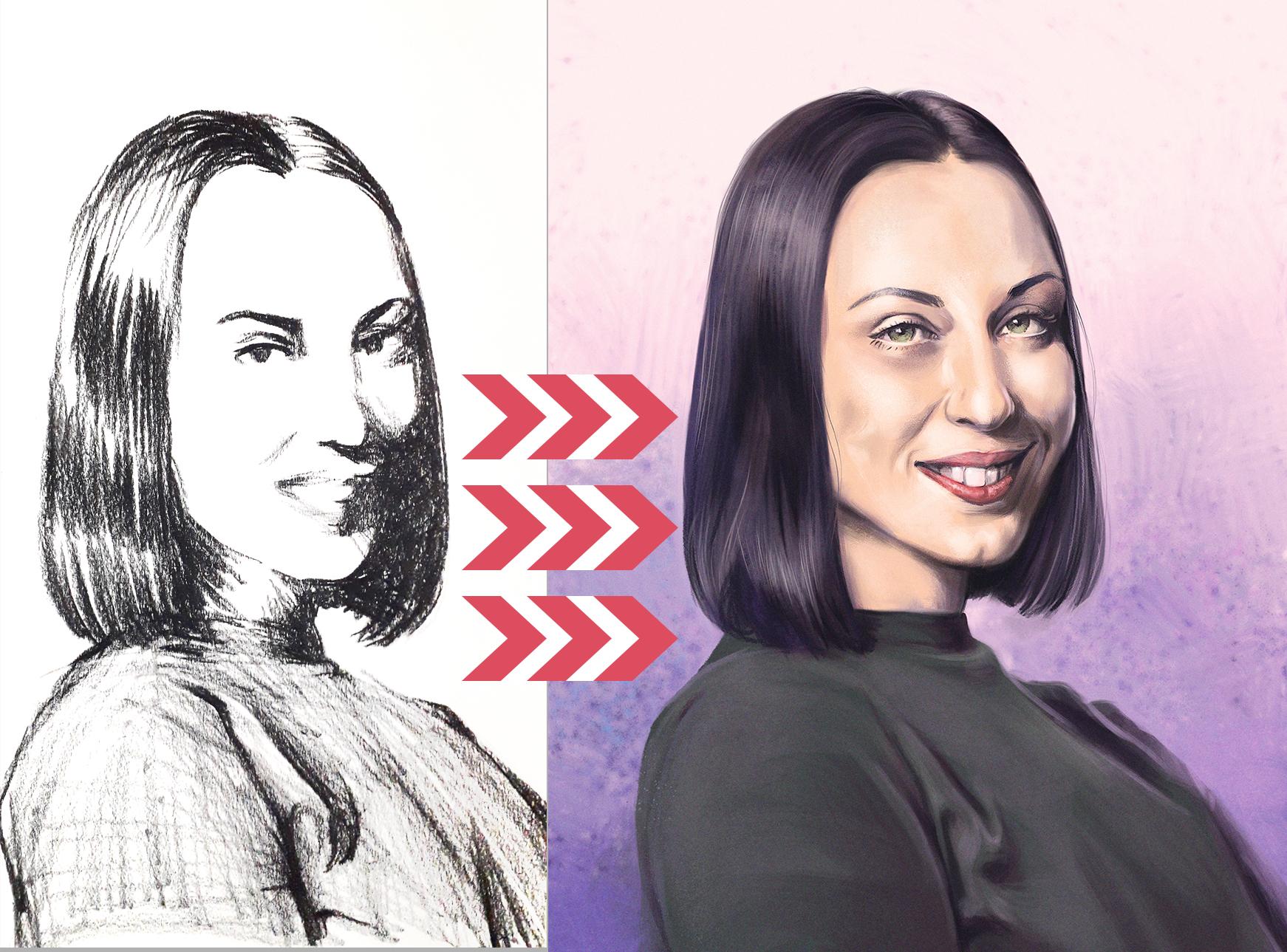
2. What is this class about?: Thank you for joining the class. I hope you'll find it useful and the work here will help you in your drawing journey. So let's start right away. When I'm starting to work on a project, on a portrait drawing, whether it's traditional mediums or digital mediums. I always try to, whenever I can. And as often as they can, work with smaller, let's say thumbnail drawings. That will inform me about where are the highlights and where is the light parts of the drawing and where are the shadows. And often I use that, first of all with squinting my eyes and looking through my eyelashes, because in that way, I lose the detail and have only the focus on the areas that are lit and the ones that are in the shadow. And that is what I tried to do in my first drawing. Like you see on this image here on the screen. That way I know that even the darkest area and the light part is lighter than the lightest area in the dark part. I hope you find that useful. Because if you don't do that, if you have shadows on the light side, right side of your drawing that are, let's say, darker than the light, lightest areas in dark side that, that make a confusion because you have some mistakes there that you can work on. And that is why I always tried to see where are those end when I'm rendering later that drawing, even if traditional and digital media is, I know that what is what, and that will make your work more naturalistic and more feel and give you the feel that you are looking for in a portrait. So that is my main concern when it comes to this way of working. I've talked about it in my other classes. But like I said, it is very important that all the light areas In year, even the shadows in your light part of the portrait are lighter than even the latest in the dark part. That way you can have that cohesive image and you can try that out for yourself. Look at portrait one on for graph. And you'll see that when you're squinting your eyes, that, that remains the same. Areas in the shadow cannot be lighter than the parts in the light, light side. Of course, you can do it that exercise traditionally with pencil or charcoal or tell you like on paper, or you can try it story, but tried to do this exercise and do this step. And this, I think that would be very beneficial for your work no matter what medium you use. Now, let's take look at some examples. How I also use photographs to the sect or to analyze the image that I'm working on. Here we have a photograph that I used for this class. It's portrait of friends of mine. And she was kind enough to allow me to use it for my work. And like you see here on these other two images, I use that image to see the proportions. See what part is where. In the blue lines. I outlined the few basic shapes. And I tried to simplify the portrait and see how would each major section of the face length on this other image. I just made it to see what are the proportions of the face. And if divided into smaller sections, where would each major landmark of the face lend just nose, eyes, mouth here, and stuff at that. See what HOW TO how wide certain parties. There's also beneficial when you work in on the porch. And this is also a great way if you're working with photographs, you can try to analyze. It, wouldn't have to do it for each work. But more you do, the better you'll get it. And it's like before you make a comparison to something else, it's like the basketball players, they don't go only to the matches that they're playing. They're investing much of their time to exercise to get fit. But we, as viewers see only their final result. We don't see the other efforts that they put in to get that result. It's basically the same withdrawing. You put your should put if you want to do it. Of course, there's put hours into practice and see how you can get better at your craft. It's not just to simply draw, draw, draw. Tried to be an elliptic in your approach, tried to study the subject matters that you want to draw. In this case, it's the portrait and tried to see two best way how to approach subject. So that is of course, drawing. You have to also analyze and see what works for you and how to improve on your skill. And then you can do it by practicing and putting your time to it. This way also is a good way to deconstruct the complex subject, such as portrait into more manageable small parts. Did you will have easier time to accurately draw what you see. So hope this was helpful. And let's now, after we've talked about this, move on to another part to this class.
3. Few tips before the drawing: For this class, I made three drawings. One with traditional mediums, such as truck call, this one and additional two in digital. And like see, the last one is the one that I'll show you how to split into digital painting. And one in the middle is digital, that I will try and to replicate the one with charcoal, but not in the technique style. But when I'm thinking about the black and white shapes, shapes that are in the shadow and shapes that are in light. You're going to have to do it every time that you paint. But I wanted to show you this in this class as a way of learning. Because each time you paint and draw, you'll get better. And I think I talked about it in the previous class, but it's not just to draw aimlessly. It's a drawing with the purpose, drawing in, in thinking how to improve you with how to understand your subject matter. In this case, that's a portrait, but it has, it can be figure drawing and can be still life or anything else for that matter. When you're drawing, think about limiting yourself when it comes to time that you draw. I think some, especially the lesson is, I think about 2019, 20 minutes or something like that. And when you're drawing with traditional mediums, take a look and examples such as these that I did in the course of 10 days, drawing 100 heads in 10 days and make you see here, I even specified time for which I drew some of these so I would know and to limit myself and that is to quickly get out of your head and think, get those drawings out of your head, out to your hand. And to think about main structure of the face and how that to translate it into a drawing. So think about that before you go. The important thing is, is to get into drawing zone. Before you come to painting. You will have easier time this way because it will be more familiar or have a good reference that you can use. And because if you use a blurry image, image that is very poorly lit, it would be harder for you to work. So when you're thinking about creating your own references or using other people's photos for your work. Think about getting the best kind of image that will suit your needs. Of course, the best way would be to have a live model in front of you. But you cannot have that every time. So sometimes you have to work on forests and since we're working digitally and using that to improve your work, and having four also is helpful. Like you see him, saw him a previous video that I use to divide the face in certain parts, Simplify it studied in that way. So having 40 is helpful in that way. So maybe the best thing would be is to have sessions with models that will fit for you and that will, you'll paint and draw, but also work from references and see how that will impact the work. So that's it for now. And let's move on to another section of this class.
4. A quick class overview: Now that we've talked about wine, how we approach this subject, it's time to show and talk about what else will be covered in this class. One, of course, dominantly when it comes to digital work. In this class, we will first of all go through and trips and before we go into painting, because it will help you go about digital drawing. I also show you how I use radial menu for Wacom tablets or syntax and stuff like that and how they can also speed up your work. Talk a little about the selection that I often use in our work and making selections. And that is also very helpful starting a new document and of course, talk about the pure F, that is a piece of software free after, but you can also donate to the developers so they can improve on that. We'll talk about also. I'm seeing me make digital drawing. And of course, then there's no painting. Final thing that will show in this class when it comes to digital painting is a couple of finishing touches. Let's say then let's call them post-processing tips. That will be that final one or 2% of your work, but that will have maybe a much more impact on the overall piece of work. So that is what we'll cover hope that will be very useful for you and beneficial. So let's start with showing you the workspace. That is also very important when you're working digitally. Same way. You will do it with traditional media. It's important to arrange your workspace in a way that suits your needs the best. And you can feel comfortable and also be beneficial for your health because working digitally on traditionally a painting and drawing a rose or die on sitting down. And if you're sitting in correctly, that can also impact of your overall health, especially if you're doing for long hours. So let's take a look at that.
5. Working in a digital space, Part 1: Hello and welcome to my drawing area or my workspace to be exact. And where we have a webcam tablet that are working on at the moment. Lg monitor as my second monitor, keyboard, of course, mouse and stuff that they normally don't use, don't have no use for it. And that is remote by webcam. If I was using a bigger one, that then probably I would have less space for the keyboard. So this thing could be enhanced. So since I'm left-handed, I put my webcam tablet on the left side and work with my other hand on the keyboard. That is how usually if you're right-handed, then it's verse i tablet is an angle because Oberlin drawing, I'm trying to not bent over a surface that is flat, but have a certain angle that will also push my back in other direction. So I wouldn't bent over and the hunched over the time because that would really be painful if we are working for long hours and our work demands that we push more work into it. So when you're drawing, try to have a comfortable chair that you consider and it will be a very good for your back and give support for that matter because taking care of your back and having the right posture is very beneficial for your health and keeping that thing in check. So males to stay healthy, do exercises and keep the back will boast lower and upper part of your back at an angle. And while you're working, have very good on everything that you do. Courts we have pencil and when we working on pen tablets, like to have that love that will make each stroke smoother. And that way you can have more, feel like you're working with traditional media, has more grip to it and it easier. Of course, when you're working, you don't have to have a monitor inside your tablet. You can also work with some other tablets, intos, vacuum tablets, and I've been using it for years. And I can also recommend it. Because when you're working with tablets such as these and you don't have a monitor, it's important that the size of that tablet is a little less than monitor. If the difference is, difference is too big and that is too small, or your monitor is too big, then each stroke that you make on a tablet is much bigger on the screen and that will be very well. That wouldn't be, wouldn't have that feeling as if you were drawing on the paper. Of course, that's something different when talking about working with tablets that have monitors inside. Also, another benefit of these tablets is that. Can pretty much take care and take everywhere with you in your bag or something that can work with a laptop. So as you can see, all of this is it's active surface and you can do it. It's also sensible to touch if you need it. I personally don't need it. And non-life that option because you may trigger something accidentally, so I leave it off and I see It's very light, durable and has very good sensitivity on the touch. So that's basically the setup that I'm using. You can, probably if you're working digitally, you will list have just, you have to have at least some of these things to work with. So welcome to this part of the class while we go over some important features and tips and tricks and to the world to share with you. And of course at the start, we have creating, we have created a new document. And what is most important is that you're starting image has at least that's important to me. And it has the resolution of 300. It doesn't matter if you're working for web or for print. Always a good start. And I started with having luck to by 3000 pixels white canvas. Of course, when I'm adding details and working on finishing touches of my work, I like to push that to maybe 56 thousand. And by doing that, those details that are most important will be crisper then all the other parts of your image, but don't go abruptly from 2 thousand to six or eight or 10, just go gradually. And the details that you add that are important is slowly building up. So go from smaller to higher. And the hardware solution, you may add smaller details. That's basically it for that part. And if we see some of my work, Let's see the resolution is 300. We see here three by 4 thousand and stuff. It isn't that big. If we have it in inches, this size, in centimeters, stuff like that. Let's see another illustration that I did in similar style. And we see image size is 50, 5000 by 5000. And finally, this one here is, let's see, image. It's about traces. So I haven't done much change and didn't for this one, enlarge it in much detail. But I think this is pretty much okay. And if we go to the zoom tool and say a 100, we see this is the size of that. We'll talk more about stuff that are about here, double layer layers. But for now, let's move on to, let's say, shortcuts that are mostly. Used and they often use in my work because they speed up the overall process. And if you see me press, you see also on your screen on the center of the page on the lower part, and see me what keyboards, as I'm using that way, you will have a quicker and you'll see better. What, what exactly am I doing with the keyboard and think that will be beneficial for you? And when I'm painting, most of all, I use the space to move the image around. I like to use z to enlarge R to rotate. And those are basically the main ones. Press R again, I can reset the view and make it like this. Another to another. Did like that I like to do is to use the lasso tool by pressing the letter R and making the selection. You'll see me make those, those selections in the later videos. But if if we press the button, we can remove from the selection. And if we press Shift, we can add to selection. You can see that those icons here, but you don't have to click those there. You can use the keyboard and you'll see that sign changes from minus to plus. If we add it's plus and press it's minus. But if we put it here, then it can be minus 4 subtracting from the selection and plus for adding. I'm, I'm sure you probably already know that, but that's, for example, stamp they don't maybe need, don't know, is that when you're working, those marching ends can be pretty annoying. So I like to hide them by using this shortcut Control Shift P and painting. Now, the selection is still there. It's just hidden. And if you press that again, we'll see where that goes out. Later part also, in a few moments, exactly. I'll tell you a play you can change and make your own shortcuts. But for now, that's it. And you can deselect it by Control D. We don't mean it's less so we can remove it. Other very important shortcut that I often use means that when I'm satisfied with most of the work, I like to merge all the visible things together, but not on that layer, but on the layer above that one. So for that Control Alt Shift E. And we have another layer with all the stuff that we've done here. And that is because we can then use mixer brush. And do other great stuff, pinterest stuff. Because mixer brush and we'll talk about that too later, is only working if we have something to move around. And we can have all these other adjustments for that. The thing that for now, That's one thing. Another shortcut dialogue like to use is Control Y. And that is to have the proof color. And to see how, what are the values. Earlier, you should make another layer on top and turn it to black and white and see it like that. But if we use the Control Y, we can then make that easier and quicker. And you can see it. It's here proof colors. So we can see it in black and white. Also the other commands that we talked about, show layer. Select the option to show selection edge. You can find it also here, but you can also change that. Let's take. So those are basically most important because for other stuff, I'm using the vacuum radial menu and we'll talk about that more. Also. You can use your tools from the toolbox and have them arranged at your will, like you see here, I have some tools that are maybe different from yours because I changed them to fit my own needs. So you can do it the same by going to Edit toolbox. And you can see here, these are two bursts and years. And some are together and some are apart. So this, you've probably gone here. Okay. And then here. And they are altogether if you want to access some who don't, you also have to go down here selecting from a menu. But if you know that you use certain to regularly, you can click on him and move him outside the group and put them so we'll have that thing. And that is the same way why I have mixer brush. Apart from these other tools. If I put him back, then we don't see the brush and we will have to each time go there and take that. But since the light my mixer brush to be outside, that is very important. Okay, thanks. I have everything the way I should go cans. But you see that that can be very useful. About the shortcuts that I talked earlier. Keyboard shortcuts, you can find all of them here and you can change them to fit your needs. So for example, view. This is that command that I like to use very often just to check the colors. That is Control Y. I'm sorry for the misspelling. Some of those things because native speaker, but the hope and the right selection edge is very important. So we can hide or unhide that selection. It is very useful to get away from those annoying ants, marching ends as you call them. But to still have those munchkins and have the selection but hidden. And that is this shortcut. It's little bit long, but I didn't find any other solution, but I even got used to it. And by using the vacuums radial menu, it became even, even simple to use. It's all about getting stuff quicker. So here you can find and change any of the shortcuts. And you can see Hamilton panel menus Tools. And you can see which shortcuts can you use? The same comes from the menus. So if you're interested in customizing your tools, your shortcuts, this is the place where it can go.
6. Working in a digital space, Part 2: When it comes to radial menu, they have these options here. And like I said earlier, I like to erase with my brush. Now of course, if we click E, we have an eraser, but I like to erase with my brush. So I'm having this brush. It's so true random. And if I wanted to subtract from it and I go to eraser, you see, it's a different field, it's a different brush. And if you wanted the same, we'll have to pick that same brush. But if we go back to brush and we want to erase it in part, I want to have that work be cohesive. And then we can use the eraser that would have the same tip. If you don't have vac and tablets, you see that it, these are the modes and this is where you can change, change that won't go from normal dissolved behind clear, but I usually go there until it. And by just pressing my pencil, you see I can go back to the normal brush and it's a very quick way. And you can also change that. And you see that is the command Alt Shift R to access the eraser with the brush, with the eraser. And the band back to normal tip of the brush and comes to the vacuum. And where you can change all these settings is to go to vacuum desktop center. First of all, of the pen settings. And like you see here on the lower button of my pencil, I have made that so I can call the radial menu. And the upper button is just regular right-click. So when we go there, we see on the radial menu may have brush, eraser, normal blush, hide selection, deselect, and all the stuff that you see saw me do. I want to change it? Make a new stroke keystroke. You see, this is, this is the command. Keys that are used to flip vertically, flip horizontally. And we'll talk about it in a little bit. Now this is about vacuum and how useful the radial menu is. It saves time. If you have these types of tablets, but even, uh, tablets that are not from vacuum tried to get in the game and have those radial manager will be, these are extremely useful for ongoing about digital work. Another thing that I wanted to talk about is working inside the groups and you will see me do that work later on in the parts where I'm demonstrating me and showing you how I go about painting this image. And you can see those groups here also somewhat, somewhat merged. And you'll, and also explained why I made all these. Changes and why we have this image here. Because and I'll talk about that earlier when I'm satisfied with the progress and the work done inside the group, what I like to do is to merge all those visible changes and put it on a layer on top of this and then work on this part. You can see that same applied in that painting. We have groups. Certain groups can really see all these groups are massed in a way that helps us have much cleaner workspace and workflow. And here we have some other groups. Groups are very useful in keeps your work clean and helps you determine various what enemies you even name those groups. It will be much easier for you to find where is what. I'm not that good at naming groups and layers yet, but I usually know each part is where. So let's see how we can work with layers and groups. So we have this, let's say background and one color on a new layer. By using the Lasso tool, let's create a circle. And this way, they have very simplified look of the profile. And maybe add a different color. Brush, maybe enlarge it. Some other color. Orange, whatever. So we have that. And what happens if we want to paint just end side this figure and we don't want to go on the purple. So it's maybe the best solution. One of the solution is to create a group. Then Control click on the image on the player, and then and mask. So we have this mask for the group and anything that's inside the group will be visible only in this part here. So we add that to the group. And then you've seen an assay. Now, this is inside the group and everything that we obtained is no visible only because of the mask inside that group. So that is very useful for starting the work and for stuff in the early parts of your work. Father, later in one style painting to go then in other direction by clicking on it to select the color. So now that we have that, let's talk about another good thing when you're using the groups and that in combination with hue saturation. Now, the way that I used to go when I was shading is to use the multiplier layer and stuff like that. But I find this more convenient is to use a hue saturation layer and it's very non-destructive. So if we lower that. Maybe desaturated a bit, change the hue of it. We have this layer that is covered all in shadow, but we don't want that. We want to invert that selection. And while the mask for hue saturation is active, and when we can see that it is active, it has these white lines around the box. We press Control. Y, I cry. And now everything is in black on the mask, so that mean it's all covered. And we want, if we want to bring that back, we see that we have here black and white color for selection. And everywhere we want that to be seen. We just paint. Why is this cool? Because by changing and pressing the letter X, you can remove and then pressing again, you can add those shadows and you can have multiple shadow layers on top of each other by Control J, we can add. Then GO ALL IN black, hide the entire thing. Then you can maybe changed color at some saturation, make it even darker, and then go back. At additional layer of shadow. See, this is very rough because I'm trying to be quicker and move to the next part. But you can see the implications and how this can be very useful in its own separate layer. And it's always accessible to you and you can always change it. And you can do the same thing. When it comes to highlight. Go brighter, adds a trace, maybe, maybe you make some huge shift. Then repeat the process to hide that and place it only where you want. Of course, this is not enough when it comes to painting, but it's because you have to have this new changes and stuff like that. But you'll see me work with this kind of work later demonstration. But it's also very good as a starting point when you can decide where is, what, where is the light source and each of that light source can be done easily changed and you move until you are certain. What you want to do. Final piece that I would like to talk about is post-processing your images. One of the things that I like to do, and you will see on all of these three is that they have this grayish kinda looking layers, more or less. See here. And those are layers that add certain add grain to your image. And I like to put those layers last. You see the effect with that grain. And here is without, with, without end, with. Here. I even have two of these layers on top of each other for additional effect. I think I made this layer and then flip this one horizontally so that it has even more tooth to it and see what you can see the changes when I'm clicking. And for this case, It's also important because I wanted to make this kind of pastel looking effects h1 elements. And having that layer really puts those lines into effect and makes it look more traditional. Painting. Another thing that I like to do, let's see here first is to sharpen, but let's see how I make these layers. So if we have, if you don't have that layer, Let's create a new layer. It's on normal, and when it comes to color, go to run 50, some middle gray color and fill it. The entire painting. Shift F5. Then go to Filter Noise, Add Noise. I like to go all the amount to 400. And Gaussian distribution and monochromatic. After that is done. To go to filter, filter gallery. Go to spatter with around 10510 prey radius and five smoothness to it, okay. And then enlarge it a bit. Like Okay, why I want to enlarge? Because I want some of those. And why did they use spatter? Because if you using only noise, the noise is very uniform, uniform or very little difference. If we use spatter, we see that It's more unpredictable. That noise end the weight. I think that is the way it should be. And after we enlarge it, we made those disturbances even bigger. So after that is done, go with that layer selected, go to soft light. And like you say, it's too much. But what we can do is to lowered, needs to lower the opacity. I think I have somewhere else.
7. Working in a digital space, Part 3: Lower the past even further to something between 1520 is the way that I like to have it. So it's barely visible, but it's also very beneficial. Went for details and gives the tools. I can see that here is 21, here is 15. And for this one, IU, when I added the noise, I said it was with multi-carrier. We see the difference between those two. And we put it all the way up. Soft light and normal. It looks this, but I'll put it to soft light or maybe only know stuff like that and then reduce it to, I think it was 2001. So that is one way that you can process your images and make them more interesting. Or you can use, like I said, you see here, sharpen. And when it comes to sharpen, I want to sharpen the most important parts and those are often the ice see here with and without the eyes. And you can see that also here. Yes. We see how that looks like with and without using it. There are three same layers that make those eyes pop up because of thing, those are the most important parts in the portrait. So I decided to sharpen them. But how we go about that, Let's see what's inside this layer, its color lookup and other adjustments. So in order to do that, Let's use our longest shortcut. This is that one here. And we have this inch. If we want certain parts to be sharper, we go first to image adjustments and make it black and white. Black and white. After that, go to Filter. I think stylize no other high-pass. And what that does is just show you certain ones. An entire layer is great. But we see here the lines and you radius. You can decide if we want to have that sharper lesser. This is, I think, too much yet, probably it is. But that's because I usually work like two or three. And if I needed that effect to be stronger than I make different number copies. But let's experiment here, and we'd say seven. And like we see here, all these layers are on soft light. So we'd say, yes, Soft Light. Do the same here. We say satellite. And we see that entire image is now sharper because of that layer. But we may not want to have one. Maybe we do not want to have the entire image be sharper. Maybe we want some certain parts. So using the mask for that and have that mask and everything is visible because the mask is white, but we want to make it hidden. So we use Control I and everything is the same. Now we want to cover and show these parts that we want to be more prominent. We take Russia, enlarge the brush size with brackets and with white color. And we go that white color with pressing X. We can reveal those parts that we want. Let's say for example, eyes, nose, and mouth. And if we look back, we can see that these parts are now sharp. If we want even more, we can control J and then see one more. If you want to control those together, press Shift and press on those both layers. And Control J to put it in one layer. So you can work on those and you can mask them and all the stuff. And there are many other ways that you can post-process. Maybe you want to add chromatic aberration. That is also very simple. Do that. Then go to blending options of that layer, change up a few channels, say red, blue. And then plus v. Two can move that canvas and we can have this effect very quickly that you will see that chromatic aberration, those parts. But also, again, we don't need that in all the parts. We can, we can do, we can, let's say with the lower levels. And by pressing the Alt, we can use for black and one white parts that we want to it can change the white and black pieces to kind of blend together with layers beneath. Or we can also make mask. Find a suitable brush, let's say some with soft edges. I can track that here. We see that, yes, this is nice, nice. Okay. And remove. It's white, so you go to black. Chromatic aberrations on parts where we do not want a slightly little pressure. We don't want to go on board. But now they see that focus on this portrait is a hurry and we see that all other stuff is blurred. But we can also do this iss and now face, eyes are much more folks. And that's how it looks in the end. And we can also add that grain effect and take a look at work. So these are basically the main three post-processing tips that I have for you. There are probably a lot more details from time to time. But in every occasion, I think I like to use that high-pass filter thing, the noise layer. And in occasionally Chromatic Aberration, if there is a need for that. One of the essential tools that I like to use when I'm painting is to use pure F. And you see that here. And you can very much change the size of this and fit to your screen. And you can get to the site was of course, free while. But now we have additional options. When you click on the pure side to get pure ref, you can decide which platform you're using it for, Windows, Mac, and Linux. And then select the amount 105 or customer amount 20 or even than that. But also if you're still just wanted to check it out and not pay, you can type 0 and go with that. But previously, it was able to do that for $0. But I think they've changed their plan. A bit unfortunate, like say, I think I don't think that it is. Yes, if these free for $0, so you see it download absolutely for free. And you get the app. You'll see that you can import images from your folders. You can drag it directly from anywhere on the web, let's say from from Pinterest. Save some of my images and you can swipe directly there and say like this. And you can have that reference directly in your pure F document. Also, what you can do inside of it is that you can put an arrange all your photos in any manner that you like. You can quickly by double-clicking, focus on one illustration and you will see the other. And since I'm using. Flip Canvas in Photoshop. You can also use it here by clicking Control Alt O. That means that can enlarge, Shift Alt and dragging to the left or right. You can flip the canvas both horizontally and vertically. You can use handles on corners to enlarge it. You can rotate it this way. So if you need that, you can move around those paintings. Ever. Of course, you can save that. Put it in the folder where all your reference images are. Or if you just did like I did, screw and swipe the images from the website, you can save and selected images, all images seen and stuff like that. So you can have it also that way. And there are also modes. So we can have that is always on the bottom. That means that whatever you do, pure F will say, stay beneath. If we go to Mode and say all this on top. So whatever we press Play, we see that only that, that it goes on top of all other applications, web browsers and Stato get for. I usually make it always on bottom. So that way it stays there. And then you can arrange them in every way that you can. Also, you can, what you can do. Let's rotate this. If we need just certain part of that image by pressing the sea and dragging, we can crop that image. And by Control Z, of course, like in every other program, we can undo the change. So more, most important, Control, Alt, left and right, up and down, rotate, stuff like that. I think Control P, Control Shift P will arrange them in an optimal view. So Control Shift P. And there are much more ways that you can use, but this is basically the way I use it. I put it on my monitor. I don't monitor because I'm working on should tick 16s and there is monitor for that. But I like to put it on edit mode and then look at the reference that I prepared and make it easier for my work. So that's basically it for this pure F, It's great application. You can also transform the images together or individually to make room for other preference shots and stuff like that. So if you haven't been using pure f that I highly recommend using, it is very good for work and to keep all your references in one place. And you can see like this small part, you can have thousands and thousands of your references, but also it will be vary for your company. It depends on your computer. If he can handle this, how he the computer can handle all those reference, but you can have thousands or just a few. And simply by scrolling on the one new mouse, you can enlarge small and stuff like that. So think about using this program and contributing to the developers were all, if you just want to try it, download it for free. And later on, if you think that's fair, you can donate to them as well. So that's it for pure F. And let's move on.
8. Digital drawing demo: So here is a start of digital drawing, and I'm working in Photoshop, just to say that the same way that I would start when I'm working with traditional mediums. And to show the examples of how these, um, how to work in that way. I'm starting with a circle and then creating additional shapes that will create the base of the head. This video is also sped. So I think it was about 19 minutes in real time and something a little bit more. And this you can see in about six minutes, six minutes. So it's basically the same process. Like I said earlier, when I would start in on a real piece of paper, I'm constructing the lines on constructing the basic shapes and the oral forms to start with. Also, the distal pencil that I'm using is just Few, let's say pixels in width. And I also have on other monitor or another display, the photo that I'm working on. And you can see me using the dual wheel. There are talked about the vacuum wheel that has all basic or the tools that I'm using. The most often. After that, you'll see me start making additional details and going from eraser to pencil. So in order to save time, I'm switching very quickly through that wheel to pencil, from pencil to eraser and blocking the main shapes that create the head. And deciding on other details thing where each part should go before going into any additional work. So like I would say in my previous classes, it's important to determine places for each of the main elements of the face, see where they are. And then based on that, put details and other shapes. Right now, I'm starting to work on the eyes. And just positioning that these shapes, I'm working all around and not focusing my attention too much, just on one place. And let you see there is much and is oftentimes erasing because if we can use it, why not? When I would probably work in traditional medium out, use a lot less erasing. But I don't know, I think our gut, when I'm working digitally, more spoiled by, by all the things that we have there. So I'm much more using the digital, the eraser when I'm working digitally. And also you can see here, if you're not satisfied with certain part, you can always select it and then enlarge it, make it smaller and other other stuff. And you can see all the tools, all the menus are on the side, so I can have an easy access to that. The way I've positioned this canvas is in such a way that makes me working on a real traditional piece of paper. So it's all one color, white and I don't see any other details that would distract me. Adding pupils and slowly working towards the jaw and the hair. And it's just an Indian, you'll see it will be a plane drawing with just the rough details and all, all the elements. But that will not be in a perfect finished on a 100 percent drawing because the goal of this joint, because it's going to repeat it. We don't have to have all, all those details. The goal is to have as much accurate is you can draw and then you can use later. And finished with painting. I finished the teeth, the lower lip, and other datas m, Let can see can, like you can see here, I used to flip the image horizontally so I can look into that way. The good thing about PRF is that you can do that same thing in pure F. That is not a program that I talked about earlier. And you can watch that image Also like that. So that's also another benefit because in digital it's much more easier to flip the canvas. And reason why I do that is to have fresh perspective on the thing that you draw and paint. And that is very helpful because it gives you a perspective, change of perspective and you can spot mistakes easier. This trend is slowly coming to conclusion. And very soon it will be done end in next video, we'll start with painting this drawing on top of it. And we'll talk about more details about that in the next video.
9. Digital painting demo, Part 1: So here we are with painting and acute maybe notice I've tweaked the drawing further after recording that session previous, previous video. And now I'm trying to paint it. First on the layer beneath the drawing. I work on the background and you can see I added a simple color and on top of it made a gradient, but that is not enough. So I decided to find in my brush library some spare brushes that will give that additional, let's say texture for the background that I led later on, blur little bit. Just to give it none other, something more interesting field might my brushes there. So I tried to use some of them. You can use other textures to make it an overlay layer or, or some other modes. But This is the way that I start, like you see in the left part of the visual, I have some like the size of the brush and stuff like that. And like see, I'm adding a few more colors, duplicating that layer. And finally, here I blow that background because that is not the primary thing for this piece. It's about the portrait. And before I go into portrait, like you see here, I make selection of the portrait. That will be easier for me to color. I do it a few ways. I zoom in about 100%, maybe even pressing the letter R, rotate. So it could be easier. Then choose a color that I would like to have end on the layer beneath the drawing, fill that layer with Command Shift F5 and move it into a group. Group also is masked. So it's easier to work that way because everything stays inside the mask, everything neutral. You cannot go outside the mask or the figure. So that way that's easier when you're working on simple character because it speeds up your work and you can be much freer when it comes to drawing and having sticks to draw outside the shape. So create a group that is masked by your character. And you can do that by clicking on the icon of that image that you're drawing. And then creating the layer mask. Now I'm adding details for the for the cloth, for the clouds. And it'll be some kind of greenish color. I'm also looking at the image and trying to get the exact base color as this will be starting with the work flat colors that can be used, and the end that can be manipulated later. If you're satisfied with color, you can always use adjustment layers that are on the bottom on the right side and change it and it's non-destructive way because you can always change that color. And like you see here, and that way it can always change it. I'm using right now Hue Saturation Adjustment. And that would be to bring the shadows or offered this flat layer over that flat layer. And by doing that, you have a layer. You don't have to think about. Let's say for example, the code that you will use, you'll be painting like you see on the left side, I'm painting only with black and white. White is to show that hue saturation layer and black. You can use it to hide that selection. So basically, and hue saturation, adjustment layer, I made it, let's say darker image then it should be, oh, let's say made the shadow. And then by clicking on the control, why I inverted it so height, I just hit that layer. And by painting with white, you put those, you reveal those that layer again. So that's exactly what I'm doing here. Or if I don't like certain parts or hide them again, I'm using with black and working is very simple in this way because you're only working with black and white on that layer and you're hiding and showing that layer. Of course, I like to go about and go on the layer beneath, on the color layer. So right now I'm adding the colorful base, base color for the lips. And if I'm not satisfied with the shadow or highlight, I can always go to that hue saturation level and adjust the shirt. The main, Let's say, the best thing about these adjustment because nothing is still set in stone and you can always rework the shadows. All you will see later, the highlights. So hue saturation adjustment layer that you can find on the button on the right is very useful when it comes to quickly creating shadows and later parts of the face that are in the light side. Until that in C. And working on the layer that's beneath and adding some details to the ice. This brush that I'm using, it has little bit text to be an I like it because it feels more like like mature. Usually you, traditionally. And now you see I created another, a few saturation level, but that is on the opposite side that I did with the previous. I made it lighter. Then the basic layer. So I'm adding the parts of the face that are lighter and that the sun is hitting. So just yeah, I can see I'm maybe I'm doing it, saying it all over again. Just by using black and white. You don't have to think about what the US at this point. You're just adding the parts that are on the sunny side. On the side that is the, that the sun is hitting or the light source. And just putting those in big shapes, just adding those shapes and lighting the entire figure. And also going back to the previous layer, hue, saturation adjustment layer and adding an additional parts of the shadow. And we had talked about that when I showed you the drawing that I did with traditional mediums. And that was very helpful because they, that those drawings in for me where where the shadows are and how to approach it when I'm come, when I, when I come to digital drawing and painting, the same thing as I did on face. I'm also doing it on, on the clothes. I'm just simply showing where the light is hitting the subjects. I'm paying close attention to reference for also squinting my eyes. But when I'm doing these things, because that allows me to stay off the details, the stuff that are less important. And let me see here. We don't have to use just on hue saturation adjustment layer. You can add additional layer in your painting group and trust print in the normal layer in Photoshop, adding further adjustments. Just Eugene and painting with normal brush mode. And sometimes it's good to, to move away from your work or make it smaller so you can see it from the distance. Also, I'm making another adjustment layer, hue, saturation adjustment layer and also bringing that to shadow, making it darker. And by pressing the Control Y, I'm also make an all-black. The layer mask is black, so everything is covered and it cannot be seen trust by painting with white, brush, with brush that has white, we reveal that layer. Reason why I'm doing it, because even shadows don't always the same. So I'm adding second layer of shadows. This is still very rough parts of the drawing or painting. And I'm trying to give more, let's say, some line elements to the drawing and making those shadows make thicker and have more, more life. I'm also thinking about ambient occlusion and thinking about where the light hits the most and the phase where we have indirect light. So light, light that bounces of other objects and other environment that is around this portrait. And thinking about that when I'm trying to, when I'm adding this, this next layer of shadows. So basically we have two layers for shadows and one layer for highlight. And you can see me here going constantly from shadow to highlight. And trying not to Zoom too much at this stage, at least. But as we go further into painting, I'll probably zoom in much more. So when you're starting, try not to zoom at all. Oh, zoom as least as you can. So you can have the entire painting in front of you. But as you progress and you made some choices, then you can go and zoom in and work on the details. Just remember, not work on one part of your painting or your drawing. Only in one specific, specific moment of time. Tried to, if you're drawing to go about all of the stages of your work in all parts because that way you create bit of unity and all the parts will be one cohesive element.
10. Digital painting demo, Part 2: Again, using that shadow layer with hue saturation and adding those, let's say darker elements. And I'll show you after this part is done, we'll work on another layer. And I think that's, and I know I'm here just watching the drawing and deciding to make it even less opaque or completely cover it, or disable that layer with the drawing, because I feel I don't need that drawing anymore. So I can work by looking at the reference images that I have on my second monitor that are used with on in pure F and go from there. Good thing when you're working inside the group that has mass means that you don't accidentally go over the figure outside to the background. But you'll probably need it in some points. So soon we'll see me combined all those into one. I use Merge Visible command. We'll talk about it more when it comes to that. Right now, I'm replacing the drawing with lines and with painting. The places that has the least light. And then drawing those parts with with the color that is darkest. Now you see the moment when I merge visible. All that's there with that is with Command, Control, Shift Alt E. I think that's how it's pellet. And we are now working on just one layer. We are satisfied with all the work that we've done previously and now with the mixer brush. And you can see all that. That's about the mixer brush in the upper part of the video. I'm trying to mix the lines and prevent those hard edges because we need those hard edges in some places, but not know. So after that, I'm using another color, balance layer. Balance out any colors that I have missed or, or thing that the fit that. And then merge it again by pressing Control E. Also, I'm using another exposure level and I'm thinking, is it good? Should I have more light or not? Hiding that layer by clicking on the icon of that layer. Thinking if that's okay. And if I do, then I merge that layer, that exposure layer back to the layer beneath by, like I said, Control E. With a normal brush. I use one. I think these are brushes that I bought from Ross trend or maybe you should know him by name. Ross draws on YouTube or on Instagram. Like some of his brushes, they have very good texture. So I didn't have to make some of those brushes by myself. I sometimes use the brushes from people I trust the most when it comes to these things, have a range of brushes from Ross, brushes, from, from other people that I trust. And I see the work and they inspire me. But I use them in my work as well if I see that that brush fits my needs for that particular work. So working with those brushes. But always you can make your own brushes on your own or purchase some of them for like a couple of bucks or something like that. Now, like you see, I'm working on the layer that's above this one because I'm not sure. We'll these stay. So until I'm sure I will be painting on that layer, but you can see I'm trying to work as much on the few layers. And the reason is because the one to have for this piece at least, and because it's something that I do personally for me, there are no clients involved to work as I would work on traditional layers and working on, on on normal layer with normal blend mode for the brush. And I'm just painting looking at the reference image that's on another monitor and trying to add some diversity on the skin because we know, know the color of the skin is not equal on all its parts. There are also changes in skin tone. There are also reflections from, from the other surfaces that are around the portrait and other stuff. May also, there are variations in the skin and stuff like that and like that and so on. So making the bigger strokes, small strokes, usually at this point, I put on some music and just enjoy the work. And I'll probably, since when I'm done with that, come back with the mixer brush and then use that to mix certain parts together to join them in a cohesive, Let's say painting. For now it's rough. But we're getting there slowly. All other layers are still in the group beneath. But since we have filled that layer on top of that with color, you cannot see that, but we can use that for safety for if we need some selection or stuff like that. So that's the reason why I haven't deleted that part. Also, when you're working, remember to save a lot. Something may happen to computer and all your work. Will be lost. So whenever can or when you finish or going to start something important part of your work, remember to save. I usually do it by making a name and then adding like number. So this will be like Donna done. It's that surname, 000 001, then 0, 0, 2, 0, 0, 3, or stuff like that. So I can have different variations of the portrait in various stages. So you feel I made a mistake there. I can go back. Rescue summer of debts. Particularly important if you're working for clients. And then you will probably need to have every single element of your work on layers, then you can make adjustment to their needs. If you are working for your cellphone to improve on your drawing and painting skills, then maybe you should try working on this fuel level levels as you can. Or work with traditional mediums. If you're like in this class talking about digital than that's what we're doing here. And now I've merged that layer with layer beneath. And I'm using the mixer brush to mix certain parts together. And those brushes can be bigger, can be smaller depending on what you wanna do. In this part of the work, it's important to look at your reference image and then go about the work. Since I'm wanting to create something that resembles working with, let's say, oil or temper paints. Then that's the way I'm working in choosing the brushes for that kind of style. So these brushes a little bit rougher, have certain texture to them. And now I see adding certain reminds, maybe exaggerating them from what we can see on the reference image. But that is maybe some of the points when you're painting. You're not making for a copy of what was on the 40 you are painting and expressing yourself with paints, brushes, colors, and stuff like that.
11. Digital painting demo, Part 3: Quite zoom in right now. But remember even when you're zoomed in on some work, try not to go over 100%. So when you click Zoom tool, like you see here, when you click going to use the right-click on your mouse, you can see the cells. You can zoom entire page, 100%, stuff like that. If you're zooming in. And then we want to see the details. Don't go over 100%. That would be my, my, my advice still high. Don't follow that advice myself. Many times. Like you see here, is something much more than 100, but basically that won't be seen. And I don't think that would be necessary in real life, you wouldn't be able to zoom that much onto the painting. But this is digital and you can try and see if it works for you right now, just like when I was drawing, I flip the canvas horizontally. You can also flip it vertically if you like. Just to have a fresh view on the workout. Probably worked for now on this painting for, let's say an hour, an hour and a half, or even, maybe more. I'm not sure. So I decided to flip the canvas and flipped the image in the pure ref as well. And then try to paint further. It's perfect time to add highlights. And like to see, it's all done on one layer. But you don't need to do that. But if you want to learn to paint the Cloud this way, then it would be beneficial for your work to try to use as few layers as you can, maybe use them more and start to work until you make a proper composition and have all the parts, parts in its places. But once you feel that that part is done and there's probably would be some just rendering that should take place. Then maybe go this route. Here. I'm using some brushes that have that are very spectrally looking like. So I'm trying to not to blend the skin just by using the mixer brush and moving the paint around. I'm deciding to do it with little bit of spray, but not the airbrush way. I'm using a brush like you see on the right, has that unpredictability in, isn't even in every way. So that is good for, I think, for more natural kinda look. And the way I'm working hours constantly color, picking one, working with brush by pressing the Alt button and then moving on. And maybe the key is to use those, all those tools like mixer, brush, brushes that have different qualities in variety of way to create something that looks more naturalistic. Right now, I'm painting the strength individual strands of hair and, and trying out different brushes in small sizes to see which one of those will give me the desired effect. So it's always, and that is maybe that's the part I love about painting, which ever medium that I'm doing, that exploration style. And if I don't like it, I have that on separate layer. I can try, I can raise it or if I'm satisfied, then, then move on from there. So I'm thinking about this rougher brush to add some individual strands of hair, painting and adding little background to it. Highlights and parts of the hair and seeing how it fits with the original four. Now, after that is done, one back looking where it needs to be because this is an painting, simple painting that is focused around the face. Learn some of the parts that should the track that attention and try to, to give the viewer the look and to make it seem the most important parts in that. And this, the face. After that is done. I also again merge the layer with the layer beneath and continue to, to say, soften up these shapes, consultative, crying brushes. But remember it's not about the brushes that I use. It's about how you use them because they are, again, at the end of the day just to it's what you do with them. That's important. But like, like to experiment with the brushes, tried to find out which brush does what. Even when I know, I often forget what using for which. And again, thinking, oh, what did I use for that time, what did they use for this? That would be cool. But it's all about, if you like painting traditionally, and you put your time, enough time into digital painting, you start to love that as well. It's all about working, experimenting, trying out different methods, maybe listening to class like this one, going on to other classes on Skillshare and YouTube and improving on that way. Because not there is, there isn't one class that will give you everything. You can always improve by watching. Many other people do. And here I'm adding some other ring light. And you can see I'm using a blur, blur brush that is not much sharp because I don't need those sharp details here. Sharply tails will be reserved for the face. And I'm using also another technique for that to simply show more details on faith. But you will see that eventually. I think that right now we need some correction on hair. So that's what I'm doing. Right now. You can see I'm using, again a soft brush, painting brush to make them a little bit smaller and in additional shadows. And this brush has also called dynamics. So the colors is shifting between the foreground and the background. So we have two colors on the same stroke. And you can change that in the brush menu. Brush properties that sometimes can be useful, sometimes not. It depends on what effect that you can use, but be aware that that's also one of the things that you can make your brush. So we have this hair that it's referenced. You'd like to see, since I'm not convinced it will keep it and working that on a separate layer above the main layer, that one layer that Tammuz and life again, I say one, I'm certain that that's the way to go. Then I'll merge it with the layer beneath. You can find it in layers and merge visible. Trying out some adjustment for the brush. I'm not satisfied trying different experiments thing. Oh, that was too dark. So I'm using it in different Let's see. The layer, there's new layer that I put on color dodge. Those are probably with, let's say, final parts on to try and when I'm making these decisions, because all other work is probably done. These can be, let's say, some post process work or final tweaks that should be left for the last thing that you do. And that is adding some highlights, making them brighter, making shadows. But don't overdo it. And when you're working with color dodge, dodge tool, be very careful. I have it on low opacity like I think it has on the RAM using and use it sparingly. Because sometimes if it's used too much, it can break the painting and it can ruin the experience for the viewer. Now, I'm using the high-pass filter. Just and when you're using that new, make it much sharper. The way you use it is to copy that the layer that should done, turn it to black and white and then go to filters. So I high-pass and put it to overlay mode. I had to duplicate that layer a few times and put it into a group just to see the difference. And you can see that I also messed certain parts. And the white, what remained was the parts that were only highlighted to give the texture. To do overall painting, I use another layer, fill it gray, and then add noise and filters and put it to soft light. And when that is done, try to put it just like 1520 percent visibility. So that's basically it for this class. I hope you enjoy it. And if I feel like misstep some part of the work, then make a PDF or some document that will be attached to this class. So you have all the shortcuts on the process, on the papers. You can come back to it with much more ease. So thank you for listening and see you in the next video where we'll talk about your assignments.
12. Class assignments: Welcome to the assignment part of this class. And for start tried to fund for graph with good lighting, good interesting sideway lighting, light that comes from the side, or light that has a natural feel to it. Use the sunlight. Try not to have light flashes and stuff like that. Trans to have light that has had the chosen the natural topography of the face on which you can work. After we have that 40 started and analyze it. You seen in previous videos that I've made. How I go about analyzing the 40, trying to see which part is bigger than the other, how they are proportional to each other, what lines could be made? And apps that make a few sketches on paper doesn't have to be, they don't have to be as big as mine works, basically on A4 paper. But what is important in these sketches is to work with few lines. Tried to acknowledge what are shadow parts of that image, the portrait, which are the light parts. If you like, you can do a few of those quick ones, let's say even digitally. But when you're working on those, try to limit the time and say, don't spend more than 20, 25 minutes on each. So that if you're making a few drawings, then that's like B under our hour, 15 minutes for the three drawings, if you're doing that way. And after that, maybe use charcoal for these joint if you are working on paper. And like I said, I think earlier, we're working with charcoal is good because it prevents us from going too much into details. And after that, do a digital painting like I did or showed you today. And, and all that is done, please leave your work in the project section of the class. We can all take a look and improve on it if you also have in common. So in my work and the way I, I did this painting on drawing, please comment on my work because we can only improve if we comment and talk about each other's pieces and see what can be approved and what may be our mistakes and how to go about. So that's it for now. Thanks for watching a class in C you in the final video with additional information. So bye-bye.
13. Final words: Congratulations on finishing the class. I really hope you enjoyed it. And before we go to the next class of x2 or some other time, I have just a few announcements. Remember to post your work in the project gallery because I will try to look at each and every one that you send me and give you feedback if that is what you want. Also, if you like the class found it useful, helpful in any way, please leave a review so I would know how to push on further and make the content and the classes that you would like and appreciate. Finally, if you want to look some other classes that I have prepared on Skillshare, you can take a look at my profile and see sunglasses about shading, using simple shapes too big to build a figure drawing to level up your skills or any other digit you can find them interesting. So until the next time, have fun drawing and see you in the next class.
 Milan Glozić, Painter, illustrator, Designer