Transcripts
1. 001 class introduction: Hello everyone and welcome
to level-up series. A series of class is dedicated to improving
your drawing skills. Beginner, more advanced plaque. Right now, we're glad
for and for this one, drawing interiors and pets. We'll try when tends
your observation skills. So let me quickly introduce you to the
class so you can have a better understanding
of why and how it can benefit.
You're trying drawing, learning to draw
interiors and pets can be incredibly rewarding and
valuable skill to acquire. The main benefit is, like I said earlier, that it helped enhance
observational skills. When drawing interiors, you're presented with
opportunities to closely examined the detail
and intricacy of dead space. This careful of the racial enables you to notice
things that might have otherwise unknown
play of light, shadow, how certain objects and I placed based what gives them that in perspective
in the interior, or simply the texture
or different materials. Similarly, and drawing pets, you're faced with the
challenge of capturing their unique personality
and characteristics. This requires a
keen eye for detail and an ability to observe
their expression, body language you with individual quirks that
makes them what they are, who they are by the
end of the class. And by honing this
Observational Skills, you will not only
enhance your disability, but also develop deeper
appreciation for the whole ranch. So if you like, hearing, sharpen your pencil,
get ready to unlock the next level and
your creative potential. Gain more confident while
you're drawing there. And thank you for
joining the class. I look forward to
seeing your project
2. 002 why what and how of the class: Thank you for joining the class. I appreciate you
taking this step and I certainly hope it will
benefit your drawing skills. Still, before we dive into our class project and my
drawing demonstrations, there are few
things to consider. Think of them as a checklist while you're
working on your project. This will in turn
help you to stay on right track while you
making your drawing. In this video, I'll try to
be as brief as they can, but also give you enough
food for thought so you can be better prepared even
before picking up opacity. So let us start with
drawing interiors. And effective technique for adding depth and perspective to interior drawing is the use
of shadows and highlights. By carefully observing
light sources, drawing and determining
the direction in which the light
is coming from, you can create
realistic shadows that will give your artwork a sense
of three-dimensionality. Additionally, using
varying degrees of darkness and intensity of your shadows can further enhance the depth of your
realism for your drawing. And finally, by
carefully observing and understanding how light interacts with
different surfaces, you can bring your
turn drawings to life and make them more
visually compelling. To recap, always look for
your light source or sources. If they are more
than one of them. Use varying degrees of darkness. Finally, textures. Light interacts differently
with different surfaces. Your drop as a
draughtsman is to show us viewers what's the material of debt service.
What's the texture? Also more about this
later on, but for now, just be aware of these three key points and
look for them in your work. Okay, great. When it comes to drawing
animals like dogs and cats, understanding their
basic shapes and proportions is crucial
for capturing their life. For Dogs. Start by visualizing
a large oval for the body. Keeping in mind that different dog breeds may
have bearing body shapes, smaller circles for
the head and stout, and ensuring that you place them in appropriate
position for the body. From there, sketch
elongated rectangles, four limbs and tail, adjusting to their
size and positioning based on the particular
breed that you'll join. Us for cats, begin with
an oval for the body. Taking note of the
graceful curves that are characteristic
for the feline Annette, Place the circle for the head, mindful of its size. Comparing to the boy. Then a triangle
shapes for the ears and long slender rectangles
for glimpse entail. By breaking down these animal
forms into simple shapes, you can better understand the underlying structure
and proportions, setting a solid foundations
for your drawing skills. And did you notice the common thread in my
description of the drawing, both cats and dogs.
Basic shapes. Students get easily
distracted with details early on and
end up with a mess. Yet, make sure that doesn't
happen to you as well. In short, simplify,
simplify, simplify. Especially at the beginning, that pay you will thank
yourself later on. Trust me on this one, I'm made fair share of mistakes
and learn from them. So I hope you won't have
to make as many as I did. Just as a disclaimer, I think there is nothing
bad in making mistakes. We all make them, and that's perfectly fine, but it's even better to recognize them early on and
make them as few as possible. In the next video, we'll go over the class project and
two final prefer, preparations before starting
our drugs. See you there?
3. 003 class project: As I mentioned at the
beginning of the class, this one is number
four in this series. And in each of these classes, I had different topics for students to
draw. In each class. Tackle the different goal to accomplish mean that
the perspective edges, Shading and so on. This point, you
might be wondering, why are we drawing
these subject matters. In this class?
Introduction of the class. I said it's because in this class we are working
on the observation skills. But there's also a hidden reason that I wanted to
discuss right now. In the previous classes, students were drawing scowl, rocks, trees, insects,
things that can. You can draw an infant if you make certain amount mistakes, these mistakes won't
hinder your progress. They wouldn't be that important. But now that we are in
the class number four, and the stakes should be at
least a little bit higher. And we're tackling the subject, the term more closer to us. In a way, all of us live in interior spaces and even
if we don't have pets, like cats and dogs, we see them, these
animals daily. We are much more familiar with these animals spaces and we can see mistakes
when they arrive. By now, we're at the point at the goods spot in this
series to make more, Let's take responsibility
for these mistakes. Recognize them when
improve, learn from them. That's the other reason why I decided to take these
subjects for this class. When it comes to
drawing materials, understanding various
pencils is fundamental. Most commonly used
pencils for sketching and shading are HB to be and for B, and they can provide
a solid foundation. The HP is fine choice for general outlines, light shading, while the to-be offers slightly
darker lines for shade, for deeper shadows
and more contrast. For B is often employed. Experiment with different
pressure levels and allow for variation in line and thickness
to get good textures. Adding dimensionality
to Drawing. Shading. Mastering the Art of
blending is crucial, right? Smoothly merging
different tones and using techniques like
hatching, crosshatching, smudging, you can create realistic shading effects in achieve a greater sense
of depth in your Art. When it comes to paper, my drawing sketch
book is filled with approximately 100 gram paper. And the size of the
sketchbook is 11 by 14 ", 27 by 35 cm. But you can also
work on A4 paper. I also think 90 grand
paper is fine as well. You can check this paper at your local arts supply
store or online. There are countless websites
that sell drawing material. Pay attention to the
cover of the sketchbook. Find declaration, and you'll see if that's something
that you need. Just make sure that the
surface of the paper is not, let's say just to smooth. Now with that touted way, Let's talk about
the class project. Like in the previous classes. You do two sets of Exercises and you'll see me draw as well. My suggestion for you would
be to draw to interiors, to cats and two dogs. If you do more, that's
even better. That's great. As you can see in my sketchbook. It doesn't have to be
the entire figure. And you can add backgrounds or one Interior doesn't
have to be shaded. But try to get a fairly
good perspective. One more thing, take
notes, if that helps. Many people have different
waves to hone their skills. And what works for me
may not work for you, Whichever you Pet you choose. I hope this class will provide good base for you to improve
and learn at your own pace. Still, one thing is
certain for sure. After you finish your drawing posted to the project gallery. No one is here to judge. Just exchange experiences
and grow together. So showcase your
work and I'll try to give you my feedback
as soon as a cat. For your convenience. I left a few Reference images on the project section of the
class for you to work on. Or you can use your own
references. Either way is fine. As long as you start drawing. Okay, a quick remark. Make sure to have enough light when
photographing your work. Also, you don't need a fancy
camera to shoot the image. Your phone will work just fine. As long as you
have enough light, please let me know if you
have any questions about the class project
and just leave them in the comment section
of this class. And I'll try to answer
them as soon as possible.
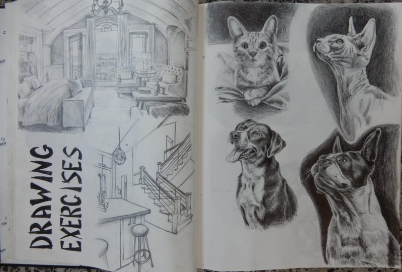
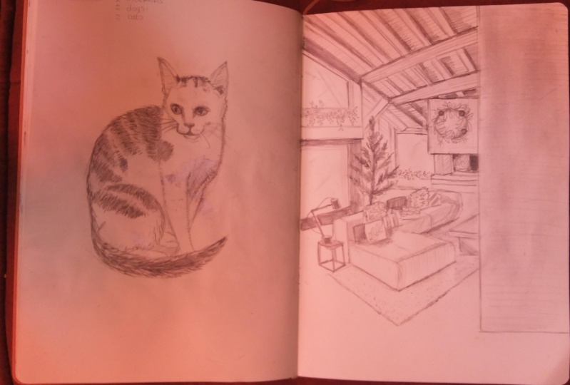
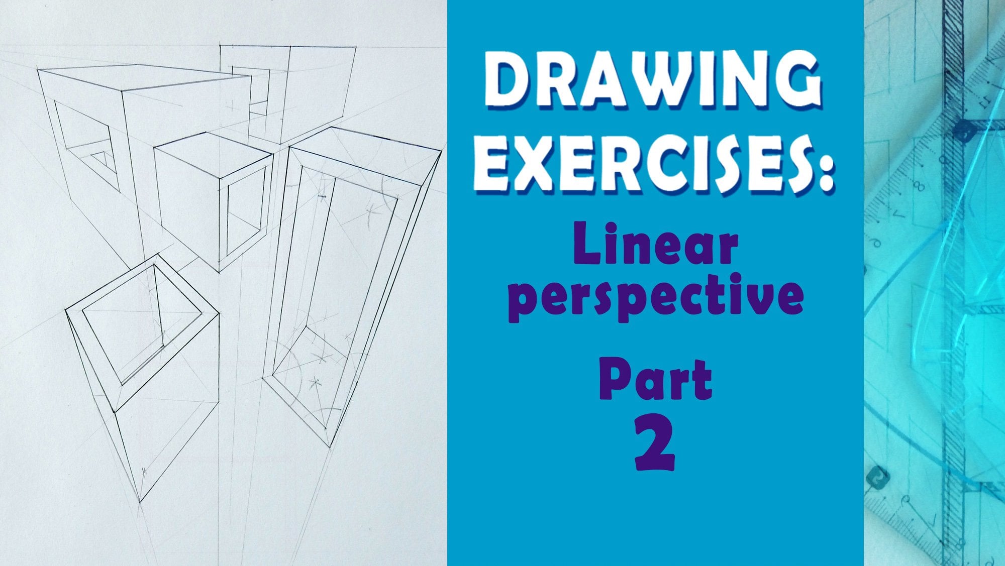
4. 004 first interior drawing: Okay, Welcome to the first Drawing
demonstration of this class. And to start, Here's
the finished result of the drawing it'll
be creating today. Also, while I'm drawing, this will be sped-up
videos process. But I'll do a voice-over
sharing my tips and tricks and my process and how I think about those things as I draw without any
further delay. Let's start. To start. I'm using a harder pencil
like HP or be something that doesn't give too
much pressure and I decide where to put
the vanishing points. And as you can see, over
one of these points is all over there near the dog. And the one is at the
end of the paper. And then I first tried to establish the main
points of this drawing. I'm using a reference
image and I'm watching it on site and then compare
it to my drawing. And this is the
most important part of entire work as you draw and, and make these decisions. Because in the end, if this step is not accurate, the final drawing will
not be as quite as good. So take your time at this stage drawing and try
to get the proportions, perspective and everything
else as close as possible. Like I said, this
is sped up video. I think like ten times to
save you, save your time. Wouldn't have to watch
like entire drawing, I think I may dislike
in 40 min or so. So to save some time on that, I decided to sped up this video. But you can see and get the, the, again, the general idea
behind the entire process. So use lines that are softer. Do not use too much
pressure if needed, use an eraser and tried to establish at this point
where everything is. Looking at your reference image. A couple of times. It's no hurry. Can see, sometimes make mistakes
or lines are too thick. Erase them because
you'll later do it with a thicker line or maybe use this same line but with
much bigger pressure. And also for this first drawing, you don't have to
go into shading. It's good exercise to find
these vanishing points, see where they are and
try to align them to, to, to do reference image. It's also good when you're doing stuff based on the Reference
before start drawing. Tried to find on that reference image where
the vanishing points are. And then use that
in your drawing. If you have, if you can, maybe you should print
that reference image, draw a horizon line across it, and try to see where all the
important lines converge. And that will tell you where
the vanishing points are. At this stage, I'm
adding details, but also whenever I see
that lines are too thick, I go over and erase them, adding other details like the railing and stuff like that. And now I can see I'm
using thicker line, softer pencil, I
think two or three B. And just making
the lines thicker. What it did, I probably
made them too thick, but I wanted I wanted you
All to see on the video correctly to see
better these lines because they will not be
shading in this example. So I wanted to make them
as thick as possible, but you don't have to. You can use and apply as much pressure as you
like. We don't have to go. This is exercise.
But like I said, what is the most important thing is at the start of drawing to be as precise as you
can when it comes to deciding what are
the vanishing points. And it could tip that I would recommend is to print out
the reference image if they are not already
printed and try to find vanishing points there. That will greatly help you
and benefit you whenever you have to do this kind of
exercise to see where they are. Because sometimes cameras have some distortions and
stuff like that. But it's also good to
see if you can find them on Reference and tried to
repeat that on your drawing. This is basically it, just a few more lines and
the finished work is done. And again, this is the final work still
in the next video. And I hope I'll see
you work as well. So
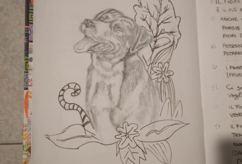
5. 005 first dog drawing: Welcome to the second
demonstration of this class. And as you can see, the finished result
of this exercise, we have drawing of a dark. And just like in previous one, I'll hope you'll have
a sped-up video. I think about ten
times N me explaining things as I go along
with this exercise. So let's start just like in the previous
exercise. Same here. When I start, I'd like
to use thinner lines, whether that be interiors, exteriors or animals,
portraits, and stuff like that. I try to have a clear
understanding of what I'm drawing. And in this case,
I'm using like you see a photo reference
image looking at phone. And as you see occasionally
from time-to-time, I would Reference measure. Take a look at the photo that
I'm drawing and compare it to do one to do to the
one that I'm making. The point is to not go into
too much details at first. Maybe I'm boring saying that all over again and repeating. But the thing that's very,
very, very important, and keep paying all
these big shapes first. And then only then when you're certain that the
shapes are sorted, right? Then you move on
to the next part. I'm using all sorts of shapes, like I said, triangles,
squares, circles. And sometimes they don't think that they are
just geometric, but then you can do it
and transform them. Compare them to what
you're looking at your reference image and see how that relates
to your drawing. See where each of
the part is and how it is connected to the
overall picture and use. You can see on the video, the Reference images smaller. I'm making it a bit larger. Bottom constantly
comparing where it's one shape to another. And only when I'm, let's say sort of satisfied
with the way that looks. Then I move on to shading and adding a bit more details
like you see me do right now. So none of that work
should be done early on. The most important part of
this toy and drawing that I make is to first establish
the main shapes. See them, see how they are
related to the overall image. And then after that work, then you go into that
for some people, for most of the people, funner part when you have all those things
established to the goal there and add shading
at textures and so on. But when, if you want
to create drawing, that is fairly correct. Most important part
is how you start and proportions is to make perspective and
stuff like that. One then that you
can truly and really enjoy making all those hatches, making Shading and
stuff like that. One more thing to
consider when it comes to shading is to squint your eyes, to see only the
bigger shapes and see relations between
light and shadow. Because even in this stage, you can make mistake. I made mistakes where
I would dark and too much one part and the
other one would be too light. To avoid that. Look at your reference
image through squinted eyes and
see that that way. So you can see only the
bigger shapes that we, you lose details and then
focus on the drawing. And after that,
looking at your join through squinted eyes and see, does that match with
the reference image? If does can grade you,
you're on the right track. It doesn't, then
you need to lighten some places or darken
the other ones. So that would be my
who also wanted to great recommendations is to look so squinted eyes and see only the big shapes
and then try to translate that to your drawing. Right now, I'm further
on when shading. And as you can see, in this case in this drawing, I'm using only one pencil. And only by doing that, I have thinner or thicker lines. But the only difference
is the amount of pressure the TI apply to lines to make, to make them look
the way they are. So you can do also that. It is easier if
we will work with different pencils that have
different hardness to them. But you can see you can also
do it with just one pencil, but be mindful of how much pressure you
apply to these lines. And now it's practically the
final stage of the drawing. I'm finished making
all big shapes, small shapes, placing
that on that paper, adding values,
shadows, highlights, and right now and the
only thing that's left basically is to
work on the texture. So I look at differ, tried to think, with
every stroke that I make. Where's the light source, how that impacts the surface? Is that surface sperm drawing directly in the sunlight
or the source of delight? Or is it in the shadow? How would that be? How
would that reflect? So that's also another
important, important, more important things
when your drawing and thinking about texture is how the light
interacts with that. And also finally, extra is
when talking about dogs, they're cute animals and
stuff like there are pets. So try to see the expression
of that animal and see if you managed to convey that expression
to your drawing. And you can see me
here that making those details and trying
to be as best that I can. Actually. And now you can
see the final result. That's it for this exercise. I hope you enjoyed it and
found it useful or have better understanding of how
to approach this topic. And I will love to
see your work in the project gallery so
soon the next video. And have great time drawing
6. 006 second interior drawing: This drawing took me
the longest to make, at least for this class, has a lot of detail. More intricacies that he
wants to pay attention to, but I think it was
worthwhile and really gave me a dunder understanding
of drawing interiors, as you can see in
the final image. So without any further delay, let's jump into
two demonstration of this class that
is also sped up. So you can spend less time hearing me talk
and listening to me draw, but that you can have more time to actually
do your own work. I'm again here with the
same pencil and I'm making small lines then just
before everything else. Want to apologize, maybe if you are if you've seen that video
is maybe too zoomed in. But I wanted to make sure that you can see everything
in full detail. So I problem, made a mistake by zooming in
too much into the drawing. Paying attention how
that looks in the end. But I think you can what
I want it and look to. I think we will get from this, we will have a better
and detailed image of what I'm doing.
Detailed video. Okay, let's go back to it. And like in all of
the previous cases, previous two cases
that made drawing, I like to start with
bigger shapes and Leicester pressure and then
move into other areas. This is a one-point
perspective drawing. And the start of drawing, I made the horizon line. That's very important
whenever you making these kind of
drawings is to have the horizon line and see where all the lines will converge. At the end. After that, I added some details like tours, table, lamps and
stuff like that, and moved in to other
parts of this interior. Now, you can see I'm adding
the window and the lamp, and that will be also the space where we will have
additional light coming through that window shining over the lamp and on to Tibet. That's all very rough for now. I'm not thinking about
all the details. I'm looking at Reference and try to establish exactly where each part of that interior ease and how to place
them in that space. The final thing, final things, lines and stuff like that. Shading will be later
on. As you can see. At this point, I used
a kneaded eraser to just take all
the lines that are not needed to make drawing a bit lighter so I can later
on add more details. So my process when it
comes to these joint, especially from
using a feeling lazy maybe and using just
one pencil is to draw, see if the lines are too thick and then use
kneaded eraser to erase much of the work and
then progressed from there, adding another layer of
shading and drawing. So basically, for me
it is always to go over the entire
drawing in layers, erase if needed, and
then progress on. Because many times people go and start making drawings
from one side. And they, in one swoop, finished the entire drawing. And they had their hand. Find my might much more
enjoyable and maybe for me better to go over the
entire drawing in layers. And that way made
the finished work. Because I think that way, why I think that for
me at least better. Because that way you go over the entire drawing in
sections, in layers. And you have a
consistency of line, you have consistency
of your movement. And I think it has
certain field. You can have that description, you can have that signature. You, your work, how
you work in and it will be recognized by others. You will have that something
that will be only yours. And if you are just drawing from One place to another feels I think a little bit
different. I don't know. I don't just like maybe
you should try it and see it for yourself
and how does it work? But I think I have much more FUN when I'm
doing it like this. And to avoid smudging
of the paper, the drawing and me working
on all of these lines is to have another piece
of paper that will be underneath your drawing
hands so you don't, wouldn't smudge that
much on finally adding some details on the
left side site. I'm trying to make to add
texture to these objects. And let's see, how
can I add the texture and how do I prove what
is the surface of that, that thing that I'm drawing? I'm using that with just one pencil adding
different stroke. Imagine. Okay, if the light is coming on this side and then how that would reflect
on the entire piece. And what material would that be? Mostly thinking
about spatial depth and how to convey
that difference. What is closer and
further from us? How lines should be thicker? Places should be,
let's say darker. That is also very
important when you drawing interiors is to convey that spatial message of
spatial depth on what is closer and
noticed further from us. And where you can do it is by blocking big shapes
in shadow or enlight. Because that way you
can have Much more, let's say, perspective
in this space. Then by randomly adding places that are in shadow
and that are in light. Then this way, because everything that is
closer to us should be darker, but also have more details. And things that are farther
away from us should have less contrast in shadow and
light and have less detail. So that's what I'm
doing right here. We would, and I'm drawing
those sheets on the bet. I've placed places that aren't shadows that
are in the light, but also I'm adding much
more details in these areas. Then I would be on, let's say, in the middle of the
drawing that behind the curtain on the balcony, they are very few details. And if there are the
tools, the different is, the difference between the
light and shadow is much smaller than all the differences
that are closer to us. So remember that
when you drawing, especially those who
works in interiors, to have much more
contrast in the areas that are closer to us and
less in the distance. And you can see here the final
result of this exercise. If you have any questions
about the process or would like to ask me, please let me know and I'll
try to answer soon as I can. And the next video
7. 007 second dog drawing 1: Welcome to the
final demonstration of the class, and that
will be the drawing. Second drawing or pets, this case dog, as you
can see on the screen. So without any further delay, let's jump into it. For this one, I would focus solely on
creating the textures. Because in the first
drawing of a dog, we've seen the entire process. But now I wanted to focus
more on solely the textures. And previous to I used only
one pencil and this one, I wanted to show the process
of me adding texture. In this stage of the work, you should be more familiar with starting process and making
all those decisions. But now let's see how to
go about adding textures. It's all about, for me, at least in squinting your eyes, looking at to Reference. Maybe even in this case, the Zoom mean to see all
of the smaller details. And then look at your
drawing and try to be to think and to see those
shapes, just big shapes. And then at more details, working with softer
pencils and also always putting paper
beneath your drawing, beneath your arm and in front of the drawing because
that we wouldn't match. But also, think about all those little areas
that need attention. Adding hair. Think about how to draw hair. Always thinking about,
like I said earlier, bigger shapes first and then
move into smaller areas. It's always good to
from time-to-time, zoom-out and seed big picture. Then when you feel you're satisfied or
feel confident enough. Then also moving into details, I'm using the softer pencil, getting five or six P and changing that pencil when I
want to add darker areas, I think I'm right now using even maybe API to add the background. Like I said earlier, you can add those things
in order to push it. Way. Push your character in front and make the
background overlay. And I'm doing it here. So let's find that part in. You can relax the
new field confident. Always remember to sharpen your pencils and have
it while you're drawing that those important
thing when you drawing and using
those softer pencils, roll it between your fingers so the tip of your pencil
always remains sharp. And if needed to do it again, sharpen it, stuff like that. And now, using all that softer
pencil and adding details, if needed, I would
use the eraser. But always screen to rise. Look at the reference and
squint your eyes again. Look at your drawing. Compare these two. And C are the darker
areas in the dark. Are the light areas in good
place and how they connect to each other to
drawing should flow and have natural feel
if you want that. So be mindful of that as well. So I'm adding the final
stroke, changing the pencils. And that's what I
wanted to show in this exercise in this example, that you don't have to draw all your work with one pencil. Always have a few of
the pencils around so you can switch
between those two. And here is the final result. Like we said. Now,
it's time for you to join and make the work
on your, of your own. I hope you found this
demonstration useful. And please, if you
have any comments, I think I haven't probably
explained enough, let me know and I'll try to
answer as soon as I can. And in the next and final
video of this class, we'll go over the entire class. Now. Class, we will
do class overview and point you to the next step on the
work that you should do. So See you there. And he found time drawing
8. 008 class overview: Hello everyone and
congratulations. We have reached the final
video of our drawing class. Before we wrap things up, I would like to take
a moment to express my gratitude for you
joining this class. And if you have just a
few minutes to spare, it would mean the world to me. If you could leave a
review of this class, feedback will help me improve future classes and
tailor them for any X. Only by doing, we can
prove and you can get the most out of this trespass simply finishing the project
for yourself. You can join the
community either through sharing project or
providing useful comments. To kick-start this
part of the class, I'll post my own project with the work I did
creating this class. My hope is that you'll join me as soon as you
have their own work. I'm excited to see all your amazing Art Books and I will make sure to provide individual feedback and suggest additional resources to
further enhance your skills. To start in the project section of the class and the resources. You have links to previous
classes in this series and some other ones
that I think my views classes that tell a different
perspective shading using simple object starting point
for joining and much more. You can also find them
on my profile page. And you are more than
welcome to check them out as well. Thank
you once again. And I can't wait to see
amazing, great day. And remember, keep drawing
 Milan Glozić, Painter, illustrator, Designer