Transcripts
1. Introduction: [MUSIC] If you've poked around my channel or you've seen any of the art that
I love to create, you know that I love to
create abstract art. I love to look at it. I love to collect other
artists' abstract art. I love to make it, I love to frame
it and hang it in gallery walls in my house. I love smudges of
color and mark-making and the interest it creates when you stand back to admire it. I love texture, probably why I
started a business doing textures to add
to my photography. It's just something
that I truly love. This class is not going
to be any different. I'm Denise Love and
I'm an artist and photographer based out
of Atlanta, Georgia. In this class, we're
going to create what I'm calling
a beautiful mess. We're going to create
pretty abstract pieces where we play with
color and mark-making. We're going to start off in our sketchbook and we're
going to make ourselves a color palette and mark-making
library to refer back to. We're going to start creating little inspiration pieces
so we can get our ideas together and then use those inspiration
pieces to then go into [NOISE] some bigger pieces. In this class, I'm working with a blue and
green color palette. [NOISE] This is
the color palette that inspired this technique. For me, it was oranges and
blues and greens and how they combine and the
marks that I used and the fun supplies
that went into it. I'm going to show you
how I created these. I did this different
color palette for today's class so that I can experiment with more
things that I have. I love art supplies [LAUGHTER] almost as much as I
love making the art. Maybe even more because
I like to collect it, I like all the colors, I like everything, that walking in the
art store and getting excited to see what it is
that I can bring home. [LAUGHTER] The drawback to too many art supplies is
then you get paralyzed. You have too many
colors to pick. You have too many
different options. You're like, what should
I use? I feel stuck. In this class, we're
going to start off with a limited amount
of art supplies. We're going to pick out, I personally picked out
watercolor and pastels and said, what can I create? That's what I want for you too. Whether you choose to use
the same supplies that I chose or substitute for
things that you already have. Or things you love to use, or something new you
want to experiment with, I want you to limit the supplies that
you're using and say, what can we create
with this limitation? That's why I like doing color palettes studies
in my sketchbook. It helps me narrow down further. Once I decide on the medium, now I can decide on, let's play in this
color palette and now, I'm ready to create. It gets rid of that
white page paralysis that you tend to
have when you sit at your art desk and you have
a white page and you have too many supplies and you're
like, now I feel stuck. I don't want to mess up. I don't want to create
something terrible. I don't want the
colors to be ugly. I like to build up
in little stages. Start little, go a little bigger and then work your way up
to your big piece [NOISE] with the different choices that you've made to get
to this point. I hope you enjoy this class, I totally enjoyed filming it. I love making [NOISE] these. I like making beautiful messes. [LAUGHTER] I can't
wait to see what you create from this class, so let's get started. [MUSIC]
2. Class project: [MUSIC] In this class, your class project is to come back and show me your
mark-making journal that you created where we start off with some color samples and move
into little tiny abstracts, practicing different marks that we might do in our big pieces. I want to see what you've done and then come back
and show me either your smaller piece like
we created in class or the larger piece
that you made from that smaller inspiration
set that you created. I'm looking forward to
seeing what colors you use, what marks you love, and the piece that
you ended up with. So come back and
share that with us. I can't wait to see it. I'll see you in class. [MUSIC]
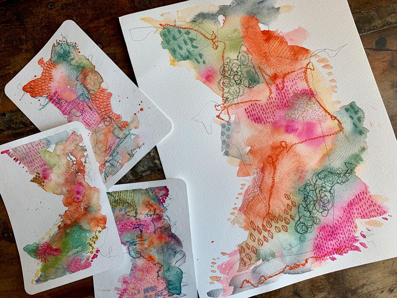
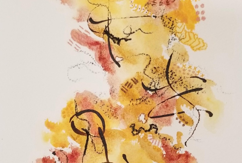
3. Inspiration pieces: [MUSIC] I thought we could take a real quick look at some of the pieces that
inspired this class. In this class, I'm making this colorways, the colorway that I decided
on after we went through and made our sample book in our
little pattern collection. I am filming this
inspiration piece after I've already done all
the projects in class because I thought it might
be fun just to see some other colorways and some different
experiments that I tried before perfecting. I guess you could
say what I like to do and how I like
these to turn out and how on every single piece at the watercolor stage I doubted whether I was going to like it and the
choices that I made, and then once I doodled them
and came back the next day, I'm like these are great. Sometimes you just have
to trust the process, walk away from it and
come back tomorrow. Then once you see a whole
collection that you've created, I guarantee you're
going to be like, I love how these came out. This, I started off with my favorite blue-green
that we use in class. I also added in some
orange and pink and then I doodled in some other
colors on top of that. I really like the way
this colorway came out. I like same colors and
adding in some orange. This one I really thought, I'm not going to like that. Look at that weird shape. But after I got done doodling
and playing on top of it, I love it, even if
it is a weird shape. We can move that around and say, where does that look best? Then here was an early blue-green
experiment that I did. This was with dirty water. The pink part of
that is dirty water. I thought that was
fun and interesting. It was one where I put
the water on the paper first and dipped
the color into it. I think it's interesting
how that turned out. I would not say
it's my favorite, but it was a fun experiment. Using dirty water, you
can see exactly where you put it on the paper
rather than the clean water. This one I really love. It's got that yummy rose madder, that brighter color
from our palette. [NOISE] Which one is that? Permanent rose? No. I think it is
the rose madder. [NOISE] It's the one
where I did it twice. Oh, it might be
the thalo crimson. It's the one where
I did it twice on my color palette because I
liked it so much, I guess. [LAUGHTER] But it's that
bright pop of whimsy that I talked about in
class when we're doing our samples in our pattern samples
there. But I love this. It's got some of this
different turquoise color. It's got that pop of pink, that yummy sap green color
that I'm using in class. There's lots going on in this one and I like
the variation. For this whole colorway, I was a little more
colorful than I was in today's colorway of
the blue-green because sometimes I just
want simplicity and sometimes I want
the vibrant colors. This one is the very first
one that I even did when I'm fleshing out the idea in
my mind and I'm thinking, what would I like to create? I sit down and think, I'm going to create
something great today. I'm going to pick out my
watercolors and my pastels and my white Posca pen and just
see what I can come up with. This is the very
first one I created. It is probably my very favorite. Sometimes the first one you do is your favorite and I love it. I probably need
to set this under some books and let it really flatten out nicely and
then stick it in a frame. Put it up here on my
wall of stuff that I've done because I think
it's really beautiful. I like all the little
details and the colors and the pop of that pink
that I like so much. I just love it. This piece inspired
all the other pieces in this technique because
I loved it so much. Another fun piece where
I was playing with the same colors,
different mark-making. I really like the
orange in this one. Then I progressed up to the larger piece inspired
by that first piece, and oh man, I love it. We've got the orange, we've got the pops of pink, a little bit of the
blue and the green, little bit of indigo
thrown in here. I like all the fun, a little marks, and
things going through it. That pop of orange
and the scribble. This piece, I really love. These colors were super fun and just something to
think about as you are trying out different
colors on your palette. This was a completely
different colorway that I did. These are done with some watercolors [NOISE] that
I was experimenting with that I'd never heard
of that came in my art subscription called Nicholson's Peerless
Transparent Watercolors. This set happens to
be the face tones. I liked it so much that I ordered quite a
few other colors. I wish they were in half pans, but their watercolor on paper
and they're really [NOISE] vibrant when you activate
the watercolor with a brush. These have a completely
different look than the regular watercolor. They're really intense,
they're opaque, they're transparent,
but they're just so vibrant and vivid. Look at those colors. I am just insane for this set. I love them so much. I can't wait to get the
other ones in and just the different ones
that I was testing out and playing with to see, what can I do with this? What marks can I make? I've got some lines
and some dots and some scribbles and some
other dots and some circles. All kinds of fun things
happening in these. Then I progressed to
the larger pieces. Then these are the
two big pieces. Look at how vivid and
vibrant those colors are. As a collection, these along with the little
ones here that I did, look how beautiful
all those turned out. As an individual piece, you might start
questioning yourself, but as a whole collection, it has such pizzaz and drama and it really comes together. This is why I like doing many
pieces at the same time. When you get to your final
collection and you're like, okay, what do I want to do? How do I want to, colors? What do I want
everything to look like? As you're doing
these little pieces and these big pieces, now you have a whole collection to take to a gallery
and be like, this is this collection. I like working on many
pieces of paper for one colorway simply because if I don't like one piece in it, that doesn't mean
I'm not going to like all the other pieces, and not doing many pieces
then makes it where I'm like, I love these because
out of this one, this is my least favorite. If that's the only one I did, I'd be like, oh, I don't
like those colors. It didn't work out right. But now that I'm looking
at it with all of these colors and I've looked
at these for days and days, every time I come up
into my art room, they're scattered
so I can see them, I'm like, I love these so much. [LAUGHTER] I want you
to be inspired to try some things that you
might not have tried. Take a look at the
different colorways that inspired me to see if any of these look
interesting to you. That's the very first piece that inspired these
little collections. I hope you have
fun in this class. Let's get started. [MUSIC]
4. Supplies: Let's talk about the
different supplies that I'll be using in class today. Even though I'm using a specific set of supplies
like I've pulled out here, this class is all
about experimenting, especially experimenting
with the supplies that you've already got on hand. Please don't feel like you
need to go out and buy additional supplies
unless you just see something that
you absolutely love. I'm telling you I
love art supplies, so when I'm starting
a project like this, I think I want to work with
watercolor and pastels. Then, what I'll do, because I have so many different supplies, sometimes having too many
supplies is worse than having not enough because too many
choices is paralyzing. I find that if you will narrow down those
choices and then say, what can I create? You'll find it much
easier to create with the limitations than you
will with all the choices. All the choices just
get you stuck in, "Well, what should I use? Well, what color, or
what this or what that?" If you narrow it down to
watercolor and pastels, and then pull those
out and then say, I want to work with
pink and orange, and blue and green or
something like that, pick yourself a color palette. Then you've narrowed
it down even more. Now, you don't have
all the extra choices getting you stuck in
the creating process. Today, I've decided to work with the watercolor
and the pastels. Because I'm filming a class, I've decided to stick to colors that I know
you could probably get. I'm going to use some of
the Sennelier colors, and I'll use some Daniel
Smith colors maybe, but they're all colors
that I know that you could duplicate if you saw something that you loved
and you wanted to try. I'm just going to go through the different things
that I've got here on the table and talk
about it for a bit. We're going to start off
with a project that I particularly love doing
and I've done it many times and we'll start
off in our sketchbook. I like the Moleskine sketchbooks and these sketchbooks
are Arteza. I think Speedball makes
the same sketchbook. But I do like this size. This is 10 inches by
10 inches, I think. Let's see. It's about
the size of this. Now, these are eight
inches by eight inches. Sorry. This is a great size
for experimenting with. The sketchbooks that I like from the Moleskine they're more like five inches by eight inches. I particularly love the
paper in the Moleskine. They're just so
beautiful and they take the paints beautifully, and they're higher-quality
nicer paper. I do feel like these Artezas are nice quality and I
like working in them. These are 110-pound
200 GSM papers. They're watercolor
paper sketchbooks. The better quality paper, the better quality your
finished painting will be. When you start off, start with student grade and learn your skill and
play with your colors. Then as you get
better and better, you'll advance up to
better quality papers. Because a better-quality
paper takes the paint differently
and more beautifully, and just gives you more options
than the cheaper papers. If you tape stuff down with the painter's tape, which I do, I tape off things, the better quality
papers are less likely to tear when you
pull that tape off. Because they're made of
better quality materials, the really nice quality ones are made of 100 percent cotton, and student grade ones are made with cotton and wood pulp. Wood pulp tends to tear when
you tape off your piece. Just be aware if your
paper is tearing and you're using a
lower-quality paper, you have to be more
careful peeling that tape because it's got filler in it that just
doesn't peel as easy. We're going to start off
with our sketchbooks. I'm using eight by eight, these ones by Arteza. But you can get, I think that's basically the same one
as the Speedball one. Wherever you're at, just find a good quality sketchbook
to start playing in. I will be using nicer
watercolor paper, but I do have cheaper watercolor papers that
you could give a test out. I've got several that I had gotten from Michaels
or Hobby Lobby, just student-grade
watercolor paper to play in. If you get the lesser
paper, that's fine. It tends to have a smoother pattern and it
tends to have fillers in it, which is what makes it
more student grade. But it's perfectly fine. They're 140 pound. That's what I'm going be working with in the paper
that I'm doing. I'm going to do these on the little bit
nicer quality paper because if I love them, I may want to frame
them and keep them. I'll be working
either in the Arches, which is a cold-press
watercolor paper that really has a nice, subtle texture and it takes the watercolor
really beautifully. Another one that I'm going
to play in for myself is the Canson Heritage series. Again, it's 140 pounds, so that's the 300 GSM. Both of these page sizes are
the nine inch by 12 inch, which is 23 centimeters
by 31 centimeters. I also have a larger even pad than this that I
ordered recently. You can get this in that
10-inch by 14-inch size. Today, I'm not going to
play in the larger size, but I did think that for this technique I might
want to play later. These are 100 percent cotton. The main difference
that I can see between the Canson Heritage and the Arches is the Canson Heritage texture
is slightly different. It's still a cold press, they
both have texture on it, but I think maybe
this texture is a tiny bit more but
it's very slight. But I'm going to play
in the Canson today, because I normally
play in Arches, and because that's something
that's familiar to me, I think it's fun to play in something I don't
normally play in. For the larger pieces, I'm going to be doing Canson. For the sketchbook pieces, I'll be doing them
in my sketchbook. Then we're going to
work our way up. We'll start off with
the sketchbook, we'll work our way up to a small piece and
then we'll work our way up to a big piece. For the small piece, I'm going to use
these postcards that are Hahnemuhle
watercolor postcards. These are 105 pound if you wanted to try
something like that. I'm using them because I have them and they're a nice size. This says 4.1 by 5.8 inches, so 4 by 5, give or take. You could do easy like
cut your bigger sheet into smaller pieces or get
a 4 by 6 watercolor pad. I'm just going to
play with these, they're a little postcards. I can do something
with it when I'm done. I'm doing it because I have it. If you don't have
the postcards which probably you won't or you
don't want to get those, you can just take a larger
piece and cut it into fours to do your
smaller pieces in, but this is fun to play with. I have one of those
art box subscriptions. This came in the
subscription and I thought, perfect way to use that
paper that I might just normally stick in a
drawer and forget I had. I'm going to be using those papers
in class today. I also got just
some pieces of box. These just came in a box
that I got some prints in. They're nice and flat. I've got two different
sizes because I'm working with two different size papers. I'm going to tape
my piece to this, paint on it, and then
we can untape it. That's what I'm
going to be using as my surface to hold
my paints today. Now, for the watercolors, I'm going to try to stick with colors that I can tell
you what they are, and so I just have a
basket of colors here. These are wet colors. I also have plenty of dry
colors to experiment with. Some of those I
forget what they are, but if I see a color out of my favorites that
I've pulled out of my Daniel Smith and my
Sennelier half pens, then I'll tell you what it is, because some of these
are my favorite. Like this rose madder, I just love this color. It's the greatest color for
a nice little pop of whimsy. I will be using either Daniel
Smith or the Sennelier today and then I'll be
painting on a paint palette. If you are interested in
a ceramic paint palette, there are several artists
out there that create these, but I've found if you
go to T.J. Maxx or Cost Plus World Market
or somewhere that sells dishes and
plates and stuff. This is actually a
server plate that I got for eight bucks
at T.J. Maxx. I like it because
it's a flat surface and it has a little tiny room, and it's really very pretty. Actually, it's
more contemporary. This is a serving tray
and it's a nice size. I love using these
for my paints. Here's another one that I got, it has even smaller side. It's my very favorite, but since I've already got paint on it, I thought I'd start fresh. This one was from
World Market for $5. Even though I collect
ceramic palettes and I have several
really beautiful ones, these little $5 ones
are my favorite. Look around at your
local dish places and see if you can get a nice
elongated serving platter. I like white. Gray would
be nice, cream is okay, but I don't want to patter
on it because it distract from my colors.
These are perfect. If I'm using watercolor, I go ahead and just
leave the watercolor out there and reactivate it next time I pull this palette out. But you can easily wash
those off in the sink also. Just a fun little side note, I do have people ask me about my palettes
when I'm using them, so I thought I'd mention
that here in class. I said I'm going to be using
watercolors and pastels. For the pastels, I
have pastel pencils. I like this set because
it's got enough colors to make my art supply
craving happy. These are the Faber-Castell, Pitt pastel pencils and
this is the 36 quantity. These do come in
smaller quantities. You could also use
regular colored pencils. You could also use
neo-color to crayons. You can get creative here on your color choices and the different supplies
that you use. I'm just pointing out what
I'm going to be using in class today because these are some stuff that I
have in the art room. I'm also using the Charvin
little hard pastel pieces. These are not expensive. These might've came off Amazon because I didn't want to
drive to the art store, but it's the little
pastel paint sticks. These are the hard Pastel and I like them
because they give you a really nice line compared
to the soft pastels, which are very soft and chalky. I'm going to be using
the Charvin pastels for a line or two. I also have my big little
thing of soft pastels, and I think these are the Sennelier half-stick set
are what most of these are. I don't know the colors.
They're not labeled as easy as some of
the other things, but I just have a range
of ones here that I'm going to just have
out and consider using. Then I have a pencil
sharpener for my pencils. I also like having
a graphite pencil. This is an automatic pencil with the lead in and I like
having one of those. I like the Posca pens, so I have a gold fine Posca pen and a white Posca paint marker. What I love about these
is making dots and lines, and so favorite item
when I'm playing. The paintbrushes I'm
going to use today, I'm going to stick to
two of these I believe. I've got the Princeton
round number 8, Neptune series and I've got the Princeton quill number 6, Neptune series because I
found that when you do smaller pieces like this, the smaller brush is more handy. Now when you do larger
pieces like this, the larger brush is more handy. I've figured out for myself
that size of the supply correlates to size of the
paper to get me what I want. If I'm using a little
bitty paintbrush on a big piece of paper,
I get frustrated. I have a big paintbrush now. I really like these quill ones and I've ordered a
few other sizes. I like them so much,
they hold tons of water. Then I've also got some little glasses of water
back here to rinse off in. That is most of what
I'm going to be using. I've also got some
painter's tape or some art tape to
tape off my pieces, so either of those
would be just fine. Then, I also have decided
that I really love these microfiber cleaning cloths for cleaning my fingers of pastel and just in general
having that cloth to work with while I'm creating stuff rather than having tons of
paper towels available. I love these. I got this at the hardware
store on the paint department. They're used for cleaning,
they're used for paint rags, they're used for all stuff. Then what I really like about
it is if it gets too dirty, you can wash them in
the washing machine. I'm not throwing tons
of paper towels away while it's doing stuff here at my art table, so super fun. That's the gist of
my supplies today. I know that was a lot of stuff. Please use what you have, pull together things that you think that you would like
to do these pieces with. Don't feel like you have to
do them exactly like I do. I just want you
to be inspired to create an experiment
with what you have. Let's get started.
5. Paint colors on my palette: [MUSIC] Let's just
take a quick look at the colors that I'm
actually going to use in class because I've been playing with them and I did
this video once but I had a color that I've
changed out because it was an oil paint
color instead of a watercolor which I'm
glad I did this now. It was one of these
little tubes that looks like it should be a watercolor but magically it was oil paint. You'll see me using that in my sketchbook and then go, oops. That was why it was ultramarine blue and it was
not a watercolor. [LAUGHTER] We're going to redo this video so you know exactly what colors
that I'm playing with and you could then be able to go back and reference
this video because as I'm playing in the colors
I'm not calling out color names because
I don't remember what they are at the point
that I'm playing with them. Some of these are Grumbacher
Academy watercolors. I've got hookers green which is that one and I've got sap
green which is this one. I've got yellow ocher in the Cotman which is a
Winsor Newton color. These are more of a little bit less
expensive brands than the Ciniary or the Daniel Smith. I've just got a
variety in colors that I thought who I love
that, let me buy that. They may be student grade, they may be artist grade
or they may be expensive depending on which line
that you decide to go with. I've gotten this
annealing lock rail 566, this is the Naples yellow
703, the Payne's gray. This one is the chromium oxide green and the cobalt green. These two are my favorite
colors. I really love them. Then I have the
Grumbacher Academy, turquoise, the Cotman cerulean blue up here in the middle. I've got the intense blue are the fallow blue
and the Cotman. Then I actually have
two colors that are, I don't know, they may have just changed the packaging but I put them down here and they're the same color accidentally. I've got Thaler crimson
and Thaler crimson. [LAUGHTER] Those two
are the same color. I've got the rose matter. I was just going
through looking for different pinks and reds and oranges because
I like those. This one is cadmium red, purple 611 in this newly A
Cotman cadmium red pale hue which is a pretty orange
permanent rose in the Cotman. Then I've just got a titanium
white in case I want to experiment with that by
the M Graham Company. Most of these colors
you could probably get in any brand and
be real similar. They'll all be slightly
different but very close. But just so you have
a reference as to the exact colors on my palette in case you're wondering one
that you really loved. That's the colors so that you can refer back to this video. But if you don't
remember what color is where because I
certainly am not going to [LAUGHTER] remember as I'm painting which one I'm grabbing. I'll see you back
in class. [MUSIC]
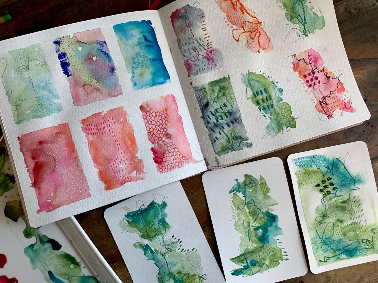
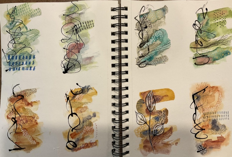
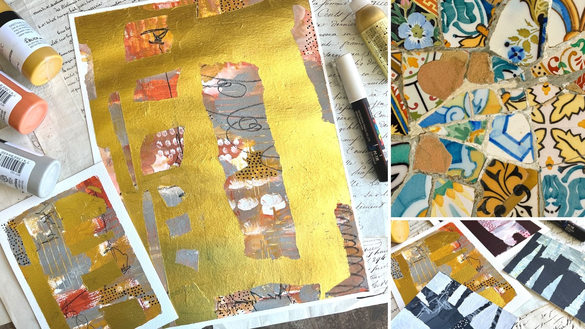
6. Sketchbook warmup: [MUSIC] In this video, I want to take some inspiration from some things that I
have done in the past. This is going to be your
pattern play reference library. That's what we're
going to call this. It's also the place to
experiment with colors. I like to warm up by experimenting with
colors for a reason because then I get to know the colors I've
chose to work with. I can figure out
what I want to do the next larger piece with
or the great big pieces. I like to test things
out in my sketchbook. I've got lots of fun, different things that
I've used this for. But today we're going to
use it for pattern play. I've actually got
some painter's tape. This is about a half-inch. It's not the biggest
painter's tape size. I'm going to tape
off little squares. It's because I want them to be or I can just
peel and be like, look at how beautiful
because peeling tape is my favorite part
of this process. I'm just going to tape
some squares and then we can experiment with the colors that we've got out and decide, I think I've got a color
palette or colors that I like to do a larger piece in. One of the reasons why
I really like to do this is because so many times I have gone into making larger pieces and I'll pull
a color out like green gold. I'll put it on my
piece and I'll think, oh, that didn't quite end up
the way I thought it did. Because I want to
love green gold. I think it's because
of the name. [LAUGHTER] But green
gold is a bright, slightly obnoxious
shade of yellow-green. You'll notice there's
no green gold on this palette today because
I didn't want to make the mistake of putting it on
my piece and then thinking [LAUGHTER] because I know green gold ends up not
being my very favorite. I'm just going to eyeball this. I'm going to split this
up into six-inch squares. They don't have to be perfect. This is my area to experiment. Let's make these rectangles and that'll give me a
chance to really do miniatures of
our pieces today. I have lots of different
ones of these I've made. I love making these. I just love abstract art. I think I'm attracted
to just shape, color, and experimenting. I buy abstract art
to hang in my house. I'm not one of those
traditional painters and I may get there one day
and then you'll hear me say, I'm one of those
traditional painters, but today is not that day. [LAUGHTER] We're going to
use this and experiment. Then once it's dry, we'll use it to then
add patterns and stuff. I'm going to get out
my thing of water and I'm going to be using the smaller brush on
these smaller pieces. We could even go with smaller
than this if you thought, I think that's even too big, but I'm using this
number 8 Princeton round to give this a tryout. Let's just start off with
the blue-green and we'll start making colors and playing. I'm going to get
the color started. You could start off with
water on the paper. My goal on these is for
the colors to blend. I don't want them to be
all completely separate. I want to play and
experiment and see what those colors do. Let's just come down
here to the green, adding some water
here to activate it. I want the colors to mesh, meld, and blend and
do their thing. I want there to be just some interesting things happening in these squares.
Look how pretty that is. The first part of this
is to play in color. We're just looking
to see what they do, how they blend. Do we like them? Are they going to do what
we hope on a larger piece? Maybe. I like pinks, reds, and oranges, so
let's go ahead and dip into one of these and
just see what can we get. Maybe add some more
water in here. I'm not really looking for
any particular pattern. Look at this rose
matter, I'm telling you. That is just a pop
of fun right there. It's like that rose opera that I was just
talking about with the paints that I have in one of the videos
I've already done. I think that was in
the supply video. It might be fun on
this one even to see if we come back on
top with the white. Not just mixing the white in. But can we make some lighter
shades in here just from the natural mixing of those watercolors when
we're doing this here? That might be fun. Definitely, a fun time to experiment with
different colors. I like this green here. A mossy green color. Maybe we like the green with, I don't know, one of these, maybe not, maybe that
looks like Christmas. [LAUGHTER] Maybe tap in some
of this brighter color. Maybe the ultramarine blue. Well, this ultramarine
blue is not happy. It does not really want
to mix with the water. Let's just start
on a fresh square and we'll put a big
X on that square. But look how those
colors are blending. I might need to go back
and actually do that some. Let's just do some blues
and some greens here. See what we can get. Maybe a little bit
of this turquoise. Look at that color. That turquoise is pretty vivid. That might have been a
surprise if I did not know when I was painting and
I had been like, oh crap, [LAUGHTER] that's why I
like doing these more so just to figure out which
color is going to be a gigantic surprise that
I was not expecting. That turquoise would
have been that this bright vivid pink
sometimes is that too, but I know what it does and
I get excited about that. I'm actually going to put a bunch of water
on one of these. Let's just really saturate this because you're going to get a different look with a dry
square versus a wet square. Then it'd be
interesting if we do a wet square and maybe
we just dab some color in and just see how that color
spreads and what it does. Maybe we love it so
much that that's our piece that we
create because this is all about being
very deconstructed, not very structured, and seeing what can I end
up with these pieces. I really like the way
that's doing that. Let's just wet down
a couple of squares here and then go back and try. I really like dabbing
the color into the wet and then seeing what
it does and where it goes. I'm using the wet watercolors, but feel free to use any of your half-paint colors to
experiment with like this. A good tip there is to just take a little
spray bottle and get everything wet and flowing
before you get started. That's fun. Let's go back. Let's see. This one the water is pulling.
Let me get a tissue. We don't want all the water to pull on one side
before I get paint on. I just wanted it to be wet so it started doing something fun. It might be fun to start
making a shape or a pattern or a direction like I've done in pieces that I've
done prior to this. I've gone in and I'm doing a direction
with some movement. I'm not filling the whole page. We could also start to experiment
with some of our shapes here on our pieces
and our sketchbook. Then it might be fun to tap in an unexpected color and see, what does that do to our piece? Do we like where
that came in at? Do we want to use it again? Do we want to duplicate that? [LAUGHTER] Let's try yellow. These are dry squares, but we're just going to
go ahead and just see. If we do like a
shape rather than the whole square like I
was just talking about, maybe we can just see how
those colors blend and dab. I want the colors to match up. I want them to start doing their little thing and blending and doing
some fun stuff there. I'm not waiting for
the colors to dry before I tap in
some other stuff. I'm really loving this
ocher and this orange. Then we could also start
to experiment with some watercolor texture, like overall on the dry
side, like look at that. Now this can be a winner
for me. Let's see. Let's do that with this green. Maybe I'll get it started
going up this way. Then I've got another
green here with a little bit different shade, but it might give us some
interesting color variation. Look at that. Now this is fun. I love blue and green, I love pink and orange. When I start mixing
them and I get some really random exciting
things that weren't expected. Then I'm like, look at this. I'm actually feeling these two. One thing too with doing these in your sketch
book like this, is if you end up with some
that you're thinking, wow, I love this so much. Let's do these pinks
and oranges here. I love this so much, I want to save this
for future reference. I want to remember what I used. Once we take this tape off, you have room to then right underneath these color palettes. You'll be able to say, I used this color in this
color and this color. Now you could come back
and duplicate what you did because you saved these color
palettes for future use. I love what this
one's doing too. You'll see that the more
little swatches you make, the first ones you're
getting your feet wet. The next ones you are like, let's start building
some shapes. Let's start mixing some colors. Let's see if I do some
of this on the outside. What I end up with, do I like these, I'm I going to
like how they dry? Is that a technique
I'm going to want to use on my final piece? That's how I want these
to progress from you, from being solid colors, discovering your mistakes, discovering what's really
not going to work because it wasn't the supply
you thought it was. This is the place
to make mistakes. If I pulled that wrong
oil paint out and painted an entire on
my piece that say I was three-quarters done and I thought, I need this color, and I've put that on my piece; I would have been very upset that I had
ruined my piece and then I might have had to start
over and let me tell you I'm not good about replicating
things that I've done. Let's go back here to this
yummy color back there. I'm not good at
replicating things. I can see something I like, but I can probably
never create it again, [LAUGHTER] like with these little sample
pieces that I've done. I've done some that
look like this and then I've done some that
look like this. But if I wanted to go
back and create this one, I can't do it. I've
tried to do it. I've tried to come
back and create it, and it turned out slightly
different every single time that I've played in these colors and tried
to recreate that piece. What I do love that, they're all individual
and I love them all. Let me tell you at
this stage where I'm just painting and experimenting, I get discouraged and think, am I going to like this? Is this is going to turn
out the way I want? This is the stage where I just
start to doubt everything. When I'm painting is
when I'm laying color. But when I go back and
see the finished pieces the next day, I'm
newly rejuvenated. It turned out so much better. I think it's because
by the time I'm done painting for
the day like this, here that I'm doing
by the time I'm done, I'm exhausted mentally
and I find it hard to then objectively look at
my piece and like it. Let's leave that right there
and do the blue-green, that how pretty those are. I find it hard to be
objective and say, yes, I love this at
certain points of this. Sometimes it takes me
doing the doodling on top to turn into the magnificent
piece I know it can be. [LAUGHTER] Here's
some other ones that I've done with some
really vivid colors. These I didn't hardly
like them at all when I had just the
color laid down. But now that I have like a little series and I have the doodling on
top of the colors. I'm like, wow these are so dynamic and really
make a statement, and I absolutely love them now. At the color stage, I do doubt myself and think, am I going to like that? I don't know. Some of
these are actually dry. Because they are, we're going to move
this to this side , and start doodling. I like a mechanical pencil, I like my posca pens, and I liked my pastels. At this point, I'm going to start making a little reference library
of different things I like. I like this pen and
I like scribble; so One square might
be my scribble. I really love dots. The next one might be my dots. This is the white posca pen. I'm letting the color
variations guide me as to what I might
actually colors. So I'm not going to put
dots on the entire piece, but maybe in one section where I can see a
differentiation of color. We can then pick all that shade throughout the entire piece
and put dots on it. You got to be careful
when you're making dots. If you get lazy, you're
dot's start to connect, or they get long, or you get tired. I do have to watch myself
when I'm making dots. It's funny that I like
dots because in school, when I had an art
class in high school, we studied pointillism, where the pictures
are all made of dots. I distinctly remember
at the time, not liking pointillism or
not like doing it myself. It's funny now, as an adult, many, many, many years later, I like dots and you see
dots and my abstract work. Of course it's not dots
to make a picture that's realistic like an eyeball
or a face or a hand, like we were doing in school. But still funny because
I just remember thinking how tedious it is
to make all these dots, to make this picture. Now I'm like, I love dots. But I want them to be random and if my hand gets
tired I'm going to put that down and come back to something else later,
ain't that funny? I didn't even remember
that little story in my mind until I was doing dots one day
and I was thinking, I didn't like this
when I was younger. Got some little dots adding to our overall storm of stuff. If we get a little
closer to that, look how pretty that
is. It's very subtle. Just adds extra pretty detail in the storm of stuff
that we have going. I like the gold, so we could experiment
with the gold. I also like other pastels. Actually, before I do the gold, maybe I will get
my pencil as well because I like the
pastel pencils. Let's see if I can
put that on my paint without making a huge mess. With these, I might
pick some fun color to contrast or to blend
in or to be similar. I think that was still wet. If you're working on stuff
and you don't want to smear or if it's still slightly wet but
you're not going to damage it by setting
something on top. [MUSIC]
7. Building up your mark library: [MUSIC] Where I can have
my hand lifted off of my piece without damaging it. I like dashes. Again, I'm letting my color
variations guide where this doodle or dash or mark or however you
want to think of this, I'm letting the color
variations guide that. Whereas here I've
got a little bit of a lighter stroke going
through the middle of this, I've decided that's the part
that's getting the dash. Rather than dash on
the whole thing, it's really making a certain
area standout differently. That's why I like the colors to be able to blend
the way they do. I want those variations. I want those blooms. I want those things that that color is
doing as they blend. I do it wet on wet so that they blend in ways that maybe
I wasn't expecting. But you could do some wet on wet and then come back
and do some wet on dry and add some more to
your piece if you wanted to. That was really cool. I like that right there. [NOISE] Another
thing that I like, look how beautiful this
one is really pretty. I like circles. Maybe we could do on this one. Put this over here
because my tape is wet. This is why I have
the sharpener if I get something that all
of a sudden because, pastel pencils are
soft like pastels, it starts to get total, and I'm not getting
the shape I want. I will go ahead with the pencil and with the sharpener
and sharpen that backup. Actually I want to do right here also in this lighter area. Don't be afraid to repeat an element throughout
your piece. Letting the colors be your guide as to where
you stop and start. Look at that. That's fine. You've got scribble,
we've got dots, we've got dashes,
we've got circles. Another thing that we
could do is we could have two toned stuff. Like we could have, say, two shades of blue. Look at this here. Maybe pick a couple of different
colors of blue. Maybe I want to do a circle
and inside that circle, color it in with another color. Something ponder,
consider there. I've discovered that I like similar colors here like when
I put something on here, I've used pink on pink or blue
on blue or green on blue. I like some of
them to be similar or enhancing that
little bit of color. If you want it to contrast, feel free to do contrasting things like
maybe you wanted that to be orange rather than,
blue blue blue. That's perfectly
fine if you want to try out things that
contrast really cool. That's a nice little area there. This one, I don't know, it may never dry with that
little bit of oil paint on it, but we could still come back and practice
something on it. Like maybe here I
want gold dots. Let's just move this over
here with my gold pin. Maybe I want, I really
like what that was doing before I put that
wrong paint on there. I think I would have
really liked it. Even if you make a mistake, and this is the place
to make those mistakes, don't consider that to be just
devastating and terrible. Consider that to be, hey, I figured out that I didn't
need to be using that on a piece before I got to
my very important piece. Actually, I'm super
glad I was working in my sketchbook before I decided to use that color on a piece
that it was important to me. Look how fun the gold dots are. If we take a little
bit closer look there at some of our library, we have some really good
pieces going in there. Now let's come over here
to this other side. Now we might think about and do as many
of these as you want. I'd like you to do pages and
pages experimenting with color and experimenting
with different marks. Then over here we'll
get two pages of actually creating some
little tiny mixed pieces. Let's start off with some
scribble. I like scribble. If you can't get organic
enough with your scribble, try scribbling with your
less dominant hand. For some reason, I really like mechanical
pencils or graphite, have a lot of graphite
things I like. What it does. I like that it's not jump
off the page at you. That's just like a particular
thing that I like. After I do a little
bit of scribble, we might come in
here now and let's just start adding some stuff. I really like this,
green pastel. Maybe I'll add in a
few little marks here. In one part of this the
thing you got to worry about with soft pastel versus colored pencil is this
will still smear. If you don't want
these distill smear, you don't want to
finish them off later with some
type of fixative. Use the neo color crayons, the neo color to or use some type of other
colored pencil. I do have regular colored
pencils that I like to use. For some reason, I'm just particularly
attracted to pastels. I like the vibrant colors. Doesn't bother me that
when we look at that, like those with two circles,
[LAUGHTER] working on. Let's just work on all six
at the same time here. Because these are all
similar in color, actually, we could do something just
completely unexpected. You don't have to do
shapes that people don't. I mean you could do
like a flower shape. You could do any doodle
shape in here that you like. If you want to have flowers and leaves and shapes
in your piece, go ahead and do that too. Let's see, I've got
this over here. I think I want some
orange. Yes, look at that. Perfect way to see
how these materials react and how if the
colors you picked, maybe this was a shade off, and I thought, I'm
glad I did this here. Now I can go back and not
do this in the next piece. This is how we can
figure that out. Maybe this is still a tiny bit wet because
I went right into it. Maybe we want some stripes. Again, I'm letting the
color variation determine where that stripe lint instead
of like the whole piece. I like that. Maybe
we like a yellow, maybe this orange. I just want little pops and
surprises on these pieces. Because when we get to
our bigger piece will want pops and
surprises there too. [NOISE] That's what makes him so pretty to me is
the doodle part of it. The paint part of it doesn't
really get me as excited. Let's go back now
because I said we're going to use other pastels. Let's take a look
at these just to see is there any that might make it pop
in a different way. I could do different marks
than I have already. Let's try out whatever this is. Maybe I want some vivid spots. [NOISE] Look at that. [NOISE] That's pretty. I'm just going to do
maybe some orange. Look at this one. I just love a little bit of
orange mixed in sometimes. That's pretty. [LAUGHTER] I don't know what this color is. It's a purplish shade, no, it's more brown. That just went from I
think I like it to, God, I did it here instead
of on my big piece. [LAUGHTER] Here's
the moment when I love this [NOISE] rag. I like being able to wipe
this stuff off my fingers. Since we've already done
something weird on this one, let's just go ahead and
test out some other stuff. Because even though
I'm thinking, oh, I didn't love that
at the same time, it could possibly end up
being their very favorite. It would be nice too if you don't know what the colors
your pastels really show up as if you had
a piece that you could then make a mark on or test out somewhere
else rather than on a piece that you think
could be important. If you had like a little test or sheet that you could draw
on that would be handy. That was interesting.
I liked this one. Look at that [LAUGHTER]
fine. Let's see. I want something in here
and maybe I want it to be one of these pastels instead
of the super soft ones. Let's just switch over to that. This is exactly
what I like to do. I like to do my base and then I like to pick different
supplies and start to experiment and
see what I can get. There's this really
pretty teal color in here that I want to try. Yes, look at that. Perfect. That's so pretty.
I love this color. Don't ask me what color that is, but it's a real pretty teal
in this little sharpened box. We could come back and
do some big marks. Then you see how these
marks are much more defined than the ones that
we were doing with the super soft pastels. That's why I like
having options. [NOISE] That's pretty. Then it might be
fun on this one to come back with some
type of green. Maybe this. Let's see if I can get a big
scribble out of it. Interesting didn't show up
quite like I thought it would. Look at this one. Let's just
try this crazy one and see, because we already have
this weird brown on here. See if that'll change it for us. How fun, even though I thought
crazy color, its perfect. [LAUGHTER] These are super fun. Let's just do one
more thing on these. No, do I like this teal
going in here, maybe I do. [NOISE] That's fun. Maybe even this darker blue that was in there
next to the teal. Just for some big marks. That's fun. Let's see. I've got a pretty gray here. This might give us
something. Look at that. Here I might pick all the
lighter shades that are coming through here and letting
that guide me in that piece. Look how pretty that is. I think we will wipe
off our fingers. It keeps your art clean because even though you've got
some color on there it's probably to the point now that it's not going to
come off in your piece. Now we can come back
with some white dots. This is the place
to experiment with multiple mark-making and tools
to see what did you love. What part did you truly like and what part were you like that was not
what I expected? On something like
we already have a little details like the dots, do it in two or three
places in that way you'll have something that ties
the piece together. If you just do every
supply in one place, it may look disjointed
more than anything. If you'll do something
here and here and here on some of these with some of the different supplies
instead of one place, think of two or three
places you could put that. You'll pull the whole
piece together. It will look like a finished, completed piece of art
when you've done that. I honestly like
the white dots so much that you might see
white dots in anything I create going forward because now I know that's an
element that I like. I enjoy putting
the dots on there. It's these little
discoveries that you make and then start to
include in your art. These are how you
get to your style. These are how people
start to recognize the pieces that you
did and they're like, that looks like Denise did that. Because of the elements that you end up loving and repeating and using in everything
that you create. It takes a while to get there. Many people, especially
in the photography because that's what
I normally do, they're like, how
do I find my style? How do I get to those
pictures that I'm going to be taking [LAUGHTER] that define me and years and years I'd be practicing
and I'd be like, I think this is my style. But you know what, that's
your style for that moment. The more you work and
the more you practice that style changes. What you do this year is different than what
you do next year. Now I don't try to box myself into any one particular
thing anymore. I'm not trying to be
like is this my style, I don't know, I'm not out there asking
people, what do you think? Is this my style? Because they can't
tell you that. They may recognize your pieces when you put it out
there and even today, like I say, I think in my mind, I don't have a style because every time I make a workshop, that style evolves and
changes and grows with all of this stuff that I have learned and what I'm creating
and the things I do. That's all part of
the growth process. I don't ever want to be stagnant and only have one
look or one style. To be honest, I want to
continue to grow and learn and create and be able to look
back next year and say, look at how far I got, look at how much
my stuff changed. Look at what I learned. I want to see that growth. I want to see those changes, and I want to see my
style evolve basically. When my photography
especially I say, I don't have a particular style, but every single time
I post a picture, somebody says, I immediately
knew that was yours. I'm still creating
something recognizable, even if I'm fooling myself in my own mind saying I
don't have a style. [LAUGHTER] These just got
better and better as we went. I want you to start
off your sketchbook, playing with colors
and figuring out which supplies are
going to be a mistake, something you didn't expect. Then we're going to be able
to look at these and say, okay, here's the colors that I want to
create with today. I didn't take these super goods. It's like you can see variations and lines and places
where it bled. But my goal was not to
have a perfect box. If you want a perfect box, use a stickier tape and then make sure that you
press it down on all edges. But it's not really my goal. There's going to be
a little variation. My goal was to give me some
separate places to work in and to experiment and see what do I want to create
with for the next project. Look at these. These
start off pretty but man, you get to those four
and I get super excited. [LAUGHTER] This is
what I want you to do. I want you to start
off making squares of color and one pattern. We're creating our pattern
play reference library. Then after you've done lots of these and I'd like you
to do more than six. I'd like you to have
pages and pages of them just so that
you start to learn your colors and you figure out what you really love and
what you don't love. Then I want you to start
doing some pages of some mini little abstracts
where we're combining color. We're seeing how they
blend and we're combining marks and materials so
that now I can say, I love this blue-green. I loved the pastel in there and the pencil and I like
the shapes that I did, and I can use this piece now as a reference for
a larger piece, or I could use this piece
or the pinks and stuff. These are going to be
the inspiration for the next set of larger
pieces that I do. Let's go ahead and do as many of the
squares and then many pieces as your heart desires in your
experimenting and your play. Then once you've got some really good ideas of
what colors you love and the supplies that
you're wanting to play in then we're going to
go to the next project. I'll see you back in class. [MUSIC]
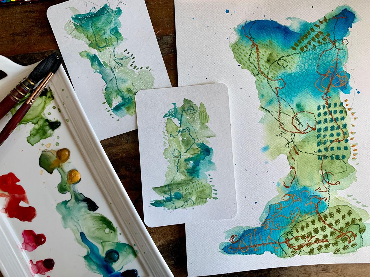
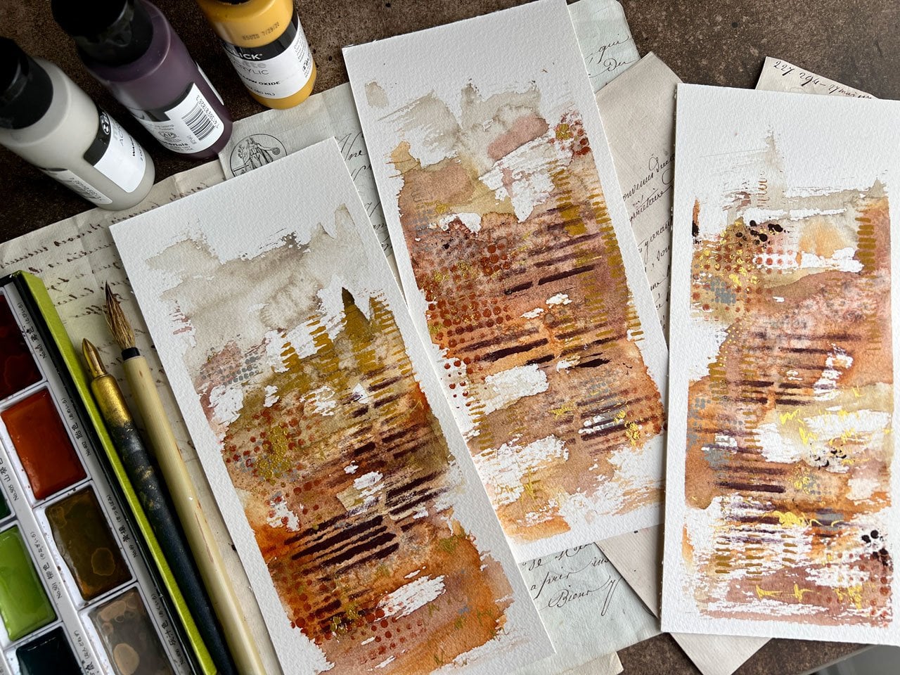
8. Creating your abstract background: All right. In this section, we're going to start
our larger pieces. So I'm working on basically a four-by-five
or four-by-six piece of watercolor paper. So definitely, you can tear
these out of your sketchbook. You could cut a larger sheet
down to smaller pieces. I'm using these
watercolor postcards only because I have them. I would not have purchased postcards randomly as something
I buy at the art store. That just wouldn't have
occurred to me to buy these. But I have them because I have the art box subscription
and there's so much fun and they send
you different papers. It's the sketch box
that I get and you get different paper
samples and things to experiment and play with. I'm only using it because it's the perfect size and I
thought what a great project to do these little
abstracts on and a way to use this paper so that I don't waste it by just
putting it away thinking, what is this and put it away. I try when they send that box of stuff or when I come home with new stuff, I try to make myself use that in some projects so
that it didn't go to waste. Because let me tell you, I got a whole year of this art thing and
then took a year off, and now I've started it back
up because, I don't know. Collecting art supplies
is like a hobby. Just like using them, it's like a separate hobby. I want all the colors and I want all the
different supplies, and I want to be an
expert in every medium every put out there apparently. Which means that you're probably
an expert in none if you feel the need to try to be
an expert in all of them. But I do feel like a student
back in school, and now I can experiment and play
in a way that maybe I didn't allow myself otherwise to do and making workshops, I really let myself
experiment and have fun. What I thought I might do is I've got those
little pieces of box, little pieces of
cardboard pieces that I've taped these down on. In that way, I can move one out of the way when
I'm done with it. I thought it would be
really fun to work in sets of two so that if you end
up with one that you hate, well then you didn't feel
like the day was wasted, and the way you lay
watercolor down, it's going to change
every time you do it. Like these two
pieces look similar, but they're different
and these two pieces look similar, but
they're different. I think that's what
I'm going to do. I'm going to do a pink and
yellow and orange set and a green and blue set and
just see what I get. In the other colorways
that I've done, I've done and I
might try to make these go a little closer even to the sample ones
that I played with. I actually combined
the orange and the blue and the green and
I love these so much. I want to frame them
and hang them here in my art room because
the colors are beautiful. You can see how I use the
smaller piece to inspire this larger piece and that's what I want these
pieces here to do. I want one of the
pieces that I create to inspire the larger
piece that we do in class and we'll just see what we get if we can get
something that we love. These pieces are not huge
and so I'm probably going to stick to the smaller
brush to paint on. But I do like
watching the colors spread and bloom when
the paper is wet. I'm actually going
to wet the paper pretty good on this set. Then in the next set, we
might experiment and do dry. I want you to try it both ways. In this one, we're
going to do blue-green so I'm going to start off, I think, with the green. But I want you to try both ways, maybe you'll like
it with the paper dry better than the paper wet. The paper may be too wet here. But we're just going to
see what we can get. I liked how that one did. I like how this balloon out. A little bit of color laying on there and then I'm
going to just dab some color and let it do its thing and I'm going to
start blending some colors. If you end up and it's too light like you wanted it to be
darker, more vivid, whatever. There's nothing saying that
you can't later come back and add more paint to your piece. Don't feel like one layer
of paint and you're done if you feel
like that didn't quite get where you
wanted it to be. It's at this point that
I really question, am I going to like this? Did I pick the right colors? I don't know if this is going
to be the what I wanted. Just know and I really actually
want to do, let's do two. Let's do all this in the
same shade just to see what the difference is of working on all wet versus wet and dry. I may do the two like
this and the two on the dry in the same
colorway, just to see. I think I'm going to come
down here to this sap one, sappy color looking just to see, am I getting what I want
if the paper was wet? Or did I need that
paper to be dry? This is a very
important experiment because on the little ones, you might get what you were
thinking or you might not, but it's really small, so it's hard to tell. On these bigger pieces, it's a lot easier to be like, okay, I hated the
wet-on-wet, or okay, I loved the wet-on-wet, or whatever it is
that you decide. I'm just coming back
in here because I want more color going than I have. It's light on some areas
because the paper was so wet, it just ballooned and spread out in a way that I was like, okay, that's very interesting. Now I know that that's
what that does. I don't want to
overthink it either. I'm thinking, I like this. I want to let it dry and
see what we end up with and that might be
perfect like it is. But let's do the same thing. I'd like you to try this
experiment yourself, two on the paper completely wet and then two on the
paper completely dry. Then see what did you like and how did that change
up your piece for you? How did the watercolor
work different? What did that do
that you're like, oh, I like it, or oh,
I didn't like it? I'm already thinking that
this feels pretty good. Let's come back maybe
with some blue. Look at that. I might come back and add a little water to
these so they blend and they start doing some
stuff. I got a drip. If you get a drip, you can pat off the drip or you
can let the drip be part of the piece. I'll go back in here with this different color
of green that's a little more vivid and a little kick to it. I don't want that kick,
I like that kick. Then two, while these
are wet, you know, it's harder to do it
on those dry pieces. But while these are wet, we could do our little wet on wet little colors at the edge. Then we can think, do we
like it? Do we not like it? But I'm feeling it
today. I like that. This is feeling good. It's early but preliminarily
like as a first opinion. I'm going to say I might like these
on the dry better. But we'll hold the final opinion till the other piece
dries, because this is the point where I have a hard time figuring
out. Do I like it? Do I wish I did it different? What do I wish I
had done different? I need the piece to be dry and the doodles
on it to be like, oh, look at this, it's surprising
what I got. Look at that. Now, I have a tendency to
overdo like over, overdo, so you need to get to
a point and think, let's stop for the moment and step back and think about this. Do I want anything else in here? Are you? I love it like it is. I'm almost wondering if I would like a little bit
of a blue in there, this turquoise here. What I might do is add this
in, like just strategic, very little tiny bit
to add a pop in there. Because of what I really
like about some of the earlier pieces is some of the other colors that
are in there that I did and I like the shape too, which I didn't do
that shape on these. I did that shape a little bit on these
that are still wet. Let's let the dry ones dry then let's come
back to the wet one and see because
I do actually like what's going on here and the way that spread
into the paper. Now what we might do is add
another layer on top of this so that we have some really pretty
defined colors on top. And then this could
be my favorite. I don't know. I got to be real
careful too with the blue-green that I'm not adding in some color
that I'm like, oh crap, I ruined it
because I tend to do that. If I'm working with the
orange and the red and adding the pink and
I like it and then I start adding in
blues and greens, sometimes I'm like, what
the heck was I thinking? But sometimes, I'm like, oh, that was a good move. Some of this is just going to be practice on your part
and figuring out. I almost hate to add anything
else to some of these because I like it so much. Let's just let these dry. We are going to let these
dry and then we'll come back and we'll do
our doodle thing.
9. Making marks and experimenting: [MUSIC] These are
98 percent dry. We'll say there's
probably a little dot somewhere on here that's
not completely dry but what I encourage you to do
is to let them dry naturally if you can because putting heat on these will
cause the tape to lift and let watercolor up underneath them and the more that
you can not do that, the better you'll have a
cleaner edge when you're done. That being said, I did hit
these with a heat gun at the very end just to dry
up any little last spots. Hopefully, I'm not going to have any bleed through,
but we will see. These are both
looking super fun. I'm going to start off with
these and I'm going to decide now what pretty marks and things that
I want to create. I'm going to move the
watercolor out of my way here here I don't want
to stick my hand in it, [LAUGHTER] which I tend to do. If we come back to our
reference library, this is the perfect
time to reference it. Let me say, look how pretty this blue one ended up with
that turquoise now. You have to let the watercolors dry before
you can really be like, that's amazing because when
we painted that I thought, that's a mistake
but now that it's dry, it's freaking beautiful. [LAUGHTER] Happy surprises. Now I'm going to be having this set up on my
table back behind me, using it as a reference for different marks
and things that I liked so that I
have something to refer to as I'm doing
my larger pieces. I've also got my
different pastels around. I've got my posca pen and my mechanical pencil
and so let's just pull out some of these yummy goodies and
start making some marks. I think I'm going to start with my mechanical pencil and do my scribble because
I like to scribble. I just like that it
adds an extra elements, not something that's so in your face but
when you look close, you're like, look at that
little element in there. Now that I did that one, look how pretty that
pencil mark is in there. I just love a little bit
of graphite in my pieces. That one might not
be, I might have a thick piece of paint
that's not completely dry. I also think graphite
marks are fun. I might even come in here and do some graphite marks just
as something different rather than everything being
a pastel pencil because I've used the layers of lines in
lots of my abstract pieces. This is definitely a mark
that we've seen before, but I love it and that's what you want to
do in your pieces. You want to do things
that you love. I love this green. [LAUGHTER] Let's make this
green do something for us. We could do lines, we could do dots, we could do more long lines like this but maybe we will do
because we did the lines there, maybe we'll do some dots. I want this light
part to stay light. I don't want anything
in this white part. I'm letting the colors
guide what I want. Maybe right now up here, I'm going to do some dots, maybe in this green and
if you've got stuff on your page that
you're afraid to put your hand down on as you're
working on part of it, then have maybe a little piece of something to
put your hand on. This is just a gigantic
paint stick that I got at the paint store and it actually has a
piece of ruler on it. That was convenient. If you would rather have a yardstick, that
would be great. Just something that
you could use to put your hand on to keep your
hand off of your art. I have found it to
be super useful. I'm actually staying within
the color of the piece like I'm using this green on what was probably
the same color paint, but I'm using it
in a lighter shade and it just makes that area have its own little
interesting pop to it rather than just being a
little bit of paint in there. It just makes it more
interesting to have these interesting
little bits to look at and so because
I have it there, I want to remember to maybe include that same
element somewhere else. I've got this section
of lines in one place. I want to do some of
the other elements in more than one place just to help pull the piece altogether and give
me some continuity. I love that. Oh my goodness
and then I may do some of those over here
because I really do love those green dots in the green. You can see on this one, there's like a line where I can natural separation
in the paint and that's what I'm letting be my guide
as I'm adding this on her. I'm letting those natural
paint blooms or separations be my guide as to where I'm going to put these and where
I'm going to stop them. I like this teal, I think just some
circles in here. Because I did like that
on our other piece there was green circles
on my sample pieces, but I want to vary up my
marks and my doodles. If you're a doodler,
this is the most fun, is deciding what doodles
do I want to go in here, what colors, what shapes. It'll be very interesting
if you're a doodler to see what some of your favorite
things are to doodle. It doesn't have to be lines
and circles like mine are. Could be flowers and
different shapes and different interesting
things you've got going on. I love that. [LAUGHTER] We can do maybe some lines on this
one, like long lines. I like the lines. That's fun. I might come back in. We could do gold, we do white, we can do silver
in the pink pins, but I think I'm
going to be white because I like the
white. [MUSIC] [NOISE] I like the spots. Now I want to play a tiny
bit with my bigger pastels. Let's see what we got here. I really like the certain
spots to have a big spot, a different thing in it. Let's see, what do I want? [LAUGHTER] I really
like a pretty teal. Let's go back to the
soft, this one here. I'm really feeling this. Maybe in this one, I'm going to have some bigger spots. I like that. That gives
us a little pop there. They will even come
off into the white. Now on this one, I
like this color, but I don't want it to be the
same thing so I might do it as a scribble thing. Look at that. I do like that. Nice. Now I would like more of
this army green color. Let's see what we can get, maybe I'll do this. Some big areas. That's fun. Maybe I'll do a little scribble line
of the green on this side. I like that. How did this one? I already see a clear
favorite for myself. I feel like it might be
this one, but I don't know. [LAUGHTER] Now we have played with all of our pastels that I
wanted to play with. I've got my pencil
mark in there, I've got my posca dots in
there. What do we think? Let's peel the tape off this and then we'll move
into our next piece, our more dry pieces. Let's just see what
we got because peeling the tape is
what really turns something from a
piece of scribble into basically a
piece of art for me. It's the final exciting piece. It reveals itself. Look how pretty these are. You got to be real
careful like you saw, I just tore my paper. You got to be real careful
when you're doing this, not to pull it too fast
and do what I just do because if this is my favorite and I just did that,
it's pretty sad. [LAUGHTER] I can
still frame them and put a mat around
it but I like it better if you pull
it on the angle real close to the paper rather than getting in a
hurry like I just did. If the paper is still
wet, it will tear. It's really good if
you can make sure you let it really dry. Look at those. Look how pretty that is. Those are pretty.
I don't know if that's going to be
the favorite or not, but those are definitely
the first two that we've finished. Let's do this. I have an idea on my
bigger pieces that I didn't do on
either one of these. Here, I did a splat of color. Here, I did water
on the whole thing. On the bigger pieces, I have done water
just on part of it and blended the colors rather than water
on the whole thing. I should have done one of
those but that's okay. This is why we experiment to figure out what it
is that we love. I'm going to go ahead on
these and just speed this up. I'm going to do the same
thing on these two that I did on that and just
see how we end up. [MUSIC] Sometimes less is more. Look how beautiful these are. I love them. Let's peel the tape off and then we'll have
all four to compare, and then these will
be our inspiration for our large piece that we do. I do feel it's easier to me to step up in size when I
have an idea in my mind, it's easier to figure out
colors and layouts and different mark-making things
in stages almost for me. I find it easier to
start here and progress bigger than just jumping
into a big piece and think, where do I go from
here, I feel stuck. This helps me stay unstuck
when I start with something of a manageable size and then make that larger because now I can look at different
elements and say, I can unstick myself by doing this or that
or what have you. I really like the
little watercolor dots that I was able to
achieve on this, where it was more dry paper. Look at those. See, look how pretty these are. Now you can even decide, did you like it better this way? Did you like it
better this way or do you have a direction
that you thought was even better because this one almost looks like it
should go this way. Now I'm thinking maybe they
should both go that way. I'm I feeling that? What do you think? Those are beautiful. Compared to the all wet paper, it's a completely
different look and feel, but I still love them
in their own way. I'm going to try a third
thing when we get to the bigger piece and not have the whole paper wet or
the whole paper dry but I'm going to actually do
a direction where it's wet which I did on this one that I had as
my inspiration sample. I had wet part of the paper
and then worked a little bit with that and it allowed
for these colors to blend, but allowed me space to put dots and I really loved
that technique. I should have done that as a
little one, but that's okay. Look at these beautiful
pieces that we're starting with to
inspire our big piece. You certainly don't
have to work in the same color way
like I've done. You can pick different
color ways for every piece. I just find this fun because
it allows me to create a little collection
all in one color and if there was
something I loved enough and wanted to sell, then I would have
several pieces to give to a gallery
in different sizes. I think that's a
fun way to work. I will see you back in class. We will jump into
our big project. [MUSIC]
10. Going bigger: I got so excited to get started painting that I painted
one and didn't film it, and the whole time I was talking and telling you
that I was doubting myself, I did not know if I
was going to love this colorway the way I did it. Then I looked up and
I didn't film it, which I actually got two of
these pieces of paper ready. Because this is the point
where I'm thinking, this is ugly, or I
don't love this, or am I going to love this? Or what was I thinking? I don't know if I
love it or not, so I actually got
two pieces of paper ready in case I wasn't
end up not liking this which totally doubtful because every single
one of these I've done the next day I
thought were amazing. I'm actually going to do the second one I prepared, since I didn't film that one. Now, I don't feel so bad
about painting two of them. I'm just going to put a little bit of water on the
paper very strategically. Because my very favorite of some of my sampler ones that I did had the shape,
more like this. I want to mimic that. I'm going to mimic that by wetting part of the
paper just a little bit, and then coming back in with my paint and letting
some of that blend. Then, I've got enough dry
paper that I can then do some of those nice
watercolor dots. Just because I was doubting
myself on this other one, I'm going to start off with
this other green and watch it how it balloons out and
add in some of this blue. It's at this point
that I like to see how the water blends the paints differently
than it would blend it if I had
everything dry. I also like this green and I have to get
some more paint out. I don't mind leaving
these paints on this watercolor palette forever. These are four. If
you're doing watercolor, you can always re-wet these. There's no reason why you should have to clean your
watercolor palette off. You can continue to add paint, continue to mix things, continue to just
do all wonderful, fabulous things even
when the paint is dry because this lets you continue to just
re-wet and re-wet and re-wet and then add too. If you have a favorite
color palette, you can just continue to
use and add to your colors. But if you are tired of
whatever you've got on here, then certainly, just take
it and you can wash it all off and it's all clean
again to start fresh. I like this yummy,
crazy sap green. I think I'm going to like it on this piece a little better as the accents and outliers
rather than the center, which is what I was hoping
for as I started the experimenting on
the second sheet versus what I did over
there on that first piece. I really like doing
multiples of everything. I like to do two at a time
rather than just one. This is fun, that is like that. It's almost like a dress
can you see the top of the dress and the
dress playing out and we're dancing along
the dance floor is what this is reminding me of. Look at that. That's pretty. I want a little tiny bit
of vividness in here. I really liked the turquoise that I added into
some of these pieces. Let's add that turquoise
in and just see if we can get that
little bit of yumminess. I have a tendency
to do too much. At this point, we should be getting
really close to saying that's as far as I want to go because I want this to dry
then before I get too far, too much, too whatever. Maybe too whatever
is your style, so don't take that as a hard
find-a-place-to-stop thing. As I keep on going, this would be the
perfect time to stop and then go eat
some lunch or dinner. Because then you're not tempted
to keep on adding to it. You're going to let it dry. You're not tempted to hit
it with the heat dryer. I caution you to resist
hitting this with a heat gun because the heat gun makes the tape come back off the paper and then you'll
get things seep up under it that you didn't intend. I'd like to not do
that on this piece. I want this piece to
be able to dry and organically blend and do the
things that's going to do. At this point too, we can shift these colors around and let them run a little bit and
just see what are they going to do and let them
completely dry organically and then we'll come back and
start our yummy doodling. I do feel like this is a
lady dancing in her dress. A little bit I should
put some arms and neck. But I think I'm going
to like this one. This one, I think I'm going to add
too a little bit more. Let me set this to the side because now it's
starting to dry, I can see that I'm
not getting some of these super intense areas
that I was wishing. Perfect opportunity to
add a second layer of watercolor and just see if it's not doing exactly
what you were thinking. Come back and add some more
to it before you're done. I'm glad I set that
to the side and let it do its thing
for a moment. I don't know. I still really
like the other one better. But every time I've thought that I've
come back and thought, oh no, I really do love this. On this one, I did some
little splatter out here, so there is some more going on. Fun to experiment with
some paint splatter, but maybe do it with
a smaller brush. I found it really hard to paint splatter with the giant brush. I'm not sure I'm going
to love this one. That one's definitely
questionable. I am loving the things
that's going on. This one, so I think I'm
definitely going to love it. We're going to let this dry. I'm going to go
take a break and we will let these dry naturally, and then when I come back
we'll be ready to doodle. Come back from eating, and now that they're
dry, weirdly enough, I think the one I
doubted might be the one I like more because of the vivid lay of color that's on top
for a second layer. At this point, I might think, let me add another
layer of watercolor to this one and let that dry. Then that will have
these really vivid, saturated areas in it, which I don't seem
to have in this one, but I could still end up
loving it with all the doodles and the extra contrast that
I get from the doodles, but how fine are both of those? Let's start off with the
first one that I painted, and we'll come back
to the second one. Let's just take inspiration from the little pieces that we created and think what are
the parts that I love. Say I loved the vividness, so I got some of the vivid. I like these little dots here that we created
with the pastels. Let's pull the pastels out. I really liked the little
dots on the outside of these. At this, I got the
dots on the outside. I also like the little
area of graphite lines. Then this one, I really love the white dots
through the center. I've got lots of inspiration with our
little pieces that we did, and I love having
those to set up behind my art table to just
continually inspire me. I think I'm going to start with my posca pen and do my
dots in this lighter area. Again, I'm letting where the watercolor separates and
blooms and creates edges. I'm letting that be my
guide to where I stop and start different
things that I want to add doodle. Look at that. Now that I've been working on this
for a few minutes, I think what I'm going
to do on the first one, because I really do like the vividness of some
of these colors, I'm going to take
this opportunity on this piece so that it's drying while I'm working
on the other piece. I'm going to take this
opportunity to add some more of the colors that I
really want to stand out. We're going to add some color on top of the color
we already have, which is fun because
now you're going to see how that changes our
piece up and do we love it, and does it add the
extra bits that I want. Then, you can see
on your pieces, you don't have to stop in a
certain place if you think, not quite what I wanted, I want those vivid
pops of color, I want it to be doing some
stuff but it's not doing. Don't be afraid to go ahead and add some more color in there. Then as they dry,
you can see did you get what you wanted
after you had that dry? I want some more of the blue. I want some more of
this yummy green. I just want it to be
areas that really give me that contrast that
I'm just not seeing now. Then, when we do
little on top of it that I think
it'll make me happy getting these extra
bits in here. At this point also, if you want some water
cuddle color doodling, not just the doodling that we were getting
that didn't work out. But if I get the smaller brush, I bet it would. If you want a watercolor doodle now's the time to do that. Let's say, I want
some of this yummy green and I want it to
make dots on the dry area, just like I'm doing with say, the pastel crayons or
the pastel pencils. Now's the time to do that because now you'll
get that color. It'll still dry but you'll get that look that you're wanting. It won't soak in,
it won't blend. It will now give you a
definite defined shape. Now that I'm doing this, I'm glad I'm doing
this. Look at that. I like this extra element
that that's giving me in these parts right here. Look at that. I could
even come on up here. I'll leave that like that
I think. That's pretty. Is there any other that
we want to do before I move on? I think I'm good. Now, I should have hopefully some vivid areas and
we're going to let this dry over here to the side while I'm working
on this one some more. I'll move that watercolor
back out of the way. Take a look here at our crayons. I like this one. I think I really liked
the green lines, so I think I'm going to do that. It's really nice to have
more than one piece that you're working on so as
you're letting one dry, you can be adding details
and stuff to the other one. You're not just sitting
around waiting and you're not tempted to use the heat gun because
this you really want to let it do its thing. You don't want to speed
it up if you can help it. The goal here is not to
go as fast as you can. It's to enjoy some
of this process. Have fun with it. Look and see where it leads you. Stop and look around and think, what do I really want to do in a certain area rather than rushing into
something and think, why did I do that? I really like that detail
that that added right there. Look how pretty
that is. So pretty. I also really loved these, and that is this other
pastel, it's the sticks. Let's pull the sticks out. Just because I quit using one product over
the other doesn't mean I can't go back to
any of these products at any time in the process. I'm just referencing my
drawings and saying, what do I like about those? I'm actually going to
do those right here. Which you'll notice is a similar area that
I did in this one. You can see how much my
inspiration is coming from our warm-up
exercises that we did. I really like those. Do we want it to go further? I think I'm good with that. Maybe further I like that. Now, let's see what else did I like out of
our particular pieces? I liked our big lines. Let's see what our big
pastels have to say. Let's pull those over. I love making myself use some of the supplies that I
gather because otherwise, you're just wasting all
these pretty things. I like this color
here. Let's try it. Maybe I'll do a big
line in here and see, I didn't do my graphite
yet. Which I don't have to. I just happened to like
that particular element. Look at that. I like that. That was an inspiration
line out of that pastel. I really like the elements
that I have in here. I also have some blue
stripeys that are pretty. I have to set this
over to the side, I think for the
second I'm done with that. Let's say second because I might
pull it back out. Let's see what else we got here. We got our mechanical pencil. Add some pretty details
that's not so obvious, but when you get up close, you see it and that's
what I like about that. See. Look at that. When
you get real close you can see just
barely in there. It's just an extra tiny
detail that really helps me. Let's see. Let's go back to these pencils and
see is there one in there like this color. I think this is what that was, but maybe I'll do
little circles. What I like about that is
it just adds a detail into that color like it's not so jump out at you
that you're like, what is that but when you
get close you're like, look at the details in there. But this is a great place to
experiment with contrast. If you want that to
really be something, go pow maybe you do an
orange pencil on the blue, something opposite
on the color wheel. Just time to play
and experiment. I like the variations that
different shapes given the color though
because then it almost has a rise and fall to it. It's not just a flat color. I like these lines. Let's go ahead and do some
lines, nice and subtle, but it adds that extra bit of excitement
when you get in there really looking at
what we've included. I like these
surprising elements. That's to be like a little
surprise. I like that. Then we'll just look. Do we
want to add anything else? At some point, there
is a point where it can be too much in my mind. Maybe I want one
other thing right up there and what would
we want that to be? Maybe we'll pull our soft
pastels back over here. I really like this
moss-green color. I don't know if that's
that color or not but I do like this little twig of a color I got left here
so maybe I've used it enough that I love it.
11. Experimenting and making marks: [MUSIC] I like those. Sometimes, I might be thinking,
I've gone too far? Do I need to stop? Should I have not done that? But I guarantee you
after you put these away for a day and you come back and you look at your
whole collection tomorrow, you're going to be
like, oh, I love that. I'm actually really
loving this one and I think I'm
going to stop here, make sure I clean my fingers off because we'll pull
the tape off this, and then I'll go back
to that first piece and we'll finish it up. [NOISE] See how nice
the tape peels off of, the really nice paper
just comes right off. But again, I like
to peel it angled. See it picks up that
wood pulp with that box. Look at that. Now, pull that off. See how pretty that is once
you get that out by itself. Once you get these
other pieces with it and it's like a
whole collection. Look how pretty those are. These are really pretty. I'm going to pull the second one out and do a little
speedup, finish a bit. I'm going to start with my fine white dots and
just work from there. I'm going to speed this one up so you don't have to
watch the whole thing. [LAUGHTER] Then we'll see what
we've got when we're done. [MUSIC] I think I'm
going to add some micron and pin marks in here for something different
that I haven't done on the other little pieces. I just thought I
would tell you that I was doing that as
I was going here. I like the micron
because they are really beautiful quality line and I can do lots of
pretty things with them. [MUSIC] See that pretty detail, I think that's really pretty. [MUSIC] On this one I've done some completely different things that I've done on
the other ones, and I almost want
a pop of surprise, like some crazy bit
of maybe an orange, or something that
is going to just completely add a
surprise element. I think I will come in here with this orange because it's
the opposite of blue and just see if that'll
give me like a pop of something that I wasn't
expecting but I'm like, oh yeah, look at that
pretty line in there. Let's go back and
do some of this. Just enough of a
surprise element to be like, what is that? That's a fun extra element. It's like I want to
keep going with it and I don't want
to add too much, but look how pretty
that color is in there. Add in a little touches
of this other orange to see, do I like it, is it too much, could I get away with adding a little bit of this
element like over here? Oh, yeah, see that's
still pretty. A little bit of some
scribble going, maybe an orange dot in the
middle of our blue dots. Yeah, that just made me happy. [LAUGHTER] I should really do
this turquoise and orange, that made me so
happy. Look at that. I'm filling that one. I'm almost thinking that I should stop now before I overdo it because I definitely
can overdo it. I'm liking all the elements
that I've got in here. Look at these pretty, pretty elements. Very pretty. Nothing saying that if you put these away and you look at them again tomorrow and you think, now, I know what else it needs, you can keep on working
on these for days. Leave them on their
little bored. You could take the tape
off and think, I'm done, and then come back
tomorrow and think, I need this one last thing. Then it's done. You can continue to work on
your little pieces even if you think they're
done and you come back tomorrow and think,
I need one more thing. Don't be scared to do that. I like all the colors
in here though, this is such pretty colorway. I can see an interior
done in these colors. Look how pretty that is. See, [NOISE] once you get
all the doodling on here, that's what really brings
it together for me. I'm almost loving
that so much that I wish that I had the
oranges in this one. Before we're even
completely done, we could go back and add that to this. That's what I'm saying. If you do something on one
that's unexpectedly fabulous, don't be afraid to go back
and tweak the other one. I've got the orange, I've got a pretty gold
pieces that I added. But I definitely feel like this could use some of this
really pretty scribble. This a fabulous color that
I didn't even know I loved, [LAUGHTER] until this
moment with this blue. See on this one, I
might just do like a whole scribble in the blue, so it's a little different than what I just did
on the other one, but I'm still getting
those pops of color. Look at that. I really, really loved the gold flowers that I added on this
piece over here. I'm almost thinking that
I could add gold flowers, so I might think about that. But here we are with our
lovely little pieces and if we look at those
with our other pieces now, I'm thinking that
the little ones could do with a little
bit of the orange, [LAUGHTER] because it's
fabulous with that blue. I hope you enjoyed
the big project. I can't wait to see what you
end up coming up with for your colorway and
your large project and your smaller projects. Definitely come back
and share those with me and I'll see you
back in class. [MUSIC]
12. Finishing spray and substitutions: [MUSIC] In this video, I want to talk for
a moment about finishing your piece if
you're using the pastels and possibly some substitutions
that you might consider if you don't want to
work with pastels. I have used the soft pastels
every way I could get them, pencils, the sticks, and the little soft
sticks, the big ones. If I leave these
just like they are, and I accidentally scrub
my finger across a piece, it's going to smear, and to prevent that, you're going to need
to fix the pastel. I use this soft pastel fixative
that Sennelier offers, and I got it at
the art store and a couple of layers of this
sprayed outside, it does stink. You'll set those pastels so that it'll keep for you to do
other things on top of it or it'll keep for you to take
it in to do some framing or it'll just store much better so that your pastels don't run and smear if people
are touching them. To finish this off, if you're using the pastels, I would definitely hit it with
some soft pastel fixative. Now if you don't want
to use the pastels, which a lot of times,
I'll use other products rather than what
I've used today, for the pencils, you could
use regular color pencils. I've got a set of
the Prismacolor that I've had since
I was in college. These are well-used, it's got lots of colors. That's a good choice. You could use also these
Neocolor 2 crayons. I've got a variety of those
in my favorite colors and that would be great
for all of the mark-making and color adding that I've done. Then the benefit of using
products like those is you don't have to fix
them after the fact. The Neocolor 2 are
water-soluble, if you get this wet,
you'll reactivate them just like you'll reactivate
that watercolor, but that's okay. Just so that you know, it's not going to
smear if you touch it quite the same way
as pastels do. I want to encourage you
all through this class, don't be afraid to pull
from what you have and substitute to create
these yummy abstract pieces that we're creating
in this class. Just a little note there in case you want to
seal it or substitute, definitely go for it. I will see you back
in class. [MUSIC]
13. Final thoughts: [MUSIC] I want to thank you for taking this class with me, and I hope that you
really enjoyed learning how to make a few
of these beautiful, messy, abstract watercolor
mixed media pieces. I can't wait to see what
you come up with yours. What supplies you decide to use, what colors you end up with, I'd love to see your mark-making
journal that you made. Come back and share some
stuff with us and I can't wait to see
what you've done. I'll see you next time. [MUSIC]
 DENISE LOVE, Artist & Creative Educator