Transcripts
1. Introduction : Hello, my dear art fellows. Today we're going to paint cute picture book
illustration for kids. And so it will be funny. I prepared for your new
brushes for doing that. So I hope you all read it. So our today's topic is picture book
illustration for kids. My name is Zynga, you and I am an artist, freelance
illustrator, and I'm obsessed
with watercolor, cute things and magical stuff. And I'm trying to implement
those topics into my classes. I hope you share the
same passion with me and my classes would be
interesting for you. During my class as
I constantly share some tips and tricks
how to use Procreate. So if you are new to
Procreate or maybe you experienced artists told my classes will be
interesting and funny and you go find
them useful in some way. Also guys, your opinion
is very important to me. So if you have some
questions, recommendations, suggestions, you might leave
them in discussion section. Our class, I'm going
to take you through the whole journey Miochol
creative process. We will start from experts in all previous
into the Procreate. Then I'll show you how
to use my new brush set. And after that, we'll move
to paint and process. And we're going to
explore the new style. I hope you're ready
for doing that. I will show you the way how to create perfect composition, how to use colors in the most efficient
and beautiful way. Why do we need story
in our illustration and how to make our
objects less flat? I'm going to focus on paint
and lovely surroundings. Visa, cute character in the
center as a final project. And your project will be same. To create an illustration. This lovely elements, character background elements
or whatever you like, and what will cause
warm emotions. And as a bonus, I will share with you
my textured paper, new custom brush set, color palettes that I created. I will also add file of
my pictures that I drew. Feel free to use it for
your own art projects. This class is great for
intermediate level, also can be useful
for beginners. If you've watched
my previous classes and experienced artists, probably here you can
find an inspiration and new ways how to create
lovely picture book art. I really want you
guys to join me. I tried my best to make this
tutorial, fun and creative. Completing this class
will help you to learn how to paint
in watercolor style, in procreate on an iPad. And also to get general
knowledge about composition. How to wisely use space, and how to choose
colors properly, and how to create lovely
picture book art. I can't wait to start this
class and definitely I can't wait to see what you upload to your
project section. Please feel free to
enroll and let's enjoy painting process together.
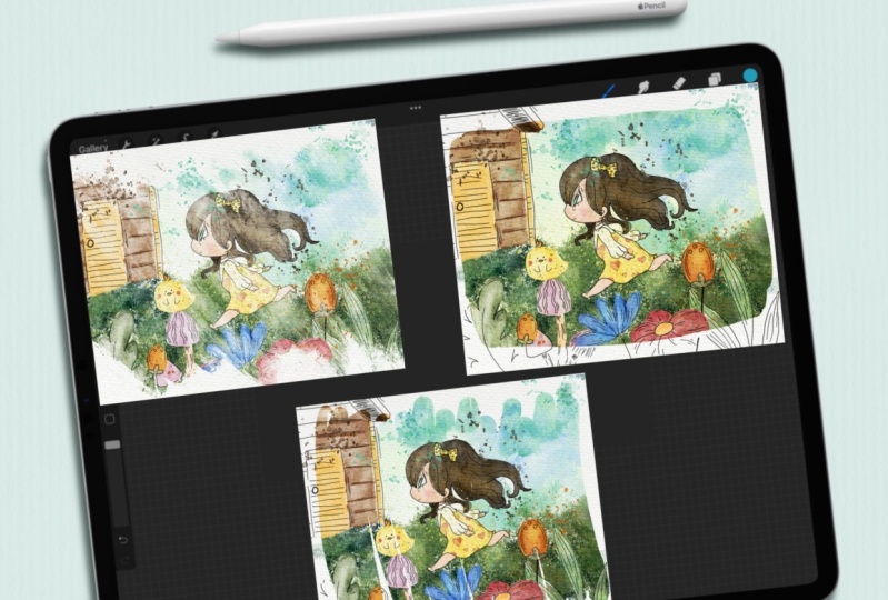
2. Creating Paper : Hi guys. Hello everyone. So we are ready to
start our next class. And today we're going to create lovely picture book
illustration for kids. I prepare for your
loss of freebies. I was preparing this
class for a long, long time and I
hope you liked it. And I think let's not
wait and start our class. First of all, guys, what I
wanted to tell you said, I little bit changed the way how I share with
you my freebies. So actually today
I shared these use a whole Procreate format file
with all the layers inside. It might be easier for you to follow my instructions and draw, first of all, your open
our Procreate app. And then we need to
tap Plus, Plus again. If you need to switch
from pixels into inches, and then writes nine 11 ". And as you see, we have 300 DPI resolution
is pretty good. And maxillary that we might
use this 56 then tap Create. So we have, our file
is here. Wonderful. We have just one layer. Now we need to
duplicate this layer. After that, we need to export all our freebies
into the Procreate. But before that I will
tell you where to find them and how to
download all the flavors. You open my class in browser, it can be Chrome or Safari. Why should the browser? Because if you do that
in Skillshare app, my freebies might
not be reasonable. So after you open my
class in the browser, you go to Projects and
Resources section. And in a part where we have Projects and Resources
section from the right side and the
headline resources. You will find all my freebies. After that, you download them
and you can find all this previous in my downloads
folder in files. Okay, Wonderful. So guys, if you if your eyes please
the screen into two parts. From one side, we have our Procreate app and
from another one is file. So I go to my folder which
is called Skillshare, but your folder
build the downloads. And in downloads you will find all the files that
I shared with you. After that, what you can do. Here, I have sketches and I have all of them says
separately from Canvas. I also have picture
book illustration, Procreate four months at ease
your pain to process a lot. You just need to go drag it
and drop into the procreate, not even into the Canvas. I'll show you later. And we have the
paper, of course. So first of all, we
need to create paper. You go to our paper and we
just need to drag and drop it also from files app
into the Procreate, like what we did here. After that, we need to rotate our paper and
press Fit to Canvas. You sees the paper is
a little bit too thin. It's normal. We'll just move it to the edges. After that, we should duplicate this layer two times and move blend layer mode to Linear
Burn and ColorBrewer. After that, Let's
duplicate color, burn mode one more time
and merge together. Color Burn, mold together. Linear Burn, duplicate it also merge together two layers
is linear burn mode. After that, let's
lower the opacity of Linear Burn modes to 50, 60%. And after that, we
select two layers. How to dose it by
swiping, right? We select two layers and we can, we see the word group, level, group it together. After that, let's rename
it and write paper. After that. Underneath, they
also will rename our layer and we
will write sketch. Another layer, we will rename, and we will write it
for the ride, right? Paint here. So wonderful. Let's ion like this. Let's turn the kids sketch layer and paint
layer a few times. After that, we have my sketches, my folder with sketches, and we have six sketches that
I created for you today. You don't need to use exactly
the sketch that I created. You can do it by yourself. I, I created the brush
set for doing set. And later I'll show you
how to create sketch. But if you want to use mine
is totally normal, it's fine. I'll be happy if you do so. You can just choose the sketch, drag and drop, or you can
just do it with our sketches. And you see automatically
it's exported into procreate. So how to export
analysis catches? That's easy. With applicator layer loggers. Turn off the visibility of one layer and go to
another sketch layer. And just simply drag and drop this layer into the Procreate. So we have another sketch here. Turn it off if you want, and you can do say V
is another sketches. Okay, great guys saying veto this brush set and same deal with all
this color palette. Speaking about color palette, we have picture book
illustrations, this lovely, very soft color
palettes that we're going to use during
our today's class. And saying we have
about brushes. We have to brush sets, which is called bone
your watercolor set, and boo Scene Creator, this one. Now let's talk about brushes. I can. So I guess what I
wanted to tell you, we have another option, what you can do in order
to export all my previous. In this way, you just leave our canvas that we just created. You might not create it. You just export all the
previous few splits the screen into the
Procreate app and files F. And after that, you just need to export our procreate file, this one, into the Skillshare. Alexis will do that after that, if you go to our illustration, we don't need our
files app anymore. Here. Here we have all the sketches,
all the compositions, and I even have some background
option to tie created. And we have paper
already created here. So guys, if you want
to do it by yourself, I just show you the way
how you can do it and what I did in order to
create this canvas. Or if you want to save time, you can just export
this is Procreate format file and just
start painting. My Today's aim was to
let you experience fun. Use your creativity to use
your imagination and create some picture book
illustration without too much thinking about
the rules of composition, rules of light and
shade and so on. Our today's class, I hope, will help you to
experience joy, happiness. And it will be just
finding painting, anything you want
without thinking, without diving into the
fundamentals of painting. So what we have in
this lovely Canvas, we have all the
sketches that here. Speaking about skater, this is a first sketch. This
is another one. I'll show you how I
created the sketches, what is away and so on. We have this lovely illustration.
We have this sketch. And like I told you during
my previous classes, it's very important to have
story behind an illustration, to have some, to help people to feel some
attachment to characters. And of course, if you paint
them in a lovely way, if you feel that the paper
with some characters, with some objects that will bring life to
your illustration. And by the way here, why I have this
layer on different, I have this sketch with two different layers because
we have two options here. If you want to make our
background brighter, you can increase the opacity. Or if you want to emphasize
the attention on characters, you can decrease the
opacity of backgrounds. I gave you some options. And the last one is this lovely
Asian style illustration with water and some
a lovely plants I gave you have sketches. We will talk about composition
in our next class. And let's talk about brushes. Let's talk about brushes. You have two brushes, two sets. First one, it's called bone your watercolor with lots
of watercolor brushes, watercolor stems, some
texture brushes, some quotes. Also, I have some
procreate brushes along with my own brushes, so feel free to use
them, all of them. Next scene created as a
brush that I'm really proud of because I spent lots
of time creating Zed. So if you have many brushes, you have many backgrounds, and I'll show you what we have. First, we have some
kind of stones are wet. What happened here? Let's duplicate this layer. This is some cartoony
style stones. We have mushrooms. You have some kind of trees, different kinds of trees. So we have like variety of, so we have some bushes. I like this bush, so swallow pretty
simple some botanicals. I already added some
kind of texture to our illustrations that will
help you to save some time. And what else do we have? This botanicals. So those elements will help you to create
an illustration. Within seconds, we have
many, many flowers. We have some kind of
water, we have both. You see that I used
for one of my classes. What does it cost? You have to have house if you want to add it to
our illustration. And we have some characters, some cheapest style characters, because I told you
like some cute things. So I decided to create an
illustration that will reflect the beauty of the world and the
cuteness of the world. We have different
kinds of characters. We have some lovely
animals, many, many lab animals that you also can add to
your illustration. After that, we have some
background options so we can frame our illustration
within something. Or you decide by yourself
what you like or don't like. And so we have some backgrounds. This is very cool
because you can put your illustration,
wait a second. Plesiosaurus edges
and you can actually create a few scenes altogether. Like I show you,
we have one here. We can place it to this side. We can create another one, use a free form Replace. And now they've seen here so we can create two illustrations. And it will help you to
create a real book in future. Maybe you are doing it now, which is truly cool. Okay, so what else did
we add in like e.g. this watercolor style, it
will be semi-transparent. I'll show goes away. And this one, we have some
options what we can do, and we have our picture book
illustration color palette, and I think we are ready
to start painting. Let's go to our next
part where I will show you all what are the rules of composition
we're going to apply. That pretty simple. Don't worry about you
don't need to have any fundamentals in order
to create an illustration. I'll show you how
to create sketch.
3. Creating Sketch : Let's start painting. Let's start creating
some kind of composition and
differences class. I will try to talk
less and draw more. So what do we have
in our composition? So guys, we have also six options because you
just saw six sketches. Sketches are based on
the compositions that I prepared for two days lesson. Our first composition,
I'll show you the sketch. So you see, this is here, and this is our
first illustration. First sketch replace
our main object in the center and around, like we have the sketch and
around our main character, we've placed different objects. And as you see I showed with arrows set all of the objects. They're aimed to. The center to our main
character is like our attention is focusing on the center of
the illustration on girl. You might use another
characters and nasa composition style,
whatever you like. But it's just examples
that I prepared. In a center. We have
the main object and this object is surrounded
by a narrow their elements. And what's important in our today's class in all the
sketches that I prepared, I wanted to show
some kind of flow, the direction of the objects because composition should
be dynamic so it can't be, otherwise it will be boring. So we need to see that
object is going somewhere. Yeah, that I know the flowers, botanicals, Zai have
some kind of anger. So maybe they are aiming to the sun or
thanks to the wind, Zaha, go into the right
side or to the left side. Or maybe our character is going
to, is running somewhere. And it's actually our second
illustration, this one. So as you see, I place a main
object also in the center, but I also shows a
direction that we need to show that
object is moving. So what do we have in
our sketch? This one? We have girl, and also I painted lovely goals and grow
is chasing butterflies. That's why we have a composition
and like I told you, we have the story
behind our art. So you see here we have girl, she's somewhere in the forest. We have lovely rabbit,
It's a background. We have butterfly. She is happy and
also have some pet, yeah, like this lambda goes. And thanks to also sauce plants, we try to avoid some gaps, some empty spaces
in our composition. Because as you see here,
if we just draw this, just Girl and that's it, or maybe she's running. It might be not enough. So if you want to create
a full compensation, think about some
additional objects here, like here we have
lovely rapid Cloud and we have these three
objects in a central, but obviously Joe's
main character. And also we have some kind
of ground and we have plans. All of it creates very lovely children's
book illustration that it's not overwhelming. So we don't have too
much objects here, but on the other hand, it doesn't have the feeling that something is missing. Now. It's a good balance
between objects and the space negative
and positive space that we have in
our illustration. If you want to hear more about negative and positive space
and about composition rules, you might check my other class, which is about magical
Scene Creator. It spouts of which is
surrounded by a lovely Coast. I will leave a link in the
description of our class. You can check it out.
Next competition. Here, what I wanted to show is that everything
is aiming somewhere. Yeah. So here in this composition we
have the main objects, our character in the center
and around our character, I decided to put some plans. So our character also
Amazon nature surrounded by lavalier, botanicals
and florals. And also, on other hand, we have some kind
of heel and we also need to show show
some volume yes, some movement down this hill. So what do we have? I
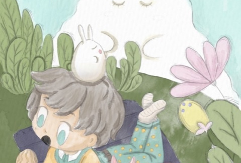
created this is a 3D sketch. We have our character, our lovely boy. We have folks. I decided to place rabbit. What kind of composition and what kind of story I created. I made this lovely
red cloud and I placed on a Hegel a boy Rapid
is like this tiny rabbit. So as a Cloud rabbit
and I don't know, and it's trying to have
some kind of conversation. Or maybe it's inspired
by this rabbit Cloud. So you can think about that. And also boys concerned is
interested in those mushrooms. And as you see how I
showed volume, yeah, because we have ankle, we have the direction of power flowers are
looking at the boy. And behind the boy, we also have some kind of botanicals and also they have different kinds
of directions. We have some kind of
movement. He has a curve. So everything is
aiming to one side, to the left side. Yeah. Next, I notice this one. Illustration. I was thinking
what I want to draw here, this illustration
is complexed one, because you see we
have one dimension, we have another dimension. They have main character. And I wanted to show
also the directions that everything should be
around our main character. But as you see here,
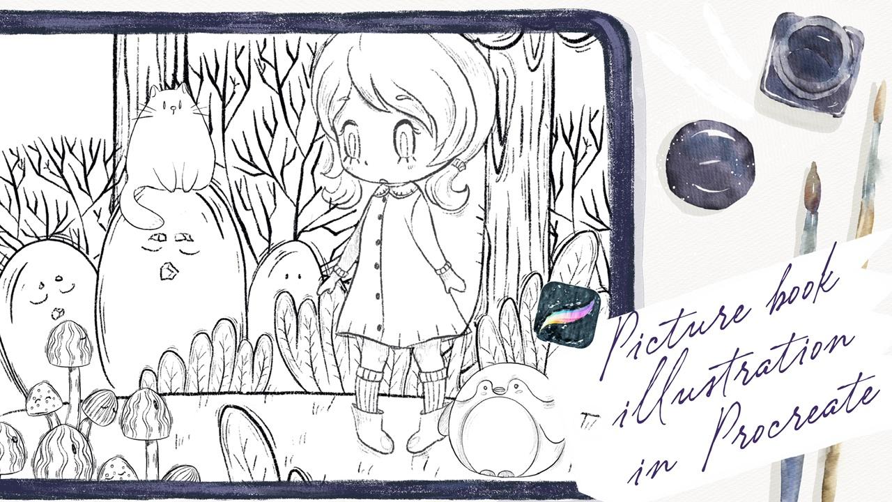
we have a few layers. What do we have in our sketch? You have girl who has this pen
and pad and girls entering forest and she saw some lovely mushrooms that are like some kind of creatures. He says they have eyes. They are very friendly. And she's on a rod is, she's surrounded by stones
that also printed alive. And there is a cat who's, I don't know, maybe
she is a pet. Envelopes the girl on
maybe is it catches leaving here we have a few
layers in our illustration. First we have plants and
we have our mushrooms. Second, we have girl
yen says horizon line. Third, we have kids, we have trees and
we have stones. So this composition is complex, but if you create picture
book illustration is perfect. So go in a central potential. She's looking at mushrooms. They made an icon
that chief surprise, maybe because she
didn't expect to see them here in a forest. So you create a story. But the most important
things that we are trying to use to
show their emotions. And here we have a
lot of emotions. Next. Number five. Okay, this is pretty
simple illustration. I would think you'd
want to create an, I decided to show some
kind of love story. And we also have two layers, like first one, we have
our main characters. And as a background, I would think it would
be great to create a forest because this
is nature again. And what do we have? We have girl and boy, and we have the background. But like I separated backgrounds of forest
from our main characters. You see I painted on
different layer because I want to put people's
attention to our characters. If I kept drawing and surrounds them by the
bushes and trees, people's attention
will be drawn yet to source trees and
to love the bushes. So our aim is to show our
couple to have a conversation. Maybe he's offering gold, apples or tangerines,
whatever you want it to be. So this is one of the ways when you separate background
from our main characters, you can frame it in a rectangle, triangle, whatever you like. And yeah, you can keep painting. Next. We have our main character here also in the center and here we need to show the flow. You see I have a few layers, so everything is going up and our main character in
opposite is going further. Yeah, so we have a separation of our main object from the
background elements. And this is the illustration
that we created. We have our someone, we have a character
on a board vote, of course is going
further and we can show it thanks to the splashes
or on the contrary, yeah, you have some
botanicals say, Don't move. They will stay still. And it creates the
dimensions a movement. It helps us to feel
the picture is real, or is it water is moving
and character is moving. And moods that it creates is
peaceful mood. I hope so. At least I feel that I
said was our last sketch. Last sketch that we have, and I will turn it
off for a while. Okay guys, you just saw six sketches that I
created, but of course, I'll show you what you can do or how to create
some other characters. If you want to use
either characters, how to create other
compensation. So it's up to you if you want, you can rotate the
paper this way. And of course, first
thing that we need to do, we need to think
what character we're going to use during
our illustration. Maybe we can use
this lovely girl. Likes head. Also
she has championed, she's going somewhere
around a girl. We can draw some
plants, some florals. We need to do it on a
new layer of tours. Need to think. What
do you want to show? We can prove and put our
girls to the center. Be careful, make
sure that you have uniform not free
form selection tool. Otherwise, you might
distort the proportions. You have some kind of grass, but I I like to use
this grass a lot, but I will not do it this
time because I use it a lot. Maybe is a goal will fly. I don't know. Like in a sky, maybe she's in the clouds or maybe let's just
paint something. Or maybe she's Yeah, Maybe she's in a cloud
or something like that. So some kind of
fantasy illustration. So if we draw a few
floral seer and withdraw a few clouds
around the girl. Like I said. If you want, you can
duplicate it and make it more saturated. Erase the overlapping,
like sad again. And now we can start creating some kind of
botanical surrounds. A girl. We can use the same
botanicals a few times. Don't forget about the direction
what you want to show. Here. We can actually show
that all the objects, also botanicals or
whatever you want to add, they are aiming to the girls. So girls in the center of
our attention and she will be surrounded by some
kind of natural elements. So let's what kind of
elements you want to use. The eraser Olympians merge
together, create new layer. May be careful to get free form. I want to change the size. Merge together, create 1 ml. And I think I want to
add something like sad. I think we need to add
couple of let's put it here. I can't it, I like how it
looks and if you want, we can add more elements. Maybe chicken. Okay. Merge everything together
so guys be created. Our sketch, and I hope you
enjoyed our painting process. And now you have some
ideas in your head. What else you want to draw, what you want to create. And now we're ready to
move to next part finally, and we're going to start
adding some colors.
4. Adding Colors: Hey guys, So moved this part. So I'm going to use
illustrations that we just created altogether and
they're gonna paint it. And I've already
prepared some colors for this illustration
and this second, and beacons start creating
our illustration. Thus, we need to paint on
the layer where it's written the paint here and the
needs of everything. Once again, you might
use a any colors that you like prompt
our color palette, but I decided to use those
colors specifically. And I'm going to move to my board and your
watercolor brush set. And here we have the right
of watercolor brushes. You see all of them
are truly cool. So you will need to decide by yourself which one
you like most. I think I'm going to use glazing brush because
I like the texture. You see this one? If you press harder,
you have more pigment. And I'm going to
love herself tacitly of our sketch, of course. And let's get start to paint. As blender. I'm going to use
data lake brush. Because I think this brush
is truly cool as blender. They exist as eraser. I'm using mercury brush. So if you have some overlapping
feel free to erase them. And guys you, if
you want to make the tip of the brush theme, your mind, duplicate my
brush and go to taper. Can just move this
Pressure Taper Lexus. And it's easier to pay in here, I think because it
has very thin tubes. Okay. Like Dan is this part. Next I'm going to use
is pretty bright color. I will create new layer. Try not to lift your
Apple Pencil practice green because this brush
is semi-transparent. So if you do so, you
might have some gaps. And same about Reagan. Maybe a little bit brighter. And rabbit, of course
it to be pink. Speaking about skin color. And I want to duplicate a
layer, make it brighter. Like six hour course
will be almost white. Very loudly. You see, I'm using
some muted colors. I don't want to make this
illustration too bright. That's why it's very important
to keep the balance. My embed. Make mistake here. We can now use fluoresce. Now let's go to botanicals. Create one more layer. You'll have a few
shades of green color, warm green, and we'll grab some coolish shade
of green color. So if you have the same color, we'll move a little bit. You see Joseph bluish one. Don't forget via on a layer
that had be new layer because later we're going to change the color as well if
you would like to. Okay, Wonderful. Now let's think about
the color of the sky. I'm going to use this
baby blue color. This layer should be
underneath everything. And for this brush, I'm gonna
change it to another one. Which one would be perfect? Maybe bool watercolor texture. I will turn off for a
while our switches. And guys, I'm going to use boo dance textured
brush for the sky. After that grip
eraser or Blender? Blender would be better. No. To curse. I want to make it
nice and bright. And now white colorful clouds. Let's return our switches. And pinkish color, or
sorry, pinkish color. Right first we're going
to use to ZBrush. Yeah. First we're going to
use but glazing brush. And nafta said, we're going
to switch it to another one and add some texture
to our loudly Cloud. Be careful of is overlap pins. You can add some kind of pre to white color around the cloud. I came down with coloring. And our next part
we will be adding shades and highlights and
some kinds of loud elements.
5. Adding Shades : We're ready to start adding
some kind of shades. And I'll create one
more layer above. You. Multiply blend mode. And I'm going to clip it. After that. I will use our color go a little bit darker shade, use both transparent
watercolor brush. And I'm ready to start
adding some kind of shapes. And don't worry, for now
it's transparent mostly. But later we're going to duplicate the layer
and it will be darker. Now, you're going to
grab my dark blue color. And the same here. Guys. Now I want to tell
you about clipping mask, why it's so important. Because when we create a new layer and after that
satisfies a clipping mask, you see it don't let us
paint above SSL layer about the edges of the previous layers that we have
underneath this one. If you don't use clipping mask, you see because the
underlying it looks terrible and it's not what I
want for our illustration. So when I set it as
a clipping mask, blend and layer modes. Cool because it's
on a new layer. If you want later, we
can love yourself. Positive, change, different
modes, blending layer mode. So whatever you like. V might have the same option. If we paint with alpha lock, it gives us the same
functionality yet, we go to our original layer
and we can press Alpha Lock. Now, we can paint on our layer and we also
don't go beyond the lines. But the problem is that we
can't undo our illustration. If you don't like some color. We can change it. We can't simply turn it off. What we can do with clipping, mask blend and layer mode. So be careful and see
what you want to have and whether you would think
about the colors and so on. So I will not use Alpha Lock. I returned to my
clipping mask layer and I will keep
adding some shapes, like a perfect shape. Now we can duplicate
a layer you see, thanks to the application of a layer to color
is more saturated. I don't want to have
answered saturated. That's why I love
herself passage of 50%. And then I merged
together two layers. I will merge it together
with original layer. Dosave is our florals clipping, mask, move, blend and
layer mode to Multiply. That means that we
can add shades and we shouldn't worry about
our original layer. If you don't like it, we can
simply delete this layer. Maybe. I'll go grab a
little bit darker. Let's go grab a darker color. And you can start saying
this yellow color. Okay, Daniel Suarez. Now we can just same
duplicate layer you see now it's so saturated. We can merge it together
and blend some sharpness. Lexus key, merge together. Same with girls outfit, clipping, mask,
move to multiply. Grabs this yellow, maybe
darker color than little bit. And we can show the shade. This part could be
a shadow, a key. Now purple color. And I think that sit right. Now. We also have our lovely Rabbit. We've got to add some shades
to the rabbit as well. Next Duplicate Layer. Now, I like how it looks. So saturated, merged
together, merged together. Go to our girl clipping mask, Multiply blend mode, layer mode. Why I like to use this brush because it's
semi-transparent and I can control the intensity of the color of the
shape like this. Year in the shadow. I What else? Girl's hair as well. Shade from my accent. And clouds. Also be
have some clouds. Let's add some pink is shape. Shape to the illustration
and abdicated. Blending tool plan,
some sharp lines. The rest is pretty good. And I forgot about
our lovely dark. So for dark, I'm going to use
a little bit darker color, darker brush, not in a color. Blends of parts that
you don't like. Merged together. Key. So I really liked the way how it looks now I'm going to add some pink color. Pink, pink to the top. Same blend and layer mode. Glazing brush color. Pink. Cheeks are dark grades. Now lovers have passive dislike. And wait, I forgot this part. Now I'm going to
use another brush, border to ZBrush more shades. It gets too dark. So what I'm doing right now, I, I tried to add more shades, so I make the second
layer of shades and go to the parts where we have two
objects next to each other, that the part of a body
is hidden from us, e.g. the sun is going
from the left side. So that means that right
side will be more in shadow. If you think this is too
sharp, you can just blend it. Same is clear. This part is a
little bit to Kish. So I decided to make a new layer and I
will add more shades, kind of paints and
on a new layer. But later I'm going
to love herself. Back. Keep after
said, Let me think. I'm going to add some
color to the hair. And I'm going to do it. I'm going to do
it on your layer. In Multiply blend layer mode. As you see, I'm still
using both with the brush. We have some shade
from cerebral area. Some shapes here. So incites a ribbon area. We have a shadow. Shadow here and here. Some eyelashes. Key. Let's go and grab a pencil
and grab a pink color. Tool break and show some
details thanks to this brush. So now as you see, I'm
trying to add more details. Let's return to the
layer where we have some hair can blend sharpness. Okay, wonderful guys. Our next step will
be we are going to add some colors to the Cloud. Let's create one
more layer above. And I'm going to use
data, lake rash. Now, a little bit purple. Let's select our rabbit. He's a little bit too dark. I go to hue saturation
and brightness, increase the brightness
and make him pretty pink. Came. I think we've done with this
part now let's start adding. Some tiny details. Because the details, I'm
going to first of all use Boost pleasures and
I'm going to add some splatters on a top layer. Now, yellow color, now
green color, bluish color. Q1 to fall. A little bit of brown
color on a hair. This helps us to create
lovely watercolor elements. Watercolor splatters. I'll create one
more layer above. Use Multiply blend mode, moved to the florals
and leaves, clip it. And we have so many textures.
I'm going to add it. And be careful because I just merge all the layers together. You might overlap
with fluoroscopy. If you lose it. If you want, you can
duplicate the layer. It go to brighter. You see I like this
watercolor texture, so I'm going to merge together. And sames girl, lipids, multiply some color
to our Reddit, some skin color to our, cuz maybe a reddish
color to hair of a girl. Be careful. With clouds. We can also add some shade. Okay, fine. If you want, you can duplicate. If you don't want to duplicate. Like I said, pretty easy COVID, match together and
merge together. Final touch. You guys, we have our sketch. It's over there. We can
increase the opacity you see, and keep it that way. It's also pretty loudly or
we might do something else. I'll show you what we can go to our layer lovers
have positively to bid and paint on top of that. So we create a new layer. We need to grab six
B pencil brush. And we need to emphasize girl. Main elements. If you want, you can use
Multiply blend mode. Just for me, it's a
little bit too bright. Iterated brightness like six. And emphasize the main part. Actually, what else you can do? This is one way, one
option, another option. I'll show you. We have our sketching layer. We can loggers,
opacity lenses, grade. After that, we can press
Alpha Lock finally, yes. And if you like, we can go and grab, let me think which brush may
be able to see watercolor. Grab the colors that we
need and just color. Maybe a little bit. Lovers the opacity, wait, I think NOT will
increase the opacity. Go to hue saturation and
brightness, make it brighter. Okay, Perfect and
desaturate it a little bit. Wonderful. Now, if you want, we can start turning this illustration to the
colors that we need, e.g. for now it's brown color. Yeah, I think this is
easier and it will save lots of time. Here we need more
purplish color. Now, dark orange to orange. If you want to kick it,
you can keep it that way. I think purple and
yellow fits perfectly. Now skin color. And little by little,
Let's start adding colors. It will take us some time, so I'm going to
speed up the video. What about clouds? Ok, unlock Alpha Lock. White color.
6. Adding Final Details : Final part of the class. I hope you are ready for that. And in this part, I'm going to show you
how to add some kind of texture and how to create a
frame for our distribution. So let's get started. Guys. I also added, you see, I created a new layer above
the background, the sky. And I said at it as
a clipping mask, I change the blending
mode to multiply. And I use some stems, a C, either some kind of
texture to our sky. And final file details
that I'm going to do. The ICC, we have the
layer of texture and I export it one more file
that was M and freebies. They're just called texture. You can export it as well. Iphones is texture on a
website, unsplash.com. You can find pictures for personal and
commercial purposes. You might find any other
textures that you like. It's up to you. So I'm going to show you how to enhance our extraction,
what we can do. So we need to turn
on our texture. Don't worry, for now,
it looks very scary, but we need to change
blend and layer mode. And here you can play with them what kind of layer
mode you like. Most vivid Light is,
looks very lovely. I actually like it. I'm going to duplicate and
decide which one I like more. You're going to use
color burn as well, but I'm going to love herself positive slightly off course. It helps us to create some kind of texture which is very lovely. Colors are slightly
muted Here we have another texture here we
have some kind of strokes. Both ways are very cool. You need to decide by
yourself what you like more. Occ, we have enhanced layer. Here, we have overlay
blending layer mode. I'm going to use
both dense texture. I'm going to use
nearly white color. And here I just want to emphasize some parts that I
want them to be brighter. Maybe some floral like phase. Miami rabid or sky
Eyes makes it. So we enhanced some parts of our illustration.
This is what we have. Once again, you
might use this one. It has just different wipes. I like both our illustration. It's so hard to choose the
ones that I like more. But I think I'll
stick to this one. And we've done this
illustration, this texture. Next steps that
we're gonna do is we're going to frame it in tos, add something background
options that we have. So let's do it. First of all, what we
should do if you're going to merge together also
layers to this file. And I'm going to
duplicate it and leave one in case if we don't
like some of the options, go to lower layer where
we have pane here, layer. And I will go and grab
slightly darker color. And here, wait a second, go to Scene Creator. We have some background options. I think I will start
this first one. Also. Let's try another one. What do we have? By the way, yeah, we have our
sketch which is separated. So I'm going to duplicate it, turn off one sketch, and move it to our illustration. Once again, you can make it
less visible or more visible. It's up to you. I'm going to keep it, but I won't have it too bright. Just seven per cent,
something like set. Merged together. We have our illustration. I'm going to duplicate
it a couple of times. Again. Locks original layer. And now if you
kinda play around, so we have our first option. I'm going to use free-form tool and I will just move
it to the edges, same with this illustration. And simply be Create New Layer. Use such as a clipping
mask blending layer mode. Same, create a new layer
set as clipping mask. And we have our illustration. I will just write copy and three fingers
down and press paste. But I do like that the
color is not wide entirely. So what I'm gonna do is I'm on my layer with our
background option, I go to hue
saturation brightness and I'll move
brightness to maximum. So we have, you see, the edges are so lovely. It has an actual picture
book illustration wipes. So we're going to just
saying with another one, turn off first option, go to another one. Move again to hue
saturation and brightness, and move it to maximum
to white color. Go to our illustration to the layer which is clipped three fingers down
and press paste. This has more abstract
wives you see because snot, this picture is not
entirely within the frame, but you can just move around and decide the options
that you like more. It's also very lovely
what you're going to do, we will create one more layer. You can use white
color, it's fine. And let me think which background option
I might turn it off. I think I have. Yeah. Let's go to the last one. Watercolor. Increase than little bit and create one more
layer above CalliBird, three fingers down
and press paste. Is this very lovely,
logins a vibe, look, it looks so gentle. So we have our illustration, we can just zoom it a little bit and move our art to pages. So this is the
option that we have. We have different
kinds of frames. If you want to duplicate it, you want to make it more
saturated like what I just did, just duplicate our
clipping mask layer. I don't like it. I saw hard to show
surveys that I like more. Maybe I'm going to
increase the size. Bar like sad. And this illustrations
that we have, we have last option, last, last, last option
duplicates the layer. Turn off this one. And I think this is a
second background option. Yeah. I think it's also
feel wonderful. Create one molarity above lipid, three fingers down
and press paste. Also very lovely illustration. Again, it's so hard to decide. You're going to flip this way. Maybe we will not see rabbit, but we have duck, which
is also known bad. Like said, no so-called. So as you see, hard, hard to choose the
options that we like most, but it's fine. And we have one more option. You can merge together the
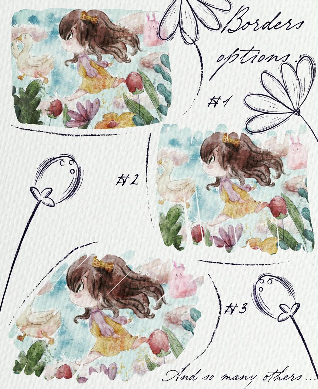
layers that you like most, yeah, I think I'd like
it merged together. And you can decide later. Also what we can do. E.g. we have vielleicht
this background. So what we can do just duplicate the layer rotated
theme painting, Fit to Canvas, likes it. And underneath we can write something like if
it's picture book. So we can write some story. And we have new watercolor, and we have so many stamps. Like said. So guys, it was our
picture book illustration. I hope you enjoyed
today's tutorial. You'll learn some new
tips that you can implement in your picture
book illustration. And speaking about next class, next class we're going to
paint lovely illustration. I'm going to use same
sin creator brush set. Smart tiny difference is, where is my illustration? The dynein difference is we're
going to paint this art. I'm going to paint
it in pastel style. And I'm going to tell you more secrets about
procreate and how the gradient lovely
picture book illustration in pastel style. So see you in next class. Bye bye. And for our today's class. And I hope you enjoyed our new style today and
you learn something, you guys, I'd be happy to
see all your artworks. I just declares to
do my own his bed, and let's see each other
in the next class.
 Inga Yoon, Digital illustrator and teacher