Transcripts
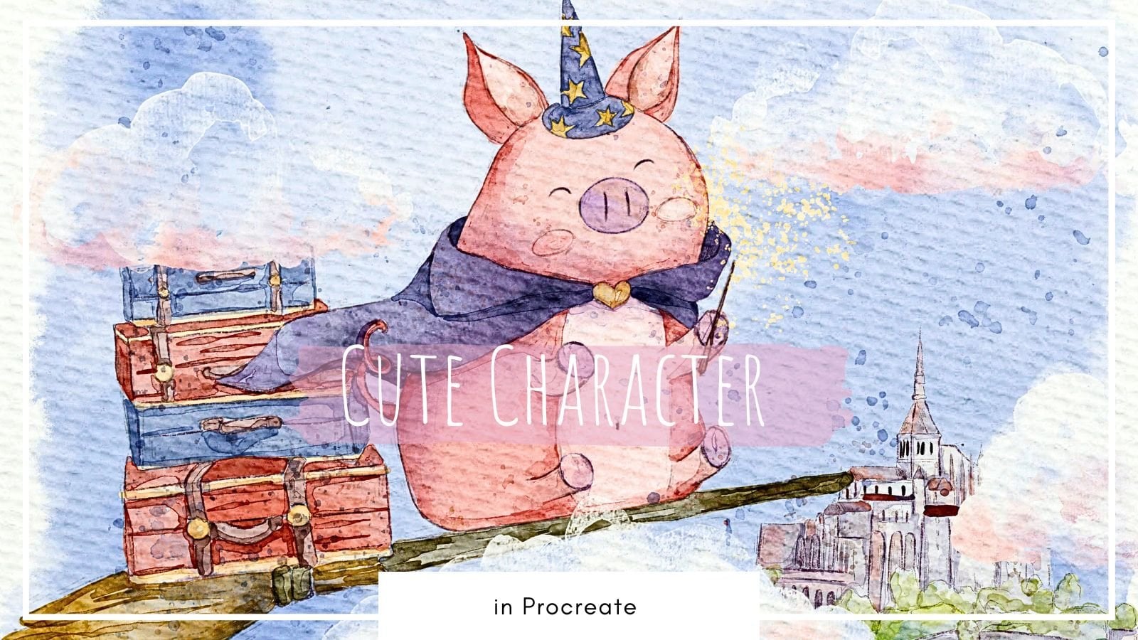
1. Introduction : Hello, my dear art fellows. Today we're going to paint a cute picture book illustration for kids and said he'll be fine. This is the second
part of our topic. Last time we were painting illustration in
watercolor style. And today we will do
that in pastel style. I prepared for your new
brushes for doing set. So I hope you are ready. So our today's topic is picture book
illustration for kids. My name is Ingo you and I am an artist, freelance
illustrator, and I'm obsessed
with watercolor, put's themes and magical stuff. And I'm trying to implement
those topics into my classes. I hope you share the
same passion with me and my classes would
be interesting for you. During my class as
I constantly share some tips and tricks
how to use Procreate. So if you are new
to Procreate or maybe you experienced artists, you go find them
useful in some way. So if you have some
questions, recommendations, suggestions, you might leave
them in discussion section. Speaking about our today's
lesson during our class, I'm going to take you
through the whole journey, my whole creative process. We will start from experts in all previous
interests of Procreate. Then I'll show you how
to use my new brush set. And after that, we'll
move to paint in process. And we're going to
explore the new style. I hope you are ready
for doing that. I will show you the
way how to use colors in the most efficient
and beautiful way, and how to make our
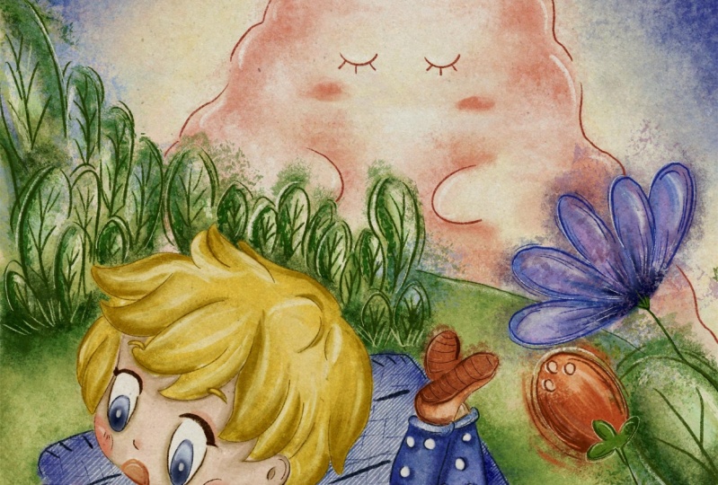
objects less flat. I'm going to focus on paint
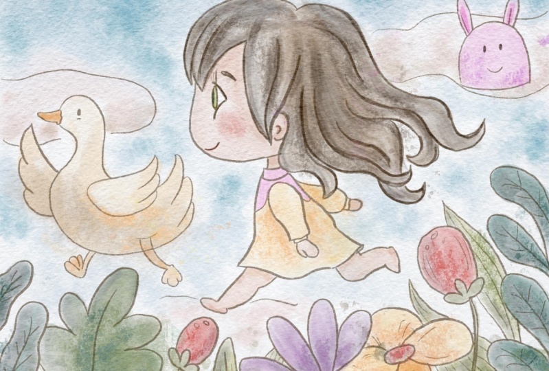
and lovely surroundings. Visa, cute character in the
center as a final project. And your project will be same the previous illustration,
this lovely elements, character background elements
or whatever you like, and what will cause
warm emotions. And as a bonus, I will share with you
my textured paper, new custom brush set, color palettes that I created. I will also add file of
my pictures that I drew. Feel free to use it for
your own art projects. This class is great for
intermediate level, also can be useful
for beginners. If you've watched
my previous classes and experienced artists, probably here you can
find an inspiration in new ways how to create
lovely picture books art. I really want you
guys to join me. I tried my best to make this
tutorial, fun and creative. Completing this class
will help you to learn how to paint in
procreate on an iPad. And also to get general
knowledge about composition. How to wisely use space, and how to choose
colors properly, and how to create lovely
picture book art. I can't wait to start this
class and definitely I can't wait to see what you upload to your
project section. Please feel free to
enroll and let's enjoy painting process together.
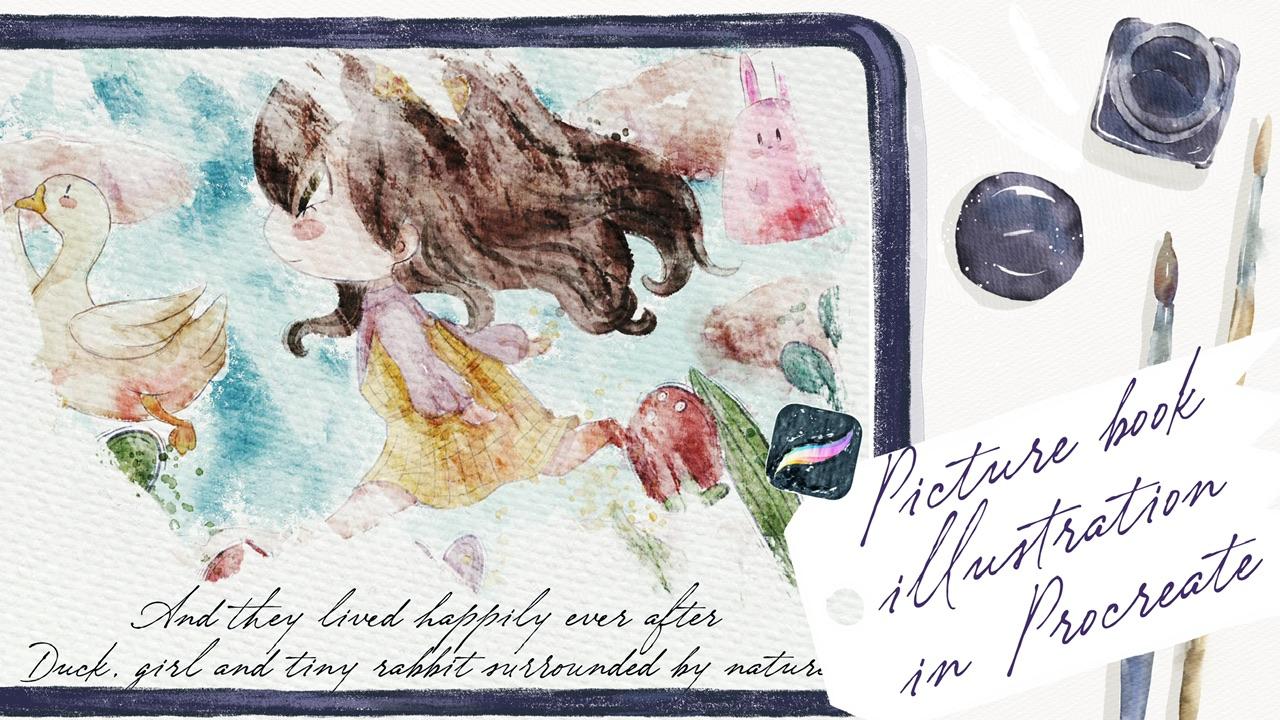
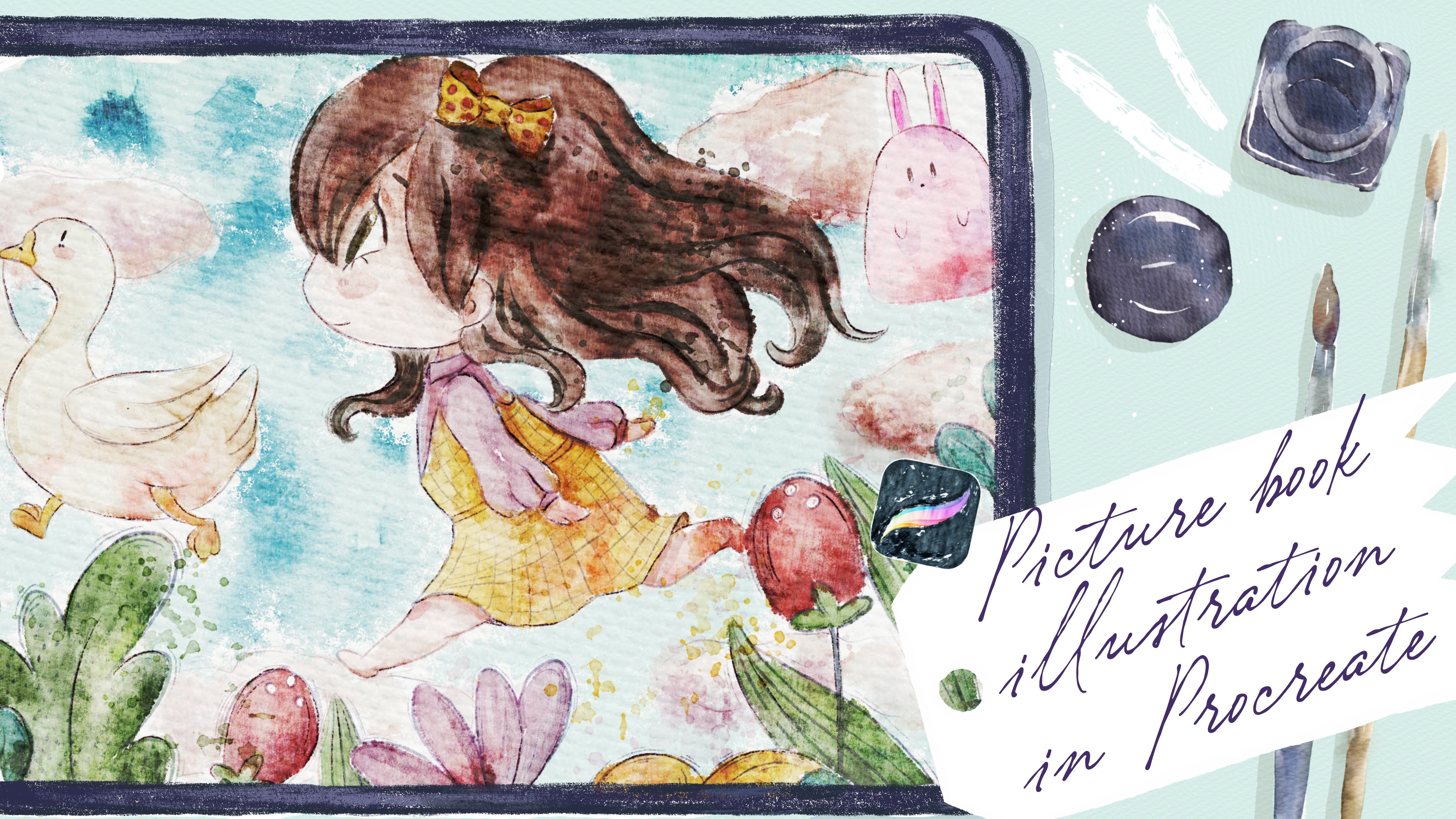
2. Creating Paper : Hi guys. Hello everyone. I hope you're ready
to get started. And first of all, I want to tell you
that wiggle pains is lovely illustration
in pastel style. This is the second part of our picture book
illustration class. And you might see as a result, that's what we will have
in the end of my class. I decided to choose
pretty bright colors. And as you see, I
changed the paper later. I'll show you what
should we do in order to get this paper
and how to create canvas? But also, I leave the option for you that
you can use a canvas. And I actually already created
in Procreate file format. And also here we have sketches. We have so many sketches you can grab the options
that you like more. We have six different sketches. Also, we have
compositions that I explained to you during
our previous class. Also guys, I have for
you to brush sets. The first one is when you watercolor brush set and
I added some new brushes. You see pastel brushes. We have five new
brushes that I created, especially for this class. And that will help you to create lovely pastel
illustration. And the second brush set that I also add it to
this class is seen creators at ones that I shared with you during our
previous class. And thanks to this brush set, you might paint
the demonstration within seconds so you don't need to spend lots of
time painting sketch. You might just grab
this brush set and it will use your
paint and process a lot. So I think we're
ready to get started. Once again, you might
export this procreate file into the procreate and
just start painting. You will have lots of layers. Or another option is, I will tell you how to
export our new paper, intercept, procreate, how to
create canvas, and so on. So both options are fine. Just choose the ones
that you like most just, I want to mention that in
my Procreate format file, you will not have new paper. Because I added this new
paper to this class because it's specially for the
pastoral illustration. I still Illustration
color palette. We use justice to
robes because we don't need lots of
colors for today's art. And I also added it
to the freebies. And I think that's it. Yeah, We're ready
to get started. We need to tap Plus and
after that tab plus again, switch from pixels into
inches and write nine. 11 ". B is 300 de Paris solution and 56 maximum layers that are
available that we can use. But that depends on size
on a modal of your iPad. My iPad is iPad Pro 2018. So if you have like
iPad Pro 2020, 2021, 2022, probably you will have larger amount of
layers that you might use. Tap Create. Now I'll show you how to export. All are freebies and
where to find them. For that, you need to go and
open my class in browser. It can be Chrome or Safari. Why should the browser? Because if you open my
class in Skillshare app, my freebies might
not be visible. So make sure that you
use Chrome or Safari. After that, when
you open my class, you'll go to Projects
and Resources section. And in the right corner, under headline resources, you
can find all my freebies. You download them
and all of them, they will be saved in files app. After that, you may just go and splits the screen
into two parts. From the first, from
the right side, we will have procreate. From the left side, we will have file's app and all your files will be
in downloads folder. After that, you just
need to drag and drop. Also free visit. You have the intercept
Procreate app. I have puzzle book illustration, pastel picture
book illustration. This one, I changed the the sketch a little bit because I don't
want too many details. And it's why I erase mushrooms and I moved our
rabbit to the bottom. Let's create one more layer. After that, we will
have colored palette. Yeah, you see we have picture
book illustration swatches. You just drag and drop
it. I already have it. I don't need to do it. Saying what what we
D to B is a sketch. Same about the brushes. So you have one, your
watercolor brush set and you have seen
created a brush set. So I'll just drag
and drop it into the Procreate and it
will be exported. And you can find all
the brushes actually on top of your brush library. And I think that's it. You are paper. I
forgot about paper. And we have paper is a new one. I decided not to use
watercolor paper for that. But once again, if you prefer watercolor
paper, you might do it. So after that, we
need to press V to Canvas and just
move it two sides. Next step, what we
should do is we're gonna change blend layer modes. But before we do that, we need to duplicate the layers. Move one layer to Linear Burn and another
one to color burn. And guys pay attention
why we are doing sad? Because thanks to change
in this layer modes, we can reach the right
blend in a positive here. So I duplicate it, linear burn mode, and
I merge it together. And I just save this Color Burn. I duplicate it and I
merge it together. Then we need to lovers and Linear Burn blend layer
mode till 50 per cent. Then I want to
group these layers. So I select two layers
by swiping, right? And I press Group. After that, I want to
rename it and write paper. Guys, pay attention
that you will paint underneath our
paper layer group. Why it's important
because if you paint on a top of all layers, it will not have this
blend in effect. I'll show you later
how it looks like. Actually I can show
it to you now. So let's turn off our sketch and grabs this purple color and
go to our pastel brushes. And I'm going to show you some brushes and
in the same time, I'll show you what are their
results if you use ah, it on a top of all layers. I like it because it's
like some snowflakes. So I decided this
brush is important. We're going to use
it for the sky. So this is one brush,
both pastel strokes. I like this brush because it
can help us to read this. You see this pastel
strokes effect. So it help us to reach
this authentic look. Thanks to the sea is a
shade from the stroke. What pastel thing, which
is very convenient. And it has very thin tube. And it's pretty
opaque in a middle. Vertices, edges are a
little bit less dense, if you might say so. What pastel base, this is a brush that you
need to start with. Like my suggestion, I'm going
to start with this brush. You see it's very soft. And it looks truly like
Pastel, Pastel water. This is one of my
favorite brushes because it's kinda little bit
semi-transparent. You see, it has this
I Bristol effect. Can we say Bridgestone? And it's like you added a little bit of
water into your pasta art. And I like water, and I like watercolor. So this brush is very useful. Okay, So now I will show
you what will happen if we move our layer from
the bottom to the top? You move it, grab it, and move it to the top. And you say you lose
this blending effect. This is the color doesn't
blend into the paper. And for realistic art is important to reach
those blend in. Effect is why we need
to move it underneath our paper layer group
makes it more with here. And also, if you want to have the color a little bit
brighter, you might lover. Paper layer maybe
two or 35 degrees, because I don't want to have our illustration to be Zed dark. It's fine. I'm going
to keep it that way. So let's clear it.
And we have paper. I just show you the brushes
and we have the sketch. And I think we're
ready to get started.
3. Adding Colors : Like you guys in
before we get started, I want to show you where to find our reference
picture and how to add our reference
picture into the canvas without
disturbing painting process. Rosetta going to go to Actions button and we
need to tap reference. Here. I already exported
our reference picture into this reference window. Once again, you might find
this reference picture in downloads folder
in your files app. So we need it for to
check the colors. I was experimenting with the colors and I
thought it would be great to have pretty warm,
saturated color palette. And this is those brushes,
unlike what color? They have very bright. So sometimes you will need
two lovers, capacity. And you just need to control cell level of
intensity of a color. That's why my
suggestion is this art, don't paint everything
on just one layer. For Ziad, I'm going to paint every element
on different layer. Because later I'm going to adjust that posit
is a brightness. I might change the hue a little bit. Let's start with Skype. I'm going to grab this
pretty bright color. I will use pooled pastel brush, and I'm going to start it
in a little bit. Colors. You see so saturated and so bright, brighter blue. So you might lay or
strokes, it's so beautiful. So guys, we are
trying to imitate soft pastels as a blending tool. I am User Pool
pastel base as well. Now let's grab a yellowish color. Next. Up, Kevin, we've done this part. Let's go to our
lovely rabbit graph, nearly white color and fields. The area where we have our
rabbits means is color. And remember what I told you. We need to do it on a new layer. Saw rabbits, we're going
to paint the rabbit. Owning your hair. Also
same lovely pink color that we used for the sky. And after that, I'm going to
stick to light purple color. You see for this aren't
views very light colors. Little bit yellowish. Lucky. If you think it's
not bright enough, just duplicate a layer. And we create new layer. Every new layers that
you create should be above of the previous layers, because this is not
the watercolor, so it's not semi-transparent. In this case, if you place your layer underneath
of previous layer, like I'll show you, e.g. we have the rabbit and if
I place it underneath, we will not have the color of rapid because it will
be behind the sky. Same brush. Let's add color to our greenery. Here. You don't need to be like,
perfectly accurate. Wonderful. Now let's create one more layer underneath because I wanted
this color between I'm Denise of the greenery because it's not in front of everything. Now I'm going to grab a
little bit brighter color. Once again, we painted
on a new layer. So if you don't like
it, you might just go, go to curves and play with the color you might
saturated desaturated. I, you see I slightly
desaturated color because I don't
want it to be that bright as the other leaves. And I'll create one more layer. And I will grab this blue color. Oh, I forgot. We're going to lower the
opacity of our sketch. And I'm going to paint
on the same level, same layer because it's
almost same color. So one change it significantly. So our first aim is to fill
the area with some color. Now, we will go to our lovely rapid and you're going
to draw another rabbit. Use the same colors. So the revenue but
kind of colorful. Next, I will create
one layer above, and I want to paint
our lovely fox. This is ginger color. And next is this flower nearby. I want to make with same color. Because I want to
match the colors like surroundings and our
main characters. Now duplicate and grab
yellow color for hair. Create one molar, but
we have the skin color. It's kinda too dark. Once again, you
who decide to use my watercolor paper from
the previous class, say colors will be
nodes at saturated and they will be more
semi-transparent. So it keeps it in mind. Probably he will have blue eyes. I can, let's create
one more layer above. And I'm going to add some colors to here to our boys out feed. And we have some polka dots. So we cannot erase some parts cause I'm
gonna keep it wide. It's a bit darker
and D saturate it. Actually like Iran's a t-shirt. Kinda white. So I'm going to
actually keep it wide. Maybe I really need to
look at a little bit of purple shades. And that's it. So create one layer above, grab purple color. Same brush. Little bit. And that's it we've done is first part of our illustration where we added some colors. Are next part, BOB, we actually going to add some shades and add more
texture to our art. So let's do it.
4. Adding Shades and Highlights : So we move to our next part
where we're going to add some texture shades
and highlights. And I just want to add a
little bit of shades above. So each layer where
we were painting. So I'm going to create
one layer above, and I will add some shades
above our rabbit and the sky. And same about the grass. I'm going to create a layer
and paint above this layer. Same. I'm going to do resist
part with our plants, with our rapid Mr. Fox. Same about boy in here. So some layers I
will clip in order to prevent painting on the
objects that are nearby. And I'll show you
later how to dose it. But if you go to the
bottom and we're going to paint from this,
from the beginning, from the sky and our lovely
rapid and I'm going to switch the brush to
pass tool flakes. And here I will have
our lovely color. So I want to add a
little bit of texture. This part. Now, yellowish
color in this brush is very bright pink
color around the ears. All of our lab director even picked a schwa,
maybe darker. And if you don't like
something, just blend it. You might experiment and see
which colors you like more. You will have more shades. Play visa. Color saturation. Blame is a size of the brush. So I'll just show you
what we had before. Yeah. And what do we have this pretty much satisfied
is what we have. Then I'm going to play
with this flower, crabby on the layer
just above our flowers. And I want to add says flakes
around this flower as well. You see it creates
very lovely feeling. Non-business flower. Now, let's go grab a little bit. Reddish color, create
one layer above you. And I want to add
some flakes around this flower and the
round-off fox, of course. Because I want to
have some texture. Now same with leaves. Grab a little bit darker shade. But don't go too much
beyond the lines. Because we will create
some kind of mess in some shades to
the head of a boy. And I want to do same. Uses purple t-shirt because that's flakes can help us
to add very lovely shades. Editor, shade here. And don't forget about rabbit. Glue on. And I nearly
forgot about blanket. Dark shade, dark blue. We have, and we need to
show the shadow objects. Now, next part, what
else we should do is let's move next
part and we're going to grab my watery brush, pasta, watery and we're going
to keep adding some shades. Lucky pink color. And I'm going to show the
shape from this part. This part. Maybe we need to show a little bit the
shape of an object. I love herself passed him. Okay, I won't do anything
to the sky already. Likes away how it looks. And I'm going to
paint on the grass, of course, because I think we need to show some
kind of shades. And why is this brushes cool? If you press harder, you will have more pigment. And here you went,
grabbed different shades of green and just throw it. It's a little bit of colors. You think it would be useful. Grab its color and blend some overlap
in some sharpness. And off from Zazi head, Let's grab a lighter color and
add some white highlights. After sad, let me think,
what else should we do? I'm going to add some
shades towards a fox. Some far. You might grab some
yellowish color. So thanks to his brush, beacon shows a
texture. Like sad. Once again, this is
childish illustration, so it's normal to like
play with colors, have some overlap, pins have
dark colors, bright colors. Experiment and see what
you might like more. We can go beyond the
lines and show some of glow with this part will be lighter because
it's facing the sun. And then the quanta, or is this part of goods
will be darker. Now, this lavender flower
here shows a shade. Does that go and grab brighter color and
shows the highlights. So my suggestion
is when you paint with pastel, soft pastels, you might draw some
kind of strokes. Now, voice here. Same brush. Now, free to pride. Yellow color. Increase
the size of the brush. And now we need to
show some highlights. Just very important. Don't forget, like
when you add shades. Where we have shades, we always have
highlights as well. Okay, Now, let's go to
the rest of his outfit. Same color. Here. I will press clipping
mask because I don't want to draw
on our polka dots. And I'll grab a little
bit darker color. Yeah. And I'm going to do is
save this history shirt. I like this very warm color, shade from this part. Bright color. And we need to show buttons. Coursera, I'm going to
draw sam slightly darker. Also, let's not
forget about ice. Also guys, if you
want to love her, If you want to use this
brush as as a pencil, yes, like very soft pencil, you might just
lovers the size of the brush and just
start using it as a pencil or a suggestion graph. Go to the native Procreate
brushes and grab six B pencil. It's also very useful. And almost, almost done. I still want to add
some shade tools. Lovely fox. Let's start his blanket. I think. We need to show the
shade from the boy. If you want, you might add
a little bit purple wipes. So add purple shade here. Because boy's t-shirt
is a little bit purple. Now let's return to look color and add some shade
to our Lambda Fox. And about highlights. We might grab a little
bit darker shade and because it has some
kind of strokes, we can show the strokes
with brighter color. Just simply copy it. Make sense. Now let's go to our rapid and show a little bit
of shades here as well. And final page, like I told you, you're going to add a little
bit shades to sloppily. Articles of leaves. Here, like what we did. We eat plants, flowers. I still want to add some
shades to boys scheme. Yes, I'm shadow. In an area where we have two
objects next to each other. We will have some shade
and then some color. I'm going to show
chicks and cheeks here. Here of course. Don't
make it too bright. Just like setting. And guys, in our next part, I'm going to add some
final touches to our art. And we're going to
turn this illustration into picture book illustration.
5. Final Details : Well, I grabbed six B pencil and I create a new layer above. And I'm also a splendid
layer mode to multiply. And guys, before we start
adding any details, I'm going to show
you why we actually needed to paint
everything on your layer. So if you don't like
some color for, for some reason, e.g. you might grabs a color of hair March with original color here. So we just have the hair color. If you want to
make a darker e.g. we have our layer. After that, we go
to curves and we might make sec color
a little bit darker. We made saturated desaturated. It's totally up to you. Or if you don't want to
have it set to yellow, you might go to hue
saturation and brightness. And you might play
this hue and change the color of boys hair
in a way you like. You're saying, you can
adjust the brightness, make it lighter and brighter. In chess, the saturation make
it less or more saturated. It's all up to you. You might keep this
cat hair color or make it brighter or lighter. I think I'm gonna keep this hair color a truly like
how it turned out. And I'll create one
layer above everything. And I grabbed some reddish pinkish color,
something like that. And I'm going to add this
tiny details to our art. Don't worry if you
don't like something, you might just adjust
the brightness. Make it non said pride. Add some strokes. Don't worry, I'm
going to desaturate the color a little bit later. So it won't be that bright. So if you see that
in some parts, you actually need to add some kind of lines,
you might do it. It's normal to your Samantha
media and not just pastel, who might also use pencils. And I think that's it. Knew Dan muses part
of illustration. They need details. And we don't need this
illustration anymore. You're going to turn it off. And like I told you, if
you're going to desaturated, so go to curves and slightly desaturate
your illustration. We've done with this part
of the illustration. Now, I will show you
how to turn it into picture book illustration
as it's so simple. So what we're gonna
do is we need to merge together everything. We have our illustration
on one layer. Then if you like, you might give this cage
or you might sketch, you might just turn it off. It's up to you. I'm
gonna keep it a little bit to maybe 20 per cent. Behalf, we should select
our sketch and our pain here layer and grab
the selection tool. Make sure that you
have a uniform. We need to move it a
little bit to the center. Because I'm going to
add some book borders. That in some old books
about fairy tales, their books, they have
some kind of borders. So that's what we're going
to create right now. And I have new layer turned
on and six B pencil still on. And I just want to draw a rectangle and tap with one finger. And now we have
beautiful rectangle, not the ones that I first
painted in the beginning. And now we can just control it. Go grab free form, and here we can control the
proportions. Now finally. I just wanted to move it
close to the illustration, but not too close. You have this proportion. I can. Now I'm going to
duplicate it again. And by using uniform, I just want to move and
make the second row. So if you have some
kind of frame and as you see like
actually the borders like the edges of a book page to have
some kind of ornament. And here we might experiment
and I'm going to show you the ways you can draw when you create a
picture book illustration. And we have a few
ornaments that I like. I'm going to use. Now. Let's just duplicate
this layer two times. Let's create one
more layer above. And here I will
use drawing guide. And I will go and press Edit Drawing Guide,
Symmetry here. And when we draw
something from one side, we will have it from
another side and tap Done. Okay, now we have one layer turned on
and we're going to add some border frames for their ornaments that might help us to make our
illustration more beautiful. I decided to add some
kind of struggles. Like said, Hey, it
looks very good. Let's just add one more here. Now. We're going to duplicate it. Flip vertical and
move it to this side. And then merge it together. And you go to the previous
layer and just erase the part where we have
Islam, the borders. This is one way and
it's very lovely frame. So I'm gonna keep it for now. Now, we're going to duplicate
this assisted layer. And the previous one, we're going to merge together with frame is the
rest of a frame, the one that is active where
we have Assisted turned on, you're going to clear
turned off previous layer, turned on one more frame
that we have, this one. And we're going to create one
more lovely illustration, lost one more frame. Here. You might add a little bit. You see me paint from two sides. Oh, it's lovely. Vintage borders. If I want to make
it seem similar, I will duplicate it, flip vertical and
move it to this side. Now it looks more
or less similar. So now let's merge
together these two layers and let's turn off
our drawing guide. And we still have the lion of Assisted Drawing
Guide turned on. So in this case
you need to go to Action button and turn it off. And that's it, guys. I hope you enjoyed today's tutorial and
now you know better how to paint this pastel brushes and how to reach
his pastoral epoch. And by the way, guys,
during our next class, we are going to pay in
plausibly cute creatures in watercolor style
and pastel style. But that was the end
for our today's class. And I hope you enjoyed our new style today and
you'll learn something. You guys, I will be happy
to see all your artworks. I will be glad to
do my own feedback. Let's see, each has
it in next class. And during our next
class, once again, if you're going to paint
lovely, cute animals. So let's meet each other
in the next tutorial.
 Inga Yoon, Digital illustrator and teacher