Transcripts
1. Introduction: Hi guys. Hello everyone. My name is ingayoon. I am an artist,
freelance illustrator. And during my short tutorials, I teach people how
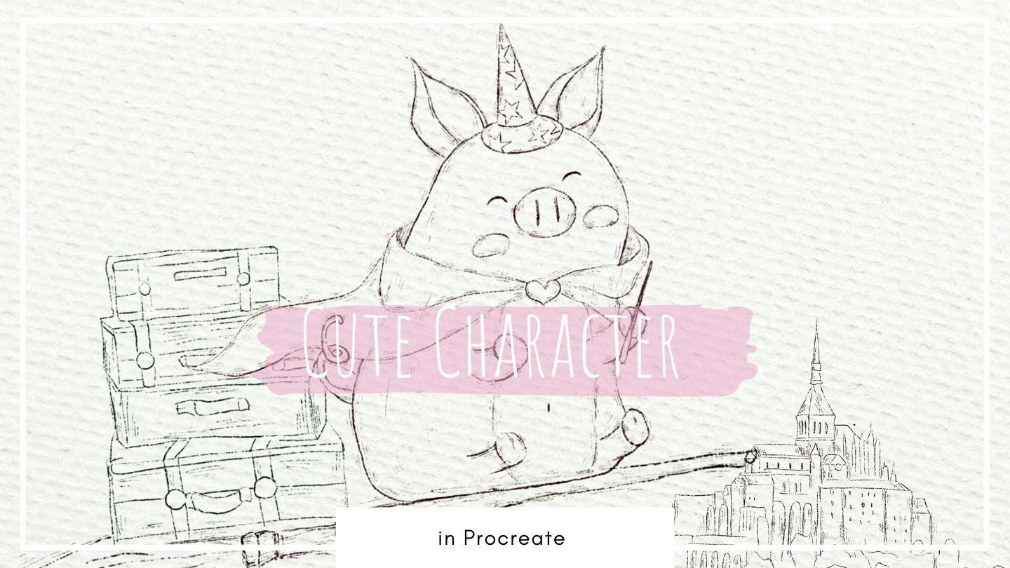
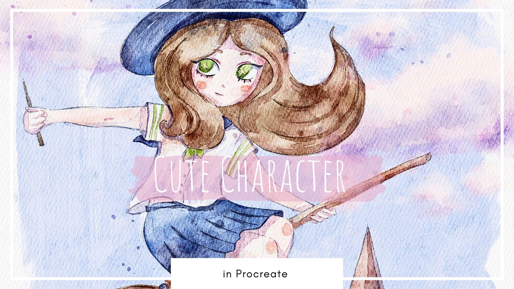
to use Procreate, how to paint in watercolor style in a fast and simple way. And during our today's class, we're going to paint lovely, Cute Character in watercolor
style, in Procreate. And we're gonna do it
in a font and easy way. During my today's class, I prepared for your loss of previous that you can use during my classes and in your
everyday painting process. I hope they will be useful. And guys, I'm ready to take you through the
whole my journey, my whole creative process. You gotta follow some steps in order to complete
our lovely Art. I will show you step by step
process creating lovely, cute character illustration
in watercolor style, and the process of adding
colors, shades, and highlights. And you're going to create
different sketches. I will briefly tell you
about the main rule of compositions that
will help you to ease your paint
and process a lot. As a bonus, I will
share with you textured paper and your
brushes that I create, especially because it's class
color palettes that I used. I will also add file of sketches and my
picture that I drew. Feel free to use them for
your own Art projects. This class is great
for intermediate level and for beginner
and advanced level. For everyone who is
interested in painting cute characters in watercolor
style, in Procreate. And guys, I really want you to join me in this, our journey. I tried my best to make this class fan and
creative competence. This class will help
you to learn how to paint in watercolor style, some useful tips and tricks. And also, I hope
to have FUN guys. I can't wait to start this
class and definitely I can't wait to see what you
upload to Project section. Please feel free to
enroll and let's enjoy. I'll painting process together
2. Creating Paper: In this part of the class, I'll tell you how to
import all our freebies, where to find them, and what we should do
in order to create lovely textured paper.
Let's get started. Hello, my dear act by us
during our today's tutorial, you're going to paint lovely, Cute Character Illustration. And we're going to paint
in watercolor style. And I prepared for your
some lovely freebies. You might not follow
exactly my steps. I prepare for your
different sketches that you might use for
your illustrations. I think they're ready
to get started. First of all, let's grab iPad, then let's open Procreate. And after that, we need to tap and tap Plus
again and switch from pixels into inches
and write nine 11 " with 300 DPI resolution
and then tap Create. Let's rotate our paper due
horizontal orientation. Then I'm going to duplicate
our layers, two types. After that, we need to jump to our freebies sockets
where to find them. First of all, you need
to open my class. In browser. It can be hello or Safari. Why should the browser? Because if you do it
at Skillshare app, my freebies might
not be visible. When you open my class. Then you go to Projects
and Resources section. And in the right corner under
the headline resources, you can find all my freebies. So you'll download them and
then your mic open files app. And in downloads folder, you will find all the freebies. And then my suggestion, let's just split
screen and prompts. The left side we
will have file sap. From the right side, we have our Procreate canvas. Then you need to drag and drop our brushes from files
app into the Procreate. Saying we should do
these color palette is paper and this is sketches. So let me show you
how to do that. Now let's go to color palette. In color palette, we have
Cute Character color palette. And then you need to tab dot, three dot and press
set as default. So when you go to the main
menu of our color palette, we might see our
color palette here. Then let's do same visa sketches as you see I prepared for you lovely girl character, this one. So if you like, you might paint in
illustration of is this girl. And also I prepared
for your some options. We're going to create a
composition for our today's Art. So you might experiment
and make some changes. Like I told you,
you don't need to follow exactly my illustrations. Here we have pro and we
have some blockages, and we have some magical castle, and you're going
to use this one. This is a castle that
he's located in France. I think. Darn it off, create one more layer. And I prepared this lovely peak. And this is Magical
because you might see. And we also might use is Sketch for our
today's Illustration. And let's create one more layer. And let's drag and drops
Alaska, just as lovely cat. In end, we will create some compositions so you might decide which
one you like more. This is a brushset. You need
to also drag and drop it. I already have this
brushset, Emmons of brushes, so I don't need to drag
and drop at a few times. But guys, once again, when you drag and
drop it as a brushset will be on a top of
the brush libraries. But watercolor,
this is a brushset, and here I have
Procreate brushes. This is native
Procreate brushes and this is my brushes,
pastel brushes. You have some options
if you want to paint in Pascal style watercolor brushes
I prepared for yourself, clouds said we're going to
use for our today's Art. You actually don't
need to paint them. You already can use
some stamps that I prepared for our
today's class plexus. You see it's already
has watercolor texture. And I have some
watercolor brushes here. Then I have textured
brushes that might add lovely
additional elements. And some stamp brushes, some crosshatching, some
dots, lovely handwriting's. And we have
watercolor stems that also might be useful
for our today's class. Let's find the paper that might be very good for
our today's class. And say me need to drag and drop paper into the Procreate. And you see a, we downloaded all the freebies. We imported them
into the Procreate. And then we need to
move the paper to the sides. Make care for. Our next step. Feel
the need to change the blending layer modes in order to reach
watercolor effect. Let's do it. I'm going to
duplicate it and change blended layer mode to color
burn first and Linear Burn. After said, I'm going to
duplicate Color Burn, blend and layer modes
and merge it together. And I'm going to do same
with the second paper. So duplicated Linear Burn
blend the layer mode paper. And then I'm going
to merge it together and either love or SAP
positive deal 50 per cent. And then I want to
group the papers. So by swiping right, I select the two layers and
then I need to press Group. Next plays chess, rename
it, then press rename. You can use your stylus. Didn't think and write paper. That we have our paper layer. So guys, pay attention now, everything that we paints, we need to do it below the paper layer groups in
order to reach watercolor. Later when we start coloring, I will show you what are
the differences if you place it about paper layer group or if you place it below. And yeah, I've, you
have all our options. You have different characters that we have clouds as well. So now let's create lovely composition and we
go do it in our next class. Let's jump in
3. Creating Sketch: In this part of the class, we are ready to create
some lovely sketches that will help us
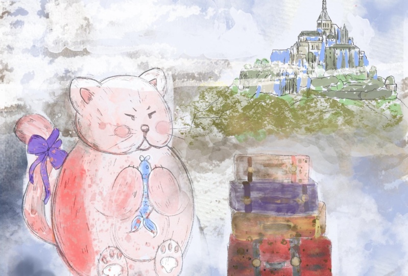
to jump into next, next process. Let's do it. Time for creating
lovely composition. Here, guys, I think we
can create some options. So first one will
be our lovely girl, and we need to place her. I cried in front of us. As I told you in my
previous classes, we have the rule of thirds. So ethnic, quickly repeat. What is the rule of thirds? Rule of sorts? It's the
ruling composition. Like some kind of
methods that we can use when we create
actually composition. When we divide the
space into thirds, intersections of those lines, we need to place our main
objects because this is where actually human
eyes will be focused on. Like for example here, here we can put it on
intersections are along the lines. So as you see, I
decided to place our girls somewhere
along the line in intersection of the
blower parts of the thirds and in a bottom
of our composition here, I'm going to place our castle. So let's just turn on our
sketch with a castle. Turn off the girlfriend
while because I don't clearly see what
we need to select. And then you're going to select a castle exits and
press Copy and Paste. And then I'm going
to place his castle Sandberg in this area. So as you might say, it's right in intersection
or source lines. And the girl is, if you want, you might place
curl a little bit higher and move her a
little bit to the side. Again, this is the perfect
composition that we created. And that's what we're going
to use for our today's Art. And then we don't need the
rule of thirds anymore. We'll turn it off.
Then we're going to select our girl and
Kessel and group. It says that will be our foreign way of
grading Illustration. And also guys, we're going to add additionally some clouds. We have some cartoony clouds. This is Cloud 1.2 and we have more realistic
one which is 3876. I think number four is
also kinda cartoony one. So you will decide which
one suits your style. And we're going to add
clouds in the end after zed. So this is a first
way or of the Sketch, and I think I want to experiment and try
some other options. So I turn it off and
I want to select. Next. Let's write a
press cut and paste. And let's just say am here, three fingers down,
cut and paste. So now if you have broom luggage and Kessel on different layers, That's what you need for
help with today's Art. And let's turn on
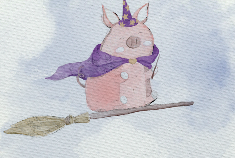
our rule of thirds. And let's place our main objects in a lines of intersections. And I would thinking about, yeah, chosen peak as main
character for this Art. Let me think I'm going to
place it somewhere here. And B will be placed
in this area. It makes it. What about add in some language? You're going to add a
story behind the Art. Let's select it and
place it somewhere here. And thanks to the angle, we can show that direction
of the peak we can chose. There is a dynamic of a
picture of illustration. So it's like the peak is aiming
somewhere like in front. If you want guys also another
option what you can do, You might change
their proportion. I think it would
be great to extend the size of the Paper little bit for this type of composition. For, for such occasion, they need to go to Actions
button, go to Canvas, and press Crop and Resize, and just move it a
little bit to the sides. I think. Yeah. This is very good option and crops the canvas so it
helps us as you see now, we have the iPad size
canvas and about paper, I select as a paper layer group. Now guys, I selected uniform transforming tool and just also move it to
the sides like this. Now, because we change its
resolution of our paper, we also need to
change the rule of thirds line now gets better. It's better because
here our lovely big truly stays
intersection of the lines. And then let's just add Caswell. Thank you. Let's increase the size a
little bit because I want to make our peak likes
the center of attention, like sad, and I think we
didn't need our lines anymore. So let's turn to move next. And let's group it. So we have this as a first
illustration or very lovely. What about moving into a
little bit to the side? Now, let's turn off
our lovely peak. You now have options. What you can do if you want, you can also play visit Sketch. You can experiment and
see what suits your more. And now let's jump
into next part where you're going to start coloring and you're going
to start it and clouds
4. Adding Colors: Finally, it's time for adding colors to our loud illustration, which is very important step. So the ready, once again, you might use a
brush that I use. You might use a
colors that I use. If not, you might create
your own artwork. You might grabs a color
palette that suits your more. Feel free to do it again. Now we have sketches and
let's create some clouds. And guys, I create
one layer below is a paper layer group
and I want to place it underneath everything. Let's look at our
background layer. And now I'm going to change
the brushes and I will go and grab more water drops. Brush. Now let's grab this blue color. It'd be created 1 mol here. And let's grab pure white color. And let's choose a
Cloud set we like most. And also let's keep experiment in and
finish our composition. Now guys, let's grab
the eraser and I'm going to use both
pastoral watery brush as an eraser via on our
background color layer. And let's just little
by little, erase color. Merge together,
clouds duplicates me now even make them pretty Pride. March the case as a layer, as a class for first Sketch. And if you want, we
can keep painting. But I prefer to choose, I will lovely pick Sketch
for our today's artist. And let's just say, let's just grabs as per our clouds and move
them to our pig layer. We just need to change their
position a little bit. So I'm going to create a feeling like the peak is actually flying in his Kai likes it. Let's see what Cloud
Mike work very well. Be careful. You need to
add clouds on new layers. I'm gonna keep it
at way side, Alexa. How's the clouds look like? And I'm going to keep
them in this way. And after that, Let's
keep it in some colors to our peak and all the elements little by
little, they store. So guys, what I
wanted to tell you, we need to create one more layer underneath of
our Sketch and layer group. And I will grab this pink color and I will
grab Bush shader brush. This brush will be our
basic coloring brush. It's very soft and fluffy. What do we need right now? And let's just start
painting color. And guys, in this brush, Mrs. brush, if you press harder, you have very lovely
coloring effect. I'll show you. But first of all, don't worry, like now you think it's
a little bit too pale. It's a K later we're going
to duplicate the layer. Or we can use curves option. And thanks to girls, are color might be very bright. This part is white, but I also color it just easier later to change the colors and feel it again with
another color. And of course tail, don't forget about it. Okay, next, things
that we're gonna do is just duplicate the layer. And you see by duplicating it, we have very lovely pink color. We can duplicate
it the third time. It's given pinkish. One more thing that you need
to do is we need to remove the transparency because
you see this is watercolor. Watercolor brushes
are semi-transparent. So if you need to block
the background color because our peak
looks very violet, in this case, we need
to duplicate the layer. Go to I already like
this pink color. Again. Martha together
duplicates the layer again. Go to lower layer, go to adjustments, hue, saturation, brightness and
most of brightness to maximum. So now the 100%. So now we have
clean white color, is it helps us to block set background color.
That's perfect. If you want, you
can duplicate it and make it even a
whiter likes it, and then just merge it together. I get less the same. This arrest of our
elements in guys, like I told you earlier. Now I will show you
why do we need to paint below paper layer group. Now guys is you see behalf
this watercolor texture, but if you place it Above our paper layer, copious, it sit color looks
very artificial. It doesn't look like it's
actually watercolor. If you place it below. Now we have this
watercolor texture. If you want to even exaggerate
is watercolor paper, you might duplicate
the Color Burn, blend, the layer mode
you see likes this one. Let's keep it that way. I think wireless color
would the pre-sale lovely. So if you do it on and
you'll their pay attention. Now let's just
blends overlapping. And here we need to be careful. We overlap is a pigtail. So let's just say in what we
did before, duplicate it. Yeah, it looks
very, very lovely. Don't want to make it too dark. Then you might go to curves. And thanks to the course, you might adjust the brightness. Makes it after that, duplicate it one more time. Go to lower layer adjustments, hue saturation, brightness, and increase the brightness to 100%. So in this case, you just blocked,
or we'd be careful. In this case we just blocked
overlap pins that we might have froms a
background thing, think, merged together. Now, yellow color,
maybe even brighter. Now here we might switch
to another brush. Edge would be fine. Breccia has a very lovely
watercolor texture. I decided to choose it. It's small. Opec. Just duplicate it if
your times and getting semi-transparent mean like
that. And keep it that way. Okay, let's keep adding Colors. And if you want to
create 1 mol or above about ambush shader, I'm going to grab this yellowish brown color push shader brush, yellows brown for this part of the broom because it's
supposed to be lighter. Perfect. Now, let's grab
brown color, like dark one. Here. Now let's just duplicate it
few times and you see I like this gradient That's
a brush might create. It looks stunning. So beautiful. Now what we're going to
duplicate it one more time. Go to lower layer adjustments, hue saturation and brightness. Brightness. All way up. Good. This is a
brooms that we have. Now let's go to luggage. And I'm going to
merge it together. Raise yellows, yellow stars create 1 mol report.
Grab reddish color. And what about this luggage? I also want to make reddish. And about other colors. I'm gonna grab this
bluish color here from. And now I'm going to
grab this brown color. That's GREP code Carl color. This one more to yellowish. You shouldn't be very precise in coloring. If
you don't want to Now brown part. And look, WE kids. Now it becomes so bright. Merge together and replicate
like this. Merge together. If you want, you can go
to adjustments, hue, saturation and brightness
and you make an, make it brighter or darker. I'm going to make it
a little bit darker. Brighter, but less
saturated like this. Because later I'm going
to add some shades. And I'm going to duplicate it, go to lower layer adjustments, hue, saturation and brightness. Now let's finish our peak. Go grab selection tool,
freehand, breast, ed. Little bit further,
maybe two per cent. Now let's make it brighter. Just a little bit, tiny bit. Now about the belly. Let's talk Pfizer two per cent as well, frustration
and brightness. Some make it brighter and desaturated a little
bit likes it. Now knows 2% saturated, and I think like cetera. Now, let's jump into
paint and Castle. Add. We need to
create my new layer. And a nice of everything. Perhaps some green
color, shader. Paint, some food, some rocks. Green, Green. Thinking painting. Of course, we don't need
this part because it's already hidden from us. But I just want to
finish it properly. What if I just want
to erase this cloud? And in this case, I don't
need to have all my paint. Next. Let's grab
this color for them. Maybe not Mountain Ciroc. Yeah. Okay. Now, this is for the Ruth ruth East
brown. Very, very broad. Let's duplicate the layer. Make it brighter like here. Applicators again, I don't
want it to desert saturated. So I'm going to love
her SAP acetyl likes. Wk, replicate again,
go to lower layer hue, saturation brightness and
removes transparency. Now a magic wand. Go grab brown color. Go grab a chip brush, and now go to this pink color. Increases size. So the brush and fill this area
is pink colors. Now go to this part, like a little bit purplish shade and add some color on top. It will give you a slide
shade of purple color. I think it might work
good together and might separate the feet from the peak. Now let's grab
this purple color. And as you see now, we started adding some Shades. So let's jump into
shades and process
5. Adding Shades and Highlights: Finally, not the last but almost the last part of our
today's class ends this part. You're going to add
lovely shades and highlights to our Illustration. And be ready to
jump to the next, next part. Okay, great. So now let's create one more
layer above our move to multiply blend and
they're the same, they're gonna do Sketch Layer. So let's merge together. They Sketch Layer and
I will go to multiply. Then I've been lovers,
sat by satanic, bit likes and same. I'm going to Adobe's a castle, multiply and lovers that
Bassett to deal 50, 60% like sad on a new layer. And it's in Multiply blend mode. I'm going to grab this
pretty violet shade. And as a shader, I'm going to use edge brush. And let's start with our
lovely peaks outfit. I likes as this brush has
very distinctive edges. Like what's real watercolor has. I'm accessing watercolor
textures as his brushes. If you press harder, you will have more
transparent sheet. So controls the pressure. And if you have darker
shade like here, just press lighter if you have, if you wanted to have
more transparent way, just press harder. This brush is perfect if you
want to add some shades. Shading part. So if you want, you might
grabbed his blender and erase some parts
that you think of very like Alderfer place likes this. And I'm going to blend
these sharpness part. And I think tail also
should be in the shadow. What about sits? Let me see. Sam about the stars. If you want, you might
have some kind of Shades, just like by putting
the second layer. Now let's grab
this bright color. Now in this area, I think
we need to add some color. Likes ahead. Again. Once again, if you want to make the
Shades brighter, what you can do it
just go to cars. Pinkish one. We need to
show the shadow here. Hi, yellowish brown color Now blender. Now let's just say
with this part, create 1 mol or above. Multiply. You're gonna, we're gonna do it in a new layer
because later I think I want to adjust
contrast to Zach you. So I don't need to use
new layer for doing that. So remember you press harder. You have very light texture, your breast lighter
or darker shades. And if you want to
my blend some part. I think it's just too bright. So in this case, just adjust
the opacity of the brush. Next is, now grab a brown color for
some kind of spots. I came brown color for the leather belts called color. Okay. In don't want
to change anything. I like. It merged
together with our big. And let's see what
else should we do, just so let's add some
shades to Castle. Multiply symbol Shades. Just a little bit of Shades
don't be like I told you to precise because it's
castles like far away. It shouldn't be well Details. Comparing to the
rest of the objects. We have shade underneath of the roof sheeting this area. So also guys, we have shade in areas where two objects
are next to each other. So in areas where we have two buildings are buildings
and we have some trees. In this areas, we
will have shades. Okay, This part behind the
building and sees area. Maybe have shade, shade
here, Shades here. You might soften it a little
bit by blending the edges. Here. Let's go and grab this brown new Schwann,
brownish shade. I want to emphasize
the shape froms a staunch slightly darker. Okay guys, we've done
visa SHA-1 part now. It's time to add some
final touches and said fill this end for
our today's class.
6. Adding Final Details: Adding Final Details, it says a part that you're waiting for that will help us to Darren, our lovely are even
more beautiful piece. And if so, once again, grab your iPad, Apple pencil. And let's not wait. Adding some texture and
patient our illustration. Now I'm going to grab
board Dots, brush. I'll create new layer, set it as a Multiply blend mode, and then gave you have Kessel was murdered
together with our pink. Then I'm going to merge
together all the peak elements. Okay guys, so now I create
1 mol or a bowels if peak, and then I'm going to set
it as a clipping mask. I think I would call
this purple one. And I just want to
add some texture, like old texture
to our ligatures. So be careful, don't
put any dodged. A broom, likes it. And I adjust a little
bit intensity. After that, Let's go
to boost splashes. Still purple color. And I'm want to
add some splashes towards the outfield over peek, maybe a little bit
to peak as well. Just want to show this
watercolor texture like this. Now let's grab this light
color and add some dots here. Cute color and shows a Shades. Cars. Blade is intensity
like I told you. Can next, let me see both flashes as well as
create one more layer above. Grabs this bright yellow color. Let's show some kind of
like magic splatters. And now we can play these
blending layer mode. Add and screen work very
well at and duplicate above. I'll put this green layer. And I still want to make it a
little bit yellowish green. So in this case I go too
bright yellow color like this. And I'm going to merge it
together like this way and press Select and
then fill layer. That blockade. Said
it isn't normal. And love for SAP
as a daily forbid. I can now be have
our orange layer. I think I'm going
to add some shapes. In this case, I will
go to our castle, go to Clipping Mask, go to multiply, maybe a
little bit bluish one. And then let me find my
brush box, salted brush, creatine my layer, set
it as a clipping mask, multiply and shows a
shades from this side, for example, lovers adiposity. And then grab eraser and
erase some of silver lead. Now guys, I will go to
the hue blending mode. I think it looks
wonderful situation. I was also very lovely. If you want to have
some distance L castle, that might work very well. Lexis, after sad, let me see. I want to remove some parts that actually should be
blocked by the Cloud. So in this case,
I've just duplicate our one of the kettle layer. Make one and reasonable
in order if I want to keep regional colored version. And now on one layer, I just want to erase the part of a castle
that is blocked from us. So let's go to the
layer where we had some shadings and erase it. Again, made it a little bit
brighter by using the curves. Likes head is great. One more layer above, multiply. Likes blue color. Those precious,
increase the size. And now I think I want
to add some kind of shades to our lovely Cloud. So in this case, I'm going to go on the top of the cloud layer, use it as a clipping mask. Go to the peach color. After that, go grab who sold it. And this is one of the
ways that you can do it. You can add some kind of color. And I'm, I'm with you,
but you can do same. You can keep the same
brush, same peachy color, and you can add
more shades with, as a brushset we have. You can help you to add like better volume or call the route. You might grab even
purplish shade. Add some sheets. I can't add. I think that's
it for our today's Art guys. I hope you enjoyed this tutorial and you'll learn something
new about creating lovely, Cute Character in watercolor
style, in Procreate. And during our next class
we're going to pay and lovely vintage style postcard. B is a bird I already
prepared for your soul. Many tools that will help you to paint in
a fast and easy way. Finally, this is a and
for our today's class. And I hope you enjoyed our today's painting process and you learn something
you wouldn't, maybe you get some
inspiration and I hope you enjoyed playing
didn't lovely peak, Magical peak in
watercolor style. Guys, feel free to use
any Sketch set you want. You might use one of the
sketches that we created today or just follow the
steps that I was drawing. I will be happy to
see any artwork you create and lead
teachers and next class
 Inga Yoon, Digital illustrator and teacher