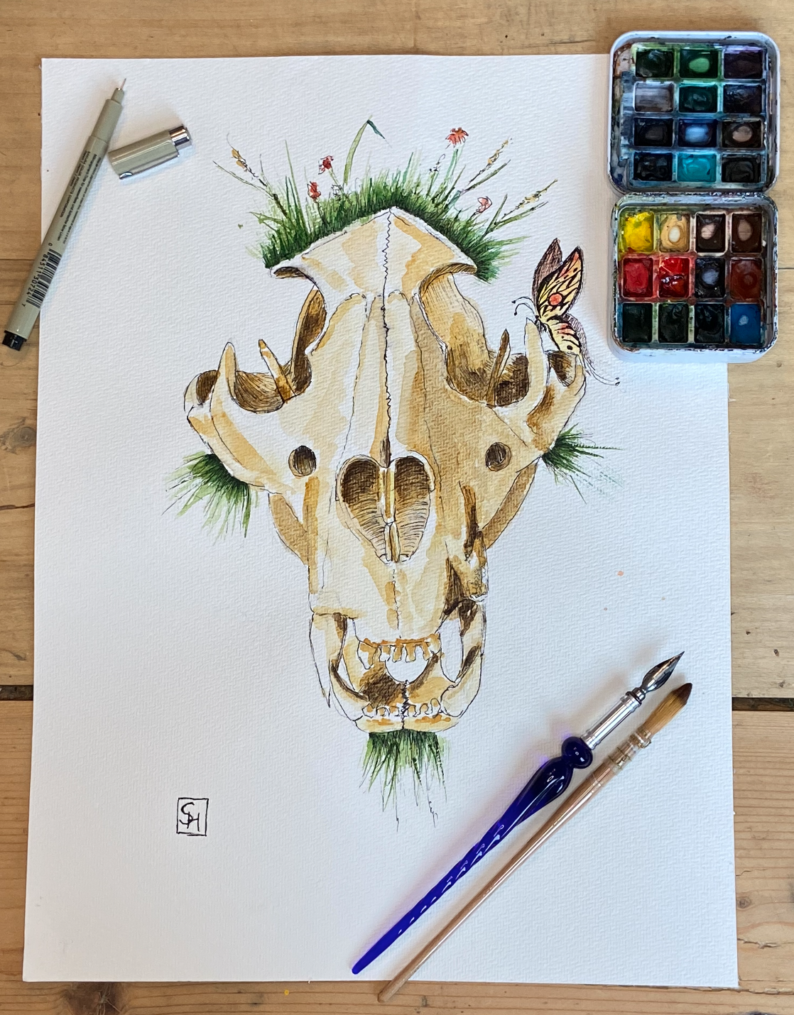
Transcripts
1. Introduction: Hi, I'm Sophie. What we will do today is the
painting of an animal skull. Understanding the anatomy
of an animal will help you really achieve
to understand how does it move,
how was it built? How do the proportions work? Where are the highlights
and where are the shadows? And if you're an absolute
beginner to watercolor, then this class is for you. It'll be fun and easy. There's not going to be a
lot of mixing involved. I'm not going to speed
up the segments, so you can really follow
along in the class materials. You will find the
reference as well as other materials that
might be helpful to you. What we will do is we will start sketching out the animal skill, then add the ink lines to really define it a
little bit better. And then we will layer on
top of the watercolor, go from the highlights to the mid-tones to
the darker tones. Then we will have a
great animal skull. I hope you will share with
me what you're painting. The more animal skeleton you do, the more maybe you discover a little bit about
your personal style. And I would love just to
see what you're doing and if you're stuck and
you have any questions, don't hesitate to ask. So. Lets you go. Not you baby!
2. Materials: Let's have a look at the
materials that we'll be using. First of all, we
will need a pencil. I like to use technical pencil because it has a very fine
tip and it's easier to erase. Why is it important? It's because watercolors
are transparent. Once you put on
some pencil lines, you want to make sure if
you don't want to see them, to erase them really well, then of course you
have the erasers. This one's a hard rubber one. And this one is in moluable one. I prefer this one because it adapts well to the
texture of the paper, so I find it takes off the
pencil lines much better. Then of course, for
the ink there are several options you can just
use fine liners. They're different brands. They also come with
a brush pen tip. Another option
that I quite like. Are those fountain pens. Fountain pens essentially, you will use an adapter in
which you can fill in ink. Looks like this. You can fill in any color that you like. Whatever ink you decide on You want to make sure
that this is waterproof. If you still want to
take it up a notch. There's also dip pens. These are just a
plastic or wooden or metal or glass handle. And you can again
swap out the tip. You can see as you
apply pressure, it opens up and it's then releasing more ink if you
play a lot of pressure. And less if you use a little pressure. You can
also turn it on the back. I use them rarely only
at home in the studio because you will then have to carry around
the ink with you. And if it just opens in a
bag and it gets everywhere, It's an absolute nightmare. That's why the fountain pens are great. There is also all the brushes. You don't need all of
those brushes though. Frankly, most of the time
I want to use this one. Most of the time, 80% of the time only use
the round brush. Every once in a while
I might use a mop brush. Those can take up
more water and more pigment. I have some, some bigger
ones, there is as a cat tongue, what is nice to have is
a rigger for detailing. There's also just a fine
brush for detailing. I like to have a square one. Just nice straight lines, especially if you do
architectural motives. Those ones are just
really cheap ones that I use for mixing colors, so I don't mess up
my good brushes. This one is just a
thing to play around with for mostly vegetation
for trees and such. This one I like for wetting
down an entire page. If you want to do like the whole landscape thing, that's great. But quite frankly, we all might have lots and lots
and lots of brushes. Then in the end: round brush
almost all the time. But what if you are
just a beginner, you don't have any material yet. If you just get one of these pre-filled ones,
that's just fine. If you're already a bit more advanced on
watercolor journey, then putting a palette
together might be a nice idea. You can see mine is
completely super messy. You have different choices. These are dry cakes. Then come in half pans
and full pans. These ones I actually
get in tubes and I squeeze them into my palettes. So I get to put together the colors I like, I prefer the ones in the tube because I find
them more vibrant. They just work better for me. But every once in a
while I like to use these ones because I find
they work more opaque. But that's a preference.
I think a lot of people like to use tubes Just to show you what these
tubes look like. These are a couple
of different tubes. Then you can just put together a palette. What I like is Daniel Smith and I like Winsor and Newton
for sure. These are pretty much
the only two that I like. every once in awhile I
might use some Sennellier, but frankly Windsor and Newton and Daniel Smith works great. What else will we need? It's watercolor paper? I like to use Arches or Fabriano, you can use
any watercolor paper. Of course, there's a couple of things you want
to look out for. One thing is if it's cotton, it will work much better for any kind of free
flow technique. Really for bringing out
the best in watercolors. I feel like this
is the way to go. And you want to make
sure that you have these 300 grams
per square meter. Because the density of the paper makes out just
how much water it can take up. Your techniques are going
to work much better on paper like this. You see mine are little
bit more rougher. This is a rough texture, for dry brushing for example. The paper that I use, you will see different kinds. So there's either
hot press paper. This is the one that
I like to work with. It has some bit more
of a rough texture. It allows the paper to stay wet longer and to take
on more water. It's great if you want to
work with free-flow colors, with smooth gradients, mixing
on the paper itself. And the rougher surface
also makes for ink lines that skip over the page, it's
a little bit less clean. But I really quite like that look. The other option you have
is the cold press paper. It is not so well suited for the free
flow techniques. It has a smoother surface, it takes on less water, it deforms more easily, it buckles, and the color will
dry much more quickly. For any kind of free flow technique
absolutely not practical. But it is really
good if you want to work with very crisp ink lines, the colors are more vibrant. And it is really great
if you want to work on very detailed, realistic
botanical illustrations. A lot of technical artists
like to use a kind of paper.
3. Pencil Sketch: So we just want to
make sure that we position it in a way that
we wanted to position it. I'm going to try and keep
it kind of in the middle. Then we have the right size. I'm gonna make it a little bit
stronger than I would. So you can see the
pencil lines better. See how I try not to do it
just with the wrist. But you want to pull
the entire arm. I already feel like
this is a bit small. Let's go with a little
bit bigger. It's okay if we have to change something. I like to use the moluable one, because it adapts better to
the texture of the paper. Check, just that you're lining up
with the other side. You can just use your pencil. See
if everything works out ok. Just under the eye we have these little two holes. Ok I feel like we're a little bit off. So we're gonna change
it up a little bit. It's okay if that happens. It's part of whatever is hand-drawn, it's not necessarily
a 100% always perfect. It's part of the carme, so don't fret.
Don't panic, it's okay. We have a weirdly shaped one (tooth), and then two on each side. Just for the distance, we can work with the negative space here and see that whan we look at the negative space that we only have that much. And then we're already at the lower teeth. This finally, it has turned out
a bit bigger than I wanted. But I think I'm okay with that. If you'd like it just lands well on the page. nobody's gonna see your reference. It'll be just fine. Sometimes it's fine
if it's not a 100%. Especially if it uses
the page pretty well.
4. Ink: Okay, Now it's time for inking. I decided to go with
my fountain pen that I had refilled with
the waterproof ink. First of all, we just want to
make sure that - we want to make these pencil
lines a little bit thinner and not
quite as pronounced. So you have an easier
time getting rid of them completely afterwards. Once
you put the ink on it, some of the graphite will
still be visible later on. I'm just gonna make this
a little bit more subtle. I'm just making sure that
the ink is running smoothly. We want to really start with the save lines and the darkest darks when
we work with ink. Because this is
probably going to be the strongest contrast. We're going to lay a color
on it on top afterwards. But with ink, this is gonna
be our darkest tones. I don't mind that the line is
a little bit broken. In fact, I kind of want
that so that the line is not too bold and too strong. Only where I have a
really dark tones, I might apply a little
bit more pressure, which will cause more
ink to flow out. And then the lines are
going to be much more visible and pronounce later on. Now, I kind of want them
to be scribbly and light. It can be a little bit broken because most of
the time what we see are not perfect lines either. Most of the time what we see is
an interpretation of what our brains perceives
as just shapes and colors darker and
the lighter tones. So these lines can
totally be interrupted, especially since we layer
the color on later. Don't worry, it will
read - it will still read well. Well, this one here is a little
bit on the darker side, I apply a little
bit more pressure. The lines are gonna be more pronounced On this side, maybe
a little bit less so. So we see that here the lines are a
little bit overlapping, Which is fine, just fine. That'll do. On this side here, we have
much stronger shadows. I don't mind putting in a
little bit more pressure. You see how I'm not following a 100%, the pencil, I'm
adjusting as they go. I'm looking at the
reference at the same time. To adjust if need be.
A little bit of a broken line. The lines can be scribbly.
Look! The more they are scribbly, The more it
looks also like bone. It's usually a
little bit damaged. It's a little bit frail. It has this sort
of dry texture to it. Don't be afraid to apply some
of that here. Here I'm pulling the line a little bit further than
I do on this side. Because in the reference
photo we see that there's just a teeny
bit of a tilt, which makes that
here we have a bit more than we actually see, plus the shadow is going to
be more pronounced here. This is also why this little
piece of bone in the back. It comes out much further. We're having a
little bit more of a wider opening,
Which is just fine. This maybe got a little bit away from me. It's a little bit
large here, just this one. But that'll be fine. Don't worry about it. There is gonna be very little
color on the top. Lines can be quite light here. But I do want the middle line
to be somewhat pronounced. Might just apply a
little bit more pressure. See, I'm not counting the
zigzags that we're seeing. Just do a couple more. We have some really stark lines. I don't hesitate
to apply a lot of pressure. We come to make it a little
bit scribbly again. Then the ones that we
see on the side, are less pronounces. So I'm gonna go in and
turn my pen around. A little bit of a lighter line. This one will tilt around somewhere like this. They're running just right
next to the nostril. Which here, we have some of
the strongest contrasts. I wanted to make sure to
kind of work this in. I'm going to do a
little bit of a broken line because it's very bright and bending into
very dark on one side. Just right up to the tip. Might adjust - it looks
a little bit weird. It's not a 100%. You're going to put
in a lot of shadow. Here's don't fret. It'll be just fine. Pulling the whole arm to
fully close this one. And then we're having more
of a bit of a heart shape. We have these round edges here. You see how this edge is kind
of covering the other one. The other one is almost a bit in retreat just behind,
which is fine. It's exactly what
we see as well. And then we having
a little bit of a - almost looks like a tongue. Obviously it's in the nose. A little bit of
separation going again, goes a little bit lighter here. Goes stronger, when we come
back to the teeth. Kind of want to get these
little holes in it gonna make them a bit smaller than
a sketch was a bit too much. And we have the outer
edge that's here. This one actually is
a little bit bigger. Exactly on the other side. Not lining up perfectly. That's something that we
can work on as we go along. This nose parts starts on the little hole
that we just worked in. Just a little bit of break up. We will start with the darkest darks. Using a
hatching technique here. We're gonna make parallel lines. There are going to be
overlapping. Depending on how strong a
pressure you apply. and how close the lines are, the darker it will be. And if you space
them out a little bit use a little bit less pressure, they will be lighter. And we will try and make a smooth
gradient for both sides.
5. Hightlights: Okay, First step is
erasing the pencil marks. I like to use a moluable one. Just makes sure that you go very carefully because we want
to make sure that we get rid of all the
pencil marks without smearing around the ink - just in case something
isn't entirely dry, just make sure you go carefully. But thouroughly, so we get rid
of all of the pencil marks, not smearing the ink lines. I'm going to speed
up the footage little bit because
nothing interesting is happening while you're erasing the pencil marks. But however, I notices that I missed one of those
little arches here. I'm gonna go ahead and turn
my pen around just to add in very carefully ink lines. Now we can press this
together a little bit and use it to tilt our paper. Because the water is going
to follow the gravity. It's just going to keep
running down the page. So all of the pigment is
going to follow it as well. For a smooth gradient,
what we want to do is to apply some water and
then the pigment will spread evenly. And we will start with
the lightest color because of its transparency. You always want to try
and preserve the highlights. And the strongest highlight you will have is
the white paper. Everything you will apply will automatically
be not as bright. So we will start with
the brightest color, which is gonna be
the yellow Naples. Just to kind of define
the base color. And what we will leave white will be the strongest
highlights. So there's going to
be very little white. I always prefer if
it's a little bit more covered in color and
everything that has, at least this - the ink was still not a
100% dry, but that's okay. It can bleed a little bit
into our color. It's fine. Everything that has
at least this color or darker. We can now apply. Even here where it's gonna be
darker, we can apply some. Don't worry about the ink-bleeds
because we're going to apply several layers still. Since the ink is also defining
where we have shadows, this is not actually going
to be issue at all. You will be just fine.
Just work our way down. I'm going to apply more
on the lower part of the little separation here. And now that I started this one, I want to go all the way round. Because the moment you stop and the water and the
watercolor dries, there will be these these
lines that you see (watermarks). So it's nice if you
can avoid them. A little bit of a
darker section that's right underneath this little, let's call it a pillar. Then this one obviously
is going to be very dark. But first, we're going to
finish defining all of this. You want to make
sure you get this nice and covered
because as I said, everything that now stays white, it's gonna be the
brightest highlights. So we want to have
very little white. Maybe at the limit, just apply a little bit of
pigment with a lot of water. Under the nose is gonna
be a lot of pigment. We're gonna go over it several times with darker
colors as well. You can start on the top again. Keep in mind that watercolors
will dry a little bit more pale than what
you see when they are wet. Don't fret if you feel like you have put on
too much pigment, that's not a problem. It will already
dry a little bit lighter. Plus, right now, we're
really in the highlights. This is gonna be the
brightest colors, A little bit more ink bleed. What is fine, especially since
we're on the shadow side. This side is going to have even darker pigments. This is gonna be
the brightest bit on the right side. The rest is gonna be quite dark. Don't worry about putting
on a little bit more ink. It's okay, we can
already define. This is actually going to
have a lot of pigment here. I'm kinda want to pull some out of it. I'm going to just
apply some water because I feel like it can
still be a bit brighter. It's a little bit too strong, Given that this is going to be really the brightes highlight on the
rightern side. We keep working our way down. This is going to be quite
bright right here. Is gonna be lots
of dark over here. And right here. Don't have to adhere a
100% to those ink lines. The idea of the
watercolors is that everything's flowing
into each other. It will also look a little
bit more natural. Not everything is always breaking
exactly at a crisp line. Here I'm going to apply the color where we have some
dark spots already defined. I just let the
rest of the pigments spread into the other parts. It's time to do a second run. Just gonna let it
dry a little bit. So that we can have a little bit
more of a separation. Same goes for what is behind the skull. Here where the edges are forming and I don't
want as much of an edge, I'm just going to go over
it with clear water. Going to encourage
the pigment to spread a little bit more. Cover the spotter right now, so they are not just plein white. Now that we have
done the first layer, With the Naples yellow, we're going to go into
the background layer here. This again, it can be
much more pronounced because this is gonna
be a shadow area. So we're gonna go over it
again with all the other tones that we are goint to apply. Applying the same
background color is going to pull it
together. It's gonna make it look
much more harmonious. I'm still wetting down
everything because I want - I want this to be a
smooth gradient - so it doesn't - it shouldn't be
grabbing attention. This shouldn't be disruptive. Just going to go down on the
little teeth and into the nose. That will give us
some time for this to dry and fill out just the last little bit that
we haven't done yet. I want to make
sure that it's not too dry or too wet you either. I don't want the yellow to cover too much
because I still want to have some of the
texture from the ink. Alright, and that was
the first layer of highlights. We're going to give
this a little bit of time just to dry. So it doesn't
all bleed into each other. Because next we're going to
use not the Naples yellow, but we will stay with a
color that's very similar. We're going to go
to yellow ocher, which is just a
little bit darker. There's not gonna be
any complicated mixing. We are going to use pure colors, Naples yellow than
the yellow ocher. Then the natural sienna. Now we are having some
burnt umber here. Then we're gonna go straight to the darkest brown over here. Then we will have established
all of our layers.
6. Midtones Pt. 1: Alright, time to apply our lighter mid-tones. We're going to use yellow ocher. So we're going to
use a very similar, tone and
very similar color. Just a teeny, teeny bit darker. We'll apply it quite generously. Because our Naples yellow is going to be the
highlight tone here. Can be generous with
wherever you apply it. The one that I use here
from my palette is from the dry ones,
it's not from the tubes. It's a little bit more opaque. Something I kinda want
to watch out for to to make sure that it's not
gonna get too much. We work our way around in
the same manner. I want it to be darker right under these little separations. That's all I'm going to apply, because I want
the rest to slowly fade into
the background. I want that to be more
on this corner here. This entire corner looks
a little bit darker. We're going to go for a little
bit more color here. I want to slowly fade it
into the rest here. I want to keep it a bit lighter
under the eye so I'm not gonna apply any more color here. I'm just going to apply
some water, so it's smooth in it's transitions. Down here, it gets a
little bit darker again, so we can definitely
apply some of this. Thinking about it. It looks a little bit more (dark) here. Connects the little
spots a little bit better. Quite opaque. Same on the other side. We're just going to
run the same track just a couple of times. And we're going to apply a little bit less color
because we don't want to cover up all of the
highlights that we wanted to preserve course. But essentially we are going
to go round and round in the same tracks again and again. Preserve our highlights. Just apply some of the
darker colors here. A little bit less water here. Especially on the
right side because it's gonna be
actually fairly dark. We can go straight in here to apply it
in here as well. I think it's good to
always do the same, the two sides at the same time, because it will just give you
a better idea if you have applied approximately the
same amount of pigment. If you're in the right
amount of saturation. You could apply a
little bit more. Especially since it's going
to be darker later. Again, none of this
tragic, if anything, doesn't work out 100%. If something's a little bit
lighter, a little bit darker. It's not a problem. It's supposed
to be nice and easy and fun. Handmade things just are
not 100% perfect. You don't try to
be a 100% perfect because it's going to
give it a little bit of character, a
little bit of flow. It's going to just make
it so much more personal. I'm going to go into the
nose first because I want to give this area some time to dry before I'm going to do the arches
right next to it, so it doesn't
bleed into each other. You don't have to wait
half an hour every time. It's not dramatic if it
bleeds a little bit into each other because there
was just a tiny bit of moisture left. Not the end of the world. I just don't want it to get
it too too messy either. I'm going to prioritize the parts, don't touch each other. Here, I know nothing is
touching on this. Haven't been applying colour
anywhere else in this area. You can already see that
the ink does help, defining the shadow more. The right side is
just a bit darker. I don't think I'm gonna go
much darker on the teeth. Just because they do tend to look a little bit
shinier, a little bit whiter. I just don't want them to look
completely disconnected, so I want to pull
them into the yellow. Now. I'm just gonna go in with a wet
brush, just water. Just treat the little edge here between the brighter highlights. Just so it blends in
a little bit nicer. I think we're good to go
for the middle part here. The middle part will
not have an awful lot of darker color anymore because this is one of the
brightest parts. I want to make sure
we have under the line a little bit
more definition here, as well as on this
separation line here. Then just comes over a little
bit- shadow spreading over the side a little bit more. I want to try and do
this rather gently. So it's not going to
contrast quite too much. Also going to go ahead
and apply this on the side, as well as in the
little nose spatula here. Take off some of the pigment. Just going to go in
with a clean brush, takes a little bit off. I'm going to skip one segment
and go into this one. We give this one a little bit of time to dry so it doesn't
bleed quite too much. I'm going to apply
it heavier because here we're truly in
the shadow side. We want to start defining that. Okay, there's shadows
happening here. We have the entire half here
covered in water now. I'm just want to go in. Here. We have a little bit
darker, especially down here. We have darker. Down here, especially.
Under the nose, we have it a bit darker. And in this little corner
spot here we have it darker. We want to go all
the way around. Nothing should be
disconnected here. I'm going to look for a
nice highlight here, so I'm not going to go all
the way up this little, still calling it a column. A little bit
more just above here. Fades away a little. Then of course here we
have a stronger one. I want to leave some room for
a little bit of variation. Want to make this
a bit smoother? I'm going with just clear water to smooth it out a little bit. At the end of the day, I feel
like we are a little too light on this side is still so I should just applying a little bit. The entire bottom. I want it to be a bit darker so it's a little bit
offset from the rest. Much like little background
bony area there. We have the inside here
a little bit more. Now we can finally wet down this last
final segment here. I just want to have
a little bit of pigment right under this edge. Right now as well. Then have it run down here a little bit and have
it just come over little bit. A bit rounded here. There we go. One of the last things
I want to do is just have a little bit
more under the nose. I want to have it run out
relatively smoothly like this. Alright. I think we preserved our
highlights pretty well. We have already defined some
more of our shadow areas. I feel like this can be a
little bit more connected. I'm going to pull this
in a little bit more. Now we gonna let this dry. Then we can start on our
darker midtones.
7. Midtones Pt. 2: All right, we're going in
with our next darker color. I'm gonna do less and less smooth blending
at this point. Round and round. The one that is close to the separation line,
just over here. Just our
separation line here. As well as a little corner here. I'm going to go ahead and
fill in all of the background again. All of the safest
darker spots for now. I'm going to blend
this a little bit because I don't want this
to distract too much. This more of
background piece here. Might actually
throw in a little bit more of the shadow by the teeth. But I'm not blending it into
the entire tooth anymore. I just want to have some
dramatic shadows at this point, increase the contrast
a little bit. Now on this side, there's very little for us to do
with the darker tones. All I want to do is to just add a little bit under this
little edge here. Just a little. Maybe we can still increase the
contrast just a little bit. And this area here, that is just an outer edge here. It's more like applying some blush at this point. Just very gentle. Maybe we can have
a little bit here, wetting it down this time Because here I don't want
this to be very harsh. I just want this
to be quite gentle. So blends in a
little bit better. Here under little nose
bridge, we can have a little bit more for sure. This is really the only part we're having still a
little bit shadow. Here. We have like
a little bit of rounding happening so we can throw in a little
bit more just over here. But again, not too drastic. Actually not going to
blend it in on the top only it a little bit here towards our little hole. The same goes for in
here, just the edge. Then the little sort of
triangle shape here. Edge and triangle. That's all in here. Now for this one we're
gonna to do the edge and more triangles still. Want to feather it out a
little bit at the bottom. Here, I want it to be
a bit more pronounced. Once we get to the bottom, I feel like it can be a
little bit more gentle. Want to feather out a teeny bit. Also cover some of these... parts that I find it a little bit
too white at this point. I'm going to go in a
little bit stronger, now that it has
dried a little bit on this side. Now that we're on the shadow side, everywhere here, we can wet everything
down. Because it is a big shadow that overall
falls quite smoothly. Under the nose it gets a
little bit brighter, so I'm going to hold off
for just a second here. Here we can colour everything. Here we are truly in the shadow. It can all be quite strong. We can have a little
bit more right under this little hole and on the
separation, pretty dark. It's very dark next
to the nose here. Then there is a little
spot, it's brighter. Then it's dark again, just on the side. On this tiny edge here. Want to make
sure that we get that. Then pulling it in
a little bit over the tooth because it's a
bit of a harsher shadow. Then I just want to
have a little bit under the nose here. Can be a bit stronger
right under the nose. Then I want to feather
it out a little bit. Putting this pigment
down a little bit more, blend in a little bit. And those were the little bit brighter
mid-tones. Now we're going to go more and
more into the browns here. You've got to let this dry. Then we're going to go back in again with our burnt umber.
8. Dark Tones: All right, time for
the dark tones. On this left side, we're going to have
very little of those. We can apply some
just under the brow. Very gently. I might even blend it in a
little bit with some clear water. Then of course, all of the background layer
can have some of this. Even darker on the edges here. Same goes for this side. All of the background layer
can get some of this. And of course it's very
dark just over here. Then of course, the nose cavity, we'll get some
really dark tones. Let's apply some
of just over here. Also in the little nose
bridge in the middle. Now in the background
we can go back in with just a little bit more
of that burnt umber, just to give it a little
bit more depth as well. I want it to be brighter on the upper part because we can see some light
shine through. So I'm just going to apply
a little bit more water. Down here, it can be a bit darker.
Then the upper part I kind of wanted it a
little bit lighter. So I'm just gonna go in
with a little bit more water. I'm going in again just under these little arches
with just a teeny bit. Want to make sure not to
have too much pigment. We want to blend this in really well with a little bit of water. The little middle divide again, I'm going to try and apply a little bit of the darker
color. Not too much though. Once again, we
don't want to cover up all the other layers that we did because they're
going to help us achieve a more gradient shadow. These are really
the last dark tones if we wanted to apply so
go easy with it. Just not to cover up all of the other things
we've done before. Then of course, on
the right-hand side, we're going to have
much more of this because this is where we
have the real shadows. Kind of want to blend
it a little bit though. But the entire right side is
going to have some of this. I want it to be a bit more pronounced right
next to the nose, where it's a bit darker, still. As well as the little corner here. And here. Where we have it pretty dark. This corner here can have a little bit more for sure just so we get a little
bit more definition. We might have just a little
touch of it over here. It's a bit of a balancing act here. I do want it rather thick on this one here because it is
really rather dark. A little bit less on the
right-hand side though. It's quite dark as well, just under the
crinkle of the nose. And then of course on this
lower level just over here. I'm going to smooth
it out a little bit with some clear water applied, so it'll be a bit more smooth. It doesn't draw too
much attention. I want to have it just
a little bit over here. See that already gives it
a much nicer definition. We can add quite a bit
just under here as well. I want to have a little
bit more definition on that background layer here. Don't be afraid
that it bleeds in too much. Because
we have a tilted, it should be flowing downwards. I might want to have just a
little bit more definition on this little triangle
here, but very gently. Very gently. Maybe even in this little
corner over here. Not quite as much as before, Don't want to
cover everything up. I just want to try and
increase the contrast. So it looks a little bit more
dramatic and interesting. I'm just going to rubb on the
edge of this a little bit. It will be a little
bit more smooth and not give this very
strong watermark. Just so it's a little
bit more subtle. Alright, that's the darker tones working with
just the burnt umber. Now we only have one
more layer left. We're going to go back
in with the sepia, which is gonna be
our darkest dark. The darkest darks.
We're almost done. Once again, we don't just want to go in muddle up
everything we already did. Really only just want to go
in for the darkest darks. The nostrils typically - the
absolutely darkest darks we have on this one. It's not really nostril so
much as a nose cavity. Makes it look so
much more dramatic. Just go back in and see
where you want to increase a little bit more
contrast and add a couple more darker tones. I think I'm going to add
just a little bit as well in the eye cavities and a
little bit on the lower jaw. Then we got to
check again, just for the last
little details.
9. Clean up | Details: Welcome to the last segment. Now for cleanup and detailing. For the darkest tone, I really only applied it in the nostrils and a little
bit on the corner, just on the lower part
over here you can see how it's having this
granulating effect. And finally, I decided to give a wash. Just over all of this. You can see that this is a
little bit more pronounced, but really the
darkest tones are in here and then a little
bit under here. And that is about all of it. Then next step. Now
we just want to look into what we can still
improve a little bit on. So in terms of cleanup, There's a few things that I
would like to do and I think actually I'm gonna
change the brush. I think I'm going to go
for detailing brush here. The two options
that are like this, either a small flat brush or one of those little
detailing brushes. I might also use a little
bit of our round brush. One of the things
that I would like to clean up and that
might be different for your painting depending on what yours looks like and where you
would like to improve on. There's a few things that I
quite like and others that I would like to improve
on just a little bit. I feel like I can add just a little bit of a
touch of color on here. I'm gonna go with our
lighter mid-tone, just going to be a little bit of the yellow ocher because it is a little bit of an edge
that is also on the reference. I just wanted to add a little
bit of this, but truly, at this point, these
are only tiny, tiny details, that we're changing. Another thing that
I would like to do, I didn't like the ink bleed
over here because it is in an area where we
don't have a lot of other color that
went on top of it. I think I'm just going
to go in there with a little bit more of
the Naples yellow. Just so it looks a
little bit smoother. And it's also closer to the
edge. And to the edge we can see that it warps into the deeper parts, so that we can add a little bit
of a darker color, still. Going to add a little bit of
a darker tone here. Actually I might go little bit darker still. I'm gonna go ahead and smooten out
the edge a little bit. I want this to be a
little bit more smooth. Something else that I
would like to add on a little bit is having a little bit of a darker color on top of this one here. I'm just going to darken this a little bit. And smoothen it
it out as we go down. I think I'm going to even go even a little bit
darker than this. Just added a tiny bit. Again, this one is
granulating. But see as it flows down on our page will make for a nice transition and it will essentially cast the shadow
of this upper edge here. They will just, let through
a little bit less light. So it makes sense for this
to be a little bit darker. But I want this to
be very smooth. In fact, I might pull the edge down a little bit more on
the lower part of the nose. For me, even under
the nose here. It could still be a bit darker. On the edge too. Gonna go first with a mid-tone. I'm gonna go in with
a flat brush this time. For adding a little
bit of a darker color. I might put it on the palette just so it
doesn't come off too strong. I want to add rather a
little bit more water. And then dabbing my brush here. Even though the flat brush, I just wanted to
have more control. But I liked that it's spreading
out a little bit more. Every time that you put
the brush on the page essentially, the pigment will displace what is
already in the flow in the water. So it will move and shift the pigments around
a little bit more, which is exactly what I want. I also want to improve on the darker tones next to the notes. I'm just putting the color
on my palette again, adding a lot of water. So it doesn't come off too strong. Again, you might - the
painting is finished, when you say it's finished. If you feel like
you added enough, then just leave it be as it is. There's no need at this
point to add on too much. The biggest risk here is
just to over muddle. I really want to preserve
this little corner of brighter color that
is right under the hole. Because I feel like
it really helps us turning the form and giving, giving this a little bit
more dimensionality. I think I'm not gonna go much, much further than this. I might just add...actually
clear water. I'm going to go in here
with my flat brush to scrape the page. What I want to do is just to make this a little
bit less pronounced. Scraping off a little
bit of the color and applying some of the water just to make this edge a little
bit less pronounced. Don't be scared that this is looking a bit darker
now. This i sjust because we added the
water and as it dries, it will become paler again. So don't worry about that. I also feel like the
top is a little bit too disconnected and then I might
just add a little bit more. of the Naples yellow here. Because finally, I didn't
leave a lot of white at all. All right. I think I'm pretty
much happy with this. Just spend another
extra 10-15 minutes to look at little things
you can improve on. Maybe you want to smooth
out a couple of edges. Maybe you want to
just get rid of some pigment or add a little bit of more of
contrast here and there. Just take a little bit of time to improve on the little
things you still see. And at the very end, do not forget to sign
your work as well. It's always important to sign every single
piece of your work. I'm gonna do that right now. I like to use my fountain pen for that one. There you go. Finished.
10. Thank you !: All right, we're done with
our animals skull painting. I hope you had a lot of fun. I hope to see all of
your class projects. So don't hesitate if you want to switch
it up a little bit, maybe throw in a
monkey skull instead, or maybe a nice deer, go for it! I would love to see what you do and hope to see you very soon.
 Sophie Herbert