Transcripts
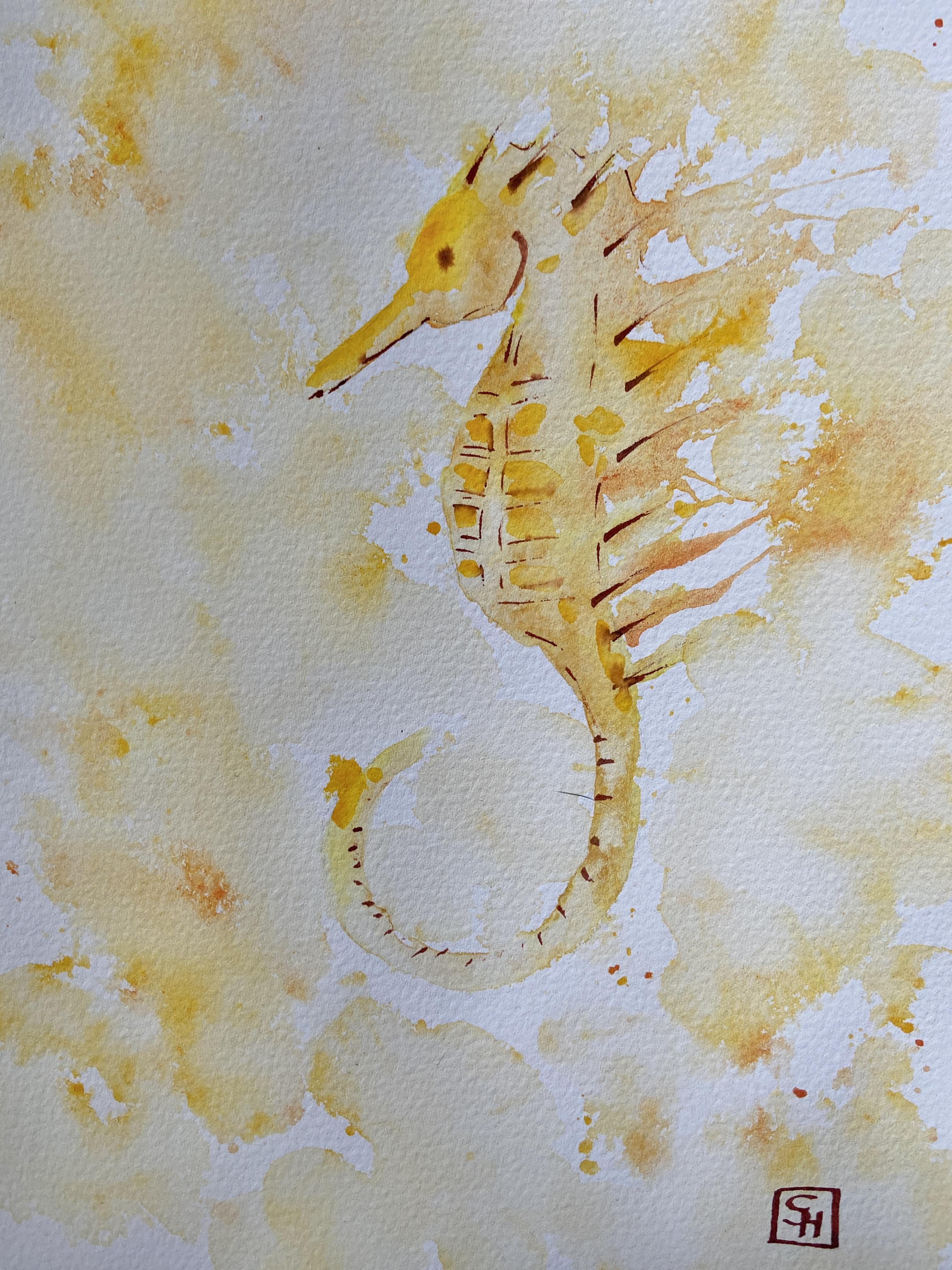
1. Seahorse Intro: Hi, I'm Sophie.
Today we're gonna do a refreshing free
flow seahorse All we'll need is some
watercolor paper, pencil and eraser, some ink. And of course the watercolor. You will also need a
little spray bottle with water for later on.
2. Seahorse Pt 1: Now let's start sketching
out a seahorse just from memory because - I mean
did a bunch of those, but I will provide you also a template in the
class resources. If you feel more comfortable
working with a reference. you want to make
sure when you're working with pencil marks that you make them rather
a little bit more light. Because otherwise because of the transparency of watercolor, you will see the pencil
marks through later on. So try and work
relatively light. You can also after
the pencil sketch, go over it again with an eraser in order to
have lighter lines. Before you go on top. With the watercolors. Think everybody has an idea what a seahorse looks like
approximately. It's a pretty simple
form overall. I'm just going to make
some indications of the overall form. You can always go online and look at just a couple of different
reference photos. This is the one you'll see most of the time. I will do one little
change though. Actually seahorse eyes, are very big and whenever
I paint them, I just feel like they, they look immediately cartoonish because
of the huge, huge eyes. So instead I just do a little
dot to indicate the eye, which I feel like what
works better for me. For the paper that
we're working on, make sure that you have a
proper watercolor paper, 300 grams per square meter. And pure cotton will definitely
get you better results, especially since we're working
with free flow techniques. You want to have paper that
doesn't buckle too easy, that holds water really well. So you can move the pigment
around on the page. You also want to make
sure that you have, maybe you want to make sure that you have one
where the sides are glued. That will also help you
that the watercolor paper is not going to buckle too much. Just indicating the tiny
little exoskeleton. So I know later on where I want to I want to put
in some shadows. Alright, I think I see this coming
together rather nicely. You don't have to have a
complete sketch either way, we can always add little details later on when
we go in with watercolor, and especially when we go back in with the ink to define
it a little bit more. I feel like our sketches
largely sufficient. So what we're going
to do next is we want to apply some just clean water. I want to have the entire
seahorse covered in water. But before we do that, I just go over with my with my kneaded eraser just to
get rid of some of these, some of these pencil lines so
we don't see them later on. And I go in with
some clear water. I think you can see just
with the papers shiny. I will have to go over
probably more than once because once
you place some water, you can see on top it's
already drying up. I want to make sure
that the entire seahorse, the whole motive, at the same time is covered in water and that
everything nice and wet. So the pigment can move freely. This is where we get the nicest effects of
the watercolors. I'm going to go over a
second time just to make sure there's no
little dry corners. Then it's time to
apply some watercolor. I decided to go with
a cadmium yellow because it's very vibrant. You can go with any
number of color also doesn't need to
be super realistic. You can go in with orange, you can go in with green,
you can go and blue. I choose the yellow
because I like it. It's very vibrant. But also when I go in
to define a little bit better afterwards and
to throw in some shadows. I'm going to go in with
an equally vibrant color, but a little bit darker. So I'm gonna go in
with the orange. You don't need to move your brush around on
the page a whole lot. I really just want to have the pigment applied
and then I want to move it free on the
water that we've applied. You see I can hold my
canvas just a little bit of an angle to make
sure that because of the gravity that pigment's
just going to flow downwards. And it's gonna give
us a nicer mix. I don't mind keeping some of the lighter areas
where the stomach is. Either way we're gonna go in with shadow in just a little bit. Gonna start applying
a little bit, a little bit of the orange. You see it's a little
bit watered down. It's not a very strong
color just yet. Just want to go in with
the exoskeleton. Just to define a little bit
of shadows are falling. We see that there's
a certain texture. There's a pattern on the belly where the
exoskeleton is. Then the curved tail as well. I'm going to go into
a little bit of a darker tone and add a little
bit more vibrancy as well. Because here we have, I want to have some
stronger shadows. You don't have to, you
can also just have one flat color applied of course. Especially if you want to
have it a little bit more cartoonish then of course you can always go a
little bit more flat. I want to start a
feather this out a little bit. Later, I'm going to apply
even more water so it blends in with the background. The paper's still wet. So when I apply
the darker color, it blends in very smoothly,
very naturally. Feather out the little spikes. Add a little more interest.
Also definition. Really want to set
apart this curve of the head a little bit more. I'm just going to
keep on building a little bit of a darker color. A little separation on
this is running down This also gives it
more three-dimensionality. You can see that
it's upper body is essentially a little
bit turn towards us. And I think it orientates the motive within
the space a little better than just a flat
side of the sea horse. Still a little bit stronger orange through building up a
little bit more interests, a little bit more definition. You see the more we add the more it kind of
pops off the page. Getting rid of some excess
water on my paper towel. I feel like it's a little bit coming off a little bit too
strong the separation. So I'm just going
to go in there and pick up a little
bit of the pigment, pick up a little
bit of moisture, and make sure that
it's not gonna get a super strong watermark. Now I'm just going to go in
there and I'm going to add a little bit of yellow and
orange and do some splattering. And you will see in
the second step, we will, we will go in with our water spray bottle and move the pigment around
on the page much more. Really speaks to watercolor
being a happy accident. So sometimes it's nice to give up a little bit of control and just have
something on the page. It's very spontaneous, it's
very natural. That is free. Adding a little bit
more of the orange as well, some more splatters. I don't want to get them
directly onto the seahorse, so try to not get too
much of the seahorse itself, just go all around it
and then I'm going to add the water with
my spray bottle. And you can see how
this immediately spreads the pigment
over the page, gives it a nice splatter. Don't be afraid to move the page around a little
bit if you need to. Now what I would
like to do is - I want the spikes to spread out. You see I'm going
to use a straw to just blow the pigment
across the page. There are a few things that you want to keep in
mind when you try this, what do I do
essentially is I place a large quantity
of both water and pigment right onto the edge. And where I blow the water, it's imperative that
the paper is dry. Because if the paper
is already too wet, it means it's just
going to not going to form these lines where you see the splatter
that is moving across the page in a directional away. It's just going to bleed into
and not be very defined. So make sure that the
rest of the papers is dry. And you just pose, you put a deposit of water and pigment right
up to the edge of the dry paper and then
you blow it across the page with the straw. You can see how
this just really, it's a watercolor motive in the water and
maritime topic like, I love it how those
splatters is just speaking to the topic of water
that we're covering here. Make sure you don't
get dizzy when you're blowing too
much with a straw. I should like to give
one strong burst. Like, don't go and
have a very soft and easy, you want to have one
strong blow that really pushes the pigment
across the paper. You could leave it at that. I want to have a
little bit most splatter around just so it
integrates more. I want to have a little
bit more watery, still, so I add a couple
more splatters, and I'm gonna go back
in with my spray bottle and have a little bit
more of the background happening. I'm tilting the page so I can move the pigment
around a little bit more. You can see it's really
quite wet and it's a little bit more deposits
of little little puddles. We can go in with a (paper) towel if
you don't want to have it. In these paddles,
what I'm gonna do instead is - I'm gonna go in there and add a little more water closer to the seahorse so it
doesn't look so separated. And going with more splatters. And I just want to distribute everything relatively equally. I don't want to have
the seahorse stand out too much. I really want this to be integrated a little bit
more with the background. Don't be afraid
to loose definition because we're going to
go back in with ink. I've chosen the colored ink, I'm going to go in with sepia, but you could just
do it with black. Black, of course,
it's going to be a little bit more stark. I want to make sure
here that I don't come too close to the splatters. I just made, because this
I want to have more defined. I want to have this splatters
quite, quite visible. We're going to have to let
this dry a little bit before we can go back in with the ink. I suggest you go get a cup
of tea, a little smoothie. I have a little break
while we let our paper dry and then we're gonna come back in and add a little
bit more definition.
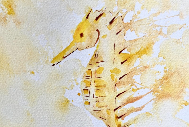
3. Seahorse Pt 2: Okay guys, here we are back. You see it has dried with also obviously
means watercolors, they dry a little bit more pale. It's not quite as
strong anymore. So I want to go back in
with my watercolors just to rework the lines that
got a little bit too fuzzy when I
applied all the water. Especially I want to have
this exoskeleton a little bit more defined because this also makes it look
like a seahorse. It's the significant head, the little tail,
the little spikes, but also the pattern on the belly I feel like
makes a big difference. So I really want to have it stand
out a little bit more. I don't worry too much about the tail because I feel like it's not necessarily my focal
point of the whole thing. I want to have more the upper
body, the head defined, and then I want the spikes to be sort of a bit of an eye catcher because it's
bleeding in with water. But they also get a little bit more paler as
we go away from the motive. Same goes for the tail. I go in with a fountain pen
that I've loaded up with ink. This ink for ones as
actually water-soluble. This is not waterproof ink, so that means if it comes
into a puddle of water, it will definitely bleed. Which I don't mind in this case because I feel like it just going to reinforce the
shadows I already laid down. What I wanna do here is I
want to go in and just cover the shadows and some detail to gain a little bit
more definition. And if it bleeds in a little bit
with the shadow areas, That's fine by my. Want to make sure
I have a couple of edges here for my exoskeleton. So you see that the motif itself becomes a little bit more clear without losing
this very free feeling, this very sort of natural watery feeling that we have here. Want to go in with relatively
strong strokes. I want this to be a bit more bold because the motif is kind of bold. I'm going to make it smaller because here
we have the continuation, essentially of what we've seen
on the belly of the seahorse. What do you see that
the tail usually - the little ripples, they get smaller
and smaller and smaller. So we also make the ripples on the tail bit smaller as well as the
distance between them. Really try and work out this exoskeleton over
here a little bit more. Trust is the little
squares essentially. So it's not
super-complicated to make. I want to have these spikes
a little bit clearer. I want to keep this nice
free-flow feeling to it. But I also wanted to be clear
that these are the spikes for the seahorse. Could be a bit longer these spikes. I'm gonna stick with a tiny eye. I'm telling
you when I do a big eye, it just looks so cartoonish it and it's just
not what I like. I like this to look... not super Looney Tunes - ish. There you have it. They
have a super refreshing, nice and easy, quick exercise
of a nice free-flow Seahorse. Don't forget to add
your signature. You can always go back in, maybe work in a little bit more splatters if you wanted
to - on the spikes, The painting is done
when you decide is done. This I hope was a fun
exercise for you. I love to see what you've
painted and which color you chose to came
up with this seahorse.
 Sophie Herbert