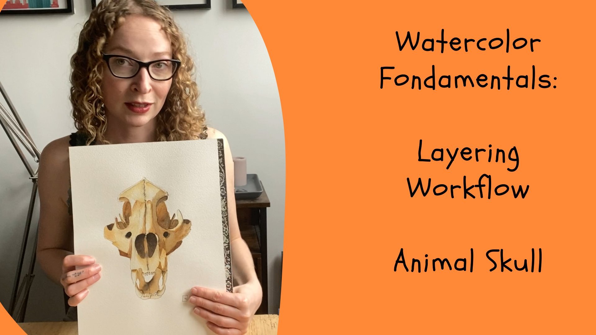
Transcripts
1. Intro: Hi, I'm Sophie, and I'm going to take you
urban sketching today. This is a class rather for beginners who are
not comfortable yet to be really in public and
get the sketchbooks out. So I thought the park
is going to be a really nice place to start. So let's get a sketchbook,
grab some material, and let's go urban sketching! Ok guys, we're now in the park Buttes Chaumont. So our goal is to find a nice shady spot in order to do
some urban sketching. The park is usually a little bit easier because
it's not as dense. It's less people, you don't have to sit right next to someone. That being said, usually
people are quite welcoming. They don't really
come up to you to look at your sketchbook
and to tell you that you suck Usually people
look at your sketchbook and say "Oh, this is so great
what you're doing. This is so nice, can I
have a look at this. But most of the time honestly, if people have
other things to do and they go about
their business. But I never had a
negative interaction while it was being
out sketching. But I think the park is probably the easiest spot to
give it a first try. As you can see I'm running around with a selfie stick.
No one is making a note of it. In Paris, the worst
touristy thing to do. Even me, I'm a little
bit embarrassed. Not about sitting there with
my sketchbook, but running around
with a selfie stick. Definitely a new
challenge for sure. So I already have in
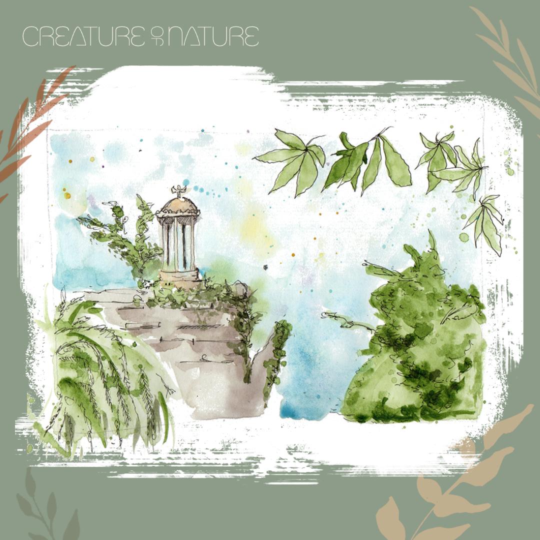
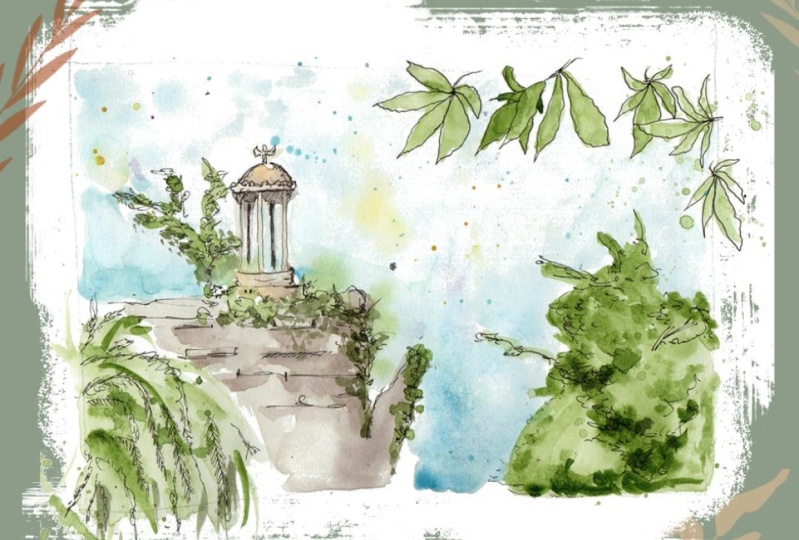
mind what I want to do. That behind me. Behind me is
the temple de Sybille right there. This is my favorite motive. I usually come here every couple of months to do a little
take on this one. That being said, we can
walk around a little bit, to get a couple of
different thumbnails and see if there's maybe a
more interesting motif. Especially since there's so much to choose from in terms
of flowers and other things, to round out the
design a little bit. We're gonna do a couple of thumbnails before we decide on what we
really want to do. Then when we pick
one, we gonna sit down to actually do
with sketching session, which doesn't have to be super, super long. Let's say at
least for 15 min. And the goal is to do the color while we're outside,
to do the color while we're in the park. But I will do a second run, For those of you who
would rather maybe take your work home and only
do an inch sketch in the park and finish
up with color when you're at home in your studio.
That being said, the interest of being outside
and doing it in the moment, it really gives you
a more vibrant, more lively impression, is very spontaneous and
has lot more character. This is why I like this so much. This is also why ultimately, people do open air painting, especially when you think
back about the impressionists. Painting outside to really try and catch the color
in a very moment. It's very fleeting. It's never going to be perfect and it's only going to be a
representation of a moment. So just take this
opportunity to take a little more freedom
in your art and fill your sketchbook with
something that is lively and not sitting at
your desk with a photo.
2. Tumbnails: What's very important when
you're sketching outside is, to remember it's really
hot or really cold, depending on when you do it. Do think about your environment, bring something to
cover your head. A hat e.g. or a cap, a baseball
cap, to bring some sunscreen. I usually like to sit
down where you have a little bit of shade but do keep in mind as you're painting, the sun might turn. It
might change or a little bit. So do keep that in mind
when you're picking a spot. Of course, when you're painting somewhere where
it's pretty cold, it's probably better
if you have a cafe or somewhere where you can get
something hot to drink, maybe some gloves where you can
cut the fingertips off. So I have a little
bit more mobility. But ... just try to bring
enough water for you. Stay in the shade. Probably still going to get
burnt a little bit though. I have to say
this happens to me all the time. Always tell myself I'm not going to sunburnt like an idiot. A then I'm getting sunburnt like
an idiot, but that's okay. I'm just very pale. As an added bonus : kind of a workout at the same time. This park is all uphill. But honestly, it's
refreshing to get out of the studio and the office every
once in a while. And actually be in the sun.
What are we feeling about the pink Flamingo? Original
cafe bar bistro. I think it's really cute.
Especially with the Flamingos on top and the colourful parasols. I think that would
be a nice spot to do a first thumbnail
sketch and then decide on whether
or not we want to continue with this one or one of the other
ones we've seen. Ok so, time to get
your sketchbook out. This is more of a
multimedia sketchbook that's good with ink. So I do sometimes use
watercolor on it, but very often I just
stick with ink instead. Let's just do a quick thumbnail maybe. Let's say we want to do maybe six different
thumbnail sketches. Before we decide on what
we're gonna do as the motif today. Let's just come up
with a couple of frames. And the idea is just
to have an idea of the proportions of the objects that we're
going to put in the frame. Don't spend more
than like 2 min on this because really
the idea is just have a general idea of how the sketches is built
and whether or not this composition
interests us or not. We already got two out
of our six thumbnails. I just did this one with
a very thin ink liner, which I usually
prefer and almost never have pencil on me. I like sketching
directly into ink because I feel like if
you have to commit more. Pencil can be quite precise. This one was just not
very well prepared, but it's also because
I never use pencil. But I believe with the inkline, you just have to engage stronger because
you have to commit to the stroke that
you're making. Kinda like how it turned out. I've only been marking
out with the dots: The top of the temple, the bottom of the tempo and where the pillar
is gonna be later. That just gives me a little idea of..if the setting is
approximately right. Or if I want to position
it differently, maybe I wanted to do it smaller. I feel like it could
be the bit smaller. There's very little time
left for the cliff. So I want to keep
the same height. We're going to do it a little bit smaller. Then I'm going to have enough
space for my cliff as well. Again, these are thumbnails. The whole idea is to not
spend a lot of time on this. So half a minute, 2 min, but not an extraordinary amount of time. So looking at those - There are some
that I like and others I like little
bit less. This I feel like... it's too cluttered. So I'm not gonna
go with this one. This one too. I quite like this
one, but my idea was to do something
with the talk today. So I want to really
stick with the park. And maybe I'm going to
note this one for a little bit later. I kinda like the one with the two women having a picnic by
the, by the lake side. But I feel like this
would be more suited as a sort of skeleton for a real
painting in watercolor. Not so much for just an
urban sketch that we want to do here. So I really like... And I already told
you that I do have, I do have a little bit of a passion for this
temple of Sybille. I do like both of
these. I'm uncertain which one to choose to be
quite honest. I like that this one is a little
bit more framed with the greenery that was around it. And it has like a nice
amount of negative space, which I think makes for
much cleaner scenery. I quite like this one. I have been doing it a
bunch of times though. So maybe it would be interesting to actually choose
a different one. And this one, knowing that
this is on the other side of the lake - will also allow me to actually be more comfortable because I'm
gonna be able to be in the shadow and have a good
view onto the motif.
3. Ink Sketch: Okay guys, that's
already much better, no longer in the sun. I'm going to start with making now a little
bit of a sketch. I use these clamps now to
just fixate with page. It doesn't move
around all the time. Have here my brushes, my spray bottle with water, some paper, towel, my palette. I'm going to start out
scratching an ink. You don't have to do it. You can go in straight with
watercolor if you wanted to. But this being more
of a beginners class. And I would like the
first couple times I did just everything and ink outline and then painted
everything at home. If you do plan to
put on some color, you can just use outlines for the darkest parts and then
work the rest of color. If you do plan to do every
everything kinda at home, it's going to have
the outlines already, already prepared or
you can take a photo. Of course. If we go back
to our little sketch. Oh, a thumbnail sketch. This is the one we are on. This powered approximately
of the page. The should go from here to here. The tempo here, till
here, the top here. And the restaurant
relatively free afterwards. To set how we want
to have our greenery now a trees and branches. To give it a little more
of a 3D perspective. I also recommend to set
boundaries for your sketch. This is actually
the only, the only time I'm going to use pencil. If you are going straight
in with watercolor. You can also just use a tape, because you will probably
need the tape in order to keep the pages from warping. Alright. Let's stop with maybe
the most important thing and then we'll be
out of the temple. I haven't said, alright, another sort of edge here. I like to use broken
lines because from this far away
we don't really see all, all of the detail. Some, some sort of a cross at some top could be
cross-compile angel. In some of it is actually
even covered greenery when we have a
decorative border on it, sorry for the
French term around. And then we have some columns, 1234566 columns that
go all the way around. So there's some that are closer to us and there's some that
are a little further away. Pedestal. The board do as actually going over the edge, over the edge a little bit more. Then we have sort of tree branches shouldn't be
super visible afterwards. This is just to give
us a little bit of an idea of where we want to group little more
of the greenery. Maybe if we're lucky,
there's gonna be a little bit more
pupil so we can get an idea of the size
a little bit better. Usually there's
always people there, but they're doing some some
renovation works right now. And see, this is just
a scribbly line, so this is just my bad
handwriting pretty much. We have a couple of greenery and grasp things
sticking out over here. Then we have a boundary, border around the edge and click a couple
of more stairs. Actually. You can. This green sort of sticking out over
the edge over here. Then we just have these layers. Why do we have this
peculiar layers in this particular stones? Because it used to
be Stone line here. They used to dig for
Gibson and other things. And this is where we have these strange geometrical
shapes in this rock. So far I do want to get this little sticking out rock here, the different stick out
Brooklyn we've seen from them, from the other side.
They all around. And actually all of this isn't shadow up to you if you want to just
reinforce your ink lines. If you want to emphasize
the shadow more in the camera directly,
completely up to you. Then we have a couple of weeping willow and it's here actually
that is close to us. And here we have a
different kind of tree. Looks like a chestnut tree. For the chestnut tree,
what interests me more? Just general. The volume of it. So it can help us. Putting everything a little
bit more inches perspective. I like to lower edges. It a little bit more emphasis. Filled out a little bit more. It's a couple of
branches sticking out, a couple of branches
even on the inside. And there's a secondary
right behind it. And I'm just gonna
make a little bit less for less detail than
what color in any ways. Maybe there's another
thing we could do it sitting right on
the chestnut tree. I think it could be
interesting to have these really big leaves up top. She go over the edge. It's not a worry at all. Even think it gives it a
little bit more character. There is a belief you can
just fill out the fur color. We don't need to put in
every single detail here. So how do we do at a
couple of big leaves? Thank you. There you go. That
is the sketch, but other kinda just an ink. But now, step one.
4. Watercolour: Next step of the color. I recommend trying to use a bigger brush than you
think you would need. The idea here is not to
catch every single detail, make it larger than life, incredibly, incredibly
fine and details. The idea is how to be an urban sketch to get a
rough idea of free quickly. Get a feel for the light of the place and the
space and volumes. If you're having, having a paper that is more watercolors suited than the
multimedia paper, you can wet down
the entire page. Of course, on this case, I'm just going to
actually spray my colors. I activate the
colors a little bit. And then I'm going to use the
little bottle with a brush. That's my water has unlocked. I'm lucky enough that
here in the pocket has an extra fountain. But you wanna make
sure wherever you are that you either
have enough water with you or that you can
refill border if needed. I like to start with this guy. This is actually
going to be a section that I'm going to
wet down first. Multimedia paper
dries much quicker. And I felt that paper because of its smooth surface
is not the little, the texture that keeps the war ended or as
little pebbles or people. You need to work much quicker. It's really, you just
have a couple of seconds to get this,
to get this going. I'm just going to dab it yet. And what if I want to have the impression of
having some clouds? I will not cover certain
areas of the paper. As we get closer to the ground, I like to add a little
bit more pigment. If you want to have clouds
leave out a little bit more, I would apply a little bit
less pigment on the top and add more pigment as we're getting
closer to the ground. Then forget that since e.g. like me, you're sitting on the ground and you have the
sketchbook on your lap. The angle will also make
the pigment flow down. Don't forget about
this. This part. I want to get a little
bit of the blue also in-between the leaves. But I'm probably going
to do it every time at the end of every
girl with a brush. So as I go, you can see that
there's less and less pigment and less
water on the brush. So because the leaves are
all the way on the top, I would rather use a
teeny little bit of rest. And having a too much, I
might even just gotten with a little bit more
water to thin it out. But I don't want it to be
completely disconnected. It needs to feel like it's still part of the same painting
at the end of the day. Okay. Now, is still your chance to throw in if you want to
have any effects of it. I like yellow and pink is
little droplets in the sky. I've no idea why. I cannot tell you why I liked this so much. I just really think it gives
it a nice happy feelings. You don't have to. You can just have
one that's fine. To keep in mind that the border colors
will dry a little bit lighter than they are on
the page today, right now. And they will be dry today hopefully. But do
keep that in mind. Okay, next, I'm going to do areas that don't
directly touch the blue. I'm going to do this little area over here with the,
with the tree. I'm going to take
a lighter green and use more water for now. And then in the second one, I might apply a little
bit more pigment on areas that I would like
to highlight bit more. You can also make these
little these little trends. So the inks trends are not the only strength of this tree. It's advisable to go
back and at the end of it and add a couple
more details. I'm also going to start
with this tree already, even though it touches the blue. Now I'm going to make sure
to keep a little bit of a distance to the edge itself. But the only area that's still
very wet, it's down here. All the other areas
will already be dry because as I said, the multimedia paper, it doesn't hold water
for a very long time. It does dry quite quickly. It's an advantage and
disadvantage you can. You can go and you have
to go and quite quickly. But it also means you don't
have to wait for ages and ages to apply your next layer. The green on the bottom
left is already dry, so I'm gonna go and
get another time. That even more little trends might actually go over some
of the instruments as well. This one was a bit much so. Now is the time for
the paper towel. The water. Again, it's a watercolor paper. So pigment is not
going to lift off the paper as easily as it would
for the watercolor paper. The top of this
guy should be dry. You see it's a really
quick process. Didn't have to wet everything. Now, Nick, if you feel
like you just want to go in straight with the brush, wet on dry, go for it. I like to always
apply a little bit of water for the error
that I'm working on, even if it's a multimedia paper. Just feels more than mimic. Should go in a second time to define which leaves on top of which leaf is going to give it a little
bit more, more volume. Set us up a little bit
better in this space. E.g. this one I want to be
on the bottom. This one. You should have
some backup kinda want to fix up just the edge. Now that's a little
bit more dry. There's this danger of leaving
straight into the blue. Then we're going to still
add some darker greens. Maybe even dab, a
little bit of niches. Break up the nine law.
It wouldn't actually. Okay. Time for the stone. Kinda wanna give
him one base color and then go in and
define the darker tone. Gonna do have a bit
more of a gray, grayish color to it. Good. Earth tones. I still have the
little mix of maple, yellow and then sienna. And I'm just going to
throw in a little bit of a blue color so I can get more of a tone down
grayish brown. Welcome to overpower
everything too much. I can put the darker one. Just go in and define
without shadows anymore. Especially that all of this area here is actually
in the stripping. The shadow will
become much more P&L. Still want to be more, still want to get a bit
more dark tones in here. So all of the sides much darker. And then of course
we had the temple. The temple actually is not
that much brighter than, than the stone around it, but I want it to be a focal point. I'm going to try and apply it very gently and then it
would have been finished. And they would have
Naples yellow. And then we can go back in with a gray mix just to tone it down a little bit
where the shadows would be. C. We also have to edit a bit
of sky in the middle there. But because this is
the main focal point, the main point of
attention, the main object, no creation here. I wanted to, just to notice something
that's very hopeful, positive and a lighter color. I don't want it to be cited in gray in this
particular instance, if I was going to make a moody
composition, they may yes. Add a little bit. Shadow side. You see the seven didn't
wait for it to dry. I just wanted to blend in a
bit more with maple yellow. Just so the Naples yellow
isn't quite as strong. Since this ball on top of the other elements like to add a little bit more
shadow here as well. And underneath should
be actually quite dark. I'm going to add just a
teeny bit more neutral tint to my next mixing height, or we go, There we go. Can give this just a
couple of seconds. When I fly this guy, I don't actually want to mix
in with the Naples yellow. Want to wait for this one to
be a little bit more dry. But for the rest. Since I'm such a fan of the big splatters and might already applied a
couple of most Plato's, especially for the greenery. Cover the wrist, that
doesn't get everywhere. They also want to
try and direct it. This one I want to swoop
down really quickly. Here we go. Now it's not going to mix with this guy and
these droplets, we're going to stand
out a little bit more. But I love it because
it's so bright, fun. Just wonder about this
a little bit too big. So it's quite dramatic. The motoric they wanted up. I'm trying lifted, It's going to blend in a little bit more, maybe a little bit more water with a little bit too dramatic there. But I love this button. Again, note quite gently with a lot of water, that
was not enough water, but we want to try it
and add this guy Lou, behind the little pencil and add a little bit more
sky blue, round. Just have to add a teeny
bit more greenery. We're good here. So you want to play a little
bit more where there's darker tones,
especially in here. When grandma and there you go. There's our sketch.
5. Thank you!: I hope you had fun
and that you learned something during our class. Don't forget to leave a review and to post your class project. I would love to
see what you did. I will add a little add-on
class for you on how to present your
work on social media. So see you soon and
thanks for stopping by.
 Sophie Herbert