Transcripts
1. Intro: Welcome to the course!: Whenever I see a
colorful sunset, a person with stories
in their eyes, or a garden full of flowers. I feel inspired to create. Mother Nature is always
in creation mode. And what I witnessed
her doing her thing, I reminded of the creator
within myself as well. My name is Maya. I'm an artist and entrepreneur. I've sold thousands
of prints, stickers, and custom pieces
of artwork all over the US and all using
Procreate on my iPad. Today, I'm going to take you through the
step-by-step process I use to create my most
popular surreal portraits. These pieces combined elements
of the natural world in surprising ways to create beautiful conversations
starting pieces. Whether you're a seasoned
artist or you're new to your art practice
and you're not even sure if you want to call
yourself an artist yet. This class has something
valuable for you. You in the back,
you are an artist. Yes. You all that you need to complete this class
and the project, or an iPad and Apple
Pencil and procreate. I also recommend
using sergeants oils. This is a downloadable
Procreate specific brush pack. I use sergeants oils for everything that I make
and it's about $9, but it's also totally
fine if you want to use the oil brushes that
come with procreate. You can find these in
the painting section. We'll start out by choosing reference photos to combine
into a unique composition. And I'll share
exactly where I find beautiful and interesting photos that really make the work pop. Then I'll walk you
through my process to compose your work
using Procreate. Next, we'll create value
studies and a sketch together. Then we'll get into the step-by-step process of creating the digital painting
from start to finish. I'll show you exactly how
I combine tried and true traditional painting
techniques with the efficiency and
accessibility of Procreate. I'll break everything up into short videos so it's
easy to follow along. Feel free to pause the
videos at anytime. Also, ask questions
in the discussion. I read and respond to every comment and I would
love to hear from you. Also follow me on
Skillshare and you'll be the first to know about new
classes that I released. Thank you for taking this
time to create with me and to invest in yourself and
in your creative practice. Let's get to it
2. Lesson 1: Choose reference photos: So the process
starts before we sit down to create our painting by choosing reference
photos I like to do is just regularly
browse Instagram, Pinterest, Behance,
and Unsplash. And I'll save compelling
photos that I think I might want to create
based off of later. That way, when I'm
in a creative mood, I can just go to where
I've stored these photos and pick something out
and get to creating. I made a class
resource that contains a list of my favorite places
to find reference photos. So if you're not
sure where to start, check that out in the
resources section. To create our portrait today, we're going to choose
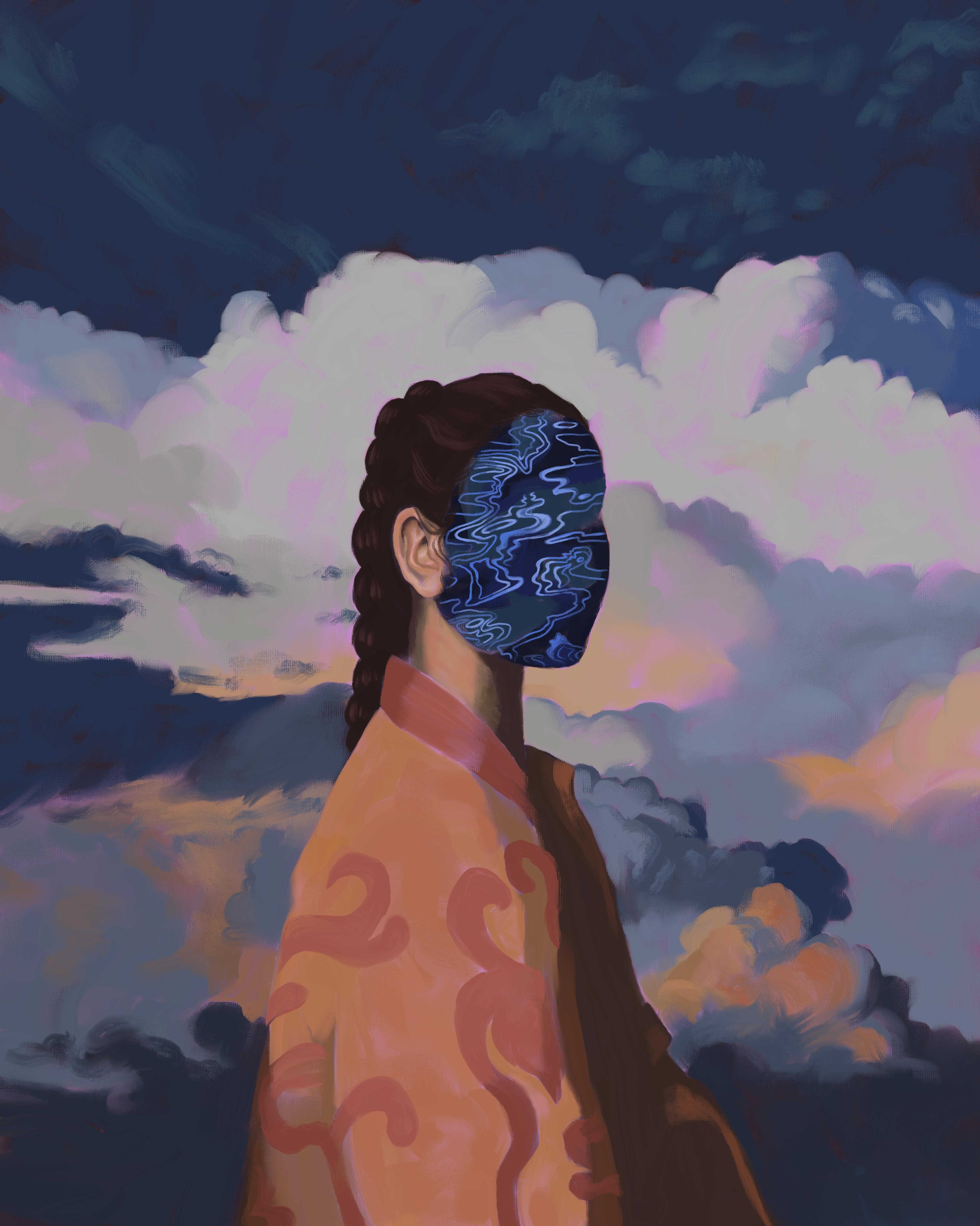
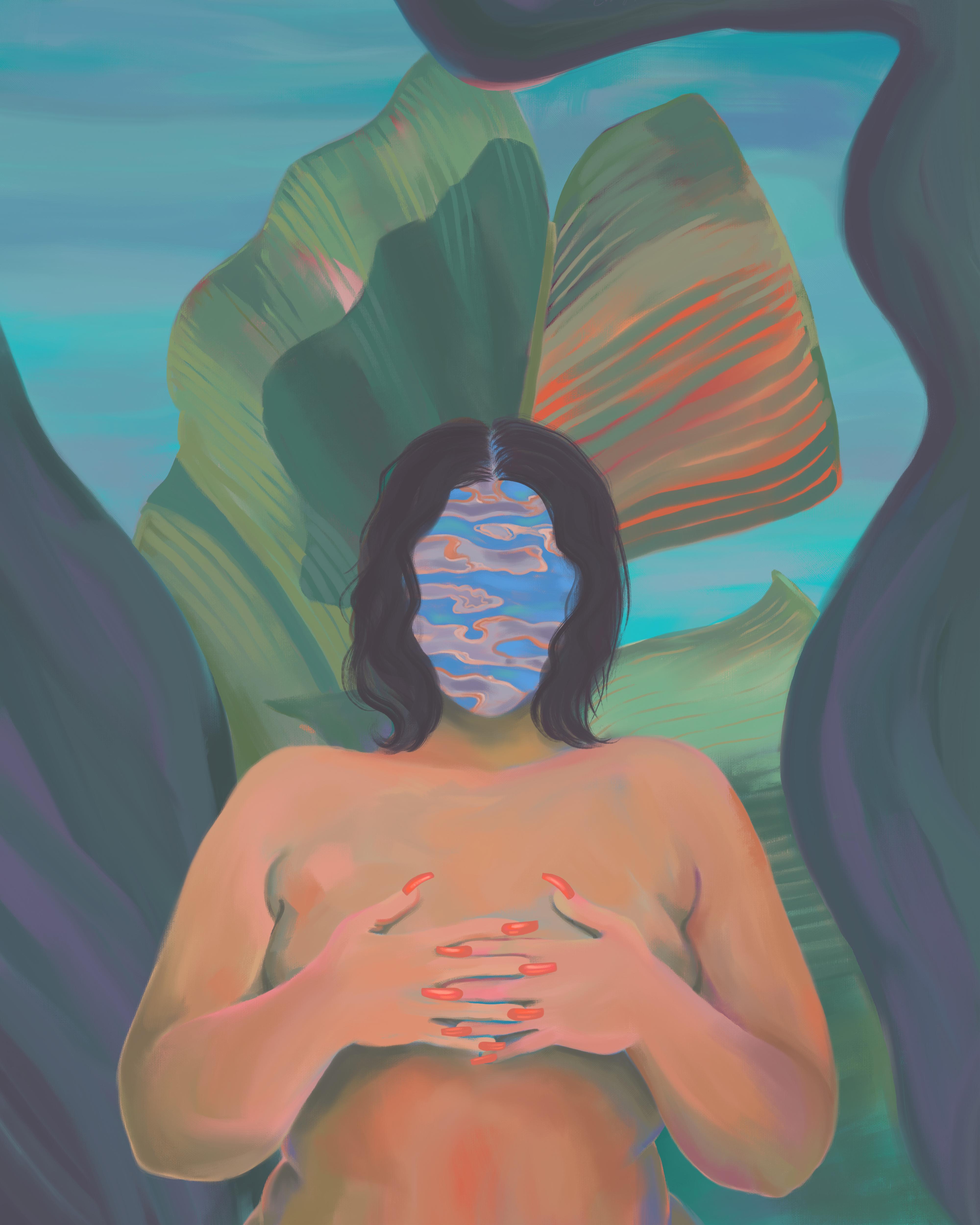
three reference photos. The first will be a portrait, the second, a natural texture. I really like to use water, reflection textures,
so I recommend that, but it doesn't have to be water. And we're also going to choose
a photo of a background. Ultimately, we're
going to combine these three elements to
make a unique composition. Some things to keep in mind as you're choosing your photos. I recommend keeping each
photo relatively simple. It can be tempting to choose
something really elaborate, but with combining
three reference photos, you're already
going to have a lot of details to work with. I also recommend that you choose a few options for
the background and textures so that you can
play with them and see what you ultimately like and
what works well together. And finally, trust
your intuition if a photo is speaking to you, if it strikes you as
interesting or compelling, go with that one, you don't
have to overthink this. So once you've found
your photos, screenshot, or download each of
them to your iPad. And in the next lesson, we will use parts of each
photo to compose our painting
3. Lesson 2: Compose your piece: Okay, y'all, now that you have chosen your
reference photos, bringing a compose
your painting. So open, Procreate. And we're going to
create a new canvas. Click the plus button in the
upper right-hand corner and choose the size that you
already have or create a new canvas by clicking
this button here. I'm going to create
a canvas is 4,000 pixels by 5,000 pixels. The DPI is 300. So this will allow for high-quality printing off to
a pretty good size print. If I do happen to want
to make a print of it, and it gives me 22 layers. So that's a lot of
layers to work with. This is this canvas size that I really liked
for portraits. But feel free to choose
whatever size you want. Click Create. And we have our new canvas. So to compose our painting, we're going to start
by importing all of the reference photos
that you've chosen. To do that, click the wrench icon in the
upper left-hand corner. And click, Add. Click, insert a file or a photo, depending on where you have them saved, mine are in a file. And I'm just going to import
everything that I chose. So we're going to start
with the portrait. I'm going to click on the
layer of this and just toggle the visibility off
by unchecking this box. And I'm going to input
my other photos. So this is the
texture that I chose. I love water
reflection textures. I just think they're gorgeous. Know to water reflections
are the same. I really liked the
colors as well. So for backgrounds, I
have three contenders. This one I think is so dreamy. I love the colors. It kinda looks like a flow
of lava through the sky. So I thought that was cool. I think this one is interesting because I really liked
the color palette. We have this blue
that's dark and soft, but it's decently saturated too. So I really like this
blue, I like these, how it contrasts with these
little pops of orange. Then finally we have this one. I love a dramatic sunset cloud, and this is pretty much as dramatic as
sunset clouds gets. So I'm going to start by toggling the visibility
for the portrait. We're going to start here. So what I want in my final
composition is just the woman. And I'm going to
erase everything else that I don't want in
the final composition. So to do this, I'm going
to select an eraser. I'm going to use
sergeants oils and the flat brushes Angular, so it kinda helps me get
in these smaller spaces. That's why I'm choosing it. And I'm going to
take the brush size down pretty small because I'm going to be erasing details around her
face and in her hair. I'm going to select the layer
of the portrait and get to it a little too big. So what I've just done there is I've undone my brushstroke. If you don't know already, you can use two fingers to tap to undo whatever
you've just done. Feel free to be really
meticulous with this process if you want or just give yourself a
general idea of what you what you want to
paint based off of. I am not that meticulous. As you can see, there's
some small gaps here because I just want to
get a general sense of the shapes and the light that I can base my painting off of. But it's really up to you. If you want this
to look perfect, feel free to take the time
and do that. Also a pro tip. If you know how to use Photoshop and you have access to it, you can also do this step in
Photoshop a little quicker, but procreate works great too. And speaking of the Undo button, I did undo that erased stroke. That was absolutely not where I needed it
to be, but overall, to achieve a painterly
look in digital media, one of the best techniques
I've discovered is to keep as many
mistakes as possible. In traditional
painting, obviously, painters can just hit
an undo button so they incorporate mistakes into the finished piece
in creative ways. And this is actually one of the reasons that painting
is can look beautiful. Not all mistakes
are created equal. And of course sometimes it makes sense to use the undo button, but just use it as
sparingly as possible. And whenever you can
incorporate mistakes in a creative way or just let them mistakes
shine through. Honestly. I do think that painting is a metaphor for
life and a lot of ways. And one of those metaphors is that the mistakes plus all of the other brushstrokes
really do make both paintings and us beautiful,
interesting and unique. So work with your mistakes. Mistakes can be beautiful. I know it sounds cheesy,
but it's really true. Okay, so now that I use a smaller brush to erase
around the subject, I'm going to use a
bigger brush just to speed up the process of
erasing the rest of the photo. So we have now isolated
our portrait subject, which allows us to place them
in an entirely new setting. Next, I'm going to
incorporate my water texture. So how I'm going to use
this texture is I am going to cover the face
of the subject. I do this for a few reasons. Mainly I just think
it looks cool. I think it makes them look like a otherworldly goddess alien. It also by obscuring the face, makes us subject more universal. So feel free to use
your texture and cover your portrait subjects face or cover a different part
of the portrait subject. It's really up to you. There are no rules here. I'm going to select my texture and I'm going to
decrease the opacity. To do that, select the layer and use two fingers
to tap on the layer. This brings up an
opacity slider here. So you can just drag your
finger from left to right. As you can see. My hands in the way.
As you can see, it decreases and
increases the opacity. So I want this to be opaque enough that I can see
the water texture, but I'm going to use this to position the water
texture over the face. So I also want to be
able to see the face. So this is pretty good for me. Now I'm going to use
the arrow tool to move the texture around until I've found the placement that I like. So now that I have
the water texture, a place where I want, I'm going to erase the
parts that I don't need. A way to speed up this process
is to use a clipping mask. So open up your layers. Make sure that your
water texture layer is immediately above
the Portrait Layer. And click on the
water texture layer. This menu will come up and
you can click clipping mask. So this kind of takes out
some of the hard work for us. I'm gonna go ahead and manually erase around the parts
that I don't want, but we've already had this part. The curve of the face done
for us, which is nice. Tea break. Okay, lovely. So I'm liking
how this is looking. She is ready for
a background now. So I don't know which Becker and I'm going
to choose quite yet. I'm going to test them
out one at a time. I'm going to just move
these behind the subject. First. We're going
to try this one. I'm going to make it visible
by toggling the visibility. I'm going to adjust
the size of the photo. So that wrong layer. I'm going to select
the correct layer. Then using the arrow, I'm going to adjust
the size of the photo. So this is a really
gorgeous background. I'm liking how the orange
and blue go along with the orange and blue of
the subject and the face But this background
is so dramatic, I'm concerned it
might detract from the focus of the
attention which I really want to be
on this subject. Okay, this one needs
to be adjusted. So I'm really liking the clouds are dramatic
but not so much so that it's really
detracting from the subject of the portrait. I'm just going to test out
which placement I like. Honestly can't really go wrong. Okay. I like this placement here, so I'm going to toggle out
of the selection mode. This is gorgeous. I really like how
the blue goes with the blue of the of
the water reflection. And I like how it has a little orange which
goes with her jacket too. But it's not so much that it would distract too much from the focus
of the painting. Let's give the third one a try. Okay, So this is gorgeous. It kind of looks
like a dream world, which I'm always a big fan of. I think that I like
the second image most. So I'm gonna go with this one. So go ahead and bring your
composition up to this place. Feel free to pause the
video if you need to. And once your
composition is already, you feel happy with it. We're going to export this file. So to do that, click
the wrench icon. Click Share, and JPEG is fine. I'm just going to
save it to my iPad. Save Image. Beautiful. So now that we've
saved the image, we don't need these
photos anymore. I'm gonna go ahead and just
remove them because I like my layers to be as D
cluttered as possible. So to delete layers, swipe left, and
just click Delete. Then we're going to bring
the reference photo into the reference window
of Procreate. Click the wrench icon. Click Canvas. And with reference here,
toggle Reference on. It defaults to just showing a miniature
version of the Canvas. We're going to choose
image and import image. So I really liked this
reference photo feature. You can move it around as you're working on your finished piece. And now we're all ready to go. So go ahead and bring your reference photo
into the reference pain, and I will see you
in the next lesson.
4. Lesson 3: Create value studies: Okay, y'all, the next step of the process is to
complete value studies. And for those of you who
are not familiar with value, hue and saturation, I'm going to quickly go over the definition of these terms because they will
really help take your creation to the next level. If you already are
familiar with this, feel free to skip this section. So hue, saturation,
and value are all different aspects of the paint that we are going to choose. Paint. It's important to understand
the difference between each. Okay, so we're going to
be talking about hue. We're talking about the color. Hue is often used interchangeably
with the word color. So when we change the hue,
we changed the color. So this hue is red. This hue is yellow. Maybe more like golden rod. This hue is teal. And this is a nice violet. When we talk about saturation, we're talking about
the intensity of the pigment, of the color. I'm going to stick
with this purple and I'm going to adjust
the saturation. You can do that in
this color wheel. I'm gonna go ahead and go to the value section to show
this really clearly. So up here, you can
adjust the hue. Saturation takes you from gray all the way up to the most purple
you can possibly get. So I'll just show you
how this changes. This is D saturated. I'm increasing the
saturation as I go along. Even more saturated. So I'm not changing the queue, the hue, rather I'm just
changing the saturation. And then finally we have value, which is the darkness or brightness of the
color that we're using. So if we're sticking with
the same hue, purple. So value is referred
to as this B slider, which I believe
stands for brightness in Procreate. It's
the same thing. You can use it interchangeably. So when we're all the way over toward the darkest extreme, you're going to get black. As you increase the value. You increase the light that
is present in your color. Okay, So this is just a
really simple overview. Basically, we're
now gonna go into value studies where
we just look at the value of what we're
creating because this will really help us simplify
our painting process. Once we've figured
out how we want the values to look in
our final painting. That enables us to just focus on saturation and hue when we're actually creating
the final painting. So let's go back to our canvas. And what I like to do is
create two value studies. I'm gonna do one value study where I'm referring
to my reference. And I am going to divide
up the reference photo into simply dark and light. Obviously, there's
a lot of values that are in-between here, but it's really going to help
us with our final painting to reduce the complexity and simplify this to just
darken light at this stage. This value study should take
you about five-minutes. And I like to use my
favorite Procreate pencil, which is eagle hawk. It's under drawing, but you
can use a brush if you want. I'm just going to use black. I'm gonna make this
relatively large. Don't worry too much about
being terribly accurate here. I'm going to just start with
these clouds down here. These are dark. This front part. It's kinda dark as well. Just going to fill in the
figure really roughly She's got an ear right there. The hair is obviously
dark, dark, bright here. So this is not going to be
in your final painting. It's just to prepare you. Really, this is just dark here. Let me don't want
any nuance right now we want to either
dark or light. I'm gonna go ahead and simplify
part of the phase two. We have a dark
stripe right here. Then we have a lighter section. We have another dark stripe with a little glowy section
just on the chin. I'm going to simplify
this down, up here. Okay, great. So this is
much oversimplified. Obviously, there's a
lot of medium values, but this is what we want here. So go ahead and bring your first value study
up to this point. Don't spend too long on it. Set a five-minute timer. If you tend to be a bit
of a perfectionist. And once you're ready, we are going to label
this as value study one. Just to keep things organized. I didn't know, I always keep my layers organized
to be honest. But it's a best practice and I am grateful to myself when I do. So we're going to
practice today. Okay, so now that
we have finished with our first value study, we are going to do a second. This one's also just going
to take five-minutes. Making a new layer for this. I'm going to rename it this value study. We're going to add in
another dimension of nuance. So this time we're going to just divide
this up into dark, medium and light values. So again, it's really going
to be oversimplified still. But we're adding in a
little nuance here. So what I'm doing right
now is I'm going to put in the darkest values. And after that I'm going to
add in media and values. Okay, so I've added
in all of my dark, dark values and now I'm going to add in some medium values. So in my color wheel, I am going to increase the value of the paint
I'm working with. You can use a color
here or gray. I'm actually going to use gray. And I'm going to add in
those medium values. One thing you can do if it's difficult for you
to determine what is dark and waves light is
used the squint test. So just squint your eyes. And the photo will reduce in complexity because you're blocking out
some of the light. So that can help you see more of a simplistic binary between dark and light values. So this is still obviously
very simplified, but this is pretty much there. See if there's anywhere. So at this point, you can see value wise how your composition
is looking so far. I liked that mine is mostly either light values
or dark values. I think it's striking and I am going to
stick pretty closely to choosing values in May and peace that are similar to these values that
I've made here. You may find that you really don't like how the
values are looking. Sometimes if there's
too much alternation between light and dark
and medium values, it can look a little bit
muddy or just messy. So you may choose
to use dark values where in the reference
photo they would maybe be more medium just to simplify
things when in doubt, err on the side of
simplification. Okay, you all, so we've
done our value studies, bring your second value
study up to completion, and then we'll be ready
for the next lesson, which is creating our sketch
5. Lesson 4: Sketch your piece: Okay, so now that we have
made our values studies, we're going to create a
sketch that will serve as a guide for our
finished painting. The goal here is to
define important shapes. Seasoned artists, this may be a breeze for you if you
have a sketching practice. If you're new at sketching
or especially at sketching, people just remember to be
really kind to yourself. It is more difficult
than it looks. I have been drawing
people for years and I still create ugly
sketches regularly. Maybe today you will get to
see one of my ugly sketches. We will see you.
But it's all good. Either way. Feel free to redo your sketch
as many times as you need. So I'm just going to
refer to the reference. You can tap this to make
these extra bars go away. I'm going to get
started on my sketch. Don't know why I
decided to sing that, but it just felt right with my style. I like to be semi realistic, but I'm really not interested
in being photorealistic. It's totally is a
stylistic choice. You might be the type
of person who wants it to look exactly like
the reference photo. That's cool. It's also cool to be more
loose in your approach. It's really up to what
you feel is best. So I'm going to take inspiration
from this cool design, but I'm really not going
to worry too much about it being accurate or being the
exact same as this design. Would love a jacket like this. Wonder where she got it. So here I don't want to
sketch out every single line. I'm just going to do the
larger shapes as guidelines. And then later when I'm actually creating
the finished piece, I will put in all
these little details. If you want to be really exact, you might want to sketch
out all the little details right now before you
get into painting. But for me I just want
some placeholders. So I have guidelines on where
to put my digital paint. I think clouds are so beautiful. I put them in like 70% of
my paintings these days. Maybe I'll get tired
of them at some point, but they're like snowflakes, like no cloud is the same there. So inviting. Like I've
always wanted to just hop up into the Cloud and sit there. Or like taken up better yet. Haven't figured out how to yet. But maybe one of these days. I love how this tag
cloud is kind of blocky. Clouds are usually so
fluffy but they have range. Cool, cool, cool. Okay, I like how this
is looking over all. Don't need this. Okay girl, so my
sketch is finished. It's pretty rough,
but it's a map to help me know where to
put down my paint. So go ahead and take
your sketch up to a point where you feel like the shapes are where
you want them to be. All of the elements are
harmonious to your liking. And I will see you in the
next lesson where we will start putting some pixelated
paint on our Canvas.
6. Lesson 5: Block in dark values: Okay, So our sketch
is looking beautiful. It's ready to go, and now we're ready to start
doing some digital painting. I do want to mention that
I took a little break after creating my sketch
in a modified it slightly. I realized I wanted
to adjust the size of the ear a little bit
and I moved the head, the top of the head
down a little bit. Sometimes getting some
distance from your sketch can help you come back and see the proportions
more accurately. Just wanted to let
you know that I made some slight adjustments and that is something
that I do regularly. Make. Any adjustments
at any point in the process is
totally recommended. This lesson is about
blocking in our dark values. Before we do that though, I'm going to choose
a background color that I am okay with it. A little bits of it show
through the finished piece. So right now it's just white
That's procreates default. And I don't really want
white peeking through. I'm going to choose another
color that I'm okay with. And I'm going to bring my
reference back right now. So ultimately I'm going
to choose colors that are quite similar to
my reference photo. I don't always do that, but I really liked the colors of this reference
photo I've created. So I'm going to choose an under color that is gonna be interesting if you
see it poking through. We already have lots of blue, we already have orange. And why? So let me think
what would be interesting. So this is a very cool
color palette overall, we do have some pops of orange, but it's a lot of blue. So I'm gonna go ahead and choose a coral color that
will peek through. So we're going to choose
somewhere that is fairly read. So I'm gonna go to the
background color layer and we're going to choose a color that is in-between
red and orange. And I'm going to choose
a color that is not too saturated and
it's pretty light. Just kinda see what feels good. I'm gonna make this
slightly more red so that it can be
differentiated from the oranges that are going to
end up in the final piece. And I feel really
good about this. So once you've chosen a
background color for your canvas, we're ready to start
blocking in dark values. So what I'm gonna do
first is decrease the opacity of my sketch layer. So to do that, we double-tap on the layer and just slide
down that opacity. Okay, lovely. I'm going to create a new layer. And this is the layer
where I'm going to make all of my painting. Some people prefer
to use up a lot of the different layers so
that they can go back and make edits to individual
layers if they want to. That's what I originally did when I started
using Procreate. It's great for going
back and fixing mistakes are just
changing values. I like to lay down all of my digital oils in one layer
for a couple of reasons. One is the oil paint can
blend together really nicely, which gives it a painterly look. If you paint in
different layers than the oil paint is not
going to interact, it's all going to
be very separated. So you compromise
a painterly look when you use multiple
different layers. And secondly, painting all in one layer helps really
keep me honest and it helps me value each paint
stroke more as I go along. If it's harder for me to
go back and change things, it really motivates me to value every single paint stroke and also to embrace my mistakes, which I was talking
about earlier. So I'm going to start by
blocking in my dark values. And this stage is really
going to mirror what we did in our first value study. Let me just bring that back
to remind us real quick. So I'm going to choose a
pink color that is dark. And I am going to
basically replicate this, but with more precision and
with digital oil paints Going back to my painting layer. So I am going to bring
my sketch back and I am going to choose the largest brush
that I possibly can. This also really helps you
achieve a painterly look. If you use a small brush, it can lead to
fixating on details a bit too much and it can make the final painting
look a little bit. For start over done. So lean into using the
biggest brush that you can. And we're going to choose
a dark value here, not black but quite dark. I'm going to choose purple
because I like purple. But the hue here, the color does not
matter as much. This is really just going to be a placeholder for the
dark values that we're going to place over this later
in the painting process. So don't worry too
much about value. What you do want to worry
about is that it is a dark value in that it's
relatively desaturated. So you can always double-check
these sliders over here. So the brightness is quite low. I might even decrease it. More. Saturation is
quite low as well. I'm going to decrease
it just a little bit. I'm just going to
start blocking in the dark values on the right layer. Okay, I love to double-check
because it's really easy to start painting in the wrong layer and
that is not ideal. So you want to be generous
and your application here, it's better to slightly over
paint then under paint, because we're going
to come back in with lighter values later. If we've over painted
at this stage, we can just paint over anywhere that we need
to with light values. Whereas if you underpay and then you come in with
a light values later, you're going to have
gaps where your canvas is going to show through
and that is not ideal. So this brush doesn't
go any bigger. I'm at the maximum size and buys a slight drawback
to sergeants oils. Oh, that is the wrong place. Mistakes happen in it. So K going to undo that. Y'all. I'm actually a highly
coordinate person. If you haven't already
realized that one of my coordinates traits is singing things
instead of talking. I don't know where
I picked this up. Maybe in musical theater
when I was a kid. And actually that's
probably aware. I've always loved singing. Please pardon my
extreme coordinates. Now as you can see, I'm sticking pretty closely to my sketch, but I'm not sticking
to it entirely. Like my line here for the Cloud is a little higher
and I've decided in my painting to put the dark
value a little bit lower. So use your sketch
as a reference, but you can still make modifications at this
stage if you want. It also depends on how meticulous you were
in your sketch. If you made your sketch really, really close to exactly
how you want it to look, then sticks were really closely. If you were a bit more loose, which is usually my tenancy, then feel free to
continue to modify. Kinda just depends on
how you like to work. Okay, I'm going to refer
to my value study to see if I classified
this area is dark. I don't actually remember. Okay. So I didn't so I'm going to
just leave it blank for now. It's back. That's the nice thing about
having a value studies. You can refer back to it
and you don't have to make a decision about the
value more than once. I've already done
that thinking for myself in the value study. Okay, so I feel good about
where this has landed so far. There's some places that I've a little bit over
painted the dark. So like in the face, e.g. there's places that I'm
going to come back in and ultimately will be
a little bit lighter. But again, over painting here is
better than underpainting. So bring your painting
up to this point. And I will see you
in the next lesson where we will block
in our medium values
7. Lesson 6: Block in medium values: Okay, so now that we have
our dark values blocked in, we're going to proceed and
block in our medium values. So if you would like, you can refer to the second value study
that you did here. I'm going to pull
mine up real quick. Value study too. So this can give you
just a little refresher. You've already made
these decisions for yourself so you don't have to think too hard about
this stage of the process. There's not actually a
ton of media and values. In my reference photo. We have some in the clouds here, here, a little bit
on the figure. But yeah, this should actually
be quite quick for me. This will certainly vary based on the reference
photos that you chose. So similarly to when we
were doing our dark values, we're going to stay desaturated, but we're going to
choose a medium value. And I am just going to
keep the hue the same. I'm going to increase the
value to about medium. Should be medium, but I'm just going to double-check here. We have in the value or brightness scale it's showing it's almost exactly
in the middle. So this is going to be perfect. And now we are just
going to get into it. We're going to continue to use as big of a brush as possible. Sometimes you're going to
need to reduce the size of the brush a little bit to get in some fine, finer details. But we're still really in a, in a stage where we want to give very broad
brushstrokes literally. There'll be plenty of time later to get the details
looking really good. And if you're anything like me, you wanna kinda jump the gun and have your painting look
perfect at this stage, I've had to learn to really
embrace the messiness that's in the middle of
the painting process. Like this. There is so much time during
the painting process that it really looks so not
cute in my opinion. And that actually is how
it's supposed to be. It's not supposed to
be cute at this phase, which is another one of those
painting life metaphors. The process is oftentimes very messy and this
is not a bad thing. It's just how the process is. So whenever there's
a dark value that's interfacing directly or that's directly adjacent
to a dark value, don't leave any gaps. So we want to paint
the median value into the dark value
as much as possible. I'm pretty sure I'm
going off script here because of my value study. I think I left this light, but I'm just going to
embrace it and roll with it. It's kind of a mistake, but I'm just going to incorporate it and
see what happens. I'm just doing a last scan here. I really want all
of my medium and dark values to be
covered at this point. Again, once I put it
in the light values, I really don't want any gaps in-between the medium
and dark values and the light values, you can always go back and
fill in places that you miss. But ideally you just do a
little scan and make sure that you've put in all of
your medium values before we move on. Okay, so this part is
a little bit tricky. Basically, when I do my
final painting of the face, I'm going to put all of the dark values down
first and I'm gonna, I'm gonna, I'm gonna move
up to the median values. And then I'm gonna do all of these little light
details on the very top. And so right now in this phase, I'm not going to leave the light sections blank like
I'm doing with the rest. I'm just going to fill
it in as medium values. Because if I tried to leave
these light sections, that would just
take way too much time and not really make sense. So I am also going to
bring my sketch to the foreground because I can't really see it under
the painting anymore. I've almost completely
covered it and I'm just going to
bring up the opacity. And this is going to help me refer to these shapes that I
have already sketched out. I'm going back to
my painting layer. And I am going to use it as a reference while I put
in my media and values. So this is a classic example
of over applying paint, which is totally fine
as you see here. This is really a light
section of the neck and I've left a relatively
small portion here, but that's totally
fine because with our light values
and then we come back and put the
light values down. We can paint over the medium
values and the dark values. Okay, I'm done with
the sketch pretty much so I'm gonna move it back here and reduce
the opacity again. I'm just going to use it for
these designs on the jacket. Double-check. Oh, I almost started painting in
the wrong layer. So I'm glad I double-checked. Going back to painting here. So as you can see here, I've let the original back of the canvas show that kind of soft coral that I
chose the beginning. And this is just a
stylistic choice. I like to let a little bit of the back color come through. That's why I chose
it intentionally. It may get covered up later, but I'm intentionally leaving it a little bit
transparent here. So that's one technique that
you can use if you want. Or the other
approach would be to completely cover this in paint. It's just a stylistic choice. Can't go wrong. Okay, great. So all of our dark and median values have been blocked
in at this point. So go ahead and bring your
painting up to this point. And I'll see you in the next lesson
where we will start adding in our light values
8. Lesson 7: Add light values and underglow: Okay, so we have our median
value placeholders in place, we have our dark
values painted in, so we're gonna do our
light values next. Now, you have a
couple options here. You can continue our
sequence of what we've been doing and just block
in the light values. Choose a desaturated light color and don't really
worry about the hue. And you can just completely paint over this
later if you want. So the hue really doesn't
matter if you take this option. Option two is to choose
an interesting light, still desaturated, but
interesting light color that you paint over
somewhat toward the end. But you're going to
choose this color more intentionally to let it
show through a little bit. I call this under glow. I looked up that term and it's actually in reference to
the lighting under a car. So it's really not an
accurate term at all, but it makes sense because
if you choose e.g. a, lemon yellow
and then you paint over with your ultimate values, but let the yellow shine
through a little bit. It creates this really interesting
kind of surreal effect of looking like the painting is illuminated and
yellow from under. So that is an option I'm
gonna go with today. I'm gonna go with option two. And I'm actually really
liking this purple, even though I chose these desaturated purples
just as placeholders. I'm just a big fan of purple, so I'm going to choose
a light, purple. And I'm going to block in everywhere that is light and
just know that later on. I'm going to let this peek
through a little bit. So the only real
difference here is you can just choose whatever hue and completely paint
over it later. Or two, you can be more intentional with
your huge choice if you want to let
it show through, I hope that is clear. So whichever option
you are choosing, go ahead and get a light value. So my value, I'm going
to make it slightly lighter or slightly
brighter, not wider. But it's definitely
in the light range. Okay. I'm going to make sure
I'm on the right layer. Bring my reference photo back. We're gonna get started. Go ahead and start painting
with your light value. And after we've
finished this section, we're going to want our entire canvas to
be covered, right? So we have our dark medium
and light values there. That's the extent of the values that we're
gonna be putting down in. If you notice some
spots that are not covered because they
should have been medium or dark values,
that's totally fine. Just go back in and add
in the correct value. So I'm still using as big of a brush as possible
for this step. But once I get down
to the finer details, I am going to use a bit
of a smaller brush. So like with the ear, I'm going to use
a smaller brush. I might with some
of these clouds. I'm like right here, I've
already done such a nice job of outlining the braid that I don't really want to overlap
too much into this. I've already defined this
dark shape quite well. So I'm using a smaller brush to maintain the integrity of the dark shape that
I've already created. Procreate pro tip. If you want to go back
to the color that you just had on your paintbrush. You can just click and
hold the color dot. And as you can see,
it goes back to the previous color.
So this helps with Making the workflow
nice and efficient. I'm painting into
the dark value to define the dark shape more
using the light shape. So again, this is one of the helpful things about over painting the
dark because I'm coming in here anyway
with the light and can continue to
refine the shape. Kind of like sculpting out
of a block of wood, right? Like you want to be able to cut away from the dark values. So what I'm doing here
is I'm just using the smudge tool which I also
I'm using my Sergeants oils. And there were some gaps
that I just smudged a little bit so that the light Canvas
didn't show through. So I could have gotten the correct paint color and
paint it over if I wanted to, but I just prefer to use the smudge tool for
quick fixes like that, but it's totally up to you. Those are just two
options that you have. So I'm realizing I made
this part of the hair a little bit more bubbly
than I really want it to. So again, I am using
the lighter value to define the darker
value a bit better. Then when I get to adding
in my final colors, I've already gotten the shapes to a point that I feel
really good about. And I can just focus on adding the colors that I want
in my finished painting. I've been using my
high opacity wet flat, which I really like because
of the angular nature to it. So I can get into corners, but it's also really
wide so I can make wide strokes as well. And to do this, I just adjusted the opacity
of the wet flat brush, which is a brush that comes with the sergeant oils brush pack. But I bring this up
now because we're getting into the Cloud
textures and I'm wanting to be more accurate
with the shapes and the angular brush
just isn't really the best for some of
these cloud shapes. So I'm just doing my best
with this large brush, but I may need to switch
it up at some point. I pretty much use this brush
for most of my painting, but I also really
like the wet bright. So I think I'm actually
going to use this one. Let me just show you
the difference in the brush shape really quickly. I'll just make another layer. The wet bright is more round. It's a very organic shape still. Then the wet flat or
the high opacity wet flat is more angular, has a sharper edge. So this is better
for rounded shapes. This is better for angular
shapes. Don't need this layer. So going back to the painting, I'm going to switch
to wet bright. And I'm going to get into making this cloud shape
more or less accurate. I'm still not at a point where I need to have
it completely perfect. Although if you do get your
shapes pretty close to how you want them in their final form during
this blocking in period, it's going to make your rest of your painting process
a bit simpler. Okay, lovely. So I have blocked in
all of my light values, and I am now ready to get
started on my true colors. So bring your painting
up to this point. And I'll see you in the
next lesson where we will start adding
in our final colors
9. Lesson 8: Dial in dark colors: Okay, y'all, so we are now going to go back to dark values, but this time we're
going to choose hues that we want to be in
our finished painting. We're also going to
gradually add in saturation. So everything's been really desaturated up until this point. And now is the time we can
start adding that back in. I'm making sure I'm on
the correct layer here. I'm going to pull up
my reference again. Okay, Lovely. So some notes on saturation. If you're anything like me, you absolutely love color. And my first tendency was to just add in way
too much saturation. When I started doing digital
art, I was like, Wow, you don't have to mix
these paints together. You can just go like this on the color wheel and have max saturation
whenever you want it. And that led to my work
looking really overwhelming. Everything is relative. So if your whole painting
is super saturated, it just going to
be way too much. It's kind of like an
assault on the eyes. And it's going to
defeat the point of having a few different colors
be released saturated, the rest being not
too saturated. And by contrast, the saturated colors that
you do have really pop. So I recommend choosing a couple of colors that
you really want to pop and letting those ones
be the most saturated. So I'm really
wanting my focus of the whole painting to be
on the subject's face. So I'm going to mostly
be moderate with my saturation for the rest of
the painting and the face, I'm going to make more
intense saturation wise. So I am going to choose a
color for the sky right now. And I'm just testing these
out on the background. I like how this is looking. I'm not really going
for an exact match. I really enjoy playing with the colors of my reference
photo and I very rarely, actually, I never stick
to the colors exactly. I think getting creative
with the colors is one of the most interesting ways to create a painting that's
not photo-realistic. It's a creation that is
unique to you and your taste. But as I mentioned earlier, I do really like the colors in this
reference photo overall, so I'm going to stick fairly
close to them this time. But if you feel inspired
to change up the colors, feel free to do so. If you're more of a beginner, it can be really helpful to do some paintings that
are more accurate. Color wise, while you're just getting a feel
for what looks good. I recommend doing that. If you're more of a beginner. If you know your way around. Creating a painting more than that can be a great place
from which to really break the rules and get
wild with the colors. They say that you need
to know the rules before you break them so you
can do it intentionally. And I think that's really true. I'm just trying to make kind
of interesting paint strokes here in very directions. If everything is
in one direction. That's not exactly
a bad approach, but it's not the
one that I prefer. I prefer this more organic,
almost impressionistic look. Oh, I messed that up. I'm going to undo that. So we have already done the
work of establishing where we need these
dark values to go. So really all I'm doing here is adding in the color
that I ultimately want. Also you all, I had to take a hydration and snack
break just now. So if you haven't done that yet, remember to take
care of your body. I don't know if any of you
all can relate to this, but If you're like me, sometimes
when you are creating, you kind of forget that
you have a body and then come to ours in, and you're like dehydrated
and super hungry. I do this thing where I just like come out of
my creative trends and run to the fridge and
grab whatever is there. My partner likes making
fun of me for it because once I get
to that point, sometimes I really settled for some food that I shouldn't
be eating you all. So don't be like B, be kind to your body. I've chosen to let some of the hue underneath show through. So you can see that it's
like a little bit purple. I'm actually going to
remove that slightly. This is a stylistic choice. You can completely cover
it up if you want. But if you happen to get to this point and
you're like, Oh, I kinda like how the
underlying color looks. Feel free to let it just
kinda peek through. Okay, I'm gonna decrease the
saturation a little bit and increase the darkness
as I move into painting these clouds down here, I'm keeping the
color very similar to the color that I
used to paint the sky. Okay, so there's some
spots on the clouds where they're darker values but they're definitely lighter. Then what I'm using right now, I'm actually going to
go back to the history, to the color I was using for the sky and much of the clouds. I'm going to just increase
the brightness a little bit. Start filling spots like this in where it's definitely
lighter than the sky. It's probably a bit more
saturated than I need it to be. So I'm decreasing
the saturation. And even though I
didn't really like exactly where the
color was landing, I'm just painting over it
because one of the ways I like to incorporate mistakes
is to do just that. I leave my mistaken
colors down and I just paint over and
I'm going to let some of it shine through because I actually think it
looks kinda cool. Sometimes when I want to blend two colors together
a little bit like this is kind of a naught
that Q abrupt edge here. I'll take the current color I'm using and decrease the opacity and blend it in kidneys,
it decreases more. Another way, I incorporate
mistakes into my work. Okay, So I've covered up
everything in the background. That's a dark value
of covered up with the final color
that I want there. So now I'm going to move on to the figure and paint in
my dark values here. So as I mentioned, I really want the attention of the piece to be
drawn to the face. So I'm going to have more
saturated values here. I'm going to pick
a more saturated blue to go on the face. And I'm also going to draw attention to the face by having a stark contrast
between the values. So we're going to have
a very dark, deep blue. And then on top of that
we're going to have a very light blue. So the contrast between the
lightness of the light blue, that'll be these ripples and the darkness of the
background is going to be the greatest value contrast
in the whole piece. And that will really draw
viewers attention in. Okay, You also all of my dark
value final hues are in. And in the next lesson we're going to add in
our medium values, as you may have guessed. So go ahead and bring up
your painting to this point, and I will see you
in the next lesson.
10. Lesson 9: Add final medium colors: Okay, welcome back. We are now going to add in our
medium value final colors. So you're still going
to use as big of a brush as possible
for this step. But at this stage, we're getting to the final
details of the painting. Everything we're
really doing now is going to show up in
the final painting. So there's gonna be some
moments where you need to switch brushes to get different shapes or downsize
the size of your brush. So you'll see me doing
that a little bit here, but I'm still keeping the brush really as big as possible. Let's also partially because
the brushes I'm using don't even get that big relative
to this canvas size. So this is really
going to vary based on the brushes that
you are using. But as a general rule of thumb, use the biggest brush that you can and you all
know the drill. I am going to identify
where my median values are. They are designated
by where I did my underpainting and put
these medium values in here. So I have that as
a reference point. Don't forget that you
have that laid out still. And I am just going
to get to it. So when I blend colors
together again, I'm gonna do this right here. I'm decreasing the
opacity of this brush. And I'm just going
to slowly wiggle my brush gently
from side to side. It does not look perfect, but that is not what
we're going for. I still haven't chosen what color I'm going
to do for the designs. I don't think I really wanted
to stick with the gray. I want to do something warmer. So I'm gonna do a medium
reddish color here. Let's see what this looks like. I'm really simplifying
the jacket because I as lovely as it is, I don't want it to be
the center of attention. Okay, cool. This looks good. This is really the first
example where you'll see me changing up the colors dramatically from where they were in the
original reference photo, photo I created. But it just felt right. Okay, lovely. So I have all of my medium
value final hues in place. And all we have left at
this point is to put the light values in and our finishing touches,
we are almost there. Y'all, I know this has been quite the process you're doing. Amazing. Thank you so much
for sticking with me through this whole thing. So close to the finish line and go ahead and bring your
painting up to this point, and I will see you
in the next lesson.
11. Lesson 10: Final colors and finishing touches: Okay, This is our final lesson. If you hadn't made it this far, please take a moment to
acknowledge yourself. You have shown up
for yourself today. You had invested in
learning something new. You've invested time and energy into your
creative practice. And this is a big deal, especially considering
all of the distractions. Okay, y'all, this is
our final lesson. If you hadn't made it this far, please take a moment to
acknowledge yourself. You have shown up
for yourself today. You had invested in
learning something new. You've invested time and energy into your
creative practice. This is a big deal, especially considering all of the distractions available in this distracting world that you could have given your
time and attention to. More hairlike textures. Let me just show you. So as you can see,
it's more streaky. As we're finishing this up. Look for things that
are missing from your painting or
that need balance. So maybe you have too
much cool colors, like I would say, that applies to my
painting at this point. It's a lot of blue, a lot of glue. And I want to make
sure that I have enough warm colors in
there to balance that out. Also, something you
might want to look for is do you have
enough saturation? Is it looking washed
out at this point? If so, add some saturated colors and some intentional places. Okay, so I am gonna get started in on these background clouds. So I'm going to keep
them relatively close to the reference
photo colors. This is always optional. You can always change
up the colors as long as you keep the values
true to your values. Study mixing up the colors were really just add interests. So my mom was my
first art teacher. She is a incredible
traditional calligrapher and one of the best pieces of
advice she ever gave me is to know when you're done
with a piece of art, you may be the type of person
who wants to keep just messing with the details and adding and adding and
adding and adding. But just keep in mind that
only you know, when it's done. And the end point isn't
necessarily obvious. It's not necessarily
the point at which your finished piece exactly resembles the photo or has
the same level of detail. There's something really
compelling about art that is fussy and are the, has a balance between fine
detail and broad brushstrokes. So just keep in mind
that shout out to mom. Okay, I'm just
gonna get into it. And also, as I mentioned
in a previous lesson, I intentionally made this
under painting color, a color that I really liked and wanted to let show through. So I'm not covering up the
underpainting color totally. And it's kinda creating this nice glowy lavender
effect which I am into. So have you want to let your
underpainting show through, just be cognizant of that, use a relatively transparent
brush right now. I'm using the wet flat
from sergeants oils. And then one last
thing to note at this phase is before or
during this step can be a really great
time to take a step away from your art piece
and get fresh eyes. After you've been staring at the same art piece for
a long period of time, you can lose objectivity. And just taking a half hour or an hour away can give
you a fresh perspective, which can help you see where
you need more saturation, where you need more detail. This is the perfect time
to catch those things. Okay, So something
that I'm gonna do here is to slightly modify
the colors I have down by using a transparent
or semi-transparent brush. So I'm reducing the
opacity to around 50%. And her skin is looking a little bit orangey
yellow to me. I want to add in a little
bit of kind of pinkish red, just because I think that
will be visually pleasing. I like to really bring
out pigments in skin. And this reference photo, actually not a ton of
pigment to her skin. So I'm just going to amplify
what is their a little bit. But this far in the painting, I pretty much have all my
values where I want them to be. I pretty much have the colors, how I want them to be. So I'm using this
transparent brush, so I'm not going to mess
up what I've already done. I can just gradually,
slightly modify it. Just a transparent brush
is one of my go-to ways to make some subtle color or value changes
toward the end. The wet filbert for
the hair details. With hair, It can be
really tempting to paint very detailed interpretations of each strand or even like right
here you can see there's, there's a very complex kind of zigzag of the light
going on here. But this is another great
opportunity to simplify, especially as you're laying down your first few colors with
creating hair texture. Err on the side of using a bigger brush than you
need their SAT again. And simplifying
the hair pattern. Otherwise, it can look
a little bit fuzzy Okay, homestretch. I am just going to do
the light patterns. I'm really, I'm
going to simplify the patterns that we have here. They're super detailed. So my approach is going to be, I'm going to take inspiration
from these designs, but I'm really not
going to worry about it looking very close
to the original. I'm going to use many of
the shapes that are here, but honestly keep
it quite loose. And also for
simplification sake. So I want the lines to be quite light in value because the
background is quite dark. I want there to be
a stark contrast between the face and the line details because I really want the attention of the
piece to be the face. But here I'm going
to go ahead and use a slightly darker blue. And then I'm gonna go back
over and add some very, very light blue over
the top of that. Okay. I'm all done. The perfectionist in me sees all these little places where
I can make corrections. I can make adjustments. I can keep on working on this, but I'm going to take
my own advice and my mama's advice and
just leave it here. If you feel great about
what you've made, take a moment to enjoy the feeling of
accomplishment here. You finished, you did it. That is no small feat. So congratulations. If you do not feel great
about what you've made, take a moment to learn
from this process. Notice where you can improve. Lesson is still a win. Also, please acknowledge
what you did do well, even if you're not completely satisfied with the end result. There are many ways that
you did show up for yourself and things
that you did do well. So even if it's difficult, please take at
least a few moments to acknowledge yourself. This has been quite the process. It is not for the
faint of heart to tackle a project that
is this complex. So congratulations for making
it all the way through
12. Conclusion: You did the whole thing!: Thank you so much for taking the time to create
with me today. I would love to see
what you've made. So please take a
moment to upload your finished piece to
the discussion section. That way other students
can also see what you've made and be
inspired by your work. Follow me on Skillshare to get
notified as soon as I drop a new class and follow
me on Instagram to see new art and
behind the scenes. See you in the next class.
 Maya Kay