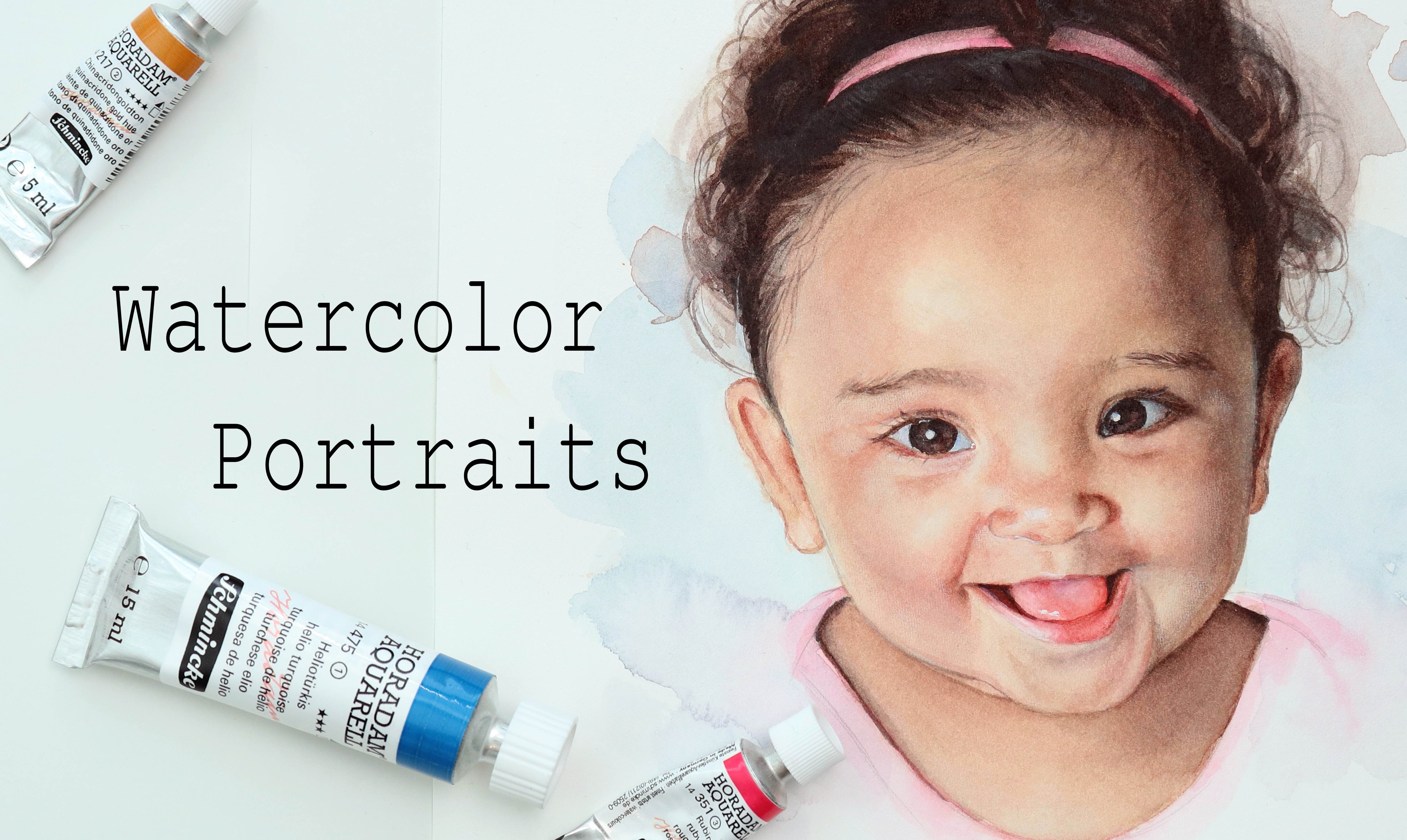
Transcripts
1. Intro: Hey there, if you've
clicked on this class, you might really
love oil pistols. Or if you're anything like me, oil pistols, not your thing. I'm being serious for
the longest time. And actually up until recently, I stayed away from oil pistols, but then I decided to
give them a go and, you know what,
they're so much fun. Hey, there, I'm Tanya and I'm
an artist based in Denmark. Oil pastel is truly such an approachable
medium and this class will be the first in a
series where we'll be painting realistic
portraits using oil pastel. In this class, we'll be
doing a study of an eye. We're not going to spend
a lot of time going through basics and we'll
be skipping sketching. I've provided my
sketch for you to use and then we'll be going
straight to using the pastels. It may help to have
some experience with rendering portraits, even if you've just watched
my sketching class. But if you're
curious about using oil pistels for
realistic portraiture, I encourage you to join
me for this class.
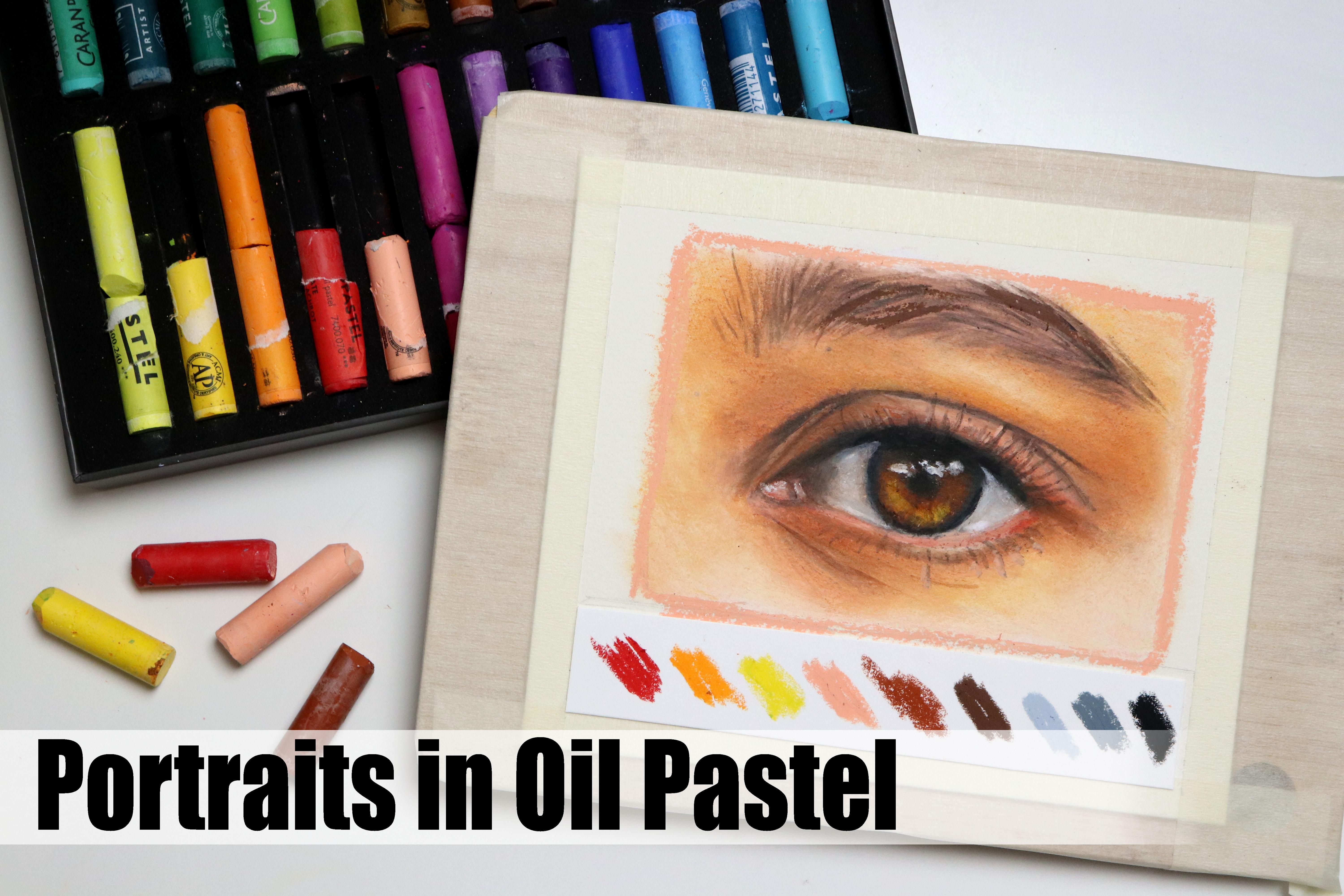
2. supplies: Let's take a look
at the supplies. You're going to be
using some oil pistols for the purpose of this class, I'm going to be using a
fairly limited palette. I'm just going to be
using calls within this set for the paper, I'm going to be using
watercol paper. If you have different
paper that you like using for oil pistols, feel
free to use that. But I'm going to be using
hot pressed watercol paper, optionally, some tape to
tape down your paper. If you're working on a
smaller sheet pencil and erasor to transfer a
sketch onto your paper, you can use the sketch
that I've provided in the projects and
resources tab or trace the reference directly a craft knife for a
portion of the class. We're also going to be using some sort of solvent
or blending medium. If you have linseed
oil that can work. I'm going to be
using oil medium, which is practically
a paint thinner. But you can also use something like this colored
pencil blender, which works for oil
pistels as well. Some brushes, the ones I
have with a black handle, are cheap makeup brushes. And the one with
a white handle is a cheap craft brush
from Pan Art. Finally, some paper towel
to wipe off the brushes. Okay, let's get started.
3. Oil pastel comparison: Before we get started
with the class itself, I want to show you a comparison between three different
brands of oil pastels. And I'm going to apologize in advance if this is not the
correct pronunciation. Karen dash whole
bine and Senala. To start off, I'm
going to fill in an area with each and
I'm trying to use the same amount of pressure and approximately the same
amount of pigment for each, although the rest of this
class will be in real time. For the purpose of
this demonstration, I will speed up the footage just so we can get through to
the result a bit faster. And we want to actually playing around with our oil pastels, If I try to take a tissue or
some paper towel and try to smutch the pastel again using the same amount
of pressure for each, the result is pretty
much the same. Even though these are three different brands
and price points so far, none of them stand
out from the rest. If we then take a
second color and layer this on top of the
first color and bearing in mind that the colors
I'm using are not an exact match between
the three brands, we will start to
see a difference. The current dash appears to have the least opacity when it comes to covering that
underlying color. Sinibilie definitely
has the most opacity. This can be down to the brand, but it can also be down
to the color itself. Some colors and pigments
are just less opaque. And Sineli actually does have some semi opaque or semi transparent
colors in their range, which are great for glazing almost like you would
with oil paints. The main factor that
plays in here though, is that the sinelipistil
is much softer. It almost feels like a
lipstick in texture. In certain instances, this brand might be
better for layering. However, if we go
back to our red color from each brand and try
to apply a third layer, ran, dash, and hole bine
are both doing pretty well. Whilst the Senelia
Pistil is struggling, try applying lipstick
to a stick of butter. I mean, don't actually try, but it's probably going to be
difficult because there are two slippery surfaces and
that's what we're seeing here, we're just kind of
pushing the pistil around instead of layering. The reason why I wanted to show you this is
to show you that even though there
are going to be some differences between
different brands, none of them are magic. All of them have some
strengths and some weaknesses. You don't need the most
fancy tool to produce a beautiful painting or drawing if you're just starting
out, use what you have. A lot of it comes down
to getting to know your materials and working with them rather
than against them. So let's get to know our
pastels with some basics.
4. Basics: Where most of my classes
are about water colors, oil pistil is a bit more
straightforward and easier to approach in the sense
that you don't have to worry about water control
or anything like that. I'm going to go a
couple of very basics because we're only going to
need a few for this class. First, color mixing. I'm going to use a set of 24
oil pistils in this class. This set is your
standard selection with a few of your
most common colors. And inevitably, this means
that we're going to be missing some of the colors we need for painting something
like a portrait. And that's where color
mixing comes in. Let's say we want
to mix an orange. Try grabbing a red
and a yellow and fill in two squares,
circles or similar. On one side you want
to start with red, and on the other you
want to start with the yellow switch between the two colors and build up the layers until you
get a solid color. It doesn't have to be
perfectly even or blended. We just want to be able to see an orange color rather
than red or yellow. Chances are that the side where you started off
with the red color is going to appear
darker or more red toned than the side where you started off with the yellow. This isn't always
the case, of course, it depends on how
much of each color we're putting down
onto our paper. But what I want you to think
about when mixing is that the colors you put down will be affected by the
underlying layer. Because oil pistols
when layering, are not going to cover like
an opaque paint when mixing. Let's say we want a bright, sunny, yellow, toned orange. We want to start with
the color that is the most present in our mix, which in this case
will be yellow. Once we have that, we can build on top of that with
a small amount of red and then go back into the yellow to help blend
out that red pigment. If you want to
blend this together without altering the colors, you can blend using your
hands or some paper towel. Let's try mixing a bright green. Grab a blue and a yellow here, I'm starting with about the
same amount of each color on the left. When I then
go in with the yellow, no matter how much
pressure I apply, there's a limit to how
light of a green I can get because the yellow simply isn't strong enough
to cover that blue. It's still a beautiful,
bright green. But let's say we're
looking for more of an acid green on the other side. Try just in the amount of blue to add a much smaller amount. Could you start with just
applying a small amount of blue and then applying the yellow on top instead
of mixing like this? Yes. But depending on how evenly distributed you
get that first layer, the paper you're using as well
as the pistels themselves. There's a great chance
that it's going to be more difficult to blend and it may end up looking more streaky. Having the first layer be
an even distribution of pigment on that surface will often make it easier
to blend seamlessly. Let's mix one more color, but take it to the extreme. Let's say we have a very
limited selection of colors, but we want to paint
a realistic portrait if you have your
three primary colors. Theoretically, you should
be able to mix any color. I have red, yellow, and blue. I'm also adding white to help blend and
lighten the color, since with this
specific example, I'm going to mix a
light skin tone. Okay, so looking at
my skin and yes, practically translucent,
I don't get out much. The most present color
is pale or white. Let's start with a
layer of white pastel. Next color I'd say is a very
pale orange or peachy tone. So let's apply a small
amount of red and yellow. We can blend that
out using the white, which is also going to
help lighten the color. On a side note, some
brains like Senelia do make translucent oil pistols which are meant for blending. If you like blending using oil pistols and you don't
want to alter the color, that may be a good option already we're getting close
to something that could work. Let's apply a bit more, but this time we can add in
some of the blue as well. Why add blue? If you mix
together your three primaries, you'll get your neutrals
and more muted colors. The blue is going to help pull that orange or peachy color
into a more neutral area. Which is where we'll
find our flesh tones using the same red,
yellow, and blue. But without using the white, you could use that same trio
to mix a deep buskin tone. I'm just going to add a bit
more white for good measure. I'd say that could be used as
some base for a skin tone. You can go ahead and
play around with color mixing as
much as you want. This can really help when wanting to get to
know the colors you have so you know which ones will work best for
your painting. But let's take a look at another essentual technique
which is blending. Aside from the fact that you can use different tools
to help blend, there are two main
ways you can blend oil pastels with and without a solvent or blending
medium, grab two colors. I'll go for Blue and Fumagenta. Our goal is to create a blend or smooth transition
between the two colors. For this first rectangle, I'm going to start
with the two colors coming from each side, and I'm going to allow them
to overlap in the center. It's usually easier
to blend when you have a decent amount of pigment
or pistil on the paper. So you can just go ahead and
build up those layers a bit. Let's blend that out
and see where we're at. I'm not a huge fan of using
my hands for blending. I'm just using the paper towel. But feel free to use any
tool you have or your hands. It's looking decent. I'm going to go in with a bit more to try and get
a smoother blend. I'm actually not
particularly a fan of using this method
for blending Pstels. That's for a couple of reasons. The first reason is that I feel like you're
using a lot of pastel and art supplies
can be expensive, so I'd like for them to
last me for a while. The second reason is that I feel it takes a lot
of work and again, a lot of pastel to
get an even coverage. And by all means, if you like working this way,
feel free to do so. I know a lot of people
really love working and building up those
layers of pistel and getting an almost
textured look. If that's your preference, definitely go ahead and
use this technique. If you have some blending
medium or thinner, try filling in
another rectangle. I'm going to apply
the pastel the same way with the two cars
coming from each side, but this time I'm using
much less pastel. We can then blend that out. This is not perfect, but if we apply some more pastel and
then blend it out again, we're going to end up
with what in my opinion, is a much nicer
looking transition and with better
coverage because we're getting to really
spread that pigment and get it to distribute
evenly across the paper. We don't have to blend
it perfectly for this. I just wanted you to
experience a difference. Of course, you'll
have to be mindful when working with any type of solvent and make sure that you're in a well
ventilated area. And as I said,
whether you want to blend with the solvent
or blending medium, or just with the pistils on your own is completely up to you. Once you're ready, let's
move on to the next lesson.
5. Using Solvent: When using a solvent like this, it's recommended to keep a small amount in
an airtight jar rather than dipping the brush directly into the
bottle like I am. Because over time
this can transfer pigment into the bottle
of clean solvent, which typically you don't want. But aside from
that, on doing when using the solvent in this
class is dipping my brush. If I need to get rid
of some of the excess, I may wipe it on the
edge of the bottle on lightly touch the tissue to help get rid of
some of the excess. To clean my brush.
In between use, I'm going to dip the
brush and then wipe it really well on the
tissue or paper towel. You may want to repeat this a few times to get
it nice and clean.
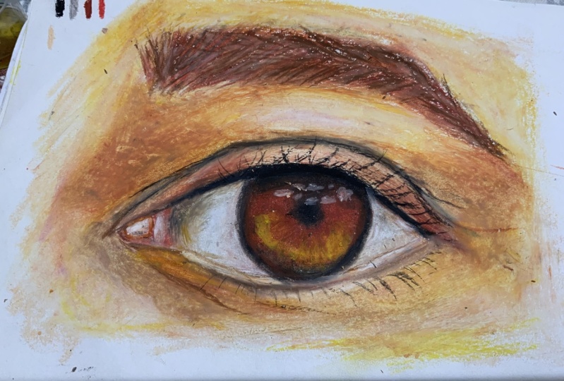
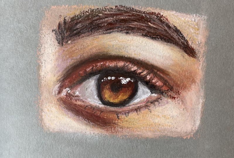
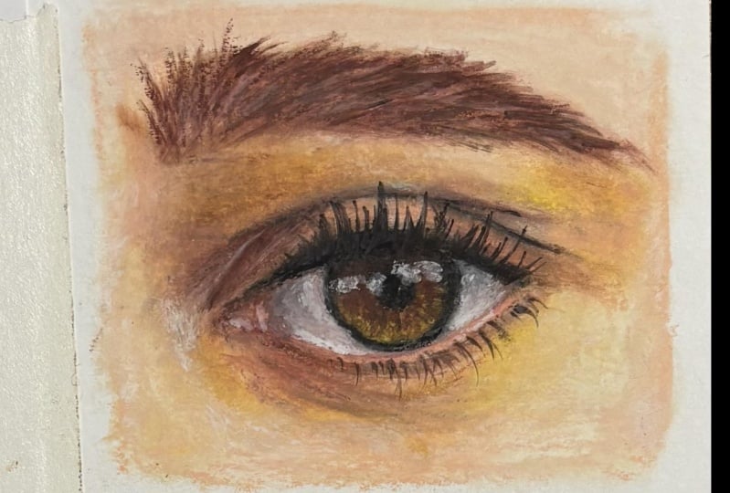
6. Eye - Base layer pt. 1: Okay, finally time to have some fun and get some
color onto our paper. We're going to add the base
layer section by section. The first color I'm
going to add is black. The reason for this
is that we do have some or very deep
tones in the pupil. And on that upper ash line, by adding in some of
the darkest values, it's going to give
us something to compare all the other colors to. It'll help make it easier
to know how light or how dark the rest of the
colors and values need to be. We want to try and be fairly accurate though it's okay
if it's not perfect. Oil pistels are not
typically known for precision, for mine. The line around the iris
definitely got placed too close to the outer
corner on that right side, but we're not going to
stress about things like that. Do your best. And also leaning in and looking at your
paper at an angle can also help you see where exactly the tip of the pistel
is touching the paper. Especially when you're first starting out painting with oil, pistels can feel a bit clumsy. It'll get easier, I promise. When selecting colors, I'm
going to look at which colors in my set are the
closest to the colors I need. For the white of the
eye, we'll need a gray Looking at the
2 grays in my set, both of them could work, but I'll go with
the lighter one. It's not a perfect match
and it's too cool toned. If we look at the reference, you can see the
color of the skin affecting the color of
the white in the eye. We'll need something to tint it. We could use this fleshy, peachy color or a warm brown. This looks like a
burns, a type of color. And I think I'll
go with that one. Let's go straight in
and add the gray. I'm not adding a
lot of pressure, but because this paper does have less prominent texture than the paper I used
for the exercises, it does go down more smoothly
and may be easier to blend. But no matter the
amount of texture, you can always use
blending tools or a blending medium to help. Then for the brown,
we'll just add a tiny bit and focus this around the corners of the
eyes where there's more shadow as well as
right around the iris. I'm being very light
with my hand here because I don't want a lot
of pigment on my paper. When chilling this
in, I'm trying to maintain some
visibility of my sketch underneath a just enough
for me to be able to visualize those two main
shapes in that inner corner. I'm then going to take
the white and add this here where there appears to
be a slightly lighter value, and already the pistils
are starting to blend. If you want, you can also
add a light layer to the remaining portion just to
help blend it a bit better. Finally, I'm going
to swatch the colors here so you can see
which ones I've used. Let's move on to
the next section. For the inner corner, I want a slight pinkish tint,
just very subtle. There's not a lot of
pink in my set though. I have a red and a fuschia. Not great options, but
both of them could work. I'll go with the red just for a bit more of
a natural color. Looking at the main
color in this area, it appears to be closer
to the flesh tones. I'll add in that synthetic
looking flesh color, or peach pestel from before. At the peach color, then the red. And you don't want
to act too much. This is a very strong
color and I've already added more than what is
needed, but that's okay. To help turn that
down, I'll go in with the warm brown we used
for the white of the eye. Let's blend that out and
assess the situation. I'm using a small brush with the tiniest amount
of the solvent, depending on your paper, as well as the
pistils you're using and how much pistel
is on the surface. You may be able to blend it using the brush
without any solvent. Feel free to give that a
go, and if it doesn't work, you can always go back
in using the solvent or a different blending
tool of oil. Pistels are very forgiving.
Don't stress about it. If you don't get the
perfect color right away, we can always adjust it. Just have fun with
it, and experiment. Definitely two red and two dark. Let's try and fix that so we can lighten it
up using white. And then to tone down
some of that red, I'm going to go over it lightly with some
of the darker of the 2 grays in my set and a touch more of
the brown as well. There's not just
one right answer. You could also tone down the red using a
complimentary color, so that will be green. Or if you have a larger
variety of reds and pinks, you can use those or mix them up and layer to
get the color you need. Don't be afraid to
just try things out. And then we can blend
that out again. Next, we can start
adding call to the eyelid and surrounding areas starting with the upper
ash line and the iris. Let's add some more
of that warm brown. So we're just going
to fill in that area. Especially once we
filled in the iris, it's all really starting
to come together. Although there's still
some detail to be added, it's getting easier to
see where we're going. We don't have to worry about the highlights at this point. If you prefer, you
can of course, sketch those out and try
and draw around them. But again, oil pastels are
very forgiving and even if we can't layer that
perfect high light on top, there are ways to get around it. For those golden
tones in the iris, I'll go for the warm yellow from my set and just
roughly add this in, no need to worry about the
details at this stage. We can then blend
that out and I'm using a small amount
of the solvent. You don't necessarily have to blend everything
straightaway, But I find that it helps me keep track of the progress
and what to do next. As you can see here, it's also a really nice and easy way to clean up some of those edges. One of my favorite things about oil pastel is how
immediate the medium is. It's so quick to just
cover the paper in color, almost like paint, but
without the drying time, it just feels like a medium
that invites you to play. We can add some more
black to the top of the iris where
there is no shadow. I'm not being very precise at
this point with this area, so the pupil may be
too small or may not be placed in the
exact right spot. As long as we get the approximate
placement and colors, it's all good though. Of course, the more accurate
you are with these details, the less adjustment
you have to do later. Moving on to the
lower lash line, the eyelid and under the eye, I'm going to apply a layer
of that peach color. Because although it may not be a great match to the skin tone, it is the closest
we've got in the set. If you want, you can apply this all onto the rest of
the skin as well. But the reason why I'm not
doing that and just doing small sections at a time is because I don't want
to lose my sketch. This is going to
help ensure that I don't cover that up on accident. We can go back in and use
our warm brown for some of the warm shadows on the sides of the eyelid decrease
and under the eye, just try and look for the values and the color changes
in the reference. And then for that, Chris, we do have some very deep tones. So I'll start by
adding in some of the darker of the two
browns from my set, followed by a small
amount of the black. Adding thin lines this way can be tricky, but
just do your best. It doesn't have to be perfect. Mine is definitely not. And that's okay. We
can fix that later. All we're looking to do
right now is just get down a base layer that somewhat
resembles our reference. I'm also applying some
of that dark brown under the eye and on the edge
of that lower lash line. It may be a bit
too dark for this, but we can always
lighten it up later on. Let's blend that out.
Again, I'm using some of the thinner to help
blend out that first layer. Once you have a surface
that's covered in pastel, like with this first layer, any oil pastel we
apply on top will be much easier to blend without
using any blending medium. When blending, you
don't have to use a brush as small as
the one I'm using. I will be switching to a larger brush when doing
the rest of the skin. But when working so
close to the eye itself, I just like having that
extra control and precision as we're blending the skin. We can also go back
up into that white of the eye with some of the
pigment that is on the brush. So we're basically cross
contaminating here, but this is going to help
us bring that warmth from the skin up into
that white portion. Let's finish up the base
layer in the next lesson.
7. Eye - Base layer pt. 2: Let's fill in the
rest of the skin. Once again, I'm going to use the Ch color for
the initial layer. It's still not a perfect
match by any means. But with a bit of mixing,
we can make it work. If you have colors that are closer to the color
in the reference, feel free to use those instead. But I'm sticking to my somewhat
limited color palette. Right here near the crease, you can see that I
accidentally got some of the black
onto the brow bone. And even though it's not ideal, I definitely recommend
not doing it. It's really not
that big of a deal and we'll be able to
cover that up in a bit. So we'll just move
on, pretending as if nothing happened next. We can take the white
and add this to any part where there
is a light of value. This is going to be up near
the center of the forehead, on the brow bone, and also
on the cheek below the eye. Using the white for this
is going to make the skin look too pale compared to
the skin in our reference. But right now I want
to just look for those general changes in value and color and cover
the surface as well. We can always adjust it because we're looking a bit
pale here to bring back in some of the warmth and
start building that up. I'll take the warm yellow
from the set Again, we can add this to any area where the color
appears more golden. It may not look very
dramatic just yet, but wait until we
start blending. That yellow definitely
has a kick to it. Finally, for this first layer, we can add some of the
warm brown to places where there are shadow or
slightly deeper values. Up until this point,
I've avoided the brow. This is again, because I don't want to cover up my sketch. I'm making sure that I can see where that eyebrow
is supposed to be. For the eyebrow, we
can use a mix of that PG color and the
warm brown as well. Even though the hair in the
brow is a deeper brown, we want to have that skin color as a base to make it
look more natural. Because the last thing
we want is to make it look as if the eyebrow
has been painted on. Let's blend it out.
I'm switching to a larger brush for this in
order to speed up the process. And because there's not
much detail going on, hopefully you can forgive me, but I'll speed up the
footage just a bit. This layer is not going
to look super pretty and that yellow is coming
in a bit too strong. But once we have a base, we can start to properly look at the detail within each area. There's also just
something really fun about seeing the different
stages of a painting. As I mentioned previously, there's not just
one right answer. You can use different
colors or go about filling in everything
more methodically. It really just comes down
to personal preference. I encourage you to
just play around because there is some
slight streakiness going on from the pastel layer
being on the thinner side, which therefore made it more difficult to blend
the pastel properly. I'll go ahead again
using the white. And then once we
start to bring in the proper colors and values and make those final
adjustments later on, it'll be nice and easy to blend due to the amount of pastel
that's already there. I'm going over the
same areas as I did before of the face where we
see those lighter values, but I'm also going over some of the mid tones with a thin layer, mostly to cover up
that streakiness. But it will also cover
up some of that yellow. The cool thing about oil pastel is that as long as
you're not trying to dramatically go from light to dark and back to
light too many times, or go between colors that are very different
to each other. You really do have the
option to play and try different things before
settling on the final color. Here we are very much staying within one fairly
small group of colors. Already when blending out
the second layer of white. I'm not adding any additional
solvent to my brush. I'm simply working the pistol that's on the paper already. Using small brushing
and circular motions While we are added, we can
go back into the eyebrow. We're still not going
to add details as such, but we're going to cover up that streakiness
and get started on some of the texture using the white followed
by the peach color. We can go in and add
some more pistil. This is mainly going to serve the purpose of covering
up those streaks, but I'm still moving in the approximate direction
of which the hair grows. This isn't all that important
for this color hair, but once we go in
with more brown, we do want to follow the
direction of the hair. So if you want, you can use
this as an opportunity to practice and get a feel
for how the hair grows. For the hair, I'll use the
darker of the two browns in my set and we can just begin adding some
thin lines like this. There's no need to
worry about placing each hair exactly where
it is in the reference. No one is going to yell
at us if we don't, But we want to try and
get the general shape of that brow whilst still
allowing some of that skin color to shine through on the left side or the front of the brow,
if we can call it that. I'm being careful not to add those final hairs
furthest to the left. The reason being that we
still need to finish up the shading on the
skin underneath and we'd end up smudging them. Instead, we'll be
adding those as part of the final details, then blend that out. Not completely, we
still want to be able to see some
of that texture, but we do want to soften
and blur those lines. I'm still not adding solvent, but if you feel like it's
not blending well enough, definitely feel free to use some or you can use at
different blending tool. Almost done with the base layer. If you have any bits of paper shining through in
or around the eye, feel free to blend
that out a bit better, just like
I'm doing here. Before moving on to
adding the details, we can take a look at
what we have so far and see if there's anything that jumps out as something
we need to fix. As I mentioned in the beginning, the iris of mine got placed too close to the outer corner
on that right side. That's definitely something I
want to fix. Straight away. I'm taking my white pistel
and going over that black. Because the black
has been blended out and the layer isn't
all that thick, it's fairly easy to cover it up. I'm then using a brush
to help blend it, as well as kind of push the pastel back into
the right shape. For now, I'm not worrying about the value of that white being too light compared to the rest
of that surrounding area. My main goal here
is just to correct that shape or correct the iris. I also want to move
up the crease a bit. So with this I'm using
the dark ground. This will make that line
in the crease too thick. I'm adding some of the
PG call to help though. I'm in no way worried
about perfection. We can also cover up
that black smudge below the eyebrow if you find that you're having a
tough time laying because there's too much pistel
on the paper already. One option is to use something like a craft knife
and just gently scrape off some of that pistel without damaging the
paper underneath. Getting rid of some
of that waxyiness or thickness that has built
up will usually help. Finally, I'm going to make
the eyebrow a bit full on near the top because it doesn't have quite
the right shape. If you look at the
angle of the top of the eyebrow on my painting
versus the reference, they appear to be slended
in different directions. That's because we
need to fill in the brow up here some more, but I'm still not
adding those hairs closest to the left side. Then finally, we're going to
be blending everything out. I'm also going to
deepen the black on that apple ash line and
then once you're ready, we can move on and start
working on some of the details.
8. Eye - Adjustments: We're going to go over
everything again and make adjustments where we feel
things don't look quite right. I'm going to start with
the eyelid and the skin. I'd like to correct the
line in the grease, but I don't have a nice, crisp
edge on my pastel stick. So what you can do is
take a scrap piece of paper and just draw with
the pastel straight on. And push down a bit
to flatten the end, which will give you
a nice crisp edge. Don't worry, we're not
just wasting pastel. We'll be using this
scrap piece of paper. In the next lesson. I'm going in with
that dark brown followed by the peach color. And I'm trying to crisp up
those lines a bit as well as move them closer to the
correct position or shape. We're not looking
for perfection, and you don't have to
worry about whether or not it looks exactly
like the reference. Our goal is to practice rendering an eye and get
a feel for the process. I'm also using it to lighten
the corner of the eye. Enhance a couple of the
eyelid folds as well as cover up some of the hair from the eyebrow
that's out of place. It's up to you how much
detail you want to add. For this one, again, the
goal is not to make it photo realistic or make it look
exactly like the reference. And I'd like to
still have some of the characteristics
of oil pastel. You can render the details as
much as you'd like though. Taking the warm brown, I'm going back over some
of the areas where I put the peach car to bring
back the shading. And I'm also going to use it to add more of these deeper values, especially near the
outer corner and below the eye where I didn't
previously spend much time. We want to keep
referring back to the reference and try and copy some of these same
value changes and shapes at least approximately. Don't stress about accuracy. I want you to just have fun. I want to bring in some
more warmth as well, but I'm not mentally prepared
for more of the yellow. So instead I'm going in with
the orange from the set. And I'm keeping it very light. We can always add more. And likewise, we can, of course, tone it down
if we add too much. But we're just going to warm up those shadows and
general skin tone. I'm going to grab the white because right here
in the outer corner, I've lost some of that
definition between the white of the eye
and that water line. So I'm going to try and bring back some shape to this area. The iris is also too
flat on the left side, so I'm going to shop
my black pistol on that scrap piece of
paper and correct it. We can. Deep in the shadow
near the inner corner, I'm using the dark gray
and dark brown for this and I will be going in
with a touch of black later. But for now, we can just
gradually build up those values. We can also add a
touch of white to make the edge of that lower
water line stand out, even though we're not rendering
every tiny bit of detail. Minor adjustments like this
can make such a big impact. And making sure we have a range of values going all the way from dark to light will make everything look so
much more dimensional. It's truly just a
matter of going back and forth and making
these little changes. Don't be afraid of
making mistakes. If you add some pistil and
don't like how it came out, you can layer some more
pistil on top or use a craft knife to scrape
off some of the pistil. Take full advantage of how
forgiving this medium is. You know what, if we
mess it up completely? We can just start over. Every mistake we make is still
experience gained and it's an opportunity to learn and understand what to do different
the next time around. Time to blend. I'm not using any of
the solvent for this, I'm just using the brush to really work that
pestel and blend it. You can, of course, add
some blending medium if you want and if you are working
with a softer brush, it may not be strong
enough to blend the pistel properly on its own. In which case, adding
a small amount of a solvent or a similar can help. You can wipe your brush on paper towel to get rid
of some of the pigment. Because whether you're working
with or without solvents, the brush will pick up some of the pastel in order
to not spread those dagger colors
or accidentally transfer them into a
lighter area too much. It's a good idea to wipe
it down every now and again as I'm blending. I'm also adding those
final touches of pastel to places like the inner and
outer corners of the eye. Then once you're ready, let's
add those final details.
9. Eye - Adding details & class project: To be adding the final details and the techniques
we'll be using. As one of my favorites, let's grab the scrap
piece of paper. I've swatched out a couple
of additional colors. So I have my warm brown, dark brown, black,
orange, red, and white. What we can do is add
some of the solvent to our brush and use these swatches
almost like watercolor. So we're going to
pick up some color and apply this to our painting. We can use this for crisping
up the lines and adding finer details a lot more easily than using the
sticks on their own. And we can add glass if we
want a sheer layer of color. For instance, we can use this
to deepen the shadow areas. You'll see me doing
this on the eyelid, near the inner corner. You don't have to use this
technique in order to create details using oil pistel. You can render a lot more of
the detail using the sticks. But I do feel like
this is a technique that's worth playing around
with and it's a lot of fun. That's why I'm using
it for a good portion of details in this class. This is the perfect
way to add in a few of those fine lines under the eye as well as the
details within the iris. Once again, we're going to keep referring back to
our reference and try to see where we need to make adjustments or add some detail. The brush I'm using
is quite soft, which does make it
harder to pick up a more saturated or
opaque amount of pigment. And likewise, I do find the
pistells like the ones from Sindell tend to be
easier to use this way, because they're already so
creamy and highly pigmented. You also don't have to swatch the pastels on a piece of
paper in order to use them. This way, you can pick up the pigment with the brush
directly from the sticks. But if you've been sharpening the edges of some of your
pastels on scrap paper, anyway, this is a perfect way to still get some use
out of that product. For the details
inside of the iris, I'm using a mix of
the brown and black. I'm not being accurate at all, I'm just doing a rough
approximate version because we're just having fun for areas where I want more opaque layers like
on the water line, where I really want to
lighten or brighten that up. I'm going in with the
pastel sticks instead, which is going to
make it easier to get that opaque coverage. Then for the water line, I'm glazing o with a
mix of orange and red. I'm also bringing some of that
color up onto the eyelid. I have been careful not to add too much red to the skin on the eyelid because
otherwise we may end up with an eye that
just looks irritated. Then for the
highlight of the eye, we can go in and add
some of the white. I'm pressing a bit
harder for this to really transfer
some of that pastel. This will create a bit
of texture as well, but you can dab it using your fingers to flatten
that texture if you want. Then you can use a craft knife
to scrape off some of that white in order to correct the shape or crisp up
a few of the edges. I'm leaving the skin tone as is. It is technically
a bit too yellow. This could be fixed by
glazing over the skin with a layer of blue or
even a slight purple mix. So adding a bit of red
into a blue color. But for this class and project, we don't need to be that exact. Although you can if you want. As always, I'm not
here to bush you around for correcting
the skin tone. You don't have to
apply a glaze using the solvent you could go in
just with pastel sticks, add some to the skin
and blend it out. Finally, let's take a look at
the eyebrow and eyelashes. I'm going to make sure we have
some pigment on the paper. And then using the
same technique, we can pick up the pastel, or the pigment and apply
it using the brush. This brush is, as I
mentioned, quite soft. It's also a filbert, which means one of those
flat oval brushes. It's not the best brush
for precise fine lines, but I really don't mind that
it looks slightly loose. Since we haven't fully rendered all the details
in the reference. The fact that these strokes
remain more painterly matches the rest for this class. The project is to paint
an eye using oil pastel. You can use the reference
from the class that I've provided in the
projects and resources tab, or you can paint
a different eye. That's completely up to you. You can work in gray
scale if you prefer, but I do encourage you to try
using color and you can do realistic coloring or use more expressive
colorful coloring. That's completely
up to you as well. The main goal here is just
to practice rendering an eye and also practicing using oil pastel to
render some details. No matter which techniques
you choose to use, you can also build up the
values more than I am. It's just a matter of getting a thicker mixture going with
the solvent and the pistil, all going in with the
pistol sticks if you want, but it's completely up to you. You can use a craft knife to help shape and make
those eye lashes look thinner or even use a silicon tool to push
the pigment around. I'm going to use the
Pch pestel and just add a few highlights next
to some of those lashes. That's pretty much it. I really hope you enjoyed this class. If you have any questions,
please let me know. I'd be more than
happy to help or to elaborate on anything
you're not sure about. I will be making more
classes using oil pistel. Any questions you may
have a More than welcome.
 Tanja Jensen, Artist - Sculpting, drawing and painting