Transcripts
1. 1. Overview: I think she's an alert. And I had so much fun creating my painting joyful Okay, class that I wanted to create another class for us to continue the journey. This isn't abstract floor of garden class, which is gonna be loads so far will be loose and playful with this. So whether you're a beginner or have more experience, either way, you're gonna grow, learn and have fun. We'll cover supplies, inspiration, color palette, various styles of these kinds of jobs, tracks. And most importantly, we're gonna learn a really easy way to slay what I call the blank paper monster. You know, when you get that brand issued a white paper out and it's just staring in the face and you have no idea where this happens to all of us. We'll learn how to add multiple layers of pain and other materials to build texture, detail, interest, and then we'll finish it up with those important details that unify the piece and really bring it to life. So let's play together. We'll have fun and I'll show you the different ways that I approach abstracts. And then we'll bring it all together at the end and you'll have a beautiful piece of art that you can hang in your home. Can't wait to see you in class.
2. 2. Supplies and Tools: I like keeping supply lives simple because I want creating to be accessible to everyone. So I'll show you a variety of things that I have and that we're gonna use. But don't feel like you have to get them all. Or they have to be exactly these things. I'll tell you the ones that I think you really do need and just know you can use just about anything you have around the house. Even hold lipstick or nail polish. Okay, Look at all these delicious supplies. Um, don't get overwhelmed, though, because remember, what I keep saying about using fewer supplies is fine. Yeah, it's harsh paper. Let's do that first. You do not need a fancy watercolor paper for this work. I think Kansan, which is widely available. I have links to most of these. If not all of these supplies on my website at since I am color dot com. Yeah, it's a great paper for this purpose. So I wouldn't worry about anything more expensive than that. All right, paint The glass pane is the star of the show. This is a pallet. Come again. Leaks to the palate links to everything on my website If you want more information on goulash, I go into it and positive detail in my other class. The painting. A dreadful book, A class. Uh, there are a variety of brands from expensive to medium. Too cheap. Am I cover all that again, please, to all three types on my website. Okay, the So you definitely need the wash? Because I told you. I tell you what. What you really need for this project versus what's kind of nice to have, uh this is a nice to have, but at least one side of the room would be great. We're getting at any water soluble cram, uh, that you could find these air neo color twos, and we'll show you how those work later, then. Little chalky pastels, thes they're not has have oil pastels. So these are really old comptel, and so are these oil pastels. I'll set trans in here from my kids when they're a little and I have tumble murders. These are water soluble markers, so with watercolor markers. And you certainly don't need all these colors. You could just get a few. Not essential, because what kind of does the same thing? I just use them cause I haven't these, I would say I would say probably are kind of essential, not nearly this many. It's taken me a long time to get this money, but I would get a few colors that I think if you love, so I can tell you I love these two the off way and this coral paint. But you know, your grey is really nice, But you can go again on my website and see sources for these. And I would encourage you to pick out three or four colors that you really like. That's all you really need. Or you might have some other kind of paint marker. If you already have a paint marker, don't spend money on more. Um, I do like to have these white and black China murders, not essential boo and then a white paint him that's the same as after this. A little more finer detail. I would say this isn't essential category, at least if you like metallics like I do, um, I find this brand while not made as well. The actual metallic exits in them is better than the pasta, and these air cheap these air and Michael's get the fat and then gold. And same with silver. If again you like my house to be done. Don't. But you can also grab any acrylic paint you have. It could be anything from a nice paint, like a golden to cheapies. Uh, it's fine for this kind of project. I don't need to get fancy, uh, sort of brushes. Nothing very quality, I would say, Except if you wanted to have a liner brush that can get, you know, get your dinner things more detail. A palette knife is nice. And then just I would say in the servants of pens and pencils and because you never know what you might like using as a mark, Um, I'll talk about these at the end, but these are, if you are work still continued to work on the peace. And you want to see what you've already done. A workable fixative. And then to finish your piece off a final flourish. And that's it for supplies. All right, let's go have some fun playing with these
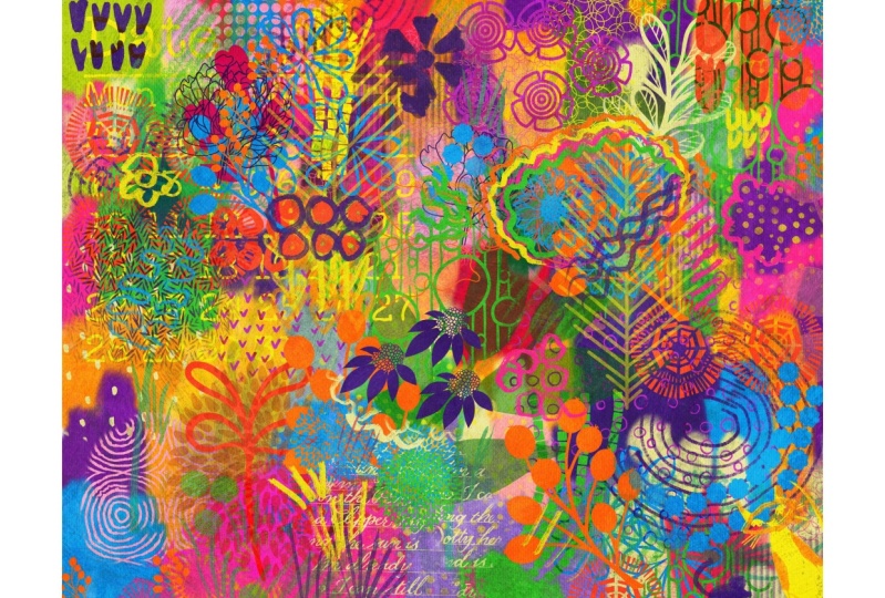
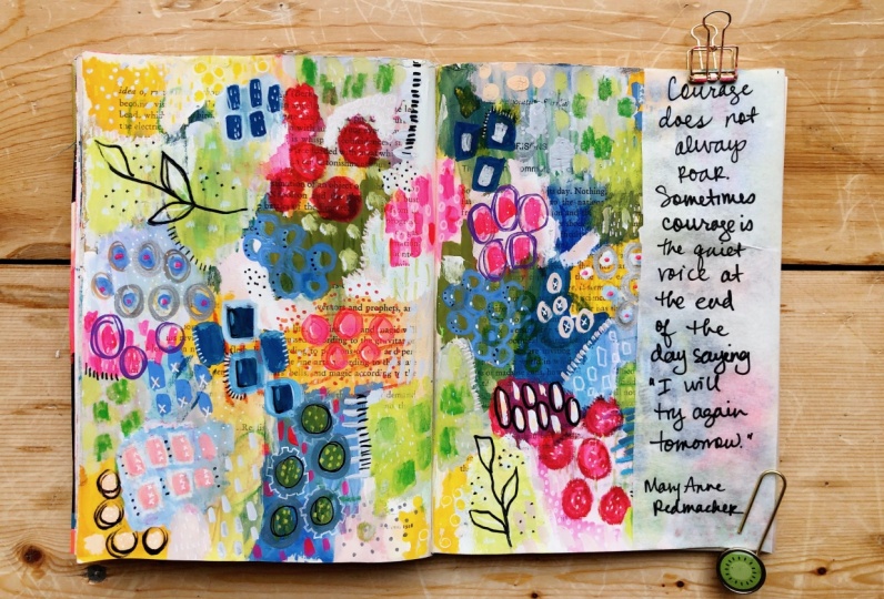
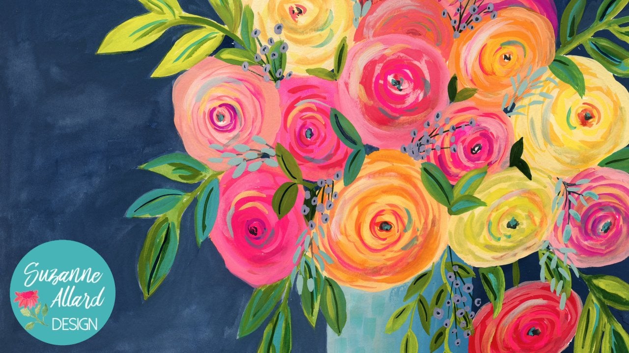
3. 3. Inspiration, Style and Color: All right. So I want to share with you some of the wonderful sources of inspiration. I do have a section a great inspiration section on my other class. Paint a joyful. Okay, but what I'm looking for when I grabbed things like this is an anthropology Catellus, which I love because of the color scheme. So I might just pick, for example, this is a color palette. I want to try to get the purples, the lines, this Navy, which is a favorite of mine. So right, there is a color power. I could just pull out colors from there. Um, same saying that maybe another page, if you wanted to do a quieter pallet. Well, there's a couple right there. Do one like this one like this or actually these here. These here. So colors are really everywhere. And they spent a lot of time putting your these catalogues. So I think it might know what they're doing with color. And then if you wanted a really quiet or piece, you could use something like that. I like to those colors. I don't so full color and texture from things like this. You know, this is, um, from Instagram. I can't remember her name but a florist. And you just see so many great pattern examples in here. Look at these little squiggly lines and, oh, ruffle any feathers. It just gives you ideas, different textures to make in his pieces. Same thing. You may be my chooses for color, but you might also choose for those little lines that are under an Oculus. You this piece that shows because that's colors rectum One painting without pile. If something here love the colors also, there's a look at this. Look at this idea. I just saw it for a pattern. So, you know, lexicon things. Could you that look at the way these table legs come out? You could do something like that. Even the chain. You could make a change quickly. Okay, More color inspiration. That's a beautiful color. If I was there and just want some of this too is never pretty, you know, with the weight and the navy. Teal, think even the lime green. Okay, so I pull from things like that and they take pictures of my own garden. I take pictures of the nursery back that just went and got some beautiful pictures, uh, of the plants that are out now they're, you know, nurseries or just especially if they're cute, sweet little ones like this one. And I got some beautiful photos that I'll be using for inspiration as well as my own Garden People's Gardens, A botanical gardens, right? Anywhere you third catwalks. So I want to show you a couple of pieces that have their in process. And this'll thesis this one of a limited color palette. It's not all over the place, like a lot of mine, and I don't know how to do a whole lot more to it, but I'm definitely not done with it. I haven't had it. Those fashion details, same with this one. This is a limited color palette. So when you thinking about what style you want to do your peace and we're gonna do, uh, you know more full one hand, Amar Very color palettes in this. But I just want to give an idea that you could choose three or four colors and I'm halfway space and do this kind of style one as well. The office other. That would be this right, because lots of colors a lot going on, and I love them both. This one is probably kind of in between. Those two it's not doesn't have as much going on is this one. But it's not as quiet is this way, and everybody has their own taste. So, you know, sensibility in terms of that, in terms of this is one it iss wholesome process. I've left this one for a while. I worked on in a while. You know, I go back and forth around these because one of you know what? I'll be inspired to do one and then I'll try another one. This one's also in process. Haven't haven't touched this one in about a week. This one is done. I talked about this little out of the class, Uh, and you'll see the one that we finish. It's similar somewhere style. Here's another one that is a little more intricate, but it doesn't have every color in the rainbow. It is somewhat limited in the color palette. And then here's one that I let the black underneath come through, appreciates of really dark, maybe come through a little bit more. I really like that one. So one of the things I do uh, help me get inspiration is I think he's a little many ones of these in my and my heart journal. So I have a couple of going, and I'll literally do this like it was my husband while watching TV tonight because I'll get my little instead of wash. You know this from here and a paintbrush, but maybe a couple of pounds and all do something like this and then let it dry and come back to it. But I might start something like this and come back to it. This one is just the very first layer through it on their I haven't come back to it. Yeah, And then you some of the ones I have played with these air just one later have not come back thes I got these are done. What I would consider done. I am. I did. All the detail actually think goes this way. Sometimes you can't tell what this one does. I did all the detail after the fact, you know, and the same with this one's. And here's the thing about this. Every time I do one of these I learned, so I might I might say you know, I really like the way this turned out. I'm gonna use that in a bigger piece where I love the way white and gold glove together. You know where I love how playful this one turned out, which really dio that to me is like a C C side guard that's like that. That's on watercolor paper. But I also use this. This is a mole skin. It's not a lot of color paper wanted to see part one actually have a link to it in my my website because I had trouble finding it. So it's thicker paper. The same thing. Actually, this one I did on an airplane. I had so much fun with that. I took this on the airplanes. I took my little set of wash and I took a metallic pen. I think a black pin couple pens and this one. And then I said, Let me use the same colors over here, and it was so much. This one is you know, I would do more to it, but it's a couple of years in saying here, but I lift. I find this very relaxing, this one I did finish and turned into a print. It's in my new print collection called Pretty in Pink. So I am one of the things that really are so many things I loved about this one, but this kind of thing here and then this texture here that and I think that it's easier to do these things when I'm not thinking too hard or they turn out better, so even doing them sometimes. Like I said, watching TV close my family jokes that I never actually watched don't. So I heard you two get a a blue book like this or water flypaper and start playing like this because then this itself becomes a source of inspiration. And this was a completely different thing that I just want to play this and this is just a base painting for a new one. So it's great, because any time I want to be creative, I just pulled these out and say, OK, let's do something on this one. And then it dries and I grabbed the other one lots of fun. Okay, I wanted to show you another way that I collect inspiration since I'm inspired by nature and the patterns and textures that show up in nature. I finally to save images of those and I talked about controls to my other class the painted , joyful okay, class. But in this case, I used Instagram, and I just want to show you how you probably you may already know how to save images. But case you don't this is what I dio. So you got your instagram page and the hashtag there several I like you could do botanical photography or you could do nature patterns is beautiful. So you put that in and you come up with these amazing photos, I look for a pattern that's really pretty, like this one already saved those drops on leave. And look at this moss fungus. I guess it is just a fungus and then you click save, and then I'll show you how that winds up in my saved. Look at this idea, what a great idea of this person did. They just simply traced the shadows. Now anybody can do that, and that's another way to get over blank paper monster, right? You could start with something like that. So just to be able to say that idea, I could hit safe and then in your If you do it on your phone, you can. You actually make folders. And I have one called botanical. But on the computer where I'm showing you don't see that Look at these beautiful lines. Gorgeous sand dunes. So I'm saving that. And so then I'll go back to my profile and show you and I saved right here saved botanicals , and there you see the ones we just saved, and these are ones that I've saved previously. So the way use this is when I'm thinking about shapes and patterns and marks really that I want to make. Uh then I looked at this, you know, some lines. Maybe like this. Some circular poeple shapes like this. This one here is actually something that I think could be a composition in itself. Just the whole piece kind of inspired by that. And you can see that I collect all kinds of shapes I'm looking for and this one I'm really not looking for color. I'm really looking for a pattern. Shape marks the marks of air in nature and, of course, probably in that probably it's endless. So, yeah, that's a really fun way to gather inspiration because If you're stuck, you can just pick any one of these and start drawing or pick three of them and start drawing these shapes. So have fun with that. You can use Instagram or Pinterest for this.
4. 4. Mark Making Party: learning to loosen up and be playful. Painting is really more about asking questions when you're working rather than answering them. Here's what I mean by that. If I approached a painting and I'm thinking, huh, I would never let this tool what kind of market will make and what if I hold it this way? And what if I later these colors and this type of paint on another deputy? Let's see what happens. I mean, this is the fun of it. You don't there's no harm done. The worst that happens is you create layers and layers of stuff on the paper, which just adds great texture. So I really want encourage you to be playful with this and not worry about rules. I find that if I approach this work in that way about asking questions rather than thinking , I've got to answer the question or I've got to create this amazing piece. It gets me out of my own way, and I end up liking the result of that. OK, so this is a mark making party, and the most important thing to do here is to have fun and be loose. Gather whatever tools you have. You probably don't have much as I have the things I have, but hopefully have a couple of them. But get your kids, Kranz. I mean, these were left over from my kids. He's got some kind of German grand desert wheel pastels and I have regular pastels, their chalky. I have the neo colors that we talked about in supplies the tumble markers and await what china pan, various pens and some pain. Just grab what you got canned. We'll just have a little bit of practice. There's no really right way a wrong way to do this. I'm just gonna show you some of the shapes and and marks that I like to make. But I discover new ones all the time, so we'll just have some fun here, get your stuff and then play it just this past little so you can leave it like that. You can rub. Sometimes I feel see, I do a lot of circles, different things I might take a timer. Marker works, you know, this way as a crash, um, where you can do it. This wear clothes cost something, and you know this is gonna be our This is for this class, but you'll probably use this piece is a base for another painting because it just doesn't. Doesn't matter. No, I like the China market because he will give this kind of text ary black background. So you could do that. You could get bigger things. Same with the weight. One's not gonna shop here, but could make ready with it. We'll try that on top of some cover. We got our oil pastels. It's just just one big color mark making party. If you go old nail polish, you could throw that on here. You could throw an old lipstick on. It would blend with the water because it's a little base would be kind of fun to see if I like that color missile launch gets a lawyer here, uh, materials to keep that one out. Hey, on, we can take some of any other colors for sure you have those blended with water. So we do some purples here and then free minds here. I'll just show you when what are on those? What happens? They're basically like a watercolor cram. Well, they are. See that? Let's really have these were playful. If you have small Children, so they will help you in estate because they're so free. You can take sharpies. Chris therapies are very intense, so But you know what? If anything can be covered up, let's take. Besides, I like she's in the side of these past owes This is an oil one, so you can see this is how we're gonna start are teaming. But it's theirs. There's not a whole lot of science to it that marks we're gonna make with pain can be anything you want, But I tend to do a lot of this kind of scratching the paint Han with site, holding the brush sideways and keeping it pretty dry. But then there are other times where you'll see me dio how really this is a flat brush and I'll do you know, markets more defined like that. You do all kinds of marks, depending on your brush. So there's really sinned one brush where we could do something more like lines. I don't use paint on the first layer because it will just get covered. What So pretty much anything goes with marks? You can I use a lot of paint pans. I love metallic, usually not at the beginning stage, but as we get further along. See, you have to like this to get these. But I have even had an accident. Half on where? The paint. There. I didn't show you. The hand kind of leaked a bunch. So I just went like this. I got this lovely metallic gold drip and then it's who I want more of those. And so I made more of those. That was a happy accident. But that gives you an idea of the kind of things that can happen when you're kind of playful. You see what shows up? Settle metallic Sharpie. All right, that's Mark making. Sky's the limit. Have fun with it.
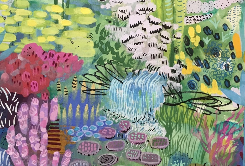
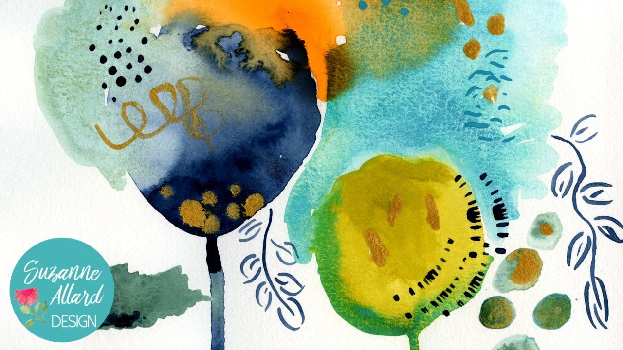
5. 5. Beginning Playfully: Okay, beautiful people. So for this one, we're gonna use our letter colored paper. This is 9 12 and I haven't done anything to the surface of it. This is gonna be our water based. Well, at least for the initial layers. Abstract floor, Durden. And so we'll start with So the mark making that we practiced. All right, so let's just start with a few colors of the Crans or markers picketing and throw down some here. Some of Modis have styles. Thieves are not oil pastels. You can't use all the best girls within the water. The color will react. Well, you won't cover it up. So there's just a different technique and let's see, for our initial layers will start with this and we'll just start with some scratchy stuff Was a different color. Some lights and some darks. We could even use this black talking tomorrow for And, um, I'm thinking of a garden. You know, that is the garden bed that has spread out, have a lot of different parts to it. And you know how when you have a garden, you have maybe some of the orange things here, and, um, maybe some of the yellow mixed in with this, but then you might have, you know, some sunflowers or something over here, and then you might have ah, leaving something here with this color. Throw that in. Especially greens, obviously, in a garden. Although we can make our garden really anything you want and I might do some actual shapes . Maybe we'll have some stuff like this over here. Just kind of random playing kind of getting in touch with your inner child. It's fun, actually, to watch kids do this cause they don't understand why we think it's so hard. I am at this point keeping most of it in here. Uh, you don't have to, and sometimes I go. He didn't last the page like that. Let me think. I tend to like to do that and then move outward. All right, so let's kind some of these the chalk is fun because you could just take the side of it and it'll get in interesting ways with the paint. People will do something little over here. No, but we're just creating layers so thes first layers are just to start to get something Val on our paper, you know, maybe There's some sky up there. No, his light blue. I think I like those colors to start with. So that is Leah. One hand, this will be Don't even need to let dry right, because it's OK that it's not gonna be kind of messy, especially with the past. All right, now, eso Now we'll take some paint and this is the wash and my handy dandy airtight palette. And I'm just going to start to play. Was color placing. I'll do Alex and I like to pay for the side of the brush in. Look, this is just a cheapie artist left. I have other ones here. Of course we'll variety, but you'll see none of them are really great Russians. Not for this technique. When we get later on, we'll use some of the final brushes. Okay, so you airbrush not too much water. Not too much again. I'm just gonna kind of you'll see that it's kind of mixed, endless the water cooler grands, and that's okay. That's actually what I want. Push paint around. I'm not really I don't have to put the pinks with a pink or red cram list, but I'm just putting it where I think have made pretty and at this point again, I'm just being playful. I think this is like color therapy. E usually do put three sections of a color. I just did, too, in that case, so I'll probably come back. And I do use a lot of weight. So I'm mixing in the life along the way. Whenever I want, it will come back later. Was more weight. Seems fun about the way it is when you put that on top of the new cover crams it blends in with whatever you have. How fun is this just going? These are all my favorite colors. I seem to use them on everything. After really challenge. We've seen up too much water saturated, so just lift it off. But I will slap you with water curry so you see that I'm using the side of the brush later on, we'll use the front of it more for detail, and I'm just picking out colors and almost scrubbing it. No, not too heavily, because make my paper doesn't agree. What I love about quash that I talk about my class to is it gives you that great chalky texture So you see right here. But you can have more water if you want more translucent texture, like cup. Since that's where Avital Water Cocoa season that is. Okay, Someone come back in with this, which is my castle? Favor colors kind of life. Turquoise. I just make it by heading white and we'll of green to turquoise. So you can see the other great thing about wash is it's blending with the colors next to it . And if I wanted to do that like here, then I can If I want there to be more aligned like here, I can leave it. But I want that blended. So I'm just gonna come in with a sort of a dry brush, keep cleaning it off, people toe and win it. No needing some darks here, and some of it was me. Stand by, which is my I have maybe color that I love and just put a bit of that in there Really dark . I think I decided to dark later. Can employees listen white? So you it looks like now grab some way, pick up some of that just working out. So I'm not really thinking too much about shapes. Yet I'm feeling in color at this point. Do something back here too, for balance. And when we do this kind of thing, this layer oppose we don't really know what from this original layer is Even gonna show, we do know is gonna add texture. And we like that. Okay. When I had a little bit of this limey get the rest. That means really It likes me. Needed, clearly likes to stay in the brush, which is fine sometimes. But I really want to get that pop of lingering co there. Maybe a little bit. I love it next to the maybe. Isn't that beautiful? All right, so I think I'm gonna add some more weight and whatever makes it with its neighbors. That's the other thing is you get up getting sort of ah, different shades of neutral when you just mix the white with neighbors, any bright colors in this way you can with just a few colors with those underlying new color. Kranz, you can end up with lots of colors on your paper because everything's constantly blending. Get some of this weight from here to finish. Top of Jack Hedley will have winner one Done. Let it dry. - You don't have to cover the whole paper in this first layer. Sometimes I covered in the second layer. Okay. Gonna let that dry? Well, you're number one.
6. 6. Second Layer: Marks and Paint: now you might be hitting that offered stage in your painting. That teenager stage where it just you don't like it much and you don't know what it's gonna become. So don't despair, because I can kick in anywhere from right after the beginning away to pretty close to the end. So just stay where they keep learning, keep experimenting and trying different tools and colors. You'll see me do that a lot and then the worst. As I said before, the worst thing that can happen is you end up with a bunch of great texture from painting over things, and then you just can't keep going on back and you'll help you learn. Each choice you make teaches you so much. Okay, so we'll let this dry and you can see that it's curled a little bit. Uh, that's not a big deal. I actually let it dry overnight. Yeah, it was something I just use A He's a baby from a another thing. Okay, so we could do that for now, and so were and continue to play with different things I did throughout this photo adjust. It's just getting the idea. Sometimes. If I think if I run out of an idea for a color or a texture. It just kind of gives me some ideas that house some time to have a picture on him for that read and look out the window. If you have a window or look around your room, almost anything can serve as inspiration. So I have for our next layer again, doesn't you? Don't have to use all these shots of oil pastels for my kids like they're probably 10 years old. You crams will try that. See what happens. I also have some time but markers. But you could try any markers. Tom O. R. Watercolor market. So we're gonna blend in with the paint, but didn't get a completely different effect by using other markers, too. When my favorites is this because I love this kind of maybe color. So I found a Navy Sharpie. I also have a Navy micron pen. So who knows? We'll see what we end up. Okay, so let's play with some, well, pastels, remember, this is the one that's gonna have lots of different colors. So I want to add to the color palette on this one because it's fairly limited and I'm I start making some flowery type shakes here and there. Some lines that, you know, I know. I've noticed a couple times I've done lines like this and they end up I didn't realize until afterwards he had a kind of looking like a path into the garden so we could try that on this one. I do love greens. Green and purple are always pretty. A nice little resource for playing with color is this. Ah, pocket guide to mixing color I got on an Amazon. I don't really pay a lot of attention to color wheels, but it is kind of fun to, you know, release notice that here's yellow, green and red violet go really well together. Um, I love blue and orange, and like I said, I don't It's not a formula, but once you notice these things and start seeing like blue and yellow, um, and then there's different combinations. Cop of complementary color. So it's kind of fun to play with and notice. I see put in circles here. I do always work in odd numbers. So 357 in terms of the shapes I'm making and I do live ready in size. I think that's not the real pastels. Let's play with a few Tom bows, mix up on and add more different colors straight. Does these combos you? Can you have a brush on the side that you can, you know, do similar to the paintbrush were under side. You can do a more specific detail. I have a family. Most of these things are probably gonna getting painted over, but you never know. I do like to change it from sort of round shapes to almost rectangle shapes. I don't like, um, looking to meet random random placement and him color. You can hear them if you find being to tidy or two. I don't know overthinking of that. You could switch hands and you left him. Or just hold the brush where the market differently like this. Let's play with this a little bit so you can see you like to dio small marks just like you would see if you looked at a bed of flowers. That would be all kinds of textures. Colors. We did it. Bill. Terrorism, energy. It's more yellow. How that's too Save it, and then that will do some negative painting I'll show you what I need for that. So you've got these black for colors, and I like to take a brush and go around the area and negative painted. So I mean, so let's say like this green here you take another color. I use a lot of my favorite teal so I can paid such that I'm leaving random shape and size parts of the green showing. This reminds me of biology cells, and I just like how it looks like it's kind of like organic. So it's not gonna hold the uniform, you know, like that, and then pick up this color somewhere else in here. So I always like how it looks against the dark blue. Remember that? What? The glass we can change how translucent or opaque it is by the amount that we use. Squash always dries a little bit. Um, you know, fated, more faded than it looks right here depends on the color, but usually so now I am starting to think a little bit more about the balance. And do I like the things that I'm seeing and I'm starting to look at What are the areas that really like in the areas I don't like as much. So I really like this and there's probably I'm not sure I like This was the oil pastels region. So I might either take more and kind of make that written more pronounced. However, I would do less. It was more and so that's oil in there. But I can take so my uhm pink wash will be kind of fun to see what it does with oil. You know, if you can see that separating and so you see the red coming through which I like and I don't have to do a mall. I like to have some surprises. I just think I might come with some weight over this and see what it does over the oil. It's only like that because it gives a little bit of texture. And yet you can see some of that through season of the reds come true. Gonna do a little bit more weight here and maybe come around these with the weight. I like do a pen to at some point. But so you know, we like this at this point. It's the process of growing the painting getting word That's as him first, but also bringing it together. So it's a weird twist of weird balance, your kind of expanding it and unifying it. I I don't have that much of a process for you, except that I think I go in both directions. I do like in my have strikes one stem or leave. Anything of some kind is just kind of a thing I started and I, uh I just like to have it in there. I don't doesn't necessarily have to stick out too much, But the element of something that is rial within it, not really. But you know, more literal. I don't know. Just like it. You may not. And of course, at any point you can decide to stop. If you like the painting, you might have liked it of the first layer. If you like it, them file needs stop pretty heavy on the screen. But I don't want to do all of the pink shapes, so feeling like it needs something up here and something down here. But we're getting close to where I like it with this guy. We'll take another look. So one of the things I like to dio when I'm not sure where to go. Next is I like to look at, uh, previous pieces for inspiration. I realize if you don't have any previous pieces, has hard. But if you keep doing lots of these, there will be at least parts of them that you like and keep everything because even if you think that you've messed the whole thing up But you really like this or this, save it because you can incorporate it. So here's one of my favorite pieces and so then I can look at this and say, OK, Oh, yeah, gets my dios. I really like this corner of here. Let me put more shapes there. Let me go around these more. Um, I also always do a unifying color state agent in this one I took my favorite color. Is this deal with White in it and then kind of went through the piece to bring it together ? You can see elements of that everywhere. And then here's another piece. This one is different. This one's more linear. Uh, but there still might be elements like I don't know if you can tell, but I used to tell it gold and pretty much every peace towards the M. So these are old circles and gold here and there. Some, actually Gold Inc there. So, yeah, I can maybe get ideas from this one. And then here's another one. That's a little bit loser. Kind of like this one with more dark areas. Uh, yeah. So that's one thing I do is get your own stuff again. We'll never part of it were inspired by Or Did you, like. You can also look at these pieces, obviously for inspiration. Okay, So given that I think I'm going to have some more, that's a paint in some different areas. I had also paint where we're still seeing the the black China marker of because I like having that for texture. But I don't really some places I don't want to see it, like right there on the best thing to cover that up. Busy there dark color or a light color, very light. Kind of like white. Play around with it and see what we can get covered up. Having fun. You guys stay light and playful through this or no, it's no fun for one, uh, becomes too much pressure. Believe me, I've done that. And remember, in this one, we haven't used any acrylic. I don't know if we will. I might just do this piece and wash and all of our other tools, and then we'll do in a car like one. But you never know we might. We may have some acrylic. It's so nice that it's spring out because everything is blooming kind of exploding and that that's inspirational. When you're painting, we try to capture that feeling of everything. Just exploding trees. Sometimes I like to let the dress get really brought dry. So this, this is I'm almost rubbing it into the That's why I use these cheapies. With this, you're gonna ruin a good brush.
7. 7. Adding Details and Texture: Okay, let's make some progress on this. So whatever do at this stage is I talked a little bit about that unifying color. So finding the color, usually a neutral I really like this grave for that purpose. Uh, it's just a very neutral light. Gray. Just take some dark colors. Doesn't have to be black, but some dark colors, maybe a little bit of black and white. I also like to use this, uh, kind of really light see color or sea glass. I guess I call it so just kind of kind of go through. I'll see what I think about the the gray as I travel through. And remember what? Glashow? This looks really white right now, but he cries much more. I feel kind of fade into the background a little bit more. He'll be a little darker. I'm just kind of looking for places where I think it might fit eso that there's a one color or close colors. It doesn't have to be the exact gray all the way through, but close so that it brings this painting to get her And I can do it with more concentrated shapes. I change my brush because this is this is more a breast that I would use for leaves or something too much letter in there. You see, I like what that touched down there. You can also see that the greatest fading now and I take my liner brush and do some to some Cray circular type shapes have to be careful not to put your hand in the what pain. I've done it many times. It's not a big deal, especially with this kind of painting. It'll just add that the texture right? This is a very sensitive little brash. What I like is because of the length of the Brussels. It really holds the pain. When I make these shapes I like, you know, I like him to not be super even I don't mind. Have some sections of the shaper thicker, you little bit water. This brush is really good for outlining things. So let's do some complaining. Look over here. You were really windy day today in Virginia, so I know if you can hear the wind. Beautiful spring day. In fact, I went for a walk this morning and two pictures, um, to the university near here, and some beautiful things were in bloom. I saw the biggest Camelia Bush I have ever seen and pictures of that. It doesn't do it justice, though, but I got to see it, which is wonderful. So I'm really liking with this, uh, pale grace doing when it had some smaller I will miss in this cover, it has that effect of being like a weight, but it sold softer and then maybe some really tiny. That's sometimes, if you are completely blocked creatively were just scared. Like we all get a blank paper. If you just take your paints out and I brush and make dots and lines, you will liberate yourself, and then you know you won't have a blank piece of paper. Okay, so I think I can carefully bring out some of the pasta plans. Even though I've got stuff drying here, I'm gonna show you them can. One of the things I really like to do with these this dio what I call color on color. So I pick. So let's say some pink over here and then put the pain Posca found on top of it. I also do opposite colors, but there's something just really cool about using the same color or shade of it on top of another one. So I have my favorite use. Get this whole basket of goodies, but you don't need this many. I didn't start with this many this'll. Peach color is fantastic, and let's pull up this pale orange Get off white play with those So I think I'm going to. It's a little bit of this is dry some shapes in this color? This is that coral pink. It's called amazing, especially on top of this green. Can you hear the paper? I love that sound that you get with wash, so just reminding myself to not make the shapes call the same shape or size. You have to put some of that somewhere else, too. I think easily look may. So the some of the surrounding them and you'll notice. I don't do Amal. Kind of you like to keep some surprises. Remember, at any point in this, you know you could stop. I think this was getting close, and here's where I want to look over in the same way, but I like but apples I don't like, and I don't wake over here something needs to change their otherwise. I'm pretty happy with it, So we'll try some things over there. Actually, we can't get something happened. So yellow. Maybe nice over here. Maybe even see what we think about some some yellow leagues. Sometimes I usually only do kind of one set of leaves, but who knows? Let's see what we think. I like that it gets in time to dry speaking for I loved using the Tallix. I used either gold and pretty much every piece. So I have this dark blue grey and then the lighter great I like to use to and you know that maybe I talked about that. I love that's there and they're Well, here's my Navy Sharpie end. You know, I might come in here and just looks a little bit of something. I had another bit of that, Co where remember, you wanna have contrast? Always. That might be enough. There doesn't seem dark enough. I want this to drive over here before you do anything there, and I think I want to bring some of the great paint, can cover up some of this and get some sort of more texture to it. That might make me happier with us. And remember, we put the oil pastel under here, so we're still gonna get some of it popping through, which I think it's done. And maybe we'll just do it on this side of the Levi saying, When I want something to blend like first there, I can use my finger. It works really well and watch. Wasn't questions off so easily. So I love is the paper gets more layers of stuff on it. I just love how the paper itself develops texture. Go over some of these a can. Can you take this like Craig and see what we think about? I'm not. I'm not sure where I want to put this. Maybe let's just say we do something. So here, be careful with that. Paints dry. Yeah, So here's an example of that color on color. This is great pain, and I'm doing great painting over it. You might say, Well, what's the point of that? But it adds a dimension. You can see that dimension in there. See, I feel like I need some more lines. Usually use a lot of lines, and I haven't in this one too much they can be kind of random places. Sometimes they seem to be at the beginning, around of color. I'm going to use my needy my ground pen to do a little bit of smaller stuff. These are just sort of wrong migrants not liking the paint surface that happened. Sometimes. If it does, you just goto clean sheet of paper and clean the pain off. - So now I'm noticing that this is a We're just getting to where things either make me happier. They bother me. This her here that we did the Tambo bothering me. How? How? It's not planning a little bit, loser. So I'm just gonna loosen it up with a Web rush. Yeah, I like that better. We'll see if there's anything else about me. You could say the same thing about it. Here, the tom bows. You know, you're using a marker instead of a brush. So you get that market look and I just like it a little bit more blended and lose more painterly. Same thing here. We did these in Tom Bow so I can come through the brush and yeah, I like that. Okay. These are all the places I use Tom Bow. Okay, so now I think we're gonna move to the school. Painter can see what it does when I go around these because I don't want all that weight showing. I don't know if you can see, though. Amazing gold should we get with them? But it just brings the piece toe life, all these little details at the end. Branta lionizing. So see those little red things? I didn't really about those some hitting them with the They're still showing through a little bit, which is fine and kind of interesting, but I'm hitting with the paint Bam right over him. Do that. Looked at trying it again already. Like it better with the gold. I try to just make sure that it's not whole and just in one place. So I might I might do 45 places on the page and I just try to balance it out. So right now I have it. Here, here, here, here. Me. A little bit of something here, I think Justice. My little navy macron. Just thinking about some organic shapes and textures. Some lines. I think I might want to duck in those those green circles tonight with the wheel passed down. And I like him. I just want the green showing up more. Let's see what green videos. Yeah, because I green with the purple is really pretty. I can't even have a little bit of the other green in There were some dimension because we know leaves and things are so many shades of green, You know, like that, Okay?
8. 8. Unifying and Adding Interest: Okay, so I'm gonna switch gears a little bit because I want more coverage in some of these areas and I can only get so much coverage with quash. Sometimes I switch to some acrylic, and these are just They did not need to be fancy acrylics. I have mine and off palette that I've been using for something else. So they mix of nicer loans and cheaper ones. But I'm gonna get a little bit of weight. Make some of my favorite l A T o. Just see if I could get some coverage in some of these areas that that I want acrylics sicker, obviously not water based. And it just adds another to mention it will blend a little bit with the question. Could probably see that happening here with this blue. And I like that, too, because then it's naturally blending. I'm trying not to put too much water on my brush like a feeling something to get a different one. - Good little finger. Acrylic as a whole different texture, too. Just the same reason I like the wash. It does the same thing. I'm just thinking about where I might want to know something different happening. It's okay . Lets see. Hurry. I think they want some of this color up here. It's funded. Notice what happens when you just do something as simple as more water or less water on your brush. What are using glasswork? Acrylic. You know what happens with a drier brush versus a wet one muscle Blending these This was that oil Pasto blending that a little bit of my finger and these kind of got lost. So I'm gonna bring back a little bit of that in the acrylic and just come on top of those just suddenly thinking back a little bit to get even with some more of a blue. So you can see this is just a process of a mixture of more intuitive things like feel and her sense of things And then other specific things, like composition on balance. And now I'm gonna a little bit better. Where this yellow is yellow paint. Pretty after, just see what happens. You hope you get a sense of how much experimentation there is and play to get the result that makes you happy. And which is, of course, different for all of us. So I'm just mixing a little bit of yellow with boy, you know, too much pain in my person. Just like to get off on the paper toe way too much. I want that scratching effect and you can't get that Put globs of paint brush. That's my brush for in between here. But I'm liking this. This is This is giving me some definition, Jeezy. I went right over some of these circles. They're still there. But to me, that has interest. - Kind of like those painted over a little bit. And there's a teeny tank brushing I'm scrubbing was now, but I like this color this really pale yellowy green. So I'm just gonna put it in a few other places. Of course, every time you add earlier on top of another color, you're getting a bunch of other colors because the other colors coming through some fine tuning. At this point, it takes a while for me to get to where I like. Everything about him is really important to step away, let days go by. Sometimes it's days. Sometimes it's hours. Sometimes it's minutes. Doesn't matter. Still feel like those were getting lost, so I'm adding something else on what's fun is so you know I'm changing color of things because I don't really care for these sort of flesh color things anymore. I'm mixing white and yellow, but I don't have the car holding in because so that can come to within background. It's interesting. This could be a grouping of Let's see where some small yellow flowers maybe maybe just some seniors for something. Her head zinnias in my garden last year, and I don't normally Wow, they performed really well. Do you think I'm gonna color these thieves? End of this, You're saying so I like my off white pasta panels of the unifier. Sometimes I just I just give her just signing some places to do something that he's a little unexpected. Okay, thinking hot numbers I don't see here. I have to do a second coat on that. Try sometimes, depending on what you're painting and out of the Pasqua's get finicky. Maybe these air flower centers. I think I'm happy with it. I don't think it's probably done hopeless things. I say that something jumps out at me. Okay, hang in. There were in the home stretch. The painting feels about 80 to 90% finished to me. So when that happens, I step away. Come back later that day or another day and see what I think of it. Sometimes I leave a painting and not like it. Panel and the seat. Look at it the next day and think. Okay, how you see exactly what needs to be fixed on this? I might look at some photos or another piece of art scroll through instagram. Just get some sort of idea on what to do with it.
9. 9. The Grand Finale: Okay, so I left it overnight, and I definitely wanted to do some more things to it. And that that's just for the process, By the way I describe it is when I'm happy with everything where it stops talking to me or a certain areas, Stop bothering me then Then it's done. And that takes a while sometimes. So, um, what I want to do is put just the more layers on fix some areas. I don't really like these flu. Thanks here. So I think we'll blend that in. I also And this this helps me to I covered up this orange spot, and I liked it better without it because it's just like itself, and I tend to do grouping. So I didn't like it. I was Don't want to go over another coat here because I don't like out this looks and maybe add some more details. I also want a darkening here with I think I'm going to start with that right now with some of this oil pastel. At this point, the oil pastels really nice. Um, because they just kind of you can see that texture that they am on my rabbit also Let's see your pour a little bit of oil here. I'm talking a little bit more. It's just trial and error. All right, so let's see. I think we're going to do up here is take some of our neutral, Uh, teal was with white and use a lot. See if we can blend that in a little bit to the top of that purple, which is probably too dark. Anyway, See this guy? Just a little bit water. Let's see what happens here. Sometimes the finger is the best tool we have painting. I want to lighten that up, but we'll leave it for now. Let it dry. This will also help unify, because is that unifying color that we were using? So I hope that you let yourself play just doing this and expected to go through the awkward stage like a gangly teenager. When they start growing, they feel awkward and maybe even look backwards. She got a power throw to get to the other side. I have almost given up paintings many a time and ends up really glad that I didn't. So remember, we put acrylic on this before to get better coverage. Uh, what type of glass, and I'm going back. Overlook wish today just a little bit. I like the different shades that I like, that it goes from director light. That doesn't bother me. I think I'll go back over that with something else after whatever prized part I also felt like we could do is a little bit brighter pink here to happen. Great. Cure that down here a little bit. You see, like wash dries. Not as great as you think it's going to, so sometimes you have to go back over it. I just want to lighten up that purple just a little bit so I could do that by going over it like this with another color light in here. What? They don't come back to it. Wait down here just to blend in some of these later areas. I can remember wherever, including in this governorship by putting it on top of wash. It's blending in with the color below, even putting it on top of acrylic. It's not so that's all stuff you can play with. I wanted to do a couple of little details have been here. I like some of my pieces. I like to do You know how plans will have like a clematis. It's something will have a wind e swirly. This leaves go and try to attach to something that life how that looks so sometimes I'll just take So it really just scribbles and put them in a little pattern again, Does something unexpected. And it's And it's good to do in an area that I feel like I need something. I just want a picture paints dry. So I think of those currently cues from plants, one of making these so I can have one kind of just even go out like that. You see, the other thing I like to do is a little bit of black and white. In certain places, there was just something I go back to this, I'll show you. It really pops about that. So I have some here and here here, kind of like to do long three different places. You know, this one looks like I just did it here. But then I have little white parts here, here, here. So we'll just come back to see how we like it. Where do those as I take the black basket, Pam and let that dry for the weight. Either Want to start with one and then I, um, go back. And between those with the way I'm just I tend to do well on the edge of something can also dio let's go get a white where the off wait Some lines like this My idea with this low with this stage is just continuing to add interest so that someone once said with my pieces, you know, I just like getting lost and I'm looking around and look at this and that and I didn't see this, and that's what I like to do. I like to feel like you're actually in the garden and marrying all the different pieces and parts and textures like a little adventure. He's a little bit because they got a little bit lost. So bring them back out. Maybe an skull more because I love them so much. Just gonna wait for that, um, Black to drive will go into the weights. This is a little bit of biology. I also wanted to do something to bring this shape, uh, into its background a little bit. And one way to do that is to take an element like this and then carry it off the shape like so That way it doesn't seem to separate from what's behind it. I hope you do a lot of these because when I liked, what I'll do is I'll start one and then have several going to affect. I'll show you somebody process. This one is. This was acrylic And then I put some glass display this clash and just not done with it. But it's in process, and so it's fun to go from one to the other. Okay, right now, think back when I was working with fabric. I remember holding, actually, and someone along the way said, If you have a black and white anything, it prints the whole piece alive and so have incorporated that into this That concept in the year feeling the need for some gold in here? Can you see that she on machine on that? So it's pretty when you're going. That's just try to vary the size. Try not to make him to linear. Think about how nature is thistles, feeling like it needs something over here. I think you know, I think I might need to get my needs a little bit. He leaves coming off it with the screen that we used here January amount of from a bridge. So even in a really abstract piece, I like to mix elements, stuff, something that's not his extract. I should get my brush to do the rest of that. I'm definitely getting happier with it. There are less areas that I don't like. I still I want something happening here, and I think what I want is that color on color concept. Just about so this teal This marker matches it where I could use paint, but I think I'll bring some of us back in here. And I like that. You can see the faded ones behind. It almost looks like there's a shade there that shading them all right. And I think I want to lend these. This was the oil pastel, and I want to blend it. So I'm gonna a little bit of orange squash and just put that right over the oil pesto and I can change my orange Roma. You know, when we're ready the orange or yellow and orange, Same here. Can you? Not a little weight to turn it down. He can see how much of this is just personal preference, right? It's what you connect with us. What you like. It's gonna be different for everybody. And now that I've done that with the orange, I'm feeling like I need a little bit of it somewhere else. So what? I'm gonna do that. I don't want a lot of it, though, so I'm just gonna take some on this side of these. Just a hint. Bring these back out. It happens when you don't let the paint dry completely. You get a little bit being on your worker. I think some of these would be nice in here. E think the last thing that's bothering me Keep saying that right is the way these little something's look here we get on with the I think the time Bill Marker and I just loved the color is great. I just wanted to be more painterly unless looking like a marker. So I have to do is go around with some water. Yeah, that's nice. You can even, you know, change the color a little bit by having some weight. Now, I'm just really That picking is having fun relaxing And if anything cupped that you put down feels too heavy. Remember that look with acrylic or wire base, you can have the paper towel in late night right up just over these another coat and then just need another coat as well done here. Probably guys, they don't need it. Of course you can leave. Leave the color. Believe there as much as you want. But I wanted them to pop a little more. Well, I think we're gonna proclaim this one done. E think I've said that before I but this time it's done.
10. 10. Protecting your Painting and Wrap Up: Okay. I want to show you how you protect your painting. So this is one that I've already sprayed. And it has had spells on its oil pastels, squash, acrylic, marker pen. Pretty much everything. But you can see that I can. Brother, it is perfectly fine. It's got a nice matte finish. So couples products, I want to show you the if you're going to stop at a stage, anyone preserve what you've already done, But you want to keep working. In other words, if you use passed down and you know it gets powdery, then you will use this little fixative on. I'll put this on. The resource is, but so you would do that you need containing if you're done and you're not gonna work out any more than I use a mat. Final varnish. This says it's for oil and acrylic, but I've used it on all of my water based painting supposed to sign, and then you'll have your pain well preserved and able to be framed. I really love doing this class with you abstract. It's such a great way to loosen up play, you know, silence that inner critic and you learn every time you do a project like this, so I encourage you to do a bunch of them. And, like I said, starting at different stages do different color palettes. You can do one in five minutes, a little time in one in a sketchbook and just have a little bit of creativity to your day.
11. DIY Palette: So I'm always looking for ways to make things easier and just work better. And I kinda stumbled on this one because palettes are kind of, I don't know, sometimes frustrating. I've tried paper plates and plastic plates and purchased palettes and then they just get filled with pain. So I came up with this idea and it's in my little one is in my travel kit. I took cardboard that just comes from stuff that you get in the mail. White. I like because I can see the colors better. And then I take that sticky paper that present seal. So let's, and then I wrap it. And so let's do one. And that's going to show you what I think the best part. So there's a lot of good parts to this, but I also like kind of obsessed with textures. And you see the little pockets that are in this plastic. So I think it helps to hold the paint on the palette. But it's simple. Go like this kinda reminds me when you have to put a new screen protector on your phone. And you don't want the bubbles in it. And you start from the middle and go out. Hello. Bubbles and wrinkles would not be a big deal, but I smooth it out and then flip it over and up, fold it like present that are wrapping paper maybe. And so far they have stayed and not not been an issue. I'm good. I also like about this is I can make them any size I want, like this narrow size I can have right next to me painting. Want I like to be able make my own custom sizes. So then I thought, well gosh, these are really pretty. I mean, look at that. I think that's really pretty. So then I thought, what if I was thinking I would just peel this off and throw it out and put on a new one when it got to gummed up. But then I realized that the PO is lovely. So I've been using, I use this on a color as a collage piece and the bonuses, It's sticky already of course I still used a matte medium to attach it. But look at this yummy mass that I could use just somewhere on. And even the vaccine is pretty. So I'm pretty excited about this little thing that has given me a way to make custom size pallets cheaply, easily and then given me a pretty product to use on something else. So that's my present seal palettes, go forth and make them.
 Suzanne Allard, Landscape, Floral, Abstract Painting Teacher