Transcripts
1. intro: If you are a logo designer
or they just want to create a logo for your brand.
This course is for you. Hi, my name is surely art. And in this course, you
will learn how to create this beautiful and professional
logos for your brand. You also have access to my
full prompt Luba collection, which took me one months to
create them for you guys. And trust me, by the
end of this course, you are capable of creating any kind of logos that you like. Alright, let's get started.
2. Quick Start in Logo design in Midjourney: Welcome to mask the Logo
Design in new journey. Do you want to create a
perfect logo for your brand? Alright, let's get into it. I have created a
perfect prompt formula for logo design image any. Alright, take a look at this. Imagine a mascot logo. Which the type of
logo which I will explain of the rabbit, which is the subject, then I want it to be simple
and should be vector. This is we call this style. Then we put the famous
designers name and also the artistic technique that we want to
use by Paul Rand. And I want it to be symmetry. And at the end you
put dash, dash, no texts and shading details. So it just gonna give
you a flat image. Let's try the same prompt in image any version four
and version five. Alright, we already
made journey. And let's click on here. And I'm just going to look
for any modern version five. And my stylized in his medium, public mode, remix more high variation
mode and fast mode. Sympathetic, you slash forward, imagine and Control V. I'm just going to paste the
mosque a logo of a rabbit. And I'm just going to try
the different measure. So anytime a new
versions comes up, just add the same
formatting system. And it's just going
to work better than the version before. So in this one, in this case I'm just
gonna press Enter and you can see the
result conversion for, alright, This is cool, and this is the style that version four in median
is going to give us. Now, let's go back
to the setting. I'm just going to change
it to version five. Slash forward. Imagine Command
Control V, and paste it. Now let's see what we
get with just five. Alright? So basically this is
version four, very simple. A line base. Version five. And let's try 5.1. Cool. Reward. Imagine. And this is version 5.1 is very minimalistic
and it's kinda cool. Now let's try the same
from version 5.2. So do you remember any
new version is comes up, just switch it between different versions to
get different results. This is version 5.2. So during the course, you use
the same formatting system. Just switch between
different version. Let's understand what are the best types of
logo to create. Unmute, Jenny, I'm just going to explain each one of them. Mascot logo. And remember, when you learned how to
use all of these type of logo in the formula
that which I've gave you, then I will give
you the access to my logo collection prompt.
Yeah, Take a look. I have created more
than 264 pins or image or logo design for you guys with different
prompts, different style. So you can come here and
just copy the prompt. For example, if you'd
like this image, I want to come inside,
you'd like this logo. I'm just going to
copy the prompt. I did here. Make sure you put it
on version five or venture for or need GMO. Just copy the prompt. Take it to meet journey
and just paste it. And you're gonna get something
similar to this logo. As I sit here, you have to understand all of these so you can
create your own logo, which is very simple. Just watched this
course to the end. And I can promise you by
the end of this course, you can create any
logo that you like.
3. Quick Start in Logo design in Midjourney: Welcome to mask the
logo design in magenta. You want to create a perfect
logo for your brand. Alright, let's get into it. I have created a
perfect prompt formula for logo design imaging. Alright, take a look at this. Imagine a mascot logo, which the type of
logo which I will explain of the rabbit, which is the subject, then I want it to be simple
and should be Victor. This is we call this style. Then we put the famous
designers name and also the artistic technique that you want to
use by Paula Ron. And I want it to be symmetry. At the end, you put dash, dash, no texts and shading details. So it just gonna give
you a flat image. Let's try the same prompt in me, Jenny, version four
and version five. Alright, Before we start, just click here, slash forward. And let's go to settings
and press Enter. Make sure for now you're
on median version four. I want to put it
on high-quality. You put it on base
quality or half quality. If you're on a fast mode, it's better to put
it on base quality because it's just going to cost you two times more enhancement. Then medium. Public mode, where it makes smooth and
fast mode is activated. Now we are in the same setting. Click here, slash
forward into imagine. Now I'm just going to paste
the same prompt in Moscow, logo, which is a type
of logo of a rabbit. Simple vector by Paul Rand. I want it to be symmetry, dash, dash, no texts, shading. Let's see what we
get in virtual for. Now, press Enter. Alright, this is what we
get image any vision for. If you don't like it, we can just redraw that here and to get a
better and new ideas. Now let's try the same problems. We meet Jennie version five. Here. I'm just going to
sweep the vision for it immediately
measure and five, Let's try the same prompt. Imagine I'm going to Control V, just going to make this smaller. And that's it. Let's present there. Alright, This is beautiful
and this is what we get in New
Guinea vision five, as you can see, the symmetry and the imagery is much better
than division for logo design. For comparison, we
have the same prompt on the left side
immediately version four, we have a very simple
logo and under right side means union version five is giving us more detail, more accurate logo, and also the color combination
is much better. And basically the result, I'm getting a better result in version five instead
of version four. Let's understand what are the best types of logo
to create unmute, Jenny, I'm just going to
explain each one of them. Mascot logo. You remember when you
learned how to use all of these type of logo in the formula that
which I've gave you, then I will give you the access to my logo collection prompt. Yeah, Take a look. I have created more
than 264 pins or image or logo design for you guys with different
prompts, different style. So you can come here and
just copy the prompt e.g. if you'd like this image,
I want to come inside. You like this logo. I'm just going to
copy the prompt here. Make sure you put it
on version five or venture for or need GMO. Just copy the prompt. Take it to meet journey
and just paste it. And you're going to get
something similar to this logo. As I sit here, you have to understand all of these so you can
create your own Diego, which is very simple. Just watched this
course to the end. And I can promise you by
the end of this course, you can create any
logo that you like.
4. Create Mascot logo in Midjourney: When and why to use
the mascot logo. Mascot, is it leaving
character that represents an
organization or business? It has a life
outside of the logo. Mascot can give you a brand or a sport team personality and help humanize
your organization. Just take a look at the
famous mascot logo, the KFC. And as a character, it has a leaving
character in it. Wednesday mentioned
ampere ankles. Let's take a look at here. We already created a
mascot logo of a rabbits. Take a look at
this same problem. The mask of the goal of Honda. Simple Victor, no
shading detail. This time, I removed
the bike, Paul Rand. Let me explain something. Again to get the formula. Sometimes I don't want to use a designer's name or
artistic technique. I just want to make
it very simple. This is how we start here. Start very simple. If we didn't get what we want, then we add a designer's name. If we didn't like
the image prompt, we add artistic technique to it. You get exactly what
we are looking for. So it's okay to remove
something from here. This is a total formula which we can add or remove
something for it. So you understand,
one is mascot logo. It should be something
which has a lifetime. It's like a mascot character, tiger in hoodies, right? Like these images. Let's try this prompt. Beautiful elemental
Kid zone logo, mascot. Let's put it on new
G4 and also dash, dash needs you fine for now. And what is elemental Kid
zone? I would explain. Alright, let's go
to the ceiling and put it on Ngugi vision for guys, slash forward, imagine
paste in front. And this is an
easy version four. And let's see what
we get on, right? Let's check it out. I believe this one
and this one also, this one are cute. Let's try the dash. Dash means you're fine. And let's see what we get. Now. I'm just going to go back and
put it on DG version five. Come here. Slash forewarn, intern, paste, and inter. Wow, it's beautiful. All right, let's see
them side-by-side. Alright. The need you for, we have more simple, better stroke lines here. Basically, direct
result is simple, flat and Victor base. Here we have more lines inside, it's more complex, has a better symmetry,
is more realistic. And basically, if R0
something for my logo, probably I'm just going
to use something like this for printing for company. Maybe this one is looked better. So always try. They need you for, need you
find a version for also. And version five,
which I will explain. You definitely will get different results with different
setting in my journey. Now let me explain what
are the type of kid. So imagine this prompt
elemental Kid zone elements. It means go through all the kids on what is good zone. Hit song. It's spiritual
Japanese word for Fox. There are 13 types of Kid
zone in Japanese methodology. These are the famous one which I'm putting the names here, e.g. if I like one of
these and I can put the same prompt and use it
to get different results. Now, let's try beautiful. Cassini consume logo mascot, dash, dash version for
also the same prompt. Dash, dash version five. Let's try it. First. I'm just going to put
down version four. And let's try the prompts. So imagine instead
Hasidic its own. Let's see what we
get into Orion. This is beautiful. Now let's bring it back
to mg version five, trying to same prompt,
slash forward. Imagining the same
prompt, envision five. Wow, and let's check it out. This is amazing. I love it. I love all of them. Alright, let's see
them side-by-side. This one is more
line-based, more realistic. As you see, you've got
a lot of shadings here. We could put dash, dash, no shading details under prompt. So basically we could get
something much better, more line-based, more
vector-based, more flat. This one division 500 standard. We wanted to use it for logo and it gives us a
perfect symmetry, amazing style, amazing
colors of the logarithm. So now you understand,
if you put a cost like its own in your
logo mascot prompt, you get something
very interesting. You can also try this
with different animals. Now, let's try the same
prompt in need you for MDG5. Now, let's put a
new Jewish and for imagine the same
prompt, press Enter. Now here, slash, imagine. Alright, this is what we
get if you put it on dash, dash, need you for,
Let's try the new G5. Need you vision five. And if you use the
same prompt, dash, dash need G5, I'm going to
get something like this. Let's do the comparison. Need you vision for
a new division five? Which one is better? Just take a look at this
one. It's beautiful. It's symmetric. It's also has more
characteristic to it. This one is very simple. It's like it's not finished yet, but this one is perfectly done. It's amazing. And also he's
giving us something to put here like a brand name. We can remove this. You can add a text here. Just take a look at this one. I like this one, U1 and U4. And again, upscale it
and use it as my logo. Now what's going to happen
if I add dash, dash, no texts or no shading details.
Let's see what we get. Now take a look. If I put the beautiful sign
kits on logo, mascot, simple, Victor, symmetry, dash, dash, no text, no shading detail. I would get something like this. It's more flat, it's more
simple. It's vector. So make sure to add this
end of your prompts. Simple vector
symmetry, no texts, and no shading details. Let's try the same prompt, MDG5, the same problem
in dash, dash need G5. You're just gonna give us a beautiful cartoonish
animal look. Logo design, which I believe
this one is perfect. If you're looking for like a kid or cartoonish style logo, the best way to go for it is
used dash, dash needs U5. So to recap, this is what
happened to our formula. Imagine IF switched the
subject and the Moscow, I wanted to say to meet you and the subject is more
important to me right now. I put the cosign Kid zone, which is the subject
and artistic technique. At the same time, then I put the logo, mascot, the type of logo I
want to start should be simple vector
and artistic thing. Also symmetry, no text,
no shading details. And this is exactly
what we used to get, something like this in dash, dash need you find I loved this one and this one, I
love this one as well. Now let's try the same
problem with no text, no shading in version
four and version five. Alright, in the sitting
upright on version four. And I put the same
prompt, me dash, dash, no text, no
shading details. Envision for. And this is exactly what I got. When you explain no ********, no details is give you more
vector-based, more simple. And it's beautiful. I love it. It has a character to it. It's simple. I can print it and I can
use it anywhere I like. Let's try the same
problem in version five. And this is what we
get when I put it on dash, dash version five. So let's see the
comparison vision for this version of five. I believe vision for in this
case has done a better job. I love this one. This one, this one also, this one. All of them are amazing. This one is not bad,
this one is not bad. But I believe division for as
more characteristic to it. And also the Ngugi need you for a kinda like this one
and image you find them. I love this one. So we can switch between
different settings. You get different result guys. Now, let's try this one. The mask and the waistline. Cartoony character,
fully scale with body. Lovely sticker style. Illustration, vector
character, smiling, flat logo, flat colors, epic, Instagram, artists,
stations, graphic art, dash, dash, no text,
no shading details. I'm sure you guys use the
full-scale with body stickier. Victor, smiling, flat
logo, art station. These are very, very important. And remember me, Janet
tends towards complexity, so you must tell it. You want it opposite. You want it to be more simple. Now, let's try all of this
mascot logo style mosque. And there was time after that, I want to change the
mascot logo slide and put it in the middle
and see what happened. What can result
again, in this one, I will tell them a journey. The mascot logo style is
more important to me. First, a different
initiative in Moscow. But here I say the cartoony cow character is more important to me.
Let's see differences. So if I put Moscow Louis style, cartoony character vision for, I'm gonna get
something like this. If I change the
mascot logo style and put it in the middle, I'm going to get something like this and see the difference. It's more cartoony looking here. And here. Here has more stroke. It's more mascot logo style. This one. Less stroke, more cartoony. Because the musket, the quiz in the middle. Let's try this one. The same prompt. In version five, the
mascot logos style. Very stroking. It has a stroke around, it has got a funny, but look, when I put
it in the middle, I'm going to get a better
result in what I want. So basically, I wanted
something like this. They wanted something like this. Exactly. All of them are beautiful,
more realistic, more characteristic, and this
is exactly the mascot logo. Now, for your assignment,
Let's try this. Happy, cute butchery,
manage your face. Cartoon clip, art, mosque got isolated on
white background. When you finish, probably you should get
something like this. Try to envision for version
five also need G4 and G5. Then let's try this one. Happy too, casual work at face. The same prompt, again. Cartoon clip art, mascot, isolated on white background. I don't show you the result. The result is here. You can come back
and see what I got. And also try accused
around AI robots. And this is very important, similar to something similar to the GitHub co-pilot Moscow. Get up, co-pilot Moscow. I wanted something like this. Around robots with
a yellow hardhat, like a construction worker, big expression eyes
versus a pair of glasses and boots and so on. The famous style is
similar to something. You shouldn't remember this. Also, I want it to
be cartoonish mask. So make it cartoony. Style is a 500, 100 standard style and
chaos and everything. Just watch my first course
in media any AR version five plus charge UP when you finish your project
or your assignment. Upload it to the website so everybody else can
see your results.
5. Famous Designers: Now, here are some
legendary designers that I recommend for me journey, like Paul Rand, I
have 22 designers. You can search them under Google because I put
one of the famous here, like Carolyn Davidson, which
designed in Nike logo. Saul Bass, which designed one of the most iconic logo
in the history, which we can see here. Paul Rand, the next, the IBM, the ABC, the UPS, polar, sure. Cnn or up, Jana
Apple, Alan Fletcher, Linder, letter,
FedEx, Erin Joplin. So basically, if you like something based on these images, maybe this one, you want it something like this or
this kind of style. So you put saggy by the
end of your prompt. And basically in luca is going
to be something like this. This is gonna be your
assignment based on the designer
mid-century design of stylized mountain
with Aspen trees, sports mascot, logo on
isolated white background. 1950s black and
white color palette. So it should be totally
black and white. Flat vector illustration,
boy, artist, Aaron droplet. So probably you should
get something like this. Inversion for vision five tried in need you for also MDG5.
6. Create Emblem logo in Midjourney: When and why to use M&M logo, an emblem logo consist of font, we did a detailed symbol. Think of badges. A good emblem features as simple and clear icon and
easy to read inscriptions. Remember that you will put
your emblem on a clothing, banners, billings, and a
variety of other surfaces. So make your emblem scalable. This is very important, but sometimes I want it to
get just something circled. I don't want it detects
in this case also, I can use emblem. So I wanted just to be a circle with a very
cool iconic character. I can use them as well. Let's see. Now let's try this logo. 15 years anniversary,
professional, sustainable. If you want a color
to be specific, cold, brick, red, primary, chillax
and classy white background. So going panicle, so-called
grain head and a ligand. This is something
that we should use. Let's try it. On my journey. We get something like this. And this is on version five. Let's try it on vision for
knee G4 and new G5 as well. To see exactly what you
get, Let's try this one, circular badge with
a large number, 25 in the center. So basically, if you want to put a number center of something, this is how we use it. Circular badge, but
a large number, 25 in the center, featuring elements of a
sports and athletics used as the emblem of a
sport event of games. Dash, dash style 750. Let's see what we get. Let's
go through my journey. And if you use the same
prompt in version five, I'm going to get
something like this. Let's try an M but M for a
motorcycle group vector, which is this line on
a white background. And make sure you
put dash, dash, no shading, comma,
realistic detail. Let's see what we get. Alright, if I put my
setting on a dash, dash version five, I would
get something like this. Now, let's try it. Envisioned for, if I tried
this on version four, I will get something like this. Let's try the need you
for and you find as well. This is dash, dash. And did you find
the same prompt? I would get something like
game is style logo actually. Now let's try it in easy
for, and if I use dash, dash needs you for I, we get something like
older style game logo. Now let's see them side-by-side. This is gonna be a version
of four versus vision fine. In version five, I
will get more detail, is more realistic as a specific
exact same spot lines. Actually, this one, you get this circle is
not nearly so cool, is like lying around something. It's not accurate. It's not sharp. This one is very sharp. I definitely can use
this one in my t-shirt, in my hat, in my glass. Let's see their needs
you for versus new G5. This is like more game-based. The very complex
detailed logos slide. Like if you're playing Apex, if you playing games actually, you see a lot of
these kind of logos which you can use new G54, that very simple logo
for a very simple game, like IT, website
game, mobile game. They definitely can use
this one with low quality, lower side, which is, you can go for
Nietzsche for now. And let's try Eminem logo
design for barbershop. All this light. Now, try it with and
without symmetry. Alright. This one is a readout symmetry. Let's take a look at
it. It's kinda weird. I don't like it. Let's try with this symmetry.
Let's see what we get. All right, very cool. If I just add symmetry, we get something like this. Let's see them side-by-side. So this one has a symmetry of words. This
one doesn't have it. Which one you like? I like this one, even this one. And this one. This is kinda weird, but these three are amazing actually. This one is not bad, but this one is beautiful, is amazing, does exactly what I was looking
for, even this one. Look at the amount
of details and lines you get in this images. Please try them in
vision for need U4, U5, and upload your images so anybody can see
what was your results. Now, take a look at here. Add a vintage style or
gaming style to emblem logo. And this is the result
that you can get if you put lion emblem in
an Esquire style of Clash of Clans or similar to
Clash of Clans, game icon. You will get
something like this. If you add emblem, logo of a special force unit, you will get
something like this. And if you put fishing
Eminem, vintage, retro, which is the same
thing in the prompt, you will get like a
vintage style look logo. This is a better way
to use these kind of words to your prompt to get exactly what
you're looking for. Let's try this. In different versions.
Victor logo, Viktor Orban, simple cartoon, 2D, elephant, space helmet in outerspace. I want to try just
the value of five. You guys try dealership
for need U4, U5 and uploaded to the website. If I use these prompts
in version five, you get some delight
is which is very interesting. I love this one. It's very cool. Even this one is perfect. Here we can see the better
quality of the images. Now, let's try the
barest smiles, baseball cap, field hero, Victor, logo, Victor, art. Eminem, simple to the embryo. This is envisioned five, you're going to try and
indifferent version. I love this one. The U4 is perfect,
isn't very happy. Smiley. And it's exactly what
I was looking for. And he had his upscale and
a better quality of images. Let's try fat, dirty chef, Victor logo, vector or Eminem cartoon circled
background games. I'm pretty interested
to see these results. Wow, this is very,
very interesting. Now let's try this in need. G5, guys. This is the new G5. And I think it's
very impressive. Let's see, side-by-side, vision, fire versus Nietzsche. Fine. I love all of them. It's very cute, but it's kind of angry because we put
the fat dirty shift. Let's try the fat happy shift. Let's see what we get. All right. This is fat happy sheriff. Vision five. I love this one. And also this one is
very interesting. And let's try it in
need G5 and vision for this is the version four. And also this one in an EG file. Let's see them side-by-side. Division five, fat
happy sheriff. This is nucleophile. Let's try this one. Big fat is the fat happy shift. And I love this one also. This one is very interesting. Oh my God. Knew G's are beautiful. I love them all. Let's see. Division for vision for is
another really interesting, the face, the hands. It's not accurate. But division five and
new G5 are amazing. Especially this one or this one. Beautiful guys. I loved them. Let's
try an emblem, logo of ice cream. And we get something like this. It's not accurate
that this is exactly why we have to put more prompt, more warmth to it like simple vector that you can looking for to get
exactly what you want. But this is not what I want. If you like an image, a logo in a website that you
want it something like that. You can just copy that image, putting in a new journey and add your prompt with,
let's try this. I love this one. I want to add it to my journey to get exactly what
I was looking for. So this is my MAN named. We can right-click on
it and copy image link. Just paste it here. Put your prompt here
in version five, and you will get
something like this. Now, let's say the
better quality. Here. I love it. Look at this one. This one, this one that is amazing guys. Now, this is gonna be
your project write-up prompt to get a logo like this.
7. Create Abstract Logo in Midjourney: Then and why to use abstract
level and abstract, I can't convince multiple
concept and various emotions in a single symbol is the central focal point
of your abstract level. The icon you use in
your abstract logo, which represent all the different aspect
of your business, such as the product you offer,
personality and values. Let's try this. Imagine you love icon and you
cite in internet, you right-click on it and
you copy the image link. So you have this link and add flying eagle abstract
logo design. Let's see what it gets. If I put it on version five, I would get something like this. Let's try the
different versions. If I put it on vision for r, we get something
like this, right? It seems side-by-side vision
for versus version five. I love this one. This is kinda splashy logo and
this one is very accurate. It's very sharp steel. I want it to be more
line-based, more simple. Let's add some prompt. It will get something like this. If we add the word
simple vector, flat and line, they get
something very interesting. There is a gap between the rings and it's more look like the
image that we're looking for. Now let's try abstract
human figure, logo design, gym, fitness. If I put an image and
I will get something like this, It's cool. But as a problem,
let me explain. I love this one. It's beautiful. But as you see, we have a shading here. See, which it shouldn't
mean the lego. How to make it flat
polygon version four and add a gradient color to
it to make it more flat. So there is no shading here. If I put abstract human figure, logo design, gym fitness, gradient, color, I'm using
dash, dash version five. We get something like this, which you see here. Above. There is shading
here and here by adding on the version that I really like,
which is this one. Vision for an end. I'm adding the gradient
color and submit. Then I would get
something like this. Let's go back, which
is how we can improve the version that
you'd like to make it more accurate
for logo design. Also, I can put vector, line, black and whites, no dash, dash, no texts, shading and realistic DCs
to get something like this. So remember, Victor line, black and white will give
you a very simple logo. Now, let's try this
vision I abstract logo. Let's see what we get. If I add this vision
I abstract logo, I will get something like this. But this is not what
I was looking for. Let's see here. It's very complex. How to improve it by adding
the designer's name. Now, let's check this out. I'm adding by Lyndon leather and I'm getting
something like this. I like this one but still
I don't like the star. So remember one thing. If you don't like something, always trying different
artists or designers. And also different mode like
immersion for version five. Need you for a new G5
to get what you like. Now, let's try something else. If I use this same from Anna, change the designer
by Saul Bass, I may get something like this. And also I can use
the same prompt. Dash. Dash needs you five to get
something more interesting. I listed the results. Need G5, this is version five. So basically I love this one and this one and
also this and this. So basically by changing
the designer's name, you will get different results. Also, we added the vector simple and minimal to the
prompt as well. Now, for your assignment, trying the same prompt
with different artists. Try three or four
different artists to see exactly what you get. Make sure upload your prompt and images so others can
see what you have done.
8. Create Geometric Logo in Midjourney: When and why to use
a geometric logo. Geometric shapes are clean, eye-catching and mother, right? Geometric logo also
have to convey complex idea in a simple
and versatile format. Just take a look at
the Spotify, Twitter, YouTube, like Olympic
Games audit us and so on. Instagram Windows. Let's try flying eagle,
geometric logo design. And let's see what we get. So if I put it on vision five, I will get something like this, which is very complex and
I don't really like it. I want it to be like a sign, like cross-site or
something like that. So let's see how
we can get that. Let's try division four. Listed the comparison
side-by-side. This one is going to very
realistic illustration and this one are also
natural interesting. How to change the problem, what to add to the prom? Exactly what we're
looking for it. Let's also they need G5. Let's see if we get
something we like. If I put it on
dash, dash need G5, I will get a better logo. I like this kind of style
and also this kind of style. But I want it to be
more flat, more vector, more black, something like
that. Let's make it happen. So this was the vision
for version five, new G5. They didn't like them. Let's go to meet journey. So this same prompt by
adding Victor, simple, minimal flats by Saul Bass, is going to give us
this kind of logo, which still, I don't like it. Even though I put
the designer's name, estate is another built. This was on version five. Let's try it on new G5. G5. The same prompt is going
to give us this one. I like this one. Let's add a symmetry to it. So I want it to be symmetrical. So if I use the same
prompt and symmetry bars, Saul Bass, we get
something like this. I like this kind of style, but let's try the mini-G mold. The same prompt,
dash, dash need G5. And this is exactly
what I was looking for. If I upscale this one, this is going to
be my main logo. And you can see that from here. From this logo, flying eagle geometric
logo design version for vision five-year liked
them, even need U5. Wasn't that good? We added the vector, simple, minimal flat by a designer name. You got something like this. We were getting close, but when we added the
symmetry on dash, dash need G5, we got
exactly what we wanted. These three logos are
amazing on the left side. Even this one Not bad, also this one not bad, but this one is the best. Now for your assignment, try running rabbit
geometric logo design. And try to improve it by adding some words exactly
what he wants.
9. Create Brand Marks Logo in Midjourney: When and why to
use brand marks or pictorial marks is probably what do I have in mind
when you think of Logo? Think of the iconic Apple logo, the Twitter bird,
this shed logo, a pictorial mark or
brand mark logo, is the opposite of wordmark,
which you see here. Google, EBIT, Sony, visa, canon is symbol without words. Let's try logo of a deer. So let's add some
wording skates, which is going to be
something like this. Saggy have IV is famous for
brand mark logo design. So I want to put it this way. Flat vector logo of deer head, minimal graphic
by saggy have if, dash, dash, no realistic
photo details are shadings. Alright, let's add this problem. Let's see what we get. Let's bit on dash, that means U5 and also the version five. You can also try it in EG for, envisioned for, alright,
this is the version five. And it's going to be like this. This is like a brand mark. This is like a brand
mark, brand mark. I love division file. Let's try on new G5 as well. And this is the dash. Dash needs your file,
which is very interesting. If you have an
animation company, if you're designing
for animation company, this is the way you go and
lets them side-by-side. This is dash, dash need
G5 and version five, different brand
different companies like definitely different icon or a logo mark for the
brands, which is amazing. Let's try cloud
shape, logo design. Alright, I've added
some boards when I say flat geometric vector graphic logo of minimal cloud
shape, gradients. Simple, again, minimal
by Yvonne term f dash dash needs you five or
so dash, dash version five. Let's see what we get. If I put it on
dash, dash need G5, I will get something like this. This is interesting. This
is also interesting. Now instead of Nietzsche,
if I put it in dash, dash version five, I will
get something like this, which is very cool. I love this one. This one. This is like a brand logo. This is what you have to
design for a company. Let's see, side-by-side. Now the cool version
five, beautiful. Now for your assignment, create a security
geometric logo design for a company and shed your dissolve in need
you for needs U5, version four and version five.
10. Create Lettermark Logo in Midjourney: Number six, letter mark, logo or monogram,
get them marks. Or monograms are logos
that consists of letters, usually brand initials,
IBM, AMC, nasa. The full names of
these companies can be too long or too boring
because the designs here, unfortunately median it
cannot produce words, but it can generate
single letters. And the best way to
put it and typography, you can put serif font, slab phone, calligraphic, or black letter fonts to your prompt to get
something more interesting. A letter mark of a letter B, logo, serif fonts,
vector symbol. And you're getting
something like this. Also, a letter, a, letter B, logo,
serif, font, vector, simple dash, dash, no
shading or realistic details is going to view
something like this. Also, let them work of letter B, logo, serif, font,
vector, simple. On a white background. Dash, dash, no shading,
you elicit details. Gonna give you
something like this. So basically this is the way you can create a letter
mark for your brand, which I don't really
recommend it. It's very hard to get
it in the journey. Median is good for
a lot of logos, which I will share my collection with you
guys so you can see, but not really,
for letter marks.
11. Prompt Collections Explained: This is my best
prompt collection for logo design in median. And it took me one month to create all of these
logos for you guys. We have done this in the
course. I want to try it again. Cartoony character,
cartoony is very important. Fully scale with body. Sticker is important. Illustration,
mascot, logo style, which we put it in the middle. Flat logo, flat color,
epic, Instagram. And artists Station
and graphic arts use these words to get
something like this. Let's try this one. It drawing of a cartoon shark. Different expressions. Use the same word with
different expression, concept art, concept or
contexts art, concept, art. Again, official or 2D game art. You will get
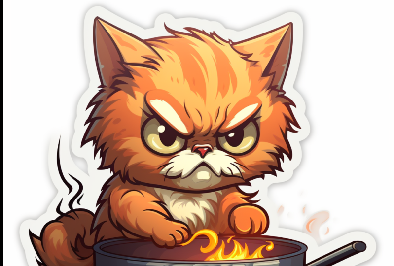
something like this. Angry kitty cooking
a meal, twitch, a moth is kind of emotion which you can put it in your
wordings and your prompt. To get something like this. You've got online-based logo, truck logo, line
design, Victor logo, minimal, flat,
modern, symmetric, get something like this. And Irish Marvel superhero. He's logo is a potato,
which is a potato. And he's able to control
the rain, is lucky poem. And median is understanding. Minimal flat design. Victor logo of a dragon,
elephant, tusks, dreamlike inside combined
with a crescent moon. And this exactly I
was looking for. Or maybe something
simple erasing sail boat in a
contemporary logo. Logo of a mad scientists
cat cooking honey, Fire, Hot Press flames, which is in the
parentheses in a circle. Bodybuilder, vector
logo, vector art, emblem, simple cartoon to D, and illustrative logo for camping using smoky
blue base color, which if you're looking for
a specific color with 3D new animal character wearing
sunglasses with the same face, having a beer bottle. And this is very important. Appearing out of a tint. It takes off camping. Below the character Victor, both line, white background. Simple vector logo, a
coffee machine, flat color, note takes an angular that efficient care
overall as it minimalist, 3D color, logo, contour. And you get something like
this very harmonic color. Vector escrow, face,
logo, drawing, elegant icon, black and
white, white background. This is very important. Dna is styled company, logo and all made with bronze. Complicated mechanics,
structure, highly detailed. You get something
like this guy's short mighty cartoon
Justice logo, coffee shop logo with the red panda as
the primary Moscow. And if you want to
see my collection, please click here to
see the old collection. At the same time,
pinterest.com slash solely or slash mid-year need
dashed prompt dash logo. You come here to meet any
prompt logo and you have access to All the logo
that I have here. Maybe you like this
logo, you click on it. This is the prompt. This is the fourth prime. You can copy and paste
and put it in my journey. When I come back here, Let's
go through all of them. Logo of eagle's head, Asian mom logo, t-shirt. Trust me, I put a lot of time to create this logo for a guy
with this kind of prompting. Even if you're
looking for a letter, liquid letter E, bc, whatever you like,
use the same prompt, click on More, change the E
to S or whatever you like. Something like this. Go back through all of them slowly so you guys can see
what I have done for you guys. Different style. Like if food, burger, like a guitar, like Chef, cats, different kind of cats. Letter B, Letter a. Stair. Like a cool cat, cartoonish design that
I M eyes mountain. As you can see, I have a lot
of full list for you guys. Just going signed copy to prom
and enjoyed prompting and immediately it may go
through all of them. It's gonna be a lot. This is the ones that have
done the upscale version. Each, you're going to love him. Alright guys, I hope you
enjoyed this course and you have access to all of these
prompts. So use them. Happy.
 Soli Art, Content Creator | Digital Artist