Transcripts
1. Intro Video Adobe XD: Hi, welcome to user
interface design cases 30. My name is solely art
and I am UX strategies. Anyway, designer. You and I are going to create
this beautiful website and mobile application for a
mere real world project from scratch in Adobe XD, if you're a total beginner or you have no idea where to start. What is the path to become a professional user
experience designer? Discourse is for you. We start from scratch by understanding the difference
between UX anyway, and we download and
install Adobe XD. Then we learn how tools
work in Adobe XD. Then we create simple shapes. And then for your
assignment one, you have to create
multiple shapes. And then after you created, you can come back and watch the video for your
assignment two, you have to create an owl. Now it's time to working
with types in Adobe XD. Then for your next assignment, you have to create this
topography with the shadow. Don't worry about
a font right now. We talk about it in future. Then we understand masking or putting an image
inside a shape. For your next assignment, you have to create an Instagram
profile page for tablet. We also learned how to make any website responsive
for mobile view. Finally, we have to start
a real world project. But first, you have to
convince the customer you are the best designer to this
website and mobile app design. Now, I will show
you the secret of getting any job offer easily. By following these steps, we understand the
problem statement and we come up with a possible
solution for other client. After getting the
job from declined, we have to go through
the design process, which may have three steps
in UX and twist steps in UI. The three steps in
UX is discover. First, what is user researching? What is a scope of work or timeline and how we create one. What is user interviews? What is competitive analysis? And how we can compare
the competitor. How we can create user personas, empathy mapping, how to create user journey mapping or
customer journey mapping. What is user flow? How to create a moodboard
required sorting. How to create information
architecture. What is wireframing or
low fidelity wireframing? Website sizes, grid system
high fidelity wireframing. How to create prototyping
had to do animation. There's a lot to cover guys. I'm so excited to get started.
2. UX vs UI: What is the difference
between UI and UX design? Which is actually as
UX and UI. Ui UX. Ux or user experience design is the process designers
used to build products that provide
great experience today, user's UX design refer to
filling then the motions of user experience when
interacting with the product. It focuses on user
flow and how easy it is for the user to accomplish
the desired goals. So what is UI? Ui or user interface
design is the process. Designers use interfaces
in software or computerized devices focusing
on MOOCS or a style. Now, let me explain and
I start with an example. Let's take a look at this image. What is UX? Ux is user experience, which you see here. And you, why is this way? This is a UI without
the research, because this is user experience, this is, user behavior. Usually likes to walk
this way, this way. So we call this a bad UX
design because you use it. Experience is not right. What about this example? We have two good designs, but one of them has a battery, you, one of them has a good UX. A bad UX is this old, typical Heinz tomato
ketchup design, which you cannot get
anything out of it. But this is a good UX
because you can get all the catch-up pyramid easily and has a
good UI as well. Now you are getting, what is the difference
between UX and UI? Let's go to another example. In this scenario, we have
two different user, parents. And the kid. As you see in this image, parents are happy and having
a good UX because they can see the elephants and the tiger and everything
in the right place. But the kids having a bad, you just take a look. The kids can just see the
bottom of these animals. So always remember which
person you are designing for. You are designing this area
for yourself or for a kid. If it's for the kid, you're having a bad day. F is where parents are,
right? You are good. Now, let's get a letter deeper. So we always first
do a research, research based on the UX
we discover, be defined. We just talked to a lot of
people, to stake holders. We do a lot of
interview with users, data mining, business
analysis, and a lot of things. After a good research, which is the phase one, it means design the right. Think like this one. Design the right thing. Design the right tank. This is UX. When you design it, when you have the prototype. We go for UI design. We go for design things, right? The face to redesign,
and we deliver. So basically it's simple. Do your research and then do your design to the
UX and duty you are. And this is a very simple way of explanation of what is the
difference between us. Anyway.
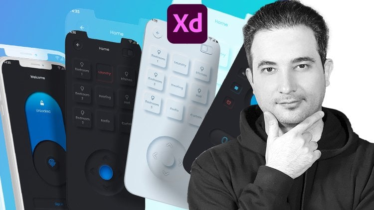
3. Start knowing the Environment and Working with Tools: Let's see how we can download
and install the Adobe XD. Just come to Yale and just type, download Adobe XD and
just click on it. And by default we can find here download Adobe XD
and get us started. Just click on it. Get XD, just click on it. You have two options. If you have Adobe
Creative Cloud, which you have to be signed in, it means you have to sign in
in Arabic Creative Cloud. Then you can download this Creative Cloud
desktop application. Then you can download
all the applications. Adobe XD is totally free. When you download it, you
can just click on Open. So after you open Adobe
XD for the first time, you have some custom
template here. If you are designing for iPhone, you just click on
this icon here. You can choose which
iPhone you are designing or which web app size. 1920. The 1366, which basically not in 2010 AT is
the famous one. Instagram story, Twitter post
Facebook, YouTube video. Or you want to design something totally custom like
a banner design. So for instance, we are
starting with a web 1920 1080. Just click on it. Let me just make it bigger bit. So before we start anything, let's see how we can save it. You can save it on Creative
Cloud application, which you have to pay for it. Or you can just come to File, Save as local document. And let's just save it here. I'm just call this
artboard and click Save. Let's close this 1 first. And to zoom in and out, hold on Alt and cold
with your mouse wheel. Look. Or if you hold Command or Control and press
three on your keyboard, It's going to just zoom
in on that artboard. This is the canvas that we
can draw, anything on it. And the left side, we have the tools like rectangle,
circle, triangle, line. Like for example, I'm just going to draw
something like this. Click on it, draws
on the at symbol. We have the pen tool here. You can click on it. I will
explain every single detail. Just for now, I'm just
going to click on it, like outside, click and drag to select it
and press Delete. I can click on Text, type, something like
welcome to Adobe XD. If we click here, we have some letter handle here and drag it down. I
can make it bigger. As I said, I will explain
every single digest. This is for demonstration.
Now press Delete. If I click on art board, I have access to
all the RPO like mobile, tablet and desktop. If I click, if I come out a bit, hold on Alt or Option ambiguous, mouse wheel, right out. And if I click, now, if I drag it up, can
just put this one, this one, this May
1 be a bad Nexus. Maybe, maybe Samsung Galaxy,
watch, 40 millimeter. Now, if I click and maybe
drag this down a bit, maybe click on this one, drag it up, drag it
down, drag it up. And I click and
select all of them. And the right side, I have this bar, which I can align
everything from the top. Click, Command or Control Z. Maybe I can align
them from the center. Maybe it can align
them from the bottom. Right. Maybe I can align them equally. For example, if this is
here and this is here, this is a bit here. If I click and select all of them and click on this
one, see what happens. The separation and the gap between them are
totally equal to z. Here, I can align them
totally from the left. Look to magnetosphere from
the center, from the right. And this is going to be
equal from the center. Correct? What do we have on? I'm just going to
click on one of these common control 32. Just specifically zoom
on this artboard. If I come out and
click on this one, command control TV, I'm just
going to zoom and this Lara. So hold down Control or Command
and your mouth come out. Let's click on this one. For a zoom-in. You have
this. If I drag it. And just select this area
and risk zone that area. If I hold down Alt or Option and just click to the left side. I'm going out. If I
just zoom in like this, I'm just going to be
their artwork here. Now, let's go back and
select the Move tool, holding down Alt or
Option and drag with your mouse wheel is
going to be very easy. So on the right side, we have our control panel. If I click on this rectangle
and just hold down, Shift, select to be cube, right? On the right side. The properties is
going to be active for this little
rectangle or a cube. I can change anything here. I can just adjust
that or alignment. I can use Repeat Grid, which has, which I
will be explained. So it's something that
if you click and you get this handle and you can
repeat anything you have. Now I'm just compares,
come back nosy. I will explain, repeat
grid with a real example. For now, I'm just going
to explain to you, get the idea how everything
works and transformation. You can change the
width, maybe put 600, maybe this one to a 150. And this one, it's
going to be Phillip, Anything you have here? This is for fixed
positioning for animation. I'll explain, I will explain the responsive for when we
are designing a website. And this is like the opacity. Let me just fill this. If I want to color this, I'm just going to click
on this little icon here and just it with red. And this is the border, the size, maybe ten. So we can see it. And the color, if I click
here, I can make it black. Now I can drag the opacity
and make it 20 percent. Now, if we zoom in
all our other option, assuming you get this
little corner points here, if I click on it and drag it, I can just around the
corner, as you see here. Specifically give it 20. If I want to have a
control just and change one single corner or
an author or option, and just click on one of
these and drag it down. As you see, this is separated by default is going
to be something like this. It means all the
corner are the same. But if I click on this
little icon here, I have control on
each, every corner. So maybe I can put this 0, maybe this one hour, I put it 100 and see. Let me just go back
and all is 20. So all is the same. What about the border dash? What is it if I just put
on 10, see what happened? And the gap is too. If less. So, maybe increase
the gap to test it. See what happened. And the size 20. So it's coming inside. I have control of this
is coming inside. This one going outside, but this one is in, out is exactly in the center. But I don't want to be sure. I want to be cornering. So our controller that to look round cap. What about this one? Projecting cap. But this one but cap. Corner RCA projecting. I want to put it on round cap. And now I can play around
with the dash, maybe two. So you get the idea.
Maybe take a look. Now, the gap is 50, is more gap. The size is 10. Smaller. Look. So I'm converting. Let's put a dash
and the gap on 002. So the size is 10, so it's fine for now. It's very normal. Let's change the color to something else,
something like purplish. At the top we have something
called solid color. Just click on it. We have linear, which I can just drag this
corner and put it here. And I can click on this
one and bring it here. As you see when you click on it, there is a white circle, white border around it. It means it's active. And I can change this color. So maybe I can make it red. I want to change this
one if I click on it. The second is going
around this one. Maybe two yellow. Look, now we are very cool. Linear Gurion. What about if I want
to change this to radial gradient is going
to be in the center. I can play around with this. It's very simple to get there. Very cool, effective
like sun effect. What about Angular gradients? It's not really useful actually, this one, I mean, you
can play around with it. You can change it to
different colors, but, but basically
I never use it. So most of the time is
going to be linear, which I will be explained
in different lesson, how we can use linear
gradient professionally. For now, you get the idea
how everything is work. What about here? We have the layers here. So it means anything you create, if I press Command or Control D to duplicate this one is the Rectangle Tool and
drag it and put it here. Or if you hold down Alt or Option and click and drag down, you're copying these two. So some backend with
command or control, minus or plus as well, you can zoom in and zoom out. So I'm holding down
Command or Control and click on minus and plus. The other way of copying
is the simple one, command or control C and
command control loop also, you can just copy things here. So C, so we can get a four. And you see, when
you just drag it and drop it here you
see these align. So it says line look
and just let it go. So how many ways we are copying? Let me just select and hold down Shift and just
make this smaller. Zoom it. Hold on Alt or
Option, click and drag. We are copying. Press Command or Control D. We can press Command Control C, Control V still be copied. So three way of copying
things in Arabic. See, let me click on this. Let's bring it down. And the effects panel, we have inner shadow. If you click on it, look
a participant to inter, click this one on five. But nothing happens. Why? Because this is transparent and you see something like this. You have to click
on it and change it to black and drag this up. And just come here.
So inner shadow is getting the shadow inside
this just presuming, you get this one and
look at this one. You see there is
a shadow inside. And let me just maybe
10 depth, right? You can tell it's
very dark, right? So if you click on it and this one we can bring
down the opacity. So gradually we are adding the inner shadow
like, like a button. All right, let's go to this one. Going down and click
on the drop shadow. Again, drag this up. So automatically we have a
drop shadow and y, y axis. So most of the time put
this one as 20 or 12. Look, we get a very
gradual shadow around it is not very sharp. And you can get a direction, maybe 30, right on the
right side, or minus 30. Just put a minus
here and click Okay. So you're going to
have left. Maybe this is 30, so it's going down. So let me just put it as
026, the normal ones. So this is the normal layer. Now, if I click on it, I
can drag it down so I can control the intensity
of the shadow. Or I can change
the shadow color. Maybe I want something
reddish, maybe bluish. So it's up to you. What about if I click on this one and what
is background blur? If I click on it, anything
inside is going to be blur. I don't have an image inside. So let's bring an image. So I have a lot of MHA
just click on it and drag it and drop it
and put it inside. When you see these blue lines, it means it's inside and you see the words copy, just let it go. So it means inside,
but nothing's appear. Why? Tennis off? You see it, right? Let's go back to background
behind just activated. Right now, the opacity is at 0, is drag it up so it's active. As you see when I change
the amount and brightness, nothing is happening,
just opacity. Why? Because this is an
object, this is an image. It means after putting our
object layer, now, you see, you see this as an
object now have an amount to something. Now we get the idea how
everything is in Adobe XD. And in the left side
we have the plugging. There's a lot of plugging that I will show you guys
how to download them. And we have the layer panel
and we have the document as the color characteristics in a component which
will be explained.
4. Create Simple Shapes: Let us start the first project. In this project, we have three shapes that we
are going to create. Shapes and lines. So how we do it? Let's
start with the simple one. So I'm getting a bit inside. So we have a background, which let's create it. I'm just going to click on
this image and go to Layer. And for now, I'm
just going to lock, lock in place or press Command or Control L to
lock an image the place. So I locked damage. So if I click on it, I unlock it and I like it again. So for unlock and
just click on it. And so so we have these shapes, this created very quickly. Now click on this
rectangle and it's closer. I'm just going to go
to this corner and just hold down Shift and drag to see what exactly
is under, beneath it. Just drag the opacity down so I can see
what is behind it. What about the color? How we fix the color? I'm just going to put it
aside and holding down Shift. So it's going straight
to the right side. Pick up this color
picker and silicon atom. So this is getting
the same color, but because the opacity is down, it's going to be like this. We don't need the border. So now click and
drag it to the left. Now drag this corner down to match this
with the layer below. I'm just going to turn
on the border so we can see what is behind it or bring
down the opacity as well. So play around and see,
sorry, this is cool. When it's fine. I'm just going to turn that off the border. All right. What about this one? So
because this is a straight, it means we have to use a
rectangle to why I show you. I'm just going to
come to this corner, hold down Shift
and drag it down. Click on this little corner and just totally make it a circle. Now, this is a circle. So for now, what I'll
do is slowly from the center I just and drag it to the outside and see
this is so-called Nam. Click on this little circle
here and I drag it down. So I get this little corner
in a straight line here. Then thereof, click on this
icon to move to a long shift, drag it to the right, pick up the color picker, I click, and now it's colorized. Let's bring it back.
What about this one? This is going to be
very interesting. Elliptical Marquee Tool and
hold down Alt or Option, drag it from the center. And I just want to make
it exactly like this. All right, bring down
the opacity so you can see where the R drag it down. This line. It means you are in the center. I'm going to make
it a bit larger. So along shift, drag
it to the left. Keep holding down shift, click on this little corner
and drag it to the right. Pick up the color began
and it's totally read. Now, bring it back. Now, how do we get half circle? It's actually very simple. The cool thing about it is you
can come here and click on rectangle marquee tool and
just drag a line on top of it. Now, click on the
Move tool again, hold down shift, and
click on the circle. So the top one is
going to be deleted. This could talk and
click on substract, click, and it's
going to be removed. Now, double-click on this
and check off the border. So we are good to go. Or maybe it's a bit bigger. Hold down Shift to make it a bit from the writer,
the big, better. This one is simple. Just put it in the center
Alt Shift and drag up. So with the arrow key, drag left arrow key,
left, opacity down. Turn off the border and
risk and drag it to the right of the color
bigger, make it black. Let's go back to a place
and bring up the opacity. What about this one? It's like a button
spit useful actually. So rectangle marquee tool. So let's bring down the opacity. Drag this to the left the pits. Use this corner to drag this. A king just going to click
and drag to the left. Coo. No need to have border. Drag it to the right. Color picker, click
springing top. And I'm just gonna put it here. While this one is a triangle. And it's gonna hold down, Shift, bring down the opacity. And come here,
Let's go above it. And maybe a bit larger, holding down, Shift
and drag the corners. What about this corner? Bring it down. You see, has some corner, right? All right. Let's bring up the opacity. And you see this handle here at the top and
just drag it down. Drag it to the right, pick up the color began and
make it orange. Let's bring it back. Turn off the border. And I'm just going to
lock this in place again. Click here and
select all of them. Hold down Shift and
drag it to the rights. What are the background? No problem. They can Rectangle Marquee Tool, click here and drag
to this corner. Now, drag it to the right, but it's on top,
just right-click. Send to back. We could color
picker and scholar. Noted to have border. So I'm going to select all of them again and drag
it to the right. I can make them centered. So all of them are
selected and I'm going to select this one. Bring up the passages in
this one opacities top. This one has a towel
and represent. So basically this was
the first project.
5. Assignment Create Multiple Shapes: I'm going to remove this. Let's start from scratch. Click on this one. Matrix luck. If it's not, click on the lock icon because
me change the artboard. We don't see these
lines anymore. Each artboard has his
own lines and shapes. This is the second artboard. So I just see inside, if I click on the artboard
and the image inside it, I can see the inside
one-to-one look, which is locked. Now,
let's go inside. We always draw back 1 first, which is the circle. They're getting an a circle. Shift hold down and drag up. Bring down the opacity Greek man selection tool,
drag it down, hold down Shift to make
it totally match our ICU. No need to have border. I keep bring down the opacity so I can drag it to the
right color picker, pick a color, so drag it back. What about this white cube? So I'm just going to
hold down Shift and just create something
known it out border. Let's bring down the opacity. If I put my mouse here, I get this icon so
I can rotate it. You sort of put it
here, color shift and make it a bit larger. Maybe any, to have a bit more
rotation to make it more straight to the left. Now back. Now, what
about this triangle? This triangle, hold,
Shift, drag it down. Put your mouse here,
rotated selection to bring down the opacity. Hold down, shift,
drag it down again, and get more rotation. Maybe more rotation. I can make it larger. It from this angle
to 90 to a border. The color is orange. Now there is a circle inside. Can condemn, circle, hold on, Alt and Shift and
click and draw. All right, this is cool. I'm just going to get it here, put it here, and
get to our border. Maybe I can make it smaller. I'm holding Alt and
Shift and drag it down. Is it what is exactly behind? So it's pretty cool. So 100 percent, 100
percent, a 100 percent. And this is what we have. Right now, let's draw this one. It's very cool Actually. Let's click on the line
tool and just click here. And dry line to here. Now click on the border color
and make it totally black. It's going to be here as well. And just drag it down for
the color, totally black. Now, select both of them, Command or Control D
to duplicate them. Put your mouse here to get this rotation circle
and I can just rotate it and get this one. Kinda Control D again. Do it until you cover all
of these. Come up actually. The same thing we did last time. Now, to combine these together, just select all of them
and click on the Add. Now, all of them
are united, right? So it means I can
move them around. Now. Press Command T
rosettes, go back. All right, let's draw. This one. Is really
cool. Actually. Click on the triangle
and hold down Shift. I'm just going go back a bit. Shifts a bit. I'm just going to sit down, bring down the opacity. So what is fire? The border? Let's
go to the right. Click on the color, blue color. So it means if I increase
the color because color. So let's go back. Bring down the opacity. So I just leave it here. What about this one? So already know, rectangle. Bring down the opacity. Here, see the selection. So I'm trying to match
this hold down Shift. Let's go in a bit, maybe rotate it a bit more. Nice border. What about this one? Again, rectangle. Along Shift. Bring down the opacity. Come here and allow
ship that smaller. Hold down, Alt, drag this down. Hold down, Alt, drag this down. So you have them separately. Nice. And the last one is very nice. Bring down the opacity. Rotate it, make it the same
size as our border selection, select on this one and
Monica border as well. Now I'm just going to
click on this little icon here and let me just
select all of them. Drag this down a bit. Select this one, bring up the
opacity, select this one, bring this one to color
picker and the same coloring. And this one is also reddish
kind of pick up the opacity. I'm just going to select it, I'm just going to bring
it back to its location. Let's draw this one, which is going to be very
cool as very quickly. Rectangle, drag
down the opacity. Drag to the right. The
color began Glick. Nice. What about this one? Allow shift. One rotation. Let's go click on selection. I'm just going to give it here. Maybe a bit more rotation,
hold down shift. Drag these 10. Size, the size three here. Sometimes you see it's
not going to match. So for example, like this,
bring down the Opacity. Double-click here. Now you
have this point separately. So by double-clicking every
corner, it's movable. So click on this one,
so drag it down. Click on this one, put it here, and click on this
one so we can make it a very cool triangle. Now, in the school, back to this one. Bring down the opacity. I can just rotate it. I can put it here. More rotation, larger,
larger, school. Now, what about this
one we already know. Make a big circle right here. Now. Let's draw a line here. All right, so to do that, I'm just going to
use my rectangle. Just click here, bring
down the opacity. And we need to just rotate it to make it very accurate line. Because I need to just put
it here. This is on top. Now, hold down, shift, click on the circle, and click on, then, subtract. Now we have this. So I just need to have a bit of rotation. And that's it. I'm just going to
select all of these, drag it to the right. So typically color, this one
was white, a 100 percent. Select this one. This one was yellow,
pink up the opacity. Click on this one. Color opacity 100 percent. And this one also this 100%. Here. We have this very cool
and interesting design. I select all of them, drag them to the right. We also need the background. Select it, drag it to the right, right-click, send to back. Now we have the
same color border, just going to select them again and drag it to the right of it. So it's very cool
and interesting. So let me just select this
one and bring up the opacity.
6. Assignment Create an Owl : Let's try and do this one. I'm just going to
delete this one. Let's zoom in a bit. I'm just going to select this.
Let's try the first one, which we are going
to use, Pen Tool. Pick up your pencil. Let me show you how it works. Click, click, click,
click and click. Solidworks. Right? Now, select it and delete it. Again. Select the Pen tool, click, click and drag. Click and drag. But if I want to continue,
I don't want this. So I have to hold
down Alt or Option, click on this handle and
bring it back this point. So I'm free to go
anywhere I want. I can click here and just drag, hold down Alt again, click on this little icon, bring it back so
I can keep going. Next right? Now, let's select it. Let's draw this one too. Let's click here,
let's click here and drag until we
match these lines. Or lambda. I have this handle. I cannot continue to
hold down Alt or Option. Click on the icon, bring it back to center, is going to disappear.
I'm free to go. Click and drag. Now. Playing this back,
click, click and drag. Hold down Alt, bring this back. Click and drag back. Here we go. Pick a color. Now it's
red night our border. Trade that off. Let's try this one. Press the pen to layer. I'm just going to close
that up. More space. Pen tool again. So click here, click here. Make sure you just
follow the curve. So right now it's
going to straight. So did here, click and drag
Alt and drag this back. Straight, hold down Shift
to be totally straight. And click here and drag Alt. Drag this back here. And keep holding
down shift here. I'm trying to see
if I can do it. Cool. Thanks. Missed it. Kamikaze to go
back and click and drag it here to here. If it's going to be something
like this, don't worry. If you allow all, you can just click on
this and just bring this back to the center. Now, why we this
just the right part, because we just
going to copy it to the left side is going
to be very interesting. Color picker for the field. Click on this. Now, click outside.
Now if we click, we have all of it. Press Command D to duplicate it. Let me just open this
up. See what happened. She Pad 15, look, connected to D is become
past 16 on top of it. Now, click on this little
icon to flip it horizontally. Hold down shift,
drag it to the left. Now it's totally match. Allow Shift and click
on this little icon. So both of them are selected. Now click on Add. So they are, two of
them are combined. We want to see what
happened, turn that off. But now let's try this one. This one either we
tried left side, then we copy to trisect. So I'm just going to click
and drag until here. For now. Bring down the opacity. Now is go inside. I need to have
these kind of care. Some reason hold on Alt or option and just drag it
to get the sculpture. So I have to bring this down. Cool. I have it. The other thing
is have descended to back because this one. Right now is on top of this
to send anything back, hold down Control or let me
show you the shortcut keys. Send backwards,
Control, Left Bracket, bring forward contour,
right bracket, send it totally to the back
Shift Control Left Bracket. For this one, we're going to go step-by-step, sent backwards. So press Control Left Bracket, just going to select it
Control Left Bracket. So I'm going backwards. Look and feel and make it black. Or if you're going to be
get to the same color. And it will have four there. Also bring this down. So I don't just see this. Now. I need to have this kind of
care wish things, right? So what I do is click on
rectangle, marquee tool. Click and drag. Now. Make it totally circle. Bring down the opacity. Bring it up to our border. And just to make this
straight hold down Alt, drag this to the left or
the drag is to the right. They can feel and make it black. Make sure it's a
100 percent black. Now, we're going to hold down Alt and drag this to the right. Alt and drag this to the right. Again on top of these hold down Control
and Shift bracket, left bracket until it's
going behind this. Now, let's try the I, click on this, bring
down the opacity. And let's click on this to actually bring
down the opacity. So I want to see exactly
what's going on. Click on this layer silica. Come here, hold on Alt and Shift and drag from the center. Pin down the opacity and
strategical political border. Click on this icon. Command D to duplicate the
circle again or that off. And so the make it
from the center point. Maybe it's too big. Let's click on this
one, delete it. Click, hold down Shift. Maybe you can make it a bit
smaller, which is cool. Command or control D. Hold on Alt and Shift and
make it smaller. So we have the center
point as well. Now, one shift, click
on this circle. Again, we need to subtract
this from the center. Now subtract it. It's gone. Right? Now. Selected, bring
up the opacity to 100 percent selected to
pass it a 100 percent, select this one
as a 100 percent. Now, select the left parts. I don't select this one. Hold down Shift and
click on this icon. So only these four are selected. Hold down Alt to copy it
and drag it to the right. And meanwhile, keep holding
down Shift to be a straight. Now we are here. Click on Flip horizontal along Shift to make
it a straight. Cool. Now just check this out. Now, there's something
on top of this, which is two of them because
we copied from this one, we just contract is not needed. Just going to delete that I
can bring down the opacity. Also click on this
one, down, one, left, one down so I can see what is here as well as the dam because this one is
on top of everything else. You so actually is
a very cool trick. Look at the circle on the
Alt and Shift, drag it up. So this is our circle, right? And the color is yellow border. Bring down the opacity. So if I double-click on this and get every
single points, right? Now, double-click
on this corner. It's going to eat this. Now, hold down Alt and click
on this to get this handle. Click and drag this
handle, this point. Again, hold down Alt,
click on this handle. Click and put this here
and keep holding Alt. All right, now,
which is very cool. And hold Alt again and
drag to the left than alt, tags the left and Alt. And then pick up the opacity. Now, click on everything
else to being up there. Opacity also, this one. Bring up the opacity
and EA we go, Let's see where
we are right now. And they're very
cool. All right. The rest of them are
simple and tricky. Let's try with this one. Let's try a rectangle
here for now. Here and here. Pick a color which is
yellow or orange, yellow. Now, for this one is a circle. Come here and try silicon
than Alt and Shift, bring down the opacity to
make it the same size. And it'll have border, color, picker, yellow, 100 percent. Now, we need to combine
these two together. What something is out from here, I'm just going to bring
this term will disappear. Cool. What about this corner?
Hold on Alt and bring down this corner
to get this line. Hold down shift,
click on the circle so both of them selected
and click on Add. So they are united with an alt, drag it, and meanwhile, hold down Shift
to be a straight. Come here and click, Flip Horizontal color picker, and pick the color and
drag it and put it here. You can use your arrow,
left arrow keys. Now, hold down control and
click on this little icon. Hold down Alt and drag it here. You see this bounding
box, the blue line. It means you're still
inside the group. So Command or Control
X to copy it. Click outside. Now we are out of this group. Press
Command Ctrl V. We need because I
needed the circle, because I want to put it here. But I have to put it
behind this black shape. So, you know, already Control Left Bracket
until you go downwards. And you are behind the color
picker and make it better. Hold on Alt or Option and
drag it to the right. Use your arrow key
to be totally okay, and this one is white. Again. Have to bleed the back
control and left bracket key. Again, Control F rapidly cool. Well then Alt and
shift to the right. And this is yellowish. Alt and Shift drag
it to the right. And this one is red. So we keep doing this. So down here, I'm just going
to pick a color picker here. And if you use your space for an already that you can
just move around or just middle mouse if you're all like click it and
you can just move around. Control Left Bracket can go
backwards called shifts. Click color, hold Shift, click here and make it whites
and Alt Shift as well. I'll just put it here. Hold down Control left brackets
so I can go backwards. I'll shift to the right. Shift. We can color. Pick a color. What about these two? You already know? All shift. Drag it to the right. Click on this rectangle
tool and just click here. This is on top, so
it needs this going to be disappear or down Shift and click on this
circle and subtract. The color is cyan alone, Alt and Shift and
drag it to the right. So open it and flip horizontal. Just come here. And here. What about
these lines here? There's a cool trick to do that. Let me just click here. This is a rectangle which is going to be
totally black border. I have to put it backwards. I can just drag this
and just put it here behind all of them. All the layers. Now bring down the opacity so we
see what's going on. And we're going to use this one, hold down Alt and
just drag it here. And let's make it white. Again. I'll drag this right. Drag this to the right, flip horizontal along Shift
Alt and shift to the right. But they have this bottom
area, so we have to cut it. Again. Can just
draw a rectangle. Click here. But we want to delete
all of them as the same. So it means we have to unite and click here,
hold down, shift, click, click, click,
Add them together. So the R1, now they are united. Click on the rectangle
or lunch shift, click on the circle and minus. And then the top one is easy. Here, rectangle. And here we go. Drag this down to a border. Now down Alt, click
and drag the corner, alt click and drag the corner. And let's see what
you have done. Selected hold down Shift and
drag it to the right hand. How cool is that? But these two has to be behind. So select both of them. Belong control and
left bracket key. Baikal. This is going to be selected and opacity
should be 100 percent. And we have something
very, very interesting. He's going to see this one. Maybe I can just, you know, sometimes let's just drag this up with an old from one corner. I can add more to it. All. From one core. I can add more to it. It is more convenient. Now, trust me guys. You guys can create anything
in Adobe XD very easily.
7. Working with Types: Let's start working
with text in obesity. I'm just going to
click on the artboard and press Control 3. So to be exactly,
and it's a spot. Now, I'm just going to
click on the artboard and create something like this. For now, prestige and type. I love Adobe XD. All right. The first one here that
we're going to look for is the spacing. I put it on a 0. And if I click here and
use my top arrow key, I can increase the
spacing letters. If I use my down arrow key, I decrease it and less spacing. Let's initialize cool, cool. Minus 60. All right, this is the first step to understand
these two options. I'm just going to go
here and just copy this line of text,
bring it here. And let's try to use
this for explanation. Too big, I paste something
that which is too big. Let's fix it. Put this on 10, still is
totally on top of each other. This is the spacing between
letters, line spacing. Because my top hierarchy, so play around it. This is cool. And I increase the spacing between letters so
it's more readable. And drag this to the right. So if I drag it to the left, screaming like this, so
drag it to the right. It's going to be
just three lines. Just take a look at this one. This is nothing
happening, right? But if I click here and just, just wanted spacing and press Control V and
just copy the top one. Just, let's see what happens. If I come here and use
this down arrow key. This is going to be
the paragraph spacing. If you have two paragraph,
something like this. If you have two paragraphs, and click on this and increase the spacing
between paragraphs. But this one is between the lines which is going to
affect the paragraph as well. All right, Now what else? I'm just gonna hold
on Alt and drag this. You know, all of this, right? If I can make it uppercase, lowercase letter Z, the
first letter capital Z. And I can just select the XD and this one is going to
the top or the bottom. This is underlying. And this is just
like an O prime. Now let's go to the border. What is it? Let's use the field will
change the color to blue and maybe changed it to the white and just
give it some border. And just take a look. We're
just going to select this and go back and just
take a look at it. I love Adobe XD, just with a border. You can change the color to
black or maybe blue, right? As you see, we have something
called here sampler. How we can add blur
to this image. For blurriness, which is here, I have to put
something behind it. So they just put something, maybe a color behind it. So right-click, send to back up and just
take a look at it. For this one, we're
going to select it and uncheck the border. Select the text, drag this down. You can add initial attitudes, can add drop shadow to it, and also we can add
background blur. If a checklist on, just take a look and
drag this down a bit. See, this is going to be
very, very interesting. But I get up and down, see it's totally blur. And I can just play around
with this capacity, this blurry and more
blurry for click on the background and play
around with the color. You see perhaps the
effect, the blurry effect. So back if I change
the background color, the color is going to
be change as well.
8. Create Typography with Shadows : Now it's time to create this beautiful
effect in Adobe XD. All right, I'm just going
to create an artboard. Click and feel and
make it totally black. And let's start. And we'll go one by one letter. Press S. Now, click and drag and
make it a bit larger. Just going to scroll down, I don't need the border. Just this one. Now. Hold Alt and Shift and
drag it to the right. Risk gonna call this h. But we need to add
shadow to it, right? How do we do it? First, we add a bit of
inner shadow with the Y. Maybe one or three is fine. This one maybe 10. Initiative. What about drop-shadow? Play around with shadow because you want to add the
shadow to the left, to the left or right, use the x value. I'm just going to
put 10 or minus 20 to go to the left for the shadow
and the y should be 3000. Now let's click on the drop
shadow icon here and drag this up the opacity to
add more shadow to it. So it means it's put on
minus 10 would be enough. Now, the blurriness,
It's going to be 10. Now, take a look on an altar
and option go to the right. This is going to be
double-click on it, press Shift a to b capital. Now I'll shift again, drag it to the right,
double-click Shift D. I call the Alt and Shift,
drag it to the right. Targeted. Shift O. Drag it to the left. A bit more cool. Maybe here, nice. Alt Shift drag to the right
and shift W to be kept up. And just take a look
at beautifully, we created this cool
effect in Adobe XD. All right, do some practice when you're really good at it. Go the next lesson, which is working with images.
9. Masking images within a shape in Adobe XD : How we created this, how we have default inside
this beautiful items. There are two ways to do this. We call this masking. First. Let's try this. Let's
bring the images here. And let's try this. One. Can track this
and just put it here. It's going to be huge. Look. So I'm holding down shift and
make these various smart. But we need to add,
put corners around it. There's two ways to
do is this hardware, which is masking, misconstrue. You click on the
Rectangle Marquee Tool and just make a
selection around us. Right? Now. Make the corners rounded,
maybe around 30. Now, here's the tricky part. I'm selecting the selection. You have to select both of them. The top one should be the one that we want to
put the image inside. All right, right-click
Mask with shape. And remember the shortcut
Shift Control M, and see what happens.
The same thing. Now let's try to
do the easy way. Click a rectangle marquee tool. Click and drag. Make the corner around the
spring the images again. Now just drag the image
and put it inside. As he says, copy,
just let it go. This is the easy one, but this one is
keeping the border. Just you have to uncheck this. And that's it. What about this one? The same scenario. Click on the icon here. And I'm just going
to drag something like this. Maybe
I want this one. I don't need the border. Bring the images. Maybe this one just drag
it and drop it inside. The cool thing about it is
you can just double-click on it and you can
just move it around. I can make it a bit
larger, maybe here. And click outside. The
same thing with this one. Just double-click around
it and select this image, Alt and Shift and
make it a bit larger. And how about this one? We don't have a shape like this. Click our triangle. Come here, and we have
some options here. Your arrow cages, bring it up. You can change the size,
something like this. You can go to your images
and this time it is, drag it and drop it inside. Look, now, double-click on it and just move it to
the right to be centered. The outside, click on
this little icon here. Check off the border,
and that's it. What about these two images? I can bring this image. It's going to be huge, right? Going back, I'm holding down
shift and make this very small on a put this here. I'm just going to go up so
you guys can see what I mean. So how we put a blurry
shape on top of an image. So it's good to adding text
to it. It's very easy. Just rectangular marquee to the radius around eight is fine. Border. It's good down and click
on background blur. Right? Click on it and make
sure the amount is less. To see more of the texture under a real
image from the background. And you can play around with
the blurring, sticky body. Once again, this is nice. How we can make an image blurry. Right? Click on this for the Alt and Shift, drag it to the right. And here, just click on this
icon here and object blur. If you click on it,
the amount is five, bring it down 1, 2, 3, or C. That so generally is 1 or 2. And this is how we
work on images. In Adobe XD. There's a lot of things
that we cover in future. Make sure to do some practice
guys without practice, we don't go anywhere. After doing some practicing. And you're really good
at playing around with the text and shapes and
images in Adobe XD. We go for our project.
10. Assignment Create an Instagram Profile page for Tablet Repeat Grid: All right, Let's try to
recreate this in Adobe XD. Actually, it's very, very cool and I'm just going to
click on this icon here. Click here and drag a box. I'm just going to click on my selection and
click on this to see which is two to five. The height differ for, click differ for which is cool. So 23 the same. All right, let's
start from the top. Let's go back to my
air image folder and it Instagram logo. Just going to drag
it and drop it here. It's too big or down Alt
and Shift and make it smaller from the center. And I'm just gonna put it here. Let's pick up the line here and hold down shift
to the right side. You see the size is one. You can put it on half. Click on 0.5. So the size
is going to be half. Now, we need to change the
color maybe with a bluish. Now, how we can create
this very fast, let's create one of them. So I'm just going to click hold down Shift and make one of them. Let's go inside and click on this little corner
to have border. For now I'm just going to keep the ball and just
consider something. In Adobe XD, we have
something called Repeat Grid. Just click on it.
When you click on it, you get two handles. Just drag it to the right
to see what happened. I'm going to copy
everything for you guys. If you put your
mouse between them, we can just change the spacing by dragging to the
right and left. I want to put the
spacing of five. Now, drag this to the right. Now, let's do the
same with this one. Put the mouse here and make this spacing five new dragon up. And tree line is enough. Is click outside. I want to feel this
with the same pictures. How do we do it? We need a plugin. You need to install a plug-in
in other weeks, click on this little icon
here, which is the plugins. And you shouldn't
have anything here. Just click on this
little plus sign. When you click on it,
you get this panel, the Creative Cloud Desktop App. Click on All plug-ins, a search for UI Faces, and click on Install here
you see an historian. When it's installed. You can close this one because it's just going to be appearing
in the Plugins panel. Click on UI Faces. It says just double-click
and select one of them. So double-click and
select one of them. So you can tell them which
sources you are going to use. I can use a splash and pixels. Select photo. I can tell it randomly fill 24 remaining follows for
me and click on Apply. So random nature is
going to fill it with this and see how cool is that. I don't need the
border Double-click. Now let's see what happens. If I uncheck the
border is going to be canceled it for all
of them. And what else? I can add this letter I
here and see what happens. Whatever I do to this single image is going to
be affected in all of them. In and in your project file, you have something called a material icons, Google
material icons. And this is going to look for
something called ions here. We're just going to
select it and copy the eyes and kinda Control V, hold down shift and
make these small. I want to put it here. And I want to make it white. But the thing is, I want to
be added to all of them. What I'll do is
I'm just going to click Command Control X. Now, double-click. Now I'm going
inside one of them. Now, command and
control V to paste it. See, it's adding it
to all the images. Now drag it and
just put it here. And how cool is that? What else? We have here actually?
So this is more spaces. We have drop shadow here. So double-click on one of them. Let's add drop shadow. Maybe the y is one and b is two. But the drop shadow color
should be have more intensity. And the color, maybe we changed the color
around something like. Lowish, something more cool. But I get some
lines here, right? So I can double-click here and just drag
this to the right. And just take a look. Take a look. If we get some loose here, click here and tract is
to the right a bit more. And now check this out. If I click here, I can
just move it around to make it more nice. What about this one? Kate and a circle and hold
Alt and Option. That's it. You can use the
same method guys, which is going to plug-in. Maybe this time just Unsplash. Now select photo. And you can pick four or like
this one and apply it. Right. Now, Let's change
the border color. Blue is going to change
it to this color. Nice. What else we have here is going to close
that up for them. Imposed following followers,
t to 1 followers. So I can click on Color and change it and make
it a bit crazy. And put it here, you
see it's going to be centered all time shift, drag it to the left and
this is going to be post. And you see this spacing
is going to be falling. Now, what about the spacing? I can just select these
four and click on this layer icon here so I
can make the spacing equal. All right, This is nice. What about this one? So I
need another line here, so I'm just going to copy
this one because I'm lazy or the Alt and
Shift, drag it down. That's it. What about this image? Let's select the rectangle. Is going to come here
and interact is down. Maybe change the corner
of it to make it aligned. Just drag it so you
get this line is line. Now let's bring the images. I'm going to drag this
and drop it here. I don't need the border. Just fine. Now, let's add this on top. You know how to do that
right leg a rectangle. You can drag border, radius too much weight to
make it background blurry. Click on background blur. So drag this down. Play around with it until
you are happy with it. I believe I'm happy
with this one. We need to have some icons here. Let's go back to Google icon. Just randomly, I'm just
going to add some of this. You can go and just
pick a better icons. Copy. Paste, long shift
to make him smile. Now, put this here. Click and drag this
one, and this one. Select four of them. Make sure the spacing is equal. A line from the center. All right, cool. Now again, select four of them. And let's fill it with white. Now, how to add the text here? Double-click here, press
Control C. Now, come here. You can click and drag. So our text is going
to be just inside. Now, Control V. Now, click on it. Change the fill color to black. Now, we need to add
more spacing to it. All right? This one, so the top hierarchy look is going to be always inside this bounding
box, which is very cool. And what about this one? Either change, you, click
on Text again, one-click. Be the change. You, right? Right. Now. Change the color to
something like this. You should be on top in order
to do click on the top one. All right, that's it. If I hold down
Shift and drag it, I can put it on the center. The line. It meant this is centered. Right. Now, easily, we
created our project now press Command or
Control S to save it. Now it's time to finalize
them, our design, the first thing that I can
see is they are not aligned. So it means I can click here and down Shift and very
gradually bring this down. I can select all of these and drag it to the
left a bit to just align this nice
Instagram as well. Cool. The top one. I'm just going
to delete this or down, Alt and Option and
drag this down. Nice. This one should be all capital. So we're just going to click here and click on the capital. Maybe I can drag this up a bit. Different colors, a bit darker. And that's it. You are totally okay. This, maybe I can
just move all of these to derive it
to be centered.
11. How to use components Colors Character Style in Libraries or assets panel: Let's work professionally in Adobe XD by learning
how to use libraries, or it was used to
be Assets panel, but right now it's changed
the name to libraries. Here we have three options, colors, character,
style, and component. I'm trying to create my
mobile application with multiple images and artworks. It's going to be a lot of
this may be a 1000 of this. But how to work professionally? What I mean is I'm
only down Control and clicking on this little
icon to go inside this box, I see the bounding box. So hold down Command
and Control and click on the color
that you want. Now, click on plus sign. Now I have added this. I can double-click
it and I can just type B for sure for Bitcoin. I'm holding down Control and
clicking and this purplish. And am I adding
this color as well? I'm just going to call
this button, for example. Right? Now. I'm trying to add this color to
this one as well. Hold down control
and select this one. And just one click on this. I've added this color. The again, I've
added this color, so it's going to be the same
name and the same colors. Now, if I change my mind, if I wanted to change this
color to something else, just take a look, right-click and the color you
want to change. Press, Edit, and just change
it and see it's going to change in every other color that had been using
this color, right? Take a look. All of this has been using this color is Command or
Control Z to go back. What is characters like? Just take a look at this text is different from this one
and this one, right? But I want all of these
texts to be the same. So what I do, I click on this Bitcoin text and
click on this plus sign. Now I'm selecting this one
and just click selecting this one and click
on the characters like and I'm always going to change the name to
be four-bit code. For example. Now, I know all the name is
going to be the same size, the same family, the same font. And I'm not worry about it. I'm adding this color as
well. I'm selecting this. I'm adding this color as well. But there is a problem. I want to add this
color to this one, but I also want to size and
font be the same as well. So in this scenario, I need to make this
character array as well. Just take a look. If I just go here
and add this color, the current is added, but the font size is not
going to be the same. So what I do, press Command or Control Z
to go back to the normal. Now, take a look. I'm silicon this one and I'm
adding a character slide. Now, let's change
the name to number. Now, just take a look. If I come here and select
this one and click and this is going to be the same as this one.
What about this one? The same? And the cool thing about it. If I change my mind
and I want to change the font and the color,
I can right-click. I can edit the color making, maybe make it publish, right? And also what about the font? I can change the font to. All of them are going to be
changing at the same time. This is the way we work as a professional
designer and Adobe XD. What is components? Now? The component is very cool. Just take a look at this
one day become logo. For example. I need this logo everywhere. Maybe I'm holding down Alt and Option and Shift and
drag this to copy this. I have a lot of these Bitcoin. If I change my mind, I want to change this logo, which they do have to go here
and change it one by one. It doesn't make sense. What about if I want to
change the color so it needs so what about
the other one? Have to go one-by-one and
change all the colors. So this is not really good in design because we have
thousands of things to change. So the best way is just
hold down Control and click on this icon and
make it a component. And I'm just going
to call this API. Just take a look at this one. I have to remove all
of these as well. Now, there are two
ways we can do this. We can click on this and
drag it and put it here. Which is not a good
idea because I want to be the exact same place.
So I want to delete it. Press Delete on your keyboard. Click on this little icon here, press Command or
Control C to copy it. Now, select the top one, the Arthur press
Command or Ctrl V, to copy in the same place. Again, control V to
copy in the same place. Now, why we do this? Because if I change my mind, if I click here and maybe I want to change this color to something
else and take a look. All the colors are changing. And another cool
way why we do this. Maybe in future, I
changed my mind. I want to add this sign
to all of these Bitcoins. What I do, let me just hold
on Alt and copy these. Hold down shift and
make it a bit smaller. Nice. Now, take a look at this. I'm clicking on this plus sign. Now, it's a terrier. I want to change all the Bitcoin because all of them are
combined with Italian logo. Just going to click on the
Ethereum and drag it and put it on an a CDS box. Let it go. See. All of them are changing and they are the
same size, the same place. Let's press Command
or Ctrl Z to go back. Right. Now you know why
we are using this. Now I can click this and a, B. All of them are changing. Now you know why use colors, characters, slide,
and component. Always when we designing, we always have to grade
our color palette. This is how it created. Or if you want all the compiler that
you're using the art board, you can click on the screen and just click on the plus sign. All of them are
going to be added. So just remember, change the name so you
know where they are. Maybe this one is the date, this one is the Ethereum title. This line is the line. This one is prices. So you get the idea. This is how you work with this. We can also do something else in this one.
Maybe this one. This one is going to
be repeated a lot. So I'm holding down
Control and clicking and this number will shift to
be these two are selected. So Control Shift, I'm silicon 28 and make these
components, right? Let's go back. Now. Let's click outside,
click on this, and drag it and put it here. I want to put it
here. The easy way is right-click Edit
main component. And I'm holding down Control and clicking and this color,
I'm going inside. I'm changing the color
to something else. So it's going to be
changed here as well. What about these numbers? Is the same, maybe
element size value to 15, 14, C is changing as well. So this is going
to be very easy. And when we have a
lot of artworks, it makes our life much easier, especially with the client that every day is changing as mine
in future in our projects. We do a lot of practice on
this. Don't worry about it. This was just a
review of how we use colors, characters
like components.
12. Create a Responsive Website Design: Have to make
everything responsive. In Adobe XD, we have this website header and
it has to be responsive. It means if I drag this animated
a smile for mobile view, everything should
come to the left. But in this case,
nothing happened. Press Command or Control Z. But if I select my artboards, the blue on the top and
click on responsive resize. Now, take a look. If I drag this to the left. It works. So this is how responsive
works actually, right? All right, let me
press Command Z. Now, let me explain
how it works. I'm going to delete these two. Right now Let's create a button. I'm just going to
click on a rectangle, drag from left to right. Let's drag this corner to
make it very rounded button. Click on the fill color, became greenish
color, border plus t. And put it here, call this side. I want to make it a bit larger. I'm just going to put
it here. Click on this. And it's automatically is going to be an
responsive resize. Let's see. If I drag it
and make it smaller. It's going to change. This one is going to make everything responsive
inside the page. What about if I want to
make this one responsive? It means if I want to drag this, this sign-up texts should
be always in the center. How to make that happen? Let's press Control Z. It should be grouped first, select both of them. Control G. Now, if I make
this the left or right, if it's grouped, It's going
to be always in the center. That's the trick. Right? Let, let me just
make this larger. And this is going to
be exactly like this. What about this one? If I select this one and I
want to make this smaller, I want to be the same. But the same thing. Group everything, Control G. Now, if I make this as small, c, everything is going to
be in the same position. Just the image is
going to change. All right, this was a very
simple responsive resize. Now, what about this one? A menu bar at the top. If I drag this and
put it in a left, I'm losing everything right? So this is not right. So it means let me
just copy this. I want to keep it here and make sure all of them are
group control G. Now, let's do it again
and see what happens. Nothing, right? Because after we do that, you have to click on responsive resize. Now
let's check it out. Everything is okay,
but the text are going inside Y and we're going to show you a press
Control Z to go back. Now, let's click the Menu bar. After double-click. Select bits, shift all the text. Now going into manual. And see here we have
fixed position, it means fixed width
and a fixed height. I check that off. I want to click on this. The height changes to
the size of the screen. Look at this screen. This is going to be a
tablet screen and this is going to be a
more or less given, but it still is going
to get it right, but the size is changing. Press Control Z. Let's go back again. Select them, hold down, Shift, select all of them, make sure they align
from the bottom. So p are all aligned. Now, I want to fix
the position here, the align at the bottom, so they are not
going up and down. That's one thing. What about this one?
Silicon, this one? And go to manual. So fixed with the graph
and just take all of them, are Ramon be fixed,
maybe just the bottom. So select this one and
let's drag it to the left. Cva happened. Very interesting. And this is how we create
a responsive web design.
13. Real world project – Problem Statement – how to get the job : We have a job offer
from a customer, and this is what they
are asking antagonists. They have a bookstore
called T book, and since a few
people have time to visit and buy the physical book. And also due to
COVID-19 lockdown, we are thinking about
creating an online bookstore. We are thinking
they are thinking it means I'm not sure about it. This is our job to convince them do the discharge and you are the
right person for it. They want a website
and mobile apps so anyone can order
book at any time. We have no idea
about the process. Please let us know
what you think and give us your
ideas and timeline. So they want our ideas. How to convince the customer. You are the best designer to do this website and
mobile app design. Now, I will show you
the secret of getting any job offer easily by
following these steps. First, we are telling the customer via
understand your problem. Problem statement. This is what we respond
to the customer. With the increasingly
competitive world, maintaining a good
work-life balance is already a challenge. People are chasing deadlines, traveling for work more often, we're stuck at work, will
pass their office hours. In this process, they don't
have enough time to visit Buddha stores or libraries
to buy or rent the book. Also due to COVID-19, libraries and bookstore
had been shut down. And people are in luck now, so people are not
able to purchase or borrow new books
from the bookstores. So the T book is facing a financial loss as they only
have offline because doors. All right, Now we told the customer we
understand the problem. And now we come in
with the solution. We come up with the ideas, digital solution or
an e-commerce website that can make the presence
of the book online. That the user can browse two different categories
of books and give all the information
of books online without visiting
any other website. It means Europe size is going
to be completely perfect. The users can also
purchase the books from the favorite authors
and favorite genre. And we also provide delivery
for free or for cash. This is up to you. So now we came up
with the ideas. We're going to next step, which is the design process. So now we show our customer
what is going to be the process of doing this job and how long
it's going to take. First, we do the discovery. It means VDD user research, user interviews, competitive
analysis with moodboard. Then we define, we
define user personas, empathy map, user journey map. Then we ideate user flow, card sorting, information
architecture. Then we come up with the design, wireframing or low fidelity, high fidelity and prototyping. Then at the end of the testing, which is the feedbacks
conclusion future concepts. The first three is going to be UX and a 4 and 5
is going to be UI. Now, we have to send
them user research. What is user research? We send them these questions
because we have to tell them we understand your
problems and we came up with the questions. So you have to tell
us the answers. What are the user goals, values, and vision
of your company? What are your gross metrics for the next five or ten years? But problems does
your product solve? And how commercially
viable is it? What are you trying to
help them to achieve? Who are your competitors? What do you like about them? What is the research that
has already been done? Are there any
design constraints? If yes. What are they? Are there any
technology constraints? If yes, what are they? What are the deadlines
for the projects? What is the process of
approval for design? And who will be approving them. After you asking this question
from the stakeholder, you come up with a scope
of work and timeline. The timeline is going
to be eight weeks. We do the discover in parallel. At the second week we define
ideate, design and testing. Let's go back and
the user interviews. So we also telling
our customers, asking some of
these question from our friends to come up
with a better idea, a better understanding
of how really people do and buy books online. This is what we are
sending to the client. So these questions from the user interviews
and these question from user research, let's go back activity
we're sending back to the client these
questions and ideas. Wait for the response. If the answer was yes, it means we can start our work.
14. What is User Research Design Strategy How to create work timeline: What is user research? This is stakeholder
interview questions. Even after receiving a creative
brief for the project. Conducting a stakeholder
interviews crucial because it helps to make
the right decision, await, end, moment,
disappointment, and changes to create
the right product. Here are a few questions. You already know. What
are the question is. So for example, the first one, what are the goals, values, and the vision
of your company? Gather all this answer in a place called
design, a strategy. Executive intent. This project is all about making user or
their desire books. Users can browse and also read
the books of the choices. In addition to
that, they can also get author's information
at the same time. Moreover, they can
freely browse through books like they do in their
libraries or a store. Use it can also read the review by top credits to
choose from definers, books, collection,
genre or categories. So let's go back again. User research. What are the gross metrics? What are the problems? What are the unique
selling point? Who are the users? All these answers is
going to be here. What a target audience, working professional,
students, housewife, basically, all the
active book readers, gender, male, female,
transgender doesn't matter. Profession working or not
working both ages, all ages. What is the general task? The general task is selling books are add-on that
you say can browse through different sections and categories of books
and can also read the preface and introduction
of every book online. So pay attention to detail and everything the stakeholder
says and just put it here. Technology constraint, Internet, smartphones
are acquired. A small town might have network
issues, cross channels. They wanted for all platforms, iOS, Android, web platforms. It can also work on TVs,
laptops and tablets. Marketing or branding
goals increase profits to increase the sales of books and maintain
retention rate. Leverage social, social
media is the New World. We should let people create accounts and make
them share blogs, articles and products, and social media publishing content. To increase our credibility, we can write articles, share videos, information, apps, and services, user referrals. We can use referral program
to increase brand awareness. Major competitor, Amazon
books, buy books, India. So begun and submit online. Now. Again, all the answers and user research is going
to be in two places. One, in designing strategy. Let's go back again and also in a scope of
work and timeline. So after all this answer, we come up with the proper weeks and
duration of the project, and we put everything here. Discover stakeholder
interviews we already did. Then we go for user interview, user research or
competitive research. Then we define,
define user goals, business goals by creating
brand attributes, user personas, C, j, m, or customer journey
map and empathy map. We create every single detail. This platform guys don't
worry about ideas. Create user flow, card
sorting and information architecture of possible
features and sections to add. Then you go to Design, View or service sketch, wireframing, which is
low-fidelity design. You go for high fidelity design
and the end prototyping. Then we do testing and
feedback, testing prototypes, getting feedbacks, executing improvements,
final presentation.
15. How to do User interview Create Gathering insight: What is user interviews? Qualitative analysis. I interviewed some
of the friends and family members who love to read books and also people who are students and passive leaders. I interviewed them over video calls and phone
calls by using Zoom, WhatsApp and you'll get
do because of COVID-19. In total, 11, nine participants. Which one I got an
opportunity to talk to and get us some insight about their challenges
and motivations. Here are a few
general questions. How would you describe
your typical day? What you currently do? How often do you read books, which is your favorite book? And a y? So these are some
of the question and the answer is going to be gathering inside and it put the answer in
gathering insight. I always like to buy new books every month,
increase my collection. I use online shopping apps lot to buy all household products. I had a habit of going to offline stores and read
information of a book. I like. I like to have good offers, MDS and the new
books I purchase. I always written in with a new book publications
and books to read. Books I want are not
always available online. I always have to keep checking. What are the pain points? What are the
problem? No apps are an Amazon available
to buy books online? I don't get any good
offer or discount or under multiple
purchase of the books, have to search for
the reviews and relevant info about a book
on different website. It means it's not
all in one website. Don't have much option
to choose from. Many of them are out-of-stock, takes too much time to deliver or received them in
a bad condition. Payment gateways
never feel safe. And these website,
which I never heard of. Let's go back again. When we do this
quantitative analysis, you go for
quantitative analysis. I did an online survey
using Google for to observe any pattern and similarity in what the
potential user may want. A total of 56 people
responding to this area which assisted us in
framed problem correctly. The book users survey, I get the email nickname. What is your age? What do you currently do? You read books. What paper
books do you generate? Read. Mentioned the name of
your favorite books. Have you purchase your book? What is it about
education or business? Mentioned the name of your favorite books
while binding new book. What excites you
more and what can be improved in the
website and then SAP it. Here is the analysis
of the research responded. What is your age? Mostly were around 21 to Teddy. What do you currently do? Mostly working jobs. What type of books
do generate read. So 22, it's nonfiction. 23 is fiction. 18, educational, which is good. How do you purchase your books? Our flying a store, 39, which is a lot, and align 51. So we have to convert this offline ester
to the online ester. While binding new book. What excites you more? Look forward to gain some
more good knowledge. So this is mostly what they want for reading a
details or reviews. Do rely on any website at it for all details from
the website, I buy the book. I search for other website
where I can get all the info. So we have to create a
website which is complete. What features you would love
to have in a book store? Mostly news sections.
The owner C. What is the newest
books about a genre? Category? Notification, which is
higher offline pickup. And the awesome, like
gamification, like, uh, such as shins come
up with new ideas. All right.
16. How to do Market Research and competitive analysis by creating moodboard: In discovery mode, Let's do competitive analysis
plus moodboard. What is it? Competitive analysis, competitive and
strategic management is an assessment of
the strength and a weakness of current and
potential competitors. I did the research looking
for similar products and compared five website or which
four of them are strong. So this is how you
compared them. They put the low
features at the left. High fishers underwrite, high user experience,
Lu, user experience. And we go through every
single one of them, which is simple guys. I go here, I searched for
buying books online, India, or in any country you are. Then a step-by-step. You go through them and you
try to find out what is the problem and what is the process they
are doing exactly. I mean, the first
badge on bookshop.org. Let's click on one of the
books and see the process. Right when I click, I go AC, discount is the priors
which is very low. I don't like the design. And just put a lot
of ticks here. It's boring. So I think it's
not a good design. The good thing is
about Arthur part, which is good, but it's
not in a nice design. Alright, they have at the
core, at the wishlist, which is not really
important for us right now. Now we go to the next page. So I'll cookies. I want to see the layout. I want to see the process. I want to see how the
competitors are doing and come up with a better design
is good the next one. So the fissures are at the top. It's confusing. Still on the category
and the top. It's not bad design. They care about the price. All right, Let's start
with the category on the left for the part design. So you go for Amazon design. Let's see. We are in near
Black Friday week. You have 20 percent off. Is it the advertising in the
first page? Which is good. We have all the feature
categories, like the animation. This is Books Department, nice. Sabina, my line,
another competitor. Let's see. All right. Now it's time
to create the moodboard. So what is moodboard
and how to create it? Like come here, search for
full-page screenshot Chrome. It's a plugin. Go full screen capture. We're just going to go
in and add to Chrome. And it just gonna come
up here at extension. So now we added these at a time. So it's cool, just come here. I want to take a screenshot
abit whole page, right? Just if disappeared, I'm
just going to refresh it. If not, if you don't
see it on the top, just click on this icon here and try to activate
this peanut at the top. So now it's pin. Now, just click on it as you
what happened? Takes the screen up
the whole page right? Now, press Command or
Control C to copy it. Let's go back to Adobe XD, discriminate mood boards, right? I'm just going to press
Command or Control V. And it's gonna come here. And I'm just going
to scale it down. For example. I'm going to and put it
somewhere, maybe here. So you get the idea. Just going to put this here. Just going to put this here. Then I can zoom in and compare all this website
that I took the screenshot. So anything you like, just take a screenshot of every single process and every single pages that
are their website half. Then copy it here, try to compare it, come up with new ideas. Just check the colors
and the process, the flow, and you get the
idea about the whole process. The moodboard is the best thing that you guys can do actually. So after we created
the mood board, we can go to
competitive analysis. So now we know how they works. The Luisa experienced the OBS or online because there were heading lose and experience
and low features. Amazon Books and Sedna
have a low features. But how user experience? The best one was buy
books, India.com. This is our main competitor. We also put the
fissures accounts, the or have, they have
to create accounts. Free shipping. Just buy books
in the ass for shipping. Gift with purchase.
Three of them. Book details, educational books for returns, offline
store filters, or have customer care, or have offers
coupons and shingles. And this is how you guys created competitive analysis and this
is very, very important. You have to come up with
the better idea then. This one. Always. If you want to be a real
competitor, actually. Now we finish our
discovery partly, it's time to go for
defined process.
17. How to Create a User Personas: Defined process. The purpose of personas is decrypt reliable and
realistic representation of your key audience segments. For reference. These representations should
be based on qualitative and some quantitative user
research and a VIP analysis. Remember, your persona's are only as good as the
research behind them. All right, now we sit down
and talk to Sartre Sandy. Her age is Teddy for education, graduate status, married,
location deadly India. Occupation, Designer, passionately,
enthusiastic about books. Books are parents, social
media or digital media? This is what she's thinking. Personality, creative, carrying,
professional, organized. We'll start with the buyer. Sarah is an interior designer
and working independently. She loves to read books and
has a huge book collection. Because of her workload. She is unable to
visit offline because student motivation
get physical books and whenever required,
random e-books. Reading physical books gives more satisfaction once the
book is finished good. Another one likes to read
all category of books. But mostly design looks, likes to know the details
description of books, goals, get physical books
online at the low-cost, get more recommendation
of near books in market should be able to buy
multiple books at onetime. Pain point or problems. Visiting offline store to buy books every time
is not possible. Browsing categories in
offline stores, difficult. Buying books every time is expensive and get no discounts. Do not get any book
recommendation or new books info. We get to add a person persona. We have David Taylor here,
age, foreign education, postgraduate, married, Mumbai,
India and is a teacher. By David is a teacher in high school and loves to
it books on a daily basis. He loved all the categories, but books of wisdom, knowledge, and positivity,
or his favorites, is also encourages his
students to read books. Motivation like to be a
member of a reader community. Like to ask feedback about books and also like to
give them feedback. Love to explore more
about new books. And he believed every day to
have to learn new things. What are these goals? This should be a
platform where you can read news related to books, get more suggestion
according to categories. Can be able to
pick up books from offline stores once
ordered online. And he loved to
create a wishlist and get notified when the
book is in the stomach. What is the problem to paint, but no proper details
available of the book online. No place to read
news about the book. Readers won't be able
to receive book early. That's able to read a review of the fellow readers about
the particular books. All right, now you guys know
what is the user personas.
18. How to Create an Empathy Map Get to know your Customer: Defined section, what
is empty mapping? The empty mapping is a tool that really helps
you get to know your customers by understanding what your customers think, feel, say, and do. You can develop,
reach inside which helps you to identify
genuine issues, problems, or concerns that your customer may
have right now. All right. Sarah, what does the
user say and do? What does the user see? What does the user
thinks and feels? What does the user here? What does the user say and do? Loves her work and provide design solution to our clients following the timeline
given to her, she keeps her body healthy and fit by regular exercise,
healthy eating habits. Like two drives and take a
long drive it a lot ones. Also like to do shopping. Sometimes she'd love to drive. What does it mean? It means she can
listen to podcasts. We can draw a podcast or audio
in our online bookstore. What does use a C, watch online documentaries and
lookout for new books and magazine tree with novel and magazine regularly and buy
them on monthly basis. With blogs and articles on different website
in their free time. Or we check for good
deals and discounts. So mostly people are looking for discount, thinks and feels. Should tries to save money
to buy valuable products, feels frustrated about lots of social media issues that are currently happening
in the country. Fixed concern about
the health of her family and friends can
takes good care of them. All these things
that she needs to be more focused and
organized in her work. What does the user here? Here's about complaints from her family to spend less money. Listen to podcasts
and a Spotify. Here's reviews about
different books and articles from your friends. Here's about what
social media inferences talk about design and a style. So we are really
understanding person needs and we tried to cover all these needs
in our website. And we have the same
thing with David. What does the user see and do? Likes to wildland Tn, different projects
and social activities and spend a lot of money
on shopping products. And it reduced the amount of
products that you can buy. So you get the point and
you get the idea guys, make sure you create empty mapping is going to help you a lot during the process. Because when you're talking
to people face to face, you get the feeling of
what they really need. And it makes you a
better designer. Because when you feel the people and you feel
the understandings, you can create and come
up with good ideas.
19. Create User Journey Mapping or Customer journey Map: Defined section, what
is user journey map? It user journey map, also known as a
customer journey map, is a diagram that visually illustrates the user
flow, true your sites, starting with initial
contact or discovery, and continuing through
the process of engagement into long-term
loyalty and advocacy. Based on user research, have created a customer journey. So we create these
pairs on Use of research to better understand
the crucial pinpoints, challenges, mindset,
and overall GMI, which use a mitten counter
while buying a book. And list down the opportunities. We have. Five parts, Awareness, Research, compare, choose a feedback, and guys take a look, uh, finding a book in awareness
and research parts, then purchasing in
compare and choose, then post-purchase feedback,
touch point and excitement. So the point or touch point, and these are the
exciting process. The user is going through
this process to buy our book, things, to read a new book. First. Then take suggestions
from friends, such as for book online reads, reviews, information
about a Books, browse different
section for new books, such as website to buy the book, such as on website if
the book is available. In research part checks with the filter and other
options available. After selecting the book. Looks for the info
about the book. Checks for offers or
discounts or coupons. At the book to the cart. Checks for other suggestions, adds more book to the car. Proceeds to payment gateway. At details like name, numbers and address, selects payment method, placed, order, received the delivery
after a few days, writes a review
about the book and potentially comes back
for next purchase. While we do every
single process, this is going to be our mindset. This is going to be
our customer mindset. The first thing that a
customer is thinking about, are there any new
books that I like? Get a book of particular genre? I will quickly look for the
book that I have in mind. What are their books
would I be interested in? That's the suggestion part. Which books are
the best sellers? How much do they spend
on the books I added? Do I have any coupon
code ticket discount? Now, he wants to buy the book and this is his start right now. Why do I need to signing
cannot purchase it as a guest. So there are a lot of
people that don't like to sign in and
they wanted to buy it as a guest or the any discounts on
any particular pyramid? Are there any options
to get delivery faster? Are there any gifting options? Can I pick up the
item at a store, can wait to receive the books. I haven't made any mistake. So these are the targets. Where is my delivery? Why I still haven't
received my order? It happens to a lot of us. So this means we need a
timeline tracking system. So every single time that
you are worried about it, we come up to the side
is the tracking process. And we know exactly where
our book various order. I hope the package
doesn't get damaged. Finally, new books at
it in my collection. New books to read
and gain knowledge. What are the pain points
in some websites? Until about what new
books are there? Until about the
prices of the books? No, such as the books or
bestselling books are displayed. Can find the books
means sometimes you search and we
cannot find the books, but you're not the
books is they're not proper search filters to
narrow down the results. So this is the process
that we must do. Guys. Sites is difficult to browse over
cluttered website, can find any result
and out-of-stock books can apply an existing
coupon on the order. Unsure why do I need to signing too many steps
for ordering books. So we have to reduce the steps. Discount on payment options, nuts, many options for payment. No free delivery, no
alternative delivery method. No fast or same-day delivery. Not sure what to do next, no proper information or the estimated delivery or
the track or their option. This is a must-do guys on sure. About the delivery status, your notification of the
delivery delivery revenue late, wrong book received, and no
option to return the book. No clear information
to give a feedback. And what are our opportunity? This is the most
important part about us. We regularly have to
update user or new books. Seller offers visual
books suggestions based on common search queries. It means we have
to address that. What is the user is
looking for and we come up with suggestions, provide
additional research. Twitter provides suggestions
according to the keywords, customize book recommendation on homepage to reduce the
need of navigation. So the minute the user is
searching for something, if you add a row at the top of our main page and we'll recommend new books
related to that keywords, reorganized layout,
reduce the number of CTA. Call to action is a prompt on a website that tells the user to take some specific action. So you guys get the idea, what is exactly user
journey mapping? And this is very, very important because
in every single flaw, in every single process, we know what the user
is worrying about, what is the problem. And if you have to come
up with the solutions.
20. How to Create User Flow: After we did the
user journey map, we have to create a user flow
and easy way in IDA part. So what is user flow? Is a flow is a path taken by
a user and a website or app. To complete a task. The user flow takes them from
the entry point to a set of steps toward a successful
outcome and final action, such as purchasing a
product. Scenario. User had heard from a
friend about T book, online bookstore for
online book shopping and decided to try out
and buy some books. This is what they use. It is going to do Search
website and Google is going to type t book online because stone then browse through link, clicking the website link, opening the link is come up
to the homepage, the T book. In a homepage, we have
offers and discount. You have flash sales About Us. And the menu is
going to navigate to the homepage and explore
available products. For exploration, we have recommended pages,
we have cataloged, and we have a special
offer to at the end, come up with the product page, explore available products. You have news,
testimonial newsletters. The most important part is the category which
is the filter, books and sales newsletters. Maybe he go to the
fetus to buy the books. Maybe go to the special offers and bar and order the book. At the end, we have
a product page. In product page, we
have related books. Maybe he wants to add another book based on
our recommendation, protect info and reviews,
which is very important. After reading all these infos, is going to add
this to the cart. In my cart, you have the gift
options and add coupons. Proceed to checkout, checkout
page into payment info, into delivery address
place earlier. And then we have a
tracking system to show the process of receiving the book and
the delivery of the book. This is going to
be Avar user flow.
21. What is Card Sorting and How Moodboard Can Help : What is the card sorting? Card sorting is a UX
research technique for discovering how people understand and
categorize information. Card sorting creates
a foundation for robust information
architecture which allows for the creation of a navigation system that
matches user expectation. So we always asking what is going to be
inside the homepage, navbar menu, search,
favorite card account. So this part is also is going to be based on
our moodboard guys. So we're good the moodboard, if you have all the
pages, all the steps. So if we click on this, what's going to happen? If we add an ID card
was going to happen. So we already know what are
their websites are doing. Now with this information. We can create our card sorting. So let's go back. So we know what we are
going to have in homepage. What you're going to have in a catalog or category page 330, genre edit topics
should be at the top. So we know what we have to bring catalog of field test page. We know what is inside about US. Hero section given two lines of info about this doors,
missions, and goals, what is going to be
inside product gallery of two or four
images of the book, both price and offers
and discounts. Detailed description,
author's name, publication, multiple section books button
and add to cart option. What is going to be
inside cart page? List of all the books in
ListView mentioned offers, discount applied, also free
delivery if it's available. Checkout page at the buyers
info, name and address, payment option CTA, including information and safe and secure payment
services and features. So this is exactly what we
have to do incarcerating. So we put like a
note that what is going to be inside every single page that
we're going to create. And it's going to help
us a lot in future.
22. How to Create Information Architecture : After Card Sorting, we do the
information architecture. So basically,
information architecture is based on Carter's name. Whatever it be put there. If you have to put it
inside this T book, online bookstore,
process or architecture. Information architecture
is the practice of deciding how to arrange
the parts of something. To be understandable. Information architecture
aims to add organizing content so
that user would easily adjusted the functionality
of the product and could find everything
they need without big effort. So this is what we do
and this is what we use for prototyping,
for sketching. So Tybalt, the AV homepage. What is inside the homepage? We have menu in the
menu of our books, magazines, takes books, audio
books, books for sales. In homepage of your bestsellers, news released, pre-order, educational
books, and used books. We have different
sections like trending, recommended books,
special offers, flash sale, latest news. We have also different
navigation for drop-down menus, search bar, such argon
favorite marker, where count drop down. And you have some features could delivery, secure payment. So this is why you have to
trust us section basically best quality retains guarantee for the delivery
of light bigger. And on the right side
we have filters. You have social media
part. At the bottom. We have the account,
my order tracking list in the fetal vf editor
picks at the top. Newest books featured
watch history. Right now we know
exactly how to organize our design. In categories. We have photography, Biography,
Educational cookbooks, and quick links like about us, contact us at the
bottom for the footer. And this is going to be
information architecture. And also you have to
use your moodboard, see what other websites are doing and come up with a better
idea, a better solution.
23. How to Create Wireframes or Low fidelity wireframing: What is wireframe? Low-fidelity wireframing
or paper sketch. Once I organize all my insight
from the ideation phase, I began to design the website. To start this process, I began to sketch several
of sites main screens using my user flow as a guide for the user
flow, this process. And also we can use the
information architecture. What is the process? What is every single detail? We don't put every
single detail, just the general the Home
section, like this one. Let's go back to wireframes. And this is how it looks like. At the top we have the logo, you have the search bar, we have some icons here. And you have the CTA
call to actions. You can go to the filter page. So here, Services, features, trending and recommended e-books like trending
recommended offers. Then flash sales, new section,
testimonials, newsletters. And we have the footer,
we have the logo, we have the social media here. And defeater page. We have the most used. And the top one was editor page and all
the categories here, if you click on one of the
books in the description page, we have some photos,
you have some details, some info about the
books, reviews. And we also have a
footer newsletter. So we also have an About page. After we added this product, after we added this
book to have a card. We have a list of products
added to our cards, right? We have a subtotal, we have a coupon for a discount. We have a detailed breakdown of amount of money you
have to pay and why. We have a progress bar
tracking part payment in four and the payment
security quite line. So this is the process
that we have to do in our low fidelity
wireframing or sketching.
24. Website Sizes and Grid System High fidelity wireframing: Now it's time for a wireframing
high fidelity design. So create a new page and put your moodboard and
your sketches here. And we are trying to
do high wireframing based on the feedback
and personal insight. I learned from the
sketching phase. I began to design my first
wireframes using Adobe XD. You have to make sure to
create something that is best for our users, right? Try to make it very simple. So you have a lot of ideas from different location,
different places. How to start from
the a hero page, the top page, the logo. But the high-fidelity
design should be very quick because you
want to get some feedback. We don't want to go
to design process. I mean, pick up the colors
and choosing the fonts. This is a very fast
process. Right? Now it's time to
create our website. We know what to do. We have a lot of idea, we have a lot of information. The first thing we do is the
grid layout system guys. So by default is 12, 16, 122, and 140. For the margin, I will explain every single
detail right now. But first, let's move here. By default. This is what the Adobe XD
is going to give us. 1640. What if my clients
want 1400 for design? So we have to create
these margins. Let me just explain what
is going to be happening. I have to make this line 1400. It means this is
going to be 1400. So my design, it should
be in the center. So until like this and have to make the grid
exactly look like this. And this is can be 16,
it doesn't matter, can be 20 and playing
with the gutter. But it's going to the
left. That'll be excused. Make it very weird when you
want to put the margin. I can click on this icon here. I can tell it 120,
deft 120, right? But it's going to change
this one as well. So it's very difficult
to align everything with the size that I want
for my website. So I have a very cool trick for that, which I'm
going to show you. Our client sending us a
website that is asking us, can we have this website? The website size is 16, forcing the total size in 1920. So we can easily
use this formula, 1920 minus this size that
the customer asked us, or the size of the
website that we really like is going to
be equal a number. We divide that by two
and we have the margin. And then I can just come here
and put the margin here. Let's come back here. For example, I'm going to design something
like four hundred. Four hundred right? Here. We have it. 1920 minus 400 is
going to be 5, 20. Now 520 minus 2 is 260 for the margin from
the right and the left. If I click on the main, then the grid is going
to be activated. Just simply click on
this icon, the left. Now, click here and put
this number to 60 to get the 400 to 64 the margin. Okay. Now, as they exactly in the
center, how cool is that? Let's come here. So this red line is going
to be our main website. So we don't go to the
left or to the right. This is the margin area. This is the spacing area. Just for the heavier. And for some hero pages, we can use the total 1920. The rest should be exactly
in the middle of 1640. We have 12 column. The gap between the
column is gutter with 16. The column is 12. 12 column. We have the gutter. See, when I click on the
number, I use the grid, I have to always
go back and click on the main default name. Decreed is going to be
activated right now. And the column width, we can make this
as a make default, but I don't want to
do that for now. So when you are really sure
you want to use this grid, use it as a default
for that project. So it means if you create an edit page is going
to be exact same grid. So you learn that if the size is 1640 anti-union minus
that divided by two, you have the
marginal one, right? Put the margin here and you get the same size
that you really want.
25. Design Hero Section or Slider or banner design Hi Fi Design: All right, Let's go back here. So we already have this 400 and muscular remove this risk
going to remove this. We're going to start
or a wireframing brag. But how do we start very
quickly and very fast? We have some UI
kit to start with. Let's come to your UI
kits and double-click on UIKit web mobile
material current, likely him darkening team. I may add some more as well. It's a UI kit web. We have, I just put
some title here so you guys can find
the UI element. If you're looking
for landing pages, these are some options. You can just copy it
and just put it inside. Your landing page is
going to be so easy. For example. Ours is going to be
combination of this one and maybe the header,
the hero had air. It's going to add
some footage on video, or maybe this one. All right, so let's
come here to UI element for now and just show you
first call to action pages. Let me show you pricing,
tables, contents section. We can add quickly so we get the idea how the client like it. For example, I want this
one and right-click. Copy it. Good. Your page, Main. Click on the main and control
V. Now we have it here. Just put it here guys. Right? Now I'm just
going to drag it to the left and here as well. So it's cool. Now, click on the
main and come to the column area and
drag this down. The opacity. I don't
want to see it a very, very short, something like this. It's has less attraction. We have a top header, right? But I can change some of these. I don't want to put
some name at the top. Maybe just going to
delete this one. And let's come up with
some of the ideas, guys. Based on what we see. I'm going to just click
here and just put it here. Let's go up a bit.
Let's get closer a bit. Maybe six is going to be fine. The border should be
white and feel is empty. Just going to use the same text. And I'm just going
to call this effect that it's 10, it's too small. Let's make it 14. Now. It's equal from
the left and right. Now let's zoom in a
bit. Select the board, I just double-click
on it, holding Alt and Shift and drag it right? Right. And I'm trying to just be the same in the center
of this 12th grade. I'm just going to use
this as my search bar. Your trip, longer. Track this and just put it here. The same takes hold
down Alt and Shift. And I'm just going to call
this search under right side. Instead of using these 10, this, I'm just going
to delete them. So come here and maybe
put the character here. No border. I don't have
to put the person here. Let's go to your plugins. Click on icon for design. In a search bar
type heart. Right? I believe this is
cool, IS heart. So press Command or
Control X to copy it. Let's go back here and
just paste it here. It's going to leave it here. I'm just going to make
it white for now. Let's just select this
one so it's going to be to copy it next to this one. Next we need cart, maybe shopping cart. Cool. So if you select this
one is going to be copy these icons next to it. Alright? And I'm just going to hold down shift and
make it a bit smaller. And also put it here. It is white as well.
For now it's okay. So and here instead of
x, we have a t book. You can also create the logo of a table very quickly, guys. So let's create this logo because it's going
to be helpful. Press T. Let's go back. I don't need a plugin
called T book. Bringing it up. Now, let's
create the same thing. Just use this artboard
and just put it here. Change the color to black goo. Just going to copy this
and put it here as well. Zoom in a bit. Nice. Let's zoom in a bit
with inside here. Nice. What about these two is
going to put this here in the center and drag this here. Cool. Put this here. Negative b, the
smaller rotate it, put it in here for the C. Here, maybe with larger zooming. Let's go select all of this
along shift and select them. And now select the total text and click on this
minus b2, subtract. And look. We created the
logo very quickly. And what about the
texts online store? Just going to type
larger, change the color. And the first letter is
capital. Click on this layer. And here we go. Nice. All right, Now spacing, I'm using my arrow key
down and select here a top arrow key until
you match this coup. Right? Command Control G to group them. Nice, right? Now, we have this
image as well, right? Let's go. I'm trying to put this hold on Alt and just copy your
lungs Shift to make it to various small and tried to put it here guys.
And see how it goes. Nice. Also hold down control
and click on the inside. Make this white. So we have the LIGO here, which is very cool. Something is missing right now, I think spacing and the Catholic margin
is, has a problem. Click on a main layout. Right now it's not,
something is missing, something is not cool or non-control and click
on this inside. So you have to click on
Control to go inside. And now I can just
bring this back. Sometimes happen, you
don't know what happened. So you're tried to fix it. That's why we use the margin. So let's go back end. I
don't need the margin. Why? Because I can just use
something like this. I need to draw some
till like this. And let's pick up a color. This is our main color. And let's come up with
something very lighter. Let's click on this plus color to add this
color to our swatches. Are so click on this color
or down Control. Click. Let's go in and plus. So we have these two color as our main color so we can
use it all the time. Now, let's go back to this. Go back here. I'm looking for a video guys,
something like this. Because I'm going to add a
video Control C, go back, control V. I like this color better than this
one. So select this one. No border. Eye dropper,
click on this, and this is the same color
that we like go to here. And at this one, I don't like this
to remove this out, just drag it out, is
going to read out. Fine. What about this? I want this
logo, I want this icon. Let's go to icons here. Just call this a video. Select this one. And can you get us videos
are going to be here. Drag it here, and we
get a bit larger. I want to put it in the center. So I know and the customer know. This is going to be
playing a video. Or I can change the color
to blue to be more obvious. Here I can type. Welcome to T book. Is change the color. Maybe just a bit larger. We check, I want to
put this 0, right? Then I can decide maybe
50 would be fine. And also the T book
should be bold selected. Using the bolt. Drag this down, make it a small muscle called
this online store selected. The first would be capital. Make it a bit too small. And the font should be
narrow. It's just a test. It doesn't matter. I can change it later, right. The gap, maybe 600, so much. Now, select down arrow key. And let's go back. Now, press Command or Control
S to save our project. And because of my
Moodboard, have some ideas. I want to put some image here. And I'm just going to
click here, 16 is fine. Now, field should be blue. And also, I'm gonna
put something like the bestseller. Drag this down. Maybe 60, too much. 8, cook or Alt. Drag this back, hold down, Alt click on this little
corner, break it back. Turn off the border where I ness now plus t and type here. Best seller, right? I'm just going to list 10. This is, should be bold. And also these gaps too much, Maybe 100, Much better. Best seller option here. This is weak. Right? Now. Make sure this is in the center. Cool. Select. That takes hold
down, Shift, select, and select, press Command
or Control G to group them. Well, I'm Control and
click on this border. I want to make it a bit smaller. Drag it to left. Click on Repeat Grid. And this here,
look, it's aligned. I'm just going to induce back. Very interesting. Or I could, this is
some of my ideas. I want to put some text here. I don't know what is it,
but probably I'm just going to put some text
to click on Text, Go back from plugins,
look for them. Fill with placeholder. It means you have the Select. Now fill it. And insert text. Is going to add in some text based on your default setting. This should be 12. Guess. Drag this up. The
gap is a very high. Use your use this
spacing between the letter and then arrow key. So I believe this is cool. And I don't want to be
maybe or two lines. Nice number here. Maybe a bit. As a school, here, I have a collection of a button, call to action button. Decides right night
doesn't matter. Explain about the size
and I'm a scholar. I'm just going to
call this collection. Click here. Pick up at why ticks larger. Right? I need the arrow. So let's go to select this
one is good to icons. Just call this arrow. And we, this is cool. Quadratics come here. So along shift make it a bit smaller here. And make it white. Select both of them and
drag it to make it center. Nice. Maybe this one it
goes a bit into, right? This one here. Can eyeball it to
get the good idea. I'm looking for Book,
Type your book. And you go Control X, come here and put it here. I want to mention how many books we have in restore press T, maybe 60 K books we have in
our online bookshop. 60 K. And call this book
collection collections. Here 45, first letter
should be capital. Select the icons should be blue. Right? Copy. The same thing here. I'm looking for user. Users. Kinda put users S, giving us something cool or ICU. Allow shift, make it a bit
smaller. I don't want this. Put it here. Make it blue. Click here, deleted. Maybe we have 20 million user. All right, cool. I'm just going to
put here customer. You have 2 million
customer, right? Nice. This is our main page, the main page icon
here to plate. And this is how it's
going to be look like. So the bestseller maybe
can be a bit bold. Everything is cool online
because store nice. We can change this font. Selected a seller. And I want to make
this go inside. Nice. Again, main. If you hold down Control
and press Enter, you also can get the
Play button. That bad. What about online? Because
store narrow should be on the regular, I guess, better. And select this one down arrow key to bring the spacing
back and select outside. Get it here. Maybe we up. I like it better.
26. info Page Design for main page Hi Fi Design: So based on our sketches, we have four category here. So I asked from the client the only
told us what they need. I'm holding down Alt, drag this down and make sure you click on
this little icon here, align it, feel blue. So these are the names
that we need for now. We're just going to
click on the text. Just going to call this quick
delivery. Make it white. 0. Good white. The spacing should be 20. And we make it a smaller
a bit. All right, cool. I'm looking for time icon. Just going to click
here and type time. Not bad. Tract is here. Make it white. Quick delivery and the font should be bold. Nice. When it's some text, I'm just
going to click on this. Dealer takes hold on Alt, drag it down and make it white. If you make it white, it's
going to be very nice year. Just going to drag this here. Some text. Very cool,
very interesting. And just put this
up. Good delivery. Here we go. All right, now what
about the spacing? Well done all of this. Select them with Shift and
click Add Rubric grid. Now I can just do this. I want just to be four. And the gap and spacing
should be like this. Awareness can look at the main and what about
the grid system? All right, every tree, Columbus, we have
this, so we'd be fine. Select the rubric group
and ungroup grid. Right-click. Let's go inside. I call
this secure payment. Also, we changed the
icons with a credit card. Nice. Make it white, make it a bit smaller. And just put it, yeah, I'm
just going to remove this. Print is back here. Nice. The other one is best quality. We can fast forward this guys, but I wanna do it. So maybe a lot of you on
deceived by the exactly do. I would just search the
icon, I put it here. It's going to remove this one and drag this one to the left. And also this one. I'm going to search for an icon. I put it here, I'm just
going to move this one here. This icon here. The name
is return guarantee. So this is going to be exactly what we're
looking for and play. Very cool and very interesting. What about this one? We need something
like this as well. Now click on the line and
come here and just to x until like this, make it blue. The size maybe should be five. Not bad. Maybe a bit
larger. Coordinate cab. Nice. Maybe this IS
should be eight. Better. Track this to the right. Size for and also the size
should be less. The color. Here should be proud. And here we go. Select and C. I'm just going to put it
in the center of this. So they just switch these three. Nice. So we have three banner here then by clicking and this
is going to be Switch, going to left and never. Nice.
27. Design Trending Section Hi Fi Design: So select the main page and click on this little
icon and I drag it down. Sometimes people have
problems with this, right? This is as Kool-Aid and the viewpoint higher
should be 1080. If it's here. If I click and open this up, it's going to be like this. To be realistic. It should be on 1080. And play or Control Enter is
just going to be like this. Now I can scroll down. So the next one is very
important and very cool. Just call trending. Based on our sketches, we know that we have to
put trending icon here. I can use the same thing. Put into lines. If you want to be aligned. Just select both of them, align them to spring it
and put it in the center. You see the blue line
is in the center. Select this one and drag it up. For trending, I can use
something like I have an idea, maybe I don't use it, but I'm just going to
give some ideas here. 16. No border should be blue. I'm looking for image polygon, just going to call us
and see what I get here. So let's add an image. I can use this image
Center, right? You have trending images here. And we also have maybe
some ideas, guys. Feel the poor, there
should be white, maybe five, too much, three. And also, we need to fill
this with this no school. Right now. Maybe I want
Drop Shadow for this. But the truck shadow
should be blue. Opacity. And the name of the author of
the book, maybe Dave roles. And also we need the star. Just click here this triangle and drag this up to be five. This go inside,
use these corners. And also here. To create this star. It's going to go into the field, come up with a very
interesting color. Now I can make it smaller. Make it five. The gap should be less. Ungroup it. Click and make this package or G
to group it. Nice. So we have all of this. Let's select this
command G to group it. It's drag it to the right, hold on Alt and Shift to make it a smaller from the center. Click on this and bring
down the opacity. So select this right-click
and set the back. Again. Select, drag it to the right and Alt and
Shift to make it smaller. Right click. Send to Back. Then opacity. So we bring down the
opacity is going to be look like this is not cool
or lung Control. And click because it's
group. Go inside. Click on this little icon
here and select this color. Now, triglyceride, we pick up the same color, lung control. Click on this. Click, tried to
pass it to right. So we have the same color. So I know I should be
like here and here. This is the gap, right? So we can use the same
thing on the right. The same thing, hold down Alt and Shift and drag
it to the right. Nice. So this is my idea of
putting the training here. So select all of them and just drag and put
it in the center.
28. Design Recommended Section Hi Fi Design: So I'm just going to come here and come up with some ideas of creating my
recommended for you. It can be something like this, but maybe I can use
this in my own way. I like this part,
the big one and the two small, but in different way. Let's come up with the idea. So we get the idea of different design and we use
it to improve our design. Let's click and drag this down. The same thing,
track down trending. I'm just going to put it here. Call it four. Still the act is down a bit. We're just
gonna use this one. We track this, put
it here, control. Make it white. This one, make it, look. Maybe I can just make it
smaller, something like this. Now, C, drag this to the
left to see the center. Now, when you see this
and then just drag it a bit to the left. Nice. Now let's click
and drag this here. Make it white. Make it a bit smaller. Title. I'm just going
to type something. Look nice by who? Maybe this is should
be narrow for now. It should be regular. By Jack Dorsey capital. Let's drag this and put it here. Make it white. Make it look nice. All of this. And also I need this. I'm going to copy this and
this and just drag it here. I want to make this blue. Select the frame, get white. By now. Maybe a bit larger
in the center. Here we go. And here. Now press T and type $40. Field should be white. Now, all on Alt and drag this. I need my main grid, so I don't want to go outside
the school back here. So this is going to be here. This is going to enter here. So we have the gap between them. So I need two of them. So here we go. We're just going to
co-op school back down. Have the same size. It's going to copy this
and just put it here. Shift to make it smaller. The same thing. This text by now should be a bit smaller, right? And 40 in the top. Maybe the size should
be 40 as well. Now, select this and Shift and drag it down
to put on top of this. Let's go up. So now it's totally match. Now, right-click,
send it to back. And it is one. So we have recommended for you. Nice. Alright, lets
it main, control, enter, debug feature, search, everything is in
place for named. Commended for you. Nice.
29. Design Special Offer section Hi Fi Design: Let's go back down, is go and get some ideas. Let's select this 110
of the layout grid. Something like this. Maybe looking for
some cool ideas. And maybe I can use
this one. But color it. Put, instead of add the
basket at the cards, put the number here. And the three of them, because these are very small. I want to see the big picture. All right, let's go back. Use the same training
or lumps Shift and Alt and drag this down. So we call this special offer. Special offers a long
shift and make it center. Drag it to the right. All right, Let's click
on this so we have more space for a special offer. I'm going to first click on
the main and actively, great. To see where I'm going. I'm going to select this one, hold on Alt and Shift
and drag this down. So I'm looking for four. There's four of them. Click here. Border-radius 16.
There's a cool trick. Pressing Command C, command V, and make this light. And drag this up to copy
one on top of each other. Can use this image. So we're telling the customer, we put the image here. I don't need the border
and the great right now, select this one. It control, hold down Alt, drag this to the left. Drag this to the right. Nice. I need this. Takes around. I'm just going to
double-click to go inside, hold down, shift, click, Copy, come here, paste it, click and hold on Alt
and drag it here. Good to be smaller.
But before that, for a special offer, we need some tags. Just click here and just create
tags. Let's be embodies. Tax six would be fine. Text. Like a romance. Description of what
is the book's about, what is this offer about? But if the category
of the books, romance and maybe
together should be 20, you play around with it until
we get something at school, a long shift and drag
it to the right. Let's call this inspiring. So I can make it center. Not bad, right? But let's do it. This is should be 12. This is should be various
smaller, something like this. And try to make this center. I'm dragging to the right. Same thing. Again,
double-click copy, click here, control
V inspiring center. I don't wanna meet this on. So illegal background and drag down to make
it a bit larger. Now at carte option to cart round can use this takes command or control
V to bring it on the top. Card. 16. Next. Also need these numbers. Let's put it here. For the dollar
console, I'm all time. Drag it to the right, make this regular bit smaller. And maybe it was d3 color. We did discount, bring down the opacity and click on
this Layer icon here. Right? Now, put it
here and center it. Make sure the color
is close to the blue. Means to drag it to the left. Have this light bluish color and click on this icon
here for the discount. Maybe I can click here and
lighter. So it was 53. And now as for the discount, click here, bring this down. This is what we are creating. Now. Click on the background
and Control L to lock it. Just going to click on this and bring it a bit to the left. Nice. You can just to bring
it to the right. Much better. Now click on this and unlock it. Now, let's go back up. Click on a main,
activate layout. Select all of these lipid grid. Go to the right. It's going to zoom in a bit
so I can live with it. Nice. Very cool. This is going to be a
special offer. Parts. And click layout
is off right now. Let's click in the main and write these down to
make it a bit larger. And also this plate. And let's see what we have done. Recommended for these
two beak special offer. You play around with
it takes something that we have to fix
first is this one. I explained that takes
the size and everything.
30. Design Discount section Hi Fi Design: Now the next one is discount. Drag this down. Just going
to put this discounts. And the first letter is capital. And let's use one of these. Track it up to the right. And it's going to make
this pretty good here. This white. I'm just going to put this
here. Discount option. Already have the icon for this. Maybe here's this one. Copy this and just
also put it here. Alright? And we have the time
for the discounts. Let's say put this on
16, would be nice. No border. Actually the Polish
should be white, the field should be empty. Let's try this one. And the
size can always change it. So come up with the idea. I'm just going to call this Rs. Good radiator. Nice. Maybe a week larger, 14. And just going to kind of
control G to group it. Bring here and bring here. Change this to 12, and it's 6. Second. Now select three of them and align them from the
center of this. Very interesting and very cool. Now, I'm thinking too good. Two or three books
here for discount. What I do is I design
something like these guys. Let's put this on a 16 border. Already have an up
this pink it here. Bring it on top, right-click. Bring it to front and
make it make it small. And what about the text? Book bracket here? X Command Control V, pick a color, make it white, and make it smaller. We don't really pay attention
to ticks and other things. Just the ideas of designs and how things
should be laid out, just things like that. And also at the cart. Copy, this here is should
be low and it takes, should be quite nice. Click on this k clique. All of this repeat grid. I can make it too. Here we go. So this is going to be
discounted and go Our bit. What about all of
these coordinates? Select, Select,
select should be 16. This one. It's fine because at the top, 1616 and this one, so corner radius should be 16.
31. Design Latest News Section Hi Fi Design: Next one, we're just going to
copy this and drag it down. It should be Latest News, which everybody
likes. It. Me see. If I can copy from anywhere. We're going to ungroup this, can just click one of
these, drag it down. And I want to put four of
these naturally it right now, grid just selected. I want something like this. And add to cart. It doesn't matter like this
because it's in the news. No need to have time. And also uses should
come in the center. So listen for these two and drag it and
put it in the center. Is to let them put some
text line from the center. Also can play around with this. Nice. The next one, I want to add
the face of the Arthur here, the photo of the other light. And this is should
be different color. It's something
that it's obvious. Well now, what about
the name Sarah? And the time of
these news where? Maybe two days ago. Now, it shouldn't be
capital a, lowercase, a select, and drag this pen
on something like this. Click on Repeat Grid. And because this tree is
going to be four here, let's go inside the liver this. So pay attention to
number and the gap. So you always try to design something very
easy for our developer.
32. Design Testimonials section Hi Fi Design: What about testimonials? Just going to copy this, track this down for
our testimonial. So we call these I don't need to logo for this. This is going to be cool. Instead of this press Command
L to lock the background, I'm just going to
delete this one. Maybe a come up with the
idea of put some image of some of the authors. Write the Polish repeat and repeat create,
something like this. And I'm just going to put
it on top of each other. Somebody in like these guys. I want to show you
something cool. Let's go to Plugins.
Let's go back. Select one of these UI faces. On Unsplash is cool. Select photos. You
can select for those mean or randomly field out
nine remaining and applied. It's going to just
fill it for you guys. And as quickly as that. Right now, and I click
on this and ungroup it. Could again this letter
icon here and make the last one white. This is going to put here
a number like plus 60. These are the number
of people lead. We have the testimonials
about her books and reviews. So I don't want this. Delete this. And let's come up with very
interesting ideas. For me here to here. Remember the border is 16. Drag it up, it cool. One of these here is
bigger than the top. And the border here should be 3. Again, use some of these ticks. Right-click. Break forward it
with blue. Let's see some. And there's some testimonials
or people that are writing about a
100 we just store. I'm looking for this. Zooming. Copy it and
let's go back here. Put it here but that up. Let's align this.
Discourse, select this, select this, and select this
one and align all of them. I could, and also
I need an arrow. Let's go back to icon
and tap this arrow. Hello, Gun, Control X. Let's go back because it's
just copying at the top. If I selected this and I click on this arrow is
going to be just here. It's better. Maybe make it a bit smaller. But here you can change the
color to something else. And people know. And just
getting into this layer, I can just switch it to
undress them exactly that. They can just switch this. I can come up with a
better idea as well. Just all on track this right-click
and send it backwards. Let me see if I can just
come up with a better idea. Or I can just select
all of this, group, it, go to this window
on top, track this. And I'm just going to something
like this in the color. I mean, so let's
go for this color. And before that, this
layout is very distracting. And I'm just going to hold
down Alt and drag this down. Something like that. Also can play around with this. Now, I can put this here. It's kind of obvious that
there is something Benezet. Nice. Very nice. Now, if I click, it's going to be switched
the left and right.
33. Design Subscribe and Footer Section Hi Fi Design: What about subscribe? I'm just going to click this.
I'm just going to drag this to subscribe to our newsletter. Let's come up with
very cool design here. 16, right? Command-c. Come on, we
track this to the right. Make this blue. I
don't need this one. So I need more space plus t
scribe. And get the right. Here's the handle to
make it a bit larger. The spacing should be 20. So spacing should be 40. So I already did the
footer for you guys, so don't waste your time. The table, some info
about it follows. Quick link customer,
my Cartesian coordinate axes get in touch. The address, the
phone and email.
34. Design Filter Page Hi Fi Design: All right, let's start
the filter page. Click on the main press
Command D to duplicate it. Now, I don't need all of
this from here to also here. Let just, it was locked. Click here and just lists. I keep the footer.
So let's go inside. And what we need is books. And I'm gonna make it as
small. Just bring it here. Now. We need all the
books categories. So let's go to Amazon
for example, like books. And from here, and just
copy all of them till here, for example, press
Command Control C. Now, the best way
to do it is good your notepad and copy it here. File Save As to a place. Doesn't matter like filters. Yes. And close that down. Now, let's go back
to our design. I'm just going to
type here something. For example, books are good. So maybe 24 should be involved,
it should be regular. Maybe a bit larger, a bit 2004 is fine, I guess. Now, use your repeat
grid and drag this down. Measure, this size
are okay. Everything. And drag it down till here. Maybe a bit closer, maybe a much better. Now, let's get you a folder. The filter is that
you just saved as a node and just drag it and drop it here and see what happened. Look, this contract is the
spacing should be more. And here we go. And this is the easy way
of doing good in Adobe XD. All right. But now I notice that
the size very large. I want to make it 18 and better. The gaps is very high and just
bring it down maybe eight. Very cool, Very nice. All right, Cool. Still, I believe it's huge. Maybe use 16. Nice. All right, now, let's go
here and just press T type. Most commented. Also DC's should be bold. And there is a plus here, here. Here. And these should be 14. And also regular. Select them, Repeat Grid, shrink it down. And group it. Should be newest book featured, such as books. So this is what we do exactly. And for the right side, we come up with this cool idea. I'm just going to copy
this and bring it here. Make this a bit small. Some ten like this zooming. We have the topic and genre
and maybe it uses comics. Sunbelt, regular. We have some spin
to put it here. We also have to copy. Put it here. This is huge 12. Here. You have the
format of the book. And that's designed books
format so it can choose it. 16, too much, 8. So press T, This is going
to be p d f, p, d f. Maybe a bit larger. The price maybe 19 donor. And we also here, we have the hardcover. White. 16. Also 16, 40. For the other. No
need to border. This is should be
something like this. Let's add this color. That is too. Okay, cool. So you can choose from, you want the hardcover
or PDF to the active. This is active when
it Add to Cart. So this is most of
the time we just copy this from the
previous page design. So to get a life easier, getting into main and this
is going to be page layout. If I get clique, would be fine. Control G to group it. Nice. Turn that off, select all of this. Repeat grid, bring it down. But also want press Control Z. Also want line here. Maybe it will align
and download our city. Something like this to this. Pit grids. Qu. Pretty nice. So if you click on
these icons here, you can have this. Can also bring this
to the left a bit. And just take a look at this. I can just drag
this to the right. This is something
happen like this. You have to open this up. You have to increase this. And you can play with this. To be aligned with this. Let's go back a bit. Here we go. It's nicer, cleaner. So until here would be fine.
35. Design Pagination Hi Fi Design: Now here, we did
some pages here. I'm just going to click here. Let's go inside. This is going to be older. Meet the border also. So this is going to
be the number one. So it's going to be number 2. Something like this, but
a bit more color to it. The background color should
be the same as the scholar. With MS is an active. Maybe this one should be a
bit low light, brighter. Now, here we have next page. It should be next page. I don't need this one for this. Let's add a color to it. This should be the
previous page. P cap. And it's add some arrows, state dice. Era, cool. This one. This one. And click on this. My Control X, Control
V to copy it. Sometimes it's easier. So previous color should
be something like this. Again. If I drag this
and put it here, switch it here, make it right. This is too big. Maybe a notepad should be a t in as well. And here and here we go. Still this is to
write down like this. And so this should be
popped, this should be low. So 1234. And I'm going to use, put it, some place is cool.
36. Design Recommended and popular sections Hi Fi Design: Again, we have recommended. Now let's activate the grid. And let's add six
recommended book. We can use the same thing here. Click, click, Copy,
come out and paste. Here we go. Again, close that up a bit. What about this and this copy? Come here. Just paste it here. By who? Janice. Make it smaller. Move it here. What I need is this starters. And at cart copying, come out and paste it. So select, select,
select, select. Maybe put in the center. Nice. So I'm just going to click here and just
make this pretty larger. Discard all of this. Maybe I can do it. Select this one, select this
one and drag this down. And I made it nice. I need to drag this down. Now feel the border
should be blue. And right-click and
send it to back. So click here, alt and drag
here, alt and drag here. All right, now let's
close down my space. Click on Repeat Grid easily
and see what happened. I will explain. Press
Command or Control Z. Again, Command or Control Z. We have to group them, or at least we have to
select all of them. You don't need to group them. Because when you select
them and click on Repeat Grid automatically
is going to be select. And this is what happened. But the spacing of
the mean, look, if I fix this, spacing is going to be fine. Look six of them. And how easy is that? This isn't going to
be recommended and the same thing as risk
going to select both of them like this or Alt and
Shift and drag that down. This is going to be popular. And that's it. And drag this up. Select the whole canvas. Zoom in a bit and
close that down. Let's zoom in and
click to see the page. Write books and takes
what are right here. We need direction from
wherever we came here. Should be from home
and dash fitter. So this is going
to be at the top. Good to be here. And the whole page
and the whole thing from here. Go up it. Nice. And this one is not
that bad, right? See one more time. Books. Here we go. At court here. This line should go to
the end. Let's go back. Small little things that
you have to just fix. Nice. Cover follows next
page, previous page. Commended, popular,
and he'll go. So the total of them. So if we click on the plus sign, I can see that it's going
to be open and nice. Click on free to check
off this grid layouts. And this was our filter page. If you click on this book,
what's going to happen? Each book has his own page.
37. Design Book Single page and info Hi Fi Design: What's going to happen if I
click on this single book. So it's going to
have its own page. Click on the Filter icon, press Command or Control
D to duplicate it. Now, select here and
delete this part. Select here. I'm just gonna go in a bit. I want to keep one of these
and ungroup the grid. Right-click. Ungroup it. We need
these furrows. Add to Cart and
some of the texts. You don't need this one, delete. We don't need this one PDF. I can put these books
because if we tell is books. And for example, this
category of book is comics. It's going to be a
time to like this. Correct? I'm just going to drag
and put this one here. Maybe a bit up, down, Shift. Drag this down. Make it very small. Here we go. Smaller. Repeat grid. I need to have four of them. If I can put this coup. But it's still the size is
two pq, but it's smaller. So it should be in the center. Again, click and select. Have some space. Nice. And these two should be
fine. And integral here. The title should be
20, for example. And I need it. This one is going
to put it here. Command X to come out
of that green box. Control command V, change the color to blue
so I can see it. This is going to be the
picture of the other. And I'm just gonna hear me, I can use one of these writer. Sarah. This is going to be area
which is going to be pulled. I have to write down if you just copy these two here
should be published. One of the famous
publisher is Mc Kay. And when is it going
to be publishing? Maybe it doesn't
turn on a new book. Don't need this one. Can break these down here. Me put it here. Let me just make
this a bit larger. Also need something like 26. That is a very important
alignment and get down. So when we come inside, we can put something
like this as well. I'm just going to copy this. Make sure it's aligned and
I'm just going to type kinda because it's going to
buy it from the Amazon maybe. And Amazon tries should be here. And also we can just
put it on this side. Coming here. And maybe it was 246. And here, Bowl trip irregular. The same thing here. So you can choose from
PDF, kinda and hardcover. Here we go. Bring it down and put it here. Click. But I'm clicked to go inside. I'm holding down
Control guys Glick. Use these circles and
just drag it inside. So it's going to be scheduler. Now, I'm just going to select all of this tract is Tell me. And I wanna put this here. Now I'm just going
to drag and select all of this and drag it up. This one is going to
be under right side. We also need a Share button. Let's go to Filter. Just going to call
this share icon. Select one of these. So we'll select one
of these icons. Share icon here, or
this one can compare. I believe this one is much
better. This one is huge. All right, so you
have the Share icon. We also need to heart. I can drag and drop this here. Change the color to blue. And the outline should be blue. Actually, know,
feel much better. Okay, and look, we have
to align it from the top. Nice. We also have this fun. But for TCF to put the number like 4, alright, nice. And for the inside, I'm just
going to need three reviews. Let's make it a bit smaller. Let's put it here. 12 is a good number. And right, I can select this and make this a
bit larger as well. The same size as this one. The other thing that we
have most of the time is this sign for the discount. Their speed, the layout
that we do indeed get out. Because they have bounding box. That's why sometimes
seven, right? Select the top one and
k2 that this select this corner should
be eight, nice. Or the blue should be 20
percent discount for today. And this is 0. So I can fit it inside. Also see which bring this down. The same size. Next one, I'm just
going to go a bit up. What else they have?
The same thing. Hold down control
and select this one, drag up command Control X to go select outside and command
or control V. All right, now let's active the
border of the few. Give me go. Select number 1. The field should be
black and also bold. It's gonna put it
here in the center. And then Alt, drag
this to the right, double-click Shift plus. Let's go back here. Shift. And this go up. This is the color should be up, something like this, right? This one also should be blue. So I can add to it selected, see their actual size,
right, that bad. So we have everything
here, right? What else do we have
based on our research, we have something called, I'm just gonna use
this format here. And I'm just going to
make these statistics and no gap between
them, maybe 0. We have product detail and
also we have customary view. All right. I'm just gonna make this a beat. And what else do you need? I need a line here, from here to here. Maybe bluish color. Drag this a bit down. Is to select the input it here. Nice. And I'm just going to click and
draw something here. Make this. Let's go inside. But then Alt, drag this corner down. Alt drag this corner down. This is exactly what we need. What do we have here? We're going to use this
line, drag this down. And we have book title. Click both of them and make sure we can
just use this one. Now I'm just going to
select both of these. Repeat Grid. Nice. Ungroup it. Maybe I'm just
gonna set it again, Right-click ungroup it. So I'll create this
should be the other. So I'm just going
to remove these, drag this down a bit. The tags can be something
like this guy's gonna put eight and also make it blue. It is too much. Maybe for love. These are the
category of the book. So I'm just going to put
something like this. Love, because we
have a lot of this. I'm just going to
select this one and hold down shift and
select also this one, press Command or
Control G to group it. When we do that, we have here something called
padding, just took data. So it means from now on, I use this method. Just going to use is
going to be 10 as well. So is it level, so it is in the center
right now, 10, 27, 27. Let's make this 28. And this 128 as well from left and right. Now test this out.
If I hold down Alt and Shift and drag this
and put it on the right side. And I'm just going to
call this romance. Just check that out. See, prominence. I don't need to
do anything else. Is going to be in the center and it's going to give
me a line as well. Let's call this
design is I and j. This out is going to be
the same, 1028, 1028, write something at the bottom. Six. So this is going to be six as well. Drag this up. What else we have
on the right side, we have related books, which is very important. Everybody was asking for it. So I'm just going to use one of these and just drag
this one here. Smaller, ungroup it. If I can just fit these two
year old, is too small. Not that bad. I related books. Stick both of them. Repeat grid and here we go. Four. I can put something here. I'm just going to use this one. And now we have to
design the customer bar. And this is the tricky part. We are going to design
it here first, right? And these are the comments
people add to this. Very interesting. Let's make it nice. Like people's names. Dave Jackson should be regular. And this should be
some texts that he mentioned about the book. And this is going to
be the star that he gave. All right, Cool. Nice. We have for these for now.
38. Create Component Animation for Product Details Hi Fi Design: All right, how to
create the component? Select the part that you
want to be disappear. So it means if I click
on this customer review, we shouldn't see
this part, right? So this should be group,
Command or Control. G. Nice. Now, if I click
and select all of them and select the
component part. This one, we have
a default state. Click on this plus sign
and click on New estate. Just leave it at state two or you can just put it
on customer review. I'll leave it at state
two. In essay 2. Remember, I select this group
and bring down the opacity. So I don't see this one. And also is what's
going to happen. Just going to click on this. It's contracted to the right. Nice. Click on this, and this should be this color. And this customer review
should be totally blue. What else? I'm just gonna select
this command Control X. Now, I'm just gonna go inside, double-click inside Command
Control V and drag this up. Now I am inside this
component's state. If I could now
select this again, go to default state. If you have to do something
called prototyping, Let's do it right now so you
guys can know what I mean. Go to prototype. I want when I click
on this customary, when you click on
this customer review, just double-click on it. You see this is happening. It means by tapping. And this customary view, I can go and choose
my destination might destination is
the state to cool. And the easing should
be an ease in, out. And the duration is six seconds. Let's go outside. Let's put the design again. Click on this product of u. Now let's go to state
2 and state two. If I click on Product detail,
what's going to happen? Again, it's good to prototype. Double-click on product
detail, double-click. It means by tapping
on product detail, the transition should
be on auto animate. We have the change this as
well, the previous one. Also the board is default,
state six seconds. So let's go out and
select this one, and let's go to default state. And in default, if
I click on this, the transition, the type
should be good to animate. So I need this smooth
animation from left to right. Let's go outside. Click
on design, click on this. So we can switch if
you see this one, click on Default estate. So again, this, you
can see this is it. Now click on filter and play it. Just check this out. If we click on the customer
reviews, what happened? If I click on product
details, what happened? So we call this component state. You do a lot of example and
a lot of practice and the, so don't worry about it. This is just a simple
explanation of how it works. And here we go, Let's continue. So at the bottom we have
something called recommended. Again, I'm just going
to copy these guys. Just drag it and drop it here. Nice. And that's it. We're just going
to drag this up. Let's go in. And this is what we do. Nice, very cool and
very interesting. Press Command or Control S
to save this page as well.
39. Create My Card Page Hi Fi Design: Now this was a comic, a page about comic
or one single book. The second one is my card. I don't need all of this. Delete. I don't want
this one as well. Maybe I keep the rest. Don't like to format
the name. It's okay. It's okay to write here. Maybe you can decide if you
want to keep it or not. Have something extra here. We had to write a name, tried to make this very small. And we also have
something like this. Add it to the cart, right?
I don't need this, right? Well, no need to get smaller. This is just going
to put it here. Then here is going to be free. And ISBN number to make
sure this is the same book. I'm going to put. This might go to a G to group. It is going to come here. What I'm thinking of is
something that above this, of just going to select all of them are long
shift, drag this down. We need something
like this because you might have multiple
books in this page. And you need to
have poor the blue, but very, very light blue. Just going to copy this
and bring it here. Right-click, Bring to Front. This is the items, maybe we have a file items. All right, drag this
to the right quantity. We also have the price
and the total price. Price maybe it was foraging. And the total price
is going to be 40. What else do we have? We can have trash in the trash can here. Can be to the left. Bring everything to the left. If I want, I can delete it. I can select all of
these repeat grid. But before that again, we need the line clinical,
clue, city down. Select all of this repeat grid. Here we go. Three, fine, ungroup it. Supposed to be five. It means that this
is going to be to the ordered two books
of the same book, maybe 20 as well. This is going to be 80 AD. At the bottom we have
something called subtotal. Here we go. We have GST, very low. What does the half
if we have a coupon? Discipline should be blue. This one should be
blue, no field. And this creates
something interesting. Press Command C, command
V. Drag this to the right. For the blue, I need x. Me. Maybe write your own code here, should be smaller. Also here. Have a coupon code.
Nice, and drag this up. See what is my card look like? Plate. So that we have five
items when total price, subtotal GST, shipping, total payment into your code here. And that's it.
40. Create Shipment Tracking Hi Fi Design: Okay, For ship and tracking, just select the title
Command Control V. It's going to call
this meant tracking. And we do not need, maybe I need this title
is going to call this. Here we have expected delivery
and should be time on it. 16 or example. This one, I don't have this one. Here. We have your packages
out for delivery. Select all of them,
right-click and ungroup it because we
don't need this part. This part and this part. No time select all of this down Shift to make all
of these various small. Ok. Select this T. Just
drag it to the right. Bring this down a bit
for our main parts, which is going to be very,
very interesting part. Which contract is
round cap, blue. Maybe five or maybe 10. Ligand the circle. All on, all time
sheath off here. Here. But this one should be gray. Also. Put DCL down, shift back and shift, drag this to the right. I'm going to make
this brown as well. And I put it here, down, Shift, drag this to here. So this is going to be our
main shipment tracking. Just going to cooperate. And these are the
texts shipment soon. And also should be gray. And here we have
something called unaware, which is very low opacity. So this is the shipment
tracking in the process. What else do we need here? I need the price, $40. The same year. You
don't need this part. I'm just going to copy
this and track this down. It's going to go inside. It's going to be
tracking details. Lamp control and select it. Then Alt and Shift
and drag this down. Let's go up a bit. And we need this border. No need to have track. And I'm just going to select
this and go up a bit. And also I'm just going
to use the same title. Is going to be
something like this. Select those, come
here, come here. So this is the process
that you have to add, maybe package arrived.
And you get the idea. And I'm just going to
go up the same thing. So we are done with our
shipment tracking as well.
41. Design About us page: For creating About Us page
just click on this again. We can use the first
and the main page for it is going to hold down
Alt and just copy this one. Put it here. Let's go inside. I'm just going to
call this About Us. Delete this part. This part, I just want to pause the
photo here and just click this one Command or
Control L to lock it and just delete all of this. Just going to delete
this one will come to be about maybe I can
centralize this one. Doesn't need this. Unlock. Try this up. And we can also use
the same method. Here. Is going to be maybe. And we add some text here, guys. Maybe we'd number 6. This is happened. So that's six. Maybe we have a number counting. You cannot control L to lock it. And it's centralized. This line is from the center. Center. Maybe go and better, select all of it and
from the center. Now. And just repeat grid. I just need for Ungroup. Now I'm just going to put
an image here, for example. This is the image part. And I think we each just
going to write some unlikely provide better
quality books in the market. Selected and the capital X. How controlled me? 16. So two like this. So the amount of
publishing that we have or we do it here, make it very small. Drag this down for doesn't 400. So they both, maybe this
one should be bit larger. Maybe 26 is going to be buyers. Select this one and this
should be 0 here as well. So we need photo here. You have some testimonial. I don't need this one. Delete delete the already
happened testimonial, selected, and drag it up. And we need subscription
and also the location. So you put the
subscription here. And I put didn't location here. Because I want to use this
vacations and bring them here. Paste them. Make sure
you use the blue color. Select them and make
them a bit larger. And in the map, select here. Alright, for the map,
we have a plug-in. It's called fancy map. Just select the map
and just go to it. And maybe Tokyo, it doesn't
really matter, Tokyo. And it can pick up this one
and apply the map. That's it. And here we need pin. Just going to zoom in and create an ellipse and circle.
Something like this. Border should be white. Fields should be maybe though. Why it should be maybe five. Just double-click on it. Here's this one. Drag it down. Again, create an
ellipse, the center. The border should be white. And five maybe no field. And it's what we
do. Shift, click on this and minus, and that's it. This is what we have here. Just make the size
a bit smaller. And maybe it is the place. Interesting, right?
And here we go. Click and drag this up. Let's see what we often
forget about our speech. Commodity and tear,
and about the book, some texts or mission
and our history. Testimonials or location
should be kept. And that's it. Kept on. Nice. All right. Let's close that plugging. Let's close this one. And the next part,
we did prototyping. This is one of the
best and the fun thing that we'd love to
do it in Adobe XD. I'm sure you guys
got to love it.
42. How to Start Prototyping and Animation: Before we do the prototyping, Let's play around with did auto animation and prototype and understand the basic of it. Right? Now, I've created the box here and I'm trying
to duplicate this. Hold on Alt and Shift and
drag our artboard to write. Right. Now, drag this one. They go back. If I drag this formula down, shift, drag it to the right. This is how it works. I want when I click on this, this is going to
move to the right. So how it works,
go to prototype. When you go to prototype, when you select something, this is going to appear. Right? Now I'm just going to drag this and drop it to this artboard. I'm telling it what I'm going to click on this cube and a box, move it to the right, and you see this line, this is called wireframing. By default is untap. So it means if I click on this, it's going to write the type
by default is on transition. And two, so it means if
you click on this is going to R2 and
animation is dissolved. And the duration
is for a second. The time that is going
to this one from left to right. Click on this. Let's play it. As you are up. Jumping to right. Now. Go back and select
this one again. Good transition. And instead of transition, just put it on auto animate. So the type is auto animate. The easing is none. Right now I will explain. Click on Artboard,
plate, select and click. It's just drag it right. It's like an animation from left to right is
understanding by itself. Now, if I select
this one and drag this to the left or
to the art board one. The same apply to this. By tapping on this, we type auto animate and
Eurasia for a second. If I click from right
to left, Let's play it. Play. Play. It's simple animation. What if I want this one? The easing, it should be
on ease out for this one. And for the right to left. I'm going to put an ease in. You see the difference? This is out. It's going fast and slow. Let me just do one more thing.
I want to make it smaller. Just select this column shift, select this one, and make
both of them various small. Right? So I can see the duration. Again, go to prototype,
select this one, plate, see what happened. It's going to be very
fast and very slow. This one is starting a slow, is 0s in, this is slowing
and going fast is out. It means that when you're
finishing it tried to be slow. But the best one is always, is this using, using in and out, meaning the start, the
various lowly in the middle, go fast and at the end, try to slow again. This one is any Zout plate. Left, right, right, left in the center is
fast from assorted, slow at the end is a slow. That transition is going
to be various mode. What about the difference
between using snap? Right to left? Let's put it on, wind
up the difference. So left, right is a snap. Just snapping to the place. Right to left is wind up
going back and just jumping. It's like like a
running, go fast, get a momentum as going, snap, momentum, going fast. This one that using at the end it should be
balance, let's say. And this one is a snappy. See the difference
between snap and bounce. Just bouncing like this one. And this is going to be various low and just at the end is
going forward and back. What about the duration? If I click on this and duration, we have 1 second. But I can come here and press
number three and enter. Now the duration is going
to be three seconds. See the difference? Click. This is taking three seconds. So this is fast.
What about these? Foreigners may make this
one for the possible yes. Four seconds. So 3 second bounce. Force again. Snap. Second bounce for
a second, snap. So I'm just explaining
the animation part. Now let's try to put this
on 1 second to save time. 1 second. And auto
animate is an ease out. This one also is in his out. This is mostly what we do. What are the triggers? I don't want to
just click on this. Sometimes I want to
have a clean page. I don't want my
mouse to be appear. So I'm just going to click
and select the wireframe, go to trigger and put it
on Keith and gamepad. It means you can type
a key words like S. So if I press S, this is going to be
animated like this one. I don't want to
put my mouse yet, my mouse it outside. And I press S, is
going to be animated. But for the next one,
I have to click. If I wanted this one to be
with keys, could trigger. But like keys and
gamepad type S as well. So plate S, again, as it works. We can also trigger
it with drag. Just going to drag this. All right. I'm just going
to drag this to the right. That's it. Again. Press S is going back. It's going to drag
it to the right. What about voice? You can put your voice, yeah, I mean, you can say, hey, and this is
going to be animated. And also you have to
hold down spacebar. And your plane is
going to tell you hold down spacebar and say, Hey, now because I'm recording,
I'm not gonna do this. So Spacebar and say, Hey, and it's going to work. I'm just going to
put a tab right now. It's not going to be drag. So most of the time is untapped. And this one also is untapped. What I'm going to
show my animation, I'll put it on
keywords and gamepad, So I don't use my mouse
in the whole page. Now, let me just show you one more thing
about auto animate. I'm going to design mode. I'm just going to drag
this to the right, right. And just tried to
make sure this is circle C is going to get this corner
and make it a circle. And just see this
animation guys. By tapping is going
to be so cool. Let's go back. Tapping is good to hear. So this is called auto animate and we put it on the easing. It should be is in, is out the duration that
you put it on to second. Now you can see it better. And the same thing here, getting it out to second. Let's see what happens. Now is going to be
very small because the easing was on
none right now is on, is in his out. Look very nice and very smooth. Now you guys know the
basic of prototyping. I'm just going to select both
of these and delete them.
43. Prototyping the main page: Before we do the prototyping, Let's play around with the auto animation and post dip and understand
the basic of it. All right, now I've
created the box here and I'm trying
to duplicate this. Hold on Alt and Shift and
drag or ortho to the right. Alright. Now drag this one, drag this one down, shift,
drag it to the right. This is how it works. I
want when I click on this, this is going to
move to the right. So how it works, go to prototype and you go to Puerto
when you select something, this is going to appear right. Now. I'm just going to drag this
and drop it to this artboard. I'm telling it what I'm going to click on this cube and a box, move it to the right, and you see this line, this is called wireframing. By default is untap. So it means if I click on this, it's going to write
the type by default is on transition and
the artboard tool. So it means if we click
on this is going to R2 and animation is dissolved. And the duration
is four seconds. The time that is going to
this one from left to right. Click on this. Let's play it. As you are up. That's it, jumping to the right. Now. Go back and select
this one again. Good the transition. And instead of transition, just put it on auto animate. So the type is auto animate. The easing is non, right now I will explain. Click on Artboard,
plate, select and click. It's just drag it right. It's like an animation from left to right is
understanding by itself. Now, if I select this one and drag this to the left
or to the Artboard 1. The same apply to this. By tapping on this, we type auto animate and
Eurasia for a second. If I click from right to left, as played, play, play. It's simple animation. What if I want this one? The easing, it should be
on ease out for this one. And for the right to left. I'm going to put an ease in. You see the difference? This is out. It's going fast and slow. Let me just do one more
thing. Automated smoke. Just select this column, shift, select this one, and make
both of them very small. Right? So I can see the duration. You can go to prototype, select this one plate and
see what happens. It's going to be very
fast and very slow. This one is starting
a slow is easy, skin is slowing and
going fast is out. It means that when you're
finishing it tried to be slow. But the best one is always, is this easing is
an inner, meaning. The start very slowly,
in the middle, go fast and at the end
try to slow again. This one is in his LT plate. Left, right, right, left in the center is
fast from assorted, slow at the end is, is slow. That transition is going
to be various mode. What about the difference
between using the snap? Right to left? Let's put it on, wind
up the difference. So left, right is a snap. Just snapping to the place. Right to left is windup is
going back and just jumping. It's like logger running. Go fast, get a
momentum as going, snap, momentum, going fast. This one that using at the
end it should be balanced. Let's see. And this one is a snappy see the difference
between snap and bounce. Just bouncing like this one. And this is going to be very slow and just like at the end
is going forward and back. What about the duration? If I click on this and duration, we have 1 second. But I can come here and
press Number 3 and enter. Now the duration is going to 3 second, see the difference? Click. This is taking three
seconds. So this is fast. What about these?
Foreigners may make this one for the possible, yes. Four seconds or three seconds. Bounce. Force again. Snap to the second, bounce. For a second. Snap. So I'm just explaining the
animation part. Now let's try. And I'll put this on 1 second
to save time, 1 second. And auto animate and is
any Zout this one also? This is mostly what we do. What about the trigger? I don't want to
just click on this. Sometimes. I want to
have a clean page. I don't want my
mouse to be appear. So I'm just going to click
and select the wireframe, go to trigger and put it
on Keith and gamepad. It means you can type
a key words like S. So if I press S, this is going to be
animated like this one. I don't want to
put my mouse yet, my mouse it outside. And I press S, is
going to be animated. But for the next one,
I have to click. If I want this one to be
with keys, go to trickier. But like keys and
gamepad type S as well. So plate S, Again, s, it works. We can also trigger
it with drag. This contract is right, I'm just going to drag
this to the right. That's it. Again. Plus S going back. It's going to drag
it to the right. What about whys? You can put your voice? Yeah, I mean, you can say, hey, and this is
going to be animated. And also you have to
hold down spacebar. And your plane is
going to tell you hold down spacebar and say, Hey, now because I'm recording,
I'm not going to do this. So down spacebar and say, Hey, and it's going to work. I'm just going to
put a tab right now. It's not going to be drag. So most of the time is untapped. And this one also is on tab. What I'm going to
show my animation, I'll put it on
keywords and gamepad, So I don't use my mouse. The whole page. Now, let me just show you one more
thing about auto animate. I'm going to design mode. I'm just going to drag
this to the right, right. And just try to
make sure this is circle C is going to get this corner
and make it a circle. And just see this
animation case. By tapping. It's going
to be so-called. Let's go back tapping
mosquito year. So this is called
auto animate and we put it on the easing. It should be in, out the duration that
you put it on to second. Now you can see it better. And the same thing here, using these out to second. Let's see what happens. Now is going to be
very smart because the easing was
unknown right now, is on, is in his out. Look very nice and very smooth. Now you guys know the
basic of prototyping. I'm just going to select both
of these and delete them. Let's come here. For prototyping. I want to use it fast. I'm just going to hold all of these and drag them
to the right a bit. Maybe I select everything
and bring everything here. So for prototyping, I'm just going to drag
this to the right. For the first one, I'm just
going to select all of this and press Command or
Control G to group it. When you group that, I'm just going to right-click
and drag it to the right. Right. Very interesting. So if I click on this icon, I want to switch this banner
and going to the right. So it means it's going to
drag this to the left. Drag this to the right.
All right, cool. Also this is going to the right. And opacity is going down. This two is coming
to the center. This is going to the right
and capacities down. Quickly. The center is make sure to select the right tank on down Control
and Shift select. Control Shift Select going to
the right and opacity down. But this one, control select
coming to the center. Maybe we did change of color and maybe change this color to purple as well. Now, let's see the animation. If I click on this little arrow, is going to the right, right. Let's go to prototype is
selected it drag this to this Artboard tab and this, the auto animate, ease in, ease out and six
seconds, it's fine. The same thing. If I click
back on this little icon, is coming back to this. The Arabic C is going to
remember the previous settings. So just drag this to the left, to the left artboard
and it's going to work. Select the Main click Play. Let's see if I click on this,
let's see what happens. Look very nice and very cool. This is going to be nice slider and everything is going
to be understandable. Just look at the switch
and we're going to change up the color awareness. So the next thing is if I
click on go to collections, this one should come to
this page, the filter page. All right, so I'm just going
to drag this to the right. If I click on this and drag it, put it on this page, if fetal page, everything,
you should be fine. Now, by selecting the T book, you have to always
back to the homepage. So I don't need to put it on auto animate right now because I'm not looking for animation. If you are not looking
for animation, always put it on transition. Also in this one, I'm not
looking for auto animate. I'm looking for a
simple transition. All right? I will explain every
single detail in destination animation and
type in a lot of practice. But right now we know the basic. So if I click on Main
and go to Collection, simple transition,
now let's go back. Simply transition, right? So we should the customer, if you click on to
go to Collection, you go to the Filters. Let's go back to design. What else? We don't need to
animate all of this is understandable,
is understandable. Just animate this tree is going
to show you how it works. Select these three Repeat Grid and try to do the repeat grid. I'm just going to drag this and just put it
somewhere like so. By expanding this, you have
access to this scroll group. Just click on it. If you click on it,
we get two handles. And I'm just going to
bring it back to here. And bring it back to here. Let's animate it and
let's see what happens. Go to main plate. It's good down and
just take a look. I can drag it to the left, I can drag it to the right
so I can easily show my clients how this
carousel works. All right, very nice. The same thing
applies to this one. I can come here and I can expand this so I can show
it to my clients. This is how it works. Again, click on this link, it is level two handles.
Let's zoom in a bit. Let's come here. Zoom in a bit. Let's come here. Let's play it again. Let's play it again. It's cooled down. And you see how it works. It's very easy and
very interesting. All right, so now we know
if a good approach step, if we select this tab, simple transition, we don't need the animation that
goes through filters.
44. Create animated component Filter page Prototyping Hi Fi Design: Now let's animate this parts. Click on design mode. In this part, we
need two things. If I select this for
now, Let's drag this up. Misconceived one
thing, ungroup it. So just maybe this many, this one ungroup it. So we need the line. I want to change this
with this one guys. Because I want to animate it. I want to animate
the whole thing. Copulas here and paste it. And try to make it
a very small size. Right? Right-click, ungroup
it and remove. And move these to bring this
here and just put here. So let's animate this. Now I want to select
this one chemical to G. Select this one Command
Control G and select this one command line to make sure the spacing is correct
is four, It's fine. Now, select all of these
and click on components. This is going to be
our default state. Click Plus sign near
states, newest state on. I'm just going to call PDF. It means we are clicking on PDF. If you select the PDF, everything is going
to be backward. Look, this is the PDF of
state. We are inside. Now, hold down control and
select this tenable off. The field should be
blue and everything else should be white. Except this one. We bring down the
opacity around 15. And this To, should
be, this color. Should be white and poor
there is this color. So let's animate this
setting outside. Click here. This is pdf
and this is default state. I'm going to prototype one. I'm selecting this one, I get this handle is
already grouped the PDF. So I want to choose the PDF, just double-click on it for component and default
estate is how it works. We double-click on it and you
double-click, you get this. And tab animation, put it on auto animate is an ease
out and six seconds, but the destination is PDF. Now, let's go out. Select again. Now if we are in PDF mode and we need to click on hardcover again,
this is what you do. If you select the hardcover,
double-click on this, we can just handle it means the animation is going to
be active. Go to animate. The destination is default. State right now is an
ease out and six seconds, let's go out and
see how it works. Click on the filter plate. So click jumping, jumping. Look nice. Maybe it's going to
be a bit fast, right? Let's try to make
it a bit slower. So I'm going to PDF mode
and put it on 1 second. Get it outside again,
click here, default state. Click on this icon here
and put it on 1 second. All right, let's go to
Design feeder play. Default. I've got now is a bit better. So I can select
which one I want. I can add it to the cart. Now, the cool thing about it, if I select all of this and hold down shift
and select this one. Well done the Repeat
Grid and paint it down. Right? And again, go
to fit on a plate. All of this is going
to be animated. Does the cooling by Repeat
Grid and component. So all of them are
working properly. This is heritability. This is, I'm just going
to add this to my cart.
45. Books Categories prototyping Add to card animation Hi Fi Design: The other thing here that
we can animate is this one. Select this one,
right-click and ungroup it. By now. Now, just press Command
or Control G to group it. All of them are selected. Change the color to gray. And we are in the comic page. Maybe there is a
page called Comics. If it's not, create a comic, it is one like comics. So we are in comics page. It should be different
from another pages, right? So the color should be on 20, maybe a bit too much. 16, maybe a bit bold. And blue. And just tip. So I'm just going to press
Command Control G to group it. Now, what an alternate option
to copy this Victor page. Right? Now, if I
click on fiction, this is what's going to happen. The comic is going back to 14, going back to the same color. And also a radiator. The fiction is going
to be bold and it's going to be, look, right. But when we click on fiction, these or should be
changing climate, this one should be fiction. Fiction, right? So I'm just going to
change the color. Maybe we fight it so it can see the difference that we
are changing something. So let's go to prototype mode. If I click and fiction, hold down control and click, we get this letter
wireframe handle. Drag it to the right. I wanted to go to
animate, is in news out. And six seconds, if
I click on comic, goes back to comics. The same applies tab autonomy. And that's all. Let's play it. If I click on fiction, I'm going to feature sections. All of these books
is going to change the comic fiction coming back. The other thing is Add to Cart. If I click on this,
what's going to happen? We have another example
of component guys. Just ungroup it. If I click on this, these two are selected, right? And a component
adding new state, a state to file an estate to. This is going to be
the color should be changed to maybe green. And this is going to
be added to cart. Right? Go to default state, go to port, the type. Double-click on this. The animation is
everything is fine. This is going to
be state to state, to double-click on this
to the destination. We do default state,
comeback the default state. And now I can just select
all of these again, Repeat Grid and come back down. Good, a filter. Control Enter. So this is working, right? I want a hardcover can add to my cart and add
to cart. Go back. I had carte can use the
same thing for this one. And this one can add
this one's a guard. So this is the cool and
very interesting animation. And also this is working. Fictions. Comics. Go back and do the animation. Right? When we do the add
to animation, we can also, in the real world, we
can add the 1 to this. There are cart icon
here, my card, the basket, which We're
gonna do it in final design. But for now, you
know the basics. So this is added to cart. If I click on this, link it to my cart page. Right now, for animation.
46. Finish the prototyping and animation Hi Fi Design: I'm going to select this one. If I click on this one,
what's going to happen? It's going to this page. I'm just going to drag
this and drop it here. Let's bring this closer. So this animate this page. If I click on this,
what's going to happen? I'm going to single page. I like to call art. Also. We already did this one. See how cool is that? The component parts. Everything is nice and smooth. Right now we're going to
add to the cart option. It's going to go back here. Just going to
double-click on this, copy it and bring it to here. Maybe it's a bit small. But there's nothing we can
do about it is going to be very hard to just change
this default state. So let's get to it
again very quickly. Just take a look
component near state. So the new state,
this one is going to be and just type added to cart. And that's it. Let's go to prototype
and animated VR in default, state double-click. The destination should be state
to state to double-click. Destination should be default. State is called the comic page. And let's try to
do the animation. Cool. If I click on this,
something is just going to show up here. Again. It's going to be
very interesting. Let's go to Design. I can add a plus sign to it. This is going to be E as well. Select all of these command
Control G to group it. Click on component plus sign
near state, a new state. This is going to be number 2. And also this is going
to be totally blew. Right? So let's go back
to default state. If we are on default state
and a double-click on this. I click on this double-click. The default state
should be in state 2. And if I click on this, define state two and get
the candy is double-click. We choose the destination is the default state. Let's
see what happened. Comic play. Minus 1, 2. You see this sign. It means you have
to do it faster. Here. If we are in default
state and we click on this destination should
be and two seconds. And again go out and click
state to select on this one, the destination should be on to second click. And here we go. Minus plus, plus. Added to cart is going
to be like this. This is how we animate it. It's going to tell us
something like this. Plus sign and add to cart. And one is going to appear
here and we see the reviews. Everything is working
properly and we have to fix this part with the design. If we are in default state. So this is going to
come to this part. So it means we have
to select this. And we have to do
something like this. And we can add
something called More. If you click on More, can see more of this
customer review. Again, the same thing. The icon here. Bring this right. Before that, I'm just
going to align this first. Then I'm just going
to play around with it until we get very
cool, interesting effect. All right, this is
going to be our page. Let's go back to school down. So this is what
we do. We come to this page and maybe
use the hardcover. We already did. We change the product. We see the title to see
the customer review it. We see the related
books we can add, we can see more, we
can see more reviews. And we can see that
recommendation. Very cool, very
interesting. And that's it. They add more to
it, Add to Cart. Now we have the silicon, the basket, something that's
coming into the basket. So if we select the basket, you go to this page, but the transient should
be Type Transition. Something is, I think let
me just check if I click on this default state prototype. Now, this is an, this
is an a transition. That's why it was
a nice animation. Select this, see
the default state. That's where you see
the 12 numbers, right? I'm just going to select on this to try and it should
be auto animate. Let's go out, click again
to stay to the type. If I click the Minus, the type transition to auto
animate, animate this again. If it was weird, we see the
100 to see nice nowadays it to the Autonoma animate
is going to address that. But it was on transition. Even this one is on
transition, I guess. Let me see. It's a transition
should be able to animate. Default state is auto animate. Let's just comic again to cart. Smarter. Nice. So if we click on this disc is going to be on transitions because we
don't need animation. Transition and be
going to this page and you go to payment. And the end, we go to
shipment tracking. If I click on the payment, the shipment tracking,
click on T book. We go back to our main page and it's
going to be transition. This one select transition
known in animation. This one, select
my car transition. So it means when we are done, something that's going
to come up here. So it's like two or
the basket is full. When we click on the basket, we come to this page and
we see the sub-total. You can click on
payment be paid. After the payment, we see our shipment delivery
and all the information. And when it's
delivered, it's fine. We can go back to
T book everything. It works perfectly. We can see all the animation
and the final books.
47. Record your prototype and Final check Hi Fi Design: So before we send this to our client and get
some feedback, we try to test this and get some feedback
from some friends. Sent this to some friends, maybe five or six friends, and ask them, do
you understand this properly? They have to get it. So this is something that
we have to just record. A window Alt R is going to
record just this page, guys. So Windows Alt R is a
recording this page. Then you can send
it to some friends. When you get some feedbacks. When we did some tweets
and some quick review, some changes in design and text. You can send this to the customer and get
some information. You can ask the customer for
their real names, the books, and some words, vocabulary, sentences, everything you
need in this process. As for About Us page
and a lot of stuff. And even About Us page
can be animated as well. If we go back here, we have something
called About Us. Now it's going to drag this
and put it on About Us page. Click this one. Drag this to this page and cool. So it means if I
go here, go down. If I click on About Us page, I'm going to go to About Us. The other thing that we can
do here guys, is this one. I can click on this
little icon here and just select
all of this right, Right-click and
bring it to front. And fixed position, then scrolling, this is
what's going to happen. If I reviewed this
when you're scrolling, everything is going
underneath it, right? And it's sticking to the top. There's a lot of customer that
they asked us to do that. And also we can just click
on this and come up. If you are in design mode, click on this little icon here. We'll just scratch
this to the left. And also I can come
up with drop-shadow. Drop-shadow is going to
be good for this one. Look, man, I'm here, see the drop shadow. So the current is not
going to be combined and it looks
professional, right? So we always have access
to the top bar menu. There are some that
the ask us do that. That's why I have to tell
you that the fixed position, it works this way. Right? Now, we already did our prototyping.
Let's click on this. Again. It's gonna come here. Let's go back. Scroll down. This is going to be a scroll
or carousel. Carousel. Very nice. Let's go
to the collections, fictions and comics works. Let's PDF and hardcover. It works at the card works. And let's click on this
page is go inside. Bring this down. Maybe I went too. Maybe I want to see the
product details. Very nice. Carousel this one. Or I want to have these
books at the court. Now click on the basket. Perfect. Pay for it and see the
delivery shipment.
48. The secret of choosing colors – Color emotion guide to create design system: How to choose colors for
our web and mobile design. Before we choosing the color, we have to understand the color, emotion, and the color of
the logo of the company. The company has this logo. It means they already
have a main corner. So most of the time
you have the color, but you haven't tweeted, maybe this color can be
changed this color. I will explain. Before that. Imagine there is a company that doesn't
even have a logo. So you have to suggest them. If there is about a book, it means is trust is creativity
is wildly imaginative. Combination of blue and purple is going to
be the same color. Let's go to some
website like this one. The Amazon, they kept the
title, mean the banner. It's the same color
as this color. So it means, but this one is a bit
lighter. Let's go back. So they should the
same color here also, we have some colors. So you have to visit some
website and get some ideas. Maybe this color,
maybe discolored. So most of the colors
are a bit dark, has tint to it, has dark to it. So Let's go back to Amazon, how they came up
with these colors. There's a website called my
color dot is space, right? Let's go back here. Imagine I have this color. This is the main color, right? I'm just going to copy this. The main kind of the company, the already habits or
one of these colors. It doesn't matter.
I just look for it, maybe discourage the
same as this color. You pick a current as
you may encounter. It doesn't matter based on
what exactly company is doing. So we need this color to this triangle and just
fill it with this color. And it is color, just copy it. Control C. Let's go
back to this website, Control V, and the same color, just click on Generate. So I put my main color here and click on Generate in Michel
Wedel Espace website. Now, here we get a lot of
cool color generation. This is a generic gradient. This is matching gradient, spot palette and a lot more. So we can use this palette. The first one is
your main color, and the second, third, and there is a lot, right? But basically, we choose three color most of
the time, right? This is our main color. This one could be
our second color, but we have to treat it, we have the change it a bit. So how to do it? I'm just going to copy this. I'm just going to come
here and duplicate this. And again, I'm just
going to put this color here and getting and generate. So I'm coming to something
like this, right? So this is actually the color that they
already have here. Look, this is the color, so this is how they
choose the color. But button for call to action, we need something more pop
so they can see it more. So it's going to come here. I'm just going to drag
this how they copied down Control V. So this is
the color that they have. So I played around with it. I already know I like this. It's called DCG would arose. So let me go back here. This other website
called current hexa means we can put this color
here in color hexa that come. Press Enter. You get a lot of options. You get the alternatives. And maybe I'll exempting
like this, right? It's rose color,
something more pop. But I already know that I want something called a
good rose color. And this is the color
that I already know. It's kind of pink,
but it's shaded. It means a bit of darkness
added to that pink. So this is d 71868. So I pick this color
and a perihelia, right? So now this is my
second comment. So this is my main color. The company already have. It means creative wise, the same kind of
have this company, they choose the same color. What else? Let's go back here. And this is going to a third
color, exactly like Amazon. So it is this again
material color. So first one, this one, I changed it to more
pop color like pinkish. And this one is
going to be orange. Third collar crime. So we only have three colors. So how to apply them? There is a rule
called the 60, 30, 10, 60 percent is going
to be our background. Now, check this out. Here. 60% is going to be this
background color, right? 60 percent. The 30 percent is going to be elements or
here, text or photos. 10 percent is called to action. This is called Call
to Action, right? So 60 percent is the background. This is what we're going to do. And telepresence is can be elements of photos
here and texts, and 10 percent call-to-action. And this is how we apply. Right? Now, let's go back
to our design. If you want to know the
meaning of the color, just search in Google
color meaning. And it can get a lot of this. The purple one is luxury, ambitious,
independence, mystery. There is a meaning
two colors, right? So when you choose your colors, you can create
something like this. I call it design system. I put district website and
my color that is space correlate adobe.com
and color hex. Let me show that
adobe.com as well. How it works. We can put this same color, such as maybe this one. Let's copy this and put it here. Eta. Then you can choose E1 analog. Monochromatic is all the same. So just paste it again. So all monochromatic. So pick which cardio like triad, complimentary color,
they are opposite, just pasted, see the
opposite of discarded. It can be discolored.
And there's lot more. But the cool thing about
it is the Explore button. That means I can
search if I like a rose color and just add rows. Or if I like dark rows, can just turn dark rows. Just click on it. And you get a lot of
cool color palette. Just take a look at it. Beautiful. And you
can just click on them and just copy the
color that you really like. Come to Adobe XD. And here we go. Just paste it. And
this is your car, for example. I don't
need this one. So we already have our color, right? What it put it here. The main color, the
dark wood rose color, and the yellow color, like the Amazon one. The yellow one was this one, but I added a bit of tinted, drag this down a bit
to get the same color. So I was thinking maybe a bit darkish is
better than this one. So it was too bright for me. So for each color to
bring down the opacity, to get a second color
of that color maybe is going to be useful
during the design, right? And also, we have the black
color and gray and light. Greg is going to be helpful
for a lot of things, especially for this
kind of borders. Right? At the end, I put the meaning of each color so the
scholar means something. You shouldn't be mistaken
with Jakarta color. I explained why we use that withdraws and why we use
this kind of yellow color. And what does it mean? So every single
color has a meaning, so you have to look for it.
49. Add Colors to color pallet: Now is the time to
add these colors to our library or to
our color assets. We need to add these colors
to the color palette. I'm just going to create
something like this. No border and this color. Or I can just copy
these. No difference. Come to here, double-click
and paste it. So the same thing. I need to do two things, clinic and the feel,
I don't need these. Drag this out. Just
click this plus sign. I have this main color. And also I add this plus
sign. I added this. So this is going to
be my main color. You can always name
this main color. Now this one, so this
one is selected. Click on the eyedropper
getting a lighter color. Click on this, lighter, and also click on
this plus sign. The same thing either occur, and this is the color plus sign. And also these subtle ICU. Now, just going to
drag this down. The same thing with this one. That would rose, just
going to copy this. Select this one here. Click on the plus sign. And also I'm just
going to add this one, just going call this rose, then click the
eyedropper. This one. This is going to be
our color palette. Any other color? Maybe you
can change the opacity. Just these colors.
50. How to find the best Fonts for our website: All right, Now it's time to talk about something that
is very important. How to find the right
font for our website. The best way to do it
is this one, guys. For example, let's go
to Amazon and install this plugin is called
Font Finder. Type. Font finder will get
Chrome extension and in a solid is going to
be like a t. All right, So when you're in a website
and click on this icon here, I can put my mouse in any
text that I want to know. For example, what is its title? If you click on it,
it's going to tell you the font size is 28 pixel. So I knew that I like this font size. I will
use the same thing. What is the font-family? The font family is
Ariel and Amazon Ember. So basically these
areas sensitive. So most of it takes or Arial. And here, this one is to
an eight, and it's normal. The font weight is
normal. It's not bold. So again, we're just
going to close down. And what about this one? This is looked like both. It see, if I click on
Next and click on this. The font weight is
700, so it's both. So 400 is normal, 700 is both. What about the
font-family is again, ariel is font size is
28. What was this one? Tonight as well? So 28, normal, 28, bold for featured categories. And what about this one? And what about these numbers? Is find out, we're going to type here and maybe this number is going to be 21
pixel area and normal. So this is how we find
out about everything. So if we go back and
forth when you're designing something and
sometimes we don't know, you can go back
and for us to find the best thing for our website. Then again, create
something like this.
51. How to Create character style for your design: I'm just going to type
something like this. Play. One. Bring it here. Now, the
color that we want to use is going to be this dark color, the main color, right? I'm just gonna select
Asia. And also I don't, spacing should be 0. And it is, spacing is, most of the time bias is 16. And 16 and its Fourier
is start from 48. So I'm just going to go eight. So the Fonda is Helvetica. I'm just going to put
it on area for now. So we create all of these, has an area of 484044 and
the 14 is the least one. Then create the
top 1234 carbons. So I have this one display. The fourth way is 400 and it
means is regular this one. So I selected this and
click on character style. And that's it. So it means if I type
something like this one, hello, change the color. This. Also change this
to bolt and calm. Yeah, like this.
If I select them, this will happen, is going to be changing to
exact same thing. So this area 48, this area 48 also can be bold
and also can be regular. So right now I'm
just gonna put it on both n plus k. Well, you can see this small, right? So now again, I put
it down regular. This time, 40 ng-click. You can see this 40 area, right? So this is what we do. This is going to be
40 bold. Here we go. So before, before is going
to be the Poppins one. So we don't use it. Now we go for 36. 36. Now, put it on
regular. And plus sign. Going to bold. It can plus sign. So guys, I put everything
from 48 to 14. Bold and normal or regular for the area or are
regular and bolts. What about the puppets? We will for display one and
display two for the puppets, 48 and 40 and 44. Let's try. Just going
to click on this. I'm just going to type. Poppins is a Google font
is free to just type puppies in Google
font and download it. Just type Google phone Poppins. And if you click on it. Now, download the family. And this size should
be 4848 normal, or 48 extra light. And an a plus sign. It's going to call this
Poppins, which is Poppins. And here just type display one. Right? And the same thing can
be also bolt guys. Look, display one,
which is both. By doing this, we save a lot of time and confusion during
the process, guys. So make sure to do it first. The next one is, I'm trying to do the Fourier than 44
because it's the heading one. All right, now we are created our characters and we
find out our type faces.
52. Design the website menu bar: Have to start designing. We already have the
high-fidelity design, right? I'm just going to
scroll back and hold on Alt and just drag
it and drop it here. All right, press Command or
Control D to duplicate it, because I want the grid as well. So if I click here, I can get my grid layout. Now. I don't need anything else. So now I'm just going
to delete everything. So you again see how we
can design from scratch. It's a story that designing, I'm just going to
draw a box here. I click on a rectangle and
make you just come here. The total right? Now. So you drag it up and see what is going to be
the rule of terror it. So I think it's okay. So right. So most of this is
going to be part of the video that vehicle
just going to show. For now. What I'm just gonna change
this color to the main color. And there's something else. I'm just going to drag
this down for this part. I'm looking for a very, very so this one has a border. No need to have border
this one as border. I'm going to use
a lighter color, but I don't like this color. That's the thing. So I'm just going to go up and I'm just going to drag this out until I get
something very cool. So I'm just going to drag
it to make it very low, light color, but we have to make it lighter because
we need to put a text. Maybe a dark takes to it may be something like good delivery. And maybe this is
going to be 20 or 40. So the background
should be brighter. Let's go back here. This is going to
be our background. So I'm trying to change this to something very,
very light, this. So I like this color. I'm just going to copy it. I'm just going to count
this subtle right-click edited and paste it here. So this is basically what we do. So come and change the color. So let me just come
here and edited. Maybe I can be a bit more. This guy is something
very, very light. If I go back, I liked this, so I'm just
going to keep it for now. So this is how we
work around this. And what about the top line? We have some like
these that T book and the size and
everything. But let's try. I'm just going to bring
this year as a reference. And this is started
designing this. So most of the time
go for 17 and 20. Here. Santi into it. If you want to design
something like this. So the width should be 17, 20, the border
radius should be 16. And we play around
with the height. We start designing
IE or six times. And press 1, 1 e
and press Enter. So this is going to
be our light gray. So we always can change this during our
design guys, right? So I'm just going to click
here and come up here. I need this icon. And I'm just gonna put it here. I'm just gonna go
out of that box. So click outside,
come here and just, let's put it here. And the main color. Nice, I'm just checking out. So let's put
everything here first, then become up with ideas. Here we need some icons
that they are all the same. So let's go to your files and click on Material,
Icon Google. Open it up. I'm looking
for heart and it is two. And also the basket. And let's copy it. Go back here. And here at the top, I'm going to create an artboard. The same size. And everything that
I'm just copying, I'm just going to bring it here. Let's ungroup it. Then. I have a very
cool collection and I'm not going to lose them. For now. I have the three. Let's go back. What else we need from
here, from audio. I don't need one. Because we're looking maybe the major
icons that we always use. Editor files for download,
maybe for image. And let's copy it, go back here and
paste them here. Could close. Here we go. Maybe go. Also, I need the share icon. Let's see if we can find that. Copy it. Go back. Here we go. It's going to bring it here. So all should be the top. I'm just going to select
all of them and make them equal and level. All right, right,
now I have these, I'm just going to
call these icons. So always can come here
and find my postcards. For now. I need this one. All right. I need to search icon,
I guess as well. Let's go back and
find the search icon. Here we go copy. It's going to compare it
that I believe is better. I don't like that one
because the handle is a smaller I'm just going to
copy it here. It's good. Keep this here. Nice. Electro heart. And let's go and bring
their basket as well. But the basket is filled in. You need to have
something very similar. So ten off this field, go to the border and
click on this icon, the same as this one. This is wheat field and
Affiliated scholar. Now how to make the
stroke the same? I'm just going to
click on this one. Maybe two. I believe too much. 1.5 better. And I was kind of close. Now I can just bring it here. And it just take it
again here and face. The character. Or the user. Make it to Napal to
add a face here, let's go to Filter UI Faces
and a splash select photo. I'm just going to
choose this guy, apply it and bring it here
so I can put the name, like bring it here. And let's go back to our
library and asset panels. And here I'm looking
for this type of thing. If I getting, as a user,
what should it be? What is the color that I need? I can always go here in Amazon and I'm looking
for something like this. I mean, this can press T and
I'm just going to come here. And here you go. This size is 14 pixel. All right? So this is what I'm going
to go and it's normal. So we're just going to go back. I want to put this pass 14 normal so I can put any
name. So let's see. So, so the arts, so it's cool. So we don't try to
guess what is the size. Always look for it in different websites,
the major websites, the famous website,
so it can get the idea what the font
size should be for. Now, just remember this. Don't just put any
size to your desire. What else do we need? We need this little
icon here for profile so I can click it, it can drop down. Let's go here. This is what we need to copy it. Bring it here. Pasted. Nice. Change the color. I could hear, what do we have a filter and
such. I changed my mind. I tried to just
design something like this and make it light gray. So again, isn't that Argon? Yeah, maybe I can make
it gray or disgrace or I can just add
these light to it. Let's see what is the color. I'm just going to copy it. I want to have this in
my swatches, right? I'm just going to paste
it like six, 1, 2, 3, 4, 5, 6 counter and add it and just
bring it over here. So it's all devil.
What about this one? So it's not okay. So these are nice. But look at the cap. The cap should be around it. Because everything is
rounded in our design. Here we have Filter. So I'm just going to type what is the size of the
effect that let's go back to this and
I'm just going to check this is going
to be 14 again, IT is the same as this one. Let's go back. So I'm just gonna put
these 14, go back. I can make this a
bit smaller as well. So it can make more sense. You never design
and select this. That nice and more spacing
to be aligned with decay. If you see when you
make it a small, sometimes this is
going to happen, guys. I mean, sometimes some of these things is
going to be missing. And because this side
is getting to a small, this is what going to happen. Do I know that we have
here, we have search. Let's go up gray
filter, main color. Now, let's change this
to home Control Enter. So we can see the top. See how cool and
beautiful is that. Nice? It is in the center,
right nowadays, and maybe printed
epic to the left. So now everything makes sense. You can just search. And
I don't need this one. I'm going to delete it.
53. Web Design Hero Section or Slider or banner design: Now it's time to add
the display here. I'm going to type something
that we already have here. Welcome to T book. I'm just going to drag
this last selection and come here and
paste them here. Right? This is going to
align this like this. For now. I'm going to make it white. So this one, for now, it should be display one, which is the Poppins,
right? It's gonna try. Book is 44. What about 48? For it is much better. But this one, the T
book, should be 48. The capital or the bold one. If you don't see it guys, like, why don't see? It's because we changed
this character's like to be the same as discolored
domain colored background. Here, come here to the
field and change it. The same as bookstore. If I add these two, like something like
44, vetoes it. Simple, go to feel,
make it white. So we have online bookstore, welcome to T book on. I'm going to store cool. Here we need some random text, which I'm just going to copy it from this and bring it here. That's a cool thing about
the high fidelity design. You always can go there. And before that,
what is this color? Just gonna go back to the
year is some of these color. Let's see, what is
the size of this? 26. I'll also I'm
looking for 2014 A6, our AMI small like this. 24, same color. Change the color to white. I believe 24 is too big. So I'm looking for
something else. I'm looking for
something like this. Size. Here we go. I believe
it's 40 pixel. So I'm looking for something
like 14 pixels or 16 pixel. Here, changed color better. And now we need to
fix the spacing. But the top arrow key
change the spacing. If you click on it, you see this red icon means
I can drag it down. I can just bring it in to fill
it with just three lines. Nice case, right? Right. Let's go back here
at the bottom. What do we have here? If I select it, it's grouped, right-click and ungroup it. So now I can just lock the
background and just copy this. Copy and bring it here. All right, For the button,
this is what we do. Already created one, so I can explain this size of the
button and the margin. So this is what we do. This
is I don't need the border. This is the box. Look, the height is
important, is a 40. Most of the time, the VDD is 14, 16 for this one, it doesn't matter the weeds. This is how we do actually
miscalculating the center. Just take a look from the left
and from the right is 32, from the top and bottom is
12 for the margin, right? So I'm just going to shift
select and group these two. And just select this
one and fill it with a dark color so you
guys can see this one. Now let's click on
the background. Go to Color, rose-colored, killing at a view more, and select the white from here. And if we want to make it a
component, we can do that. You can just, if it's group. After grouping them,
we want to use the most of the time or make
them as a component. What do we do here?
It's recreate padding. So anything we type here, it's going to consist
of these 12 from top and bottom and
from left and right. So here I need to type. Good to collection. And it's
going to be in the center. Now, we fix this right
is already perfect. We have to make it
a component first. So after we make it as
a component is what we do is going to copy
this, select Copy. Just guys, double-click
inside and paste it. Drag it down. So it's holding the
telnet 1 right time. And make sure this is cool. And that's it. And this is what we have, is already keep it, tell it to you and tell you to. And how cool is that? Delete. And it's already a group. I'm just going to align them. What about this? If you
weren't looking for icon here, guys, Let's go to free
peak or free Victor. You can just look for books. There's a lot of cool icons
that you can use, right? So flat icon is the website that you guys
have to go or free peaks.com, you can just type book. Or books. Say there's a lot of
book icons that you can just download and
use it in Adobe XD. So I already have these to make sure when
you copy it here, also copy it in a main icon. And I'm just going
to change the color. So you always have the
icons in one place. All right, Let's come back here. I don't need this one. And I have this pink down. 60. Let's look for something
that it suits our design. 48, maybe. It's gonna make it white. So it's too big. Is it what I'm gonna do?
I'm just going to make it the size that
I'm looking for. Extra light, it
doesn't make sense. 24 bold. Make it divide. Nice. Because I want to be obvious. Maybe we can put it on 20 and also change the
fill color to white. I like this more than
just copying this down. I'm going to give
for something 16. And also white. Click on this one. Again, this title, case capital. This is, well, it's too big. Let's look for something
a bit smaller, like 14 pixel wide and not bad. So they can put 14 pixel. Right. Click on this. You should use the
first letter capital. I'm just going to align
this a here you go. Try to align this, this as well. Go click on this and Command
or Control L to lock it. Again. Just play
around with this. I can just bring it down
and get it going home. Controller, inter. And nice, very smooth, very cool
and very interesting. Go to collections. Awesome. Goes down. Right here, we
have best-sellers. The background is going
to be a video guys. For now. I'm not gonna do it. Just the designing in
prototyping and for animation, we can add all this stuff and there's a lot of fun
that you're going to do. So I'm just going to click
the box for a book cover. First, we have to
find out what is the actual size of a book cover. Let's go back to Amazon. Here we go. I'm just going to copy this. Bring it here. Pasted. This is going
to be the actual size. So it's going to, it's on top, right
click, Bring to Front. So this is going to
be the actual size. Now, it's going to bring this
down to 26, for example. Here, I need to have border, so I don't need this one, I'm just going to delete it. So basically this is going
to be our actual size. I remember to orbit, just copy this and bring it to different places at different
locations in our design. So it might also need
something like these to be it to any. If I can make it to any, can just go in and
we just tap it, lift arrow key so the
gap between them is 20. Also. This is Tony. And now if I want to
make this smaller, I'm going to hold down Alt and Shift and make this smaller. Right? Maybe a bit larger. Disk. Again, maybe
a bit smaller. Now again, let's
just make this 20 and make this 20 as
well. And that bad. I flip this, this
can be a bit bigger. And the bear, to
select both of them, make them make sure the center and align from this
angle as well. So what I do most of
the time is I'm just going to hold my mouse care and drag this a ruler on a mouse here and
drag this ruler. So I don't go outside. Let's go back. I'm looking for something
more interesting. This one, Hold and drag
and drop it inside. And the next one,
maybe this one, I'm just going to drag
it interrupted here. I don't need this. I'm just going to
leave it outside. Let's take a look. Control into mice
collected very much. So. Let's go to the next part.
54. Website info sections: Now we decided to go for 1400. What is 4800 is going
to be this size? 1400. So you guys remember
what we did. If you want 4800 from
left and right to be 260. So if I click here,
add my layout. This is going to be 400, right? So I'm going to design between
these two from now on. So this one, the
text should be here. So I don't need this and
we're going to delete it. Now. I'm just going to drag a
line or a ruler at here. Drag another one, put it here. So let me just close. See from perfect. If you don't like the
color of these guys, you can also change
it to any color. Remember, I mean, can we change? It depends on your design, but most of the
time, silence. Cool. All right. I'm just going
to delete this one. Select this command and
control L to lock it. Now, let's come here
like this one as well. Can I control L? I'm just going to drag
or just one of these. And for now, It's
going to put it here and change the
color, this color. So this is how it's going to be, going to align here
in the center. So quick delivery icon. I'm looking for character style. The same size would
be fine, I guess. But bold. It's too big. I want to make it 20 iPad. This one should be 14. And normal. Nice. Just going to drag it out a bit. The gap 16 is fine. So most of the time is 16. It depends. But I
believe it can be more. Let's go back to Amazon
website as what is this? And just press T
and click on this. Line. Height is 2960. Let's go back here. I'm just going to click on this. It was 14. I'm just going to fix this one. Right-click Edit. Set of six millimeters can
make it 20 and into law. And it works perfectly. So quick delivery. So I've already have icon. I'm just going to paste it here. And also paste it here. I'm just going to
put it in a tab. Click and drag it out. You see it was if you
are out of the box, command or Control
X, double-click inside command or control V. Now we are inside
this group, right? Let's now I need to get a three columns and Muslims
could double-click here. And so I'm just going to
drag this and come here. So we covered the two
columns, Repeat Grid. And make sure this is
going to be exactly here. So I believe this is
a bit coming back. So I fixed for all of them. And that's it guys. Beautifully done. Select all of them. Now, if everything is
perfect, Let me check. So can come back a
bit bad. All of them. Okay. And now ungrouped. A cool. Now let's change the name. This was security payments. Security payment
and hola control. C, But have you hold
down control to see a bounding box even if
inside a group, click on it. Now double-click, copy, go
outside of our control. Select totally contrary. Click, double click, Copy and go back. Double-click. Now for the icon, you have to look for
secure payment security. Or I can just put this, I'm just going to double-click
inside, paste this one. I'm just going to make sure
I'm exactly here, the center. And just click on this
and just until it is best quality,
double-click here. All you have. The logo. Double-click. And I'm going to just put it here. Delete, retained
Guarantee. Have the logo, double-click, copy, and here
we go. Donate this one. Let's click on Home
control inter. And here we go. See how beautiful is that. Only get this beautiful
color that we created. The good old pings or align and they are absolutely perfect. I love it.
55. Design trending sections: The next thing we have to do is something called trending. I'm just going to
bring this here. Maybe for this training, we need to use 28
bold, it's very small. 10 is six. Not bad. Let's bring
it in, put it here. And this is, you already know, it should be 14, irregular. We're nice and drag it, drag it up a bit. If you see this grid
is a bit distracting, I can click and control, go to columns and bring it down. And I need to see it. Now. For this one, I changed my mind. I don't want to use
this. Only, use one of these as my guide. And here we go. I want to put six here. So this is going to be online. Now here I need to
click on the Home, go to column, bring that up. I want to see
exactly where I am. So yeah, that's why you
need these guidelines. What about here? Perfect. Now I can go back and
I can bring this down. So what else do I need? I need to come up with a very interesting
idea, which is good. Come here and just
hold on Alt and Shift and click with a circle. I can create
something like this. Border and the border, maybe a lighter border. The border should be too bad. What about the name? Is going to call this David. I'm sure it's 14. Arial bold. When it some stars, we already created
the stars. Furiously. Is the same. I'm going to use
the same star here, but or their actual historicize. Let's go back here and
I'm looking for stores. And also they have
this is going to copy these three hold Tab. And first of all, I want to just copy them
here is hold on a second. I forgot to copy these. To copy paste. And let's paste them here. So see that the friend decides that actually
a bit smaller. So I'm just going to keep
this here getting a nice. And that would be the grid. Spacing would be fine. For I'm going to maybe change the color
the same as the scholar. Also. Just going to put this here. So now shift,
select all of them, command Control G to group them. It is one diluted. And put this here. And this is actually
how we design this. So this one also
should be light gray. Now, I'm going to select
all of this repeat grid. And Eleanor put
six of them here. So this is what we do, is going to come
here and make sure this is exactly aligned
with these lines. So it's going to
be very easy for our developer to design this. So let me go a bit
outside a bit. So if I give it a shadow, would be fine if
give it a shadow. So what about this guy? And this covers trending, right? Let's drag this up a bit. And this one. Click on this. Let's go back to your
eye faces on a splash. Select Photos already
selected six. And let's just pick
the next 112 tree. Looks like authors. Maybe this guy, this one. Apply. And just take a look. Even for the name. If you have some, you can just put
something like this. I'm just going to show
you and fires in liters. We have a lot of
names here, right? We can put some names, like I'm just going to show you. Let me just duplicate this. Control C, Control V. Let's call this names. Is gonna double-click inside. Should be Dave Lee. Well, so imagine you
have six of these. And I'm just going
to save it and close it down and
just take a look, guys, this can make it smaller. So I'm just going to drag
this and just put it here, look and just take a look. All of them have that name. So you can ask for all
of this information. It only delayed yourself. Ask for this information. And content creators
working with this client, then they can just
send it to you. If that's, you can just do this. Let's take a look, click
on Home Mac Control plus. And just take a look. Trending. Very nice, I love it. Let's go back.
56. Design recommended sections: The next thing we need to
do is recommended for you. We already had this one, right? Recommended for you, is
can drag it and drop it here to get the idea
what I was designing. Correct? Yeah, For the gap between them, I'm just going to eyeball it. So this is trending. It means if we have a
gap of maybe around 62, I'm just going to keep doing the same thing with
these little guys. So there's a gap between
here and keep this here. Select every tank. Bring it down to this line. And I'm just going to go
to home and just press entails if it's okay. Yes. Recommend
maybe it can go up. Commended for you. So I already have this
spacing and everything. I'm just going to
delete this already know. I'm just
going to keep this. Maybe I can copy this
one and just drag it in. Clinical trial x2000. So bring it on top. Same size. We love the size actually, I don't think is that
big enough the size? I can play around with this. Maybe I can just squeeze it in. These two can come here, but also can go up. Here we go the Buy Now. And this one. We already created this, right? I think the same formula, but I need to change the color. So I'll go back to as a panel. I drag one of button here. Nice. I don't need this one. I'm just going to delete it, just going to type by now. So because it's independence,
again, change the color. I can select it. And I can choose
this color by now. What about the background? The background color? This is why May 1
be the main color, the same main color? The buy now option
to 40. It should be. What was the size
of the main one? Something like this, pink. This is a small school back. What it says is this size
is font size 21. I think. Is it with this
small for my taste? Let's see websites. Let's see sixteenths,
but it's smaller. So it didn't really
make it large, right? So 21 is fine. This one, I'm looking for. 20. Make you do it. You can add more text here. More info about a guy. Here we go. This
is should be here. So here was the king
to make it here. So I'm just going to
align this from the left. Everything should
be aligned as well. Even the text. You see these coronary SHE is from
left to right is equal. So I'm trying to make
everything level. Nice. Human. This 40 can
bring another one here. Maybe the actual price was 56. This is going to be tony. And what light change the color should in-between
your recollection be 16. Again, change the color. Also. Add that I got a
strike and true. And probably bring
down the opacity. Let me just see
what we have done. We always have to check
it this way, guys, because this is the
actual way. 40. Six, I believe it's a bit
small for our design. I can just make it a bit larger. The 40 is right now is 20. Wanna make it 28 bolts. And also make it
white, pink it down. This one is already is 16. Maybe I can make it 24. Make it white. Maybe 24, light. And a strike and true. Let's check this out. This is not bad because
the cover is so big. There's a lot of information
this recommended for you. Let me just fix that. Can bring down the trending. Bank it here. Click
on this, Copy it, double-click here and copy
it here. Recommended it. And just, just put it here. And only this one. And I can just put it
here, go up a bit. The gap between these
two should be around 20. So this is what we do.
I don't know this one. Let's save it, press
Command or Control S. The other thing that is
missing from here is, I believe that the star, I'm just going to
copy these stars. That's going to bring it here. Let's clean to be
somewhere here. Nice and aligned. This is should be
aligned as well. What about green book size? The dream book size? It's too big to 40. Still big. Teddy seeks to beak 24. Not bad. And this one should be 16. Light. By Jack Dorsey
was old first capital. Here we go. Pick it up. Here we go. The learning
span some takes, the order should be very light 16 and I want
to make it white. Now here we go. Everything is perfect and it's in the right place. To
check that out again. Trending recommended for
you. Prepare enough. I like it and it's bold. And by now, is that a bug now? It can be at court. It's much better. Add to cart. And also I'm just going
to select all of these. Drag them to the left of it, copy this and just
drag it to the right. We go up. I don't want this one. It's going to
delete it, copy it, and drag it down. Right? Glib going to back, I don't want to do this one, deleted the same year. Click and drag it, put it here. Hold down, Shift, make
it a bit smaller. That's the thing, guys.
I'm just going to explain the border-radius
the corner. If this one is 16, this one should be
16 or 88 is better. So what we have to keep
them very organized at this one should be eight. Nice. Just select this tool
is going to bring it here to improve the star. The text. Nice. Just going to align
the button clicks, aligned button text. That bad. At the
card should come. Here. For ADKAR, I need
the cart icon as well. So this is how we do it guys. Select this, check, tosylate. Paste it, and look nice. Right at the curve. That is too big. I can click on it,
make it a bit smaller. Here we go. Here we go. Align this with this. Maybe here, and
just click on this. And here the 32, we
can make it 2828. Even I can click again 24. 24. Now you have no space. So this is something that
we can do all the time. We can play around with it. So it shouldn't be the
exact same thing, guys. So base our design. We change things. So you can put this here
for the same thing, but this one put it on the top. So I'm just going to copy this. Put it here. X, delete this one, Command Control V
to paste that one. Let's say, nice, very nice. Actually, the spacing between
these two and these two. So this one can come
to the right of it. This one. So on this is, this can come to the right until you get
the same size of this. Nice. Let's go back and see it again. This size and this size. Everything looks
perfect and clean. See we have some space, so don't feel everything. So most of the time
we need some space. Right. This is
recommended for you. Then we have a special offer. Special offer is
going to be like this training. Just
going to copy these two. I'm just going to
drag this down. So what if I want to
see more of this? I need something like
View icon, right? And just copy this,
drag it here. And all of these colleagues. View Background layer
can be called throws. And I can just put it here. Because if it's recommended, I wanna see more of it. Now it's in the center. And this can be a special offer.
57. Design Mobile Web View header: Now it's time to create the
mobile view of this webpage. So click on the Home button. Then let's go to the Artboard. And in mobile, I'm looking
for on iPhone XR, Zmax 11. This is right now
digital iPhone size. Actually, I'm just going to
drag it and put it here. So if you want to use this as auto responsive is going to be a lot
of problems for me. Personally drag this and
everything is going to be messy and to fix all of this, it takes a lot of times guys. So it better to just drag it and put it here and create our
own mobile view. So let's create this 1 first. The background and a water. Here we go. The second
one is this one. Just drag it a little bit here. This should be this
boulder is eight. Just going to put it here for
mobile from left and right. We need a margin. I'm just going to
click on this one. And the margin should
be around 15 or 15, right, from left to right. So let's make this
a different color. And I'm just going to drag
this and put it here also. You don't need to create the grid for this
one because easy, I'm just going to drag
this and put it here. Just going to drag this here. So I don't need these two. And for mobile it's simple. And it is. And we also need
something like this for About Us Staff looking
to maybe around cap, maybe a bit smaller
and just drag it here. And I'm gonna make
it this color. And what about the texts? The same thing is
going to happen. I'm just going to go
back and see the Amazon. So if you want to
check the pages, I'm just going to open this up. Let's go to store this one, this, this, this, open that up. If I right-click and inspect. So right-click in any pages, inspect and click on
this letter mobile icon. And make sure put
the size that you want from me is like for 14. Just put it in dimension. So it means the Amazon, the biggest website
under planet, doesn't support the view. And why is there?
I don't know why. Let's check this one.
Right-click Inspect. And this is the size. So I'm looking for the text
lines and the text numbers. I can use this one
again, the font size. So I'm just going to
click on this one. So decide the font size for
the big one is 14 pixel. Again, for this one, the size is 12, so 14 and 12. What about the text? So 1412, normal way or this one? T, click on this 13. So between, so this is 13. This is by something is 12. So that's the thing
that started from 14. 12, and this is going to be 13. What about this one? The title? That's going to be 18. So we have 18 title. Right? Right now. We know what to do. Let's go back to
inspect honestly how they align things
and it's how they do it. What about this one? As T? Click here? 14, the number 18. And this is huge. I think this is too
big for a mobile. I believe this was much better. The 1801 was much better, right? Let's go back. So we have
some info about this. I'm just going to drag
this hold Shift and select all of this
and drag it to here. I'm going to make it small. Ready to go. It's going to be the
biggest one was 18. But I believe for this Mobile, I can make it 26. I also I can just put this here. This one can be 18. This 126. Extra light. This one, I can put it
down 14. Here we go. Next. What about
these icons here? Is going to control click and then shift click
and select all of them. Copy. And I can put it with
the same size here. Wouldn't be a problem. But the thing is, when you're coming from left to right and to the mobile phone. I believe if I
make everything in the center is going to be
much nicer. And take a look. I can drag this center
and Control L to lock it. So I can just shift, select these two, and drag
them and put it here. And now, take a look. How cool is that. Let's check this out. Control inter,
beautiful, beautiful. What about this tree? This tree can be also dragged
here, I believe here. And Shift, Delete and
do the same thing. The only problem is the border. The border of this should
be eight, would be nice. And also this command Control L, I'm just going to track this up to make it more interesting
for the mobile view.
58. Design info and trending sections Mobile Web View: So we have some space. I'm just going to click
and drag this up here. And also the same thing. And we have some here it out. We have some space. I can drag it up to
fill this space. Make sure these three
right-click and bring to front. Now it's time to put
these beautiful items. Contract them one by one. So this one is cool. This one is 14. 14. Track it down. And this is should be 12. I can see all of
these beautiful. And let's change the name. This is going to
be control select, double-click and best quality. Control select or click. Copy it onto a select
targeted, come up into a C. Control select, those are
the kind of control V. And what about these icons? Copy. Write something. Just quantity. Sink. Okay. Copy. Go inside, paste. Make it a bit smaller. Let's go and do
the training part. Click, shift, click, drag
it and drop it here. This is going to be 14. This is going to be 12. And center. Next, trending. For trending, I want to make this carousel. So I want to track this up, put it here, ungroup it, shift, make it a small Alice. I can put three
here in one shot. Select all of them, and group them so I
don't lose anything. This is what we see.
Actually copy this. This is going to be 12. Drag it down. Drag it down to size should be
eight. Nash, right? So I'm gonna do is right-click and ungroup it
and just remove all of this. Let's fix one. And I'm just going to use
the repeat grid to fix it. Here we go. Great. And it should be a carousel. Most of the time we put
it on 10 would be nice. So there's going to be six. Let's go to book cover here. Alright. So for this one
called UI Faces on a splash and randomly apply. So it can be an image. Change all of them. Cool, and put the names. Let's go to files and
track the names here. All of them are going
to change as well. So this one, it should
be like this guys. I'm going to click
on this icon here. And it's always
going to be nice. Now, it's cool. So if I click on this
little icon here, control plus, so I can jump in. Now I can scroll this to
left and right. Nice. It's exactly what
we are looking for. Right, cool. Now, I'm
going to drag it up. That was for training.
59. Design Recommended Sections Mobile Web View: What about recommended? Just going to drag
the recommended here. Let's go back to asset panel. Put in a 14. And
it's great here. All right, let's copy this. Copy and paste it here. Paste, left, hold
down, shift, drag up. Now It's okay. The Dream Book should be 14. But Jagger Rosie should be 12. Bring it down a bit. It takes, should be 12 as well. Down. Started coming down
a bit as well. This radius should be for
Add to Cart, should be 12. This one. So I'm just going to drag
this up a bit. This is getting to a small
decode should be obvious. This routine, this is 14 volts. You don't have to be 12. Let's check this out. I'm curious to see
if this one and this one is break it down a bit and Control,
Delete Control, Enter. Nice trending. Carousel. Recommended for you. All right, no problem at
the card. It's a bit big. To card, can be 10. And the problem, and this
can be a bit larger. So the only problem here is I can make it smaller. Line is from this corner. All right, cool. So I can click and
this and bring these lines to align
it with this as well. Perfect. Let's go for this one. I'm just going to
drag this down. We also needed to change this as well with some book cover. Maybe this, maybe this, write this one as well. This is going to
make this smaller. It should be B2, smaller. Lift. Drag everything up. And control click, drag it up. Now, I can play
around with it and just put the left
discipline as well. And to cart and drag it up. Should be 10. I'm not, I'm just going
to copy this change. Book. This one and this one
is check this out, see how it's going to be. A leg. Good, Nice, Very nice. Decorrelate the guard,
right, we're interesting. Just align this fully. Read this last
lines, the picture. I don't think it's necessary because it's aligned
with this add card. All right, cool. Also you have, you have the VOR is going to drag
it and drop it here. And all of these have
their own pages, guy, so don't forget.
60. Design Special offer sections Mobile Web View: It's going to shift
select, drag this down. It's going to be
a special offer. Nice. Track this down. Because of the special offer that this is going to
be a carousel as well. Just going to drag this
and just drop it here. Alt to copy it. I need
to fix one. Ungroup it. And I'm just going to
drag one of these. I make two of these or
three. This carousel. Now, let's get graded
for carousels 10. And this is how
it's going to be. It's going to be look like. So basically you can
see something is going out so you can
drag it left and right. Fully. Still much. So my Control
L to lock the background. I'm just going to
bring this back. Ungroup it. This size should go up and make sure to unlock it or
corporate thirst. Again. And group selected. If you cannot select it, it means you will have to
lock the background first up. This is for this
is going to be 12. Star. Copy this and paste it. Same thing with this one. Go to click up, down, right? All right, Nice. Now I'm gonna do is the same. This one should be 14. So it should be 12. And can be going up
this one as well. And I can drag
this over as well. Select Repeat Grid. The gap should be 10. And this is what I'm gonna do, is gonna drag this
to make it six. Let's bring up the photographs
from here to here. So I'm just going to
drag and drop it. Also. I'm just gonna go
to Files and then names. Because you have something
called by De Li. If I drag and drop it
because I don't have a y in front of it, so it's not going
to mention the bug. So I'm just gonna
do it like this. But for a carousel parts, I'm going to get into the
icon here. Keep it this way. Control intern as
coming down. Nice. You just have to
drag it up a bit. To be more liberal. The arrow key, I can
just come and control. Pocket. Bang it up, down. Mu 0 is going to own
a special offer page.
61. Design Discount and Popular Sections Mobile Web View: What about the discount? They're just going
to drag this down. We have the main
page color here. Special offer. This formula is going
to drag it down. Command, we make it white and see this count. And also just going to copy this little icon here
and put it here as well. Make it a bit smaller. This can color. This is a girl or a text. Or the discount timing command, G to group it, hold down Alt to copy it. Don't forget, hold down Alt
and Shift to make it small. From the center. Click should be aids from
the border. Here we go. It's nice to have this. So I'm just going to drag this down Command or
Control L to lock it. And Alt Shift select, right-click and ungroup it. Right-click and ungroup
the grid. And let's see. If we can't put two here. Make it smaller. Something like this. All right. This one should be
810, create should be. I don't need this one. Also willing to delete
this one as well. Select and delete. Here. They really should be. 1210. Stars are kinda weird. So they right-click and
ungroup the component. This is going too crazy. And make it a bit larger. Click on All to copy it. And should have a border. Should be 1.31.5. Nice. Now, control, select and group them so I can use it in different
locations, different places. Great to really 14. Now, copy one of these and get up to me. So I can put it here. This corner should be four, I guess for this image. Can control select and
bring it down a bit. Because everything
is moving item nice. Stars come down. And you see the
price. Selected grid. Make sure the gap is. And I get 23. And just drag this and
just drop it here. And also select this again, select that icon here. Scroll group. Let's see
what we have done. Iphone. Scroll down. Nice WebView. Beautiful. Your hands, you can just drag it to left
and right and everything is readable and add to cart
option. Beautifully done. Come I control the L
to unlock it again. Drag it up. Here we go. What about the popular? The cool thing about
popularity is I can drag all of these and drag them down. Because I'm using the same team. Just popular. And it's going to derive
these two, right? And here we go. Nicely done. And let's check this out. Command or Control Enter. See this special offer. And they're beautiful.
62. Design Latest News and Testimonials Mobile Web View: Well, let's do you have
you have the latest news and testimonial and subscribe. Particularly easy. Again, shift select,
track that down. Copy, come here. Paste. Latest news of drag. Right-click. Group. Delete this, delete this one. Select, Show. This is a lion from the left up, down shift and make it very small because it's Nios
should be readable. So I'm just going to
drag this down a bit. This is going to be 12. So drag this up. By Dave Lee, make it 10. The same here. Make it ten. So it's going to be
Latest News Group. So I'm just going
to drag this up. The gap between them
should be 10, maybe 14. For Mobile, be very nice. And here, let's make
this track this up. They really were already
had a deeply here. What did I put it here? So this is something
that we shouldn't do. So I'm just going to
click in this Davey. Due date, it drag this up. Drag this up. I'm just going to just increase this because it's neon
so you can read more. Now it makes more sense. Again, predictively. Should be deleted, are omitted. Drag this up. So we can just add more lines to it so they can read more. Now, the 10, Today's ego
should be 10 as well. Drag it up. And this is exactly
what we want. Mac Control G to group it, repeat grid. Spacing is 10. Now, Here we go. We're just gonna go
to my photographs, start from here to here, maybe this one as
well. Drag-and-drop. And also for the Image control, click and tear and a
splash applied randomly. And that's it. This
is fine, I guess. Let me check it out. Control Enter. Scroll down. All right, News. Scrolling. Triangle it. All right, because again, we're
just gonna do it. School back. Control into I love
what we have done it. I mean, it's beautiful. So the reviews look like an app. Awesome. Let's finish it up
with the testimonial. Also need the view
all the meals. And the testimonial. Select and dropped here. Change the color
to the main color. Testimonials. Copy, paste. This should be 14. This should pick 12. In the center. This is working as
well aware it and bring it up, drag it down. I can also copy this and pull on all
to drag them all here. Num Shift, make them small. And drag this down a bit more. To luck, good luck as well. I'm just going to
select all of this. My Control G to group. It will then hold down
Alt, Shift. Smaller. Drag it from left to right. Here we go. So I'm just going
to attach this. So we don't need these
two, but it's okay. We can pick my hands, I can scroll and drag
to the left and right. And it's going to be okay. All right. What else
we're missing here? I'm missing the
name of this copy. Just double-click here. Should be right. Start working. It should then be bold,
should be regular. Gneiss, much better.
The same team. Kirby should be Sarah worker, could do x squared 12. Let's go back to assets. 12. Ok, select all of
them, drag it up. Stroke is too much, make it too. And it's beautiful, awesome. I'm going to just
select all of it. Drag it to the center,
to the outside. Can I can unlock it. Drag it up. Let's go for subscribe. So I go up here. Should be 14,
splitting the center. Here we go. Drag it up. Same thing. All right. Here we go. And what happened? All right. Let's put it here. Let's make it a small drag it over here. Make sure this is going
to be cool newsletter. Nice. Perfect. And we have the bottom part. Let me just click
here. I get down. So to save time, I've
done it already. So you guys can just
check this out. Same thing. Just table can drag it up and put all of
this here as well. We're going to select this one, scroll down and
expertise as well. So you see it's going out. Selected the group left. And let's put it as components. So we can use it should be to
the footer and mobile view. Nice. And this is the last time. All right, I have the top trending recommended carousel. Discount care. So beautiful. Awesome. Here we go.
63. Design Filter page Categories: Let's create the feeder page. But before we create the filter, fix this, this is
going to be fitter. And the one thing that
I'm thinking about is, so this is locked. I'm going to select all of these Command or
Control G to group it. And I'm just going
to drag it up. Because in different pages we're going to have
the same thing. I will show you. So let's press
Command or Control D. Delete all of this for now. And even this one, it's going to be filter page. So because we're going
to use this a lot, you have to make this component. So a plus sign. And that's it. I'm just going to
copy this for now. And also is at the same
time copy paste here. It's going to in this page
because it's the Flickr page. I want something like this. Now let's start. Now, Let's copy all of this. Copy and paste it here. But we don't know where
to paste it, right. So we have to activate decreed. Now I know where to
put all of this area. Instead of books. This should be filters. Decides probably 2020. It's nice. I know it's a filter, right? What I'm gonna do is I'm
going to drag a line here and drag
another ruler here. So I'm just going to
make sure the ruler is sticking to this place. Awesome. Now, the other thing is, I'm going to start
this form here. This angle. So from this area, have this space and the left side here
is going to be fine. The window, I need a
line from here to here. So I drag the line. I'm just going to
show you what I did. I drag a line which I'm
going to put it here. All right. Nice. And that's it. The rest would be fine. Maybe this line can come here. And I can just start from here because I need the same space. And I can change the color
to this color for now. I don't need delay
out right now because it's so distracting here. This is what I'm gonna do. I'm just going to drag
this all, keep it front. And here. Maybe it back a bit. And coming down. We have filters. But still, I believe it's big. 16. Fine. Drag it down. Have categories, which
is going to be rows. It's 14 rows. And all of these are 15. Light. Let's click one of these, 14. So because let's see, right-click and
ungroup it for now. I'm just going to
select and thank them. And lighter or even
lighter color. I believe it's fine. So we have these comic for now. This comic can be
drawn like this color, probably should be blue. And this is, its makes it more obvious that we
are in this page right now. So 16 bold. What else here? These are going to
be the main color. Or maybe the lighter color
would be nice as well. Alright, we select them
all and we put them on 14 body as a regular. So what does the yeah. What I'm gonna do is I need
to add something here. I'm just contract is to write. This one should be
plus load more. Which can drag
this to the right. Make it yellow. Drag these things up. So I'm just going
to drag this down. We have something
called editor picks. And what do we have here? We do have an icon. Just going to copy this. Drop it here. Make sure this low. Here if we go. And let's bring
one of these here. These are going to
be the editor pick. And also these are here as well. Load more. We also have we just group this book formats. Selected, hold down
shift and rotate it. Publishers. And, and sit there
and hold down Shift. Let's design the price range. Select the line
from here to here. Then I can line, make sure the cab is rounded. Zoom in a bit. The
size, That's good. Three, Wow, Zhuge. Three or four by four is fine. In this top circle and we
subtract this two inside. Click on this. So cool
matures in the center. All right. Turn off the border. Gilligan, feel nice from here. And bring this down a bit. Make sure this is light gray. Or because this is going to work on the field
lot on the border. That's why we do
have all along here. Also, I'm just going to
try one of these here. Another line from here
to here should be three. Was it three or 444? And the color. Select this one and this one, right-click and send it to back. Now, you can play
around with this and it's trackable and it's going to bring it here for now. Then in animation, we
will animate this. This is going to be maybe 10. Dollar. Size is 14 balls and
it's going to leave it here. And this is going to be $40. And it's how it's going to work. Here. We're going to group them. And I'm just going to put it on the top for the animation. So when we click under load, more is going to be animated. All of this is just going to go down and it's going to be
a beautiful animation. All right, awesome. Let's click Control Enter. And let's see, we have a
variety of categories. We have a little pigs. We have most commented
newest books feature, which is to read
these books load more book formats or for my ass and publishers
year and price per range. Awesome. Just going to click on it
and drag it down a bit. So brings up.
64. Design Listed Books: So let's take a look here.
I'm going to get idea. I'm just going to come back to my design and drag
one of these and put it here and align
this to the top. Let me check. This
is going to be 16. Not bad. Here on top. I'm just going to use this filter
and bring it up. This is going to
be 12, actually. Guess, it's good to be here. Books. And here at the bottom, what do we have here is select
both of these, align them. It's going to call this C. And this one should be 12. Cool. I'm going to right-click on
this and ungroup the grid. Copy this one, and
let's put it here so we can use some
of these as a guide. I'll right-click and ungroup it because we already have this. I'm just gonna put it here. Just change this. So look in default, state and PD of individualism. This one is going
to be rose color. And also he's board, there's going to be lighter. The same thing in default, state, PDF, same color. Now click here. Make sure the border is lighter. So we already have this. Bring all of this
and put it here. Aligned on Mondays. Comics should be 14. Book sample is going to be bold, but I believe I can
put it on 16 bold. Regular. Four lines would be enough. Here, we do have
something called this format so people
can understand this. What we also have is this. Let me just drag this over it. So it's going to be the
writer of the book. And we have everything
in the right place. First letter capital. What about the stars? I believe on a put
the stars here. And let's put it here. And what I need is 4.020. Bad. What I'm going to say is, is maybe we have 230 reviews, right? And it's lighter. Let's put it here. Zoom-in. Picture is in the center. And here you go. At the card. I don't discipline. I don't need this one. We have we need something called like if this book
collection has a discount, like ate too much for and the border
should look like this. Click on the color
and make a DLL. I love it. I'm looking
for the add to cart option because we
already created it. Let's go back here. Beautiful. What else do we need? So if you come to the
book collections unit, some filters here,
from here to here. And I'm just going to do something like this
is going to be four. This is going to be ds. Let's check this out. I'm just going to put a line
here and make them white. Also allows you to drag
this down like a circle, drag this like a circle, right? It will be something like this. Nice. Maybe. I'm just thinking, if
I put this on and make this two should be
something like this. Okay? Georgie, since the center, drag it down, write it down. Group them, command
like Georgie, put it in a center. C. Select both of them, align them. I'm just going to copy here. And this is going
to have a border, not to have debt. And also it's going
to be look like this cute little line. Let's bring it here
and drag this down. Bring this here. Take a look. So to make sure is going
to be in nicely aligned. At the stick. Here. Click on this little two icons, and this is what we have. I believe it can go closer. Maybe one more is
two and this is two. And again, select both of these. Align them in the center. Glute down, make
sure the output. What else do you have? I call it space. Any arrow key will be easier. It's going to copy this, drag it to the left with Alt
and Shift Command Control X. Go out of that box. Can I control V? Drag
this to the left. I need one of these. Copy, select outside of the box. Come here, paste it. And what I need is some
random text like this one, just gonna put it here. Let's call this newest. So we are looking for the newest book and pick
color should be also purple. In animation we animate this is going to be
newest to oldest. The highest rated,
most commented, and it's going to be
free tier based on debt. Now, what else do we need? I need a line basically
from here to here. And this is going
to be the color. Her. Break it down the opacity. Nice. Select everything that you need. Control G to group it. Click on lipid, create, make sure these lines are equal. 14. Nice. And bring it down. Bring it down. Basically. 1, 2, 3, 4, 5, 6, 7 1012345678910.
65. Design Pagination and Finish the Filter page: Now here they have to add the pages and the next
page and the previous page. So page in nation parts. I'm just going to
use this format. The size, lay down Shift. Drag this down. Sugar is four. And this is going to
be maybe are numbers. Drag this to the
right, right to left. So maybe this is going to
be page two to white color. And also it's going to be bold. It's going to be let me check. 18 for this color would be nice. And also this make
this subtotal. And this one is going to be one. Lead, this one is
going to be three. And then I'm just going to
do something like this. Now select all of these. Can bring down the opacity. Something like this would
be more interesting. Maybe just these colors. Maybe the previous. Just mostly people are
looking for the next page. Hold down Control
and press Enter. If we go to New us, these tabs of
switching is going to show the next filters. Just the stars, I believe. Let me just copy this
stars from here. Copy and come here and paste it. Paste it here. Because these stars
are very big. Split it here. Also. One of these
should be the gray. Select them, both
of them and align them. Let's take a look. Nice. I really, really
liked this design. Various mode, very natural. Everything is in
the right place. I love it. Just if we add some
beautiful images book cover. Let's come here.
Drag it and drop it. Let's see How cool is that. Now, check it out again. It didn't change, right? So what happened? Select them, select them up, loop a company
down the opacity more. Let's see again. When I quite like it. Yes, very interesting. Now. Now it's time to
add the popular and the recommended on a copy. These popular guys, we already have the recommended
for you, right? But I want to use
these kind of format. I'm just going to put this year. So you're going to use
this same thing, two ions. This is going to be
put in the center. This is going to be the popular. I'm just going to remove this. So you guys can see that we also added the border because we want to make the difference between this and the other one. So this is going to be
recommended for you. And this is going
to be the popular. The same as style,
no difference. And just change the color
of the recommended. So it would be easier
maybe from here to here. Nice. Now, let's check it out. Books, everything fire. Or I'd recommended
for you a love it. And the popular you are now is bring this one
and drag it, right? I believe already
have a footer, right? To have a threat. So our footer, we already
created this in previous. Work, is gonna go
up and that's it. You already have a
design completed. Go up. Let's say
it one more time. Control intern. And let's check it out. Within these categories,
everything in the right place. When this one is
working with animation. We're going to animate all of these guys, so
don't worry about it. Even the Add to Cart everything. Pagination, nice. You all the popular and
66. Design Filter Page Mobile Web View: Alright, this create view. And I'm going to hold down Alt and Shift and drag
this to the right. We're just going to keep
the footer and drag things up for this deal here. And also this one. Delete this. I don't
need this one. Delete it. Let's go up. Select these. I don't need it. Let's go back. Click on the background Control
L to lock it around it. All of these moves
going to delete it. And here we go. It's going to be stay like this. Maybe it can go up above it. So this is lock. And can I control G to group it? And also, let's make
it a component. So if you've changed, it would be easy to use it. Log and nice. So it's going to be
mobile and web you. What is the name of this one? Main page? And then buy it. Because we already
have a lot of this. I'm going to copy some of them and use the
same text. Copy. Bring it here. Just, just leave it here. So I'm just going to copy this. Put it here. Decide is fine for the filter communicating for something like this.
This is the filter. So let's go to Plugins, icon for design and type filter. And this one, and this one. Let's see which one is better. So x out and place
it here. Who's here? And let's use this
one for the filter, which is going to be like this. So people know that
they have to click on it to be activated. So if we click and we can choose the category
of books and everything. For now, I need to have these two is going to hold down Alt, copy all of these. Bring this up and ungroup it. And make sure I can
make everything perfect for just this area. So we need to
enable it in a bit. Now shift and bring it to here. I'm just going to delete this
for now. Just use this one. Select all of it, and bring it here. Not that bad. Just this. Probably, I'm just going to delete the publisher
run and keep the air in here
because it's mobile. So much better. Also, we need the heart. Let's copy this. I'm going to leave it here. Let me check. So if you come
and see the mobile view, you can see these
beautiful, right? Maybe. So this is not inside,
should be the same. So drag it up. And let's click on Repeat, create the gap tiny, fine. Because it's a filter
that you can filter what you want and
just look for it. But we want to keep on seeks. After six. We need to see something
like this one, but it change the type to load more. Here go. So fun to be a lot more. You can just click on this. Right. Now we do have the
recommended and popular, which we already have. And we are going to
use the same thing. And here you go. Check it out. Command or Control, Enter
or Return or Mac users. This is too big. Newest. I'm scrolling. So you can still search. Beautiful, can see
the year writer. Nice. Let me just change everything into this data. Load more. You all
recommended for you. Popular Air Marking. Nice, Nicely done, beautiful.
67. Design the Single Page: Now it's time to designing
the single page. So I'm just going to copy this. Come back here to have this one. Select these two for
acting to the left. Yeah, let's go put them here. Delete this one, select
this and Control V. So I have this. So forgot to make this a
bit smaller Alt Shift. And that's it if you
see the sizes too big. No problem. I'm going to align this
to the top of this. Cool, Awesome. We know that if we click on it, we can see the filter page. All right, we already have this risk uncle is Single-page
As a book, single page. Right? Now I'm just going
to hold on Alt Shift and drag this to the right
because we need a lot of this stuff to just delete this and keep some of this at the bottom because probably
we're going to use them. And it is going to be home. And again, copy you and I have this triangle
here. This is cool. Drag this up, ungroup
it, ring it here. As you see, we use a
lot of this stuff, especially when we
do our first page. The rest is easy actually. So we can right-click
and ungroup it. So it would be easy
to do anything, right is now probably I don't need it. I'm just
going to delete it. The rest. Select all of these and
drag them to the right. Select all of these and
drag them here for now. And this should be much
bigger than single page. Is people want to see. The actual design
will make it eight. Nice. And I'm just going to add four more picture of this book. At the bottom of this eight. Let's see if we can use, you could create four. Nice. And also I can drag
this up for beautiful. Now let's put the book cover and bring four beautiful images. Drag and drop. It's like they're
inside this book. Probably if you are, make sense, look for some images that are the same theme,
the same look. So maybe this one, this one, maybe this one. Drag and drop. At least they have
the same color theme because we don't
want to show that they are different book. And probably we need something is deleted around the corner. And here we have number one. Here we have the minus. So make it larger. Shouldn't be bold,
should be regular. Use your arrow key
if it doesn't work. Voltage, shift glass. So after made is very small. 28. Come on up, shift select, and change the color to purple. And this one should be
the opacity for now. Right? Now, probably I'm going to use this 20 pixel up and
down in the center. So select this default state and just we need to colorize
it, guys, That's it. Product detail is huge. Probably. When it's something this bolts of the lactate is 28. Same thing. 28, which is C. This is how we align them. Should be here. So I don't need one right now. And for now, the opacity,
It's very light. Can use this one. And it shouldn't be bold. It should be regular product
until the book title. Everything is 16. So I'm just going to
shift select everything. And 16. Bad. The same thing. Shift select 16 bots. Regular. What about this shift
select maybe a shift, select shifts and
it doesn't work. Right now you have to hold down control and click to go inside. Now cooled down
Shift and select. Then we can change
the background. So we're just going to
shift select and copy this to stay inside. This deleted. Select this deleted. Candies here. Change the yellow
color for the type. The same thing should be 14. This should be 14. Low. Should come down probably. I'm just going to use
one of these and just bring it here. But not this one. We change this to
something else. The vision, copy, double-click, paste it here, and put it here. Because you want to know
what people are saying. What is the rate? David? The color should be
this color probably is some text report. The abuse should be 14. Even I'm thinking 12. It is one color. And bring this down
and delete this one. Awesome. I love it. I love it, It's beautiful. Maybe this very light. Select codec default
state, select this. And let's see if
that actually works. Because we changed some of this. So if I are in
default, is state. If I go to prototype, this one. Nice. Take outside selected step two. If I click on, so something is,
there's a problem. So this color should be, if I click on this, select this color and make sure our as the
same as this one, but not bold, regular. Select this one. Make it bold and change
the color to main color. Now I believe it's going to
be okay, just the prototype. When you click on this
double-click here, and we have to choose
the default state. Let's see if it works. Priority mode trunk. This one, the transition, it should
be an auto animate. Let's check this out. Let's see the
default is this one. We put it on six is in ease out. The outside select again, state to this one. Click on six and
using these out. So it has to be an
animation to work. So beautiful, awesome.
In the middle, we have a blue lines. Drag this down. Now, here, default to, I don't want to lose
anything. Here you go. Ungroup components. Ungroup component. So we have two of these. Let's see if we can fix it. So select this. And mostly we have to select
this first. This is a group. This is a group as well. So this is a group
and that's it. So make sure this one is group. And then at this top to it. Now I also, I'm just
going to come back onto G to group it,
make a component. So this is a default state. So both default is
going to be this one. But the minute I add a plus sign newest
state to it and a state to see what going. So this is what we have. Select this, come here. It should be bold, color. This one, gray and regular. Right? But this one, I'm just going to
track this down. The opacity. So the customer I don't
need the top one deleted. Just this one. Bring it up, bring it here to
make it look professional. So when you are in default, state 2, and we have this
one, press Control X. So we are inside
this box, right? Command Control V. And this is going to be
state to default state, state to default state and state to write
given default state. We have to do the animation
again, Porter very quickly. If I click on customer
review, double-click, it's going to be 0 to 18
is a IN OUT six seconds. The artboard should be
state to the outside. Select this again. If I'm an estate
tool and I click on product details,
double-click. It's going to choose
the default state. Same thing, default state. Let's just review it. Nice. So before related books, just going to type
and look for related, just going to copy the same
thing and bring it here. Let's see if you
can match it. 24. I need to add a line here. At the end of this. For this last one. Should be this color and
bring down the opacity. Right? Take a look at this. Maybe I can bring it
here. Same thing. Related books. I really want to use this one, see if I can do it and
group it, drag it. Clipped to see
what we have here. Is there something you had
deleted? What are these? Does a copy of this one? Now, I'm going to zoom in. If I can. There's a lot of space here. State to still have
a lot of space. To again select. And I can bring things, hear things back to here. Again, selected
the default state. Banks things here, okay? It's Shift select this one,
Control, Shift, Select. Drag it to here. I'm missing this. And Control Shift. Nice. Let's see if it was this and default,
is it so, sorry, I'm looking for
the default state and drag this down.
This is good. I'm gonna hold down
shift and make this smaller as much as
I can. All right. Let's see if the size
has been changed. I want to keep the size 12. Downgrade should be the nice star level story. This one should be 11 or 10. And 10. This is firing, and that's it. I want to make sure it's
Repeat Grid. Alright. And it's ad for this. Spring up the book cover. Shift, click Select Plus Command or Control S to save
the whole design. So in this one, I probably default
state it this way. I'm adding one to it
and even do one more. So I'm just going to come here, drag this to the left
if it breaks down. Lift everything, and align them. Awesome and
beautiful. I love it. So this is state
one, state two here. We can also put
something called add more or see all the reviews. Just going to just drag it here. Right-click, ungroup
the component. Delete this C, split it here. And I am looking for this
arrow again. It's very useful. Everywhere. This should be gray and
also maybe the square. And let's put it here. Make it white. My Control G to group it. See all the reviews. And here we go. I want to
put the popular again here. No recommendation. Was there. For this recommendation,
I'm going to use these. All we are here. So everything is in
the right space. Select it, drag it up. Let's check it out.
Controlled entire. Everything is nice, readable. Working Related Books
totally aligned, share like product
detail, customer review. And you have the
popular CR reviews, popular view, and that's it. So here we add this to the cart. So then you have to go for adding to the court section. But right now, let's see.
68. Design the Single Page Mobile Web View: Let's call this single-page. And right now you go for a web or mobile
view of this muscular. Select this hold on Alt
and Shift and drag it, put it on the right
side. Let's go in. It's going to copy this
single-page mobile view. Keep this. We also need to keep this one. I'm going to remove these two. Select and drag this, drag it here. This control enter. To review these a little bit. In one page I have
this ad can cover, can change the hardcover, PDF. And very, very cool. Let me get the
contract. So a bit. But also have two things. I'm just going to put it here. I already have this before
for different design. I'm just going to bring it here, add here as well. And also I'm just going
to add them here as well. So this is going to
be here or here. 20 percent discount
diffusion bank in stock. Everything looks perfect
and they have a semester. So I'm going to use
the same method, the same thing
here in my design. Because this is a single page. You have to explain
if this book is, I'm trying to make
this align with this, if it's possible. Nice. Drag this to the right. What about in stock? Can we do that for
everything as possible? Now, what about these guys? Risk and drag it
and drop it here. So default state, select this, put it a bit here, and there, just see the size. Because it's easier to play
outside next to me here. So this is what we have. So I have to put
everything inside. Now. I'm just gonna put and drag this here and right-click on it. Bring it to front. Let's first, I'm just going
to try to fix it here. Then. So what this one
should be 14. Here we go. I'm going to drag this here. Make it a bit smaller. I can just drag it, put it here. And here we go. Product. We have customer 14. If you're long Control
and click and hold on Alt and Shift and
drag it to the right. I can align this. Scanright. What's
going to happen? I don't need it. So this is
going to be centralized. And then we'll subtract
us up to align it. It is. Now. Select everything,
select, Control, select. What I'm gonna do is I'm
going to put it here 14 and interact
this everything up. I'm going to try to
make this sushi. Maybe 16, 16. 16, 16. Because the margin sustain. Because I need to find
a way to fit them in, in a way that they all
be aligned with this. And this would be pointless. So the outside
double-click on this. Anybody's is 10, 10, 10. All right, I love it. This is cool actually. So I'm just going to
remove one of these, control select and delete. Now, it's okay. Selected, put it here, click this, drag this down. Now, if I go to state 2,
Let's come back here. This one and this one, and this one. Copy it. Stay to paste, delete this one, delete this one,
delete this one. Directives one amplitude here. Select, drag all of them
and put them inside. And the lines should select. Scroll back up. Maybe I can just put
three of this. Here. I go. Let me try to see if
everything is okay. Do click here, Shift select. Again, 1, 2, 3, 4, select, double-click
and paste. So default one state to state 2. This should go to the right. All right, say two. Because
it's going to be bold. This is going to be a 0. And let's see if what
we have done is work. All right, let's drag
it and drop it here. So nice. Sre is Control, Enter. Check this out. Anyway, this is going
to cause a type. If I click on this, so something happen for problem. If I go to state 2
and click on product, that was Lee here, I have to choose the destination
and put it on default, the state into it. For luxury, product detail, customer review, love
it, and something here. So I have to fix this is going
to be part of the design. And here we go. Now, we do have debt related. Let's see if I can make
it a carousel like this. Drag everything up. Event here. And this one looks explanation. Okay, kid. Centered ish. Track it up. Everything should
cause her beautiful. And it's going to work. Also. I do have these popular as well. The same thing. Let's drag this up. Easy-peasy. Control, enter to
check these out. Comics, Green Book, everything
in the right place. Love it, plus so something
is missing here. This should come
here one more time. So in animation, we
fixed all of this because we have to animate
all of this as well. You all to cart. Nicely done. Some popular. All right. So now it's time to
remove this one. I don't need it. Select, Shift, select
drag to the left. What is the next?
Should be my cards right now it's time to design.
69. Design My Card Page: All right, Now it's
time to create them. My card pitch, just select it Command or Control
C to copy it. Come down here, select this
one command or control wheel. Let's just
control-click Alt Shift and drag this one to the right. We are going to use this. This one is going to delete it. Select this probably I'm just
going to use all of this. So this one from the
top should be here. Make it very small. I want this one. Command Control C.
Select the top one, comma Control V,
and drag it down. Nice. Here should be my cursor. Alright, selected. Go here, select this one, bring down the opacity. Here. Like it. Select all of this
measure is 14 balls. That's all. For the quantity. We need to add this one. Make sure this group,
can I control G? This one is already in card. Drag this here. Price should be $40. Our line, this Alt Shift, drag it to the right,
and that's it. We also need the trash cans. So the people that they don't
want to change the mind, they can also smaller. It shifts a little
bit smaller and change the color to light
gray. And that's it. Everything. Make sure it's center
of this and drag it down nicely. And that's a grace. And SELEX and drag the line. Make sure the line
is very light. Select everything,
bring it up a bit, a bit grid, drag it down. Make sure this is
going to equal. Nice. It's good to cover
some of the cool ones here that you like to active
interrupt them here. Next. So Let's make this two. And also I'm Control
selecting two. This is going to be 80. It's going to be 20 dollar. All right? Can be more 20 volts. This one is going to go
inside and select this part. Probably 16 or 14 volts. I'm thinking 16 life. So those all select these and
these can get, get arrows. I'm just going to align this. This is going to be
the subtotal. $240. Drag this down. Looking for subdural, come back, withdrawal L to lock it down. And bring this all here, called Shift. Drag it. All of this. Select this, make the border purple and track this one and
this one here to the left. We do have heavy Coupang. And this is it. This, again, drop it here. Select this right-click and ungroup component. So this is what we do. Your code, copy Control-V. So this is going to be 14. This is going to be the border and this is going to be white. It's going to produce here. But the color should
be very light gray. And only this one up a coupon, maybe 16 would be fine. So they can drag this, select, drag it to the right. If I can, I can
just put it here. I love it. And let's
track this up. So take my card and let's save it
first command or Control S to save
the whole project. Now, click on my card. Control or Command Return. Everything is in
the right place. Too easy if you have
a lot of gap here. Let's go back. Can I control? Select everything, drag it
up and lock it like this. Nice quantity. Perfect. Right now we've
finished my cart. Loved it. Let's create the mobile
view of my cart.
70. Design My Card Page Web Mobile View: All right, now let's
create the mobile view. Drag this one to the right. We don't need this one. Select both of these, drag them to the left. So I'm going to remove
everything to the top. Nothing. Let me give it a bit smaller. S1. It's good though. So we can add and plus
as it named price. And every time I bring
this to the left. The cool thing about this, if we don't need this one
actually in mobile measure. The cool thing about this is
just going to drag this up. Let's see the subtotal in top. Amended. See it this one. Yeah, it's hot. So I'm coming to my cart page. I see this subtotal. This is a mobile yield,
so it will be fine. Let's flip it graded
and let it down. Make sure this is 14. Nice. Ungroup. Ungroup, don't ungroup it. Now, let's just add some of
these beautiful images here. Then you can ungroup them. So you can go to, so this is going to be two. This is going to be all right. And I'm just going to drag
this and police tier. So let's see what we
can do with this. Drag it up. Some down. Can I control as the Luckett? So this is my contract with
luck, this one as well. Drag and drop this here. Alright. We do
something like this. I have a coupon code. Put it here, right? Try to do something like this. Now let's make sure is in
the center the same as this. Select everything. Come back. I told
you to group it Alt, drag it here is a line. Coincide, drag everything to the left until the
align this with this, align this with this one, and pick it up. Next. Just everything should
be 14, That's the line. Drag it to the left. This one should be 20, I guess. Beautiful. And all of these should
be 16 or maybe less, 14. This is good. Continue should be 14
or even lighter color. And it's the payment. And me are good to go. Let's fix this one. Again. Selected, bring it up. So that single-page anymore is my card mobile
view and save it. And let's check it out. All right, we can see
the subtotal above. So the NAD plus can deleted. Beauty are some have
a coupon code here. And that's it. What if I align this
with this left leg? Check what I'd be better. Like 23, left aligned. Let's see. I don't think so. Command Control Z to go back. But you can do something
to make it better. Aligned the last on
this y, like this. Now it makes sense. Spin it here so I
can see it better. Now I love it. A coupon code is huge, right? So maybe 14. I remember. Let's see that again, mobile subtotals, there's 40. All right, now I like to design. Continue shopping and
e-book and the footer. All right, we have the
myocardium or value. Let's see what else
we laugh designing. Then we have a lot of
cool list of the enemy that I'm really excited
for the animation part. And we are now going
to create the shape.
71. Design Shipment Tracking Page: Now let's go for shipment
tracking design. I'm just going to copy this
and bring it down here. Select this command
control V to copy these. And it again, select
this, my card. I'll chief, drag
it to the right. I'm going to delete this first and then the
current would be unlocked. I'm going to right-click
and ungroup. This may be the case. 24 now, we can just fine, I'm just going to drag
this down for now. Copy it is only like
to design. Maybe. I just change color. And I believe these
are all small. Nice. Drag it here. Hey it here. Let's make all of them equal and shifts selecting then shifts it. Here you go to titles. Let's do this. For now. 14. Let's go up here, shipping, shipment. Now, select all of these. I'm trying to come up this
idea to make this yellowish. If it doesn't work, it needs its border and I have
to do it this way. So what about the term
we already have is copy control select
double-click Control V. So it's going
to look like this. This rose. And sometimes she's hanging something else. And then click. This MOOC tool though would
be no problem. Delete this. Bring your package
is fully delivery, is out for delivery. And here we go. And we derive today
out for zeros. Or even rows. Should be gray. Repeat Grid, bring this down, make sure eight equal in size. I'm looking for same
photo of the same photos. So so when we animate them all to be the same and
the CIO care. All right. They are equal. Now let's bring this down. Would be the same
design probably. So I'm just going to select. These things down
here can be liked. These items, five
explicated area. All right. And it's copy one of these. Put it here. Shipment tracking. And here we go. This should be out for
delivery, delivery. So I should cue
routine, should be 14. Same thing that I get down. And do this one can be 16. Let's see, or even this one. Copy, paste. Let's go back. Paste,
Chapin tracking, control, inter ocular tracking
out for delivery items. Tracking details. Poet. I call something
missing here. So something that we
can do here is select these and do the same thing. Make it come inside. Select these, hold down Alt
or Option, drag this down. If these two are
in the same color, now, made it the same color. And this one should go here. Select is Alt or
Option, drag this down. So it makes more sense now. Control or Command Return. That are, so these
two should be, I'm just going to make
this and drag this up. All right, aligned. And then do a diesel
engine grew up with it. Select controls. Sure, this is selected
Control Zone. And that's it.
Let's check it out. So beauty, justice should
be 8080, two items. So we don't forget
it for animation. So try to make
everything makes sense. There's menu, animate
this and people say, What happened, was
forties was 80. So they don't always different
patient and a design and they want to see something real,
especially in animation. So we have two items AT. So can I Control S? And let's go for the
mobile view of this.
72. Design Shipment Tracking Page Web Mobile view : All right, Let's go
for the mobile view of shipment tracking. We don't need this one. Select is drag this to
the left side is mobile. You Alt and Shift
at the same time and delete everything here. And even the lock. So again is going
to be very fast. Copy this, paste it here. Drag this down a bit. Control Enter. So I can have for duty
very associate men. All right. It's cold and very
simple and catch it. Right? I'm just going to save
this Command or Control S. Let's see what
else do we have? Now let's design
the About Us page.
73. Design About Us Page: Now let's go and design
page for my Control C. Come here. Let's first time. Drag and hold down,
shift the main page. Because we are going the same. Look probably. So we keep this up here. We don't need anything. Maybe we can just leave
them here for now. So can I control that? We use a very
amazing video here? So this is going to be, I've also done the rest
of it very quickly so it can play around. So it should be like this. History. Just fix character style to any mission. Just need to fix this. 1624. Too much 20 size of this. Hello. So we can add more text. Unless they have the publisher. And buyer. 16 probably should be 8, 24. This one should be
28 old, this is 14. District is 14. This is going to be this one
and this one should be 28. This, this, this should
be 16 volt hour. They have this right.
It's going to delete it. And let's go back
here because we have already designed this. So nobody to do it
again. Drag it down. This one. Well, that probably
I'm just going to use this. Instead of this, we get this
huge going to put this into practice at the top of this subscription. All right, and so ended up connected to
change that design. And here we go. Let's see. So if something
happened like this, you know, when you
move these up, everything is moving because
it's responsively size. So make sure that 10 of control about T MOOC or emission. So this is should, we should change these colors, 1, 2, and 3 of this. This yellow. This yellow. This. Make sure that our
main Connor stay, provide rose gold. Chicken for location. Nice. Everything is in
the right place. Up a bit too small
for the header. We probably have to
make it bold and white. So the gap between
them should be 26, probably six hours. Make them centralized. Let's check them out. It's going to call
this About Us. Card drawn into S3. All right, everything
is perfect. Let's close that down.
Let's go for mobile. If we don't need this one, drag this here and
bring it here. So I've already done the mobile view for you
guys because it's easy. And just copy it here. Because then It's going to be about us mobile deal. Because now we can
go for animation. Just let's save this. And it's time for the prototyping and
animating. Our work.
74. Add Video to Header and Use Lottie Animation in Adobe XD: Finally, we are in
animation parts. Let's play this. This is what we're trying to do. We are going to add a video to the banner or a hero banner. Then if I come here and
click on this book, I see a flipping cards. Right? Then if I add to cart, if a depressant effect clicking is going to change
the add to cart. And then we have a
lot of animation. And also this one is
going to appear here. Check this out again at the car. Lot of the animation and
the one is appearing here. Let's go back. All right, beautiful. Let's see how we
can design this. And that off. And I'm just going to print
down one of these here. And I'll show you the
proper animation. First, I select the background, make sure this is an active
the 3D transform for now. Select the background. Go to your file, the videos. We have three video here. I edited this and cut it
down in Adobe Premier Pro. It was become this one, but the file size
was 25 megabyte. The problem is the file size
is huge, it's 25 million. Adobe XD is accepting
less than 15 megapixel. So I'm using an application
called handbag. I'm dragging and
dropping these two. It's application, it's free. Just search in
Google hand brake, drag and drop this. You can go to video
mode and bring down the quality
is lower-quality. Then make sure this is
going to be M p four. So save it as an MP4. You have to do it by hand. So you just type it MP4
and click on Start code, give it a location may be
dislocation and start encoding. After encoding,
you have something like this eight megabyte
and you have it, drag and drop it
to the background. Now if I double-click
on it, I go inside. You see here I'm on rectangle. Still nothing is active here. Make sure you click on
this icon, the play icon. Then you see this video
panel is activated. Make sure this is
unplugged automatically. I can also play the video. I can tell it where
to start right now. If I click here and played
is going to start from here. But if I click on it again, make sure you click on
this little icon here. With the play icon on it. Play automatically click on
this panel and the left, you can choose your own
time near lift you have, or we can just use
whatever is on your video. Then. And about audio, I'm going
to mute it. This trim. If I click on it, I can trim it. I can tell start from here, start in second one. And also I want to be just
like here so I can trim it. I can tell it be like
until here, the 15-second. Then OK. Click outside. Now I can play it
selected and play it by starting from here
is going to be 15-second. I also, I can put it on a loop, which I didn't do for now. If I click here, Loop playback, you
can activate it. So It's going to
be loop forever, but we don't want that for now. But if you want, you
can put it under. So this was how you can add a video to your banner
easily in Adobe XD. All right, now let's go
for the second animation. This is going to be
very interesting. This is going to be
a flipping cards. So this is going to be front, is going to call this front
for press Command or Control. D is going to copy something
above it, the same thing. So I believe something is missing piece can drag
this to per year. Selected again. So this is going to be front, this is going to be back, right? So turn off the front for now. But before that, select both of them and press command or control G to group them. I'm just going to
call this Flipkart. Flipkart, we have to
the back and front. The front should be
height, right now. Look at this, I click it and
it's hard to sell the back. Make sure click on Fill and bring it back to this wide,
it's going to be white. And here what we have to do. And this is going to
copy these three copied. Select outside, so
and paste it here. I'm just going to
drag it up above it. And this line of text
copied here. Here we go. Centralize it down. I also need these, copy, this, this, and this copy. So like outside. Then come here and
paste them here. So this is exactly what we want. So select this again. If flipkart, make
sure you're inside. And I'm just going to lock
this command Control L. So I locked the
background so I can just select everything here and
definitely card right? Command Control G to group it. So everything is a group
and see what happen. So the Flipkart, you
should go outside. Take a look. The Flipkart is outside. This group should
go inside this, and even the bag
should come here. So I changed everything. So the Flipkart,
there's a group inside. This is the group inside
the Flipkart has already, I'm just going to
call this back. So nothing really special then that on the front and the back, the back is just
inside this flip card. That's all I did. Then are on again.
And then add off. Perfect. Let's make this a copy, hold on Alt and
Shift and drag it to the rights for animation. After come to the second
one, select these, activate this 3D animation
and rotate this. If I rotated, is
going to rotate. Flipkart is press
Command or Control Z. Open it up, select
just the front, then rotate it 90 degrees, will predict BET hand 90. Okay. That's it. Select outside. Come here. Ten, the front off for now, so they can go back. If this is the front
going that way, this one should go this way. This is going to be 90
from the right angle. Now, make sure this is active. Click on Flipkart. And let's see if we
can animate this. Let's go to prototype. Drag this to the right. It's going to be
tab, go to animate, ease in, ease out. That's an ease out. And Eurasia is six
seconds would be fine. Also select this one, drag this to here. The same thing is going
to apply a tab or to animate is in his
out six seconds. Let's see what we have
done. Select this one. Plate. Silicon. It is nice, nice. We can also do some tweets, something like this one. Go back to Design, select these, make sure the front is off
right now. Go to back. Bring it back to 0 for now. Let's go inside. Now,
select this one. Just turn it off when I
select this and drag it up. Drag this up. Fact is the left, drag this to the right, drag this down a
bit, and that's it. Try not to go out because
the flipping court, if you go out is going to be laggy based on your computer. Just going to select this. Then on select the back, activate, these are 90. Again, select the home plate. Let's see what we have done. Select. Nice. So really
obvious that we are, but this is a bit means something is moving
in the background. And that's make it
more interesting. Or if you want to make
it more interesting. Front, off the back, sec the back, make sure it's 0. I can just drag this to
the left, to the right. So we can see a bit
of cool animation. And 90, turn that on. Let's play again. So this how you do
eliminated play around with it and you see something
is moving back. And that's making it more
natural and interesting. Next part is if
someone Add to Cart, What if I press this? We have to add something called Lottie animation for this part. Let's go to the website,
latae files.com. Then you type here
shopping cart. This is something that
we are trying to use. If I click on this, I have this animation. I can just download
the latae JSON, but right now I have a problem. The color of this
layer is black. I want to be my main color. So I come and edit these layers. If I click on that, I can come here and
change this color. Let's go back to my design. One of these colors, I'm just going to copy, this was my main color copy. Select outside. Let's go back to the website. Let's click on it. This is going to appear and just paste it here and update it. If I update it, you see
what's going to happen. And you update that
tried to update the whole image as well,
the whole animation. Now, click on this little
icon here so you can just download the JSON file
and you download it. I've already put
it here in files. The latae, Jason's,
and shopping cart. Let's go back. Let's come here to
the second part is going to bring it here because
this JSON files are huge. See is so big and you don't
see any day 10 out of 10 the 3D animation of hold down Shift to make it smaller. The problem is we
don't see the size. So we have to guess it
and we have to play around and long shift and I'm trying to put
it in the right place. Actually. I leave it here so I can always see
if I come here selected, we can select the
C, put my mouse here so I see, I know it's here. So double-click on this, right-click and ungroup
it on the component. We tried to make the
component again, so Shift select all of them
and click on this plus sign. Again. Click on the plus
sign again and your states. We are on a state 2. It means this has to change to, for example, this
color added to cart. This is going to the left and also disappearing
the opacity 0. This is going to
come in. The center. Background should be white, the border should be
purple. Alright, cool. And here I need to add
this to this statement. So selected Command
or Control X. You're in this state, right? Select on it. We are in a state to
double-click, to go inside, then press Command or Control V to paste it and to copy it here, I'm just going to drag
it and put it here. And it'll make it a bit smaller. Holding Shift, make
it a bit smaller. Here. A bit maybe with smaller. Because it's going to go to
the right and disappear. So we're in state 2 and
this is default state. When you are in default state, if I go to prototype, double-click on this
tab, auto animate. Maybe for second,
choose the destination. The destination should
be a state two. If we are in state 2, again, Add to Cart has to go
back to default state. Choose the default state. Let's go back here and let's
see what we have done. Plate. Flip the card.
Beautiful, Add to Cart. Nice animation. Look. Again. Look, It's a bit big. Square ethics. Also. When
we click on Add to Cart, something should come
here like one number, something added to basket. So we have to show that there is one item is in your basket. Let's go back here. Let's go to design mode. Comeback here. We, so could the
default state two. We click on this and or lunch, make it a bit smaller. Nice. So when we're in a
state to double-click inside, go to so-called Alt Shift, drag, something,
something like this. Also, I need to make this
purplish it a border of white to and press T and type 1 here, make sure the color is white. Here. It is, should
be a bit bigger. All right, cool. Shift select Camera
Control G to group it. Now we are in default, state to as the right. Drag this and drop it here. So it means, let's double-click and let's go
back to the folded state. Miss, if I click on this plate, flip the card to see. This is Jack Dorsey
can see the review. I love this book.
I want to buy it. If I click on it, I see the animation also the
one is going to appear here. If I don't want
it, I can go back. Look, take a look here
and I click on it. It's connected here. And beautiful latae
animation. Love it. All right, so, so
far we know how to add the video to Adobe XD. You know how to
reduce the file size to be less than 15 megabytes. Now the flipper car
and also how to create a component state
with Lottie animation in it. What I see is when
I click on this, I see this behind it, right? It's coming very fast. Is that still available? So let's make this
fixed actually. If I click on the first
one and I'm inside part, the back one should be 0. And this one as well. If I go to next
one, in this one, the cart behind it, which is the front, the
opacity should be 0. Now, if I play it, it would be much smaller. And exactly to be like
flipping court, right? Tess, it is much better. Or that we try to do this animation a
bit faster. This is six. If I put it on for, this is six. If I put it on for, let's see what happened now. Look, it's better. So when something is flipping, tried to make it faster so you don't see
something in the middle. Look much better. And I'm also thinking that
if I click on this and put the easing out on a snap,
what's going to happen? So just the test. So sometimes you have to play
around with it until you see which one is better
for you. Let's see. Just a step into a
place. At the end. Look, it's a letter movement. Snapping is much better than you increase the time duration. Look, if I put an
eight, just a sample, let's see what happened.
It's much smaller. But for flipping, if I don't want to see
something behind it, I can make it faster or I
can make it as it is up to you so you try to
play around with it. Maybe for a second, it's good. And let's see, which
one is nicer for you. I believe the 4 second is nice. Maybe it's a bit fast or
it depends on your client. You can play around with it. You can put it on 6
second. 6 second. I believe. It's good to go. Let's check it out. I love it. I love the feeling of it. All right, cool.
75. Create Hover Animation trending sections: Let's go for second
animation for trending, for click here and
Control Enter. Let's see. So we have done this one. And if I hover on
this to see what happened outside
and hover on it. See how beautiful is
that this is coming up. See some texts, see the Prius
and add to cart action. Awesome. If you don't want to, just click back and go outside, look. Is it a beautiful? All right, let's see
how we can create this. Let's try with
this one. I could. It's very simple. If you select this, Let's call this homer too. I'm just going to call
this folder hover. So probably for you guys
should be like this. If it's like this, you see this handle
just ungroup the grid. If you ungroup the grid, you're going to have
the same thing. So each individual is
going to be a folder, which we call these higher too. Now, I'm says click on is how
our estate and click on it. I wanna see what we have done and exactly do it
at the same spot. Now, we've already do anything, just selected the hardware
to clinical component. Now, click on Plus sign, and here it should
be hover state, just hovered it and let it go. Now or LAN control, click to select the image. Drag this up until here. And let's see. The
border-radius is 10 here, the border-radius
should be also ten. Then shift select all of
these and drag them up. Right next. Now select outside. I'm just going to copy this. Copy these as well. This tree. Can I control C directly
here, this zooming. Now come out Control V and drag them down
and make them Center. And trying to align it, this one set of Galton. If we want to be
a line, actually, I'm just going to drag this one here to make sure I am
100 percent aligned. So click this and one down, so to be perfect. And also is to wonder. So if I select this
amine hover state, how our estate by default
is animated by itself. So it means if I come
back on default, the state, Let's go to our estate and double-click
on this image. So drag it down a bit so I
can see both eyes better. Now, again, selected, go
back to default the state. And here selected go back
to default as they select their home tree and play
and animation icon. Now let's play it. Come down to the minute I hover and this is
what I'm seeing. Or this one, or this one. You can change the duration of this animation by default
is this has animated. If you go to prototype, you see it's animated by itself. It's hover auto animate n is three, basically
three seconds. I'm just going to
pull it like ease in out and let's put
it on six seconds. And let's see the
difference actually. Let's go back to Design plate. So let's see first
this one real quick. Now this one, it's
much slower, right? And it's quick. Slower. So it's
totally up to you. I'm just showing you guys what is the possibility
is inadequate. See, so here, quite here. I think this is nice. And you can add to the cart. Awesome. Go back and go
outside is very fast. This is various mode, so we shouldn't really like, It's totally up to you. All right, now, we have done the very quick animation
after trending. Let's go up to the next part.
76. Drag Animation with Scroll Groups: All right, Let's animate
the rest of the page. What do we have here? We have this special offer. Guys. We don't need to
animate everything, so we'll recommend for you
like this would be fine. We have a special offer. So right now it's an grid. I'm just going to drag it here. Nice mixture. I'm just going to keep
continuing something like this. And click scroll,
scroll group ID. And here we go. What does need to be
a scroll grouped? This one need to
scroll group as well. Here we go. Drag it to
here, drag it here. So these are going to be a
very easy and very fast. The same thing here. Should be Scroll group as well. Here we go. Let's check it out. See, everything is smooth. This beautiful. You have these animations, this animation, awesome, cool. They can see it is
this special offer. A lot more? Also the popular and
the Latest News. Perfect. Oh, and we need to
animate this family changed designed to
something cooler. Right? Let's go back.
77. 3D Animation Testimonial Section: This is going to
be, our animation is going to be like this. And go back. It's beautiful. So what do we do here? I'm just going to lock this
and change the design. We don't need this one. Don't need this one. I'm just going to prime this. Right-click and go to France. And bring this here. Use your arrow key, Right-click, Right-click, and
bring it to front. So let's select it. Make sure you are
inside the group. This two should come
inside this group as well. So these two icons are out. Right? Now. I'm just gonna call
the whole thing. And you mention this one. So I'm just going to number one. Click outside again, select
is, so this is number 1. Can I control liter
domesticated, call these two
Command or Control D to duplicate it as well. So It's going to
be double-click. It's going to rename
it to call this three. So 123. So right now we
have three folders on top of each other to
what do we have to do? Is this exactly. So did three is the top right. Now, turn that off. Go to number 2 and
10 that off too. So we are in number
two right now. Change this to take
that off the 3D, to apply and apply
randomly in your faces. David, Let's go back to linear. Now. Then these are tendons
are going inside. Again. Select this photo, plugging. Apply randomly. All right, cool. Let's go back to the year. Now. All of these are in the
same and cool spot, but the ticks are
inside, has a problem. So what do we do here is
something like these guys. Number 2, go to number two, the name bring down. And also the ellipse, the image. Bring down the opacity. Go to number one. The name, bring
down the opacity, go to ellipse the circle, bring down the opacity. So we have all three of them inside this
animation folder. Now, we need to copy
this animation folder. It's got deleted and
paste it inside this. So we have the
animation inside this. There are also another copy. So we have three of these
in number 2, in page two. So we are coming to page 2. This is going to, I'm going
to be inside this animation. Select this top, select
this one, rotate this. And what we do here, I'm just going to let it go to the left and bring
down the opacity. Now, that was number two. So it means right now
we are seeing number 2. I select this to
bring up opacity. As we'll do this one. Open that up, select
the top line, bring down the opacity. It doesn't matter.
Select a number 2. Let's go inside. Look at David, an ellipse, bring up the opacity. You are in this
folder right now. So I'm just going to
rotate this one as well. Drag it to the left. So sometimes you see
that is happening right? So lock the number three. Number two. So I'm just going
to drag it to the left. With my mouse. I can just rotate it. More. Drag this up and the
opacity should track down. Selected, should be unlocked. The number three,
select the number one. Let's go inside the folder. Just going to bring
back the opacity. So we see this one. So this
is what's going to happen. If you click and this see the animation prototype
is gonna to this page. If I click again, I'm just going to
go to this page. And it auto animate is an
ease out as in seconds. The same thing. This
is going to happen. You can see here. This
is going to happen. If you click here probably
I'm just going to go back to this one because
it's continuing. If you click here, I'm
just going to go back to this one and let's see
what's going to happen. Command Control, Enter. Let's go down. All right, Let's see. Glick. Nice, nice. Let's go back. Let's go back. Awesome. How beautiful is that?
78. Drop Down Animation – Component State: We are in a fetal page and I've got a lot
of animation here. And also here. Let's see how we can
animate these first risk. Gonna select it,
select all of it, Command Control G to group it. Then click on the
component again. And new estates. Make it one. In US state. We have
something like this control, click on this and
drag this down. So let's go back. If default state should be something like this
because it's default. When you click on this, go to this one. And we have something like this. We have rating, which is
going to be gray color. Here. Eight Tate. Also hit control. Click on this one is
going to be reviews. So your search is
going to be based on reviews and stores. All right, so when
we click on this, this is going to open. Now I'm going to click on
rating, see what happened. So I need a new one
and call this 2. So number 2, B, or clicking on a rating scale, which means everything
is going to switch. This newest is coming down. This rating is going up. This is going to be this color. And the rating color, I should change this color. And also this is
going to backup. Also, these should
bring down the opacity. Let's see what we have done. 123. Now let's animate it here. Double-click. If
you click on this, it's going to state one. By tabbing, going to state 1. If we're in state one. If we click on rating, by tabbing, we are
going to state two. Outside. Come back here. If we're in state 2, Bye Clicking and
this double-click, we're going to go back on. State one again. All right, let's see
what we have done. Play. So it's a rating. Click newest with ligand
rating, rating is coming. We click on this. We haven't choose this one. So means probably
be more states. Let's go back to Design. So the default, the newest, so the number one is opening, the new S is right there. The number two. And let's select the rating
is going to be raining. Now, we need something
called the number three. Number three is the one that
when we click on rating, everything is going back on. This is, can I come down? You need to choose
the newest again, and it's going back to
number the default one. All right, So we
missed one step. Again for animation. Prototype is when
we click on it, it's going to number one, okay? Correct. We are number one,
which is the rating, is going to number two. Number two, correct. Here we have a number to it. Click on TS, VG go
to number three. Alright. And we are in number 3, we click on new asked. You go back to the fallen state. This is something that
probably it should work. So again, select this, go back at the photo state. Click on this plate. So I'm just going to sort
this thing is and rating. Nice. Click on this nearest. Awesome. And how cool is that? These are working
properly. Awesome. The next animation
would be when we click on the load more,
see what happened. Everything going down and up.
79. Categories Animation – Component State: All right, In the left side we have lot of features, right? Let's animate this first. I'm going to duplicate this, drag it to the right. And here. When we drag this one, I'm just going to bring it here and bring it here as well, maybe 120 or one or two. Drag this to the right. If we click on this one and we go to pour the type and
click on this and drag it. This artwork by
triggering should be and drag the auto animate, ease out. And also, if I click on
this and drag this back, it's going to be and
drag and the same thing. Let's see what happened. Let's come down, see, drag to the right, 100, 10 to 40 on a two for the
magnitude for some beautiful. So I love this. Quote. Let's see what else we can do. I'm looking for this. Remember, if I
click on Load more, I'm just going to bring
back all of this arrow key. If we can load more, this is should come
and be added here. So I'm going to select all of these press Command G to
group them from here. So I'm just going to
select everything, even the load, press Command
or Control G to group it. Now I'm going to
select everything. Click on component,
the plus sign. Also this is default. By default should be
looked like this. What if I click on new state, state to an estate to year, drag this down, bring the scene. The right, a bit,
bit left, come down. Nice. Now, command control. Click here, double-click. So we go inside. Press Command Control
V to group it. All right. Now here in this state
to this it should become less and the color should be changing to something
like, great. Let's see. State one. State two, awesome. All right, let's
select this one. You are in default
state, go to prototype. Select the load more, make sure the trigger is untap. If it's not, if it's an
drag is not going to work. So that was luckier. If it's an drag, we
don't see anymore. You don't see the destination. So it should be an tab. When you click on Tab
autonomy to commit activated. And you can choose this day too. And in state two, when we click on less,
double-click here, you can choose a destination
of default state, so the state control. So if I click on Load,
Morsi will happen. Awesome. That's more or less. More perfect though. The rest would be the same. And also, this one
here is per perfect. I love it. So there is something
is missing guys. I'm just going to show
you what happening. So what I mean here, and it's number one. This one should be rotating inside because it's
open. Let's go back here. Number 2 is okay. Number three. Again, if I look at this small little things
that makes that perfect, Let's now take a look. Open that up. Beautiful. Rating, callback. Open that up. Yes. Look, how cool is that. So small little things
that makes this perfect.
80. Animating Counter and Add to Card Animation – Component State: We also already have this. The same thing that we
created. Double-click here. Can I control V,
bring this here, delete this one, drag this
and just sure is here. So we can just edit the card. I see this beautiful
animation at the car. And see this
beautiful animation. Then you love it. Don't you love this
lady? Animations. So everything works. Electromagnet card. Perfect. Let's see what else do yeah, you have this single page. Let's see everything
in the right place. Just need to animate this one. Back. This is cool. And here we go. I love this one. This popular. You have to just
animate this as well. You already know how to do it. Add to Cart and this plus icon. Let's just copy this
and bring it here. Change it with this one. All right, now
let's animate this. Just going to select
this icon to copy this. And a plus by default is
going to be look like this. The plus sign in your state. So in new state, going to add these
two, number two. And this one is going back up. Look for the state. That's it. Now we need to animate
it. Go to Prototype. If I click on this plus sign, is going to stay two. Now let's go to state two. If we click on the
minus, double-click. Went back to default. Design or pets. Animate this. Minus, plus, minus, plus. Now I can add this to my cart. So it's something
wrong with this. So this is not the real
animation one, is this one. Speeches. Copy this. Bring it here. That's the one. Split it here. Let's see if it works. Awesome. Let's go backup. Detail. Customer. You already know how to do this. Again, very quickly. This one scope and see how quick is that we
can animate everything. Control plus ns at court. Scroll down. I love it. You can also come here
and do the same thing. When you add things to this, we have to see lump
number 2 here, right? Go back to this
double-click here, and we try to trust something. Again. Whitewater to text should be add number to make it white. It here. Shift, select my Control G, and I'm going to try it here. Copy. I'm also trying
to put it here as well and pull it because
I have five items here. You can put the 5. So this is what is going happen. Select this, bring it to here. So if I click on this
ASCO bags Not in here, and this is one. So this is the
scenario that we are going to send to our clients. So which is the hardcover? You see the product C, the customer review all
these beautiful animations and we click on the plus sign. We add the cart. Right? Cool. So two is added here. Let's go back. Nothing. This year. The next part is, when I click on this basket,
what's going to happen? If I clicked on the basket, I'm going to my cart page, then select the payment, I pay for it. Then we see a delivery date, and that's going to
be the end of it. Right? Now It's time to the final
connection at wireframing.
81. Final Prototyping and wireframing: All right, Let's do
the final animation and hear about us page as well. So we are here in
prototype mode. Click and go to collections.
Where does it go? It's going to filter page. So dragging a particular page. If I click on this T book, I'm going back to my
homepage all the time. So when we are in fetal page, we do a lot of things load more. We can play with
the price range and even the hardcover PDF
when we select this one, the first one, I'm
just going to go to the single-page and we don't need to put the
time and also animate. We can put it in transition. Even the first one. When I click on this one, you shouldn't go to animate. It should be on transition,
just three seconds. So the simple going pages, it should be on transitions. So when you are in page, in this page, I can then
just click on this. If I click on this, it's
going to animate this. So I have to have a trick. I'm just going to come here, drag something on top of this. Make sure there's nothing there, but I see this. Go to prototype mode. And if I click on this one, I can go with transition. I can go to this page. If I do the payment, then I go finally to dispatch. And here, if I click on this or if I see or
click on About Us, I go to this page. When I read this, I can
go back to my homepage. Let's see if everything
works perfectly. I mean, this page, everything
is working at the discard. Okay, I see one. Can bring it back. You can go outside. Select. And let's see what
else do we have? We have this one.
Yeah, this one. If I click on go to collections, I'm coming to this fetal page. And I can just click
on the newest rating. Grating nearest. Perfect. I can click on a
load more and less. Awesome. I can go to this page. I like this book. I want to see more info about it, right? Product details, customer
reviews, awesome. When the popular books about it, the related books electrode is on Add to cart
and this is on one. So then I'm just going to
add a plus sign to it. I'm adding the discard, so two is going to
the shopping basket. Now, the cool thing is if I
click on the shopping basket, I'm going to my card 122. I don't delete anything and
I'll have to pay for it. Payment, but I don't see this. There is something missing
here. Let's go back here. Let's go to design. Something is missing. I want to see if it's behind
me is going to unlock this right-click
and send to back. So bring this down, misconduct, this control L, ungroup it. This guy selected, put it here. Should be the same size. This one should be on 41. Write this back. It's smaller. Come here. Sometimes happen, guys, you don't know what's
wrong with it. And this, it should be Arial. Regular 14th. Sometimes you come back and you see something is not there. And this is exactly
when you want to finish the final work. But that's it. That's the process of our work. And we're going to make this 14. Have a coupon name
of that school. So you have this page?
I've paid for it. It go here. The delivery page, the tracking, guessing the tracking
that everything else. And then I can see about us. It's about the book, trusted, contact us and the map
and everything else. And if I click on the T book, I go back to the main page. And this is what we
send to a client. And trust me, they cannot love it because everything
is on the principal.
82. Mobile Web view Prototyping and wireframing: Now, let's go back down. Still. We have these pages. The same thing guys. The animate this mobile view. We're going to go to prototype, drag this, and drop it here. You don't need to animate this, so they already know what
is the real animation is. So it's going to
exhibit this one. Go to this page. Sorry. Go to this page. And now we click on the baskets. Goes through here. And we did the payment. It goes to here. Click on the e-book, goes back to here, and let's see what we have done. So you can see this
page is beautiful. Everything in the right place. In even the animation is there. Go to collections. Nice. These are working properly. Going back up. And I'm just going to click
on this or have this page. All right. Add to cart or click
on the basket. And I'm in my basket, the total payment can pay for it as it is delivery
and that's it. Let's see if you had the About
Us page as well, about us. And here we go. So let me just bring back to the main page.
Control. Enter. One more time. Collections are some
single-page customer review. Everything works
and it's beautiful. If something added to the cart. Be nice. You can pay for it. And also again, see
that about us. Awesome. And I'm going to go
back to the main page. And this is what we
send to our client to check for if everything
is okay about the website. And David view.
83. App intro Page Design and Prototyping Animation: After we created the website
and the mobile view, it's going to be easy for us
to create the application. I went to dribble
and Behance website. And just to get a snapshot of a lot of ideas of
how a reading books, how AP, books is look like, and what we need to do. There is lot of information about the pages,
about the onboarding. And I came up with some good ideas and
that we need to start. We have to start with the intro. The cool thing
about this design. We go through this,
recreate the intro. Then we animated, we go to the onboarding and we
animated at the same time. So we doing the both
design and animation. So we don't need to create
the wireframing and a lot of low fidelity and
high-fidelity design. Just be go for a design
because we already did divert side and the VIP view. And we have the
colors, the fonts. You use the same font like
Poppins and the areas. All right, now we need to start designing. Click
on the artboard. Let's come down.
Look from iPhone X, XOR and 11 Pro. So this is going to be also good for Android version and
the iPhone version. So something like this. I'm just going to
call this intro. Click on the Move tool, then click on Layout. Make sure this is going to be, the margin is going to be
20 from right and left. After we created
from right and left, just click here and drag
a ruler and put it here. And to any, drag
another one to here. 20. Just going to drag this out. And also just remove it.
So make sure it's 20. And from the top also under contract something like it's 20. So from left, right, top is going to be 20. At the top we have the notch. So that's why it's
20 percent off. And at the bottom, and
we have the home button. So for the intro, it
doesn't really matter. I'm just going to
click on any true. Let's go to Fill color. We're going to solid correct and put it on a linear gradient. Now, make sure this
one is selected. So the top is selected, Oregon selected from here. Then click on this
or click here, this is going to be easier. Then we shifted this
one, the right side, the bottom, and
click undiscovered, so we already have the current. So it's cool. Make sure you have the TI book. You have to copy it from
anywhere. Like here. Drag it down and put it here. Right? So this is going
to be the e-book, so probably I'm just
gonna put it here. The rule of thirds, it makes it even better. So for our eyes, right? Now, you have to make
sure this is group, this one and this one. So both of them love to select them and group them
command or Control G. Now, click here and hold Alt and Shift and
drag it to the right. So for animation, I'm just going to click on
this one. Hold down control. Make sure this is blue. Now I can select it, drag it down and bring down the opacity. For this one, we just selected. Drag it up. Now, let's click on the 3D icon and make sure this is flipped. Like this is minus 180. Right? Now. Make sure it's selected
and bring down the opacity. Right? Now. As I said, we design and we
animate in this process. Let's go to prototype. Drag this to the right for now, because there is no Tab button, it's always a trigger. To trigger. It should be time. So we put it on time. I will explain
what is the delay. And the time would
be auto animate. And this one, I'm just
going to put number 2. So in two seconds is in, ease out and go to the next one. But take a look. If we play, this is
going to be very fast. I can not see what happened. So I'm telling it before you
go to the next artboard, I want 1 second delay. Right? So because of this
1 second delay, if I place, see what happened. We are 1 second, then we have the animation. So let me just click
on this and drag this back and see what
happens. Again. Let's play it. Nice. Let's go back. Nice so I can just
see what happened. Very small and very natural. So it was on time. We put one delay so we can just wait for the animation,
then it's going to happen. Or ICU.
84. App Onboarding Sing in Sign Up Design and Prototyping Animation: Let's go back to Design. Click on the intro and
Control D to duplicate it. And just call this
onboarding sign-in. To do two things. I'm going to select everything
and make sure this is off. And press Delete. Click on the on-boarding
and make sure the fill color is going back to solid and it's totally white. Before we come to this page
because it's onboarding. What is onboarding? It's 30 slides. Before we start the animation, after the intro animation,
you have the onboarding. It's something about the
application, what is it out? How we can trust us? There is a lot of things that
we can learn in onboarding. Then after the unrewarding, we go to the main page, right? The same thing here. So we need some pictures
about the reading. So let's go to this website. Free big and typing, reading. If you're reading
in page second, we see something
like this, right? Just downloaded. When
you download it, you just going to
have it like here. It's like be just right-click and extract to young people. So here we go. I'm just going to
double-click on Adobe Illustrator because we
need to make them SVG file. All right, this is what we do. I'm just going to press
Command or Control N and its points. I want to put it on pixel. I'm just going to create it. Now. I'm just select
each one of them, copy it, and we're just going
to come here and paste it. So I'm just gonna put it here. Click on this art board, make it a bit smaller. Then that's the tricky part. Let's go to File, let's go to Export
and Export As. So here. Type as it should be, is V, G, especially in Illustrator, but for Adobe XD, for websites. So why SVG? Because InDesign, we need
the high-quality image. Sometimes you make the
photo smaller or larger. We don't want to lose quality. That's why make it SVG. So I'm just going to call
this getter for example, or girl reading book standing. Then click Export and click
OK because already have it. Actually cancel. Guys. The same thing
with this one. I'm just going to click
on this little guy. Control C. Just going to delete this one, Control V, and make sure that
our code is a bit larger. Which contract this
guy put it here and make it the same size, kinda the same thing. File, Export, export As. And this is going to be
boy reading book, sitting. And the next one is going to
be this one dissenting guys. Let's go back to Adobe XD. Now, let's drag it here. So select both of them. So now select three of
them and drag them, put it inside, that'll
be extinct or ICU. Now I'm just going to
put them on the top. So the first one is
going to be this one. Just drag it and drop it here. Branko, that what do we need? We need a cool design. So actually, I didn't
like any of these ideas, so I tried to came up I tried
to come up with my idea. So this what happened
when you see a lot of images,
a lot of things. This is finally you come
with your own idea. So this is what
I'm going to say. Drag something here, zoom
in a bit and no border. Let's fill it with
the main color. Hold down Alt and drag
this corner down of it until year five. So let's make it 90. Alright. Now double-click on it and make sure you
click around here. This icon is up here. Now, double-click on it. So we get to handle. Now drag this up. If you click on this again, click here, hold down Shift
and drag to the left. We get a very small
silk around here. So I love it. And this is like
standing on top of this. So very interesting, very cool. And I make sure this
is around here. What else do we need? I need to create something maybe
more interesting. Craig, circle. No border. You should feel is the
same color as this one. And bring down the opacity. Right-click and Send to Back. So it's going to be around here. And hold down Shift
magnitude larger than Alt, drag it and drop it here. Long shift make it a bit larger and come up with a different color and
it's gonna make it blue. Print down the opacity. So for onboarding, already have some texts which I'm
going to put it here. So these are for onboarding. I put some text here, right? And we also need like a button that shows that
we are in the next page. So this is going to
do the first page, this one and this one. So I'm just select these
two and come up with their different color and make
sure they are all center. Drag a bit. And
that's it, the code. Make sure these
three are grouped. And finally, group all of
these together as well. So this one, this one, this one and this one, again, the R groups. What else do we need? I need the sign-in
button here as well. So select this background, press Command or
Control C command or control V to copy it. Now drag it down. Make sure the color is
this main purplish color. So before we knew anything, we add the sign-in button here. I'm just going to
talk about the type. The type here is
areas over takes. Use Arial, bold. And for mobile phone is a
very good font actually. But for signing for the main text views the
Poppins is stamping and type. And here type in sine n. Make sure It's unpopular
is 24 and medium. Write. This text is Ariel, so it doesn't matter
that takes bar area to any 2016 measure. These three are grouped. Also, let's hold down shift
and group these as well for onboarding Command or Control
G. So we have a group here. Let's select this one and select this one and drag it up for now. And also, let's
drag this up a bit. Maybe around here, right, around here, right now
the cool thing is, if I drag this, I'm just going to
change the shape. All right, so I have
to double-click, click on this alone shift, click on this arrow key, and the shift, it's going to
be 10 pixels at the bottom. So I don't change the
top to the bottom. So it's going to be something like this
guy's signings here. Just going to put it here. Also have the sign up. And we'll pass it is 40% shift select and
make them in the center. Here for these points we
have something like this. Should be white, the
size three rounded caps. And make sure it's in the
center and bring it down a bit. So from here to here, I'm just going to drag a box. Make sure is around eight. Let me to have border. Hold down Alt and drag it
to the inside. Much better. Plus t and type
in email address. So if we use gray
color, actually is 14. And put it here.
Let's go to plug in. Let's go to icons, and I'm just going to type here. Made. Let's look for
something interesting. Like what is this thing is cool. Just going to drag
it and drop it here. And make sure all
township and make this smaller. Just
going to put it here. Change the color to purple. Make sure this is
going to do right. All right. Now, let's hold down Shift, select this, select this one, and let's go back
to their libraries. And click on the
component is plus sign. You can also click on this. One is green, it means
is a master bins. This is the one that
we have to edit. If I drag it down, hold on Alt and Shift
I drag this down. This is going to be empty. Look, it's empty inside. Click on this, this
is green inside, this is empty. Now
I have to change. This takes the password. So let's see if I change it. Let's see what
happened to this dot. Now, there's a dot inside. It means has changed and it's going to bring
this back to here. I said that I don't want
this to be changed, but if I go back like
this, nothing has changed. If I click on this
and change this, everything is going to change. As long as this is empty, we haven't done
anything else to it. But if I change
this to password, it means I've already
done the change. I don't want anything happened to this particular components, but I just need everything to
be in the exact same place. For a password. Let's go back to plug-in. Click on the icon for I'm
just going to call this lock. And let's see what
you find here. Luck. Scum here, make this smaller. Come I going to double-click. So BR inside command module V. And let's put it
here, is a bit larger. Let's go and change the color. Now, select this
one and delete it. So this is the password and log. So make sure is in the center. Beautiful. And take a look at why we
didn't make this like this. Because if we do that, and then if you want to
create something like this, you get the height is 46. And just take a
look at this one. I'm just going to
click something here. Just going to drag this corner is going to be aware,
Sign In button. And take a look. You should see a difference between
the form that takes the form text field that
you type in something and the bottom like Sign In
button and Charles type here. So let's put it here. It's like 16. Poppins should be on bold. Nice color, so purple. And I'm thinking that
these are a bit large. And let's see, let's make this 40 size and make sure
this is in the center. This is also in the sentence, will select this and drag it
up and make sure it's 20. And this is also 28, my bad Shift, select both of them and click
on this component. And let's go back to libraries
and call this button. This one is going
to be text field. So I know if I want to take this field,
I can use that one. This is going to be designing. And also we need something here like forgot password here. So it should be
irregular, should be 12. And also pass word and the question mark and
bring down the opacity. So let's make it 70. And also we need the online just
going to click here. So for the password, this
being a downer of it. All right, awesome. Now let's click on the Layer. Click on all of these guys. This one, this one, this one, this one, this, and this. And also this one,
the background. All right. And press Command or Control
G after the grouping, dad, I'm just going to
bring this down guys. Look, I'm just going to
bring this down to here. All right. Before I want to take it
to the Sign Up button, because this one, when
we click on Sign up, we have the e-mail
address and password. And we also have something
else called confirm password. So select here,
select and this one, the text field I'm just
going to call this TextView. Password. Change it takes to email. Now set the password again, press Command or Control
D to duplicate it. Select the one that is below
and call this confirm. So if I hold down shift and
hierarchy here right now, so call this confer. Drag this to here. And that's it. Select again, select the confirm
and drag it up. So it's exactly
behind the password. So we have to put
everything here first, then we have to animate it. What else should be
inside this group? Right? Inside this group,
we have something. Let's go back to Gear. Standing, sitting, and
sitting in judgment is to write it down. So I'm double-click
on this group. Make sure this is, is inside. I'm just going to copy it. Double-click inside this group. So we are inside this
group Command V. So this is the boy. And I'm just going to drag
it outside of this box. So we're just going
to drag this here. So if I click on this board, so if I click on this, the boy is inside this
group, but is outside. And what about the girl? Copy, Double-click. Take Gil or inside this group, if we go outside, make sure it is inside. So I'm just going to drag
it actually is here. So we have everything
in the right place. Now, select this sign in. Click on this girl, Control X, double-click
to go inside this group. Again, can I control V? Because this girl was
an insight was outside. So select the border, select the sign in, make sure you click
on component to. This is our default state, but still you have
to make it perfect. I'm just gonna put
this sign in here. Sign up. Let's just bring this one
and even to confirm down, more, sign up coming here, and this one is
coming through here. So this is going to
be our default state. If we click on the plus sign, go into a new state, which I'm going to
call it sign-in. Now, this is sign in from
the past and forgot, select everything
and drag them up. It's going to be
something like this. This one is going to the right. This one is coming here. What do we have? Also
send this to the back. Sometime like this. All right. And we need to
switch this. It is. All right. Let's put the sign in here. Drag this up. Sorry this up. Email, password and confirm, select both of
them, drag them up, make sure is almost near
20 years, like 19.9. So okay. This is okay, and this is also fine. If you want to see what
happened until here. So this is going to be signing, this is going to be
the default state. All right, So I
mean, default state. To animate this. Let's go to prototype. Sign in. Double-click on this
little icon here. Now, make sure the type
is on auto animate. And make sure the destination, the artboard should
be signed in. Ease in, ease out is the
best for this kind of animation and put it on 0.6. Let's animate it. It's played. Click on Sign in. Beautiful. Let's go back. Let's click here. Let's back to Design. Click here, sign in. So we also have the
Sign Up button. Click on the plus sign, new state. Sign up. For sign-up. This is the select this
is 40 percent opacity. It's going to be full capacity. And drag this to the right. Select this, bring up opacity, and this is what we have to do. Sign in and password
is going down. You're going to password given a Kafir and allows
you if an arrow key, make sure this is the same, like ninety-nine point nine. To bring this 2 down, like 40, we don't
need the password. Drag down the opacity. And this is also should be sign up and make sure
is in the center. So this is going to be sign-up. So when I'm in signing
in and we go to portray, hold down control and
select the sign up. Double-click. Destination should
be sign up. Again. Let's go out, come back
when you are on Sign Up and hold down control
and click on Sign-in. Double-click. You have to sign
here. All right. What does the image when
I'm in sign up? This one. Let me just select this, drag this to the right
here and bring this here. This is the sign-up. But
when me and sign in, I have to bring this down to
make sure the same level. Again, sign-up, sign-in
should be here. And let's see our animation
from the beginning. Here. Default, the state plate, sign-in, awesome. Sign-up, sign-in. See how beautiful is
that sign-up sign-in? Now, I believe
it's a bit boring. What we need is latae animation is going to burst animation. What I mean is let's go
to files and type bird. Here, we have this one. Click on it and download
it as a Lottie JSON. Now let's go to your
latae JSON files, and here is happy bird JSON. Now drag it and drop it here. See, I'm just going
to put it here, guys. And we didn't bit smaller. Let's see if it's okay
in different states. So go back, sign-in, sign up. Nice. Maybe it can go up a bit. And also maybe smaller. Something like this. Sign in. State. Awesome. Now makes sense when you
bring the latae animation, make sure is on
play automatically. And this one, we need to loop
playback to activate it. So it means when we play it, it always going to be animating. And let's take a look. Sign in, sign up. And sign up. We also can go to the Sign In when I'm
clicking on this little guy. And I'm in prototype, I can double-click and go
back to default state. Even when I'm in a sign-up and I click on this
girl double-click, I can go back to default state, so I can see the animation here. Let's call the default
state on boarding, played. Sign in, awesome, sign up on a go back to
default the state. So they sign up. Love it. Now, what
about onboarding? So what I'm going to do is press Command or
Control D and also d. And you click on this
because it's on-boarding. It doesn't really matter. In this one. We're just
going to drag this up or drag this on the right. Make sure this one is
coming in. On this one. Sure. I'm just going to drag all
this to the right and drag this one down here. And also I'm just gonna put this here and the right, Sorry, Just this one is
three to the right. We should align to the
right Dragon here as well. I'm just going to play
around with this text. So making and right
and beautiful. Also, I need to do
something like this. This is the second
page on onboarding. So this should be activated, and now this is
should be activated. Here we go. If I click
on this prototype, drag this to the right. I don't need the auto animate
and he did transition. I can put it on dissolve,
but these are these boring. Just take a look. These are boring. But we can take again. But if we put it on a slide left, Let's
see what happened. Plate. Beautiful. Again, Control, select this one. Tribe is to the right. And the thing is going to stay in the same place,
that animation. What if I want to go back? This is going to
be a slide, right? Again, it's like right. Now let's take a look. Here we go. The cool thing about it is this going to be animated
all the time. So the animation, it works. Let's go back, and that's it. But if a plate here,
Let's take a look. Let's go back. Awesome. Let's see. Let's see. And basically we
go at like this. It, we can drag it as well. So onboarding, slide
to write slight right, side to left, slight right. So I name. Sign up. Beautiful latae animation. You'll also learn how
to bring this as SVG. And we are done with the
intro and a lot of things. But how we can connect
this to this simple, drag this to this one. It should be on time because
we're going to touch it. No need to have a delay. And let's put it on 1 second. Let's take a look. If I
played 1 second delay, T book animation and awesome.
85. Rules for Perfect Mobile App Design: All right, before we start
designing mobile application, let's find out what are the rules for perfect
mobile design. The first one is readability. Mobile devices have
the smallest screens as compared to desktops. So fitting lot of information in a small mobile UI
can be challenging. A good way to balance color
is the 60, 30, 10 rules. So this is the dominant
isn't a second color, the Columbia heavier, and the
10 one is the third color. So and clear progress. Take a look at this progress. We have to squeeze in D4 shipment process in a
tub of the mobile device. This is not a good
way and this is a better way shipment
information. Or we can design
these vertically, not in a landscape mode. So this is don't, and this is due. What about accessibility? Design for every bond? The right handed, the left
hand and Dan the combined. So most people are right-handed. So this is the part
that is out of reach. It's hard to its right. And also here is hard to reach. So you have to put most
of the information, the main information
in these areas, all right, because it's
easy to access is natural. For left-handed, is
exactly the opposite. This is out of reach, is hard to reach and
is also hard to reach. What about a spacing? The smallest screen doesn't mean a small text or less space. Done the text or other
elements overlap like this. Just take a look at here. And the line spacing or the line height is very
close to each other. So it's hard to read and just
take a look at this one. So this is don't,
and this is due. Number 4 is padding. New technologies are being
presented every day. As a designer, you need
to stay up to date. For example, care of this place, increased
panning, right? So it's more care. You have to add
more padding to it. So the minimum padding would be Pitman
study from 16 to 20. So I always put it on 20 from
the start, left to right. So the margin or padding
from left or right is 20. The top, it should be 30
because of the notepad. Number 5 is make it responsive for Android is 360
pixel the minimum? When you think about
mobile screens, think of designing for the
smallest screen first, then make it responsive for
larger screen for iOS is 375, which we are going
to design this one. Number 6 is navigation. Tried to use a
standard sequences for your navigation menu, like the iOS tab bar or, and or Nav drawer. Don't try to reinvent the wheel. Users are familiar with
these common patterns. So your app will
be more intuitive, them like this one for
iOS or Android app. So basically the iOS tab is very popular nowadays,
given for Android. But remember, you can design
this way or just keep it like the iOS step number 7. Visual weight, usually in UI comes from a combination of
a lot of elements, colors, text size, spacing, etc. What catches your eyes? Take a look here. This is catching my eyes. While you're providing
a lot of information, your main goal is to
drag the user attention. They need to be without a
lot of the screen analysis. So I want my use it to think
about this spacing area, this area that it can focus on. And number 8, usability testing. Usability testing defines
how good your design is. Testings offer a
fresh perspective and things that might have
escape your attention, sometimes even a
possible redesign. So before you deliver a project
to the development team, remember to handle testing. Tools you can use
is usertesting.com. App.com, discipline yourself on your colleagues or
under potential users. Also, we can use a camera to
record their interactions. Right? So remember these things. Then we go and follow the user floor and
information architecture. Anytime you don't know vertigo, which line we have to put in, we have to come back here
and just think about it. Follow the user flow, follow the information
architecture. And it can come back here. And it exactly what to do.
86. App Main Page Design Prototyping Animation: So we are on the
homepage. It's simple. So drag one of
these, hold on, Alt, drag it to the
right along shift, is going to remove
this politically here. Just going to call this home, zoom-in and deletes everything. And I come here, I
put the main page, mobile view, mobile
video on the right side, so you'll know exactly
what are the differences. First thing first, here, we have to increase this to Teddy pixel because we
have the notch pack, notch bar at the top. All right, let's go to
your Google Material Icon, the material hungrier, okay, and just click on this Command
or Control C to copy it. And we're going to come
here and paste it here. And let's put it
here. The margin from left and right is 20. So if I click on OK
and see the layout. So let's bring down the opacity so we know
exactly what to do. Now, let's create
the search bar here. So I'm just going to
Click here to here, is going to make this eight. Now let's come here and
it will have border. You want to drop shadow, but know why, make it 0. So it shows from left and right. So how cool is that? So always check that how long
Control and press Enter. So you know exactly
what you are doing. Right now. I can copy this search by icon and I can put it here like this, but with a very light color, something like this,
or even this one. And some text. So make sure it's Poppins
and it's 12 or even 14. But for me, I believe
it's 12 is better. So the font that we are using for mobile is still the same
as the web one, Poppins. And for the text should be areas or you can
keep it on Poppins. Poppins is very
popular in web design, is add in more applications. Just going to put
it search here. And maybe light gray or maybe
this one or lighter gray. Right? I can save, search
for books or so. And click here and drag
this here as well. I don't want to put
a menu bar here because I believe my guy, my user is signed in. When he signed in. You have to see
something like this. I already have my image, so I'm just going to
drag it, apple it here. I'm just going to delete these. So, so guys, because
it's your work, try to use your own picture. So then you showcase this to client or you put
it under web dino, you design this because
your PJs everywhere. So this is one of the cool thing about publicity or
branding yourself. So here the border
should be a bit lighter, or this one, maybe this one. What about this size, the height of this search bar? Guys tried to put it on 50 and on a drag it
down and just get here. So there is a space
between the top and the bottom so easily they
can just click on it. Now what I'll Alt
and drag this text here and put it on 14. So the number that we
have for Poppins is 14, 18, 12, 12, and 12. So this is 18 Poppins. So you can see
Poppins 18 minimum. It's huge, right? So for now I'm just
gonna put it on a 14. And I'm just going to
make this dark way. And I'm just going to
call this Black Friday. Doubleclick is click on this
one and make this yellow. And again, double-click on this, and this is the main
color, black Friday. Now, let's try a box. Pb already know the size of
our cover is 12, 82 or three. Radius is four. The border color. Now, let's go to
book cover and drag this one to here for now. So we know exactly what it, because it's Black Friday. We have two things here to here. You have Add to Cart
and at the bottom you have buy and the price tag. So let's go here and here. I can copy this. Paste it here, make it white, and it should be exactly
here. Let me check. All right. It's nice. But it's too big, I guess. I could. And there is a trick. If I bring it here, guys, it's not
possible to see it. So add a drop shadow to it. If you add a drop shadow to it, it's kind of and I'm
just completely 10. And maybe this is 0. So at least we can see what happening. Some of the book covers and
some of the cover designed. Maybe this is going to be
in a white background. That's why we add this. So at least they can see it. Also. We have something
like this case. Again, is going to be for
the height should be 32. The border is kind of
this color for now. Now, here type by, make sure the Poppins here. It's on semi bold because
we don't have it here. And this is sometimes
easy ways to do this. And we usually I can bring it over because sometimes we usually is better to
bring it up one inch. Now, selected add
character style, so it's going to be
this one. The tub. And also make sure
is yellow color. So I'm just going
to bring it here. Go to the right. Put a $1.9, 0.99. Select both and make sure
they are in the center. Let's see what's going on. I like it. Maybe double-click, hear me, bring it a bit to the
right. It's a bit better. Now, I'm going to
select all of this. I don't need this layout. So I can see it better. You can select this repeat grid. And let's go to the right. Maybe here, right? But the book cover
and select here, hold down Shift select year,
track everything again. And here we go. Double-click this and drag
it to the right again. I'm just going to
select this and put my mouse between them and
drag them to the left of it. So this is the gap between
again, Let's check it out. Awesome. Like Friday, perfect. And I can select
this, drag this down. And this is going
to be explored. T book, right, is
click on the rectangle and draw a box around. Come on for two. And the height 85, right? Border for and its main color. Check off the border. Yeah, I want to put an icon
for the genre, section. Genre. Let's make this capital
and also make these white. To find the icons for genre, I'm looking for a book should
have some books on it. So you can go to free
pic.com and type book icons. And there's a lot of books
then you can just find here. But right now I
put some of these, which we can find it here. I'm just going to put it here. So this one is going
to put it here. And I'm just going to move this API to the
right, three genre. Copy this, drag it to
the right, maybe 10. And I'll call this top selling. Which means I have to increase
this a bit, right? Yes. All right. Now let's remove this. Put this one here, typesetting, and bring
this back a bit. So, can I control
G or Control G? Let's drag this
one to the right. So it's going to
copy this W here, remove this one and
current control V is I'm just going to
drag and put it here. That'll, I'm just going to
call this new releases. And click on this one
and increase this a bit. And remove this month, I quote. So make sure these
bar are grouped. Select this tree, and
again, group them. Select this one, and click on this little icon here
for a school group. And here we go. Let me as apprentice here. So this is going
to be this one I call Explorer, TEA book. What I'm thinking is explored
table can be semi bolt. This one is dark. Let me just right-click
on it and edited. Pick up the color,
picker, the main color. And that's it. Much better. Even this one can be semi bold. So the next part is
something totally new, which my clients told
me to design for them, which is a combination of
eBooks and audio books, which it wasn't available
in the website. Just, it's going to
be an application. So I'm just going
to click on this. It's going to drag a box. Hold down Alt, drag this down, or Alt, drag this down. Not alter, drag this down. Make it down a bit. No border. And try this one. Also for this one, I'm looking for
something like this, very light and me being inside. So it's going to be, let me just hold on Alt
and drag this here. E-books and also audio books. Or allow Shift and drag
it to make them center. So this is the center part. So here we go. Still, it's large
from the heart side. Make it down, make it five. Or even for even better. Now, the other
thing that we have, so this one should
be very light color. So I'm looking for a
lighter like this one. And also these are too heavy, which means I have to
put it on medium there. And in pink it down at it. Now I can set it all
over it and drag it up. Maybe the whole
thing should come down if it's the same spacing. Awesome. Now, let's click here
and drag this down. There's some colleagues
all these in one place. It's good to plugging
type I error. This error, control X. Come here, control V, make it very small. And put it here. It's going to find the lines Qu. Just gonna put it
exactly an idea and make it a scope back to library
and make it a rose color. Perfect. Guys, the same thing. We're just going to select this one. Copy. Come here and paste. So let's put it here. Click and drag it down
so we have more spacing. So an e-book, again, the color should be rose color. I'm going to click in this
one and drag it down. So for text, I want
to put it on 12, medium, something like
that, Exactly, guys. So should we Poppins medium 12? Right? Now, just going to
keep it aligned. Bring it up. House of Gucci by Maya Shen. So this one should be a lighter. So I'm looking for
something light. So this is the
Poppins, but regular. And also so you can see
that pink it up a bit. So the gap between them. I want to put it on 16 gap. Here you go. It should be 4.8. And also, I'm
looking for a star. That's being one of
these historic copy. And put it here. We don't want distraction. Which means this is the color and this is the
size, the same color. Maybe a bit larger. For 0.8. This should be ten years ago. And the price should
be, the other 9.99. Price should be 40. So here we go. Make sure the Poppins, and this should be
an medium price. So just take a look. It can make this a bit smaller. Bring everything up. Here is much better. Close to this. Let's
take a look at it. So we have to visualize it, right, 4.8, it's very small. Again, just going to click
on it and put it in 12. Click on this star and
make it a bit larger. Everything goes to
the right a bit. Let's take a look at this again. Alright, nice. Now, select this Command
Control G to group it. Repeat Grid. The gap between them
should be around 10. And that's it. Track it to the right. Just make sure you
use different photos. All right. So what if we select the audio book, what's
going to happen? So select this and ungroup it. Go to layer, see
if it's grouped. So these are three groups. I want to make it one group, control G to group them. So all one group, group. So total group and has
the same size or ICU. So this one is just, you guys can see that
this is the value and this is a totally
different format, right? So I don't need this, I'm just
going to drag it to write. Select everything
guys and everything. The top of probe, e-book, audio book and everything,
and critical component. So by default, state this
is when you click on eBook, what's going to happen if
we click an audio book? So I had a plus sign
and your state. So you our newest state, right? Drag this one, right. Select this and make it
click on the eye dropper. And this is going to
be the same color, this one. Let's go. Can you use feel audiobook? And also I can just hold on Alt and just increase it
from left and right. Even better. So select all of this, and this is, the width, is one or seven, the height should
be 10, 7 as well. The same thing. Lot of 7. Select every Think
and click on 10, 7. Now select everything. Hold down Shift 1, 2, 3, 4, 5, 6. The same thing. 1, 2, 3, 4, 5, 6. Selected against your state
to go to prototype mode. So if you click on eBook, hold down control and click
are able to be selecting. Click here. Type should be auto animate,
duration 6 second. And the destination
should be default state. Got come outside,
select this again, go to default state. If you go on controlling click
on audiobook, select this. And this is going to
be honest state two. You want to see what happened. Select the home plate. And just guys, take
a look at this. Look. Audio books. Audio books. Click on Design has come here. Click on this and also this one. Drag this down. Control X to come
out of that box. Select outside
Command or Control V. Missile. Call this, spring
these on a book. Again, the same
thing. Click here. Copy, come outside,
come here and paste it, and make sure it's here. Right? And here we go. Click on Repeat Grid. Go to the right,
measure, this is ten. And here you go. Sweat to cool
places, nice photos. And I'm just going to
drag and drop it here. Beautiful. Right now let's click here and drag
this other bit. Come inside. And here we go and click on
this triangle is the left. Also, this one. Keep it the same thing as well, but we leave it. So this one, this one eBook. So the thing is
when you play this, this should have come to
the top as well, right? So let's do that. So I'm just going to select, this one has to be de-select. Just going to select these
Command or Control X. Click here if you are in
default, state, right? So click to go inside this box, this group command or control V. So now everything
gets inside this. Now click outside, select the AM and go to the
state to state 2. I'm just going to select
this, this, everything. Here we go. And drag everything up right? Now. So this is going to be
folded states, state two. And let's see how it works. Let's go to default,
state, home, play, a book, everything
is coming up. Work. Audio book, a book. On How cool is that. I loved these components.
87. Using Component State App Menu Design and Prototyping Animation: Now let's design the
bottom navigation bar. So I'm just going to
click on this artboard and make sure David is JSON 50 to 75, and the height is 61, which is the best size
for mobile navigation. You can go some interest
caught up and down, but usually I'm just
gonna try to do this. So no border, make
sure this art board, I'm just going to bring
it down a bit so I can see this one because I'm
going to add a drop shadow. The y is minus three actually. And also, I'm just going
to use this color, but bring down the
opacity around 25. Now, let's design the nav bar or the bottom map
we're on the menu bar. There's a lot of names for it. Right? Now, Let's bring the icons here. I already selected
some of the icons you, I'm just going to copy this. You guys can also copy
or you can just follow here in Material Icon Google and find your own icons here. And I'm just going to drop it here. Let's bring this down. So by default, I'm just
going to start with this one and make sure you separate them
in the right way. So the best way is I'm
just going to drag this. Select all of them, make sure spacing are okay. Again, press Command or
Control G to group it. Select this long shift, select the background,
and click on this. So this is totally and I said, select all of it,
right-click and ungroup it. Now, just to look
at the borders, the borders are huge right now. So this one, so this one, the border should be
around one or 1.5. Better. This one, There's
no way because we designed this bit feel or
the icons in the field. So we can add some border here, but make it white and 1.5. So we have the same
size for the border. The same thing. We
cannot add border. Look, so make it a
border of white and 0.5. The same thing, control
select white border, 0.5. So all of them have
the same border size. What about the color? Just going to Shift. Select all of them. And you go. I can achieve said it because
one of them is this one. And I'll shift select. These are just need feel. And here we go. So by default is going
to be this one, right? So we also need to
design the second stage. This one. This one, this one, this one. So bring this one here, right-click and send it to back. Again, select this one again and send this background
to back as well. Everything should be
renamed right now. So this one should be lines. This one line library. Just going to drag this
here and put it here. Drag this one and put it here. This one as well. And this one, I call something like
this, we'd be fine guys. If you want to make
it perfect alignment, if you select it, just that left arrow and
it's perfectly, here we go. It goes down arrow, left arrow. So if something did happen in left and right
doesn't matter, it just make sure you click here and just put it
in the left image. Select this head and
make it a bit smaller. And we'd be nice. So we selected the home,
selected this one. So I'm just going
to select all of these library home favorite. And also four or five, 1, 2. So I'm just going
to break them down. For now. Each one of these need a color. I'm just gonna make
this. The scholar. Also. I'm just going to type here, which is going to be to a pixel. And also medium. Something like this,
and the same color. So let's copy this here
and call this library. To find a very
cool color for it. Was going to write this
down, drag this up. I love this color.
Select this one and make this the same color. So the hard probably
already know it's red. But not that red. This red. Bit lighter. It's going to be favorite. Pick up the eyedropper
and make it red. And this one should be green. And I'm just going to call
this profile and also green. So make sure these are selected. And at the bottom, which is going to align them. The same thing with this. Align them and bring
them here in the center. This also is for holding Shift, select them and align
them from the bottom, and also align them
from the center. Also, we need to do
something like this guys, I'm just going to drag this, just going to select
the box here. Mecca is rounded. Select this whole
township, select this one. Right-click assembly
to, to the back. So yeah, please in the
back can drag this up. Can also drag this up. Here. The border. Make sure this is the same
color, the background. Now, drag this to the left. So you get the idea. Something like this
would be fine. All right, now we're
just going to drag this. So this rectangle is calm. And its contract
is to the right. Like this to the
top in the center. So for numbers
contractors the left. So select this tree, command Control G to group them. Select this tree, come
back onto G to group them. Select this. Select Command Control G.
So this group is home, this is library, this is fave, and this is per file. Select these four, shift, select the Background, right-click
and send them to back. Make sure you do
something like this. Drag it up. So exactly
going behind that. Drag it up. Drag it up. So make sure you set
it, the whole thing. Crank it up. And the same thing, I get up, I go. So it's going to be something
like these guys are right. This is cool. Now, select everything,
I select everything. Make sure click on component. So this is going to default
state plus sign, new state. This is going to be home in
your State Library, right? Yes, state, fav, state profile. Now let's go back
to default state. So in default the state, this is what we have. Drag this here. And I'll rough home. 10 auf. Select the home. Here we go. Again. Library, the background, drag
it to here, turn it off. And the whole thing. Ten enough. The background, bring it here. Turn off. And but this one before
a 10, everything off. I'm going to do
something like this. So it's like this is coming from the inside. Now drag it up. So let's do this one as well. So we'll see home from inside, it's coming out. So it opacity. If we read it as a group. The profile. Here you go. Here you go, and visit. And this is going to
be our default state. Right now we know what to do. Everything is going
back to normal. If you click on Home, this is what they're
just going to select. This one. This one cancels, this one, drag it up. This one. It's going to be like this. Click the Home, drag
it to the right. And this is going to
be very interesting. I select this one. Bring nano gasoline. So this is going to be the home, but inside the home,
this is too close. In home. You should
drag this to the right. Practice. To the right. This is just going
to happen in home. So if you go back
to library again, because its default state
of things going back. So in a library mode, select this one, drag it up. Select this, drag it up, and also select this one. Drag it onto opacity. Here you go. Hold down control and select this
thing to the right. This one, I don't need
a ton of opacity. I select the background again. Thank you. To the right a bit. Very nice. Maybe I should be aligned. Nice. The same thing if you click
on this triangle is to the right and drag to the right. So this is going to be library. Let's go to the faith click and this bring down the opacity. For this one. This is what we do, is going to drag it to the Deaf they bit. And I want to move this. And also I'm just going
to move this here as well. Here we go. Nice. This is, so this is going
to be favorite and is going to be the profile. Here. This one comes to the left. So constantly left. And this is going to be done. Now, we need to go to Prototype. If I'm, let's say if we in default the state
and I click on the Home, click on this little icon here, come to auto animate. A destination will be home. Or down Control, click on
the library's selected. Choose the library,
control, select, click a 20 minute
fav, then ease out. I believe should be. He's
IN OUT and six seconds. And this one is saying is in, out, it's much better. Right? Control. Click on the profile
selected, so it's activated. Profile. So select it
again, go to home. If you're at home, and I
select the Home, click on it. It should goes back
to default, state. If I click on, the Library, should go
to library, something. Fave and click Profile. Select outside, click inside
again, go to library. For the library for
a silicon library, it's going to be the
default state control. Click on the Home, takes me to home, takes me to fave. And the poor file select. We are in fav. If I click on fav, let's go back to default,
the state profile. Let's go to profile, library. She is active. Go to
library and home. Goes to home. So they
outside select again. And the last one is profile. Finally profile click on
Profile is going to be default. The state click on the
fav is going to be fav. Click on library is going to be Library and select the
home is going to become. Now let's click here
and put it on default, the state selecting nav bar. And let's test this
out. Kilogram. Because our testing
device beautiful. See the spacing is
changing frequently on it. It's going back to default. I see a small little movement that makes it very interesting. Don't try to make it crazy, like flipping over,
going up and down, some splash on it. It doesn't work in real-world. So this is cool,
simple, and beautiful. So you know exactly
where you are. Right? Now. Select the design selected, and let's drag it. Let's select this one. So we have to put it
here on this line here, I'm just going to drag it
and put it on this line. All right, cool. Now let's try it. So like home plate. So up and down. So this is what happened. It's going up, right? So make sure when
you click on it, fixed position is active. So again, click a home plate. So it means if I go up and down, you just stick this bottom. And it's going to
work beautifully. Awesome. I love it. All right, this is cool. Now we are done. The menu bar at the bottom.
88. App Search bar Simple Prototyping Animation: Let's do some animation. What happened if we click on this little icon
here, the search bar? So let's see what happened. So the thing is I'm
just going to select, Shift, select all of these. And let's click on the
components that you want. I'm just going to select here and change this
color to discard. It's better. So this is going
to be the default state. So neo state, it's going to be like
this. Double-click here. Shift, make this straight. Now, click here. And when you double-click
here, you see these points. So delete them,
just the top ones. So I'm just going to delete
them until the last is two. So make sure just
select this one. So the top one is deleted. When I zoom in, I see
something like this. I'm just going to
track this up or down Shift and drag it up. Select this one, drag
these are parallel shift, and select it again and drag this up and trying to make this nice curve,
something like this. Now, select this one,
hold down, Shift, select this one and also
this one of the Zoom Mac. Click on Arrow Key. Nice. Now getting outside, drag it up. So this search bar is
going to be like this. It's coming to here and
the opacity is going down. The same thing we do is going to the right and opacity is down. Now, select this, it's
going to default this day. If I Control, click
on this one and go to select this and make
sure destination estate T2. So if you are in state two, if you click here or here, is going to go back
to default state. So I'm just going to click here, go back to default state, home. Let's play it. See what you get. Nice. So it's like, It's, this one is eating these texts. So beautiful. It's very minimal and effective. So this is what we
do with animation.
89. App Categories Design and Prototyping Animation: So this is the huge process for now. I'm just
going to leave it. If you click on this, something very cool
is going to happen. Let's come to explore. If you click on this genre
was going to happen. Go to design mode, alt, Shift, and drag
this to the right. I'm just going to
call this genre. And I'm just going to
remove everything. Let's click on this
and remove it. I don't need anymore of you guys know exactly what happened. And you see, everything
is totally different. I'm going to shift select this
because we need this one. Copy, select outside,
come here and paste it. Now, drag it up. For the top one. Let's go back here
and drag this, copy this, and paste it here. And make sure it's
exactly like this. And this is the coolest
spacing between them. Check it down is 10, exactly the spacing, right? So I just paste
it twice, 92 red. So the genre is here. And so you can go back
to genre as well. So this is something that you have to put
here, drag it up a bit. Now, let's bring some text here. I'm just going to put them here. Is the same as that
takes that we put here. The SEMMA, the stakes, just copy them, bring them here. So also we need to kind of
takes there's another one. And I'm just going
to delete some of these and drag the
whole thing up. Now, let's select everything. Component. Not select this one and come
outside of this box here. And make sure the capacity is 0. So drag this here. So this is the default state. If you click on Audio,
What's going to happen? Let's go to new state. You're in New York
State right now. This one is going to do. All right. Well, I'm old and this is
going to happen larger. Select an e-book eye dropper. Here we go, the audio color. And this one has the switch with this one is going to
bring this one here. All right, that's going to
track this to the left. All right, and here we go. Let's go back to default
to state prototype. If I Control click, click here, go to animate, state to click outside
and click back state to effectively can e-book select two activated default state. All right, let's
go back to default the state and see what happens. But if I click on this
little icon genre, I'm just going to drag
this and put it here. It's going to be the
slide to the left. So the type is transition and the
dissolve is a slight left. If I click on this attract is to the left, I
want to go back. So this is slightly
left or slide, right. Let's see what happen. So this is moving to
the left and right. If I click on the
genre, nice, HUAC. Awesome. Genre. Go at CU. Everything works perfectly. Nice. I love it. Genre. Audio, e-book. See the transition.
How beautiful is that? Awesome?
90. Search bar Professional Design and Prototyping Animation: Now let's bring it to here bit. So I'm just going to hold down Alt and drag this to the right. We don't need this part. I'm just going to remove it. But I wonder line, I'm just going to
keep selecting here. Bring up the line to here. Alright, nice. And on some
texts like Control X, Control V, like top selling, when you click on search, the top setting is one
of the options here. And it should be on radio there. Most of the field is lighter. And I'm looking for
an icon which already have is going to be this one. Like top Senate. What's gonna happen
if I click on this? What's going to happen to this? This one is going to here. And this is going down. Again, this one is rotating. The same thing's
going to happen. Double-click and
I'm just going to delete everything
which is in the top. The same thing. I'm going
to zoom along Shift to make it a straight hold down
Shift to make it a straight. Drag it up. Drag it up. Maybe drag it down. Write it down. Nice. Now, select this a
tree with shift, zoom back and arrow key and are exactly
what I'm looking for. Oscillate outside
selected. And here we go. So we need to create
something like blinking. So to create the blinking, I want something else
and something like this. So in this one, this
opacity should cool down. You see the blanket. So it means if I click
on this prototype and let's go to this fine
with auto animate 6. Second in his out. But when you are in this page, this page should goes to
this one and go back, right? And let us select the top one, drag it to the right
and put it on time. The time animation is, there is six seconds. Let's see what happened. If I click on this, this just goes back to
this one as well. So if I click here or click
on this little bar here, it brings me back. So if I click here,
brings me back. Now let's see what
happened in this page. If I click on this Layer icon. Beautiful. Look. It's exactly like
it's animating. Nice, go back. Nice, top-selling, beautiful. Take a look at it. I loved this kinda stuff
And I love Adobe XD. It's easy to do that. All right, so we designing
and we animated. Alright, one more time. Let's take a look
at it. When the first page, it will search. So C is not like you right now. So it's cool. Audio book, genre. Audio, e-book from
beacon for a search. Perfect. Let's go back. Let's go back. What if I click on biology? What's going to happen? This is going to be
our next design.
91. Design and prototyping Sorting based on categories: So if we click on biology, we should see a category of biology books and sorted
by selling or rating. And also we can see some
category. We can click on. So click on genre and Alt, drag it along shift. Miss gonna call this biography. We don't need these. Just going to remove this and
double-click here or ICU. The first thing we need is
something like these guys. Here we go. Maybe I go
to the right a bit. This inquiry into the general. Just going to leave it here. It 12. Leave it here. And this one should
be very light. And also the background
should be very light as well. So there's a general this
is the gap between them. Is rounded cap. And also very light. This is the category our biology like composer to. We also need this one. I'm going to hi Ally. Make sure black, rounded cap, Command or Control
D to duplicate it. And make sure 90 degree
selected lung Shift to drag it and make it smaller. Come back onto G to group it. I need to put it here, or probably want to put
it here and drag it down. So low opacity. So select everything. Go to component. To this default state
is the new state. State two is going to
be something like this. So long control and select the background,
something like this. And I'm going to shift
everything to the right. And here we go. I'm just
going to put it here. Also track this to the right. I have something here. Pinned up capacity. Now. Selected. Fill it with this one, and this is going to be
general and this is light. Let's see the animation. If you are in default
state prototype, if I select a general, if it goes to state two, if we are in state two, if I click on this icon here, to close it down, you should go back
to default state. So let's go back
to default state. Played out. General, nice. So here, if I go to state 2, now sometimes this is very smart the clicker
going to design. And I'm going to select
something around it. But no border. Nuffield still have
these guys look. So I'm just gonna select
this command or Control X, double-clicking and paste it. So we are in the state to
click on this default state. So now if I click on it, if I go here, it's going to be
activated. Nice. Icon is going back to layers. Here. I'm just going to
go back to Design. Press T, and sorts
by top-selling. Let's go here. So this is 12 regular and the color should be
this one as well. And for sorting, we need to
do something like these guys. Rounded cap. Make it too. Here we go. Let's see. Nice selected. Click on this online shift, back, select it and
drag this back. Select all of it, and select this one. And group two. This one should be
a bit more obvious. Let's click on this or
let's select one of these. And I'll shift select Copy. Come here and paste it. This one is huge. This smaller. Just going to put it
here. Alignment this. Everything else should be here. So if I select everything Comic-Con
through G to group it, Repeat Grid, drag it down. This is what we have. Let's go to cover. Drag it here. Cool. Let's go inside. Let's make this. Number two. I want to put
everything inside this. I'm just going to
drag this over a bit. Select everything. Am I going to do a little here? So I'm inside this repeat
grids are going to read. So say outside, then
this is component. So in default exterior here
in this disease state to write to default
estate, select this. Select, maybe just gonna bring this one and select
and drag and drop it. So in default state you
have something like this, but in a state to state two. And let's see if we can change this bio plate. Nice. So the exactly know what we are doing.
Everything changing. Beautiful. Now click on the bio,
click on prototype. And when we click on
this, this should happen. It's like a push.
Dissolve is push left. If I click on bio, you should go to push
left, push right. So this is going to
be pushed right? This is what happened. If a
Gilligan bio. Let's go back. We can also do
something like this. If I click on this bio and
if we click on component to, but if, if I hover on this, then I can click it
and then we can go the next step by you. So when you click on Boeing or sometime this has happened. Why? Because we already have one
component on this page. And when you want to
add something inside that component is just
going to drop us out, is telling us create this one. Outside of this, I could click on this video
and new state. So we shouldn't have
in USDA, lets go back. What we want is Horace
states on hover. This is going to be
something like this. The color will change. So control-click it takes would be something
like this one. Biography. Now, we have created
the Horace day. Now here, if I click on this horror estate
and I'm import the type, I can drag this
and drop it here. And I'm telling it in
transition, push left. So make sure this one
is in a secure place. I normally put it
on top of this. So an exactly what we have. If I click on genre, if I hover on this, see, it's like your web. So it's a push. But because we don't have a
hover and mobile application, we're just going to
put this here for now. It doesn't matter if
all the state hover on. However, I don't want
this does happen. And hover, I want
the same thing, same color, square
inside the hover. And then above. But
what I want it, something like this things. I want a box which is
from here to here. It's like I'm
pressing something. Maybe the whole space. And I want to discover and
bring down the opacity. And I want to send
it to the back. Right? Now, Let's drag this outside. Let's click on genre played. Look, if I press my mouse,
that's going to happen. For press my mouth,
that's going to happen. So I need to
increase the height, hold on Alt and increase the height or length.
Click on genre. Press. So you know exactly
what you are clicking. Right.
92. BookStore Special Drag Animation: Right, Let's animate
the homepage. But after select
this, ungroup it. Now again, I have to group them. By doing that. Again, hold Shift
and duplicate this. If I drag this to the left, I mean it's something like u. And if I come and just select one of these,
go to prototype, drag this to this one, measure the triggers
and drag auto animate, select the whole thing. And the other artboard. Drag this to the left one. And let's see what happened. Can click on this and drag it to the left and drag to the right. Beautiful. What about the
animation of this one? I want to animate this. So this is 24, right? I'm just going to call this
pic so I can remember it. So this is going to be
our peak. Let's see. An inmate is perfect. Inside this peak. This peak. We need to have
something interesting. I'm just going to
draw a box here. So I want to see if it's
going to be fit here. Still big, maybe a bit smaller. Now I'm just gonna try
them for a center. It's not bad, maybe
a bit smaller. All right, let's see. I'm just gonna put in the
center. Cool, I love this. I'm just going to group these command or
control G to group it. So this one is inside a group. I'm just going to
call this top peak. Peak. We have topic. Let's put it on the top. You have rectangle on it. No need to have border selected. Make sure you can drop shadow. 3 should be 0 on y. This should be 20. Drop shadow. I want this one Command or Control D to duplicate this called Shift, make it even smaller. Drag it up, nanotube
drop shadow. Let's go up to this and try this here. We
don't need this one. Right? And I'm just going to
type something here. So I can go out and in. So I'm just going to click, I'm just going to
be here in topic. Come back and Julia
sometimes when we copy this, go outside. So I'm just going to
come back to the topic. So type stuff, go chain. I'm just gonna put it here. What we have, we do have star, copy, control, click on this. It's come closer and Control V. So we're just going
to copy it here. Make sure I'm just
going to call this star and put it inside the topic. Make sure it is yellow. And repeat grid. The gap should be for ungroup. Going to adjust the
group and just call this star in the center. Click on one of these
and make it four-star. Right? Also. What
else do we have? Drag a rectangle, get corner. And I'm just going
to put it here. Tau. So Wuji Command Control D, duplicate it, put it
above the rectangle. So we just put it inside. So it's outside of this box. Make this 12, we can
call this romance. Let's change the color
to something like this, even though we have to
change this as well. Beautiful. So this
rectangle and romance. A controller selected
and come up with two G. And here we go. We've got this fantasy. Well, Let's do we need, we need to copy these background or lung control selected hold
on Alt and drag it down. What I call. Now, draw a rectangle here. Make sure you go back down the color to our border, bring down the opacity so we
need to see where we are. Just going to round the corners. I love it, perfect. And bring it up. Shift,
select just these two, right? And intersect. Need to have a drop shadow, can drag this up and fill it
with this beautiful color. Select this select is
they can drag this down a bit. Select this. Just select Control. I'm going out of it. Select this, drag it down a
bit so it's totally match. If we select this one, house of Gucci
Command or Control D. And I can drag it down and put
it here and make it white. Just going to type more info. And 14 is great and awesome. So you see, we have
the top peak here. I'm just going to drag
it and put it here. Also, I need to hold on Alt and Shift and drag a copy
of it and put it here. Drag it down a little
bit. Maybe here. Do the same thing, drag it down a bit. So we have three
topic, all right, but we have to do
is, I'm going to change the icon of this. If this guy and this
one, we did Joker. Or with this, I love everything, everything in the same place. Just the name of this. This is one. This is topic one. This is going to be Topic 2. We'll just do that. 22 and 23. Select these three. And again, make them a group. Group called animation. So everything is going to be
inside this animation box. So say outside click. And this animation
box is going to be 0 passing click on Home Alt
and drag it to the right. So the scenario is, I want just this one,
not the other one. So shift, select
everything else, drag it to the right, bring down the opacity. I don't need this one.
Delete. This one delete. All should be deleted. And delete. Shift select. Let's go inside of
it and drag this to the left. Here we go. Control. Click on this one
and make it a bit larger. You see these corners. Drag it inside. Now. I can drag it to the left. Bring down the opacity, hold down control and
select the photo, hold on Alt or Option
drag to the left. And this is going to be
our cool background. Follow, make the
opacity on 50 pixel. Now it's time to
bring this animation, bring it up, and bring it
up like this. Here we go. All right, Good. Now let's see the animation. Control. Click on this
one, prototype track. This is art board control. Click on this one, drag
this in the article. So it's going to be untapped. Transition now it's wrong. It should be an auto animate
should be on 1 second. Ease in, ease out the same
thing. Control-click. Quotes, I animate.
1 second animation, ease in, ease out. So let's plate. Awesome. I love it. See how beautiful
and cool is that? Lovely? Lovely. No error. Everything is
smooth and perfect. I love it. Now. Select this one. So
everything is perfect. Just going to drag it
a bit to the right. Select this as well. So every top of these, we need one peak like this. So press Command or Control D. Bring it here and bring it down. Image. This one
should be this lady. All right, cool. Let's see. Beautiful. And
drag this again to the left. Bring up the photos.
Drag this here. So these two are zero-padding. So let's name that. So this is number 2, peak to number two,
P3, number cream. Now, what do we need? So looking at this
system a tree and speak to it, something like this. Select this one and
select just these two. Alt and drag this to the left. So we have this one. Now, select the topic 2 and colon control and
select this one as well, or Alt, and drag
it to the right. Now change the follow this one. And now we can do the animation, drag this to the right. Right? The first thing we do is we
have to bring down one of these rulers from here to here and one of the rulers
from here to here. So we know exactly where
to put disciplines. And also this, so click on
this uncoupled opacity. Sure, we save this one and
this one, right arrow key. I'm just moving to the left. Like this. And this
and bring it here. Just with the arrow
key, make sure they are perfectly aligned. Now, just say the peak,
pink down opacity. This one, Shift, select this
one and just drag them up. Now, just select this, make sure do as it
is and our pixel. So bring that opacity down
to 50, picks up this. And this should come here. Awesome. Now, let's take a look. If I select this one. If I select a topic
peak to peak one. Hardening prototype,
drag to this one. So the trigger is
drag, go to animate. The same thing here. That big to drag
because they are. So let's animate it and let's
see what our course is. Perfect. Nice. So how we can make it better. I select this using, should be using it out. Selecting using his app. So it's going to be smoother. Look. There's a lag. I believe. Put it there. None.
None. This one as well. Should be nine. And when I click on these two, this one, I believe I
can put it on a snap. Let's see what happens.
If I click on this. This is snap into place. This go back. Snapping
to the place. Now I can drag. Perfect, Awesome, I love it. But now if I click on More Info, what's going to happen is
going to be the next video.
93. Single page Design and Prototyping Animation: Right now it's time to
design the single page. So it means if I click on More Info, what's
going to happen? Right? I'm just going to
select one of these and Alt Shift and
drag it to the right. Delete everything. They don't need them. I'm just going to click
on this right-click. Ungroup it. I don't need them. Biography. Bring this here. We don't need this one. So let's go to some icon here. I'm just going to need this one. For now. Let's put it here. What else do I need any
at this one as well? Let's put it here. Make it the same color. So it is Add to Cart and
make sure all of them are equally spaced,
equally centered. Now it's aligned with
this one as well. So perfect. So let's go here and I'm just going
to copy this one. Bring it here, make
sure it is a smaller. Here. I do have some text
and some icons for this, so we don't waste time, you know, where to get all this. And the design is spacing. It's very simple.
The same thing. Let's print this $1.9, 0.99, and also make it purple. What else do we need? Alright, let's create a box. Maybe. That is the polar radius. For. This is going to
be a free sample. So you can click on it and
you can read some part of the books for this one. And this is the very, very cool, I believe. Just going to use
this and also for this and use this much better. Thank you. So right, so let's group this one is group two, so it's going to
call this by now. Select the background. Make sure this is the corner. And make it right. The
same thing, copy, paste. Make it a bit smaller. Here we go. Let's go
back to the icons. I need the plus button. Here and here, paste. Here we go. Center, alignment center. This is should be purple. This is should be a very light. Purple. Maybe bring down the opacity. So here we go, contrary to contribute
to commit top one. Make sure it's a very dark. So select, follow it, ungroup it, shift, select. This one, makes sure
these are in a center. Beautiful. So this selected and this one is selected, click on Components. So this is the default state. If I click on the plus sign, new state should be number two. Number two, make
sure it is aligned. And this one is
also a passive is high and the numbers
should be 18. And to x-ray. Again one more time at a
plus sign your state 3. This is three. Twenty seven. Ninety seven. Right. Let's go back to default estate. If I click on this plus sign,
what's going to happen? Let's go to prototype, activated tab, auto animate. And it's going to number 2. If you're in number two,
what's going to happen? If I click on this plus sign, it's going to number 3. But if I click on
the minus sign, I'm going to go back
to default state. If you're in a number
three, click on Minus. Let's go ahead and
let's see what happen. Play. Nice. Beautiful. All right, Just, let's put this under full state so it's
going to be normal. The other thing that
my client wants, it's switched to audio book. And I want to put it here. If you press on it, it's just going to switch
everything and you can just, instead of reading, we
can just listen to it. So let's go back. So here we have something
called about this, but let me just put
this in the center. Just come here. And I was thinking of
copy one of these and also copy sitting
outside and paste. Let's drag it up. It should be about this book
or e-book, which is ebook. Actually. We have some text, can put it here so we
can play around with it. So random text. All right. Let me just group this. Bring this down. This is going to be
rating and reviews. So the rating part, I'm just going to copy
this to bring it here. So this is going
to be this color. Maybe make it a bit larger. This one is going to be
a darker color. Also. Semi bold. Something like this. Repeat grid captured
the floor. And go look. And they're going
into one of these. Delete. This one should be this. Come to the center. Group this. Or maybe I can align
this to it here. Let's see which one
is better. We decide. And we need some ratings. Maybe put it on for maybe seven. Rounded cap. Here we go. So this is going to be the background controlled
deed obligated. Change the color. Printing this to here. So select these two. Or maybe just put a number here. This is going to be five. All right? So five. Also this kind of 5. Medium color. Nice. Now select everything, command Control G to group it. Now we can use the
repeat grid easily. Write five. Mainly the text is Big. 12 better. And make them align. Because I believe I
can bring him up. Nice, This is good. Now ungroup it and
select this one. Deleted. Select this one and
bring it to here. Well, I'm Shift,
click, hold down, shift click. And when they do. So, most of the people just
selected the number 5, select everything and
kinda Control G to group. Select here and select here. We want to know how many
people actually voted. So I'm just going to type
here like the reviews. Just going to put total is
make sure this is capital. So I'm just going to
align this in the center. Center. Let's see. What I think is if this one is, the left is better. And even though this one. It's very small.
It should be 14. It's like, but the colors
should admit that this is good. This is good. The maybe 12. So this is sometimes you have to play around with it until I get something that is
very cool and interesting. So what about the
abuse? Took reviews? We have some two
like this properly. We have this one. Press T. For example, an a inside
is That's the name. The person is starting
with a group. And select this one
and bring it here. Shouldn't be semi bold,
should be regular. And the name is Toolbox. One is yes and no. Alright, interesting. Now, select both of them. Create a component. This is going to be, first component is clean. This one is going to be purple. This one is going to be
white. No more there. Then number three is now. This one is going to
be the same thing. This one is white. Screen is perfect. All right. So let's animate it. If you click on the yes. Prototype mode is
going to be used into. If you click on no, it's
going to be as the tree. So if you missed the 211 yes. Came back to default state. If you get again now, you're going to state here, if you NSDate tree, I guess, going
back to state two, you can know who the bad, the default state.
That's how it works. Actually. Curious. Yes, no, yes. Yes. Nice. I love it. We just need to drag the
whole thing up a bit. And let's put it
on default state. Make sure Repeat Grid. Make this a bit. The next thing we need is
About the Author, some text. We also have continually series. I'm just going to pick
up something like this. This drag the whole thing down, right-click and
ungroup the component. So we can just copy
this and put it here. Because this is exactly
the same thing. Drag this town. If the book has a series, you can say just
continue the series. Let's bring this to here. And just still some code. So probably, so probably
we have to connect everything to this one because
this is the animation one. We animated this. Let's go back to the
Design tab transition. Slide left for a second. Scope, if I click
on that, go back. Can go back to this one. Is going to bring this down. And make sure these
four are here to, here. Play around with this, see if this one is working. Nice. Genre. Go back to this. In a go. Awesome, I love it. Beautiful. Or I can just gonna
keep this one. Let's go back to this one. It's not by you
as a single-page. It's made is a bit
larger for now. The next thing we have
here in the same page, we have something
called similar e-books. Let's go back here for me
here and, and drop this. And also we have
create this e-book. I can tell others
what do you think? And I'm just going to
copy one of these stars. Come here, bit grid and group, and make
them in the center. Now, create a component. So this is default state. If I go to new state, is going to have four stars. Default state, prototype. If I select this one, this is going to
transition is fine. None state do. So. This is undeformed tested. Well, I'm in state two. If I click on this, it's going back to
default a stamp. Let's see. Single-page.
Come here. All working. Beautiful. Ice. So these ones should
be like this guys. So make sure you select this. Correct is the deft at this. And so we can animate them. Also, you have something here, we have something
called let me just drag a box to be the same. Copy. Paste. Like write a review. Here we go. And that's it. That's not that obvious,
so it would be fine. Just going to drag this
up and take a look at it. So these are working. Can click on by now. About is ebook
rating and reviews. Icon. If you click on about this
ebook, what's going to happen? Right? So let's create another one. This is going to be
what's going to happen. Double-click prototype. But it, and this one, and it's going to be a
slight to the right. Dissolve the slide left. And if I go back, It's going to be a slide, right? Let's see if animation works. Slightly. If I subtract. Nice. Now, we don't need
anything, guys. I'm just going to remove
everything and use one. Given all these reviews
and everything else. Let's go back up. This one should be 16. Don't need to have this one. Here we go. Also have case assertion
is something you can. And let's see what
happened. Beautiful. Awesome.
94. Text and Tone E book component change for better reading Animation: Let's go for the fun part and create the
free sample pages. If we click on free sample,
what's going to happen? So basically, I need this. Let's call this example. Here. This country P center, like Capital chapter one. You also have some text and you don't need this right now. And also these would be me, just right-click on
it and ungroup it. This one would be 20. So basically the Chapter
1 title is huge, kinda. Down to if we press
and click on the text, something at the top
is going to appear. And we can change the font, you can change the theme
and it's go to the icons. Are already have this. Just going to copy this. I'm just going to
put it on the top. So it's going to be
here, exactly, right. So this one and this one is coming down a bit,
something like here. So just take look. This one has a drop shadow. I'm just going to Control
click on Add Drop Shadow of five and this is 65 is drag this down because
I don't need it. Some border or a space
or shadows at the top. So that's why I put
five and the border. The player is six. So if you click on this,
what's going to happen? So let me just do this. Risk can come here. And 10 is off. If we click on the page, this is going to appear. So it means if I press on
is this is going to appear. Now. For now, I'm just going to
do something like this. I'm just going to select all of these and make this a component. Now let's create another one. I'm gonna call this text box. From here to here. We want to cover all of these, probably 16. Drag it up. And then like here, we
need to have border. Me do the drop shadow. And we also made
this a bit darker. I want this color to the cooler. Answer. So here we have
something like this. Bar. The type will be text. This is 12, semi bold. Phi. Leave it here. And we have also tone. This is going to be purple. We also want
something like this. And Alt, drag this down, Alt drag this down. Let's fill it with
purple as well. Make sure it's very small from the heart
side, write text. And mostly, most of the time, if I make this size of the
text or even a smaller, basically would be nicer. Nice. So all of these
foods cause either read text in the center. Here we go. Let's align
them in the center. You can do this as well. What else do we have here? We do have something like this. If I click on this screen to be, it takes a, for example, make you do it, Let's
make it larger. So it should be irregular. So if I click on this, the whole page will change. I'm going to type here original and make sure the color is pink. Make very small.
And just read it. She said IT. Group.
Drag it to the right. This one should be something like this. Has a border area light
and even this one. Area. Check, right, Cool. The next next. Select this for premium to here. This is going to and for the bottom parts, Let's go to the icons
and just copy this. Bring it to here and
just paste them. And it would be
something like this. I'm just going to click
and drag this up. All right, so this is the text. So I'm just going to, let
me just select everything. So let's group these first introducer. All of these are selected. So when I click here, this is text, right? So select this one,
the total one. Alright, let's call this text control X.
Double-click here. And you double-click, see, one-click, It's inside the text. Double-click. We make sure
we are inside this group then Command or Control
V. Then if I come here, default, it should be this one. The taste is this one
that we have designed. We also need to add this takes also to this one because
when we switch it, this is going to change. So just going to select
this, the background. Br in texts rank, select the background
color Control X. Make sure you are
inside. Double-click. Can I control V? Right-click on it
and send it to back. So we are in text. If I
click on Ariel as gravity, click on a text a. So let us state Takes a, so it means we are switching. So if I click on a,
should be opposite. This one should be white. Border area is purple. And the same thing. Now feel a border and also the color. So in this situation, this is going to be Arial bold. Just going to make this area. But bold sorts of
see the difference. So if I click on Original, I'm in the area of the
prototype would be it's activated taste cell
if the ligand text, Ben-Gurion text double-click
here. Activated. When we click on area. This is should be
auto animate it using is out for a second. And the state should he takes a, let's go back to take a, select this one and make sure
it's auto animate is in, is out for a second. So let's go back to
the default state. Let's see which one is this? Objection. Is this one. Can I
control X? To me? I'm going to do, I'm
just going to countries. And to really make
sure this is here. And I can actually write this if everything is in the same place. But here it's not. So just copy, click
on this code. It takes double-click inside, so I'm inside my
control V. Again, this should come top,
contradicts ventrally. So probably it's
fixed that next. We also need this one guys. If I go to text, if
I click on this X, click on this one. Got default state,
double-click inside. Now paste it and make
sure send it back. So if I click on this, every one of it, you have to text on top
of each other, right? This is the one on
top of each other. So I'm just going to delete
this one. Let's see. One should change right? Area and propane and balls. Let's see if it works. All right, cool, cool. So this text should be in default state and
in other states, we are going to change it. Awesome. And let's just check this out if see if the animation
works properly. If it's not me after
fixing equilibrium this, for click on this,
something should happen. So I mean, default state. I'm just going to click on this. Go to port up. If
you click on this, it's going to be auto animate and the text
is going to be appear. You're in text. So the rest would be fine. I guess. Let's see. Animated active change. Nice. Alright. So this is cool. We also have to
animate this one. If I click on this center and
this should happen quickly. This is, should be
appear as well. So let's see this coming. All right. So, so far, so good. Everything is nicely done. So I'm still here. I mean takes a I mean texts. Now after surgery the tongue. So add a new state
called this term. Here we have this one, this goes to the right. This takes, will
change to scholar. Scholar could be purple. So we don't see any updates. All of this is going
to be like these guys. It's going to animate
them to the center and even this one and this one. So every one of them is going to be
disappeared in the center. And here it is fine. So now sitting
outside, select this. If I'm in text or the time. If I click on tone activated. Good, to see. Who was the animation look like? If I'm in turn, if I click on Text,
default state. Let's animate it. Here. I like it. Awesome. Alright. So here we go. Let's
go back to term. We have, I'm just going to use these texts reading
the brightness. And we need to
create these guys. And very quickly in a very
cool or made lighter. Let's practice up. That's it. And also we need to
put some drop shadow. What is maybe two? Maybe one, maybe a bit darker. Control G to group it. And this is it should be like these really small
and the other one. So I'm just gonna put it here. Yes, it should be
reading night light. It also have a line for
controlling their brightness. For sure. Seven rounded cap. Control D, drag this
bag different color. And also. Here we go. We also have something
called viewing teams. Let's activate this
toggle component. And here is drag me out
because we are all, this is a component inside the component new state or Portugal with only
declared newest. Something cooler.
If I click on here, I can click on Toggle estate. This is going to
be automatically then because it's tackled right? So for this, if I drag
this to the right and make this purple and make
this one litre. So it's going to work. Let's make the default state. I'm just going to drag
it and put in the time. It will go. If I click on it. The toggle automatically. I don't want to make this toggle because our plan for this. So click on this, the whole thing. Getting tone. I'm just going to create
a tone night months near state, night dot. So if I'm in night mode, this is going to be happening. Dragging this to the right. That's it. That's it. So if this one is
activated, take a look. I'm inside of this double-click
to go inside again. And I'm dragging a box, right-click, send it to back. You should feel is
probably this color, maybe a bit lighter.
So select this. So you can see that if I click on Toggle,
see what happened. So if I'm in tone and if I go to prototype and click on
this little icon here, I want to take me
to turn night mode. And if I'm in tone night mode, if I click on this, you can switch that off. Getting back to tone. Let's
see our half on, half. Let's see, look. So after animate all of this, again, toggle as well. So if I'm here, if I select and text
should take into text. So all of these should be
animating text default state. So let's try one more time. So you see this one is
going to kind of control X, X, go back, click. It should be in the tone,
just double-clicking. So make sure it's
just inside the time. Let's go back. One more time. Click once on the page
or tab on the page. This is going to disappear. Bring it back activated. In Taiwan, the area. Let's go back. Let's go to turn. Awesome. Takes tone perfect TO can readings and the
night mode. Perfect. Now, before we go
to the next video, I'm just going to click
this and drag this up and check it one more
time from the free sample. Now, let's connect the free
sample as well to Chapter 1. Make sure is on transition
and slide left. If you click on this, it's going back to this
one at this slide, right? Let's check it out. If I click on, for example, are some beautiful, nice, nice, perfect. I love everything back. And I need to click outside. We'll click on this, so
this should be disappeared. So let's go back. When I'm in text. If I click on this, you should go back
to free sample or you should go back to default state and the top
one as well. So let's see. I can just click here. So I can go back here, right? Click outside. Much better. So when I'm here, click outside, something like this,
and that's all. Perfect. I love it. Now, in the next video, we are going to design
the flipping Page.
95. Flip Page Effect Adobe XD Design and Prototyping Animation: It's time to create
a Philip in page. So I'm just going to
select this free sample. So before that, I need
to put a number here. Maybe one. Also. Liquidity as well. Cool. So now need to
practice this one. Change this. Just going to maybe cut this up would be something like this. So I want to see is different. That's a, we just need to be a bit different in
case of the text. So it will be more believable
and more realistic. This is going to be page two. Awesome. So if you click on this
and drag this page, we can flip this over
and it's going to page 2 on I can bring this here
and also bring this here. And it's to the left and also make sure blame this on the top. So all of these should
be on top of this. So, so let's go to Google
and look for a Philly pages. There is a lot of
fully pages guys, and you can download
one of them. We did P&G backgrounds, so there should
be no background. So I already did that. I just copied this one, guys. I'm going to copy this. Bring it here. This
one has animation. I'm just going to turn
that off for now. Right now I'm focusing on the Fleet part and just
press Command Control V. Make sure this is very small and I'm going to
put it here guys. Maybe every rotation the year. If it outside,
maybe it this way. This is how we flip the page. I'm going outward by the box. The blue line is inside, so it means I'm good. Now, let's just delete this one. And let's try to do this again because it will
just copy this here. P1 want to use the same thing. Chapter 1 is going
to be doing more. Number 2 is going to be two. This is going up the capital D. Different. Look. And that's all. In this one. We need to make it very large. And also we have to make
it something like this. So make it very large. Rotated. We also need
to see a shadow here. I'm just going to drag the
whole thing and bring it back to the right. So you see the shadow
inside miscalculate. So you have the
CT scan of shadow because it's like
flipping PageRank. So Let's see if you animate
it, what's going to happen. So click on prototype,
drag this one. Go to drag, auto animate
and make sure this is. Click on this one again,
and the same thing. Let's see what happened. Drag. So here we losing some part at the bottom,
like here, here. So it means you have
to do two things. First, it's the opacity should
bring down the opacity. Also, and this one opacity
is too high, bring it down. The second thing is it still
have to make it larger. So we don't see these parts. Let's try again. All right, Still, we are losing some point, but everything is good. Awesome. Time. Still make it a bit larger. I believe it's going to be fine. So how simple is that? You put something small here and look and press your mouse. It means hold down your
mouse left and right. And this is how we can show you an animation to your client. And this is very, very cool. Dede. And I loved this part. And this part is amazing. It shows the effect of
the previous pages. I love it. What
about disconnection? So I'm just going to do
something like this guys, if I click on the top prototype, if I click on the tab, it goes to this one. Now need to alter my transition. Dissolve would be
fine. And that's it. If I click on this, it's going to come
back to this one. So let's see if I go
to Design and play it. If I click here, this is going to
appear, to go back. For example, again, click on
the top is going to appear. And everything is smooth
and in the right place. I love everything that
guys we have done so far. Let's click here. Page, right. When you flip the page,
There's something happened. So this one should be
no field still works. That's why you have to
test your applications. See nothing. So far so good, and I loved every part of it. So in the next video, we're going and buying this book to see what's
going to happen.
96. 3D Glass Effect Credit Card Adobe XD Design Prototyping Animation: All right, it's time to design the payment and the current
animation just can try it. One of these, I'm just
going to remove everything. Now, select the artboard. I'm just going to
type this payment. Make sure I'm just gonna
give you the feel of linear. This war. It probably should be Scholar
or even darker color. And this one should be some sort of bluish color.
Maybe a bit darker. Now, click on this rectangle and draw a box here, Monica border. Let's go to your images and I have a folder
called texture. Drag one of these textures
guys and just put it here. If it is active, this is the 3D transforms
or turn it off. So we just drag
one of the texture and we dropped it
inside that box. But what I'm gonna
do is I'm just going to use the blend
mode by default. If I put it on a screen,
will be beautiful. It's like stars, right? The next thing that
we can do is I'm just going to just drag
this to the right a bit. So I'm just going to
click here and try box. Again, go to linear. Maybe one of them should
be read religious, pinkish is going to pink. And this one should
be some sort of blue. Select this one and move the border duplicated
or unduplicated. Make it a bit smaller
and just drop it here. Now, select these two ellipse. And you can see that, right? Just these two, these two
circles and drop it below. So you can see it's going
to affect the whole thing. And it's just much nicer. One is, we're just
gonna do is let's create card, the credit card. And the border
should be lateral. Border. Lecture. Be sure it
is in the center. Now you see the background blur. Just click on it as what
app. You see the amount. We can drag it to
the left and right. So in the right, we don't see much
of the background, but here we can see some sort of a background
as well, which is cool. And you can play around
with the brightness. And sometimes it's
really good if you add a border of
white border and also make it very light. It's going to be very,
very interesting. But for my case, and our desire, we don't
need to have the border. Believe it's okay. There is another cool
thing that we can do. If we go back to this texture, you can see it is
fog drop texture. Drag it and drop it here. But when you do that, you don't see anything
because the opacity is 0. If I play around
with the opacity, again, bring it up. And this design is very famous nowadays in Dribble Behance, you see a lot of
design like this, and this is the way they do it. It's much cool to play
around with this. And also you can play around
with this amount as well and the brightness to get
more beautiful effect. And you see the
background as well. So bring down the
opacity, see the texture. But we don't want that. I'll show you guys
what are the options and what are the other
things that you guys can do? So let me just put some
text on these guys. Something like this. Nice may only to put
the cctv and that's it. Make sure this is in the center. Select this one,
select this and this, and make it if group. All right, this is cool or you can still play
around with it and you can just make
it a bit nicer, which I believe this is very
cool and very interesting. All right. You see if everything
is inside this group. When what I'm gonna do
is I'm just going to click on this so you
guys can see something. If I rotate this, the number and the
cars are separated, even they are in the group. And sometimes the
Adobe XD does that, sometimes works. Sometimes it doesn't. The best way to fix this is
to make this a component. So click on this
component, and that's it. Now, if you go to the transform, we can rotate it. And the text is going to stick to the cart,
is bring back. Now we need to duplicate this. So this component should
be card one, Control D. And this is called 2, 3, 4. Write the number 4 is the one
that we want is under top. So I'm just going
to bring it here. Then number three
and number one. So do number one should go
to the right and we need to rotate it like minus 50%. Well, long shift and
right arrow key, you can send it to the right. Next is core to minus 50. And also drag it to the right. Hartree minus 50 and hold down Shift and
drag it to the right. Because it's not visible. This is what we're
just gonna do. And they said,
double-click on it. Let's go to border. And we can add a border
of 0.5 pixel. Nice. The same thing, border
0.5. Same thing. Or they're just here, 0.5. And here I'm holding down Control and click
on this to select this text layer and
activate the border. And I just put 1.5 and see how close that and
we can see everything. Now, it's time for animation, but before that we have to
shift select all of this. So I've selected all
of these and press Command or Control
G to group them. So basically we have one group, just call cart, right, is going to be our group. Now, press Command or Control D. Come here, select this one. So if we switch and
we go to this one, the sum is going to change. So make sure when you select in don't select the original one. Double-click to, you
can go to the court for rotated minus 50. Shift left-click, and it's
going to come to here. Next. Select this
one and put number 0 and also bring it to here. Beautiful. Now, let's animate it
with triggers and keypad. Double-click on this. So
this is selected, right? Let's go to prototype
dragon and drop it here. So the three-year should
be keys and gamepad. So if I press S, I'm going forward and double-click on this and
drag it to this one. If I press a on keyboard,
if it's going to go back. So here you see number
S, and here you see a. So if I play it, press S on your keyboard, press a, s, a, see how beautiful is that. So in this kind of
animation and presentation, you don't need to show you a mouse because it's
kind of distracting. But if I use the three-year, it's much smoother and nicer and you feel
like you have done it with Adobe After
Effects. Theat goes up. So it's go back. Select this one, this
go back to Design, press Command or Control
Lee. That one more time. I'm just going to
double-click to go inside this minus 50. Shift lift arrow. Nice. And this one should be 0. Drag it here. Nice. The same thing. Double-click. So you see
the green box prototype. Drag this to here. Is S is for. If I select, if I click this one and
drag it to this, press a. The type of animation
is a snap guys. So make sure you put a snap. So there is a transition. I mean, you can
put your Unbounce, but it is not going to be nice. Let's just be, if a put this, Unbounce, see what happened. Press S, C, it's going
to be like this. But the snap is
like is very small, so we don't want that. So make sure you select this. Put it on Snap. Plate. S going for S and a back. Beautiful. Isn't it? Awesome guys. Now I'm thinking
that turn that off. Maybe this is too much the stars and you can bring
down the opacity of it. Maybe around 50, 50. Nice. Shift, select these two
and put them on 50 as well. Much clear, so I don't
see any distraction. In the next video, we
create the payment info.
97. Payment info Design Prototyping Animation: All right, Let's
create a payment info. If I click on this, if I say buy now, so what's going to happen? If I click on Buy now? I'm just going to
go to this page. And I'm just going to create
a box here and the top. And we bring down
the corner of it. Hold on Alt, drag this back, these two at the bottom. Awesome. And what I need
is exactly the same thing. This one is, this is copy and paste it here. So let's make it very small. This should be 14
square root here. So 14, the gap between
them, it should be 16. So we can drag this up. And also this one should be 12. I'm just going to drag
and drop it here. So I already designed this. It's very simple,
the same thing, just gonna put it here. And what we need is something called let me just drag
this and drop this. Your delivery address. All right. Shift select, all of it, come out Control G to
group it, drag it down. And this one is the one that
is selected, the top one. So this is okay. So maybe change
this one, purple. And it's interesting and nice. So let me select this
and select that one. Could a component
create a new state? State two would be the opposite. So this one is this, this one is this. So I'm just going to
click on this one, make it purple border. So default the state. Go to Prototype. If I select this one,
Let's animate it. Let's go to tab. To animate. It shouldn't be a snap, it should be on is in his out. Should be faster for
a second state with the state to select this one, go to a state to click
on this activated. It should be default state. So by default is this. Let's see what's
going to happen. One can select it
is, It's very nice. All right, Let's go back. Let's select everything here. Address. And also we need to put the payment as
well before we group them. You need the payment button. It would be fine. All right. I'm looking for an arrow. Copy. Come here to paste. Flip it, make it white. Now let's tie payment. Make sure it's 14 and it's
aligned in the center. So setting goals and reach
your goals are aligned center. Much nicer like this. Now, select everything,
come back on to j is two. So this R group as well, you have separate
group, this one, this one, and this one, and even do background
command Control G. So we have one group of this. I'm just going to copy these
two here and two here. If I click on Buy, Now, what's going
to happen, guys? Take a look, click on Buy. Now. Drag it and drop it to this one. Let's put it on transition. Slide up. We also need this icon
here to this one as well. Also you have to make it white. The same thing. So we can go back. We need to put this
one on top of it. This cannot control V
and make them white. Let's go inside and
let's play this. See what is going to happen. Beautiful. Alright, let
me just close this. So if I click on
this and prototype, can go back to this one, be it slide down, Let's see, slide up, or it's going to be look like
by now. It's a bit fast. Right? Maybe six seconds. Let's see why now. Delivery address, and this
is going to be your payment. Let's see if S, S, S a, a, awesome, I love it. And let's go back. So coming back is also fast. Let's put it on six seconds. Let's see it one more time. By now. Press S, S a going back. And Erica, choose your address. You can click on payment.
98. Shipment Tracking and Side Menu Design Prototyping Animation: Let's create the
shipment tracking. I'm just going to
click on one of these alt Shift, drag it, delete everything, zoom
in a bit, and shipment. First thing first, I'm going
to draw a box like this. Something big, baby bit
larger. Here we go. And this is going
to be our image. Let's go to plugging. There is a plugin called
a fancy maps, right? Let's click on it. And
you can choose your city. Maybe Tokyo, Paris, Paris. And I believe this dark
would be very fine. And you can zoom in a bit
to see what's going on. Something like this, I
believe would be fine. So this should be a bit large. And apply map. So the map is going to
be inside and you can now make it a bit small. I echo something like
this would be fine. So this is going to be
our map for tracking. And I'm going to
copy this from here. This is one and this one. Copy and paste it here. Make sure I can drag it above. It is going up. Already have some text. So I'm just going
to put it here. Just going to drag this down. This is going to be order. Drag it down. Nice. So I'm just going to shift
this a bit different. Check this 10 and
I get beautiful. Now, we need to create
some lines here. Something like this
is going to be, it is, it's going to
create a line from here. Maybe here. Make it pink. Dash would be maybe 25. Good. This should come to the top. Or they have some text, I'm just going to put it here. So this one is going
to drag this here, zoom in a bit fields. And also here we go. Drag it to here. I copy this, drag it
down, bring it up. This should be
something like this. Change the color. So it's aligned. All right, Cool. Time. And the whole thing
just come down. This one would be gray. Everything else would
be great as well. With the transit. I need this icon here
and risk, I put it here. So let's go back. I don't need that one. We also need one of these is going to come
here and paste it here. Let's get a compelled
to follow these lines. Escape. And you can change the color to the same color as
this one is when it should be an a top click
and bring to front. The same thing. And I'm going to do something like this guys draw a rectangle. The border should be yellow and the inside should be
the same color as this one. Starting point. And this is, and
maybe you can make the line to Pixel event. This one can be two
pixel beautiful. You can change this one as well. The color should
be a bit pinkish. It a border of white. And maybe a bit larger. Or I can come up
with a better idea. Maybe do something like this. Maybe there is
another road there. So here's what we do. I'm just going to leave it here. Nice. Awesome. Let's change the spacing
and make it too. I believe it's more
obvious that C. All right, it's cool, I love it, nice. We also need some sort
of animation guys, but let's do a very
cool trick here. Just drag a box. Leave it here. Make
sure, you know, feel a little
weight. Five, maybe. Nice. Let's duplicate it. Command or Control D to
duplicate it the top one. And just take a look. There's going make this pinkish, but make sure the gap is a 110. I'm just going to show
you a trick, 11000. Now, if you click on Dashed
and the top arrow key, it can increase this and
we can animate this. It's going to be
very interesting. Now, let's go back. Command Z to go back, right? This is going to be
our trick for now. And for now, let's
make it Two 100, too much, maybe 120 and 140. Because it's very close, right? 160. And rounded cap would be very nice for inside when
it's something, when it's something
more interesting. If you go to free pic.com, we have this did very
motorcycle, right? Just downloaded. You already have
it in your files. Did vary. Double-click on the
AI file is going to be open in Adobe Illustrator. Just select it, select
everything, go back to XD. And let's just paste
it here. It's huge. And if I switch this deliberately is
going to be assertions. Come I Control Z, just
going to double-click here, Control, click Control
X to copy this. Now I can rotate it,
I want it this way. I can paste it again
and bring this, but it should be inside this millisecond Command
or Control X. Double-click. I'm just going to go
inside the magnitude. Now. I'm inside this layer,
right inside this group. All right, I'm just going to
keep the big warning here. Bring one more down and
always keep the original. Maybe something happened,
you don't know. All right. I want to make it,
as we've just seen, the center was thinking to
do something interesting. I just leave it like that. Nice. Now, let's do some sort of cool animation
guys to do the add. I was thinking we also
need this guy Hold on, Hold and drag it. I want to put it on this road. But and one control click
on this, remove this part. That's the cool thing about this file is you can
just animate them. I want to put it is
underway, right? So it's more interesting. So for animation, we have to
do some sort of grouping. So a Mexican I click
everything and group the top part and a right-click on it and
send it to back prime. For this part, I'm
just going to separate this part and the top part. So you always have to
group these things. Come back onto a G. Nice. This first. Again, select Shift,
select Control G. And this one, this one, and this one Command Control G. So we just keep
silicon everything. And again, this one, and this one totally grouped. So everything is grouped, right? So it's just one
group of everything. Can I Control Z? Now I can bring it here. I can select this
and drag this down. I can select this
part for animation. I can just move this here, this here, this here. And it's going to help a lot for a very nice animation
goes to that port. For these parts. I'm going to just
click on this map, make it a bit larger, and move it around a bit. And also double-click
on this is Shift, select these bars
and move them here, for example, like this. And here is Pi here. So this one probably goes
out to, we don't see them. This one is probably
a bit larger. It's going to come here. And this one is
going to be here. The same thing. And this one, Let's put it on 0. And make sure I'm
selecting this 1100000. This is the gap, right? I wanna make it look like this. So let's see the animation. What's going to happen
if I click on payment, means we have done
the payment and we should see the
shipment tracking. If I go to a prototype, drag this and put it here. So this is should be a transit and it should
be in for a second. It doesn't matter. So when you are here, this one to this one, it should be on time. All right. Should be on auto animate. Should be on 1
second and ease in, ease out or probably a snap. So we check if which
one is better. So safe is using results. And also, I need one
of these carpi based. So if I select this
and bring this back, I can just bring it back here. We just simple transit
with four seconds. Let's see what we have done. Scrambling it here. If you press S, these are
going to work beautiful. Let's go back now to choose the location
and it'll the payment. Awesome. See,
everything is moving, but it's very fast. So you have to see it more. Polygons shipment,
put a number to two. And let's try again. Play payment. Let's
go back here. See, everything is
in the right place. Let's try the snap. Let's see if we put it on the stack. What's
going to happen? Let's bring it here. Payment. It's a bit moving
at the end, right? It's I believe it's nice. Nice. As like with your hands, you drag up and down. I love it. So everything could just, this part is not
right. Let's see. It is good to design. This part. Should be gray. Like this. Awesome. Honestly
it one more time. Actually works. It's
beautiful, beautiful payment. So let's see this animation. Just focus on this animation. Now this animation,
it doesn't work. Something is wrong about
these animation grace. If I copy it is
something like this. So always do a Control V. Let's make it dark. Control V. And here we go. This one, Glick. This is, should be maybe 120. Let's do the animation. Like time animation. Let's delay a 1 second. Let's see if we can
see the animation. Right? We can see the animation. So this is the thing guys. Sometimes it looks up there, but at the bottom because we are let me just let's go back. Let's go ahead and
just do the delivery. The delivery. Paste here. Copy the n now pasted here. Just to paste. That's it. And control-click,
automate this. 120 is just wanna
see if it's works. Let's go to payment. Alright, now works. And just copy that again. That's what I did. I don't get tired of
watching this look awesome. All right. The audit teams that you have
to add is, guys, this one. This is a sidebar. And we don't create a Soy board. I mean, I just want to
use this one because it's simple and it's
normal, and it's okay. So if you click on this, if you go to prototype, this one, transition, and it should be
slide left to right. Slide right. If the close that down. Should be slide left. Let's see. Nice. Awesome. It's a snap. That's why you see something like this and I
believe it's cool. But it's a bit slow because it's an 2 second will make
it 1 second event. This one, make it 1 second. Again. Here you go. Better. So this will happen if you
click on tracking list, you can come exactly
to this part. Transition. I want to make it none. It should be dissolve. Let's see what happened. If I come here. I'm just going to
call this side menu or a hamburger menu. If I come here and if I
click on tracking list. Beautiful, quiet, Perfect. Now it's time to share this work with some
of your friends, colleagues and even put it on some websites and get some
feedback how to do it. You can see in the next video.
99. App Main Menu Prototyping Animation: I'm gonna do is
I'm just going to hold down Alt and just
make a copy of this. So you select this one. Right? Now. This is going to be the library. I'm just going to
put it on default. Actually, I don't
want the default. Let's put it at home. Go to prototype, and click
on this and delete this. So we just need the
default home, right? When it's on a home. It means we have
to put everything inside this component
to be animated. I'm just going to
select this and also shift select this one, command or Control X,
so we copy everything. So we are in home. Double-click here,
control V. Now, right-click and send to back. Perfect. This could do library. I have something here. Just copy this Command. C, double-click here, control V. So it's just a bunch of images in order just write
ligands at the back. The same thing would
happen for this, the favorite
double-click Control V and just change the images guys. So this is going
to change some of the images so you guys
can see what I mean. Are equal. And for your assignment
and also make sure right-click and
send them to back. For your assignment. I'll let you guys
go to profile and create a profile
page for this guy. What should be in their
profile page, right? You guys have to do this. Let's go back to default state. And it's got to own. Click here, here, here, here, here and here. My control C. Let's go back to default, state publicly here
are my controls. We right-click and
send it to back. So basically it should
be like this guys. So this is going to
be home, no change. This is, the library, is going to be the favorite. I'm just going to
put favorite here. And you have to design this. Nice and nice. And that's it. Let me just fix this one. If this one is on home, which is fine libraries
five, favorite. And Michigan changed it takes to unfavorite. Let's
check it out again. Home. That's it, and that's it. So here we go. Just going to click
here and put this here. Let's go to default state. Basically event the default is state should be the home guys. So I'm just going
to disconnect this. So this is disconnected. So if you play on it, by default, it should
come to this page. And by default in this home. So it's going to be like this. So if we come to this page, you should see the home, right? Heart. Perfect. And how and this is so-called. All right, so what's
going on here, guys? Here? I can show this
kind of animation, so I can go back, but these
are not going to work. But in this page, this is going to work. So to make a perfect
animation for the client, because we record a movie. When I'm in this page. If I click on Black Friday, I'm just going to
drag and drop it to the art board with
the key and gamepad. If I press Z, I'm just going to go back. And I'm just press Z
again, is gonna go. Let's press it z, just
going to go back again. So let's see. If I am here. If I click on this,
I can go back. No problem. Febreze. Nobody I've seen,
I've changed this, but this is going to work again. The Prezi, nobody
have seen this. I'm jumping to this artboard. And this is a trick for your working eyes and C is
not going to work right now. If you want to switch this, proceed, switches, switch it. And this is your assignment. Beautiful, right? Prezi again. Let's go back to John run, everything works like a char. So beautiful. So make sure to remember to bring back
something like this. Press Z on your keyboard and it's going to work perfectly
and will only this one. We're just going to delete it. The other things that you should just fix is this one guys, if I click on this, if I go to Prototype, make sure this is connected to this one with a slight left. So then press Save.
100. User Testing by Sharing your Work and Getting Feedback: Right now it's time to share
this with Arab people. Write how to do that. Let's try to organize it. So I'm just going
to track this here. Then I'm just going to
select all of these and drag them to hear, right? Select these ones,
drag them down. And the whole thing. There is a trick. If you want to see this
animation in other artboard, you have to just select
everything in prototype mode. Now let's go to File, New. Click on whatever you want,
it doesn't really matter. So make sure you're in
prototype mode, right? If you're in prototype mode, you can paste the press. Let me just open that up. Close this one, command
or control V to paste it. Perfect. Now you can see the wireframe
as well and everything, it works like a char. So let's test that out. I don't need this one. I don't need this one. Let's go to Design. I don't need this one as well. I'm going to delete them. Now let's go to
every single thing. For example, like sine n. And let's see if the
prototype mode is working. So if at the end
you play sign in, it mean if you are here, if you click on Sign In, this one should
goes to this one, we'd transition and
slide two left. So check this out, check everything if
it's working or not after you test this out
and all the animation are, all the links are working, then we can go for sharing. All right, now let's
see how we can share this with other people
and get some feedback, which we call it user testing. So basically, we have to
share this with other people. Let's go to Share automatically
is going to be selected. We are in this page
view design review. And I'm just going to tell
if this is for development, if this is just for presentation or this
is for user testing. Right now, I put it
on user testing. So anyone with the link
can just watch it, review it, see the animation, and give me some feedback. Then click Create Link. Now, let's wait for you. It depends on your artwork and how you use
your photograph to basically takes two
or three minutes to create the link for us. Right now it's done. It's created a link for you guys so you can share this link. You can just copy
the link and send it to some of your friends for
getting some feedbacks. Let's click on it and
see what happened. This is just for
user testing eyes. So the animation is going
to start right here. This is basically, it's
going to start from here. Sign-on, sign-in. Let's go back. This is all animated. Beautiful latte animation
works like a charm. Beautiful. Write. Everything
works perfectly. I'm going to signing. Well, I'm in this page. So let's see if it works. Beautiful, nice audio e-book. And if I click on a genre, how do you the book? You can search.
Nice. Let's go back. Biography. General. Let's go back. Amazing. So before I click on this, I want to show the
customer this one. So if I press Z on my keyboard, I'm switching back,
then I can just MAX. And this is something that
you guys have to design. All right, so let's
go back to this one. If I press Z again, I'm going back again and
I can click on this. And I see this
beautiful animation. Awesome. Beautiful. So more infer. Coup, see if this works. You see this is just
animated mobile application so everybody can give you
some feedback about it. For example. And if you click on a top, activated or x, perfect, good to turn. Nice. The text. Let's go back here. So page Philip. Beautiful, awesome. Or a cool. Let's go back and
click on the top. Let's go back here. And I'm just going to buy it. So remember, you have to tell the client that
they have to press S, S and a, a to go back. They can choose. You can pay. And see these
beautiful animation. Somebody can go back all the way and everything
would be fine. So this is something that you shared before you send
this to the client. This is for user testing. So let's go back. And this time guys put it on development and say Update Link. For development. You have to tell
this explored for iOS or export for
Android version. If for example it's for Android and one and put it on
Android for example, and update the link. So when declined,
accept your design. This is what you're going to send to the development team. Now, we've got the link again. Click on it. This time we get a lot
of information guide. Let's click on this 1 first, Let's click on this,
this the first page. So the second page. Then we go to this page. So basically you should come
to the spatial sign-in, sign up, sign in. Let's get a candy. So it's going to be animated. So if I click on something here, like for example, this one, or this one gets either
animation right? And it can switch between them. And we can write a comment. If you want something to say, maybe varies in next
page, for example. And you can mention
a user if you know. I mean, you can just
submit that, right? So they can reply you or
you can reply to them. You can also go to the coding
part, the view aspects. So if you click on
something that you can go to spec so you can see all the color palettes and you can see all the
character style that you have created and all the
interactions. Drag tab. So, and this is going to be awesome in when
you are in this, if you put your mouse here
so they know what to do. You see that takes top line, everything is here
so will be easy for them to create your
design with programming. All right, So this is the part somebody can
reply to your message. So that was very simple
in sharing the company in development mode or
presentation, or user testing. Or customer can do a
lot of things with it. So basically, that's it. So the most important
part is the user testing. Make sure you do user testing
when it's fine and decline. Approve that, send it to development team
for programming. All right. That was
the whole course. I hope you guys enjoyed
this huge tutorial.
101. Final Project UX UI Case Study Design Grocery Shopping Website Mobile Web View and App: Let's get your final project. Your project is
about fresh market. You have to create a website
and application for that. First, you have to
reply to this client. You have to prove that
you can do this job. So how do you do it? Design grocery shopping
website or an app that helps customer easily sharp and
purchase groceries online. What is the project goals? Shop for fresh and
affordable groceries through a website and application and
get them delivered promptly at little to no cost. All right, how you
have to start? Go to listen. What
is user research? How to create work timeline
and design strategy. All right, Good to
every single step. And create questions
for your customers. For user interviews,
ask some questions so he knows that you
care about this job. Then definitely is going
to get you the job. Then go to the timeline guys. Then imagine you got the
job to every single detail. Then go to discover, define, idea, design, user testing. And you have to do each single
step and send it to me. And if you have any question
during the process, don't hesitate to ask me. I will definitely get back
to you as soon as possible. And we can go through together. So you can design this beautiful website
application for your portfolio.
 Soli Art, Content Creator | Digital Artist