Transcrições
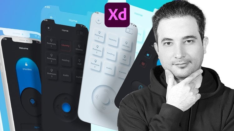
1. Vídeo de introdução Adobe XD: Olá, bem-vindo aos casos de design de
interface de usuário 30. Meu nome é apenas arte
e sou estratégias de UX. De qualquer forma, designer. Você e eu vamos criar
este lindo site e aplicativo
móvel para um
mero projeto
do mundo real do zero no Adobe XD, se você é um iniciante total ou não tem ideia de onde começar. Qual é o caminho para se tornar um designer profissional de
experiência do usuário? discurso é para você. Começamos do zero
entendendo a diferença
entre UX de qualquer maneira, e baixamos e
instalamos o Adobe XD. Em seguida, aprendemos como as ferramentas
funcionam no Adobe XD. Em seguida, criamos formas simples. E então, para sua
tarefa, você precisa criar
várias formas. E depois que você criou, você pode voltar e assistir ao vídeo da sua
tarefa dois, você tem que criar uma coruja. Agora é hora de trabalhar
com tipos no Adobe XD. Então, para sua próxima tarefa, você precisa criar essa
topografia com a sombra. Não se preocupe com
uma fonte agora. Falamos sobre isso no futuro. Então entendemos mascarar ou colocar uma imagem
dentro de uma forma. Para sua próxima tarefa, você precisa criar uma página de
perfil do Instagram para tablet. Também aprendemos a tornar qualquer site responsivo
para visualização móvel. Finalmente, temos que iniciar
um projeto do mundo real. Mas primeiro, você precisa
convencer o cliente de que você é o melhor designer para este
site e design de aplicativos móveis. Agora, vou
te mostrar o segredo de conseguir qualquer oferta de emprego facilmente. Seguindo estas etapas, entendemos a declaração do
problema e
criamos uma possível
solução para outro cliente. Depois de obter o
trabalho recusado, temos que passar
pelo processo de design, que pode ter três etapas
no UX e etapas de torção na interface do usuário. As três etapas na
UX são descobertas. Primeiro, o que o usuário está pesquisando? O que é um escopo de trabalho ou cronograma e como criamos um. O que são entrevistas com usuários? O que é análise competitiva? E como podemos comparar
o concorrente. Como podemos criar personas de usuário, empatia, como criar mapeamento jornada
do usuário ou mapeamento de jornada do
cliente. O que é fluxo de usuários? Como criar uma classificação
necessária de moodboard. Como criar
arquitetura de informações. O que é wireframing ou wireframing de
baixa fidelidade? Tamanhos de sites, wireframing de
alta fidelidade do sistema de grade. Como criar prototipagem
tinha que fazer animação. Há muito para cobrir os caras. Estou tão animado para começar.
2. UX em UX em UX: Qual é a diferença
entre o design UI e UX? O que, na verdade, é como
UX e UI. Ui UX. Ux ou design de experiência do usuário são os designers de processos
usados para construir produtos que oferecem
uma ótima experiência hoje, design UX
do usuário refere-se ao
preenchimento, em seguida, os movimentos da experiência do usuário ao
interagir com o produto. Ele se concentra no
fluxo do usuário e como
é fácil para o usuário atingir
os objetivos desejados. Então, o que é UI? Design de interface de usuário ou interface de usuário é o processo. Os designers usam interfaces
em software ou dispositivos
computadorizados com
foco em MOOCS ou em um estilo. Agora, deixe-me explicar e
começo com um exemplo. Vamos dar uma olhada nessa imagem. O que é UX? Ux é a experiência do usuário, que você vê aqui. E você, por que é assim? Esta é uma interface do usuário sem
a pesquisa, porque isso é experiência do usuário, isto é, comportamento do usuário. Geralmente gosta de caminhar
assim, dessa forma. Então, chamamos isso de
design de UX ruim porque você o usa. A experiência não está certa. E quanto a esse exemplo? Temos dois bons designs, mas um deles tem uma bateria,
você, um deles tem uma boa experiência do usuário. Um UX ruim é esse antigo típico design de
ketchup de tomate Heinz, que você não pode tirar
nada dele. Mas esta é uma boa experiência do usuário
porque você pode obter toda a pirâmide de recuperação facilmente e tem uma
boa interface do usuário também. Agora você está recebendo, qual é a diferença
entre UX e UI? Vamos para outro exemplo. Nesse cenário, temos
dois usuários diferentes, os pais. E o garoto. Como você vê nesta imagem, os pais estão felizes e tendo
um bom UX porque podem ver os elefantes e o tigre e tudo
no lugar certo. Mas as crianças que estão mal, você só dá uma olhada. As crianças podem ver o
fundo desses animais. Então lembre-se sempre para qual
pessoa você está projetando. Você está projetando essa área
para você ou para uma criança. Se for para o garoto, você está tendo um dia ruim. F é onde os pais estão,
certo? Você é bom. Agora, vamos aprofundar uma carta. Então, sempre primeiro
fazemos uma pesquisa, pesquisa baseada na experiência do usuário
que descobrimos, seja definida. Acabamos de conversar com muitas
pessoas, com os detentores de estaca. Fazemos muita
entrevista com usuários, mineração de
dados,
análise de negócios e muitas coisas. Depois de uma boa pesquisa, que é a fase um, significa projetar o certo. Pense como este. Projete a coisa certa. Projete o tanque certo. Isso é UX. Quando você o projeta, quando você tem o protótipo. Nós vamos para o design da interface do usuário. Nós vamos para coisas de design, certo? O rosto para redesenhar,
e nós entregamos. Então, basicamente, é simples. Faça sua pesquisa e faça seu design para a
UX e o dever que você é. E essa é uma maneira muito simples
de explicar qual é a
diferença entre nós. De qualquer forma.
3. Comece a saber o ambiente e trabalhar com ferramentas: Vamos ver como podemos baixar
e instalar o Adobe XD. Basta chegar a Yale e basta digitar, baixar o Adobe XD e
clicar nele. E, por padrão, podemos encontrar aqui baixar o Adobe XD
e começar. Basta clicar nele. Obtenha o XD, basta clicar nele. Você tem duas opções. Se você tiver a Adobe
Creative Cloud, na
qual precisa estar conectado, isso significa que você precisa entrar
na Arabic Creative Cloud. Em seguida, você pode baixar este aplicativo de
desktop Creative Cloud. Em seguida, você pode baixar
todos os aplicativos. O Adobe XD é totalmente gratuito. Ao fazer o download, basta
clicar em Abrir. Então, depois de abrir o Adobe
XD pela primeira vez, você tem algum
modelo personalizado aqui. Se você estiver projetando para iPhone, basta clicar
neste ícone aqui. Você pode escolher qual
iPhone você está projetando ou qual o tamanho do aplicativo da web. 1920. O 1366, que basicamente não em 2010 AT é
o famoso. História do Instagram, postagem no Twitter
no Facebook, vídeo do YouTube. Ou você quer projetar algo totalmente personalizado como
um design de banner. Por exemplo, estamos
começando com uma web 1920 1080. Basta clicar nele. Deixe-me torná-lo um pouco maior. Então, antes de começarmos qualquer coisa, vamos ver como podemos salvá-lo. Você pode salvá-lo no aplicativo Creative
Cloud, que você precisa pagar por ele. Ou você pode simplesmente acessar Arquivo, Salvar como documento local. E vamos salvá-lo aqui. Só estou chamando essa
prancheta e clique em Salvar. Vamos fechar este 1 primeiro. E para aumentar e diminuir o zoom, segure Alt e frio
com a roda do mouse. Olhe. Ou se você segurar Command ou Control e pressionar
três no teclado, ele apenas
ampliará a prancheta. Esta é a tela que
podemos desenhar, qualquer coisa nela. E no lado esquerdo, temos as ferramentas como retângulo,
círculo, triângulo, linha. Por exemplo, vou desenhar
algo assim. Clique nele, desenha
no símbolo at. Temos a ferramenta caneta aqui. Você pode clicar nele. Vou
explicar todos os detalhes. Só por enquanto, vou clicar nele,
como fora, clicar e arrastar para selecioná-lo
e pressione Excluir. Posso clicar em Texto, digitar, algo como
bem-vindo ao Adobe XD. Se clicarmos aqui, temos algum identificador de letras aqui e arraste-o para baixo.
Posso torná-lo maior. Como eu disse, explicarei
cada resumo. Isso é para demonstração.
Agora pressione Excluir. Se eu clicar na placa de arte, tenho acesso a
todo o RPO, como celular, tablet e desktop. Se eu clicar, se eu sair um pouco, segure Alt ou Option ambígua, roda
do mouse, para fora. E se eu clicar, agora, se eu arrastá-lo para cima, posso
simplesmente colocar este,
este, este
1º de maio ser um Nexus ruim. Talvez, talvez Samsung Galaxy,
assista, 40 milímetros. Agora, se eu clicar e talvez
arrastar isso um pouco para baixo, talvez clique neste, arraste-o para cima, arraste-o
para baixo, arraste-o para cima. E eu clico e
seleciono todos eles. E do lado direito, eu tenho essa barra, que posso alinhar
tudo do topo. Clique, Comando ou Controle Z. Talvez eu possa
alinhá-los do centro. Talvez possa
alinhá-los de baixo. Certo. Talvez eu possa alinhá-los igualmente. Por exemplo, se isso estiver
aqui e isso estiver aqui, isso é um pouco aqui. Se eu clicar e selecionar todos eles e
clicar neste, veja o que acontece. A separação e a lacuna entre eles são
totalmente iguais a z. Aqui, posso alinhá-los
totalmente da esquerda. Olhe para a magnetosfera
do centro, da direita. E isso vai ser
igual ao centro. Correto? O que temos? Só vou
clicar em um
desses controles comuns 32. Basta ampliar
especificamente esta prancheta. Se eu sair e
clicar neste, controle de
comando TV,
vou apenas ampliar e esta Lara. Então mantenha pressionada a tecla Control ou
Command e sua boca saia. Vamos clicar neste. Para um zoom. Você tem
isso. Se eu arrastá-lo. E basta selecionar essa área
e zona de risco nessa área. Se eu mantiver pressionado Alt ou Option e basta clicar no lado esquerdo. Vou sair. Se eu
apenas ampliar assim, vou ser o trabalho artístico
deles aqui. Agora, vamos voltar e
selecionar a ferramenta Mover, mantendo pressionada Alt ou
Option e arrastar com a
roda do
mouse será muito fácil. Então, no lado direito, temos nosso painel de controle. Se eu clicar neste retângulo
e apenas manter pressionado, Shift, selecione para ser cubo, certo? No lado direito. As
propriedades estarão ativas
para esse pequeno
retângulo ou um cubo. Posso mudar qualquer coisa aqui. Posso apenas ajustar
isso ou alinhamento. Posso usar Repeat Grid, que tem, o que
serei explicado. Portanto, é algo que
se você clicar e conseguir esse identificador e você pode
repetir qualquer coisa que tenha. Agora sou apenas comparados,
volte intrometido. Vou explicar, repetir a
grade com um exemplo real. Por enquanto, vou explicar
para você,
ter a ideia de como tudo
funciona e se transforma. Você pode alterar a
largura, talvez colocar 600, talvez este para um 150. E este aqui,
vai ser Phillip, alguma coisa que você tenha aqui? Isso é para
posicionamento fixo para animação. Vou explicar, vou explicar o responsivo para quando
estivermos projetando um site. E isso é como a opacidade. Deixe-me preencher isso. Se eu quiser colorir isso, vou
clicar neste pequeno ícone aqui e apenas ele com vermelho. E esta é a borda, o tamanho, talvez dez. Para que possamos vê-lo. E a cor, se eu clicar
aqui, posso torná-la preta. Agora posso arrastar a opacidade
e torná-la 20%. Agora, se aumentarmos
todas as nossas outras opções, supondo que você obtenha
esses pequenos pontos de canto aqui, se eu clicar nele e arrastá-lo, posso virar a
esquina, como você vê aqui. Especificamente, dê 20. Se eu quiser ter um
controle apenas e alterar um único canto ou
um autor ou opção, basta clicar em um
desses e arrastá-lo para baixo. Como você vê, isso é separado por padrão
vai ser algo assim. Isso significa que todos os
cantos são iguais. Mas se eu clicar neste
pequeno ícone aqui, tenho controle sobre
cada canto. Então talvez eu possa colocar esse 0, talvez essa uma hora, eu coloquei 100 e vejo. Deixe-me voltar
e tudo é 20. Então, tudo é o mesmo. E o traço de fronteira? O que é se eu apenas colocar
no 10, ver o que aconteceu? E a lacuna também é. Se menos. Então, talvez aumente
a lacuna para testá-lo. Veja o que aconteceu. E o tamanho 20. Então, está entrando. Eu tenho o controle disso
está entrando. Este está indo para fora, mas este está dentro, sai é exatamente no centro. Mas eu não quero ter certeza. Quero estar em curvas. Então nosso controlador que para olhar tampa
redonda. E quanto a este? Tampa de projeção. Mas este, mas boné. Projetando RCA de canto. Quero colocá-lo na tampa redonda. E agora eu posso brincar
com o traço, talvez dois. Então você tem a ideia.
Talvez dê uma olhada. Agora, a lacuna é 50, é mais lacuna. O tamanho é 10. Menor. Olhe. Então, estou convertendo. Vamos colocar um traço
e a lacuna em 002. Então o tamanho é 10, então está tudo bem por enquanto. É muito normal. Vamos mudar a cor para outra
coisa,
algo como arroxeado. No topo, temos algo
chamado cor sólida. Basta clicar nele. Temos linear, que eu posso simplesmente arrastar este
canto e colocá-lo aqui. E eu posso
clicar neste e trazê-lo aqui. Como você vê quando você clica nele, há um círculo branco, borda
branca ao redor dele. Isso significa que está ativo. E posso mudar essa cor. Então talvez eu possa torná-lo vermelho. Eu quero mudar este
se eu clicar nele. O segundo é dar a
volta por este. Talvez dois amarelos. Olha, agora estamos muito legais. Gurion linear. E se eu
quiser mudar isso para gradiente
radial vai
estar no centro. Posso brincar com isso. É muito simples chegar lá. Muito legal, eficaz
como o efeito solar. E quanto aos gradientes angulares? Na verdade, não é útil, este, quero dizer, você
pode brincar com ele. Você pode mudá-lo para cores
diferentes, mas, basicamente,
eu nunca o uso. Então, na maioria das vezes, será linear, o que serei explicado
em diferentes lições, como podemos usar o
gradiente linear profissionalmente. Por enquanto, você tem a ideia de
como tudo está funcionando. E quanto a aqui? Temos as camadas aqui. Então significa qualquer coisa que você criar, se eu pressionar Command ou Control D para duplicar esta é a Ferramenta Rectangle e
arrastá-la e colocá-la aqui. Ou se você pressionar Alt ou
Option pressionado e clicar e arrastar para baixo, você está copiando esses dois. Portanto, alguns back-end com
comando ou controle, menos ou mais também, você pode ampliar e diminuir o zoom. Então, estou pressionando
Comando ou Controle e clique em menos e mais. A outra maneira de copiar
é o simples, comando ou controle C e loop de controle de
comando também, você pode simplesmente copiar as coisas aqui. Então C, para que possamos obter um quatro. E você vê, quando
você apenas arrastá-lo e soltá-lo aqui você
vê estes alinhamentos. Então ele diz olhar de linha
e simplesmente deixá-lo ir. Então, quantas maneiras estamos copiando? Deixe-me apenas selecionar e manter
pressionada a tecla Shift e apenas
fazer isso menor. Amplie. Mantenha pressionado Alt ou
Option, clique e arraste. Estamos copiando. Pressione Command ou Control D. Podemos pressionar Command Control C, Control V ainda será copiado. Então, três maneiras de copiar
as coisas em árabe. Veja, deixe-me clicar nisso. Vamos derrubá-lo. E o painel de efeitos, temos sombra interna. Se você clicar nele, procure
um participante para inter, clique neste em cinco. Mas nada acontece. Por quê? Porque isso é transparente e você vê algo assim. Você precisa clicar
nele e
alterá-lo para preto e arrastá-lo para cima. E só venha aqui.
Então, a sombra interior está colocando a sombra dentro
disso, apenas presumindo, você pega esta e
olha para esta. Você vê que há
uma sombra por dentro. E deixe-me talvez
10 de profundidade, certo? Você pode dizer que está
muito escuro, certo? Então, se você clicar nele e
este , podemos
derrubar a opacidade. Então, gradualmente, estamos adicionando a sombra interna
como, como um botão. Tudo bem, vamos para este. Descendo e clique
na sombra. Mais uma vez, arraste isso para cima. Então, automaticamente, temos uma
sombra e eixo y, y. Então, na maioria das vezes, coloque
este como 20 ou 12. Olha, temos uma sombra muito
gradual em torno dela não é muito nítida. E você pode obter uma direção, talvez 30, bem no lado
direito, ou menos 30. Basta colocar um menos
aqui e clicar em Ok. Então você vai
ter saído. Talvez isso seja 30, então está caindo. Então deixe-me colocá-lo como
026, os normais. Então, esta é a camada normal. Agora, se eu clicar nele,
posso arrastá-lo para baixo para poder controlar a intensidade
da sombra. Ou posso mudar
a cor da sombra. Talvez eu queira algo
avermelhado, talvez azulado. Então, cabe a você. E se eu
clicar neste e o que
é desfoque de fundo? Se eu clicar nele, qualquer coisa
dentro será desfocada. Eu não tenho uma imagem lá dentro. Então, vamos trazer uma imagem. Então eu tenho muitos MHA,
basta clicar nele e arrastá-lo, soltá-lo
e colocá-lo dentro. Quando você vê essas linhas azuis, isso significa que está dentro e você vê as palavras copiar, basta deixá-lo ir. Então significa dentro,
mas nada aparece. Por quê? Tênis fora? Você vê, certo? Vamos voltar ao plano de fundo
por trás apenas ativados. Neste momento, a opacidade está em 0, é arrastá-la para cima para que esteja ativa. Como você vê quando eu
mudo a quantidade e o brilho, nada está acontecendo,
apenas opacidade. Por quê? Como este é um
objeto, isso é uma imagem. Isso significa que depois de colocar nossa camada de
objeto, agora, você vê isso como um
objeto agora tem uma quantidade para algo. Agora temos a ideia de como
tudo está no Adobe XD. E no lado esquerdo
temos o plugging. Há muitos plugging que
vou mostrar a vocês
como baixá-los. E temos o painel de camadas
e temos o documento como as características de cor em um componente que
será explicado.
4. Crie formas simples: Vamos começar o primeiro projeto. Neste projeto, temos três formas que
vamos criar. Formas e linhas. Então, como fazemos isso? Vamos
começar com o simples. Então, estou entrando um pouco dentro. Então, temos um plano de fundo, que vamos criá-lo. Só vou clicar
nesta imagem e ir para Camada. E, por enquanto,
vou bloquear,
bloquear no lugar ou pressionar Command ou Control L para
bloquear uma imagem no local. Então eu trancei o dano. Então, se eu clicar nele, eu o desbloquearei e gosto novamente. Então, para desbloquear e
basta clicar nele. Então, temos essas formas, isso criado muito rapidamente. Agora clique neste
retângulo e ele está mais próximo. Eu só vou
para este canto e mantenha pressionada a tecla Shift e arraste para ver o que exatamente
está abaixo, abaixo dele. Basta arrastar a opacidade para baixo para que eu possa ver
o que está por trás dela. E a cor? Como corrigimos a cor? Só vou colocá-lo de
lado e segurando o Shift. Então, ele vai direto
para o lado direito. Pegue este
seletor de cores e átomo de silício. Então isso está ficando
da mesma cor, mas como a opacidade está baixa, vai ser assim. Não precisamos da fronteira. Então, agora clique e
arraste-o para a esquerda. Agora arraste este canto para
baixo para corresponder a isso
com a camada abaixo. Só vou virar
a fronteira para que possamos ver o que está por trás dela ou
derrubar a opacidade também. Então brinque e veja,
desculpe, isso é legal. Quando estiver tudo bem. Só vou desligar isso da fronteira. Tudo bem. E quanto a este? Então,
porque isso é direto, significa
que temos que usar um
retângulo para o porquê eu mostro a vocês. Vou até
este canto,
mantenha pressionada a tecla Shift
e arraste-a para baixo. Clique neste cantinho e apenas faça dele um círculo. Agora, isso é um círculo. Então, por enquanto, o que eu vou
fazer é lentamente
do centro eu apenas e arrastá-lo para o exterior e ver que
isso é o chamado Nam. Clique neste pequeno círculo
aqui e eu o arrasto para baixo. Então eu recebo este cantinho
em linha reta aqui. Em seguida, clique neste
ícone para mover para um turno longo, arraste-o para a direita, pegue o seletor de cores ,
clico e agora está colorido. Vamos trazê-lo de volta.
E quanto a este? Isso vai ser
muito interessante. Ferramenta Elíptica Marquee e
mantenha pressionada Alt ou Option, arraste-a do centro. E eu só quero fazer
isso exatamente assim. Tudo bem, derrube
a opacidade para que você possa ver onde o R arrasta-o para baixo. Esta linha. Isso significa que você está no centro. Vou
torná-lo um pouco maior. Então, ao longo do turno,
arraste-o para a esquerda. Mantenha pressionado o turno, clique neste pequeno canto
e arraste-o para a direita. Pegue a cor começou
e é totalmente lida. Agora, traga-o de volta. Agora, como conseguimos meio círculo? Na verdade, é muito simples. O mais legal é que você
pode vir aqui e clicar na ferramenta de letreiro
retangular e
arrastar uma linha sobre ela. Agora, clique na ferramenta
Mover novamente, mantenha pressionada a tecla shift e
clique no círculo. Então, o primeiro será excluído. Isso pode falar e
clicar no substrato, clicar e ele
será removido. Agora, clique duas vezes sobre isso
e marque a borda. Então, estamos prestes a ir. Ou talvez seja um pouco maior. Mantenha pressionada a tecla Shift para torná-lo um pouco do escritor,
o grande, melhor. Este é simples. Basta colocá-lo no centro
Alt Shift e arrastar para cima. Então, com a tecla de seta, arraste a tecla de seta para a
esquerda, esquerda, opacidade para baixo. Desligue a borda e
arrisque e
arraste-a para a direita da cor
maior, deixe-a preta. Vamos voltar para um lugar
e trazer à tona a opacidade. E quanto a este? É como um
cuspe de botão útil na verdade. Então ferramenta de letreiro retangular. Então, vamos derrubar a opacidade. Arraste isso para a esquerda dos poços. Use este canto para arrastar isso. Um rei só vai clicar
e arrastar para a esquerda. Coo. Não há necessidade de ter borda. Arraste para a direita. Seletor de cores, clique na parte superior de
mola. E vou colocá-lo aqui. Enquanto este é um triângulo. E vai segurar, Shift, derrubar a opacidade. E venha aqui,
vamos acima disso. E talvez um pouco maior, mantendo pressionado, Shift
e arraste os cantos. E quanto a esse canto? Traga isso para baixo. Você vê, tem algum canto, certo? Tudo bem. Vamos trazer à tona a opacidade. E você vê esse identificador aqui na parte superior e
apenas arraste-o para baixo. Arraste-o para a direita, pegue a cor começou e
deixe-a laranja. Vamos trazê-lo de volta. Desligue a borda. E vou
trancar isso no lugar novamente. Clique aqui e
selecione todos eles. Mantenha pressionada a tecla Shift e
arraste-o para os direitos. Quais são os antecedentes? Não há problema. Eles podem Rectangle Marquee Tool, clicar aqui e arrastar
para este canto. Agora, arraste-o para a direita, mas está no topo,
basta clicar com o botão direito do mouse. Enviar para trás. Poderíamos
seletor de cores e estudioso. Observado ter borda. Então, vou selecionar todos eles novamente e
arrastá-lo para a direita. Posso torná-los centrados. Então, todos eles são
selecionados e eu vou selecionar este. Traga as passagens
neste topo de opacidades. Este tem uma toalha
e representa. Então, basicamente, este foi
o primeiro projeto.
5. Atribuição de um modo de criar múltiplas formas: Vou remover isso. Vamos começar do zero. Clique neste. Sorte da matriz. Caso contrário, clique no ícone de cadeado porque
eu mudo a prancheta. Não vemos mais essas
linhas. Cada prancheta tem suas
próprias linhas e formas. Esta é a segunda prancheta. Então eu só vejo por dentro, se eu clicar na prancheta
e na imagem dentro dela, posso ver o visual interno de
um para um, que está bloqueado. Agora,
vamos entrar. Nós sempre retiramos 1 primeiro, que é o círculo. Eles estão recebendo um círculo. Mantenha pressionada e arraste para cima. Abaixe a ferramenta de seleção de
homem grego de opacidade ,
arraste-a para baixo, mantenha pressionada a tecla Shift para que
ela corresponda totalmente à nossa UTI. Não há necessidade de ter borda. Eu continuo derrubando a opacidade para que eu possa arrastá-la para o seletor de cores
certo, escolher uma cor, então arrastá-la de volta. E quanto a esse cubo branco? Então, vou
segurar o Shift pressionado e apenas criar algo
conhecido fora da fronteira. Vamos derrubar a opacidade. Se eu colocar meu mouse aqui, recebo este ícone para
poder girá-lo. Você meio que colocá-lo
aqui, mudar de cor e torná-lo um pouco maior. Talvez qualquer, ter um pouco mais de
rotação para torná-lo mais direto para a esquerda. Agora de volta. Agora, e
esse triângulo? Este triângulo, segure,
Shift, arraste-o para baixo. Coloque o mouse aqui,
gire
a seleção para reduzir a opacidade. Mantenha pressionada, desloque,
arraste-a para baixo novamente e obtenha mais rotação. Talvez mais rotação. Posso torná-lo maior. Deste ângulo
para 90 para uma borda. A cor é laranja. Agora há um círculo dentro. Pode condenar, circular, segurar, Alt e Shift e
clicar e desenhar. Tudo bem, isso é legal. Só vou pegá-lo aqui, colocá-lo aqui e
chegar à nossa fronteira. Talvez eu possa torná-lo menor. Estou segurando Alt e
Shift e arraste-o para baixo. É o que está exatamente por trás? Então, é muito legal. Portanto, 100%,
100%, 100%. E isso é o que temos. Agora, vamos desenhar este. Na verdade, é muito legal. Vamos clicar na
ferramenta de linha e basta clicar aqui. E linha seca para aqui. Agora clique na cor da borda
e torne-a totalmente preta. Vai estar aqui também. E basta arrastá-lo para baixo para
a cor, totalmente preta. Agora, selecione ambos, Comando ou Controle D
para duplicá-los. Coloque o mouse aqui para obter este círculo de rotação
e eu posso girá-lo e pegar este. Meio Control D novamente. Faça isso até cobrir tudo
isso. Suba, na verdade. A mesma coisa que fizemos da última vez. Agora, para combiná-los juntos, basta selecionar todos eles
e clicar no botão Adicionar. Agora, todos eles
estão unidos, certo? Então isso significa que eu posso
movê-los por aí. Agora. Pressione as
rosetas Command T, volte. Tudo bem, vamos desenhar. Este aqui. É muito
legal. Na verdade. Clique no triângulo
e mantenha pressionada a tecla Shift. Só vou voltar um pouco. Muda um pouco. Só vou sentar,
derrubar a opacidade. Então, o que é fogo? A fronteira?
Vamos para a direita. Clique na cor, cor azul. Então, significa que se eu aumentar
a cor porque a cor. Então, vamos voltar. Abaixe a opacidade. Então eu deixo aqui. E quanto a este? Então já sei, retângulo. Abaixe a opacidade. Aqui, veja a seleção. Então, estou tentando igualar
essa suspensão Shift. Vamos entrar um pouco, talvez girá-lo um pouco mais. Bela borda. E quanto a este? Mais uma vez, retângulo. Ao longo do Shift. Abaixe a opacidade. Venha aqui e permita que o
navio seja menor. Mantenha pressionada, Alt, arraste isso para baixo. Mantenha pressionada, Alt, arraste isso para baixo. Então você os tem separadamente. Bom. E o último é muito bom. Abaixe a opacidade. Gire, faça o mesmo
tamanho da nossa seleção de bordas, selecione nesta e na borda da
Monica também. Agora vou
clicar neste pequeno ícone aqui e deixe-me
selecionar todos eles. Arraste isso um pouco para baixo. Selecione este, traga a
opacidade, selecione este, traga este para o
seletor de cores e a mesma coloração. E este também é um
tipo avermelhado de pegar a opacidade. Só vou selecioná-lo, vou
trazê-lo de volta à sua localização. Vamos desenhar este, o que vai ser muito
legal tão rapidamente. Retângulo, arraste a opacidade
para baixo. Arraste para a direita. A
cor começou Glick. Bom. E quanto a este? Permitir turno. Uma rotação. Vamos clicar na seleção. Só vou dar aqui. Talvez um pouco mais de rotação,
mantenha pressionada a tecla shift. Arraste esses 10. Tamanho, o tamanho três aqui. Às vezes você vê que
não vai corresponder. Então, por exemplo, assim,
derrube a Opacidade. Clique duas vezes aqui. Agora você
tem esse ponto separadamente. Então, clicando duas vezes em todos os
cantos, ele é móvel. Então clique neste,
então arraste-o para baixo. Clique neste, coloque-o aqui e clique neste
para que possamos
torná-lo um triângulo muito legal. Agora, na escola, volta a este. Abaixe a opacidade. Eu posso girá-lo. Posso colocá-lo aqui. Mais rotação, maior,
maior, escola. Agora, e sobre este
que já conhecemos. Faça um grande círculo aqui. Agora. Vamos desenhar uma linha aqui. Tudo bem, então, para fazer isso, vou
usar meu retângulo. Basta clicar aqui,
derrubar a opacidade. E precisamos apenas girá-lo
para torná-lo uma linha muito precisa. Porque eu preciso
colocá-lo aqui. Isso está no topo. Agora, mantenha pressionada, desloque, clique no círculo e clique em, em seguida, subtraia. Agora temos isso. Então eu só preciso ter um pouco de rotação. E é isso. Só vou
selecionar todos esses, arrastá-lo para a direita. Então, tipicamente, a cor, esta
era branca, 100%. Selecione este. Este era amarelo,
rosa até a opacidade. Clique neste. Opacidade de cor 100%. E este também é 100%. Aqui. Temos esse design muito legal
e interessante. Eu seleciono todos eles, arrasto-os para a direita. Também precisamos do plano de fundo. Selecione-o, arraste-o para a direita,
clique com o botão direito do mouse, envie para trás. Agora temos a
mesma borda de cores, basta selecioná-las novamente e arrastá-la para a direita dela. Por isso, é muito legal
e interessante. Então deixe-me selecionar este e trazer à
tona a opacidade.
6. Atribuição de um coruja: Vamos tentar fazer este. Só vou
excluir este. Vamos ampliar um pouco. Só vou selecionar isso.
Vamos tentar o primeiro, que vamos
usar, Pen Tool. Pegue seu lápis. Deixe-me mostrar como funciona. Clique, clique, clique,
clique e clique em. Solidworks. Certo? Agora, selecione-o e exclua-o. Mais uma vez. Selecione a ferramenta Caneta, clique, clique e arraste. Clique e arraste. Mas se eu quiser continuar, não
quero isso. Então eu tenho que manter
pressionada Alt ou Option, clicar nesta alça e
trazê-lo de volta neste ponto. Então, estou livre para ir a
qualquer lugar que eu quiser. Posso clicar aqui e arrastar, manter pressionada a tecla Alt novamente, clicar neste pequeno ícone, trazê-lo de volta para que
eu possa continuar. Em seguida, certo? Agora, vamos selecioná-lo. Vamos desenhar este também. Vamos clicar aqui,
vamos clicar aqui e arrastar até
combinarmos essas linhas. Ou lambda. Eu tenho esse identificador. Não posso continuar
pressionando Alt ou Option. Clique no ícone, traga-o de volta ao centro, vai desaparecer.
Estou livre para ir. Clique e arraste. Agora. Reproduzindo isso de volta,
clique, clique e arraste. Mantenha pressionado Alt, traga isso de volta. Clique e arraste de volta. Aqui vamos nós. Escolha uma cor. Agora é noite
vermelha nossa fronteira. Negocie isso. Vamos tentar este. Pressione a caneta para camada. Só vou fechar
isso. Mais espaço. Ferramenta caneta novamente. Então clique aqui, clique aqui. Certifique-se de
seguir a curva. Então, agora, ele
vai direto. Assim aconteceu aqui, clique e arraste
Alt e arraste isso de volta. Direto, mantenha pressionada
a tecla Shift para ser totalmente reta. E clique aqui e arraste Alt. Arraste isso de volta aqui. E continue
segurando o turno aqui. Estou tentando ver
se consigo fazer isso. Legal. Obrigado. Perdi isso. Kamikaze para
voltar e clicar e arrastá-lo aqui para aqui. Se vai ser algo
assim, não se preocupe. Se você permitir tudo, basta clicar
nisso e apenas trazer isso de volta ao centro. Agora, por que é
apenas a parte certa, porque
vamos copiá-la para o lado esquerdo vai
ser muito interessante. Seletor de cores para o campo. Clique nisso. Agora, clique no exterior.
Agora, se clicarmos, temos tudo. Pressione Command D para duplicá-lo. Deixe-me abrir
isso. Veja o que aconteceu. Ela Pad 15, olha, conectada a D está se
tornando mais de 16 em cima dele. Agora, clique neste pequeno
ícone para virá-lo horizontalmente. Mantenha pressionada a tecla shift,
arraste-o para a esquerda. Agora é totalmente compatível. Permitir Shift e
clique neste pequeno ícone. Então, ambos são selecionados. Agora clique em Adicionar. Então eles são, dois
deles são combinados. Queremos ver o que
aconteceu, desligue isso. Mas agora vamos tentar este. Este ou
tentamos do lado esquerdo, depois copiamos para trisect. Então, vou clicar
e arrastar até aqui. Por enquanto. Abaixe a opacidade. Agora é entrar. Preciso ter
esse tipo de cuidado. Algum motivo segure Alt ou opção e apenas arraste-o
para obter a escultura. Então eu tenho que derrubar isso. Legal. Eu tenho isso. A outra coisa
é ter descido para trás porque este. Agora está em cima disso
para enviar qualquer coisa de volta, mantenha pressionada Control ou deixe-me
mostrar as teclas de atalho. Envie para trás,
controle, suporte esquerdo, avanço
contorno, suporte
direito, envie-o totalmente para o suporte esquerdo do controle de
mudança traseiro. Para este, vamos passo a passo, enviado para trás. Então pressione Control Left Bracket, basta selecioná-lo
Control Left Bracket. Então, vou para trás. Olhe, sinta e torne-o preto. Ou se você vai
chegar à mesma cor. E ele terá quatro lá. Também derrube isso. Então eu não vejo isso. Agora. Preciso ter esse tipo de
cuidado desejando coisas, certo? Então, o que eu faço é clicar na ferramenta
retângulo, letreiro. Clique e arraste. Agora. Faça com que seja totalmente circular. Abaixe a opacidade. Traga isso para a nossa fronteira. E apenas para fazer com que isso
mantenha pressionado Alt, arraste isso para a esquerda ou
o arrasto para a direita. Eles podem sentir e torná-lo preto. Certifique-se de que seja
100% preto. Agora, vamos manter pressionada a Alt e arrastar isso para a direita. Altere e arraste isso para a direita. Mais uma vez, em cima
destes , mantenha pressionado o suporte Control
e Shift, colchete
esquerdo até
ficar atrás disso. Agora, vamos tentar o I, clique nisso,
derrube a opacidade. E vamos clicar nisso para realmente
reduzir a opacidade. Então eu quero ver exatamente
o que está acontecendo. Clique nesta camada de sílica. Venha aqui, segure Alt e Shift e arraste do centro. Aplique a opacidade e a fronteira política
estratégica. Clique neste ícone. Comando D para duplicar o
círculo novamente ou isso desligado. E então o faça a
partir do ponto central. Talvez seja muito grande. Vamos clicar neste
, excluí-lo. Clique em, mantenha pressionada Shift. Talvez você possa torná-lo um pouco
menor, o que é legal. Comando ou controle D. Mantenha pressionado Alt e Shift e
diminua. Então, também temos o
ponto central. Agora, em um
turno, clique neste círculo. Novamente, precisamos subtrair
isso do centro. Agora subtraia. Ele se foi. Certo? Agora. Selecionado, aumente a opacidade para
100% selecionada para
passar 100%, selecione esta
como 100%. Agora, selecione as partes esquerdas. Eu não seleciono este. Mantenha pressionada a tecla Shift e
clique neste ícone. Portanto, apenas esses quatro são selecionados. Mantenha pressionada a tecla Alt para copiá-lo
e arrastá-lo para a direita. E enquanto isso, mantenha
pressionado Shift para ser uma reta. Agora estamos aqui. Clique em Virar horizontal ao longo do Shift para
torná-lo reto. Legal. Agora, basta verificar isso. Agora, há algo
em cima disso, que são dois deles porque
copiamos deste, apenas contratamos não é necessário. Só vou excluir que eu
posso derrubar a opacidade. Clique também neste, para baixo,
um, para esquerda, um para baixo para que eu possa ver o que está aqui, bem como a barragem porque esta está
em cima de tudo o resto. Você, na verdade, é
um truque muito legal. Olhe para o círculo no
Alt e Shift, arraste-o para cima. Então este é o nosso círculo, certo? E a cor é borda amarela. Abaixe a opacidade. Então, se eu clicar duas vezes sobre isso e receber
todos os pontos, certo? Agora, clique duas vezes
neste canto. Vai comer isso. Agora, mantenha pressionada a tecla Alt e clique
sobre isso para obter esse identificador. Clique e arraste esse
identificador, neste ponto. Mais uma vez, mantenha pressionada a tecla Alt,
clique nesta alça. Clique e coloque isso aqui
e continue segurando Alt. Tudo bem, agora,
o que é muito legal. E segure Alt novamente e
arraste para a esquerda do que alt, marca a esquerda e Alt. E então pegue a opacidade. Agora, clique em todo o
resto para estar lá em cima. Opacidade também, este aqui. Traga à tona a opacidade
e a EA nós
vamos, vamos ver onde
estamos agora. E eles são muito
legais. Tudo bem. O resto deles é
simples e complicado. Vamos tentar com este. Vamos tentar um retângulo
aqui por enquanto. Aqui e aqui. Escolha uma cor
amarela ou laranja, amarela. Agora, para este é um círculo. Venha aqui e experimente o silício
do que Alt e Shift, derrube a opacidade para
torná-lo do mesmo tamanho. E terá borda, cor, seletor, amarelo, 100%. Agora, precisamos combinar
esses dois juntos. O que algo está fora daqui, eu só vou trazer
esse termo desaparecerá. Legal. E quanto a esse canto?
Segure Alt e derrube este canto
para obter esta linha. Mantenha pressionada a tecla shift,
clique no círculo para que ambos sejam selecionados
e clique em Adicionar. Então eles estão unidos com um alt, arraste-o e, enquanto isso, mantenha pressionada
a tecla Shift para ser uma reta. Venha aqui e clique, Flip Horizontal seletor de cores, escolha a cor e
arraste-a e coloque-a aqui. Você pode usar a seta, as teclas de seta para a
esquerda. Agora, mantenha pressionado o controle e
clique neste pequeno ícone. Mantenha pressionada a tecla Alt e arraste-o aqui. Você vê esta
caixa delimitadora, a linha azul. Significa que você ainda está
dentro do grupo. Então Command ou Control
X para copiá-lo. Clique no exterior. Agora estamos fora desse grupo. Pressione
Command Ctrl V. Precisamos porque eu
precisava do círculo, porque eu quero colocá-lo aqui. Mas eu tenho que colocá-lo
por trás dessa forma preta. Então, você sabe, já controle o suporte esquerdo
até você descer. E você está por trás do
seletor de cores e o torna melhor. Mantenha pressionado Alt ou Option e
arraste-o para a direita. Use a tecla de
seta para ficar totalmente bem, e esta é branca. Mais uma vez. Tem que sangrar o
controle traseiro e a tecla do suporte esquerdo. Mais uma vez, Control F esfriar rapidamente. Bem, então Alt e
mude para a direita. E isso é amarelado. Alt e Shift
arraste-o para a direita. E este é vermelho. Então, continuamos fazendo isso. Então, aqui em baixo, vou
escolher um seletor de cores aqui. E se você usar seu espaço para um já que você pode
simplesmente se mover ou apenas do meio do mouse se você é como clicar nele e
você pode simplesmente se mover. Control Left Bracket pode
retroceder chamado turnos. Clique em cor, segure Shift, clique aqui e torne-o branco
e Alt Shift também. Vou colocá-lo aqui. Mantenha pressionada Controlar colchetes esquerdos
para que eu possa ir para trás. Vou mudar para a direita. Turno. Podemos colorir. Escolha uma cor. E quanto a esses dois? Você já sabe? Todos os turnos. Arraste para a direita. Clique nesta
ferramenta de retângulo e clique aqui. Isso está no topo, então
ele
precisa que isso desapareça ou desça Shift e clique neste
círculo e subtraia. A cor é ciano sozinha, Alt e Shift e
arraste-a para a direita. Então abra-o e vire na horizontal. Só venha aqui. E aqui. E
essas linhas aqui? Há um truque legal para fazer isso. Deixe-me clicar aqui. Este é um retângulo que vai ser uma borda
totalmente preta. Tenho que colocá-lo para trás. Eu posso arrastar isso
e colocá-lo aqui atrás de todos eles. Todas as camadas. Agora derrube a opacidade para que
vejamos o que está acontecendo. E vamos usar este,
mantenha pressionada a tecla Alt e
arraste-a para cá. E vamos torná-lo branco. Mais uma vez. Vou arrastar isso para a direita. Arraste isso para a direita, vire a horizontal ao longo de Shift
Alt e mude para a direita. Mas eles têm essa
área inferior, então temos que cortá-la. Mais uma vez. Pode
desenhar um retângulo. Clique aqui. Mas queremos excluir
todos eles da mesma forma. Então, isso significa que temos que nos unir e clicar aqui,
manter pressionado, deslocar ,
clicar, clicar,
adicioná-los juntos. Então o R1, agora eles estão unidos. Clique no retângulo
ou no turno do almoço, clique no círculo e menos. E então o topo é fácil. Aqui, retângulo. E aqui vamos nós. Arraste isso para baixo até uma borda. Agora, desça Alt, clique
e arraste o canto, clique
alternativo e arraste o canto. E vamos ver o que
você fez. Selecione a tecla Shift pressionada e
arraste-o para a mão direita. Quão legal é isso? Mas esses dois têm que estar atrasados. Então, selecione os dois. Controle de pertença e chave de suporte
esquerdo. Baikal. Isso será selecionado e
a opacidade
deve ser 100%. E temos algo
muito, muito interessante. Ele vai ver este. Talvez eu possa apenas, você sabe, às vezes vamos
arrastar isso com um velho de um canto. Posso adicionar mais a ele. Tudo. De um núcleo. Posso adicionar mais a ele. É mais conveniente. Agora, confiem em mim pessoal. Vocês podem criar qualquer coisa
no Adobe XD com muita facilidade.
7. Trabalhando com tipos: Vamos começar a trabalhar
com texto em obesidade. Vou
clicar na prancheta e pressionar Control 3. Então, para ser exatamente,
e é um lugar. Agora, vou
clicar na prancheta e criar algo assim. Por enquanto, prestígio e tipo. Adoro o Adobe XD. Tudo bem. O primeiro aqui que
vamos procurar é o espaçamento. Eu coloquei em um 0. E se eu clicar aqui e
usar minha tecla de seta superior, posso aumentar as letras de
espaçamento. Se eu usar minha tecla de seta para baixo, diminuirei e menos espaçamento. Vamos inicializar legal, legal. Menos 60. Tudo bem, este é o primeiro passo para entender
essas duas opções. Vou apenas ir
aqui e apenas copiar essa linha de texto,
trazê-la aqui. E vamos tentar usar
isso para explicação. Grande demais, eu colo algo
que é muito grande. Vamos consertá-lo. Coloque isso em 10, ainda está
totalmente em cima um do outro. Este é o espaçamento entre
letras, espaçamento entre linhas. Porque minha hierarquia superior, então jogue em torno dela. Isso é legal. E eu aumento o espaçamento entre as letras para
que fique mais legível. E arraste isso para a direita. Então, se eu arrastá-lo para a esquerda, gritando assim, então
arraste-o para a direita. Vai ser
apenas três linhas. Basta dar uma olhada neste. Isso não está
acontecendo, certo? Mas se eu clicar aqui e apenas, só queria espaçamento e pressione Control V e
apenas copie o topo. Apenas, vamos ver o que acontece. Se eu vier aqui e usar
esta tecla de seta para baixo. Este será o espaçamento
de parágrafos. Se você tiver dois parágrafos,
algo assim. Se você tiver dois parágrafos, clique nisso e aumente o espaçamento
entre parágrafos. Mas este está entre as linhas que
afetarão o parágrafo também. Tudo bem, agora o que mais? Só vou segurar o
Alt e arrastar isso. Você sabe, tudo isso, certo? Se eu puder torná-lo maiúscula, letra
minúscula Z, a
primeira letra maiúscula Z. E eu posso apenas selecionar o XD e este vai para
o topo ou para baixo. Isso está subjacente. E isso é
como um O prime. Agora vamos para a fronteira. O que é isso? Vamos usar o campo
mudará a cor para azul e talvez a alterou para o branco e apenas
lhe dê alguma borda. E dê uma olhada. Vamos
apenas selecionar isso e voltar e
dar uma olhada nele. Adoro o Adobe XD, apenas com uma borda. Você pode mudar a cor para
preto ou talvez azul, certo? Como você vê, temos algo
chamado aqui sampler. Como podemos adicionar
desfoque a essa imagem. Por desfocagem, que está aqui, tenho que colocar
algo por trás disso. Então eles simplesmente colocaram algo, talvez uma cor por trás disso. Então clique com o botão direito do mouse, envie para backup e
dê uma olhada nele. Para este,
vamos
selecioná-lo e desmarcar a borda. Selecione o texto, arraste isso para baixo. Você pode adicionar atitudes iniciais, adicionar sombra a ela, e também podemos adicionar desfoque de
fundo. Se uma lista de verificação estiver ligada, basta dar uma olhada e
arrastar isso um pouco para baixo. Veja, isso vai ser
muito, muito interessante. Mas eu levanto para cima e para baixo, vejo que está totalmente desfocado. E eu posso apenas brincar
com essa capacidade, esse borrão e mais
embaçado para clicar
no fundo e
brincar com a cor. Talvez você veja o
efeito, o efeito embaçado. Então, de volta, se eu mudar
a cor de fundo , a cor também
mudará.
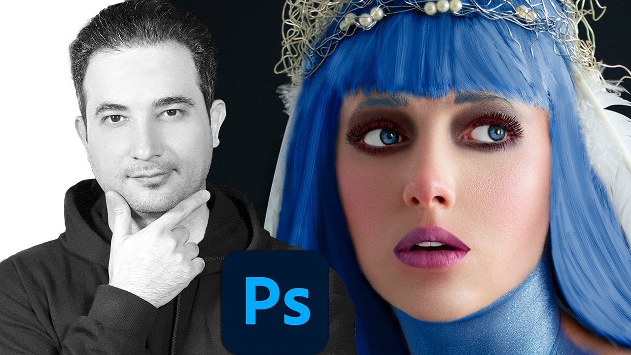
8. Crie tipografia com sombras: Agora é hora de criar esse belo
efeito no Adobe XD. Tudo bem, só vou
criar uma prancheta. Clique e sinta e
torne-o totalmente preto. E vamos começar. E iremos uma a uma letra. Pressione S. Agora, clique e arraste e
torne-o um pouco maior. Só vou rolar para baixo, não
preciso da borda. Só este. Agora. Mantenha pressionado Alt e Shift e
arraste-o para a direita. Risco vai chamar isso de h. Mas precisamos adicionar
sombra a ele, certo? Como fazemos isso? Primeiro, adicionamos um pouco de sombra
interna com o Y. Talvez um ou três esteja bem. Este talvez 10. Iniciativa. E quanto à sombra? Brinque com sombra porque você deseja adicionar a
sombra à esquerda,
à esquerda ou à direita, use o valor x. Vou
colocar 10 ou menos 20 para ir para a esquerda para a sombra
e o y deve ser 3000. Agora vamos clicar no ícone soltar
sombra aqui e arrastar isso para cima a opacidade para
adicionar mais sombra a ele. Então isso significa que é colocado em
menos 10 seria suficiente. Agora, o borriness,
vai ser 10. Agora, dê uma olhada em um altar
e a opção vá para a direita. Isso vai ser
clique duas vezes nele, pressione Shift a para b maiúscula. Agora vou mudar novamente, arrastá-lo para a direita,
clique duas vezes em Shift D. Chamo Alt e Shift,
arraste-o para a direita. Segmentado. Shift O. Arraste para a esquerda. Um pouco mais legal. Talvez aqui, bom. Alt Shift arraste para a direita
e desloque W para ser mantido. E dê uma
olhada lindamente, criamos esse
efeito legal no Adobe XD. Tudo bem, pratique quando você é muito bom nisso. Vá para a próxima lição, que está trabalhando com imagens.
9. Masking de imagens em uma forma no Adobe XD: Como criamos isso, como temos padrão dentro desses
belos itens. Existem duas maneiras de fazer isso. Chamamos isso de mascaramento. Primeiro. Vamos tentar isso. Vamos
trazer as imagens aqui. E vamos tentar isso. Um. Pode rastrear isso
e simplesmente colocá-lo aqui. Vai ser enorme. Olhe. Então eu estou segurando o turno e
faço esses vários inteligentes. Mas precisamos adicionar,
colocar cantos ao redor. Há duas maneiras de
fazer é esse hardware, que é mascarar, interpretar mal. Você clica na Ferramenta
Rectangle Marquee e apenas faz uma
seleção ao nosso redor. Certo? Agora. Faça os cantos arredondados,
talvez em torno de 30. Agora, aqui está a parte complicada. Estou selecionando a seleção. Você precisa selecionar os dois. O primeiro deve ser o que queremos
colocar a imagem dentro. Tudo bem, clique com o botão direito em
Máscara com forma E lembre-se do atalho
Shift Control M e veja o que acontece.
A mesma coisa. Agora vamos tentar
fazer da maneira mais fácil. Clique em uma ferramenta de letreiro retangular. Clique e arraste. Faça a esquina ao virar da
primavera as imagens novamente. Agora basta arrastar a imagem
e colocá-la dentro. Como ele diz, copie,
basta deixá-lo ir. Este é o mais fácil, mas este está
mantendo a fronteira. Só você tem que desmarcar isso. E é isso. E quanto a este? O mesmo cenário. Clique no ícone aqui. E vou
arrastar algo assim. Talvez
eu queira este. Não preciso da fronteira. Traga as imagens. Talvez este apenas
arraste-o e solte para dentro. O mais legal é que
você pode simplesmente
clicar duas vezes nele e você pode
simplesmente movê-lo. Posso torná-lo um pouco
maior, talvez aqui. E clique no exterior. A
mesma coisa com este. Basta clicar duas vezes em torno
dele e selecionar esta imagem, Alt e Shift e
torná-la um pouco maior. E quanto a este? Não temos uma forma como essa. Clique em nosso triângulo. Venha aqui, e temos
algumas opções aqui. Suas gaiolas de flecha, traga para cima. Você pode alterar o tamanho,
algo assim. Você pode ir para suas imagens
e desta vez,
arrastá-lo e soltá-lo para dentro. Olhe, agora, clique duas vezes
nele e apenas mova-o para
a direita para ser centralizado. Do lado de fora, clique
neste pequeno ícone aqui. Verifique a borda,
e é isso. E essas duas imagens? Posso trazer essa imagem. Vai ser enorme, certo? Voltando, eu estou segurando o
turno e faço isso muito pequeno em um colocar isso aqui. Eu só vou subir para que
vocês possam ver o que quero dizer. Então, como colocamos uma
forma embaçada em cima de uma imagem. Portanto, é bom adicionar texto
a ele. É muito fácil. Apenas letreiro retangular para o raio em torno de oito está bom. Borda. É bom para baixo e clique
no desfoque de fundo. Certo? Clique nele e
verifique se o valor é menor. Para ver mais
da textura sob uma
imagem real do plano de fundo. E você pode brincar com
o corpo desfocado e pegajoso. Mais uma vez, isso é bom. Como podemos deixar uma imagem embaçada. Certo? Clique nisso para Alt e Shift, arraste-o para a direita. E aqui, basta clicar neste
ícone aqui e borrar o objeto. Se você clicar nele,
o valor é cinco, derrube-o 1, 2, 3 ou C. Isso geralmente é 1 ou 2. E é assim que
trabalhamos em imagens. No Adobe XD. Há muitas coisas
que cobrimos no futuro. Certifique-se de praticar alguns
caras sem praticar, não
vamos a lugar nenhum. Depois de praticar algum. E você é muito bom
em brincar com o texto, formas e
imagens no Adobe XD. Nós vamos para o nosso projeto.
10. Atribuição Crie uma página de perfil do Instagram para Repetição de comprimidos: Tudo bem, vamos tentar
recriar isso no Adobe XD. Na verdade, é muito, muito legal e vou
clicar neste ícone aqui. Clique aqui e arraste uma caixa. Vou clicar na minha seleção e
clicar nisso para ver qual é de dois a cinco. A altura é diferente, clique em diferir para o qual é legal. Então 23 o mesmo. Tudo bem, vamos
começar do topo. Vamos voltar para a minha pasta de imagem
aérea e para o logotipo do Instagram. Só vou
arrastá-lo e soltá-lo aqui. É muito grande ou baixo Alt
e Shift e o torna menor do centro. E vou colocá-lo aqui. Vamos pegar a linha aqui e manter pressionada
a mudança para o lado direito. Você vê que o tamanho é um. Você pode colocá-lo ao meio. Clique em 0.5. Então,
o tamanho será metade. Agora, precisamos mudar a
cor talvez com um azulado. Agora, como podemos criar
isso muito rápido, vamos criar um deles. Então eu só vou clicar em Mantenha
pressionada a tecla Shift e criar um deles. Vamos entrar e clicar neste cantinho
para ter borda. Por enquanto, vou ficar com a bola e
considerar algo. No Adobe XD, temos
algo chamado Repeat Grid. Basta clicar nele.
Quando você clica nele, você obtém duas alças. Basta arrastá-lo para a direita
para ver o que aconteceu. Vou copiar
tudo para vocês. Se você colocar o
mouse entre eles, podemos mudar o espaçamento
arrastando para a
direita e para a esquerda. Quero colocar o
espaçamento de cinco. Agora, arraste isso para a direita. Agora, vamos fazer o
mesmo com este. Coloque o mouse aqui e faça este espaçamento de cinco novos dragões. E a linha da árvore é suficiente. É clique fora. Quero sentir isso
com as mesmas fotos. Como fazemos isso? Precisamos de um plugin. Você precisa instalar um plug-in
em outras semanas, clicar neste pequeno ícone
aqui, que são os plugins. E você não deveria
ter nada aqui. Basta clicar neste
pequeno sinal de mais. Quando você clica nele,
você obtém este painel, o Creative Cloud Desktop App. Clique em Todos os plug-ins, uma busca por UI Faces e clique em Instalar aqui
você vê um historiador. Quando ele é instalado. Você pode fechar este porque ele vai aparecer
no painel Plugins. Clique em UI Faces. Ele diz apenas clique duas vezes
e selecione um deles. Então clique duas vezes e
selecione um deles. Então você pode dizer a eles quais
fontes você vai usar. Posso usar um splash e pixels. Selecione a foto. Posso dizer que preencha aleatoriamente 24 seguintes restantes para
mim e clique em Aplicar. Então, a natureza aleatória
vai preenchê-lo com isso e ver o quão legal é isso. Não preciso da
borda Clique duas vezes. Agora vamos ver o que acontece. Se eu desmarcar, a
borda será cancelada para todos
eles. E o que mais? Posso adicionar esta carta
aqui e ver o que acontece. O que quer que eu faça essa única imagem
será afetado em todas elas. No arquivo do projeto e no arquivo do projeto, você tem algo chamado ícones de material, ícones de
material do Google. E isso vai procurar
algo chamado íons aqui. Vamos apenas
selecioná-lo e copiar
os olhos e meio Control V, manter pressionado o shift e
torná-los pequenos. Quero colocá-lo aqui. E eu quero torná-lo branco. Mas o problema é que eu quero
ser adicionado a todos eles. O que vou fazer é clicar em Command Control X. Agora, clique duas vezes. Agora vou
entrar em um deles. Agora,
comande e controle V para colá-lo. Veja, ele está adicionando
a todas as imagens. Agora arraste e
coloque-o aqui. E quão legal é isso? O que mais? Temos aqui, na verdade?
Então, isso é mais espaços. Temos sombra solta aqui. Então clique duas vezes em um deles. Vamos adicionar sombra. Talvez o y seja um e b seja dois. Mas a cor da sombra
deve ter mais intensidade. E a cor, talvez tenhamos mudado a cor
em torno de algo como. Lowish, algo mais legal. Mas eu tenho algumas
linhas aqui, certo? Então, posso clicar duas vezes aqui e arrastar
isso para a direita. E dê uma olhada. Dê uma olhada. Se nos soltarmos aqui, clique aqui e o trato está
à direita um pouco mais. E agora confira isso. Se eu clicar aqui, posso
simplesmente movê-lo para torná-lo mais agradável. E quanto a este? Kate e um círculo e segure
Alt e Option. É isso. Você pode usar o
mesmo método pessoal, que vai plug-in. Talvez desta vez só Unsplash. Agora selecione a foto. E você pode escolher quatro ou gostar
deste e aplicá-lo. Certo. Agora, vamos mudar
a cor da borda. O azul vai
mudá-lo para essa cor. Bom. O que mais temos aqui vai fechar
isso para eles. Seguidores impostos,
t a 1 seguidores. Então eu posso clicar em Color e alterá-lo e
deixá-lo um pouco louco. E colocá-lo aqui, você
vê que vai ficar centrado o turno todo o tempo, arraste-o para a esquerda e
isso vai ser postado. E você vê que esse espaçamento
vai cair. Agora, e o espaçamento? Posso selecionar esses
quatro e clicar neste ícone de camada aqui para que eu
possa tornar o espaçamento igual. Tudo bem, isso é bom. E quanto a este? Então eu
preciso de outra linha aqui, então vou copiar
esta porque sou preguiçosa ou o Alt e
Shift, arraste-o para baixo. É isso. E quanto a essa imagem? Vamos selecionar o retângulo. Vai vir aqui
e interagir está em baixo. Talvez
mude o canto dele para torná-lo alinhado. Basta arrastá-lo para que você
obtenha essa linha é linha. Agora vamos trazer as imagens. Vou arrastar isso
e soltá-lo aqui. Não preciso da fronteira. Muito bem. Agora, vamos adicionar isso por cima. Você sabe como fazer essa perna
direita um retângulo. Você pode arrastar a borda, raio muito peso para
deixar o fundo embaçado. Clique no desfoque de fundo. Então arraste isso para baixo. Brinque com ele até
ficar feliz com isso. Acredito que estou feliz
com este. Precisamos ter alguns ícones aqui. Vamos voltar ao ícone do Google. Apenas aleatoriamente,
vou adicionar um pouco disso. Você pode
escolher ícones melhores. Cópia. Cole, turno longo
para fazê-lo sorrir. Agora, coloque isso aqui. Clique e arraste
este e este. Selecione quatro deles. Certifique-se de que o espaçamento seja igual. Uma linha do centro. Tudo bem, legal. Agora, novamente, selecione quatro deles. E vamos preenchê-lo com branco. Agora, como adicionar o texto aqui? Clique duas vezes aqui, pressione
Control C. Agora, venha aqui. Você pode clicar e arrastar. Então nosso texto estará
lá dentro. Agora, Control V. Agora, clique nele. Altere a cor de preenchimento para preto. Agora, precisamos adicionar
mais espaçamento a ele. Tudo bem? Este, então o
visual da hierarquia superior estará sempre dentro dessa
caixa delimitadora, o que é muito legal. E quanto a este? Altere, você, clique
em Texto novamente, com um clique. Seja a mudança. Você, certo? Certo. Agora. Mude a cor para
algo assim. Você deve estar no topo
para clicar no topo. Tudo bem, é isso. Se eu segurar
Shift e arrastá-lo, posso colocá-lo no centro. A linha. Isso significava que isso está centrado. Certo. Agora, facilmente,
criamos nosso projeto agora pressionamos Command ou
Control S para salvá-lo. Agora é hora de
finalizá-los, nosso design, a primeira coisa que posso
ver é que eles não estão alinhados. Então isso significa que posso clicar aqui e para baixo Shift e
gradualmente derrubar isso. Posso selecionar todos esses e arrastá-lo um pouco para a
esquerda para apenas alinhar este bom
Instagram também. Legal. O primeiro. Vou apenas excluir isso ou
para baixo, Alt e Option e
arrastar isso para baixo. Bom. Este deve ser todo capital. Então, vamos clicar aqui e clicar na capital. Talvez eu possa arrastar isso um pouco. Cores diferentes, um pouco mais escuras. E é isso. Você está totalmente bem. Isso, talvez eu possa
apenas mover todos estes para derivá-lo
para ser centrado.
11. Como usar o estilo de personagens de cores de bibliotecas ou painel de ativos: Vamos trabalhar profissionalmente no Adobe XD
aprendendo a usar bibliotecas, ou ele era usado para
ser o painel Assets, mas agora ele mudou
o nome para bibliotecas. Aqui temos três opções, cores, personagem,
estilo e componente. Estou tentando criar meu aplicativo
móvel com várias imagens e obras de arte. Vai ser muito
disso pode ser um 1000 disso. Mas como trabalhar profissionalmente? O que quero dizer é que estou
apenas para baixo Control e clicando neste pequeno
ícone para entrar nesta caixa, vejo a caixa delimitadora. Portanto, mantenha pressionada
Command and Control e clique na cor
desejada. Agora, clique no sinal de mais. Agora eu adicionei isso. Posso clicar duas vezes
nele e posso simplesmente digitar B com certeza para Bitcoin. Estou mantendo pressionado Control e
clicando e este arroxeado. E estou adicionando
essa cor também? Só vou chamar
esse botão, por exemplo. Certo? Agora. Estou tentando adicionar essa cor a
esta também. Mantenha pressionado o controle
e selecione este. E apenas um clique sobre isso. Eu adicionei essa cor. De novo,
adicionei essa cor, então ela será o mesmo
nome e as mesmas cores. Agora, se eu mudar de ideia, se eu quisesse mudar essa
cor para outra coisa,
basta dar uma olhada, clicar com o botão direito do mouse e a cor
que você deseja mudar. Pressione, Edite e apenas
altere e veja que ela
mudará em todas as outras cores que usaram
essa cor, certo? Dê uma olhada. Tudo isso está usando essa cor é Command ou
Control Z para voltar. Como são os personagens? Basta dar uma olhada neste texto é diferente deste
e este, certo? Mas eu quero que todos esses
textos sejam iguais. Então, o que eu faço, clico neste texto Bitcoin e
clico neste sinal de mais. Agora estou selecionando este
e basta clicar em selecionar este e
clicar nos caracteres como e sempre vou
alterar o nome para ser um código de quatro bits. Por exemplo. Agora, eu sei que todo o nome
vai ter o mesmo tamanho, a mesma família, a mesma fonte. E não me preocupo com isso. Estou adicionando essa cor
também. Estou selecionando isso. Estou adicionando essa cor também. Mas há um problema. Quero adicionar essa
cor a esta, mas também quero que o tamanho e a
fonte sejam os mesmos. Então, nesse cenário,
preciso criar esse array de
caracteres também. Basta dar uma olhada. Se eu for aqui
e adicionar essa cor, a corrente será adicionada, mas o tamanho da fonte não
será o mesmo. Então, o que eu faço, pressione Command ou Control Z
para voltar ao normal. Agora, dê uma olhada. Eu sou silício este e estou
adicionando um slide de personagem. Agora, vamos mudar
o nome para número. Agora, dê uma olhada. Se eu vier aqui e selecionar
este e clicar e isso será o mesmo que este.
E quanto a este? O mesmo? E a coisa legal sobre isso. Se eu mudar de ideia
e quiser alterar a fonte e
a cor,
posso clicar com o botão direito do mouse. Posso editar a criação de cores, talvez fazê-lo publicar, certo? E também o que acontece com a fonte? Posso alterar a fonte para. Todos eles vão
mudar ao mesmo tempo. É assim que trabalhamos como designer profissional e Adobe XD. O que são componentes? Agora? O componente é muito legal. Basta dar uma olhada neste logo de
um dia. Por exemplo. Preciso desse logotipo em todos os lugares. Talvez eu esteja pressionando Alt e Option e Shift e
arraste isso para copiar isso. Eu tenho muitos desses Bitcoin. Se eu mudar de ideia, quero mudar esse logotipo, que eles precisam ir aqui
e mudá-lo um por um. Isso não faz sentido. E se eu quiser
mudar a cor para que ela precise, então e
a outra? Tem que ir um por um e
mudar todas as cores. Portanto, isso não é muito bom em design porque temos
milhares de coisas para mudar. Então, a melhor maneira é
manter pressionada a tecla Control e clicar neste ícone e
torná-lo um componente. E vou
chamar essa API. Basta dar uma olhada neste. Eu tenho que remover todos
esses também. Agora, existem duas
maneiras de fazer isso. Podemos clicar nisso e
arrastá-lo e colocá-lo aqui. O que não é uma boa
ideia porque eu quero ser exatamente o mesmo lugar.
Então, eu quero excluí-lo. Pressione Excluir no teclado. Clique neste pequeno ícone aqui, pressione Command ou
Control C para copiá-lo. Agora, selecione o superior, pressione Arthur
ou Ctrl V, para copiar no mesmo lugar. Mais uma vez, controle V para
copiar no mesmo lugar. Agora, por que fazemos isso? Porque se eu mudar de ideia, se eu clicar aqui e talvez eu queira mudar essa cor para
outra coisa e dar uma olhada. Todas as cores estão mudando. E outra
maneira legal por que fazemos isso. Talvez no futuro, eu
mudei de ideia. Quero adicionar este sinal
a todos esses Bitcoins. O que eu faço, deixe-me
segurar Alt e copiá-los. Mantenha pressionada a tecla Shift e
torne-a um pouco menor. Bom. Agora, dê uma olhada nisso. Estou clicando neste sinal de mais. Agora, é um terrier. Quero mudar todo o Bitcoin porque todos eles são
combinados com o logotipo italiano. Basta clicar no
Ethereum e arrastá-lo e
colocá-lo em uma caixa de CDS. Deixe-o ir. Veja. Todos eles estão mudando e têm o
mesmo tamanho, o mesmo lugar. Vamos pressionar Command
ou Ctrl Z para voltar. Certo. Agora você sabe por que
estamos usando isso. Agora posso clicar nisso e um, B. Todos eles estão mudando. Agora você sabe por que usar cores, caracteres, slides
e componentes. Sempre quando projetamos, sempre
temos que avaliar
nossa paleta de cores. Foi assim que ele criou. Ou se você quiser todo o compilador que
você está usando o quadro de arte, você pode clicar na tela e clicar no sinal de mais. Todos eles
serão adicionados. Então lembre-se, mude o nome para que você
saiba onde eles estão. Talvez este seja a data, este é o título Ethereum. Esta linha é a linha. Este é os preços. Então você tem a ideia. É assim que você trabalha com isso. Também podemos fazer
outra coisa neste.
Talvez este. Este vai se
repetir muito. Então, estou pressionando
Control e clicando e esse número mudará para que
esses dois estejam selecionados. Então Control Shift, sou silício 28 e faço esses
componentes, certo? Vamos voltar. Agora. Vamos clicar lá fora,
clicar nisso, arrastá-lo e colocá-lo aqui. Quero colocá-lo
aqui. A maneira fácil é clicar com o botão direito em Editar componente
principal. E eu estou mantendo pressionado Control e clicando e esta cor,
vou para dentro. Estou mudando a cor
para outra coisa. Então, também vai ser
mudado aqui. E quanto a esses números? É o mesmo, talvez o valor do tamanho do
elemento para 15, 14, C também esteja mudando. Então, isso vai
ser muito fácil. E quando temos
muitas obras de arte, isso torna nossa vida muito mais fácil, especialmente com o cliente que todos os dias estão mudando como minha
no futuro em nossos projetos. Fazemos muita prática sobre
isso. Não se preocupe com isso. Esta foi apenas uma
revisão de como usamos cores, personagens
como componentes.
12. Crie um design de site responsivo: Tem que tornar
tudo responsivo. No Adobe XD, temos esse cabeçalho do site e
ele precisa ser responsivo. Isso significa que se eu arrastar esse sorriso animado
para visualização móvel, tudo deve
vir para a esquerda. Mas neste caso,
nada aconteceu. Pressione Command ou Control Z. Mas se eu selecionar minhas pranchetas, o azul na parte superior e
clique em redimensionamento responsivo. Agora, dê uma olhada. Se eu arrastar isso para a esquerda. Funciona. Então, é assim que a responsiva
funciona, certo? Tudo bem, deixe-me
pressionar Command Z. Agora, deixe-me explicar
como funciona. Vou excluir esses dois. Agora, vamos criar um botão. Vou
clicar em um retângulo, arrastar da esquerda para a direita. Vamos arrastar este canto para
torná-lo um botão muito arredondado. Clique na cor de preenchimento, tornou-se
cor esverdeada, borda mais t. E coloque-o aqui, chame esse lado. Quero torná-lo um pouco maior. Só vou
colocá-lo aqui. Clique sobre isso. E automaticamente
será um redimensionamento
responsivo. Vamos ver. Se eu arrastá-lo
e torná-lo menor. Isso vai mudar. Este fará com que
tudo seja responsivo
dentro da página. E se eu quiser
tornar este responsivo? Significa que, se eu quiser arrastar
isso, esses textos de inscrição devem
estar sempre no centro. Como fazer isso acontecer? Vamos pressionar Control Z. Ele deve ser agrupado primeiro, selecione os dois. Controle G. Agora, se eu fizer
isso à esquerda ou à direita, se estiver agrupado, vai
estar sempre no centro. Esse é o truque. Certo? Vamos, deixe-me
fazer isso maior. E isso vai
ser exatamente assim. E quanto a este? Se eu selecionar este e
quiser diminuir isso, quero ser o mesmo. Mas a mesma coisa. Agrupe tudo, Controle G. Agora, se eu fizer isso tão pequeno, c, tudo vai
estar na mesma posição. Apenas a imagem
vai mudar. Tudo bem, este foi um redimensionamento responsivo muito
simples. Agora, o que acontece com este? Uma barra de menus na parte superior. Se eu arrastar isso e
colocá-lo à esquerda, estou perdendo tudo certo? Então, isso não está certo. Então, significa deixe-me
apenas copiar isso. Eu quero mantê-lo aqui e
ter certeza de que todos eles são controle de
grupo G. Agora, vamos fazê-lo novamente
e ver o que acontece. Nada, certo? Porque depois que fizermos isso, você precisa clicar em redimensionar
responsivo. Agora
vamos conferir. tudo bem,
mas o texto está indo dentro de Y e
vamos mostrar a você uma pressão
Control Z para voltar. Agora, vamos clicar na barra de menus. Depois de clicar duas vezes. Selecione bits, mude todo o texto. Agora entrando no manual. E veja aqui temos posição
fixa, significa largura fixa
e altura fixa. Eu verifico isso. Quero clicar nisso. A altura muda para
o tamanho da tela. Olhe para esta tela. Esta será uma tela de
tablet e
isso será
mais ou menos dado, mas ainda assim vai
acertar, mas o tamanho está mudando. Pressione Control Z. Vamos voltar novamente. Selecione-os, mantenha pressionado, Shift, selecione todos eles,
certifique-se de que eles se alinham a
partir da parte inferior. Então p estão todos alinhados. Agora, eu quero consertar
a posição aqui, o alinhamento na parte inferior, para que eles não
vão para cima e para baixo. Isso é uma coisa. E quanto a este?
Silicon, este? E vá para o manual. Então, corrigido com o gráfico
e apenas pegue todos eles, são Ramon ser consertado,
talvez apenas na parte inferior. Então selecione este e
vamos arrastá-lo para a esquerda. Cva aconteceu. Muito interessante. E é assim que criamos
um web design responsivo.
13. Projeto real do mundo — Declaração de Problema — como conseguir o trabalho: Temos uma oferta
de emprego de um cliente, e é isso que eles
estão pedindo antagonistas. Eles têm uma livraria
chamada T book, e já que algumas
pessoas têm tempo para visitar e comprar o livro físico. E também devido ao bloqueio do
COVID-19, estamos pensando em
criar uma livraria online. Estamos pensando
que eles estão pensando que isso significa que eu não tenho certeza sobre isso. Este é o nosso trabalho
convencê-los a fazer a alta e você é a pessoa
certa para isso. Eles querem um site
e aplicativos móveis para que qualquer pessoa possa pedir
livro a qualquer momento. Não temos ideia
sobre o processo. Por favor, deixe-nos saber
o que você pensa e nos dê suas
ideias e cronograma. Então eles querem nossas ideias. Como convencer o cliente. Você é o melhor designer para fazer este site e o design de aplicativos
móveis. Agora, mostrarei
o segredo de obter qualquer oferta de emprego facilmente
seguindo estas etapas. Primeiro, estamos dizendo ao cliente por meio de
entender seu problema. Declaração de problema. É isso que respondemos
ao cliente. Com o mundo cada vez mais
competitivo, manter um bom equilíbrio entre
trabalho e vida pessoal já
é um desafio. As pessoas estão perseguindo prazos, viajando a trabalho com mais frequência, estamos presos no trabalho,
passaremos o horário de expediente. Nesse processo, eles não
têm tempo suficiente para visitar lojas ou bibliotecas de
Buda
para comprar ou alugar o livro. Também devido ao COVID-19, bibliotecas e livraria
foram encerradas. E as pessoas estão com sorte agora,
então as pessoas não
conseguem comprar ou pedir novos livros
emprestados nas livrarias. Então, o livro T está enfrentando uma perda financeira, pois eles só
têm off-line porque as portas. Tudo bem, agora dissemos ao cliente que
entendemos o problema. E agora entramos
com a solução. Apresentamos as ideias, a solução
digital ou
um site de comércio eletrônico que pode tornar a presença
do livro online. Que o usuário possa navegar duas categorias diferentes
de livros e fornecer todas as informações
de livros on-line sem visitar
nenhum outro site. Isso significa que o tamanho da Europa será completamente perfeito. Os usuários também podem
comprar os livros dos autores favoritos
e do gênero favorito. E também fornecemos entrega
gratuita ou em dinheiro. Isso depende de você. Então, agora criamos
as ideias. Vamos para o próximo passo, que é o processo de design. Então, agora mostramos ao nosso cliente
qual será o processo de fazer esse trabalho e
quanto tempo vai demorar. Primeiro, fazemos a descoberta. Isso significa pesquisa de usuários VDD, entrevistas com
usuários,
análise competitiva com moodboard. Então definimos,
definimos personas do usuário, empatia, mapa de jornada do usuário. Em seguida, idealizamos o fluxo do usuário, classificação de
cartões, a
arquitetura da informação. Em seguida, criamos o design, wireframing ou baixa fidelidade, alta fidelidade e prototipagem. Então, no final do teste, que é a
conclusão de feedbacks conceitos futuros. Os três primeiros serão UX e um 4 e 5
serão UI. Agora, temos que
enviar-lhes pesquisa de usuários. O que é pesquisa de usuários? Enviamos essas perguntas
porque temos que dizer a eles que entendemos seus
problemas
e criamos as perguntas. Então você tem que
nos contar as respostas. Quais são as metas,
os valores e a visão
do usuário da sua empresa? Quais são suas métricas brutas para os próximos cinco ou dez anos? Mas os problemas que
seu produto resolve? E quão comercialmente
viável é isso? O que você está tentando
ajudá-los a alcançar? Quem são seus concorrentes? O que você gosta neles? Qual é a pesquisa que
já foi feita? Existem restrições de
design? Se sim. O que eles são? Existem restrições
tecnológicas? Se sim, o que eles são? Quais são os prazos
para os projetos? Qual é o processo de
aprovação para design? E quem os aprovará. Depois
de fazer essa pergunta à parte interessada, você apresenta um escopo
de trabalho e cronograma. A linha do tempo será
de oito semanas. Fazemos a descoberta em paralelo. Na segunda semana, definimos
ideate, design e teste. Vamos voltar e
as entrevistas com o usuário. Então, também contamos aos
nossos clientes, fazendo algumas
dessas perguntas de nossos amigos para ter uma ideia melhor, uma melhor compreensão
de como
as pessoas realmente fazem e compram livros online. Isso é o que estamos
enviando para o cliente. Então, essas perguntas das entrevistas do usuário
e dessas perguntas da pesquisa do usuário, vamos voltar a atividade
que estamos enviando de volta
ao cliente essas
perguntas e ideias. Aguarde a resposta. Se a resposta for sim, significa que podemos começar nosso trabalho.
14. O que é a estratégia de design de Pesquisa de usuários Como criar a linha de tempo do trabalho: O que é pesquisa de usuários? Estas são perguntas de
entrevista com partes interessadas. Mesmo depois de receber um
resumo criativo para o projeto. A realização de
entrevistas com as partes interessadas é crucial porque ajuda
a tomar a decisão certa, aguardar, fim, momento,
decepção e mudanças para criar
o produto certo. Aqui estão algumas perguntas. Você já sabe. Qual
é a questão. Então, por exemplo, o primeiro, quais são os objetivos, os valores e a visão
da sua empresa? Reúna toda essa resposta em um lugar chamado
design, uma estratégia. Intenção executiva. Este projeto é sobre fazer livros de usuários ou de
seus desejos. Os usuários podem navegar e também ler
os livros das escolhas. Além
disso, eles também podem obter informações do autor ao
mesmo tempo. Além disso, eles podem navegar
livremente por livros como fazem em suas
bibliotecas ou em uma loja. Use-o também pode ler a resenha pelos principais créditos para
escolher entre definidores, livros, coleção,
gênero ou categorias. Então, vamos voltar novamente. Pesquisa de usuários. Quais são as métricas brutas? Quais são os problemas? Quais são os pontos de
venda exclusivos? Quem são os usuários? Todas essas respostas estarão aqui. Que público-alvo, profissional
trabalhador,
estudantes, dona de casa, basicamente, todos os leitores
ativos de livros, gênero, masculino, feminino,
transgênero não importa. Profissão trabalhando ou não
trabalhando em ambas as idades, todas as idades. Qual é a tarefa geral? A tarefa geral é vender livros que são complementos que
você diz que podem
navegar por diferentes seções e categorias de livros
e também pode ler o prefácio e a introdução
de cada livro online. Portanto, preste atenção aos detalhes e a
tudo o que o stakeholder
diz e basta colocá-lo aqui. Restrição tecnológica, Internet, smartphones
são adquiridos. Uma cidade pequena pode ter
problemas de rede, canais cruzados. Eles queriam para todas as plataformas, iOS, Android, plataformas da web. Também pode funcionar em TVs,
laptops e tablets. metas de marketing ou branding aumentam os lucros para aumentar as vendas de livros e manter a taxa de
retenção. Alavancar as
mídias sociais e sociais é o Novo Mundo. Devemos permitir que as pessoas criem contas e façam com que
elas compartilhem blogs, artigos e produtos e conteúdo de publicação em mídias
sociais. Para aumentar nossa credibilidade, podemos escrever artigos, compartilhar vídeos, informações, aplicativos e serviços, referências de usuários. Podemos usar o programa de referência
para aumentar o reconhecimento da marca. Grande concorrente,
livros da Amazon, comprar livros, Índia. Então começou e envie online. Agora. Mais uma vez, todas as respostas e pesquisas
com
usuários estarão em dois lugares. Um, na estratégia de design. Vamos voltar novamente e também em um escopo de
trabalho e cronograma. Então, depois de toda essa resposta, criamos
as semanas e a
duração adequadas do projeto, e colocamos tudo aqui. Descubra
entrevistas com partes interessadas que já fizemos. Em seguida, vamos para entrevista com o
usuário, pesquisa de usuários ou pesquisa
competitiva. Em seguida, definimos,
definimos objetivos do usuário, objetivos de
negócios criando atributos de
marca, personas de
usuário, C, j, m ou mapa de jornada do cliente e
mapa de empatia. Criamos todos os detalhes. Esses caras da plataforma não
se preocupam com ideias. Crie fluxo de usuário,
classificação de cartões e
arquitetura de informações de possíveis
recursos e seções a serem adicionados. Em seguida, você vai para Desenho, Visualização ou esboço de serviço, wireframing, que é design de
baixa fidelidade. Você escolhe um design de alta fidelidade
e a prototipagem final. Em seguida, fazemos testes e
feedback, testamos protótipos, recebemos feedbacks, executando melhorias, apresentação
final.
15. Como fazer a entrevista do Usuário Crie a visão de reunindo: O que são entrevistas com usuários? Análise qualitativa. Entrevistei alguns
amigos e familiares que adoram ler livros e também pessoas que são estudantes e líderes passivos. Eu os entrevistei videochamadas e
telefonemas usando o Zoom, WhatsApp e você vai
fazer por causa do COVID-19. No total, 11, nove participantes. Com qual eu tive a
oportunidade de conversar e nos
dar algumas informações sobre seus desafios
e motivações. Aqui estão algumas perguntas
gerais. Como você descreveria
seu dia típico? O que você faz atualmente? Com que frequência você lê livros, qual é o seu livro favorito? E um y? Então, essas são algumas
das perguntas e a resposta será reunida por dentro e colocará a resposta na
coleta de insights. Eu sempre gosto de comprar novos livros todos os meses,
aumentar minha coleção. Eu uso muito aplicativos de compras on-line para comprar todos os produtos domésticos. Eu tinha o hábito de ir a lojas
offline e ler
informações de um livro. Eu gosto. Gosto de ter boas ofertas, MDS e os novos
livros que compro. Sempre escrevi com um novo livro publicações
e livros para ler. Livros que eu quero nem
sempre estão disponíveis online. Eu sempre tenho que continuar verificando. Quais são os pontos problemáticos? Qual é o
problema? Nenhum aplicativo está disponível
para comprar livros online? Eu não recebo nenhuma boa
oferta ou desconto ou sob a
compra múltipla dos livros, tenho que procurar
as resenhas e informações
relevantes sobre um livro
em diferentes sites. Isso significa que não está
tudo em um site. Não tem muita opção
para escolher. Muitos deles estão fora de estoque, levam muito tempo para entregá-los ou recebê-los em
más condições. Os gateways de pagamento
nunca se sentem seguros. E esse site, do
qual eu nunca ouvi falar. Vamos voltar novamente. Quando fazemos essa análise
quantitativa, você vai para análise
quantitativa. Fiz uma pesquisa on-line
usando o Google para observar qualquer padrão e semelhança no que o usuário em
potencial pode querer. Um total de 56 pessoas
respondendo a esta área que nos auxiliou no problema
enquadrado corretamente. O questionário de usuários do livro, recebo o apelido de e-mail. Qual é a sua idade? O que você faz atualmente? Você lê livros. Quais
livros em papel você gera? Leia. Mencionou o nome de
seus livros favoritos. Você comprou seu livro? O que há sobre
educação ou negócios? Mencionou o nome de seus livros favoritos
enquanto vincula o novo livro. O que o
empolga mais e o que pode ser melhorado no
site e, em seguida, no SAP. Aqui está a análise
da pesquisa respondida. Qual é a sua idade? Principalmente eram em torno de 21 para Teddy. O que você faz atualmente? Principalmente trabalhos de trabalho. Que tipo de livros
geram leitura. Então 22, é não-ficção. 23 é ficção. 18, educacional, o que é bom. Como você compra seus livros? Nosso voar em uma loja, 39, o que é muito, e alinhar 51. Então, temos que converter este éster offline
para o éster online. Enquanto vincula o novo livro. O que te excita mais? Estou ansioso para obter um pouco
mais de bom conhecimento. Então, isso é principalmente o que eles querem para ler
detalhes ou resenhas. Conte com qualquer site para todos os detalhes
do site, eu compro o livro. Eu procuro outro site
onde posso obter todas as informações. Portanto, temos que criar um
site que esteja completo. Quais recursos você adoraria
ter em uma livraria? Principalmente seções de notícias.
O proprietário C. Quais são os
livros mais novos sobre um gênero? Categoria? Notificação, que é
maior captação off-line. E o incrível, como
gamificação, como, uh, como canelas
surgem com novas ideias. Tudo bem.
16. Como fazer a pesquisa de mercado e análise competitiva, criando moodboard: No modo de descoberta, vamos fazer análises
competitivas
e moodboard. O que é isso? A análise
competitiva, a gestão competitiva e
estratégica é uma avaliação
da força e da fraqueza dos concorrentes atuais e
potenciais. Eu fiz a pesquisa
procurando produtos similares e comparei cinco sites ou quais
quatro deles são fortes. Então é assim que você os
comparou. Eles colocam os
recursos baixos à esquerda. High fishers subscrição, alta experiência do usuário,
Lu, experiência do usuário. E passamos por
cada um deles, que são caras simples. Eu vou aqui, procurei
comprar livros online, na Índia ou em qualquer país que você esteja. Em seguida, um passo a passo. Você passa por eles e
tenta descobrir qual é
o problema e qual é
o processo que eles
estão fazendo exatamente. Quero dizer, o primeiro
distintivo em bookshop.org. Vamos clicar em um dos
livros e ver o processo. Logo quando clico, eu vou AC, desconto são os antecedentes
que são muito baixos. Não gosto do design. E basta colocar muitos
carrapatos aqui. É chato. Então eu acho que
não é um bom design. O bom é
sobre a parte Arthur, o que é bom, mas
não está em um design agradável. Tudo bem, eles têm no
núcleo, na lista de desejos, o que não é realmente
importante para nós agora. Agora vamos para a próxima página. Então, vou biscoitos. Quero ver o layout. Quero ver o processo. Quero ver como os
concorrentes estão indo e
criar um design melhor
é bom no próximo. Então as fissuras estão no topo. É confuso. Ainda na categoria
e no topo. Não é um design ruim. Eles se preocupam com o preço. Tudo bem, vamos começar
com a categoria à esquerda para o design da peça. Então você vai para o design da Amazon. Vamos ver. Estamos perto da semana da
Black Friday. Você tem 20% de desconto. É a publicidade na
primeira página? O que é bom. Temos todas as
categorias de recursos, como a animação. Este é o Departamento de Livros, bom. Sabina, minha linha,
outro concorrente. Vamos ver. Tudo bem. Agora é hora de
criar o moodboard. Então, o que é moodboard
e como criá-lo? Como venha aqui, procure por captura de tela de
página inteira Chrome. É um plugin. Faça a captura em tela cheia. Vamos apenas entrar
e adicionar ao Chrome. E só virá
aqui em extensão. Então, agora adicionamos isso de cada vez. Então é legal, venha aqui. Eu quero tirar uma captura de tela em
toda a página, certo? Só se desaparecer,
vou atualizá-lo. Caso contrário, se você não o
vir na parte superior, basta clicar neste ícone aqui e tentar ativar
este amendoim na parte superior. Então, agora é pino. Agora, basta clicar nele como você
o que aconteceu? Leva a tela para cima toda
a página, certo? Agora, pressione Comando ou
Controle C para copiá-lo. Vamos voltar ao Adobe XD, discriminar quadros de humor, certo? Vou pressionar
Command ou Control V. E ele virá aqui. E eu só vou escalá-lo
para baixo. Por exemplo. Vou colocá-lo
em algum lugar, talvez aqui. Então você tem a ideia. Só vou colocar isso aqui. Só vou colocar isso aqui. Então eu posso ampliar e comparar todo esse site
que eu tirei a captura de tela. Então, qualquer coisa que você goste, basta fazer uma captura de tela de cada processo e cada página que
são metade do site deles. Em seguida, copie-o aqui, tente compará-lo, criar novas ideias. Basta verificar as cores
e o processo, o fluxo, e você tem a
ideia sobre todo o processo. O moodboard é a melhor coisa que vocês podem fazer na verdade. Então, depois de criarmos
o quadro de humor, podemos ir para a análise
competitiva. Então agora sabemos como eles funcionam. A Luisa experimentou o ORG ou on-line porque havia perda de
direção e experiência
e recursos baixos. Amazon Books e Sedna
têm recursos baixos. Mas como a experiência do usuário? O melhor deles foi comprar
livros, India.com. Este é o nosso principal concorrente. Também colocamos as contas de
fissuras, ou têm, elas têm que
criar contas. Frete grátis. Basta comprar livros
na bunda para envio. Presente com compra.
Três deles. Detalhes do livro, livros educacionais para devoluções, filtros de
loja offline ou atendimento ao cliente, ou tenha
cupons e telhas de ofertas. E é assim que vocês criaram análises
competitivas e isso
é muito, muito importante. Você tem que ter
a melhor ideia então. Este aqui. Sempre. Se você quer ser um verdadeiro
concorrente, na verdade. Agora terminamos nossa
descoberta em parte, é hora de ir para o processo
definido.
17. Como criar uma pessoa de usuário: Processo definido. O objetivo das personas é
descriptografar uma representação confiável e
realista de seus principais segmentos de público. Para referência. Essas representações devem
ser baseadas em
pesquisas qualitativas e quantitativas com usuários e em uma análise VIP. Lembre-se, sua persona é tão boa quanto a
pesquisa por trás delas. Tudo bem, agora nos sentamos
e conversamos com Sartre Sandy. Sua idade é Teddy para educação, status de
pós-graduação, casado,
localização mortal Índia. Ocupação, Designer, apaixonadamente,
entusiasmado com livros. Os livros são pais,
mídias sociais ou mídia digital? Isso é o que ela está pensando. Personalidade, criativa, carregadora,
profissional, organizada. Começaremos com o comprador. Sarah é designer de interiores
e trabalha de forma independente. Ela adora ler livros e
tem uma enorme coleção de livros. Por causa da carga de trabalho dela. Ela não consegue
visitar offline porque motivação
do aluno
recebe livros físicos e sempre que necessário, e-books
aleatórios. leitura de livros físicos dá mais satisfação quando o
livro terminar bem. Outro gosta de ler
todas as categorias de livros. Mas principalmente design looks, gosta de saber a
descrição dos detalhes dos livros, objetivos, obter livros físicos
on-line a baixo custo, obter mais recomendação
de livros próximos no mercado deve poder comprar
vários livros de uma só vez. Ponto de dor ou problemas. Visitar a loja offline para comprar livros sempre
que não é possível. Navegando em categorias em lojas
offline, difícil. Comprar livros sempre é caro e não recebe descontos. Não receba nenhuma
recomendação de livro ou informações sobre novos livros. Podemos adicionar uma pessoa persona. Temos David Taylor aqui,
idade, educação estrangeira, pós-graduação, casado, Mumbai,
Índia e é professor. Por David é professor no ensino médio e adora livros diariamente. Ele amava todas as categorias, mas livros de sabedoria, conhecimento e positividade,
ou seus favoritos, também incentiva seus
alunos a ler livros. A motivação gosta de ser
membro de uma comunidade de leitores. Gostaria de pedir feedback sobre livros e também gostaria de
dar feedback a eles. Adoro explorar mais
sobre novos livros. E ele acreditava que todos os dias
tinha que aprender coisas novas. Quais são esses objetivos? Esta deve ser uma
plataforma onde você pode ler notícias relacionadas a livros, obter mais sugestões de
acordo com as categorias. Pode ser capaz de
pegar livros em lojas
offline depois de encomendados on-line. E ele adorava
criar uma lista de desejos e ser notificado quando o
livro está no estômago. Qual é o problema para pintar, mas nenhum detalhe adequado
disponível do livro online. Não há lugar para ler
notícias sobre o livro. Os leitores não poderão
receber o livro com antecedência. Isso é capaz de ler uma resenha
dos colegas leitores sobre
os livros específicos. Tudo bem, agora vocês sabem
o que são as personas de usuário.
18. Como criar um mapa de empatia Conheça seu cliente: Seção definida, o que
é mapeamento vazio? O mapeamento vazio é uma ferramenta que realmente ajuda
você a conhecer seus clientes ao entender o que seus clientes pensam, sentem, dizem e fazem. Você pode desenvolver,
alcançar o interior, o que ajuda você a identificar problemas,
problemas ou preocupações
genuínos que seu cliente possa
ter agora. Tudo bem. Sarah, o que o
usuário diz e faz? O que o usuário vê? O que o usuário
pensa e sente? O que o usuário aqui? O que o usuário diz e faz? Ama seu trabalho e fornece solução de
design para nossos clientes seguindo a linha do tempo
dada a ela, ela mantém seu corpo saudável e forma por exercícios regulares, hábitos alimentares
saudáveis. Como duas unidades e faça uma
longa viagem por muitos. Também gosta de fazer compras. Às vezes ela adoraria dirigir. O que isso significa? Significa que ela pode
ouvir podcasts. Podemos desenhar um podcast ou áudio
em nossa livraria online. O que usa um C, assista documentários
on-line e procure novos livros e revistas com romance e revista regularmente e
compre mensalmente. Com blogs e artigos em diferentes sites
em seu tempo livre. Ou verificamos boas
ofertas e descontos. Então, a maioria das pessoas está procurando descontos, pensam e sentem. Se tentar economizar dinheiro
para comprar produtos valiosos, se sinta frustrado com muitos problemas de mídia
social que estão acontecendo atualmente
no país. A preocupação fixa com a saúde de sua família e
amigos pode cuidar bem deles. Todas essas coisas
que ela precisa para ser mais focada e
organizada em seu trabalho. O que o usuário aqui? Aqui está sobre reclamações da família
dela para gastar menos dinheiro. Ouça podcasts
e um Spotify. Aqui estão as resenhas sobre
diferentes livros e artigos de seus amigos. Veja o que as inferências
nas mídias sociais falam sobre design e estilo. Portanto, estamos realmente
entendendo
as necessidades das pessoas e tentamos cobrir todas essas necessidades
em nosso site. E temos a mesma
coisa com David. O que o usuário vê e faz? Gosta de Wildland Tn, diferentes projetos
e atividades sociais e gasta muito dinheiro
em produtos de compras. E reduziu a quantidade de
produtos que você pode comprar. Então você obtém o ponto e
obtém a ideia pessoal, certifique-se de criar mapeamento
vazio irá
ajudá-lo um mapeamento
vazio irá
ajudá-lo muito durante o processo. Porque quando você está falando com
as pessoas cara a cara, você tem a sensação do
que elas realmente precisam. E isso faz de você um designer
melhor. Porque quando você sente as pessoas e sente
os entendimentos, você pode criar
e criar boas ideias.
19. Crie o mapeamento de jornada do usuário ou mapa da jornada do cliente: Seção definida, o que
é o mapa de jornada do usuário? mapa de jornada do usuário, também conhecido como mapa de jornada do
cliente, é um diagrama que
ilustra visualmente o
fluxo do usuário, verdadeiro seus sites, começando com
contato ou descoberta inicial e continuando através
do processo de engajamento em
lealdade e defesa de longo prazo. Com base na pesquisa do usuário, criaram uma jornada do cliente. Por isso, criamos esses
pares no Uso de pesquisas para entender
melhor os pontos essenciais, desafios, mentalidade
e GMI geral, que usam um contador de luvas
ao comprar um livro. E liste as oportunidades. Nós temos. Cinco partes, Consciência, Pesquisa ,
compare, escolha um feedback, e os caras dão uma olhada, uh, encontrando um livro em partes de conscientização
e pesquisa, depois comprando em
comparação e escolha, depois postar- compre feedback, ponto de
contato e emoção. Então, o ponto ou ponto de contato, e esse é o processo
emocionante. O usuário está passando por
esse processo para comprar nosso livro, coisas, para ler um novo livro. Primeiro. Em seguida, tome sugestões
de amigos, como para leituras on-line de livros, resenhas, informações
sobre livros, navegue em diferentes
seções para novos livros, como site para comprar o livro, como em site se
o livro estiver disponível. Na pesquisa, verificações de parte com o filtro e outras
opções disponíveis. Depois de selecionar o livro. Procura as informações
sobre o livro. Verifica ofertas ou
descontos ou cupons. No livro para o carrinho. Verifica outras sugestões, adiciona mais livros ao carro. Procede para o gateway de pagamento. Em detalhes como nome, números e endereço, seleciona método de
pagamento, colocado, pedido, recebeu a entrega
após alguns dias, escreve um comentário
sobre o livro e potencialmente volta
para próxima compra. Embora façamos
todos os processos, essa será a nossa mentalidade. Esta será a mentalidade do
nosso cliente. A primeira coisa que um
cliente está pensando, há algum novo
livro que eu goste? Obter um livro de gênero específico? Vou procurar rapidamente o
livro que tenho em mente. Em quais são os livros deles eu
estaria interessado? Essa é a parte da sugestão. Quais livros são
os mais vendidos? Quanto eles gastam com
os livros que adicionei? Tenho algum desconto de bilhete com
código de cupom? Agora, ele quer comprar o livro e este é o começo dele agora. Por que preciso assinar
não posso comprá-lo como convidado. Então, há muitas
pessoas que não gostam de entrar e
queriam
comprá-lo como hóspede ou descontos em
qualquer pirâmide em particular? Existem opções
para obter a entrega mais rápida? Existem opções de presentes? Posso pegar o
item em uma loja, posso esperar para receber os livros. Não cometi nenhum erro. Então, esses são os alvos. Onde está minha entrega? Por que ainda não
recebi meu pedido? Isso acontece com muitos de nós. Então, isso significa que precisamos de um sistema de rastreamento de
linha do tempo. Então, toda vez que
você está preocupado com isso, chegamos ao lado
é o processo de rastreamento. E sabemos exatamente onde
nosso livro vários pedidos. Espero que o pacote
não seja danificado. Finalmente, novos livros na
minha coleção. Novos livros para ler
e adquirir conhecimento. Quais são os pontos problemáticos
em alguns sites? Até sobre quais novos
livros existem? Até os
preços dos livros? Não, como livros ou livros
mais vendidos são exibidos. Pode encontrar os livros
significa que às vezes você pesquisa e
não podemos encontrar os livros, mas você não é o
livro é que eles não são filtros de pesquisa
adequados para
restringir os resultados. Portanto, esse é o processo
que devemos fazer. Pessoal. Sites são difíceis de
navegar
pelo site desordenado, podem encontrar qualquer resultado
e
livros fora de estoque podem aplicar um
cupom existente no pedido. Não sabe por que preciso
assinar muitas etapas
para encomendar livros. Então, temos que reduzir as etapas. Desconto em opções de pagamento, nozes, muitas opções de pagamento. Sem entrega gratuita, sem método de entrega
alternativo. Sem entrega rápida ou no mesmo dia. Não tenho certeza do que fazer a seguir, nenhuma informação adequada ou a entrega estimada,
a faixa ou sua opção. Isso é um pessoal obrigatório com certeza. Sobre o status da entrega, sua notificação da receita de
entrega com atraso, livro
errado recebido e nenhuma
opção para devolver o livro. Não há informações
claras para dar um feedback. E quais são nossa oportunidade? Esta é a parte mais
importante sobre nós. Temos regularmente que
atualizar usuários ou novos livros. O vendedor oferece sugestões de
livros visuais com base em consultas de pesquisa comuns. Isso significa que temos
que resolver isso. O que o usuário está
procurando e apresentamos sugestões, fornecemos pesquisas
adicionais. O Twitter fornece sugestões de
acordo com as palavras-chave, personaliza a recomendação de livros na página inicial para reduzir a
necessidade de navegação. Então, no minuto em que o usuário estiver
procurando por algo, se você adicionar uma linha na parte superior da nossa página principal e
recomendaremos novos livros
relacionados a essas palavras-chave, layout
reorganizado,
reduza o número de CTA. Call to action é um prompt em um site que diz ao usuário para tomar alguma ação específica. Então vocês entendem a ideia, o que é exatamente o mapeamento
da jornada do usuário? E isso é muito, muito importante porque
em cada falha, em cada processo, sabemos com o que o usuário
está se preocupando, qual é o problema. E se você tiver que
criar as soluções.
20. Como criar fluxo de usuário: Depois que fizermos o mapa de jornada
do usuário, temos que criar um fluxo de usuário
e uma maneira fácil na parte IDA. Então, o que é fluxo de usuários? É um fluxo é um caminho tomado por
um usuário e um site ou aplicativo. Para concluir uma tarefa. O fluxo do usuário os leva
do ponto de entrada para um conjunto de etapas em direção a um
resultado bem-sucedido e uma ação final, como comprar um
produto. Cenário. usuário tinha ouvido de um
amigo sobre o livro T, livraria
online para compras e decidiu experimentar
e comprar alguns livros. Isso é o que eles usam. Ele vai fazer o
site de pesquisa e o Google vai
digitar t book online porque pedra, em seguida, navegue pelo link, clicando no link do site, abrindo o link é chegado
à página inicial, o livro T. Em uma página inicial, temos
ofertas e descontos. Você tem vendas flash Sobre nós. E o menu
vai navegar até
a página inicial e explorar os produtos
disponíveis. Para exploração,
recomendamos páginas,
catalogamos
e temos uma
oferta especial para, no final,
criar a página do produto, explorar os produtos disponíveis. Você tem notícias, boletins informativos de
depoimento. A parte mais importante é
a categoria que
é o filtro, livros e boletins informativos de vendas. Talvez ele vá ao
feto comprar os livros. Talvez vá para as ofertas especiais e bar e peça o livro. No final, temos
uma página de produto. Na página do produto,
temos livros relacionados. Talvez ele queira adicionar outro livro com base em
nossa recomendação, proteger informações e resenhas,
o que é muito importante. Depois de ler todas essas
informações, adicionará
isso ao carrinho. No meu carrinho, você tem as
opções de presente e adiciona cupons. Prossiga para a finalização da compra,
página de checkout para informações de pagamento, para o endereço de entrega
local mais cedo. E então temos um sistema de
rastreamento para mostrar o processo de recebimento do livro e
a entrega do livro. Isso vai
ser o fluxo de usuários do Avar.
21. O que é a classificação de cartões e como o Moodboard pode ajudar: O que é a classificação do cartão? classificação de cartões é uma técnica de
pesquisa de UX para descobrir como as pessoas entendem e
categorizam as informações. classificação de cartões cria
uma base para uma
arquitetura de informações robusta que permite a criação de
um sistema de navegação que
corresponda à expectativa do usuário. Então, sempre perguntamos o que vai estar
dentro da página inicial, menu da
barra de navegação, pesquisa, conta de cartão
favorito. Então essa parte também
será baseada em
nossos caras do moodboard. Então, somos bons no moodboard, se você tiver todas as
páginas, todas as etapas. Então, se clicarmos nisso, o que vai acontecer? Se adicionarmos um cartão de
identificação aconteceria. Então, já sabemos o que
seus sites estão fazendo. Agora com essas informações. Podemos criar nossa classificação de cartões. Então, vamos voltar. Então, sabemos o que
vamos ter na página inicial. O que você vai ter em um catálogo ou página de categoria 330, tópicos de edição de
gênero
devem estar no topo. Então, sabemos o que temos para trazer o catálogo da página de teste de campo. Sabemos o que há dentro dos EUA. seção Herói deu duas linhas de informações sobre essas portas,
missões e objetivos, o que será
dentro
da galeria de produtos de duas ou quatro
imagens do livro, preço e ofertas
e descontos. Descrição detalhada, nome do
autor, publicação, botão de livros de
várias seções
e opção adicionar ao carrinho. O que vai estar
dentro da página do carrinho? Lista de todos os livros em ofertas mencionadas na
ListView, desconto aplicado, também
entrega gratuita, se estiver disponível. Página de checkout nas
informações dos compradores, nome e endereço, opção de
pagamento CTA, incluindo informações e
serviços e recursos de pagamento
seguros e seguros. Então isso é exatamente o que
temos que fazer encarceramento. Então, colocamos como uma
nota que o que vai estar dentro cada página que
vamos criar. E isso vai
nos ajudar muito no futuro.
22. Como criar arquitetura de informação: Após a classificação de cartões, fazemos a arquitetura da
informação. Então, basicamente, a arquitetura da
informação é baseada no nome de Carter. Seja o que for colocado lá. Se você tiver que colocá-lo
dentro deste livro T, livraria
online,
processo ou arquitetura. arquitetura da informação
é a prática de decidir como organizar
as partes de algo. Para ser compreensível. arquitetura da informação
visa adicionar conteúdo
organizador para que o usuário
ajuste facilmente a funcionalidade
do produto e possa encontrar tudo o
que precisa sem grande esforço. Então é isso que fazemos
e é isso que
usamos para prototipagem,
para esboçar. Então Tybalt, a página inicial do AV. O que há dentro da página inicial? Temos menu no
menu de nossos livros, revistas, livros, livros de áudio,
livros para vendas. Na página inicial de seus best-sellers, notícias divulgadas, pré-venda,
livros educacionais e livros usados. Temos diferentes
seções, como tendências, livros
recomendados, ofertas
especiais, venda
flash, últimas notícias. Também temos
navegação diferente para menus suspensos, barra de
pesquisa, marcador
favorito de argônio, onde contagem suspensa. E você tem alguns recursos podem entrega, pagamento seguro. Então é por isso que você tem que
confiar em nós seção basicamente melhor qualidade retém garantia para a entrega
de luz maior. E no lado direito
temos filtros. Você tem
parte das mídias sociais. Na parte inferior. Temos a conta,
minha lista de rastreamento de pedidos no editor de vf fetal
escolhe na parte superior. Livros mais recentes apresentavam o histórico de
relógios. No momento, sabemos
exatamente como organizar nosso design. Em categorias. Temos fotografia, biografia, livros de receitas
educacionais e links rápidos como sobre nós, entre em contato conosco na
parte inferior para o rodapé. E isso vai ser arquitetura
da informação. E também você precisa
usar seu moodboard, ver o que outros sites estão fazendo e ter uma
ideia melhor, uma solução melhor.
23. Como criar frames de fio de fio de alta fidelidade ou frames de baixa fidelidade: O que é wireframe? Wireframing de baixa fidelidade
ou esboço em papel. Depois de organizar todos os meus insights
da fase de ideação, comecei a projetar o site. Para iniciar esse processo, comecei a esboçar várias telas principais
de sites usando meu fluxo de usuário como guia para o
fluxo do usuário, esse processo. E também podemos usar a arquitetura da
informação. Qual é o processo? O que é cada detalhe? Não colocamos
todos os detalhes, apenas o geral da
seção Home, como este. Vamos voltar para wireframes. E é assim que parece. No topo temos o logotipo, você tem a barra de pesquisa, temos alguns ícones aqui. E você tem o CTA
call to actions. Você pode ir para a página de filtro. Então, aqui, Serviços, recursos, tendências e e-books recomendados como ofertas
recomendadas de tendências. Em seguida, vendas instantâneas, nova seção,
depoimentos, boletins informativos. E temos o rodapé,
temos o logotipo, temos as mídias sociais aqui. E a página do derrotador. Nós temos o mais usado. E a primeira foi página do
editor e todas
as categorias aqui, se você clicar em um dos
livros na página de descrição, temos algumas fotos,
você tem alguns detalhes,
algumas informações sobre os
livros, resenhas. E também temos um boletim informativo de
rodapé. Portanto, também temos uma página Sobre. Depois de adicionarmos este produto, depois de adicionarmos este
livro para ter um cartão. Temos uma lista de produtos
adicionados aos nossos cartões, certo? Temos um subtotal, temos um cupom para um desconto. Temos um detalhamento detalhado da quantidade de dinheiro
que você tem que pagar e por quê. Temos uma barra de progresso que
acompanha o pagamento da peça em quatro e a
segurança do pagamento bastante linha. Portanto, esse é o processo
que temos que fazer em nosso
wireframing ou esboço de baixa fidelidade.
24. Tamanhos de sites e sistema de Grid: Agora é hora de um design de
alta fidelidade de wireframing. Então crie uma nova página e coloque seu moodboard e
seus esboços aqui. E estamos tentando
fazer wireframing alto com base no feedback
e no insight pessoal. Aprendi com a fase de
esboço. Comecei a projetar meus primeiros
wireframes usando o Adobe XD. Você tem que se certificar de
criar algo que seja melhor para nossos usuários, certo? Tente torná-lo muito simples. Então você tem muitas idéias
de diferentes locais, lugares
diferentes. Como começar a partir
da página de um herói, a página superior, o logotipo. Mas o
design de alta fidelidade deve ser muito rápido porque você
quer receber algum feedback. Não queremos ir
para o processo de design. Quero dizer, pegue as cores
e escolhendo as fontes. Este é um
processo muito rápido. Certo? Agora é hora de
criar nosso site. Sabemos o que fazer. Temos muita ideia, temos muita informação. A primeira coisa que fazemos é o sistema de layout de
grade pessoal. Portanto, por padrão, é 12 ,
16, 122 e 140. Para a margem, vou explicar todos os
detalhes agora. Mas primeiro, vamos nos mudar para cá. Por padrão. Isso é o que o Adobe XD
nos dará. 1640. E se meus clientes
quiserem 1400 para design? Então, temos que criar
essas margens. Deixe-me explicar o
que vai acontecer. Eu tenho que fazer esta linha 1400. Isso significa que isso
vai ser 1400. Então, meu design, ele deve
estar no centro. Então, até assim e tem que fazer com que a grade pareça
exatamente assim. E isso pode ser 16, não
importa, pode ser 20 e brincar
com a sarjeta. Mas vai para a
esquerda. Isso será desculpado. Torne muito estranho quando você
quiser colocar a margem. Posso clicar neste ícone aqui. Posso dizer 120,
hábil 120, certo? Mas isso também vai mudar
este. Portanto, é muito
difícil alinhar tudo com o tamanho que eu quero
para o meu site. Então eu tenho um truque muito legal para isso, que
vou te mostrar. Nosso cliente nos enviando um
site que está nos perguntando, podemos ter este site? O tamanho do site é 16, forçando o tamanho total em 1920. Assim, podemos
usar facilmente essa fórmula, 1920 menos esse tamanho que
o cliente nos pediu, ou o tamanho do
site que realmente
gostamos será igual a um número. Nós dividimos isso por dois
e temos a margem. E então eu posso vir aqui
e colocar a margem aqui. Vamos voltar aqui. Por exemplo, vou
projetar algo
como quatrocentos. Quatrocentos, certo? Aqui. Nós o temos. 1920 menos 400 será 5, 20. Agora 520 menos 2 é 260 para a margem
da direita e da esquerda. Se eu clicar no principal
, a grade será ativada. Basta clicar
neste ícone, à esquerda. Agora, clique aqui e coloque
esse número em 60 para obter a margem de 400 a 64. Certo. Agora, como eles exatamente no
centro, quão legal é isso? Vamos vir aqui. Então, essa linha vermelha será nosso site principal. Portanto, não vamos para a
esquerda ou para a direita. Esta é a área de margem. Esta é a área de espaçamento. Só para os mais pesados. E para algumas páginas de heróis, podemos usar o total de 1920. O resto deve estar exatamente
em meados de 1640. Temos 12 colunas. O espaço entre a
coluna é calha com 16. A coluna é 12, 12 coluna. Temos a sarjeta. Veja, quando clico no
número, uso a grade, tenho que sempre
voltar e clicar no nome padrão principal. Decretado será
ativado agora. E a largura da coluna, podemos fazer isso
como um make default, mas eu não quero
fazer isso por enquanto. Então, quando você
tiver certeza de que deseja usar essa grade, use-a como padrão
para esse projeto. Portanto, isso significa que se você criar uma página de edição será exatamente
a mesma grade. Então você aprende que se o tamanho for 1640 anti-união menos
o dividido por dois, você tem o
marginal, certo? Coloque a margem aqui e você terá o mesmo tamanho
que realmente deseja.
25. Design Herói Seção ou design de de de um Herói ou de banner: Tudo bem, vamos voltar aqui. Então, nós já temos esse 400 e musculoso remover
esse risco para remover isso. Vamos começar
ou um gabarito de wireframing. Mas como começamos muito
rapidamente e muito rápido? Temos algum
kit de interface do usuário para começar. Vamos aos seus
kits de interface do usuário e clique duas vezes no
material móvel da web UIKit atual, provavelmente ele escurecendo a equipe. Posso adicionar um pouco mais também. É um kit de interface do usuário web. Nós temos, acabei de colocar
algum título aqui para que vocês possam encontrar
o elemento da interface do usuário. Se você está
procurando páginas de destino, essas são algumas opções. Você pode simplesmente copiá-lo
e simplesmente colocá-lo dentro. Sua landing page será tão fácil. Por exemplo. A nossa vai ser a
combinação deste e
talvez do cabeçalho,
o herói tinha ar. Vai adicionar
algumas filmagens em vídeo, ou talvez esta. Tudo bem, então
vamos aqui para o elemento UI por enquanto e apenas mostre as
primeiras páginas de chamada para ação. Deixe-me mostrar preços,
tabelas, seção de conteúdo. Podemos adicionar rapidamente para que tenhamos a ideia de como o cliente gosta dele. Por exemplo, quero este
e clique com o botão direito do mouse. Copie isso. Bom. Sua página, Main. Clique no principal e controle
V. Agora nós o temos aqui. Basta colocá-lo aqui pessoal. Certo? Agora
vou arrastá-lo para a esquerda e aqui também. Então, é legal. Agora, clique no
principal e venha para a área
da coluna e
arraste isso para baixo. A opacidade. Eu não
quero ver isso muito, muito curto, algo assim. Tem menos atração. Temos um cabeçalho superior, certo? Mas eu posso mudar alguns desses. Não quero colocar
algum nome no topo. Talvez apenas
apague este. E vamos criar
algumas das ideias, pessoal. Com base no que vemos. Vou apenas clicar
aqui e colocá-lo aqui. Vamos subir um pouco.
Vamos nos aproximar um pouco. Talvez seis fiquem bem. A borda deve ser
branca e a sensação está vazia. Só vou usar o mesmo texto. E vou
chamar esse efeito que é 10, é muito pequeno. Vamos fazer 14. Agora. É igual
à esquerda e à direita. Agora vamos ampliar um
pouco. Selecione o quadro, basta clicar duas vezes
nele, segurar Alt e Shift e arrastá-lo para a direita? Certo. E eu estou tentando ser o mesmo no centro
desta 12ª série. Vou usar
isso como minha barra de pesquisa. Sua viagem, mais longa. Acompanhe isso e coloque-o aqui. O mesmo mantém
pressionado Alt e Shift. E vou chamar
essa busca do lado direito. Em vez de usar esses 10, isso, vou
excluí-los. Então venha aqui e talvez
coloque o personagem aqui. Sem borda. Não preciso colocar
a pessoa aqui. Vamos para seus plugins. Clique no ícone para design. Em uma barra de pesquisa,
digite coração. Certo? Acredito que isso é
legal, IS coração. Então pressione Command ou
Control X para copiá-lo. Vamos voltar aqui e
colar aqui. Vai deixá-lo aqui. Eu só vou
torná-lo branco por enquanto. Vamos apenas selecionar
este para que ele seja copiá-lo ao lado deste. Em seguida, precisamos de carrinho, talvez carrinho de compras. Legal. Então, se você selecionar
este,
copiará esses ícones ao lado dele. Tudo bem? E vou segurar o turno e
torná-lo um pouco menor. E também coloque-o aqui. Também é branco.
Por enquanto, está tudo bem. Então, e aqui em vez de
x, temos um livro t. Você também pode criar o logotipo de uma tabela muito rapidamente, pessoal. Então, vamos criar esse logotipo porque ele vai
ser útil. Pressione T. Vamos voltar. Não preciso de um plugin
chamado livro T. Trazendo isso para cima. Agora, vamos
criar a mesma coisa. Basta usar esta prancheta
e colocá-la aqui. Mude a cor para gosma preta. Só vou copiar isso
e colocá-lo aqui também. Amplie um pouco. Bom. Vamos ampliar um pouco
com o interior aqui. Bom. E quanto a esses dois
vai colocar isso aqui
no centro e arrastar isso aqui. Legal. Coloque isso aqui. Negativo b,
quanto menor girá-lo, coloque-o aqui para o C. Aqui, talvez com zoom maior. Vamos selecionar tudo isso
ao longo do turno e selecioná-los. E agora selecione o texto total e clique neste
menos b2, subtraia. E olhe. Criamos o
logotipo muito rapidamente. E a loja online de
textos? Basta digitar
maior, mudar a cor. E a primeira letra é
maiúscula. Clique nesta camada. E aqui vamos nós. Bom. Tudo bem, agora espaçamento, estou usando a tecla de seta
para baixo e selecione aqui uma tecla de seta superior até
você combinar este golpe. Certo? Command Control G para agrupá-los. Bom, certo? Agora, temos essa
imagem também, certo? Vamos. Estou tentando colocar isso em Alt e apenas copiar seus
pulmões Shift para chegar a vários pequenos e
tentei colocá-lo aqui caras.
E veja como ele vai. Bom. Mantenha pressionado o controle
e clique no interior. Faça isso branco. Então, temos o LIGO aqui, o que é muito legal. Algo está faltando agora, acho que o espaçamento e a margem católica
é, tem um problema. Clique em um layout principal. No momento, não está,
algo está faltando, algo não é legal ou não
controlado e clique nisso dentro. Então você tem que clicar em
Control para entrar. E agora eu posso
trazer isso de volta. Às vezes acontece, você
não sabe o que aconteceu. Então você tentou corrigi-lo. É por isso que usamos a margem. Então, vamos voltar.
Não preciso da margem. Por quê? Porque eu posso usar
algo assim. Preciso desenhar alguns
até assim. E vamos pegar uma cor. Esta é a nossa cor principal. E vamos criar
algo muito mais leve. Vamos clicar nessa
cor mais para adicionar essa
cor às nossas amostras. Portanto, clique nesta cor
ou abaixo Control. Clique em. Vamos entrar e mais. Então, temos essas duas cores como nossa cor principal para que possamos
usá-lo o tempo todo. Agora, vamos voltar a isso. Volte aqui. Estou procurando por um vídeo pessoal,
algo assim. Porque vou adicionar um
vídeo Control C, voltar, controlar V. Eu gosto mais
dessa cor do
que esta. Então, selecione este. Sem borda. Conta-gotas,
clique nisso, e esta é a mesma cor
que gostamos de ir aqui. E neste, eu não gosto disso
para remover isso, apenas arrastá-lo para fora,
vai ler. Tudo bem. E quanto a isso? Quero esse
logotipo, quero esse ícone. Vamos para ícones aqui. Basta chamar isso de vídeo. Selecione este. E você pode nos obter vídeos
que estarão aqui. Arraste aqui, e
ficamos um pouco maiores. Quero colocá-lo no centro. Então eu sei e o cliente sabe. Isso vai
reproduzir um vídeo. Ou posso mudar a cor
para azul para ser mais óbvio. Aqui eu posso digitar. Bem-vindo ao livro T. É mudar a cor. Talvez um pouco maior. Nós verificamos, eu quero
colocar este 0, certo? Então eu posso decidir que talvez
50 ficariam bem. E também o livro T
deve ser selecionado em negrito. Usando o parafuso. Arraste isso para baixo, torne-o um pequeno músculo chamado
esta loja online selecionada. O primeiro seria capital. Faça um pouco pequeno demais. E a fonte deve ser
estreita. É apenas um teste. Isso não importa. Posso mudá-lo mais tarde, certo. A lacuna, talvez 600, tanto. Agora, selecione a tecla de seta para baixo. E vamos voltar. Agora, pressione Command ou Control
S para salvar nosso projeto. E por causa do meu
Moodboard, tenha algumas ideias. Quero colocar alguma imagem aqui. E eu só vou
clicar aqui, 16 está bom. Agora, o campo deve ser azul. E também, vou
colocar algo como o best-seller. Arraste isso para baixo. Talvez 60, demais. 8, cozinhe ou Alt. Arraste isso para trás, mantenha pressionado, clique
Alt neste pequeno
canto, quebre-o de volta. Desligue a borda onde eu
tenho agora mais t e digite aqui. Best seller, certo? Só vou listar 10. Isto é, deve ser ousado. E também essas lacunas demais, talvez 100, muito melhor. Opção de best-seller aqui. Isso é fraco. Certo? Agora. Certifique-se de que isso esteja no centro. Legal. Selecione. Isso mantém
pressionado, Shift, selecione e selecione, pressione Command
ou Control G para agrupá-los. Bem, eu sou Control e
clique nesta borda. Quero torná-lo um pouco menor. Arraste para a esquerda. Clique em Repetir grade. E isso aqui,
olha, está alinhado. Só vou induzir de volta. Muito interessante. Ou eu poderia, essas são
algumas das minhas ideias. Quero colocar algum texto aqui. Não sei o que é,
mas provavelmente vou colocar algum texto
para clicar em Texto, voltar dos plugins,
procurar por eles. Preencha com espaço reservado. Isso significa que você tem o Select. Agora preencha. E insira texto. Vai adicionar algum texto com base na configuração padrão. Isso deve ser 12. Adivinha. Arraste isso para cima. A
lacuna é muito alta. Use esse
espaçamento entre
a letra e, em seguida, a tecla de seta. Então eu acredito que isso é legal. E eu não quero ser
talvez ou duas linhas. Bom número aqui. Talvez um pouco. Como escola, aqui, tenho uma coleção de um botão, botão chamada para ação. Decide que a noite certa não
importa. Explique sobre o tamanho
e eu sou um estudioso. Só vou
chamar essa coleção. Clique aqui. Pegue o porquê de carrapatos maiores. Certo? Preciso da flecha. Então, vamos selecionar este
é bom para os ícones. Basta chamar essa seta. E nós, isso é legal. Quadratics vêm aqui. Então, ao longo do turno, torná-lo um pouco menor aqui. E torne-o branco. Selecione os dois e
arraste-o para torná-lo centralizado. Bom. Talvez este seja
um pouco, certo? Este aqui. Pode olhar para
ter a boa ideia. Estou procurando Livro,
digite seu livro. E você vai Control X, venha aqui e coloque-o aqui. Quero mencionar quantos livros temos na imprensa de restauração T, talvez 60 K livros que temos em
nossa livraria online. 60 K. E chame essa
coleção de coleções de livros. Aqui 45, a primeira letra
deve ser maiúscula. Selecione os ícones devem ser azuis. Certo? Cópia. A mesma coisa aqui. Estou procurando usuário. Usuários. Meio colocar os usuários S, dando-nos algo legal ou UTI. Permitir turno, torná-lo um pouco
menor. Eu não quero isso. Coloque-o aqui. Faça-o azul. Clique aqui, excluído. Talvez tenhamos 20 milhões de usuários. Tudo bem, legal. Só vou
colocar aqui o cliente. Você tem 2 milhões de
clientes, certo? Bom. Esta é a nossa página principal, o ícone da página principal
aqui para placa. E é assim que
vai ser parecida. Então, o best-seller talvez
possa ser um pouco ousado. Tudo é legal online
porque loja legal. Podemos alterar essa fonte. Selecionou um vendedor. E eu quero fazer
isso ir para dentro. Bom. Mais uma vez, principal. Se você pressionar Control
e pressionar Enter, também
poderá obter o botão
Reproduzir. Isso é ruim. E quanto à internet? Porque a
loja estreita deve ser regular, eu acho, melhor. E selecione esta
tecla de seta para baixo para trazer o espaçamento de
volta e selecione fora. Obtê-lo aqui. Talvez tenhamos levantado. Gosto mais disso.
26. info Design de página para a página de página de a página de página de a Hi Fi Design: Então, com base em nossos esboços, temos quatro categorias aqui. Então eu perguntei ao cliente o único nos
disse o que eles precisam. Estou segurando Alt, arraste isso para baixo e certifique-se de clicar
neste pequeno ícone aqui, alinhe-o, ficar azul. Então, esses são os nomes
que precisamos por enquanto. Só vamos
clicar no texto. Só vou ligar para essa
entrega rápida. Faça-o branco. 0. Bom branco. O espaçamento deve ser 20. E nós o tornamos
um pouco menor. Tudo bem, legal. Estou procurando o ícone do tempo. Basta clicar
aqui e digitar a hora. Nada mal. O trato está aqui. Faça-o branco. Entrega rápida e a fonte devem estar em negrito. Bom. Quando for algum texto,
vou clicar nisso. dealer toma controle sobre Alt, arraste-o para baixo e deixe-o branco. Se você torná-lo branco,
vai ser um ano muito bom. Só vou arrastar isso aqui. Algum texto. Muito legal,
muito interessante. E basta colocar
isso. Boa entrega. Aqui vamos nós. Tudo bem, agora e
o espaçamento? Muito bem feito tudo isso. Selecione-os com Shift e
clique em Adicionar grade Rubrica. Agora eu posso fazer isso. Eu quero apenas ter quatro anos. E a lacuna e o espaçamento
devem ser assim. consciência pode olhar para o principal e
o sistema de grade? Tudo bem, todas as árvores, Columbus, temos
isso, então ficaríamos bem. Selecione o grupo de rubricas
e desagrupe a grade. Clique com o botão Vamos entrar. Eu chamo
isso de pagamento seguro. Além disso, alteramos os
ícones com um cartão de crédito. Bom. Torná-lo branco, torná-lo um pouco menor. E basta colocá-lo, sim, eu
só vou remover isso. A impressão está de volta aqui. Bom. O outro é de melhor qualidade. Podemos avançar rapidamente esses caras, mas eu quero fazê-lo. Então, talvez muitos de vocês
enganados pelo exatamente fazer. Eu só procuraria o
ícone, coloquei aqui. Ele irá remover este e arrastar este para a esquerda. E também este. Vou procurar um ícone. Eu coloquei aqui,
vou mover este aqui. Este ícone aqui. O nome
é garantia de devolução. Então, isso vai ser exatamente o que estamos
procurando e jogando. Muito legal e muito interessante. E quanto a este? Precisamos de algo
assim também. Agora clique na linha e
venha aqui e apenas para x até assim, torná-la azul. O tamanho talvez deva ser cinco. Nada mal. Talvez um pouco
maior. Cabine de coordenadas. Bom. Talvez este EI
deva ser oito. Melhor. Acompanhe isso para a direita. Tamanho para e também o tamanho
deve ser menor. A cor. Aqui deve estar orgulhoso. E aqui vamos nós. Selecione e C.
Vou colocá-lo
no centro disso. Então eles apenas trocam esses três. Bom. Então, temos três banner aqui, clicando e este
será Switch, indo para a esquerda e nunca. Bom.
27. Seção de tendências em Design Hi Fi: Então selecione a página principal e clique neste pequeno
ícone e eu o arrasto para baixo. Às vezes, as pessoas têm
problemas com isso, certo? Isso é como Kool-Aid e o ponto de vista mais alto
deve ser 1080. Se estiver aqui. Se eu clicar e abrir
isso, vai ser assim. Ser realista. Deve estar em 1080. E jogar ou Control Enter vai ser assim. Agora eu posso rolar para baixo. Então, o próximo é muito
importante e muito legal. Basta chamar tendências. Com base em nossos esboços, sabemos que temos que
colocar o ícone de tendências aqui. Posso usar a mesma coisa. Coloque em linhas. Se você quiser estar alinhado. Basta selecionar os dois, alinhá-los para molhá-los
e colocá-los no centro. Você vê que a linha azul
está no centro. Selecione este e arraste-o para cima. Para tendências, posso usar
algo como se tivesse uma ideia, talvez não a use, mas vou
dar algumas ideias aqui. 16. Nenhuma borda deve ser azul. Estou procurando um polígono de imagem, só vou nos ligar
e ver o que recebo aqui. Então, vamos adicionar uma imagem. Posso usar esta imagem
Center, certo? Você tem imagens em tendência aqui. E também temos talvez
algumas ideias, pessoal. Sinta os pobres,
deve haver branco, talvez cinco, demais, três. E também, precisamos preencher
isso com isso sem escola. Agora mesmo. Talvez eu queira
Drop Shadow para isso. Mas a sombra do caminhão
deve ser azul. Opacidade. E o nome do autor
do livro, talvez papéis de Dave. E também precisamos da estrela. Basta clicar aqui neste triângulo e arrastá-lo até cinco. Isso vai para dentro,
use esses cantos. E também aqui. Para criar essa estrela. Vai entrar em campo, criar uma cor muito
interessante. Agora eu posso torná-lo menor. Faça cinco. A lacuna deve ser menor. Desagrupe isso. Clique e faça este pacote ou G
para agrupá-lo. Bom. Então, temos tudo isso. Vamos selecionar esse
comando G para agrupá-lo. É arrastá-lo para a direita, mantenha pressionado Alt e Shift para
torná-lo menor do centro. Clique nisso e
derrube a opacidade. Então selecione este clique com o botão direito do mouse
e defina a volta Mais uma vez. Selecione, arraste-o para
a direita e Alt e
Shift para torná-lo menor. o botão direito. Enviar para trás. Em seguida, opacidade. Então, derrubamos a
opacidade vai
parecer que isso não é legal
ou controle pulmonar. E clique porque é um
grupo. Vá para dentro. Clique neste pequeno ícone
aqui e selecione essa cor. Agora, triglicerídeos,
pegamos a mesma cor, controle pulmonar. Clique sobre isso. Clique em, tentei
passá-lo para a direita. Então, temos a mesma cor. Então eu sei que deveria ser
como aqui e aqui. Essa é a lacuna, certo? Então, podemos usar a mesma
coisa à direita. A mesma coisa, mantenha pressionadas Alt e Shift e
arraste-a para a direita. Bom. Então essa é minha ideia de
colocar o treinamento aqui. Então, selecione todos eles e apenas arraste e
coloque-o no centro.
28. Design de seção recomendada em Design de: Então, vou vir
aqui e criar algumas idéias de criar o meu
recomendado para você. Pode ser algo assim, mas talvez eu possa usar
isso da minha maneira. Gosto dessa parte,
da grande e das duas pequenas, mas de maneira diferente. Vamos criar a ideia. Então, temos a ideia de design
diferente e
o usamos para melhorar nosso design. Vamos clicar e arrastar isso para baixo. A mesma coisa,
rastreie as tendências. Só vou colocá-lo aqui. Chame de quatro. Ainda assim, o ato caiu um pouco. Só
vamos usar este. Nós rastreamos isso,
colocamos aqui, controle. Faça-o branco. Este aqui, faça, olhe. Talvez eu possa torná-lo
menor, algo assim. Agora, C, arraste isso para a
esquerda para ver o centro. Agora, quando você vê isso
e, em seguida, basta
arrastá-lo um pouco para a esquerda. Bom. Agora vamos clicar
e arrastar isso aqui. Faça-o branco. Faça com que seja um pouco menor. Título. Só vou
digitar alguma coisa. Fique bonito por quem? Talvez isso deva
ser estreito por enquanto. Deve ser regular. Por Jack Dorsey capital. Vamos arrastar isso e colocá-lo aqui. Faça-o branco. Faça com que pareça bonito. Tudo isso. E também preciso disso. Vou copiar isso e
isso e arrastá-lo para cá. Quero fazer isso azul. Selecione o quadro, fique branco. Até agora. Talvez um pouco maior
no centro. Aqui vamos nós. E aqui. Agora pressione T e digite $40. campo deve ser branco. Agora, tudo em Alt e arraste isso. Preciso da minha grade principal, então não quero sair
da escola aqui. Então, isso vai estar aqui. Isso entrará aqui. Então, temos a lacuna entre eles. Então eu preciso de dois deles. Então aqui vamos nós. Vamos para a escola
cooperativa de volta para baixo. Tenha o mesmo tamanho. Ele vai copiar isso
e apenas colocá-lo aqui. Mude para torná-lo menor. A mesma coisa. Esse texto agora deve ser um pouco menor, certo? E 40 no topo. Talvez o tamanho deva
ser 40 também. Agora, selecione isso e Shift e arraste-o
para baixo para colocar em cima disso. Vamos subir. Então, agora é totalmente compatível. Agora, clique com o botão direito,
envie-o para trás. E é um. Por isso, recomendamos para você. Bom. Tudo bem, permite
que ele principal, controle, insira, depure o recurso, pesquisa, tudo está no
lugar para nomeado. Louvado por você. Bom.
29. Seção de oferta especial de design: Vamos voltar para baixo, é ir e pegar algumas ideias. Vamos selecionar esse 110
da grade de layout. Algo assim. Talvez procurando
algumas ideias legais. E talvez eu possa usar
este. Mas colore-o. Coloque, em vez de adicionar a
cesta nas cartas, coloque o número aqui. E os três, porque estes são muito pequenos. Quero ver o quadro geral. Tudo bem, vamos voltar. Use o mesmo treinamento
ou caroços Shift e Alt e arraste isso para baixo. Então, chamamos essa oferta especial. Especial oferece um
turno longo e torná-lo central. Arraste para a direita. Tudo bem, vamos clicar
nisso para que tenhamos mais espaço para uma oferta especial. Vou primeiro clicar
no principal e ativamente, ótimo. Para ver onde estou indo. Vou selecionar este, segurar Alt e Shift
e arrastá-lo para baixo. Então, estou procurando quatro. Há quatro deles. Clique aqui. Border-raio 16.
Há um truque legal. Pressionando o Comando C, o comando V e faça essa luz. E arraste isso para cima para copiar
um sobre o outro. Pode usar essa imagem. Então estamos dizendo ao cliente, colocamos a imagem aqui. Eu não preciso da borda
e do ótimo
agora , selecione esta. Ele controla, mantenha pressionada Alt, arraste isso para a esquerda. Arraste isso para a direita. Bom. Preciso disso. Leva por aí. Vou apenas
clicar duas vezes para entrar,
manter pressionado, deslocar, clicar, Copiar, vir aqui, colar, clicar e segurar em Alt
e arrastá-lo para aqui. É bom ser menor.
Mas antes disso, para uma oferta especial, precisamos de algumas tags. Basta clicar aqui e apenas criar
tags. Vamos ser encarnados. imposto seis seria bom. Texto. Como um romance. Descrição do que
se trata o livro, sobre o que é essa oferta? Mas se a categoria
dos livros, romance e talvez
juntos devessem ser 20, você brinca com ele até
conseguirmos algo na escola, um longo turno e
arrastá-lo para a direita. Vamos chamar isso de inspirador. Para que eu possa torná-lo central. Nada mal, certo? Mas vamos fazer isso. Isso deve ser 12. Isso deve ser vários
menores, algo assim. E tente fazer esse centro. Estou arrastando para a direita. mesma coisa. Mais uma vez,
clique duas vezes em copiar ,
clique aqui, controle o centro inspirador
V. Não quero conhecer isso. Então, plano de fundo ilegal e arraste para baixo para
torná-lo um pouco maior. Agora, na opção carte para
carte , pode usar isso toma comando ou controle
V para trazê-lo no topo. Cartão. 16. Em seguida. Também precisa desses números. Vamos colocá-lo aqui. Para o
console do dólar, estou o tempo todo. Arraste para a direita, torne esse pouco normal menor. E talvez fosse a cor d3. Fizemos desconto, diminuímos a opacidade e clicamos
neste ícone de Camada aqui. Certo? Agora, coloque-o
aqui e centralize. Certifique-se de que a cor
esteja próxima do azul. Significa arrastá-lo para a esquerda. Tenha essa cor azulada clara e clique neste ícone
aqui para obter o desconto. Talvez eu possa clicar aqui e
mais leve. Então, era 53. E agora, quanto ao desconto, clique aqui, derrube isso. Isso é o que estamos criando. Agora. Clique no plano de fundo
e Control L para bloqueá-lo. Basta clicar nisso e trazê-lo um pouco para a esquerda. Bom. Você pode apenas
trazê-lo para a direita. Muito melhor. Agora clique nisso e desbloqueie. Agora, vamos voltar. Clique em um layout principal,
ative. Selecione todas essas grades lipídicas. Vá para a direita. Ele vai aumentar um pouco para
que eu possa viver com ele. Bom. Muito legal. Isso vai ser uma oferta
especial. Peças. E o layout de cliques
está desativado agora. Vamos clicar no principal e anotá-los para
torná-lo um pouco maior. E também este prato. E vamos ver o que fizemos. Recomendado para estas ofertas especiais de
dois bicos. Você brinca com
isso é preciso algo que temos que consertar
primeiro é este. Expliquei que leva
o tamanho e tudo mais.
30. Seção de Desconto de Design Hi Fi: Agora, o próximo é desconto. Arraste isso para baixo. Só vou
colocar esses descontos. E a primeira letra é maiúscula. E vamos usar um desses. Acompanhe para a direita. E isso vai fazer
isso muito bom aqui. Este branco. Só vou colocar isso
aqui. Opção de desconto. Já tenho o ícone para isso. Talvez aqui esteja este. Copie isso e
também coloque-o aqui. Tudo bem? E temos tempo
para os descontos. Digamos que coloque isso no
16, seria bom. Sem borda. Na verdade, o polonês
deve ser branco, o campo deve estar vazio. Vamos tentar este. E o
tamanho sempre pode alterá-lo. Então, venha com a ideia. Vou chamar isso de Rs. Bom radiador. Bom. Talvez uma semana maior, 14. E só vai
controlar G para agrupá-lo. Traga aqui e traga aqui. Mude isso para 12 e é 6. Segundo. Agora selecione três deles e alinhe-os do
centro disso. Muito interessante e muito legal. Agora, estou pensando muito bem. Dois ou três livros
aqui com desconto. O que eu faço é desenhar
algo como esses caras. Vamos colocar isso em uma borda de 16. Já tenho um acima
deste rosa aqui. Traga para cima, clique com o botão direito. Traga-o para a frente e
faça com que ele seja pequeno. E o texto? Suporte de livro aqui? X Command Control V, escolha uma cor, deixe-a branca e diminua. Nós realmente não prestamos atenção
aos carrapatos e outras coisas. Apenas as idéias de projetos e como as coisas
devem ser apresentadas, apenas coisas assim. E também no carrinho. Cópia, isso aqui deve
ser baixo e demora, deve ser muito bom. Clique neste kclique. Toda essa grade de repetição. Eu posso fazer isso também. Aqui vamos nós. Então, isso vai ser
descontado e vai nossa parte. E quanto a todas
essas coordenadas? Selecione, selecione,
selecione deve ser 16. Este aqui. Tudo bem porque no topo, 1616 e este, então o raio do canto deve ser 16.
31. Design de Notícias de design: Em seguida, vamos apenas
copiar isso e arrastá-lo para baixo. Devem ser as Últimas Notícias, que todo mundo
gosta. É. Eu vejo. Se eu puder copiar de qualquer lugar. Vamos desagrupar isso, basta
clicar em um
desses, arrastá-lo para baixo. E eu quero colocar quatro
desses naturalmente
agora , grade acabou de selecionar. Quero algo assim. E adicione ao carrinho. Não importa assim
porque está nas notícias. Não há necessidade de ter tempo. E também os usos devem
vir no centro. Então ouça esses dois e arraste-o e
coloque-o no centro. É deixar que eles coloquem alguma linha de
texto do centro. Também pode brincar com isso. Bom. O próximo, quero adicionar
o rosto do Arthur aqui, a foto da outra luz. E isso deve
ser de cor diferente. É algo
que é óbvio. Bem, agora, e
o nome Sarah? E a hora
dessas notícias onde? Talvez há dois dias. Agora, não deve ser
maiúscula, minúscula, um select, e arrastar essa caneta
em algo assim. Clique em Repetir grade. E porque esta árvore
vai ser quatro aqui, vamos entrar no fígado isso. Portanto, preste atenção ao
número e à lacuna. Então você sempre tenta
projetar algo muito
fácil para o nosso desenvolvedor.
32. Depoimentos de design seção Hi Fi: E quanto a depoimentos? Só vou copiar isso, rastrear isso para
nosso depoimento. Então, chamamos isso não
preciso de logotipo para isso. Isso vai ser legal. Em vez disso, pressione Command
L para bloquear o plano de fundo, vou
excluir este. Talvez um surgir com a
ideia de colocar alguma imagem de alguns dos autores. Escreva a repetição polonesa e repita criar,
algo assim. E vou
colocá-lo em cima um do outro. Alguém como esses caras. Quero te mostrar
algo legal. Vamos para Plugins.
Vamos voltar. Selecione uma dessas faces da interface do usuário. No Unsplash é legal. Selecione fotos. Você
pode selecionar para esses campos
médios ou aleatoriamente
nove restantes e aplicados. Vai apenas
preenchê-lo para vocês. E tão rápido quanto isso. Agora, clico
nisso e desagrupo. Poderia novamente este
ícone de letra aqui e deixar o último branco. Isso vai colocar aqui
um número como mais 60. Esse é o número
de pessoas que lideram. Temos os depoimentos
sobre seus livros e resenhas. Então, eu não quero isso. Exclua isso. E vamos criar ideias muito
interessantes. Para mim aqui até aqui. Lembre-se de que a borda é 16. Arraste para cima, é legal. Um desses aqui é
maior que o topo. E a fronteira aqui deve ser 3. Novamente, use alguns desses carrapatos. Clique com o botão Quebre em frente
com azul. Vamos ver alguns. E há alguns depoimentos
ou pessoas que estão escrevendo cerca de
100 que acabamos de armazenar. Estou procurando por isso. Zoom. Copie e
vamos voltar aqui. Coloque-o aqui, mas isso. Vamos alinhar isso.
Discurso, selecione isso, selecione este e selecione
este e alinhe todos eles. Eu poderia, e também
preciso de uma flecha. Vamos voltar ao ícone
e tocar nesta seta. Olá, Gun, Control X. Vamos voltar porque está
apenas copiando no topo. Se eu selecionei isso e clicar nessa seta
estará aqui. É melhor. Talvez o torne um pouco menor. Mas aqui você pode mudar a
cor para outra coisa. E as pessoas sabem. E apenas
entrando nessa camada, eu posso simplesmente trocá-la para
despi-las exatamente isso. Eles podem simplesmente mudar isso. Posso ter uma ideia
melhor também. Apenas tudo no caminho certo, clique com o botão direito do mouse
e enviá-lo para trás. Deixe-me ver se consigo
ter uma ideia melhor. Ou posso selecionar
tudo isso, agrupar, ir para esta janela
no topo, acompanhar isso. E eu só vou para algo
assim na cor. Quero dizer, então
vamos para essa cor. E antes disso, esse
layout é muito distrativo. E eu só vou
segurar Alt e arrastar isso para baixo. Algo assim. Também pode brincar com isso. Agora, eu posso colocar isso aqui. É meio óbvio que
há algo Benezet. Bom. Muito bom. Agora, se eu clicar, ele será trocado
à esquerda e à direita.
33. Design de assinatura e de projeto: E quanto a assinar? Só vou clicar nisso.
Vou arrastar isso para assinar nosso boletim informativo. Vamos criar um design
muito legal aqui. 16, certo? Comando-c. Vamos,
rastreamos isso para a direita. Faça isso azul. Eu
não preciso deste. Então eu preciso de mais espaço mais t
scribe. E pegue o direito. Aqui está a alça para
torná-lo um pouco maior. O espaçamento deve ser 20. Portanto, o espaçamento deve ser 40. Então eu já fiz o
rodapé para vocês, então não desperdice seu tempo. A tabela, algumas informações
sobre isso a seguir. Cliente de link rápido,
meus eixos de
coordenadas cartesianos entram em contato. O endereço, o
telefone e o e-mail.
34. Página de filtro de Design: Tudo bem, vamos começar
a página de filtro. Clique na tecla principal
Command D para duplicá-lo. Agora, eu não preciso de tudo
isso daqui até aqui também. Vamos apenas, estava trancado. Clique aqui e apenas listas. Eu mantenho o rodapé.
Então, vamos entrar. E o que precisamos é de livros. E vou fazer isso tão
pequeno. Apenas traga aqui. Agora. Precisamos de todas as categorias de
livros. Então, vamos para a Amazon,
por exemplo, como livros. E a partir daqui, e basta
copiar todos eles até aqui, por
exemplo, pressione
Command Control C. Agora, a melhor maneira de
fazer isso é bom seu bloco de notas e copiá-lo aqui. Arquivo Salvar como em um local. Não importa como filtros. Sim. E feche isso. Agora, vamos voltar
ao nosso design. Só vou
digitar aqui alguma coisa. Por exemplo, livros são bons. Então, talvez 24 devam estar envolvidos,
deve ser regular. Talvez um pouco maior, um pouco 2004 está bem, eu acho. Agora, use sua
grade de repetição e arraste isso para baixo. Medida, esse tamanho
está bom. Tudo. E arraste-o para baixo até aqui. Talvez um pouco mais perto, talvez um muito melhor. Agora, vamos comprar uma pasta para você. O filtro é que
você acabou de salvar como um nó e apenas arrastá-lo e
soltá-lo aqui e ver o que aconteceu. Olha, este contrato é que o
espaçamento deve ser mais. E aqui vamos nós. E essa é a maneira fácil
de fazer o bem no Adobe XD. Tudo bem. Mas agora percebo que
o tamanho é muito grande. Quero fazer 18 e melhor. As lacunas são muito altas e apenas
derrubem talvez oito. Muito legal, muito bom. Tudo bem, Cool. Ainda assim, acredito que seja enorme. Talvez use 16. Bom. Tudo bem, agora, vamos
aqui e basta pressionar o tipo T. Mais comentado. Além disso, os DCs devem ser ousados. E há uma vantagem aqui, aqui. Aqui. E estes devem ser 14. E também regular. Selecione-os, Repetir Grade, encolha-o para baixo. E agrupe-o. Deve ser o mais novo livro em destaque, como livros. Então é isso que fazemos exatamente. E para o lado direito, criamos essa ideia legal. Só vou copiar
isso e trazê-lo aqui. Faça isso um pouco pequeno. Alguns dez gostam desse zoom. Temos o tópico e o gênero
e talvez ele use quadrinhos. Cinto solar, regular. Temos algum giro
para colocá-lo aqui. Também temos que copiar. Coloque-o aqui. Isso é enorme 12. Aqui. Você tem o
formato do livro. E esse é o
formato de livros projetado para que ele possa escolhê-lo. 16, demais, 8. Então pressione T, Isso vai
ser p d f, p, d f. Talvez um pouco maior. O preço talvez 19 doadores. E nós também aqui, temos a capa dura. Branco. 16. Também 16, 40. Para o outro. Não há
necessidade de fazer fronteira. Isso deve ser
algo assim. Vamos adicionar essa cor. Isso também. Certo, legal. Assim, você pode escolher, você quer a capa dura
ou o PDF para o ativo. Isso está ativo quando
ele Adicionar ao carrinho. Portanto, é na maioria
das vezes que apenas copiamos isso do design da página
anterior. Então, para facilitar a vida, entrar no principal e isso
vai ser o layout da página. Se eu conseguir camarilha, ficaria bem. Controle G para agrupá-lo. Bom. Desligue isso, selecione tudo isso. Repita a grade, derrube. Mas também quero pressionar Control Z. Também quer linha aqui. Talvez ele se alinhe
e baixe nossa cidade. Algo assim para isso. Grelhas de poço. Qu. Muito bom. Então, se você clicar
nesses ícones aqui, você pode ter isso. Também pode trazer isso
para a esquerda um pouco. E dê uma olhada nisso. Posso arrastar
isso para a direita. Isso é algo que
acontece assim. Você tem que abrir isso. Você tem que aumentar isso. E você pode brincar com isso. Para estar alinhado com isso. Vamos voltar um pouco. Aqui vamos nós. É mais legal, mais limpo. Então, até aqui ficaria bem.
35. Design de Paginação de design de Paginação de design: Agora aqui, fizemos
algumas páginas aqui. Só vou clicar aqui. Vamos entrar. Isso vai ser mais velho. Conheça a fronteira também. Então, esse
será o número um. Então, será o número 2. Algo assim, mas
um pouco mais de cor. A cor de fundo deve
ser a mesma que o estudioso. Com o MS é ativo. Talvez este deva ser um
pouco de pouca luz, mais brilhante. Agora, aqui temos a próxima página. Deve ser a próxima página. Eu não preciso deste para isso. Vamos adicionar uma cor a ela. Essa deve ser a página
anterior. Tampa P. E é adicionar algumas setas, dados de
estado. Era, legal. Este aqui. Este aqui. E clique nisso. Meu Controle X, Controle
V para copiá-lo. Às vezes, é mais fácil. Então, a cor anterior deve
ser algo assim. Mais uma vez. Se eu arrastar isso
e colocá-lo aqui, troque-o aqui, faça certo. Isso é muito grande. Talvez um bloco de notas deva ser um t in também. E aqui e aqui vamos nós. Ainda assim, isso é para
escrever assim. E então isso deve ser
estourado, isso deve ser baixo. Então 1234. E eu vou usar, colocar, algum lugar é legal.
36. Design de seções recomendadas e populares: Mais uma vez, recomendamos. Agora vamos ativar a grade. E vamos adicionar seis livros
recomendados. Podemos usar a mesma coisa aqui. Clique, clique, Copie,
saia e cole. Aqui vamos nós. Mais uma vez, feche isso um pouco. E sobre isso e essa cópia? Venha aqui. Basta colar aqui. Por quem? Janice. Faça com que seja menor. Mova para cá. O que eu preciso é disso iniciantes. E na cópia do carrinho, saia e cole-o. Então selecione, selecione,
selecione, selecione. Talvez coloque no centro. Bom. Então, eu só vou clicar aqui e apenas
tornar isso bem maior. Descarte tudo isso. Talvez eu possa fazer isso. Selecione este, selecione este
e arraste isso para baixo. E eu fiz isso legal. Preciso arrastar isso para baixo. Agora sinta que a borda
deve ser azul. E clique com o botão direito do mouse e
envie para trás. Então clique aqui, altere e arraste
aqui, alt e arraste aqui. Tudo bem, agora vamos
fechar meu espaço. Clique em Repetir Grade facilmente
e veja o que aconteceu. Vou explicar. Pressione
Command ou Control Z. Novamente, Comando ou Controle Z. Temos que agrupá-los, ou pelo menos temos que
selecionar todos eles. Você não precisa agrupá-los. Porque quando você
selecioná-los e clicar em Repetir Grade automaticamente
será selecionado. E foi isso que aconteceu. Mas o espaçamento
da média, olha, se eu consertar isso, o espaçamento vai ficar bom. Olhe seis deles. E quão fácil é isso? Isso não
será recomendado e o mesmo
que arriscar selecionar ambos assim ou Alt e
Shift e arrastá-lo para baixo. Isso vai ser popular. E é isso. E arraste isso para cima. Selecione a tela inteira. Amplie um pouco e
feche isso. Vamos ampliar e
clicar para ver a página. Escreva livros e pegue
o que há aqui. Precisamos de direção de
onde quer que viemos aqui. Deve ser de casa
e apto de traço. Então, isso
vai estar no topo. É bom estar aqui. E toda a página
e a coisa toda a partir daqui. Suba. Bom. E este não é
tão ruim, certo? Veja mais uma vez. Livros. Aqui vamos nós. No tribunal aqui. Esta linha deve ir até
o fim. Vamos voltar. Pequenas coisas que
você precisa consertar. Bom. capa segue a próxima
página, página anterior. Louvado, popular,
e ele vai. Então, o total deles. Então, se clicarmos no sinal de mais, posso ver que ele será
aberto e agradável. Clique em grátis para verificar
esses layouts de grade. E esta era a nossa página de filtro. Se você clicar neste livro,
o que vai acontecer? Cada livro tem sua própria página.
37. Livro de Design de página e informações de livro de página e de Hi Fi: O que acontecerá se eu
clicar neste único livro. Então, ele
terá sua própria página. Clique no ícone Filtro, pressione Command ou Control
D para duplicá-lo. Agora, selecione aqui e
exclua essa parte. Selecione aqui. Eu só vou daqui um pouco. Quero manter um desses
e desagrupar a grade. Clique com o botão Desagrupe. Precisamos
desses sulcos. Adicione ao carrinho e
alguns dos textos. Você não precisa deste, exclua. Não precisamos deste PDF. Posso colocar esses livros
porque se contarmos são livros. E, por exemplo, essa
categoria de livro é quadrinhos. Vai ser um
momento para gostar disso. Correto? Só vou arrastar
e colocar este aqui. Talvez um pouco para cima, para baixo, Shift. Arraste isso para baixo. Faça isso muito pequeno. Aqui vamos nós. Menor. Repita a grade. Preciso ter quatro deles. Se eu puder colocar esse golpe. Mas ainda é o tamanho de
dois pq, mas é menor. Então, deve estar no centro. Mais uma vez, clique e selecione. Tenha algum espaço. Bom. E esses dois devem estar
bem. E integral aqui. O título deve ser
20, por exemplo. E eu preciso disso. Este vai
colocá-lo aqui. Comando X para sair
dessa caixa verde. Comando de controle V, mude a cor para azul para que eu
possa vê-la. Esta será a
foto do outro. E vou me ouvir, posso usar um desses escritores. Sarah. Esta será a área
que será puxada. Eu tenho que anotar se você apenas copiar esses dois aqui
deve ser publicado. Um dos famosos
editores é Mc Kay. E quando ele
vai publicar? Talvez não
ative um novo livro. Não preciso deste. Pode quebrar isso aqui. Eu coloquei aqui. Deixe-me fazer
isso um pouco maior. Também precisa de algo como 26. Isso é um
alinhamento muito importante e desça. Então, quando
entramos, podemos colocar algo
assim também. Só vou copiar isso. Certifique-se de que ele esteja alinhado e
eu vou
digitar um pouco porque ele vai
comprá-lo da Amazon talvez. E as tentativas da Amazon devem estar aqui. E também podemos
colocá-lo deste lado. Vindo aqui. E talvez tenha sido 246. E aqui, viagem ao Bowl irregular. A mesma coisa aqui. Então você pode escolher entre
PDF, tipo e capa dura. Aqui vamos nós. Traga para baixo e coloque-o aqui. Clique em. Mas eu sou clicado para entrar. Estou segurando os caras do
controle Glick. Use esses círculos e
apenas arraste-o para dentro. Então, vai ser agendador. Agora, eu só vou selecionar todo esse trato é Diga-me. E eu quero colocar isso aqui. Agora vou
arrastar e selecionar tudo isso e arrastá-lo para cima. Este vai
estar abaixo do lado direito. Também precisamos de um botão Compartilhar. Vamos para Filtrar. Só vou chamar
esse ícone de compartilhamento. Selecione um desses. Então, selecionaremos um
desses ícones. Ícone de compartilhamento aqui, ou
este pode comparar. Acredito que este seja muito
melhor. Este é enorme. Tudo bem, então você
tem o ícone Compartilhar. Também precisamos de coração. Posso arrastar e soltar isso aqui. Mude a cor para azul. E o contorno deve ser azul. Na verdade, saiba,
sinta-se muito melhor. Ok, e olhe, temos
que alinhá-lo de cima. Bom. Também nos divertimos. Mas para o TCF colocar o número como 4, tudo bem, bom. E por dentro,
vou precisar de três resenhas. Vamos torná-lo um pouco menor. Vamos colocá-lo aqui. 12 é um bom número. E certo, posso selecionar isso e fazer isso um
pouco maior também. O mesmo tamanho que este. A outra coisa que
temos na maioria das vezes é esse sinal para o desconto. velocidade deles, o layout
que realmente saímos. Porque eles têm caixa delimitadora. É por isso que às vezes
sete, certo? Selecione o superior e
k2 que este selecione este canto deve
ser oito, bom. Ou o azul deve ter
20% de desconto para hoje. E isso é 0. Então eu posso encaixá-lo dentro. Veja também qual derrubar isso. O mesmo tamanho. A próxima,
vou subir um pouco. O que mais eles têm?
A mesma coisa. Mantenha pressionada o controle
e selecione este, arraste o comando Control X para ir selecionar fora e comando
ou controle V. Tudo bem, agora vamos ativar a
borda de poucos. Me dê ir. Selecione o número 1. O campo deve ser
preto e também em negrito. Vai colocá-lo
aqui no centro. E então Alt, arraste
isso para a direita, clique duas vezes em Shift plus. Vamos voltar aqui. Turno. E isso sobe. Esta é a cor deve estar acima, algo assim, certo? Este também deve ser azul. Então eu posso adicionar a ele selecionado, ver o tamanho real deles,
certo, tão ruim. Então, temos tudo
aqui, certo? O que mais temos
com base em nossa pesquisa, temos algo chamado, vou usar
esse formato aqui. E eu só vou
fazer essas estatísticas e nenhuma lacuna entre
elas, talvez 0. Temos detalhes do produto e
também temos uma visão habitual. Tudo bem. Vou fazer disso uma batida. E o que mais você precisa? Preciso de uma linha aqui, daqui para cá. Talvez cor azulada. Arraste isso um pouco para baixo. É selecionar a entrada aqui. Bom. E eu só vou clicar e
desenhar algo aqui. Faça isso. Vamos entrar. Mas então Alt, arraste este canto para baixo. Alt arraste este canto para baixo. Isso é exatamente o que precisamos. O que temos aqui? Vamos usar essa
linha, arrastar isso para baixo. E temos o título do livro. Clique em ambos e certifique-se de
que podemos usar este. Agora vou
selecionar ambos. Repita a grade. Bom. Desagrupe. Talvez eu só
vá configurá-lo novamente, clique com o botão direito desagrupá-lo. Então eu vou criar esse
deve ser o outro. Então eu só vou
remover esses, arrastar isso um pouco para baixo. As tags podem ser algo
como esse cara vai colocar oito e também torná-lo azul. É demais. Talvez por amor. Essa é a
categoria do livro. Então, vou colocar
algo assim. Amor, porque
temos muito disso. Vou
selecionar este e
manter pressionado o shift e selecionar também este, pressionar Command ou
Control G para agrupá-lo. Quando fazemos isso, temos aqui algo chamado
preenchimento, apenas pegamos dados. Então, isso significa que, a partir de agora, eu uso esse método. Só usar
será 10 também. Assim é o nível, então está no centro
agora, 10, 27, 27. Vamos fazer isso 28. E este 128 também da esquerda e da direita. Agora teste isso.
Se eu segurar Alt e Shift e arrastar isso
e colocá-lo no lado direito. E vou
chamar isso de romance. Basta verificar isso. Veja, proeminência. Não preciso
fazer mais nada. Vai estar no centro e isso vai
me dar uma linha também. Vamos chamar esse
design é eu e j. Isso vai ser
o mesmo, 1028, 1028, escrever algo na parte inferior. Seis. Então, isso
também será seis . Arraste isso para cima. O que mais temos do
lado direito, temos livros relacionados, o que é muito importante. Todo mundo estava pedindo por isso. Então, vou usar um
desses e arrastar
este aqui. Menor, desagrupe. Se eu puder encaixar esses dois
anos de idade, é muito pequeno. Não é tão ruim. Eu relacionei livros. Cole os dois. Repita a grade e aqui vamos nós. Quatro. Posso colocar algo aqui. Só vou usar este. E agora temos que
projetar a barra do cliente. E esta é a parte complicada. Vamos
projetá-lo aqui primeiro, certo? E esses são os comentários que
as pessoas adicionam a isso. Muito interessante. Vamos torná-lo bom. Como os nomes das pessoas. Dave Jackson deve ser regular. E isso deve ser
alguns textos que ele mencionou sobre o livro. E esta
será a estrela que ele deu. Tudo bem, Cool. Bom. Temos por isso por enquanto.
38. Crie animação de componentes para detalhes do produto: Tudo bem, como
criar o componente? Selecione a parte que você
deseja que desapareça. Então, isso significa que se eu
clicar nesta revisão do cliente, não
veremos
essa parte, certo? Portanto, isso deve ser grupo,
comando ou controle. G. Bom. Agora, se eu clicar
e selecionar todos eles e selecionar a parte
componente. Este, temos
um estado padrão. Clique neste sinal de mais
e clique em Nova propriedade. Basta deixá-lo no estado dois ou você pode simplesmente colocá-lo
na avaliação do cliente. Vou deixá-lo no estado
dois. No ensaio 2. Lembre-se, seleciono esse grupo
e derrubo a opacidade. Então, eu não vejo este. E também é o que
vai acontecer. Só vou clicar nisso. É contratado para a direita. Bom. Clique nisso, e essa deve ser essa cor. E essa análise do cliente
deve ser totalmente azul. O que mais? Vou apenas selecionar
este comando Control X. Agora, vou entrar,
clique duas vezes dentro do Command
Control V e arraste isso para cima. Agora estou dentro do estado desse
componente. Se eu puder
selecionar isso novamente, vá para o estado padrão. Se você tem que fazer algo
chamado prototipagem, vamos fazer isso agora para que
vocês possam saber o que quero dizer. Vá para o protótipo. Quero quando clico
neste costume, quando você clica
nesta revisão do cliente, basta clicar duas vezes nele. Você vê que isso está acontecendo. Significa tocando. E essa visão habitual, eu posso ir e escolher
meu destino pode ser o destino é
o estado para esfriar. E a flexibilização deve
ser uma facilidade para entrar, sair. E a duração é de seis segundos. Vamos lá fora. Vamos colocar o design novamente. Clique neste produto de u. Agora vamos para o estado
2 e o estado dois. Se eu clicar em Detalhes do produto,
o que vai acontecer? Mais uma vez, é bom protótipo. Clique duas vezes nos
detalhes do produto, clique duas vezes. Significa que, ao tocar
nos detalhes do produto, a transição deve
estar no auto animate. Temos a mudança isso
também, a anterior. Além disso, a placa é padrão,
estado seis segundos. Então, vamos sair e
selecionar este, e vamos para o estado padrão. E, por padrão, se
eu clicar nisso, na transição, o tipo
deve ser bom para animar. Então eu preciso dessa
animação suave da esquerda para a direita. Vamos lá fora. Clique
em design, clique sobre isso. Assim, podemos alternar se
você vir este, clique em Propriedade padrão. Então, novamente, isso, você
pode ver que é isso. Agora clique no filtro e jogue. Basta verificar isso. Se clicarmos nas
avaliações dos clientes, o que aconteceu? Se eu clicar nos
detalhes do produto, o que aconteceu? Então, chamamos esse estado do componente. Você faz muito exemplo,
muita prática e o, então não se preocupe com isso. Esta é apenas uma
explicação simples de como ele funciona. E aqui vamos nós, vamos continuar. Então, na parte inferior, temos
algo chamado recomendado. Mais uma vez, vou
copiar esses caras. Basta arrastá-lo e soltá-lo aqui. Bom. E é isso. Vamos apenas
arrastar isso para cima. Vamos entrar. E isso é o que fazemos. Bom, muito legal e
muito interessante. Pressione Command ou Control S
para salvar esta página também.
39. Crie minha página de cartão de design de Hi Fi: Agora isso era um quadrinho, uma página sobre quadrinhos
ou um único livro. O segundo é meu cartão. Não preciso de tudo isso. Excluir. Eu não quero
este também. Talvez eu mantenha o resto. Não gostaria de formatar
o nome. Está tudo bem. Não há problema em escrever aqui. Talvez você possa decidir se
quer mantê-lo ou não. Tenha algo extra aqui. Tivemos que escrever um nome, tentamos fazer isso muito pequeno. E também temos
algo assim. Adicione-o ao carrinho, certo?
Não preciso disso, certo? Bem, não há necessidade de ficar menor. Isso só vai
colocá-lo aqui. Então aqui vai ser livre. E o número ISBN para
garantir que este seja o mesmo livro. Vou colocar. Isso pode ir para um G para grupo. Vai vir aqui. O que estou pensando é
algo que acima disso, de apenas selecionar todos eles são longos
turnos, arrastar isso para baixo. Precisamos de algo
assim porque você pode ter vários
livros nesta página. E você precisa
ter o azul pobre, mas muito, muito azul claro. Só vou copiar isso
e trazê-lo aqui. Clique com o botão direito do mouse, Trazer Estes são os itens, talvez tenhamos itens de arquivo. Tudo bem, arraste isso
para a quantidade certa. Também temos o preço
e o preço total. Price talvez fosse forrageamento. E o preço
total será 40. O que mais temos? Podemos ter lixo
na lata de lixo aqui. Pode estar à esquerda. Traga tudo para a esquerda. Se eu quiser, posso excluí-lo. Posso selecionar todas
essas grades de repetição. Mas antes disso novamente, precisamos da linha clínica,
pista, cidade para baixo. Selecione toda essa grade de repetição. Aqui vamos nós. Três, tudo bem, desagrupe. Deveria ter cinco. Isso significa que isso
vai ser para os dois livros encomendados
do mesmo livro, talvez 20 também. Isso vai ser 80 dC. Na parte inferior temos
algo chamado subtotal. Aqui vamos nós. Temos GST, muito baixo. O que faz a metade
se tivermos um cupom? disciplina deve ser azul. Este deve ser
azul, sem campo. E isso cria
algo interessante. Pressione Command C, comando
V. Arraste isso para a direita. Para o azul,
preciso de x. eu. Talvez escreva seu próprio código aqui, deva ser menor. Também aqui. Tenha um código de cupom.
Bom, e arraste isso para cima. Veja como é meu cartão? Prato. Para que tenhamos cinco
itens quando o preço total, subtotal GST, envio,
pagamento total em seu código aqui. E é isso.
40. Crie o rastreamento de envio Hi Fi: Ok, para envio e rastreamento, basta selecionar o título
Command Control V. Ele vai chamar
isso de rastreamento. E não precisamos, talvez eu precise que esse título
vai chamar isso. Aqui esperamos a entrega
e deve ser tempo nela. 16 ou exemplo. Este, eu não tenho este. Aqui. Temos seus pacotes
para entrega. Selecione todos eles,
clique com o botão direito do mouse e desagrupe porque
não precisamos dessa parte. Esta parte e esta parte. Sem tempo, selecione tudo isso Shift para baixo para tornar todos
esses vários pequenos. Ok. Selecione este T. Basta
arrastá-lo para a direita. Traga isso um pouco
para as nossas partes principais, o que será uma parte
muito, muito interessante. Qual contrato é
redondo, azul. Talvez cinco ou talvez 10. Ligand o círculo. Tudo ligado, todo o tempo
bainha aqui. Aqui. Mas este deve ser cinza. Também. Coloque DCL para baixo, desloque para trás e desloque, arraste isso para a direita. Vou deixar
isso marrom também. E eu coloquei aqui, para baixo, Shift, arraste isso para aqui. Então, esse será o nosso
principal rastreamento de remessa. Só vou cooperar. E esses são os
textos enviados em breve. E também deve ser cinza. E aqui temos
algo chamado inconsciente, que é uma opacidade muito baixa. Portanto, esse é o
rastreamento de remessa no processo. O que mais precisamos aqui? Preciso do preço, US $40. No mesmo ano. Você
não precisa dessa parte. Só vou copiar
isso e
rastrear isso . Vai entrar. Vai
rastrear detalhes. Controle da lâmpada e selecione-o. Em seguida, Alt e Shift
e arraste isso para baixo. Vamos subir um pouco. E precisamos dessa fronteira. Não há necessidade de rastrear. E vou selecionar
isso e subir um pouco. E também vou
usar o mesmo título. Vai ser
algo assim. Selecione esses, venha
aqui, venha aqui. Então esse é o processo
que você precisa adicionar, talvez o pacote tenha chegado.
E você tem a ideia. E eu só vou
subir a mesma coisa. Então, terminamos com nosso rastreamento de
remessa também.
41. Design Sobre a página de nós: Para criar a página Sobre Nós,
basta clicar sobre isso novamente. Podemos usar a primeira
e a página principal para que ela mantenha pressionada
Alt e apenas copie esta. Coloque-o aqui. Vamos entrar. Só vou
chamar isso de Sobre nós. Exclua esta parte. Nesta parte, eu só quero pausar a
foto aqui e basta clicar neste Comando ou
Controle L para
bloqueá-la e apenas excluir tudo isso. Só vou excluir
este virá
a ser talvez eu possa
centralizar este. Não precisa disso. Desbloqueie. Experimente isso. E também podemos usar
o mesmo método. Aqui. Vai ser talvez. E adicionamos algum texto aqui, pessoal. Talvez fôssemos o número 6. Isso aconteceu. Então, são seis. Talvez tenhamos uma contagem de números. Você não pode controlar L para bloqueá-lo. E é centralizado. Esta linha é do centro. Centro. Talvez vá e melhor, selecione tudo e
do centro. Agora. E apenas repita a grade. Só preciso desagrupar. Agora vou colocar
uma imagem aqui, por exemplo. Esta é a parte da imagem. E acho que cada um de nós
escreverá alguns improváveis de oferecer livros de melhor
qualidade no mercado. Selecionado e o X. Quão me controlava? 16. Então, dois assim. Então, a quantidade de
publicação que temos ou fazemos isso aqui, torna muito pequena. Arraste isso para baixo para não 400. Então ambos, talvez este deva ser
um pouco maior. Talvez 26 sejam compradores. Selecione este e isso também
deve ser 0 aqui. Então, precisamos de foto aqui. Você tem algum depoimento. Eu não preciso deste. Exclua exclua o depoimento já
ocorrido, selecionado e arraste-o para cima. E precisamos de assinatura
e também da localização. Então você coloca a
assinatura aqui. E eu coloquei o local não aqui. Porque eu quero usar essas
férias e trazê-las aqui. Cole-os. Certifique-se de
usar a cor azul. Selecione-os e
faça-os um pouco maiores. E no mapa, selecione aqui. Tudo bem, para o mapa,
temos um plug-in. É chamado de mapa extravagante. Basta selecionar o mapa
e ir até ele. E talvez Tóquio, não
importa, Tóquio. E ele pode pegar este
e aplicar o mapa. É isso. E aqui precisamos de alfinete. Basta ampliar e criar uma elipse e um círculo.
Algo assim. borda deve ser branca. Mas os campos devem ser talvez. Por que deveria ser talvez cinco. Basta clicar duas vezes nele. Aqui está este. Arraste-o para baixo. vez, crie uma
elipse, o centro. A borda deve ser branca. E cinco talvez nenhum campo. E é o que
fazemos. Shift, clique nisso e menos, e é isso. Isso é o que temos aqui. Basta tornar o tamanho
um pouco menor. E talvez seja o lugar. Interessante, certo?
E aqui vamos nós. Clique e arraste isso para cima. Vamos ver o que muitas vezes
esquecemos do nosso discurso. Mercadoria e lágrima,
e sobre o livro, alguns textos ou missão
e nossa história. Depoimentos ou localização
devem ser mantidos. E é isso. Continuado. Bom. Tudo bem. Vamos fechar esse plugging. Vamos fechar este. E na próxima parte,
fizemos prototipagem. Essa é uma das
melhores e divertidas coisas que adoraríamos
fazer isso no Adobe XD. Tenho certeza que vocês
têm que adorar.
42. Como começar a começar prototipagem e animação: Antes de fazermos a prototipagem, vamos brincar com animação
automática e protótipo e entender o básico disso. Certo? Agora, criei a caixa aqui e estou
tentando duplicar isso. Segure Alt e Shift e
arraste nossa prancheta para escrever. Certo. Agora, arraste este. Eles voltam. Se eu arrastar esta fórmula para baixo,
desloque , arraste-a para a direita. É assim que funciona. Eu quero quando eu clico nisso, isso vai
se mover para a direita. Então, como funciona,
vá para o protótipo. Quando você for para o protótipo, quando você seleciona algo, isso aparecerá. Certo? Agora vou arrastar isso e soltá-lo nesta prancheta. Estou dizendo o que vou clicar neste cubo e em uma caixa, movê-lo para a direita, e você vê essa linha, isso é chamado wireframing. Por padrão, é destocar. Então, isso significa que se eu clicar
nisso, ele vai escrever o tipo
por padrão está em transição. E dois, então significa que se
você clicar nisso
vai para o R2 e a
animação será dissolvida. E a duração
é de um segundo. O tempo que vai
para este da
esquerda para a direita. Clique sobre isso. Vamos jogá-lo. Como você está acordado. Saltando para a direita. Agora. Volte e selecione
este novamente. Boa transição. E em vez de transição, basta colocá-lo no auto animate. Portanto, o tipo é animado automaticamente. A flexibilização não é nenhuma. Agora vou explicar. Clique em Prancheta,
placa, selecione e clique. É apenas arrastá-lo para a direita. É como se uma animação da esquerda para a direita fosse
compreensiva por si só. Agora, se eu selecionar
este e arrastá-lo para a esquerda ou
para o quadro de arte um. O mesmo se aplica a isso. Ao tocar nisso, digitamos auto animate e
Eurásia por um segundo. Se eu clicar da direita
para a esquerda, vamos reproduzi-lo. Jogue. Jogue. É uma animação simples. E se eu quiser este? A flexibilização, deve ser
fácil para este. E para a direita para a esquerda. Vou colocar uma facilidade. Você vê a diferença? Isso está fora. Está indo rápido e lento. Deixe-me fazer mais uma coisa.
Quero torná-lo menor. Basta selecionar esse turno de coluna, selecionar este e fazer com que
ambos sejam pequenos. Certo? Então eu posso ver a duração. Novamente, vá para o protótipo,
selecione este, placa, veja o que aconteceu. Vai ser muito
rápido e muito lento. Este está começando um lento, está 0s dentro, isso está diminuindo
e indo rápido está fora. Isso significa que, quando você está
terminando, tentou ser lento. Mas o melhor é sempre, é isso usando, usando dentro e fora, o
que significa o início, os
vários humildes no meio, vão rápido e, no final, tente diminuir novamente. Este é qualquer placa Zout. Esquerda, direita, direita, esquerda no centro é
rápido de sortido, lento no final é lento. Essa transição será
de vários modos. E a diferença
entre usar snap? direita para a esquerda? Vamos colocá-lo,
acabar com a diferença. Então, esquerda, direita é um piscar de olhos. Apenas se encaixando no lugar. direita para a esquerda é acabar
voltando e apenas pulando. É como uma
corrida, ir rápido, ter um impulso como ir, estalar, momentum, ir rápido. Este que usar
no final deve ser
equilíbrio, digamos. E este é um rapaz. Veja a diferença
entre snap e bounce. Apenas saltando como este. E isso vai ser vários baixos e, no final,
vai para frente e para trás. E a duração? Se eu clicar nisso e na duração, teremos 1 segundo. Mas posso vir aqui e pressionar o
número três e entrar. Agora, a duração será
de três segundos. Vê a diferença? Clique em. Isso está levando três segundos. Então, isso é rápido.
E quanto a esses? Estrangeiros podem fazer
este para o possível sim. Quatro segundos. Então, salto de 3 segundos. Força novamente. Snap. Segundo salto por
um segundo, encaixe. Então, estou apenas explicando a parte
da animação. Agora vamos tentar colocar isso
em 1 segundo para economizar tempo. 1 segundo. E
animar automaticamente é uma facilidade. Este também está em sua saída. Isso é principalmente o que fazemos. Quais são os gatilhos? Eu não quero
apenas clicar nisso. Às vezes eu quero
ter uma página limpa. Não quero que meu
mouse apareça. Então, vou clicar
e selecionar o wireframe, ir para o gatilho e colocá-lo
no Keith e no gamepad. Isso significa que você pode digitar
palavras-chave como S. Então, se eu pressionar S, isso será
animado como este. Eu não quero
colocar meu mouse ainda, meu mouse lá fora. E eu pressiono S,
vai ser animado. Mas para o próximo,
tenho que clicar. Se eu quisesse que este estivesse
com as chaves, poderia acionar. Mas como chaves e
gamepad tipo S também. Então placa S, novamente, como funciona. Também podemos
acioná-lo com arrastar. Só vou arrastar isso. Tudo bem. Só vou
arrastar isso para a direita. É isso. Mais uma vez. Pressione S está voltando. Ele vai
arrastá-lo para a direita. E quanto à voz? Você pode colocar sua voz, sim, quero dizer, você pode dizer, ei, e isso
vai ser animado. E também você tem que manter
pressionada a barra de espaço. E seu avião
vai dizer que você segure a barra de espaço e diga:
Ei, agora porque estou gravando,
eu não vou fazer isso. Então, barra de espaço e diga, Ei, e vai funcionar. Só vou
colocar uma guia agora. Não vai ser arrastado. Então, a maior parte do tempo é inexplorada. E este também está inexplorado. O que vou
mostrar minha animação, vou colocá-la em
palavras-chave e gamepad, então não uso meu mouse
em toda a página. Agora, deixe-me mostrar mais
uma coisa
sobre animação automática. Vou para o modo de design. Só vou arrastar
isso para a direita, certo. E apenas tentei
garantir que este é círculo C vai pegar esse canto
e torná-lo um círculo. E só veja esses caras de
animação. Ao tocar, vai
ser tão legal. Vamos voltar. Tocar é bom ouvir. Então isso é chamado de auto animate e nós o colocamos na flexibilização. Deve estar dentro,
está fora da duração em que
você colocá-lo em segundo lugar. Agora você pode vê-lo melhor. E a mesma coisa aqui, levando-o para o segundo. Vamos ver o que acontece. Agora vai ser
muito pequeno porque a flexibilização estava em
nenhum agora está ligado, está em sua saída. Parece muito bonito e muito suave. Agora vocês conhecem o
básico da prototipagem. Só vou selecionar os dois
e excluí-los.
43. Como criar prototipagem da página principal: Antes de fazermos a prototipagem, vamos brincar com a animação automática e postar mergulho e entender
o básico disso. Tudo bem, agora eu
criei a caixa aqui e estou
tentando duplicar isso. Mantenha pressionado Alt e Shift e
arraste ou ortho para a direita. Tudo bem. Agora arraste este, arraste este para baixo, desloque,
arraste-o para a direita. É assim que funciona. Eu
quero quando eu clico nisso, isso vai
se mover para a direita. Então, como funciona, vá para o protótipo e você vai para Puerto
quando você seleciona algo, isso vai parecer certo. Agora. Só vou arrastar isso
e soltá-lo para esta prancheta. Estou dizendo o que vou clicar neste cubo e em uma caixa, movê-lo para a direita, e você vê essa linha, isso é chamado wireframing. Por padrão, é destocar. Então, isso significa que se eu clicar
nisso, ele vai escrever
o tipo por padrão está em transição e
a ferramenta de prancheta. Então, significa que se clicarmos
nisso vai para o R2 e a animação é dissolvida. E a duração
é de quatro segundos. O tempo que vai para
este da esquerda para a direita. Clique nisso. Vamos jogá-lo. Como você está acordado. É isso, pulando para a direita. Agora. Volte e selecione
este novamente. Boa a transição. E em vez de transição, basta colocá-lo no auto animate. Portanto, o tipo é animado automaticamente. A flexibilização não é, agora vou explicar. Clique em Prancheta,
placa, selecione e clique. É apenas arrastá-lo para a direita. É como se uma animação da esquerda para a direita fosse
compreensiva por si só. Agora, se eu selecionar este e arrastá-lo para a esquerda
ou para a Prancheta 1. O mesmo se aplica a isso. Ao tocar nisso, digitamos auto animate e
Eurásia por um segundo. Se eu clicar da direita para a esquerda, como jogado, jogar, jogar. É uma animação simples. E se eu quiser este? A flexibilização, deve ser
fácil para este. E para a direita para a esquerda. Vou colocar uma facilidade. Você vê a diferença? Isso está fora. Está indo rápido e lento. Deixe-me fazer mais uma
coisa. Fumaça automatizada. Basta selecionar esta coluna, mudar, selecionar esta e fazer com que
ambas sejam muito pequenas. Certo? Então eu posso ver a duração. Você pode ir ao protótipo, selecionar esta placa e
ver o que acontece. Vai ser muito
rápido e muito lento. Este está começando
um lento é fácil, a pele está diminuindo e
indo rápido está fora. Isso significa que, quando você está
terminando, tentou ser lento. Mas o melhor é sempre, é que essa flexibilização é
um significado interno. O início muito devagar,
no meio, vai rápido e, no final,
tente diminuir novamente. Este está em sua placa LT. Esquerda, direita, direita, esquerda no centro é
rápido de sortido, lento no final é, é lento. Essa transição será
de vários modos. E a diferença
entre usar o snap? direita para a esquerda? Vamos colocá-lo,
acabar com a diferença. Então, esquerda, direita é um piscar de olhos. Apenas se encaixando no lugar. direita para a esquerda é windup está
voltando e apenas pulando. É como logger em execução. Vá rápido, ganhe um
impulso como indo, estalar, momentum, ir rápido. Este que usa no
final deve ser equilibrado. Vamos ver. E este é um rapaz ver a diferença
entre snap e bounce. Apenas saltando como este. E isso vai ser muito lento e assim como no final
está indo para frente e para trás. E a duração? Se eu clicar nisso e na duração, teremos 1 segundo. Mas posso vir aqui e
pressionar Número 3 e entrar. Agora a duração vai para 3 segundos, vê a diferença? Clique em. Isso está levando três
segundos. Então isso é rápido. E quanto a esses?
Estrangeiros podem fazer isso para o possível, sim. Quatro segundos ou três segundos. Salto. Força novamente. Encaixe para o segundo, salte. Por um segundo. Snap. Então, estou apenas explicando a parte da
animação. Agora vamos tentar. E vou colocar isso em 1 segundo
para economizar tempo, 1 segundo. E animar automaticamente e
algum Zout é este também? Isso é principalmente o que fazemos. E o gatilho? Não quero
apenas clicar nisso. Às vezes. Quero
ter uma página limpa. Não quero que meu
mouse apareça. Então, vou clicar
e selecionar o wireframe, ir para o gatilho e colocá-lo
no Keith e no gamepad. Isso significa que você pode digitar
palavras-chave como S. Então, se eu pressionar S, isso será
animado como este. Eu não quero
colocar meu mouse ainda, meu mouse lá fora. E eu pressiono S,
vai ser animado. Mas para o próximo,
tenho que clicar. Se eu quiser que este esteja
com as chaves, vá para mais complicado. Mas como chaves e
gamepad tipo S também. Então placa S, Novamente, s, funciona. Também podemos
acioná-lo com arrastar. Este contrato está certo, vou arrastar
isso para a direita. É isso. Mais uma vez. Além disso, S voltando. Ele vai
arrastá-lo para a direita. E quanto a porquês? Você pode colocar sua voz? Sim, quero dizer, você pode dizer, ei, e isso
vai ser animado. E também você tem que manter
pressionada a barra de espaço. E seu avião
vai dizer que você segure a barra de espaço e diga:
Ei, agora porque estou gravando,
eu não vou fazer isso. Então, desça a barra de espaço e diga, Ei, e vai funcionar. Só vou
colocar uma guia agora. Não vai ser arrastado. Então, a maior parte do tempo é inexplorada. E este também está na guia. O que vou
mostrar minha animação, vou colocá-la em
palavras-chave e gamepad, então não uso meu mouse. A página inteira. Agora, deixe-me mostrar mais uma
coisa sobre animação automática. Vou para o modo de design. Só vou arrastar
isso para a direita, certo. E tente ter
certeza de que este é círculo C vai pegar esse canto
e torná-lo um círculo. E veja este caso de
animação. Ao tocar. Vai
ser chamado. Vamos voltar tocando o ano do
mosquito. Então isso é chamado de
auto animate e nós o
colocamos na flexibilização. Deve estar dentro,
fora da duração em que
você colocá-lo em segundo lugar. Agora você pode vê-lo melhor. E a mesma coisa aqui, usando-os para o segundo. Vamos ver o que acontece. Agora vai ser
muito inteligente porque a flexibilização era
desconhecida agora, está ligado, está em sua saída. Parece muito bonito e muito suave. Agora vocês conhecem o
básico da prototipagem. Só vou selecionar os dois
e excluí-los. Vamos vir aqui. Para prototipagem. Quero usá-lo rapidamente. Vou segurar todos esses e arrastá-los
para a direita um pouco. Talvez eu selecione tudo
e traga tudo aqui. Então, para prototipagem,
vou arrastar
isso para a direita. Para o primeiro,
vou selecionar tudo isso e pressionar Command ou
Control G para agrupá-lo. Quando você agrupa isso, vou clicar com o botão direito do mouse
e arrastá-lo para a direita. Certo. Muito interessante. Então, se eu clicar neste ícone, quero alternar esse banner
e ir para a direita. Então isso significa que ele vai
arrastar isso para a esquerda. Arraste isso para a direita.
Tudo bem, legal. Além disso, isso vai para a direita. E a opacidade está diminuindo. Esses dois estão chegando
ao centro. Isso vai para a direita
e as capacidades para baixo. Rapidamente. O centro é
certifique-se de selecionar o tanque direito na seleção Control
e Shift para baixo. Control Shift Select indo para
a direita e opacidade para baixo. Mas este aqui, seleção de controle
chegando ao centro. Talvez tenhamos mudado de cor e talvez mudemos essa cor para roxo também. Agora, vamos ver a animação. Se eu clicar nesta pequena seta, vai para a direita, para a direita. Vamos para o protótipo é
selecionado, ele arraste isso para esta guia Prancheta e isso, a animação automática, facilidade de entrada, facilidade e seis
segundos, está tudo bem. A mesma coisa. Se eu clicar de
volta neste pequeno ícone, está voltando a isso. O árabe C
lembrará as configurações anteriores. Então, basta arrastar isso para a esquerda, para a prancheta esquerda
e vai funcionar. Selecione o clique principal Reproduzir. Vamos ver se eu clico nisso,
vamos ver o que acontece. Parece muito bonito e muito legal. Isso vai ser bom controle deslizante e tudo vai
ser compreensível. Basta olhar para o interruptor
e vamos mudar
a consciência de cores. Então, a próxima coisa é que se eu
clicar em ir para coleções, esta deve chegar a
esta página, a página de filtro. Tudo bem, então vou
arrastar isso para a direita. Se eu clicar nisso e arrastá-lo, coloque-o nesta página, se a página fetal, tudo,
você deve ficar bem. Agora, ao selecionar o livro T, você precisa sempre
voltar para a página inicial. Portanto, não preciso colocá-lo no auto animate agora porque não
estou procurando animação. Se você não estiver
procurando animação, sempre coloque-a em transição. Também neste, não estou
procurando animação automática. Estou procurando uma transição
simples. Tudo bem? Vou explicar
cada detalhe na animação de
destino e
digitar muita prática. Mas agora conhecemos o básico. Então, se eu clicar em Main
e ir para Coleção, transição
simples,
agora vamos voltar. Simplesmente faça a transição, certo? Portanto, devemos o cliente, se você clicar para
ir para a Coleção, você vai para os Filtros. Vamos voltar ao design. O que mais? Não precisamos
animar tudo isso é compreensível,
é compreensível. Apenas animar esta árvore
vai mostrar como ela funciona. Selecione esses três Repetir Grade e tente fazer a grade de repetição. Eu só vou arrastar isso e colocá-lo
em algum lugar assim. Ao expandir isso, você tem
acesso a esse grupo de rolagem. Basta clicar nele. Se você clicar nele,
obtemos duas alças. E vou
trazê-lo de volta para aqui. E traga de volta para aqui. Vamos animá-lo e
vamos ver o que acontece. Vá para a placa principal. É bom para baixo e
dê uma olhada. Posso arrastá-lo para a esquerda, posso arrastá-lo para a direita para
poder mostrar facilmente aos
meus clientes como esse
carrossel funciona. Tudo bem, muito bom. O mesmo
se aplica a este. Posso vir aqui e posso expandir isso para poder mostrar
aos meus clientes. É assim que funciona. Mais uma vez, clique neste link, são alças de nível dois.
Vamos ampliar um pouco. Vamos vir aqui. Amplie um pouco. Vamos vir aqui. Vamos jogar de novo. Vamos jogar de novo. Está resfriado. E você vê como funciona. É muito fácil e
muito interessante. Tudo bem, então agora sabemos
se uma boa etapa de abordagem, se selecionarmos essa guia, transição
simples, não precisamos da animação que
passa por filtros.
44. Crie a página de filtro animada de de imagens de de de um componente de prototipagem Hi Fi: Agora vamos animar essas partes. Clique no modo de design. Nesta parte,
precisamos de duas coisas. Se eu selecionar isso por
enquanto, vamos arrastar isso para cima. Uma
coisa equivocada, desagrupe. Então, talvez esses muitos, este desagrupe. Então, precisamos da linha. Quero mudar isso
com esse pessoal. Porque eu quero animá-lo. Quero animar
a coisa toda. Copulas aqui e cole-o. E tente torná-lo
um tamanho muito pequeno. Certo? Clique com o botão direito,
desagrupe e remova. E mova-os para trazer isso
aqui e apenas colocar aqui. Então, vamos animar isso. Agora eu quero selecionar
este produto químico para G. Selecione este
Controle de Comando G e selecione esta linha de comando para
garantir que o espaçamento esteja correto
seja quatro, está tudo bem. Agora, selecione todos esses
e clique em componentes. Esse será
nosso estado padrão. Clique em Sinal de adição perto de
estados, mais novo estado em. Só vou ligar para o PDF. Isso significa que estamos clicando em PDF. Se você selecionar o PDF, tudo estará atrasado. Olha, este é o PDF do
estado. Estamos lá dentro. Agora, mantenha pressionado o controle e
selecione este tenable off. O campo deve ser
azul e todo o resto deve ser branco. Exceto este. Nós derrubamos a
opacidade em torno de 15. E isso Para, deve
ser, essa cor. Deve ser branco e pobre,
existe essa cor. Então, vamos animar essa
configuração do lado de fora. Clique aqui. Isso é pdf
e esse é o estado padrão. Vou protótipo um. Estou selecionando este, percebo que esse identificador
já está agrupado o PDF. Então, eu quero escolher o PDF, basta clicar duas vezes nele para componente e a
propriedade padrão é como ele funciona. Nós clicamos duas vezes nele e você
clica duas vezes, você obtém isso. E a animação de tabulação, colocá-lo no auto animate é uma facilidade
e seis segundos, mas o destino é PDF. Agora, vamos sair. Selecione novamente. Agora, se estivermos no modo
PDF e precisarmos clicar na capa dura novamente, é
isso que você faz. Se você selecionar a capa dura,
clique duas vezes sobre isso, podemos apenas lidar com isso significa que a animação
estará ativa. Vá para animar. O destino é padrão. estado agora é uma
facilidade e seis segundos, vamos sair e
ver como funciona. Clique na placa do filtro. Então clique em saltar, saltar. Parece legal. Talvez
seja um pouco rápido, certo? Vamos tentar
torná-lo um pouco mais lento. Então, vou para o modo PDF
e colocá-lo em 1 segundo. Leve-o para fora novamente,
clique aqui, estado padrão. Clique neste ícone aqui
e coloque-o em 1 segundo. Tudo bem, vamos ao
design feeder play. Padrão. Eu tenho agora é um pouco melhor. Para que eu possa selecionar
qual eu quero. Posso adicioná-lo ao carrinho. Agora, a coisa legal sobre isso, se eu selecionar tudo isso e manter pressionado o shift
e selecionar este. Bem feito o Repetir
Grade e pintá-lo para baixo. Certo? E novamente,
vá caber em um prato. Tudo isso vai
ser animado. O resfriamento por Repetir a
grade e o componente. Então, todos eles estão
funcionando corretamente. Isso é herdabilidade. Isto é, vou
adicionar isso ao meu carrinho.
45. : A outra coisa aqui que
podemos animar é esta. Selecione este,
clique com o botão direito do mouse e desagrupe-o. Até agora. Agora, basta pressionar Command
ou Control G para agrupá-lo. Todos eles são selecionados. Mude a cor para cinza. E estamos na página de quadrinhos. Talvez haja uma
página chamada Comics. Se não for, crie uma história em quadrinhos, é como quadrinhos. Então, estamos na página de quadrinhos. Deve ser diferente
de outras páginas, certo? Então a cor deve estar em 20, talvez um pouco demais. 16, talvez um pouco ousado. E azul. E apenas gorjeta. Então, vou pressionar
Command Control G para agrupá-lo. Agora, que opção alternativa copiar
esta página Victor. Certo? Agora, se eu
clicar em ficção, isso é o que vai acontecer. O quadrinho está voltando para 14, voltando para a mesma cor. E também um radiador. A ficção vai
ser ousada e vai ser, olhe, certo. Mas quando clicamos na ficção, estes ou deveriam estar
mudando o clima, este deve ser ficção. Ficção, certo? Então, vou
mudar a cor. Talvez lutemos contra isso para que ele possa ver a diferença de que
estamos mudando alguma coisa. Então, vamos para o modo protótipo. Se eu clicar e ficção, mantenha pressionado o controle e clique, obteremos essa alça de
wireframe de letra. Arraste para a direita. Eu queria ir
animar, está em notícias. E seis segundos, se
eu clicar em quadrinhos, volta aos quadrinhos. O mesmo se aplica à autonomia da guia. E isso é tudo. Vamos jogá-lo. Se eu clicar em ficção, vou apresentar seções. Todos esses livros
vão mudar
a ficção cômica voltando. A outra coisa é Adicionar ao carrinho. Se eu clicar nisso,
o que vai acontecer? Temos outro exemplo
de caras de componentes. Apenas desagrupe. Se eu clicar nisso, esses dois serão selecionados, certo? E um componente
adicionando novo estado, um estado para o qual arquivar uma propriedade. Esta será
a cor que deve ser alterada para talvez verde. E isso
será adicionado ao carrinho. Certo? Vá para o estado padrão, vá para porta, o tipo. Clique duas vezes sobre isso. A animação está
tudo bem. Isso
será estado para estado,
para clicar duas vezes sobre isso
para o destino. Fazemos o estado padrão,
retornamos o estado padrão. E agora eu posso selecionar
tudo isso novamente, Repetir Grade e voltar para baixo. Bom, um filtro. Controle Enter. Então isso está funcionando, certo? Quero que uma capa dura possa adicionar ao meu carrinho e adicionar
ao carrinho. Volte. Eu tinha carte pode usar a
mesma coisa para este. E este pode adicionar
este é um guarda. Então esta é a animação legal e
muito interessante. E também isso está funcionando. Ficções. Quadrinhos. Volte e faça a animação. Certo? Quando fazemos o adicionar
à animação, também podemos, no mundo real,
podemos adicionar o 1 a isso. Há um ícone de carrinho
aqui, meu cartão, a cesta, que
vamos fazê-lo no design final. Mas, por enquanto, você
conhece o básico. Portanto, isso é adicionado ao carrinho. Se eu clicar nisso,
vincule-o à página do meu carrinho. Agora, para animação.
46. Termine a prototipagem e animação Hi Fi: Vou selecionar este. Se eu clicar neste,
o que vai acontecer? Vai para esta página. Só vou arrastar
isso e soltá-lo aqui. Vamos aproximar isso. Então, esta anima esta página. Se eu clicar nisso,
o que vai acontecer? Vou para uma única página. Gosto de chamar arte. Também. Já fizemos este. Vê como isso é legal? As partes componentes. Tudo é bom e suave. No momento, vamos
adicionar à opção de carrinho. Vai voltar aqui. Basta clicar
duas vezes sobre isso, copiá-lo e trazê-lo para aqui. Talvez seja um pouco pequeno. Mas não há nada
que possamos fazer sobre isso vai ser muito difícil mudar
esse estado padrão. Então, vamos
voltar a ele muito rapidamente. Basta dar uma olhada no
componente próximo ao estado. Então, o novo estado,
este será e basta digitar adicionado ao carrinho. E é isso. Vamos para protótipo
e VR animada em padrão, clique duas vezes. O destino deve ser estado
para estado para clicar duas vezes. destino deve ser padrão. State é chamado de página em quadrinhos. E vamos tentar
fazer a animação. Legal. Se eu clicar nisso,
algo vai aparecer aqui. Mais uma vez. Vai ser
muito interessante. Vamos para Design. Posso adicionar um sinal de mais a ele. Isso também vai ser E. Selecione todos esses comandos
Control G para agrupá-lo. Clique no sinal de adição do componente
próximo ao estado, um novo estado. Isso será o número 2. E também isso vai
ser totalmente estragado. Certo? Então, vamos voltar
ao estado padrão. Se estivermos no estado padrão
e um clique duplo sobre isso. Eu clico neste clique duplo. O estado padrão
deve estar no estado 2. E se eu clicar nisso, defina o estado dois e obter
o doce é clicar duas vezes. Escolhemos que o destino é o estado padrão. Vamos
ver o que aconteceu. Jogo em quadrinhos. Menos 1, 2. Você vê este sinal. Isso significa que você tem que
fazer isso mais rápido. Aqui. Se estivermos no
estado padrão e clicarmos neste destino deve
ser e dois segundos. E, novamente, saia e clique em
estado para selecionar neste, o destino deve estar no segundo clique. E aqui vamos nós. Menos plus, plus. Adicionado ao carrinho
vai ser assim. É assim que o animamos. Vai nos dizer
algo assim. Sinal de adição e adicione ao carrinho. E um vai aparecer
aqui e vemos as resenhas. Tudo está funcionando
corretamente e temos que consertar essa parte com o design. Se estivermos no estado padrão. Então, isso
chegará a esta parte. Então, isso significa que temos
que selecionar isso. E temos que fazer
algo assim. E podemos adicionar
algo chamado Mais. Se você clicar em Mais, poderá ver mais desta avaliação do
cliente. Mais uma vez, a mesma coisa. O ícone aqui. Traga isso direito. Antes disso,
vou alinhar isso primeiro. Então eu vou
brincar com ele até ficarmos muito
legais e interessantes. Tudo bem, esta
será nossa página. Vamos voltar para a escola. Então é isso que
fazemos. Chegamos a esta página e talvez
usamos a capa dura. Nós já fizemos. Nós mudamos o produto. Vemos o título para ver
o cliente analisá-lo. Vemos os
livros relacionados que podemos adicionar, podemos ver mais,
podemos ver mais avaliações. E podemos ver essa
recomendação. Muito legal, muito
interessante. E é isso. Eles adicionam mais a
ele, Adicionar ao carrinho. Agora temos o silício, a cesta, algo que está
entrando na cesta. Então, se selecionarmos a cesta, você vai para esta página, mas o transitório deve
ser Transição de Tipo. Algo é, acho que
deixe-me verificar se clico
neste protótipo de estado padrão. Agora, isso é um, isso
é uma transição. É por isso que foi
uma boa animação. Selecione isso, consulte
o estado padrão. É aí que você vê
os 12 números, certo? Só vou selecionar isso para tentar e ele deve
ser animado automaticamente. Vamos sair, clique novamente
para permanecer no tipo. Se eu clicar no Minus, a transição de tipo para
animar automaticamente, anime isso novamente. Se foi estranho, vemos os
100 para ver bem hoje em dia para
o animado Autonoma
vai abordar isso. Mas estava em transição. Até este está em
transição, eu acho. Deixe-me ver. É uma transição que
deve ser capaz de animar. O estado padrão é animado automaticamente. Vamos só cômico novamente para o carrinho. Mais inteligente. Bom. Então, se clicarmos neste disco, estará em transições porque
não precisamos de animação. Faça a transição e
vá para esta página e você vai para o pagamento. E no final, vamos para o rastreamento de
remessa. Se eu clicar no pagamento, o rastreamento da remessa,
clique em T book. Voltamos à nossa página principal e ela
será transição. Esta transição de seleção
conhecida em animação. Este, selecione a transição do
meu carro. Então significa que quando terminarmos, algo que virá aqui. Então, é como dois ou
a cesta está cheia. Quando clicamos na cesta, chegamos a esta página e
vemos o subtotal. Você pode clicar no
pagamento ser pago. Após o pagamento, vemos nossa entrega de remessa
e todas as informações. E quando é
entregue, está tudo bem. Podemos voltar para
T reservar tudo. Funciona perfeitamente. Podemos ver toda a animação
e os livros finais.
47. Registre seu protótipo e a verificação final: Então, antes de enviarmos isso ao nosso cliente e receber
algum feedback, tentamos testar isso e receber alguns comentários
de alguns amigos. Enviou isso para alguns amigos, talvez cinco ou seis amigos, e pergunte a eles,
você entende isso corretamente? Eles têm que obtê-lo. Então isso é algo que
temos que apenas gravar. Uma janela Alt R vai
gravar apenas esta página, pessoal. Então, o Windows Alt R é uma
gravação desta página. Então você pode
enviá-lo para alguns amigos. Quando você recebe alguns feedbacks. Quando fizemos alguns tweets
e algumas análises rápidas, algumas mudanças no design e no texto. Você pode enviar isso para o cliente e obter
algumas informações. Você pode pedir ao cliente
seus nomes reais, livros e algumas palavras, vocabulário,
frases, tudo o que você
precisa nesse processo. Quanto à página Sobre Nós
e muitas coisas. E até mesmo a página Sobre nós também
pode ser animada. Se voltarmos aqui, temos algo
chamado Sobre Nós. Agora ele vai arrastar isso
e colocá-lo na página Sobre nós. Clique neste. Arraste isso para esta página e esfrie. Então significa que se eu
for aqui, desça. Se eu clicar na página Sobre nós, vou para Sobre nós. A outra coisa que podemos
fazer aqui pessoal, é esta. Posso clicar neste
pequeno ícone aqui e selecionar
tudo isso direito, clicar com o botão direito do mouse e
trazê-lo para a frente. E posição fixa, depois rolando, isso é
o que vai acontecer. Se eu revisei isso
quando você está rolando, tudo está acontecendo
por baixo, certo? E está aderindo ao topo. Há muitos clientes que
eles nos pediram para fazer isso. E também podemos clicar
nisso e surgir. Se você estiver no modo de design, clique neste pequeno ícone aqui. Vamos apenas arranhar
isso para a esquerda. E também posso
criar sombra. Drop-shadow vai
ser bom para este. Olha, cara, estou aqui, veja a sombra. Então a corrente não
vai ser combinada e parece
profissional, certo? Portanto, sempre temos acesso
ao menu da barra superior. Há alguns que
os pede que façamos isso. É por isso que tenho que
dizer que a posição fixa funciona dessa maneira. Certo? Agora, já fizemos nossa prototipagem.
Vamos clicar nisso. Mais uma vez. Vai vir aqui. Vamos voltar. Role para baixo. Isso vai ser um pergaminho
ou carrossel. Carrossel. Muito bom. Vamos
para as coleções, ficções e histórias em quadrinhos. Vamos PDF e capa dura. Funciona no cartão funciona. E vamos clicar nesta
página é entrar. Traga isso para baixo. Talvez eu tenha ido também. Talvez eu queira ver os detalhes
do produto. Muito bom. Carrossel este. Ou quero ter esses
livros no tribunal. Agora clique na cesta. Perfeito. Pague por isso e veja a remessa de
entrega.
48. O segredo de escolher cores — guia de emoção de cores para criar o sistema de design: Como escolher cores para o
nosso design web e móvel. Antes de escolher a cor, temos que entender a cor, a emoção e a cor
do logotipo da empresa. A empresa tem esse logotipo. Isso significa que eles já
têm um canto principal. Então, na maioria das vezes
você tem a cor, mas você não tuitou, talvez essa cor possa ser
alterada dessa cor. Vou explicar. Antes disso. Imagine que existe uma empresa que
nem tem um logotipo. Então você tem que sugeri-los. Se há sobre um livro, significa
que a confiança é que a criatividade
é extremamente imaginativa. A combinação de azul e roxo
será da mesma cor. Vamos para algum
site como este. A Amazônia, eles mantiveram o
título, significa o banner. É da
mesma cor dessa cor. Então significa, mas este é um pouco
mais leve. Vamos voltar. Então eles devem da
mesma cor aqui também, temos algumas cores. Então você tem que visitar algum
site e obter algumas ideias. Talvez essa cor,
talvez descolorida. Então, a maioria das cores
é um pouco escura, tem tonalidade, tem escuro. Então, vamos voltar para a Amazon, como eles
criaram essas cores. Há um site chamado meu ponto de
cor é espaço, certo? Vamos voltar aqui. Imagine que eu tenho essa cor. Esta é a cor principal, certo? Só vou copiar isso. O principal tipo de empresa, os hábitos já ou
uma dessas cores. Isso não importa.
Só procuro, talvez desencoraje o
mesmo que essa cor. Você escolhe uma corrente como
você pode encontrar. Não importa com base no
que exatamente a empresa está fazendo. Então, precisamos dessa cor para esse triângulo e basta
preenchê-la com essa cor. E é cor, basta copiá-lo. Controle C. Vamos
voltar para este site, Control V, e da mesma cor, basta clicar em Gerar. Então coloquei minha cor principal aqui e clique em Gerar no site Michel
Wedel Espace. Agora, aqui temos muita geração de cores
legais. Este é um gradiente genérico. Isso combina gradiente, paleta de
pontos e muito mais. Então, podemos usar essa paleta. A primeira é a
sua cor principal, e a segunda, a terceira, e há muito, certo? Mas basicamente, escolhemos três cores na maioria
das vezes, certo? Esta é a nossa cor principal. Esta pode ser a
nossa segunda cor, mas temos que tratá-la, temos a mudança um pouco. Então, como fazer isso? Só vou copiar isso. Só vou vir
aqui e duplicar isso. E novamente,
vou colocar essa cor aqui e conseguir e gerar. Então, estou chegando a algo
assim, certo? Então, essa é na verdade a cor que eles
já têm aqui. Olha, esta é a cor, então é assim que eles
escolhem a cor. Mas botão para call to action, precisamos de algo mais pop
para que eles possam vê-lo mais. Então, ele virá aqui. Vou arrastar
isso como eles
copiaram o Control V. Então essa é
a cor que eles têm. Então eu brinquei com ele. Já sei que gosto disso. Chama-se DCG surgiu. Então deixe-me voltar aqui. Este outro site
chamado hexa atual significa que podemos colocar essa cor
aqui na cor hexa que vem. Pressione Enter. Você tem muitas opções. Você obtém as alternativas. E talvez eu isente
assim, certo? É cor rosa,
algo mais pop. Mas já sei que quero algo chamado de
boa cor rosa. E essa é a cor
que eu já conheço. É meio rosa,
mas está sombreado. Significa um pouco de escuridão
adicionada a esse rosa. Então isso é d 71868. Então eu escolho essa cor
e uma periélia, certo? Então agora este é meu
segundo comentário. Então esta é minha cor principal. A empresa já o fez. Significa criativo sábio, o mesmo tipo de
ter essa empresa, eles escolhem a mesma cor. O que mais? Vamos voltar aqui. E isso vai para uma terceira
cor, exatamente como a Amazon. Então, é essa cor de
material novamente. Então, primeiro, este, eu mudei para uma cor mais
pop como rosada. E este
vai ser laranja. Crime na terceira coleira. Então, temos apenas três cores. Então, como aplicá-los? Existe uma regra
chamada 60, 30, 10, 60% será nosso histórico. Agora, confira isso. Aqui. 60% será essa cor de
fundo, certo? 60%. Os 30% serão elementos ou
aqui, texto ou fotos. 10% é chamado à ação. Isso se chama Call
to Action, certo? Portanto, 60% é o plano de fundo. Isso é o que vamos fazer. E a telepresença pode ser elementos de fotos
aqui e textos, e 10% de call-to-action. E é assim que nos aplicamos. Certo? Agora, vamos voltar
ao nosso design. Se você quiser saber o
significado da cor, basta pesquisar no significado da
cor do Google. E isso pode ter muito disso. O roxo é luxo, ambicioso,
independência, mistério. Há um significado de
duas cores, certo? Então, quando você escolhe suas cores, você pode criar
algo assim. Eu chamo isso de sistema de design. Coloquei o site do distrito e
minha cor que é espaço correlacionam adobe.com
e cor hex. Deixe-me mostrar isso
adobe.com também. Como funciona. Podemos colocar essa mesma cor, como talvez esta. Vamos copiar isso e colocá-lo aqui. Eta. Então você pode escolher E1 analógico. Monocromático é o mesmo. Então, basta colar novamente. Então, tudo monocromático. Então escolha qual cardio como tríade, cor
complementar,
eles são opostos, apenas colados, veja o
oposto do descartado. Ele pode ser descolorido.
E há muito mais. Mas o mais legal sobre
isso é o botão Explorar. Isso significa que posso
pesquisar se gosto uma cor rosa e apenas adicionar linhas. Ou se eu gosto de linhas escuras, posso simplesmente virar linhas escuras. Basta clicar nele. E você obtém muita paleta de cores
legal. Basta dar uma olhada nisso. Lindo. E você
pode simplesmente clicar neles e simplesmente copiar a
cor que você realmente gosta. Venha para o Adobe XD. E aqui vamos nós. Basta colar. E
este é o seu carro, por exemplo. Eu não
preciso deste. Então, já temos nossa cor, certo? O que ele colocou aqui. A cor principal, a cor rosa de madeira
escura e a cor amarela, como a amazônica. O amarelo era este, mas adicionei um pouco de matizado, arraste um pouco
para baixo para obter a mesma cor. Então eu estava pensando que talvez um pouco escuro seja
melhor do que este. Então, era muito brilhante para mim. Então, para cada cor
reduzir a opacidade, obter uma segunda cor
dessa cor talvez
seja útil
durante o design, certo? E também, temos a
cor preta e cinza e leve. Greg vai ser útil
para muitas coisas, especialmente para esse
tipo de fronteiras. Certo? No final, coloquei o significado de cada cor para que o
estudioso signifique alguma coisa. Você não deve se enganar
com a cor de Jacarta. Expliquei por que usamos essas retiradas e por que usamos
esse tipo de cor amarela. E o que isso significa? Então, cada
cor tem um significado, então você tem que procurá-la.
49. Adicione cores à palete de cores à palete de cores: Agora é a hora de
adicionar essas cores à nossa biblioteca ou aos
nossos ativos de cores. Precisamos adicionar essas cores
à paleta de cores. Só vou criar
algo assim. Sem borda e essa cor. Ou posso simplesmente copiar
esses. Sem diferença. Venha aqui, clique duas vezes
e cole-o. Então, a mesma coisa. Preciso fazer duas coisas, clínica e a sensação, não
preciso disso. Arraste isso para fora. Basta
clicar neste sinal de mais. Eu tenho essa cor principal. E também adiciono este
sinal de mais. Eu adicionei isso. Então essa
será minha cor principal. Você sempre pode nomear
essa cor principal. Agora este, então este
é selecionado. Clique no conta-gotas
obtendo uma cor mais clara. Clique nisso, mais leve e também clique
neste sinal de mais. A mesma coisa ocorre, e esse é o sinal de mais cor. E também essas UTI sutis. Agora, só vou
arrastar isso para baixo. A mesma coisa com este. Isso aumentaria, só
vou copiar isso. Selecione este aqui. Clique no sinal de mais. E também
vou adicionar este, basta chamar essa rosa, depois clicar no
conta-gotas. Este aqui. Esta será
nossa paleta de cores. Alguma outra cor? Talvez você
possa mudar a opacidade. Apenas essas cores.
50. Como encontrar as melhores fontes para nosso site: Tudo bem, agora é hora de falar sobre algo que
é muito importante. Como encontrar a
fonte certa para o nosso site. A melhor maneira de fazer isso
é essa, pessoal. Por exemplo, vamos
para a Amazon e instalar este plugin é chamado
Font Finder. Tipo. localizador de fontes obterá a extensão do
Chrome e em um sólido
será como um t. Tudo bem, então quando você estiver em um site
e clicar neste ícone aqui, posso colocar meu mouse em qualquer
texto que eu queira saber. Por exemplo, qual é o título? Se você clicar nele,
ele informará que o tamanho da fonte é de 28 pixels. Então eu sabia que eu gosto desse tamanho de fonte. Vou
usar a mesma coisa. O que é a família da fonte? A família de fontes é
Ariel e Amazon Ember. Então, basicamente, essas
áreas sensíveis. Então, a maior parte é necessária ou Arial. E aqui, este é para
um oito, e é normal. O peso da fonte é
normal. Não é ousado. Então, novamente,
vamos fechar. E quanto a este? Isso é parecido com os dois. Veja, se eu clicar em
Avançar e clicar nisso. O peso da fonte é
700, então é ambos. Então 400 é normal, 700 é ambos. E a
família da fonte é novamente, ariel é o tamanho da fonte é
28. O que foi esse? Hoje à noite também? Então 28, normal, 28, negrito para categorias em destaque. E quanto a este? E quanto a esses números? É descobrir, vamos digitar aqui e talvez esse número seja de área de 21
pixels e normal. Então é assim que
descobrimos tudo. Então, se voltarmos e
voltarmos quando você está projetando algo e
às vezes não sabemos, você pode voltar
e encontrar
a melhor coisa para o nosso site. Então, novamente, crie
algo assim.
51. Como criar estilo de personagens para seu design: Só vou digitar
algo assim. Jogue. Um. Traga aqui. Agora, a
cor que queremos usar será essa cor escura, a cor principal, certo? Só vou selecionar a
Ásia. E também não sei, espaçamento deve ser 0. E é, o espaçamento é, maioria das vezes o viés é 16. E 16 e seu Fourier começa
a partir de 48. Então, vou apenas ir oito. Então a Fonda é Helvetica. Só vou
colocá-lo na área por enquanto. Então criamos todos esses, tem uma área de 484044 e
o 14 é o menor. Em seguida, crie os
principais 1234 carbonos. Então eu tenho esta tela. O quarto caminho é 400 e
significa que é regular este. Então eu selecionei isso e
clique no estilo de personagem. E é isso. Então, significa que se eu digitar
algo assim, olá, mude a cor. Isso. Também mude isso
para ferrar e acalmar. Sim, assim.
Se eu selecioná-los, isso acontecerá, vai mudar
para
exatamente a mesma coisa. Portanto, esta área 48, esta área 48 também pode ser ousada
e também pode ser regular. Então, agora
vou colocá-lo em ambos n mais k. bem, você pode ver isso pequeno, certo? Então agora, novamente, eu
coloco para baixo regularmente. Desta vez, 40 ng-click. Você pode ver esta área 40, certo? Então é isso que fazemos. Isso vai ser
40 ousado. Aqui vamos nós. Então, antes, antes será o Poppins. Então, não o usamos. Agora vamos para 36. 36. Agora, coloque-o
regularmente. E sinal de mais. Indo em negrito. Pode sinal de mais. Então pessoal, coloquei tudo
de 48 a 14. Negrito e normal ou regular para a área ou são
regulares e parafusos. E os bonecos? Vamos exibir um e
exibir dois para os bonecos, 48 e 40 e 44. Vamos tentar. Só vou
clicar nisso. Só vou digitar. Poppins é uma fonte
do Google gratuita para digitar filhotes na
fonte do Google e baixá-lo. Basta digitar o telefone Google Poppins. E se você clicar nele. Agora, baixe a família. E esse tamanho deve
ser 4848 normal ou 48 luz extra. E um sinal de mais. Ele vai chamar isso de
Poppins, que é Poppins. E aqui basta digitar display um. Certo? E a mesma coisa também pode
ser caras de parafuso. Olhe, exiba um,
que é ambos. Ao fazer isso, economizamos muito tempo e confusão durante
o processo, pessoal. Portanto, certifique-se de fazer isso primeiro. O próximo é, estou tentando
fazer o Fourier do que 44
porque é o título. Tudo bem, agora somos criados nossos personagens e
descobrimos nossos tipos de rostos.
52. Crie a barra do menu do site: Tem que começar a projetar. Já temos o design
de alta fidelidade, certo? Vou
rolar para trás e segurar o Alt e
arrastá-lo e soltá-lo aqui. Tudo bem, pressione Command ou
Control D para duplicá-lo, porque eu quero a grade também. Então, se eu clicar aqui, posso obter o layout da minha grade. Agora. Não preciso de mais nada. Então agora vou
excluir tudo. Então você vê novamente como
podemos projetar do zero. É uma história que está desenhando, vou
desenhar uma caixa aqui. Eu clico em um retângulo e
faço você vir aqui. O total certo? Agora. Então você o arrasta para cima e vê qual será
a regra do terror. Então, acho que está tudo bem. Então, certo. Então, a maior parte disso
fará parte do vídeo que o veículo
vai mostrar. Por enquanto. O que vou mudar
essa cor para a cor principal. E há outra coisa. Só vou arrastar
isso para esta parte. Estou procurando muito,
muito, então este tem uma fronteira. Não há necessidade de ter fronteira com
este como fronteira. Vou usar
uma cor mais clara, mas não gosto dessa cor. Essa é a coisa. Então, vou subir e vou
arrastar isso até conseguir
algo muito legal. Então, vou
arrastá-lo para torná-lo muito baixo, cor
clara, mas temos que
deixá-lo mais claro porque
precisamos colocar um texto. Talvez uma obscura leva a ele possa ser algo como uma boa entrega. E talvez isso
seja 20 ou 40. Portanto, o plano de fundo
deve ser mais brilhante. Vamos voltar aqui. Este
será o nosso passado. Então, estou tentando mudar isso para algo muito,
muito leve, isso. Então eu gosto dessa cor. Só vou copiá-lo. Vou contar
este sutil clique com o botão direito editado e colá-lo aqui. Então isso é basicamente o que fazemos. Então venha e mude a cor. Então deixe-me vir
aqui e editado. Talvez eu possa ser um pouco mais. Esse cara é algo
muito, muito leve. Se eu voltar, gostei disso, então
vou mantê-lo por enquanto. Então é assim que
trabalhamos em torno disso. E a linha superior? Temos alguns
desses que o livro T e o tamanho e
tudo mais. Mas vamos tentar. Só vou trazer
este ano como referência. E isso começou a
projetar isso. Então, na maioria das vezes,
vai para 17 e 20. Aqui. Santi para isso. Se você quiser projetar
algo assim. Portanto, a largura deve ser 17, 20, o
raio da borda deve ser 16. E brincamos
com a altura. Começamos a projetar o
IE ou seis vezes. E pressione 1, 1
e pressione Enter. Então, este
será o nosso cinza claro. Então, sempre podemos mudar isso durante nossos caras
de design, certo? Então, vou clicar
aqui e vir aqui. Preciso desse ícone. E vou colocá-lo aqui. Só vou
sair dessa caixa. Então clique lá fora,
venha aqui e apenas, vamos colocá-lo aqui. E a cor principal. Bom, estou apenas verificando. Então, vamos colocar
tudo aqui primeiro, depois nos aproximar de ideias. Aqui precisamos de alguns ícones
que eles são todos iguais. Então, vamos para seus arquivos e clique em Material,
Ícone do Google. Abra-o. Estou
procurando coração e são dois. E também a cesta. E vamos copiá-lo. Volte aqui. E aqui no topo, vou criar uma prancheta. O mesmo tamanho. E tudo o que
estou copiando, vou trazê-lo aqui. Vamos desagrupá-lo. Então. Tenho uma coleção muito
legal e não vou perdê-las. Por enquanto. Eu tenho os três. Vamos voltar. O que mais precisamos
daqui, do áudio. Não preciso de um. Porque estamos procurando talvez os principais
ícones que sempre usamos. Arquivos do editor para download,
talvez para imagem. E vamos copiá-lo, voltar aqui e
colá-los aqui. Poderia fechar. Aqui vamos nós. Talvez vá. Além disso, preciso do ícone de compartilhamento. Vamos ver se conseguimos encontrar isso. Copie isso. Volte. Aqui vamos nós. Vai trazê-lo aqui. Então, tudo deve ser o topo. Vou selecionar
todos eles e
torná-los iguais e nivelados. Certo,
agora tenho isso, vou
chamar esses ícones. Então sempre posso vir aqui
e encontrar meus cartões postais. Por enquanto. Preciso deste. Tudo bem. Eu preciso pesquisar o ícone,
eu acho também. Vamos voltar e
encontrar o ícone de pesquisa. Aqui vamos copiar. Vai compará-lo
que eu acredito que seja melhor. Eu não gosto desse
porque o identificador é menor, vou
copiá-lo aqui. É bom. Mantenha isso aqui. Bom. Electro coração. E vamos trazer a cesta
deles também. Mas a cesta está preenchida. Você precisa ter
algo muito parecido. Então, dez deste campo, vá para a borda e
clique neste ícone, o mesmo que este. Este é o campo de trigo e estudioso
afiliado. Agora, como fazer o
derrame o mesmo? Só vou
clicar neste. Talvez dois. Acredito demais. 1,5 melhor. E eu estava meio perto. Agora eu posso trazê-lo aqui. E só pegue de
novo aqui e enfrenta. O personagem. Ou o usuário. Vá para o Napal para
adicionar um rosto aqui, vamos para Filtrar UI Faces
e uma foto de seleção inicial. Só vou
escolher esse cara, aplicá-lo e trazê-lo aqui
para que eu possa colocar o nome, como trazê-lo aqui. E vamos voltar para nossa
biblioteca e painéis de ativos. E aqui estou
procurando esse tipo de coisa. Se eu conseguir, como usuário,
o que deveria ser? Qual é a cor que eu preciso? Eu sempre posso ir aqui na Amazon e estou
procurando algo assim. Quero dizer, isso pode pressionar T e
eu só vou vir aqui. E aqui vai você. Esse tamanho é de 14 pixels. Tudo bem? Então é isso que eu vou
ir e é normal. Então, vamos voltar. Quero colocar este passe 14 normal para que eu possa colocar qualquer
nome. Então, vamos ver. Então, as artes, então é legal. Então, não tentamos
adivinhar qual é o tamanho. Sempre procure-o em diferentes sites,
nos principais sites, no famoso site,
para que ele possa ter a ideia para que serve o
tamanho da fonte. Agora, lembre-se disso. Não coloque qualquer
tamanho ao seu desejo. O que mais precisamos? Precisamos deste pequeno
ícone aqui para o
perfil para que eu possa clicar
nele, ele pode cair. Vamos aqui. Isso é o que precisamos para copiá-lo. Traga aqui. Colado. Bom. Mude a cor. Eu podia ouvir, o que temos um filtro e
tal. Mudei de ideia. Tentei
desenhar algo
assim e torná-lo cinza claro. Então, novamente, não é Argon? Sim, talvez eu possa
torná-lo cinza ou desgraça ou eu possa apenas adicionar
essa luz a ele. Vamos ver qual é a cor. Só vou copiá-lo. Quero ter isso em
minhas amostras, certo? Vou
colá-lo como seis, 1, 2,
3, 4, 5, 6 contador e adicioná-lo e apenas
trazê-lo aqui. Então, é tudo diabo.
E quanto a este? Então, não está tudo bem. Então, esses são bons. Mas olhe para a tampa. A tampa deve estar ao redor dela. Porque tudo é
arredondado em nosso design. Aqui temos Filtro. Então, vou digitar qual é o tamanho do
efeito que vamos
voltar a isso e
vou
verificar se isso vai ser 14 novamente,
a TI é a mesma que esta. Vamos voltar. Então, vou colocar
esses 14, voltar. Eu posso fazer isso um
pouco menor também. Então, pode fazer mais sentido. Você nunca projeta
e seleciona isso. Esse espaçamento agradável e mais
para ser alinhado com a decadência. Se você ver quando você
faz isso pequeno, às vezes isso
vai acontecer, pessoal. Quero dizer, às vezes algumas dessas coisas
vão faltar. E porque esse lado
está chegando a um pequeno, isso é o que vai acontecer. Sei que temos
aqui, temos busca. Vamos subir
filtro cinza, cor principal. Agora, vamos mudar isso
para Home Control Enter. Para que possamos ver o topo. Veja como isso é legal e
bonito. Bom? Está no centro,
hoje em dia, e talvez impresso
épico à esquerda. Então agora tudo faz sentido. Você pode apenas pesquisar. E
eu não preciso deste. Vou excluí-lo.
53. Seção de Heróis de Web Design ou design de banner: Agora é hora de adicionar
a tela aqui. Vou digitar algo
que já temos aqui. Bem-vindo ao livro T. Vou arrastar
esta última seleção e vir aqui e
colá-los aqui. Certo? Isso vai
alinhar isso assim. Por enquanto. Vou torná-lo branco. Então este, por enquanto, deve
ser exibido um, que é o Poppins,
certo? Vai tentar. O livro é 44. E quanto a 48? Pois é muito melhor. Mas este, o
livro T, deve ter 48. A capital ou a ousada. Se você não vê isso caras, tipo, por que não vê? É porque mudamos
esse personagem como
ser o mesmo que o fundo colorido do
domínio descolorido. Aqui, venha aqui para o
campo e mude-o. O mesmo que a livraria. Se eu adicionar esses dois, como algo como
44, veta-o. Simples, vá sentir,
torná-lo branco. Então, temos livraria online, bem-vindo ao livro T. Vou guardar legal. Aqui precisamos de algum texto aleatório, que eu vou copiá-lo disso e trazê-lo aqui. Isso é uma coisa legal sobre
o design de alta fidelidade. Você sempre pode ir lá. E antes disso,
o que é essa cor? Só vou voltar ao
ano é um pouco dessas cores. Vamos ver, qual é
o tamanho disso? 26. Também estou
procurando por 2014 A6, nossa AMI pequena assim. 24, da mesma cor. Mude a cor para branco. Acredito que 24 é muito grande. Então, estou procurando outra
coisa. Estou procurando
algo assim. Tamanho. Aqui vamos nós.
Acredito que sejam 40 pixels. Então, estou procurando algo
como 14 pixels ou 16 pixels. Aqui, mudou melhor a cor. E agora precisamos
consertar o espaçamento. Mas a tecla de seta superior
altera o espaçamento. Se você clicar nele, você verá esse ícone vermelho significa que
posso arrastá-lo para baixo. Eu posso trazê-lo para
preenchê-lo com apenas três linhas. Bom caso, certo? Certo. Vamos voltar aqui
na parte inferior. O que temos aqui? Se eu selecioná-lo, ele será agrupado,
clique com o botão direito do mouse e desagrupe-o. Então agora eu posso simplesmente bloquear o
plano de fundo e simplesmente copiar isso. Copie e traga aqui. Tudo bem, para o botão,
isso é o que fazemos. Já criei um, para que eu possa explicar esse tamanho do
botão e da margem. Então é isso que fazemos. Isto
é que eu não preciso da fronteira. Esta é a caixa. Olha, a altura é
importante, é um 40. Na maioria das vezes, o VDD é 14, 16 para este, não
importa as ervas daninhas. É assim que realmente
calculamos mal o centro. Basta dar uma olhada pela esquerda
e da direita é 32, de cima e de baixo é
12 para a margem, certo? Então, vou apenas mudar a
seleção e agrupar esses dois. E basta selecionar este
e preenchê-lo com uma cor escura para que
vocês possam ver este. Agora vamos clicar no plano
de fundo. Vá para Cor, cor rosa, matando em uma vista mais e selecione o branco daqui. E se quisermos torná-lo um
componente, podemos fazer isso. Você pode apenas, se for grupo. Depois de agrupá-los,
queremos usar a maior parte do tempo ou
torná-los como um componente. O que fazemos aqui?
É recriar o preenchimento. Então, qualquer coisa
que digitarmos aqui, consistirá nestes 12 de cima e de baixo e
da esquerda e da direita. Então aqui eu preciso digitar. Bom para coleta. E
vai estar no centro. Agora, nós corrigimos esse direito já
é perfeito. Temos que torná-lo
um componente primeiro. Então, depois de fazermos isso como
um componente, o que
fazemos vai copiar
isso, selecione Copiar. Apenas pessoal, clique duas vezes
dentro e cole-o. Arraste-o para baixo. Então está segurando o
telnet 1 na hora certa. E certifique-se de que isso seja legal. E é isso. E isso é o que temos, já
é mantê-lo, dizer para você e dizer para você. E quão legal é isso? Excluir. E já é um grupo. Só vou alinhá-los. E quanto a isso? Se você não
estava procurando um ícone aqui, pessoal, vamos ao
pico livre ou livre Victor. Você pode procurar livros. Há muitos ícones legais
que você pode usar, certo? Então, o ícone plano é o site que vocês
precisam ir ou libertar peaks.com, você pode simplesmente digitar livro. Ou livros. Digamos que há muitos ícones de
livros que você pode baixar e
usá-lo no Adobe XD. Então eu já tenho isso para ter certeza de que quando
você copiá-lo aqui, também copiá-lo em um ícone principal. E eu só vou
mudar a cor. Então você sempre tem os
ícones em um só lugar. Tudo bem, vamos voltar aqui. Eu não preciso deste. E eu tenho esse rosa para baixo. 60. Vamos procurar algo
que se adapte ao nosso design. 48, talvez. Vai torná-lo branco. Então, é muito grande. É o que vou fazer?
Só vou fazer do tamanho que
estou procurando. Luz extra,
não faz sentido. 24 negrito. Faça-o dividir. Bom. Porque eu quero ser óbvio. Talvez possamos colocá-lo em 20 e também mudar a cor de
preenchimento para branco. Eu gosto mais disso do que
apenas copiar isso. Vou dar
por algo 16. E também branco. Clique neste. Novamente, este título, maiúscula do caso. Isso é, bem, é muito grande. Vamos procurar algo
um pouco menor, como 14 pixels de largura e nada ruim. Então eles podem colocar 14 pixels. Certo. Clique nisso. Você deve usar a
primeira letra maiúscula. Eu só vou alinhar
isso aqui você vai. Tente alinhar isso, isso também. Clique nisso e Command
ou Control L para bloqueá-lo. Mais uma vez. Apenas
brinque com isso. Eu posso derrubá-lo
e levá-lo para casa. Controlador, inter. E bom, muito suave, muito legal
e muito interessante. Vá para coleções. Incrível. Desce. Aqui,
temos best-sellers. O plano de fundo vai
ser um cara de vídeo. Por enquanto. Não vou fazer isso. Apenas o design em
prototipagem e para animação, podemos adicionar tudo isso e há muita diversão
que você vai fazer. Então, vou clicar na caixa
de uma capa de livro. Primeiro, temos que
descobrir qual é
o tamanho real de uma capa de livro. Vamos voltar para a Amazon. Aqui vamos nós. Só vou copiar isso. Traga aqui. Colado. Este será
o tamanho real. Então vai, está no topo, clique com o botão direito do mouse, Trazer para a frente. Então, esse
será o tamanho real. Agora, isso vai
reduzir isso para 26, por exemplo. Aqui, eu preciso ter borda, então eu não preciso desta, vou excluí-la. Então, basicamente, esse será
o nosso tamanho real. Lembro-me de órbitar, basta copiar isso e trazê-lo para lugares
diferentes em diferentes
locais em nosso design. Portanto, também pode precisar de
algo
assim para qualquer um. Se eu puder chegar a qualquer um, posso simplesmente entrar e
apenas tocá-lo, levantar a tecla de seta para que o
espaço entre eles seja 20. Também. Este é o Tony. E agora, se eu quiser
diminuir isso, vou segurar Alt e Shift e diminuir isso. Certo? Talvez um pouco maior. Disco. Mais uma vez, talvez
um pouco menor. Agora, novamente,
vamos fazer este 20 e fazer este 20
também. E isso é ruim. Eu viro isso, isso
pode ser um pouco maior. E o urso, para
selecionar ambos, faça com que eles se certifiquem do centro e se alinhe a partir desse
ângulo também. Então, o que eu faço
na maioria das vezes é que
vou segurar o cuidado do mouse e arrastar esta régua em um mouse aqui e
arrastar esta régua. Então eu não vou lá fora. Vamos voltar. Estou procurando algo
mais interessante. Este, segure e arraste
e solte para dentro. E o próximo,
talvez este, eu vou
arrastá-lo interrompido aqui. Não preciso disso. Só vou
deixá-lo lá fora. Vamos dar uma olhada. Controle em camundongos
coletados muito. Então. Vamos para a próxima parte.
54. Seção de informações do site: Agora decidimos ir para 1400. O que é 4800 será desse tamanho? 1400. Então vocês se lembram do
que fizemos. Se você quiser que 4800 da
esquerda e da direita sejam 260. Então, se eu clicar aqui,
adicione meu layout. Isso vai ser 400, certo? Então, vou projetar entre
esses dois a partir de agora. Então este, o
texto deve estar aqui. Então eu não preciso disso e
vamos excluí-lo. Agora. Só vou arrastar uma
linha ou uma régua aqui. Arraste outro, coloque-o aqui. Então deixe-me fechar. Veja do perfeito. Se você não gosta da
cor desses caras, também
pode
alterá-la para qualquer cor. Lembra, quero dizer, podemos mudar? Depende do seu design, mas na maioria das
vezes, do silêncio. Legal. Tudo bem. Só vou
excluir este. Selecione este comando e
controle L para bloqueá-lo. Agora, vamos vir aqui
como este também. Posso controlar L? Só vou arrastar
ou apenas um desses. E por enquanto,
vai colocá-lo aqui e mudar a
cor, essa cor. Então é assim que vai ser, vai se alinhar aqui
no centro. Ícone de entrega tão rápida. Estou procurando por estilo de personagem. O mesmo tamanho
seria bom, eu acho. Mas ousado. É muito grande. Quero fazer 20 iPad. Este deve ser 14. E normal. Bom. Só vou arrastá-lo um pouco. A lacuna 16 está boa. Então, na maioria das vezes, é 16. Depende. Mas
acredito que possa ser mais. Vamos voltar ao
site da Amazon como o que é isso? E basta pressionar T
e clicar nisso. Linha. A altura é 2960. Vamos voltar aqui. Só vou clicar nisso. Era 14. Só vou consertar este. Clique com o botão direito em Conjunto de seis milímetros pode
torná-lo 20 e entrar em lei. E funciona perfeitamente. Entrega tão rápida. Então eu já tenho um ícone. Vou colá-lo aqui. E também cole-o aqui. Vou
colocá-lo em uma guia. Clique e arraste para fora. Você vê que foi se você
estiver fora da caixa, comando ou Control
X, clique duas vezes dentro do comando ou controle V. Agora estamos dentro
desse grupo, certo? Vamos agora eu preciso
obter três colunas e os muçulmanos
podem clicar duas vezes aqui. E então eu vou
arrastar isso e vir aqui. Então, cobrimos as duas
colunas, Repetir Grade. E certifique-se de
que isso será exatamente aqui. Então eu acredito que isso está
um pouco voltando. Então eu consertei para todos eles. E é isso pessoal. Muito bem feito. Selecione todos eles. Agora, se tudo estiver
perfeito, deixe-me verificar. Então, pode voltar um
pouco ruim. Todos eles. Certo. E agora desagrupado. Um legal. Agora vamos mudar o nome. Isso foi pagamentos de segurança. Pagamento de segurança
e controle hola. C, Mas você mantenha
pressionado o controle para ver uma caixa delimitadora, mesmo que
dentro de um grupo, clique nela. Agora clique duas vezes, copie,
saia do nosso controle. Selecione totalmente contrário. Clique, clique duas vezes, Copie e volte. Clique duas vezes. Agora, para o ícone, você precisa procurar segurança de pagamento
segura. Ou posso simplesmente colocar isso, vou apenas clicar duas vezes
dentro, colar este. Só vou me certificar de que
estou exatamente aqui, o centro. E basta clicar nisso
e até que
seja melhor qualidade,
clique duas vezes aqui. Tudo o que você tem. O logotipo. Clique duas vezes. E vou colocá-lo aqui. Excluir, retida
Garantia. Tenha o logotipo ,
clique duas vezes, copie e aqui
vamos nós. Doe este. Vamos clicar no Home
control inter. E aqui vamos nós. Veja como isso é bonito. Só obtenha essa bela
cor que criamos. Os bons e velhos pings ou alinham e eles são absolutamente perfeitos. Eu adoro isso.
55. Seção de trending em Design: A próxima coisa que temos que fazer é algo chamado tendência. Só vou
trazer isso aqui. Talvez para este treinamento, precisemos usar 28
negritos, é muito pequeno. 10 é seis. Nada mal. Vamos
trazê-lo, colocá-lo aqui. E isso é, você já sabe, deve ser 14, irregular. Somos legais e arrastamos, arraste-o um pouco. Se você perceber que essa grade
é um pouco distrativa, posso clicar e controlar, ir para colunas e derrubá-la. E preciso vê-lo. Agora. Para este, mudei de ideia. Não quero usar
isso. Somente, use um desses como meu guia. E aqui vamos nós. Quero colocar seis aqui. Então, isso vai ser online. Agora aqui eu preciso
clicar no Home, ir para a coluna, trazer isso para cima. Quero ver
exatamente onde estou. Então, sim, é por isso que você
precisa dessas diretrizes. E aqui? Perfeito. Agora posso voltar e
posso derrubar isso. Então, o que mais eu preciso? Preciso ter uma
ideia muito interessante, o que é bom. Venha aqui e
segure Alt e Shift e clique com um círculo. Posso criar
algo assim. Fronteira e a fronteira, talvez uma fronteira mais leve. A fronteira deve ser muito ruim. E o nome? Vai chamar isso de David. Tenho certeza que são 14. Arial negrito. Quando algumas estrelas, já
criamos
as estrelas. Furiosamente. É o mesmo. Vou usar
a mesma estrela aqui, mas ou a historicização real deles. Vamos voltar aqui e
estou procurando lojas. E também eles têm
isso vai copiar esses três segure Tab. E antes de tudo, quero apenas copiá-los
aqui é esperar um segundo. Esqueci de copiar esses. Para copiar a pasta. E vamos colá-los aqui. Então veja que o amigo decide isso realmente
um pouco menor. Então eu só vou manter
isso aqui ficando um bom. E essa seria a grade. espaçamento seria bom. Pois
talvez eu vou mudar a cor da mesma forma que
o estudioso. Também. Só vou colocar isso aqui. Então agora desloque,
selecione todos eles, comande Controle G para agrupá-los. É um diluído. E coloque isso aqui. E é
assim que projetamos isso. Então este também
deve ser cinza claro. Agora, vou selecionar
toda essa grade de repetição. E Eleanor colocou
seis deles aqui. Então, isso é o que fazemos, vai vir
aqui e garantir que
isso esteja exatamente alinhado
com essas linhas. Então,
será muito fácil para nosso desenvolvedor projetar isso. Então deixe-me ir um pouco para
fora um pouco. Então, se eu der uma sombra, ficaria bem se
lhe desse uma sombra. Então, e esse cara? E isso cobre tendências, certo? Vamos arrastar isso um pouco. E este. Clique nisso. Vamos voltar para seus
olhos em um respingo. Selecione Fotos já
selecionadas seis. E vamos escolher
a próxima árvore 112. Parece autores. Talvez esse cara, este. Aplicar. E dê uma olhada. Mesmo para o nome. Se você tiver algum, você pode simplesmente colocar
algo assim. Vou mostrar a
você e disparar em litros. Temos muitos
nomes aqui, certo? Podemos colocar alguns nomes, como eu vou mostrar a você. Deixe-me duplicar isso. Controle C, Controle V. Vamos chamar esses nomes. Vai clicar duas vezes dentro. Deve ser Dave Lee. Bem, então imagine que você
tem seis desses. E eu vou
salvá-lo e fechá-lo e
dar uma olhada,
pessoal, isso pode torná-lo menor. Então eu vou arrastar
isso e colocá-lo aqui, olhar e dar uma olhada. Todos eles têm esse nome. Então você pode pedir todas
essas informações. Só se atrasou. Peça essas informações. E os criadores
de conteúdo que trabalham com esse cliente, então eles podem simplesmente
enviá-lo para você. Se for isso, você pode fazer isso. Vamos dar uma olhada, clique
em Home Mac Control plus. E dê uma olhada. Trending. Muito bom, adoro. Vamos voltar.
56. Design de seções recomendadas: A próxima coisa que precisamos
fazer é recomendada para você. Já tínhamos este, certo? Recomendado para você, é
possível arrastá-lo e soltá-lo aqui para ter a ideia do
que eu estava projetando. Correto? Sim, para a lacuna entre eles, eu só vou para o olho. Então isso é tendência. Significa que se tivermos uma
lacuna de talvez em torno de 62, vou continuar fazendo a mesma coisa com
esses garotinhos. Então, há uma lacuna entre
aqui e mantenha isso aqui. Selecione todos os tanques. Traga isso para esta linha. E eu só vou
para casa e apenas a imprensa implica se estiver tudo bem. Sim. Recomendo que
talvez ele possa subir. Louvado por você. Então eu já tenho esse
espaçamento e tudo mais. Só vou
excluir isso já sei. Só
vou ficar com isso. Talvez eu possa copiar
este e arrastá-lo para dentro. Ensaio clínico x2000. Então, traga-o por cima. O mesmo tamanho. Nós amamos o tamanho, na verdade, eu não acho que seja
grande o suficiente do tamanho? Posso brincar com isso. Talvez eu possa apertá-lo. Esses dois podem vir aqui, mas também podem subir. Aqui vamos nós o Buy Now. E este. Já criamos isso, certo? Acho que a mesma fórmula, mas preciso mudar a cor. Então vou voltar para como um painel. Arraste um dos botões aqui. Bom. Eu não preciso deste. Só vou excluí-lo, só vou digitar agora. Então, porque é independência,
novamente, mude a cor. Posso selecioná-lo. E eu posso escolher
essa cor agora. E o plano de fundo? A cor de fundo? É por isso que 1º
de maio é a cor principal, a mesma cor principal? A opção comprar agora
para 40. Deveria ser. Qual era o tamanho
do principal? Algo assim, rosa. Esta é uma pequena escola de volta. O que diz é que esse tamanho
é o tamanho da fonte 21. Eu acho. É com isso
pequeno para o meu gosto? Vamos ver sites. Vamos ver dezesseis anos,
mas é menor. Então, não o
tornou grande, certo? Então 21 está bom. Este, estou procurando. 20. Faça você fazer isso. Você pode adicionar mais texto aqui. Mais informações sobre um cara. Aqui vamos nós.
Isso deve estar aqui. Então aqui estava o rei
para chegar aqui. Então, vou apenas
alinhar isso da esquerda. Tudo deve
estar alinhado também. Até o texto. Você vê que essas coronárias ELA é da
esquerda para a direita é igual. Então, estou tentando fazer
tudo nivelar. Bom. Humano. Este 40 pode
trazer outro aqui. Talvez o preço real tenha sido 56. Isso vai ser o Tony. E que luz muda a cor deve entre
sua lembrança ser 16. Mais uma vez, mude a cor. Também. Acrescente que recebi uma
greve e é verdade. E provavelmente
derrube a opacidade. Deixe-me ver
o que fizemos. Nós sempre temos que
verificar dessa forma, pessoal, porque essa é a maneira
real. 40. Seis, acredito que seja um pouco
pequeno para o nosso design. Eu posso torná-lo um pouco maior. O 40 é agora é 20. Quero fazer 28 parafusos. E também torná-lo
branco, cor-de-rosa para baixo. Este já é 16. Talvez eu possa fazer 24. Faça-o branco. Talvez 24, leve. E uma greve e verdadeira. Vamos verificar isso. Isso não é ruim porque
a capa é tão grande. Há muitas informações
recomendadas para você. Deixe-me consertar isso. Pode derrubar as tendências. Faça o banco aqui. Clique
nisso, Copie, clique duas vezes aqui e
copie-o aqui. Recomendado. E apenas, basta colocá-lo aqui. E só este. E eu posso colocá-lo
aqui, subir um pouco. A diferença entre esses
dois deve ser em torno de 20. Então é isso que fazemos.
Eu não conheço este. Vamos salvá-lo, pressionar
Command ou Control S. A outra coisa que está
faltando daqui é, eu acredito que a estrela, eu só vou
copiar essas estrelas. Isso vai trazê-lo aqui. Vamos limpar para estar
em algum lugar aqui. Bom e alinhado. Isso também deve ser
alinhado. E o tamanho do livro verde? O tamanho do livro dos sonhos? É muito grande para 40. Ainda grande. Teddy procura bicos 24. Nada mal. E este deve ter 16 anos. Luz. Por Jack Dorsey
era antiga primeira capital. Aqui vamos nós. Pegue-o. Aqui vamos nós. O
período de aprendizado que alguns leva, a ordem deve ser muito leve 16 e eu
quero torná-la branca. Agora aqui vamos nós. Tudo é perfeito e está
no lugar certo. Para
verificar isso novamente. Tendências recomendadas para
você. Prepare-se o suficiente. Eu gosto e é ousado. E agora, isso é um bug agora? Pode ser no tribunal. É muito melhor. Adicione ao carrinho. E também vou
selecionar todos esses. Arraste-os para a esquerda, copie e
arraste-o para a direita. Nós subimos. Eu não quero este. Ele irá
excluí-lo, copiá-lo e arrastá-lo para baixo. Certo? Glib voltando, eu não quero fazer este, excluído no mesmo ano. Clique e arraste, coloque-o aqui. Mantenha pressionado, Shift,
torne-o um pouco menor. Essa é a coisa, pessoal.
Vou explicar o raio fronteiriço
no canto. Se este for 16, este deve ser
16 ou 88 é melhor. Então, o que temos para
mantê-los muito organizados
neste deve ser oito. Bom. Basta selecionar esta ferramenta
vai trazê-la aqui para melhorar a estrela. O texto. Bom. Basta alinhar
os cliques do botão, texto do botão
alinhado. Isso é ruim. No
cartão deve vir. Aqui. Para o ADKAR, também preciso
do ícone do carrinho. Então é assim que fazemos isso caras. Selecione isso, marque, tosilato. Cole e fique bonito. Bem na curva. Isso é muito grande. Posso clicar nele,
torná-lo um pouco menor. Aqui vamos nós. Aqui vamos nós. Alinhe isso com isso. Talvez aqui, e
basta clicar nisso. E aqui o 32,
podemos fazer isso 2828. Até eu posso clicar novamente 24. 24. Agora você não tem espaço. Então isso é algo que
podemos fazer o tempo todo. Podemos brincar com ele. Portanto, não deve ser
exatamente a mesma coisa, pessoal. Então baseie nosso design. Nós mudamos as coisas. Então você pode colocar isso aqui
para a mesma coisa, mas este colocou no topo. Então, vou copiar isso. Coloque-o aqui. X, exclua este, Command Control V
para colar esse. Digamos, bom, muito bom. Na verdade, o espaçamento entre
esses dois e esses dois. Então este pode chegar
à direita disso. Este aqui. Então,
isso pode chegar
à direita até que você obtenha
o mesmo tamanho disso. Bom. Vamos voltar e vê-lo novamente. Este tamanho e esse tamanho. Tudo parece
perfeito e limpo. Veja que temos algum espaço, então não sinta tudo. Então, na maioria das vezes,
precisamos de algum espaço. Certo. Isso é
recomendado para você. Então temos uma oferta especial. Oferta especial será como esse treinamento.
Só
vou copiar esses dois. Só vou
arrastar isso para baixo. Então, e se eu quiser
ver mais disso? Preciso de algo como o ícone
View, certo? E basta copiar isso,
arrastá-lo aqui. E todos esses colegas. Exibir camada de fundo
pode ser chamada de lançamentos. E eu posso colocá-lo aqui. Porque se for recomendado, quero ver mais. Agora está no centro. E isso pode ser uma oferta especial.
57. Design de cabeçalho de visualização na web: Agora é hora de criar a visualização
móvel desta página da Web. Então clique no botão Home. Então vamos para a Prancheta. E no celular, estou
procurando no iPhone XR, Zmax 11. Este é o tamanho do iPhone
digital agora. Na verdade, vou
arrastá-lo e colocá-lo aqui. Então, se você quiser usar isso como auto responsivo será um monte
de problemas para mim. Pessoalmente, arraste isso e
tudo vai
ficar confuso e para consertar tudo
isso, leva muitas vezes caras. Então, é melhor
arrastá-lo e colocá-lo aqui e criar nossa
própria visualização móvel. Então, vamos criar este 1 primeiro. O fundo e uma água. Aqui vamos nós. O
segundo é este. Basta arrastá-lo um pouco aqui. Este deve ser esse
pedregulho é oito. Só vou colocá-lo aqui para
celular da esquerda e da direita. Precisamos de uma margem. Só vou
clicar neste. E a margem deve
ser em torno de 15 ou 15, direita, da esquerda para a direita. Então, vamos fazer disso
uma cor diferente. E eu vou arrastar
isso e colocá-lo aqui também. Você não precisa criar a grade para esta
porque fácil, vou arrastar
isso e colocá-lo aqui. Só vou arrastar isso aqui. Então, eu não preciso desses dois. E para dispositivos móveis é simples. E é. E também precisamos de
algo assim para equipe da
About Us procurando talvez
ao redor do boné, talvez um pouco menor
e apenas arraste-o aqui. E vou fazer
dessa cor. E os textos? A mesma coisa
vai acontecer. Só vou
voltar e ver a Amazônia. Então, se você quiser
verificar as páginas, vou abrir isso. Vamos armazenar este, isso, isso, isso, isso, abra isso. Se eu clicar com o botão direito e inspecionar. Portanto, clique com o botão direito do mouse em qualquer página, inspecione e clique
neste ícone móvel de carta. E certifique-se de colocar
o tamanho que você quer de mim é como para 14. Basta colocá-lo em dimensão. Portanto, significa que a Amazon, o maior
site do planeta, não suporta a visualização. E por que existe?
Não sei por quê. Vamos verificar este.
Clique com o botão direito do mouse E esse é o tamanho. Então, estou procurando as
linhas de texto e os números de texto. Posso usar este
novamente, o tamanho da fonte. Então, eu só vou
clicar neste. Então, decida que o tamanho da fonte para
o grande é de 14 pixels. Novamente, para este, o tamanho é 12, então 14 e 12. E o texto? Então, 1412, de forma normal ou este? T, clique neste 13. Então, entre, então isso é 13. Isso é por algo que é 12. Então essa é a coisa
que começou a partir de 14. 12, e isso vai ser 13. E quanto a este? O título? Isso vai ser 18. Então, temos 18 títulos. Certo? Agora mesmo. Sabemos o que fazer. Vamos voltar para
inspecionar honestamente como elas alinham as coisas
e é como elas fazem isso. E quanto a este? Como T? Clique aqui? 14, o número 18. E isso é enorme. Acho que isso é
grande demais para um celular. Acredito que isso foi muito melhor. O 1801 foi muito melhor, certo? Vamos voltar. Então, temos
algumas informações sobre isso. Só vou arrastar
essa retenção Shift e selecionar tudo isso
e arrastá-lo para aqui. Vou torná-lo pequeno. Pronto para ir. Vai ser o
maior dos 18. Mas acredito que para este Mobile, posso fazer 26. Eu também posso colocar isso aqui. Este pode ser 18. Este 126. Luz extra. Este, eu posso colocá-lo
para baixo 14. Aqui vamos nós. Em seguida. E sobre
esses ícones aqui? Vai controlar o clique e, em seguida, clique em Shift
e selecione todos eles. Cópia. E posso colocá-lo com
o mesmo tamanho aqui. Não seria um problema. Mas o problema é, quando você está vindo da esquerda para a direita e para o celular. Acredito que se eu
fizer tudo
no centro será
muito melhor. E dê uma olhada. Posso arrastar este centro
e Control L para bloqueá-lo. Então eu posso simplesmente mudar, selecionar esses dois,
arrastá-los e colocá-los aqui. E agora, dê uma olhada. Quão legal é isso. Vamos verificar isso. Controle inter,
lindo, bonito. E quanto a essa árvore? Essa árvore também pode ser arrastada para
cá, acredito aqui. E Shift, exclua e
faça a mesma coisa. O único problema é a fronteira. A fronteira disso deveria
ser oito, seria bom. E também este comando Control L, vou rastrear isso para torná-lo mais interessante
para a visualização móvel.
58. Informações de design e trending: Então, temos algum espaço. Só vou clicar
e arrastar isso aqui para cima. E também a mesma coisa. E temos alguns aqui. Temos algum espaço. Posso arrastá-lo para cima para
preencher esse espaço. Certifique-se de que esses três
clique com o botão direito e leve para a frente. Agora é hora de colocar
esses belos itens. Contrate-os um por um. Então este é legal. Este é 14, 14. Rastreie isso. E isso deve ser 12. Eu posso ver todos
esses lindos. E vamos mudar o nome. Isso
será seleção de controle, clique duas vezes e melhor qualidade. Controle selecione ou clique. Copie-o para um seleto
direcionado, venha para um C. Control select, esse é
o tipo de controle V. E quanto a esses ícones? Cópia. Escreva alguma coisa. Apenas quantidade. Pia. Certo. Cópia. Vá para dentro, cole. Faça com que seja um pouco menor. Vamos fazer a parte
do treinamento. Clique, mude, clique, arraste
e solte-o aqui. Isso vai ser 14. Isso vai ser 12. E no centro. Em seguida, tendências. Para tendências, quero fazer este carrossel. Então eu quero rastrear isso, colocá-lo aqui, desagrupá-lo, mudar, torná-lo uma pequena Alice. Posso colocar três
aqui em uma única chance. Selecione todos eles
e agrupe-os para que eu
não perca nada. Isso é o que vemos.
Na verdade, copie isso. Isso vai ser 12. Arraste-o para baixo. Arraste-o para baixo até o tamanho deve ser
oito. Nash, certo? Então, vou fazer é clicar com o botão direito do mouse
e desagrupá-lo e simplesmente remover tudo isso. Vamos consertar um. E vou usar a grade de
repetição para corrigi-la. Aqui vamos nós. Ótimo. E deve ser um carrossel. Na maioria das vezes,
colocamos no 10 seria bom. Então, haverá seis. Vamos para a capa do livro aqui. Tudo bem. Então, para este
chamado UI Faces em um splash e aplique aleatoriamente. Portanto, pode ser uma imagem. Mude todos eles. Legal e coloque os nomes. Vamos aos arquivos e
rastrear os nomes aqui. Todos eles vão
mudar também. Então este, deve
ser como esses caras. Vou
clicar neste ícone aqui. E sempre
vai ser bom. Agora, é legal. Então, se eu clicar neste
pequeno ícone aqui, controle mais, para que eu possa entrar. Agora posso rolar isso para a
esquerda e para a direita. Bom. É exatamente o que
estamos procurando. Certo, legal. Agora,
vou arrastá-lo para cima. Isso foi para treinamento.
59. Design de seções recomendadas em design: E quanto ao recomendado? Só vou arrastar
o recomendado aqui. Vamos voltar ao painel de ativos. Coloque um 14. E
é ótimo aqui. Tudo bem, vamos copiar isso. Copie e cole aqui. Cole, esquerda, mantenha
pressionada, desloque, arraste para cima. Agora está tudo bem. O Livro dos Sonhos deve ter 14 anos. Mas Jagger Rosie deveria ter 12 anos. Traga um pouco para baixo. É preciso, deve ser 12 também. Para baixo. Começou
a descer um pouco também. Este raio deve ser para
Adicionar ao carrinho, deve ser 12. Este aqui. Então,
vou arrastar
isso um pouco. Isso está chegando a uma pequena
decodificação deve ser óbvio. Essa rotina, isso é de 14 volts. Você não precisa ter 12 anos. Vamos verificar isso. Estou curioso para ver
se este e este está
quebrando um pouco e Controle,
Excluir Controle, Enter. Boa tendência. Carrossel. Recomendado para você. Tudo bem, não há problema
no cartão. É um pouco grande. Para cartão, pode ser 10. E o problema, e isso
pode ser um pouco maior. Então, o único problema aqui é que eu posso torná-lo menor. A linha é deste canto. Tudo bem, legal. Então eu posso clicar e
isso e trazer essas linhas para
alinhá-lo com isso também. Perfeito. Vamos para este. Só vou
arrastar isso para baixo. Também precisávamos mudar isso com alguma capa de livro. Talvez isso, talvez isso, escreva este também. Isso vai
tornar isso menor. Deve ser B2, menor. Elevador. Arraste tudo para cima. E clique de controle, arraste-o para cima. Agora, eu posso
brincar com ele e apenas colocar a
disciplina esquerda também. E para carregar e arrastá-lo para cima. Deve ser 10. Não vou, só vou
copiar essa alteração. Livro. Este e este
está confira isso, veja como vai ser. Uma perna. Bom, bom, muito bom. Decorrelate o guarda,
certo, somos interessantes. Apenas alinhe isso completamente. Leia essas últimas
linhas, a imagem. Não acho necessário
porque está alinhado
com este cartão de adição. Tudo bem, legal. Além disso, você tem que o VOR vai
arrastá-lo e soltá-lo aqui. E todos eles têm
suas próprias páginas, cara, então não se esqueça.
60. Design especial de seções de oferta em design Ver em Web: Ele vai mudar a
seleção, arraste isso para baixo. Vai ser
uma oferta especial. Bom. Rastreie isso. Por causa da oferta especial que isso também
será um carrossel. Só vou arrastar isso
e soltá-lo aqui. Alt para copiá-lo. Preciso
consertar um. Desagrupe isso. E eu só vou
arrastar um desses. Eu faço dois desses ou
três. Este carrossel. Agora, vamos ser avaliados
para carrosséis 10. E é assim
que vai ser. Vai ser parecido. Então, basicamente, você pode
ver que algo está saindo para que você possa
arrastá-lo para a esquerda e para a direita. Totalmente. Ainda muito. Então meu
Control L para bloquear o plano de fundo. Só vou
trazer isso de volta. Desagrupe isso. Esse tamanho deve subir e se
certificar de desbloqueá-lo ou sede
corporativa. Mais uma vez. E grupo selecionado. Se você não puder
selecioná-lo, isso significa que você terá que
bloquear o plano de fundo primeiro. Isso é para isso
vai ser 12. Estrela. Copie isso e cole-o. A mesma coisa com este. Vá para clicar para cima, para baixo, certo? Tudo bem, Nice. Agora vou fazer é o mesmo. Este deve ter 14 anos. Então, deve ser 12. E pode estar subindo
este também. E eu posso arrastar
isso também. Selecione Repetir grade. A lacuna deve ser 10. E isso é o que vou fazer, vai arrastar isso
para fazer seis. Vamos trazer as fotografias
daqui para cá. Então, vou
arrastá-lo e soltá-lo. Também. Vou apenas
para Arquivos e depois nomes. Porque você tem algo
chamado de De Li. Se eu arrastar e soltar
porque não tenho um y na frente dele, então ele não vai
mencionar o bug. Então, vou
fazer assim. Mas para peças de carrossel, vou entrar no
ícone aqui. Mantenha assim. Controle o estagiário como
descendo. Bom. Você só tem que
arrastá-lo um pouco. Ser mais liberal. A tecla de seta, eu posso
apenas vir e controlar. Bolso. Bata para cima, para baixo. Mu 0 será dono de
uma página de oferta especial.
61. Desconto de design e de exibição em sites de web em design: E o desconto? Eles só vão
arrastar isso para baixo. Temos a cor da
página principal aqui. Oferta especial. Esta fórmula vai arrastá-la
para baixo. Comando, tornamos branco e vemos essa contagem. E também só vou copiar esse pequeno ícone aqui
e colocá-lo aqui também. Faça com que seja um pouco menor. Isso pode colorir. Esta é uma garota ou um texto. Ou o comando de tempo de desconto, G para agrupá-lo, mantenha pressionada a tecla Alt para copiá-lo. Não se esqueça, mantenha pressionadas Alt
e Shift para torná-lo pequeno. Do centro. Clique deve ser auxiliares
da borda. Aqui vamos nós. É bom ter isso. Então, vou arrastar este Comando ou
Controle L para bloqueá-lo. E selecione Alt Shift, clique com o botão direito do mouse e desagrupe-o Clique com o botão direito e desagrupe
a grade. E vamos ver. Se não pudermos colocar dois aqui. Faça com que seja menor. Algo assim. Tudo bem. Este deve ser
810, criar deve ser. Eu não preciso deste. Também está disposto a excluir
este também. Selecione e exclua. Aqui. Eles realmente deveriam ser. 1210. As estrelas são meio estranhas. Então eles clicam com o botão direito e
desagrupam o componente. Isso está ficando louco demais. E torná-lo um pouco maior. Clique em Tudo para copiá-lo. E deve ter uma fronteira. Deve ser 1,31,5. Bom. Agora, controle, selecione e agrupe-os para que eu possa usá-lo em
locais diferentes, lugares diferentes. Ótimo para realmente 14. Agora, copie um
desses e chegue até mim. Então eu posso colocá-lo aqui. Esse canto deve ser quatro, acho que para esta imagem. Pode controlar o select e
derrubá-lo um pouco. Porque tudo
está se movendo o item bom. As estrelas caem. E você vê o
preço. Grade selecionada. Certifique-se de que a lacuna seja. E eu recebo 23. E apenas arraste isso e
solte aqui. E também selecione isso novamente, selecione esse ícone aqui. Grupo de rolagem. Vamos ver
o que fizemos. Iphone. Role para baixo. Boa WebView. Lindo. Suas mãos, você pode simplesmente arrastá-lo para a esquerda
e para a direita e tudo é legível e adicionar à
opção de carrinho. Muito bem feito. Venha eu controle o L
para desbloqueá-lo novamente. Arraste para cima. Aqui vamos nós. E o popular? O mais legal sobre
popularidade é que posso arrastar todos esses e arrastá-los para baixo. Porque estou usando a mesma equipe. Apenas popular. E isso vai derivar
esses dois, certo? E aqui vamos nós. Muito bem feito. E vamos verificar isso. Comando ou Controle Enter. Veja esta oferta especial. E eles são lindos.
62. Crie últimas notícias e depoimentos em web de Mobile: Bem, vamos
você ter as últimas notícias e depoimentos e assinar. Particularmente fácil. Novamente, selecione Shift,
rastreie isso. Copie, venha aqui. Colar. Últimas notícias de drag. Clique com o botão Grupo. Exclua isso, exclua este. Selecione, Mostrar. Este é um leão do turno esquerdo para cima, para baixo e torná-lo muito pequeno porque é Nios
deve ser legível. Então, vou
arrastar isso um pouco para baixo. Isso vai ser 12. Então arraste isso para cima. Por Dave Lee, faça 10. O mesmo aqui. Faça dez. Então, será o
Latest News Group. Então, vou
arrastar isso para cima. A diferença entre eles
deve ser 10, talvez 14. Para Mobile, seja muito bom. E aqui, vamos fazer
isso rastrear isso. Eles realmente já
tinham um fundo aqui. O que eu coloquei aqui? Então isso é algo
que não devemos fazer. Então eu só vou
clicar neste Davey. Data de vencimento, ele arrasta isso para cima. Arraste isso para cima. Só vou aumentar isso porque é neon para
que você possa ler mais. Agora faz mais sentido. Mais uma vez, de forma preditiva. Deve ser excluído, são omitidos. Arraste isso para cima. Assim, podemos adicionar mais linhas a ele para que eles possam ler mais. Agora, o 10, o ego de hoje
deve ser 10 também. Arraste para cima. E isso é
exatamente o que queremos. Mac Control G para agrupá-lo, repita a grade. O espaçamento é 10. Agora, aqui vamos nós. Vamos apenas
ir às minhas fotografias, começar daqui até aqui, talvez esta
também. Arraste e solte. E também para o controle de imagem, clique e rasgue e um
respingo aplicado aleatoriamente. E é isso. Isso
é bom, eu acho. Deixe-me verificar. Controle Enter. Role para baixo. Tudo bem, News. Rolagem. Triângulo isso. Tudo bem, porque de novo,
vamos fazer isso. Escola de volta. Controle em Eu
adoro o que fizemos isso. Quero dizer, é lindo. Então, as avaliações parecem um aplicativo. Incrível. Vamos terminar
com o depoimento. Também precisa da visão de
todas as refeições. E o testemunho. Selecione e caiu aqui. Mude a cor
para a cor principal. Testemunhos. Copie, cole. Isso deve ser 14. Isso deve escolher 12. No centro. Isso está funcionando
bem consciente e
trazê-lo para cima, arraste-o para baixo. Também posso copiar isso e puxar tudo
para arrastá-los aqui. Num Shift, faça-os pequenos. E arraste isso um pouco mais. Para sorte, boa sorte também. Só vou
selecionar tudo isso. Meu controle G para grupo. Em seguida, ele manterá pressionado
Alt, Shift. Menor. Arraste da esquerda para a direita. Aqui vamos nós. Então, vou
anexar isso. Então, não precisamos desses
dois, mas está tudo bem. Podemos escolher minhas mãos, posso rolar e arrastar
para a esquerda e para a direita. E vai ficar tudo bem. Tudo bem. O que mais
estamos perdendo aqui? Estou perdendo o
nome desta cópia. Basta clicar duas vezes aqui. Deve estar certo. Comece a trabalhar. Em seguida, deve ser ousado,
deve ser regular. Gneiss, muito melhor.
A mesma equipe. Kirby deveria ser trabalhador Sarah, poderia fazer x ao quadrado 12. Vamos voltar aos ativos. 12. Ok, selecione todos
eles, arraste-o para cima. O derrame é demais, faça isso também. E é lindo, incrível. Vou apenas
selecionar tudo isso. Arraste-o para o centro,
para o exterior. Posso desbloqueá-lo. Arraste para cima. Vamos nos inscrever. Então eu subo aqui. Deve ser 14,
dividindo o centro. Aqui vamos nós. Arraste para cima. mesma coisa. Tudo bem. Aqui vamos nós. E o que aconteceu? Tudo bem. Vamos colocá-lo aqui. Vamos fazer com que seja um pequeno arrastá-lo aqui. Certifique-se de que este será
um boletim informativo legal. Bom. Perfeito. E temos a parte inferior. Deixe-me clicar
aqui. Eu desço. Então, para economizar tempo, já
fiz isso. Então vocês podem
verificar isso. mesma coisa. Apenas a tabela pode arrastá-lo para cima e colocar tudo
isso aqui também. Vamos selecionar este, rolar para baixo e
experiência também. Então você vê que está saindo. Selecionado o grupo à esquerda. E vamos colocá-lo como componentes. Assim, podemos usá-lo deve ser para
a exibição de rodapé e móvel. Bom. E esta é a última vez. Tudo bem, tenho o melhor carrossel recomendado. Cuidados com desconto. Tão lindo. Incrível. Aqui vamos nós.
63. Categorias de página de filtro de Design: Vamos criar a página do alimentador. Mas antes de criarmos o filtro, corrija isso, isso
vai ser mais apto. E a única coisa que
estou pensando é, então isso está bloqueado. Vou selecionar todos esses Comando ou
Controle G para agrupá-lo. E eu só vou arrastá-lo
para cima. Porque em páginas diferentes teremos
a mesma coisa. Vou te mostrar. Então, vamos pressionar
Command ou Control D. Excluir tudo isso por enquanto. E mesmo este, ele vai ser a página de filtro. Então,
como vamos usar isso muito, você precisa criar esse componente. Então, um sinal de mais. E é isso. Só vou
copiar isso por enquanto. E também é ao mesmo
tempo copiar colar aqui. Vai nessa página
porque é a página do Flickr. Quero algo assim. Agora vamos começar. Agora, vamos copiar tudo isso. Copie e cole aqui. Mas não sabemos onde
colá-lo, certo. Então, temos que ativar o decretado. Agora sei onde
colocar toda essa área. Em vez de livros. Isso deve ser filtros. Decide provavelmente 2020. É bom. Sei que é um filtro, certo? O que vou fazer é arrastar uma linha aqui e arrastar
outra régua aqui. Então eu só vou me
certificar de que a régua está aderindo a este lugar. Incrível. Agora, a outra coisa é que vou começar
este formulário aqui. Esse ângulo. Então, desta área, tenha esse espaço e o lado esquerdo aqui
vai ficar bem. A janela, preciso de uma
linha daqui até aqui. Então eu arraste a linha. Só vou
mostrar o que fiz. Eu arraste uma linha que
vou colocá-la aqui. Tudo bem. Bom. E é isso. O resto ficaria bem. Talvez essa linha possa vir aqui. E posso começar daqui porque preciso do mesmo espaço. E posso mudar a cor
para essa cor por enquanto. Não preciso de
atrasos agora porque é tão distrativo aqui. Isso é o que vou fazer. Só vou arrastar tudo
isso, mantê-lo na frente. E aqui. Talvez volte um pouco. E descendo. Temos filtros. Mas ainda assim, acredito que seja grande. 16. Tudo bem. Arraste-o para baixo. Tenha categorias,
que serão linhas. São 14 linhas. E todos eles são 15. Luz. Vamos clicar em um desses, 14. Então, porque vamos ver, clique com o botão direito do mouse e
desagrupe-o por enquanto. Só vou
selecionar e agradecer-lhes. E cores mais claras ou até
mais claras. Acredito que está tudo bem. Então, temos esses quadrinhos por enquanto. Este quadrinho pode ser
desenhado como essa cor, provavelmente deve ser azul. E isso é, torna mais óbvio que
estamos nesta página agora. Então, 16 negritos. O que mais aqui? Essa
será a cor principal. Ou talvez a cor mais clara também
seja boa. Tudo bem, nós selecionamos
todos eles e os colocamos em 14 corpos como um regular. Então, o que faz o sim. O que vou fazer é que preciso
adicionar algo aqui. Só estou contratado é escrever. Este deve ser
mais carregar mais. O que pode arrastar
isso para a direita. Faça-o amarelo. Arraste essas coisas para cima. Então, vou
arrastar isso para baixo. Temos algo
chamado picks de editor. E o que temos aqui? Temos um ícone. Só vou copiar isso. Largue aqui. Certifique-se de que isso seja baixo. Aqui, se formos. E vamos trazer
um desses aqui. Essa
será a escolha do editor. E também estes também estão aqui. Carregue mais. Também
acabamos de agrupar esses formatos de livro. Selecionado, mantenha pressionado o
shift e gire-o. Editores. E, sente-se lá
e mantenha pressionado Shift. Vamos projetar a faixa de preço. Selecione a linha
daqui para aqui. Então eu posso fazer fila, certifique-se de que a cabine esteja arredondada. Amplie um pouco. O
tamanho, isso é bom. Três, Uau, Zhuge. Três ou quatro por quatro está bom. Neste círculo superior e
subtraímos esses dois por dentro. Clique sobre isso. Tão legal
amadurece no centro. Tudo bem. Desligue a borda. Gilligan, sinta-se bem a partir daqui. E derrube isso um pouco. Certifique-se de que isso seja cinza claro. Ou porque isso vai
funcionar no
lote de campo na fronteira. É por isso que
temos o tempo todo aqui. Além disso, vou
tentar um desses aqui. Outra linha daqui
para aqui deve ser três. Foram três ou 444? E a cor. Selecione este e este, mouse e envie-o para trás. Agora, você pode
brincar com isso e é rastreável e ele
vai trazê-lo aqui por enquanto. Então, em animação,
vamos animar isso. Isso vai ser talvez 10. Dólar. O tamanho é de 14 bolas e
vai deixá-lo aqui. E isso vai ser de US $40. E é assim que vai funcionar. Aqui. Vamos agrupá-los. E vou colocá-lo no topo para
a animação. Então, quando clicamos sob carga, mais serão animados. Tudo isso vai
acabar e vai ser
uma bela animação. Tudo bem, incrível. Vamos clicar em Control Enter. E vamos ver, temos uma
variedade de categorias. Temos porquinhos. Temos mais comentado o recurso de livros
mais novos, que é ler
esses livros carregar mais formatos de livros ou para meu rabo e editores
ano e preço por intervalo. Incrível. Basta clicar nele
e arrastá-lo um pouco para baixo. Então, traz à tona.
64. Livros de design em design: Então, vamos dar uma olhada aqui.
Vou ter ideia. Vou voltar ao meu design e arrastar
um desses e
colocá-lo aqui e alinhar
isso ao topo. Deixe-me verificar.
Isso vai ser 16. Nada mal. Aqui em cima. Só vou usar esse filtro
e trazê-lo para cima. Isso vai
ser 12, na verdade. Acho que é bom estar aqui. Livros. E aqui na parte inferior, o que temos aqui é selecionar
ambos, alinhá-los. Vai chamar isso de C. E este deve ser 12. Legal. Vou clicar com o botão direito do mouse sobre
isso e desagrupar a grade. Copie este e
vamos colocá-lo aqui para que possamos usar alguns
deles como um guia. Vou clicar com o botão direito do mouse e
desagrupá-lo porque já temos isso. Vou colocá-lo aqui. Apenas mude isso. Então olhe por padrão, estado e PD do individualismo. Este vai ser
de cor rosa. E também ele é bordo, haverá mais leve. A mesma coisa em padrão, estado, PDF, mesma cor. Agora clique aqui. Certifique-se de que a borda esteja mais leve. Então, já temos isso. Traga tudo isso
e coloque-o aqui. Alinhado às segundas-feiras. Os quadrinhos devem ter 14 anos. A amostra do livro vai ser ousada, mas acredito que posso
colocá-la em negrito 16. Regular. Quatro linhas seriam suficientes. Aqui, temos
algo chamado esse formato para que as pessoas
possam entender isso. O que também temos é isso. Deixe-me arrastar isso sobre ele. Então, será o
escritor do livro. E temos tudo
no lugar certo. Primeira letra maiúscula. E as estrelas? Eu acredito em um colocar
as estrelas aqui. E vamos colocá-lo aqui. E o que eu preciso é 4.020. Ruim. O que vou dizer
é, talvez tenhamos 230 avaliações, certo? E é mais leve. Vamos colocá-lo aqui. Zoom-in. A imagem está no centro. E aqui vai você. No cartão. Eu não disciplino. Eu não preciso deste. Precisamos de algo chamado como se esta
coleção de livros tiver um desconto, como comer demais para e a fronteira
deve ficar assim. Clique na cor
e faça uma DLL. Eu adoro isso. Estou
procurando a opção adicionar ao carrinho porque
já a criamos. Vamos voltar aqui. Lindo. O que mais precisamos? Então, se você vier para a unidade de coleções de
livros, alguns filtros aqui,
daqui para aqui. E eu só vou fazer algo assim
vai ser quatro. Isso vai ser ds. Vamos verificar isso. Vou colocar uma linha
aqui e torná-los brancos. Também permite que você arraste
isso para baixo como um círculo, arraste isso como um círculo, certo? Será algo assim. Bom. Talvez. Só estou pensando, se
eu colocar isso e fazer isso dois devem ser
algo assim. Certo? Georgie, desde o centro, arraste-o para baixo, anote. Agrupe-os, comande
como Georgie, coloque-o em um centro. Selecione ambos, alinhe-os. Só vou copiar aqui. E isso vai
ter uma fronteira, não ter dívidas. E também vai ser parecido
com essa linhinha fofa. Vamos trazê-lo aqui
e arrastar isso para baixo. Traga isso aqui. Dê uma olhada. Então, para se
certificar de que estará bem alinhado. No bastão. Aqui. Clique nesses pequenos dois ícones, e é isso que temos. Acredito que possa se aproximar. Talvez mais um seja
dois e isso seja dois. E, novamente, selecione ambos. Alinhe-os no centro. Glute down,
certifique-se de que a saída. O que mais você tem? Eu chamo isso de espaço. Qualquer tecla de seta será mais fácil. Ele vai copiar isso, arrastá-lo para a esquerda com Alt
e Shift Command Control X. Saia dessa caixa. Posso controlar o V? Arraste
isso para a esquerda. Preciso de um desses. Copie, selecione fora da caixa. Venha aqui, cole-o. E o que eu preciso é de um texto
aleatório como este, só vou colocá-lo aqui. Vamos chamar isso de novo. Então, estamos procurando o livro mais novo e a
cor da escolha também deve ser roxa. Na animação, animamos isso será
mais novo para o mais antigo. O mais bem avaliado,
mais comentado, e será o nível
gratuito com base na dívida. Agora, o que mais precisamos? Preciso de uma linha basicamente
daqui para aqui. E essa será
a cor. Ela. Quebre a opacidade. Bom. Selecione tudo o que você precisa. Controle G para agrupá-lo. Clique em lipídios, crie, certifique-se de que essas linhas sejam iguais. 14. Bom. E derrube isso. Traga isso para baixo. Basicamente. 1, 2, 3, 4, 5, 6, 7 1012345678910.
65. Crie a Paginação e finalize a página de filtro: Agora, aqui eles precisam adicionar as páginas, a próxima
página e a página anterior. Então, página em partes da nação. Só vou
usar esse formato. O tamanho, deite Shift. Arraste isso para baixo. O açúcar é quatro. E isso talvez
seja números. Arraste isso para a
direita, da direita para a esquerda. Então, talvez essa
seja a página dois para a cor branca. E também vai ser ousado. Vai me deixar verificar. 18 para essa cor seria bom. E também isso torna
esse subtotal. E este vai ser um. Lead, este
vai ser três. E então eu vou
fazer algo assim. Agora selecione todos esses. Pode derrubar a opacidade. Algo assim
seria mais interessante. Talvez apenas essas cores. Talvez o anterior. Apenas a maioria das pessoas está
procurando a próxima página. Mantenha pressionada Control
e pressione Enter. Se formos para Novo nós, essas guias de
comutação
mostrarão os próximos filtros. Apenas as estrelas, eu acredito. Deixe-me copiar essas
estrelas daqui. Copie e venha aqui e cole-o. Cole-o aqui. Porque essas estrelas
são muito grandes. Divida-o aqui. Também. Um deles
deve ser o cinza. Selecione-os, ambos
e
alinhe-os . Vamos dar uma olhada. Bom. Eu realmente
gostei desse design. Modo variado, muito natural. Tudo está
no lugar certo. Eu adoro isso. Só se adicionarmos uma capa de livro de imagens
bonitas. Vamos vir aqui.
Arraste e solte-o. Vamos ver o quão legal é isso. Agora, confira novamente. Isso não mudou, certo? Então, o que aconteceu? Selecione-os, selecione-os, faça um loop de uma empresa
para baixo a opacidade mais. Vamos ver novamente. Quando eu gosto muito disso. Sim, muito interessante. Agora. Agora é hora de
adicionar o popular e o recomendado em uma cópia. Esses caras populares, já
temos o recomendado
para você, certo? Mas eu quero usar
esse tipo de formato. Só vou colocar este ano. Então você vai usar
essa mesma coisa, dois íons. Isso vai ser
colocado no centro. Isso vai ser o popular. Só vou remover isso. Então vocês podem ver que também
adicionamos a borda porque
queremos fazer a diferença entre esta e a outra. Então, isso será
recomendado para você. E isso vai
ser o popular. O mesmo que estilo,
sem diferença. E apenas mude a cor
do recomendado. Então, seria mais fácil,
talvez daqui para aqui. Bom. Agora, vamos verificar. Livros, tudo fogo. Ou eu recomendei
para você um amor. E o popular que você é
agora é trazer este
e arrastá-lo, certo? Acredito
que já tenha um rodapé, certo? Para ter uma ameaça. Então, nosso rodapé, já
criamos isso em anterior. Trabalho, vai
subir e é isso. Você já tem um
design concluído. Suba. Digamos
mais uma vez. Estagiário de controle. E vamos conferir. Dentro dessas categorias,
tudo no lugar certo. Quando este está
trabalhando com animação. Vamos animar todos esses caras, então
não se preocupe com isso. Até mesmo o Adicionar ao carrinho tudo. Paginação, boa. Você todos os populares e
66. Página de filtro de Design: Tudo bem, esta visualização de criação. E vou manter pressionadas Alt e Shift e arrastar
isso para a direita. Vamos manter
o rodapé e arrastar as
coisas para este negócio aqui. E também este. Exclua isso. Eu não
preciso deste. Exclua-o. Vamos subir. Selecione esses. Eu não preciso disso. Vamos voltar. Clique no
Control L em segundo plano para bloqueá-lo em torno dele. Todos esses movimentos
vão excluí-lo. E aqui vamos nós. Vai ficar assim. Talvez ele possa subir acima dele. Então isso é bloqueio. E posso controlar o G para agrupá-lo? E também, vamos
torná-lo um componente. Então, se você mudou, seria fácil usá-lo. Log e bom. Então, vai ser
móvel e web você. Qual é o nome deste? Página principal? E depois compre. Porque já
temos muito disso. Vou copiar alguns
deles e usar o
mesmo texto. Cópia. Traga aqui. Apenas, deixe-o aqui. Então, vou copiar isso. Coloque-o aqui. Decidir que é bom para o filtro se comunicar por algo assim.
Este é o filtro. Então, vamos para Plugins, ícone para design e filtro de tipo. E este, e este. Vamos ver qual deles é melhor. Então x fora e
coloque-o aqui. Quem está aqui? E vamos usar
este para o filtro, que será assim. Então, as pessoas
sabem que precisam clicar nele para serem ativadas. Então, se clicarmos e
podemos escolher a categoria
de livros e tudo mais. Por enquanto, eu preciso ter esses dois vai segurar Alt, copiar tudo isso. Traga isso à tona e desagrupe. E certifique-se de que eu possa
fazer tudo perfeito para esta área. Então, precisamos
habilitá-lo em um pouco. Agora mude e traga para aqui. Só vou excluir isso
por enquanto. Basta usar este. Selecione tudo e traga aqui. Não é tão ruim. Só isso. Provavelmente, vou
excluir a execução do editor e manter o ar aqui
porque é móvel. Muito melhor. Além disso, precisamos do coração. Vamos copiar isso. Vou deixá-lo aqui. Deixe-me verificar. Então, se você vir
e ver a visualização móvel, você pode ver essas
lindas, certo? Talvez. Então isso não está dentro,
deve ser o mesmo. Então, arraste-o para cima. E vamos clicar em Repetir, criar a lacuna pequena, bem. Porque é um filtro
que você pode filtrar o que deseja e
apenas procurá-lo. Mas queremos continuar buscando. Depois das seis. Precisamos ver algo
como este, mas ele muda o tipo para carregar mais. Aqui vai. Tão divertido ser muito mais. Você pode simplesmente clicar nisso. Certo. Agora temos o
recomendado e popular, o que já temos. E vamos
usar a mesma coisa. E aqui vai você. Confira. Usuários de comando ou controle, Enter
ou Return ou Mac. Isso é muito grande. O mais novo. Estou rolando. Então você ainda pode pesquisar. Linda, pode ver
o escritor do ano. Bom. Deixe-me mudar tudo para esses dados. Carregue mais. Todos vocês
recomendaram para você. Marcação de ar popular. Bom, bem feito, lindo.
67. Crie a única página: Agora é hora de projetar
a única página. Então, vou copiar isso. Volte aqui para ter este. Selecione esses dois para
agir à esquerda. Sim, vamos colocá-los aqui. Exclua este, selecione
isso e Controle V. Então eu tenho isso. Então esqueci de tornar isso um
pouco menor Alt Shift. E é isso se você
ver os tamanhos grandes demais. Não há problema. Vou alinhar isso
ao topo disso. Legal, incrível. Sabemos que, se clicarmos nele, poderemos ver a página do filtro. Tudo bem, já temos esse risco que o tio é uma página única
como um livro, página única. Certo? Agora vou
segurar o Alt Shift e arrastar isso para a direita
porque precisamos
de muitas dessas coisas para excluir
isso e manter um de muitas dessas coisas para excluir pouco disso na parte inferior, porque provavelmente
vamos usá-las. E vai estar em casa. E novamente, copie você e eu temos esse triângulo
aqui. Isso é legal. Arraste isso para cima,
desagrupe, toque aqui. Como você vê, usamos
muitas dessas coisas, especialmente quando
fazemos nossa primeira página. O resto é fácil, na verdade. Assim, podemos clicar com o botão direito do mouse
e desagrupá-lo. Então, seria fácil
fazer qualquer coisa, agora é provavelmente que eu não preciso disso. Só
vou excluí-lo. O resto. Selecione todos esses e
arraste-os para a direita. Selecione todos esses e
arraste-os aqui por enquanto. E isso deve ser muito
maior do que uma única página. As pessoas querem ver. O design real
fará com que seja oito. Bom. E vou adicionar mais
quatro fotos deste livro. Na parte inferior desses oito. Vamos ver se podemos usar, você pode criar quatro. Bom. E também posso arrastar
isso para o belo. Agora vamos colocar a capa do livro e trazer quatro belas imagens. Arraste e solte. É como se estivessem
dentro deste livro. Provavelmente, se você for, faça sentido, procure algumas imagens que são o mesmo tema,
o mesmo visual. Então talvez este, este, talvez este. Arraste e solte. Pelo menos eles têm
o mesmo tema de cores porque não
queremos mostrar que eles são livros diferentes. E provavelmente precisamos que algo seja excluído ao virar da esquina. E aqui temos o número um. Aqui temos o menos. Então, torná-lo maior. Não deve ser ousado,
deve ser regular. Use a tecla de seta
se não funcionar. Voltagem, vidro de mudança. Então, depois de fazer é muito pequeno. 28. Venha para cima, selecione a mudança e altere a cor para roxo. E este deve ser
a opacidade por enquanto. Certo? Agora, provavelmente vou usar
esses 20 pixels para cima e
para baixo no centro. Então, selecione esse estado padrão e só precisamos
colori-lo, pessoal, é isso. detalhe do produto é enorme. Provavelmente. Quando é algo esses parafusos do lactato são 28. mesma coisa. 28, que é C. É
assim que os alinhamos. Deveria estar aqui. Então, não preciso de um agora. E por enquanto, a opacidade,
é muito leve. Pode usar este. E não deve ser ousado. Deve ser um produto normal
até o título do livro. Tudo é 16. Então, vou apenas
mudar para selecionar tudo. E 16. Ruim. A mesma coisa. Shift selecione 16 bots. Regular. E sobre esse turno,
selecione talvez um turno, selecione turnos e
não funcione. Agora você tem que manter pressionado o controle e clicar para entrar. Agora esfriou
Shift e selecione. Então podemos mudar
o plano de fundo. Então, vamos apenas
mudar a seleção e copiar isso para ficar dentro. Isso excluído. Selecione isso excluído. Doces aqui. Altere a
cor amarela para o tipo. A mesma coisa deve ser 14. Isso deve ser 14. Baixo. Deve descer provavelmente. Só vou usar
um desses e apenas trazê-lo aqui. Mas não este. Nós mudamos isso para outra
coisa. A visão, copie, clique duas vezes, cole-a aqui e coloque-a aqui. Porque você quer saber
o que as pessoas estão dizendo. Qual é a taxa? David? A cor deve ser
essa cor provavelmente é algum relatório de texto. O abuso deve ser 14. Até estou pensando em 12. É uma cor. E derrube isso
e exclua este. Incrível. Eu adoro isso. Eu adoro, é lindo. Talvez isso seja muito leve. Selecione o
estado padrão do codec, selecione este. E vamos ver se
isso realmente funciona. Porque mudamos um pouco disso. Então, se eu estiver no
padrão, é state. Se eu for ao protótipo, este. Bom. Tire para fora da etapa dois selecionada. Se eu clicar, então algo é,
há um problema. Portanto, essa cor deve ser, se eu clicar nisso, selecione essa cor e certifique-se de que nossa seja a
mesma, mas não negrita, regular. Selecione este. Torne negrito e mude
a cor para a cor principal. Agora acredito que vai
ficar tudo bem, só o protótipo. Quando você
clica neste clique duas vezes aqui, e temos que escolher
o estado padrão. Vamos ver se funciona. Tronco do modo prioritário. Esta, a transição, deve
ser uma animação automática. Vamos verificar isso. Vamos ver que o
padrão é este. Nós colocamos em seis está em facilidade. O seleto externo novamente, estado para este. Clique em seis e
usá-los. Portanto, tem que ser uma
animação para funcionar. Tão lindo, incrível.
No meio, temos linhas azuis. Arraste isso para baixo. Agora, aqui, padrão, eu não quero perder
nada. Aqui está você. Desagrupe componentes. Desagrupar o componente. Então, temos dois desses. Vamos ver se podemos consertá-lo. Então selecione isso. E principalmente temos que selecionar
isso primeiro. Este é um grupo. Este é um grupo também. Então este é um grupo
e é isso. Portanto, certifique-se de que este seja um grupo. E então, neste topo para ele. Agora eu também
vou voltar ao G
para agrupá-lo,
fazer um componente. Portanto, esse é um estado padrão. Portanto, ambos os padrões serão este. Mas no minuto em que adiciono um sinal de mais novo
estado a ele e um estado para ver o que está acontecendo. Então, isso é o que temos. Selecione isso, venha aqui. Deve ser arrojado, colorido. Este, cinza e regular. Certo? Mas este, só
vou
rastrear isso. A opacidade. Então, o cliente não
preciso do top excluído. Só este. Traga isso para cima, traga-o aqui para que
pareça profissional. Então, quando você estiver no padrão, estado 2, e nós temos
este, pressione Control X. Então, estamos dentro
desta caixa, certo? Command Control V. E isso será
estado para estado padrão, estado para estado padrão
e estado para gravar
determinado estado padrão. Temos que fazer a animação
novamente, Porter muito rapidamente. Se eu clicar na
avaliação do cliente, clique duas
vezes, será de 0 a 18
é um IN OUT seis segundos. A prancheta deve estar
estado para o exterior. Selecione isso novamente. Se eu for uma
ferramenta imobiliária e clicar nos detalhes do produto,
clique duas vezes. Ele escolherá
o estado padrão. A mesma coisa, estado padrão. Vamos apenas revisá-lo. Bom. Então, antes de livros relacionados, basta digitar
e procurar por relacionados, basta copiar a mesma
coisa e trazê-lo aqui. Vamos ver se você
pode combiná-lo. 24. Preciso adicionar uma linha aqui. No final disso. Para este último. Deve ser essa cor e
derrubar a opacidade. Certo? Dê uma olhada nisso. Talvez eu possa trazê-lo
aqui. A mesma coisa. Livros relacionados. Eu realmente quero usar este, ver se consigo fazer e
agrupá-lo, arrastá-lo. Cortado para ver
o que temos aqui. Há algo que você
excluiu? O que são esses? Faz uma cópia deste? Agora, vou aumentar o zoom. Se eu puder. Há muito espaço aqui. Estado ainda
tem muito espaço. Para selecionar novamente. E posso trazer coisas, ouvir coisas de volta para aqui. Novamente, selecionou
o estado padrão. Bancos coisas aqui, ok? É Shift selecione este,
Control, Shift, Select. Arraste para aqui. Estou perdendo isso. E Control Shift. Bom. Vamos ver se era
isso e padrão,
é assim, desculpe, estou procurando
o estado padrão e arraste isso para baixo.
Isso é bom. Vou segurar o
turno e fazer isso menor o máximo
que puder. Tudo bem. Vamos ver se o tamanho
foi alterado. Quero manter o tamanho 12. downgrade deve ser a boa história em nível de estrela. Este deve ser 11 ou 10. E 10. Isso está disparando, e é isso. Quero ter certeza de que é
Repetir Grade. Tudo bem. E é anúncio para isso. Prime a capa do livro. Shift, clique em Select Plus Command ou Control S para salvar todo
o design. Então, neste, eu provavelmente o
declaro por padrão dessa maneira. Estou adicionando um a ele
e até faço mais um. Então eu só vou vir aqui, arrastar isso para a esquerda
se ele quebrar. Levante tudo e alinhe-os. Incrível e
bonito. Eu adoro isso. Então este é o estado
um, estado dois aqui. Também podemos colocar
algo chamado adicionar mais ou ver todas as avaliações. Só vou arrastá-lo aqui. Clique com o botão direito,
desagrupe o componente. Exclua este C, divida-o aqui. E estou procurando essa
flecha novamente. É muito útil. Em todo lugar. Isso deve ser cinza e
também talvez o quadrado. E vamos colocá-lo aqui. Faça-o branco. Meu Control G para agrupá-lo. Veja todas as avaliações. E aqui vamos nós. Quero
colocar o popular novamente aqui. Sem recomendação. Estava lá. Para essa recomendação,
vou usá-los. Tudo o que estamos aqui. Então, tudo está
no espaço certo. Selecione-o, arraste-o para cima. Vamos verificar isso.
Controlado inteiro. Tudo é bom, legível. Trabalhando livros relacionados
totalmente alinhados, compartilhe como
detalhes do produto, revisão do cliente. E você tem as críticas
populares de CR, visão
popular e é isso. Então, aqui nós adicionamos isso ao carrinho. Então você tem que ir para adicionar à seção judicial. Mas agora, vamos ver.
68. Crie a visualização de web de página única: Vamos chamar isso de página única. E agora você vai para uma
visão web ou móvel desse músculo. Selecione esta retenção em Alt
e Shift e arraste-o, coloque-o no
lado direito. Vamos entrar. Ele copiará essa visualização móvel de
página única. Mantenha isso. Também precisamos manter este. Vou remover esses dois. Selecione e arraste isso, arraste-o aqui. Esse controle entra. Para rever isso um pouco. Em uma página eu tenho
esse anúncio pode cobrir, pode alterar a capa dura, PDF. E muito, muito legal. Deixe-me pegar o
contrato. Então, um pouco. Mas também tem duas coisas. Só vou colocá-lo aqui. Já tenho isso antes
para design diferente. Eu só vou trazê-lo aqui, adicionar aqui também. E também vou
adicioná-los aqui também. Então, isso vai
ser aqui ou aqui. Banco de
difusão de desconto de 20% em estoque. Tudo parece perfeito
e eles têm um semestre. Então, vou usar
o mesmo método, a mesma coisa
aqui no meu design. Porque esta é uma única página. Você tem que explicar
se este livro é, estou tentando fazer
isso se alinhar com isso, se for possível. Bom. Arraste isso para a direita. E quanto ao estoque? Podemos fazer isso para
tudo o que possível? Agora, e esses caras? Arrisque e arraste
e solte-o aqui. Então, o estado padrão, selecione isso, coloque-o um pouco aqui, e lá, basta ver o tamanho. Porque é mais fácil jogar
lá fora ao meu lado aqui. Então, isso é o que temos. Então eu tenho que colocar
tudo dentro. Agora. Vou colocar e arrastar isso
aqui e clicar com o botão direito sobre ele. Traga para a frente. Vamos primeiro, vou
tentar consertá-lo aqui. Então. Então, o que este
deve ser 14. Aqui vamos nós. Vou arrastar isso aqui. Faça com que seja um pouco menor. Eu posso arrastá-lo, colocá-lo aqui. E aqui vamos nós. Produto. Temos o cliente 14. Se você for longo Controle
e clique e segure em Alt e Shift e
arraste-o para a direita. Posso alinhar isso. Scanright. O que
vai acontecer? Eu não preciso disso. Então isso
vai ser centralizado. E então vamos
nos subtrair para alinhá-lo. É. Agora. Selecione tudo,
selecione, Controle, selecione. O que vou fazer é colocá-lo aqui 14 e interagir tudo
isso. Vou tentar
fazer esse sushi. Talvez 16, 16. 16, 16. Porque a margem se sustenta. Porque preciso encontrar
uma maneira de encaixá-los, uma
forma que todos
estejam alinhados com isso. E isso seria inútil. Então, o lado de fora
clique duas vezes sobre isso. Qualquer um é 10, 10, 10. Tudo bem, eu adoro. Isso é legal, na verdade. Então, vou
remover um desses, controlar selecionar e excluir. Agora, está tudo bem. Selecionado, coloque-o aqui, clique nisso, arraste isso para baixo. Agora, se eu for para o estado 2,
vamos voltar aqui. Este e este, e este. Copie isso. Fique para colar, excluir este, excluir este,
excluir este. Diretivas uma amplitude aqui. Selecione, arraste todos eles
e coloque-os para dentro. E as linhas devem selecionar. Role de volta para cima. Talvez eu possa colocar
três disso. Aqui. Eu vou. Deixe-me tentar ver se está
tudo bem. Clique aqui, selecione Shift. Novamente, 1, 2, 3, 4, selecione, clique duas vezes
e cole. Portanto, padrão um estado para o estado 2. Isso deve ir para a direita. Tudo bem, digamos dois.
Porque vai ser ousado. Isso vai ser um 0. E vamos ver se o que
fizemos foi trabalhar. Tudo bem, vamos
arrastá-lo e soltá-lo aqui. Tão bom. Sre é Controle, Enter. Confira isso. De qualquer forma, isso causará
um tipo. Se eu clicar nisso, algo
acontece por problema. Se eu for para o estado 2
e clicar no produto, esse era Lee aqui, eu tenho que escolher o destino
e colocá-lo no padrão, o estado nele. Para luxo, detalhes do produto, revisão do
cliente,
adoro e algo aqui. Então eu tenho que corrigir isso vai
fazer parte do design. E aqui vamos nós. Agora, temos dívidas relacionadas. Vamos ver se consigo fazer
dele um carrossel como este. Arraste tudo para cima. Evento aqui. E este parece explicação. Certo, garoto. Centrado ish. Rastreie isso. Tudo deve
fazer com que ela seja linda. E isso vai funcionar. Também. Eu também tenho esses populares. A mesma coisa. Vamos arrastar isso para cima. Fácil de peasy. Controle, insira para
verificar isso. Quadrinhos, Green Book, tudo
no lugar certo. Adoro, além disso, algo
está faltando aqui. Isso deve vir
aqui mais uma vez. Então, em animação,
corrigimos tudo isso porque temos que animar
tudo isso também. Vocês todos para o carrinho. Muito bem feito. Alguns populares. Tudo bem. Então, agora é hora de
remover este. Eu não preciso disso. Selecione, Shift, selecione
arrastar para a esquerda. Qual é o próximo?
Devem ser meus cartões agora é hora de projetar.
69. Crie sua página de cartão: Tudo bem, agora é
hora de criá-los. Meu tom de cartão, basta
selecioná-lo Command ou Control
C para copiá-lo. Venha aqui, selecione
este comando ou roda de controle. Vamos apenas
clicar com a tecla Control e arrastar este para a direita. Vamos usar isso. Este irá excluí-lo. Selecione isso provavelmente
vou usar tudo isso. Então este do
topo deve estar aqui. Faça isso muito pequeno. Eu quero este. Controle de Comando C.
Selecione o superior, vírgula Control V
e arraste-o para baixo. Bom. Aqui deve estar meu cursor. Tudo bem, selecionado. Vá aqui, selecione este, derrube a opacidade. Aqui. Gosto disso. Selecione toda essa
medida é de 14 bolas. Isso é tudo. Para a quantidade. Precisamos adicionar este. Certifique-se que este grupo,
posso controlar o G? Este já está no cartão. Arraste isso aqui. O preço deve ser de US $40. Nossa linha, este Alt Shift, arraste-o para a direita,
e é isso. Também precisamos das latas de lixo. Então, as pessoas que eles não
querem mudar de ideia também
podem ser menores. Ele muda um
pouco menor e muda a cor para
cinza claro. E é isso. Tudo. Certifique-se
de que é o centro disso e arraste-o bem
para baixo. E isso é uma graça. E SELEX e arraste a linha. Certifique-se de que a linha
seja muito leve. Selecione tudo,
coloque-o um pouco, um pouco de grade, arraste-o para baixo. Certifique-se de que isso seja
igual. Bom. É bom cobrir
alguns dos legais
aqui que você gosta de
interrompê-los ativamente aqui. Em seguida. Então, vamos fazer isso dois. E também sou Control
selecionando dois. Isso vai ser 80. Vai ser 20 dólares. Tudo bem? Pode ser mais 20 volts. Este vai
entrar e selecionar essa parte. Provavelmente 16 ou 14 volts. Estou pensando em 16 vidas. Então, todos eles selecionam
estes e eles podem obter, obter setas. Só vou alinhar isso. Este vai ser
o subtotal. $240. Arraste isso para baixo. Procurando por subdural, volte, retire L para bloqueá-lo. E traga tudo isso aqui, chamado Shift. Arraste. Tudo isso. Selecione isso, torne a borda roxa e rastreie
esta e esta aqui à esquerda. Temos Coupang pesado. E é isso. Isso, novamente, deixe-o aqui. Selecione este botão direito do mouse e desagrupe o componente. Então é isso que fazemos. Seu código, copie Control-V. Então, isso vai ser 14. Esta será a fronteira e isso vai ser branco. Vai produzir aqui. Mas a cor deve
ser muito cinza claro. E só este um cupom, talvez 16 ficaria bem. Assim, eles podem arrastar isso, selecionar, arrastá-lo para a direita. Se eu puder, posso
colocá-lo aqui. Eu adoro isso. E vamos
rastrear isso. Então pegue meu cartão e vamos salvá-lo
primeiro comando ou Control S para salvar todo
o projeto. Agora, clique no meu cartão. Retorno de controle ou comando. Tudo está
no lugar certo. Muito fácil se você tiver
muita lacuna aqui. Vamos voltar. Posso controlar? Selecione tudo, arraste-o
para cima e bloqueie-o assim. Boa quantidade. Perfeito. Neste momento,
terminamos meu carrinho. Adorei. Vamos criar a
visualização móvel do meu carrinho.
70. Crie minha página de cartões em Web: Tudo bem, agora vamos
criar a visualização móvel. Arraste este para a direita. Não precisamos deste. Selecione ambos, arraste-os para a esquerda. Então, vou remover
tudo para o topo. Nada. Deixe-me
dar um pouco menor. S1. Mas é bom. Assim, podemos adicionar e mais
como ele nomeou preço. E toda vez que trago
isso para a esquerda. A coisa legal sobre isso, se não precisarmos deste
na medida móvel. A coisa legal sobre isso é
apenas arrastar isso para cima. Vamos ver o subtotal no topo. Emendado. Veja este aqui. Sim, está quente. Então, estou chegando à minha página do carrinho. Vejo esse subtotal. Este é um rendimento móvel,
por isso vai ficar bem. Vamos virá-lo graduado
e decepcioná-lo. Certifique-se de que isso seja 14. Bom. Desagrupar. Desagrupe, não desagrupe. Agora, vamos adicionar algumas
dessas belas imagens aqui. Então você pode desagrupá-los. Então você pode ir, então isso vai ser dois. Isso vai dar tudo certo. E eu só vou arrastar
isso e a camada policial. Então, vamos ver o que
podemos fazer com isso. Arraste para cima. Alguns para baixo. Posso controlar como Luckett? Então este é o meu contrato com
sorte, este também. Arraste e solte isso aqui. Tudo bem. Fazemos
algo assim. Tenho um código de cupom. Coloque-o aqui, certo? Tente fazer algo assim. Agora vamos nos certificar de que está
no centro o mesmo que isso. Selecione tudo. Volte. Eu disse
para agrupá-lo Alt, arrastá-lo aqui é uma linha. Coincide, arraste tudo para a esquerda até
alinhar isso com isso, alinhe isso com este e pegue-o. Em seguida. Só tudo deve
ser 14, essa é a linha. Arraste para a esquerda. Este deve ter 20, eu acho. Linda. E tudo isso deve
ser 16 ou talvez menos, 14. Isso é bom. Continue deve ter 14
ou até cores mais claras. E é o pagamento. E eu estou pronto para ir. Vamos consertar este. Mais uma vez. Selecionado, traga para cima. Então essa única página mais é a
visualização móvel do meu cartão e salve-a. E vamos verificar. Tudo bem, podemos ver
o subtotal acima. Portanto, o NAD plus pode ser excluído. Beleza são alguns têm
um código de cupom aqui. E é isso. E se eu alinhar isso
com essa perna esquerda? Verifique o que eu ficaria melhor. Como 23, alinhado à esquerda. Vamos ver. Acho que não. Command Control Z para voltar. Mas você pode fazer algo
para torná-lo melhor. Alinhou o último
neste y, assim. Agora faz sentido. Gire aqui para que eu
possa vê-lo melhor. Agora eu adoro isso. Um código de cupom é enorme, certo? Então, talvez 14. Eu me lembro. Vamos ver isso novamente, subtotais
móveis, há 40. Tudo bem, agora eu gosto de projetar. Continue comprando e
e-book e o rodapé. Tudo bem, temos o
miocárdio ou o valor. Vamos ver o que mais
rimos projetando. Então temos muita lista
legal do inimigo que estou realmente animado com
a parte da animação. E agora vamos
criar a forma.
71. Página de rastreamento de envio de design: Agora vamos para o design de
rastreamento de remessa. Só vou copiar isso
e trazê-lo aqui. Selecione este
controle de comando V para copiá-los. E novamente, selecione
isso, meu cartão. Vou chefe,
arrastá-lo para a direita. Vou excluir isso primeiro e, em seguida, a
corrente será desbloqueada. Vou clicar com o botão direito do mouse
e desagrupar. Este pode ser o caso. 24 agora, podemos muito bem, eu só vou arrastar
isso para baixo por enquanto. Copie é apenas como
projetar. Talvez. Eu só mudo de cor. E acredito que todos
são pequenos. Bom. Arraste aqui. Ei, aqui. Vamos fazer todos eles iguais e turnos selecionando, em seguida, deslocam-no. Aqui você vai para títulos. Vamos fazer isso. Por enquanto. 14. Vamos subir aqui, envio, remessa. Agora, selecione todos esses. Estou tentando criar essa
ideia para tornar isso amarelado. Se não funcionar, ele precisa sua fronteira e eu tenho
que fazê-lo dessa maneira. Então, e o termo que já
temos é
controle de cópia selecione
clique duas vezes Control V. Então, ele ficará
assim. Esta rosa. E às vezes ela está pendurando outra
coisa. E depois clique em. Essa ferramenta MOOC, porém, não
seria problema. Exclua isso. Traga seu pacote
é entrega completa, está fora para entrega. E aqui vamos nós. E nós
derivamos hoje para zeros. Ou até linhas. Deve ser cinza. Repita a Grade, derrube isso, certifique-se de que oito sejam iguais em tamanho. Estou procurando a mesma
foto das mesmas fotos. Então, quando animamos
todos eles para serem iguais e
o CIO se importar. Tudo bem. Eles são iguais. Agora vamos derrubar isso. Provavelmente seria o mesmo
design. Então, vou selecionar. Essas coisas
aqui em baixo podem ser apreciadas. Esses itens, cinco áreas
explicadas. Tudo bem. E é copiar um desses. Coloque-o aqui. Rastreamento de envio E aqui vamos nós. Isso deve ser feito para
entrega, entrega. Então eu deveria deixar a
rotina, deve ser 14. A mesma coisa que eu desço. E fazer isso pode ser 16. Vamos ver, ou até mesmo este. Copie, cole. Vamos voltar. Colar, rastreamento
Chapin, controle, rastreamento
inter ocular para itens de entrega. Detalhes de rastreamento. Poeta. Eu chamo algo que
falta aqui. Então, algo que
podemos fazer aqui é
selecioná-los e fazer a mesma coisa. Faça com que ele venha para dentro. Selecione-os, mantenha pressionada Alt
ou Option, arraste isso para baixo. Se esses dois estiverem
da mesma cor, agora, fizeram da mesma cor. E este deve ir aqui. Selecione Alt ou
Option, arraste isso para baixo. Então, faz mais sentido agora. Retorno de controle ou comando. Ou seja, então esses
dois devem ser, eu só vou fazer
isso e arrastar isso para cima. Tudo bem, alinhado. E então um
motor diesel cresceu com ele. Selecione controles. Claro, essa é selecionada Zona
de controle. E é isso.
Vamos verificar isso. Então, beleza, justiça deve
ser 8080, dois itens. Então, não esquecemos
disso para animação. Então tente fazer
tudo fazer sentido. Há cardápio, animar
isso e as pessoas dizem: O que aconteceu, foi
quarenta anos foi 80. Portanto, nem sempre são
pacientes diferentes e um design e querem ver algo real,
especialmente em animação. Então, temos dois itens AT. Então, posso controlar S? E vamos para a visão
móvel disso.
72. Visão de página de rastreamento de envio em Design: Tudo bem, vamos
para a visualização móvel do rastreamento
de remessa. Não precisamos deste. Selecione é arrastar isso para
o lado esquerdo é móvel. Você Alta e Shift ao
mesmo tempo e exclui tudo aqui. E até a fechadura. Então, novamente,
vai ser muito rápido. Copie isso, cole-o aqui. Arraste isso um pouco para baixo. Controle Enter. Então eu posso ter por dever homens
muito associados. Tudo bem. É frio e muito
simples e pegue. Certo? Só vou salvar
este Comando ou Controle S. Vamos ver o que
mais temos? Agora vamos projetar
a página Sobre nós.
73. Página de design sobre nós: Agora vamos e crie a
página para o meu Controle C. Venha aqui. Vamos pela primeira vez. Arraste e mantenha
pressionada, mude a página principal. Porque estamos indo o mesmo. Olhe provavelmente. Então, mantemos isso aqui em cima. Não precisamos de nada. Talvez possamos
deixá-los aqui por enquanto. Então, posso controlar isso? Usamos um vídeo
incrível aqui? Então isso vai ser, eu também fiz o
resto muito rapidamente para que ele possa brincar. Então, deve ser assim. História. Basta corrigir estilo do
personagem em qualquer missão. Só precisa consertar isso. 1624. Demasiado tamanho 20 disso. Olá. Assim, podemos adicionar mais texto. A menos que eles tenham o editor. E comprador. 16 provavelmente deve ser 8, 24. Este deve ter
28 anos, são 14. O distrito é 14. Este vai ser este
e este deve ter 28. Isso, isso, deve
ser de 16 volts hora. Eles têm esse direito.
Ele vai excluí-lo. E vamos voltar
aqui porque
já projetamos isso. Então, ninguém para fazer isso de
novo. Arraste-o para baixo. Este aqui. Bem, provavelmente
vou usar isso. Em vez disso, temos esse
enorme para colocar isso em prática no topo
desta assinatura. Tudo bem, e assim
acabou conectado para
mudar esse design. E aqui vamos nós. Vamos ver. Então, se algo
aconteceu assim, você sabe, quando você os
move para cima, tudo está se movendo
porque tem tamanho responsivo. Portanto, certifique-se de que 10 de controle sobre T MOOC ou emissão. Então isso deve, devemos mudar essas cores, 1, 2 e 3 disso. Este amarelo. Este amarelo. Isso. Certifique-se de que nosso Connor
principal fique, forneça ouro rosa. Frango para localização. Bom. Tudo está
no lugar certo. Um pouco pequeno demais
para o cabeçalho. Provavelmente temos que
torná-lo ousado e branco. Portanto, a diferença entre
eles deve ser 26, provavelmente seis horas. Faça-os centralizados. Vamos verificá-los. Ele vai chamar
isso de Sobre nós. Cartão desenhado no S3. Tudo bem, tudo
é perfeito. Vamos fechar isso.
Vamos para celular. Se não precisarmos deste, arraste isso aqui e
traga aqui. Então eu já fiz a visualização móvel para
vocês porque é fácil. E basta copiá-lo aqui. Porque então será sobre nós negócio móvel. Porque agora podemos
ir para animação. Só vamos salvar isso. E é hora
da prototipagem e da
animação. Nosso trabalho.
74. Adicione vídeo ao Header e use a animação de Lottie no Adobe XD: Finalmente, estamos em partes de
animação. Vamos jogar isso. Isso é o que estamos tentando fazer. Vamos adicionar um vídeo ao banner ou
a um banner de herói. Então, se eu vier aqui e
clicar neste livro, vejo cartas virando. Certo? Então, se eu adicionar ao carrinho, se um efeito depressivo clicar irá alterar
a adição ao carrinho. E então temos
muita animação. E também este
vai aparecer aqui. Confira isso novamente no carro. Grande parte da animação e
a está aparecendo aqui. Vamos voltar. Tudo bem, lindo. Vamos ver como
podemos projetar isso. E isso fora. E eu só vou imprimir
um desses aqui. E vou mostrar a animação
adequada. Primeiro, seleciono o plano de fundo, certifique-se de que esta é uma transformação 3D ativa
por enquanto. Selecione o plano de fundo. Vá para o arquivo, os vídeos. Temos três vídeos aqui. Editei isso e
cortei no Adobe Premier Pro. Tornou-se este, mas o tamanho do arquivo
era de 25 megabytes. O problema é que o tamanho do arquivo
é enorme, é 25 milhões. O Adobe XD está aceitando
menos de 15 megapixels. Então, estou usando um aplicativo
chamado bolsa de mão. Estou arrastando e
soltando esses dois. É aplicativo, é gratuito. Basta pesquisar no freio de mão
do Google, arrastar e soltar isso. Você pode ir para o
modo de vídeo e
reduzir a qualidade
é de menor qualidade. Então certifique-se de
que isso será M p quatro. Então salve-o como um MP4. Você tem que fazer isso à mão. Então, basta digitar MP4
e clicar em Start code, dar a ele um local pode ser
deslocamento e começar a codificação. Após a codificação,
você tem algo
parecido com esses oito megabytes
e você o tem, arraste e solte-o
para o plano de fundo. Agora, se eu
clicar duas vezes nele, vou para dentro. Você vê aqui que estou no retângulo. Ainda assim, nada está ativo aqui. Certifique-se de clicar
neste ícone, o ícone de reprodução. Então você verá que este
painel de vídeo está ativado. Certifique-se de que isso esteja
desconectado automaticamente. Também posso reproduzir o vídeo. Posso dizer por onde
começar agora. Se eu clicar aqui e jogar
, começará a partir daqui. Mas se eu clicar nele novamente, certifique-se de clicar
neste pequeno ícone aqui. Com o ícone de reprodução nele. Jogue automaticamente clique
neste painel e à esquerda, você pode escolher seu próprio
tempo perto do elevador que você tem, ou podemos simplesmente usar
o que estiver no seu vídeo. Então. E sobre áudio, vou
silenciá-lo. Esta guarnição. Se eu clicar nele, posso cortá-lo. Posso dizer que comece a partir daqui, comece no segundo. E também quero ser
como aqui para que eu possa cortá-lo. Posso dizer que é como
até aqui, os 15 segundos. Então, OK. Clique no exterior. Agora eu posso reproduzi-lo
selecionado e
jogá-lo começando a partir daqui
vai ser de 15 segundos. Eu também posso colocá-lo em um loop, o que eu não fiz por enquanto. Se eu clicar aqui, Reprodução em
loop, você
pode ativá-lo. Então, vai
ser loop para sempre, mas não queremos isso por enquanto. Mas se você quiser, você
pode colocá-lo embaixo. Então, foi assim que você pode adicionar um vídeo ao seu banner
facilmente no Adobe XD. Tudo bem, agora vamos
para a segunda animação. Isso vai ser
muito interessante. Isso vai ser
um flipping cards. Então isso vai ser na frente, vai chamar essa frente
para pressionar Comando ou Controle. D vai copiar algo
acima dele, a mesma coisa. Então eu acredito que algo está faltando peça pode arrastar
isso para por ano. Selecionado novamente. Então isso vai ser na frente, isso vai estar de volta, certo? Então, desligue a frente por enquanto. Mas antes disso, selecione os dois e pressione comando ou controle G para agrupá-los. Vou
chamar isso de Flipkart. Flipkart, temos
na parte de trás e na frente. A frente deve estar em
altura, agora. Olhe para isso, eu clico
nele e é difícil vender a parte de trás. Certifique-se de clicar em Preencher e trazê-lo de volta para essa largura,
ele será branco. E aqui o que temos que fazer. E isso vai
copiar esses três copiados. Selecione fora, então
e cole-o aqui. Só vou
arrastá-lo para cima dele. E essa linha de texto
copiada aqui. Aqui vamos nós. Centralize-o para baixo. Eu também preciso disso, cópia, isso, esta e essa cópia. Então, como lá fora. Então venha aqui e
cole-os aqui. Então, isso é exatamente o que queremos. Então selecione isso novamente. Se for flipkart,
certifique-se de que você está lá dentro. E vou bloquear
esse comando Control L. Então eu bloqueei o
plano de fundo para poder
selecionar tudo aqui e
definitivamente cartão certo? Command Control G para agrupá-lo. Então, tudo é um grupo
e veja o que acontece. Então, o Flipkart, você
deve sair. Dê uma olhada. O Flipkart está lá fora. Esse grupo deve
entrar nisso, e até a bolsa
deve vir aqui. Então eu mudei tudo. Então, o Flipkart,
há um grupo lá dentro. Este é o grupo dentro
do Flipkart já, vou
chamar isso de volta. Então, nada realmente especial que na frente e na parte de trás, a parte de trás está
dentro deste flip card. Foi tudo o que eu fiz. Então, volte a ligar.
E, em seguida, adicione. Perfeito. Vamos fazer disso uma cópia, segurar Alt e
Shift e arrastá-lo para os direitos de animação. Depois de chegar ao
segundo, selecione-os, ative esta animação 3D
e gire isso. Se eu girar,
vai girar. Flipkart é pressionar
Command ou Control Z. Abra, selecione
apenas a frente e,
em seguida, gire 90 graus, preverá a mão BET 90. Certo. É isso. Selecione fora. Venha aqui. Dez, a frente fora por enquanto, que eles
possam voltar. Se esta é a
frente desse jeito, esta deve ir por esse caminho. Isso será 90
do ângulo reto. Agora, certifique-se de que isso esteja ativo. Clique em Flipkart. E vamos ver se
podemos animar isso. Vamos para o protótipo. Arraste isso para a direita. Vai ser
guia, ir para animar, facilitar, aliviar. Isso é uma facilidade. E a Eurásia é de seis
segundos seria bom. Selecione também este, arraste isso para aqui. A mesma coisa vai
aplicar uma guia ou
animar está em seus
seis segundos. Vamos ver o que
fizemos. Selecione este. Prato. Silício. É bom, bom. Também podemos fazer alguns tweets, algo como este. Volte para Design, selecione-os, certifique-se de que a frente está desligada
agora. Vá para trás. Traga de volta para 0 por enquanto. Vamos entrar. Agora,
selecione este. Basta desligá-lo quando eu
selecionar isso e arrastá-lo para cima. Arraste isso para cima. fato é a esquerda, arraste isso para a direita, arraste um
pouco para baixo, e pronto. Tente não sair porque
a quadra invertida, se você sair vai ficar
atrasada com base no seu computador. Só vou selecionar isso. Em seguida, selecione a parte de trás, ative, estes são 90. Mais uma vez, selecione a placa inicial. Vamos ver o que fizemos. Selecione. Bom. Tão
óbvio que somos, mas isso significa algo está se movendo
em segundo plano. E isso é torná-lo
mais interessante. Ou se você quiser
torná-lo mais interessante. Frente, na parte de trás, segundo na parte de trás, certifique-se de que é 0. Posso arrastar isso para
a esquerda, para a direita. Então, podemos ver um pouco
de animação legal. E 90, ligue isso. Vamos jogar de novo. Então, é assim que você
eliminou brincar com ele e você vê que algo
está se movendo para trás. E isso está tornando-o mais
natural e interessante. próxima parte é se
alguém Adicionar ao carrinho, E se eu pressionar isso? Temos que adicionar algo chamado animação
Lottie para esta parte. Vamos ao site,
latae files.com. Então você digita aqui carrinho de
compras. Isso é algo que
estamos tentando usar. Se eu clicar nisso, eu tenho essa animação. Posso baixar
o latae JSON, mas agora tenho um problema. A cor dessa
camada é preta. Quero ser minha cor principal. Então eu venho e edito essas camadas. Se eu clicar nisso, posso vir aqui e
mudar essa cor. Vamos voltar ao meu design. Uma dessas cores, vou apenas copiar, esta era minha cópia colorida principal. Selecione fora. Vamos voltar ao site. Vamos clicar nele. Isso vai aparecer e colar aqui e atualizá-lo. Se eu atualizá-lo, você verá
o que vai acontecer. E você atualiza isso
tentou atualizar a imagem inteira também, toda
a animação. Agora, clique neste pequeno
ícone aqui para que você possa
baixar o arquivo JSON
e baixá-lo. Já o
coloquei aqui em arquivos. O latae, Jason
e carrinho de compras. Vamos voltar. Vamos aqui para
a segunda parte
que vai trazê-lo aqui porque
esses arquivos JSON são enormes. Veja é tão grande e você não
vê nenhum dia 10 em cada
10 a animação 3D de manter pressionada Shift para torná-la menor. O problema é que
não vemos o tamanho. Então, temos que adivinhar
e temos que
brincar e turno longo e estou tentando
colocá-lo no lugar certo. Na verdade. Deixo aqui para que eu sempre possa ver
se venho aqui selecionado, podemos selecionar o
C, colocar meu mouse aqui para ver, eu sei que está aqui. Então clique duas vezes nisso, com o botão direito do mouse e
desagrupe-o no componente. Tentamos fazer o
componente novamente, então Shift selecione todos eles
e clique neste sinal de mais. Mais uma vez. Clique no
sinal de mais novamente e em seus estados. Estamos em um estado 2. Isso significa que isso precisa mudar para, por exemplo, essa
cor adicionada ao carrinho. Isso vai para a esquerda e também desaparecendo
a opacidade 0. Isso vai
entrar. O centro. fundo deve ser branco, a borda deve ser
roxa. Tudo bem, legal. E aqui eu preciso adicionar
isso a essa afirmação. Então selecionado Command
ou Control X. Você está nesse estado, certo? Selecione nele. Estamos em um estado para
clicar duas vezes,
entrar pressionar Command ou Control V para colá-lo e copiá-lo aqui, vou
arrastá-lo e colocá-lo aqui. E isso o tornará um pouco menor. Segurando Shift,
torne-o um pouco menor. Aqui. Talvez um pouco com menor. Porque ele vai para
a direita e desaparecerá. Portanto, estamos no estado 2 e
esse é o estado padrão. Quando você estiver no estado padrão, se eu for para o protótipo, clique duas vezes nesta
guia, animar automaticamente. Talvez por segundo,
escolha o destino. O destino deve
ser um estado dois. Se estivermos no estado 2, novamente, Adicionar ao carrinho terá que
voltar ao estado padrão. Escolha o estado padrão. Vamos voltar aqui e vamos
ver o que fizemos. Prato. Vire o cartão.
Bonito, Adicionar ao carrinho. Boa animação. Olhe. Mais uma vez. Olha, é um pouco grande. Ética quadrada. Também. Quando
clicamos em Adicionar ao carrinho, algo deve vir
aqui como um número, algo adicionado ao carrinho. Portanto, temos que mostrar que há um item na sua cesta. Vamos voltar aqui. Vamos para o modo de design. Volte aqui. Nós também poderíamos o estado
padrão dois. Nós clicamos nisso e ou almoçamos, tornamos um pouco menor. Bom. Então, quando estamos em um
estado para clicar duas vezes dentro, vá para o chamado Alt Shift, arraste,
algo assim. Além disso, preciso tornar este
arroxeado uma borda de branco para e pressionar T e tipo 1 aqui, certifique-se de que a cor seja branca. Aqui. É, deve
ser um pouco maior. Tudo bem, legal. Shift selecione Camera
Control G para agrupá-lo. Agora estamos em padrão, estado como o direito. Arraste isso e solte aqui. Então, isso significa que vamos clicar duas vezes e vamos
voltar ao estado dobrado. Senhorita, se eu clicar nesta placa, vire o cartão para ver. Este é Jack Dorsey
pode ver a revisão. Adoro esse livro.
Quero comprá-lo. Se eu clicar nele, vejo a animação também
a que aparecerá aqui. Se eu
não quiser, posso voltar. Olha, dê uma olhada aqui
e eu clico nele. Está conectado aqui. E uma bela
animação latae. Adoro isso. Tudo bem, até
agora sabemos como adicionar o vídeo ao Adobe XD. Você sabe como
reduzir o tamanho do arquivo para ser inferior a 15 megabytes. Agora, o carro flipper
e também como
criar um estado de componente
com a animação Lottie nele. O que vejo é que quando
clico nisso, vejo isso por trás disso, certo? Está chegando muito rápido. Isso ainda está disponível? Então, vamos
corrigir isso na verdade. Se eu clicar no
primeiro e eu estiver dentro da parte, a parte de trás deve ser 0. E este também. Se eu for para o
próximo, neste, o carrinho atrás dele, que é a frente, a
opacidade deve ser 0. Agora, se eu jogar, seria muito menor. E exatamente para ser como
virar quadra, certo? Tess, é muito melhor. Ou que tentamos fazer essa animação um
pouco mais rápido. São seis. Se eu colocá-lo para, são seis. Se eu colocá-lo para, vamos ver o que aconteceu agora. Olha, é melhor. Então, quando algo está virando, tentei torná-lo mais rápido que você não veja
algo no meio. Parece muito melhor. E também estou pensando que
se eu clicar nisso e colocar a flexibilização em um piscar de olhos,
o que vai acontecer? Então, apenas o teste. Então, às vezes você tem que
brincar com ele até ver qual deles é melhor
para você. Vamos ver. Apenas um passo em um
lugar. No final. Olha, é um movimento de letras. O encaixe é muito melhor do que você aumenta a duração do tempo. Olha, se eu colocar um
oito, apenas uma amostra, vamos ver o que aconteceu.
É muito menor. Mas para virar, se eu não quiser ver
algo por trás disso, posso torná-lo mais rápido ou
posso fazê-lo como depende você, então você tenta
brincar com ele. Talvez por um segundo, seja bom. E vamos ver, qual
deles é melhor para você. Acredito que o 4 segundo é bom. Talvez seja um pouco rápido ou
dependa do seu cliente. Você pode brincar com ele. Você pode colocá-lo em 6
segundos. 6 segundos. Eu acredito. É bom ir. Vamos verificar. Eu adoro isso. Adoro a sensação disso. Tudo bem, legal.
75. Crie seções de trending de animação Hover: Vamos para a segunda
animação para tendências, clique aqui e
Control Enter. Vamos ver. Então, fizemos este. E se eu passar o mouse sobre
isso para ver o que aconteceu lá fora
e passar o mouse sobre ele. Veja como
isso está chegando bonito. Veja alguns textos, veja o Prius
e adicione a ação ao carrinho. Incrível. Se você não quiser, basta clicar de volta e sair, olhe. É lindo? Tudo bem, vamos ver
como podemos criar isso. Vamos tentar com
este. Eu poderia. É muito simples. Se você selecionar isso, vamos chamar esse homer também. Vou chamar
essa pasta de passar o mouse. Então, provavelmente para vocês,
devem ser assim. Se for assim,
você verá esse identificador
apenas desagrupar a grade. Se você desagrupar a grade, você terá
a mesma coisa. Então, cada indivíduo será uma pasta, que chamamos de mais alta também. Agora, estou dizendo que clique em é como
nossa propriedade e clique nela. Quero ver o que fizemos e exatamente fazê-lo
no mesmo local. Agora, já fizemos qualquer coisa, acabamos de selecionar o hardware
para o componente clínico. Agora, clique no sinal de Plus, e aqui ele deve
estar pairando o estado,
basta passar o mouse e deixá-lo ir. Agora ou controle de LAN, clique para selecionar a imagem. Arraste isso até aqui. E vamos ver. O
raio fronteiriço é 10 aqui, o raio fronteiriço também
deve ser dez. Em seguida, selecione todos
eles e arraste-os para cima. Logo em seguida. Agora selecione fora. Só vou copiar isso. Copie esses também. Esta árvore. Posso controlar C diretamente
aqui, esse zoom. Agora saia do Control V e arraste-os para baixo
e faça-os Centralizar. E tentando alinhá-lo, este conjunto de Galton. Se quisermos ser
uma linha, na verdade, vou arrastar esta aqui para ter certeza de que estou
100% alinhado. Então clique nisso e um para baixo, para ser perfeito. E também é se perguntar. Então, se eu selecionar esse estado de foco de
amina, como nossa propriedade por padrão
é animada por si só. Então, isso significa que se eu
voltar ao padrão, o estado, vamos para a nossa propriedade e clique duas vezes
nesta imagem. Então, arraste-o um pouco para que eu
possa ver os dois olhos melhor. Agora, novamente, selecionado,
volte ao estado padrão. E aqui selecionado voltar
ao padrão à medida que eles
selecionam a árvore inicial e o ícone de reprodução
e animação. Agora vamos jogá-lo. Desça até o minuto que eu pairo e é isso
que estou vendo. Ou este, ou este. Você pode alterar a duração
dessa animação por padrão
é que isso foi animado. Se você for ao protótipo, verá que ele é animado por si só. É hover auto animate n é três, basicamente
três segundos. Eu só vou
puxá-lo como facilidade para
dentro e vamos
colocá-lo em seis segundos. E vamos ver a
diferença na verdade. Vamos voltar para a placa Design. Então, vamos ver primeiro
isso muito rápido. Agora este, é
muito mais lento, certo? E é rápido. Mais lento. Então, cabe
totalmente a você. Só estou mostrando a vocês qual é a possibilidade
inadequada. Veja, então aqui, bem aqui. Acho que isso é bom. E você pode adicionar ao carrinho. Incrível. Voltar e
sair é muito rápido. Este é um modo variado, então não deveríamos gostar, é totalmente com você. Tudo bem, agora, fizemos a animação muito rápida
após as tendências. Vamos subir para a próxima parte.
76. Animação de arrasto com Grupos de rolagem: Tudo bem, vamos animar
o resto da página. O que temos aqui? Temos essa oferta especial. Pessoal. Não precisamos
animar tudo, então vamos recomendar para você
como isso seria bom. Temos uma oferta especial. Então, neste momento, é uma grade. Só vou arrastá-lo aqui. Boa mistura. Eu vou continuar
continuando algo assim. E clique em rolagem,
rolagem ID do grupo. E aqui vamos nós. O que precisa ser
um rolagem agrupado? Este também precisa
rolar o grupo. Aqui vamos nós. Arraste para
aqui, arraste-o aqui. Então, estes serão
muito fáceis e muito rápidos. A mesma coisa aqui. Deve ser o grupo de rolagem também. Aqui vamos nós. Vamos verificar. Veja, tudo é suave. Isso é lindo. Você tem essas animações, essa animação, incrível, legal. Eles podem ver que é
essa oferta especial. Muito mais? Também o popular e
as últimas notícias. Perfeito. Ah, e precisamos
animar essa família mudou projetada para
algo mais legal. Certo? Vamos voltar.
77. Seção de depoimentos de animações 3D: Isso vai
ser, nossa animação vai ser assim. E volte. É lindo. Então, o que fazemos aqui? Vou bloquear isso
e mudar o design. Não precisamos deste. Não preciso deste. Só vou preparar isso. Clique com o botão direito e vá para França. E traga isso aqui. Use a tecla de seta, clique com o botão direito do
mouse, clique com o botão direito do mouse e
leve Então, vamos selecioná-lo. Certifique-se de que você está
dentro do grupo. Esses dois também devem
entrar nesse grupo. Então, esses dois ícones estão fora. Certo? Agora. Só vou chamar
a coisa toda. E você menciona este. Então, vou apenas para o número um. Clique fora novamente, selecione
é, então este é o número 1. Posso controlar litros
domesticados, chamar esses dois
Comando ou Controle D para duplicá-lo também. Então, vai
ser duas vezes. Ele vai
renomeá-lo para chamar isso de três. Então 123. Então, neste momento,
temos três pastas umas
sobre as outras para
o que temos que fazer? Isso é exatamente. Assim como três é o canto superior direito. Agora, desligue isso. Vá para os números 2 e
10 que desativam também. Então, estamos no número
dois agora. Altere isso para tirar
isso do 3D, para aplicar e aplicar
aleatoriamente em seus rostos. David, vamos voltar para linear. Agora. Então estes são tendões que
estão entrando. Mais uma vez. Selecione esta foto, conectando. Aplique aleatoriamente. Tudo bem, legal. Vamos voltar ao ano. Agora. Todos eles estão no
mesmo local e legal, mas os carrapatos estão
dentro, tem um problema. Então, o que fazemos aqui é
algo como esses caras. Número 2, vá para o número dois, o nome derruba. E também a elipse, a imagem. Abaixe a opacidade. Vá para o número um. O nome,
derrube a opacidade, vá para elipsar o círculo, derrubar a opacidade. Então, temos todos os três dentro desta pasta de
animação. Agora, precisamos copiar
essa pasta de animação. Ele foi excluído e
colado dentro disso. Então, temos a
animação dentro disso. Há também outra cópia. Então, temos três deles
no número 2, na página dois. Então, estamos chegando à página 2. Isso vai acontecer, vou
estar dentro dessa animação. Selecione esta parte superior, selecione
esta, gire esta. E o que fazemos aqui, vou deixá-lo ir para
a esquerda e
derrubar a opacidade. Agora, isso era o número dois. Então isso significa que agora
estamos vendo o número 2. Eu seleciono isso para
trazer opacidade. Como faremos este. Abra isso, selecione
a linha superior, derrube a opacidade. Isso não importa.
Selecione um número 2. Vamos entrar. Olhe para David, uma elipse, traga a opacidade. Você está nesta
pasta agora. Então, vou
girar este também. Arraste para a esquerda. Então, às vezes você vê
que isso está acontecendo certo? Então, bloqueie o número três. Número dois. Então, vou
arrastá-lo para a esquerda. Com meu mouse. Eu posso girá-lo. Mais. Arraste isso para cima e a
opacidade deve rastrear. Selecionado, deve ser desbloqueado. O número três,
selecione o número um. Vamos entrar na pasta. Só vou trazer de
volta a opacidade. Então, vemos este. Então, isso
é o que vai acontecer. Se você clicar e isso ver o protótipo de animação
vai para esta página. Se eu clicar novamente, vou apenas
ir para esta página. E a animação automática é uma
facilidade como em segundos. A mesma coisa.
Isso vai acontecer. Você pode ver aqui.
Isso vai acontecer. Se você clicar aqui provavelmente
eu vou
voltar para este
porque continua. Se você clicar aqui,
vou voltar para este e vamos ver
o que vai acontecer. Controle de Comando, Enter. Vamos descer. Tudo bem, vamos ver. Glick. Bom, bom. Vamos voltar. Vamos voltar. Incrível. Quão lindo é isso?
78. Animação em queda — Estado de componentes: Estamos em uma página fetal e tenho
muita animação aqui. E também aqui. Vamos ver como podemos
animar esses primeiros riscos. Vou selecioná-lo,
selecionar tudo, Command Control G para agrupá-lo. Em seguida, clique no
componente novamente. E novas propriedades. Faça dele um. No estado dos EUA. Temos
algo como esse controle, clique nisso e
arraste isso para baixo. Então, vamos voltar. Se o estado padrão for algo assim
porque é padrão. Quando você clica nisso, vá para este. E temos algo assim. Temos uma classificação, que
será de cor cinza. Aqui. Oito Tate. Também pressione o controle. Clique neste serão revisões. Portanto, sua pesquisa será baseada em avaliações e lojas. Tudo bem, então quando
clicarmos nisso, isso vai abrir. Agora vou clicar na
classificação, ver o que aconteceu. Então eu preciso de um novo
e chame isso de 2. Então, número 2, B ou clicando em uma escala de classificação, o que significa
que tudo vai mudar. Este mais novo está vindo para baixo. Essa classificação está subindo. Essa será essa cor. E a cor da classificação, eu deveria mudar essa cor. E também isso
vai fazer backup. Além disso, isso deve
reduzir a opacidade. Vamos ver o que fizemos. 123. Agora vamos animá-lo aqui. Clique duas vezes. Se
você clicar nisso, ele irá declarar um. Por tabulação, indo para o estado 1. Se estivermos no estado um. Se clicarmos na classificação, por tabulação,
vamos declarar dois. Lá fora. Volte aqui. Se estivermos no estado 2, Bye Clicando e com
esse clique duplo, vamos voltar. Indique um novamente. Tudo bem, vamos ver
o que fizemos. Jogue. Portanto, é uma classificação. Clique mais novo com
classificação de ligante, a classificação está chegando. Nós clicamos nisso. Não escolhemos este. Então significa provavelmente
ser mais estados. Vamos voltar ao Design. Portanto, o padrão, o mais novo, então o número um está abrindo, o novo S está bem ali. O número dois. E vamos selecionar
a classificação vai chover. Agora, precisamos de algo
chamado número três. O número três é aquele que
quando clicamos na classificação, tudo está voltando. Isto é, posso descer? Você precisa escolher
o mais novo novamente e ele voltará para
numerar o padrão. Tudo bem, então
perdemos um passo. Novamente para animação. protótipo é quando
clicamos
nele, ele vai para o número um, ok? Correto. Somos o número um,
que é a classificação, vai para o número dois. Número dois, correto. Aqui temos um número para ele. Clique em TS, VG vá
para o número três. Tudo bem. E estamos no número 3, clicamos em novo pedido. Você volta para o estado caído. Isso é algo que
provavelmente deveria funcionar. Então, novamente, selecione isso, volte para o estado da foto. Clique nesta placa. Então, vou apenas classificar
essa coisa e classificar. Bom. Clique neste mais próximo. Incrível. E quão legal é isso? Eles estão funcionando
corretamente. Incrível. A próxima animação
seria quando
clicarmos na carga mais,
ver o que aconteceu. Tudo indo para baixo e para cima.
79. Categories Animação — Estado de componente: Tudo bem, no lado esquerdo temos muitos recursos, certo? Vamos animar isso primeiro. Vou duplicar isso, arrastá-lo para a direita. E aqui. Quando arrastarmos este, vou trazê-lo aqui e trazê-lo aqui também, talvez 120 ou um ou dois. Arraste isso para a direita. Se clicarmos neste e vamos derramar o tipo,
clicar nele e arrastá-lo. Esta obra de arte
acionando deve ser e arraste a animação automática, alivie. E também, se eu clicar
nisso e arrastar isso de volta, ele vai ser e
arrastar e a mesma coisa. Vamos ver o que aconteceu. Vamos descer, ver, arrastar para a direita, 100, 10 a 40 em dois para a
magnitude de alguns belos. Então eu adoro isso. Citação. Vamos ver o que mais podemos fazer. Estou procurando por isso. Lembre-se, se eu
clicar em Carregar mais, vou trazer de
volta toda essa tecla de seta. Se pudermos carregar mais, isso deve vir
e ser adicionado aqui. Então, vou selecionar todos
esses pressionamentos Command G para
agrupá-los daqui. Então, vou
selecionar tudo,
até mesmo a carga, pressionar Command
ou Control G para agrupá-lo. Agora vou
selecionar tudo. Clique no componente,
o sinal de mais. Além disso, isso é padrão. Por padrão, deve ser
parecido com isso. E se eu clicar em novo estado, estado para uma propriedade para ano, arrastar isso para baixo, trazer a cena. A direita, um pouco, um
pouco à esquerda, desce. Bom. Agora, controle de comando. Clique aqui, clique duas vezes. Então, vamos para dentro. Pressione Command Control
V para agrupá-lo. Tudo bem. Agora, neste estado
para isso, ele deve se tornar menor e a cor deve estar mudando para algo
como, ótimo. Vamos ver. Estado um. Estado dois, incrível. Tudo bem, vamos
selecionar este. Você está no
estado padrão, vá para o protótipo. Selecione a carga mais, certifique-se de que o gatilho está destoque. Se não for, se for um
arrasto não funcionará. Então isso foi mais sortudo. Se for um arrasto,
não vemos mais. Você não vê o destino. Portanto, deve ser uma guia. Quando você clica em
Autonomia da guia para confirmar ativado. E você pode escolher este dia também. E no estado dois, quando clicamos em menos, clique
duas vezes aqui, você pode escolher um destino
de estado padrão, para que o controle de estado. Então, se eu clicar em Carregar,
Morsi acontecerá. Incrível. Isso é mais ou menos. Mas mais perfeito. O resto seria o mesmo. E também, este
aqui é por perfeito. Eu adoro isso. Então, há algo
faltando caras. Só vou mostrar o que
está acontecendo. Então o que quero dizer aqui, e é o número um. Este deve estar girando para dentro porque está
aberto. Vamos voltar aqui. O número 2 está bem. Número três. Novamente, se eu olhar para essas pequenas coisas
que tornam isso perfeito, vamos agora dar uma olhada. Abra isso. Linda. Classificação, retorno de chamada. Abra isso. Sim. Olha, quão legal é isso. Pequenas coisas tão pequenas
que tornam isso perfeito.
80. Contador de animação e de adição à animação de cartões — Estado de Componente: Também já temos isso. A mesma coisa que
criamos. Clique duas vezes aqui. Posso controlar V,
trazer isso aqui, excluir este, arrastar isso
e com certeza está aqui. Então, podemos simplesmente editar o cartão. Vejo essa bela
animação no carro. E veja essa
bela animação. Então você adora. Você não ama essa
senhora? Animações. Então, tudo funciona. Cartão eletroímã. Perfeito. Vamos ver o que mais fazer sim, você tem essa única página. Vamos ver tudo
no lugar certo. Só preciso animar este. De volta. Isso é legal. E aqui vamos nós. Eu amo esse. Isso é popular. Você tem que
animar isso também. Você já sabe como fazer isso. Adicione ao carrinho e este ícone de mais. Vamos apenas copiar isso
e trazê-lo aqui. Mude isso com este. Tudo bem, agora
vamos animar isso. Basta selecionar
esse ícone para copiar isso. E uma vantagem por padrão será assim. O sinal de mais em seu estado. Então, no novo estado, vamos adicionar esses
dois, número dois. E este está voltando para cima. Procure o estado. É isso. Agora precisamos
animá-lo. Vá para Protótipo. Se eu clicar neste sinal de mais, permanecerá dois. Agora vamos para o estado dois. Se clicarmos no
menos, clique duas vezes. Voltei ao padrão. Design ou animais de estimação. Animar isso. Menos, mais, menos, mais. Agora posso adicionar isso ao meu carrinho. Então, é algo
errado com isso. Portanto, esta não é a
animação real, é esta. Discursos. Copie isso. Traga aqui. Esse é o único. Divida-o aqui. Vamos ver se funciona. Incrível. Vamos fazer backup. Detalhe. Cliente. Você já sabe como fazer isso. Mais uma vez, muito rapidamente. Este escopo e veja o quão rápido é que
podemos animar tudo. Controle mais ns na quadra. Role para baixo. Eu adoro isso. Você também pode vir aqui
e fazer a mesma coisa. Quando você adiciona coisas a isso, temos que ver o
número 2 aqui, certo? Volte para este
clique duplo aqui e tentamos confiar em algo. Mais uma vez. água branca ao texto
deve adicionar número para torná-lo branco. Aqui. Shift, selecione meu Control G e vou experimentá-lo aqui. Cópia. Também estou
tentando colocá-lo aqui
também e puxá-lo porque
tenho cinco itens aqui. Você pode colocar o 5. Então é isso que vai acontecer. Selecione isso, traga-o para aqui. Então, se eu clicar nessas bolsas
ASCO Não aqui, e esta é uma. Portanto, esse é o
cenário que
vamos enviar aos nossos clientes. Então, qual é a capa dura? Você vê o produto C, o cliente analisa todas
essas belas animações e clicamos no sinal de mais. Nós adicionamos o carrinho. Certo? Legal. Então dois são adicionados aqui. Vamos voltar. Nada. Este ano. A próxima parte é, quando clico nesta cesta,
o que vai acontecer? Se eu cliquei na cesta, vou para a página do meu carrinho, depois selecione o pagamento, eu pago por ele. Em seguida, vemos uma data de entrega, e isso
será o fim dela. Certo? Agora é hora da
conexão final no wireframing.
81. Prototipagem final e wireframe: Tudo bem, vamos fazer
a animação final e ouvir sobre nós página também. Então, estamos aqui no modo
protótipo. Clique e vá para coleções.
Para onde ele vai? Ele vai filtrar a página. Então, arrastando uma página específica. Se eu clicar neste livro T, voltarei à minha
página inicial o tempo todo. Então, quando estamos na página fetal, fazemos muitas coisas carregam mais. Podemos jogar com
a faixa de preço e até mesmo com o PDF de capa dura
quando selecionamos este, o primeiro, vou
apenas ir para a única página e
não precisamos dedicar
tempo e também animar. Podemos colocá-lo em transição. Mesmo o primeiro. Quando eu clico neste, você não deve ir para animar. Deve estar em transição,
apenas três segundos. Então, as páginas simples, devem estar em transições. Então, quando você está
na página, nesta página, eu posso clicar
nisso. Se eu clicar nisso, ele
vai animar isso. Então eu tenho que ter um truque. Só vou vir aqui, arrastar algo em cima disso. Certifique-se de que não há nada lá, mas eu vejo isso. Vá para o modo protótipo. E se eu clicar neste, posso ir com a transição. Posso ir para esta página. Se eu fizer o pagamento, finalmente vou despachar. E aqui, se eu clicar nisso ou se eu vir ou
clicar em Sobre nós, vou para esta página. Quando eu li isso, posso
voltar para minha página inicial. Vamos ver se tudo
funciona perfeitamente. Quero dizer, esta página, tudo
está funcionando no descarte. Certo, vejo um. Pode trazê-lo de volta. Você pode sair. Selecione. E vamos ver o que
mais temos? Temos este.
Sim, este aqui. Se eu clicar em ir para coleções, estou chegando a esta página fetal. E eu posso clicar
na classificação mais nova. Grade mais próxima. Perfeito. Posso clicar em uma
carga cada vez menos. Incrível. Posso ir para esta página. Gosto desse livro. Quero ver mais informações sobre isso, certo? Detalhes do produto,
avaliações de clientes, incrível. Quando os livros populares sobre isso, o eletrodo de livros relacionados está em Adicionar ao carrinho
e isso está em um. Então, vou
adicionar um sinal de mais a ele. Estou adicionando o descarte, então dois estão indo para
a cesta de compras. Agora, o mais legal é que se eu
clicar na cesta de compras, vou para o meu cartão 122. Não excluo nada e
terei que pagar por isso. Pagamento, mas não vejo isso. Há algo faltando
aqui. Vamos voltar aqui. Vamos para o design. Algo está faltando. Quero ver se está atrás de
mim vai desbloquear
este clique com o botão direito do mouse
e enviar para trás. Então derrube isso, má conduta, esse controle L, desagrupe. Esse cara selecionou, coloque-o aqui. Deve ter o mesmo tamanho. Este deve estar no 41. Escreva isso de volta. É menor. Venha aqui. Às vezes acontecem, pessoal,
vocês não sabem o que há de
errado com isso. E isso, deve ser Arial. Normal 14º. Às vezes você volta e
vê que algo não está lá. E isso é exatamente
quando você quer terminar o trabalho final. Mas é isso. Esse é o processo do nosso trabalho. E vamos fazer isso 14. Tenha um nome
de cupom dessa escola. Então você tem esta página?
Eu paguei por isso. Vai aqui. A página de entrega, o rastreamento, adivinhando o rastreamento de
tudo o resto. E então eu posso ver sobre nós. É sobre o livro, confiável, entre em contato conosco e com o mapa
e tudo mais. E se eu clicar no livro T, volto para a página principal. E é isso que
enviamos para um cliente. E confie em mim, eles não podem adorar porque tudo
está no diretor.
82. Prototipagem em Web em rede móvel e wireframe: Agora, vamos voltar para baixo. Ainda assim. Temos essas páginas. A mesma coisa, caras. O animate esta visualização móvel. Vamos para o protótipo, arrastar isso e soltá-lo aqui. Você não precisa animar isso, então eles já sabem qual
é a animação real. Então, ele vai
exibir este. Vá para esta página. Desculpe. Vá para esta página. E agora clicamos nas cestas. Passa por aqui. E fizemos o pagamento. Ele vai para aqui. Clique no e-book, volte para aqui e vamos ver o que fizemos. Então você pode ver que esta
página é linda. Tudo no lugar certo. Até mesmo a animação está lá. Vá para coleções. Bom. Eles estão funcionando corretamente. Voltando para cima. E eu só vou clicar
nisso ou ter esta página. Tudo bem. Adicione ao carrinho ou clique
na cesta. E eu estou na minha cesta, o pagamento total pode pagar por ele como é entrega
e pronto. Vamos ver se você também tinha a página Sobre
nós, sobre nós. E aqui vamos nós. Então deixe-me trazer de volta para a página principal.
Controle. Entre. Mais uma vez. As coleções são uma análise de clientes de uma
única página. Tudo funciona
e é lindo. Se algo adicionado ao carrinho. Seja legal. Você pode pagar por isso. E também novamente, veja
isso sobre nós. Incrível. E vou
voltar para a página principal. E é isso que
enviamos ao nosso cliente para verificar se
está tudo bem no site. E a visão David.
83. Design de páginas de introdução em aplicativos e prototipagem: Depois de criarmos o site
e a visualização móvel, será fácil
para nós criar o aplicativo. Fui ao drible
e ao site Behance. E apenas para obter um instantâneo de muitas idéias de
como uma leitura de livros, como AP, livros são
parecidos e o que precisamos fazer. Há muitas informações sobre as páginas,
sobre a integração. E eu tive algumas boas ideias e
que precisamos começar. Temos que começar com a introdução. A coisa legal
sobre esse design. Passamos por isso,
recriamos a introdução. Então animamos, vamos para a integração e
animamos ao mesmo tempo. Então, fazemos o
design e a animação. Portanto, não precisamos criar
o wireframing e muito design de baixa fidelidade e
alta fidelidade. Basta ir para um design
porque já
desviamos o lado e a visão VIP. E temos as
cores, as fontes. Você usa a mesma fonte como
Poppins e as áreas. Tudo bem, agora precisamos começar a projetar. Clique
na prancheta. Vamos descer.
Veja do iPhone X, XOR e 11 Pro. Então isso também vai ser bom
para a versão Android e para
a versão para iPhone. Então, algo assim. Vou
chamar isso de introdução. Clique na ferramenta Mover e, em
seguida, clique em Layout. Certifique-se de que isso vai ser, a margem será
20 da direita e da esquerda. Depois
de criarmos da direita e da esquerda, basta clicar aqui e arrastar
uma régua e colocá-la aqui. E para qualquer um, arraste
outro para aqui. 20. Só vou arrastar isso para fora. E também basta removê-lo.
Portanto, certifique-se de que seja 20. E do topo também sob contrato algo como se fosse 20. Então, da esquerda, da direita, o
topo será 20. No topo, temos o entalhe. Então é por isso que está
20% de desconto. E na parte inferior, e
temos o botão home. Então, para a introdução, isso realmente não
importa. Só vou
clicar em qualquer verdadeiro. Vamos para Cor de preenchimento. Vamos corrigir o sólido e colocá-lo em um gradiente linear. Agora, certifique-se de que
este esteja selecionado. Então, o topo está selecionado, Oregon selecionado daqui. Em seguida, clique nisso
ou clique aqui, isso será mais fácil. Em seguida, mudamos este
, o lado direito, a parte inferior e
clicamos não descobertos, então já temos a corrente. Então, é legal. Certifique-se de ter o livro TI. Você precisa copiá-lo de
qualquer lugar. Como aqui. Arraste-o para baixo e coloque-o aqui. Certo? Então este vai
ser o e-book, então provavelmente
vou colocá-lo aqui. A regra dos terços, torna ainda melhor. Então, para nossos olhos, certo? Agora, você tem que se
certificar de que
este é um grupo, este e este. Então, ambos adoram selecioná-los e
agrupá-los
comando ou Controlar G. Agora, clique aqui e segure Alt e Shift e
arraste-o para a direita. Então, para animação, vou clicar
neste. Mantenha pressionado o controle. Certifique-se de que isso seja azul. Agora posso selecioná-lo, arrastá-lo para baixo e derrubar a opacidade. Para este, acabamos de selecionar. Arraste para cima. Agora, vamos clicar no ícone 3D e garantir que isso seja invertido. Como se isso fosse menos 180. Certo? Agora. Certifique-se de que ele esteja selecionado
e derrube a opacidade. Certo? Agora. Como eu disse, projetamos e
animamos nesse processo. Vamos para o protótipo. Arraste isso para a direita por enquanto, porque não há botão Tab, é sempre um gatilho. Para acionar. Deve ser hora. Então, colocamos na hora certa. Vou explicar
qual é o atraso. E o tempo
seria animado automaticamente. E este,
vou colocar o número 2. Então, em dois segundos, relaxe e vá para o próximo. Mas dê uma olhada. Se jogarmos, isso
vai ser muito rápido. Não consigo ver o que aconteceu. Então eu estou dizendo isso antes de você
ir para a próxima prancheta, quero 1 segundo de atraso. Certo? Então, por causa desse atraso de
1 segundo, se eu colocar, veja o que aconteceu. Estamos 1 segundo, depois temos a animação. Então deixe-me clicar
nisso e arrastar isso volta e ver o que
acontece. Mais uma vez. Vamos jogá-lo. Bom. Vamos voltar. Bom, então eu posso
ver o que aconteceu. Muito pequeno e muito natural. Então, chegou na hora certa. Colocamos um atraso para que possamos esperar pela animação,
então isso vai acontecer. Ou UTI.
84. Canto de inscrição em design de inscrição e animação de prototipagem: Vamos voltar ao Design. Clique na introdução e
Controle D para duplicá-la. E basta ligar para esse login de
integração. Para fazer duas coisas. Vou selecionar tudo
e garantir que isso esteja desativado. E pressione Excluir. Clique na integração
e verifique se a cor de preenchimento está voltando para sólida e está totalmente branca. Antes de chegarmos a esta página
porque ela está integrando. O que é integração? São 30 slides. Antes de começarmos a animação, após a animação de introdução,
você tem a integração. É algo sobre o
aplicativo, o que está fora? Como podemos confiar em nós? Há muitas coisas que
podemos aprender na integração. Depois do ingratificante, vamos para a página principal, certo? A mesma coisa aqui. Então, precisamos de algumas fotos
sobre a leitura. Então, vamos a este site. Gratuito grande e digitando, lendo. Se você está lendo
na segunda página, vemos algo
assim, certo? Acabei de baixar. Quando
você baixá-lo, você só vai
tê-lo como aqui. É como apenas clicar com o botão direito do mouse e extrair para os jovens. Então aqui vamos nós. Só vou
clicar duas vezes no Adobe Illustrator porque
precisamos torná-los arquivos SVG. Tudo bem, isso é o que fazemos. Vou pressionar
Command ou Control N e seus pontos. Quero colocá-lo em pixel. Só vou criá-lo. Agora. Só vou selecionar
cada um deles, copiá-lo, e vamos apenas
vir aqui e colá-lo. Então, vou colocá-lo aqui. Clique neste quadro de arte, torne-o um pouco menor. Então essa é a parte complicada. Vamos para Arquivo, vamos para Exportar
e Exportar Como. Então, aqui. Digite como deveria ser, é V, G, especialmente no Illustrator, mas para o Adobe XD, para sites. Então, por que SVG? Como o InDesign, precisamos
da imagem de alta qualidade. Às vezes você torna a
foto menor ou maior. Não queremos perder qualidade. É por isso que torná-lo SVG. Então eu vou chamar
isso de getter, por exemplo, ou livro de leitura de garotas em pé. Em seguida, clique em Exportar e clique em
OK porque já o possui. Na verdade, cancele. Pessoal. A mesma coisa
com este. Só vou clicar
nesse carinha. Controle C. Apenas vou excluir este, Control V, e certifique-se de que
nosso código seja um pouco maior. Qual contrato esse
cara colocou aqui e faz do mesmo tamanho, meio que a mesma coisa. Arquivo, Exportar, exportar como. E isso vai ser
menino lendo livro, sentado. E o próximo
será esse cara dissidente. Vamos voltar para o Adobe XD. Agora, vamos arrastá-lo aqui. Então, selecione os dois. Então, agora selecione três
deles e arraste-os, coloque-os para dentro, que
serão extintos ou UTI. Agora vou
colocá-los no topo. Então, o
primeiro será este. Basta arrastá-lo e soltá-lo aqui. Branko, é o que precisamos? Precisamos de um design legal. Então, na verdade, não
gostei de nenhuma dessas ideias, então tentei surgir,
tentei criar minha ideia. Então isso aconteceu
quando você vê muitas imagens,
muitas coisas. Isso é finalmente que você vem
com sua própria ideia. Então, isso é o que
vou dizer. Arraste algo aqui,
amplie um pouco e sem borda. Vamos preenchê-lo com
a cor principal. Mantenha pressionada a tecla Alt e arraste
este canto até
o quinto ano. Então, vamos fazer 90. Tudo bem. Agora clique duas vezes nele e certifique-se de
clicar aqui. Este ícone está aqui em cima. Agora, clique duas vezes nele. Então, conseguimos lidar. Agora arraste isso para cima. Se você clicar nisso novamente,
clique aqui, mantenha pressionada a tecla Shift
e arraste para a esquerda. Temos uma
seda muito pequena por aqui. Então eu adoro isso. E isso é como
ficar em cima disso. Muito interessante, muito legal. E eu me certifico de que isso
seja por aqui. O que mais precisamos? Preciso criar algo talvez
mais interessante. Craig, círculo. Sem borda. Você deve sentir a
mesma cor que esta. E derrube a opacidade. Clique com o botão direito e Enviar para trás. Então, vai ser por aqui. E mantenha pressionada a
magnitude Shift maior que Alt, arraste-a e solte-a aqui. turno longo torna um pouco maior e apresenta uma cor diferente e
vai torná-lo azul. Imprima a opacidade. Então, para integração, já tenho alguns textos que
vou colocá-lo aqui. Então, estes são para integração. Coloquei algum texto aqui, certo? E também precisamos um botão que mostre que
estamos na próxima página. Então isso vai
fazer a primeira página, esta e esta. Então, basta selecionar esses
dois e criar
suas cores diferentes e me certificar de que estão todos no centro. Arraste um pouco. E é
isso, o código. Certifique-se de que esses
três estejam agrupados. E, finalmente, agrupe todos
esses juntos também. Então este, este, este e este, novamente, os grupos R. O que mais precisamos? Eu preciso do
botão de login aqui também. Então selecione este plano de fundo, pressione Comando ou
Controle C comando ou controle V para copiá-lo. Agora arraste-o para baixo. Certifique-se de que a cor seja
essa principal cor arroxeada. Então, antes de
sabermos de alguma coisa, adicionamos o botão de login aqui. Só vou
falar sobre o tipo. O tipo aqui é
áreas em excesso. Use Arial, negrito. E para o celular é uma fonte
muito boa na verdade. Mas, para assinar as principais visualizações de texto, o
Poppins é carimbar e digitar. E aqui digite seno n.
Certifique-se de que é impopular
é 24 e médio. Escreva. Este texto é Ariel, então não importa
que a área da barra leve a qualquer medida de 2016. Esses três são agrupados. Além disso, vamos manter pressionada a tecla shift
e agrupá-los também para integrar Command ou Control
G. Então, temos um grupo aqui. Vamos selecionar este e selecionar este e arrastá-lo para cima por enquanto. E também, vamos
arrastar isso um pouco para cima. Talvez por aqui, certo, por aqui, agora
o mais legal é, se eu arrastar isso, vou
mudar de forma. Tudo bem, então eu tenho que
clicar duas vezes, clicar neste turno sozinho, clicar nesta tecla de seta ,
e no shift,
será 10 pixels na parte inferior. Então eu não mudo de
cima para baixo. Então, vai ser algo como as contratações desse
cara aqui. Só vou colocá-lo aqui. Também tenha o cadastro. E vamos passar por
40% de seleção de turno e
torná-los no centro. Aqui, para esses pontos,
temos algo assim. Deve ser branco, o
tamanho três tampas arredondadas. E certifique-se de que esteja no
centro e derrube um pouco. Então, daqui para cá, vou arrastar uma caixa. Certifique-se de que está em torno das oito. Deixe-me ter fronteira. Mantenha pressionada a tecla Alt e
arraste-a para dentro. Muito melhor. Mais t e digite
o endereço de e-mail. Então, se usarmos
cor cinza, na verdade é 14. E coloque-o aqui.
Vamos para conectar. Vamos aos ícones, e vou digitar aqui. Feito. Vamos procurar
algo interessante. Como o que é essa coisa é legal. Só vou
arrastá-lo e soltá-lo aqui. E certifique-se de que todos os
municípios e façam isso menor. Só
vou colocá-lo aqui. Mude a cor para roxo. Certifique-se de que isso
vai fazer o certo. Tudo bem. Agora, vamos manter pressionada a tecla Shift, selecionar este, e vamos voltar
para suas bibliotecas. E clique no
componente é sinal de mais. Você também pode clicar nisso. Um é verde, significa que
é um compartimento mestre. Este é o que
temos que editar. Se eu arrastá-lo para baixo, segure Alt e Shift
eu arraste isso para baixo. Isso vai ficar vazio. Olha, está vazio por dentro. Clique nisso,
está verde por dentro, está vazio. Agora
eu tenho que mudar. Isso usa a senha. Então, vamos ver se eu mudo isso. Vamos ver o que
aconteceu com esse ponto. Agora, há um ponto dentro. Isso significa que mudou e vai trazer
isso de volta para aqui. Eu disse que não quero que
isso seja alterado, mas se eu voltar
assim, nada mudou. Se eu clicar nisso
e mudar isso, tudo vai mudar. Enquanto isso estiver vazio, não
fizemos mais
nada com isso. Mas se eu mudar
isso para senha, isso significa que já
fiz a alteração. Não quero que nada
aconteça com esses componentes em particular, mas só preciso que tudo
esteja no mesmo lugar. Para obter uma senha. Vamos voltar ao plug-in. Clique no ícone para que
eu vou chamar esse bloqueio. E vamos ver o que
você encontra aqui. Sorte. Escória aqui, faça isso menor. Venha, vou clicar duas vezes. Então BR dentro do módulo de comando V. E vamos colocá-lo
aqui, é um pouco maior. Vamos mudar a cor. Agora, selecione
este e exclua-o. Portanto, esta é a senha e o registro. Portanto, certifique-se de estar no centro. Lindo. E dê uma olhada no porquê de
não fazermos isso assim. Porque se fizermos isso, e se você quiser
criar algo assim, você terá a altura é 46. E dê uma
olhada neste. Só vou
clicar em algo aqui. Basta arrastar este canto vai estar ciente, botão
Entrar. E dê uma olhada. Você deve ver uma diferença entre
o formulário que usa o campo de texto do formulário que
você digita em algo e na parte inferior como o
botão Entrar e Charles digita aqui. Então, vamos colocá-lo aqui. É como 16. Poppins deve estar em negrito. Cor bonita, tão roxa. E estou pensando que
estes são um pouco grandes. E vamos ver, vamos fazer esse tamanho 40 e garantir que
isso esteja no centro. Isso também está na frase, selecionará isso e arrastá-lo
para cima e certificar-se de que é 20. E isso também é 28, meu Shift ruim, selecione os
dois e clique
neste componente. E vamos voltar às bibliotecas
e chamar esse botão. Este será
um campo de texto. Então eu sei que se eu
quiser tomar esse campo,
posso usar esse. Isso vai ser projetado. E também precisamos de algo aqui como esquecer a senha aqui. Portanto, deve ser
irregular, deve ser 12. E também passe a palavra e o ponto de interrogação e
derrube a opacidade. Então, vamos fazer 70. E também precisamos que o online só
clique aqui. Então, para a senha
, isso é um baixo dela. Tudo bem, incrível. Agora vamos clicar na Camada. Clique em todos esses caras. Este, este, este, este, este, este e este. E também este,
o plano de fundo. Tudo bem. E pressione Command ou Control
G após o agrupamento, pai, eu só vou derrubar isso caras. Olha, só vou
trazer isso até aqui. Tudo bem. Antes de eu querer levá-lo
para o botão Inscrever-se, porque este, quando
clicamos em Inscrever-se, temos o
endereço de e-mail e a senha. E também temos
outra coisa chamada confirmar senha. Então selecione aqui,
selecione e este, o campo de texto
que vou chamar este TextView. Senha. Altere o que leva para o e-mail. Agora defina a senha novamente, pressione Command ou Control
D para duplicá-la. Selecione o que está abaixo
e chame essa confirmação. Então, se eu manter pressionado o shift e a
hierarquia aqui agora, então chame este confer. Arraste isso para aqui. E é isso. Selecione novamente, selecione a confirmação
e arraste-a para cima. Portanto, está exatamente
por trás da senha. Então temos que colocar
tudo aqui primeiro, então temos que animá-lo. O que mais deveria estar
dentro desse grupo? Certo? Dentro desse grupo,
temos algo. Vamos voltar para o Gear. Em pé,
sentado e sentado em julgamento é anotá-lo. Então, estou duas vezes
neste grupo. Certifique-se de que isso seja, está lá dentro. Só vou copiá-lo. Clique duas vezes dentro desse grupo. Então estamos dentro deste
grupo Command V. Então este é o garoto. E vou
arrastá-lo para fora desta caixa. Então, vamos
arrastar isso aqui. Então, se eu clicar neste quadro, então se eu clicar nisso, o garoto está dentro desse
grupo, mas está lá fora. E a garota? Copie, clique duas vezes. Leve Gil ou dentro deste grupo, se formos lá fora, certifique-se de que ele esteja lá dentro. Então, eu só vou
arrastá-lo, na verdade, está aqui. Então, temos tudo
no lugar certo. Agora, selecione esse login. Clique nessa garota, Control X, clique duas vezes
para entrar neste grupo. Mais uma vez, posso controlar V? Porque essa garota era
uma visão estava lá fora. Então selecione a borda, selecione o login, certifique-se de clicar
no componente para. Esse é o nosso estado padrão, mas você ainda
precisa torná-lo perfeito. Vou colocar
este sinal aqui. Inscreva-se. Vamos apenas trazer este
e até mesmo para confirmar, mais, inscreva-se vindo aqui, e este está
vindo por aqui. Portanto, esse
será nosso estado padrão. Se clicarmos no sinal de mais, entre em um novo estado, que vou
chamá-lo de login. Agora, isso é fazer login
do passado e esqueceu, selecione tudo
e arraste-os para cima. Vai ser
algo assim. Este está indo para a direita. Este está vindo aqui. O que temos? Também
envie isso para trás. Em algum momento assim. Tudo bem. E precisamos
mudar isso. É. Tudo bem. Vamos colocar o sinal aqui. Arraste isso para cima. Desculpe por isso. Envie um e-mail, senha e confirme, selecione ambos,
arraste-os para cima, certifique-se de que está quase perto de
20 anos, como 19,9. Então, tudo bem. Tudo bem, e isso também está bom. Se você quiser ver o que
aconteceu até aqui. Então, isso vai ser assinado, esse será
o estado padrão. Tudo bem, então quero
dizer, estado padrão. Para animar isso. Vamos para o protótipo. Faça login. Clique duas vezes neste
pequeno ícone aqui. Agora, verifique se o tipo
está no auto animate. E certifique-se de que o destino, a prancheta deve
estar conectada. Facilidade de entrar, aliviar é o
melhor para esse tipo de animação e colocá-lo em 0,6. Vamos animá-lo. É jogado. Clique em Entrar. Lindo. Vamos voltar. Vamos clicar aqui. Vamos voltar ao Design. Clique aqui, faça login. Portanto, também temos o botão
Inscrever-se. Clique no sinal de mais, novo estado. Inscreva-se. Para se inscrever. Este é o select
que é 40% de opacidade. Vai ser capacidade total. E arraste isso para a direita. Selecione isso, traga opacidade, e é isso que temos que fazer. Faça login e a senha
está diminuindo. Você vai ter uma senha dada um Kafir e permite que
você se uma tecla de seta, certifique-se de que isso seja o mesmo, como noventa e nove ponto nove. Para derrubar esse 2, como 40, não
precisamos da senha. Arraste a opacidade para baixo. E isso também deve ser
cadastrado e certifique-se
de estar no centro. Então, isso vai se inscrever. Então, quando eu estiver entrando
e vamos retratar, mantenha pressionado o controle e
selecione a inscrição. Clique duas vezes. destino deve
ser cadastrado. Mais uma vez. Vamos sair, voltar
quando você estiver em
Cadastre-se , mantenha pressionado o controle
e clique em Entrar. Clique duas vezes. Você tem que assinar
aqui. Tudo bem. O que faz a imagem quando
estou me inscrevendo? Este aqui. Deixe-me selecionar isso, arraste isso para a direita
aqui e traga isso aqui. Esta é a inscrição. Mas
quando eu entrar, tenho que derrubar isso para ter
certeza do mesmo nível. Mais uma vez, inscreva-se, o login
deve estar aqui. E vamos ver nossa animação
desde o início. Aqui. Padrão, a placa de estado, login, incrível. Cadastre-se, faça login. Vê o quão bonito é
esse login de inscrição? Agora, acredito
que seja um pouco chato. O que precisamos é que a animação
latae vai explodir a animação. O que quero dizer é vamos
aos arquivos e digitar pássaro. Aqui, temos este. Clique nele e faça o
download como um Lottie JSON. Agora vamos para seus arquivos
latae JSON, e aqui está happy bird JSON. Agora arraste-o e solte-o aqui. Vejam, só vou
colocá-lo aqui, pessoal. E não fomos um pouco menores. Vamos ver se está tudo bem
em estados diferentes. Então volte, faça login, inscreva-se. Bom. Talvez ele possa subir um pouco. E também talvez menor. Algo assim. Faça login. Estado. Incrível. Agora faz sentido quando você
traz a animação latae, certifique-se de que esteja em
jogo automaticamente. E este, precisamos
reproduzir em loop para ativá-lo. Então, isso significa que quando jogamos, ele sempre será animador. E vamos dar uma olhada. Faça login, inscreva-se. E inscreva-se. Também podemos ir
ao Sign In quando estou
clicando nesse carinha. E estou no protótipo, posso clicar duas vezes e
voltar ao estado padrão. Mesmo quando estou em uma inscrição e clico nessa
garota clique duas vezes, posso voltar ao estado padrão, para que eu possa ver a animação aqui. Vamos chamar o
estado padrão no embarque, jogado. Faça login, incrível,
inscreva-se em uma volta para o
padrão do estado. Então eles se inscrevem. Adoro isso. Agora, e
quanto à integração? Então, o que vou fazer é pressionar Command ou
Control D
e também d. E você clicar nisso
porque está embarcando. Isso realmente não importa. Neste.
Vamos arrastar isso para cima ou arrastar isso para a direita. Certifique-se de que este esteja
chegando. Sobre este. Claro. Vou arrastar tudo
isso para a direita e arrastar este aqui para baixo. E também vou colocar isso aqui e a direita, desculpe, só este é
três à direita. Devemos nos alinhar com o Dragão
certo aqui também. Só vou
brincar com esse texto. Então, fazendo e certo
e bonito. Além disso, preciso fazer
algo assim. Esta é a segunda
página sobre integração. Portanto, isso deve ser ativado, e agora isso
deve ser ativado. Aqui vamos nós. Se eu
clicar neste protótipo, arraste isso para a direita. Não preciso do auto animado
e ele fez a transição. Posso colocá-lo em dissolução,
mas estes são tão chatos. Basta dar uma olhada. Estes são chatos. Mas podemos tomar de novo. Mas se o colocarmos em um slide à esquerda, vamos
ver o que aconteceu. Prato. Lindo. Mais uma vez, Controle, selecione este. tribo está à direita. E a coisa vai ficar no mesmo lugar,
aquela animação. E se eu quiser voltar? Isso vai
ser um slide, certo? Mais uma vez, é como certo. Agora vamos dar uma olhada. Aqui vamos nós. O legal disso é que isso vai ser animado o tempo
todo. Então, a animação funciona. Vamos voltar, e é isso. Mas se um prato aqui,
vamos dar uma olhada. Vamos voltar. Incrível. Vamos ver. Vamos ver. E basicamente
vamos assim. Ele, podemos arrastá-lo também. Então, integração, deslize
para escrever leve à direita, lado para a esquerda, leve à direita. Então eu dou o nome. Inscreva-se. Bela animação de latae. Você também aprenderá
a trazer isso como SVG. E acabamos com a
introdução e muitas coisas. Mas como podemos conectar
isso a este simples, arraste isso para este. Deve ser pontual porque
vamos tocá-lo. Não há necessidade de atrasos. E vamos colocá-lo em 1 segundo. Vamos dar uma olhada. Se eu
joguei 1 segundo de atraso, animação de livro
T e incrível.
85. Regras para design perfeito de aplicativos para dispositivos móveis: Tudo bem, antes de começarmos a
projetar aplicativos móveis, vamos descobrir quais são as regras para um design
móvel perfeito. O primeiro é a legibilidade. Os dispositivos móveis têm
as telas menores em comparação com os desktops. Portanto, encaixar muitas informações em uma pequena interface de usuário móvel
pode ser um desafio. Uma boa maneira de equilibrar
a cor são as regras 60, 30, 10. Portanto, este é o dominante
não é uma segunda cor, a Columbia mais pesada, e a
10 é a terceira cor. Então e claro progresso. Dê uma olhada nesse progresso. Temos que espremer no processo de envio
D4 em uma
banheira do dispositivo móvel. Esta não é uma boa
maneira e essa é uma maneira melhor das
informações de envio. Ou podemos
projetá-los verticalmente, não em um modo paisagem. Então isso não é, e isso é devido. E quanto à acessibilidade? Design para cada vínculo? A mão direita, a
mão esquerda e Dan o combinado. Então, a maioria das pessoas é destra. Então esta é a parte
que está fora de alcance. É difícil para a direita. E também aqui é difícil de alcançar. Então você tem que colocar a maioria
das informações, as principais informações
nessas áreas, tudo bem, porque é
fácil acessar é natural. Para canhotos, é
exatamente o oposto. Isso está fora de alcance, é difícil de alcançar e também
é difícil de alcançar. E quanto a um espaçamento? A tela mais pequena não significa um texto pequeno ou menos espaço. Feito o texto ou outros
elementos se sobrepõem assim. Basta dar uma olhada aqui. E o espaçamento entre linhas ou a altura da linha estão muito
próximos um do outro. Portanto, é difícil de ler e
dê uma olhada neste. Então isso não é,
e isso é devido. O número 4 é preenchimento. Novas tecnologias estão sendo
apresentadas todos os dias. Como designer, você
precisa se manter atualizado. Por exemplo, cuidar
desse lugar, aumento da
panorâmica, certo? Portanto, é mais cuidado. Você precisa adicionar
mais preenchimento a ele. Portanto, o preenchimento mínimo seria o
estudo Pitman de 16 a 20. Então eu sempre coloco no 20 desde
o início, da esquerda para a direita. Portanto, a margem ou preenchimento
da esquerda ou da direita é 20. No topo, deve ser 30
por causa do bloco de notas. Número 5 é torná-lo responsivo para Android é de 360
pixels o mínimo? Quando você pensa em telas
móveis, pense em projetar para a tela
menor primeiro e,
em seguida, torná-la responsiva para tela
maior para iOS é 375, que vamos
projetar esta. O número 6 é navegação. Tentei usar sequências
padrão para o seu menu de navegação, como a barra de guias do iOS ou, e ou gaveta Nav. Não tente reinventar a roda. Os usuários estão familiarizados com
esses padrões comuns. Portanto, seu aplicativo
será mais intuitivo, eles gostam deste para aplicativos
iOS ou Android. Então, basicamente, a guia iOS é muito popular hoje em dia,
dada para Android. Mas lembre-se, você pode projetar
dessa maneira ou simplesmente
mantê-lo como o passo número 7 do iOS. peso visual, geralmente na interface
do usuário, vem de
uma combinação de muitos elementos, cores, tamanho do texto, espaçamento, etc. O peso visual,
geralmente na interface
do usuário, vem de
uma combinação de muitos elementos,
cores, tamanho do texto, espaçamento, etc. Dê uma olhada aqui. Isso está chamando meus olhos. Enquanto você está fornecendo
muitas informações, seu objetivo principal é
arrastar a atenção do usuário. Eles precisam ficar sem
muita análise de tela. Então eu quero que eu use isso para pensar
sobre essa área de espaçamento, essa área na qual ela pode se concentrar. E o número 8, testes de usabilidade. teste de usabilidade define
o quão bom é o seu design. Os testes oferecem uma
nova perspectiva e coisas que podem ter
escapado à sua atenção, às vezes até um
possível redesenho. Portanto, antes de entregar um projeto
para a equipe de desenvolvimento, lembre-se de lidar com testes. As ferramentas que você pode usar
são usertesting.com. App.com, discipline-se em seus colegas ou
sob usuários em potencial. Além disso, podemos usar uma câmera para
gravar suas interações. Certo? Então lembre-se dessas coisas. Em seguida, seguimos piso
do usuário e a arquitetura
da informação. Sempre que você não conhece a vertigem, qual linha temos que colocar, temos que voltar aqui
e pensar nisso. Siga o fluxo do usuário, siga a
arquitetura de informações. E ele pode voltar aqui. E exatamente o que fazer.
86. Animação de criação em design de páginas principais de aplicativos: Então, estamos na
página inicial. É simples. Então arraste um
desses, segure, Alt, arraste-o para a
direita ao longo do turno, vai remover
isso politicamente aqui. Só vou chamar isso de casa, fazer zoom e excluir tudo. E eu venho aqui,
coloco a página principal, visualização
móvel, o
vídeo móvel no lado direito, para que você saiba exatamente
quais são as diferenças. Primeiro, aqui, temos que aumentar isso para o pixel
Teddy porque
temos o pacote de entalhe, barra de
entalhe na parte superior. Tudo bem, vamos ao
seu Ícone de Material do Google, o material mais faminto, ok, e basta clicar neste Comando
ou Controle C para copiá-lo. E vamos vir
aqui e colá-lo aqui. E vamos colocá-lo
aqui. A margem da esquerda e da direita é 20. Então, se eu clicar em OK
e ver o layout. Então, vamos derrubar a opacidade para que saibamos
exatamente o que fazer. Agora, vamos criar
a barra de pesquisa aqui. Então eu só vou
clicar aqui para aqui, vai fazer isso oito. Agora vamos vir aqui e
ele terá fronteira. Você quer soltar a sombra, mas saiba por que, torná-lo 0. Então, ele aparece da esquerda e da direita. Então, quão legal é isso? Portanto, sempre verifique se há quanto tempo
Control e pressione Enter. Então você sabe
exatamente o que está fazendo. Agora mesmo. Posso copiar essa pesquisa por ícone e posso colocá-la aqui assim, mas com uma cor muito clara, algo assim,
ou mesmo essa. E algum texto. Portanto, certifique-se de que seja Poppins
e seja 12 ou até 14. Mas para mim, acredito
que é 12 é melhor. Portanto, a fonte que estamos usando para dispositivos móveis ainda é a
mesma que a web, Poppins. E para o texto devem ser áreas ou você pode
mantê-lo em Poppins. Poppins é muito
popular em web design, é adicionar mais aplicativos. Só vou
colocá-lo em busca aqui. E talvez cinza claro ou talvez
este ou cinza mais claro. Certo? Posso salvar,
procurar livros ou assim. E clique aqui e arraste
isso aqui também. Eu não quero colocar
uma barra de menus aqui porque acredito que meu cara, meu usuário está conectado. Quando ele entrou. Você tem que ver
algo assim. Eu já tenho minha imagem, então vou
arrastá-la, maçã aqui. Só vou apagar esses. Então, pessoal, porque
é o seu trabalho, tentam usar sua própria foto. Então você mostra isso para o
cliente ou você o coloca
sob web dino,
você projeta cliente ou você o coloca
sob web dino, isso porque
seus PJs em todos os lugares. Então, essa é uma das coisas legais sobre publicidade ou
branding você mesmo. Então aqui a fronteira
deve ser um pouco mais leve, ou esta, talvez esta. E quanto a esse tamanho, a altura dessa barra de pesquisa? Os caras tentaram colocá-lo em 50 e arrastá-lo
para baixo e apenas chegar aqui. Portanto, há um espaço
entre a parte superior e a parte inferior tão facilmente que eles
podem simplesmente clicar nele. Agora, o que eu vou Alt
e arrastarei este texto aqui e colocá-lo em 14. Então, o número que
temos para Poppins é 14, 18, 12, 12 e 12. Então este é 18 Poppins. Então você pode ver
Poppins 18 no mínimo. É enorme, certo? Então, por enquanto,
vou colocá-lo em um 14. E vou
deixar esse caminho sombrio. E vou
ligar para isso Black Friday. Doubleclick é
clicar neste e deixar isso amarelo. E, novamente, clique duas vezes nisso, e esta é a
cor principal, Black Friday. Agora, vamos tentar uma caixa. Pb já sabe que o tamanho da
nossa capa é 12, 82 ou três. O raio é quatro. A cor da borda. Agora, vamos para a capa do
livro e arraste esta aqui por enquanto. Então, sabemos exatamente o que é, porque é Black Friday. Temos duas coisas aqui para aqui. Você tem Adicionar ao carrinho
e, na parte inferior, você tem compra e o preço. Então, vamos aqui e aqui. Posso copiar isso. Cole-o aqui, deixe-o branco e deve estar exatamente
aqui. Deixe-me verificar. Tudo bem. É bom. Mas é muito grande, eu acho. Eu poderia. E há um truque. Se eu trouxê-lo aqui, pessoal, não é
possível vê-lo. Então, adicione uma sombra de gota a ele. Se você adicionar uma sombra de gota a
ela, é meio que e eu tenho
apenas 10. E talvez isso seja 0. Então, pelo menos, podemos ver o que está acontecendo. Algumas das capas de livros e
algumas das capas projetadas. Talvez isso seja
em um fundo branco. É por isso que adicionamos isso. Então, pelo menos, eles podem vê-lo. Também. Temos algo
parecido com este caso. Novamente, será para
a altura deve ser 32. A borda é uma espécie
dessa cor por enquanto. Agora, aqui digite por, certifique-se de que os Poppins aqui. Está em negrito porque
não o temos aqui. E isso às vezes é
uma maneira fácil de fazer isso. E geralmente eu posso trazê-lo porque às vezes geralmente é melhor
trazê-lo para cima uma polegada. Agora, selecionou adicionar estilo de
caractere, então será
este. A banheira. E também certifique-se
de cor amarela. Então, vou
trazê-lo aqui. Vá para a direita. Coloque US$1,9, 0,99. Selecione ambos e verifique se
eles estão no centro. Vamos ver o que está acontecendo. Gosto disso. Talvez clique duas vezes, ouça-me, traga um pouco para a
direita. É um pouco melhor. Agora, vou
selecionar tudo isso. Não preciso desse layout. Então eu posso vê-lo melhor. Você pode selecionar essa grade de repetição. E vamos para a direita. Talvez aqui, certo? Mas a capa do livro
e selecione aqui, mantenha pressionada Shift select year,
acompanhe tudo novamente. E aqui vamos nós. Clique duas vezes nisso e
arraste-o para a direita novamente. Vou
selecionar isso e colocar meu mouse entre eles e
arrastá-los para a esquerda dele. Então esta é a lacuna entre
novamente, vamos conferir. Incrível. Como sexta-feira, perfeito. E eu posso selecionar
isso, arrastar isso para baixo. E isso vai
ser explorado. livro T, à direita, é
clicar no retângulo e desenhar uma caixa ao redor. Vamos para dois. E a altura 85, certo? Borda para e sua cor principal. Confira a borda. Sim, eu quero colocar um ícone
para o gênero, seção. Gênero. Vamos fazer esse capital
e também torná-los brancos. Para encontrar os ícones do gênero, estou procurando um livro deve
ter alguns livros nele. Assim, você pode ir para
pic.com grátis e digitar ícones de livros. E há muitos livros que
você pode encontrar aqui. Mas agora
coloquei alguns desses, que podemos encontrá-lo aqui. Só vou colocá-lo aqui. Então este vai
colocá-lo aqui. E vou mover
essa API para a
direita, três gêneros. Copie isso, arraste-o para
a direita, talvez 10. E vou chamar isso de mais vendido. O que significa que eu tenho que aumentar
isso um pouco, certo? Sim. Tudo bem. Agora vamos remover isso. Coloque este aqui, tipografia, e traga
isso de volta um pouco. Então, posso controlar
G ou Control G? Vamos arrastar
este para a direita. Então ele vai
copiar este W aqui, remover este e o controle
atual V é que eu vou
arrastar e colocá-lo aqui. Isso vai, vou
chamar isso de novos lançamentos. E clique neste
e aumente isso um pouco. E remova este mês, cito. Portanto, certifique-se de que essas
barras estejam agrupadas. Selecione essa árvore e,
novamente, agrupe-as. Selecione este e clique
neste pequeno ícone aqui
para um grupo escolar. E aqui vamos nós. Deixe-me como aprendiz aqui. Então este será esse que
eu
chamo de Explorer, livro TEA. O que estou pensando é que a
mesa explorada pode ser semi-parafuso. Este é escuro. Deixe-me clicar com o botão direito do mouse
sobre ele e editado. Pegue a cor, o
seletor, a cor principal. E é isso. Muito melhor. Mesmo este pode ser semi-ousado. Então, a próxima parte é
algo totalmente novo, que meus clientes
me disseram para projetar para eles, que é uma combinação de
eBooks e audiolivros, que não estava disponível
no site. Apenas, vai
ser um aplicativo. Então, eu só vou
clicar nisso. Vai arrastar uma caixa. Mantenha pressionada Alt, arraste isso para baixo, ou Alt, arraste isso para baixo. Não altere, arraste isso para baixo. Desça um pouco. Sem borda. E experimente este. Também para este, estou procurando
algo assim, muito leve e eu estar lá dentro. Então vai ser, deixe-me segurar Alt
e arrastar isso aqui. E-books e também audiolivros. Ou permita Shift e
arraste-o para torná-los centralizados. Então esta é a parte central. Então aqui vamos nós. Ainda assim, é grande
do lado do coração. Faça isso para baixo, faça cinco. Ou mesmo para melhor ainda. Agora, a outra
coisa que temos, então esta deve
ser de cor muito clara. Então, estou procurando um
isqueiro como este. E também estes são muito pesados, o que significa que eu tenho que
colocá-lo no meio lá. E em rosa para baixo nele. Agora eu posso configurá-lo
sobre ele e arrastá-lo para cima. Talvez a
coisa toda deva
descer se for o mesmo espaçamento. Incrível. Agora, vamos clicar aqui
e arrastar isso para baixo. Há alguns colegas
tudo isso em um só lugar. É bom conectar o erro do
tipo I. Este erro, controle X. Venha aqui, controle V, torne-o muito pequeno. E coloque-o aqui. Vai encontrar as linhas Qu. Só vou colocar
exatamente uma ideia e torná-lo um escopo de volta à biblioteca
e torná-lo uma cor rosa. Perfeito. Pessoal, a mesma coisa. Só vamos selecionar este. Cópia. Venha aqui e cole. Então, vamos colocá-lo aqui. Clique e arraste-o para baixo para
que tenhamos mais espaçamento. Então, um e-book, novamente, a cor deve ser de cor rosa. Vou clicar neste
e arrastá-lo para baixo. Então, para o texto, eu
quero colocá-lo em 12, médio, algo
assim, exatamente, pessoal. Então, devemos Poppins médio 12? Certo? Agora, só vou
mantê-lo alinhado. Traga isso para cima. Casa de Gucci por Maya Shen. Então este deve ser um isqueiro. Então, estou procurando
algo leve. Então este é o
Poppins, mas regular. E também para
que você possa ver esse rosa um pouco. Então, a lacuna entre eles. Quero colocá-lo em 16 lacunas. Aqui está você. Deve ser 4,8. E também, estou
procurando uma estrela. Essa está sendo uma
dessas cópias históricas. E coloque-o aqui. Não queremos distração. que significa que esta é a cor e esse é o
tamanho, a mesma cor. Talvez um pouco maior. Por 0,8. Isso deve ser há dez anos. E o preço deve
ser, o outro 9,99. O preço deve ser 40. Então aqui vamos nós. Certifique-se de que os Poppins, e isso deve ser
um preço médio. Então, dê uma olhada. Isso pode tornar isso um pouco menor. Traga tudo para cima. Aqui está muito melhor. Perto disso. Vamos
dar uma olhada nisso. Então, temos que visualizá-lo, certo, 4,8, é muito pequeno. Mais uma vez, basta
clicar nele e colocá-lo em 12. Clique nesta estrela e
torne-a um pouco maior. Tudo vai para
a direita um pouco. Vamos dar uma olhada nisso novamente. Tudo bem, bom. Agora, selecione este Command
Control G para agrupá-lo. Repita a grade. O espaço entre eles
deve ser em torno de 10. E é isso. Acompanhe para a direita. Apenas certifique-se de
usar fotos diferentes. Tudo bem. Então, e se selecionarmos o livro de áudio, o que
vai acontecer? Então selecione isso e desagrupe. Vá para a camada, veja
se ela está agrupada. Então, esses são três grupos. Quero torná-lo um grupo, controlar G para agrupá-los. Então, todos um grupo, grupo. Portanto, grupo total e tem
o mesmo tamanho ou UTI. Então este é só, vocês podem ver que
esse é o valor e este é um formato totalmente
diferente, certo? Então eu não preciso disso,
vou arrastá-lo para escrever. Selecione tudo
pessoal e tudo. O topo da sonda, e-book,
audiolivro e tudo mais,
e componente crítico. Então, por padrão, afirme que
é quando você clica no eBook, o que acontecerá se
clicarmos em um livro de áudio? Então eu tinha um sinal de mais
e seu estado. Então você é nosso mais novo estado, certo? Arraste este, certo. Selecione isso e
clique no conta-gotas. E isso vai
ser da mesma cor, esta. Vamos. Você pode usar o audiolivro do feel? E também posso apenas segurar o Alt e apenas aumentá-lo
da esquerda e da direita. Melhor ainda. Então selecione tudo isso, e isso é, a largura, é um ou sete, a altura também deve
ser 10, 7. A mesma coisa. Lote de 7. Selecione cada Pense
e clique em 10, 7. Agora selecione tudo. Mantenha pressionada a tecla Shift 1, 2 ,
3, 4, 5, 6. A mesma coisa. 1, 2, 3, 4, 5, 6. Selecionado em seu estado
para ir para o modo protótipo. Portanto, se você clicar no eBook, mantenha pressionado o controle e clique
para selecionar. Clique aqui. O tipo deve ser animado automaticamente,
duração de 6 segundos. E o destino
deve ser o estado padrão. Chegou para fora,
selecione isso novamente, vá para o estado padrão. Se você continuar controlando clique
no audiolivro, selecione isso. E isso vai
ser um estado honesto dois. Você quer ver o que aconteceu. Selecione a placa inicial. E só pessoal, dê
uma olhada nisso. Olhe. Livros de áudio. Livros de áudio. Clique em Design chegou aqui. Clique neste e também neste. Arraste isso para baixo. Controle X para
sair dessa caixa. Selecione
Command ou Control V.
Missile externo . Chame isso,
molhe isso em um livro. Mais uma vez, a mesma
coisa. Clique aqui. Copie, venha para fora,
venha aqui e cole-o, e certifique-se de que está aqui. Certo? E aqui vamos nós. Clique em Repetir grade. Vá para a direita,
meça, isso é dez. E aqui vai você. Suar para
lugares legais, fotos bonitas. E vou
arrastá-lo e soltá-lo aqui. Linda. Agora, vamos clicar aqui e arrastar
esse outro bit. Venha para dentro. E aqui vamos nós e clicamos
neste triângulo é a esquerda. Além disso, este. Mantenha a mesma coisa também, mas deixamos. Então este aqui, este e-book. Então o problema é que
quando você joga
isso, isso deveria ter chegado
ao topo também, certo? Então, vamos fazer isso. Então, vou selecionar, este tem que ser desmarcado. Basta selecionar esses
Command ou Control X. Clique aqui se você estiver no estado
padrão, certo? Então clique para entrar nesta caixa, este comando de grupo ou controle V. Então agora tudo
fica dentro disso. Agora clique fora, selecione o AM e vá para o
estado para o estado 2. Só vou selecionar
isso, isso, tudo. Aqui vamos nós. E arrastar tudo para cima, certo? Agora. Então, isso vai ser estados
dobrados, estado dois. E vamos ver como isso funciona. Vamos para o padrão,
estado, casa, jogo, um livro, tudo
está chegando. Trabalho. Audiobook, um livro. Sobre Quão legal é isso. Adorei esses componentes.
87. Como usar o design de Menu de aplicativos de estados de Componentes e animação de prototipagem: Agora vamos projetar a barra de navegação
inferior. Então, vou
clicar nesta prancheta e garantir que David seja JSON 50 a 75, e a altura é 61, que é o melhor tamanho
para navegação móvel. Você pode fazer algum interesse
pego para cima e para baixo, mas geralmente
vou tentar fazer isso. Então, sem borda,
certifique-se de que este quadro de arte, eu só vou
derrubá-lo um pouco para que eu possa ver este porque
vou adicionar uma sombra. O y é menos três na verdade. E também, vou
usar essa cor, mas derrubar a
opacidade em torno de 25. Agora, vamos projetar a barra de navegação ou o mapa inferior
que estamos na barra de menus. Há muitos nomes para isso. Certo? Agora, vamos trazer os ícones aqui. Eu já selecionei
alguns dos ícones que você, só
vou copiar isso. Vocês também podem copiar
ou simplesmente seguir aqui no Material Icon Google e encontrar seus próprios ícones aqui. E eu só vou deixá-lo aqui. Vamos derrubar isso. Por padrão,
vou começar com este e me
certificar de separá-los
da maneira correta. Então, a melhor maneira é
que vou arrastar isso. Selecione todos eles,
certifique-se de que o espaçamento está bem. Mais uma vez, pressione Command ou
Control G para agrupá-lo. Selecione esse turno longo, selecione o plano de fundo
e clique nele. Então isso é totalmente e eu disse,
selecione tudo, clique com o
botão direito do mouse e desagrupe. Agora, só para
olhar para as fronteiras, as fronteiras são enormes agora. Então este, então este,
a borda deve estar
em torno de um ou 1,5. Melhor. Este,
não há como criar essa
sensação de pouco ou
os ícones no campo. Então, podemos adicionar alguma borda aqui, mas torná-la branca e 1,5. Então, temos o mesmo
tamanho para a borda. A mesma coisa.
Não podemos adicionar fronteira. Olhe, então faça dele uma
borda branca e 0,5. A mesma coisa, controle
selecione borda branca, 0,5. Então, todos eles têm
o mesmo tamanho de borda. E a cor? Só vou para Shift. Selecione todos eles. E você vai. Posso conseguir dizer isso porque
um deles é este. E vou mudar a seleção. Estes são apenas uma sensação necessária. E aqui vamos nós. Então, por padrão, será este, certo? Então, também precisamos
projetar o segundo estágio. Este aqui. Este, este, este. Então traga este aqui, clique com o botão direito do mouse e envie-o para trás. Novamente, selecione este novamente e envie esse plano de fundo
para trás também. Tudo deve ser
renomeado agora. Então este deve ser linhas. Esta biblioteca de uma linha. Só vou arrastar isso
aqui e colocá-lo aqui. Arraste este e coloque-o aqui. Este também. E este, eu chamo algo
assim, ficaríamos bem caras. Se você quiser fazer
o alinhamento perfeito, se você selecioná-lo, apenas aquela seta para a esquerda e
está perfeitamente, aqui vamos nós. Vai seta para baixo, seta para a esquerda. Então, se algo aconteceu à esquerda e à direita não
importa, basta clicar aqui e colocá-lo
na imagem à esquerda. Selecione essa cabeça e
torne-a um pouco menor. E seríamos legais. Então, selecionamos a casa,
selecionamos esta. Então, vou
selecionar todos
esses favoritos da biblioteca. E também quatro ou cinco, 1, 2. Então, vou
apenas quebrá-los. Por enquanto. Cada um deles precisa de uma cor. Só vou fazer
isso. O estudioso. Também. Vou digitar aqui, o que vai ser um pixel. E também médio. Algo assim
e da mesma cor. Então, vamos copiar isso aqui
e chamar essa biblioteca. Para encontrar uma cor muito
legal para isso. Ia escrever isso,
arrastar isso para cima. Adoro essa cor.
Selecione este e faça isso da mesma cor. Então o difícil provavelmente
já sabe que é vermelho. Mas não tão vermelho. Este vermelho. Um pouco mais leve. Vai ser favorito. Pegue o conta-gotas
e deixe-o vermelho. E este deve ser verde. E vou chamar
esse perfil e também verde. Portanto, certifique-se de que eles estejam selecionados. E na parte inferior, que os alinhará. A mesma coisa com isso. Alinhe-os e
traga-os aqui no centro. Isso também é para segurar Shift, selecioná-los e alinhá-los da parte inferior, e também alinhá-los do
centro. Além disso, precisamos fazer
algo assim, eu só vou arrastar isso, apenas vou selecionar
a caixa aqui. Meca é arredondada. Selecione esse
município inteiro, selecione este. o botão direito em assembly para, para trás. Então, sim, por favor, na
parte de trás pode arrastar isso para cima. Também pode arrastar isso para cima. Aqui. A fronteira. Certifique-se de que esta seja da mesma
cor, o plano de fundo. Agora, arraste isso para a esquerda. Então você tem a ideia. Algo assim
seria bom. Tudo bem, agora
vamos arrastar isso. Então esse retângulo é calmo. E seu contrato
está à direita. Assim até o
topo no centro. Então, para os
empreiteiros de números à esquerda. Então selecione esta árvore, comande Control G para agrupá-los. Selecione esta árvore,
volte para G para agrupá-los. Selecione isso. Selecione Controle de Comando G.
Portanto,
esse grupo está em casa , é biblioteca, isso é favorito, e isso é por arquivo. Selecione esses quatro, desloque, selecione o Plano de fundo, clique com o botão direito
e envie-os para trás. Certifique-se de fazer
algo assim. Arraste para cima. Então, exatamente
indo por trás disso. Arraste para cima. Arraste para cima. Portanto, certifique-se de
defini-lo, a coisa toda. Manique para cima. E a mesma coisa, eu me levanto, eu vou. Então, vai ser algo
como esses caras estão certos. Isso é legal. Agora, selecione tudo,
eu seleciono tudo. Certifique-se de clicar no componente. Portanto, isso vai para o sinal de mais
estado padrão, novo estado. Isso vai estar em casa na
sua Biblioteca Estadual, certo? Sim, estado, fav, perfil de estado. Agora vamos voltar
ao estado padrão. Então, no padrão, o estado, isso é o que temos. Arraste isso aqui. E eu vou difícil para casa. 10 auf. Selecione a casa. Aqui vamos nós. Mais uma vez. Biblioteca, o plano de fundo,
arraste-o para aqui, desligue-o. E a coisa toda. Dez o suficiente. O plano de fundo, traga aqui. Desligue. E mas este antes de
um 10, tudo desligado. Vou fazer
algo assim. Então é como se isso estivesse vindo de dentro. Agora arraste para cima. Então, vamos fazer isso também. Então vamos ver a casa de dentro, ela está saindo. Então, é opacidade. Se o lemos como um grupo. O perfil. Aqui está você. Aqui você vai, e visita. E esse
será nosso estado padrão. Agora, sabemos o que fazer. Tudo está
voltando ao normal. Se você clicar em Home, isso é o
que eles vão selecionar. Este aqui. Este cancela, este, arraste-o para cima. Este aqui. Vai ser assim. Clique no botão Início,
arraste-o para a direita. E isso vai
ser muito interessante. Eu seleciono este. Traga nano gasolina. Então este vai ser o lar, mas dentro de casa,
isso está muito perto. Em casa. Você deve
arrastar isso para a direita. Pratique. Para a direita. Isso só vai
acontecer em casa. Então, se você voltar
para a biblioteca novamente, porque o estado padrão
das coisas está voltando. Então, em um modo de biblioteca, selecione este, arraste-o para cima. Selecione isso, arraste-o para cima e também selecione este. Arraste para a opacidade. Aqui está você. Mantenha pressionado controle e selecione essa
coisa à direita. Este, eu não preciso de
uma tonelada de opacidade. Eu seleciono o plano de fundo novamente. Obrigado. Para a direita um pouco. Muito bom. Talvez eu deva estar alinhado. Bom. A mesma coisa se você
clicar neste triângulo é para
a direita e arrastar para a direita. Então, isso vai ser biblioteca. Vamos para o clique de fé e isso derruba a opacidade. Para este. Isso é o que fazemos, vai
arrastá-lo para o Surdo que eles morderam. E eu quero mover isso. E também vou
mudar isso aqui
também . Aqui vamos nós. Bom. Isto é, então esse será
o favorito e será o perfil. Aqui. Este vem para a esquerda. Então, constantemente à esquerda. E isso vai ser feito. Agora, precisamos ir ao Protótipo. Se eu estiver, digamos que se estivermos no padrão o estado
e eu clico no Home, clique neste pequeno ícone aqui, venha animar automaticamente. Um destino será em casa. Ou para baixo Control, clique
na biblioteca selecionada. Escolha a biblioteca,
controle, selecione, clique em um
fav de 20 minutos e, em seguida, relaxe. Acredito que deveria ser. Ele está
IN OUT e seis segundos. E este está dizendo que entra, sai, é muito melhor. Certo? Controle. Clique no perfil
selecionado, para que ele seja ativado. Perfil. Então, selecione-o
novamente, vá para casa. Se você estiver em casa e eu
selecionar a Página inicial, clique nele. Ele deve voltar
ao padrão, state. Se eu clicar em, a Biblioteca, deve ir
para a biblioteca, algo assim. Favorite e clique em Perfil. Selecione fora, clique dentro
novamente, vá para a biblioteca. Para a biblioteca de
uma biblioteca de silício, ele será o controle de estado
padrão. Clique no Lar, me
leva para casa, me
leva a se preferir. E a seleção de arquivo ruim. Estamos em fav. Se eu clicar em fav, vamos voltar ao padrão,
o perfil de estado. Vamos para o perfil, biblioteca. Ela está ativa. Vá para a
biblioteca e para casa. Vai para casa. Então, eles
lá fora selecionam novamente. E o último é o perfil. Finalmente, clique no
perfil no Perfil será padrão. O clique de estado no
fav será fav. Clique na biblioteca será Biblioteca e selecione a
casa se tornará. Agora vamos clicar aqui
e colocá-lo no padrão, o estado selecionando a barra de navegação. E vamos
testar isso. Quilograma. Porque nosso
dispositivo de teste é lindo. Veja se o espaçamento está
mudando com frequência nele. Ele está voltando ao padrão. Vejo um pequeno movimento que o torna muito interessante. Não tente deixá-lo louco, como virar,
subir e descer, um pouco sobre ele. Ele não funciona no mundo real. Então isso é legal,
simples e bonito. Então você sabe exatamente
onde você está. Certo? Agora. Selecione o design selecionado e vamos arrastá-lo. Vamos selecionar este. Então temos que colocá-lo
aqui nesta linha aqui, vou arrastá-lo
e colocá-lo nesta linha. Tudo bem, legal. Agora vamos tentar. Então, como o home plate. Então, para cima e para baixo. Então foi isso que aconteceu. Está subindo, certo? Portanto, certifique-se de
que, ao clicar nele, posição
fixa está ativa. Então, novamente, clique em uma placa inicial. Então significa que se eu subir e descer, você apenas enfiar esse fundo. E vai
funcionar lindamente. Incrível. Eu adoro isso. Tudo bem, isso é legal. Agora estamos acabados. A barra de menus na parte inferior.
88. Barra de pesquisa de aplicativos de animação de prototipagem simples: Vamos fazer alguma animação. O que aconteceu se
clicarmos neste pequeno ícone
aqui, na barra de pesquisa? Então, vamos ver o que aconteceu. Então o problema é que
vou selecionar, Shift, selecionar todos esses. E vamos clicar nos
componentes que você deseja. Vou selecionar aqui e mudar essa
cor para descartar. É melhor. Portanto, esse será
o estado padrão. Então neo state, vai ser
assim. Clique duas vezes aqui. Shift, faça isso direto. Agora, clique aqui. E quando você clica duas vezes
aqui, você vê esses pontos. Então exclua-os,
apenas os principais. Então, vou
excluí-los até que o último seja dois. Portanto, certifique-se de
selecionar este. Então, o principal é excluído. Quando eu amplio, vejo
algo assim. Só vou
rastrear isso
Shift para cima ou para baixo e arrastá-lo para cima. Selecione este, arraste
estes deslocamentos paralelos e selecione-o novamente e arraste isso para cima e tentando fazer essa curva agradável,
algo assim. Agora, selecione este,
mantenha pressionado, Shift, selecione
este e também este do Zoom Mac. Clique na tecla de seta. Bom. Agora, saindo, arraste-o para cima. Então, essa barra de pesquisa será assim. Está vindo para aqui e
a opacidade está diminuindo. A mesma coisa que fazemos é ir para a direita e a opacidade está baixa. Agora, selecione isso, ele
será padrão neste dia. Se eu Controlar, clique
neste e vá para selecionar isso e
certifique-se de que a propriedade de destino T2. Portanto, se você estiver no estado dois, se você clicar aqui ou aqui, voltará
ao estado padrão. Então, vou clicar aqui, voltar ao estado padrão, casa. Vamos jogá-lo. Veja o que você ganha. Bom. Então é como, é, este está comendo esses textos. Tão lindo. É muito mínimo e eficaz. Então é isso que
fazemos com a animação.
89. : Então esse é o enorme processo por enquanto. Só
vou deixá-lo. Se você clicar nisso, algo muito legal
vai acontecer. Vamos explorar. Se você clicar nesse gênero
aconteceria. Vá para o modo de design, alt, Shift e arraste
isso para a direita. Vou
chamar esse gênero. E eu só vou
remover tudo. Vamos clicar nisso
e removê-lo. Não preciso mais de vocês
saibam exatamente o que aconteceu. E você vê, tudo
é totalmente diferente. Vou mudar para selecionar isso
porque precisamos deste. Copie, selecione fora,
venha aqui e cole-o. Agora, arraste-o para cima. Para o primeiro. Vamos voltar aqui
e arrastar isso, copiar isso e colá-lo aqui. E certifique-se de que seja
exatamente assim. E este é o
espaçamento mais legal entre eles. Verifique se é 10, exatamente o espaçamento, certo? Então eu só colo duas
vezes, 92 vermelho. Então o gênero está aqui. E assim você pode voltar
ao gênero também. Então isso é algo que você tem que colocar
aqui, arraste-o um pouco. Agora, vamos trazer algum texto aqui. Vou colocá-los aqui. É o mesmo que isso
leva que colocamos aqui. O SEMMA, as apostas, basta copiá-los, trazê-los aqui. Então, também precisamos tipo de
tomadas, há outra. E vou
apagar alguns
desses e arrastar a coisa
toda para cima. Agora, vamos selecionar tudo. Componente. Não selecione este e
saia desta caixa aqui. E certifique-se de que a capacidade seja 0. Então arraste isso aqui. Portanto, esse é o estado padrão. Se você clicar em Áudio,
o que vai acontecer? Vamos para o novo estado. Você está no
estado de Nova York agora. Este vai fazer. Tudo bem. Bem, eu sou velho e isso
vai acontecer maior. Selecione um conta-gotas de e-book. Aqui vamos nós, a cor do áudio. E este tem o interruptor com este
trará este aqui. Tudo bem, isso vai
rastrear isso para a esquerda. Tudo bem, e aqui vamos nós. Vamos voltar ao padrão
para o protótipo de estado. Se eu Controlar clique, clique aqui, vá para animar, estado para clicar fora
e clique no estado de volta para efetivamente poder e-book selecionar dois estados padrão ativados. Tudo bem, vamos
voltar ao padrão o estado e ver o que acontece. Mas se eu clicar nesse
pequeno gênero de ícones, vou arrastar
isso e colocá-lo aqui. Vai ser o
slide para a esquerda. Portanto, o tipo é transição e a
dissolução é uma ligeira esquerda. Se eu clicar neste
atrativo é para a esquerda,
quero voltar. Então isso é um pouco
à esquerda ou deslize, à direita. Vamos ver o que acontece. Então isso está se movendo para
a esquerda e para a direita. Se eu clicar no
gênero, bom, HUAC. Incrível. Gênero. Vá para a UC. Tudo funciona perfeitamente. Bom. Eu adoro isso. Gênero. Áudio, e-book. Veja a transição.
Quão lindo é isso? Incrível?
90. Barra de pesquisa de design profissional e prototipagem: Agora vamos trazê-lo para aqui pouco. Então eu só vou segurar Alt e arrastar isso para a direita. Não precisamos dessa parte. Só vou removê-lo. Mas eu me pergunto linha, vou
continuar selecionando aqui. Traga a linha até aqui. Tudo bem, bom. E em alguns
textos como Control X, Control V, como os mais vendidos, quando você clica na pesquisa, a configuração superior é uma
das opções aqui. E deveria estar no rádio lá. A maior parte do campo é mais leve. E estou procurando
um ícone que já tenha será este. Como o melhor Senado. O que vai acontecer
se eu clicar nisso? O que vai acontecer com isso? Este está indo para aqui. E isso está diminuindo. Novamente, este está girando. A mesma coisa
vai acontecer. Clique duas vezes e
vou
excluir tudo o
que está no topo. A mesma coisa. Vou ampliar
ao longo do Shift para mantê-lo pressionado em linha reta
Shift para torná-lo reto. Arraste para cima. Arraste para cima. Talvez arraste-o para baixo. Anote isso. Bom. Agora, selecione uma
árvore com mudança, zoom para trás e
seta e é
exatamente o que estou procurando. Oscile fora
selecionado. E aqui vamos nós. Então, precisamos criar
algo como piscar. Então, para criar o piscar, quero outra coisa
e algo assim. Então, neste, essa
opacidade deve esfriar. Você vê o cobertor. Então isso significa que se eu
clicar neste protótipo e vamos para essa multa
com o auto animate 6. O segundo na saída dele. Mas quando você está nesta página, esta página deve ir para
esta e voltar, certo? E vamos selecionar o topo, arrastá-lo para a direita
e colocá-lo na hora certa. O tempo de animação é, há seis segundos. Vamos ver o que aconteceu. Se eu clicar nisso, isso só volta para
este também. Então, se eu clicar aqui ou
clicar nesta pequena barra aqui, isso me traz de volta. Então, se eu clicar aqui, me
traz de volta. Agora vamos ver o que
aconteceu nesta página. Se eu clicar neste ícone de Camada. Linda. Olhe. É exatamente como
se estivesse animando. Bom, volte. Bom, mais vendido, lindo. Dê uma olhada nisso. Adorei esse tipo de coisa
e adoro o Adobe XD. É fácil fazer isso. Tudo bem, então nós projetamos
e animamos. Tudo bem, mais uma vez. Vamos dar uma
olhada nisso. Quando a primeira página, ela pesquisará. Então C não é como você agora. Então, é legal. Audiobook, gênero. Áudio, e-book do
beacon para uma pesquisa. Perfeito. Vamos voltar. Vamos voltar. E se eu clicar em biologia? O que vai acontecer? Esse será o
nosso próximo design.
91. : Então, se clicarmos em biologia, devemos ver uma categoria de livros de biologia e classificados
por venda ou classificação. E também podemos ver alguma
categoria. Podemos clicar em. Então clique no gênero e Alt, arraste-o ao longo do turno. Senhorita vai chamar essa biografia. Não precisamos disso. Basta remover isso e
clicar duas vezes aqui ou na UTI. A primeira coisa que precisamos é
algo como esses caras. Aqui vamos nós. Talvez eu vá
para a direita um pouco. Este inquérito sobre o general. Só vou deixá-lo aqui. É 12. Deixe-o aqui. E este deve
ser muito leve. E também o fundo
deve ser muito leve também. Então, há um general, essa
é a lacuna entre eles. É uma tampa arredondada. E também muito leve. Esta é a categoria da nossa biologia como compositor. Também precisamos deste. Vou oi Ally. Certifique-se de que a tampa preta, arredondada, Comando ou Controle
D duplicá-lo. E certifique-se de que o pulmão Shift
selecionado de 90 graus para arrastá-lo e torná-lo menor. Volte para G para agrupá-lo. Preciso colocá-lo aqui, ou provavelmente quero
colocá-lo aqui e arrastá-lo para baixo. Muito baixa opacidade. Então selecione tudo. Vá para o componente. Para esse estado padrão
é o novo estado. O estado dois vai
ser algo assim. Controle longo e selecione o plano de fundo,
algo assim. E vou mudar
tudo para a direita. E aqui vamos nós. Só
vou colocá-lo aqui. Acompanhe isso também para a direita. Eu tenho algo aqui. Capacidade fixada. Agora. Selecionado. Preencha com este, e isso será
geral e isso é leve. Vamos ver a animação. Se você estiver no protótipo de
estado padrão, se eu selecionar um geral, se ele for para o estado dois, se estivermos no estado dois, se eu clicar neste ícone aqui, para fechá-lo, você deve ir voltar
ao estado padrão. Então, vamos voltar
ao estado padrão. Jogado fora. General, bom. Então aqui, se eu for para o estado 2, agora às vezes isso é muito inteligente que o clicker
vai projetar. E vou selecionar
algo em torno dele. Mas não há fronteira. Nuffield ainda tem
esses caras. Então, vou selecionar
este comando ou Control X, clicando duas vezes e cole-o. Portanto, estamos no estado para
clicar nesse estado padrão. Então agora, se eu clicar nele, se eu for aqui, ele será
ativado. Bom. O ícone está voltando para camadas. Aqui. Só vou
voltar ao Design. Pressione T e classifique
por mais vendido. Vamos aqui. Portanto, isso é 12 regular e a cor também deve ser
essa. E para triagem, precisamos
fazer algo como esses caras. Tampa arredondada. Faça isso também. Aqui vamos nós. Vamos ver. Bom selecionado. Clique neste turno online, volte, selecione-o e
arraste isso de volta. Selecione tudo e selecione este. E o grupo dois. Este deve ser
um pouco mais óbvio. Vamos clicar nisso ou
vamos selecionar um desses. E eu vou mudar selecione Copiar. Venha aqui e cole-o. Este é enorme. Isso é menor. Só vou colocá-lo
aqui. Alinhe isso. Tudo o resto deve estar aqui. Então, se eu selecionar tudo Comic-Con
a G para agrupá-lo, Repetir Grade, arraste-o para baixo. Isso é o que temos. Vamos nos cobrir. Arraste aqui. Legal. Vamos entrar. Vamos fazer isso. Número dois. Quero colocar
tudo dentro disso. Só vou
arrastar isso um pouco. Selecione tudo. Vou fazer um pouco aqui? Então, estou dentro desta repetição
das grades que vão ler. Então, digamos lá fora, então
isso é componente. Então, no exterior padrão aqui
neste estado de doença para escrever para a
propriedade padrão, selecione isso. Selecione, talvez apenas traga este e selecione, arraste
e solte. Então, no estado padrão, você
tem algo assim, mas em um estado para o estado dois. E vamos ver se podemos mudar essa placa biológica. Bom. Então, o sabe
exatamente o que estamos fazendo.
Tudo mudando. Lindo. Agora clique na biografia,
clique no protótipo. E quando clicamos
nisso, isso deve acontecer. É como um empurrão.
Dissolver é empurrar para a esquerda. Se eu clicar em biografia, você deve ir empurrar para a
esquerda, empurrar para a direita. Então isso vai
ser empurrado certo? Isso é o que aconteceu. Se uma biografia
Gilligan. Vamos voltar. Também podemos fazer
algo assim. Se eu clicar nesta biografia e
se clicarmos no componente para, mas se, se eu passar o mouse sobre isso, então eu posso clicar nela
e então poderemos dar o próximo passo por você. Então, quando você clica na Boeing ou em algum momento isso aconteceu. Por quê? Porque já temos um
componente nesta página. E quando você quiser
adicionar algo dentro desse componente
vai nos abandonar, está nos dizendo criar este. Fora disso, eu poderia clicar neste vídeo
e no novo estado. Portanto, não deveríamos ter
no USDA, vamos voltar. O que queremos é que Horace
afirma em pairar. Isso vai ser
algo assim. A cor mudará. Então, clique com a tecla Control necessária seria algo
parecido com este. Biografia. Agora, criamos
o dia Horace. Agora aqui, se eu clicar nesta propriedade de terror
e importar o tipo, posso arrastar isso
e soltá-lo aqui. E estou dizendo isso em
transição, empurre para a esquerda. Portanto, certifique-se de que este
esteja em um lugar seguro. Normalmente coloco isso
em cima disso. Então, exatamente o que temos. Se eu clicar no gênero, se eu passar o mouse sobre isso, veja, é como sua web. Então, é um empurrão. Mas como não temos um aplicativo móvel e
pairar, vamos
colocar isso aqui por enquanto. Não importa se
todo o estado paira sobre. No entanto, não quero que
isso aconteça. E passe o mouse, quero
a mesma coisa, mesma cor, quadrado
dentro do pairar. E depois acima. Mas
o que eu quero, algo como essas coisas. Quero uma caixa que é
daqui até aqui. É como se eu estivesse
pressionando alguma coisa. Talvez todo o espaço. E eu quero descobrir e
derrubar a opacidade. E eu quero
enviá-lo para trás. Certo? Agora, vamos arrastar isso para fora. Vamos clicar no gênero jogado. Olha, se eu pressionar meu mouse,
isso vai acontecer. Para pressionar minha boca,
isso vai acontecer. Então eu preciso
aumentar a altura, segurar Alt e aumentar a altura ou o comprimento.
Clique no gênero. Pressione. Então você sabe
exatamente no que está clicando. Certo.
92. Animação de arrasto especial de BookStore: Certo, vamos animar
a página inicial. Mas depois de selecionar
isso, desagrupe-o. Agora, novamente, tenho que agrupá-los. Ao fazer isso. Mais uma vez, segure Shift
e duplique isso. Se eu arrastar isso para a esquerda, quero dizer, é algo como u. e se eu vier e apenas selecionar um desses,
vá para o protótipo, arraste este para este, meça os gatilhos
e arraste auto animate, selecione a coisa toda. E a outra prancheta. Arraste isso para a esquerda. E vamos ver o que aconteceu. Pode clicar nisso e arrastá-lo para
a esquerda e arrastar para a direita. Lindo. E a
animação desse aqui? Quero animar isso. Então isso é 24, certo? Só vou chamar essa
foto para que eu possa me lembrar dela. Então, esse será o
nosso pico. Vamos ver. Um preso é perfeito. Dentro desse pico. Este pico. Precisamos ter
algo interessante. Só vou
desenhar uma caixa aqui. Então eu quero ver se
vai caber aqui. Ainda grande, talvez um pouco menor. Agora vou
experimentá-los para um centro. Não é ruim, talvez
um pouco menor. Tudo bem, vamos ver. Só vou colocar no
centro. Legal, eu adoro isso. Vou agrupar esses comandos ou
controlar G para agrupá-lo. Então este está dentro de um grupo. Vou
chamar esse pico de topo. Pico. Temos tópico. Vamos colocá-lo no topo. Você tem retângulo nele. Não é necessário ter a borda selecionada. Certifique-se de que você pode soltar a sombra. 3 deve ser 0 em y. Isso deve ser 20. Sombra solta. Eu quero que este Comando ou Controle D
duplique esse chamado Shift, tornando-o ainda menor. Arraste-o para cima, nanotubo
solte sombra. Vamos subir a isso e tentar isso aqui.
Não precisamos deste. Certo? E vou
digitar algo aqui. Para que eu possa sair e entrar. Então eu só vou clicar, vou
estar aqui no tópico. Volte e Julia
às vezes quando
copiamos isso, saia. Então, vou
voltar ao tópico. Então digite coisas, vá em cadeia. Vou colocá-lo aqui. O que temos, temos estrela, cópia, controle, clique nisso. Chegou mais perto e Control V. Então, vamos
copiá-lo aqui. Certifique-se de que
vou chamar essa estrela e colocá-la dentro do tópico. Certifique-se de que esteja amarelo. E repita a grade. A lacuna deve ser para desagrupar. Vou ajustar o
grupo e basta chamar essa estrela no centro. Clique em um desses
e torne-o quatro estrelas. Certo? Também. O que
mais temos? Arraste um retângulo, pegue o canto. E vou
colocá-lo aqui. Tau. Então Wuji Command Control D, duplique-o, coloque-o
acima do retângulo. Então, acabamos de colocá-lo dentro. Então está fora desta caixa. Faça isso 12, podemos
chamar esse romance. Vamos mudar a cor
para algo assim, mesmo que tenhamos que
mudar isso também. Lindo. Então esse
retângulo e romance. Um controlador selecionado
e vem com dois G. E aqui vamos nós. Temos essa fantasia. Bem, vamos precisar, precisamos copiar esses controles de fundo ou pulmão selecionados segurar
Alt e arrastá-lo para baixo. O que eu chamo. Agora, desenhe um retângulo aqui. Certifique-se de voltar a cor para a nossa borda, derrubar a opacidade, então
precisamos ver onde estamos. Só vou arredondar os cantos. Eu adoro, perfeito. E traga isso à tona. Shift,
selecione apenas esses dois, certo? E se cruzam. Precisa ter uma sombra solta, pode arrastar isso para cima e preenchê-lo
com essa cor bonita. Selecione este select é
que eles podem arrastar isso
um pouco para baixo . Selecione isso. Basta selecionar Control. Vou sair disso. Selecione isso, arraste-o um
pouco para baixo para que seja totalmente compatível. Se selecionarmos este, casa do
Comando Gucci ou Control D. E eu posso arrastá-lo para baixo e
colocá-lo aqui e torná-lo branco. Só vou digitar mais informações. E 14 é ótimo e incrível. Então você vê, nós temos
o pico superior aqui. Só vou
arrastá-lo e colocá-lo aqui. Além disso, preciso segurar Alt e Shift e arrastar uma cópia
dela e colocá-la aqui. Arraste um
pouco para baixo. Talvez aqui. Faça a mesma coisa, arraste-o um pouco para baixo. Então, temos três
tópicos, tudo bem, mas temos que fazer
é, vou
mudar o ícone disso. Se esse cara e
este, fizemos o Joker. Ou com isso, adoro tudo, tudo no mesmo lugar. Só o nome disso. Este é um. Este é o tópico um. Este será o Tópico 2. Vamos apenas fazer isso. 22 e 23. Selecione esses três. E, novamente, faça-os um grupo. Grupo chamado animação. Então, tudo estará
dentro desta caixa de animação. Então, diga o clique externo. E esta
caixa de animação será 0 passando clique em Home Alt
e arraste-a para a direita. Então o cenário é, eu quero apenas este,
não o outro. Então, mude, selecione
todo o resto, arraste-o para a direita, derrube a opacidade. Eu não preciso deste.
Excluir. Este exclui. Tudo deve ser excluído. E exclua. Seleção de turno. Vamos entrar e arrastar isso para
a esquerda.
Aqui vamos nós. Controle. Clique neste
e torne-o um pouco maior. Você vê esses cantos. Arraste para dentro. Agora. Posso arrastá-lo para a esquerda. Desligue a opacidade, mantenha
pressionado o controle e
selecione a foto, mantenha pressionada Alt ou Option
arrastar para a esquerda. E esse será o
nosso passado legal. Siga, faça a
opacidade em 50 pixels. Agora é hora de
trazer essa animação, trazê-la à tona e
trazê-la assim. Aqui vamos nós. Tudo bem, Bom. Agora vamos ver a animação. Controle. Clique nesta faixa
de protótipo. Este é o controle da placa de arte. Clique neste, arraste
isso no artigo. Então, ele vai ser inexplorado. Transição agora está errado. Deve ser um animado automático
deve estar em 1 segundo. Facilidade, alivie a mesma
coisa. Clique com a tecla Control. Citações, eu animo.
Animação de 1 segundo, facilidade de entrada, facilidade. Então, vamos preparar. Incrível. Eu adoro isso. Vê o quão bonito
e legal é isso? Adorável? Adorável. Sem erro. Tudo é
suave e perfeito. Eu adoro isso. Agora. Selecione este. Então,
tudo é perfeito. Só vou arrastá-lo
um pouco para a direita. Selecione isso também. Então, cada top destes, precisamos de um pico como este. Então pressione Command ou Control D. Traga aqui e derrube. Imagem. Esta
deveria ser essa senhora. Tudo bem, legal. Vamos ver. Lindo. E
arraste isso novamente para a esquerda. Traga as fotos.
Arraste isso aqui. Então, esses dois são preenchimento zero. Então, vamos citar isso. Então este é o número 2, pico para o número dois,
P3, creme numérico. Agora, o que precisamos? Então, olhando para este
sistema uma árvore e
fale com ele, algo assim. Selecione este e
selecione apenas esses dois. Altere e arraste isso para a esquerda. Então, temos este. Agora, selecione o tópico 2 e controle de dois pontos e
selecione este também, ou Alt, e
arraste-o para a direita. Agora mude o siga este. E agora podemos fazer a animação, arrastar isso para a direita. Certo? A primeira coisa
que fazemos é derrubar um
desses governantes daqui para aqui e um dos governantes
daqui para cá. Então, sabemos exatamente onde
colocar disciplinas. E também isso, então clique
nessa opacidade desacoplada. Claro, salvamos este e
este, tecla de seta para a direita. Só estou me movendo para a esquerda. Assim. E isso
e traga aqui. Apenas com a
tecla de seta, verifique se eles estão perfeitamente alinhados. Agora, basta dizer o pico, opacidade
rosa para baixo. Este, Shift, selecione este e
apenas arraste-os para cima. Agora, basta selecionar isso, certifique-se de fazer o que
está e nosso pixel. Então, derrube essa opacidade
para 50, pega isso. E isso deve vir aqui. Incrível. Agora, vamos dar uma olhada. Se eu selecionar este. Se eu selecionar um tópico
pico para o pico um. Protótipo de endurecimento,
arraste para este. Então o gatilho é
arrastar, vá para animar. A mesma coisa aqui. É grande para arrastar
porque eles são. Então, vamos animá-lo e vamos
ver qual é o nosso curso. Perfeito. Bom. Então, como podemos torná-lo melhor. Eu seleciono isso usando, deveria usá-lo. Selecionando usando o aplicativo dele. Então, vai ser mais suave. Olhe. Há um atraso. Eu acredito. Coloque-o lá. Nenhuma.
Nenhuma. Este também. Devem ser nove. E quando clico nesses dois,
este, acredito que
posso colocá-lo em um piscar de olhos. Vamos ver o que acontece.
Se eu clicar nisso. Isso é encaixar no lugar. Isso volta. Encaixando
no local. Agora eu posso arrastar. Perfeito, incrível, eu adoro. Mas agora, se eu clicar em Mais informações, o que
vai acontecer será o próximo vídeo.
93. Design e prototipagem em páginas únicas: Agora é hora de
projetar a única página. Então, significa que se eu clicar em Mais informações, o que
vai acontecer? Certo? Vou
selecionar um desses e Alt Shift e
arrastá-lo para a direita. Exclua tudo. Eles não precisam deles. Só vou clicar neste clique com o
botão direito do mouse. Desagrupe. Eu não preciso deles. Biografia. Traga isso aqui. Não precisamos deste. Então, vamos para algum ícone aqui. Só vou precisar deste. Por enquanto. Vamos colocá-lo aqui. O que mais eu preciso
de algum neste também? Vamos colocá-lo aqui. Faça da mesma cor. Portanto, é Adicionar ao carrinho e
certifique-se de que todos eles estejam igualmente espaçados,
igualmente centrados. Agora está alinhado com
este também. Tão perfeito. Então, vamos aqui e eu só vou
copiar este. Traga aqui,
certifique-se de que seja menor. Aqui. Eu tenho algum texto
e alguns ícones para isso, então não perdemos tempo, sabe, onde conseguir tudo isso. E o design é espaçamento. É muito simples.
A mesma coisa. Vamos imprimir esses US $1,9, 0,99 e também torná-lo roxo. O que mais precisamos? Tudo bem, vamos criar uma caixa. Talvez. Esse é o raio polar. Para. Esta
será uma amostra grátis. Então você pode clicar nele e
ler parte
dos livros para este. E isso é muito,
muito legal, eu acredito. Só vou usar
isso e também para isso e usar isso muito melhor. Obrigado. Então, certo, então vamos agrupar este é o grupo dois, então ele vai
chamar isso agora. Selecione o plano de fundo. Certifique-se de que este seja o canto. E faça isso certo. A
mesma coisa, copie, cole. Faça com que seja um pouco menor. Aqui vamos nós. Vamos
voltar aos ícones. Preciso do botão mais. Aqui e aqui, cole. Aqui vamos nós. Centro, centro de alinhamento. Isso deve ser roxo. Isso deve ser muito leve. Roxo. Talvez derrube a opacidade. Então aqui vamos nós, ao contrário de contribuir
para comprometer o primeiro. Certifique-se de que está muito escuro. Então selecione, siga, desagrupe, mude, selecione. Este, garante que
eles estejam em um centro. Lindo. Então este selecionado e este está selecionado, clique em Componentes. Portanto, esse é o estado padrão. Se eu clicar no sinal de mais, novo estado deve ser o número dois. Número dois,
verifique se ele está alinhado. E este
também é um passivo é alto e os números
devem ser 18. E para raio-x. Novamente mais uma vez em um
sinal de mais seu estado 3. São três. Vinte e sete. Noventa e sete. Certo. Vamos voltar à propriedade padrão. Se eu clicar neste sinal de mais,
o que vai acontecer? Vamos para protótipo, guia
ativada, animar automaticamente. E vai para o número 2. Se você estiver no número dois,
o que vai acontecer? Se eu clicar neste sinal de mais, ele vai para o número 3. Mas se eu clicar
no sinal de menos, voltarei
ao estado padrão. Se você estiver no número
três, clique em Minus. Vamos em frente e
vamos ver o que acontece. Jogue. Bom. Lindo. Tudo bem, vamos colocar isso em pleno estado, então
vai ser normal. A outra coisa que
meu cliente quer, ele mudou para o livro de áudio. E eu quero colocá-lo aqui. Se você pressionar,
ele só vai mudar
tudo e você pode simplesmente, em vez de ler,
podemos apenas ouvi-lo. Então, vamos voltar. Então aqui temos algo
chamado sobre isso, mas deixe-me colocar
isso no centro. Só venha aqui. E eu estava pensando em
copiar um desses e também copiar sentado
do lado de fora e colar. Vamos arrastá-lo para cima. Deve ser sobre este livro
ou e-book, que é ebook. Na verdade. Temos algum texto, podemos colocá-lo aqui para que
possamos brincar com ele. Texto tão aleatório. Tudo bem. Deixe-me apenas agrupar isso. Traga isso para baixo. Isso vai ser
classificação e avaliações. Então, a parte da classificação, vou apenas copiar
isso para trazê-lo aqui. Então, essa será
essa cor. Talvez o torne um pouco maior. Este vai ter
uma cor mais escura. Também. Semi negrito. Algo assim. grade de repetição capturou
o chão. E vá olhar. E eles estão
entrando em um desses. Excluir. Este deve ser esse. Venha para o centro. Agrupe isso. Ou talvez eu possa alinhar
isso a ele aqui. Vamos ver qual deles
é melhor. Nós decidimos. E precisamos de algumas classificações. Talvez coloque-o por talvez sete. Tampa arredondada. Aqui vamos nós. Então, esta será
a ação controlada em segundo plano
obrigada. Mude a cor. Imprimindo isso aqui. Então selecione esses dois. Ou talvez apenas coloque um número aqui. Isso vai ser cinco. Tudo bem? Então, cinco. Também esse tipo de 5. Cor média. Bom. Agora selecione tudo, comande Control G para agrupá-lo. Agora podemos usar a grade de
repetição facilmente. Escreva cinco. Principalmente o texto é Grande. 12 melhor. E faça-os alinhar. Porque acredito que
posso trazê-lo à tona. Bom, isso é bom. Agora desagrupe e
selecione este. Excluído. Selecione este e
traga para aqui. Bem, eu sou Shift,
clique, mantenha pressionado, clique em
turno. E quando eles o fazem. Então, a maioria das pessoas acabou de
selecionar o número 5, selecionar tudo e
meio Control G para agrupar. Selecione aqui e selecione aqui. Queremos saber
quantas pessoas realmente votaram. Então, vou digitar
aqui como os comentários. Basta colocar o total é
garantir que isso seja capital. Então, vou apenas
alinhar isso no centro. Centro. Vamos ver. O que eu acho é que se este for, a esquerda é melhor. E mesmo que este. É muito pequeno.
Deve ser 14. É como, mas as cores
devem admitir que isso é bom. Isso é bom. O talvez 12. Então isso às vezes você tem que brincar com ele até eu conseguir algo que é
muito legal e interessante. Então, e o
abuso? Tomou críticas? Temos alguns dois
como este corretamente. Temos este. Pressione T. Por exemplo, um a dentro
é Esse é o nome. A pessoa está começando
com um grupo. E selecione este
e traga aqui. Não deve ser semi-ousado,
deve ser regular. E o nome é Toolbox. Um é sim e não. Tudo bem, interessante. Agora, selecione os dois. Crie um componente. Isso vai ser, primeiro componente está limpo. Este vai ser roxo. Este vai ser
branco. Não há mais lá. Então o número três é agora. Este vai
ser a mesma coisa. Este é branco. tela é perfeita. Tudo bem. Então, vamos animá-lo. Se você clicar no sim. modo protótipo será usado em. Se você clicar em não, será como a árvore. Então, se você perdeu o 211 sim. Voltei ao estado padrão. Se você voltar agora, você vai declarar aqui, se você árvore NSDate, eu acho,
voltando ao estado dois, você pode saber quem é o mau, o estado padrão.
É assim que funciona. Na verdade. Curioso. Sim, não, sim. Sim. Bom. Eu adoro isso. Só precisamos arrastar a coisa
toda para cima um pouco. E vamos colocá-lo
no estado padrão. Certifique-se de Repetir a grade. Faça isso um pouco. A próxima coisa que precisamos é
Sobre o Autor, algum texto. Também temos séries continuamente. Só vou
pegar algo assim. Isso arraste tudo para baixo,
clique com o botão direito do mouse e
desagrupa o componente. Então, podemos simplesmente copiar
isso e colocá-lo aqui. Porque isso é exatamente
a mesma coisa. Arraste esta cidade. Se o livro tiver uma série, você pode dizer que
continue a série. Vamos trazer isso para aqui. E ainda há algum código. Então, provavelmente, provavelmente
temos que conectar tudo a este porque
esta é a animação. Nós animamos isso. Vamos voltar para a transição da guia
Design. Deslize para a esquerda por um segundo. Escopo, se eu
clicar nisso, volte. Pode voltar para este. Vai derrubar isso. E certifique-se de que esses
quatro estão aqui para, aqui. Brinque com isso, veja se este está funcionando. Bom. Gênero. Volte para isso. De uma vez. Incrível, eu adoro. Lindo. Ou eu posso
ficar com este. Vamos voltar para este. Não é por você
como uma única página. É feito é um pouco
maior por enquanto. A próxima coisa que temos
aqui na mesma página, temos algo
chamado e-books semelhantes. Vamos voltar aqui para mim
aqui e, e largar isso. E também
criamos este e-book. Posso dizer aos outros
o que você acha? E eu só vou
copiar uma dessas estrelas. Venha aqui, grelha e grupo, e
faça-os no centro. Agora, crie um componente. Portanto, esse é o estado padrão. Se eu for para um novo estado, terei quatro estrelas. Estado padrão, protótipo. Se eu selecionar este, isso vai fazer a
transição é bom. Nenhum estado faz. Então. Isso é testado sem deformação. Bem, estou no estado dois. Se eu clicar nisso, ele voltará ao
padrão um carimbo. Vamos ver. Página única.
Venha aqui. Tudo funcionando. Lindo. Gelo. Então esses devem
ser como esses caras. Portanto, certifique-se de selecionar isso. Correto é o hábil nisso. E para que possamos animá-los. Além disso, você tem algo aqui, temos algo
chamado, deixe-me arrastar uma caixa para ser o mesmo. Cópia. Colar. Como escrever um comentário. Aqui vamos nós. E é isso. Isso não é tão óbvio,
então seria bom. Só vou arrastar isso para
cima e dar uma olhada nele. Então, eles estão funcionando. Agora pode clicar em. Sobre a
classificação e as avaliações de e-books. Ícone. Se você clicar sobre este
ebook, o que vai acontecer? Certo? Então, vamos criar outro. Isso vai ser
o que vai acontecer. Clique duas vezes protótipo. Mas isso, e este, e vai ser um
pouco para a direita. Dissolva o slide para a esquerda. E se eu voltar, vai ser um slide, certo? Vamos ver se a animação funciona. Um pouco. Se eu subtrair. Bom. Agora, não precisamos de
nada, pessoal. Só vou remover
tudo e usar um. Dadas todas essas avaliações
e tudo o mais. Vamos voltar. Este deve ter 16 anos. Não precisa ter este. Aqui vamos nós. Também ter afirmação de caso
é algo que você pode. E vamos ver o que
aconteceu. Lindo. Incrível.
94. Mudança de texto e de livro de um livro de tons e de acordo com a: Vamos para a parte divertida e criar as páginas
de amostra grátis. Se clicarmos na amostra grátis,
o que vai acontecer? Então, basicamente, preciso disso. Vamos chamar esse exemplo. Aqui. Este país P centro, como Capital capítulo um. Você também tem algum texto e não precisa disso agora. E também seria eu, basta clicar com o botão direito do mouse sobre
ele e desagrupá-lo. Este seria 20. Então, basicamente, o título do Capítulo
1 é enorme, meio. Até se pressionarmos
e clicarmos no texto, algo na
parte superior aparecerá. E podemos mudar a fonte, você pode alterar o tema
e ele vai para os ícones. Já estão com isso. Só vou copiar isso. Só vou
colocá-lo no topo. Então, ele vai estar
aqui, exatamente, certo. Então este e este está descendo um pouco,
algo como aqui. Então, dê uma olhada. Este tem uma sombra. Eu só vou
clicar em Control clique em Adicionar Sombra Drop de cinco e isso é 65 é arrastar isso para baixo porque
eu não preciso dele. Alguma borda ou um espaço
ou sombras no topo. Então é por isso que coloquei
cinco e a fronteira. O jogador tem seis anos. Então, se você clicar nisso,
o que vai acontecer? Então deixe-me fazer isso. O risco pode vir aqui. E 10 está desligado. Se clicarmos na página, isso aparecerá. Então, significa que se eu pressionar
é que isso vai aparecer. Agora. Por enquanto, vou
fazer algo assim. Só vou selecionar todos esses e fazer disso um componente. Agora vamos criar outro. Vou chamar essa caixa de texto. Daqui para aqui. Queremos cobrir tudo isso, provavelmente 16. Arraste para cima. E então, como aqui,
precisamos ter fronteira. Eu faço a sombra. E também deixamos
isso um pouco mais escuro. Quero essa cor para o refrigerador. Resposta. Então aqui temos
algo assim. Bar. O tipo será texto. Isso é 12, semi negrito. Phi. Deixe aqui. E também temos tom. Isso vai ser roxo. Também queremos
algo assim. E Alt, arraste isso para baixo, Alt arraste isso para baixo. Vamos preenchê-lo com
roxo também. Certifique-se de que seja muito pequeno do
lado do coração, escreva texto. E principalmente, na maioria das vezes, se eu fizer esse tamanho do
texto ou mesmo um menor, basicamente seria melhor. Bom. Então, todos esses
alimentos causam qualquer texto de
leitura no centro. Aqui vamos nós. Vamos
alinhá-los no centro. Você também pode fazer isso. O que mais temos aqui? Nós temos algo assim. Se eu clicar nesta tela para ser, é preciso, por exemplo, fazer você fazer isso, Vamos
torná-la maior. Portanto, deve ser irregular. Então, se eu clicar nisso, a página inteira mudará. Vou digitar aqui original e me certificar de que a cor é rosa. Faça muito pequeno.
E apenas lê-lo. Ela disse TI. Grupo.
Arraste para a direita. Este deve ser algo assim. Tem uma área de fronteira leve
e até este. Área. Verifique, certo, Cool. O próximo próximo. Selecione isso para premium para aqui. Isso vai
e
para e as partes inferiores, vamos para os ícones
e basta copiar isso. Traga para aqui e
cole-os. E seria
algo assim. Só vou clicar
e arrastar isso para cima. Tudo bem, então este é o texto. Então, eu só vou,
deixe-me selecionar tudo. Então, vamos agrupar esses primeiros introdutores. Todos esses itens são selecionados. Então, quando clico aqui, isso é texto, certo? Então selecione este,
o total. Tudo bem, vamos chamar esse controle de texto X.
Clique duas vezes aqui. E você clica duas vezes, veja, com um clique, Está dentro do texto. Clique duas vezes. Nós nos
certificamos de que estamos dentro deste grupo , em seguida, Command ou Control
V. Então, se eu vier aqui , por
padrão, deve ser este. O sabor é este
que nós projetamos. Também precisamos adicionar isso
também a este, porque
quando o trocamos,
isso vai mudar. Então, basta selecionar
isso, o plano de fundo. Na classificação de textos, selecione a
cor de fundo Control X. Certifique-se de que você está
dentro. Clique duas vezes. Posso controlar o V? Clique com o botão direito sobre ele
e envie-o para trás. Então, estamos em texto. Se eu
clicar em Ariel como gravidade, clique em um texto a. Então vamos declarar Toma um, então significa que estamos mudando. Então, se eu clicar em um,
deve ser o oposto. Este deve ser branco. área da borda é roxa. E a mesma coisa. Agora sinta uma borda e também a cor. Então, nessa situação, isso vai ser ousado Arial. Só vou fazer essa área. Mas os tipos ousados de
ver a diferença. Então, se eu clicar em Original, estou na área do
protótipo seria a célula de gosto
ativada
se o texto do ligante, o texto Ben-Gurion clique duas vezes
aqui. Ativado. Quando clicamos na área. Isso deve ser animado
automaticamente
usando está fora por um segundo. E o estado se ele tomar um, vamos voltar para pegar um, selecionar este e certificar-se de que
é auto animado está dentro, está fora por um segundo. Então, vamos voltar
ao estado padrão. Vamos ver qual deles é esse? Objeção. É este aqui. Posso
controlar o X? Para mim? Vou fazer,
só vou para países. E para realmente
garantir que isso esteja aqui. E eu posso realmente escrever isso se
tudo estiver no mesmo lugar. Mas aqui não está. Então, basta copiar,
clicar neste código. É preciso clicar duas vezes dentro, então estou dentro do meu
controle V. Novamente, isso deve chegar ao topo,
contradiz ventralmente. Então, provavelmente, foi
consertado isso a seguir. Também precisamos desse pessoal. Se eu for para o texto, se
eu clicar neste X, clique neste. Obteve o estado padrão,
clique duas vezes dentro. Agora cole-o e
certifique-se de enviá-lo de volta. Então, se eu clicar nisso, cada um deles, você tem que enviar mensagens um
sobre o outro, certo? Este é o um em
cima do outro. Então, vou excluir
este. Vamos ver. Um deve mudar certo? Área e propano e bolas. Vamos ver se funciona. Tudo bem, legal, legal. Portanto, esse texto deve estar no estado
padrão e
em outros estados, vamos alterá-lo. Incrível. E vamos verificar isso
se a animação
funciona corretamente. Se não sou eu depois de
consertar o equilíbrio, para clicar nisso,
algo deve acontecer. Então, quero dizer, estado padrão. Só vou clicar nisso. Vá para a porta para cima. Se
você clicar nisso, ele será animado
automaticamente e
o texto será exibido. Você está em texto. Então o resto ficaria bem. Eu acho. Vamos ver. Mudança ativa animada. Bom. Tudo bem. Então isso é legal. Também temos que
animar este. Se eu clicar neste centro e
isso deve acontecer rapidamente. Isto é, deve
aparecer também. Então, vamos ver isso chegando. Tudo bem. Então, até agora, tão bom. Tudo está bem feito. Então, ainda estou aqui. Quero dizer, pega um texto que eu quero dizer. Agora, após a cirurgia, a língua. Então, adicione um novo estado
chamado esse termo. Aqui temos este, isso vai para a direita. Isso leva,
mudará para estudioso. estudioso pode ser roxo. Portanto, não vemos nenhuma atualização. Tudo isso vai
ser como esses caras. Ele vai
animá-los para o centro e até este e este. Então, cada um
deles vai
desaparecer no centro. E aqui está tudo bem. Então, agora sentado
do lado de fora, selecione isso. Se eu estiver no texto ou na hora. Se eu clicar no tom ativado. Bom, ver. Com quem era a animação? Se eu estiver, por sua vez, se eu clicar em Texto, estado
padrão. Vamos animá-lo. Aqui. Gosto disso. Incrível. Tudo bem. Então aqui vamos nós. Vamos
voltar ao termo. Nós temos, eu só vou usar esses textos lendo
o brilho. E precisamos
criar esses caras. E muito rapidamente em um isqueiro muito
legal ou feito. Vamos
praticar . É isso. E também precisamos
colocar alguma sombra. O que talvez sejam dois? Talvez um, talvez um pouco mais escuro. Controle G para agrupá-lo. E isso é que deve ser como esses muito pequenos
e o outro. Então, vou colocá-lo aqui. Sim, deve estar
lendo luz noturna. Ele também tem uma linha para
controlar seu brilho. Com certeza. Sete boné arredondado. Controle D, arraste esta
bolsa de cores diferentes. E também. Aqui vamos nós. Também temos algo
chamado ver equipes. Vamos ativar esse componente de
alternância. E aqui está me arrastar para fora
porque somos todos, este é um componente dentro do componente novo estado ou Portugal com apenas
declarado mais novo. Algo mais legal.
Se eu clicar aqui, posso clicar em Toggle estate. Isso vai
ser automaticamente porque é abordado, certo? Então, para isso, se eu arrastar
isso para a direita e fazer isso roxo e fazer
este um litro. Então, vai funcionar. Vamos tornar o estado padrão. Só vou
arrastá-lo e colocar o tempo. Ele vai embora. Se eu clicar nele. O botão de alternância automaticamente. Eu não quero fazer isso alternar porque nosso plano para isso. Então clique nisso, a coisa toda. Obtendo tom. Eu só vou criar
um tom noite meses perto do estado, ponto noturno. Então, se eu estiver no modo noturno, isso vai acontecer. Arrastando isso para a direita. É isso. É isso. Então, se este estiver
ativado, dê uma olhada. Estou dentro desse clique duplo
para entrar novamente. E estou arrastando uma caixa, clique com o botão direito do mouse, envie-a para trás. Você deve sentir que é
provavelmente essa cor, talvez um pouco mais leve.
Então, selecione isso. Então você pode ver que, se eu clicar em Toggle,
veja o que aconteceu. Então, se eu estiver em tom e se eu for ao protótipo e clicar
neste pequeno ícone aqui, quero me levar para
virar o modo noturno. E se eu estiver no modo noturno de tom, se eu clicar nisso, você pode desligar isso. Voltando ao tom. Vamos
ver nossa metade, metade. Vamos ver, olhe. Então, depois de animar tudo isso, novamente, alterne também. Então, se eu estiver aqui, se eu selecionar e o texto
deve levar para o texto. Portanto, todos eles devem estar
animando o estado padrão do texto. Então, vamos tentar mais uma vez. Então você vê que este
vai controlar X, X, voltar, clicar. Deve estar no tom,
basta clicar duas vezes. Portanto, certifique-se de que
esteja dentro do tempo. Vamos voltar. Mais uma vez. Clique uma vez na página
ou guia na página. Isso vai desaparecer. Traga de volta ativado. Em Taiwan, a área. Vamos voltar. Vamos virar. Incrível. Toma o tom perfeito para
leituras de lata e o modo
noturno. Perfeito. Agora, antes de irmos
para o próximo vídeo, vou clicar
nisso e arrastar isso para cima e verificar mais uma
vez a partir da amostra grátis. Agora, vamos conectar a
amostra grátis também ao Capítulo 1. Certifique-se de que esteja na transição
e deslize para a esquerda. Se você clicar nisso, ele voltará para
este neste slide, certo? Vamos verificar. Se eu clicar, por exemplo, são lindos, bonitos ,
legais, perfeitos. Eu amo tudo de volta. E preciso clicar do lado de fora. Vamos clicar nisso, então
isso deve desaparecer. Então, vamos voltar. Quando estou em texto. Se eu clicar nisso, você deve voltar
para a amostra grátis ou você deve voltar ao estado
padrão e ao topo
também. Então, vamos ver. Posso clicar aqui. Então eu posso voltar aqui, certo? Clique no exterior. Muito melhor. Então, quando eu estiver aqui, clique lá fora, algo assim,
e isso é tudo. Perfeito. Eu adoro isso. Agora, no próximo vídeo, vamos projetar a página
invertida.
95. Efeito de página de flip Adobe XD design e prototipagem: É hora de criar
um Philip na página. Então, vou
selecionar esta amostra grátis. Então, antes disso, preciso
colocar um número aqui. Talvez um. Também. Liquidez também. Legal. Então agora precisa
praticar este. Altere isso. Só ir para cortar
isso seria algo assim. Então eu quero ver que é diferente. Isso é um, só precisamos ser um pouco diferentes no
caso do texto. Então, será mais crível
e mais realista. Esta será a página dois. Incrível. Então, se você clicar nisso
e arrastar esta página, podemos virar isso
e ele vai para a página 2 em Eu posso trazer isso aqui
e também trazer isso aqui. E é para a esquerda e também certifique-se de culpar isso no topo. Então, todos eles devem
estar em cima disso. Então, vamos ao Google
e procure por páginas da Filadélfia. Há muitas páginas
totalmente caras, e você pode baixar
uma delas. Fizemos antecedentes da P&G, então não deve
haver antecedentes. Então eu já fiz isso. Acabei de copiar este, pessoal. Vou copiar isso. Traga aqui. Este
tem animação. Só vou desligar
isso por enquanto. Agora estou focando na parte
da Frota e basta
pressionar Command Control V. Certifique-se de que isso seja muito pequeno e vou
colocá-lo aqui pessoal. Talvez todas as rotações do ano. Se estiver lá fora,
talvez desse jeito. É assim que viramos a página. Vou para fora pela caixa. A linha azul está dentro, então significa que estou bem. Agora, vamos apenas excluir este. E vamos tentar fazer isso novamente porque ele
simplesmente copiará isso aqui. P1 quer usar a mesma coisa. O capítulo 1 vai
fazer mais. O número 2 será dois. Isso vai subir a capital D. Diferente. Olhe. E isso é tudo. Neste. Precisamos torná-lo muito grande. E também temos que fazer
isso algo assim. Então, faça isso muito grande. Girado. Também precisamos
ver uma sombra aqui. Só vou arrastar a coisa
toda e trazê-la volta para a direita. Então você vê a sombra
dentro de calcular mal. Então você tem a
tomografia computadorizada da sombra porque é como
virar o PageRank. Então, vamos ver se você anima
, o que vai acontecer. Então clique no protótipo,
arraste este. Vá para arrastar, animar automaticamente
e certifique-se de que isso seja. Clique neste novamente
e a mesma coisa. Vamos ver o que aconteceu. Arraste. Então aqui nós perdemos alguma parte na parte inferior,
como aqui, aqui. Então isso significa que você tem que
fazer duas coisas. Primeiro, é a opacidade deve
derrubar a opacidade. Além disso, e essa opacidade
é muito alta, derrube. A segunda coisa é que ainda
precisa torná-lo maior. Então, não vemos essas partes. Vamos tentar novamente. Tudo bem, ainda assim, estamos perdendo algum ponto, mas está tudo bem. Incrível. Tempo. Ainda o torna um pouco maior. Acredito que vai ficar bem. Então, quão simples é isso? Você coloca algo pequeno aqui e olha e pressiona o mouse. Significa manter pressionado o
mouse para a esquerda e para a direita. E é assim que podemos mostrar uma animação ao seu cliente. E isso é muito, muito legal. Dede. E adorei essa parte. E essa parte é incrível. Ele mostra o efeito
das páginas anteriores. Eu adoro isso. E
quanto à desconexão? Então eu vou fazer
algo assim, se eu clicar no protótipo superior, se eu clicar na guia, ele vai para este. Agora preciso alterar minha transição. Dissolver seria
bom. E é isso. Se eu clicar
nisso, ele
voltará para este. Então, vamos ver se eu vou
ao Design e tocá-lo. Se eu clicar aqui, isso vai
aparecer, para voltar. Por exemplo, novamente, clique
na parte superior aparecerá. E tudo é suave
e no lugar certo. Eu amo tudo o que
caras que fizemos até agora. Vamos clicar aqui. Page, certo. Quando você vira a página,
algo aconteceu. Portanto, este
não deve ser um campo ainda funciona. É por isso que você precisa
testar seus aplicativos. Não vejo nada. Até agora é bom, e adorei cada parte disso. Então, no próximo vídeo, vamos comprar este livro para ver o que
vai acontecer.
96. Cartão de crédito de efeito de vidro 3D Adobe XD em criação de prototipagem: Tudo bem, é hora de projetar o pagamento e a
animação atual só pode experimentá-lo. Um desses, eu só
vou remover tudo. Agora, selecione a prancheta. Só vou
digitar esse pagamento. Certifique-se de que vou te
dar a sensação de linear. Esta guerra. Provavelmente deve ser de cor Scholar
ou até mais escura. E este deve ser algum tipo de cor azulada.
Talvez um pouco mais escuro. Agora, clique neste retângulo e desenhe uma caixa aqui, Monica border. Vamos para suas imagens e eu tenho uma pasta
chamada textura. Arraste um desses
caras texturas e coloque-o aqui. Se estiver ativo, essas são as transformações 3D
ou desligam-na. Então, basta arrastar
uma textura e deixamos cair
dentro dessa caixa. Mas o que vou
fazer é usar o
modo
de mesclagem por padrão. Se eu colocá-lo em uma tela,
será lindo. É como estrelas, certo? A próxima coisa que
podemos fazer é
apenas arrastar
isso para a direita um pouco. Então, vou
clicar aqui e tentar a caixa. Mais uma vez, vá para linear. Talvez um deles deva
ser lido religioso, rosado vai ficar rosa. E este deve
ser algum tipo de azul. Selecione este e mova a borda duplicada
ou não duplicada. Faça um pouco menor
e solte-o aqui. Agora, selecione essas duas elipse. E você pode ver isso, certo? Apenas esses dois, esses dois
círculos e deixe-o abaixo. Então você pode ver que isso afetará
a coisa toda. E é muito melhor. Uma é que
vamos fazer é criar cartão, o cartão de crédito. E a borda
deve ser lateral. Borda. Palestra. Certifique-se de que
esteja no centro. Agora você vê o desfoque de fundo. Basta clicar nele como qual
aplicativo. Você vê o valor. Podemos arrastá-lo para
a esquerda e para a direita. Então, à direita, não
vemos muito
do fundo, mas aqui podemos ver algum tipo de fundo
também, o que é legal. E você pode brincar
com o brilho. E às vezes é
muito bom se você adicionar uma borda de borda
branca e também torná-la muito leve. Vai ser muito,
muito interessante. Mas para o meu caso, e nosso desejo, não
precisamos ter a fronteira. Acredite que está tudo bem. Há outra
coisa legal que podemos fazer. Se voltarmos a essa textura, você pode ver que é uma textura de queda de
neblina. Arraste e solte-o aqui. Mas quando você faz isso, você não vê nada
porque a opacidade é 0. Se eu brincar
com a opacidade,
novamente, traga para cima. E esse design é muito famoso hoje em dia em Dribble Behance, você vê muito
design como este, e é assim que eles fazem isso. É muito legal
brincar com isso. E também você pode brincar
com essa quantidade também e o brilho para obter um efeito
mais bonito. E você vê o
fundo também. Então, derrube a
opacidade, veja a textura. Mas não queremos isso. Vou mostrar a vocês
quais são as opções e quais são as outras
coisas que vocês podem fazer? Então deixe-me colocar um
texto sobre esses caras. Algo assim. Bom pode apenas colocar
o cctv e é isso. Certifique-se de que isso esteja no centro. Selecione este,
selecione este e este
e torne-o se agrupar. Tudo bem, isso é legal ou você ainda
pode
brincar com ele e você pode simplesmente
torná-lo um pouco mais agradável, o que eu acredito que isso é muito
legal e muito interessante. Tudo bem. Você vê se tudo
está dentro desse grupo. Quando o que vou fazer
é
clicar nisso para que
vocês possam ver alguma coisa. Se eu girar isso, o número e os
carros são separados, mesmo eles estão no grupo. E às vezes o
Adobe XD faz isso, às vezes funciona. Às vezes, não acontece. A melhor maneira de corrigir isso é
fazer disso um componente. Então clique neste
componente e pronto. Agora, se você for para a transformação, podemos girá-la. E o texto vai
ficar com o carrinho,
é trazer de volta. Agora precisamos duplicar isso. Portanto, esse componente deve
ser o cartão um, Controle D. E isso é chamado de 2, 3, 4. Escreva o número 4 é o
que queremos estar abaixo do topo. Então, vou
trazê-lo aqui. Em seguida, número três
e número um. Então o número um deve
ir para a direita e precisamos girá-lo como menos 50%. Bem, mudança longa e tecla de seta para a
direita, você pode enviá-lo para a direita. Em seguida, é o núcleo para menos 50. E também arraste-o para a direita. Hartree menos 50 e mantenha pressionada a tecla Shift e
arraste-o para a direita. Porque não é visível. Isso é o que
vamos fazer. E eles disseram,
clique duas vezes nele. Vamos para a fronteira. E podemos adicionar uma borda
de 0,5 pixels. Bom. A mesma coisa, borda
0,5. A mesma coisa. Ou eles só estão aqui, 0,5. E aqui estou pressionado Control e clique
sobre isso para selecionar essa camada de texto e
ativar a borda. E acabei de colocar 1.5 e ver o quão perto isso e
podemos ver tudo. Agora, é hora da animação, mas antes disso temos que
mudar selecione tudo isso. Então eu selecionei todos
esses e pressione Command ou Control
G para agrupá-los. Então, basicamente, temos um grupo, basta ligar para o carrinho, certo, será nosso grupo. Agora, pressione Comando ou Controle D. Venha aqui, selecione este. Então, se
mudarmos e formos para este, a soma vai mudar. Portanto, certifique-se de que, ao selecionar não selecione o original. Clique duas vezes para, você
pode ir ao tribunal para girar menos 50. Shift clique com o botão esquerdo e ele
virá para aqui. Em seguida. Selecione
este e coloque o número 0 e também traga para aqui. Lindo. Agora, vamos animá-lo
com gatilhos e teclado. Clique duas vezes sobre isso. Então
isso é selecionado, certo? Vamos ao protótipo de
dragão e deixá-lo aqui. Portanto, os três anos devem
ser chaves e gamepad. Então, se eu pressionar S, vou avançar e clicar duas vezes sobre isso e
arrastá-lo para este. Se eu pressionar um teclado,
se ele vai voltar. Então aqui você vê o número
S, e aqui você vê a. Então, se eu tocá-lo, pressione S no seu teclado, pressione a, s, a, veja como isso é bonito. Portanto, neste tipo de
animação e apresentação, você não precisa mostrar um mouse porque é
meio distrativo. Mas se eu usar os três anos, é muito mais suave e
agradável e você
sente que fez
isso com o Adobe After Effects. O teat sobe. Então, é voltar. Selecione este,
volte para Design, pressione Command ou Control
Lee. Isso mais uma vez. Vou apenas
clicar duas vezes para
entrar neste menos 50. Seta de elevação Shift. Bom. E este deve ser 0. Arraste aqui. Bom. A mesma coisa. Clique duas vezes. Então você vê
o protótipo da caixa verde. Arraste isso para aqui. É S é para. Se eu selecionar, se eu clicar neste e
arrastá-lo para isso, pressione a. O tipo de animação
é um rapaz instantâneo. Portanto, certifique-se de colocar um piscar de olhos. Portanto, há uma transição. Quero dizer, você pode
colocar seu Unbounce, mas não vai ser bom. Vamos ser, se colocar isso, Unbounce, ver o que aconteceu. Pressione S, C,
vai ser assim. Mas o snap é
muito pequeno, então não queremos isso. Portanto, certifique-se de selecionar isso. Coloque-o no Snap. Prato. S indo para S e uma volta. Lindo. Não é? Caras incríveis. Agora estou pensando
que desligue isso. Talvez isso seja demais as estrelas e você pode
derrubar a opacidade disso. Talvez em torno de 50, 50. Bom. Shift, selecione esses dois
e coloque-os em 50 também. Muito claro, então não
vejo nenhuma distração. No próximo vídeo,
criamos as informações de pagamento.
97. Informação de pagamento de animação de prototipagem: Tudo bem, vamos
criar uma informação de pagamento. Se eu clicar nisso, se eu disser comprar agora, então o que vai acontecer? Se eu clicar em Comprar agora? Vou apenas
ir para esta página. E eu só vou criar
uma caixa aqui e o topo. E nós derrubamos
o canto dele. Segure Alt, arraste isso para trás, estes dois na parte inferior. Incrível. E o que eu preciso
é exatamente a mesma coisa. Este é, isso é copiar e colar aqui. Então, vamos torná-lo muito pequeno. Isso deve ser 14 raiz
quadrada aqui. Então 14, a diferença entre
eles, deve ser 16. Então podemos arrastar isso para cima. E também este deve ser 12. Só vou arrastar
e soltá-lo aqui. Então eu já projetei isso. É muito simples,
a mesma coisa, só vou colocá-lo aqui. E o que precisamos é de algo chamado, deixe-me arrastar
isso e soltar isso. Seu endereço de entrega. Tudo bem. Shift select, tudo,
saia do Control G para
agrupá-lo, arraste-o para baixo. E este é o que
é selecionado, o superior. Então, está tudo bem. Então talvez mude
este, roxo. E é interessante e bom. Então, deixe-me selecionar isso
e selecionar esse. Um componente poderia
criar um novo estado? estado dois seria o oposto. Então este é esse, este é esse. Então eu só vou
clicar neste,
torná-lo borda roxa. Então, padrão, o estado. Vá para Protótipo. Se eu selecionar este,
vamos animá-lo. Vamos para a guia. Para animar. Não deve ser um piscar de olhos, deve estar ligado está em sua saída. Deve ser mais rápido para
um segundo estado com o estado para selecionar este, vá para um estado para clicar
sobre isso ativado. Ele deve ser o estado padrão. Então, por padrão, é isso. Vamos ver o que
vai acontecer. Pode-se selecioná-lo
é, é muito bom. Tudo bem, vamos voltar. Vamos selecionar tudo aqui. Endereço. E também precisamos colocar o pagamento
também antes de agrupá-los. Você precisa do botão de pagamento. Seria bom. Tudo bem. Estou procurando uma flecha. Cópia. Venha aqui para colar. Vire, torne-o branco. Agora vamos empatar o pagamento. Certifique-se de que seja 14 e esteja
alinhado no centro. Portanto, estabelecer metas e alcançar
seus objetivos estão alinhados ao centro. Muito melhor assim. Agora, selecione tudo,
volte para j é dois. Então, este grupo R também, você tem um
grupo separado, este, este,
e até mesmo o
comando em segundo plano Control G. Então, temos um grupo disso. Só vou copiar esses
dois aqui e dois aqui. Se eu clicar em Comprar, Agora, o que vai
acontecer, pessoal? Dê uma olhada, clique em Comprar. Agora. Arraste-o e solte-o para este. Vamos colocá-lo em transição. Deslize para cima. Também precisamos desse ícone
aqui para este também. Além disso, você tem que torná-lo branco. A mesma coisa. Para que possamos voltar. Precisamos colocar
este em cima disso. Isso não pode controlar V
e torná-los brancos. Vamos entrar e
vamos jogar isso. Veja o que vai acontecer. Lindo. Tudo bem,
deixe-me fechar isso. Então, se eu clicar
nisso e protótipo, posso voltar para este, seja ele deslizar para baixo, vamos ver, deslizar para cima, ou vai ficar parecido
agora. É um pouco rápido. Certo? Talvez seis segundos. Vamos ver por que agora. Endereço de entrega, e esse
será o seu pagamento. Vamos ver se S, S, S a, a, incrível, eu adoro. E vamos voltar. Então voltar também é rápido. Vamos colocá-lo em seis segundos. Vamos vê-lo mais uma vez. Até agora. Pressione S, S a voltar. E Erica, escolha seu endereço. Você pode clicar em pagamento.
98. Rastreamento de envio e de prototipagem em menus lateral: Vamos criar o rastreamento de
remessa. Eu só vou
clicar em um
desses alternativos Shift, arrastá-lo, excluir tudo, ampliar
um pouco e enviar. Primeiro, vou
desenhar uma caixa como esta. Algo grande, bebê um pouco
maior. Aqui vamos nós. E essa será
a nossa imagem. Vamos para o plugging. Existe um plugin chamado
mapas extravagantes, certo? Vamos clicar nele. E
você pode escolher sua cidade. Talvez Tóquio, Paris, Paris. E acredito que essa escuridão
seria muito boa. E você pode ampliar um pouco
para ver o que está acontecendo. Algo assim,
acredito que ficaria bem. Então, isso deve ser um pouco grande. E aplique o mapa. Então o mapa
estará dentro e
agora você pode torná-lo um pouco pequeno. Eu ecoo algo
assim seria bom. Então, esse será o
nosso mapa para rastreamento. E vou
copiar isso daqui. Este é um e este. Copie e cole aqui. Certifique-se de que eu possa arrastá-lo para cima. Ele está subindo. Já tenho algum texto. Então, vou
colocá-lo aqui. Só vou arrastar isso para baixo. Isso vai ser pedido. Arraste-o para baixo. Bom. Então, vou mudar
isso um pouco diferente. Verifique este 10 e
eu fico linda. Agora, precisamos criar
algumas linhas aqui. Algo assim
vai ser, é, vai
criar uma linha a partir daqui. Talvez aqui. Faça-o rosa. Dash seria talvez 25. Bom. Isso deve chegar ao topo. Ou eles têm algum texto, vou colocá-lo aqui. Então este arrastará
isso aqui, amplie um pouco os campos. E também aqui vamos nós. Arraste para aqui. Copio isso, arrasto
para baixo, trago para cima. Isso deve ser
algo assim. Mude a cor. Então, está alinhado. Tudo bem, Cool. Tempo. E a coisa toda
acabou de descer. Este seria cinza. Tudo o resto também
seria ótimo. Com o trânsito. Preciso desse ícone aqui
e arrisco, coloquei aqui. Então, vamos voltar. Eu não preciso desse. Também precisamos que um
desses venha
aqui e colá-lo aqui. Vamos ser obrigados
a seguir essas linhas. Escape. E você pode alterar a cor para a mesma cor que
esta é quando deve ser um clique superior
e trazer para a frente. A mesma coisa. E eu vou fazer algo como esses caras desenhar um retângulo. A borda deve ser amarela e o interior deve ser
da mesma cor que esta. Ponto de partida. E isso é, e
talvez você possa fazer a linha para o evento Pixel. Este pode ser bonito de dois
pixels. Você pode mudar este também. A cor deve
ser um pouco rosada. É uma borda branca. E talvez um pouco maior. Ou posso ter
uma ideia melhor. Talvez faça algo assim. Talvez haja
outra estrada lá. Então, aqui está o que fazemos. Só vou deixá-lo aqui. Bom. Incrível. Vamos mudar o espaçamento
e fazê-lo também. Acredito que seja mais
óbvio que C. Tudo bem, é legal, eu adoro, legal. Também precisamos de algum tipo
de pessoal de animação, mas vamos fazer um truque muito
legal aqui. Basta arrastar uma caixa. Deixe-o aqui.
Certifique-se, você sabe, sentir um pouco de
peso. Cinco, talvez. Bom. Vamos duplicá-lo. Comando ou Controle D para
duplicá-lo no topo. E dê uma olhada. Vai fazer isso rosado, mas certifique-se de que a lacuna seja um 110. Só vou
te mostrar um truque, 11000. Agora, se você clicar em Dashed
e na tecla de seta superior, isso pode aumentar isso e
podemos animar isso. Vai ser
muito interessante. Agora, vamos voltar. Comando Z para voltar, certo? Este vai ser
nosso truque por enquanto. E por enquanto, vamos
fazer dois 100, demais, talvez 120 e 140. Porque é muito próximo, certo? 160. E o boné arredondado seria muito bom para dentro quando
é algo, quando é algo
mais interessante. Se você for grátis pic.com, nós temos isso fez muito
moto, certo? Acabei de baixar. Você já o
tem em seus arquivos. Variou. Clique duas vezes no arquivo
AI que será aberto no Adobe Illustrator. Basta selecioná-lo, selecionar
tudo, voltar para o XD. E vamos
colá-lo aqui. É enorme. E se eu mudar isso deliberadamente, serão afirmações. Venha I Control Z, basta
clicar duas vezes aqui, Control, clique em Control
X para copiar isso. Agora eu posso girá-lo,
quero assim. Posso colá-lo novamente
e trazê-lo, mas ele deve estar dentro deste Comando
ou Controle X. Clique duas vezes. Só vou
entrar na magnitude. Agora. Estou dentro dessa camada,
bem dentro desse grupo. Tudo bem, vou
manter o grande aviso aqui. Traga mais um para baixo e
sempre mantenha o original. Talvez algo tenha acontecido,
você não sabe. Tudo bem. Eu quero fazer isso,
como acabamos de ver, o centro estava pensando em
fazer algo interessante. Só deixo assim. Bom. Agora, vamos fazer algum tipo de
pessoal de animação legal para fazer o complemento. Eu estava pensando que também
precisamos desse cara Espere, segure e arraste-o. Quero colocá-lo nesta estrada. Mas e um clique de controle
sobre isso, remova esta parte. Essa é a coisa legal sobre esse arquivo é que você pode
apenas animá-los. Quero colocá-lo em
andamento, certo? Por isso, é mais interessante. Então, para animação, temos
que fazer algum tipo de agrupamento. Então, um mexicano, clico em
tudo e
agrupo a parte superior e
clique agrupo a parte superior e com o botão direito sobre ela e
envie-a para o back prime. Para esta parte,
vou separar essa parte e a parte superior. Então você sempre tem que
agrupar essas coisas. Volte para um G. Nice. Isso primeiro. Novamente, selecione Shift,
selecione Control G. E este, este, e este Command Control G. Então, apenas mantemos
silício tudo. E novamente, este, e este totalmente agrupado. Então, tudo está agrupado, certo? Então, é apenas um
grupo de tudo. Posso controlar Z? Agora eu posso trazê-lo aqui. Posso selecionar isso
e arrastar isso para baixo. Posso selecionar essa
parte para animação. Eu posso simplesmente mover isso aqui, isso aqui, isso aqui. E isso vai ajudar muito para
que uma animação muito boa
vá para esse porto. Para essas peças. Vou
clicar neste mapa, torná-lo um pouco maior e movê-lo um pouco. E também clique duas vezes
sobre isso é Shift, selecione essas barras
e mova-as
para cá, por exemplo, assim. E aqui está Pi aqui. Então este provavelmente vai para
lá, nós não os vemos. Este provavelmente é
um pouco maior. Vai vir aqui. E este
vai estar aqui. A mesma coisa. E este aqui, vamos colocá-lo em 0. E certifique-se de que estou
selecionando este 1100000. Essa é a lacuna, certo? Quero fazer com que pareça assim. Então, vamos ver a animação. O que vai acontecer
se eu clicar no pagamento, significa que fizemos
o pagamento e devemos ver o rastreamento da
remessa. Se eu for a um protótipo, arraste isso e coloque-o aqui. Portanto, isso deve ser um trânsito e deve
ficar por um segundo. Isso não importa. Então, quando você está aqui, este para este, deve ser pontual. Tudo bem. Deve estar em animação automática. Deve estar em 1
segundo e facilitar, aliviar ou provavelmente um piscar de olhos. Então, verificamos se qual
deles é melhor. Tão seguro é usar resultados. E também, preciso
de um desses carpi baseado. Então, se eu selecionar isso
e trazer isso de volta, posso trazê-lo de volta aqui. Simples trânsito
com quatro segundos. Vamos ver o que fizemos. Lutando aqui. Se você pressionar S, eles
vão funcionar muito bem. Vamos voltar agora para escolher o local
e ele será o pagamento. Incrível. Veja,
tudo está se movendo, mas é muito rápido. Então você tem que vê-lo mais. Embarque de polígonos,
coloque um número para dois. E vamos tentar novamente. Jogue o pagamento. Vamos
voltar aqui. Veja, tudo está
no lugar certo. Vamos tentar o snap. Vamos ver se o colocamos
na pilha. O que
vai acontecer? Vamos trazê-lo aqui. Pagamento. Está um pouco se movendo
no final, certo? É eu acredito que seja bom. Bom. Como com as mãos, você arrasta para cima e para baixo. Eu adoro isso. Então, tudo poderia simplesmente, essa parte não está
certa. Vamos ver. É bom projetar. Esta parte. Deve ser cinza. Assim. Incrível.
Honestamente, mais uma vez. Na verdade, funciona. É
lindo, lindo pagamento. Então, vamos ver essa animação. Apenas se concentre nessa animação. Agora,
essa animação não funciona. Algo está errado sobre
essa graça de animação. Se eu copiar isso é
algo assim. Então, sempre faça um Control V. Vamos deixá-lo escuro. Controle V. E aqui vamos nós. Este, Glick. Isto é, deve ser talvez 120. Vamos fazer a animação. Como animação de tempo. Vamos atrasar um segundo. Vamos ver se podemos
ver a animação. Certo? Podemos ver a animação. Então essa é a coisa que caras. Às vezes ele olha lá em cima, mas na parte inferior porque
estamos deixados eu só vamos voltar. Vamos seguir em frente e
apenas fazer a entrega. A entrega. Cole aqui. Copie o n agora colado aqui. Só para colar. É isso. E clique com a tecla Control,
automatize isso. 120 é só querer
ver se funciona. Vamos para o pagamento. Tudo bem, agora funciona. E basta copiar isso novamente. Foi o que eu fiz. Não me canso de
ver isso parecer incrível. Tudo bem. As equipes de auditoria que você tem que
adicionar é, pessoal, esta. Esta é uma barra lateral. E não criamos uma placa de soja. Quero dizer, eu só quero
usar este porque é simples e é
normal, e está tudo bem. Então, se você clicar nisso, se você for para o protótipo, este, transição, e ele deve
deslizar da esquerda para a direita. Deslize à direita. Se o fechar isso para baixo. Deve deslizar para a esquerda. Vamos ver. Bom. Incrível. É um piscar de olhos. É por isso que você vê algo assim e eu
acredito que é legal. Mas é um pouco lento porque é um segundo 2 que fará com
que seja um segundo evento. Este, faça 1 segundo. Mais uma vez. Aqui está você. Melhor. Então isso acontecerá se você
clicar na lista de rastreamento, você pode chegar exatamente
a essa parte. Transição. Eu quero fazer isso nenhum. Ele deve ser dissolvido. Vamos ver o que aconteceu. Se eu vier aqui. Vou
chamar esse menu lateral
ou um menu de hambúrguer. Se eu vier aqui e se eu
clicar na lista de rastreamento. Bonito, silencioso, perfeito. Agora é hora de compartilhar esse trabalho com alguns
de seus amigos, colegas e até mesmo colocá-lo em alguns sites e obter alguns
comentários sobre como fazê-lo. Você pode ver no próximo vídeo.
99. Animação de prototipagem em aplicativos: Vou fazer é
apenas
segurar o Alt e apenas
fazer uma cópia disso. Então você seleciona este. Certo? Agora. Esta será a biblioteca. Só vou
colocá-lo por padrão. Na verdade, não
quero o padrão. Vamos colocá-lo em casa. Vá para o protótipo e clique
nele e exclua isso. Então, só precisamos da casa
padrão, certo? Quando está em uma casa. Isso significa que temos que
colocar tudo dentro desse componente
para ser animado. Eu só vou
selecionar isso e também selecionar este, comando ou Control X,
então copiamos tudo. Então estamos em casa. Clique duas vezes aqui,
controle V. Agora, clique com o botão direito do mouse e envie para trás. Perfeito. Isso poderia fazer biblioteca. Tenho algo aqui. Basta copiar este Comando. C, clique duas vezes aqui, controle V. Então, é apenas um monte de imagens para escrever
ligantes na parte de trás. O mesmo
aconteceria para isso, o
clique duplo favorito Control V e apenas altere as imagens caras. Então isso vai
mudar algumas
das imagens para que vocês
possam ver o que quero dizer. São iguais. E para sua tarefa
e também
certifique-se de clicar com o botão direito do mouse e
enviá-los para trás. Para sua tarefa. Vou deixar vocês
irem ao perfil e criarem uma
página de perfil para esse cara. O que deve estar na página
de perfil deles, certo? Vocês têm que fazer isso. Vamos voltar ao estado padrão. E tem que ser dono. Clique aqui, aqui, aqui, aqui, aqui e aqui. Meu controle C. Vamos voltar ao padrão, estado publicamente aqui
estão meus controles. Clique com o botão direito do mouse e
enviamos para trás. Então, basicamente, deveria
ser como esses caras. Então, isso vai
ser em casa, sem mudanças. Esta é, a biblioteca, será a favorita. Vou
colocar o favorito aqui. E você tem que projetar isso. Bom e bom. E é isso. Deixe-me consertar este. Se este estiver em casa, que são bibliotecas finas
cinco, favorito. E Michigan mudou
para desfavorito. Vamos
verificar novamente. Casa. É isso, e é isso. Então aqui vamos nós. Só vou clicar
aqui e colocar isso aqui. Vamos para o estado padrão. Basicamente, o evento que o padrão é estado deve ser o pessoal da casa. Então, vou
desconectar isso. Então isso está desconectado. Então, se você jogar nele, por padrão, ele deve
chegar a esta página. E por padrão nesta casa. Então, vai ser assim. Então, se chegarmos a esta página, você deve ver a casa, certo? Coração. Perfeito. E como e isso é chamado. Tudo bem, então o que está
acontecendo aqui, pessoal? Aqui? Posso mostrar esse
tipo de animação, para que eu possa voltar, mas isso
não vai funcionar. Mas nesta página, isso vai funcionar. Então, para fazer uma
animação perfeita para o cliente, porque gravamos um filme. Quando estou nesta página. Se eu clicar na Black Friday, vou
arrastá-lo e soltá-lo no quadro de arte com
a tecla e o gamepad. Se eu pressionar Z, vou voltar. E eu só estou pressionando Z
novamente, vai embora. Vamos pressionar z, só
voltando novamente. Então, vamos ver. Se eu estiver aqui. Se eu clicar nisso,
posso voltar. Não há problema. Febreze. Ninguém que eu vi,
mudei isso, mas isso vai funcionar novamente. O Prezi, ninguém
viu isso. Estou pulando para esta prancheta. E isso é um truque para seus olhos de trabalho e C
não vai funcionar agora. Se você quiser alternar isso, prossiga, alterne, mude. E esta é sua tarefa. Linda, certo? Prezi novamente. Vamos voltar para John run, tudo funciona como um char. Tão lindo. Portanto, lembre-se de trazer de volta
algo assim. Pressione Z no teclado e ele funcionará perfeitamente
e só será este. Vamos apenas excluí-lo. As outras coisas que você deve apenas consertar é esse cara, se eu clicar nisso, se eu for ao Prototype, certifique-se de que isso esteja conectado a este com uma ligeira esquerda. Então pressione Salvar.
100. Teste do usuário compartilhando seu trabalho e recebendo feedback: Agora é hora de compartilhar
isso com o povo árabe. Escreva como fazer isso. Vamos tentar organizá-lo. Então, vou
rastrear isso aqui. Então eu vou
selecionar todos esses e arrastá-los para ouvir, certo? Selecione esses,
arraste-os para baixo. E a coisa toda. Há um truque. Se você quiser ver essa
animação em outra prancheta, basta selecionar
tudo no modo protótipo. Agora vamos para Arquivo, Novo. Clique no que quiser,
isso realmente não importa. Então, certifique-se de que você está no modo
protótipo, certo? Se você estiver no modo protótipo, você pode colar a impressora. Deixe-me abrir isso. Feche este, comando
ou controle V para colá-lo. Perfeito. Agora você pode ver o wireframe
também e tudo, funciona como um char. Então, vamos testar isso. Eu não preciso deste. Eu não preciso deste. Vamos para Design. Eu não preciso deste também. Vou excluí-los. Agora vamos para
cada coisa. Por exemplo, como sine n. E vamos ver se o modo
protótipo está funcionando. Então, se no final
você jogar login, significa
que se você estiver aqui, se você clicar em Entrar,
este deve
ir para este, este deve
ir para este, nós fizeríamos a transição e
deslizaremos dois para a esquerda. Então confira isso, verifique tudo se estiver
funcionando ou não depois de testar isso
e todas as animações estão, todos os links estão funcionando, então podemos compartilhar. Tudo bem, agora vamos
ver como podemos compartilhar isso com outras pessoas
e obter algum feedback, o que chamamos de teste de usuário. Então, basicamente, temos que
compartilhar isso com outras pessoas. Vamos para Compartilhar automaticamente
será selecionado. Estamos nesta revisão de design de
visualização de página. E eu só vou dizer
se isso é para desenvolvimento, se isso é apenas para apresentação ou se
é para testes de usuários. Neste momento, eu coloquei
em testes de usuários. Então, qualquer pessoa com o link
pode simplesmente assisti-lo, revisá-lo, ver a animação e me dar alguns comentários. Em seguida, clique em Criar link. Agora, vamos esperar por você. Depende da sua arte e de como você usa
sua fotografia para basicamente leva dois
ou três minutos para criar o link para nós. Agora está feito. Ele criou um link para vocês para que você possa compartilhar esse link. Você pode simplesmente copiar
o link e enviá-lo para alguns de seus amigos para
receber alguns feedbacks. Vamos clicar nele e
ver o que aconteceu. Isso é apenas para testar os olhos
do usuário. Então, a animação começará
aqui. Isso é basicamente, ele
vai começar a partir daqui. Sign-on, login. Vamos voltar. Tudo isso é animado. bela animação com leite
funciona como um charme. Lindo. Escreva. Tudo
funciona perfeitamente. Vou assinar. Bem, estou nesta página. Então, vamos ver se funciona. E-book de áudio bonito e bonito. E se eu clicar em um gênero, como você faz o livro? Você pode pesquisar.
Bom. Vamos voltar. Biografia. Geral. Vamos voltar. Incrível. Então, antes de clicar nisso, quero mostrar ao
cliente este. Então, se eu pressionar Z no meu teclado, vou voltar,
então eu posso apenas MAX. E isso é algo que
vocês precisam projetar. Tudo bem, então vamos
voltar para este. Se eu pressionar Z novamente, vou voltar novamente e
posso clicar nisso. E eu vejo essa
bela animação. Incrível. Lindo. Então, mais inferir. Golpe, veja se isso funciona. Você vê que este é apenas um aplicativo móvel
animado para que todos possam lhe dar
alguns comentários sobre isso. Por exemplo. E se você clicar em um topo, ativado ou x, perfeito, bom para virar. Bom. O texto. Vamos voltar aqui. Então, chame Philip. Linda, incrível. Ou um legal. Vamos voltar e
clicar na parte superior. Vamos voltar aqui. E eu só vou comprá-lo. Então lembre-se, você tem que
dizer ao cliente
que ele tem que pressionar S, S e a, a para voltar. Eles podem escolher. Você pode pagar. E veja essas
belas animações. Alguém pode voltar todo o caminho e tudo
ficaria bem. Portanto, isso é algo que você compartilhou antes de enviar
isso para o cliente. Isso é para testes de usuários. Então, vamos voltar. E desta vez os caras colocam em desenvolvimento e dizem Update Link. Para desenvolvimento. Você precisa dizer
isso explorado para iOS ou exportar para a versão
Android. Se, por exemplo, for para Android e um e colocá-lo no
Android, por exemplo, e atualize o link. Então, quando recusado,
aceite seu design. Isso é o que você
enviará para a equipe de desenvolvimento. Agora, temos o link novamente. Clique nele. Desta vez, recebemos um grande guia
de informações. Vamos clicar neste 1 primeiro, vamos clicar nisso,
esta é a primeira página. Então, a segunda página. Em seguida, vamos para esta página. Então, basicamente, você deve
ir ao login espacial, inscrever-se, entrar. Vamos pegar um doce. Então, vai ser animado. Então, se eu clicar em algo aqui, como por exemplo, este, ou este recebe qualquer
animação certo? E ele pode alternar entre eles. E podemos escrever um comentário. Se você quiser algo a dizer, talvez varie na próxima
página, por exemplo. E você pode mencionar
um usuário, se você souber. Quero dizer, você pode apenas
enviar isso, certo? Assim, eles podem responder a você ou
você pode responder a eles. Você também pode ir para a
parte de codificação, os aspectos da visualização. Então, se você clicar em
algo que você pode ir para a especificação para que você possa ver todas as paletas de cores e ver todo o estilo de
personagem que você criou e todas as
interações. Guia Arraste. Então, e isso vai ser incrível quando
você estiver nisso,
se você colocar o mouse aqui para
que eles saibam o que fazer. Você vê que leva a primeira linha, tudo está aqui,
então será fácil para eles criarem seu
design com programação. Tudo bem, então esta é a parte que alguém pode
responder à sua mensagem. Então isso foi muito simples
compartilhar a empresa em modo de desenvolvimento ou
apresentação, ou testes de usuários. Ou o cliente pode fazer
muitas coisas com ele. Então, basicamente, é isso. Portanto, a
parte mais importante é o teste do usuário. Certifique-se de fazer testes do usuário
quando estiver bem e recusar. Aprovar isso, envie-o para a equipe de
desenvolvimento
para programação. Tudo bem. Esse foi todo
o curso. Espero que vocês tenham gostado
desse enorme tutorial.
101. Projeto UX: Vamos pegar seu projeto final. Seu projeto é
sobre novos mercados. Você precisa criar um site
e um aplicativo para isso. Primeiro, você precisa
responder a este cliente. Você tem que provar que
você pode fazer esse trabalho. Então, como você faz isso? Crie um
site de compras de supermercado ou um aplicativo que ajude o
cliente a apertar facilmente e
comprar mantimentos online. Quais são os objetivos do projeto? Compre mantimentos frescos e
acessíveis por meio de um site e aplicativo e
entregue-os prontamente, com pouco ou nenhum custo. Tudo bem, como você
tem que começar? Vá ouvir. O que
é pesquisa de usuários? Como criar uma linha do tempo de trabalho
e estratégia de design. Tudo bem, bom para
cada passo. E crie perguntas
para seus clientes. Para entrevistas com usuários,
faça algumas perguntas para que ele saiba que você
se importa com esse trabalho. Então definitivamente vai
conseguir o emprego para você. Então vá para os caras da linha do tempo. Então imagine que você conseguiu o
trabalho em cada detalhe. Em seguida, vá para descobrir, definir, ideia, design, teste de usuário. E você tem que fazer cada
passo e enviá-lo para mim. E se você tiver alguma dúvida
durante o processo, não
hesite em me perguntar. Eu definitivamente voltarei
para você o mais rápido possível. E podemos passar juntos. Assim, você pode projetar este belo
aplicativo de site para o seu portfólio.
 Soli Art, Content Creator | Digital Artist