Transcripts
1. Introduction: My name is Daniel Brown and I'm the owner of SketchUp trainer.com. I've been teaching SketchUp full-time for over a decade. And I'm happy to provide this course to you. Look, we've all been there countless of times where we've searched the Internet looking for video tutorials on how to Learn SketchUp. Only the fine that we've learned something more relevant or better yet. We learned from self-proclaimed experts that taught us bad habits. Well, I'm here to fix that. And have you learned sketch up the right way? In this course, we'll learn the basics and understand the fundamental techniques to give you a strong foundation to use SketchUp efficiently in any workflow that you are going through. The exercises have an architecture and interior focus. So we'll learn how to create a model from scratch. Add materials and textures will bring in furniture from the 3D warehouse, will create scenes, will export images and an animation, and will even send the file to lay out where we can create a paper document to allow us to add dimensions and annotations and export it out as a PDF document. We have a lot to cover in this course. So let's get started learning SketchUp the right way.
2. Setting up the Template in SketchUp: To get started in SketchUp, we first want to set up the template. When you launch sketch up for the first time, you're likely going to be given this welcome screen. On the welcome screen here, you can sign in, up in the top right. Once you're signed in, the screen will allow you to set up your template. And it may even show some of your recent files that you may have opened. You can also find out information about your license down here. And you can even open a file if you don't see it on your recent files below. Now, I don't like the simple template and what I want you to do is click on more templates up here in the right, click on the heart under Plan view inches, and then click right above that image on that square there. That is now going to set up the template in a nice clean white model space. The reason why I like this is it starts us off in a plan view. So it starts us off looking above. And then as we begin to orbit and navigate, we can of course go into 3D. But I generally like to start in that plan view because it gives it a nice clean look. And typically, I go back to the days of where I was drawing by hand on pen and paper. So I always like to draw sort of in top view first and then kind of work from there in 3D, also to the blue background and the gray floor. It just, it looks cheesy, it looks cartoonish, It doesn't look professional. Now we can do the same thing over on a Mac, and it's pretty much the same exact thing. We are going to click more templates, are going to click on the heart. And then we're going to click right above. One thing to know though, on a Mac is if SketchUp doesn't maximize, So if it doesn't fill the entire screen, just double-click anywhere in the title here. And that will maximize the SketchUp window to the available space on your monitor or on your display. And then every time I go to File New, you're gonna notice that our template is now locked in this plan view. Feet and inches, I'm sorry, inches Actually. Now that we have the template set, let's go ahead in the next video and take a look at how to set up the toolbars.
3. Setting up the Toolbars in SketchUp: Setting up our toolbars is pretty straightforward, but there are some UI differences between setting it up on Windows than there are intending it up on a map. So let's first take a look at how to set it up in Windows, and then you can skip ahead if you want to set it up on a map. First thing in Windows is we're gonna go up to view and we're gonna click on toolbars. Now by default, SketchUp gives you what's called the Getting Started toolbar. And it does just that. It gets you started, but it doesn't give you all the tools that you want at your fingertips. So let's uncheck the Getting Started. Let's turn on the Large Tool Set. Just going to give us all are nice. Drawing tools, modification tools, navigation tools and sort of orbiting tools. I'm going to press the down arrow key, and that's just going to kind of open this toolbar up a little bit more so that I can bring on standard styles and views. Now Standards is optional. I'm going to actually turn it off for the recordings, but it basically is your File, New File, Open File Save, and your cut copy paste on doing 3D. So you can choose to have that up. I'm actually going to remove it. But typically most users keep that on, particularly for undo and redo for styles and views. I'm just gonna click close down here. In some cases, you might get two rows that appear here. And what I'm gonna do is just grab the left part of the tool and just kinda drag it over, grabbed the left part of the tool, and just kinda drag it over. And I'm also gonna track this up. So that sets up our Toolbars on Windows. Let's see what this looks like. Over on a map, on a Mac, you get a similar Getting Started toolbar up top here. But where Windows tools are docked, mac tools are floating. So we need to bring up the large tool palette, that's a floating tool palette. So we're gonna go up to view. We're gonna click tool palettes. And then we're going to click Large Tool Set. And I usually just kind of float this over on the left side here. Now for the tools top here, I'm gonna go to View and I'm going to click customize toolbar. What happens is a lot of the getting started tools are actually duplicates of what's in the large tool set to the left. So I don't need two versions of the select tool here. So I want to take the top one and just drag it down. So I'm dragging it out of the top tool set there. And think of this like dragging applications out of your start screen on a Mac. You can further customize this later and you can add more tools back into this. But for right now to get started, what I typically do is bring up standard views. I'll bring up styles, and then we are bound to make some mistakes. So undo and redo isn't bad to have. And I'm going to flip these. I'm gonna drag this over to the left just so that it looks similar to my windows here. And if I switch back over real quick, you can see I have the styles first and then the view second. And I'll go back over to a Mac. When you're done, go ahead and just click done here in the bottom right. Or sometimes with a smaller display, you might not be able to see this. You can always just press return or enter in URL, close that out as well. Now we're Windows has the default tray, Macs have the palettes that flow both you wanna find under window. So if I go to Window Entity Info, for example, it's going to open up that individual tool. Whereas over on a PC, Those are all docked in the tray. So big difference just right out of the get-go, if you're on a Mac, is you want to have these floating palettes, these, these entities that just kinda flows in quite honestly, just to get started, just close them all out. You don't need them. You don't need them right now to get started. So if you had the instructor pilot that comes up, you can go ahead and close that away. And then also over on a PC, if you have these open, just clean up the user interface, It's less distracting. And you can just kinda doc all of these if you want to, to, you can also just close it out altogether. And like a Mac user, if you want to get those back, just what's different is instead of going window Entity Info window materials, you go Windows default tray and you can just bring the whole tray backup either way. This here is the default template and toolbars that I typically use, whether I'm on a Mac over here or if I'm on a PC here. In our next video, let's take a look at how to set up some system preferences that are gonna make SketchUp just work a little bit better for us.
4. System Preferences in SketchUp: There are a few system preferences we want to change to make for a better experience when we're first using SketchUp. So let's take a look on how to change some of these system preferences. And Windows will go ahead and go to Window and click on Preferences. And over on a Mac, we're just going to click on SketchUp and then click Preferences. From here. Both interfaces look pretty much identical. The only difference is on a PC, we're going to click okay after we do some changes. Whereas on a Mac, When you're done, you're gonna close out of this little red circle. I'll switch back over to a PC and primarily work off of this PC here. The first thing that I want you to do is under drawling. Under Drawing, SketchUp wants to auto detect if you're clicking, releasing or click and dragging. And what I find with Auto Detect is that if you have a very sensitive mouse, rephrase. What I find is if you have a really sensitive mouse, SketchUp will accidentally click and drag instead of Click and releasing. So just so you're aware, when you're using a mouse in SketchUp, you always want to click and release. You don't want to click and hold and then release. So that's another way of just saying click and drag. So you don't want to click and drag. You always want to click and release. Pretty much every tool is going to be like that. The only thing that you want to click and hold is your scroll wheel when you're orbiting. So that's going to be really one of your only click and drag or click and hold tools. Everything else is going to be clicking release. So back in here, if we change this, then we can do move, click, click, Move click, which is basically click and release. The other thing that we're gonna do is we're gonna disable pre pick on push-pull. Basically you don't need to pre-select before you push pool. And if you accidentally did, it will just disable it. So it just helps prevent some errors. Next, go down to General and uncheck, create a backup. And I know that sounds a little scary. A backup file in SketchUp is a dot S K B file, native sketch of files or escapee. And what that backup can potentially do is if you accidentally deleted your SAP, you could rename the SK B and then change the exception to escape and then open up the file because that to duplicate or that secondary backup files created. Now, what I've found over the years is that a, I've never open this or ever needed to restore from a backup file and be it just takes doubles my hard drive space because it's creating that file. So disable it because sketch up, although it says auto save here, don't think of it as SketchUp constantly, auto saving. Think of auto save as your recovery or Azure backup file. So I do always set it to auto save every five minutes. And this way, if SketchUp were to crash, the next time you open SketchUp, you'll see in your recent files, this will be highlighted red and it'll save recover. And basically when you click on that file, it'll ask you to choose between the time of the last saved file, the last time you actually saved it, versus the last time SketchUp auto kind of created that save ish sort of recovery file. That's kind of the best way that I always tried to explain it is that it's not auto saving. You still want to certainly save that auto save is your recovery, that's your every five minutes. There are some other settings that you could potentially do here later on. For example, if you like displaying crosshairs, that's something I do a lot when I'm space planning. And also if I'm using an external image editor like Photoshop to edit any JPEGS are images. You can set those up here as well. You can also further modify your workspace. You can reset how large the workspaces change your template here as well. And if you ever add shortcuts, This is where you can filter through and manually type in any keyboard shortcuts. So now that we have our template set, our toolbar set, and some of the System Preferences set. We can now begin drawing in SketchUp and having a better understanding of the key concepts and principles when we're inside of sketches.
5. Faces and Edges are Everything in SketchUp: Before we dive into a project, it's important to understand some of the key fundamentals and basic principles when your drawling and sketch up one of those first ones is faces and edges. Let's take any object in SketchUp can be broken down into a face and the edges that make up that face SketchUp as a surface modeler. So in order to create a surface, you need to draw lines or edges. They need to be coplanar. Then that way they close the loop so that you can create the fill. So let's quickly do this. Let's go ahead and click on the Line tool located here. Also, L has a keyboard shortcut. I'm going to start somewhere in the bottom left-hand corner are quadrant here. Click and reliefs to start my line and I'm going to move in the red acts as I do this, you get this rubber band effect and sketch up wants to draw in whatever position that you are. So if you let go of your mouse right now, SketchUp will draw in that angle or in that position. So if you want to stay in the red axis, just hover until you find the red axis. Let your mouse go. And now at any point, SketchUp is waiting for your input. So notice I'm not holding down to the mouse at all. I can now just use my right hand and type on the keypad whatever distances that I want. So you're not holding your, not dragging any of that. You have that freedom to move your mouse and move your hand to actually do that. So I'll go back in here and I'll type in to 0-0 apostrophe or foot symbol. So since I'm working in feet and inches, you'd never have to put the inch symbol, so the quotation, but since I'm taping phi, I do have to put the apostrophe, so 200 foot sign and then enter. After you enter that, don't click on the cursor. Don't move the cursor because you can further type in a different value and hit enter. So SketchUp, again, always waiting for your input. Once you move your cursor, you're now in a new command. I'm in a new line. So this is essentially drawing, kind of, it's not drawing an actual polyline, but it's drawing the continuation of this. So if you want to get out of this, if you want to get out of any active tool in SketchUp, press escape. If I want to start drawing that again, I'm gonna go down to the endpoint, going to click and release, going to lift my cursor up, drawing cream, some drawing in the y axis, I'll type in a 100, but sine and then hit enter. Now another important note is what's called inferencing. As I move my cursor to the left, let's say I forgot that original distance. I can move my cursor down and hover over this point, but don't click just hover. See other little green endpoint is there. If I click, it's going to draw a triangle and I don't want that. Instead, I'm just going to hover. And then I want you to hover up and to see the dotted green line began to appear here to see the red line turn. And now you get the inferencing and get that snapping there. So I just referenced and drew the same length. But the other line, I'll click and release and then I'll bring my cursor down to close the loop. Remember SketchUp is edges and faces. So if you fill or close the loop, you're creating that face or that surface. If I continue to hover, you'll see another snapping point in that SketchUp has what's called bases. So it'll say on face, where it'll say on edge or on endpoint, or even on midpoints, you'll see all of those snapping reference. And I'm going to undo. So I'm gonna go back into edit, undo, undo because I wanna show another trick and that is locking in a axis. So if I click and release on this endpoint here and begin to draw, maybe I don't want to reference this endpoint here. I just want to kind of lock in it right down three arrow keyboard shortcuts. Right arrow key is read, left, arrow key is green, and you're up, arrow key is blue. So in this case I'm going to press and release the right arrow key, not holding it, just press and release. And as I move my cursor, I'm independent to move it and actually adjusted. So this is how I can reference and infer so that it's drawing in the same plane, in the same ortho. And then I'll go ahead and click and release that draws the line. Then I'll click and release again to finish drawing the line, we can also erase an edge. So I'll click on the eraser tool here. I'll make sure that the cursor is in that little circle. You zoom in a little bit closer. You can see by click here, it's not going to do anything. You want that circle to be on the line. And if you erase aligned, not only do you erase the surface a, you erase the edge too. So if you want to get that surface back, you need to actually generate the edge as well. So remember we set up that template to, in a plan view, SketchUp will always draw, even if you orbit and are in 3D, SketchUp will try to always draw on the ground plane. It does sometimes get off that. So be careful when I am begin drawing, I try not to orbit because it is likely that it could drop accidentally into a different axes. So that happens to you. It's always get back up to your top view located here. And then you can also, because I have some stuff in here, I can always zoom extents as to Senate, erase this little edge here while we're here. And then I'll zoom extents again now that we know a little bit better of editing edges and surfaces, let's take a look at how to edit push pool or how to create 3D objects using full.
6. Introduction to the Push/Pull: Sketch ups patent that tool is the push-pull tool, allows you to take any surface and extrude it perpendicular to that surface. So let's take a look at how that works. You can start with the rectangle that we had in the previous video, or you can just always start a new document as well. I'll just start a new document and maybe I'll take the rectangle tool here and I'll just create a little rectangle. I click and releasing, move my cursor down, clicking releasing again. Now before you push pool, I made a plan view. So I'm looking at this from above. And when you do that, it's very hard sometimes to see if you're, when you're pushing this, if you're actually in 3D or not. So what I like to do first before I click push pool is actually to orbit and to orbit on a mouse, you're gonna press and hold the scroll wheel down. And a little tip here is think of your model space as a clock. So move your cursor down here to six o'clock. Press and hold the scroll wheel and move your cursor up and then release. So this again is one of the only click and drag, click, drag, Elise, click and drag release. So I tend to kind of use smaller gestures as well, which makes it a little bit easier. Also, don't forget your icons up here. I can quickly go back to a top view, or I can go quickly to isometric view. Let's say you're on a laptop and you don't have a mouse. One, I highly recommend a mouse going by any mouse that has a scroll wheel. It'll be much faster and much easier on your hands when you're using SketchUp. But if you are without a mouse and you're using a trackpad, first thing you want to do is press 00 is the keyboard shortcut for orbit. If that keyboard shortcut isn't working for some reason or oh, didn't work. You can always press orbit here two, or you can go to System Preferences and you can change your shortcuts as well. So with O selected on the trackpad, you're going to click and drag and release. Look in drag and release, like in drag and release. So now that we're orbited and we're in the space, let's really kinda focus on what push pull is and how it works. So we're going to click and release on push pool. We're going to hover over the surface. We don't have to pre-select, we can just hover, you'll see it highlight, we'll click and release, and then we'll move our cursor up. And then we can do one of two things. We can lick and release to set it to whatever dimension we were at. So that's really good if you're just kinda working conceptionally and don't need to worry about scale and undo. So I'm going to Control Z or Command Z on a map, control C on a PC. I can also push this up. And if I want this to be a fixed height, you're going to let go of your mouse and then type in whatever distance that you want. So for me right now, you can see in the value control box I'm around 75 feet. So I'll type 75 foot sign and then make sure I hit Enter or Return efforts. Now that I have a box, the other important thing to understand about push pool is how to break an object. So if I take the line tool and I draw an edge from here to here, I'm then going to take the Select tool. You can see I broke that into two separate edges. I take another line and I draw, but I don't quite hit the edge. It doesn't create a brake, still keeps it as one surface. So this is the beauty with push pool in that if you can draw a line to break that edge, you can then extrude that surface and make a more complex shape from it. Feel free also to scroll in an owl, making sure you keep your cursor on the object. Otherwise, if you scroll too far down and it's very easy to go pass the object. You can also hold down orbit and hold down shift, and that will also pan for you. Otherwise, h is the keyboard shortcut for pan, or you can click on the Pan tool here as well. So again, I can break that geometry whether it's with a rectangle, a re-form surface, or even a circle. I can push pool from that object to create any of that new geometry. Now where the push pull tool can run into some conflicts is if you need to separate out geometry. So if I needed this box separate from something. So in the next video, we're gonna take a look at how to separate objects and really what the difference is between individual geometry, groups and components.
7. Making Groups in SketchUp: Understanding how to group and may components is by far the most important thing that you can learn as a first-time user in SketchUp, roofs and components organize your geometry, not tags or an older version of SketchUp layers. It's the act of grouping it or making it a component that contains it. So let's take a look at how that's effective and what that really means. You're inside of SketchUp. So I'm just going to draw a rectangle in the model space here using the rectangle tool going to orbit up and over. And then I'm going to take the push pull tool and just click and release on the surface and lift it up just to give it some height and click and release to set it a pan the screen a little bit using orbit and shift mental scrolling. So this object, this box is not contained. It's all individual geometry. We can break apart as we did in our previous video. We can also run into some challenges when we go to move it because everything's connected and everything sticky. So for example, if I draw a rectangle on the edge here and then push this owl. If I wanted to move this little box here, I would need to take the Select tool and select this surface. I'll hold down shift and I'll click on this surface, and I'll click on this surface. So it looks like I pre-selected just the object. Now if I do the move tool, I can then move the object by clicking on it. And then beginning to problem though, is it's sticky. It is connected to the original box. So how do we prevent this from happening? How do we prevent this from taking effect of our entire model? The short and simple solution is group as soon as possible. So in this situation, what we're gonna do is undo. And right here this would be a moment where I would say, you know what, this object before I push pool, should I make it a group or a component or leave it as part of the geometry. If you're just working conceptually and you're not trying to keep a super organized model by all means, push it out. It doesn't matter. But if you're trying to separate parts, maybe you're separating walls or cabinets from walls or door openings, things like that. You want to take the Select tool, double-click on the surface, and then right-click. And that's gonna give you the option to either make it a group or to make it a component opponents I'll talk about in just a sec grouping just isolates it. So if I make it a group, it's now no longer part the rest of the geometry and actually removes itself from it. And you can see I can move it freely. The challenge with groups and components for that matter is you have to be in them in order to modify them. So I can't just simply take the push pull tool and expect to push this. Because when I'm actually doing is I'm pushing the back surface or here, I might be pushing this surface down. So when you're working with groups and components, make sure you hit the space bar, which is the shortcut for select with the spacebar, you can then double-click on the object to open up that group, you're going to see that dotted line around the object. That's our visual cue to know that this is a group or that it's a component depending on what it is. It allows us to know that it's separate from the rest of the geometry. So now if I take push pool, which is p as a keyboard shortcut, I can now extend this object L. And you can see I can sort of make any sort of change to this as if I was, you know, outside the object as well. Other tip here is when you're done modifying this group, Don't forget to close out of the group. You don't want to try to draw, for example, a line break over here because I'm not drawing that break right now outside of the group, I'm actually drawing it. Part of this, be careful. Little tip is Space-bar for select and then escape to close out. And now if I take the Move tool, so m And you can see I can click and release to move that. And this is still in its own geometry, so it's not actually group. And if you, if you realize you forgot to group something or you want to just group the rest of the year geometry, you can take the Select tool and you can Triple-click a select all the entities. So it Triple-click, might have to click a couple more times to just in case that's going to select all that geometry so that you can then right-click and make it. One other thing that you can have is you can have groups within groups. And this is more complex. It's something that we'll get to in other videos. But basically you can have a group like we have here. And when I double-click inside of that, I can have a subgroup. So I can have maybe the roof is a subgroup of the geometry. That way it's separate or think about it as this being a table and this being a chair. All right, maybe I had a couple chairs here and I want to move this whole thing around by Select All I can then R2P all of this. And that way it's containing that into one object that I can then move. But then if I want to modify that individual object, I still need to double-click inside them, the major groups, first group, and then double-click again inside of the secondary group or the intake. So again, you can have groups within groups, within groups, or even components within components within components. That way it further allows you to organize the file here. Now these are ways in which we can organize groups. However, in the next video is take a look at what the differences between a group and a component.
8. Making Components in SketchUp: As we learned in the previous videos, one of the easiest way to organize geometry is to create groups. The difference though between creating a group and in here, which is creating a component, is that components act like cloned objects. So things like furniture, things like Windows, things that repeat, you want to create as components. That way when you modify one, a modify all of them. So groups really good. Just as a sort of safeguard, you group something that's containing it, that's good. But then when you go to copy it, you want that change maybe to reflect or to duplicate. That's where you would make a group instead a component. And let's take a look at how that actually works in real life. So I'm just going to draw a rectangle here, then a orbit. And I'm gonna push, pull this up, up, down like that so that it looks like a stair for me. I'm going to take the Select tool. I'm going to drag a window around that object. And then I'm gonna take the Move tool. I'm going to press Control on a PC or option on a Mac. And that's going to toggle that little plus signs that allows us to copy. I'm going to click and release on the object to start my copy. And then I'm gonna move my cursor down in this direction. I'm gonna click and release to set it after I've set that copy. After I've done that click and release, I can now type two x and press return or enter to make two copies. So again, select tool, select a window, Move Tool, press control on a PC option on the Mac, click and release to start your copy, move in the direction like unreleased to set, and then type in 2X and press enter. So we have three staircases. The far one I'm going to leave as individual geometry, the middle one, I'm going to Triple-click. So it's selecting everything within that selection. I'm going to right-click and make the middle one a group. I'm going to Triple-click the front one and make this a component. First difference between creating a group and a component is you can name a component. There's also some more advanced features like how it glues, whether it cuts openings, you can create face me, people that always face the camera. You can add metadata to it as well. The only two things you're going to worry about right now is the name or the definition, I should say. And just make sure replace selection with component is checked off and then go ahead and click Create. So I'm gonna do a control a, which is on a pc, select all Command a on a Mac. Or you can always go to Edit, Select All. And I'm gonna do Move Tool Control on a PC option on the Mac click and release here and move my cursor up and over as we're trying to make a copy of our step here, click and release to set it. And then let's just give it a couple of copies. So let's say ten x and then return. So we have a staircase going to zoom out just a little bit, or it might even zoom extents. So on the surface, these all look the same. But what I usually do with first-time SketchUp users, or if I get a model from a user, attempt to take the Select tool and I start to click are out. So I'm just double-clicking here or triple clicking. You can see, I can see all the geometry. If I double-click here, you can see as I select, it's only selecting this geometry. That's a good visual cue to know that it's a group. Whereas notice when I Triple-click or, I'm sorry. Double-click inside, then I start clicking on the surface, steal everything highlights. That's a good visual cue to know that it's a component. So main difference. Groups are fraternal twins. Components are identical twins. So as you make a change to one that stays, they always stay identical, right? They always stay together. Whereas a group, if you modify a group, it has no reference to the original copy that it was. And again, there are certainly benefits to just creating a group and there are other benefits obviously to make it component. So in this case, for a stair, components are a huge time-saver because I can now double-click inside of one of those steps. I can create a break in the front and maybe take push, pull and push that out a little bit. And I could even bring that across and maybe push this back, are actually pushed this four, right? So as I make the change to one, it's affecting all of now. There are times though with components that you have a unique situation, right? You've built this step to a certain point, but then you realize you need to make it unique because it needs to change or be different from the original. And notice in your component library and our default tray, which is here on a Mac, you're gonna go to Window and click on components and you'll see it Ben as a default tray. So on a Mac, if I go to Window and click on components, you'll see go ahead and click on just the home button just to make sure it's back to the default. And same thing over and windows. If I click on the home button here, you can see that component that is created. Notice what happens though when I want to make this unique. So if I right-click, I can make this unique and that way it creates its own identity. It's now step number one. So if I copy this, take the Move tool, press Control, click over to copy it. Notice when I make a change to this one, it only affects these two. So that's the beauty of components. Components, fear and AutoCad User components work like blocks. Your illustrator user components work like symbols. Now, you can intermix groups and components, and this is where it can get a little confusing and it's where using hierarchy or organizing the model can be really effective. For example, with our staircase, just going to delete those with our staircase, I maybe want to move this all as one single object. So if I take the Select tool, I have to hold down Shift and I'm going to click to add these to my selection. So I don't want to have to do that act of pre-select, right? I just want to contain this until one larger route by right-clicking and then making it a group. So remember, if you copy a group, any changes you make to that group do not affect the original group. So the group of stairs can change. But remember that the component itself that's nested in this is a component. So whatever changes I make to that do affect, Let's look at a different scenario. What if instead, I'm going to copy this over load? If I made this by right-clicking, by make this not a group but a component. And I call this a staircase by making it a component, by making the steps components and inside the steps is the staircase component. So having a component in a component versus components within groups, I have a component, whatever change I make to this one also affects the other component. So this is how you can do components with a components or groups within components and so on. And so that's not confusing enough. You can also explode groups and opponents, and I rarely suggest you to explode those only if you need to remove that hierarchy. So to explode a component you or group, you right-click and select explode. So that will explode the containment of it. But if there are secondary components, like there are here, these will still keep their component attributes. If you right-click and explode the individual component, then it becomes similar to the original over here, it becomes trade geometry. So you really wanna do this where you're exploiting it back to nothing. If you do that, what I tend to do in a can always convert a group to a component, but you can't compose, can't convert a component back to a group unless you explode it and then group it. So the major takeaways from this are simple. Group as soon as possible. If you know you're duplicating the object and you want it to mere those changes, make it a component. So when in doubt, make it a group, you know, it's gonna replicate, make it a component.
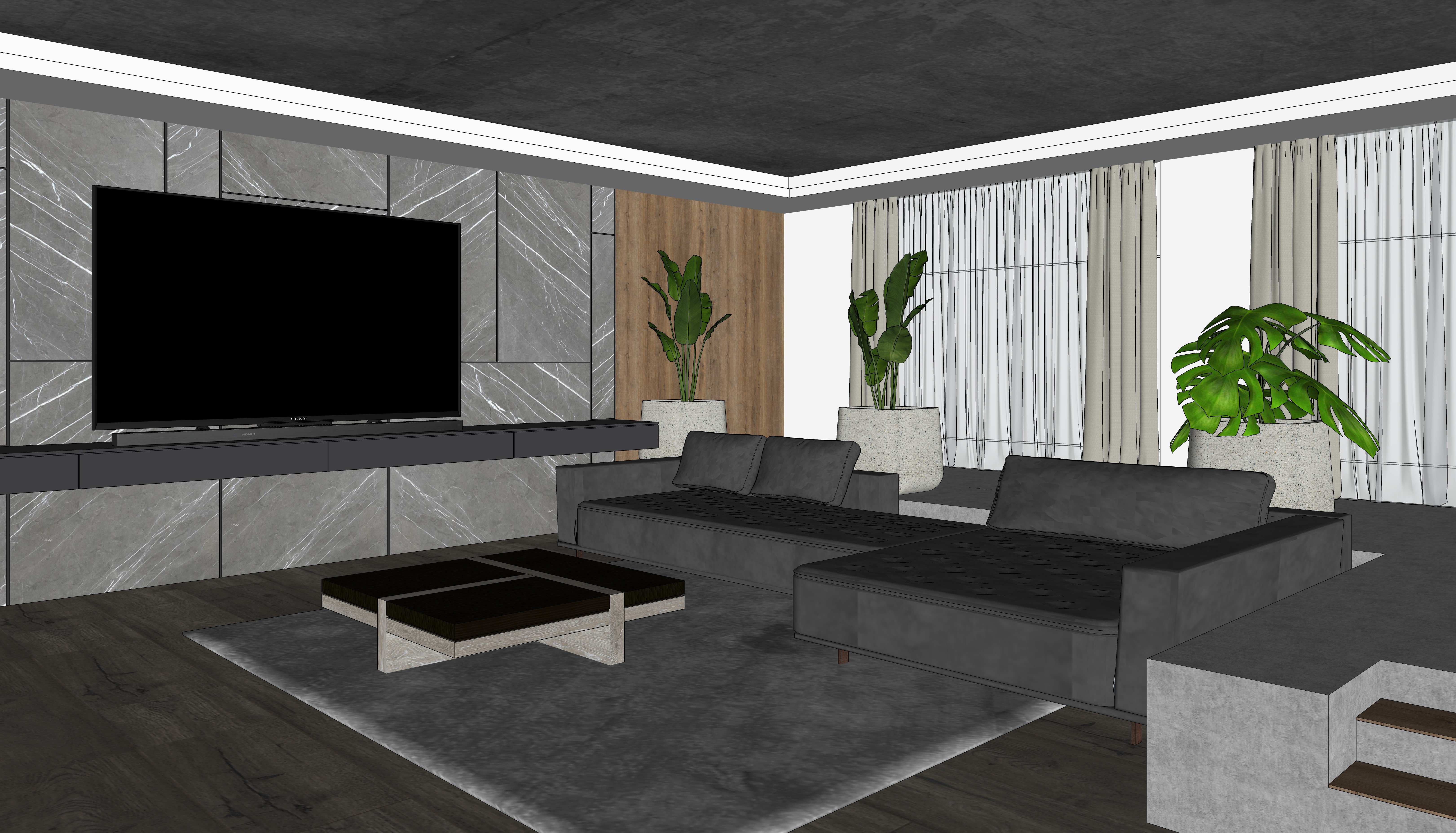
9. Drawing the Walls: Starting a SketchUp model can feel like a daunting task. You're not sure where to begin. You might have some ideas that might start from a sketch or a plan or cat file. In this series, we're going to take a look at really how to kind of start with an idea with some measurements and how to draw from that. So I had this idea for several years of how I could build this kind of remote retreat sort of house with a simple and minimal design aesthetic. And it's turned out that it's actually a pretty good training tool. So throughout these videos, we're going to use this project as a way to learn a lot of the key tips and tricks and using SketchUp for right now, let's just focus in on this main living area. So it's a very simple design in that the house is essentially two rectangles with a center for your sort of breeze way in between. So it's very sort of linear project and it makes just for her training purposes, it makes it easy to kinda start. So we want to get to here, but there's a lot of steps that we need to cover first, just simply even just drawling, right? How do we begin sketching and setting up that initial wall and geometry? So for me, I go back to my days in architecture school and I still like to hand draw. So if this is an existing location, I may go in and dimension out and do a rough sketch that maybe only I can read. But this at least gives me an idea of some of the framework and some of the constraints that we have for this project. So in our situation, we're going to define those guidelines are to define those restrictions. So we're gonna say that the interior walls or 16 feet by 30 feet, There's a breeze way here. There's maybe some windows, maybe some windows, a doorway here, and a window here for kitchen. So you have the sort of kitchen area if the living room, raceway, and then this is all sort of private spaces, aka your bedrooms, bathrooms, things like that. So again here, let's focus just on the public space. So how would we begin drawing this? There's couple of ways we can do it in SketchUp. So let's dive right in and use this as a reference. But you're more than welcome to create a similar exercise or use your own dimensions that you see fit. So I'm going to launch a new file and then I just want to draw the outside balls first. So what we're gonna do is because I know those dimensions, we can take the rectangle tool located here, and I always like to draw from the origin point. So my first click is going to be at that origin point. I'm going to move my cursor up into the right. Now, as I'm doing this, notice down here, don't try to click in the value control box. Just be aware of it as I'm moving up into the right, notice that there's a dimension comma, another dimension, right? So there's the red dimension first and then the green or y dimension seconds. So I'm just trying to make note of which dimensions first. And here it's going to be red being first. It sometimes does change for you once you're in 3D and that it's always the longer dimension first, right now, just be aware of what's there. So for the width, we want 16, but sign comma 30, but sine and then enter. So it's going to be a very small rectangle because we're dealing with the infinite model space. And we just need to take the scroll wheel on our mouse and slide and a little bit, you could also click Zoom extents as well. I'm going to undo for a second because if you accidentally drew 30 FY 16 feet, hit Enter, it, drew it that way. Just typing the distances the other way, right? So type in 1650 comma 30 feet. All right, so now we have our rectangle. This is our indoor area. And with the indoor area, we need to offset the walls to create the thickness. So to offset in SketchUp and we're gonna click on the offset tool located here. And what you wanna do is you want to hover over that surface. As I hover over that surface, it's going to highlight it, letting us offset all the edges that make up that surface. So if we click and release to start our offset, we can then move our cursor inward or outward, basically in relationship to that red dot there. If I notice it's here versus yours might be over here. Depending on where your cursor was, you're moving in relation to that. So I'm going to move outward and now I'm going to type in the thickness that I want the walls to be. I want them to be nine inches. So I'm typing nine and then pressing Enter. Notice I didn't need the inch symbol that need the quotation because inches is my default unit. Therefore, I never have to type for me. I like to build all the walls first before I create door openings or window openings. So you may see users might create breaks like this and then later go and push pull stuff. But I tend to find that that actually creates more work, right? Build the wall first and then carve it away.
10. Creating Door Openings: To create the walls, we just need to push, pull them up. So let's orbit first. I'm going to orbit, then click on the push pull tool. A hover over the surface will click and release to start the push pool and then I'll lift the cursor. And I went pretty tall ceilings here. So I'm gonna try and shoot for a ten-foot ceiling. So I'm going to ten feet and press return is the public area. I might do a shorter nine feet for the for the bedroom and bathroom over here. But for right now, let's shoot for ten. Now, as you push that wall up, notice the surfaces are white whereas the floor is blue. Whenever you create a box in SketchUp, if it had no sort of mass or if it was just sort of a frame, you always want the outside faces pointing up. So what happens is this surface stays there and the new surfaces are just kind of showing in front of it. If I orbit underneath, you'll see the white is out and the blue still stays there. But what happens is when you offset sometimes the surface now really doesn't make much sense, right? So it being blue doesn't really work for us because we want this to be the ground. Now not adding thickness to the floor. I'm not creating a slab. I would later as a separate group or right now, I just want the orientation to be the same. So right-click on the surface and select Reverse Faces. This just flips it so that everything that we see now is nice and white and clean to modify the walls, let's say for example, we needed to add a wall or maybe add another part. It's no different than what we did in previous exercises where you break the geometry and then you can push, pull that out. However, there is a trick to it. So right here on this wall. So if I go back into my plan view, we're going to focus on this right section over here first. So orbit and try to get into a similar camera position that I have here. So remember, there's going to be like a galley kitchen or long narrow wall of kitchen right here. And there's going to be a door opening right here going into that vestibule. So if I want to create a reference point of this five feet six, I'm not going to take the line tool. What I'm gonna do instead is I'm going to draw like Guide, guides in SketchUp our construction lines. They allow us to trace from those points to create our new geometry. So I use a lot of these. Think of this like if your hand drafting, your drafting in pencil, you're kind of sketching out the idea that you're going to sketch out where that reference point should be so that you can add, although it's the pencil tool and SketchUp for us in drawling terms would be like the pen tool to make it permanent. So that way we can permanently kinda break that and then be able to push, pull it. So construction lines are really, really affect the way they work is you want to click and release on the edge that you're starting from and move in the direction away from it. So as I move away from it, it's drawing a parallel line infinitely in model space. So think of it almost like an offset tool as well. Although it's not offsetting all the edges, it's creating a guide that's offset from the position that you clicked on. So for here, I'll type five foot sine six and press return. Now I want to four foot wide opening. So I'm going to click and release on the guide that I just drew and go to the right five with sine six and press return or Type in 48 or our opening size. So again, when you're typing in feet and inches, just to go back five foot sine six, we'll do five feet, six inches. So you don't need a dash, you don't need a space, just five foot sine six, and then return. And then for this one, I could type four foot sign and return, or I could type in 48 and hit return, either will get me to the same position. Usually if I'm measuring, I try to measure all in inches. And then that way I am just typing in an int values on, I'll have to do foot sign and then be inch. Now this entryway and the header of our windows, we have the height, so let's make it eight feet. So I'm going to start somewhere on the edge here. Click and release with the tape measure. I'm going to go up in the blue eight foot sign and hit enter. So now I have the three guides that I need to now create a rectangle that you can see the intersection now creates a little plus sign there. So With that intersection, I can now click and release during my rectangle down, click and release and then hit P for Push pool. And I can push that surface now away. And notice as I push back, it says something like offset limited. So it's only allowing me to push back to this edge here. So I'll click to let it push there. You can see if I orbit now, have a nice opening. Now for Windows, be careful because you don't get that same locking. It's very easy to accidentally push beyond the model like that. Now for here, I want to do two doors that are going to look something like this here. But I'm not sure yet on the spacing and the dimension yet. But we know that at least it's going to be a six or eight foot wide door. So for right now, what we'll do is we'll click and release on the left edge at this wall here. And let's just set up some buffers here. So I know, for example, I want to go at least two feet before the next OPE. And then over here, same thing, I'm going to draw a guide over here, bring this over. They've been 24 at return, may get lucky. We might actually do it as one whole door opening and really not sure yet. But for right now, let's just draw it as one big opening and we can always modify it later. And it shows us a good way that you can always change this design later as well. So that's gonna be another sort of more windows and a door, but it does go to the floor so great that as a door opening or over here or our last doorway, This is a doorway going to some sort of out the outside area. And I want it to align up the width here. So there's a couple of tricks that we can do to help us align in SketchUp. The first is, I'm going to take the tape measure. We're going to draw from this edge here. And I'm going to click and release and bring that down to draw would guide. And I'm going to bring it over till it hits this corner. So that gives us that guide back at five feet six and draw another guide to our four foot side. So I don't need a four foot wide door here. So I'm going to split the difference. So I'm going to draw a guide from this edge going down to this point here. And then I'm going to bring this in six inches. And then I'll draw another guide at 36 and then it guide eight feet. Actually, let's do seven feet. And from there we can draw our rectangle. We can then take push pool and we can push that away. Now once you're done creating all the door openings, will take a look next on how to do a window openings. But before we finish, let's delete these guides. So you could take the eraser, which is located here, and you could erase each individual guide. But the problem with this is it's likely you accidentally erase geometry. So try not to erase individual Guides. Instead, go up to Edit and then select delete guides that will delete all the guides from the model. So now we have all the door openings in place. Let's move on and create some of the window.
11. Creating Window Openings: Creating the window openings is going to be very similar to what we did when creating the door opening its orbit first. And I like usually doing this from the inside of the walls and on this wall here. So we have the living area. We figure there might be sort of a couch here. There's going to be sort of TV entertainment there. The kitchen is going to run along here with maybe an island here. So then a dining table maybe there. So wall we're just gonna do to sort of windows here. And that way if we decide to move this space around, we at least have a wall here to work with. So like we did with the doorways, We're gonna create guides. And again, I'm just kind of making this up and it's really just good practice to, so the first guide with the tape measure. So again, t for tape measure, Click and release to start the guide. Let's do 12 inches, will do Guide over here as well. So we'll click and release, go to the left, taken 12, and hit return. Now the width of the window is going to be four feet. So from the existing guide, I'm gonna go over 48. And I go from this guide to the left, 48. And then from the bottom, I'm going to bring this. But be careful. Notice as I'm going up, see, I don't see the line or to type in 36 right now, you'll see that I drew a guide on the floor 36 inches away from the interior wall. So be careful of your camera position. So I'm going to kind of orbit and be more in plan. I'm sorry, I'm going to be less than Plan and more in sort of elevation. I'm going to bring this up and I'm going to over-exaggerate it. So just keep lifting up, maybe go to the left a little bit and you'll see that blue line appear. That arrow lets us know that we're in the blue axis now. And here we're gonna tape in 36 or are still height. I'm going to click on that guide one more time and I'm a go up to eight and then press return. And so now I have all the guides that I need for this wall so that I can create the openings. So remember, you're always creating the openings later. You can add the windows and door groups and component. So I'm gonna do a rectangle. So go ahead and click on the Rectangle tool. And then with the Rectangle tool, you're going to draw from intersection here to intersection here, intersection here section, and then take push pull. Now with the push pull tool, as you push that surface away in a accidentally do something like that, right? So to prevent that from happening, always be aware of your outside edge for the wall. So with this outside edge, as I push, I'm going to keep moving my cursor. I know it looks like it's passed, but notice once it clicks, once a dials in, you'll see it locks back into place. Says on edge, that lets us know that it's only pushing to the edge of the wall. So I'll go ahead and click, and now it'll cut that spinning through. Let's also note, what's also nice to understand is that push-pull has a copy feature. So if I double-click on the next surface, it repeats my last push pull. But be careful, don't accidentally push your wall. You're gonna pan and orbit over, pressing home the scroll wheel with shift. And we'll take a look at this wall here. So for this wall, we want something that's going to look like this. Alright? We want sort of a window that's going to be able to so we can look out. So we have sort of a backslash here maybe. So we want that to go on this wall here. So I'll do take measure again. But this time I'm going to go from the edge, going to move my cursor over. And I'm going to move over until we get to the midpoint here. And you can see I'm at the midpoint because it's a cyan colored dot onclick and release to set that with the tape measure. Once again, you're going to click and release and go to the right. This time we're gonna go over to foot sine six and enter. So we could also go the other way. If we just go 30 inches, would be the same two-foot sine six, right? So we're drawing a guide in the center and then sort of offsetting it to the left and then off-setting it to the right. So we don't need this middle guide anymore. So we can press E or eraser, and then we can click to erase that at now, press T again to bring the tape measure back up once again. And for the sill height, I'm going to click and release during my cursor up. And right now let's see, the countertop is going to be at 36 inches. So I want to give a little space from there, so I wanna give another six inches. And then I want a window that I don't know, it doesn't have to be too tall. It just make it at 24 inches, like a nice narrow window there. We might extend it taller later. So again, it's a lot of just playing around understanding how guides work. You can create ones that you can later delete and then press our rectangle and just kinda draw that rectangle there. That way we can then take bush pool ensuring that we're on the edge. We could also too, if we knew it was nine inches, we could push type in nine press return or remember our last push pool was nine inches. So I could double-click and it's going to repeat that push pull as well. So with the door and window openings created, let's go delete all the guides by going to Edit and then selecting Delete guides. And then in the next video we can go ahead and start to kinda space, plan out what we wanna do for the kitchen.
12. Kitchen Space Planning: To create a simple Space Plan for the kitchen, we wanted to do what we similarly did for creating doors and window openings. And that is creating guides. Where this is going to differ though, is instead of subtracting geometry, we want to group or may components, blocks are objects that we're building so that we can put them as place holders for later, more detailed cabinet tree or appliances or things like that. So let's jump back into the model. And again, just to use a frame of reference, we're focusing on this area here to be our kitchen. We take a look back at the original model. You'll see that we'll have a sort of kitchen area here and maybe at bay or Island. I mean, so let's say we were not really sure yet on what we wanted to do and how we want a space this out. So first thing we need to understand is we don't want to create cabinet tree or other geometry that is part of the wall or part of the floor, right? We don't want this. So this is a perfect opportunity to take the entire model that we have so far, meaning the walls and the floor, going up to Edit, Select All, and making it a group. So for me in any project, I like to build all the exterior walls, create all the openings, and then group it right? Once it's grouped, I may not enter this for a while. So a good little tip that you can do is you can right-click. You can actually lock that group. This will prevent you from moving it and will also prevent you from accidentally deleting it. So a locked group will turn red, and then if you need to unlock it, you can always just right and unlock it. That's why I'm gonna keep it locked for right now. So let's scroll in and let's focus in on our space here. And let's go through a couple scenarios. First, we obviously need some position for appliances here. So a simple way to build some reference points is to create guides. So will again take the Tape Measure tool, will click and release on this back edge and we'll pull this out. 24 inches is most standard cabinets in fact are 24 inches wide. Now I'm thinking with this design, I'm thinking, you know, a linear approach in that we're gonna have AB, the oven over here, refrigerator here, and then maybe a sink here so that maybe the range will be on the island. Not quite sure yet. I might flip those, but generally in a design like this, we'd flank one side and the other and we might have to move this window around, whatever it might be. But let's just, let's just do this as a start, see how it goes. So typically, refrigerators and Wall units can range in sizes from 30 to 36 inches. So typically that's kind of where we're at. So if I take the Tape Measure tool, we're gonna draw a guide going from the left edge over. I'm gonna bring a guide at 30 inches. That's going to be for my wall unit. And then from the right edge here, and I go guide our 36 and press f for here. I know the wall unit and the refrigerator are just going to be placeholders for right now. So it doesn't really give us an advantage of making it a component. So I'm just going to draw my rectangle and draw my rectangle. Then going to take the Select tool, I'm going to double-click and then right-click and I'll make it a group though. Select tool, double-click, right-click, and make it a, I always like to make groups prior to push pooling, but be careful in doing so because a, you'll notice as you orbit you get that flickering. Just make sure before you push pull this, that you double-click inside the group. So if I double-click right now, we can then push this up. And I'm just going to push this up. I don't know what the height of this as yet. I'm just gonna give it 80 inches and this sort of standard door. Hi, so I'm gonna do Space-bar for select escape and then double-click here, and I'll push this one up 80 as well. Or see I can move my cursor over in kinda reference it until it snaps right there. I'll go ahead and click. I'll then take the Select tool and I'll click away from not sure, yeah, I want to break up any of the rest of this. And without adding too much detail, this is where we can just take the rectangle tool row, a large rectangle here. Take the Select tool, double click on it, right click, make it. You can also then once it's a group like this, rather than double-clicking on it. Once it's selected, you can press return, return with the selectable access and enter. Then I'll just push this up 36, just to give it our height. I'll hit the spacebar for select and then press Esc. And again, this is fine just to sort of get us started. So now let's take a look in our next video on how we can create the island.
13. Building the Kitchen Island: To create the kitchen island, this is where guides are also really helpful. So for space planning, let's make a couple assumptions. Let's say that we want the island to be 42 inches away from the cabinet tree. So that just gives us an enough sort of walking space and turnaround radius for a person there. Let's also let's give a little bit more leeway because we have traffic area coming in, traffic area coming in. So I don't when I walk in and sort of hit that. So it's actually give 48 inches on each side here. And if you want, you can erase the eraser. These guides we previously had, that way. We have now just the guides that were working with on the floor, just going to recenter my view and actually go back to a top view. And I'm going to pan down, sometimes it's just a little bit easier to see it from a top-down view. Now I'm not sure how big I want to make this, but I know I at least need 24 inches for some kind of Cabinet tree underneath. And then I'm going to add another 18 inches because I want benches or stools to be able to fit underneath this. From here, we can now take the rectangle tool and draw a rectangle around the edge here, and take the Select tool. And we can double-click on that right-click and make it a group. I'll press enter, open up that group, and then we'll push, pull it up 36 inches to give it that height. And if we look at my concept here, you'll see I have this nice sort of inch and a half frame or offset around it and it's going to recess in 18 inches. So a quick way that we can visualize that without getting into too much detail is to offset. However, if we offset like we did the walls, it's going to offset all the edges, right? So we don't want that. Instead, we're gonna take the Select tool. We're going to select the Edge and we're going to hold down shift because we're going to add this to our selection and this two are selection. So key tip here. If you pre-select during push pool, it only, excuse me, few pre-select during offset. It only offsets your existing selection or your pre-selection. So I'm gonna click offset, and now I'm going to click and release and I'm gonna pull this n. And instead of an inch and a half, let's actually do two edges. I would bring this in and I'll type in two and press enter. Now actually, let's go back. If you wanted to do an inch and a half, changing my mind, I can click and release, move that back and you can type it either as a decimal. So 1.5 and then return. Or you can click and release, move your cursor and type it in as a fraction. So one space bar one, slash two, and then enter. So make sure remember previously with feet and inches, you type foot sign and then the inch there was no space. However, with a fraction, you need to type the Int value if the space bar, so that you separate between the pinch and the fraction amount. I find it much easier just to type in the decimal amounts. So have a little cheat sheet or 0.1 to 5.25.375, so on and so forth. So we can keep it at 1.5. That's fine. You'll want to add to, it doesn't matter. I'm going to then push this back with push pool. I'm gonna push this back 18 inches. So the concept of all of this is we're creating brain works for potential detail that we're going to add later. So we're not worrying yet about me. Now. We're not worrying about any sort of high level detail. We're just trying to get those little nuances that way when we find the right component or we go to edit that geometry, this is that placeholder, that low poly version of it that's gonna make it easier for us to reference later. I'm gonna take the Select tool and I click out of that and I'm going to orbit back. And one of the last things that we can actually do just to kind of cap off the kitchen here is we can double-click inside of our cabinet tree here. And since we push this up to 36, I'm going to select this edge and then take the Move tool, going to press Control. And I'm going to copy this down by clicking on the end point here, copying it down an inch and a half. So 1.5 and then hit return. From there, I'm going to select this edge and I click on the Move tool and oppress control. I'm going to copy this over all the way over to here. So it's going to be ten feet, six inches. I'm copying it all the way to here. And I'm going to click to this is like copying and just kinda placing it right there. When you click, instead of typing five x, I typed 5X. Right now, it would just create five lines along that path, right? But instead of typing five x, I'm gonna type five slash and then hit return by typing five slash. It's dividing this into five equally spaced line breaks. So this is a good way that you can quickly kind of break these. Then you can better understand sort of what each sort of cabinet with this. And just visually this just kind of helps quickly, kinda break and subdivide this up. So we have a better idea of what that kitchen it's going to start to look like in the next video is take a look a little bit about the living room and how we can further Space Plan in there to help us create a bookshelf later.
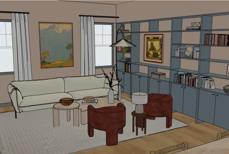
14. 2D Massing Exercise: It's very easy early on in the modelling process, particularly for interior design, where you want to start putting in the actual furniture or finishes that you want. But I have a little caution doing that. And what I want you to do first is really think through the design. Whether it's on pen and paper or in what we're going to do, which is a little bit of pen and paper in SketchUp, We're going to space pan a little bit more to understand the size and shapes of the furniture that we need. We went to grab stuff from the 3D warehouse or if we create stuff on our own, we have a better idea of the overall constraints of size and dimension that we're looking for. Plus it's much easier to move 2D geometry around than it is to move 3D geometry around. So let's jump in. So inner design, you know, I'm, I'm thinking trying to go with maybe a circular table, maybe a couch at the end here, and then to sort of armchairs. Not quite sure yet. And let's say in this process, we're trying to figure out what's going to work. And quite honestly, that's where standard sizes and sort of options, that's really where Google is really helpful. So a lot of times when I'm doing interior work, I'll do a lot of what is standard dining room tables? What is the standard sectional size? What's a standard cabinet size? You know, a lot of that from years of experience you kinda figure out. But don't be afraid to jump into Google and do an image search for, you know, different sizes, for dimensions, the things. So what we're drawing is really just kind of what, what I've kind of found that kind of works for different dimensions, spaces. I go back one, I'm gonna just put that over on another screen. So all we're gonna do right here is we're going to create some blocks are, and create little sort of geometry here. So first we want to round or rectangular table here. And I wanted to see at least six maybe. So a size for that usually is somewhere between 44 inches wide by 84 inches long. So I'm gonna click on the Rectangle Tool and I'm not going to worry about Guides and constraints. If you want, you can actually go to edit, delete guides. And I'm just going to draw a rectangle in the model space here. And I type in 84 comma 44 and it returned. Now I want to make sure if I draw any chairs or any other geometry that, that doesn't intervene or mixed with any of that geometry. So I'm just gonna make sure I group it. Not going to worry about making a component because this is really just like 2D placeholder. You do a lot of this. You know, you might actually create a component library for your own leader on, but to not over-complicate things, let's just group it just to kind of keep it simple. Alright, so we've got our table there that's maybe go inside there. And I'm just going to draw with the Arc tool. Just going to draw kind of like an arc here and maybe another arc here. So click and release, click and release then move your cursor out. In realistically, I should be making the SS as individual components that I can move and copy. But just to kind of, this is really I'm not showing the client this, this is really just for me. So I'm just going to kind of draw it, something like that. And I'm not worrying about these being perfect. Certainly if you wanted to, you could take this and move and copy it over and kind of align them. Something we're gonna do later on once we have it in 3D. But right now, that's fine. I'm gonna take the Select tool and a close out of it. And I'm gonna do the same thing for our living room furniture. And for this, you really don't even have to be true in the dimensions and size, right? You can just kind of, I had a little bit. So for example, if I take the rectangle tool, I may draw a rectangle along here. And I'm just visually just trying to look and see what those dimensions are. It's about 19 feet by foot or two. So that I might just put it as a placeholder right now for a bookshelf and do a whole long wall bookshelf there, then it might draw another little rectangle here. And let's say let's do like a long sort of couch. It may be with the circle, will have coffee table that maybe with rotated rectangle. I'll click and release, click and release, and I'll move back to build ITU chairs. Again, it's not that the dimensions certainly are not correct by any means. If I take the tape measure, you know, you can see this chair's about over three feet wide. It's, it's a really large coffee table, are really large. Single chair. And same thing with this couch. This is almost a 12-foot wide couch. But generally, you know, you can see how quickly doing this quickly really allows you just to kind of be free. Don't be hold, held down to the constraints of SketchUp, wanting to draw sort of true to size or true to shape and locking into things. You know, just kinda take the rectangle, take the circle tool, and just kind of free form here because eventually you're going to just select all of these and delete them. But at least this is giving you the framework on where you want to do this within the model. And really to, it's really something too that you could do. You know, still by hand. I'd love still going by hand. Even here in Acrobat and just kind of marking this up, right? Maybe you have an iPad and you wanna kinda sketch out, you know, don't hesitate to use the tools that you have to help you kinda Space Plan that though, you know, here might do a little bit for organizing this leader. Whatever that might be, whatever gets you to, where you need to go for creating the geometry is really, really what we're striving for. So now that we have a direction with where we want to go for some of the furniture using the 2D placeholders helps us. But really to make it look better, we want to create or import from the 3D warehouse where we can actually bring in 3D furniture. So in the next video, we'll go ahead and do that.
15. Importing Components from the 3D Warehouse: Now that we have an idea for what we want the furniture placement to be in our space. Let's take a look, the 3D warehouse and how we can import components that other users have already created for us. So let's jump in access to 3D warehouse. We're gonna go up to a window and then click 3D warehouse. I'm gonna make the screen bigger just so that it's a little bit larger for us here, the 3D warehouse is a database or library of free SketchUp components. So the way this started years ago was when Google purchased SketchUp. It used to be a place where you can upload 3D models of cities and buildings that anyone could create. And then those would publish and be on the Google Earth build 3D buildings layer. However, that technology changed in SketchUp is now owned by trimble. So the 3D warehouse has become a repository where users can upload products. It's also been a place where manufacturers can also put their products. So it's a balance. It's a balance of manufacturers actually providing the 3D models of their products with everyday users like yourself, sharing and distributing models and objects that they've created. So there are a few tips that we can use to make it easier to find the right thing that you want. So let's first start in the dining room. So we need a dining room table. So let's just do like we do any kind of search. We'll just do a search. Hit Return here. And you're going to see right now the first set results, the 449 results are all from products. So these are from sort of trusted creators or manufacturers that are actual products that you could probably find off the shelf or online to purchase. So in short, these are kind of ones that are created and are clean and nice depending on what you're searching for, you might get not as nice results, or maybe you only get a couple of things that you can find. So that's where you want to sometimes searched by models. And this is where you're going to see more of really any kind of user uploading a dining room SET, right? So this could include chairs, it can include dimensions and just other elements that just maybe you don't want. You can also search different collections, which are essentially folders that people have created to bookmark multiple products or components within a particular subset. So it's a great way if you find something you like, you might find something slightly similar. There's also catalogues which work very much like collections. So for me, I tend to stay within the product Rome. If anything, I might use the categories over here, but I rarely kind of adjust these. The only time I may do is I might just the file size. Note that when you import components, you're importing all of the geometry and all the textures that are in that file too. This is where users can quickly see there file go from maybe one or two megabytes to 20 or 30 or 40 megabytes because a through and a lot of furniture, a lot of complexity. We can also two, instead of sorting by relevance, we could sort by popularity. I, you can see you get the idea here. So I'm going to browse through, I'm going to try to find a table. This one actually looks pretty nice. Let me find a table that I think it's going to work within the space. This one's pretty interesting, although I'm not too sure about the dimensions and size of it. So I can click on it to open up a preview of it. And if I like it, I can, of course click download. But if I want more information, I can click see more details. And this is going to actually bring us to the product page of it. So remember, SketchUp is used worldwide. So being in the States, we really don't work in metrics all that much. So you will have units or you will have models that are in a different unit then, then inches. So you'll see here that this particular model is bounded by a one by two by one meter object. So it's not that you need to understand conversions between inches in meters or inches and centimeters. The important thing to get here is people create thing and then other scales or other units. When we download this, it will automatically convert to inches. So you don't have to worry about it converting and sort of changing the scale or changing the size. What you may have to worry sometimes is users not drawing things to scale. But here's a good indication that this is pretty typical of a table. Also, while I'm here, we can take a look of other models by the author or other collections by this author as well. So it's really great when you find something you like by a creator, you can kind of browse some of their other stuff. I'm just going to, you can also favorite This. You can like it. And you can even create your own folder or collection to catalog things. I tend to just kind of ignore some of that and just kind of download it because I may not ever need this again for another project and it's easy enough to search. So we're going to load this directly into the model. We'll go ahead and click yes, it's going to download, and that's gonna place the object on your cursor. But see how I'm not exactly on the corner of the objects SEO, it's off a little bit. Every object that you create in SketchUp has a different inserting point. So we're pretty close. You can see we're pretty close to that size that we used. So I'm going to just use the bottom 2D geometry that I set here just to kind of set this table in place here. So I'll go ahead and click, Set it. One of the biggest tips that I can give you when you're placing components from the 3D warehouse is just get it in the model. Sometimes don't worry about getting it in the exact place. Because a lot of times you don't know exactly where that inserting point is going to be. So a user might create this with the origin point, not here, but they might create it somewhere, sort of off the model. And if that's the case, when you import it, it's a lot more difficult to kind of set and adjust. In the next video, let's further add more components within our model using the 3D warehouse.
16. Moving and Positioning Components: Let's jump back into the 3D warehouse and add more components into our space. So we're gonna go back up to window. We're going to click on 3D warehouse. It's going to bring us back to our previous page. So since we're on this product page, it's going to bring us here. So we can either click home or we can search by other models that maybe this creator has done. So I'm gonna go back to our search and type in dining table set. And maybe I'm just going to find a chair. So this chair works pretty good. I don't need to open up the product. It can basically click on this little Download button right here. And that's going to prevent us from having to go to the product page. So we'll click on that little button. It'll load it directly into the model. We'll click yes, download it, and then I'll place it on our cursor. And again here I'm just trying to kind of place it somewhere in the model in reference to the table. So right about there looks pretty good. Now with the chair in the model, we can rotate it, but I don't want you to actually use the Rotate tool located here. Instead, we're already on the move tool. And notice as you hover over an object, you get not only these and corner anchor points, but as I hover over the top, see the red plus signs that appear right there. That red plus sign is an anchor point for built-in rotate. So once you hover over, click as it makes that rotate symbol appear, and now you'll begin rotating it. The farther your cursor is away from the object, the less likely it is to snap to these 15 degree increments. So I'm gonna move my cursor closer here. So I'm right on that spot. And then I'll click this Edit in-place. Now with one chair set, I'm going to press the Control key or option on a Mac. I'm gonna copy from the bottom corner of the dining chair here. And I'm going to click again to set it. So I'm moving. Notice I'm moving in the red axis, a click there to set it. I'm going to take the Select tool and I'm going to select the base plan that we have below, and I'm going to delete it. We no longer need it. Now if you'd like to Space Plan in a true 2D plan, let's go up to the top view. And here we're still in perspective although we are looking above. So I'm gonna go to camera and click on parallel projection. This flattens our model into a 2D axonometric. If we were to orbit right now, we would see our model is in fact an axonometric and not a isometric. So I'm gonna go back to parallel projection. We go back to a top view. And what I like about this is I can select this table, I could select this chair and select the other chair. I can take the Move tool rest control, and rather than clicking on the object to copy, if I copy from a place on the ground by clicking and place it on another spot on the ground, it ensures that I'm keeping the object on the ground itself. So if I orbit, you can kinda see it still all on that plane. What many first-time users will do by accident is they'll copy this, but then click on the object and the lifted. So then you'll end up with your chairs kind of floating above the model. So certainly there are times where copying from the object or from the corner is effective. That was really good previously when we copied it over. But when I space plan for furniture, I tried to find an arbitrary point on the ground and then I click to copy it from there. So then I'll click to set it. Now rather than rotating these chairs, we can right-click and we can flip them. And we're going to flip them along the green direction. Because notice when we move this, well, you moved and copied it. We moved it along the green axis. So flipping is essentially like mirroring. The difference though is it's always in relation to the axis that you're flipping it. So if green doesn't work for your particular component that you download, just undo and then flip it by the red. Go back to our plan, maybe move it forward a little bit. And then I'll select this chair. I'll control or option on the Mac. Click and place it here, a hover over the top and click and then click to rotate it. Press control again or option on a Mac, copy it over to here, and then I can either rotate it or the Undo, or I can right-click and flip it along the green. So you can use m as a keyboard shortcut to quickly go back to move. And once you're done moving, hit the spacebar. The spacebar is a great way to get out of the move tool. Otherwise, it's very likely that you can just kind of click on an object. Forget that you had it selected, and then you're over here kinda clicking it by accident. So feel free to hit the space bar to bring back to the Select tool. And I'm going to hold down Shift actually, I'm going to select our chairs and I'm also going to select our table because I want that to move all as one piece to similar to the stair example in a previous video, I can right-click here and contain this into one larger group, because as you can see, I'm not really centered here. So I'm gonna take the Move tool now and we're going to move it just to kind of I it up and center it. In the next video, let's take a look at how we can use the component library or component palette within SketchUp to actually change or just the components and drag and drop them into the model.
17. Using the Component Tool Palette / Window: Another way that we can place furniture that's already in the model is actually using the component palette or the component toolbar over in the default tray. So on a PC, you wanna make sure the default trays open and then you're gonna open up the component tray here. Now if it doesn't show your two current components here, just click on the little house, and the house will show the models currently in the file. Now, over on a Mac, you wanna go up to a window and click on components. And that's going to bring up the component palette. Same idea here. I'm just going to drag the toolbar up and over. And I'm going to click on the home button just to show the components in the model. So once you bring a component into the SketchUp file from the 3D warehouse, it's going to show here. It will also show if you create any of your own components. For example, if I take the island here and convert it to a component using the Select tool and right-clicking on it, you can see after I click Create that it shows up in our library over here. Now this only shows up in this file. So if you were to go to File New, these will not show up here. Do you ever wanna save out a component so that it's part of a larger library. That's something I'll show in a future video. But quickly you can always right-click and Save As so that you can save it out as its own SketchUp file. Or right now, let's focus on what we have in the model. So I'm going to orbit and I'm gonna get out of this parallel projection view. So I'm gonna go up to camera and click on perspective. So let's say I had that chair in the library over here. I can now click and release the thumbnail image over here on the right. And as I move my cursor into the model, you're gonna see it appear again. I can click and release and then drop it to the model and click and release the table. Certainly drop that in as well. Just going to delete that. Keep the two chairs here. Because what we wanna do is we want to replace these chairs with bar stool chairs. So let's say maybe at first we wanted it to be a little bit lower or maybe we had an idea to do sort of a regular chair size here, but it just didn't work out. So now, if I go up to a window, click on 3D warehouse, I'm gonna do a search for bar stool, and I'm going to find one that I like. This one looks pretty good. So I'm going to download this. I'm going to load it directly into the model and we're gonna place it just kinda over here to the side. I'm not going to place it in the correct location. I'm just going to kind of place it here. So what happens here is let's say you have a new product that you like and you want to swap it with these two existing ones. I'm gonna take the Select tool and I'm going to pre-select the two existing components. And then over in your component library, you can right-click on the component that you want it to be replaced with, and you can click replace selected. So that's going to swap out these two components with our new component. Now you will see it shift slightly. And the reason for that little shift there is because these components, you can see the origin point is in the middle, or the axis origin of that component is in the middle. Whereas when we replace it, see how for the object within it, it's just kind of off a little bit. So there's really no way of knowing that right away unless you actually go into that component and kind of make the change in, sort of re-center it. But don't waste your time doing that. It, it's just unless you're using this object a lot. It's really not worth the time really to, to adjust all that. What I'll do instead is I'll delete the copy that we have there, because now we have these two in the model and I'll select these and now just kind of move them out. And also looks that I need to rotate this. So I'll rotate, select just this one, and rotate this one, this one. Another important thing to know is not every user on the 3D warehouse creates components the same way. So one thing that I always like to do is I like to take the Select tool and I like to double-click inside the object to kind of see how they organize this. So you can see it's actually, it's actually a component, and inside of that component is a subcomponent and then another subcomponent. So it looks like they actually have a couple issues here. One other way to visualize that is what the outliner. So on a PC, if I go to window, I can go to default tray and bring up the outliner over on a Mac. If I go to window, I can then just click on outliner. So the outliner is the hierarchy of an object, the hierarchy of your model to over here you'll see the filename here I have, and then the components in groups within it. So components show up as a four dot, groups show up as just a one sort of square dot. So we can see this little drop-down arrow, that stacking arrow means that it's a component and inside it are sub objects. So it looks like they have a group within a group, within a group. And then these component number ones, these I would say are likely be individual legs. Yep. Leg, leg, leg. The group here, this might be the Bar or sort of a subobject within there. Oh, it's the the support there. So what you can see here, and honestly you don't even have to change this. But what I can see here is this grouping and this grouping is unnecessary. What happened is they probably downloaded it, grouped it together, grouped it together and then named it. So I can clean some of this up. I can take this group here and explode it. And then I can take this and up here and right-click and explode that. And then I can take this group here and right-click and explode that that way. In the stool component, there's just the four legs, the two underneath sort of parts that we're not seeing right now because they're underneath and then the top. So that just kind of organizes it. It doesn't really matter in the long-term. It just makes it a little bit cleaner and easier to work with. You can also see after I did that exploding, see how that wireframe around the object is much more narrow. So that group within a group created sort of that extra sort of boundary area. So now it's a much cleaner sort of object. And because it's a component also does it over here to this copy. So again, the outliner over here is here, as well as the component library. Those are two ways to help you organize your objects within that model. Personally, I do not use the outliner all that. Often. I use it just as a quick visual check, but I likely just kinda go in and double-click around just to see. So I suggest once you're done with the outliner, you can close it that way. It doesn't sort of refresh every time you're clicking on something. In the next video, let's take a look at a new feature in SketchUp 20-20 one called Live components.
18. Intro to Live Components: A new feature in Sketch Up 2021 is the ability now to use what's called Live components. These are configurable components that allow you to change and adjust the properties within them. If we take a look at an existing SketchUp model from the 3D warehouse, you can see that this component, there are no configurations, right? I can't scale it. I can't stretch it. I can't change the material without altering and changing the model properties associated with it. So SketchUp came out with a feature in 2021 called Live components. So I'm gonna delete right now just our double-click on our rectangle that we added here. And actually I can double-click and sort of delete just kind of the rest of the furniture that we have here because we don't need it. So to find a live component, we first need to go on the 3D warehouse. So we're gonna go up to window and we're going to click on 3D warehouse. I'm going to click back on the home button or the 3D warehouse button. And you can see right away in the top here that there are some models from SketchUp labs. The SketchUp labs is that designation for this new development, which is the which are these live components. So I'm gonna go to this furniture, live components, and I'm going to click on this modular furniture here. So one thing to understand that the, this is new, so there aren't a lot of options as far as designed on a lot of these, this will change. Sketchup, adds more to these. And as live components become more of a part and integrated into everyone's everyday workflow. So without it being configurable, you would just download this and if you needed to change it, you would have to figure out how to stretch it and move it. But now you can click configure here and you can actually kind of preview how you want to configure and adjust the component. For example, if I don't want a L sectional, if I just want a street three seater, you're gonna see it change an update based off of the parameters that you put. Now I'm going to close out of this preview because I'm doing this configuration on the 3D warehouse. But you can also do this in SketchUp, Which I think that I find a little bit easier. So just download it as it is. So I'll click Load, I'll click yes. And I'm going to place it in the model and I'm just going to orbit around as well. Maybe pan this kinda get a better look at the model here. Now previously in SketchUp, what users might have a tendency to do is they would try to click the scale tool that try and stretch this. You see as I click the scale tool on this component, can't do that. Like I can hear. I can't I can stretch or irregular component but it can't stretch a live component because I need to right-click on it and go to Configure live component. However, before I do that, let's actually take the Move tool and let's hover over the top and let's rotate it. And then now we'll right-click and configure the live component. You will see the properties of it up here. And now similar to what we had when we were on the 3D warehouse, we can configure this. So because the model was done in millimeters, that's going to keep the units that it had. So I'm just going to kind of expand this, might move it a little bit too, and I might change the base color, just keep it white for right now. And I might change it to a large sectional with an Ottoman. Maybe I'd be a little too big for this area here. I think we'll just actually end up with the three cedar here. This works, but you can see how you can further kind of go in and customize this. And then I can still use the Move tool. It's still kind of adjust this around. Now I sort of have a position for it with how I like it. I'm gonna go back up to the 3D warehouse and Azure searching for objects. Be aware that over in the right, excuse me, over on the left, under Advanced here, you can actually enable the search so that you're only searching for live components to maybe an Ottoman. There's just not any Ottoman jets. So maybe living room didn't work either. Every I gotta go to models. So they're not showing up first under Products, but under models. If I type in living, you can see some stuff there. But because this is still kind of in its infancy here, I would definitely just go to the furniture live components in the curated collection here. And again, this is a new feature, so expect this to expand and maybe I'll bring in this coffee table. So again, same idea. You're gonna right-click configure live component. And you can see we can change the style of it. And maybe I want to rectangular one oval-shaped, I'll actually go oval shaped. I think this works pretty well for this current design and make this much bigger. This one, we can even add a shelf underneath and we can change the material top or we gave in change a custom color. So again, there's a lot we can do with this. And again, this is really just kind of the beginning of life components. But you can see it does make it a little bit easier to kind of stretch and movies compared to maybe a table that we found just off of the warehouse that wasn't a live component to finish off the living room furniture here, let's go ahead and just add two more chairs. And again, you can choose any kind of chair that you want here. I'm gonna go back into the furniture and maybe I'll just grab one of their sofa ones for now. So I'll click on the corner here and just maybe rotated a bit and sort of place it with whatever looks good there. So finding stuff on the 3D warehouse definitely makes it a much easier to fill up the space with furniture. But there are times where you're obviously going to have to create your own custom furniture, or in our case, mill work from scratch. So in the next video is take a look at how we can create the set of bookshelves that are gonna run along the wall here.
19. Creating a Bookcase Component from 2D: A way in which we can understand components better is by creating a series of bookshelves and understand how to create components within components and how they act and react within the model space. So our end goal is to try to do something like this. We want a series bookshelves that go along that space there. And if we jump back into our model, we can see we have this whole wall here to work with. So the first thing that I'm gonna do is I'm going to take the rotated rectangle tool and I'm going to start somewhere here. And I'm just going to create a base shape. So I'm going to click and release to start my rectangle gonna move out because I want the depth of this to be 12 inches. So type in 12 and then hit return. I'll then move to the right. And I want each row to be no wider than three feet. So I'm gonna type in 36 and hit Enter. So with my bass shelf, I can take the Select tool, double-click on it, right-click on it, and then select may component. And I'm gonna call this a twelv by 36 bookshelf and then click Create. So again, I always find it easier to move and copy stuff when they're 2D. So let's take the Move tool, let's press Control, and let's click and release. Click and release to set it will type in, see how good my math is. We'll type in 5X and press Enter. I'll try 4X and press enter. So it looks pretty good. So you can always change that value so long as you don't click on another tool. Now from here, I really just want to kind of focus on what the size of this is going to be and how it's going to look before I add too much detail. So let's just take the Select tool. Let's double-click inside of one of these, and let's push this up. And we're pushing this up really just to kind of get a sense of height. So I certainly don't need it to be ten feet. May actually put a soffit above it so we can get some lighting in there. So I would probably say the tallest wood that we should go here is going to be eight feet. So I'll type in eight feet and press return. And again, the beauty of the component here is once we model one that affects all of them.
20. Creating Cabinet Sub-Component: The basic framework of the cabinet components set, we can now go inside and create some sub-components of individual parts within the bookcase itself. So let's jump in and we can see now here, if I take the Select tool, I'm going to double-click inside of the first component here. And what I wanna do here is I just want to copy or separate the vertical piece. So let's take the Select tool, let's double-click on it. And then we're going to right-click and make it a component. And the component for this is going to be, we can call it component two. I'm just gonna call it V bookshelf. So v, meaning the vertical part of the bookshelf or bookcase. It doesn't really matter what you name these. These are just for your own internal nomenclature and, uh, go ahead and click Create. Now what I also want to do is the existing geometry. We're going to take the eraser, or actually it's a little bit easier rather than trying to erase these individual edges. It's actually easier if I take the Select tool, if I Triple-click, it's going to select all the geometry except for the component and only selects stray geometry or ungrouped or on Component ID geometry. So I'm going to Triple-click, I'm going to press delete. So now all that's left is the subcomponent of the vertical shelf piece that we created. So let's double-click inside of that, that way we're inside of that geometry. And let's push this over an inch and a half. So we're gonna type 1.5 and then hit return. So again, let me back up. So we're going to triple click to select all this geometry. We're gonna delete it, suppress dot delete key. We can't push, pull the outside of the subcomponent. So we have to hit the spacebar for select. We have to double-click and then hit P for Push pool so that we can now push this over 1.5 and then hit Enter. Here is where it can get a little tricky. Remember, over in the outliner, we're inside of the subcomponent. We're inside of the subcomponent bookshelf. So if I added a actual shelf, this would be part of the vertical piece and I don't want that. So here, just be careful when you're inside a subcomponent, single click with the Select tool outside of the object. That way you can just highlight it. So right now I'm in side the bookshelf without having to be inside the vertical piece. So then here I want to add a base cabinet. So I'm gonna take the rectangle tool, I'm going to draw a rectangle over that geometry. Now if you don't see the others duplicating, it is because you're completely outside. So if you just see this, notice I'm not inside of a component here. So make sure select tool, double-click inside, but not double-clicking inside of the vertical. You just want to be here. From there, let's do rectangle. We'll draw a rectangle around the base. Let's double-click on that, and let's make that a component as well. And let's call this cabinet and then click Create. So the cabinet, as well as the vertical piece is inside the shelf itself. Let's double-click in that, and let's push this up. So again, we're going to click on push pool. We're going to bring this up. Let's bring this up 28 inches. So I'm not sure yet on the detail that I want for that, but I also don't need a twelv inch shelf. I'm going to push this back a little bit to maybe I want a little reveal there, so I'm just going to push that back one inch and then also going to take the Move tool and press Control. And I'm going to copy this bottom line here, and I copy it up or inches. So again, select tool pre selecting the edge Move Tool, press control option on a Mac looking release and begin moving up in the blue. Be careful not to stray away from the blue axis. Make sure you're staying in the blue type in for and then press return. We can then click on the push pull tool and we can push this back to bring this back another three inches. So I'm trying to create kind of like a toe kick their basically. So this is our cabinet. And just to quickly visualize it, I'm just going to take the line tool. I'm just going to kind of draw a line that starts at the midpoint, because SketchUp allows you to find every midpoint of an object. And I'm going to click there and kind of drop it down to there. Now with the base cabinet created, we can now go in and create some additional components for the shelf's.
21. Adding the Horizontal Shelves: To create the horizontal shelves, we want to first make sure we're not creating them inside of our base cabinet. So I wouldn't want to take this and make it a component and then start to copy it because it's part of the subcomponent of the cabinet here. So just to start fresh, I'm gonna take the Select tool and press escape. And escape. Now press it a couple more times. That way I know I'm out of every object. So I want the shelf to be inside of the definition that we have for each 12 by 36 bookshelf. So I'm going to double-click inside. And now here I'm going to draw on top of the existing rectangle that I have here. Draw this rectangle here. I'm going to take the Select tool. I'm going to double-click on that surface and then right-click on it and make it a component. And let's just call this our shelf and then click Create. I'm gonna press return or enter to open up that shelf. And I'm gonna take push pool. I'm gonna push this up three-quarters of an inch, so 0.75. So again, we're drawing the rectangle first, select tool, double-click on it, then right-click and make it a component called a shelf. It return, enter again to open up that and then hit P for push, pull and push this up 0.75 with the shelf created. I want to copy it, but I don't want to copy it inside of the definition. And you copy objects, you always want to be outside of it. You want to just select that containment of it. So hit the space bar with your thumb to bring it back to Select press escape to close out of the subcomponent of the shelf, right? So you should just be able to highlight it, just be able to single click on it. Now I'm not sure how many shelves that I want, but I know that I want one here and I want one all the way up at the top. So I'm gonna take the Move tool and a press Control and I'm going to copy going from this back corner here. And the reason for that is when I click to start my copy, I can move this up and then click and release to set it. Once you have that set, type in the number of divisions that you want. So type five slash and hit return. So with five slash, I have 12345 openings. And if I take the tape measure, I can now scroll in a little bit, some hitting that wall, but I can now see that I have a little over a foot between each, which for my books, that should be fine. And I always like odd numbers. So having five shelfs, I think works. Having four, don't know that it would work that much. But if you wanted to try for just undo selected again and then do the move tool plus control or option on the Mac. Click and release at the corner, clicking release again at the top corner, and then four slash and then return. So this could work, it's more of a display. So that worked better maybe in the dining room area. But I know I want a bunch of bookshelves here. I want to put throw a lot of books on it. So we're gonna go back to the original with five. Now the beauty of these as being sub-components within the larger component is when you make a change to that one is going to change all of them. So right now I realize, you know what, I actually want. This may be it'd be flush. I can double-click on that component and then I can take push pool and I can push this out and notice how it's changing every instance. So if I wanted to be flush, I can bring that out the extra inch to hear. And for right now, I think that works. But the beauty with components here is as you make your changes, it's going to change all of them. So you still have the flexibility to change this later. Let's continue forward and in the next video, we'll create some unique components on the corner and maybe the shelf here. And that way they have their own instance and don't replicate like the others.
22. Making Unique Components: Creating unique components give us the ability to have an object not link or relate to the original copy of it. So this is going to be really helpful in our bookcase where we're starting to alter the design and have it change and not be so repetitious. So as we jump back into the model, let's do a couple things. First, let's one, take the Select tool on this one here, and let's take the Move tool and press Control, and let's copy this over to the end here. So again, control on a PC option on the Mac, we've got that extra sort of shelf there. Now let's also take this selection here, hold down shift and select the object to the right. I want these to be unique because I want to put essentially an entertainment console here or TV. So if I right-click on those two and make it unique, these two components now and any copy of it now act only in relationship to itself, right? So it doesn't relate back to these. So whether I'm inside of this one or I'm inside of this one, I'm going to double-click inside and I want you to delete this shelf and delete this shelf. And let's actually delete the bottom one here to actually we don't need that much space for a TV there. So let's undo, because again, we're gonna try and put a TV basically here. So notice as we make those changes, it's affecting the one to the left as well. However, I want to now modify this piece, kind of ignore the one to the left. Let's focus on just this middle one because it's a subcomponent. That's subcomponent. So the the bookshelf or I'm just going to rename it just so that it's easier for, for you. And if I right-click and rename it, just call it vertical. So if the vertical piece is modified, it still other locations in the model. So even though the overall component is unique, that does not make the subcomponents unique. So it doesn't make this unique and it doesn't make our shelves unique. So the tip here is be careful if you're creating components within components within components. And you need to modify one of the sub-components. Just make sure you're also making that unique. Because now with this unique, which it will be in real life, if I push this down, it's now only affecting those two objects. So now we have the open geometry that we're looking for. And if I actually take the Select tool, gonna close out of this and close out of it again. So what I want is I actually don't want be vertical here to be inside are nested in this component. What I'm gonna do is I'm going to double-click inside. And I want you to just a single click on just this component. So we're basically going to pull this out of the definition. So we're gonna go up to Edit and we're going to click on cut. So we're removing it from the component definition. We're going to close out of the component and then we're going to actually paste it back in place. So it's pasting it in place in the model, but it's not placing it in place inside of the object. Now, in hindsight, by Undo, If I were back inside of the component and did a paste and place, it would put it in every definition. But I don't want that. So we want to be outside and then paste in place. Because this left edge here, what we're gonna do is we're going to define. So I'm gonna take the Select tool. I'm going to select this component. I'm going to hold down Shift, and I'm going to select the n component, right? We don't have an end here. So I want to make the definitions of these unique because on the ends, I want to treat them so that they both have sides to them, right? Our component right now the way we've modified this is so that it only has a left vertical piece. So by making the outer 21S unique, when I double-click inside of that, I'm going to select that component, take the Move tool, press control or option on a Mac. And I'm going to copy this over to give it an end cap. But not only does it give the end cap here, but also gives it on the other side here. And that's really helpful because now if I close out of that, now I can go back in and I can modify these components, which in hindsight now I may want to remove the shelves altogether to thick in them up because I can't span this far of a distance with such a thin sort of shelf. So in the next video, let's go ahead and modify this entertainment center.
23. Making Design Changes to the Bookcase: To build out the entertainment center, we need to make a few changes to the component definition. We're going to leave some of the geometry here, but then we're later going to delete it. So the first thing I wanna do is I want to select the vertical piece. And then I'm gonna take the Move tool. I'm going to press Control, and I'm going to copy this up from the edge here, going all the way up to here. Then I'm going to click and release to set it in place. I'm then going to right-click on it and make it unique. And then I'll take the Select tool and I'll double-click inside of it. I'll orbit just below. And then we'll take push pool and maybe pan up a little bit. And we'll push, pull this up so that it ends here. And I think for this design, I think now I'm sort of realizing that I'm gonna close out of that. I'm going to double-click inside of the right component here. And I'm just going to delete each of these pieces. And then with the Select tool, I'm going to close out of it. So what I think I'm realizing right now is I want a thick inch and a half 0s here. So I'm not gonna do it inside the component definition. I'm gonna be outside similar to what I have here and here, I'll take the rectangle tool and draw another rectangle across the existing rectangle, just so that it makes it a little bit easier to kind of draw the exact same shape or size. I'll double-click on that, right-click on it and make it a component. So I'm going to call this thick shelf and click Create. I'll press return or entered, open that up. And let's push that up 1.5 and then press Enter. So now we defined our thick shelf and now we need to move it. I'm going to take the Select tool. I'm going to press escape to close out of that component because remember you don't want to move inside of the object. You always wanna move outside by selecting the constraints of it. Let's then take the Move tool and we'll move it from here up to there. And then with the move tool once again, this time with control or option on a Mac, I'm gonna click from the corner and we're going to move up. I don't wanna just iot instead, remember your arrow keyboard shortcuts up is blue, right is red and left is green. So if I press the up arrow key and release it, I'm now constrained to just the blue axis so that I can move my cursor over and have it just touch right there. And then I can click and release is set it in place. Now what if we further need to modify this? Maybe we realize now, you know what? I need, I want that bottom, that bottom to be flush. So if I take the Move tool, I can move it up, press the up arrow, and lock to the bottom of the shelf there. But now see I have that air here. I have to take the Select tool and double-click inside of the shelf and then take push, pull. Although I can't see it, I can push pull this surface. If you can't see it. You can go up to view, click on component edit, and you can turn on hide rest of model so that now I can see this surface. Another thing that you could do is if you don't want to turn on hydrous of model in turn on x-ray mode. X-ray mode allows you to see through the model so that now I can highlight this. You can see that I can highlight it. I can click and release it and bring it up until it's on this edge. So it's just going to be up three-quarters of an inch. And I can click, I don't like staying in x-ray mode, so I'm going to turn x-ray mode off and then I'm going to hit the Select tool to spacebar to bring back to the Select tool. And then I'll press escape so I can repeat the same thing down here, driving me crazy that these are off. So I'm going to select this shelf, take the Move tool, move it down, press the up arrow to lock in the blue over over until I can click on this point here. Space-bar for select, double-click on the vertical piece p for Push pool, Click on this surface and bring that down. So as you begin to modify objects, and it just got stuck in the wall there. But as you begin to modify those objects, you can see how as you make a change to one, it's affecting all the other pieces. It's affecting how you create this. So if you plan ahead, you make sure you're creating those components. It does make it a little bit easier to change and modify later. So from here, if I realize, you know what, all that I did with the thicker shelf, maybe I've realized I don't really like that design anymore. And with the support that I have here and the support that I have there, I actually don't need to thicken that out. I want to keep that thick, get my vertical stack, and I want to keep that horizontal or thin, sort of drawing too much attention. So what I can do is because it's a component. So these are the same components. I can go back and just push this as needed so I can push it back to three-quarters of an inch. And then I can double-click inside of here and bring this up or here, I need to move this down to as we did before, lock in the blue and then push this. So all of your components, do you have a cause and effect? And it's really just up to how you want that design to be and how you want that to look and feel for your particular design, your particular workflow. So if you liked it thicker, by all means keep it thicker. But for me, I think that just looks a little bit better. And then that way you have that continuity between the design. Lets continue to add more detail to this. Specifically, let's go ahead and add knobs to the cabinets below.
24. Importing an Oversized Component from the 3D Warehouse: One way that we can add more detail to the bookcase here is by adding knobs to all the cabinet drawers. So if we go to the 3D warehouse, we can download a knob and add it into the file. So the first thing I'm gonna do is I'm not gonna import outside here. I'm going to first go inside of the actual component. So it doesn't matter if I'm here or here is remember, we created the subcomponent of the cabinet. So if I double-click inside, double-click inside, I'm now inside of the cabinet component. And it's here that I'm gonna go to Window and click on 3D warehouse. Now I'm gonna do a search. Go back to the home screen here. If I do a search for knob, make this a little bit bigger. You can see just within the products that there are a lot of existing knobs here. Or I can always of course go to models and I can search by popularity. We want to be more specific to like maybe a material or texture. You can as well. I'm just going to stick within the products here and I'm going to sort by relevance and I want something pretty minimal. So this actually design here could work. And of course you can choose whichever knob that you want to. So I'm going to download, I'm going to load it directly into the model. And as I do that, you're going to see an air that happens. So why on earth do I have this monster knob here? So the reason for that is that whoever created this did not create it at the correct scale, and it's coming in at this super large object. So to verify that, we could go up to window, click on 3D warehouse. And if I go back into that object, which is this one here, you're gonna see that dimensions are in millimeters and it's just, it's off. And honestly what likely happened here is they just took a CAD 3D file and import it into sketch up without actually looking at the scale. Because 559 millimeters turns out to be like 22 inches, right. So something just kind of wrong within the conversion. So we're not going to worry about that. We're not speaking the knob. So all I wanna do first is kind of scale it. So to things that happened on the import one, even though we are inside of this geometry when we imported the component, it, close this out of it and just drop the object in the model. So if you need to nest this to be part of this geometry, we're going to have to cut it and paste it in place. This is something that has changed in recent versions of SketchUp, you used to be able to stay within the component, but now it really just kinda drops it sort of outside. So for the knob, what I wanna do is I want to rescale it and redefine it so that it's actually the appropriate size. So let's just say that the length of this is one inch. So if I take the Select tool, I'm going to double-click inside of the component and then I'm gonna take the tape measure located right here. But notice the tape measure, notice the cursor on the tape measure. It's got that little dash, dash plus signs that lets you know that you are creating guides. What I wanted to do is simply measure. So press and release control on a PC or option on a map. That way that little dash plus sign is gone. If we click and release here, move our cursor and click and release here, we can now define a new distance for this object or a new dimension for this object. And you can actually see down here it says enter distance to re-size the active group or component. So after you did that click type in two or two inches there, just type into and hit Return. And what this does is it says do you want to resize the active group or component? We're going to click yes, and you're gonna see it's gonna rescale that so that now they zoom in closer. I measure from here to here, you're going to see it's now in fact two inches. So I am going to take the Select tool, I'm going to click off of the object and rather than sort of taking it, rotating it and then cutting it and pasting it, I'm going to actually delete it. So what happens is when you bring in a component and you redefine it like I did there, deleting it, it doesn't delete it or purge it from the model. It still keeps it in your component library. So it keeps it within the model because we haven't purged or model something I can show later. So if I scroll down, you're gonna see that that knob is still here. The difference though, is because we scaled it, it took on that new attribute, that new scale that we set. So I'm going to double-click inside the cabinet, double-click again and make sure I'm inside the object. I'm then going to click on the knob, and I'm actually going to drop it just above here a little bit. I'm going to rotate it by clicking on the top surface and rotating it this way. Actually, the other way, rotate it this way. And I'm going to click on the corner here, and I'm going to position it just somewhere on the surface here. Now if you want to be precise here, it's actually knob looks a little too big, so maybe see what the width is. A little over an inch wide. That's still pretty big. So I'll double-click back inside, take the tape measure, press control or option, and let's measure this again. But let's make it an inch and a half long. Could even do just an inch. Feels about right. Again, it's going to be very low-profile. So take the Select tool, press escape, close out of that. So once we have the knob in the file, we can actually be more precise in how we position that.
25. Centering the Knob Component on the Cabinet Guide: To more precisely place a component or an object, we can use guides to help us. So let's first take the Select tool. And if we close out of the components that were in, I'm going to scroll in and I'm going to double-click to open up that component and a double-click again. And then I'm going to single click or you can just keep double-clicking just to make sure you're in this object. Also, if everything else around is in your way, just go to View component, edit and click Hide rest of model. And that's really going to hide everything except the active group or component that you're on. So let's make up a rule here. Let's say with the tape measure, I'm going to click on the vertical edge. And I'm gonna go to the left because I want this knob to be two inches away from the edge here. Then I also want to go from the top edge down two inches. And we do the same thing over here since we have two drawers. So I'm gonna go to the right, tape into inches. So we have this x, now we have this intersection. That's perfect because now we can take the Select tool, we can single click on the object and then we can click on the Move tool. The Move tool has these anchor points on an object. So you can see it's got the outer points here. If I actually press Alt in Windows, See how it switches. If I press Alt again, switches one more time. So now it gives me the center right there. That's the midpoint that we can't see it. It's the midpoint of the Barend here, and that's the center point that we actually want. So I'll click there and then pull that will that up. But notice as I do that, see how it actually didn't click on that point. And actually through it between also to Mac users. Alt in Windows is option on a Mac. So you're going to press and release option on a Mac. So what I want you to do, because we can't see that point there. I'm going to click back edges just here. So now we'll be able to more easily click through on that snapping point. You wanted to. You could try x-ray mode. The back edges, usually it looks a little bit nicer. So again, I'm hovering over it. I'm going to press alt and press Alt again and press alt one more time because I want that snapping point. You can see how, see how it changes in highlighting right there. It says origin in knob, that's what we want right there. So I'm going to click on that point and now I can move it to the intersection. If that is really troubling for you, what I find easier to is actually move it off of the object altogether, right? Get it away from the object orbit so that you can see, so you can actually see this side of it. And then that way you can move from that point to there. So with that one set, I'm going to turn off x-ray mode or turn off back edges depending on what you had on and oppress control to toggle it to copy. I'm going to copy this over to here. So notice I'm not copying on the object. I'm actually copying from the guide point. I'm going to click and release on the guide point. Up here. We're going to move in the green axis until I hit edge here. Perfect, sorry, guides look pretty good there. We can now actually go up to Edit and we can click delete guides. That's going to delete the guides within the model. And then I want to show the rest of the model again. So let's go up to view, look on component edit, and let's uncheck hide rest of model will then take the Select tool and press escape to close out. A bookcase wouldn't be a bookcase without books. So in the next video, let's go ahead and add some books.
26. Creating Book Components on the Wall: There are several ways in which we can add books within our bookcase model here, one simple way to do it is to just manually create a placeholder. And because our level of detail right now is pretty schematic where we don't have textures as much just yet. Let's actually go ahead and do that. So within the model, without being in any component, let's just kind of create a book, right? So we're gonna take the rectangle tool and I'm going to zoom in closer and I'm not gonna go all the way to the edge. I might kinda come in a little bit just to give it a little bit of space. And same thing on the other side. We want to, Actually, you can just draw this from edge to edge here, but don't go all the way to the front. Let's kind of set this back just a little bit. We're going to double-click on that surface. We're gonna right-click on it and we're going to make it a component. And we're gonna call it book placeholder. And then click return and a press enter again to open up that book, group or component, I should say. And then we're gonna push this up to give it some height. So generally, most books now aren't going to be over 11 inches or 12 inches tall. Really, honestly, it just depends on the set of books. But let's just say for placeholder, let's just do 12 inches. Actually, let's do 11. Give it a little bit of breathing room. Now to simulate a series of vertical lines here, Let's take the Move tool, press Control. And let's copy this vertical line over all the way to here, all the way to the edge and then click and release to set it. This is similar to what we did with the kitchen cabinet drawers. This time though, are the number of copies we're gonna do 20 slash and hit return. There we go. That looks like a bunch of books. Now from there, I'm going to close out of the component. And this is where depending on how we organized the file, this is where creating components within components is really effective. For example, if I take this component and cut it, if I double-click inside of this unit and then paste it in place, it places it only in the other copy of that unit. Alright, so think of this as unit a. These two is unit B and these two as unit c. But if I go a step further, so let me cut this again. Every shelf, every vertical, horizontal shelf is a subcomponent. So if I just need this to look like a bunch of books, then what I can do is I can open with the Select tool by double-clicking, I can open up the shelf itself and then I can paste that in place so that now the shelf definition has actually a subcomponent within itself. Now, the downside to this is our top shelf has books on it. Alright, so let's close out of that. And with the top shelf, let's right-click and make that unique. If we want to, we can actually rename it within Entity Info. Step calling IT shelf, we can call it top shelf. So on a Mac you can go to Window Entity Info to bring up Entity Info. And with the top shelf, let's double-click inside and I'm just gonna delete out that unit. Now because I did this. Inside of this unit, you'll see the ramifications for that too. I'd actually need to go in and delete that top shelf and delete this top shelf. And that way in my components, I can go back in, I can find my top shelf component and I can drop it back in for my other locations. So I can drop it in there and go in to this component here, this one here. And then I can drop in at top-shelf again. Now if there's too much sort of connection between components, right? Let's say you realize, you know, let's not have the top shelf be part of all the definitions, right? That's okay. You can delete it there. You could believe it here, and you could delete it here. It's just that you'll have to add this manually. On top of each one. I would have to go in and sort of move this here, press control, copy it. For the other occasions. It honestly doesn't matter. It just really depends on how connected you want the two or three to be and see how in this one it go and add that last shelf. See how in this one, because this isn't the top shelf component, we actually would have to manually go in and just click on our books just here, and then drop that into the model. So click and release on the book, then drop it into the model. If that's a little difficult, remember, turn on back edges. And then you can see where that corner's going to import as well. Of course then turned back edges off. Another way in which we could add books is actually by finding some on the 3D warehouse.
27. Importing Books from the 3D Warehouse: By bringing in books from the 3D warehouse, we're going to alter the way in which we imported the previous exercise here. And the reason for that is we want the books to look a little bit more unique and we don't want that repetitious look that we have. So if we go into our model here, I'm going to actually delete all of the existing books that I have. So you could undo this or you could go back through. Make sure though, when you're undoing these, don't delete the shelf. Make sure you go in that subcomponent and select bookcase itself, and then press delete. The other way that you could do this, although one that I don't necessarily recommend is in your component palette over here, you can right-click and delete this and all instances of it will be deleted in the model. So that's a way that you can essentially purge out a component that you maybe have downloaded are created from the model. It's one way in which you can purge the model. So because each shelf is going to have something unique on it, it doesn't make a lot of sense to go in and to place the bookcase or the books within the bookcase, I should say. So I'm going to be outside of all the objects. And then I'm gonna go to window, click on 3D warehouse. And let's do a search for books. And this set looks pretty good right here. So I'm gonna click download right there. I'm going to load it directly into the model and then it looks like the orientation is off. So I'm going to rotate my view and I'm just going to kind of place it just so that it's on one of these shelfs. So I'm gonna place it onto the shelf right here. Then with the rotate tool, I'm going to click on the bottom corner here and click and release to start. Clicking, release along the endpoint here or corner to start my rotation. And then once I get to 90, I can either type 90 or you'll feel it click so I can click there to set it. I'll then take the Move tool and I'm going to move it over just so that it fits right inside here. Now, it looks like the books don't fit this shelf, right? This long Architecture book is a little bit too long. So I'm going to cheat. It's more about the aesthetics of it looking and fitting. So I'm going to click on the scale tool. And I'm just going to grab this middle anchor point here on the top, and I'm going to click to drop this down. So this is actually skewing this. I'm actually distorting this. The artwork here. It's so small within the model that it's okay that I'm skewing this. You're not really going to see that if you didn't want to skew this, escape for a second, you didn't want to skew this. You would grab an outside corner, which would be here. If I grab this outside corner and scale, it's keeping it all proportional. And that's another way that we could do this. I could pull this in or I can grab the middle. If you grab the middle, you're distorting it into that lane or in that direction. So for something that really is generic like this, it doesn't matter scale and size. I'll sort of do that. We'll go back up to window 3D warehouse and maybe I'll just download a bunch of these books here. So even though it's a huge collection of books, you can copy and pool only parts of the books out. So I'm going to zoom out and zoom way out. And let's actually just throw them all on the table here. Ok, so it comes in as one big component. I'm gonna take the Select tool and I'm going to double-click inside. And I kinda like this little grouping here. And you can kind of see how it is it's own, that it's actually a group. Although I'd argue it should be made as a component, but I'm not going to change it now. So this sort of set, I'm going to cut it. So I'm gonna go to edit and I'll click on cut. I'm cutting it out of the component that it's in. And I'm gonna go to edit, paste because I'm pasting it on my cursor. So I'm just going to drop it here. And I click rotate and do what we previously did. And I rotate it 90, then take the Move tool, just kind of move it forward. So again, I can select a set, go to edit, cut flows out of it, control V or command V to paste. And then either rotate or remember, you can always use the built-in rotate within the Move Tool as well. So this is a little big C, it's cutting off just a little bit there. But again, I'm going to scale it down. And then I may move it just a little bit down to again, select Control or Command X and then Command or Control B. And again, I'll continue and feel free you can cut this, paste it in. Q is the keyboard shortcut for rotate. So I can rotate this 90 and then I get kind of move it forward. So control x, close out of that role, w_0, wrap it in. These books are entirely too large. So S for scale. And I can scale that down now. Take the Move tool and move it back and then maybe just kinda move it over. So adding variation definitely helps, but it does take a lot more time. So what I end up doing a lot of times is I'll just kind of load one bookcase up. So I'm just kinda moving these over. Scale that down a little bit and moving that over to few, load one bookcase up. You want to save time. Just do as we did previously. Cut the, select them, cut them, making sure you select all of them, cut them. And then you can paste it place, but see how it only does it for these two. So what you could also do is instead of cutting, you could select these and make this one larger component called books, or can't make it a component called books because one of these objects is already a component called books. So let's call it books on shelf, and then click create. So if the component definition is just your objects, you can move and copy those over to your shelves. And then that way, if you say go into that component and add changes to it, like copying more books, then it's taking effect to all of them. So this is where it is really effective sometimes of not having every object within an object because that way the Millward is separate from the entourage or the secondary sort of objects. Now once we're done with the books, which I'll leave these empty for right now. We can take this and delete it. But remember, deleting this from the file or from the model, doesn't delete it from the file here. So at a certain point, after you're done, sort of bringing in a lot of stuff from the 3D warehouse. You want to purge the model in your component palette over here, click on details, and then click purge unused. This is going to remove any component that was no longer being used in the file. So it's gonna keep that nice and clean. Go ahead and save the file. And then we can move on and really take a look at how to add materials and textures into this file.
28. Applying a Material: Understanding how to apply materials and textures will help bring your SketchUp model to life. So first, let's take a look at how we can apply textures already inside of SketchUp default material library into the model. So the first thing that we're gonna do is we're gonna take a look at the file that we have here. And from the previous section, you'll see that these are all different components. So tip number one, when applying materials is to always make sure you're applying the material or texture inside of the object. So notice right now that I'm not inside this particular bookcase, you wanna make sure that you can click on the actual surface itself. So let's do a shelf right now. For example, if I click on the paint bucket located here, also B as a keyboard shortcut, you're going to see the material library open up over here. So once I click B, you'll see that open up. Now over on a map, you're gonna see it's slightly different in that when you click on the paint bucket, you're going to see this color. We'll first, now on a Mac, what you're gonna do is you're going to click on the brick here to bring up the color palettes. And then from the drop-down menu, we're going to go to would. Now to make a material active, you simply need to click on it. And so for example, if I want to use this wood material here, you'll notice that it's active because you'll see it down here below that it's active. Now over on a PC, it looks slightly different. You want to click on the material over here to make it active. You'll see the blue ring around it, and then you'll also see it active here. So that's always your active material. Now, notice I'm not inside of the component, so this is what you don't want to do if you apply material to the outside of a group or component simply by clicking the material and then clicking on the object, it shrink wraps it, meaning it just applies to the overall group, but it doesn't define it as part of that group or definite or component. So notice even though this is a component, it's not reflective over here of the changes that you've made to it similar to what we previously done, where you change one shelf and they all change. So doing this is fine. If let's say you're, you're doing master planning and you're just kind of colorizing things, right? It's fine to apply groups to the outside. It's fine to apply materials to the outside of a grouper component in that particular instance, however, use groups and components to your advantage. So if I want to apply a wooden material to this, I'm going to first take the Select tool, double-click inside, double-click inside again. So now inside of the object you can see I can actually click on it. And also just to showcase this, I'm gonna go to View, click on component edit, and I'm going to hide the rest of the model this way that you can also just see this a little bit better. Now notice when I click on the material to make it active, and if I single Click on the surface, it's going to apply to only that surface, meaning only that surface in this component. And you'll see it applied to the other locations here. See how it's shaded and it's not the actual texture. This is just a visual setting. So know that once you close out of the component, that you'll see that texture than everywhere. So it's just a way graphically to kind of save processing time. I'm gonna go back in. And this time I want all of the sides of this shelf to be this material. So I'm going to click on the material that I want again. And this time I'm going to hold down shift and see the three little squares that show up next to the cursor that will replace every instance of the material or surface that you're clicking on. In this case, the white default material with whatever material that I'm, that I have selected. So I have this veneer selected and you'll see it, it wraps it in every single surface. So a quick way to kind of drape the entire material and all of this is to take the Select tool, press escape, double-click inside of the vertical element, press B for bucket shift are all surfaces and then click again Space-bar for escape, spacebar first select, and then escape for escape. And then let's double-click down in here, hold down before bucket or click B for bucket, hold down Shift, and then click on the surface spacebar escape. So here it's also kind of a nice way to see what is unique in the model as well. So in the previous section on components, we made this shelf uni, and we made the horizontal shelf as well. Then we made these top pieces as well. So it's also just kind of a nice way to understand what is unique and what isn't if you colorize the inside element. In the next video, let's take a look at how we can edit the color of this existing material, as well as the repeat pattern or the scale of it.
29. Scaling and Resizing a Material: Once you have a texture applied in the model, you can now modify the color as well as the scale of the texture within the model globally. So the first thing that we can do is let's take a look at what those properties are within the model. And this interface looks a little bit different in Windows than it does on a PC. So I'll go through both. First in windows, one is you want to make sure that you're selecting the actual existing material. So what I usually like to do here is let's say for example, I did some other work and I had a different material selected. Okay, the first thing that I'm gonna do is I'm going to click on the home button here. And what this does is this shows all of the materials currently being used in the file. So I'm going to click home and you're gonna see a bunch of textures here. So this is likely because of the bookshelf and for third party objects that we brought in from the 3D warehouse. So it is going to look like a mass here. So from here, I want to make sure that I'm selecting the appropriate material. What I can do is I can click on the eyedropper here, and that's going to sample any existing material. So I'm just going to sample now anywhere on any existing wood texture that's being used. So I'm just going to click. So it's gonna say wood veneer two is selected. If I actually were to scroll down, you will actually find a blue selection window around it. And sometimes that's hard to find. So when I drop and click, It's not initially visible there. So you might have to just scrub a little bit more and tc that they're, now you don't technically need to see that on Windows, on a Mac you will in just a second. But for Windows to modify this material, we're going to click once we have it selected up here, all you can do is actually just click the Edit tab here and that it's going to bring up the properties. Should this toolbar B2 small, you can expand it down a little bit as well. Again, over on a Mac, it's gonna look a little bit different. So the first thing that we wanna do is we wanna make sure that we have the material selected. So we're gonna do is similar to what we did on a Mac, excuse me, similar to what we did on a PC. We're going to click on the paint bucket. And then RPC we clicked on the eyedropper. However, don't click on this eyedropper. This is a little deceiving. This is a color picker. It's not a I drop this in the sense that it's going to pre-select your material. So let's click on the home button first, just so we can see all the colors in the model. And then on a Mac, we're going to hold down command. Now over an RPC, you could do the same thing. You would just hold down Alt, Mac command, PC alt. So I'm going to click right now on any part of this material and you're gonna see it jumps the model or the material library over so that the material actually appears and it looks, appears to be this one here. So again, as I cyclic, typically you would see a blue selection around there. But you can kind of use the reference name here as well. And you can see it active down here below. So with that material I dropped. You can reference it here. And on a Mac, you don't have the Edit tab. To get into the edit tab, you actually have to double-click on the swatch. When you double click on the swatch here now you can reference the width and the height. So let's change the scale First. Let's say we don't like the scaling of the texture. Maybe it's too tight. Let's make that two feet. So for the width, I'm just gonna type in 24 and then hit the Tab key to space out of that. Once you're done here on a Mac, you can go ahead and click close. Now over on a PC, same idea. You can just go in here, type in 24, it the Tab key and you'll see it update. What's nice about this is this is a global change, so this is affecting every part of the material that's applied in the model. Now what we can also do here, we can colorize this. So remember in SketchUp, if you ever bring in an object, you can always colorize it to make it the appropriate color that you want. So I don't like this sort of dark stain to this wood. And you can see over here on the right, I have this color picker, and then I have this brightness dial here. So I'm going to drag this down and you can see I can darken it or I can lighten it up. If you want more control, you can switch from color wheel. You can switch to one of my favorite, which is hue, saturation and brightness. It might be black in here actually, because it does go to the black here. So let's say I wanted more muted. I would pull S, which would be the saturation. And then if I wanted a little bit darker, less sort of vibrant, I could add some more black into it. So you can really kind of change any property within here if you really mess this up and you want to get it back to normal, just go ahead and click Reset color, sometimes two, depending on the material or texture, you might want to click on the color eyes box. And then that way it further colorizes, I think even the the more contrast at areas within the material or texture. So usually I don't keep that on. And then for certain materials you might want to turn on, it will colorize. It's kinda like doing an overlay or multiply on the object. Now, over on a Mac, it does look a little different when you want to modify this. So I'm going to double-click on the material. And right now I just have the dimensions of this. I don't have that color wheel or those color properties anywhere here. So that's where we need to go up. And instead of being in the brick, you need to click on the color wheel. And then now, similar to what we hadn't PC, this is changing the brightness. What I find sometimes is it will automatically go to this like black and white grayscale. So if that happens to you, go to this drop down and then click Reset color, and then it sort of finds that color and then you can kind of stay there. So if you ever get it where it sort of grayscales, that's usually why you don't like the color wheel. You can always switch over to the sliders here. And as I like to before, I like yet as brightness, not blackness. And so I like the hue saturation brightness gonna reset the color here. And then I'm going to further apply some saturation three, set that color once more. So it changed the hue here. So maybe I just have to find the u that I don't want and then adjust that. Once you're done, go ahead and click Close. And now it's important to note that this material, this wood veneer, is the, is only set in this file. So you're not like globally changing the material similar to the 3D warehouse. When you bring objects in, you're not changing it back on the warehouse. You're not changing the overall definition. You're only changing it within this file. So we have the wood veneer here, but I can always go back to the wood drop-down and click on the original color there. It's not overriding any of these subfolders here in a later video show how you can save these out so that you can use them in other files. Now that we have the texture colorized and scaled, let's take a look in the next video on how we can reposition the grain or the pattern of the texture on the shelf.
30. Texture Position: Editing a material in the library globally changes it within the model. What if though we want to change the rotation or scale of a particular surface of that texture being applied. So to do that, we need to use what's called texture position. So the first thing that we're gonna do is we're gonna take the Select tool and I want you to double-click inside of a shelf here, for example, I'll use this one. So I'm gonna take the Select tool, I'll double-click and I'll double-click again. So now I'm inside the shell. So when we took that material and applied it, SketchUp automatically assigned its orientation, meaning the direction of the grain or whether it's going left or right or up or down. That really depends on how it was created. So from here, what we can do is we can actually change the position by taking the Select tool and by right-clicking on the individual surface. From there we can go to texture and then click on position. Now when you do that, you're going to see these pushpins, that red, green, blue, and yellow pushpins, the quickest tip to remember is red, green, blue. So use the red pen first, then maybe the green than maybe the blue, the red pin. If I click and drag it, it positions at. So this kind of acts just like if I were to actually click anywhere on the surface as well. So it's just panning the material, the green pen, if I click and drag it, so I'm clicking holding, it will allow me to scale and rotate the texture. Now the difference between this here versus modifying it here is this is only doing it locally on this particular surface. So it doesn't globally change the scale. So there are times where you need to maybe change this. Then as you move this, the closer you get to the protractor to, the more likely it will snap to those elements, The blue and the yellow pins. As I click and hold them or click and drag them, they will scale, they will shear and transform or skew texture. So if you really mess this up, right-click and click on reset, also, a click and release lifts the pen and then I click and release sets it. So this is good or photographs that you can actually just do like a crop or transform on that. These are also called fixed pins. And in texture mapping with photo textures, you can uncheck these so that you can actually freely transform and stretch the material. If I ever messed up here, I'll right-click and just reset. I'll right-click again and go to fix pins. So one way that we can quickly just rotate this without messing with the pins, is actually just by right-clicking and go to rotate and then click on 90. And that's usually what I'll do. And then I'll take the red pin and I'll drag it forward just wherever I want that seam or that positioning to be. So maybe your climbed on where you want that wood grain to start. Now another big tip here is let's say I've really mess this up. Don't go edit, undo. Undo will not undo the positioning of the texture. I don't really understand why other than the fact that it's just within the texture position. So SketchUp undo does not work this way. The same thing happens with SketchUp, Sn2 match photo, you have to undo by right-clicking inside of texture position and undoing. Now because I close out of it, I actually do need to go back and undo that positioning. But watch and notice if I stretch this, I go to Edit. Undo is now undoing the position that I did. It's undoing the fact that I double-click inside of the object. So big tip is if you mess this up, right-click to undo or feel free to right-click to reset. Now once you have the grain set, you can actually then click on the paint bucket, old down. So be hold down Alt on a PC or command on a Mac. Click to make that active. Not only are you making the material active, but you're making the position of that texture also sort of copied or sort of remembered that way when you let go vault and you apply it to a adjacent surface, that grain or that pattern will actually extend down. So imagine some reason If I had a surface here, right? If I just click on the paint bucket and select this material, it may, it may not find the right position. You might get something like that. That happens. But if you paint bucket, hold down Alt or Command on the Mac, sample the existing surface, then click over. It will match your grain there. When you're done modifying that Space-bar for select escape to close out, that escaped to close out again. And, and it's important to note that even if you make a scale change here, right? If I do something like like that and maybe rotate it 90. So it's like this super long sort of grain. So if I do something like that, I can still and modify, but be aware that your global settings will still change your global materials. It will also factor in on how you stretch that individual material as well. So be aware even though you texture and position and resize it, it will still use the global settings. So it's always best to set your global settings first. And then if you're tweaking positions of textures to then go in, double-click inside, right-click and go to texture position. Now that we have a better understanding of how to position textures, we can now take a look at how to import textures from the 3D warehouse and use those as a quick way to bring in custom materials.
31. Creating a Paint Swatch: There are two ways that we can take materials from objects that we download from the 3D warehouse. One way is actually by just downloading the file and then using paint bucket. And, and the other way is using a kind of hidden property within the 3D warehouse where you can download just the KM or the SketchUp material file and bring that onto your browser and just bring in the material. So let's take a look at how we can do both of those. So the first is just to bring in an object. So I think for these cabinets, I wanna go with sort of a plywood looking feel. So I want to kind of see the sort of edge cut and have it look like birch plywood. So I'm gonna go up to a window and then I'll click on 3D warehouse. And I'm gonna do a search for birch plywood. I'm gonna go to models and I'm just gonna kind of scrub through this. So what I'm looking for is something that has sort of the material in it that I'm looking for. So that would be a pretty nice front, but I want something that also has the side to it as well. So maybe actually up top, this one actually looks pretty good. So I'm going to click download. I'm going to load it directly into the model. So go ahead and click Yes, I'm just going to place it somewhere in the file. So it looks like it's a bunch of pieces of plywood, which is fine. I'm just going to kind of click the place it. Once you place it in the model, it is now a material in the model here. So if I click home that material via, I drop it, that material will show up in your models option here. And sometimes it's hard to scrub through this, but we can kind of see it right there and we can see the Baltic birch plywood. And I think to the right and left would be the horizontal or vertical edges. So it looks like it actually brought in a couple extra materials. So now with the object in the model, I'm just going to leave it here as a reference and I'm going to click on the paint bucket. I'm going to hold down Alt or command on a Mac. I'm just going to click to select that baltic birch plywood material. I'm then going to take the Select tool. I'll double-click inside of my component. I'll double-click again because remember I want to make sure that I can click on the surface to apply it. I'll hit B for bucket a, hold down shift. So that way it replaces all of the surfaces here. And then if you want, you can now take the Select tool. I want this seem to look better. So I'm going to right-click, do as we did in the previous video and go to texture position. Or it might even just reset the position. And then if I sample it and apply it, it should repeat now. So then I can do the same thing for all of my seems as well. So you can see the created this nice little seam texture. So I'm gonna do B for bucket Alt or command. I'm going to click and make that active. And then I'm gonna go inside. I'll double-click here, double-click again, select that front surface and apply that seem. Now if you have this hide rest of model on like we did from the previous video, let's just turn that off so I know the plywood material is here. So I'm going to, even though I can't see it, I'm going to hold down Alt and I'm going to click to sample it. And that way you'll see it. Now then I'm gonna apply it onto the top surface. I'll do spacebar escape, escape again. And then I'll come inside the vertical one. So I'm going to alt or command to sample our CME. Click there, you'll see it's running in the wrong position. So spacebar and select right-click, exposition, right-click and rotate it 90. And then sample again, click on this side and that side. So now I can do this for all of the other shelves here. But what I want to also show you is another way in which you can import materials. So let's delete this and let's pretend real quick that the material isn't in the model. So what I'm gonna do is go up to window 3D warehouse. And this is the way if you want to get just the material. So this came in pretty simple, but what if you downloaded a material from this? It would be a lot of other sort of parts. You'd have all the geometry, it's just extra things that you have in the file. So what I want you to do is click on the component that you want to download. So I'm going to click on it. I'm going to click on the title of HCI, and I don't want you to download the object here. Instead, there's this hidden little hotkey right there. See that little arrow, when I click on that, uh, widgets cannot pop open, and it's going to show us all of the materials in this file. Now I know this doesn't look all that pleasing, but remember this is the material for the, for the side panel here, for the, for the cut section. So if I download that, I want you to notice what happens here, over here in the material palette here, when I click Download, it is not downloading the entire model. It's just downloading the SketchUp material file and making it the active material in my model. So now with an active, I'm going to take the Select tool. I'm going to double-click inside, double-click inside again, make sure I'm on that object. And then because it's active, I'll just click on the paint bucket one more time and click on the surface. So this way of right-click and go to texture position and right-click again and just rotate this 90. So this way I'm only importing that specific material it out have all the other stuff that is associated with downloading that component. I'll stay in the object here and I'll go back up to the 3D warehouse by going to window 3D warehouse. And then I'll do the same thing again. But this time I'll click on the virtue here. And actually, you can see there's a little air that they did here. They didn't need to create a horizontal and vertical texture. You really just need the top two. And then if you just manually go in and rotate, you can save from having to create a vertical or horizontal texture. You can just keep them all in one direction and then rotate it. So again, just saves on, on file size. So I'll click on that side and click on this side. And again, like here, you can see the patterning wouldn't happen this way. This is running horizontally. I'm gonna right-click and rotate this 90 again. And then I'll sample this because remember sampling it and then applying it also changes the position of that. So we can finish off the rest of these. So if I sample the edge here, I'll go into this little object and apply it there. I'll sample the side here, and I'm just constantly going back to Alt or command on a Mac. To change this, I'll go inside of our top shelf. I'll sample this edge because it already has the pattern. I'll sample here. I'm sorry, I'll sample here, hold down shift and apply their clothes out to shift again and click there as well. Show us one last little thing here. And even though really never going to see this and a little OCD, so this get that little seam there. Alright, looks pretty good so far. One last thing that I'll change again just cuz it's bothering ME. You'll see all my plywood going horizontally are not the right way. I'm just going to go to texture position and I'll rotate this 90% of it actually was, I was correct, might skew that a little bit. So you can certainly do something like that and then I'll just apply it onto the other surfaces. And again, not really loving how, how this is looking. So I may just go in and rotate it 90, kind of find where you want that sort of seem to be an, you know, a lot of this is just kinda made up anyway, but that looks a little bit better. Yeah. And then that bottom that was bothering me too. So now that we know how to take materials from the 3D warehouse, let's take a look at how to create our own materials in the next video.
32. Matching Color on Screen: To create a material based off of a color or paint swatch, we first need to find that either as a swatch or find it online. So let's go into our file first and let's say that the back wall here, I want to apply a specific paint color. I'm going to open up my web browser and I'm gonna go to pant town. Pan Town is a way that we can color match. So I'm gonna click Find a Pantone color and then I'll select a color that I want to use on that wall. So I'm going to randomly select something like this one here. So Pantheon does something nice in that it separates out your RGB values as well as your hex or CMYK values. So That's basically what values you need in order to actually make painter, make ink in the painting world. Let's say you're on a site like Sherwin Williams. Let's go in, find a similar color. We'll explore the colors here. And again, we'll find something that we like. So yeah, but this cheerful color, so many manufacturers, many companies will provide not only the color, but also there's usually like a details are spec and also give you those values. Perfect. We have the values as RGB and, or as a hex value here. So let's first start with the Pantone value. And I'm just going to write these numbers down, or I'm just going to slide it over onto my other screen here. Now to create a paint swatch or paint color for this wall in Windows, you're gonna open up the paint bucket. And what I usually like to do first is just make sure you click on the default material. That way the new material doesn't take on any existing property. Otherwise you would act like a duplicate texture. So I'm gonna make sure I click default. That just gets us back to sort of a white material. I'm going to click right above it that create new texture. So in that, this screen's going to pop open and it's going to give us some options. Now I know this is different on a Mac, so just Mac users hold on for a second. For PC users though that's named this. So this is Pantone 7408 C. And I don't want HSB, I actually want RGB to the RGB, or this is the first number is the red, so it's 246. The second number is the green value, which in this material is 190, and then it has 0, blue in it. There is no texture image basically there is no like, it's not like the wood where there's a actual texture to it. Think of material is just color and texture as having pattern to it. So there's no pattern to it. So there's no need to set any of those settings. This was a glass material. You could certainly change the opacity. Let's leave it at a 100, and then let's click OK. Now over on a Mac, it's kinda look slightly different. The first thing that you wanna do is you want to open up your paint bucket. So if it's closed, just hit B for bucket, it'll open back up and then there is no create material button here. So what I need to do first is I'm going to click on the default, which the default is always that first material, so it's the blue and white. And then, and then going to go up to the sliders here. So I'm gonna do RGB slider could also do CMYK, since I'm on a Mac here, MCAT. Gives me the ability to do CMYK, which we'll just do that just for fun here. So CMYK is based in percentages. So this particular material is 0% cyan, 20% magenta, and they're always in this order. It's always CMYK, 98% yellow, and then 0% black. So the main difference right here, right now is that in a Mac versus a PC that hasn't created the material in the model yet. It's created it in the materials palette. But until you click to actually apply it, it won't generate it as a, as a material in the model. So before we apply it, let's just take the Select tool first. See how I'm outside of this group. I'm going to double-click inside so that now I can actually touch this wall and then I'll click the paint bucket and apply it to that surface. And then you'll notice if I click back on the brick, you will see likely all the way at the bottom, your last material is that color. By default on a Mac, it just calls it material one. So if we want to stay in line with how we did on a PC, we can double-click on it and actually give it a name if you really want to. This is something quick. I wouldn't worry about doing us, but let's just stay consistent. So it's called a Pantone seven or 08 C. And then we'll click Close. Now over on a PC, remember let's not click right away because that's going to shrink wrap it on to everything. Never apply material on the outside of a group. Remember to take the Select tool, double-click inside, and then click on the paint bucket because the material is still active, you can just click on that surface and feel free to apply it onto another surface. Some apply it to the right as well. And then I'll apply it to this surface here. I'll hit the spacebar or select and then press escape to close out of the group. Now, depending on the color that you chose, you might notice that one part of the wall look slightly darker than the other part. This is because SketchUp has a setting called US sun for shading. And SketchUp will tend to shade the model in a way that might create a desirable look. But in other cases, it might create something that doesn't look true to the color that it is. So one little tip here, if you're trying to get color perfect models here is open up your shadows toolbar. And in our first video, I did go over how to set up use sun for shading. But just to reiterate this, you want to click on the drop-down menu to expand that. And if you didn't have this on, this is what the model would look like and it doesn't exactly look great. So that's why we turn you son for shading on. And then sometimes based on the material or color, it might be too bright or it might be too dark. So a lot of this is just based off of the color that you're using and what kind of looks good on your screen. You're never gonna get a true, a 100% color match in SketchUp because it's not a 2D graphic program that's 3D. So there is going to be some depth and some separation between the two. But you can further tweak this, particularly for interiors. You don't want it too bright and you don't want it too dark. So depending on what my export is, if I know I'm printing a hard copy, I might actually keep it a slightly brighter because typically I've always had prints that come out a little too dark. I know I'm doing just a digital like an email. I might try to keep it as true as possible. They really, if I'm doing photorealism, I'm going to try to stay true as possible because the program that I use has its own ways of interpreting the ambient inclusion and the sort of ray tracing of the image. But generally this will, this use sun for shading will just naturally set that up. If you're on a Mac, you can always go to Window shadows to open up the shadows panel as well. And it looks pretty similar to what we have over here on Windows. Now there are times where you don't have the exact color, but you want to match something on screen. So in the next video, we'll take a look at how we can color match with something on screen or in a photo or in a graphic.
33. Matching Color on Screen: There are many times as a designer that you find a color palette or a material that you like, and you just want to kind of match that color property. So in this case, let's say we have something that we found online. So this is just an image that I found on Pinterest. And maybe I like the teal that's in this color palette, right? But I don't have, I don't know what the properties are of that. So what we can do in SketchUp is we can color grab from any color on screen. And easy way to make this work on Windows is I'm just going to drag this screen over so that it's one side of the screen. And then I'm gonna open up SketchUp so that it's the other side. So that's a little trick on a PC that you can sort of dock each cider, snap each side. The next thing that we're gonna do is we need to create a new material. So I'm going to click on the little default material because I want to get back to there. And for Mac users, just bear for a moment, we're going to do this. It's much faster to do on a Mac than it is on PC in, in this particular example. So you can skip ahead to that or continue to watch here for PC users, you need to first create a new material. So by clicking the default, I get back to just a white material. I'll click on the little plus sign there to create a new material. And let's just call this loop. So I don't know the RGB values. So like in the previous video, I can't put those properties there. I'm just going to click OK So that I created this new white material. And I'm now going to click the Edit tab right here. And in that edit tab, there's a property right here which is match color on screen that has the little projector there. So I'm going to click on that and you're gonna see it's gonna, I drop. So I could literally click on any color. Like if I wanted the pink of the eraser, it would grab whatever that pink value is. But in this case, I want to grab something outside of SketchUp. So I'm gonna do the PEC again. I'm gonna go over to here, although it changes my cursor, the same rule will apply in that I want to click on this color of the image. Now it's a little tricky here is the browser wants me to actually open that. So this might actually change the color. It might make it darker yet, did it a little too dark? Because it was the hover over effect. So I'm going to click back on the color wheel again, go to the color and now that I'm in the image, and then I can click there. Now that gets pretty close. If it's off a little bit, you can, of course, slide it. So I'll tend to change too. Saturation, lightness and maybe I want it more vibrant or a little bit darker. It tries its best to grab whatever is exactly on screen. Again, this a Pantone match would be much more effective. We're actually having the RGB values. But once you have the material, you can then take the Select tool. You can close out of that material tab. And then with the paint bucket, you can go ahead and apply it. And then you might just need to adjust x1 for shading a little bit just to get that color property a little bit better. Now, as I mentioned earlier over on a Mac, it's much easier. So to create a color swatch from screen, what I'm gonna do is I'm going to shrink, I sketch up window a little bit. I'm going to then have this over on the screen as well. Just kinda pull that over a little bit. And then I'm going to click back into sketch up so that I can see my paint bucket. So down here is a color picker. So this, Once you click, acts like a spotlight and you can see any pixel value. So I'm just going to move my cursor over and until I find the color that I want, which is gonna be kinda right there. So once I click it now makes that blue material, that teal color active. And you can see that right there. So when I take the Select tool and double-click inside the group, I can then click paint bucket and apply that color. In both cases, once you apply it inside the model, it now becomes the material in the file. So if you want to name this, you certainly can get do whatever else you want with this as it is in the file. Now that we have a grasp on importing colors in the model, let's take a look at how we can import textures that have patterns to them.
34. Importing a Texture: Importing a texture or material can be a little tricky if you don't know the exact properties of it or if you don't have a good seamless texture. So let's first start and see how we can import a texture, See how it repeats. And then if we need to show how we can change the material or grab it in a way that it is in fact seamless. So let's take a look into the model first, and I'm actually going to open up my web browser. And I don't know the exact product that I want yet. Usually I'll start with just the image search in Google. So maybe here I'll do a search. Let's focus on the back wall here. Let's say we want some kind of subway tile. So in this search, I'm going to type in the word subway tile, and then I usually try to put the word texture afterwards. That way it's a better seamless texture. I'll then do an image search and then I'm trying to find a texture that's gonna repeat both left and right. So I want something that is in fact seamless. This one looks pretty good, although I like this one a little bit better. So let's give this one a try. So I'm going to right-click on the image and I'm gonna do Save Image as. So I wanna make sure I'm saving this as a.jpeg. And this is a little trick for Google. Google tens, Google Image search results tend not to save initial jpegs here. So what you may wanna do is actually open up the link to where that file is. So I might right-click again and do open image and new tab. That way you're getting down to the actual JPEG file of where that image actually exist. If you are back in Google here and just right-clicking on the search, it's something at Google Sets, not what the actual source image is. So this is usually a better way. I'm gonna right-click on this texture and click save as save images. And I'm just going to dump it in my downloads folder here, might rename it, calling it subway tile. And if we open that up, you can see it's just a really small sort of file. And I already know it's not going to be a perfect seamless texture mainly because of the way that it was cropped in this image. But I'm going to leave this here just in case. Now to import a texture file, you need to import either a JPEG or a PNG for SketchUp. Those are the two best ways to import texture files. Let's make an assumption. Let's say that the texture, since it's a square image, let's just assume that it's a twelv by 12 repeat pattern. So I'm making this up. I'm assuming that each tile here six inches and then whatever the height is. So backend SketchUp. You first want to click on the surface that you're gonna apply this to. So I want to take the Select tool, double-click inside, single click just to make sure I can touch that surface. You technically don't have to pre-select that surface. I usually like to. If it's a group that I know, maybe it's a group within a group and I'm not sure if I'm on that object. I wouldn't want to be here where I'm outside of the object because then you can't import the texture. You have to make sure you're replacing it essentially. When you're importing it has to be on a physical surface. But then I'm gonna go to file. We're going to click on import, and we're gonna change our format down here to make sure that it's all supported image types. We're gonna make sure down here where it says uses image or uses texture. We wanna make sure that we use as a texture. And then we'll go ahead and just find that JPEG image. So I believe I put it in my downloads folder. And then this file here. Now over on a mac, the interface looks slightly different. So I just want to show you that if I go to File Import or your format, changed that to all supported image types. And then just below that, select uses texture. Then go ahead and select the jpeg file, and then click Import and it'll look exactly from there on it look similar to what we have over here on a PC. Let me switch back over to Windows, will select the JPEG image, will click Import. After you click Import, you're gonna see the object. It might be really large like minus here. That's okay. Don't click, just hover over the surface. Wherever I hover, that's where the inserting spot is going to be. So I'm going to hover because I want the first tile to be starting kind of pretty close to the beginning of that backslash there. So I want my first seam there. If you don't start here, if you're getting that like glitching like I am here, don't worry about it. Just kinda move up a little bit and let go of your mouse. So notice down in the bottom right, it says the dimensions. So down here it says the dimensions and it says 14 feet six by 14 feet six. So for some reason, SketchUp thinks that this material is that dimension or that scale value. What I want you to do right now is if you know those dimensions, type them. So type 12, comma 12, and then press enter. And now it's going to repeat that so that you're tiling or your repeat pattern of it. Over here, I open this up, you're going to see it's a twelv by 12 repeat. So the problem with this material though, is it's not a truly seamless texture. There's that white sort of band here, which that's not really ideal. It's not what we want, so it's not a good texture. In video after this, I'll show how to clean that up. But just to start here, let's just say this was a seamless texture. You could then right-click on it and go to texture position. And then you could further sort of set where you want that to be. And then, and then remember, as previously shown, you can go into the material properties here and you can change if you want that scaling to be different, you can change it, make it bigger textures, bigger tiles, I mean, whatever you need here. Now sometimes you don't know the exact dimension. You're just kind of eyeballing it. So remember you can always go to File Import, select the texture, and then I can click to start my import, and then I can move my cursor to the right. And now I'm essentially manually defining the scale of this. So I could click to finish it or notice down here, see how it says with death because I'm moving to the right. So my cursor is on the right edge. So I could type just the width here. Or if it's a texture where I only know the height, I can move up top here along the top edge. As I move up, I can type in the height here as well. So I'll click to set it. Now let's say the image was brought in as a square, but it's not an actual square texture. Maybe you want to skew it. That's where over here, you can that be scaling of this. So if I click on the lock here to break it, I can make the width, say 12 inches, but I can make the height, say 24 inches or 36. It is distorting the texture As you can see, even colorize it as well. So it doesn't create a great look. But again, you can further modify this as much as possible. And as you can see here, the challenge with just grabbing something off of Google image search is making sure that it's seamless. So in the next video, I'll show you how you can take that same texture and snapshot it. So that is in fact a seamless texture.
35. Creating a Seamless Texture from a Google Image Search: So in our previous video, the texture that we imported off of Google image search didn't come in seemless. So let's take a look at how in Windows we can use snipping tools. And on a Mac we can just use the preview or a capture snapshot to actually create a crop of this texture that is seamless so that we can then import it. So let's first start in Windows. So this is actually something we can do. There's a lot of different ways that we can do this. We could certainly bring this JPEG into Photoshop and crop it. So that's one way that we could do it. We could even, I have this open right now in photos. So photos on Windows and I could actually click crop here. So I can click crop and I want to crop it so that left to right is left and right is okay. But top to bottom is not. So I want to get rid of this square that was here. So I want to start at right at that edge there, maybe down a little bit more, something like that. There we go. And then down here, I don't want to bring it just to hear because I'm going to get a line and that a double line. I'm going to bring this even closer here. I'm going to bring it to there. That is a true seamless texture because from left to right it will repeat and top and bottom it will. If you want to get even more precise, I could actually kind of wrap this in from here to here. Might just kind of keep file size a little bit cleaner to, I can pull this up just a little bit more. I'll do save a copy here just so that it keeps that copy. And I'm just gonna say this as a.jpeg and my downloads folder. Now another way that you could do this is actually in your browser. So let's say you have the snipping tools. So down at the bottom here, I'm gonna do a search for snipping tools. So snipping tools is an app that comes installed with Windows. There's also a new feature, it's called snip and sketch. I haven't moved on to that yet. So old-school snipping tools here. So when you click New here, you're going to generate a rectangle around the cropped area. So I'm going to go from here to here as best as I can. And I might have a double line there. That's where Photoshop is much better, but that might do as well. So then I can of course save this. Now over on a Mac, it's a little bit different. It's really just a keyboard shortcut. So let's say you have a texture up here. I'm just going to click on, on one here. This is fine. I know it's not actually this is the same as the other one. So what I can do with this here is I can zoom in a little bit closer on it. And then as a keyboard shortcut, it's Command Shift four. So I'm holding down command and holding down shift. And that impressing four brings us little pinpoint, which now I can drag the same type of cropping again, just trying to do this as best as I can from there to there, and then I'll let go. So you can hear it takes a little snapshot that usually saves it. Depending on how you have your settings that might just save it to your downloads and may also save it to your desktop. Or I use Dropbox. So for me I have it to save it automatically, a folder called screenshots. So now once you have the model cropped, we can now try to re-import it. So I'm going to take the Select tool, I'm going to double-click back inside of the group, select that surface and go to file import or find the crop, the version of the texture that I'm looking for. And this time because I did a smaller crop, I'm assuming that it's a twelv inch wide tile. Maybe it's a long narrow tile going to import as texture as previously done. I'll click Import. And then on my first click, I'll start a move to the right. And yet 12 inches feels right. So let's type in 12th and then hit enter. So now you can see that texture looks a lot better than our previous one. So you can see there's, there's no sort of seem. I right-click and go to texture position. You can see it looks nice and clean, nice and true. Now that we have a better understanding on how we can snapshot and crop textures. Let's take a look at how we can grab a wallpaper texture in the next video.
36. Importing a Wallpaper Texture: Now that we know we can import a cropped version or a snapshot of a texture. Let's take a look at how to import a wallpaper fabric and define the 3p pattern or that, that way we can import it into the wall exactly how it's gonna look like. So I'm gonna open up my web browser first. And I'm gonna go to this website. It's called gave birth and Paul. So there are company just outside of Philadelphia that creates some really great fabrics and patterns and materials. So let's go to wallpaper and let's go to patterns maybe. And let's find something that looks interesting. I don't know it's going to work for this space, but we'll make it look nice. And I'm going to scroll down the tensor. Pretty cool. Let's try that one out. I'll go ahead and click. And what's really important here, not every manufacturer, every vendor does this sum will actually provide a custom JPEG that is the repeat pattern. Others, we'll just define u what the repeat is. So for example, I can tell just looking at this material for this image that it's not repeatable. But I can better kinda understand what the sort of trim width is or what the repeat is in either length or width. So at least it'll give you a better idea of what that pattern is going to look and feel like. So something like this, we don't have to get it like perfect. We can maybe click on the schematic here, and it just gives a little bit more insight into the repeat width of it and sort of how that may look and feel. So like previously I'm gonna find image that I want, which is this one here. And I can right-click and save that image out. And then again, I can tell it's not repeatable in this particular file. So I may have to come in and actually crop it. So top to bottom, just going to crop the tent off a little bit, something like that. And then left array, I'll probably just use the peaks to help kind of match that, which that looks pretty good. Then I'll save this and then I'll go back to this schematic. And if I understand this correctly, and it's that it's almost 11 or almost, let's say 12 inches from each of these squares. A 12345678, let's say eight of these equals 12 without What's my image size. So I got 12345. So I'm going to try and guess this as much as possible. This is where, depending on the texture, might not always be perfect, but you can at least get it pretty close. So I'm going to say that 12345 of these, let's just see what it looks like. So I'm gonna go inside the group selected on this wall, go back up to File Import, select our texture, and I'll go ahead and click import. So I'll click once and then move my cursor up. So probably like 67 inches is probably going to be about right for this. So I'll type in six and press return, and I'll take the spacebar and press escape. And this wall is pretty well in shade, so it looks like my JSON for shading, it's just a little off, so let's break that up a little bit. And the beauty of this is as you kind of set this at all, you know, if I didn't get that scale completely right, I can always go and I dropped the material and then edit, repeat. So if any SV like seven or maybe eight inches, I can kind of change that nine. Some textures are really harder to see than others. So this is a very small detail texture. So sometimes in designs I may actually bump it up. So even though that this isn't the size that it's going to be. It just makes it more legible for the client to see. So I might have two versions of this. I might kinda create a rendering just so that we can kind of see it. And then if I am like in a more close up view, you know, I might make it to be truly accurate. I tend to try to keep it truly accurate, but then there are certain clients where I'll kind of bump it up. And the same thing with wood grain. If, if this wood grain is too small to large, you can always kind of simplify it out a little bit. You know, you can make it repeat a little bit more. Or sometimes you can just kinda completely blurred out. Have it really big and wide. Really just depends on the texture that you have that's going to work for that file. So again, it's always going to be kind of a case by case basis. Now one other way that we can import textures is by using a database of materials. And there's a great website that I use a lot called SketchUp texture clubs. And we'll take a look at that on importing textures from there in the next video.
37. Create a Material from SketchUpTextureClub.com: If you're looking for a nice, seamless textures, a good resource that you can take a look at is SketchUp texture club.com. So it offers a free membership as well as a paid membership. The free membership allows you to only download low-res images and you can only download 15 per day. So certainly if you're getting started, not a bad idea. However, if you do become a member, I believe it's the membership for a club member is €12 per year. And that gives you 50 textures that you could download per day. So quite honestly, now, 13 bucks is well worth the price here. So I'm gonna go, if you can get past the advertisements, It is a really great site. So I'm going to first go to textures, and then I'm going to scroll down. And really everything lives in the subfolders here, in the search here. And then you can see the subsections as well. So let's say I needed some flooring, you know, I'm trying to kind of figure out a nice hardwood floor. So I'll open up architecture and then I'll open up a wood floors. And then they're broken up into sub categories. So maybe in this design, I want sort of a, a light-colored finish, right? And remember, we can always colorized these later. This just kinda gets us started. So you can browse through, you can find sort of any texture that you want. I think one of the ones up top was fine. I usually like ones that don't have much in variation. So like this one, it's got to subtle variation and actually it's go, yeah, lets try this light per K. So I'm gonna click on the image and then I can do the low res free version if I create a free account or I can login to download the higher s. So I am a member here. And now that I'm signed in, I'm gonna go ahead and download it. Now it doesn't download it as a jpeg file. It downloads it. Oops, there we go. So I'm going to click download. It looks like looks like my membership expired. So let me go back. I'll download the free one. Since I have to upgrade my club membership. It has been a year since I've it doesn't auto renew on you. So good little tip to note here. If I did have the high res versions, it will actually give you, if you're doing photo-realistic work, it'll give you the ambient occlusion that displacement, specular and normal map. So those make more sense for those of you doing realistic things like for V ray or for n scape, for analogist download, the free one since I have just the free membership apparently right now. So it does save it as a zip file. So make sure that you not only open that ZIP file, make sure you actually extract it. So I always forget to do this on Windows because I worked in a MAC for so long. So just make sure you extract it and then you can kinda see that image or that file there. So with this image, let's take a look. Let's say it's 12345678910111213141516 planks. So if we have 16 and let's say typical plank, say and this May 1 be there are wide style, so it say it's 16 times five. So 16 times five is 80. So we need art with the texture to be 80 inches as we import it. So back in the model, let's take the Select tool. Let's double-click inside the group. Let's select the floor surface and then let's go to file, click on Import, bind our texture, which for me is in downloads, and it's in this folder. I'll go ahead and click Import. And then our first click is going to be here. And then I'm going to just move to the left. So I'm actually doing this backwards depending on your orientation. So as I move now to the right, I can type in 80 and press return. And now I got the floor tile here. You could see em approximately at five inches for each plank because I did the math and that looks pretty good. So again, SketchUp texture club is a really, really great resource. I downloaded just a bunch of these and just kinda save them into my hard drive wherever I can and try to reuse as much as possible.
38. Saving a Material Library: Now that we have some materials and textures that we've created in this file. How can we save these so that we can use them in another file? So for PC it's pretty easy. For Mac. It's a little bit of work, it's actually pretty frustrating. I'll show you how to, how to work around that on a Mac. But first, let's do the easy way with PC users. The first thing that we wanna do is we essentially need to create a library of materials and textures that we want to see. So over in our material palette, if I go to the Select Tab, as we click on this drop-down, we're going to always get a list of certain folders there. So these are default folders that automatically import into sketch up, but you can add your own. So before we extract materials to a folder, let's first create the folder. To do that, we're going to click on this little button here. So on that little button, we're going to click Open or create a collection. So we're gonna go ahead and click that. And right now we're basically selecting a folder directory. So a location where we want to dump dot SK.m files or sketch out material files, not jpegs with the actual mapping of that file. So it's going to be just within sketch up here. So I'm just going to create a dummy folder on my desktop here and call it Sketch Up materials. And then I'm going to select that folder and click Select Folder. By selecting that folder, I can now click on that drop down again here. And I can have it as a favorite by adding this as a favorite at Collection to favorite, I'm selecting that folder once again. But by telling SketchUp that this is where I'm placing these items. Every time I open SketchUp, it's going to show that favorite location, gonna show that dropdown. So now what we need to do is click back on the home button and we need to find the materials that we want to bring. So for example, the hardwood floor that we made, I can right-click on it and do a Save As, by doing a save as here, I'm saving this material as a dot S KM, and it actually defaulted back to the previous folder location. Now I'm going to create a sub folder in here because we might have more folders layer later. So I'm gonna create a folder called flooring and another folder called Paint. I'm going to dump this into the flooring folder and click Save. And then for the, for the wall color that I have there, I could do a Save As and throw that into the paint folder and then maybe the wall covering here in sample it and scroll down and find it somewhere here, there it is. So I'll right-click on that and do a Save As. And then maybe I'll do another new folder called wallpaper. So you get the idea. You can add folders and then you can place the files into that folder. You can also place things loosely. So let's say with the subway tile texture, let's say, yeah, I'm not at a point where I want to organize it yet. Maybe I just kinda dump it loosely here. It's something I always use for projects or something who knows? Alright, so I've saved a bunch of folders. I've saved a bunch of data SAM files, and now let's say I start a new document and I'm drawing in this model, doing some things. And now I get to a point where I want to find that material library. So you'll see over on the right, the materials in the model are gone. There's no materials currently in this file. I click on that dropdown. The last folder you're going to see there is called SketchUp materials. So I can click on it and it's going to show any SAM file, and it's going to show the subfolders as well. So I drew a really large box here. I can go back and forward and I can apply any of these materials. So for me, I switch back to a pc for a few reasons for SketchUp. One was for landscape, which is what I do all my photorealistic renderings out of right now currently. But the other part was, I found that organizing a material library on a Mac is just simply impossible. I'll show a slight way in which you can organize it. But quite honestly, I end up going back to previous models in sampling from those a lot of times for future projects. And so that's one main difference. I would say Windows works a little bit better on controlling material libraries that impact us. We're talking about it. Let's switch over to a Mac and see why it's not easy to save out any of those materials. For example, if I click on the paint bucket, you'll see I can do as we previously did. I can sample the material. You'd see it active here, but when I right-click, there's no option to save as I can edit it, I can duplicated, but I can't save it out. Saving a list doesn't really do much either. So one thing that I tend to do is I create a master file of all my materials. For example, let's say on a Mac, if I go to File New, just going to draw a nice blank model here. And I'm gonna take the Rectangle Tool and I'm just going to draw a twelv inch by 12 inch rectangle or square should say, it's going to be really, really, really tiny. And I'm gonna take the Select tool, I'm going to double-click on that. I'm going to click on the Move Tool her em as a keyboard shortcut. I'll press option and I'll copy this over. Let's copy it over 24 inches, and let's type by x and then press Enter. So I'm creating basically a swatch, a select all of these and move and copy these up as well. Another, let's do 18 inches. Again, I'm a little OCD. See another 5X. So I'm gonna create a file that has a bunch of squares in it. And this I just save somewhere in my templates or somewhere just kind of loosely so that I kind of always have it. So let's pretend that there's a bunch of other swatches in here that I've had from previous projects. What I do is I have both files open and if I want to save this material, what I'll do, and this is something nice that Macs have that PC doesn't, is that from, from file to file, it remembers your material. So if I take the paint bucket in the file to the left, I can sample. So I'm holding down command and I can click on the floor sample that it makes it active here when I click inside of the right file, although there's no colors in the model here, you'll see the color or the material is still active from my selection. So that's the beauty. So that now I can click B for bucket, try not to click, or I can click paint bucket here too. And then when I click on the surface, it applies it in all places it in the model. So I can go around then and just hold down command and sample could click over here and then apply it here, click back, sample, click in here, and then apply. So if I'm starting a new file, I'll just save this file as its own listing here. And again, that's just kind of what I've sort of done as the best sort of workaround when dealing with material libraries. So on a Mac I tend to just kind of have this like swatch book of squares. And instead of doing folders, usually I'll do like one of just all would. I'll do one for fluorine, one for wall surfaces. It depends on what type of project that I'm doing. Also, a lot of times I just don't have the time to go back and organize this. So if I am working on a project, it's like, oh, I want that flooring from whichever project. I'll just open up that project. I drop it and then bring it into the new project. So that's another way. It's not as organized as I would like it to be. But, you know, time is always tired and sometimes you just don't have the time to organize your content library. So can worst-case scenario, you can always create swatches, best-case scenario switched over to a PC c value material library, and then you can reference it. But those are different ways that you can save your material libraries in SketchUp.
39. Adding Trim and Baseboards: Adding the small details to the model will help polish it off and add those final little touches that are gonna make it feel more complete and finished. So let's jump into the model. And one way that we can achieve this is by creating trim and bass ports. So we could use an extension and could develop these three-dimensionally. However, one quick way that I like to start with, particularly if you don't need that high level of detail and depth is just to do a series of offset and move and copy. So let's take a look first at the doorway that we have here. And I'm going to zoom in a little bit closer, and I'm going to pan and scroll a little bit here too. So we'll notice that the outside wall as a group, we're gonna take the Select tool and double-click inside of that group. Next, we're going to select the vertical edge, hold down, Shift, select the horizontal edge, and then select the other vertical edge. So I'm pretty selecting before I use offset. If I didn't pre-select, it would want to offset all the edges of the wall, which isn't what I want in this case. So again, pre-select, then click the offset tool, which is located here. You can also click offset by clicking the F key on your keyboard will then click and release once to start the offset and then move our cursor. Now, be careful when you do this, it's very easy to kind of click real quick and it kind of will do like a drag. See how it's kind of like doing that. Basically I'm moving my cursor too fast. So let me undo that. And let me pre-select these once more and then hit F for offset and then click and release to start that. So I'm making sure I'm not moving my cursor. When I do that, then I'll move my cursor up or down, in this case, up, and I'll type in two and press enter. So that's gonna give me the trim around the door frame there that I want. That's a 2-inch trim. Now for the base board, there's a couple of ways that you can do this. The easiest though, is to the Select tool and just pre-select the edge that you want to move and copy. So I'm just pretty selecting this bottom edge here. And while I'm here also hold down shift and I'll do this bottom left edges. Well, I'll then click on the Move Tool or click em for move control for copy or option on a Mac. And then I'll click and release at a reference point somewhere. So like right here is a pretty good reference point around the corner. So click to start my copy. I'll move that up. I'll type in four and press enter. So now I have a four-inch baseboard. So basically we broke this wall surface into its sub surfaces. So we could theoretically push this out or push the tram out. But for low detail models like what I'm trying to achieve right now, what I tend to just do is in the material palette, I'll go down to colors and then I'll scroll all the way down and select just the white color here. And then I'll just apply it to the surfaces that I want. So if I want obviously a white baseboard and a white trim, I'll do that here. So i'm users like to kind of get rid of all the edges so you can take the eraser, kind of erase those two edges. I kind of like having the little break kind of defines the two. So if we orbit around to the other side, we can do the same thing here. And actually a little trick that we can do on this wall is we can actually offset the entire wall. So I'll hit F for offset and then I'll click and release. So the common denominator for most of this is two inches for the for the trim. So I'm gonna type in two and press return. And what it does is it gives us a bunch of edges that we don't need. So I'm gonna take the Move Tool and I'm actually going to click on the line itself and we're going to be careful as I move this, I don't want to move it down. We wanna make sure I keep it in the green, but I'm just gonna kind of slide this over to the edge, basically removing that piece there. So if I stay in the green, it's going to remove that offset. The last thing that I'll do, I'll erase e for eraser and erase this top trim here. Could certainly keep if you want to show sort of a crown molding. But for the base, it's now a 2-inch base and that I don't want. So I'm going to take the Select tool and pre-select those two edges, hold down shift and select that edge as well. And then I just need to make up the difference. So I'm gonna move this up to inches now. And then from there it the paint bucket, make sure that the white material is still my selected material, and then I can click to apply it. So again, that's going to take this electoral and press escape just to close out. That's definitely going to make the model feel and look much more finished, much more complete. And then if you want the vertical pieces here, just go back into that group and you can kind of draw a little line breaks here to kind of show that. And again, that really is personal preference. In this early on change where you are not sure if these door positions are going to move or if this opening is going to stay, You don't want to add too much details. So I wouldn't like make this three-dimensional yet because if this doorway changes, it's much more difficult to kind of move the section when it is three-dimensional, it's much easier to move it when it's just sort of a 2D surface. It's less geometry for you to accidentally sort of mess up on. And this is just kind of a good takeaway. Keep things as simple as possible first, and then add your more detail as you start to finalize the design here, another way that we can add some detail to the model is by creating the doors and windows. And we'll take a look at how to do that in the next video.
40. Adding Windows and a Door: Another detail that we can add is by creating a window component. Now there are several you could certainly download and find off of the 3D warehouse. But a lot of times when you're initially starting, you may not have a vendor set or you're just trying to kind of get something to look like a window and not just be a white box in the model. So let's take a look at how we can quickly just kind of create a simple window component. Now, you can certainly overdo this. You can add the trim around it, you can add the sill, you can add all the millions potentially inside of it. But to start, I just want to keep it simple. So let's zoom in to the opening that we have and we're going to draw this. There's two. So if you draw it outside of the wall, then when you move, it's not gonna move with the object. So that's fine if it's just like one room and you're only working on this space and you're never going to move this. But if you want this to be part of that geometry, then be sure to take the Select tool, double-click inside, and then now you're actually in that object. So from here, I'm going to take the line tool and actually going from the outside because I want the window and entity flush on the outside here. I'm just going to take the line tool and just draw over the existing edge here. It's going to heal, regenerate that surface and bring that back end. You can kinda see that there. You don't need to do the same thing over here because these two windows are the same size. So I'm gonna undo that. Just keep this one here with the one surface. Let's take the spacebar for select. Let's double-click on this surface and then we'll right-click and make it a component. So because we have a duplicate window, we're going to duplicate it to the left there. So we'll click Make Component. I'm just gonna call it w1. By default, components like to define in the bottom left-hand corner. So that's good. Don't need a description. We're just going to click replace selection with component and then go ahead and click Create. So all we did was created a component that's a rectangle and take the Move tool, press Control. And I'm going to copy from this corner here over to this corner here. And that's just going to give us our second window. So it doesn't matter which one. We now modify it and hit the Spacebar. And then I'm going to double-click inside of that component, and I'll just center the screen a little bit here as well. Now, like we did with the trim, we need to click offset. So f or offset, we're going to hover over the surface and then I'm going to click and release to start my offset. So I want this to offset two inches. I'm going to assume that the window has a 2-inch border around it. Now from here, it's hard to see inside of the object. So let's zoom out a little bit. And what I want you to do is I want you to turn on x-ray mode, which is located right here. X-ray mode allows you to see through the model so that when I take push pool, I can push this surface back. So if this was a trim around the window and then you wanted to show another frame of the actual window around that. You could certainly do another offset or bring this all the way to this edge. But I'm just going to kind of show this as like a simple 2D, not 2D, 3D, but a simple low poly window. So I'm just going to push this forward. And then I give a push of two inches. So I'm saying that the depth of the window is two inches. Now notice what happens when we turn x-ray mode back off and what actually will make this easier if we go up the view component edit, we can hide the rest of the model. So we essentially pushed the surface and created a frame. And now we have this little glass or sort of inside surface to deal with. So what I typically like to do is I like to keep the frame separate from the Glass. So I'm gonna take the Select tool and I'm going to double-click on this surface, right-click on it and make it a group. Certainly if you're using other glass, you can make it a component as well. So actually, let's just actually make it a component and let's just call it glass window or it's really Glass. And then click Create. Now the reason for that if I turn x-ray mode back on is I'm not gonna show glass as having depth. I'm just gonna take the Move tool and I'm going, it's hard to tell with our x-ray, but I'm going to move it from the edge here to the midpoint so that it's in the center. So that should be moving it back one-inch. That'll turn x-ray mode off. I'll go to view component edit and then uncheck hide rest of model. And then we need our glass surface to actually be glass. So in the paint bucket over here in the dropdown, lets go to glass and mirrors. And I'm going to use this translucent glass gray. You're gonna use the blue as well if that's your choice, but either or, and then I'll click on the surface to Apply and the blue might actually look a little better. That looks better. So notice whatever changes we make to this component are going to replicate or here to the other object. And if I close out of the component, you can kind of see it just adds a little bit of detail. To The other thing that we can do is we can select the both of them, can take the Move tool and if you don't want it flush, maybe we want to push it back a little bit. You can push it back maybe an inch or two inches, just so we have a little sill outside there. The other thing that we can do is to do a simple Malian rather than doing offset and showing depth, I tend to just take the Select tool, double-click inside the object, double-click again so that we're inside of the glass surface. And then let's actually turn on hide rest of model once again so that we can just see the glass surface. So let's say it's a simple, simple window here and you just want to show it with a line break across it. Take the line tool and you can hover over and you can kind of feel the midpoint stop here. So I can click on this point here. I can go across and click again. Now if I want to show more detail, I could click here and here you can see you can always kind of break it point to midpoint. So that window would look something like that. But I can also do though, let me go back is let's say it's a double hump, right? So we got this line break here. I'm going to take the Move tool, press Control and, and w1 are two separate pieces of glass are technically in real life, you know, this should actually be like forward so that they slide. But we're simplifying it just for visual representation. I'm going to select this line, take the Move tool, press control. I'm going to copy it up. 1.5, so an inch and a half. So it's gonna be a little thinner than the outside edge there. And that's just personal style. I'm going to select this surface then and take the Move tool because this is no longer in the center of the window because I drew them at point moving copied that up a inch and a half. I actually need to move it back down three-quarters of an inch. I'm gonna take this, take the Move tool, click this down 0.75 and hit Return again, not necessary, but this one and make sure that these are in fact the same distance. Now doing the Malian breaks is fine if you have a center point here, what you can also do though, is you can take this edge here, and I can take the Move tool, press control. And I can copy all the way over to the edge and click. And then I can do three slash on my keyboard and then press return. So if I wanted three pieces of glass on the top, maybe for some reason you could do it like that. And then I could do a line and maybe do it as a six piece. And then the only other thing that I would do here is with this piece here, let's go back to our colors and let's just create whatever our color is there. I'm just gonna make that white. I'd be careful sometimes when you do this, not only do you need to click it on this side, but a surface does have two sides to it. So we can see that the glass in fact shows transparent, but that would weight material did not show through. So just gonna apply it to the backside, a click on the Select tool or spacebar, press escape, and let's turn off hide rest of model just to make sure that's all for the next time, I press escape again. So again, it's not a high level detailed window, but it looks better than simply having a blank opened. It suggests enough that it's a double lung window with six sort of pieces of glass. And then certainly by creating a component, if you want to add trim around this, you have to do it in 3D a little bit, but at least gives you the framework to begin sort of mapping this out and planning it out. Now I would do the same thing for any kind of door. I would just kind of, in a lot of cases, I just kind of draw a rectangle, making a component, call it the one click Create. And sometimes I just literally just move it back to inches and then maybe just apply a surface to it. So there are doors you can find from the warehouse that are much better. You can also put a graphic on here if you have like panels and whatnot. But I tend to just kind of do that to start. And then if anything else, I will have apply them material and then either download a doorknob from the 3D warehouse. Or just generally to start, I might just take the circle tool and just kind of I approximately where I want that sort of door knob to B. Again, that's more or less just kind of placeholder obviously doesn't look highly level detailed, but I'm not trying to sell the client on this door right now. I could certainly go in there. If it was a glass door, I could offset say six inches, maybe move this edge up other six inches for the plate there, and then click on paint bucket and maybe sample glass that we have there. Maybe add this depth to it so you get the idea. Try not to overdo it. It's very easy. Get rid of that, bring this back out two inches. It's very easy to, you know, to want to overdo this. I try to keep this early on stuff as simple as possible. Or once I create sort of a standard door that I use from project to project, I can see that as a component and then certainly save it out. So I have it later to use as well. But generally just to start drawing a simple rectangle isn't a bad idea to have here. Alright, so now that we have the two windows created and this doorway created, let's take a look at another way in which we can add doors and windows. And that is by using an extension and the extensions called 1000 1-bit tool.
41. Installing an Extension: Now as you saw in the last video, it can take a little bit of time to create doors and windows quickly. So there are extensions or third-party applications that you can add inside of SketchUp that are gonna give you extra functionality. Some of these are free, some are subscription-based psalm or a onetime fee really just depends on the developer and what their services are, what their application inside of SketchUp is applying. So let's take a look at a free extension that we can download. And this one is called the 1000 1-bit tools. So the first thing that we want to do to install an extension is to go to Window and click on extension warehouse. The extension warehouse essentially is the database or the App Store for extensions inside of SketchUp. Now there are other locations that you can download these. For example, there's a website called sketchy occasion. However, most of the extensions are all now living in this extension warehouse. And also these are the ones that have been vetted or approved by SketchUp to be on their extension warehouse. So let's type 1-0-0 one and you'll see 101 bit Tools comes up. So I'll go ahead and click on that. We'll then click on the thumbnail image of the extension. And then on the extension page, you can see a lot of information here. Sometimes there are videos or pictures that you can slide through to see what the toolbar does. You can get a description, maybe see some release notes, learn more about the developer or maybe other acceptance that they have. And then here you'll either see a price for it, which you can purchase if, if there was an extension that costs money, or it might link to a developer's website. In this case, we're just gonna click Install. Now when we do that, this extension is an older extension and it just really hasn't been updated in the last couple of years. It's not that it's not going to work, it's going to work in this version. It's just that the developer has an updated some of the coding for it to be for skeptic 20-20 one. We're gonna go ahead and click yes. Should pop up a little warning here and then we can click Okay one more time. It's also good to note you typically do not need administrative rights to install extensions. However, if you do have a very strong or secure network or need admin rights from IT. I, you might, you might need to seek your companies IT to actually install this, okay, once it's done, we're going to close out of this screen. And you should now see this really long toolbar that appears for some reason if this does not come up, which I'm just going to close it out. You can always find it in windows by going to View, clicking on toolbars, and then you'll see it now as an option that you can bring up here. I'll go ahead and click close on that. Now, over on a Mac, it's slightly different in that a lot of times the toolbar will come up and it'll come up as this long vertical toolbar. So I'm going to take it and then just drag it to the right and to my drag it up a little bit so that it flips in his now horizontally. And I'm just gonna let it float and sort of sit here for right now. I'll switch back over to a PC. And it's important to note a couple of things with this toolbar. One is, it's a lot of tools, many of which I don't actually use in my workflow. So a couple just to kind of give you a sense of what I use and what's, what's good. The first one being the build vertical wall, I will use the create openings and then the window frame, door frame, panel divide. Those are primarily ones that I use. In addition to that, there are some Louver tools, some grill and Ridgid Tools, and then some joyce drafter and a hip roof tool. Generally everything to the left of the built vertical wall tool, I don't use. These are more 2D application sort of needs and those that don't require. So if you don't want this toolbar to look like this, every time you launch SketchUp, you can always go up two extensions. Click 100, 1-bit tools, and then click Manage Toolbar. Now this won't take effect until the next time you launch SketchUp. But what you can do here is you can basically turn off all the tools, although tool groups, as well as the actual tools themselves of the tools that you don't actually use. So I'll go through here and essentially just kind of click off all the tools that I don't use. Also, it's just a good note of kind of understanding what each tool does here. So you see there's some staircase tools. These are pretty intuitive. So you can really just kind of click on the tool and get a sense of what it does. So again, I'll just kind of click on the ones that I don't need. And I really don't use much of these anymore. And yet for me right now, it's mostly the window and panels and then the door opening and vertical wall. So I'll click OK. It's going to tell me it's not going to take effect until the next time I restart sketch up. So I'll click OK one more time. I'm going to actually close out of this file and reopen it. So I'll close this out and you'll notice on relaunch, I have now a much smaller toolbar here. And it looks like I actually missed one of those tools that I didn't need. There it is. So next time I launch, let's close that out and try that one more time. Alright, so now we should do, you should be ready to use this uses extension. I'm just going to dump it up in here just to have it there as well. So now that we have the extension installed, we can go ahead and take a look at how to use it in the next video.
42. Door Frame and Panel Divide with 1001 Bit Tools: There are a few ways that we can use the 10001 bit Tools extension. One of the first ways is just simply by creating door frames. So if we take a look at the model, we can see that we already added a trim around that. And that was really just kind of a simple low details single kind of surface. So what I'm gonna do is I'm gonna take the Select tool. I'm going to double-click inside of the group. I'm actually gonna go ahead and erase this 2-inch frame that I put around it. And I'll do the same thing here as well. So it's important to note if I'm including this frame, I may need to either push my opening. And that really just depends on how you're drawing your rough opening. So in this case, I'm going to push this out for my extra two inches frame. That's gonna make this opening a little bit bigger, which is fine, just taking push pull and I'm double-clicking because remember push-pull remembers your last push pull distance. So I can click on all those and have those two inches. So now I gotta four-foot orange opening and I'm gonna do it two inch frame around that ruffled. So I'm gonna take the Select tool and close out of the group. So now here, let's assume that we want to create that 2-inch frame. So we know we want it to interframe and we know we want that frame to be nine inches. Because if I take the take the tape measure and measure this, you'll see I have a nine inch opening there. So now I'm going to take the Rectangle Tool and I'm going to draw a rectangle inside surface there. And I'll do another one over here to draw inside of the surface here. So it's simply just a placeholder. If for some reason your surface is showing up blue like that, just right-click on the surface and select Reverse faces and that's just going to flip the orientation. Now you can only do one surface at a time. So I'm just going to select this surface. And in the 1000 1-bit tools, there's the tool here called create door frames. So I'm gonna go ahead and click on that. Now all you have to do is put in the variables. Every time you click on one of these frame tools, it's going to pop open the interface. And now you can select and adjust the variables based off of what you need. So for example, I will only need these two values because I'm only doing a rectangular frame style. So I wanted to be nine inches by two inches. And essentially what's going to happen is once I click Create door frame, we're going to click on the surface that I want it to apply to. And it's going to take that surface, it's going to group it. It's gonna do the offset and push pool for us. So it's kind of like a batch or a script that's just kind of running the parameters that you put. So if you do like a beveled style or a recess style, same idea you can put in these variables once you click Create, Click on the surface, and it's going to apply that preset 40. So this saves a ton of time because you don't have to do that offset and push pool and make it a group. So it's really, really great for that. For some reason if you have the door frame location set incorrectly. So if I set this to push front, I can still click Create door frame. Just be aware that it will kind of push forward. So if that happens, you could undo and redo it and just change the location or just take the Select tool, select the group object that you have, and then take the Move tool and then just move it back. Now let's say I also wanted a glass panel or a series of glass panels. So this is where the divide panel tool is really, really great. I'm going to orbit around to the back end just to make it a little bit easier. Also little tip too, I can erase the rectangle that I originally drew there. They're unhedged second MOOC. So Panel divide work similar to be framed tool in which you need a rectangle first. So I'm going to draw a rectangle over my opening. I'm then going to take the Select tool. I'm going to select this object. And now up at the top here, I'm going to click on the divide selected panels are delights. Divide selected face into panels. And I go ahead and click on that. So rather than just kind of offsetting and push polling, you can now set a grid. So the number of rows, this I really want one row because I just want for vertical panels. For the frame depth. I'm gonna do two inches cubed, two inch thick piece of glass or piece of panel. And let's just make the panel width to be four inches. The inside panel width, I might make four inches as well. Once we have that set, we can go ahead and click Create window frame. And there it goes, it creates our four panels. You can see the outside edges four inches, and then the inside edge is also four inches. Now let me undo that just to show you some of the other settings here. So let's say I needed two rows and then I wanted the dividers to be two inches. Notice what happens when I create that. So this is good when you want millions, that you want the inside dimension to be thinner. So I can have a nice outside sort of thick frame and then it inside sort of thin frame, undo that to go back because I do in fact want the original one row and what's to keep it four inches, that's fine. And then we'll click Create. So one downside of this extension or one thing should sort of make you aware of. It always creates the object as a group and not as a component. So if you want to use this elsewhere just before you move and copy it, just make sure you right-click on it and make it a component. So that would be really helpful if we made this window, for example, with the tool and then we want it to move and copy it. We want the changes to affect both. The other tip to note is it's a group inside of a group. So right now we have the group. And then when I double-click inside of that group, you'll see that there is a subgroup of just the class. So let's say you wanted like a shelving unit or you just wanted to frame. You could delete this glass group by simply pressing the Delete key or selecting it and pressing the Delete key. If you wanted to apply material, just go to your paint bucket, select under glass and mirrors a translucent color, and then click on that surface to apply it. And then if you want, I'm going to take the Select tool, going to move it in just a little bit so it's not flush and maybe move it in to inches. So with the panel divide tool as well as with the door frame tool. In addition to the window frame, the window frame is going to work like Panel divide. It just does a border or picture frame around it. But those three tools are really great at creating quick placeholders are quick items for doors and windows. You'll see a kinda keeps it as a much lower polygon count versus kind of bringing in something heavy from the 3D warehouse. So it keeps it nice and lean without having to really kinda create yourself. In the next video though, let's take a look at how we can add what's called dynamic components. So these are components that have further attribute to them, similar to live compounds.
43. Adding a Dynamic Window Component: Components that are created as dynamic components allow us to use the options and variables that are inside of that component to further customize and create a unique component inside of our model. So let's take a look at how to use dynamic components here. Now, dynamic components are very similar to live components that we previously worked on. Live components are the newer future in 2021 that only allow SketchUp to create them until it's sort of rolled out. In the meantime, SketchUp still has what's called dynamic components. So I'm gonna delete the existing Slider window that we have here are sliding doors. And I'm gonna go up to Window and click on 3D warehouse. So let's say I'm looking or shopping for a sliding door. And let's just make this a little bit bigger here. Now what I can do is I can do my search. But then over here in the advanced, I can actually check on or dynamic components. So to simplify what dynamic components are, basically it's a way to kind of code or our script, a component. You can do this yourself. There's videos and documentation on how to create and modify dynamic components all over the internet. However, it does take a little bit of time and there are some complexities within that. But it's a way, for example, a manufacturer to essentially, instead of downloading multiple versions of the same product, they can kind of embed or live inside of that product. So you have all the variations to actually customize it. So let's scroll down into our sliding doors search here and let's find something that's going to work for our opening. I think this one might work this sliding patio door from Marvin. So obviously Marvin, you got mill guard and there are a bunch of other LO windows and doors as well. So you have three major manufacturers that are actually providing their products so that you can actually download and play with. So I'm going to click on this one here, and then I'm gonna go ahead and click download. So we'll click Yes to load that and then we'll drop it into our model. So this one is kind of interesting in that it's a glue to component. So it's actually trying to glue to a surface on the wall. So in this case, I just want to be careful where I place it because I want it to adjust and sort of sit right there. So it is a little touchy. But once I find that, I can go ahead and click the set M. Now obviously the component does not fit the opening that I have here. But what we can take a look at is we can right-click on the component because it is a dynamic component. And in dynamic components I can go to Options. So these options are unique to this component. So marvin, for example, created all of these subset of properties that we can choose from within this object, you want to right-click and go to dynamic components. You can go to component attributes and you can kind of see the coding and scripting on how that is all are all how all that logic is kind of created. So we could choose a standard size that they have. So maybe we need to choose a larger model and then click apply. You'll see it bumps up inside, gonna take the Select tool and we're going to actually delete out the frame that we created. And then that way, because this component has its actually, now let's keep it because it looks like this component does not have a trim around it. So we'll leave that there for right now. But you can see that there's a inside and outside version of this component. If I select on it, you can also change all the variables to it as well. For example, if I wanted the standard cladding or if I wanted to change, the material may be I want sort of a white and white. I can change the settings and click imply. I can also change the number of grills or lights here they're referring to him. So maybe I just want, you know, horizontal sort of luck, do something like that or I can remove them altogether to have something like that. I can kind of turn off the arrows because I don't really need those in the drawing. I don't need a brick molded casing and I can move that over just a little bit right to there. So you can see I can further customize this if I wanted to, if I needed it to fit the custom size, I could go to custom size and then I could type in RE feet by 16 feet six to make it work. Otherwise, I could delete the rough opening frame that I have and then push pool the group inside to actually make it fit. I think that's what we'll do here, will kind of push this down. I have to orbit to the inside as well. So push this to there and then maybe push this over two there. Or again, I could undo and I could use my eight feet too because that has the frame around it. So let me actually undo. I'm going to keep the frame because I wanted to be eight feet by 16 S6. So let's do custom size eight feet, I'm sorry, 1686. And let's do eight feet and click plots now is going to fit that opening all nice and easy for us. And again, you can further customize these. Now, dynamic components work great because they give you all of the properties. So if you're trying to spec this product to use in your project, it's certainly is helpful to have it actually in the model. There is one caveat to that, though. The component itself and dynamic components in general tend to be heavier. So there are a lot more complicated than the simple placeholder window that we created here. So for a perspective from far away here, you might see a lot of these double and triple lines because you're seeing every single little part of that window, right? You're seeing all of that detail. So for me, sometimes for projects, I tend to actually create a simplified version of that. So in the next video, we'll take a look at how to create that simplified version of this dynamic component.
44. Simplifying and Creating a Cleaner Sliding Glass Door Unit: Sometimes a component from the 3D warehouse like this dynamic sliding door here, creates a high-level detailed model. And what we wanna do here in this video is take a look at how we can simplify that or create a sort of low poly version of it. So let's take a look at the object first. So we can see with this sliding door here is we have a couple things. So I'm going to take the tape measure and I'm just gonna kinda measure a couple of things. So we have about an inch and a half. I'm just going to call this a 2-inch yet tension three quarters almost. I'm just gonna call this a two inch frame. And for each window, and then there's a sort of a border around it. So I'm going to take the Select tool, I'm going to select this component. I'm going to press delete. Next. I'm going to take the Rectangle Tool and I'm going to draw half of this from there. I'm going to take the line tool and I'm going to break that into 1.5 more time. So I'm basically creating a fourth of this. I can then take the eraser and erase this geometry. And now I have just my single panel. So I'm going to double-click on that, gonna right-click on it, and I'm gonna make it a component. And let's just call this sliding. Let's just call it Panel and then click Create. So like we did the door over here, because there's two ways we could do this. We could double-click inside and we could push this and over or undo as we did in the previous section. Or we could actually use the 1001 bit tool to create that when different. However, there's a note to mention here. So there's gonna be an overlap of two inches here between here and the start of the next door. So what I need to do with this door here is I'm going to double-click inside of the component, and I'm gonna take the Move tool and move in the green axis two inches to add that to enter overlap. I'll then select the object and I'm gonna click the create window frame tool. So the depth is going to be two inches and the frame is also and I think it real I feel is 113 sixteenths. But I'm going to again, just try to simplify it and make it two inches. So create the window frame, which is essentially going to create a group inside of this component definition that we have. So with this component, I'm going to, I'm sorry, inside of the component, I'm going to select the group that was just created. And we're going to right-click and make that a component as well. And I'm not going to worry about naming it. Just click Create, gonna take that. I'm going to take the Move tool and press control. I'm going to copy it from this bottom corner here. I'm gonna copy it over to this point here because they can't be but it next to each other, they have to slide. I have to pull it forward a little bit to there. I'll then take the Select tool and it doesn't matter which one, I'm just going to double-click inside. And because I have my glass setup as my last material, if not, I can go to the glass and materials and click on that and just apply the glass material. So I want the two panels here to mere for the other side here. So I'm going to take the Select tool and I'm going to close out of that individual component. And I'm going to click again to close out the overall component. So this component has two subcomponents inside of it. So if we take that, I can then take the Move tool press Control and I'm going to copy it from the corner all the way over until I get to here. So I get to the endpoint here and which I'll go ahead and click now with.com. I'm going to right-click and select flip along and then select the components red. So basically allows me to mirror the component. And what's really cool about this is now that there are mirrored, I can enter one of those components. I can select the subcomponent, and now I can move it and you can see how it's going to flip and mirror. So in this case, actually mirrored it in the wrong direction. So I'm gonna go back and undo. So you can go up to edit undo. I'm going to right-click on this and do flip along. And this time I'm going to try that green area. That's, that should be better. So see how there's that overlap. We're gonna double-click inside of one of those components. And now you can see I flipped it are mirrored in the correct position. So I can kind of show this if I want. Maybe I've a presentation where I want to show it kind of open. And then I can also just take the Move tool and move it to here. I'm going to move it four inches so that those are butted up next to each other. And if I orbit around to the other side, you can see I have that nice flat sort of view there. And again, if I have a presentation, I can just kind of quickly go into that component, maybe set it to a couple inches and then sort of close out of it. But I'm going to kind of keep it in this closed position. So again, what's really nice about simplifying this is once we get into those perspective views and those renderings that we're trying to produce, it's going to be a lot less detail. It's just really not kind of overcrowd the model and sort of draw the viewer's eye to it. Now by all means certainly if you want that, then stick with the previous video and, you know, show that level of detail. But typically for some of these interiors, if I'm focusing more on furnishings and wall into core, I don't want the client to get tied down on molding and beveled edges of a standard product, we can just kind of take a look at the spec sheet of the product or an actual photograph of the product. In the next video, let's take a look at how we can close off the ceiling and create a south it for the model.
45. Adding the Ceiling and Soffit: There are several ways that we can create sulfates are ceilings for the model. The biggest tip to know is that you want to group it. So make sure that when you're creating this geometry, they are always creating as separate group. That way you can quickly hide it and then actually get into the model here. So if we take a look at the file, a simple way just to add a ceiling to This, is just take the rectangle tool and draw a rectangle over the inside edges of our interior walls here. So this is good if you just need to kind of enclosed the model and you're not worrying about creating the exterior. So I could then take the Select tool, double-click on that, and then I could right-click and group it. So then if I want to get into the model quickly, I can right-click and just hide the group, go inside the model, do whatever I need to do, and then go up to Edit unhide and then click All. And it's going to unhide that group. So that's really helpful if you just need kind of a, a ceiling group just to kind of hide that or just to kinda show. However, for our model, I'm going to delete this for right now. I'm going to just take the Select tool and press Delete. And however, for, for our model, I not only want to ceiling, but I actually want to solve it because I think I'm going to drop the ceiling in the kitchen dining area to allow for maybe HVAC system and some other elements. And then I'm also going to just kind of extended over to here so I can maybe do some wiring and sort of making the cabinets here feel more like a built-in. So one quick way that we can do this is simply just starting with the Rectangle tool. So I'm gonna start either with the Rectangle tool or actually what works pretty well too is the rotated rectangle tool. I'm going to start with that and we're gonna go ahead and click and release. I'm going to start in the corner here, and I'm not inside of any group and I know not inside of the wall, so that's good. Whatever I draw isn't going to interfere with any geometry. So I'm going to click and release here. We're gonna go down and let's say I want this to be a 24-inch soffit. So I'm gonna type in 24 and press enter. And then we're gonna move over to my right until I get to this edge here, and then I'll go ahead and click. So basically we just drew a rectangle on that surface sort of freely. The other way that you could do this is you could take a guide and draw the guide with a tape measure. So I can click on the tape measure, click on this, go down 24 inches and hit return. And then I can click on the Rectangle tool. Draw that rectangle either way is fine. However, once you draw the rectangle, let's make sure we group it. So I'm going to double-click on this surface. I'm going to right-click and make it a group because I want that Safa to be separate from everything else. I'll then press Enter or Return to open up that group. So now I can push pool this surface. So I can click on the push pull tool, click on the surface, and I'm going to push this, how, let's say maybe somewhere around there. So let's say actually including the opening. Sorry, let's, let's bring it. Let's say ten feet. Start at 1010 foot side and then hit Return, or maybe I want it half the distance. So if I click on this surface, you can move my cursor down until I hit that midpoint. So it looks pretty good there. Now I also want this side here to be a soffit. So what I can do is I can take the Select tool and select this vertical line. I can click on the Move Tool, press Control, and copy this over in the red axis. And I'm not sure or maybe I forgot how deep the shelf was. So notice I'm moving in the red axis. I can press and release the right arrow key, and that's going to lock my movement in the red. And then I can just hover over until I get along this point. And you can see it is in fact 12 inches or one foot. So I'll click there. And that essentially creates the break between the two surfaces so that now I can take push pool and I can just push this surface all the way down until I get to here. And then I can click and release. To finish this off, I'm just gonna do a flat little surface here. So I'm going to take the rectangle tool and just kinda close off the higher part of the ceiling. Just going to be to here. Now, be aware that this is not a solid surface, right? It's only a thin sort of surface. And this is good if you are just doing interior elevations and you're not worrying about showing sections or wall sections of the geometry. If I was in fact showing this as a section, then I may actually need to lift that up and give it its actual thickness here. But I'm gonna assume right now that I'm just doing interior elevations. So I'm not going to worry about showing that thickness air because I'm also not worried yet about any of the exterior because the focus in intent on this is on the interior. So I'm not going to push up the exterior walls or to push up the single sort of floor there. However, Let's say you were doing a second floor. Another approach, if I hide this real quick and other approaches, you could draw sort of your entire floor section. You could group this and then push that up to whatever your floor surface is. Let's say it's 12 inches. You can take the Select tool and click out of that. And then I can take my group and kind of move and copy that up to here. And same idea if you wanted, sometimes, sometimes you want the exterior to kind of be together. So I could do just the interior, make that grouped, and then I can take this and copy this up to here. And now I have my floor slab. I may need to add. This obviously isn't what I'm going for here, but I could push away these openings that I had and this get rid of this doorway that we had here. But you get the idea here. You can have it be sort of two groups. And the beauty of that is they're all separate pieces. I'm going to delete that. I'm gonna delete that goning to unhide our group geometry because this is all we really need right now, just to kind of get us started. And I think what I might actually do just to finish this off, I don't like that little space there. So I'm gonna take the Select tool. I'm gonna push this surface in until it touches that corner right there. Then it may take the eye tool here. And I'm just going to turn my view just to kinda see where that ends. So it is a little tight on that, on the opening there. I don't really love that, so I might actually undo that, kind of keep it sort of back there. Those are just a little OCD details that I'm worrying about. The only other thing to kind of be aware of and to acknowledge is because in this area the ceiling is a single surface. That means you're seeing the blue side of it, which is the inside side of it instead of the white side of it, which is the outside of it. So simple way just to kind of correct that or simple way just to kind of apply some getting us lost their civil way just to kind of apply this is take the Select tool, double-click inside of that group. And you could go to materials, go to the dropdown, down for colors, and just select a weight material and apply it to that surface. So now you have sort of white on both top and inside. Again, that's really good for just those kind of interior sort of use that we have there. So orbit back out a little bit and I will delete guides here as well.
46. Overview of Glue to and Cut Opening: There are a lot of times when you're within a file and you go to move something and you want another object to move with it, whether it be something like a solar panel moving on a roof pitch or a piece of artwork gluing to a wall SketchUp as a feature within components that allow you to glue to them. So let's take a look at how this could work. One way that you could do this is you can be inside of an object. So I just have a very simple little roof that I added here. And if I'm in the object so that I can touch the surface. If you go to draw a rectangle on the surface, when you make this a component, it is likely that SketchUp things that you want a glue two-component. So when I click may component here by double-clicking and then right-clicking and selecting may component is very likely that SketchUp will already set this to be a glue to as ANY. Now by default, this is typically off and you'll see the axis of the object, kind of something like that. However, because you're on the surface, that's where it will glue to any surface. And you can further expand that and you can have it only locked to horizontal surfaces or vertical surfaces or even just slope surfaces. I'm gonna choose any. And the most important thing that you're going to look for is you want that the blue to be an x because that's the surface that you are a centrally gluing it too. So it's usually the blue axis or actually it's always the blue axis. There's another feature they are called cut opening. And what that allows you to do is if this was a single surface like we have here, and we want to just kind of see through it. It's going to create that opening and basically allow you to kind of push through it. Let's see what that looks like. So when I click Create, it creates our component. We're going to take the Move tool and just copy it over just to make a duplicate over here. And then we're gonna take the Select tool and double-click inside of that object. And first, just to show you the cut opening, you'll see that if I apply a glass material or transparent material, I can in fact, I can't see inside the object because behind the rest of the model real quick. So I'm gonna go to view component edit and then high rest of model can't see through because this object here has this surface. So I'm just going to delete that surface there. But now, as you can see, I can now see through that model. So I don't use glue to, for this particular reason, this is more cut opening, but I always like to show you this in case you do need to use that opening feature. The main reason why I don't use this opening all that often is because cut opening only works on a single surface. So if this wall had depth to it, you know, I failed was actually deeper like that. It's not going to be able to cut through to surfaces. So I typically don't use it for its cut opening feature. I more so use it for its GLUT-2 feature. So notice, because it's a GLUT-2 component C, if I move this up or down, it stays with that surface, which is really, really nice. If you have a panel or something that you always want it to kind of snap with that. Another way some students will use this, particularly for interiors, is if they are inside on the floor surface. If you draw a rectangle for your rug and make that a component, then it's gluing to it, keeping it on that surface. So if you ever move the floor surface, the rug is gonna move with it. In this case, what I would suggest, you can certainly cut opening. But what I'd actually probably suggest is don't cut opening. Click, Create, and then just make sure whatever you do with your rug, just give it a little thickness, like a quarter of an inch and that usually just pulls it up a little bit if you don't do that. And let's say it's a different material. So let me go to fabric and I'll just apply something here. You don't do cut opening. You're gonna get that air right there. That flickering is when SketchUp is trying to add Z fighting, it's trying to show one surface versus the other. So a quick little trick to that is just double-click inside of your component and just bring it up whatever the thickness of the product is, then that way it's it's above the ground surface there. So those are a couple of ways in which you can use bluetooth with the opening feature. However, in the next video, let's expand on this and show you how to create your own custom glue, two components specifically for something like artwork that you can then bring into the file.
47. Creating a Glue to Component: Creating GLUT-2 artwork components is a great way to personalize any project and include specific artwork or elements into the model that the client once. So let's take a look at how we can do that. So in our model here, we have the wall between the two windows that I think would be a good spot for a couple of small picture frames. And it just so happens that I have a couple of photos that we can use. So during some of the travels that my wife and I go on, I try to do some watercolors, and these are just four quick examples of a couple watercolors that I essentially just scanned or took a photo of from my notebook here. I thought they'd be a good little touch to show you not only how to import this, but then we can also size it within the file. So if I remember correctly, the artwork that I have, the sketchbook I think was six by nine. So I believe the borders that I tried drawing, like this is a five by seven. That's a five by seven. I think this one I screwed up. I think this is five by eight. My math wrong when I was pulling out my ruler. And that should work for a five by seven. So let's go through a couple of scenarios. One is we have an image that we have. Now, if you don't want to use these images, you can certainly use your own image or you can find an image online as well, their websites all over the internet like Society six, where you can simply find different art prints and graphics that you want. So similar to creating a custom texture, you can refer back to those videos on how to actually take a snapshot or a screenshot of this, whether you're on a Mac or a PC, or you can follow along with the working files here with my watercolor sketches. So back in SketchUp, what I'm gonna do first is I'm going to make sure that I'm inside of the wall group itself. It's not required, but it is better in that it keeps it part of this geometry. I don't want to separate like the bookshelves are separate like the furniture here. So I'm gonna take the Select tool and a double-click inside. It looks like hide rest of model was turned on. So if that happens for you, just go ahead and turn address the model back off. They go into view, component, edit, then hide rest of model. Now in here, I know that the final artwork size is five by seven. So I'm gonna take the rectangle tool. I'm going to start somewhere. I'm not sure how I want to center this artwork. Yeah, I just really want to kind of create it. So I'll start with a rectangle tool. I'll click and release a move my cursor to the right and then down. Now be careful as you're drawing a rectangle, I'm going to over-exaggerate the width. And the reason for that is it always wants to measure the longer distance first. So I'm going to type seven comma five and then hit return. That's going to give me my single rectangle. And it take the Select tool, I'll double-click on this surface. And because it's part of that wall surface here, when I double-click on it, I'm then going to right-click and make it a component. It's going to automatically. You can see that here. It's going to automatically make it a GLUT-2 because we're on the existing surface and let's call it five by seven water color. Now, if this for some reason was set like that, if the GLUT-2 is set to none, what you can do there is you can click to any and you wanna make sure that the x is like this. If it is not, click Set component axes, and then your first click as you're inserting point, your second click is along the right here, along the horizontal line. So I'll click again, and then that will set the green pointing straight up. So that's just kinda realigns it. Now, personal preference, if you are not adding depth to this, there are some users that will simply take a snapshot and leave it flat on the wall. That's, it's a very quick approach so you don't have to overbuild it. So if you're going to take a snapshot of a picture with the frame already, you know, similar to this print here, maybe I wanna take a screenshot of the whole image here. If you're gonna do that, then certainly cut opening. But because in our case we're adding a little bit at depth, I may choose to uncheck it. It really doesn't matter all that much for today, we'll keep it on and then I'll click Create. Alright, so now we have our water color. I'm going to take the Select tool. I'm going to double-click inside. Then I'm going to insert that image. So I'm gonna go to File Import and I'm gonna go browse wherever I placed that file. And I'm going to select the first image file. So have it selected. I'm going to have import as a texture selected. And then I'm gonna go ahead and click import. I want you to notice something real quick. I didn't crop the photo, so you could save yourself a step. Crop the photo to be the exact size, then you won't have to do the next step, which is going to be using texture position to adjust it. But our situation, because I wanted to show you that it was in fact photo or a print out. I kept it on cropped. So I'll go ahead and click Import and I'll click and release once to start my import, I'll move my cursor over to the right and I'm just going to have it tried to fill the page. I know it's not completely accurate, but that's okay. We're just going to kind of have it fill as much as possible here. Now that we have the artwork in as a glue two-component, let's further customize this so that it looks a little bit better. In the next video.
48. Adding Matting and the Frame: Now that we have one of the components created in our model, let's go ahead and add some more detail to it, like matting and a frame. And then that way we can further place it and position it in the model. So back in our file, I'm gonna take the Select tool and I closed out of the wall group. I'm going to double-click back in. Then I'm going to double-click back into the object when a scrolling closer. Because remember I want the piece of art to fit the crop that I have here. So I'm gonna take the Select tool. I'm going to right-click on the surface and go to texture and click on position. This is going to bring up the pins in SketchUp. And these pins are called fixed pens and they have the red, green, and blue positioning to them. So what I want you to do is to always use these red, green, and blue. So I'm gonna click and release the left sort of red pin. I'm going to place it in the bottom of my artwork right about. They're going to click and release the right pin here. And you'll see that little dotted line right around there. Looks pretty good. And then I'll click and release. And this one because I did a pretty true sort of photo of this. I don't need to worry too much about stretching it if I need to, so I'm not going to position this. Otherwise, you could bring this in and kind of set it sort of right there. We could bring this one in here as well, but actually ignore that one. And I bring this back up where it was. So we got the bottom two set. So I'm going to take the red pen now and I'm going to drag it until it snapped to the corner of the rectangle. So remember, we're trying to get it by click Done For a second, trying to get it to fill the whole surface because that's the actual dimension, the actual size of it. So I'm going to right-click again, go to texture and click on position. And then the green pen here, I'm going to drag it to the right until it hits that little point. So you will see that the scan is a little off. And I actually, I think it's this one, at least this because I drew this to be eight inches wide instead of seven. So we're going to cheat a little bit. I know it's not going to be completely realistic. Maybe we do a larger print. We're gonna take this and we're going to stretch it up. This is going to actually distort the image. And a lot of cases you don't wanna do this. So if you don't want to stretch it, keeps the green pen and drag that to the right. So that's going to keep the proportion better. And then what we may have to do in real life here is actually dragged the red pin over. So I'm just going to kind of crop that a little bit once I have matting in this. So it looks pretty good right there. Once you have that set, you can right-click and press done. So now that the R fits the placement of the 5V, five by seven inches, not feet. Let's take the offset tool located here. And we're gonna take the offset tool and we're gonna give this a matting. So I'm just going to click on the surface when to move outward. And this artwork needs some matting and needs to take up a little bit more space on this wall. So I'm gonna give it a 2-inch maddening. So I'm gonna type in two and then hit return. And you'll notice what happens because there's only one surface and the model, it's actually taking the white surface that would be here and kind of using this material. So we don't want that, you don't want this material to show up. So I'm going to open up the paint bucket or materials. You can click B for bucket. We're gonna go to colors and I'll scroll all the way back down, and I'll select this white color and then click and apply it. So now I have my nice sort of white matting there. Let's do one more thing in this, and let's create the frame. So I'm gonna do offset one more time. I'm gonna click and release, bring offset l. And this is really personal preference on the style of frame that you want. You could go super thin sort of frame, which I think will probably work pretty well for these small pieces. So I'm going to go like a super thin order of an inch. So do 0.25 and hit enter, and then I'll give it a color to. So over here in my colors menu, I'm going to click, I don't typically use always like pure black because I like to see the lines. So I tend to go down just one sometimes too. So I'm gonna click on this one here and apply it to the surface there. And I remember that frame is still flat. So let's take the paint bucket or excuse me, let's take push pool and let's push this out just to give it a little bit of depth, not a lot. You know, this this frame might only be, I don't know, half inch. So that's 2.5 and hit return. So if we look at the geometry, so I'm going to click on the hidden line style here. You can see now that we have the matting and the artwork is back. So you can imagine if there's like a piece of glass in the front here. Certainly personal preference and you can really get into the weeds here if you want to kind of pull this forward a little bit so that the matting looks like it's separate little material. So you see that little bit of depth by all means. Do that, add that little bit of nudge. But remember it's just adding more detail to the, to the model. In some cases it makes it look like a double line. So I'm going to actually undo that little push and I'm just going to keep it flat, like we have it here. I'll take the Select tool then, then I'll close out of this component. And now I have my one piece of art. Let's move on to the next video and create the other components. And because they're the same size, we can quickly make them unique and add the textures.
49. Creating Unique Artwork Components: Once you have one piece of artwork created, it's pretty easy to go through and make the other ones copies from the existing one. So once we have our first component here, well, we can do is we can take the Select tool and then click on the Move tool rest control. We can copy it over. So I know I need three of these, so I'm just going to copy it to here. I'm going to click and then I'm going to type x and hit return, actually 3X and hit return. So now for the second piece of art, I'm going to take the Select tool. I'm going to right-click on it because I want to make it unique. By making it unique, it's no longer going to be linked to the original file. So this is good when you're creating something that kind of all look the same. And then at a certain point you are making the simple change or quick change. That's where making an object unique is really great. And because I have all the frames already set, makes it pretty easy to do here. So now inside of this component, I'm gonna go to File Import, and I'll select the second graphic and then click import as well and do the same thing. So I'm going to click and release here, and I go up to the right and click and release to set it. Now what happens for some users? This was a glitch in earlier versions of SketchUp when you apply a material like that right at the corner, sometimes SketchUp will do this. It'll apply the material to the, to the connected edge. So if that happens to you, don't freak out. Just take the paint bucket, hold down Alt on a PC or command on a Mac, click on that existing material, let go of Alter command and then apply it back into the surface. Now the other thing that you could do as well, then they go back one more, is when you do that initial import, don't start maybe on the corner here will up just a little bit. So I'm not starting right on the corner there. I'm just kind of going up a little bit because I have to reposition it anyway. So if I go up a little bit, I can just kind of center it or just kind of get it on the surface. And then I can right-click and go to texture position. In that case, we'll click and release the pin, click and released a set it and then drag it down, take the green and drag it over and might pull this in just a little bit. So we're getting some of that edge here. There we go, that looks better. And then again I can click and release afterwards and click and release again. Now if we look at this piece of artwork and even our original one, sometimes this line here can be kind of heavy. So what we can do is we can hide that edge. So if I take the Select tool, I can double-click inside the component. I can then press E for eraser, but I'm not going to erase the edge because that's going to lose the surface and break it into one to surface there. Instead with the eraser, I want you to hold down shift, some holding shift right now. You don't need to necessarily have this selected, so let me just click off of that so you can see that. So eraser e, hold down Shift and then click on the edge. And instead of erasing right now, it's actually hiding those edges. So again, if I take the eraser, will downshift. I can click, click, click and click, and I can hit the space bar and then press Escape. To close out of it, you'll see that it looks much nicer. It's, it's just a line you don't really need to see. We could do the same thing for this one here. So if I double-click inside, another way we could do this is double-click again. So if I double-click again, it selects the surface and edges. I'm going to hold down shift one more time. And this time I'm just going to single Click on the surface. So I basically subtracted from my selection so that now I only have the four edges selected. With the four edges selected, I can go up to Edit and click on hide. That's going to hide those edges, then I can click out of it. So let's do the same thing for this one here. I'm going to double-click inside actually, before I do that, let me close out. Make sure you right-click and make it unique. And then I'll double-click inside, go to File Import, select our third image, and then click and release the set. Click and release the set right-click texture position. And then can kind of drag it and have it sort of fill the frame there. And then right-click and press Done and single click out. For this one, we're gonna take the Move tool first and I'm going to hover over it. And typically you would see some snapping points or some red anchor points to rotate it, but you'll see those aren't, aren't showing up there. So because I need to flip the orientation of this, I'm going to click on the rotate tool and then I'll click on the center of the click again. And now I'll just rotate this and click one more time to rotate it 90 degrees and you can kinda feel it snap to the projector there. Be sure you're clicking on the rotate tool and not the protractor. So now at this component, I'm going to double-click inside of it and you'll see that I can now import this again. So I'm gonna go to File, click on import, select our graphic and click import. And I'm just going to stretch it here again, see a position to incorrectly. So I'm just going to right-click and go to texture position. We can right-click again and rotate this to 90 degrees. And then I'll take the red pen and just kind of center it. And again, taking the green pin, I'll stretch this up, kinda hard to tell where the artwork ends. So if you ever need to, you can always go to View and turn on hidden geometry, and that will show you the edges that we just hit. So I'm gonna make this a little bit bigger and kinda center. And I can take the Select tool. And one other thing that you could do with this, it's certainly not necessary. But if I go to move this or take this component and drop it somewhere else. So for example, if I go into the component library and if you notice the artwork here, you'll see are versions of the five by seven watercolor files. If I click on that, you'll see I forgot to make it unique. So you can see the air that I have there. So let's take this one and let's make this one. You need to go back through and just re-import. Actually the image is already imported so I can go to materials, go to home, rather than having two versions of it. Just need to scroll down and find it. Is there watercolor one. I'll click their right-click and go to texture position, and then just try my best to center it again and then press done and then close out of it. So the issue that you can run into, what I was originally getting at is the, the Paris metro assign this one here. It's aligned to be horizontal because that's the way it was created. So if you want to avoid that or fix that with this component, you can double-click inside of it and you always want essentially the red going horizontally and the green going vertically, or array components. So if I right-click on the green axis over here, I can click Place and places allowing me to redefine the axis or axis. So I'm going to click and release once, click again along this edge for it to be the red. And then I'm gonna move my cursor up because I want the green going up in this case. And then I'll click one more time. Once you take the Select tool and close out of that component, you're gonna get a warning is going to say that, you know, you're updating or changing the axes. In this case, you can go ahead and click yes. So now you'll notice that updates over here when I click on the component, it's going to now show in our library here. So I can click and release and then just drop it, click and release and drop it. Be careful with the glue to setting because you wanna make sure you're on that surface if you're using that cut opening setting, I should say not GLUT-2. If I close out of this, notice how I'm not in the not in the wall group. If I go to add the artwork, See how it doesn't do the cut opening. It will still glue, so it's still stay stuck with it. It's just not in that wall group. So if you are going to use the opening setting, just make sure you double-click and you can actually touch that surface and then bring in your art. In the next video, let's take a look how we can further center and align some of the artwork files.
50. Aligning Artwork Components: Now that we have the artwork components in the file, let's see how we can actually Center and align these on our wall so that we create a nice little composition here. So I'm thinking with the artwork that we have here, I'm thinking the vertical, one of the pair subway station just doesn't kind of fit in because it's the vertical element. So I'm going to take the Select tool and I'm going to make sure I'm inside of the object. So I'm gonna double-click and then I'm going to actually delete out these duplicates that I have. So I'm just taking the Select tool and then pressing Delete select tool. Let's delete select tool, let's delete, so on. So I have my three pieces of art here that I think I want to center on the wall here. And I want to hide the couch for a second. So I'm gonna go to View, click on component Edit, and then select Hide rest of model. Now as a general rule, it's best to center artwork off of the floor 60 inches. That's generally if you're looking at a piece of artwork. If you're looking at a piece of artwork, you generally want your eye to be the center of the art. So if I just kinda drop a person in here real quick, let's me, if I take the tape measure, I'm going to click on the edge of the floor and I'm going to bring that up to 60 inches. So generally your I am five foot nine, so my eye is somewhere around 560 inches, maybe a little bit more. So that's just kind of a starting point. You can always kind of break that rule depending on the artwork that you have and certainly on the opening that we have here, certainly if we had like a dresser or something that's here, you're not going to hang artwork there. You're going to put those pieces of art a little bit higher. And then for this, I might actually cheat a little bit. I might actually bring it up a couple more inches because I want it to be kind of center of the windows as well just to kind of reinforce that, that line there. So either way, you can draw a guide up and I can either have it 60 if you want it lower, or I'm going to bring this guy up until it hits the midpoint here, which is going to be five feet, six, so it's a little bit higher. That's okay. I'm just gonna take the Select tool and delete me out of the model. Once you have the guide, you can now select and hold down shift the three pieces of art so there is no alignment tool natively in SketchUp, there's an extension we can take a look at. Otherwise what you need to do is create guides to help you reference it. So we're going to set the horizontal guide and then we'll figure out the vertical guide and just second after that. So I'm going to orbit just a little bit and I'm going to pan n as well. And we're gonna take the Move tool and I'm going to move from the midpoint here. So once I click on that position there, I can now move the object down until it touches the guide point here. And then I'll click and release to set it a orbit out a little bit. And let's just turn hide RESA model back on so we can go back up the view component edit and then uncheck hydrous of model. So it looks pretty good. It's pretty modest. These are small pieces of art for, you know, a large wall, but there's so much going on over on the bookcase that maybe this balances that are a little bit i. So once we have this guide here, I'm gonna take the eraser and just erase that guide because I no longer need it. From here, I want to find the center of this opening here. So I'm actually going to take the Line Tool and I'm just going to draw a line across it because the line or the act of drawing the line will actually give me this midpoint right here. I'm actuality we should have kept that guide there. Let's keep the original guide here. So I'm just going to take the tape measure and draw another one back in here just to have that reference. And then I'm going to click and release on this edge here. And I'm going to bring that until it touches right there. Now if I like this spacing here, I'm just going to take the Select tool, hold down, Shift, select all three, and then take the Move tool and move from the midpoint here all the way over, making sure stay in the red. Don't dip down because then you're, you're changing your alignment. Stay in the red. You can always press the right arrow key to lock in the red as well. Then I can click here to set that in place. Sooner I have that artwork nice and centered, and then I have the two pieces kind of flag next to it. So I think it looks pretty nice. Now what if you wanted to be at a piece where you wanted, you wanted to divide this truly into kind of four sections. So you want each one to be off the center of each. What we can do one more time is we can take the Select tool and we can right-click on the line here and we can divide it. So I can click divide. And as I move my cursor, it starts to show a bunch of separation. So I can type in how many divisions I want this in. So here if I wanted this to be four segments, each being one foot, six inches in this case, I'm going to click. And what it basically did is it created four lines there. You could see how it actually broke this into four segments. And the beauty of that, although it's hard to tell her, it's hard to see is when I click on the tape measure and go to draw a vertical guide from this existing vertical edge. I can snap right to that point. I can click here and I can move over until I hit that endpoint right there. So then from here, I'll just take the object, click on the Move Tool and do as we did previously. Just kinda move it over until I hit the guide point. Can pan over, select the object, will more time. Take the Move tool, click on that midpoint, make sure I don't lift it and just keep it there as well. So that's really personal preference. As far as the groupings, I think these are a little too spread out for my liking. I kinda wanted to read as a group, so I might kinda cheat this in, let's say like four inches and I'll just be consistent. Bring that in four inches. Just make sure you erase that those line breaks when you're done. And then you can also delete the guides when you're done as well. Now as you can see, you can take a lot of time to center and align artwork. So in the next video, let me show you a quick extension. That's a paid-for extension that is called slick moves, and it allows you to quickly move and align objects.
51. Overview of Tags vs Layers: There's a certain point in the model where you want to begin to create camera positions as well as organized the visibility of certain objects. And this is where tags, as well as scenes come into play in SketchUp. So let's take a look first. Let's take a look at tags. If you've used previous versions of SketchUp, this is what was referred to as liars. Layers have changed to tags in recent versions of SketchUp. So if you are accustomed to the terminology of layers in those previous versions, just know that they are tags in the newer versions of SketchUp and Windows, we can simply go there by opening up our default tray and then making sure we click on tags here. Time's gonna open that up over on a Mac. You can, of course, just go to Window and then click on tags. And I'm gonna make this a little bit bigger just so that we can see the tags that we have. And also on a Mac, what I tend to like to do as well is I will bring up what's called Entity Info. So I'm gonna go to Window and click on Entity Info. And usually I'd like the tags to be docked underneath the Entity Info. So I'm going to drag the tag pallet. You'll kind of feel that click into place. And then I'll just slide this over to the right. So now both interfaces should look pretty similar between a MAC and over here on a PC. The only difference maybe is I'll drag the tags up and then I'll also make sure I hit entity and photo open that up. Now as I was mentioning previously, old versions of SketchUp USA have what's called layers. And if you've used other programs like AutoCad or Photoshop, layers act in a way that control both visibility and geometry. However, in SketchUp, it's the act of creating groups and components that control the geometry. So then tags or older versions, layers only control the visibility of the object, not the geometry. So to give you an example, let's say I'm over here and I have this clean white model space. And let's say I draw a rectangle and then I select that rectangle and I put it on a tag or layer called rectangle, and then an Entity Info. I'm just gonna quickly assign it. So let's say I drew on that tag, right? So I can hit the little pencil here, make that the act of drawing tag again and other elements here. But then at a certain point, maybe I want to hide this. So I'll go down to this next tagged, so that's not the active one. And then I'll turn off the rectangle tag here. So because it's hidden, that doesn't necessarily mean that you can't interfere with the geometry. So if I go to draw a new rectangle in this space, notice what happens after I click, I get this warning. It's telling me that my recent operation has caused visible geometry to merge with existing geometry that is hidden. So to me, this is telling me that the hidden geometry that was on the rectangle tag, the act of just tagging it does not control its geometry. So to properly prevent this and to properly use tags, a few tips can come to mind. Tip number one, always draw on the untagged and previous versions, I would have said always draw on layer is 0. But because layers are now tags are always trawl and make sure that that pencil is always on the untapped tip to create your geometry, whatever it is. But before you do anything, right-click and group it or make it a component depending on what the object is. So let's say this is a group. Once you make the object a group, then an Entity Info, not in the tag palette, but in Entity Info with the objects selected, you're gonna change it to the tag that you want it to go to. So for right now for demonstration purposes, I'll just say this is layer one. So that now if I want to turn this off, I'm just going to hit the little i here for the tag that I want to turn off at. Not only is it going to turn off that object, but because the act of grouping, is there, any new geometry that I draw is not going to give us that interference, that warning. So again, big tip early on here, just to group or make the object a component and then assign the outside of that group are component to the tag that you wanted to correspond with. Now you'll notice in the tag menu that we do have these tags that were brought in, maybe from an object that we had from the 3D warehouse. So what I'm gonna do to help us for the next step is I'm going to delete this rectangle that I have here. And then I'm just going to right-click on this tag and select delete tag. It's going to ask what we wanna do with any other geometry that might be on that tag. And let's just move it to the untagged. That's okay. If you were to select, delete the entities that will delete not only the tag, also the geometry that that tag was assigned to. So the only time you really only want to do this tends to be when you have like a CAD file that imports and you're trying to purge some of that unwanted geometry. Alright, so now that we have a clean file with no tags, in the next video, let's go ahead and actually create an assigned some tags that represent this model.
52. Creating and Assigning Tags: Creating an assigning tags and our model is pretty straightforward. So let's take a look. So we don't have any tags now in the model. And one of the first things and easiest tags that I tend to create is just a ceiling or a roof tag. Now, some users really go in depth in creating different tags for models. I tend to keep it simple and then add the complexity of the model needs it. So I usually don't break down and create tags for Windows versus doors versus living or inversion or char versus dining room versus mill work. But if you need to control those different types of visibility for some reason, then of course create those. I'm going to hit the plus sign here. And the tag that we're gonna do is gonna be called sealing, and I'll hit enter. And then to assign that object to that tag, remember, we're never going to draw, so never move that pencil to that ceiling tag. Always keep it here, the untagged, and instead select the object that is a group or a component. So in this case, we created this soffit sort of object as a group here. Be sure not to be inside the geometry. You're not selecting the individual entities to be on that group. You're selecting the overall group itself. This is really helpful because you can accidentally have an object that is assigned to a one tag on its outer shell and then have a inner sort of geometry that's on a different tag. So it is possible to assign an object with multiple tags. In our case though, up in the untagged here, let's drop down and then select ceiling. And then let's see if that works. So we're just going to click on that little i under ceiling. You're gonna see that that turned that off. Now let's zoom in a little bit closer and let's create a folder. There's actually a new feature in SketchUp 2021 that allows you to create a tag folder. So I'm going to create a tag folder and I'm going to call this tag folder furniture and then hit return. And then I'm going to create a, a tag that I'm going to put in that furniture folder. And I'm going to call it Kitchen. And that I'm going to create another tag Hall it living. And let's do one more and just call it dining. So now let's take a look at how we can use this. So I'm going to pre-select and hold down shift. I'm going to select the living room furniture here. I'm then going to, in the drop-down, select the tag called Living. I'll select the dining room table and do the same thing, the dining room. And then I'll select it to stools and the island here and put this to kitchen. Mysql, select these elements two and add that to kitchen as well. So now that the objects are assigned, notice I can turn off each one individually, or I can turn off the whole folder. So that's the beauty of having folder now is you can create a sort of a subset in previous versions, what you'd have to do is you'd have to go into the object, select the internal objects and assign them to kitchen or dining room, whatever that is. And then select the outside of the object and assign that. To an individual objects. And again, be careful of that because notice, let's say I select this chair for some reason and I put this to the living room. You'll see that it will turn off here, but then it will also turn off here because the group itself is on dining and then the individual chair is on living. So you can over-complicate this pretty quickly when in doubt, just untag it and then come back and just select the overall sort of elements. But that's the beauty of it. You can really kind of make it as complicated as you want. So I might create one more tag called artworks, and then maybe another tag called bookcase. And then that way I can select all of the elements. Or I can maybe even tried to do a selection window like this here, select all 14 of those components and put them on the bookcase. And then I can select my pieces of artwork. And this is where you want to be careful. Because right now I have the wall selected because remember the artwork is inside of that group. So I'm going to double-click inside and then select those pieces of art with shift. So now I have the six components selected and then put them onto the artwork tag. And then just to make sure that that works, you see I can turn that on and off and you get that little cut out there. That's because it's a GLUT-2 component. So to alleviate that, you actually want to actually glue this. However, the leave, we can't actually really do that because yeah, the matting would actually you'd have to pool. You have to take push, pull and kind of pull this out like an eighth of an inch and may push this out an eighth of an inch. But you'll notice now that sort of works like that. So if you do have GLUT-2 components, just be aware that opening for some reason does still sort of live here. I'm just gonna undo, undo back just so that's back to the original eric go. One last thing to be aware of here is the tags that are created automatically dumped into the folder called Furniture. So if I want to get the artwork as an example out of that, I'm going to take the tag and drag it so that it's right above it. Notice when I do that it's really subtle, but it doesn't indent. So now it's actually on its own. So I'll do that for the sealing as well and the bookcase as well. So if you wanted to create tags here as well for your doors and windows, you certainly can, again, not necessary unless you need to turn it on and off for some reason, but it's good practice as well. So I'm gonna put that under doors, make sure that that works. And then I'm gonna go inside of the group and select my two components and put them on the windows tag. And then just to verify, I'm going to kind of click everything on and off just to make sure this all works. And we looked pretty organized there. I'm just going to finish by going to a top view. And then maybe you just kinda turning just to kind of orbit and see the model in this kind of plan view like I have here. So in the next video, let's take a look at how we can use tags to actually create design options for our model.
53. Creating Design Option Tags: There are certainly times within a file where you want to create different options are variations for a client to look at or for you to explore. And you don't want to necessarily have to create a new document because it's only some small elements that are changing. So this is where we can create the object as one large group and then assign that to a tag for that option. So let's take a look at how that works. So let's say for the living room and for the furniture that I want to show a couple configurations. And let's say for right now that this configuration is option one. So I'm going to create a tag here and I click on the plus sign and we'll call this option on and hit return. And I'm going to create another tag and just call it Option two and it returned. So this will lose the organization of this being on the dining room tag, which for me is fine because it's more important for me to control the option than it is to control the sub section of that. If you want it to be both, you can go inside and then assign these objects, dining room tag if you choose. But for right now, the lesson here, the objective is really about getting the design options. So I'm gonna select this object. I'm going to select that chair, the table, and the couch. And I'm going to put these four entities on the tag called Option one. So again, that's going to lose the tag information. So that's kind of like quick way to do it. I'm going to undo this actually for a second. So maybe I want to keep the dining and the living sort of tax. And other thing that I could do is I could select these four and create one larger group by right-clicking on the object and then selecting make group. So I'm just kind of containing all of my furniture. So one tagged group called option one. And what I'll do then is let's say you want to use the same furniture, but you want it to be a different option. So if it's the same furniture, what I'll do is I'll go up to Edit and then click on copy. And I'm going to turn off the option one tag. So I'm copying that group, turning it off and then I'm going to paste in police. And that just is going to paste it right back in the same place that it was. But I don't want it to be option one. I want it to be option two. So I'm going to switch it to be option two. And then if I take this object now and just kinda move it a little bit, you'll see now that there's two groups in the model. There's option two, option one. So again, let's turn off option one. Let's turn back on option two, and let's right-click on it. We can edit the group. And now maybe I'm going to reconfigure this. Maybe, you know, maybe I don't need the couch at all. Maybe I'm gonna take this with the Move tool and just kinda rotate it and maybe move it into the corner here, and maybe move and copy it with control or option on a Mac. And I don't know, do something like that, probably something that I wouldn't want. You get the idea that maybe, you know, the point of this is maybe just to have more dining room space. I don't know. Do something like that, right? So I'm gonna press escape my clothes out of that configuration. And now you can see I have option two and then option one. So certainly you don't want both on at the same time. So you can control each one individually. And what's kinda great about that is as you kind of orbit and change your view, you know, you can quickly kind of switch to see what it looks like from certain angles. You can also liter control does even more. If you have a certain tag on when you create a scene, then that way you can toggle the scene to have one. On versus off. And we'll actually do that in the next video. But one other tip, while we're here within creating tags is what if you have a design option that you actually need to change physical geometry? For example, what if we need to actually change the group of this wall here? Maybe we need a configuration that's two windows, and maybe we need one that's, you know, no windows at all. This is where it gets to be. A little bit more tricky because u one, you want to anticipate that if you know that's going to be something that's changing, it's easier to create it as a group to begin with. But right now here, it's a little bit more difficult because this is already part of this geometry. So what I'm gonna do here to clean this up is I'm going to essentially select this any way in which I can only select that wall. So if I go back up to a top view and if I also click on the x-ray mode, I can see through the model a little bit easier now. And I'm also gonna go up to camera and click on parallel projection. And that way it flattens it out to a 2D view. So you don't want to be outside of the group because if I do this selection window, nothing's going to happen. And if also too, if you want to kind of hide some of the furniture, it might make it a little bit easier to make sure you don't accidentally select those. So again, I'm going to select tool, I'm going to Double-click inside of the wall group, and I'm going to click and drag a selection window of round the geometry that is going to include not only the wall here, the front of the wall, and the back of the wall, but then also it includes the window, actually includes that artwork as well. So it's essentially everything that makes up that wall surface with that selected, I'm going to right-click and make it a group. So I'm making a subgroup in our wall group. And that subgroup now that I have, I'm going to assign that to be my option one and then I'll go ahead and turn it off. So I'm going to turn x-ray mode back off as well, just so we can see the rest of the geometry. And you're kind of notice what happens it now created. And let me turn camera perspective back on because it's, it's kind of challenging to work with parallel projections. So just go up to camera, click back on perspective. You'll see what happened there. Is it basically just strip that out of this group, kind of removed it from the file. And then we can of course turn it back on and off if we need it. But what I'll do here now is we need to kind of patch in. We want it to be just a solid wall. We need actually to surfaces. So I'm going to take the line tool and I'm going to draw the line tracing along this edge here so that it regenerates the interior wall surface. And then I'll do the same thing on the outside. I'll just take the line tool and just kind of trace that little piece there. So it kind of regenerated that geometry. Then going to take the Select tool and I'm going to select this surface and an orbit on a hold down shift and select the back surface. So I'm essentially selecting the front and back. And I'm going to right-click on this and make this a group. But this time we're going to assign this to the tag called option two, and then I can close out of that and close out of that. So now if I want option two on, I'll go ahead and turn it on at the solid wall there, we turn the furniture back on so you can see that furniture layout as well. It turn on case as well. So you have that layout or I can turn option one on and then turn option to off. So this is really great also to if you're doing like before and after or if you're demoing and object. What I highly recommend though is if you know that's going to be a wall like let's say that there is really a partition wall here or something. I'm not going to create this wall group here. As part of the rest of the geometry, I'm going to hopefully anticipate as I'm building this and as I'm designing this, that I might group it as a separate piece and then I might add it to a layer called demo and then just assign it to that demo tag. And then the beauty of that is now, let's say that this is the before condition. I can now take that demo tag, turn it off, but it looks like I'm selecting the bookcase as well and have the me it just single click. There you go. So you can see the bookcase on and off and the demo on at all. This, I use a lot, particularly when doing renovation projects. I tried to build every wall as a separate group, but I do try to anticipate areas of the model that I know I might be demoing or showing different design options. And it just gives you the ability to kind of quickly turn that off and then turn it back on. And for this one I'm going to turn it off because this is all new. So there really is no demo here. And I'm going to keep with kind of version one that we have here are Option one. So now that we have an understanding of how tags work, let's also take a look at how now to create camera positions and how to use visibility states in scenes in SketchUp. So we're gonna take a look at scenes.
54. Creating and Organizing Scenes: Using scenes in SketchUp allow us to create camera positions that we can go back to if we have a presentation or if we later want to export these as images. So let's take a look at how we can use scenes within the file here. One of the first scenes that I always like to create when starting SketchUp or when we get to a point where we kind of have the model sort of built is just a simple top view. Just kinda get us back into that traditional or typical 2D or 3D top view. So I'm going to click on the top view here. And I'm also going to zoom extents just to kind of see the extent of the model. So let's say, I don't want to, to do that every time. I don't want to have to click top view and then click Zoom extents. We can save a scene that's going to allow us to capture that view. So in PC, just make sure you have seen Manager or palette over here on a Mac. You're gonna go over to window and you're gonna click on scenes right here. And then for this, if you want, expand it just so you can see all the other properties that show up under scenes. And same thing over here and windows. If I want to expand that property, just going to click on this little symbol here, and that's going to expand that down. So notice scenes save certain properties. Camera location, hidden geometry, hidden objects, visible tags, active section planes, the style, the axes, and even the shadow settings. So primarily people use this just to kind of save a camera location. But know that in addition, you can save a camera location that has the object on or off, or the time of day to be a morning or afternoon, or you can use it to save different axes. So yeah, if you have a model where, you know, you're, you want to draw a lot, maybe a 45-degree, you can create a new axes and have a scene that's drawing always in that axis. So there's a lot you can do with scenes here, and we're just going to introduce some of them right now. First, to create a scene, it's gonna take the properties that we have in this file. And then when we want to, we're just going to hit the little plus sign here. So it may give us a warning. And this is likely due to the start of this file where I likely changed some of the view styles. For example, I change the profile edges so that there are one instead of two. So what I wanna do here, and we'll get into styles a little bit later. But what I wanna do here is just kind of update the selected style and then click Create scene. If you're unsure, you can always click do nothing to save changes. But generally I know that we changed the profile edge here. So I'm just going to update that change and then click crazy. You'll notice over here, si Manager that it creates a thumbnail image and then gives us a description. Now, I tend never to use this thumbnail description here, thumbnail image. So I tend to go to View options and just kinda view it as a list. Also just kind of freeze up a little bit of space there. Also on a PC, you're gonna notice a tab up top here, the top left. On a Mac, we switch over to a Mac. You're gonna see after you add that scene, the tab is not going to be left align like it is on a PC. It's going to be center aligned. So the tab is here. So that's really just the main difference between Windows and PC when creating scenes. Mac, that's it, center line. Pc just puts it left aligned. So we created a scene that had the ceiling off and had our camera position in this top view. So notice over in tags, option two is turned off, the demo is turned off and the ceiling was turned off. So I'm going to turn those on for a second and then I'm going to orbit. And let's say I'm working on something else. I'm doing maybe some design change, whatever it might be. Let's say I want to get back to that original top view. I can do one of two things. I can double-click on the name of the scene here, or I can single click on the tab and I find it just easier just to single click on the tab that way too. If you don't have the same manager open, you don't have to expand it and double-click on it. And usually always a single click is little bit faster than that double-click. So notice when I click on scene one, it's going back to the original camera position and it's turning the tags off that were associated with that particular scene. So this is nice too, that if I want to change this, let's say I want to same view but I want it to be option to, I can just toggle those off and then at the plus sign. And then let's go down here as well. While we're here, we can rename this. So I can select the word here, and I can call this option two and then hit return, hit tab just to close out of that. And then I can double-click on scene one and rename that to option one and then hit return. So this is pretty sweet. You can now toggle this using the tab to toggle back and forth between the two options. Now you can complicate this too if you want. Let's say you only want those tags to change the visibility of those objects, but not have it use the camera position. You see how it flips and orients back to here. What I can do is on option one, I can choose to have it not save the camera position. And then I can click on option two and do the same thing. I can uncheck that property. So this is a bit of a more advanced feature, but it does work really nice within design options where you can orbit, kinda set your view, and then click on the option and you can see it kind of toggle back and forth, however, be careful here. So let's say now I just want a top view and want to get back to that sort of physician. I'll click top view, click Zoom extents, and I'll hit the plus sign. However, the previous scene that I created, which was option two, it doesn't keep that camera position. So just be careful and the other thing you can do, sometimes two or you can accidentally do. So let me undo this for a second. The other thing you can accidentally do is you can click on option to option one. And then when I hit the plus sign, see how it's going to seeing three between the two. So let's fix that in the name and the location. So let's call this top view. But I do wanna save camera location of tab out of that, I'll click camera location there. And then actually maybe because I'm dealing with options, maybe I don't want to, don't want the top view to remember the visibility that's on or off. So if I uncheck that, now, if I'm in option two, I can click back to a top view and it keeps me an option to buy Click Option one. It just switches that. So it's not remembering or not saving its own layer properties there. So be aware though if I turn the ceiling on and then go back to the top view, it's going to stay on because it's not saving that visibility state. So it can get a little tricky, can get a little messy. Try to simplify it, keep it as clean as possible. And then that way you're not sort of confusing yourself too much here, the last thing that we'll do here is this top view scene. I want to select it and then click on the up arrow here so that it's in sequential order here. So I want the top view first and then R two scenes there. Another way that we can use Scenes is by creating camera positions as if we're actually standing in the model. And in the next video we'll take a look at exactly that.
55. Position Camera and Setting the Field of View: In order to create a view as if we're standing in the model, we need to do two things. One, we need to use the position Camera Tool. And two, we need to adjust the field of view to widen the degree or the angle at which we're seeing the model. So let's take a look at how we can do that. So let's say we want to create a camera position as if we're standing maybe here in the model and sort of looking this way into the living room. So the first thing that we can do is we can click on the position Camera Tool, which is located right here. Now what this tool does is when we click on it, you can see down in the value control box that says height offset five feet, six. So essentially wherever we click, it's going to put our eye level five feet, six from that position. So if I click right here in the model, you're going to see it's going to drop our feet right there. And because we're oriented from this top view, it's going to kind of position us looking at their refrigerator or at the wall unit there. So let me go back. And if you want to kind of have it turn and look, it's kind of best to kind of get into the angle that you want by orbiting and then do position camera and then click and release to set it. If however we go back, if however you click and release and you're positioned here to things you do not want to do, do not a bit and do not scroll. So don't zoom the moment you orbit or scroll, you're actually lifting your feet off of that position. Instead, notice what happens when we click on the tool. It actually changes us now to the eye tool or to look around tool. And you can kinda see that by the way, in which the cursor actually changes. So with your cursor, think of this as being in a first-person video game. So click and drag with your left cursor. And now you're essentially just turning your head. You're keeping your feet there, but you're turning your head. Now, let's say you find the position that you like, maybe like right here. But then you accidentally scroll, right? You did all that hard work and then you lost it, right? So we haven't created a scene yet, so we haven't captured it to, in order to save it. And we can't go to Edit Undo because edit undo does not undo our camera position. So always remember that there's zoom previous, zoom previous kind of caches, your last couple views that you've sort of stopped at. So I'm gonna just kind of toggle through this until I find right there does until I find the view that I have, which is this one here, perfect. Now the last thing that we wanna do, or two more things, but the other thing that we wanna do to set this camera position is notice the field of view. So if you're a photographer, you might know field of view better in focal length, which would be in millimeters. So if I'm using a camera, I'm using right now, what feels like a very telephoto lens, right? So I'm maybe shooting right now at like 50 millimeters. What I really want is something wider. I went like 17 millimeters. So in photography terms you do a lower number. So lower the number, the wider the angle. So like a ten millimeter lens is a super wide angle lens. Sketchup terminology. And in drawing terminology, we don't necessarily use focal length and sketch up the default by click on the Zoom tool. The default is in degrees, so 35 degrees is the default that SketchUp sets, which is fine for exterior renderings. It keeps a nice kind of true sort of straight vertical lines, things like that. But once you get into an interior space, you really want something wider so that you can see more of the space. And particularly when you're in a smaller space like this living room here. So what I usually recommend are interior to start is somewhere between 5055 degrees. So let's type in 50. We'll click on the Zoom tool. If we haven't, well then type 5-0 and then hit return and it looks like zoomed us out. But remember, think back like your camera. Think like you're sort of scrolling that, that focal length on that telephoto lens, you're kind of opening up and using a lower lens amount. So here 50 looks pretty good. However, I want this composition to be just a little bit nicer. You're gonna see right now with the eye tool or the look around tool, I want you to notice if we take a look at our vertical lines, see how they're not actually straight Cl, this is kinda bowing a little bit. This is kinda Boeing. We compare it to our guide here. So I tend to like renderings that are truly straight on as if my eyes looking straight at the horizon line. So right now I'm kind of looking down at the model. So I'm gonna take the eye tool and just kind of drag up until the model starts to sort of straighten out. And somewhere, somewhere around there looks pretty good. So you can see I'm, I'm pretty straight now. It just, it's a better composition, it's a better perspective. However, uses at your own discretion. Discretion, you might not want to see as much roof and ceiling here. You might want to actually lower down and sort of turn it. It's, it's really personal preference. I tend to like to stay sort of true, are looking sort of straight. My own preference. So position camera zoom to 50 or 55 degrees. And then two more things. One is we want to turn the ceiling back on because now we're inside the space, we can kinda turn that on and see it. And then lastly, most importantly, let's make sure we create the scene. And for this scene, I'm going to hit the plus sign. It's going to call, it seemed for I'm just going to call this rendering and hit return. And I actually want it to save all these properties. So because on our, in previous videos we turned off some of these properties. Let's make the rendering view have all of these properties on. And then I'm also going to move it down so that it's the last tab there. And if you want, just as a precaution, you can update the scene just to make sure it saves all of that. So now let's take a look at what happens when we click on the top view and then go back to the rendering view, that's pretty nice. It sets our view sort of nicely there. The only thing now that I'm noticing is with the top view because it's not hiding the visible tag. What we could do is instead of turning this off because this scene is controlling tags, it does control hidden objects. So in the top view, we can actually right-click, Hide this, and then we can actually update the top view here. So this is also just how we can update scenes if you make a change. For example, if I want to kind of turn a little bit more sketchy, it's going to not kind of capture that even though I haven't selected, it's going to always go back to it or originally was. So if you make a slight sort of change to the scene, just make sure you click on the update button. And that way it updates that scene for you. Now that we have a better understanding of how tags and scenes work, we can move on to the next section where we can further customize scenes and polish up the model by using styles, shadows, and actually exploiting the file.
56. Overview of Styles: We can add a little bit more character to the presentation or the export of the model using styles as well as shadows, so that we can export a 2D graphic or also export a movie or animation. So let's take a look first at changing the style. So one quick way just to change the style is change it off of the default style. So the default salary here is shaded with texture. To the left of that is shaded. And then one of my favorite which is hidden line, this I use a lot to just do line work exports, wireframe. I probably rarely use the only time you use that as maybe when selecting certain objects. But typically I will keep this on shaded with texture. Occasionally I will turn on back edges or maybe turn on x-ray mode. And those two work independently of the style that you choose. So you need to click them off to turn them off. Now the default style in this file, we can also get to by going to styles. So on Windows, just open up your default tray makes your styles is here on a Mac. Just go up to Window and click on styles, dopant up the style manager. So again on a Mac, if you just go to Window and click on styles, it should look something like this here, may want to make it a little bit larger as well. And depending on how your previous setting, where it may show up as a ListView or it may show up as a thumbnail here, and typically it will show up as a large thumbnail. So I'll leave it like that for right now. And I'll go back into a PC here as the interfaces look pretty similar. So if I click the home button here, that's going to show the default style that I've used in the model, or it may show any other styles that I may have clicked on. So the construction documentation style is what comes default part of the plan inches default template. So that's why it looks like that there. What if we wanted a sort of line work file similar to this one? We wanted it maybe as a sketchy style. So what we can do is in the drop-down menu, we're going to go to sketchy edges and you're gonna see a bunch of these thumbnails of different type of pen or line strokes. So these are different styles that you can choose from the default in SketchUp, you can actually use what's called Style builder. And there's a process where you can actually take your own pen stroke and actually create a style. But I find it, you know, there's, there's plenty here to work with. So I find just using one of these is probably easier until you find the style that you're looking for. I'd also say the amount of geometry you have or the complexity will depend on the visibility of a style so, you know what might work well, or pencils with edges in this model may not work well in another file because of the level of detail. I will say there are a few that are sort of my favorites. I do like pencil with end points and I always use fine liner, fine liners. Kind of my go-to. It just has like a little bit of sort of scholarliness that I like. That's kinda close to how I actually draw. Hand here. So we want to use fine liner and we want to capture this view. We want to save this that way. The scene not only saves the camera position, but also saves the active style that we're working on. So I'm going to open up the scene manager. And on a Mac, if you don't have it open, just go to windows scenes and I'm gonna hit the plus sign. Now when we do this, it may give you a warning about updating the selected style. I'm going to click, do nothing to save changes. I think the problem here is because I had A-B edge profile change or something. It's, it's defaulting back. So I want it to stay true to what the original style creation was. And then if we want to edit the style later, we can. So I'm gonna do nothing to save changes. If you did go over here and tweak some properties within it, which we'll do in the next video. You can click Update the selected style, but for right now to do nothing to save changes and click Create. So we'll create seen five is that fine liner style? We're going to click on the drop down here one more time. And I'm going to go to style builder competition winners. And there's this kind of pencil sketch one which is pretty interesting. There's this one here. This is more of a exterior one which i like. Let me orbit out and scroll out a little bit. So put it something like that. And maybe on this one I'll actually go into my tags and maybe I'll turn off the ceiling as well. So this is kinda cool. It has like a watercolor sort of paper to it and then has a kind of fine liner type of style here so that I like as well. And in the sea manager will go ahead and add the scene to that they're, and maybe we'll select one more. We could try straight lines. These will just kind of show nice, clean, crisp straight lines for, for everything. We can also try maybe a color set. So not my personal preference by any means, but you could see how they can, you can essentially change some of these. One thing that I'll actually do as well. You can see some of the photo modelling. This is kind of a cool little line, sort of style good for like if you're gonna trace over this and let's just go to default styles. Let's say we want to get just kind of back to the original to the beginning. The default style in SketchUp is this one here. It's shaded with texture. So you can always click on that shaded with texture to get you back to your original style. So if you want to add that as a scene, you certainly can't as well. And maybe change the view a little bit just so that we have a different view and position that we're looking at it that'll hit the plus sign. So let's kind of review what we had so far. So we started on the rendering view, which had this perspective here. We clicked on the next scene, which should create the fine liner style change. And then the next scene should be the pencil edges with whiteout border. And then seeing seven should bring us back to shade it with texture. So it's important to note too that the original scenes that we have here, for example, the top view, that is also another nice way to kinda get you back to the default style. And then lastly here, I'm going to click on the home button right here. The home button there will show us all the current styles that we've clicked on in the model. So the problem with this is I've clicked on some things that I actually are not using. So it's very subtle, but if you want to actually remove these, are purge them. So it only remembers the ones that are actually saved to specific scenes. So ones that you're actually using. Click on this little details button and then click purge unused. So that way it will purge it down to the four styles that we have. So the construction documentation style is the original one that came with the template, fine liner, which was in Scene five, pencil edges with white border, which is in C16, and then shade it with texture, which was in seven. So if I wanted, there's really, there shouldn't be much of a difference. Yeah, there's there's really no difference between SHE construction documentation style and shade it with texture. Actually that the main difference, or actually want to remove the shadow texture. Because in the original videos that we did for this early on, remember we changed the default style so that profile edges are there. So that's one of the original things I highly recommend to do because you're gonna see with shade it with texture, that curved edges are not shown what the default shaded with texture. So that's why I like to kind of change that because you get that sort of nice line refinement there. So if we delete this style, so if I right-click on it and delete it, it's going to say that this style is being used by one or more scenes. Would you like to delete the style you click? Yes, It's going to default now seen seven, it's going to default back to its last style. So what I wanna do is seen seven, I wanted to go back to your construction documentation, so I'm just going to click on it and then up in the scene, I can right-click on it and select Update. And that way it captures the new style or the updated style change that I want for that. So when I go from C16, D16, we'll go back to the whiteout border and then seeing seven will go forward to the default style that we have here. So now with the grass with how styles work, in the next video, let's take a look at how we can edit and mix some of the styles.
57. Editing and Updating Styles: Editing or mixing styles is a great way to refine the way in which SketchUp looks in a particular scene. So let's jump into our file here and let's go to seem five that we created. So that's the scene that has the fine liner view. And you're gonna notice here that maybe I want to change the level of detail that's showing up in the particular sketchy style. For example, the books are just kind of looking a little too sort of heavy in this, really drawing your eye to there. So what we can do is we can click on the Edit tab here or over on a Mac. You wanna do the same thing. You just wanna click on the scene, make sure you have the specific style selected. And you can either double-click on it, where you can click on the Edit tab right above it. And now let's switch back over to a PC. Once you're in the edit of that style, there's a couple settings to take a look at. So there are edge settings, base settings, Background Settings, watermarks, and then modeling settings. So this first particular change is going to be in the edge settings. So notice in the ED settings that there's the level of detail. If I drag this level of detail slider to the left, you're going to see, begins to hide a lot of the extra edges within books. So this is going to be specific to each view in your model. So you kind of want to find something that sort of works well. You can also change things like I can bring back in the profile edges if it's losing some of that edge quality. And again, I can sort of refine this now once you're done with the style setting. So let me just exaggerate this for training purposes that's maybe put it to here. And I don't love this at all by any means. But just as a visual representations, make sure once you're done modifying a style that you change it globally. And what that means is you want to hit either the button here, the thumbnail, or you want to hit this little rotate update button here as well, doing either or we'll actually the style and lock in the properties that you redefine it to. So that way, when I go back to Scene five, you'll see that the properties of the level of detail and the profile turned on, it's going to save there, so that's good. Now, other things that we can do to change this, let's maybe go to Scene six now. And let's say that this watercolor background is great, but maybe I don't want it to be a hidden line style. So instead of adjusting the edge settings, we're gonna make sure again that I'm in the style, some in the pencil edge. Then I'll click Edit, and now I'm going to go into the face settings. And the style property that it has right now is to display just the line via the hidden line style. So I'm going to bring it back because I wanted to display the textures. So hit on the little stripe box there. And now we have a hybrid. We have the pencil edges with whiteout border as the background. But then we mixed in some texture by showing the textures and elements here, we can simplify it a little bit if we just want to show it as a shaded, you do that. Scheduled tries to shade the generic texture or color that. But generally I find this to work a little bit better. Other thing to change while we're here is transparency. It's not a huge issue in this model. But if we had a lot of trees and a lot of vegetation, usually I change this to nicer. It just makes transparent surfaces look better. Probably a very subtle change in this model. We're probably not even going to notice it a little bit within the glass there, but it does make it look a little bit better. So now with those two settings saved, again, I can click on the update that way, and I click back on C16 and updates that with that particular style. Now one more thing that I like to do when updating styles, and this is more as a check when I'm drawing, I'm gonna go ahead and click on scene seven. And in this style, I'm going to actually go to the edge settings. So if you've ever wondered how to stay or how to check to make sure that you're in the red, green, and blue axis to maybe make sure that the object is drawn in a true ortho. What you can do is you can create a new style. Or in this case, we're going to edit this right now and then hit the plus sign to create it. So in our default style, we're going to hit the wireframe and then notice down here where it says color. So for the edge settings, if the colors are all the same, they're all black. So what's really helpful and sometimes is, let's say I was in a hidden line style and I wanted to just like export out a line work file that was super light can make like a super light line file. Now, sort of a file that I could trace over, but I don't want that for this particular example, what I wanna do instead is not Have the edges or color of the edges all be the same. But I want them to go buy axis. And what happens is now you see the model in this kind of colorized version, but it's a way to really double check your work. So because this is a very linear and true to ortho sort of model here we can start to kind of verify thing, agreeing verifier work. Our walls are nice, sort of 90 degrees. We can verify same thing with our bookcase and being with our table and even the parts of the couch here. Notice here how this chair is not in that ortho. So if I double-click inside, single click on it, I can then use the Move tool here and then hover over it. I can hover over one of these little anchor points right here. And then I'm going to rotate it so that it goes back to that original sort of 90. And if I take the Select tool and click off of it, you can kind of see how it reorients is now sort of nice that position. So I use this a lot to double-check, particularly when I'm importing CAD files as well. Because there are times where, you know, you might accidentally sort of taken edge, like shifted, even if it's like an eighth of an inch there, you can kinda see that that line now, this line here is not red. So it's a great way when you're modelling just to kind of double-check your work. Because if they are true, then you won't have issues when you're push polling or when you're trying to cut the surface or add something to it, Everything Is that true? Sort of 90 degree ortho there. So I made a change to this style and I don't want to save it as the original default style. So what we can do is we can click on this Create New Style. And by creating the new style, you'll see it thumbnails that option there, and let's just call this axis. And it returned that I'll update this as well just so that it set. And then maybe for Scene seven, I click back to Scene seven. It's going to go back to the original construction documents style, but I'm going to click it back to the access check. And you can see there I can kind of use it as kind of a, you know, just to double-check to maybe I'm in a particular rendering view or working on the file. And then I just wanted to kinda double-check. You can sort of use that there as your, as your reference. So now we have a good understanding of how we can not only edit styles and use them to our advantage. Let's take a look how we can add a little bit more detail to this model using shadows.
58. Intro to Shadows: We can use shadows in SketchUp to create depth within a file and within our composition. So it looks a little bit more lifelike and real. So a couple of ways that we can do that. First is shadows are saved independently on the scene that you have created. So it's important to note that if you want shadow settings on for some reason, do it seen specific? So you'll notice I typically as it default, I always have used sun for shading turned on. And in previous videos, you may recall the reason for that. So if I open up the shadows manager here, the reason for that is that SketchUp tends to kind of show it dark kinda file. So using sun for shade, using sun for shading just makes it more realistic, makes it more close to what it's going to be. So if you didn't have used some for shading turned on or any of these scenes, it would be checked off right now. So let's say, for example, you forgot to do that. So maybe this was turned off. Alright. You would click on the scene that you want. You would turn that JSON for shading on and then you'd make sure you just right-click and update the scene. But because we had used for shading turned on, we really don't need to do that. I'm just showing you that in case you haven't watched these videos sequentially. Now in addition to use sun for shading, highly recommend to start with and shadows, there's also the ability obviously to turn on shadows. And this I recommend doing at the end. So doing right now where we have the file created, we have some scenes and now we want to kind of showcase those scenes in those views. So the problem with shadows here in this top view is we don't have this ceiling on. So it's actually creating a false shadow or false perception of shadows here in the model because of the fact that we don't have the ceiling on. So let's actually change view. So let's go to our rendering view because that's going to be really what we're trying to kind of showcase here. So you're gonna see this looks fine, but notice the difference once we turn shadows on, right, it's just going to add a little bit more depth to it. And we can actually change, see how this is a pretty long casting shadow. So the reason it's pretty longest because it's in the winter here you can see I'm sort of close to the winter solstice here. It's in November-December here. So if you want a shorter shadow, moved to summer, moved to June or July. And of course, the time of day would matter to so at noon you're going to have the shortest shadow possible, whereas in the morning or in the afternoon you're going to have longer shadows. So you might be asking yourself, okay, so we have long and short sadness, but that's really dependent on where you are in the world, right? So if I go back to a top view and then I zoom extents, so I'll zoom extends here. True north is always the green axis. So true north is always like that, right? So if you see the green axis, True North is perfectly along the green axis. However, this model, we never set a geolocation to it. So the shadow settings that we see right now are actually based off of Boulder, Colorado. And that's because SketchUp is headquarters in Boulder, Colorado. So by default you will always have the UTC, says the universal. It's the, it's UTC, but the abbreviation is actually Coordinated. Universal Time. But basically, you know, East Coast is five and mountain time where Colorado is, is seven. So that's why you see that there. If you do want to change that for some reason, which I don't recommend doing unless you need to change it for accurate shadow settings, you can always go to Window ADL info and you can click on geolocation and you can actually set up a manual location or you can add a location. Clicking Add Location would also be the same as going to file and clicking allocation are filed geolocation and then clicking application. But for something like this, that's just an interior model. I'm not going to worry too much about this. I may worry about the orientation of the file, making sure that the model is in fact oriented the right way. But we're going to assume that in the beginning of the file when we first created it. Or you might just have a model north and then you can change the styles, the shadows here. So in the rendering view, let's go back to that. Let's turn on shadows, and let's change the time of day a little bit. I want to create something a little bit more kind of dramatic. I want it to really kinda cast through the space here, something like that. It looks pretty cool to be a little bit shorter. I think that works. Now, if your shadow area is too dark or if you're highlight area is too light. Remember, you can always change the darkness and lightness here so you can make it super contrasts the super moody here like I have here. Or you can kinda lighten it up a little bit to a lot of that is going to be personal preference on your style and your take on what you want here. I tend to have the shadows just be kind of subtle. I don't want them to be super, super strong, but I certainly want my model to feel lit. And in this case, because there's so much of the model that is in shade because we're inside. Obviously, I'm going to move that as much as I can and really set the dark value first. And then I'll come back in and set the sort of lightness because you're really not going to see the shadows on the inside are going to be much more diffuse and they're not going to be sharp, crisp shadows like we see here. And that's just, that's just reality. So something like that works pretty well because the shadow setting we've enabled or we've turned on, we want to make sure that we capture this within the scene. So remember I'm on the rendering view, but whatever changes that I make, I want to make sure after I'm done that I update that scene so I can either update it here or I find it easier just to right-click and select update. So let's take a look. Let's do it one more time. And this works actually really well in a black and white line drawings like this, where it's really hard to get a sense of depth. So once I turn the shadows on and then further kind of adjust this, you can see it's going to add a lot more realism to the model. And you'll see that it looks like a little bit of a glitch. It's kind of going back to hit in line. And then once I let go the shadow, it then shows the sketchy yet style that is purely just to save memory and your graphics card. But once you have it set, you can then right-click and update that scene. So now that we have some scenes created that have some shadow settings, kind of nice insight for us. Let's take a look at how we can actually export this in the next video.
59. Exporting Images: Now that we have the styles and shadow set, we can go ahead and export a image here and sketch up. In order to export a JPEG image of the model, we need to understand that first, wherever you are, wherever your camera position is, that's what's going to export. Also, SketchUp tries to export out the size of your model screen. So it's one thing, especially on a Mac, to understand that if you're SketchUp window is a little bit smaller, or if you set it like super wide, it is going to export out that's at that particular size by default. So what I tried to do is always just essentially maximize the screen for whatever monitor or display that you're using. So to export out a view, I always like to also just save as seen. So here you can see we've created the rendering scene. I'm gonna go ahead and click on that. And then I'm gonna go up to File, gonna click export, and then 2D graphic. And that should look pretty similar over on a Mac as well. So again, File Export, 3D graphic. Now were they change a little bit, is in this interface. So if you're a Mac user, one thing that Microsoft does, her Apple does is it usually has this like docked version. So I'm going to expand this open by clicking this little drop-down arrow. And then depending on your previously saved image, I'm just gonna make sure I select jpeg there. Also, if you want, you can go ahead and click options just to see what those image options are. Now over on the PC, it's pretty similar in that we need to change the file type that we want. So I want to export out as JPEG. And if we want to just to double-check, I can go ahead and click on options to see what my export options are. You'll see here it is trying to export out using the US view size. So that's essentially what our display sizes. So on Windows, I currently have a 4K display that I'm using on this particular screen. So that's why I have that almost 3100 pixels. So that's literally this from here to here. That's that width there. So if you're just emailing something and you're not worrying about resolution and size. Whatever you see on display is typically fine for a email resolution. However, if you want to increase the size and make it larger, you can uncheck view size and you can expand the width. So notice here variation between Mac and PCs. So on a PC, if I say I want this to be like 5 thousand pixels, you'll see it automatically puts in the height for me. Now, over on a Mac, I do the same thing and select 5 thousand pixels. You'll see here. It also does auto update the height. However, where they differ between Mac and PC, Mac users can actually break this proportion that is set by SketchUp and actually put in your own ratio. So if you need an image for a printed page for maybe like an 11 by 17 or even half by 11 and you want it to be 300 dpi, whatever that is. You could put in not only the pixel amount, but I could also put in sort of the interim out as well. So if I wanted it to be, say, a 5 thousand by 1000 image, that could be super-large. The other thing that you can do in this is new and I believe it was 20-20 and a tear in 2021 as well is you can change the scale of the line. So whether you want it to be sort of one pixel or if you need to increase that, as well as you can set the quality which I was just make sure that that's on the highest because these file size are always pretty small. So typically, and quite honestly, I don't change this. I usually just kind of leave it uses view size if it's something that I'm just trying to email, let's jump back over into a PC. Let's just kind of use the view image size and let's click OK. And let's export this out as rendering. And I'm just going to dump it on my desktop and click Export. Now if I go onto my desktop and find that image, I can double-click on it and just preview the image and open it in whatever your default image viewer is, whether you're on Mac or PC. And the next video we'll see how we can refine this to make it an even sharper image here as an export.
60. 2pt Perspective, Axonometric and Pdf Export: In the previous video, we went to file export and export a 2D graphic or JPEG of the image. However, as we take a look at it, you can see it looks pretty good. But if I want to be super detailed and nitpicky, you can see this kind of like fuzzy S here. So you have a little like squiggly. So if you want to get a more crisp line, the long approach is something I'll show in a separate video, which has to do with sending it to lay out to create an actual paper document. But here, a simple approach is just to make sure your verticals are in fact straight by setting this to be a 2 perspective. So let's see what that means back in SketchUp or back into our rendering view. And what I'm gonna do is I'm gonna go to camera and I'm gonna click 2 perspective. And I want you to notice what happens. Right click on that. It kinda looks like it tilts us down a little bit. But what it actually did is it made all of your vertical lines, in fact, truly straight. So if you were to print this out and take a ruler, you could take parallel lines, running all your lines straight. So it's a true two-point perspective. So this looks like a better composition. And then what I usually do after you do two-point perspective here, you can kind of see up in the top it tells us where in a 2 perspective and it puts us on the Pan tool. So I'm actually going to drag down a little bit because now in this 2 perspective, I don't need to see as much ceiling. We can kinda drop this a little bit, like right there looks pretty good. If you want that as your scene, then just make sure you right-click and update the scene. If you don't, it's going to bring you back to the original perspective. So again, Camera 2 perspective drag down a little bit with the Pan tool to center your view and then right-click and update the scene. So now when I export this, I'm gonna go to file. I'm going to click on Export and select 2D graphic. And I'll call this rendering just to save over my previous image, I'm gonna go to options just to verify what my settings are and those are the defaults, which is fine. I'll click OK and click Export. I'll open back up that image. And now you can see it is in fact much more Chris, much more straight. So I'll use this quite a lot just to kind of create nice and straight images or renderings. But be careful in that this only works when you're at an eye level or in your sort of standing in the model. For example, notice if I click on the top view and then maybe export out this view here. And let's say I don't want these to kind of angle, I want them to be straight. Well, it wouldn't make much sense to do a 2 perspective because it's going to severely distort the image. So notice that there, what you could do instead, let me orbit just to get out of that. Well, we could do instead is we could go to camera and click on parallel projection. Parallel projection is the same thing as a axonometric drawing. Axonometric drawings measure the same so there is no perspective to them. So if I were to print, the length of this line should be the same as this line. So there should be no distortion from the perspective. So what I usually like to do for this kind of export is I'll click on the top view and then I'll click on Iso just to get me to a nice kind of, although it is, although this view is isometric, it's because we're in parallel projection. Think of it as an axonometric. So I usually like these kind of diagrams a lot. A lot of times I made just like hide. So I might right-click and hide the walls are my, organize this in a way that I can kind of just see the furniture layout may go to edit, undo just to undo that hide. But here I like this, so I might right-click and select, Add and foreseen a over here and the right, I'm going to rename this and just call it acts and hit enter. So now we have a top view and we got that pretty nice axonometric view. So one other tip that I want to reference before we export in the next video as an animation or walkthrough is if you want to export out multiple images at the same time, there is a way to kind of batch these, but you can't PDF them. So a lot of students want to go to File Export and do a 2D graphic as a PDF. But I highly discouraged you discouraging you from doing this because it's not a pdf in the sense of a document here. So it's not a multiple page document. You do get options in that, you know, you can kind of export it out to a certain scale and you can have different prompts and things like that. But I never used this. I should say, I rarely ever use this. The only time a uses is typically if I'm trying to export something from SketchUp to illustrator, if I'm creating a map. So the reason for this is the file that exports, it's a vector file. It's not a raster image, it's not a rostered graphic. So notice what happens. Although the model looks really, really Kris and it's very, very Chris because it's all vector lines. It loses all the texture. So you lose all any transparency or graphics or patterns to those materials. So I'll exploiting as a PDF directly from SketchUp really isn't a great option unless you need it for this particular reason. So instead, I suggest you using Acrobat, export out your jpegs and then combine them using Acrobat Pro. That's typically my workflow to create a PDF from multiple images. And that's for something quick. However, you can take a look in the next section where we'll actually send it to layout to create a true paper document. And that's where you can actually export out as a PDF with annotations and notes and dimensions and things like that. But before we get there, there's one last thing that I wanna do in this section, and that is to show you how to create a walk-through animation. So we'll do that in the next video.
61. Exporting an Animation: We can use the scenes that we've created or add additional scenes to create a walk-through animation, that SketchUp will transition from keyframe to keyframes. Let's take a look at how that works first, because we already have scenes in our model. Let's say we wanted this as an animation. What we can do is we can right-click on the first scene and click Play Animation. And in Windows, it's going to pop open this little pause and stop display. However, over on a Mac, when you right-click and select Play Animation, It's just gonna cycle through the animation. It's going to take a second to sort of pause, but then it will go through the sequence. And on a Mac, there is no stop each year. So if you actually want to stop this from cycling through, just right-click and click Play Animation, and it will essentially stop it from going, however, back over on a PC, we don't have to worry about this as much in that we can just click stop or we can close this out. So you'll notice and I'll I'll stay over on Windows for now here. But you'll notice two things. There's the delay and then the transition time. Also, you'll notice the position or how SketchUp moves to the space. So one, you can't really control how SketchUp will transition. Well, you can to a certain degree, but you can't control how SketchUp will go from say here to here, right? See how it kinda like rotated like awkwardly around and pulled out. So this is where you want to create keyframes to essentially force SketchUp to move in a particular way. Before we do that though, let's just kind of go through some of the more basics first and then we can refine it using keyframes. So I earlier mentioned the transition times. So if we go up to a window and click on Model info, we can then click on animation. And here you're going to notice now you can enable a longer transition. So maybe a 5 second transition and maybe I don't want to delay. I don't wanna pause between each scene. So I can set that to be 0. Once you set these settings so you can press the Tab key, you just tap out and then you can close out of this screen. And you're gonna notice right away that it is a much slower transition out. Usually five seconds is a good start and then you can tweak it accordingly. You cannot, however, usually one of the main questions I get is can you control the speed at different levels between scenes? And the short answer is no, not natively and sketch up the long answer is you can download a extension and there are extensions that allow you to manually just transmission times between each scenes. And honestly, I haven't used them in several years because my workflow doesn't really require exporting out animations natively in SketchUp. Typically, I do this with a photorealistic program instead. So my need or request for File Export animation is very low right now. I may be export out one animation a year if this is now the speed that you want and you'd like the transition, you can simply just go to File, click on Export, and go to animation. You'll see I can name the file, so I can call it animation. And we can, of course, click on options here. So here we can change the resolution as well as the frame rate that we want. And then always make sure anti alias is checked on. That just has to do with how the line quality will be. Also, you can have this loop back to the starting scene. So to kind of create the transition from Scene seven back to the top view, I can click OK and then click Export. Now when it's exporting, give you the number of frames that's going to create and that's based off of the number of scenes you have, your frame rate and the transition time between each frame. So you can actually kind of figure that out or do the math. So it's, let's see, it's five times, and I forget what it is five times seven or however many scenes I have here times 24 frames per second. So that's where we get that number. It'll give you the estimator file size and the duration that it takes to export. So again, SketchUp is kinda locked up. You can't do anything until this export is done. And I'm just going to cancel this because it's just going to export out as a movie file. So you can certainly double-click on that video and open it up and you'll see a nice smooth SketchUp model from your transitions. However, it doesn't do like auto smoothing. So it might feel a little like clunky as you kind of go from scene to scene. So like if you're doing a 360 like orbit around this, it might kind of like, you know, walk through a wall there a little bit. So in the next video, we'll take a look at is how to create a walk-through using new scenes, scenes that aren't already in the model, then that way it's just a walkthrough for that animation.
62. Creating a Walkthrough: Creating a smoother walkthrough requires us to create multiple scenes and then export those scenes as an animation. So we can also exclude certain other missing scenes in the animation as well. So first thing that we wanna do is we're going to click on scene seven. That's just going to kind of get us to the last possible seeing that we have here. And let's say in this Walkthrough, I want to create a scene that starts here, that orbits down here, that then looks at the kitchen and kind of turns this way. And then it's going to circle back to here and then maybe walk forward. We'll see how that looks. So the first thing I need to do is create those scenes. So let's start with the first scene. I don't need the objects selected, so I'm just going to click off of it and I'm just gonna kind of orbit and center and sort of straighten this model the best that I can to fit the space. So something like that looks pretty good. Gonna hit the plus sign and the name C9 is going to take up a lot of space. So constantly having the word scene before, it's going to just kinda take up a lot of space. So I'm just going to call it one and then hit the Tab key. So that's gonna be my first seen, my second scene. I'm going to do position camera. So I'm going to click on the position Camera Tool. And I'm going to position the camera as if I'm standing in the middle right here. So I'm gonna go ahead and click. And then with the eye, I'm going to drag to the right a little bit. Now my last scene didn't have the ceiling on, so it looks a little weird here. So under tags, I'm just going to turn back on the ceiling that way we have that. And I might start this to actually kinda come in and sort of look at the kitchen Maslow gonna click Zoom and just kinda verify that I'm at 50 degrees, which is good for this image. I'm going to hit the plus sign in the sea manager here. And instead of seeing ten, I'm just going to call it to tab. So now for Scene Three, where you can get into trouble is, let's say I wanted something that's gonna rotate and look like this here. Ok, so if I were to create this, which I'm not going to create it just yet. But let's say that this is seen three. If I go back to seem to notice what happens, it goes outside of the building and then comes back in. So SketchUp doesn't know how to get to the next position in the smoothest way possible. It just kinda arcs and does its best, but it doesn't know not to collide with that. So what we wanna do is we want to essentially kind of create like a keyframe, like a halfway point. So I'm gonna scroll in and maybe I'll make it actually be sort of a look, just kind of looking at a maybe sitting on the island here. So I'm just changing this a little bit. So I'm just kind of having a common sort of like turn in a little bit here and just kind of capture this sort of moment where you are at the dining table or the kitchen island and kinda see through this window that we didn't create hen this doorway here. So I'll right-click and add this as a scene. And again over here, I'll go through and just name this scene three. So let's see what that transition looks like. So I go to two, it's going pretty smooth back. And then when I go to three, again, it's, it's creating a nice little transition there for us. Seen four, I'm going to take the Eye Tool and I'm going to drag to the left and just kind of turn our head. And I'm actually, although I said in previous videos, don't scroll, gonna scroll because I want to kind of step back a little bit into the space here. I want to be, I want to catch a little bit of the island that we haven't created yet or haven't detailed yet. But I want kind of let's let's just say I want sort of like that kind of view of things like that there. So again, I'm going to right-click, add this as the scene. I can also right-click and rename it here too. So now let's see what that transition looks like if I go from scene to scene for. So again, kinda weird. Sketchup automatically kind of like turns. So let's say you're going down a hallway and you need to kind of turn 90 degrees. What we're gonna do next is exactly what you want to do. So we actually need kind of a halfway point or stopping point in between. So I'm gonna go to Scene four because that's really the shot that I want. I want that to kind of sit there, but I want to keep my feet here. I'm going to click on the i tool and I'm going to turn as if I'm just kinda looking closely at this artwork or something. So it's not the best scene, I totally get that. But it's going to work in this case here. So I'm going to right-click and, and this as is seen, but this scene that was created, I want to actually move it so that it's between C3 and C4. Because now notice what will happen when I go from here to now the transition seen much smoother because I'm only walking straight. And then because I'm standing in the same position and just turning my head, it makes for the transition from this scene to this scene much smoother because it's just a 90 degree or a little bit over 90 degree turn. And then I can kind of finish kinda looking straight. And then actually with this last kind of scene, if you wanna look truly straight onto a surface, if you take the Select tool, you can double-click inside the group and click on the wall. So you can see this wall group. I still can't select it because it's a sub-group or making it an option. So I'm going to double-click one more time and then single click. You can see now I can select that surface. So with that service selected, I'm going to right-click and select Align View. So it's going to align our camera position to the plane or the surface that you're on. So this is great when you wanna do elevations, you can actually then go to camera or law projection to flatten it. But here this is great if you want that kind of nice straight on view. And then I can just kind of take the Pan tool, just kinda pan and sort of center the view. So that looks pretty good there. Then click on the Select tool and press escape and kinda close that out. Lastly, I just want to make sure I add this as is seen. So hit the plus sign and make it seen six because this, whoops, a fix that. So this one should be seen or this one should be five and this one now should be six. And of course it's trying to rename this something else. I'm just going to name it that for now. And then there we go. Now it's, now it's worth, alright, so we have our Order nice and in place. But if we right-click and do plan animation, it's going to play all the scenes. So I want you to do is over here in your scene manager, click on the last scene. And before your creative walkthrough scenes, put on that last seen hold down shift and select the top scenes were essentially selecting everything but our animated ones. And what we wanna do is we want to uncheck here where it says include an animation because of course we don't want it glued it. And you'll see it's not included because it puts a bracket around it. So now if I were to right-click and select Play Animation, you're going to see it much more smoother than our previous export. And you'll also notice that it is going to be a little bit cleaner because it doesn't have all of those other scenes that were created has just the ones that we want. And we'll go ahead and hit stop on that. And I'll just go back to seeing two. So again, there's a little bit in exporting a walk-through animation, it's important to note that if you're trying to export multiple animations within a movie, so maybe that is one series of exports, but then maybe I want sort of an export where I'm just doing something here and then turning and maybe looking here, maybe I want seen 1516 to be separate exports. But you'll have to do is you'll have to select these and exclude them from the animation. And then that way it only exports those two animations. Are those two scenes in your animation. And then go back and include these if you want to just do that and you would exclude the other ones. So that's kinda the only caveat with exporting out or trying to create multiple exports within the same file. So now that we have a good understanding of how all the tools work in SketchUp or most of the tools work in SketchUp. We're going to see now how we can take this presentation and move it into layout, which is sketch ups paper space to create a document drawing.
63. What is LayOut: Once you have a model nearly complete, you want to be able to create a presentation document. Maybe you want annotations, dimensions, some notes. You can do that not in SketchUp, but in layout. Well, technically you can do some of that directly in SketchUp, but Dimensions and annotations and notes are really meant for layout. So the question becomes, what is layout? So layout is actually a separate program from SketchUp that comes with SketchUp Pro. So if we didn't have layout and we wanted to know or dimension or label something. We could use the label tool, we could use the dimensioning tool. And this I do quite often use, but this is more for me, just for sort of the designer, just for something in house where you're kind of coordinating something just internally, it may be used and you can certainly take a look at the text tool and the dimensioning tool in your workflow. If you're doing smaller objects or cabinet tree or mill work, sometimes it does work just to kind of keep it in sketch up here. But we have a pretty sophisticated or complicated interior here. And one downside of having the dimensions and labels here is that they live everywhere in the model. So when I click back on a top view, that label or No, starts to look really weird, right? And actually the dimensions kind of disappeared. So it's very hard to control these labels are notes on a given scene, right? You'd have to kind of turn it off and it would just be a lot of work. So I rarely use this feature where you wanna kinda label things. A lot of times I use it just as like notes for me, like, Hey, fix this corner, you know, whatever it might be or client wants to change the artwork. So I'll do this a lot. If I'm doing a presentation, the Screenshare, I might present the model and then kind of mark it up as we go so that I don't forget later as we're making changes to things. So again, the label, the label and the dimensions are good there. But really the point of this is, what is layout? What, what is the difference? What can I do with layout that a can't natively do in SketchUp. So let me switch over to layout and just to kinda show you some examples. First thing is actually switch back to sketch up. The first thing to know is your scenes are really important. So your scenes in SketchUp can translate and move over to viewports in layout. So here, where in SketchUp we have a model space that's infinite in layout. Think of it like InDesign, like PowerPoint, like your Word document, creating the paper size first. And then you're adjusting the viewport and the text and the information based off of the size of the viewport. You can also add things like title blocks, master items so that the show on every page as an example. So let's say like in this example here you have a kitchen remodel. So you can set up a viewport of one of your particular scenes and you can actually call to any scene, didn't that model. And it's going to update to that specific view. And you just undo that. And you can see, I've created a couple pages here. Just give you a sense of this. But these are just scenes from the model. And in addition, you can also create plan views that you can dimension off of. You can actually put this plan to scale. So it's a half edge equals a foot base off of the 11 by 17 page size that I have here. And then you can also do section cuts OR elevations of your specific walls. So I'll do this a lot for any interior rendering work that I do. This one doesn't have a lot of call outs, but you could imagine I can kind of isolate a specific area and maybe do sort of call-outs with what we're sort of choosing for that. Here's another example. This is actually a hair salon and you can have multiple view ports on the same page and you can do quick annotations. And the beauty of these labels are annotations is there in the paper space. They're not in SketchUp or not in the model space, right? So they're only showing up when they need to, which in this case is going to be just in that particular view. What you can also do with this as you can overlay, and you can actually draw on top of this. So traditional 2D drawings like wiring diagrams and things like that, you can actually create those. You see I have this little overlay here. Let me just delete that for a second and let me delete the underlying real quick. But you can see, you can wire that not in SketchUp. So if you're AutoCad user, this is a little different. Where in AutoCad you draw everything and model space in SketchUp. You draw the 3D model in SketchUp. But then if you want to add just quick 2D elements, you can do those in layout. So like wiring, stuff like that, that I don't want to like have it be in the model. You can kinda Note that in layout, the other thing that I suggest, there certainly is documentation online of designers and architects that use SketchUp for construction documentation. However, I would say it's pretty limited in the scale and size of a project. And I would say SketchUp is really better suited, or I should say layout is better suited or design intent, or let's say permanent dwellings, whatever that might be. So here's an example of just like a quick little one-page doc where in I have some drawing elements. I got some title block or tags that some symbols. And then here, although it's subtle, this is actually a cross-section of a model in SketchUp. And then there are several elements that you can add on top of it and lay out just to make it kinda look a little bit better. So that's the SketchUp part. If I delete that real quick and then things like the hatching and the notes. And just like a little extra line we, those you have to do in layout. So you can really get this to be very complicated if you want something certainly for a more advanced video for right now, the focus here is really to get you on how to create a quick little presentation document with some dimensions, some labels, a, b, a plan view and so on. So in the next video, we're gonna take a look at how we can prepare the model in SketchUp, knowing that we're sending it to lay out to create a presentation document.
64. Creating Rendering Views and a Plan View: In order to prep the model for layout, we first need to know what our presentation documents going to be, what we're trying to convey, and then what scenes we'll need to actually create that. So let's jump into our file and let's do a couple things. So I'm thinking I want to light document, I just want a couple pages maybe to perspective views. So we already have kind of the rendering one scene that we can certainly use. So that'll get us kind of this nice view here. Maybe we do another scene looking sort of this way. We have to nice perspective views. In addition to that, let's not have a top view, but let's actually do a plan view, an actual 2D flattened plan view. And we want it to be just a line file, just a black and white drawing. In addition to that, we also maybe want a section cut or an elevation of this wall here so we can dimension out where we want the bookshelves to B. And then maybe the same thing here, cutting, cutting right here, looking at the cabinets so that we can get a better understanding of the spacing of those cabinets as well. So there's tons of ways that we can sort of prep this. And let's start with the most basic. So we want that rendering view. So I'm going to click on the rendering view since that's sort of the first view that I want and I no longer need, no longer need some of these other elements. So I'm gonna move this up to the top just so that it's the first scene. And then I'm going to click on the position Camera tool. I'm going to click right here and the model sort of right on the ground right there. And then I'm going to drag with the eye tool to the right. And that way I have something like this. Alright, so that looks pretty good. But then around here, I might actually lower my eye level a little bit, so I might actually pan down. So you don't always have to stay with your current i height. You can always kinda change this base off the composition, so trying to lower it so that it feels as if I'm sitting at a into space versus standing and just balances out the competition a little B composition, a little bit better. So I'm going to hit the plus side on that in the senior manager and I'm just going to call this rendering to and hit Return. Alright, so we've got two good perspectives. So let's say that those are going to be page one and page two. You don't need the name pages, you don't need to worry about any of that. Let's now do the section cut. So there's a couple of things that we have to do in order to create the section cut. One is just for Sketch Up to run faster, we really don't need shadows on anymore. So go ahead and turn that off. It's going to make it run much faster for us. And my adjust the color just a little bit because it looks like that lightness is getting really dark there. So that looks more, more in line with the way that texture should be. Second thing that we wanna do is we wanna create a section cut which is located right here. Go ahead and click on that tool. And when you do so, you're gonna get this frame that appears and it tries to align to the plane that you're on. So I want to cut directly down so that I'm cutting in the blue axis. However. Be careful where your cursor is because some of your elements are not on that axis. So you could lock this, you could press the up arrow key and release it just to lock it in the blue. You could press the right arrow key to lock in the red, and you could press the left arrow key to lock in the green. So let's press the up arrow and let's cut. Don't worry about the four corners of the rectangle. Worry about where your cursor is, where it says locked plane. So wherever I click, that's where it's cutting through. So I'm gonna cut this short on accident and then we're going to fix it. But ultimately I want to cut maybe a right above here somewhere. But let's say I accidentally click somewhere low on the cabinets here. So I'm just gonna go ahead and click. It's going to ask me to name the section. You can choose to name this if you want. I usually just leave what it is and click okay, so now it creates a section plane of our object and of our model space. Now if it's too low, like minus, I'm going to take the Select tool. We're going to select the frame itself or the face around it. See that plane. So that's the section plane. Be careful not to click in the model. You're likely going to select an object and the model instead click on an object outside of the model. I'll then take the Move tool and then I'll click on the object, begin to just kinda lifted up a little bit. So you can actually create animations with this. You could create a cut ear, and then you could create a cut ear. Kind of reveal the model, which is pretty cool. I, but I'm going to have it cut somewhere, somewhere around there. I want to capture the window, make sure it has the door openings, that door and these two windows. So it looks pretty good. Okay, now that we have the cut, let's go back to a top view here. So I can go back to the top you here, not the scene top view. So don't click on the tab, click on the actual top view here. That's gonna get us back into our default top view. We wanna zoom extents as well, right here, just to see the extent of the model. Now from here, the section plane is still on and we're still in 3D. So if you still want to be in 3D, that's totally fine. You can leave this the way it is. But what I wanna do is I wanna go to camera and click on parallel projection. That's going to flatten this view so that it's now a 2D land via be careful not to orbit the moment you orbit, you're now in a axonometric, which is really nice too, but not what we want for right now. So I'm going to go back to the top here and I'm going to zoom extent again and again. If you uncheck parallel projection, just check it back on that way, you're in 2D here. Last thing we wanna do before we create this as a scene is under, under view. We want to turn off the section plane, so we don't want that blue line and blue selection to be highlighted when we see it. We want it to be, you know, non-visible. So we're going to uncheck it. Now. It looks nice and clean. So let's go ahead and hit the plus sign and add this as a seed for the name. I'm gonna call this plan view and then hit return. The last thing we actually wanna due to this particular scene, which I almost forgot, is under styles. So over here in windows, go to styles. If you don't have styles up on a Mac, go to windows styles. Let's click on one of the default styles. So if I go in the drop-down menu, I can go to default. And I'm going to use the hidden line style to the hidden line style is a black and white line work file of the model. Now, I don't like a couple of things in this real quick. I don't like the fill that it's doing because it's really heavy and it's actually losing the profile edges. So I actually tend to always customize this and make my own. So I'm gonna go to edit. I'm going to turn on profile edges so that there are one pixel. And then I'm going to go over to model settings, which is this little box here. See how this section with set to three, I don't need that thick line weight or this particular model. I could try to and hit Return, or I could even try one and hit return. That way everything is just one line weight one pixel. The other thing that I can do is the section line is black, but the fill is also blocked. So I can turn off section fill altogether and that will clean that up. Or you can actually change the color by clicking on it. You can change the fill. It'd be a lighter color. And quite honestly, this is really just personal preference. However, be careful because there are sometimes like even in this model, there's times where the wall will not fill in. And this is likely because it's not a clean group in a sense that we created two subgroups of this wall. So this wall is kind of broken because we isolated to parts of it. So I tend to always find these errors even in my models. They tend not to worry about creating the section fill certain projects, you know, I will. You can also fill these in later in layout if you really want to. So I tend to just turn it off that we have a nice clean white line work file and then just make sure you update this. So hit the little update sign there. In addition to updating the style, let's right-click and update the scene that way it captures the style that we've saved. So now when we go from rendering to which is the perspective view down here, and then go back up to the plan view. It's going to change to have the active. It's also going to change to have the style set two hidden lines. Okay. But this said, let's move on now to the sections or the elevations.
65. Creating Interior Elevations: We can create the interior elevations similar to the way that we created the plan view, but let's make it so that is in color and then in layout will dimension it and annotate it. So jumping back into the file, we need to create the two scenes for each elevation. So we want this elevation here on this wall, and then we want the north wall here for the kitchen cabinets. Over in styles. I'm going to go back to the default. So I'm gonna click on home and I'm going to select the construction documentation style just to bring the textures back on. And then I'm gonna go ahead and orbit and pan. And it's okay that a existing section is on. That's fine. But we're gonna do, is we're going to click on the section tool again. But this time we don't want to cut in the blue. We wanna cut in the red. So I will right-click, or I should say, right arrow click. So click on the right arrow key to lock in the red axis. Remember, OPE is blue, right is read, left is green, so do right. And then we'll click one more time to actually create the cut. So here, since we already have an existing cut, we're gonna see the option to create a section two, which is fine. We'll click OK. Now, depending on where that cut ended, you can not only see the first cut, but you can see the current cut. So I'm going to select number two here. We're going to click on the Move Tool. And I'm just going to move by clicking forward and then moving. So I'm gonna move in and out. So I want this to make sure it includes that window. And I also want that little drop in the Cabinet over here. So I might move it forward even more if you need it to include the island. But in this case something like that, like here is fine. Now that we have the section cut set, let's say for example, you went back to perspective for some reason. So I'm just gonna go to camera and click on perspective. So now I'm gonna take the Select tool and I need to align the camera position to this plane. And because this plane is a standard elevation, it's a standard view. We could try clicking on one of the standard views that we have. So we can try the right view and that would get this elevation here for us. However, if you don't know that view or if you're not sure, you can always right-click somewhere in the plane and select Align View. That's going to align our camera position to the plane of the model. And we do the similar to setting up the perspective in a previous video. Now from here, it's still in perspective and the section plane is on. So like we did in the plan, let's go to camera, click on parallel projection, and let's go to View and turn off the section plane. I'm then going to zoom extents to get a little bit closer. Perfect. Now we got a nice clean perspective. Arcs are nice, clean, colorful, NOT perspective, colorful elevation here in our scene manager, let's add that as a scene, and let's call this elevation one and then hit return. And I'm going to orbit. And after orbiting, I'm going to click on the section tool again. I'm going to left arrow click for the green axis. And then I'm going to cut straight through the middle of this wall here. So I'm gonna go ahead and click right about here. It again asks us for the plane. We're going to name it section three, which is fine. We'll click OK. I'll orbit and pan over just a little bit. And then also right-click and select Align View. So we aligned to that plane. And then once again going up to camera, going up to view and turning off the section planes. Now you will notice in this particular elevation that it's a little dark. This should all be white here. So because we have in shadows here. So on a Mac, if you go to Window shadows or in a PC, just open up the shadow integer and just as a reference if you ever lose this. So sometimes you might click this out by accident. Remember you can always go to Window and bring that back open. So in shadows, I'm not turning shadows on like we did for our renderings. Instead, I might just kinda control the lightness and darkness here. So I might bright in this more and the beauty of US sun for shading, I, you can actually just turn it off. It'll, it'll be pretty good in this particular elevation. But the beauty of that is you, you really do have control on how light or dark you want that to be. Si Manager will hit the plus sign one more time and we'll call this elevation two and then hit return. Okay, so for our document, we have maybe first page is our rendering view here. Second page might be our second rendering view, which would be the one over here. The third page can be the plan view as a 2D line drawing here. And then of course, the two elevations that we just created. So now that we have these created, we can save this file and then send it to lay out.
66. Sending to LayOut and Setting Up a Document: Now with the SketchUp file offset, let's send it to layout and see how we can start our document inside a layout to create our presentation. Jumping back in, what we can do is if this is the first time that you've sent this file to layout, meaning you haven't created the layout file yet. Rather than opening up layout, creating File New, creating the document and template and then going to file insert. We can essentially use SketchUp to allow us to do the initial insert. Now, I'm going to warn you, you only need to do this once for this file. Once you have it into layout, it links the SketchUp file to the layout file. So you don't wanna have to click File Send again. You only need to do this once. So I'm gonna click File and click Send to layout. And it should actually give me a warning here. And the warning is because I haven't saved the file yet. So go ahead and do a File Save for training purposes, I'm just gonna do a File Save As, but you certainly can just do a File Save and then go ahead and click File Send to layout. Now when you send this to layout, your gonna see layout began to open. And then the first thing that you're going to see here is the ability to choose a template. So we'll give this a second to load here. Now, over on a Mac, it looks pretty similar to just to show you that either macro PC, this is the most important thing to do when you're first starting the document, you want to choose a template. Now, just to get you started, you can certainly choose a graph piece of paper. You can choose a plain white piece of paper as well, where there are different title blocks that you can choose as well that have different styles and settings to them. So if you want something that has sort of a pre-created title and page number, you can certainly use that to get started in a quick little presentation. I'll actually just use a plain piece of paper and I'm accustomed to using tabloid. Tabloid is another way of just saying 11 by 17. But certainly you can use whatever paper size you're accustomed to when you're creating deliverable documents remain tabloid is the norm. So I'll go ahead and click on that. And I'll switch over to a PC and do the same thing over here. I'm gonna scroll down, go to tabloid landscape and click to launch that template. So as I mentioned earlier, rather than going to to layout and clicking File New, selecting a template and having a blank page. So if we didn't have SketchUp open, you could go to create a new document and then you could insert the SketchUp file. However, since we clicked file center layout, sketch up is automatically, r should say layout is automatically inserting the SketchUp file. And what it's gonna do to start is just kind of put us in this last see view, which was our rendering view. And it's just going to have it kinda fill the page for us. Now I want to make sure that your toolbar looks the same as mine. So if your default tray isn't here. In Windows, remember you can always go up to a window and then click Show tray. So that's similar to how SketchUp is over on a Mac. It's a little bit different. It's similar to what you're accustomed to in SketchUp. You're going to have this tray here. And for some reason, if some of these tools get lost or get removed, you can always go to a window and then you can turn them on. And actually what I like to do to begin with is I'll click arrange panels. And this is something specific for a map. By clicking arrange panels, it brings back up the default toolbars over on the right. So essentially everything that we need, we don't need the instructor Paola right now because you have me, but everything else here you can take and kind of keep here. And I actually tend to like the lower this a little bit. That way it doesn't hide these toolbars over here, which has to do with creating new pages. So we'll leave it something like this here. Then if I switch back over to a PC, you should see that they do look pretty similar now. Okay, so we got step one, we got our first page. Now what I like to do first before adding dimensions are annotations or notes, is I like to create in storyboard out each page. So set all the viewports first. So rather than adding a new page, we're going to actually duplicate this page. And the reason for that is if we just add a blank page to go back to this page and copy this viewport and then drop it back into the model. So we undo that. So over here in pages, let me just minimize these other ones so that they're not as confusing. I tend to like to view this as a list. The thumbnails, I can't really see that well, so I don't use them. So I'll do a ListView. And then I'm going to click on the Second button here, which is duplicate selected page. So I'll click that. So now we have to know where on this page you want to click on the name of it here. And that way we are now on the page. It's tough to tell at the beginning because both viewports look exactly the same. But with page two selected here, we can click on the viewport that we have selected now. And then we can go up here under SketchUp model, we're going to open up that toolbar. And then instead of the rendering view, we're going to click on the drop-down and select rendering to. And notice what happens when we do that. Sketch Up is gonna give us a little bit of time. It might take a second or two, but it's going to update to the perspective view that we have. Now let's continue going with this. So we'll duplicate the page again. So that page three, if I click on the view port, you can see that pop-up, usually first-time students and they get to the page here, they'll see the SketchUp model seen grayed out. So if you see this grayed out, it's because you don't have the viewport selected. So just single click on the viewport in the drop-down menu, set that to be the plan view. Now with this plan view, what's even more important or even more critical is we can set the current scale. So based off of the page size, I could probably do a quarter-inch equals a foot in this model, you'll see that 316 says a little too small and three-eighths, probably too big. So quarter of an inch it is. Now, if you don't want the viewport here, you can see the frame around it. So the Select tool up top here is not only the Select tool to drag the object and to move it, but it also allows you to rotate it and you can also crop the view port as well. So I'm going to undo that because I don't want to do any of that. But it's important also to note that in layout, unlike SketchUp, SketchUp is very Click and release layout is very click and drag your inner paper space now. So everything is more like InDesign or like PowerPoint where you're dragging elements of round versus Click and releasing them around. All right, so we've got page three. Let's duplicate this page one more time. And for page for, let's single click on the viewport. Let's go to our plan view and let's do elevation one. And we might be able to do quarter-inch, probably get away with three-eighths. Let's do three-eighths. And then I'm going to crop this up a little bit. It's just going to make it easier to organize this later. So I'm going to crop that a little bit there. And then I'm going to take the middle of it and just drag it up. I'm just kind of trying to place it on the page and we have all this blank space down here now. So I'm going to hold down control or option on a Mac, unlike SketchUp where it's a click and release here, you have to hold it. So I'm going to click and hold Control. And then I'm going to click and drag down so that I'm actually copying or moving copying this viewport. So this is how you can create multiple view ports in the same model or in the same page. Once you let go, you'll see that duplicated viewport. And what's nice is I can now go up top here instead of elevation one, I could set this to be elevation two. So now with the pages set, let's take a look at how we can add some notes and some annotations to better illustrate this file.
67. Adding and Editing Dimensions: With the viewport set now in our paper document, we can easily add labels or dimensions into the paper space to give some more information and more properties to the file. To start, let's go back one page to the plan view page. And what we wanna do is open up a couple toolbars over here on our right. The first I want you to bring up is the layer palette. The second I want you to bring up is the shape style. And then the third is the actual dimension style. So first things first, in a paper document. So we don't have tags like we do in SketchUp to control visibility, we're gonna use layers, traditionally how they're used in other programs. Meaning if I have a layer above the default layer than anything I draw on that layer is not going to interfere with the objects below, and it will also show above that geometry. So think of layers in layout, working like layers and other programs. So I'm gonna click Add New Layer, and I'm going to double-click where it says the name which is layer three. And here I'm just going to call this dimensions, then I'll hit return. So now I have a dimension layer. I want to make sure it's my active layer. So unlike SketchUp, where I told you always draw on the untagged in layout. Make sure you're drawing on the specific layer that you want. So we're gonna keep that pencil on the dimension layer. The next thing we're gonna do is we're going to click on the dimension tool located right here. That's going to activate the tool. You can see there is a way there, this little drop down that you can do angular dimensions or you can do linear dimensions. So we're of course going to do linear dimensions. And I'm going to scroll in just a little bit closer just so that you see the model a little bit because the line weight is pretty thin here. And before we begin drawing, so before you begin clicking to draw your dimension, I want you to take note of the shape style and the dimension style because it's most important to make the style change before you use the tool. Otherwise, it will always default back to this original. So for me, I like a arrow style that has the slashes to it. And you can see this on a Mac a little bit easier, where if I click on the dimension style, you can see as I click on the drop down, we can see those styles there. So again, you can kind of choose any kind of start and end Arrow style that you want. So I'm just gonna do the little slash items there. Over on a PC. The style is going to just look a little weird on my computer right now. And this is because of the way that I'm recording these videos. It's a rejection in the retina display. So don't worry about that. You should see that a little bit more visible on your screen. And if not, you can always test it out just to see what it looks like. I so I got the leader lines for the tags which are good, but I don't need that precision. I don't need that to be a 64th of an inch accuracy. Ab for my work, I only need an eighth of an inch. Now the last thing, and this is purely optional. You can change the text style or the font. So in Windows, you're gonna click on the textile here and here you can then select whatever font that you want. So if you have a custom font installed or if there's a specific font that you like, you can certainly use that here. So I'm gonna go at something that I like, like Leto there, Google font. And then you can of course set the size of it as well. Now over on a Mac, it's a little different in that there is no show text style here. What you wanna do is you want to go up to a window and click Show thoughts. It's also Command T has a keyboard shortcut. And then here you can select the font and size that you want. Again, purely optional or selecting the font and the size. But just knowing that it's there, particularly later on when you're creating other texts elements, ie, you can always change this values. Alright, so we have an eighth of an inch, we have autoscale, We have some of these settings here. We get our Shape Styles kind of nice. Now take a look at how we can draw it dimension. So let's say for this we want to do just sort of overall wall dimension, interior wall dimension. So it snaps to the SketchUp file. So my first click is going to be here, and then my second click is going to be here. I'm gonna move my cursor out, so it moves away. And then I'm going to click and release to set it. So again, I can look and release, click and release and pull that away. Now it's also pretty cool, is I'm gonna zoom in closer. Let's say I need to do this run of where the window is. I can click and release, click and release, pool the cursor up and click and release. So if I want to run that chain of dimensions, rather than clicking here, I'm going to double-click on my next point and it pulls to my previous finishing point. So I can double-click here and it's going to continue that run by needed the wall thickness Double-click there as well. You'll notice it tries to create if, if the dimension is thinner than the area allowed, you can take the Select tool and this dimension is essentially a grouped object. So if you need to move this nine, you can actually double-click on it and then click and drag it. And you can sort of slide it wherever it needs to go. I'm just gonna leave it backward is I can take the Select tool and delete the other elements here. So you can see I can quickly take the dimensioning tool and I can dimension around this file pretty quickly to get all of the dimensions that I need. Now let's say that the style you have didn't create correctly or maybe you want to adjust it. So I'm gonna take the Select tool and I'm going to select these two dimensions here just to give us a reference. Let's say for these two dimensions that I actually want these to be not inside, but I actually want these to be outside. So you can do that. You can also have it orient. You can have it then center line, which actually would be better for this particular dimension. And you can also, this is one thing that I really like in some of their more recent releases of layout. I don't, in a lot of cases, I don't need the long liter lines or the long extension line to the dimension. So instead of having the extension line BA gap, I actually want the overall length of the extension or the line only B, let's say 0.25. So let's say a quarter of an inch. So it creates a gap and kind of takes the dimension offer the file makes it look a little bit nicer. So I'm going to click off of it. You can see it looks much nicer right there. I don't need that sort of snapping here. It's longer because you have this dimension cues. So remember there are, there are two lines actually there. There's the original, The Little five foot four, and then there's this 30-foot. So one other and last kind of nice thing to know, not only for dimensions, but also for labels that we'll get to next is you can always take the eyedropper up here, which is this one here. You can click it to make it active and then click on the style or the properties of an object. So I'm gonna click on the five feet, four dimension that we just measured. And then now my cursor's the paint bucket. So I can paint bucket and apply the specific style to any object. So this is really great where you have something started. You think, you know, you think you've got it looking right? But then you want to make that style change. It's going to just kinda refine it a little bit more Fourier. And of course be careful with it because if I click over here, you know, it's starting to get a little bit far. Actually don't need this dimension so I can take the Select tool and actually deleted. But you can, of course see how dimensions can be effective within the file. And it's also important to note that these dimensions snap to the SketchUp file. So later, I'll show you that you can make a change in Sketch Up and the dimension will move with the object later in layout. So now let's move on to the next video where we'll take a look at how to use annotations.
68. Adding Labels: Labels can be used as a way to create annotations are call-outs of specific products or square footage or dimensions. You can use it really to kind of label any object in the April document. So let's take a look here and staying on the plan view since we have a lot of these dimensions going up and to the right, let's do some labels and call-outs going to the left. So we're going to use this similar to how we use the dimensions. We're going to set the style first and then we're going to use the tool. So let's click first on the label tool to make it active. And by default, let's just see what it looks like. So I'm going to click and release once, gonna move my cursor out. And then I'm going to click and release again, and then one more time. So it's actually three clicks to set a label and then it'll give the option to default subtext or to actually type in whatever text you want. And then you can click outside of the object to finish the text. So what I'll have to say to begin with is I hate the default style here. So it does a dot at the end Arrow and the front arrow is not an arrow I particularly liked. So for the start arrow, I'm gonna actually use the dot. And for the end era, I'm going to use the first one, which is just a straight line for the font. That's going to be your own preference. So I'm gonna stick with what I've been using in this file. You can certainly use Arial if you want. That's a default or Helvetica. Just don't use Times New Roman please. You can use later Leto. You just have to download from Google. It's one of Google's fonts. It's a free download actually. So I'm going to delete this because I don't want that there anymore. I'm going to click back on the label tool. So again we have the start arrow being a dot, the end arrow being a straight and narrow style. We have our font selected. We actually have the color too, so you want to change the font color. Don't worry too much about left or right alignment. We can sort of adjust that there. And again, remember on a Mac, you don't have the text style panel here. You wanna make sure you bring up the show bots. So you can go to window show fonts to bring that up. And again, make sure, similar to how we did the dimensions, make sure you do the style setting first because then I can click and reliefs. I can move my cursor. I can click and release to end the leader line. And then it draws this sort of straight line here. So I'll click and release one more time. By default, depending on what you clicked, it might give you the name of the component because I clicked on an object. So if I click off of it, it will default to that. So notice if I click on the chair here, bring this out. It tries to default to the name of the chair, but because it's chair wasn't named anything, it's just gonna kinda default. So weird sort of wording there. If I click on an edge, it will actually bring out fight, bring this drop down. I can click on edge and you can see it will actually give you the edge length. So sometimes like in product design, I may use the label tool to actually dimension because I just need a quick little call out. So I'm going to undo all of these here. And we can also do this. So you can see most of the labels tried to be sort of an angled label, right? And That's okay sometimes in perspective, but in plan light here, I went straight lines going across. So let's do a click here. Let's move our cursor over. And then instead of doing a click and then another click just to a double-click. So that way it just creates a straight line for us instead of having the sort of angled line. So I'm going to double-click right here. And I'm gonna put on Caps Lock and I'm gonna type in kitchen island. And then I'm going to click off of it. I'm going to click on this point here, double-click and do dining table, and then click off of it. And we can continue to do this. We can do a click here and then double-click and call this case or cases maybe. And same thing here. I'll do a call out for the sofa, whatever it might be, rather times x2 where I'll do sort of a, a click. I'll go down, I'll click and then I'll go over and click again. And here I'll say, you know, kitchen, kitchen unit, whatever it is. Okay, so here's the fun part. If you want this drawing to be a little bit more organized, See how it's a little chaotic here. It's kind of like I didn't have a good end position for all of these. I'm going to take the Select tool and I'm going to hold down Shift, and I'm going to select all of my labels. And then there are a series of arranging tools in layout. So if I go up to a range, I can click on a line and I want to align all of these to be left aligned. So notice when I do that, it pulls all the text so that I have this nice sort of straight line there. You could also do the same thing. You wanted it to be right aligned, do right aligned, and all the edges will be the same there. So again, that's just personal preference. I like left align here, just personal preference. You can see I, you can kinda keep that nice and straight and accurate there. Now, other ways that we can use labels is if we go into perspective here, let's say in this particular image, maybe I have questions or want to call out the material or the objects into here. Usually what I'll do is I'll decide in the rendering where I wanna kinda go, whether I want the notes to all be above or below. So in this particular image, I'm going to do all the notes kind of in this little area up top here. So I'll click on the label tool, click on the soffit here, I'll click and release. I'll bring my cursor up. I'll click and release again. And then I can either do a line like this. So if you want it to be like an arrow call out, you can do that or let me save you a step. So I'm going to click and release. I'm gonna go up, but see how if I double-click right now, it's going to bring the text to the right, which might be okay in your situation. But I know I'm having a lot more text over here. So I actually want that text to be left-aligned. So I'm going to click and release again. I'm going to go up, and this time I'm going to press Control and actually going to hold control down on a Mac. You're gonna press and hold option over on a Mac and show that. So if I click on the label tool by clicking release, See how it's going to the right. Actually it's command, I'm sorry. If I hold down command, it's going to switch locations on. It's gonna go to the left then. And then from here, double-click to set the position to back on a PC. If I hold down Control, double-click. Now I could say add lighting above bookcase, might even need to create a return in there. So right at the a and above, it might hit return, and now it creates a double line or a two line text field, then I can click off of it to close it. So I might have these coordinating items about let's just talk all about lighting, you know, add recessed lighting. Question mark, click away from it, click and release. Yeah. And here this is where you can run into an issue where I have this point here and now the other text is in the way. So I'm going to click and release and I'm gonna say add hanging, hanging fixture, enter above table. Then if I click off of it. So the problem I have right now is this text field. So if I take the Select tool, this label that I have, it's right aligned. Alright, so I could try to flip it, but that won't work. So what you actually need to do on this particular texts, you could try to flip it, but I think it's going to mirror it. Yeah, it's going to mirror the text. So what you actually have to do with something like this if you need to have it left aligned now is you actually have to delete it. But before I delete that, I'm just going to double-click inside so I can copy the text. I'm going to select it and then delete it. And then I'm just going to create a label here, click and release. I'm going to hold down control and a double-click and then control V to paste that text. And then I'm going to click off of it. So again, I can click and release, double-click and say, you know, wall material question mark. So these might be all like, you know, suggestions for something or call-outs, whatever it is. And like I did with the left align, what I can do here is I can select a window. So I'm gonna drag either left to right. Left to right will only select the object if it's in the selection window. Whereas a right to left as a crossing window. And this works similar to how Selections Work in SketchUp. So be careful when you're doing this. Be careful not to select the view port in this case. So I'm gonna make sure I select up in just the label areas. I'll click a range, click a line, and then I'm gonna top align them that way. The top edge is all set and then the left alignment here are fine. But this one, and if I hold down shift and this one, these should not be left aligned. These should actually be right align. And you can notice if I just, it's very subtle, but if I click that right align, it just keeps that text a little bit nicer. So now we have a grasp of how to do dimensions and how to create labels. Let's do another few things to make the presentation document look a little bit more polished.
69. Adding Lineweight to Objects: Polish up the document a little bit more. We can do three things to add some character to it. One is we can add line weight to the drawing. We can also change the view ports to be hybrid or vector files so that the edges look more crisp. And then in some of the viewports, we can actually mask off areas that we don't want to see. So let's jump in back into our file and let's go back into the plan view. So I'm gonna go over a page actor here. And if I zoom in a little bit closer, you're going to notice that there is in fact only one line weight for this particular file. It's that thin, sort of one pixel line here. So let's say for some reason that you wanted to kind of make the outside perimeter be more pronounced, right? First thing we're gonna do is let's minimize some of the toolbars and pilots that we don't need. What I wanna do is in the layer palette, I'm gonna do. So one, we're drawing on dimension, which I should have actually called that. Let's double-click in there. Let's call that notes and dimensions. So you could separate those out as separate pieces. But as you see there, I got a little lazy. So you can have it all be in one. Just be careful when you're doing that because you do want notes and dimensions to be separate. Certainly create them on separate layers. If you mess it up for some reason, if you created an object and had it on the incorrect layer, like I have here, just right-click on the object. And then you can click Move to layer, and then you can move it to the corresponding layer. So the default, I always referred to that as the viewport and then notes it dimensions. And let's add one more layer, set a layer for, let's call this added elements. So what I'm referring to as added elements is kind of things that you're adding to the drawling elements that you're placing within the file. And I'm going to hit return on that. But I don't want added elements to be above the notes. I want notes and dimensions to always be on top. So I'm gonna take that and I'm going to drag it so that it's above the added elements. And then lastly, just make sure you click on your added elements to make certain that that is in fact your, your selected or active layer that you're drawing on it. Okay? Added elements is our selected layer. We could do this in one of two ways. We could, because we have a rectangle, we can easily click on the Rectangle tool. So I'm going to click on the Rectangle tool here. You can also see the other options that you have there. But I'm going to click on the Rectangle tool and starting at the outside edge here, I'm going to go ahead and click and release. And we're gonna pull this down and we're going to have a cover entire space. So I'll click and release again. So what we could have done is we could have changed the shape style over here before we've drawn it, which is probably a better idea. But if you didn't like, like you have in mind, take the Select tool and select the surface that we just drew. And what we can do is we can turn off the fill now. And then for the stroke weight or the line we, we can increase that. We can make it maybe a 2 Bill and then I can click off of it. So you're gonna see here this is how you can add other elements into a file. For example, see how complicated the looks like. I forgot a couple shelfs are where the cut was through as is showing some of these bookcases. I may draw a rectangle with the fill on, and I may draw it over around the objects here. And then that way it just kinda simplifies that object. So this is kind of the beauty, a paper document where you're kind of marking up and simplifying the drawing right here. Inside of layout, I can draw another rectangle. Maybe I need the interior walls or maybe actually, let's take the line tool and let's click and release, and click and release, click and release, click and release. And we'll go to here will include a little end. And then I'll go to here. So it's creating a fill. So I'm just gonna turn that fell off. And like we did the previous line, I'm going to make this to be two points. So I can, I can kind of fill that in and make it a little bit bigger and then I can press escape to close out of it. And I might have to go back and just make sure that that's too the space bar for escape. You can see I can kinda punch out that wall there a little bit. Could do the same thing for the other elements, but it isn't good habit if I turn the fill off and set the style first, and then I can go in and kind of draw on precent holding the scroll wheel to pan. So think of pan in layout and pressing Escape right now to end that line work there and then click and release, clicking release, release and clicking at least. And then here when you get to, when you're done, you can Hey, there hit Spacebar or you can press escape to close out of it to see how there's a fill rate here. So just be careful. So it will create a fill without having edge sort of close are looped So you do, and a lot of cases when be careful when you're drawing with those. Okay, so that's a little bit on line weight. And really that's really only can be done with the drawing elements. It's a lot more advanced if you want to try to set line weights from imported objects from SketchUp, kind of involves exploiting the object or creating a vector file and setting it on. But there's a lot less control or it's, it's a lot, it's still a bit of a workaround, so I don't really suggest going there just yet. Really kind of play around in focus with the native tools here first, Another thing that we can take a look at is changing a viewport to make it a vector file. And we'll do that in the next video.
70. Hybrid Viewport and Clipping Masks: You'll notice when you have a viewport, particularly a rendering inside of layout, that it can look a little grainy, are little fuzzy. So what I mean by that is take a look at the model here and see this sort of jittery line. So what's going on here is this is a raster image inside of this paper document. So there are times were for presentations, like for a half by 11, it wouldn't matter too much. But for a larger pronounce, this can look really distracting or just kind of create sort of an undesirable look. So if you want this to be a hybrid so that the lines are vector. This is something going back several videos where I export it out the SketchUp file as a PDF to create vector line work. The problem though is it lost the textures. So layout actually gives you the ability to keep both. So let's single click on the viewport in this particular view. And we're going to open up the SketchUp model toolbar. And you're gonna see by default, it sets the line scale to be roster. And that's a good thing because it just runs faster, a raster images a little bit faster for this to create then a vector one. If I open this up and select vector, this is going to be similar to export it out as a PDF in SketchUp. And it's gonna create an undesirable look in that it's going to lose all the color. I'm sorry, it's gonna lose all the texture and just kinda colorize the file. So I don't want that. I could do that in SketchUp. I don't need that. What I want you to do instead is instead of going into effector, go to hybrid. And this is the best of both worlds. We get the vector Lindberg, in addition to keeping the textures are the faces as textures. So now when I scroll in much closer on that, you can see it's a much more sharp sort of edge or sharp line there. If you want even more control over in the viewport year, you can set how thin you want the scale of that line to be. So if you want super, super thin lines, takes a couple of seconds for it to update because this does require a little bit more on the graphics card. But you could set different line weights for, not for specific elements, but for the entire viewport. Which again is nice depending on the complexity and the graphic illustration that you're trying to do here. Now one other way that I like to use this hybrid or to use this kind of vector. And it kind of compiles what we did in the previous video, which was kind of creating line way using the line tool or using the rectangle tool. And that isn't, isn't creating a mask. So what do I mean by that? Let's go over to our elevation here. And in elevation drawing like this, I want it to be much more simpler. So I don't need the wall thickness here. I don't need this little cutout of the soffit and of the Cabinet, I want to mask it so that I'm only seeing the stuff actually in the space. So in other programs this would be a clipping mask and sketch up. It is also called the clipping mask. So you can think of it like a clipping mask. Let's do the bottom elevation first because it's much easier because it's just a rectangle. So the first thing that we're gonna do is we're going to draw a rectangle. And it actually doesn't matter all that much what layer this rectangle it is. But let's actually make sure we're on the default because we're clipping the viewport, which is on the default layer. So I'm going to make sure I'm drawing on the default. I'm going to click on the Rectangle Tool, and I'm going to draw a rectangle around the area that I want to clip, which is just going to be the inside or the interior of the space. From here, the fun part, I'm going to click on the Select tool. I'm going to not only select the viewport, but I'm going to hold down Shift and I'm going to select the line or rectangle, we should say that I just drew. You could also, you could do a click and drag, and you can drag a selection to select both of those. But be careful if you had text or labels or dimensions, make sure you're not selecting those labels are dimensions here, we just have the two items. From here, right-click anywhere on your selection. And now you'll see this option here called create clipping mask. We're gonna go ahead and click on that. So it's going to take the rectangle that we drew that's above the viewport and it's going to clip it so that the viewport is now cropped into just that area. What's also really cool about this is we can select that viewport and now we can actually give it a stroke so that it has a nice sort of oper, sort of locked to it. And what's really cool about that is we can take it, we can now drag it. I can move it. You can do whatever we want with that. Now we can do the similar thing and I'm going to move it up just a little bit. We can do a similar thing to our interior elevation here, but this one's a little bit more complicated because it's a compound path. And to create that, I'm going to create the line tool. And I'm going to start at the top-left and kind of work clockwise. So I'll click and release here. I'll click here, here, here, I'll click down to here, down to here, down to here. I'll go all the way across to here. I'll go and pan over a click here. And then I might just cut the window off here, might go all the way to the edge. And I'll go back up over to the right and then I'm going to close it off back to the point. So I created a compound path that now is clothes. Make sure you close. If you don't close it, then the next trick isn't going to work. I'm going to click just a set it. And just so you can kind of see what that looks like, if I take the Select tool and select that path, I'm going to do just like a quick fill. And you can kinda see where I sort of created that path or that compound. So again, I'm kind of cutting away the geometry from all of the sort of solid objects in the model. One thing I could have done, and I can actually go back and adjust this is I didn't want to include this cabinet here. I could double-click on the segment and I can actually drag the endpoints by clicking and dragging them. And then that way it's actually part of that geometry now. And that's just really personal preference on what you're styling is for your interior elevations. Okay, so now with the compound Path selected, I'm gonna hold down shift and, uh, select the viewport below it. So I'm gonna make sure I have both things selected and do as we previously did. Right-click and click create clipping mask. And then I'm going to turn on the stroke just so it gives a nice sort of perimeter. So for me, this always looks much nicer. Sometimes I can really kind of extend this out. I can do like two points just to give it a nice sort of, you know, hard edge and give it some definition off of the object. And that just kind of draws your eye to it a little bit more to it simplifies the drawing and makes it a lot more cleaner. So this is much easier to look at and understand versus, you know, releasing the clipping mask and having it look like that. So I'm going to undo that. But again, you can of course, always release your clipping mass by right-clicking and selecting release clipping mask. But we won't do that for right now. Instead, we'll move on to the next video where we want to create drawing elements for the titles and tags. Within the drawing here.
71. Drawing Titles and Scrapbook Items: Creating texts or tags within a drawing can be done in two different ways. We can either do a simple text fields or text window, or we can create or use the scrapbook items to drag into the file. So let's do the simple way first with just the text tool. So I'm going to click on the Text tool, and I'm also going to go to textile or on a Mac, go to window, show fonts. So if you want to change the font and the particular style of the text that you're placing. Go ahead and do it now. Otherwise, you can leave the defaults that are there. So I'm just going to change the font to be a more bold font here, just so that the text is a little bit more pronounced. And I may also increase it to 12, again, personal preference. So let's say for here, I just want a quick little text that's just going to label this. So if I single click and release, it's going to drop my cursor right in at that position and I could type whatever it is that I want. So I'll put on caps and type elevation. This would be the give us the west elevation, but we could say elevation, living room, wall. And then to finish, we'll click off of it. The other way that you can use this is you can click and drag. So you can create the selection or the text window and then release. And then it will create the tax within that as well, elevation ON kitchen. And then I can click out of it. So once you have texts created, you can take the Select tool and you can select that text frame. So notice the difference. Here. It's a larger window, whereas here it's just a single object. So if I drag this, it starts to kind of created into a text window or text frame. So couple of things to understand about text frames. One is you can hover over them and you can drag them. So you can kind of have it fill in our particular area using your textiles or your show fonts, you can write a line. You can center align it, left alignment. And you can also anchor it, whether it be to the top, the center, or the bottom as well. So you do have full control like any other text kind of window here. In addition, you can also go to shape styles and you can give a box and actual stroke if you need to, which I tend not to. So you can colorize this. You can do sort of, you know, a lot of changes within this. So say a prime example of what you wanna do here is maybe I want to draw a text window around this area here. And I want it to be, you know, HVAC above HVAC and lighting inside or something. I don't know. So I can click off of that. Alright, I can select that box. I can go to my show fonts or textile and I can put it center, center, and then maybe do a Phil and I can click on the color. Maybe I don't want white as a color fill. I can have it fill kind of any color. I want here. So again, just kind of illustrating what you can do. You can actually set the opacity to so you lower, you can set some defaults here too. But just to further illustrate what you can do simply with text boxes. So you can almost use it as like a rectangle two because I can add a stroke around it as well. And maybe even with that stroke, I might even do it with sort of a dashed line. So you can kind of see that there. So you can kind of do a lot with these sort of items just by kind of using the error of qi, moving it around, maybe dragging whatever that might be. I'm going to delete that because doesn't make sense for this drawing right now. And I'm going to zoom extent switches capital Z. So I'm going to hold down shift. I'm going to press Z for it to genomic sense. You're going of course, always go down here as well. And you can click Zoom extents down at the bottom right to zoom extents. So these labels are fine if you just need sort of a quick text. What we can do though, is we can use, or we can even create our own scrapbook items. So open up scrapbooks over on your right. And if you don't see that there, if you accidentally close that out, so you can always go back up to window and bring that open there. So I'm going to click on scrapbooks. Scrapbooks are essentially pages inside of a layout template or layout document that you can kind of go to and create custom elements to bring into your file. So let's say, for example, the TB's all mean title block. So let's say I go to TB simple serif, or let's actually go to TB simple. See how there's a couple of pages here. And I'm going to zoom in a little bit closer for you so I can go to the right. You can see these are kind of typical drawling elements that you would see for architectural drawings. So one right here, progress drawing. Let's grab that. So I can take this object and I can drag it into the file. And when I release, it's going to bring it in as a text object. So I can take this and I can just kind of like drag it over and kind of set it maybe in the bottom corner there. Or actually let's put this, let's put this up in the top right, better spot for it. And I can arrow key to move it over. What I can also do is I can take one of these text items. So I can take this and drag this down and release. And now I have a label or my actual elevation. So I can delete this, move that out of the way. I can drag this one over. And then it's kind of like a group in SketchUp. It's just a group of text objects. So you can see there's sort of the selection and then there's sort of that number. There's the line and circle. There's some other elements here. So you can create these all on your own and to just using the line tool and some of the text tools and then grouping it just by selecting it and grouping it. But here with it created, you can double-click inside of that object. So now in that group, and then I can double-click again, and I can type in the label for the elevation living room wall. So this label isn't long enough for my space. That's okay. I'm going to fix it in just a second. So I'm going to click outside of it and I'm going to single click on it because I'm going to, I can either stretch it here, which I don't want to do because it's going to kind of like scale the whole thing. So I'll just do on that. So I'm going to double-click inside and then I'm going to single click on the text field. With the single click on the text field, I can take the right side of it right there, and I can drag that to the right. That's going to extend it. And then in the scale below, I'm going to double-click inside of there. And I believe I go to a SketchUp model that get the scale that we're in. So I'm just going to click on the view port. So you can see we're at three-eighths of an inch equals a foot. So that's just simply by clicking on the viewport just to make it active, just a highlight and see what that skill is. There's no way for it to know the scale in a text field here. So this is a manual process. So you have to go in here and type in three slash eight inch space equals one with sine dash 0 inch and then click outside of it. So again, personally, the scrapbook items you can use, I tend to actually just take this and I will go to the textile and I'll just make sure it's top anchored and I'll kind of drag it up a little bit, a hold down Control, and I'll copy the text field right below it. And in this time, in show fonts, I'll make the second one a little bit smaller, and I won't make it bold. And I'll type in scale three eighths of an inch equals one foot. So I'll do something like that. And then if I want to draw a line, I can take the line tool and I can draw a little line going across sort of the object, can press escape in, select that line and maybe make it a smaller shape like 1 or even thinner, make it like 0.6. And then if I need that label, I don't like the labels like that. I tend to just kind of click the text tool, click and the number, put one, and then take the selected object. And I'll just kind of move it here and I'll make it bigger. And then i will align it so that it's center and so that it's anchored in the middle. That I might make that a little bit bigger and I might even it out a little bit, doesn't have to be so. Or I could even do a lighter font, just what I'll typically do. So if I want that to be an item that I can use, alt, drag an object around it, and then I'll right-click and make it a group similar to how we'd make a SketchUp. So now that's just kind of goes a little bit better with my file. And I can drag it to here. And then I can select this text and delete it. I can single click on this group and hold down Control or Command on a Mac, drag it down to here and let go. And then I can double-click inside, double-click inside the text and make that a number two. And I can double-click inside of this text here, which I might just have to get a little bit closer, or it's actually see how every time I'm double-clicking, It's just clicking on the line. That's because the line is above the object. So I might have to go to arrange and send this line back. That way the text is above the line and it just makes it a little bit easier to select. And that just takes practice. The more you use it, the more you see the nuances of selecting objects, I can escape out. And now it's pages looking pretty good. I might take this and use the left arrow key just to kinda move it over. I might take this as well and use a left arrow key just to move it over. Because again, I like, I like straight lines. I like simplicity. Drawings to look nice. Now there is a way to save this as a scrapbook item. It's just a much more complicated process because you actually have to create a new document separate from this one where you can save items and then you can sort of drag those into your scrapbook. So it's something definitely more advanced. What I tend to do rather than using scrapbook is I will just kind of have a master file where I dump everything and then I just copy and paste them into the other files. Okay, now that we have all of these items set, let's add some master page elements so that we can add a page number and we can add our logo, or we can add a title block.
72. On Every Page Text for Titleblock: Because we're created a document using a template that didn't have a title block. Let's look at how to actually create our own title block and insert some items so that they repeat on every page. So it doesn't matter which page that you're on when you do this, it's more about knowing what objects are on a particular layer to set a master layer. So I'm going to minimize some of the tools that we have here just so that I can focus you in on just the layer palette here. So right now we've been drawing on the default for some of this where we could have had that page tells here that's fine, that they're on the default, the drawing elements and the notes. There aren't any on this particular page. Let me go back page. So the added elements, you can see that and then the notes and dimensions you can see that, which is fine. So you'll see by default, SketchUp creates a on every page layer and we know it's on every page because of this little reference here, that little double-page. So what we can do is we can take an item like the progress drawing note or reference here, and we can right-click on it and we can move it to the layer called on every page. So I'm going to click there and set it. So now it makes that our drawling layer, which is good and it also puts that onto that layer. Be very careful when you do this. Make sure if you're drawling something specific to this page that you don't do it on the, on every page layer because you will notice as I go to the next page, it stays there. So don't get in a habit of drawling an item and then accidentally placing it on that on every page. Just be careful or make sure when you're done this particular workflow that you change that. So you're going to notice this is pretty nice because as we kind of cycle through that progress drawing is showing on every page. So it doesn't matter if I move it here on this page. If I move it there, for example, on the next page, it's going to stay there. So I'm gonna keep it back up where it was up in the far right corner because that's a decent spot for it, keeps it off of the title block that I'm going to create for this anyway. And I'm going to click and release to set it. Now for the title block, I'm not going to create. And just to kinda show you, there are already Title Block drawings that you can choose from. So if you want something to kind of start with, by all means, you can use one of these title blocks for a future project. So notice on this one here it has page number has drawn by project named issue dates, clients, logo as all these elements in here. You can certainly by any means use one of those. I'm going to close out of that because we're just going to create a simple one. I just want to create something that has the page number and then also the trawling title. So again, I'm on every page, I'm going to click on the text field, and I'm going to click somewhere down here. I'm going to click and release. And I'm going to call this layout type in an all caps layout tutorial example project. So let's say that that's my project name. Alright, so I might take that label that I just created and I may go into the textile or the show fonts. And I might adjust this to be more in line with what I want. So maybe it's branding font or the document font. So in the, in this file so far then using laid over everything on that, I might make that a little bit bigger. And again, a lot of this is really just dependent on what your, what your end goal is, what your, you know, exploiting this for. So let's say 16, like that. I don't want it to be overkill. I'm gonna take this text box that I have and I'm going to hold down Control or Command on the Mac. And I'm going to drag it all the way over to the right and I'm going to let go. And then for this object, I'm going to double-click inside of it so that it selects all of the text and SketchUp or sets a layout gives you the ability under Text to insert Auto Tech later too. You can also, if you want, you can customize the auto texts. But for right now let's do insert auto texts and I want to insert the page number. Now it looks like a kind of random code here. And because it is code is once I click off of it, you'll see how it changes to that page number two. So I'm gonna take that object. I'm just going to drag it over and I'm gonna make this maybe a little bit bigger. I'm gonna make it like size 24 font or maybe 28. And I might just to be safe, I might write a line it. So I'm just clicking on the right alignment in the text options there. So now if I cycle through my pages, you can see it's going to auto update the page number there. Now what we can also do, let's actually, let's take this and let's hold down control again. And let's drag it over to the right. And let's leave that there for a second. And the original one, let's make it a smaller, sort of less bold font. And I'm going to double-click inside of it. And let's say I want this to be a page name so I can go to Text, I can click on Insert auto texts and I can call this page name, and then I can click off of it. I'm then going to take the Selection Tool and I'm going to select all three of these. And then I went to align them because I drag that up a little bit and it's just not sort of nice. So I'm gonna go arrange, going to click on a line and going to, in this one, we'll click on, we'll click on top here, which is fine. If you want to to just to, just to be safe, you can make sure your anchors are all the same inconsistent for these. So if I have all these to be top aligned, then the tech should be better align their, or it might even bottom align these just to kinda move the text. Or I might just select these two and just kind of I it up a little bit. So again, I'm going to keep this one kinda close to the page number. So that's going to be more about the right, about the title block, about the drawing and the page number. This is going to be more about what are I'm sorry. You have the page number. This is going to be more about what's on the actual page. So right now it says page one. And the reason why it says page one is because under pages the page name here is just page one. So we can use the page names not only as a way to organize the pages, but also we can use that auto texts to have it automatically show there. So I'm going to press Caps Lock again because I'm staying in all caps for most of this. And I'm going to double-click here. And I'm gonna say living room and then hit return to see how it updates not only here, but also updates down here. When I click on page two, when a double-click call this kitchen and hit return. And then I'm going to click on page three. I'm going to double-click and call this plan. And it returned. Then I can double-click on page four and call this elevations and hit Return. So without having to kind of place your texts, you can automatically do this with this auto text feature and sort of as were set and done here. Let's just make sure we, since we're done on the, on every page, just make sure we click off of that. That way. If we draw something else new or drawing it on the default, or redrawing it on the added elements. Again, making sure that we're not drawing in that on every page will make sure it doesn't save within the sort of master page or the on every.h file. So this looks pretty good. And in the next video, we'll add a couple more little details within it.
73. Updating and Relinking the SketchUp Model: This happens all the time for me. You have a project set, you're ready to go, you're ready to export it. And then your client asked for a change, or your boss or manager asks for a quick change and something quick and simple might sound like that. But in a lot of cases it can take a lot of time to re-export, uh, several images or to update that model. The beauty though is the SketchUp file is linked to the layout document. So if we make a change in SketchUp, it will update automatically into layout. So let's see how that works. Now because we still have SketchUp open, we can make the change and come back in and select update. We can also though if, let's say for some reason if we didn't have SketchUp open, we can take the Select tool and we can right-click on the viewport or in any viewport, and we can click open with SketchUp. So what that's gonna do is it's going to see if SketchUp is open or it's going to switch over and actually open sketch up. And you're going to see right now it's actually giving me a warning. It says, do you want to open this read-only file? The reason why it's saying that is because I already have it open. So I don't want to open the read-only file. I'm just going to toggle through and just go back and to sketch up. So just go down to your task bar and go back into sketch up. So let's say the client had a change of something, right? So I'm gonna take the Select tool and actually I'm gonna take the paint bucket and I'm going to hold down Alt on a PC or over on a Mac. You're going to hold down command. So I'm going to drop to sample that orange wall material. I'm going to go on a Mac at least. So I'm gonna go on the brick and I'm going to find that color. I'm going to double-click on it because let's say they don't want this color anymore. Maybe they want it to be something else, something a little bit, or sort of burnt orange. So I'm going to make that change. I'm gonna switch back over to a PC here, and I'm gonna do the same thing, IPC. So I'm going to sample that material. And then in the paint bucket here, I'm gonna click Edit and I'll do whatever kind of change. I'll make it darker, maybe make it a little bit more red, a little bit more saturated. So let's say that's the change that they want. You could also be something even more complicated like, let's say, for example, if I orbit, let's say that we took this object and we moved it. So let's say we move it. Let's say we move it to the left, six inches. So what I want to show you in layout is it doesn't update automatically. So what I want to show you here is I'm just going to, you don't have to draw this dimension. I'm just going to kind of draw this for, for our reference here. So I'm going to draw sort of that dimension, double-click and then double-click again. So we have that nice sort of spacing. So this is what we had. But let's say client comes in, is like no, I need to kind of move it six inches for some reason, whatever that is. So all I'm really showing you is we made a design change, right? We made the color change and we made a physical property or object change in SketchUp. Go ahead and save the model. Don't do a save as if you do a Save As it's not linked to that new file type. Or that file path. So it keeps the file name as the link to it. So if for some reason you rename a file outside of SketchUp, just know that it's going to affect your layout document, cuz your lamp document is linked to that file. You're going, of course, you can, of course Save or you can of course read link the file once you're in layout, but just, just general rule here. Okay, So back in or backend layout, and you can notice it right there. Did that little shift. So it will update the model once you come back into it. If you're not seeing it, update, just right-click on the viewport and select update model reference, and then it will update. You don't have to do this for every viewport. It's not only going to update this viewport, but notice when I go to the next page, it updated the color in our elevation as well. And if I go into my other views, you're gonna see it's taken a second or two to kind of refresh the page. It's essentially re-rendering the viewport. So it has to update all of that information for you. So this is great. Imagine if you had a really complicated drawing and you had to Batch Export out a bunch of views. You can use layout as a way to kind of remember these views and these call-outs and these, these notes here to make it easier for you to change sort of later on. Now, I'm gonna go back into sketch up. I'm going to undo the move that I did. I'm going to undo the color that I changed, And I'm going to save this as a new file. So let's say for some reason that I wanted to do a Save As yeah, maybe you have a couple of design options and you just for some reason had to rename it, whatever that might be. So I'm just going to name it nine No.1 for No.1 for this file and click save, I'm gonna go back into layout. So let's say right now you have a newer file that is a different name than the existing file. So right now the previous file that I had was 9.49.5. Can't remember now. But I save the new file, saved a version 9.11. What I can do is I can right-click on any viewport and I can select relink model reference. Now, what I can also do instead of doing that, which I recommend you to do anyway, here is go up to File and click on document setup. This is going to show you all of the presets within this document. So the auto text parameters, you can actually create a grid or show a grid to help you with your paper document. You can readjust the page size if you need it to be larger or smaller. And then most importantly, you can change the units here as well. So I can adjust that precision globally within the model. But here, this is what I really want you to focus on, which is be references. So it will show any reference file here and sketch up, and it'll show it when it was last, sort of set. And here instead of referencing or linking to 9.4, I'm going to relink it because I saved a different file size, our file name. So I'm going to select that 9.11. Click open. And now you're gonna notice it's going to bring it because I save 9.11 with the undue of the changes that we did. You're gonna see it brings that color back and it re-centered that. So it will move these labels for you because the geometry, the fiscal geometry hasn't changed as far as, you know, it's just the movement that sort of changed for it. I think we got everything that we need to finally export this document. So let's take a look in the next video on how to export.
74. Exporting a LayOut Document: Exploiting the document in layout is pretty straightforward. There are a couple of little tips though that we can go through. The first thing is, it doesn't matter which page that you're on when you're exporting. I tend to just like to kinda move to the first page just as habit. But again, it doesn't matter. It doesn't matter which page that you're on. So let's say in this scenario, right, we have this four-page document and we want to export it out as a PDF or our client to see, we can go up to file, we can click on export and then we can select PDF. I'm then going to just kind of create a folder to drop it into. And I'm going to name the PDF file. So let's say this is layout, a capital O layout presentation as in patient. And then I'll go ahead and click save. Now on this next page, this is really important here. You can adjust the quality of the export. So I tend to try to keep this to be at higher resolutions. That way the renderings, the graphics just kind of look a little bit better. But if you have a large document, you know, you might have to play with this a little bit if you want it to be a certain file size, that way you can email it. But generally, I tried to start as high as I can and then work down if I need to or, you know, something like Acrobat Pro is a great way really at reducing file sizes of PDFs versus trying to do it in SketchUp. I usually try to have Adobe Do it in Acrobat Pro versus having SketchUp to it. So I'll click export and it's just going to run through and essentially go on every page, create the PDF of each page and put it together into one larger PDF document. And if I scroll down, it's going to automatically open up Acrobat, since acrobats my preferred and default PDF program. So you're gonna see it sort of preview here. So again, this is one way that we can export owl documents, and this is probably what I do 95% of the time. What we can also do. And this is sometimes effective. Let's say you're an interior designer and you're doing a keynote presentation in Keynote. Or if you're using, if you're on a Mac or if you're in Windows, let's say you're doing a PowerPoint presentation, or let's say you just need this page to be embedded into an InDesign document, to be in a larger document file, what we can do is we can go to File Export and select images. By selecting images, we're going to now export each page as a JPEG or PNG. And that's really just personal preference. So I'll do JPEG. Since most people are familiar with JPEG, PNG just remembers the alpha transparency or the background information. So I'm going to name this just layout, and then I'll click safe. Here. I can set now, I can have a set all pages and I can set the width of the page in pixels. So I'm on a larger screen here, so I might be better off with something like 3840. Which is 3040 is the width of a 4K monitor. So I might set something like that, whatever it is, it doesn't matter here. You can, you can change this as much as you want. I'll go ahead and click export. And it's going to now render each page. And it's going to export for images and call it layout underscore one, underscore 234, so on and so forth. But close that out and I'll just show you what those look like there. So if I go to page two here, you can see that overall JPEG there. And then on page three and page four. So sometimes you wanna be careful with JPEG. Jpeg does sometimes create artifacts because it is a compressed file. That is where PNGs are a little bit better than jpegs and that they're, they're not compressed files. So I will typically use PNG for a lot of these if I need that just because it's going to be a larger file, but it's going to be much more crisp. It should be much brisk. And we can see that they're a little bit. So this is the PNG vs that JP. I mean, it's going to be subtle at this point here, but it's a little bit, a little bit different. And so you get the idea of that. So again, PNG definitely is preferred, but if you prefer JPEG, you can certainly use jetpack. One other thing I want to show you is, so my layout document just crashed and I actually didn't see this. So we can see is it recreated this recovered file here and it actually timestamp does for us. I'm going to click on that and I'm going to lose a little bit of work here because I didn't save it. But you'll notice that you do, you really do want to save as much as possible in layout, same in SketchUp as well. So I'll just make sure I do a File Save here, or actually a File Save As since I want to save it to a specific location. And let's just call this layout layout file and then click Save. Okay, last thing to wrap up, you can export out a DW G as well. So if you have, you can actually export as a DW G in SketchUp, which I actually prefer because you're just getting the line files when you export out of dw. Dw here kind of puts it in paper space, in, in AutoCad. Or it just kind of like scales it. So just be aware it, it's not the best Export option, but if you do need things to be vectorized, it, it can be an option there for you, something I don't use really at all. So there's definitely better documentation online on how to use this. But I just always like to note that it is there in case you need it. It's much better if you need just a sketch up line were TWO G it, I would argue it is better to just be in SketchUp and then go to File Export as a DW G graphic. And then you can change your file type two DW G here. So we could do that same thing for elevations and so on. I, you don't get the textures at all. You just, you're gonna get line weight just like this. So that wraps up us creating the layout document here. And again, remember, the layout document always links to the SketchUp file. So when you initially set that up, makes sure in SketchUp you have your scenes created, Save the SketchUp file, send it to layout. And then when you're in layout, you can make all your changes of annotations, notes, and dimensions. There.
 Daniel Brown, Leading SketchUp Trainer | Designer | 3D