Transcripts
1. Introduction: Have you ever wanted
to learn how to render an interior
space appropriate? Hi, I'm Heidi from HH Drawing. I am an interior and
garden designer with very strong drawing skills in both digital and classical art. As an interior designer, I have had many chances to see behind the scenes during
the design process. Too often do I see designers
struggling to communicate their ideas because they feel uncomfortable drawing
digitally or by hand. Visualization is one of the strongest methods of communicating in all
forms of design. And my aim is to give you the and methods you need to help you reach
your drawing goals. In this class, I am excited to show you all the
steps from beginning to end about how I create an interior rendering in
one point perspective. With procreate, we
will be covering how to create a clean and
precise line drawing, The ways in which we can add basic color
to our rendering. And how to add texture, light, and shadow to
an interior space. Although this class is aimed
at an intermediate level, I also encourage beginners
to follow along. Think that it is
impossible to be able to draw beautiful interior
renders using procreate. Because you can do it only takes this practice
one step at a time. And we'll be able
to go far beyond the limits you imagine
you had for this class. The only tool you need
is the app procreate. I have deliberately used just two default brushes throughout the entire
drawing process. All you need to do is
have determination, concentration, and
follow the steps. If this sounds
interesting to you, join me in the first lesson, and together we can get started.
2. Lesson 1 - Creating The Basic Drawing: In this lesson, we
will be creating the basic line drawing
of our interior space. To begin, we need to make sure that we have assisted
drawing turned on. To do this, go to the action panel on the top
left corner of your screen. Select added drawing
guide and turn on assisted drawing by
using the drawing guide. Every line that you
draw will be straight. Then using the
technical pen brush from the default
inking brush set, I am dividing the canvas into an equally spaced grid to reduce proportion
into the drawing. Once this is complete
on a new layer, we will start to draw
the chest of drawers. Using the grid that we created, I decided to divide it into
three equally sized drawers. Above it, I have also
marked the vanishing point. Then to create the background, we are adding lines to
show the wall panels. Once the background
panels are drawn, we are going to switch off
the drawing guide as we don't need it anymore and we want to see a green base to continue. So now we have a
clean background. We will start to draw the
sides of the chest of drawers. These lines go in the direction
of the vanishing point, allowing us to give dimension to the
drawers in the space. Within one point perspective, then it is the guidelines
that are unnecessary. I like to make my process
as enjoyable as possible. I strongly suggest
that you create a new layer for every
part of the interior, whether that be the
walls, furniture, or other accessories,
so that every part of your interior
rendering is easy to access without ruining
any element within. Before we start
drawing the floor, we will be turning on the
Symmetry drawing guide. Which you can do
by going to Edit drawing guide and
switching to symmetry. Now working from the middle
of the canvas outwards, draw the floor plan outlines. You will see that by using
the Symmetry drawing guide, you will only have to draw
one side of the floor. Once all of the
lines are in place, we can erase the
unnecessary lines. You will find that
in this layer, all of the unwanted lines
can be easily raised while keeping the rest of the drawing untouched because they
are in another layer. Now we will create a new layer for the legs of the
chest of drawers. First, we will draw
two vertical lines to mark the starting
points of the rear legs. This type of drawers
has angle tapered legs. We will be drawing the line from the vanishing point for both
the front and the rear legs. Afterwards, erase
the unwanted lines. Then we turn off the
grid layer withdrew. Now we are ready to move
forward to lesson two, where we will continue
to develop the drawing.
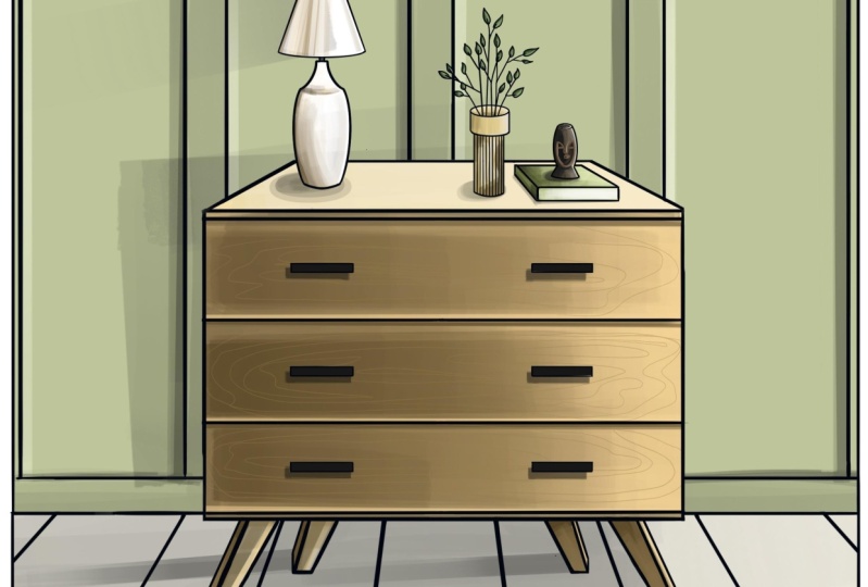
3. Lesson 2 - Adding Decorations To The Drawing: In this lesson, we will
finish the page drawing adding details such as a
handle to the drawer spokes, sculpture a lamp and the
vase. Let's get started. First, we need to
open a new layer and begin to establish the
position of the lamp. Using the technical print brush, we will draw a horizontal line followed by a perpendicular
vertical line. I also two additional
horizontal guides for the position
of the lamp base. The vertical line will give us the center of the lamp space, which also acts as
a symmetrical line. On both sides of the line, we will form two lines to create the elongated
narrow base. We also need to give
curvature to the bottom of the lamp base to suggest the cylindrical
shape of the lamp. Following the same process, we will draw the
lamp shade because of the rounded form
of the lamp shade. We should also give
curvature to the lower edge. As we did in the first lesson, we will remove all of the
guidelines we don't need. Don't worry about the
reward corner line in the lamp base because we will clean it up later
in the process. Now we can start drawing the book and the
sculpture on top of it. To be in one point perspective, all of the side lines must
meet at the vanishing point. Then I start to create the
sculpture on top of the book. Using the same technique
we use for the lamp, we will begin to create the cylindrical form
of the sculpture. I'm going to begin to establish the facial
part of the object, the brow line, the eyes, the shape of the
nose and the lips. Throughout this, I'm
keeping the drawing simple and again we clean the unnecessary lines
and move on to the face. As the face is a similar
cylindrical shape, we stick to the same method that we have been using so far. We use vertical lines
to create some texture. Again, we clean the
unnecessary lines. If we keep our drawing
as clean as possible, we will have a good foundation for the coloring
process later on. Now we are adding some
branches to the vase, keeping it simple, and adding leaves to every
branch at the end. Then on a new layer, we will create the
handles of the drawer. To do this, we need
a few guidelines. These are vertical
and horizontal lines to determine the exact
position of the handles. Once the guidelines are drawn, we create another layer
and draw the six handles. I wanted to keep the
handles as simple as possible to keep the drawing uncluttered and easy to draw. When this is done,
we can turn up the visibility of the guideline
layer as we don't need it anymore because we have unnecessary drawer
outlines behind the lamp and other accessories. We need to go to the
chest of drawers, layer and clean up these lines. Well done. We have a
beautiful and clean line drawing ready to be colored, see in lesson three.
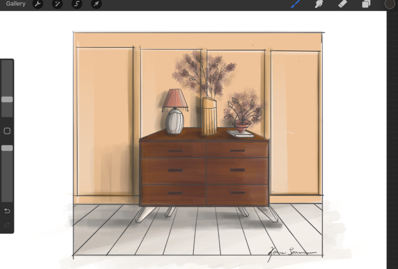
4. Lesson 3 - Primary Colouring: Now that we have
the line drawing finished, let's start coloring. In this lesson, we are
going to be adding the base colors to all
parts of the rendering. First, add a new layer and
move it to the bottom. Then press the
selection panel on the top left hand
corner of the screen. We are going to begin
by filling in the wall. Make sure you have
color feel turned on. With your upper pencil, tap around the four corners of the wall until you have
a closed selection. This will give a field
color to your selection, which I have chosen
to be a sage green, creating a new layer
for the floor. We are going to use
the same method. In this case, I chose a light gray color for
the floor filling. The next step is to
fill in the chest of drawers and the legs as well, choosing a light base color. All of these selections
are on separate layers. Afterwards, I'm using
an off white for the lamp and then filling
the vase with a limp color. For the sculpture
and the handles, we are going to use
a black fill color. The base color for the book
is a light green color, and the leaves are filled
with another shade of green. We have finished applying the
basic colors to the draw, and we are ready to move
on to the next lesson.
5. Lesson 4 - Primary Colour and Shadow Layering: In this lesson, we will be creating shadows and
light in perspective. Above the war fill layer, we are going to add a new layer. The first step is to establish the position of
the light source. Ka light is coming
from the right side. Taking this into consideration, the vertical borders of
the wall panels will have light on the left side and
shadow on the right side. This means that the left
vertical border will be a lighter green and the right horizontal border
will be a darker green. The upper horizontal
borders also catch light, they will also be light green. And the lower horizontal borders near the floor will
be in a shadow. They are going to be dark green. Using the flat brush from
the default painting set, we are going to work in straight lines to define
the value of the shadows. If I feel that the
color is too strong, I manipulate the
opacity of the brush. I try to find a good balance between opaque and transparent. Considering that we
are trying to create a shadow which is usually
not a full block of color. Once we have finished
the was on a new layer, we can add shadow to the as we are still using the same
brush, the same technique. But this time we are taking
into consideration that the sculpture and the book is casting a shadow on the vase. I am applying lighter and
darker tones to achieve the light and shadow
of the surface of the As the next step is to apply some shadow to the leaves. Making sure you open
a separate layer, we can add a darker green to create the shaded
areas of each leaf. Don't forget that the light
is coming from the right. The right side of the
sculpture will be lighter, whereas the left side of the
sculpture will be darker. Using the Fred Brush, we are going to use the same method to
shade the sculpture. We are going to
move onto the lamp, where we will be
using a variety of lighter and darker
based tones to achieve a three dimensional
effect and also adding shadow to the lamp shade
and the base of the lamp. I'm continuing to do this until I'm satisfied
with the result. We can then clean any
unnecessary lines. Afterwards, we are going to create a new layer
above the drawer layer. Then still using the flood bush, we are going to select the base color that is
lighter than the base color. With this, we will
be trying to give the chest of drawers the
more realistic aesthetic. I am gradually
layering darker tones to visualize the effect of
the light on the drawer. As the light is coming
from the right side, the right side of the
drawer will be lighter. We are going to use the
same method for the legs to speed up the process. I have used the selection
tool to quickly fill the front face of the
legs, which are in shade. Well done. Our drawing is already looking like
a cool rendering. Some finishing
touches still remain. So I will see you
in the next lesson.
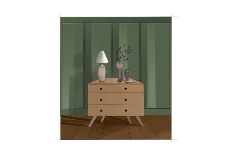
6. Lesson 5 - Finishing Touches and Background Shadows: We have reached
the final lesson. Soon you should be ready to
tackle the class project. In this lesson, we are
going to be adding background shadows and finishing
touches to the drawing. First, we are going to add the wood grain texture
to the drawers. To do this, we need to add a new layer above the shading
layer of the drawers. Then we are going to switch
to the technical pen brush, decrease its size, and begin
to draw the wooden texture, a lighter base color. Throughout the
process, I am not only manipulating the
opacity of the brush, but also its size. This is the case for the
vase where we are using a darker green color to develop the shadow where the
light catches the leaves. I add some lighter colors to suggest they are three
dimensional form. I am also adding similar
details to the vase, the book, and the sculpture until I am
satisfied with the result. We are also add some light to the left side of the
wall panels where they catch the light to suggest a smooth transition between the darker parts of the panels. The last part which remains
to be developed is the floor. Using the flat brush, we first add some shadow to
the floor with a darker gray. Since the drawer casts a
downward shadow on the floor, we use several steps to
achieve the finished look. The handles and the accessories also cast a shadow
on the wood surface. We need to implement
those as well. The drawer and the
decorations together all cast a shadow on the panels
using the flat brush. With a larger brush size, we are going to add these
shadows to the drawing. We are finished. Well done.
7. Class Project: Well done for
completing the lessons. It is now time to submit your class project
for this class. Your assignment is
to either choose the wall panels and add
colors and shade into it. Or instead, choose to do this
for the chest of drawers, which is a more complex task. If you feel ready to complete the entire drawing with
or without accessories, I'm more than happy to
receive your submission. I am looking forward to
see what you create.
8. Final Thoughts: In this class, you have
learned how to draw a basic line drawing in
one point perspective. How to add decorations
to your drawing, how to add basic color
to your rendering, And how to approach light
and shadow in perspective. Thank you for joining me on this interior rendering journey. I hope it was
inspirational for you. And if you feel motivated
for another project, I will meet you in
the next class. If you enjoy this class, please leave a review
and follow me on skis to stay updated
if I post a new class. Until then, I wish
you happy drawing B.
 HH Drawing, Artist & Interior Designer