Transcripts
1. Introduction: I love doing crafts, but I can't always make it to the craft store to get supplies. That sounds like you
then you are in luck. In this class, I'm
going to teach you how to make them easy 3D digital art using only your
iPad and the app Procreate. Here are some examples of the amazing 3D digital art that you'll be able to make by the
time you finish this class. Hey there, my name
is Lori Russell. I'm a graphic designer,
digital artist, and basically lover of
all things created. I am so excited to share
this class with you. Paper is one of my
favorite art mediums. And finding a way to
translate that into a digital format is
really satisfying. I've done everything
from scrapbooking, making 3D paper boxes
and gift tags to on edge paper cooling and actual layered paper
cutouts in light boxes. I love how the color, texture, and thickness of the paper can totally change the
look of your art. And we're going to be
exploring that in this class. As a graphic designer, I
also know the importance of choosing the right
typeface or font. Each one conveys a different
emotion or feeling. And I am thrilled to be
able to combine my love for typography and paper art in this digital
style in procreate. In this class, you're going to learn the basic techniques for creating 3D paper cut
art in procreate, you should have a basic
working knowledge of your iPad and the procreate app. But I'll be walking
you through every step along the way as we create
this design together. If you want to recreate
the sample design with me, I've provided a stamp brush as well as a bunch of different
paper texture brushes. You'll also get the
color palette that I'm using and some fun
holiday colors as well. After you've completed the
main part of this course, you'll be able to take what
you've learned to create your own digital typography, paper cut artwork to
share via e-mail, social, or as a digital card. The bonus section features
additional tips and tricks to help you take your
design to the next level, as well as a guide on how
to bring your designs into Canvas to create printed
cards for any occasion. These designs are
so unique and fun. I cannot wait to see
what you create. Please make sure that you share your designs in the
project area of the class.
2. Class Project: Your project for
this class is to create a digital 3D paper cut typography design in Procreate and share it with
the rest of the class. Your design should have a minimum of three
paper cut layers. I recommend five to seven
for a really nice effect, but you need at least three so you can show your technique. You should also have at least
one typography elements. It can be one word
or an entire phrase. And you should incorporate
a digital paper texture. You can either have one
overall texture for your whole piece
or choose to have different textures on
each layer, your choice. In order to complete
this project, all you'll need is your iPad with the procreate
app installed. I do highly recommend
that you use an Apple pencil or stylus,
but it's not required. You will also have access to the paper brush set
that I've created, as well as a couple
of color palettes. Check out the
resources video for information on how
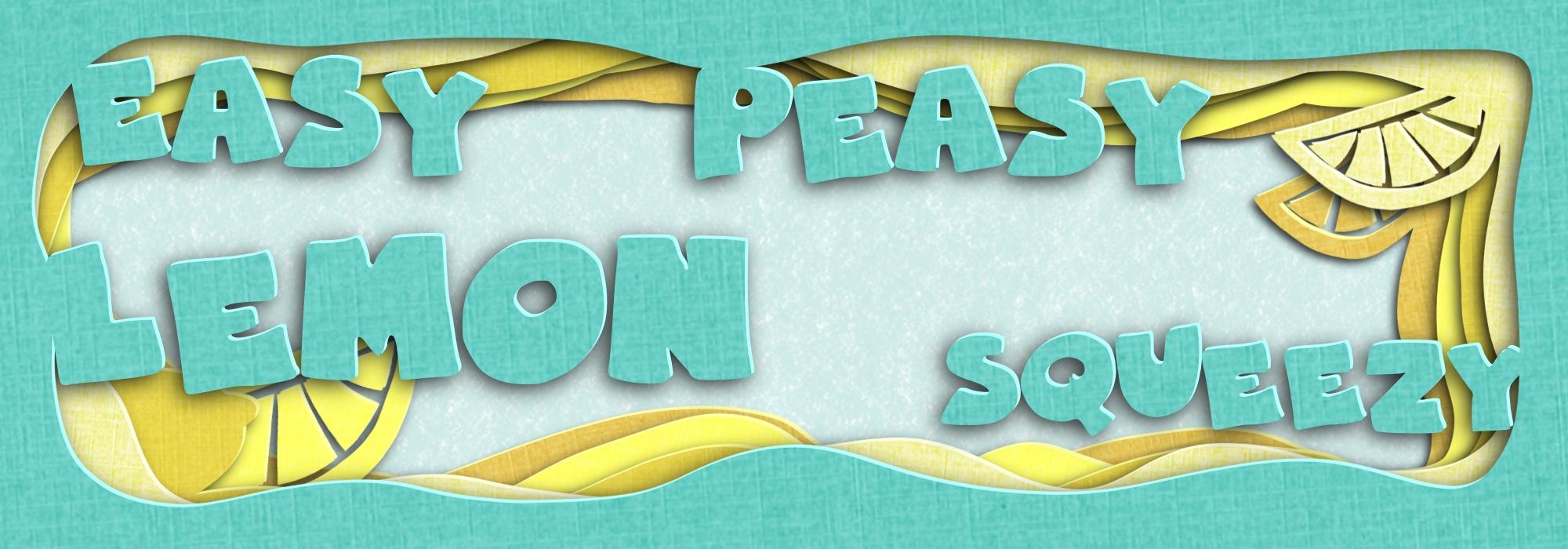
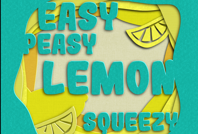
to download these. I chose this easy peasy, lemon squeezy as my sample
project because the phrase is really fun and it encompasses how I want you
to feel about this class. Anyone can do that. I also really love
the color palette. This project can be
adjusted to suit any level from beginners
to more advanced creators. As you go through the class, you'll get the overview of the technique and
then we'll work through the sample design together so you can
see it in action. This technique creates really
fun and unique artwork. So even if everyone in class and recreates
the sample piece, no two will look the same. If you need help choosing the right font for your project, you can follow the link in the resources section to download my free
topography guide. Make sure to share your
paper cut artwork with the class by following
the tips and the exporting your
design video to save it as a JPEG or PNG file, and then uploading it to the your project section of
this class on Skillshare. If you have any questions or need more help,
please let me know. One quick tip doesn't allow for multiple
projects in one class. But if you want to share
more than one design, you can update your project
to add additional images. We would all love to
see what you create. Make sure to watch the next
video on how to download all the resources
and then you'll be set to jump into
learning the technique. You can be thinking about
whether you want to recreate the sample
design along with me, or start working on your
own creation right away. I'll see you in the next lesson.
3. Resources: Now that we've gone
over the class project, I want to really quickly
walk you through how to access all the resources
that I've included for you. Due to the file size of
the procreate brush set, it's too large to
host on Skillshare. So I decided to just keep all of the class resources
together in one spot. And I've posted
those on my website. In order to get there,
make sure that you have Skillshare open in a browser, not in the Skillshare app. Then you're going
to come here to the projects and resources tab. As you scroll down, you'll see this button
that says see more. Go ahead and click on that
to expand this information. Here in the materials section, there's a link that will
take you out to the page on my website where I've got all the resources
hosted for you. Just click that
link and it should automatically open in a
new tab or a new window. It's going to take you
to this page that says paper cut topography
class resources. The first thing you're going
to want to do is click this button that says
download the resources. This will give you the procreate brush set
and color palettes. Below that is some information as well as the form to fill out, if you'd like to get
the additional guide on how to choose the right
font for your designs. Clicking on the download
the resources button should open up Dropbox for
you if you have the app. Otherwise it may take you to Dropbox in the browser itself. Then you'll be able to
save or download the file. It is a compressed zip file, and it does tell you that
it can't be previewed, but we're gonna go
ahead and unzip that. I'm just going to choose
to save it to my file. And I'm going to save it
to my downloads so I know exactly where it is and
it's easy to ask them. Next, open the files app, go to the downloads folder
or wherever you saved it. And all you need to do is
just tap on that zip file. Your iPad will
automatically unzip it and reveal all the
files that are inside. You see we have the
paper brush set here as well as
to swatches file. And those are the
color palettes. Tapping on any one of these, open them and install
them in procreate. You'll see our new files at
the bottom of your list.
4. Digital Papercut Technique Overview: Before we get into
our actual project, I want to really
quickly run through the technique that
we're going to be using to create our design. Let's go into procreate and just go ahead and
create a new design. It can be any size. I'm just going to grab a square and reduce it down so I
can see the whole Canvas. Then you want to make
sure that you're using a mono line brush. I'm just going to grab this
one here and pick any color. Then you're just going
to draw a shape. It is important that
you close this off. Our next step is going to be to color drop this on the outside, just drag it on over there. And this is going to
fill in the outside of our shape as if we cut out
this part of the paper. Now we have two options here as far as how we create
our other layers, we need probably
at least two more. So we can see this
technique in action. If you want to have all
of the layers be similar, we can then duplicate
this a couple of times and use a transform
tool to adjust it. You can also just freehand draw with another color
on another layer. I'm going to show
you both of those. Let's go ahead and duplicate this layer by swiping to the
left and choosing Duplicate. Then I'm going to select
the bottom layer here, change my color and just color drop that
anywhere on the outside. Now when we come to
our layers panel, you can see we have
two different colors. I'm going to come up
to the arrow here. This is our transform tool. And using these corners, I'm just going to drag
it a little bit to reveal that bottom color. This is our next layer of paper. Now the other method
is to actually draw freehand and this gives a little bit more variety
to your paper cut. So we're simply going
to make another layer, drag that all the
way to the bottom. Choose a different color. And then just draw kind of
a free hand shape here. You do want to make sure
that you close it as well. And again, just color drop. And now we have three
different layers of paper. In order to get this 3D effect
that we're looking for, we need to add both
highlight and shadow. In order to do that, we need to duplicate each of
these layers twice. We're going to come
to our layers panel, swipe to the left,
duplicate. It. Important that you're
duplicating the original layer. You're going to have
less degradation of the artwork that way. Alright, so now we have
three copies of each layer. We're going to select the
bottom layer and each group. We're going to turn
on Alpha Lock. There's two ways to do this. You can take two fingers, swipe to the right and
you can kinda see it. There's a little checkerboard
pattern behind there. You can also simply tap on the
layer and turn it on here. Alright, then we're going to
come up here to our colors. Double-tap anywhere
close to black, and you'll get a
solid black color. Then we're simply going to fill in each of these
layers with black. And then you can turn
that alpha lock off. Now these middle layers
and we need to brighten up because they are going to
be the edges of our paper. We're going to use
the magic wand, the adjustments menu to do that. Choose any of your
middle layers. And we're going to use hue
saturation and brightness. Usually somewhere
in the range of 60 to 70% is pretty good here. For the darker colors, you can brighten them
up a little bit more. For these really light colors, they won't need as much. Now to create the magic
of our 3D effect, we need to move our
shadows down and our highlights up because we're imagining that our light
is coming from up here. We're going to
multi-select our layers, selecting more than
one at the same time. Select one of your
middle layers. And then you're simply
going to swipe to the right to select all
the other middle layers. And we're going to come up
here to our Transform tool. I'm going to shrink my
canvas a little bit so they can get at this
top right corner. And we're going to nudge these just a few
pixels this way, just by tapping maybe
four or five times. You can see right here, we're starting to get the look
of the edge of that paper. That's what we want. You can make your paper as
thicker, as thin as you want. I like a more subtle look, but that's totally up to you. Now we need to make our
shadows go the other way. So we're going to tap
one of our shadow, swipe to the right on the other to use our transform tool. Now we're going to go off
of this bottom left corner. I usually make my shadows
a little more dramatic. Two fingers to undo that. All right. Now to make this look
a bit more realistic, we are going to
blur our shadows. Fortunately, you can't
do these as a group. You do have to do
them one at a time. So tap any of your shadows, come back to your magic wand in the adjustments menu
and we're going to choose Gaussian blur. Now all you have to do is
simply drag your stylus or your finger across the screen and you'll start to see
that blur happening. I'm usually in the
range of five to 8%. It really depends on
the look that you're going for and how dramatic
you want it to be. Generally the layers that
are furthest away from the back are going to have
more shadow and more dramatic. So this one I might
make a little bit more. And then the one at the back, I might do a little bit less. And then our middle shadow,
somewhere in the middle. Now, if these shadows are still appearing too harsh for you, you can come and adjust
those in the layers panel. Tap on the shadow, and then tap on this little n
here that's going to let you change the opacity or the transparency of that shadow. You can take that up
or down a little bit. It's looking like
it's a bit too dark. And now we have the basics of
our 3D paper cut technique. Later on we're going
to learn a couple of different ways to add
paper texture to this, but this is the general way that we're going to
create our designs. Next, we have a bonus
lesson on how to choose the right font for your designs if that's something that
you need help with. Otherwise, you can go
ahead and move on to the lesson on how to
plan out your design.
5. Choosing the Right Font: Why do I love typography
and fonts so much? They have the power to convey emotion and meaning
in a visual way. They can also enhance your overall design and how communicate your message
more effectively. Now, let's take a
moment to talk about the elephant in the room. I know that's cheesy, but it's going to help
you remember it. There's so many mistakes
that are easy to make when you're choosing
your typefaces and fonts. Knowing what not to
do can be just as important as knowing what
to do to help you out. I've put together a PDF guide of the top ten mistakes to avoid when choosing
fonts for your design. You can get your
free copy along with the other class resources in the link in the project
description below. Now, we're going to
hop into procreate and start planning our design.
6. Planning Your Design: In this lesson, we're going
to talk about how important it is to plan your
design before you start. Now, you can, of course, just start playing around. And as you get better
at this technique, you may just want to jump in and see what
you come up with. But especially when you're
first starting out, it's really a great idea to
do at least a basic sketch. So you have some idea of where you're headed. If you know e.g. that you want to use your
design on social media, then you're going
to want to set up your design and
specific size for that. Usually a square
tiny by 1080 pixels. If you're creating a design that you know you
want to get printed, you are of course
going to want to check on these specifications and the dimensions for
that so that you can set it up at the right
size, right from the start. For this sample piece, we're just gonna go ahead
and make a square design. I have that here
set up as a preset. So we're gonna go
ahead and grab that. And when I'm sketching
in Procreate, I like to just use one of
the pencils that's in here. This procreate pencil
will work great. And I just keep it
on another layer so that I can use it,
turn it on and off, all that kinda stuff
as I'm working later, you'll want to think about the general shape that you
want for your paper cut. I'm gonna go with just
an organic shape here. And how many layers
you want this to have? Do you want them to
be all the same shape like we did before in
our first example. Or do you want them to crossover and have other shapes mixed in? And this doesn't have
to be exact or perfect. You're not necessarily going
to trace directly over this is just to give you an idea
of what you want to do later. You're also going to
want to think about what texts you want to
include on your car. For this one, we're going
to use the easy peasy, lemon squeezy, which
is really fun. And I want to have
that spaced out. I'm not sure what font
I'm going to use yet, but I'm just going
to block it here. Now I know I want the word
lemon to be a lot bigger. So I'm gonna go ahead
and just do that. Then I can fit in these
other words around that. It's always best to put your biggest ones first and then work the
rest of them in. Another thing to consider
is if you want to incorporate any other paper cut elements into your design. For this one, we're going to have a couple of
these lemon wedges. I know where I
want to have those as well as a full lemon. And this is super, super rough. It's again, just to give you the basic layout of where you're going to
put things later. Then the last thing
is you want to think about your color palette. Now of course, for this one, I've included a
color palette here. But if you're not
doing a sample piece or you even wanna do it in
a different color palette. You're going to want to
think about that as well. If you need some extra
inspiration for color palettes, Pinterest is a great
source for this. I use this all the time. You have some idea of what
you'd like a base color, you can search for that
balloon color palette. And all of these will come up. And you can grab stuff
from just a picture, or it can be an actual
color palette like these. There are so many options. So here's my super rough
sketch and then we're gonna move on to the next lesson
where we're going to turn this into our initial
paper cut layers. I'll see you there.
7. Creating Your Papercut Layers: Now that we have
our basic sketch, let's go ahead and turn this
into some paper cut layers. I'm going to add a new layer. Drop that below my sketch. I'm going to go ahead and
rename this to sketch, just so I am super clear
when I'm working on, I'm going to lower the opacity
of my sketch quite a bit. So I can still see it, but I'm able to draw on my other layers and
see what I'm doing. We're going to pick
our first color, switch back to our
monoline brush. And we're going to
create our first shape. You want to make sure it's
fairly close to the edge. We're going to be doing
five paper cut layers for this one and we need
to have room for them to work their way inwards. So I'm gonna kinda
vaguely follow the shape. It does not have to be perfect. We're going to color
drop onto the outside. And then one thing we
want to look at here, especially on this top layer, I'm going to turn my
sketch off for a minute, come over to your Layers panel and just check that box there. It'll turn off the visibility. Now, I'm going to use two
fingers to zoom in here. Can you see this
little bump here? That's pretty typical when
you're sketching by hand. And if you want your paper cut to be really
rough, It's totally fine. You can have things like this. I like mine to be
pretty neat and smooth. So I'm gonna do is
just come in here and clean up this edge
just a little bit. So it doesn't look
quite so bumpy there. Perfect. Alright, now we can
turn our sketch back on and move on to
the next layer. Now, to avoid having to keep
moving these every time, I'm going to go ahead and add all the extra layers I
know I'm going to need. I'm going to make sure I
have four empty layers here. Now I can go to my colors. Select the next one
is light yellow. Then I can come through
here and just draw. Now, I'm choosing to do
the method where not all my layers are the same and just make sure that
it close my shape. And now when I color drop, it's going to fill
in right there. If you look at the layer itself, you can see that filled
in all the way around. Then we're just
going to repeat this process for the
other three layers. So I'm going to do
that real quick. Now we have our five
different paper cut layers. In the next lesson,
we're going to look at adding in our text.
8. Adding Text to Your Papercut: Now that we've created our
five paper cut layers, it's time to think about
where we want to put our texts and what
font we want to use. We're going to come to our
top colored layer here. Go ahead and sample
this color by pushing and holding
with your finger. Or you can always come to our color palette and
grab it down here. Come over to the
wrench icon here, this is your action menu. Go to Add and Add text. If you're doing the
sample along with me, you can follow along here. Otherwise, add whatever word
or phrase you want to do. I find it's better to do
these one word at a time so that you can move things around and put them
where you want them. Now we're going to double tap that and go
into our font menu. Now for paper cuts, if you want it to
look more realistic, I find it's better to use
a thicker, chunkier font. That way it looks
like something that could really be
cut out of paper. But it's your design.
So have fun with it and use whatever font
you think looks cool. Let's see here. That's kind of a fun bubbly one. Will go ahead and do that. This one is called Betsy. Now we can use our
transform tool. We can re-size this, move it around, put
it wherever we want. So I have a vague idea of how big I want each
of these words. But you can always
adjust it later. Now, if you want
everything the same font, I find the easiest
way to do that is to simply duplicate these layers
and then change the text. So I'm going to duplicate
this one always the bottom 13 more times. Then I'm going to move these
where they're going to go. So I'll be able to see
which one I'm working with. Then I'm going to
change the texts. Alright, so let's
double-tap on this. And this one. Pretty simple. We just need to add the p. Move it out a little bit. This one we're
going to change to lemon squeezy. As you see here. This one is too long for
the textbox that was in. So I'm just going to
take these handles here and drag it out until it fits. So as you're thinking
about where to position these and how
big they should be. We want to make sure
that each of them touches some part
of this edge here. Go ahead and turn my sketch
off again temporarily. Now I'm going to select these three just so they're
all the same size for now and make them all just a
little bit smaller because I know I want my lemon to
be quite a bit bigger. Then you can just play around with the placement of these. Maybe easy could be
a bit bigger there. But again, You want you
to them to be touching one of these edges so
it looks like they're connected to the
rest of the paper. Let's pull squeezy down
here a little bit. Now we can make lemon
quite a bit bigger. That's really the
emphasis of this tree. It's the lemon. You can play around with the
text as much as you'd like. Take your time with
it and have fun. This is one of the parts
of the design that can really change a lot depending
on which font you choose. Let's take a look
at a few examples. Here's a bunch of different ways that I've recreated this design. Here's a more
traditional script font, which conveys a totally
different feeling from this bubble, the one or this very blocky
letters san serif font. So enjoy the process and find a font that
you really enjoy. And then I will see you
in the next lesson.
9. Adding Elements (Optional): Now that we've got the
texts and our design, It's up to you if
you want to add additional elements
for our sample piece. So we're going to add
some lemon wedges and a full lemon as well. To make this really easy, I've included a
brush set for you. Not only does it have the paper textures we're
going to use later, but it has this
lemon stamp brush. Now turn my sketch
back on so I can see where I was going to
put these lemon pieces. Then we need to decide which paper layer we
want to attach them to. I think for this one that's
coming out of the top, it would look good attached to this second layer here,
this light yellow. I'm going to add a
layer on top of this. And then I will
select that color. I can either do it from
the color palettes and say no which one it is. Or I can take my finger
and sample it that way. Then I can just choose this lemon stamp brush and
simply stamp it on there. Now that's obviously too big. I'm going to undo that
with the two finger tap. You can change the size of the brush over here on the left. You generally want
to make it bigger than you need and shrink it down instead of making it
too small and increasing it, because that will
pixelate it a little bit. So always go a little
bigger than you need and shrink down if you're
going to adjust it. Let's get our transform tool. And at this point, I generally am turning
my sketch on and off quite a bit just so I can see where I want
to put something. But then I want to see how this design is
actually going to look. You can change the opacity to whatever works for your process. I like the look of having this lemon be a little
bit behind the letter Y. So I'm going to shrink
this down a little bit and kinda tuck it
into this corner. Remember when we apply
our 3D effects to this, all of these layers
are going to separate. Now we're going to put another
lemon wedge down here. I think we're gonna
go ahead and do that in this third color here. I'm gonna go to that
layer, add one above it. Going to go ahead and sample that and simply
stamp another lemon. One little trick
that I like to do here is come to
my Transform menu and just flip that
horizontally so it's not absolutely identical
to the other woman. Then we can adjust it. Move it down behind
these letters a bit, rotate it, play with it until you like the
layout and where it is. Then the last thing
we're going to add is a full lemon back here. You recall from our sketch, we are going to have a
regular lemon right there. I believe we're gonna do
that in this bright yellow. I'm going to add another
blank layer above it. Sample the color. For this one. We're actually just
going to draw it. I'm going to go back
to my monoline brush. And I'm going to isolate
this layer temporarily. Come back to the Layers
panel and push and hold on this checkmark that will temporarily turn off
all the other layers. In order to draw this
lemon, it's super easy. Just going to draw an oval. Use the quick shape when you
push on hold at the end, creates an ellipse for you. Go ahead and fill
that with color drop. And then we're just going to add that little tip at
the end of the lemon. You actually don't
need to do anything on this other side
because it's going to be covered up by the
edge of the paper cut. Now we can go ahead, turn all the other
layers back on by pushing and
holding this again. The, obviously that
lemon is way too big. Remember I said, better dressing bigger and
shrink it down. We're going to come over
to our Transform tool. Take that down a little bit, angle it, and move it over. I wanna be able to
still see the shape of that lemon behind
the rest of these. So I'm just going
to play around with that until I like the layout. One other way that you can add elements to your
design is by using a PNG file that has a
transparent background. If you have something
that you've saved, either in your photos
or in your files, you can simply insert it. Here. You can see
I have some here that I was working
on another project. If you import that, then you can change
the color of it, move it around
usage just like you would any of these other stamps. Let's go ahead and
bring that up to the top just so you can see
what we're working with. Alpha lock this two
fingers swipe right, sample this color, and
then fill that layer. Then we could attach this element to that
same paper layer. I'm gonna go ahead
and delete that because it's not
part of this design. But I wanted to show you that's another way that you
can bring in elements. You just need to make sure
that they're ones that you have created or have
the rights to use. In the next lesson, we're
going to talk about how to combine these
layers and make some groups so that it's really quick and easy to
make our 3D effect.
10. Combining Layers and Grouping: Now that we've got
all of our text and our elements in our design. We're gonna go ahead and
combine the layers so that each one looks like it's cut
out of one piece of paper. To do that, we're going to
come to our layers panel here. And we're just going
to use two fingers and pinch together everything
that's the same color, putting it all into one layer. May have to do this
a couple of times at the top when if you have
a lot of texts like I do, you can either
delete your sketch, move it down to the bottom,
whatever you'd like. Now that we're back to just
having five layers of paper, we're gonna go ahead and create those two duplicates
of each one, just like we did in
the technique video. We're going to swipe to
the left, duplicate. Swipe to the left, on
the bottom one again. And duplicate because we have so many pieces
of paper now, this is gonna get really long and we don't want to
keep scrolling through it. I find using groups
to be really helpful. So as I've duplicated
this twice, I'm going to swipe to
the right to select all three of those and
then just choose group. Then you can collapses and
make it a lot cleaner. I'm gonna go ahead and do that for all of
these other ones. Now that we have
our five groups, we're ready to go ahead
and create that 3D effect.
11. Creating the 3D Effect: We've got our five
paper groups here, and now we're ready to go
ahead and add that 3D effect. I'm going to go ahead and expand each of these groups by
clicking on this little arrow. So even though it's still long, they are separated
into their groups, which I think makes it a
lot easier to work with. First, we're going
to go ahead and get our black
shadow layer setup. We're going to alpha
lock the bottom layer in each group by either a two-finger swipe or clicking on the layer
and choosing Alpha Lock. Then we're going to come
up to our color panel, double-tap anywhere close
to black to get black. And then we're
simply going to fill these layers and then
remove the alpha lock. Next, we need to get
these middle layers turned into a highlight. So they're going to be
the edge of our paper. We're going to have to
do these individually. Select the layer and come up to your magic wand and
the adjustments menu, we're going to choose hue,
saturation and brightness. I like to keep these in
the 60 to 70% range. Darker colors generally need a little bit more brightening. Lighter colors, not so much. Now that we've got our highlight layers and
our shadow layers, then we're going to
move them as a group. Go ahead and pinch this down a little bit so I can
see all the edges. I'm going to select my
first highlight layer and then swipe to the right
to select the other four. This way I have all
my highlight layer selected at the same time. Come to the Transform tool. I'm going to just tap outside this corner to nudge them
a little bit this way. Depending on how
thick you would like your paper and how subtle
you want the look. You can do this as
much as you'd like. I'm doing about five
tabs because I like my paper edge to be pretty
minimal and subtle. Then we're going to do the
same thing with our shadows, but in the opposite direction. I'm imagining that
the light source is coming from this top
right corner again. So tap of your top shadow layer, swipe to the right.
On the other four. Tap the Transform tool, and we're going to nudge
them, awesome this quarter. Now you can see that separation
really starting to show. And the last step
for this 3D effect is to add the blur to
the shadow layers. And again, you do have
to do them individually. But I think that's
actually a good thing because you can adjust them and make it look a
little bit more realistic. The layers that are closest to this background generally would have a little bit less shadow because they're pressed
up right against it. And as they get further away, they could have a
little bit more. So play around with
that, have fun. We're gonna come up here to this adjustments menu
and go to Gaussian Blur. Take your pencil or your finger and just
slide to the right. I usually keep this in the
range of five to eight. If you have more layers, you can go a little bit higher
because they're going to be further away from
the background. If any of your shadows
seem too harsh, you can come in to the layer itself and
adjust the opacity. Tap on this little n here, and you can change the
transparency of those shadows. Now we've got a really
nice 3D effect. I'm going to show you a
couple of different ways to add paper texture to this.
12. Adding Paper Texture (Method 1): We've got our beautiful
3D paper cut design, but it doesn't quite
look like paper yet. I'm going to show you a
couple of different ways to add paper texture to this, to really make this design pop. The first method is to add a paper texture over
the entire design. The second method
will allow you to add different textures to
each paper cut layer. Let's go ahead and add color
to this background here. We're going to add
one more layer here and just pull it
out of this group. I generally don't
change the background layer color just because I want to be able
to add effects to this with the paper texture
and things like that. I have a couple background
options for you here. Or you can of course, stick with white or choose something
else that you'd like. I'm going to just grab
this light yellow. For the first method, which adds one paper texture
to this whole piece. We can go ahead and
collapse these groups. Make this a little bit cleaner. Go ahead and click on
the top group and then add one layer above
everything else here. Now for this, you're
going to actually need a paper texture that is usually a image file that's done in a medium gray tone
with a high contrast, should be a high
resolution file. Let me go ahead and go
to my Actions menu here. Insert a file, grab
this paper one. And you need to
make sure that it's covering your entire Canvas. So go ahead and stretch
that out a little bit. And then we're just
going to change this blend mode here, the n. And I'm gonna change
this to overlay. It works pretty well.
You can play around with which one you like
and how strong it is. But if I set that to overlay, then you can see when
we zoom in here, there's this really
nice paper texture, but it is on every
single layer and kind of pulls away a little bit from the depth of the shadows. This is a quick and easy
way to add texture. But if you really
want to step it up, I really like having a different
texture on each layer. And one way you can adjust this one and make
it a little bit more dynamic is to actually duplicate this and
rotate it on each layer. It's a little bit
more time-intensive, but let's take a look. Gonna go ahead and
open up this group. I'm going to
duplicate this image. And then I'm going to
actually turn this one off, drag this bottom
one into the group. Tap on the layer and
choose clipping mask. Now this paper texture is only being applied to the
blue layer right now. If I go to the Transform menu, I can actually rotate
it a little bit, make it a little bit different for what I'm gonna do
to the rest of them. You just need to make
sure again that it's covering that full layer. Then you can go ahead
and minimize that. If I go to a new group
here, duplicate this again, grab the bottom one, drag this into the group
and make it visible. Turn it into a clipping mask. Then we can actually turn
this a different way. And now you can see a little
bit of a difference between the texture on this layer and
the texture on this layer. Now, it doesn't show up quite as well on this light yellow. And it's really going to
depend on the texture you use and how much
contrast it has. A couple of different
ways that we can make this texture show up
a little bit more. You can come up to
the Adjustments menu, come to curves, and kind
of play around with that. It is going to affect the
actual color of your paper. So that's just
something to consider. Another thing you can
do is actually just duplicate the texture itself. And that tends to make it
the texture a little more prominent without
changing the color of the paper quite so much. So there's a couple of
different options there. But you could
repeat this process for the other layers here and get a nice difference in the texture and the
rotation and all of that. In the next method that
I'm going to show you, you're actually going
to be able to get different textures
on each layer, which will add another
depth to this. So let's take a look at that.
13. Adding Paper Texture (Method 2): If you want to quickly
and easily add different textures to
each layer of your paper. That's why I've created
this brush that I wanted to really quickly run
you through how these brushes work before we
put them into the design. Let's go back into
our gallery and just create a new canvas. Each of these brushes
is set up for either a variable
or a sheep style. Some of these are only
sheet style because they just didn't work very
well with the variable Week. I want to show you the
difference between these. Grab a nice dark color here. So for this linen brush, which is very similar
to the image we just had in the sheep style,
the paper sheet. No matter which size
you set your brush, the image on the page
will always be the same. If you paint without
picking up your brush. It's going to fill in an
entire sheet of that texture. For the variable brushes. That texture size is going to depend on the size
of your brush. You said it's small
versus large. You can see there's actually two different sizes
of that texture. That's really the main
difference between these. Now as far as how to use them, you can either use them with color like I just showed you, or you can use them more
similarly to the images where you set them
in a gray tone. Going to show you a couple
of different examples. Let's just put the general color behind this so we can see
what that looks like. Alright, if we are
going to try and put this linen paper texture
on here, generally, we are going to want
to grab the sample, sample this color, and then go a little bit lighter
or a little bit darker. And then we're going to
play with the blend modes, like color like this, and
make it into a clipping mask. Then we can play around
with these blend modes and see what we like
that texture to look at. So if you go with a lighter
color and you choose screen, you're going to get this really nice texture with a little bit
of lighter color. They're really just depends on what look you're going for. And you can have a lot of fun
with these and experiment. If you just wanted
to keep it simple, I would suggest setting it somewhere in the mid gray range. Make it a clipping mask. And then choose
either multiply or overlay are gonna
be your best bet to keep a similar color. That's the overview
of these brushes. And you have a whole
bunch of options here. Now let's go back
into the design and see these in action. I'm gonna go ahead and
sample this top color here. Come into the group. New layer, make sure it's a clipping mask. And I'm going to try going
a little bit lighter. Let's grab this scrap
of paper brush. And I'm just going to brush
this over a whole sheet. Really quick and easy. And then I'm going to try a few different
blend modes here. Let's multiply. Overlay seems to
look pretty good. You can see there's that
kind of texture right there. If I duplicate that, it gets a little bit stronger. With these brushes. It's
a quick and easy way to add different textures
to each of these layers. I'm going to go through
and do that real quick. Now you can see
we've got a bunch of different textures
on each layer. I can play around with this
for quite a bit longer, but I just wanted to show
you the technique and how you can utilize
these brushes. Now let's learn about how
we can export our designs.
14. Exporting Your Design: Once you're happy
with your design, it's time to export it. So you can actually
share it with people. All you need to do
is come up here to the Actions menu
and go to Share. We have a whole bunch
of options here for how we can export
things from procreate. The main ones you're
probably going to use are either a JPEG or a PNG. All you need to do is select the file type and then tell
it where you want it to go. Are you going to AirDrop
it to a computer? Are you going to
send it to someone? Save the image,
save it to a file. There's a lot of
different options here. If you're going to move on to Canva and use
that on your iPad. I definitely recommend just saving an image to your camera
roll because it will make that process really quick and easy for sharing your
project with our class, you can either save it
as a JPEG or a PNG. It doesn't matter. A JPEG is going to be a
much smaller file size. You can see this
one is only 156 kb, which is pretty small. Much better for emailing. If we change this to a PNG, it's going to be 5.6 mb, which is almost six
times as large. There's something to
consider when you think about how you want
to export something. If you have anything that needs
a transparent background, it is going to need to be a PNG. But for the type
of work that we're doing for this project,
that's not an issue. Now let's go ahead and
talk about how you can share your designs with
the rest of the class.
15. Sharing Your Design: Now comes the fun part where you get to share your design. Please share a copy
of your JPEG or PNG file in the project gallery
of this Skillshare class. The rest of the students
will love to see your work and I'll
be in there and giving feedback as well. Remember that Skillshare
doesn't allow you to have more than one
project per class. But if you've done
multiple pieces that we would love to see them. So you can go in and edit your project to add
additional pictures later on. If you decide to share
on social media, make sure you tag
me on Instagram at Lord Russell design so I
can see what you create. You can also share
your design digitally. You can attach it to
an email or use one of the various apps or programs that allow you to create a card. You can also check out the
bonus lesson of this class to find out how to get your
designs printed with Canvas. Here are a couple of
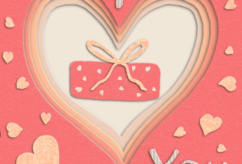
cards that I've made.
16. BONUS: Leveling Up Your Design: We have a really
nice design here, but there are some
ways that we can take it up a notch if we'd like. One way is to add some
dimension to this text here. Let's go ahead and
open that group. We're going to add
a new layer between this top paper layer
and the texture. Makes sure that it's
a clipping mask. I'm going to go ahead and
sample this color and come quite a bit darker
using a monoline brush. I'm just going to draw a line across the bottom
of these letters. Then I'm going to sample this again and go quite
a bit lighter, maybe almost white, and
draw a line across the top. Now, when we go to
our magic wand and the adjustments menu
and do a Gaussian Blur. We're gonna get a really nice
gradient on our letters. Sometimes when you
Gaussian Blur and stuff will stretch out too far. I'm gonna go ahead and fill
this out a little bit. Erasing anything that's
not part of the letters. And I'm just going to
double-tap and grab white just so I have some
more contrast up here. Here we go. So that's a quick
and easy way to put a nice gradient on your letters and give them a little
something extra. Now we can also add some
dimension to our lemons here. We can go in to those layers. Same thing between the top of
the paper and the texture. Add a new layer that's clipped. I'm sure it does have
a clipping mask. For this one, I might sample
this dark layer down here. I'm going to go ahead
and use a soft brush. This is one from the
procreate brush set that I've just saved
to my favorites. I usually take the opacity
down just a little bit. So I have room to play
with it a little bit. Change the brush size
to whatever you need. I'm just going to color in Wendy's in our wedges
here a little bit. Then I'm gonna do
my Gaussian blur again until I find much hit like for that
nice subtle look. Again, I'm going to take my
eraser and just come over here to kinda define
that a little bit. Let's go ahead and add some more dimension
to these other ones. There's another brush that
I really like to use. This one is when I've
made called flicks with There's some similar
ones in Procreate, basically any kind
of a splatter brush. And this one can create
some really fun effects. Some little freckles
on this lemon, e.g. I. Really like doing that on the
word lemon for this piece, let's go back to our letters. We do need to do a
new clipping mask because I'm going to probably
be erasing outside of this. But just adding a
little something to these can be really nice. Since I made this word
lemon really big. I want to highlight it. I'm going to take
this a little bit darker, a little bit smaller. Perfect. Then I'm
just gonna grab my eraser and come in here and clean up these edges that aren't
part of the liver. And if you did get any
on these other ones, you can go ahead and
erase this as well. Obviously the splatter
brushes tend to splatter. Now we have a really
nice-looking finished piece. In the next lesson, I will
show you how you can take this into Canva and use it
on printed designs.
17. BONUS: Printing with Canva: Now that you've learned
some tips and tricks to take your designs
to the next level. We're going to hop on over into Canva and see how we can
get these designs printed. I'm going to walk you
through this on the iPad, but you can use Canvas on your computer or even
your phone as well. Let's go ahead and
open the Canvas app. And then we're going to click Create a design appear
on the top right corner. I'm just going to search for postcard because
that's the design that I'm going to
make right now. And I'm going to
choose landscape depending on what design
you're going to use. Sometimes it's nice
to go ahead and start with one of
Canvas template because they already
have layout preset for you that then you can
just change the colors, change the texts, and
then you're good to go. Let's take a look
at some of these. You can tell if they have a
front and a back side and the template by this little
number two That's here. I'm going to go ahead and grab just the backside
of this template. Because remember, we're
actually going to be importing our design from
procreate or the front. Let's add a new page and
pop it over here in front. We're just going to grab the
design from our camera roll. This is why I told you in
the exporting lesson that if you know you're going to
use Canvas on your iPad, this is the easiest
way to do it. To camera roll is easily
accessible here you don't have to go through an extra
step of uploading it. Go ahead and pick your image
and then click Add to page. Then we just need to resize
it to fit this template. You already know that you're going to get something printed. It's best to do your design at that size from the
very beginning. That way you don't have to
worry about your design getting stretched or
cut off later on. One thing I really
like about using these canva template
is that we can actually pull colors out of
our design, out of our image. So if we temporarily bring
us design into this page, it doesn't have to be on the
same page for this to work. Then we can actually
select an element or some texts and pull colors directly out of
our image from procreate. We're going to scroll down
here to photo colors. You can see here it's pulled out five of the main
colors from our photo. We can then use these to
re-color the background, any of these elements, the lines, or even the texts. Once we've done that,
we can go ahead and select our picture and just
remove it from this page. Once you're happy
with your design and you're ready
to get it printed. We do that through
the Share menu that's here in the top right. If you look down here
towards the bottom, it says print your design. That's what we're
going to click on. The easiest way to do this is to just type in what
you're looking for. In this case, I'm going to type postcard and then
select landscape. Give them very
specific dimensions for what they're going to print. It may ask you to
re-size your design. Don't worry if this
happened because they're going to
make a copy of it. Go ahead and let the
copy be made and then adjust anything that
you need to before printing. Next, you'll want to
confirm which pages from your design are going to
be the front and the back. With a regular postcard. This isn't quite as much of a concern because
it's not folded, it's just a regular flat card. But if you're going to do
any kind of a folded card, pay extra attention
to this though that the correct images and
up in the right place. You can see a preview
right above them. Next, you can choose
what size you want. Depending on what
you're printing. Postcards have a couple
of different sizes. They have some different types of paper, different finishes. Then you'll choose how
many you want to order. In some cases, e.g. with postcards, you
also have the option to include envelopes and your
order for an additional fee. After this, Campbell
will walk you through the steps of getting your shipping and
payment information. Once your order is
complete and process, you'll be able to track
it in your Canva account.
18. Thank you: Thank you for joining
me in this class. I hope you had as much
fun as I did learning the technique to create this digital 3D paper cut artwork. And then adding in typography will allow you to
create beautiful, unique designs for any future
projects that you have. If there's one thing that you
take away from this class, I hope it's the fact
that topography is super-important
to any design. And taking the time to choose the right font is time wealth, but don't forget to post your project in the Skillshare
gallery for this class. And if you did enjoy it, it would mean the world to me. If you took a few minutes
to leave me a review, this will help future students know what to expect
in this class. You can check out my
Skillshare profile for more info on me and
make sure you follow me on Instagram at Laurie Russell design so you can see what
classes I have coming up. Thanks again.
 Laurie Russell, Digital Artist | Illustrator | Educator