Transcripts
1. Dynamic Charcoal Portrait Intro VID: Hi, I'm Stuart. I've been director of
Art in education for over 20 years and taught thousands of students across
multiple education settings, all of them with one
common desire and that is to improve that
understanding of art. But more importantly,
their understanding. I'm also a practicing artist and this is a really
important function. But my role as a
classroom teacher, I've been lucky
enough to appear on Sky out to landscape
artist of the year 2021. And in the past year,
I've exhibited several times and some of the prominent
galleries down in London. Before we start the drawing, you will need to learn using only the very basic materials, how to set up a balloon and then lighting
in your own home. To take the perfect
portrait photographs. We're going to use charcoal. Charcoal is
absolutely brilliant. It's forgiving, it's expressive, and it's also rich
in tonal values. Is sure to be able to describe the form
of the human race, but also render careful, delicate details as well. You're going to learn a
step-by-step process. Firstly, we're going to explore the different
materials you need. We're then going to
prepare the paper. We're also going to go through
a step-by-step process of plotting the face out and then applying dark tonal values, then lifting those off to rebel might have
worn underneath. You. Honestly don't need much ability in order to be
successful at discourse. This idea of natural-born
talent anyway, is a myth. In the past year, I have coached many
students are being downloaded with their results are completely mixed ability. Let's dive into the course
and let's get started.
2. Lesson 1 Materials: Hello, Welcome to lesson one. I'm so glad you're here. This is the first
time this project has been released to an
online community. I've only ever taught it before, one-to-one through
coaching sessions. And later on this course, I will show you some
of those outcomes. Well, with no further ado, let's go inside and I'll show you the
materials you'll need. Welcome into the
learning space contained within each lesson or
a series of slides. And the slides contain
images, written, annotation, and time-lapse
videos, giving you all the information you need in order to create a
successful portrait. Let's start by looking at the materials that you
need to make a style. Most obviously, first on
the list is charcoal. And for 90 per cent of the
production of your drawing, you're going to need willow charcoal comes in
various different sizes. I've highlighted here
the most common, and that's the thinnest
willow charcoal. But bigger pieces can be
used for broader areas, but don't be alarmed
if you do not have those bigger
chunkier Pieces. Number 29, graphite, if you're without a charcoal pencil coming to
that in a minute. And then before you
can use bigger, thicker graphite in order
to find detail later on. So don't worry about that. Just yet. A blending stick is just that when you
apply charcoal, willow charcoal to the
surface of a paper, it does need working
into the surface and this is a useful
tool for that. It's not essential that
you can use your finger. And before is great. Compressed charcoal. Charcoal pencils are used
for high fine detail. Again, towards the end of the drawing, the
unimportant sharpener, you can even sharpen
willow charcoal, but good for pencils,
obviously, 6.7. So graphite. Now, again, if you are
without your charcoal pencil, like any form of
graphite pencils soft generally to be
a freebie pencil, will be perfect for
those finer details later on in the portrait. A recent addition to my toolbox is these Tombow pen erasers, fine, lighter marks for
refined detail later on. But much like the
charcoal number one, the staple diet for my
chocolate toys tends to be both willow charcoal accompanied with my
other drawing tool, and that is the potty rubber. Rubber obviously removes
any of those areas. But it's really
important for lifting of Taco for those lighter areas. Number ten, is the
classroom rubber. Straightforward.
Rubbers are fine if you don't have
a party rubber. Now, the sharpie
and the fine liner either one works well
for drawing over your printed out
photographic portrait so that you can grid
in preparation for scaling up onto your paper a pen or be fine if
you have one of those. And then finally, a
ruler for drawing straight lines grids
over your image. Next on the list is PayPal. Now, these images here show just a straightforward kind of GCSAA level sketch
book I've put down. The texture of the
paper is pretty smooth and the weight of
the paper is pretty light. It's perfect for
charcoal drawing. Just be sure the Pope, but isn't too thin like photocopying paper
or printing paper. If you want something a little
bit on the heavier side, you can have heavier
white paper. This is 220 g/m squared, and that's how we measure
the quality of paper. Again, this is smooth
and we want to really deal with smooth paper rather than heavily
textured paper. It doesn't really work
that well with charcoal. And another example I have
as well is another brand, this time Cass Art. And this is 300 g/m². And you can see that the
texture is slightly heavier even though it's actually
regarding itself as smooth. Generally speaking,
cartridge paper is fine, but the more advanced you
get is well worth trying. Some heavily textured paper. It's certainly sells well. Generals or quality of the
outcome is much improved. So it's worth trying a
little bit later on. So that brings us to the end of the introduction
into materials. I hope you found that useful. Let's get stuck into
the next lesson.
3. Lesson 2 Portrait Photography: Hello, Welcome back. We're in lesson two already. And before we get
our hands dirty, we need to understand
how to develop a really powerful photograph in order that the
drawing is successful, we need to find that careful balance of
light and dark tones. But don't worry, you don't need incredibly expensive
or powerful equipment. A smartphone or a basic camera. Digital camera will do. So with no further ado. Let's go inside and I'll
tell you exactly how to set up a room to take a
really strong photograph. Hi, welcome back. This is lesson two, welcomed back into
the learning space. But just before we
start to talk about photography and how to
build a really accurate, powerful photograph ready
for you to draw from. I thought I'd give
you a little bit of background on the
beginnings of this project, where it came from and
why I've built it. Way back in lockdown. Looking a little bit for lawn, took a series of self
portraits in order to prepare for a drawing to submit to portrait
artist of the year. I took this photograph on the
left hand side, cropped it, saturated the contrast
and the black and white obviously then builds
a portrayed out of it. I was unsuccessful activity
in the application, but I thought just how much
one I enjoyed doing it, enjoyed the drawing and just
how I thought the skills associated with building this
drawing would be cooked, convert themselves into
a really good lesson. That's the beginning. Right? Let's go over now to the studio
and I'll show you how to build your mini kind of
low fi home photo studio. Really straightforward. No concerns here at all. Let's look at number one, the neutral or white background. Obviously that can
just be a wall. At home. It's better to have it light or neutral because you can see
the light on it easier, much easier than
color or anything to brighten them up to. Nothing more. Tremendous are complicated
than a angle poised lamp. This one is attached
to a wall lamp, but you can have
one just to look a bedside lamp or something with some sense
of direction to it. But it's got to be a
self not too dark. It's not like a torch, but soft light in
the background. And then number three is a
quite a strong LED light. This is like a desk light. Something with a
movable arm would be ideal for number three and you'll see why when we go through the different
photos scenarios. A tripod, this case, this is a camera tripod with a fixed little hinge on the
top that carries my iPhone. Alternatively, you can get like a gooseneck clamp
that will fit too. You can actually see one
on that photograph just clumped to my desk on
the right-hand side. They're really useful
or get a willing volunteer turn off
all overhead lights. That one too, any
interference from those. And I also need you
or your model to stand a couple of feet away from the wall so that
you're not casting a shadow on that back lit wall. And you'll see why
that's important. Now. Let's go now through some different lighting
scenarios of the face. Start with perhaps
the most obvious, and that's a front
light. Notice as well. I've got the backlight
just there as a reminder, the front light does
cost some shadow, but not as much
as the top light, which costs a lot of shadow. Either one of those could
be a successful drawing. But for the more
dramatic lighting, the bottom left and
nothing works really well. Couple of no-nos,
needless to say, I mean, this is not the most
flattering image of me is that
neither of them are. Don't look down your nose, don't close your eyes. The main reason for the one on the left-hand
side, by the way, is that actually
what that changes is the proportions and
the features of the face. Already you've got a real
challenge on your hands drawing the human form during
the human head, It's tough. Don't make it any more
difficult for yourself. Okay. I decided in the end not to have this front facing view
portrait, but those scenarios, but instead to just
do something a little bit different, you can, when you gridding out images as we're about to
show you later on, you can be as
complicated as you want. So these are the final
two that I liked. I liked the up light, light
the shadows in both of these, obviously, they're
both backlit as well. And the light in
this direction is coming from the bottom, right. I can actually, if you've
seen the image already, it's the right one that
I eventually choose. Here it is. It's very long and thin this image to get from
here over to here, and obviously got to
make some adjustments. And I thought I'd just write
those down so that you can read them and
just come back to this without having
to listen to me. Should you want to follow those
instructions really easy? One of the main reasons
why squatted a, cropped it, particularly in the negative space
below the chin. So Walmart jumpers
removed is that the paper of the photograph needs to fit the
paper of the image, not, not in size, but in aspect ratio. So if they were the same size one and fit perfectly
on top of the other, or as close as you
can get it anyway. You probably don't need any help changing a color images
to black and white. There's so many
different filters. There's so many different
ways of doing that. Ipads, iPhones, Androids. This lesson is not about that. So go away, do that. Just edge up the contrast
a bit, but not too much. And you'll see why here.
Because if it's too light, you will want to see my face. Look at that. My face dissolves into the
background if it's too dark within those dark areas is no
detail at all to be found. So just be cautious that you're getting
the balance right. There we go. So that brings an
end to this lesson. I hope you get to this
stage successfully. I'll see you in the next lesson. Starts drawer.
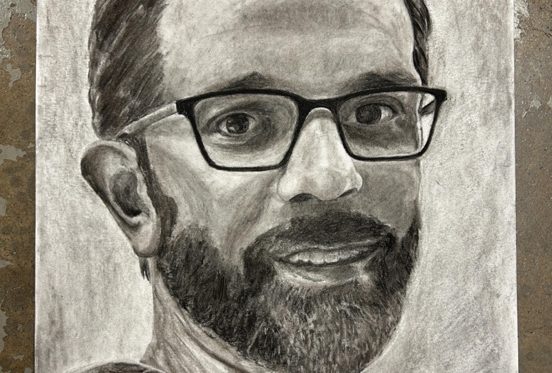
4. Lesson 3 final Gridding and ground: Welcome back to lesson three. Who doesn't want to draw with that stunning sense of
realism and representation? There's nothing quite
like getting a portrait looking exactly like the
person that you're drawing. One of the methods of doing
that is the gridding method. So let me show you how to do it. Okay, first and foremost, here's a photograph again, lay over a vertical
and horizontal line, but actually halfway along
each of those edges. I'm on Keynote and I've
just carried that line, an animated line over the top. I can do on Powerpoint
or any simple software. There's even a load of apps
out there allow you to do it Simply to make that
grid more complex, I'll just half and half again, vertically
and horizontally. Now you could leave
it there, but for an even greater
sense of accuracy, you can carry over more
subdivisions halfway like. So. Now you can keep going. You can make that grid
as small as you want. I've stopped there. I think
that's enough for me. But if you want to keep going and you want to
start picking out gentle little folds in flesh and eyelashes and stuff,
that's absolutely fine. You can go into an enormous
amount of realism, much more than I've shown you. Okay, now we've got
our digital grid. Let's go on now to
applying a ground. In this little video here, what I'm doing is
I'm carrying over some charcoal over
my sketch pad page. I'll just play this
video a couple of times over so you can
see what I'm doing. I'm working the charcoal
into the surface. Just working into the
fibers of the paper. You can't leave it
on the top because it sits on too superficially, it just gets smudged
around too much. Just work it in with your
hand or paper towel. That gray surface is the
surface we're looking for. It operates as a midtone
for two reasons. We need it, one to go
lighter so we can use a putty rubber or an Azor to lighten it up
back to the paper. You know what I like
about it is it just takes away that intimidating
white page, let's say for painting as well, let's get rid of that
white clinical surface. I think it's just a much more forgiving and welcoming
subject to work on. Okay, let's go on
to the next slide. We'll talk about
gridding the paper. Here we have our digital grid. Again said, here is actually
up to you whether you want to work digitally or
from a drawn out printouts. Here you can see I've
used a black marker pen, showed you in the materials
at the beginning in a ruler to carry this
grid over my face. Either one will work or even
a combination of them both. Because here on the
right hand side, I've got it next to my paper
on the left hand side. A bit cumbersome to
maybe carry a tablet. To be honest, I
think working from your phone is probably
a bit too small. A combination of
the two works well. The backlit digital image
actually does give us that stronger sense of contrast all depends on
the quality of your print. I suppose in this case I'm quite happy I've got
it right next to my paper and that's
where you need to see your portrait image
as well, right next to it. Okay. Now, the gridding is slightly different from
analog to digital. Not just because the paper
size is slightly different, doesn't matter either way, as long as you stay
consistent with it. Drawing out the grid
is straightforward. It's exactly the same
method as working over the digital or the
black, white image. Drawing out the grid on a large paper is
exactly the same, providing you just halving the vertical and
horizontal lines and then just
subdivide as you go. Just remember that
you are putting down a charcoal ground first
before applying the grid. Otherwise, you might
end up losing the grid, applying the ground after. Okay, that brings an end
to the lesson of gridding out your photograph and
gridding out your paper. I'll see you in the next lesson.
5. Lesson 4 Plotting your portrait drawing: Welcome to lesson four. Now you've worked
really hard to prepare your paper and to
prepare your photograph, ready to start drawing. The moment has arrived. I'll see you on
the inside to talk about plotting and mapping
out your portrait. Hi, welcome back. This is lesson for now, things really start
to come alive. Here's my digital image. I've got my paper, I've got my charcoal. Everything's ready to go. It's time to start drawing. Now, in this time-lapse, I'm going to show
you more than once. I'm going to explain each step of the way I've made
plotting out this picture. Now, I use the word plotting
out rather than drawing, just because it feels more
like that kind of sense of mapping or plotting out the portrait rather
than drawing it. I don't want people to feel
as though they need to do long continuous
straight lines or start even
worrying about curves actually or gentle,
subtle areas. This is really just
getting the fundamentals, the portrait down to the point where we feel
confident about that accuracy. Notice in my drawing
that instead of using long curved,
delicate marks, instead I'm just using short
chiseled abbreviated marks, almost making sure that I'm cross-referencing
with my photograph, which by the way is just to the left-hand side of my paper. I'm making straight lines
just because simply straight lines are
easier to do than curved lines predominantly,
I've got straight lines. There's a few curves
in there as well. I'm thinking less about finesse, less about detail, less
about even lightness. Instead, I'm staying very loyal to the image to the left
of me to ensure that those key markers or down and intersecting through the
relevant grid underneath. One more time. Notice, I haven't
been eyelashes. I'm not interested
in surface texture. I'm not interested in hair. I'm not even interested
in lights and darks. I'm just interested in getting the fundamental foundations
to my drawing out. Okay? Remember, we're using willow charcoal
throughout this drawing. Now graphine. If we make a mistake, you don't even need a rubber
to get rid of that line. Just work it in with your hand and walk it
over the top again. If you've got a
particularly stubborn area, don't worry about it. You can always
draw the grid over again if you're
constantly rubbing out. Good luck. Hope you enjoy it. And I'll see you in
the next lesson.
6. Lesson 5 Applying dark tonal values: Welcome to lesson five. Well-done for mapping
out your portrait. It's time now to get
our hands dirty. If you've never worked
like this before, you're going to really enjoy it. Don't take it too seriously and follow my
instructions carefully. I'm sure you're going to have a great piece of
work ahead of you. Welcome back to the
next lesson, everybody. This is where we lay
the foundation of tone into your drawing. We're going to apply
a lot more charcoal than we do just in this video. And of course, what
comes after this is a lot of light
application as well. But let's first start that
dark application of tone. Try squinting your eyes actually looking at this
photograph to begin with. Through squinting your eyes, you should be able to identify easier those dark areas within the face and of
course within the jumper. What squinting your
eyes does as well is it just removes all of the
distracting detail. It's an interesting tip. Or remind my students
to use all of the time. On the left-hand side
you can see the drawing. That's approximately what stage you'll be at and you've
got your ground, your grid, and the
drawing mapped out. Now it's time to
apply some charcoal. Willow charcoal blocked
in hatching marks. Let's leave some hatching. Do not be afraid to leave
some expressive marks in. We're not coloring
in withdrawing. And through the drawing, we need to remain expressive. And through that hatching, you'll start to
see a signature or stylization of the
way that you like to draw in some of the darker areas like in
the jumper of crosshatch, I've got multiple
layers taking place. And then in the areas
perhaps not so dark, sort of along my right hand, cheek, the cheek that's
facing us the most. It's about quite as dark. So we're just adding
one layer there. Let's go through
that sequence again. Starting in the nose
doesn't have to be, the nodes can be up
in the forehead, can be the jump rod,
doesn't matter. I'm not spending too long
in any of those areas. Just a few seconds blocking
it in, plotting it in. I started on the jumper,
then worked in the face. I can return back to the jumper. It's good to keep that sense of flow and that
sense of sequencing. Not starting in one area and feeling like you need
to finish in that area. That's absolutely fine. In fact, treating the
whole image is one, I think is really useful. So one final time, It's worth mentioning as well. I haven't fully completed
the top of the head. Maybe I could even
go a little bit darker in some elements of the face and
also in the jumper. But you will see
in lesson number six that actually I can
come back to this later on. Make decisions. It's always good to
keep the pace flowing. When you get to this stage, you're about ready to move on to blending the charcoal
into the face. And I'll see you in the next
lesson to do exactly that.
7. Lesson 6 Working back into the tone: Welcome back to lesson six. In this lesson,
we're going to work back into the charcoal
surface that you've created. In the last lesson, I'm going to bring up the images again now to show you what stage
you left your drawing at. It should look something
similar in description to this. The charcoal is sitting
very much on the surface. Using the blending stick, I'm working back the charcoal into the fibers of the paper. Not dissimilar, I suppose to the way that we applied
the charcoal ground, this is so that the charcoal not only is not sitting
on that surface, it looks crude and actually
too dark in some areas. But we're trying to make it more sympathetic with the
form of the face. I think what you'll start to
understand is those gentle, more sensitive contours of the face as that's
brought into play. Let's watch that video again. Every single area, more
or less I'm working into. By the way, this isn't just
the one stage process. This isn't just me
leaving it now and assuming that that area
on the face is complete. We're working the charcoal in to give us a fundamental layer. That layer is something that
we can build on top of. Let's watch that video again. Notice how the charcoal becomes considerably lighter after I've blended it into the paper. We're not going to abandon the drawing after
we've blended it in. It's by no means finished. What that layer operates as is a foundation from
which we can build on, make it even darker
in those given areas. We don't want just that charcoal sitting superficially,
at least not yet. Hopefully, by now you're
starting to see how charcoal can be used,
much more sensitively, much more like human flesh, in the way that the charcoal
delicately describes lights and darks and gives
us form within the face. At this stage, I'm
still not interested in refining the drawing and
looking for too much detail. Join me in the next lesson, where I'm going to show you
how to apply lighter tones.
8. Lesson 7 Lifting light tonal values: Welcome to lesson seven. We've drawn and we've
applied charcoal. We've blended in that
charcoal into the surface. And now, probably one of the
most satisfying parts of a drawing is to lift off some charcoal and reveal
some of those highlights. So without further ado, let's go inside and I'll show
you exactly how to do it. Welcome back to
lesson number seven. Now, you can't really have a drawing made up
entirely of dark tones. The lighter tones are crucial. Remember we started
with a mid-tone. So going darker and lighter
than that mid tone is essential for us to incorporate
that breadth of tones. And with it a wonderful
sense of form. So let's remind
ourselves when we left off in the last session, we blended the charcoal into the surface with
the blending stump. And now we've got to find those lighter tones using the photograph as our
reference really carefully. I'm going to show you
this time-lapse video of me using a potty rubber. Don't need to use the
Tombow fine potty, fine rubber that this day is just using a
particular was fine. Now, I think about using
the potty rubber almost in the same way I'm using charcoal in the very first instance. So when we applied that, the blocks of charcoal
across multiple fields, I'm doing the same
with the potty rubber. Notice I'm not staying isolated
to one area for too long. I'm trying to work sequentially, as I've said to you before. Let's watch that
video once more. Highlights within the
face are important, but they are no less
important or more important. Then those lighter tones in what we call the negative space. Negative space really
is just space anywhere around the figure
or round the head, that it is not part of the
positive shape itself. Now there are, I've noticed at the very end of
this video some, some elements of the face that perhaps I still
could have worked in. The bottom right-hand side. Negative space, I think will require a little
bit more rubbing out, but I think that
that probably comes later on in the drawing process. I hope you found that useful. Next lesson looks
at refining detail.
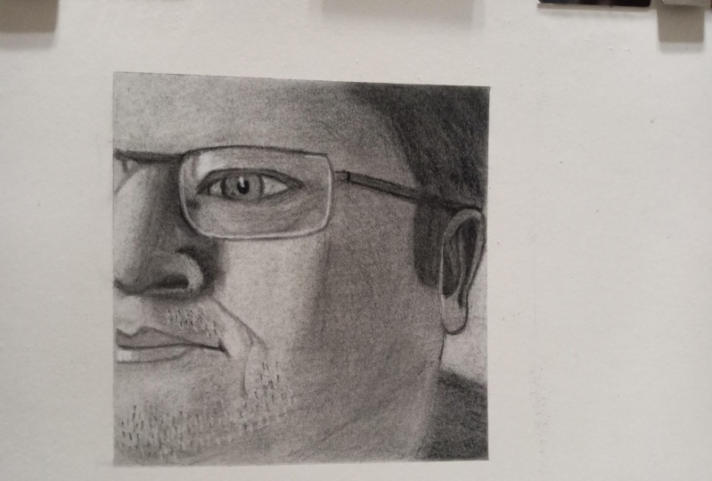
9. Lesson 8 Refining detail and texture: Welcome to lesson eight. Now we're quite a long
way down the path. You've applied charcoal,
you've lifted it off and you can repeat that
process at any stage. But broadly speaking,
we've covered these large field of dark and light across the expanse
of your portrait. It's now time to go into
a little bit more detail. And I'm going to show you
exactly how to do that now. Welcome into the final
sequence of time-lapse videos, where we're gonna go into great
detail looking at how you refine the portrait in
these final stages. So let's introduce ourselves to the stage that you
should be at. Now. You've got your expressive mark-making down
and predominantly you've got the whole
face in full form, which gives it this
three-dimensional quality. Mostly speaking, You've got
rid of the grid as well, but that is something to
bear in mind as we get towards the end of this product. Now, I'm just going to focus on some isolated details
to begin with. Cropping and enlarging and
area of the photograph. So you get a really good
clear sense of how I've gone about this final stage
starting with willow charcoal. Think of that again as a small,
isolated foundation part. Incomes the Tombow pen eraser, little bit of profile and a little bit more
detail in there. Keeping the crosshatching going, keeping that shape
nice and circular, and then incomes the
compressed charcoal pencil. And I don't think I
would've been able to get that pupil quite so
sharp without it. Think about creases. Think about muscle
fibers within the iris. It more or less
speaks for itself. You can rub out charcoal,
compressed charcoal. I felt that the willow
charcoal is just a little bit more
appropriate and easier to rub out and give me that surface texture
within under the eye. Okay, so there's the
completed version. One on the left hand
side at the end of the video is not quite finished, but you can see how that
element progressed out. Okay, let's move on
to the next video. We're going to focus
now on the other eye. And I've just panned out slightly to give you a sense of what both
of them look like. Again, in comes the
rubber incomes, the charcoal, willow
charcoal to begin with. Blending stick, just
pushing it back in again, giving it that kind
of foundation. And then incomes the compressed charcoal dancing around the eye, picking up on those dark spots, but not working too harshly. I'm trying to avoid
long continuous lines. Allow the drawing to build
out of these shorter sprints, little mark-making dashes here
and they're continuously. And I'm not focusing on
one area for too long. I mean, the eye I'm
in the outside of the eye in the lids
and then maybe a little bit of eyebrow as well. Moving on to the nose. By now, marks are
pretty characteristic. You're probably pretty use
this type of mark-making. I'm I'm going about this kind of vertical hatching incomes the
rubber to just sharpen up the edge of the nose back in to the compressed charcoal
again to really cut in and find that form at the bottom of the
nose really going in dark there to give it that wonderful
three-dimensional profile. And finally, we're going
to work even lower down. There's a little bit
more surface texture to consider down here. Not bothered about going in for the pores within the skin. I think that's taken
things a bit too far. But the stubble and the
creases within the lip, we can try and define that
is pretty straightforward. Don't be afraid to rub out trespass from one
area into another, from my chin into the jumper. And don't be afraid to do
that on the lips either. I could have taken the jumper, perhaps even darker than that in with the
charcoal pencil, but I'm quite happy
with those mark-making, so I'm going to
leave it at that. In fact, I'm going
to leave a hole. Portray that. Let's have a look at what it
looks like in its full form.
10. Lesson 9 Reflecting on your drawing: Welcome to the last lesson. Unfortunately, this is where
the project comes to an end. Sit back, relax and admire
your fantastic work. I hope you've really
enjoyed yourself. But most of all, I
hope you've learned some skills that you
can take with you. They are transferable skills from the landscape,
the built environment, into still life, any subject
matter really that you want. Please take the time to take a photograph of your
work and upload it. I would love to see it. Before I end here, I'm going to take you back
in to that workspace and show you a few things that I
think you'll find I've use. Welcome to the
concluding lesson. Hope you've really
enjoyed the project just as much as I've
enjoyed making it. I love art, I love painting, and I particularly love
drawing with charcoal. I loved the expressive nature of charcoal and hope you do too. And you've really enjoyed exploring the
limitations of using the charcoal and
using the rubber across a large dynamic portrait. What we're hoping to achieve
is this sense of refinement, but also this sense of
expressive mark-making. I'd love to be able
to see your outcomes and I'd love to be able to
comment on them as well. Please do upload them
where you see the link. And just before you leave, just like to show you some
of my other artists who have also taken the course before
it arrived here on line. Joining the pandemic
that I first thought about the
idea of developing a course in order to help particularly beginners understand the
mechanics of drawing. So I collected a bunch
of artists and students, mainly beginners, and ask them to produce a
portrait drawing. Right at the beginning
of the course, they all stood in
front of the mirror. Or use the photograph, develops their own portrait. After the course,
some six weeks later, following all of
my instructions, they developed another response. Hope you can see that the
results are startling. Look out for the sign, the
drawing transformation. And I hope to see you
again in the next course.
 Stuart Jarvis, Artist and Teacher