Transcripts
1. Introduction: When I got my iPad more
than five years ago, I had no idea how much it wasn't going to change
my creative practice. It gave me so much more freedom because I could
create on the go. When I was done, my art was ready to be
sent to a printer, posted on print-on-demand
or shared online. Hi, I'm Katie Cindi far I'm an educator by training
and then artists by heart. I am really excited
to teach this class. I'm going to share
with you some of my favorite tools to use
in the Procreate app. And we're gonna do
that by designing a personalized
photo card that has some hand-drawn illustrations
and some lettering. When you're done
with this class, you are going to
be able to design any kind of photo card
that you could think of. I'm going to show you
my whole process. We're going to look
at color palettes. We're going to design
our own color palette based on the photo are
photos that we choose. We're going to
sketch some layouts. Look at single photo layouts,
multi photo layouts. And of course, I'll
show you how we can get it printed so that you can share it with your
family and friends. To take this class, all
you need is your iPad, stylus, like the
Apple Pencil here, and your procreate app. I'm so excited to get started
on this project with you. Let's dive in together. I'll see you in the next video.
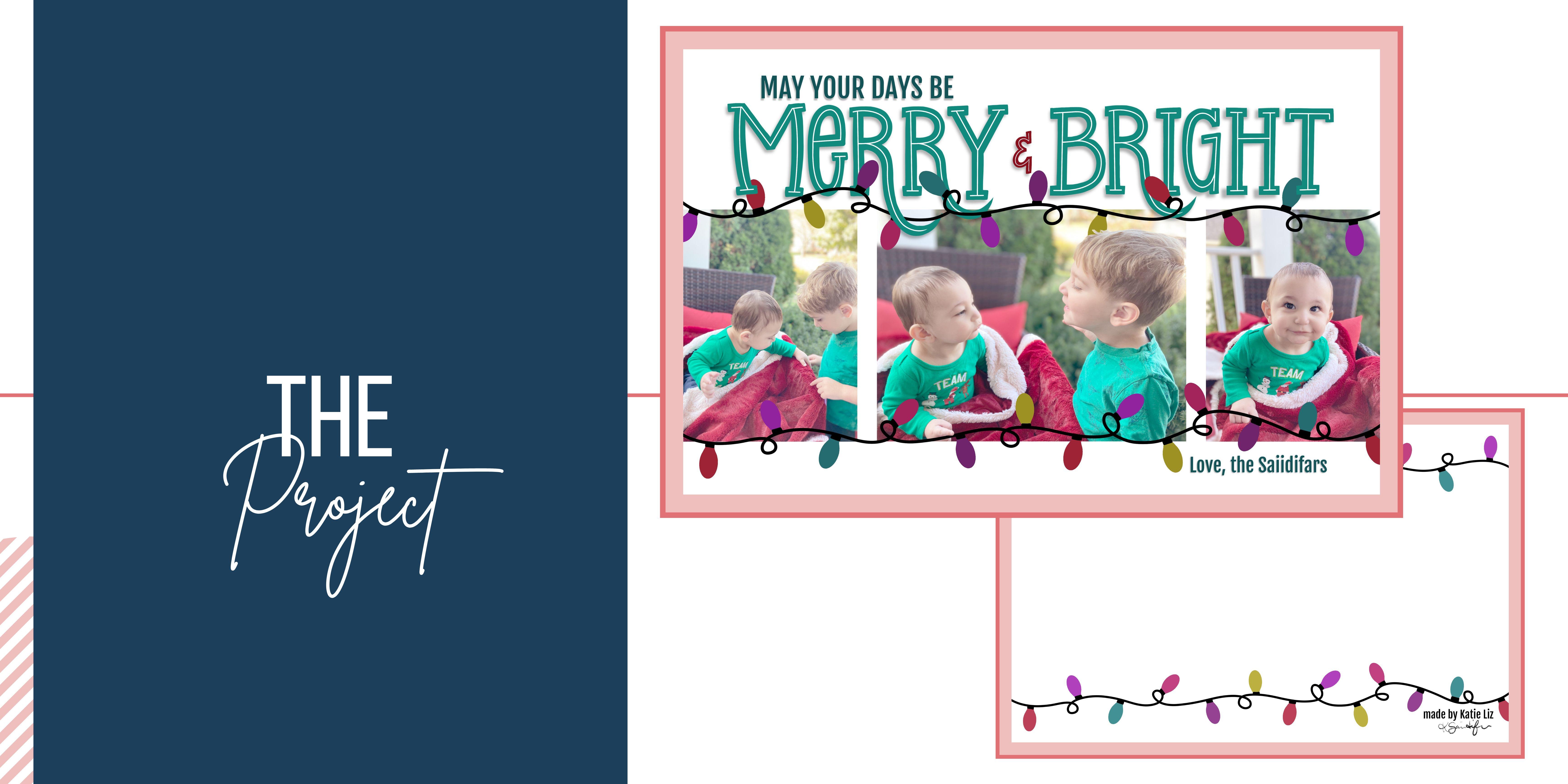
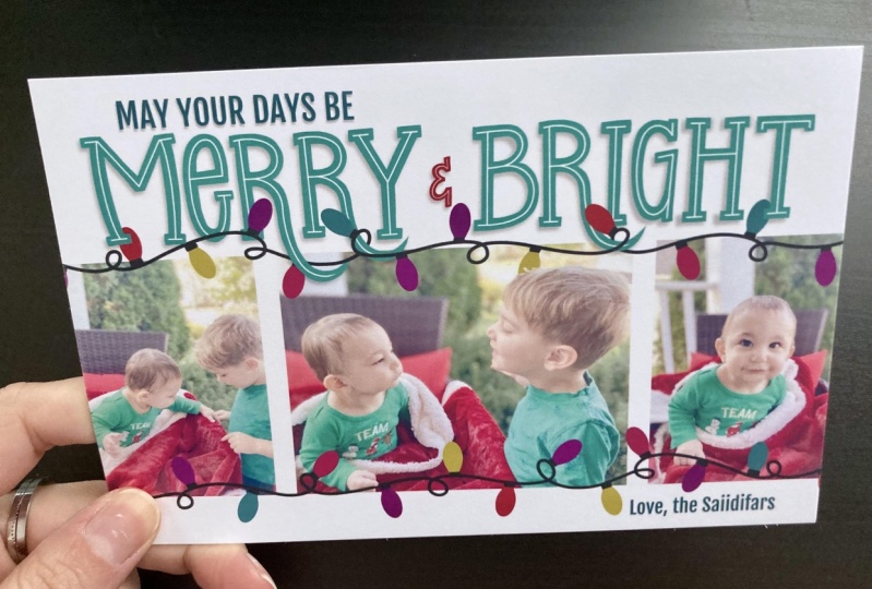
2. The Project: Let's talk about the
project for this class. We're gonna be making a
personalized photo card. I'm going to be making
a winter holiday card. It's actually going to
be the holiday card that my family's
sending out in 2022. So you're gonna get
dizzy, my adorable kids. You can make whatever
photo card do you want? It could be a save the date, birth announcement,
invitation to a child's first birthday party. Or you can follow along and make your own winter
holiday card. Through this project, I'm going
to show you how to import some photos and make adjustments to both the
shape and the color. We're going to decide on a color palette that
compliments the photo. We're going to create some
really fun hand lettering using some of the
procreate brushes. I'm also going to
show you how to add texts and how to export your final product so
that you can get it printed. I'm going to show you
how we can literally drag and drop at some
of our illustration. I cannot wait to see your finished cards in
the project gallery. Quick tip. Take a screenshot of your
final project and upload that to the project
gallery will still be able to see all
of your lovely work, but the file size will be something much more
manageable for the site. Alright? Before we dive in, make sure you pick out some of the photos
that you might want to use. I normally have four
to five set aside. Then I'll decide from there. If you don't want to
use your own photos, but you still want to practice. Download some of
the sample photos that I have in the resources. There'll be great for practicing omega birth announcement. A save the date or
winter holiday card. All right, I'm excited. Let's jump in.
3. Decide Card Size: It is so important to look at where you're going to
order a card from. So we're going to look at a
couple of different sites. This is vista print and they have several different options. You can see the inches, the size of the card, right next to the choices. When you click on it, it opens this dashboard. And you can also click
Change size there if you think that you want
something different. Shutterfly is another
popular option. And under filters
you'll see theme. And when you scroll
through that, you can find upload your design. Those are all of
the blank versions and they have so many options. If you want to see the
exact dimensions, click on, see full details, and
scroll down to the bottom. It'll have details and I'll
show you the size in inches. So this one is a five by seven. Another option is
simply to impress. And there are many
different websites out there where you
can order these. So the main thing is to
know the size of the card. In the next lesson, we
will set up our canvas.
4. Canvas Set Up: Let's start by setting up
our canvas in Procreate. Click the plus symbol. In the top right corner. You'll see I already have a
lot of canvas size is saved. Right click the little
black button here, and it opens up this window
to set a new Canvas. Alright, I hit
inches because that is my preferred
method to work in, especially for
something like this where there you're working with a photo card and you know exactly in inches how
long it needs to be. I'm not changing the
DPI that's set at 300. Um, but I could or
what I prefer to do is I like to double the
length that I'm putting in. So instead of a five by seven, it would be at ten by 14. But in my case, it is going to be 14.4 by 9.2. And you'll see it changed
the number of layers. I have 83 layers and you might have a
different number of layers. It just depends on your iPad. Now, I am not really going
to change anything else. I'm keeping the defaults for
all of these other areas. I don't typically change those. But the last thing that
I do is I rename it. So if I want to come back and make another card
in the future, I can. And I'm going to use this my favorite iPad feature where it turns to your upsell? No. Okay. Where it turns your
handwriting into text. So I'm labeling it photo card. So if I make another row card, I don't have to come
back in here and put in the height and the width or change the DPIs or
anything like that. So hit Create. And there is our canvas. So when I made this, I made it into this horizontal
version, the landscape. But all you have to do
is pinch and twirl, and you can make it into
a portrait if you want, or pinch and twirl and
put it back to landscape. I will see you in the
next lesson where we're covering card layouts.
5. Card Layout: In this lesson, we're
going to explore options for our card layout. When you start thinking about
the layout of your card, we're faced with some
decision points. Will your card be
horizontal or vertical? Are you going to use one
photo or multiple photos? What are you going to include? Hand lettering,
illustrations, text. And if you do need
to have texts, what words does need to include? Here are a few examples of words you might want to
include on your cart. Knowing exactly what you need to include is important as you
think about your layout. So you leave enough room for
all of the inflammation. You also are going to
want to think about how much space do you want
around or between the photos. In the resource section, you'll find two pages
of layout ideas. Some have whitespace
around the pictures. Some have no space at all. You can have photos
overlap or be spread out. And maybe you want to go through and combine some of the ideas. I'm about ready to sketch
some ideas for my card. I'm really drawn to
these two ideas, but I think I need
to make some tweaks. I want more space above the photos rather than having
them in the exact center. But I want this
three photo layout. I'm going to grab my
six B pencil to sketch. You can use any color but
I'll be using plaque. All right, I think
I'm going to put one like landscapes
style photo here. Let me adjust this so
it looks more centered. And then I'm going to add a couple of smaller
pictures on this side. Let's see, maybe
aligned at the top. Or actually, let's look, I think the bottom, then even on the bottom
that looks good. Or I could do it more centered, like the original inspiration. But I think I'm actually
going to have them all be the same size. Yeah. This almost looks like a
film strip or something. I'm that old school
photo film strip with some space in
between each picture, a little bit of
space on the bottom. Maybe I can fill this with
some illustrations or something and have
room down here. I can put in some text, love this IED vars. And at the top, that's where I'm going to
put in the hand lettering. So I will sketch that
in, in future lessons. So let's go through
my decision points. I made it a horizontal
layout with multiple photos. I'm including some
minimal illustration and text with featuring
hand lettering. It only needs a few words. And I have decided most
of the space will be above the photos and none of the photos will
be touching each other. It's your turn. Make
your way through all of these decision points as
you sketch out your layout.
6. Import and Place Photos: Okay, let's import our photos. Click the French,
and we're going to add and insert a photo. I have them saved in an album. I have a holiday card album. La photo shoot that I did in my front yard
with my two kids. My two-year-old only
participated in three photos, and my nine month old is only happy and one is
little grumpy and the rest, but, you know what, between some of these photos, I think I can make
a really cute card. So select the photo
and it will import. And here's my two-year-old
playing peekaboo. Alright, let's go back. Same process. And we're going to
import another one. Here's a close-up
of my Smiley miles. And last one. Let's do this one where they
are looking at the blanket. Alright, I have to
portrait and landscape. Let's make some adjustments
to the size of the photos. I'm going to click
the Selection tool, the arrow, and I want to
make sure uniform is on. If I have free form on, it, makes the picture
distorted and distort, actually shifts it up and down. That's not what we
want. Warp, does this not what we want either? So uniform, make
sure uniform is on. I have snapping on. That's one of my favorite
tools and that allows me to snap to the edge or in
line with others as needed. I am going to reduce the size sum and I'm going
to snap it to the side. You know, it snapped when it
has the yellow line on it. And I'm going to have it reduced the size until it snaps
here in the middle. And when I do that, it means the photo is exactly
one-half of the card. And now I will put it in the
middle and snap it here, another yellow line to make sure that it's
snapped to the middle. Now, I have my two
portraits that are gonna go on either side of this photo. We'll start with the
portrait of smiley miles. And I am going to
put it on this side. I'm reduce the size
down until it's matching on each side with
the height of the landscape. But I actually think
that might be too. Yeah, I have it snapping. You see the blue lines there, but I think I think
it's too big. And so I am going to have it snap to the side
so it has that yellow. But then reduce the size. So sometimes you just have to play around with
things to figure out exactly how it's going to go. In the next video,
we'll look at how to crop the other portrait photo so that it matches perfectly.
7. Adjust Photo Shape: We are going to crop this second portrait
photo because I want the main
focus to be my kids. I have a lot of
extra space around and I just want it to be
more focused on them. So how we're gonna do that? I'm going to take the
photo of my littlest one and duplicate
it because this is the exact size that I want. So I'm going to turn
on Alpha lock so you can either click on it
and click Alpha Lock. When you see the checkerboard, that's when you know it's on. But you can also use
two fingers to swipe. So if you just use one finger
that selects the layer, but if you use two fingers that either turns alpha
lock on or off, so make sure that
checkerboards are behind. And thin. With Alpha Lock, it will only color pixels that already have
something on it. So we're going to
use the fill layer to turn the whole thing black. And now it's the same
sizes what I want. And I'm going to turn
off my other photos. And let me make sure that this layer is above the
photo that I want to edit. I am going to pull, push it that on top. I'm going to I'm going to
place the black box on top and reduce the
opacity to about 50%. I want to be able to
see where the box is, but I also want to be
able to see through it so I can see what parts of
the picture I'm keeping. Now, I'm going to using
the uniform tool, shrink the photo, and play around with
what's inside the box. So I have it snapped
to one side. And now I have to decide, do I want to have meiosis elbow in the
picture or zoom in closer? I think I'm going to leave as little pointing
finger in the photo, but I am so cropping off
some of the background. I don't really want to worry about snapping to the center, but snapping to the
corner of this black box. Alright, I will turn the
opacity all the way up. And now here's where
the magic happens. I am going to place the
photo above the black box. And we are going to now take the image and turn
it into a clipping mask. And so a clipping
mask just only shows things on the image if
there are pixels below it. It's a non-destructive
way to make edits. So I just cropped the photo
using the clipping mass. So let me undo. You can see the whole thing. Redo, you can see
where it's cropped. Now, we could leave this, that's why it's non-destructive if I ever wanted to come back and look at it again and
just put in a group, keep it as that photo forever. But in this case, I know I'm not going
to want to go back. This is what I want. So I'll flatten it
into one image. And now my photo is
perfectly cropped to be the same size
as my other one. And I will snap it here to
the side so it's all in line. And so even though these photos
are on the opposite side, when you see those blue
lines, that's when, you know, it's snapped. And I also have it
snapped aligned to the side of the
landscape picture. But I think that this
picture is too big. I want that space
between the photos. So I am going to now take
and reduce the size of my landscape photo
until it snaps to the same height as
everything else. And then I'm going to move it until it snaps back in the middle
with that yellow line. Now, all of our
pictures are placed. In the next lesson,
we're going to look at some color adjustments
for the photos.
8. Adjust Photo Color: Okay, I'm going to show just
a quick tip on how I like to add a filter to the photos. So first we have to group
all of photos so that they're altogether I'm not going to be moving them around much. So they're together. And I'm going to add
a layer above it. And I want to grab a
soft, light pink color. Some of my favorite
pinks are saved, so I just grabbed one
of those and then take it to almost be like a blush or a skin tone, almost like a really light pink, not quite all the way to white, but very, very light. And I'm going to fill my layer. And then I'm going to use the Blend Modes to
make my adjustment. I like soft light. It just softens it. And this is for me exactly how I want my
photos to come out. This is just one of many ways
you could edit your photos. There are lots of
different ways to do it. This is just my preferred method and it gives it a
real softened look, which I want to make sure
the pictures are exactly colored the way
that I'm going to want them before we head
into the next lesson, which is about picking
our color palette.
9. Color Palette from Photo: Now our photos are colorized
exactly how we want. So we can use that to
create our color palette. We're gonna go over
to the side and click the plus sign under palettes
and do create new pallet. And this just opens up a
blank palette for you. Will be able to fill in
the exact colors that we want as we pick them. I am going to rename this, call it photo card 2022. We're going to take this
photo that we have. We're going to click
the wrench tool share. We're going to
export it as a JPEG. It doesn't really matter. But we are going to
save it to our photos. Because procreate has this
awesome way of capturing some of the most dominant
colors in a picture. So click the plus sign again
and go down to the bottom. And we're going to say a
new palette from photos. And then we're going to select the photo
that we just saved. And magically, it has picked out some awesome prevalent
colors in the photo. So I just use this
as a starting point. I don't want to use
all of those colors. I'm going to limit my
palette a little bit more, but now I'm going to
take and pick some of my favorites and put them on
the card to save for later. So let's start with
this really fun green. I'm gonna change my pen
to the monoline pen. And I'm going to use
the quick shape. So if you draw a
shape and hold it, it'll make a quick shape. And this is an ellipse. If you put down one finger, it turns it into
a perfect circle. It's the coolest trick and something I use
all of the time. So then you release and
you can fill your circle. I'm going to stay on the
same layer to put all of my base colors together. So any, any colors I'm
picking from this palette, I'm going to just
leave on one layer. So let's do this green, make another circle and fill it. And now we're going to
go to the next color. I like this berry. Let me show you this trick. So one thing that you can do is that you don't have
to go back and forth, is click this little white line and you can drop
down the palettes. And so now you can move
the pellet anywhere. It will stay up while
you're working. You can scroll through
to other palettes. It'll show you basically
one at a time. So it's just a really
neat little feature. I'm going to speed
it up a little bit. So you're not just
watching me draw circles. Now I'm going to
move my circles. So the best way for me to do that is use the Selection tool. So when I have
automatic selection, I want to take the threshold
up as high as it can go before it captures everything like in where
you see going right here. So pretty high, high 90s. Then I'll hit the Move tool, the little arrow here. I can move it and
reduce the size and put everything
where I want it to go. So let's do that again. We're going to do
it with this color, this lighter yellow, green. And I'm going to place
it over this color. But once I do that, there'll be connected because they are on the same
layer, but that's okay. Because that's kind
of how I see it. Three different pairs of colors. Alright, so here's a tricky one. These two were drawn so close together that they are just
going to be moving together, but it's a pair, so it doesn't really matter. But I'll show you if you
wanted to split them. What I would do is
zoom really close, zoom really close, and then using a different
selection tool. And instead of automatic, I'd use free hand. And I use the free hand to squeeze between
the two dots here. And then you can draw
around the shape, connect it by clicking the
original little gray circle. And that gives you
your whole selection. Now I can use the Move
tool and you'll see it's not connected like it was
when we use the automatic. So here I will just
put that one there. And we'll just do a quick
move of the greens. They're not too far
apart. I'll do this. Dark light, dark, light,
dark, light. Perfect. And you know what? Let's move these little closer. And I don t think I want
this like grayish color. I've decided make
tweaks along the way. So we're going to use
Procreate to our advantage. When you move something
off of the page, it cuts it off or delete it. So I'm just going to select it, move it to the side and once you unselect it,
it's gone forever. So these are my final choices from the imported color palette. And in the next lesson, we're going to look at some
of the color harmonies. The elbow in the palate tool.
10. Color Harmony: So we have our
original selection. I'm going to turn off the photos because they
don't need them anymore. I'm going to create a new
layer above the other. And I am going to
look at the harmony. The harmony is in
the color palette. And what you can do is if
you long hold on the screen, it turns into a color picker. So let's hold over this color. And the main color is
the larger circle. And then it will show
you these other things. So this is the complimentary
color to that green. And so let's make a circle
of this really fun. Oh man, that's a
beautiful cherry red, although I still liked the bury. That is a really
pretty complement. Now, if you want to look at
other different harmonies, you need to select
your original color so that it can show all of them
for the original color. Whatever is the largest,
that's what you want. So here's a split
complimentary of like an oranges and a purplish. Analogous is for colors
that are next to it around, like around the color wheel. Tie, tragic. Oh, I love these. These are some of my favorites. So this is really fun purple. And I always think of
Titanic as a triangle. I just, I love some
of the colors. And so I do try to
keep the colors around the original color, but it's not required. And this is another
really fun little gold. Now, I, I did some overlap here. So I am going to
continue filling with three colors so that I
can color in this spot. So once these cross
hairs come up, I'm going to drop it to
where I want and you'll notice it changed the entire
color of that purple dot. And that's not what I want. I just want to fill in
that little overlap part, so I'm going to move
the flood down until it stops having that color change. So obviously, you could avoid this by
not having things overlap, but I wanted to
show you how that works and something that I do. Alright, so we're
still in this green. Now. Tetrad is like
this quadrant, so, you know, across
is the complimentary. We already grabbed that
one. We like that one. And then it also has these
that are halfway between. But I think for this, That's all that I want to do. And I will fast-forward through my color picking for the
rest of these colors. Alright, I just
think we're gonna go back and we're going to
move these off the page. I don't need them. I really liked the
colors that I have. The next lesson, we will look at how to save
our color palette.
11. Saving Your Color Palette: Now let's go and
save in our color. So I have our photo
card palette. I'm going to long hold to select any colors and just click a box, and that will drop the color in. And I'm going to keep the same general layout
as what I have drawn. I'm even going to have
that space between. It's mostly because
I want colors to be near ones that they have. And it's almost like I have
two different color palettes. Then these purples and golds are almost
like accent colors. They're not going to be
like the primary color. And so I'm going to put
those over here to the side. And then I always like
to have white and black. So it doesn't matter
how you get to it. If you are in the disk and you double-click in
this general area, it'll snap it to white. If you're on the classic, just make sure that it is as far up in that
corner as possible. It won't matter the hue, as long as the saturation bar is all the way and the brightness bar is in
the opposite direction. So I'm actually just going to
drop the white right here. And we're gonna do the
same thing with black. I'll show you if you
double-click in the bottom, that gives you a solid black. Or if in the classic, anywhere along the bottom, it doesn't matter
what the saturation is as long as this brightness
bar is all the way, you can change any
of the other bars. And it really doesn't
matter as long as the brightness bar is
all the way to the bottom. And we'll drop the
black in right here. And that is my color palette. So I'm just going to take
these dots and group them. I'm not going to
get rid of them in case I want to
come back to them, but you can delete them
if you would like. I'm just going to group them
and move them to the bottom. I tend to move things to the bottom as I'm
done with them, if they're not gonna
be an active part of the illustration. So we have our color palette. In the next lesson, we're going to start working
on our hand lettering.
12. Sketch the Lettering: In this lesson, we're going
to sketch out our lettering with intention to the spacing and the shapes of our letters. So with a new layer
and the six B pencil, I'm using black, but you
could use whatever color. I'm gonna go to the wrench tool Canvas and turn on
the Drawing Guide. Then we're going to
edit the Drawing Guide. So it is going to pop
up with a 2D grid. You can adjust the grid size
to whatever you would like. I'm just going to reduce
it just a little bit here. I'm looking at about three
boxes high for my letters. So I'm looking and trying to think about how
much space above and below. Alright, so let's
start sketching. We're going to say
Mary and bright. And I haven't decided exactly
what I want to do yet. I'm thinking a mixed case, some upper or lowercase
m, lowercase. Mostly because I love
that lowercase e. And just try and figure out
exactly where things can go. We'll just add a
little ampersand here. I think I want some of
these letters to interact. They might dropped down into the picture or
cross into each other. And I'm really looking at the R as something that I could do
something do that with. So let's reduce
this layer opacity. And then I actually, I think we'll go through
and sketch another. And with this, I'm
just playing around. This is the sketching. I can figure out
exactly what I want. Can try dropping these r's down. Try different, you know,
play around with it. Don't feel like
you're you're tied to something because you sketch it the first time,
like would this be? I had a large bowl on top the first time and now I have the
larger bowl on the bottom. It just try and
do something new. Figure it out. You can refine it over and over and
over again until you feel good about how
everything looks. Okay. So here I have one dropped
down lower than the other. But I like how they are going to interact with the other
letters around them. And let me turn that off. Make a new layer. I want
to see what it might look like if I add some
like slab serifs. I have been in love with
slab serifs for awhile. I just think they can be so interesting and I just want
to play around with it. I think this is something
that I'm gonna wanna do, but I put it on a new layer
in case I don't that way I don't have to delete
or I can just undo, I can just delete the layer. But I'm liking this. I'm liking this a lot. In the next lesson, we will start adding some
weight to the letters.
13. Weight the letters: Alright, now we're gonna go
into weight our letters. We can turn on for
our drawing guide. We don't need that and we can
turn off these sweep boys. We don't need those either. We have our sketching
layers and we're going to combine them and then
reduce the opacity down. And now we're ready to go
in and add our weight. Or I'm going to use the
studio pen that's one of my favorites for like
a smooth inking. I have it saved at a 7%. That's the consistent
level I like. If you want to change it, you can always hit
the minus sign. Or if you want to
save another one, hit the plus sign and it
will add that line for you. Alright, let's start
drawing in our weights. When I say Wait, I really just mean the thickness
of the letter. This is all going
to be hand-drawn, so it's not gonna be perfect. But we're going to try and
eyeball things and get as close to the same
weight as possible. So first draw my shape, make sure everything is closed, drag and fill that with a color. Now I'm going to add these little slab serifs that also covers up some of
the imperfections of the where the lines connect. I'm going to drag and drop that color and then continue
filling with re-color. So once that crosshair comes up, you can move it to
wherever you want to fill and then you can just tap
and any additional places. And I do want to make
sure the flood is up as much as possible
in the nineties. And then after I've
got it all colored in, I'm gonna go through and refine. I like to refine as I go. So I don't like this
pointed em very much. I think it needs
to be more flat. So I'm going to go in
and flatten that out. And you will notice I go
back and forth all the time double tapping
my Apple Pencil. And that is just easiest for me if you
haven't yet done it long. Hold on the eraser until it comes up saying erase
with current pen. You can see I have
another setting here, so it's the same sizes
when I'm drawing, I'm just going to keep on erasing and double-tap my
pin to go back to draw, just back-and-forth to
keep refining this letter. Looking at it, you can see the lines don't
match up exactly. So I'm going to add some
weight to this one, make it a little more thick so that it looks more balanced. And now I need to add some more to these metal
pieces as well. We're just going to
keep going back and forth really on all of the letters to make sure that
it looks pretty consistent. It doesn't have to be exact, but you want it to be as
consistent as possible. So that looks more consistent. And now we're gonna
go and head to the next letter
with lowercase ys. I think it is easier if you almost treat it like a circle. So you almost want to go
and come back and touch, but just leave a little
space in between. And then you can
add the crossbar and whatever other
things that you need. I'm going to fill it
with black same way. And this doesn't
look quite right. So I'm going to go through, and one thing I like
to do is I like to over erase and then come back and draw in so that
it has a sharp corner. Or sometimes I do it
the opposite where I'll overdraw and that what I want. And then double-tap and erase
to get that sharp edge. So that's just something
that I like to do to get any like sharper details. Okay. To have my little slab Sarah. Alright, I am going to fast forward so you don't
have to watch me in real-time because it
can take a long time to get letters refined
the way that you want. In the next lesson, I'll
show you some shortcuts to making your letters
be exactly the same.
14. Lettering Shortcut: Alright, let's look
at a shortcut. Now. I have one R, but there are three
in this piece. So I am going to use
my selection tool. Put a automatic select
the R and make sure my threshold is as
high as it can go without grabbing
anything else, extra. Then there's a Copy and
Paste button right here. And now I have an exact R.
And I'm gonna put it here. I use snap. I'm using the snapping to make sure it's
aligned at the bottom. There we go. Once you
see the blue line, that means that it is
snapped into place. So I am going to now take, I have my original
three letters, MER and I have my new R. I'm going to take
that r and duplicate it. Now, I, some people might want magnetics on at this point since you're moving
that are further away, that will tell you if you're
moving it at an angle. But personally, I don't
like using magnetics. I like having a more
free form movement, but if I want it to match, the snapping still tells me. So by having the
three blue lines, it is telling me
it is in line with this are on the top,
middle, and bottom. So that is all I need to do. Now I have all my art. I will eventually go
through and merge it. But for right now, I'm not
going to worry about that. I'm just going to draw
on my original layer and we're going to
keep on drawing. I'm going to
fast-forward through this because once again, you don't want to spend
too much time just watching me draw and
refine them letters. I'm going to use
my selection tool, automatic selection to move
this G over a little bit. And now I am going to use that same copy
and paste tool to get these arms of the H
to be exactly the same. And once I have them, I don't want them to
look exactly the same. So basically it's just the
framework for what I want. So I am going to distort them. I'm going to erase to
change some of the, the way the line looks. But it gives me a starting point so that
they're still pretty consistent in the
weight of each letter. I want to merge these two
together so that I can now erase as one piece to make
them flat across the bottom. That way they look
more like one letter. Right? Now that I have
everything inked in. I see that even though the
r's are the same height, all these other letters seem
to have gotten off track. So now is a good time to select the layers that I want
and pinch them together. And then I'm going to use my automatic selection tool and select these other letters. And now with my move tool, I'm going to distort them
so that I can bring them down so they look a
little bit better. There. The height is
much more appropriate. In the next lesson, we are
going to finalize our letters.
15. Finalizing the Lettering: The last thing I wanna do is just finalize some
of these shapes. I'm in my original sketch. I had one are come further down. And then these other two Rs, we're closer to the
letter next to them. So I wanted to change that here. I'm going to have
my selection tool, but I'm going to have it on
free hand and I'm going to pick up this end of the R.
And then with the move tool, I'm just moving this little
piece up a little bit. Now. I'm going to refine again. I'm going to connect
it so that it looks better instead of jagged. And that includes both
drawing and erasing. I wonder how many times I double-tap in creating a
single piece of lettering. I am noticing that the
weight is a little off on this this piece. So I'm gonna just go through and that's a little bit wonky, but I'm going to go
through and just add some more weight here because
that was just too skinny. And sometimes I find that
I do better if I turn my letters so that they are more like shapes as
opposed to letters. And I think that's really what hand lettering is all about. Is looking at letters as shapes. And it's easier to match shapes when they're turned
this way or that way. One of my favorite
things about Procreate. I love getting to turn
the page so easily. Alright, that looks much better. Okay, We can do
that with this are, or what we could do is
use our selection tool. So I'm going to go
to automatic and select this R. And I want to make sure
I'm grabbing it all. And I'm actually going to
just push it off the page. Once I, once it's gone,
it's gone forever. So now I'm using that same
copy paste for this new R. And it's not exactly right because the eye is
a little close. There are a couple of different ways that
you could do it, but I think I'm going to, oops. I'm going to use the free
hand selection tool. And under distort, just have it come over just a little bit. So it is going around the eye and it just needs another little fix like
the other one did. Whenever you have a freehand selection
of part of a letter, you're going to need to go
through and clean it up some. And I think that's it. I like that. Alright. So merge that back in. Now. Everybody at now this is
looking a little large. I want it to be a
little smaller. So make sure uniform is on. So nothing changes and
then make it smaller. And I'm going to put
it in the middle. But in general, this is
looking really good. It's important to go in and out. Look at it, close up to
the letter and look at it big picture because
when I'm out further, I feel like ours aren't
weighted as well. And so go back in and
make the adjustment. And now on a separate layer, I'm going to work
on the ampersand. I love drawing ampersands. I think they're so
fun. In the sketch. I had a fancier one, but now that I've
seen these letters, I think I want to keep it
a little bit more simple. I feel like this matches. And in order to get the
weight exactly right, I think let me start over
actually with my monoline pen. And now the weight
is even foreshore. And after I get the
shape the way I want, I'm going to go back with the studio pen to get the
crisp edges that I want. But the mono line
is really helpful in determining that weight
in one single stroke. All right, oh, so nice. So we have drawn in
all of our letters. The next video we'll
look at adding.
16. Add Text: Let's look at the
ad text feature. So instead of hand
lettering everything, I wanted to say, Mayor days b. And then down here,
loved this IED vars. So click the wrench and
under add, add text. And this is just
going to add like a font instead of hand-drawn. So if you want to
change anything, click this like a and it
opens this dashboard, you can always go back by clicking the little keyboard and that will allow you
to change the words. But let's, let's look at this so it'll bring up whatever
you had last or its default. So fall G1 is one of my favorites that I think a free one that you can
download from the internet. I don't change much
generally except for size. Sometimes I'll turn on like an outline feature
and I frequently use this all caps feature
which I might use today. It just changes everything
to all capital letters, um, which is nice. Click on the layer edit text. That's how you can get
back to that editing part. And let's write it in. I'm going to use
fancy Apple Pencil. May your days be okay. And I'm going to make sure
it's all on one line. Happens to me all the time. Oh my goodness all the time. Alright, select all
the letters, then. Click to change the
font information. And I'm going to put
them on all caps. Like magic. Now with the move
tool, I can move it. Okay, it looks like there's
an extra space here. So in order to change that, click the Layer,
click edit text. And now, if you need to
add or delete all space, just draw one line down. That'll take a space away or add a space
between some words. So now I'm going to
move this around. And one thing you can
do to change size, just like you do other
things under uniform. You can use the Move tool
and change the size. So we'll play around
with placement. Move this up a little bit. Let's turn on yeah, all the other stuff
so we can see it as one whole picture. And I also want the
letters up here to be the same size as the
ones down here where I say love this id far so
I'm going to duplicate it and then move it down here. And now I need to
change the size. I'm going to reduce it
using the Move tool. Make sure that
it's where I want. And now I can use
this, figure it out. So click on it and look
and see what size. So it's a 40.4. Now I'm gonna go to the top one, edit text and change
the size to 40.4. And now they both match. So they're the same
size, top and bottom. And so now I just need
to go into this 1.0. And oh my goodness, change the words. Here we go. So it's going to say I
love the site if Rs. And it didn't recognize my name, but I'm not surprised by that
and it didn't put spaces. So let me use my fancy line trick to
capitalize this letter. There we go. Let's try that. Well, look at this. Something, something
is happening here. That is not what I wanted. Let's try this again. Click on it. Edit text, just that one word and let me
write it out again. Very clearly. Distinguished handwriting. Now going to mess that up. Okay, Perfect. That's how you want it. And then move this over. I actually think we can do some more
moving things around. So I'm going to shift this down to be closer to
my hand lettering. And I think I'm going to shift some of this
other stuff up. So put the pictures up a little bit so that I can get
some room to move, love this AT fires up. I want it to have some space
below it the same way. The letters have space
above it on top. So solid mount trying to
keep it relatively even. A way, I think that looks good. In the next lesson,
we will start the process of adding
illustrations.
18. Inking the Illustration: So now I want a simple
canvas to draw on. So I only want the sketch layer when I long hold that checkmark. It turns all the other ones off. Add a new layer, reduce the opacity here. And now I'm going to
use my monoline pen. I want to check the weight of it first and make sure
that that is yeah, that's the weight
that I want to use. And so I am going to
go fairly quickly to keep everything
smooth over my sketch. And you can do it as many
times as you need to. And it's not perfect, but it's close enough. And so now I'm going to go in, let me do this. And I'm going to go ahead
and go through and draw the little connector points
for all of felt light bulbs. Okay, So instead of
coloring them all in, I'm going to use the color
drop and re-color feature. And even though these
are super small, if you move those
crosshairs in or you tap those crosshairs
into the blank spaces. Oops. You will still get everything re colored
the way that you want. One more. Oh, no, this N2. And now that is all colored and I have
my string of lights. So I'm going to
create a new layer. And I'm going to put
it under the string of lights so that the
light bulb looks like it's screwed
into the socket using the color palette
that we already chose. I'm just going to
pick one color for now and drawing these lights. So I'm going to use the
quick shape of the oval. And if you haven't
touched anything else, you can edit shape. And that way you can
edit the thickness, how it's oriented,
all of those things. Oops. Okay. So I clearly didn't have a
fully connected underneath. So there we go. The color drop works better now. And something is just
looking a little funky here. So I'm gonna move this
up and try and even out. Oops, oops. Even out the shape a little bit and make
it more light Bowlby. And that's still
not working for me. Sometimes you got
to play around with things That's a bit better. But you know what? I think? I think it's actually the the connector part
on the string of lights. So I am going to use my eraser and try and
sharpen it up a little bit. Um, because when we drew it, we use the mono line. But I want to use
the Studio Pen. And so I'm just going
to use the studio pen and add some sharpness to it. But you know, now that
I have zoomed out, it doesn't look bad at all. So let's go back to
drawing our light bulbs. I'm going to duplicate
the light bulb so there's shapes are
the same throughout. And then I am just
going to take this and place it at one of
the other sockets. And sometimes that's going
to be twisting and rotating. Sometimes it will be getting the color and adding it in so that
there are no white gaps. And here let me show you. So I have taken this light bulb and duplicated
it from the duplicate, and it is starting to
get fuzzier and fuzzier. You can see like sharp, crisp lines, fuzzy lines. And the more you duplicate it, the fuzzy or it's gonna be, that might be something
that you're looking for. That's not what I want. So I am going to only
be duplicating now. Okay. When I did that,
it showed everything. It went back and turned
everything else on, but honestly, that's okay. So I am only going to be duplicating from my
original drawing now. I am not going to make
you watch me do that in real time because they
can be pretty tedious. And we're just doing the
same thing that we did when we were sketching this. Okay, now I have my
entire illustration done. I am going to combine all of
the lights into one layer. I'm going to pinch. And in the next lesson, we will re-color the light so that they're
all multicolored.
19. Recolor with Color Fill: Alright, so let's re-color so that they're
not all the same. We're going to use
the color fill. So under the selection
tool, automatic, and we are going to
select different colors. So there are six colors
that we're going to use. Select 112, 345-612-3456 and turn color fill on. That means whatever
color you pick, it will automatically change the color of what
you've selected. So each time you got to do this, so pick the color that you want and then select
what you want. So I'm going to have
these to be read. And now pick a new color. I'm going to go with I'm
going to leave some, I'm going to leave
some of these yellow. So the next one, it will be this dark
purple, colorful still on. I'm not going to do that one. And then red, yellow, there we go, purple. These are changed. And now let's do this
like gold, green color. And I think it's these
yep, That looks great. And the last one, maybe maybe dark red. So here are I'm not
sure I love that. So now that they're selected, I can still I can go
back and change my mind. I think this dark green. Yep, that's the one. I'm actually not loving this green and gold color
now that it's on here. So let's select
them and change it. Light green, dark
red, pink, pink. That's it. That's what we want. And so we have now
recolored all of our lights and we have this
beautiful string of lights. Now I'm going to
select both layers, the string and the lights, and group them together. I'm going to duplicate the group and just
bring it down a hair. And I found that this is the best way to be able to re-color this other
set of lights. So it's not exactly the same. I'm just going to be shifting the color
down a little bit. So what was red is now gonna
be purple or what have you? I think I'm just going
to shift down one color. So let's use that same
method of the color fill. And I'm going to shift so
that these three are the red. And then the next
color is yellow. And hopes, yeah, I forgot to
unselect before I changed. So now, now the color
is going to be yellow. And automatically select, pick the one below each red because the red
is what I'm changing. It can get really confusing. So I like to have these
right next to each other. So the next thing
is dark purple. So under yellow, under yellow
change too dark purple. Next one's pink. So under per pool, no, purple change to pink. And the pink will
change to green. Green, pink, green. And the last one will be
the bright purple, green. Green becomes
purple. There we go. So now we have
colored the lights and we have changed the color of the lights using
the color fill. So grabbing the whole group, I'm going to drop it down, use that flip tool and place it. And I think I'm going
to leave it like this. In the next lesson, we are going to look at
coloring our lettering.
20. Color the Lettering: Okay, We have the
colored lights and now we want to color
the other pieces. So I'm leaving the
background white, and I am here we can
delete the sketch, delete the white opacity layer. We can rasterize,
which basically means go from font to pixels. We, but we can rasterize
each of our texts layers. You don't have to, That's just a preference of
mine as we're looking to color all of the
letters on our page. So I'm going to look at using
the Alpha Lock feature. So using two fingers. And it can be any, I tend to use these two fingers. So I am holding my
pencil and I'm using my middle and ring finger and slide over until you see that. Once you see those
check checkerboards, that means that your
alpha lock is on. So this makes it easier
to fill the color. So I started with this purple, but I really don't like that. Maybe this brick red didn't
use that as a light bulb. But that's all I
want dark for me and I want it to
be Marion bright. So let's try this green. Yes. Oh my goodness, this looks so bright and it looks
awesome with these lights. And that's because
this base green is really where all the
other greens came from. I mean, all the other colors. So but I think let's let's use this dark
green for the text letters. So it's a little bit
more in the background. Marion bright or the
star of the show. Same with love this site AT, except look at this, this color is the
same as the words. And so let's change. Once basically exchange
these two colors, will go back into
the light bulbs. And we will Selection Tool. Color fills still on. We're going to color
fill this one green, and now change it
to yellow in color, fill this one yellow. There we go. So it's not now the same
exact color as the lettering. And I still need okay. So I'm moving this up so
it's above the light. And now I'm going to change
the color of the ampersand. Let's try pink. That's now. Let's try red. Red is the color of the
light bulb right next to it. So it could be interesting, but I don't really like that. So let's exchange some colors. And I think my iPad is putting
the night color shift on. So let me fix that,
be right back. The next lesson, we will
start to mask the lights. So they are going in
and around the letters.
21. Using a mask: We have our lettering, we have our strings
of lights and sold. Let's do a mask. So what I'm gonna
do is duplicate this whole group because I
want to save it in case. And then I'm going
to click flatten. And now I'm going to add a mask. So a layer mask use black or white to either
conceal or reveal. So black conceals and white
reveals what's underneath. And this is the tool
we'll use to make it look like these pieces are
going around the letters. So I'm gonna get my studio pen. And I have black
on the mask layer. And going and getting close
to where I want to mask. And that is, I don't
know how that happened, but here's black again. And there we go. When you use black,
it completely conceals what you're
covering over. So I I'm doing a bigger
swatch then what I want, and I'm going to
change back to white. And now I can reveal all the way up really close to the
edge, that letter. And so that looks like it's peaking out behind the letter, but I haven't erased anything. This is so much easier and you can make changes over and
over again if you need to. So there we go. Black conceals just
a little bit here. Now I want I think yeah, there are pieces where
I'm going to have it go in front of or behind. Here's like a teeny tiny
little piece that it can technically be in front of. The letter, will be in
front of the string. And it's so tiny. But I find that even in
those teeny tiny moments, it makes a huge difference. One thing you'll notice, I am terrible when it
comes to the mask. I still tried to tap my
my pen pencil for erase, but that does not
work on the mask. So here's the little
detail that makes a big difference in
making that 3D look. So we have that behind our. Let's also look
at this one here. And we're gonna make
it look like part of it is that behind and
part of it as in front. So basically it's coming up behind the r and then
coming down in front of it. So I need to make, make this look almost
like a line here. There we go. I don't have to do
anything on this side, really because like
you can see it, it's in front of itself, not in front of the letter. Alright, go back to white
and get up as close ups, as close as possible to
the edge of this are. When you go back. That looks so cool. Let's do it over here too. We're gonna do it opposite
the way that we did before. So instead of coming up
behind and going in front, we're going to come up
in front and go behind. If that makes sense. You'll
see, okay, black conceals. So we're going to
have to conceal around this loop both sides, unlike the last time. Here we go. And now up to the To line. Here we go. So we have some going in
front and some gun behind. Um, and I'm also going to go and do this one
behind my kids hair. I'm gonna do this relatively
fast because I'm Anna. Use a lot of detail, but I'm going to fast-forward
through this for you. Now you'll notice I did a
lot of like wispy things. An up-close it might not look. Why not look awesome?
But far away. It makes it really look like his hair is in front
of that light bulb. And that's it for masking. In the next lesson, we'll
do a quick drop shadow.
22. Adding Drop Shadow: Now we are going
to add a shadow. So I'm going to
duplicate the layer. That's this Marion bright. And I'm going to fill it. And I will. I'm gonna do the same
for the ampersand and I'm going to
fill that with us, the darker red, since it's
a little bit different, I don't want it to
be the same color as the shadow shouldn't
be the same color. So let's drop this down. It's a little distracting. So let's change
the opacity downs. And let's turn off alpha lock. And under the Magic
Wand Tool there's Guassian blur and that's what I use to make a little shadow. No more than 5%. You don't need much. And I don't like this color. The coloring isn't
working for me. So one way we can change that, we could fill it, use
Alpha Lock and fill, or we can select it under Magic Wand, Hue
Saturation, Brightness. Turn the brightness all the way down and it goes to black. Now, I'll take the
opacity back down. Back down. There we go. I have a quick
drop shadow on my lettering.
23. Adding Details to Lettering: So I'm going to turn
off the light bulbs so that I can draw this inline
and see the entire letter. Even though I know
some of it will be covered up in lines, are one of my favorite ways to decorate letters right now. And I'm going to go through
this kind of speedily. It doesn't have to be perfect. It's hand lettering,
but this is going at eight times speed that it takes for me to let her it and it's still imperfect. There's lots of erasing
and take your time. It doesn't it? You want to get it
right. Erase, undo as many times as you want. Like I have thickened this one too much, but I want to get it as
close to center as possible. And I also want to sharpen this point almost like the point of
the letter itself. So erase. I'm using a monoline brush
to do these n lines. And you can use
whatever you want. Some people, you might, this might not be your style. You may choose to do some
other kind of lettering, or maybe you've done some fancy script or
ribbon style lettering. But this is something
that I feel very, is a very cheerful and
fun lettering style. And it just, it speaks to me. Skip the ampersand for now. And I'm making sure
each Sarah has their, its own little inline too. Now, we're gonna go back and
do one for the ampersand, but I'm going to make
this as small as it can go so that it fits better into
this teeny tiny lettering. So all the way to
the bottom there. There you have it. I think
I might change the color. That white is not working
for me. Alpha lock. Pick my color. Let's do the dark
red fill layer. Think I like that either. Let's go back to the white. And instead, let's just reduce
the opacity of the white. Yeah, I like that a lot better. And that is the inline. In the next lesson, we
will do our final touches.
24. Final edits: We just have a few
final touches. Some things that I
had wanted to change. So I don't really like
the size of this now. I don't want it on top of that. So even though I
originally wanted it to be the same size as the
letters up at the top. I think I want it to just
tuck right in there. Turn the lights back
on and look here. Something happened where I am
just maybe one pixel over. That's an easy fix. Let's go to that layer. Pick the red color. And it doesn't matter
what brush you're using. Whatever you use
last, literally. This is just one pixel over. You can, if you, if you've made a
mistake like that, just fill it in. I just don't want
that little gap to be there on my end product. Always good to go through
and double-check. Make sure nothing has gotten shifted as you've been
working on things. Alright, so that taking
care of now, I want to, I think I want to look at
the color of the light, so similar to how we
changed the photos, we're going to use a clipping
mask, fill with white. And I'm going to
change the blend mode. C, It's a clipping mass is only affecting the
one right below it. I'm going to change the
blend mode to soft light. And light kind of lighten
things up a little bit. So you can see here
with them without and I want the same thing
to be on the ones above. So I'm going to
duplicate and drop. And you'll notice this
changed everything. This did not carry over
as a clipping mask. And you can tell
because it doesn't have that little arrow symbol. If it had that, it would
be a clipping mask. So let's turn it back on. So it's only affecting
the string of lights. So you can see it's affecting
everything right now. Turn it on and then
clipping mask, and now it's only
affecting lights and everything looks
way more balanced. But I liked the
dark green lights against the green lettering. So we need to figure
something else out. I know what we should do.
Let's adjust the opacity. So it around 40%. It is still lightening
up just a hair. But it doesn't. It's closer to what
we want. Okay. So that looks good. Now I think I'm gonna do
just a little bit more masking some of these letters. I want to be peeking out around. So I'll fast-forward since
you've seen them before. Let's see. The last touches. I think I think I need some
matching drop shadows. So the drop shadow behind
Marion bright looks great. But I think I need some behind these other pieces of lettering. So let's go in and we're
going to duplicate. And let's just fill, fill the layer with
black fill layer. And then turn off alpha lock. And I turned it off
that menu instead. And it is so important
to turn off alpha lock. I cannot tell you how
many times I went to do a Gaussian Blur and
couldn't ask like, why isn't this blurring? It's like because
alpha lock still on. Because these are smaller, these pieces of text or smaller, I'm only blurring it to 3%. And I'm dropping the
opacity down to what the marion bright
per opacity is. Okay. I feel like this is
something I can be proud to send out to my family and friends for this
holiday season. In the next lesson, we'll look at how to share
and save our final design.
25. Save the File: We'll look at how to
share our design. Go to the wrench
tool and hit share. You want to share the image. You don't have to
worry about layers. So share as a JPEG, it will export it. You can save it however
you normally like to. I prefer to save it to either files or to
Dropbox because I can access these from
my desktop when it comes to uploading
to get them printed. So I'm going to Save to Dropbox. And I need to retitle this. I never added a title and the gallery I'm
going to call it say it if our holiday 2022. I don't want the space. I don't want that space. Okay. And save. When you click Done,
it changes the name. It hasn't saved it yet. I'm going to save
it to this folder. And it's uploading. And now it's saved.
In the next lesson. Let's take some elements and make a matching back
of the cupboard.
26. Back of Card: So I want to take
these strings of light and put them on the back
of the card so they match. I don't want to have
to redraw them. So let's go to the gallery. Remember, we saved the
size of the photo card. So there it is. You can just select
that and it will make a new canvas at the
photo cards sides. Now, I have a blank one and I have the one
that we've completed. So going back into the
one we've completed, we are going to
look at the layers that are related to
the string of lights. So both the overlay and the
strings of lights themselves. So click on one of those layers. Then either using one finger, remember too does alpha lock one finger will help you select
the layers that you want. I don't care if it
brings a layer mask, but I'm not
necessarily selecting those because I don't need
that on the back of the card. And when they're blue, you can hold them all. You'll need two hands
for this, so hold them. And when it shows the
little green thing, you have, all of your layers. And you can click on
the New Canvas that you want and drop them and
it will import them. It imports each layer
individually as an image. And it didn't import
the masks. That's fine. We don't need this mask. So we'll just swipe
over, hit Delete. Now we have the lights. And let's this
layer is of white, is going to be our
overlay layer. It's the one that we need
to change to soft light. It, imported it as normal, so we have to make that change. So there we go. That's correct. This layer we don't need, I think this is another
masking layer of some kind. So delete that. And we don't need this second layer here because that would
be an overlay layer. But we can have the one overlay for
both strings of lights. Alright? And then this layer is the original layer that came with when we created the canvas. So the bottom one is placed
perfectly, in my opinion. So we're just going to take
this top one and move it up. Um, I want uniform on, it really doesn't matter, but I just don't want
to make sure that I don't accidentally
distort something. I have the snapping these lovely yellow lines
snapping into place. And now it's spaced
more like I want. I'm going to flip vertical
this time so that it's I feel like there are more
lights going upwards. I'm not trying to
get those lights to hang down from the lettering, so but you can flip it or change it or leave it the same
however you want. And now I want to
make sure there's an even amount of
space above and below. So I'm going to select either with your finger or you
can use your pencil. Select both layers. With the move tool. It has both layers. Now. I can move it until
that center yellow is there. Everything is even and centered. And I have exactly what
I need for the back. As always,
double-check, make sure the things haven't
shifted on the edge. And in the next lesson, we will sign our work and
export the back of the card.
27. Sign your work: Alright, let's sign our work. We're going to add text
just like we did before. We're going to use
the matching font. And let's try 40. We might have to change it, but at least this
will get us started. I wanted to say, made by Katie, Liz, which is the name of my Instagram and small business at C-sharp, all of those things. So let's say Edit Text. I'm missing a space here. Let's use that handy tool. And let's see, 40. 40 is too big. Let's shift this down. And actually, yeah, I
think I need it over here. The spacing is just so
much better on the side. Tuck it in here. I don't want it to
be distracting, but I do want people
to know that I created this myself, so yeah. Perfect. Tucked right in there. And I also want to assign it. This is my business
with a pencil. I'm going to assign, like I would sign
a piece of art. And so this part is complete. Let's export it just
like we did before. We're going to
share it as a JPEG. Save to Dropbox. Let's rename it. Let's rename it similar to
the one that we did before. Except this time
we'll have the heck. Let's add here. Let's
fix the spacing. Okay, and now that's changed. We're going to save it
in that same folder so that when we go to get it printed, we know
where to find it. In the next lesson, I'll show you how I upload
my design for print.
28. Upload and Order: It's time to order our cards. So I'm going through vista
print and this year, like we talked about
in the first video, there are lots of options. I am going to wait
for this to load. Alright, upload your
own card design. I designed the 4.6 by 7.2. And if it's the print, my Internet will ever go. We'll select the correct size. Alright, there it is. And here is the dashboard. Click on images, upload
a logo or an image. Scroll to where you
have the file saved. I have mine saved to my Dropbox. Once you click Upload, it will put it there
on the side for you to choose and automatically
upload it to the front. We're gonna do the same thing
for the back of our card. Upload, scroll down, and
this is why we saved it with back in the name so that we wouldn't know
which one to upload. And there's the back. And one thing just to
note is the safety area. You can see that my signatures getting a
little close to the line. But if you move it there, a little triangles
that pop up just say that it's not exactly in line and there
might be printing errors. You can always look
at the preview. And this gives you
a better sense of where things might
actually be cut off. I'm okay with the
way this is placed. I want it to be tucked
away in the corner so I will click Next. Almost every site has you
double-check again and again. So before I say that I've reviewed and
approved my design, I do want to make sure
I check one last time. I don't have to worry about
spelling and such because we did all of that when
we were designing. But I do want to make
sure that it's clear. And now that I've reviewed it, I will click continue. And there are few more
design-related elements that we have to
decide as we order. So the first one is
about the paper. We could pay a little bit
more for some upgraded paper. I'm going to stick with
the standard paper. And then this actually
gives it a sense of design. You might choose to
look at the edging. So a round corner or a scalloped edge that doesn't
work well with mine design, but it might work
great with yours. So I'm going to stick with
just the traditional corners. And this is also how we will figure out how many
we're going to order. I'm going to select 20
and add it to my cart. The last thing, art cards
come with envelopes, so you can select
colored envelope, vista print offers, pre
addressed envelopes. I am not going to use
any of those this year. I'm gonna do it myself. And so I will add the plane cards to my
cart, hit Continue. And that is the process.
29. What we Learned: Thank you for taking this class. We learned a lot
about Procreate, how to create a canvas. Including our photo, adjusting our photos with
clipping masks, and blame them. Creating color palettes. Using drawing guides to
estimate our lettering, copying and pasting our letters, adding texts, and how to use
masks on our illustration. So much. I can't wait to see
your final projects. I hope to use what
you want to create some beautiful
dynamic photo cards with just your
personalized touch. Please share your project
in the project gallery. And if you decide to
post to Instagram, please tag me at
made by Katie lives. See you in the next class.
 Katie Saiidifar, Educator by training, artist by heart