Transcripts
1. Welcome to the Class: When we combine vibrant
colors together, it turns out to be
something really beautiful. If you observe
landscape carefully, there are a lot of
colors that you'll find. Welcome to eight days of watercolor landscapes with
easy painting techniques. Watercolors is a very
versatile medium in which you can create
these beautiful landscapes. Without worrying about the
output and perfection, just enjoy the
process of creating these beautiful eight
paintings based on landscapes. Hey, everybody, you
are most welcome to my new class, myself Rock Patel. I am a self taught
independent artist and an interior
designer by profession. I personally love to explore different art mediums and styles and not stick to
one particular thing. So if you're joining
me, you'll find a variety of classes
that I create. Before starting with the class, I'll be giving you
the details about all the eight class projects
that we're going to create. We are also going to talk about all the art supplies that you will need for the entire class. In case you're missing out on
any particular art supply, you'll find it very easily in
any nearby local art store, or you can go for any other
good alternative as well. We are going to
use poster colors, which is very similar
to watercolors. You can use watercolor
tubes as well. It is absolutely fine. We're going to learn about the
color palette in detail so that you can get an exact
idea about the colors. Before we start with
the class projects, there is going to be a simple practice session in
which we are going to learn about all the elements and how to paint them in detail. The practice sheet
will help your lot to develop confidence
while painting, and the chances of making
mistakes will be very less. It will be like a
warmer exercise. We're going to start
with the class projects, which includes beautiful
abstract blue sky. Some amazing elements
like mountains in detail. There are going to be
houses that are going to be little elements
like ens, grass, et cetera, which we are going to paint using easy and
simple brush techniques. The best part about the
class is that you will need only two simple brushes to create these minute
details in your paintings. No need to worry
about the output. You just have to
enjoy the process of creating all the
beautiful landscapes. At the end, we are going
to add a simple text to all the paintings to make it look a little bit
more attractive. By the end of the
class, you'll be having a collection of eight
beautiful landscape paintings. The class is absolutely
suited for beginners and also intermediate and advanced
level artists can try it. So without any delay, grab your art supplies, and join me on this
creative journey.
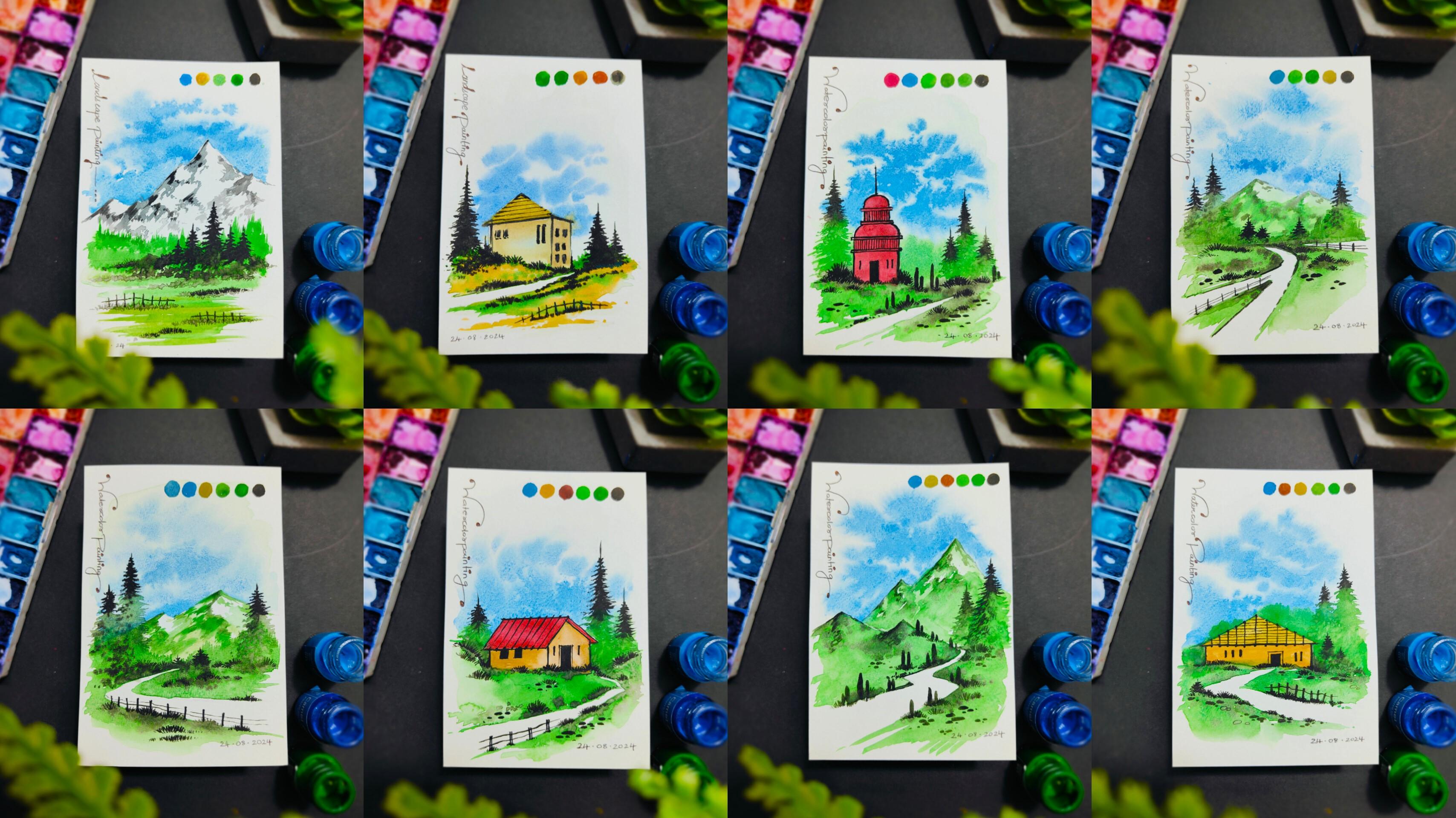
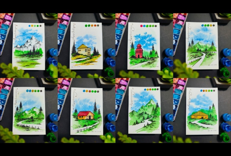
2. Details About the Class Projects: Hey, everybody, before we
start with the class projects, let us talk about
all the projects in detail so that you get an exact idea of all the eight
paintings that we are going to create
based on landscapes. So here I have one of the class project that I
have named as Hill Road. There's a beautiful road
going towards the hills, surrounded by these little
trees and pine trees. I have added a nice
color palette on the topmost portion and
a little bit of text. Then we have another
class project, which I have named
as the temple. The major element
is a nice, red, vibrant temple with a lot of greenery around and
some pine trees. You can observe the
details carefully. We have added some minute stones and rocks in the bottom portion. Then next up, we have
another class project, which is a red roof. So I have named it as red roof because the house is
having a beautiful, vibrant red roof, which is also combining with a lot of
greenery surrounded by it. Then we have a nice road with a fence element in the bottom portion,
as you can observe. Then we have another
class project, which I have named
as green mountains. So there are going to be a nice combination of mountains with a lot
of greenery in it. There is going to be these
beautiful combination of roads in the bottom portion
that we're going to paint. There are a lot of pine trees as well that you can observe. Then we have another
class project, which is the cottage. There is going to be this
beautiful house with a lot of windows that
we are going to create. You can observe a combination of the sky and the
pine trees as well. There is going to be a
little bit of landscape in the bottom portion with
a nice fence element. I have added the color
palette as well. Then we have another
class project, which is into the forest. There are a lot of mountains
and pine trees and a beautiful curved road with
a beautiful fence element, and it is one of my
favorite class project. You can observe the way
we are going to create this beautiful subtle sky and little grass elements in
the entire landscape. Then we have another
class project, which I am named
as Village House, that is going to be
a nice, vibrant, ca yellow house with a
lot of landscape around. A fence and some pine trees completing the entire painting. Then next up we have
the last class project, which is the snowy hills. There is going to be
a beautiful giant snowy hill that we are going to paint with a lot of landscape elements
and an abstract sky. If you observe all the
eight paintings carefully, there are some similar elements which combines together to form some beautiful landscapes with different composition of
all the elements together. I hope that you got
an exact idea of all the eight class projects
that we're going to create. Now let us move
towards the next part. Oh.
3. Art Supplies: Hey, buddy. Now,
let's talk about all the art supplies
that you will need for the entire class. No
need to worry at all. In case you're missing out on
any particular art supply, you'll find it very easily in
any nearby local art store, or you can go for any other
good alternative as well. So here I have a simple sketchbook in which
you can create your color palette and some practice element
on the bottom portion. It's a simple sketchbook that
you'll find very easily, or even you can use
a rough scrape of paper to practice
these elements. This is a simple
sketchbook of size A six. That I generally
use to practice. So it is always good to maintain an art journal in which you can practice on a regular basis. Then we have the
next art supply, which is a simple masking tape that we are going
to use to place it on the watercolor paper so that the paper will not move
while you're painting. It's a simple paper tape that we're going to place
on the corners. Then the next art supply
is a simple color palette. You can observe I'm
already having a lot of colors in the
entire color palette. Make sure that
your color palette is having enough space to take up some good amount of colors
in it and mix them well. Then the next art supply
is a simple container, which is having
some water in it. You can observe it's
a sky blue water. Of course, we're going to
take some clear water. So this is basically an
essential element to clean the brushes and use
water whereever required. Then next art supply is the
most important art supply. These are the watercolors
that we're going to use. Basically, I'm using
poster colors, which are very similar
to watercolors. Let me take a bunch
of four colors together to give
you the details. So the first one is yellow co, as you can observe,
then we have cobalt, cerlin blue, and crimson red. Now, let me give you the details of the next batch as well. We have black, green, light green, white,
and burnt sienna. So these are nine basic
colors that you will need for all the
eight class projects. No need to worry at
all. In case you are missing out on
any particular color. You can go for any
other good alternative as well. It is completely fine. Now, I'm going to
use poster colors, which are going to be very
similar to watercolors. In case you do not
have poster colors, you can use these
watercolor tubes as well. It is completely fine. The effect is going to
be completely same, so no need to worry about that. So I hope that you've
got an exact idea about the colors that
we are going to use. Now, let us talk about
the next art supply, which is going to be the brushes
that we're going to use. The best part about the classes that you will need
only two brushes. The first one is a quill
brush of Size two, and the second one is a
round brush of size zero, which is basically
a detailing brush. So these are the two brushes that you will need
for the entire class. Now, in case you do not
have a quill brush, you can go for a round
brush of Size four as well. Then the next art supply
is a simple black pen that we're going to use to add
some text to our paintings. Then we have a simple
pencil and an eraser that we can use to create a basic sketch before
we start painting. A The next up, I have a simple tissue paper, which we are going to use
to dab the brushes and remove axis amount of water
and color wherever required. So it is always good to
keep a tissue paper nearby. It will be really helpful
while you're painting. Now comes the last art supply, which is also very
important art supply, the watercolor papers
that we are going to use. So these are A six size
watercolor papers, and it is 200 GSM. The 200 GSM basically
denotes the thickness of the paper so that you can apply heavy washes of
water colors on it. So always make sure
about the GSM. It should be 200 GSM. Let me show you the
watercolor sheet as well. On this sheet, we are going
to create the class projects. I hope that you
got an exact idea of all the art supplies
that you will need. In case you're missing out on
any particular art supply, you'll find it very easily in
any nearby local art store, or you can go for any other
good alternative as well. Now let us move
towards the next part, which is understanding
the color palette.
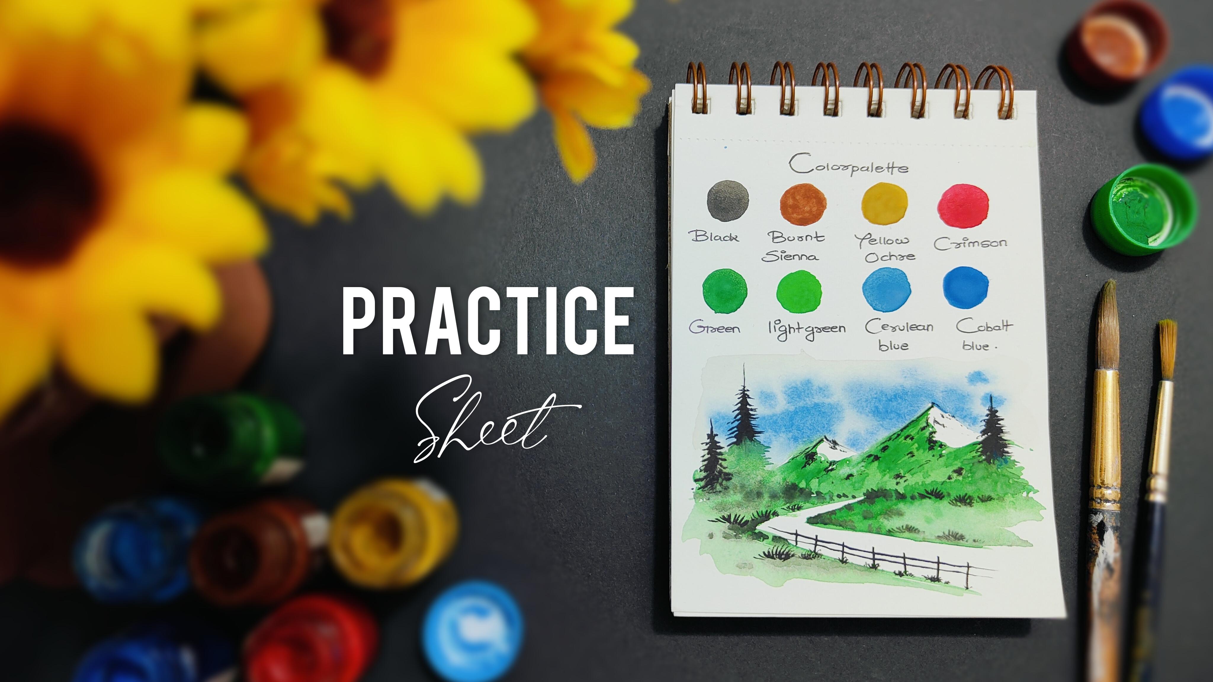
4. Color Palette: Hey, everybody, now,
let us understand the color palette
that we are going to use for the entire class. It is going to be a beautiful vibrant color palette
that we're going to use. I have my practice
sheet over here, which is a simple sketchbook, where I have labeled
the color palette and all the colors that
we are going to use. All the colors are
also placed on the topmost portion
as you can observe. Apart from white color, we're going to apply
all the colors on this particular sheet so that you can
get an exact idea of the color application. You can observe two of
our class projects here. There are these beautiful color combinations that
we're going to make. We are also going to add a little patch of all the colors that we're going to use in the class projects to
make the paintings look a little bit more
aesthetic and attractive. So I'm ready with my
color palette sheet. Let us start with
the first color, which is going to be black. I'll be using my quill
brush of size two, and we're going to
add a little bit of water and color in
the color palette. Mix the colors well
together and apply a small circular portion of
the color onto the sheet. Now, I will simply clean
my brush in water, dab it onto the tissue paper, and let us take the next color, which is burn Ciena. Now, again, take the color
in the color palette, mix it well with water. Make a good combination
of color and water together and apply the
color onto the sheet. Now, you might be wondering why I'm showing this
particular step. It is very essential for you to know that the
color application on the paper is very much
different once the color dries. So this particular part will
help you a lot to understand the saturation of the color once the entire color dries up. Then I have taken
the next color, which is co yellow, and made a nice small patch
just above its labeling. Then we have the next color,
which is crimson red. I'll be taking a little bit of crimson red in the
color palette, and I'll make a
small circular shape and apply some color inside it. You can observe a
beautiful patch of four colors in
the topmost portion, which is a part of our
vibrant color palette. Then let us start in
the bottom portion as well with green. Just create a small
circular shape and apply the color
in the inner portion. Now, the next color is
going to be light green, which is a little bit
lighter than the first one. These two colors are going
to be major colors in all the class
projects because we are going to use them in
the entire landscape area. She'll find these two colors in the major portion of
the entire painting. Then next up, I have cerlin
blue and Cobalt blue, which are going to be these
two beautiful colors, which are going to be very much vibrant in all the paintings, where we are going to create
some nice abstract clouds, which is the part of
our beautiful sky. So these are all the
eight colors that we are going to use in
the class projects. White is not over
here because it is not going to be
visible on white paper. Also, we are not going to
use white color that much, so it is absolutely fine in case you're missing
out on white color. Let me take you a little bit closer so that you can observe all the eight colors carefully and the application
on the paper. The colors will get
a little bit less saturated once the
color completely dries. So that's why it is
important for you to know the entire color
palette carefully. So now let us move
towards the next part, which is the practice session of all the elements and how
to paint them in detail.
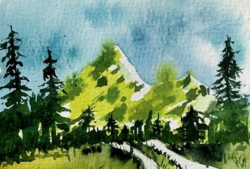
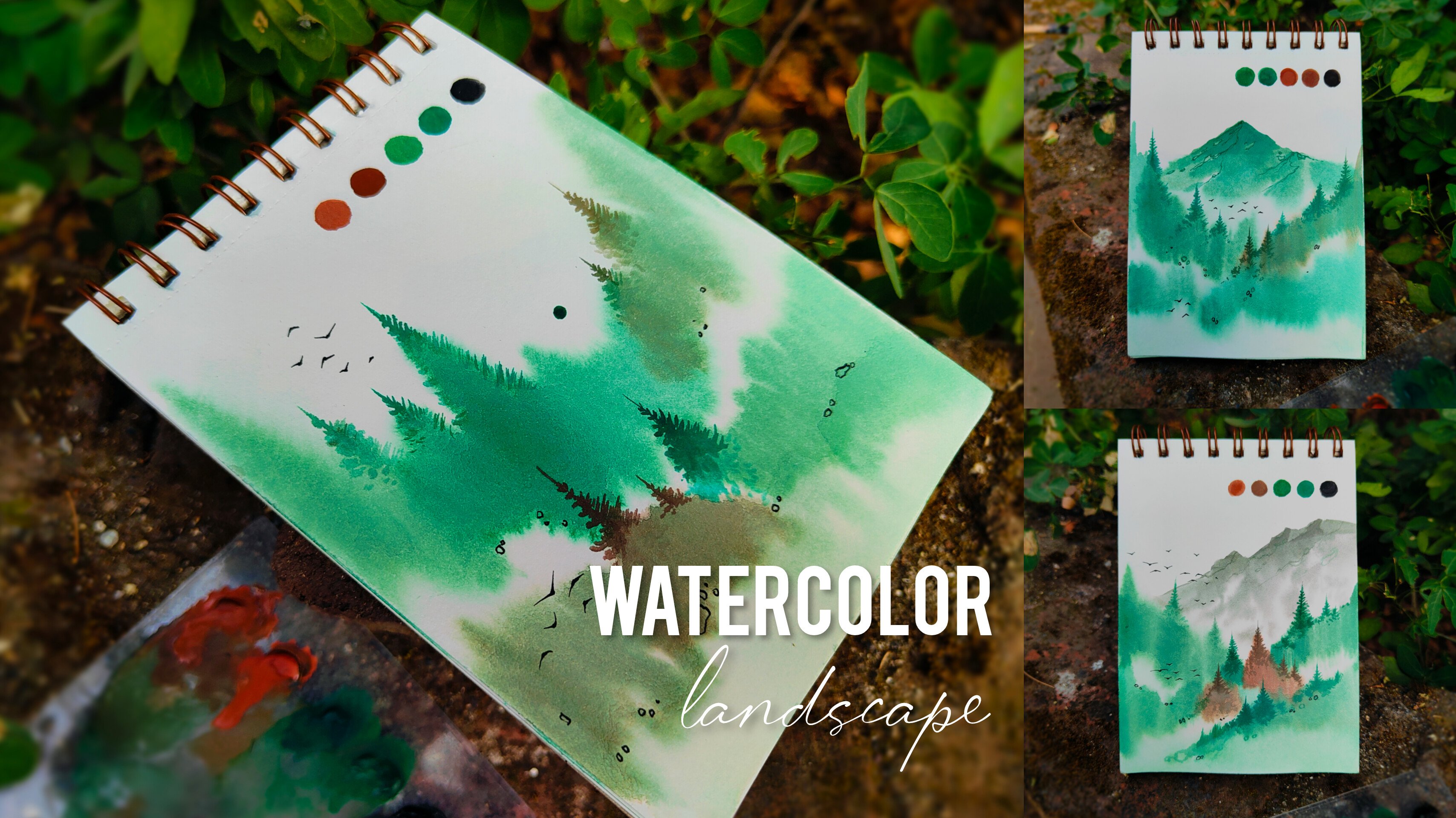
5. Lets Practice: Hey, buddy, now, let us practice all the elements and how
to paint them in detail. All the eight paintings
are going to have these beautiful landscape
elements in which the elements are going to repeat and have a
different composition. So once we are done with
the entire color palette, you can observe these paintings, where we have these
elements like mountains, pine trees, these beautiful,
minor grass elements, some little trees, some
stones in the bottom portion, these beautiful hills that
we are going to paint. So if you observe carefully, we have some similar elements
like these pine trees, some grassy elements
in the bottom portion, and the mountains that
we are going to paint. So there is going to be a
difference of composition, but the painting technique is going to be completely same. Also, if you observe carefully, there are these
little textures in the mountains and
the bottom portion of the entire landscape, where we have created these little grassy elements as well, which is very easy
and simple to create. So there is going
to be a little bit of practice session that I'm going to give you
so that you can observe these steps carefully, the brush moments, and how you can hold your hand
in a careful manner. So let us start with a pencil
and create a basic sketch. So I'm starting with a pencil. We are creating
these little hills. You can observe the
shape carefully. No need to apply a lot of
pressure on your hand. It is going to be
a light sketch, which basically helps us to know the entire position of the
mountains and the trees. I have created a
simple horizon line in the bottom portion
and a simple street, which is in a curved manner. Then I'll be adding
these vertical lines, which basically represents the position of the pine trees. Now let us start with
the first element. I've taken my quill
brush of size two. Take some water
from the container, apply a thin layer of
water in the background. Make sure that the brush does not move inside the mountain. Now take some cobal blue and light blue from
the color palette, and just simply dab your brush
onto the entire surface. The color will
automatically spread, which is basically known
as a wet on wet technique. No need to worry
at all, the clouds will form in this
abstract manner only, and no need to
worry about getting the clouds in the
exact same way. It is absolutely fine if your clouds are a little
bit different from mine. So I hope that you got an
exact idea of how we have to create these beautiful abstract clouds in the sky area. Now, let us start
with the mountains. We have to take a
good combination of green and light
green together. Now simply apply it on
one side of the mountain, Let a little bit
of white portion be left on the right hand side, which creates some
nice depth and details and make the mountain
look a little bit in three. Now you can simply apply the entire color in
the bottom portion. Now, there is going to be
a simple white street, which is in this curved manner. You can also consider
it as a road as well. Now I'm going to apply the green color in the
remaining portion as well. Just use the tip off
your quill brush and carefully apply it
in the outline first. And then you can apply the green color in the
remaining portion. Similarly, on the other side, you can do this particular part. You can apply some water to make the color spread
automatically and make some nice difference in
the entire grass portion. Now I'll be taking some
nice darker tone of green. So take less water and
more color in your brush and apply these little strokes on one side of the mountain. It will create some
nice depth and detail and make the mountain look a little bit more in depth. Similarly, you can add the darker tone of green
in the bottom portion, applying these vertical strokes. In case you want
to make your green a little bit more darker, you can add a little bit of
burnt sienna or black in it, but make sure that you do not
take a lot of black color. Just take a little bit
of black color and simply dab your brush
on certain areas. It will create some nice depth in the entire landscape portion. The color will automatically
spread because the base color is a
little bit wet right now. No need to hurry at all, just enjoy the process, and just observe these
steps carefully. Also, one thing that you do
not have to worry is not to get the painting in the exact same way that
I'm creating right now. There might be a little bit of difference between
yours and mine, and it is completely fine. In fact, you can create your
own composition as well. Now, let us start
with the pine trees. The pencil line
is still visible. So you just have to take your
round brush of size zero. Start from the topmost portion, create a simple vertical line, and simply start adding
these little strokes, which are smaller on
the topmost portion. And as you move towards
the bottom area, just increase the size of the
strokes that you're making. We are not completing
the entire pine tree with this particular
black color. We want a little bit of
depth and dimension in it. So that's why I have just kept the pine trees in a
half portion only. We're going to paint the remaining half portion
with dark green. So I'll take my quill brush and take some dark green in it. Now the remaining portion
of the pine tree, we are going to paint
with dark green. So it's a nice blend of
solid black color in the topmost portion and a beautiful dark green color
in the bottom portion, which basically blends with the landscape that we have
painted in the bottom part. So it creates some nice depth
in the entire landscape. Now, similarly, I'll be
taking my round brush of size zero and take
some black color in it, add these little strokes
on the mountain portion, to make the mountain
look a little bit more in depth and detail. You just have to randomly
apply these strokes. There is no specific
way of painting it. It will make the entire painting look a little bit more
in detail as well. Trust me, you'll definitely
enjoy the entire process of creating the landscape if you don't worry
about perfection. It's an abstract form of creating the landscape
using watercolors, so no need to worry
about perfection. Also, if you observe carefully, using a detailing brush, which is basically this
round brush of size zero, I'm creating these little
grassy texture also. It is basically creating the vertical lines only
in a smaller portion. So you can add the
grass wherever you want to in the entire
landscape portion. Now, in order to make
the entire landscape look a little bit
more aesthetic, I'll be adding a little bit
of fence element on the road. So you just have to create these horizontal and vertical
lines combining together, forming a beautiful
fence element. And you can add a
little bit of grass in the bottom portion to make these strokes look a
little bit more perfect. Also it blends the fence
with the bottom area. So we are done with the
entire practice sheet. I hope that you've
got an exact idea of the common elements
that we are going to paint in all the
eight class projects, but it is also going to have
a different composition. Let me give you a
little bit closer look to the entire practice sheet, which contains the color palette and the elements in
the bottom portion. The practice sheet will act as a warm up exercise for you before you start with
the class projects. So I hope that you
enjoyed the entire part. Now let us move towards
the class projects.
6. Painting 1 - Snowy Hill: Hey, every buddy, you are most welcome to the first painting, which is snowy hills. So as you can observe, I have placed my
watercolor paper with two masking tape on the corners so that the paper will not move
while we are painting. So let's start with the hills. We are going to draw a basic
sketch using a pencil. Observe the way I have created this pointed structure
on the topmost portion. It is absolutely fine
in case you want to create your own
composition of the mountain. Then I have created a simple horizon line in the
bottom portion, which is having a little bit of distance from the mountain. This will help us to create some nice landscape area
in the bottom part. Now, I'll be taking my
quill brush of size two. Take a little bit
of water in it and apply a thin coat of
water in the sky area. Make sure that your brush
should not move inside the mountain area
because we do not want the blue color to move
inside the mountain area. Try to apply an
even coat of water so that the color will
spread in a nice way. So now, I'll be taking
some cyline blue, which is very near
to sky blue color. Take some good amount of color, mix it well with water, and simply use the tip of your quill brush to add these little patches
in the sky area. You will observe that the color will automatically spread. Try to leave some space
in between the patches, and it will automatically create these beautiful cloud effect
in the entire sky area. No need to hurry
at all, try to do this particular step in a
very slow and steady manner. This particular technique
is known as a wet on wet technique in which you apply a thin coat of water initially, and then you take
some good amount of color and apply it again on that particular layer
so that the color can spread automatically
in the entire surface. Now, you can take a little
bit of cobalt blue, which is a little bit
darker than Seroln blue to create some nice depth
in the entire sky area. So you can again dab your
brush in this dotted format. And you'll observe
these darker patches of blue color in the
entire sky area. So I hope that you've
got an exact idea of how you have to create this
beautiful abstract sky. Now, let's start painting
the mountain area. It is a very simple
and easy technique. You just have to
take a little bit of black color in
the color palette. Add a little bit of white. So that we get a
nice gray shade. And then we can take a little
bit of water in the brush. Now start applying
these little patches on the mountain area. We are not going to cover the entire mountain with
these solid gray patches. We are going to cover
it on one side, which is particularly
left hand side. You can observe
the way I'm using the tip of my quill brush to add these little strokes
combining together to form some beautiful depth
in the entire mountain. So you can observe
that I have left white space in the right
hand side of the mountain, which creates a nice
three D effect as well. Now, to make the shade a
little bit more light, you can add a little
bit of water so that it will get a little
bit less saturated. You can add few
little strokes in the right hand side as well to complete the entire mountain. Whenever you're working
with water colors, make sure that the more amount of water your
pigments will have, the lighter the saturation
of the colors will be. And if you have less amount
of water and more color, the saturation of the color will be more in the
entire painting. So you can observe we
have created a beautiful, snowy hill, and it is a very
simple and easy technique. We just have added
these gray patches, and now I'll be taking a
little bit of black color. And I'll just create
a nice contrast on the left hand side
of the entire hill by adding these
little black patches. No need to hurry at all, do this particular step in a
very slow and steady manner. Use the tip of your
quill brush to add little strokes
combining together, forming these beautiful
abstract patches. Now you can observe that the entire hill looks a
little bit more dramatic, and it looks really nice. Now, let us start with the landscape area in
the bottom portion. It's a very simple
and easy technique. I'll be applying a
nice coat of water in the bottom portion in a very
random and abstract manner. There is no specific
way of applying it. Just make sure that your brush does not move inside
the snowy hill. Now take some good
amount of light green and dark green
in the color palette. Mx it well with water. And start applying
these vertical strokes, starting from the
left hand side, slowly move towards
the right hand side. You can observe that I am adding these strokes in
this pointed manner on the topmost portion, which basically creates
some nice grassy effect. You can carefully
observe the way I'm using the tip
of my quill brush. And since we have
already applied a thin coat of water initially, that's why the color
will automatically spread as you can observe. Now, slowly, we'll add
these horizontal strokes in the bottom part to make the entire landscape look a
little bit more abstract. You can add a little bit of
co yellow and burn sienna to make a little grounded effect to the entire landscape area. So it basically creates a nice brownish color in the bottom portion
as you can observe. Also, one more thing
I would like to tell you is that
no need to worry about painting it in
the exact same way I am painting right now. You painting might
differ from mine, and it is completely fine. Since it's an abstract form
of landscape painting, it is completely fine. Now you can take some dark
green and apply it on the topmost portion of the grassy effect that
we created initially. So that it creates a
nice contrast with the hill that we have painted
on the topmost portion. Now, I'll be taking some solid black color in the
color palette, mix it well with water. Now we are going to add a beautiful pine tree
in a certain area. So you just have
to use the tip of your quill brush and simply create this simple
vertical line. Now to paint the pine tree, it's a very simple
and easy process. You just have to create these little strokes on
the topmost portion. And as you move towards
the bottom area, increase the size of the
strokes that you're making. Slowly, you'll observe that the strokes will form
a beautiful pine tree, and in the bottom part, you can just add the strokes
in the center area as well. Now, similarly, you can have a noice variation
in more pine trees, so you can create the vertical
lines with a difference in the height and slowly add these little strokes to
complete your pine trees. It is absolutely fine in
case you want to create your own composition and
position of the pine trees. Just follow these
steps and paint them. Now you can carefully
observe that I've created a beautiful combination of
five pine trees together. Now, I'll just add
a little bit of random abstract
landscape area around. You just have to
create these patches. You can leave some space
in between as well, since we already have a dark green color
in the background. That will create a
nice abstract effect. So if you observe carefully, the background layer of
green color is still wet. So if you apply these
solid black patches, it will spread a little
bit in a nice way. And you just have to create
these little patches only using the tip of your quill brush in
a very random way. So there is no specific
way of painting them. You can just add these
little patches around. The reason behind using a nice solid black
color is so that it creates a beautiful contrast with the green color
in the background. Now, if you observe carefully using the tip of my quill brush, I'm adding these little vertical strokes
combining together, which forms a nice grass
effect in the entire area. There is no specific way of creating the composition
of the grass. You can do it according
to your convenience. But you'll definitely enjoy the entire process of
painting the grass. You can observe how minute details enhances
your entire painting. So we have almost painted a beautiful landscape
in the bottom area. Now, in order to enhance the entire painting and make it look a little
bit more attractive. We are going to add a
nice fence element, which is a very simple
and easy technique. You just have to use the
tip of your quill brush, try to have a nice
black color in it. Just apply these
vertical strokes, and then a simple
horizontal stroke, combining all the
vertical lines together, and it forms a beautiful fence in the entire landscape area. This is how you can paint a beautiful fence element
in the entire landscape. Now, to make the painting look a little bit
more attractive. What I'm going to do
is that all the colors that we have used in
the entire painting. We are just going to create its little patches on the topmost portion in
this circular form. So I've started
with black color, take some black color in
the color palette and just simply create
this circular shape. Similarly, we have
used dark green and light green together to
form a beautiful landscape. So I have painted them again. You can just create it in whichever shape you're
comfortable with. I have painted it
in a circular form. Then I have taken some ca
yellow and created its circle. Then comes the last color, which is sky blue, which is basically cylin blue and Cobal blue
that we have used. And these are the colors
that we have used and painted the
entire landscape. Now, let us remove
the masking tape so that we can
move the painting, and we're going to
add a beautiful text, which is going to enhance
the painting even more. So I'm going to write
landscape painting using a simple black pen in case you want to write
any other message. According to your convenience, it is completely fine. There is no specific
way of writing. You can write it in
your own handwriting. In case you want to write
it in a creative manner, that is also completely fine. Also in case you want to draw a reference line using a pencil and then
write the message, that is also absolutely fine. So I've written landscape
painting on the left hand side, and I'll simply add a date
in the bottom portion. So we are done with
the entire painting. Let me take you a little
bit closer so that you can observe all
the details carefully. Using some basic elements, we have combined them
together and form this beautiful landscape
painting in an abstract manner. I hope that you enjoyed the painting and got to
learn something new. Now let us move towards
the next painting.
7. Painting 2 - The Cottage: Hey, everybody, you are most welcome to the second painting, which is the cottage. So as you can observe,
I'm reading with my watercolor paper placed
on the desk surface. Now let us start
with a basic sketch. There is going to be
a beautiful cottage, which is basically a house only, having a lot of windows in it. So we are starting with
a triangular shape, which is basically the roof of the entire cottage on
the topmost portion, followed by these
vertical lines, which is forming the walls. No need to hurry at
all. Whenever you're drawing a basic sketch, always take your time and try to draw it in a very
careful manner. Because it is basically
the reference before we start painting. Then there is going to be
a nice random landscape in the bottom portion connecting
with the cottage area, so you can create
a nice random line followed by a simple street, which is basically a road coming out of the
landscape area. Then we are going to draw the windows in the
entire cottage. So there is a combination of six windows in the wall
on the right hand side, and we can add few more
windows later also. So I'll be adding two windows on the left hand side as well. So this is the basic
sketch which is required. Let us start with the sky area. So I'll be taking my
quill brush of size two. Apply a thin coat of
water in the background. Make sure that you do not move your brush inside
the house element. No need to hurry at
all. Try to apply an even coat of water on
the entire paper surface. Now we are going to take
some good amount of cerlne blue and
cabal blue together, forming a beautiful sky color, and just simply dab your
brush onto the paper surface. No need to hurry at
all, just simply apply the patches in
a very random way. There is no specific way
of applying the color. You can just randomly move your brush and apply
these little patches. You'll observe that the color
will automatically spread forming these beautiful
cloudy effect in the entire sky area. This is also basically known
as a wet on wet technique in which we apply a thin
coat of water initially, and then we apply the color. This basically helps the color
to spread automatically. And you'll definitely enjoy
this entire process of creating this beautiful abstract
clouds in the sky area. Now, let us start by
painting the cottage. So I'm starting with
the roof element. Take some good amount of ocher yellow in
your color palette, using your quill
brush of size two. Since it's a very
small area to paint, so you can use the tip of
your quill brush to paint in this particular area and make sure that you do not move
out of the pencil line. Now, similarly, we are going to paint the walls in
the bottom portion, but it will be a little bit lighter than the roof element. So I'll be adding a little
bit of white in ocher yellow. You can add a little
bit of water as well for the color to
spread in a nice way. Then I'll just apply
a little patch of the color in the entire
building structure. You can observe
the way I'm moving my hand and brush to
paint in the entire area. You have to use the tip of your entire brush to paint
in a smaller portion. Now, in order to
create some depth, I have added a little bit of burnt sienna in my
cer yellow color, and to make a nice darker color, I have just added
it in the wall, which is in the right hand side. You can also apply
the color patch on the topmost portion of the entire cottage to create some nice rough texture in the
entire building structure. Now, let us take some
solid black color from the color palette and enhance the entire building structure. It is a very simple
and easy step. You just have to take
some solid black color. Use the tip of your quill brush, to enhance the outline
initially of the entire roof. You can observe the way I'm
just adding a thin line. If you want to use your
round brush of size zero, that is also absolutely fine, and you'll be also able to add this thin line using your
quill brush as well. Now, I have added these
horizontal lines in the entire roof area to make it look a little bit more
attractive and aesthetic. Similarly, using the tip
of your quill brush, you have to add these
solid black patches in the windows as well. So there is a combination of six windows in the
right hand side. Similarly, we have two windows on the left hand side as well. So this is how we have painted the entire cottage in a
very abstract manner. Now let us start with
the landscape area. I'll be taking a thin coat of water in the bottom portion. Just make sure that you
do not move your brush in the entire street that we
have created using a pencil, which is basically
a road element only coming out
of the landscape. So I've added a thin coat of water in the remaining portion. Now take a little
bit of ca yellow and burn sienna together
in the color palette. Now, we'll just add
these little patches, and you'll observe that the color will
automatically spread since we have already applied a thin coat of water
in the background. Again, this is known as a
wet on wet technique in which you apply a thin
coat of water initially. Now, I have randomly created these patches of burnt
sienna and ca yellow, leaving some white
spaces in between as well in the landscape area. You can also add these
little strokes on the topmost portion to
create some dynamics. Now, let us take some dark green and light green together, forming some beautiful
grassy texture as well. So you just have to
take some good amount of light green and dark
green in your quill brush. Again, you have to
add the strokes in a very random
and natural way. There is no specific
way of painting it. And we are applying the brush in the remaining portion that we left while we were applying
burnt sienna and ca yellow. You can create a combination of small and big patches of
this particular green color. Also, you can add
these vertical lines to form a beautiful
grassy texture. You can observe a
great combination of both the colors in
the landscape area. Now, using some good amount of dark green and
light green together. I'm adding these vertical
lines combining together, forming a beautiful grassy
effect on the topmost portion. Similarly, we can add this particular color on
the left hand side as well. You can observe
the way I'm moving my brush to create this
beautiful grassy effect. Now, you can add these
little strokes on the bottom portion of the
entire cottage as well. Now, let us take
some good amount of solid black color from
the color palette, and we're going to add a solid black patch in the
bottom portion as well. We're not going to
cover the entire area. You just have to apply the
brush in certain areas only. Using the tip of your quibra, you'll be able to create these little solid
black patches. Now, if you observe carefully, we are adding these little
solid black patches around the road area, which basically creates a
noise contrast and enhances the entire street which is coming out of the
entire landscape area. Now, similarly, to add a nice grassy texture
in the bottom portion. But in a very small amount, I'll be adding these little
black strokes around. You can also enhance
the grassy element near the entire cottage area by creating these little
vertical lines. Again, I'll be telling
you the same thing. No need to worry
about painting it in the exact same way. I'm
painting right now. There can be difference between
your painting and mine, and it is completely fine since it's an abstract
form of painting. So you can observe that we have enhanced the entire
landscape area. Now, let us move
towards the next part, which is painting a
beautiful pine tree in the entire landscape area. So we are going to add a simple vertical line using
our quill brush of size two. Now you have to add
another vertical line, which is a little bit
smaller than the first one. The entire process of painting the pine tree is going to
be very much satisfactory, and you'll definitely enjoy it. Start creating these
little strokes, starting from the
topmost portion, using the tip of your brush. And as you move towards
the bottom area, simply increase the size of the strokes that
you're making, and you can connect it with the landscape area that we have painted on the bottom portion. Similarly, you can repeat
the same steps for the next pine tree that we have created on the
right hand side, which is a little bit smaller. You can definitely play
with the composition of the pine trees and
the position as well. So this is how we have
created a combination of two pine trees on
the right hand side. Similarly, we'll add
a huge pine tree on the left hand side as well. The steps are absolutely same. You just have to create
a simple vertical line, which is a little
bit bigger than the first two that
we have created. Then you have to start
creating these little strokes, starting from the
topmost portion. And as you move towards
the bottom area, you have to increase the
size of the strokes. No need to hurry
at all, try to do this particular step in a
very slow and steady manner. Similarly, you can add
few more vertical strokes to complete the
entire horizon line. And if you observe carefully, the pine trees should look
the part of the landscape. It should not look separate. That's why we are adding
few more strokes, where there is a meeting of the landscape area and
the pine trees bottom. We have taken a highly
saturated solid black color. That's why we have less amount
of water and more color. Now let us move
towards the next part, which is adding a
beautiful fence element in the entire landscape area. It's a very simple
and easy step. You just have to create
these vertical lines first. Using the tip of
your quill brush, then you can simply connect the vertical lines using
a simple horizontal line. No need to hurry at all, do this particular step in a
very slow and steady manner. In case you find that the windows are a little
bit less saturated, you can reapply
solid black color in that particular area. Now, in order to create a nice depth and detail in
the building structure. I'm using the tip
of my quill brush, adding these little vertical
and horizontal strokes. And I'm finding that the cottage is looking
a little bit plain, so I'm adding two more windows
on the building structure, which is a little bit elongated. So you can create these
rectangular shape in this vertical format. So there's a combination
of two windows around. So we are almost done
with the entire painting. Now, let us add
the color patches, all the colors that we have
used in this entire painting. We are going to create its
patch on the topmost portion. I'm starting with
solid black color. So take some good amount of black color in your
color palette, add a little bit of water and just create a
circular shape. So in order to create a
nice aesthetic effect to the entire painting and to make it look a little
bit more attractive, we are doing this
particular step. It is not at all
compulsory for you to create these color patches
in a circular form only. You can create it according
to your convenience. So we have used some burnt
sienna and cer yellow as well in the building structure
and the landscape area. So we have created its patches
on the topmost portion. Similarly, in the
landscape area, we have used some dark green
and light green together. So we have created its patches as well in this circular form. And you can observe
how beautiful these color patches look
on the topmost portion. So these are enough color
patches in case you want to add the Cobal blue and
Selin blue color patch, that is also absolutely fine. Now, simply remove
the masking tape carefully so that you
can move the paper, and we are going to write a nice text in the
entire painting, to make it look a little
bit more attractive. I'm going to write
landscape painting, and you can enhance
the entire text. You can also write
the entire text in your own calligraphy. In case you want to draw a simple reference line using a pencil and
then write the text. It is completely fine. You can also write the message according to your convenience, so you can change
the text as well. I'll be writing a simple date on the bottom portion and the
entire painting is complete. Now, let me take you a
little bit closer so that you can observe all
the details carefully. You can observe the
way we have combined these minimal
elements together to form a noise abstract landscape. I hope that you enjoyed creating this particular painting and
got to learn something new. Now let us move towards
the next painting. I.
8. Painting 3 - Village House: Hey, everybody, you are most welcome to the third painting, which I have named
as a village house. So you can observe
that I'm ready with my watercolor paper being
placed on the desk surface, and I have placed it
using two masking tape on either sides so that
the paper will not move. Now let us start
with a basic sketch, which is going to be a
simple village house. So we are having a
nice triangular roof on the topmost portion, followed by these
vertical lines, which adds a nice detail
to the entire house. Now, let us complete the
entire house structure by adding a simple horizon line, which is the line
of the landscape, followed by two vertical lines which completes
the entire house. There is going to be
a simple door element and some windows in
the entire house. You can draw the
entire rough sketch of the house according to
your convenience also. Then we have a nice street coming out of the entire house, which is basically a
nice road element. You just have to create these random lines on the
bottom portion, forming a nice street Then we're going to
add vertical lines, which basically will add a nice reference to
the entire painting, where we are going to
paint some pine trees. So this is the entire basic
sketch that we have created. Now let us use our quill
brush of size two, and we're going to
add a thin coat of water in the background. No need to hurry at all, try to apply an even coat of water. Make sure that your brush should not move inside the
house structure, since we do not want to paint a sky area in the house element. Now once we have added a nice coat of water
in the background, you're going to take
some ceruline blue and just simply dab your brush
in this random manner. You will observe that the color will automatically spread, and you just have to
randomly move your brush. You can also leave
some space in between, and you will observe that
the color will spread automatically forming these
beautiful cloud effect in the entire sky area. There is no specific way
of applying the brush. You can just randomly move it. So no need to worry
about getting the clouds in the exact same way
I'm painting right now. There might be a little bit of difference between your
painting and mine, and it is completely fine. So you can observe how beautiful
the clouds are looking, and you can also
observe that I have not moved my brush inside
the house element. Now, apart from the sky element, there is going to be a
beautiful landscape as well in the bottom part
that we are going to paint. I'll be taking some
good amount of green and light green together
in the color palette, mix it well with water, create a good combination of
water and color together. Now we are going to
apply a nice stroke of this green color in this random way in the
left hand portion. Then similarly, we
are going to add a nice solid patch of green
color in the right hand side. So you can observe the
movement of my quill brush, the way I'm adding
these vertical strokes combining together and forming a beautiful green patch on the right hand side
of the entire house. You can observe the way I'm carefully using the tip
of my quill brush just above the roof element so that the color should not move
inside the house structure. Now, you can add the color
in the remaining portion. Similarly, we have
this solid green color in the bottom part as well.
No need to hurry at all. Take your time and paint it. So now I'll be taking
some good amount of green and light green color together again from
the color palette. You can be a little
bit careful near the roof structure on the right hand side
and left hand side. Now we are going to add the
color in the bottom portion, starting from the horizon line, you can use the tip of
your quill brush to create the outline initially for the street that we have created. Now you can add the
darker color and you can just complete
the entire portion. Using some water, you can
spread the color as well, and you'll observe
that the saturation of the color will decrease, forming some nice variation
in the entire landscape area. So you can spread the
color automatically, and you can also add some darker tones
in the entire area. No need to hurry at all, do this particular step in a
very slow and steady manner. You can observe the way I'm spreading the color
in a very random way. No need to worry about painting
it in the exact same way. Now I'll be taking some good
amount of black color in my quill brush and we'll enhance the entire
landscape area. So take some good amount of black color from the
color palette and simply dab your brush in
this random way just below the horizon line. You can also add these strokes near the street to enhance it. You can observe that I'm moving my brush in a very
random way only. There is no specific
way of painting it. So you just have to create
these dotted patches in the entire landscape
area and the color will automatically spread since
the background is still wet. Similarly, to create
some more depth around the entire house, I'm going to add this
beautiful solid black patch around the house as
well on either sides, using the tip of my quill brush. No need to hurry
at all, you have to do this particular step with a lot of patience and try to paint in a very slow
and steady manner. Now let us enhance the entire house element
using some co yellow. Take some good amount
of occ yellow in your quill brush and start painting the entire
roof element. Whenever you have to paint
a very smaller portion, try to use the tip
of your brush and simply add the entire
color in this solid patch. You can observe the way I
have painted the entire roof. Similarly, we have
a nice wall in the bottom portion with a
lot of windows and doors. You're going to
paint that as well. So in case you find that your color is getting
finished from the brush, you can take some more color
from the color palette. Make a good combination of burn sienna and co
yellow together, and you can add the color in the wall in the
bottom portion. No need to hurry at all,
use the brush carefully. You can observe the
movement of my hand and the way I'm using my
brush to apply the color. So we have added a nice background color for
the entire house. We can add details after that. So I'll be using my round
brush of size zero this time, and we are using the
tip of the brush carefully to add some minute
details to the entire house. I've started with the roof
element in the bottom portion, which is a simple
horizontal line. Now let us add the
vertical lines in the entire roof structure to make it look a little
bit more attractive and in detail. No
need to hurry at all. You can use the way
I'm using my hand and the tip of my brush to add these beautiful
vertical lines. You can observe a
beautiful contrast of this solid black color with the background color
that we have painted. You can add a little
bit of.in the ends of the entire vertical lines where it is connecting with
the horizontal line. Now, similarly, we
are going to enhance the entire house structure in
the bottom portion as well. You can start by adding the vertical lines
on either sides. Now let us paint the windows, which is these little
rectangular structures. Then similarly, we have
a nice door element, which is connected
with the street. You just have to paint
it completely black, and you can give
it a nice outline using the tip of your
round brush as well. Similarly, we have two more windows on the
right hand side. You can paint them
black as well. I'll be taking some more solid black color and let us enhance the other elements like some
grass in the bottom portion. You can add these little vertical strokes
combining together, forming these beautiful
grassy texture on the entire landscape area. Since we already have a nice dark green color
in the background, the entire solid black color
will look really nice. So it's a very satisfying step, and you'll definitely enjoy
this particular part. You just have to use
your round brush of size zero and add these
little strokes together. And there is no specific way of adding this grassy texture. You can add it
wherever you want to. So no need to worry
about painting it in the exact same way I'm
painting right now. You can add this
beautiful grassy texture just above the street
element as well. It will look really nice. So the entire black color basically enhances
the entire painting. It creates a beautiful
contrast and creates some nice depth
in the entire painting. Now, once we are done adding
these grassy texture, we are also going to add some little stones in
the bottom portion. It's a very simple
and easy technique. Create these little oval shapes using the tip of your
round brush of size, and you can add them
wherever you want to. I'm adding it in
certain portions only. Now, to make the landscape look a little bit
more aesthetic, let us add a nice fence element. You just have to use the
tip of your round brush and create these vertical lines having variation in the height. You can create a
double line also to make the vertical
line a little bit thick. Once you're done with
the vertical lines, take some more color from
the color palette and add a horizontal line connecting all the vertical lines together. You can paint an irregular line connecting all the
vertical lines together. It makes the entire fence look a little bit more
authentic and natural. Now, let's start
with the pine tras, which is going to be a very satisfying
process of painting. So you can already see the vertical line that we
created using the pencil. Start from the topmost portion, start creating these
little strokes, and as you move towards
the bottom part, just increase the size of the
strokes that you're making. We're not going to paint the entire pine tree
with black color. We're going to just keep the topmost portion,
solid black. And the remaining portion, we are going to paint
it using dark green. I'll be using my quill brush, take some good amount of dark green from the color palette and start painting where you
lift the solid black color. You'll observe a beautiful blend of the black and
dark green together, and it creates a nice
gradient effect also. Now, slowly move towards the
bottom part and blend it with the landscape area that we have created in
the bottom part. No need to hurry
at all, try to do this particular step in a
very slow and steady manner. Try to use the tip of
your quill brush and blend it with the landscape
area in the bottom portion. You can observe how beautiful both the pine trees
are looking right now. Now, I'll be taking
some solid black color, and I'll be adding
a little bit of plantation just on the right
hand side of the house. You can observe the color. We get a nice blend because the background is a
little bit wet right now. So we are almost done
adding the pine trees. Now, let us add a little bit of details in the roof
of the entire house. It's a very simple
and easy technique. Just try to keep your
hand very much steady and free and use your round
brush of size zero, add a little bit of
black color in it, and create these
horizontal lines. Start from the topmost portion and slowly come towards
the bottom area. You'll observe that the
roof structure gets a little bit of more details
from the vertical lines. No need to hurry at all. Try to paint in a very slow
and steady manner. Try to keep your hand
very much loose and free. This will help you to move your brush in a
comfortable manner. Now, if you observe carefully, we have this
beautiful plantation on the right hand side
of the entire house. We can enhance it by using
our round brush of size zero, take some solid black
color and try to create these beautiful little strokes
on the topmost portion, which basically creates
a smaller pine tree, and it creates a nice effect to the entire landscape as well. Similarly, you can add
these little strokes on the entire landscape in the bottom portion as well,
wherever you want to. No need to worry about painting
it in the exact same way. You can create your own
composition as well, and you can add these
solid black strokes according to your convenience. Now, I'll be just adding
the small patches of the colors that we have used
in the entire painting. To make the painting
look a little bit more aesthetic and a little
bit more attractive. It is not at all compulsory for you to do this
particular step, but if you want to, you
can definitely do it. So I've started with
solid black color, and I have just created
a simple circular shape and completely filled it
with solid black color. Now I'll be taking some
dark green and light green, which is the major part
of the entire painting. So you can create the circles of these two colors as well. Now we have another color which
is going to be ca yellow, and you can also add a little bit of burn
Ciena if you want to. So you can observe
this particular color in the entire house
that we have painted. Then the next color
is burn sienna. So you can clean your
round brush again and take burn Ciena in
your color palette. Add a little bit
of water so that the color will get
a little bit loose. And then you can apply
this color patch also. It is not at all compulsory for you to create
the color patch in a circular form only
in case you want to use another shape or just
create a simple patch, that is absolutely fine. So we have added
five color patches. Now let us paint the last one, which is cerlin blue, which we used in the sky. S create its color patch on
the topmost portion as well. So you can observe we are
done with the colors. Now, I'll be using
a simple black pen to add a date in
the bottom portion. This helps to remember whenever we created this
particular painting. Wherever you find
these little patches in the entire landscape area, you can use the pen to
create a nice oval shape. Now, simply remove the
masking tape and you can rotate the painting in this
way to add a little text. So I'm going to write
watercolor painting. You can write any other
text if you want to or any message you want to
add towards your painting. You can enhance
the entire writer. It is absolutely fine
if you want to write it in your own calligraphy
and handwriting. It is completely okay. So we are done with
the entire painting. Let me take you a little
bit closer so that you can observe all
the details carefully. You can observe the way we
combined all the elements together to form this
beautiful abstract landscape. I hope that you enjoyed creating this particular painting and
got to learn something new. Now let us move towards
the next painting.
9. Painting 4 - Into the Forest: Everybody, you are most welcome
to the fourth painting, which I have named
as into the forest. So as you can observe,
I'm ready with my watercolor paper
with the masking tape on either sides of
the corner so that the paper will not move
while we are painting. So I'm starting with
a basic sketch. We have created two
beautiful mountains, as you can observe, and there is a simple horizontal line in the bottom portion, which will spread the
mountain and the ground area. Now, there is going to
be a simple road in a curved manner that we have started from
the horizon line, and you can just come
towards the bottom area, creating these two curved lines. Then you can add
these vertical lines, which basically gives an idea of the position of the pine trees that we are
going to paint. Now, let us start
with the sky area. I'll be taking my quill
brush of size two. Take some good amount of water from the container and simply apply a thin coat of water
around the paper surface. Make sure that you do not
move your brush inside the mountain area
because we do not want the clouds to come inside
the mountain area. Now, I'll be taking
some cerline blue and just simply dab your brush
in this random manner, and you'll observe
that the color will spread automatically in
the entire paper area. This is basically
known as a wet on wet technique in which
we apply a thin coat of water initially
and then the color so that the color
spreads automatically, since we have a good amount
of water in the background. Now you can use the tip of your brush to apply
the color near the mountain area so that you do not move your brush
inside the mountains. You can observe how beautiful the entire sky area is looking. It's an abstract form of
creating these beautiful clouds. Now once we are
done with the sky, let us move towards
the mountains. To paint the mountains,
we are going to take some light green and ocher
yellow together this time, Mx it well in the color palette. Add a little bit of water
to loosen the color up. Now start from the topmost
portion of the mountain, and we are not going to
cover the entire mountain. You can leave a little bit of space on the right hand side. To create some nice depth and dimension to the
entire mountain. Now slowly use your
entire brush to paint the remaining portion
of the mountain and move towards
the bottom area. So this is basically the base coat of the
entire mountain. Now we'll take a little bit
of dark green and create some nice depth and make the entire mountain look
a little bit more green. So you have to create
these little patches on the entire mountain. Slowly start applying the color, and you're not going to
cover the entire surface. You just have to use the tip of your quill brush and apply
the color in certain areas. Similarly, you can add a little bit of patches on
the right hand side as well, but don't cover the
entire white area. Now, I'll be adding
a little bit of solid black color
to make a bit of contrast of the entire surface that we have painted on
the left hand portion. No need to hurry at
all, use the tip of your quill brush and slowly
apply these little patches. You can observe how beautiful the entire mountain is looking. It's having a lot
of colors in it, and basically the entire
mountain is greener. So you can observe
these steps carefully. You can also observe the
way I'm moving my brush. You can take a little
bit of water to make the saturation of the darker
colors a little bit less. No need to worry
about perfection. Also, no need to worry
about painting it in the exact same way
I'm painting right now. You have to enjoy the process. It's an abstract
form of painting, so your painting might
differ from mine, and it is completely fine. Now I have taken
some good amount of dark green from
the color palette, mix it well with water. Start applying these
vertical strokes in the bottom portion just
above the horizon line, to create a noise forest area, basically having a lot
of green color in it. Now you can observe the
way I have just combined the vertical strokes
together to form this pointed structure
on the topmost portion. Now, slowly, we
are going to cover the remaining portion in
the bottom area as well, but make sure that your brush should not move
inside the road area. So you can definitely
use the tip of your quill brush carefully to apply the color in the
remaining portion. Take some good amount
of dark green color, add a little bit of water
in the remaining portion, to make some nice depth and dimensions to the
entire painting. You can observe slowly, we have created a
nice green area in the entire bottom portion, leaving the entire road area. So the white color
basically creates a nice contrast with the
green color as well. Take a little bit of solid black color in your quill brush and just randomly apply these patches around
the road area. You can also add the
solid black color in the remaining
portion just above the horizon line to create some nice depth in the
entire forest area. The background color,
which is green, is still wet, so your black color will
spread a little bit, and it will look really nice, creating some little shrubs around the entire
landscape area. You can also use the tip of
your quill brush to create these little vertical
strokes combining together to form some
beautiful grass effect. While you're painting the entire landscape area on
the bottom portion, don't worry about perfection. It's an abstract
form of painting, so your strokes and mine
will definitely vary, and it is completely fine. Now, let us start painting
the pine trees as well. It's a very satisfying process, and you will definitely
enjoy the entire steps. We already have
these vertical lines that we have drawn
using a pencil. Now you just have to
follow the pencil line, start from the topmost portion, using your round
brush of size zero, create a simple vertical line. Now start from the
topmost portion, creating these little strokes, and as you move towards
the bottom area, increase the size of the
strokes that you're making. No need to hurry at all. Try to observe these steps carefully. We are not going to paint the entire pine tree
with solid black color. We are going to paint half of the pine tree using
solid black color, and the remaining portion is going to be using
dark green color. So once you have painted half of the pine tree using
solid black color, take your quill
brush of size two, take some dark green color from the color palette
in case you want to add a little bit of
black color in it. It is absolutely fine, but it should not
be solid black. Now, start painting
the remaining portion of the pine tree using this particular color
and blend it with the landscape that we have
created in the bottom area. You'll observe a beautiful
gradient effect, which is having a
solid black color in the topmost portion, and the bottom portion
is dark green. It creates some nice depth
in the entire forest area. Again, I'll be telling
you the same thing. Don't worry about perfection or painting it in
the exact same way. It's an abstract
form of painting, so you can definitely play with the composition of the elements. There might be a difference in the color
combination as well, and it is completely fine. Now you can observe
that we have created a nice blend of the pine trees with the
landscape area in the bottom. Now the pine trees
becomes a part of the landscape that we have
painted in the bottom area. We have created these
little solid black patches in the bottom area, which creates a nice
look of the shrubs. Now, I'll be using my
round brush of size zero, which is basically a
detailing brush only, having a very thin tip. We are going to create
some nice grassy effect, which is a very
satisfying process. You just have to combine these
little strokes together, forming a beautiful grassy
texture in the bottom area. You can add this
grassy texture near the solid black patches that we created using our quill brush. It will look really nice and your shrubs will get
a nice definition. Slowly, I'll be adding
these little strokes on the right hand side as well. So we added a lot of vertical strokes and created
a beautiful grassy texture. Now, it's time for us to
create another element, which is a fence. So we are going to
paint a beautiful fence on the side of the road. So you just have to start by creating these vertical strokes. Now once we are done, adding
the vertical strokes, you can also give
it a double line. Connect it using this
thin horizontal strokes, which is basically
an irregular line, connecting all the
vertical lines together, forming this beautiful
fence element. You can add a little bit
of grassy texture near the vertical lines to make it a part of the entire
landscape area. You can also add a little bit of more grassy texture
on the above portion. Now, once we are done
with the entire painting, we are going to add
the color patches of all the colors that we have
used in the entire painting. So I've started with
solid black color, create a simple
circular shape and simply fill in solid black color in the entire inner portion. Now, we have the
major color that we have used is green
and light green. So you have to similarly
create circular shapes of both the colors and fill in that particular color
in the inner portion. So again, it's a simple
circular shape only. In case you want to create a random color patch
or use another shape. That is absolutely fine. Also, in case you do
not want to create the color palette on
the topmost portion. It is absolutely fine. I'm using a little
bit of ocher yellow. We have not used a
lot of cer yellow, but we have mixed it with
green in the mountain area. So you can add that
color as well. Then we have the last color, which is colin blue, which we have used to create these beautiful abstract
clouds in the sky area. So you can create that
particular color patch as well. So we are done with the
color patch as well. In case you want to create a lighter patch of cerlan blue, add a little bit of water, and you can add that
particular color as well. To make the color palette
a little bit more vast and having a lot
of options in it. I'll be using my black
pen to add a date on the bottom portion so that you know when you painted
this particular painting. Now, I'll remove the
masking tape carefully, and we're going to
write a simple text, which is watercolor painting. You can add any message if you want to in your
entire painting. You can enhance your calligraphy and use whatever handwriting
you're comfortable with. So we are done with
the entire painting. Let me take you a
little bit closer so that you can observe all
the details carefully. You can observe the way we combine these
elements together to form a beautiful abstract landscape painting
using watercolors. I hope that you enjoyed this particular painting and
got to learn something new. Now, let us move towards
the next painting.
10. Painting 5 - Green Mountains: Hey, everybody, are most
welcome to my fifth painting, which I have named
as Green Mountains. So as you can observe, I have placed my watercolor
paper on the desk surface, and we're going to start by
creating a basic sketch. So I'm basically starting with the mountains in
the center portion. One is a little bit bigger. Another one is a
little bit smaller. Followed by a simple
horizon line, which spreads both of them. Now, there is going to be a road which is coming
out of the horizon line, and it is again splitting
into two different roads. Then we have these
additional vertical lines, which basically represents
the pine tree position. So there we are going to
paint the pine trees. You can decide the number of pine trees you want to have
towards your painting. So we are done with
the basic sketch. Now let us start
painting the sky area. I'll be using my quill
brush of size too. And we are going to
start by applying a thin coat of water initially. No need to hurry at all, take some good amount
of water and just apply an even coat of water
on the paper surface. Make sure that your brush should not move inside
the mountain area. Near the mountains, you can use the tip of your quill
brush to apply some water. Now I'll be taking some cerulne
blue in my quill brush, make a good combination of
water and color together. Now simply dab your brush
in this random manner, and you'll observe
that the color will automatically spread on the
entire surface of the paper. This is basically known as a wet on wet
technique in which we apply a thin coat of water
initially, and then the color. You can carefully observe the way the blue
color is forming these beautiful clouds in this abstract manner. No
need to hurry at all. Also, no need to
worry about getting the clouds in the exact
same way I have painted. Your clouds might
vary from mine, and it is completely fine. Now, in order to create
some darker clouds, you can take a little bit
of cobalt blue and just add a little bit of patch of this particular
color as well. So this is how you can paint a beautiful abstract sky area. Now let us start
with the mountains. I'll be taking a little bit of light green in the
color palette, mix it well with water, and we're going to start by adding the color on one
side of the mountain only, which basically means
you have to leave a little bit of white space
on the right hand side. Now you can fill in the green color in the remaining portion. Let us take a little bit of darker green in
the color palette. You can mix it with a
little bit of black also to get a darker
shade of green. Now, this time, you do not
have to cover the entire area. Just apply the green color in certain portions
of the mountain, and you'll observe these
beautiful green patches forming a nice texture. So this basically represents that the entire
mountain is green. So I hope that you
got an exact idea of how you have to create a beautiful mountain with a
lot of grass and trees in it. So it looks completely
green right now. You can add a little
bit of texture using a little bit of black
from your color palette. So you can use the tip
of your quill brush to add this beautiful
texture to your mountain. It basically makes it look a little bit more in
depth and detail. You can observe the way
I'm using the tip of my quill brush to add
these little textures. Now, in the remaining portion, where we have left a
little bit of white space. There also you can add a
little bit of texture. Now we are going
to start by adding a little bit of green and light green together in
the color palette, and we are going to
apply the color in the bottom portion where we
have the entire landscape. So again, it's a very
simple and easy process. You just have to
leave the roads and just apply the color in
the remaining portion. So to do that particular thing, use the tip of your
quill brush and simply apply the color in
the remaining portion. You can observe the way
I'm using the tip of my quill brush to apply the
color in certain areas. In case you want to
create a little bit of dynamics in the
remaining portion, you can add a little
bit of water, and you'll observe
that the color will automatically spread
in the bottom area. This is how you can
create some depth and details in the entire
landscape portion. Now, to make a little
bit of darker tones, you can use a little
bit of burn sienna, and you can add it on the topmost portion just
below the horizon line. Now, I'll be taking
a little bit of solid black color in
the color palette, and we are going to simply dab the brush in certain areas. You can start from the
horizon line to create some nice depth in the
entire landscape portion. You can observe the
black color will automatically spread
in a very natural way, since the background green color is a little bit wet right now. So you can observe that I'm adding it in a very random way. There is no specific way
of applying the color. You can just do it in a very
random and natural way. So no need to worry
about getting it in the exact same way I'm
painting right now. Now, from the color palette, I have taken a little bit
of darker shade of green. You can add a little bit of ocher yellow and black in it and just combine these
vertical strokes together forming this
beautiful forest area, just above the horizon line. No need to hurry at all,
just carefully observe the movement of my hand and the way I'm creating
these strokes. So now you can observe
a beautiful forest area just above the horizon line. Apart from this, we are
going to add few pine trees, and we are going to enhance the landscape area in
the bottom portion. So now, what we are going to
do is that we're going to take some solid black color
in the color palette. I'll be using my round brush
of size zero this time. You can add a little bit of solid black color in
the color palette. Mix it well with water. Now let us start with
the first pine tree, which is on the
left hand portion. You can simply add
a vertical line. Now, you have to add these little strokes from
the topmost portion. And as you move towards
the bottom area, just increase the size of the
strokes that you're making. We're not going to cover the entire pine tree
using solid black color. We're just covering half of
the portion of the pine tree. Similarly, I'm going to do the pine tree on the
right hand side as well. Now, once we are done, adding half portion
of the pine tree, we're going to
paint the remaining portion using dark green. So you can take your quill
brush again of size two. Take a little bit of dark grain, mix it well with water. Now start applying
the strokes again, increase the size
of the strokes, and try to blend the
entire pine tree with the landscape area that we have created on the
bottom portion. So slowly, you'll observe that the pine trees
becomes the part of the landscape that we have created just above
the horizon line. And it also creates
a beautiful depth and a gradient effect in
the entire pine tree. You can take a little
bit of solid black color in your quill brush
and simply dab it in this dot format on the
left hand portion of the pine tree to make it look a little bit more
attractive and aesthetic. Now, let us add some
minor details in the entire landscape area
in the bottom portion. Take your round
brush of size zero, add a simple vertical line
in the bottom portion, and just add these little
strokes combining it with the landscape that
we have created already using dark green color. There is no specific
way of painting it. You can do it in a very
natural and abstract manner. It is completely fine. In fact, in case
you want to create your own composition and
position of the trees, that is absolutely fine. So this is how we have added these little trees just
above the horizon line. Now, apart from this,
we are going to add a nice grassy texture using this particular
solid black color. So it's a very simple
and easy technique. You just have to take
a good amount of solid black color in
your round brush and just add these little
strokes combining together to form a
beautiful cluster of grass. No need to hurry at all, just do this particular
step carefully. It is also a very
satisfying process, so you'll definitely love and
enjoy the entire process. You can randomly add the grassy texture
wherever you want to. Now, apart from the
grassy texture, we have one more element in
the entire landscape area, which is going to be
a beautiful fence. There is a very simple and easy technique to paint the fence. So you just have to add
these thin irregular lines, and then just combine it with these vertical lines just
above the landscape area. You can also make a double line of the horizontal line as well. And in case you want to combine the vertical lines with
the landscape area in the bottom portion, you can add few little
strokes in the bottom area. Similarly, I'll be
adding another fence in the road that we have on the
right hand side as well. You can observe carefully the way I'm moving my round brush. So we are almost done completing
the entire landscape. Now let us add few
minor details like these little stones in
the bottom portion. So it's a very simple
and easy technique. You just have to use the tip of your round rush and create
these little oval shapes, having variation in sizes. You can decide the
position according to your convenience. It
is completely fine. And wherever you find
that you want to add this beautiful
grassy texture, you can do that as well. Now, I wanted to enhance
the road as well, so I'll be taking
a little bit of solid black color and just give a simple outline to the entire road using this
particular black color. No need to create a
complete perfect line. You can just break it into segments and create
an irregular line, just to define the
road in a nice way. So you can already
observe the way we have combined
all the elements together and formed a
beautiful abstract landscape. Now on the top portion in the top right corner, basically, I'll be just adding these
little patches of colors, and these are all
the colors that we have used in the entire
landscape painting. This step is not at all
compulsory for you to do, but in case you add
these little patches, your entire painting will look a little bit more
attractive and aesthetic. So I've started with
solid black color, just simply draw a
circular shape and then fill in solid black
color in the inner portion. Then we have a little
bit of cer yellow. You can just add that
particular color patch as well. Then we have a little bit
of light green and green, which is the major color
in the entire painting. So you can add those patches on the above portion as well. In case you want to create the patch in a very random way, that is also absolutely fine. It will look really nice. Now, I'll be adding the last
color which is cerlin blue, which we have used
in the sky area. So these are all the colors that we have used in the
entire painting. You can add a little date in
the bottom portion so that you can remember the day on which you painted the
entire landscape. Then I'll be using
my black pen to add a simple text to
the entire painting. I'm writing watercolor painting. You can write any
message you want to. It is absolutely fine. You can use any calligraphy and your own handwriting to write it in a very
creative manner. So we are done with
the entire painting. Let me take you a
little bit closer so that you can observe all
the details carefully. Combining these natural
elements together, we have formed a beautiful
abstract landscape. I hope that you enjoyed this particular painting and
got to learn something new. Now let us move towards
the next painting.
11. Painting 6 - Hill Road: Hey, everybody, you
are most welcome to the sixth painting,
which is Hill Road. As you can observe,
I'm ready with my watercolor paper placed
on the desk surface. I'll let us start by creating
a simple basic sketch. There is going to be
a nice huge hill. You can create it in
a combination of two. No need to hurry at all, use your pencil simply to
create a basic sketch. Then there are going to be two different hills on
the bottom portion, align towards the
left hand side, followed by a simple road which is coming
out of the hills. This is the entire basic sketch
that you need to create. Now let us start with the sky. I'm going to use my
quill brush of size two. Simply apply a thin coat of
water in the background. Make sure that your
brush should not move inside the hills. No
need to hurry at all. Try to apply an even coat
of water on the paper and make sure that your brush should not move
inside the hills. So you can use the tip of your brush to apply
water near the hills, basically the outline
of the pencil. Now once we have applied
a nice coat of water, we are going to take some cyllin blue in the color palette. You can also add a little bit of cobal blue if you want to. Now simply dab your brush onto the paper surface
in this random way. You'll observe that
the color will automatically spread
on the paper. This is because we have already applied a thin coat of
water in the background, and this particular technique is known as a wet on wet technique. Near the mountains or hills, you can use the tip of your
brush to apply the color. You can also observe that I have left some space in between, which basically creates some nice dynamics in
the entire clouds. So this is how you have to paint the clouds
in the sky area. Now once we are done
painting the clouds, let us move towards the hills. I'm starting with
the first hill, which is a little
bit bigger than the two hills that we have
created in the bottom portion. I'll be taking a
good combination of light green and co
yellow together. You can also add a little
bit of dark green. Now we are starting from
one side of the hill. We have to paint a little bit
on the left hand portion. So I have left a little bit of white space in the entire hill. So it will create a nice depth and detail to the entire hill, and it will also make it look a little bit
more realistic. So once we have covered
the entire hill with this beautiful light green color and left some space in
the right hand side. We're going to take a
little bit of green color, which is a little bit darker and saturated than
the first one. You can simply use the
tip of your quill brush and add these little
patches on the entire hill. There is no specific way
of applying the patches. You can just randomly
move your brush. We're not covering
the entire surface. No need to hurry at all, try to apply the patches
in a very random way. Now, clean your quill
brush and water, and you can apply
some water around to spread the color and make it look a little
bit more authentic. We can also add a
thin coat of water in the white portion to make it even a little bit
more light green. Now, once we have
painted the entire hill, we are going to create
some more details in it. I'll be taking a little bit of solid black color
in my quill brush, and using the tip
of my quill brush, I'll just enhance the edges by adding these little
strokes around. No need to hurry at all do this particular step in
a very careful manner, and just apply these
little strokes randomly. So you can observe that we have almost painted the big hill, which is in the background. Then we have two more
hills in the foreground. So we are going to take
a little bit of green and light green together
in the color palette, mix it well with water and
start applying the color. You can observe that I'm using the tip of my quill brush to paint in a careful manner so that I do not move
outside the outline. Now, slowly, we are going
to cover the entire area, but make sure that you do not move your brush inside the road. So that's why I'm using the tip of my quill brush near the road. In case you find that your
color is getting finished, from the brush, you can
take some more color. Now I'll be adding
the same green color in the right hand side
of the road as well. You can observe carefully
the way I'm using my brush. You can also add these
vertical strokes together and create a nice forest area
just above the horizon line. Then you can simply
follow the road line and cover the entire area
with this green color. While you're using the brush, no need to worry
about perfection. The way I'm moving my hand
in a very natural way. You can do that as well. Since it's an abstract
form of painting, so no need to worry
about perfection. Now we're going to
take some solid black color from
the color palette and just simply add these little patches
of solid black color. You'll observe that the
patches will automatically spread since the coat in
the background is wet, and this is also known as
a wet on wet technique. I'm adding this particular
solid black color near the road to enhance
the entire road element. No need to worry
about painting it in the exact same way I'm
painting right now. Your painting might have a little bit of
difference than mine, and it is completely fine. In fact, you can create your own composition of the
hills and the road as well. You can decide the
position also. So now you can observe
that the hills that are in the foreground are
a little bit more darker, and it creates a
beautiful contrast with the background hills. Now, let us paint some
beautiful pine trees. So I'll be using my round
brush of size zero, take some good amount of solid
black color in the brush, and start applying with
a simple vertical line. Now you have to add these little strokes on
the vertical line, starting from the
topmost portion. Try to have little strokes
on the topmost portion, and as you move towards
the bottom area, increase the size of the
strokes that you're making. We are not going to cover the entire pine tree with
solid black color. The remaining portion of the pine tree is painted
with green color. So you can observe a beautiful
radiant effect also. So this basically creates a beautiful depth in
the entire pine tree, and the pine tree
will look a part of the landscape that we have
created in the bottom portion. You can take some more black
color in your quill brush and apply it on the left hand
portion of the pine tree. You just have to dab the brush using the tip of
your quill brush. Now, I'll be taking my
round brush of size zero, and let's add few details to the entire road element by creating some nice
solid black strokes. I'll be adding
these little trees on the outline of the road, which are completely
solid black. It's a very simple
and easy technique. You just have to create
these oval shapes, and to make it look a part
of the entire landscape, you just have to create these little strokes
combining together, forming a nice grassy texture. Now, similarly, we are going
to repeat the same steps. And we're going to add these little trees on the
outline of the entire road, having a beautiful
variation in these size. You can simply
follow these steps. Oh. So you can observe that we have added a lot of small trees on the
outline of the entire road. We have also added
a few little trees on the mountain line as well, and you can observe how beautiful the entire
road is looking. It creates a beautiful
contrast with the landscape color in the background,
which is dark green. Now, similarly, you can use the tip of your
round brush of size zero to enhance some details on the entire mountain as well. You can create some thin lines. You can create some
nice rough texture by adding these little patches
of solid black color. Again, I'll be telling
you the same thing. No need to worry
about painting it in the exact same way I'm
painting right now. It's an abstract
form of painting, so your painting
might vary from mine, and there might be a
little bit of difference, and it is completely fine. In fact, you can have
your own composition and you can decide the position
of the elements as well. Now, similarly, I'll
be adding a bit of texture in the hills that are
on the background as well. But we're not going to create a lot of solid black
patches on that. Now, to make the
landscape area look a little bit more attractive
in the bottom portion, you can add these
little stones by having these little oval shapes
using solid black color. You can have a nice
variation in the size and put it in a combination
of two to 3 stones together. Now, on the right hand side, I feel that the space
is a little bit empty. So that's why I'm adding
another pine tree. The steps are absolutely same. But this particular pine tree is a little bit smaller
than the first one. You just have to start applying these little strokes
using solid black color, and I have used my round
brush of size zero. Then take your quill
brush of size two and apply green color
just below that. And slowly, you'll observe
that the second pine tree also gets a beautiful blend with the bottom landscape area. You can also add these little
solid black patches on the left hand portion
of the pine tree to enhance it and make it look a
little bit more attractive. So we are almost done
with all the elements. We can add few details in the
bigger pine tree as well. So I'll be using my round
brush of size zero, take some good amount of
solid black color in it, and apply these little patches
on the bigger pine tree. So I hope that you
got an exact idea of how you have to paint
the entire pine tree. It's a very beautiful step, and you'll definitely
enjoy creating it. So we are almost done
with the entire painting. Let us add the color palette
on the topmost portion. It is not a compulsory
step to follow, but in case you want to add
these little patches of all the colors that we have used to create this beautiful
abstract painting. You can do that. So I've
started with cerlne blue, which is used in the
entire sky area. You just have to create
a circular shape and then fill in that particular
color in the inner portion. Then I have taken
some ca yellow, and I have created its
patch next to cerlne blue. Then we have burned Ciena. So we added a little bit of
cer yellow and burn sienna, where we want to create the
landscape a little bit dense. Now we have two
more colors left, actually three more colors left. One is light green
and dark green, which is the major color
in the entire painting, where we have created
the entire landscape. So you can add the color patches of light green and dark green, followed by the last color, which is solid black color. So black color basically always enhances
all the elements, and it creates a
beautiful contrast. It gives depth to
your entire painting. So now I'm adding the last
color, which is solid black. So you can observe these
little dots looks really nice and makes your painting look a little bit
more attractive. Now using a black pen, you can add a date in
the bottom portion so that you can remember when you painted this entire painting. Now using the same black pen, I'll be adding a little text
in this vertical format. I'll be writing
watercolor painting. No need to hurry at all, write
it in a good hand writing, using any good calligraphy
that you know. So we are done with
the entire painting. Let me take you a little
bit closer so that you can observe all
the details carefully. Combining all these
natural elements together, we have formed a beautiful
abstract landscape painting. I hope that you enjoyed creating this particular painting and
got to learn something new. Now let us move towards
the next painting.
12. Painting 7 - The Temple: Hey, everybody, you are most welcome to my seventh painting, which I have named
as the temple. So as you can observe,
I'm ready with my watercolor paper placed
on the desk surface. They are starting
with a basic sketch, which is the temple. So you can start with
a simple vertical line and a semicircular
shape just below that, followed by two
vertical lines again, and a simple rectangular shape. Then we have these two curve
the shapes on either sides, followed by another
simple rectangular shape, and then you have to add
these huge vertical lines, which is the part
of the main wall. So this is how we have created the entire structure
of the temple. Now we are going to
have a little bit of landscape in the
bottom portion. So I have created a nice
irregular line on either sides, and there is going
to be a simple road forming from the landscape. We have a simple door in the entire temple in
this rectangular form, and you can add these
little windows as well. Now we are going to add
some vertical lines, which will tell us
about the position of the pine trees in
the entire landscape. You can decide the position of the pine trees according to
your convenience as well. Now, let us start
with the first step, which is painting the sky area. I'll be taking some water
from the container, and we are going to
apply the water using our quill brush of size two.
No need to hurry at all. Try to apply the water in an
ice way and make sure that you apply an even coat of water on the
entire paper surface. You can apply the water using the tip of your quill
brush near the temple. This is basically known as
a wet on wet technique in which we apply a thin
coat of water initially, and then we are going
to apply the color. Now I'll take a little bit of cyline blue in the
color palette, mix it well with water. Now simply dab your brush randomly on the
entire paper surface, and you'll observe
that the color will automatically spread. While you're dabbing your brush, just make sure that you leave a little bit of white
spaces in between. No need to worry about painting the sky area in the
exact same way. It's an abstract
form of painting, so your clouds might be a
little bit different than mine, and it is absolutely fine. So you can use the tip of
your brush near the temple. Now we are going
to take some light green and dark green
in the color palette, mix it well with water, and we are going to paint the landscape just
above the horizon line. So you can carefully observe the movement of my quill brush. I'm just moving it in this
vertical manner and combining the vertical strokes
together to form a nice forest area just
in the background. Make sure that your brush should not move inside the temple. So be a little bit careful
near the entire sketch. So you can observe the
way I'm using the tip of my quill brush to paint
this particular area. Now using the same color, we're going to add this on
the bottom portion as well. Just be a little bit careful. Use the tip of your quill
brush near the road. Now using the same combination
of light green and green, we're going to
paint the remaining landscape area as well. You can observe the way I'm
covering the entire portion. In case you want to
create some variation, you can add a bit
of water as well. No need to hurry at all, apply the color in a
slow and steady manner. Also, no need to worry about painting in
a perfect manner. Now, I'll be taking a little
bit of black color in my quill brush and simply dab the brush in
this random way, creating these little
solid black patches. I'm generally adding the
patches near the road, and you can also add it just below the temple area as well. We already have a nice green
color in the background, which is a little bit wet. That's why the black color will spread in this amazing manner. You can observe
the way I'm adding these solid black patches
near the temple as well. It creates a nice depth
in the entire landscape. It also separates the sky area and the landscape in
the bottom portion. Now, once we are done adding
the solid black patches, I'm going to paint
the entire temple, so you will have to take a
little bit of crimson red, and we have added a little
bit of ocher yellow in it to make the saturation of crimson red a
little bit lighter. Now makes the colors well
in the color palette and start applying the color
from the topmost portion. So we have this tiny
little semicircular shape and followed by a
rectangular shape. You just have to cover
the entire temple with this particular color. You can observe the way
I'm using the tip of my quill brush
carefully to paint the entire temple so
that the color will not move outside the
outline of the pencil. You can observe a
beautiful, vibrant color, which is this
beautiful crimson red, and it creates a nice contrast with the background as well. Now once we have painted
the entire temple, we are going to add
some minute details in it using our round
brush of size zero. Make sure that you have applied the color in the entire portion, let it dry for a while. Now once the entire
crimson red color is dry, you can use your round
brush of size zero, take some good amount of
solid black color in it, and start applying
it on the outline. It's a very simple
and easy step. You just have to keep a grip in your hand and try
to keep your hand very much loose and
free so that you can give the outline in a
very comfortable manner. You can observe the way I have started from the
topmost portion, and slowly, I'll be moving
towards the bottom area. Whenever you are
giving an outline, make sure that you take
good amount of color in it, and you get a nice solid
outline using this black color. Now, just below the
semicircular shape, we also have this double lines that we are doing right now. Apart from that, we're
also going to add some minute details using
this particular brush. So now, I'll be
adding the line on either sides of
the entire temple, which is basically the walls. Then we have these
little windows in rectangular shape
and a huge door, which is also in
rectangular shape. So we have painted it
completely black so that it creates a nice contrast
with the background color. Now, using the same brush, I'm adding these little
grassy texture by combining these vertical
strokes together in a very small and tiny amount. Now, I'll be taking some
more solid black color in my round brush of size zero, and we're going to
add some minute details in the entire temple. It is a very simple
and easy step. You just have to create
these little vertical lines. In case you're not
comfortable adding these little lines
using your brush, you can use a black pen as well. Slowly, I'll be giving these vertical lines in the
bottom portion as well. Now, let us add some
nice grassy texture in the entire landscape area. It's a very simple
and easy step. You just have to add these
little vertical strokes, combine them together, form a nice cluster of grass in
whichever area you want to. Generally, if you add it near
the solid black patches, it would look really nice, so you can carefully observe
these steps and follow. Oh. Now, apart from the grassy texture that we have given using
our round brush of, we can also add some stones
in the landscape area. So it's a very simple
and easy technique. You just have to use
the tip of your brush, create these little shapes
in the landscape area. Now, if you observe carefully, the pencil line
is still visible, where we are going to paint
some beautiful pine trees. So just create a simple
vertical line and start adding these little strokes from the topmost portion and slowly move towards
the bottom area. As you move towards
the bottom area, increase the size of the
strokes that you're making. We're not going to paint the entire pine tree
with solid black color. On the topmost portion, we are having solid black color, and in the remaining portion, we'll use dark green
color. So you can observe. Similarly, I'm painting the
next pine tree as well, which is a little bit
bigger than the first one. Now we have the last pine tree, which is almost similar
to the first one. So you can observe in all
the three pine trees, I have not added solid black strokes till the
bottom of the ground area. Now we have one more pine tree in the left hand
side of the temple, which is a little bit bigger. So the steps are
absolutely same. Create a simple vertical line. Start adding these
little strokes from the topmost portion, and as you move towards
the bottom area, increase the size of the
strokes that you're making. So we have almost painted the topmost portion of
all the pine trees. Now I'll be taking
my quill brush, and we are going to take
some green color in it, mix it well with water, and use the tip of
your quill brush. Start applying the strokes again just below the
solid black color. If you observe carefully, you get a nice blend of both black and green
color together. It creates a nice
gradient effect, and the reason behind using a green color in the
bottom portion is so that the pine trees will get a nice blend with the
bottom landscape area. So the pine trees will look a part of the entire landscape. Similarly, we are adding the green color in the
remaining pine trees as well. No need to hurry at all. Try to paint it in a very
careful manner. Also, you will definitely enjoy this entire process of creating these
beautiful pine trees. In order to enhance them, you can take your round
brush of size zero. Now to add some
more grassy effect to the entire landscape. You just have to create some more strokes combining together, forming some beautiful solid
black landscape portion. Now, apart from the
grassy texture, we can also add
these little trees in the entire landscape area. I'm starting to paint these little trees just
above the horizon line. You can observe it's a
very simple and easy step. You just have to create
these little oval shapes. Now, following this
particular technique, you can paint the
remaining trees on the outline of the
entire road as well. It will make the
entire landscape look a little bit more
attractive and aesthetic. So now we are almost done
with the entire painting. Let us add the color palette of the entire painting on
the topmost portion. This particular step is not at all compulsory
for you to do, but if you add these little
patches of the colors, it will look really nice, and all these colors are basically used in
the entire painting. So I've started with
solid black color, just create a simple
circular shape and fill in solid black
color in the inner portion. Then we have the major
color that we have used, which is green and light green, which is in the
entire landscape. So you can create
their circles as well. Since we also have a
nice light green color, having a good quantity
of water in it, so you can add a nice solid
light green color as well, which looks really nice
in the bottom area. Then we have the next color, which is cylin blue, using which we have painted
the clouds in the sky area. You can use Cobal blue also in case you want some darker
clouds in the sky area. If you observe carefully, all the color patches looks really nice on the
topmost portion. Then I have the last color, which is crimson red, which
is used in the entire temple. So you can observe that we have created the entire
patch of colors. I'll be adding a little
date using my black pen in the bottom portion
so that we can remember on which day we have created the
entire painting. Now, using the same black pen, I'll be adding a little text, which is watercolor painting. You can write it according
to your convenience, using any handwriting you love. And we are done with
the entire painting. Let me take you a little
bit closer so that you can observe all
the details carefully. Using all the natural elements together and combining them, we have created a beautiful
abstract painting. I hope that you enjoyed creating this particular painting and
got to learn something new. Now, let us move towards
the next painting.
13. Painting 8 - Red Roof : Hey, everybody, you are most welcome to the eighth painting, which I have named
as the red roof, and this is the last painting
of the entire class. So let us start with
the basic sketch. I'll be using a simple pencil to create a roof of
the entire house. You can observe it's
a parallel gram on the left hand side, followed by a slopy roof
on the right hand side, and then you have to add these vertical lines forming
the entire wall structure. Then we have this irregular line forming the horizon line
for the entire house, and you have to add this
little road as well. We are going to have two
rectangular windows followed by one rectangular door on the
walls of the entire house. So this is how we have
created a basic sketch. Now, I'll be adding
these vertical lines, which basically represents the position of the pine trees. Now, once we are done with
the entire basic sketch, let us start with the
abstract sky area. So I'll be using my
quill brush of size two, and we are going to
apply a nice coat of water in the entire
surface of the paper. Just make sure that
you do not move your brush inside
the house area. Now, once we have added
a thin coat of water, we are going to take
some cerlan blue from the color palette and just simply dab your brush
randomly on the paper surface. You'll observe that
the color will automatically spread
on the paper. You can leave some white
spaces in between, which will help you to form these beautiful abstract
clouds in the sky area. Make sure that you do not move your brush inside
the house element. You can use the tip of your quill brush near
the roof structure. Now, once we are done
adding the sky area, take some dark green
and light green in your quill brush and just simply apply it in
this random way. We are just connecting these vertical strokes
forming together a nice forested area on the
right hand side of the house. Similarly, you can add these strokes on the left hand
side of the house as well. No need to hurry at all. Try to paint in a very
slow and steady manner. Now, slowly, we
are going to paint the landscape area in the
bottom portion as well. I'll be taking some green
color from the color palette, add it in the outline of
the entire landscape area. Wherever you want to decrease the saturation of the color, just add a little bit of water
in that particular area. Your darker color will
automatically spread in that particular area in
a less saturated manner. Now, I'll be taking some
nice green color again from the color palette
and let us cover the area in the right
hand side as well. You can observe the way
I'm using the tip of my quill brush to spread the color and create
a nice green effect. So we have created
a nice base color. Now let us add some
depth and dimensions. I'll be taking a little bit of black color from the color
palette in my quill brush. Simply dab it near the
outline of the road, and you can also dab it on the forest area that we have created on the topmost portion. There is no specific way of applying these little patches. You can randomly apply it in any area to create some
amazing abstract effect. You can observe that the
base layer is still wet. That's why the black color
will spread automatically. And this is basically known
as a wet on wet technique. Now, let me add
these little patches in the bottom portion as well. Now, once we have added
the black patches, let us paint the beautiful
red roof of the entire house. I'll be taking some crimson
red in my color palette, mix it well with a little
bit of ocher yellow to decrease the saturation
of crimson red color. Now take some good amount
of color in your brush and start applying it on the
outline of the entire roof. You can observe the
way I'm using the tip of my quill brush to
create the outline first. Now, once we are done
with the outline, we are going to fill in crimson red color in the inner portion. No need to hurry at
all, take your time, paint in a slow
and steady manner, and just fill in
the entire portion with this particular
crimson color. You can observe how beautiful the entire color is looking. It creates a nice contrast
with all the colors. Now once we are done
with the entire roof, we are going to paint the walls of the entire house as well. So this time we
are going to take some burnt sienna and
ocher yellow together. Now slowly start applying the color in the walls
of the entire house. You can observe again the
way I'm using the tip of my quell brush to paint
this particular area. Whenever there is a
smaller portion to paint, always apply very less pressure on your brush and try to use the pointed tip of your
brush so that you can paint in a very smaller portion
in a very careful manner, and your color will not
move outside the line. So we have almost
completed the entire house with a beautiful
crimson red roof and a nice cer yellow wall. Now, let the color
dry for a while and take your round
brush of size zero, take some good amount of
solid black color in it, and you're going to apply a nice outline to
the entire house. While you're giving an outline
using a detailing brush, always try to keep your hand
very much loose and free. No need to make it stiff. You will observe that
the solid black outline will enhance the entire house. It will create a better contrast with the entire surrounding. So I'm creating
these slant lines in the entire roof to create some minute details and to make the entire house look a
little bit more attractive. Similarly, you can add these
little vertical lines in the walls and you can fill in solid black
color in the windows. Now you can observe that the entire house is
looking really nice. I'm adding solid black color in the windows that are present
in the next wall as well. I'm also going to make the
door completely black, and you can give an outline using the tip of
your round brush. Now you can observe that we
have created the entire house in this beautiful
abstract outline using solid black color. Now we are going to add
some minute details in the entire landscape by creating this beautiful grassy texture. It's a very simple
and easy technique. You just have to combine
these little strokes together and you have to form this beautiful
grassy texture. There is no specific way of
adding this grassy texture. You can just randomly apply the brush according
to your convenience. If you'll add it near
the solid black patches, it will look really nice. If you observe carefully,
near the road, also, we have these beautiful
solid black patches, and there you can add
these little strokes and define these shapes in
this particular manner. You'll definitely enjoy the
process of creating and painting these little
grassy texture on the entire landscape area. It also enhances the
entire landscape. You can observe that
it also creates a beautiful contrast with the green color in
the background. Now, similarly, I'll be adding these little stones in
the landscape area. The step is very easy. You just have to create
these little oval shapes using the tip of
your down brash. You can have a nice variation in the size of the
oval shape as well. P Now, let us paint
the pine trees. So the pencil line
is still visible. You just have to create a
simple vertical line initially. Then you have to start creating these little strokes
from the topmost portion and slowly come towards
the bottom area and increase the size of the
strokes that you're making. We are not going to cover the entire pine tree
with solid black color. Only half of the portion is
going to be solid black. And then the remaining
portion is going to be painted using green color. Now I'm also adding these little strokes in the
second pine tree as well, which is a little bit
smaller than the first one. We also have one more pine tree in the left hand side as well, which is again a little
bit smaller than both the pine trees
that we have painted. Now, once you have
added solid black color on the topmost portion, you'll have to take some green
color in your quill brush. You can make it a little bit darker by adding
some black in it. Now, using the tip
of the quill brush, just try to apply
the strokes again and increase the size of the
strokes that you're making. Complete the entire pine tree, and you'll observe
that the pine tree gets a nice blend with
the background color, which is basically
the landscape that we have created in
the bottom portion. You can also observe a
nice gradient effect of the solid black color and the dark green color in the bottom portion of
the entire pine tree. Now, I'll be adding
another beautiful element, which is a simple fence in the
front portion on the road. You just have to create
these irregular lines followed by the vertical lines. And to make the vertical lines a part of the entire landscape, you can add this
grassy texture in the bottom portion of
the vertical line. To make the fence look a
little bit more attractive, you can double the
vertical lines as well. You can observe the way
I have used the tip of my roundbrush to create this
beautiful fence element. So we are done with
the entire painting. Now I'm going to simply add the entire color palette
on the topmost portion. I'm starting with the
solid black color, which basically enhances
the entire painting by creating a nice depth. Just create a simple
circular shape and fill in solid black
color in the inner portion. Now we are going to
add two more colors, which is green and light green, which is the major color
in the entire painting, using which we have painted
the entire landscape. Then we have the main color, which is the crimson red color, which is popping out in
the entire painting, creating a beautiful roof
structure for the entire house. Then I have created a nice
cer yellow circular shape, which is a beautiful
color patch that we have used in the walls
of the entire house. Then we have the last color, which is my personal
favorite color, cylane blue, using
which we have created a beautiful sky area
in an abstract manner. Now, I'll be using
a simple black pen to add a date in
the bottom portion, which basically helps to remember when we
created this painting. Now, simply remove the masking tape, rotate
your painting, and we're going to
add a little text, which is watercolor painting. You can write any other message according to your convenience. It is absolutely fine, using a good calligraphy. So we are done with
the entire painting. Let me take you a little
bit closer so that you can observe all
the details carefully. Combining these natural
elements together, we formed this beautiful
abstract landscape painting. I hope that you enjoyed this particular painting and
got to learn something new. This is the last painting and the class project of
the entire class. Now let us move
towards the next part.
14. Class Conclusion: Watercolors is a very versatile medium that
you can explore. While I was creating
this particular class, I made any number of mistakes, and that is something
that I always tell my students never to be
afraid of making mistakes. You are always free to
explore and experiment. When we talk about landscapes, there are a lot of elements
that you can paint and combine together to form
a beautiful painting. The practice sheet will help you a lot to develop
confidence while painting, and the chances of making
mistakes will be very less. All the eight paintings are very easy and simple to create. You're free to explore
and experiment with the composition of
the entire painting. You can also experiment
with the color palette. I would be really
excited to see all of your class projects into
the project gallery. Feel free to ask any questions or doubts you have
related to the class. It would be really great
if you leave a review for the class as it
encourages me a lot, and my class can reach many
more students like you. No need to worry
about the output, just enjoy the
process of creating. At the end, I would like to say, keep learning, keep practicing. Thank you so much for joining the class and happy painting.
 Rutvik Patel, Artist and Instructor