Transcripts
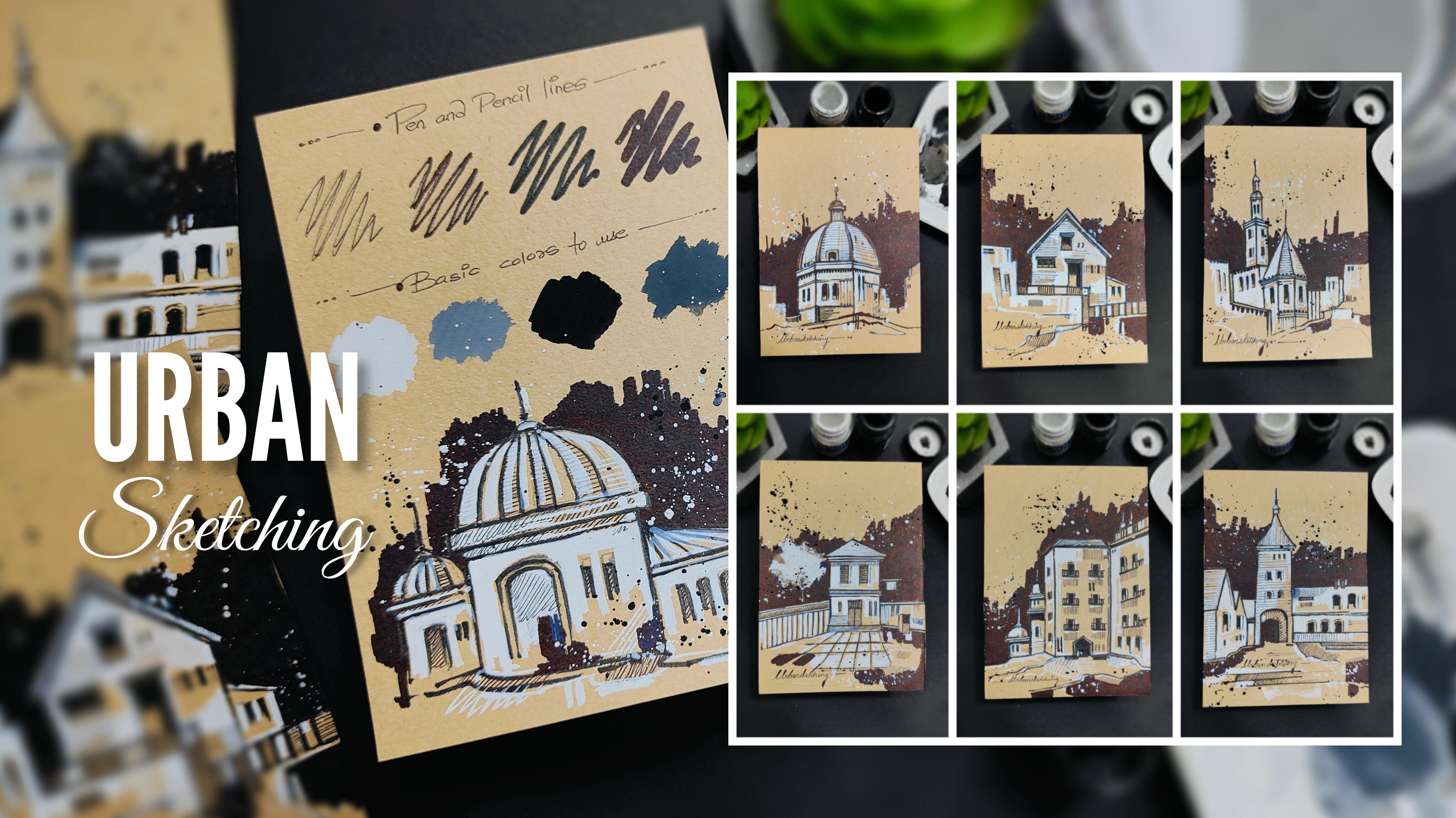
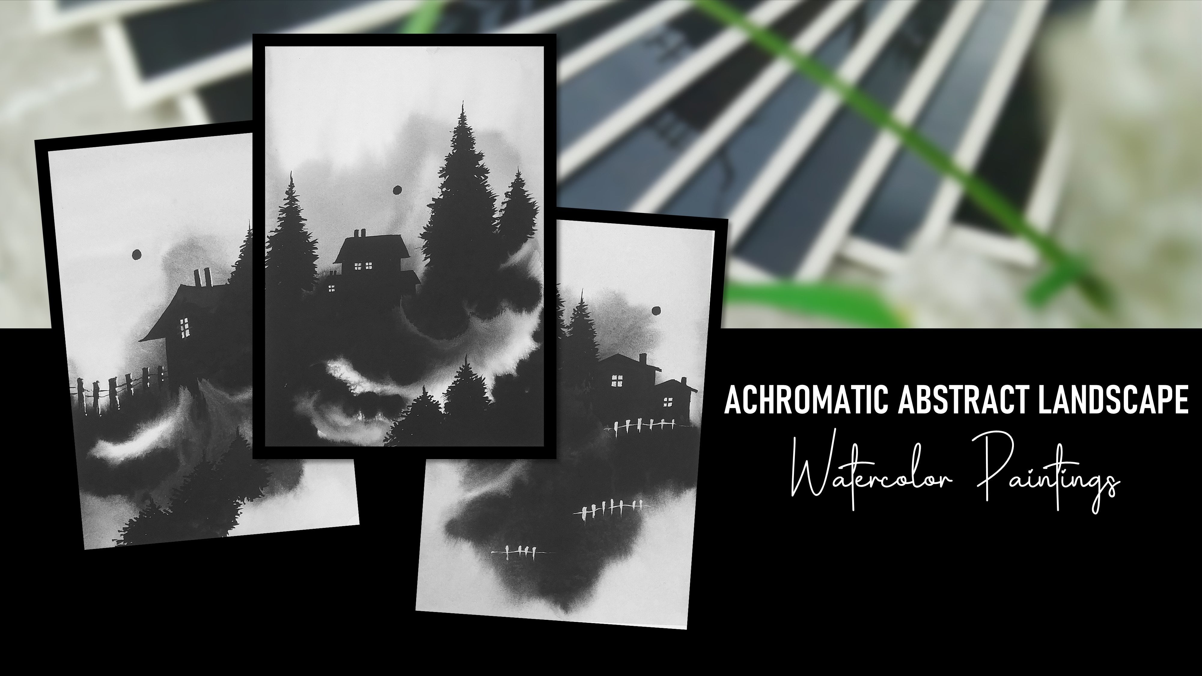
1. Welcome to the Class: When we talk about sketching, it's an art style in which you do not have to worry
about perfection. The first step before we start painting is always sketching. In this class, we
are going to have eight days of urban
sketching on a brown paper. Using simple and easy
painting techniques, we're going to create
eight beautiful paintings, which will be having an
achromatic color scheme. All over, it's an eight
days art journey. Everybody, myself, Ruth Patel. I'm a self taught
independent artist and an interior
designer by profession. I personally love to explore different art forms and styles and not stick to
one particular thing. If you're joining
me, you'll find a variety of classes
that I create. There are going to be eight
different building elements that we are going to
convert into paintings. Before we start with the class, I'll be giving you
the details about the class projects that
we are going to create. We are going to talk about
all the art supplies that you will need
for the entire class. No need to worry at
all. You'll find all the art supplies very easily in any nearby
local art store. Or you can go for any other
good alternative as well. Before we start with
the class projects, I'll be giving you a
simple practice session in which I'll be
showing you how to use black pens and markers to apply a nice inking
to the entire sketch. We are going to talk about the color palette that
we are going to use. There is going to be a
simple warm up exercise, which will help you a lot
to work with your strokes. The practice sheet will help you a lot to develop
confidence while painting, and the chances of making
mistakes will be very less. The different part about
the class is that we are not going to use a
regular white paper. We're going to use a
beautiful brown paper. In each and every class project, there are three basic steps. The first step is basic
sketching using a simple pencil. Then we are going to apply a black marker to create the outline of
the entire sketch. The last step is enhancing
the entire sketch by applying colors and a beautiful background
to the entire sketch. There are going to be
rough and random strokes that we are going to
apply using a black pen. Using a solid black marker, we are going to apply a beautiful black
abstract background. We are going to splatter
some colors randomly. And by the end of the class, you'll be having eight
beautiful paintings based on urban sketching. The class is absolutely
suited for beginners and also intermediate and advanced
level artists can try it. Without any delay, grab
your art supplies, and join me on this
creative journey.
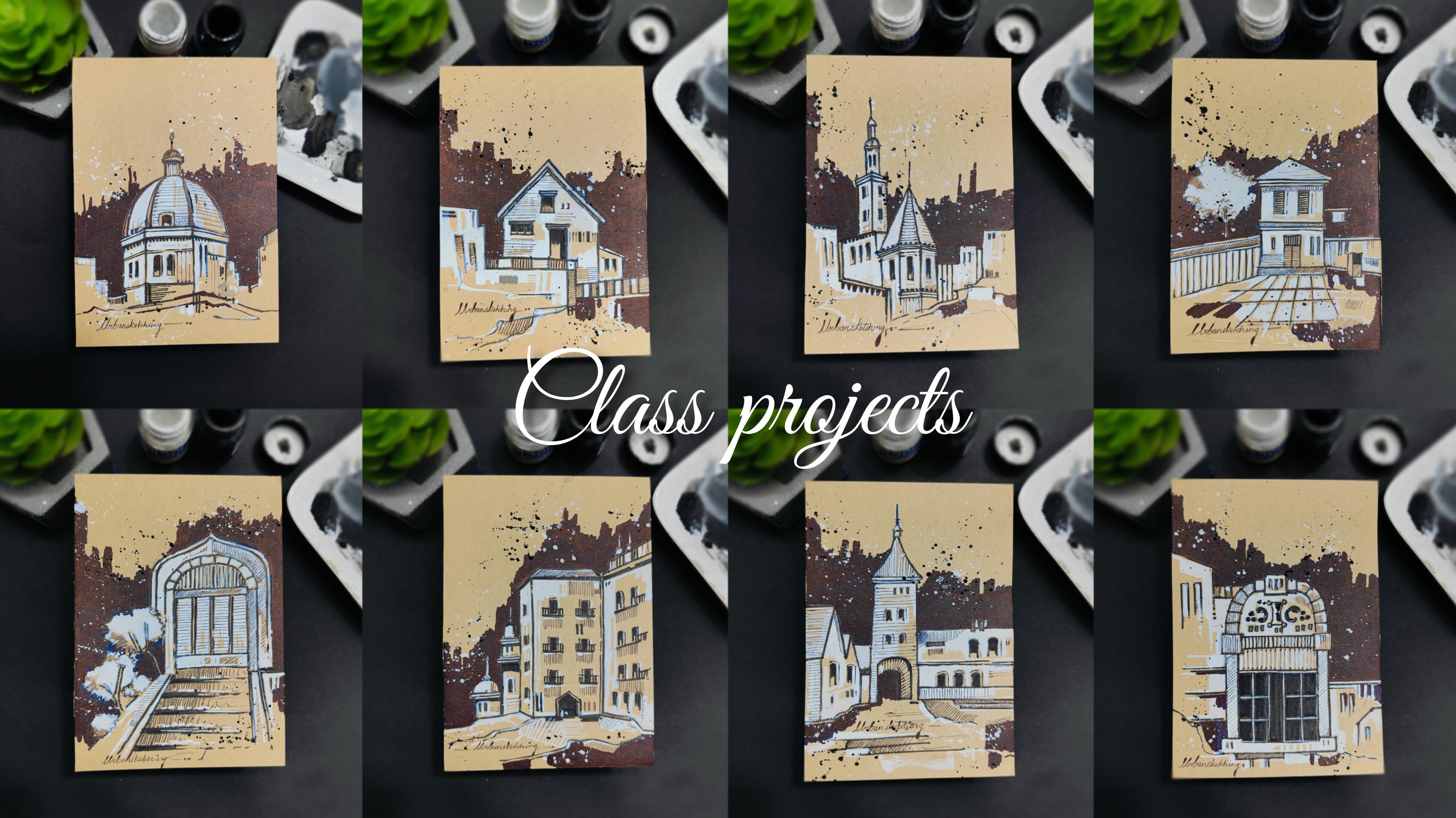
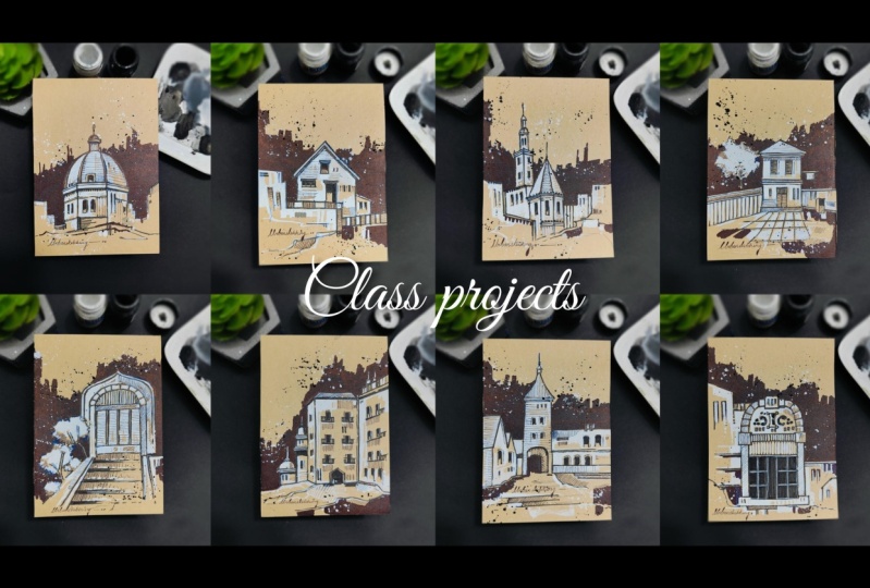
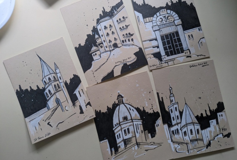
2. Details About the Class Projects: Hey, everybody. Before
we start with the class, let me give you
the details about the class projects that
we are going to create. There are going to be
eight beautiful paintings based on urban sketching. One thing that I would like
to tell you all is that, no need to worry about creating the projects in the exact
same way I have created. You're free to explore
and experiment, so no need to worry
about the output. Just enjoy the
process of creating. One thing which is a
little bit different about the class is that we are not
going to use a white paper. Instead of a white paper, we are going to
use a brown paper in which you can observe that we have created eight
beautiful paintings based on urban sketching. There is going to be a simple
achromatic color scheme, which includes black and white
color, as you can observe. Now, let us talk about the
class projects one by one. So here is one of
the class projects, which is the castle. You can observe all
its details carefully. There are these basic
elements based on a castle with a lot of abstract elements.
Then we have the dome. You can observe a
beautiful dome as a center element and a lot of abstract elements
in the background. If you observe carefully, there is no perfection in
any of the class project. There is a lot of abstract
and rough sketching. Then we have another
class project, which is the building. Then we have the
next class project, which is the backyard. The achromatic color
scheme basically creates a connection between
all the eight paintings. Then I have another
class project, which is the window with
a lot of details in it. These elements are not at
all difficult to create. It's a very simple
and easy technique. Then I have the door, which is another class project that we're
going to create. You can observe all the details carefully in the background
and the foreground as well. Then I have the
next class project, which is a vintage house. You can observe the elements and a beautiful
abstract background. Then I have the last class
project, which is the tower. These are all the eight class projects that we are
going to create. No need to worry about
getting an exact output. Just enjoy the
process of creating. Now let us move
towards the next part.
3. Art Supplies: Hey, everybody. Now
let us talk about all the art supplies
that you will need for the entire class. No
need to worry at all. In case you're missing out on
any particular art supply, you'll find it very easily in
any nearby local art store, or you can go for any other
good alternative as well. So the first art supply is
a simple color palette. You can observe there are
already colors in it. Just make sure that you have enough space to take out
colors and mix them well. Then we have the
next art supply, which is a simple
glass container in which I'm having some water, which we are going to use to mix the colors well and use
it wherever required, also to clean the brushes. Now comes the
important art supply, which is the brushes
that we're going to use. So these are two
basic round brushes. The first one is a round brush of size three that
we're going to use. In case you do not have
a size three brush, you can definitely use a size
seven round brush as well. It is completely fine. These are the two
brushes that you will need for the entire class. Then I have a simple pencil that we're going
to use to create a basic sketch before we start applying the ink
to the entire sketch. Then the next art supply is a simple tissue paper
that we are going to keep nearby while we are
painting so that we can remove axis amount
of water from the brush. Now, let us talk
about the markers and the black pens that
we are going to use. No need to worry
about the brands. Just observe the details, and you can go for any other
good alternative as well. So the first one is a simple
black pen that I'm using, which is having a very thin tip, which we are going
to use to apply some random strokes
to the entire sketch. So it's basically a
simple black pen. Then I have another marker, which is a little bit
thicker than the black pen. So it's basically a black
marker from Faber Castle. You can observe the
tip of the marker and you can go for any other
good alternative as well. Then I have a calligraphy
pen as you can observe. So it is going to have a
nice tip which we are going to use to apply an outline
to the entire pencil sketch. It's from Art line
and you can go for any other good
alternative as well. And then I have the last marker, which is a very thick
marker from Faber Castle. Let me show you the tip as well. It's having a nice thick tip, which we are going
to use to apply a nice solid black background
in all the class projects. These are all the markers and pens that we
are going to use. Now comes the next art supply, which is the brown paper. You can already observe
two of our class projects, and it is basically
an A six size. So we are going to simply
use a A five size paper, and we're going to cut it
into two equal halves. So let me give you the details about the brown paper as well. So these are basically the
brown papers that I'm using. It is one eight GSM, A five size acid free papers. You will find it very easily in any nearby local art store. You can observe the
rectangular sheet that we are going to convert
into two equal halves. So this is the brown paper
that we are going to use. It is not at all
compulsory to create the class project in an
A six size paper only. You can have a
variation in the size, and it is absolutely fine. You can just observe the details carefully and follow
the painting process. Now comes the next art supply, which is the colors that
we are going to use. So I'll be using
only two colors, which is basically
poster colors, and it is black and white. It will give us a
noise mat finish once the color is
completely dry. In case you want to go
for gouache colors, that is also absolutely fine. Now comes the next art supply, which is a simple
eraser and a sharpener. In case you want to sharpen your pencil or erase your
sketch wherever required, you can use this
particular art supply. Then next up, I'm having
a simple masking tape. You can observe it's
a simple masking tape that we're going to use to place the paper onto the
desk surface so that it will not move while we
are painting or drawing. There are going to be
eight class projects that we're going to create
on the brown paper. And these are all
the art supplies that you will need
for the entire class. No need to worry at
all in case you're missing out on any
particular art supply, you'll find it very easily in any nearby local
art store or you can go for any other good
alternative as well. Now let us move
towards the next part.
4. Color Palette: Hey, everybody. Now, let us talk about the
color palette that we're going to use in all
the eight class projects. I'm having a simple
brown sheet right in front of you and two
of the class projects. If you observe carefully, there is a nice combination of black and white
colors together. And apart from that, there
are a lot of strokes that you can observe using a black
ink and a black pen. So let's talk about that first. So this is the first
pen that I'm using, which is a simple black pen. It is having a very thin tip, and you can just
apply its strokes on the paper so that you can get an exact idea of the
thickness of the tip. So you can observe
a thin black line that we are going to use
in the entire sketch. Then we have another marker, which is a little bit
thicker than the first one. You just have to scribble
it onto the paper so that you can observe the thickness of this particular marker as well. Then next up, I have
my calligraphy pen, which is very near to
the second marker. We're going to use
this particular pen to give an outline to the
entire pencil sketch. You can observe a nice
vibrant black color. Then I have the
last thick marker, which is having a thick tip
and a solid black color, which we are going to use
to apply in the background. So you can observe a nice
variation in all the inks, and we're going to use
it in the entire sketch. We have different thickness
of all the four pens. Now, let us talk about
the color palette. If you observe carefully, there are two basic
colors black and white placed on
the desk surface. These are basically
poster colors. In case you want to
use guash colors, it is completely fine. So I'll be taking the first
color in the color palette. You might not be able to see the color properly because the color palette is also white. Just take a nice combination
of water and color together and apply a small patch of the color onto
the brown paper. So you can observe a nice white vibrant color
onto the brown sheet. Now, we are going to create a combination of black and white together just to show you a
shade of a particular color. And it is basically
creating a nice gray shade. So it is basically a combination of black and white
color together. We have black less
and white more. I'll be applying the
solid black color onto the paper surface, take some solid black color
in the color palette, make a good combination
of water and color together and
apply a small patch. Now, similarly, we
are going to add another gray shade by adding
a little bit of white in it. So it is basically going
to be a dark gray shade. We are only going to
use black and white. I'm just showing you
the color combination, which is basically a part of
an chromatic color scheme. In case you want to incorporate a gray shade, it is
completely fine. So this is the entire color palette that we're going to use. I hope that you've
got an exact idea. Now let us move
towards the next part.
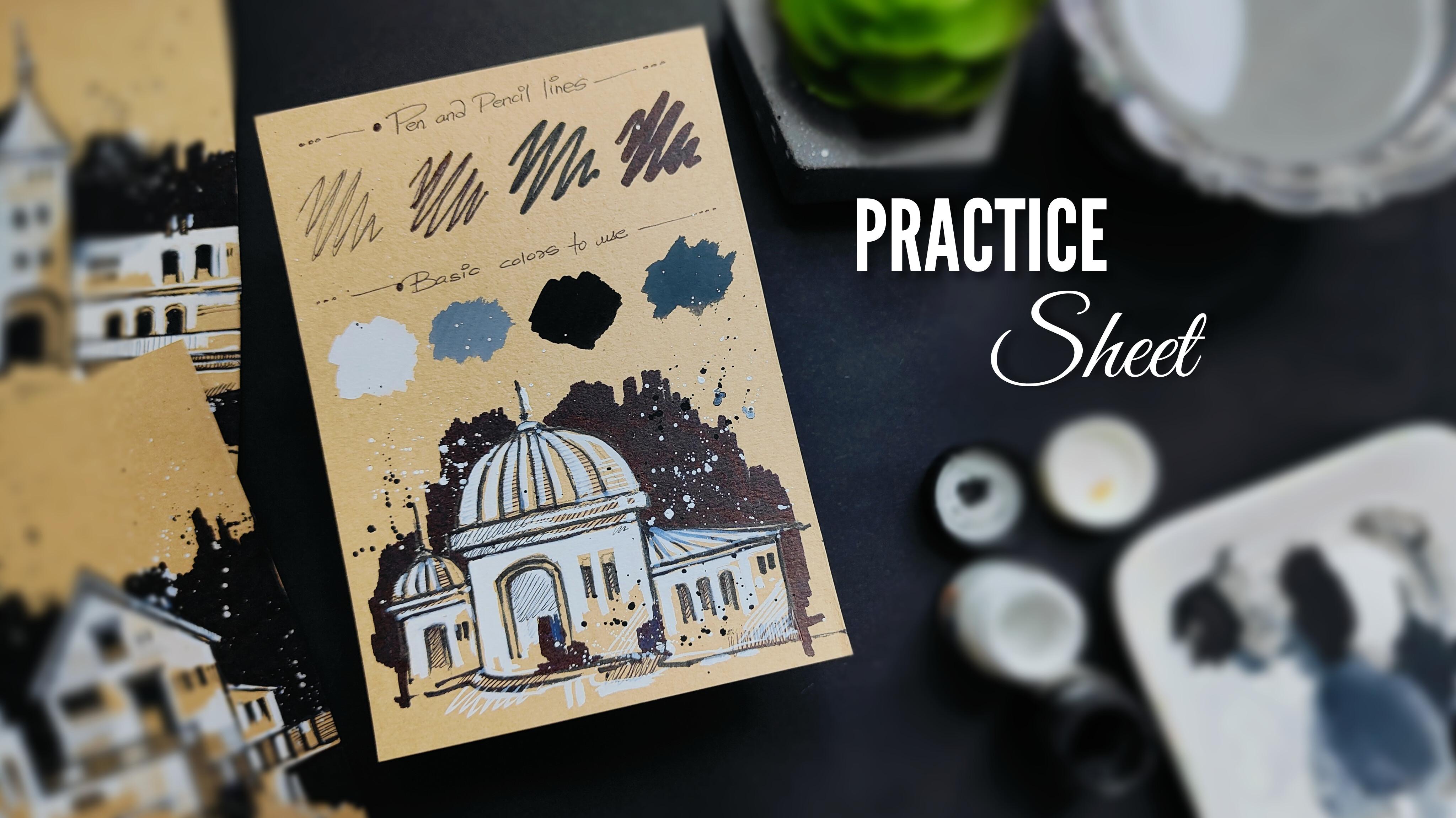
5. Lets Practice the Elements: Hey, everybody. So before we start with the
class projects, let us have a simple practice session in
which we are going to learn about all the elements and how to paint them in detail. The practice sheet
will help you a lot to develop confidence
while painting, and the chances of making
mistakes will be very less. So I'll be using
a simple pencil, and I'm starting
with a basic sketch. I've created a simple
rectangular shape and a semicircular
shape on that. You can simply observe and
follow the steps carefully. So it is basically
a nice dome shape, and I'm creating
another dome shape, which is a little bit
smaller than the first one. Then we have a nice rectangular shape in
the right hand side. You can add these
little smaller windows using a rectangular shape. No need to worry
about drawing it in the exact same way I'm
drawing right now. You can create your
own sketch as well. Now, once we are done with
a basic pencil sketch, I'll be using my
calligraphy pen, and we're going to
add an outline to the entire sketch
so that it becomes a little bit more vibrant and creates a nice contrast
with the brown background. No need to hurry at all. Try to add the outline in
a slow and steady manner. Use the tip of your marker to add this nice thin
solid black line. You can observe that there are these minute strokes in between. You can use the tip of
your marker carefully. So we are almost done adding a beautiful outline to
the entire pencil sketch. And you can already observe a beautiful contrast
of the entire sketch. You can add these
little rough lines in a very random and natural way to create some classic effect
to the entire sketch. Now, once we are done
adding a beautiful outline, I'm going to use
my black pen with a thin tip to add
these minute details, which is basically adding these little strokes in between. So it basically creates some nice details to
the entire sketch, and it will look really nice once we apply the color also. If you observe carefully, there is no perfection
while adding these strokes. I'm just randomly applying these beautiful strokes
to the entire sketch. You can observe that on
the topmost portion. It is basically creating some horizontal
lines in between. So no need to worry
about applying these strokes in the exact
same way I'm adding right now. You can do it in your
own way as well. So we are done with
the entire sketch and applying the ink as well. Now, I'll be taking some solid white color in the
color palette. Make a good combination of
color and water together. Now we're going to apply
it to the entire sketch. Using the tip of my brush, I'm starting from the
topmost portion of the dome. You're not going to cover the
entire surface of the dome, leave some space in between. You can add these
little strokes also. Now, slowly, I'll be moving
towards the bottom area by adding these little
white patches in between. If you observe carefully, I'm leaving the solid black
line because we do not want to cover the outline
using the white color. If in case you might apply the brush onto
the black lines, it is absolutely fine. We can reapply the strokes. Now, slowly, I'll be covering the wall using my
solid white color. If you observe carefully, I'm not covering
the entire area. I'm leaving some
space in between, and it looks really nice when you leave some
space in between. It creates some
nice aesthetics and classic effect to
the entire sketch. Now, the building structure that we have in the
right hand side, you can observe that
slowly I'm adding the white colors in
between the windows also. Now, similarly, you can add these little strokes into the dome structure in the
left hand side as well. You can add these
random strokes in the bottom portion using
the tip of your brush, and you can observe that it is a very abstract way of
applying these strokes. There is no perfection here. So no need to worry about that. You can apply it in
your own way as well. So you can observe that
we are almost done adding the white color in the
entire building structure. I'll be using my
thick marker to apply a solid black background in the entire sketch
that we have created. So be a little bit
careful near the outline. Make sure that your marker
does not enter the outline. You can carefully
observe that I'm making these little vertical
strokes combining together to form a nice
solid black patch. Now, slowly, I'll be moving
towards the right hand side, connecting it with the
building structure in the right hand side as well. If you observe carefully, there is a noise contrast of the entire building element with the black background
that we have created. Now, slowly, you can
cover the entire area. No need to hurry at all. Try to do this
particular step in a very slow and steady
manner. Take your time. Now, using the tip
of the same marker, I'll be adding a few more
solid black patches to enhance the entire sketch in the bottom portion basically. Now take some solid white color, add a little bit of more
water into the color palette, make a good combination of
water and color together. Now, simply tap your
finger onto the brush and splatter some color around
into the background basically, and in the bottom portion
also, if you want to. And you'll observe this
beautiful white dots creating some nice
abstract effect. Similarly, you can do this with solid black color as well. Just make a good combination
of water and color together. Tap your finger onto the brush and splatter
some color around. Using three basic steps, sketching, inking, and painting. We have created the entire
beautiful urban sketch in the bottom portion. You can compare
it with the color palette that we have used from the above portion and the strokes of the black
pen and the black marker. Using the black pen, you can add few more minute details
inside your entire sketch. I hope that you've
got an exact idea of the techniques and simple methods that
we're going to use to create all the
eight class projects. The practice sheet will help you a lot to develop
confidence while painting and the chances of making mistakes
will be very less. It will also act as a warm up exercise before you start with
the class projects. Now, let us move towards
the next part. Okay.
6. Lets Cut and Place the Paper: Hey, everybody, now, let us
cut and place the paper onto the desk surface so that it will not move while you're
creating the class project. So if you observe carefully, it is basically a one
80 GSM brown paper, and this is basically an A
five size acid free paper. They are going to
convert it into an A six size paper by cutting
it into two equal parts. In case you want to create the class project in
an A five size paper, it is completely
fine, but I'm going to convert it into
two equal parts. So just simply fold the paper. Try to match the corners from
both the sides and just use your thumb and finger to press the entire fold. No
need to hurry at all. Try to do this particular
step in a careful manner. Then using your
thumb, you can just press it onto the entire fold. You'll observe once
you open the paper, you'll find a nice line, which is basically creating two equal parts of the
A five size paper. Now, using a simple scissor, we are going to
cut it just follow the line and be very much careful while you're
using a scissor. You can observe that I'm cutting the paper into two equal parts. So using one A five size paper, you can get two A
six size papers. Now, once we get
the Ax size papers, you can observe the
class projects as well. You're going to place it
onto the desk surface so that it will not move while you're creating
the class project. It's a very simple
and easy step. Just place your paper wherever
you're comfortable with. Then I'll be using a simple
masking tape to place it onto the corners
so that it will not move while you're
painting or drawing. So take your masking tape and cut a small piece of
the masking tape. Similarly, add one more
piece of masking tape. Now we're going to add
it onto the corners. Place it onto the
corner and just simply apply some pressure
using your finger or thumb. Similarly, place it on another corner on
the bottom portion. Now, if you observe carefully, the paper will not move while
you're drawing or painting, and this is how you can place your paper onto
the desk surface. I hope that you've
got an exact idea of cutting and
placing the paper. Now let us move
towards the next part.
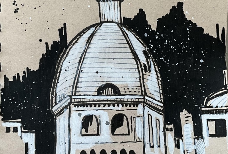
7. Painting 1 - The Dome: Hey, ey buddy, you're
most welcome to the first painting,
which is the dome. So as you can observe,
I'm ready with my brown paper being placed
on the desk surface. And let us start with
the basic sketch. I'll be using my simple pencil. No need to hurry at all. Try to create the sketch in a very
slow and steady manner. Just observe these
steps carefully. So I've started with a
small semicircular shape on the topmost portion, followed by two vertical
lines on either sides. And then we're going to have
this huge semicircular shape on the bottom portion. Now, there are going to be three walls on the bottom portion connected with this huge dome structure that
we have created. So you can add two lines
in an inclination, which is a little bit slant and one horizontal
line in between. And then you have to add
these vertical lines connecting with the rectangular shapes that we have created. There is this nice
randomness of lines, which is basically
a connection of horizontal and vertical lines together in the
right hand portion. No need to draw it in
the exact same way. You can create your
own variation as well. Okay. Similarly, I have added these random lines on the
left hand side as well. Now, we are adding two little
windows in the first wall. It is a simple combination of a semicircular shape on
the topmost portion, followed by horizontal
and vertical lines. Now, we can add minute details. So the pencil sketch is just a basic form of the
entire building structure. Then we are going to apply
solid black color as well. So this is the basic
sketch that we have created using
a simple pencil. I'll be starting with my marker. Now, we are going to simply follow the pencil line slowly. No need to hurry at all.
Also, there are going to be additional strokes that we're going to make using the marker. The pencil sketch
basically gives us a basic idea of the entire sketch and
the building structure. Additionally, we can add minute
details using our marker. It is completely fine. She can observe that I'm
following the pencil line, and I'm also adding
one more line. So it basically enhances
the entire sketch, and the sketch
will look a little bit more classic and aesthetic. No need to hurry at all, take your time and sketch
with a lot of patience. Now, in order to make the
line a little bit thicker, I'll be shifting from this
marker to my calligraphy pen. This is also a
simple black marker. But the tip you can observe
is a little bit thicker. So now, slowly, we are going to follow the pencil lines again. In case you want to make the lines a little
bit more thick, you can add another
stroke using your marker. In case, there is a minor
difference of adding the outline and your line goes a little bit out
of the pencil line. It is completely fine. It's a rough sketching method, so it is absolutely okay. No need to worry
about perfection. So you can observe
that I'm adding these little details also
using the same marker. Now, slowly, I'll be moving
towards the bottom portion. So I want to add a
few minor details, and it is a very
simple and easy step. You just have to create these
little strokes just below the horizontal line
that we have created below the huge dome structure. Now, I'll be creating the outline for the
walls as well and the building structure
that we have created on the left and right
hand side as well. So you can observe the
movement of my marker, the way I'm moving my hand. Also, whenever you're giving any outline to a
basic pencil sketch, always try to keep your hand
very much loose and free. This will help you a lot to draw in a very
comfortable manner, and your hand won't
be that much stiff. So I've added these little
black patches in the windows, and I'm additionally adding a few more details by creating these little black patches and some horizontal
strokes in the wall area. If you observe carefully, there is a good contrast
with the brown paper and the solid black color that
we have applied right now. So right now, you can already observe that we have created a beautiful black solid outline to the entire dome structure. Now, in order to enhance
the entire sketch and make it look a little bit more classic and attractive, you can add a few
more horizontal and vertical strokes
in a random manner. It is completely fine. So no need to worry
about adding it in the exact same way
I'm adding right now. It's just a simple
technique of adding these horizontal and
vertical lines randomly. The more details you'll
add to your entire sketch, the better the sketch will look, and it will create
some more aesthetics. Now, let us move to adding
a few more details. It is a simple method. We'll be using our
simple black pen, which is having a nice thin tip. You just have to add these horizontal
and vertical lines in the entire
building structure. It's a very simple
and easy technique. You can observe carefully. I'm adding a little.in
the starting portion, and I'm completing the line
if you observe carefully. So you can see that these
beautiful thin lines creates some nice details
to the entire sketch. It will make it look a little bit more in depth and detail. There is no specific way
of adding the strokes. You can randomly apply them in whichever manner you want to. Just make a combination of good horizontal and
vertical lines together. Similarly, I'll be
adding these strokes on the right hand side and left hand side of the building
structure as well. So we are done with the outline using a black pen and a marker. Now, let us start by adding
a beautiful color element, which is a solid white color. So I've taken some color
in the color palette. It might not be
that much visible because the color
palette is also white. So just make a good combination of color and water together. Start applying it to the dome structure and starting from the
left hand portion. You can observe that we are applying it in certain
portions only. If there is a little bit
of space left in between, it is completely fine. You can knowingly
do that as well. It will make the entire sketch look a little bit more
aesthetic and classic. Also, no need to worry about the pen strokes that we
made in the dome structure. It will reappear once
the color will dry. Also, we can apply the strokes on the
entire paper as well. Now, slowly, I'll be applying the color in the remaining
building structure as well. If I tell you in
specific detail, you don't have to worry about the exact same way I'm
painting right now. You can add the strokes of the color according to
your convenience as well. It is completely fine. I'm just randomly adding this solid white color to the entire sketch
that we have created. Also, you can observe a nice combination of
solid black color, the brown color that we have on the paper and the white color that we are applying right now. Wherever you have smaller
portion to apply the color, you can use the tip of your round brush of
size three, basically. In case you are missing out on a round brush of size three, you can use a round brush
of size seven as well. It is completely fine. You can use the tip of your
round brush carefully, wherever you want to paint
in a smaller portion. Now, you can slowly
observe that I'm leaving some space
in between knowingly only so that it creates some nice depth and details
to the entire sketch. In case you find
that the saturation of the solid white color
is a little bit less. You can take some more color
from the color palette, and in case you
find that there is axis amount of water
in your brush, you can dab your brush
onto the tissue paper. It will remove axis amount of water and you'll get a nice, highly saturated
solid white color. Also, in case you find that your color is getting
finished from the brush. You can take some more color
from the color palette. I'll be adding the
solid white strokes in the right hand side of the
entire dome structure as well. It's a combination of horizontal and vertical lines together. In the bottom portion, you can apply these little
solid white patches and follow the solid black line. You can observe the way
I'm using my brush and creating some random strokes in the bottom portion as well. If you want thin white strokes, you can just apply
less pressure on your brush and just
randomly move it. Now, let us add a noise
abstract solid black background in the entire dome structure. I'll be using my thick
solid black marker, and you can observe
carefully that I have created these vertical
strokes combining together. And it is in a very
uneven manner. No need to worry
about perfection. Once you have applied
the vertical strokes in the topmost portion, you can fill in the
solid black color in the remaining portion
in the bottom part. Just make sure that
you do not move inside the entire
building structure. Similarly, we are going to
add these vertical strokes combining together in the
right hand side as well. And slowly, we are going
to cover the entire area in the bottom portion with
this solid black color. Just apply the marker in smaller portions so that
you can get a nice, highly saturated
solid black color. Also, in case, while
you are applying this solid black color
in the background, if there is any space left in between, it is
completely fine. You can reapply the marker
in that particular area. Now, if you observe carefully, there is even better contrast of the entire dome
structure that we have created and the solid
black background. You can apply it on the
random strokes that we have created in the bottom portion
as well and the windows. If you're using a
solid black marker, always try to keep your hand
very much loose and free. No need to make it
very much stiff. This will help you a lot to paint in a very
comfortable manner. Now, wherever I feel that the solid white color is a
little bit less saturated. You can take some more color
from the color palette. Try to have less amount
of water in your brush, and you can reapply some nice solid white strokes in
the building structure. It's a very random
and natural process, so no need to worry about adding the strokes in the
exact same way. You can do it according
to your convenience. It is completely fine. In case you find that your color is getting finished
from the brush, you can take some more color. Now, to create some
nice classic effect, I'm taking some solid white
color from the color palette, add some water and tap your
finger onto the brush. You can splatter
some color randomly. You can splatter the color in the topmost portion
and the bottom part. You'll observe that
the color will splatter in this round format. Basically tiny circular shapes. Similarly, we can do this
particular thing using solid black color as well to
create a nice combination. So I'll be taking my black pen, and I'll be writing a nice
text in the bottom portion. You can write any
particular message. I have written urban sketching. Now, in certain areas, the solid white
color is covering the solid black strokes
that we created initially. Now to retain that, we are just reapplying
the strokes. It is absolutely fine if you're not able to retain
all the strokes. You can just randomly apply
it wherever required. If at all, you find
that your details are getting covered using
the solid white color. You can reapply these strokes
using your marker and pen. I'll be just splattering some
solid black color as well, the way we did with
solid white color. You can just take some
solid black color, add some water, and tap
your finger onto the brush. Simply just splatter the color in a very random
and natural way. So we are done with
the entire painting. You can simply remove the masking tape from
both the corners. Now, let me take you a
little bit closer so that you can observe all
the details carefully. You can observe a
beautiful contrast of the entire building element, a beautiful abstract background, the entire building structure
that we have created. I hope that you enjoyed creating this particular painting and
got to learn something new. You can observe
the minute details carefully and create the
particular class project. Now let us move towards
the next painting.
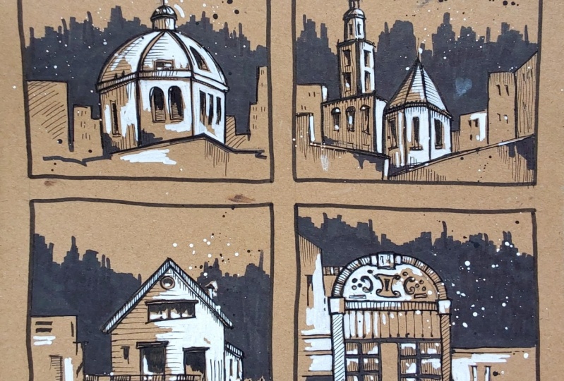
8. Painting 2 - The Castle: Hey, every buddy, you are most welcome to the second painting, which I have named
as the castle. So as you can observe, I'm
ready with my brown paper, and they are starting
with a basic sketch using a simple pencil. So I'm starting with a
simple semicircular shape on the topmost portion, followed by two vertical lines, and then again repeating
the same step. But in a huge scale. So again, you have to add
another semicircular shape, which is a little bit
bigger than the first one. Now, followed by another
two vertical lines, you have to create this
nice building element, which is a little
bit in an angle, followed by a triangular shape, which is connected
in a lower altitude. In case you find it a
little bit complicated, you can simply follow
the pencil line. Now, similarly, I'll be adding another huge
building structure connecting with all
the structures that we have created on
the topmost portion. It's a combination of horizontal and vertical lines together, so no need to worry
about getting it in the exact same way
I'm drawing right now. In case there is a
minor difference or you want to create your
own building structure. It is completely fine. So I've added a nice wall
element in the left hand side. Similarly, we are adding this nice building structure in the right hand side as well. It's a simple combination of horizontal and vertical
lines together. If you observe carefully, I'm adding these
little rectangular windows in between as well. So the pencil line
basically gives us a basic structure of
the entire building. Once we are done with
the entire pencil line, we are going to give the
outline using a black marker. So I've added a few
more windows in the building structure
that we have created in the bottom portion. If you observe carefully, you can add a nice
semicircular shape on the topmost portion, followed by horizontal
and vertical line. And I have added this
nice random line in the bottom portion to make the sketch look a little
bit more classic. So we are done with the
entire pencil sketch. Now I'm going to use my marker, which is basically
a caligraphy pen. You can use a solid
black marker as well. It is completely fine. So we are starting from
the topmost portion. You just have to follow
the pencil line. And apart from the pencil line, we can also add few
additional strokes. It is completely fine
because we want to create the entire cartel element a
little bit more in detail. You can observe very
carefully the way I'm using the tip of my marker and
the way I'm moving my hand. Whenever you're giving any
outline to a basic sketch, always try to keep your hand
very much loose and free. No need to make it stiff. I'll be adding solid black
color in these tiny windows, and you can observe carefully the way it enhances
the entire sketch. Similarly, we are going to add horizontal and vertical lines to the entire building structure in the bottom portion as well. No need to hurry at all. Try to give the outline in a
very slow and steady manner. Also, try to keep your
hand very much loose and free whenever you're
using a marker or pencil, it will help you a lot to give the outline in a very
comfortable manner. Now, I'll be adding the outline to the entire
building structure, which is having this
beautiful triangular roof. Wherever you want to give a
nice thick, solid black line, you can reapply another
stroke on it and make it a double line so that you can get a nice thick solid black line. If you observe carefully, it's a combination of horizontal and vertical strokes together. Also, no need to
worry about adding the strokes in the exact same
way I'm drawing right now. You can add the strokes according to your
convenience as well. It is completely fine. You can observe
the way I'm adding this nice solid black color to these tiny windows
that we have created. Now, apart from
this, you can add these beautiful horizontal
and vertical lines to add some more minute details
to the entire sketch. You can observe the
way I have added a nice solid black line to the random stroke that we have applied on the
bottom portion. Let me remind you once again
that no need to worry about adding these strokes in the exact same way I
have drawn right now. You can create your
own combination of the strokes as well. So no need to worry about
perfection and the output. I'll be using my black pen to create some more
depth and details to the entire sketch
so that it will look a little bit more
in detail and aesthetic. So you just have to use
your solid black pen and add these little
horizontal strokes. If you observe carefully, it creates a beautiful detailed element to
the entire sketch. And your building structure will look a little
bit more aesthetic. Similarly, I'll be adding the strokes in the bottom
structure as well. Now I'll be adding
vertical lines. I'm randomly adding
these strokes, so there is no specific way
of adding these strokes. You can randomly apply
them wherever you want to. So I'll be adding a few
more random strokes in the bottom portion as well, and a few more horizontal strokes in the
building structure. Now, in order to add a
few more minor details, I'll be just adding
these little strokes on the topmost portion of the building structure
using my marker, and you observe carefully that you get this nice
solid black patch. Similarly, I'll be adding these little solid black patches just below the roof
structure as well. So now you can observe the entire sketch is
very much enhanced. It creates a nice contrast
with the brown background. Now, let us make it look a
little bit more aesthetic, so I'll be taking some solid white color in my color palette. I'm using a poster
color basically. In case you want to
use a guash color. It is completely fine. Make a good combination
of color and water together and start applying
it in the building structure. No need to worry
about perfection. You just have to apply the solid white color in a
very random way. In case there is any
space left in between. It is completely fine. In fact, you can knowingly
leave some space in between. Just make sure that your color does not enter the
window elements. In case it enters the
window element, it is fine. You can reapply the
solid black color. Also, in case you observe carefully using this
solid white color, your horizontal strokes that you applied using
your black pen, will get a little bit vanished, but it is absolutely fine. We can reapply the
strokes again. Now, slowly, I'll be covering the building area in the
bottom portion as well, and I'm knowingly leaving
some space in between. It makes the entire sketch look a little bit more classic. I'm using my round
brush of size three, and wherever there is a smaller portion to
apply the color, you can use the tip of your round brush to
paint in smaller area. In case you find that your color is getting finished
from the brush, you can take some more color
from the color palette, and in case you find
that the saturation of the solid white color
is a little bit less, you can reduce the
amount of water from the brush by dabbing it
onto the tissue paper. Now, slowly, let us cover the building structure in
the center portion as well. Just make sure that
your brush does not move inside the
window element. You can just create
these beautiful strokes. Wherever you want to
add thin strokes, which is basically
solid white strokes, just use the tip of your round brush and apply
least pressure on it. Let me remind you once again that I'm randomly
applying the color. There is no specific way of applying this beautiful
solid white color. So no need to worry about
perfection or painting it in the exact same way
I'm painting right now. Your strokes might vary, and it is completely fine. In fact, you can paint it according to your
convenience as well. You're free to
experiment and explore. So I'm adding the
solid white color in the building structure in
the right hand side as well. By leaving some
space in between, you can observe that as well. In case you find that
the saturation of the color that you're
applying right now, which is basically a solid white color is a little bit less. You can take some color
from the color palette and make sure that you have less amount of water
and more color. So make a good combination
of both of them and just dab your brush onto the
tissue paper so that axis amount of
water will be removed, and you can reapply the
strokes wherever you find that the saturation of solid white color is a
little bit less. You can observe carefully
that I'm randomly applying the color in
the bottom portion also. And I have added a few more
strokes in the bottom part. So we are done adding
solid white color. Now let us add a nice abstract
solid black background to the entire
building structure. So I'll be just combining these vertical strokes together forming a beautiful outline. And then in the remaining
portion in the bottom part, you have to fill in
solid black color using your thick solid black marker.
No need to hurry at all. Apply the marker in
smaller portions so that you can get a highly
saturated solid black color. Also, you have to be
very much careful that you do not move your marker inside the building structure. Be a little bit careful near the outline of the
entire castle. Now, similarly, we
are going to add these vertical strokes in
the right hand side as well. It's a very random
and natural way, so no need to worry
about perfection or adding it in the exact same
way I'm drawing right now. So you can observe that
we are done adding a beautiful abstract background using our solid black marker. I'm adding a little bit of more strokes in
the left hand side on the topmost portion to make it look a little
bit more classic. In case you find that
there is any space left in between applying
the solid black marker, you can reapply the strokes
in that particular area. I'm also adding a few more solid black strokes in
the bottom portion, using the same marker. And I'm adding these
little patches of solid black color to
add few more details. I'll be using my black pen
to add a simple message, which is urban sketching
in case you want to add any other message
according to your convenience, it is completely fine. You can enhance the entire write by adding a few more
black strokes in it. Now, let us splatter some
color in the background to make the entire sketch look
a little bit more classic. So I'll be taking some
solid white color, add some water in it, and simply tap your
finger onto the brush. You can observe that the color will splatter in
this random manner. So I'm basically trying to splatter the color
in the background. Now, similarly,
I'll be splattering some color in the
bottom portion also. You will definitely enjoy
this particular step because there is no specific way of splattering the color. You can just randomly do this. Similarly, we'll be taking
some solid black color, and we are going to tap our
finger onto the brush to splatter some solid black color as well in the background area. No need to hurry at all. Just
enjoy the entire process. Now, if you observe carefully, after we have applied this beautiful solid white
color to the entire sketch. There are a few
solid black patches that are a little bit
less saturated right now. So you can reapply your marker in that particular area to make the solid black
color look a little bit more in contrast
with the white color. In case you want to
leave it as it is, that is also completely fine. If you want to enhance your
solid black strokes again, you can just reapply your
solid black marker in it. Do it very much carefully
using the tip of your marker. Try to keep your hand
very much loose and free while you're doing
this particular step. So we are done with
the entire painting. You can simply remove the
masking tape from the corners. Let me take you a little bit closer so that you can observe all the details carefully of the beautiful castle painting
that we have created. I hope that you enjoyed this particular painting and
got to learn something new. No need to worry
about the output. Just enjoy the process. Now let us move towards
the next painting.
9. Painting 3 - Vintage House: Hey, everybody, you're most welcome to the third painting, which I have named as
the vintage house. So as you can observe,
I'm ready with my paper being placed
on the desk surface, and we're going to start
by a simple pencil. So I'm starting with
a basic sketch. I've started creating a
simple building element in the left hand portion. It's a combination of
vertical and horizontal lines if you observe carefully. I'm adding a little bit of fence element in the
right hand side as well. Now, the main element
is a vintage house, so it is going to have
a triangular roof on the topmost surface. So you just have to connect
two slant lines together. You can add one more line to double that triangular shape. Now, we are going to
add vertical lines on either sides to complete the walls of the
entire vintage house. No need to hurry at all. Try to draw the basic sketch in a very slow and
steady manner. You can observe that
we have created a basic structure of
the entire house. Now, let us add few details
like doors and windows. So I'll be just adding two
little rectangular shapes followed by two vertical lines to complete the entire door. Now, if you want to
make a little bit of changes in your
entire sketch, you can erase it by
using a simple eraser. So I wanted the position of the door a little
bit different, so I'm drawing it again by adding two rectangular shapes on the topmost portion and two little windows on
the right hand side. You can add the windows according to your
convenience as well. It is completely fine. Also, it is not at all
compulsory for you to draw the basic sketch in the exact same way I'm
drawing right now. If you want to follow
the steps and draw it in the same way, it
is completely fine. And in case you want to
create your own composition, that is also absolutely okay. So we are done with the
basic sketch using a pencil. Now, I'll be using
my calligraphy pen, which is basically a
black marker only, and we are going to
create the outline of the entire basic sketch. You can observe the way
I'm moving my marker, and you can observe the way
I'm moving my hand as well. We are simply going to
follow the pencil line. But apart from the pencil line, we can also add
additional strokes using our marker so that we can create some nice details
to the entire sketch. If you observe carefully, if you want thinner strokes, just apply less pressure on your marker and use the tip
of your marker carefully. Whenever you're using any pencil or marker or even a black pen, just try to keep your hand
very much loose and free. No need to make it stiff. This will help you a lot to
draw in a comfortable manner. Try to move your hand
around the paper so that you can make the strokes in a very comfortable manner. Now, I'm starting
with the house, and I'm starting
from the topmost. Now, let us start
with the outline in the house element as well. We have started from
the topmost portion, which is this beautiful roof. Now, if you observe carefully, there was no pencil line
in the right hand side. So I additionally added a simple slant roof
with a vertical line, which is a part of the
entire house element. So it is completely
fine if you add additional strokes and create some additional elements
apart from the pencil line. I'll be adding a small
solid black patch in the window to make a nice contrast with
the background color. Using the same
solid black marker, you can add these little
solid black patches so that it creates a nice contrast with
the background color. Now, if you observe carefully
in these smaller windows, also we have added the
smaller black patches. And in case you want to enhance the line and make it a
little bit more thick, you can reapply the
solid black strokes. Now, if you observe carefully, I'm randomly adding these
random strokes around the entire sketch so that it looks a little bit more
aesthetic and classic. Now, let us use our black pen, which is having a thin tip
and solid black color. You can add these little strokes to enhance your entire sketch. It will look a little
bit more in detail, and it also enhances the entire
aesthetics of the sketch. There is no specific way
of adding these strokes. You can observe carefully, it's a combination of horizontal
and vertical strokes. I'm going to add
horizontal strokes on the wall of the
entire vintage house, and you can observe that I'm not covering the entire surface. I'm just adding it in
certain area only. You can observe how
these beautiful strokes will enhance your entire sketch, and it is completely
fine if you add the strokes according to your convenience in
your own random way. No need to worry about
adding the strokes in the exact same way I'm
drawing right now. The main purpose of adding
these strokes using a white pen is to create some nice depth and details
to the entire sketch. Also, no need to hurry at all. Try to add these strokes in a very slow and steady
manner, try to have patients. So now we are done, creating some nice depth in
the entire sketch. Now let us apply some
beautiful solid white color. So if you observe carefully
in my color palette, I'm taking some
solid white color using my round brush
of size three. Now let us start from
the roof element. I'm just adding this
solid white color. Wherever you want to apply the paint in a very
smaller portion, always make sure that you use the tip of your
brush and apply very less pressure
on it so that you can apply the color in
a very smaller portion. Now, let us start adding the color in the building
element around the window. If you observe carefully, we are not going to cover
the entire structure. We are just going to add the
color in certain areas only, and we are knowingly doing
that because we want to create some nice classic
effect to the entire sketch. Right now, if you
observe carefully, the horizontal strokes that we made using our black pen will get a little bit
less saturated when we apply this solid
white color on it. But it is completely fine. We can reapply the horizontal strokes using our black pen. Now, you can observe
that I have applied the solid white color in the left hand portion
of the entire house. We can also add few
more strokes to make the saturation of the solid white color
a little bit more. In case you find that your brush is having axis amount of water, what you can do is you can
just dab your brush onto the tissue paper so that axis amount of water
will be removed, and you'll get a nice, highly saturated
solid white color. Let me remind you once again that no need to
worry about adding the solid white color in the exact same way I'm
painting right now. Your strokes might vary. The way you apply the color
will be definitely different, and it is completely fine. In case you can knowingly
add the color in random way and no need to worry about getting
an exact output. You're free to explore and experiment so you can
randomly apply these strokes. Additionally, you can add
some solid white patches in the entire sketch
wherever you want to to make the entire sketch look
a little bit more classic. So it's a combination
of horizontal and vertical strokes
in certain areas. In certain areas, you can
add solid white patches. So basically, there is a lot of randomness in the entire sketch. Now, let us add some
more white color in the building structure that
is on the left hand side. If you find that your color is getting finished
from the brush, you can definitely
take some more color from the color palette. And in case you find
that the saturation of the solid white color
is a little bit less, then you can definitely
take some more color and try to have less amount
of water in your brush. In case you find that there is axis amount of water
in your brush, you can dab your brush
onto the tissue paper. Now, using the tip of my brush, I'm just adding these strokes in a very random
and natural way. Now, I want to add
a little bit of solid white color in the right hand side
of the vintage house. You can do that as well. Now, let us add a nice
abstract background. I'll be using my thick
solid black marker and just combine these
vertical lines together to form an outline. And then we are going to add the solid black color in the remaining portion
in the bottom area. You can add these
solid black patches in smaller portions so that
you do not leave any space. Be a little bit careful
near the building element. Just make sure that you do not enter the entire
building element. So just be a little bit careful near the outline of the
entire building structure. Now, we have added the entire background on the
left hand side. Similarly, we are going to do that on the right
hand side as well. So I'll be combining
the vertical strokes together and forming a nice abstract background on the right hand side as well. In case you find that there is any space left and between, you can definitely reapply the solid black strokes
using your marker. No need to hurry at all. Try to apply the color in a very
slow and steady manner. Try to keep your hand
very much loose and free while you're doing
this particular step. So you can observe a
beautiful contrast of the solid black color
with the building element. We can also add few
solid black patches in the bottom portion as well. So we are done adding a
beautiful abstract background. So when we applied the
solid white color, our black strokes
using our black pen, caught a little bit
less saturated, so you can reapply the
strokes using your black pen. Now, I'll be adding a little
text on the bottom portion, and I'm going to write
urban sketching. You can write any other message also according to
your convenience. It is completely fine. Now, once we are done adding a text element to
the entire sketch, let us add you more
aesthetic elements. So I'll be taking some
solid white color in the color palette,
add some water in it. Now, simply tap your
finger onto the brush, and you'll observe that
the color will splatter in this random and abstract
manner in circular form. You can splatter the color in the background area and
also in the bottom portion. There is no specific way
of splattering the color. You can randomly do this. Now, similarly, we
are going to repeat the same step using
solid black color. Add some water and loosen
the color a little bit so that the color will
splatter in a nice way. Now, simply tap your finger and splatter some color around. Again, it is the same process. Just splatter it onto the background and in
the bottom portion. You can observe how beautiful the entire sketch is
looking right now. In case in certain areas, you find that your solid black marker strokes are
a little bit less saturated after you have applied your white color
to the entire sketch. You can reapply those strokes
again using your marker. To retain the solid black color, you can observe the
entire sketch carefully, and wherever you find that you want to add the strokes again, you can reapply the strokes
on that particular area. So we are done with
the entire painting. Let me remove the
masking tape from both the corners so that we
can remove the brown paper. And let me take you a
little bit closer so that you can observe all
the details carefully. You can observe the
way we have combined all the elements together to form this beautiful painting. I hope that you enjoyed this particular painting and
got to learn something new. No need to worry
about the output. Just enjoy the process and create the entire
class project. Now, let us move
towards the next part.
10. Painting 4 - The Window: Hey, buddy, you're most welcome
to the fourth painting, which I have named
as the window. So as you can observe, I'm ready with my brown
paper on the desk surface, and we are starting
with a basic sketch. So I'll be using
my simple pencil, and you can observe I have created two lines on
the left hand portion. Now, let us start with
the window structure. So I have drawn a simple
rectangular shape on the topmost portion, followed by two curved lines, which we are going to double. So this basically creates a nice semicircular shape
on the topmost portion. On the ends, we are going to add these rectangular
shapes again, and you have to connect it
with two horizontal lines, creating the frame structure
of the entire window. Now, I'll be adding two vertical lines on either sides and one horizontal line on the bottom portion to complete the entire frame
structure of the window. No need to hurry at all. Just simply follow
these steps carefully. Try to keep your hand very
much loose and free while you're creating a basic
sketch using a pencil. This will help you a lot to
draw in a comfortable manner. There are going to be certain
additional elements to the entire building
structure like horizontal and vertical
lines together. So you can add them according to your convenience as well, and in case you want to follow the way I'm
drawing right now, that is also completely fine. I'll be adding these
vertical lines together forming the windows, which is basically the opening shutter of the entire window. I'll be adding few details in the semicircular shape that we have drawn on the
topmost portion. So you just have to create
these nice patterns. No need to hurry at
all. Just try to draw the patterns in this
abstract manner only. No need to worry
about perfection. Also, in case you want to create your own pattern and
add the details. According to your convenience, it is completely fine. No need to worry
about perfection. I'll be adding certain elements in the right hand side as well, followed by one horizontal line. And some vertical lines. You can also add few strokes on the left hand side of
the entire window. So we are done with the
basic sketch using a pencil. Now, let us start
adding the outline. I'll be using my marker, which is basically
a black marker. No need to hurry at all. Try to follow the pencil line. Apart from the pencil line, we are also going to add few additional strokes
using the marker. This will help us to add few more details to
the entire sketch. Now, whenever you're
using a marker to add an outline to
your pencil sketch, always try to keep your hand
very much loose and free. This will help your lot to draw in a very
comfortable manner. Also, the more you'll change
the position of your hand, the better and comfortable
way you'll be able to add the strokes to the
entire pencil sketch. It is not at all compulsory that you have to
add the outline, wherever you have
applied the pencil only. Additionally, also, you
can use your marker to add some nice outline
to your entire sketch. In the entire sketch, wherever you want to have a thin line, try to use the tip of your marker and apply
very less pressure on it. And wherever you want
to create a thick line, you can add multiple strokes and even apply some more
pressure on your marker. Now I'll be adding
the outline to the details that we have
created using the pencil. If you observe carefully, we have created a nice contrast with the solid brown color. Now, in order to enhance
the entire sketch, what I'll do is that I'll add these little vertical lines in the framework of
the entire window so that we can add some
nice depth and details. So we have almost covered the entire outline of the
entire window structure. Now, let us add the outline to the building structure around
the entire window as well. So, again, it's a combination of horizontal and
vertical lines only. You can just randomly add
these strokes around. Also, in case you want to add these strokes according
to your convenience, that is also completely fine. Now, I'll be using my black pen, which is having a thin tip
and solid black color, and we're going to
add some nice depth and details to the
entire sketch. It is a very simple
and easy step. You just have to add these
horizontal and vertical lines randomly in certain areas. While you're using a pen, always make sure that your hand is very much loose and free. No need to make it stiff. This will help your lot to draw in a very
comfortable manner. You can add the details according to your
convenience as well. So we are done adding
some nice depth and details to the entire
sketch using a white pen. Now, the next step is to
add some solid white color. So take some good amount of solid white color in
your color palette. Make a good combination of
water and color together. We are starting from
the building structure, which is on the left hand side. I'm slowly applying these
little solid white patches. No need to hurry at
all, take your time and apply the patches in a very
random and natural way. No need to worry about painting
it in the exact same way. I'm painting right now. In case you find that your color is getting finished from the brush, you can definitely
take some more color from the color palette. Also, in case you
find that there is axis amount of water
in your brush, simply dab it onto
the tissue paper. So right now, I'm applying the color on the left hand
portion of the entire window, adding a few horizontal and
vertical lines together. If you observe carefully, there is a nice combination of the brown color in
the background, the black color that we have
used to give an outline to the entire window and the solid white color that
we are applying right now. The paint will basically
enhance the entire sketch. You can also add few random strokes in the bottom portion. Now, similarly,
we're going to add solid white color in
the building structure, which is on the right
hand side as well. You can observe
that I'm randomly adding these white
patches around. No need to hurry at
all. Take your time and apply the color in a very
slow and steady manner. In case you find that your color is getting finished
from the brush. You can take some more color
from the color palette. Now, let us start with the
window element as well. I'm starting from
the topmost portion. No need to worry about applying the color on the entire
surface of the sketch. You can knowingly leave
some space in between. It looks really
nice and classic. Also, if you find that
the saturation of the solid white color
is a little bit less. What you can do is you can just dab your brush onto
the tissue paper so that axis amount of water
will be removed and you'll have more amount
of solid white color. In case you have already applied a less saturated solid white
color in certain area, you can reapply
the white color on that particular area once the color is dry so
that you'll get a nice, highly saturated
solid white color. Now you can observe that
in the detailed area, I'm just adding these
vertical lines. So whenever you want to paint
in a very smaller portion, just try to use the tip of your brush and apply
less pressure on it. Now, let us add some nice color to the frame structure
of the entire window. You just have to take
some good amount of color and just apply
a nice stroke. In case there is any space
left, it is completely fine. It will look really nice. If you observe carefully, the solid black lines
that we applied using our pen is a little bit
less visible right now, but it is completely fine. We can reapply the strokes. Now, similarly, I'll be adding the solid white color in the below frame
structure as well. You can observe
that I'm knowingly leaving some space in
the right hand side, and it looks really nice. Now, we are almost done applying a nice solid white color
to our entire sketch. Now, I'll be using
my black pen again, and we are reapplying the
strokes that are less visible right now. It
is completely fine. You can randomly
apply it wherever you find that the strokes are
not that much visible. Also, whenever you're
using a black pen, try to keep your hand
very much loose and free. This will help you lot to
draw in a comfortable manner. You can also add some
random strokes around the entire sketch to make the sketch look a little
bit more aesthetic. In case you want your strokes to be a little bit more visible. You can definitely use your
marker rather than a pen. Wherever you want your
solid black color to be a little bit more visible. You can apply the strokes. You can use the tip of
your marker carefully, and wherever you want
to have a thick stroke, you can apply a little
bit of more pressure. Now, I'll be adding a nice
text in the bottom portion. I'm writing urban sketching. You can write any message
that you want to write. It is absolutely fine. Now, once we are done with
the entire text element, now we are going to add some solid black patches to enhance the entire
shutter of the window. It is a very simple
and easy step. You just have to cover the rectangular shapes
using your marker. Just try to apply it
in smaller portions and make sure that there is
no space left in between. You can leave the
frame structure. It will look really nice. Slowly, I'm going to cover the entire smaller
rectangular shapes, and no need to hurry at all. Use the tip of your
marker carefully. So we have this one
rectangular shape in between, and we are going to
cover that as well. So you can observe how
beautiful the entire shutter of the window is creating a nice contrast with
the frame structure. Now, in order to enhance
the frame element, I'll be taking my
round brush of size three again and take some
solid white color in it. Apply it on the horizontal
and vertical lines of the shutter as well. Use the tip of your
round brush and apply very less pressure on it so that you can get
a nice thin line. So now you can observe
that the shutter of the windows are
looking really nice and it creates a
beautiful contrast with the solid white lines
that we have applied. Now let us create a nice
abstract background using our thick
solid black marker. So I'm starting from
the left hand portion. You just have to combine
these vertical strokes together forming a nice outline, and then you have to fill
in solid black color in the remaining portion.
No need to hurry at all. It is a very random and natural process of
applying the marker. So no need to worry
about perfection. Also, don't worry about drawing
it in the exact same way. I'm applying the
marker right now. There will be variation
in your strokes and mine, and it is completely fine. Just be a little bit careful near the outline of
the window structure. Just make sure that
your marker should not enter the sketch that we
have created in between. Apply the marker in
smaller portions and make sure that there is
no space left in between. In case you find that you have left some space in between, you can reapply the marker
in that particular area. So we are almost done applying a nice solid
black background. Now, apart from the background, if you want to add some
solid black patches in the remaining portion of the
structure, you can add them. Use the tip of your
marker and apply some less pressure so that
you can get a nice thin tip, and wherever you want to
create a solid black patch, you can apply it in
the entire portion. So I'm adding some
nice black patches on the bottom portion of
the entire window as well. So we are almost done
with the entire sketch. Now let us add some
nice abstract element. Take some solid white color in your color palette,
add some water in it. Now, simply tap your finger onto the brush to
splatter some color. You'll observe that
it will splatter in a very random
and natural way, creating some nice
aesthetics and classic effect to
your entire sketch. Similarly, you can repeat the same step with
black color as well, mix it well with
water and simply tap your finger onto the brush to
splatter some color around. You will definitely enjoy
this particular step. It is really fun. Also, no need to worry about perfection. Just do it in a very random
and natural way only. To enhance the details in
the semicircular shape, I've taken my round
brush of size three, take some solid black
color in it and apply the color in this
particular detailed manner. Use the tip of your brush. So we are done with
the entire painting. Now, let me remove the masking
tape from the corners. And let me take you a
little bit closer so that you can observe all
the details carefully. You can observe how we have used some basic elements to
create a nice urban sketch. I hope that you enjoyed this particular painting and
got to learn something new. No need to worry
about the output. Just enjoy the process
of creating the project. Now let us move towards
the next painting.
11. Painting 5 - The Building: Hey, everybody, you
most welcome to the fifth painting,
which is the building. As you can observe, I'm
ready with my brown paper, and I'll be using
a simple pencil to start with a basic sketch. So in this particular
class project, we are having a nice
building element. So I'm starting with
the topmost portion creating these horizontal
and slant lines together. You can observe them carefully. Then followed by
two vertical lines. We are just trying to draw
a nice rectangular shape. If you observe on
the right hand side, we have created two slant lines to make the building
look in perspective. Now, once we are done with the entire huge building structure, we're going to add some
nice building elements in the left hand portion
connected with the big rectangular structure
that we have created. So I've added a nice
building element having a small dome structure
on the topmost portion. Similarly, we're going to add one little building
structure connected to it. Now, we're going to add
these tiny windows, which is in a rectangular shape. Okay. No need to hurry at all. Try to keep your hand
very much loose and free. Now, we are going to
add some elements in the entire building structure like some windows, some doors. Okay. I've added
a nice door with a semicircular shape on
the topmost portion. Then we're going to add
these rectangular shapes which are basically windows
in the entire building. Similarly, you can add these slant lines and add rectangular shapes
in that as well. It is absolutely fine if you draw these shapes according
to your convenience. It is completely okay. You're free to experiment and draw it in your own way as well. In fact, in case
you want to create your own composition of
the entire building, that is also completely fine. Now, you can add
some random strokes in the bottom portion
using your pencil. There is no specific way
of applying these strokes. You can add it in a random way. So I've added a little bit of roof element in the
building structure on the right hand portion. Now, once we are done
with the basic sketch, we are going to
give an outline to the entire sketch that we have
created using the pencil. We're going to follow
the pencil line, but apart from the pencil line, you can also add few additional strokes
using your marker. No need to hurry at all.
Whenever you're using a marker to apply an
outline to a basic sketch, always try to keep your hand
very much loose and free. No need to make it stiff. The more you will move your
hand around the paper, the better position you'll get to draw in a comfortable manner. If you observe carefully, I'm trying to use the
tip of my marker, wherever I want a thin line. And in case wherever you
want to create a thick line, you can apply a little
bit of more pressure, and you can add few more strokes to make it look a
little bit more thick. Using the same marker, we are also going to add the details in the entire
building structure. So I'm starting with the
building elements that we have drawn on the
left hand portion. You can observe the
way I'm using the tip of my marker to add
these little lines. Whenever you're applying an
outline to a basic sketch, always try to keep your hand
very much loose and free. No need to make it
very much stiff. This will help you a lot to
draw in a comfortable manner. We are going to apply
a solid black patch in the entire window that we have created in the surface
of the entire building. You can use the tip
of your marker to add a nice horizontal line
in the bottom portion. The more strokes you'll
add to the entire sketch, the better it will
look, and it will add a lot of details to
your entire sketch. It is not at all compulsory to follow the pencil line only. You can add additional
strokes as well. So I'm just adding these
beautiful fence element in the outer portion
of the window. So you just have to create these little vertical
lines around and just make a small
horizontal line on the topmost portion. Apart from that, you can add a few more additional strokes. I'll be also covering the door element in the
bottom portion. Also, I've added a nice
solid black patch. Now, similarly, the
way we have added a nice solid patch in
these little windows. We are going to add them in the windows that are on the
left hand side as well. Now, we're going to add some
nice solid black patches in the building portion on
the left hand side as well. Now, once we are done adding
an outline using a marker. Now I'll be using my black pen, and we're going to
add these strokes to create some nice depth and
details in the entire sketch. It's a very simple
and easy step, and there is no specific way
of applying these strokes. It's a combination of horizontal and vertical lines together. You can add them wherever you want to in the entire sketch. So you can slowly observe
I'm just creating these beautiful patches
using this black pen. The main reason behind
using a black pinners so that you can get a less
intensity black color, and you can create
some nice depth and details towards
your entire sketch. So I'm adding these
vertical lines just below the fence element that we
created near the windows. And you will slowly observe that your entire sketch will look a little bit more
attractive also. No need to hurry at all.
Try to apply the patches in a very slow and steady
manner and try to keep your hand very much
loose and free while you're doing
this particular step. So now we are done with the entire sketch and the outline. Let us use solid white color to add some paint to
the entire sketch. I'll be taking some solid white color in the
color palette. I'll be using my round
brush of size three. And I'm starting from
the top left corner. You just have to apply
these little patches using solid white color. Wherever you want to apply
color in a very smaller area, always try to use the tip of your brush and apply
very less pressure. Now, I'm just
covering the walls. You can observe the way I'm adding the strokes
using my brush. It is not at all compulsory
to cover the entire area. You can knowingly leave
some space in between where the brown paper
will be visible. So now, I'll be just applying the solid white color in the
main wall which is visible. Just make sure that
you do not move your brush inside the
solid black patch. In case you might move your brush inside the solid
black patch of the window. It is absolutely fine. You can reapply the black
color on that particular area. Now, I'll be just applying
the solid white color in the building structure in
the right hand side as well. You can already observe a beautiful contrast of
the solid white color, the brown paper, and the black outline
that we have created. In case you find that your color is getting finished
from the brush, you can definitely
take some more color from the color palette. Also, in case you find
that the saturation of the solid white color that you are using is a little bit less. What you can do is
you can simply dab your brush onto the
tissue paper so that excess amount of water
will be removed and you'll get a nice saturated
solid white color. Now, in the dome structure that we have in the
left hand portion. I'm also going to apply
solid white color there. You can observe the movement of my hand the way I'm moving my brush to apply solid white
color to the entire sketch. You can also create
these random strokes in the bottom portion using the
tip of your round brush. Also, one more thing that I would like to tell
you is there is no specific way of applying the solid white patches
to your entire sketch. Your strokes and my
strokes might vary, and it is completely fine. There might be a little
bit of difference. In fact, you can add the color according
to your convenience. You can add the patches
wherever you want to. To create some classic
effect to the entire sketch, I'll be adding these random strokes in the bottom portion. And if you observe carefully, there is a roof
element there also, you can add some
solid white color. So now we are done adding
solid white color. I'll be using my
black pen again, and we are going to
reapply these strokes, which are now a little bit less visible once we have
applied solid white color. You can add these
strokes according to your convenience
wherever you want to. I'll be writing a
small message which is urban sketching
in the bottom part. You can write any
other message as well according to your convenience,
whichever you want to. I'll be using my thick
solid black marker to create a nice abstract
background in the entire sketch. It's a very simple and
easy step you just have to create these little vertical
lines combining together, forming a nice
solid black color. While you're using a
thick solid black marker, be a little bit careful near the entire building structure. Use the tip of your marker
to add a nice outline, and then you can apply some more vertical patches
to cover the entire area. There is no specific
way of applying the solid black background
in the abstract manner. You can create it according
to your convenience. Also, if you observe carefully, we are not going to cover
the entire brown paper. We are just adding
it in certain areas. While you're using a
thick solid black marker, always try to keep your hand
very much loose and free. No need to make it stiff. Now, if you observe carefully, the entire building
element will get a nice contrast with
the background paper. Similarly, we can add some nice solid black patches on the bottom portion as well. Again, I'll be telling
you the same thing. There is no specific
way of applying it. You can apply it randomly
wherever you want to. So you're definitely
free to explore and experiment with
the entire sketch. In case you find that there is any remaining space where you have not applied
solid black color. You can reapply your marker
in that particular area. It is completely fine. Now, once we are done adding a noise abstract background
using this black color. We are going to add
another aesthetic element, which is going to
be some splattering of solid white color. So take some solid white
color from the color palette, add a little bit of water. I'll be just enhancing
the towers in the building structure on
the left hand portion. Now, add some more water and color into your
color palette. Mix them well and
just tap your finger onto the brush to splatter some color around
in the background. You will definitely enjoy this particular step.
It is really fun. Now, similarly, I'll be taking
some solid black color, and we're going to add
some water and tap your finger onto the brush to
splatter some color around. You just have to do it randomly
in a very natural way. So we are done with
the entire painting. Let me take you a
little bits so that you can observe all
the details carefully. I hope that you enjoyed creating this particular class project and got to learn something new. No need to worry
about the output, enjoy the process of creating. You are free to explore
and experiment and create your own composition of the entire
building structure. Now, let us move towards
the next painting.
12. Painting 6 - The Tower: Hey, buddy, most welcome to the sixth painting,
which is the tower. So as you can observe, I'm
ready with my brown paper, and I'll be starting
with a simple pencil. We're going to create
a basic sketch. So there's going to be
a nice house element in the left hand portion. So you just have to create
these triangular shapes and connect it with a horizontal
line on the topmost portion. If it seems a little bit
of complicated structure, you can just simply
follow these steps. Now, there is going to be
a huge tower in between, so you just have to draw
these two vertical lines. Then we are going to
add a ground line, which is going to be very
much random and rough, so no need to worry
about perfection. There is going to be
another building structure, which is on the right hand side, so you just have to draw
these two horizontal lines, and then again, the ground line. You can add some
variation by adding to multiple random strokes
in the bottom portion. There is going to be
a big door element, which is having a
semicircular shape on the topmost portion, followed by two vertical lines. Now, there is going
to be a triangular roof in the entire tower, so you just have to create
a triangular shape. You can add a little bit of vertical element as a tower
in the topmost portion. No need to hurry at
all, take your time and draw the sketch in a very
slow and steady manner. You can simply
follow these steps. In case there is a little bit of variation between the sketch, it is absolutely fine. In fact, you can create your
own composition as well. In order to create some details, we have added these
beautiful windows, which is having
semicircular shape on the topmost portion, followed by two vertical lines. So this basically helps us to know the exact
position of the window. You can simultaneously add
some more details by adding some random strokes
and rectangular shapes in the entire
building structure. In fact, you can decide the
position of the window. According to your
convenience as well. It is completely fine. So now I'm adding some random strokes in the bottom portion. Now, once we are done with
the basic pencil sketch, let us start with the marker. We are going to apply an
outline to the entire sketch, and starting from
the topmost portion where we have this
beautiful rectangular roof. Wherever you want
a nice thin line, try to apply some
less pressure on your marker and use the
tip of your marker. And wherever you want
to make a thick line, you can reapply multiple strokes
in that particular line. It is not at all compulsory for you to only cover
the pencil line. You can additionally add some more strokes
using your marker. Now, slowly, we are also
going to cover the windows. We are going to apply some nice solid black patches
in the windows. There are these little windows
in the huge tower as well, so we can cover that as well. Now I'll be adding an outline to the door that we have
created in the entire tower. Whenever you're
using a marker to apply an outline to a
basic pencil sketch, always make sure that you keep your hand very much
loose and free. No need to make it
very much stiff. The more you'll move your hand, the better comfortable position you'll get while you're drawing. Now, once we are done applying
an outline using a marker. What we are going to do
is that we are going to use a black pen to add some beautiful horizontal
and vertical strokes to the entire sketch so that we can create some nice
depth and details. This particular step
basically helps us to create some nice aesthetics
to the entire sketch, and the sketch will look a
little bit more in detail. There is no specific way
of applying these strokes. You can randomly apply them. You can enhance the doors
and windows using the pen. You can create an outline
for the windows as well. You can carefully observe
the way I'm applying these strokes in some random
areas of the entire sketch. It is a mixture of slant horizontal and vertical
strokes together. So there is no specific
way of applying them, so no need to worry about that. You can just apply it according to your convenience
wherever you want to. Even if you're
using a black pen, it would be really
great if you try to keep your hand very
much loose and free, no need to make it stiff. It will help you a lot to
draw in a comfortable manner. Now, in order to
enhance the main tower, I'll be adding these
horizontal lines in the entire tower. You can observe there is a small black patch that I'm
creating using my black pen, and then you have to
stretch the entire line. So it's a very random process. So no need to worry
about creating perfect horizontal strokes. Similarly, I'm going to add these horizontal strokes in the house element in
the left hand portion. Now, once we are done with the entire sketch
and the outline, we are going to use
solid white color to paint our entire sketch. So I'm starting from
the topmost portion. Take some solid white color
in your color palette, mix it well with water. I'll be using my round
brush of size three. Whenever you want to paint
in a smaller portion, always use the tip of
your brush and apply less pressure so
that you can apply the color in a very careful
and comfortable manner. Now, I'll be starting
in the roof structure that is in a triangular form. The strokes that
we created using our black pen might get a little bit less
saturated and visible, but it is absolutely fine. We can reapply these
strokes again. Then we have these little
rectangular shapes. You can add some white
strokes in that as well. Similarly, we are going to apply the color in the entire tower. You can observe the way
I'm moving my round brush. Then using the tip
of my round brush, I'll be creating these
horizontal strokes. You can add the
solid white patch around the window as well. Then slowly, I'll cover the entire tower in
the bottom portion. There is no specific way of applying solid white color
towards your entire sketch. You can just randomly apply
it wherever you want to. In case you find that
the saturation of your solid white color
is a little bit less, then you might be
having some axis amount of water in your brush. To remove axis amount of
water from your brush, just simply dab your brush
onto the tissue paper so that axis amount of water will be removed
and you'll get a nice, highly saturated
solid white color. In case you have already applied a less
saturated white color, let it dry for a while, and then you can reapply
the color on it. Now, I'll be adding some
solid white patches in the house structure that we have created on the left hand side. Similarly, you can add some strokes in the
bottom portion as well. So now we have applied
the solid white color in the roof structure
that we have in the right inside in
a very random way. We have knowingly left
some space in between to make the sketch look a little bit classic
and aesthetic. One thing that you can make
sure is that while you're applying a solid white color
towards your entire sketch, just make sure that you
do not move your brush inside the solid black
patches that we have created. In case by mistake, you move your brush inside
the solid black color. You can just reapply the black color once
the color is dry. Now, we are almost done applying a nice solid white color towards the entire
building structure. Let us add some
nice random patches to the bottom portion of the
entire building structure. There's a little bit of portion left in the left hand side, so you can add the patches. Accordingly, you can add the color according
to your convenience. Now, if you observe carefully, the black strokes that we
made using our white pen are a little bit less visible once we have applied a
solid white color. So to enhance them, again, you can reapply the strokes
wherever you want to. This will basically enhance the details of the
entire sketch. So I'll be adding
the vertical lines in the triangular roof as well and the horizontal lines that we created in
the bottom portion. No need to hurry
at all. Just try to draw it in a very
slow and steady manner. You can observe a
beautiful contrast of the solid black lines and the white color in
the background. Now, we can add one more
element to the entire sketch, which is writing a
simple text message. So I'm writing urban sketching. You can write any other message according to your convenience. It is completely fine. To enhance the text, you can add some more
solid black strokes so that the text will
be a bit more visible. Also, in case you do not
want to add a text element, that is also absolutely fine. Now we are done with
the entire sketch. Let us add a nice
solid black background in an abstract manner. So I'll be using my solid
black marker with a thick tip. I'm combining vertical strokes together to form an outline, and then we are going to
fill in solid black color in the remaining portion.
No need to hurry at all. Just apply the marker in
a slow and steady manner. Just make sure that your marker should not move inside
the building structure. So be a little bit careful near the outline of
the entire building. Now, similarly, I'll be adding a nice random
abstract background in the right hand side as well. While you're applying
a solid black marker, make sure that there is
no space left in between. In case you find that there
is any space left in between, you can reapply
these strokes again. You can observe a
beautiful contrast of the solid black background and the sketch that
we have created. They are not going to cover the entire brown paper with
solid black color. You just have to apply it
in an abstract manner. Now, to enhance the
entire door element, I'm just adding these
solid black patches in the bottom portion as well. You can add few more solid black patches in
the ground area, which is in the bottom part. No need to worry about applying these strokes in
the exact same way. There might be a variation in between your
strokes and mine, and it is completely fine. Now, let us add another
aesthetic element to the entire sketch. I'm going to splatter
some color around. So take some solid
white color from your color palette and
mix it well with water. Now, you just have to
simply tap your finger onto the brush and splatter some color around
in the background. No need to hurry at all.
It's a very fun step that you'll definitely enjoy. You can also splatter some
color in the bottom portion. Now, simply clean
your brush and take some solid black color in
your round brush again. Mix it well with water, and then again splatter the black color in
the background. You just have to
tap your finger. There's no specific way
of splattering the color, so you can just do it
in a very random way. So we are done with
the entire painting. I'll be removing the masking
tape from the corners. Let me take you a
little bit closer so that you can observe all
the details carefully. Using some basic techniques
to sketch and paint, we have created this
beautiful painting. I hope that you enjoyed creating this particular painting and
got to learn something new. No need to worry
about the output. Just enjoy the process of
creating the class project. Now, let us move towards
the next painting.
13. Painting 7 - The Backyard: Hey, everybody, you're most welcome to the seventh painting, which is the backyard. So as you can observe,
I'm ready with my brown paper on
the desk surface, and I'm starting with a
basic sketch using a pencil. So there is going to
be a simple backyard. So we are starting
with the roof element, which is a simple
triangular shape, followed by two vertical
lines on either sides. Then you can add a simple
horizontal line on the bottom portion to complete the entire
building structure. I have added a small
rectangular shape to separate the ground floor
and the first floor. Now, apart from
that, we are adding these slant lines on the bottom portion to
make a nice perspective. There is also a
simple board attached with the building in
the right hand side, and there is going to
be a simple post box that we have created in
the right hand side. Now, in order to enhance the flooring in the
bottom portion, I'm just creating
these lines which are forming some tiles
in a perspective manner. So you just have to create vertical and horizontal lines
in an angle, basically. Then there is going to
be a nice fence element in this slant way. Then you can just attach it
with these vertical lines. Now, let us add some details
in the house element. So there are going to be these two beautiful
rectangular windows, and we're going to add one nice door in the center portion. No need to hurry at
all. Take your time and draw the basic sketch. Apart from the door, there are these two little windows in a rectangular shape
on either sides. The pencil sketch will
help us a lot while we are applying a solid black
outline using our marker. Now, there is going
to be a nice tree just on the left hand portion
above the fence element. So just have to create
these random outline, which basically depicts
an entire tree. Now, once we are done with
the entire pencil sketch, I'll be using my marker to apply an outline to
the entire sketch. Let us start with the tree. So you just have to simply
follow the pencil line. Also, no need to
worry about adding additional strokes
using your marker. It is completely fine. We can add a few more details
using the marker directly. So you can observe
that I'm adding the outline to the
windows as well. Whenever you're using a simple marker to
apply an outline, always try to keep your hand
very much loose and free. The more you'll move your hand, it will be better for you to apply the marker in a
comfortable manner. If you observe carefully, there's a combination
of horizontal and vertical strokes together, which forms the entire scenery. Now I'll be adding the marker to the door and the window in
the bottom part as well. You can add these
little vertical strokes to enhance the entire
building element as well. I'll be adding a
nice fence element, which is on the
left hand portion. You just have to simply
follow the pencil line. Also, you can add few
additional strokes. You can also add these
strokes in the ground area. Then next up, we have the
building structure in the right hand side and a simple post box that you
can cover using your marker. So we are done adding a simple
outline using the marker. Now I'll be using my black pen to add some additional strokes, which will help us to create some nice depth and details
to the entire sketch. It is a simple and
easy step only. You just have to create these vertical and horizontal strokes in certain areas of
the entire sketch. There is no specific way
of applying the black pen. You can just randomly apply
them wherever you want to. Okay. So you can
observe the way I'm adding these strokes in the doors and the element
in the bottom portion, which is a simple
rectangular shape. You can also add it
on the flooring, which we have created
on the ground area. You can add some
random strokes by creating some rough lines also. Now, to enhance the
fence element, also, I've added a few random
strokes using my black pen. Whenever you're using
a black pen also, just make sure that
you try to keep your hand very much
loose and free. No need to make it
very much stiff. This will help you a lot to
draw in a comfortable manner. I'll be adding a simple text
element in the bottom part, which is urban sketching. You can write any other message also according to
your convenience. Also, in case you do not
want to add any text, that is also absolutely fine. Now I'll be adding
few adonal strokes in the entire building element. There is no specific way
of applying these strokes, so no need to worry
about drawing it in the exact same way. You can add it according to your convenience in
a random manner. Now, once we are done with
the entire outline and getting some nice depth and
details using our Blackthn, let us add some solid white
color to the entire sketch. I'll be taking some white
color in my color palette, add a little bit
of water and make a good composition of
water and color together. Now, start applying it
from the topmost portion. No need to hurry at all. I'll be using my round brush
of size three. Whenever you're applying color
in a very smaller portion, always try to use the tip of your brush and try to paint
in a slow and steady manner. Apply very less pressure on it so that you can paint
in a smaller portion. I'll be adding these
little strokes in the rectangular
shapes as well. You can knowingly leave
some space in between, and it is absolutely fine. This will make the entire sketch look a little bit more
classic and aesthetic. Now, we have the remaining
portion where we can add this beautiful
solid white color. So you can take some more color
from the color palette in case you find that your color is getting finished from the brash. Similarly, you can add this beautiful texture of solid white color into
the tree as well. Also, in case you find
that the saturation of the solid white color
is a little bit less. Then what you can do
is you can simply dab your brush onto
the tissue paper so that excess amount of
water will be removed and you'll get a nice
saturated solid white color. In case you have already applied the white color and it is a
little bit less saturated. You can reapply it once
the first coat is dry. So you can observe in
the fence element, I have created these
beautiful vertical strokes using the tip of my round brush. I'll be adding these
small white patches in the ground area. While you're applying
the solid white color, just make sure that you do not enter in the solid black lines. In case by mistake you enter towards the
solid black lines, you can reapply the strokes
that is completely fine. So you can observe how beautiful the entire ground area
is looking right now. It is creating a nice contrast
with the background color. I'll be adding some
solid white color in the building structure
that we have in the right hand side as
well, near the post box. So we are almost done adding
the solid white color. I'll be taking my
black pen again, and I'll be adding a
few more black lines. Where we have applied
the solid white color. The black lines got a
little bit less visible, so you can reapply the strokes
in that particular area. This step is not
compulsory to do, but in case you want to make your black strokes look a little bit more visible,
you can do that. I'll be using my
solid black marker with a thick tip to add a nice abstract background.
No need to hurry at all. Try to apply the color
in smaller portions. Use the tip of your marker
to add the color carefully. While you're applying
the solid black color, just make sure that you use the tip of your
solid black marker carefully and make sure that you do not enter the
building structure. Now, slowly, I'll be covering some area in the top
most part as well. While you're even using a solid black marker
with a thick tip. Always try to keep your hand
very much loose and free. Now, to create some nice
abstract solid black background in the right hand side also. I'll be adding these little
strokes combining together, forming a nice outline, and then you can fill in solid black color in the
inner portion. While you're applying
the solid black marker, in case there is any
space left in between. No need to worry about that. You can reapply the marker
in that particular area. Just be a little bit careful near the outline of
the building area. Make sure that your marker does not enter that particular area. So we are almost done creating an abstract background behind
the building structure. Now, we are going to add
few little black patches in the bottom portion as well. There is no specific
way of applying it. You can add it
wherever you want to. We are almost done creating a beautiful solid black texture. Now, I'll be using
my black pen again, and I'll be just adding a few more solid black lines wherever there are
these white patches. You can do this particular
step if you want to. Or else, it is completely fine. Now, I'll be taking my
round brush again and I'll be just mixing some
solid white color with water. Now, simply tap your finger
onto the brush and splatter some color in the background.
No need to hurry at all. Just do this step in a very
slow and steady manner. It is a very fun step to do. Similarly, we'll be
taking some black color, mix it well with water. Now, slowly, tap
your finger onto the brush and splatter
some black color also. You can observe how beautiful all the elements combined together to form an
aesthetic sketch. If you find that your color is not getting
splattered that much, then you can add
some more water in your color mixture in
the color palette. So we are done with
the entire painting. We'll be removing
the masking tape carefully from the corners. Now, let me take you a
little bit closer so that you can observe all
the details carefully. Using some basic techniques
to sketch and paint, we have created the
entire painting. I hope that you enjoyed creating this particular painting and
got to learn something new. No need to worry
about the output. Just enjoy the process of
creating the class project. Now let us move towards
the next painting.
14. Painting 8 - The Door: Hey, buddy, you're
most welcome to the eighth painting,
which is the door. It is the last class project. So as you can observe, I'm
ready with my brown paper, and I'm going to
start by creating a basic sketch using
a simple pencil. So there is a simple
semicircular shape on the topmost portion, followed by two
vertical lines on either sides and a rectangular shape on the bottom portion. You can leave some space
in between and draw the entire shape again to create the frame structure
of the entire door. There are going to be a lot of staircase in the bottom portion. So I'm just adding two
lines and perspective, followed by horizontal
lines in between. So you just have to add
these horizontal lines. No need to hurry at all. Try to draw in a very slow
and steady manner. Now, once you are done adding
these horizontal lines, we're going to add some trees and bushes in the
left hand portion, so you can add these
branches in random manner. So you can create a
nice random outline of the entire bush
in this manner. You can observe the way
I'm moving my pencil. It is not at all
compulsory for you to draw the exact shape of the
bush that I have created. You can create your
own composition also. In fact, you can
decide the position of the bushes according
to your convenience. I'll be adding few
details in the frame of the door by adding these
little lines in between. There are going to be two
shutters basically and one simple rectangular shape
on the topmost portion. We can add few more
vertical lines to make the door look a
little bit more attractive. You are free to explore
and experiment. In fact, you can add
as many as details as you want to using
your simple pencil line. So we are almost done creating a basic sketch of
the entire door. Now, we are going to use a simple marker to
create an outline. I'll be using the tip of my marker to add a
solid black line, which basically creates a bigger contrast with
the background color. You just have to simply
follow the pencil line. Also, apart from
the pencil line, you can also add few additional strokes
using your marker. It is completely fine. It will make the
sketch look a little bit more attractive
and aesthetic. Now, once we are done adding
the outline to the bushes, I'm going to start with
the urban element as well, which is the entire door and the staircase that we have
created on the bottom portion. You can start from
the topmost area. While you're using a marker, always try to keep your hand
very much loose and free, no need to make it stiff. The more you'll move your hand, the better position
you'll get to draw in a comfortable manner. Now, let us slowly move towards the inner portion of
the door as well, where we have some more
detailed elements. You can observe
carefully the way I'm using the tip of my marker. Wherever you want to
create a thicker line, try to apply some more pressure. In fact, you can reapply
a few more strokes, and wherever you want
to have a thin line, try to apply less pressure, use the tip of your marker. Just below the
semicircular shape, we are adding these
many vertical lines to create some nice details. And these vertical lines are an additional element that we have drawn using the marker. Now, slowly, we are going to
add these horizontal lines, which are the
staircase, basically. You can add some
depth by creating some black strokes to make the staircase look a little
bit more in depth and detail. Now, slowly, I'll be covering the area in the right
hand side as well, using the tip of my marker. So we are almost done adding
an outline using our marker. Now, I'll be using
my simple black pen, which is having a thin tip, and we're going to add some nice depth to the entire sketch. By creating some horizontal
and vertical lines, No need to hurry at all. Try to add these strokes in a very slow and
steady manner. You can also add some
slant lines in between. It is not at all
compulsory to add these strokes in
the exact same way I'm drawing right now. You can add them
wherever you want to and you can add them according
to your convenience. Just make sure that
you try to keep the sketch a little bit
in depth and detail. The more strokes you'll add, the better your entire
sketch will look. You can observe I'm adding
these vertical lines in the staircase to make them look a little bit
more attractive. So we are almost done adding these beautiful strokes
to the entire sketch. Now, similarly, we're going
to add these strokes in the bushes that we have created
on the left hand portion. You can add these strokes
in certain portion only. No need to cover
the entire bush. Now, we are almost done adding some depth and detail
to the entire sketch. I'll be taking some solid white color in the
color palette, mix it well with water. I'll be using my round
brush of size three, and we're going to apply these random patches
in the entire sketch, which will create a
nice contrast with the solid brown
background that we have and the outline which we have created using a black color. Whenever you want to paint
in a smaller portion, always try to use the tip
of your brush and apply less pressure so
that you can apply the color in a smaller area
in a comfortable manner. Also, whenever you're
using a brush, try to keep your hand
very much loose free. No need to make it
very much stiff. Try to move your hand
as much as possible so that it will help you a lot to paint in a
comfortable manner. If you observe carefully, we have covered a lot of
portion in the topmost part. Now, similarly, we
are going to add nice details in the
bottom portion as well. I've created these
nice vertical lines, and I'll be covering
the rectangular shape in the shutter as well. While you're applying the color, you can knowingly leave
some space in between. It looks really
nice and aesthetic. It makes your sketch look a little bit more
classic and random. Also, one more thing
that I would like to tell you all is
that no need to worry about painting the
sketch in the exact same way. I'm applying the
color right now. You can paint the entire sketch according to your convenience. It is absolutely fine. No need to hurry at all. Try to paint it in a very
slow and steady manner. In case you find that your color is getting finished
from the brush, you can definitely
take some more color from the color palette. Also, in case you find
that the saturation of the solid white color
is a little bit less, then you can just simply
dab your brush onto the tissue paper so
that excess amount of water will be removed and
you'll be able to get a noise, highly saturated white color. Now, we are going to simply add these random strokes
in the staircase area. So I'm just randomly
moving my brush just above the solid black color that I have applied in the staircase. You can carefully
observe the way I'm using the tip
of my round brush. Now, if you observe carefully, we are almost done adding a nice solid white patch
to the entire sketch. Similarly, we are going
to cover the bushes that we have created on
the left hand portion. These steps are absolutely same. You just have to take some solid white color from
the color palette. Apply it in the bushes and simply use the tip of your
round brush carefully. In case you find that the color is getting finished
from the brush, you can definitely take
some more color from the color palette So we are almost done adding a nice
solid white color to the bushes that we have created on the left hand
portion as well. Now I'll be using my
solid black marker to add a nice abstract background just behind the
building structure, which is basically
the door only. You can be a little
bit careful near the outline of the entire
building structure. So try to use the
tip of your marker. Slowly try to cover
the entire area, in case any space is
left in between while you're applying the solid
black color using your marker, you can reapply the strokes
in that particular area. You can observe a
beautiful contrast of the solid black color that
we are applying right now, the white color that we have applied and the brown
paper in the background. We are not going to
cover the entire paper. We are just applying the
marker in certain areas only. Even if you're using a
thick solid black marker, try to keep your hand
very much loose and free. The more you'll change the
position of your hand, the better it will be for you to draw in a comfortable manner. Now, we are almost done applying a noise abstract background just behind the
building structure. In case you find that
there is any space left applying this beautiful
solid black color. You can reapply the strokes
in that particular area. I'll be taking some solid white color in the
color palette, add a little bit of water, make a good composition of
water and color together. Now, simply tap your finger onto the brush to splatter some
color in this srandom manner. No need to hurry at all. It's
a very fun and easy step. You'll definitely enjoy
this particular step. Now, simply clean your brush and take some solid black color, make a good composition of black color and water together. Now again, tap your
finger onto the brush and splatter some color
around in the background. So we are done with
the entire painting. Now I'll be removing the
masking tape from the corners. And let me take you a bits so that you can observe all
the details carefully. This is the last class project that we have created
for the entire class. I hope that you enjoyed creating this particular painting and
got to learn something new. No need to worry
about the output. Just enjoy the process of
creating the class project. Now let us move
towards the next part.
15. Class Conclusion: Hey, every buddy, so I
hope that you enjoyed the entire class and got
to learn something new. Urban sketching is a very interesting topic
when it comes to art. And while I was creating this particular class
for all of you, I made any number of mistakes, and that is something
that I always tell my students never to be
afraid of making mistakes. Just enjoy the
process of creating. I would be really excited to see all of your class projects, so feel free to ask any questions or doubts you
have related to the class, and do not forget to add your projects to the
project gallery. It would be really
great if you leave a review for the entire class as it encourages me a lot and my class can reach many
more students like you. One thing that I
would like to tell you all is that no
need to worry about painting and creating
the class projects in the exact same
way I have created. You can create your
own composition of the class projects as well. It is completely fine. By the end of the
class, you'll be having eight beautiful class projects
based on urban sketching. At the end, I would like to say, keep learning, keep practicing. Thank you so much for joining the class and happy painting.
 Rutvik Patel, Artist and Instructor