Transcripts
1. Class introduction: I O and Sara go from India, an illustrator and
watercolor instructor. I teach both online and
in person workshop, driven by my passion
to inspire people to paint and find joy
in the little things, like peeling of the masking tape at the end of the painting. In this class, I will guide you th seven days of
watercolor painting, helping you build a
consistent painting habit while discovering your
creative potential. I truly believe in fostering
an autistic mindset through regular practice and developing skills with modern
watercolor techniques. For each project,
I will explain in detail how to apply
watercolor stokes and provide an in depth
understanding of why I use specific technique to capture the mood
of the painting. The step by step
instructions for each project will help you
master watercolor painting. As we dive into
each class project, you will gain important insights into advanced
watercolor techniques, the fundamentals
of composition and learn to create you something
new in your own style. We will start from the
basics so you can join even without any prior experience
or knowledge of watercolors. All you need is the desire to create and passion for learning. I will take you through the essential
watercolor techniques and materials needed
to get started, including choosing
the right paper and size for each project, mixing colors, and turning your painting into
a stunning reality. Join me the next seven
days and transform your creative passion into the florising artist journey.
See you in the class.
2. Class overview and Projects: Class overview and projects.
Hello, once again. First of all, thank you
for joining the class. I'd like to give you
a brief overview. So you know what to expect
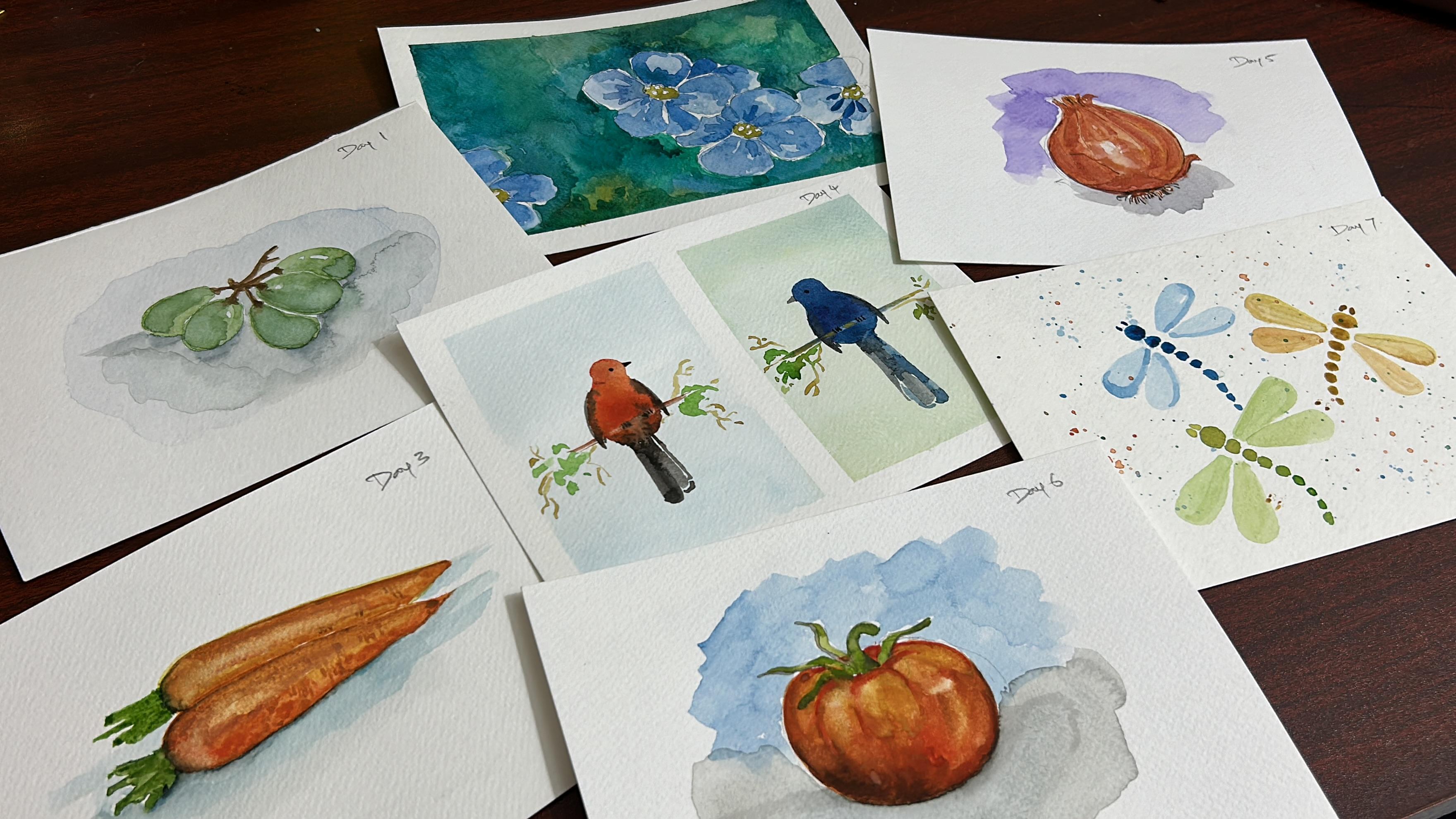
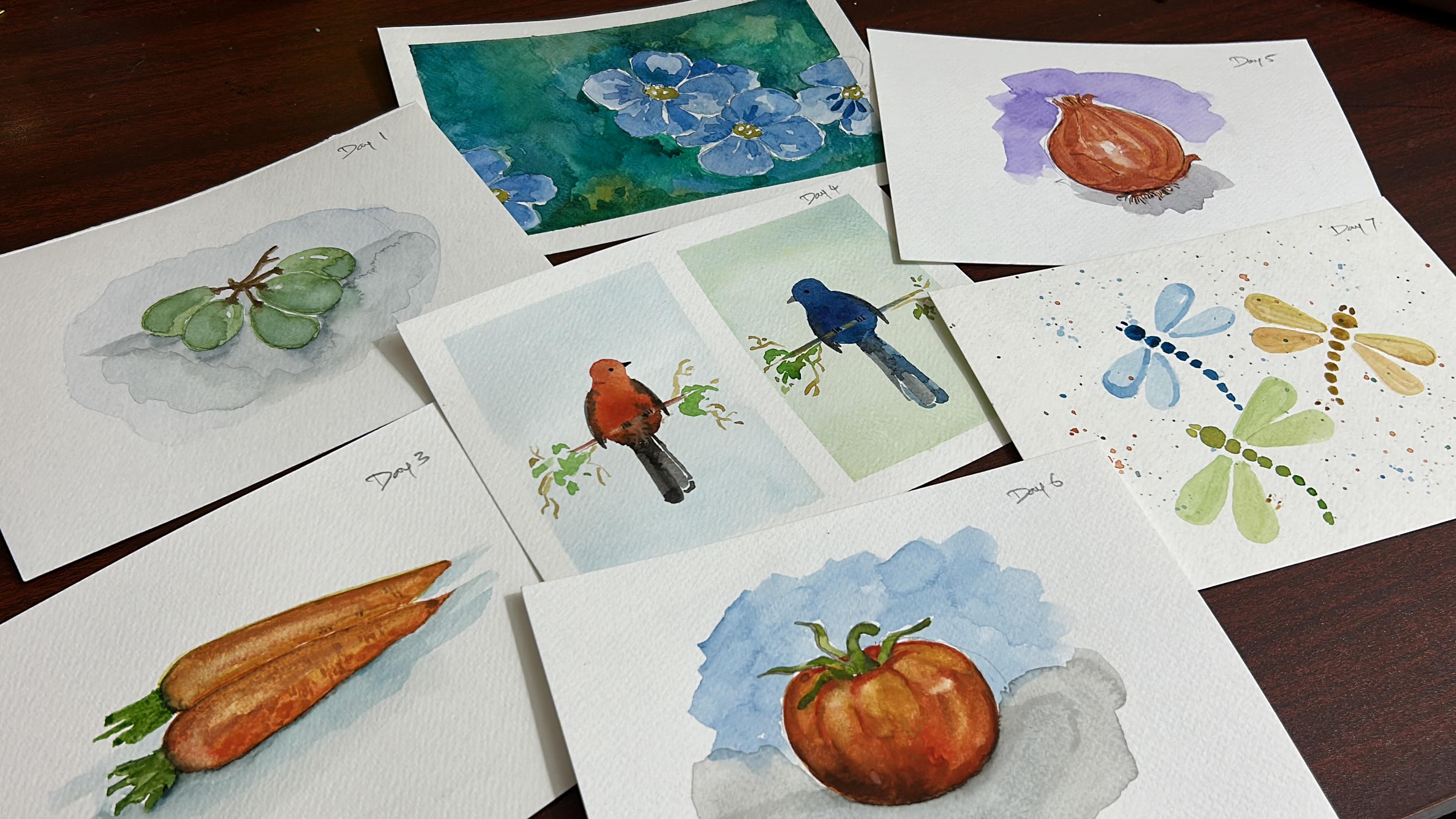
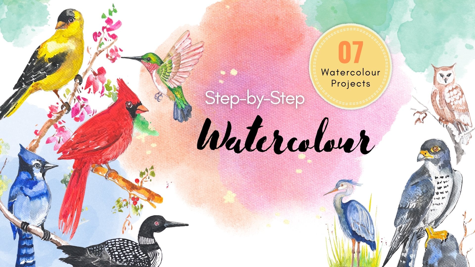
in the coming days. Here are some of the paintings
we will be creating. We will be working in landscape mode with all
projects on A five size sheets. While there is not a specific
theme for the seven days. Expect beautiful simple and fun filled watercolor paintings. I will upload everything to the resource section under the project tab on Skillshare
for easy reference. You can also upload your work to the project section along with
your other class projects. This class is all about enjoying the
process and consistency. I encourage you not to
worry about the end result. Focus on developing your
own painting style rather than strictly following the
step by step instructions. Sometimes your paper
may dry too quickly. You breastks may not
turn out as intended, or your paper may
have too much water. Embrace these moments, enjoy the process and go
with the floor. Try to develop your
creativity style by understanding
why each stoke is made by grasping the composition and perspective of the painting. You can then create
your own version. I suggest watching
the project videos once before you start, then following along
the second time. This way, you will know
what to expect and be aware of any mistakes I
made and how I corrected them. I have left these corrections in the videos because they are the part of the
learning process. Be sure to listen to
the tips and tricks. I mentioned about color theory, color mixes, and additional
colors you can use. These will help you
develop your own style. If you are a beginner, consider watching my
previous waterglor class, whether I explain all the
waterglor techniques in detail. I will also briefly cover the major techniques used in this class to refresh
your knowledge. If you are painting with a basic palette or
just primary colors, I recommend reviewing
the color theory portion of my watercolor pigment
properties class. We have several
projects but you don't have complete them all at once. Start whenever you are ready and build a consistent
painting habit, develop your own creative style. Lastly, don't hesitate to upload your watercolor
projects in the projects area. If you have any
questions or need help, feel free to us in the
discussion section on station. I will be happy to assist you.
3. Art supplies: Welcome to seven days
of watercolor workouts. Let's look at the materials
we need for this class. First, we need
watercolor papers. I recommended using
100 percentage cotton, 300 GS cold pressed paper in A five size for
the class projects, like the Orchespad I'm using. Have cut the A four size
in half for the projects. You may also use a
sketchbook or paint in different sizes
to your liking. But I recommended using
a sketchbook with 100% cotton and 300 GSM
paper. Water glo paints. I will be using my curator watercolor palette consisting of colors
from Mont Mart. But you can use any brands
such as White Knights, S Daniel Smith, and
Vincent and Newton. The next brushes.
Throughout the class, I will mostly use round brushes in sizes eight, four, and two. These are ideal for most of
my background stokes while the smaller brushes or for
refined stokes and details. All the brushes I use or
from odd brush supplies. In general, I recommend
having a large flat brush, a medium size brush, and a liner brush for
the class projects. These are the
additional supplies, two jars of water, one for cleaning paint
from your brushes, and the other for fresh
clean water for painting. Next, white catch
paint for highlights, stars, and some flowers. A watercolor palette
for mixing your paints, whether metallic, plastic,
or any type you prefer. The next pencil erase
and for rough sketches. Next, masking tape,
masking tape, if you prefer clean ages. Then any kind of board for
tapping your paper onto, for lifting your work to,
your painting convenience.
4. Watercolour Techniques: Let's look at the
major techniques we will be using for
these seven projects. I explain all of these techniques
extensively in my class. First one is wet
on wet technique. As the name suggests, this involves applying
wet paint onto wet paper. To wet the paper, simply dip your brush in water and
apply it to the paper. You can use a larger brush to
cover a large surface area. Once the area is wet, take some paint and
apply it to the paper. The paint will spread
out creating soft edges. You can use this technique for a wash for blending multiple cs. The second one is wet
on dry technique. This involves applying
wet paint onto dry paper. The dry paper can either be an empty surface or a
surface with existing paint. For example, I've taken green color and
apply to dry paper. As you can see,
the paint does not spread as it does in the
wet on wet technique. The third one is dry
on wet technique. This involves applying dry
paint onto weight paper. First, wet paper. Then dry or brush though
to remove excess moisture. Use the dry brush to pick up some paint because the
brush is almost dry. The paint won't spread much when applied
to the wet paper. This technique is useful
for creating waves, soft backgrounds, whole
age and distant trees. Oh. Fourth on is we we splattering. This involves splattering wet
paint onto a wet surface. First, apply a layer of
wet paint to your paper. While the surface is still. Load your brush with paint and splatter
it onto the paper. Mm. You can do this by tapping your brush or flicking it
with your fingers. The splatters will spread out
and create unique textures. You can also try we dry splattering by
splattering wet paint on a dry surface for
smaller, more defined dots. Be sure to remove
excess water from your brush each time to avoid affecting the
rest of your stokes. If you are new to watercolors, practice these techniques at least once before starting
the class projects. Now that you have had a quick look at the essential
watercolor techniques. Let's look at taping down
the paper onto your board.
5. Day 1: Watercolor still life - Grapes: Let us paint and
AC stick together. Perfect for
watercolor beginners. The reference picture for this
painting is provided here. You can also download it
from the description. I'm using a light
value of ultramari to paint the background with
a wet on right technique. After painting the background, I tilt the board to collect any excess waterclor
pigment at the edges. The news damp brush to
absorve the excess pigment. I want to remind you
that in this painting, you should use
only a light value of altromerin for
the background. I mix sap green with
a small amount of damper and have
it on my palette. On the other side
of the palette, I added water to this mix
to get a light value, which I used to paint the
base layer of the grain. T. While painting the base layer, I leave some white
areas for highlights. The white areas for the
highlights are not completely. They have a light value of, which we applied
as a background. After painting the base
layer of the grape. I then paint the mid
tones on the grape. Next, I mix ultramarine with a small amount of sap
grain to get a dark value, which I used to paint at
the base of the grape. Next, we are going to paint a second grade with its direction
indicated by my finger. Like the first
gray, I start with a light value for
the base water, leaving some white areas
for higher lights. Now, I'm applying a medium value from the middle to the
bottom of the gray. Finishing with the dark value at the very bottom of the gray. Since the light is
hitting the top, the color gets darker as
you move down the green. While the gray area is still, I add the base of the
stem using p temple. The third grape is partially
hidden behind the first one. I'm going to use three different values and high light to paint this grape, just like with others. For the fourth and fifth grapes, I paint them the same way as the previous ones using
three different toes. To save time, I speed
up the process by twos. One of the grapes
looks quite flat. To make it more realistic, I with the grape and
added a dog value in the middle to give it
and bring it to life. After that, singer, I paint
the stems of these grapes. I simplify the shadows of these graves as much as
possible for clarity. We can refer to the
reference image. I started by waiting the areas where the graves touch
the ground, the t. I painted the shadows. While painting these shadows, I made sure they feed as they
move away from the grapes. Next, I mix sap green with
ultramarine to create a dark value and
use this to paint the darkest part of the shadow near the
bottom of the grapes. Using burn number, I added
brown spots to the grapes. We have reached the end
of the painting process. Hope you enjoyed
watching this video, if you like the video. Give me a thumbs and follow me. Oh Oh Oh Oh Oh
6. Day 2: Watercolor negative painting - Flax flowers: Join me in painting these beautiful and
delicate blue flax flowers with watercolor. The sketch needed for this
painting is provided here, and you can download it
from the project area. I'm starting by painting the ended paper
using ultramarine. I want to pollen of the
flows to remain paper white, but I accidentally
painted over the pollen. To fix this, I am lifting
the pigment using a tissue. After that, I'm painting the spaces between
the polen with ultra. These white spaces are not visible right now due to the
light value of the ultra, but they will
become visible when we add a darker value while
painting the flowers. The paper is still wet, I mixing ultramarine with sap green to paint
around the floors. Since the paper is still wet, the consistency of water
and pigment is crucial to prevent the green hue from
seeping into the floor areas. I also adjust the consistency of the pigment on my
palette for reference. First, I adjust the ratio of
sap grain and ultramarine, aiming to capture the essence
of light and darkness between the leaves without
delving too much into details. C. Initially, I use a medium
value of the mix of ultramarine and sap green to
paint around the flowers. Now, I'm using a dark
value of the mi, which helps to bring
the flowers to life. While painting with
this dark value, my paper is still. Optic painting
around the flowers, I allow to paper
to dry completely. While the paper is
completely dry, I add more of the
ultra rhine and sap green mixed using the
wet on dry technique. I paint this green hue, which is a mix of
ultramarine and sap green. Only on the right
side of the flowers, leaving the left side
touched to avoid a messy overen background. O Next, I'm using ultramarine to paint the petals of the first floor. I'm I'm leaving some areas very light to show the high lights created by the light source. O. Then I use green to paint around the block. As I add the, the pollen
becomes more visible. Next, I paint the other
petals of the flow using. Looking for medium
and light values of tee to create and dimension, making the floor
appear more realistic. I use a dark value of ultramarine to paint the
veins on the petals. Oh. The first floor is fully painted and complete. Now we are moving on
to the second floor. We will paint this
second floor with a mix of tamarin and Azeri crimson. The second floor the first, so there will be a shadow
on the second one. Oh. Is a dark value of the mix of and Alysa imson to paint the petals
that are under the first. Oh Look for the light medium
and dark values in the second and try to them in your painting
to enhance realism. Using, I paint around pollen, and with a dark of, I paint the veins on the petals. For the third floor,
I use a mix of ultramarine and blue
to paint the petals. I add only a few
details to this th. As the first as the first and second floors are the main subjects
of this painting. O The background flows will have no details. Once again, I'm using
a dark value of ultramarine to paint the
veins on the petals, and I'm using sample to
paint around the pollen. We have reached the end
of this painting process. I hope to enjoyed
watching this lesson. Oh Oh Oh Oh. Oh good Oh
7. Day 3: Watercolor still life - Carrots: Join me in an AC watercolor
painting station where we will paint carrots in an
expressive style rather than aiming for prizes details. I'm mixing yellow cer with armam rate to create
an orange color. I then add more water to
achieve a medium value, which I used to paint the
base layer of the carrot. I start by painting the overall
structure of the carrot, leaving some white areas
just above the middle while filling in the other parts with the medium value of orange. You can see there is a lot of water and less
pigment on mem brush. After applying the paint, the area will stay
white for a long time. When we apply a second
layer of pigment, while the paper is still wet, it blends with the
previous layer, creating beautiful and
unexpected results. This is an expressive way of
painting with watercolor. Next, I use a clean damrige
to blend the pigments, leaving small spot
for the highlights, which are surrounded
by a little value of orange. Using a clean. I then track the pig at the end of the carrot
to form the root. Next, I mix cadmium red with Alcon and rincon
to create a dog value, which I used to
paint the carrot. While applying this dot value, I make sure it doesn't touch
the top edges of the carrot, leaving the highs
around the area. After applying the dot value, the highlights on
the carrot look almost like small
boxes with hot edges. To soften these edges, I use a damp brush to
blend the pigment, then lit some pigment near
the highlights so that it blends seamlessly with
the surrounding areas. Next, I mix Cavium rate with ultramarine to
create a brown shade, which I used to paint the bottom edges of
the carrot to depict the darker areas where the
carrot touches the ground. Using ultramarine, I add color to the crown
of the carrot. You can see the ultramarine
blending with the pigment already upright because
the paper is still white. I use sap cream to
paint the shoots or leaves emerging from the
crown of the carrot. For the darkest areas of the
shoots, I use ultramarine. For the car shadow
on the ground, I use ultra marine. Then I mix Cardium
rate with a touch of ultramarine to get
in dull orange shade. Using a light value of seismic, I paint around the shadow
to suggest the presence of the carrot and its
interaction within ground. I then use a dam rush to soften the pigment that
has been applied, ensuring there are no liges. M. If you want, you can stop
the painting process here and be proud of your
expressive watercolor painting. Or if you had like to continue, you can keep going and enjoy painting the second carrot
be paint the first one. I will be using
the same pigments for painting the second carrot. However, the angle of the carrot is slightly
different from the first one. So pay attention to its angle and paint the overall structure
of this second carat. To paint the base layer
of the second carrot, I use a light value
of a mix of yellow ocher and um to
create an orange. I use this light value to
paint inside the carrot and also some white areas
for the highlights. Next, using a mix of lesin
crimson and armmate, I painting the areas
around the high late. Using a damp rush, I blend the high light areas
to avoid any hod edges, and I make sure to leave some spots paper white
for the highlights. The second carrot is not
standing out from the first one. I use a mix of ulcer and and a to different and
give it moth th life. Next, I mix Cam with a touch of altame which I used to paint the darkest
part of the carrot. I use Alcin near the
ground of the cart and the same altamarn to
paint the part of the carts where it
touches the ground. Then I use a light
value of the and ultra from the palette to paint the lighter
parts of the shadow. I paint the shots of the carrot using and for the darkest
part of the shoots, I use. O I hope you were
learning something. I hope you enjoy
watching this lesson. S
8. Day 4: Watercolor Fun painting - Birds: Join me in painting these
beautiful birds directly onto paper without any
primary sketching. I divided the watercolor paper into two halves vertically. On one of, we will paint the background using the
weight on weight technique. After wetting the paper, I mixed paints gray, vermin hue, and Camboch yellow
to create a brown shade, which I used for the background. I applied the brown
shade to the top of the top and
bottom of the paper. Then blended them together
using a damp reh. After painting the background
on on f of the paper, the next step is to paint the background on the other off. I mixed rosian blue with bug yellow to
create a green hue. Then mixed this green hue with gray to create
a my green shade. I used the white on tie. To apply the pigment to the
top and bottom of the paper, then blended them
together using a bruh. Once again, I tilted the board to collect any excess pigment near
the masking tape and way. Once the paper is completely, Once the paper is
completely dry, I used a medium value of
arm to paint an oval shape. I then applied a
thicker consistency of vermin hue in the
middle of the oval. After that, I mixed hue with
go to create an orange hue. Which I applied to the top
and bottom of the oval. Finally, I mixed with gray and applied it to the
bottom of the oval shape. Using a medium value of here, I do a circle for the bird's head and
connected it to the body. I added yellow to the
top of the bird's head, then blended the pines upped with the e for
the smooth transition. Next, I used a dark value of gray to paint
the bird's wing. After painting the wings, I used a medium value of
to paint the bird's tail. Making two long strokes. Oh Oh Using a dark value of prey, I added the peak
and I of the bird. We have finished the
painting the first bird. Now for the second bird. We start by painting
an val shape for its body using a medium
value of prician blue. Next, using a dark
value of Prussian blue, I painted the middle
part of the old shape. I then mixed Prusian blue with the pens gray to
create a dark shade. Which I applied to the
bottom of the old shape. I blended the colors to
achieve a smooth transition. M Using a medium
value of brucan blue, I painted a circle
above the oval to form the bird's height and connected the height to the body
as shown in the video. I then added panes gray
to the bird's head. Using a thick consistency
of panes ray, I painted the bird's wings. I used a medium value of y
to paint the bird's tail. Then used a thick consistency of gray to paint the eye anda. Oh. I then used a dampers to soft lift some erminin hue
near the bird's neck. I also used the clean
dampers to lift pigment from the area
just above the tail. Then tracked the brush
along the paper to paint the branch where
the bird is perching. I repeated this process
a couple of times and ed to paint the shadowed
part of the branch. With a medium value of cray, I added a small curve
near the bird's neck. Using a damp brush, I lifted pigment from
the area just above the tail to create the branch on which
the bird is perching, dragging the brush,
to form the branch. We have reached the
end of the video. I hope you find it
helpful to learn how to paint birds using simple
shapes effortlessly. Oh, Oh, Oh Oh, good
9. Day 5: Watercolor still life - Onion: Join me in the watercolor
painting demo. As we elevate our skills from
beginner to intermediate. We will explore painting a
still life, mastering depth, dimensions, and color theory to bring our creations to life. We need the sketch for
drawing for painting. We can download this image
from the project area. Oh I mixed a small amount of rose with French marine and added a lot of water to
this to paint the background. Once the background
is completely dry, I start by waiting the
area inside the onion. We will use the weight
technique to paint the onion. I mixed rose mad with
a small amount of cambge o to get air
the orange hue. Which is used for the
base layer of the on. Notice how I purposely leave some white space to represent
the high les on the on. Highlights or areas where light folds directly
on the object, adding depth and realism
to the painting. In the first layer, we
apply the light value. In the second layer, while the paper is still, we will apply medium and values. I mixed more rose mad with camog yellow to a pinkish
shade of orange. Applying this mixture
to the left side of the onion while the pa is still. Observe how I intentionally some areas at the
bottom of the onion, maintaining their light value. Also note the strokes that replicate the curved sticks
found on the onion skin. Next, I mixed with
a small amount of French to a color. This hue is used to paint the
darkest value of the onion. Finding the darkest
value was not deepen up. I increased the amount of
French ultramarine mixed with with less water in the mi, achieving a very dark value applied to the onion
as shown in the video. Oh. Using a medium
value of burgundy, I added some stokes at
the top of the onion. Using a mix of rose mat
with more French tram, I painted the darkest part of the specific
area in the onion. Using the brown died in color, I applied the top
part of the onion. Oh, Oh, Oh Using the dark
value of Burgundy, a mix of rose madder
and French tra, I painted the darkest part
of the top of the onion. At this stage, the
paper is completely, so I used on technique to
paint the top of the on. Notice how I added
all the details at the top of the onion to
enhance its realism. Using a medium
value of burgundy, I painted the crack
on the onions skin. I used a brown hue
to paint the door, cystic value of the onion, gradually shifted the ten
from door to light value. By mixing rose matter
with more cave yellow, we get an earthy orange tone used for the onions outer skin. We will paint the root
part of the onion, using a hue and add to the
onion skin using the same u. Next, I painted the
shadow of the onion, using a light value of French ultramarine mix with
a small amount of rose ma. I then mixed more
rose matter with French ultramarine to paint the darkest part of the shadow. O. The final step involves
using the lifting technique. I gently lift the pigment using a dam brush along the curved lines
created in this sketch. This painting took nearly
25 minutes to complete, but I sped up the process and edited the
video for breaking. I hope you find these steps useful for painting a
realistic still life.
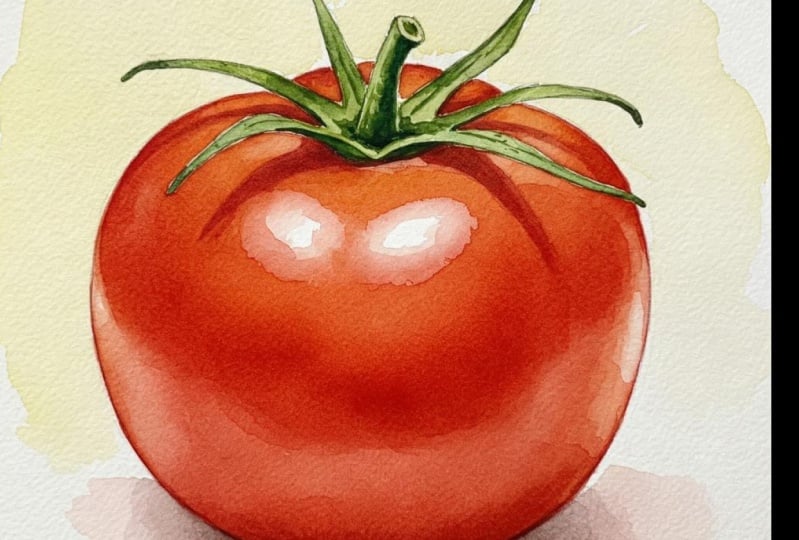
10. Day 6: Watercolor still life - Tomato: Oh. Today, let us explore still life painting by focusing on a simple substance. The sketch and
reference image aeded for this painting or
provided here with links to both available
in the description for download in
the project area. I being by creating a
simple background using a light value mix of ultramarine and scarletly
to achieve this. O. Added a touch of scattered lake
to ultra marine and dilute it with more water. This mixture is used to paint the background
of the tomato. After painting the background, allow the p to completely. O Once the paper
is completely dry, we move on to
painting the tomato. We will use the whiton weight
technique for this part. I start by wetting the
area inside the tomato. Then I mix cabello with scab leak to create a
nice light orange color. Which is perfect for painting the light
value of the tomato. Be sure to leave some white
areas for the highlights. In our painting, highlights of the untouched spots where
we leave the paper white, allowing them to shine as if
light is falling on them. This technique adds realism and debt bringing our
outwork to life. Next, I use scarlet leak
to add some curved stokes, which brings the tomato to life and add dimension and
realism to the painting. Refer to the reference photo and try to imitate the curves you see as these are essential for avoiding a
flat lifeless appearance. Oh Oh, good. Oh, Oh Oh, good. Then I apply rose mad at
the bottom of the domato, followed by ultramarine at the left bottom for
the darkest value. For the darkest parts, mix in a bit more ultra main. I list a small high light on the right side of the tomato. So I used the lifting
technique to bring it out. This technique adds
realism and depth, bringing our tw to life. To paint the stem and
sepals of the too, I amounts of and ultimi
to a medium value. In the reference photo, you'll notice two
crazes on the tomato with very dark red
color under the sepals. To tbc these I mix
scarletly with a touch of ultramarine to create
a maroon color and paint those areas. For the shadow of the tomato, I use the weight down
weight technique. I mix a small amount of rose
with t to paint this shadow. H First, I use a medium value of this mix to paint
the cast shadow. Then I mix a small amount of rose metal with ultramarine
to achieve a dark value, which I use to paint
under the tomato. This technique adds realism and de bringing our tw to life. Using a clean dab righ, I wait the area where I
need to lift the paint. Then I gently brush on that area with the cloth to remove the paint
and reveal the high. We have reached the end
of the painting process. Oh
11. Day 7: Watercolor Fun painting - Dragonfly: A In this class, I'm going to paint these
awesome dragon flies using water colours. I'm going to be
super simple with no need for any
sketching beforehand. I begin by painting the head
of the first dragon fly. As I work, I gradually
add more water to the pi. Oh. Creating a subtle
gradient effect towards the end of the body. Next, I move on the veins, opting for a lighter
shade of gray. While the wings are still wet, I introduce French alta Marine
to add a unique texture. With that, we have completed painting the first dragonfly. Creating a subtle radiant effect towards the end of the body. For the second dragon fly. I use gray to paint the head. Sorry. I use paint the head. Then I mix French
ultramarine with Cabo o to paint the body. Create and cool grain hue. As before, I gradually reduce the pigments intensity
as I work down the body. Using the remaining pigment on my brush and adding more water, I paint the wings. To add a unique
texture of the wings, I apply mix of camo
jello with a touch of t. Finally, I add the ice
to the dragon fly. Just like that,
we have completed painting the second dragon fly. For the third dragon fly, I once again green
color to the head. For the body, I use
light green color. As I use well, I gradually reduce
the pigment's value as I move down the body. I make some gray Oh Oh Oh, Oh Oh adding more water to paint the wings. While the wings are still wet, I apply gre to create
unique texture. Add a little more green to
create a unique texture. M At the end, I splatter some blues and greens on the
remaining white areas to create visual interest
in the painting. I hope you enjoyed
watching this lesson.
12. Thank you: Thank you all for
joining this class. Can you believe we have
completed all seven paintings? Congratulations to each of you. I sincerely thank
you for being part of this class for
seven wonderful days. I hope you all had
a fantastic time. Don't forget to upload your class projects to the project section
here on Skillshare. You can also share them on
social media and a tag me. Once again, a huge thank you to everyone who joined
and painted along. See you all in the next
class tell them, bye bye. S.
 Sahaya Babu Manickam, Motion Designer & Watercolor Artist