Transcripts
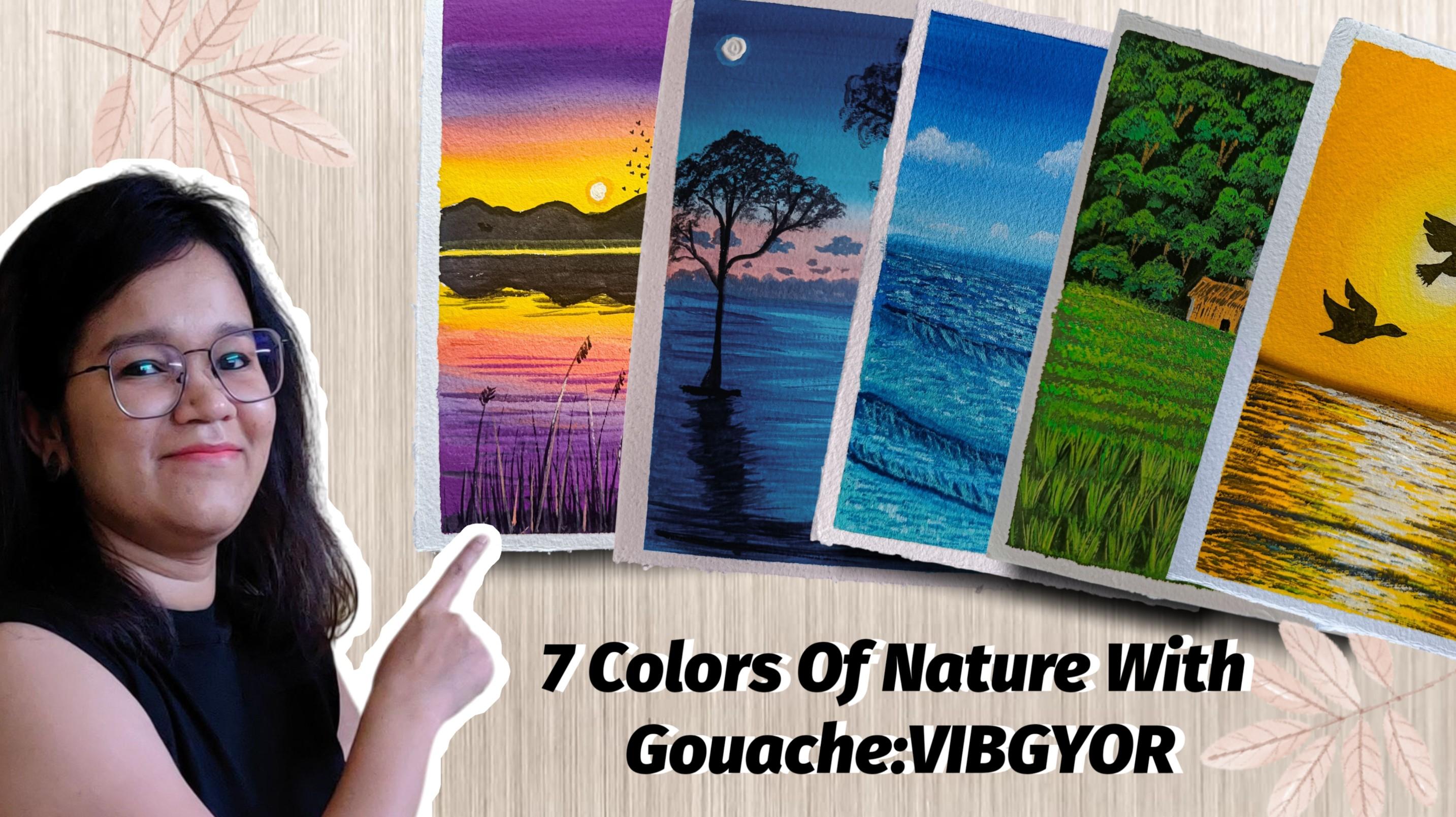
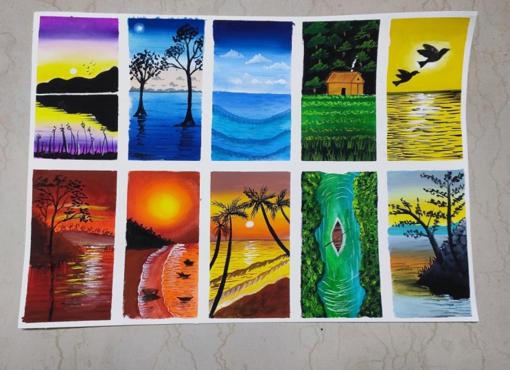
1. Introduction: A rainbow is one of nature's most beautiful
optical phenomena. So culturally, rainbows
often symbolize hope, promise, peace, and sometimes
even mystery or magic. Its fleeting beauty
reminds us of the wonders in nature and the signs
hidden in everyday sight. So I thought, why not to paint the rainbow colors
in form of nature? So different different
rainbow colours, landscape painting we will be doing in this entire course. Hello, friends. My name is
Mohiisna and I'm from India. And most of you know me as Mohani Art Gallery from
my Instagram account. I mostly do nature
related painting, mostly related to nature. So this whole class
will be related to nature painting with Kosh. So in this class, we will be learning. So what are materials we will be needing for a
complete painting. Then some techniques we
will be learning how to use those techniques in
the seven paintings which we will be doing. Very basic and useful
techniques of using gauze. Then some beautiful
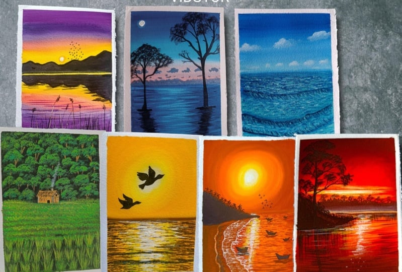
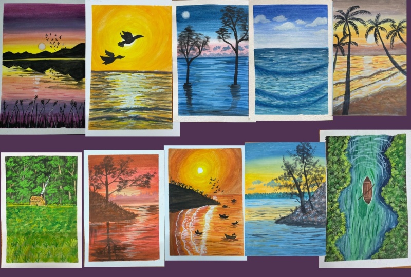
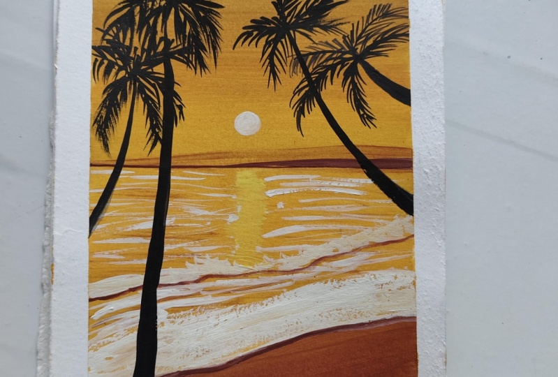
paintings starting from the violet color. Then comes the indigo color. So all seven rainbow colours
we will be doing one by one, and I will be posting all of these paintings, alternate days. So again, blue colour,
then green color. Also, if you want to practice
more of gauche techniques, you can watch my class. That is 15 days gauge
landscape painting. So let's start and begin with our first painting that
is with violet color.
2. Materials Required: Welcome back. So let's discuss about the materials which
we will be needing. Let's first talk
about the paper. This is the 300 GSM
paper which I'm using here and it's from the
hithrput which I'm using here. It's a very good textured paper, not very textured,
but medium texture. This is the masking
tape which I will be using in the painting. Then the colors, there are three different
brands of colors. This is from art creation, and one is from Brostro
and another is from Camel. So these brands I will mostly be using for my Gauche colors. Apart from that, let's
talk about the brushes. So the first brush, which
is the rigor brush, it is a very thin brush
of size two by zero. Then comes the flat brush. I have three flat
brushes. You can see. These are three brushes, which has a thick at the top, and one is very thin from
the top. You can see. When we will be doing
the texture painting, we will be using these brushes
also for the background. Then comes the Filbert
brush of size one. And the fan brush, this is the Bristol fan brush
which we will be using. Then comes the round brush. Of two different size
of size two and four. All these materials we will
be using these all brushes. Then let's talk about the
pen, technical pen, rubber, then the pencil, scale, all these things we will be
needing for drawing purpose, then the palette,
then the cloth. Also the water container
we will be needing. All these materials
we will be needing in our entire painting.
Let's begin.
3. Techniques: Welcome back. So let's talk about the techniques
we will be using here. So I have few colors over here. I have just randomly
taken some colors. So let's discuss
about the techniques. The first technique
which we will be using is just how
to use that color, how to use gauche color, how much water to use. So let's talk about that. So mostly we will be
doing wet on dry. So the colors will be wet
and our page will be dry. So first, just wet your brush
properly with clean water, and then just take your color. If your color is milky,
then it is fine. No need to add too much water because we don't want
a transparent color. The color should be
in a very milky form. It should not be thick also, I should not be thin also. It should be somewhere in between so that you can
easily flow your brush. If in case your
brush is not flowing and some rough
textures are coming, that means your brush is dry, you have to wet
your brush, again, take the color and try to do the whole
background painting. You can see how I am
doing it in one go. I've just added few white
colors inside this blue. That is the teal color,
and I'm just moving in my brush in the
upward direction. So this is one way of doing it. Another way is
when you are using three different types of colors and you are
blending those colors. Let's discuss about that
also because that will be required when we will be doing the colors,
two, three colors. So first color which
I'm taking is the blue. First wet your brush and then only do the color combination
or color blending. First, I'm just taking this teal color and just
covering the above part. My brush is wet and I have
loaded the brush with lots of colors so that in
one go I can do a proper opaque painting. After that, I will just
wash off my brush. Now, water is there on my brush. Now I will take
this yellow color, put it below, and I will try to blend this color
with this steel color. I'm pushing my light color
towards the dark color. This is how I'm
doing the blending. But again, you can see there
are some lines over there. I'm just trying to blend it over there where the two colors meet. Sometimes you have to
add a little bit of white colors to make that
color a little opaque because sometimes the colors
are very thin and you will add little white to it to make
a nice thick opaque color. So just adding and
you can see how I'm mixing the color and how
it has blended properly. Such a beautiful
color has come up. If you feel that it should
be blended more than add again that blue
and move downward, not totally downward,
but little downward. So like that, we have
to fix the colors. So every time take milky color, not very thin color, not very thick color. This is how we have to
do the color blending. There will be lots
of color blending in these entire seven
days painting. So you will get to know this. Also, let's talk
about the brushes, how we will use the brushes. You can see these three
brushes are there. This has a thick,
uh, above texture. You can see it is very thin. The breadth is very thick
and one is very thin. It has a very pointed tip. There are two types of
flat brush which comes. You can see it is
creating a thick line. But when I will use the thin
brush which has a thin tip, you will see it will create
a very nice thin line. There are two types of flat
brush which comes in market. You'll notice this
brush is very good for creating textures
and water textures. This texture part we will
be using in our painting. In our water painting
in our sea painting. I'm just mixing a
little dark color, and this type of texture we will be creating inside
the water part. Using the tip of the
brush and the dam brush, this is a painting in
which this type of technique we will
be using so yes, so it's a very
beautiful painting with a blue color everywhere. So this is a blue
colour painting. So now comes the fan brush, how to use fan brush. You have to use fan brush that
is completely damp brush. Fan brush should
not be totally wet. It should be a damp brush means
you have to dip in water, remove excess of water, and then you have
to use that brush. It is a bristle brush, not a synthetic brush. Just keep that in mind. And just using the
tip of the brush, you can easily create the grasses which we will
be using in this painting, which is a green colour
painting. So yo yo. So these textures we will be using if you want to
create a bigger grasses, you can create bigger
grasses with this. Beautiful grasses are used to create in just one
go with this fan brush. It's excellent brush
for creating grasses. And now comes another brush, which is the Filbert brush. This is a very small
size brush which we will be using for
creating the tree textures. Now, these tree textures, you will see in the
painting which I have shown you previously. That painting also that
tree texture was coming. So you can this type
of tree texture we will be using in
most of our paintings. It's very beautiful way to create the texture of the tree
with this type of brushes, and it's very easy also. With the same brush
we will be using for the cloud also that
I will show you later. So with my liner brush, whenever you are using any
liner brush or rigor brush, make your color a
little thin and then use it because these
are very thin lines and it's very easy to create the branches and sub brranches
with these rigor brushes. So all these brushes we will
be using for the painting. You can see how
thin the lines are. These thin lines we
will also be using in the water painting
because there also we will be needing
the thin lines for creating the reflections
or the water part. Wherever it will be required, we will be using these brushes. So now comes the Round brush. Again, round brush also here, it will be used for
filling of the colors, but it is also used for creating the textures
of the water. You just have to move the
brush in to and fro direction. Make sure the color is fluid, then only your brush
will move properly. And if your color is not fluid, it will create
breaks in the lines. Make sure that your
color is fluid, then only that
texture will come up. This type of textures we will
be using in this painting. So there are numbers
of painting. This is the indigo color
which we will be using. So yes, there are different
different variations of techniques of the styles which we
will be using in these different different
paintings of different colors. This is a seven
colors of nature, which is in the rainbow. So so all these techniques, try to practice it so that it will be helpful for
you to do it in the next class which we
will be doing the painting. This is a rough texture,
just making your brush damp and take a thick
color without any water, and this is a nice
rough texture you can create on the
mountains or anything. I'm not sure if we will be
using this texture or not, but I wanted to show you how
to use this dry texture. That's why I have shown you Let me show you with
a little darker color so that it will be visible more. You can see how rough
the texture is coming. You have to use damp brush and co little colors and that's it. Now let's talk about
the cloud formation, how to create cloud
using the filbert brush. Here we will be using Filbert
brush for creating clouds. This is a very good brush
for creating clouds. Take damp brush and very
little amount of color on your brush and just
with the edge of the brush as it is a
half circle shape. It is very easy to create the
cloudy effect in the sky. Since the gauge paints react to the colors if it is too
wet, don't make it too wet, it should be a damp brush, and the color has to
be very little amount so that that
fluffiness is there. Like this, we will be
creating clouds also. And different colors of
clouds will be there. One will be white and one
will be another color. So I'm just trying to show
you how you have to create the clouds so that you can easily create in your painting. Another cloud with
different colors is a violet color
which I'm using. Just dab, dab, dab
and it's done. So like that, you have
to create the clouds. You don't have to
overdo the brush marks. Otherwise, the color behind
will get reactivated. So this you have to keep
in mind in Gauche because Gauze gets reactivated
with water. So something like this type of shape should come when
you're creating clouds. These are the techniques
which we will be using. Let's start with
our first painting.
4. Violet: Welcome back. Let's start with our first painting
that is violet. So maximum colors which we
will be using here is violet. So first, I'm drawing
the center line. So I think it's not visible. Let me use a different pencil
so that it is more visible. So again, drawing the line. Same line just with
a different pencil. So that you guys can
see what I'm drawing. So now I think it's visible. So after that, not much
of drawing is there, just the backside
mountain and rest, we will be doing
the coloring part. Backside mountain. I'm
just trying to draw it. I'm keeping a little
curve area in the center because there
will be the sun part. So the reflection below So this is it. Now let's discuss
about the colors. So these are the colors. The first color is
move the violet, the coral, yellow,
white and black. So all these colors we will
be using in this painting. If you don't have
any of these colors, you can use just
one violet and make it a little lighter
violet with adding white. So anything you can use, it's completely up to you
which violet you want to use. If you have different
type of violet, like different shade of
violet that also you can use. It's not an issue. So just starting from the top, make your color fluid, like a milky color and
then start from the top so that you don't have to repeat the background process
again and again. My color is already a
little bit of milky, so that's why I'm not adding too much amount
of water in it. Otherwise, that color
will become thin. So now this violet color so
first is the mauve color. It has a little tint of
that reddish color in it. Then this is the violet color. So just adding this violet, you can see my brush
is getting dry, so I will just wet my
brush a little bit more, and then I will use it. I'm just trying to blend
these two colors together. Go one at a time slowly, slowly, just adding little white and
this coral color and just adding one layer of
it and trying to blend it with this
violet color first. So every time
first, try to blend the colors, then move downward. Always push the color
which is below above, then it will look like a
uniform blend of colors. Adding little white
to this coral, and again, I will take this
coral color and put it below. And again, I will try to blend
those two colors together. So every time you have
to blend the colors, there should not be any
sharp lines in between. So try to blend it
as much as possible. I'm adding a little bit of white to this lemon
yellow and just covering this part which is
below this pinkish part. You can say the
pinkish color it is. If you don't have
the coral color, you can just make
a little bit of orange and add white to it. It will come similar
color to this. So just adding a thick amount of this yellow color and just
covering the below part. This is a lemon yellow, which I'm using here because
I want a bright color. That's why I'm using
here lemon yellow. If you don't have lemon yellow, you can use any yellow
whichever you have. So now the upper part
is a little done. A little bit more blending is required for the orange part. So you can see how
pink is mixing with this yellow and it's
turning into orange color. So it's basically an
orangy pinkish color that is called as coral over here as it is
written in the brand. So it's like that color only. So just try to blend it a little bit more once your
background has dried. Once you feel that you have
done the background properly, then only stop blending it. So every artist knows
where they have to stop because every artist have
their own way of painting. So just look it from behind
and see how it is looking, where it is missing, and then try to
blend the colors. Till you feel that you
are satisfied with it. Now we will be doing
the below part also with similar colors, since it is a reflection,
so the colors, whatever we have applied above, it will be below also. So I could have used just
violet color on the whole, but I wanted to give
a little touch of the sunset where there
is a nice warm effect. That's why I have added
this yellowish color. So first, now, since
this is a reflection, so reflection is always
the opposite of the sky. So first will be
the yellow color, then a little orangy color, then the violet and
then the mouth color. So it will be like that. Similarly, here also, we
have to blend the colors. So yes, you have to blend the colors as
you're moving down, try to blend the colors. Push the color to down
and try to blend it. You can see an trying
to blend the colors. This is how we have
to do the blending. Now I'm using this violet color and just applying just below
to this pinkish color, and that is the coral color
and trying to blend it. Slowly, slowly, similarly, whatever colors you
have used on the top, you have to use the
same colors below. Currently, just focus on the blocking and
the blending part. No detailing is done over here. Just we are blocking the colors and blending the
colors simultaneously. Follow the same process which
I am doing and you'll get the same result like
this. Just follow it. And since the below
is the darkest, so the morph color
which is there, that is the darkest color
which I've used below, and similarly, try to
blend the colors as well. Once we are done
with the background, then we'll start with
the detailing process. So you can see when
we have added yellow, it's becoming so
bright and beautiful.
5. Violet Final Details: Welcome back. So
let's start further. So let's continue
further with this. I'm just taking black and my rigor brush and just first outlining
the entire mountain, and then we'll fill the colors. So first outline it. Make your color a little thin because we are doing
the outlining part. So make your color thin and then start with the outlining. The horizon line which is there. So all this part we will be
filling up with black color. You can use a bigger size round brush for
filling this up, and a little bit of gap
I have left in between the horizon line just to add a little yellowish
color on that area. So just a double
line parallel line I have just added with a
very little gap to it. And with my round brush, I will just try to fill
up this whole area. Very simple process. Take the round brush, make your color milky,
and then fill it. I'm just taking a little bit
of violet and mixing it with this black color to make it a little bit of
violety touch to it. Just slowly fill up the entire area because
this is a very dark color, and if any mistakes happen, we cannot cover it up. So try to do it very carefully. Once we are done with the above part, similarly, we will be
doing the lower part also. So we will be filling out this whole reflection
which is there, the below part with
a similar color. Whenever you are
doing any blocking, just try to outline the color, the whole thing so that the colors should not go
outside the boundary. It is a very easy and a very fruitful way to fill
out the colors, and you will never
get any mistakes or never spill the colors
outside the boundary. So first, draw the boundary
and then fill the colors. This is the best way
to fill the colors. Now, once you have done with the entire filling of the area, there is a center line which
will be with yellow color. But first, you have to wait for this whole black color to dry. Then only you can add
the center yellow line. Now in the center, I'm
just adding a little bit of yellow and this coral mix, so it will turn into a
little orangy color. And in the center, a nice small size sun we will be
adding over there. Oh very small size, just taking white
and just making a small round circular
shape on that area. So you can see how bright that color has come
up when you have added that white
color in the center. Now taking my flat brush, you can see this is
a thin flat brush which is there to
give the texture. So I've just taken
that flat brush and adding some lines below. Now, in this, you can also use the round brush for
giving the textures. So I think it's better to use round brush here instead
of using this flat brush. So I will take my
round brush and I will just make the color more fluid so that the
colors can easily move, and then I will create the
line in a to and fro manner. It's just some big
and some small lines. It all depends upon
how much pressure you're applying on the brush. If you're applying
lots of pressure, it will create thick lines. If you're applying
less pressure, it will create thin lines. So it all depends upon how much pressure you're
applying on the brush. So I'll not fill it
completely with all lines. Just the darker part, I will be filling up with the lines. And the lower part
which is there, I'm just making it a
little bit more dark with black color because there I
will be creating grasses. So just filling up this
with whole black color. And a little bit of lines over these mountain reflection area, because reflections are
not always of same shape, so just a zigzag
line just to create a nice reflection texture
on the water part. So very small small
details are these, which makes your painting really very beautiful and lovely. So just taking this
white and yellow mix and adding a line in the center, which we have left at white. So just adding that line, which gives a separation
of the two reflections. So this line is actually
the line of the sun, which is falling on that. That's why I have
created this line. So now let's add a
little bit more lines. And after that, we are
done with the lines, and then we'll
create the grasses. So for creating the grasses, you can use your
round brush also. You can use your
rigor brush also. It all depends upon your choice which
brush you are using. So I'm using here my rigor
brush and just making the color thin and moving the brush in
the upward directions. Just move it up and leave. So it will give a nice
pointed shape to the grasses. Always make sure that your color is fluid and little thin. Otherwise, these thin
lines will not be created. So try to make your colors thin and then only
create these textures. So you can see how
I'm filling up the entire area with
smaller grasses. After that, I will add
bigger grasses also. So now let's add some
bigger ones as well. These grasses actually adds more beauty to this painting
because on these grasses, also, I will show some yellowish and whitish and some orange
reflection falling on it. So it will enhance
the grass beauty. So just taking white
and yellow and just adding a little bit of
more lines to that, little bit of coral color also, and just adding some
lines which depicts that the light is also falling
on these grasses. Just to show the light effect. Not on all the grasses I will
be doing on a few of them, which are bigger ones. Adding some leaves on the
top, some small textures. And So we are almost done with this painting. We just have to add
birds on the top, and then we are
almost done with it. Just a few detailings are left, few highlights, and then
we are done with it. You can see how
bright these grasses are looking when we have
added the lighter colors. Just adding a little more
of white in the center. So you can see how
beautiful it is looking. Just adding there are a few white patches.
I'm filling that up. Just try to make these
colors as dark as possible. And then let's add
some birds on the top. Now for adding the birds, so I will not be using my brush because these are very small. So I will be using my
technical pen to create those just a V shape size. Very small size birds are these, which are flying in a group. So very small shape, like we used to do
in our childhood, how we shape birds,
very small, small. This painting is almost done. We'll just take out the
tape and see how it looks. So let's take out the
tape and see very slowly, you have to take out the tape
when you are using paper. So this is our first
painting with violet color. So I hope you liked it. I would love to see
your project work. And you can also tag me on Instagram that
Mohini Art Gallery. And now we will meet
in our next painting.
6. Indigo: Welcome back to day two, that is indigo color. So let's draw a simple drawing. Simple line in the center, we will be drawing,
not much of it. Not much drawing here
in this, the line. A little bit below, I think
we can draw the lines. It's a little bit above. So just drawing
the line a little below and I will
erase the upper line. Just the horizon line we have
to draw and rest we will be doing directly when we
will start painting. So let's discuss
about the colors. The colors which we will be
using here is Prussian blue, the light blue, coral,
white and black. So now let's start
with the painting. So the first color which
I will be using here is the Prussian blue and with
a mix of this light blue. So taking my flat
brush and mixing both the colors and
very little amount of this light blue since I
don't have the indigo color, so I'm just trying to make it by mixing this light blue
to this Prussian blue. So if you have indigo color, you can directly
use indigo color. So you can mix and
make any colors, whatever colors
you want to make. So I'm just applying a nice horizontal direction
coating with my flat brush. Try to make the color milky
and then use the colors. So it will be easy
for you to flow the colors and move
the brushes smoothly. Don't make the color very thin. Otherwise, it will turn
into a transparent color. So try to keep it thick only. It should be milky, not watery. So just adding and making a nice indigo tone
and just blocking in. Then I'm just using
this light blue and applying it and trying
to blend the colors. So you're blending
everywhere whenever you will change the color if you have to blend the colors. Wash off your brush, and again, if you feel that your
brush is becoming dry, wash off your brush, again, take the crap the color and
then try to blend the colors. Now, if you don't
have this light blue, you can use any blue and
add some white to it. Now I'm taking this coral color. If you don't have this
coral color also, I think I told you in
the previous class that how to make it just
by mixing orange, yellow and little white. So just coloring it. So we have to blend the colors. I'm not making it very
dark coral color. It's more of a whitish, pinkish color so that when you will blend
with this blue color, it will nicely blend with that. So yes, you have to blend
the colors simultaneously. So again, taking this
nice pinkish color a little bit more darker than the one which is above and just covering the
part which is below, that is the horizon
part, covering it up. And trying to blend the colors, which is the light color. So whenever you are
doing the blocking, blend the colors, try to mix it. And similarly, we'll be
doing the lower part also since lower part
is the reflection, so it will be of similar color. So first, I'm just
making a line trying to add first the indigo color by mixing Prussian
blue and light blue. O using same flat brush. Now, a flat brush size depends upon the
size of your paper. Whatever is the
size of your paper, accordingly, choose
the flat brush. If your size is very
big, then of course, you have to use a
big flat brush. So choose accordingly. This size which I'm using
here is the A five size. That's why I have used a
smaller size flat brush. Just taking this light
blue and mixing with this Prussian blue and just covering first the foreground. Just filling it up first. See how this color has come up. Similar color is there below, it is a little bit
of dark color. Otherwise, the color is same. Now my upper part
has almost dried up. So you have to wait for
the background to dry, then only you can
add certain details. So yes, you have to wait
for this background to dry. Then only we have to do
the other detailing part. Just adding a little
more of this light blue. Again, mixing this Prussian
blue with light blue and applying first on the top because I want to do
one more coat on this. Wait for the first coat to dry, then only apply the
second gauche coat. Like we do in
acrylics, similar way. You can see I've added
more of this blue part, the dark blue part,
and then I'm applying this lighter blue and trying to blend this
color with this. I'm pushing the
lighter blue above, not too much above
just to the line which is joining the two colors. Again, taking this
light blue and trying to blend the colors. Till you are satisfied
with the blending, try to blend it because everyone has different
way of blending. You can see I've just taken
mix of white and light blue, and I'm just trying to
blend the colors with the lighter blue
washing off my brush. And again, I'll take
this coral and white mix and just mixing it nicely and just applying the color and
trying to blend it. Every time whenever you're
blending the colors, try to push the lighter color
towards the darker color. But if you feel
that there is lots of light color and you
want more dark color, then of course, you can push the darker color towards
the lighter colour. It all depends upon how you
want to adjust the colors. Just adding a line
in the center. Mm.
7. Indigo Details: Welcome back. So
let's start further. We have already drawn
the background and blocking of the background
and foreground. Now, let's do the
detailing first. I will be using here
the round brush and just center will be lighter and the
sides will be darker. So like that, we
have to color it. Make your color fluid so
that the brush can move easily because we have to move the brush in the
to and fro direction. So taking my round brush and
taking the lighter color and just you have to just touch
the brush from the top, and as you will move the
brush in two fot directions, automatically, these wave type
structure will be formed. I'm doing this one in the
center, the lighter colors. So you can see how
the lines have been formed when we are
using the round brush. Now, the sides I will be
using the darker color, that is the Prussian blue and a little bit
of that blue mix. So the color should be darker than the color which you
have used as the base. So only Prussian
blue will also work, add the brush strokes
into and fro directions. I'm hardly touching the
paper. You can see. I'm just touching the edge
of it and little bit, and you can see how the
texture is being formed. This technique I have
already discussed in my technique section that
we will be using this. So if you have any issues, try to check that technique
section and then do it later. Just adding a little bit of black and then just repeating
the same technique, adding and moving the brush
in the to and fro direction. Now, see, here I have used
a lot of black over there, which I will fix it by just
using the lighter color, just taking a little
bit of color. As we can reactivate the colors, you can fix it anything. So we will be fixing this one by one once we will
be drawing the trees, so this will be covered. So don't worry about that. So you can see how
nicely the water ripples are coming when we are using
this movement of the brush. So adding the lighter
section in the center, darker section on the sides. I will add more darker
section on the sides also. So again, taking my flat brush. Now, this is the pointed flat brush which I was talking about. With this brush, I will start adding more textures
from the sides. So this brush also I'm moving
in the same manner and just filling the sides
with the darker colors. This type of movement makes the water look more realistic. Similarly, on the other sides, we will be repeating
the same process. You have to keep in mind
that the sides will be dark and the middle
section will be light. So small small details actually
make the painting look more beautiful and vibrant,
as you can see here. Now, this part is almost done. We will add now the upper part. This part has also dried, so we can add the clouds now. So let's take the round brush
with white color and first add the small moon
which is on the top. First, I'm just taking a very transparent color
and adding one circle. After that, I will take
a thick white color and I will add in the center. So this white, which is
the transparent white, will create a nice shadow
effect of this moon. So you can see how bright
and vibrant it is looking. Now, let's add some clouds. Now, this is actually a
sunset time when the moon is there and a little bit of darker clouds are visible.
So it's something like that. So I'm just taking my brush
and adding some clouds. Now, this time, the
clouds are a little wet, so it's not totally wet. It is a damp brush and
a little bit of water, little bit of fluid
color I have taken. And I'm not repeating
the process. If I'll repeat the process, the background color
will get reactivated. So you have to be very
careful when you are drawing this type of shapes of clouds. Don't repeat it. Just
do it in one go. Let me zoom in a little so
that you can see it clearly. You can see how little small
small clouds I'm making. So you don't have to
repeat the process. Just take these two colors that is coral and
a little bit of black and blue color and just
try to do the cloud part. Don't repeat the process, do the blocking in one go. Another some clouds which are
there at the horizon part. These are also the
clouds which I'm making, which are in the
continuous form. You must have seen when there is a sunset time and you can see the dark grayish clouds which are there at
the sunset part. So this is what I'm trying
to depict over here. Just add the colors very slowly. So once we are done with this, the cloud part is done, and then the tree and the
reflection will be left. So you can see how beautiful these small clouds are
looking in the below section. Smaller clouds means these
clouds are very far away. That's why they are
looking very small. I'm just marking the area where I will be
putting the trees. No.
8. Indigo Final Details: Welcome back. So let's start
further the detailing. So now we will be
drawing the tree. Now, here I'm also using my
round brush of size four. And first, I will draw the
tree trunk and the branches, and then I will go with the
detailing of the leaves. So first, I'm just focusing on the branches, how it will be. If you're not okay directly
drawing with black color, you can draw with your pencil, and then you can draw it. But remember, you cannot
rub the pencil marks. So, yes, you have to
draw it so you can, little lighter pencil
marks, you can draw it. And just making the tree trunk, wherever the joining is
there of the branches, there it is thick, and as it
goes out, it becomes thin. So that you have to keep in mind when you are
drawing the tree part. So first, I'm just drawing
some of the branches. Just follow the process and
you will be able to draw all these beautiful trees which are there
inside the water. You can say these trees
are mangrove trees. Any trees can be these, but, yes, it is
inside the water. So after drawing the branches, we will be drawing the
whole tree leaves. So just I'm just adding
branches here and there. One tree is big and
one tree is small. M So whenever you are
drawing anything, try to make your
color a little fluid. Otherwise, you will end
up creating thick lines. So any lining part, anything, make your
color a little fluid. That means a little
thin, not milky, a little thin, and
then draw the lines. This will be easy for
you to move the brush, and you can easily
draw thin lines. So here you can see the lines
are not much thin, but yes, if you will do such thing like making the color thin draw very. Yes. Now, if you're not comfortable drawing with
your size four round brush, you can use your liner brush also for drawing such details. It's completely your choice
which brush you want to use. Now for the reflection, I'm
just drawing first the line, and then I will
create the details. Using the same brush, I'm just making the lines like the zigzag lines
and just filling it. Because the lines, these are the reflection of
the tree lines, so it should not be straight. Similarly, I will be doing
for the other tree as well. Now, once you have drawn this, let's go ahead by doing the
leaves using filbert brush. So just taking damp
brush and with little color on my
brush and creating some of the leafy
textures on the top, like we did in our
technique section, similar way I'm
doing it over here. But when you're
repeating this process, take very little little
amount of color. Don't take too much color. Otherwise, you will end
up like patchy things. So that's why take very little little amount of color and then
create this texture. You just have to da, da, dab the edges, and you can easily create this
half circular shapes. So it's mostly half
circular shapes which I'm trying to
create, some small, some big Very easy and very convenient way of
creating the tree texture. Now, this brush, which I'm using is of size one, filbert brush. You can use size two also. If you don't have this brush, you can use your
flat brush also of smaller size for
creating these textures. But use the corner
of your brush. Don't use the complete brush. Use the corner of the brush and try to create the textures. And one more brush you
can use is the fan brush. But again, fan brush use the Bristol fan brush
of smaller size. So here I'm just creating the tree which is
hole on the above. So you can see how
real these trees look when you're using
this filbert brush. Very easy way to create this. But remember, one thing that use less color and damper brush. No need to use wet brush. It should be a damp brush. Damp brush is nothing.
Wet your brush, remove excess of water, and then use the brush and
very little little colour. You can see the tree
texture, how it has come up. It looks very real. Now I'm just adding a little bit of this Prussian
blue color inside this just to make the color a little light because I feel
that this color is very dark. And similarly, this
color is blending with this thing, this reflection. So it's looking more beautiful
and real and just adding some more darker textures below with the same color
mixing little black to it, just a little bit
of darker lines here and there just to show the reflection of the tree
foliage and the tree textures. So just using my round brush and adding some more
textures and below. And finally, we are done with this painting,
final details. Let's take out the tape
and see how it looks. So if you're trying
out this painting, do tag me on my Instagram
that is Mohni Art Gallery. I would love to see your
project works and reshare it. You can see the white border adds more beauty
to this painting. So that's why I
use masking tape, and it looks neat also. So see you in the next class.
9. Blue: Welcome back to day three
that is with blue color. So today we will be painting something related to the ocean. So again, the
portrait shape paper, and just drawing the center line a little bit of
waves we will add, and that's it for
the drawing and rest we will directly
do by coloring. Very simple drawing,
just the center line and some wavy texture. Try to draw with
very light hand. Don't make very sharp lines. Otherwise, these
all black graphites will mix to your color and
can make your painting dirty. So try to use very
light soft lines. Now we will talk
about the colors which we will be using here. So the first color
is cobalt blue, then the teal color, then white, and this
is Prussian blue. All these four colors
we are going to use. Let's start with
first the blocking of the background,
that is the sky. So taking first color, which is the cobalt blue
and starting from the top. Just simple cobalt
blue you have to take. Take milky color so that it gives a nice thick
coat on the top. So nice thick color on the top. And as we will go down, it will become more
lighter and lighter. So one third part I'm just covering with this nice
cobalt blue color. Now I'm mixing a little bit of white and just
adding more amount of this lighter color and trying to blend
with that darker color. So as we will move down, I'll just take more white. And again, more lighter color than the one which we
have applied on the top. As you are going downward, try to add more and more white and try to blend the
colors simultaneously. You can see I'm gradually
adding the colors. Basically, I will be
using two colors only, more of these light
and dark blue color and a little bit more
lighter at the horizon line. So you can see I'm
just mixing white and making the color lighter and lighter and just blending it and pushing the light
color towards the dark color. Don't push it towards the
end of the dark color, otherwise, everything will
turn out to be same color. Again, a little
bit more white to the horizon line and just
blending the colors. You can see how beautiful
that cobalt blue has come up when you
are doing the base. Now we will be doing
the lower part. Once the upper part will dry, we will then add the details. So a little bit it has dried up. Now you can see the
color has become light. So I will add a little bit
more amount of cobalt blue, and just take this color. So since here it is too hot, so the colors are
drying very fast. So if your color
is a little wet, wait for it to dry and
then you can start again. Just doing one more
coat so that it gives a nice finish
to the background. Just adding the same colors which we have used and trying to blend this lighter color
with the darker color. Once you have done
the upper part, we will be doing the lower part. Do it slowly and patiently when you're doing this and don't
press your brush too much. Otherwise, lots of brush
lines will be created. Now, let's add the
lower part first. Just taking this bal blue
with a mix of little bit of Prussian blue because I want a little darker color
at the horizon line. Now the upper color is a little dark and as
I will go down, it will become a little lighter. So for lighter color, just making it a
little more darker, just by adding Christian blue. After that, just cobalt blue. Just making the upper part
a little more darker and more brighter because as we come near the colors becomes light and as we see far away, it becomes a little dark, especially when it is related to C. That's what I'm trying
to create over here. Now taking white mix, and again, same cobalt blue, and I'm just trying
to blend this color. It's fine if the
lines have gone. We will be doing it
with the colors, so it will be fine. Just taking this steel color and just trying to blend it
with this darker color. You can see how beautiful
that teal color is. If you don't have
this steel color, you can make it just by mixing blue and yellow and a
little bit of white. Just adding wherever I
have created those edges, I'm just making that
area a little bit dark because those
are the waves area. It's just making
it a little dark so that this will be
the reference point. Now again, taking a little
bit more lighter color and just adding it below. Taking Christian blue and adding one more wave which is there and just blending this
color with this teal color. We're almost done
with the background, one more line is left and
then we are done with it, adding white and teal color. I'm just trying to block
in this lower part. So we're almost done with
the blocking of colors. Now we will start
with the detailing. First, we'll do with the
clouds and then the detailing.
10. Blue Clouds: Welcome back. So
let's start further. So now we will start first
with the cloud details, so I'm taking white
a little bit more. So after that, we will start creating the clouds
with our filbert brush. So make sure that your filbert brush is
a little bit damp. It should not be a wet brush, and start creating the clouds in these type of fluffy shapes. Don't repeat it and don't
overdo the coloring. Otherwise, that blue colour
will start coming up. So do it very carefully. Don't smudge the colors. You just have to dab dab dab. So that's how you have to do the cloud detailing over here. So try not to smudge the colors and take very
little little color on your tip to create these
small fluffy clouds. Now, these are smaller
clouds of smaller sizes. Now, smaller means that the
clouds are at a far distance. That's why these are
very small sizes clouds. Bigger clouds means they
are a little closer. That's why they
are a little big. So adding a little
bit more white on the top just to
show that these are more glowing on the top area because sun is
directly on the top. That's why it is more
glowing on the top, adding a little bit of white. So very easy process of making cloud by using your
filbert brush. But try to use
smaller size brush. Now let's use the detailing. Let's do some more detailing. First I creating the center line with just Prussian blue color. After that, I'll start
creating the details of the water and the lines
which are dividing, these are all the waves
which are coming. So that's why I've created it
with a little darker color. So once we have
done the outlying, then we can do the detailing. As we have learned in
our technique section that how we have to
do the detailing. Same way, we have to do
the detailing over here. I'm using a smaller
size flat brush, taking the steel color, and just dabbing it. Now, again, your
brush has to be damp. It should not be wet. Color can be a little bit fluid, but your brush has to be damp
brush.Te very little little colour and try to fill in these areas with
these textures. You can see how I'm
filling up these areas. Try to make the line
as close as possible, then only it will look more
beautiful and little real. Just making some lines
in a slanting way, in a diagonal form, just to add some
wavy look to it. A little bit of textures
on the top just to create the border
of these lines. Similarly, I will be doing
for this lower part as well. Similarly, for the upper one. Once you have done with
dark color, use lighter. That is the teal color
to add more textures, in between leaving
some darker edges also and just adding
some textures below, mixing this cobalt blue and
Prussian blue and adding some nice dark textures
to this steel background. This is how we mix the colors when we are doing
the water part. So where there was blue,
I use lighter color here. It is lighter color, so
that's why I'm using here a little darker color,
not too much dark. So you can see I've
just filled it up. After that, again, I will take teal color a little
bit white mix, and again, I will start adding. But this teal color
is a little bit more lighter than the one
which is the base color. Also adding some
textures on the lines, which is the slanting lines. So more textures, I'm just
adding here and there, leaving some areas of
dark and light textures. I'm not overcvering those lines. Just in between, I'm just
adding these textures. Oh try to add these textures
very close to each other. Then only it will look a
little more realistic. Similarly, taking a
little darker color and adding on the top. I'm using the
smallest flat brush which I have to create
these textures. Now, just dab dab
dab you have to do, and you have to use damp brush. So again, a little bit more dark textures I'm
adding over here. Similarly, I will repeat
this section also, the below section, little bit of slanting lines
with lighter colors. Then some darker textures. Again, some little
darker textures below.
11. Blue Sea Details: Welcome back. So
let's start further. So again, taking my
same brush and adding some more white and
teal mixed color and my damp brush and just adding these textures to the
lower area which is there. Just adding the textures where
there are gaps in between. Adding a little bit more
textures on the top because I feel that the upper area
is a little bit darker. So just blending this color with the lighter teal textures. When we do the detailing of NC, this is how we blend the
colors with textures of the base color than the lighter color than
the more lighter color. So like this way, we do it
the detailing of the water, adding more lighter textures
in the center part. So the more you will do the
layering of these colors, the more it will look more
realistic and beautiful. Now I'm taking my round
brush and just giving a little shape on the
upper part so that it looks more clear the waves and just adding some
more slanting lines. What I'm doing is I'm just
doing the layering of colors. I'm layering the colors. I'm not repeating it, I'm not overdoing it. I'm not smudging the colors. I'm just layering it. Adding again the darker
lines on the top and this line which is on the top should be
a little sharp line. That's why it'll be visible. Otherwise, it will
not be visible. So that's why I'm just making
it a little more darker and just adding few more
lines, slanting lines. Similarly, little bit
of lighter lines. Similarly, I will be doing
for the lower part as well. So all of these processes
are very repetitive process. So most of the time, what happens that
we end up doing it very fastly just in order
to finish the painting. So try to do it very slowly. Take breaks if you feel like, and then start doing
it because the more neatly and more calmly you will do the painting
more patiently, the more your result
will be beautiful. It all depends
upon how much time you are giving to your painting. You can see mix of dark and light lines I have added to these all
waves which are there. Also taking a very thin color and just adding on
the top just to add some nice shadowy
texture of this darker line. Just make your
colour thin and just add one layer of it. That's it. Now, again, I'm just
taking a little bit of more textures. I'm
adding in between. A little bit, I will add it on the lower part also mixing
bar blue and teal together. That's what I was
telling. The more you will layer the colors, the more beautiful it will look. So that's what I'm
drawing over here. Just keep on layering it
till you feel satisfied. So you can see how
this whole texture is coming up when we are adding so many layers to
this whole painting. It's actually coming up with real beautiful waves
and the water effect. So just enjoy the
process of detailing and do the layering until
then you are satisfied. Now I'm just taking
this round brush, making the color very thin and just making the
line which is there on the top little more straight because I feel
that line is not straight. Little bit more lines over
here where the waves are a little bit color below, adding a shadow type color. You can see how
thin my color is. Just adding a simple line
on the top of the waves. So let's take out the tape
and see how it looks. I feel that something
is a little missing on the below part because I want the third layer
which is there. It's a little bit more
detail it should be.
12. Blue Final Details: Welcome back. So even if I
have removed the tape out, but I feel that this third
wave which is there, I want a little more
detailed version of it. So I'll do it carefully so that the sides are not hampered. So just adding a few
more darker lines of this prussian blue over here. A little bit of the lines which are little
darker lines below. A little bit of
lines in between. So just adding a few
lines here and there. So now a little bit of the lines I will
be adding on the top also just to make it a little
more dark and more visible. A little more textures
in the second part. Now, this is all optional. You can leave it like this.
You can do it further, but I still want to do
it a little bit more. I'll make the line which
is there more visible because this is the main part of the line and it has
to be more prominent. So I'm just making the
outline of the outer part a little bit more
lighter like a shadow, very thin color I'm taking. So now let's do the lines
which is on the top. The line which is on the top is a little bit or it's
not straight line. So what I will do is, I'll just take my flat brush, and I will just take
the Prussian blue, mix a little bit
of water in this, and just try to add a
straight line on the top. Or instead of doing
the straight line, I will just make that
line with the scale. So putting the scale on the top and just making
the line straight line. And I'll just fill in
the colors over here. So once I've done this whole
filling of colors, again, I will add the textures
on the area where the lines were just
few lighter areas. Just to blend the
colors with the same, which is in the background. So you can see little
little things makes your painting more
beautiful and unique. You can see how nicely
it has come up. So the last part
of it is, again, just taking this round brush and taking a small round
brush of size too and just blurring that
line just with water. I will just blur that
line a little bit because I don't want that
line to be very sharp line. So I'm just trying to make that line a little blurry line. So I'm just repeating
there the process. Just with the damp brush, I'm just repeating there only and making those lines
a little blurry. This will give a little
bit more effect to the painting just to show that the sea which
is very far away, it's becoming a little blurry
and it is not visible. Sometimes we feel
like that, right? So that's what I'm trying
to create over here. So this will make your painting a little bit more realistic. So the last part of it, adding some white because here a little bit of
blue has come up. M. Now just the last part
of the painting which is giving a little bit more
highlight to the top by using my flat brush. Just a few final details, just taking this teal
color and adding a little bit more textures
in the third part of the waves with this steel color and a little bit on the edges, I'm adding this color,
the edge of the wave. And we are almost done with it. So do try out this project. It's very beautiful and
very, like vibrant colors. So if you're trying it out, do tag me on my Instagram. That is Mohni Art Gallery. I will love to reshare it, and we will meet
in our next class.
13. Green: Welcome back to day four,
that is green color. So today, our main focus will
be on the greenery side. So let's first draw
a little bit of drawing and then we'll
start with the coloring. So just not a center line just below the center line, you
have to draw it, and then we will be
doing the hot drawing, which is very small
hot in between, and rest we will be
doing bicloring. So very simple hard drawing, it is not very difficult. So only this much drawing is required for
this painting rest all the background
and everything we will directly do
by using colours. So our drawing is almost done. Now we have to just do
the background blocking. First, we will do the upper one with black and sap green colors. So I have taken two
colors out as you can see the sap green and black so with my flat brush, I'm just mixing
two of the colors, making it a quite
dark sap green color. And then I'll just paint
the background first. So you can see how dark
green color it is. So you have to mix sap green is already a dark
color, but, yes, you have to mix a little bit of black to it to make it
more dark and to cover the background because we
want a dark background because we have to create
the textures on above this So just using your flat brush, you can just fill it the
entire the background. Even if the brush marks is
there, it's completely fine. You just have to do a thick color coating on the
background part. Do it very carefully when there is the hot part because
these are gauge colors, and if they react
with dark color, it may turn into
something muddy color because that we have to
do with lighter color. So be careful when you are
coming across the hot part. So covering the
area which is near the hut using my round
brush of size four. Slowly, slowly, I'm just
filling the colors, first making the outline and
then I'm just blocking in. You can see the upper part,
blocking is almost done. Now let's do the lower part. Again, for the lower
part, upper side will be more of green. So first, I'm using just the sap green color a little bit of black
mix, not too much. You can see the green
texture is already there. So just moving the brush
in vertical direction, and I'm just filling it. So as I will go down, I will make the colors a
little bit more darker. So you can see there are
lots of brush marks, but I'm not bothered about it because we have to
do the texture part, and those all brush marks will be gone when we will
do the texture thing. So try to fill it completely
with thick colour. It should not be a
transparent color. Don't mix too much water. You can see we have done the whole blocking
of this whole thing. Now we'll start
with the detailing.
14. Green Background Detailing: Welcome back. So let's start with the background
detailing now. So for this
background detailing, the brush which we will be using here is the filbert brush. So once the background has
dried, then only do that. So the small size filbert brush of size
one I'm using here, you can see for creating the
details of the background. So it has a nice
round tip on the top. So the colors which I
will be using here is the light green light
permanent green. And one more green I will use, that is the lemon green. If you don't have lemon green, you can use lemon yellow
and mix a little bit of green to this lemon, and it will turn out to
be a nice greenish color. So yes, you can use any color,
whichever color you want. Now, I've just wet my brush
and making it a little damp, so removing all the excess
water from there and just taking this light
permanent green and mixing a little
bit of black into it. And just creating the textures with the top part of the brush. It should be like a
half circle shape, some big, some small. So random shapes I'm
trying to create. You can see some are
small, some are big. So these are actually the trees which are in the background. It is a very dense forest, so it's looking
like so many trees are there which are
overlapping one another. So you can create different
different sizes of trees, some small, some big. So like this, we have to repeat the textures in all the parts. The entire background
should be filled with this. So it's actually very easy way of creating the tree texture. If you are drawing smaller smaller details in
your canvas or anything, this is the best brush for
creating tree texture details. So you can use a bigger
size Filbert brush for bigger size page or canvas, or you can use the
smaller brush also. It depends upon how
you want to create, how much details
you want to create. The best way to
create you can see, I have left a little bit of gap, also, wide gaps in between. So try to leave it so that you can see the proper
shape of this tree, the half circular shape. So if you will not
leave the spaces, it will look like one
bundle of these textures. So try to leave
the spaces so that all the trees are
individually visible. I'm just repeating
the same process, and I'll fill the entire
background first. I really like the outcome
of this painting. It is looking very beautiful
and very green and fresh. Painting it is. You can also try it on
a bigger size paper or a bigger canvas,
you can try it. I think it will come out really, very beautiful and green. That really suits your eyes. Just adding the textures on the top and filling
the entire background. I will be doing
one more layer of this one more layering because
this is just one layer. One layer is the
background we have filled, this is the second layer where
we are creating textures, and on the top of the texture, we will be creating
lighter texture. So one part is done, wait for it to dry a little bit, and then we can start with the next layering with
the lighter colour. So here I'm taking lemon green and mixing a little
bit of green also that and just adding the textures on the
upper part of the tree. Leaving few of the areas of that green and just the
upper part of the tree, I'm just highlighting it. So try not to cover
the entire part, just highlight the
upper part of the tree. So you can see when you're highlighting the upper
part of the tree, it is looking like more
bright and vibrant. Similarly, I will be doing for all the trees,
as you can see. Like, these textures play a very magical role in these
tree texture painting. I really like this brush for creating trees, for
creating clouds. You must have seen
how I've created clouds in my previous painting. Here I am just creating
the tree textures. So very beautiful and
very unique texture comes up with this
type of brush. Almost the entire
thing is filled up. Now I will create the tree line. The lines and the
branches, small, small tree lines and
branches, I'll try to create. For this, I'm just
taking yellow ochre there and just taking yellow
ocher with my round brush, I will try to create
the tree lines. We're mixing a little bit of yellow to make it more bright. Just some nice tree
lines here and there. Okay. Don't bother about
the shapes and sizes, add the lines, few
straight lines, few branches here and there just to give the
look of the tree. Make your color a little thin
when you are doing this. So you can see how I'm
adding here and there, the lines, some sub branches. So likewise, you have to
fill the entire tree area. And when you will see
the entire thing, it will look like all the trees which are the back and they are filled with leaves and green leaves and
the tree branches. So it's full of forest area. You can see how bright and beautiful this background
is looking now. And now we will do the
grass part which is below. But first, let's
paint this part, which is the hut part
with my same color, which is the yellow ochre. I'm just filling the entire
hut with this color. Mm So now we'll wait for this to drive and then we'll start with the base. That is the foreground.
15. Green Grass Detailing: Welcome back. So let's start
with the grass detailing. So for this grass detailing, we will be using a
different brush, that is the fan brush. This is Bristol fan brush, which I'm using here. So just wet your brush, remove all the water from it. It should be a damp brush again. Take both the mix
of this light and dark green color and just adding the textures from the
tip of the fan brush. Very easy and very powerful way of creating small
textured grass. So take very little little
color on the tip of the brush and just
add these textures. Don't use the synthetic
fan brush over here. Use the Bristol fan brush. It is a very hard brush. It is not very soft brush. So try to use Bristol fan
brush for creating this. If you don't have
Bristol fan brush, you can use the flat brush also for creating this texture. Similar way you have to do, but in flat brush, you don't have to
wet your brush. Directly use the dry brush
and create these textures. So I'm just applying on
the upper part first. And as I will go down, I will increase the length of the grasses a little
bit more bigger, just by pulling it
down the brush. Currently, I'm just making it
small only small textures. After that, I will just
take the colors and I will push it a little bit
downward to make it a little bigger size grasses. You can see I'm doing
all the grasses in line because this is something
like a paddy field or you can say where
there is full of greenery and all
the field is there. So that's why these all
grasses are in line. That's what I'm trying
to create over here. Adding some lighter
textures on top of it with this lemon green color. The more you add layers
to your painting, the more beautiful it looks. But in gosh, layers means that you have
to use thick colour. You cannot use thin colour
for layering anything. So whenever you are
doing any layering part, just use thick colours. Now mixing a little
bit of this sap and this permanent green and
creating little bigger grasses, as you can see in a line, you have to create in a line. Also some light
textures in between. Now, as I will go down, the grass size will increase, so I will now start
making bigger grasses. I've also taken
white over there. So now let's move on further. So before taking
any longer grasses, take your rigor brush, make the color a little
thin and rest by mixing water and then
try creating the lines. I'm just mixing a little bit of white also so that it becomes more visible because white makes the color a
little more opaque. So starting with
smaller grasses, and as I will go down, it will become
bigger and bigger. So this is my whole thing
which I am doing over here, making the grasses in all the directions and in
a bunch, as you can see, So as we will go down, it will become the grasses will become a little bit bigger. So just enjoy the process
and do it patiently because all these process really needs a lot of
time and patience. If you will do all these
processes in a hurry, it might ruin your painting. So try to do it very
slowly and try to create very thin grasses that
will look more beautiful. Now you can see I'm
creating another grass which is below in
between the two grasses. So like this, I will be
moving forward in a line. You have to move in a line
because this is a paddy field. This is not a normal grass. These types of paddy fields, you can see a lot in India. I'm not sure about abroad, but yes, a lot in India, you will see these type of paddy fields you must be seeing
in your countryside also. So yes, so lots of paddy fields, you will see in Indian villages, not in the cities,
but yes, in villages. So all these, you can
see as I'm going down, it is becoming
bigger and bigger. Now I'm adding a little bit more textures to these grasses, just making it more light, just by adding a
little more white to this lemon green colour and just adding more
of textures to it. I'm not filling it entirely. As you can see, I'm not
filling it entirely. I'm just adding in
between the grasses. Here exactly what I'm
doing is the layering of colors so that there are
multiple greens should come up. I'm also adding a little
bit of yellow ochre to make it a little
bit of browny look. When the leaves dry, it becomes a little
bit of brown, so a little bit brown
texture will also look good. Use here rigor brushes. Don't use any thick brush. Use your rigor
brush for creating all these lines and
textures of the grasses. A little bit of black
textures also here and there. So we're almost done with
this background details. The last part which
is left is the hut, which is there,
the hut detailing, and then we are done with
the entire painting. A little bit of smaller
grasses also I'm adding at the edge
of these grasses. Adding some more layers
to these grasses.
16. Green Final Detailing: Welcome back. So let's start
with our final details. That is the hut which is there. So for this hut, we will be using this yellow ocher with a
mix of little bit of black. When you will mix
a little bit of black to this yellow ocher, it will turn out to be
like burn sienna color. So just blocking and
creating some Details. Now first, I'm doing
the lining, small, small lines I'm adding to create a nice pushy shade on the top with the grasses
because this is a hut. So just small, small details
with my fine liner brush. That is the rigor brush. After that, the window and
the doors we will be doing. So making the edge of this, that is the triangular edge, little bit more visible by using the darker color and
making it more prominent. Outlining the sides and
the below part with the same color and also
the door and the hut, the door and the coloring
it with this dark color. And a little bit of
textures also I will add to the walls just to give a
little bit of texture to it. You can leave it
like this or you can add a little
bit of texture to this wall area also with the same color a little bit lighter than the
one which is above, just to give a hot look to it. So very small circle over there. I'm just trying to add. So it's a very small hut. I haven't created it very big, so it's a very small and
tiny hut which is there and mixing little bit of black and yellow ochre and
just making it more prominent. Since these areas
are very small, so you have to do it
very carefully with your liner brush or your
small size round brush. Don't use bigger
brush over here. There's one line
which divides there. So just lines I'm drawing. Now let's create the
smoky effect on the top. Is there some smoky effect
which is there on the top, just taking white colour
and little bit of lines I'm adding to the sides because I want this a little
lighter in color. So a little little textures
you can add just to make your painting a
little bit more beautiful. So we will be adding a
smoky effect on the top, making the upper part
a little more white because this has been covered
with a little bit of black. So that's why I'm adding
little white to it. Now taking my round brush
and making a color, little thin just by
mixing water and just adding some smoky
effect on the top. Don't repeat it,
don't overdo it. Otherwise, the background
color will reactivate. So you have to be very careful
when you are doing this. Take thin color, but do it
in one go. Don't repeat it. Otherwise, this may
damage your painting. So this is it. We are done
with the entire thing. Little bit of final details you can add by using
the green color. So it's totally
optional, but yes, little bit of details are
always there when you do it. So the little bit
of final details by mixing this white
and this lemon green and adding a little
more lighter texture of the grasses on the top. So now let's take out the
tape and see how it looks. So this is the entire
painting to try out the project and do share me or tag me on my Instagram that
is Moheni Art Gallery. I will love to reshare it. So this is the entire painting. I hope you enjoyed
doing this with me, and we will meet in our next class that
is the yellow color. Little last detail
which is left. I'm just mixing this
and adding on the top, which is the horizon
line can say, just making it a
little more visible. So this is it. See you
in the next class.
17. Yellow: Welcome back to day
five that is yellow. So here we will mostly
be using yellow color. So different variations of
yellow here we will be using. First, let's draw the sketch, and then we'll start
with the painting. First, I'm drawing the
horizon line which is there a little below
the center line. It's not in the center.
It's a little below. So just drawing a
straight horizontal line. After that, I will add
some birds on the top. So there will be two birds
which I will be drawing here. So since we are using the
background as light color, so these all pencil
marks will be visible. That's why I'm
drawing these birds. So very easy and simple
birds, I'm drawing over here. So let me zoom in a little so that you can see
it more clearly. So very simple drawing of the two birds which
is flying above. The two wings which
are coming outward. Now, another bird which
is in the lower side, just following the another bird. Same type of drawing. Little wing directions
will change. So very easy to follow. Just follow the process, how I'm moving my pencil and draw with a
very light pencil. Don't draw it with
a very hard pencil. Once you have drawn
it, try to rub all these lines which are there with your
eraser very light. There should not be the
pencil marks too much. So make it light so that
when you paint that black color should not come
into your yellow color. So try to rub the graphite part, and then we'll start
from the center. The entire painting. After that, let's discuss
about the colors first. So the first color is white, Christian blue, black, then
lemon yellow and deep yellow. So these are the colors
which we will be using here. And this is the normal brush, which is the mop brush, or you can say a blender brush, which easily blends the
colors very nicely. This you can use
with acrylics, also, you can use with the Kash
or watercolors also. It's very nice blender brush. First, we will use
our round brush, that is the bigger
size round brush. Starting from the center, start moving the
brush in circles. Make your color a little fluid, should not be very thick color. So you can see I'm just making
the circle in the center. After that, I will
take this lemon yellow color and start
adding around this white, and then I will
blend the colors. First, I'm adding it
in circle and then slowly moving the brush
from inside to out. Whenever you are applying
the darker color, wash off your brush immediately. And then when you are
using the lighter colour, take some lighter color or you
can use the damp brush and just move the brush in the outward directions
like I'm doing over here. So slowly, slowly, you
have to do the blending moving in the outward
direction from light to dark. So just try to move
the brush in circle. Now I'm adding a little
bit of this deep yellow to this lemon yellow
and moving it outward. So it's like a light to dark transition that we
are following over here. So applying this color
again in circle, you can see now my
brush is getting dry. So again, I'm taking
water on my brush and taking the color and again,
applying these circles. After that, I will just
wash off my brush, or I will just take this
yellow color and I will try to blend this color with
this deep yellow color. Again, I will wash off my brush and starting
from the center, taking a little bit of white, I will move the brush in
the outward direction using the side of my flat brush. So slowly, slowly, you
have to blend this way. As we are going outward, it will be more
darker, so you don't have to make lemon
yellow directly, use color which is
the yellow colour, deep yellow color and apply
it on the outward part. So you can see how bright this yellow is when
we are applying it. Now, once you have thoroughly
applied the colors on the sides of your paper, just remove the brush
and just wet your brush, remove the color, and you can
do it with this brush also. You can do it with
this mop brush also. But I'll try to do
it with mop brush. I have wet the brush, make
the brush a little damp, and I'm just moving the brush
in circle as you can see. So you have to just move your brush in circles
like this and you can see how nicely the blending is being done with this mop brush. It's a little bit of color
mixing to the sides. We have done the upper part. Now we will be doing
the lower part. So for the lower part,
middle part is lighter and the sides part is darker. Using my flat brush and
mixing a little bit of this Prussian blue in this. So if you will mix
Prussian blue, it will turn into a
little greenish color, which I don't want. So I will take it a little
bit of violet color. So I will use violet color over here instead of
this Prussian blue. So just taking this violet color or mauve color to the sides and just mixing to this yellow and applying first the line. So this I'm creating
a little blurry line. So first, I have
drawn the line and I will make it a little blurry. You can see I'm just
repeating it over here to make the lines a little blur. Now, once you have done this, now we will be blocking the
foreground which is there, the area, which is
the water part. So to the sides, I'm using
the deep yellow color, and to the middle portion, I will use the
lemon yellow color. So to both the sides, I'm applying the
same deep yellow. And to the center, I will be using this lemon
yellow colour. A little bit of white
also I'm mixing, just to make this part a
little bit more light. So you can see we almost
done with the blocking. Now we will be
doing the details.
18. Yellow Water Details: Welcome back. So
let's start further. So our background
is still drying. So first, we will do the water part and then we'll
start with the upper part. So let's start with first
the water detailing. Similar detailings we
will be using here, but lots of layers to
it using my flat brush, taking a little bit of this prussian blue
and a little bit of this purple color that
is the violet color. And I'm just starting to add
these sides first because the sides are more darker than the one which is in the center. So make your brush a
little bit of damp. It should not be very dry brush. Just mix the color
and start applying to the sides of the water part. Just the same
technique as we used earlier in our
previous painting. Similarly, we have
to use it over here, but less textures in the center and more textures
towards these sites. So this is the process
we are using over here. And don't make your
color very dark. As you can see, it is
not a very dark color. I have mixed a since this
is the violet color, so it's not coming very dark. And I have mixed
very little amount of prussian blue not too much. So don't make your
color very dark. And a little bit of black also
you can add little bit of this Prussian blue
to the sides to make more darker textures. So as it goes in the
center, it is light, and as it is in the
sides, it is more dark. So this is the process
how we have to go. Some of the waves are
also there in the center, so just I'm making it with
the same brush, the line, and similar lines
on the top also, making the lines first, and then we'll do the
further detailing. So same technique you have
to repeat on the sides. So the more you will
add the layers, the more realistic
your water will look. So you can see how closely I'm just adding these textures. So try to use the damp
brush, not wet brush. Otherwise, these textures
will not come up. So don't use wet brush. Color, you can see I'm taking very little little
color on my brush, not too much color, and
try to give the textures. You can see I'm
leaving the center, which is just below the one
which has a white part. So like that, you have to create the glowing
effect over there. So first, I'm just
taking my lemon yellow, so just below the
white part, first, I will add the white
color in the center. Similar process, just
the dabbing technique, taking white colour thick
white color you have to take, and then just apply it to the center and a little
bit to the sides also. Just expand it a little bit. So try to do it as
close as possible. Don't make it with lots of gaps. Otherwise, it will not
look like a real water. So you can see how closely I'm just creating
these textures. So these all processes are
very repetitive process. So do it calmly with patient. Don't do it in a hurry because this can spoil your painting
too if you do it in a hurry. So try to do it very patiently. So you can see how I'm
just adding the textures first and the center
which just white colour. Now, I'm again taking this
mix of the two colors, that is the yellow and
the mauve color and just adding more textures to the
sides of the white part. So this is how we
blend the water part. You can see I'm adding
in the center also, even if the white is
a little bit of wet, but still I'm
adding so that this get merged in this
white part too. Not too much inside the
white part a little bit. So again, taking this Prussian
blue and adding bellow. You can see the lower
part is a little bit more darker than the upper part. Adding some more darker values to the waves which are there. Now, again, taking this
purple and this yellow mix and just adding a
little more textures to the sides and a little bit
to the white part as well. So you can see how much
layering I am doing over here. The more and more
you will layer it, the more it will look beautiful. You can see how blended
it is looking the colors. Now I'm taking this lemon yellow and adding to
the sides of the white, not to the center to
the sides of the white. Once you add this yellow color, it becomes more glowing. Similar process, I'm doing
what I have done above, white the lemon yellow, then the darker
color. It's similar. So similar is the
water part also. Little bit more white, I
will add to the center, very thick white color
and to the center part. You can see how
glowing it is looking when you will add
these textures. Now little bore finishing, I will give to the upper part, which is the background part to the So just using my mop brush and the
blender brush, you can say, and just moving the brush in circles and just
making this part, which is the lemon yellow
part a little more bigger so that this part is a little bit more
bigger than the one, which is the deep yellow one. So very little little details, you have to just do it. Just try to make it more blended so that
it will look more beautiful and vibrant
and neat also. Now we will be doing
the bird part.
19. Yellow Final Details: Welcome back. So let's start
with the final details, that is the bird painting. So for this bird
painting, first, let me add a little more
darker details over there, and then we can start
with the bird painting, little bit darker
lines to this part. Just some slanting
lines I'm adding just to make this area a
little bit more highlighted. So just final lines, and then we will be
doing the bird painting. So for this bird painting, we will be ding the round
brush of smaller size like two or four and try to make your black color a little fluid and then start
filling the colors. So make sure that
your base has dried, then only use this black color and do it very
carefully and very slowly when you are
doing this bird painting because if little drop
of black goes on it, and your whole painting will
be you have to redo it. So try to do it very carefully. Use the pointed tip
of your brush first to outline it and then
start filling the colors. Very slowly, slowly,
you have to do it. You can see very slowly
and take the colors, fluid color and slowly the
wings first outline it, everything, and then
fill the colors. This is the easiest way
to do the painting, which is the blocking
of any colors. And this way, you
will never ever take the colors outside
the boundary line. And little bit shapes, you can correct it when you
are painting it. And also, if you are not
comfortable using round brush, you can use your liner
brush or rigger brush for filling this up if you're not comfortable
with round brush. So slowly, slowly, I'm
just trying to fill it up. Now, this is a main part
of this sky, actually, because of this,
the sky is looking more beautiful because
of these two birds. So try to do it very
neatly, very carefully. And if you are trying
out all these paintings, all these paintings
and do tag me or you can share me on
my Instagram that is Mohii Art Gallery.
I will reshare it. And I would love to see
your project works. You can see first
one I have done. Then I'm doing the second one. First, I've outlined it, and then I will fill the colors. So when you are not redoing it, your color, the background
color will never reactivate. So try to do it in one go. Don't redo the colors
again and again. Otherwise, the wet color will reactivate the
color which is behind, so that you have to be careful
when you are doing this. So slowly, slowly, you can
see the shapes are coming and already when it is in
between this white part, it is already looking
very glowing, actually, especially this bird. So intentionly,
I've put this word in the white part,
as you can see. Just fill the colors slowly. So once we are done with
this filling of the colors, we're almost done
with this painting. We'll take out the tape
and see how it looks. You can see how beautiful
that bird is looking, which is in between
the white part. So let's take out the
tape and see how it looks or a little bit of white. I just missing a little bit of slowly take out the tape when you are
taking out from paper, and this is done, so we'll
meet in our next class.
20. Orange: Welcome back to day
six, that is orange. So first, we'll start with the drawing a very
simple drawing it is with a horizon line and some mountains and
some sea waves. That much drawing is
needed over here. So a simple horizontal line. And then the mountain, which is little below
the horizon line. And after that, some
waves I will be adding, and that much drawing
is needed for this. So once we are done
with the drawing, we'll talk about the colors
which we will be needing for this entire orange
painting because here mostly focuses
on the orange color. So let's discuss about the colors which we will
be using over here. So the first color which we will be using is the Indian red, deep yellow, orange, lemon
yellow and black and white. So these are the colors we will be needing for the
entire painting. Let's start from the center, moving the brush in circle, like we did in the previous
yellow one painting. Similarly, we will be doing
here, but with orange. So here, just adding a
nice circular white color, then lemon yellow, and slowly we will be
blending the colors. So starting from
the center part, now you can see here my main
focus is on the orange, orange will be more
than the yellow part. So just taking again
this deep yellow, which is the permanent
deep yellow, or you can say cadmium yellow, or you can take
chrome yellow also. There are different
names of these yellows. So you can take any yellow. It looks like an orange shade, you can see, and just
taking a little bit more. Similar way, we have to
do the blending over here like we did in the
previous yellow one painting. I'm just taking the
lighter color and I'm trying to blend it
with the deep yellow. Now you can see I've mixed both this yellow and
orange color and I'm again putting
the color outward. This is how we have to do
the filling of colors. It's a very bright and
beautiful painting. I'm sure you will love this. So this orange is very bright
and very vibrant color, as you can see. Now, we will be using
the outward color, which is the Indian red. This Indian red is something like burn Sienna, you can say. I've mixed the Indian
red and orange together, and I'm just
applying it outward. I don't want a perfect
Indian red color. I've just mixed it
with orange to make it more towards the orange part, and I'm just covering it. After that, I will
blend the colors. Try to do it slowly and
fill up the colors slowly. Don't bother about the blending in first go when you are
blocking the colors. After that, you can
blend the colors because these colors can get
reactivated. So it's fine. Even if it gets dried, we can reactivate it and
we can blend the colors. So don't worry about that. So slowly, slowly, I'm
just filling it up. Taking white and
moving the brush from circles to outward,
adding again, yellow and moving the brush in the outward direction with this mop brush, as you can see. It's a blender brush or mop
brush, whatever you can say. It's a very nice circular brush which has a circle
tip on the top, and slowly you can easily blend this color
with this brush. If you don't have this brush, use the round brush
itself for blending it. With that brush, also, you
can easily blend the colors, but make sure that always push the color from
light to dark, not from dark to light. Oh So slowly, slowly, I'm just blending the color. You can see how bright and vibrant it is looking
when I'm just blending the color and moving the brush in
the outward direction. So you have to move your brush
in the outward direction, starting from center
to the outer portion. Once we are done
with the background, we will do the foreground. Blending is a never
ending exercise. The more you will blend, the
more it will look beautiful. So you have to see where
you can stop the blending. So now we will focus
on the foreground. So using my flat brush, taking red and this orange
mix, that is the Indian red. If you don't have Indian red, you can use burn Sienna and just applying
first from the top and filling the colour slowly. So to the sides, I'm putting dark
and to the center, I will put a little
lighter version of it. So mixing this orange and yellow together and
putting it in the center. So slowly, slowly, I'm just
trying to fill the colors. It is same color which we have used on the top. It
is similar to that. Adding and blending
it also a little bit, and also taking a
little bit of yellow, this lemon yellow and mix, and just adding in the center
to make it more light. So this is the whole
blocking of the foreground.
21. Orange Blocking: Welcome back. So let's do further blocking
of the foreground. So I'm using here
my round brush. First, I will do the part, which is the land area. So just taking this Indian red, black and orange mix a little bit and doing the outer part, which is the land part
of the um, water. That is the sand part. Since
it is the sunset time, that's why it is a
little bit darker area. So I'm not putting it too dark, so just making it a little
bit of the brownish effect. So that's why I added
a little black to it. So just covering it
with my round brush. Now mixing a little bit more of orange and doing the other part, which is the second final
wave which is the final wave. I'm trying to cover that. It's a little lighter
than the sand color. So blocking that part now comes the final, which is the middle
part of the wave. That also we will
cover using my orange, more orange and Indian red mix. Then we'll be covering the part, which is the middle
part of the wave. It's a little bit
similar color but not similar exactly,
little bit yellow. I'm just adding to it
to make it more lighter to give a little variations
between the two waves. So just adding this color
and filling it out. Now, once this blocking is done, we will also do the
blocking of the above area, which is the mountain area. For the mountain area, I will be using black color and just filling it again
with round brush. The easiest way to fill
the colors is just to outline it first and then
start filling the colors. So the colors will not come out. Do it very carefully, and because this is a very dark color and
you cannot remove that, so do it very carefully. Now, once we are done
with the blocking, we'll first start with
the detailing of the C. So you can see already this painting is looking very bright
and beautiful, very vibrant color it is. And I'm really loving the
outcome of this color. So if you also try it out, I'm sure you will also love it. So now I'm using my flat brush, which is a pointed
flat brush and giving the detail to it. It's of smaller size, and I'm just adding the details
with my Indian red color. Same technique you
have to use as we have used in the previous
paintings, as you have seen. You can see you have
covered the sides first with this
Indian red color. So just covering the
sides and slowly, slowly, we will do
the center also. Center part also. But I'm not blocking it too
much the center part. I'm leaving some spaces in the center because I want
a little bright it to be. So that's why I'm
keeping the center a little bit more brighter. So that's why I'm adding a
little less details to it. When I was adding the
texture to the side, they were more closer, and when I'm adding
in the center, it a little more far. So this is the difference
between putting these textures. Now, you can see I've
just put the texture. Now I'm taking the
orange color and just putting it to the center
part, the orange color. So where we will be
creating the reflection, that is the sun ray, which
is falling on the C part. So just below the white part. I'm just trying to give
the reflection of the sun So it should be just
below the white, that's try to do
it like that only, making it with a mix of
first white and then yellow. So a mix of white
and yellow will make this reflection more
brighter and more beautiful. So again, taking a little bit
more white and adding from the top and I'm going
towards the down. Now taking this lemon
yellow color and putting to the sides of this reflection. So this film just similar to the color which we have
used the above part. That's why I'm
using center wide, and the sides this lemon yellow. After that, we will do a little bit more
of the detailing. So taking again this color
which we have mixed, the darker color, mixing a
little black to it, and again, creating the waves, little
darker waves below, making it little
fluid, the color, and just making some more lines of the waves, as you can see. All these small
small details make your painting look more
beautiful and more realistic. So you can see how vibrant this water part is also looking. Now we will do the ripples
part and the whole waves part, and the mountain part
is also left out. So we'll complete that first. We
22. Orange Sea Details: Welcome back. So let's start
further the sea details. So first, I'm just
taking my rigor brush, making the color a little
thin and little thin, it should not be thick colour. Otherwise, you'll not be able
to create some thin lines. Again, I'm taking the
size for round rush, and I'll start creating some nice small boats of
different different sizes. The boat which is near,
it will be a little big, the boat which is very far,
it will be very small. So different different sizes of boats I will be making
in this water part. So not just only one boat. There will be three to
five boats in this. So you can create
a number of boats. It's your choice. I'm making a little bit of orange
shade also so that the reflection of the
sun is falling on this boat and making it
a little more orange. So that's why one side, I have
added black and one side, I have added a
little orange color. Very small, small
size boats are these. So let me just try
to zoom in a little so that you can see a
little more clearly. So just making the reflection
of the boat below. So every boat will have the
reflection of their boat. So this is the boat which
is a little nearer, so this is little big. So as we will go
towards the upper part, the boats will be
more smaller and smaller because those
boats will be very far. That's why I will be creating those boats in a smaller size. Just making the reflection
more dark and prominent, taking a little bit
of yellow color and adding on the top, just to give a highlight of
that sunlight falling on it. These all small details matters a lot when you are
doing these paintings. It's a bit time consuming, but the whole outcome is very
beautiful and very vibrant. Just try to do it
carefully one by one. Now we will create
other boats also. The upper boat is the smallest boat which
is in the corner, upper part just
below the horizon, very small size boat. Try to do with your rigor brush, you can use the smallest
brush which you have the liner brush for
doing all these details. Don't use the bigger size brush. Otherwise, there will be
chances of doing some mistakes. So try to do with a
very small size brush. Now, I will add three
or four more boats and the reflections as well. You can see actually
this boat effect adds more beauty
to this painting, more beauty to this water part. So you can see as it is coming more near towards
the foreground, it is more bigger in size. So, likewise, we have
to create the boats. It's not like I have
created five or six. You have to create
the same number. You can create any number
of boats if you want. So we're almost done with the board part, does
the reflections, and reflection will be
again with a little more of the brownish color. So I'm just mixing this
brownish color and making it the reflection with the same brush, that
is the round brush. Now, once we are done
with the reflection part, now I will be doing the water ripples with all these white water
ripples which are there. Now using my rigor brush, just making more highlight
in the center with white, just to make it more vibrant. Now, just adding
the thin layer of color on the sides of
these water waves. Don't use too much water
when you're doing this. Try to use a milky color, not a very thin color. Otherwise, that brightness of white colour will not come up. So very carefully try
to do these lines. These are not straight lines, very small curvy
lines are these and also try to create some
more wavy textures. Now, in this case, I'm using my rigor brush only to create
all these wavy textures. Very thick colors are
these and less of water. The thickness of these colors make this white
color more vibrant. You can see how
thick the color is. I'm just making the waves, and you can see how bright
and beautiful it is looking. So one more way which was in the middle, adding those lines. Now, this texture I will
add with my flat brush and just a nice damp brush and making the textures
like horizontal textures. The same textures
are these which I have applied on
the water part. But you can see I'm
not fully covering it up and just at the
edges, I'm applying it. Similarly, a little bit of to the first wave which is there. A little bit orange
and a little bit of this mix of orange and this red mix to
the other side also. Now to the last one
which is there, I will just first add the lines. Using my round brush and taking this nice color that is the Indian red color and making
these ripples more clear, outlining it with a thick line. Just to make it more bold and the shadow which
is coming there. Mixing little white and orange together and just highlighting this last wave which is there, making it more like
light orange color.
23. Orange Final Details: Welcome back. So let's start
with the final details. So the last part of, which is the ground part. So that also we will
do the detailing. But first, let's add a little
bit of the orange texture, mixing this little black and this little orange and just adding some
more highlights. Now, again, use a damp brush. Don't use wet brush. Otherwise, this texture
will not come up. So damp brush, it should not have much of water
in your brush. Then only this nice texture will come up because we want
a little darker texture. Also, a little bit
of light textures. Also, we will add
mixing white and this orange and adding some textures to
the opposite part. So it is a mix of dark
and the orange textures. You can see how vibrant and
beautiful it is looking, adding little one more line
of this white to this ripple, just to make it a little
more white and glowing. So now we will be doing the
next the final details, which is the details
of the mountain also and a little bit of the textures of orange to the ground part, just to give a little more
highlight of the sun which is falling on the this crown part. I just adding a little bit
highlight of this orange. Again, every detailing
with the damp brush, don't use wet brush. Otherwise, this background
color will reactivate. So be careful when
you are doing that. Now taking my rigor brush and taking a liquid black color, making small small
textures on the top. And then I will start
adding the palm trees, very small size palm trees where I will be
adding on the top. So once these textures are done, first, I will create the lines, and then I'll start adding small different sizes of
palm trees on the top. So just try to do it very carefully when you are
doing these palm trees. Don't need to
create any details, create the lines of the
leaves, and that's it. Now, in this painting,
you can also create one big palm tree if you want
the additional thing here, I have not done, but, yes, you can do it like
your own creativity. I'm just giving you a little bit of idea how you can change it. So you can add one big palm tree from the ground to
the above part. And that will also
look very beautiful. So just I've added some small, small palm trees on the
top part of Des mountain. A little bit of birds
I will add on the top. So some small birds also, I will add on the top, moving in like groups. So this is it. This is
the entire painting. I hope you liked it because
I really liked the outcome. And I really enjoyed
doing this painting. I hope you will also
do and do share your project works and tag me on Instagram that is
MohiiatGallery. I would love to see
your project work, and we will meet you
in our next class. Thank you so much
for watching. H
24. Red: Hello, all. Welcome
back to Day seven. That is red. So this is
our seventh painting. So let's first do the
little bit of drawing, and then we'll start with the
painting. Simple drawing. So just taking my ruler and just drawing the
center line first. So just a center line, and then the mountain. Now, again, this
mountain is a little bit below the horizon
line, as you can see, and also we will be adding the
mountains which is behind. It's behind the main mountain. So there are two mountains, one front and one at the back. And rest or we will
be doing le coloring. So let's talk about the colors
which we will be kneading. The first color which
we need Indian red, vermilion red, lemon yellow, and white and black. So these are the colors
which we will be kneading. So let's start first with the blocking of the background
with my flat brush. So I'm just wetting my brush and taking first
little bit of black, mixing it with this Indian red. If you don't have
Indian red color, you can also take burn Sienna and because Bn Siena is
also a similar color, but in Bern sienna, don't
mix too much black in there because it's already
very brownish in color. So I'm starting from the top and filling up the
color, as you can see, we make them brush in the to and fro direction and just first occupying
the darker color. And as I will go down, it will be more and more red. So whenever you are
using the gauche colors, makes the color milky,
and then use it. Now here I'm using my
again round brush. Bigger size round brush, making the color a
little more fluid. That is a little more milky, and I'm just filling
the upper part first, moving the brush in circles. So you can see I'm moving
the brush in circles. So this is how we have
to move the brush, so we have to paint
it in circular form. Then I'm simply taking
Indian red and again, moving the brush in
circles and also trying to blend this color
with the darker color. So when you are blending the
colors, do it very gently, otherwise, and push the
lighter color towards the top. Don't push the dark
color towards below. Otherwise, all the
colors will become same. So you can see I'm just
making it a little curvy. This is also one of the way
of filling the background. Now I'm using vermilion
and just again, moving the brush in circles, just trying to blend the
color with the darker color, pushing this vermilion towards the top and just blending it. So whenever you are
blending the colors, try to wash off the
brush again again and again when you are doing
it on from the top. So now I'm mixing red
and this lemon yellow, and again, I'm filling the
color in the same way. So you can see it will look
like a cloudy effect with these circles and just trying to blend it
as much as possible, taking again this same
color which is a little orange and just
moving it in circles. Try to take bigger size brush
when you are doing this. Don't use a very
small size brush. Otherwise, it will be
difficult for you to blend. Now I am taking more of yellow and just doing the same
repeating the same process. So this way, we have to
fill the background. Now comes the foreground. So the foreground, again, since it is a reflection, so first will be the lighter
color then the darker color. First, I've just made a line with lighter
color and slowly, slowly, I will fill it with
first the lighter orange, then dark orange, then red, then then vermilion,
then the Indian red, and then Indian
red and black mix. So this is how we have to go downwards from light
to dark transition. Try to do it very carefully, very smooth touch of the
brush should be there. Don't use the brush
with lots of pressure, very smoothly, try
to use the brush. You can see here I'm also using my round brush for
filling this up. So you can use any brush for filling your background
and foreground. There is no brush like compulsory that you have to
use your flat brush only. Now you can see I'm
slowly filling it, and as I'm going down, I'm mixing more
and more this red. Now I'm taking
this vermilion and the Indian red mix and just trying to blend
the colors with this Indian red and vermilion. And then I will take
vermilion and sorry, Indian red and black mix and then I'll try
to blend it more. You can see I have filled the background and
the foreground. Since the foreground is the
reflection of the background, so both will be similar colors.
25. Red Blocking: Welcome back. So let's start for the blocking
of the background. So once this
background has dried, I will just add one
more coat to it because I feel that this
is not blended perfectly. So I'm just taking more
of this Indian red, and I'll start again
with the blending part. Do again this coating once the background has
dried so that, the background color
should not come out because of the water effect. So just mixing a little
bit of the black and this Indian red together and starting again from
the top similar way, we have to repeat it like
how we did previously. Same colors, and just I'm
doing one more layer of it. This time, little more
perfection in the blending part. As you can see, I have made
this a little round in shape, and simultaneously, I'm
blending the colors as well. So taking again this
vermilion red and trying to blend it with this
nice Indian red, and you can see how nicely this blending is happening now. Sometimes in first layer, the blending does not happen. So you can add
second layer to it, like we used to do it in
watercolors or acrylic. Similar way, we have
to do it in gauze. You can add one more layer of it just to make the
blending more perfect. So that's what I'm
doing it over here. Now, I will just take again this vermilion and just apply
it more towards down part. So slowly, slowly,
your blending will become more perfect when
you start doing this. So similar colors you have to use when you're doing
the second coat of it. So I've done the second at now. Now I will do the
part which is above. You can see there
is a part which is above the horizon line, and a little bit of blending
over here also is needed. So just with my blender brush, I'm trying to blend
these colors, moving the brush in circles. It's a very nice blender brush, which blends the colors
very beautifully. It's a very small
size, as you can see. Now let's add some
more blocking part, which is the part which is
above the horizon line, little bit more
yellowish over there, because I want to create
some yellowish effect there. So I want that part to be more yellowish and more glowing. So a little bit more of the blending I'm doing
on the upper part. So taking more of this vermilion and just
trying to blend it properly, you can see blending takes time, especially when you're
moving it in circles. Sometimes with
round brush, also, it doesn't work, so use
the thick round brush. So now let's do the bindl
part which is there. So taking my round
brush and just taking this Indian red and black mix and making a color
a little more of reddish and a little
muted just by adding white to it and
a little more red. And you can see a nice
maroonish color is formed, and I'll just cover
the backside because I want the backside not to
be very dark in color. I want it to be a little
lighter in color. So just first outlining it, and then I will block
in the whole part. With the same brush, I will just block in this part. Just slowly, slowly, I'm
just trying to block it up. I haven't block in
the entire thing. I have left. You can
see a little bit below. That part, I will do it
with a more lighter color. Just filling the straight line and just taking a
little more white. I haven't washed off my brush. Already, there is some color on my brush and just filling it with more lighter
value of this color. So just applying this white to it and just taking
more white and again, applying it just to make a
misty effect over there. That's why I'm adding a
little more white over there. This is how we create a little misty effect
over the any area. So taking more of this
yellow and making a line which is below
with a lighter color. So these are very little small small details
which actually make your painting looks more
beautiful and more vibrant. So now you can see how this misty effect has come up when you have
added white to it. Now I'm taking my rigor
brush and making the color a little more fluid and
adding some trees on the top. First, I will add some
branches and some shapes, little bit of these
textures on the top. Then some small tree lines
and some tree textures. As I will be adding. So very small tree
lines are these? Uh
26. Red Detailing: Welcome back. So
let's start further. So now we will add some
more tree lines on the top. So a little bit of the first, the yellow part and
then the tree lines. So just I'm taking
a thick color using my round brush and just moving the brush in
to and fro direction. My backside has already dried, it should
not be weathered. Otherwise, you will not be
able to move the brush. It will blend with
this red color. We don't want the color to
blend with this red color. So that's why I'm using your
thick color and damp brush. Don't use wet brush
over here and take quite thick color and then
apply this whole technique. Then your color
will not mix with that background
color because I want a vibrant yellowish
on the top just before you can say just after the sunset when there is a
yellow part which is there, that is the reflection. So just adding more of
white in the center, just taking a little bit more
of white and adding it to the center to make
it more vibrant. As you can see. So the more
you will do overlapping, the more vibrant it will become. Again, you have to
use thick color and the damp brush don't
use very wet brush. Otherwise, the background
color will reactivate, which we don't want the
color to reactivate. Now we will be doing the
upper part of the tree which is there using
my same brush, or you can use your
rigor brush also. You can use the same round
brush, smaller size, and we can add these
tree lines on the top. Or let's first paint
the one which is here. Just block in this
first, and then we can start with the tree
lines on the top. So just adding some
textures on the top, and then I will just block
in this entire mountain. Now, just using the
same brush or you can use this flat brush
also for filling, mixing a little bit of red because I don't
want this also to be very dark like black color. So that's why I'm mixing
a little bit of red. And below, I will make
it a little more dark, upper part a little
more reddish and below part a little more darker. Like this, we have to fill
it up and then let's start up nicely try to fill it up so that there
are no gaps in between. Now taking this red colour
and applying it on the top to make it more reddish because
it's a red background, so it would look like
a reddish effect on the mountains also. So now let's do the
further detailing of the mountains as well as the tree lines which
is at the back. That is left, which
we have to do it. So again, using my this brush, which is the filbert brush, making it damp, and then using the same color
which I used earlier for this background blocking and creating some nice tree
lines at the back. Take very lessless color, use your damp brush. Don't use wet brush, and create some nice
tree lines at the back. So once we are done with
backside tree lines, I'll just take my rigor
brush here and again, take this white color
and apply it in the center to make this area
a little bit more brighter. So white color adds actually more brightness
to that area. So add more white to it. You can see how
bright that part is looking when I've added
just white there. Now, again, that brush
was also not very wet. So try to use a
thick color whenever you are creating any
textures on the top, creating some small
textures over here. Just to add the small, small grassy effect
to these mountains. So the tree part and
the below part is left. So let's first draw
the tree line. So taking again,
this same color. This is the black color
which I'm taking, making the color fluid, and then start the lining part. So first, try to draw the line. You can use your black color or you can use your
pencil also to draw it. But remember that you cannot
rub anything over here, even if you do any mistake, you have to overdo
the coloring part. So do it very carefully when
you are doing the tree line. So slowly, slowly just try
to create the tree lines. So you can see first I'm
just creating thin lines. After that, I will make these
lines a little bit thick. Now, once you have done
this thin line part, now you can create
the thicker lines. So you can see how
the lines are coming. There are small trees
as well on the sides that also I will draw
it, just the lines. So once the tree
branches are done, we will now be doing the leaves part and the
water reflection part, and that's it. Oh
27. Red Final Detailing: Welcome back. So let's start further with the tree detailing. So now we will add
some details with the tree again with
my filbert brush. So taking some nice black color, taking less color,
not too much color, and your brush should be damp. Same thing we have to repeat like we did in the green one. We have to just create a
half circle sort of tree part and take less less
color on your brush. Don't take too much color. Otherwise, it will end
up creating patches. So take very less
amount of color and try creating the tree
textures on the top. Similarly, the gap which I have left in between there also, I will create these
pre textures. Similarly to the sides of the trees on each
and every branches, I will try to create
some nice tree textures. So on the smaller trees also, I will be adding
some tree textures. So in between. So this is how
we arrange the tree format, the tree textures
and everything. So little little textures
I'm adding here and there to the branches and making it
like a half circle shape. U So you can see, I've just added to the
smaller tree part also. So this is how we have to
add the tree textures. After that, we will be doing the water part, the
water reflection, the reflection of
this big mountain, the reflection of the waters, the reflection of the tree. Every reflection will
be there in this water. So let's start drawing
the reflections. So for the reflections, we'll start with the brush
which is the rigor brush, making the color a
little thin and adding little textures
first on the top, adding a few more tree
branches here and there. Little bit of branches
here and there. I'm just adding some
small thin branches. This is not necessary.
You can leave it also, and you can add it also. It's totally up to you if you want to add further
more details. Now, let's do the detailing
of the water first. So this is the line of the tree line which I
have drawn over there. After that, I will be doing the detailing with
my same brush, which is the rigor brush, just creating some line, which is the So I think instead of creating
with my rigor brush, I will be using my
round brush for creating these lines
because that is very thin. So just creating a straight
line first off the tree line. So for the reflection
of the back mountain, I will be using my flat brush, which is the pointed flat brush. There are two types
of flat brush which I discussed earlier. So taking, again, damp brush, very less water, less color. And first, I will create the line so that the
line is, like, straight. And then I will start creating some nice
downward strokes. With very less amount of
color and damp brush. Don't take too much
color, otherwise, there will be very thick lines, so I want a little
more dry texture. That's why I have to use
damp brush over here. Just creating some nice
vertical lines there. So you can see I have
already created some lines. Now I will create some lines over below this mountain,
which is the bigger one. A nice vertical strokes,
downward strokes. So your brush should not
be wet, it should be damp. If it is sticky, if it
is drying too much, again, wash off your brush, remove excess of water, and then take very little amount of color and then do this. Don't use too much color because we want a dry brush effect. So this is how we have to do the reflection of
this bigger mountain. Adding a little bit
more darker details, moving it in downward direction. So this is the reflection
of the mountain. Now we will add some
reflection of the trees also. But before that, I will
just mix a little bit of this Indian red
and black mix, and I will create
some nice lines, water lines of this here below. Similar lines like to and fro. Make your color fluid
and try to create some nice lines in to
and fro direction. So this is how I'm just covering
the lines of the water. So very gentle touch to it. Don't press your brush, move your brush in to and fro directions and automatically that design that whatever it is called, the
design will come up. So don't press it. Do it
with a very light hand. So as you are going up, use the lighter color. That is the Indian
red only because the upper part is little
more lighter in color. So this is how we have
to do the whole thing. Now the reflection of that white and yellow
color in between, I'm just adding
here yellow first, and then with the darker
textures we will be adding here. But first, I'm just adding
this lemon yellow texture. Then I'll take white and add a little bit more
textures over here, just moving here and there, making this area more brighter. This water part will only add more beauty
through this painting. So do it very carefully. Take your time and do it. Now, you can see I'm just taking a thick raw white and I'm adding it in the center just to
make it more glowing. So I'm sure you will enjoy doing this painting a lot because
I also enjoyed doing this. This one and the orange one is really very beautiful
and vibrant. I'm sure you will enjoy this. So, this is our last painting of the seven colors
of nature, so. So, yes, I will be sharing
43 more bonus lessons. So coming week, so
stay tuned for it. This was a surprise for you, so I will be sharing three
more bonus lessons. So, yes. So they are also very
beautiful and very colorful. So with warm colors, with cool colors, and with a
mix of warm and cool colors. So again, adding a
little more white texture pillow just to
make it more vibrant. So just adding this
white highlight over here, and this is it. I'm not doing much of it. You can add birds also
on the top if you want, or you can leave it like this. It's totally your choice, how you want to do it. You can leave the
trees and you can just make this whole
background effect. That will also look
very beautiful. And if you're trying
out this painting or any painting in this project, do tag me or share
me on my Instagram. That is Mohini art gallery. I will love to reshare it. And please don't forget
to share your feedback. So let's take out the tape
and see how it looks. So I hope you enjoyed
this whole series and three more bonus
lesson coming up. And thank you so much
for your support.
28. Bonus Lesson 1: Welcome back to
bonus Lesson one. So here we will mostly
be using warm colors. So let's do a little
bit of drawing, and then we'll start
with the painting. So first, I'm just drawing the line a little
below from the center. And a little bit of waves
also we will add below, and that's it for
the drawing and rest we will do just
by coloring it. So you can see one
is the slanting line and others are a
little straight line. So now let's in the center, there will be the sun. So this is the drawing which we have very easy drawing it is. Not much to do. Now, let's talk about the colours which
we will be needing. So the first color is
black, white, burnt umber, yellow ochre, then burnt
sienna, orange and yellow. This yellow is cadmium yellow. So let's start first with the painting using
my flat brush. I will start first with
the background painting. I have wet my brush,
taking first the color which is the burnt umber, mixing it with white
and a little bit of burnt sienna and just making
it a very creamy color. So I'm just mixing
it and you can see how I'm just taking a
little bit white, also. I'm just making it more
like a cacheu type color. So just applying
first from the top. So this is the
color which we want a very light creamish color, as you can say,
chocolate color, it is. So just adding first above, and then as we will go down, it will become more
and more yellowish. So first adding on the top, then as I will go down, I will add more of
the warm colors. So here, basically, I'm
using more warm colors. You can see they
are all warm colors except the two neutral colors. So mostly warm colors, landscape is this, or
you can say seascape. So just adding more white
and this yellow occur. And applying it in the center and just trying to mix it
with the darker color. So whenever you are
blending it, blend it, push the color, lighter color
towards the darker color. Don't push the dark color
mostly towards the lighter. So every time you have
to push the color that is light towards the dark color. Sometimes we do push
the color towards the lighter color also when we want the
darker color more. So now I'm using yellow
ocher and I'm putting just and I'm trying
to blend also. So whenever you are doing it, try to use milky color, don't use a very wet color. Now taking this cadmium yellow mix and a
little bit of this white and adding again this color and blending
it with yellow ocher. So you can see, as
I'm going down, it is more and more yellowish. So it's a very beautiful, very vibrant, yellowish
painting, as you can see. So just try to follow the steps, and you will easily
be able to do it. So slowly, slowly, I'm
just adding the colors. Now, the lower
part of the color, which is more towards the
orange, brownish side, so that I will first add it firsts I've added the
yellowish color in the center, then another the cachet
color on the top. Now I will add a
little bit more of the orange color in
the bottom part. So taking orange, yellow, and little bit of this burn dumber mix
and adding it below, making it little light color, and just adding it below. So you can see you can mix so many colors
with these colors. You can make so
many variations of these yellows and browns
by just mixing it. Adding it over here in like
a half circle type of shape. And then slowly with my
light yellowish color, I will try to blend
this color together. Every time blending is there, so every time you have to do
the blending and in Gauche, blending is little easier than acrylic because it can
easily get reactivated. So you can easily
blend the colors. So again, adding this
yellowish color, making it a little bit more lighter because I don't want here to be a
very darkish color. So just blending it properly. So you can see, I have done the blending of the
upper part now. Now we will do the
lower part blocking. So for lower plat blocking, I'm using again that color which I have mixed with
orange and everything, and I'm starting to
apply this color, making more of this purumber
first making the line. And then I will just
blend the line with the colors because I don't want a very sharp
line to be there. So just blending it and applying
again this color below, this mix of orange, yellow, and the burned umber. As we will go down, it will be more lighter color. So mixing yellow and white and then adding it towards down. So as I will go down, it will be becoming more
and more yellowish, and the area which
is the land area will be more of the
brownish color. So now I'm just adding more of this yellowish color and
filling it with my flat brush. Just make your color milky
and try to fill it up. Currently, we are mostly
focused on the blocking part, no detailing, nothing,
the blocking. Once we are done
with the blocking, then we'll start with the
detailings of everything. So just blocking here first. Now, you can see
almost a blocking is done the ground part is
left, and that's it. So for the ground plat,
I'm using black and this burnt umber mix and just applying it
with my flat brush. Now, this whole
blocking is done. Now we will start with
the detailing part. So let's start first
with the detailing. For the detailing, first check that your
background has dried, and then we'll add one
sun in the center. Using this blender brush, I will take this yellow
and add it in the center, this yellow color,
just yellow colour. After that, I will just take the white color and I will apply it in the center
first yellow color, a nice round circle. You can use your round brush also if you don't
have this brush. Now I will take my
flat brush and make it a little more
orange because I want this lower area to be
a little more orange. So just making it a little more orange just by
adding orange color. And slowly, I will blend this colour with
this yellow color. So sometimes we have
to do a little bit of adjustment when we are doing
this whole coloring part. And after that, I
will add one sun in the center once that
blending is done. So let's add the
sun in the center of the sky with my round brush. Taking yellow and more of white, thick color and just add a
small circle in the center. And just a little bit of
clouds here and there, just to add more
variations. Very small. Again, damp brush, not very wet brush and just add
here and there these lighter yellowish clouds, the lines here and there. So just take thick colour. Don't take thin colour,
take thick colour. Then only these will be visible because already the background
is very light in colour.
29. Bonus Lesson 1 Details: Welcome back. So
let's start further. So here I am using
my liner brush and just making the lines on the
top with a nice thick color. You can see I'm just using thick color and I'm just trying to make some nice
lines on the top. To give a little
bit more effect to the sky area and to the sun. That's why I'm adding
here the yellowish line. Now, let's take the round brush
and using my round brush, I'm just taking
this yellow color and outlining the
outer part of it. Now, this is lemon yellow, which I'm using here. So you can use lemon
yellow or you can just take the yellow which
you have and mix white, and then you can just create it. Now, let's add this orange color on the sides of the
path which is there, just to make it more vibrant. Just to make this
path more vibrant, that the light is
falling on this area, and this is becoming
more vibrant. That's why I have added here a little bit of orange color. Now let's do the detailing
of the water part using this burn tumber and a
little bit of black mix. Try to use damp brush, not too much water and mixing
all these brown colors. And then I will start with the detailing from
the top first. Just similar way we
have to do like we did in the previous
painting of the water part. Similar way, we have
to add the details. So now, there were a little bit of
waves which we have done. So I'm just doing it with my this brush and
making the line first. And then, again, I will
start adding the details. Same details. Again,
use less less color. Damp brush, don't use too
much water on your brush. It should be a damp brush
and take very less amount of color and try to create these textures
just by dabbing it. So slowly, slowly, you can see I'm just trying
to fill it up, adding more orange color
to this brownish color, mixing a little more of
black and a little more of burnt umber and just making these waves a
little thicker one, moving it in a
downward direction and making these
waves a little thick. So there are two waves which
I will be making over here. So one above and one this side. The wave which is near
it is lighter in color. So that's why I've added
little white to it. And similar way,
I'm just creating the textures using
the dry brush effect. O. Again, adding more
details on the top, adding these details also in the below portion
of the water part. This is the actual
best way of adding water details
because this way you can mix the colors and
you can make the colors. Now here what I'm
doing is I'm taking the lighter color in
the background and adding the darker color
on the top of it. So this way you can
create any background, any lakeside beauty, anything. So you can see already this painting is looking
so beautiful. Now I'm taking this yellow
and orange mix, and again, I'm adding these orange texture in between here and there, leaving some areas
of yellow also, not filling the entire thing. Here and there, I'm just
adding these orange texture. So you can see we have mixed
so many colors like orange, the browns, the yellows. Now here, again, I'm adding
a little bit more of orange texture just to
make it more highlighted. So slowly, slowly, the beauty of this painting is coming out, as you can see, it's so bright, warm, and very beautiful. I really liked this
painting a lot. So just making the lines a
little bit more darker with the black grayish
color and making some more lines with
the lighter color, not the dark color, a little lighter color. So I think I'll be using a little bit more lighter color than the one which I
have used over here. So just taking more
lighter color, and I will be
creating these waves, removing it with my same
color which I have used. This is the way you can correct your mistakes also when you
have done it somewhere. So I'm just using the
background color, and I'm just filling it up with this yellow color,
as you can see. So slowly, this is the cadmium yellow,
which I'm using here. So just have filled it, and then again, I will
create the details. So this way, I have just removed the mistakes which
I have done over here. Now, making the color again, just making more of
these wavy lines. Again, same texture, but a little more
with the dry brush. Now I will be creating some more lines and
textures with my fan brush, taking my fan brush
and a little bit of yellow and white mix and just adding to the sides to the area, the corner area
of the sea waves. Again, dry brush effect, a little bit more dry effect. I'm adding it here. Now, again, taking a little bit more of this white and again, adding a little more layers. Use completely dry brush when you are creating
such type of textures. Don't use any water or anything. Just dry brush and
the color. That's it. Now I'm taking my liner brush or you can say rigor brush and creating some more fine
lines of the waves, some fine lines to this
final wave which is there. Very small, small,
minute details actually adds more
beauty to your painting. So do it very slowly, patiently. Don't do it in a hurry. Whenever you are
doing any painting, take your time and
do it patiently. It's not like you have
to do it in one go. Just take your time,
enjoy the process, enjoy the mixing of colors, enjoy the brush strokes. Enjoy each and everything. So the more you will enjoy, the more beautiful
your painting will be. So I'm just taking first the
black color and a mix of this brown and making the
highlight to this line. Just making a nice line
highlight to this. A thick line also
you can create, just highlighting this area so that these waves
become more prominent. So you can see now you can clearly see the
lines of the waves, adding a little bit of yellow to this area just to make it
more bright and shiny, that the rays are
falling on this also, taking a nice thick colour
of this yellow and orange. And just applying it on the top, you can see it's
a very dry color. It's not wet. After that, I will blend it with my
darker color which is there. Just taking my round brush
and I'm trying to blend it with my damp round
brush very slowly. After that, I will blend this orange color with
the darker color as well. So you can see how we
can blend the colors. So this is actually again a
little bit of glazing thing where you can see
the background color as well as the top color. So this is how you can create more vibrant and more
bright land area. So making this more orangy
and more brownish in color. So very vibrant and very
warm landscape it is, or you can say seascape, it is. So just add these and you can see how
vibrant this is looking. Now let's add a little bit more details to the water part. So making first the line, which is in the center,
the horizon line, just making a little
more dark and just trying to blend
it with the colors, like how we did in the
previous painting. Same way we have to
do it over here also. Don't make it very sharp line. Just try to blend the colors. After that, we will be adding some more palm trees
here and there, giving a little more shape to the upper wave which is there, adding a little more
orange color to it. A little more white on the top.
30. Bonus Lesson 1 Final Details: Welcome back. So
let's start with a final detailing
that is the trees. So now we will start
creating the trees. So for just a little
bit of details of the reflection of the sun which is left just
adding that and then we'll do the tree part. So just below, just
I'm using yellow and the thick yellow color you have to use when
you are doing this. Don't use wet color,
use thick color, and your brush should
be dry, not wet. And with the edge of the brush, try to create these textures. So try to create it just below the circle which is there,
the sand which is there. And then let's start
creating the trees now. There are three to four trees
which we will be doing. Now, trees, you can
arrange it accordingly. It's your choice how
you want to arrange it. Just mixing a little bit of this burnt umber
and black mix and making it a little
fluid and using my flat brush for creating
first the lines So again, make your color fluid. Don't use thick color. Otherwise, you will not be
able to make a smooth line. So try to make the
color a little thin and then
create these lines. One is in the slanting lines, one is straight lines. So these lines are actually in different
different angles. So once you have
created the lines, then you can make
it thick or thin. It's totally your choice, how you want to
arrange your trees. I want to arrange it like this. You can arrange it
in different form. You can arrange just two trees. It's totally your choice. Very simple and easy creation
of palm trees are these. So two, I will create over here, two, I will create this side. So now let's start
with the lining part. So using rigor perch, now we will start
creating the tree lines. Make your colour fluid, very thin fluid color, and then start creating
the lines with using your liner brush
or rigger brush. Just try to create
nice round lines. Try to make this tree
in a round shape. You can see how when
I'm creating the lines is actually the round
shape which is coming. So try to create it like that. Very simple and easy to do it. Just try to follow the steps and try to create these lines. And again, I'm telling
make your color fluid. Don't use thick color. Otherwise, you will
not be able to make these lines in one go. So try to make your color fluid, then only use these brushes, especially for lining thing. Now, once I've created
all the lines, I'll start creating
the leaves part. For the leaf part, I'm
using my round brush. You can use your liner
brush over here, but I want a little
thicker lines. So that's why I'm using here, the round brush for creating
some thick textures. Again, mixing this black
and brown mix and just trying to create some
nice thick textures of these leaves. I don't want very transparent textures, very thin textures. So that's why I have
used this round brush, especially for creating this. You can use any size
round brush size two, size four, any size. Just use the tip of your
brush and you will be able to create some nice lines, some nice diagonal lines. So try to enjoy the
process and very simple and easy tree I'm making over here, not
much complicated. If you have seen my series, which is the seven
colors of nature, and three more are coming, this is one of them, one bonus lesson, and
two more will come. If you have done
these ten paintings, then I think you will be able
to do any gauze painting. Any landscape gauge painting, I think I have covered most
of the areas over here. So you can do any painting with Gauze if you have
done it correctly, if you have seen the steps, if you have followed
each and every process, I think you will be able to do any gauze paintings now,
especially the landscapes. So just try to do it slowly
and create these textures. Now, here, since
the area is small, I'm using my, again, the liner brush,
which is of size one and creating these textures. So you can see how
these textures, when I'm adding these trees
in black and brown mix, how these are looking beautiful with the background
of this warm color. So this tree actually adds more beauty to this
entire painting. So you can skip this tree
part or you can put it. It's totally your choice. You can arrange the
trees in different form, like two trees over
here or four trees. Anyway, you can
arrange it and you can just do your painting. It's totally your painting, how you want to arrange it. It's totally your choice. So just follow the process. So we have almost
done this painting. Just one more tree is left
and we are done with it. I hope you enjoyed
this whole series of gosh painting because
I really enjoyed it. And I'm sure you will
also enjoy it while doing it because all these are very beautiful
landscape paintings, very beautiful and
very vibrant colors I have used in this
entire series. So try to follow the steps and do share
your project work. And if you are doing the
project, any project, any one of them, you can tag me on my Instagram that
is Mohii Art Gallery. I will love to reshare it. If you want to practice more
and more gauche techniques, there is one more lesson. I think there are two
more lessons there in the Gasch series. You
can just check it out. There is also one
more Gauche lesson on the indoor plants that
also you can check it out. That is a very lovely lesson. So you can see I have just
created all the trees, and now I will just
remove the tape. Here, you can add birds
also if you want, but I will not add it here. So you can definitely add birds. Now I will just remove the tape and a little bit textures, I will apply it below
with my fan brush, mixing yellow and orange and just adding some
highlights over here just to give a little
more vibrancy to this area. And little bit of
vibrancy to this part. So just to make it a
little little textures, I'm just adding there. I'm just trying to
blend this color with this nice yellowish color,
making more highlighted. And now we will take
out the tape and let's see how it looks
when we take out the tape. So I hope you enjoyed
this bonus lesson, you in the next bonus lesson.
31. Bonus Lesson 2: Welcome back to
bonus Lesson two. So let's start first
with a little bit of sketching and then we'll
start with the painting. So first, I'm drawing a
straight horizontal line, which is in the center. And then I will
draw the mountain, which is a little below
from the horizon line, a little mountain or you can
say a path which is there, and then some nice small wavy
mountains on the back side. A little bit more higher. I'm just trying to make it. So this much drawing is needed. Let's discuss about the colors which we will be using here. So these are the colors
which we will be using here, blue, white, black and yellow. Any blue you can take,
whichever blue you like, reliant blue, cobalt, blue, thalo blue, any
blue you can take. So just taking this blue first, and I will mix this
blue with white and black to make it a
grayish blue type color. So just taking a little
bit of blue first. Wash off your brush and
then take the white. So lots of white here is needed because I want a
very light color, not very dark color. This is the hallow blue
which I have taken here. You can take any blue, whichever blue you want
and mixing little bit of black to it just to make it a little grayish touch to it. Still, I feel that the
color is a little bit dark, so I'm just making
it more lighter. Now, let's see what color is formed over here just by
checking in it a little. So I feel it is a
little more darker. So just adding a little bit
more of this white and blue, and I'm just adding
it on the top first, taking thick amount of
creamy color and try to do it in a horizontal manner
on the top part first. And then as we will go down, it will become more yellowish. Now, you can see I've
added white here and just blending this color
with this blue color, which is the grayish blue. So always try to push the lighter color towards
the darker color. So here my light color
is the white color, which I'm adding
here a little bit of blue is also
there in my white. So it's not too much blue, very little amount of blue
and more amount of white. So I'm just pushing the color
towards the bluish part. That is the bluish grayish part. Wash off your brush
again and take this yellow color with a mix of little bit of white in this. Applying it just below the
part which is the area, which is the mountain
area just above that. And as I will go towards the up, it will become more and more
light, the yellow color. So this is how we have to
move towards the top so we don't have to make
the color turn into green because when
blue and yellow will react, it turn into green color. So we don't want it to make
it to secondary color. So that's why I have used
their little whitish color. So as I'm going above, I'm increasing the amount of
white mixed to this yellow, and less yellow will be added. So when we will blend
this lighter color of blue and yellow, it will not turn into
that greenish color. So this is a technique
how you can do the blending of the
yellow and blue colour. Slowly, slowly. I'm
just trying to fill it. Now I will blend the color
just by taking white, and I will apply
their white color, and I'll just try to blend that line which divides
the two colors. Very simple and easy way to
blend two primary colors. So now let's take black and
mix it with yellow color. And this is a nice
greenish color which has been formed, as you can see. So I think we'll need
one more color that is the orange color over here. So I'm just taking a little
bit of orange over here, and I will mix this
orange color to this black to make it a
little brownish color. I want a little brownish
color to be there. So just taking a little
bit of black mix, and you can see how very
light brownish color is formed and just putting
it above the area, which is just a little bit above the area and trying to make that area a little bit
more like orange type. Taking a little bit
more of white in this, making it a little lighter in color and a little bit more of black and just applying
it just above this area. I want this area to be more like a brownish or orange
type of shade. So that's why I've
applied this color. Again, I will take a
little bit more of white, and I'll just try to blend this color with this yellow
color which is there. O. So you can see how it has been blended. Now again, I'll take
this blue color and just apply it
and move downward. So this is how the
blending is done. If in one go, you are not
satisfied with your blending, you can do second coat also, but first wait for the
first coat to dry a bit, and then you can repeat
the second coat. Now, just the blending
part is left. So I'm just blending
it carefully with very light pressure
onto my brush. Again, washing off
my brush and just taking this yellow
color a little bit. I'm just trying to
blend this with the lighter color which is there on the top very
slowly and softly. With very light brush pressure, you have to blend
all of these colors. Now the above part is done. Now we will do the below part. So let's start with the
blocking of below part. It is similar color as we
have done the above part. So same color we
will be using with this grayish blue color first. Then in between, it
will be a light orange, yellowish color, then
again, blue color. This is the pattern how we
have to create the water part. So you can see I have left
in between this area. This part, I will use the yellowish and orange
color which is there. And as I'm going down, I'm making it a little
more darker color. So just try to fill it up, and I think one coat is more than enough for filling because we will be doing the detailing. So when we will do
the detailings, all these marks and
brushes will be covered. So don't worry about that. Now adding this
yellowish orange color in between and blending
it with this blue. So I'm not blending it too much. And this is whole part, which is the background part of this whole water
part which is there. Now we will do the detailing.
32. Bonus Lesson 2 Clouds Details: Welcome back. So
let's start further. So let's first do
the back pountain and the clouds and the
blocking of this bigger one. So let's take first
our round brush. Now taking this
tallow blue and a mix of black and a little
bit of white to it. So making it a
little dark bluish color and just trying to cover
this area which is above. So first, I'm just doing the outlining and then
I'll start blocking that part using my round brush. So a little more
darker color I want. So just adding it little water to it because my brush is getting
dried as you can see. So just taking water
on my brush and just grabbing the color and filling
this part which is there. So try to do it
slowly, carefully. It's a little bit textures, I'm adding on the top, just to show that
there are small small trees on the backside. Little little textures,
I'm adding on the top. Now using the same color, I will be adding clouds. So taking little little color on my brush and just creating
some cloud shapes. So very small, small clouds. I'm just trying to
add on the top, making it a little lighter in color and just adding
small, small clouds. Make sure that your color is milky and you're not overdoing the background color because
if you will overdo it, your background color will
reactivate and it will mix with this color and a
different color will be form. So don't redo it.
Do it in one go. And with very light
pressure on your brush, don't just smudge the
colors over there. So slowly, slowly adding few of the clouds of
different shapes. These clouds actually will add a little more
beauty to your sky. Some bigger clouds,
some small clouds, some horizontal clouds. So very small small
clouds here and there, especially to above
the horizon line. I'm just taking this
orange color and a little bit of white
mix and just adding some orange part over
here just to add that there is a sunset point
happening, which has happened. So just a little bit
of orange area over here and a little bit of yellowish also. Oh. So adding a little bit of
yellow thick yellow color. Don't use mixed
water or something. Try to use thick
color over there. And then we'll do this part, which is the part, which is the rock part,
Viger rock, which is there. First, we will fill
in with black color. Or you can mix a little bit
of blue also in this black. But maximum part will
be black in this. Sing my same brush, I'm just trying to fill it up. So once we have
done the filling, now we will do the detailing of this rock also,
which is there. So they are very small, small rocks which are there inside, so that we will start
creating so little bit of black below because this area is more blacker than the
area which is above. This is actually the starting
point of the detailing. Now we will do the detailing
of the part which is there. But before that, let's
add little white colour, making it a little lighter color and
drawing the line over there and just trying to make it a little blurry over there, moving the brush like this and the lines will become
a little blurry. So you can see the blurriness which has come up when we
are using these lines. Now, let's add the water. For the water part, I will just be using this blue and white mix and just mixing the color nicely and just adding some
details over the water part. Similar way we have to do like we did in our previous painting. Same way here also I'm doing, just adding some waters, especially in this
orange part also.
33. Bonus Lesson 2 Detailing: Welcome back. So let's start further with
water detailing. So a little bit more of, so as we are going down, I'm just making the color
a little bit more darker, that is a little
bit more dark blue. So just adding
these textures with the same brush and just making the color a little bit
more darker as you can see, and adding the same
textures below as well. Especially the area
which is below. This is a reflection
of this rock. So this area should be a
little bit more darker than the area which is
the farther away. So this area, I'm just trying to make it a little
bit more darker, especially the area
which is the near to the rock because this is a reflection which
is the of the rock. So that's why I'm making this area a little
bit more darker. You can see how
beautiful this water is looking with a mix of
different different colors. And this is how we mix the colors by giving
textures to it. We add textures and we make a different different variations of colors, and we add them. Now I'm adding this
orange shade color over here just to give a little
more blendness to this part. So already this lighter blue is there, but orange
is not there. So just adding a little
bit of orange so both the colors try
to mix to each other. This is how we blend when we do the water part or
something related to that, something related to water. This is actually we are blending the colors with the
help of textures. So water part is almost done. Now we will be doing the rock
detailing, which is there. So a little bit of the orange part I'm
just adding above also. After this water
part, we will start doing the details of the rocks. So for this, I'm
using my fan brush, a dry fan brush, just mixing this white
and black together. And just giving a
nice texture to this. Use your damp brush,
just wet your brush, remove excess of water, and then use this brush. Don't use a wet brush, otherwise, this texture
will not come up. So applying this
texture all above, leaving little below black area. So you can see I've applied
to every area above there. So just giving textures
to the corners also with black color and to the
below area just with black, giving a little textures to it. After that, the textures, I will start creating
the details of the rock Very easy way of creating details in the rocks and very realistic
also it looks. When it is done,
you will see how. So just adding a
little bit more of whiter details in this, just to add a little
bit more realism. Now, taking my rigor brush and making the color a
little more dark grayish, and just adding the
lines of the rocks, as you can see, different
different shapes of the rocks are there. So I'm just outlining
the lines first. Just random shapes. I'm trying to give to this rock. As this big rock contains different different small rocks, that's why I'm just
trying to give a shape. And also to some
of the edge area, I'm making it a little
more thicker lines with black, as you can see. So this is how we have to create the rocky textures on
this whole mountain. So this is a small rock or you can say it's
not a mountain. It's a small rock kind of thing, which is having a small, small rocks shapes in there. So that's what I'm trying
to create over here. So this is how you can do rock formation when
you want to do it. Little bit of the textures of the trees and everything
and little grasses. I'm just trying to
add it over here. Little little small small
textures of the grasses, just adding to the
boundary area. Also adding a dark
textures of the line, which is the below part, which is there, just
highlighting that also. All these things matters a lot. Very small, small
things are these, but these things
really helps you to make your painting look more
real and more beautiful. See how the textures are coming
up and how the rocks are looking very real
and very beautiful. So this is how you have to create the rocks when
you are doing it. So now let's add some tree
lines which are there. There are some tree lines
which are there and two, two, three trees we will
be adding over there. So let's first draw
the tree line and then we'll add the tree textures. And So if you're not comfortable adding
directly black color, you can draw it with pencil. But remember, you cannot
rub pencil over here. You have to remove the pencil line just by
using the background color. So make sure that you do it very carefully when you are
using black color. So simple tree lines I'm just
trying to draw over here. Very beautiful and
very serene painting it is very calming effect
it gives this painting, especially the
background, the sky, it looks like very
mesmerizing effect. So when you will paint it, you will feel it
because when I did it, I really enjoyed
doing this painting, and I'm sure you
will also enjoy it. So little tree branches
here and there. I'm just adding it. O. So once we are done with the whole tree lining
and tree branches, then we will start creating
the tree textures. So you can see, try to draw thicker lines
from the beginning, and as it goes out, it should be a thin line. So this thing you
have to keep in mind when you are drawing
the tree branches.
34. Bonus Lesson 2 Final Details: Welcome back to
the final details. So let's do the tree
texture part now. So this is the only thing
which is left here. So here you can use
your elvet brush also. I'll show you two, three
techniques how you can create the tree texture. You can use this brush also. Again, everything you are using, you have to use your damp brush. Don't use your wet brush. So I'm just trying
to create textures first with this brush,
as you can see. Just using the tip of the brush, you can easily create some
nice beautiful textures. So since I want the texture to be more
towards the outer side, so that's why I'm trying
to create it like that. Also, you can use
a different brush, which is the round
brush or the fan brush, I will show you both
of them how to use it. Round brush, also, if you
don't have any brush, you can use your round brush to create these textures just by using small dots and different different textures
just by creating it. This is also one of the way of creating textures
of the tree line. So anyway you can
create the textures, there are no rules in it. So whichever brush
you feel like, now I will show you
with the fan brush how to create with fan brush. Again, damp brush,
take the colors and just put the
side of the brush, take the side of the brush and try to create the textures. Very easy and very quick way of creating textures
with these brushes also. So you can see there are
so many ways you can create textures
of the tree line. This will also create
very small, small, nice textures of the trees
when you will use this brush. So there are variety
of ways where you can create textures
of the tree line. So now let's use another brush
which is the flat brush. That is the pointed flat brush, which we did with the water
pod also of smaller size. Just take the brush and
you can create a nice, small textures of the tree line just using the
sides of the brush. So you can see, even if you have just the flat brush
and the round brush, you can easily create any
textures of your tree line. It's not necessary
that you should have the fan brush or the filbert brush because
most of them don't have it. So you can use your round brush
or simply the flat brush, the corner of the flat brush, and you can create a
nice texture with it. So you can see, I'm making
a texture like that that it is going outward and it is
becoming little pointed. So this is something
the tree shape is. So a little thick inside, and as it is going out, it
is little pointed in shape. So similarly, I will be doing the entire tree lines like this. So take very little little
color and try to do it. Don't take too much color on your brush and use the side of your flat brush to create
these tree texture lines. This is one form of
tree which is there. There are many forms of tree
which you can create it, but this is one form of them. Now, let's add some texture with our rigor brush also taking some nice textures on the top, just on the top, just to give a little shape to
these tree textures. Just adding to the sides
the textures of the leaves. It's completely optional. You can leave this part also, and you can just use
your flat brush and create the tree textures.
That is also fine. But to give a little
bit more depth to these tree textures, just I'm using this rigor brush because these are very
fine pointed brush, and it gives a very
nice texture to it. Adding few more textures
here and there. So let's take out the tape
and see how it looks. So it's looking very beautiful
and bright and vibrant. And so this is it a little bit more of the
detailing I will do over here. I feel little textures
on this side. So any painting is
never ending exercise. You are never satisfied with
whatever you have done. You will always do it
until you feel satisfied. So just adding a little bit of these three textures
on the corners, and then we are just done with I hope you are enjoying
this whole series, and I will love to see
your project work. And if you are trying
out these projects, do tag me on my Instagram. That is Mohini Art Gallery. I will love to reshare them. So one last bonus
lesson is left, and I will meet you
in the next class.
35. Bonus Lesson 3: Welcome to Bonus Lesson three. So let's first start
with the drawing and then we'll start
with the painting. So first, we will draw
the side trees or bushes, you can say, which are there. And then we'll start
with painting the water. And in between, there is
one boat which is there. So very simple drawing it
is not very complicated. So just you have to draw
the side bushes and then the center
boat, and that's it. So drawing a small
boat over here. Now, let's discuss about the colors which we will be needing for doing
this entire painting. So these are the colors. So the first color
is Prussian blue, then lemon green,
permanent green, teal, white, black, and viridian. So
these are the colors. So let's start first
with the painting. Here I will be using
my round brush for painting the background. So use your bigger size
round brush of size six or eight to complete
these paintings. So first I'm just doing the
outline with black color. Simple outlining the
lines which we have made. And then we'll start
with the color filling. Now, I'm just creating a
little more thicker area, which is because this area is
a little blackish in color. So I'm just covering a
little bit of the area of this sides of the bushes
with simple black color. Not too much thick, very thin black colour details
filling is there. After that, I will be
using Prussian blue, which is the first color
which we talked about. Make your color a little
milky and then use it. And a little bit of radiant
also I'm adding to it. So just filling this
entire thing slowly. If you don't have radiant, you can use normal green
color and mix it with this blue to make it a little more like greenish blue type, and just covering
this area over here. Now slowly, I will try to blend this color with
this black color. This area, which is
on my right side, it is more dark and the left side is more
lighter and more greener. So it's like that.
So I'm just adding this Prussian blue mix of green and just adding
this color here. After that, I will
take this lemon green and a mix of this teal color. It will create a
nice, beautiful, greenish like color,
like a sea green color. So mixing this color together. If you don't have
this lemon green, you can use the lemon yellow and add some green and then teal
to make this color. And just trying to
blend this color with this Christian blue. So whenever you are
filling any color, just try to blend the colors
with the lighter color. That will be easy
for you to fill it. Now, just filling it entirely
leaving that board part. Very beautiful and very
serene color it is, very charming color it is. When you will start
painting this, you will automatically
feel very good when you will do these greener
color painting. So now, this side
is a little bit of lighter dark. It's
not much dark. So I'm just adding
a little bit of this Prussian blue and adding
this color to this side. And also making some
uneven shapes over here. So you can see slowly, slowly I am just
building up the color and the shapes inside the
water which is there. You can see already this
color with green and blue mix is looking so vibrant
and so, like, beautiful. Once you have done the
first coat, slowly, the colors will dry because these colors don't
take much time to dry. Just try to apply one
more coat on this, which we will be
doing here also. So I'm just trying to blend this Prussian blue with this green just by using
green colour. Now, again, I will
take this ridian and this Prussian blue and a
little bit of this steel mix, a little amount of steel mix. And again, I'll start filling this over here just
to make the color a little lighter because I feel that this color
is a bit darker. Then taking this steel and this green mix and just trying to blend this color
with this blue color. So try to build up
the colors and blend the colors slowly to
give the shape of it. Now, the other side, I will make another little darker lines and textures on the other side. Little little shapes to it
because you can see in water, there are some shapes which is inside and just giving
a little bit of shapes to this area just by adding this Prussian
blue and green mix. Also creating one shadow
part of the boat over here.
36. Bonus Lesson 3 Blocking: Welcome back. So
let's start further. So now we have done the
blocking of the middle part. Now let's do the blocking
of the sides first. So just mixing this viridian
and this black color. And I don't want it to be
very dark black color. So that's why I'm mixing this viridian and black mix
and just covering the area, which is the tree part or the bushes part,
which is on the sides. Just covering blocking this up, you can block this
up with any brush, either round brush
or flat brush. Whatever brush you feel like
you can use it and just try to do the blocking
of both the parts. Simple one layer of
blocking you have to do. So try to make the
color dark only. Don't make it light because
we need darker color. Then only that light
green color will reflect. So one side we have done, we have to do the
other side as well. Yeah It's better to first outline the things
and then do the coloring so that the colors will not go
outside the boundary line. You can see I have
done both the sides. I will just make a
little more finish to the middle part first, and then we'll start with the detailing of
the other sides. My color has properly
dried the center part one, and I will just use
one more layer of color just to make it a little
more lighter green colour. Using my flat brush and making
the color a little thin, I'm just trying to give a
little glazing effect to this whole area just by adding
this lemon green colour. See how the glazing effect works when you add
on the top of it. And just on top of you, you have to add this color, and you will see
amazing result to this. Little bit of colors will automatically activate
and it will mix. That is fine. It's okay. But try to do this glazing
effect on the top, just to make it more greenish. Simply try to add the slighter green
colour to all the sides, especially to the greener area. Also, some more light to this
area where this boat is. So now let's take
our round brush now because we have to
do the corners now, so we cannot do with
the flat brush. So I'm just taking, again, my round brush to fix
a little bit more of the colors because I want a
proper color mixed to this. So we will first take
the round brush, taking this Prussian
blue and just adding to the sides a little bit of
textures into the water. Little bit of textures
I'm adding just to show that there are stones which are below the water part, and it is reflecting
in a dark area. Also some shadow of the boat. Try to do it very slowly, carefully once you
are doing this. Little bit textures here
and there doesn't matter, but make sure that the
shadow part is clear, especially the boat shadow part. Now, we will add the
textures on the parts, which is the sites, the bushes. So for this, I will be
using my filbert brush and mixing this permanent green and this lemon green together. And we'll start first
from the corner. Just adding with the
edges of the brush, make sure that your
brush is not very wet. It should be a damp brush, as we have done in
so many paintings. So similar way, we
have to do this. Also, remember the green
painting which we have done. It is a similar way
here we are doing it just by adding textures
like a tree formation. But here we will not be
creating any tree line. So first, I'm adding this green color with
a mix of light green. We will also be doing layering, but first we will do
this color first. If you have permanent
green light, you don't need to mix
this lemon green, you can directly use that
permanent green light color. And if you don't have
this type of green, you can just mix cobalt blue and lemon yellow to
make this green. So any color you can make just
by mixing the two colors. So slowly, slowly, I'm just building the textures
as you can see. Just enjoy the process
and do it slowly. Take your time and
do it very slowly. This is our last
painting of this series. That is the seven
colors of nature. I hope you enjoyed this
whole painting series. And if you did do share
your project work, and you can tag me on my Instagram that is
Mohini Art Gallery. So you can see one
side we have done.
37. Bonus Lesson 3 Adding Texture: Welcome back. Let's
start now adding the textures to the tree
lines or the bushes. So let's take again, the other side,
which we have to do. One side I have already done, I'm now doing the other side. Same process I'm
repeating over here also. First I'm doing the edges, and then I will do
the entire thing. Don't cover the entire area, leave some black spot
also in between. And make sure that your
brush is completely damp. It should not be wet. Otherwise, this texture
will not come up. So you can see I'm leaving
some gaps of black also in between the darker
color which we have done, and try to leave some gaps also. So slowly, slowly, we are
building up the textures. This is just the one
at we are doing. We will at least do two
more coats on this. Because you must have seen the colors of the
leaves or anything. It's not just one colour. There are different variations
of greens are there. So that's what I will
build over here also. So one coat already done, now we will do the
second detailing of this using the lighter color. So as we go above and
above more layering, we use more lighter colour. So you can see I mixed
a little bit of white also in this to make a
little lighter color. And this time it is more
of the lemon green. So I'm not covering
the entire sections, on the top of it, I'm adding just to give
a little shape to it, mostly in half circle shape. So as we did in that
green painting, similarly, I'm doing over here. But in this painting,
I will not create any lines or anything
of the tree lines, we are creating
these bushy shapes. So slowly, slowly leaving
some of the areas, you have to create
this type of shapes. Don't cover the entire
green sections, leave those part also. And little little area
just on the top to create. You can see half
circle type shape is coming up when
I'm creating this. So similar way, we have
to do the entire thing. If you have any doubts, anything, any
questions, any query, you can always ask me in
the discussion section, or you can ask me through
my Instagram DM also. Anything you can ask
me, you can DM me. I'm always there to help you. So just adding the
textures on the areas, not fully, just some areas. So one side, I have done it. Now I will do the
other side also. Just slowly, I will just remove the tape, and
then I will do that. Just adding some
green textures also where that green has
been overlapped. So this also you can do. If you feel that there are
a lot of lighter color has come up and
green is not coming, so you can add some
greens in between also. This is nothing just
are laying the colors. I will just rotate it to the other side and
we'll see how it goes. It's to the other side also with the lighter version of
greens in some parts. So starting from the bigger one, we'll go towards
the smaller one. First, I'm just trying
to correct the edges, and then we'll do
the inside part. So slowly, slowly, I'm
just taking the color and adding some of the
lighter textures here and there in between. So when you are doing
this type of textures, do it very slowly, patiently. Don't press your brush too much. It should be a very light
touch to your brush. Don't press your brush
and give these shapes. Otherwise, these shapes
will not develop. So you have to do with a very light pressure
and damp brush. You once we are done with this, then we'll add some more
details in the water part. If you don't want these
lighter green textures, you can just leave it,
make it a little darker, and you can leave it like this. It's totally your choice, how you want to
decorate your bushes, how you want to
color your bushes. So I'm just adding some of
these textures over here. So we're almost done
with adding the texture, the last part is left
and we're almost done. Once this texture part is done, we'll start with the
middle part detailing, the boat detailing,
the water detailing. All these are left. Just final touch to
this shape thing, and then we are done
with this side part.
38. Bonus Lesson 3 Water Details: Welcome back. So now let's
add the water details now. So for the water details, you can use your
rigor brush also. You can use your
round brush also. But try to use the tip of your brush when you are
doing the rigor brush. I'm just making the sides a little bit just outlining the sides and making
it a little more darker, just to give a little
more shape to this. Also covering a little bit of this area a little darker color. Because this area is
this shadow area, which is very dark in color. Now I'm adding some lines along these sides,
as you can see, some nice curvy lines to
the areas which are there, which is the water part, just to add the little
lines of the water. Simple lines with
my round brush. To the other side
also, I will be adding the lines,
but it's very dark, so I'll make it a
little lighter color, and then I will start
adding the lines. First starting from here, just adding some nice
greener lines to here. You can see these lines
are not very dark, very lighter lines are these and just adding
here to this water part. Just giving a little
shape, round shape to it. Also adding some
lines to the sides. Now we will be using now
the little darker color, not too much dark. Also adding some
line to the side. You're not comfortable drawing the lines with your round brush. You can also use
your rigor brush for drawing these lines. Now here also I'm just making the outline with
the darker color. Now here my darker color
is the Prussian blue. So adding some more
lines to the side also. So now I will add
some lighter lines with my teal and white mix. Into darker area also, I will be adding
some lighter lines. So just try to use
your tip of the brush, and you can easily draw these
very fine lines easily. Drawing some lighter
lines here and there. Can see now the water
part is coming up slowly. Now I'm just adding some more lines of these blue
colours to the outer area. So I feel that this side
should be more bluish. So I'm just taking
this Prussian blue and adding this blue
color to this side, just making it a
little more bluish. And blending it with
the lighter color. So now, again, I'm
adding some lines of these bluish lines over here. Taking some teal color and
adding some lighter lines. So mix of light and
dark lines are there. So more lines, lighter lines we will add to the area which is beyond this part, which
is the side part. Just adding some lines, making it a little curvy. To make the water
look more realistic. That's why I'm
adding these lines. So mix of teal and
white is there. That's why this
color is lighter.
39. Bonus Lesson 3 Final Details: Come back to the last
and final details. I've just taken two more colours that is burn Sienna
and yellow ochre. So I've mixed burn sienna
and yellow ochre together, and I'm just first a little bit of yellow aquar I have
added not too much, and I'm just blocking this whole this whole boat
first with this burned Siena. So I will just take
this Prussian blue and I will just
make this shadow, which is the boat shadow
a little bit more darker, just by using a little bit of thin transparent color
of this Prussian blue. Now, let's do the further
detailing of the boat. So till then the burn
Siena is drying. So let's do a little
bit more detailing of the grassy part which is there. Taking some more
lighter colours of this lemon green and
white mix and just adding a little bit more
textures on the top part of these bushes and just giving a little bit
more curvy shape to it. These are just final details. You can skip this option also. If you don't want to
add more details, you can leave this and you
can keep it like this. It's totally your choice. It's a little bit of
textures I'm just adding in. U same technique, same thing here and there. I'm just adding the
lighter textures. So since this is the last
part of the painting, so a little bit
of final details, I'm just doing here and there. So if you also feel that
something is missing, you can just add the
final touch to it. Now, once the background
has dried off the boat, now you can do the
detailing part of the boat. So using my rigor brush, I will just take
this burnt sienna and mix a little
bit of black to it. And first, I will outline
this whole thing. So try to use as thin
brush as possible. You can use size zero
or size two by zero, any size you can use, but try to use a thin brush. Also taking this mix of
yellow ochre and white, and now I'm trying to give
some more details inside. First, I'm just drawing the lines And then some horizontal lines also. So you can see now the shape
is coming off this board. Now again, with
this darker color, I will just outline the areas, which I have done
with lighter lines. After that, I will just
take white, and again, I will draw the line
outside this darker line. So you can see now
the boat is looking very clear when we have
added this white color. Now I will add the stick
which is there in the boat. First doing with white and then with the same darker color. If you have used directly white, it wouldn't have
been much visible. That's why I'm just adding
first white and then this color and making this a
little shape straight line. And a little bit of oval
shape at the end is there, so you can see there.
So this is it. We'll not do much of it. So I hope you enjoyed doing this entire
painting like I did. It's a very beautiful
painting, as you can see. A little bit more
darker textures you can add to the bushy part, but it is completely
optional if you feel that it is perfect
and don't do it. Since sometimes I don't feel it perfect because
I need some perfection, so that's why I add
some more green, some more black, just to
make these bushy areas look more realistic because I am more towards
the realism part. So I hope you enjoyed
this whole entire series, which have ten
paintings together, three bonus painting and the seven paintings of the
seven colors of nature. That is the rainbow color. And I will love to see your
project work of these. If you are doing any
of these paintings, do tag me or share your project work
just by tagging me on my Instagram that does
Mohini Art Gallery. I will love to see
your project works. The final touch up I have
done, and that's it. And then I'll just take out the tape and let's
see how it looks. Very easy and simple painting it is if you follow
each and every step of mine. So just taking out the tape. So this is the last painting
of this whole series. I hope you enjoyed
it like I did, and we will meet
in our next class, and it will come soon.
Thank you for watching.
 Mohini Sinha, Acrylic and Gouache Artist- Nature Lover