Transcripts
1. SkillShare Intro: Hello, My name is Derek and I am going to be teaching this course on how to model a 3D cartoon head and nomad sculpt on iPad. So the things you'll need for this course are an iPad with an Apple pencil. Though, you could use your finger if you wanted. And the nomads sculpt, which is, I think $15 on the App Store at is worth every single penny. And you can also get that app for Android. And so you could do this an Android tablet if you wanted a little bit about my background. I'm quite honestly a much better teacher than I am sculptor. I've been sculpting on the iPad for about a year and before that, I started sculpting when I was a kid, maybe 13 or 14. So almost 20 something years at this point, I'm older than I want to be, but I'm not an expert sculptor. I'm a hobbyist. What I am an expert itis teaching. I've been an educator for the last 15 years, have taught at many different levels, and even founded my own high school. So my hope here is that I can be, that I can distinguish myself in my explanations more than in my personal sculpting talent. That we don't suck. But I am always trying to get better and we all are. The course is going to be focused pretty simply on first learning the tool. So breaking down the different brushes and the workflow within nomad sculpt. Learning a little bit about the anatomy of the face and what goes where. Then learning a bit about cartoonish notice and what it means to exaggerate certain things and de-emphasize other things. And after that, going through the process of sculpting a cartoon head, you know, the whole process from the beginning, starting with a lump of clay and moving into something that looks hopefully appealing to you and even painting it and doing materials at the end. And then there'll be a little bit, we'll talk just briefly about how to print it. If you're interested in 3D printing, if all goes well and you've published your work in the project gallery. My final lesson will be soliciting suggestions for further courses. I'd like to do this sort of thing off and I'd like to teach more about character modeling in general. Whole bodies do it, getting into creature modeling, materials, procreate painting, and so on, postprocessing. So hopefully you'll stick with me through this journey and we can learn and develop together. Thank you.
2. Nomad Interface and Tools Pt. 1: Okay, So this is the default interface for nomad and I'm just gonna kinda walk through various things. In the middle. Obviously you have the viewpoint. One of the important things to go through in this pressure setting at the top. I like the camera to be finger and stylus, but sculpting to just be stylus, which allows me to put my finger on them, on the model without changing it. And I can move that, but I can't. I can sculpt with the stylist, so that's helpful. I think that's a thing that I change. So I'm just going through some various things to look at. I go through this interface and I add shortcuts to the bottom left. So if you look over here where my cursor just tapped, there's shortcut buttons. So I like to have all of these buttons there. They're all helpful in various ways. And all of the shortcuts to left, you can change the various slick cosmetic things if you want, but you don't really need to do that. You can flip top left, middle if you're left-handed it, it can help change the scale of things so you can make the interface bigger or smaller. Eventually, on my own stuff, I go all the way to the bottom so that I have a bigger window to model it. But that's pretty much the interface thing as I go through settings. This is stuff that changes what you actually see. So like you can turn wireframe offer on. I do that sometimes, which is why I have that button at the bottom left it, as you've noticed, the button turns colors as you go through. So in order to follow what I'm doing, you're going to have to look for little cues from what is happening on the screen. I don't darken unselected messages, meshes because it messes up painting though sometimes if I have a lot of different things I'll do that. Show back faces. Good. Grid is useful when you're moving things around some time I'd get the way I turned it off. Usually. Outline puts an outline around what you've selected, which can be very useful. I'm going to show circle will sculpting, which I wouldn't normally do. But this is going to help you follow what I'm doing as we go. Small dot, yes. Rope Stabilizer. That just if you do a lazy rope for your stroke, hit show. So you see that little line there, like it's not actually moving until I get to the end of that line. And in the stroke settings I can make that one much longer. Rotate loading with three fingers. Wireframe yet backspace. So all this stuff is pretty straight forward and not necessarily useful. Max detail range depending on the machine you have, you may want to put this up by. I usually put it around 900. I never really get that high unless I'm getting super detailed on something. But it's useful to have that high so that you don't get warnings if you try to do otherwise. The rest you don't need to worry about their layers. We'll talk about later pressure, since this is for your Apple pencil stuff and the double pencil tap can be useful, but also can be frustrating. So you might turn it off if it, if you find yourself switching from sub, so you see that button over here, sub, if I double tap on the pencil, it changes the function of the tool that I'm using. Which can be cool if you do it on purpose, but sometimes I'll do it on accident and suddenly you'll be getting the wrong thing on the vision. What you see, this positive instead of this negative, right? If you're going for negative and you get positive, that can be pretty frustrating. But You'll get used to with symmetry. So let's get back to a clean model. Symmetry. We'll get into these tools when we talk about symmetry. You generally you're going to want it on when you're modeling faces. And then turn it off towards the ends and break the symmetry to make it a little more realistic. Painting. So you can turn on painting for almost any tool, which is really great. But generally at the beginning of the time you're going to want it off. And there's various things to learn about painting. The intensity of the color or the roughness medalists shows you how the materials work. So you can sort of pick a material and then if you want it to be shiny or you can make it less rough. If you want it to be more metal like and more reflective, you can do that and you can find some combination of the two to get something that you prefer. Force paint all if you'd like. And we have that, which is pretty cool. So yeah, there's different materials. There's also Matt caps and we can talk about that. And you don't have to do the whole thing, right? Like if you have painting enabled, then the parts that I put clay on will be painted and the parts that I don't put clay on will not be. So you can sort of paint while you sculpt. I don't do that a ton, maybe with alphas at some point. Got office later. Stroke. This is a pretty important menu to go through. Basically talks about the behavior of the brush. So things that are important to pay attention to here, the stroke section, where you have stroke spacing. You can space out your stroke more. So if you space it out versus making it lower, it will be a smoother experience. Though they do warn you that stroke spacing can lower your performance. So if you're dealing with if it's starting to lag, you, space it out. The lazy rope stabilizer. This is what I was talking about earlier. So you see this rope through the center and it's only going to move when I get to the end of that rope, which allows you to sort of slowly make your choices or to go kind of smoothly as needed and clean up this thing. So that's useful when you want to make some things. You also have smooth stroking which takes an average of your movements. So as you go through it makes very smooth lines instead of jittery lines that can be very, very useful at times. And then dynamic, dynamic radius, like this, dot grab the stroke type dot just puts a bunch of dots and a line wherever you push, then based on your pressure, it will get thicker or thinner. Dynamic radius takes this alpha, which is, you see this right now, I'm just using an all white thing, drags it out. And so you may think, okay, I guess if I want a perfect circle, that's fine. But the cool thing about office is that you have a bunch of them here and you can put different textures. And so we can drag out this texture. And that's kinda gross. It's a little bit too intense. If I turn the power down on it, you start to get textures that are pretty cool. And sometimes you need the power to be really far down on it. That's kind of nice. And you're starting to look like scales are saying sometimes you get to a spot where you have the diamond gradient on ND. Don't realize here like why isn't this coloring the way I want it to? And if that's happening, then you just go back and you change apart to drop. The last thing is the specific settings for different brushes. And as these different brushes, as you choose them, you'll get into specific settings for different ones, which is useful. And we'll go through specific brushes and a second. Right now we're just looking at the sort of tool tips. There's also this little thing in that side, push changes this from there. They're actually prefer it to be like this. But it will move occasionally and it's not a big deal. Going further from right to left. Okay, camera view. So you can do perspective and change the amount of perspective was put some shape on this so you can see what we're talking about. Get rid of the Alpha so it'll make a better geometric difference of a sudden then some and looks like go in there and some mouth, turn it a little bit. Okay, so the main idea here is that you can start to get us into the tree. So as you're in perspective, you can push your perspective in or out. And there's reasons to do both of these. Certainly you can get kind of a more dramatic picture when you're rendering from perspective. But I tend to stay in orthographic. And the reason I do that is because there's a lot of tools that are better in orthographic. So like if I use this trim brush and I want to cut a line, okay, Now that did a weird v because it was symmetrical, because the symmetry over here is font. If I take symmetry off, it'll only cut on one side. And you'll see that it closes the hole, which is pretty nice. And if we look at the wireframe the way it's closed as a little bit weird and we might want to read mesh at some point, but we'll get to that later. So I've cut this, this thing here. Well, when I have an orthographic view, it cuts perfectly. In the view, like cuts perfectly through all the way through. Now if I change this to perspective, the way that it's cuts is based on the camera. So if I trim here, okay, it looks fine. But then when I change it to orthographic, you'll notice that the actual trim is not strict. Know it's straight, It's flat, but it's not straight in terms of being in the front view, you can see that it doesn't make a straight line there, that there's a little bit of a curve to it. And so if you really want to be making a 90 degree cuts are making hard surfaces. It's much better to be an orthographic. Then in perspective, because a straight cut and our perspective mode may end up looking differently in an orthographic mode, you see that those are not parallel. Anyway. Those are powerful tools to use, but they're pretty cool. So let's get back to normal mesh took wireframe off. Okay, So that's a camera thing to think about. Orbit mode. Turntable keeps you up and down basically. Whereas trackball allows you to turn with two fingers. You can see this cube and the top right there that's moving as I move the cameras so you get a sense of what I'm doing right? Now. I use the Magic Keyboard with this while I'm doing this so that I have some hotkeys to use. And if you hold down the command, you can see the various hotkeys that show up. One that I focus on a lot is the camera front-back and camera left, right? So by hitting F, it will go to the front and to the back. Let me load a model to so we can see what this looks like. Okay, so I have loaded a model and I use this mostly so you can get a sense of how the cameras stuff works. So if I hit F, it goes to the front. If I hit it again, it'll switch to the back. If I hit L occurs to the left, hit again, we'll go left and I can hit T for top or bottom. So this allows me to move around and see things from different views in orthographic views fairly quickly, which is really helpful for looking at various views when I am sculpting. So that's pretty important. So with and turntable keeps you upright when you do trackball, you can get all sorts of random waves and turntable will also keep you from going all the way through. I would suggest staying with turntable until you're like setting up your shot for, for rendering. Other things here are necessary to add camera view. We can talk about when we get to ornery background. I don't think you need to worry about that for now. You can put a background reference image up there, herb, which allows you to then sculpt with that in the background, which can be really helpful if you put some images of something that you're interested in and you can begin to make those shapes. This was a reference that I did when I was making a center. But my center wasn't actually horse paste, it was bore based. So that was kind of useful. But you don't actually need to focus too much on this. Post-processing actually would not worry about at all at first. It will make your, your iPad run a little cleaner to turn it off. And also it's a little easier to model without worrying about it. Shading. So you have two options here. One is PBR, physically-based rendering, which is based on an image which is called an HDRI, high dynamic resolution image, high dynamic reference image. Anyway, the point is there are images that have a wide range of lighting information. So that's what these images are and you can download them. I think I do H2O, HDRI reference.com or something like that. And you can download a bunch of them and they're basically panoramic images that have been put. And you can change the exposure to change the way the scene as lighted, you can change the rotation. So to say that our r characters in a different spot in that thing. And you can sort of change. If you go back to background, you can change the border so that we can see it a bit, a bit more. But these are ways to figure out actual lighting based on, based on an environment, right? And that's kinda cool. That's a, that's a good thing that it can do is change the lighting based on the environment. The other option is called map cap. And to do a mat cap, there is no lighting setup. What there is instead is a material that captures the lighting within the material. So the way these are drawn renders out what's happening. So like this is very pixelated because this is a low poly image, but this is not based on lighting or the thing around. This is just based on the shape of the object. And it's taking this sphere and it's rendering that shape across the object. If I do one that's less. That's less hard edged, then you get a softer effect. If I do one that's all types of colors, you get different colors. And these can be cooled to model with. Sometimes people like to do like a red clay because they feel like they can see really cleanly with the red clay. I don't really worry about it one way or the other. I usually beholden PDR to be honest and try to pick something that has a good amount of light. I definitely blurred the background, could have not interested in seeing all that extra stuff. I'd like to see something pretty clean. Sometimes when I'm rendering, I end up turning the exposure up in order to get more contrast, more bloom, that sort of stuff. Okay, I'm going to skip this topology menu for now. We'll come back to it in just a second. It's a really important. So the Scene menu, this has all the various things. And you can expand the UI to make it a little larger if you'd like, which I'll leave it this way for you to be able to see. And each of these icons doesn't think so. You can turn the visibility on or off of things. So different parts of the scene. You can move this up and down in the list, which actually doesn't affect much other than organization. You can change the name of it. So I don't remember what that is. Let's see. Okay, So that's the face. So I can scribble out sphere and right face. And now it's named face so I know what it is. You can delete it or you can duplicate it. I'm not going to click to delete it because I like to keep it. But yeah, so those are options that you have in the scene. You can also add all the primitives. And this is a really important place for starting off. So like, let's say I wanted to add a neck to the sky. I might start with a cylinder. And from there I can get it to the right space. You know, change it around a little and figure out if it needs to have an angle on it. Move it to where it needs to be, make sure, you know. So I would do some more modeling on it, but that's kind of a, a decent start for where that would be, right? So those are things after you make a primitive, you have to validate it in order to further move it around. And we can talk about what that is. But there's lots of different primitives. There's boxes, spheres, cylinders, Torah, which are donuts, combs. I can whoops, Hedron, which I don't, I don't use very often, but it's essentially like a sort of different type of geometry for a sphere. Try planar is pretty cool. It's a way to create pretty complex objects by using projections from multiple planes. Planes, just a, just a street sheet of paper, one-sided, or a UV sphere. Okay? Then we have the project thing. So this is all pretty standard for other programs that you use. Save, save as open add, add adds another scene into this one, which can be pretty cool. The autosave, which I have found useful though I have seen some people complain that it will save over their stuff. So they've changed the way it works. It saved into a temp file now, which is nice. Import is for importing objects. Export is for exporting stuff. I usually export to OBJ or STL so that I can 3D print. You can. So export here to this GIT F. If, if you want to export it into like a blender or into another 3D program. Rendering is the button you push just to get a picture of the screen with all the stuff away so that you can then maybe use it to post-process and procreate or something like that. And then their settings in material library, which was other stuff to think about. This whole thing in the corner here, you can do turntable turn speed Chinese, which I am not going to do. And there usually is a, an option here. I don't know why I reset to default and it disappeared. But there usually is an option for keeping windows open until you interact with them to find that, that option. Now the left side, I'll start with clay here. This left bar is the stuff that you interact with the most. So a lot of people will just hold their thumb and their left hand on the machine. All of the stuff on the left side you can do with the various keyboard shortcuts, which is another way to sort of think through it. But this top slider is the radius of your thing. If you have a keyboard, you can also hit X and then, and then with your pen you can drag out the size that you'd like to be, you know. But that just shows the size of the tool. So here I am making very large marks and you don't want that versus if I have a much smaller tool, I'm making very small marks. Maybe. Okay. But it's not just the size, it's also the strength. So if I have a very large tool, but, but it's not doing much, then as I push, it will accumulate much slower. Or food very large or very small tool that's doing a lot that has a specific intensity. Then as I go and we look to the side, we see we're starting to really pull things out that way. Um, no, always you can undo with two fingers on the on the screen. So you can tap two fingers or three fingers to redo. So you can sort of go through and see what you've done. I accidentally tap with four fingers, which shows you it gets rid of the AI and gives you more space to sculpt, which is pretty nice. So those are pretty important. The mirror or symmetry is important as well. So right now, validating, Yeah, so here we're back to clay. So symmetry means that it works on both sides versus not Cemetery working on one side. And that's important to figure that out. And when you do symmetry, there's local symmetry and world symmetry. World being specific to the item based on how it was created. So it'll preserve the left and right front back after you create the primitive and then deform it were world's symmetry, which I think is more useful for facial sculpting, right? So when I click on it, you see that there is this line or plane that goes through the middle. And that sort of shows you where the symmetry is built. You can, you can do this gizmo at the bottom where you move the plane of symmetry and it will react on that. But that's not fully figured out yet and it can get pretty confusing pretty fast. Then. So we were over here, we talked about radius, we talked about intensity, we talked about symmetry often on. So then in this bar below that, at the bottom here you have alpha. We talked some about that. So that changes what you are using to color. So you see all the dots, they're not even color, but actually that's making clay marks as well. So that you can do that in various different ways based on what alpha you use. You start with fewer office than this and this one is all you need that first. Then you have to sort of color and paint material section with roughness and metal. This is the same one that we talked about over here. Can get at these things in multiple different ways. Sometimes pain intensity will be down and you wanted up or when you want it down, you just have to be mindful of that. Pay attention. But you don't always want to be painting. I'm going to disable it now because we are going to try to disable it now. Weird. You can disable it over here. Then you have mask Smooth. And so these are important. There are keyboard shortcuts for this control does switches it to mask, shift, switches it to smooth options, which was at disarm. So those three keys there are kinda where I keep my hands most of the time. But otherwise you can just keep your thumb on these things and click these things.
3. Nomad Interface and Tools Pt. 2: Here we have a lot of texture on the skin, little scales for this guy, right? So this should help us see what smooth does. So if I'm on the clay brush, I might be clay adding or taking away right now it's moving. So it's moving things away from there. It's not symmetric, right? I'm gonna take off post-processing so we can see a little bit better. The exposure is kind of high, but that's okay. Now if I take sub off, it's adding clay. So it's building up a big report here on the side of his face. So I can add clay and I'm going to lower my radius and my intensity some so it can make kind of lines here. Okay? So maybe we're building out gills or something like this. And then I can hit Shift or, or hold down the smooth button on the left, you should see it turn orange. When I when I hold it down, it's not turning orange when I hit shift, but it is the same thing you can see on the top right. The tool moves from clay to smooth to clay to smooth. So that's how you can follow along what I'm doing here. So as I hold Shift, I go through and I smooth and these edges become cleaner and the texture starts to go away, right? So you don't have the same level of texture. You can sort of see me pulling that away. I wouldn't actually want that in this context. But when you're early modelling, being able to smooth your mistakes or to smooth over certain things so that you can have volume and then, and then smooth it out can be really helpful. So smooth is a really important tool. Then masking and unmasking. This is using the same concept of masking tape from painting, right? Where you've mask over something so that it doesn't get messed with. So what I do this, that's now a mass to area. And so around the edges of that, if I try to add clay even over that section, it's not adding clay on that mast area. It's only adding clay around that mast area. Now, there's some interesting things here. So if I do Control and swipe up, the masked area, goes away. So I swiped up with my finger and you can see now it's a little weird around the edges. So I'm going to smooth that down. So smooth that until it becomes more of an organic shape instead of something. It's all jaggedy, right? But you can still see that space that I masked is kind of in there and I've created a shape by masking something out. So if I mask that same area, but let's say that's the area I do want to effect, not the area I don't want affect. Well, I hold mask and I just tap on the screen and it inverts it. So I can tap to invert back and forth. Remember I can swipe while holding mask and it will get rid of the mask. But I can then undo and go back. And if I tap to invert and I do clay around this edge. And then again, it's only affecting that one place where I'm asked. So obviously that can be very useful when you're trying to get more details onto your saying. So that's mask that then sub is the other thing. So each of these brushes over here in the brush on the top right has different actions that they take. Clay is going to be your simplest one. Okay? Clay. And you put on a mat tap so we can see a little bit more. Yeah, I'll do this one. Okay. So Clay adds material and adds clay and you can build out volume and shape, which is an important thing to be able to do. And it adds material at different speeds in different sizes based on the radius and the intensity, right? If you go and hit sub c, you'll notice on the left there. So turning orange also the cursor is going from this orange to this like reddish to a darker orange. That's the sub. So then you can take away stuff. And we haven't talked about topology ETL. And we'll get there in a second about like the way that the geometry is actually formed. Because neither clay more sub actually changes the geometry doesn't add more, more wireframe. It just moves around what's already there. And at some level, you're going to be able to get detail or not get detail based on the amount of geometry that is there. And so that's an important thing to think about is like do I need to put more geometry there to, I need to make the square smaller so that the terms make more sense right? Now that's an easy and nice curve right there, because there's enough geometry to do that. But if there wasn't enough geometry and I was looking for very fine details, then I might need to add squares in order to get the details that I wanted. Okay, so that's the clay brush. That stuff. Brushes similar, but it's more heavy handed. It's basically builds up faster. But it does a similar thing, right? It's more like like clay is kind of hard edged here, its own side, but it doesn't need to be. It's kinda hard edge. And you get, as you use clay, you get these strokes and that's kind of a nice look. In some ways, brush is much more just like adding, adding, adding. I don't use brush a lot. And sometimes I set up the settings on brush to act very specifically if there's something I know I'm going to need so that I can come back to it. Move, move, grabs a single thing and then moves it and you can wobble it all around, move it up and down. There are limits to the way that things can be moved and maintain effective geometry. So as I do that, you see it's kind of inside out there. And what I've done is I've moved the what was there down past It's spots. I'll make it a little simpler to see. This is the autosave coming up. So what are we going to call this practice? Practicing? So as I pull that through, now you see that the bottom of that hole is coming through there. That's not good for geometry. And the way that these wireframes are really moved, like really stretched in that way is not good for your geometry. And we'll talk about how to avoid that when we get to the sculpting aspects. But just so you know, you can, you can move in a way that will mess up your geometry, but mostly you move and you start to shake things. So when I start making faces, sometimes I will think through like, Okay, we got to the nose and I need to like pull down here. And you want to make sure that you are looking from all angles as you go. So as I started to think this, okay, well, this is looking pretty hideous and a scary way. There's a guy who does some really amazing sculpting ZBrush. Name's Shane Olson who talks about a thing called the Valley of the suck, where your characters are going to look really bad until they don't. So you can start to see the beginnings of what a face might look like. They're based on the Move brush are very powerful brush in the beginning when you're staying rough and you're not getting into details yet. So the move brushes a big thing. The alternate there is not sub because move is grabbing and moving it in the plane of the camera. The alternative normal, which means that you grab a thing and then as I move right, it's pulling it towards the screen, or I guess not towards the screen, but in the angle of the normal of the geometry. So like directly perpendicular to the x and y of the thing. So if the plane, if we look at these lines, they're going x and y, the coordinates up and down, right? When I do this and I click right, It's going z, so it's going the alternate. And if I go left, it's going in to them. So that can be useful when you need to do very specific things. But I don't use it a lot to be honest. Okay. So that's the alternate there. Drag is like move but has more, it sort of holds onto less of the geometry as you move. So if I do the Move brush and I do a stroke that goes like that, it's all moving but it hasn't done anything. It hasn't there's no history to it. It's just this is my purchase and I can move it farther than I should or not, right? With drag doing the same movement Exactly. I get some horns. It like leaves more of it behind me. We already talked about it smooths out the lines. The alternate for smooth is called relax. What you don't necessarily need in most contexts, but that actually makes it so that the mesh is less strained. More NACA, focus on that masking we talked about. You can mask things. You'll notice that's Jadi on the edge. That's related to the way the vertexes are calculated and whether it is smooth or not. We can talk more about that when we get to topology. Select mask allows you to mask based on a certain selection, which is kinda nice. Sometimes you want your mascot to be cleaned in this way. So the various things on the left there are different ways to select it. You can do a polygon. You can do it symmetrically or not. The other cool thing about select mask is that when you click on the tool settings, there's a couple of very specific things that are really helpful. So extract is really helpful if you change your border smoke less than you. And that's created a new object extracted from that mask, which is really helpful. I think it's really helpful, particularly when you're making clothes or armor. Or you want to like pop something off of the skin in a way that makes sense for a character that can be really helpful. So but then I just deleted that by hitting delete. You also select it up here and hit delete. But I didn't need to do, I'm going to strike that. Mask. Painting is where you get into all the colors and things and that can be really great. We'll get towards that at the end. Smudges for painting specifically. Flatten, I use flattened all the time. It's one of my favorite brushes. And if you're familiar with the brush at all, it is similar to a polish brush. And what flattened does is, it is sort of the effect of just like pushing down on clay. So here it pushes it in and depending on the strength you use, you can use it really effectively to get angular plane. So let's say I want to get like cheekbones in here. And I go to flatten, go to the front and start to get cheekbones. And I want to bring in a chin, right? I'd like to sort of make the back of the skull so there's some planes that are that was too intense. Some plans that are at the top of the skull that I'd like to have. Right There's the temples. So I'm just sort of like blocking out, flattening the side of the head, some blocking out the side of the face and then a useful way, then I might bring move in, make it small enough so that it doesn't overdo it and pull in some eye sockets. Bringing the eye sockets together some. And you start to have what is a more planar face. And generally the difference between a model that looks super amateurish at a one that looks a little bit better is going to be whether you are thoughtful about your planes, Whether you put intentional edges in your model. Then we'll talk about what that looks like later. But that's sort of the flatten brush. One thing to flatten brush will do in its alternate section. So if I click Fill there is, it will fill a hole, which is nice because it fills it in sort of a flat way. So if you have two things that meet, it's really great when you're blocking out models for arms. And you have two objects for the forearm and for the bicep. And you want to find a way to meet those together. The fill will make that transition look really nice in a way that is less, is more realistic looking, then just smooth. I think. Layer we're not going to talk about, but we will talk about crease. Let's get back to, let's start looking around here. So crease does what you might imagine it does, it makes a crease. I'm going to increase the resolution so we can see it a little cleaner. So now you'll see this has a lot more squares, right? A lot more geometry. And that's helpful for when I'm not actually going to turn it off so we can see. So it's all right now it's all faceted, right? It's got all these little, little squares. And the reason isn't because there's like our actual geometry is much smaller than that. It's keeping that based on the old geometry that I read meshed because there were little squares before. So if I smooth that out, they'll go away. And that might be good or bad. Youtube, you make choices based on that. But right now I'm just smoothing that out. So we have a nice lump of clay. Pit symmetry on. Put my smooth brush power all the way up. What size all the way up. And I'm just smoothing out this so that it looks a bit more organic to me. Little habits that aren't necessarily useful could, but like that you get to liking certain things when you're working and it helps. Okay, so crease brush, like we said. So the crease brush creates a line. And it can be really useful for things like carving out a mouth. It can be great. Around the eyes. It can be great. And the cheekbones, creases are usually pretty, pretty helpful, right? The specifics of how strong that creases or the size of that crease. If you go into the Stroke panel, the fall off here is pretty important. So if you want to create a different kind of crease, which like that might help, great. Obviously, that's a wider crease than the one that I did before. But if you smooth it down, it might end up being exactly what you need. So it just kinda depends what you're going for, right? And there's a lot of presets for the fall off. There. There's a great video from Glen Southern in southern GI effects about how to create a dam standard brush, which is a brush that people like and see brush a lot that carves into the model very effectively. And a lot of it comes down to changing these fall offs and intensities and so on. So then the other cool thing about the crease brush, and it is honestly one of my favorites is when you, So that's sub, because it is sub means it's going into the model, right? It's, but if you do the non-self, the positive version, it creates a line. And sometimes that's really helpful. So if we look at this curve right here above this isochore, it's very round right now. And that could be good or bad. But sometimes when you're trying to be stylized and create something cartoony, you want to be able to break that into two planes, right? So now as we look at it, it looks like to, you know, there's sort of this this area here and this other area here. And those two areas are, they seemed separated by this line. Now, there's some smoothing and stuff that we need to do obviously around the edge. But having that line there creates the shape and makes the, makes the shape or read differently to your eye, which is really important. So I find often that I end up using creases and creases in the subversion. And then the positive version quite close to each other so that you get a kind of different mark. And that can be pretty helpful. Anyway. We'll keep moving creases, one of my favorites. The other cool thing is pitch and I'm going to make some creases here so that we can pension, talk about how they work. So strong. Oh, it's weird. It's weird. So now we have a clean kind of crease. Okay? Now when we look at the geometry there, it's using a couple of squares to make that crease. If I use pinch and I'm going to turn the radius down just so we can see as I stroke along that crease, it's pulling the geometry together. This can be really useful for, let's turn the wireframe often looked back. So. You can see as you pinch that, that line becomes just a bit cleaner. Right? Pulls it together. And it can be very useful at the edges of things for creating planar differences. It can be useful for creating. Like here we have a sort of soft plane change around the forehead and the temple area. And as I pinch that back and forth, it just starts to get a little cleaner, right? So it's a detailed thing, but it does make a big difference in how realistic your models look. Smooth. I don't know why sometimes the models are acting right. I reset all my settings in order to have a default interface for you to look at. So it looks the same as yours in the course, but now there are things that are acting differently than I want them to. But that's okay. So pinches there. Oh, that's so that's what happened there. So a normal pinch pulls things together and does it effectively. Right. But I had accidentally switched to sub. And when you're sick to switch to sub, it does the opposite, right? And so what that's going to do, instead of pulling this geometry together, it's going to push it apart. You see how it's making wider geometry there. And that can be useful at times. But like right now the, the geometry is really gnarly in there. So if I smooth that out, that might be helpful, but ends up creating sort of a carving a little channel instead of creating a clean increase. So there's different options to do there. I think that's all I'm going to talk about other than trim, split and project or all sorts of similar things. And they use a lot of the same stuff on the left here that the select Mask used. Trimmed cuts a model and gets rid of part of it, right? So that got rid of that stuff. If you flip it, it keeps part of it. So we're really going to keep this stuff in the circle. Now you may think that's not a circle. Well, it had symmetry on. So when I take symmetry off, it's just the circle. But if symmetry is on, it's only going to keep the part of this that is that is kept for both parts, right? So it's cutting in, in sort of a weird way. Um, so that's trim. Split does the same thing except instead of deleting the part that you highlight, it keeps both, but it puts them in separate objects. So as I switched it to whine, you'll see no real difference. But now if I want to, I can select this and move it over, right? And it's separate. So split can be really useful. Inflate used to be very useful, but right now is kind of broken. I think. Or at least I was talking to the person who developed this app. And he was telling me that the last update broke inflate a bit and that we need to work on. It's still. But what it does from a geometric standpoint is it pushes the Different things apart based on their, their normal, right? So it's pushing these squares away from their normal. So it gives you this sense of like blowing up a balloon. And it can be really useful around things that need to be a little bit bulbous or fuller. So inflating these eyebrows like that, pretty cool, coming back and flattening some of them and so on, fill and flatten holder. Coming back and flattening them can give you something a bit more severe and less like boldness, right? Then maybe smoothing it out. So you can get really great effects depending on what you're hoping to do, right? So we will talk about that as we go. And it's flattened out that and again, things are going to look super ugly until they don't. So don't, don't worry too much about that as we go. Nudge We don't need to talk about stamp is very similar to the dynamic radius grab thing that we talked about earlier with Alphas. So if you want to stamp on an alpha, if I want it to say something on this guys. Let's get rid of symmetry so we can read it. So she's been, that's my Instagram handle. Then I like to give my characters tattoos of the cheese bun. So I have this as an alpha. And here it is. You can drag it out and push things that are based on the Alpha. So that's useful. Delete layer gets useful when we're in layers. But one you definitely didn't need to know a ton about is the gizmo. So this 3D thing that we're looking at is the gizmo. It's broken out in different planes. So you've got blue going in one access, red and another green and the third, and there's lots of different things that this will do. So let's talk about it bit by bit. The first is the orange circle in the middle. And that just moves it in the plane of the camera. So where it moves things is going to be different based on where the camera is. This is not a reliable way to move things. It can be useful for little tweaks, but honestly you'll end up moving your stuff in relation to other things really far away. I'll give you an example. So here we have a sphere and we're validating it, okay? So we know where they are next to each other. But if I use this to move it, it's going to move in the plane of the camera. But now as I move around, it's not really where I thought it would be. Like It's not super where I want it to be. It's much easier to move it reliably to be precise by using these arrows. So you have these three arrows and as you click on them, the other ones disappear, which is really helpful because otherwise that gizmo gets a little busy. And they're going to move it directly in the plane that it's focused on. So x, y, and z, right? And then when you rotate, it stayed in the same place in all the other ways. So that's really helpful, particularly when I'm snapping between views front, back, left, right. I will end up using different things to to figure out how to put things in the right place. So like if I wanted to Let's just put it in context here. I'm going to turn this white and paint it. Oh, it's got to go back to physically-based rendering. Okay. I'm going to paint this white. Okay? So that's why, and just for distinction, we'll paint that blue. Okay, so I'm going to try to make this into an IPL. Well, I need to make it smaller. So this orange ring, no matter where you are, scales it in all directions. Okay. So just make something smaller. Now, maybe I don't wanna make it smaller and all directions. Maybe I only want to make it thinner, or maybe I want to make it squat. Or if I turn this way, maybe I wanted to make it deep work or thin in that way. So those are all options, right? I'm going to get back to red. But for an eyeball that you mostly just want it to be a sphere. So if I'm doing this, it's like Okay, I want to move it up there, but now I like really don't know how far back or forward it is. So I'm going to use this to bring it forward to the right spot, move it up a little bit, come back to the front. Make sure my spot in or out, up or down. Okay, cool. Now, the other things to look at, so orange, orange ring scales on all axes, red box, blue box and green box scale on their particular axes. Right? Those can be useful. The green plane, the green plane, blue plane, and red plane move on two axes instead of one, right? So this, this will just move on the blue axis right there. If I do this, it will move everywhere but the blue axis. So it's like if I needed to come forward or backward, There we go. But if I need it to just move left and right, there we go. And you can get that by going into the front view and moving. But it's a little bit easier, I think, to use that plane sometimes. So if I want to move it on the red axis, okay? But if I want to not move at all the red axis, here we go. If I want to move it on the green, okay? But if I want to move it on the green, No, I can't even see the green right now. But when I rotate it, I can see where it is. You see where did so? It's not up and down. This is only left and right and forward and back. Okay? Now the next step here is the circles. So you have a blue circle, red circle and green circle and they are rotational. So blue will rotate and that way, red will rotate it in that way. Green or rotating that way. Okay. And you can end up making something that you kinda dig. I don't know how I feel about that as an eyeball to oblong, it's not necessarily what I would choose, but it's a beautiful wider that way. It's to sit slightly further back. Now what's interesting is the axes are related to the object. So as I rotated the axes move, That's because I have this local button over here. But I can change it to the world instead because I just want to move this back here, maybe rotating further forward. Okay. No, I haven't. I
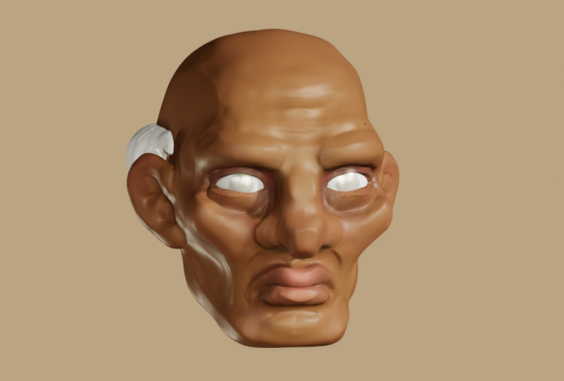
4. Anatomy of the Face: Okay, so we're going to talk a little bit about human heads and the way they are shaped and what is underlying them. So the first thing is looking at a skull, right? So this is just a model of the skull that I downloaded it and make this but main things to recognize here and get rid of this gizmo, your face is that you have you have a cranium and a jaw, and they are separate. So the skull is not just a sphere, you can make it a sphere if you're stylized, but generally it is two shapes. Then when we start plucking it out, I'll show you how to make that. That's the sort of left, right view from the front. The jaws a little thinner, comes to a chin, whereas the cheekbones are at the front of the cranium, the nose, the bridge of the nose starts up here and all this stuff in front of that would be cartilage. This particular dip here. And I'm filling it in with clay as we talk. But that particular dip there is an important spot ticket for realism that's around where your temples are. Another important thing to notice is as you are looking down, the jaw is sometimes in front of the nose, sometimes behind it really depends like this guy sort of looking up and if we were to rotate him to where he was looking forward, usually what happens. So your years are going to be at around the same level as your mic a smaller things. So your ears would be on the same level as your eyes. The nose is going to pull out and there's not an easier way to do it, but the nose will end up being out here, right? It's not there now because that would be cartilage. So it's not in the skull. But if it's out there, it's worth noting that your nose is further out than your mouth, lips, or chin. And that usually there's a bit of a line between the end of your nose or your lips and your chin that comes down, sort of like the line I will draw for this trim brush. So the lens usually about like that. So your faces kind of protruding someday you might change that when your stylus you might make a snub nose and been a big chin. There's lots of different options. But generally knowing the real anatomy will help you change it in a mindful way when it's time to do stylized, cartoonish anatomy, right? So that's some things to keep in mind. There were not yes. The bridge of the nose is between the eyes. There's usually about an eye shape between in terms of distance. So this part here is about the same distance as there is about the same distances there. Um, so that's a thing to keep in mind that the end of the mouth usually is about the center of the eyeball. So some relationships we're thinking about there. That's things that can move around. There's usually a triangle from like the end of the nose to the end of the mouth, right? And this one's huge, is there's a lot of head, a lot of forehead above the eyes. So there's got to be room for the upper eyelids, the brow, some forehead and the hair. And when you're making hair, it is sitting on top of the skull and the head and the skin. So usually eyes are about halfway down. The entire school figure. So that's worth thinking about. And we can kinda look at that here with this child. With children, the proportions are a little bit different. This is a 3D scan of some get off the internet. And what you get, as you know, software features, bigger head, sort of smaller jaws and ears. They're still growing into them. But you can see all those same things even in this kit. Now this is not very planar, right? If we wanted to make this kid look older, we could start to, to kinda plane out. Let's see. So symmetrical, interesting to sort of played out different things around him. And he might get to look a little more severe. Now he's 12-years-old instead of six years old, right? So we start working on the eyebrows. He might begin to look a bit like a teenager as we go through. I don't really like working with 3D scans much, but they can be useful for figuring out proportions and whatnot because it's actually what's there, right? It's, and you're able to look at it in your program. That's like using real life reference in a drawing program. So he looks a bit older. He says lopsided has symmetry, is not working out. But, you know, that's that. Now I look at this older man and again, there's not a lot of definition here, but we don't need a lot of definition to understand. So let's, let's go through with the crease brush and just mark out some things, right? So eyes right? Halfway up the head, right? So that's important. The face is rounded around the edges here, so your faces not flat when you look down. It's looking a little serial killer there, sorry. So about one space of an eye between the eyes, eyeball and of mouth, right? Eyes, nose, lips, chin. They're all kind of equidistant. They don't have to be playing with the relationship between those distances is really important. And you've got a lot of space above the eyes for the head and hair. Ear is about the same level as the eyes. And this ear goes slice to mouth. So that's something I think about jaw line there. Now as you look from the side, this guy has pretty good posture, but even then there still a line that goes from the nose to the mouth to the chin? Right. Jaw goes about there. The neck, depending on age and body composition, right? This neck might be here or it might be further back. As it goes back. Same thing here. And there is a cranium behind the year. So those are all things to keep in mind. We're not gonna spend too much more time on this. There's plenty of great stuff on the Internet about this. I think my favorite is Marco blue cheese series about how to understand the human head submits based on painting, not 3D, but in terms of understanding the anatomy of the face and what not, It's really, really good.
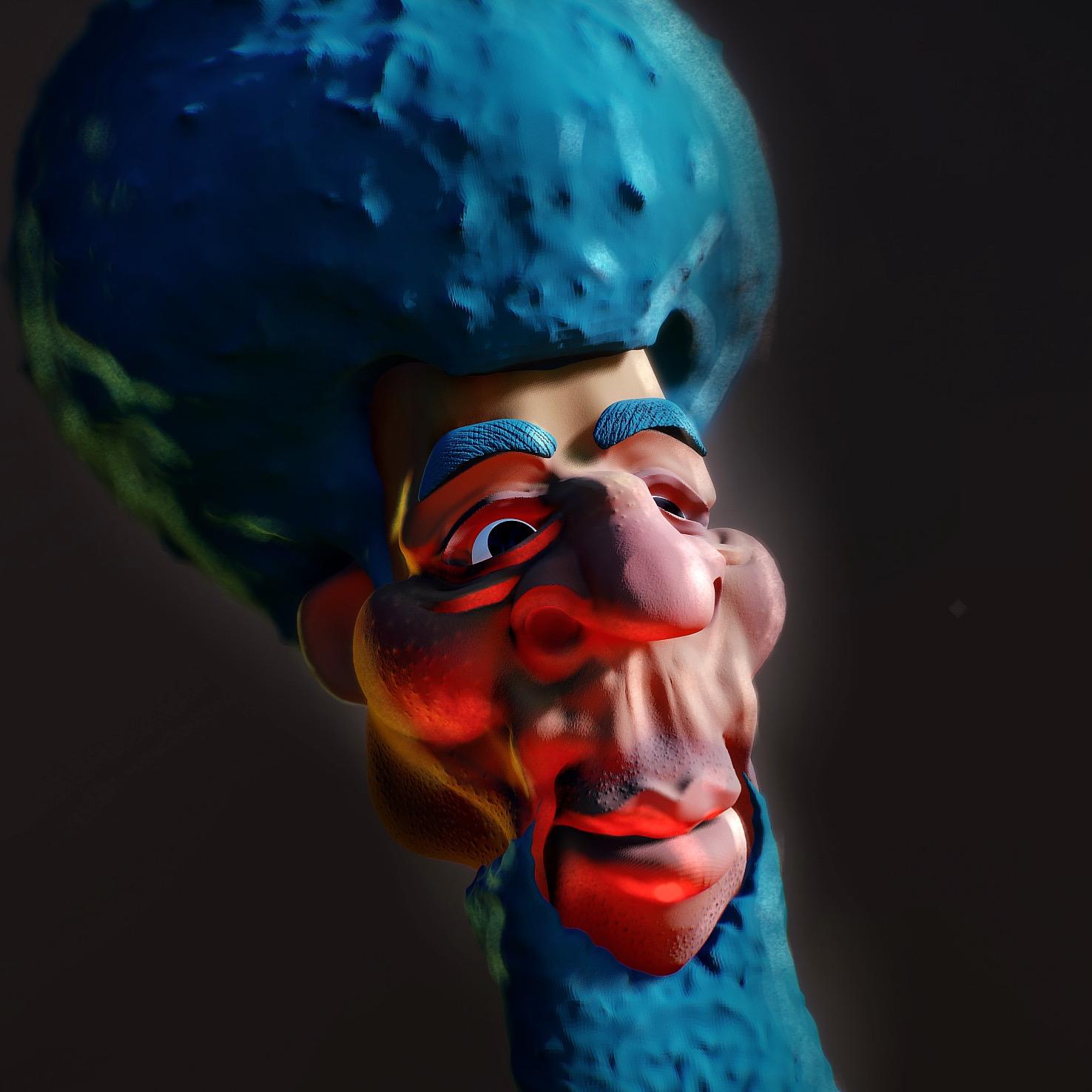
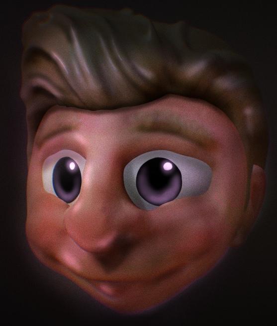
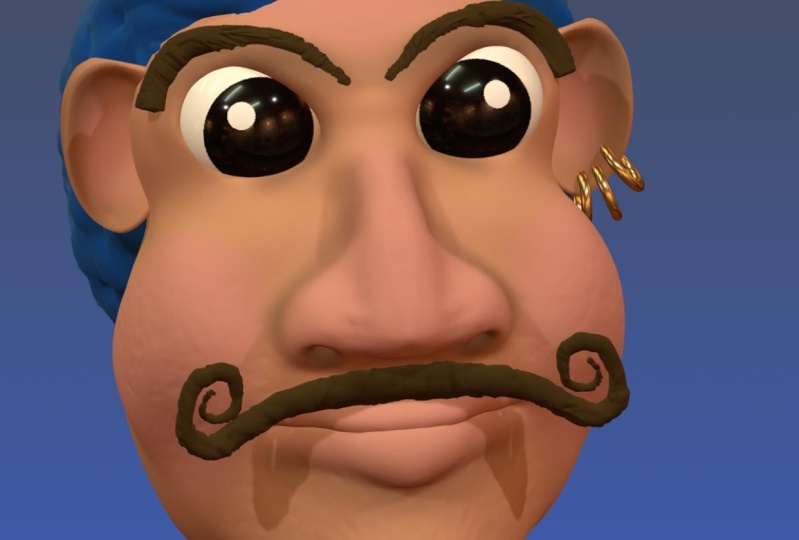
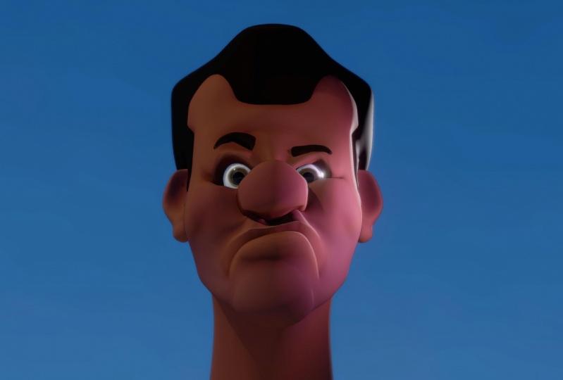
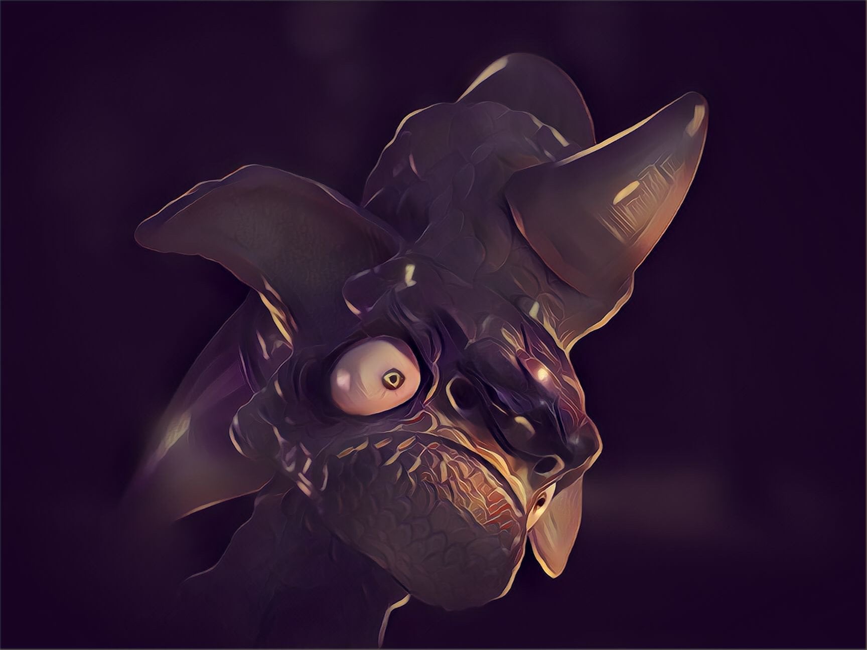
5. Cartoonishness: Hi there. So let's talk a little bit about cartoonish. Notice these are just a few characters that I've put together. They are all different in different ways and at different, different styles in some ways. But what I wanted to show you is what you can do by exaggerating or de-emphasizing different things. So as we look at any particular part of the anatomy, we can see really different choices based on these things. So if we think about chins, for instance, right? And you like, look at this guy over here. He's got this like serious but chin, right? And from the side It's pretty serious. His nose is also crazy in terms of its emphasis, right? And you can see sort of different noses across this line as we look. Some are further out. This guy on the far side over here, the bridge of his nose is not as intense as the other part. This guy has a real serious bridge. This guy in the front, just as this bulbous thing that is not a bridge at all. His brows are also really intense. I like this guy who's got more angular browse, sort of a snub nose. His jaw is crazy, right? This guy has a similar jaw, but not the snub nose, and his lips are really, really emphasized. A guy in the middle, tiniest nose, lower lip, but the eyes are going crazy. The ears or small. My daughter really loves big guys with little ears. And she thinks it's funny. This guy, his eyes are super BD and small. Even though they're in these larger eye sockets. His lips are very smooth. Chen is de-emphasized, knows, button he knows, and big, big ears. Right? Here we have something slightly more realistic. Eyes are a little stylized and large, but the other things are pretty reasonable, right? So I guess my point here, and then we can look at the hair. Think about this, this, this guy's mouth and hair. Crazy, right? And big, big years. Exaggerated mouth. I like that one a lot. So as I look at all these, I guess what I'm trying to tell you is with cartoonish Anise, you can exaggerate or de-emphasize anything. And you can go back and forth and play with it and decide what you wanna do. And usually the way that I think about it as I exaggerate something until it doesn't work. And then if it no longer works, it no longer looks like a face. That's the time when I need to back off of that. So I'll give you an example from one of my previous scopes here. If this one. So my wife and I argue about my stuff, I'm going to turn off post-processing. So she doesn't like this. And, you know, it's it's okay. It's good. I was practicing mostly I was trying to figure out hair and do some like jewelry and stuff like that. So I did some stuff with color. I like. But she particularly didn't like the nose. She felt like the nose doesn't really read. As a knows that it's a face that becomes hard to parse because the nose is higher than the eyes. And I don't think she's wrong. I mean, let me lower the radius here and the power of this. And I should be able to sort of nudge the nose down in a way that might make it easier to read. Anyway, my point is I've exaggerated or yours looks crazy. Her eyes are about the same, but as I move the nose down from where it was. So I'm trying to re-invigorate in this nose in a way that will partially please my wife, but also just be in a situation where it reads a little easier because I think she's right that it wasn't reading very cleanly. And there's a couple of different reasons that that was happening. But one was just the placement, it wasn't in the right place for a nose. And that's that's going to be a problem. If your nose isn't in the right place for nose, then they won't look like a nose. I guess that's pretty simple sounding, but it's true. I'm going to use some crease tool here to kind of plain out some stuff. Fleet the Austral. So I'm going to flatten out the bridge a little bit more. Gotta bring in nostrils up. So it's a very intense hook nose. Maybe move the whole thing forward a bit. But it's definitely a nose now. Let's flatten out the tops. And I'm really just kind of sketching here to be honest, so I can just see what works and what doesn't work. Because your eye automatically knows what things are supposed to look like. You've been looking at things forever. Hello. I'm kinda like that. I don't think my wife a Leica. Then we can sort of go back through the history here, go all the way to the bottom and see what what it looked like before. And let's take a look. Yeah. So I increase the size of it dramatically and moved it forward and down. But it might be more that the eyes need to go up and the nose needs to stay where it is. I don't know, different things to think about. But my point is that like the thing that keeps this from being as appealing as it could be, is that the nose doesn't read properly.
6. Modeling your Cartoon Head: Okay, so let's get started baking your cartoon head. The first thing I'll say is there's a lot of different ways to get to a head shape because the first thing you wanna do is get to a head shape. So some people myself included will take a brush and start to thin this out and maybe pull down where the jaw is. And turning to the side. I'm going to push in under the jaw and bring the head up and out. So I'll flatten the face a bit, lower my radius here and pull in some eye sockets, go back to the front and start to push those in. Some might make some cheekbones there. Okay. Some people will even pull out the nose. That's not generally how I do it, just because I find it to not be very specific, but that's a certain way to do it. You want to kind of pull out the muzzle area and the chin. Me think like to humans have muscles. They do. You have teeth and outside of your teeth There's a lot of stuff there. Pull in this little section there. And so you have a skull, right? And that's one thing, right? But let's, let's show another way that we might do that. Just so that you can have some options. So some people will date this sphere, will use the Trim brush, so they'll turn symmetry on and put the trim brush on. And this has world symmetry and not, not local symmetry, hold local symmetry. Okay, So the trim brush and they'll say, well the sides of that or flap. My eye in the right orthographic button. Okay. So let's try that again. The sides of the head are flat. Okay. They'll say the back of the skull is kinda like that. And you can start from there. But I've also seen people take the gizmo and if they're in the right section, I'm going to go ahead and make this other thing invisible so it doesn't mess with us. Reset the camera. Okay. So I've seen people say, okay, here we are. I'm going to clone this, make it smaller, rotated a bit, Pull it back to where it needs to P. And now from the front, you could have a thin jaw if you want, or you could have a thick sort of, you know, early do jaw, but that can be your sort of jaw area. And so then if you take that and maybe the first thing you wanna do is kinda flatten out the planes on it around the edges. Because they're kind of intense, right? Don't necessarily need it to be that intense. We can flatten out the plane up here as well, planned out the back of the head. Okay? Just smooth to get rid of that geometry real quick. Okay? Now, with a clay brush, I can start to do more stuff. I can say, okay, here is a nose, face, it's okay. Here is a nose. And I'm like Putting in space and you see it getting kind of jaggedy and we'll talk about that in just a second. I'm going to sub the clay brush to sort of dig in some eye sockets. And I had a bottle here. I'm just trying to get shapes right? And I'm not really worried about whether it looks good right now. Let's see, I'm going to do some. So I just selected, so this first spheres, the other face, that's delete it. These two, that's the bottom one is the jaw, the top one is there. And I'm going to voxel merge them. And when I do it, I'm going to raise the resolution sum so that they get a little smoother. So now they're one object and it's not that smooth. But there are, there is a lot of geometry. So if I take my smooth brush, I can smooth over and it will look smooth. It's like a nice soft piece of clay. And you can start to see that I have some shapes there that are going to look kinda like a face, right? Take a brush, throw, throw in an ear. I'm going to mask. So I'm using local tools that we talked about before, masking that, emptying it or I'm sorry, inverting it not empty. Then using the move tool to move it in so that I have some space there. I'm going to smooth it out. No masking was smooth it out some I'll inflate the edges. When I did the first video, I thought that the in-flight was broken because it had been broken, but they're actually it was just an update and so inflate is fixed again, which is great. It's a really useful tool. Inflate works particularly well next decreases, That's what I need to sub in my crease. Because it will inflate and kind of and we'll go over the crease a little bit, which is nice. Because you wouldn't be able to kinda like things and under other things, sometimes, particularly when you're messing with noses and things like that. Okay? Now that you can see even there that, that geometry is getting stretched in a way that is not necessarily good. Now I talked earlier about the Relax brush, but you can smooth it and that will, that will help some. But the issue here is you just don't have enough geometry. So that's when you can do voxel 3D mesh. And what that does is average out the squares to an average size across the whole mesh. So if you voxel rematch, you may be losing a little detail in one place or another. Which can be a problem if you do it after you've done detail. So you really need to start with very broad, like looking at your silhouette and looking at your shapes before you want to get too intense into details. If you detail a bunch of stuff and then you've oximetry much, you'll lose your detail. So you also can just crank the resolution much higher if you'd like. But to be honest, that is something you should probably wait to do until later. Okay, so I'm going to put in these nostrils, have an urge to build out the nose a little bit. Okay, let's smooth it as we go. Um, I'm gonna throw a crease in for a mouth. Let's do a big frowny mouth. Frowning mouth. And I went wide, I'm exaggerating a mouse. I don't know why I'm doing that. I'm just choosing two. So now I have that big frowny mouth and I am going to build out some lips. So soften this down. I don't want to go over the crease, only go up to the crease and get some space to hit. And one thing about ellipses, you always got to look at other, other angles because they can look really right from the front without being right from the side or the bottom. That all so yeah, I'm starting to get all right. Let's clean that up a little bit. There we go. So that feels okay for now, for that lip. And then even if you have a dude who doesn't seem to be super tuplet, like it's not like some voluptuous lips. You still need thin lips there. You've got to put something. Nobody just doesn't have a lip at all. Well, maybe somebody but nobody that I like to draw. I'm smoothing this out. Adding a little more wasn't quite where we wanted to. Okay, so let's see, let's flatten out those cheekbones, some that works. Let's get some some angle on this jaw. So yeah, a lot of what I'm doing here is about planes and making sure the planes read the right way. Make space for the neck under likely shipping planes there and planes there. There's usually planes here. This becomes kinda together. Soften that bit. Counts, flatten out these eyebrows. Something here will sharpen up the nose a bit. I don't really like the edge of the nose, so I'm softening it. So it's like soft is important. You want soft at times, but you want to have chosen it like I think it's so easy to just hit smooth over the whole match that people will choose to make a super smooth mesh just by default. And so you wanna, you wanna make sure that you pay attention to where your soft curves are and why they're that way. Because they may not be, that might not be the best way to present what the, the idea of the shape language that you're trying to get across flatten out the back of the ear a little bit. Actual ears are like when there's an indent on the front, there's an end and on the back they have the shape shows through. But that's not what we're doing for a cartoony ear. Taper down a bit. Okay? Alright, so I'm feeling okay about that shape. It's not a bad shape. But there might need to be some more visual interest here. I think I might need to fill out the cheeks event. So I'm just using the clay brush here to kind of fill out the cheeks as we go. Making him a little more. Not jolly exactly, but You know, just a little more. And I'm going to change to the inflate brush. And with a big and flat brush and a very low intensity, you can get a nice soft inflation. Now I'm smooth, I'll just make that look. Let's see. Yeah. Yeah, I like that. There's some weight to those cheeks. Since I have the inflate brush now I'm going to inflate the lips a bit and helps give me some space. And we'll do some nostril inflation and maybe the tip of the nose feeling okay about that, smoothing out the edges there. All right, So I think the next thing is to build out some smile increases. So around here, there's usually some creases and they, they often go over the edge of the mouth, particularly if there's a smile going on. This guy has a crazy frown. So there is that you bring those out and you sort of smooth them as you go. Now the level of detail you want to get into is really up to you. You don't have to be super detailed. You don't have to go through and figure out what are the facial muscles that you're trying to indicate. That's not, that's not necessary. You can just make like a big round face and put some eyes at it. And there's nothing wrong with that at all. Skies looking a bit like a monkey. Because as he hears or think or to talk too high. Let's see if we can move that way. He's frowning, so we give them like a sad face. I always like to look. One mistake that I make pretty regularly is having the side of the eye a little bit too far back. So we've made this sad face. I'm gonna go ahead and voxel refresh this much higher resolution. Now. I didn't go all the way or anything. I just wanna make sure there's enough geometry for me to start doing more detail oriented work. I see the little fascinating around, so I'm just putting a light smooth on stuff to try and get it to look the way I want it to look. I'll add in some eyeballs. All right. So zoom down to the right size, bring him in. Okay. They're in the face. That's not really where you want. There you go. Move over just a bit. Now we haven't talked about mirroring yet. So this is a right eye. I would love to have a left eye that was similar. So if I go through to the symmetry, I can, well first I have to validate it, but if I'm in the symmetry, I can do mirror. So I'm going to hit X just to make sure that that's what I'm hearing across the x plane of symmetry and had mirror. It's asking me, do you want to do this even though it's not touching the plane of symmetry. Yes, I do. I said Yes. Why is it not happening? By picking the wrong thing? Now I'm confused. Oh, I know why that's happening. My face isn't actually on the origin because I made that other face first. So let's, let's delete that. Let's reset the camera. See it mirrored across the origin, but way over here. And I didn't realize that was going on. Okay, so let's take this move to the origin. Okay? So now the plane of symmetry is down the center of this dude's face, which is important. I had local symmetry on. Now local and world symmetry would actually be the same. So I take this, move it out to the side so I can see a little better, get it where it needs to go, bring it back in. Let's go to come forward. Boom. Okay. Now we can decide we want big eyes are little lies that doesn't really matter that much with a blue lights are better at being sad. So maybe that's not true. I don't know. I'm gonna go little eyes. Now let's try it. We validate that and we mirror it across and there it is. Now you have it on both sides. Now, it's actually the same object now. So as I build on the left, it'll pop it on the left, on the right as well. But also it means I can move it together, which might be a problem, because if I want to adjust where this i is, that's not going to be in the right space on both parts. So sometimes what you have to do is trim and you go to a lasso, you take symmetry often you trim one side of it. And then after you readjust, say I want a bigger eye and I want it closer to the center. Then I readjusted mirror again to get to preserve my symmetry. Okay, let's build in some. So I'm, I'm not selecting and I might even lock my selection so I don't select the item on accident. But I'm building in some some eyelids and some some wrinkles around the eye. One thing I think I got it from the guys at Flip Normals. When they were doing their tutorial on eyes, they were talking about paying attention to the thickness and the weight of the skin around the eyes and that lake. You know, as you have this, these wrinkles, you can really get into understanding what weight looks like. Which I thought was a cool thought. Bringing this up so that we have like a proper the situation smoothing out as I know, I have some ice. Now there's some work to do with defining those curves. And I'll show you the way I do it normally, but it doesn't have to be that way. Honestly could be any kind of way. So one thing to do is with the crease brush on Nazi up. You can make these planar changes, right? So now you have much more of a planar change there. And I'm gonna go ahead and connect it. Where it was. So now it's, now might require a little bit of smoothing on the inside. And even if you smooth over those planar changes, like you can erase them with the smooth brush, which you don't want to do. But at some point, smoothing isn't going to help smooth. That helps where the geometry is a little bit funky, right? But at some point you need to add more geometry before you try to smooth more. Okay, So that's pretty good. But to make it even better, I'm going to pinch the geometry to that crease that I made. I guess it's on a crease because it went up on it. But pinching the geometry allows me to sort of massage the lines and to the right spot, but also allows me to clean up the actual corner. And the other thing I said before that I like to use the crease sub and not's up together. Well, I'm going to do sub creases under these lines and over these lines. So they're sort of alternating there. And then soften it out. Some want to get real sadness from this guy's face. That's excellent. I mean, I don't necessarily want I gotta be sad, but I guess in this case I do. All right, so we got some wrinkles there and let's get some get some creases in the folds of the mouth. So that was not decrease, it will hit that wasn't an indent that was a line out. Here. It would be a great opportunity for me to put some strokes smoothing in. When you get into details. Sometimes it's helpful to have a more smooth tools for the lips. I love to put a line sort of defining the top edge of the lip can be very helpful about image as well. Or like a sort of software around wherever you have a plane change there. And you can make the line and then soften it out some. And it'll still have positions of that little geometric shift that you made. It just won't be as hard edged to the same thing on this. Okay. So we got we got the makings of a face and I don't know how I feel about it. Let's get him some some eyebrow lines here. Did a weird thing at the edge there. Mr. there we go. And let's sub in for her. Similarly, forehead creases. Can't be this set without some some stress. Now as you saw, is I crease too hard there and started to crinkle the geometry. And if we look at that, that's off. Alright? So like I could rematch. But if I rematch, it might get rid of some of, And let's actually look, let's see. So if I just this button at the bottom next to the wireframe here, the voxel button that 3D meshes without changing the resolution, right? So it's at 362, which is a random number that I picked. But and we voxel refresh and it'll take a second mesh. And now when we look up here where these lines were, you see this is much cleaner now and now it can be smoothed. And that's actually what I was worried about, is whether it would sort of mess up by definition here and it kind of has. So what I can do to fix it some, because as I look now there's like geometry going across what used to be a clean line. So what I can do to fix it some as is I can pinch. So if I pinch really hard, and in fact, I'm going to put the intensity up at a 100. And I might even go in the stroke and go to intensity and multiplier and take it up. And that will pinch even faster than you're normally allowed to do. And in a moment I'll turn the wireframe on and you can see what's happening. So you see it's like bringing this together but still not like clean the way it was, right. I don't I don't like it that much. So what I'm probably going to do is come back to we made these creases that made that geometry. This is before the rematch rates. So we still have this issue. And what I'll do is I'll rematch but at a, at a higher resolution. And so all the squares get smaller. And you might lose some definition around here. But now there are at least as more geometry to make it the way you want, which is ideal, then you might end up coming back and doing the same creases again. Just to like re-emphasize what you did before because you had to rematch. Now, if you were really, really slick and I'm not, but if you were, you would do all your work in such a way that you didn't have to do that very often. But I still I'm learning that process to be honest. I think it still takes me a long time to figure out exactly what I need to be doing, in what order, in order to sort of maximize my workflow. But, you know, it's not the worst thing to have to redo something. That's really what it's always practice. There's kind of planing out that knows a little bit. Let's get some creases on the, okay, so now we've got some, some action there. All right? And we've got some lines here. I'm trying to decide do I want to like, sort of thin out his truck? Awesome. I want to say about some of this. And it's not as clean as I want as you get more geometry, the flattened, the smooth brush is less effective. And sometimes you can up the intensity multiplier like I did on the pinch button, on the pinch brush just now. Or you can use flattened sort of in its place in a, in a way that I think is more artistic and does less to get rid of your details. It's me, I brought that in a little bit and you always want to be looking from different angles. So like, I'm not super pleased with this jaw line. And it's hard to get a Joe line that you want without thinking through this part. Okay, so now we're looking a little intense there. And this is where you start to get into exaggerating or not exaggerating, right? So you've got to face, it's got things that faces have. But like, do you want the nose to be Elephantina? Do you want the chin to be further back and weaker? We could make the lips fuller if we want it. We're going to raise, is cheekbones bones. Let's give what does affectionately called an eight head. Now I am affecting the geometry as I go here, which is to say that it's not necessarily clean anymore. So if we see it'll be quite stretched. And what's less stretch because I voxel rematch so much. But It's just a thing to keep in mind. You know, like the, the underlying geometry that you're dealing with does affect the way the tools work. And if you're not careful, you can sort of mess that up. Not in a way that's not fixable obviously, but just so you're not just flatten those edges to soften them a bit and then smooth it out so the plane changes are more subtle. Okay? So I like that head and I'm like, What's going on there. But that head doesn't seem to work with this mouth for me. So I'm going to try let's try a really long. I know that perhaps never had that happened before. Okay. Let's see what we got back. The quick recovery. Let's pull in. Let me hook the nose and down some little bit of nostril action. Bring it in for the cheekbones is really puckered up here. We're getting to the point of caricature at some level, which is a fine thing. It's a type of art. It's not the same as making a cartoon character, but I think we could get there with this guy. Okay. So things that I know I don't have nostrils, let's make some nostrils. You get the right size and you just take them in. Nothing, Nothing fancy. Smooth them out after you take a man. Unlike any other thing else you can go through and define the edges a little bit with creases and pinches. Now as we have moved around the geometry a lot, you can see that some of these polygons are a little bit intense, so I'm going to read mesh. And that gives me a more even thing and it will make things act more. Predictably. I think this little section under the nose that is always there. Could talk the lip. Okay. I'm going to increase in the lips a little bit more than I had. This frowned that he had. The wrong crease. This frown that he had is become less frowny. And maybe that's good because he's still sad. I don't know. He's weird. I don't know if he's sad. He's got this limb. Okay. Let's connect this a little bit more. You'll often see that I start using a tool to find out that I have it in the wrong form. And that feels like a pretty common effect. That's like probably my main like, I don't know a pet peeve because it's not that big of a deal, but it is a thing that happens more often than I would like to happen in this program. So a string out there, I'm going to move the lips. Not exactly, but a little bit less out. Smoothing out that lower lip. I'm going to I'm going to get rid of some of this to start fixing up the lower lips them. So that to me suddenly looks like a chin and a beard, maybe. So maybe this guy has like a pretty intense beard. And let me inflate a little bit along that lower lip to give a more reasonable overlap. Oh, well, that's out there. See, that's what I was saying earlier about her lips can look right from 11 spot but not be right. Smooth that out and that feels fine to me. Maybe a little further than I'd like, but we're okay. All right. So I think it's time probably to start talking about hair for this guy. And I think one thing I want that I see that I want immediately is like a sort of very straight go t. So I think what I'm going to start with is just a box. Okay. So I'm looking at the front section. I'm going to bring down this, put it about at the size that I need it to be. Okay. And I know for a fact that kinda how long I want it a little shorter. Okay. So I'm going to validate that. I think if I go up here, Yeah, I can change the opacity of the material box, which is good because I'm going to want to cut out the part that is his chin, right? So I'm gonna take the trim brush ellipse. I'm going to go in the particular tools for the trim Bush, and I'm going to create a centered ellipse. That's just about how you create it. So a normal ellipse you create from a Wicca corner. A centered ellipse you'll create from the center and build out. And that is what I want, because I want to start from right there and build out a trim there. So now that trimmed all the way through, which is nice, Let's kinda what I wanted. It's a bit longer in the front that I want. And I think there's going to be some movement here that I need to do. But let's start with the gizmo, like sort of move it back to there. And in fact, we can make it a bit thinner. Do I want to rotate it? Not yet. Okay. I'm going to build it first and then we'll rotate it. So let's get some moves here. Well, they see the move is kind of aggressive because it's, it's a low poly box. And so things you move are moving kinda quickly. I'm going to, I don't want it to be totally squared upon, but I kinda like mostly square. I want to smooth off that back edge will change the color so it becomes a little easier to see. Get rid of the opacity difference. Oh, that's way too shiny for a beard obviously. See a change, the roughness, but then I didn't paint it. Okay, So later I'll do some work around like integrating those two shapes together. Right now. I'm just kinda blocking out to get a sense of what I want. Now, what can I do We want this guy to have? I was thinking for simplicity, I might give him just a big afro. So let's see where see here, it's okay. So you sort of set the hair where you think about hairline and you think about heres because those were things that matter. Okay? And we've got some real Black Power BI here going on, which is great. So I'm going to flatten out some of these edges. And we're going to turn the intensity up some. So I'm trying to like flat it out. Then I maybe should even do trim or than flattened because it's such a big shape. But just kinda try to flatten out the edges a little bit. Like it won't. It won't be actually fully round because that's a little bit comical. But I'm not into k. Well, let's get some Move brush here. You notice that the moves just started painting. Well, I moved. I'm not into that. Later. I will paint it. We will paint it together. But right now I'm just moving it. Obviously, things go down past the back of the eye, neck. So there I accidentally moved I moved his face instead of his hair, which was not what I was trying to okay. I kinda like that. Yeah. That's pretty good. Now I got to do some clean up around the edges. So with the clay brush on sub, I'm going to paint over his ears. Let me change this code. We can see what's going on here. So I'm, so I'm just digging into it with the clay brush basically. And I'll add some where I want to add some because nobody has that. Okay. So like that's too high on the back of the ear. So I will sub clay and sort of dig into the back of the hair. This how you do eyeballs as well, like eyelids that is, you know. Okay. So smoothing out the edge there. And it's a very low poly thing right now. That's part of why this is happening. In terms of hair line. Let's see. There's usually kind of a bit of a male pattern baldness thing that goes on here. Like a widow's peak. And he's got a real serious forehead so we don't want to waste that. That feels like a thing that we can use. Now with this color, It's really hard to see the contours. Let me get blue for now. We'll change it later, but okay. So. That's good. I like that book, that particular angle. Pulling a little bit more here off so that we can get some, some shape. They're just always looking from all the different angles. This is a really important angle for faces, right? Like where does the nose come? Can you see the eye than the eye socket from behind? It's not that there's an answer that you always want for that question, but it is the sort of thing you always want to think about. It's going to smooth that down some, we can get it. And later we'll add some texture. Now you see how just then the smooth changed, change the shape. You don't want that. So I remeshing it just now at the same resolution as the rest of the thing. So now, now it's really quite dense and that's fine. Because we're going to use an Alpha to put some, some stuff on it later. I'm gonna make this the same color. I kind of like his blue stuff. And I'm going to move Let's work on moving these into into the right spot. So the next yep, then I'll probably trim the top of this to be like there, right? So I got my ellipse that starts in a circle stone. I think if I blend that in, that will look nice. Once. Let's trim out these edges here. See I'm not quite front. You gotta be careful with that. That's why I do orthographic is so that I can do, so that I can do symmetrical operations without them becoming suddenly like kinda cardiomyopathies. Okay, so I just voxel refresh that, so that'll be quite dense as well. And I'm smoothing this out. Now eventually I'll build it into the face a little bit more. But so far, just big picture. I kinda like what's happening here. I'm going to flatten out the back of a little bit more a little planar. So that was too much. Yes. What's quite close to the surface of his of his skin there. So I gotta be careful. I don't like that. That's good. Take the power down. I get some curve. That curves are generally more appealing than flats. But the planar choices need to be there. And you'll hear me say that a bunch, it's not about like that things need to be angular. That's not really it. It's that you have to have a choice about where the form is. Because if you are instead just deciding that you're going to just draw it wherever it is and you haven't made a decision. It's like if this were 2D or you'd be like skipping an entire portion of the drawing. You're not making a decision about the way something looks. Whereas here, I want to make sure that, okay, so we've got some hair. No pause this video for now.
7. Painting and Rendering your Cartoon Head: Back in a second, let's start thinking about paint jobs. So for painting, this is where you start thinking about layers. So I'm going to find a skin tone that I like to think that looks pretty nice. So I'm going to do paint all on that. Popped up. No kidding, not done. So go up to layers, add a layer. There's lots of different things that people do. But generally, things to think about when painting skin are, there's a couple different zones of color. There's a reddish zone, and in African-American skin tones, it's sometimes skews, slightly purplish. And what that is it. So let's go to paint here. And I'm gonna make a big brush and make it soft. And I put it on a different layer, so I added a layer and this is on layer 1. The reason I do that is because if I paint the whole face purple, which I'm not going to do, I then can scale it back and scale it forward and scale it back. Okay. But I don't want them to be purple. I want sections of him to be purple. So there's usually more blood around the nose, around the cheeks. And because because your skin is very thin around the top of the ears. So that's kind of the start of some warmth to that. And I'm going to scale it back. But now I can choose and it becomes very subtle. Another color change is that there usually is some sort of yellow, green ocher ish tones. The closer that you get to bone. And these would be a little bit darker for African Americans getting that, that would be for Caucasians scanner Asians can. So there's this sort of a yellowish flavor. Now I'm going to add another layer so that I can adjust this separately. I'm going to bring this where, where the bone really shows up. This guy is pretty, pretty bony in some ways. But the main bones you're going to be able to see are really the forehead to the side for the temples to. Some people might have smaller cheeks or more angular noses. You can do this sometimes in the cheeks of women as well. But we're going to come back over the cheeks of this guy with a different color because of five o'clock shadow with hair follicles of the face. And again, you put it in there where it's noticeable that you bring it back. And even as I'm looking at this layer now I feel like the red is a little stronger than I'd like to be at a third layer. For the hair follicles. You can use black, don't generally gray or darker blue is going to be the thing that reads the best. So I'm gonna bring that around the chin and neck. Everywhere we're hair would grow but it's not growing because he chose to shave it or whatever. So there's that. And with this one I'll come back and erase some as well. Because I want to get the lines just right. Right. So what you do is you click Erase. This is just the sub. I'm going to lower it down and just kinda clean that up so that there's a nice line there. I think that's a good thing to do. And we're gonna do a similar thing here. And then like before, I'm going to clean the back of the neck to if you've got a good Barbara if this happens. Okay. So then like the other ones, I'm going to sort of take that total knowledge. But it gives you some color variation that face That's pretty subtle. But it's useful. It's good. The last one is I come in, color the lips. And a lot of people think let's read because of lipstick or whatever. But they're, they're kind of not there. More than African-Americans can. They're closer to like a pinkish gray. So I'm going to keep that in mind as you go. Put a little bit of color, blood, blush, and the lips is useful. Make sure you're moving around when you paint just like you would when you sculpt. Because you don't want to miss spots. Little bit of the heat on that. Okay. So altogether that's sort of facial color stuff, something that some people do and I'm adding layers each time ago. Some people like to increase darkness and certain places to get to sort of increase mood. Which makes some sense. So I've seen people who are into like sort of shading and around the eyes a bit so that this, the shine of the eyes will pop a bit more. I don't want that on the nose though. I think it's pretty reasonable to go through and color and the nostrils. The ambient occlusion post-processing here should handle that at some level because the nostrils should be like kind of hard to see because the light can't get in there. But that's not actually what happens all the time. Now that doesn't look great, I'll be honest. Let's look at the ambient occlusion and see how it acts. It seems like that's probably a bit too much, but if we take the layer down, I think we get to a place that's okay. I might find myself bringing the nostrils further down, smoothing out the bottom of the thing. But when you go to change this thing again, if I change, if I move things when I'm on a layer, it will only move to the percentage that that layer is being represented. So I like to go back to the base before I do it. And then if I smooth the bottom of this nostril, it'll be a little bit less like a dot, which is helpful. Nice look. Okay. So I'm feeling all right with the shapes. Let's work on some pupils for the highs. Okay, So one way did you pupils is to just close your eyeballs, scale them down and move them forward. And you'll you got to work on where you move them. Okay. I'm going to make my black and shiny. Okay. And this is that situation where I told you where you have to trim half the half the model. So my trim those eyes so that now I can like rebuilt. I can rebuild my symmetry. So those too far forward, obviously, I don't know where it, what I wanted to looking at are how big I want US peoples to be. Those are questions. Maybe we want to really pick. Maybe we want them really big. And let's do like not that. I want to rotate this a bit. Now it makes no difference because it's a sphere, right? But I rotated it because I want to scale it on that particular axis. I'll show you what I did again. So right now I can only scale it like this and that makes my people not look proper. So I don't want to do that or I can scale it here, but that makes it an islet proper either. So I want to scale it on this axis, particularly, so I just moved it to be able to do it. So now I have sort of a flatter iris sitting on the top of what I otherwise would have had. And now I'm going to mirror that like I did before. So now I have it on both. And now we got some we got some eyeballs. Okay, Cool. We need some eyebrows. So we have the shape for the eyebrows and we could colored in or use an Alpha to sort of scratch eyebrow hairs in. Though sometimes in a cartoony space, it's pretty good to create another shape for it. So I'm going to, I'm going to clone these eyebrow eyeballs, change the color so that there. And use the eyedropper to turn them the same color as his hair right now, just for for my memories. And then we'll trim half of it off. Careful, there we go. And then we're going to move this, this sphere around too, create the shape. And sometimes you want kind of a heart shape. Sometimes you don't. So what I'm gonna do is try to get it about there. And then I'm going to use trim brush. And again, an ellipse to sort of cut off the bottom and a clean way. Let me move that across the the line that we had. Okay. And then I bet you can guess the next thing I'm going to mirror it. Okay. So I got some eyebrows, I got some hair, blue hair. I've got serious Coty, kinda dig it. All right. So let's start working with alphas, okay, so this hair, I need it to be not quite so smooth. So one of the things I will do sometimes is take the drag brush is if I need to create. And I'll get an alpha that I have here that's just dots. And then I can pull and I get some texture. Now I'm not backups them. Right now, the texture is coming out really hard. So I'm going to add a layer so that after I bring this texture out, I can then pull it away as much as I want. I can say, Oh, that's too much texture. I want less texture because this is not really accurate. I mean, I guess none of it's accurate. It's a massive blue Afro, but it's not, it doesn't look stylized in the way I wanted to. This is too extreme. And remember when you're stylizing things, it's about emphasizing and de-emphasizing things. And so at some level, if everything is extreme, what you're doing is that, that serves to really hurt your emphasis, emphasize nation. So now I can go all the way down or I can bring it up a bit. Thank something like a rounded There's kindness. And I might go through and where I see it being a little high, I'll just smooth out some. Just a general smooth is kind of nice actually. You don't want edges, you just want texture. Well that's better looking. We'll do a similar thing to the beard. But beards tend to grow in a single direction. Domino lower the intensity and the radius. Now with the beard, I think it's important that you get it in the, in the silhouettes. I'm bringing it like around the edges here. Which is what I was talking about in terms of working it into the skin. Ok. And you'll notice I didn't have to do the layer thing there because it's on the same layer. So it was already adding that effect of taking it down to oh, no, it's not on the same layer. I was wrong because it's a different object. Objects are specific to those things. Anyway, I smooth out the bumps so we're doing okay. This line is probably fine because it's in the back, but it's bothering me. So I'm going to use the fill to kind of use the fill to just fill in that section. Then smooth it out. Okay, good, got a nice, Let's draw a line there. And now I want to do some like. What's called porosity, which is like getting some like pores and some texture on the skin because skin is not just flat. Like this one, I think. So this is where I go dot grab to grab, I'm sorry, from dot to grab for dynamic radius. And it's blue right now, which is not what we want. And that's also to bumpy. So I'm going to take the intensity way down. And I'm going to go to the color of the skin. And I'm going to darken it just a bit. Now that didn't change the color skin, that's just what it's going to drag out as so you can see it a little bit. Let's see. Is that too intense? No, I think that's pretty good. Then you don't have to do it everywhere. Well, that might be a little too intense on the nose, it works on the cheeks. So what I do to make it even less intense is about to fall off and go to Custom. Drag this middle point down, widen it a bit. And now you get a really subtle thing. Feeling pretty good about that. I'm going to add another layer of bigger dots. And this is the same thing I was dragging with earlier. Do a little bit of litres, cancel some freckles here. I like that. We saw on the bridge of the nose. And then with that same alpha, do it darker one in blue around the beard area to sort of get some more serious follicles happening. But I'm going to increase that and decrease the radius. And you'll hear a lot. Some bumps, five o'clock shadow. So like the background color that we put in earlier, it gives you a sense that it's all throughout. And the bumps give it some actual texture where it needs it. Okay. Feeling pretty good there. Is there anything else that I need? The ears are really simple, but I'm gonna leave them. I didn't do anything to the eyebrows. Okay. So far eyebrows, the alphabet I go with is this stripy Alpha. Michael Clay. See, what's the I'm going to read mesh them. What level? They're really low. So I'm going to refresh them higher because we're going to put some detail and I'm so we need some geometry there and then smooth them to start. Like it's smoothing much. Okay? And then we can drag out these lines, get some texture in there. Now, you can always keep going, but I'm feeling pretty good about this. So I'm going to stop here, at least with this part. So we painted at getting like some lighting and a render. So let's go to postprocessing. So the first thing is ambient inclusion. The curvature bias has to do with the intensity of it. You can change the size and the strength. That's basically just saying what are the parts of the model that occlude light from hitting them that are darker because it's harder for light to get there. So that's part of it. Depth of field is really neat. So like, Let's see what view we like him. Ical like. In reality, I would turn my iPad to get a better view just because of the way that he's doing it. But I'm gonna go to trackball in perspective. So you can really bend them out of shape there. I like him being a bit wider, so I don't want a lot of that, but I can kinda get a better view here. I like this view. Let's see if I can get both eyes and their nose might be too intense for both eyes. Okay. So now depth of field, it talks about near blur and foreign blur. There's nothing really near from this perspective. You can see the edges of his afro start to blur out at the back there. I think that's nice. Never do something a 100 percent. That's just not subtle. Blum. Blum is real shine. There's nothing super shiny here. So blue isn't super appropriate in this context. And other things you do, there might be more shine. Tone mapping is helpful. I don't really know the difference between 98 says, But I understand what exposure contrast and saturation are. So saturation sort of builds up the saturation of color versus washing it out some. I think with our blue hair, the saturation looks pretty good there. Contrast Takes a difference between things and makes them more serious, but also can get rid of some of your details if you're not careful and then exposure sort of brightens the entire picture or doesn't. So I end up moving saturation, exposure and a little bit of contrast. Chromatic aberration. Here is a thing that happens with cameras where you see the bottom of his beard there, you can see the blue sort of sticking out and it disappears. So that happens with cameras. It's a, it's a problem of lenses. So it adds a little bit of real realness to the picture, but it's not necessary. Then yet puts it around the edge. You can go really hard with your vignette if you want to be super dorky. More softer and then change the size as you want as well. I don't think that's going to matter that much grain. So you can make your picture with more noise or less noise. I usually don't use grain and if I do I use it very low. And then sharpness is similar. You can really tighten up the edges or you can make it more blurry. If I use it, I use it pretty low. Okay, so that's good. I'm going to go to camera and addView. So now if I move, I can come back to that view whenever I want because I know that's where I want to render it, but I need to move aside to add some lights. So we look at this light, right? You start to get into some really fun stuff here. So this is a directional light and doesn't actually matter where it is on the screen. It's really about its angle, right? And I kinda like that one side light. Do we want to push that even further? Maybe go to like some sort of rim light. There we go. Okay. It doesn't really, really PUT and they've only just added and you can change the color also. So that's a white light, but we could make it a green light if we wanted or whatever. I can I like to wear it was to be honest. And you can change the intensity as well. So we can be really over the top or less. Maybe we'll go back and check bloom and a little bit. They just added spotlights, which are new and I didn't really know that they were here. So this is honestly my first time playing with them. I'm going to make it a funny color so I can really see it big time, just so I know what's happening. So softness. I wonder if I have to move it like, oh, we'll see, this is an issue if you don't really have your your directional stuff together. Okay, we've got a spotlight there. Okay, interesting. So we'd like a really stays within that. So why don't we let him from below with a spotlight thick, be neat. Okay. Go back to our view that we like. All right, look at the spotlight and we'd like a red spotlight. We want a white spot. I see it coming off the hair a little bit there. That's nice. I don't mind red. We can change its intensity, certainly. Cone angle to widen it up and make it softer or less off. I like soft. Okay. That's pretty cool. And then I feel pretty good with that in general that we want to lower the exposure of the overall scene. Let's go back to post-processing. That chromatic aberration is bothering me on the edge. It's a little too much. Let's get back to bloom. Turn the threshold down, bloom, intensity and radius as well. And then we're gonna do one more light. Previously there was only three lights was the most you could have. And that seems to still be the case on this version. We're gonna do one more light to sort of fill in from over here. What we want it to be a little bit from behind. So this is like, oh, I like those bumps on the on the chin there. Look really nice. And let's get a color to this light. Maybe. Maybe some orange. Yeah, give him some real real shape there. Okay, let's get back to our overview. And now I feel ready to 0. What is this? I see a thing and it's here that I don't like. Okay, I got it. Let it go to the base layer to make sure that I get it. They're just little stuff looking through to see what's what I like and don't like. So I'm going to export a PNG that will take all the stuff from the face, from the user interface off. It's just saving that image to my photos. And I'm done. And I also am going to turn table this just to see what we got. And you can see the light rendering all the way around. I think I like this. I think this is pretty solid guys. We've made a pretty good cartoony dude. All right, I'm going to stop the video for now, but thanks.
8. Post Processing your Cartoon Head: Okay, so now I've taken that render that we just did and I've moved to procreate oh, it's a different program that I'm going to assume you're familiar with because people usually do 2D before they do 3D. But if you're not, I'll try to explain things as I go. So the photo is just one thing. It's on one layer. I'm going to add in a layer. And using the finger to sort of do the color picker, I'm going to pick something that I think is the average background color. I'm doing this because I want to turn the lights off. Now on a normal thing, you can't see that, but when you go to multiply and just darkens. And so this is like turning the lights off in the room. And now as I erase that, so I'm going to go to soft airbrush. I can turn the lights back on in certain areas. So we have lighting. And I'm just kinda brushing around over his face and bringing some light back to those areas. And really bringing it around the eyes, the mouth. I feel good about those areas. This Gq is nice. Okay, so, so that's the first thing it did. I'm going to add another layer and I'm really only doing this to mess with light and public adding anything particular. I'm going to add another layer. And this layer I'm going to change the blending mode to add. And then I go through and I'm going to pick just to get a sense of the colors like this is a bit green, but I don't want it to be that dark, so I'm going to kind of get it here. And I go through and I like the sharp render brush from Jane paint. But you can do any sort of soft brush. And what this will do is just bring out those highlights from that ring light. And so I'm just sort of looking for where it is already and kind of softly bringing it in. So you get a little bit of it around here. Selection there. Make it smaller for this enter here. And let's just kinda, kinda emphasizes some of those little lighting bits. And it makes the, makes the image really pop, right? So now I'm gonna do the similar thing, this overhead light to it on the skin, right? So there's there's some yellow orange to that kid at a little cream here. And let's see. Put some texture and light around here. I'm trying to emphasize the form as I go. So I'm not just coloring bluntly, like blindly, I'm trying to put it in certain spots that I know would have at so on like the right side of pumps are at this little, there's that little shape. Remember I was working on the plane of the afro. Okay, So that kind of tightens that up some, I'm going to try and get it here, sum. And I'll use a different color when it's time to use the skin, to do highlights on the skin. So for the skin colour, redder. And we have 0. Let's do this red spotlight first. Okay, so we're really quite red. They're very saturated. And I'm going to pull it back and up a little bit. And now I'm looking for the red sections on the underside from that red spotlight that we put in. And in the places where it's really close. I might give him like sort of if you just keep pushing, you can really kinda bloom and blow out the color. Some, which can be a cool thing to do. It also can be overdone, So you gotta be careful, but you see that blue right there. The little section of the beard that's off. That's an indicator that my geometry is messed up and the other program, but I won't fix that here. I guess I could just erase it, but not too worried about it. Read is really quite nice. Let's look at pretty good. And we'll come back to this color here to get a little bit of shine on the side of the skin. Inside of the part. Let's get some on the cheek to and we're just about done. I feel pretty good about that. So then share exporting, Save Image and we're done.
 Derek Davidson, 3D Sculptor