Transcripts
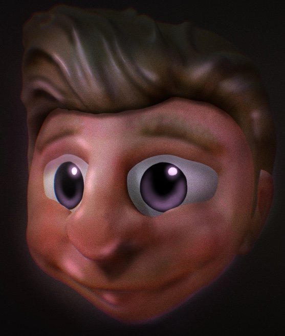
1. Course Overview: Hi there. My name's Derek
Davidson and I'm back with my second Nomad
sculpt course. This course is going to be
about making creatures. So I have a couple of creatures
I've made here just to kinda give you a
sense of the sort of thing that we're
going to focus on. Some of it may be
about blocking out, and this is a recent blackout. I've been working on a
sort of scorpion guy. Some of it may be about adapting animals and other creatures into sort of cartoony
versions of themselves. Here we have something
that is basically humanoid and a lot of the
other ones we look at will be, um, but has exaggerated
features in some ways. You can look and see the texture that was brought in by alphas. And we can talk about some of that as well. These are
also set up for 3D printing because
that's kinda what I do in my normal life. Here we're looking mostly at secondary forms instead
of primary forms. So there is texture there,
there's tertiary forms. But we're really looking
at how do you make it have appropriate shapes and forms in the mid level that
then are textured as opposed to relying on texture to make all of your things
also look a little, little bit of Boolean action in terms of what's going on
with the horns they are, and how to work with low poly
stuff to get sharp edges. This is a really old sculpt. I think it's actually a
non-example in some ways, like you can see the texture is kind of all the same all across. So here I relied on texture
to make this image pop. When in fact, the primary
forms are pretty strong, but I don't have many
secondary forms here. And so what you end
up getting is a very sort of simple, stylized look. Not that, that's bad, but
it isn't necessarily what you will be looking for and it's not a thorough job for sure. And I basically just use
two different textures. One for the chin
side of the head and another for
the horns on top. And that's kinda
hit. This, I think, is a pretty good example of both primary forms
in terms of looking at the way those horns are
shaped and the concept behind the whole thing, as well as secondary forms, the individual scales
which are actually modeled on not, not Alpha based. And then tertiary forms there where you can see
where I've added texture. Even to the places where
it's been modeled. There's little bits of bump and waiver in order to give it a sense of
weightiness and skin. So that's kinda what
we're focused on here. And we're hoping to
give you a sense of hopefully, you will like it. Hopefully I've figured
out the sound situation. I know some people
complained about that in the last and the last class, and that's a fine thing
to complain about. I want to get it
better. I'm sorry that it's taken me so long
to get back to it. But yeah, here it is. Creating creatures
in nomads sculpt.
2. Creature Head Blockout/Primary Forms: Okay, So I've got a
brand new scene here. I turned on the wire and
the outline for y'all, it's going to make it
a little easier for you to follow along and
see what we're doing. But this, in this course, I'm not actually intending to go through all the different tools. There's been a lot
of updates to nomad since since my last class. Customizable tools, they've started doing
uv and procreate, and we may get
into some of that. But mostly this is
a sculpting class as much as anything else. Just how the course works,
but actually how to think about sculpting the things
that you're looking at. So that's kinda where we want
to start and think about. All right, so in general, when starting you're
going to make a creature, I tend to start with
some form of blackout. Blackout is going to come
from primitive things. And often, the blackout doesn't necessarily end up being the thing that
I want it to be. So right now I
don't really have a plan for what's going on. I'm going to put some stuff together and see what comes out. So I'm going to add
another sphere, move it sort of in
a forward area. I'm thinking roughly about
this being kind of like a a cranium and this
being more of jaw. And I'll change the sizes and
shapes and just a moment. And then I'm going to
think a little bit about maybe some form
of horn as well. And it's easy enough to
start with cylinders. But you can also use this
tool which I think is new since the last
time we talked. So I made a tube, I'm going to mirror it so that
it's showing on both sides changing the radius so that
it's two radiuses or radii, I guess you can start
with one where it's just a single thickness. You can go to to where you have one thickness on
the end and one on the other end or
three where it can be looked at entirely. For this context, I'm
gonna go with two. So I'm going to move these down to sort of embed them in
the head a little bit more. And look at the top and go
here and try to think about, is that the right spot I have? It's sort of adjuster
ear type situation here. And in fact, I'm going to
rotate them back a little bit. I think it's too strong
and the profile for now. So let's see. Yeah. The outline is a little confusing for me,
but that's okay. So then having put
that together, I'm going to think
if there's anything else that would be like really big picture for this character that
I'm coming up with. But I think we'll do most of it probably around the
mouth and nose. So let's, let's add
something for them knows, I'm going to validate that tube. Come back through. Think about a box. What's it going to be? Creature. Okay. The auto the autosave always interrupts me almost
no matter what I'm doing. But I'm I've only
ever been pleased later when something goes
wrong that I have it. So, so just creating a box and I'm gonna make
it sort of make it a bit smaller and then embed
it in a way over there. Okay. That's the front. Bring it to where
it needs to be. But yeah, I'm going to
embed it more directly in the space between the
cranium and the jaw line. And get a sense of, okay, so now we have a nose and that's going to need
shape work obviously. But just kind of putting it, rotate it up a bit. I may want. So obviously here, I'm going to turn mirror or not because I want it mirrored, but because it helps me find the center when
they're overlapping, I know that it's
where it needs to be. I'm going to widen it out a bit. Okay? So this is kinda what
I'm thinking so far. I wonder sometimes
after doing this, the next, the next move and the block out is going
to involve trimming. Just sort of staying super big picture in
this context, right? Like I'm not, I'm not
shaping things yet. Eventually I will be. But right now I'm just kind of thinking about how do I
want these things to work? So I'm just trimming
down nothing to trim because I picked
the wrong thing, obviously. Okay. So I'm thinking about sort of cleaning up
this job. Awesome. Let's toward the stuff
that's not good. Let's try that again and
see if it does it again. At don'ts. I don't know
that's doing well. What you can do instead of trim is project and what that does. It's sort of a
subtle difference, but it pushes the geometry into the line that you're doing. So it should never leave a hole. You don't always want to use it. Sometimes it's a little better
to not have used it here. So we have this forward-facing
thing and I get a little bit more of a
jaw line going here. Okay, So I feel all
right about that. Let's see what we can
do to this head that will help it feel a little
less like a globular. These might need
to move back in. I wonder if they're still
mirrored. They are. Okay, Cool. Make them
a little small o. So that's a weird thing. They sort of connect when they get pushed into each other, it becomes one item. So then after a few
pulled them apart, again, you have issues. It's not a it's not a favorite. Back to trimming or will even project the back of this head. I'm going to try and get
a little bit of an edge they're feeling okay about that. Leaving the, leaving
the horns where they are working on the nose. Wanna stay front. You'll notice that I'm
not in perspective here. When you're going
to be doing a bunch of trimming perspective makes it so that what you trim isn't exactly what
you think it is. And that can be problematic 0. So I'm not, so I didn't
have symmetry on. I want symmetry on in
this context because I'm trying to shape a nose
from two directions. And we'll leave that to sort of pug nose it up when
the time comes. Okay. So I feel pretty good
about all those things. And now what I'm gonna do is highlight all of them
and voxel merge them. I'm not, I'm not running the resolution of
really high yet. In fact, you want to keep
it as low as possible. When I get to a
form that I like, then I can change from
voxel merge to sub-divide, which will allow
me to hold things together so you can see some sort of growth
snus around the edges. But this is an organic creature, so I don't really care. And I'm going to start
working with flatten. I think the flattened brush in Nomad is by far my favorite. And it just sort
of helps you build out the shapes that you want. So we have this muscle here
that we're cleaning up. And I'm not so much smoothing
and an attempts to like make it look cleaner
yet I'm just trying to get a sense
of what I want. And part of that is getting, getting some like a
touch point on every, every spot in the, in the model. Which is a weird thought like, you know, in a drawing, if you have blank
paper, it's just blank. But when you sculpt, you create a form and that form isn't necessarily
entirely blank. Even if you didn't
do anything to it. Like I created these spheres and maybe I just left them
how they were identif, or thought about that
particular spot. But it wouldn't necessarily be it wouldn't be blank
even though I hadn't considered it or made a deliberate choice
about what was there. So I'm going to try to
leave the tube section of the horns kinda
where they are. Let's see if I can flatten
this head a little bit. I don't want to mess that up. And in fact, I'll come back
around and sort of sheets. So I think that around
the edge of horns, the smaller and stronger, you tend to have like some skin that kind of
goes up against it. I sort of think of it as like the edge of your fingernail. You know, like you have
you have some skin that kind of dimples or
what's the right word? Bulges a bit around the
edge of your fingernail. So I'm sort of creating
that around the edge of the around the
edge of the horns. And I'll come back and
clean that up with the crease and
some other things. With a pretty large clay brush. I'm going to dig in some
spots and you may not you don't know if I'm touching sub or if I'm using a keyboard, just so you know I am
using the keyboard, I find it to be really useful. So I just hold it that
held the command button in order to pull up the shortcuts. It makes it really easy
to flip from front to back, left and right. I can change from sub2, not sub mask and unmask without ever having
to like move my hands, which is pretty excellent. So I do use the
keyboard even while I, even though I'm not
super into the angle, it's the right thing still. Okay, So I want to get this
bridge of the nose proper. And one thing in creatures and sculpting in general is like noses are kind of more important
than we think in terms of creating a character. You know? So thinking
about nostrils here, gotta kinda big nose. Lower that down a little bit. And I'm going to dig into
the nostrils just for now. Not necessarily what we want. But I think once
you have nostrils, you start to really
have a character. You know, it's, it's a
different sort of thing. All right. I'm going to
dig in some eye sockets. Here. Let's turn to get somewhere. Alright. I'd really love the fill brush. I love flatten and I love
it the other way to. I think it really helps
because often my scopes at least kinda have a
tendency to lacks subtlety, which is positive. That means my primary forms
are strong and stuff, but I think it can
be a bit of a pain. If you don't fill in some of the deep cuts that you
put there on accident. Okay. So I'm feeling pretty good about this for now in
terms of blackout, I still need to use
something for them out. So let me get some
major markers in there. I'm using a brush that
I call fat crease. And I'm using it
very, very lightly. I find that crease brushes work really
differently depending on the number of polygons that you're
working with, right? The geometry, the geometry
becomes more dense, decrease brushes, are they,
they behave differently. So I'm looking at this
nasal labial fold there. And then I'm going to try
and get some form of like, oh, well, I guess too high. I mean, I thought it was
too high to start with. Let's go to low, see
what that looks like. Okay? So it's kind of a great thought about this sort
of thing is that, you know, go until you break something and then take
it back just a bit. All right. Go go too low or too high and then take it back and see what
happens from there. Okay. Well, I didn't care
for that loss both. Okay. So having sort
of a horsey face, Let's bring the nose
forward a little bit back. Some might, might add
tusks or some sort of t. It might open his mouth. We'll see. Now what we don't have
our ears of any sort. So let's see what we
wanna do with that. I like the sort of big
guy, small year thing. I don't know why like that. So entrepreneur I do. So I'm going to start just
by digging in a whole. Because at the base
of your ear there is, inside of your ear there
is a whole I'm going to do a little bit of pulling for that little flap
at the front of your ear? I do. I do. Or I once knew all the technical
terms for these things, but I don't know. So that's okay. And then I'm going
to sort of build out what becomes the ear. Just the clay brush, just tapping it in. As I look through, I can see that the
shapes not right, this is unwind up all back
the way I want it to be. Let me move it into place. One of my favorite shortcuts
here is just the X key, which allows you to immediately change the shape of something. So I have this big
brush, but if it hit X, I can change the radius quite quickly without
having to reach over there. Which is kinda nice. Just kinda tucking skin up
under the edge of the ear. I'll come back and clean that
up as needed eventually. But for now, I just want
to get some volume there. I'm going to have to do something
in between those two to make sure that that's distinct because right now it's not. And that's fine,
but I don't have the polygons to work on it now. Alright, so now I'm looking and I'm turning and looking
at silhouettes. And I'm trying to
think what parts of this are working and
what parts aren't. That's, that's kinda the
way to think about it. Like is this, Is this
a working design like where it's sort of like has appeal and is interesting, or is this a design that is
not working in some ways? So like right now
as I look at it, I feel like the
horns are working. I think the nose and
the eyes are working. The ears are a little iffy. Back of the head,
It's super iffy me, back of the cranium, I guess. Build this out a little bit. There's going be a
neck there some point. Also the angles wrong.
He's sort of looking up. I'd like him facing a bit down, more down, which I can
fix in just a second. I'm going to smooth this
out just a bit as I see. So there's places where the
geometry is stretched so much that it's sort of
getting close to tear. And so I might, You don't
want it to tear because then you'll see back faces and that messes up
your whole thing, particularly if you're going
to try to print later. So, but again, I'm
not interested in a super smooth thing right now, like that's not, that's not
where I'm going right now. We're just trying to get them
silhouettes looking right? So I pulled out a little bit. They're pulling in
Austria the edge of the nostrils and try to
pull out the muzzle some, let's call it a muzzle on
humans too, by the way, maybe we'll do a big overbite
that's kind of interesting, sort of Simpsons ESC. And then a creepy smile. Kinda like a camel ish front. I'll put a line there. Let's see, those are
getting closer to 0. So let me smooth it
a little bit. Okay? It's kind of a happy
creature isn t. All right. So I think that made the
mouth work a little bit. I'm worried about
the lack of a chin. I don't think I
need a huge chin, but getting some sort of stronger jaw features
might be helpful. Too much though. I thought
too much for now at least. I'm trying to give
him a little bit of a bunch and as we go and then I'll flatten this
edge, some will help. Oh, interesting. Yeah, I like that. So as I looked through and
I'm going to go and do unlit so that I'm just looking at the I'm just looking
at the silhouette, not looking at
anything internally. If the silhouette works, then you have an
opportunity for something. So there's some bumps here that like could be simplified, right? In this silhouette. Like
I don't think this is like all that strong, but let's take a look and see. That's that's stronger
before the nose comes in. The full side is pretty strong. I guess the lower lip needs
to come out a bit more. From this back view. Have no idea what
I'm looking at. So yeah, there's work
to do. This is this is complex in a way that
it doesn't need to be. And that's okay. But I did get a sense that I need to inflate the lower lip a little bit. I think that does help. Tibia sense of that loop. So I have the inflate brush out. Clean up these. Again, I'm thinking like
what works and what doesn't work in here in
terms of major landmarks, I think the chin is solid. I like the lower lip. I'm just kinda moving up. I think the the like
upper lip muscle needs some secondary
forums to work. But in terms of
still primary forms, I think we're missing
kind of a brow. So I'm gonna throw in some brow work here
and just working with the clay brush trying to get pretty pretty
pronounced there. Yes. When we start to
have a brow, that's nice. Then I'll pull out and neck
at some point, but not yet. And maybe we want
to throw something down the center of
his head eventually when we start thinking about
hair or something like this, let me use subduct
kinda clean up this section here so
that there's more of a distinction
between those things. And next to where I pulled that skin and
I'm just going to go around with sub and kinda
and some space there. A lot of times if you want
to make a bump of some sort, there's kind of a
question around like is your bump bump or is it Is it a whole next to it? Right? Like there's
multiple ways to sort of think about
what you're doing. And in doing so, you can kinda figure out that some combination of them both is going to be the
best idea for sure. So you want to bump, but you also want to create a depression
next to that bump. And that's like a smart
way to go about it. That's not great. So smooth that, so they're fun. The back of that headstone. Clean that up in a second. All right, so feeling
pretty good about that. Overall. I do think it can
be simplified some, but I'll get to that
as I add space, as I add more geometry. So as you can look right now, the geometry, it's really
pretty low polygon. I mean, we're, we're under a 100 K right now if you look at the stats on the top-left and
you know, that's not many. So you can't get too detailed
when you're like that. So I'm going to go up, and once you have kind of one
of everything you want is a phrase I learned from Glen Southern once
you have one of everything and then you can start doing subdivision, right? So you do voxel marriage until
you finish the block cout. And then after that, by
adding sub-division, you can make sure that you maintain the shape and that you're able to
reverse that as needed. And you can have multiple
versions of your final without in any way degrading. So if you have details
and then you voxel merge, it may end up getting rid of
those because voxel mergers about really just averaging
polygons across the surface. Whereas if you sub-divide, it takes every polygon that you have and just turns
it into four. So we have to pay attention to that and something to think about before you do that
with the smooth brush, you can go through and do relax and relax the
mesh in certain places. Now, the thing about relaxing
the meshes that it doesn't actually change the geometry
at all in terms of what? It changes the
geometry, it doesn't change the surface at all. Like it may look as if
this is moving somehow, but it's not actually so like if I were to take the
wireframe off and do it, you can't actually tell that anything's happening
in most contexts. In fact, a lot of people find themselves thinking this
distMoved brushes and smoothing out because they're
relaxing a mesh and it's not actually changing
the shape at all, but it is making it so that
when you decide to subdivide, your geometry will be more
equally distributed, right? Like these curves. If you were to subdivide that, that would be a lot of geometry that's following those curves. And it's just not
necessary, right? It's better. And you'll
have cleaner topology. If you do a little
bit more relaxation. Now with other tools, you
can go a lot further in that way in terms of going from, instead of relaxing the mesh and trying to fix
it here you can just read topologies entirely
and keep the same surface, but decide where you want
your geometry to be. And if you wanna do
anything low poly, you, you're going
to need to do that.
3. Secondary Forms Pt. 1: Okay, so we're back here and I am starting to think about
apologizing a little bit. So I'm going to subdivide to
go from 30 K2 over a 100 K. You'll see there's less fascinating, It's
a little smoother. And now my thought is, okay, have primary forms in place. Now I need to start working
on secondary forms. And before I get too deep
into secondary forms, I'm going back with
that fat crease and I'm just going to pronounce the forms that I've already
got just a bit more. That they're the lines are
really they're sort of have these landmarks that
helped me understand exactly what I'm looking at right now should have
been something here. I think this one's
called the philtrum. If I recall, I make that
crease and then I'm going to use the clay brush just to
sub in there a little bit. Yeah. Smooth that out and
that'll look nice. Though I'm still
in relax. I fell prey to the same mistake
that I talked about. Okay, So now we have a big, big family philtrum there. Sort of build out this
clip a little bit. I paused earlier to
see if you could hear my my heavy breathing pug dog. But now I'm almost certainly can and will see
smoothing out that edge. Okay, coming back
with crease, again. Kinda have a sort of
side of the crease here inside of the ear
creates to clean that up. And there's more geometry that goes inside of
any earlier than that. But we'll get there eventually. Gonna do inside of the
brow as it goes up against the nose crease. And I'll probably do a
forehead crease or two. And I get a little bit
of that. Let's get something across the nose. So as you can see, this is not changing the overall silhouette, but what it is doing is giving it more visual
interests as we go. I'm going to do couple wrinkle. The mouth lines, bring this
all the way into the lip. Okay, We're still symmetrical, which is not necessarily the right thing to
do at this point. I tend to get as much in as I can before I start trying to think about
breaking symmetry. Just because it can
be really tough. Okay, so now putting this, this crease here is defining
the ear and the ear lobe. And then I'm gonna do a
different crease over here to define this edge around the the sort of horn part where it is
connecting to the skull. And again, I'm using this
very lightly clean up to around my fat crease the way of the brush tuned it almost always require some
smoothing next to the edge because it pushes, you know, pretty
hard in that way. And then I'm gonna do a crease
of where the skin connects actually to the horn itself. Just lightly putting I would care about
it being perfectly round except that it's
an organic creature. And so mistakes sort of
give character at times, though other times not so much. So you got that can only go
so far smoothing out this. Okay? So starting to have
more visual interests, I've got some stuff going on
here, some secondary forms. So then the next step
with secondary forms, generally you are going to
sculpt from the inside out. So we started by
talking about cranium and jaw lines and
that sort of thing. Horns. And then, you know, we've added some skin. I think the next step
is to think about where the fat is. Fat goes under scan. I probably should have
thought about that beforehand if I were truly
building inside out. And so we have to
think about like, what sort of creature
we talking about. Is this a fat creature, not a fact creature
like, you know, I have this urge right
now to take a sort of big brush and see
what happens if I pull the jaw dramatically out. And this is a this is
a question about fat. No, that would have
to connect to a neck of some sorts or that's sort of a chin that's
covering a neck. So I'm going to move
this back and kinda pull, pull out here. Yeah, like kinda like that. Starting to get somewhere. Let's make sure that we have. And if we had some, some sort of a real fat rolls, we'd have a wider and
wider cheek line as well. Pulling out this back
of the cranium bit. And I may end up
adding, you know, sort of trimmed out sphere
in order to create that. If that's what we're
looking at here, I'm just kinda rounding it out. Come back and show the is
these chin sections a bit, come back through the middle and separate them some
smooth that out. So then there's
going to be lines there that indicate fat, but also that
indicate skin, right? So I'll just kinda building
in the idea that there's like things that are a
bit more blobby and a bit more like built up. So this is the Tiao Guo and
gels are gonna be kinda big and we'll have more
than one probably aware. You're kinda of dealing with
fat rolls of some sort. And I'm going to
build up the cheeks. I'm also, when I come
back in with the crease, it'll make more sense of these, of these buildups, right? I'm even going to sort of pay a little more attention to
the underside of these, of the browse here
will push the, the sort of connection
and pay attention the underside there to give you a different
sort of expression. This here is too tight for
someone who is, you know, sort of as weighty as this term. And I'll come back with the
crease and let's factories, Let's clean up some of this. Okay, so I'm seeing
like a sort of line ish there and
another line there. We've got the initial lip, but then some some
stuff going on there. And then I'm thinking
a little bit about where the jaw actually is. I don't think it's
going to matter because I'm going
to connect this. Here's can play a
little bit more. So I'm looking at
silhouettes again as I'm still in the design
phase here, right? Like I could go
really wide, good, suck it in and get more
fatty in the neck. I think the neck is pretty
solid at this point. I can lower that if I wanted. The main issue is sort of figuring out which
part, you know. Yeah. This part right here is making it not
read very well to me. So I'm just pulling
out some of the clay. Let's see what we can do here. So I don't use the
smooth brush often. I learned this from
the Flip Normals guys. They kind of never
use the smooth brush. I use it some, but
I almost always will start loop
sort of recording the form with something that is more organic
than the smooth brush. Because the smooth
brush really is very inorganic even though
it makes things smooth. And you think about
smoothness as being part of it's almost like the student has like a
really weird Adam's apple. Like the smooth brush just
gets rid of geometry, right? So like as I go across this with a high-level smooth,
now that's gone. I don't know if I want that. So what I would do
instead is like, well, if I don't want
that form at all, I can flatten it out and then smooth whatever's left after the flat and if I need to, but I don't try to get
smooth to change shapes, I mostly get smooth just to like clean geometry that's next to it, each other already. So like smoothing
like that doesn't do anything to the geometry. Yeah, What's missing
up here as I have, I don't have enough of a chin
for this level of wattle. So I'm going to build
in a stronger jaw line. We think about where
that would be, kind of here ish. Yeah, you're not helped. Digital is gonna go
all the way up here. Let's smooth a little bit and I'm going to come back
and crease under the jaw. Yeah. Okay. Now I've got I've got some
interesting things going on. Okay. I keep turning like that, so I'm just going to
turn the whole I told her I would have him
looking the right way. Make it this so that
he's super, yeah. It's an important moment
actually to switch him to facing the right
way because it's, it's helpful for me and sort of Estimating the effect that gravity would have
on the skin, right? Like that's, that's the
thing that I learned from the Flip Normals guys
that I really liked is that like this idea
that like skin has a weight and that there, there is some gravity in the skin that you
have to account for. And that really helps
when you're figuring out how to model wrinkles. You know, I think sometimes you can use the in-flight brush on a pretty subtle thing to sort of push the edges of it over. So you see, I would like that
nasal labial fold is sort of like further over
that crease now. And then I come back and smooth
like the other edge sum, um, can do the same
thing with these here. So that there's something here
and this, I'll be honest, this is like almost
time to read topologies again and sort of add some more, some more polygons to work with. But as you can see like
now, that mouth is much more creature like, right? As I've just added
these secondary forms. And I think that's, that's
the thing that's missing. So often in, in sculpture is like somebody
who's gone through and really done the work to
not just do the sort of easy alpha stuff
because there is easy alpha stuff to be done that will improve
almost anything. But like someone who really has put the work end to say like, what are the actual like
sculptural details? Oh, I hit Caps Lock and sort of smooth ER, and that's
why that happened. Sculptural details that I
need to pay attention to that will make this have a different
feel to it, you know. So like I'm going to sort
of pull that out some, you know, this inflate
brush here is. And so now that
knows has some real, you know, kinda earliness to
it, which I think is good. Smoothing out this
brown, awesome, like the top of
this wrinkle there. And then smooth out
the top of it that way to the bottom as well. Using an inflate around the
edge of the ear to kind of create some of that
part there as well. Yeah. So now we
have kind of a kind of a gross dude, which is, you know, when you're doing
creature sometimes that's what you're looking for.
So I'm going to come in. I think this this cutoff to
the chin is a bit dramatic. So I'm just using the fill
brush to clean that up. With your permission now that
we have enough to look at, I'm getting rid of the
grid because I don't, I don't usually sculpt with it. I find it to be annoying. It's useful when you can't
tell what you're looking at. Like if your actual thing
is not that pronounced. Okay. So we go back and look
at some various things. Yeah, I feel okay about this. I think there's a lot of
secondary forms that are inside the silhouette
that don't work. I wonder if I need to pull
it hears out some right now, the ears in the silhouette
right along that green line, the ears aren't really
making a difference. And they don't necessarily
need to be more pronounced, but they don't read
as ears as the issue. And so I'm just
trying to figure out how to get that to happen. And like think about the idea
of whether this guy's head is too like are his cheeks
too much at this point? If I pull a second, his
cheeks a little bit, does that make his
mouth look a little? Oh, no. I think I
have ears or not.
4. Secondary Forms Pt. 2: I'm not trying to change
his chin here as much as I was trying to
change his neck. Pull out like spy and
kinda shoulder blades. Go sense of I probably should have done all
that before I subdivided. I'm going to try to
cut in a little bit into this too small
of a brush and cut in a little bit into
this sort of neck area. And I give them a little
bit more definition. They're kind of like that. We want the whole back of
his head to be further back. Like action. I'm going to work
on the side of the eye that didn't
do what I wanted. I but I think other than that, it should allow me to give
him something of a jaw line, at least up here. Well, that's not how
that should be at all. So let's clean that up from the front and we're
starting to look, okay. I'm pleased with his jaw line. I'm pleased with the ears
are now in the silhouette. I haven't messed up
the horns at all. I'll do something with
the horns eventually and probably a break one off
when we break symmetry, symmetry, I think that's
always kinda cool move. I'm going to rough this
front of this nose up a bit. I'm just using the
flatten brush to kind of get a little bit more edge. I think in CAD that would
be called a chamfer. But just kinda making the edges
a little more pronounced. I'm going to bring in
push forward terabit. Front of mind tells me that
all my guys have big noses. Everybody that I make, which is not I don't
think he's wrong. I think the nose okay. So I'm getting somewhere. I feel I feel good
about this stuff. I think it's clear
that there needs to be more detail on the
jaw line for sure. Like it seems quite a
bit more spare than the upper lip area or
the nose or the eyebrows or anything like that? Yeah. The ears are now part of it. So let me get some let me get some striations and
stuff and the jaw line. Okay. So first thing, let
me fill this in some it's a little bit and it's going to be
tied to subdivide again, let me take a look
at the geometry. Yes, I'm like trying to
put details in there, but there's not there's
not a ton to work with. We're off. So I'm seeing like
another like a fold sort of I think another such thing I didn't like
the bottom of that. I think that part is fine. But I need this unless
you have a big chin, It's not just in the
front. So on the bottom. Okay. Greenland, pretty
good about that at only the way that that connects, I need to do an Adam's apple and then increase it
off so that there's a distinction between
what we're looking at. Okay? Okay. I'm going to subdivide again. And now I'm at 0.5
million polygons. So there's some places where
you can see it could use, I could use a
little help, right? So but we're starting to get something that looks pretty creature
like in a nice way. I'm I'm going to fill
in this a little bit. So I saw this. I guess why I'm filling
in is because it wasn't an intentional crease. And you could smooth it out, but that wouldn't actually
be the same as like adding, adding the mass
there that you need. So I like to fill
and then smooth so that it doesn't smooth
towards the crease, it smooths towards the
other the other surfaces. Right? So like right there, there's some work
that I need to do. Okay? And just to get a sense
of these bombs and stuff, I'm going to use
three fingers on the screen and rotate the, rotate the light
sort of slowly to see if this is so like I see right there that I don't I don't know that I
liked the way that looks. So I need to go check that out. Yeah. And the bottom half there
needs to be some smoothing for sure because I'm starting to get the edges of, by the way, I don't have smooth shading on and I don't have some shading
on because I think it, it's nice to be able
to put it on at the end and to see
that difference. But also like I just like to see what it's
going to look like. I think if you, if you have smooth
shading on and then you transfer to
a different program, you really won't know
what you're working with. And, you know, you can't accurately predict what
it's going to look like. And that's an important thing. Okay, I need to flatten that
little edge a little bit. Oh, it's filling
and still flooding. Yeah, I need to flatten that
little edge a little bit. I do like the double tap of
the Apple pencil, like that. That functionality like being able to double tap
it in order to get my dark shrieking. Double-tap it in
order to switch from sub two, sub and back. I do like that functionality, but it does, it does almost always get me in
some kind of way, like I end up making a
mistake and you know, doing their own thing, right? Let's get some, get some fat
on the back of this as well. So if I think about like, you know, they're being
kind of like neck rolls. And then like I did before, I'm going to inflate, smooth out there first, but I'm going to inflate this edge so that
it's kinda over. Yeah, I feel pretty
good about that. While I'm back here,
I'm going to add a spine too big of a thing. And it doesn't have to
be perfect because it should be covered by
skin and fat, right? But you just need to like have these bony markers to kind of
get a sense of where it is and it moves or a little pronounced like almost
like Stegosaurus action. Yeah, I feel better about that. Let me fill in a little
bit at the top of that, so it's not quite so pronounced. I guess. I'm working on my
subtlety as best I can. Okay. I'm feeling pretty
good about that. I need to clean up the
top of that jaw, right. So so I'm sort of digging in next to the jaw in order to get
the top of it just right. This a situation
where sometimes I go mad cap to see if I can get a better view of
what's going on there. That's not the best Mac
app to look at this. That's a fun backup, but it's not the easiest one. All right. So I'm thinking that the John he needs
to come in here. So I'm sort of digging out this is jawed area that
I'll need to fill in these muscles that come through this like sort of neck tendons that are
touched to your collarbone. And the whole front of that
needs to move forward some so that I have more
space to work. What I'm aiming for with this particular thing
is eventually to have like kind of a
bust for 3D printing. In my, my day, my day job, I am a founding makerspace
teacher for a high-school. So we've just gotten
some pretty cool tech, got the photon mono x. And so I'm 3D printing
with that stuff. If you have questions
about 3D printing, you're welcome to ask me I'm I've been doing
it for awhile, know enough about it to do it some sort of adding
shoulders here. And now we have a neck
that I feel okay about. I mean, the, the fascinating there isn't my
favorite, but that's okay. So yeah, I feel like this is o as I was about to
say, I think it's okay. I see things in the cheek
that I don't like much, so let me see if I can get some sort of lower limb
going and we'll add eyes. You know, at some
point it's pretty essential that your creature
have eyes of some sort. I think about like wrinkles
as we go through here. And here I'm thinking
about like jaw, like specifically
just checking it out, see and why I think
looking for places where the where the mesh seems
distressed in some ways. I'm gonna cut in
above the browser. Awesome. To give a little
bit more distinction. Again, it's that same idea
that sometimes it's not the, it's not the additive process to that that makes
something pop. It can be removing the
things around it, you know. Yes or no. The browser
a little stronger. Okay. Got a muzzle, got some other stuff
looking looking okay. Smoothing out some
sort of neck action, looking from below,
cleaning up that chin, feeling okay about that. I got some national
work I need to do here. And that's too big of a brush. Making the brush smaller? Yeah. Just kinda making sure
that the nostrils are properly dug in from
multiple sides. Yeah. So one of those things where
you just tuck it up under, do a similar thing with
the eyes at some point. But feeling pretty
good about that. Let's kinda hideous,
hideous looking dude but very creature
like so I'm into that.
5. Tertiary Forms Pt. 1: Okay, so now what I'm
thinking about is tertiary forms. That
occurs to me, right? As I said, that the one sort of non tertiary form
that I need to work on is this this horn situation, like them working out an actual, an actual shape difference, not just adding things to it. So let's see. Okay, there and what I'll do, I like to project. So now we have sort of, I think, kind of cuter, cuter
horns, which is cool. Okay, so then in terms
of tertiary forms, I want to start
thinking about adding texture before I
subdivide again. Because I'd put it at
2 billion vertices, which is kind of a lot. But what, I'll do it
and do it anyway. So here I am. I'm
subdivided here. 2 million vertices is plenty. For our benefits. I'll go to smooth
shading now so I can start looking to see
what's really happening. And I'm gonna go to stamp. So in stamped, there are some things you got
to focus on first, this fall off here is
not how it starts. It starts like that. But I like to do this so
that I have a better sense of what exactly I'm doing, you know, and you're
going to want the power of it to go away way down. Now in this black box of the bottom left,
you have alphas, and I have a ton of
alphas of various things. Lots and lots of
them are associated with particular
brushes that I have. But also there's just a bunch
that I have put together over time and collected some. I've paid money for others
I've made myself and I can go into how to make them
in another course. But for right now
what I'm looking for is something that's going to add sort of a general like a general sort of
irregularity to the skin. And speckles worked pretty
well for that sort of thing. So I'm looking for
something that has something like this. And as I pull it out, you get
some, some wrinkled action. Right now I got to be careful the size of the brush is
going to matter here, but more so the
intensity, right? So like that's not what we want. Well, looks like some porno
flick Jacqueline domains. So you want to be kinda subtle. And it's a situation where you want to
get rid of symmetry, not because you don't think that the thing
should be symmetrical. But when you get
towards the center, doing that, like having that
symmetry can be a problem. So right now I'm
really just looking for places that are wrinkled. And I do things like this
where I tell myself, okay, this is the texture for
this particular part. Not like part on the model, but like this, this
instance, right? So this is what wrinkles are going to look
like for this guy. So everywhere I have wrinkles, I go back and fill this in and get sort of tearing and some places
depending on the geometry. So if I go to the wire frame, you can see that
that's built into it. But still I think I'm
staying away from the top, which I want to be a
little bit harder. So here we have like
pores there, okay. And I'm not going to stay on
the same thing for too long. So now I have, I think, a different
type of speckle. And for me I think that looks better kind of around the chin. I'm going to lower the
intensity even more. Right? But this is maybe, maybe more than that though. Let's see. Yeah. You get sort of like
a hair follicle feel. You turn around the
way you want to. This, I'll be honest, this geometry here is not, is not deforming the
way I want it to. So this is another
case of going in and relaxing the mesh. Turn the strength all
the way up on the mesh. Relax it intensely than
smooth that out to try and give and get back
to stamp and stamping. And hopefully the stamp
will show up better. Having relaxed that fresh. And he's a little better
as long as it's not too close to the to the edge there. So yeah. Further away, you get some
some good effects there. So we've got some
sort of Chin stuff. We'll do a little bit of that on the bottom of the neck here. I think some of that goes
around here as well. Sort of going into the chance. So you think about it as
like hair follicles as you're sort of what
you're thinking about, there was too much. You can tell pretty quickly
when you do too much, which is a good feeling. Okay? So there we have immediately like a sort of different
level of realism, even though this is a creature
that could never exist. Like you start to
have a sense of like, oh, it's really there, which is a good feeling. I'm turning the camera to be straight on with whatever I'm touching as
much as possible. Like if I'm going from under, you see I'm looking from under, because that has to do with
the Alpha projection as well. And if you overlap
multiple things, that's really no big deal. Okay? So then the last sort of undulation stuff I need
to do is on the forehead. And for that milk for
something that's a little bit more line-based. Again, I have a ton of these. So something kinda. Now, one thing
that's worth paying attention to is the
mid value here. For certain Alphas. This changes like what does
white renderer as like, does white push in or pull out as black
push in or pull out, it changes depending
on the Min value. And for these particular ones, having it at like 50
percent is better. So I'm trying to like,
have them sort of meet at the middle so I don't
have to turn symmetry off. It's really kinda lazy
thing that I'm doing, but just getting some bumps going there at these
under the eyes as well. And you see how it's combining with the other so you can get bigger in certain places to kinda make it read
a little better. Okay, So now we really have some stuff that were suited to the inside of
the back of the head. This will work well for
the back of the head. So I'm rotating it just
a little bit as I go. Okay. So now we've got
some bumps go in there and we've got
some variation. Still need to do that lip. But I actually I'm
gonna do that lip with a combination of so
this isn't my fat crease. This is a much thinner crease. And going through and doing a subbed crease next
to and not sub-queries so that you can get like sort of undulation in the form that I'm going to take off symmetry because lips are notoriously
not symmetrical. So you want to have some
spots in there that aren't. And it should kind of
curve down as you go. Alright. Be a little bit harder as
you're at the top there. Turn symmetry back on. Now I've got some,
some movement there. All right, feeling
okay with that stuff. Still need to do something
with the horns from a and also the sections
around the horns. Not trying to get to
scaly in general, but I am going to
put some sort of scale stuff around this section. Similarly, the idea is
that it's getting a little tougher as we're getting
closer to the horns. So yeah, that sort of aspect
where you're like thinking through how a thing I didn't like the way
that was rendering. So I'm kinda evaluating
that section. But thinking through like, you know, when you're
doing creature design, it's about like actually
thinking about creatures and thinking about
like what they would do and how
they would look. And so figuring that stuff
out is kind of important. I'm going to smooth this part where it went over
on to the thing. So I didn't mean to do that. And as you can see,
I've set tree back on. So now that has a bit
of a unique spot to it, which is nice. It has
a different look. And then in terms of
the horns themselves, part of it as secondary
like you want to have, I'm going to take take
symmetry off here. Like you want to have, oh, that's too much over the string. Now, we want to have some like
secondary stuff going on. And then another part
without symmetry, I'm going to cut off a section here so that we have like a more broken
and sort of jaggedy space. And I'm going to use a
stamp like with too much. Oh, that's interesting. I could try to put like
wood grain in there. Hadn't considered that. What would that look like? Yeah, it's kind of
it's kind of nice. All right. We'll go with that. So I'm over here stamping
and on the edge I also see now that is an issue because
I trimmed There's really like bad topology. Their normal amount of
relaxing is going to help it. And so let me go back and see, can I project instead? Felt all right,
let's take a look. I can flatten that
out. Let's move it. I'm going to want to cut like something into this a
little bit like edges. So it's not perfect. They're always said dude
with his situation. Okay, stamping. Now, I'm on sub accidentally, OK, and let's turn the
power up a little bit. It's sort of a grain
so that it can have kind of an
ivory feel to it. I'm going to use a different
wood grain for that part. Go back to something a
little more panel based. And I'll do some of that
same stuff over here. But I'm going to increase a little bit more
in a couple of places. I like the idea that like his
warrants were like shaved. I don't know why
I like that idea. I guess it's pretty
gruesome actually, but but I do like that idea. Okay. And then start pulling you in That's
a little too strong. You get some, some
texture and the horns, they're not going to worry about next stuff
because I'm going to cut most of that off. And in fact, I might
cut it off now if I don't have to do
anymore subdividing.
6. Tertiary Forms Pt. 2: Symmetry. That'll cut a nice, nice front part for that. And then I like to cut
looks straight from the left and cut down
this way as well. So I have a spot for
the pedestal to go in. So there's this
feeling pretty good. I might add like some horny
stuff in his spine but maybe not probably
time to add eyeballs. Procedure done in awhile you but feeling feeling okay
about it right now. So eyeballs for a
lot of ways to do it would have been doing recently is not
necessarily my favorite, but I do like it. Some were not. What's going on here? My NMAC. No, that's just the
way the, the thing is. Okay. So I'm going to move this, this way and mirror it
and make it smaller. Changing to local pivots. Get it into the spot
that it needs to be. And you certainly can just do like a single sphere for eyes. I don't think that's a
great look honestly. Particularly if you want the sort of refraction
that people get from eyes that sort of
make a thing look alive. So what I tend to do, do I have not showing paint
on showing paint. Okay. I haven't really painted yet. But so what I do then is I
clone it, pull it forward, make it smaller, go
back in and find a part where it's
going to be On Walton. Okay. So now this is seeing so I'm making it
smaller, pulling it forward. I didn't come. Okay. Alright. Clone it. Make it smaller. Move it forward. I don't want them
to be cross-eyed. Now you'll notice
that that green line is sort of the same
and the middle there, like it's got a
bar between them. That's because they were close to each other
when I cloned it. So it clone it as one thing. But now I'm gonna go in here. So that's the sphere that I just added. And here's this one. I'm going to erase
the one on or hide them and do a voxel merge
with the other eye. And it'll give me, you know, sort of pupil action there. Now there's some other stuff
going on here in that I need to move the skin of
the eye socket back. So I use normal mode for that because it's
really the most helpful to just be able to push directly against the normal
of what I'm working in. It's really the only US I can think of for normal
at some level. Okay, so here we
have those eyes. And then what I
often do after doing that company tech
normal mode off here and just kind of
push that and so on. I often do after that. Okay, I'm going to subdivide
this so that it's a little tighter around the
edge and I will pinch, pinch that edge so
that it cleans up some because it's a little
it's a little ragged. He has you can see. And then I'm going to in
the gizmo cloner again, rotate it, make it slightly bigger so you
can't see it anymore. And then change
that to refraction. You paint glossy,
take that index of refraction down because
I don't need it to like do that sort of thing. The rest of it it'll
do on its own. But now you have a nice thing going on
there TO the pupil. Sort of look weird
from the inside there because of that tube. I could fix that if I wanted, but I'm not going
to look at it from that angle. So it's
not a big deal. It's amazing how much the I
is just like change things. I'm going to take
this outline off so that we can sort of
look a little bit more. And I'm going to think a
little bit now about coloring. So into this view here. And then we'll go to coloring.
7. Color: Okay, so now our job is to color light and pose this duped. And maybe think a little
bit about whether we want any hair or any sort of
costuming or anything like that. I'm just looking around
to see what I was thinking some about like maybe some like
cheek hair weirdly. So I don't know if that's
exactly what I want to do, but I'll take a look at it. So I'm using the keyboard
to do the masking tool. And I'm going to mask sort of like some mutton choppy area. And that should be symmetrical, so I'm on both sides. And then I can go to Select
Mask and extract it. It's good to read
about the closing, show, other closing options. I always forget exactly
which one it is. Close the extraction shaped by using a thickness value, yes. So it's shell is normally
what I'm looking for and know it should be a
different color entirely. I don't know what color
would want for hair. Maybe a sort of dark
refer force painted some. And we can start
using like some, some office here to kind of
pull it out a little bit. This time I'm going
to use an alpha with the clay brush as opposed to and sometimes they do actually with the drag brush. Um, I can kind of
help you get a sense of pulling small amounts out, giving kind of like
a prickly texture, I guess is what I would say. Slow me see if I can find a good If you can hear
that my dog is okay. It's just a pug any sort
of struggles with life? Yeah. So you get a little furry here with yeah, it's not bad. It looks pretty good actually. Okay, so now we've got the hair. Let's work on color. So a little bit for coloring or clicking on the main
mesh and we're adding layers will go to base and figure out
what the base sort of skin tone we're
looking for is. We haven't really
decided on that. Orange looks nice to me. Not too shiny. So It's kind of orangeish. And then on layers, we're going to add
some variation. You never just want to have one color when you go through it. And the sort of
simplest way to think about it is that you go a bit cooler for the Chen, warmer for the nose
and nose and ears, and then sort of whatever your bone color
would be a so sort of yellowish often for a forehead and places where bone
shop quite close. So just kinda getting
some of this this like I still don't like that. I only use a color
that's a little closer to what I
did for the hair. So let's see where that is. It's cool, little darker. And because it's on a layer, you can color it in kind of whatever whatever
intensity you'd like. And then you can use the opacity of the
layer tool to sort of slow fade it out a little bit. Let's get a little bit
of this very light, but a little bit of this, and a little bit on the neck. And again, we're looking
for color variation, not details here. So as I zoom that out. Pretty good. Another layer here. This one will be for
the blood that shows up more in the nose and ears. So you want to take
this and go, oh, just a bit red are pretty good. Actually. Got the opacity pretty low, so you can get cheeks here. Well, we have some Britishness
on the next layer. And do we want to
pull that back at all? That's pretty good. Well, the next
layer will do lips. So main thing is
that the top lip tends to be a little darker
than the bottom lip. And this is all
vertex paint, right? And a lot of people will start
looking at Procreate for the next version
of what they wanna do with texturing and
that's a fine thing to do. I don't think there's
anything wrong with that. Procreate is doing some
pretty interesting things. I'm not going to cover
that in this class, but maybe in the next
class I do with that will be the right thing
to talk about. And then as I said,
bone color ish, which is going to be
kind of a lighter yellow right around here. Where the brow turn the yellow down on that
forehead a little bit. So we've got some
skin tone variation, got some mutton
chops that we like. Let's color these horns. So horns are going to be a
form of sort of an ivory. Like a, like a grayish yellow is a good color to
look at for horns. And actually let me
make sure I have another layer that I'm
working on so that color will come through symmetry. I broke symmetry on
the horns earlier in the symmetry is trying to, to work even though
it's not possible, There's no horn over there. But it should color
the edge well enough as we go near at, okay, so let's see, it's missing that top part. I'm gonna take symmetry off
and they go to it race. So I can get these edges
and clean them up. So I don't want
things other than the horns to be colored, but I gotta be careful. The main advice for
coloring in this way, I could ECLAC at a dog. I'm so sorry. My main advice for coloring this
way is just light. Light pen strokes. You don't need to push too hard to get the
effect that you need. Do you need to set
up the sliders correctly such that
a light touch will actually get you the right thing and get you the right effect. So something pretty good there. Let's go around here
and see what we got. Clean up these edges. And then the other
thing about horns. So they tend to be a bit darker and then
get in this hole here. They tend to be a little
darker and more brown as you get closer to the bottom
or the root of them. So that's just a thing that
sort of exists in nature. And so you want to try to mirror that in
some ways if you can. It's it's partially because it was like ambient
occlusion. Right. Like it's a thing
that happens just because it's harder
for light to get into those spots that are closer
to where it joins the skin. But also it just is a coloring thing that
tends to happen. No matter what horn or animal you're,
you're talking about. It's something that
you can notice as you look at pictures, blending that and as we go, It's got to make it quite a bit smaller to
make it work here. Sometimes I wonder
like what would the inside of a broken
horn look like? And that's the sort
of thing I should probably look up to know. But I don't know. And so I'm not going to Okay. So we've got that.
8. Lighting, Posing, and Post-Processing: I got some color
there and let's throw some light in here. So in terms of adding light, I think the first thing
is picking your HDRI. So I have one that I like
here and then I like to turn the exposure way down so that I can really see what
the lights are doing. So I add the first light. Think about a color. What am I trying to simulate? Spotlight, daylight,
whatever it is. This one is a directional light, so it doesn't actually
matter where it is. So I like to move them out of the way so that they
don't mess with anything. I don't like, I don't have a specific idea that
I'm going for in terms of where this light
should be coming from. So I'm going to start with this directional overhead light. And then the things I'm going to be thinking about as having a fill light coming from the opposite side
that is not as strong. And that one should
not be directional. It should be either a
spot or a point light. So I'm pulling this one
over and then I need to change its behavior some. Let's see. So right
now it's too far back. Sort of move it forward. Let's go down a little bit. And what I'm showing you here
is three-point lighting, which is pretty common in pretty common in
film and theatre. See if I can change the
gizmo here to be local, to do what I wanted it to. So I'd like it to
be farther back, but also a little
farther forward. I'm going to go in and change the cone angle so that it's more of a flood and
less of a point, right? You can make it sort of a point. And then the other
thing is the intensity. So I don't want that to be as bright as the overhead light. So that when I'm
looking from the front. And this may not be the, the picture we want
eventually with our perspective on to start looking at things in a
perspective the way. But there's clearly a fill light because I'll show you what
it looks like when it's off. Right? That's a little bit
darker, can't see as much. So there's clearly a fill light. And then the last one
is your rim light. And we can work on colors and a second for now they're
all the same color. This sort of greenish
color for rim light. I really like doing
a point light. Wow, that's very intense. And you want it to be behind such that it catches the rim of your character and lights it up from that sort of angle
and just makes things pop. And I'm trying to decide if
I want it on this side or the other side and do kinda
like the way it looks now. It makes me wonder if
maybe I should do. Now we can add a fourth light. Let's new recently. But I wonder if I should
add another rim light behind on the other side. So that's we get sort of
lighting on both sides there. I think that one is quite a bit further back than the other. And if I come forward, that will help go back
to this front picture. And there we have some good It's pretty good lighting which
changed the intensities here. So I don't think we need full intensity for
either of these. When we get into
post-production. That will help a lot in terms of looking at Bloom and
intensity and color shifting. But this is nice and should show us the bumps
we need to see and stuff so you can rotate it afterwards and kinda
get a sense of it. His eyes are looking a
little creepy, right? And you can really
look for where those rim lights shine like
they do on the left there. And maybe these should come up with it too. Okay. I think I like that. I like that angle to it. It's not bad. In
terms of his eyes. He needs pupils clearly. So a very easy way to do this. Let's get rid of the shine part. And I'm just going to
put a black sphere. Inside. Oh no, yes, cool hair. All of a sudden, I'm going
to color this black, make it flat, matte
black so that it doesn't have any specularity. Let's get it into
the right spot. I'm going to mirror it so
that it's in both spots. Takes a little while
to get it right. Look how we want it to look. Too far forward or not,
or forward enough. Interests looking at it like
the eyelid specifically, whether it's like
and the right spot. So that's definitely
not in the right spot. So that's about right. And we go, and when
we add the other one, we should then have the shine
that we were looking for. Sad body. Okay, So that's lighting. And then the last thing we wanna do is some form of posing. So we can add a layer and
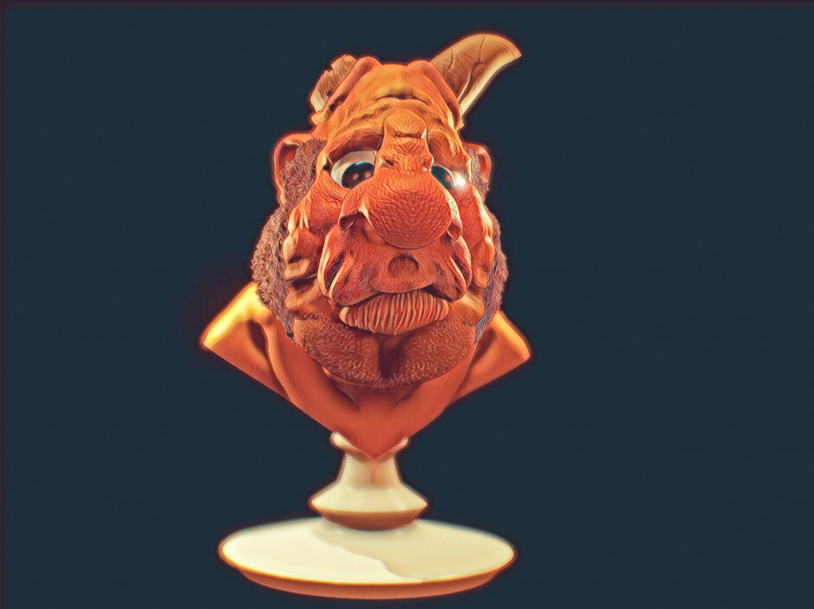
instead of changing color, we can begin to change movement. And again, it'll be like you
can impact it with the layer specifically metal
know what sort of movement I'm looking for normally when I do
something like this, I just kinda think a
little bit and started like kinda moving stuff around, looking for some
looking for expression. You know, sometimes you
want mask certain things. So like this, still moving
the top and the bottom at the same time and we
don't really want that. But I'm just trying to like put a little bit of a squint and this I maybe maybe a
little extra curve here. Kind of like that. Kind of a worried,
cartoony look. Very cool. The last thing I'm going
to do is make a pedestal. So this is a, this is a bust and we would want to print
this out, I think. So. I am going to get the
laser tool and make a curve. So for that I usually click the front buttons
so that we're like, you know, right on symmetry. And I just draw sort of
something like that. And I'll clean it up as I go. Tap to make some things
like sharp edges. Sometimes you like to
add like one of these. No, it's not in the right
place and so you want to move it back? Let's make sure we're
in the right place. Move it up differently
too far back. Do I like that? That's how I try to move it down instead of
affecting this thing. Feel pretty good about that. Let's make sure this bottom is fully I'm going to take perspective off, so I'm looking at this properly. And I like it to be a little
concaved in the bottom. It just helps when
you're cleaning off the print eventually
on any of this, be sharper like that. Okay, so mission
accomplished here. Got it in perspective. Validate that. And then I'm going to go to post-process and let's
see what we can do here. Okay, so a lot of
things just turned on and it's got a sort of
different look immediately. But let's take a look and see. So Max samples cool
ambient strength. So here we can turn on the amount of darkness
that we see around it. Curvature bias changes
aware that threshold is the field is a nice
thing to add here. It's just picking
different spots. And let's get out of
clay brush for now. Yeah, I think depth of field feels a little too strong
there for the FAR blur. But having the edges of the
things blur looks kinda nice. Near blurs, good. In terms of Bloom, turn that threshold down and get some real bloom
off the edges. We can, can look nice. Tone mapping. I'm liking that exposure. I actually feel okay with this
saturations. Pretty nice. Color grading. I like to get the darks darker
and the lights lighter. So that often looks
kinda like this. I'm going to remove
that particular thing. And then I think that's
another place where exposure can go up if you're grading is set up
in a certain way. But let me pull this
up a little earlier. I actually like that better
without degrading curvature. So for curvature I have
cavity, I have black, and I'm going to turn the
black all the way up for bump. I have white and it's real
low because you can go, you can be, you know,
sort of glow worm action. Here it is without it. And it sort of highlights
the hair earners. And I don't mind
having a little bit. I think it gives
it some strength. Vignettes not necessary
with something like this. Chromatic aberration can sort of separate the
channels as you go. Little bit is okay, but again, you want to be light grain. Little bit is okay. And sharpness. Again, it does something similar to what the Bump
does for curvature. So a little bit is okay, but you don't overdo it. So here is our guy. Let's get a render of this. I'm going to Save Image. And then what I tend to
do after I render it. I mean, there's
ways to go through and do color
correction yourself, but I actually really
enjoy Prisma as a very quick way to
do color for others. My dog that's making all
the noise by the way. And you can go through, and there's a ton
of these to pick, but you'll find yourself liking certain ones
more than others. You know, you can
get a sense of it. And I'll go through and
find some that I think are great and post them in the well, that's not right. Okay. It's not bad. But yeah, lots of
cool options for just kinda of
post-processing things. You can do. Some nicer
than others for sure. Oh, I like that. Yeah. I've thought a lot about like what it would look like to make a comic book with 3D characters. That then we're
post-processed in a consistent way across
the board because you turn the 3D artwork into 2D artwork really effectively
using these filters. And good, so I think
it's pretty excellent program, if I'm honest. Anyway. For now. Let me find where is the one that's yellow
that I like so much. I think it's ROI as a
very yellow look to it. No two-point elastic.
And it's interesting, you know, all of these are made, presumably, at least
they say so with AI. So they're just sort of
looking at the images on the extent to which you have, you know, thicknesses of
lines and things like that. And it's rendering it
out using its own thing, which I think is pretty cool. It's Blue Lagoon do
for us today. Okay. Blue Lagoon it is. Let's get at HD version of blue cone and we're going to save that. I think
that looks great. I don't know something went
wrong. We'll try again. Saved to that time. Okay. Bye guys.
 Derek Davidson, 3D Sculptor