Transcripts
1. Welcome to the Class: Since I became a bomb, time has felt very different. Days feel fuller,
moments feel faster, and somehow the s
that once felt like mine are now beautifully
and completely shared. There are days when I
plan to sit and paint, but little humans
don't follow plans. They arrive with needs, with emotions, with
moments that matter more. And before I know
it, the day slips by without me
picking up a brush, my little one is two years now, and I've come to realize how
quickly this phase passes. Right now, all he needs
is me, my presence, my time, and my attention, and I want to be
there for all of it. But somewhere along the way, I also realize something else. Art is a part of me,
and I need it too, not just to create but
to pause to breathe, to feel like myself again. And that's when I started creating these small
bite sized paintings, 15 to 20 minutes while he naps, or in the quiet moments
I can find in between. No longer, a small
window of time. That's completely
mine. And slowly, I realized I may not be the
only one feeling this way. There are so many of you who
may be balancing work, home, responsibilities, motherhood and feel like there is no time
left for creativity. And that's exactly why
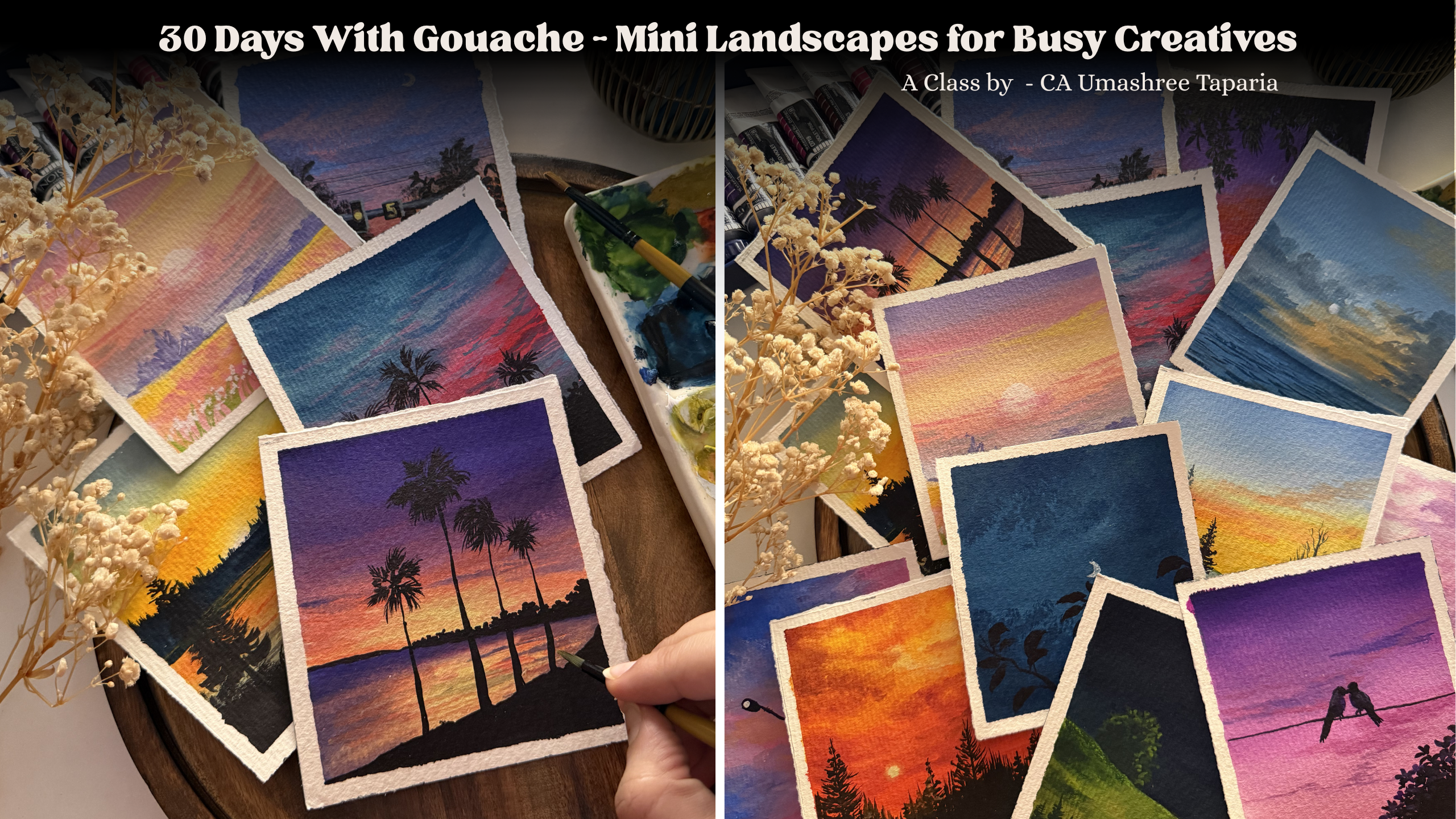
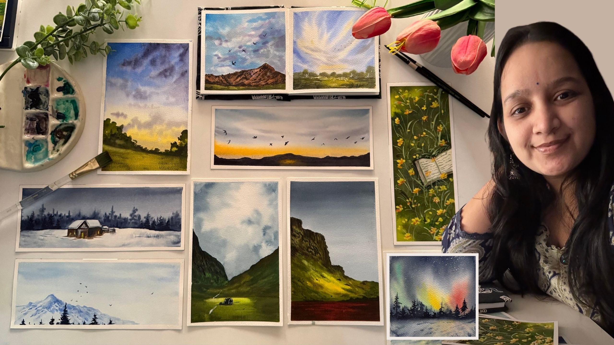
this class came to life. Hi, I'm mashiTapaya, a
chartered accountant, a watercolur and a quash artist, a creative business
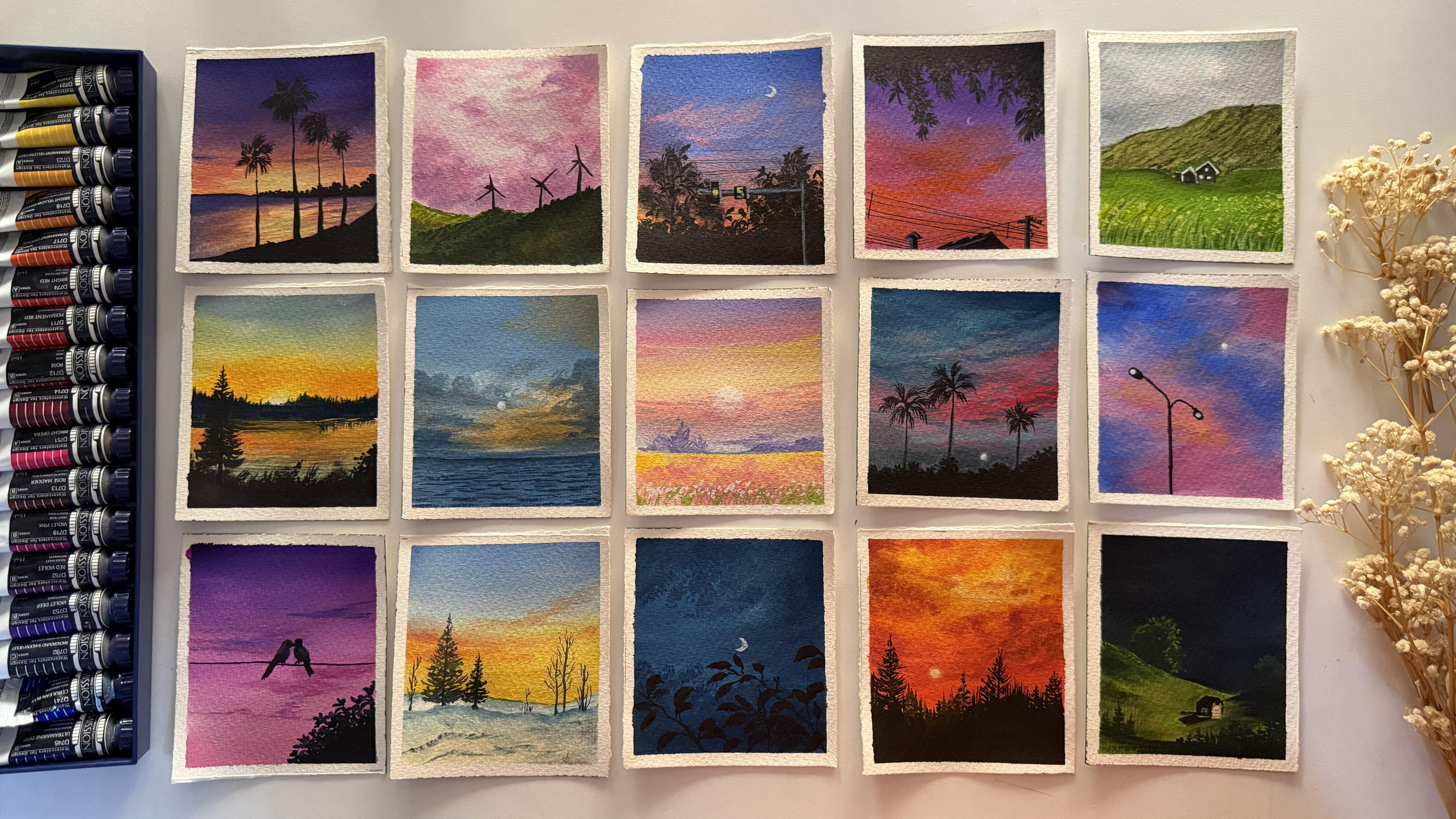
entrepreneur, and a mom to a toddler. In this class, we'll be
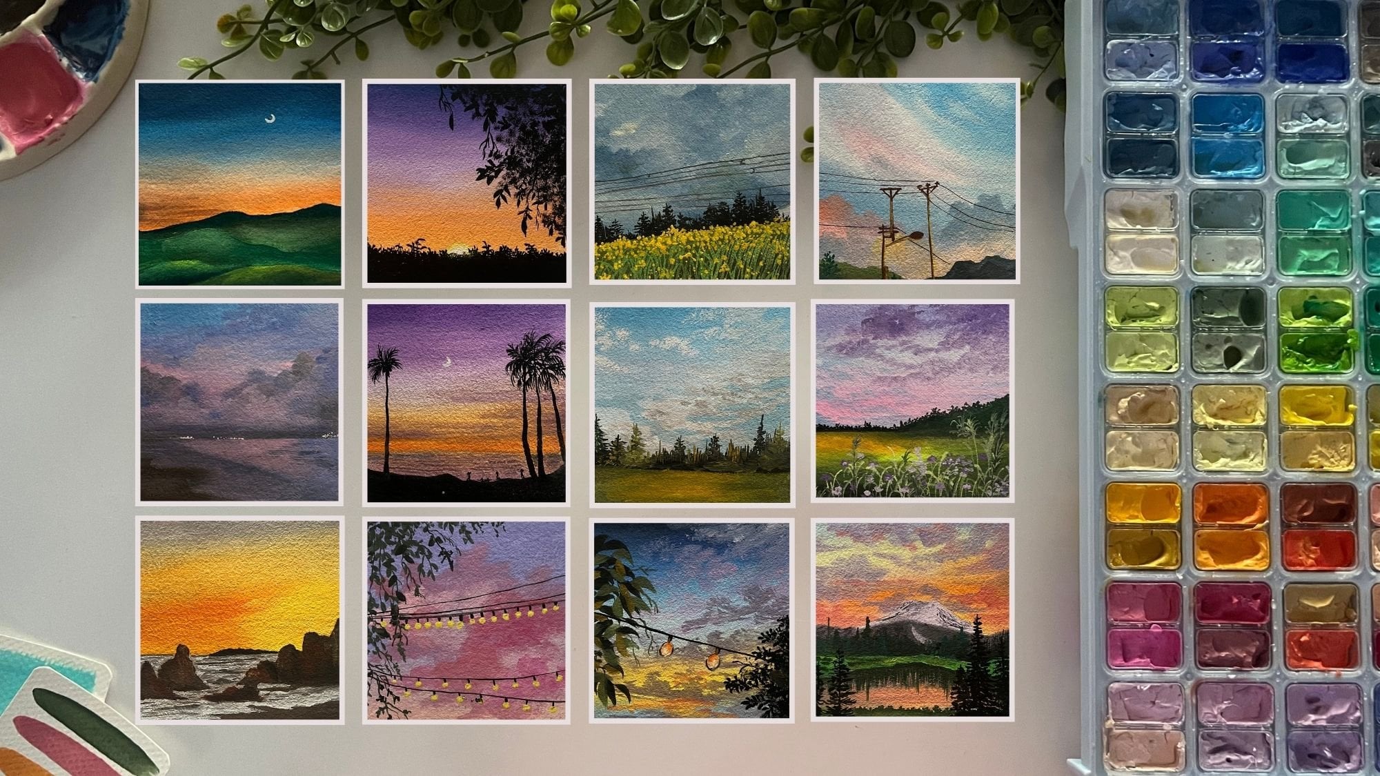
painting mini gouache artworks, each one designed to be completed in just
15 to 20 minutes. Simple, calming and
easy to follow. Something you can fit into
your day without overwhelm. Sometimes all it takes
is a few quiet moments, a brush and a little
bit of color. So whether you are a busy
mom, a working professional, or someone who just
hasn't found the time lately to unwind or to
reconnect with yourself, then this is your reminder. You still can. You can create, you can paint, and you can do it in your own time,
in your own way. A complete Pigna to
gouache and don't know where to begin
with. Don't worry. Throughout the class, I
will be guiding you through the color palette for each of the class projects every day, every day I will keep guiding
you step by step to create these beautiful mini paintings
in just 15 to 20 minutes. I hope this class becomes
your pocket of calm just like it became mine
without a further ado, I'll see you inside the class.
2. What all you'll need: So before we dive
deep into the class, let me give you a quick
material guide to be ready for the
paintings each day. First and foremost, you
need a paper to paint on. I will be using this
four inch by 4.5 inch I am using a cold press, 300 GSM watercolor paper, so you can see this little
grainy texture on the paper, and the back also has
a little texture. You can use it any
side that you wish to. I have cut it in a very rough edge deckle
edged kind of way. I had a bigger block from that. I've been, you know,
cutting it down to these four inch by
4.5 inch sizes. You can choose four
inch by four inch, five inch by five inch, the size that suits
best for you. So most important
thing is the paper. You can choose any
paper which is about 200 GSM so that it can
handle all the layers well. And since we are
working with wash, it need not be 100% cotton. Even non cotton paper
will work fine for it. So first is the paper. Now, to tape down the paper, I will be using
this wooden board. You can use any card board or a cutting mat like this or any movable surface
is what I recommend, even a back of your
book that you can use. And for taping down, I will
be using the masking tape. Now, that makes it
easier to just rotate, lift up, or adjust according to your hand movements
while adding in details. Hence, I recommend taping
down on a movable surface. You can choose the
surface of your choice. Next tap is going to be
a set of gouache paints. I will be using my
Migelomssion, guh paints. These are professional
grade paints. You can use poster colors,
gouache colors, uh, any gouache brand that
is available with you, I need not be the
professional level only, or you do not need
all of these shades. You will see how through
each of the projects, we'll be mixing our
own colors with the colors that are
already on our palette. So with that, you need a
mixing palette if you're using from tubes or even if you're
using from the jelly tubs, you will still need a palette
for mixing the colors, getting them in the
right consistency. And since gouache is like
a water based medium, I can simply reactivate
these colors and use them. But while reactivating, I need to make use
of minimal water because gouache has to be opaque and if I will
add too much of water, these will turn out
to or, you know, like watercolors,
acting translucent, which is what we don't need. So for that purpose, I keep this spray
bottle handy with me so that whenever
I want to use these, I just spray a little bit of water and let it settle
for a minute or so. So the paint gets
reactivated easily. And then with a very
little bit of water, like a drop of water,
the paints come down into the right
consistency that we needed. You would be needing a jar of water as well for
cleaning up your brushes, adding into your paints, getting them in the
right consistency, sometimes just for using for
blending purposes as well. Apart from this, I will be
using this white quash. This set of mind does
not have a white quash, so I will be using
this white quash. We will be kneading in a
lot of the white quash, for mixing in our colors, getting in the pastel colors, diluting the colors, sometimes
creating our own mixes. You will see a lot of white is what you
will be kneading in. Apart from that, you
would be needing a rough cloth to clean
up your brushes. You can use a paper towel. You would need basic stationary
pencil eraser scale, and lastly, but most
important tool, your brushes. Now, of course, you do not
need so many of these brushes. These are all of my
synthetic hair brushes which are perfect for gouache. You would just be
needing a flat brush, a good half inch flat brush. If you're painting
on a larger size, then you can go ahead
with a 1 " flat brush. Alright. So depending on
the size of the paper, your brush size will
make a difference. But basically, what you would
be needing is a flat brush, a round brush, a mini
flat brush, if you can. Otherwise, the round
brush will do the job, and you would be needing a detailer brush or a liner brush for adding in some fine
details like grass strokes, the wire line details. So for that, brushes are you just need actually
four to five of them, a flat brush, a round brush, a detailer brush, and, you know, smaller size flat brush if that is what is
available with you. And next, you would be needing a few of these waterproof pen. So these pens will help us add in some fine details
into our painting. I'm going to be using them
in different nip sizes. So this is like 0.5. Then I
will be using the 0.3, 0.1. So these will help me
adding in fine details easily without the use of the
black color or the brush. It just makes the job easier, but another thing to remember with this is
that you need to use these technical pens which are waterproof because if they
will not be waterproof, wash is a water based
medium, so on top of it, if you correct anything
or add a drop of water, the ink will fade and
spread out completely. So that is the reason
it's very important to make sure it's water
and fade proof. Only then use that pen. Otherwise, your painting
may get shrunda. So that's all what you will
be needing for this class. Basically, you just
need a set of paint, paper, brushes to begin with. You don't always need
a fancy palette. You can just begin in
with a simple home plate, a simple jar of water, and we are ready to go. So go ahead, grab
all your materials, and I'll see you guys
into the next lesson.
3. Basics - Consistency: Now, before we dive deeper
into the class projects, I just wanted to give a very bigner level
guide for anyone who's beginning first time with Guh so that you can understand
basic things about Guash, including the consistency,
the layering, and, you know, the color
mixing ideologies. So I just wanted to give a very basic bigner
level guide for someone who's first time
beginning in with uh and just wants to know
how to begin with it. Now, first and foremost, the important thing
is going to be the consistency of the paints. So let me first begin in with the color that's
already on my palette here. All right. So I will just begin in with this orange color. Now, first, you see, I'm just adding
in a lot of water and re wetting this
paint. All right. And now I will just layer
a layer of this color. And as soon as I
layer this color, you can see the whiteness of
the paper is still visible. So this is not the
right consistency to gh because this is
acting like watercolors. So if I just go ahead, add in water, dilute it, and you see it's acting
like watercolors, which is where the transparency
of the paper is visible. That's the whiteness
of the paper. Now I will just go ahead, re wet a lot of this paint which is
already on my palette. So this tube had squeezed
out a lot of paint. And now I'm just activating
the entire paint here and I'm not
adding much water. I've just used
very limited water and just re wetting this paint, getting it into the right
consistency. All right. And now, when I add in a layer, do you see the difference
in both the layers, the transparency, the opacity? This is what is the right
consistency of quash. So if you just have a look, the whiteness of the
paper is completely covered up in the second
layer that we have added, and that is what gouache is. It is an opaque medium, not a transparent or
translucent medium. That is the whiteness of the paper has to get
covered up completely. So this is how gouache
consistency looks like. It spreads out smoothly,
just like a glide. It should feel like butter
applying out on your bread. So this is the
smooth consistency that you need for gouache, which is just gliding
on the paper smoothly. Now, this is a consistency
like watercolor. This is a consistency
like gauche. But in case if you
do not, you know, add in the perfect consistency of water and use the paint in a very dry consistency or say you're trying to use it directly just
squeezed out from the tube. Let's just go ahead and, you know, try it out with a color and show you what I mean. So I've just squeezed
out a bit of the color. I'm not adding any water. I'm not adding any, you know, water to it or just picking up the paint,
and I'll just go. You see the roughness
that is coming in. That is because now,
this is too pigmented, and it is not in the right
consistency to blend easily. So this is the
right consistency. When we picked up
the orange color, you had seen how smoothly it was gliding since it was in
the right consistency. So it's very important to
get the right consistency. You will see again how smoothly the stroke goes by and
case of the green color, the stroke in between
goes out dry. So consistency is important. The ratio of water to pigment is what will get
you the right consistency. So this is the
right consistency. This is when you want to
use it like watercolor or just for the background
based layers. And this is when you
want to add in details, when you want to add
in layer over layer, just getting in some
dry brush texture. That is when you need to use
this kind of a consistency. The most important
role that will play while playing with wash
colors is the consistency. So go ahead, mix in
your pigment with different ratios of
water and see what sets the right consistency
to your brand of paints because every brand paints
will react differently to water and you need to
just do a little trial and error to understand what works right for your pigment. This is about the
consistency that you need to understand,
very simple. Mix water into your pigment and see what works best and get you this smooth butter like consistency with zero white
cast of the paper showing up. Now, in the next lesson, we'll just go a little more into the techniques before moving
to the first project.
4. Basics - Blending: Now the next thing is
about blending with quash. For wah blending, you need to know a little bit of
the color theory. Basically, you just
need to understand what colors blend
with each other well. Say, for example, if I just
pick up my blue color, and I pick up the orange color. I want to blend these
two colors and I blend directly just blending
both the colors. Do you see this muddy, unpleasant color being
formed in the middle? That is something
which we do not want. So in such cases, while blending when the colors
are complimentary to each other and blends of them
will create in muddy tones. You take help of the white, which will make
your task easier, smoother and give you
that perfect blend. One way is with
the help of white. So first, we'll just go ahead, again, add in layer
of the blue color. And again, picking
up the orange. I will add the orange as well. In between the gap that we have, there we will be taking
help of the white color. You can either add
white to blue, orange both and use the
pastel of both and then blend or just simply
put it up on the paper, begin blending in between. Now you see you do not have
this unpleasant color. Of course, the blue color
can be increased at the top. Right now I'm just showing
you the basic technique that is about how you can just
use white for blending. So I just added a little bit
more of the blue, again, cleaned up my brush
and just going to run the damp brush so
that the line is full. You see now here the transition is so smooth from the
blue to the orange, but in this case, it
was all muddy patchy. The other way is you can use a third color which
goes well with both. Say I begin with blue, then I transition to the
pink color because pink goes well with both orange
as well as the blue color. When blue and pink will mix in, it will give a beautiful
violet tone. All right. And when orange and
pink will mix in, it will give that, beautiful
sunset reddish pink color. So you see in this way, you can either use white
color or you can use a transition color
which I call so that the blend goes smooth
from the top to bottom. So from the blue now
to the orange, again, we do not have the muddy tones because we've used a color which goes well with both of our colors and makes the
blending smooth and easy. Once you know the
complimentary colors or the colors which are opposite to each other
in the color wheel, you'll be able to figure out. I always prefer using
a little bit of white or a color which
is going well with both. So basically, a pink color would be or you can use
even a reddish color. It will be going
well with both of the colors that I'm
using here right now. So say in case if
you are going ahead with blue and yellow sky, again, you can take help
of pink because pink and yellow mixed
together does not create muddy tones because they are closer to each other in the color way and pink
and blue as it is, will give you the
violet color tone. That is how you can go
ahead with the blending, either help of white
or a third color which goes well blended with
both of the colors. This is about blending your basic skies that
we'll be needing in
5. Basics - Layering: And before we now dive
into the first project, just a few last thing that
I want to share with you. One being the dry brush texture. So for the dry brush texture, you need to pick up really
medium to dry paint without any water on your brush. After picking up
the pigment, also, you need to just make sure the excess water and
pigment is removed. And then just glide your brush in the
directions that you needed. You see the dry brush
texture that we are getting this will be used by us in a lot of projects to create textures into our fields, mountains, sometimes to give in little cloud details as well. Now you can pick up more
darker pigment and just go with the darker dry brush
strokes as well or layer them. Now, direction will be
depending on how you need it. It can be horizontal,
slant, diagonal, top to right, bottom to top, whichever way you wish to. This is the important
thing about dry brush, along with the dry brush, you can even add in
some thicker lines. See? This will give in adding texture to your fields,
your mountain ranges. You can do this with any color. I'm just demonstrating
you with the black color. The next thing is
about layering. Whenever you want
to layer with guh, you need to make sure that your first layers are
completely dried. Then whichever color that
you want to layer it with, say, I'm choosing the
green color here, you need to pick it up in the right consistency and just go ahead and
very gentle handedly, you can just layer in. Now, while layering, you need
to remember a few things. Squash is a water based medium. So if you will apply
a lot of pressure, the base color will
also get activated. Whenever you are going
ahead with layering, you just need to make sure that you are going
very gentle handedly, soft blends, soft strokes, and then just layer it. So that will not make your
previous layer get activated, and you can simply just add
in the details that you wish. So here you have just added
simple one stroke leaves. I begin in with
this thin branch. You see my brush has a fine
pointed tip at the top, and then I just press my brush, give it a wiggle,
and lift it up. This way, you can add in these leaves into
your paintings. This was about layering. You need to apply very
minimal pressure. You need to make sure
that your previous layer is completely dry. Your paints need to be in
the right consistency, and then you can
just give in layers when we'll be adding in the
details into our painting. So when you see here
into this painting, we'll be adding in
these yellow flowers, these green strokes,
the dry brush texture. You see how layers work and how we can simply just
create in the details on top. For that, the consistency and the timing will make
a lot of difference. You see, we'll be using a lot of these simple leaf strokes for adding in the silhouette
details into our painting. All right, here you
can see for blending. Now the orange and
the blue color, violet blue color, both blended together will
again give you muddy tone. So we've taken help
off a little bit of the pink color and then given in cloud
strokes on top of it. But this is the
very basic that if you are a bignll
level, this much, if you just study
and practice it out, you can simply paint along with us because through
every class project, I'll be guiding you
through step by step. How are we adding in the clouds? How are we adding
in the details? Again, I will even
be guiding you with the colors that we
are using for blending, why I'm using a specific color. But this is just a big null
level guide to begin in so that you do not feel
everything new altogether. So go ahead now,
grab your supplies, and let's begin with
our first painting. And
6. Day 1 - The Bird Duo: So let's begin with our
class project for day one. The colors that you need will be shades of violet and pink. I'm going to use this rose
metar color or sorry, the rose color, and I'm going to be using in the violet color. I will be using the red violet, which is one tone lighter
than the actual violet, because we need kind of pastel
tones for these colors. All right, so I've squeezed
in both of the colors, and now I'm going to be
picking up some white. So I'll just pick up extra
white and keep on my palette. And now let's begin
creating in our sky first. I'm going to begin in with a simple flat brush and first going to mix in the
colors well on my palette. So mixing in white to the rose color to get a
little pastel pinkish tone. You can directly choose to use a pastel pink color
if you have so. And beginning from the bottom, I will begin in with a
layer of this pastel pink. I will further use
some white and I'm just going to
use in more white and lighten up this color further as I move
towards the top. And now at the top, I'm going
to use this violet color. And just pick up white and
lighten this up as well, moving from the top
towards the bottom, till the center and
blend these two colors. S. You can take help of white while
blending or take help of little water if your
colors feel too dry. I'm just going to
pick up little white and run at the blending
point of both the colors. So we've got a simple blend
of the two colors for now, and now to this,
I'm just going to pick up a little bit
of the violet color. So the violet deep colour
is what I will pick up. And just going to pick
up very little of this and run from the top. And just going to quickly blend
it in at the top majorly. And as I move towards the town, you will see because
of the lighter pink, it's automatically
getting blended. If you want, you can directly go ahead and use the violet in pastel consistencies or blend in like this so that you get
in more tonal variations. Thing. Now I will shift into my round crush and just begin adding
in some sky slouetes. For that, I'm mixing in the red violet and the violet with a little
bit of the white to get a little light or pastel
color and just going to give in simple cloud strokes going to further dilute this. Just softening it up with my
fingertips as well quickly. Using a tama, just going
to quickly blend it in. Now, using a little bit of
the light pink tone here, mixing it with a little
hint of the red violet. Basically, you just
need the same colours, but in different
tonal variations to create in simple
cloud strokes. We're not going to be adding in much of the cloud
details into this one, very little that we
are going ahead with. Making sure everything
is soft and blended, using the same colors
closer to each other to create that smooth flow
between the clouds as well. You see very simple strokes
close to each other, just adding in a little
character to your sky. And now we are going to go
ahead and mark out a silhet. So I'm going to take help of a pencil and just mark
out a simple string. On top of which we are going
to be adding in two birds. So I'm just marking out the
silhouette for the pod. And the other pod is just
looking towards this bird. So like kind of a couple bod Now, you can choose any
reference for this silo head. I'm just going with a very
simple one, as I told you, and you can choose to use the black color
paints gray color or dark or brownish tone. I'm using in a little
bit of the indigo color, which is like a black color. So just squeezing out. And to this, I will just begin first with
the violet color. Now to the violet,
also just add in a little bit of the
white in a lighter tone. So basically, just
trying to show a little of the sky color falling
onto this silhouette. Make sure that your
base is completely dried before you begin
adding in these colors. And now to the rest of it, I will just pick up
the indigo color. As I told you, this
indigo is very dark and almost
like a black color. That is the reason
I'm using this. You can choose to use a
Pains gray or a black color. Alright, now the
other way around. See, at the bottom, I'm
giving in that feather look. Now, just small
strokes for the legs. And just going to pick up
the same color that is the indigo and give
this fine line. Make sure you use
either a fine line or brush or a small detail or brush to give
in these details. Just giving in that
feather look at the end. And now at the base, just going to pick up
the same indigo color and just going to give
in little bush detail. So at the top, just going ahead, dabbing in the tip of my brush to create in simple
leaf strokes. And as you move
towards the base, just going to take a mix
of this blend and dab. And further downwards, we're just going to fill
in with the color. Make sure you use the colors in a bold consistency so that
you get in that opaque look. See, I'm just pulling
out some detailed leaves from the same space to
add in more character. And one thing that you
can do is to reflect a little of the sky colors
onto this, as well. Just pick up the same violet mix and drop in a few
towards the top space. Mix in a little more
white so that it's more bright, but not too much. You see how that little
pop also gives in the effect of the sky colors
falling in here as well. Same way, going to pick
up this light mix and put in a little over
the body of the bird. Towards the top spaces to reflect the sky colors
a little better. And that is it. We are ready with our force
painting for deep one, a pretty simple one just
under 10 minutes to create a simple blend of colours into the sky and simple silhouette. Let's peel off the tape and have a final look
at our painting. As I told you, I'm going with a decled edge look onto
the paper on a few sides. So yours are painting from day one of this quash challenge. I hope you guys enjoyed painting this simple follow
along painting, and I can't wait to
see your recreations. Thank you so much
for joining me into this class and painting
along with me.
7. Day 2 - Street Light: Hello, everyone. Welcome back to day two of this quash challenge. And for today's Cross project, the colors that you would be needing is the
cobalt blue color. You would be needing
a pink color. So I will be using the rose
color mixed in with white, which I already
have on my palette. And then you would be needing
a yellowish orange color. So I have this bright
yellow orange color. So these are the colors
that I will be using. Now, say, in case if you do not have the bright
yellow orange, you can simply mix
in yellow and orange to get a similar looking
yellowish orange tone. You need not exactly
have the same you know, shade or readily available. You can simply mix in
with the help of white, yellow and orange because I will be using in a little bit
of white to this as well. And for cobalt blue, in
case if you do not have it, you can just use whichever
blue is available with you, Cerlean blue ultramarine
blue, or Prussian blue. Prussian blue will be too dark. So if you have a
Prussian blue color, you'll have to dilute it a bit to get it into a
light or consistency. So that's about the
colors that you need. Now, we are going to be creating
in a simple cloudy sky, and then we'll be going ahead. Adding in a simple silo hit. So for the colors into the sky, I'm going to begin with
the cobalt blue color. So to the cobalt blue, I'm just going to mix in a little bit of
the white as well. So to my cobalt blue as well, I've just mixed in a
little bit of the white, and at the top,
I'm just going to begin in giving in a color, leaving in little gap on the
right for the pink clouds to add in and towards
this side as well, as I move towards the bottom, I will just leave little
of these color highlights. And rest of the space, we are going to go ahead
with the pink clouds now. So let's go ahead and
now to the pink as well, we'll first begin
mixing in the white. So picking up the
white, mixing in, creating in a light pink colour, just going to begin
adding in from the edge. Now, make sure when the blue
and the pink will mix in, they will give you
a violet tone. So you go across very
carefully while mixing, such that if any
color is lifted, you just clean in and you do not get a complete
violet tone everywhere. So I've just laid down
the colors for now. We have to go ahead
and blend these now. Okay. Now I'll just go ahead
and blend these spaces. For that, I will shift into a smaller size brush or you can use a mop
brush like this, and I'm going to pick up white with little
hint of the pink. So it's going to be more of white and very less of the pink. And across the blending points, just go ahead, blend in. And you can still
see the sharp edges. So there you just need to
pick up the damp brush and run across to blend in. Same way in the rest of
the species as well, just going to pick up white
with hints of the pink. Laying down the colors first. And now I will just
use the damp brush again and just run at
the blending spots. Sometimes you will need
to run a little towards the top as well or
towards the base or, you know, make the blends
go smooth and fine. Like, you see, I run a little of the pink more towards
the blue spaces, and then a little of the blue. But still, you will see
this uneven edge coming in, so you can use a damp
brush or pick up the blue color and
blend them in quickly. You see? So there are
multiple ways of blending in. It's what suits you the
best that you select. So I prefer using in the lighter colors for
blending and sometimes just picking up the darker tones accordingly to get the
blends right and smooth. Now I still have
to go ahead with a little more of
the cloud details. So I'll just pick up
the light pink color and run from the top here, mixing in the pink
and the white. And just using this
mo prash adding in simple lighter
cloud strokes over the blue with the pink color. Now, onto the pink also, you can see these sharp edges. So in order to avoid those, I will just pick up a little
of the pink color again. And run it here again. So it brightens up plus
has that smooth blend. So basically, just
multiple layers to create in that flow
happening smoothly. First layer, we just laid
down the colors simply, and then now we're just
building in the sky effect, the cloud effects with the
help of the same colors, but just with the
layering technique. Now picking up little white, creating in little of the
bright cloud effects as well. In case if you do not
have a mop brush, you can even use a
simple round brush or a flat brush to do
the same technique. You need not specifically
have the same brush as mine. Now going to pick up
little pink mixed in with white and going to create in the cloud effect
over the blue spaces. You see, blending in with the pink and the
blues, just dabbing, creating in that fluffy cloud
effect to turn it lighter, as well as still having that beautiful effect of
the pinks coming in with that light highlight of the pinks that we are
adding with the white. Right. Simple lens
of the colors. You see, we've created
a simple cloud by now. Now the thing that we're
going to be doing is we are going to pick up this yellowish orange color that
we've squeezed out, mix in to the white. So you see you need a very light paste
still color of this. So I'm mixing it in
with a lot of white, and I will shift to a
smaller size brush. So now I will just
use my round brush. Make sure you pick up this color in a good bold consistency, more of white, less
of the pigment. You get this paste
still yellowish orange color and just create
in some more brightness. Now, again, here you see I've just added the
layer of the color. Now using a dam brush, I will just very
gently blend it into the edges such that it
blends into the base. And you see we get that
little highlighted effect using a little lighter
color as well. Very gently blending
it into the edges. And now using this color, we'll just create some more
cloud effects at the top. With every stroke, you will see, I quickly go ahead and
blend it into the sky. Okay. All right, gently adding in some
highlighted strokes. We're almost through the sky now just another minute or two
to add in the silhouette, and we'll be ready with
this painting as well. So you see the cloud
took us the sky and the cloud both basically took us around a good 10
minutes to add in, and we've got such a
beautiful, pretty looking sky. And that is it. We've added in the highlights with
a yellow orange, and now it's time to
add in the silhouette. For the silhouette, I'll be
using in the indigo color, which is like a
blackish color here. Or you can choose to go ahead and use in the black colour, paints gray color, whichever
you wish to, right. And for the silhouette, we are going to add in a
simple street light effect. So I will just make my hand movements
easy and comfortable. Now you can first watch the
slohit maybe and then add in. Make sure that your base
sky is completely dried, and then you begin
adding in this. So one goes here at the back and the other
one here at the top. Okay. Now I will just
refine this shape a bit. Now, at the top here. I'm leaving in a small
circle at the top, where we'll be adding in the
white color for the light. Same way here as well. Alright. Now, let's
just go ahead, pick up some fresh white. So picking up some
fresh white quash, I'm going to be creating a
small space for the moon here. So first, adding in a very
small patch and going to go ahead and create
a dull space with this, just running, diluting it,
blending into the piece. Now, this will act as the
glowing space for the moon. Alright. And just picking
up fresh white quash. Make sure this you pick up in a good thick consistency with
clean brush, clean water. And to the circles
that we've left in, once your black spaces dry out, add in these white lights. All right. So the bold white
lights are there. And once your circle for
the moon also dries up, just add a small moon
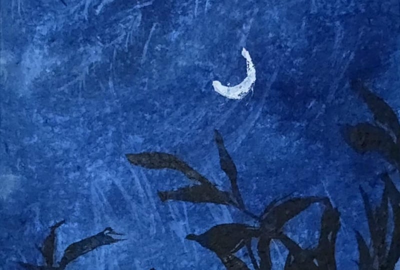
to the center of this. Okay, that is it. We are ready with our
painting for day two as well. You see, it took us again, around ten to 15 minutes to create in this
beautiful painting. It's simple studies that make, you know, an entire
painting come together. You don't always need a lot
of colours or a lot of time. Art can be simple, and it can be created
in small time as well. So here's our final
painting from day two. I hope you guys enjoyed
painting this with me. I will see you guys soon into the day three of this
squash painting challenge. Thank you so much for joining me and painting along with me.
8. Day 3 - Seascape: Hello, everyone. Welcome back to day three of this
squash challenge. And today, we are going to be
painting a simple seascape. The colors that you will be needing is a shade of blue and a little bit of sunset,
yellowish orange color. So for the blue, I'm going to use the Prussian blue color and going to mix it with white to create in
the lighter tones. So I've squeezed out the
Blues and blue color, and I already have the
white on my palette. I also have the
yellowish orange color from the previous project, which I will reuse for
the sunset effect. And now I will just mark out our horizon line and
distinguish the simple C area. All right. So the
top is going to be our sky and the bottom
will be our C space. Let's begin in with the
colors into the sky first, going ahead, picking
up the white. And mixing it up with
the Prussian blue color. So less of blue, more of white, you get this beautiful
sky blue kind of a color. You don't really need
a very light color and not even a dark color. We need a dull kind
of a color for this. That is going to be our
base layer for now. All right, so beginning with
this color mix at the top. Now, remember, yellow and orange mixed together will
give you muddy tones. So for the blending in between, we are going to go
ahead, use in white. So I'm going to pick
up the white color, lay a little closer to the
blue that we've added so far. And now I'm going to pick up
this yellowish orange color. And to this, I'm not
adding much white, just a little
highlight because we want a simple sunset effair. Now, again, we'll
just pick up little white and blend it with
the blue at the top. So you see I just laid the color and then
again for blending, taking help of the white. And on the horizon line, we are going to have that
little blue effect coming in again and even towards
the left side here. So you will notice that I lay the blue color closer
to the orange color, and then I clean my brush, and for the blending spot here, I just take help of white or a damp brush and blend
it with the blue. So for now, we've just got the
base layer of our sky with just that little sunset effect
on the right side here. The left side still has the blue sky effect
only coming in. Now on top of this, we
are going to go ahead, add in some cloud details. And for that, I'm going to go ahead with my mop brush first. I'm going to be
picking up this color with a lot more of white and getting a bright kind of a color and just adding in some
cloud highlights at the top. So kind of like some
dry brush effect, which will act in as those
soft dried clouds at the top. See? Just as you use
a blush on maybe, you just need to
go very softly and just given that little
blush of color at the top. A? And now closer to
the horizon line. Let's go ahead with
some cloud details. For that now, I'm just going to pick up a little of
this indigo color, mix in with the Prussian
blue and white. And we are going to get a
grayish blue kind of color. You see, I'm mixing
in the colors very slowly so that we don't
get a really dark tone, neither a very light tone. We just want a simple
grayish blue color. And just going to create in
some cloud movements here. Now, in case if you do
not have a mop brush, I've already told you
you can go ahead, use in a flat brush or you
can even use a round brush. Now I've just picked up little
indigo on the brush with the same mix to get a
little darker color view. So you see slowly we are
building in the cloud. Now, I'm just going to use
the same clean brush and at the base going to blend in and create in the softness
into these clouds. Wherever you want to just
give in the softness, just go ahead, blend in with
the help of a damp brush. Now, on the horizon line, I'm going to go
ahead and darken it up using just the tip of this brush and going to add in some
smaller clouds over the orange with the
same blue colour mix. But again, you will notice how I'm just using the
tip of my brush, creating in these
cloud shapes very gentle in such a way that the orange sunset space
is still visible. Mixing the colors. Make sure whenever you
go ahead with layering, you do not have excess
water on your brush, and your pigments also need
to be little damp and dry. All right. So just simple cloud steps
that we're adding in. Picking up the same colmix. You can, of course, create
extra colmis and key, but I prefer mixing in different tonal
variation so that you can automatically get in multiple tonal variations
into your sky. Just some more blue highlights. That is for our sky, and now we'll go ahead into the Caspace blending
it in quickly. Now we'll move on
to the sea area. Before that, I will
just go ahead, pick up a little bit of the white mixed in
with the orange. The yellowish orange color. You can mix in yellow,
orange and white, and I will just correct a
little of this space here. You see with quash, it
is so easy to go ahead, layer again and create in
those highlighted spots. All right, so just a little
bit of the glow again. I'm going to pick up
little white, run it here. So just corrected that little
horizon line view again. Now into the base of the S, we are going to go ahead with the same Prussian blue color mixed in with a little
bit of the white. Very carefully
define your C line. So you see you can even
blend the colors on paper depending on what kind of space you are
going ahead with. So and now we are just going to give in simple
C wave details as well. I'll just soften up this cloud with the help of a
little bit of the white. I usually don't prefer a
lot of bold cloud effect, so I prefer blending
them in quickly. And now, using the
same dull blue color, that is a mix of
the indigo blue, and a little hint of the white. Basically, the use
of white makes the color more
opaque. All right. And just going with
this color mix, we are going to go ahead and just add in
simple waves effect. So very small waves. Make sure you use
a fine tip brush. Just pulling out very small, fine lines close to each other. You can see my base
is already dried and then I'm going ahead
with these waves detail. Make sure that
your base is dried and only then you move
ahead with these details. And now we are just
going to darken up this color mix
with a little more of the indigo and a little
off the trustian blue. So you see you get
this dark blue color and just going to add in
some more wave details. Make sure you do not
have excess pigment. Otherwise, you may
get in bold lines. You just need very fine details. You see how I'm just
dragging and adding in very fine lines close to each other to form
the waves if fair. Just go ahead, keep adding in the lines completely
till the base. As you move towards
the bottom space, you can increase little length
of these waves as well. Make sure your pigment is
not too wet and not too dry. Of course, you can use
the dry brush method if you wish to to
add in the waves. But in case if you're
adding in these strokes, then make sure your pigment
is in the right consistency. So that after drying also it has that bold effect coming in. Now, I'll just pick
a good layer with a little more of the indigo and on the horizon line going to go ahead with a good layer. So you see how the horizon
line distinguishes and forms the C space. And using a damp brush, I will blend it towards
the base of the sea. And now one last
thing that we have to add in is a
small setting sun. So now using in the white quash, we are going to just add in a small moon here in the center. Make sure for this, your
base is completely dried and you use the white quash
in a good thick consistency. I will just define the shape better. Right. So a small circle to add
in there. And that is it. We are ready with our simple
Seascape for day three, a pretty simple, easy one. And you can see how we
just used in four colors, the indigo, Prussian blue, yellow, orange, and the white. And we got in all the tonal variation
by just the color mixes. I'm just softening
up the horizon line. And we have our simple Seascape ready with simple cloud details. Let's peel off the masking tape and see the final painting. Make sure your edges
are dried and you peel off the masking
tape against the paper. So yours are painting
for day three. I hope you guys enjoyed
painting this with me today. I will see you guys soon
into the next painting. Thank you so much once
again for joining me into this class and
painting along with me.
9. Day 4 - Windmill View: Hello, everyone. Welcome back to the next painting of
this quash challenge. And for today's class project, I'm going to be recreating one
of my watercolor paintings that we had done in our 30 days of unwinding
with watercolor challenge. So I'm just going to go ahead, mark out the outline
for the same. So just a simple field area that we are going
to have in here. Now these reasons of marking is here we'll have a
light green colour, a medium green tone, and then a dark green coming in. And on top of these, we'll be
having in three wind meals. If you've joined
me in the 30 days of unwinding with
watercolor challenge, you will already be knowing which project are we recreating. And at the top, we are going to have a simple pink
and white sky. We are going to begin
in with the sky first. Now, I already have this
rose color on my palette. You will actually be needing
very less of pink as well. You will be needing what is
more of the white color. So I have the white color
ready on my palette, and now I'm going to begin adding in the white
color into the sky first. So picking up the white, I'm just going to
begin adding in a good layer into the sky. I know at this point
you may be thinking, why am I adding even the
white color into the sky. But as we move
further and as you see the class project
coming together, you will understand why we
use the white into the sky. Go ahead with a good wet
layer of the white color. Now just going to mark
out the space as well. That is leaving the
field space blank. I haven't given the
outline to the wind meals completely
because as it is, that we'll be adding in with the dark paints gray black color later on once
everything dries out. For now, just go ahead
with a good white layer. And now, what you need to do is just pick up lots of
white closer to the pink, begin in with a very light
pink consistency and just begin adding in
simple cloud shapes. You see, we are working
with a very light pink. It's again, just
like a white color, but just a highlight
of the pink. And using in the mop brush, I'm just dropping in simple
cloud silhouettes for now. This is very basic layer
that we're adding in. With this, now you
will see we have some white spaces and some
highlights of the pink color. Now go ahead, pick up
more pink, less of white. So just add in a little
more pink to this same mix and picking it up in the medium consistency,
same process. We'll go ahead, add in
more defined clouds. So this class project
may actually feel as if you are playing with
wash and watercolor mix. That's what you will
feel like because of the technique of
adding in the clouds. Now, everything is wet, my base is wet and
into the wet base, I'm adding in these
clouds so you will see the softness
automatically coming in. So closer to the horizon line, I want really good,
well defined clouds. So at the top, you will
see the white caps. Wherever you feel, you
just need to blend it in, you can still again, use a damp brush and soften
up the pink as well. Make sure you add the
pink in such a way that not all of the white
spaces get covered up. You need that white
highlighting effect. That is the reason of adding in the white in the first place. Now we'll just darken
up the pink a little more and add in
some more clouds. I'm just tabbing creating in some fluffy clouds
with the pink color. If you want, you
can take help off a little bit of the
violet highlight as well, just to give in a
little color touch. You can use even
the orange color or the violet color because both work well with the pink and will create that
beautiful glow effect. I am picking up little
violet highlight. And as I told you, closer
to the horizon line, I'm giving in this good
bold cloud effect, and at the top, I'm
maintaining in that whiteness. Now I'll just pick
up little white, blend in at the
center spots again. In between the pinks closer
to the horizon line as well, just dropping in little
highlights of the white. You see how we've built a very simple sky with
such a simple technique. You just need to
build layer on layer with the tonal
variations of the pink, and your simple cloud with
the white spaces is ready. Just adding in
some small clouds. Again, we'll just give them a little soft blended, if fat. And that is it. We are
ready with our sky. I won't overdo it because I may just ruin how pretty it looks right now and I don't
want to overdo it. All right. So that
is for the sky. If you want just at
the horizon line, you can just add in a little more of the
bold color effet. Make sure you maintain that fluffy cloud effect
while adding in this. So you see I'm just dabbing dabbing dab dab dab to give
in that top fluffy effect. All right. So now we'll go
ahead with the field space. Into the field, I'm going to be going ahead with
the green colors. So first, closer
to the field here, we'll go ahead with
a light green color. So I will use this
greenish yellow color. And I will even pick up a little bit of the
yellow ochre color. I will get all the
colors ready and then begin adding in
these step by step. I squeezed out a
little extra of it. And next for the green, I'm going to go ahead with
the dark sap green color. You can even pick sap
green or olive green, whichever you wish to. And lastly, I will
just squeeze out a little of the olive
green and keep. Okay. Now, let's go ahead and add in the
colors into the field, shifting into the
smaller size flat brush. I will begin in with this
light green color first. This is the greenish
yellow color to which also I am picking up a
little bit of the white. All right. Now I will pick up a little of the yellow
aqua in between. Picking up a little white. Just this top space is where
we want the lighter colors. Again, the green. All right. So we painted the first block. Now, you don't
really need to wait for it to dry or anything. We can just go ahead
to the second block. I'm picking up the sapren color, mixing in a little white hint. I'm purposely overlaying over the first field very roughly. And again, into the
second one as well, we'll just pick up a little
of the yellow ochre. And you see how I'm
blending the yellow ocho also with the sapren color by just dabbing in Now, add the base again, just a
little of the green again. You see how into the
top layer, we blended, giving in that distinction also, add that soft blend also. Now in the base here, we
are going to go ahead with a little mix of
the sap green and the indigo color we'll
pick up to darken up this. And I will just use a
little olive green. Same as we went ahead over the first layer while
painting the second layer. Same way also we'll go ahead
over the second layer. Now, again, if you
want, you can just pick up little
lighter highlights, creating that natural
effect by just dabbing in. You will see this unevenness
into the field which is actually creating in creates
the realistic effect. Now, just picking up a little of the olive green in a
darker consistency, I will just create
little effect. If you want further pick up
little indigo along with the olive green so that you
get a good dark effect. And I'm just holding
my brush almost perpendicular and giving in
little details at the top. So in this way, you will see the fields have the
separate color look also, but they still look well
blended into each other. Now picking up this indigo color and dabbing at the base
to create the darkness. In the center, you can
see the glowing effect of the yellow ocher and just a little more dab
dab dab while it is wet. And that is for the field also. I will just go ahead with a little green and
at the top here, just creating this bushy effect. And one thing that I
will do is just pick up a mix of the
indigo olive green in a light consistency and just create a little
flow onto this one. So just some dry brush
after it dries out. Simple strokes. All right. Simple strokes that we've added in onto just the second field. And if you want, you can add a little onto the
first field as well. So I will just pick
up this screen and use a smaller
size round brush. Just some very fine lines. You see? I'm just adding
in very fine lines. This just adds in a little
texture to the feel. Same way with the indigo color mixed in with a little
hint of the green, adding in a little more texture to the second field as well. Very loose fine strokes. Your tip of the brush will
play a major role in this. So make sure you use
a fine tip brush. All right. And now, lastly, let's go ahead,
add in the wind meal. For the wind meal, what I'm going to be doing
is I will pick up the indigo color in a
light consistency first. So like more of water, less of the pigment, right? Don't mix in white to this, go ahead and use it in
a diluted consistency, and we'll add a
first one here. Oh. No, just pulling out
the spikes to these. Make sure you use a fine
tip brush for this. Now for the second one,
I will just pick up the same color in a
little bold consistency. You see how we've changed
the placement of the spikes? And one last one here. Go ahead very carefully adding
in these details slowly. Take your time. No need to rush. And just some simple details
that we've added in. So that is it. Our painting is ready. Let's peel off the masking tape and see the final painting. So here's our final
painting for day four, a simple windmill field, again, just took us 15 minutes, but a beautiful, pretty, cloudy sky with just
limited colors that we could create and simple field
details that we've added. I hope you guys
enjoyed painting this. I will see you guys into
the next painting tomorrow. If you're liking this class, make sure to drop a
review so that it can help me reach
maximum students. And thank you once
again for joining in and painting along with me. So
10. Day 5 - Warm Sunset: Oh, Hello, everyone. Welcome back to day five of
this gosh painting challenge. And for today's class project, we are going to go ahead
paint a beautiful sunset. The colors that you would be needing is a shade of yellow, orange, yellow ochre, brown, and then the paints gray
or the indigo color. Now, my orange got squeezed out a little excess, as you can see, and I'm just going
to go ahead with the orange first from this side before
this pink bleeds in. So it's going to be a
pretty simple sunset that we're going
to be painting in. All right. So beginning
in with the orange. At the base, even if you
don't add much color, it's okay because it's going
to get covered up with the darker colors while
adding in the pine trees. I'm just giving a very
light layer at the base. Now, at the top, I will go ahead with
the yellow color. Now, I will just pick up a little bit of
the yellow ochre, mix it with the white yure and add a light
layer at the top. Right, we've got a very simple
sunset sky look for now. Now we are going
to go ahead add in the cloud details on top of this using in
the brown color. So I will shift into
my mop brush and you can use the round brush or a flat brush,
whichever you have. I'm just going to pick
up this light red color. You can use the burned
sienna color or a light brown color and just begin creating in little
cloud highlights. You see, wet on wet, I'm just going ahead, creating in simple
cloud outline. Anywhere you feel blending
is becoming difficult, just use a damp brush
and blend it on the go. The reason of adding in that light layer at
the top was because we are going to be going ahead with a lot of these cloud
details at the top. That is the reason I just used a very light layer of the yellow ocho
mixed in with white. See simple clouds
that we are adding creating in that warmth
and at the base, just going to go
ahead, blend in. As I always tell you,
you can either use a damp brush or use the base
light color for blending in. Now, I will just pick up a
little bit of the orange, mix it with a little hint of the brown and going to be adding in
some cloud strokes. You see, simple strokes
that I'm pulling out from the left and right
towards the center space, creating in that cloud effect. Now I'm going to use in a
little bit of the white and going to be creating in
some highlights at the top. Again, this is also
a simple cloud shape that you're adding in
with a lighter color. If you want a sharp cloud, you can let it be as it is. And if you want
softness, just like me, you can just go ahead
and on the edges, blend it into the base gently. So you will see the colors
just settle in well. Now, the same white, I'm going to mix
it to the yellow, get a very light yellow and going to add
in some highlights here. You see, every time that
you lay over the color, there is orange color from the base that gets
lift up and you need to keep cleaning your brush before you lay the
second layer of colors. So just a little highlight. Now, going to be picking up the brown in a little
darker consistency. So just mixing it
with a little hint of the blue on my palette to
get that darker effect. And just some dark highlights. The process, if you
notice, is the same. It's just where you place and when you place makes
the major difference. So just some darker
highlights and the same process blending it
so that it has a soft look. And we have this glowing
effect also here, but we still have that darkness on the edges of the clouds. That is for our sky,
not going to overdo it. And now we are going to go ahead and add in the pine trees. So for the pine trees, you can either use the black colour, indigo color,
paints gray colour, whichever dark color
available in your palette, I'm going ahead, just
reactivating this indigo color, which is like a black color. And I'm first going to create in a small rough outline and fill this bottom space
completely with this color. Make sure you use this
color in a bold layer. You really need a good
opaque layer of this color. Alright, so just added
a simple layer first. And now on top of it, let's go ahead add
in the pine trees. So you see I'm beginning in
with a very simple pine tree. And as again, we move
towards the base, just fill in this
space so that it looks well blended
into the base layer. It's a very simple technique. You just need to actually add in little detailed
foliage at the top, and rest of the details are
again just going to be pretty simple just filling in the
gaps with the darker color. Now, we are going to vary the length of these
pine trees throughout. I will just shift into a much fine tip brush and
using the same indigo color. See, so this is basically a calligraphy brush which
gives you this fine tip. When unwed, the
brush may look like, you know, the bristles
are too thick. But once you just wet the brush, you get a very fine tip to
add in these fine strokes. Now, towards the base
of this as well, again, just pick up the
color and blend in. You see the
unevenness that we're trying to get in making
it look realistic. And now from here, just going
to put in some fillers. So just some simple
strokes like these. You see, we've completed such almost half
of this space with just little techniques and simple ways to add in detail
as well as the quick ones. Now, you can go with the kind
of trees that you like to add in not necessarily to add in the same kind of pine trees. Your selection for
the tree filage, the tree style can be completely different than what
I am preferring, and that's absolutely okay. Again, in between these
two trees as well, just some simple strokes
to fill in the gaps. Now I will just add
one major year first. The trick is at the top, you just give in that
little detailed look and towards the base, again, it's just filling in the gap and giving in
that patch of color, blending it till the base. You see, even if you notice
the foliage is very simple. I'm just going left and right and just adding
in simple strokes, not even going
ahead with a lot of a detailed look.
Again, here as well. Now, here I'm going to give
in a setting sound effect. So here I will keep the foliage
of little smaller length. So just some simple trees. You see, they are not
detailed yet they look so detailed because of the rest
of the trees around them. Now, again, a mix
of simple strokes and simple detailed trees. Adding in a few more strokes. Now we are going to go ahead
add in the sun to this. For the setting sun effect, let's go ahead, pick up. Basically, it's going
to be white but mixed in with just a
hint of the yellow. Now for this, make sure
you use a good bold white. First, I'm picking up a little
lightish yellow colour, going to add a circle here. And now clean my brush and
using this damp brush, I'm just going to be
blending it into the base. So you're just creating a yellow dull space before
you add in that sun effect. If you want to pick
up some fresh yellow. I'm just picking up some fresh yellow directly from the tube. Now going to mix in the yellow along with pure white and pick it up
in a thick consistency. So it's going to be actually white with just a
hint of yellow. Just making sure
the color is good, thick and opaque and now just going to add in
to the center of this. You see how automatically
the sun gets that glow because of the background space
that we created. Now, if you want, you can still
add in this layer as well and soften it up to create
more glow in the background. So I just went ahead with the same
technique for this layer, and now I will pick up the
same white yellow mix in a good thick consistency and
add in to the center again. And now you see the
glow is more prominent. And now one last
thing before we peel off the masking tape is
that we are going to add in little highlight of this sun falling onto
these foliage here. So for that, you just
pick up the brown and the orange color mix
in a good consistency. And using that, just create some highlights
onto the foliage. I'm picking up, in
fact, the brown color, mixing it with a little hint
of a blue to create the darker look and just going
to add in some details. Now just going to pick up a little bit of the
pure orange color. Majorly this space reflecting the light on the details here. So some highlights. You can even directly use a brown color to add
in the details here. To the same mix, I'm
going to add in a little white and add in the
details like this. Just a little of this highlight. And that is it. We are
ready with our painting. So let's peel off
the masking tape now and see the final painting. I'm loving how the sky has
turned out in this one, the softness in the center, the light effects here, and then the dark clouds
coming in from the edges. So here's the final
painting for day five of this mini gauche challenge
wherein you just need ten to 15 minutes
a day to create mini gauche paintings like this with limited
colors as well. I hope you guys enjoyed
painting this with me today. I will see you guys soon into the Day six of this challenge. Thank you so much once again for joining me painting
along with me.
11. Day 6 - The Palms: Hello, everyone. Welcome back to day six of this mini
gouah challenge. And for today's class project, the colors that you will be
ing is the bright red color. You can use any red color
available in your palette, and you would be kneading in the Prussian blue color and a little hint of
the indigo color. And then for the silhouette, either the black
indigo or pains gray, whichever dark color you
have in your palette. So we are going to be pgning
in with a simple sky. Again, this is also one
of the recreations of my watercolor paintings from the 30 days of unwinding
with watercolor challenge. Love doing such, you know, recreations, wherein I create the same painting with
different mediums. And when you try it out, you will get to know
how with every medium, the technique or
the way of layering is so different because
with watercolors, it's going to be the play of water that makes in the
clouds and everything. And here, it's going to be
the blend of colors and your brush techniques that will make the play of
colors into your sky. I'm beginning in with
a very dark layer at the top for the
Prussian blue. Now I'm going to just go
ahead, pick up white. If you want create
the lighter color. But at the top, since I need the dark values
of the color, I laid down the color first
and now I'm just creating a little lighter gradiation as we move towards
the bottom space. Going to pick up
little more white. So you see, I'm altering
between the white and the blues and going to have a little of
this blue color here. Now in the rest of the spaces, I'm first going to go
ahead with the red color. So again, I've laid the red, but to blend in the red
and the blue together, I'm going to take help of the white color that makes
the blending smooth, easy, as well as gives in the good gradiations Now you know why under
the blue I used in the white color so that
when you blend this, you automatically get that ease of transition
between the colors. We're still going
to be adding in the cloud effect on top of
these for now we are just going ahead with the base colors to lay on and create
in that simple effect. At the base, it's going to
be covered up with the silt. I'm not worried much
about the colors there. I will just give a
simple blue layer. Mm at the base, there is a reason
why I'm giving in a dark layer so that this will act in as the shadow to the silhouette that we'll
be adding later on. Now I'll just pick up white and blend in with this
moving towards the top. That is the reason
I've used a little of the indigo color as well
at the base to blend in. Now we are just steady
with the base of the sky. Let's begin building up
the sky with some clouds. We're going to go with
simple clouds this time, not going to play much. We'll be playing in
with the siloed detail, picking up the blue color first. Firstly, making sure the
blends are smooth. Now, shifting into the
smaller size round brush, going to pick up some blue N it in more lighter consistency. All right? Just beginning to
add in simple cloud strokes. So just some little
cloud details. Now on the blue,
I'm going to use the same blue in a little
darker consistency. We are even going to be adding similar clouds with
the red color, first going ahead with the blue. You see simple strokes that we are adding in to
build in the clouds. Now I'm going to mix
in white with the red. And using this, let's go ahead
and add in some details. So closer to the blue
clouds at the top, you will see the strokes
are very simple, simple lines close
to each other in a little curvy sense
that I'm adding to create them as
the cloud strokes. So every cloud does
not exactly need to be in that round fluffy shape. These small strokes
put together also create in that simple cloud
effect that you need in. You see how with
just two colors, we've built in the entire
sky with the help of white, diluting, creating in
different tonal variations, adding in simple cloud strokes. Oh. Just closer to
the horizon line, I mean, closer to the
silhouette space as well. Going to add in little of
these lighter cloud effect. When you lay the red
over the blue spaces, you need to go with
very gentle soft hands, not adding in much of
pressure just very loosely so that the base color does not
get activated because again, gouache is just a simple water based medium
like watercolors. And if you add in too much
pressure or wet strokes, the colors get
reactivated easily. We're done adding in most
of the cloud details. Just last, I will pick up a little bit of the
dark blue color. Going to add in little
flour at the top here. You see my cloud
strokes are visible, but yet they have that
soft blend into the base. That is it for the
top layer as well. One last thing into the clouds is just some little blue
highlights over the red here. We've basically laid the
colors on each other to create in the cloud and the blend happening
into the sky. All right. Now let's
move on to the Silhet. For that, going to pick
up the indigo color. And we're just going to go ahead very carefully and slowly. F creating a simple baseline, filling in this entire space. All right. Now
we're going to use the same indigo color
and just going to create in simple leaf
details at the top of this. So for that, I'm just
using the tip of my brush, creating in simple
leaf silhouettes. So just pressing the tip, and you will see how
these leaves are coming. And then I'm just filling
in the gap till the base. So you see simple details, let me give you a closer view. So using the tip creating
in simple shapes. You see I'm even varying the length and the
height of these. Again, this looks so detailed, but the technique
is so simple, easy. Now, I'm just going to mix in a little Prussian blue indigo and a little bit of the white to get a grayish color
to the back of these, just going to create
in little highlights. You see, just fine dots. At the back of it, this creates a highlighting
spot for these. You can first either
go ahead with a layer of this color
first like this. So I've shown you both the ways, and now you can pick up the darker color that
is either the indigo, pains gray plaque,
whichever you are using in. And using that now you can give in the layer in
such a way that you get a fine line of
the lighter color in the back and rest of the space, you just fill it up
with this color. All right, so we've just created little highlight
on the right side. And now we are just going to go ahead add in simple palm trees. So picking up this same color, that's the darker color
for the silver hat. M so I'm first pulling
out the main branches. And now using in
the detailer brush. You can either use a fine
tip brush, a detailer brush, whichever you are comfortable with and just going to pull
out strokes from this. You see simple strokes
that we are pulling out. All right. So in
just a simple way, we've got one palm tree ready. We're going to add
another small one here. The process is going
to be seam and simple. Who In this, you will see a little of the leaves overlapping
onto the previous tree, and that's absolutely what you need to create in
that realistic view. Okay. And just one more
that we'll add in here. Mmm. All right, a very
small one here. Now, the same thing that we did to the foliage here,
giving in that background, glowing effet, I'm
going to pick up the same mix of the indico, Prussian blue and white,
adding in more white, and going to use
it and just create a fine highlight to
these palm trees. All right. A very fine line. That just creates
that highlight, giving it to the little of the foliage on the
left side as well. And now, lastly,
just going to be picking up some
fresh white quash. So picking up fresh white quash. And going to add a
small moon here. Alright. You see how just
a very small moon or a small setting sun adds so
much more to the painting, going to blend it, create in a soft background. And let that soft moon be there. So we are ready with another beautiful painting for D six, let's peel off the masking tape, see the final painting. I love how simple strokes
brings the entire sky together, simple highlights that create more realistic effect and simple silhouettes that add in more depth to your painting. So here's a simple Palm
view sunset painting. I hope you guys enjoyed
painting this with me. Thank you so much once again for joining me and painting
along with me. I will see you guys soon into the next painting.
Thank you once again.
12. Day 7 - Winter Sunset: Hello, everyone. Welcome back to day seven of the
quart challenge. And for today's class project, we are going to go ahead
with a winter landscape. I'm just marking out
two light snow spaces in the bottom space. Alright. So these
are going to be the two snow spaces that
we'll be painting in, like distinguishing like
two layers of snow. And this is going to
be our winter sky. So the colors that you need for the sky is a shade of blue, yellow, and a little hint
of orange along with white. So I'm going to be using
the permanent yellow deep. I already have the orange color, and I have this cobalt blue
color on my palette already. So I'm going to be just
reactivating these colors with minimal water and using
these colors only. I will first activate
all of the colors that are on my palette so
that while painting, I do not have to wait and my
colors don't dry out uneven. So it's very important
that either you pick up fresh colors when
coming to gouache or you have your colors ready on your palette before
you begin painting. So going to begin in and
just going to pick up little Prussian blue mix it to this cobalt blue. All right. And just at the top, going to go ahead with a
little layer of this color. And now I'm going to
pick up white I want a gradient from the
blue moving from the top darker tones to the bottom center light
tones of the blue. You see a simple
wash that we have. Same way now, I'm going to be picking up the yellow color. And from the snow space, going to go ahead with the
yellow color carefully. Now, yellow and blue mixed
together will give you green. Leave that space in between
and use white for blending so that it will give you a better transition
without forming in greens. You see we've got the
transition happening between the yellow
and the blue color. Now I'm just going
to pick up white, create in some lighter
spaces in the yellow. Now with the orange color, we are going to be adding in
the highlights into the sky. For that, I will shift into
a smaller size flat brush. So I'm using this
smaller size flat brush and going to begin
with the orange. All right, so just picking up the orange and just
going to go ahead, add in little strokes. And while this is wet only
we are going to go ahead, blend it into the sky. Now, I'm going to take help of the yellow to blend
in the color. You can even take help of white. You see how just creating
that little hot space into the sky and I'm using white for blending it
into the sky well. Now I'm just going to go ahead, pick up a little lighter
orange mixed in with white and going to be adding in little
more cloud details. You see the softness
that I'm trying to get in by just blending
it into the sky over the yellow spaces as well, just going with a very light
orange layer to build in picking up a lot of white and
lightening up this space. I guess I should have used a little lighter
yellow that would have given more of the winter
effect, but it's okay. We can still see how just lightened it up
with the help of white. Now lastly, if you
want, you can just use a little hint
of the red color. Since I have on my palette, I will just go ahead and
use a very light hint and add little glow. Okay. So that is for
our simple winter sky. Now, we'll begin painting
the snowbd one by one. So first, make sure that your line here for the first
snowbd is completely dried. Since mine is still wet, I will go ahead with this
bottom layer of the snow. For that, I'm going to pick up white and going to add a
complete layer of white. Now the same blue
that you picked up in the sky to that,
add in more white, and we're just going to use very light values
of this closer to this line to define the depth and the shadow and the curves into the snow space. What I will do is
I will actually first paint the top
space so that we can get in more of the better
line and the shadow effect. To the top space also I'm just
adding in the white layer. Now let's pick up the same blue and first define the top line. You see with quash,
it is so easy to just work to and fro. You see just define
the snow line. O and just going to use a
damp brush, blend it all in. Now for this second line, you can use a one
tone darker value. Make sure no excess water, no excess pigment, and now
run onto this line again. We're just going to go ahead
and blend this also in. Using the damp
brush, soften it up, blend it into the base white. Now you see I'm giving the
top a very rough edge so that it looks like the natural
effect of snow buildup. You see the two distinguishing
lines that we've got. Now, if you want,
just go ahead and define these lines
a little better. So just a very fine line. I'm just using the
tip and defining these spaces with one
tone darker value. And now to make it
look well blended, I'm just going to pull out
simple strokes like these. Basically some dryush h, see? Simple textures and
flow into the snow space. Some dry brush. You can
give this drybush with a darker color as well to show some rock spaces or like
the dirty snow effect. We are done with the first
layer of the snow bed. Now let's go ahead to a pointed tip brush and just add in some
simple pine trees. For that, I'm going to pick
up the Prussian blue color. You can directly use a pains gray or an indigo
color for this. I'm going to go ahead
with a little effect. I'm first going to
pick up the indigo. I have my Prussian color also ready now getting
my indigo color, which is like a
pinsrey All right. Now, let's pick it up
in a thick consistency. All right. Now going to use the Prussian blue mixed in with a little hint
of the indigo. And for the foliage, going to use this blue mix to show the effect of
the light as well. For the pine tree,
the main thing is not how you add the foliage. It's the shape at the
end that you get. It should just have the
triangular shape coming in and it will make your
tree look realistic. You see, I'm just going with simple left
and right strokes, pulling out smaller strokes. Now as I move
towards the bottom, I've picked up more of the indigo color to give
in the darker effect. Basically, at the top, I use the light blue
effect to show the effect of the winter
sky and moving downwards, just darken the color up
with the help of indigo. Same way, altering
between colors, I'm just going to go ahead, add in a few more. Now here, I'm going to add in two barks close
to each other. And from these, I'm just going
to be pulling out simple, fine stems coming out
without much foliage. You see, I'm just
using the tip of this brush and pulling
out very fine details. Make sure you use
a detailer brush or a fine tip brush to
add in these details. Same way to this one as well. Just going to go ahead, add in. And you will see that
the smaller branches are overlapping onto each other. M Okay, very fine details
that we've added in. Now going to go ahead, create in some more details. Make sure you use either a good dark indigo
color or a paints gray color. Just adding some tweaks
close to each other here and just some fine strokes. We'll just add one
detailed pine tree here. If you notice my hand
movements for the foliage, it's just simple
moving left, right. Of course, if you
want, you can go ahead with a lot detail and, you know, very intricate details into the
pine trees as well. I like keeping it
simple so that it's not overwhelming and
not even stressful. Just another loose branch here. And now here in the center, we'll just pull out
some very small twigs. Very light in color as well. Now, one thing that
I'm going to be doing is picking up a little of the Prussian blue. All right. And here, we'll just create a little shadow
to these trees, add in the color and
just blend it in. You see how automatically
it lifts up the tree. Go to do this a little on
the top space in the center. Right? Same way, just
going to go ahead, use the damp brush, blend it in. And lastly, using
the indigo color, we'll just give a little
dry brush texture. So it's using a damp dry brush and just picking up
some indigo color. You see the dry brush texture
that we are getting in. For the dry brush texture, it's very important that you
do not have excess pigment, neither excess water, or
the pigment should be dry. Only then will you be able to achieve in these
dry brush effect. I'm just giving in little
of those stone texture. Okay. So we've got in
the details there as well. So that is it. Let's peel off the masking
tape and see a final painting. Make sure you peel off the masking tape
against the paper, and once your edges are
completely dried up, the only thing that I am
a little unsatisfied in this painting is that the yellow color could have
been much more lighter. But nonetheless, I love how the snow bed looks
and the pine trees. I hope you guys enjoy
painting this with me today. Another mini sunset in
just another 15 minutes. So go ahead, try this out, and if you join in, make sure to upload
your class project into the project section so that it can motivate one of them seeing it to
just try it out. I hope you guys
enjoyed painting it. We'll see you guys
into the next one.
13. Day 8 - Rooftop: Hello, everyone. Welcome
back to day eight of this quash challenge and
for today's class project, we are going to be painting
a beautiful purple, pinkish sky with a lot
of leaves coming in from the top and a simple roof and city light silhouette
at the base here. Alright. So for the colors, we'll be needing a
shade of purple. I already have on my palette. I'm just going to reactivate it. Then you would be
needing a shade of pink, which also I have on my palette. I will just go ahead,
add in little water. And just reactivate it as well. Lastly, you would be needing a little hint of the orange
if you wish to add in. The most important color is the white color that you
will be kneading in. I'm just going to
pick up white first, add into my purple as well. Using this light purple, let's begin in at the top. I'm further going to pick
up a little more of the white and pick up the pinkish
let color that I had here. Now, just going to
pick up pure white and dilute and create a
gradient to this color. There is a reason we have
gone diagonally here and left more space here
and less space there. Now, going to pick
up white and pick up the pink color and blend it in. Just going to make sure the
blends are even smooth. Now at the base, I felt there
was a little extra white, so I just picked up the
pink and blended it in. We've got a simple smooth
blend into the sky for now. Now I'm going to pick
up white with orange. For that, I will shift
into a smaller size brush. You see the extra orange that had squeezed
out altogether. Going to keep using that
throughout the class, mixing in white to the
orange and at the base here. Adding in the orange light. You see that little orange
glow that's coming in, going to add in more white. A little of the bold
orange as well. Creating in simple
clouds over the pink. Now, using a dam brush, just going to blend it all in because I like
softer cloud effect. You see how the
orange highlight is creating that beautiful
effect into the sky. Now going to pick
up a lighter color. Added in little lighter
effect and just going to use the damp brush and blend it in to create those lighter
highlight spots automatically. It's not going to
look like white, rather it's going to give in that base color lighter effect. Now, picking up
the orange again. Just going to go ahead, add in little cloud strokes
at the top as well. You see, it's the
bright orange that I've picked up in a bold consistency, and you can see how
beautiful and popping it is. And since purple and orange
are contrasting colors, it gives in that
beautiful effect because they do not well
blend with each other. They may give you muddy colors, but when they are together, they make a perfect
match of color. Simple highlights of the clouds that we've added at
the top as well. That is it for the clouds. We won't overdo, just
simple orange color that we worked in
for the clouds. Now, time to go ahead
with the silohet. At the top, I told you we
are going to be having in a huge bunch of the
foliage detail. For that, you can either pick
up the dark black color, paints gray color, and we'll be adding in little
highlights with the green. I will just squeeze out a
little fresh dark color here. And now we are
going to go ahead, add in these details. Going to pick up the
pains gray color and we'll just begin adding in. I will just mark
a rough outline. All right. I've
marked a rough space. Now, the top space of this, I'm going to be filling it up. If a little gap stays in
between, that's perfectly okay. I'm intentionally leaving in a little gap to show
the sky from behind. We've just filled in the space, and now we are
going to go ahead, use a fine tip brush and just begin creating
in the details. For that now, let's just
begin adding simple leaves. Use the tip of your brush and create leaf silhouets
like these. Mm. You see,
throughout the space, I'm just using the
tip of my brush, adding in very small, fine dots and, you know, just dabbing my brush, which is making it
look like the leaves. For this, you need to
make sure that you use a very fine tip brush and go ahead very slowly
taking the time, pulling out these
small leaf strokes. So fine leaves like these. The more natural you make it
look with wearing the lens, the type of leaves, the more realistic
effect it will give you. Now, from these as well, just going to pull out some
fine branch and just tabbing, giving in some leaves. So not necessary to pull out from the same spots
as I am pulling out. You can choose your own
placements for these. So from the side here, I'm pulling out some pam lies. Just some branches. All right. This way, we've created the top space first
layer for now. Now at the base here, we are going to go ahead
with our silhouette. Let's go ahead at that as well. For that also just using
in the same color. A simple rooftop. Now to the top of the rooftop, I'm just going to give
in those style detail. So simple triangular looks. A small chimney look here and a simple power
line wire look here. We'll add the poles. We'll
add the reines later on with the fine tip pen so that we get in
very fine details. Just adding simple
details to the pole. Okay. So simple details
that we've added for now. Now, the main look to
add in here will be of the wire lines that we'll add in once these things dry out. By then just let's go ahead, use in the green color. I'm using the green mixed
in with a little hint of the white. All right. We're going to just go ahead and add in the leaf
details at the top. Now at the top, you're
just going to go ahead, use this green colour and
add in some overlaying if so the same leaves that we
added with the black color, we are going to use
this green and add in. So basically the blacks
will act in as the shadow, and these greens will be the
main, highlighting ones. Now, use a very muted
green like this so that it's not even completely
popping and not even dull. And with quash, that's the best thing that even
the lighter colors, you know, dry opaque
over the darker colors. So it's easy to go ahead with layering and create
these highlights. The entire slo heat
is actually black because of the dark sky effect, but just a little light
effect coming onto a few of the foliage that we've added hence making
the lighter foliage visible because of
the light effect. Just using the same method, adding in simple details. And pulling out fresh branch of green leaf. That is why I tell
you never add all of the details altogether
if you're going to be working in with multiple
colors because you never know where you may want to add in more details
with the other color. You can always add more
details at any time, but it's very difficult to undo details if you've
already added them. So always go step by step
adding in these details. Now, I'll just
pick up this green and we'll just pull out maybe just make
it a little darker, adding it to the paints gray. So you see from the bigger ones, I'm pulling out smaller leaves. Now just going to
pick up a little of the dark black color directly. And same way from
this bigger one, just pulling out smaller leaves. All right. We're almost through the painting
a little more detail. One thing I will
just pick up little white and going to just
blend this cloud a bit here. So with quash, even after
things have dried out, you can see how you
can simply just reactivate things
and blend them in. Now, let's go to a fine tip pen. I'm going to be using in
size 0.3 or size one. Make sure you use a waterproof
pen so that even if you ever have to redo
any of the details, you can always, you know, redo without activating
these lines. So just adding in simple lines. Now, make sure when you
begin adding in these, your space is completely dried. Otherwise, your pen
may start acting. Now I will shift into my 0.1, which is much fine
than that one as well. A connection to these lines? Now, one last thing
to add in is going to be our moon and
some highlights. For the highlight, I'm just going to pick up a lot of white, mix in with the violet color. It's just little hint of
the white with violet. A fine line and you see
how it adds the dimension. And a fine line. So basically, reflection of the sky colors onto these
elements as well. I'm not going with
a lot detailed one, simple, easy to follow along. And now pick up fresh, pure white or you can use a
white gelpin and add a small, fine moonre Okay. I know this took us a
little time to add in the details because of
the detailed foolage that we've added it took us around almost 20
minutes, but that's okay. Sometimes a few class projects need those details
coming in and I feel like I've ruined
up this space just quickly wetting this
up and blending it in All right. So with
the help of white, I just again, brightened up that space and add it in the
orange highlight, and I will just pick up since I've ruined
up that spot a little, I will just pick up little pink and add it
across and blend in. With quash, it's very easy
to correct in your mistakes, and it's easy to just, you know, fill in those
spaces completely and redo. So same technique I used here, and I quickly filled up that
space with a little hint of the pink and made it
look better than before. Okay. I will leave it for now and not overdo anything now. To this darker spot here, just some pink highlight
and blend it in. So that is it. We are ready
with our class project. Let's peel off the masking tape and see the final painting. So here's our final
painting for day eight. I hope you guys
enjoy painting this. I love how these highlights are glowing of the green color. And I love how after drying, all of this has also
turned out better. A simple view
silhouette, sunset. Thank you so much for joining in and painting along with me.
14. Day 9 - Countryside: Hello, everyone. Welcome back to the next painting of
this quash challenge. And for today's class project, we are going to be painting
a simple countryside view. So I'm just going to begin in adding in the
simple pencil sketch. We are going to
have a simple sky, a simple mountain range and
a simple field coming in. The sky is going to be a very
simple, misty foggy sky. Then we'll have this beautiful mountain range, a simple feel. And then here in the foreground, we are going to be
adding in two simple, uh small cabin houses. All right. So just doing a
small rough outline for these. Now with quash, you know that
overlaying is also easy. And if you want, you can leave white spaces and then go
ahead with the field details. So what I'll do is I'll
just erase this line from here and take this field here, and then like this. All right. So we
have the cabins, the field, the
mountain, the sky. Now let's begin
adding in the colors. So now the colors that you
need is firstly for the sky, you just need a
good grayish color. I'm just reactivating
the white on my palette. Going to mix in a little bit of the Prussian blue and a little bit of this indigo
or paints gray color. You get a grayish color mix, which is basically a mix
of blue, black and white. You adjust the proportions according to the tonal
values that you need. I've added in more white, got a very light color, and with this light gray color, we are going to fill in the sky. Now with this, I'm just going
to be picking up more water and create more tonal variations
while painting as well. See? Just simple sky with one color mix that
we've created and then using white to
create little more, you know, color
effect into the sky. Now if you want, just pick
one tone darker mix value of the gray and go ahead
and just add in. Using one tone
darker variations, you can just create in
little cloud effect. I'm just using the tip of the
same flat brush to give in little crowd strokes
and blend it all in. Just a little misty effect. You can even use white to
create some lighter spots. So that is for our simple sky, not going to overdo
it or anything. Now, next, you will be ding in green colour for
the mountain first. Now for the mountain, you
need a very muted green. Basically a reflection of the sky that we are
going to give in a bit. So I'm going to
mix in this green, a little bit of the
yellow ochre, right? And we'll just begin in for the first layer
for the mountain. So just going with
a simple layer. And while we are at it, we are just going to pick up the same gray color that
we had created, mix in with a little bit of
the green and add in here. Now, I'm going to leave
the cabin space blank. We've just given in
a simple layer of the yellow ochre mixed in with green and a little hint
of the grease in between. Now what I will do is I will just create
this gray mix again. Of course, if you
want, you can create it beforehand and keep in extra. Using this, I will just add
some highlighting spots. At the top also, you
will see I'm just creating a very uneven
shape to the mountain. Now, once this dries out, we'll give in little
texture and flow as well. Into the field, we are going
to go with bright colors. I'm going to pick up
the yellow green color. It's going to be a beautiful bright field effect that
we'll be giving in. I already have the darker
greens on my palette here, so I will just reuse them. First, I will begin in with
this light green color, which is the yellow green color. You want a real
beautiful bright field. Closer at the top line, we are going to use
the darker values. And to this also, I will
just pick up little yellow and blend it. So you will automatically see a few tonal variations
into the field. And now just going to pick
this darker green from here. So you can pick up
olive green, sap green, or just mix in your black or blue with the greens and
get the darker values. And I will just add
it here at this line. And now, we'll just go ahead and blend it with
the light green color. So pick up the light
green a bit and blend it You see how automatically the
darker green values create that distinction point for us and just moving it downwards, blending it in into the field. We have the bright
field at the piece, and at the top, we have the
darker effect coming in. Very gently with the light
green, we've blended it all. Now using the same dark
green at the bottom, we'll create in little shadows. And just giving in little flow, you see the yellow here is adding so much more
to the field again. So these little things add
more details to your painting. Okay. Now, we'll just wait
for these spaces to dry out. By then, let's pick up
a smaller size brush, and we'll just be adding in little texture to the mountain. So for that, I'm going to
pick up this dark green, mix it with a little hint of
the paints gray or black. And we're just going to create simple dry brush texture
onto the mountain. You see, I'm moving from the bottom left
towards the top right, creating in the
texture on the field. I'm just going to use a
little of the raw paints gray black color as
well for the dry brush. See simple strokes
that we are adding in to create that
texture on the field. You can use dark
green, brown, black, whichever colors you want that will make it
look realistic. You can go with a mix of
all the colors as well, making it more realistic. So I am majorly using in the
green and the black color. And I'm just going to use a little bit of
the yellow ochre. Like, just some
dried highlights. Again, moving to the
black and the greens. Just very fine
strokes to create in texture and some dry brush
texture for darker effects. You see, we've slowly build
in the texture and flow into the top mountain
space into the field, we are just going to go with
very simple grass strokes. Now let's pick up this
dark black color. To this, I will just mix in a little bit of
the yellow ochre. So it's very much more
of the paint screy. Very little of the yellow occur, and we're just going to add in the details
into the cabin. So filling both the
fronts of the cabin. We will use the
highlighting strokes later on to just create
some distinctions. Okay. So we've added the
paste of the cabins as well. Now, for the grass strokes, I will just move to my fine tip brush and I'm
going to be picking up lots of white mix it with the green White will make it more opaque and, you know, make it
shine beautifully even on the lighter
paste that we have in getting it in the
right consistency, dab off the excess
water and pigment and just going to go with some fine grass
strokes at the base. Make sure you use
a fine tip brush and go very gently
adding in these. No excess water,
no excess pigment, just a fine tip doing its magic. Throughout at the bottom here, I've given in just one
layer of these all moving majorly towards from the bottom left to
the right side. And now I will just use this lighter green
colour mixed in with white and add in a few strokes with this. You see how the white makes the color just pop
up so beautifully. Now, see if you
notice I'm beginning a little from the
masking tape space here. So automatically,
the thicker lines stay on the so when I press, the thicker line
comes on the tape, and then when I move upwards, I just get the fine line. So that's another
way to just add in those fine grasses moving
to the top of your paper. You get more control by getting that grip on
the masking tape. All right. So just this
much of the grass strokes, and then we're just
going to be adding in some small white flowers. Before that, let's pick
up a dark bold green. I will just mix in white
to this olive green color here and going to use this and paint the top roof of the house and the top
roof here as well. We will, of course, use
white and define a lot of the details onto these
cabins that we've painted. Okay. So we've added the
simple roofs as well for now. Now let's mix in white along with the yellow to get a
bright yellow for the flowers. You can use a pastel yellow
if you have readily. No excess water, pure
thick pigment to get those bold eff and just going to go ahead and add in
small florals like this. You can even just go and
splatter them if you don't want to wish to add them
with the tip of the brush, but make sure you have
them controlled only in the bottom space where we've
added in the grass trope. At the top here, just going
ahead with little details. See just simple flowers that
have come into the field, going to add in more white,
make it more bright. See how I'm using
the tip of my brush. All right, that much is it
for the florals, as well. Now, let's just pick up white and add in the
details for that. I will just pick up my white
shellpin and into the cabin here defining the outlines. You see how automatically
the first cabin gets distinguished from
the second one which is the white details. Of course, if you want,
you can use whiteqah. Small windows on this one, a small window in this one. There I will just use
some white quash. Let's pick up fresh white wash. Making sure it's thick. And using the fine tip brush. Okay. Just adding a touch up to
the gel lines as well. So let's peel off
the masking tape and see a final painting. I just corrected
a little details of the house as well,
the white spaces. Once they dried out, I just
use the black color and give them fine outlines so that they look more
precise and detailed. So here's a final
look at our painting from day nine of this
quash challenge. I hope you guys enjoyed painting this simple countryside,
painting with me today. Thank you so much for joining me into this class,
painting along with me. And if you've been painting, make sure to upload in
your class projects and do join in the giveaway
that is on for this class. Thank you so much, once
again, and painting along.
15. Day 10 - Night Blue Sky: Hello, everyone. Welcome back to the next painting of
the Guash challenge. Today we are going to go with a simple night sky and
very simple silhouette. It is just going
to take us around ten to 15 minutes for
today's painting. The first color that
I'm going to be using is the
Prussian blue color. Now I'm going to lay the
Prussian blue color and then use white for creating in the first background
layer of the sky. And then we are
going to be creating in the cloud details. You can either mix the color on your palette or you can go ahead with the same
technique that I'm going ahead with that
is laying the color. On the paper at spaces, and then using white and
blending the entire sky. You can see how dark this
color is at the moment and you don't really need such a
dark layer into your sky. You need a very beautiful
pastilPuhian blue color. Now picking up white in
a good gentle amount and just going to lay over
blending and just use blue. So I just need the first
layer as a flat wash of this, not completely light, but
muted, pastel Truianblue color. So just going ahead with this entire layer for
the background sky. If you feel that the color
is turning too light, you can just pick up
the main element color, that is the Prusien blue or whichever darker
blue you wish to use and just run again
and get the blends right. Just picking up a
little more blue. All right. Now, this is just
the base layer of a sky, and now we are going to go
ahead and build in a lot of clouds into the sky and
create a good cloud layer. For that, I'm going to just
shift into my mop brush, and I'm going to be using the
same Prussian blue colour just with a little hint
of the indigo as needed. Or you can pick up the direct Prussian blue
color in a dark consistency. Towards the base here, I'm going to give in a good
entire patch of the cloud. Make sure when you're adding in this dark layer of the cloud, you do not have excess
water on your brush, pick up pure pigment. Filling in the space
first at the base. Now going to pick up and
create the cloud effect. See how I'm just dabbing
the darker value. As I told you, if you feel
that the Prussian blue alone is not creating
in the darker effect, you can take help of
the indigo color. See, simple strokes, how we built in a huge
cloud area at the base. Now, just going to dab create
the clouds at the top. You see, we got a
very light pastel, not completely light in the sense as in very
light in a tonal value, but we created a
simple background sky, and now on top of that, we're just building
in the cloud area using in the darker
value of the same color. And you can see how roughly I'm just giving in that
dry brush effect. Just filling in the dry
brush cloud at the top. At the top, I'm majorly only picking up
the Prussian blue, not adding in the indigo. Slowly our sky is
coming together, and then we'll begin working
on the silhal which will take us a little time to just add some detailed
leaves this time. See, we've built in
an entire cloud shape towards the entire space. Go to pick up some white, mix in, and just use
some lighter values. I'm going to use the
damp brush, blend it in. Now the reason of
doing this is we are going to be having
in a moon here. So just showing that
little moonlight effect coming in beforehand only. So we've got and built up a simple cloud going to pick up a little more colour,
add in at the top. You see how the
simple white effect has just lit up the center sky. Now we are going
to stop here for the sky and shift to
adding in the silhouet. For that, I will shift
into my round brush. Black or the pain's gray color. That is going to
be your color for the silhouet in a good
thick bold consistency. We're just going to go ahead, add in a lot of detailed
leaf into a sky. So first, let's pull out
the first main branch. Make sure that your base skyleo is dried and then
you begin with this, and we're just going to go
with such one stroke leaves, wherein I'm just
pressing the belly of my brush and lifting
it up once I'm satisfied with the leaf
shape and giving in those mini stem connecting
it to the main branch. So you see we're just
going to go ahead, keep on adding in some
detailed branches and leaves. If you want, you can even create outlines like these
and then fill in the shapes if you are not
confident of adding them with the one stroke
method directly. So it's absolutely your choice, how you wish to go
ahead for this, whether you want to add in these in the
one stroke method, or if you want to create the shape outlines
and fill them in. Now, just going to
make these leaves overlapping onto each
of the other branches. A few leaves just popping
out from the edge here. So I just added a
few more leaves, and somehow it just didn't
get recorded. No issues. Let's just go ahead, keep on adding more leaves
overlapping onto each other. COVID different shapes,
different flows of the leaves, making it more
realistic, natural. A few branches popping
from between the leaves. And I'm going to be adding
in one branch here as well. Just pulling out the
same kind of leaves. You see how I'm adding the leaves overlapping
onto each other. That makes it look
realistic and natural. A a brush which has a pointed tip will make your
jaw very quick and easy for painting such leaves because you don't have to keep
on switching between brushes to add in
some delicate leaves or some thicker leaves
or some fine lines. All of it, you can just keep
on doing with one brush, and that's the beauty
of such brushes. I always recommend
have this round brush, which has a pointed tip along, which will make your
job much more easier and quicker. All right. So we've added good bunch
of leaves at the base. Now I'm going to go
ahead, pick up white. And mix it with the
blue color again. Picking up the Prussian
blue mixed in with white and just going to create in some
lighter values here. Again, just tab, tab, tab and use a clean
brush and blend it. Okay. And now the last thing
to add in is going to be the moon closer to this
lepe a small moon. I'm using the white chirpin. You can, of course, use
a fine tip brush and whiteqh a small moon out there, making it the glow. O that is it. We are ready with our easy
painting for day ten. Let's peel off the masking tape, see the final painting. You see the sky took
us a little while. That also just around
six to 7 minutes, and then you just had to
go with simple silo hit. So this is just to tell you that paintings don't
always need to be complicated or with too
much delicate details only. Small paintings also make it
look complete, beautiful. The details are there
yet so delicate, yet so easy to paint along. I hope you guys
enjoyed painting this. We'll see you guys
into the next one. Oh.
16. Day 11 - Sunset by the Sea: Hello, everyone. Welcome back
to the next class project. And for today's class project, we are going to go
ahead with a simple, beautiful sunset, making
the horizon line. On top of this, we are
going to be having in a simple bush space. And here, again, at the bottom, we'll be having in
some bush area. And this will be the sky.
This will be the sea. And here we'll have that
little glowing sun effect, which we'll be creating
while painting the sky S. So for the sky, the colors that you would be needing is a shade of yellow, orange and a grayish blue color. And that's the same
colors that you would be needing for
the sea as reflection. And then for the silhouettes, we'll be using the
dark pains gray color. Now, coming to the sky, I'm going to be beginning
in with white color first. But before that, I will just mix in my gray color that
I will be using. So I'm going to be using the Prussian blue along
with a bit of indigo. And to this, I'm going
to be adding in white. All right, so you'll get
that grayish blue color. If you have a redy color, you can of course, use that. If not, you can just
mix in like this and adjust the tonal values
with the help of white. So I have this grayish
blue color here now. Now I will go ahead first
with the lighter colors. So first, beginning in with the white color for this
glowing space here. Now I will pick up the yellow. And blend these two for now. So you see in the center, we
have that glue coming in. And now I will just pick up the orange and mix
it with the yellow. So the orange is still too dark, so I will just pick up more of the yellow and less
of the orange. Just adding in. Now, you see the blend between the yellow and the orange is uneven. So you can either
pick up white or the yellow color and just run across there or
use a damp brush. So I've blended the first layer. Now again, I will
just use in white and blend the glowing
space of the sun as well. You see how simply
you could just create that highlighted spot as
well as get the blends easy. Now I will go ahead with this gray color
that we've created. Now, between the gray
and the orange also, I'm going to leave in gap and going to use in
white for blending. So I will just add it
till the very fine line. And now just going to pick up white and blend it in between. So you see, you do not
get any muddy tones. Rather, you get the transition
happening between the sky. You can, of course,
use the base colors again and lay over the white
a little for blending. So that's a simple sky
that we've created. Not much details to add into
a simple sky for today. Now we'll go ahead,
paint the sea. Now the sea also is going to be a reflection of
the same colors, so I will just quickly again, mix up my color
and keep it ready. So I have my gray ready. Now I will first begin in with the yellowish orange color. So closer to the horizon line going with the
yellowish orange color. We'll just pick up white and add at the top to create
some lighter values. And now using the white, picking up the gray, just lay over here in the
rest of the C space. So you see we've just created
a simple reflection of the sky into the
sea area as well. Now, into the sea,
I will just pick up a little bit of
the bold orange. Now, using a fine brush, let's pick up a little
bit of the orange. And while this is wet, just add in some
wet on wet leaves. Oh, some fine lines. Not much details that we'll be adding into
the waves either. Just some simple or, you know, single color waves
that we are adding in and into the base, just going to darken up
this gray color and add in. We've used the same base
colors to add in these waves, one tonal darker value. Now, just laying over the
top a little so that it all looks well blended and
the transition looks smooth. So that is it for
the weaves as well. Simple details. Now we are going to go ahead with
the silhate look. For that, going to
use the dark color. Now you can use
Pains gray, black, indigo, whichever color is
the darkest in your palette. Now, first, I'm
filling up this space here in a very rough
line, as you can see. And All right, given in the details. Now on top of this,
let's just go ahead, add in fine details
while this is wet. So just going to be creating in simple bush details
at the top here. Now from here, just some fine
grass strokes like these. Somewhere we'll pull
out some longer leaves, some simple bunches like these. You see how I'm just going with very random details to make
it look natural and blended. You can even use a spoiled
round brush and given these simple texture details
to fill in the spaces a bit. All right. Now we'll
wait for this to dry. Then we'll be adding
one pine tree, but before the pine tree, I need to go into the background to add in a mountain space. For that, I'm going
to pick up the blue mixed in with the
indigo so that we have the dark grayish blue color and using a very dark
layer of this color. Let's just go ahead, paint
this mountain space. Going to add in a little
more of the blue. Be very careful closer to the horizon line
to define it well. Now, from the top of this, I'm going to be pulling out some simple spikes to add
in some details to this. So just use the tip of your
brush and just pull out small fine lines. You see? I'm just wearing the lens somewhere taller,
somewhere shorter. Now, closer to the sun, just be careful that
you don't cover up the entire glowing spot
that you've created. Just creating a bump here to break the
monotony of the length. These fine lines have to be
very close to each other. Basically, these are
very distant views that we are creating hence, such tiny details that
we are adding in. All right. Do you see
how we could create in a simple detail Now, just going to be using
in this same color and creating a few fine lines into the sea to add in a
little reflection look. At the left edge, you can see it will be connected
to the top space. Just make sure you use the color in a good
bold consistency. Again, from the right space, just going to give
in this little dry brush reflection effect, right? So just pull out that
little stroke with the dry brush to show
the reflection of the mountain color coming
into the sea area. And to just blend it all in, I'm just going to add in
some further fine strokes. Now, just let's go ahead and quickly add in
the last pine tree. For that, picking
up the dark paints gray black color again. And here, we'll just be
adding in this pine tree. Just going ahead
with simple details. Now you see how the black is popping over the
blue of the mountain, and that is the
reason we didn't go ahead with the black color
for the mountain space. And we went with
a dark blue look. So just a simple pine
tree that we've added in. I will just pick up
the orange color. And just turn these lines
into little fine lines. So you see with quash, even over layering is so easy, and you can just correct and
lay over the colors again. Okay. So we've got those
little reflections. We've got the glowing
sun effect coming in, simple silo heat that we've
added in, and that is it. We'll just keep it very simple. Only one thing that I'm a bit unsatisfied is the space here. So I will just
pick up some fresh yellow and correct
that space a bit. Mixing in some white and yellow. Now, if you go ahead and
do the same process, be a little careful because gouache is a water based medium, so the base colors
get activated, so you need to apply the
pressure accordingly. I've just added in the layer
here and corrected it. Now I will go ahead with some
fine lines, very fine ones. So picking up the
blue, using the tip. All right. That is it. We are ready with our painting. Let's peel off the masking
tape and see the final effect. So here's our final painting
for today's class projet or simple seascape painting
with beautiful sunset colors. I hope you guys enjoyed
painting this today. I will see you guys soon
into the next painting. Thank you so much once
again for joining me into this class and
painting along with me.
17. Day 12 - Dreamy Sky: Hello, everyone. Welcome back to the next painting of
this quash challenge. And for today's class project, we are going to go
ahead with a beautiful, dreamy pastel landscape. So it's going to be a
simple pastel field. It's going to be
completely dreamy. So at the top, you're going to be using the
pastel colors for the sky, and we'll be creating a
pretty yellow pink field with very simple details
and pastel colors. Now, the colors that
you will be needing for this class project
is pastel colors. So I'm going to be creating up my own pastel
colors, basically. I will just pick up another palette and just add
in the colors fresh here. So I will just squeeze out a little bit of the lemon yellow. I already have the
orange and the pink separately to
be mixed with white. I have the violet color also. And for the blue, I will
go ahead with a little bit of the ultramarine blue, or we can choose to go ahead
with the cobalt blue color. So I will just choose
the cobalt blue instead. So I will just pick
up the cobalt blue, and I will squeeze this
out also separately here. Alright. Now we are
just going to go ahead and begin picking
up some fresh white. White with the yellow. You need white with the blue, white, with the purple and
pink and the orange as well. So I'm just laying enough white so that we can
have good pastel colors. All right. Now we are
going to go ahead and begin creating
in our simple sky. So first, I will begin in with a very pastel violet
color at the top. So it's like more of white, very less of the pigment
that you need in. Now, of course, if you
have ready colors, you can choose to use your
ready colors as well. But since I am using
a tube set this time, I don't have all
the colors ready, so I'm mixing in
my pastel colors. Now, next, moving on
to the dreamy pink, which is like the
star of the painting. Like, our entire painting is going to be more of
the pinks and yellows. All right. Now next, I will move on to the yellow. So picking up a
hint of the yellow, mixing it with a lot of
white, very bright yellow. Now, again, I will just pick up a very little
hint of the orange. It's more of white. I will pick up more white. With the pink, just
going to blend it in. And at the base, we are just going to add
in simple blue hint. So picking up the cobalt blue, mixing it with a lot of white. You can directly use
a royal blue color if you have a direct
royal blue color. Now, you can see the sky is looking very flat
and dull for now. So I'm just going to pick up a good generous amount
of white on my palette first and going to
dilute it All right. And I'm just going to begin layering the white
and blend the colors. So after every patch, like I first blended two colors, I clean up my brush, pick up some extra
fresh white water, go to the next
layer of blending. Again, blend up two
colors, tone them lighter. Clean up my brush. And now the last top blending. So with quash, the thing
is that the colors get reactivated and you just lighten up the tonal
values in case if you feel that your tonal
values have gone in too dark. So you see how we just created a more lighter value effect. Now we are just
going to go ahead and wherever you feel you
want a touch of colors, you can just use your base
colors like the pink, the yellow, and create
highlights on top of these. Now I'm going to shift into
my smaller size round brush and we'll just create in
simple cloud strokes as well. So first, beginning
in with the blue. Now for the cloud,
basically you just need one ton taco value if you're
laying over the same color, or if you're going
over the other color, then you can use the same
tonal variation as well. Just simple strokes
adding in the clouds. And we'll add in a little
clouds with the yellow. All right. See if we are just adding in simple clouds wherever you feel it's bold or you
just want it a little settle, run a little of your brush
strokes and blend it in. I will just lighten
the value a bit. All right. And now,
lastly, with the pink. So we just added
some simple clouds. Now I'm going to pick
up a good layer of the white color and create a setting sun
effect in the center. So a huge sun depending
on the size of the paper. Now, this is the first
layer that I've added in. At the base, I will just make it a little blurry and
settle into the sky. Now, once I'll wait for this
to dry, how it dries out, then we'll see if we
need one more layer of it or then lay over
some cloud strokes. At the base, I'm blending it and creating in the dull
effect already. Now, as I told you
into the field, we are going to go ahead with
a good yellow pink feel. So picking up the yellow. And I'm going to be
going ahead with a very different
technique this time. I will just begin kind of, you know, dabbing while
layering the color itself. I will pick up a little of this yellow color as well here. Now, going to go ahead, pick up lot of the white, mix it in with the pink. And now to this also
what I will do is I will just pick up this
plain white color and create tonal
variations to the pink by just blending it with the pink that we already
have on the paper. Now, over the pink as well, we are going to be doing a little layering
with the yellows, so I will just pick up
this yellow from here. Mixing it a little bit of white. You see, I'm just using
the tip of my brush and adding the yellow over the
pink by dabbing my brush. Now at the base, I will just
go ahead with some green. You can choose to use a ready pastel green colour
or a lighter green like this. And at the base, giving in some very
fine grass strokes. Now let's go ahead with the next layer of the
setting sun first. For that, I'm picking
up bold white quash. Layering it over. And
at the base again, I've added in that small
layer and just going to blend it into the sun. And now we'll use the same
pink color that we use for the sky cloud details. Mix it in with a
little more white. And we're just going to add in some cloud strokes
overlaying over the sun space like this so that the sun looks
from behind the clouds. Okay. Just a little detail. Now on the horizon line, we are going to go ahead with the purple color and just be giving in some
simple bush detail. So I've used two
tonal variations of the purple color and just
a simple bush detail. As I told you, this
landscape is like a very dreamy kind of a
landscape that we're trying to create in Again, with some lighter,
some lighter strokes. So you just need to play
with two tonal variations of the purple to create some details on the
horizon line like this. So simple cloud details. And I will just use
a little value. Some little more
bosch details here. Slowly, our entire dreamy
landscape is coming together. And now, lastly,
I will just pick up some white
colour, pure white. I'm just going to create some very tiny
dotted flowers here. Just some simple tiny dots. You can use any color of
your choice if you wish to. If you do not want to go ahead with the white color
of the florals, you can choose to go
ahead with the red, yellow, whichever
color you wish to. I'm using white so that
it pops out on the pink, very simple dots
close to each other. They will act in as the
tiny florals from afar. We don't really want
to add in, like, you know, a detailed detailed
look to the flowers. It's a simple gay kind of a landscape that
we are creating in. And lastly, I will just
pick up the yellow. Just tap tap tab, a little texture on the field. Same way with the pink,
a little tap tap tab, a little texture on the field. All right. Now I will just take a little
lighter value of the purple. Little tonal variation
here as well. Okay. That is it. We are ready with our
dreamy landscape. A simple pastel, dreamy
landscape that we've created in. Let's peel off the masking tape, see our final painting. This class is just about
creating tiny works in tiny times that's available
in these busy days. And here's our final outcome. I hope you guys enjoyed painting this dreamy pastel
landscape with me today. I will see you guys soon
into the next painting. Thank you so much
for joining me into this class and painting
along with me. Who.
18. Day 13 - Evening Sunset: Hello, everyone. Welcome back to the next painting of
the first challenge. And for today's class project, we are going to go ahead with a simple beach kind of view
or a pretty sunset view. So this is going to
be the sand space, and this will be
our sea area here. Here, we will have in some
little far off silo heads. And here we'll be adding
in a few palm trees, and it's going to be
a pretty sunset sky. Now, the sky that we are going to be painting is going to be a beautiful violet,
orangish sunset sky. So we'll begin in
with the colors. The sea is going to be a
reflection of that as well. So the colors that you will be needing is a shade
of the violet. You will be needing a
little bit of the pink to transition from the violet
to the orange smoothly. You can even use white, but pink pink creates
a better transition. So I'm beginning in with the
violet color at the top, going ahead with a
beautiful bold layer. I have added a little
white to my violet so that I have that
blendbility at the top, if you want, of
course, you can use pure violet and
darken up the value. So major sky is
going to be violet. So half of my sky, I have filled it up with
the violet for now. Now, next, I will pick
up the pink color. So I'm using this
pastel pink from here and going to blend
it with the violet. So along with the pink, I will keep on using
the violet because basically the usage of pink is only to create the transition
happening in smooth, not for the purpose
of the color to be visible completely
into our sky. Alright? So just going to pick up
a little more of the pink and add in some strokes
while we blend in, right over the violet. So you see the transition looks smooth and entire
thing looks even out. Now next, we'll pick
up the yellow color. So I will first pick
up the lemon yellow. Now going ahead with
a lot of white. And for blending, both of the yellow and the
pink spaces again, I will just go with
a little bit of the light pink color and
create in that smooth plan. So we've just caught a
simple best for now. Now we'll just go, move on
to a smaller size brush, begin with the orange color. So mixing in the orange with
a little bit of the white, and I will begin creating
in the clouds from the left edge moving
towards the center. So basically just creating in the strokes over the yellow, blending it in at spots, and in the center, we'll have the glowing
effect of the yellow color. That is the reason of adding in that color there in
the first place. Oh, you see how in a subtle
way we've added the orange, but we still have
the yellow clouds. Now we'll take the orange
up over the pink a bit. Now, gently just going to
go ahead, blend it in. Using the damp, just
blending it all in. Now if you feel that the
yellow is looking a little lighter or if you just want
to brighten up that space, just pick up white
with yellow again. And again, in between, I will just create in
some cloud strokes. So basically reverse now laying yellow strokes
of the clouds over the orange so that it looks all much better,
blended and seamless. You see? Just the highlights. Now, I'm going to pick up the pink mixed in with a
little hint of the violet. And first with the pink, let's create in some
lighter clouds. Just some blends. Now picking up the white with the violet, going to lay some violet
clouds coming over closer to the pink and the orange spaces. Use it in a very light diluted
consistency, not too bold. We just need little highlights. So that is it for our
sky, simple easy. Now, into the sea area, we are going to go
with the same way. We'll first begin in
with the yellow color. So picking up the yellow. And where we have the yellow
reflection in the sky, same place here into the sea. We'll add in the yellow color. I'm adding a layer of yellow on most of the
spaces so that it's easier to just create in the waves while adding in
the rest of the colors. Now we'll pick up the orange
color and just blend in from the edges just as
we did for the sky, same way for the sea as well. All right. Now going to pick up the violet mixed
in with the white a bit. And at the top here going to give in
the violet highlight. So from the left
side, just pining in with a clear horizon line. Now, to blend the violet
and the yellow together, I will just use a little
of this pastel pink. You see how we got the transition
happening smooth, easy. And now just to
blend the yellows, just pick up a little
yellow and blend it all in. So we've got a good base
layer of the sky coming in. Now we are going to add in
more of the purple highlights. So just pick up the purple. And as we pull the orange color, we are going to
pull out the purple like this over the orange, but it will be lesser than the orange because we want the
orange also to be visible. Now, anywhere blending you
want to make it smooth, just go with a damp brush. You can pick up the base colors or just take help
of the white color. Okay. Same way from
this side as well. Just some fine
strokes coming in. Okay, we've created a reflection
of the sky into the sea. I will just pick up a
little of the orange and add in her in between the violets again to
create the highlights. And for blending,
I will just use the yellow See pulling it towards the outside
so that it layers over the purple and not over
the yellow spaces. All right. So we've got a
simple C also and a simple sky. Now we just have to go
ahead with our silo hit. For the silo hit, I
will just squeeze out a little bit of
the indigo color. Just go ahead, fill in the spaces where we just need a simple layer
of the color. Simple bowl layer of the
color is all you need here. I just gave a uneven
line at the top, making it look natural. Next out here on the
horizon line at the top, I will just keep on giving
in simple push detail first. I'm just using the tip of
my brush, dabbing it in. And as I'm moving
towards the right, you will see I'm just
increasing the length at spots. Again, some smaller ones. And now till the horizon line, I will just fill in this space. Okay. And now, one last
thing that we have to do is add in some
palm trees into our painting to complete and get our entire
painting together. Before that, just
onto this left side, I will just mark out this
fine line and fill it in to define the horizon line much better onto
the entire space. Picking up a bit of the yellow. Of and I will just pick up a little orange define some strokes into the sea. And now let's shift into
a further fine tip brush. So I will just use
a very fine brush. I'm using the size two round
brush, and using this, let's just go ahead, pick up the color and add in
our final palm trees. Now, go ahead with very
tiny details for this. So make sure you use a fine tip brush so that
you get the details fine. You see, I'm pulling out
very fine foliage detail. Another one here. You can pull out like five to six
mean branches and from them, pull out the, you know, mini branches like these. So the wind is blowing from
the right to the left. So most of the foliage that
I'm trying to add in is moving towards the left
side because of the wind. To be honest, if
you really don't want to make it too complicated, you can just simply go ahead with simple palm tree
foliage as well, nothing complicated, nothing detailed,
just simple strokes. So I'm pulling out the mean, and then from that, pulling
out the smaller ones. Oh. See simple details how the entire painting is
slowly coming together. I will just add in one last
palm tree tall one here. You can also see
how I try to make the stem thin at top
and moving downwards, I just make it thicker. All right, adding
in simple ranches. I just pulling out simple strokes in the
remaining spaces, and we're almost
through the painting. So that is it. We are
ready with our painting. Let's peel off the masking tape and see our final painting. It's a beautiful
sunset that we've created in under 20 minutes. If you have your color palette ready and your colors ready, it may actually
effectively take you like 12 to 15 minutes to create
this beautiful outcome. You can see how beautiful the two complimentary
colors look together, the orange and the purple color. I hope you guys enjoyed painting this simple
sunset with me today. If you've been painting along, make sure to upload
the class projects. And if you're liking this glass, make sure to drop a review. If you have any feedback, you can drop them as
well into the review. Thank you so much
for joining me into this class and painting
along with me.
19. Day 14 - The Street Signal: Hello, everyone. Welcome
back to the next painting. And for today's class project, we are going to paint a
beautiful street signal view. So we are first going
to begin with the sky. No pencil sketch just
directly colors. So the first color you would be needing is a shade
of blue for the sky. So I have the cobalt
blue color here, and then you would be
kneading in the shade of pink and a little
bit of orange. But for all of that, we will even be kneading up
the white color. So I will just
pick up some white and keep it here first closer to the orange and the pink so that when I pick
up these colors, I have the um white
colour readily there. And I will just pick up a little white closer to
the blue as well. Now we are going to begin
creating up the sky first. So into the sky, we'll begin in with the
blue color directly. So let's mix in the cobalt
blue, along with the white. So it's going to
be more of blue, just a little hint of white
that you have to add in. And we're just
going to go ahead, paint a simple sky with this. You see, gouache colors are beautifully opaque and they cover the whiteness
of the paper. And when you add in white, it makes it a little
pastel and more opaque. You can even use direct colors if they are not
too bold and dark. But since I prefer a little bit of that lightness into the sky, so I go ahead with this
little light muted tone, now I have added in
a complete layer of the blue in more than half
of the paper for now, and then we are just going to begin with the orange color. With the pink, we'll be adding
in the cloud highlights. So now let's pick up the orange. So for the orange,
just go ahead, add in very little hint of
the orange to the white. And I will even add in
a little yellow maybe, so we get that yellowish
orange sunset color. All right. And using this
yellowish orange color, just laid closer to the blue. Now, do not blend these two
colors directly because they will give you a very muddy tone. So we are going to use pink
in between for blending first in a light
medium consistency. You see, we get that
transition happening. Now, at the base here, I'm not going to be adding in any colors because
there as it is, we are just going to be having
in the slow head space, so you don't really
need the color there. Just making sure that
the edges are clean. All right. Now we'll
first go ahead, add in the details into the sky. Now for that, I'm going to pick up white mixed in with the pink. And we are going to
begin creating in the cloud details
using the dry texture. So I'm not adding too
much water to the paint. Now, you see, as soon as
you add in the white color, it creates a beautiful view of the pink even on top
of the blue color. That is why adding the
white makes the colors more opaque and pop out
even on the darker colors. So we're just going to create some light clouds of
the pink over the blue. I'm using a mop
brush and just going ahead with kind of a dry
brush stroke on top of it. You can use a simple
round brush flat brush as well if you do not
have the mop brush. I will just pick up
a little more white. Now, make sure no excess water. Creating in the pink highlights over the orange as well, a bit. Now, same way, I
will just pick up a little bit of the
blue and lay over a little blue clouds very
gently over the orange. Very little on the left only. So you see you can even use the round brush and given
these similar strokes. I see in between the
pink also wherever I feel to just give in a
little pop of the blue, just running it again, so the clouds settle in more. Alright, so we've just added
in simple details for now. We'll just pick up the
little of the pink color. I I'm just going to blend it on this side. So that is it for
our simple sky. Not going to do any
more details into this. Now we are going to move
on to the silhouette, and for the silhouette, we are going to go ahead
with the dark color. You can choose black
paints gray indigo, whichever is the darkest
in your palette, and we're just going
to go ahead with a good thick layer of
this first at the base. All right. Now you can either use a spoiled round brush or you
can use your flat brush, and we are going to just begin
creating in the foliage. So just picking
up the same color and holding my brush
perpendicular, beginning to create in the details roughly
at the top first. You can see the unevenness
that I'm trying to give in. Now let's build this more. For that, I will shift into
my spoiled round brush. So I will take this
spoiled brush, and the bristles of which
you can see are very spoiled and scattered because
of the ecrlic colors. Now I will just dip it
in very light water, pick up the pains gray
color in a dry consistency, and we will just dab holding it perpendicular and create in
little details like these. Now, onto the left side, I will leave little space
and create this such that the sky is beautully visible in between
from this at the back. Okay. Now, let's go ahead, add in a little detailed
view to this. So for that, shift into a
smaller sized round brush, pick up the same color. And to this, let's
just begin adding in the detailed leaves and stem. This see just pulling out first
some branches from these. And now you can see the
foliage that you've added is automatically
beginning to add in as the leaves onto
these branches, some smaller branches
that we are adding in. And now somewhere
you can just give in some detailed leaf
strokes as well. Now, when you go ahead
with this technique, you can see how that
background detail makes in the filler
spaces easier, and you just need to go ahead
with less detailed strokes, making the process quicker and makes it look more natural, realistic and easy to
follow along as well. Same view onto this side. Let's just go ahead with some detailed leaves on top of these. Masally on the outside side, you will see that we add
in the detailed look. Just using the tip of my brush, tabbing in simple leaves. Alright, so just going ahead. We're almost through
the details. We just have to add in a few strokes like
these in between. See very random grass strokes, leaves that I'm adding in. And now we just have to create the highlight of the
painting that's going to be our signal view street
signal view, basically. Okay. Now for that, we are going to go ahead, create up our grey color first. So I'm going to use in my blue. I have the Prussian blue here. Picking up the pains gray
or the indigo or black, whichever color you have, and just add in a little hint
of white to this mix now. Now, this is too bright, so we'll just add in
a little more of the blue and the pains gray. You can use cobalt
blue if you want, so that it will
create the effect of the sky color falling in. So I will just pick up
a little cobalt blue as well and add to this. All right. Now, again, just a little more of the black and a little
more of the white. So you've got the
gray color which is reflecting the sky
color blue into it. Now using a detailer brush, fine size brush, let's just
begin adding in the hole. So first, make sure that your black details are completely dried out before
you begin with this. And now we are
going to go ahead, add in this line for the signal. And U All right. Now we'll have to wait
for this to dry out and then go ahead with the
next layer of details on this. So now everything is completely dried and we are
going to go ahead, add in the final details. For that, I'm going
to be picking up the black color or the paints gray whichever
you are using in. And we are going to be creating
the signal blocks now. So the first block
here, All right. Into this, I will just leave space in the center for adding
in the light and the top, I will just fill in
and even the bottom. And the other block that
we will be having is for the timer, the signal timer. That will be smaller as
compared to this one. All right. Now, we'll wait for these two blocks to
dry out as well. Now, I just did one line
which I could not record in is underneath the pools that
we created this one and two. I just gave this
underneath black line. And on the right side here, I gave a black line to
define the shapes better. Now, once these two dry out, we'll add in the details with a yellow color on top of it. That is the signal light
and the timer as well. By then, I will just use the white color and give a
simple moon detail as well. Now, if you want to
make it more detail, what you can do is
you can even go ahead using the green
color for the foliage, but I will just keep it simple
with the black color so that we have it under, you know, like we get this project done under 20 minutes because
with the green again, it will take you time to
add in all of the details. So if you have enough time at your disposal and if you
want to just level up, you can go ahead, add in one more layer of the foliage
with the green color. Now just add a small
moon at the top here. Now, let's wait for
the black spaces to dry and we'll add
the final detail. Now using this
bright yellow color, let's fill in this gap here. Now make sure if
you feel that you want first a layer of the
white color going in, you can go ahead, add in
a layer of white here. What I have done is I had
left that space blank, so I did not need any layer of white because I did not
add the black color there. But if you feel that your color is not popping out well enough, you can go ahead, first add in a layer of white, let it dry, and then
add in this layer. Now just using a little
bit of the orange color to define the outline. All right. So that way, we've
got that detail. Now onto this, you can add any timer number of your choice. So I will just pick up
the same yellow color. I'm using this very fine brush, and we'll just throw the timer. I guess that black is not completely dried yet,
so I will just wait. And I added one more layer
to the yellow as well. And by then, what you can do is just pick up this gray
color that we had created. With a fine brush. And you can just define
these a little more. You see how it automatically lifts up and
gets that three D effect. So let's wait for the other
black also to dry first. Until the time that dries out, I'm just using my size 0.1 nip pen and just going to add in some very fine
lines into the sky. You can see they
are so fine and so um thin and of a
very light color. So we just need these fine lines moving into the sky,
and that is it. It adds more realistic view. Now for adding the
number onto this color, you can do two things. You can use either the
white goh yellow color or you can even use a white
gel pen and add in this. I will go ahead with
the yellow color, and I will add the
number five here. So you see to the timer, we've just added the number. Now, in case at the base here, the black paint was wet, so you can see that blending in. So I will just again, wait
for it to dry for a second. Alright, so I just corrected it once it was dried,
and there it is. We are ready with our painting. Let's peel off the masking tape. This one took us a good 20
minutes because we had to wait for the layers to dry out to add in the main details
of the painting. But nonetheless, it
has turned out into a beautiful sunset
street view painting, and I absolutely love how the pink clouds in the
sky have turned out. Alright. And here's
the final look at our painting with
those clean edges and beautiful details. You see how the clouds
are popping up, how the simple
background details of the leaves are acting in as the far off details and simple details
into the signal. I hope you guys enjoyed
painting this with me today. I will see you guys soon
into the next painting. Thank you so much, once again, to each one of you for joining and painting along with me. I'm grateful for each painting that you do watching
my tutorial. Thank you for joining in.
20. Day 15 - The Dark Sky: Hello, everyone. Welcome
back to the next painting of the court challenge and
for today's class project. We're going to go
with a night view of a field or a
cottage core view, but it's going to be the night view that we'll be painting. So the top is going
to be a simple sky. Maybe I'll just increase
the length for the field. All right. So this is going to be a field,
the bottom space. The top is going
to be a night dark sky into the field here. Let's just go ahead
add one cottage. Okay. Now to this cottage,
we'll be adding the reflection here,
basically the shadow. So just marking the rough
shadow as well to the cottage. And basically, we are going to show the
foliage that is here. We are going to show a simple
shadow for those as well. And then some simple pine
trees here at the base. That's how our cross
project is going to be. First, we'll begin with the sky. For the sky, you just
need a dark indigo color, or you can choose even
directly a black color. I will go with a little bit
of an indigo mixed in with my Prussian blue color because my indigo is very
dark blackish color. I'm going to mix up the
Prussian blue along with the indigo so that I get
a very dark indigo color. We need a very simple dark sky. So beginning to first
blend the color enough, and then just begin layering
it simple to the entire sky. You see how dark our sky
is a dark indigo color. Now, if your indigo is light, then you can directly go with the indigo without
mixing in any blue. But if your indigo is
also dark like mine, you can just take help of a
blue color to lighten it up. Do not use white
because it will give in that pastel look because we want a really dark
night sky like this. So to the entire sky, just a simple lay off the color. So that is for our sky, a simple indigo color
sky that we painted. Now let's move on to the field into the field you will be ding in
the green colors. So I have the light green, the dark green, the olive green. I'm just going to
first go ahead, activate all of these,
the yellow ochre, the green color, and the olive green and
the sap green here. We'll first be creating
in like a base, and then we'll go ahead add in the shadow and little textures
into the field as well. So first, pging in
with this light green. I will just leave the shadow
and the cottage space blank. All right. So I've just
left that much space blank. Now I'll pick up a little
of the yellow ochre. And now in the remaining spaces, I will first fill in
the lighter color. And now I will shift into
a smaller size flat brush. So I will use like a half centimeter flat brush to make my process easier
for the dark color. So we'll move on to
the darker color now. And just begin creating the darker depth from the edges moving towards the center. So the center is going to be glowing from the edge you need
that little darker values. You see, wet on wet, I'm
blending the darker values. Now I'm just going to be picking
up the lighter color and blending it with
the darker values to have the soft blend. I will just pick up a
little of the yellow ocher, mix it with yellow
and white to get a little lighter value and just lay a little
lighter glowing effect here and blend it in so we have the bases
of the field also ready. Now, we are going to go ahead add in a little
more textures. For that, I will just
pick up the green, dab all of the excess, and just going to
run a little drybra stroke taking help
of the indigo orbit. In such a way that the lighter
values are still visible. So just given in
very little texture. Now here we are going
to create one tree. For that, I will first pick up a dark green value
mixing in with a bit of the indigo and just create
a simple first layer here. Now, at this point, you may feel that
the dark green is hardly visible on
the indigo color. But once we begin adding
in the lighter values, it will pop out. All right. Now using in the lighter color, let's go ahead and mix
in a little bit of the green, white, lighter green. Using this light green color, let's just add in fine leaf strokes on the outside edge
towards the right side. Now you see how the
entire tree pops out. We are showing the light
is coming from the left, from the right.
That is the reason. The right side of the
foliage is all lit up. Now I will just pick up one
more layer lighter color. So you can either
add yellow, white. Just pulling out little leaves. Again, to balance it, I will just pick the darker
values again. You see, we have that
glowing tree effect coming in with very little
foliage visible. In between just giving in
little darker values again. Now let's go ahead, pick up this dark green
color with the help of the indigo and just create some shadow
as I told you here. For the foliage, that
is not in our view, but we just have the
shadow coming in. Now, just vary the
length of these. See, simple shadows that we've
added on the right side. Now, let's go ahead with the first clear into the cottage. For that, I will just use
the yellow ochre and paint the left side. All right. And while this is
wet, we are just going to pick up
some brown color. And just layer and just
using some daco value. For that, I'm just picking up the indigo mixing
it with the brown. So the front is very light. Into the front space,
I will just go with a very light layer
of the yellow ocher. All right, so you see
the glow coming out from the cabin and using
the dark color, let's add the shadow
to the cabin as well. So you see this painting
is so much detail, but in a simpler way, right? Just a little back shadow and then the shadow
towards this side. And now using a dark green mix, I'm mixing the indigo along
with the greens here. We're just going to be adding in a few pine trees at the base. And we'll even be adding in the shadows to these
pine trees here. So just while adding only, add in these simple lines
to act in as the shadow. I will just fill in the
space at the base here. And then on top of this, just
go ahead with simple trees. In between, you see how I quickly just add in
some filler strokes. Now, you will see as I move
towards the right side, the way I'm adding in these
pine trees is very simple, and I'm making some of the pine trees go
longer towards the shadow. But in between these
gaps that I've left show the background
of the farm as well. Just a little overdo
on the shadow again. Now, just a little bit
shadow here again. On the top here, I will just add another few of the
pine tree fair. Just a few. See how quickly we could
add in the details. And as soon as we have
added in these details, you will see how the cabin here is popping out beautifully. Now we are going to take in the dark color
defining the cabin. So turning the roof black, leaving a window of the
lighter value and turning the rest of the
detail also a little darker on the left side majorly. And now on the right, we'll just give a
little bit shadow. And now we'll just go ahead
with the white color. So picking up fresh white, And using this, we will just
be adding in simple lines. Two to three simple lines
with the white color. I will just blend this again and adapt because it's not looking
the way I wanted it to. So again, added in that layer
of the yellow ocho color. Now first using the white, I will just give a small
outline to the window. Oh and a line to the base. And now here just
some fine lines. You can even use a wide
gelpin for the same. Alright, now I am quite satisfied
with how it turned out. Now, just using in
some darker values. So just using some
darker values, I will just give a little more definition
in the dry brush form. And using a little bit of the yellow ocher going to
create a little more glow. So just add that and
using a damp brush. You see how easy
it is with quash to overlay create the glow. Now, lastly, using
the Darko green, I will just add a small
push detail here as well. So first, a similar
darker green color, and then using the
light green mix. Just going to add some details on the right
side of this as well. Alright. And that is it. We are ready with our painting
for today's class project. We are halfway through this
challenge on day 15 already, and I can't believe how easy it is just to
squeeze out 20 minutes a day from your busy life and get a complete painting
ready for yourself. So here's a final closer look at our night sky from today, a simple, easy field night
view with simple glow details. I hope you guys enjoyed
painting this with me. I will see you guys soon
into the next painting. Oh
21. Day 16 - Fiercy Mountains: Hello, everyone. Welcome
back to the next painting of the quash challenge and
for today's class project, we're going to be creating in a very beautiful
mountain range painting. I'm just marking out the layer. So below this, it's going to be multiple layers of the mountains
that we'll be adding in. And at the top, we are going
to have a very simple sky. Now for the sky, the colors that you need is going to be firstly, we are going to create
a skin tone color. So I'm going to mix in yellow. I'm going to pick up the orange. And to this, we are
going to go ahead, add in a lot of the white color. So we have, like, a
John brilliant color. In case if you have a
ready John brilliant, you can use that as well. And in case if you
do not have one, you can just mix one. If you want, you can add a little hint of the
red tint, as well. I will just go ahead, add in a little
more white first. And to this itself, I will just add a little
tint of the red here, just a little and just going
to be adding more white. So we've got a very light color. Now, we are going to just go ahead and create a beautiful
sky with this color. So first, I'm
beginning diagonally. And to this, just to darken up the color
for the next layer, I will add in a little more
hint of the red. All right. Now to this itself, I will just pick up
a little more red, add in, and you get the darker value and just
begin with that darker value. It's again, a simple sky. The real work will be on the mountain range that
we'll be going ahead with. And then we just need a
little gray color at the top. So for that, I will
just go ahead with the blue mixed in with
white and the indigo. I already had a
little gray here, so I'm just reactivating
and using that. And blending it with colors. You see, I'm going
diagonally a bit. Right. We'll just pick
up this color again, blend it in well, and
towards the bottom again, just using a damp
brush, blend it all in. I will just pick this
darker red tone, pull out a little more
from the edges here. So this way, we've got
a very simple sky. Now our main glow is going to be of the colors into
the mountain space. I will just darken
up this area a bit with one more layer. You see how blending, layering, everything is so
easy with wash. Now, for the mountain ranges, we are going to go one by one, creating in one mountain
range at a time, and we're just going to pick
up white and red color. So first, beginning in
with a very light color, I will just add a little hint of the orange as well to begin with and begin with a
very light color first. For the first mountain range. I'm just adding in a
little more white. All right, we just
got the first range. Added a little hint
of the orange. Now, for the second range, I'm just going to darken
up this color itself. So just keep on adding little
hints of the orange and the red and keep on creating
one tone darker value. Go with the second range. Now, the first range seems
to be a little dark, so I will just go ahead with
the white and lighten it up and just blend it in again. Now again, I will just pick
that little darker value. I'll wait for the first
layer now to dry completely, and the second range
as well to dry. All right. And then
we'll go ahead, build on the other layers. So now, both the first and the second layer have dried out. Let's go ahead, just
darken up the color. Keep on increasing
the main pigments and slowly we will just keep on building in darker values and going ahead with
the third range. You see how I'm just going
ahead with a very uneven top, so as to make it look
natural, realistic. This way, we are going to
keep on building the color. Now to this, I will begin adding in a little
hint of the brown, so we get that
reddish brown color, and then we will slowly even add in hints of the black
to further darken up. So for the lighter values,
we were adding white, and now for the darker values, we will just go ahead with the brown and
the paint's gray. Picking more of the brown. So basically, you will
see from the center, we are having the lighter
anges and from the edges, we are covering it up with the darker oranges
more and more. I will just pick up
a little hint of the paints gray. All right. So we've added the next two layers of the
mountains as well. I will just now blend
this lighter value. And we'll wait for
this layer as well to dry out, then move further. So now we will move on to the next mountain
range and for that, we will just go
ahead and keep on darkening the value
of the brown color. Now I will take help
a little bit of the pinks gray, black, digo, whichever you have, and we'll just go ahead with
the next layer. You see with every
layer I'm going with very different
strokes at the top of it so as to make
it look natural, realistic and somewhere even
covering up the top spaces. I'm not adding in too much of the paint scray at this
spot itself because we still have to go
ahead and create in more darker values as
we move towards the base. Again, you see till the top, I'm covering it up with
the darker values. And in the center, we have
the lighter glows coming in. Now, I will just pick up
a little bit of the red, and at the bottom, I will just lighten it up a bit. All right. Now the main thing in this painting is waiting
for each layers to dry out. So we'll again wait for
this layer to dry out, then go with the next
layer of the mountain. Now, once this layer
has dried out, let's again go ahead, pick up more darker
value into your brown and we'll just mix it up. And using one to daker value, let's go ahead with
the next mountain. From afar, at times the color values may not
seem different to you, but when you look up close, you will be able to notice
all the different color tones into each of the mountain
ranges that you've added. All right. Now again, we'll wait for this
last layer to dry and then add in one final
layer to the mountain. Now, moving on to
the next layer, which is going to be
a second last layer, creating a very dark brown. Still not going ahead with
or direct black for now. After this, we'll go ahead
with the darkest color. Just going to fill up the
space with this dark color. I know this painting is taking the time to
dry every layer, but you can use a hair
dryer if you wish to, but the layers will only get
the depth into the painting. Now, by the time this
last layer is drying out, we'll quickly go ahead, use the white color and add a setting sound effect
to our painting. Pick up the fresh white wash. All right. I will just blend
it onto my palette nicely. And using the white color in
a good thick consistency, let's just go ahead and add a circle into
the center here. It's like a setting sun effect. A simple white color
that we are using. If you want, you can use a little bit of the
yellow color in this, but I will just keep
it simple with white. I will just shift to
a round brush and quickly define the shape better because with
the flat brush, it has not turned
out to my liking. Now, let's go ahead with
the last layer here. This is also tried by that time. For the last layer,
it's going to be pure dark color with hardly
any brown pigment if needed, but I'm just going with this
dark color and just going to go ahead add in this
last layer of the mountain. You see how each layer
is moving almost till the top and at the bottom, it is the center layers
are visible clearly. Okay. All right. Now we'll
wait for this to dry and then peel off
the masking tape. So now this last
layer has dried and I just softened up the
little edges of the sun so that it has that
settle look into the sky because I was not
liking the sharp edges. And with that, just peeling off the masking tape to see
our final painting. So here's the final view at
our gradient red mountains. When you look up close, you are able to see all of the different gradients of the red brown tones
that we created. O
22. Day 17 - Peachy Hues: Hello, everyone.
Welcome back to day 17 of the 30 day
quash challenge. And for today's crass project, we are going to go with a beautiful pine tree
looking landscape. Now, the colors that
you would be needing is you can use a turquoise
blue, or cobalt blue. And if you do not have
that ready color, then like me, you can
create the color. So I've squeezed
out a little bit of the peacock blue color. Now to this, I'm going to add in the white to create it
a little pastel tone. And to this, I'm just
going to be adding in a little hint of my
light green color, which is the yellow green color. All right. So I'll just add a very little hint of
this to this mix now. So you'll get that cobalt blue, turquoise color like
mix that we need in. So here's how you
can create this mix. So it's going to be
more of the blue, little of the green, and the whites to
turn it pastel. Alright? Now to this, I will just add in
more of the white to turn it a little
more pastel and tone. So we've got our turquoise
blue color ready. And next color that you would be needing is a shade
of yellowish orange, so I already have the
orange on my palette, and of course, you
need the white. So first, we'll just begin in with our simple background sky, beginning in with this
color at the top. You see how smoothly
the color glides in. Now I'm going to create in
the gradient to this color. So to the same color mix, I'm just going to
increase the white. So you can either directly
take up the white onto your paper or
lighten up the color here by just adding more white
and then use this color. So I just added in more white now going ahead with
the next gradient. And now, I'm just going to use white and add in here so
that it turns more lighter. So that when we add
in the orange color, we do not get any muddy
tones in between. All right. Now, we'll begin
in with the orange color. So for the orange as well, I'm just going to
pick up some fresh white and begin in
from the base here. You see my brush
had blue colour, so it's given in
that muddy effect. It's very important to use
clean colour and brush. I will just lift up some
fresh white separately. And just lay over again, you see the difference the color makes a little at the bottom. And now I will just go ahead, use a little bit of the yellow Now, while blending
these two points, I will just go ahead, use clean brush, clean white. Now, you see how smooth
the transition looks without having in any muddy
tones coming up in between. You just need to run a bit to and fro to get that
blend smooth and right. Just blending it till the top with the help of a da brush, and that is for our simple
background sky that we needed. You see, with just two colors, we could create in
such a beautiful sky. Now into this, I'm just
going to go ahead, add in a few cloud details. For that, I will just shift into my round brush or you can
even use a flat brush. Now for the cloud details, I will just pick up more white, just some light orange hints. So for the clouds, I'm using a very light mix of the
orange and the white color, and we'll just add
in a few highlights, getting the consistency right. You see, I'm just
using the tip of my brush and giving in
little light details. Moving to the top
over the blues. How I'm just using
the tip of my brush, just adding in some
strokes close to each other to create that
cloud patch into the sky, majorly over the blue
spaces and the center area. Because at the base
we are going to be having in our pine
trees coming in. You see just small little
curves closer to each other, forming in that cloud shape. Mm. Just some small
clouds here and there. That is for our sky, not going to be overdoing it. Now next up, I'm going to just be picking up my brown color. You can use brown any shade of brown that you
have borne tumbo bone sienna, or a raw amber color, any darker brown
that you wish to use in using in the brown, I'm just going to create in a background
mountain space here. Now at the base, I will just
use in a little darker hint. So just gently blending in the light brown
with the darker brown. So this is going to be
the background mountain, just a simple view to it. And at the top at spaces, just going to give in some
strokes at the top, very fine. You see, I'm just
using the tip of my brush and giving
in this detail. On the left side, it's all going to get covered
up with the pine tree, so I'm not worried much
about the details. Okay? Now, next up, we need to get our green tones. I'm going to be using in the
tone of the sapren color. I have the sap creen color. Okay. I have a little
on my palette. I will squeeze out a bit more. Next up, I'm going
to be using in the same greenish yellow
color that we had used. So this is the
yellow green color. I will show you
the difference of my yellow green and
the greenish yellow. So this is the yellow green
that I've squeezed out, and now I also have
a greenish yellow. So you see this is
one tone darker. Basically, this has more of the green content and the yellow green
has more of yellow, so it's on the lighter
side accordingly. Now, we are going to be using the greens to create
in our pine trees. So first, I'm beginning in with this greenish yellow color. To this, I will just add in a little darker value if needed, and we just begin
creating in pine trees. Make sure that your brown
mountain space is dried before you go ahead with the
overlayering on top of it. Now, I will just use
this darker color. That's the indigo or the
Pinscrey whichever you want with a little hint of the green
and just in the center, give in little highlights with the darker color
while this is wet. You see? Same way, we are going to just go ahead create in a lot of pine trees. Now, I'm going to use
the lighter color. You can go ahead and just use the colors as per your
choice of greens. It's not necessary
to keep altering with the same light dark
tones just as I am doing. You see how simple strokes I'm adding and just filling
in the spaces quickly. Now, as I'm moving towards
the left side here, towards the bottom space, I'm just mixing in my
indigo and the sap creen, and I'm just going to create
this darker space here to give in that shadow effect to the trees that
we are adding in. Again, I will just shift
into the lighter value. You see, very simple
strokes that I'm adding. Now, at the base here, I'll just blend
in by dabbing in. And if needed, just pick up the darker value again and
just dab and blend in. Now I'm going to pick
up the black color. And here at the leftmost space, we are going to have
this one huge tree. Okay. From this, we are
going to be pulling out some few fine
branches as well. So I'll first add another
mean tree branch here. And now we'll just keep on pulling out some
smaller branches. Okay. Now to this, we'll just let it settle
in and then just go ahead, add in some green details, pulling out a few bigger
branches randomly and some small fine thorn details coming
out from the main branch. Now, by that time
in the center here, just going to give in
some filler trees. You will see every tree does not have to be detailed
or a lot of foliage. You can just go ahead with simple quick details
close to each other. Onto the right side,
just adding in some fine bush details and
some trees peaking out. Now, to the lighter trees, I'm just adding in some
highlights at sports. Now, first, beginning
in with the dark green, medium to dark tone. Let's just add in. I'm just dabbing in, creating in the foliage detail onto these branches that
we've added in. See simple tip of the brush
use that we are doing. At certain spots, you can
give in more of the details. And now we'll just use
the lighter green color. And with the lighter green, just going to create in the
highlights for the leaves. The same way, just
a few highlights. You see, with just some
simple techniques we've added in beautiful foliage
detail to our tree. Now at certain spots, wherever you feel you just need to give in a little
more highlights. Just go ahead with the lighter and the darker green colors, giving in more foliage
detail if you need to. And now, lastly, I
will just pick up the white quash ping it up fresh from
the tub directly. And just going to
add in a small moon. I guess, let's ad in here. And one last thing before we
peel off the masking tape, just going to create in some lighter highlights
onto this side as well so that we have that
color balance coming in. So just on top of
the darker values, giving in some front details of the lighter values. Very simple. You see, it hardly takes us a few seconds to just create
those lighter values, adding in another
layer of depth. Now, that is it
for this painting. Let's peel off our masking tape. Be careful. Make sure
your edges are dried, and then you begin peeling
off the masking tape. And in case if you're
someone who just wants to create
more details and, you know, have more
time at your disposal, you can go with more
details of the trees, make them more delicate, more, you know, building
them with patients, adding in each foliage with a
lot of detail and delicacy. But I like making it
quick, raw, real. So here's a final look at a painting from
today's class project. I hope you guys
enjoy painting this. I will see you guys
into the next painting. Thank you so much for
joining me into this class, painting along with me, and sharing in all of your
beautiful class projects.
23. Day 18 - The Farm View: Hello, everyone. Welcome back to Day 18 of the 30 day
Quash challenge. And for today's class project, we are going to paint
a beautiful sunny day with a simple farm view. So this is going to
be a horizon line. The top will be the sky, the bottom will be our field. And into our field, we'll add
a beautiful fence, as well. So the sky, as I told you, is going to be a
beautiful sunny sky. I have some Celine blue
out here on my palette, and I'm just going to use the Cerleen blue and the white color to create
the beautiful sky. So first, I'm just going to use this light sky blue color that is the mix of
cerelin blue with white, and just going to give in an
entire base of this color. Okay, that has gone
to too much water, so I'll just pick
up more pigment. And as I move closer
to the horizon line, I'll just pick up
some fresh white and give it a further
lighter value of this. So you see, we've created
a simple gradient already. Now we'll let this dry out
and then we'll go ahead with just the white to create
a beautiful, cloudy sky. Now moving on to
the field space, we'll create in the base
layer there as well. So for the field, we are just going to first go ahead with. I'll just 1 minute correct
up this space and create it. So I'm just increasing
the little bit of my sky because we're
going to add in a little bit of the bush detail as well on the horizon line. So just making space for that. Now into the field, I will first begin in with
this bright color at the top. So what I will do is I will just pick up a little
more of my yellow. So you can use any yellow
on the lighter side and just mix it to your
already present green. I already have this
yellow green color, which is a beautiful
light green color, but I still want more
brighter effects. So just adding more
yellow to that. Fully just going to add
in a layer of this. And towards the bottom side, I will just pick up the
darker green that was the greenish yellow
and add in the layer. Now towards the base, I just want to further
darken up the color. So I will just pick up a little
more of the olive green. You can just mix
in pains gray or black to your greens and
get the darker values. No need of having
multiple shades of green. Now, the reason of cleaning my brush again for
blending is so that I can pick up a bit of white and blend both
of the greens well. At the top, make sure to maintain this light
effect to have the glowing effect of the sky falling into
the field as well. Now, shifting into a
smaller size brush, I will just pick up a little of this darker greener
value and just going to go ahead and just add in some
dark spots at the top. You see, some values to show some random
shadows falling here. Just some flow into the fields. Very random strokes to just depict a little
depth into the field. Now, we are going to go ahead first add in the details
of cloud into the sky, using my mop brush, whiteqh, just a little tip
of water to just wet and now just
going to pick up a good thick consistency of the white paint and going to create a good
white, cloudy sky. So just piging in with very dry consistency
of the pigment. If you want, you can, of course, use a smaller size round brush and create similar
looking clouds. See very roughly. So towards the base here, we had already created
the lighter value. So now you will see when the pure white cloud
that you add in, it pops out so beautifully
there as well. At certain spots, just
quickly go ahead, create some soft blends
like these from the top, just getting in some clouds. So with this layer, the most important thing will be the consistency of
your white paint. If your white paint will not be in that
thick consistency, you will not get this effect
of the clouds that we've got immediately with just one
layer into the clouds. You see a beautiful sunny
sky that we've created. Now in between here, I will just pick up little
blue and blend with the white. You see how the cloud is just building up
with simple blends. Now, again, going to
just clean up my brush, pick up some fresh white, and just the second
layer of blue that we added alongside add in more white to give in
that freshness. You see? Now, that blue cloud that we created here pops
out so beautifully. I'm just using very
simple strokes to create in this detail so that it's
easy for everyone to follow. But yet, you can see it looks so detailed just with
simple strokes as well. So that is for the
clouds won't going to, you know, not going
to overdo it. Just going to let it be simple. Now, up next, we are
just going to go ahead, add in some details of the
bush on the horizon line. So first, I will pick up the
darker value of the green. I'm going to go ahead with the olive green and a little
mix of the greenish yellow. Just some simple bush
wearing them throughout. You see at the top, just
using simple technique of the brush, randomly dabbing in. And you also notice
I just go ahead with different levels of
heights for these. That is, it is not a simple flat straight line of the bush. And now using the lighter
green just going to fill in. Now, again, just going to
pick up the darker value. So you will notice that I try to reuse the colors that are
already on my palette. So to create the darker values, I just mixed in with the dark indigo color
that's already on my palette instead of squeezing
out fresh dark green. That makes your, you know, you can just reuse the colors
of your palette as well. Plus helps you or just
use the colors forming in your own colours and
creating in that blend into your painting as well with different tonal
variations easily. So if you have a close
look and just see, you will see the different tones of greens that are visible, the light, the darker values. And I will just pick up a little more of the lighter value now and create in
some highlights. Because we have this
beautiful glowing sky, we have the glow effect falling into the bush area as well. And again, just pick
up the darker value, blend the lighter
values as well so that it all looks well
blended into each other. Now somewhere if you want
just go with little details, pulling out some detailed
leaves like these. Just using the tip, you can
create multiple details. Nature is very, very
simple and you see, every stroke creates the beauty into the painting that
you're trying to add in, and it can just be loose easy. And basically, I feel nature
is just forgiving, right? So we've created a simple
bush detail there as well. Now let's move on to a beautiful fence that
we are going to create. Now for the fence, you
can either go ahead, use in a black color directly
or use a darker brown. So I'm just mixing in the indigo with the browns on my palette. I will just go ahead with a woodish look for the fence
that we are creating in. And now we're just
going to go ahead. You can either create a
horizontal or a diagonal one. I will just go ahead create
in a beautiful, easy fence. So I'm going ahead
diagonally moving from the bottom left
towards the right side. So as I move towards the right, you will see the length of
these going down a bit. Basically diminishing. You see? Because this one is
closest to our view, and as we move
towards that side, it's just becoming smaller, I mean, far to our view. Now I will just give them a little bit of a rough finish to make it
look natural, realistic. Okay. Now, let's just go
ahead, give him the you see how rough I'm
giving in the lines to make it look wooden and very rough. And, you know, those simple, realistic wood effect
to these as well. See how simply we've just
created a very light fence. Now, we'll just wait for
this to dry so that we can just create in some
highlights on top of it. By then, I'm just
going to go ahead and use in a little bit of the
shadow effects for these. So just go ahead, pick up
like a darker green value. I'm just picking up greens. And I will just keep
my rough cloth ready. I'll show you how to create simple shadows to the fence now. Just use a medium to
dark tone of green, which is darker than this value. Pick up color in a little
watery consistency. I'm dropping the
shadows downwards. You add the color,
give it a gentle dab. So you see a lighter shadow
kind of thing is created. Again, just simple strokes, dabbing with the cloth to make it look lighter
and of a shadow value. So as I'm moving
towards the right, you will see the
shadow length is also decreasing because the
fence length is also down. Now I will just go
ahead gently dab in, turn the shadows lighter. Okay. You see, simple ways
of adding in the shadow. You can use much lighter value
or more watery consistency if you want to if you don't want to go ahead with
the dabbing technique, but the dabbing
technique creates a very realistic
effect is what I feel. Okay? Now, we'll just
pick up the white color. And using in the white, we'll just add very
fine highlights. So make sure you use
a fine tip brush. See, some fine lines
onto the browns. You will see I'm
not adding much of the details towards the right
side as well because again, those details are far off so you don't really need to
add much details there. You can just give in
very little highlights. Main highlights will
be visible here. You see this class
project is so easy yet so beautiful in just almost
15 to 17 minutes. See, simple highlights
that we've added in. Now I will just blend
this space of wait, which has turned out
thick for the shadow. So with quash, you can see, you can simply just run the damp brush and
blend and again, tone the spaces lighter
and add the layer. Okay. That is it. Now, let's peel off
the masking tape, see a beautiful painting. I really love how sunny
the sky has turned out with just a very simple
play of color and strokes, no detail, no experience, no, you know, prior
practice needed. Every stroke will make another beautiful cloud
for each one differently. So that's the beauty of art. Every painting is unique, every painting is different. And everyone who creates
every stroke is different, giving in the beauty of
yourself into the painting. Thank you so much for joining me into this class,
painting along with me. I hope you guys enjoyed
painting today's class project. And if you're liking
this class so far, make sure to drop a
review so that it can help me reach
maximum students. I will see you guys
into the next painting. Thank you once again for joining me and painting
along with me.
24. Day 19 - Winter Sunset: Hello, everyone. Welcome
back to the next painting. And for today's class project, we are going to go ahead with another minimal winter landscape in just under 15 to 20 minutes. I've just fanned out
the horizon line. This is going to be a snow area, and this is going to be a sky. And just in the center here, we'll have a small winter cabin, very minimal, very
less details to add in a very tiny one to just add
that element to the painting. Alright, a very small cv in, and we're just going to go with a simple winter sky
and a snowy landscape. Now, the colors that you need, I've squeezed out a little
bit of the ultramarine blue. To this, I'm going to
add in a little hint of the violet and create a
royal blue kind of a color. So let's go ahead and keep
creating together first. So I will now squeeze out
a little bit of white All right. Now, in case if you do not have
an ultramarine blue, you can choose to go
ahead with Cerlein blue and add in a little bit of the violet and then go
ahead with the white. But you will see the ultramarine already has that little
violet hint to it. So I will add very little
of the violet touch now. Just going to go ahead
with more white. So just blending the colors
here separately. All right. So that is for the sky
color that we need. That is the ultramarine
mixed in with the blue. I will keep this brush here so that I don't
waste the pains. And the next color that you need is a very pastel peach color. So for that, I'm
just going to be picking up a lot of white, a little hint of the orange
and a little hint of the red. But it's going to be a lot, lot, lot of white that
you will be ding in. Okay. So this is going
to be a second color. So the sky is going to be a
blend of these two colors. So first, let's begin
in with the sky now. Beginning in with
this ultramarine mixed in with the
violet and the white, creating a royal blue color. Now, in case if you want, if you directly have a pastel
royal blue ready, you can of course go ahead
and use that directly. Now I will go with
the next color, just picking up more white
closer to the horizon line. I will leave the cabin space
empty as much as possible. Of course, even if
little pins go in, it's easy layering with guash, but as much as possible, try to avoid adding
in the colors there so that you get
more crisp details. Now for blending both
of these colors again, I will take help of the white and a little
hint of the violet. So I picked up more of white on my brush and just touched
it up with the hint of the ultramarine blue mix
that we created for the sky, and we've got a
simple baselier sky. Now onto this, let's go ahead, build in the cloud details. I will just pick up a
little orange hint. I'll go ahead with a
smaller size brush so that I can get
much fine details. So we'll just pick up a
little of the orange, mix it with the yellows here and just lay it over the red
tones that we have got. So just giving in that little
warmth on the horizon line. Now for the next layer
of the cloud details, I'm just going to be
using in this color. That's the ultramarine
violet mix. To this, I will just
pick up a little indigo. So we get that one
layer darker color. You see, it's a grayish
blue color that we've got. And using this, we will just
add in some cloud details. You see very light cloud
details that I'm adding in? I'm just using the tip of my smaller size flat brush and giving in these
cloud details, holding it at an angle. Now at the top here, just dabbing in with this light gray color
mix that we have. Now, picking up white with the ultramarine to
just blend in at spots Majorly at the top space. You see how with quash layering is easy, blending is easy, creating the blends into
the clouds is easy. You see, I'm just giving
a little over layer so the clouds lighten up and look
well blended into the sky. And that is for our simple
sky that we needed. I will just blend these a bit and turn them a
little lighter and dull. You see just using a damp
brush across to blend and make the strokes soft and
well settled into the sky. Now for the snow space, we are going to go with the ultramarine
mixed in with white. First I'm picking up
a very light color. So that will have more of the white and very little
hint of the ultramarine. We're just going to go ahead add in an entire layer
of this color. Go ahead with a lighter
hint so that you can create the flow into
the snow as well. Try to show in some snow
mountains forming in. All right. So we've got
this good even layer here. Now into this, we
are going to create in the flow into the snow. Now going to pick up more of the ultramarine with very
little hint of the white. And while this is wet, I'm just adding in some
darker slopes as you can see. So at the top, I'm
creating that layer. Basically, we have two flows
into the snow happening in. So while this is wet,
when you go ahead, add in this darker
layer of the ultramar, it makes the blend smooth, easy. See the curve that
I'm trying to get in. Now you can see how
both the spaces of the snow are making
that different look, giving in that depth and a little three D effect like
a snow bump collected here. Now, just going to use a
little bit of the white first and blend in at the top well now using
this ultramarine, we're just going to create
in little shadow spots. Just giving a little
unevenness at the horizon line and
quickly going to blend in. See creating in that
snowy bump at the top on the horizon line
on this side as well. Now just use the ultramarine in a dry brush texture and holding
the brush perpendicular, I'm just giving in
little stony effect. You can use a round
brush as well for this, but I try to experiment
with the brush in my hand before multiple shifts happening into the
brush as well. Now using a little of
the ultramarine going to give in this little darkness
at the bottom as well. Just blend it all in. All right. So we are done
with the snow space as well. Now let's go ahead add in
the details into the cabin. For the cabin, I'm just
going to be picking up the indigo color and mix it with a lot of the
ultramarine blue. So we get that
dark bluish color, which shows a reflection
of the sky color. Mixing in a little
hint of the white to this so that it
pops out as well. Filling this entire
cabin at the base. Now, just picking up
some indigo color and giving in the darker edges. Now, next up, let's
use in pure white. And using pure white,
let's give in the roof. To this, just add in 1% of the ultramarine to show the sky coolor reflection falling onto the snow
on the roof as well. It just has to be a light tinge. You see, getting the
right consistency of the paint is very important. Now, I'll wait for this to dry, then we'll add the
final details. So now everything is dried and we're just going
to go ahead with the white color first and
just add a few detail. Going to get it out into the right consistency and mixing it with a little
bit of the blues on my palette and just going to give a simple peaking detail. I'm just going to create
a little dimension to it. As I told you,
this cabin is very small and a very fine detail
that we're adding in. So not much details or
character to add into, little details that
can just, you know, make it look like
the main element. Just adding in some fine lines underneath to create the
shadow effect of the snow, and that is it. You see? I just 15 minutes, we could create this
beautiful painting together, a very simple, snowy
landscape with just the small cabin
that we have in. Let's peel off the masking tape, see our final painting. We are more than halfway
through the challenge, and I'm loving all the projects
that are coming in and everyone who's been joining
in and painting along. Here's the final look at our winter landscape from
today's 15 day painting. 15 minute painting, sorry. I hope you guys enjoyed
painting this with me. I will see you guys into the
day 20 painting tomorrow. Thank you so much once
again for joining, painting along with
me, and giving your soul that creative
reset that you needed.
25. Day 20 - The Red Sky: Hello, everyone. Welcome back to the next painting of the
30 day uh challenge. And for today's class project, I'm going to be using in
this rose meta color. Now, in case if you do
not have this color, you can simply choose to
mix in a little bit of the red and pink because
with this color, we are going to be creating in two shades for our
sky this time. So it's going to be a
brownish pink color and a lighter version of
the brownish pink as well. So what I'm going to
be doing is I have squeezed out a little bit
of the rose meta color. Now I will just mark out
the horizon line first. So this is going to be
like our horizon line. All right. Now,
into the sky first, we are going to go ahead. We are painting a seascape. So first for the sky,
let's mix in the colors. So to the rose midar, let's add in a little
bit of the brown. I have this brown
on my palette here. I will just reactivate it, pick it, mix it. So it's going to
be more of pink, less of the brown. We just want that
brownish pink if fed. Let's begin with
this at the top. I will just pick up a
little more of the pink. Now, up next to this, I'm going to go ahead, pick up a little
bit of the white. Now, to my white, I will
just pick this pink, and I will add in
a little hint of the orange and going to add
it on the horizon line. Using in a little bit of the raw orange to blend
in, get in that warmth. Now I'm going to pick
up some fresh white, mix it to the orange and use this lighter color
on the horizon line. Now for the top here,
to darken it up, I'm just going to go ahead, pick up a little of the violet, mix it to this color. You see the darkness
that instantly comes in. Now we'll just go
ahead, blend it well. Basically at the top, you need that maroonish color
going downwards, I just want to dilute and create a glowing effect closer
to the horizon line. Now this is going
to be the sea area, we are going to go ahead,
create a reflection of the sky. Beginning in with
the orange first. And moving downwards, just
going to use this color. Now, to blend these all in, just going to pick
up a little bit white and run across throughout. Uh now I'm keeping the orange space minimal
because here at the base, we are going to be
adding in the slow head, so this color will
get covered up. Keeping that orange highlight
at the top and giving in more of this maroonish
color that we've created. Now we are just
going to go ahead, add in a few water details, basically some wet on wet
waves that we'll add in. Picking up this color closer to the horizon line going ahead with
some sine lines. M. You see, from the edges, I'm giving in some
thicker waves. Now to this, I'm just going
to add in more darker depth. Picking up a little more violet, mixing it to the mix of the pink and the brown that
we have to get one tone darker color and add in a few waves with a darker value. You see, I'm just adding
in some fine lines. We've added some simple
fine wave details, and we've also created a good
distinctive horizon line. Now it's time to just add
in a little cloud detail. Just going ahead with a little
bit of this color. Mm hmm. I will just pick up my mop brush along with this and
while I'm adding it, I will just keep on blending
it with a damp brush like this so that I get in
that soft subtle cloud. So just add a patch of color, use this and just give
it that bushy effect. Again, just go ahead. You see, I'm basically
using this brush as a busher I dropped in a big patch of the pink, so just quickly lifted it up. And now just going to blend this big huge
cloud here as well. So very simple cloud details
that we are adding in. Just added a little brown. You see how the blush
effect is coming in? Now we move on to
the silhouette. For the silhouette, you just
knead in your pain scrap, indigo, whichever darker
color that you're using, getting it into the
right consistency first first beginning
in at the base here, just filling the
entire bottom space with this darker value
and then at the top, we'll give in some
delicate details of the leaves and the bush. Now at the top, let's go ahead and create
in some fine details. Very carefully just
using the tip, I will begin adding
in leaf details. You see how I'm just using
the tip of my brush, dabbing it in And then filling it till the base. You see how in a quick way we get in these
delicate details, use a pointed tip brush, create in simple one stroke
leave details like these at the top first and then fill it and blend it into the base
that we've created. Same way, we are
just going to go ahead and fill in the
spaces till the left edge. You can see I'm just wearing
the top heights as well, making it all uneven
and looking natural. You can go ahead with
more detailed leaves, more details if you have
a lot of time available. If you are at a time crunch, these 15 minutes easy detail adding exercises
are perfect to just warm up and yet have such beautiful outcomes that
given such realistic effect. Now, ad spots just pulling out some
leaves as you can see, simple branches and
leaves coming in. So we've created the
bottom space as well, and now you're just going
to add in one huge tree. So let's go ahead and I will just fill in this space
here at the top as well. Same way going to give
in the detailed blue. All right. Now, let's go ahead, pull out that tree
branch that we need in. A fine tree that we
are going to add in. Now, just let's pull out some small fine
branches to this. Now to these also,
just let's go ahead, add in some simple leaves like the bush details that
we added at the base. Now here trying to show as leaves popping out
from these branches. Oh. It's simple details that make the entire
painting come together and just go ahead, add in a few branches, a few detailed leaves
like these at the top. You can just create
in this entire patch like this first just as
we did at the bottom, and then pull out
some detailed leaves from the edges coming in. Same way onto this side, creating in this big patch here. And now from the edges, I will just pull out
some fine leaves. You can create multiple blocks
instead if you wish to, if not one single patch. Giving in some fine details. You, you can make it
all the more delicate. Now I will just pick
up a little bit of this color and
on the right side, just go ahead add in a fine
mountain space as well. Now, I will just add in a little more depth
and details to these. All right. So that is it for our painting for
today's class project. Let's peel off the masking tape and see the final painting. Make sure your edges are completely dried before
you begin peeling off the masking tape and always peel it off
against the paper so that you do not
ruin up the edges. So here's a final closer look at our painting from
today's class for check, a beautiful, warm,
dark evening sunset. I loved how we created in the Blush effect for the clouds
and the simple silhouet. Thank you so much
for joining me. And if you're liking this class, make sure to drop a
review so that it can help me reach
maximum students. I will see you guys soon
into the next painting.
26. Day 21 - Countryside: Hello, everyone. Welcome back to the next painting of the
30 day quash challenge. And for today's class project, we are going to be painting
a simple countryside view. So this is going to be
a simple green field. On the top here at
the background, we'll be having a simple
mountain range coming in. And then here, we'll just be having in a few cottage look. So very many cottages
that we'll be adding in. So I'm adding one in the
back and another one here. All right. And if needed, we'll just add one small
front view of a cottage here. Now across this, we'll
be having in mini tree. Then here are some mini pine trees that
we'll be adding in, and then here as well, some trees that we'll be
adding in the foreground. We are going to paint a
beautiful pastel sunset sky that we'll be going ahead with. All right. Let's go ahead and create this
project together. You would be needing
a lot of white. I have already squeezed out enough white to keep it ready. First, beginning
in with the blue, I will just use the
Cerlean blue mixed in with the white to get a
beautiful pastel blue color. So it's more of the whites
that I'm using with just a little hint of the Cerlem blue
beginning at the top. If you want, you can keep
your pastel colors ready. That is the sky colors that
you would be needing in. Up next, I'm going to go
ahead with this color. That's a mix of the yellow, orange, and the white. Just squeezing the colors here that I already have,
adding in white, reactivating the yellow Now for blending these two colors, I will just use some
white because I don't want any muddy tones
coming in while blending. Now at the bottom, I will go ahead with a
little hint of the pink. Picking up pink, adding it to
the same mix so that we get that color harmony going in and all the colors will look well
blended with each other. Now I will just pick up
little blue mixed in with the white given close
to the horizon line. I'm not going into
the mountain spaces, going carefully with just the
tip of my brush blending it in We've got the base layer
of our sky for now. Now let's move on to the next
thing. That's the mountain. Into the mountain,
I'm going to go ahead with a dark mix of the
blue tones itself. I'm just going to pick up this indigo color from
here and mix it to my ultramarine blue
that I have on my palette from the
previous project and create a dark blue. It's like a grayish blue
color that you need. So a lot of indigo, a little hint of the white
and ultramarine then, and we'll just go ahead as the layer into the
mountain at the top first, creating in the rough edges, giving in that mountain look. Now I'm going to keep
the cabin spaces empty, adding in little white
to the same color to create little color difference into the mountain
ranges as well. The tree spaces you can fill, I will just go ahead carefully, leave the cabin spaces empty. The trees are as it is going
to be of the black color, so they'll be perfectly visible. Even if paints go into the cabin spaces,
it's perfectly fine. But as much as you can, these details will just
make your work easier. If you can just keep
adding in there, it would just help you later on. Now you see how
I'm just altering randomly between a lighter tone of the same blue mixed with the help of white and
the darker blue creating internal variations into the
mountain randomly at spots. Now, I will just define the
mountain range top well. Now, while this is wet, I will just pick up more white, add into the same mix, and create some lighter flows, using the tip of my brush. You see? This is just
adding in little texture to the mountain with
the lighter color. We are ready with the
mountain space as well. Now into the field, we are going to go
ahead with the green. I will first pick up this
light green color here. You see how easy it is to just reactivate your gouache paints with a little hint of water? Now, this color seems
a little too dark. So what I'm going to be doing is I will just add little
layer of this color. These are little tips and
tricks that even you can learn. You can pick up a little
bit of yellow to lighten up the color at spots
and alternatively, I will even be taking help of
a little bit of the white, mix it to the green and add in a layer here
and blend it in. Now again, moving downwards, I will just add in this layer. Now I'm just picking up some
darker values for the base, mixing it with the lighter ones. At the bottom, we'll be giving in some bush details later on. All right. Now we've created the base into the field as well. At spots, I will just go
ahead use in more yellow. Just as onto the mountains, we added the lighter value, same way into the field as well, adding it right now and just dabbing and
blending them in. Now let's move on to
the cloud into the sky. For that, I'm going to be
picking up the yellow color. I'm using the lemon yellow, going to squeeze out a
very tiny bit of it, keeping my brush ready for just giving in
that blush effect, going to pick up a lot of the white color, mix
it to the yellow. All right. And we're going
to add in a huge patch here, pick up your brush and just
blend it from the edges. You see the magic. This was the first layer that we've
added for this cloud. Now I will go ahead with a
little more of the white. And now just going to go, again, just blend it in. And now I'm going to take help off a little bit
of this pink color. Add it in just going
to darken it up a bit. Again, just use plus,
plus, plus, plush. Now, going to pick up a little yellow and over the edge here, just given that
brightening effect. Slowly, we've just built in the cloud space a
little only for now. Now I'm going to just take
help of the blue mixed in with the white and create in a little more of
the cloud details. All right. So just going to
add in So blue highlights. Again, just use in this
brush and soften these up. I cleaned my brush after
the yellow process and quickly dam dried it and then I'm using
the same brush. Make sure cleaning your brush is important, even
on the left side, adding in the blue highlights and just going to
soften and blend it in. If you want, you can create
boulder cloud details, but I just want to keep
it all soft, subtle. And see if you do
not have this brush, you can just go with the
softness of a flat brush as well and add in the details. Just going to blush in a
little bit of the pink. That is for our sky
for now, and up next, we are going to go ahead and add in the details
into the bin now. For the cabin, I'm going to use in the
yellow ocher color. Using in the yellow ocher, going to create in
the bottom spaces. M So fill them in
completely first. And for the top space, I'm going to use
the burnt umber or the raw sienna or the
darker brown color, bone tumbo, whichever you
have in your palette. I'm just adding in
a little indigo to darken up the colour. You may be just
noticing one thing that I do not squeeze out
fresh color every time. I try to mix in and
reuse the colors already on my palette so
that they do not go waste. I'm just creating a little
reddish brown color, adding in little red
hint to the brown and going to use this color
to the top of the roofs. Be careful that the colors
are well at the spaces. Now, once these dry out, we'll add in the details
and the dimensions. Till then at the base here, let's go ahead with a
darker green value first. So I'm mixing in the indigo
with a lot of the green on my palette and just
going to go ahead, add in random patches of
the darker value first, which will act in
as the shadows. Now moving to a
little lighter green. Adding in little values. Now with the lighter green, I will just create in some
bush details at certain spots. Just as in the previous
painting at the top, we were creating in the
simple leaf structures using the tip of the brush. That's exactly what you
have to repeat in here. Again, you will notice I vary the length and
the heights and the angles of these leaves so as to make them look natural. After this, we are going to go ahead with a lighter
value as well of the green to give in
that final detail, making it look the shadow and the perfect spaces
of the greens. Now, let's pick up the
lighter green value again. I'm going to pick up
the yellow green color. You can, of course, mix
in your green and yellow. And just dabbing in this color, making sure that the darker
values are also visible, which act in as the shadow. In between, if you
need, just use the previous greens
to blend these in. All right. So we've got a
simple space at the base, giving in that bush detail. H just defining the
leaves a little more. You can go on adding in
layers and layers of details to make it more deep and depth. I'm just adding in little white to the green and adding in some highlights into
these bottom bush spaces. See the technique is very
simple just using in the tip, creating in the detail. Okay. Now, I'm just going to go ahead and add in
details to the cabin first. For that now picking
up a dark brown value. Let's add in shadows
to the roof. So small windows. So simple door details. Now, with a darker value, just going to add in some tree details
that I had told you. We're almost through
this project. It was a little detail, but it will still take us just around 20 minutes to
create this entire painting. Just some tiny trees. Same way here as well. We'll just be adding
in a few tiny trees. So you see in the
front, I've not added much detail because
we were going to have in this detail of the trees coming in front of the cottage. A tree in between these. Simple just dabbing the tip of my brush to create
in those details. Another tree that I will just
add in between these two. You will see slowly
how these trees create the details and how the background cottage
details don't make much of the difference then because of the front details
that we've added in. I will just darken
up this one layer. Just picking up
little lighter green. So here I had just given in the layer of the
darker value again, so just adding the highlights. Somewhere just giving in
a little top length view. And finally, I will just pick up this dark color of the blue and the indigo that we had
mixed in for the mountains. And on the mountains as well, just going to add in
some details like these. Not throughout just at certain spots and using
this darker value, just going to add in a
little dry brush texture. Very little because
we've already created in some light
or value textures, you just need little
highlights. That is it. We are ready with our painting. It took us roughly
around 20, 21 minutes. Let's peel off the masking tape, see the final painting. Be careful while peeling
off the masking tape, peel it off against the paper. So here's a final look at
a painting from day 21. I love the cottage core
vibes, the simple details. I hope you guys enjoyed
painting this with me today. I will see you guys soon into the next painting
of this challenge. Thank you so much, once again, to each one of you
for joining in, painting along and enjoying
this unwinding reset.
27. Day 22 - Snow Mountains: Hello, everyone. Welcome back to the
next painting of the 30 day Quash challenge
and for today's class projeq, we are going to
go ahead paint in a beautiful, snowy
mountainscape. So I'm just marking out an
outline for the mountain. Okay. So this is going to be the mountain range
that we'll be painting. The top will be a simple sky. And then at the bottom,
we'll be adding in the pine trees. Now, into the mountainscape, what I'm going to be doing
is I will just first only mark out the spaces that we'll be painting with
the darker values. So like this entire
space out here, we'll be painting with
the darker value. Okay. Then here we'll just be giving in some darker
values to show the effect of the sky colors falling onto this space as well. So this is going to be
the major dark space. And then in the wrist spaces, we'll just go ahead and give in the lighter and
the darker values. But we are going to be using
in very light pastel colors. So make sure that your
pencil marks are very light. I will quickly just lighten
these up for my reference. Okay? Now we'll
begin with the sky. The sky is going to be a
pretty pinky pastel sky with just a little
hint of the yellow. So I'm mixing in a lot of white to the pink that's
already on my palette, and going to begin with the sky. Turning it further into one tone lighter with
the help of white. I'm just going to pick up a
little hint of the yellow. So I have some very light
pastel yellow values that I will be adding
in here into the sky. So we've got a simple sky
ready in just a few minutes. Now, once the sky dries out, we'll begin adding in the
details into the mountain. So into the mountain,
what we are going to be doing
is I will mix in my white along with a little bit of the blue and the purple to get like
a bluish purple color. And first what I will
do is instead take this violet color and add little highlights into
the sky at the top. So I've just mixed
in ultramarine blue, a little bit of the violet, and a little hint of the white. And with this, I've just added little strokes of this
color into the sky. Okay, and blended it well in. Now, we are going to
show the reflection of this color falling onto
this darker space here. So let's begin with
the same color. To this, I'm just adding in ultramarine blue, white violet, and a little hint of the
paints gray you can use in or the indigo color and just marking out this
darker space here. Just going to pick
up little white and just going to
blend it all in. A, we've got a simple
darker value space to show the reflection of
the sky falling in here. Now, into the rest of
the mountain space, we're first going to go ahead
with the yellow at the top. It's going to be lighter
than the sky yellow, so pick up more white and basically you just need
a highlighting color. And now I'm just going to
pick up a lot of white. And to this just going to pick
up little pink and add in. So basically, this
will also show the highlights of the sky
colors falling in here. Now, at the base here we are going to be having
the pine tree, so I'm not worried
much about adding in the darker values there at
the moment of the colors. Just going to give
in little layer. Now, we'll wait for
this layer to dry out, and then we'll begin adding
in the depth textures into the mountain first and then move to the
final pine trees. So now this layer is
dried out and we're going to begin adding
in the darker values. So first, I'm using the same mix that we used here at the top. And with this color,
I'm going to create in the lighter shadow or the light spaces falling
onto the mountain range. See? Very simple patches that
I'm adding in at the base. Basically trying to
show in the effect of the sky colours
falling in here, creating in the shadows
and the values. Now I'm going to go ahead. Using in a little bit
of the Prussian blue, just going to create in some further darker
values at the base here. You will notice
the edges are very uneven and trying to keep
it rocky and natural. At this point, it may
feel a little messy, but once you add in the pine trees and
more of the details, you'll begin to see all
of it coming together. Now picking up the paint's
gray color and beginning to add in some dry brush
texture into the mountain. So for this, it's very
important that you pick up very limited color and just make sure your
brush is also dry. And you just begin creating in small textures and some slopes, some patches into
your mountain space, giving in all of the
character it needs. You see how I'm just adding
in very fine strokes. You can of course go
ahead with darker values, then move on to
some lighter values and as much depth as
you want to create in. With the strokes, you would
see I'm even defining this space separately
and the flow of this space towards
the bottom side. That's how your brush strokes
will actually define. You see, using in some darker
values using in the tape, giving in very fine strokes. Somewhere you can create
patches like these as well to show like the mountain
space that is visible. And somewhere you just
give in little dry brush to let the snow space
be visible more. Little drybush. The dry brush technique
here will play a very important role in
defining your mountain spaces. Now I'm going to pick
up a little bit of this darker value,
mix of the white, violet, ultramarine blue, and
a little hint of the paint screy just going to drop
in some darker values. The darker values,
also, you will notice, I've gone ahead more
with the dir stroke. Just going to pick up a little darker pink as well
than what we used for the mountain and just going to create in some
shadows to these as well to reflect the
sky colours better. Alright. Now, lastly, let's go ahead, add in the pine trees. And for that, we're
just going to go ahead with either
the paints gray, black, the dark indigo color, whichever dark shade
that you're using in. And I will just begin first by creating in
this entire patch, fill it completely at the base. Now, at the moment, you may be feeling that below
this blue line, it's looking so
weird, but all of this space will get covered
up with the pine trees now. So let's begin adding in
the pine trees one by one. Make sure you use the colour
in a good thick consistency, and just begin creating
in your pine trees. In every painting,
you can increase the level or advance
yourself by, you know, adding in more
elements, more layers. So say, if you want, you can create multiple layers
to the pine trees, beginning in with some
background lighter pine trees, then moving on to some darker
trees in the foreground. So that way, you can create multiple layers of the
pine trees as well. If you just wish to
increase the level and the complexities
of your painting and take it one
level up every time. All right. So we're just beginning to add
in the pine trees, and it's going to
be a few minutes that will take us to
fill in this space. You just need to
make sure to vary the length of the pine
trees throughout. Try to vary the foliage as well, not keeping them the
same throughout. Now, when I reach closer
to this blue space, I will make sure I add the
pine trees in such a way that this darker blue is
still visible in between. You see how easy and quick it is to add in these pine trees
just moving in left, right, and creating in that triangular look
to the pine trees. In between, you
can add some trees with very limited
foliage and letting the, you know, background
from behind be visible. The most important
thing here is going to be how you vary the
length of your pine trees and making sure that these bottom spaces that we've left empty gets covered up. These spaces that you can see the color where we
did not add in. It's important that
you fill those completely with
these darker values, but in such a way
that the blues, the mountain and everything is visible from behind
the pine trees, such that you take a few pine
trees little taller and, you know, vary accordingly. And as I reach towards
the bottom, you see, I just blend in and add
in the patch of color. Now I'm just going to add
in a few fine, you know, stems like these and just add in very little thorns coming out basically to give in those filler effects of
the pine trees in between. See? Just as soon as you add
in those simple strokes, it adds so much more
character to the painting. And that is it.
We are ready with our beautiful snowy painting
for today's grass project. I am absolutely in love with how everything
has turned out. And you see how simple
strokes coming together, creating all of the details and just get the entire
painting together. Alright, let's peel
off the masking tape and see the final painting. So here's a final look at our painting from
today's class project, a very simple, easy, snowy mountainscape
that we've painted. I hope you guys enjoyed
painting this with me today. I will see you guys soon
into the next painting. Thank you so much once again and see you
into the next one.
28. Day 23 - Beach: Hello, everyone.
Welcome back to Day 23 of the 30 day Wah challenge. And for today's class project, we are going to go ahead with a simple, easy beach painting. So just marking out
the horizon line, and this is going to
be our water space. And this space is where we'll
create the foaming effect. And here we'll be having
in the simple sand effect. Alright. So we'll begin with a simple sky that we are
going to go ahead with. For the sky, we will be kneading
in a simple blue color. And you will need
a little bit of the pink colour
highlights to add in, a little hint of the yellow. So I have some
yellow here to which I'm going to add in a
lot of white, of course. All right. So let's begin
first with the sky. Just using the lian blue and mixing it in
with a lot of white. You need a very, very
light sky blue layer. You can use any blue
of your choice. If you do not have a similar
blue, it's absolutely okay. Now, we are going to use some
yellow on the horizon line. So for the yellow, I'm
going to be picking up a little bright yellow
and some yellow deep. And to that, I'm just going
to blend in with white. Now I'll just pick in some
white further and blend in. Now, on the horizon line, I want to give in a little
hint of the blue again. So I'm just going to use in
the blue and very gently add in and at the same time, you remember that that trick
that we had been using. Just use a damp brush
and blend it in. Alright. So that's
just the first layer of the sky that we've created. Now, on top of this,
let's go ahead, add in the cloud details. For that, first, I
will begin in with the Cylan blue with very little white so that it's
one ton darker than this. Just adding in the color, and I'll use this
brush, blend it in. You see the fluffiness, the cloud effect
that's coming in? Just adding in more
clouds at the top, again. Just blend in. You see the light cloud effects
that we've got so far. Now, here we are going to
create one huge cloud with this darker value and very gently blend it in. You see slowly how the entire thing is
coming up together. Now I'm going to use in
white mixed into the pink. Now, if you're using the
same brush to blend that, make sure that you
remove in all the blue. All right. And then go ahead, just blend these pinks
that we're adding in. Again, just soft blends. It's kind of like, you know, the blush that we
apply onto our cheeks. It's the same technique, very soft bristle brush that you need to use in a dry state. Just adding in a small one here and on the edges,
softening it up. You see the subtle cloud effect, but yet that beautiful glow. Again, soft blends. See how slowly our entire
sky is coming together. Now using in a
little lighter blue, just going to create in some
clouds over the yellow. Very gently, you need
to go so that the blue and the yellow mixed together does not
create in greens. Wherever you want the softness, just use this tam brush. This is one of the
new techniques that I also discovered recently. So that is why I always tell every class is also a
learning for me as well, because you see
with every class, I get to learn so
much new things, explore new techniques. Now using in a little bit of
the orange, same process, some highlights over the pink and Bin
Bin plain softness. J. And that is it for our sky for the
beach that we are creating. I will just do one more thing. That is going to use
in a lot of white, just a little hint
of the orange, add in here, and blend in. Using a little bit of
the blue to overlap in. That is it for our sky. Now moving to the water space, we are going to create
a turquoise color. So you can just mix
in a little bit of green, blue and white. Now, the ratios will depend
on what green you use. So one of the class projects, I had created the mix here, I had used in a little
bit of the green, and with that, I had
used in a little hint of my Prussian blue and
just added in white. See the turquoise color. This is still a little dark. I'm just going to
add in more white. All right. That's how we can create
our own turquoise color. You can even create
the turquoise color with the help of sapren. It's just that you
will have to vary the ratios according to the
color tones that you use in, and that may vary for every one. The best combinations
that would work is the serine blue mixed in with
emerald green and white. That creates the best
turquoise color. Now I've created in
this turquoise color. And now for the sand beach look, I'm going to mix in
the yellow ochre along with a little
bit of the yellow to lighten it up and going to add in a lot of white And just a little hint of the brown that we need to
give that sand color effect, we'll be adding in more white so here's the color
for your reference. I've used yellow ochre, a little hint of yellow, and a very little touch of the brown color
and lots of white. I will shift into a bigger brush so that it becomes easier. Just a little bit
more of the brown. And now a lot of white. And we're going to blend both the turquoise
and the sand color. Then when we'll be adding in
the details with a whiteqh, it will all be covered up and given that
beautiful effect. So now, once this has dried out, we're just going to go ahead
with very simple details. First is picking up
some fresh white quash. Inside the liquid
that you see is the spree that I have sprayed and kept so that my white
quash does not dry out. Now just picking up some fresh
white in bold consistency. I'm going to create in
the effect in here. So on the meeting point of
the green and the sand color, just go ahead given
the dry brush. For this, it's very
important that you pick up good consistency
of the white quash. It has to be polled thick. And now I will just pick
up some more white quash. And we'll create one
more water foam line onto the sand space here and just pull out the dry brush of the white towards the
water space like this. You see the foam
effect that's been formed with just a
simple technique. Now using in the white. Just going to create in the
line in a little detail. Same way, pulling in some
foam towards the water. Now, giving in some simple
criss cross fine lines moving between the waves. Again, just reminding you one important thing that is the thickness of
the white paint. Otherwise, they
will dry out dull. It's very important
to keep them, you know, thick so that you get that beautiful consistency. And if you want, of course, you can add in some
waves effect with some darko color consistency. So I will just pick up
this Darko turquoise color and using the tip, just going to add
in some fine waves, very tiny ones close
to each other, creating in the depth. Very little. It just
adds in a latin depth. Make sure you use a fine
tip brush for this. Of course, you could
have done this before the white details that we
added in, but it's okay. We can always just
move to and fro. Now going to use a very fine
line of the dark color. And define the horizon line on the right side and just remove
in some blending strokes. Now just using the damp brush, I will just soften it up a bit so that it
looks well blended. Lastly, just going to add in a few words with
a black color. So delicate ones,
some detail looking. You see the simple way of
adding in these birds. It's easy and just show them
in different flight motions. Now using in a very
light hint of the brown, I will just add a very
fine shadow line. I just lighten up the brown
with the help of yellow. A very fine underline to this. So you see it acts in as though waves shadow on the sand
and just give it a soft, gentle blend on the
edge using this tamph. And that is it. We are ready. Let's peel off the masking tape, see a final painting. So we created this beautiful, easy beach painting
in just 15 minutes, and I love how the sky has pretty colors and the colors that we created for
the sea, as well. I hope you guys enjoy
painting this with me today. I will see you by soon
into the next painting. Make sure to upload in
your class projects and drop a review if
you like this class. See you into the next one.
29. Day 24 - Shining Night: Hello, everyone.
Welcome back to day 24 of the 30 deck
wash challenge. And for today's class project, we are going to paint
a beautiful dark sky. And I've just marked out the horizon line and just
marking the greenery area, and this is going
to be the roadway that we'll be
painting alongside. And here we'll have some silhouette of the
bushes or simple field, which will have
the night effect. So dark colors, just little
light or green highlights. And for the sky, we'll
be going ahead with purple and the John
Brilliant color look. So for the top of the sky, I will be pinning in with
a dark background indigo, which is a blackish color. I've squeezed out
some fresh color to get that bold effect, and then I will move
on to the violet. Now I will move
on to the violet. I have squeezed out some
fresh violet as well to get in the good thick
consistency at the top. Now, after you cover
up half of the sky, I will move on to a little bit of the white to mix
in with the violet. I have some white put in
here closer to the violet. Picking up this
light violet color, you see how the transition
is happening in. Just make sure that you leave in enough space
at the base here, closer to the horizon line
because now there first, we'll be going ahead with
our Jon Brilliant color. For the Jon Brilliant, I'm going to mix in
a little hint of the red, little orange. And going to pick up some white and a little
hint of the yellow. I will just spray some fresh water because
this has turned violet. If I squeeze that
violet color into this, it will turn out muddy. So to avoid the muddy look, we need to make sure that our water is clean for this mix. I've mixed in red, orange, yellow, and a little
hint of white, and we've got a beautiful
Jon Brilliant color, which we will be using
on the horizon line. I will just pick in more
white, lighten this up. Now I will just pick up little white and orangish
mix on the left side here. Now to blend both
of these colors, we are going to take
help of the pure white. I just have some pure white on my palette knife because I was just removing
in the white. I will just reuse this and
blend both of these colors. Now at the blending point, you may have to run to and fro to get that smooth
blend throughout. On the white also, I just
overlaid a little bit of purple so it does not seem like a
white patch for blending. You just need a little
overlay of that color, clean up your brush and then
move from the bottom again. So just pick up little
white and move from this bottom space
again towards the top to get those blends
smooth and easy. We've got a simple
sky blend forena. We'll add in the cloud
details once this settles in. Till then, let's move
on to the field. As I told you, the
field is also going to be dark towards the top. At the top here, I'm using
in this indigo color. Now, into the rest of the field, we'll just keep on
moving from dark green to lighter
green top to bottom. First I'm picking up the
olive green color here. And now I will use this yellow green that
we have on our palette. So basically, you just
have that little glow in the field because of the glow in the sky and rest of the
field is also very dark. Now just blending all
the colors in well. Defining the horizon line well. That's for the base of our
field that we've added. Now moving to the pathway here, we need to create
a grayish color. So the gray mix that
I use is white. Pick up a blue colour and a little bit of the
black or pains gray. Your my background indigo color is like the pains gray
color. I'm using that. So when you add in
that blue hint, it just gives you that
steel blue color effect, and now you can vary
the proportion or the tonal variation of the
gray with the help of white. So it's a mix of blue, black and white that will
give you the perfect gray. Now, depending on the blue
that you may be using, you will have to just vary the tonal variations and the
ratios to mix in the color. So first, I'm just
laying throughout this layer of the steel gray
color that we've created. As I always tell you, it's not the colors
that you need. It's just the
techniques of mixing the colors that you needed to create in your simple skies and your paintings
come together. Now picking up a little violet, adding at the top here to
show the reflection of the sky color and quickly using in this brush and a
little hint of the gray, I will just blend it topside. All right, little hint
coming in from the top. Now, towards the base here, I'm going to use
the indigo color. So you see in the sky here
we have the dark highlight. So the reflection
of that falling at the base of the pathway here, add in gray highlights
moving diagonally towards the top and we'll just go
in with our soft blends, the blushing technique which I call Now I will just
go with another layer. It's always important that you build layers rather than
going with one darker value altogether because
that way you have little scope for adjustments
and giving in the highlight, it's always easy to add on more rather than
to remove anything. We've added in the
simple pathway as well. Now into the pathway, I will just go ahead, pick up a little more white along with this steel grain and add in here in the center. Using this, I will just
brush it off at the edges. Again, from the top
and from the bottom. Now you see the light
effect coming onto the pathway as well that
we've created in the center. Basically, the effect
of the skylight falling onto the pathway is what we are trying to show
with that glow. Now let's move on to the
clouds into the sky. It's going to be very simple for the clouds that we'll be
adding, going to pick up, little violet mix in with the white first we'll add in some violet clouds over the John brilliant color
that we've created. Just going to give them
a soft blended eff. At the top, going to blend
it with that dark color of the base layer. Okay. You see the simple strokes that we use to add in the clouds. Now going to move on to the Jon Brillant that we
had used for the sky. To that as well, just
going to add in more of the white to create
a very light color. I have the color here to
which I added in more white. Going to make sure that
whichever brush you use to soften up is clean and does not have any residue
from your previous blends. Oh. See how quickly it just softens it up and giving in the
highlights at the top. Again, just gently
creating in that glow. Oh so you will notice some strokes are very soft blended and
some strokes are, you know, little sharp
towards the edge. That will give you a
blend of that glow into the sky as well as the
light effect into the sky. You see slowly how everything
is now coming together. I will just pick up little white and create a little
more blend here. I've just added the white and plush it off
creating in that glow. Now, up next, I'm going
to pick up white, mix it to the lighter
green that we used here, and just give in little
grass strokes at the base. Again, I just want
to soften these up because it's the night sky, nothing is visible that clear. But you see the soft
strokes that come in. Now, going to use this dark of green and create in that little effect
distinguishing the pathway. Now, this line at the moment
may seem very absurd. So just quickly go with
her damp brush and blend in gently towards the top side. Now, before we move to the final layer of
details into this, what we are going
to be doing is pick up really fresh, pure white. In a medium to
thick consistency, not too thick, not
too watery either. I will just cover up the bottom space
gently and at the top, just flatter in some stars. Now, you may notice the stars may splatter across around on
your table as well. So if you want to cover
those spaces as well, feel free to go
ahead, cover it up. You see the minute
stars that we get in. If your consistency
will be too watery, then the star splatters
will be too thick and, you know, bold circles
that will come in. And if you want it to be
like these tiny ones, you really need to use the
white in a perfect medium to thick consistency so that the splatters come out
very tiny like these. Now up, we are going
to just go ahead creating some
glowing star spaces. So going to be picking
up some white and turn a few of these into the patch
for the glowing stars. Going to just be adding in
three to four of these. I've added the bold white
colors now using a dam brush, just going to blend these and turn them into
the dull spots. Using the dam brush
on the edges, run across and create in, we'll wait for
them to settle in. By then. Let's pick
up the tigo color to add the final bushes
onto the horizon line. So just at the top, using the dabbing technique
created in the leaf detail. See, at the top, using
the tip of my brush, creating in simple leafs. You see, simple dabbing
of the brush also creates such beautiful realistic
looking bushes together. And now onto this side here going to create a
small tree like structure. To these as well, just
going to dab the tip of my brush and creating
the leaves coming out. Towards the bottom side, again, blending it in
with some buche fe. You see how gently I'm
just dabbing in the tip of my brush to create
these leaf strokes. Now, lastly, let's pick up the thick white colour and add in our glowing stars before we peel off
the masking tape. So to these glowing spots
that we had created, you see, as soon as you add in
that center white dot, the entire background
dull space just lights up and creates in that
glowing effect of the star. If you feel that in
the first layer, the glowing effect has not
turned out too bright, you can go ahead with one
more background layer and then add this at certain spots, I'm just adding in some thicker
stars without the glow. So that is it. We are ready with our painting for today's
class procheq as well. Once your edges are
completely dried, begin peeling off
the masking tape, and always peel off the masking
tape against the paper. So here's our final painting
from today's class project. I love the glue in the sky, how we created all our colors, you know, with just the
basic colors in our palette. I hope you guys
enjoy painting this. If you like this class,
make sure to drop a review, and I will see you guys soon
into the next painting.
30. Day 25 - Northern Lights: Hello, everyone. Welcome back to the next painting of the
30 days squash challenge. We are just six paintings away from closing our challenge. And for today's class project, we are going to go ahead with
a beautiful Northern light. So I will just mark
the horizon line. So the top is going to
be our Northern light. And at the bottom here, we are going to have a
complete snow space. And here, we'll have
a good, you know, walk effect of the color
lights of the sky coming in. Okay? So there
we'll be adding in the colors into the snow later on to show the
footprint effect there. And then we'll just be having some dried or branch effects coming in with a
little snow on it. Now for this sky, the colors
that I'm going to go ahead with is going to be a
little bit of violet, turquoise or teal color
that we'll be creating, and I'll be going
with a little bit of the yellow green to
give in some glow. And then we'll be going
with the dark blue color. So step by step, let me show you the colors first because you need to keep all
your colors ready. So I already have
this turquoise color, which you remember we had used for the beach
painting as well. To this, I will just add in a lot of white and
keep in because we really need pastel colors in a glowy effect for our sky. Alright. Our steel color in a pastel
consistency is ready. I will still be needing more white and adding
into the green here. So we have a lighter glowy
green as well coming in. Next up, we'll be kneading up
a little bit of the violet, adding little white to
the violet as well. Then we'll be
kneading in the blue. To my Prussian blue color here, I'll just reactivate it first, and to this, I will just add in a little bit of the
indigo to darken up. This indigo here is
actually a black color. When I add it to
the Prussian blue, I actually get the right
indigo color tone to that now, I will just add in a
little of the white Okay, so we have our colors ready. I will use a little bit
of the pink as well. First, let's begin in. We are going to go with
a very simple sky. Beginning in with this
turquoise green color. Now, if you feel that
the color is dark, you can just pick up more white and just blend it up
on the paper itself. Now I will just pick
up this light green. It's going to look more like a galaxy sky that we
build in together. It's going to look as I was telling you more like a galaxy. Now picking up the dark
blue here at the top. To this, I'm going to even use a little bit
of the erlean blue here from my palette to give little lighter
blue highlights. Now to blend these in, I will just keep this
brush ready and just use the lighter colors
while blending in. Now, going to pick
up a good layer of the purple onto this side. For blending, going to
use in lot of white. Just going to add in here. Now just using this brush, just dab at the blending points and you will see how
the blends happen. Pick up a little of the base
colours that you're using for blending to create that
blend happening in smoothly. Now I will just pick up a
little bit of the pink. Going to pick up
the blue from here, adding in now and then
we'll blend it with the help of my mop brush. Again, for blending, I will
just pick up the white here, drop in on the edge. So for this project, it's little working like a watercolor technique and a little bit of the
gouache as well. At the top, dropping
in the darker values. Picking up the thick layer of blue to add in on
the edges here. Now, you see the pink glow
coming in from between. Now again, for the green to
blend in with the top space, again, just pick up a
little bit of the green. And while the top is wet, just blend in at
the meeting point. Now, in case if you're using the paints in a
little flowy consistency, you can even just
tilt your board a bit and let the colors
blend and bleed in. So you see for painting
in another light, you may need multiple
layers to build in the depth as well as to
create in that flow. Now, since the paints are in
a little flowy consistency, you will see how the colors flow when I just tilt my board. We'll just pick up some blue, drop in from the top. I'm on intention
holding my board a little diagonal so that
the colors bleed in there. Making sure my brush is
dry, just blend it in. All right. So that is
for our simple night sky that we need in as the base, going to add in some
darker values of the blue. Using a dam brush, just going to soften it
up, blend it all in. Over the pink as well, just going to pick up
some more pink values. Blush it up as well as blend
it with the center pink. You see a little pink goes
into the green as well then. Now, we'll wait for
this to dry out first, then move to the snow space. Now my sky has dried out and we'll move on
to the snow layer. For the snow layer, I'm using in first a layer of
white mixed in with a little hint of the violet and we'll just add a
complete layer of this. You see, it's just like
a touch of violet, but completely more of white. All right. Now gently from the edges, I will just begin adding in
more depth with the colors. So the colors that
you used in the sky, those are the colors that
we'll be using in to add in some lights onto the
snow space as well. So just little
highlights like this, using in the same
colors of the sky, a little hint of the pink,
green, violet, blue. That's what we are
just going to use in to create a little highlight. But the colors have to be in a lighter consistency
than what you've used in the sky because
you're just showing the light effect of the
sky falling into the snow. Anywhere you feel
you just want to use a dam brush for blending
in with the base, you can just go ahead, do that. Now I'm going to pick up the
violet color and using that, we'll just be creating in a dry situation for the footsteps that
we'll be adding in. Now, this also, I just
want to blending. Just going to soften these up. Again, take help of white to cover up the extra
blending that happens in. So we've created the first
layer for this as well. Now we'll gently just pick up the color in a little
dry brush consistency. I'm not adding much
of water and we'll just be creating
in some dry brush. With every layer
of the dry brush, keep on increasing
the consistency and the tonal value accordingly. Using white in between
to create that gap. I'll wait for this
layer to dry again, then build in more depth. Now for the next layer,
I'm mixing in a little of the violet to the purple, dap my brush, removed
off the excess pigment, and just creating
in little steps. Again, just going
to use in white, clean up on the edges. I will just define the curve on this side with the
help of white again. H now using in a little bit of the violet just some highlights and just going to
use in this brush, you see, so much of the excess
pigment that was there. Again, clean my brush. Now you see the clean
brush and the dry effect. And just running over
all of these. All right. Now, Now, let's go ahead and
splatter some stars first. For that, I will
just use in thick, bold white color like
the last project. And just going to splatter some Now, we'll just go ahead, pick up black or Pins gray
whichever color you wish to and going to go ahead
add in those fine branches. So for that, make sure you
use a very fine tip brush. But So just keep on adding fine branches coming
out from the main branch. Make sure that your
paints gray, black, or the indigo color
that you're using is pole All right. So we've added a
good bunch there. And now we'll just add
in a few on this side. You see, this one, I've
added a little tilte towards the right side and just pulled
out the smaller branches. Now, to these two, I'm
going to even add in the shadows falling towards
the bottom right side. So just use a very light
watery consistency of the indigo color or any lighter value and just pull out these to act
in as the shadow. And quickly using a
damp brush or a cloth, dab and turn them lighter. So you see the shadows falling
now. Simple techniques. All right, taking
it till the end. So lighter shadows
that have come in. Now using the paints gray. Let's add in the bush
on the left here. I've just filled in the
entire space first with the paint scray
now using the tip, I will just create in some delicate push
details on top of it. Is he just tabbing in
the tip of my brush? Somewhere just giving in more detailed look
to the leaves. Now, last details to add in
with some fresh white ah, using them in a good
thick consistency. I will just add little
snow onto these branches. For that, you need to
make sure you use in fresh and pure white
wash. Just some little snow dripping
and collect it onto these branches randomly. Yeah. Similarly here as well. Very fine lines. You can take help of white gel pen if you don't
want to use in the gouache. All right. And now we'll just even add
in some simple bold stars. You can even add in some glowing stars
effect if you wish to. And lastly, we'll just
add in little dry brush. So going to pick up the indigo, brushing off a bit to show in some rocky spaces
coming out in between the snow. This here has gone
a little wrong. I'll just blend it in again. Okay. Just some
little highlights. Using in the pain scry, just adding in one final detail. A small pine tree here. And another one here. All right. To this as well, we'll just create in
simple shadow effect. So just use the color in a light consistency and
pull out the shadows. Just some foliar shadow as well. And again, dap dab I'm just blending it
in a bit and going to take these shadows a little
more diagonal, actually. And now dab dab that is it. We are ready with our painting. So let's peel off the
masking tape and see a final painting a
simple Northern light. I know it could be
a little tricky to blend in the colors of the
sky when it comes to gouache. But if you use the
blushing technique and take help off
the white color, it is very easy and simple. So here's our final Northern
lights from day 25. I hope you guys enjoyed
painting this with me today. Thank you so much for
joining me painting along with me and sharing
your class projects. I will see you guys soon
into the next painting.
31. Day 26 - Street Light: Hello, everyone. Welcome back to Day 26 of the 30
day wash challenge. For today's class project, we are going to go with
a simple city view. I have a blue color
squeezed out here, which is like a beautiful
peacock blue color, and we are going to be
using the violet color. So first, I will begin in with a good layer of
this peacock blue. Now, at the moment, it seems too dark. We'll be using in
white on top of it. Of course, you can
blend and create the lighter color only
directly if you wish to. But I prefer adding
in white on top so that we have the lighter and darker values
both coming in, giving in the color
variations naturally. So now you see you will
see the darker values, the lighter values all coming
in together naturally, creating in some natural cloud effects already
into the sky. At the base here, I'm just going to give
in the color layer because there we'll be adding in the silhouette with
the black later on. But I will just add a layer and keep so that if any of
the sky part peaks out, we still have that
completely Cvda. Now at the top, going to pick up white along with
the violet color. Mixing in a lot of
white to the violet. Filling it at the top space completely blending it with
the blue well at the top. Now, just going to pick up
little violet and pull out from the edges over the blue
as well at certain spots. So for now, we've got the
base of our sky ready. Now let's begin adding in
the cloud depth to this. For that, I have my other
brush as well ready, and we'll just pick
up some fresh white. Beginning in with the
violet color first. If you do not have such a brush, you can simply turn your brush in circular
motions to create in those beautiful cloud
depth on the edges, just blend it all in. You see simple cloud details. First, we're beginning in with a medium to dark tone of the violet to add in
some cloud highlights. Then we'll use a
further lighter tone to create in some further
lighter highlights. Now I will just pick up a little more white, add into the violet. Now you see I dab my brush first so that excess
pigment is all out. Now, just adding in little. As I showed you for
the last layer, you can use your flat
brush or round brush and just run in circular motions only if you do not
have such a brush, or if you want, you can just use this brush and spread it across. Creating in some clouds. See how well blended it looks. Now I will shift into my smaller size round brush
and add in some cloud depth. So now, using a little
darker consistency of the violet and using the
smaller size round brush, adding in some
highlighting clouds. Now up next, going to use
in blue and create in some clouds at the top here where the blue and the violet
match is happening in. So just a little highlight
there as well with the blues. Blend, blend. See the fine strokes
that are acting in as the clouds with this lighter
blue or the blue as well. It is just a simple
lay of the colors in different tonal
values to create in depth into the sky and
given some cloud effects. All right. That is it
for our cloud effect. We'll not overdo it. Now let's move on to
the silhouet part. For the siloht, we majorly need the black or the
pains gray color in a good thick consistency. I will first begin
marking up an outline. All right. Now the
bottom space is going to be filled up
completely with this color. Make sure you use the color in a good thick consistency so that it dries out
bold and opaque. Now, first on top of this, let's add in some fine details. Now here we'll just add in some small far off
building figures. Just some simple city scape
elements that you can add in. On the top here a simple
chimney and a tank effect. Now onto this side, let's
pull out some simple leaves. So you see the one stroke
leaves that we're adding in and just going to dab, sum. Now, going to add
a huge pole here. I'm going to add up
the street light pole, which is going to be very thin. Now, this line has to go thin. You can use a technical pen if you're not confident of
adding this directly. Now I'm going to use up a technical pen so that I
can add in the fine lines. You see how easy it becomes
with the help of these pins, making your task
really simple, neat, and also giving that
precision that we needed. Now, we are going to go ahead, creating a glowing
effect for the light. For that, I'm going to use in the white with a little
hint of the yellow. And we're just going
to add in here. So first, make sure you add
in those background violins. Then go ahead, create
in this dull space. We've just added in
the first layer, which will act in as
the background glue. We'll let it dry completely, then add in the real light. By then I will just go ahead, pick up a little bit of
the white mixed in with blue to create in little
more cloud details here. Not this bold, of course. Look You just pick up one tone darker value. Again, just using
in a dam brush, you can just soften up the
edges, blend it well in. You got to be very
careful such that you do not lift up the black
color from the sillohet that's You see in such cases where you've
used a technical pen, which is waterproof
and now you overlaid some colors with a
water base medium. So the black ink does not get activated here because
it is waterproof. If you would have used a pen
which was not waterproof, that color would
have got activated and ruined up your entire
space turning it black. That is the reason if
ever you are using any kind of a technical
pen for your paintings, make sure it's a waterproof one. Now picking up fresh white. And you see how the
background space acts in as that glow. I'm just blending in
a little more for the second layer because the glow was not that
prominent. All right. I will just wait for this
to dry again and then we'll add in the white effect again of the light and using
the white itself, just going to add a
small teeny mini moon. And now the light see how the background glow
that we have created is acting in as that
glow to the light, just defining the shape
well. And that is it. We are ready with our
beautiful painting in just 15 minutes. Simple silhouette,
simple lights. If you want to add
in more depth, you can create some glow into the silhouette
parts as well, but I really want to keep
it very simple, easy. But I will just add one more thing so that it
will just light up a bit. And that's going to
be I will just add a small hole here
and to this pole, I will just use very little white and add in two dots
as some far off light. So to these, I have not
added in the glow effect, just the simple light
effect. And that is it. We are ready with our
painting for Day 26. Another beautiful cityscape
in just 15 minutes. You see the cloud details now, how the color variations is
creating in all of the depth. I hope you guys enjoyed
painting this with me today. I will see you guys soon
into the next painting. Thank you so much for joining me into the class painting
along with me.
32. Day 27 - The Pathway: Hi. Hello, everyone. Welcome back to day 27 of
the 30 day cross challenge. And for today's cross project, we are going to be painting another pretty evening
time street view. So marking out the horizon line. And this time, we are
going to have, like, a pathway coming in
across this side. And here, we'll just be
having in like a walkway. This is going to be
the roadway, actually. And here we'll just
be filling it in with the details of the, you know, pathway pathway. This is going to be the roadway. And here we'll just be having
in simple Bush details. So we're going to
begin with the sky. For the sky, I'm
going to squeeze out some fresh
Prussian blue color. So let's just squeeze out
some fresh Prussian blue. Now, after the Proustian bloom, I will be kneading in
a little bit of white. So I already have
white on my palette, which I will just reactivate
and use it alone. So I have it on this palette
as well here, you see. And you see how just with water, it gets reactivated easily. In case if your paints are
dry and you are going to, you know, just sit to
paint and you know it. So just a few minutes
before if you use a spray bottle like this and spray over
your dried paints, it gets reactivated much easily, and the blending also
becomes much easier. So I've just added in some
white to the Prussian blue. And I'm just going
to go ahead with a complete Prussian blue
sky mixed in with white. Now, I feel that this color is actually too dark
for the first layer. I will just take help of white and lighten it up
on the paper itself. You see how easy it
is with quash to just turn the colors lighter on
the paper itself as well. With water colors
that freedom is not available once the
paint goes in there. Then only the lifting technique can help and save you there. But here, it's easy to
just overdo the layers. All right, we've got
the first layer. Onto this, we'll add the
clouds with this darker color. Now, next, what I'm going
to do is I will just pick up a little bit of the
pink and white mix. All right, I'm just picking
up a bit of the pink. To this, I will just add in some fresh white because this white already
has the blue to it, so I really want to avoid it. All right. So just picking
up some fresh white and pink and going to add in some pink highlights
into the sky first. Now, for this,
also, if you want, you can build in two
to three layers, beginning in with a
light or pink first, then moving to the
dark or pink values and using different tonal
variations of the pink. I've even used a
little lighter one. And now I will go ahead with this dark Prussian blue color
which we actually began the sky with and just going to add in the cloud
details with this now. Now, I will keep this brush
as well ready so that I can keep softening up the edges wherever I'm putting
up this color. Make sure you add the darker clouds in such a way that you still have some lighter
clouds in between visible. Going to keep on adding a lot
of clouds majorly towards the right side at
the bottom here because here we'll be
having in the bigger bush, so the clouds will as
it is get covered up. You see, very randomly, I just blend it into the sky and create in
that cloudy soft effect. Now even onto the pink, adding in little highlights of the darker blue
so that we have just a little pink
highlight kind of situation happening in. Now at the top, just dropping in some very small tiny clouds and just going to go
ahead, plush them off. So you see how slowly we've built in a good
layer of the clouds. Now I'm going to pick up
a little more white into the pink and going to use this very bright pink color for some highlights
into the clouds. Now, if you use the same brush, make sure you first remove off all of the excess blue from your brush and then go
ahead and soften these up. You can even use your fingertip, but everything has to be clean, whether you use your
fingertip or the brush. Now I will just pick up
a little indigo into the blue and just add in some dark
cloud highlights as well. Now you see with every layer, the darker clouds become lesser and lesser as compared
to the previous layers. That is about building
the layers so that we have different tonal variations
of the clouds visible. You see how gently we just add in the
darker layers as well. Now, next moving on
to this pathway. So for the pathway,
what we are going to do is we are
going to be using in the same Prussian
blue darker color to reflect the sky color falling onto the
pathway as well. And while this is wet, we are going to create
the other highlights on this with the help of
the dark or black color. So going to pick up
this dark color, get in from the edges. You see how gently we added
in the darker highlights, and now I'm just going to
use in this white and add in some lighter highlights
in the center and just going to use this brush and just give everything
a soft blend. Okay, so we created the pathway. You see the shining
effect that has come in. Now up next for the base here, just going to go ahead
with the black color. Very carefully adding
in this layer. Now, to this, also,
I want to give a little highlight of
the sky color coming in. So just going to pick
up this lighter color and a little hint of the
blue and just drop in a bit in the center and just going to use this
brush, blend it all in. And dabbing it with
the black again. So we just have that little
highlight effect coming in. You see this little
highlight here. That's exactly what you need. And at the top here as well, just going to go,
fill in completely. Now, we'll wait for
this much to dry out, then begin adding in the
next layer of details. Now, everything is
completely dried and we'll go ahead with the
next layer of details. Now I'm going to
use really fresh white with just a little
hint of the blue, and we are going to mark the
crossline onto the pathway. So you see it has to be white, but with the hint of blue. All right. Just adding in
parallel lines to each other. Now, you can just define
and make them all, you know, well
crisp on the edges. Do you see the simple
lines that we've added. Now let's move on
to the next thing. We are going to pick
up a dark green color. I'm just mixing whatever
greens are on my palette, which includes a
little olive green, sap green, and I'm just adding in a little
hint of the plaque. And using this, we are
just going to begin adding in the details
on the horizon line. That is the bush detail. You see just dabbing in
the tip of my brush. Random leaves. At the top, just giving in the detailed look with the
help of some pointed leaves. And as you move
towards the base, just going to be filling
in the gaps completely. Now, with the green,
I'm just going to pick up some very darker
value and drop in at the base to create some shadow effects
while this is all wet. So just drop in some dark
black or indigo color while this is wet
so that you get that darker shadow values
as well in between. Now, in between, I will
just use some black directly and add in
some random trees. Now on the edge of this, I will just give in
the pointed tip eff. So you see how I'm just
altering between the green and the paints gray randomly to
create in little details. A smaller one here. Also, if you notice, the way I'm wearing
the lens of all of these bushes to
make it look natural. Now, at the rightmost edge here, I will just go ahead, add a very small, you know, look of a house. So just going to go with
this blue white mix. More white, just a
little hint of the blue. For the roof, you can use brown, black, red, whatever is
available on your palette. Now, next, using up the white, just going to add a small, fine moon into the sky. All right, a fine
moon into the sky. And lastly, we'll even be adding in some simple light details
in between these bushes. So some light
peaking in between. Okay. And to these, I will first create in like
that little glowy effect. I will just use a damp brush and turn these little blurry. So just very softly
blending them in. We'll wait for this to dry. By then, I will just move
on to our technical pen. And I will just add in the street lamps. All right. Now, to these, if you want, you can add the light details or just let simple silht
like this be there. Another one here. Now to the lights
that we had created, pick up fresh white in a good thick consistency and just drop to the
center of these. I will just create little highlight with the
white onto this pole here. Towards the right
side of the pole, just giving this fine line. You see it gives
it a definition. Same way to this one as well. Using the pain scray. I will just make this
more thicker at the base. So to this one as
well on the inside. You can take help
of a white gelpin to add in this fine white line. Now I will just blend
it so that it looks a little dull and well
into the sky color. So you see, now we just have
that little glowing effect, giving in that
light a beautiful, you know, bold effect coming in. And just one last thing
using in a little bit of the yellow with
little hint of white. Just add in some lights here. Going to just blend this. We'll pick up a little
orange as well. Just going to soften
these up first. So these are very far off car light effects that I'm trying to give in
on the pathway. Alright, till then,
just a little detail onto the house
that we've added. Even if you do not
want to add in these details here,
it's absolutely okay. And now, lastly, using in white with just a little
hint of the yellow. Let's go ahead, drop
in the lights here. All right. And that is it. We are ready with our painting
for today's class project. I absolutely love how
simple this is yet so detailed and giving
in those views. Let's peel off the masking tape, see our final painting. So here's a final look at
our painting from day 27. I hope you guys enjoyed
painting this with me. We're just three days away from closing another beautiful
30 day challenge, and I hope you guys are having beautiful creative resets
with each class project. Thank you so much for joining me and painting along with me.
33. Day 28 - The Mountain View: Hello, everyone.
Welcome back to day 28 of the 30 days
squash challenge. For today's class project, we are going to go ahead with a beautiful pastel
pink violet sky. We are not going to go ahead
with any pencil sketch. We'll begin in with this
pastel pink into our sky. Now, you can keep on varying the tonal variations of the pink color with
the help of white. Feel free to use any shade of pink that you
have at the base here, we are going to have in simple
bush details coming in. I will just fill in this space. Now at the top,
I'm going to pick up white along with the violet. Go to pick up the violet in a little darker consistency
of the pastel color itself, but in a less white, more of the violet effect. Now, at this point, the blending between the pink and the
violet look really absor. Just clean your
brush, pick up little white and pink if you want to, and just go ahead at
the meeting point, run to and fro top
as well as bottom, and you get that seamless
blend happening in. So that is for our
simple base for the sky, and you see we've moved a little diagonal with the purple
and the pink tones. Now let's build in the
cloud depth on top of this. For that, I'll shift into
a smaller size brush, pick up the pink in
one tone darker value. Using the tip of my brush, gently adding in
these cloud strokes, blending it on the
go into the base. Now, I will pick
up a little bit of the violet with more white. So it's going to be lighter than the top violet that we used. Just simple cloud strokes
close to each other. You can of course
use another brush and keep on blending if
you want the soft lo. This time, I will just let
these strokes be there into the sky acting in as
some bold clouds. So you see, we're just using simple strokes to build
in the cloud details. Now using in a little
bit of the pink, moving onto the violet. The same method just
using the tip of my brush and adding
half sea strokes. Close to each other, forming
in random cloud shapes. Just some tiny clouds
here and there. You see some bold strokes
closer to the bottom space. So these clouds
will peek in from behind the bush details
that we'll add in. Oh We're almost through the cloud details as
well, just a little more. So you see now, I just felt that this layer dried
out a little dull. So I'm just overdoing some highlights onto
this so that it pops out and gives in that beautiful effect of
the clouds that we need in. All right that is for the
clouds that we need in. Now, by the time
the clouds dry out, we'll just move to the bottom
details of the siloed. For that, I will first be going ahead with
the black color, creating in a simple
background mountain effect. We are going to just go ahead, fill in this entire space
with the dark color. Make sure you use the color in a good bold consistency so that after drying
also it is opa. Whenever you're re wetting
the colors and also using, you need to make sure that
the consistency stays dry and the excess rewetting
and reuse of the paints does not
turn them translucent. Then they may act
like watercolors. Now at the top, just giving in random outlines. All right. We'll wait for this
layer to dry out before moving to add in
details onto the mountain. And at the top, we're
just going to go ahead with some detailed
kind of leaves this time. So we're going to use the
same pains gray black color. So at the top here, we'll first begin in adding
in the branches. For that, make sure you
use a pointed tip brush. All right, I will
just keep the palette this side so that it's easier
for my hand movements. You see with my brush, I'm able to get the
fine lines as well as the pointed edges
and even add in thickness to the branches
as needed in between. Now, before you move on to this, make sure that your base of
the sky is completely dry. Otherwise, the
colors will begin to reactivate and you may
get in very blurry edges. Now, just randomly pulling out smaller branches from
these bigger ones. A few of these we'll just
let them be as branches without adding in any leaves
to these and a few of them, we'll add in like
detailed leaf looks. So we've just added
the branches for now. Now let's go ahead, add
in the leaves as well. I'll be using in the same color. And for the leaves,
we are going to go with detailed looking leaves. So just given those
petal shapes. So you can pull out
another smaller branch from these three
leaves peaking out. M so you can mark the shape
like this and then just go ahead and fill them in. Using a smaller size
brush, if you want, you can even create these
one stroke leaves like this by dabbing in the tip
of your brush accordingly. Now, the placement
of these leaves can vary for all of us, and it can be different
as per your choice. O You see? So just peaking
out from the top. Some very tiny ones in between. Take your time and add
in these leaves very gently so that they create
in that depth and that, you know, delicacy
to your painting. Again, a smaller
one And from that, pulling out three leaves. See, the fine, delicate
leaves that we're adding in. We'll add in a few more. Now to a few of these, I'll just give in some
pointed defined edge. You see, as soon as we
add in that pointed tip, the leaves get in
upgrade, basically. Now, just going to pull out some fine branches and
let them be there. A few overlapping. Make sure you use a very fine tip brush to
add in those fine lines. Right? Now I'm going to use
in a little bit of the pink and violets to create in
highlights onto the mountain. So it's going to be more of
white, less of the pink. If you feel that it's
turning out too bright, you can add in a
little more pink. Using in a damp brush, going to blend it in. Now, from this side here, I will just give
it a little shape defining little flow
into the mountain. Similarly, going to use in
little of the violet now. Dabbing it so that
it looks light and the light effect falling and just going to
soften it up as well. Onto this side again, we'll just create a
little flow moving in a little giving it a little
flow into the mountains. You can choose the flow
as per your choice, not necessarily to move left to right from top right
to bottom left only, you can go vice versa as well. You see the simple
details that are just elevating the mountain
that we are painting? Just some more highlights
as a second layer. So see on this side,
I'm even moving from the top left towards
the bottom right, creating in those glowy spots. And now we'll just add a small, beautiful peaky moon as well. So first, we'll
create a dull layer. So using in some fresh white, Let's add the moon peeking in from in between the foliage. So let's add it
somewhere here, maybe. So a small circle first. We just use the damp
brush, blend it all in. Soften it up, create
that glowing spot. Now, this will act in as
the glow into the moon. All right. We'll wait for
it to settle and then add in the light effect. For the light effect, pick
up really thick white quash. And using the thick
uh in the center. Just add the small
circle for the moon. Now, if you want, just refine
the shape as per the need. I will just go ahead with
another layer on top of it so that the glowing spot
is beautifully visible. So now going to add
the final moon. Make sure to add the moon once your layer is
completely dried out and just one last thing going to pick up
little brighter color, either of the pink or
violet, whichever you want, and just going to create
in some more glows Just little lighter
highlights. All right. And that is it.
We are ready with our class project
for day 28 as well. A pretty beautiful view of the leaves and the
mountains coming in together. So let's peel off
the masking tape and see our final painting. You see how beautiful
each of the leaves look added individually with
so much depth and detail. And also the mountain
details that we've added. They're pretty simple
yet so beautiful giving in that little glow and flow
to the mountain, as well. Here's a final look at the painting with
those clean edges. I hope you guys enjoyed painting this beautiful painting
with me today for day 20 A. We are just two days away from closing this 30 day challenge. See you guys into the last
two paintings soon. Yeah.
34. Day 29 - Pastel Seascape: Hello, everyone. Welcome back to the next painting of the
30 days for challenge. And for today's painting, we are going to be
going ahead with a beautiful pastel seascape. Alright. So it's going
to be a beautiful, simple seascape that we'll be painting with pastel colors. So let's begin in with
the pencil outline. Going to be the
horizon line here. It's a little below
the center space. Here we'll be having
in the sea space, and here we'll just have some simple greenery coming out into the sea area like that. And the top is going to
be a simple pastel sky. Now for the pastel sky, you would be kneading in a
lot of white so make sure you have your white
handy and ready. First, beginning in
with the white itself, I will just mix in
with the yellow so that I get a
beautiful light pastel, bright yellow color. And beginning in with
the yellow first, this is still dark. I will just pick up direct white now and just lighten it up. You see the bright consistency of the yellow that you need. Up next, we are going
to move on to the pink a beautiful
bright pink color. Going to further lighten
up the pink as well. Very gently blending
in with the yellow. Right now I'm just laying
down the base colors. Now next I'm going to pick up
a little bit of the violet. Again, for the violet as well, I'm going to be
adding in a lot of white at the topmost space, I'm going to go with
a very light blue. Onto the pickock
blue on my palette, just adding in white and
blending in at the top. And this is just the base lao
that we've formed so far. Now I will just
use a damp brush, blend in the yellow
with the pink gently. You see, we have got that
yellow highlight intact, but well blended with the pink. If you want, you can again reuse a little bit
of the yellow for blending in so that the overlaying is also
smooth and bright. Now, by the time this dries out, we'll just go ahead with
the details into the sea. The sea is also going to be the same process,
yellow in the center. It's going to be a reflection of the sky and now picking up pink. I will just use the dam brush, run it in the center to blend
the pink and the yellow. Now, picking up a little
bit of the violet, little highlights coming
in from the edges. You see that dark
color that just went in quickly going to
just lighten it up. All right. So wet on wet itself, I'm just trying to put
in some waves detail. And now little hint of the blue. Now we are going to go ahead
add in the cloud details. For that, I will shift
into a smaller size brush. Make sure that your brush
has a good pointed tip, first pigging in
with the pink and mixing in a little hint of the
violet to the pink itself. And using this in a good
pastel consistency, let's begin building
in the clouds first. So this seems to be too dark, just going to add in more white. So first at the horizon line, giving in bold pink
violet cloud details. Make sure you use soft
gentle pastel colors to add in these
cloud details into your sky some few pink lines moving across over the
yellow as well gently. Now, I will pick up the pastel yellow in a
very light consistency. And over the violet
and the blues, just going to add in
some yellow highlights. Very gentle soft strokes. If you want at any spot,
you can, of course, even blend these colors and
give them a very soft effect. See gently going with
the yellow clouds over the violet and
the blue color. Now for the horizon line, I'm going to pick up
a darker consistency of the pink and the violet. Add it up on the horizon
line. All right. Now, this bold line, of course, does not look good, so we're just going to use the damp brush and blend it towards the bottom
side into the sea. You see gently blending it in. This defines your horizon
line well and gives you that distinction between the sky and the horizon line. Now, same way, as we
added the clouds, we'll just add in some wave
details with the pink, use the pink in a good
pastil consistency, and just pull out some
strokes moving in from both the edges in such a way that the yellow in the
center is still visible. Some fine strokes
close to each other. Simple wave details
that we've added in. Not much of the waves to add in and a few highlighting
waves with the violet as well. Very fine ones. I will just move on
similarly with the blue. Just a few highlighting strokes. So that is for the C, very simple details
that we've added in. Now, I will just pick
up a little bit of the violet first and add few cloud strokes over this color area here
with the violet. Very gently just using
in soft strokes over the pink in such a way that the pink is
also still visible. Make sure that Now let's
move on to this base area. For that, I will begin with
a very dark green color. The greens on my palette, mixing it with a little
bit of the paints gray. Giving in a washed layer, altering between the
values of greens as well. H. Now, while this is wet, we are going to go ahead and add in the bush details
as well to these. Just pulling out simple strokes, some leaves, some grass strokes. You see how fine pointed tip my brush is giving in
these fine strokes. If I give you a close a look
at the nib of my brush, Now, make the top also very uneven so that when you
add in these strokes, it gives in that natural effect. So I'm just dabbing
in the brush first. Now again, let's go ahead, add in the details
to the rest of it. The more natural you try to keep it with just a blend of leaves, grass strokes, bushes, the more realistic
effect it will give you. Not necessary to follow the
same greenery effect as mine, you can choose your own as well. Now, as I move,
I'll keep blending the bases as well with little
darker values to show in the shadow effects of these and giving in some darker
highlights at the top as well. Everything has to stay together. So you need to keep
moving to and fro at the bottom space
and the top details so that everything
dries out evenly and has that color blend
going in beautifully. See just pulling out some very fine details
with the brush. Now, if you see at this point, this bottom space looks a
little unmatched with the top. Quickly use this color and just do the da da
dap thing again. You see now it looks
well blended and gives in that harmony
to the green as well. Now we're going to add
in some details with the green onto this side. I'm going to give in
some palm leaf kind of effect coming out. So just two to three of these. You see, my brush
is such a fine tip one that I can add in these
fine strokes as well, making sure it's
well blended again. And the last one here. All right, so the fine
details that we've added in. Now I will just go ahead
with this violet and pink color and just use the tip of my brush and give a very fine line on the
horizon line again. You see how fine this line is. This way, it just distinguishes the sky and the sea better. Now, lastly, let's go ahead, add in a beautiful
setting sun effect. For that, going to pick up white with a little
hint of the orange. It's more of white and a little orange which is going to act in as
your background layer. Just go ahead, use a
ampa, gently blend it in. If you want to pick
up a little more orange to give in that bold glow on the edges, make
sure it's well soft, blended into the sky. We'll just wait for
a second or so for it to dry out and then
add in the detail there. Until then, I will
just use little of this light green colour and just create some
lighter highlights. So just some lighter leaf
details peaking out. Make sure that your first
layer of the greens are dry before you go ahead
with the second layer. And anywhere you feel
that they are not looking well blended,
just go dab dab, dab at the base,
make them look well blended and settle
into the base as well. Just some fine
strokes at the base. See? Just some fine strokes. They add in so much more depth. So I'm using a mix of the light green along with the sap green, and that is why it's
looking like a muted, well grounded green
with the base. You see the color
mix happening here? So just throw out
across adding in these fine strokes. All right. And by then, this is also try. I'm going to pick
up fresh white and just going to pick up a
little hint of the yellow to give in the warmth of
the sun effect and use this into the center to give
in the setting sun effect. All right. And that is it. We are ready with our
painting for day 29, our second last painting
of this series. I am loving how each of the class projects have
been toning out so far, giving in the beautiful
creative reset vibes. Let's peel off the masking tape, see our final painting. Make sure you begin peeling
off the masking tape against the papers so that you
do not tear off the edges. So here's our final painting. I hope you guys
enjoyed painting this. And now when you closely look at the grass strokes
that we added, how it is adding so much
definition to the bottom fee. I hope you guys enjoyed
painting this with me today. I will see you guys soon
into the next painting, which is going to be our last painting for this challenge. Thank you so much for joining in and painting along
with me. School.
35. Day 30 - The Sunset Bird: Hello, everyone. Welcome back to the
last painting of this 30 day gouache challenge. And for today's class project, we are going to go with
a very easy, you know, warm kind of sky with a simple silhouette of a
bird and some leaves and, you know, some silhouette florals
that we'll be adding in. So for this sky, you will need a sheet of light yellow
and a medium yellow. A little hint of browns, and then you would be
kneading in paints grate, which we'll be adding
in little white to create in the depth at the base. It's going to be
a very misty kind of a yellow sky that
we'll be painting in. Begin in with the yellow first, the light yellow that
I'm going ahead with. You see I'm going in very
circular motions of the brush. I do not want a
simple flat layout. I really want flow into the sky with different
movements and swirls. All right. So just now next going ahead with a permanent
yellow deep color. In the center, the space
that I have left empty, I will be picking in little
white and just going ahead, blending in these two
colors in circular motions. Same way. Again,
going to pick up white and add a lyre
re at the base first. And now I'm going to pick up the pain's gray color and
going to add it at the base. So just adding it
in a bit and going to pick up white and
blending into the yellow. At the base, we can have
some darker values, but it shouldn't
be completely dark because we'll be adding in the silhouette with
the black color. Now at this point, if you see the blending look really
absort and weird. So what we are going to do is just add in little highlights, go in with our brush, a dry brush, and at
the meeting point, just softly dab dab dab and
blend the colors in Alright. Blending in the light
and the darker grays, as well, carefully at the base. You see the misty effect
that we are creating in. Now, at the base, I really need a little more darker value. So just going with
the darker color and going to blush
it in randomly. Somewhere it's
shorter in length, somewhere taking it above. But still, you can see it's not a black color that
we've used directly. It has that little
hint of white making it a little pastel
towards the pastel side. Now I'm going to pick up white along with a little hint of the yellow and going to run here at the point of the meeting
of these two colors. All right. So you see how
well the gray blended in with the yellow as well
without giving in that, you know, weird color blending. Now going in with a
little bit of the brown. I will just pick up little
red into the yellow ocher, adding it onto the
left edge here. Now to blend these in again, just simply going to use the damp brush and at the meeting point
of both the colors, going to gently blush it in. If you want, you can
take help of the permanent yellow deep
while blending it in. You see simple blends
happening in how slowly we are getting in
that cloudy effect also. Same way onto this side
edge going to add in a little of this effect
of the taker color. Now to blend these, I will
use the lighter yellow and run on the inside
edge, blend them in. So we've got a simple base
layout for our sky so far. Okay. Now before we move
on to the silht part, just going to blend
the center as well. Everything well, soft
blended with each other. Now I'm going to create a
little glowing effect here. So I'm going to use in white. Pure white I'm using directly. Now onto the edges, I will just blend it gently
with the damp brush. So this was the first layer that I added for that flowing effect. I'll wait for this
layer to dry out, then move on to the next
layer again, on the edges, using the yellows again so as to blend it and give it that
effect blended into the sky. So it's a blurry sun effect that we're trying to
create in the background. Now, again, picking
up fresh white. And going to run
in the center now creating in a smaller circle as compared to the previous
time that we did. And even this is going to have a soft blended
effect on the edges. You see slowly the glowing
spot that's coming in. So we've got that little glowy sunset effect
that we needed in. Now I will just pick
up a little more white and drop in
the center only. And again, just give
it a little soft edge. Now, we'll have to
wait for this to dry. Then we'll move on with our
silhouette on top of this. So now, everything
is completely dried. We are going to
go ahead with the paints gray or the black, whichever dark color that you want to go ahead
for the silhouette. And we'll just begin creating in the silhouette towards
the right side here. I'm using a fine
pointed tip brush so I can get the fine
strokes first in place. Oh Now, from this, I'm going to keep on
pulling out leaves as well, all overlapping each other. You can pull out smaller
strokes from the bigger ones. Make sure you're using the
paints gray or the black in a good thick
consistency and do not apply a lot of pressure
while adding in the details closer to the moon or the glowing space that we've created in the sky. Otherwise, the white color
will begin to get activated. Now pulling out some
one stroke leaves. See? Just begin in
with a pointed tip, press the belly of the brush. Now, from here, I'm going to just drop in some
dropping flour. A simple silhouette for the floals as well
that I'm using it. And another small one here. Now going to add in
some fine grasstrokes. Now, towards the left side of the silhouette as well here, we'll just go ahead, add
in a few floral effects. Some small buds coming in. You see the details
are very simple, easy. Just that you need
to keep on adding in delicate details as well as some bold details to
balance all of the, you know, detail into the bush
area that we are creating. Now I will just add one
detailed leaf here. So you see these one stroke
leaves that we add in Oh. If you want, you can create in a background shadow layer as well first and then
go ahead with this. So that will act in as
another level of detail. Okay. Now we are going to
add in the bird silohet. So if you want, first look at the outline that I'm
creating in for the bird, and then you can go ahead and, you know, add in that. Before that, I will just
turne this one also into a floral. Alright. Now, closer to this flower
that we've created, I'm going to go ahead,
add in the bird silohet So the bird is trying to move towards the
flower out there. At the top, we'll just try to
give in the feather effect. Go ahead very
carefully and slowly. If you want, you can first
give a pencil outline. Now, just trying to create
in the feathers here. And now going to fill
in this entire board. Small, tiny feet
details as well. Alright, we've added in
the pot silo heat as well. And that is it.
We are ready with our final painting of
this 30 day challenge. Let's peel off the masking tape, see the final painting. Go. I hope you guys enjoy
this 30 day challenge. And in the next lesson, I will just give
you a quick flip through of all the 30
paintings that we did. Thank you so much to each
one of you for joining in, painting along with me and sharing in all of your
beautiful class projects. And if you'd like this class, just drop a review
so that it can help me reach maximum students. And, you know, if anyone
wishes to join in, it can help them join in too. So I will see you guys
into the next lesson, wherein I share a quick flip through of all of
these paintings.
36. Flip through : And with that, we are through our 30 days of painting
challenge with Wah. Let me give you a quick
flip through of all of these beautiful paintings that we've created through
this challenge. We worked with different
color palettes, forming in our o colors, creating in different
landscapes, adding in different siloads and even working with very
limited color palettes, moving across different subjects of landscapes like seascapes, snowy mountains, winter
landscapes, countryside. Adding in seascapes,
sunset painting, you know, going ahead with
all different types of trees, palm trees, pine
trees and creating in simple paintings in between to just let us relax and
just paint along. You see, through the 30 days, we worked with so many
different color palettes, working across
multiple, you know, color combinations and
different sky layouts, creating in different kind
of landscape elements. I hope you guys
enjoyed painting each one of these with me
throughout the 30 days. Thank you so much to each
one of you for joining in, painting along with me. I can't wait to see all of
your class projects coming in, and I am super excited to see how many of you complete
this 30 day alongside. Thank you so much once again. I will see you guys soon into my next Skillshare class
till then, happy painting, give yourself the creative
reset that you need and the break that you need
from the monotony of life. Go ahead and paint along
and see you guys soon.
 Umashree Taparia, Artist, Art Instructor, Entrepreneur