Transcripts
1. Welcome: Watercolors is one of the most beautiful and captivating
mediums to paint with. Its flowing pigments,
soft plants, and happy surprises makes every painting a
unique experience. Hi, I'm Madhu. I'm a watercolor artist, a published author, and an educator and the owner
of the brand Femvisionary. My mission is to
make watercolors more approachable,
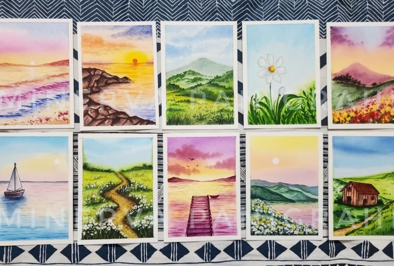
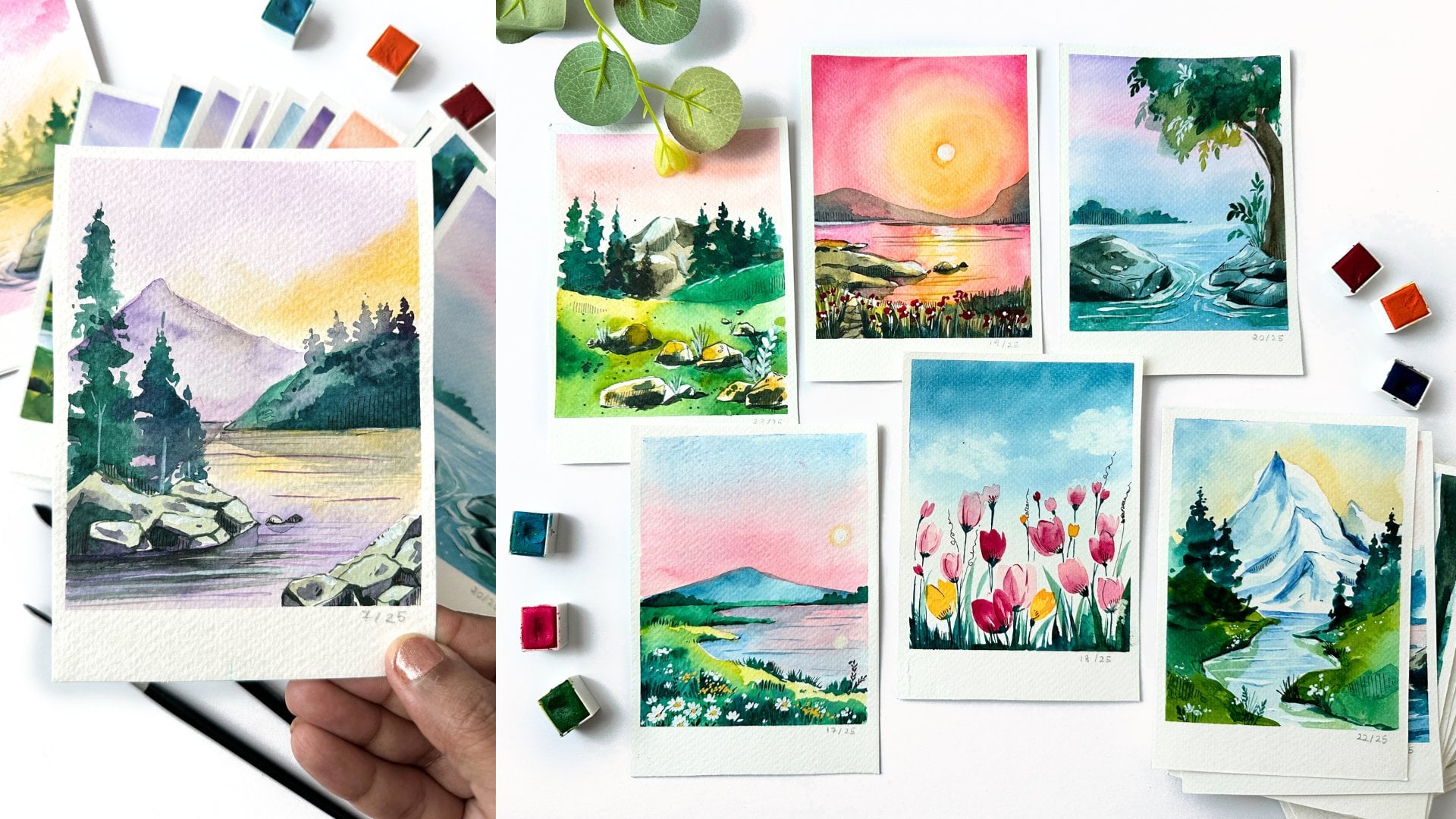
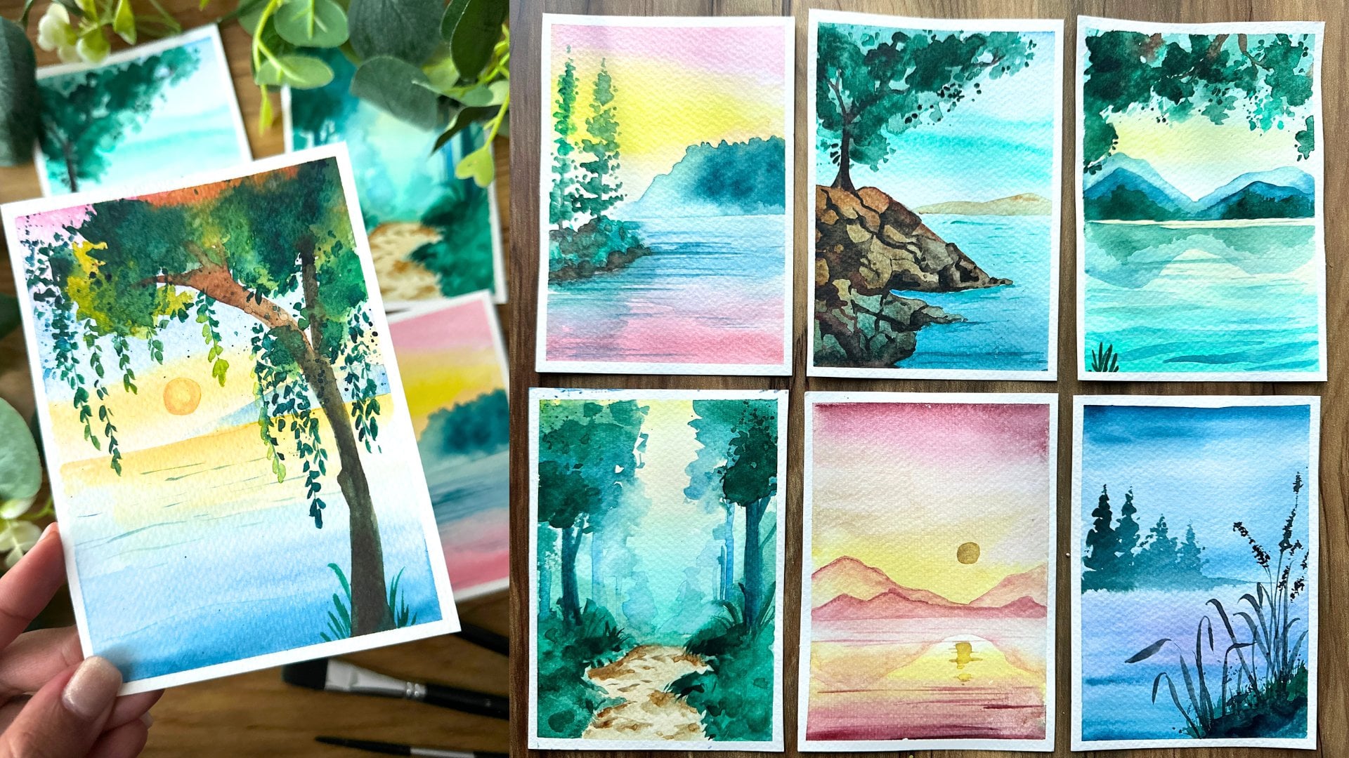
relaxing, and enjoyable. Over the next 30 days, we'll escape into beautiful
landscapes together. We'll wander through
blooming flower fields, admire peaceful lakes,
paint charming cottages, dramatic skies,
and so much more. Whether you're a
complete beginner or would like to build a
daily consistent habit, this challenge is just for you. We will begin by going over
the materials you'll need, followed by some
practice exercises. By the end of these 30 days, you'll have a beautiful
collection of watercolor landscapes and a deeper understanding
of the medium. So grab your brushes, and let's discover the beauty of
watercolors together.
2. Materials: Let's talk materials. The first thing we're going to need is our watercolor paper. We're going to need 30 of
these sheets A five size, and it is 300 GSM, Cold Press. You can have a couple of
practice sheets in hand as well for some of
our other sessions. Also, we'll need two brushes, a round brush of size
six with a pointed tip, and a mini detailer brush. Next, we're going
to need our paints. I like having a paint palette because I can look at my colors, and I'm using the Odysseus
set by Art Philosophy. You can get the similar shades. A color mixing chart is
there in the A section, which you can
download and save so you know all the different
colors we're going to mix. It's nice to have it swatched out so you
can see your colors. Following this, we're going to need some more additional items like white acrylic paint
or white gouache paint. This is going to be very useful for some of our detailed work. My next important must have for this class is a
craft or blow dryer. This is going to speed up
your painting process. Masking tape, some scissors, and then a bowl of water, pen, pencil, eraser, scale. With our materials in hand, let's begin with day
one practice exercise.
3. Color Mixing: Let's talk color mixing. So we're starting with
our standard colors. This is from the Odysseus
set by Art Philosophy. The main colors that are in the set that we're going
to be using to mix our other colors are
crimson, violet, orange, Van **** brown, sienna brown, Veridan, cerulium blue,
cadmium yellow, and burgundy. Now, if you don't have burgundy, you can mix cerulium and
crimson to create burgundy. You don't have to get
the exact same brand, but if you have similar
colors, that would work well. Now we're going to go into a
little bit of color mixing. I'll talk about this through
each project as well. But this is a general idea. You can come back and refer. The files are also added
into the project sections. You can download
them so you have this color chart as reference. So we're starting off with our serolem blue and
mixing burgundy into it. And that is going to give
you a muddy purple color. Let's change up our proportions, taking more of the serlem blue
and less of the burgundy, we're going to end up
with a royal blue. Now, to the same mix of blue and a little
bit of burgundy, when you add in white, you're getting blue gray color. So that subtle shift, and you can use white
watercolors or even gouache for this cleaning up our palette, mixing equal proportions of blue with white gives
you light blue, like a pastel shade. And if you mix in
VidianGreen to this, just a little bit gives teal, which is such a pretty colour. Adding more of Veridian green will give a teal green colour. And these are the
main shades we're going to be using mixing blue. Again, as I mentioned,
in each project, I will go over it again, but this is a good
reference for you to have. We now go into mixing of veritianGreen to get
different shades of green. So mixing verdanGreen with serleum blue gives you
a bluish green color. Next, mixing vertian
green with erleum blue, but a little potion, so it's more of green. It's gonna give a forest green. Next, mixing green
with van **** brown. We'll give you a deep sap green. We're taking just a little
bit of the van **** brown. And finally, mixing
vertan with erleim blue, van **** brown will give
a deep green color, which is really nice and rich. A Now, we do have sap cream that we would mix in some
of the projects. But as I mentioned, don't worry. This is a good
reference point for you as we move forward. Now, the last set
of color mixing is more towards the reds. So we're going to play a
little bit with our crimsons. Mixing crimson with white
gives you light pink. Super simple. The
more white you add, the lighter the pink gets. I Now comes an interesting
color mixing crimson, white, and cadmium yellow
gives a nude warm color. It's very, very pretty. I the same combination, adding more of the pink, but less of the white and yellow gives a little bit
more of an orange color, a red orange color. And then finally mixing
equal proportions of red and yellow with a little bit of
white gives you a orange. And as simple as that, we
have our color mixing chart. With all of this information, let's get started
with our projects.
4. Birds Practice: So let's dive into
a little bit of a bird's practice
that we're going to use for our day one project. Birds are super simple to do. There's two simple shapes that I follow to create a
variety of birds. The first one is really simple, adding a circle in
the center and then adding two lines
pointed downwards, one line being a little bit
thicker than the other. You can do this in varying sizes depending on your painting. The next one is a little
bit more elaborate. So we start with oval
shape for the body, a triangle for the
tail feathers, and then two downward
wings on either side, and then connecting
them to the body, making sure that one wing
is larger than the other. Let's paint this out
so you have an idea. Oval shape for the body, triangle for the tail, the two waves on either side, and then connecting them. We can play around with
the shape of this as well, making them smaller or bigger, depending on the painting and where it's
going to be placed. This is a very simple
way to do birds. There's so many
different techniques, but I feel like
these two techniques cover most of the birds that you'd need when you're
painting landscapes. The next quick thing is
when you start painting, when you take paint
directly from the pan, the colors are usually darker, and that we usually
use for details. If you want lighter shades, add in more water to
lighten up the color. You're going to see
me use this term, lighten your color,
add more water. And what I mean is just
take it in your palette, mix in more water so
the color becomes soft, light, and almost transparent.
5. Day 1 - Lavender Blooms: Are you ready to
begin with day one? For this project, I decided to go with
something a little bit interesting that is going
to pique your interest and hopefully inspire you to continue painting through
the entire challenge. So we have taped down our
sheet on all four sides, making sure that we left
a little bit of space. Now I'm taking my brush and just adding in
water to the paper, making sure that the paper
is damp and ready to paint. I've skipped the
whole process of drawing because this
is just going to be a very simple painting with
clouds and some lavenders. Go back and forth
to make sure that you get water all
through the edges. This is a very common
mistake that happens. And now we're taking
in our serleium blue. I've added a little
bit of water, so it's much more faded in, and I'm going to go
into adding in our sky. Now, you can see my
swishing movement like I spoke about in
the practice exercise. I'm just pushing my brush with spaces in between
for the different clouds. Continue this process. And then we're going
to go in a little bit darker and make sure that we have painted all
the way to the edge. Now, the paper is still damp. So we're now going to take
our green, add in more water, mix in a little bit of blue
for a bluish green color, and we're just going
to paint the bottom of the sheet only towards
the right side. This is for the grass. I. As this fades in, let's take purple. We're going to add in water. Again, lighten it down, and we're just going to add in some dots to show that there are lavenders
that are in the background. I'm keeping spaces between the lavenders playing around with the sizes and the heights. So some that are higher,
some that's shorter. I This painting is a simple ten, 15
minute painting. So even if you're
having a busy day, you can just paint
it so quickly, and most of the projects
are around that timeline. Now, I'm going to
switch my brush and use the back of the brush, make sure that it's clean, and we're going to
add in some stems for these lavenders
that we just painted. I just wanted to fade
into the background, and I don't want it
to be a thick line, which is why I'm
not painting it. As it dries, it's going
to be more clear. We just move on
to the next step, adding a little bit more green between the lavenders while
everything is still wet, so make sure that you work a bit quickly so your paper
doesn't dry in the process. In case it does dry, you can take clear water
and wet the section again. Once that's done,
we're going to take our dryer and dry our painting completely before moving on
to the next set of lavenders. This time we're getting closer, we're going to go into our
purple directly from the pan, so we're not adding too
much of water to the mix. I've switched to my
detailer thin brush, and I'm going to add in dots, thin little lines,
stacking them on top of each other to
form our lavenders. Continue this process. You can have lots of
different lavenders, add as many as you would like, or as few as you would like. I really love the background
that we created because it does look like there are
lavenders off in the distance, and then you have this hyper focused stems and flowers
right in front of us. A Time to add in our stems. I'm just adding four of these lavenders. I
think it's enough. But again, as I
said, you can add in as many as you would like. I'm mixing in my green with
a little bit of blue to get a nice greenish
blue and to match the background that we painted. And I'm using my
thin detailer brush so I can add in a nice stem. A Continue adding some long leaves by just dragging your brush
and pressing it down. Fill up the space as
much as you'd like. And then we can move
on to our last step, which is adding in some birds and completing our painting. Intuitively, I decided to add in a little bit of
purple with my green to give a more dark green color and add some leaves using that. You can see how that color just again matches what
we've been painting. And it's the same purple that
I used for the lavenders. You're going to see me do this a lot in our entire challenge, where I mix colors
that we've already used to create different
shades of colors, and that's going to really
match with our painting. It's a little trick that I use to create a more
cohesive painting. So in case you've painted
before and you feel like some of your colors
just don't match each other, this is a really fun trick. Now, I'm using a
scrap paper that I had protecting my
flowers and sky and then just taking
a little bit of the green and adding in some
splatters at the bottom. To show a little bit of
movement and playfulness. Just enough, you can see
how great that looks, and now we can go
into our birds. Using my detailer brush, I'm going to add in
one bird at a time, exactly how we practiced. A A that we have our main bod. Let's continue adding some
smaller birds around it. Maybe we can add one more bird. So we have four, and that
should fill up enough of space. Once everything is
dried and you're happy with the overall painting, we can remove out our tape to reveal our day one painting. Good job on painting your first project
from the challenge. I'm sure you're able to
learn and see your results. I'm so proud of you. See
you in the next one.
6. Day 2 - Sunset Reflections: Let's dive into Day two. We're going to work on
this vibrant, fun sky. I've taped down my paper
on all four sides. It's prepped and ready. Now, let's use our
pencil to just mark out where we're going to
add in our greenery. We're going to have
some green hills, adding in a little bit of
a wave on either side. Next, we're going to add
in the horizon line, so we know where the sea is
going to be and the sky. I've left a lot of
space for the sky, so we can really
play around with the dramatic colors
that we want. Use a scale to do this so your line doesn't
end up crooked. And once that's done, we're going to start
off with our painting. The first thing is
I'm going to take in my brush filled with clear water and just
paint the entire sheet. Make sure that the
entire sheet is damp. And I'm also making sure that there's water all the
way to the edges. And then we can just
go back and forth, make sure we cover
all the spaces. I like going horizontal and vertical just to make
sure everything is covered. And then once that's done, we can move on to
our bright sky. I'm starting off with purple. Let's get a little bit of
that purple right on top. We can take more purple to
really deepen the color, and I'm going a little
diagonal with this. Next, we can take in our orange. I'm adding a little bit
of water so it's not too bright and mixing
a little bit of red. So it's a more warm,
reddish orange color. And then adding it diagonally to what we have just painted. A Next, we're going to take yellow and then continue with
the diagonal movement. One thing I want to share is that when we're doing
all these movements, I'm not going back and forth. I'm actually just going
in one direction. We can use a tissue
to tap out any of the excess paint so that
it's not too vibrant. It mellows down a little bit. Let's take a little
bit more orange and add it especially to the edges. A And then using yellow to again brighten up
the colors a little bit more. I'm leaving a little bit of that white space along
the bottom of the sky. Now, we're going to
follow the same colours for the water because it's
a reflection of the sky. Starting with the
yellow along the edge, adding a little orange, and then finally purple. A this time around with the purple, I'm moving upwards diagonally. So keep that in
mind because it's a reflection of the sky. Another cool trick is, if you want to lighten up
the colors a little bit, instead of using a tissue
like we did last time, you can use a dry clean brush and just press down
and lift up the color. These are too simple tricks
to use when you feel like your colors are too dark
for what you're going for. Now we move on to greens. I've basically mixed
in a little bit of blue and yellow to give
a very light green, and I'm using it, especially
on the top section. Adding a little bit
more of a deeper green as I move
towards the edges, giving a very natural shadow. Adding a little bit
of that deeper green between the two
hilly mountains to show that they're
different mountains and for a little bit of shadow. Now, I'm going to wait for a couple of seconds while
everything is still wet. I'm going to take a
little bit more purple and add it to the
top of the sky. I feel like it became too light. So just going in with that purple and brightening
up the color more. So with watercolors, what tends to happen is after you dry, the piece can look
a little faded. So if you want to
add in more colour, this is your chance to do that. I overall like how
it's turned out. We're going to let
everything dry. You can use your dryer
to speed up the process, and then we're going to move on to getting a little
bit more details, adding more texture
to our hills. So I've switched to
my thinner brush, and this is great
for my details. And I'm using green
to first add in a little outline to the
top of my mountaintop. And then adding couple of dots maybe pressing down and adding more green to a
couple of the sections. We can do that for the
other side as well. You can see how the colors are making everything just
pop a little bit more. We have few more steps. I'm going to add some
lines to the water, especially the
horizon because it looks like it's
kind of faded away. And then we might add
in some trees as well. We're keeping the stay
two project, S simple, relaxing, I think, just
about ten, 15 minutes. But it's all about
understanding how to play with these vibrant kis and to get a little bit more confident
with your watercolors. It's so easy when you have a thin Detailer brush
because you can really cover up some of
the thinner sections. Now, I've switched back
to my bigger brush. I'm taking in green, and
I'm just swishing around my brush to add in some trees. We want to make sure we
get some darker color, especially at the bottom. Let's use a scrap paper
and protect our sky, and we're just going to
gently tap some more green onto the section to give it a little bit more of
playfulness, some splatters. For the finishing touches, make sure you paint
all the way to the edge with your green, and then we're going to add in some purple thin
lines for the ocean. I've switched to
my thinner brush so I can control
this a little bit. And it's just a thin line
keeping it very light. We mainly want the lines
to come in at the edges, so keep that in mind
when you're adding them. So gaps between them is perfect. We don't want a thin line
that's stretching across the entire sea because
they're just little waves. We can use a little
bit of that purple to mark out our
hilltop a little bit. Finally to balance out the
painting on the left side, I'm adding in a little bush, following the same
thing that we did before with the greens, adding in deeper color, especially at the bottom,
using some splatters. Let's go in with a deeper
green on both of these plants. Once everything is dry and ready, we can remove out our tape. Make sure that you remove your
tape at a 45 degree angle, not just straight up to
reveal our final painting.
7. Day 3 - Mountain Escape: It's Day three, Mountain Escape. I think this name
was so perfect for this project because it has these little mountaintops and a little ocean going in between. So using my pencil, I'm first marking
out my hilltop. We're having another
mountain and then just marking the
horizon line between. Start by adding water
to our entire sheet, making sure that you cover all the four sides
going back and forth, so we don't miss anything. Now, you can use a
bigger brush for this, but I kind of wanted to maintain one brush
or two brushes, in this case, for
my entire 30 days, and I didn't want to get
into too many materials. But if you do have a spare
big brush, you can use that. It might speed up the
process a little bit. So yeah, there's always
additional ways to do things. And my aim for you from this 30 day challenge is
for you to break down watercolors into such an
easy process that you can just truly enjoy the medium without needing
too many supplies, without needing
too many brushes, and where everything
is relaxing and fun. So I'm starting
off with my blue, and I'm mixing in white. So I had some white
watercolor in hand. And this is part of the set. You can add in a little
bit of Varidian green. To get a bluish green color, I think this color is so pretty. It's the teal blue
color. It's so special. And I think it's just perfect for the painting
we're going to go into today. So what I'm going to
do is just paint out the entire sky with this blue. For this project, the sky needs to be a little darker
because it's very light. So we're going to add a
little bit more blue, mix in a little bit more color so that the sky
really stands out. And then using a tissue, we're going to dab out some
paint to form our clouds. I think that's such a cool, fun technique to use
when you want to paint clouds without wanting to really add white
to your painting. So I've gone in with
a little bit more of blue because that's
also important. You need to have enough paint
for these clouds to show. And I'm going gently
from side to side, so I have a nice backdrop, and then I'm going
to take my tissue, and I'm going to use the tissue to gently tap out the cloud. You can see how I'm
lifting up the paint. Let's do that a few more times. Once you're happy with
this, which I think I am, we can add in our mix of blue and white to paint
our water, the ocean. Taking a little bit more blue, so we have some
shadows in the water, so it's not just dull. And I'm adding in
a little shadow, especially below the mountain. I wouldn't call it a mountain. It would be more like a hill
because it's quite small. Mountains are much more bigger. And then I'm going to
mix in my viridian green with yellow to paint our hills. I think of all the paintings
in this project challenge, this one is the most calm, and I would say
the most happiest. It's blue skies,
green mountains. It's the typical idea of
summer in the mountains, if you really think about it, it's just such a classic image. Now, I'm using a little darker green around some
of the sections, especially you can
see in the lower part of the hills to give it a
little bit more shadow, and so you're giving some playfulness and some
realism to your painting. While everything is still wet, let's go in and add a
little bit more green. This time, I'm mixing
my green with glue. There is a color chart that is shared in the about section, so you can have a look at
different mixes of colors. And you can see how
I'm just adding that little dots below. And by doing this, you can see how the
hill automatically has more depth to it. Let's dry our sheet completely before moving
on to the next step. And you can see now
everything has dried down, the colors are a
little bit more muted. So now we can go ahead
and work on our water, our ocean a little bit. So I'm adding in
thin lines using my detailer brush with the blue. I'm also going to
add more shadow below to show that the hill
is reflected onto the water Now we can take in
some dark green, and we can go and work on
our hills and grassy areas. Just mixing green a little bit. First, we can start by adding a couple of thin lines to show that
there are some shrubs. There's some little
grass elements. Small dots, small lines
work really well. We don't want to add too much of detail because the
more detail you add, it looks unrealistic because
these are pretty far away. You won't be able to see too
many details very clearly. So just small lines
works well enough. I Now, we tackle our hill. I'm starting off with my green, and then I'm just
going to go over the edge adding another patch of green to show that the
hill had two sections, one that was shorter,
one that was higher. Continue adding little dots, small lines using the green. As I was painting this, I had
a little doubt in my head. Would this be considered a hill or would it be an island since
there's water in between. I think that's going
to be my homework for the next session to read up the different definitions of these different
geographical elements and get the definitions. Right, because they're
quite similar. So anyway, it's a little
bit of a tangent. Let's get back
into our painting. I'm going to use my
scrap paper to protect my sky and then adding a little splatter
along our little hill, since that's what we're calling it and gently
tapping your brush. I think I like that little dots because you could
do it with a brush, but the splatter just makes
it look more natural. We're going to do the same thing at the bottom side as well. If some of it comes on
the water, it's okay. We just wanted to protect
a little bit of the sky. We didn't want too
many of those platters that it just ruined
your entire painting. And just like that, we're
done with today's project. Simple fun. So pretty. I love the clouds. I think that was such a nice technique
that we learned today. And once everything is dry, remote your tape to reveal
your final painting, which I always think is
such a special moment, 'cause you have that
nice crisp white edge that just makes the
paintings look so special.
8. Day 4 - Golden Hour Glow: Welcome to a new
project Golden Glow. This is going to be
really bold and bright, and I want you to get really comfortable with going really
bold with your colors. Until now, we've been
playing it a little safe and going for
lighter shades. So here we're challenging
ourself a little bit. So I've drawn out the horizon, and then I'm using
my clear water brush to just wet down the entire sky. This time, I'm not going
to paint the ocean. I'm just going to paint the
sky first and then move on. Making sure you go
back and forth with your water and just
dampening the whole area. Once that's done, we can
dive into our colors. So I'm using a burgundy, rich burgundy right on top. We're going to go ahead
with adding more color, and I'm going directly
from the pan, so the color is
bright and vibrant. Let's add the same color along the horizon line going back and forth and blending it out. Next, we're going to move on to orange directly from the pan. And I'm adding a very
bright streak of orange at the top
and at the bottom, leaving a little white
space in between. Now for the space in between, we're going to take
our cadmium yellow, and we're just going
back and forth and filling up our sky. Now, looking at it,
you can see how the burgundy has become dull. So we're just going
to go ahead and add another layer of burgundy, brighten up the color before
moving on to our next step. Now we're going to try
something interesting. We're going to take
a tissue paper, and we're just going to dab
out a portion for the sun. Making sure that our paper was still wet when we
did this process. If it dries, you won't be
able to dab out the colors. But I find this so fun. It's exactly the same technique
we used for our clouds, but this time for the sun. You can go ahead with a little
bit of burgundy and just paint out the edge if
you feel like it's not as perfect as you wanted it. Now, we're going to let the
sky dry, and meanwhile, we're going to go into
our ocean and paint that. For the ocean,
we're starting with our burgundy all the way
through back and forth. We can add in some clear water just to blend
through the colors a bit and then taking our orange. But I'm adding the orange
only towards the sides, keeping a nice path or space
between for the sun rays. So that middle section is
going to be in yellow. Now, taking a burgundy, let's add in some
aves for the ocean. I'm using my detailer brush so I can get some
really thin lines, leaving in some caps. So I'm not doing a straight line all the way from side to side, but leaving caps in between, which makes it
look more natural. And I'm adding quite
a few right on top. And as I move away, I'm going to go lesser Now, we're going to
let everything dry, and this is where there's such
a drastic transformation. You can see how the colors
just really mute it down. And also, you get to see what mistakes or what things
you'd like to add into your original blends because sometimes it looks so amazing, but when you let it dry, you realize how maybe it didn't look as great as
you wanted it to look. So I'm going ahead and taking
a little bit of burgundy, and I'm just painting out
the horizon line again. I think what ended
up happening is a little bit of that color
from the ocean spread out. But what we're going to
take this as an opportunity to deepen up the color for the Burgundy a
little bit more. I feel like it just became so dull after everything dried up. Now, there are multiple
ways to tackle this. You can go over another layer, and there's different
ways to do it. But this time, we're going
simple with our projects, and we're just going to add another layer and continue on. A so let's use our thin lines now and just go over the ocean again,
adding more lines. Some of them faded and some of them kind of became
much lighter. So we want to have some
deeper waves coming through. And you can see how we're really just
playing around with this, and this is looking so great. I love how bold
these colors are, and it's just it really makes you step into challenging
yourself a little bit. Now, we're going
to let everything dry before we go into
painting the sun. Start by adding
yellow on top and then add an orange
towards the horizon line. This is going to
give us a nice shade for the sun, as well. For the finishing touches, taking a little
yellow and adding our reflection of the
sun onto the water. I To complete our project, we're going to add in some birds like we practiced on day one. Fill up that sky. And we're done
with our painting. Make sure everything is dry and then you're
going to remove out your tape to reveal
your final painting. I love how this turned out. It's just it's so different. I think, compared to all the
projects in this challenge, this is the one
that is so bold in color and definitely a very unique color scheme
put together. I can't wait to see you
tomorrow for day five.
9. Clouds and Rocks Practice: Let's dive into some
practice exercises before we begin
with our project. In this, we're going
to cover clouds. Just a simple understanding
so you know what we're talking about when we go
into our main projects. Mixing whichever color
you like clouds can be different colors
depending on where the sun is and the sky is. I'm just taking an orange
for us to have an idea. Now, the shape of the clouds, basically, it starts
with thin lines, and then you have a fluffy body, which then again tapers into
a thin line towards the end. This is a general shape. You can make this as big as you want. You can layer them up. So I have a secondary
cloud that's again, right on top of
the previous one. Maybe some that are
much more smaller. And you can see how that really creates a beautiful effect. Extending some of the lines
also creates a nice wave. And just like that,
clouds are formed. So keep that in mind,
start with thin lines, build up, and then thin again. The other thing we're going
to be talking about is a little bit of a
rocks practice. I want you to test this
out before we move on to our projects so you
get really comfortable. So rocks have a little I
would say, chunky shape. And what we want to do so
I have three rocks here. You have one that's separated, and then two others. You have to cut them
into different pass, the different pass of the rock. This can go however
you'd like to. You can see how I've done that. And once you have that ready, it gets a lot more easier to
move on to the next step. So we're going to
mix in our colors, and I'm going to mix in
a dark grayish shade. Let me show you what
I'm going to do, which is a mix of
burgundy and blue, which was mentioned
in our color chart. In this case, since
the sun is up, we're going to have more
of our shadow down. So the faces that are below, I'm going to paint them up
with this mix that we created, which is a bluish gray and adding a thin line for
the outline of the rock. Let's repeat the same thing for the second and third rocks. An outline for the top
of the rock and then filling up one or
two of the faces a little bit adding in some
little dots for texture. Now, while this is still wet, I'm going to go ahead and
add in a little bit more burgundy and just add a
little bit more colour, especially at the cuts. You can see how that kind of added a little
bit more richness. Then we're going to add in
the shadow for the rock. Then we let this whole thing
dry and just add in a layer of blue on top of the
rocks to complete it. For the shadow, we're
basically doing a mirror of the shape
of the rock below. Let's try this. You can see how this looks, dried up. It's almost there. We're going to use blue, mixed in with a little
bit of water and just paint the entire rock again. Because rocks are generally
gray or grayish in shade, so we don't want
it to be a bright white. It doesn't make sense. So we're just going ahead
and painting over it. Making sure that this layer had a little bit
of water mixed in, so it's a little lighter. And then with a pen, you can just outline some
of the details. I'm using a black pen, adding in the bottom, adding a little bit
of the rock shape, maybe some of the
details which I felt like kind of
got hidden away. Maybe some hash lines for the rock face that's
further away from the sun. And there you go, in a few
simple steps, you have rocks, practice a little bit a couple of times till
you're confident, and then we can move on
to our main project.
10. Day 5 - A Moment of Stillness: I really love how this
project turned out. So pretty, beautiful blue
orange shades of sky. So let's dive right in. We're going to use our pencil to mark out our horizon line, add in some mountains.
In the backdrop. We're going to have
a couple of rocks closer to us to
frame the painting. I'm just doing rough sketches just to know where
everything goes. And then once we're ready, let's take our brush. We're going to take clear water and paint the entire sheet, prep it ready for our next step, which is adding in our clouds. Making sure that my entire
sheet is filled with clear water going back and
forth to cover every spot. Now, let's mix in our color. I'm taking crimson, a little
bit of cadmium yellow. So it gives you a
nice orange color, taking a little
bit more crimson. And then I'm going
to take white. You can use white
watercolor if you have or white gouache. To lighten up the colors, you get this nice peach color. Adding more white
and more yellow till we get a nice orange mix. And once that's prepared, we can go ahead and start
with the blue for the sky. So obviously, my color
mixing took time. So I'm going ahead with
clear water and just adding another layer because
my paper might have dried up in the
whole time that I took. So that's another
thing to keep in mind that in case you get
distracted or busy, just go ahead, add
more clear water, prep your paper, and
then begin again. So I'm taking in
my cerulean blue, starting right at the top, adding in this beautiful
blue color for the sky. Leaving a little bit of a gap and adding some quick strokes. You can see how I'm doing that, trying to get them more towards the right side, moving away. You can drop in a little bit more of the blue,
so it brightens up. Remember, everything
dries a little duller. So you want to get a little
bit more color into these. Skies. Next, I'm going to take in this orange
mix that we created, and we're just painting it through our page,
through our sheet. Adding a little
bit of that orange in those in between spaces. All in a diagonal motion,
if you can have a look. My brush is diagonal
to the sheet, so I'm not keeping
it straight or flat. It has a little bit more
of a 45 degree angle. Now, let's take in
cadmium yellow, and we're just going
to add it right at that orange point. Blending it out until
it's nice and smooth. We're going to use a tissue
to dab out any excess color. With a light touch, move around a little
bit of the color, make sure everything
is blended well. We're going to go ahead and
continue with our painting. I'll start by taking a little
bit more of the blue and finishing up our sky because I feel like it's going
to be really light, and I think it's going to
dull down quite a bit. So let's take a
little bit more blue, do the sky, do the mountains, and then move on downwards. Dropping in a little bit
of blue for the mountains. I'm being a little careful because I don't want
to blend too much. I'm just adding a little bit. We will go over it again once everything is dried up anyways. And then we go onto
the water, the ocean. So for the ocean, I
try to continue with the details we had for the sky because water is usually
a reflection of the sky. It's a mirror, and we're trying
to capture that, as well. So we're going to start off
by first using my dry brush. And I'm just picking up a little bit of paint
in the middle of the sky and a little bit
of that blue because I feel like it just went
bled through to the ocean. Now we're going to take yellow, and we're going to
add in a quick line. You can see how I'm doing
this right below the sun. Next, using orange
on either side. Then finally, blue. At the end. A continue adding in the blue and paint out
the bottom section. I'm keeping white space for the rocks area because
we're again going to paint that out with
a different color. Don't worry if everything
looks a little bit messy with the water
side, the ocean side. We will be working on
it in the next step. But for now, we're just trying
to get all the colors in place and ready for what's
going to come next. One thing I learned
with landscapes is there's a lot of I would say, not even trust, but a
lot of building colors. When you do florals,
it's pretty simple. You don't really build colors. It's the same colors
that you use, but with landscape, you
can build the colors. So your mountains get
painted again, the ocean, you're going to add layers, and we just keep building in the colors to get a better look. Now, I'm using my craft dryer and just drying everything up, and we're ready to begin with our second dip or
the second layer. Now, I'm taking in orange using my thin brush to add
in some bold clouds. You can see how I'm doing this. Adding in that cloud like shape. We discussed this in the previous practice exercise
about the shape of clouds. And it's actually really simple. I never realized until I started getting more
into detail that it's just trying to get a thin line at
the end of the cloud, which makes it look realistic. And so you can go into
different shapes, sizes as far as you follow
those main details. I don't want to have
too many clouds just enough right near the sun, and then we can add in the
orange for the horizon line. I'm adding a little
bit of blue for the mountains in the backdrop, using my small Detailer brush, adding in thin lines for the ripple lines of
the water with blue, getting them spaced closer when they're far away and keeping more gaps as they get
closer and closer. With these lines, make
sure that you don't have them go all the way
across the paper. You can have them either moving from left, midway through, or right midway through
or somewhere in the middle because they're
just ripple lines. Using the same blue,
let's paint out our background mountains because I feel like they're
just quite dull. Adding a little
bit of water mix, so it's not too dark. A Now we move on to the rocks, as we did in our
practice exercise. We're just basically mixing
in our dark gray color. And I'm adding a little
shadow to our rock. Time to take van **** brown, and I'm starting by adding a thin line for the
outline of the rock. This is standalone rock, and then there are
a few that are more towards the
end of the paper. Continue by working on
the rocks closer to us. You can see how I do the
outline and then add in faces of the rock. Maybe adding in a little bit of blue for some
of the sections. And I'm just breaking up the
rock into different cuts. Again, as we did in
the practice exercise, we're just following
the similar technique, painting some of the areas, adding a little bit of maybe blue to deepen the color
a little bit more, adding in some dots
for the textures. I feel like my rocks need
a little bit of work, but let's dry everything, and then we're going to add
in just a layer of color. I think that would
help because rocks are generally not this
white and bright. Time to dry our painting, see what it looks like, and then we can move
on to our third layer. Now that it's dry, let's take our blue mix in with a
little bit of burgundy, so it's a little darker, and I'm just adding a thin
layer on top of our rocks. And that just looks so actually looks a lot
better than what it was. I think it really
needed more color to it that white was just
it did not work out. Let's take a black pen and
just add some more details, maybe outline the
rock a little bit, especially since
there are two sets, one that's in front,
one that's back. So we're just going to
outline the two rocks, maybe add in some thin lines for a couple of the
cuts that we created. Now, for the final
part, I'm just going to take light blue or the
blue mixed in with a lot of water and just
go the middle section of the mountain to fix that part
in case it wasn't smooth. Keeping it very light. And once that's done, we can allow our
painting to rest and then remove out the tape to
reveal our final painting. I really love how this one turned out with the
blues and orange. I think it's a very
unique color combination, looks really interesting. And the rocks that
frame the painting just all of it works so well. Really excited about
today's project. See you in the next one.
11. Day 6 - Painted Skies: Now we move on to
another project where we're going to be playing around a little bit
with mountains, a bright vibrant sky. Let's start by planning out
our mountains a little bit. And then once we
have our layers, we can start by adding water and painting our
entire sheet of paper. Now, this time around,
we're going to add bright cadmium
yellow directly from the pan to one side of the sky. I'm adding it a little bit lower towards the
mountain, as well. But we want that bright
sun to peek through. Now adding water mixed
in with crimson. We're going to add in pink, just being very gentle, not pressing down my brush too much so that it
blends into the sky. Next, we can add in our
violet right at the top, giving it a nice bright
shade of colors. You can see how I'm just gliding my brush and then
adding a couple of lines to make it look like the clouds
are just parting ways. I love working when the paper is wet for
these kind of effects. I just gives you a nice finish. Adding a little bit more
purple, just a couple of lines. You can see how I did that. And then we have this
nice vibrant sky. After some time, I might add a little bit more violet
because it does dull down, and I want the sky
to look bright. It's kind of our focus
for this entire project. Now I'm switching
to my thin brush, and I'm going to be taking
a little bit of redder. I'm painting just the
part closer to the sun. Next, we can use green and
then just continue painting that section of that
section of the hill. Once we have one of
the hills complete, let's move on to the next one. What I'm going to do now is mix a little bit of
cadmium yellow with varietian green to give you
a soft sap green color, and I'm going to use
it in the top section of our hill closer to the sun. So you can see how
I'm doing that on the left side, just on top. And a little bit right
next to the other hill. Next, you can mix in some cream, and then we can continue filling in the rest of our hilltop. I know this part can look messy because it just looks like
everything is together, but don't worry, we're going
to add in more definition, more details, and it's
going to look amazing. So I'm taking in dark green, mixing inverdian green
with a little bit of blue, and then switching to
my thin brush to add in some little dots to show that there's some grass,
there's texture, and the hilltop isn't just
one color because in nature, you can see the shadows of these trees and grass and
all these little details. And it looks so interesting. There's a lot of
texture in nature. So adding these little
dots to our hilltops and what I'm going
to do is I'm going to use a little bit of crimson, add a lot of water
mixed into it, and paint our mountain that was very far
away in the distance. And because I'm adding
a lot of water, you're going to be able to
see the yellow shine through. And we want it to be
very transparent. So it truly looks like
it's off away in the mist. I Now, we're going to use our dryer and dry p sheet before
moving on to the next step. We just have a
couple of details, but what I want to do at this point is see how
our painting looks. Now that everything is dry, are the colours still
vibrant? Are they rich? Do we need to add more? You can see some
of the hilltops. It's just not obvious. So I'm going to go
in with my green and just add a little
bit more detail so you can see them because right now it still looks a
little bit messy. Adding a little bit
of that dark green. By the way, you will see
me use random mixes. Don't worry about it. I think this time I mixed a
pink and a green. You can just use a
dark green if you have or mix your Verdan
green with blue, like we shared in the
color mixing chart, which is in the project
section Upload. I also have a mix of Verdan
green and Van **** brown. That also works really well or verdant green with burgundy
also looks really nice. So don't worry too
much about that. You will see me
mixing random colors because I just use what's
in my palette sometimes. And it's not necessary to
follow the same thing. But if you want to, you
can just have a look. I basically mixed a
little bit of brown, I think, a little bit of
crimson with my green. Now you can see how I just
added those little dots, and this makes the hilltop a little bit more,
I would say, clear. It shows them without
needing too much detail. Now, I'm taking
more of the green, and I'm just going to
add in some splatters. And you can see how
those little dots just add a little bit of vibrance to the painting. And you can see how that looks. I love how this is
coming together. And we're basically
done with our painting. If you want, you can add in some words from what
we did on Day one, which I think is such a great
addition and which is why I decided to add it as a day
one practice exercise. So you have that for you to use in any of the
upcoming projects. But as a whole, I like how this looks. Maybe a little bird
would be cute. I think it would just
be such a nice touch to what we've painted already. A I feel like painting nature is so
therapeutic and calming. Like, there's just something
so nice about painting the bright greens and the reds and creating
your own colors, imagining a beautiful
scene in front of you. I think a lot of us
are living city lives, and you kind of forget
that nature does exist, and it's so beautiful. At least that's
the case with me. After seeing all the
steel buildings, I miss seeing green
grass green hilltops. And there you go revealing
our final painting. I
12. Day 7 - Thundery Clouds: After going through a couple
of interesting projects, we're going to dive
into something that is more of a stormy sky. Starting with our horizon line, we're going to play
around with a couple of trees on either side. The focus here is mainly
on the sky itself. So you know the basics. Let's take our clear water with our brush and just
paint our entire sheet, making sure that we
cover all the edges, and the paper is prepped
and ready to paint. I really like having
the paper as damp, but we don't want too much of
water where it puddles up, so just make sure
you go over it. Now we're going to take
in blue directly from the pan and just add
it right on top. Gently blending the color. You can take more blue, so it's a little
bit more vibrant. Next, I'm going to take red, crimson color, which
when you lighten down, is going to give you
a beautiful pink. And that's where we're going
to add for the remaining of the sky from
somewhere in between. Now, this I'm
keeping more towards the right side and
gently blending it out. Let's add a little bit
more of that pink. It's really light. So let's add more color because we want it
to be a bright sky. Now, let's mix a little
bit of that pink and blue, making sure that
we have more blue, so we get a nice deep color. This is going to be,
like, a very dark purple, a very muddy color
that is going to be perfect for some
of our details. Once we have that prepped, let's just work on the bottom, finish up our landscape
a little bit. And for that, all I'm
doing is washing my brush, taking Verdan green, and just painting the
bottom of the sheet. Mixing in a little
bit of red to get a muddy green colour that we're going to
use for our painting, adding more green and
filling up the space. While everything is still wet, let's switch to
our thinner brush. We're going to add a couple
of details and basically finish up our bottom section. This is going to
give the top part of your sky a little time to blend through for it
to dry up a little bit, so then we can get back to it. Now, I'm using a little bit
of green and just adding little dotted sections to show the grass in
some of the areas. A Now that I'm happy with the overall look, let's get back to our sky
and finish up those details. So washing my brush, taking that muddy purple blue
color that we mixed, and let's start by
adding in our clouds. I'm just adding straight
lines and noturally forming perfect cloud shapes like
we discussed before, thin lines, making sure that they start from the left
side, moving to the right. And What's so amazing is when your paper is still wet, you can easily create
these cloud shapes. And it's just such
a simple process without having to think
too much about it. Just dropping in color
works really well. Next, let's mix in our van
**** brown with Verdan green to get you a muddy green colour that we're going to use for some bushes and trees. This is just to complete
the entire project. We already have
our dramatic sky. We've learned a little bit
more from this project, and it's going to
help us as we move on to the more complex
projects along the way. I like slowly building up skills because as you grow
with each project, you're learning small
little techniques that are going to help you
build your confidence, feel more comfortable
with watercolors. So when we go on
to other projects, it becomes so easy. And that's my goal for you
from this entire challenge. Little bit of fun,
little bit of enjoyment, and a little bit of growth. Now, I'm adding a little bit of that dark green to
some of the grass. Let's use our craft dryer
and dry up the section. You can see how the layers have become a little
bit more lighter. So let's take a little of the green and go ahead
and add another layer. Just a couple of dots. I just wanted to lift
up the color a bit more because I felt
like it became so dull. Maybe adding a line for
the horizon as well. Y finally using a spare sheet, let's protect our sky and then add in some
splatters for the grass. And just like that, remote your tape to reveal
your final painting. A
13. Day 8 - Wildflower Meadow: It's day eight, and I wanted to pick a very fun project
for us to try out. It's got flowers and the sun, and it's definitely full of joy. Starting off by drawing out our mountain off
in the distance. It's quite small, and
it's just going to be very subtle and very misty. Now, I'm going to take my
masking tape or painter's tape, and I'm going to draw
a circle for the sun. I'm going to use this to mask
out the section of the sun. This is a really fun
technique that we're trying. Looks really great and
creates very nice results. So once you've drawn out your circle, we're
just going to cut it. With our scissors and
then paste it onto our paper before we begin
with our painting today. Make sure that your
circle is proper sized, or you can use something
that's circular, so you get your design
or the shape, correct. Placing our circle right
on top of the mountain, pressing it down to
make sure it really stays there before we continue. Now, the first thing
I'm going to do is take in my brush with clear water and just paint
out our entire sheet. Let's start with yellow in the middle right
next to the sun. We can take in our crimson and add it in the
middle section. You have a yellow reddish sky. Let's continue add in a little bit more of the
crimson right on top. Just quick lines. And then let's take in blue. We're going to use
the blue right near the mountain or the
hill that we just drew. It doesn't have to be perfect. It's okay if it comes
over the section, but we're just trying to get a little bit of blue in that area. Going back and forth
with your brush. Now, as we get to the bottom, I'm going to use verdant green. Maybe mix in a little
bit of blue and red to get a more
muddy green color, add in some bright pink or crimson in some of the sections. So areas that have crimson, we're going to add
in some flowers. So we're keeping it a little
bit mixed in together. Using green mixed in with
blue to get a little bit more green in between
these red sections. Keeping in mind that
the painting is going to dry out and
become more dull. I'm adding burgundy at the bottom to build
up even more color. Now, before drying our sheet, I'm going to take my
thin brush and add in some quick lines to show
the grass using green. Now, this is going
to blur out once it dries because it's on wet paper, but I think it's going
to give us a nice look for us to continue
with our painting. I love projects like this when you're doing
challenges because they give you a little bit of a break from the usual and you
have flowers coming in, which is always
such a nice touch. Now, we're going
to use our dryer, dry up our entire sheet. You can see how the colors
have muted in a lot more. And now we can go in and
just add another section of leaves and flowers and
brighten up everything. Using my thin brush, I'm taking green and I'm
just adding in some stems. I let's take crimson and we're going to
add in little dots that connect together to give
you some nice long flowers. This could be a good
representation of delphiniums. And we're just
continuing to follow the structure of the flour, having some of them smaller,
some of them bigger, but making sure that the
top is pointed and they become wider towards the
middle and then small again. Having some smaller ones
going towards the back, I just really playing
around with the flow, different sizes,
different widths, different length, heights. A Let's switch to green to add in our leaves for all of these flowers
that we just painted. I'm leaving certain
sections out, but I'm going to
actually paint them with the flour, as well. And we're just going to
continue this process till we really fill up that
entire bottom space. A a continuing along the process, I'm leaving those two
sections free because I want those to be
our center flowers. They're going to be the focus. Once you're done with
adding all the leaves, we're going to use
our scrap paper, protect the sky and add in some little splatters with
green along the bottom. Once that's done, we can then move on to adding
the flowers because I didn't want green splatters to come on the flowers that
we are painting. Add more leaves to
complete the space, filling up as much
as you'd like. I've sped up the process so you don't have to really
sit through this. Now, let's go into a mountain
using the same dark green. I'm just going to add
a lot of water and add a very soft mountain
in the background like it's really misty and you
can't see it very clearly. Blending it out with a
little bit of water, so it looks like there's a lot of mist off
in the distance. Once everything is dry, let's remove out our sun. Just be very careful
while doing this. I have had instances where
I've ripped my paper, so just be careful very gently lifting it out
one small section at a time to reveal our empty white spot
that we're going to then paint with our
yellow for the sun. Now, for the final step, let's add in our pink flowers for those sections in
between that I left empty. And I'm making this much more bigger than everything
that I painted before. So they really are prominent and they are our focus flowers. Add in some greens for the
stems in case you haven't, leaves everything else
to finish our painting. And there you go. I really like how
this turned out with the very soft colors of pink
and yellow for the sky, the very interesting
flowers in the foreground. Definitely very
interesting painting. And I hope you're
giving yourself a lot of compliments for
getting this far, for continuing and
continuing the challenge. Remember that it's not
easy and the fact that you're committing to this
challenge of 30 days, I'm so proud of you. I
14. Day 9 - Thunder Storm: Today's project is going to
be a very interesting one. We're playing
around with clouds. If you have your white gouache
or white acrylic paint, keep it in hand
because we're going to need this for today. So what I'm going to
do is I'm going to paint the top part of the sky. So I've drawn out a
horizon line that is in the I would say lower
third of the painting. And then I'm using clear water and just painting out the sky. My paint had a little bit of black because I didn't
wash it, but that's okay. It's not going to be noticed, so I didn't really worry
about it too much. Sometimes your water color
could be a little bit off. It doesn't affect your
painting as much, especially for something else
where we're going to use bright bold colors and
really fill up our sheet. So started with cerulean blue and painting a
little bit on top. Now, mixing a little
bit of burgundy to this to get a more
navy indigo color. If you have indigo, you
can use it directly. I decided to just
mix my shades in. And I'm starting right on top, just building the
color downwards. Let's add some blue in
the middle section. As we know, the colors dry
out and can fade away. So we're going to
add more layers of the indigo to deepen
the color a lot more. Really making sure that it is
bright and bold at the top. I'm also swishing around
my brush instead doing straight lines so we
get a more cloudy feel. Now, as I go downwards, I'm taking my cerulean blue and just continuing
to fill up the space. The first thing I'm going
to do is using a tissue. I'm just going to
tap out the center where I'm going to
be placing my cloud. Let's take a gouache or acrylic, whichever one you're using
and paint our clouds. I'm using a brush that
works with the medium. Make sure you don't use
your same watercolor brush because you might damage it
if you're using acrylics. Now, I'm going with
a little bit of a circular move and
building out my clouds. Making sure that I have those little dotted lines
towards either end, like we discussed in
our practice exercise for the shape of the clouds. This helps it form
a little bit more. Also painting some of
the areas that are still dull because even though I used the tissue
and removed it, some areas remain I would say remain dull would be the best
way to explain it. Now, as I add in a little
bit more of the white, I can see how it's kind
of coming together, but I want the clouds to have a rain like effect that it's about to rain and we
have this stormy sky. A So to pill that, what I'm going to do
is mix in a little bit of the indigo that I
had with the white. This is going to give us
a more grayish color. And then I'm going to use this to paint some
sections of the cloud, especially the bottom
areas because that's where it's filled with water. It's heavier. If you look
at the natural cloud, the bottom section carries
most of the water, and that's why it's going
to be darker and shade. So we're really
filling up that area. With this grayish tone. Adding a little bit
of that gray for some of the smaller
clouds as well. Usually, you don't
have one big cloud. There's usually patches
of smaller clouds that combine to give
you that big cloud. I Now that we've done this, we're going to take our white again and just paint
over this layer. Not too much, but just enough so it blends in and
really stands out because right now everything has kind of come together and all has just blended in. So we're going to use our white and place it over this gray. But what happens is
it's going to mix in with the gray and give
you a brighter color. You're going to see this
in a bit as I'm painting, so just follow along
and trust the process. You can see how it's
coming along slowly. I actually like how
this is looking. Maybe we can add a couple of more clouds off in the distance. You can see that gray that
we painted peeking through. A And now once you're happy with
the overall look, let's let this dry, and
then we're going to work on the grass section. I'm going to use the
green mix in with the blue and just paint
right above the grass. Adding in some
thin lines to show the grass details and
continue painting the area. Dropping in some yellow and
continuing to paint it out. You can add in some clear water to blend everything together. Adding in some green
and continuing it. Get all the way to the
bottom of the sheet, make sure that there's no gaps. Now, we're going to
let everything dry. Let's see how it looks, and then we can make
any adjustments. I want to add a little
bit more detail to the grass, especially. Maybe add in some of some more smaller grass
details using a thinner brush, adding some little
dots, some quick lines. Using a scrap paper, let's protect our sky, and then we're going
to add in some splatters for the grass. In our entire project
list for this class, I felt like while everything is happy and cheerful and bright
colours and interesting, I wanted to add something
stormy and thundery. I love the rain. Um I love looking at rain, especially since I live and have grown up in a country that
is so hot, the Middle East. It is very hot. There's barely any rains. I miss the rain and
I enjoy it so much. And I know there are other
people who hate the rain because they've just lived
so much of their life in it, but you always see the grass
is greener on the side. So since I haven't experienced much of rain, I really love it. I love looking at it. And so this painting is a
personal favorite. It means so much to me, seeing these thundery skies and cloudy it's just
the perfect setup for someone like
me who just loves in looking at the freshness, feeling, the smell, just enjoying all of
the senses of rain. And that's why I
decided to add it into this 30 days because I think it really
meant so much to me. So as we continue
with our platters, adding some small
ones, big ones. I like that it adds a little
texture to our painting. And once we're done, we
can allow everything to dry up and then remove out our tape to reveal
our final painting. Additionally, if
you'd like to add in some birds, you can go ahead. I think it could work
with a paint in this and really add some more
detail to the sky. And so I'm just following along from our practice
exercises on day one. Which was such a useful exercise because we're going to add these birds to a lot of our projects to make them
look even more better. Congratulations on
completing day nine. I'm so proud of you.
Definitely give yourself a pat on the back
and see you tomorrow.
15. Day 10 - Hidden Cozy Hideaway: To celebrate our ten
days of projects, I've picked a very special
one for today's painting. It's our little hideaway cottage with these really
nice warm colors. Let's start by drawing
out our cottage. I'm just following simple steps. You can have a look
at what I'm doing. We're just getting the
basic structure in place, having some mountains
in the backdrop. And then let's use our tape to draw out a small
circle for the moon. I'm making it much
smaller in size, about, I would say a centimeter in diameter or maybe
1.5 centimeters. So it's quite small.
We're going to cut it and then use it to mask out the section like we did in our
previous painting. Let's paste out little circle somewhere in the
middle of our paper. Press it down, make sure it's flat before you continue
with your next steps. So what I'm going
to do now is start by using clear water to paint
our background and grass. The thing that I'm going
to do is make sure that I paint around our house. So just keep that in mind
and just be really careful. To make sure that we don't paint the house section and then add clear water for
the remaining parts, we're going to do all
of it and then finally get to the details for
the house or our cottage. Now that we're ready, let's
begin with our color mixing. We're going to mix a very
interesting color for the sky. I'm taking a little bit of
cerulean blue and mixing burgundy to it to give you
a nice warm indigo color. Once you have that, let's mix
in a little bit of red with white and yellow for a
nude skin tone color. And once we have
all of that ready, we can begin with our painting. So I'm starting with
indigo right on top. It has a little bit of a purple feel because
I mixed in Burgundy, but you can use Indigo
as it is, as well. I'm going all the
way to the top, making sure that I really
blend out the colors. Adding a little bit
in between, as well. You can see how I
just flick my wrist, not necessarily paint
certain sections because we want the
color to blend through. If you have any
questions or doubts regarding any of the techniques
that we've gone through, please add them to
the discussion tab. I can go ahead and add
in a sample tutorial or additional information
if you're wondering, or if you have any questions,
I can answer them. Now, I'm adding more
pink and white. And then adding a little
bit of that yellow, you can see how the color
turns more skin tone. And once we have that,
we can go ahead and add it to our sky. I'm starting from the bottom, but I'm making sure that I
don't paint over our cottage. Adding more of this
nude skin tone color in between the purple sky. And because everything
is still wet, it's going to blend through and create a very
interesting result. You can notice how I'm not going back and forth
a lot with it. It's just quick strokes. If you go back and forth, you're more likely to mess
up your painting. So we just want to do this with very simple, easy strokes. Painting around the house
so that in the next step, we can just paint
the house without worrying about the background. Let's now move on to
the grass, the meadow, adding verdant green
for the greenery, mixing in some yellow along the way to get a nice
shade of colors, and then adding in some burgundy to get
in some darker shades, especially along the
bottom of the page. While everything is still wet, adding little dots of this mix green and
burgundy little dots along the meadow. We're getting more bigger
ones at the bottom, and as you go up,
just few of them. It is going to dry up and
blur out, which is great. For now, it's just a nice
effect for our painting. Using the same green, let's add our
background mountain. Just be careful
because we don't want to blend with everything. So I made sure that the painting
had dried a little bit, so the color just doesn't flow. It will blur out, which is great, but
it's not puddling up. Our background is
almost dried up. So meanwhile, let's go into painting the
details for our cottage, mixing the same nude
skin tone color with red and yellow with a little bit
of or with a lot of white. I'm just going to be painting the left side because I'm going to add shadow
towards the left side. So I'm just making sure that
area is darker in color. Keep your tissue ready so we
can just make sure that we remove any excess colors
so we can gently blend it. Let's allow this
to dry for a bit, and then we're going to take
in our thinner brush and use green to add in little
dots to our meadow. I I Next, let's get back
to our cottage. I'm going to take brown, and we're going to do our roof and add a couple of details and
finish up our painting. So starting off, let's
do the top of the roof, adding a thin line for either side so we know
what we're painting. Let's paint the entire roof
with brown mixed with water, so it's a lighter shade. And then while it's still wet, we can go ahead and add
brown directly from the pan. It will blur out,
but that's okay. Once we have the roof, let's move on to the other side. Outline the chimney. Add in the little
door for our cottage. As well as some of the windows. Use cadmium yellow to paint
the inside of the windows to show that there's
light coming through. Now, with Burgundy, we're going to just add in
some of the outlines, add in a couple of pushes
right next to the house. Add a little bit more of dark green around the
meadow, as well. Just small little details. You can have a look
at what I'm doing. Small things to finish
up your painting. Let's add in some
dots to the mountain. Just three of them to
show some texture, add in some grass lines, especially to the grass
that is closest to us. I'm using tissue to
protect my painting, and then I'm going to be taking acrylic white or goose white and gently tapping for
the stars in the sky, removing out our circle, being very careful while doing
that to reveal our moon. Now, in case your
tape rips your paper, like mine did, very easy fix. Instead of removing
out your paper, we're just going to
paint on top of it. I'm taking a little
bit of yellow, and then I'm just adding
an outline to the moon, painting some diagonal lines to match what we have
in the background. And this way, you
can't really see that the paper had ripped a bit. It happens, and
instead of panicking, I want to teach you a little
bit of patience and trust. Now, we're going to
take a little of gray. You can mix your gray between
blue and burgundy and add a few spots around the circle for the
texture of the moon, allowing everything to dry
before mowing out your tape to reveal our hidden getaway. I
16. Day 11 - Ocean Whisper: After painting a lot of
mountains and cottages, I wanted to go back to
the ocean and paint beautiful soft waves
perfect for this project. Let's start by drawing
out our horizon line. I'm actually keeping it towards the middle of the
sheet so that we have enough space
for the sky and enough space for the waves. Using a pencil, let's
draw our waves. I'm adding in a
couple of layers. So we have one layer.
Let's add another one. And I'm drawing them diagonally. And then maybe a final
one that's just small. It doesn't have to go
all the way to the end. So we have three waves that are going to be the
focus of our painting. Let's begin with our painting. Using clear water. Let's paint our entire sheet, making sure that it's
damp and ready to start. Et's start with our sky. We're going to use indigo. It's mentioned in
the color chart, which is basically a mix of
serleum blue and burgundy. And we're going to
start right on top, gently blending in our indigo. Next, let's mix our crimson with white to give us a very subtle pink tone for
the remaining of the sky. Now, let's mix crimson
with white to give us a pink color that within going to use for
the remaining of the sky. Keeping it really simple,
just quick strokes. I'm not going back
and forth too much, and that's really
important to note. And finally, we can add in
some yellow for the remaining. Let's add in the yellow at the bottom of the horizon line. We're going to add in a
little sun and follow the same colors for the water since it's a
reflection of the sky. What I'm going to do is take a tissue while
everything is still wet, and I'm just going to dab out a little circle in the
center for the sun. It doesn't have to
be too perfect. We will go over it
with white paint, but I just want to make sure
that I clear up that area. Just lifting up a little
bit of that paint. You can use a dry brush as well to remove any
of the excess color. While we're at it, let's take cadmium yellow and just
go around the circle. Now time to move
on to the waves. This is my favorite part. It's so fun to paint waves. It's a little bit
of an experiment. And as you get more comfortable, you're going to find it so easy. We're starting off with
yellow at the bottom. Make sure that your bottom
section is still damp. And in case it's not, go ahead, take some clear
water on your brush and just paint over it again. Make sure everything is damp. So when we go into the
step, it's easier. So I've added yellow right
below the sun in a line and then using pink to
continue the sky. Wash your brush. And then
we're going to take in our excess pink
with a dry brush. Finally, we can
take our indigo and just paint the remaining
part of the waves. For the sand, we're going to use our burnt umber to
paint out the section. We're going to bring
a little bit of that brown below the first wave. You can see how I'm doing that just getting it a
little further. Have a look at the video and go
back and rewatch it in case you're having
any questions or doubts. Sometimes I'm not able
to explain it exactly. It's kind of hard
to explain what you're painting with words. So have a look at the painting, pause so that you understand it, test it out a bit,
and then continue. Now, while everything
is still wet, I'm going to take my thin brush
and add in little dots of brown to the sand to add in
some flecks of maybe stones, little texture to it. Now, we continue with the waves. Everything is still wet. We haven't moved on to the drying portion and
moving on to the next layer. So in the same layer, I'm
taking blue with my thin brush, and I'm just going to go over all the waves that we threw
out in the beginning. After tracing out the wave, a little bit of the blue in between
before the second wave. Again, following the
outline or the shape of the second wave and
repeating it for the third. Adding a few more dots of blue
having in some thin lines. You can see how our waves
are forming already. And in the next step, we're
going to add in more detail, and it's going to
look so amazing. I'm so excited
about this project. I think it's definitely unique. And it's the next kind of fun thing we're experimenting
with in this challenge. Now, dry out our entire sheet, make sure everything is dry before you move on
to the next layer. Now that everything is dry, let's go back and
add in our details. I'm switching to my thin brush, mixing in blue and burgundy, so I get a more
dark indigo shade. And I'm just going
over the outline for the wave right above
the previous layer. Adding a couple of
little small lines for those in between sections. Continuing to add the outline. I'm making it really rough, so we don't want it
to be very smooth. It has a little bit of bumps. For the third wave,
we're just doing lines. You can see how I'm doing
that little short lines. Now we move on to the next
step really important, we're going to take our white
guche or acrylic paint. I'm using acrylic because
I had it in hand, and I'm just going to paint
the white form of the waves. So painting very
close to the edge of the wave you can see how
I'm not doing straight lines. I'm actually just
waving around my brush, kind of like we did
our trees or clouds. It's the same kind of wavy motion instead
of just doing straight lines because we
want it to look like foam, making it more white
towards the edges. Moving on to the second wave, following the same steps. I a little bit on the third wave, and then we can also paint
the circle for the sun. Y Almost there, I can see it's deforming. Now I'm going to
mix in burgundy and just add in some mountains
in the distance. So adding a little
bit of water to it, so it's much more lighter
in shade and translucent. Add that little mountain
in the backdrop, it also makes the horizon
a little bit more crisp. Following that, we're going
to add some quick lines for the ripples of the water. Now, using burgundy, we
can go ahead and add in one more layer of outline this time I'm making
it really rich. And just going ahead and adding little shadow
to our waves. I'm not doing the entire
outline, as you can see, the section that is closer to I don't know how to describe it,
but if you have a look, you can understand it's just where the wave dips is where I'm adding in the burgundy. Same thing for the third
wave, just a little bit. I think the reference is the
best way to go about it. And you can see how that
looks more natural now. En you can continue to add in some more
small little dots and details with purple. This basically shows
the kind of shadow of the waves and makes it
look more realistic. I'm using a thin brush
for all of it so I can get really into the details. Now gently tapping your brush
to add in some splatters. Just along the wave section, if you want to protect the sky, you can just place a
scrap paper over it. And now that we have done, I love everything to dry, remote your tape to reveal
our painting today. I think this is
definitely a special one. It's calming, it's relaxing. It's the perfect touch of
ocean that we all need.
17. Day 12 - Evening Radiance: Welcome to a brand new project
today, evening radiance. I think this is perfect
for our challenge. It's got rocks. We're going to play around
with the sky, some clouds. It's everything that we have been working and
painting towards. First thing I'm going to do,
tape down my sheet, prep it, draw out the horizon line
three fourth of the paper. So we have more focus on the rocks and the
water than the sky. Now that we have that,
using our pencil, I'm just going to do a very
broken line for the rocks. Follow along and just repeat the same
thing on your sheet. I'm doing little cuts
for the various rock. Something I've been doing
in my voiceovers for my projects and classes and courses is adding
a little story time, sharing a little bit of
what I'm going through, or a little bit about my past. And I wonder if that makes the process of
painting feel like a story. I do that sometimes
even when I'm painting, I imagine something
for my past or I imagine myself actually
standing on the edge of rocks, standing looking at
beautiful florals. I imagine myself there
and that adds to the feeling of calm and
excitement and joy. We're just adding clear water to our entire painting
before we get started. And I want you to give yourself that little visual before you get started
with your painting. Imagine that you're
standing right there and you're painting along. It puts you at that moment, and it gives a little
bit more of peace and sets the mood before you
begin with your painting. Try it out and let me
know how you felt. The discussion tab
is always available. If you want to share a
little bit of how you felt, you want to share
or ask questions, I love discussing and I love talking about art
makes me so happy. I've added yellow, going
back to the painting, yellow in the center for
the sun and then added in some quick thin lines all the way downward
for the reflection. Next, using orange,
I'm adding it to the sky as well as the water since it's a
reflection of the sky. Finally, we're going to take in our burgundy and we're going all the way from the
top and blending downward. Burgundy is there in
the color mixing chart. So if you don't have the color, just have a look at the
color mixing chart. It's a color that I use
often in this challenge. And what you can do is prepare a little bit of it and
keep it in advance. So you have that for
the entire challenge. So repeating the same
thing along the water, the same burgundy color. Now, I know this could look
like a little bit of a mess because nothing
has been added in. There are no details,
but it's okay. Let's continue
with our painting. Switching to my thin
brush using orange, let's add in some of
the ripple lines for the water keeping them really thin and just
going back and forth. Now, let's mix burgundy with a little bit of
actually brown or blue. We're trying to get we're
trying to get actually van **** brown and adding in
the shadow along the rocks. The area that's right below, we're just adding in
more darker brown, so it looks like the shadow. You can see how I'm doing that. Switching back to
my bigger brush. Let's take in our brown, and we're just gonna
go over all the rocks. I felt like I was being a
little timid with the brown. So we're just adding a lot more, more of the burgundy and really just painting
out our rock. Don't worry about the
mixing that I'm doing. It's basically
standard colours of Vandyke brown that I'm
mixing with my palette. And so you can use
Vandyke brown as is switching to a thinner brush, let's add some of
these brown lines for the ripples of the ocean. Make sure everything is dry before proceeding
to the next layer. Okay, so this is
our first layer. You can see how colors
have dulled down, some of it has mixed up, and we have a clear idea
of what's happened. Now, let's go ahead
and add in details, and this is going to be what's going to bring
everything together. So I've taken directly Burgundy or you can
use Van **** Brown, and I just did the
Horizon line again. And now I'm going to
go through each rock. So starting off with
doing the top outline, and I'm using my thinner brush so I can really get
into the details. I'm breaking up the section into little parts
for different rocks. And then I'm going to be
painting more of the bottom part to add in some shadow.
Just have a look. You can see me paint this
entire thing before you start so that you have an idea of how
it's supposed to look. It's a little bit of
practice, but don't worry. I'm sure you're going to get it. We have done so many
different projects, and you've gotten
this far that I feel like this is such
a good step for you a little bit test yourself and push yourself
a little bit more. All I'm trying to
do is just paint out little sections of the rock, making some of them empty while painting the rest of them. I think this side is
a lot more clear, and you can see
how I'm doing this just adding in rough rocks. Adding in little dots with vandyke brown
for some texture. Using the same
Vandyke brown to add more shadow to the area below the rocks to make it look
like those areas are darker. H. With the same Van **** brand, we're going to continue adding
in some of the outlines, just working a little bit
on these rocks so they look a little more realistic. And rocks are all about depth. So if you can add in layers, it looks more realistic
and works really well. So you can have a look. I'm just adding in a
couple of outlines. We're moving on to
the water and just using the BandagGround
to add in thin lines. Again, especially the area
that was under shadow, right? So right below the rock section. I mixing in a little water to this, and we're going to
add in a cloud. I wanted to balance out the
colors because I felt like the bottom part became
really dark and heavy. So adding in the clouds for the sky just
balances out the colors. We're following
what we did before. So these are two
different clouds. We have a bigger cloud,
which tapers and then we have a smaller cloud that is
attached right next to it. Let's do another one,
the other side as well. Same exact techniques,
Mhing your brush around to get that fluffy cloud. And there you go. We have a balanced piece. You can see how the clouds match the rocky section and
everything just comes together. I love everything to try. We're going to remove
our tape to reveal our final painting,
evening radiance, which I think is such
a great name for this painting because it
does feel like you're walking down a rocky
path in the evening enjoying the weather and
definitely enjoying the view. And
18. Day 13 - Into the Hills: After all our
different projects, I decided to pick today's
project because it's simple. It's just ten to 15 minutes, and we're going to end up
with really pretty results. I'm starting off with my pencil just drawing out
different mountains. And then I'm going
to use my brush with clear water and just paint everything before we
begin layering in our colors. This painting into
the hills is all about greens and blues and if you think of
an ideal landscape, this would be it. Lots of greenery. I have to say, I'm also sitting in a desert climate where it
is currently 48 degrees. It is very hot. I am missing this blue
skies and green mountains. So this is such a
perfect getaway. I've started with
serum blue right on top and just gently
bringing it downwards. Quick flick of my wrist. Then we can move downward
into our mountains. What I'm doing is
mixing a little bit of serleum blue with ardian green, and I'm just going to paint each section of the
mountain at a time. It's okay if the
colors blur in a bit, but we want to have
different shades of green. Mixing a little bit of the
ardian green with burgundy to give you a more
vintage forest green, and then mixing a little bit of yellow to give more
of a sub green. All I'm just doing
is really going back and forth with migraines. Let's continue this process
using yellow mixed in with ardian to give a more sap green. S that beautiful color. Then taking Verdian
green as it is, adding it to the edges, adding a couple of
dots along the way, mixing in burgundy to
the green to give you a forest rich green for the
bottom part of the painting. Notice also that I'm not going back and
forth with my brush. I'm actually just
going round and round. Exactly how we
practiced our clouds, our trees is the same method of just moving your
brush in circles. I added a little bit of van
**** brown along the bottom. Just few dots here and there to give a
nice mix of colors. Now using my tissue, I'm just going to dab out my clouds like we did in one
of our previous projects. That looks so nice. Love how that's turned out, making sure that it
tapers towards the end. In case your section
dried out and you are able to
dab out the paint, just use white acrylic or white Gouache paint and
paint in your cloud. Let's make sure everything
is dry before proceeding. We're just going to
go back to each of the mountains and
get in the details. So starting off with
the topmost mountain, I feel like it kind of blended and you can't
see it as clearly, so I'm just going to go over it with a little bit
of Verdan green and burgundy mixed in with water because I want it to be
very light and translucent, not taking away from any
of our main elements. Next, mixing in our ardian
green with burgundy. We're going to add
in little dots for some foliage
that's very far away, trees that are very far away that we can't really
see the details, but we can just see them
off in the distance. I while I'm doing this process, I'm also breaking down the
tree into different sections, there are different
fields of grass. You're going to
see that in a bit. I think it's not as
clear at this point, but as I move on to the
next part of the mountain, you're going to see
me really divided up. I absolutely love
how this turned out. Just so interesting, we're
going to add more trees. Then the hill that
we're standing on or where this
painting is created. We're going to just add in grass because that's
closer to us. We can't really see too
many trees next to us. We're just going to add
in little dots for grass, maybe some longer grass lines as we're closer to the details. After you happy with the result, we're just going to use a
scrap paper and just add in some flatters to the crus
gently tapping our brush. There you go, our simple
painting in just a few minutes. Let's let everything dry
and then we're just going to remove our tape to
reveal our final painting. A
19. Day 14 - Soft Daisy: Soft daisy, another
interesting project with a different technique that
I cannot wait to get into. We're starting off with
taking down our sheet as usual and drawing
out our daisy. You can see how I'm leaving
spaces in between the petals. This is really important as we continue
with our painting. We have our little daisy here, add in a stem, maybe a bud. That would be really nice. And then we can plan out where we're going to add in
some additional leaves. Once we have that in mind, let's just take cerulium
blue mixed in with water. I'm using my thin brush, and what we're going to do is a negative painting technique
and paint around the flour. This way, the flour remains white while we have a very
interesting backdrop. So I'm using blue
and just painting around I'm going to fill
it up a little bit, use some clear water and
blend out that layer. So we don't just end
up with an outline, we end up with a background, dropping in more of
the serlem blue next, we're going to paint
around the bud, taking more Silleum
blue, adding water. I'm trying to make
sure that there are no dry lines and everything
is blended through. Make sure to paint each section, taking in your time so that
you get the best result. This is a part of patients. Negative painting is a
topic that I talk about more in my other classes. Now, we're going to
continue adding in water, blending out the colours. I'm not going all
the way to the end. I'm just trying to
get the section that is closest to the flower. Once we have that,
it's going to be easier for us to work
on the remaining. I sped up the process a
little bit and slowly, but surely we have reached here, where we basically have painted
around the main flower. Now to complete out any of
the sections that dried up, make sure it looks nice, and then we're going to add
in our background, our sky. Now, these sections might
have already dried up. So all I'm doing is adding
a little bit more blue with more water to blend and kind of paint over
those dried sections. You can see how I'm doing that. And that way, we have
a nice background. Next, I'm going to add purple for the top
of the backdrop. It's more midnight and really
suits are painting today. For that, what I'm going to
do is just take purple or violet and add it to the
top of our painting. Mixing in a little bit of blue with burgundy to give us some clouds that we're
going to add into our sky. I Amazing. For the final touch of
our painting layer one, which is going to add
in blue, little darker. So I've added a little
bit of burgundy. You can use indigo as well, and just painting
the area below. And in case you have
sections that have dried up, just make sure to
add in more paint. You can add in some green as
well and just paint over it. Time to completely
dry our painting. You can see how the
colors have muted down and also blended through. So it looks really great. We have a good start, and we can continue
with our next step, which is just adding
in our leaves, maybe painting the center
of our daisy with yellow. Adding a couple of dots of brown along the bottom
for some shadow. A using green to add in the stem as
well as leaves. You can add as many as you'd like or as
few as you'd like. I'm adding in some
really long leaves, and I'm going to
speed up this process a bit so you can have a
look at what I'm doing. Continue adding in lots of
different variety of leaves. You can have some smaller
leaves, some longer ones. Waving about in the breeze. This also gives you
the effect of breeze. So if you can just vary the different directions
of these leaves. Now, using a scrap paper, I'm just going to
add some splatters to the bottom of our painting. I really love how
this is looking. Adding a little bit
of blue slight tinge to our petals because it
looks really just white. That little blue is going
to really add to it, adding a little bit below
the yellow section, and letting it dry before removing out the tape to
reveal your final painting. Now that you've gotten this
far into the paintings, I am curious to know
which is your favorite. We've tried a lot of
different techniques, a lot of different styles, a lot of different
colours and themes. I think I'm I'm still not sure
which is my favorite yet, but I'm curious to hear yours.
20. Day 15 Fields in Bloom: We are midway through
our challenge, and we're diving into some of the more floral based paintings, and I'm so excited about them. So let's start with this one. It's going to be a good
step up as we move forward. So I added clear water, make sure that the paper is wet, and then I'm just painting
the sky using cadmium yellow, and I've actually painted
around a little mountaintop. Now, let's use orange and add it to the left
side of the painting. I'm smooshing around
my brush so it doesn't really create
any harsh lines. And then I'm gonna mix in my
erleium blue into the sky. So our sky is looking
a little dull. So let's go ahead and
add a little bit more of cadmium yellow near
the mountains. And then we're going to
add in some clouds with our mix of seroleum
blue and burgundy. A Start right on top, and we're going to add
in some fluffy clouds. Drop in more of the burgundy
color so it deepens it up. And then we can continue with
the rest of our painting. Make sure that your
layers are still wet. So in case you feel like
things have dried out, just add in a layer of water
again in that section, and then we can continue
with our painting. Let's use burgundy
for the mountain. Keeping clear water near the cadmium yellow because I
don't want the two to mix. And then adding in cadmium. I'm being really careful. In the next step, I will go over it so that the edges are
a little bit more sharp. But for now, I'm just
painting it out, but making sure that
I leave little bit of space between the
yellow and the burgundy. Time to move downwards. We're gonna be using green for the other
hilltop or hillside. And then we're going to go
ahead and add in some color. Using crimson, painting
the section up. Let's take more crimson, add in little dots. Remember, it's all going to
become softer as it dries, so we're taking
advantage of that. Now, I'm painting the crimson, leaving little gaps in between so I can add
in a different color. I Washer brush use cadmium to paint in
between some of the areas. So we have some yellow flowers. Also leaving space so
that we can add in our stems of green
and leaves of green. Very carefully,
we're going to use our brush and paint verdant green in the
sections in between. We can mix in a little
bit of burgundy, so you end up with a
muddy color that I think would match the
painting a bit more than a bright green and gently placing it in
the areas in between. I We're now going to dry the layer using
our craft dryer, and you can see how the painting has become a little
bit more softer. The blends have come together, and now we're going to
go into the details. So I'm taking in green, and we're just going
to do our mountain. I'm adding a little outline
to it at the bottom. Let's add some thin
lines in between the flower fields for
our stems and grass. Now that we've
added in our lines, we're going to go into just
adding some more flowers. This time around,
we're going to make our flowers more obvious. We're going to use crimson. The flowers that are far
away that are far away from the bottom of the sheet
are going to be smaller in size because they
aren't as clear. And the ones that
are going to be closer to us that is closer to the bottom of the sheet are
going to be bigger in size. Next, we're going to
use our gouache white and mix it in to get
different shades of colour. Maybe we can mix a little bit of yellow with the
gouache white. So it's going to give
us a more opaque layer. Mix it well together, using your thin brush. I think a detailer brush is so useful for pretty
much any project. You could use the
same round brush, which is what I do for
a lot of my paintings, but a detailer brush is great when you don't
want to think about too much and can easily create smaller elements like
even dots and small flowers, it's so easy to do. So I would highly
recommend investing in a detailer brush if that's
something you don't have. Watercolors, I think, is
one of the mediums that you don't need too
many supplies off. If you have your basic paper, paints and even one
brush, you're good to go. And the paints last
such a long time. I highly recommend even creating
your own paint palettes. What I used to do is if
I had tubes of paint, I would mix them to
colors that I like. So taking a little bit
of ceruleium and ardian, mixing it into a pan and
adding a little bit water, so it all blends together, and then I have it ready for the next time I want
to use that color. So that way, you
don't have to keep blending every time or
color mixing every time. So what I've done is I'm just protecting the sky
and then I'm going to use my white mix with yellow. Just add in some
splatters for some of the flowers that we can't
really get into painting. Repeating the same thing
for red or crimson. A a For the last step, we're going to basically
mix in our verdian green with burgundy to get a
dark color for our stems. And this is when
we can finish off our floral section before we go ahead and add a little bit more detail
for the mountain. You can see the
mountain kind of has disappeared into the mist, so we're going to just
fix that a little bit. And then we're kind of
adding more detail. Okay, the flowers have
turned out so great. We don't want to have
perfect flowers. It's just the idea of a flower is enough to create that effect. Now, mixing in
more of the green, our vintage forest green, we're going to go ahead
and add in the hilltop, add in some mountains, add more detail and
layers to our mountains. If you've gotten this far, I'm so proud of you. Honestly, this is amazing, and you should give
yourself a pat on the back for being consistent, for keeping up
whether you've done all the projects together
or you've pasted them out. However, you have decided
to go about this, give yourself a pat on the back. Remember that it is a commitment and you
have done so well. And this is a
commitment not to art. It's a commitment to
yourself and to your peace. And I think that is so
much more important. Nowadays, with so many things
happening in the world, so many things
happening in life, we need that little bit
of peace for ourselves, that little moments
that we take, and that we honestly, I think gift to ourselves. I take it as a gift
that I'm gifting myself this moment to paint, to relax, to feel good. So, yeah, I've added in a little bit of color
to our mountains. And once you're happy
with the overall result, let's allow everything to dry, and then we're going to
remove out our tape on all four sides to reveal
our painting for today. You are doing so great. I'll see you in the next one.
21. Day 16 - Out at Sea: Another really great
project out at sea. This one is 10 minutes, which is perfect if you've had a busy day, highly recommended. We're going to start
with adding in our horizon line in the
middle of our paper, and then we're going
to use Clearwater added in throughout
the entire sheet, prepit before we start working on the sky
and other details. I like adding in quick projects
in between my challenges. You have something
that could be 15, 20 minutes, and then you have projects
that are like this, which are 10 minutes or so because it gives you the opportunity to
paint at your own ease. If you want to skip a project, you can or want to
come back to it a little bit later,
you have the option. It's all about making the
challenge work for you. And if you've had a busy day, you might as well
paint and make it a habit rather than
not paint at all. So even 10 minutes is still a good win and give yourself a pat on the
back for just doing that. I think that's something
we do to ourselves. We put a lot of
pressure on ourselves to get everything done
every day perfectly, and sometimes it doesn't
have to be perfect. Sometimes just showing up is enough. Back to our painting. As you can see, I mixed
in my cerulean blue with white and added
it for the backdrop, added in yellow for
the middle of the sky, and then finally pink, which is a mix of a mix
of crimson and white. We're going to repeat the
same thing for the ocean, the pink, the yellow, the blue. Going back to what I was saying, which is giving yourself the I would say the support to not have
it perfectly done, but to just show up. I used to put a lot of pressure
on myself to be perfect, to commit, to do
all these things, and it just felt like stress. And I stopped enjoying the process until I
decided that, Okay, I'm going to just show up, even if it's 5 minutes, even if it's 10 minutes,
I'm just going to show up. And that actually made the
process much more fun for me, and I really enjoyed myself. So, used a darker blue and
added in another layer. As we know with watercolors, things tend to fade
out once you dry them. So we just want to make
sure we add enough color, so it still stays interesting. Add it in a little
bit of a shadow for the boat that we still
haven't painted, but I wanted to add it in
because I think it's going to look really nice and blend into the
background a bit more. Drawing up the entire painting, and we can get
back to layer two, where we're going to
add in our details. Using a pencil,
let's just draw out a very simple boat
out in the ocean. Add in the mast. Great. Ready to start? Let's use our thin brush so we can really get into our details. I'm going to start by painting blue for the body of the ship. Et's continue to use the blue for the
remaining of the ship. Later on, we can add in white to brighten
up certain areas. Whether you use gouache white
light me or acrylic white, the results just add
to the painting. Is that little white streak along the ship as
well as the body. Time to mix in our indigo
seruleum blue with burgundy. We're going to get a dark color. Maybe mix in a little
white to that, and we're just going to add
the ripples for the water. A a next, I'm going to
take my acrylic paint with my acrylic brush, and I'm going to paint the sun. Using more of the
white to highlight some sections of the
boat and the water. I was a little hesitant
with this section because I decided to take a black
pen and outline the boat. I would suggest if you want
to do a black pen that works, or you can just use your thin brush with
burgundy and do the outline. I felt after I finished that the black might
have been too dark. I still love how it looks, but there are alternate
options you could try as well. Let's darken the shadow of the boat just a
little bit below. And our very simple
painting is ready. I love everything to dry, and then you can remove your
tape for the final reveal. I love how that white space
that we have along the edges, the border looks so nice and actually makes the
painting look complete.
22. Day 17 - Nature's Embrace: Let's dive into a
brand new project. This one is definitely special. It's a walk in the path just filled with
greenery all around us. Using our pencil, let's
plan out our painting. I'm starting with the
edge of the horizon. We then are going to have
some trees in the backdrop, and then we can have
a wave footpath you can see how I am
drawing that out here. Make it a little jagged, so it's not too perfect. Like there's stones in the way, and we're trying to paint that. Just something simple. So when
we get into our next step, we have a basis
for our painting. We're also going to add in
some grass along the way. The closer or towards the
edge of the painting, the grass is going to be longer. And as we move away to the
center of the painting, it's going to be shorter
to show distance and to show that depth in the painting. So it's very important
that we keep that in mind. I'm just doing quick
lines with pencil. It's not necessary, but I just wanted to have that as
my reference point. And now we're going to
use clear water and just paint the entire page. Make sure you get
through all the edges, and you add enough water so that when we go
to the next step, it works beautifully. So starting off with
our cerulean blue, we're going to do our sky. We're going to paint our sky. And what I'm doing is keeping
little gaps in between for the white fluffy clouds
and using blue in between. You're making sure
that we get blue all the way to the edge of the sheet and also limiting
it to the sky portion. Next, let's take green, and we're going to add some
pushes in the backdrop, and I want them to blur out, and that's why I'm doing it
as a wet on wet technique. So while it's still wet, I'm adding in this green. We will go over it again in the future steps so
we can layer it up. But for now, I think this is a good start where it's
off in the background, it's soft and just
adds to the painting. We now move on to the grass. I'm going to use verdant green mixed with yellow to
get a lighter shade. And we're going to use it at the top towards the
center of the painting. And as we get closer to us, the viewer point, we're going to make it
darker and darker. I love mixing in different
shades of green when I paint this part because it's going to look so great and so
natural because in nature, you don't just see one green. There's usually
variations, and also it depends on how sunny it is, the clouds because all of
that reflect onto the grass. And so you can have a mix
of greens for this and then using the darkest
for the bottom part. I think of all the paintings, this one made me feel
like I was traveling, like I was actually in a
countryside just looking through a field of grass,
walking through a path. I think it was the most calming, relaxing piece of everything
that I've painted. I'm using the back of my brush to add in
some lines for grass. What this does is add
a little impression, and that's going to
actually look really nice. Remember longer lines closer to us and shorter as
we move further away. Let's take a little sandy
yellow and paint the footpath. But I'm being very careful because I don't want it
to mix in with the green. So I'm just going to be a little careful leaving gaps so I can paint that
sandy footpath. Now, let's take dark green, and we're going to
use it to paint the section that is below, if you can see what I'm doing. It's just the area down which is going to
be in shadow where the grass is kind
of falling through. So that's the area that
we're adding more shadow to. Time to mix in our
burgundy and paint through the trees so they
look even more vibrant. I We're going to use a little bit of
burgundy as well for the shadow areas to make it
a little bit more obvious to create more contrast and add more grass it's so interesting while I was doing
the voiceover for this, there were a couple of
birds that chirped, and I immediately
paused my recording. It's pretty rare where I am to actually have birds around. It's too hot for
them to fly about. They mostly seek shelter and kind of hide during the
day because it's so hot. So this was so surprising, and it just matched
the painting so well. I immediately cut it off, and then after a second, I wondered, why
did I I would have actually been a good
addition to this voiceover. I think it just
matches the vibe. But definitely such
interesting moment. So I'm going to
continue to add in more and more burgundy grass through the entire grass field. Now, let's allow
everything to dry, and then we're going to
add in some quash flours. A simple trick is to also
make sure like the grass, we add smaller flowers
as we move away from our painting and have bigger ones closer to
us with more detail. As you move away, you
can literally just add in dots to show that the flowers are so far away that you can't
really see them, but you can see the color. A Now, I've let everything dry, and for the finishing touch, I'm going to use
another layer of green or burgundy to just
paint some of the stems, some grass, add some
more detail or depth. You can see how some of the
sections I'm adding more, adding the center of
the flowers as well, all the little things that
will help it all lift up and make the painting
more vibrant and real. A We're slowly getting there, adding a little shadow
for the flowers. And we're done
with our painting. Let's allow everything
to try and then we can reveal our final painting.
23. Day 18 - Purple Skies: How about another new painting. This one is bright,
it's vibrant. I love the colors. After all the subtle
paintings we've been doing, I think this pop of color
is going to be perfect. Let's start by drawing the horizon line in the
middle of the sheet, and then we're going
to use clear water and just paint the entire page. Let's start with violet, all the way from the top and then we can just gently
blend it down a little bit, keeping your wrist soft and also making sure that you aren't pressing down
your brush too much, just keeping it very light. Wash your brush. Take a tissue paper in hand. And what we're going to
do is use a dry brush and gently lift up a little bit
of that color and blend it. Let's take more violet. Darken up the top. Now we're moving into orange, and you can see how I'm
adding orange right below. Making sure that I don't go
back and forth, quick lines. We can take a little bit
of burgundy and then finally move on to cadmium yellow for the
remaining of the sky. Let's repeat the same
colors for the Sea. Just flip them around. We have cadmium yellow, orange, and then violet. Next, taking a dry brush. Let's take some burgundy and
gently tap in our clouds. I'm making them fluffy by moving them in a little bit of a circle instead of
just straight lines. And remember, what
we've been doing is to taper it when we start and end. Leaving couple of
dots to us edge. Now, let's repeat the
same placement of clouds along the reflection
of the water as well. I Now, let's use our craft
dryer and dry it up completely before moving
on to the next step. What I'm going to do
is with my pencil, I'm going to add
a little pathway, a wooden deck for us to
look out into the ocean. So making sure that the
Distance is triangle, you can see how I'm
doing this shape. So further away, it's
smaller and closer to us, the path is wider, creating a kind of
triangle like shape. You're going to see
this in a bit so you understand it
a little bit more. Time to take Burgundy and
let's paint our footpath. I'm starting off with
a darker color towards the edges and clear
water along the path. Let's add more color closer
to us, so it's darker. We're going to let this dry, and then meanwhile let's add in some mountains
off in the distance, mix in water with burgundy and add some mountains
off in the distance. Using our detailer brush, let's add in shadow. We're going to start by adding
shadow for the mountains. Now, let's use
Burgundy to add in some ripple lines
across our water. Let's make all of this
so much more realistic. Aren't these colors just so fun? I love the shades. It's definitely really
bright and interesting. I think it's a good step away from kind
of muted colors that we've been going into. You can add in some birds off in the distance from what
we learned on day one. I really love the
birds practice. I think it's such
a good addition. And I think I mentioned this even in one of the
previous projects. It's such a cute thing
that you can add into literally any painting that
you're doing with landscapes. I do want you to take a moment and give yourself
a pat on the back. I'm so impressed that you have gotten this far and you are
sticking to the challenge. It's not easy. I have the habit of kind of sometimes
not keeping up. So I'm really proud
of you for continuing and making this a part
of your daily habit. I've made sure that the
projects are short and limited, so that way you can
really just take out a little bit of your
time to get into them. But also, I think painting
nature is so relaxing. There's just
something so calming about nature and its beauty. Now, time to let everything dry. You can use a raft
dryer or a blow dryer. Make sure everything is dry before moving on
to the next step. The next step is
all about details. We're just going to
add in details for our footpath using a black pen, or if you want, you can use
your thin detail brush. I thought a black pen
would just be easier. So all I'm doing is adding the little wooden fence on
either side of the path. Making sure that it is bigger
and has more distance as it is closer to us and smaller and lesser
distance as it's far away. We're really using this depth in every aspect of our drawing to make it look more realistic. I think this is what
happens when people get into painting is that they
forget that there's depth. So maybe they make the
width smaller and bigger, but they forget that
the wooden stumps will also have the same effect or the colors will
have the same effect. So we just are trying
to make sure that everything just matches
with what we're painting. Next, we're going to draw out the wooden planks
for the footpath, keeping in mind that
further away is going to be shorter distance
and closer to us, the distance of the wooden
planks will be bigger. You can see how I'm doing
this as well in the steps. I kind of like the idea
of adding a little boat that's docked to the deck. So using a black pen, I'm just going to draw out a simple boat and keeping in mind that it
needs to be quite small, so it matches the
painting that we've done. Next, we're going
to use Burgundy and just paint out the boat. Let's wash our brush,
and then we're going to just lift
up a little bit of that paint in the
middle of the boat. So it's lighter in color. Using the same burgundy, let's add the shadow reflection of the boat onto the water. It wouldn't be the shadow.
It would actually be the reflection of the boat. I How adorable is this? Final step. We're just going
to use our burgundy and just paint some of the
planks for the path. This makes it look more
realistic instead of just having the black lines that we added
in. So just a few of them. You're just going to paint
either the plank itself or just the bottom or top edge, giving it a little
bit of difference. So each plank doesn't
look like it's one piece. It looks like they're individual wooden pieces put together. A a and we're almost done. We're going to let
everything dry and remote our masking tape from all four sides to reveal
our painting for today. I kind of find it hard to pick
a name for this painting. So I decided to go for
something really simple that is purple skies. But I do think I can do better. Maybe footpath to the
water, walk into the water. I think I'm going to
stick to purple skies.
24. Day 19 - Peaceful Path: Welcome to today's project. We're going to start with
something really fun. Let's start by drawing out our little details
before we get started. So first thing, I'm drawing out my pencil line of a
mountain in the backdrop, and then one that is closer
that we're standing on. It's going to get
a little bit more clearer as we continue
painting, but for now, we just need an overall idea so we can plan our base
colors accordingly. Now I'm going to use clear
water and just paint out the entire sheet in
preparation for the next step. Right. Let's start with the sky using cadmium
yellow right on top. Let's bring it a
little bit more lower, keeping my brush very light, so it just blends in. Next, we're going
to mix our crimson with cadmium yellow for an orange and use that to
paint the rest of the sky. Adding a little
bit more crimson, a little bit more cadmium yellow to get more of a vibrant orange. As we get lower,
let's add red towards the bottom of the
sky a Burgundy. I made sure to add in the
burgundy around the mountains, and in case some of
it seeps through, just wash your brush
and take a dry brush and remove out the excess paint. And Now, let's move on to
painting the mountain. I'm actually doing a gray, so a mix of blue and Pandyk
brown or blue and burgundy. If you have black, you can
just use that directly. But again, make sure that
you add a lot of water, so it's a very light mix. We don't want something dark
and harsh at this point. I'm just painting
our mountainside. Using more of the blue for the second mountain
off in the distance, being really careful to not blend it too much
with the Burgundy. Closer to us, we can again
use the grayish blue mix. Maybe mix in burgundy
with seruleium for an indigo and
use that to paint. Well, everything is wet, I'm going to use my
tissue and then try to tap out the sun in
the form of a circle. Now, in case your
painting has dried, it's not going to be posible. So what we want
to do is just wet that tissue and then use
that to lift up the color. Then we can use our brush, wash it, add in a
little bit of white. A and paint our pretty sun. In case you don't have
watercolor white, you can use quash white
or even acrylic white. Now that this is done, we're going to let
everything dry before moving on to the next step where we're going to start
adding in the details. Okay, now that it's dry, let's use our gouache or acrylic and actually
paint the circle. For the sun, it's going to be a lot more better now
that everything is dry. Let's mix in burgundy and uruleum to paint
the back mountains one at a time, add
in more texture. Switch to a little bit
of green mixing in Viridian green and painting the rest of the next mountain, leaving in little gaps. A Continue to stack on the colors. You can go ahead and add some burgundy to a little
bit of the outlines. Great. I'm happy with this. Let's move on to the mountain
that's closer to us. This one, we can
add in more color, more greens, different
shade of greens. A And while we're at it, let's take our serleum
blue and add in blue for the I would say a little lake that's in the
middle of these mountains. A Great. So mixing in a
little bit of black, and then we're going to use that for the mountain closest to us. I really want to darken up the color because
for the next step, we're going to add
in some flowers, and so we want this area to be really dark so the
flowers can pop out. Now, time to dry our painting before moving on
to the next step. You can see how our
painting is looking. I love the sky. I
wouldn't touch it. The mountains in the
background look great, adding a little bit
of white gouache for the ripple lines and
reflection of the water, so it looks a little
bit more natural. And then we start working on the element closest to us on the cliff that
we're standing on. And so I'm going to
use white to add in little flaws through
the entire section. Now, for the flowers, what I'm doing is the ones that
are further away, I'm just adding
little dots, simple. The ones that are
closer, I'm just adding in a couple of lines
that represent petals. Not being too specific
about how this looks. It's okay if you just add
little dots all around. It doesn't need to really look like a flower because
they're quite far away. Now, mixing in a little
bit of burgundy with blue. We're going to add a little
colour to the bottom of all the flowers as
much as you can. This gives it a better
effect, a better look. And I'm using my
detailer brush so I can really get
into those details. Next, we can mix in
a little yellow to this gouache mix to add in some yellow flowers because I wanted a
range of colors, so the flows instead of just
keeping them all white. I thought that would
be interesting. Y this is so great. It looks like there's
little spots. It looks so pretty, love
the flowers, love the sky. All of the details
have come together, and we can let everything dry
before removing the tape on all four sides to reveal
our project for today. I think with all the
different flowers, this one is definitely
very interesting. And I like that we have some clips and details
off in the distance. The sun with the white is
bright and it's shining. I can't wait to see
the recreation of this project in your uploads.
25. Day 20 - A Quiet Retreat: Let's dive into a new
project, a quiet retreat. We're starting off
with our pencil drawing after taping down our sheet and just
painting our hills. We're also going to paint a diagonal road that crosses
through our cottage. Let's get in our cottage now. Very simple, adding
in a triangle with a rectangle body. Breaking it down into simple
geometric shapes so we can paint a very
simple, cute cottage. And you can see how I did that. Now, after adding one more
hill at the background, let's use clear water and
just paint our entire sheet. Prepping it for the next
step when we add in our sky and other details. Start right on top. I'm mixing in cerulean
blue with a little bit of violet to get a bit
more of a purple color. Starting right on top, it
actually looks more indigo. So we could use indigo
as well, right on top. And then adding a little
erleium as it is in the middle. Compared to the indigo, the
erleium looks much more lighter and really just complements that sky
another way down with this, let's move on to our hills. Using cadmium
yellow, I'm going to just paint the hillside. Using that bright yellow to just make our painting look bright. And then we can mix
in our green and add in green for the remaining
part of the hills. You can switch
around the greens, maybe add a little
bit of iden to the mix to brighten it up. As I mentioned in
previous projects, having a mix of greens
for your hillside just looks more natural and really
works well with paintings. You can see how all of
this is coming together, and we're just layering
our first base. This is the foundation
of our entire painting. I'm leaving that little pathway. So that I don't really
add any green to it. Using the same green mix, which was basically variant
green with blue to complete our hill leaving
the cottage area white or clear by not
adding paint to it. So just being really careful when you're painting around it. A I to use a little sand brown
for the path. And then we're going to use
our craft dryer and dry this entire layer before
we continue with the next. This way, we're building
colors with a little bit of layer and layering technique, and also we want
everything to dry because we can see
how it all looks. You can see how the
sky looks amazing, so I'm not going to touch
anything from that. The hills, I'm just going to
use a little bit of ardiant green mixed with a little bit of yellow to add more texture, some dots, some outline to
separate the different hills. Let's add few
bushes, some grass. All using our detailer brush so we can really get
in those details. Next, use a green to add in grass on the edges
of the pathway as well. Continue adding grass
through the entire painting, little dots, little thin
lines, some bushes. And Let's move on to painting our cottage. We're going to use our
red or maroon shade. And let's start by
painting the roof. I'm being really careful
to make sure that I get a nice edge for the roof. It's going to really make
everything look nice. And then we can keep a little
cap and paint the cottage. After painting the
front of the cottage, we're going to use
a little bit of a darker shade with
lesser water mixed into the red to paint the roof
and the side of the cottage. Now, let's dry up our painting before moving on
to the next step, we're just going to add in
details for our cottage. So I'm using my detailer brush, and we're going to start
by taking burgundy and just working on our rooftop, adding in the lines for
the tiles on the roof. Let's add in a little
door, some windows. Now, we're going to
add in thin lines for the wooden planks
of the cottage. Could leave it as it is, but I felt like the planks
just make it look more rustic. If you want, you can
use a pen to get the details instead
of using a brush. But if you can have
a nice thin brush, you can create this very easily. Let's add a little
bit of water and just lend each of the tile
out so it looks more natural. And we're going to
do the same thing to the side of the cottage. A we're almost done. We're just going to
add the shadow for the roof onto the cottage. You can see that. We're
going to let everything dry, maybe add in some
white highlights, especially on the top
of the roof side. Now, let's allow everything
to dry and reward our tape to reveal
our quiet retreat.
26. Day 21 - Spring Awakening: Let's paint today's
project, Spring Awakening. We're going to be adding so many beautiful flowers together. Let's start by taping down our sheet and then
we're going to use a pencil and add in different
hills of different heights. First, we're going to use
clear water and dampen our sheet all the way top
to bottom, side to side. Um, Since our focus is going to be the
hills and the flaws, we're going to just
keep the sky very simple using serleum blue, gently blending it
into the sheet. You can add a little bit more
blue towards the edge since it will dull down once it dries. Next mixing crimson with white. Let's add a little
bit of pink to the sky and then continue adding blue for the
mountains in the backdrop. Now we start with
the flower fields, starting with the
mountain that's far away, we're going to start with our thin detailer brush and
add in layers of green, pink, yellow, and so on. Right on top, let's
start with green. We're keeping these
details small. These lines are very far away, so you can't see much detail. You can't see the flows and we're just
adding little dots. We have the yellow layer. Next, we can continue and
add in maybe a pink layer. I'm keeping my brush
light and I'm also, if you see going around instead of going straight
back and forth. It gives it a little texture. Now we can do another layer of green to finish up that hill. Add in a little bit more pink so that the colors
brighten up because it is going to dull down a
bit once it dries out. Let's now tackle the next hill, very similar steps of layering
different flower fields. The fun part is you can
really play around. Here I'm adding in a violet, so it doesn't have to just
be the standard colors. You can add in different
shades of flowers. Painting some
yellows and oranges. Now we move on to the main area, which is the section that is
going to be closer to us. That one, we're going to
do bigger layers of color. H. Drop in more pink and you can see how those bands are becoming larger and
larger closer to us. We can take a little bit more of the direct color and use it. There's a little depth
to the painting. Small little dots using your detailer brush
for these sections. Well, everything is still wet. I think it would be nice
to add in more colors. Even the yellows, you can
add in some yellow dots, some greens, more flowers, more dots for all of them. One of the really funny things is that while I was painting, I realized my mountain just kind of disappeared
into the background. So I'm going to paint it again. The last mountain, the
first one that we painted, basically, all the way to the back just
kind of disappeared. So let's add a little
bit more colour. And to balance it, we can use a little cloud with
the same colour. Now, we're going to let
everything dry before moving on to the next step of just
basically deepening the colors, making the green a
little bit more green. We can even add in a little
darker green to the edge of the hills to separate them out, a little green in between
some of the flowers. It's all about
layering and layering. Are we going to darken our green the one that is closer to us. I really love this picture
as an inspiration. I haven't actually
had a chance to see a fully floral hilltop. I've seen a little bit here
and there, wildflowers, but something like this
that is just color. I haven't had a chance to see, and it's definitely
on my bucket list. For example, the
tulip festival that happens in Europe has always been on the
list where I can see those tulips all
across the field. I think it's one of those must see at some point
of time in life moments. Even if you can't think at
least being able to see it on pin interest and just imagine
yourself there is amazing. There are so many different areas in the world
that has this, smaller sections, maybe
it wouldn't be tulips, it would be other flowers. The world is full of flowers. That was a little segue
from our conversation. Let's get back to our painting while we add all those
small little greens Now, I've just added
in a lot of greens. You can see this looks more realistic. There's
a lot more texture. There's a lot more
details going on. Once we are happy
with everything, let's allow it to dry for a
bit and then use our tape and remove the edges from all four sides to reveal
our final painting. I think this is one of
the brightest painting of everything that we have
painted in this challenge. Lots of color, lots of flowers, very happy and peaceful. One.
27. Day 22 - Country Road Trip: Today, we're diving
into a new project, driving through the countryside. I think this is such a great change to what we've been doing. If you're taking a road trip, this is such a great view that we're just capturing today. But I wanted to make
it a little different. We're playing around a
little bit with the colors, making the whole
painting more moody. So the first thing
I'm doing is I've drawn my main horizon line, and then I'm adding a
curve for the road. What we want to do is
remember that the road is going to be wider as
it's closer to us, that is at the
bottom of the sheet. And as you move away, the path becomes smaller. The width reduces. If you can just
keep that in mind, the painting is going
to turn out amazing. Once you have your general
idea, don't worry too much. We're just going to
go into painting. Start by adding clear water and just painting out
the entire sheet, prepping it, so we're ready
to start with our colors. As I mentioned, the
colors we're using are going to be very moody. So color you can mix and
keep prepared is burgundy, which is a mix of blue and red. And that's going to be for
our beautiful sky, the water. Starting right at the top, we're going to
start with burgundy and gently blend it
into the background. I usually start with a very light layer and
then build from there. I felt like this
became too light, so we're just going
to go ahead and make the colors even brighter, adding a little
crimson to the side to add a little hint of pink. A now we're taking orange, and this is mainly for the
bottom part of the sky. It is going to be
covered by the mountain, so it's not necessary, but I felt like I
still wanted that color to be seen through. Once you have that, we can kind of move
towards the water. And for the water, we're using the similar color that
we used for the sky. I'm making sure to leave the roadside section plain so we keep the colors separated. We're switching to
our thin brush, and we're going to
add in some ripples for the water with burgundy. Thin lines just
along the waterway. It is going to dull
down and blend in, but I think it's still
going to look really great. What I've been really
enjoying about this challenge is that it's made me try a
lot of different techniques. And I think that's what
I wanted to bring to you because it's not just, Oh, we're doing a mountain
or we're doing flowers, we're doing roadways, we're doing windmills,
we're doing cottages. There's a lot more that we
are playing around with and a lot more emotion that we're
capturing in our paintings. And I think that's
what's so special with a 30 day challenge
because it gives you so much time to play around with so many
different techniques, so many different
ideas and moods. Like, I think this one
is perfect for, like, when you're really
moody, you don't feel like painting something
bright and happy. This painting, I think
perfectly reflects that. I'm using a little
bit of a green towards the edge
of the roadway to show that there's a little green pasture along the
side of the road. Adding a little bit of yellow, so it brightens up a bit, and it's not just green. I love mixing my blues and greens together to get a very
nice, interesting shade. I've added in the color mixing chart in the about section, as well as I think
the project section, or I think it's only in
the project section, but you can see all the ways that you can mix in your
color, so you get an idea. Try it out. I think mixing greens is so fun, and you get these
beautiful vintage shades. I'm mixing in my variant
green with lean blue, and you can see that muddy green color that's come through. I Now for the road, we're going for a gray color. And since I didn't
have gray with me, I wanted to mix a gray. All I'm doing is
mixing in my burgundy, so basically adding more
blue with a little bit of van **** brown and trying
to get this gray shade. You can use black and just water it down to
give you a gray color. I love mixing my
blacks and grays. You will see me do this often instead of just using
the color from the tube. I feel like it's a
lot more richer, as well, but it's, again,
a personal choice. I honestly don't
think it needs to be a big deal if you just use
black directly from the tube. The one thing I've been trying
to do with my challenges is use one set of colors. So if you want to get
the same results, you know you can get the set. But if you have paint
sitting at home, you can just use that as
well to mix your own colors. So either way, it
just gets easier, and I want you to
have the best result. That's always my
intention for my classes, challenges,
everything that I do. I want you to get
the best results. So there's no doubts
and questions around. So I'm using that little
gray painted out the road. The painting looks
a little messy now, and this is a point where I feel like a lot of people just
give up because they're like, Oh, no, it doesn't look great. But here's where you trust the
process and just know that it's going to turn
out great once it tries and once you add in
your next set of layers. So we're going to dry
out our painting. You can see this
is our first base, and now we're diving
into the details. We started off with
a gray mountain in the backdrop because
I felt like it was nice to have something
misty just off in the back, going ahead, using
Burgundy for the ocean. And now we're going to go into
our little garden section, adding darker green, especially along the edges to
kind of mark it out. But instead of
doing a thin line, I'm actually just
adding little lines, dots, making it look like there's grass
kind of popping out. Same thing along the
edge of the road, adding in some lines, sprigs of grass that's
coming through, some dots. We're going to repeat this
on the other side as well. And what I did is
also make sure that I added a little bit
more gray towards the edge of the green grass to show the shadow
in that section. So it's slightly darker. We will go ahead and add
more depth to the painting. Little dots, little lines, small little details to show that some of
the grass is there. It also gives nice
texture to the painting. And I also want to add in a little tree that's
just popping off. This is a little about framing the painting and giving
it a little composition. So the screen that on the
side is just going to make it look more
acidically pleasing. Like, it looks interesting, it looks fun, and
it just stands out. Now I'm protecting my
paper, especially my sky, and I'm going to add some
splatters in the grass area, gently tapping my brush. To give it more texture, maybe you can add in
some dots if you'd like. And now with a pencil, I'm just going to mark
out the road lines. You can have a center
line, maybe some dashes, but I just wanted to keep two, sorry, three thick lines, two on either side for the emergency line,
and one in the middle. Once you have that,
we're going to use white acrylic paint, or if you have guache to
paint out this detail. Now, as we continue, I feel
like it'll be nice to add in some white flowers along
the sides of the road. It's gonna add a nice
pop of color, as well. I think white is so important
in any of our paintings, especially with
watercolors cause you do use the white
of the paper or we add in white to just
add to the painting. Little dots. Dryer painting completely and then remove all four sides to
reveal our road.
28. Day 23 - Lavender Feilds: Of all the projects
from this challenge, this one, I love it. I love it so much. Yes, I have a lot
of favorite ones, but this one is just so pretty. There's something
about the colors, there's something about
the lavender fields just makes me smile. So we're taping down our
sheet on all four sides. I like to keep an equal
distance across everything. So we have a nice crisp border. Once you have that prepared, we can move on to our painting. Now, I also use this because
it taps down the sheet, and it gets it makes sure that your sheet is flat
when you're painting. Now that we have that ready, let's go into a little
bit of drawing. So we're starting
off with our land, and we're trying to
plan out our spacing. I want to make sure that
there's not too much spacing for the windmill, and we're having more of it for the lavender field
itself. That's the focus. And we're going to
just with a pencil, draw out our lines so we know exactly where everything
is going to go. It's generally, if you
notice, a little angled. So it looks like you're standing in the
field and you can see the lavenders across. Then we can draw out
our windmill, as well. Very simple shape
is just a dome. And this is just a rough idea. When we get into painting, we can go into more details. I also have off
centered the dome, so it's not in the
middle of the sheet. It's slightly towards the left. And that's going to look really great when we finish
our painting. We're going to have
four windmill spooks, and you can draw
that out as well. Now, let's use clear water and just add water
to the entire sheet, prepping it for the next step. Once the sheet is
completely wet, we can start right on top
with our serleum blue, very bright, beautiful blue
for a nice, bright sky. After yesterday's
gloomy painting, I think it's time
that we embrace the countryside and just go
very bright with our colors. We're going to go
into our bright blue. I'm leaving gaps for
a very cloudy look, so it doesn't look like
it's just plain sky. There are some clouds there, and the white spaces I'm
leaving in between will give that effect without
really needing to do much. It might look a little
messy at this point, but once it's dry, it's
going to look great. Now, we're taking in our purple, which is our let and
adding it to our fields. I'm keeping little
spaces in between, which I will then go
ahead and paint as well. But notice how when
I paint these lines, I'm also following the path
that I had drawn before. And that's also
important to keep in mind because it looks better. Now, taking a little bit
more of a darker violet. On top, I'm adding little
dots, so it deepens up. We're now going to gently tap in more of the violet
through the entire field, taking it directly from the pan. But our paper is still wet, so this color isn't going to be as bright, which is great. It's going to fade out,
and that's what we want. Now, protecting our sky
with a scrap paper, let's use a thinner
brush and just add in some splatters of
violet onto the field. It's going to give you
a more natural effect. Like, we can see some
of the lavender, but not in detail. Tap, tap, tap, and
then move your paper. Now we can go into adding
more colors to these fields. What I'm going to do is take my thin brush with the violet, and I'm going to add little dots along the lines that I had
drawn before with my pencil, darker lines, and
they will fade a little bit, but that's okay. What I'm trying to do
is get more width, closer to us, the viewer, or at the bottom of the sheet, if that makes it easier
for you to understand. So anytime that we are
adding these little dots, we're adding more closer to us. And as it goes further
away towards the windmill, we make it thinner
and lesser dots. This is such a
simple way of giving the illusion of depth that
there's a distance between us. It's not that this whole thing
is right in front of us. It gives a better look
and looks more realistic. Continue adding these little
dots across the field. A among all the painting
from this challenge, I think this one
definitely is my top ten. We still have two more
of my paintings that are three more
that are coming up later on the challenge that
I think are my favorite. They're so special. I keep staring at them because
they're so pretty. So this definitely
is on that list. The violets, the lavender
is just it's so special. Take your time, add little
dots here and there, and then we're going to
use our dryer to dry up the sheet and see what
we're working with once the colors have dried. I I'm so excited to see the next step where
we're going to add in our windmill and just bring everything together
because I think that pop of brown as well is going
to be very interesting. Now, our painting is dry, and I actually like that it's
not faded out, the violet. It still is bright. You can add a little bit
more depth by adding more color if you feel like it just became a little too dull. Let's add in some green
off in the distance for some bushes on either
side of the painting. Next, we move on to
painting our windmill. So I'm going to take brown. And this is actually burnt
umber is what I'm using. And just painting the
base for the windmill. Let's add a little bit
more colour because I feel like it is quite dull. Adding in more of the brown, especially along the edges. So towards the left side, I'm adding more to show the three dimensional
view of the tower, and on the right side, I'm
just doing an outline. Drop in a little van **** brown, a darker brown color. So it just looks deeper
and gives more depth. Now we can do the top
dome of the windmill. A Let's try out the section a bit, and then we can add in the door, the windows, some more details and even the windmill spokes. Using thin brush, we're going to start by adding the spokes
with Van **** Brown. A at our tiny mini door and windows. A Now, using a black pen, we're going to add the
details for the windmill fan. And it's just a rectangle
that has lines. We're going to do that
on all four of them. For the final steps, we're going to use
our Van **** brown and just add a little bit
more depth to the tower. A Add in some dots as well to show the texture
of the windmill tower. Now, let's love everything to
try and then we can remove out our tape from
all four sides. We are currently at 23
of our entire challenge. And if you've come this far, I want you to give yourself
a pat on the back, give yourself a moment to appreciate your consistency,
your commitment, and the fact that
you've learned so much and committed to
painting every day. I'm so proud of you. Diving into a 30 80 challenge
is a gift to yourself. It's a gift to
committing to spending a little time in your
busy day for you. And I would always say never
take that for granted. See you tomorrow for day 24.
29. Day 24 - Serenity by the Lake: Diving into another new project, we've taped down our
sheet, all prepared, and we can get started
with our pencil drawing just to mark out where we
want everything to be. So I'm starting off
with a landscape, and I'm going to
have a little hill on which I'm going
to have a tree that's going to pop out. And then we're going
to have some rocks. You can see how I'm
creating this a few rocks. A few little details, and our focus is
going to be more on the water and the
rocks and the grass. So we're leaving just a
little bit space for the sky. For this painting,
instead of adding water, we're just diving right in. We're going to mix some colors. So mixing green with
yellow to get a more softer green that we can
then use for our painting. Let's mix a couple
of more greens, prep them, have them ready. This one, I'm going to
mix with Vandyk brown, so it's going to be darker. Next, we're going
to take erleium blue, have that prepped. With a little bit of
andyke brown again. This is going to give you more
of a indigo darker shade. And finally, we'll
be using orange. So in total, we're going to
have four different colours. Maybe we'll mix a
little bit more of Vandyke brown
for the painting, for the rocks, especially. Finally, for the flowers,
we're going to use yellow. Now, I don't want to use
yellow from the pan. We're gonna mix a little bit of gouache or if you
have acrylic paint, we're going to mix that
in so it is more opaque, and that's going to be
perfect for our flowers. The first thing I'm
going to do is add clear water through
the entire sheet, prepping it for the next step. And then after that's done, we're going to start
right on top with blue, add an really pretty sky. Next, using orange
with water mixed in, we're going to use that to paint the remaining sky all the
way to the horizon line. Don't be shy. Add more orange to brighten up the colors
because as we know, they do dry down dull, so we want to make sure that
we keep it deep in colour. We're going to repeat the
same colour combination for the water using orange
moving into the indigo blue. Let's now move on to
the cross section. We're going to start
with our various greens and just paint the
entire area out. Oh I like to add the lighter green
away if you see more towards the left
side and the darker green more towards the
edge of the sheet. Maybe we can drop in a little
bit of burgundy or if you have Bantik brown to just deepen the color a
little bit more, especially towards the edge. And you can see how
that's going to be even more darker green. Now, using the
back of the brush, I'm going to add in
lines for the grass. What's going to happen is
I'm marking the paper, creating a score line, really pressing down
onto the paper. So what's going to happen
is all the paint will pull in there and you'll have
these lines that show up. Now we're going to use our
burgundy to add in the rocks. Just a little bit. I know it's going to blur out,
but that's okay. We're going to get into all of the details in the next step. Now, let the painting dry
completely so we can see what we're working with and
then continue to add details. Our painting is
completely dry now. You can see how
those score lines for the grass really show. It looks really interesting. And now using our thin brush, let's first paint
our horizon line. Quickly add in some ripple
lines with the same color. Next, we're going
to add tree bark. Now, I wanted the tree
bark to be really moving, so it's not a stiff tree. It has character. And you can see how the
branches are coming out of it, breaking into little branches, having another one that's
maybe not so perfect. It's a little
tilted and crooked. Again, giving our
painting more character. A Using green, we're going to add in our
branches or leaves, sorry. Varying greens can
be used for this. Maybe add in a little bit
more of erleium blue, so it deepens up the
color a little bit more, gives it a more bluish green. And we're just
moving our brush in little circles to give
it a very fluffy feel. I like to add darker green
closer to the branch. Y our tree is completed. Now let's move on to
our grassy areas, starting off with green. We're just separating
some of the sections out. Add in some grass. At this point, you should be
so comfortable doing grass because we've been doing
it for 24 projects, this being our 24th project, which means that adding
these thin lines, adding the grass effect, you'd be able to
do this so easily. And I think that's
why a challenge is so great because you're
practicing for so long. Switch to your thinner brush. If you're kind of struggling
to add in this thin line, a detailer brush is
such a good investment, and I think I've spoken about this in the challenge as well. Like if I was going
to recommend brushes, having a detailer brush is so, so important, and
then you can have one round brush, and
you're good to go. Don't need too much to
work with watercolors, a set of basic paints, you can mix in all
your other colors. I think that's
another thing that is amazing about watercolors is that you don't need a
massive investment to start. And you can create something
really pretty with just 15, 20 minutes. So I'm adding in more
grass with my green. A and next we're going to work a little
bit on our rocks. So I'm adding a
little outline and just making one face
of the rock darker, adding some shadow to it, some reflection to
it onto the water. Let's do another one. This one is going to be more obvious. We're going to get a
little bit more detail. So I just break apart the
rock into different sections, one part becoming full with color and then adding in the reflection onto the water to make
it more realistic. Et's repeat this process
again for a few more rocks. Rocks are all about layering. Once we've done
that first layer, we're going to go in
with Van **** brown and just add even more
depth to the rock. Et's deepen out the reflection
onto the water a bit more. H. I randomly decided to
add one more rock. Just because I was having fun, and I really like these
little rock details that we're adding
into our paintings. And I think I'm
actually enjoying how this painting is looking. It's got the color.
It's got the movement. The trees are very interesting. And then we can just add
in maybe some flowers to just make it more spring
and fun and colorful. Mixing in our yellow with gouache or if you're
using acrylic, you can mix it with acrylic. Just remember that acrylic, you need to use a different
brush and a different palette and be careful to not ruin your watercolor paint
in the process. But if you're using gouache, you can just use it in
the same palette because gouache is very similar
to watercolors. And I'm just adding a
variety of flowers. Some of them that are
just side view flours, so they just kind of they're
just little details. If you want, you
can go more into detail and get the
shape of the flour, but it's not necessary. And we're having also varieties, some small ones, some big ones. And especially as we
move away from us, we're just going to
add in little dots. So closer to us that is closer
to the edge of the sheet, we're going to make
the flowers bigger, bolder, more obvious,
and then further away, just little dots because
they're off in the distance. I specifically used
opaque colors for the spots that it layers
on top of the watercolors. While we're at it to
balance out the colours, I'm going to add a little
yellow to the rocks, as well. Just a little bit. It's gonna be a little highlight
of the yellow. There's never enough
flowers, I feel like. And so I keep adding them
sometimes more than I need to. And let's just have a
look at our painting. Is there anything that
we want to add in? I do want to make, add a little bit more
detail to the flowers. So let's take Vandyke brown and just add the center for some of the flowers and then add in more of the stems
with a darker green. Adding in few dots to show
some texture out in the grass. And what we can do
is also protect our sky with a scrap paper and add some splatters, as well. I So at the bottom, I'm using yellow splatters
for some flowers. I could have used green as well, and now that I think about it, I should have
probably done that. I think that would
have been nice. But I think the painting
still looks great. It's just have fun with it. Don't overthink it. Trust that it's
gonna look great. And what we can do is maybe add some splatters to the tree. I think that would
be interesting. Give it a little
bit more texture instead of it just
being flat color. And you can protect your
sheet or I decide to be very bold and
just splatter it. But I think that's
a risk. I think definitely use scrap
paper and protect your sky so that you don't have blobs of paint just
randomly on your sky. But I'm being bold today, and I'm just going with it. So once this is done, we can let everything
dry and then remote our masking tape to
reveal our painting for today. This is definitely
a really fun one. I
30. Day 25 - Looking Glass: We're going to dive into
another new project. This one I really
like the vibes. It's a cave, and then you
have some ocean waves. It's the perfect sea
into a new world. I think the stormy
skies it's just very, very dramatic, very
interesting painting. We're going to start by
dividing our paper by half, and we're going to then just do the waves by adding in
little curved lines. In a diagonal. We've done this before in one of
our previous paintings, you would have a general idea, which is why I did
that one first, which was much more simple. And then this one, we're kind of upleveling and we're
going into more details. Adding a little cave
rocky formation around it doesn't have
to be too perfect, but we want to get
the general idea. So when we get into painting, we know where everything goes. Remember to erase out your
pencil lines where it's not needed because they do
stay after your watercolor. I have this happen so many times where students would
do the pencil marks, and then they realize
they can't erase them. Let's wet our entire paper, add a lot of water, make sure that it's
completely blended in. Making sure that you also
cover all the edges, and once that's done, we
can move into painting. The first thing we're
going to paint is our sky, make it very dramatic. It's gonna be cloudy,
very, very interesting. And then we'll move step by step into each section
of the painting. Starting right on top
with erleium blue. Next, we're going to use
violet right on top. Now, you notice how I'm not
going all the way to the end. It doesn't matter
because we're going to have the cave coming through. So we can just paint
the center portion. Adding in more of the violet, adding little clouds with
it to show that it's very stormy and thundery and
it's about to rain, and that's what we're
capturing today. A Finally, we're going to use orange at
the bottom of the horizon, just a little bit to give
a little hint of color. Don't worry if your
color just spreads. I know that this can be
very stressful to see it just blend through and you can't really control
it, but that's okay. Once it dries, you're
going to see it look really nice and it comes
together really well. So I'm using orange,
adding in little details, and then we're going to repeat the similar colors for the sea. When I first started doing
painting landscapes, I always thought, growing up, the water is blue. So I always would actually add in blue color for the water
irrespective of the sky. And it took me a while after
painting for a long time to realize that the blue was
because the sky was blue. So water reflects whatever is there because
it's transparent. So whatever color you have in the sky gets reflected
onto the water, and that's the color we see. So the blue color water
that we've always painted as children was just a
reflection of the sky. You can see how I've
added in a little bit of purple along the waves. And then I'm adding brown
for the sandy section. Now, going back to
the realization that water is based on
the color around it. I found it so fascinating, and then I noticed more and
more landscape paintings and realized that
that's actually true. And I never realized I always used to do
blue color for water. So this is what happens when you get into
painting, I think, you start noticing
the little things around you that you just
kind of take for granted. Right? And I love that. And I hope you're actually
noticing your environment after this challenge
and really seeing those little details
that we often just miss. Now, I'm using my thin
brush and adding drops of brown to the sand to
give it a little texture. And this is directly
from the pants. You can see how
deep the color is. We now move on to the
waves using burgundy, which is a mix of blue and red that we've done in
the color mixing chart. Don't forget to refer the chart. It has so many
different color blends that's going to really help you with this entire challenge. Then also with your
painting process. So I'm adding a little
bit of this color just in some sections,
not all around. It'll blend in and dull
out once it dries, but I wanted a
little color there. We're going to do another layer. And once that's ready, we can just add a little
bit of water and blend so it doesn't feel so stiff. Now let's switch back. And then we're going
to go into adding our ripple lines for
the sea, thin lines. And as they're far away, we're going to add
them closer together, and as it gets away from
the horizon closer to us, you can keep more gaps. The distance between
the lines increase. You can see how I'm
doing this here. You can even make them
much more smaller, so it's not a full length line, and it just looks like
it has more ripples. Now we move on to allowing
our painting to dry. And once it's dry,
we're going to go ahead and just add in more
of the cloud details. So I'm using burgundy
to just go over the cloudy areas and give it a little bit
more definition. Using the same fluffy
technique which is moving your brush in
little small circles, adding some thin lines at the start and the
end of your cloud. Let's try this. And
then we're going to move on to just having
a look at our painting, seeing what we need to work on. The first thing I
want to do is really mark out our horizon
line because I feel like it just looks like
the ocean is continuing. So I'm using blue to
just add a thin line, adding some more ripple lines. And now we're getting
closer to the waves. I'm adding blue in between. You can see how I'm doing this more and more ripple lines. This is very similar
to what we did in our painting with
the ocean waves. So you can have a look
at that and drefer. After doing this, we're
going to take blue directly from the pan and just outline a little
bit of those waves. Using Burgundy, we can just add a shadow for the last wave. I'm using my Detailer brush for all of this so I
can really get into those sections and it
looks really nice. Now using Burgundy,
I'm just adding more waves because I
want to look more full, like there's a lot of waves
closer to the shoreline. And you're going
to see me deepen up the color a little bit more, take it more from the pan, so it's not mixed in
with a lot of water. Add in little dots to
show some of the shadows. Finally, continuing to add
violet near the sandy areas, right on top of it with
a lot of water mixed in, so it's very translucent and
you can see the brown below. I'm super happy with
how this is looking. We still need to
add in our white. So let's go into
painting our cave. I'm using an Dike
But, very deep, very rich, and just painting
the entire section. I kind of mix in a
little bit water, so it's not too flat and it
has a little texture to it. Now, we're going to
take Van **** brown directly from the pan and add more texture
to the painting. Now that our waves
have dried up, I feel like it's still so dull. So we're going to
take our Van **** grown and just add more shadow. So I'm adding it
especially to you can see one section of the wave. More towards the bottom part. And I'm going to
continue doing that for the rest of the smaller waves. Next, we're going to use
acrylic white or gouache white, whichever you have in hand. And we're going to add it to this section to add a little
bit of foam to the water, make it more realistic. I already love the sky. The cave just looks amazing. It looks so realistic. It pops. The colors
just stand out. So this part, it's going to be the finishing touches
for our painting. We're adding in the
white just above the shadow areas we painted because it comes
right on top of that, so just keep that in mind. Adding a little bit more
white to the rocky section. This is necessary, but
I feel like it added a nice touch of white. And with rocky areas, we just want to add more texture by showing that there's
different colours, like different shadow areas, small little detail,
but it really helps. Overall, I like how
this painting just takes you inside of. It's like a looking glass. You're seeing through this. Absolutely love this painting, and I hope you really
enjoy this process. Romardo tape to reveal your
final painting for today.
31. Day 26 - Sunflower Feilds: Today, we're diving into one of my top ten paintings for
this entire challenge. These beautiful yellow flowers. It's going to be so pretty, and we're also learning
some different techniques. So I started by adding in my horizon line right
in the middle of the sheets so we
have equal space for the sky and the flowers. Adding a little mountain in the backdrop because
it's nice to have something behind
in the background. Once we have that, we're
going to use clear water and just paint out our entire
sheet like we've been doing. You can see how the
sky just turns out so much better and smoother
when you do that. I started with a little bit
of blue, but don't worry. I'm going to continue
with clear water and finish off the
entire process. Once you've added
water throughout, let's start with our sky. I'm using bright
blue right on top, and then I'm going to
add it in a little bit of a random way, leaving white space for clouds. Hold your brush in different
angles that make you feel a little bit more
comfortable with it. You might be able to paint a
little bit more if you hold it sideways and also
pressing down your brush, so you really add the
paint into the sheet. It doesn't have to be perfect. We're just adding in that blue, and you can see how it's
already looking so interesting. Now we're going to
add a little bit of green to the mix for our mountain that is
in the background. Watercolors can feel a
little bit intimidating, and I've been teaching
long enough to see people just scared
to start with a medium. But it's all about confidence. So challenges like this are
a great way for you to build that confidence and to get more comfortable
with the medium. End of the day, it is
just a piece of paper, and if you make a mistake,
you can always try again. There is no stop or end
or anything like that. You're not losing
out on anything. So mistakes help you grow, and it helps you feel more confident in
what you're doing. I'm adding in yellow
dots all over the sheet. Now, towards the mountain, you can see how I got
them a little bit closer, and they're much more
smaller in size. And as we get closer to us, the viewer or to the
bottom of the sheet, I'm making the
flowers a little bit bigger in size and
more spaced out. This is a very simple way to do our depth and to show that there's a lot of gap
between these flowers, and it's not just
a flat painting. We've been using this technique
in our previous painting, so I'm helping you
get a little bit more comfortable with the
idea of showing this. Now I'm mixing in a little
bit of my blue and yellow to form a nice green
that we're going to use in between
these yellow spaces. And this is for the green of the leaves and the
plant, the stems. So they come in between.
Just be a little bit careful to not touch
the yellow too much. What I'm going to do before I completely let the
painting dry is just add another darker green and add it
more to the bottom. You can see how I'm building
a little shadow by showing just the bottom section
deeper in green, more richer in color. Okay, so this is
looking interesting. I'm going to use the
back of my brush to add in some thin
lines for the stems. This is an easy way
to add in stems. The color pulls
into those areas, and so you have the nice thin lines that
have been created. We will paint over them, and we'll do more
details as we proceed, but this is just really
marking the paper. I'm really pressing down
so I get those thin lines. I had a little bit
more of the green, so I'm just painting the
mountain again because I feel like it was too light
and almost not seen. The darker green
is just going to make it pop out a
little bit more. Let's dry our paper before proceeding to the next
layer of details. I already like how
this is looking. It just looks so
fun. So I'm using my thin brush and taking
yellow directly from the pan, and I'm adding little
dots right on top. So you see the section
that's near the horizon. There's going to be
little dots there. And then as I get closer
and closer to us, the viewer, I'm going to
make the flowers more clear. So actually adding
in the leaves, adding in the center of the flowers and making
it more detailed. This shows that closer to us, we can really see the flowers, whereas further away, they're
just little dots of color. Adding a little bit brown to
show a variety of colors. And this also gives a
nice variation because everything in nature
has a little bit of shadow and movement
and things like that. So I've taken in brown
and I'm just adding little dots to all those little yellow
spaces that I left, this is for the center
of the flowers. And then I can proceed
to add in each petal. I'm targeting each of
these little brown dots and adding in my petals
just by dragging my brush. It doesn't have to be perfect. We're looking at
the big picture. So even if the smaller
details aren't that exact, because I know that it is
very hard to see some petals, a little bit bigger, smaller, and it can be a
little stressful. But in nature, things
aren't exactly perfect. The flowers move around, the petals move around, so you won't see every petal
looking exactly the same. Some of it has more shadow, some of it has more movement. So don't worry too
much about getting everything to be
asymmetrical or perfect. It is a part of nature that we're trying to
capture in this painting. Now, mixing in a little bit
of gouache with yellow, or if you have acrylic
paint with yellow, you can move to a different
brush if that's the case, so you don't spoil your
watercolor brushes. And I'm just going
ahead and adding in more petals with this
brighter yellow. You can see how because
it's opaque and lighter, it really stands out as well. Continue this process
through the entire painting. A And while it's all drying, we're going to use more
brown and just make those center of the
flowers a bit bigger. These aren't exactly sunflowers, but I do think it looks like
sunflowers, a bit more. Allowing the painting
to dry for a bit, and you can see how this
is coming together. Now we're going to
use dark green, and we're going to just add in more leaves and more stems. You can see how
this darker green actually makes a yellow
pop out even more. Just thin lines is
more than enough. And that's why the
detailer brush is so helpful for the step. Painting this makes
me feel so relaxed. There's something so peaceful
about this painting, and you can just repeat
it over and over again. And each flower just comes to life by adding in the leaves, adding that little green. Using a scrap paper, I'm going to protect the sky. And then I'm going to use a little splatter of green around the bottom to give it
a little bit more texture. We can now remove
our scrap paper. And what I'm going to do
is paint the horizon line, and I'm going to just work on
the mountain a little bit. Maybe we can add
in some greenery, some trees off in the distance. I'm so proud of you for
getting this far. Good job. Give yourself a little
brick after painting this, sip your tea or coffee, and enjoy the rest of your day. Revealing our fields of
I would say sunflowers. So I'm gonna be calling this
painting sunflower fields. A
32. Day 27 - Lighthouse: Today, we're going to be
painting a lighthouse. I think it's a
perfect add on for this challenge because
it's so important, so fun, so pretty. I'm starting off with
my pencil drawing. I want to have a
little backdrop, so we have some stones,
a little pathway. And then over the ocean, you can see the lighthouse. You can have a look at
my initial painting, pause for a bit, so you know how I am just drawing out
the different elements. And next I'm going to go into
painting the lighthouse, doing a little stand
section for it to sit on some rocks and then adding
in the lines for it. Now, we're going to
add in the little top for the lighthouse where
you can look out from. And I'm just adding in a little platform,
small little details. You can see the reference
image on the side. So this is going to give you a better idea of
what I'm drawing. This is important because our lighthouse is the main
focus for this painting. In a lot of the
other things that we've been doing elements, the house or the windmill
is part of the painting, but it's not really
the focus here. The lighthouse being this big, it is the main part. And we also want to make sure that we get enough of details. So when we move on,
it's easier to paint. Adding in the little windows. And once we've done
that, we're ready to get started
with our painting. Let's begin with our painting. What we're going to do is use water and paint around
our entire lighthouse, painting the section of the sky, the stones, the
pathway, the sea, everything except that building because we wanted to
remain bright white. A Now that we have preptar painting, let's begin with
starting with our sky. For the sky, we're going
to go into a bright blue. I just want to have
a nice bright sky starting right at the top. And then you know
how to do this. We're just going to continue
to paint our blue downwards, leaving little gaps of white
spaces for the clouds. I'm being very careful to not paint the
lighthouse section. Keep adding more blue to deepen up the color
a little bit, so it's really
bright and vibrant. Now we move into the water part. For the water, I'm just mixing
in a little bit of green variant green to the water to get this bluish green color. And that's what we're
going to use for the water, the ocean. A Next, we're going to begin
painting our pathway. So adding a bright green
push at the bottom, a little bit of Bandik brown to deepen the
color towards the edge. And then we can use brown or burnt umber to
paint the pathway. Using seam burnt umber to paint the stand on which the lighthouse is
sitting, the little island. I'm going to switch
to the thin brush, and with the thin
brush, I'm going to add the ripple lines
for the water. So mix in more green
with the blue. So we have that bluish green, and we're going to start
with thin lines along the horizon and just
continuing through the water. We're done with our base, so you can use your dryer and just dry up the entire thing before we proceed to add in more details and continue
with our painting. Okay, so our painting
is completely dry. You can see how it
is coming together, looks very pretty.
I love the sky. We're going to start by adding a little bit of
green for the bush, adding some spots,
giving it more texture. And then we can
add our lines for the ocean and especially
the area below the rocks, giving it more shadow. I realized midway switching to a thin rush
just works better. So mixing more of the blue
green and adding in the lines, the water ripple lines, thin lines, and
then more shadow. Using the same color
or maybe adding in a little bit of Van **** brown. We can paint our rocks. So I'm just doing the
outline for the rocks and then painting
different faces of it, kind of like we've been
doing for all our rocks. As you keep painting rocks, you're going to find
it more and more comfortable to paint them. Adding some little rock dots. So they're there, but you don't need to get into too
much detail around them, more of the van ****
brown to get more of these rocks,
adding more color. A little bit more of the brown and the rocks for
the pathway as well. You can see how that
looks. I really like it. It looks more realistic.
It's coming together. And then we can work on the
section for our lighthouse, as well. Same techniques. So we're going to have rocks, and then we're going
to add more details to the little island. Now for the lighthouse,
we're going to start from the left and add in
a thin line of blue. This is for the shadow
for the lighthouse going all the way to the top. Let's use the same blue to add in the blue for the
windows as well. And then we can move
on to other details. Something I've been enjoying with this challenge
and in general, I think with art is creating
sketchbooks with my art. I feel like before, I would be very stressed out in making sure that every
page is so pretty, but now I'm trusting
the process, and I'm just letting it be. I do have a little bit
of perfectionism in me, where I need to make sure
that each page looks so artistic and pretty and, you know, like, pin
interest worthy. But I'm trying to
step away from that. So what I try to do also is add these little projects into my paintings, into
my sketchbook. And that's been really fun to see adding it as part of a book that I
could then carry on, or I could actually
note the day of when I committed to
doing this challenge. It's a great way to think
about your art practice, a way to track your
progress and the way to track how much time
you've spent on it, the commitment you've made, and to be proud of
yourself for doing that. So what I've done now, I
loved everything to dry, and then I'm just going ahead
and layering everything up. So with the bushes, taking
darker green and just going in circular motion and
adding in fluffy bushes, Adding a little darker vandyk brown for the rocks, as well. Maybe a little shadows because I feel like it looks quite dull. So brightening up the
color with that as well. And finally, we move
on to the lighthouse. So I'm starting with
my thin brush and then just going to
paint a thin line, adding the outline for the
windows for each step. I You can even use a black pen for some of the detailing if you
find it hard to use a brush. I kind of like to add a
black pen because sometimes I am able to get
darker colors and smaller spaces to complete our lighthouse using a
bright red for the roof. Okay, so this has come together. For the final step, I
wanted to add in some words like we did in our day one. And this is such a good progress to see from that painting
to where we are right now. Remote your tape to reveal
your final painting for today. I'll see you tomorrow. We have just a few paintings
left for our 30 days. And you've come so far. I'm so amazed by our
journey together, and we've gone through
so many paintings. The paintings are gonna get
more and more interesting. The final floor are my favorite, and I've left them to the last
because they are so pretty and honestly worth framing
or gifting your loved ones. Oh
33. Day 28 - Hydrangea: I really enjoyed
painting this hydrangea inspired fence with a little
bit of beach and blue skies. The whole painting is very blue, and I like that little
flower on the side. I looked at the reference
image for a very long time. It's actually been I
think I saw it last year, and I've been meaning to
paint it for a while. It just never felt like the right moment until I
sat with this painting, and I felt like, Yes,
today's the day. It's perfect with the challenge. It's perfect with
how I'm feeling. It's perfect with the
vibe we're going for. So we're starting off
with our little fence, and all I'm trying to do is
equal distance for the fence. We don't need to go
all the way through. So if you get even three or
four of them, that's enough. And we're going to
do the same thing on the other side for the bar between them
that connects them. Having a little triangle
for each fence peg. And once we have
that, we kind of have the painting the fence is
one of the important parts, which is going to make
the painting look real. Now, let's use clear water and prep the paper before
we start with our painting. A we're now going to use blue along
the sky right on top and gently blend
it into the paper. We can continue to add in
more blue for the water. Using blue, we can add
in little dots for the waves for the ocean. I Using brown for the sandy section. And you can see how
this is coming around. It doesn't have to be perfect because we're going
to have the fence, but we want to have at
least a good idea of the spaces of what you can
see in between those fence. Now, using blue that I've mixed in with a little
bit of van **** brown, so it's more royal blue. I'm going to continue with
the Hydranger section. Painting out these
different sections, you can use a little bit of the blue directly from the pan, as well, so it
deepens up even more. But once it dries, it is
going to become more softer, dull down, and that's
going to be great for us. Using a scrap
paper, I'm going to protect the sky and
the ocean part. And we're gonna gently
tap up rush to add little splatters of blue
for the hydrangers as well. I now have switched
to my thinner brush, and we're just going to go into adding in some ripples
for the ocean. Quick thin lines
from side to side. A let's use a dryer and dry out our painting. We've got a lot of
little details. I can't wait to bring
it all together. For the next step, what
we're going to do is start off with each part. So we work step by step, and this makes it easier instead of trying to attempt
everything all at once. Starting off with
the horizon line, let's just make that a
little darker with our blue, brighten up the colors
a little bit more, add in more of the ripple lines for the water, the
ocean section. Next, for the sand,
we're going to use brown and add little
dots for the texture, and then go back to our hydran jars and
add more of the blow. What generally happens
with paintings like this is we expect to control
every little hydranga, especially since it's hydrangs. But hydrangs are bushes of
flowers combined together, and they usually grow together. It's very hard to
see each flower. So we don't need to get
too much of those details. We just want to get
the overall picture. So just adding little dots, adding little
sections can make it look very realistic without
going into each flower. I'm using blue
directly from the pan, so you can see how it is
much deeper in color. Keep adding in
those little dots, those little details
so that the flowers look three dimensional
and stunning. I like how this is looking. The pop of blue is just perfect for what
we're going to do next. Our next focus is
mainly on the fence. It's just a small little detail, fairly easy to do, and then
we're done with our painting. So you can see how we've broken
it down into easy steps, just working on
section by section, and that just makes the
process a lot more easier, and it kind of reduces the stress over painting something that
feels complicated. So now what I'm going to do for the fence is I'm
using my Burgundy, which is a mix of
the blue and red, crimson and erleium and bringing it together
and then adding in white so it's
much more lighter in color and using
that for the fence, I want it to be opaque, which is why I'm
mixing in the white. And to add in some layers, we can just take
burgundy directly from the pan and mix that along. The white can be gouache
white or acrylic white. And based on that, make sure
that you change your brush. If it's going to
be acrylic white, use a different
brush so that you don't damage your brushes. With Burgundy, I'm just
going to add in quick lines, little details to the fence. Make it look realistic. Continue this process,
complete all the fence. One at a time. A a As I was recording the
voice over for today's, I just realized that we're almost at the
end of our challenge. We have three more projects,
and then we're done. It's amazing how much
we've gone through, and it's amazing
how time goes by. 30 days goes by so quickly. 30 projects goes by so quickly if you just
stay consistent. Going back to the
painting, using Burgundy, I'm adding those little stumps in the middle with Burgundy, so it is a little
deeper in color. For the last step,
I decided to use my black pen and just add in some more
details for the fence. If you want in the sky, you can add in some birds
because I feel like it looks a little empty and it
might look really nice. Let's cover our fence
and the sky with a scrap paper and just add in some splatters
for the flows. We're done with our painting, I love everything to dry, and then you can
remote the tape from all four sides to reveal
our painting for today. I kind of struggled
with a name for this, but I do like the idea of hydrangeas because that
is the flower we painted. And so our painting for
day 27 hydrangeas a
34. Day 29 Beautiful Countryside: Y. We are on the second last project
of this entire challenge. And I left the
best for the last. So we have one of my top five
paintings. It's so pretty. It's a little fence with
a beautiful sun view. Such a great project. Definitely a lot of
colors and very playful. So I've taken my sheet, and I've taped down
all four sides, and using the pencil, I'm marking out my fence. I've added in the reference
image on the side, so you can just have a look
of where I'm placing it. This is just going to make
it very easy as we proceed. Just keep in mind that while we have this reference and
we're doing the pencil, we're going to paint over it, so it doesn't have
to be perfect. It's just a general idea of where our hills are going to be, so we have enough of space. Now, we're going to
take our brush with clear water and just paint
the entire page out. And once that's
done, let's start right on top with
our serodium blue. We're adding in gentle clouds, making the Sky, very dramatic. So this is such a good project, especially after
everything that we've been doing for the past 30 days. This is such a good step up because we're slowly
building your skills. We've been doing projects
like this, and this one, you're going to
find it a lot more easier now that
you've tried a lot of different skies and a lot of different styles
of skies, right? You have more
confidence in that, and that's what this
whole challenge is about. It's building that
little confidence by making it a daily habit. Now, I've taken in orange, and I'm just adding it
very gently to the Sky. I'm being really careful that I don't mix the blue
and the orange, so I'm not placing the
orange on top of it. I'm just keeping
it slightly below because blue and orange is going to give you a very muddy color. Now, adding a little bit
more orange along the hills, the edge of the hills,
being very gentle, so I'm not pressing
down too much, not getting too much of color, just mixing more water to it. So it's very soft. And then I'm going to go in with
my cadmium yellow, really bright, really vibrant. And paint around the edges. I'm leaving a little portion in the middle for the bright sun. What I'm going to do
is take a tissue and dab out the center
so it remains white. I want it to look
like the sun is so bright that you
cannot even see it. And the sky looks very
interesting, very happy with that. Now let's continue
on to the next part. We're going to work on our
hills and other details. So for that, I'm going
to be mixing in green. You can use ardian green or mix in a little bit
of cadmium yellow, make it a little brighter, especially since it's
closer to the sun, so it can be lighter in color. And just add in the colors. While we're at it, we can
switch around colors, add in a deeper green
midway through. And we're kind of making
patches of different greens. So some that's just in green
directly from the pan, all mixed in, but all with a
little bit of water in them. So they're a little diluted. So once it dries, it's
a lot more mellow, and then we can layer up. Adding a little green to
the side for our tree. And this is just playing
around with color. Mixing a little
yellow to the green. And you can see I've got
a muddy green color. All of this is there in the color chart that I have
added to the about section. So if you have any
question about colors, please refer that. It is a PDF that
talks about what you can mix to get different
types of greens and different shades
of the color that I'm using for this challenge
in case you haven't. And keep that as a reference. I think it's really great to
have in mind anytime you're doing your landscape that you have this
reference with you. So you can see how
I've done the base. We've got all these
colors going. I think it's turned out amazing. We've let it dry for a bit, and now we can go into
adding in detailed. The first thing I'm
going to do is start right on top for the sky. I'm just taking a
little bit more blue, mixing water and adding in another layer on top of
the clouds that we just did. Next, I'm going to mix my
blue and green and get a deeper green color
for the hilltop. I'm gently adding
in some shadow, adding in the outline
for the hills, maybe some grass and so on. A For the tree, I'm just moving my
brush in circles. I think that's such a fun
technique that we have gone through in this challenge, and adding little
dots so your tree looks more realistic in a way. And then we can add even the tree bark with
the dark green. You can switch to your
thinner brush if you feel like this is a little bit of a struggle, which I understand. So for smaller details, it's good to switch
around your brushes. Next, we can work on
our main landscape, the area that's closest to us, adding little dots for grass to show that
there's texture, and it's not just flat ground, adding little dots, maybe we can add in some thin lines to
show that there's grass. You can switch to
your thinner brush, which is also really good idea. I've been really
enjoying this challenge, and I think also what I loved is thinking of projects that
you guys can learn from. So each has something special
or something different, so you're layering up
your knowledge as well. And it actually pushed
me to try things that I normally wouldn't have
like doing the ocean. I've done it with guash, but this was definitely
interesting to paint it with the colors that I chose because
they're very unique. It was more pastel colors. Even this project, I think
doing a sky that has this kind of bright white was very interesting because
I've done similar things, but these color choices
was really fun. And I'm really enjoying
the challenge. I think I'm going to do more of these because I think there's such a great way to just keep 15 minutes
of your day for it. And at this point
of time, I feel like it's so
relaxing doing that. I skipped a head a little bit, and we're going to move into our fence and using dark brown, pandike brown, I'm just
painting the two fence. And I made sure that it is
very deep and rich in color. You can notice the size or the height of the
fence have changed. The one that's closer
on the left is longer, and the ones that are further away towards the
right are shorter. And then we're going to add in the thin line for the wooden Hold between the two. Since we have grass, I'm just going to leave that space in between
and connect it. And just add a line or two maximum for those spaces
because there's grass. So I do want to show that
the grass is still there, and I'm not going to paint
over it because I want to make it look like
through the grass, you can see a little
bit of the fence. Repeating this same
thing on either side. Even though I took
dark pan dye brown, I feel like it's
still really dull. So I'm going to take
more directly from the pan and paint
the sections again, paint the wooden areas one
more time before proceeding. I think we have just a
few steps remaining. We're almost done
with the painting. A for the last step, I just wanted to look through
the painting and see if there's any small details
I need to add in, like adding a little
line for the hill, maybe more depth for the trees, a little more grass. We can now cover our sky with
a scrap paper and gently tap to add in some
splatters around the hill. Oh Oh, I love this. I actually love how
good that looks. I didn't expect it
to look that great. I was like, Okay, it might add
a little bit, but oh, wow. It looks so fun. It just gives such a good
texture to the painting. Such a small detail, but
I think that was perfect. We needed a little bit
of those splatters, those little dots around. What I like to do at this point is add a little darker color, especially along the edges at the bottom side
of the painting. It doesn't have
to go all around, but we want to just make
it more dark because once we remove our masking tape, you're going to see the edges. And so if you can make
it a little darker, it just looks better. Now taking my acrylic
or gouache paint, we're adding little
details along the wood, just a little pop of white. And that's going to be perfect. It's just going to come
bring everything together, make it look so great. You're doing so
well, I have to say, and if you've done your
project, do submit them. I've had a chance to look
at a few of the projects, and I love how
they've turned out. It's so amazing to see how quickly you guys have progressed and how much
y'all have learned. And every time I look at a
project, I'm just amazed. Even if you personally feel like you haven't
done a good job, I always tell my
students to give yourself grace because
you're getting into it. You're not an expert.
You're not talking about picas and you're learning, and that's the
whole point of it. You're learning,
you're in progress, and you're love to not
get it right every time. Even as instructor or a teacher, I try projects multiple times. Sometimes. It takes me a while. So give yourself the grace
to learn to make mistakes. And to not get it perfect, sometimes, according to you, even though probably everyone around you thinks
you're amazing, you may not see it,
and that's okay. Continue your journey and
continue doing it for you. So a little thought
from my side because I truly believe that
we are much more harder on ourselves
than anyone else. So I love how this turned
out. Beautiful painting. We have just one more
for the 30 days, and that one is my favorite, and I've left my
favorite to the end. So I'll see you tomorrow.
35. Day 30 Stunning Poppies: Welcome to Day 30. This project is actually the
project that started it all. It started the entire
challenge and inspired me to paint something based on
nature that has flowers. So I love it. There's something so
special about it because it really inspired me to
create a whole series. It's also one of the
more fun paintings, and I'm so excited to
get started with it. Are you ready? Okay, so
let's take our paper. We're going to tape
down all four sites. We've done this before. We are pros at this point. We know how to do this.
And now using a pencil, I'm just marking out my hills. So when we go into
the first layer, we know where
everything is going. It doesn't need to
be too specific, but just a general idea
is more than enough. Now let's take our
brush with clean water, and we're just going to
paint the entire sheet, making sure that we
cover all the edges, all the crooks and crannies, all the tiny spaces, and keeping our paper wet
and ready for the next step. You can use a bigger
brush for this. I just use the same
brush because if you've noticed in any of my previous
classes or challenges, I kind of stick to two brushes just because
I find it easier. I'm not someone
who likes shifting around brushes or
using ten supplies. I love reducing the stress level and reducing the amount
of products I need. I just like to keep it simple because I know
that inspires me more than needing all these different
brushes and elements. Going back to our
painting, I've taken crimson, watered it down, so mixed in a little
bit of water, and I'm adding a gentle
blend for the sky. Once we have that,
which is going to deepen the color because it is going to fade
out a little bit. So let's just go in with
a little darker layer. We can take in some orange. And you can see
how I'm not going back and forth too much. I'm just being very
gentle with the colors, making sure that my brush
is just very soft, right? I'm not really pressing
it down too much. Now I'm mixing in my green
with a little bit of the red and giving a
very dark green color. I know something
that a lot of you are kind of wondering is
the greens that I mix. They're very unconventional. It's just mixing around
different colours to get them, and it can get a
little confusing. Like, right now, I mixed
green and basically a red. But don't stress
too much about it. Just enjoy the process. And you can look at
the color chart. It does give you the
different greens. And don't worry if you
don't get the exact shade. Try to get the colors and try
to get the entire painting. Like, focus on the painting and not the specific colors,
if that makes sense. I think as perfectionist, we try to get the exact look, and that may happen or may
not happen, but that's okay. Just try to get the
feel of the painting. Focus on how you're
bringing together the colors and how
the overall look is. You know, I think
with watercolors, the exact copy doesn't happen
because different papers, different mediums,
different way of painting. So there will be
slight differences. Now, you can see how I've
done the different hills, just mixing in different greens and then just painting them out. Now we go to our poppies. What I'm doing is using
bright red, a crimson red, and I'm painting out the
idea of some flowers. It doesn't have to
be too perfect, but we want to get some that
are very visible and bold, especially closer to us because they're going
to make the painting. They're going to
be bright and sm. And then you can add
just little dots and little smushes of paint. You can see how I'm doing that. There's no other better
way to explain it. Is she just pressing down my brush and adding
more of that green. One quick thing is as you move away that is
closer to the hilt, we can keep this smaller
and closer to us, we can make the elements
a little bigger. But it's not a specific
rule in this painting. So it's just about
adding little dots, couple of buds, basically. I'm trying to imagine
different flows. So you have the full
flower. You have the side view of the flower
because it's moving around. Then you have some buds, and I'm just adding all
those details based on that. Now, once we're done with that, we're going to mix in our green. I'm taking verdian
green and mixing it with a little bit of crimson. So you get a deeper green color. I don't think I mentioned this
in the color color chart. So I'll add it. I'll
try to edit it out and add this color mix, as well. Anyways, going back
to the painting, you can see how the color
is a little darker green. It's more deeper in color. And then I'm just painting
around the red spaces. It's okay if you
leave little gaps because I don't want
the colors to mix. So I'm being really careful and intentional to just paint around those red flowers
that I added in. I would say this
technique is very similar to what we did
for the sunflowers. But with the sunflowers, we really try to create distance. Here, we're just making
sure that it's like a field of poppies
and that's the focus. It's actually just a different, I would say angle
of the painting. Now, mixing in red, a little bit of blue, little bit of green to again, get a very muddy green. So you can see how it's a
little darker in color. And I'm just drawing basically trying to paint
especially the space below. So I'm making that
area a little darker. We can add this
little darker color in some of the little
spots in between. It's just to give it a
little bit more shadow, a little bit more depth. Next, I'm going to
use a scrap paper and protect the sky and then added little splatters with
the green because I'm not able to do too many
of these little dots. So I'm just going to
use some splatters Okay, this looks so great. Let's do some splatters
with the red as well. I think that's going to be great because we're
going to have that pop of little dots of red, and then we can let
everything dry up before continuing to the next layer and getting a little bit
more of those details. So again, protecting your sheet, just gently tap your brush. You can practice it on a scrap paper to make
sure that you're happy with the way it looks and then go back
to your painting. You can see how the color
is getting a little deeper, little brighter now that
I've added this splatter. So we're going to let everything dry to reveal what we have, how the colors have dulled down or how they
faded a little bit, and then we're ready to
go into layering up. For the flowers, I'm
going to work on a couple of the
individual flowers so they really stand out. And I was thinking
of how I could probably explain the
shape that I'm using. I would basically be a Cylinder, a cone, not really. It would actually
be a cup shape. So a small ye, sometimes you can add
in thin lines along the sides to show
additional petals. But we're basically
just painting little cups for the
side view flowers or basically for the flowers, some little oval
shapes for the buds. And then you can see how I'm just adding
a couple of buds. We want to make
them varying sizes, some that are big,
some are small, some are more prominent. Now, continue this process, and I'm adding these
little cup shapes, especially in the areas
that are added in the red. A a a while all these flowers
are going around, we're going to add one that's
going to be a focal flower. It's going to pop right out
of this field of flowers. And so we're going to
keep it right on top. And again, following
the same cup shape with a little line on the side. It almost looks like a side pumps up like you're
telling a person to go left side, if
you think about it. And then little oval
shapes for buds. Now, we're going to
mix in dark brown. You can use Van **** brown. And I'm gonna use that for just a little bottom
of the flowers. I'm also going to use it for maybe the center of
some of the flowers, and this makes it a little
bit more clear because right now it just looks
like lots of splotches. And slowly, we can start
connecting them down, bringing the stems down. I'm just going straight
with the stems. One of the common
things I notice when people paint is
that they try to bring the stems maybe sideways to make sure that
it all connects. Instead, just bring
everything down. Even if there's a flower, you can either paint
over the flour or just leave a little bit gap. But you're all trying to get
all the stems right down. For some of the buds,
because we're doing poppies, you can have them turn around. So you can have them in a little handle U shape like
the one I just did now. Where it's not just a straight, but it has a little
bit of a curve. You're going to see me
do this here as well. This is very
signature to poppies. And I think it's one of the distinguishing
features for them. So we're going to
try to make sure that we show that as well. Again, thin lines, we can
start adding in some leaves. And we're just working
section by section. Take your time, enjoy this. This is the joy of painting, giving yourself that
space to just create Slowly a painting
is coming together. When I first started, I
would rush this process, and it wouldn't give
me the best results. So I started taking it slow, doing one flower at a time, trying to just bring them down, using my thin brush so I can
really get those details. You can even use a pen if you're kind of
struggling with a brush, it's going to look amazing. Adding couple of those buds that are falling down
like a little handle I'm going to protect my paper. And just add in some splatters. Yes, I know I removed my tape, but I might have forgotten
to do a couple of steps. It happens. And I wanted
to share that with you. I could have recorded
the whole thing again, but I wanted to share
it with you so you realize that sometimes
things happen. It's okay that maybe you skip a step as far as you can go back and work on
it a little bit. So I realized that my hilt kind of faded into
the background, so I wanted to make
it a little bit more obvious by
adding some lines. I also connected
the main kind of highlight flower. To the bottom. And then I had to
look at my painting, even though I
removed out my tape to see if I wanted to
add in more leaves, some more details,
maybe some more buds if I felt like some
spaces looked empty. And that's okay because
it does happen. I was a bit too quick,
and I was like, Yep, I've done my painting, removed
the tape, and I was like, Oh, there are areas that
are still incomplete. I didn't do the stems for
everything, but that's okay. We can always go back and
just work on it a little bit. Sometimes I like to step
away from my painting and come back and then go like, Oh, okay, maybe I can add this. And it's all about trusting
the process and having a little bit more confidence in your work. And there you go. This is our final painting
for the 30 day Challenge. I hope you really
enjoyed this and really gave yourself credit for
completing and getting this far. I'm so proud of you.
 Femvisionary / Madhu S, Watercolor Artist and Instructor