Transcripts
1. Introduction: There's something so
magical about winter, the soft, snowy landscapes, frosty trees, and
beautiful skies painted in shades of
blue, pink, and gold. And in this class,
we're going to capture a little bit of this magic
through watercolors. Hi. I'm modo. I'm a
watercolor artist, an author and a
Skillshare teacher. I've published over 25
classes on Skillshare, and I love helping people around the world explore
their creativity. Welcome to 25 days of
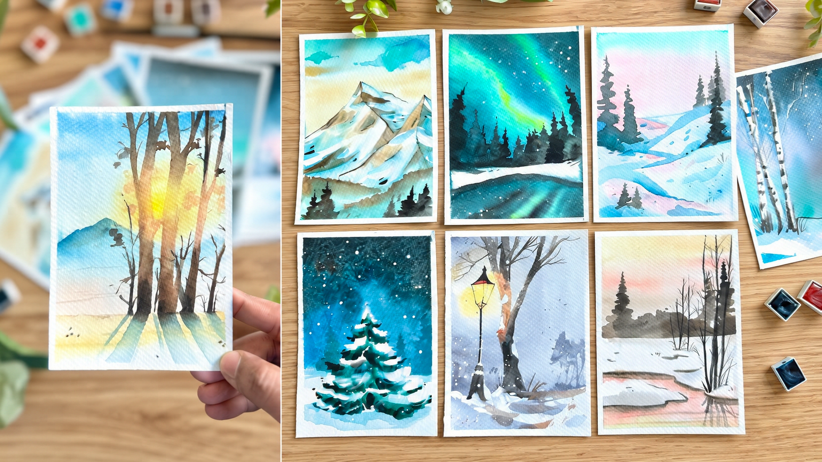
Winter watercolor. Over the next 25 days, we'll create 25 beautiful
winter inspired paintings, exploring watercolor
washers, blending, layering, textures, light and shadow through simple step
by step projects. Whether you're a complete
bigner or are looking to develop a regular
painting practice, this challenge is for you. Each painting is about
ten to 15 minutes long, so grab your pants, find a cozy little corner, and let's start with materials.
2. Materials: Let's talk materials. We're going to start
with the basics. We need our watercolor paper. I'm using 300 GSM. That is a size A five, so half of an A four sheet
and cold press paper. Next, we're going to
need a round brush. This is a size eight, so it's much bigger, and it's going to
be great for us to cover a lot of the areas. Next, we're going to
need a flat brush. This is a big size, size eight. It doesn't matter which brand. It's just for us to lay
the water onto the sheet. And then we need
a thinner brush. This is a round brush.
It's a size zero or one. All the materials are
mentioned in the descriptions, you can kind of have a look
if you miss out on anything. Now for the watercolor,
my recommendation is woodland by Art philosophy because that's the set
I'm going to be using. I'm also going to
be sharing a color mixing chart with all
of the information. If you don't have the set, you can mix your own colors. Going to need a masking tape, as well as white gouache. This is going to be
so great for all of those beautiful snowflakes that creaminess we're going to
add in the snowy areas. I like to keep a head dryer or a craft dryer on hand just
to speed up the process. G to need a bowl
of water, pencils, and a couple of the other
basics like a scale, scissors, and so on. Now, get all your
materials ready, and then we're
going to start with our color mixing chart.
3. Color Mixing Chart: Let's talk about
our color mixing. Most of the colors are
available with you, whether you're a bigner or you have the set that I'm using, that is the Woodland set. I'm going to give you the
name in the set as well as the official name in other
brands. So you have that. So in Art philosophy in the Woodland set, this
is called daylight. It's basically a bright,
beautiful yellow. So in other brands, you
can use cadmium yellow. It's a very nice, rich color that is going to be
perfect for our sunrise. The next color we're using in Art philosophy is
called Sandrich. It's a warm brown color. And you can see how
we're using it, especially along the ground and some of the mountain areas. To mix this color, we're
going to be using raw umber mixed with cadmium yellow. Just keep making a little bit of a mix until you get
the right proportions. Mostly it's a lot more of the raw umber and a
little bit of the cadmium yellow for this very nice color. Next, we're going to be using
bear in the woodland set, also known as burnt umber. Since winter has
a lot of browns, we're going to be using
different shades. So we have red wood
in Art philosophy, also known as burnt sienna. As you guys know,
if you're using the Art philosophy sets, they have their own
names for the colors, which is why I'm correlating. And if you're a bign
and you just don't want to get involved
with the color mixing, you can just get the set,
and it's a lot more easier. And I decided to do this
because I get a lot of questions from people asking
me, What material yield? What palette? What palette? And so I just decided to make
the whole process easier. But all of this is available
in all other sets as well. Next, we're using
Greystone in Woodland, also known as Ivory Black. We're now moving into our blues. So this is pont, also known as VerdianGreen. Now, make sure that
you add a lot of water to the mix because
if you add less water, it could look more green. But the more water you add, it becomes more transparent
and gives you that beautiful, rich, bluish green color. And we're going to be using
it, especially for areas like this to give you that
northern light sky. The next color we're using is stream blue in
the woodland set, also known as Prussian blue. This is going to be great,
especially for our skies. As you can see,
this color is quite rich if you use it
directly from the tube. So add in a lot of water to lighten it up
for our painting. The next color is called
mist in the woodland set, and it's actually
a mixture or a mix of our Prussian blue and Vidian. So it's a blue, green color. And we're going to be
using it for our skies, some of our other areas. It's a very pretty color. Please note the color
chart is available in the project section, as well as in the A sections, you can download
it and keep it as your reference for
this challenge. The next color we're
using is basically a mix of mist and greystone. So it's a blue and black mix, also known as Indigo
in other brands. Indigo is such a useful color. We're going to be
using it for the sky. We're going to use it for all of the paintings that require
the midnight look. Now, in additional, we're going
to need our forest green. This is a basic green color. In the Art philosophy set, it's called Deep moss. Now, since it's winter, we don't need too
many other colors. We just need a brownish red, something that's really deep. And in the set, it's
called Foxberry. To mix your own, just use
scarlet with a little bit, just a little bit of black. I know mixing colors can
feel a little tricky, but it is very good practice. And honestly, it expands
your range of colors. It teaches you so much. So don't be afraid
of mixing colors. Start getting curious,
and I think I take the whole mixing process as something as I am creating.
I'm trying something new. I have experimented and found colors that I never
thought I could make, and it's always come
through experimenting. So just have fun with it and remember that
everything that you're doing just helps
you grow more and helps your skills grow more and makes the process
more enjoyable. Now we're going to
mix two colors, the blue and the red to
give us purple or violet. Now, I've tried the two
different blues that I had, the stream and the mist. You can use the indigo. You can use the
Prussian blue with our scarlet to get two different shades
of purple or violet. And we're going to be using
this for some of the skies. And just as that, we've
done with our color mixing. Keep your colors ready, and we can start with our first painting
from the challenge.
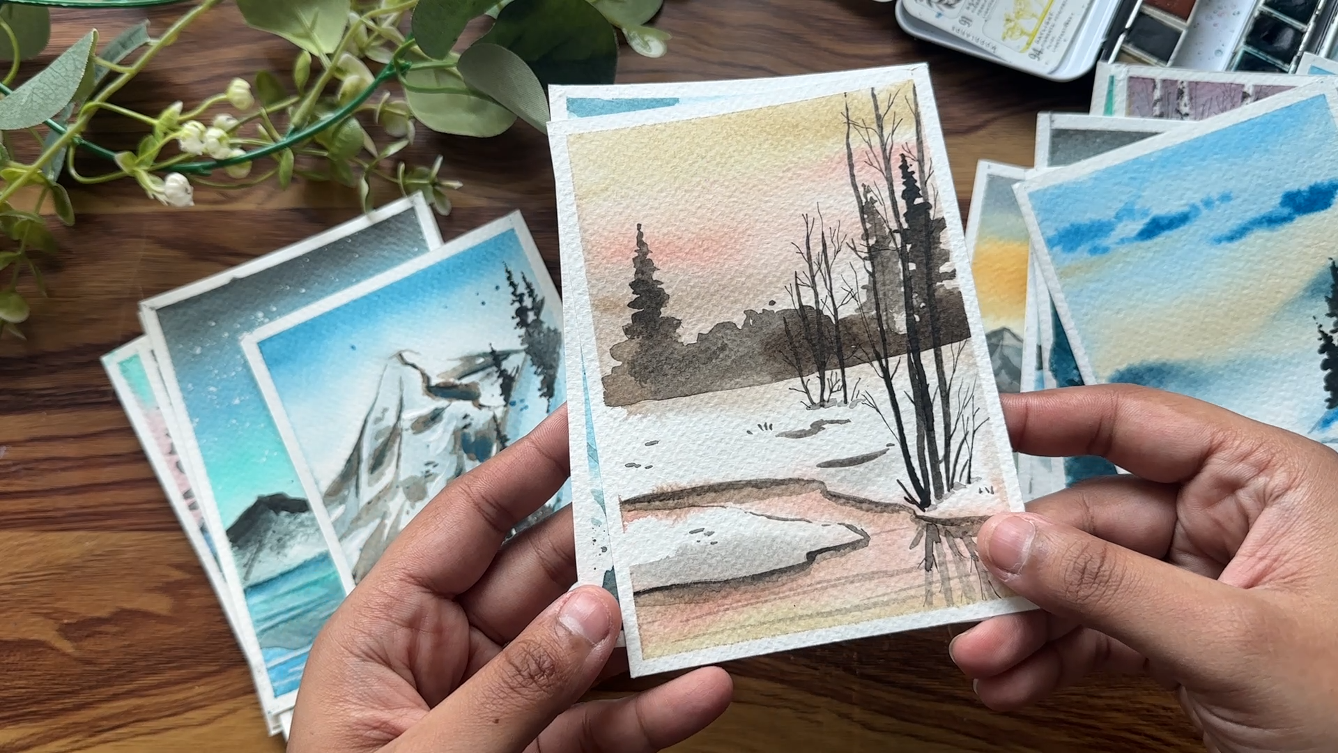
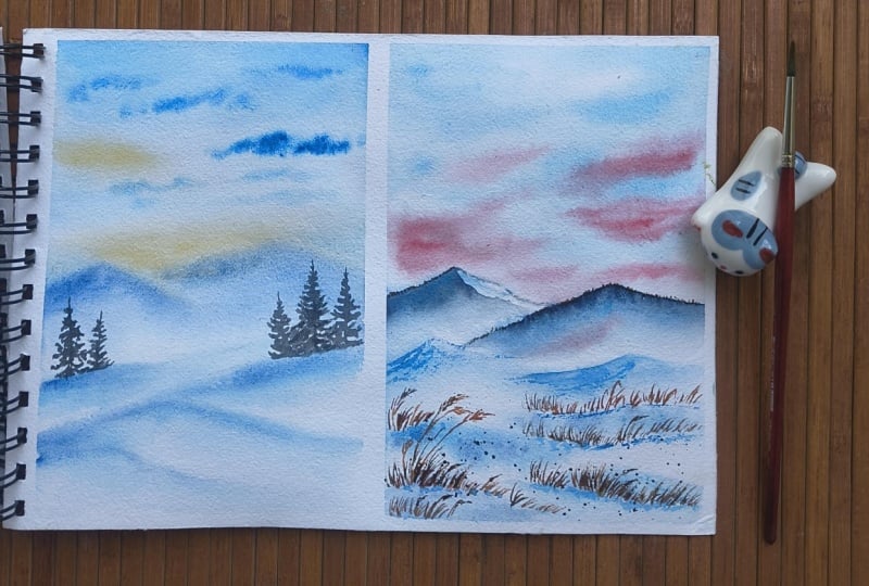
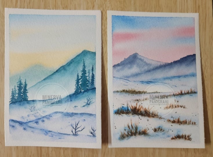
4. Day 1 The Quiet Mountains: Welcome to day one
of our challenge. I'm so excited. We're getting
started with a very simple project for
us to get more comfortable with our painting and just to enjoy the process. So using my pencil, I am adding little
hills for our painting. Keep the pencil lines
that you draw light. If it's very dark,
it's going to be seen through the watercolor.
So we want to avoid that. And let's add a couple of more
a little bit further away. Now, the next thing
we're going to do is add water through
the entire sheet. Make sure that you
cover all the edges. You can be very
generous at this point, and also go back and forth, so it really seeps
into the paper, and then you don't
have a puddle of paint or puddle of water. Now, I'm going to take are blue. And we're going to
start right at the top, adding in some quick lines. Make sure you go back and forth, so you again, cover the entire section and
don't leave any gaps. I find it harder sometimes
to use a flat brush because it to pick up the
color gets a little tricky. Sometimes you might pick the
color next to it from a pan. So you can switch to your round brush if you
find that more comfortable. You will see me alternating
brushes as we go along. And now I'm adding
a little bit of that blue at the
top of those hills. Just a little bit mixed in
with a little bit of water, so it's very subtle. Next, using warm brown sandig. We're just going to
go back and forth. Don't worry if you paint
on top of the mountains. It's part of the effect. You can see how I
kept that very soft. I didn't go back and
forth too many times, just a couple of lines,
and we're good to go. I've now switched to
my thinner brush, and I'm using the blue, the same blue we
use for the sky, but directly from the pan, making sure it's a darker
mix to add in some clouds. As we went through in
the practice exercises, clouds are very simple. Just keep in mind
the shape of it. Add smaller lines
as you move away. And if you can do the structure, it just looks so
natural and you're good to go. It's very easy. Now, I'm taking a little
bit of that blue and adding it to some of those hills. Now, with snow, it's very
hard to paint white. So how do you actually
show that something is snowy is by adding
reflection of it, adding blue to it, Mixing that up gives
you the snowy look. Now, I've mixed in
a little bit of the blue with black because
I want to go into indigo, and if you have indigo,
you can use it as it is. And I'm using that to add in some mountains
off in the distance. You can see how I've just
done the top portion. We're going to wash
our brush now. And what I'm going to do is add water and blend it out so
that it fades into the sheet. Make sure that you
wash your brush and do that with clean water. Now, we're at a point where everything kind of
looks a little messy. You can see a little idea of
where we're going with this. And so we're going
to let it dry. You can use a blow dryer
if that's more faster, or you can wait
if you'd like to. I like to speed up my process because I cannot wait
to see the results. Taking that indigo,
I'm just going to add some thin lines to show the little hills
that we drew out, giving it a little bit
more of an outline. But remember, I'm not
just doing a quick line. I'm adding little
spaces in between, adding some little dots to show that snow has
a little texture. It's not completely flat. And then we're going
to use a little bit of that indigo to add more
shadow into the painting. Let's mix a little
bit more digo. And we're going to
add in some trees. Like we practiced, very simple. It's all about the shape. Make sure that the top of the tree is just thin
and little dots. And all we want to
do is mush around our push so we get the
shape of the tree, a little triangle shape. Starting very small
at the top and then making it wider and
wider as you go down. The thing to note is that we want the trees to be
different levels. That's very important. I've
also clustered them up. So you have some on the
right, some on the left, and I've made sure that
they're not equally placed. So try to get two
trees closer together, one a little bit further away. So it looks more natural. This little tip can really
add so much to your painting. And keep that in mind
as we move forward, this is going to be something
that we keep repeating. As you keep painting, you're
going to find this just so natural that you almost
don't even think about it. I've gotten to a point because I paint a lot that
sometimes I forget these little tips
and tricks that I naturally follow, naturally do. And only when I'm teaching, I remember that, Oh, yeah, that's something I do. I add more trees to one side, I switch around the colors
or I do something different, and I kind of forget about
it while I'm painting. And my hope is
after the 25 days, you find that ease in painting, and you just enjoy the process. It's so fun to create
these artwork and just feel like you're
almost there watching it. As simple as that, we're done with our first painting
for the challenge. Quick, simple, and easy, and we've got this very stunning, peaceful
winter painting. I can't wait to see
you for day two. Let's continue on our journey of painting watercolor
landscapes. Winter edition. I
5. Day 2 Snowy Landscape: I Let's dive into another
simple project. We're building our skills and we're getting more
comfortable with watercolors and trying out
these snowy paintings. Now, I'm starting off with
just adding in some lines. I'm doing the little mountains, those little snowy sections. And once we have
just a general idea, we can start by adding our water generously
onto the paper, making sure you go
back and forth and cover all the areas. A Now, let's start with our combination of blue mixed in
with a little bit of ardiant green for this very interesting
blue green color. And we're just starting
right on top with our big brush so we can
really fill up the space. Next, I'm taking in our scarlet mixed in
with a little bit of ivory black for a more
warmer, deeper red. And we're just doing some
quick lines with it, keeping your wrist
very light and soft. Now we move on to
the other sections. And we're going
to keep it really simple by adding a
little bit of red, just a little bit,
just a bit of color. A little variation
in the wash makes the sky feel so much more alive. We're now moving on
to our smaller brush, and we're going to take a
little bit of our blue, and we're just going to add in some details for the
snow a little shadow. Since we can't paint white snow, we usually add a little bit of blue to show that it is snowy. And if you can add in
those little dots, it gives the effect that there's a little
bit more texture, and it's not like the
snow is just flat. It's fluffy. Let the snowy areas breathe. Sometimes the most
beautiful details are the ones that
we leave untouched. So keeping those white spaces in between are so important. Now, once it's done,
we're gonna let this dry. And then we can come along
and just add in more details. Our painting is now dry. So let's take indigo. We're gonna take our indigo, and we're going to first work on our mountains that
are off in the distance. And you can see how
I use my brush. I actually keep it flat so I
can really cover more area. And I'm making sure the line has a little bit of wave to it. It's not completely flat, which makes it look
like the mountains off in the distance maybe
have some trees growing. They're not just rocks. Such a simple way to
create that look. I'm using clear water
and just blending out the rest because I don't
want it to be really dark, want it to be really soft, so it just matches
what we're painting. Let's repeat the same
thing on the other side. This is such a great project for today because we're just
getting ourself warmed up. This is going to be
such a fun challenge, and we wanted to start a
little bit slowly creating these beautiful
landscapes so that when we get to our day 25, we have all the skills to
create unique paintings. Using more indigo, let's
add in some lines, little dots for the snow. Time to add in quick
lines, quick grass. And for this, we're
using burnt umber because it has a nice
reddish tone to it. We're going to use
our thin brush, and we're going to
add in some lines. When you go further
away from the bottom, these lines are going
to be smaller and shorter because they're
often the distance. And the ones that are closer
to us are going to be longer and bigger
have more detail. This is a quick way to create
distance in your painting. So we can see how I'm just
adding these brown grass. And it's such a nice contrast to our painting because
you have the blue, the pink, the indigo, and then you have this
brown that just looks so different that your mind
automatically focuses on it. And when you think
like an artist, you want to have one or two
focal elements in a painting. Generally, I prefer having
one that the viewer or anyone looking at it
can just focus on. Everything else is there. They add to the focus, but the main element
just stands out. And that's the key to creating a very interesting painting. You can see how I've added a couple of them here and there, just bunching them up
into different sections. Sometimes those
unexpected little marks are the ones that make the
painting very special. And they look more
natural as well in a world of AI where
everything is so perfect. Being a little bit
imperfect with these adds to your painting. Now for the ones closer to us, I just wanted to add a
little bit more details. You can see how I'm just
adding some dots to the end of the grass for the
little details. You can even switch
over the brown. Now that we have a lot
of the burnt umber, you can even take
a little bit more of the darker brown
color that we have, maybe raw umber or burnt sienna, even a little bit of black. So we want to mix them along because that looks
more natural, as well. Now using a spare sheet, I'm just going to
protect the sky. Placing the paper, and
then I'm going to add in some splatters for
the snowy areas. By the way, that's a nice
testing sheet that I had tried. The painting did
not come out great, and I was very unhappy with it. So I ended up removing it out
from the 25 day challenge. And you can see those little splatters that we
just added with the brown adds to the painting its little
flicks of color. And there you go. You can let the painting rest for a bit. And then remove out your tape to reveal
your final painting. This is day two.
6. Day 3 Golden Winter Light: Ready for our 15
minute painting today. So we're starting with our page taped down on all four sides, and we're going to
start by adding in some pencil details. So we have an idea of
where everything goes. I added in a little mountain, two of them just at the back as a background
to our painting. And the focus here is
going to be the lake. So I'm doing a
jagged edged lake. You can see it a little bit more clearly as I get into painting. We just want something
really rough for us to get started. And now we can
continue with adding our clear water through
the entire sheet, making sure that it's
prepped and ready for us to start with our sky
and other details. Make sure that you
go back and forth, covering all the
edges of the sheet. This is so important. And I know a lot of
people miss that, and then you end up with
something that's really messy. Now, I want you to
try something new. This is very random. I had a spray bottle of water, and I decided that
maybe it would be faster if I just
sprayed my sheet and then move that around
and worked pretty good. Honestly, I did make
the process faster, but it's just something fun to try since I had
it right with me. Now that we've made sure that
the entire sheet is ready, we can start with our painting. Now, we're going to start with our yellow brown right
next to the sun. So we're doing a little circle. And then we're just
going to go around it because we want to blend it. Now we can go ahead with
our cadmium yellow, our bright yellow color, and add more of that, so this entire thing becomes
a lot more brighter. Now, from there, I'm going
to add in quick lines. So it looks like it's in
the horizon just fading. You can go ahead a little bit to fix it and more
yellow if you need to. Let's use burnt sienna
to continue on. Burn Siena has this
orange tinge to it, and so that's going to work
really well for our sky. Gently blend it out. Next, we're going to take a mix of blue and red for our purple, and we're going to use that
for the top of the sky. So here's a fun little
mistake that I did. I actually added in the red, and I forgot to mix it in. So I just placed the blue on top of it and
mixed it on the sheet. It's a complete no, no. But it happened and
I just continued. I think that is something
that I really want you to get comfortable with
is if you make a mistake, if something goes
wrong, don't worry. Just continue what you're doing, and you will see the results. At the end of it, unless I
hadn't mentioned it to you, you wouldn't even
know that I made that mistake because it doesn't show in the
final painting, it looks like it
was very planned. So keep that in mind when you get into your painting and just remember that we're having
fun with the process, we're enjoying, and we're just letting ourself be creative. So I've added in the yellow in a line right below the sun. This is going to be the
reflection on the water. And that's why we're
adding more of the yellow. We're going to extend it a little bit to the sides as well. Let's continue on.
We're going to use our burnt sienna
or redwood along the sides of the lake
right next to the sun. Now, this time, remember, I'm keeping the white
areas that I had left and just
painting around them. I know it looks a
little messy right now, but trust the process,
it's going to look great. We can add a little bit of
that to the sky, as well, because remember
that the painting dries a little lighter when
it comes to watercolors. So it's nice to add in
a couple of layers of colors because it will
brighten up the artwork. Just quick flicks of your
wrist and you're good to go. We don't need to do too much. Now, we're going back
to our purple mix, which was a blue and a red mix. Mixing our scarlet and
Prussian blue together. And what I'm going to
do is with this color, I'm going to just
paint the lake. This time, I'm getting
a little bit closer, and you can see how from
the edge I'm just dragging out some quick lines
to the middle. We can do this on the
right and the left side. I Time to let everything dry, and then we can move
on to the next step. Once it's dry, you can see
what we're looking at. I'm using gouache white to
paint the center of the sun. Sometimes when the
sun is so bright, you don't even get to see it. It's just white. And so
we're creating that effect. And then we're going to use
the white to maybe add in some lines of reflection
onto the lake. Now comes the interesting part. We're going to use blue, or Prussian blue mixed
in with a lot of water, so it's very soft and subtle, and we're going to add in
some dimension to our snow, make it look more realistic. So I started off with adding
in a line at the top, as well as along the
bottom of the section. You can add in a couple of dots to show that
it's little textured. That looks really great. Let's use this
color for shadows. So we're going to
add a shadow for the little stone that
we have on the side. We're going to use it
also for the mountains. For the mountains to keep it
in theme of our painting, we're going to mix in
gray with a little bit of water and just
paint the mountain. Now we're going to move on and add more shadow to our painting. This time I mixed a little
bit of black to the blue, so basically using indigo. And now I'm just adding
a little shadow for the land sections
all the way through. And this, you can
see, makes it look a little bit more realistic. It just brings it together. Let's deepen the area right below the mountains to
create more contrast. Time to use black, and we're just going
to add more shadow. We can also add in some
lines to the water to show the ripples of the water to make it look more realistic. Especially in a lake water
sometimes is stagnant, but here we also wanted to
have a little bit of movement. It doesn't have to be too much, just enough to show that
it's suddenly moving, maybe with the breeze,
maybe with the wind. You can add a little
bit of a black line to your hill, the sections. I mean, technically,
they're not hills. They're just land. It's so interesting
as an artist, as I continue painting, I have to remember or research terms of things that I learned when
I was in school. So I do know what
they're called, but I kind of forget
it when I'm teaching them or when I'm
sharing information, and I'm like, What is it called? The other day, I forgot
what a plateau is, and I was just
thinking about it. I couldn't remember what it was. So yeah, it's interesting. So art also, I think, inspires you to learn more to
know what you're painting. Interestingly. So
for the mountain, I wanted to give it
a little texture because I felt like
it was so flat. And all I did is these
kind of cut lines, and you can see how I did that. It's just dragging
them on either side. And that was enough.
Like, so you can do any sort of texture, and it would look great. It would make it look realistic. Now for the sun, I want to add a little shadow to it because the white
disappears into the paper. So using our light brown
raw umber with yellow, which is caring a thin
line around the sun. And we have a golden
yellow winter landscape. Let everything dry, and
then you can remove out your tape to reveal
your final painting.
7. Day 4 Quiet River: Welcome to a new project. Imagine a quiet river reflecting the colors
of the winter sky. We're trying not to create
every little detail. We're capturing the
feeling of the scene. Get your indigo
ready if you have it or mix your own as per the color mixing video or refer to the PDF that's
in the above section. Now, we can start
with our pencil, we're just going to
draw out our river. We're going to draw a little
bit of the landscape. So we have an idea before
we get into our painting. I'm adding a little bit
of a way for the river, so it's not just flat. It gives the painting
a little movement. Next, we're going to add some
clear water and make sure that the entire paper
is prepped and ready. We're going to start right from the top using black,
going back and forth. Then we're moving on to indigo. We're going to go
over this layer a couple of times because
we wanted to be really dark because we are trying to capture the midnight starry sky. Now we move on to our blue, continuing our sky,
adding the layers gently. We then move on to a little bit of brown for the bottom part. So we have four
layers of colors. We have our brown, blue, indigo, and black, and we're repeating the same for the river since it's a
reflection of the sky. It's okay if it seeps into the sides because we are going to paint in snow
and snow has reflection, so it's okay if you
have a little bit of that blue coming along. Now, while the
paper is still wet, we're going to add a
couple of more details, add a little bit of that
indigo to the snow, give it a little texture. You can see how I
keep this very light by adding a lot of water, so it's not a dark layer. It's very soft and almost
blends into the paper. You can use a little bit
of the blue, as well. Just for some shadows. Let's wait a couple of seconds
and we can go ahead and add in another layer
of color for the sky. As I mentioned, it is going to become lighter when it dries, so we want it to be really dark. So taking your paint
directly from the pan, so it's rich and bright
works really well. And once it's done,
we're going to use our craft dryer to
dry your piece, let it rest before moving on. Now that the painting is dry, let's go ahead and add details. So we're going to
use our indigo, and we're going to
add in some mountains that are off in the distance, so we can mix in a little
bit of water to this, so it's a little bit lighter. We're going to add
some shadow for the river because right now
they all look the same. So we're trying to separate
the different elements. I'm especially adding
in shadow right below the river sections
that are downwards. You can have a look at
what I'm talking about. Just making those areas
a little bit darker. I'm going to go ahead
and make the shadow areas a little darker
by adding more black. And then we're going to let the entire painting rest before moving on to our main details. A We're going to switch to Athena brush, and we're taking black
directly from the pan. I'm going to start by
adding in some details. The first thing I'm doing
is just going around the snow bed and
adding little notches. You can see how I'm doing this. And this makes it look like
it's not a perfect bed. There's a little detail,
a little texture. It looks more natural. Continue doing these
little outlines with these little black spots. Remember to add in
some little dots along the snow bed
for some texture. Winter snow has such
a beautiful quality. We're gonna love the colors to blend in and just
do their thing. Small little details
goes a long way. So after we finish this part, we're going to add in some
trees off in the distance, and that contrast
is really going to help our painting just pop. So what's interesting is 'cause I live in a tropical region, we don't actually
experience snow. We usually just have
a very cold winter, which is like 18 degrees, which is really not that cold. So the only time I've gotten to see snow is when it's
been very far away, either through pictures
or if I've seen mountains off in the
distance that have snow. I haven't actually had
a chance to see snow up in person in
as I've grown up, like, as an adult. I've seen it as a child,
but I have no memory of it because we did
live in Canada for, I think, a year or two, but I was really, really small. I do have pictures of
me playing with snow, but again, no memories of them. So it's really been
on my list to visit a snow country and
actually experience that. Unfortunately, every
time I've traveled to a place that is
supposed to be snowing, it's never snowing
the time I arrive. I think I bring a little bit of summer to the place because
it's always like yeah, we're going to give you
a good pleasant weather, no snow, no cold breeze. So it's been very interesting. But hopefully, now that
I've painted this, it might become a reality, and I might actually get to see snow and play with it and
experience all of this. You can see how very simply I added in some trees
off in the distance, added in some little splatters, and now we're going to
take white gouache, and we're just going to add some very thin lines
for our river. Maybe add in some little
splatters for the sky to give it a starry look you can
see how this painting, there's a lot of breathing space between the different elements. I made sure that there
are trees just on the two sides instead of it crowding up the entire painting. You can go ahead and use
your brush to add in some more clear
circles for the stars. So while some of them are
just little splatters, these ones are
really going to pop. Adding in little
lines for the river. And just like that, we're
done with our painting. I like how this turned out, and it's our first
midnight winter painting. And
8. Day 5 Midnight Magic: After our first successful
midnight Sky painting, we have to do another one. This is my favorite. Love the colors, love
how it turned out. It's so simple to do, and I think this is
such a great break from what we've been doing,
what we've been creating. So just a little nice
simple project for you to keep continuing the challenge and keeping yourself interested. And now we're starting
off with black. I just wanted to
mix a little bit, keep it ready before we begin. You can mix the black with a little bit of
blue for an indigo. And we want to have
this color rich ready. So when we get into our
painting, we can just start. The first thing we're going
to do is make sure we use clear water and just paint
out the entire sheet. Make sure there's enough water, so it's seeps in and it's prepped for our wet
on wet technique. The wet on wet
technique is basically adding wet paint to an
already wet surface. Here, we're just
using clear water, and then we're going to add in another layer of wet paint, and this merges in beautifully. Especially if you want to
get those really nice skies that just blend in. Having a wet sheet of
paper works really well. I'm taking in my indigo. This is why I had it pre mixed, and we're going to
start right at the top, and I'm just going to add
in this beautiful color. You can add in a little
bit more of black, especially at the top edge because we want it
to be really dark. The darker you get on top, the better it looks
because we're going to add in some white splatters. And if it's not as dark, the white splatters
don't show up as much. So I've mixed in a
little bit of my blue. I'm mixing in a little bit of different shades of
blue while I'm at it, but making sure that the top
of my sky is bold black. Now, just to create
a little colour, because we don't want the
whole thing to be blue. I'm adding a little
bit of our scarlet. Just very light, added
in a lot of water, mixed in a lot of water. So it's just very soft and subtle to give that
little pop of color. Now that I've done the sky, we can move on to
the land part of it. For the land, I'm
adding a little bit of blue, adding some sections, few lines, making sure
that it's soft and light, that it's not too dark, but this is the
shadow for the snow. Add in more black,
make sure that the top part of the
sky is really dark, and then we're going
to let it rest before moving on to adding our details. I love how bright
and bold this is, but once it dries, it does fade out a little bit, and that can be a
little disappointing, which is why I make sure that the first layers
are really dark. Now we're going to
go in and add in some details, some trees. To finish up our painting. This one is such a quick one, but I think it's so nice, especially after a busy day
to just rest, take ten, 15 minutes, paint something that makes you smile
and then go about. And that's the whole point
of this challenge is to make the process
of painting more fun and more relaxing and a little small escape
into your creativity. Now, what I've done is
I've added a couple of lines for the land, made it a little more textured, and then I'm going
ahead with my black, and I'm just painting the top of the sky again because I
really wanted to be deep. Notice how I'm not doing
this as straight lines. I'm actually going a little
bit more of a squish swishing my brush around
in little circles. And this makes it a little
bit more, I would say, textured instead of just
being a very nice clean sky. Once you have that,
you're going to take clear water and you're
just going to blend it the remaining way cause we don't want it to go all
the way to the bottom. You're just getting
a little bit of that sky darker in color. I Now, we're going
to let this rest, and we're going to continue
on with our journey. We're going to add
in some trees. The trees stand tall. And everything else just
feels a little slower, a little bit more
magical because of them. So they're the perfect
add on to your painting. And you can see how we've used a very soft color by adding
a little bit of water so that it really fades
into the background and you can also see
the sky through it. Remember to vary the heights
of the trees, some small, some big, cluster them together. Great. So we've
filled up the space. We're going to let this dry, and then we're going
to move on, and this is going to
be our last layer. We're just going to make
the trees another set of trees darker and this is going to make our entire painting pop. So let's take our indigo directly from the pan or
tube if you're using that. And then we're going
to go ahead and add in some shorter trees. For this one, I want to go a little bit more detail with the tree so
you can really see the details of how
it's done versus the first layer where it was just trying to get
the shape of it. Here I'm paying a little bit
more attention to the shape. You can see how that looks, and that color just makes
everything look better. It creates contrast. Continue on For the last step,
we're going to add snow for the entire painting. We're going to just
take white gouache and gently splatter it through
the entire painting. So it looks like it's
snowy and we're looking at this landscape
through that lens. Let everything rest and
then we're going to just remove our tape to reveal
our final painting. I think for all of the
paintings, this one, especially removing out the tape really makes the painting complete because it gives it a nice edge through
the entire piece. And there you go. I
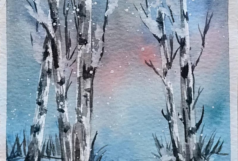
9. Day 6 White Oak Trees: This is definitely
a fun project. I'm so excited about this one. We're going to start
by drawing out our landscape and we've
got the line for us. And then once that's done, we're going to use
our masking tape. And all we're going
to do is add in some thin lines for the trees. First, we're going to
take our masking tape and cut it to the length
of the trees we need. Once that's done, we're going to take our masking tape and
cut it into smaller pieces, smaller areas for our
various tree trunks. It's a little bit of a DIY
craft part of this painting, but it's going to give
us such pretty results that I wish I had done
this long before. So I like how this is looking, and we're going to add a
couple of more of these. We can plan them out a
few of the trees closer, few a little bit further away, trying to make sure that it's all natural and looks nice and makes the
painting come together. You can even have one
on top of another one. Like it's criss crossing. Because, you know,
trees don't really grow parallel to each other. A lot of them just grow any
direction they want to. I think that's so
funny when I think about what we paint
and what we think of, especially for a perfectionist. It's so natural to want to
keep everything equidistant. And that's not nature. The leaves go here and there, the trees go here and there,
the landscape changes. It looks beautiful from far, but when you go close
up, it's not perfect. But when you go
closer, it's perfect. So I feel like as an artist, you need to be able to
step away a little bit and enjoy the creation, the final goal, the final
look of a painting. And these little
habits that we're creating is going to
be just for that. I think each project
at this point is maybe ten to 15 minutes long, and I wanted to keep it
bite sized so that it's something that you
can just do in a day. It doesn't take
away too much time, but you still create
something really amazing. So I'm using clear water and I'm just going over the entire area. What happens is because
I've added tape, those sections are going to
remain white for our tree. This time, I decided to mix in a purple. So we have blue and
red to give us purple, and we're going to use that
right on top for the sky. Instead of going horizontal, let's go vertical for this one. A Next, we can take our red, and we can go a little bit up, again, keeping our
brush vertical. And now I changed
the color of my sky. So initially, I thought
of doing purple and red, and then I decided
I want to do blue, pink, and a lighter blue. So I just painted on top of it. Now, because my first
layer was so light, I could paint on top of it without ruining my
painting completely. And this is a quick thing, quick tip for you to start with your watercolors
to keep your layers light. So I just I'm painting over it. And if you have your purple
and it was very dark, it's okay. It's going
to look amazing. Either way, you can choose any color combination
for this one. I just decided to
shift it because I felt like my purple
looked really dull. But again, no mistakes. The painting is
still going to look amazing once you're done. So I'm going to take
my aridian blue green, and I'm going to
go from down and gently add in some
lines going upward, making sure that I leave that
pink section in the middle. Using a little bit of indigo, we're going to add some
details to the snow. So adding some quick lines, especially below the trees to make it look more realistic. Like there's shadow there. A few more lines. So that
snow doesn't look fake. If you look at snow,
it has a little bit of texture because obviously
it's up and down. It's not just perfectly
flat out straight. So which is why we're going to add a little texture to it. I'm going back to the sky, and I want to make
it even more darker because I feel like it's
so subtle and light, and when it dries, it's going
to get even more lighter. So I'm going in
with black and then just adding in more depth. Now, let's use a blow dryer and dry out the entire painting. And once you move that, you let it dry. We're going to just remove out our tape and you can see
how the trees are looking. The barks look so amazing. Great. Now that that's done, we're going to take
a little bit of black and add a couple of dots on either side of the bark. You can see how I'm doing that. Just a little bit
on either side. Now you can add in some
branches on either side. And we're going
to continue doing this for the rest of our trees. Now, before moving forward, I'm going to just wash my brush, dry it completely,
and with a dry brush. I'm going to drag a
little bit of that paint. And because it's a dry brush, you can see how
when I drag it out, it's not a flat color. There's a little texture to it. Also looks like our tree
isn't just a white tree. It has a little
texture. It's real. We're going to
repeat this process for the remaining. Great. Now that we've done, we can add a little black to
the base of our hilly areas. We're going to add some
grass closer to the trees. I Don't forget to use your dry brush to
scrape at the paint so that it just creates a
very interesting texture. If a little bit of
the paint spreads, that's okay. It happens. We just want a little bit
of that scraped texture. I'm going to switch my
brush for a black pin, and this is going to be much
more easier to work with. We're going to add
in more branches for our trees and we're making sure that there's
quite a few of them. A little tip here if you
haven't started drawing this already is to make sure that the ones
that are further back, like the one we just did
have smaller branches, whereas the one that
we're working on that's in front of us,
that's closer to us. Those can have more detail. You can add a lot more branches because they're in front of us, we can see it, right? If you think about a
photograph of a snowy section. Basically, what would happen. So keep that in mind when
you're adding in your lines. I Now, using acrylic white, we're just going to add
a couple of lines right below the trees,
maybe some dots. Now using white, we can
add in some snowy parts. Like snow has fallen over
a couple of branches, and that looks I just
elevates the painting, adds more to the snowy effect. Time to add on some splatters, and we're done
with our painting. You can remove the tape to reveal our final
painting for today. Can't wait to see it tomorrow.
 Femvisionary / Madhu S, Watercolor Artist and Instructor