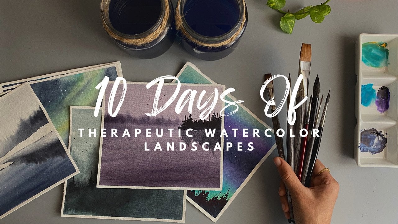
Transcripts
1. Introduction !: Monsoon season has begun. After months of dry
and hot summer. It is a delight to finally
hear that come off the style. The sound of the cold stream, quickly followed
by the rain fall. I love to read. Slowly and uniformly. Falling rain droplets. Those are just
simply a delight to a drought soul with
the chains to season. My colors on my palette
have changed to, to get you guys in the
mode of the mountains. I'm starting this 30 days of Moody mountain
landscape challenge. For the next 30 days
starting today, we're going to paint
one moody landscapes. I have given a special
interest in choosing colors. So there'll be a lot of
data and very moody colors, which I'm very excited about. All the class projects
perfect for a big now, as well as an advantage. If you're a beginner. Don't worry, Jining, I'm
gonna idea step-by-step. Hello. I'm so Krita, watercolor
artist and Skillshare teacher. I also have an Instagram
account where I post a lot of my paintings
and experiments. You can follow me there
if you're interested. This is my first
30-day challenge. So without further ado,
let's get started.
2. Art Supplies : Let's discuss that supplies
that we're going to need. I'm going to start
with the papers. Have used Fabriano, a 100%
cotton, 300 GSM papers. These are artists grade papers, and I'm sure you guys
have seen me use these papers for almost
all of my classes. I love the texture
of these papers and the paper stays
wet for a long time. So I can use my most favorite
technique, wet-on-wet. So yeah, these are perfect
papers, in my opinion. But if you don't have Fabriano, you can use any
100% cotton paper and make sure it's 3300 GSM. I'm very picky when
it comes to brushes. So I don't have a lot of them. For this particular class. I'm only using three. So this is a syllable, silver. What about hockey brush? So I use this one
to wet the paper. That's actually the first
step of a painting. To wet the paper, you don't
have to have a hockey brush. Any bigger sized brushes, fine. So this is silver black
velvet number 14 brush. I think 70 per cent
of my paintings are done using this brush. And last one is
silver black velvet. Number six. The remaining
30%, that is details. Dan using this brush. Don't have to have exact brand. But make sure you're using the brushes that are
similar to this size. Especially the last
brush that is details, that the brush that I used
to paint the details, make sure you have
one small brush so it'll be easier for
you to paint the details. Coming to the colors. I will only discuss about
the brands that I've used. Not about the shades because
I'm going to discuss the shades before painting
each class projects. Because I have used a lot of
colors for 30 landscapes. So there are only three
brands that I've used. Saturnalia, white knight,
and Daniel Smith. You can use any of the brands, make sure the
shapes are similar. I have used this acrylic
board to tape my paper on. And I have used a lot of tissue papers since
we're gonna be using wet-on-wet
technique a lot, make sure you have tissue
study and a masking tape. Of course. Finally, a pallet and a water jar. Assemble all of these
things on your table. Let's get started with
the first-class project.
3. Class Project 1 Misty Green Lake: Welcome to first-class
project style. Discuss about the colors later, I'm going to tell
you a little bit about this particular
class project. This is the main color that we're going to use to
paint this class project. You can say this
landscape is monochrome, but we're going to use a lot of values from the same shade. So I have mixed two
colors to get this color. Centralia, forest
green, and indigo, which are already
there on my palette. And I'm going to swatch this
color out for you guys, so it'll be easier for you
to find the right shade. Like I said, this green color. The forest green color
is from a Sennelier, and indigo is from white knight. Used both these colors equally, that is 5050 to get this shared. And I have mentioned about
the values previously. So if you add more
paint and less water, you will get the darker color. And if you add less
paint and more water, you will get lighter
shade of the color. I think every one of us
is having indigo color. And if you don't
have forest green, you can use any darker
shade of green color. That is it for today's
color palette. I'm going to get started
with the class project. Let me get started with adding clean water using hockey brush. There are a lot of layers
that we're going to have to add while the
paper is still wet. So we're cluster with me. This is the first layer, and this is also a very lighter
shade of a color as well. So take more water
and less paint. So make sure to keep the top and bottom part of the paper a
little whiter than the middle. Because I'm trying
to portray there are misty mountains in the middle and the sky is lighter shade. Now, take just a little
bit darker color than the previous shared. And while the paper
is still wet, add a few mountains structures,
mountain-like structure. If your paper is wet, Of course this is going to
dissolve into the background. I mean, you won't get the shape. And that's okay if you don't get the detailed shape
of the mountain because we are painting a
misty landscape anyway. I'll take a little
bit darker shade than these mountains
in the background. And let's paint the trees
in the background and the reflections in
your paper has to be wet to paint all these
mountains and trees. So as you can see, I'm not also painting
reflection separately. I'm just painting
vertical lines. And later I'm going to take a damp brush and I'm going to remove a little bit
of paint in the middle. So that gives the illusion of subject and the
reflections automatically, you will see have clean my brush and remove the excess water from it
using this tissue paper, I'm going to just slightly draw a line between trees
and its reflection. So since the paper is done, it will absorb the paint. Can see how such a simple
action gave us the trees, as well as their reflections
without much effort. The subjects will be a little bit darker shade
than the reflection. So I'm going to just add, I'm going to just
paint a few trees using the darker green color. Remember my paper is still wet. And now the last step
is to add the repulse. Hi, I'm Ben. Blending
these hard edges of the ripples using a damp brush to make them look more obvious and not stand out. This is done. I'm going
to keep this for drying. And when the watercolor dries, it dries up very lightly. So don't, don't feel disappointed when all the colors turnout very light in color. So what happens with watercolor? My paper has dried up very quickly because it's
so hot in here. And now I'm going to take
the darkest color possible. I think I'm going
to take the indigo directly without mixing
the green color. And now I'm going to
move onto my next step. This is the share that
I'm gonna be using now. It's almost identical to the pure indigo color we have painted till now, is in the background. And also very misty. That's why we did not
go for any details. So now we are going to paint the foreground and it
will be how many details? So that's why I'm
using indigo color. The foreground will be a lot
darker than the background. In the background
we have painted the trees and the reflections, but we did not paint
them with details. So now I'm painting the same
trees and the reflections, but in a very detailed manner. I told you guys, I'll tell
you a little bit about this class project at the
beginning of this video. So we went to this
place a few months ago. It's a farm, but it's completely surrounded
by the forest. Had just stopped raining on that day when we went to explore the farm and I found this biggest lake In-between
the forest and the form. We had taken a lot of pictures. And what I saw on that day was very similar to what
I'm painting today. Today I'm very happy to paint
the scene that I have that my mind had captured.
Back to painting. So I'm just gonna
use a wet brush to, to clear off those hard edges. I wanted just to look softer because we're
going to have to paint the exact same reflections
for this trees. So I'm intentionally
leaving the little bit of whitespace in between the trees. So now I can paint
the reflections. And very smart tip, I can give our painting
the reflection says make sure the reflections look exactly similar to the subjects, including the shape
and size of the trees. In this particular case. Previously, we have painted the trace and the
reflections in wet-on-wet. In this case, we are painting the reflections in
wet on dry technique. It is possible for
the pain to seep into that white space. It's okay. Occasionally just
use a damp brush to clear off the whitespace. If that does not work, we can use tissue paper later. I'm gonna show you
in the later steps. I'm going to continue to
add the trees in the, in the upper part
in a subject area. And later I'm going to paint the exact same one in the
reflection area as well. Now take a tissue
paper and remove a little bit of paint between
trees and the reflections. I'm going to paint
the repulse now using my silver black
velvet number six brush, these ripples will
be wet on dry, just like the trees and the fraction that we have
painted just before. That is it for today's
class project? I hope you guys enjoyed painting this with
me and I'm going to be looking forward
to painting with you guys for the next 29 days. I just loved this
moody landscapes, if you can't tell at my
Instagram page is full of them. By the end of this
30-day challenge, I hope you guys love moody
landscapes as much as I do. Okay, See you tomorrow with
a brand new class project. Thank you for watching.
4. Class Project 2 Winter Break: Hey guys, Welcome to
Class Project Two. We're gonna go on a
winter break and paint these two beautiful
winter cabins. Gonna get started with
the sketching fast. So there's not a lot of complicated sketch for
this class project. There are just two cabins
that we're going to draw. So this is a bigger
cabin and for some reason it took me forever
to get this part right. Now I'm going to move on to
sketching the smaller cabin. The roofs of these cabins
will have to remain white because this is a winter landscape and
then there'll be snow. So I'm using a different
technique to cover up the rules. Instead of using masking fluid, I'm going to use masking tape. So the masking fluid that I have is actually not very good. So I always use masking tape instead
of the masking fluid. So what happens is whenever
I apply it to the paper, the paper gets dried up and it won't absorb the paint later. Maybe I have gotten a damaged
piece or I don't know. But a masking tape
works just fine for me. I'm cutting the masking tape to the size of the
roof on the cabin. And later I'm going to
just place the table that I'm going to do the same under
cabin on my left. It's a little smaller one. So I'm going to cut
the tape accordingly. Area below the cabins
should also be remained in white because
it's a snow covered areas. I'm going to be applying tape over there as well, you know, just to avoid any paint spills. Let's get started by
wetting the paper. Today's class project,
I'm gonna be using a mix of orange and white
knight indigo. And I get this dark
brick red color. Paint the background
with this color. Make sure you don't spill
any paint over these cabins. We're just letting
the paint flow very freely on a wet surface. So have fun with it. Do not be fixated
on the end result. To develop the habit of
losing control in watercolor. I think this is one
of the best exercises you can do in watercolor. I am adding indigo color just around the cabins to
give it that contrast effect. With minimal effort. Direct your paint in whichever direction that you
please make sure to keep that white color on the top as it is because we
need that contrast. Now while the paper
is still wet, I'm going to have
to add a couple of pine trees in the background. I'll be using indigo
color for that. And my silver black
velvet number small brush because these are the details. So you need to have a
smaller brush for that. As you know, this is wet-on-wet. There is, I think there is
70 per cent chance that these pine trees
will not be visible after the paint has
dried. But that's okay. Even even though
you won't see it, you will know that there are
trees over there because we are using a very
contrast color, indigo. Now I'm going to keep
this one for drying and I'll come back once
it's completely dried, do not use any
hairdryer because that will manipulate the
natural flow of the paint. As my paper has
completely dried up, I'm going to remove
this masking tape. And as you can see, the details of this pine
trees are not that visible, but you can clearly make out that is a bunch of trees
in the background. Using this brick red color. I'm going to paint the cabins. Both of them. Make sure the brick red color you
are using is just a little bit lighter than the
background indigo. You need to make out that there are cabins under foreground, as well as the trees
in the background. For that, you need a
little bit lighter color. Once that is done, I'm gonna be using indigo color to paint
a few pine trees. These are the pine
trees that are going to be visible at the end because the ones are in the background completely and these are in the foreground. So you need to add detail, the trees, at least
a few of them. Going to use my Cilla
Black or LET number 14 brush and I'm going
to read the paper. I mean, the snow-covered
area with clean water. At first letter, I'm going to add a few
random lines on the ground using dark brick red color. Now using indigo and my silver black velvet
number six brush, I'm going to paint a few
pine trees underground. And with the larger brush, I'm gonna just do not drag the paint down onto the ground. It gives such soft
and blended effect. And I do the same on
this side as well. Now I'm gonna be using white
watercolor to splatter some white paint because it is winter landscape after all. If you're having grayish
color, you can use that. But I figured not everybody is having a whitewash with them. I'm just using normal
white watercolor. Draw the outline of the cabin and dark side and
other side as well, because obviously
the snow will be falling on that side
of the roof as well. I just love splattering this white paint in a
contrast backgrounds. So I think I'm
going go over here. So I'm going to stop. Well, that's it for today's
very simple winter landscape. I hope you enjoyed painting
this landscape with me. I'm gonna see you guys tomorrow with a brand new class project. Thank you so much for watching.
5. Class Project 3 Raven Calls: Hey guys, welcome to
today's class project. I have planned a very
simple landscape for today. But first, let's see the colors. I have White Nights, indigo, and Centralia stacks and
purple colors with me. First, I'm going to swatch
the Indigo and purples, so you guys will know
which shade to pick. Now, mix these two colors
together, equal amounts, 5050, and you get this
dark purple shade. And with that, we're going to
paint our landscape today. We have started our colors. The next step is getting
started with the landscape. Read the paper with clean water, and I'm using my hockey brush. 70% of this landscape is to
be painted in wet-on-wet. Work faster with me. I'm going to mix
indigo and purple in larger amounts because
we're going to have to paint the whole
landscape with it. And I'm going to just see if the shade that I'm
mixed is correct or not. Later, I'm going to get started on painting the
top part of the paper. Keep in mind, we're
going to have to turn this board
upside down later. The paper is already wet, so you don't have to
do much work here. Just put the paint
down and let it flow in whichever
direction it wants. I'm removing all the paint from the brush. I
have cleaned it. And now with a damp brush, I'm just directing the
paint not to let it spread. Turn the board upside down. Now comes the interesting part. We're going to keep manipulating the paint on this wet paper. Like I said, work
faster because you don't want the paper to dry up. Now I'm putting a little
bit of paint on the top. It's supposed to be sky. And it's supposed
to be like this. Without much details. I'm painting the trees, wet-on-wet data in
the background. So you don't have to
paint a detailed tree. I paper has started to dry, so I'm going to have to
speed up the process. And this is supposed to be
mountain, it's wet on wet. Hence, not so detailed. Since the tricky
part for a beginner, you gotta start somewhere. Start with this landscape today. Wet-on-wet technique. You will only be resting
your paper if you fail. Taking my silver black
velvet number six brush, which is a smaller one, I'm going to paint a few
more trees in wet on wet. I said before for beginners, wet-on-wet can be very
intimidating technique. But I have chosen a very easy
landscape for you today. So you can quickly get
started and see what it's like to paint a landscape in wet on
wet, complete wet-on-wet. I mean, maybe 70%. It's very easy to
paint a landscape in wet-on-wet compared
to wet on dry. You can go for a
sky, mountain trees, everything in one step. While the paper is still wet. So I think you can,
that's added bonus. You can finish a landscape, you can finish your
practice Landscapes, our everyday
practice landscapes. In just a few minutes. I think my paper is
completely drying up. I'm going to stop right here. I'm going to let this paper
dry completely before we get started with wet
on dry technique, we're going to have to
paint a tree in wet on dry. And I'm going to
splatter some paint. I use planning techniques a lot. I guess you guys have already seen in my
previous classes. In my opinion, it gives such a wholesome wipe
painting after it's finished. We're going to keep this
for drying for real. Now. I'm going to come back once the paper is
completely dried up. If your paper is dry it up, if it is still wet to not attempt the
wet-on-dry technique. So I'm using indigo
color for this, not the mix of
indigo and purple, but directly indigo color. And using a smaller brush, I'm gonna get started on
painting a very large tree. Paint as many branches
as possible for this tree and make sure the tree is in the
middle of the paper. Since this is a
beginner friendly landscape for wet on wet, I'm keeping it very simple. But if you ask me how to make this into an advanced painting, there are a couple of
things you can add. For example, I have kept the sky and a mountain, very simple. But you can add at least three layers of
mountains in the background. And you can make the
clouds even more dramatic. You don't have to
use different color. Only with the monochrome. You can add sky and the clouds, like the clouds you
see before a storm. You can go for that
effect as well. I have a class on this. You know, how to build up techniques from beginner to
intermediate to advanced. It's called black and
white landscapes. Please go check it out if you are interested
in this topic. When you are going
for wet on wet, make sure your paper
is a 100% cotton. And it has this smooth texture, like very less teeth. So if you want to see, if you want to
observe the texture of the paper that I prefer. You can go to art
supplies, video, and check out the
paper that I use. So it'll give you an idea on what paper
you have to choose. I'm almost done
painting the branches. You can see how many I have painted because I want to
keep this tree wholesome. I'm going to splatter
some indigo paint. Now I'm gonna paint
this beautiful Raven on the top of the branch
using indigo color. Once that is done, I'm going to splatter
some more indigo paint. I think I'm going overboard
with splattering again. Someone, please stop me. I hope you guys enjoyed painting this landscape
today with me. It's a very simple,
wet-on-wet landscape. I'm gonna see you
guys tomorrow with a brand new class project. Thank you so much
for joining me.
6. Class Project 4 Snowday: Hello, I'm back with
a new class project. Have used a new color that I bought recently
from Sennelier. It's called greenish amber. Well, if you don't have this
particular shared with you, you can always mix forest
green with the pines gray. You'll get a similar
shade. For now. I'm going to take this color on my palette and swatch this out for you guys so you'll have an idea what the
shape looks like. It's such a beautiful shade of green and perfect for
our moody landscapes. Here is the closer
look of this color. I have made a rough sketch on how today's landscape
should look like. It's a wintry landscape. And be prepared for a lot
of winter landscapes in this class because
some are hardly Moody. Only one line in today's
catching that snowy mountain, which is in the foreground. I'm going to get started with wetting the paper
with clean water. I'm going to use
my hockey brush. But make sure you're
not reading that. Snowy mountain area,
just a background. Put my silver black
velvet brush. I'm going to wet the
paper correctly. And then as you can see, their
little imperfections here. I'm taking the greenish
amber color right now. I'm going to first get started
with painting the sky. This is wet-on-wet technique and we're going to paint
all the background, all of the background
in a wet-on-wet only. So there'll be mountains. I think I'm going to
paint three mountains. And later we're going
to paint a background, trees all in wet-on-wet. Walk faster with me. I left. This guy is
in darker shade. Make sure you to
paint the same way. Now I'm going to paint
the first mountain. As you can see. Now I'm cleaning my
brush and removing the excess water using a tissue
paper with a damp brush, I'm just dragging
the paint down. This creates the misty
effect without much effort. Then I do the same for the
second mountain as well. Since my brush is wet, I'm just directly
dragging the paint down. Same step for the third
mountain as well. Paper is still wet. I'm going to have to quickly
paint the background trees. For this, I'm taking
a darker shade of greenish amber
that is less paint, less water and more paint. I'm just going to start adding
these background trees. As you can see, they are
not that detail because it's wet-on-wet and also
there in the background. So you don't need
details for that. Top part of this tree
should be sharp and pointy. So we're going to
have to come back later using a smaller brush. And we're going to make
these trees look sharp. Now taking my silver black
velvet number six brush, which is a smaller one. So I'm taking
greenish amber color. I'm gonna just add a few
details. At this point. My paper is getting drier. So I'm gonna have
to work faster. When I first bought this color. When I watched it at first, I don't know what to
do with it because this is very uncommon,
especially the shared. I'm really glad that I found the shared today because
this color is just, I think of all my
class projects. Today's class project
is my favorite. Just because of the color. I'm gonna take my
silver black velvet number 14 brush the larger one, I'm going to read the area had
the snow-covered mountain. I'm going to add a
few details for it. What I'm painting
currently is the shadow. After this paper is dried up, we're going to have to paint a larger tree here
on the foreground. So for that I'm adding shadows. The foreground, the
snow-covered mountain will have shadows under tree. And a few, a few other details. We're gonna get to it later. There is no right way that I'm falling here to
paint the shadows. I'm just making it look
as random as possible. Now I'm going to keep this for drying and I'll come back once the paper is
completely dried up. I pepper is dried up and the background is
looking beautiful. I'm going to take Chinese white, which is already on my palette. I'm gonna, you know,
just platters and paint. This is winter
landscape. After all. This white paint has ruined
my table on the brush. I'm just going to have to clean up a little stand. Now. I'm taking binds gray color directly and my solo
black number six, brush the smaller one. And I'm going to paint
the large pine tree here on the foreground. Do not paint the inner. Do not paint the tree
in a straight line. Make it a little bit slanted to whatever side you're
comfortable with. I'm going for my right here. Hi, it's the changes like this. Even though they're small, they give such character
to your landscape. It's the very nature
of the nature. I think nature is very
unpredictable and chaotic. And we can take a little bit of that mass and incorporate
in our paintings. It's going to make
such a difference and your landscapes are
going to look so realistic using the same color, that is pines gray. And my syllabus number 14
brush that is the larger one. I'm going to paint a few shadows and a few details
on the foreground. The last line, I said it's so fast because there is
a train coming here. And I also scared of the Han. And I just wanted to explain my piece before
the train gets here. Before you ask, my house
is very close to station. Making the hard
edges looks after by blending the color
using a damp brush here. A few dots of white paint. Again. Since I've used
white watercolor, it dried up really
light and shade. I guess that's why people
use white gouache. But I'm very comfortable
with white watercolor. If you don't have
a white gouache, you can use white watercolor. Hope you guys enjoyed
painting this class project. This is my absolute favorite. Please share your thoughts about how this class
has been so far. This is my first time. Going further today's challenge. And thank you so
much for watching. I'm gonna see you guys tomorrow with a brand new class project.
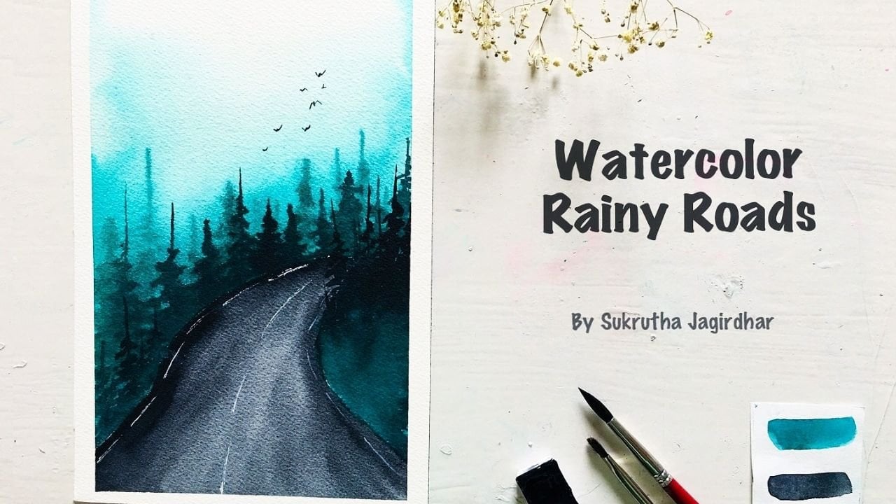
7. Class Project 5 After Rain : Hello, welcome back. Today we're going to paint
a very moody sunset scene. It's gonna be a rainy
landscape as well. Like the sunset just after
the rain kind of landscape. So first I'm going to get
started with the sketching. There. Not much
complicated sketch, there are few lines and
make sure the lines should be a little bit diagonal
rather than straight. Straight lines. Those are
supposed to be roads. Trying to paint a
road in the middle and trees on either side of the road and there'll
be sun on the top. And the roads are covered in reflections because
it had just strained. So I'm trying to paint
that scene over here. So this will be
wet-on-wet completely. Maybe not completely. Just last few details. We're going to paint wet on dry. So I hope you guys already, because so far we have painted landscapes alpha class projects Previously wet on wet. You can add this one
in that list as well. I'm going to the colors. We're going to take our typical
sunset or sunrise colors, yellow, orange, and pink. Queen Rose, I mean, so yellow and orange
are from Sennelier. Cornrows is from White Nights. And I'm taking this unique
color called Azar in crimson. It's from Sennelier as well. It's going to be
like deep color. So I'm going to
take that as well. And now I'm going
to take indigo in order to paint the
trees and reflections. To show in this video that have taken purple color as well. Then I use my old palette
as well today because I have all the colors on it and I don't want to
waste all of tent. So I'm gonna keep it aside. I'm going to use both
of the palette with all the colors that
I've just mentioned. Get started by wetting the
paper with clean water. I'm using my hockey brush and make sure you're
not just reading that top area, the road part. Just leave it alone. We're
going to work on that later. I'm going to first
take the yellow color and slowly I'm going to build the colors up
from lighter to darker. So as you can see, I'm leaving that white circle
without adding any paint. That is the sun. Now I'm
going to add orange. Orange, I'm using
alizarin crimson. So jarring crimson. Actually I, I did not use Queen
Rose because I want to make this look a moody. So kudos is kind of
like cheerful color. Instead, I have used dioxazine, purple color from Sennelier. Now clean your brush, remote access water
using a tissue paper, and blend all of these
colors together. This is a tricky
part for a beginner, but it's just like blending
any two colors together. Now, as you can see, the Sun is no longer visible. So I'm just gonna take
a tissue and dab, dab off a little paint. Now blend all of these colors together
until they look softer. Your paper has to be wet
for all this to work. So make sure you use
a 100% cotton paper. Now as you can see, the left
side of the paper is empty. So I'm going to add indigo color over there just to
bring out the contrast. When I say left,
it's on my left and right after you adding
this dark color, you can see the glow of the sun. So that's the beauty
of this sunset colors. As you can see, the
blend has become so smooth and it's only possible because the
paper is staying wet. Now I'm taking indigo
color and I'm going to add all the pine trees on
both sides of the road. My paper is no longer
soaking wet here. It's damp. But I have to paint these pine trees while
the paper is still wet. So I'm going to have
to work faster before my paper gets dried up. Is wet-on-wet. You don't see
any detailed pine trees. We're going to work on details later and the paper
gets dried up, just like we have done in
previous class project. Now comes another
one of tricky part. But I got you. Wash
off your brush. And with a wet brush, just drag the paint
downwards towards the road. Again, it only
works well enough. The tree part is still wet. So you have to work immediately
right after you paint. These paints. I'm going to
take a little bit of indigo. Now I'm gonna just add
a few reflections. Not very detailed because
it is still wet on wet. Now, using indigo color, again, just draw a few lines so
you can make a distinction between the pine trees and the reflections
below on the road. The road part is still wet, but the tricky part is dried up. So I'm using my silver black colored number
six brush and I'm going to paint a few details to those pine trees just
to give them the shape. I'm going to keep this
for drying and we'll come back once it's completely
dried to add a few details. Okay, my paper has dried. I'm taking whitewater color, so I can add a few
last-minute details. So if you have light gosh, you can use that as well. Remember those lines we have
drawn during sketching part, covered them up
using a white color. If you can't see them. Just draw based on
your best guess. I guess because I'm
unable to see them as L because it's covered in
such a dark color, indigo. As bad as some indigo paint. Later, I'm going to
add a few birds. All right, We are done.
I hope you guys enjoyed painting this very
moody after rain, sunset landscape with me. I'm gonna see you
guys tomorrow with a brand new model landscape. Thank you so much for watching.
8. Class Project 6 Wonderland: Hello friends, welcome to
today's class project. We're going to use
only two colors to paint a magical
winter landscape. There are turquoise,
green from Sennelier, and indigo from White Nights. Now I'm going to swatch these
colors out for you guys. I have two colors
already on my palette. So I'm just going
to take a brush and show you what the
shapes look like. The last color
that you see among these three colors
is actually indigo. But I'm swatching this again. That was from yesterday's
class project. So this is how integral looks
like from White Nights is my absolute favorite brand
for this particular color. This is turquoise green. For today's class project, we're going to have to
mix these two colors to get that winter
wonderland shared. But before we play
with these colors, we're going to have
to go for sketching. And there is only a single line. And it says snowy mountain. That's all the sketch we need. Pretty simple, right? The sketch, I'm
gonna get started by wetting the paper
with clean water. Garden. This message
on Instagram, someone told me that
they don't know how much wet the paper should be to
paint wet on wet landscape. Well, I can't
particularly in all tell you unless I am actually
looking at your paper. But I can show what how
much wet my paper is. So it's not soaking
wet and it's not damp. You can see the
paper is shining. I think that's the sweet spot. Hope this is helpful. And I'm going to turn my board upside
down and we can get started with painting
the background. As you can see, I'm mixing turquoise green
with indigo first. Do not wet the snowy
mountain area. I should have told that earlier. You know what? I'm
going to also keep the masking tape under my board. It wouldn't hurt to use
a little bit of gravity. Now I'm going to paint the background using
that dark eyes, green and indigo mix. The same, so light. So I'm mixing a
little bit of indigo. The paper is wet. It will blend. It will blend by itself. You don't have to go first
after strokes or anything. As you can see, I'm
painting very freely. Now I'm going to
turn the board back and I will also remove
that masking tape. We don't need that anymore. Take a lot of indigo color and a very little
bit of turquoise green. And we're going to paint
large pine trees in the background while
the paper is still wet. So these spines are being
painted wet on wet. So you don't have to
worry about the details. You have to worry
only about the shape. Said before we are
still painting wet-on-wet and my
paper is still wet, but it's going to dry up soon. So I'm gonna have
to walk faster. I hope you guys are
working faster as well. Painting this large
tree in the middle. As you can see, I have left a little bit of
space in the middle. Please. Do not ignore that. Little gap is important to us because that's where the
light is shining through. And once the painting
is completed, that's where our focus will go. So don't miss it. We're almost done
with the background. I'm just going to add
just a little bit. And now I'm going
to keep this for drying and I'll come back
once it's completely dried. Paper has dried up. Now I'm taking indigo color directly without much
of taka is green in it. And I'm going to paint a
few trees on the ground. As you can see, there
is a little bit of water droplet that fell while the paper is still
wet and it created a stain. So I'm going to paint a
pine tree over there. Have told me about a white
gap in between the trees. That's our light source. I'm going to paint a
pine tree over it. It gives such contrast. I told you guys before that
our focus will go there. It's because of this because
there is a light color in the background and contrasting dark color on the foreground. And I'm going to paint a few more pine trees and along the border
of that ground. Now while the pine
trees or drying, we're going to work on
the snowy ground here. So I just wet the paper using my silver black velvet
number 14 brush. And I'm going to add indigo
color slowly and gradually. As you can see, I'm leaving
that white gap between pine trees above the ground
below that white empty space. Without adding any color, you have to leave that
white line as well. It gives such contrast
to the painting. By adding the paint randomly
written right here. You can add any shape. You can add a few
pine trees as well. I'll covering the
background with a tissue. I'm going to splatter some indigo paint on the foreground while
the paper is still wet. I'm going to take
white watercolor and make sure the pints that we have just painted using indigo color are
completely dried up. Mine are still wet. But I thought it, I thought that died and I started splattering
white paint. You can see that light snow had fallen and those indigo
colored pine trees. We want those to look darker because I was talking
about contrast earlier. So I'm just going to repaint those pine trees
using indigo again. Winter is where my
moodiness comes from. I hear too intense. So my colors are always
done during winter season. And you can expect a lot of winter landscapes in this
third today's challenge. And I hope you guys liking
this challenge so far. Thank you so much for joining. I'm gonna see you guys tomorrow with a brand new class project.
9. Class Project 7 Moody Lake: Hey guys, Today we're going
to paint a very moody lake. And for that we're going to
need three colors in total. Indigo, taco is green, which we have already
used yesterday. Just to refresh your memory, tacos screen is from Sennelier and indigo
is from white knight. The only extra color, the third color that
I'm going to use today is dioxazine purple. It's from Centralia. I'm going to swatch this
color out for you guys. You can use any purple or
violet shade if you don't have this exact dioxazine
purple shared, it's okay. I'm going to mix all of these
three colors at some point, like I'm going to mix indigo and purple are full-width
talk ice cream. But I'm going to explain
step-by-step anyway. Since this is a lake, we're going to have to keep the horizon on the top because I want to focus more on the lake. The paint to bleed into
the lake from the top. We're going to just
put a masking tape. First. We're going
to paint the top, the mountains, the
sky and stuff. Later we're going
to paint the lake. Like usual. We're going to get
started by wetting the paper with clean water. Later, I'm mixing
purple with indigo. And I'm going to paint the sky. Painting the sky and water, water droplet has
fallen from my brush. But since the paper is wet, I have managed to
correct the mistake. That's one of the advantages using wet-on-wet technique
to paint the landscape, because it's very
easy to correct the mistakes so you can
save the whole painting. And now I'm just removing
the excess water. Is there on the edges of
the paper using a tissue. Now, before the paper dries up, we're going to paint the
first layer of the mountain. And for that I'm using the
mix of indigo and pulpal. Keep this for drying
now and I'll come back once the paper is
completely dried up. Now, it's time to paint the
second layer of mountains. For that, I'm going to
use the same colors, violet, I'm in a dioxazine,
purple and indigo. Let's keep this for drying and we'll come back
once the paper is dry. And then we can paint the lake. This masking tape. Only when the paper
is completely dry. We'll start painting the lake for that. I'm going to wet the
area with clean water. I'm using my silver black
lung at number 14 brush. Now I'm going to keep
masking tape under my board so it's easier for me to blend
the colors of the lake. I'm going to use
all three colors to paint the leg from
light to dark. So first time using
taka is green. Later I'm going to use
dioxazine purple color. And later I'm going to use indigo color. Purple color. Now, indigo color. I'm removing the
excess water around the edges using a tissue paper. The masking tape
from another board. Now, using my silver black color number
six brush the smaller one, I'm going to paint a few
repulse using indigo. We're going to keep
this for drying and we'll come back once the
paper is completely dried. Hey, paper has dried
up using my silver back wavelet number six brush
and using indigo color. I'm going to paint
a few details on the lake being the reflections. Later, I'm going to paint the subject about,
I'm just thinking, a simple pine tree forest, a small island of
pine tree forest. Then it's reflection. This is a difficult
step for a beginner. So I would advise
you guys to try on a rough piece of paper before attempting on the
Main Landscape. And also this is called
reweighting technique. It's actually one of the advanced techniques
in watercolor. Painting this island,
I'm going to go for a few rocks on the lake. So big enough. If you find this step, this island step
impossible to paint. You can just leave it out and
paint the rocks directly. Now, I'm done painting
the reflections. I'm going to paint this object. I'm going to paint
a few repulse, just a few straight lines
using indigo color. The same indigo color and
the same number six brush. I'm going to paint
a few pine trees using a damp brush. I'm going to clear
out some paint between the subject
and the reflection. Remember we have, we have done
this for class project one with the indigo color. I'm going to paint
rocks on the lake. But after painting the
rock, immediately, I will blend the
edge of the rock using a damp brush that
gives kind of soft look. The same technique for
the rest of the rocks. Step like blending the
edges of these rocks gives such realistic lake
look to the landscape. So it's always important to observe a photograph
or a reference picture before painting your landscape because these are the techniques that no-one will explain. These are the techniques
that you will only get by observing
very, very clearly. Final technique I'm going to
splatter some indigo paint. Of course, not one of my landscapes will be
complete without splattering. Looking at the
landscape clearly, I, I noticed that reflections are much longer than the subject. So I have decided to London
the pine trees, the subject. So for this I'm
using silver back. Well, what number six brush
and of course, indigo color. For today's class project. I hope you enjoyed painting this moody lake
scene. At the end. It looked kind of haunting. So thank you for watching and I'm gonna
see you guys tomorrow. The brand new class project.
10. Class Project 8 Rainy Field: Today we're going to
paint a very moody feel seen when you see a field
just before the rain. And for that I'm
using two colors, forest green and indigo. And I'm going to swatch the forest green
color for you guys. For a screen is from Sennelier, indigo is from White Nights. You can see indigo on
top row of the paper. Catching is a tricky part for this landscape because you need to get the
perspective right. And I took many trials even to get that
perspective straight. So I would suggest you guys to go directly to the end
of the sketching video. And you can directly
sketch from there. Because watching me sketch
will definitely confuse you. And of perspective
in a landscape is definitely tough
to get it right. But I would suggest you
guys don't pressure yourself in a sketching
exactly I am doing here. It will take a few trials. But even if you get the perspective on the
sketch wrong, it's okay. Try out the landscape and see the techniques
that I've used. You can apply to
different landscape with a different sketch. Let's just sketch
the top part first, the sky and the mountains. So to override the color
leading to the foreground, I'm covering it up
using a masking tape. Now. I'm wetting the paper with my hockey brush using my silver black velvet number 14
brush and indigo color. I'm painting the sky. I'm using my silver
black velvet number six, brush the smaller one. And I'm going to
paint the mountains while the paper is still wet. We need that misty
effect to the mountains. We don't need a
detailed mountain. Keep in mind, your paper
should be close to getting damp here
and not soaking wet. If you put paint on the paper while the
paper is soaking wet, It's just it's gonna
spread into the sky and it will not get a correct
structure of the mountain. So be aware of
that if your paper is completely soaking wet, please wait for a few
seconds for it to get damp. After painting mountains, I have kept the paper for drying. And once it's dried, I'm removing that masking tape. Now, I'm mixing indigo
with forest green and I get this kind
of a taco is shared. So I will show the
shed on my paper. And we're going to paint the
pine trees using that shade. And I'm using my silver black velvet number six
brush the smaller one. Sorry, it's not a taco shared. It's Palo shade of green. I'm going to paint
a few pine trees along this horizon line. As you can see, I'm painting a very small pine trees
that is smaller in size. So yeah, keep that in mind. Do not go for larger
pine trees here. We need to get the
perspective right. So you have painted
a few pine trees. Keep in mind, we're only
painting a few for now. We're going to take
a wet brush and just drag the paint down. With that, we're going
to wet the entire paper except that lake
area in the middle. I think I'm going to call it
a stream instead of Lake. Sorry. Yeah, sorry for that. Some reason I was working
very slowly here. I was just my mind
was elsewhere. I was worrying
about how to bring the stream to life and what to paint in it
and what not to paint. So I completely spaced out and was reading this
area for so long. We're going to use forest
green and we're going to use indigo as well to
paint this area fast. I'm going to take
forest green and walk faster because your paper
can get tied up really fast. Gonna take indigo. And I'm going to
just blend it in, into this field as well. Different colors gives
depth to your landscape. Even for a monochrome, we always use different
tones of the same color. I'm going to add one
more layer of indigo. Like I said, dark color are a dark shades gives such
a simple landscape. I'm taking my syllabi
cultivate number six, brush the smaller one,
and indigo color. And I'm going to paint
a few more pine trees along the horizon line. And I practiced this landscape in ordering one of
my experiments. I did not use masking tape. I have directly painted from Mountain two pints to the field. But It's gonna be
difficult for you, especially if you're a
beginner to try that method. I have used masking tape. My suggestion is please try out without masking tape with
without applying masking tape. Ones that you will paint the landscaping
completely wet-on-wet. The mountain, the trees and
the field, all of those while painting all of
those pine trees about the field area has dried up. So I'm going to get started on painting the
stream in between. So for todays, I'm taking
very light shade of indigo. As you can see, I have added so much water to
the indigo paint. It has become so dull. And I'm going to use that
shared to paint the stream. Once I'm done with that, I'm going to add one more
layer of indigo color, but only at the edges of
this in all fields about. And I'm using a normal shade of indigo that is dark shade. Now using a damp brush, I'm blending this
color properly. One more layer of
dark indigo color and one more round
of PPP lending. Do you know why the
stream is in light color as compared to the
fields on either side. It's because as you can see, the sky about is in light shade. So obviously, the reflection in the water should
be in light color. See if the paper has dried up and continue only if
the paper is dry it. Now we're going to
paint a few rocks, just like we have painted
in yesterday's landscape. Grants. We are done
with the rocks. We add hadn't read the
landscape as I hope you guys enjoyed painting
this moody feels in with me. So I'm gonna see you guys tomorrow with a brand
new class project. Thank you so much for
joining me today.
11. Class Project 9 Moody Evening: Hello. Today we're going to paint a very moody
sunset to interlace. And for that, I'm going
to use four colors. So this is Naples, yellow deep from Sennelier. And this is a raw sienna. It's also from Sennelier. And this is kaput Martin
from light night. And you know, my all-time
favorite indigo, which is, which will
always be on my palette. And I have Naples, yellow to on my palette.
I'm going to do it. The remaining colors on
the palette as well. And I'm going to swatch
these colors out for you. I'm going to swatch the colors
from light color to dark. And that's the same
order we're going to paint in our
landscape as well. So faster comes Naples, yellow, later, raw sienna. And later. We're going to pay, we're going to
swatch kaput Martin. But if you don't
have kaput bottom, you can use any brown color. And also, I'm gonna be mixing
kaput Martin with indigo. I'm not directly going to use kaput mortem for my landscape. So if you have any brown
color, you can take that. It doesn't have to be kept at mortal and mix it
with a little bit of indigo to get this
dark brown color. Remember yesterday's
painting, the moody feel, the sketching for
this landscape is also very similar to us today. But as always, I'm going to request you guys to wait until I finished my sketching
because this is going to confuse you so much. And you can directly
skip to the end of the sketching video and
sketch directly from there. Basically today's landscape,
we will have a lake and snowy aligned on
either side of the leg. And then there'll be a few
pine trees in the background. Then this guy will be
in Moody sunset shade. That is, there'll be some land, a few of the browns that we have just watched him now, I'm reading the paper using my hockey brush
as you can see, I'm leaving out the lake area. So I'm using Naples yellow to
paint the sky first letter, I'm going to layer it
up with darker colors. So now I'm taking
raw sienna color. It's just a little bit darker than the
Naples yellow right? After this, I'm gonna be taking kaput mortem mixed
with indigo color, like I have watched before. As you can see, I had a minor difficulty in
mixing the colors here. I took a lot of indigo instead of equal mix of indigo
and kaput motor. But I have character it because
the paper is still wet. You can manipulate
it however you want. This technique right? Taking
a tissue paper, wrapping, wrapping it around
your finger and just dabbing away a
little bit of paint, you will get the sun back. He does totally covered
with colors before right? Now I'm going to
take a little bit of kaput motor mixed
with indigo again. And I'm going to paint
a few clouds just to add a bit of character to the sky instead of
leaving it plain. And my paper is still wet. So that's why I'm able to paint
these clouds very easily. But if your paper
is getting dried up in order to not add clouds, because that's going to
ruin the entire sky. I'm using indigo color. And with the same brush, I'm going to paint a pine
forest in the background. As you can see,
I'm not going for a very detailed pine trees here. Just lots of vertical lines. And my paper is wet still. So it's easier for me to
just walk faster here. And I wanted to paint detailed pine
trees later wet on dry. But after the way these
pine trees dried up, they looked quite
well and natural. So I did not go for it. Remember, we have
added the water to the ground area as well except the lake so
the paper is wet. I'm just lightly
dragging that pain down in order to make
that just softer. Start off leaving it as it is. I'm going to add a few
details to the ground. And for that, I'm gonna be
using light indigo color. As you can see, this
was quite dark. So I have quickly
adjusted the color. I'm gonna do the same. On this side of
the lake as well. My day will not be complete without
splattering some paint. After that. I'm going
to leave this for drying and I'll come back
once it's completely dry. Now, I'm going to read
the area of the lake and we're going to repeat the same process of
painting the sky. Remember light to dark. First, you take Naples, yellow later, raw sienna. So we're going to do just that
to the lake area as well. Now I'm taking raw sienna and I'm going to paint
the lake with it. I'm going to quickly
exchange my brush. I'm taking my silver
black velvet number six, the smaller brush. And I'm going to add the
shadows using indigo color. That is right, I'm not adding reflections yet,
just the shadows. You see. There'll be both. In a lake scene, the shadow of the land that
is falling in the lake, as well as the reflection. So I'm going to tell you
the difference in a minute. I'll drag the paint down. With your brush. You're not just like adding those vertical lines,
but in reverse. And these are the reflections. I'm going to take
darker indigo color. And I'm going to
add the shadows, seeing the difference, right? I'm bartering up the land with a dark color and
that is the shadow. And these vertical
lines, reflections. I'm going to add shadows on this side of the land as well. I'm using dark indigo
color for that. Child. Keep adding the shadows wherever I think it's necessary. For this. I'm using
a dark indigo color. Now paint very lightly, just a few of them.
Do not do it. I'm going to quickly add a
few dried-up branches on the frozen land just to fill it up and does not
make it to look in IMT. I'm using indigo color for this and my silver black
velvet number six, brush splatter, some paint on a few areas as well
because why not? As a final step, I'm going
to add a few details. Are I should say cover-ups
because I've accidentally painted a branch here and
it was not looking good. I wanted to make this landlocked clearly the right frozen land. So I'm adding white color to it. I'm going to add light
color as well to a few places where the
color has seep through. And I'm done. I hope you
guys enjoyed painting this moody sunset winter
landscape with me. I'm gonna see you guys tomorrow with another moody landscape. Thank you so much for
joining me today.
12. Class Project 10 Full Moon Night: Hey guys, welcome to
today's class project. Today we're going to paint
a simple moonrise painting. We have painted one
of these before, but everything
will be different. Just the moon will be similar. And for that I'm taking masking tape and
I'm cutting it into a round shape and do not stick
this moon in the middle. Just put it slightly on
either side of your paper. Here I'm choosing
a slight right. My right. And I'm
using indigo color. This is from Daniel Smith. I'm using this
because it's quite different from White
Nights indigo, I will show you when I
swatch the color out. Other than indigo, I'm using quite a different
colors as well, but for the moon only. And those colors
are primary yellow, orange, and French vermilion, which is the right color. All of these colors
are from Centralia. Not going to swatch
these colors. I'm going to swatch only
indigo color for now. And also make sure you
have light color with you. I might use it. Now. I'm
taking into your color, Daniel Smith indigo,
as you can see, it's really very, very different from White
Nights indigo. But you are free to use any
indigo color that you want. I'm going to wet the
entire area with clean water and I'm using
my hockey brush for it. As you can see, the
moon is completely safe because we have put
the masking tape over it. Gonna get started on painting
the sky with indigo. And I want the top part of the sky to be in darkest indigo, because I want the moon
to reflect the contrast. The moon will be
in lighter colors, so the background should
be in darker color. And I'm slowly dragging the
paint down as you can see, I'm not adding any
extra paint and just making a gradient wash. And
now I'm going to remove this excess water because there is a chance
that this water will back-flow and it will create those unnecessary
washes on your paper. With my silver black
velvet number six, brush. The smaller one. I'm going to paint
pine trees wet on wet. You cannot paint very
detailed structures while the paper is wet. And that's exactly what we need here because
these pine trees, we will be in the background and they will not
look very detail. Also, I forgot to remove the excess
water on the top side. You can clearly see how the water is
seeping through there. I have only observed it
after my paper has dried up. It was too late for me. Makes sure you whenever you
go for wet on wet techniques, make sure you remove
the excess water using a tissue paper on
all sides of the paper. And I'm just painting these large pine trees
in the background. I'm not going for any details here as you can see,
just the shape. Now, as a last minute detail, I might change that shape, the basic shape of
these pine trees. Only a few. Using my silver black
velvet number six brush. Just a few touches
to not overdo it. Going to keep the paper drying and I'll come back once the paper is
completely dry. And you can clearly
see the water has completely seeped
into the top layer of this sky sky area. Give you a paper is
completely dry it apart not. And then take a
very small brush. I'm taking my silver black velvet number six
because we're going to paint very thin
and dried-up branches using indigo color. Today's class project ten. So we have completed ten days of painting, moody landscapes. So if you guys want me
to increase the level, intermediate level,
advanced level of this wet-on-wet technique. Please let me know on Instagram
or in discussion below. Because these are all beginner friendly and can be done
in a very easy way. So we have painted
ten of these so far. And I hope you guys got a
good practice out of them. And if you think maybe
it's time for an upgrade, please let me know because
I have a lot of ideas to take this moody landscapes in an advanced or
intermediate level. I'm going to, I was thinking, still we have 20 days left. So I thought for
the next ten days, I'm going to go for
intermediate level and later, later from the last ten days. I, I'm just having these ideas. I don't know if I will
go through it because I really want you guys to feel familiar with
this wet-on-wet, and only if you're comfortable I can proceed with this plan. So please let me
know on Instagram or the discussion below. And don't just paint these dried branches
in a straight way. You know, paint them
slanted as well. It increases the character
after landscape. Now I'm taking a white color and I'm going to
splatter some of it. My paper going to splatter some indigo
paint as well. The indigo color is
still on my brush. I'm going to paint
a few butts too. If your paper is completely dry, that can only remove that step. We always go from a light
color to dark color. Yellow color is the lightest. I'm going to paint the moon. I'm going to start painting
the moon with yellow first. And later I'm going
to paint with orange. And later I'm going to
add French vermilion, which is the red color. And once you painted the
moon with three colors, taking a damp brush, blend all of these
three colors together. Make sure you do not
lose the hint of yellow. It's very important. When you see a
blood moon picture, they will always be a lighter
color on the top and the darker on the
bottom of the moon. So do not just paint the
moon with one color. It looks just a plane. So this is one of my techniques
to paint the blood moon. And I hope you liked it. I'm gonna see you guys tomorrow with a brand new class project. Thank you so much
for joining me.
13. Class Project 11 Night Sky: Hey guys, welcome to
today's class project. I have a lot to talk
about this one. But first I'm going to
discuss the colors. Later. I'm going to tell you a little bit about
this landscape. So I'm using Queen
Rose and indigo from White Nights and turquoise,
green from Sennelier. Use tallow blue
from Daniel Smith. If you don't have this
particular shade, you can use Prussian
blue instead. The final color is
a Chinese white. And you can use any watercolor. This is not quashed, by the way. I'm going to swatch these
colors out for you. Later. We're gonna get started
with the landscape first, I'm going to show you how queen rose from
White Nights looks like, lead to talk ice
cream from Sennelier. And after that I'm
going to swatch tallow blue and later indigo. I'm going to use
Queen Rose much, maybe just one swatch
or maybe not even that. But I have this
idea in my head to use tacos with rose color. So I just kept it there. And now I'm wetting the
paper with clean water. And later I'm going to
add the lightest color, their talk ice cream. I'm intentionally leaving
whitespaces in the middle. I'm going to tell you later why. Truly going to add to swatches of Queen Rose in-between
turquoise green. Blend it using a damp brush. And later I'm going to take tallow blue and
I'm going to add, added under borders of the paper while leaving that white color as
it is in the middle. Going to have to
add one more color. Indigo. Work faster with me because I'm going to have to add it before my paper
gets dried up. I think we lost
queen rose there. It's again, never want
it to stand out anyway. Now I'm going to take
indigo and I'm going to carefully add it at the edges and in the middle of
the paper while leaving a little bit of phthalo blue
as well as that whitespace. So I'm going to tell you guys a little bit about
this landscape. Yesterday. I asked you guys
if you wanted to upgrade your wet-on-wet technique
because we have painted ten beginner friendly
wet-on-wet landscape so far. And I've got a few messages that they want a challenging
landscape from now on, or at least an
intermediate level. You take a step further into wet-on-wet
technique in watercolor, the most difficult technique that comes your way is riveting. Because you can paint watercolor landscapes
in so many layers. And those layers can be achieved by using this technique called
re-weighting technique. So do not mind the landscape
that we are painting here. It's a simple Milky Way galaxy, night sky, which we have
painted so many times, I guess. Have chosen this subject because you guys are
all familiar with it. And using this familiar topic, I'm going to introduce
wet-on-wet technique for you. This the first layer. As
you can see, these colors, especially the indigo,
will definitely dry up very lighter than I
intended it to be. So we're going to go for another layer by
wetting the paper. So I'm gonna guide
you step-by-step. For now though, we
can keep this for drying and I'll come back once the paper is completely dried. Riveting only works when your
paper is completely dried. So keep that in mind. And now I'm taking my hockey brush and I'm very
gently wetting the paper. You can see that and not putting any pressure on the
paper with my brush. Take only indigo
color from Nevada. And so I'm taking indigo
color and I'm gonna just add the color wherever I want
the paper to be darker. Any case, if you guys are not comfortable with this technique, it could be a little bit
advanced for a beginner. You can let me know on my Instagram are in
the discussion below. I will stop Going, going for reweighting
technique and we're going to paint
simple landscapes. So I just wanted to let
you guys know because you guys are really enjoying
wet-on-wet technique. I thought I could show you another important technique while going for
wet-on-wet as well. Now, with the damp brush, I'm going to blend this dark indigo properly onto the paper without
losing that white color. If it is still wet. But I'm gonna go ahead and paint the foreground using my silver
black walnut number six, brush the smaller one, and using indigo color. And this still paper is wet. Like I said, it
won't be detailed. So we're going to have
to come back later and work on the foreground again. I'm going to let the paper dry. And once it's dried, I'm going to paint the
foreground again using silver black velvet number
six, brush and indigo. Since the foreground
is still wet, I'm going to cover it up
with the spare paper. And I'm going to splatter some stars using
light watercolor. Confused here for a bit, because at first I
wanted only a few stars. Later. I have decided to go for a lot of stars in the night sky. But later I have
decided to remove all that white stars using a tissue paper and go
for a fewer stars. Again, it was a mess. But today our focus is
not about the stars, it's about learning riveting
technique. In watercolor. I have showed you guys and easy way to go for
reweighting technique, which is the most advanced
technique in watercolor. I hope you guys find it useful. And tomorrow I'm gonna see you guys with a brand
new class project. Maybe that one will have riveting technique
as well or not. Thank you so much
for joining me.
14. Class Project 12 Road Trip: Hey guys, welcome to
today's class project. I'm gonna be using three colors. Indigo from White Nights, forest green from Sennelier. And I'm going to also
use a little bit of talk ice cream from
Sennelier as well. All these colors on my palette, and I'm going to swatch
the colors for you guys. I'm going to start with indigo. Later. I'm going to
swatch turquoise green. And after that I'm going
to swatch forest green. Mix all these three
colors together to get that greenish blue color. And I'm gonna use only a
little bit of turquoise green. So if you don't have
turquoise green, that's okay as well. It doesn't make a
lot of different. Start with the sketching. First, I'm going to
sketch the roads lead. I'm gonna, you know, place where there
are trees will be. And after that,
there'll be a mistake. Very light colored mountain
in the background. I'm going to sketch
that as well. If sketching with me,
it's confusing for you. You can just skip to the end of the sketching video
and then fastest screen. Take a screenshot of the screen and continue your sketching. If you asked me, that will be easier and that's
what I do as well. Once the sketching is done, I'm going to get started by wetting the paper
with clean water. I'm using my hockey brush. I'm going to mix all
these three colors now and I'll get this
greenish blue color. I'm going to swatch that
color for you guys as well. So it'll be easier for you
to pick the right shade. Once the color is assembled, you can get started
by painting the sky. The same shared paint, the mountain as well, like I told you at the
beginning of the video, that will be a very light colored mountain
in the background. You can see I'm not
painting much on my right because there'll be
a dark mountain over there. We're going to paint it later, which will be, like I said, literally in dark indigo. Even if you paint these
mountain and sky on the right, you won't be able to see it. Taking a lot of indigo and very little bit
of forest green. I get this dark shaded,
greenish blue color. And I'm gonna get started on that mountain that I
was talking about. Edge TO at the edge
of the mountain. Try making the shape
of a pine tree. Because this is not just a
mountain, it's a forest. So obviously there'll be trees. Paint a few pine trees
along the side of the road. This is wet-on-wet. We're going to come back later. Once the paper is dry, we can paint a very
detailed trees later. And we're going to paint
this mountain completely. That means you can clearly see the sketch over
there, the border. So. Mountain goes till there. And I'm using indigo and
forest green color mixture, but a lot of indigo. Now paint this carefully,
paint this step. We're going to paint
the reflections because it's a rainy road. And you need your
paper to be wet. And if it is damp, this won't work out. Just drag whatever
the paint is there at the edge of these pine
trees down in a straight line. That's all for the reflections. Just correcting the
structure of this mountain. I'm going to paint a few pine
trees at the Edge as well. Because as you can see, since the paper was red, shape has completely gone. The pine tree shape. So I'm going to adjust that. Now, paint the reflection
of this mountain as well. But this is not the
final reflection. We're going to
have to come back. We're going to have
to revert the paper. And then we're going to paint the reflections one more time. In yesterday's class, I've
told you guys that i'll, I'll be using riveting
technique and I have given you a
clear instructions about how to proceed with
reweighting technique as well. So if you haven't seen
yesterday's class project, please go watch and then this class project will
be easier for you Then with the dark indigo
color and my son earlier, number six brush I'm just
lightly draw the border. It's time to keep
this one for drying and we'll come back once the paper is
completely dried up. My paper has dried. So I'm going to take indigo
color with a little bit of forest green and my silver
black outlet number six, brush the smaller one. And I'm going to paint a series of pine trees
on the edge of the road. So be patient with me because there are a
lot of pine trees here and we're going to
paint them slowly as well. These are thin, a
lot of branches. So it's going to take awhile. I'm going to paint is wet on dry detailed pine trees
on this mountain as well. Because like I said, it's not just a mountain, it's a forest. It will be covered in trees. That is done. I'm going to take my silver vacuolar number 14 brush and I'm going to
wet the road area. Now, this is when we're
going to have to go back and paint the
reflections once more. And I'm using indigo color. Not cover the entire road
area with indigo color. Make sure you leave those
white spaces in between. Because the blue
that we are painting here is only reflections and their own
well-being white color. I'm using indigo color and I'm taking my silver black and white number six brush
the smaller one, and I'm going to paint
the borders of the road, as well as few lines
you see on the roads. So we're going to paint those as well with the same indigo color. At this point. The road area
is still a little bit damp, not soaking wet, damp. So these lines will
be like enough, not detailed and sharp lines. It's actually perfect because
it's rainy road afterall, there'll be a little bit blur. Some indigo paint on the road. Now, I'm going to add
one more layer of indigo color to this
mountain because the paint has dried up very lightly and you
need the contrast. That is, the road
is in light colors, so the mountain has to
be in darker color. But if your mountain
is in darker color, you don't have to
follow the step. Indigo color. I'm going to add a board over there
in the background. After that, I'm done
with the landscape. I hope you guys had fun painting this class project with me. We have used the
re-weighting technique very briefly in this
landscape as well. I hope you guys
found that useful. I'm gonna see you tomorrow with a brand new class project. Thank you so much for
joining me today.
15. Class Project 13 Lake Scene: Hey guys, I'm back with a
new class project today. As always, we're going to
discuss the colors first. I'm taking Naples yellow and
a locker from Sennelier. And I have pines gray from
White Nights as well. I have two tubes of pines gray, but I'm going to
use the old one. So this is the pines gray color. This is how it looks
from White Nights brand. It's completely dark
color, almost black. As you can see from my palette, the light shade of yellow I'm watching right
now is a locker. And the dark one
is Naples yellow. We're going to need
both of these colors because we're going
to be painting a lake and a little bit of
land in-between as well. And to paint the line, I'm gonna be using
these two yellow colors and to paint the
trees around it. I'm gonna be using pines gray to paint the
lake, that is water. I'm gonna be using
these three colors, turquoise, green, indigo,
and Prussian blue. I already have these
colors on my palette. Now I'm going to swatch
these out for you guys. This is Prussian blue. It's such a beautiful
blue I'm telling you. And then I'm taking
a taco is green. So both of these colors are from a Sennelier and the indigo. You guys know it's
from White Nights. We using indigo with a
mix of Prussian blue. That's why I'm switching the indigo onto the Prussian
blue, as you can see. Can I tell you a secret? I actually don't like sketching. I always go directly onto the wet paper to paint the landscape
that I have in mind. But sketching is actually really good because most
of the times when I painted the landscape
directly without sketch, I have failed as well. But when I did sketch
even a little bit, it helped me a lot. So I have to do it. And you guys know what to do. You can directly go to the end of this video,
the sketching video. And you can sketch
directly from there, but bypassing your screen, you don't have to sketch with me because I hardly know
what I'm doing here while I'm sketching where I have painted the lake and the land that is not
touching the leg. And now I'm going to lightly
sketch the background. A few mountains and
a few pine trees. The very light
sketching of mountain and the trees, the pine trees. You just have to know
where you place them. You don't need a
detailed sketch. Sketching. I'm going to take my silver black velvet number
14 brush and I'm going to read the paper. For now. I'm gonna be reading only
the upper part of the paper. Make sure you are painting
only light colors for this. That is, this is the background. We are now painting the sky. You can see how light
color I have taken. This is phi1 square, by the way. And now I'm going to paint
the mountains as well. Very light color
I'm gonna be using. I was not wearing my specs, so I confused forest green, which has already there on
my palette with pines gray. But at the end, though
it kinda look decent. I'm still trying to paint these mountains in
very light color. So how quickly taken
off screen from my brush and I'm taking Payne's gray and I'm going to
continue painting those. Now. Background
mountains is done. I'm taking dark
color of pines gray. And I'm going to be painting
these wet-on-wet forest. These are pints by the way. They don't look like it, but this is wet-on-wet, so they won't be detailed. And I'm quickly
changing my brush. I'm just drawing the
branches of the trees. Your paper is soaking wet. The paint that you have, you have just put on the paper to paint
the forest will just, you know, spreading
to the mountain area. So be careful. Paint only when your
paper is getting damp. Does it for the top
part of the paper. Now I'm taking a yellow ocher. I'm going to paint the
land bordering the lake. If any of the pines gray
seeping into that color. Pick the damp brush and
just remove that paint. Add Naples yellow to
this. The land area. You can see it's looking
quite light color here. I want the contrast between this light color to
the dark Payne's gray. I'm just covering it up with a little bit pines
gray over there. Now this is wet on dry paint. This pine tree, pine trees. On the other edge of the paper. As you can see at the borders. I'm not going to go in for a
very plain structure, Emily. I'm painting it as there
are leaves on the borders. I'm going to take a locker and I'm going to paint the
land on this side as well, just under this pine trees. Like we have done
on that side of the paper we're going
to do here as well. Just don't let the pines
gray seep into that area. If it is in the paint is
seeping into the yellow ocher. Just take a damp brush
and remove the paint. Adding a few random
details on the land. The more details with
different colors, the more depth you can
see in a structure. To paint these random details, I'm using Payne's gray. Now, let's wait
for a few minutes until this land area
on my right dries up. After the land area is completely
dried, take pines gray, and paint the rest of the trees that are
bordering the land. It's time to paint the lake. So I'm wetting the lake
area using my silver back. Well, what number 14 brush. Make sure the pine tree that is on my right eye is completely dried before you
attempt this because there is a chance the pines gray will seep into
the lake area. We don't want that
looking very light shade of Prussian blue. And I'm going to gradually
build up the colors. So this is the light
Prussian blue. I'm going to start
with that. Later. I'm going to take
talk ice cream. And later I'm going
to take darker, Prussian blue and indigo. As you can see, we have taken very light colors to paint
the yellow color. I mean. So we're going to have to
increase the intensity of the lake because we need
the contrast, right? So the forest about is
in dark. Payne's gray. The lake is in dark blue color. It's going to look fantastic
after we are done. I think this is one of the most beautiful landscapes
I have ever painted. And I am thinking to paint this landscape again
on a very larger paper. And I just want to enjoy
the process once more. Take a darker indigo color. I'm going to just borrow
that digests of this land. These are the shadows. If you observe any
beach landscape, you will see that the islands are the lines will have the
shadows just below them. And they'll be in a very
dark color as well. Using the same indigo color, I'm gonna be adding the shadows on this side
of the line as well. Details and shadows in
the middle of the paper. Because we are seeing the line, a little bit of line
over there as well. Make sure the lake
is completely dried. And then paint this detail to the pine trees on
the right, on my right. The same pines gray. I'm gonna be adding
a few details over here as well on the land. So we are done with
today's landscape. I hope you enjoyed painting
this as much as I did. And I'm gonna see
you guys tomorrow with a brand new class project. Thank you so much for watching.
16. Class Project 14 Himalayan Lake: Guys, let's paint a
moody lake scene today. We're going to use three colors. And all three of them
are from White Nights. I have indigo with me and cap
it mortem and pines gray. So I'm going to mix Payne's gray and indigo together to get
dark bluish color. I'm going to swatch those
two colors together. So you guys will get an idea of what the
shape looks like. This is it, It's such
a dark bluish color. If you see white
knights pints creates totally dark color and indigo is quite light for
what I was going for. The mix of two is what I had in mind and I'm so glad
that I found the right color. And now I'm going to
swatch kaput mortem. It's brown color. If you don't have kaput modem, you can take any of the
brown colors that you wish. And these two are the only colors that we're
going to need today. Sketching is a long process
for this landscape. So if you want to skip ahead to the end of this sketching video and directly sketch from there. You're welcome to do so because sketching with
me is quite tedious. For this landscape. That's catching looks quite
confusing. I get that. So let me break it down for you. In the background, there'll
be mountains and the sky. There'll be very light color because there is a must here. And in the middle, you can see the land. At the bottom of the paper
also you can see the land. But in the middle, there is quite a lake that
is flowing through. So I think I'm going to attach
the final picture here. So you guys will get an idea of what we're
sketching here. Sketching is done. I'm going to quickly
get started by wetting the paper
with clean water. I'm using my hockey brush. I misplaced my hockey
brush yesterday. So I had to use my silver
black velvet brush, but I'm so glad I
found it today. Now I'm mixing Payne's
gray with indigo color. And I'm gonna get started
by painting a sky. I'm going to use
very light color. Immediately get started with painting the mountains as well. The paper is wet, so the mountains after when they have dried up gives
misty effect on their own. I'm adding darker shades on
either side of the mountains. But in the middle, I'm
going to keep it light. You can see with the damp brush, I'm blending the mountains
and the land together. And I'm going to
take some more of indigo and pines gray mixture and I'm going to paint
the land as well. There should be at the blended look between
the mountains and the land. So I have used damp brush to blend that dark edge are there. And I'm going to do the
same on this side as well. If you guys had seen the final picture that I've
put up while sketching. This all makes sense. Currently, I'm
painting the land. So the land will be in pints gray and indigo mixture color that
is dark blue color. And later we're going to paint
the land in brown color. It's such a good combination. If you guys want
to try out oceans, please use this
combination as well, because oceans look great
with contrasting colors. You can see this is the sign that you
have to stop painting wet-on-wet because
as the paint is getting messy over there, so it's flowing and
it's just spreading. And that is when
you have to stop. So I'm going to stop right
now and I'm going to wait until it completely dries up and I will
proceed further. See you in a bit.
My paper has dried. And now I'm taking
kaput Martin and I'm going to start
painting the land area. If he asked me, is this
landscape is a bit advanced for beginners and for intermediate level artists. This is such a challenge. But if you know wet-on-wet and if you
want to learn wet-on-wet, this will be a very
good practice. Because even if you lose, you will only be losing
a piece of paper. But if you, if you paint it, at least in a decent way, you have learned a skill. So that's what my mindset is. That's how I always
go for experiments. Got a lot of messages. And I have seen all the reviews guys who have posted
for this class. Most of you told me
that you are enjoying this wet-on-wet
landscapes. I'm so glad. And oh, by the way, I'm adding this indigo color on my
right side of the land. To provide those shadows. I'm gonna add one more
layer for this land. That wet on wet was very light. So I'm using indigo
and pines, gray color. I'm fast bordering the land. Later I'm going to be using my silver black
velvet number 14. Brush. With that. I'm going to be painting the
land in a bit darker shade with a damp brush to blend
those hard edges well, if damp brush didn't work, you can always dab away that
extra paint using a tissue. I'm just going to randomly add a few drops after dark colored paint that is
indigo on pines gray color. Like a tall in many
of my classes before. The more color differentiations
you see in a landscape, the more depth it will give. We're gonna do the same
for the land here as well. I'm going to first
add the border. Later. I'm going to add
the paint using a fast, I'm going to use the
smaller brush late. I'm going to use
the larger brush. I'm going to do the same to the land space that
is on my left. Using a brush. If that did not work, you can always go for tissue using only pines gray color. I'm going to paint
a few pine trees on the top of this island. As I was saying. I'm so glad you guys are
finding this class challenging. And I really want to go for challenging landscapes
for all my classes. Because unless you
challenge yourself, you will not upgrade, or more a little bit further
into watercolor paintings. The same color. I'm going
to add a few rocks. These rocks are in the moment. So we're gonna be adding
the reflections later. I'm going to paint
the reflections after pine trees as well. Give this for drying. We're going to have to paint
water after this step. And we're going to have
to paint the water over these rocks and the
reflections after pine trees. So your paper has to
be completely tied up before we attempt that very, very, very light shade of indigo guys because this
is a mistake I have made. A lot of times. I have used the same
color of indigo, like the line over there. So at the end, I couldn't differentiate
between the land and the water. That's the worst
mistake you can make. So take very, very light shade. I'm taking a little
bit darker color of indigo and I'm painting
the reflections, but only once the
paper has dried up, especially the water part. Splatters and paint. You can skip this step. I disliked a slider
for all my landscapes, ending a few rocks and the
reflections on my right. For some reason I did not like this part of the landscape. Then it looked kind of okay. But not so great. So what can you do? But I just loved the
rest of the landscape. I darken this area. Just look, looks good
with a lot of contrast. So yeah, that's the end
of today's class project. I hope you guys enjoyed
painting this Himalayan lake. It is so movie. And I'm gonna see you guys tomorrow with a brand
new class project. Thank you. Thank you so
much for joining me so far.
17. Class Project 15 Abstract: It is class project
is a little surprise. It's an abstract landscape. We have never painted
those before. And I'm using sap green from White Nights and forest
green from Sennelier, and indigo pan from
White Nights as well. I'm switching to pants, but this landscape and Naples
yellow from Sennelier, again, even though it's a
pan and it tends to dry out, tonight's panel is quite juicy. That's what I have observed. I'm not sponsored to say this. And also you can see there is no difference between tube
indigo and pan indigo as well. This is Naples yellow. If you don't have Naples yellow, you can use primary
yellow as well. And this is sap green. This is forest green, which is a little bit
darker than the sap green. If you don't have forest green, you can make sap
green and indigo and you'll get this
darker green color. You can say sketching is not that complicated
for this landscape. Even for this, I have struggled
for at least ten minutes. So only two lines
for the sketch. And it's the land and
below There'll be lake. Like I said, I have
struggled enough and I'm using a ruler
to draw this line. And I'm going to wet
the land area above. And I'm not going
to touch the lake. Now I'm going to take sap green and I'm going to mix it
with the Naples yellow, which is there on my palette. And when you mix
these two colors, you get this green color. She's such a beautiful color. Then a border up the land area. And later we're going to paint a few misty mountains and
feel misty pine trees. Slowly and gradually. You can see how gradually
I'm increasing the tone. After green. Here
I have used a mix of a sap green and yellow. Here. I'm using only sap
green currently. And later I'm going to
take a forest green. I'm going to paint over it. The only dark color
that is left is indigo. I'm taking that as well. I'm going to apply it on
both sides of the paper. A wet brush. I'm also making
sure I'm not leaving behind any hard edges because we need that abstract as
well as misty effect. We're going to do whatever it
takes to avoid hard edges. That's what I'm
doing right here. I'm not using any color, I'm just using a red brush. Quickly changing the brush. I'm taking my silver black velvet number
six, the smaller one. And with indigo,
I'm going to paint those misty trees while
the paper is still wet. As you can see, how when
you paint wet on wet, you automatically
get misty effect. Make sure you blend the edges of these trees into the ground
like I'm doing right here. Few more pine trees. I'm going to paint a
few trees, pine trees, at random places throughout
this mountain area. With a damp brush. I'm going to blend all of
these trees into the ground. This technique is quite easy, but you have to make sure your brush does not have
any water or any paint on. It has to be very damp
and without color. So you can blend
the colors easily. Going to paint a few more
pine trees at a few places. Mentioned in one of my
previous class projects. If damp brush technique
does not work, you can always go for a tissue. Hi, I'm done with the land area, but I'm only done half. We're going to have
to work wet on wet on this in a few minutes. But first, we're going to
work on the lake. For that. I'm gonna need a little bit of time so that this
land area dresser. So I'm gonna see you
guys in a few minutes. Check if the land
area is tried out. Only if it is dried,
then proceed. Now I'm wetting the lake area so that I can paint
the reflections. Reusing only indigo color
to paint the reflections. As you can see, the
sky is light color. So the bottom part of the leg should also
be quite light color. When compared to
the reflections. Reflections will be in
a very darker color. We have painted these type of infections in a lot of our
class projects before. These reflections
are wet-on-wet. And all you have to
do is move your brush downwards and it creates the reflection shape
of the reflections. And later when the
paper is still wet, we're going to add
the repulse as well. So we're going to now add these reflections that
I'm painting right here. Off-center. You see those
reflections should be larger in size when compared
because as you can see, there is a misty mountain over there with lots of
pine trees, right? As you can see when
you move your brush, it creates this slide, circular shapes at the edge
of your brush strokes. To cover those up, we're going to turn them into repulse while the
paper is still wet. Wait until this dries up and
I'll come back in a bit. Check if your paper has dried. And now take your hockey
brush and very slowly without putting much pressure on
the paper, wet top area. Now I'm taking forest green and I'm going to blend these
pine trees properly. After that, I'm taking my silver black velvet number
six brush the smaller one. I'm going to paint the
pine trees that are. I have already disappeared because we have
painted wet on wet. So I'm going to add a few
details over there as well. With a damp brush. It's a very important step. Please don't forget this one. Then to add indigo at the border between
the lake and land. Like I said before, you have to add darker shade between any reflection on
the subject above because it shows that the land plants a shadow is falling
in the water. That's completely different
from the reflections my new. And now with the
same indigo color, I'm going to add a few
random things on the land. The more details, the more
depth you see in a landscape. I paper is still wet. And I'm taking my sooner
backwards with number six, the smaller one, I'm going to paint a few more pine trees. The top you're seeing here, and later blend them properly. I add one more layer of reflections because
I did not find that the mountain
has reflected quite well in reflections part. So I'm wetting the area again, should clearly be
reflecting in the lake. So I'm going to
work only on that. And I'm only using indigo color. Now while the paper
is still wet. I'm going to add a
few more repulse. This is my take and semi
abstract landscape, which is done wet-on-wet. I hope you guys enjoyed painting
this one with me today. I'm gonna see you guys tomorrow with a brand new class project. And thank you so
much for joining me.
18. Class Project 16 Misty Walk: Today I have chosen a very
easy subject for you guys. We're going to paint
a misty at all. As always, please
skip to the end of the sketching video
and sketch from there. If you find my sketch
a bit difficult to follow reweighting
technique today. And we're going to paint this easy and very breezy landscape in about 15 minutes. Today's Monday. I don't
want to bother you. I'm taking kaput Martin from White Nights and
Sennelier orange. And I'm going to mix
these two colors. And I get this beautiful
burnt orange color, which is actually my favorite. And this is pines gray
from Sennelier as well. I have the color
already on my palette. I have sap green
from White Nights, and pines gray from Centralia. I'm going to mix these
two colors together to get this dark green color. Do not use forest green. It's quiet around Palo share. We just need a darker
shade of green. So we're going to use
these three colors today. I'm going to wet
only the top part with my silver black
velvet number 14, brush with pines gray. I'm going to paint wet on
wet background. Pine trees. As you can see, the pine trees
will be darker in color. On my left. And as we move through
the right side, the arteries will get
lighter in shared. That's how the misty effect is showing up in this landscape. Wet-on-wet method. So you don't have to
paint detail to trace. Just make sure you get the shape right like
I'm doing right here. Remote towards the right side. My right side, the pine tree has has to get
lighter in shared. So what you have to do is add
more water and less paint. You'll get the lighter
shade of color. Add a few more last minute. Details, not detail the details, just the placement of trees. And I'm going to keep
this for drying and I'll come back once the paper
has completely dried up. My paper has dried up now. So I'm going to take the sap green and I will mix
it with pines gray. I'm going to get
started on painting the land area below. Slowly. Make it a lighter shades. I'm gonna be adding
a lot of water and less paint because as you see, the top part is in dark
color, the pines gray. So this one should
be in lighter. It gives more contrast and
depth to the landscape. You live the road area alone. Do not paint
anything over there. Now, I'm going to take kaput
mortar mixed with orange. And now I'm going to paint the land just below
that green color. So it's kind of like autumn
season that is coming up. So the leaves and the order that has fell on
the ground has, is drying up. As you come to the
bottom of the paper. Take green color mixed
with pines gray, and add a random places. So the more color sheets
you see in a landscape, the more depth it gills
have already mentioned this in a lot of my previous
class projects. As you can see, the green color on my right has
already dried up, but it's not a problem. We're not going for
wet-on-wet here. It's only wet-on-dry. Green color. You see
over there the light green in-between pines
gray and this bond orange. So do not lose that light shade. Whenever you see
these landscapes, that's where your
eyeballs on fast. So that's the very important
aspect of this landscape. Splatter some random colors
on the bottom of this paper. First I'm going to splatter
this burnt orange and lighter green color. It dries. We're going to work on the
right side of the paper. So as you can see, I've just added a little
bit of green color. And I will continue from there by adding
burnt sienna color, just like we did on my left. I add darker shade of orange by mixing a little
bit of pines gray. Keep this for drying and I'll come back once it's
completely dried up. Hi, paper has dried up. I'm going to paint two trees, one on left and one on right. On my right, I'm going to paint a pine tree and I'm using
Payne's gray color for that. I'm also using my number
six brush. The smaller one. Blend the edge of the pine
tree with the ground. So I'm gonna use a little bit of pints gray color for that. And I'm going to use a tissue as well to remove extra paint. Going to paint a different
type of pine tree. On my left. It has
more branches. Unless Leah It's kind
of like dried-up tree. Just properly. Next step is to
read the road area. My brush had a little bit of
indigo paint stuck to it, so it kind of blended in. So I'm taking only pints
gray to paint the road. As you can see, I'm only adding light shade
of pines gray. That also only in the
middle of the road. Show you leave both edges of the road that is
right and left side of the road in white shade only because that
is the contrast. The contrast should be
there to differentiate the land with the road. I'm going to add a few pilings
on the side of the road, but make sure the road area
is completely dried up. I made a mistake there. So I had waited for a few minutes until the
road part has dried. And I will continue to add
those pilings and make sure those pilings should
be in different sizes. One should be taller, one should be shorter. So it gives more character. You guys enjoyed painting
this misty landscape with me. I wanted to, initially, I wanted to make
this a monochrome, but I'm glad I changed my mind and added that
green color in the middle, which is my favorite. And then I see you guys tomorrow with a brand new class project. Thank you for joining me today.
19. Class Project 17 Winter Evening: Welcome to today's
class project. First, I'm going to
go for sketching. Later. We're going to
discuss the colors. I'm going to first
draw the horizon line. Later. I'm going
to draw the lake. So today's sketching is simple. The only the only difficulty you can face here is the drawing
of this lake in perspective. If you want, you can
skip to the end of the sketching video
and directly draw from there by
posting your screen. That will give you more time. So coming to the colors, I'm going to take
Sennelier orange. I'm going to swatch this
out for you guys as well. I'm going to take a
low primary yellow and then Queen Rose. But I'm gonna be
using the mix of orange and queen rose
to paint this onset. So that color should be similar to the swatch
that I made here. And I'm taking backs in purple, which is from Sennelier, and finally, indigo
color from white knight. You know that shade, right? So I'm gonna be using a
mix of dioxazine, purple, and indigo that should
look something like this. I mean, not this. This was quite light color. The one that I'm swatching out. So make sure your mixes
something similar to this. And that's all about the colors. As always, we're going
to paint the sky for us. I'm putting the tape
to the horizon line so that the color won't
bleed into the land area. Now, the landscape begins, wet the paper using clean
water and a hockey brush. And now in watercolor, as you guys know, we paint from light to dark. So the lightest color of
all his primary alone. We're going to start with that. Later. I'm going to be mixing
orange with Queen Rose. And I'm going to paint
that as well. After Hello. Just place the colors for now. And later. We're going to
blend them all together. After the orange
and queen rose mix, I'm gonna be taking Dax and
purple mix with indigo. And I'm going to
paint that as well. It's the darkest color of all. We are painting it at last. Now. Wash your brush and
remove all the water from it. Make your brush damp and blend all of these
colors together. It's not purely a
sunset painting. So there won't be
any cheerful colors. Eventually we're going
to have to paint over that bright yellow color
to make it look Moody. Just make sure to have a hint of a law somewhere in there. You don't have to keep
that primary yellow, which is very bright
yellow in the middle. Later if you want
to darken the sky a little bit using
purple and mix, you can do so as well. All the blending I'm
going to do for the sky. And I will keep this for drying. And I'll come back
once it's dried. And then we're going
to paint a few trees. Oh, are there
authorise and line. My paper has dried. So I'm going to remove
that table there. And later I'm going
to take my silver black velvet number six
brush the smaller one. I'm using indigo. I'm going to paint a few
trees in the background. And this is wet on
wet, wet on dry. When you reach near that
alarmed orange mix, paint. The trees in orange are
orange Queen Rose mix because it shows that the
light is shining under stress. And later you can
continue with the indigo. Continue with the indigo paint till the horizon line. With indigo. I'm staying testing pad. I'm gonna take my
syllabi valid number 14 brush and I'm going to
gently drag the paint down. But make sure you don't
use the integral directly. As you can see, as I'm trying
to draw the paint down, only light color or light shade
of indigo is coming down. Paint only with that. Now try to replicate the same shared the
land below as well. So I'm using a lot of
water and very little of paint here to get that
lightest shade of indigo. Add a few details,
few random details. And with dark indigo. And I'm going to keep
this for drying. And I'll come back once
it's completely dried. The highlight part of this
landscape is the lake. And after the paper
has dried up, we're going to paint that. My paper has dried up. Now, as you can see, there is yellow and all
of those pink color here, we're going to paint
exactly that in the lake. And also if you have so, you can see only purplish
shade of color and not Indigo. So do not try to paint
indigo for the lake. So let's get started by reading the lake area
with clean water. Exactly how we have
painted the sky area. We're going to start
with primary law. Later, we're going
to add the mix of Queen Rose and orange, quickly followed by Dax
and purple mixed with a little bit of indigo
to not make it dark. Using a damp brush, I'm gonna blend all of
these colors together. Make sure you don't leave
that primary law as it is. Paint over it lightly. Do not make it cheerful. We are going for
moody landscape. Take the indigo color
and my Scylla backward, right, number six,
the smaller brush. And I'm going to just add
the paint below that. Land, snow-covered land. And since the paper is wet, it automatically
becomes the reflection or the shadow of the line. You can see how the paint is beautifully spreading
into the water because the paper is still wet
and this is all the water. I'm not doing anything. It's the magic of water. This step until it
feels right for you. Like, you know when to stop. Same brush and the
same paint, indigo. I'm going to paint a
few random details on this snow-covered land. You're not just a few things. It's always good to
paint something. Instead of leaving
it. The plane land. In. The more details, even though they are random, the more ad, the more depth
it creates for a landscape. Like I have said this
a lot of times in my previous class projects. This is the only thing I
didn't like in this landscape. Have tried to make
it in a bushy, dried-up branches, but it
turned out something else. I hope you guys
paint this better. And I really hope
you guys enjoyed painting this class
project with me. I'm gonna see you guys
tomorrow at the brand new one. Thank you for joining me.
20. Class Project 18 Mist & Mood: Hey friends, today I thought
I'm going to teach you a new method in painting
missed in a landscape. Do you remember the colors in
yesterday's class project? We're going to use
the same colors. Primary yellow, orange, Queen, Rose, dogs in purple
mixed with indigo. So all of these colors, plus I have one extra color. It's Chinese white. It's watercolor,
It's not gouache. In order to paint the midst. As always, I'm going to start by wetting the paper
with clean water. And I'm using my hockey brush. In watercolor, we
always start from light color and then
we proceed to dark. So in our color palette, the lightest color
is primary yellow. So I'm going to get
started with that. And I'm using my silver black
velvet number 14 brush. Directly. After
adding primary alone, I'm going to take a Queen
Rose mixed with orange, just like we have
painted yesterday. I just wanted to make sure
the color is correct, the shape that I am mixing here, I have mixed Queen, Rose and orange, and I'm
painting over the primary law. It's alright because you can still see they
are lower there. And remember, this is
a moody landscape. We don't want the
brightest color, indigo. After Queen, Rose and orange. I'm going to start
with dogs and purple. Later, I'm going to complete the first wash with the
darkest color indigo. I have started using my indigo from the pan and that pan is
from White Nights as well. And isn't it perfect the
color words so easily? I just loud the pan
mode and the two. Now using a damp brush, I'm going to lightly
blend the colors. Do not overdo this because
we're going to add Mr. later. And even though the
colors have blended well, they go unnoticed because
the midst gets highlighted. I'm going to remove
the excess water on there just using
a tissue paper. After that. I'm going
to keep the paper for drawing. Welcome back. Once my paper is
completely dried up, my paper has dried. And now I'm going to
take indigo color. And my silver black
velvet number six brush, which is a smaller brush. And I'm gonna get started on
painting a few pine trees. These are not
full-fledged pine trees. I should say. I'm going to only paint the top part of the tree. And remaining part, I'm
going to leave it as it is. You guys are watching me
paint this pine trees. I'm gonna tell you a little
bit about this landscape and what's so different about
painting missed here. Usually in Allah for landscapes. In this class you have seen me paint the midst in a
very different way. That is usually the midst
well-being, white color. So you guys have seen me leave that space out wherever
I want them to be. Usually that's how you
have to paint the mess. But I have also started painting mist using
a white color. And we have perfected the riveting technique in
previous class projects. So I thought, why not try the MR technique as well
using the riveting technique. So that is what this
landscape is about. Also, you guys are seeing
me paint these pine trees. One thing you should remember while painting
these are paint all of the pine trees in
various different sizes to not paint them
in a similar size. So it gives such
a random effect. At the end, you will see the ion seat at
the final result. See the pine tree that
I'm painting right now is the only tallest pine
tree in this landscape. And keep it that way. And as you can see, it
is quite off-center. I hope you guys paint it as
well to not paint it in. Medulla exactly in the middle. Place it somewhere on the
right or left ear choice. Fill up the entire landscape
with these pine trees. Painting at random sizes. Next step involves the
re-weighting technique. So now I'm gonna keep this for drying and I will come back once my paper is
completely dried up. Remember whenever you are going for riveting technique
in watercolor, the previous layers have
to be completely dried. Rls derivative technique
will not work, but don't be hard on yourself. There will always
be some paint that will just flow with the water
when you re wet the paper. And that is okay. What is not okay, is that the entire
landscape will just goes away with the water. And that's when your
paper was actually wet and not dried up before you attempt the
riveting technique. So right now I'm
going to keep this for drying and I'll come
back once it's dried. Paper has dried and I'm going to take whitewater
color on my palette. Now the actual fun begins. We're going to paint the mist. Now. My hockey brush
and clean water. I'm going to gently
wet the paper. As you can see, I'm not putting much pressure on the paper, but still there's a bit of paint that's getting activated and going away with the water
and that's perfectly okay. We are counting on that. Remember we're
painting the missed. It has to look that way. And now I'm taking my silver black hole
at number 14 brush. And I'm going to take
white watercolor. I'm going to paint
a few swatches off-white color onto the paper. As you can see, the
paper is wet so the paint is getting
spread up so beautifully. Like the natural missed EOC
in foggy mountains, right? We used a few swatches
of white watercolor and it's very important
to not overdo it. And also it's very important
to keep the contrast. You can still see the
dark color trees in the background and
the white mist is getting highlighted here. So it's important to keep, I'm maintaining that
contrast to not just put white
watercolor everywhere, just a few swatches
at random places. And this is how I paint
them in my own way. I hope you guys
enjoyed this as well. Right now I'm going to
keep this for drying and I'll paint a few boards later. My paper has dried up. Now I'm going to splatter some indigo paint
with my silver black velvet number six brush and with the same brush
and with the same paint, I'm going to paint a
few birds as well. So this is one of the ways of painting messed after you
have painted the landscape. So I hope you guys enjoyed painting this
class project with me. I always try to
teach something new. Something I have learned
in my own experiments. So I'm gonna see you tomorrow with a brand
new class project. And thank you. Thank you so
much for joining me today.
21. Class Project 19 Moody Aurora: Hey guys, what's
moody landscapes without at least one
error, a painting. And today we're going to do just start to paint another light. We're going to need four colors. When his primary
yellow from Sennelier, chocolate ice cream
from Sennelier, sap green from White Nights. And as you guys know, my indigo of pan, it's also from White Nights. I'm going to swatch
these colors for you. Now. I'm going to
swatch primary alone. And let us sap green
and later turquoise, green, and finally,
indigo color. The color we need to paint
Northern Lights today is a mix of primary yellow sap green,
and turquoise green. So I'm going to swatch
that share as well. That's a perfect shade to paint. Bright northern lights. When you combine this
color with indigo, you get such beautiful
contrast color. These two shades, along
with white watercolor, is our color palette for today. Now that we have
sorted out our colors, we're going to get
into sketching. Sketching is very simple. We're gonna just have to
draw a snow-covered land. In sketching terms, you
only have to draw one line. And after that, we're
going to cover this. Land does not cover
land that one line with masking tape to avoid
tax rental color flow. Here, this is supposed to be in white color and it will
remain in white color. You can also use masking fluid
instead of masking tape. Once we have sorted it out, we're going to read the paper. Only double sky area
using clean water. I'm in my water is
not that clean. And I'm also using
my hockey brush. After that, I'm going to take the Northern Lights mixture
that is primary yellow, sap green, and turquoise,
green color mix. I'm going to paint
the northern lights. Even while painting
northern lights, we're going to start
from light to dark. So in this case, light color is this later we're going to follow
up with indigo color. Rush moment when, when
it comes to painting northern lights are quite interesting because there
is no fixed reference. While painting northern lights, you can just dance
with your brush. And at the end, you
will always end up with a perfect
Northern Lights painting. And that's my favorite thing about painting auroras as well. Now I am painting
with indigo color. And later I'm going to
blend these two colors. Wet or damp brush. It's also important to paint very fast because the
paper is getting dried up. As you can see here. There is always a fixer plan. When painting northern lights. You may not see it. Because just a while ago I told you that I'm
painting freely. But there are few things that
you need to keep in mind. Where do you want your contrast? That is the dark indigo color. I have decided to paint the
paint with indigo that is dark color on all of
the sides of the paper, except a small little corner on my right and in the middle, I have left the color, I have left the light color. So keep that in mind
and planned beforehand. The excess paint over the edges. And now I'm going
to mount the paper. Using my water jar. United helps in paint to flow freely and it
gives more natural look. I'm going to keep the, keep the paper like
this for a few seconds. So I have covered the snow, covered land with masking tape. It's because when you keep
your board like this, That's a perfect chance for the paint to just
trip into the land. And while the gravity is doing
its thing, I'm doing mine. I'm cleaning up my table. I'm gonna keep the board
in reverse direction. After a few seconds
of your board hanging upside down like a bat, reward, and keep it on the table properly and
let it dry on its own. The paper has completely dried. I'm going to remove
the masking tape. We're going to paint
that land area some wetting the paper
with clean water. I'm using my silver black
velvet number 14 brush. Later, I'm going to add
light shade of indigo. Add a few layers of indigo, and make sure you do
not paint anything. In at the top of that land area. You can see that I have and
left it in white shade. It's very important because you can clearly see the contrast between the dark indigo
above and below. The indigo is there as well. So that white color
should be highlighted. And I'm going to add a few dots of indigo paint
while the paper is still wet. I'm just going for random
details here. Nothing specific. Indigo color and my silver black velvet number six, brush. I'm going to paint lots and lots of pine trees along that
entire snow-covered area. Lei wanted to paint even darker. Northern Lights painting
because I want to make it as moody as possible. I was initially going for purple and quin rose mix of northern lights instead
of the screen share. But I have decided at the last moment to change
the color palette. But I was thinking
to add that one as well because I have already
shot the class project. So if you guys are interested, I'm going to post that one as well to include this include in this moody landscapes
series because that one was way too darker
and way too dull. Let me know your thoughts. Either on my Instagram are
here in the discussion below. As you can see, I'm not
painting these pine trees in a similar length. They're all in different sizes. Make sure to paint them
in this random sizes. It increases the depth
of your landscape. Once you're done painting all the pine trees
using a larger brush, blend those trees
with the land below. Just like I'm doing right here. Add a few more random
details using indigo color. Here underlined. Notice I'm using a
smaller brush for this. Looking good, isn't it? One
last step is remaining yet. Gonna take white watercolor. I'm going to add a few
gorgeous stars in the sky. You can see I'm not directly going for
splattering method here. I'm going to manually place my largest stars
at random places. I'm going to slightly
splatter some stars. I don't want to go overboard
here because I don't want my sky covered entirely. White paint. I will
highlight is not the light. That is all. Today's
class project. I guess painting rather nice
is everybody's favorite. And I'm sure you guys loud painting does not been
lights today with me. I'm gonna see you guys tomorrow with a brand new class project. Thank you so much for
joining me today.
22. Class Project 20 Misty Field: Hi guys. Welcome to
Class Project 20. We're going to talk about
the colors first letter, I'm going to tell you a little
bit about this landscape. So the first color I'm
going to use is Naples, yellow from the brand Sennelier, and orange from Sennelier. And quin rose from White Nights, indigo from White
Nights as well. It's a pan. I have this special
color called blue-violet. It's also from Sennelier. And I'm going to swatch all of these colors out for you now, including this very
different color. We're going to swatch
from light to dark. So I'm going to get
started with Naples, yellow later, and then a swatch, orange and queen rose, followed by blue violet color. It's quite similar to dogs in purple that I have been using. So if you don't have
this blue violet color, you can always go for any
purple shade that you have. As you can see, the
shared is quite similar. I just wanted to try
out this new color. And this is indigo
from White Nights. While painting, I'm
gonna be mixing orange and Queen Rose together, just like we are going to paint all of us and said paintings. And finally, I have
white watercolor. After swatching all
of those colors, my water is no longer clean, so I'm just wetting
the paper with water and my hockey brush. We're going to start
with Naples, yellow. Later we're going to follow the orange and
afterwards Queen Rose. And when you paint all of
these colors together, it's quite natural
that the closer ones, like orange and Windows
will get mixed up. And that's what
happens here as well. And I'm going to use this white watercolor tube and I'm going to keep
it under my board. As you can see, I have painted
orange over there low, but still at the end you
will see the yellow shade. It's because when I have kept
that white watercolor tube, the paint is just coming down. And that's why you can still see the yellow
color on the top. And I have added Queen Rose, and I'm gonna be adding that
blue violet color as well. And lastly, I'm going to add indigo color since it's
the darkest color. I usually paint by keeping
my hands very freely. That's why you see
all of that paint just splattered on my table. First, I'm going to clean that. Later. I'm going to remove all the excess water around
the edges using a tissue. If it is still wet, we're going to paint the grass. I'm using indigo color for that. It's not a difficult task, I would say just adding
a lot of vertical lines. A little bit about
this landscape. Now, do you remember one of our class projects
where we have painted the missed I think
it was a class project 18. We have painted the midst after we are done
with the landscape. So this is similar to that. We're going to be painting
missed after we're done painting the
landscape here. So keep white watercolor with you because we
are going to need that to paint a message later. And now with a smaller brush, I'm gonna be painting a few more lines in order to make the grass
look as realistic as possible. I'm just flattering water using my silver black
velvet number six brush. Just to create some texture. I'm going to paint
the faraway trees. You can say it is
the horizon line. The horizon line is covered
with lots and lots of trees. My paper is still wet. So I'm painting these
trees wet-on-wet. And it is okay if you
make any mistakes here, like I'm making here, as you can see, the paper. Is drying up and blending
is not happening properly. That's okay because this area is going to be covered in mist that is white
watercolor later. So don't worry, just paint whatever I'm
telling you to paint, even though you've clearly see fewer mistakes because that's going to be getting
covered up later. And my paper is still wet. I'm going to be painting
a large pine tree. While my paper is not
completely wet it, or it's almost damp and
it's perfect for me. So I'm using my syllabi
for like number six, brush the smaller one
and indigo color to paint this big pine tree. So this is like the first layer. After when the paper
gets dried up, we're going to add a few
details to this tree. So I'll have to do now is get the shape
of the tree right? That's all. Can I keep this for drying? And I will come back
once my paper is completely dried up so we can add the details to
this pine tree. Now using the same brush
and the same paint, I'm going to be adding a lot of leaves at each
branch of this tree. If the entire tree
was painted on wet, on dry, it would have taken us at least 20 minutes
to finish the tree. So we have finished all work
in less than two minutes because I'm almost
70 per cent of the pine tree was
painted wet on wet. Painting leaves is
nothing but adding those dots at the
edge of each branch. Once you are done
with the painting, this large pine tree, you have to keep
this for drying. And later, we're going
to have to revert the paper and we're going to
have to paint the message, so make sure the paper
is completely dry. Before you attempt the
next step, mine has dried. So I'm gonna be taking my white
watercolor on my palette. And I'm going to start gently wetting the paper
using my hockey brush. Now take my syllabi
color number 14, brush and white
watercolor on my palette. And I'm going to add
missed at a few places, especially in the
middle and near that grass and a little
bit in the sky as well. I'm not always
perfect at painting. Messed. And this is
one of the techniques where I rarely get
the results right. But this time, for
this landscape, the myths that I painted
right now is just perfect. So I'm going to stop
right here and I'm gonna keep this for complete drying. And I'll come back to
paint a few details. My paper has dried up. And now I'm gonna take my
silver black velvet number six, the smaller brush
and indigo color. And I'm going to
add a few details to that grass over there. Now, I would say this landscape is advanced level landscape. So if you are a beginner or an intermediate level
artist and you are just attempting
wet-on-wet techniques. For the first time. You might think this
landscape is impossible. And I would also say, you can fail a couple of times while attempting
this landscape. But I have failed as well. I have failed twice when I was experimenting
this particular technique. But here I am teaching
you guys today. And that's only possible because I did not
stop experimenting. I'm saying this again yet
only vesting the paper. So go ahead. I'll hear me. It is a little bit of courage. So please use a 100%
cotton paper when you're experimenting riveting technique,
wet-on-wet techniques. Because these two techniques
need a lot of patients, tend a lot of absorbency
by your paper, and they have to stay
wet for a long time. And all of these will only possible if you're using
a 100% cotton paper. If you want to invest in
expensive art supplies, I would say Please buy paper. You can manage with
colors and brush, but paper is very important. I'm going to
splatter some paint, and I'm going to paint
a few boats as well. With that, we're going to
conclude Today's class project. I hope you enjoyed painting
this landscape today with me. Such a beautiful,
moody feel seen, I would say, thank you
so much for joining me. I'm gonna see you guys tomorrow at a brand new class project.
23. Class Project 21 Blue Icy Lake: Hey guys, welcome to
today's class project. So today we're going to paint
a beautiful snow scene. First, I'm going to
start with sketching. Ching is very simple. We're going to first draw the horizon line later when I draw the
outline of the lake. Sketching with me is a
very confusing task. I would suggest you guys to skip to the end of
this sketching video, pause your screen, and
then sketch from there. When sketching is done, we're going to
move on to colors. So I'm taking Naples,
yellow from Sennelier. Quickly followed by corporate
motto from White Nights. And this very bright blue
from White Nights as well. And finally, my favorite color, indigo from White
Nights and it's a pan. Now we're going to swatch
all of these colors. I'm going to get
started with Naples, yellow, followed by mortem. This bright blue color
from white knight. If you don't have
this bright blue, you can always use thoroughly
and blue and indigo now, from White Nights, these four colors color
palette for today. And I'm going to be using
a mix of Naples, yellow, kaput mortem, and indigo together to paint
the background. Next step is to wet the
paper using clean water. So as you can see, I'm leaving out
the Lake area and I'm adding water to
rest of the paper. Start with the blue color. We're going to first
paint the sky. And I have taken a lot
more paint than I wanted. You can see the paint is just hanging around the
brush. It's okay. We can remove the extra
paint using a damp brush. With the damp brush, again. Just remove a little
bit of paint here and there to make it
look like clouds. But the paper is wet, so it's obviously will not hold. But I'm not going for a
very detailed clouds here. Just a hint of light
color in the sky will do. Gonna take kaput Martin. And I'm going to start painting the trees in the background. To paint these trees, I'm gonna be using kaput mortem, the brown color, Naples,
yellow, and indigo. Since the paper is wet, you can see how the
color is just spreading into the sky area as well. But that's okay,
that's what we want. And this is nipples. Hello. I'm just adding a
little hint of levels, a low into these trees. Quickly changed my brush. And now using Sennelier number
six brush the smaller one. And I'm gonna be painting a little more detail, the trees. Not too detailed because
the paper is still wet. Remember, I'm taking
indigo color. I'm going to paint these contrasting
trees in the middle of this Martin and a
local arteries as well. Because the more color shades that you
show in a painting, the more depth create reference here. So I'm just following
my intuition here to paint these trees. I think much of Naples yellow. So I'm gonna be adding it a little bit while the
paper is still wet. A bit of indigo here, because that is too
much brown there. We need to show some
difference in the shade. Add a little bit
of indigo paint. On my right as well. It's looking at the plane. A paper is almost dry it up. So I'm gonna be making a
few details to these trees. For example, like adding the
shape of pine trees using indigo color tissue paper here to create textures. So if you are not comfortable, lead is in tissues. You can skip that part because It's not always
going to pan out. The top part is drying. I'm going to paint a few details on this
part of the land. First, I have added water. Later, I'm going to add
kaput mortem color. Quickly, followed by indigo. They're not traced. These are not rocks. They're just some random things. In order to fill up the
space. That is done. Keep this paper for drawing and come back once the paper
is completely dried up. Because the next part
is painting the lake and we need the trees
in the background. All should be dried-up. Check if your paper is
dry it and then later, the lake area with clean water. And I'm using my syllabus
number 14, brush. Color of sky should
be the color of lake. So I'm taking blue and I'm only adding a lot of blue at
the bottom part of the leg. And as I go upwards, the color will be
in light color. We're going to be painting
reflections at the top part. And to paint the reflections, I'm going to be
using indigo color. You're taking indigo color and I'm just slightly
lifting my paper up. The paint can easily flow down. I'm painting the reflections. You've been mined about the
sizes of these reflections. On both ends. The reflection should be longer. And in the middle, the reflection
should be shorter. Just like I'm
painting right here. Without adding much paint, just blend these
two sides together. And while we're at it, let's also paint the repulse. Paint wet-on-wet the first time, the shapes will not be proper. So you have to always go for the second time and paint
the shapes properly. Here I am making a few adjustments to the
reflections and the repulse. The land area with very
dark indigo color. So far we have
painted reflections. These are core shadows. Smith, this small step will give so much of teeth detailed
look to your landscape. I'm going to keep
this for dying. After it's dried,
we're going to add a few details with
white watercolor. Paper has dried up. I'm gonna take white
watercolor on my palette. Wherever the snow-covered
area should be highlighted, add white color there. Also add a few dots of white
paint in the lake as well. Just to give that extra effect, I'm going to splatter
just very lightly. I'm not going to
do it, I promise. And with this, we are done
with today's class project. I hope you guys enjoyed painting this beautiful wintry
scene with me today. See you guys tomorrow at a
brand new class project. Thank you so much for
joining me today.
24. Class Project 22 Swamp At Dusk: Guys, are you ready for
today's class project? Gonna get started with sketching the horizon line first letter, I'm going to sketch the field. And in-between, there'll
be a swamp as well. Today's class project
is very interesting because even though we are
using very cheerful colors, like orange L0, the class project still
looks moody or Dan. And that's very interesting,
don't you think? Now I'm sketching the field. And I think that's the only
thing I'm going to sketch. The sky and reflection in the swamp does not
need a sketch. So you can pause the
screen at the end of this sketching video and sketch at their own
pace, if you wish. First paint the sky. So I'm going to put a masking
tape at the horizon line. And now let's
discuss the colors. I'm using Naples, yellow from Sennelier and Sennelier, orange. And this bright blue color from white knight and indigo pan from White Nights as well. Now I'm going to
swatch these colors. I'm going to go with orange,
first letter, Naples, yellow and bright blue, and indigo, the last. And I want to, you guys, these are the colors
only for the sky. And to paint the field, we're going to need a
different set of colors. That is Naples, yellow,
and kaput mortem. The field that we are going
to paint should look Moody's. So it has to have
all the colors. That is Naples,
yellow kaput mortem, and indigo as well. To get that moody, dark look. And that's what I'm
swatching here. I'm switching the mix of
kaput mortem, Naples, yellow, and indigo as well. To give you that preview of what the field
should look like. Then I'll get started by reading the sky area first
with my hockey brush. Later I'm going to take my syllabus and what
number 14 brush. And I'm going to get
started with blue color. A lot by Naples, yellow. And after that I'm going
to paint orange color. Since the paper is wet, as you can see,
it's soaking wet. It's easier for me to blend
all of the colors together. And mixing Naples yellow with blue color will not give
that much of a green color. It's still there,
the green color, but not that visible. So do not use primary
yellow, use Naples, yellow. Splendid. We're going
to paint the clouds. I'm gonna get started
with Naples yellow. And I'm going to a few fluffy clouds at a few
places with Naples yellow. Later, I'm going to add the dark shadow to the
Cloud using indigo. Adding dark indigo color only
on one side of the cloud. That is on my left here. You can add on
your left as well. But don't add on two sides. The sunshine will
only be falling from one side and the shadow will
be on the opposite side. So now I'm blending these two
colors using a damp brush. A very light shade of indigo. I'm gonna be adding
few more fluffy clouds while my paper is still wet. And my new my paper
is getting dried up really fast here
as you can see, the paint is not
flowing anymore. Adding a very light
shade of indigo just at the edge of the masking tape to give that dark
background color. So do not add darker shade here, just light shade is enough. And you can see my paper
is leaving stains. That means paper has dried up. So I'm going to keep this for drying and
I'll come back in a bit. The masking tape, if your
paper has completely dried up. Now let's work on the field. I'm going to start by reading the field area and I'm using my silver black or
let number 14 brush. You remember a house watched
three different colors. Naples, yellow, cap at Martin, the brown color and indigo to create that Moody
effect in our field. So we're going to
paint that here. But before we start, keep a very dry brush with you. Do not let it get wet. Keep it aside. We're
going to use it later. Now, let's start painting the field with
Naples, yellow fast. By kaput motto, the brown color. If you don't have kaput modem, you can use any of the
brown shade that you have. Changed my brush now I'm
using the smaller brush. And I'm going to now
take indigo color. I'm going to blend all of
these three colors together. Make sure you don't
lose that allow shared, at least at the horizon line. That's where the
light is shining on and do not lose that. That's actually very important
part of this landscapes. And at the end, it's going to warn you the Moody effect to the landscape and the
contrast indigo color that we are painting
now at the border. Going to blend indigo properly with the
rest of the field. For that I'm using a damp brush. As you can see, I'm not
letting die a low fade away. Add a little bit of indigo again to make
it look more moody. And repeat the same process on this side of
the field as well. By adding yellow color, followed by cupboard
Martin, and then indigo. Final details. Using indigo color, you know, make sure you get, you got those shadows
and everything right. And now we're going to keep
this for drying and we'll come back once the field
area is completely dried up. And you can clearly see how Moody the field area
is looking already. Even though we have used a lot of bright
colors for the sky. Now, now that my field
area is dried up, I'm going to wet the swamp
area with clean water. I'm using my silver black velvet number 14 brush for this. We're going to paint
the swamp with the same colors that
we have painted the sky because it is the
reflection after all. And you don't have to paint
it as detailed as this guy. Just make sure to add
the similar colors that you see about in the sky. You can see, I did not go
for a cloud or anything. I've just included those
three colors that we have used in the sky blue,
orange, and Naples. Yellow. That is done. We're going to add indigo. Mind you, we are now painting
the shadow after field. So just keep adding the indigo color like
I'm doing right here. Since the paper is wet, the paint will
spread on its own. We're not going to
interfere much here in painting the shadows because we want the water and the watercolor to take care of this part of the landscape. Add a little bit more
indigo here because it's looking quiet,
light and shade. And make sure you are painting this step while
the paper is still wet. If your paper has dried up, you can paint this step because the paint will
not spread anymore. We're going to take
larger brush and slowly blend that indigo color on the top part of the land. Now I'm using that dry
brush to paint the grass. They don't have to go for
detailed approach here. Just brush in a vertical manner. And at the end it's
going to look like the grass islet is drying. I'm going to take indigo color and silver backward,
right, number six, brush and I'm going
to paint lots and lots of pine trees
at the horizon line. So make sure not to completely covered the
horizon line with pine trees. Leave a little bit of
space between the trees to make it look a little bit
realistic and not overdoing it. Once you're done painting with the pine trees at
the horizon line, takes him a black
walnut number 14 brush or any larger brush
that you have. And very gently and very
lightly blend edges do not let the indigo color that light shade of yellow we're
seeing in the middle. So that's what I'm
doing right here. Take the dry brush
again and indigo color, which is already on my palette. And I'm going to just add a few dried-up grass at
one edge of the paper. And I, it's just
a random detail. Before we finish up. With that, today's
landscape is completed. And I hope you guys enjoyed painting this
very moody feel. Let me today, I'm gonna see you tomorrow with a brand
new class project. Thank you so much
for joining me.
25. Class Project 23 Colorful Yet Moody: Hi guys, welcome to
today's class project. I'm going to get
started with sketching. And I'm going to first
go for horizon line. A lot by the land on which we are going to paint a
few trees wet on wet. And later, the below
part will be lake. So we're going to paint
the reflections as well. So today's class project
is a beautiful lake scene, frozen lake. I have to say. It's a very simple sketch and it can be completed
within two minutes. You can skip to the
end of the video and pause your screen and
then sketch at your own pace. Coming to the colors, I'm going to first start with Alizarin crimson from Sennelier, and bright blue
from white knight. I'm going to first swatch
these colors for you. Blue color will be this guy. Obviously. Those aren't. Crimson will be
one of the colors to paint the wet on wet trees. So let's see what happens when these two
colors get mixed up. Okay, it gives
light purple color. And that's perfectly all right, as long as when the two kilometers does not
change the entire color. So this is perfect. Paint the trees wet on wet. I'm gonna be adding kaput motto, the brown color with
a Zarin crimson. Let's see what color we get when you mix these two
colors together. Dolls aren't crimson
and kaput Martin. That's a perfect color. And now I'm going to take pines gray to paint the darker hues. And that fine screens
from earlier. I'm going to swatch
that color as well. And finally at the end I'm
going to take white color. So keep it ready on your table. We are done with
selecting our colors. We're gonna get started by wetting the paper
with clean water. And I'm using my hockey brush. As you can see, I'm only
waiting till the horizon line. A little bit of water is coming onto the land area as
well. And that's okay. Let's paint the sky with
very light, bright blue. If you don't have bright blue, you can use certainly
in blue as well. The color is quite
darker than I wanted, so I'm going to lighten it
up by painting it backwards. As you can see, that's
what I'm doing here. I'm just sending
the color backup and I got the light shade, paint the trees now, wet-on-wet, I have mixed cupboard Martin
with ALS are in crimson. I have already changed
the brush as well. I'm taking very small
brush and I'm going to slowly introduce the
color onto the wet surface. Slowly you the directions
to the paint to which direction has to flow and let the
water do the rest. Going to introduce
different shades of colors and today's trees to make them look
more realistic. So this is kaput Marta. Without alizarin crimson, you can add any brown
color. You wish. Shade is pines gray. You're going to
have to work faster because we have a lot of work to do and we have to do it before
our paper gets dried up. Now, I'm taking Martin mixed
with Alizarin crimson again. And this is very light shared compared to the color that
is in the background. And I'm painting it on the foreground
that is on the land. Not completely in the
background as you can see. Tape pines gray directly. And I'm going to paint it
here in this empty space. I'm intentionally adding
a very dark color here because it shows that that tree bunch is very far behind this background tree that is pines gray. And these are very light shade of vitamin a jarring
cream century that is on the foreground, get, get mixed up at one pint. So that's a very
difficult part because they have to make
sure that it still, the lighter shade still looks like it's on
the foreground. They just have to blend
these two colors so well, using a damp brush. Now I'm covering it up by adding a little bit
of cupboard Marta, MK, but Marta, add a few dots
of paint at random places. Please keep an eye
on how the paint is spreading in the background. So I'm not doing
much over there. I just kept the
paint on the paper. The rest of the work
is done by water. You can see I kept adding
these random dots of paint. I've kept it Martin, on
this white frozen land. Now I'm done with
the above part. Now, let's get started
on painting the lake. While the above part, that is land area is drying. We can get started on
painting the legs. I'm wetting the lake
area with clean water. I'm using my silver black
velvet number 14 brush. Just like how we have added differentiates of paint
about we're going to add the same to this lake area and we have to
let the water do its work. You can see it's already
letting the paint spread. And it's looking so beautiful, that reflection that is
happening on its own. We only have one job here that is adding the
correct shade. I thought we have added about the subject and the reflection should always look similar. Not forget to add
the blue as well because the sky
is in blue above. So I'm lightly adding blue color and my
paper is still wet. Reflection part, which is having so many colors like
Zarin crimson carpet, Martin pines, gray, or
patch with the blue sky. That is blue color.
At some point. If that happens, just take
a damp brush and very lightly blend these
two colors so that you don't lose both
of the shapes. Just like I'm doing right here. I'm taking pines gray directly, and I'm going to add the color just under the
land, frozen land area. This is the shadow of the land. Add shadow to this
land here as well, but not to the
entire border area. Just add the two places because this is where
you can see the shadow. Add a little bit of
Payne's gray once again, because since the paper is wet, that color I have added
before has disappeared. Take Cilla Black or LET
number 14 brush and very light shade of cabinet mode
of analysis in terms and mix. And just add it a little
bit on this line. It doesn't have to look
plain white color. So we're going to add
a few details to it. And now once I'm done with that, I'm going to keep this for drying and I'll come back once this is
completely dried up, my paper is dry it
and you can see how beautifully the
color has spread. And I'm taking white color now. And I'm going to add a few
details with white color. So I'm going to add
white color for this piece of land that
will have two blue color. I'm gonna do the same on that little piece of
land over there as well. Taking pines gray and my silver
black colored number six, brush the small one. And I'm going to paint a
few dried-up branches. Painting this large tree
with dried-up branches. I'm going to paint a few more, but a very smaller
trees this time that I'm going to splatter some brown paint onto the slant. And I'm going to blend
it a little bit. Small trees because I just
don't know how to stop. That. We are done painting a very moody but colorful
winter landscape. I hope you guys enjoyed painting this landscape
with me today. I'm gonna see you tomorrow. Thank you so much for joining.
26. Class Project 24 Moody Contrast: Hey guys, welcome to
today's class project. I'm going to get started
with the colors. And this is indigo
from White Nights, and it's sap green also
from White Nights. We're going to switch
these colors now. I'm going to first
swatch the sap green, and later indigo. It is all for today's
color palette. It's very simple, but
beautiful colors. Coming to sketching.
I'm going to get started with
the horizon line. And later I'm going to add a little bit of
land in the middle. This is a lake scene. And in between the line that I'm sketching right
now is very important. You can say that a small piece
of land in the middle is that action point for
this entire landscape. Now I'm gonna get started by
wetting the entire paper, except that small land
area in the middle. And I'm using my
hockey brush for this. My silver black velvet number
14 brush and indigo color. I'm going to start
to paint the sky. And later, the reflection
of sky in the lake below. The wash of these color
should be very smooth. Do not add too much color. Just add lots of color on the
top as well as the bottom. And from there, blend the color carefully into the paper in the
middle of the paper. This is not the end
that we then have to revert and paint
the ripples later. But for now, we're going
to paint the mountains and the ripples using the
same indigo color. I need the strokes of these
structures to be sharp, so I'm using a
smaller brush now. I'll paint the reflection and paint it in a same
shape as the subject about. That is in a little bit of darker indigo share paint,
the background, forest. It doesn't have to be
very clear structures. Just make out the right shapes. Think the subject about. Continue with painting
the reflection of this back down trees as well. And my paper is still
wet by the way. Interests to your paper
doesn't get dried up. Take sap green and
with the same brush, paint the land area completely
with sap green color. Only natural that sap
green will spread into the reflection part because the paper is wet
and that's okay. That kind of gives these
misty effect as well. Going to keep this
far complete drying. And I'll come back once my
paper is completely dried up. My paper is now dried. And I'm going to paint
the details of trees, the foreground now that I'm
taking the dark indigo color, that is more paint
and less water. And I'll start painting
a bunch of pine trees. I think it's in the middle. To paint another
bunch of pine trees. A little bit right side
of the paper, my right. Remember, we're going to have to paint the reflections as well. So I'm going to turn my board upside down so
it's easier for me to paint the reflection
and make sure to leave that land area alone. Do not paint
anything in-between. Start painting the reflections
exactly like the subject about the shape and size
of the pine trees as well. If you see a tall pine tree, make sure you have one in
the reflection as well. For this bunch of pine trees
in the middle as well. Thunderbird. And
see if there are any adjustments to be made in regards to the size and
shape of the pine tree. If not, we can keep this for complete drying and I'll come back once the
paper has dried up. Next, appease the riveting. So make sure the paper is completely dry before
we attempt that. Your hands, if your
paper is dry it up, only then proceed with
the next step that is reverting the paper
using hockey brush. And very gently. This step is only to paint
the ripples in the water. As you can see, it's
quite a light shade. The lake part. We have to add a lots and lots of ripples
using indigo color. Now. I'm taking indigo color and I'm taking a very
dark indigo color here. And that is more
paint and less water. And my silver black
walnut number 14 brush. And I'm going to paint
the ripples in the lake. And now I'm taking
my number six brush and I'm going to add
a few more ripples. But as you can see, the middle part, I have
let it being light color. Do not miss that. The lake, I realized
the sky is very light in shared since the
paper is still wet, I'm adding just a little bit
of indigo or there as well. But if you are, the sky that you have
painted is already dark, you can skip this step. In order to access water around the edges using a tissue paper. You can see the little bit of indigo is spread here,
but not completely. And it's looking quite odd. So I'm gonna add a little bit of indigo to these
trees as well. And with that, my
painting is completed. I'm gonna see you guys tomorrow with a brand new class project. Thank you so much for
joining me today.
27. CClass Project 25 Stormy Winter: Let's paint bright and very
moody snow scene today, I'm taking primary
yellow from a scenario, Sennelier, orange
from of course, and aliyah, and indigo
from white knight. I'm taking the tube this
time and not the pan. Now I'm going to swatch
these colors out for you. Start with primary yellow, followed by Sennelier,
orange and white knight. Further landscape,
we're going to have to make Sennelier
orange with indigo. And I'm gonna see what happens when I mix
these two colors together. I haven't used these two colors
in a combination before. And this combines looking good. And it's gonna be
very interesting to see these totally
different colors combining together.
With horizon line. I'm going to be sketching
the horizon line a little bit to the bottom
part of the paper, instead of in the middle. Sketch, a big cabin. And I would suggest you
guys to just go to the end of this video and sketch
the cabin at your own pace. I'm done with the sketching. I'm going to take my
hockey brush and I'm going to wet the background
area with clean water. We're going to fast paint
the background area later. We're going to come for the
foreground and the cabin. Now I'm gonna take my silver
black velvet number 14 brush and the lightest shade
of all, primary yellow. And I'm going to start painting the landscape with it. First. We are going from
light to dark colors. So after primary yellow, I'm taking Sennelier orange. I'm going to play at the paper. Damp brush to blend
these two colors. Spend too much time for
blending yellow and orange. Because we need to
add indigo color. And we're going to need
our paper to stay wet. So we're going to have to
work faster and smarter. After adding indigo color, I'm going to take a damp brush. I'm gonna make my brush dab by removing all the excess
water using a tissue. And I'm going to slowly blend these three colors together. Indigo color till that border that we have painted
the horizon line. Gonna be taking my silver
black velvet number six, brush the smaller one. And lots and lots
of indigo paint. And we're going to
paint the background. Pine trees, wet-on-wet. This is wet-on-wet. You don't have to worry about painting the pine
trees in detail. Just get the shape right, like I'm doing right here. Done with painting
the background. So I'm going to keep this for drying and I'll come back once my paper is completely
dried up so we can work on the foreground as well
as the cabin right there. My paper has dried up now, so I'm gonna take
my silver black, alright, number 14, brush. And I'm going to take a little bit of
water and I'm going to wet the foreground area and do not read
the cabin just at. We have painted
the foreground for the snow scenes before in
my previous class projects. So just keep adding the indigo color and make
shadows. As you paint. There are no detailed structures that we're going to paint here. We're going to just add
a little bit of paint. And later I'm going to
splatter some indigo paint. Again. Little bit of splattering will also give you a nice tip to
your landscape. The foreground is drying. I'm going to work on the cabin. So I'm going to take
only indigo color. I'm going to get started on painting the front
side of the cabin, paint with indigo and
this side as well. After that, I'm gonna be taking my silver black velvet number
six, the smaller brush. And my brush is completely dry. With a dry brush itself, I'm going to take
a little bit of indigo and I'm going to
draw it on the roof. It's called dry brush
technique. It's good. It gives a very nice
structure to the painting. Do not cover the entire
roof with indigo color. Most of it should be in white
color because it's now seen almost done with the landscape. I'm just going to be adding a few more random details
to the foreground. For today's very colorful
and also moody landscape. I'm gonna see you guys tomorrow with a brand new class project. Thank you so much for
joining me today.
 Sukrutha Jagirdhar, Watercolor Artist I Creative Entrepreneur