Transcripts
1. Welcome to the 21 Day Challenge: Watercolor art is a beautiful
and versatile medium known for its transparency
and luminosity. It's loved for its ability to create delicate washes
and via print colors. The way the colors
blend and flow together on the paper
can evoke a sense of fluidity and
spontanity capturing the essence of a moment or a
scene with a delicate touch. Each brush stroke
carries a unique energy, making watercolor art, both
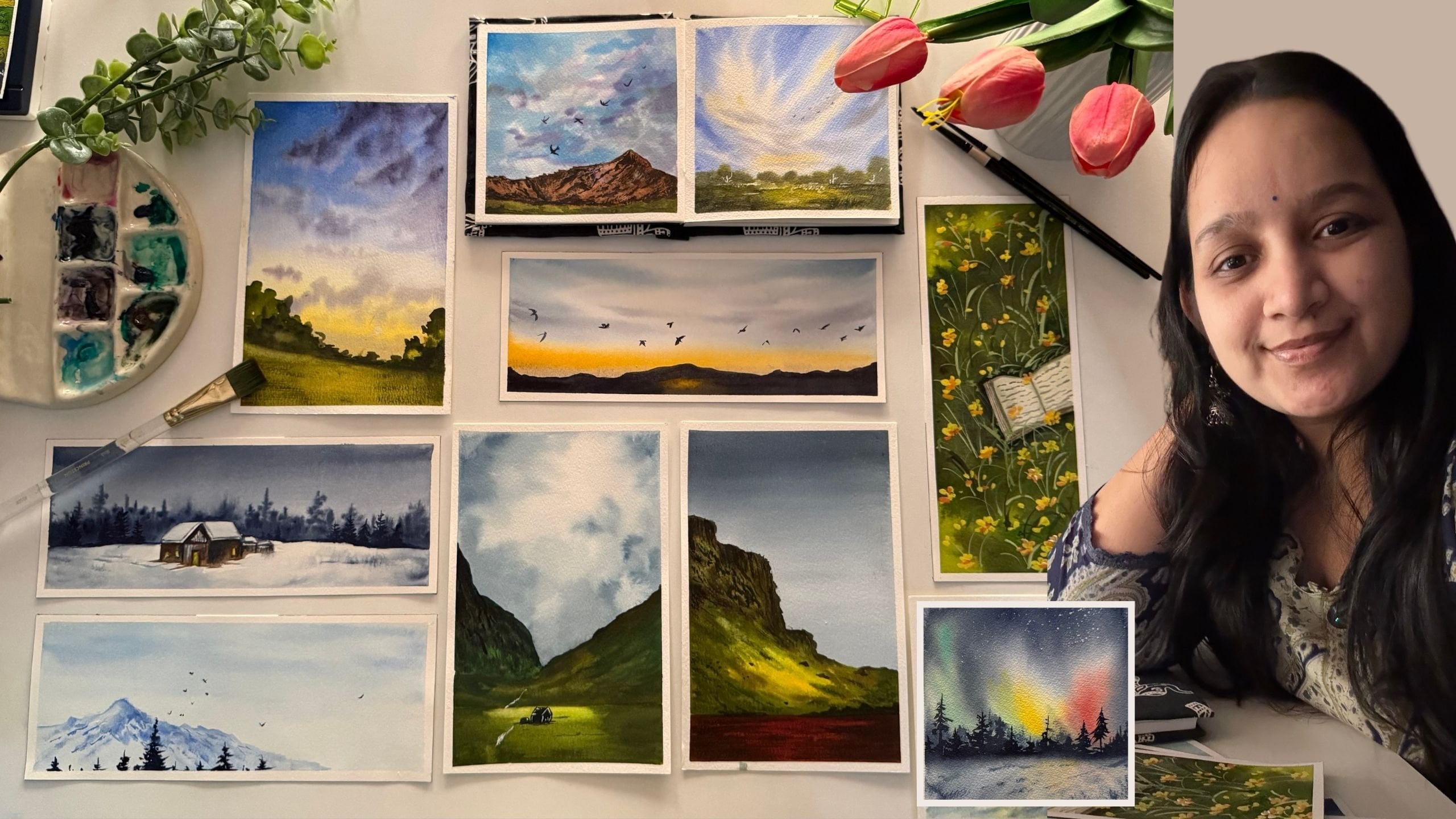
captivating and expressive. Hello, everyone. I'm Marchi
Tapara chartered accountant, an artist and a creative
business entrepreneur. I go by the name, creating
from the heart on Instagram, where you find my
creative journey, my creative practices, and all details about my
creative business. Welcome to the
planned new 21 day watercolor challenge class
where we are going to take a dive into the world of watercolors and embark on
a journey of creativity, exploration, and watercolor
skill development. Over the course of 21 days, you will learn step by
step techniques to capture the tranquility of landscapes from majestic mountains
to serene seascapes. If you are an absolute
pigner, do not worry. I will be guiding you first in detail about all the materials, beginning from paper, paints, to brushes and the other
stationary materials that you would be needing to
begin in your class projects and also discuss the
alternatives that you can use if you do not have a
particular material required. Each day, you will be guided through a new aspect
of landscape painting, starting with foundational
techniques such as washes, blending, and color mixing. As the days progress, you will deve deeper
into composition, perspective, and
capturing the light and shadow to bring your
landscapes to life. Through a combination of various landscapes included
in this 21 day challenge, you will sharpen your
observation skills and develop your own unique
style with watercolors. Whether you are a pigner
or an experienced artist. This class offers a
supportive environment to expand your artistic horizons
and unless your creativity, By the end of the 21 days, you will have a collection of stunning watercolor
landscapes that reflect your journey of
growth and discovery. So let's grab our paints and brushes and embark on this
creative journey together. Get ready to unleash
your inner artist and create breathtaking
watercolor landscapes. So without a further ado, I will see you guys
joining me inside this 21 day watercolor
challenge class.
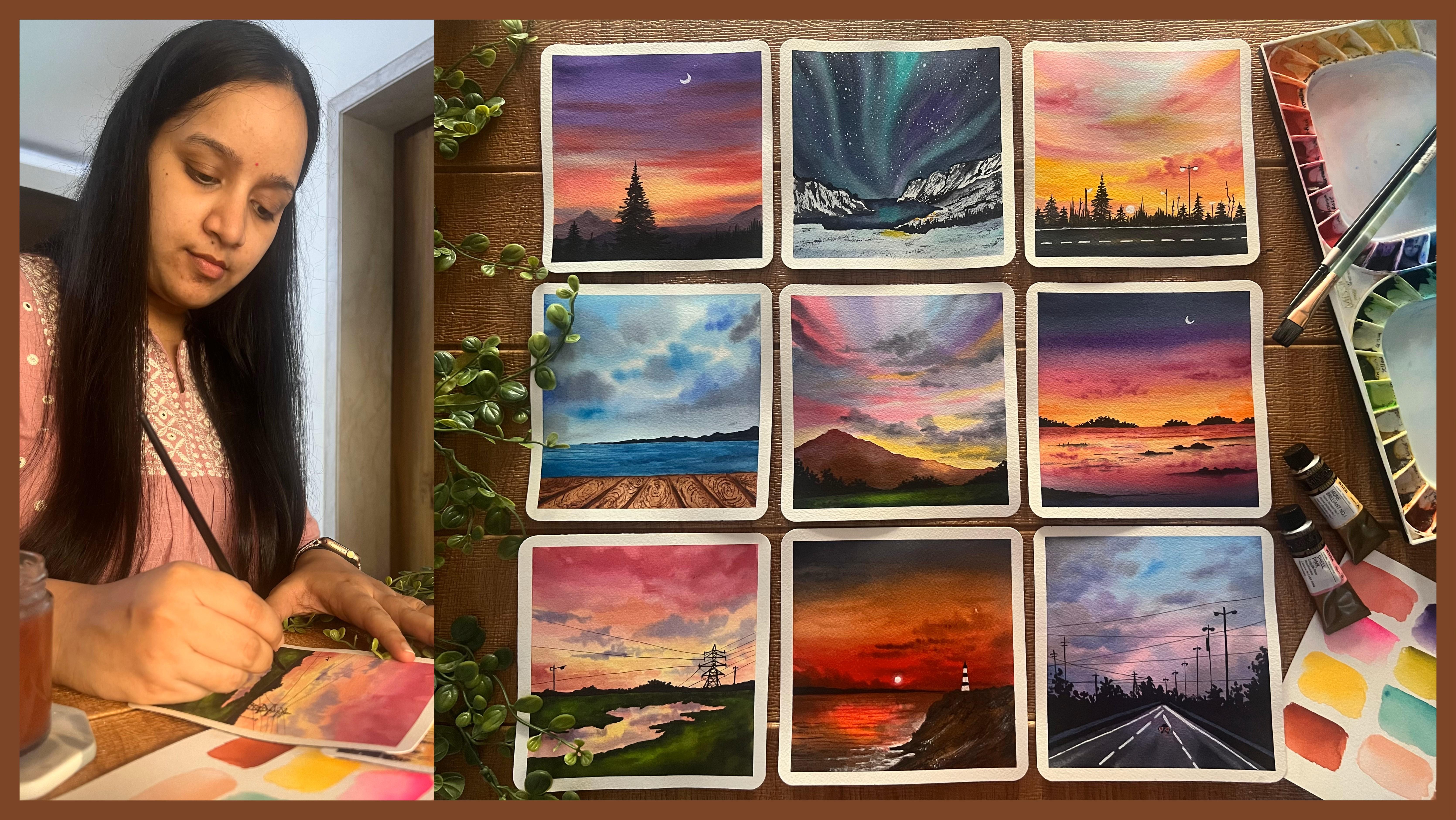
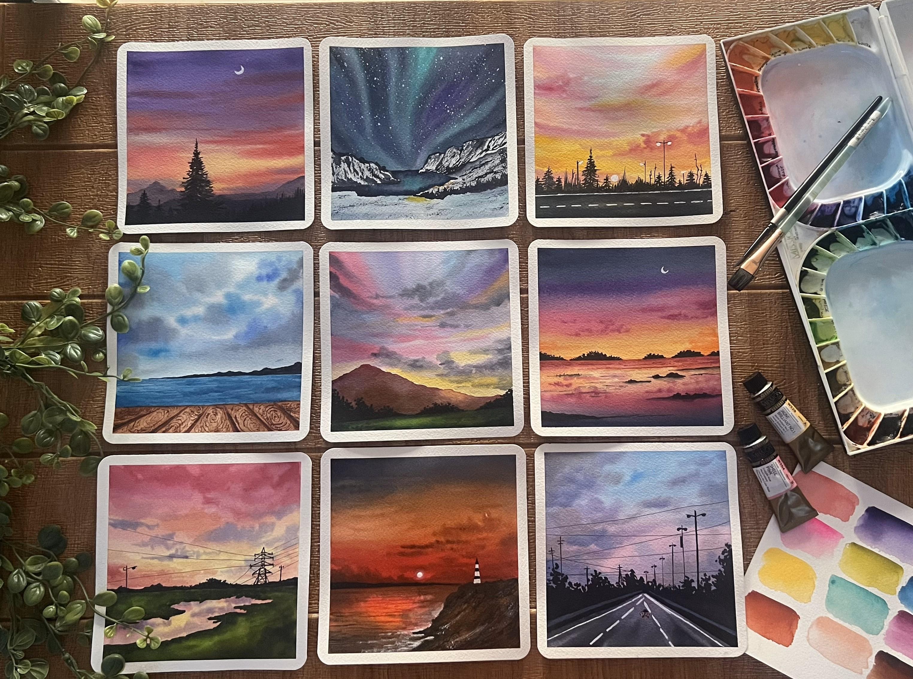
2. Materials You'll Need: So, let's first discuss
the materials in detail. We'll first begin with the watercolor paper that we'll be using
through this class. I'm using this
Archie 100% cotton 300 GSM cold pressed paper. Now, this paper has a little texture grain because of the cold
pressed technique. This is 100% cotton paper, so it will stay wet
for a longer time. It's approximately
six inch by 12 inch. I will be cutting this sheet
into two equal halves, and each painting will
be six inch by six inch. This is a glute pad. I can remove in single
sheets from these and cut it into two halves to use
it for each class project. So I'm going to be
painting each of the class projects onto these
six inch by six inch size. That is one sheet cut
into two equal halves. So from this block itself, I will be removing each sheet and cutting it into
equal halves like these, and then taping this down onto a movable surface with the
help of a masking tape. I'm going to be using in a
small board that I have, which will perfectly fit in this paper and
tape down my paper onto this board so that I can easily rotate while painting. So you can see this is the
perfect size that I've got in. You can tape it down
on your table as well. But taping it on a
movable surface makes it easier to add in some details and adjust your hand movements. So that is in detail about
the paper that I'll be using. I recommend using
100% cotton paper so that you can work a lot wet on wet and get in all the wet on
wet details, right. Now, next, moving on to the next important material
that you would need. That's the watercolor pans. I'm going to be using in this macho mission
watercolor set. This is actually a set
of 36 color tubes, which I have squeezed down onto this palette into 36 wells. I can easily re wet this and use it because watercolors
are easy to re wet. I will be also using in some
of the paints separately. So basically, these are
the seven L tubes first, which are squeezed down here, but there are some shades
which are not here, which I have separately
apart from this set. So those pains I
will keep on using as and when as per
need of the painting. And through every painting, I will discuss with
you the shades, the alternate mix
that you can create. So some of the
shades, for example, are this Cobalt creen that we'll be using in
for our thern lights, Naples yellow for some
pastel yellow effects, some past peach color, some sand color,
indigo pines gray. So I will discuss all
the alternative mixes that you can create to get the shades if
you do not have these exact same tubes.
So do not worry. You can begin with a
very basic watercolor set of 12 to 24 pins, whichever is available with you, and we can create each of the piece with those limited
color palette as well. Next important tool
are your brushes. You would be needing in some flat brush and some round brush. These are natural hair brush
that I have right now. So these hold a lot
of water and paint, making it easier to go ahead
and give in the details. You would need basically a flat brush for
giving in washes. This time, I'm going to
be using in a mop brush a lot for adding in a lot of
details into the paintings. For the round brush, if you do not have the natural
hair brushes, you can go ahead with the
synthetic hair as well, because natural hair brushes
are a little costlier, but they do the job much as for, you know, the charge
that they are for. So we'll discuss
brushes as well, while painting each painting. Next, you would be
needing in a white quash. I'm going to be using in
this Brustro white quash, because in some of the paintings for adding in some
opaque details, we will be mixing
in white quash with some basic paints to get in
these highlighted effects. So here you can see how with
the help of white quash, you can get that
opaque layer even on the dark black paints
gray color as well. So that is why you
would be needing either a white quash or acrylic or a white
shell pen as well, can do the job for
certain details. So I'm going to be using
in the same Brostro 0.7 white shell pen, which will help me in adding in some highlighting details. Next, you would be needing in some basic stationaries that's
pencil eraser, a scale. And you would be
needing in a set of watercolor or waterproof
pens, basically. These are of different nibs, as you can see, we will be using these for
adding in details, but you need to make sure
that these are waterproof, because if they will not
be waterproof and if you overdo any detail on top of
these, these ink may spread. So it's important that you
use these fine tip pens, which are waterproof in nature. Next, to each of the paintings, I'm going to be giving in these round edges with the
help of this round cutter. In case if you do not have this, you can keep the edges straight. That's absolutely
an optional choice. Lastly, you would
be needing two jars of clean water for each
of the class project. One to clean your brushes, and one for using
clean water for wetting your paints or
wetting your paper. I'm even going to be using
in a palette separately for mixing in white
gas with other colors. And rest of the colors, I'll directly mix it
on my palette here. And one more thing,
you would either need a rough cloth or some tissues to adapt
the excess pigment, excess water so that you can add in details like dry brush, wet on wet details,
wet on dry details, where you need water
control as well. So that's about the materials that you would be
needing for this class, very basic, very limited. You can begin with
whatever materials that's available with
you and we'll keep discussing the alternatives as we progress through
the class each day.
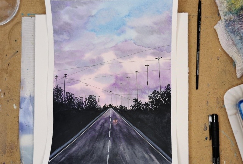
3. Day 1 - Glowing Lights: So let's begin with the
class project for tape one. The colors that you would
be needing is violet, red, pink, cerulin blue, white, black, and paints gray. Now you can either use black or paints gray as per your choice. So I have my paper taped
down onto this board, and I'm going to begin
in with the painting. So first, we're
going to begin with a very little pencil sketch, and then we'll move on further
to the layer of water. So at the bottom,
I'm marking out the pathway first
diagonally from the left to the
center and right to the center across both
sides of the pathway, we are going to have in some
black color foliage detail, and the center will be the
pathway, top will be the sky. We'll begin painting
the sky first. So we're going to begin
with a layer of water here. B we are working
with what colors, we are going to work
wet on wet to create in that soft,
beautiful evening sky. Make sure you apply an even
layer of water throughout. Now in this class project, if a little of the
water moves into the bush space or the roadway
space. It's perfectly okay. We'll be able to
cover it up because there the details will be
with the darker color. But as much as possible, try avoid adding in
the colors there. So I'm going with a clean
layer of water throughout. As you can see, I'm
running my brush multiple times so that my
paper stays wet for me to work wet on wet
getting in all the details of the sky without
letting the paper to dry. I'm using 100% cotton paper, and, you know, it stays wet
for a little longer time. But since it's summertime, paper may dry up quickly despite
being 100% cotton paper. So make sure you keep your
paper moist throughout. First, beginning in with the cellin blue
color at the top, almost half of the sky. I have covered it up with
the cellin blue color. Now, bottom of the sky, I'm beginning in with the
quinacinin rose color. You can pick up any shade of pink that's available
in your palette. It can be crimson, pink, rose, or, you know, any other tone of pink that's
available in your palette. I have blended the
blue and the pink, and you can see little
violet highlights at the blending point because of the blue and the pink
blending in together. I'm going to go ahead with a
little more darker strokes of the pink at the bottom space. Again, using in the brush, I am going to quickly blend in. You can see my paper is wet. And since I'm working with a little liquidy
consistency of the pains, you will notice my
paper will stay wet for enough longer time for me to work in with all the
details wet on wet. As I told you a
little of the colors, you can see it's gone into the pathway space to
make my blending easy, and that's perfectly okay
because we'll be able to cover that all up with the
paints gray color later on. Now, wet on wet, we
are going to begin adding in the cloud
details into the sky. For that, I've shifted
into my mop rash. It's a size two more rash. You can use a size zero
or one, if you have so. Otherwise, if you're
using a bigger size, make sure you're just
using in the tip. Now, morash holds a lot of water as compared
to a normal brash. So make sure you off all the excess water first before you begin onto the paper. Otherwise, you will have a very liquid
consistency of the pans, which may create a
mess onto your paper and spread out completely
and cover up your spaces. So I'm beginning to add in some simple strokes using
in the violet color. I'm using the
bright clear violet from the brand
magello mission here. You can go ahead
with any tone of violet that's available
in your palette, but make sure to use it in a medium consistency,
not too dark. Now, very carefully, you can see over the blue and the pink. I'm creating in
some cloud details using the violet color. Now, to the violet
at certain points, I'm adding in a little hint
of the paint's gray color to create a little
grayish violet tint for adding in some
highlights into the sky. Now, in the same way using the darker hint of the violet
and the pain scream mix. I'm adding in little darker highlights at the top as well. But you can see I'm not covering up the entire violet highlights. Plus, I'm even making sure my blue and pins
are still visible. You can see I'm holding my
brush a little perpendicular, just trying to use in the tip of the brush so
that I can get and find details plus
the water control because we are
working wet on wet. I have been dabbing my brush
always onto the, you know, a towel so that the
excess water and the pigment is absorbed
and I have very t pigment. Now, shifting into a
smaller size brush to add in some more details. I've mixed in the violet, that's a cellin blue along
with the bright clear violet, and I'm going to begin adding in some bluish violet
strokes into the sky. Now, again, for this, since I'm using a smaller size brush, working wet on wet, you will notice the edges will
be soft, but again, you need to make
sure your brush does not have excess
water or pigment, or else you may
get in, you know, patches of the color instead of maintaining in
the cloud shape. At the moment, you can see all of the strokes into the
clouds that I've added. They're retaining the shape
in which I'm adding them. Plus having in the soft blend. The soft blend is
because my paper is bed, and the shape is
there because I have the water control on my brush
while adding in the colors. So that is it for sky. Now we'll wait for this
to dry and then move on to the siloed details
for this painting. So now my sky is
completely dried, and I'm going to begin
painting in the pathway first. For that, I'm picking
up the same blue on the violet mix and
going to add it across the pathway line
that we've marked out. And at the bottom
of this pathway, I'm going to pick up the
pains gray color and blend it with this bluish violet tone that we've added in. Now the reason for adding in
the violet tone here into the pathway is to show the highlight effect of the sky colors falling
onto the pathway, creating in that glowing
space on the pathway. At the bottom, you can
see I'm going ahead with the pains gray
color onto the pathway. Now, always remember watercolors
dry or tone lighter. So you will need to
make sure that you use the right color consistency
so that after drying, you get in that bold effect
of the colors as you need. At the bottom, you
can see I'm just darkening up the pains gray
color because after drying, it will turn out too dull. At the top, you can see most of the violet has
got covered up. So again, we're just going to quickly go ahead with
a little more of the violet color at the top and try to lift in the
paints gray color. Automatically, you will notice the highlighting space that
gets created because of this violet color that we
added in the background and now trying to lift up the paints gray that's
coming on top of the violet. Now, very carefully, I'm pulling out little highlighting
strokes at the bottom as well
of the pathway to create in that little
glowing spaces. So very little color
lifting that I've done using in the
tip of my brush. You can see when it is wet
and you try to lift up, you get in that glowing
space onto the pathway. I'm just going to go ahead with little more lifting at the top. You can see now the
highlighted space is created perfectly at
the top of the pathway, giving in those violet shades, and at the bottom, we
have the pains gray look. Now let's move on to the
next layer that's going to be the foliage using in
the pains gray color. Okay. Using the pains gray, I'm beginning in with the tip
of my brush and creating in some bush detail by just dabbing in the tip of my brush randomly, and I'm going to fill it with the pains gray color till the
bottom of the pathway line. Now, make sure that your pathway is a little dried, otherwise, if you will add in
the pains gray color closer to it directly, the pain scream is spin and
create some darker edges. So you need to have
in that control or you can wait completely for your pathway to dry and then move on to this
layer of foliage. You can see as soon as
I'm adding in the pain scray a little is moving
into the pathway. I can have a control over it and I can correct it later on. But in case if you are
an absolute picner, I would recommend
you to wait for your pathway to
dry completely and then move on to adding in these details of the
foliage into your painting. Same way, we are
going to be going ahead on the left side as well. Now, using a smaller size brush, I'm just giving in
a precise line. You can see my pathway
is almost right. That is the reason this
color is not spreading much. It just had a very soft line. Now, you can see the pathway
color is so light as compared to a bold
pains gray color that we have for the foliage. So make sure for the pathway, you use the pains gray
or the black also in a little diluted medium
tone consistency. Now, same way pigging on the
left of the pathway as well. You can see at the top,
I'm just going creating in some rough foliage detail by diving in the
tip of my brush. You can see I'm trying to vary
in the heights throughout, so as to get in that
natural effect. Now, till the bottom of
the line here as well, I'm going to go
ahead and fill it completely with the
pains cray color, and then we'll move on to the next layer of
details for the silo. I'm done adding in the foliage detail on
the left and right. You can see now the pathway is having in that glowing space, that different light element because of the lighter tones
of the pain screen and the highlighted violet
color trying to show in the reflection of the sky falling onto the
pathway as well. Now, next, we are
going to go ah add in some details on
the pathway as well. Now, using the white shell pen, I'm giving in the details
onto the pathway. You can even use white quash and your brush to add
in these fine details, but make sure you use a fine tip brush so that you
can get the details right. Now, on both sides
across the lines, I've given in the details. Now, on the right,
the white line has gone a little more slant, so I will correct it with
the black color later on. Now, on the pathway, giving in the line detail, trying to show in the
movement of the pathway. Marking in two
lines so as to show that the road is
broader at the bottom. And as it's narrowing to
its perspective view, it's very fine in
the center space. All right, you can add all
of these details using in the white wash if you do
not have a white shell pen, but just that the
white shell pen makes the task easier and
more crisp and clear. Now, you're the line of white that had gone a
little extra slant. I'm just adding
in a fine line of black at the filg space again, so as to correct in that distance between
the white and the black. So you can see how easily you can correct and redo
certain things. Now I'm going to pick
up the white quash, and we'll begin creating in a
little highlighted space to add in a glowing light effect into the pathway
of a moving car. So first, we're going to use in the white quash and create
in that glowing space. So I'm adding in
two dots of fights. Then using in a dam rash, I'm going to blend these two and create in that dull space. So using in the dam rash now, I'm going to go ahead and blend these two spots and create
in that dull space. Automatically, you
will see you have two dull white patches for now. Now, till these two
patches of white dry out, let's move on to the next layer
of details in the foliage for which we are going to be
using in the fine tip pen. I'm going to use in these
micron fine tip pen. These are different nabs 0.3, 0.20 0.005, and 0.8. So as to get in
some fine details. Now, first, I'm using in the 0.3 nib to get in these
very fine lines, trying to show in
the street light across this foliage
that we've added in. Now, make sure you
can even use in the pain sky or the black color for adding in these details. But in case, if you are
using in a fine tip pen, make sure it's a waterproof one. This pen that I'm using
is a waterproof pen. Now, I've shifted it
to the 0.8 nib pen so as to get in a very thick
line for this larger, you know, pole
that I'm adding in because this pole is
much closer to our view. So basically, if you
have a perspective view, things that are far from you, would be thin and
in lighter tones. And as the objects come to you, they are much more detailed, much more bold, much
more to our view. Now, I'm just going to go ahead, shift in between the pens, and keep on adding
in these details. So I've added in
approximately six of these three very fine lines, three, a little bold as
compared to those fine lines. Now, on the left, I'm
just going to add in some very simple pole details
using in the same pens. Now, as I told you, if you do
not have a waterproof pen, you can use in your pain
ski or black color and add in these details with
a very fine tape brush. You need to make sure
that your brush is very fine so as to get
in these details, right. Now, you can see
since my paper is taped down on a movable surface. It's so easy for
me to just rotate my board and simply adjust according to
my hand convenience, rather than trying to, you know, adjust my hand and get it into a very
uncomfortable situation. Now, here, I'm going to add in a small electric
pole detail as well. So very simple details
that I'm adding in. You can go ahead
change in these polls placement or details
as per your choice. Now, to these pools as well, I'm adding in small lines here, cutting and giving in the detail and depth to the pools
that we've added in. Now, using the 0.2 nip pen, I'm going to give in some
Valine details into the sky. Again, this also you can add in with the
pain scray color, but make sure it's not
a bold consistency of the pain Skray or black. You can see I'm adding it very light handedly so as to get in a little lighter
shade consistency to these lines that
I'm adding in. Also, if you're adding
these with the brush, make sure it's a very
fine tip brush so that these details look
very fine and detail. Now, using the paints gray color and a smaller size brush, I'm just adding in
some light poles to these pools that
we've added in. So just some light
block details, we are not going to add in the detail lights with the
white or yellow tones. This time, it's just going to be simple sill hate with
the black color. Now, let's quickly
add in the last leg of detail that's going
to be the car detail. So I'm mixing in white
along with the red color. So red mixed in
with white quash. I've got that puriful red tone. Now, in the center of these white color dots
that we had created, I'm going to go ahead and add
in this red color to create in the light effect of the moving car that we are
going to be adding in. And for the silote of the car, I'm going to use in
the paints gray color. Or you can use in a
black pen as well. So I'm going to
shift and use both of those to create the
outline of the car. First, adding in
the light details with the red and the
pastal red color. And at the bottom as well, I'm just giving in some
fine lines to show some reflection of the color falling on the pathway as well. Now, till this dries out, I'm going to mix in a little bit of the white quash along
with my violet color. So as to give in a
little, you know, that side pole detail
in the foliage as well, trying to show in that side
grill across the pathway. So mixing in a very little violet hint
to the white quash. Now, reason of using white coaches because if you will use in
white watercolor, it will not give you
that opaque look. So it's important to
use in white quash or acrylic to get in
this opaque look. Now, I've just added a very horizontal line moving into the line
of the pathway, but onto the foliage
space, you can see, because of the white quash, even the white is visible on the dark black color
that we've used for the foliage because guash is
an opaque color consistency. So the white quash
helps in creating in that opaque consistency
and mixing it with violet, so as to create in
that dull effect, trying to show the sunset effect falling in here onto
the grill as well. Now, at certain
edges, if you want, you can just give
in a soft blend as well to them
or leave it here. Now, using in the black pen 0.8, I'm quickly going to create in a very small car silo hate, a small block at top
of the two red dots, and around the red dots as well, just giving in little bonnet
details of the backside. So that is it. Let's remove in the masking tape and
see a final painting. You can see such
a pretty sunset. I'm in love with the colors of the sky and how everything
has turned out. Make sure to remove
the masking tape once your edges are completely
dried and always pull your masking tape against the paper so that you do
not tear off the edges. Now, using in a
round shape cutter, I'm going to cut the edges. You can either use a
round shape cutter or cut it manually or
leave it as it is. You can use any size of the circle shape
that you want in for the edges and create in a beautiful rounded edge
on all the four sides. So here's a closer
look at our painting from day one of this
watercolor challenge. I hope you guys enjoyed painting this beautiful sunset
with me by the roadway. I hope to see you guys upload your class projects into the project section of the class, if you paint along and do proper review if you like
painting along with me. Thank you so much for
joining me into the class.
4. Day 2 - Sunset: Hello, everyone. Welcome back to day two of this
watercolor challenge. Today, the shades
that you would be needing is yellow
cer, sap green, yellow, orange, cereal and blue, white, black, and paints gray. So let's begin with a
very basic pencil sketch. I'm just going to mark out the foreground space and
the mountain spaces. And then we'll begin
painting in the sky. We're going to have in
two mountain ranges. I'm just going to
mark out one of them, and the second one,
we'll roughly add in once we are done
adding in the first one. Now, for the sky, we're
going to go ahead with a pretty combination of the orange and blue
tones this time. So we'll first
begin with the sky, wet on wet and then move
on to the next details. Now, firstly, for the sky, I'm going to mark
out a sun space and put in a small
masking tape there. So I have these circle shaped masking tapes readily with me. So I'm going to just place one of those in the center closer to the mountain range to keep
the setting sun space blank. There we'll be adding in
the details later on. If you do not have this, you can mark a circle and keep it blank or you can later on just use in white acrylic to
mark out that space, or you can even use masking
fluid if you wish to. Now, I'm going to go
ahead with a layer of water onto the entire sky. And this time the sky, we are going to go ahead with
the blue and orange tones. But now, blue and orange
are two such colors if blended together may
give you muddy tones. So you have to go
ahead very carefully while blending these two
tones so that you do not create any muddy tones while still having in the
blends happening between them, creating in the
beautiful sunset effect that we're trying to achieve
in for this class project. Again, here, you can see I'm running my brush
multiple times so that my paper will stay wet for enough time for me
to work wet on wet. Beginning in with the
dine blue at the top, using in my flat brush. Now, I'm using it in a little
medium to consistency. You can see it's a
beautiful bold color. Now, at the bottom, I'm going to go ahead
with the orange color. From the mountain
range closed space. I'm just going to add
in the orange color. But again, between the
yellow, orange and the blue. I'm going to leave in
that little white space and let the colors
naturally flow into each other so
that you do not create in any muddy
tones or any, you know, dark, muddy patche
in between for blending in. So just using in the
tampra you can simply just blend in these two colors
swiftly into each other. You can see there is no muddy tone formed
and the blue and the orange have blended and do not have any white
space left in between. Now, using in the mop brush, I'm going to begin adding
in the cloud strokes. Now, when you begin
adding in these, when you lay the blue
over the orange, make sure you go in very light handedly so that you do not
have in the muddy tones. If you will apply
a lot of pressure, then the orange and
the blue, again, mixed together will
give you muddy effect. And if you go in
very light handedly, the colors will just
settle in at the top and give you that beautiful soft
blend happening in between. Now, create a darker
hint of the blue. I'm using in paints gray mixed in with the
cedine blue color. You can use an indigo color
directly if you wish to, or you can also simply mix in a little hint
of paints gray or black to your cereal and blue color and create
a little darker hint. Again, when you're working
in with a mob brush, make sure you do not
have excess water or pigment on your brush, and you keep cleaning your
brush onto a rough tissue or a rough tile so that the excess pigment and the
water is absorbed there, and you have very little
pigment and water on your brush so that when
you apply it on the paper, it does not spread out a lot. Now, in between, you can see
some strokes I'm just using in the tip of the brush and
adding in very fine strokes. Working with a mop brush can
be tricky at times because, as I told you, it holds a
lot of water and pigment, and if that much of content
is applied onto your paper, it will begin creating
in patches of the color instead of reing the shape
that you try to add them in. I've just added a little
more orange highlight and created in a darker deck at the top in between
the blue as well, just adding in little
orange highlight, which you can see is
turning a little brownish, but giving in that beautiful
effect into the sky, creating in that beautiful
transition happening in. Now, just some last strokes. Using the tip of my mop brush, I'm adding some blue highlights over the orange spaces again. You can see I have
the water control. That is why the
strokes are retaining the shape and the space
in which I'm adding them. Yet having in the
soft blend because of the wet on wet consistency
that we are playing with. Now, adding in a layer of
water into the field space, here we are going to use in the yellowca and
the green tones. First, I'll add in a
little yellow occur space closer to the line, and then from the edges, begin pulling in green wet on wet to create in the blends. Now, again, in case, say, if you do not have the same specific yellow occur
or the green tones, you can use a
little yellow hinge to create that little
lighter space. And for the tones of greens, you are free to use in
any tones of greens, multiple choices of
greens that you wish to to create in the
depth into the painting. Now, again, using in the
tip of my mop brush, I'm beginning to
add in the green highlights from the edges. Here, also, again, we're
working wet on wet. It's important for you to have in that water control
in your brush. If you will have excess
water or pigment, it will cover up the
entire yellow occur space, and you will just be left with green patches of the color. So whenever you're
working with mop brush, I'm repeating it
again, and again, it's very important
for you to have in that water control
in your brash and your hands need to have in that controlling power to determine how much paint
and how you want to. Also, if you're working
on smaller spaces, make sure you use a
smaller size mop brush. Now, I've picked up a
little darker green mixed in with the paint's gray color and adding it from the edges. So in the center, you will see, I want to maintain in
that glowing space of the yellow occur to reflect the effect of the sunlight or the sunset falling into
the field as well, trying to show in that glow
happening in the field area. Now, I'm just going to add in a taker line at this
line of the mountain and the field space
meeting in trying to show that little shadow
of the mountains as well. So there you can see
on the horizon line. I'm adding in that bold
color effect already. So you can see for the greens. We've been kept pulling on the greens from the
edges to the center, creating in the darker
and the lighter effects, making sure that
as you are moving more towards the edge side,
you have the darker tones. And as you're moving
more towards the center, you have the lighter tones. So you have the
yellow occur visible, the lighter green,
the darker green, and now using a little
extra pains gray, I've added some more darker
highlights only on the edges. Now, again, on the horizon line, I'm giving a beautiful effect with the pains gray to create in that shadow for the mountain that we'll be adding later on. But the shadow we are
creating now wet on wet only. So you need to make sure every
tone of green that you've tried to use is visible
in the field space, so you accordingly add the
taco strokes in limited space. Now, let's wait for
all of this to try and then move on to the
next layer of details. So now my sky is
completely dried. I've just peeled off
this masking tape, and you can see we have that glowing space left
out for the sun. So first, let's begin with the first layer of the mountain. For the mountains, I'm going to use in the tones of blue only. So I'm mixing in the
same cellulin blue with a paints gray color and going to add in the first layer
of mountain at the pack. Now, a little of
the mountain has got in little of the sky colors. So that space, I'm going
to blend in well and make sure that those patches are well blended and do not stay visible. And once this
mountain range tries, we'll add in another
mountain range in front of this mountain range using
in a little taker color. So I'm going to fill this color completely to the horizon line, and then we'll
move on to the sun until this first layer
of mountain rise out. So I'm done adding in the
first layer of the mountain. You can see I've made sure
that it's a beautiful light, medium tone of blue
darker than the sky, but not too dark because we still have to add in the
second layer of mountain. Now, using in the white quash, I've added in the
first layer for the sun space that we're
going to add in here. It's going to be a setting sun effect that we'll be adding in. On top of this, we're
just going to add in little of the yellow and
the orange highlights. So I'm using the permanent
medium yellow tone and added it into the center space
around the sun at the edges. You can see I still have
the white color visible. Now, to this, I'm
going to add in a little of the orange
highlights as well. Now, make sure that you use a smaller size brush for adding in these details and also make sure you do
not overdo this, and they have a soft
blend with the white. So in between, you can
see I'm just going ahead, blending in the edges of the
yellow with a white color. Now, in case, say, if any
of the color is overdone, you can again use
wide quotion top of it and cover up the space. Now, just adding in little
spots with the orange color. This is a setting sun effect
that I'm trying to show in, hence, using in the tones
of the yellow and orange. Now, you can see the
orange has spread a lot. So what I'm going to do is, I'm just going to lift up a
little of the orange using in this brush and dab my brush every time after
lifting up the color. You can see automatically, you've again got a very
lighter yellow space left in. Now, I'm going to
use in a little more of the white
quash again and create a little more white spaces into this yellow and orange
space that we've added. For this, you need to make sure that your white quash is in a thick consistency so
that it stands out opaque. If you will use it in a
liquid or watery consistency, you will not get in
the same effect. Now, my mountain range is
also completely dried. So for the second
mountain range, I've mixed in a little more of the paints gray to
the same blue color. It's a taker blue consistency. You can directly use
an indigo color, but in case, if you
do not have an digo, in a similar way, you
can mix in your paints gray with the cdliin blue to
get this darker blue tone. Now, you may feel
that this is already, you know, like a
paints gray color. But no, if you have
a closer look, you can see it's a
beautiful dark, bold blue. I'm blending in that blue first into the base layer
till the horizon line. That is the field line
that we've marked out, and then I will add in
little darker blue effects at the bottom to the second
mountain range here. Now, if you see it's a beautiful indico blue and not a paints gray
color directly. Now, make sure you
have an even layer and you have that beautiful
glow and at certain spots, you can just drop in some
duck or hints to create in that little texture
and flow into your mountain range
as well. Okay. Now, into the field,
I'm going to add in little dry brush effect using
in the darker green color. So I've picked up a dam brush, just picked up the color in a thick consistency without
dipping my brush into water. And from the edges, I'm
just dragging my brush, and you can see I'm getting in some dry brush detail
onto the field, creating in that texture
and depth onto the field. In case, if you
want to learn more in detail about the
dry brush technique, I have discussed it in a lot of my previous classes about all these basics of water color. I will link the class as well
into the discussion post, so you can check
out those classes to learn the basics
of watercolor, or if you want to
know more about the tri brush technique
or basic details. Now, I'm a little unsatisfied
with the sunspace, so I'm going ahead
with a layer of white quash completely
on this entire space. I waited for the first layer to dry out so that now you can see, as I'm adding in
this layer of white, it's beautifully visible
and it has covered up all of my mess of the yellow
and orange that I created. Now, on top of this, I'm
just going to add in little yellow highlight and
show in that sunset effect, very little, not much. I'll make sure that this time, I do not mess it up in any way. And similarly, just some
orange highlights very little. You can see this time,
I'm going ahead very carefully so that I do
not overdo the space, and then again, you know, I have to redo the
purpose again. That is it. We are ready
with our class project. Now, let's remove
in the masking tape and see a final painting. Make sure you remove your
masking tape against the paper and only once your
edges are completely dried. Or else it may tear off your edges and always
make sure you do not lay your hands
over wet paints or fingers onto the edges. Otherwise, you may ruin
those white edges. So here's our final
painting for Day two. Another beautiful simple sunset. I love how the sky
has turned out, and the beautiful
blends into the sky of two such complimentary tones. I hope you guys enjoyed
painting this with me today. I will see you guys soon into the Day three class project. Make sure to upload your class projects
if you paint along. Thank you so much
for joining me.
5. Day 3 - By the Mountains: Hello, everyone. Welcome
back to date three. The colors that you need for today's class project
is violet, red, Naples yellow, orange,
John brilliant, white, black, and paints gray. Don't worry if you do not have the Naples yellow
or John brilliant, I'll tell you the alternative color mixes that you can use. So I am ready with
my paper taped down, and we are going to begin in directly with a layer of potter. We do not have any
pencil sketch. We'll add in the details
of the mountains and the pine trees later
on itself directly. So first to paint in the sky, moving ahead with a layer of
photo onto the entire paper. Make sure you add in an
even layer of potter and you do not have excess
water onto the edges. Now, you can see, I run
my brush multiple times two and four to make sure that I have an
even layer of water. I'm going to squeeze
out a little bit of the fresh white quash and keep it ready because we'll be needing it for blending in. Now, coming to the other tones, I'm going to squeeze out a
little bit more of the violet onto my palette since the
violet is almost over. Next, for the John
Brillant color, you can simply mix in your
orange yellow and white quash and get a beautiful
skin color tint that's a pastal peach tone. So first, pinning in with
the violet color at the top, I have added in a little
hint of the white quash, very little not much. And at the top, pinning in
with a dark layer of violet, almost one third of the
sky, almost 40% space. I've covered it up
with the violet, and then now I've added in a small layer of white
because at the bottom, we are going to be blending it with the cha brillant color. Now, the John brilliant color
is a pastel color already. So this already has an
opaque consistency, because of the white
pigment in it, it has a pigment white, because of which
it has this pastel consistency and an opaque look. So you can create this beautiful orangish
yellow skin tint and mix in your
yellow orange with the white quash and get
a similar looking tint. Now, you can see when I blend in this pastel with a white layer. You do not get any muddy tones. Otherwise, if you
would try blending it directly with the violet
without the help of white, you may get in a
little muddy tone because of the violet color. Now, onto this, I'm going to
go ahead and mix in the red, along with a little
bit of the white and begin adding in the highlight
strokes into the sky. At this point, you can
see the blending between the violet and the
endreln is perfect. So just mixing in a little
bit of the crimson red, along with a little bit
of the white quash, because I won the colors in
a good opaque consistency. I'm using my size eight
silver black velvet brush, which has a pointed tip. So I'm just using the tip
and adding in the details. At the bottom, I've added in this beautiful
pastel reddish tint. Now, the most important thing here is that you need
to make sure that you just use in the tip of your brush while adding
in these details. You can see I'm going with
very loose strokes, you know, moving criss cross,
either from left to the center or right
to the center. And I have the perfect
water control on my brush. That is the reason you can see these colors are not spreading, rather they're retaining the space in which I'm adding them. Yet having in that soft blend because of the
wetness of the sky. Now, next, I'm just going to go ahead with one
darker consistency of the same color and add in some darker
highlighting strokes. For that, I've
further shifted into a smaller size brush
so that I can get in much fine strokes as compared to the previous layer of strokes
that I've added in so far. So you can see how I'm adding
in these darker strokes, making sure that you still have the lighter
strokes visible. Even with the darker color. I'm making sure that I have that water
control on my brush. So they are retaining
the shape in which I'm adding
them into the sky, still having in the soft plant because my paper is still red. Now, just using in a
little violet tints to add in little highlights at
the top along with this. For the darker tint
of the red also, I have mixed in a little hint of the white quash as
well so that you get in this opaque consistency and do not get in
any muddy tones. Now, next, I'm mixing
in a little of the white quash to
my violet color and creating in a very light
pastel lilac kind of a tone. I'm going to begin adding in
some strokes at the bottom, where we'll be having
in the mountain ranges coming later on. So from behind the
mountain range, you'll have a little of the violet clouds
as well visible. At the bottom, we are going to be having in two
mountain ranges, and then a full line of pine trees that
we'll be adding in. Again, here you can see
because of the white that we we when the red and the violet are blending
with each other. They're not giving you any muddy or unpleasant tones, rather, they're giving in a
beautiful easy blend, having in both the
colors visible. You can see how I'm
adding in these, making sure that the John
llant color is still visible in between the
strokes of the sky, even the red strokes at
the bottom is visible. So you need to go accordingly, making sure that your color
of the sky are visible. Just adding in a little more
strokes with the pink here, sorry, the red pastal
red color here. If you want, you can even use in a pink tone mixed in
with white quash. Now, my sky is completely dried, and we are going to begin with the first layer
of the mountains. So for the first
layer of Mountain, I'm mixing in violet with
a lot of white quash. It's going to be a pretty
pastel mountain range. And then we'll add in the
second mountain range, which will be darker than
the first mountain range. Now, when you begin
adding in this, make sure that you go ahead, and, you know, you do not have excess water
onto your brush. Also make sure that you use the color in a good consistency and make sure that
you do not use the darkest consistency of
the violet here directly, because we still need to
add in the second layer. For the second layer,
I'm going to mix in a little bit of the paints
gray to the same mix. So presently, I've
just added a hint of white quash to my violet
for the first layer. And at the bottom, just giving
in little darker effects, mixing in a little paints gray. When we begin with the
second mountain range, we'll add in more pains
gray to the same mix of the violet and the white ash. Reason being that we'll
give you one darker tint creating in a
voletish gray color. But when you begin adding that, you need to be sure
that you do not take a complete paints gray
color because we still have to add in the pine
trees which have to be visible onto the
mountains that we add in. Now, here you can see the background clouds
that we added in the lilac color are lighter
tone than the mountain range. Hence they are also visible, and the mountain
is also visible. Now, we'll have to wait for this first mountain range to dry out completely so that we can add in the second
mountain range, and then the pine trees. So I'm just going to give it a little highlighted
strokes at certain places, lifting up a little
color so that we add in the second
mountain range later on. You can see the shape, I've
gone within very uneven one. Let's wait for this to dry now. Now, for the second
mountain range, let's begin mixing in the color. I'm mixing in a lot of paints gray along with
the violet color, and it's going to be a
grayish violet tint. It's not a violet color
nor a paints gray color. When it will dry out, you will be able to see the violet hint, giving in that grayish effect. Because with the bold
paints gray color, we're going to add
in the line of pine trees at the bottom space. So make sure that
this color is not a direct paints gray color
or a very dark color. It just has to be dark than the previous
layer of your mountain so that it's visible and giving in that distinctive
mountain look. For this step, make sure that your background mountain
range is completely dried. Only then begin adding
in the second layer of mountain here.
So I have added in. Now, I'm just going to add in a little darker
highlights at the top at spaces where I
feel that it's not visible onto the
first mountain range. Now, we'll have to
wait for this to dry as well completely and then move on to the next layer of pine trees into
this painting. So now, both my mountain
ranges are completely dried, and we are going to begin adding in the range of mountains here. For that, I'm going
to be using in my fine tip brush and
the pains gray color. And I will begin adding in mountains, sorry,
the pine trees. Now, pine trees are going
to be of different heights. I'm going to add in one big one, and the big one, make sure it's not exactly in the center. You can see at this moment, it's a little left
line and center. Now, for the foliage
of the pine trees, just going from left to right, criss cross, creating
in the foliage. You can see I'm just
moving my brush a little diagonally from left
to right and right to left, creating in the foliage effect. Make sure at the top, you have a pointed tip, and
moving downwards, you get a triangular shape to your pine tree to give in
that look of the pine tree. So as you move downwards, the length of the foliage
will keep increasing. You can see as I'm
moving downwards, the leaves are
increasing in length, creating in that triangular
shape for the pine tree. Now, make sure that you
use the pain scray in a dark consistency and also make sure you're
using a fine tip brash. I'm using my size
one down brash, so I'm able to get in
this foliage detail. Now, across the
entire bottom space, we are going to have in the
similar kind of pine trees. But some of them, we're going to add it in
a quick manner, using in a simple technique, which I will quickly
share in once I'm done adding in this
pine tree as well. I'm just going to extend this a bit to give it that
pointed tip effect, and wherever I feel that the
foliage is a little light giving in a little
overlapping effect as well. Okay. Now, as I told you, we are going to be wearing the heights of the
pine trees throughout, so make sure you do not add them in the same
length throughout. You can see I'm going ahead
with very different sizes. And also, I'll make sure that not all of them
are over crossing the mountains because
we want the mountains also to be visible from
behind the pine trees. That is the reason we went
ahead first and added in that one big major pine tree in the left aligned
center space. M. Also, you will notice I'm not going with a lot of detailed foliage. I'm quickly just moving my brush crash scrash making
sure that just the shape of the final pine tree is triangular to give it that
depth look at the bottom, giving in a little black
or pains gray color patch to create in that effect. Now, moving to the right side, I'm going to quickly go ahead, add in a few pine trees to the
right of these pine trees, and then to the rightmost space, I'm quickly going to fill in that space with a black patch. I'm just lengthening up a
little of the foliage of this big pine tree again
here at the bottom majorly. Now, on the left here, you can see, sorry,
on the right here, I'm just going ahead with some
simple foliage at the top, dabbing in the tip of my brush, and I'm going to fill in this entire bottom space
with the paints gray color. So you can see this entire space has got filled up completely. On top of this, we'll give in a little detailed look, Soly. So now on top of this, using in the tip of my brush, I'm just going to pull
out these simple spikes, so they will act in as a bunch
of pine trees altogether, and we'll look as if they
are a little distance, hence not visible in
a detailed manner. You can see how quickly
we could fill up this space with just a
very simple technique, filling up, creating
in a black patch, and then on the top of it,
pulling out these strokes, creating in that undetailed pine tree look and a
little far distant look. Now, in the space in between, I'm just going to add
in another pine tree between the big pine tree and
this patch that we created. Make sure that your paints
gray is in a bold consistency. Only then after drying, it will give you this
beautiful effect because if it will be in a light
or a watery consistency, it will dry out dull and
will not give you that look. So at certain spots where I feel that the color
is drying dull, I'm just going ahead
with the overlapping. So as to having that
bold effect even after it is dry
Because remember, watercolors dry or ton lighter, so you need to make sure
that these details are bold enough so that after drying also they have that bold effect. Now, I'm squeezing out some fresh white gas here separately. And for the last step,
I'm going to quickly add in a moon at the top in the
purple space of the sky. Using in the same smallest
size pointed tip rash, I'm going to add in a
small crescent moon shape. I'm not giving in
any glowing spaces for the moon or
any other detail, just a simple moon
silhouette that I'll add it. Again, this will also not
be a center alignment. It's this time towards
the right aligned center. If you're not confident about adding this moon with the brush, you can even use a wide
shell pen to add in, but white quash will give you a better opaque
and bright effect. Now, let's remove
in the masking tape and see a final
painting for day three. I absolutely love how the
sky has turned out in this one beautiful bold with
such pretty sunset tones. Make sure you remove the masking
tape once your edges are completely dried and do not lay your hands onto the edges. Otherwise, it may ruin the white edges that
we've tried to secure. So here's a final painting for day three of this
watercolor challenge. I hope you guys enjoyed painting this beautiful sunset by
the Mountains with me. I love the pastel
hints of this sky. Thank you so much for
joining me into this class. Make sure to upload
your class project and do drop a review
if you like this class for whatsoever reason so that it can help me reach
maximum students. Thank you once again
for joining in.
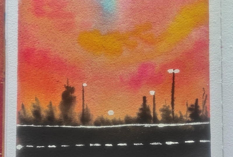
6. Day 4 - Simple Cityscape Evening: Hello, everyone. Welcome
back to Day four. And today, we are going to paint this beautiful night sky view. The color hose that you would
be needing is BoncenaRd, ndic brown or any
dark brown shade, orange, John brilliant, white, black, and paints gray. So these are the
color shades that you would be needing for
today's class project. Now, let's move on
to the painting. We're not going to be having any pencil sketch for
this Panas either. We are going to add
in the silo hate later on with the
paints directly. We're first going
to go ahead with a layer of photo onto
the entire paper. As I repeat for
each class project, make sure that you have an even layer of photo throughout, and you do not have excess water collected onto the
edges or else it will see pack into your painting and create in some
rough patches. So it's important to make sure that you have
an an even layer. Run your brush multiple times so that your paper stays
wet for enough time. Now, in case, if
you are staying in a place where
because of the heat, the paper is drying out quickly, what you could do is
wet your paper once, let it dry out a bit, and then again, go ahead
with a layer of water after a certain time once your
paper is again, 50% dried. And that way, you can keep your paper wet for a
little extra longer time. Now, I'm first pinning in with the paints gray
color at the top. Almost 30% of the space. I've covered it up with
the paints gray color. Now we're going to move
on to the tones of red. So I'm beginning in with
the permanent red color here at the bottom space. Now till the time I
reached the paints gray. You can see I've left a little
gap there where I'll use in this ja brilliant color
for blending in easily. Since the John blind color has a little white
element to it, you will see that
the blending becomes easier and much more
smoother transition between the paint
screen and the red. Now, I'm going to go ahead and darken up these colors
because remember, watercolors dry a tone lighter. So if I leave it at this
stage of color consistencies, these will dry out very light, which is not what I
want because I want a bold evening night sky look. So I'm just going to go
ahead and create in, you know, the entire layer again and add in little
more darker tins. So I've done adding
in the taco tin for the paint scray and now
beginning in with the color, I'm going to begin adding in the cloud strokes at the bottom, giving in the cha
brilliant color. Because at the bottom, we're as it is going to be having in the silhate coming in with the browns and blacks later on. We're going to add in a very
simple city scape silo hate with some foliage detail. Now, since my paints gray color, you can see is flowing a
lot at the bottom space. I'm keeping my paper tilted
while adding in the red so that my red flows towards
the paints gray side, and the paints gray does not
cover up most of the space. This is how you can
control the flow of your colors and the angle
flow of your colors. So using in the red, I've added in the darker tint
for the red as well. Now, I'm mixing in a little bit of the burn sienna
to my red color. You can even use a reddish
brown tint if you want. And using a smaller size brush, I'll begin adding
in some highlights into the cloud strokes. So I've just added
a little more of the brown so that it
be perfectly visible. Now, my flow of the
paints gray has, you know, settled down, so I've kept the paper
boat down again. Otherwise, you can keep tilted according to the flow of the
colors that you want in. Now, using in this
brownish red tint, I'm beginning to add in the
highlights into the clouds. You can see I'm using
in a smaller size brush while adding in these
wet on wet details. I'm making sure my brush does not have either excess
pigment or water. Otherwise, this color will spread completely into
the entire space, and you will not be
able to, you know, u control the flow
of these colors, and this may then create in an entire patch of color instead of giving you these
cloud shapes. Now, in the same way, I'm
going to go ahead with the pains gray color to
add in some cloud details. Now, at the bottom, you can see I've added in a lot
of ground details, though most of this space may get covered up with
the silo hate. But still, from
behind the silo hate, you'll have the cloud
effects visible perfectly. Now, adding in the cloud strokes with the pains gray at the top. I'm using the pains gray
in a bowl consistency. One tone darker than what I've used in for
the base layer of the sky and very randomly just adding
in some cloud stroke, stabbing in my brush,
creating in the depth. I'm still working wet on wet. My paper is wet enough for me to still add in all
of the details. And even onto the brown tones, adding in a little darker
highlight with the pains gray, creating in that
darker brown hint. If you want, you
can directly use a dark brown here instead of
adding in the pains gray. Now, using in the red color, I will just begin adding in some darker highlights
into the sky. Then we'll have to wait
for the sky to dry completely before we move on to the silo hate for this painting. Now, on the right side,
you can see still my paints gray is flowing a
lot towards the bottom side, which I do not want. So I'm again going to
just tilt my board a little and quickly
using in a flat brush. I'm going to lift
up that color from there where extra paints
gray color is flowing in, and very softly and
gently just swipe off that extra water or extra liquidity consistency
of the paints gray color, creating in that smooth blend still happening in between
the paints gray and the red. So this is how you
can quickly lift up a little of your color and
get in that right flow. Otherwise, the paints
gray would have flown completely to
the bottom space. So that is it. Now, before
I let the sky to dry, I'm quickly going to add in some more darker strokes of
the paint scra at the top. Again, very important to
have in the water control. Otherwise, the paints will
begin to spread a lot. After this, I'll wait for the
sky to dry completely now. And then we'll move on to the silo hate of the foliage and the sil hate of city scape that we're going to be adding in
for this painting. So let's wait for this
to dry completely now, and then we'll see once
this dries out completely. So, my sky is completely dried, and you can see the cloud
strokes that are beautifully visible and have in that soft blend into the
base layer of the sky. Now, picking up the
vend brown color in a medium tone consistency, I'm going to begin adding in a very simple silo hate
for the city's k. Now, you can go ahead
with any darker tone of brown if you do not have a vendi brown color or to your burn sienna
or burn tumber. You can add in a little hint of the paint's gray color to
get a dark brown hint. Now, the silt of the city scape
can be different for you. You can go ahead with
your own layout. I have first marked out a bottom line completely
with this color. Now, on top of this,
I'm just going to give in different shapes
for the buildings. After that, we'll shift on to the foliage detail for
this painting and then just add in some highlights to the city scape area
that we are adding in. Now, in case, if you're
going ahead with a city scape layout
of your choice, certain things to keep in mind, try to vary the shapes
of the buildings or the city scape
that you're trying to add in so that you have
in that variation. Make sure you use
a small size brush while adding in these
and also make sure that you maintain the proportion depending on the size of the paper that you're working with. Now, another thing to
keep in mind is you need to make sure that from
behind the city scape, the clouds are
visible in different color tones because that is the reason why we added in so many layers at the
bottom space also, despite it all being covered up with the city scape majorly. But from behind the city scape, you can see some lighter
tones of the sky, some darker cloud effects
creating in the depth. Also make sure you use a
smaller size brush or use in the tip of your brush
so that you get in these precise shape details. I'm almost through adding in. You can see I've gone ahead
with different shapes randomly creating in the
depth into the city scape. Now, while this city
scape area is still wet, what I'm going to do
is I'm going to begin adding in some darker
highlights onto the edges. For that, I'm going to pick up a little of the paints gray
mixed in with brown, creating in a very
dark brown hint and going to add in some
darker depth at the bottom, and even at the top,
just going to drop in some darker tints using
in the tip of my brush. You can see since the
city scape area is wet, this darker tint is
automatically blending in, creating in that dual tone
effect into the city scape, giving in those random
darker highlights coming in. Now, again, make sure you add these darker
highlights accordingly because these will
dry a tone lighter. So I'm satisfied with
the darker hints of the brown and paints
gray that I've added in. Now, using in this
piled tron brush, I'm going to begin adding
in the first layer of the foliage until the rest
of the city scape dries out. For that, I've picked up
the paints gray color without adding in
any water to it, and just using this damp brush, I'm going to keep on ding creating in some foliage detail. Now, when you begin using
in this dabbing technique, make sure that you
try to get out a shape that you want to achieve at the end
for the foliage. So somewhere you will see the foliage is coming out a lot, somewhere it's restricted
to the edges only. So accordingly, you
need to get it out into the shape that you
wish to achieve in. So same way I'm going to add
in on the left and right, and then into this,
we're still going to be adding in a lot of detailed
foliage effect as well. So I'm done adding in the
foliage at the right side. You can see I have taken it longer towards the center
at certain places, and somewhere I've
kept it very small. Same way, I'm going to go on the left side
as well quickly. Again, on the left as well, I'm just going to add in in a half triangular shape or
a right angle triangular. Because this time year, I'm going to give in a little
pine tree foliage detail on top of this as well. So on the left side, you can see I've kept the foliage very slim for now because
we are going to add in the details later on
in a detailed manner. Now, I'm going to go ahead, use in my smaller
size brush and begin adding in the detailed
foliage effect as well. Now, my brown space
is still wet, so I cannot add in the details
onto the brown area yet. So that is the reason
I'm going ahead, adding in the details
in the foliage space. So you can see closely for
adding in the detail foliage. I'm just dabbing my brush, adding in some leaf details, pulling out some branches from the edges of this space
that we've added in. We're going to add
in a little foliage falling over to this
city scape as well. But for that, you need
to make sure that your brown spaces are
completely dried. Otherwise, it will have
in a very soft plan. Now, on the left,
I'm just pulling out some pine tree
foliage from the left to, you know, a space that
we've added in with that spoil brush,
adding in the depth. So on the left, you can see, it's kind of like a half
pine tree that is visible. Half of the pine tree
is not in our view. And the background layer
that I added helps in, you know, creating in that
background foliage effect. Now, on top of these roofs of the city
scape that I've added, there also, I have to
add in a little foliage. But for that, you
need to be sure that your city scape is
completely dried only then. Otherwise, the paints
gray color will begin to seep onto the
edges of the city scape, giving in a very
unpleasant patchy effect. So on the left, you can see, I simply pulled out
simple foliage detail and just created in that
half pine tree look, and the background
layer that we added helped in so much to adding
in the details quickly. Now, I'm just adding in a little more detail
on the right side before we move on to the details
of the city scape above. Now, my city scape is
also completely dried, and on top of it, I'm going to begin adding in the foliage. So firstly, on the right side, on top of the brown
area that we've added, I'm adding in simple
foliage detail, dabbing in the tip, creating in some depth to the foliage. Then towards the left side, on top of the roof of these, I'm going to add in a
little foliage effect. I'm going to use in the same
technique that is dabbing in the tip of my brush to
create in the foliage. Until the bottom, I'm going to fill it
with a black color. So you can see just at the top, I'm dabbing in the
tip of my brush, creating in some
rough boh detail. And then till the bottom
of the roof line, I'm going to just fill it
with the pains gray color. If you want, you can
use in a black color as well if you do not have
a pains gray color. Now, for adding in
this foliage as well, make sure you're using
the paints gray in a good bold consistency because after drying
these may turn out dull. Same way in the center here, I'm adding in a
little more detail onto the roof of this as well. Then after this,
we'll just quickly add in some highlights
into the cityscape, and we'll be ready
with our class project for four as well. So, I'm done adding in
the foliage detail. Now, I will quickly shift into my micron pen and
add in some details. So I'm just going to pull out some poles from in between
of these city scale. Again, for this, you can
use in your paints gray or the black color to add in the details with
a fine tip brush. But using this waterproof
pen makes the task easier, more crisp and detail. Make sure that you use a waterproof pen so
that if at any spot, you have to overdo
or correct anything. These do not spread
and create patches, because if it will not
be a waterproof pen, and if then you try to
correct any space of the watercolor with a
wet watercolor paint, then this black may begin to spread and create black patches. So randomly, I've added in a few poles using in
different nibs of the brush, 0.3, 0.5, and 0.8. You can alternatively,
as I mentioned, use in your black color along with the brush and
add in the details. Now, using the 0.2 nip, I'm adding in some
of the lines into the sky moving from in
between the foliage, as well as crossing
through the poles. On top of the pools as well, I'm going to be adding in
little highlighting details. Using in some simple strokes. Using the same pen, you can see, I'm just creating in the details onto these pools
that we've added in trying to create in those
electric pole details here. And this little one here, I'm adding in a silo hit
of the street light. Now, lastly, quickly going to add in some highlight
onto the city scape. For that, I'm going to use
in my white shell pen. Again, for this, you can use in your white watercolors
or white quash. Watercolors will not give
you that opaque look, so I recommend
white quash or are. So I'm just creating in some highlighting spots
onto the city scape, giving in that effect. So you can see, I've not
given in this line completely throughout just at certain random spots that I've added in. Now, on top of this,
I'm going to quickly pick up the brown
color and add in on top of the white lightly so that these spots turn
a little brownish, and this will give you
a better view because this white otherwise will
stand out too bright. So quickly using a little brown, you can see I've blended
it a little into the base layer color and created in that
highlighting spots. And I've not added
it throughout. You can see just a few lines
randomly here and there. Now, remove in your masking tape pulling it against the paper, and we are ready with
our class project for day four of this
challenge as well. So here's a closer view at
our painting from day four. I hope you guys
enjoyed painting this. I've already cut the round
edges for the painting. And thank you so
much for joining me into this class and
painting along with me. I will see you guys soon into the Day five class project
till then. Happy painting.
7. Day 5 - Field Side Sunset: Hello, everyone. Welcome
back to day five. Today, we are going
to be creating in this beautiful field
with the sunset view. The colors that you need is scene blue, Crucian
blue, yellow, orange, sap green, light green, white, black and paints gray. You can alternatively shift the color tones as
per your choice. So let's begin with a very
little pencil sketch. We're going to mark
out the field space. Now, in the field, we
are going to have in the green field details, for which we are
going to create in two to three of the you know, depth into the field area. So I'm marking out two to
three different levels of the field here with
the pencil sketch. So these lines will act in
as the distinguishing point, wherein we'll be giving in little darker depths
on these lines trying to create in that depth or three D effect into
the field space. And at the bottom,
we'll just give in little yellow floral
details later on. So we'll begin with
the sky first. And for the sky, we're going to go ahead with a
beautiful sunset view. It's going to be the shades of blue and yellow here as well. So first, beginning
in with a layer of water onto the entire sky. Make sure you run
your brush only into the sky space and not
into the field space, and also that you have
in an even layer of water throughout
onto your sky area. Now, I've already told
you that you need to be sure that your paper is
evenly wet throughout, run your brush multiple times. Across the field space. You can see I ran very carefully so that
I do not run into the field area because those are going to be with the
green shades later on. Now for the sky, we
are going to be going ahead with the tones
of blue and yellow. Now, remember, blue and yellow mixed together gives
you green tones. So you need to go ahead
carefully in such a way that you do not get in those
green tones while blending. I'm going to squeeze
out a little bit of the plusian blue color first. Now, in the remaining
part of the sky, I'm going to go ahead with
the Naples yellow color. Now, I have a ready
Naples yellow color from the brand M
yellow mission itself. But in case if you
do not have one, you can simply mix in your
permanent yellow light or a light yellow color with some white quash or
white water color to get a pastel yellow color. Now, using this
beautiful pastal yellow, I'm going to begin from
closer to the mountain range. Make sure you clean
your brush and you do not have any blue
pigments on your brush. Otherwise, you may
get in green tones. Now, at the blending point
of the yellow and the blue, I'm going to leave
a fine white gap and let these two blend in naturally by tilting in my board so that you do not have
any green tones form. So using the damp brush, I'm going to blend
these two later on. But first, just running
with a layer of blue. And now at the meeting point, cleaning my brush
I'm going to run this damp brush here in between. You can see both the colors are now beginning to flow and
blend into each other, but have not formed in
any green tones here. So this is how you blend in two colors which are
complementary to each other, which may create in
some darker tins. Now, moving on to the next
detail of the clouds, I'm going to mix in a little of the orange color
I'm going to begin adding in little orange
highlights into the sky. So make sure Either you
use a smaller size brush, or if you're using a mop brush, you can see I'm just using
the tip of my brush. Also, again, mop brush holds a lot of water
and a lot of pain, so you need to have
in that control while working in
with a mop brush. If you're not enough
confident to work with a mop brush with
these fine details, you can even use a
smaller size round brush because that will
hold in less water, and you will have more control
over the pigment layer. You can see I have
the water control. That is why the pigments stay in the space in which I add
them retaining the shape, yet having in the soft edge because of the wet background. Now, beginning in with a
little darker consistency of the plcian blue color, I'm beginning to add
in some cloud strokes at the top into the blue space. Again, it's a mix of some strokes and some
cloud shapes roughly. Here, also, you will
notice the water control because of which you will see the colors are not spreading. Over the yellow as well, you can see I'm adding in
strokes with the blue. But I'm going in such light handedly that it's not giving me green tones because the blue and the yellow are not
blending into each other, rather they're staying
over each other. Hence, not creating in these green tones and
retaining the shape. So you need to go in
very light handedly over the yellow with the blue so that you do not
form green tones, and the blue retains
its color consistency. Now, using in a little of the pain screy mixed in
with the prucian blue. I'm beginning to add in some
darker strokes of blue. You can see how carefully I'm just using in the
tip of my brush. You can directly use the
pain scray as well in a light consistency to add
in some darker highlights. Again, here, important thing, water control because the morash holds a lot of
water a lot of pig. If you will not have
in that water control, it will spread
completely and give you one flat color look and will not give you these detailed
cloud shapes and the clouds that you
try to achieve in. Now, just giving in some little yellow highlights over
the blue as well, trying to blend them well. And we are almost ready with
the sky for this class. We'll have to wait
for the sky to dry before we move on to
the field details. I'm just going to add in a few orange highlight
strokes as well. Again, you can see I
picked up the color. I tapped it onto my rough
tile so that all of that excess pigment and
water is absorbed there, and I have very little pigment only on the top of my brush. So you will see automatically it retains the space in
which I'm adding them. Over the blue with the orange, you can see a
little brownish in, that's purposely that
I've added in there. Now, let's wait for
the sky to try out. Now, my sky is completely
dried and we are going to begin in with the
details into the field. For that, I'm going to begin
in with the green color. I'm first pinning
in with a layer of light green as a wash layer. Then we'll begin defining in the depths on the lines
that we've created. So basically, we are
going to show in this field in step by step
field kind of a view. That is with, you know, every, the different levels of the
field coming into view. So first pinning in with a light color wash
kind of a layer. Basically, just so
that, you know, every space is covered
up with the green color. Then using in the taker greens, wet on wet, we'll
create in some depth. And once this first layer
dries out later on, we'll go ahead with little
dry brush technique to create in more
depth into the field. So we're done with
the first layer. That's a very light layer. You can use in any light
green shade that's available, or you can mix in yellow to your sap green to create
a light green color. Now, beginning in
with the Sap green, I'm going to begin
adding in the depths onto the pencil lines
that we've created. For that, I'm just
using in the tip of my brush and onto the
outline of these lines. I'm just beginning to add
in the color strokes. You can see it's not too
dark at this moment itself. You need to build in step
by step these layers. Also, you need to make sure
between each of these lines, the lighter green layer
has to be visible. Only then you will get in that three D effect of the field that we
try to create in. So you will see at the
bottom of the first layer, we have that lighter
green still visible. Now, this depth, I'm
creating soft wet on wet. That is my first layer that's the lighter
green layer is wet. On top of that, I'm going ahead with these
darker green details. Now, picked up another
darker green color and added it on top of the
second layer of the green. So now you can see three
layers of the green tones. Same way I'm going to go ahead across on
each of the lines. Now, when you go ahead
on each of these lines, you need to make
sure that you do not have excess pigment or
water on your brush. Otherwise, they will
spread completely, and they will not
retain the shape, what you want to achieve in. So to retain this shape, you need to make sure that, you know, you do not
have excess pigment. And you need to work
wet on wet as well, B is so that they have in
that soft realistic edge. We'll give in little dry
brush details later on, which will create in more depth. But right now, wet on wet, you need to have
in this control. That is the reason we did not go ahead with a layer
of water previously. Otherwise, that would
make the paper extra wet, wherein it would be
difficult for you to control in the
smallest strokes. Now, shifting into a
smaller size brush, I'll begin adding in details. Now, wherever you
feel that, you know, the details are beginning
to dry out or something, you can quickly re wet the
space using in a damp brush. Now going ahead onto this second pencil line
here on the right side. At this point, I know everything may look in very shabby, uneven, unfinished, but don't worry, by the end when we add in
the dry brush details. Things will turn out much
pretty and much better. Now, on the right, you
can see that second layer has completely disappeared
because of the wet on wet. We'll correct that
as well later on, let it settle in a bit. And then again, we'll go ahead. You can see with the dark, I pick up a little of the
lighter green as well to make the blending easier
because at certain spots, the base layer seems to
be drying out. All right. Now, let's go ahead with a little more detail and
begin creating in the depth. Now, you can either mix in your sap cream with
a little bit of the paints gray to get a darker
hint or you can go ahead, mix in any kind of dark cream of your choice or pick up
a direct dark green color end creen dark green. Now, with this darker
green also, you can see, I'm just adding in some
strokes wet on wet. That is why they
are still having in the soft edge because of the wet consistency
of the paper. And since I have water
control on my brush, you will still stree some
strokes into the field. So very randomly, you can see I'm just adding
some rough strokes. My paint is not too wet, my brush does not
have excess water. My pigment is you know, my hand movements
are very light. You can see automatically the details being built up
into the field layer by layer, what it was looking in
the previous layer, and what it is looking
now is much more detail. Plus, since we are working wet on wet,
you will notice the You know, a flow and
the softness into your strokes that's happening because of the
wetness of the paper. So I've merged these two
mountain ranges on the left together because I was finding
it too small, otherwise. We'll still define the one mountain range on
the right here. So with the help
of the dark green, I've defined this mountain
range again with the help. And you can see, now, we have four field
ranges coming in. Now, I'm just going to add in a little lighter green details randomly at certain spaces, and now we'll wait for
this entire first layer of wet on wet details that we've
added so far to dry out. I'm just adding some bold light green strokes
as well in between to create in that more green
details into the field. Now, after this, once
all of this dry out, we'll give in a lot of dry
brush onto this field, creating in more depth
into the field and some floral details at the
bottom bottom left side. To this last mountain
range at the bottom, I'm just creating in
a little more depth, giving in some darker
depth detail with the green tones because I was a little unsatisfied
with the greens here. So I just gave a
little wet layer of paint completely and
give in this detail. Now, let's wait for the
field to dry completely. So my layer of field
is completely dried, and now we're going
to begin in with the tri brush technique
on top of this. For going ahead with the
tri brush technique, it's important you
use it a brush. I'm cleaning my brush, dig off all of the excess
water and pigment. Now I have very little
dark pigment on my brush, and I'm just beginning
to drag my brush, and you can see getting
in those tribra strokes. I have mixed in paints
gray along with my green to get a
very dark green hind. Same way, I'm going
to begin creating in these tribra strokes
to create in the depth and texture
onto this field. In between, you will notice, I will give in a few
random lines as well to create in the flow and movement into these field spaces as well. And each of the mountain
range line, sorry, the field range line
we are going to define in with the help
of these dry bra strokes, giving in more depth
to your field. So you can see randomly, I'm adding in some
strokes here and there, creating in the depth
and the texture onto the field to each of
those lines that we have, the pencil lines
that we marked which we've marked out with
the darker ones. From those lines, I
begin dragging out the dry brush and making
sure that those lines get a darker line effect so that they create in that
level of field effect. So you will notice my dry brush technique is
moving out more diagonally and not just
straight or horizontal. So again, important thing
here to keep in mind, while going ahead with
the try brush tax. Your brush should not
have excess water. Your brush should not
have excess pigment. Every time you pick
up the pigment, dab it first onto the
tile or a tissue so that the excess water and pigment
is absorbed by the tissue, and you have very
limited only pigment, which will give you
this dry brush effect. Your paper needs to
be completely dried. Use a brush that helps you support the try brush technique. Always test your dry brush onto a rough paper if you
are a new pigner and not sure how
this technique would work on your final painting. Now, onto this last mountain
range here on the left, I'm adding in the last
layer of the dry brush. To the bottom mountain range, you can see how long strokes of the dry brush I
have taken moving to the left side where we'll be having in
the floral details. So we are almost through
the dry brush technique, just going to add in a little
more line effect details onto this field here. You can see simple lines
giving in simple cuts to the field trying to create in flow and the movement
of the field. And now we'll just be left to add in the floral
details quickly. I will use a little of the paints gray color
directly to give in more depth to this field
strokes here randomly, just to some of the
spaces, not all of them. So you can, you know, keep on wearing these
dry brush as well with a different highlighted
strokes of some darker greens, browns and pains gray. So you can even use brown if you want to add a little
more depth to your field and give in some muddy spaces in
between your field as well. Now, for the flower detail, I'm going to go ahead with
the Naples yellow color. Now, using in my pointed
tip size one rush, I'm just dabbing in
the yellow color, trying to create in
some flower details. That's some wild flower
details far from our view, so not in a detailed manner. Just going to dab these
in different sizes here. In case, if you do not
have a Naples yellow, make sure you mix
in white quash to your yellow so that after
drying this yellow will still give you an
opaque low because if you will directly use
a yellow water color, it will not stand out
opaque because watercolors do not have that opacity and they dry a little transparent. So it's important to add in white quash to your
yellow watercolor, if you do not have a ready
Naples yellow color. Since I had a ready
Naples yellow color, I'm going ahead
with this because this already has white in it, which makes it opaque
even after drying. So even onto the field, you can see randomly I've
added in a little dot of the yellow trying to
show in some flow of flower effects as well. So at the top, you can see
it's very little yellow. Just a little hint of
the flower details, not much. That is it. We are ready with our class
project for D five as well. Let's remove in the
masking tape carefully. Make sure you do not lay your
hands over the yellow space as it may still be wet or
let it dry completely. You can see how I've added
a bunch of yellow dots just closer to each other to
create in that field detail. Such a simple technique, but gives in so much
more depth in detail. So here's our final
painting from day five of this Pat
coolor challenge. I hope you guys enjoy painting
this feel with me and learned how to create
these layers of feel with the Ty
brush technique. Thank you so much
for joining me into this class and painting
along with me. I will see you guys soon into the next class
project till then, make sure to upload
your class projects and do drop me review
if you like this class. Thank you once again
for joining in.
8. Day 6 - Countryside View: Hello, everyone. Welcome
back to Day six. And today, we are
going to be painting this beautiful pink violet sky. The colors that you need is prucian blue or any
Tarc blue violet, opera pink, sap green, olive green, white,
black, and paints gray. For white, I would
recommend using white ash for each of
the class projects. So let's begin with a
very basic pencil sketch. We'll mark out that small
pathway across the field and the field space so that we have the distinguishing points of all the three elements
of our painting. The bottom moving from
left bottom to right, upward stagnaly, This
space is going to be our field the
pathway for the field. And on top of it, we
are going to have in the field space for which I'm marking the horizon
line straight, and the top will be our sky. Now, in case, if you do not have an opera pink color for the sky, you can use any alternate
bright pink color that's available
in your palette. So this is going to
be our pencil sketch. We are first going to
begin with the sky. So let's begin with a
clean layer of water. The sky is going to
be with the shade of opera pink violet and a little hint of blue
on the right side. Now, first, I'm going
to add in this layer of photo only into
the sky space. Make sure you add in
an even layer of water throughout so that you
have that even space and also make sure that you do
not have excess water on the edges or else it will
see back into your painting. Now, I will first begin with the opera pink color on the left side of the sky
from the bottom space. I'm using a map rash. You can use a round brush
alternatively if you do not have a rash. With the rash. Again, you have to be careful. It holds a lot of
paint and water, so you need to have that control while adding in the details. Next, I'm going to be using
gain, the violet color. It's the bright clear
violet from this set. You can use in any violet tone that's available
in your palette. I'm adding in two
to three layers of the pink so that
once it dries out, you will see that it has a
very bold, beautiful look. I'm adding a light
layer of pink onto the entire rest of this space
so that while pending in. We will have little
pink highlights randomly in between
the violets as well. Now, next, pinning in
with the violet color. I'll begin adding in now. I'll make sure that at the bottom left closer
to the horizon line. I have this beautiful dark
opera pink look only. So I will be adding in violet
in the rest of the spaces, making sure we have this opera pink highlight here
at the bottom left. Now again, using a
moppra you can see, I have the water control
and the pigment control. The paints are staying
at the space that I'm adding them and are not
covering or moving across. Now, using the same color
in a darker consistency, I'm adding in some cloud details over the opera pink color, so as to have in that blend and transition happening
into the sky. At this moment, the colors of the violet tones into
the sky are very light, as you can see, and
once they try out, they will turn
much more lighter. So you need to make
sure that you use them in a bold consistency
with further layers. At certain spot, you will see. I just use the tip
of the brush to give in some detailed
cloud shapes and then quickly
sift onto the body of the brush for adding
in larger strokes. So that is how you need
to keep on shifting between your strokes to get in the details into the clouds. Even if you're using
a round brush, the same technique will apply. Just that the mop brush holds in a lot of
pigment together, so it becomes easier to work a longer time without picking up the pains
again and again. Now, at the top right here, I'm adding in a little hint of the plusian blue color
along with the violet. I will still add in violet there and blend it well with
the violet tones. I'm going to add in
little blue highlights at the bottom right
side as well, closer to the violet tones
here and blend them all well. Very little highlights,
and with the violet, I will blend these again. So I'm first adding
in the blue strokes, then I will move on
to the violet color and add a layer over to these tones again so that some of them will be hidden
and blended well. So, I'm done adding
in the blue strokes. Now, I will quickly
first add in a little let opera pink highlights in
between the violet again. You can see randomly again, I'm just using in
the tip of my brush, adding in some opera
prink highlight. Now, I will shift turn to the violet color and add in some darker strokes
with the violet. Now, in case, if
you want to turn your violet one to dark
or you can go ahead, add in a little
hint of the paints gray to add in some darker
strokes into the sky. So I'm beginning to add in the darker strokes,
blending in with the blue, but making sure that the
blue still be visible and having those little
blue cloud effects into the sky as well. M. Now, shifting into a
smaller size brush, I'm just going to add in
little opera pink highlight on the pink spaces again because they were beginning
to dry in a little, so just giving in that little refreshment again to them so that they stay wet so that my entire sky can
dry out together. You can see I'm still
working wet on wet. So when you work wet on wet
for such a longer time, it may at certain spots begin to dry out because of
the humidity as well. So you need to keep
that balance and re wet those spaces with
the help of the pins or light layer of washes water. Now, I'm just adding in
some darker strokes of the violet color using in
this smaller size brush. This is a size four round brush from the brand
silver black velvet. It's kind of a mop brush because this also holds a
lot of pigment. But I'm using this
smaller size to add in some smaller details, you can see, some
smaller dark strokes of the violet color
that I'm adding in. So that is it for a sky. We'll wait for the sky to dry completely and then move on to the first layer of the field and the pathway
across the field. So now my sky is
completely tried, and we'll move on
to the first layer of the field and the pathway. Both the first layers
of these two elements. We are going to paint them
together and let them try, and then we'll add in the
distinguishing details and highlights on top of these. First, I'm going
ahead with a layer of the yellow co color onto
the entire field space. Then I will move
on to the creens and create in the
highlighting spaces. So, into the center
of the field, I'm going to keep
it light green, trying to show in
that glowing effect on the field as well
in the center space. And on the edges, I'm going to begin giving in
the daker depths. So I'm using in a
light green tone here. Now, you can shift in between whatever tones of greens you have available to
paint in your field. They need not be the exact
same shades as mine. You can use in any lighter green that's available
in your palette. And in case, if you do
not have a light green, you can mix in yellow to your sap green and get a
light green color as well. Now I will shift on to my
smaller size round brush. I'll pick up my size eight
round brush and begin adding in details with the darker
green wet on wet only here. We did not go ahead
with a wet layer of water because there is not
much detail to add in. So directly with a
wet layer of paint, we'll be able to add in
all of the wet details. So I've picked up a little of the olive green and
the Sareen color, and randomly, I'm just
planning in these two colors. In the center, you can see I'm maintaining in that
glowing space of the yellow co color to show in that little sunset effect
falling onto the field as well. Alright. Now, I'm just adding in darker greens from the edges. All of this, you can see
is still wet on wet. That is the reason
they are soft. I have the water
control on my brush, and so I'm able to
get in these strokes. They stay in the place yet maintaining in the
glowing highlight spots. Now, for the pathway, I'm going to go ahead with this light layer of
the brown grown first. So I'm using a very light
consistency of the vende brown. Now, in the rest of the space, I'm going to use
in a little bit of the pains gray in a
light consistency. Now, when I add in
this pains gray, you will see the pain
scray and the green mix in together create in
that soft blend. We'll, you know, add in the dry brush details later on once these two
spaces dry out, distinguishing both the space. Now, this pathway space, I do not want it in a
very dark consistency. So I'm going to make sure that I have in a very
light color effect. So I'm just adding in a
little more paints gray and brown and lifting up
the shades again, creating in that lighter hint, because once this dry out, it will have that grayish effect. So now let's wait for
this to dry completely. Then we'll move on. So now my field layer and
the layer of the pathway, both are completely dried. You can see the grayish
stone effect color that you have on the pathway. Now, first on the pathway, I'm beging in with a little dry brush texture to create in that stony texture for this walkway in between the field that we're
trying to show in. It's not a road
that we've added. It's kind of a
cemented pathway in between the field that we're
trying to depict in here. So using in the
pains gray color, or you can even use a little of the brown hints to create
little dry brush texture. I'm just randomly adding in little dry brush texture
to create in the depth. Now, with a very fine pains
gray line, you can see, I'm just trying to mark out that distinguishing point
between the field and this pathway and
blending it well with the help of this dry
brush technique again. Now, I'm not going to cover this entire pathway
with the dry brush, just a little strokes
here and there. You will see all of these
strokes are diagonal and not straight or,
you know, vertical. Now again, just at bottom, I'm giving in little
darker depths, trying to show in little more, you know, the muddy and the rocky kind of texture
feel at certain spots. So not everywhere
it's going to be these darker ones just
at certain places. Now let's move on
to the next layer of details for the field. So Using in the sap creen with a little bit of
the paints gray color. I'm going to begin
adding in a little of the bush area
just onto the field, moving a little
into the sky space. Now, make sure you do not
add a lot of paints gray. Otherwise, it will turn out
to be a very dark black tin. You want a little green
highlight to be visible. At the top, I'm just creating
in that bush effect, dabbing in the tip of the brush, and at the bottom
giving in this line, we'll blend it into
the field once we are done adding in
this entire patch. So throughout, you can see, I've tried to vary the height. Now, on the left, we
are going to have in a very fine mountain range
on the horizon line, which we'll add in later on. First, using a dam brash, you can see I'm softening
up the base layer of this, blending it into
the field space. You can see how beautifully
it has blended using a brash creating in
that soft blend. Now, on the left, as I
told you, using the brown, I'm going to add in a
very fine mountain range till the center of the sky. So let's begin with this and quickly add in this
small mountain range. You can mix in pains
gray or you can directly use a pains gray
color or a vende brown color. It's absolutely your choice. Now, this mountain range, you will see it's on
the horizon line, and it's not on the field space. The green area was a little on the field line
as you could see. I'm just going to quickly define the shape of
this mountain range. You can see, it's
a very fine one. I'll just redefine
some dark spots as well onto this green field that we had added
because certain areas seem to dry or ton lighter. So you can see the green
was on the field line, two MM onto the field, and blending it giving in that
soft edge with the field, and the bountain range is
exactly on the horizon line, not covering the green spaces, and just till the
center meeting up these green spots
that we added in. Now, I'm mixing in
a little bit of the white quash
along with my green, creating in a little
pastel hint of the green, and I'm just going to add
in some grass strokes at the meeting point
of the grass area and that walkway area. Now, the reason of adding in white quash is so
that you get in that opaque consistency of the light color to add
in these strokes here. You can see how
beautifully this becomes visible even on the darker green strokes that
we've added in. We're just going to add
in a very small line of these grass strokes. We're not going to cover
the entire field with these grass strokes.
So just simple one. But white water color will
not give you that effect, so make sure you use in a wide quash so that you
get in this opaque low. Because watercolors
are transparent, so they will not stand out
opaque on darker colors. So whenever you want to use some lighter tint on a dark
watercolor background, add in a little white
quash that will give in an opaque consistency
to your paint creating in this beautiful opaque
layout once it dries out. So at this entire
meeting line point, you can see I've gone ahead, given in the grass strokes. Now, we are going to choose give in little more details randomly. I'm giving in some
darker strokes as well in between
these lighter strokes. So for this, I'm using
the dark green color, and you can see
without any whites, the darker will always be
visible on the lighter tones. So you can use any two tones of green to give in
these bush effect little simple grass details across the pathway
that we've given in, and the rest of the field
is going to be simple. If you want, you can add in little dry brush texture
onto the rest of the field. At the bottom, you
can see I'm giving in greeny patchy effect
as well along with the grass very
little and fine to give in that depth across
the pathway in the field. Now, using in the pains gray
color and my fine tip brush. This is a size one brush. I'm going to add in a pole
here towards the right side. Again, you can add this with
a waterproof black pen, if you're not
confident of adding in this line directly with the
pains gray or a black color. Also, you can first use a
pencil on a scale to mark out a straight line and then add in the color
details on top of it. So the pole is touching the pathway area
that we've added in. I'm just going to
define it well, and then we're going to add in some via lines into the field, sorry, into the sky with
the waterproof pen. Now, using the white quash, I'm going to add in
a moon into the sky in between the violet cloud
details that we've added in. I forgot to add in the
dbratroke onto the field space, which I've added after
removing the masking tape. So you can add it at
this point itself, the bra stroke on
the field area. Now, I'm going to use in
my si 0.2 fine tip pen, and I'm going to
add in some lines into the sky to create
in those bio details. The reason of using such a
fine tip pen is to create in these very fine lines
which are not bold black, but they have a little
dull effect trying to show in that these viio lines
are far. So that is it. We are ready with our class
project for day six as well. Let's quickly remove
in the masking tape and see our final painting. So one thing I
forgot to add in is a little of the dry bra
stroke onto the field space. So I'll quickly add in now. I will make sure I do
not ruin up my edges. So in case, if you've not
removed in your masking tape, make sure you add in these dry bra strokes
onto the field as well, using a little darker
green and paints gray mix to create little
texture onto the field as well, very little onto the left side majorly just below
the mountain range. So you can see how a little
texture on the field creates so much difference
into the field with just a simple technique.
So that is it. Now we are ready with
our class project for Day six finally. So here's a closer look at
our painting from Day six, a beautiful pink sky with
simple field details. You can see how the
Trish technique adds the difference
to the field. Thank you so much for joining me into this class and
painting along with me. I will see you guys soon into the Day seven class project.
9. Day 7 - Orange Sunset: Hello, everyone. Welcome
back to Day seven. And today, we're going to paint this beautiful orange sunset. The colors that you need
is Bonciena orange, shell pink, white,
black, and paints gray. Don't worry if you do not
have the shell pink color, we'll create an alternative
while painting. So I have my paper taped down. There is no pencil sketch. We're directly going
to dive into the sky. The mountain range if you want, you can have a light
pencil sketch layout, which we are going to give in a very light orange
layer as it is. So just giving in a rough
sketch if you want to mark out, or you can directly even
add it with the paint. Now, make sure you do not keep the peak of the mountain
completely center align, keep it a little left
or right aligned. So that is it. Now we'll
begin with the sky first, so I'm going to go
ahead with a layer of water onto the entire sky. Now, we are going to go and create a beautiful
orange sunset, for which I'm going to use in little pins gray
highlight to create in the depth and the sheping color to
create in lighter effect. Now, the shelping color,
when I will squeeze out, you will see, it's kind of a
pastal orangish pink color. So in case if you do not
have the shelping color, you can mix in a
little hue of pink, orange and white quash to
get a similar looking tone, or you can simply use in
a pastel orange color by mixing in white to your orange and use
that color directly. You need not specifically have the same color
because this is just to create that opaque effect into the sky that I'm using in
this shell pink color. So beginning in with
the shelping color, you can see it's kind of
a peach color tone here, so you can mix in your
orange pink and white quash. I'm giving in a layer of this shelping color
into the entire sky. Right now, I have not added the layer of water into
the mountain range there. I will directly blend in the orange lightly
when I add in because, you know, as it is,
we are going to be painting in that
mountain range again. Now, beginning in with
the bright orange color closer to the mountain range, I will begin adding in the
der tones of the orange, blending in with the
shell pink color. So at the top, you can see, I've let little of that
sheping be visible because on that we'll be adding in the effect of the
pines gray clouds. Now, using in water, I'm
just going to dilute this orange color and blend it completely
till the bottom space. Make sure that, you know, this lighter orange is
not in the sky part. This should be only in the
mountain range because, you know, in the mountain range, I don't want to add in a lot of the darker tints
of the orange, so I'm just adding in a very
light layer so that later on with the browns
these will blend in creating in those
highlighting spots. But in the sky, make sure that this water light layer
does not move in. Okay. Now, shifting
into the mop brush, I'm going to pick up a little of the paints gray color and begin adding in
little highlights of the paints gray at the top, blending in with the
shell pink color. Same way, I'm going to
begin adding in slowly, keep on darkening
up the layers and create in the darker
tips as well. And then we'll add in some cloud details using
in the bonciena or any other tone of
brown that you wish to and a little of the
pains gray highlight. So I'm blending in little of the pains gray with the orange. You can see because
of the shell pink, you have that little
light peach effect at the top with the pains
gray color as well. Now, using the Tam brush, blending in these two colors
well so that you have that beautiful
transition between the orange shell pink and
the paints gray effect, Now, I'm shifting into my
smaller sized brown brush so that I can begin adding in the cloud details because Mprash will hold in a
lot of paint and water. So I want to go ahead with
very minimal details, picking up the orange color. You can mix in brown
at this point or later on add in some highlights
with the browns separately. Now, I've just added a little
hint of brown to my orange, so you can see that
beautiful brown tint coming in with the orange. I'm using this size four brush. You can see it has a pointed
tape. Very carefully. I'm making sure
my brush does not have excess pigment
or excess water. So it's retaining the spaces
in which I'm adding them, giving in that shape and the soft blend with the
base layer of the sky. I'm just using the tape
holding my brush a little diagonal and beginning to
add in these cloud strokes. I'm altering between
shades of orange and brown to create in the
depth into the sky. Now, at the top left of the sky, I'm going to go ahead with
the paints gray strokes to create in the
depth into the sky. So for that, I'm again
using the same size brush. Make sure you do not
have excess pigment or excess water on your brush. Only then you'll
be able to get in the soft cloud
strokes which retain their shape and yet have a soft blended effect into
the base layer of the sky. My paper is still wet. I'm still working wet on wet. Hence the soft details, but the colors are not spreading despite being in a
watery consistency because of the water
control on my brush and the amount of
pigment on my brush. So whenever you're working
wet on wet with watercolors, it's important to make
sure you do not have excess water or excess
pigment on your brush. So only then you'll
be able to get in the stroke details trying
to retain the shape of the strokes that you want
to add in. So that is it. We've added in limited strokes
of the pains gray as well. Now, we'll wait
for the sky to dry completely and then
begin adding in the details of the
mountain range and the pine tree details on
front of the mountain. So my sky is completely
dried and we are going to go ahead with
the layer of the mountain. You can see my sky does not have those lighter orange tin
that I added at the bottom. Now, using the
pines gray mixed in with a little bit of
the vendi brown color. I'm beginning to add in the
layer of the mountain range. Make sure you do not use a very dark consistency
of pines gray because the pine tree detail that
we're going to add in in front of this is going to be
of the darkest consistency. So for this, you need to make sure that it's in a
light consistency. Now, on the peaks
of the mountain, we are going to have in
little orange highlights, trying to show in the color of the sunset falling onto this
background mountain range. That is the reason I added in that base layer orange color. Now you can see, as
soon as you added in the panes gray on top of
the orange of the mountain, you automatically get in that glowing effect of
the orange underneath, trying to show in
that sunset effect falling on the mountain range. In case if you've not have enough orange layer
on your mountain, even then it is okay because even now you can add in
the orange highlight. So I'm going to pick
up the orange color now and begin adding
it on the tip again. So you will see
automatically again, you begin to get in the brownish color hint because of the paints
gray mixing in. And this is automatically
creating in that glowing effect falling
on the mountain range. We just need this at the top. But after adding it, you need to again pick up
pains gray and blend it well. Otherwise, you will get a very patchy effect
of the orange, which is not what you want. So to have in that blend, you need to again pick up the pains gray and
blend the orange well, such that it only has that
highlighting spot at the top, and the entire bottom
mountain range is completely with
this lighter tone of the pains gray color. So now you can see at the top, I have that glowing highlight
of the orange color trying to show the sunset glow on the mountain range as well. Now, we'll wait for
this to dry and then move ahead and
add in the details. Till then I'll quickly add in a few bird silo heates into the sky so that even
that can dry out. So using in the
paints gray color and my size one down brush, I'm just going to
add in some birds. You can go ahead with any simple bird silo
hates of your choice. They're very simple to add in
just two strokes, V shape, inverted or, you know, a stroke stroke with
a v in the center. So just simple silohates
of birds to add in here. So I'm almost done
adding in the births. You can see I've added them majorly in the center
left line side, and now we'll wait for the mountain range
to dry completely, then move on to the
last layer of detail into this beautiful
sunset painting. So let's wait for the mountain
range to dry completely. Make sure you have that growing orange highlight
before it dries out. So my mountain is
completely dried. You can see the orange highlight peaking in at the
top of the peaks of the mountain trying to show that effect of
the sunset falling in. Now, using the pains
green a bold consistency, I'm just creating in
an entire patch here. Again, this, you
can see I'm going with a very rough shape outline, and I'm going to fill
in this entire space with the paints
gray color quickly. And then on top of this,
we are going to go ahead with little
detailed look as well. Now, for this layer
of paints gray, make sure you use it
in a bold consistency, or you can use the
black color as well. You can see how
bold color it is. And now I'm going
to begin adding in details on top of this patch
that we've created in. Now, using in my size one brush and the paints
gray color itself, I'm going to begin
pulling out some strokes into this black space
that we've created in. So basically, I'm not going ahead with the
detailed pine trees. It's just the simple
spiky strokes detail kind to show in these pine trees
are far and not in a clear, you know, detailed view to us. So, just some simple far off tree detail that
we're adding in. You can see this is such a simple technique to
create in depth. Now, the only thing here that
you need to keep in mind, user pointed tip brush. Secondly, make sure that you try to weary the height of
these spikes throughout. If you will keep them of
the same length throughout, it will not give you that
realistic nature view. So it's very important to keep wearing on the heights
of these throughout, you will notice even I
am trying to go randomly long short with these spiky strokes to
create in the depth. In case if you're someone who's looking to add in a
little detail view, you can add in a
detailed pine trees in between these strokes
to create in the depth. For this also make sure your paints gray is in a
bold consistency because otherwise it will
look different from the bottom layer patch that
we've already created in. Also, if you want
at certain spots, you can take these
spiky strokes a little till the background
mountain range as well. I'll first add in
here and then see if I need to increase the
length at any spot. You can always, you know, increase the length at
certain spots later on. But if you'll go ahead with bigger strokes completely
from the beginning, then you can't undo it
because with watercolors, it's very difficult
to correct in your mistakes or cover
up the elements. As far as with ah, it's very easy to
cover up redo and, you know, create in
different details again by just covering it up
with the base layer easily. Now, what I'll do is
I'll quickly add in a little detailed pine
tree somewhere in between. So randomly at certain spots, I'm going to go ahead
and just pull out some bigger strokes and add
in very simple foliage. You can see I'm just moving Cris cross to add
in these detail. One pine tree that
you can see I'm taking here till the top
of the mountain range, foliage, keeping it very simple, just moving criss cross, giving in that triangular shape. At the top, the foliage
will be short in length. Moving downwards,
it will increase in length to form in that
triangular shape. So just randomly in
between, you can see, I've added in a few of
these detailed pine trees. If you want, you can add in
an entire detailed range of pine trees or have in a
mix of both like these. I'm just going to go ahead, add in a little more
detail randomly here before we remove in
the masking tape and see the final painting. Okay. So that is it. I'm done adding in the
detailed pine trees. I've made sure my
paints gray color is bold so that
after drying also, it has the bold effect. You can see the glowing effect of the mountain
in the background creating in such a beautiful sunlight effect on
the mountain range, which is the highlight
of this painting, so make sure you achieve that glowing space
of the mountain. Now, removing the masking tape very carefully
against the paper, make sure your
edges are dried and your paints gray
color does not get lifted from your
fingertips to the edges. Okay. So here's our final
painting for Day seven. I'm in love with the sunset and how the Mountain is
looking in this one. Thank you so much for
joining me into this class, painting along with me. We are already on day seven, and I will see you
guys soon into the day eight class
project. Okay.
10. Day 8 - Seascape: Hello, everyone. Welcome back
to day eight of the series. Today, we are going
to be painting this pure full bright sky. The colors that you need
is dine blue, orange, sap green, yellow ochre, brown, white quash,
black, or paints gray. So we'll begin in with a
very little pencil sketch. I will just mark out the space to distinguish
the sky and the sea. We are going to go ahead with
a very simple silo hate, which is going to be wet on wet. We'll begin with the sky first, then we'll add the wet on wet details for the foliage here, and then we'll add
a reflection to that into the sea area as well. I'm just going to
lighten up this line because we don't need a
very bold line there. Now, I'll begin in
with a layer of poter into the sky only. Make sure you add in an
even layer of water. I'm adding in the layer of
water into the entire space. We'll paint the entire sky
and the sea wet on wet, and we'll give in the
details wet on wet. Make sure you have an even
layer of water throughout, run your brush multiple
times so that you do not have any excess
water on the edges, and you have an even
layer throughout. Now, in the sky this time, we're going to go ahead with very simple cloud
strokes directly, leaving in some white and
bold caps into the sky. I'm beginning in with the mix of the plutian blue and the
cerrin blue color a. It's going to be very
of the Plutian blue, more of the cerealin
blue color here. Now, using in the mop brush, I'm just beginning to add
in some random strokes into the sky to build in clouds directly with
the blue color. Rest of the sky will have in the white and the orange effect. Now you can see when I'm beginning to add in
these cloud strokes. I'm keeping in some
white caps purposely in between to create
in the cloud depth. Now, since I'm working
with a mop brush, you can see it holds in a
lot of paint and water. So you need to have
in that control. I'm just majorly
using in the tip of my brush to add
in the details. You can go ahead add this
with a round brusher as well. But with a mop brush, it becomes easier because
it holds in a lot of water, and you do not have to keep
running back and forth. To keep on picking up pains. Now, I'm digging in with a little bit of the
ju brillant color. You can directly use a pastel orange color or
orange color directly. In between randomly in
certain white spots. I'm adding in some orange
highlights into the clouds, creating in that
little sunset effect. But remember, blue and
orange mixed together, giving in a muddy brown tone. So you need to add
it in such a way that you only add it
into the white gaps, leaving little space
between the blues and the orange so that automatically when they have a soft blend, they will not give
in that brown tones because of the muddy mix. Now I'm going ahead
with the second layer. I'm beginning to add in
some darker strokes. Now, the darker
strokes will obviously be in less space as compared to the light strokes
because they want different color variations
to come into the sky, some lighter strokes,
some darker strokes. So that is the reason.
Now you can see, I've added very limited of the darker strokes and closer to the horizon
line as well, just going ahead,
simply adding in. I've not added any details wet on wet into the sea area yet. Same way just using in
the tip of my brush. I'm adding in some dakotropes on the orange spaces as well. You can see how carefully
I'm just using the tip of my brush so that I do not drop off excess
pigment or water. Otherwise, they will
spread completely into the entire space and not retain the shape in which
you want to add them. So it's very important if you're working
with a more brush, you have that water control
and pigment control. Otherwise, it will begin to spread in the entire space and create a one patch of color instead of letting
these strokes be there. Now, first, I'm
going to begin in with the green color and add in the foliage detail
wet on wet into the sky space closer
to the horizon line. For that, I'm picking up the sap green mixed
in with a little hint of the white quash and a little hint of the
olive green color. Now, you may not have
the exact same greens. You can go ahead
with whatever greens are available in your palette. Now, when you're
working wet on wet, make sure your sky
is not too wet. Otherwise, the green
will spread a lot. When you begin adding
in the green also, you need to be sure that your green does not
have excess water. Otherwise, it will spread
a lot and may cover up your entire sky because of
the wetness of the sky. I have kept my paper
tilted as you can see so that the pains do not
flow into the sky space. Rather the green retains
in the space in which I'm adding them at the bottom
closer to the horizon line. Yet, because of the
wetness of the sky, they will have in
that soft blend. So this is how you can
add in, and, you know, you can keep stand or something underneath so
that you keep it reclining, and, you know, it does
not spread into the sky. Yet it will have
in that soft edge. Just adding in some lighter
green hints as well. We're going to add in
little pine tree effect as well on top of this and add in the reflection
to all of these as well into the sea area later on. Now I'm going to go ahead, painting the sea area. So the sea is going to be
a reflection of the sky. So it's going to be
in the similar lines, how we painted the
sky, same way, lighter and darker strokes of blue with some
orange highlights, and then we'll add in a
reflection to the greens as well. Now, since we are
working wet on wet and we want a soft blend
between all of the details, that is the reason we are not waiting for the sky to dry out and we have directly
begun with the sea area. And while the sea
will still be wet, we'll quickly add
in the details of the reflection for the
green spaces as well. So very randomly, you
can see I've added in some orange highlights
in the placement where it was in the sky and some darker blue and
lighter blue highlights using the same seg blue color. Now, using the greens, let's
add in little reflection. Now, this is going to be the
first layer of reflection. After this, we'll
give in little dry brush reflection
once this dries out. Now, again, when you're
adding in this reflection, make sure you do not
have excess water or pigment on your brush. The reflection, try to
maintain in the height, wherever your greenery
at the top is taller, same way, even in
the reflection. That space will be longer as compared to the other spaces. This will help you retain
the natural effect. Okay. Now, make sure that you do not have excess water in the
reflection space. Otherwise, you can
see it will begin covering up your
entire sea area, and the orange and
the blue highlights of the sea will get
completely hidden. So it's very
important to have in that water control
when you're working wet on wet with such details. Now, using in a dark brown tint, I'm beginning to add
in the first layer of wet on wet details
at the horizon line. So first giving in a
line on top of this, I'm going to go ahead
with the round color, create in a very
small bush effect, and just pull out a
reflection for it. I'm using a dark brown. You can go ahead and
use in any brown that's available in your
palette or mix in a darker brown to create
by mixing in a bit of the brown shade
that's available with you with a little hint
of paints gray or blue. Now, very randomly, wet on wet, you can still see all of
this is having so much of the soft dash because
of the wet on wet technique that
we're working with. So in the entire horizon line, I'm giving that soft line I'm giving in
little bush detail. Now just going to
pull this downwards, using in this tip of the brush. This will act in
as the reflection. You can see how I'm pulling just the top layer of the
paint into the bottom space, trying to create
in that reflection effect falling into the sea. In the same way, I'm just going ahead with one more layer. This is a little paints
gray color, and same way, I'm just going to blend it
with the brown and pull out a little reflection as well into the bottom space from this
same line that I've added. Since my paper is still wet, I'm able to add all
of these wet on wet. Now, let's wait
for this to dry a little till then we'll
add in little pine trees. So what I'll do is I'll
quickly begin adding in some pine trees here
into the top space. So my green area is
still a little wet. So all of it will have a little
soft blend at the bottom. I'm going with simple
pine tree silo hate, as you can see,
and at the bottom, on the green patch, you can see it automatically begins to have in that soft blend because of the wetness of the green still. So you need to add
this while greens are still wet so that you
have that soft effect. And at the top, you
will just have in that beautiful pine
tree detail coming in. You can see with every pine tree just the top of the green
space is looking detail, and at the bottom, it
gets quickly blended in with the green patch
that we've added in. So I'm going to just
quickly go ahead, add in a few pine trees
here, and somewhere, I'm just going to pull
out these simple stroke to give in some filler details, trying to show in
some far off trees which are not looking
in a detailed manner. This technique helps you to
fill up the space quickly, as well as having
a detailed look with some detailed pine
trees here and there. Quickly using in the Saprin
and the olfreen mix, I'm going to add in into the
rest of the space at top, and then we'll quickly add
in a little reflection and little more bush detail on the horizon line with the
yellow ca and grounds. So you can see I'm
running to and fro at places where I feel that, you know, after trying
or after blending in, the strokes are not that dark. I'm running over quickly with a second layer
of greens out there so that they have that little darker
effects also randomly. So that is how you
need to, you know, keep on refining your details,
wherever you feel that, you know, once the details
are beginning to dry, they're not having
in that bold effect or different color variations. You can quickly overdo it, but you need to make sure that, you know, you get in
those soft blends because your paper
has to be wet. In case if you feel that
it's beginning to dry, You can run a small layer of damp rash so that it can stay wet for a
little longer time. Now, I'm almost done
adding in the pine trees, just last one or
two on the left, and then we'll move on further. Now, quickly, just a damp brush. You can see I'm running at
the bottom end of all of the pine trees so that it
has all of the soft edges. Now to add reflection to this, I'm going to be using in
a dam mop brush. Okay. So I'm using this
oval mop brush. I've not dipped my
brush into water. I'm directly picking up some dark green pigment mixed in with a little
bit of paints gray, and I'm giving in these
dry brush strokes, pulling downwards because these will act in as the reflection. For this, you need to make sure your brush
shouldn't have water. My brush is completely
damp and dry. I've picked up the color in a very thick consistency and still dabbed it
onto the rough tel, so that if any excess pigment
also, it gets absorbed. Now, depending on the length
of the pine trees above, you will pull out the
reflections accordingly. Wherever the pine
trees are taller, you will pull out
taller reflections, and wherever the
pine trees, shorter, your reflection will be
shorter accordingly, so you can see how
quickly you can get in the reflection detail
in a very hazy manner, still giving in that
natural realistic effect. Now, using in a
smaller size brush, I'll quickly add in
some browns again here at the top and
along with that, I will use in a little
bit of the yellow ca as well to give in little
variations and just create a little sand kind of a space in front of this pine
tree that we've added in. So quickly using in both
the colors randomly, I will just give in this line
at the horizon line first. So you can see I'm randomly
altering between dark brown, light brown and the
yellow cer color. You can use any shades of brown, and you can also
create in your shades with the help of the
paints gray color and, you know, darken up the
consistency as needed. I will just add in a little
more of the yellow occur on the right side here
because this patch seems to have a lot
of dark effect. Very simple muddy space
that I've tried to create in front of the pine tree using a simple technique. Okay. Okay. So that is it. We are ready with our class
project for day eight. Let's remove in the masking tape and see our final painting. You can see the reflection
is looking so beautiful and such a soft detail reflection and easy
technique to create in. Make sure you pull off the masking tape
against the paper. So here's a closer look at our painting from day
eight of this challenge. You can see the reflection, the different tones,
the simple bra stroke. Thank you so much for
joining me into this class. If you like this class,
make sure to drop a review. And thank you so much once
again for joining me. I will see you guys soon into
the day nine class project.
11. Day 9 - By the Road: Hello, everyone. Welcome
back to day nine. And today, we're going to paint this beautiful
sunset view. The colors that you
need is cellin blue, orange, shell pink, pink, Naples yellow, light
yellow or yellow light, white, black, and paints gray. If you do not have
the shell pink color, Naples yellow
color, don't worry. We'll create in the mixes, and you can use those.
So let's begin. We are directly going to
begin with a layer of potter. No pencil sketch for the
roadway or pine trees, we are going to directly add those details with
the paints later on. So first, beginning in
with a layer of potter, make sure you have an even
layer of fodter throughout, run your brush multiple times so that your paper stays
bet for enough time. Also, as discussed
previously in case, if in your regions, because of the
summer, your paper is some that dries out quickly. Then what you could
do is wet your paper, wait for it to dry 50%, and then re run with a layer of water again and then
begin painting. In this way, the cotton in your paper will absorb
your first layer of water, and when you add in
the second layer, it will stay wet for a little extra longer
time as to one layer. So it depends on the
paper and your area, what you prefer to use in. Now, I'm going to squeeze out
this naples yellow color. Now, Naples yellow is nothing
but a pastel yellow color. So if you do not have one, you can simply mix
in white along with your yellow to get a
pastel yellow hint. Now, beginning in
with this pastel yellow at the bottom space, we are not leaving any space
for the pathway right now, which will directly be with the pains gray and
highlights later on. Now, next, I've squeezed out a little bit of the
shell pink color. Now, shell pink is nothing
but a peach color. So you can mix in
your pink orange and white to get a
similar looking tone. Now, beginning in with a
little bit of the blue first. I'll just add in very
light blue highlight. So I'm going to use it in a
very liquidy consistency. When working with a brush, make sure you dab
off the excess water and pigment from your brush. Very little highlight
of blue that I'm adding at the
top into the sky. Now beginning in with
the shell pink color. I will begin adding in strokes. Now, this time, I'm going
to go a little diagonally. You can see we've not
given in any base layer. We are directly building
in the base and the clouds together using in
these simple strokes. Now, when I'm working
with a mob brush also, you can see whenever I
want just limited strokes, I'm making sure
I'm just using in the tip of my brush so that I do not have an excess paint and water lying down onto my paper. So at the top, both from
left and right diagonally, you can see as pulled
out some slping strokes. At the bottom here as well, just giving in some highlights
with the shell pink color, and then we'll move on to the next pink color
layer to add in more depth into the
clouds of this painting. Now, for the pink, I'm using
in the quin rose color. You can use any tone of pink that's available
in your palette. First, use it in a medium tone consistency
so that later on, you can add in some
darker strokes with a little darker hin. You can see I'm using
in a very medium consistency at the top, adding it diagonally, and then somewhere going in
straight strokes. Again, here also,
since I'm using a, you can see I'm just using
in the tip to add in these strokes so that I do
not add in a lot of these. Otherwise, they will
spread completely. Now, I'll pick up a little of the yellow light color and add in some darker yellow strokes
on the Naples yellow. So Naples yellow is a
pastel yellow on top of it. You can see these yellow high light strokes that
I'm adding in. I'm working with a
size two more brush. Still, you can see I'm
able to achieve in these fine strokes because
wherever I need fine details, I'm just working with
the tip of my brush, holding my brush in
such a way that I have the control over the flow of
the pains and the pigment. You can see how
quickly and how I keep the brush from the paper a
bit so that it, you know, Does not lay over the excess pigment or
water on the paper. It's very important to have that control if you're
working with a mop brush. And in case if
you're not confident of working with a mop brush, use a smaller size round brush for adding in these strokes. Still even then, try to have in that control over the
water on your brush. Now, I will shift into
my smalles size brush. That is the size for brush and add in some darker pink details. So I'm going to use the
same quin rose color. But in a little darker consistency than
the previous layer, I'm still working wet on wet. My sky is still wet. On the wet sky, I'm still
adding in the strokes. And now here randomly, I'm just creating in some
cloud strokes with the pink, and to blend it with
the base layer, you can use in a little
of the yellow or the shell pink color to blend in and having that soft
blend with the base. So you can see how using
in the light pink, I blended it with the dark pink. So the peach color, basically, that's the shell pink color. You can create in your
shell pink color, as I told you, by mixing in
pink orange and white quash. White ash gives it an
opaque consistency creating in that boldness
and the pastel effect. Now, randomly at
other places as well, just giving in some darker
strokes with the pink. You will notice all my strokes
are not of the same angle. Some of them are
diagonally moving, and some of them are
in cloud shapes. Some of them are just random, small half sea kind of
strokes closer to each other. You can see a drop
of water here. So I'm quickly blending it in. Otherwise, it will create
a very rough shape. Since my paper is still wet, I could easily just
cover it up with the help of the pains
and simple strokes. Now, using in a little
bit of the orange color. I'm just going to add
in little highlights with the orange randomly. And then we are almost
through the sky. We'll have to wait for
the sky to dry out, then move on to the next
layer of details that's going to be a simple pathway
along with the pine trees. So let's wait for
the sky to dry now. So now my sky is
completely dried in, and let's begin adding in
the details for the pathway. For that, I'm going to begin
with the pains gray color. So using a smaller
size flat brush. This is a half inch flat brush. I'm going to mark out a very straight line
for the pathway. Now, you can use a round brush or any other size flat brush, whichever you are
comfortable with. But just go ahead with a
straight space for this pathway. It's approximately
a three quarter inch runway that
I'm adding in here. My paper size is six
inch by six inch. So accordingly, depending
on your paper size, you can alter this
space as well. Now, into this, I'm
going to go ahead and add in little highlights
of the yellow color and a little of the pink
highlights to reflect the sunlight falling onto
the pathway as well. So just adding in a little
of the shell pink in between and blending it with
the pains gray on the edges. And now I'll add in a little of the yellow as well and blend in. And then again from the edges, I will pull out a little bit
of the pains gray color. So adding in a little
yellow now first, and then we'll move on
to the pains gray again. Now, these highlights
are majorly going to be in the center of this
pathway or the runway. And from the edges, you can see I'm again picking up the pain scy color and
adding in and blending in, creating in that glowing
space onto the pathway. Now, I have gone ahead with the wet on dry for
the first layer. Now, my paper is wet completely. So on the wet layout only, I'm working with these colors to create in that
highlight effect. Now, using a smaller size brush and using in the
paints gray color. I'm adding in the highlighting
strokes at the top. You can see the
colors are spreading, giving in that soft blend and creating in the soft effect. Now I'm going to
keep on pulling out the paints gray color strokes from the edges and blend them, creating in those highlighting
spots in the center space. Whenever you're working
with such details, make sure you do not
have excess water or pigment on your brush. Otherwise, they will spread completely because
your paper is wet. Okay. Now, I'm just adding in a little more yellow
highlight in the center, and I'll just again add in a little more pain scre onto the edges and we are
ready with the pathway. Now on top of the pathway, we are going to add
in the pine tree and the other sell head detail. Just quickly adding in
the pain screy again from the edges and blending
it with the yellow. Now, I've shifted into
my size one round brush, which has a pointed tip, and I'm beginning to add in
these pine tree details here. Now, again, I'm going to
go ahead with variety, you know, in the heights
of the pine tree. And you can go ahead with some simple strokes like these to add in some
filling details in between. We're even going to be adding in two to three street
pools as well here. So first quickly, adding
in the pine trees, and then we'll go ahead,
add in the details. Now, if your pathway is still wet and if you work in
with the pines gray color, it's completely okay,
but if you want, you can wait for it
to dry completely, and then go ahead
with these pine trees depending on the wetness
of your pathway, because accordingly, these
colors may blend in there. Now, for the pine trees, you can see I'm going ahead
with different heights. I'm not going to take them
too tall into the sky. I'm going to keep them short, but even in the short length, I'm going to keep on wearing
the heights throughout. Now, for the pine trees, I'm using the pines
gray color in a very thick consistency
so that I have in that bold effect even
after they dry out. The pine trees, you just need to keep in mind that at the end, the triangular shape comes in, giving in that
look of pine tree. You can go ahead with
some scarce pine trees, some detailed foliage or
whichever way you wish to. But just make sure that you, you know, have the triangular
shape coming in at the end. Now, in between, you can see, I'm going ahead with
these simple strokes, just giving in some
filling details, trying to show in some
far off tree effect with these simple strokes. This helps in
filling up the space completely and yet gives in
the blended natural look, creating in that
realistic effect. In between, again, moving on to the pine trees, adding in. You can see I'm using
such a small size brush, getting in these fine details. Now, if you want what you
can do is you can first give in the stroke detail
onto the entire length. And then in between
add in the pine trees, the method that
we've followed in a few previous class
project as well. So it's absolutely your choice, how you wish to go ahead
with the placements, the layout can be
different for you for the pine trees and
the simple strokes that we're adding in between. Even for these strokes, make sure that your
paints gray color is in a bold consistency. At the top, you need to
make sure you get in that pointed tip so that it looks like the
far off tree effect. And the pine trees,
whichever you add, make sure again, that it's
in a triangular shape. Also, very important to
keep in mind that you're using a smaller size brush so that you can get
in fine details, wh well settled along with the size of the painting that you're going ahead with. So I'm done adding in the pine trees onto the
entire pathway line. Now, I'm just going to give
in details here and there. You can see since my paper is taped down on a movable surface, it's so easy for me to
just rotate my board accordingly and easily just
get in the details and the, you know, hand movements
adjusted accordingly. Now, in between, you can
see I'm just adding in some simple branches
or some stick details, very simple foliage
effect on those. Now, in between this entire
pine tree range as well, we're going to go
ahead with two to three street light
effect as well. Now, let's add in the poll. I'm adding in using in the pen. You can add these using a further fine tip brush and the paints
gray color itself. But since I want these
polls to be very fine, I'm using a size 0.3 pen so that I can get
in these fine details. If you are also using a pen, make sure you use a pen
which is waterproof. Otherwise, if you will drop in any drop of water here or
try to correct anything. This will spread and create in a black patch instead
of staying waterproof. Now to these poles, I'm going to quickly add in just the street light
and details. Okay. Now, to add in the light effect, I'm going to squeeze
out a little bit of the fresh white quash. You can go ahead, use
in a wide chllpen or you can use in white
watercolor or white eclic. But watercolors, you
will have to use in a very thick consistency
to get that opaque look. I would recommend using in a wide quash because it
acts like watercolor, but gives you that opaque look even on the darker colors
in the background. So I've picked up my
smaller sized round brush, which has a pointed tip, and using in the white quash, I'm going to begin adding
in the lights to these. So somewhere I've
added in single light, somewhere I've added in
two hands for the lights. Now, again, The layout for these lights can be
different for each one of you. You can go ahead
with your own silo hit for the city
light effect here. I've gone ahead with
different kinds. You can see one facing
left, one facing right, one has both the hands, and one, the lighting
is in the center. So I've gone ahead with all
four different kinds here. Now, using the same light ah, I'm going to be adding in little details onto
the pathway as well. For that, also, again, you can use in white
help and if you want. Before that, just adding in a setting sun effect here
in between the pine trees. You can see again this also, I haven't kept it center align. Just a simple white circle to act in as that
setting sun effect. Now, using a scale and
the white shell pen, I'm going to go ahead and add in the details on the pathway. Now, with a scale, the white
shell pen may not work well, so I'll just give a
highlighting first, and then I will get off rid of the scale and add
in these details. So first, just below
the pine trees, leaving one to two MM, giving in this fine
line to distinguish the pine tree line
and the pathway line. Now, into the center, you're
giving in the road markings, simply using in the
white shell pen itself. You can use in white quash and a fine tip brush for adding
in these details as well, not necessarily to
use a white pen. So that is it. We are ready with our class project for day nine. I love how beautiful the sky looks with the simple
silo had detail. Let's remove in the masking tape and see a final painting. Make sure you pull off
the masking tape against the paper so that you do
not tear off the edges. Also, you can see
the yellow highlight on the pathway trying to reflect the sunset effect colors falling onto the
pathway as well. So here's our final
painting for D nine. I hope you guys enjoyed
painting this with me. You can have a closer look at the beautiful blends of
clouds into the sky, the highlight on the pathway, the simple moon and
the city effect. Thank you so much for
joining me into this class and make sure to uppload your class projects
if you paint along. I will see you guys soon into
the Day ten class project.
12. Day 10 - Northern Lights: Hello, everyone. Welcome
back to day ten. And today, we are going to paint a beautiful
northern light. The colors that you need
is cobalt green, yellow, orange, violet, indigo,
black, and paints gray. Now, in case, if you do not
have the Coval green color, I'll tell you a mix that you can use to create in a similar tone. First, let's begin with
a little pencil sketch. I'm just going to begin
marking out the mountain and the snow spaces for the northern light view that
we're going to be painting. So the bottom is going
to be the snow space. And on the left and right of it, we are going to have
in mountain ranges. And towards the center
of these mountains, we are going to have in a
little water flowing space, and the entire top
space is going to be athern lights that
we'll be painting in. So just adding in the
mountain details, roughly, giving in some
rough pencil sketch, we'll define in the details
further with, you know, dry brush techniques later on when we move ahead further
into the painting. So I'm done with
the pencil sketch. We have two mountains on
the right, one on the left, bottom is going to
be the snow space, and the center is going to
be a flowing water area. Onto the mountains,
I'm just giving in some pencil marks to, you know, depict some darker
patches to create in that effect onto
the mountains with the dry brush technique
moving further. So this is about our
basic pencil sketch. Now we're going to first
begin with the sky. For the Northern sky, I'm going to be using in
the cobalt green color. Now, there are two shades, cobalt green and composed blue, which are almost similar, that the composed blue is
a little turf in which you can add in white and get in a similar looking
cobalt blue. But in case, if you do not
have either of the two shades, you can mix in a little
bit of your green, blue and white and get
a similar looking tint. You can mix in either emerald
green or ririan green, along with a little hint of blue and add in a
little bit of white. In case, if you do not have
those two colors as well, you can still mix in a little
bit of your turquoise blue with white quash and get a similar looking
cobalt green color. Next, for the indigo, I'll be using the indigo from
the white knight set. I won't be using the
indigo from the mageomsion set because that's more
towards the paints gray side. So I want a pautiful
blue indigo look. And the violet I already
have in here squeezed out. That's the bright clear
violet from this set itself. Now, we're going to begin with a layer of water
into the sky first. Now, this time when
you begin painting in, you need to make
sure you do not add the northern sky colors
into the mountains because the mountains
are going to be a snowcaped mountain loop with just the dry
brush technique. So it's very important that around the mountain
range, you can see, I'm going very carefully
with the water as well so that I do not run
into the mountain space. Same way, even while adding
in the colors into the sky, you have to be a little careful. Okay. Now, I have added in the layer
of water moving on to the cobalt
green color first. I'll first add in
the first layer. We'll be working in with a lot of layers here to get
the blendings right. But with every layer, the control that
you need to have is the water control
into your brash, whether you're using
a moprah round brash, you need to have in
a water control. Otherwise, the colors
will not retain the strokes that you need to
effect the northern lights. You can see I'm going ahead
with squirly strokes. Despite using in the mop rash, I'm trying to have in
that water control. You can see the
paints are remaining at the space in which
I'm adding them, the shape in which
I'm adding them. Yet having in the soft plan
because of the wet paper. So this is something
that you need to keep in mind and
have control over. Only then you'll be able to achieve in the effect
of athern lights. Now, next, I'm going to
move on to a little bit of the violet color and add
in some violet highlight. You're in this big space
towards the right side, and then we'll move on
to the indico color. Now, this is just
the first layer. In the first layer, after I'm done adding in
all the colors, you'll see that, you know, the colors don't look well
blended with each other. They just haven't, you know, very loose kind of
a stroke effect. So you need to go
ahead with layering to get in the blends right
and the colors flowing, moving into each other softly. Now, I'm adding in
the indigo color. Closer to the mountain range. You can see I'm going
ahead very carefully, making sure that I do not run
into the mountain spaces. I have hidden up
the violet color, just giving in that
highlight effect in between the indigo color. Now, this is a very light layer of pains that we are still working with because
we have to work layers on layers to get
in the blend right. So make sure you go ahead with lighter consistencies or
medium tone consistency first, trying to create in just
the first base layer and then move ahead
with second layers, which will help you
in blending as well. Now, I'm done with
the first layer. So while this is wet again, beginning with the
Coval tren color. I will add the cream
color again at the same spaces where I
had added previously. But this time when I add in, you will automatically see it reacts with the indigo color across its edges and automatically creates in
that soft blend and flow. Now, if at certain spaces, it does not create in that
smooth flow naturally. You can use a brash
to create the flow. Adding in some darker highlights
with the violet as well. And now I'll move on
to the indigo color again and begin adding in the
darker strokes with indigo, creating in the blends
between the indigo, cobalt blue, and the violet. Now, you can see as soon
as the indigo turns dark, the night sky view begins to
look much more realistic. So you can see at certain spots, you need to go ahead with dam brushes to get in the blends. So I've just cleaned
my brush and running onto the meeting point
of the covaltcreen and the indigo
tones so that they automatically flow and
blend into each other. You can see I'm just running the tip of my brush on the edges of the meeting
point so that they have in that soft blend effect. It's very important that
you make sure that, you know, you work wet on wet
with all of these details. Only then you'll be able
to achieve in that effect. At certain parts, you
will see that, you know, the pain the indigo is
flowing a lot into the green. So at those paces, also, you need to go ahead with
the color lifting a bit so that you can get in the
details there right as well. Now, I'm just going to add in a little more of the
indigo color darker highlights at certain spots before we let the sky
to dry completely. So just squeezed out
a little more of the fresh indigo and using it
in a very bold consistency. You can see it's a
very dark consistency that I'm using in your
darker bolder strokes. Now, one last thing before
I let the sky to dry is, I'm going to pick up a
little bit of the white uh and mix it with a little
bit of the violet color using in a smaller size
brush and just add in some small highlights of this
pastel color into the sky. So I'm just mixing in the white along with the
violet color here. And using a smaller size brush, you're just going to
add in fine strokes creating in some lighter
highlights into the sky. So very little
strokes, you can see. And again, this is still
wet on wet. My sky is wet. You will see the soft blend. And because of the a wide
quash that you add in. It becomes easier to blend in. Plus it will not give you any
muddy looks onto the tones. Now, here onto the
darker violet as well, I'm going to add in little
highlights and blend those and create in that glowing
spot of the violet here. So I'll just add in
a few strokes first, and then quickly using
in the brush itself, I'll blend them together. Now, using this damp brush, you can see I'm
blending it along with the indigo color and the
violet color in the base so that these strokes have
a soft blended effect and do not stand out as
white strokes separately. So that is it for a sky. Now we'll have to wait
for the sky to dry. Until then, we'll add in the layer of snow
here at the bottom. So I'm first adding
in a layer of water here for the snow space. We'll paint the mountains
directly later on. Once the sky dries
out, otherwise, the colors will begin to
flow into each other. For the snow area, I'm using a very lighter tone
consistency of the indigo color adding
in from the edges. In the center, if you want, you can add in a little of the Cobalcreen
highlight as well, trying to show the effect of the athernsky colors falling
onto the snow area here. But you can see both the
colors that I've used are in a very liquidy
and watery consistency, a very light wash just to
give in a little patch of color effect and not too
much of the color here. So I quickly lifted
up that excess color, and I'm just blending
in using the tip of my brush and using
in more of water. It's a very diluted consistency, adding in some
darker strokes with the indigo color to reflect a little of the shadow effect. Very little you can see details that I'm
going ahead with. So that is for the snow space. Now we'll wait for the
snow and the sky to dry. Till then what
I'll do is leaving a very fine line between
the mountains and the sky. I'm going to just add in a very light layer of
the pains gray color. It's almost like a
water layer that I'm adding in with just a
highlight of the pains gray. So this will be the base
layer for the mountain. The depth of the
mountain will be defined with the help of
the dry brush strokes only. You can see it's like
an almost white color, and in between the
sky and the mountain, I've left those fine white lines so that the colors don't
bleed into each other. Those spaces will get covered up with the dry brush
technique later on. So now let's wait for
all of these to dry, and then we'll move ahead with the next layer of details
into this painting. Make sure your sky
colors are bold so that after drying
also, they stay bold. So now, everything
is completely dried, and I'm first going to add in the water space in
between the mountain. There, I'm just adding in
a layer of water first. And I'm going to use
the same colors that's the Cobaltri and the
indigo color here. So first adding in the
Cobaltrine in the center, and across the entire
rest of the water body, I'm going to go ahead
with the indigo color. This is again, trying to
show in the reflection of the sky colors onto
the water here as well. On the edges, it's going
to be darker indico. Define the edges well,
so that, you know, you have those perfect outlines for the mountain ranges as well. So across the mountain, you can see the edges
have to be very rough because of the mountain shape
that has to retain there. So on all of the edges, you can see I've
defined it according to the mountain range
edge and given in the depth and filling it in with the indigo color on the
edges and in the center, blending it well
with the balcreen color that we've added in. But the edges, you can see
have a very sharp color effect trying to show in the shadow
of the mountains as well as, you know, the shape of the
fountains being defined well. I'm just unning with
a little more depth of the indigo on the edges. You can see I'm just
using the tip of my brush and a bold consistency
of the indigo here. Now, let's begin adding in
the details on the mountain. For that, I'm going to use in the pains gray color and
the dry brush technique. My brush is completely
damp and dry. I have just picked
up a little of the pains gray color without
adding in much of water. Now, you will see for the
flow onto the mountains, my brush strokes will
be a little diagonal, moving from the top right
to the bottom left side, and they are moving
diagonally in an approximately 45
degree angle view. Now, again, at certain spaces, we'll be adding in
some darker highlights with the dry brush as well. But for now, you can
see I'm just giving a very basic diagonal
dry brush to this entire mountain
range that we've added. That's only the top
mountain on the right side. Now, using a bold consistency
of the pains gray, I've defined the
edge of the mountain distinguishing it from
the sky completely and giving in the dry
brush coming out so that you know the mountains also
have that defined edge. Now, the second mountain
range on the left here, I'm going to give in a
bold pains gray line, and I'm going to use a dam brush and blend it into the
bottom mountain range completely and create in a darker effect for this
bottom mountain range. So basically, the first layer
of water that we had added, you can see, it's almost tried and equal to a
white color, it is. So for this second mountain
range on the right here, I'm just creating in
one more depth layer by adding in a layer
of paints gray. So from the edges,
I have blended that paints gray into this
entire mountain range. Certain spots have in white
space that's completely okay. That's the beauty of the
snowcapped mountain. Till then, moving on to the
mountain on the left here, giving in this edge first. And this time here, we
are going to add in some small patchy effect as
well with the black color. Now, one thing that I
have forgotten is to sprinkle up the stars first
into the northern sky. So if you want at this stage before you go ahead with
any further details, you can add the stars
first into the sky, or if you want to
add in later on, you can cover up
the bottom spaces. I will be adding later on
as I've already forgotten, so I'll quickly complete the mountains first
and then move ahead. So on the left side here, you can see I've
given in a lot of patches with the paints gray
color creating in the depth, and now in the remaining spaces, I'm going to give in a little of the dry brush detail as well. So now in the remaining spaces, you can see I'm going ahead
with the dry brush stroke, giving in lighter strokes. Now, the whole
important technique for dry brush is your
paper has to be dry. Your brush shouldn't have
excess water or pigment. You need to make sure
after lifting the pigment, you dab your brush onto the tissue or the rough
cloths that you're using so that all of the
excess pigment and water is absorbed in there, and you have very
little pigment, and then you just
need to, you know, kind of pull in your brush strokes to create
in these dry brush strokes. Also, the texture
of the paper does help in getting in
these strokes as well. For the next mountain range on the right side here as well. I've just gone ahead given
in the dry brush strokes. Now, we'll just define in
some more details here using in some patches of the black color and
giving in some strokes. So randomly, you will see some black spots that I'm
trying to create in trying to show in the spaces of the mountains visible
because basically, this is actually a black
or brown mountain, which is covered up with snow. So we are going ahead
with the reverse type. That is, we've considered the entire mountain to be
snow and on top of that, we are adding in that little mountain rock details
that are visible. So just adding in some
darker patches with the black color randomly onto the rest of the
mountains as well. After this, we are
only left to create a little glowing light effect and then add in a little
reflection to that as well. Now, at this bottom mountain
range and the snow point, I'm creating in a little bush
kind of a detail as well. If you want, you can
add in a little of the pine tree details
if you do not want to go ahead with
the bush details, or you can simply just dab
in the tip of your brush and create in some bush detail like this that I've
gone ahead with. Now, at the bottom,
no space as well, just giving in little dry brush with the pains grave very, not much, trying to show in
little effect here as well. You can see how
beautiful this painting is looking even without
the stars for now, but we'll be adding
in the stars as well. So you're using the white
quash in a medium consistency, I'll begins plattering
in the stars. Now, when you begin
splattering the stars, you can either cover
up your water space, or if you're confident, you can add in
directly like this. Make sure you hold your brush a little far from the paper. Your paints son't
be too liquidy. Otherwise, you will
get big blobs of the white color
instead of getting in these mini star details. Now I'm going they pick up the same color in a little
more liquidy consistency. So as to splattering some
bigger stars as well. So you will see the
difference depending on the consistency of the
paints that you pick up. If you're not confident,
you can first try it out on a rough sheet and understand
how your paints come out. I'm now going to pick up a little in a liquidity
consistency, and you will see the
bigger star patches. You can see the
stars are bigger as compared to the
previous one and bold. So depending on the
consistency of the paint, your stars will also vary. Plus, I had the control, so you can see the stars
have not moved into the water area or
the mountain ranges. But if you're not confident, you can always cover it up. Now using in the yellow color.
That's the Napal yellow. I'm just going to add
in some dots trying to show in some camping
lights across the mountain of this
northern lights and adding in a reflection to this as
well into the snow space. So just add it in a
small yellow highlight and blending it
into the snow area, trying to show in that effect
of the lights here that we're adding in
the camping lights falling onto the
snow here as well. Now, to the camping lights, I'm just going to add in
two orange dots as well, trying to show in a
little variation. So that is it. We are ready with a beautiful Northern
sky for day ten. Let's remove in
the masking tape. Make sure you pull
it against the paper and also make sure your
edges are completely dried. So here's a closer look at
our painting from day ten. You can see how beautiful
the sky blends look. They have such a soft
blend yet each color being visible and the
glowing camping spaces and the reflection as well, plus the details on the
snow caped mountains. It's very important to
have in those blends in the sky right to reflect
that northern light effect. Thank you so much
for joining me into this class and painting
along with me.
13. Day 11 - Beachscape: Hello, everyone.
Welcome back to day 11. And today, we are going to be painting this
beautiful beach view. The colors that you need is cerliin blue,
ultramarine blue, yellow c, Burciena, vende brown, white, black, and paints gray. So let's begin with
a very basic pencil sketch by just
distinguishing the sky, the sea, and the bottom
space where we are going to be showing in kind of a deck area around
the beach space. M. So this bottom most space is going to be
the text space of the beach, wherein, I'm giving in
some wooden log details, trying to show in the
wooden logs around here. And while painting, also, we are going to give in
little wooden texture here. These two spaces are small as
compared to the sky space. You can see the sky
is the major chunk then the beach and
the log space. So first, we'll begin
in with the sky. It's going to be a pretty
simple sunny day kind of sky lo that we're
going to go ahead with. For that, let's begin in
with a clean layer of water first onto the
entire sky space. Make sure you have an even
layer of water and do not have excess water on the edges or else it will see back
into your painting, and it will be
difficult for you to control in the flow
of the pines ten. Now picking in with
the shades of blue, I'm going to be using in the cellin blue and
the ultramarine blue. I'm going to leave in
random white spaces, so I'm not going to go ahead with a complete layer of pins. Rather, I'm just going
to begin dropping in pins randomly leaving
in white caps. So you will see I'm
using the pins in a little liquidy
consistency this time, and using the mop brush, just the tip, I'm
beginning to drop in the pins because of the
water on the paper, you will see that the
pains begin to disperse. As well as since I'm using the pains in a little
liquidy consistency, you will see they will
automatically flow on the paper. Now, from the left side, I'm just pulling
out some strokes. Now picking up the
ultramarine blue. I'm going to begin adding
in some strokes as well. So we are going to have
in a lot of white spaces as well into the sky to
show in the cloud details. And in the rest of the spaces, just creating in cloud details. Moving further, we'll
use a little pines gray to create some darker
cloud effects as well. Again, at the bottom
here, you can see, I'm just going ahead, using in the tip of my brush, adding in some cloud details
with the same two tones, creating in random strokes, leaving in white caps. So your placement of
the strokes may vary, so your layout of the
sky may also differ depending upon the strokes and the kind of method
that you use in here. Now, as I always say, never work with the
darkest consistency together so that you have
scope for building in layers. So now I'm going ahead
with little darker tones and building in little
darker spots into the sky. If you will work with a darker consistency altogether at once, then it will be
difficult for you to create in more depths
moving ahead further. So it's important that you
go ahead and just add in details in such a
way that you can work on layers and create
the depth into your sky. Also remember what colors
dry or tone lighter. So you work with
such a consistency such that after drying, you have that beautiful view. Now, picking up the
paints gray color, just using in the
tip, you can see, I'm dropping in the
paints gray highlights, blending in with
the blue majorly at the bottom space closer
to the horizon line. At the top, in the sky, you can still see the gaps of the white color spaces trying to show in that
beautiful sky effect. I'm still working wet on wet. My paper is still wet
because of which you can see all the colors are having
in that soft blend, but still they're retaining the space in which I'm
adding them because of the wet on wet consistency and water control that
I'm playing along with. So it's very important
that you have the water control
while adding this in. We've already discussed
this importance of water control in the
technique section in the beginning of this class. Now, till the sky dries out, I'll paint in the base layer
for the log area here, so I'm just going ahead with the yellow ocher
color in the base. And onto this, I'm going to
add in little brown details. You can use any brown. I'm using here a little of the reddish brown tint or you
can use a burncena color. Later on, using
in a darker brown or vendi brown and the burciena, we'll add in texture here, giving in the wooden
texture detail. We'll paint the sea once
once the sky is dried. So right now just adding
in the paste layer. Now, using in the burnt sienna, across the pencil lines
that I've marked, I'm just giving in
dark depths wet on wet so that you will have
in that soft darker effect, trying to show in the
depth and shadow of these logs and the
different points. Now, you can see at
this point they are looking as if very bold lines. So quickly using
in the damp brush, I'm going to blend
these and soften them up such that
they are blended, but still having
those dark effects onto the lines that
we've actually added in. So now you can see we have so many different variations of crowns onto this
entire log space. Now, using the tip, I'm
just going to add in very fine lines again onto those lines that we've
tried to show in. These are different
logs that are connected to each other to create
in this deck space. So just adding in the
darker depths here, again, quickly, if you want, you can use the tip
of your brush and a dam brush and give them a soft blend into
the base layer. My base of the
deck is still wet. That is the reason
you can see it automatically all
has a soft blend. Quickly, you can see
how I'll blend this and show them as the darker
spots on the lines only. Now we'll wait for
all of these to dry completely and
then move on to the next layer of
details that will be the beach and
the log details. So now my sky and the first
layer of the logs have tried. You can see on the lines pencil lines that we
had in the deck space. I have that beautiful effect of the darker lines trying to show in that distinguishing point and basically trying to depict
in the different wooden logs that have been joined together to create in that deck space. Now we are going to go ahead, paint in the first
layer of the beach. So for the beach, I'm going to simply use in the same
cereal and blue color. You can even use a turquoise
blue if you wish to. I'm going ahead with the wet on dry detail here because there's not much detail to add in
into the beach space as well. So I'm simply just going ahead with a simple layer of
the blue color first, and wet on wet itself, I will give in
little wave details, and then wet on dry as well. We'll give in little details. In case, if you are in a
space wherein, you know, you feel that the wet dry
layer will dry out quickly. What you can do is you
can first add in a layer of water and then go ahead
with these wet panes. Now, across the deck space, go in very carefully so that you do not run into the brown space. In case, if you are using
the wet on dry method, you will have a layer of
water first in the sea area, and then go ahead with the blue color so that you can work wet on wet to create in the
beach wave details as well. Now, on the horizon line, you can see I'm giving
in a little darker depth of the blue defining it well. So I'm done with a base layer. Now, while this
layer is still wet, I'm going to shift into
my smaller size brush. I'm using a detailer
zero size brush and using it in the same color. But in a darker consistency, I'm going to add in some
wet on wet wave details. Now, in case if you want to
darken up the color further, you can either use a blue
and indico color or just mix in a hint of pans to your
cerlian blue to get in dark. Now I'm going with very
simple wave details, but here I'm working wet on wet. That is my base
layer is still wet. And on that, I'm
going ahead with these wet pains to create
in the wave details. When you're working wet on wet adding in the wave details, make sure you do not have
excess water on your brush. Otherwise, they
will spread a lot and you will not get
the wave details, rather they will spread
and just create in a patch of color instead of giving
you these wavy line details. So whenever working wet
on wet with details, it's important to have in
that water control so that the strokes have a soft esh because of the wetness
of the paper and paint. But they even retain the shape in which you're
trying to add them so as to show in the detailed
look that you want to achieve in here. Okay. Now, using a little darker hint, I'm just going to create a
little crashing wave effect, moving from bottom
left to the top right. You can see how gently
I'm going ahead. And still, you can see it has a soft edge because of the
wet on wet consistency. But my waves have retained the space in which I'm
adding them because I'm not adding these pans in an extra liquidity or
watery consistency. Just adding in some darker
waves at the bottom, and then we'll move on to the layer of details
on the deck space, creating in the wooden texture. Now, lastly, I'll just add in some darker waves randomly
at certain spots. Again, water control
is very important. My paper is still wet, so you can see the soft
effect of the waves, but still the shape of the
wave lines have been achieved. Now, let's go ahead, add in the texture details
onto the deck space. For that, I'm first going to go ahead with dry brush texture. So I've shifted into my
smaller size round brush. Now, using in a medium
darker tone of brown, I'm just picking to
add in some texture. You can see it's the
dry brush stroll So if you notice I'm moving this dry brush technique in
the movement of the logs. So diagonally on the left
and diagonally on the right, and in the center, they
were a little straight. Now, whenever you go ahead
with the dry brush technique, keep in mind that your brush does not have excess
pigment or water. Or else you will begin getting
in patches of the color. Your brush has to be dry. You need to have very little
pigment on your brush so that when you try to
dab your brush like this, you get in these
dry brush strokes creating the texture
onto the paper. Plus, if your paper is
a little rough grain, it helps in getting the texture more easily because
of the grains of the paper that make the movement of the brush
a little difficult, creating in those
textures more detail. Now, we are going
to go ahead and create in a little
wooden log detail. So I'm going to shift in to
my smaller size round brash. This is a size one round brash and using in the brown color. I'm going to begin
darkening those lines that we created to separate
out the wooden logs. And then in between
each of these, we are going to create
in some wooden designs by just creating in some spirals and rough lines here and there. Now, these lines also that
I'm adding, if you want, you can just quickly use a t brash and blend them a
little into the base layer, creating in little soft darker
effect to these as well. Now, in between
each of the logs, I'm going to go ahead with a little darker
brown hint and begin creating in the wooden
spiral texture. You can go ahead and
leave it here as well if you wish to and do not want
to add in more texture. But I'm quickly going
to go ahead and create in some simple spiral
strokes randomly. You can see I'm breaking
them in between. This is adding in so much
more realistic effect to the wooden log details, creating in that
real wooden effect. You can go ahead
with random strokes and need not be in
circle formats. At certain places,
you can just go ahead with simple
straight strokes, but make sure your
strokes are not straight. They are a little curvy and twisted randomly here and there. In every log, you will
see the placement of the spirals would be
different because of the, you know, natural effect of
the wood that can be used. So you will notice
that I go ahead with random placement of the
spirals and random strokes. So this will keep on
varying for each person to person how you want to
place these strokes here. So I'm quickly going to go
ahead add in these kind of strokes into the remaining
wooden lock details as well. You will see on the left side, these strokes were
also diagonal, so as to create in that
effect in the center space, I kept the strokes also a
little center oriented. And now towards the right, these strokes are
going to be little diagonal tilted
towards the left side. Again, to show in the effect of the wooden lock placements. You can use in
multiple colors of browns to add in these
textures as well. It's all onto you,
how you want to create the natural effect
of the wooden details here. Now, using a medium
tone consistency of the vend town color, I'm going to add in
little darker depths randomly on these
wooden lock spaces. And then we'll just
quickly add in a small mountain range
on the horizon line, and we'll be ready
with our class project for day 11 as well. You can see I'm very randomly just adding in some
darker lines to show in some shadow effect in between these lock that have been kept to create
in this entire space. Now, lastly, using in pains gray color or
the vende down color. You can just add in a
very fine mountain change on the horizon line. If you want, you can
leave it here as well, but I'll just add in a
very small mountain range. I'm using the pains gray
mixed in with a little bit of the vende crown and using
in a smaller size brush, I'm just going to fill in this entire space till
the horizon line. I'm not taking this entire space till the left end,
as you can see. I've kept that left
space a little empty. If you want, you can take a very fine line till
there if you wish to. Just be careful that you do not lose your horizon line
and going in with a straight line defining the mountain range and
the horizon line well, such that you have the
perfect distinction in the beach and
the sky as well. So towards the left ear, I'll just give a
very fine ending. You can see just
a very fine line, not even taking it completely
till the left end. So let's remove in
the masking tape and see a final painting. I hope you guys have enjoyed painting these wooden
details this time. It was something new
creating in texture and details giving in
that realistic effect. So make sure you remove your masking tape once your
edges are completely dry. So here's a closer look at
a painting from day 11, a very simple evening beach view with the perfect
wooden deck details. You can see the details
of the clouds as well, those white caps, the different
color tones of the sky. Thank you so much for joining me into this class and
painting along with me. I will see you y soon into
the day 12 class project. Till then, make sure to aplo your class project and drop a review if you like this class.
14. Day 12 - Red Cabin: Hello, everyone. Welcome
back to date 12, and the colors that you need for today's class project is Indigo, red, Burnt Sienna, Wendi Brown, Sap green, olive green, white, black, and paints gray. So these are all the colors
that you would be needing. You can surely use
alternative colors. So let's begin with a
very basic pencil sketch. We're going to mark
out that field space, and going to add in that beautiful red bin house
on top of the field space. We are going to paint
a very misty kind of a sky with a simple
indigo tonal variation. Now, almost in the center space, you can see I'm going ahead with the siloate of the red cabin
that we'll be adding in. Now, this silohate can vary
for you if you wish to go ahead with any other
siloate of the red cabin, or even the placement, you can even add multitiple
red cabins if you wish to. So that's absolutely a choice, how you want to vary or
play along with the silo. I'm going ahead with very basic minimal outline details for now. And then once we begin painting, we'll begin adding in
the depth using in the different tonal
variations of browns and red to show in the depth and the shadow effect. Ohh So I've added in all the doors and
window details as well because those we'll
be leaving in white. Now, first, we'll
begin in with the sky, then the field and
then the cabin house. So for the sky, as I told you, we are going to go ahead with a very simple indico color sky. So I'm going ahead with a layer of water onto the entire sky, but I'm not going to add in the water into the cabin space, so make sure that you move across very carefully closer to the cabin area so that you
do not let the water in the. Now, make sure that, you know, You have an even
layer of water throughout. We're going to go ahead with a very simple indigo
tonal variation. At the top, we'll have a little darker pitch, and
moving downwards, we'll just create a
misty kind of a sky, trying to show in a
winter evening feel. So just picked up
the indigo color, and I'm just going to begin
with the flat brush itself. You can see at the top, you'll see me adding
in the colors. And moving downwards,
I'm just going to drag my brush to get in
that tonal variation. This will automatically create a darker highlight at the top, and moving downwards, giving you very light tonal variation
of the indigo color. Every time you
pick up the color, make sure to run your brush again from the top
and moving down, you just keep dragging the co with the help of the
water so that you have that very beautiful gradiation happening in from the
top to the bottom. It's going to be a very
light sky, not much details, just a simple tonal
variation study that we've already done in
the technique section. So just following in
that simple method creating in the sky here, Now, you can see I am running multiple times with the
color because remember, watercolors dry or tone lighter. So I want the tone to be a medium tone. So
that is the reason. While the color is still wet, I'm running in with
enough stroke so that to make sure
that after drying, I have that light
beautiful effect. You can see how the colors are flowing here from the
top to the bottom. I'm just dragging my paper in
all directions so that you can see how the flow of the indigo color is
happening in right now. So that's it for a sky. We'll wait for the sky to dry and then move on to
the field space. So now my sky is
completely dried. And for the field, I'm going
to begin with the greens. So I'm first going to pick
up the sap green color, just add in a little
in between here. And I'm directly going
ahead with the wet on dry here because it's
a simple field detail. Using in little white in between to create
the lighter depth. So I've just added in white
quash along with this green, and first adding in this layer completely onto the
entire field space. You can see the line
is not straight. It's a very curvy
and unfinished line, so as to show in that
realistic field effect. Now, using in the sap green in a little darker consistency, I will begin pulling out
the darker depth from the edges and begin creating
in the depth into the field. Now, when you're
working like this, make sure you do not have
excess water in your brush. Otherwise, it will be
very difficult for you to get in the details, right, because the colors
will begin to spread a lot. So whenever you're
working wet on wet, it's very important to have the water control on your brush. Otherwise, the colors
spread and create a patch of color instead
of giving you the shapes. Right now, if you see
all my field strokes are staying in the shape in which
my brush is adding them. Automatically creating
in the depth and those, you know, details off the field. Now, as we keep moving forward, we are going to keep adding in darker strokes from the edges. So I'm just randomly
switching in between greens, and for creating in
little darker greens, I'm going to add in
little browns and paints gray to my green to
create darker greens. You can even use vendre green or any darker green if readily available in your palett In case if you do not have
ready dark green color, you can simply add in
browns, pines, gray, blues to your green to create little darker
green details. Now, with every
stroke, you will see, I'm beginning to add in the
darker depth from the edges. But every darker
color is less as compared to the previous
color that we've added. So in that way, you
will automatically see a field has multiple tones
of greens coming in, the center being very light, and from the edges, darkening
up stroke by stroke. Now, under the
cabin, I'm giving in darker green depth to create
in the shadow effect there. So I'm adding this while the
field space is still wet, and once we add in the cabin, if we need any adjustments, we'll go ahead later on. Now, again, I'm adding a little more darker greens
from the edges. I have taken a small, you know, a few seconds
break in between, so that the previously
layer greens settle in and then
adding in this, but my paper was
still wet while the time I added all of
these green layers. So now you can see a sky is pretty simple giving
in that misty effect. And for the field, we've
added in very simple details. Now, moving ahead to the cabin, I have picked up the bold
payroll red color and going to add in the base roof of the cabin with this color. The entire cabin is mostly
going to be red with highlights with the help of
browns and whites later on. Now, while this
red is still wet, I'm going to pick up
the light red color or the percena color, or you can use in any
little light brownish tint and add it onto the edges
to create in the depth. So with every layer that
we begin into this cabin, we are going to use
browns to create depth shadows into
the cabin house. So only on the edges, you can see I've added minimal
brown details wet on wet. All of it has the soft edge, but you can see
automatically it has created a little dimension
to the roof of the cabin. It's very important that you make sure when you
add in this brown, you do not have excess
water on your brush. Otherwise, the
browns will spread and cover up the
reds completely. Now, same way, I'm
going to go ahead, paint in the front of the cabin as well
with the red color. And to these also
onto the edges, I'm going to add in the
depth with the brown color. I'm leaving the
windows white only, so make sure that you let
the windows be white. Now, on to the edges
of this as well, I'm adding in the brown tins. You can see my brown does
not have excess water, so it's retaining the space
in which I'm adding them, still having in the soft
edge with the edges, creating in the depth
and the blended effect. Now, I've picked
up a little darker brown as well this
time and adding in a little more darker
brown onto the edges and a little strokes
into the front space. Now again, all of
this is wet on wet. So I'm just running
my damp brush again as well closer and blending all of these well because I want to
make sure that, you know, all of it has
the soft blended edge. Now we'll wait for this
much part to dry first, and then we'll begin adding in the details on top of these. Until then, I'm quickly
going to go ahead, paint in this front of the
red cabin as well here. Now again, here also to the doors and windows,
let them be white. Now, very carefully into
the rest of the space, along with the green
edges as well, I'm adding in the red color. Again, this is a
very small space, so you can see we can directly
go ahead, wet on dry, and still your paint will be wet enough for a little while until you can add in all of the highlight details
with the brown color. You can see how the browns
are looking onto the roof and the front entry space that we've created with
the help of the browns, how they have the soft edge. But yet giving in that
dimension to the red cabin. Same way, I'm going to go
ahead with the brown here as well onto the edges.
This is wet on wet. My red color is still
wet onto which, I'm going ahead with
these wet brown paints across the doors and
window lines as well, creating in that depth
and shadow effect. Again, you will see
my brown does not have excess water, so
it's not spreading. It's retaining the space
in which I'm adding them. But since the red is wet, it's automatically having a soft blended look
with the red color. If at any space you feel
it's not blending in easily, you can simply pick up
a little of the red again and run it with the
brown and blend them. Now, I've again picked up
a little darker brown and just adding in little more
highlights here as well again. So just a little darker
hint at random spaces. You can see I'm not giving
these darker details onto all of the outlines
of the doors and windows, just onto one or two sides
that I'm adding them. Now, we'll wait for
the cabin to dry, till then we'll add in little floral details into the field. For that, I'm going to pick up the green color to add
in little grass details. You can add in white
quash to your greens if you do not have a lighter
green readily available. Even if you have a light green, I would recommend you adding in a little bit of the white quash
to your green so that you get in that opaque effect onto this darker green grass
layer that we've created in. So I'm just going ahead with simple grass strokes on the bottom left side,
as you can see. First, I'm going ahead with
one tone of green onto this. I'm going to go ahead with
lighter and darker tones as well moving further. Now, I've added a little more of the white
quash to my green, so you can see the green
has turned lighter. Now, since Mia's white quash
makes your color opaque, even the lighter green
will be visible on the darker green field layer that we have already added in. We're going to add in dies
as well into the field. For that, I'm going to use
in the white to add in. F So using in the white gash
and my smaller size brush. You can see I'm going ahead with very simple silohate
of the daisy. I'm just using in
the tip of my brush, creating in small
floral layouts. The center space which
I'm leaving blank, there we'll be using in little
yellow coral brown tones to create in the bud details. Now we are going
to go ahead with little more grass details in between the daisies as
well moving further. For now, just quickly adding
in these floral silohates. If you want, you can add in these florals in different
color variations of pink, orange, violet, yellow
as you wish to. I'm keeping it simple, just going ahead with
simple white florals here. Now, in the remaining spaces, I'm going ahead with
very simple details, just having in some
white spots in between to show in some
daisies and far off places, trying to create in
that depth as well. Using in the yellow occur, I'm going to add in
the center of each of these that's creating in
the bud to these florals. Again, you can use in little
browns if you wish to or use in a little lighter hint of
the yellow tones as well. I've added little brown to the yellow c color and
adding in the buds. Now, you can see each
floral looks different because of the dimension in
which I've tried to add them, some of them blooming
towards the top, some of them blooming
downwards, sidewards. So, you know, placement or the what do we call the perspective of
the florals are different. That is the reason
the bud regions and the petals of the
flowers vary for each of Now, using the green in a
very light consistency, I'm adding in some grass
strokes in between the floral, trying to blend all of
these florals together. I've used the green with
a lot of white cores, so automatically this
layer will stay opaque, and you can see it's
visible perfectly onto the darker green base layer of the field that
we already have. Now we are only left to add in little details into the
bin before we remove in the masking tape for this painting and have a
final painting together. Now, using in the white ash, I'm going to begin creating in little depth into the
cavin that we've added in. So beginning in from the
front space, somewhere, adding in very fine
highlights with the white color along
the brown edges, but not overlapping
the browns completely. It's a little above the
brown, as you can see. This is creating in the depth and the dimension
effect that we need in. Now, to the windows
and the doors, we are going to use in black or the paints gray color
to create in the tap. Now, using in the
white shell pen. I'm just adding in little
high light strokes randomly. You can see they are not
completely from top to bottom. They've been randomly added, but are a little tightnl. You can add the same
with the help of the white ash and a very
fine tip brush as well. If you want to. And if you want, you can simply add
these highlights with the help of the white
shell pen as well. Now, make sure you do
not add a lot of these at certain places if you feel
that it's looking too much. You can simply use in the
red color again and add in a small layer on top of it
to blend it all well again. Now I'll use in the paints
gray color and add in the details into the doors
and the windows first. So very simple triangle
details that I'm adding into the doors and
windows to create in the panes of the
windows and the doors. Now, you can again add
these as well with the help of a black
waterproof pen if you do not have a smaller size brush
or are not confident and adding in such small details
with the brush directly. So for this, you can
even use the black pen, but make sure you use
a waterproof one, so that if by any chance, you have to run colors
over top of it, it does not spread and spoil
or ruin up your painting. Now, using in my fine tip pen, I'm going to add in
some details with the black color as well
into the front deck space. So very simple highlights
that I'm adding in small strokes to create
in some wooden effects. Same way onto the roof as well, just giving in very
fine highlights. I'm using 0.1 nib pen, so you can imagine
how fine this is, along with the white, just
adding in some highlights with this black color to create little texture
onto the cabin. Now, lastly, I'm just going to pick up a little
of the red color, and at certain spots, I feel that the white highlight looks a little extra bold, so I'm just going to
turn it a little dull by running in a very light layer of the white tone on top of the red tone on top
of the white, actually. So very quickly, you will see a little of
the white turning too light and creating
subtle effect here. So that is it, Let's remove in the masking tape and
see our final painting. You can see on the
right top edge a little water seeped in
creating in that patch, which I'm a little
unsatisfied with, but if I alter it, it will
ruin up my entire sky. So here's our final painting for day 12 of this 21 day
watercolor challenge. I hope you guys enjoyed painting this simple field with the
red cabin with me today. I will see you guys soon into
the day 13 class project. Thank you so for joining me into this class and
painting along.
15. Day 13 - Between the Greens: Hello, everyone.
Welcome back to day 13. And today, we are going to paint this beautiful road view. The colors that you
need is pink, violet, violet pink or a pink
violet tone, light green, Sap green, olive green, white, black, and paints gray. So let's begin with a
very basic pencil sketch. We are going to mark
out the pathway and the fields
across this pathway. So this time, this
pathway is going to be a curvy mountain view road
or entire greenery view, like a Hill station view road. So you can see I'm going ahead
with simple curves here. In the center, the road is
having in a diminishing view. That is, it's getting
completely hidden in between the greens that
we'll be adding in across. And as we move towards
the bottom side, you will see the pathway
broadening itself. Now across both the sides, we are going to have a
beautiful greenery view moving in in between kind
of a hill station view, and the top is going
to be the sky. We're going to begin
in with the sky first. It's going to be a
beautiful pink violet sky that we're going to paint in. So first, we'll begin in
with a layer of water as we'll be working wet
on wet into the sky. Make sure you have an even
layer of water throughout so that you can work we t
enough for a longer time, as well as you do, you know, your paper does not dry out
at specific spaces quickly. So it's important to make
sure that your paper has an even layer of
water throughout. Especially, there is no water
accumulated on the edges. Otherwise, it will see pack
into your painting and create in rough edges like
the last time it did for me. Now, I'm first picking up
the Qin rose color and a little of the rose pink color. You can go ahead, using any
tone of pink that you wish to carmine or a pink tone, or any shade of
pink, rose color. And next, I'm just going to go ahead with violet and
add in details to this. But first, I'll quickly add in a little more
pink highlight. So you can see the base layer of the pink I'm creating
in a very light layer. The cloud details that we'll be adding will be with
darker tones of pinks. If you want, you can
even use a little of the magenta color to add
in the darker strokes. Now, I have this tone called as pink violet
from this set, which is a mix of the pink
and the violet color, which is kind of a dark pink moving towards a
violet kind of a tone. So you can use a
magenta color in a little medium consistency to get a similar looking tone. Now, using in the tip
of this mop brush, and this darker tint, I'm beginning to create in
the cloud details wet on wet. My first layer of the
pink is still wet onto which I'm going ahead with
these wet details you can see. Now, make sure you go ahead in such a way that the lighter pink strokes are still visible. Working wet on wet, you
have to be sure that you do not have excess water or
pigment on your brush. This mop brush holds a
lot of pigment and water. So if you're working
with a mop brush, make sure that you
make sure that, you know, You do not lay down excess water or pigment
onto your paper as well. So here, I'm going ahead
with these details. Now, after this, we'll
add in highlights with the violet color
as well into the sky. So now I've picked up
the violet color in a medium consistency and
beginning to add in clouds. You will see they're
overlapping onto the lighter and the meg end pink
tones that we've added in. I'm mixing it with a little hint of pink first for
the first clear, so that olf it looks splendid, and you have a beautiful
color transition moving in from the lighter
to the darker tones. Are even going to add in little darker violet
highlights as well. You can see for adding
in these cloud details, I'm majorly just using in the
tip of my brush to add in the details so that we do
not lay down excess pigment. My paper is still wet, hence I'm able to get in the
soft blend to my clouds. But since I'm
working wet on wet, I'm having in the water
control on my brush, which is helping
me make sure that the paints stay in
the space in which I add them and do not move across to the rest
of the spaces. Now, we are next going
to paint in the pathway. We will not wait for
the sky to dry here. We'll directly go ahead with a layer of water
into the pathway. The pathway is going to have little pink and violet
highlights to show the reflection of
the sky colors along with little of the pains gray highlight that
we'll be creating. It's going to be a very
light tone variation of the pines that we'll be
using here for the pathway. So first, I'm using
in the CPA color, in a very light consistency, you can use any
light brownish tone for a light layer
of the pathway. You can even use paints gray
if you wish to directly. A very light layer,
you can see it's almost equal to a white layer
that I've gone a headway. Now, picking up the pinks
that we've used in the sky, adding in highlights
to create in that reflection of the sky
falling onto the pathway. We'll be working layers on
this to create in the depth. So you can see, I'm going ahead with very light consistency of the paints, as well as these paints are in a little watery consistency, making sure that these
are spread across easily. Now, I've picked up the
brown and onto the edges, I'm going to add in the brown. Again, the brown will also be in a light consistency because I'll just try to blend them in. All right, we are still
working wet on wet. You can see a lot
of water making sure that the pigments are
in a light consistency. Closer to the sky point, make sure you do not drop too much of the paints
altogether there because it will move into the sky because the
sky is still wet, so leave a very fine gap in between the
pathway and the sky, which will get covered up
later on with the greens. Now, with the paints gray, I'm beginning to create in the darker depth at
the bottom spaces. So again, paints gray, also, you can see I'm using in a
medium tone consistency. I'm dropping the paints
gray on the edges to create in that depth of
shadow across the pathway. Now, I'm still
going to go ahead, blend in, add in
little more pins. So now I'll quickly clean up my brush and blend these colors. Make sure you do not add
in darker tints anywhere. Go ahead with very lighter
tones and light handedly. At the top space, I'm going to keep the pathway very light. And at the bottom, I'm only going to add in
the darker hints. So from the top again, I've lifted up wherever I feel that the tones
are turning darker. Though, remember, watercolors
will dry or tone lighter. So at least leave that much
tone that after drying, it has in that
beautiful effect there. Now, I'll shift into a
smaller size brush to add in some more fine
strokes into the pathway. So using in the
paints gray itself, I'm just going to add in some darker depths at
the bottom spaces. And I'm going to add in little more pink highlights
at the top as well. So as I told you, at the bottom, we are going to have in these
little darker highlights of the paints gray color. But in the center
towards the sky space, we are masally going to have in that pink and brown highlights. Even at the bottom left, you can see the brown highlight is beautifully visible still. So now my pathway is
also completely tried. You can see the beautiful
light effect that we've got on the pathway
of the pinks and browns. Now moving to the
greenery spaces across the pathway to create
in that beautiful, you know, mountain
view kind of a detail. I'm going ahead with the
light green color first. This is the light green color. I'm using it in a
bold consistency. It has a little
opaque consistency, and it isn't transparent. I'm going to go ahead
very carefully across the pathway line so that you having that
perfect distinction. On top of these, we are going to go ahead with a lot of greens. So basically, these two
patches of the greens, you can go ahead with
greens of your choice, and just keep on
dropping in greens. I'm randomly going to
be using in sap green, olive green, light green, hookers green and vended green. Now, the shades of green
in your palette may vary, so you are free to use whichever choice of
green you wish to. In case, if you want to create lighter and darker tonal
variations of greens, I'll give you the different combinations that you can use. So firstly, to create
in lighter greens, you can mix in
white or yellow to your green to create
lighter variations. To create darker greens, you can use brown, blue, and paints gray. You can mix either of these to your greens to get different
variations of the greens. Now, that will be through a little trial and error
by mixing that you will understand what shade of
green you already have How it becomes into which
tone of green when you mix it with brown
or blue or black. Or if say you want
a lighter tone, how does that creen
turn if you want to create a lighter green with
the help of white and yellow? You can alternatively mix
both and create in the tip. Now using in the vended
green color at the top, I'm creating in these
simple pine tree details. These are the filler pine tree kind of fl
that I'm adding in, not the detailed ones. I'm still going to blend in the darker greens as
well at the bottom. You can see the beating point of the pathway and the sky is covered up with
the greens now. O So I've added in the
details at the top. Now at the bottom,
it is still wet. I'm going to go ahead with this taker green create in the depth. Very randomly, you will
see I just drop it in, and since the green
layers are still wet, you will automatically see the colors blending
flowing along smoothly, creating in the depth. Now, I'm just picking
up a little pain c as well to create
more darker depth. Since I have a lot
of taker greens, but if you need variations, you can even then use brown and black to create more depth. O M Now, in the center space, randomly, I'm just
going to go ahead with a little lifting technique to create little patches of greens. So randomly, you can
see in random strokes, I've picked up a little green to create in that little
lighter space. Now, across the pathway, going ahead carefully and giving in the shape
to the pathway, giving in those curvy details
with the darker green. So go ahead very
carefully because here, if you run and try to, you know, fill it up quickly, it may create a mess and you may lose the lines
to the pathway. Mm. Now again, using in the first
lighter green color in a bold consistency. I'm just dropping it in between the darker greens to create
little highlighting patches. My paper is still wet, so you can see all
of these greens automatically has soft blend, but gives in that
patchy field look, creating in that realistic
effect of the field. That is why I recommend you
that you use in greens in different tonal variations in such a way that you make sure that all of the
greens are visible, that will give it
that realistic look. At certain spaces, you can
see how the darker spots on the edges creates in so depth and realistic effect of
the shadows as well. Now, the same way as we
went on the right side, we're going to go ahead
on the left side, beginning in with a layer
of the lighter green, moving onto the darker greens. And at the top, I'm going
to give in the same kind of simple pine tree
silo height detail with a darker green color, moving a little into the sky. When you add in those silo height of the pine
trees as well, make sure that you use in these strokes in different
height variations. You will see on the right side, I've added it moving in
smaller in the center, and moving towards the edge, I've kept on increasing
in the height, creating in that effect. So you need to make
sure that, you know, you have in those
realistic effect by varying in the heights because no tree is going to be of the same shape height ever. Now, beginning in with
the darker green here, meeting both the
points of the left and the right side in the center
of the pathway space. I'm first adding in a little darker green patch onto
the lighter green, and then on top of
this, I'm going to begin pulling out
those strokes now. Make sure you use in
a smaller size brush, which has a pointed tape. Only then you will get
in these details right. Now, again, you will see I'm
wearing in the heights of t, s, taller, shorter, so as to give in that
realistic effect. Uh, my brush has a pointed tip, so I'm able to get
in these details with even a size four brush. But in case if your brush
does not have a pointed tip, make sure to shift into
a pointed detailer brush so that you get in
these details, right. Now into the rest of the field, I'm going to go ahead
same way as we went on the right side and quickly add in the details
of the greens. I'm going to keep on using very alternate shades of greens. I don't even exactly remember which green from the palette
I've been picking up, so I would recommend
you to go ahead with your own shades of green
creating in the depth here, making sure that you have all the different greens
visible, some lighter, some darker depth,
somewhere creating in very dark turning edges to show in those shadow and
reflection effects as well. On my right side, you can see
the patch has almost tried, but there are so many tones
of greens that is visible, which is creating in
that realistic effect to that green patchy
space that we're trying to create
across this pathway, giving in that
perfect, you know, it view that we're
trying to a in here. I just felt like adding
in little green here, blending in that
top line because it was looking a little
distinctly dry. Just quickly added in the
green using in the dam rash, blended it down so that it
does not have that sharp edge. I'm just going to redefine these little spiky
strokes here as well onto the left side. Now, you can see how
simply you can overlay also and correct in creating
in that patchy detail. First on the right side,
the pine trees were looking too dark and a
separate line was there. So I just ran with a little
of the green blended it into the pase layer so
that we do not have that one patchy
line distinctively. Now, using in the panes cray, adding in little darker depths as well onto the left side. But you can see at
the bottom space, I'm trying to maintain in
that lighter glowing effect of the field on
the left as well. Now across the edges
of the pathway, adding in very fine line to
show in the shadow effects, and make sure that you'll
blend this as well. I'm adding this onto
the inside side of the field so that the
field is already wet, and using in a dam rush, I'll quickly be able
to blend this with the greens and having that
soft effect of shadow. So now quickly using in the
greens on the edge of this. You can see I'm blending it in with the field space
on the inside part. So automatically on the edge, you will just have
that darker line of the paints gray color, but it will have in that
blended effect into the field. We are almost through
this class project, just left to add in
some white details onto the pathway and
the moving effect with the yellow color
of the roadway. Now, before I get
done with the greens, I'm just going to go ahead, add in some lighter
green spots randomly. So you can either
mix in white quash along with your greens
and add in or yellow, or if you directly have an
opaque lighter green color. You can even directly add that. You can even go ahead
with a lifting technique as we went ahead
on the right side, or here, my paper is still wet, so I'm just dropping in
little pains randomly. So that is it. Both
the field spaces. Simple one, just
using in greens we've created in so much of
the texture and depth. Now we'll go ahead and
quickly squeeze out some fresh white quash to add in the details
onto the pathway. You can even use a white
gel pen if you wish to, but I'm going ahead
with the white quash. I'm going to use it in
a bold consistency. I'm using a size double zero, fine tip brush so that I get in these details across the
pathway very fine and detailed. Now again, you can see since my paper is taped down
on a movable surface, it's so easy for me to just tilt my board according
to my hand convenience, and it gives me a grip
to my hand as well to add in these lines swiftly
into the pathway space, creating in the depth effect. Same way, going to add in this line onto the
right side as well, creating in the detail. Now, this time into the
center line of the pathway, that is the moving
line of the pathway. I'm going to use in
the yellow color to depict in the depth there. If you want, you can
use in the white color, but yellow will give
it a beautiful effect. For that, I'm going to
mix in yellow to my white cos so that I have a
beau bold opaque layer. So mixing in yellow
with the white creating in this beautiful
light yellow color. I'm going to add in two
lines into the center space. So wing from the bottom here, make sure that you're using
a very fine tip brush. In case if you're
not confident about adding the curves
directly with the paints, you can have a fine
pencil outline and then go ahead
with the paint. I'm mixing in a
little more white to my yellow so that it stands out more brightly onto the pathway in the
center space there. Now moving into the
greenery space, the line is going to
be a diminishing one. So accordingly, we are going to add in the second line there. I just turn the yellow a little more bright
and going ahead with the same light yellow color on top of the first
line that we've added so that I have it in a further lighter
tonal variation. Now going to go ahead
with the second line. So at the bottom,
the second line will be completely visible. But as it moves
towards the center of the pathway and towards
the end of the pathway, the line will blend
into the first line, giving in that diminishing perspective effect
that we're trying to. So that is it. We are ready with our class project for Day 13. Let's remove in the masking tape and see our final painting. Make sure you remove the
masking tape against the paper so that you do
not tear off the edges. And especially you also make
sure that your edges are completely dried before you begin peeling of
the masking tape. Otherwise, the paints may get lifted onto your
fingertips as well, ruining up your edges. So here's a closer look at
our painting from day 13, those lines meeting
in the center, the yellow path,
the white lines, the simple field you're just using in greens,
creating in textures. I hope you guys enjoy
painting this with me today. I will see you guys soon into the day 14 class
project till then, thank you so much
for joining me.
16. Day 14 - Candy Sunset: Hello, everyone. Welcome
back to Dave 14. And today, we are going to
paint this amazing sunset. The colors that you need
is pink, violet, indico, Naples yellow,
orange, white quash, black, and paints gray. You can use any shades
of these stones, whichever is available
in your palette or create alternative mixes with
the help of basic colors. So let's begin with a very light pencil
sketch that's going to be just marking
out the horizon line. Now, the sky and the sea are going to be a
reflection of each other. So the colors of the sky will be exactly into the reflection
of the sea as well. We are going to be painting a beautiful pastil
violetish tone of a sunset view this time. So first, we'll paint the sky and then move on
to the sea area. So for this sky, we are
going to go wet on wet, so beginning in with
a layer of wet water. And then we'll move on to adding in the details
into the sea. I'll just correct this
horizon line a bit because it seemed a
little moving diagonal. So I'll just straighten
this up at the right edge. Now, beginning in with a layer of water into the sky first. Make sure you have an
even layer of water. You can see I run my brush
multiple times to make sure that the water is
spread all across evenly, and there is no water
collected on the edges mainly. Now, into the sky, I'm using
my half inch flat brush, pinning in with the
Naples yellow color. Now in case, if you do not
have a Naples yellow color, you can simply mix in your
permanent yellow light with a little bit of white color and get a pastal
yellow tone like this. Next, I'm just going to pick up a little of this
shell pink color, which is nothing
but a skin tone. In case if you do not have this, you can just use in a little
hint of white gash there. Basically, I'm
using that color to create a transition from
the yellow to the pink, giving in little lighter
hints in between. For the pink, I have used
in the Quin rose color. You can use carmine, Qin rose, or magenta or any other pink that's available
in your palette. Now, after that, moving
on to the violet color, you can see for the first
layer of the pains, I'm going with a very light to medium tone consistency
of the pains. Now at the top, moving
ahead with the indico. After this, I'm
going to run on with the same shades into a second layer and
create the darker depth, giving in that beautiful, dark Sunset night
view setting in. So make sure you
work in layers so that you can get the blends
between the colors right, also get in the
proportions right. Always remember
watercolors will dry or tone lighter than what you see on the paper at the moment. So always make sure you have an idea how your
watercolors dry. Some watercolors may dry too
dark and some dry light. So depending on the brand or the quality of the paints that you're using,
it will differ. So make sure you first swatch it onto a rough
sheet if you need to, and then go ahead onto
your final class project so that you know how your
colors will react after drying, and then you can add them into the consistency
accordingly, so that after drying, you can
get in the desired result. Now going ahead with one
more layer of the darker hints so that I have that
bold effect coming in. So basically, you will see I'm running in with the
same color tones that we've been using just in different layers to
create in the depth. I've just squeezed
out a little more of fresh dico to add in at the top creating in
the darker depth. With every layer of
pain that you add in, it's important to blend it
again so that you do not have any sharp or uneven edges coming in in between the colors. While blending,
you can either use water or you can use in the lighter tone to
create the blend. So say in case if you want to blend the yellow
and the pink again, you can pick up a little
yellow on your brush, and with the help of yellow, you can blend it
along with the pink. Now, I'm going to go ahead, just adding a little
more pink highlight, and then we'll begin adding in some orange highlights onto the horizon line over
the yellow color. Now, I've switched into
my size four round brush. This has a pointed tip, and beginning in with
the orange color. I'm beginning to add in the highlights on the horizon line. So first on the horizon line, I'm giving a very fine line
of the orange as you can see. And then I'll begin adding in little cloud effect with this orange color onto the yellow. But it has to be in such a
way that you need to make sure that your yellow is
not completely hidden. You have to have in that yellow highlight along with the orange highlights that
we're trying to add in. So it's so easy for me to
just tilt my board to adjust my hand movement and get in the flow of the colors
right and easy. Now, just using in
the tip of the brush, I'm adding in these
highlights as you can see. I'm having in the water
control, that is, my brush does not have an
excess water or pigment. My paper is still wet, so all of these strokes are
having in the soft edge. But they're retaining the
space in which I'm adding them because of the water control that I have while adding them. Now, at certain
spots, if you want, you can use a little of
the yellow to blend in the orange and given
that soft effect. Next, I'm going to use
a little of the darker pink tint to create
in some highlights. So I'm using this
pink violet color. You can simply use in pink
in a darker consistency. That is the reason why blending
the pink and the yellow, I used a little of that
lighter peach tone, which you can use white to create that little
lighter pink effect. So with the pink as well, you can see I'm adding
in simple strokes into the sky to create
in the cloud effect. It's very important
that you make sure that you have the water
control while adding these. Otherwise, they will spread and cover up the entire space. Now we are ready with our sky, so we'll wait for the sky to and then move to the sea area. So now my sky is
completely dried. I'm going to begin
in with the sea. So for the sea, also, we are going to go with the
same color layer, beginning in with the yellow, closer to the horizon line. So for the reflection,
basically, it will work, the color that's closer to
the horizon line will be the same color that's closer to the horizon line in
the sea as well. So I'll begin in with yellow, then move to the pink, violet, and then
the indigo color. In the sea, I'm going to use in a little of the pines
gray as well at the bottom space to create more darker reflection of the
sky happening in the sea. So first, creating
in the base layer, then we'll create in
the similar looking cloud shadow effect
as well into the sea. Now, lastly at the bottom, I'm using an indigo in
a bold consistency. If needed, I'll add a little of the hint of paints gray
as well at the bottom. But for now, you
can see I've used the indigo in a very
bold consistency, and now at the meeting point, I'll quickly run this damp
brush so that there is a smooth transition
happening between the tones. Make sure that after every stroke you clean
your brush, otherwise, you will see that
the indigo color lifted on your brush will get laid over the yellow
and create a patchy effect. So it's important that
when you have taker tins, you clean your brush
when you're again blending the top lighter spaces. Now, into the sea as well, just adding in little
darker effects of the pink. Again, you can see, whenever I'm blending regularly at
regular intervals, I'm dabbing my
brush onto the tile and cleaning it with
clean water so as to make sure that when I pick up fresh paint or blend the
other lighter tones, I do not lay colors
over each other, creating in muddy and, you know, patchy effect. So I'm done with the
paste layer as well. Now, what we're going
to do is create in similar looking reflection
of the sky into the sea using the orange
and the magenta tones. So now I've shifted into again, my smaller size brush, and using the orange color
closer to the horizon line. I'm just going to create in
similar looking strokes. Basically, the reflection of the sky clouds falling
into the sea exactly. So where in the sky, you've given little
orange highlights, just given little orange
strokes similar way in the sea. But again, making sure you still have the yellow
parts visible, creating in a
highlighted effect. Same way, going to go ahead with pink color to create
in the strokes. Again, my sea is still
wet and onto the wet sea, I'm giving in these
stroke details, creating in the depth. So you will see
wherever in the sky, we had the magenta highlights. Similar spots in the sea, I'm trying to add in
similar, you know, strokes. Some of them may look
different, but that's okay. That's how the reflection
and shadows will look. And we're trying
to just replicate a similar looking sky
reflection into the sea. Now, I'm just going to give in a little darker effect
on the horizon line. So I'm just turning
my board so that I do not lay my hands onto
the wet sea space. On the horizon line,
using the pink color. I'm giving a very fine line. And this line, I will quickly blend it into the
bottom of the sea, trying to just give in
that highlighted effect, giving in that
distinguishing point of the sea and the sky. So quickly using the damp brush, you can see I'm blending
this color into the sea, so that it does not look like a fine line added there, rather, it looks like that horizon
line bold and beautiful. Mm So you can see completely the pink
color has been blended. There is no fine line visible. It has that very fine, distinctive line giving
in that horizon view, but softly blended
into the sea area, giving in that perfect effect. Now, I'm just going to add a little more pink
strokes before we completely and then move on to the last leg of
details of this painting. So now let's move on to
the next layer of details. My sky see both are
completely dry. Now, using in the
pines gray color. I'm just going to
begin adding in some details on
the horizon line. So I'm just going to create in some small patches with
the pines gray color, giving in some bushy patches
on the horizon line. It's not going to be
throughout the horizon line. I'm going to give in little
empty spots in between, so we're going to create in four to five bushy patches
on the horizon line. They're going to be
very, very tiny, giving in those delicate look
and feel to the painting. So the simple technique that I'm falling here is at the top. I'm just tabbing in
the tip of my brush, creating in that bushy detail, and at the bottom till
the horizon line. I'm just filling
it completely with the darker tint of the
paints gray color. You can either use black,
brown or if you want, you can even use in
a little highlight of the violet tints
here as well. It's absolutely your choice. I'm going ahead with
a paints gray color in a very bold consistency
as you can see. Now, in between the
bushes as well, you can see I'm leaving gaps at the horizon line and giving in these patchy
details of the bush. Not every time it's
necessary that you need to fill in the
entire horizon line. I'll just add in
this last one here, a little on the left edge, and then I'll just give
a very small detail on the right end as well. But in between each
of these bushes, you can see some gaps
left in between, giving in that
little more detail and depth to the horizon line. Now, similar way, we are
going to be adding in a few rock and patchy details
into the sea as well. And to those, we'll even be
creating in shadow spaces. So sing in the same
pains gray color, the smaller size brush. Now I'll begin adding in
the details into the sea. So just very small, tiny rock, patchy details that we are
going to create in first. And then I'll show
you how we'll add in a small shadow to those
into the sea spaces. Now, these rock details, I'm going ahead very randomly. Somewhere you will
see very fine lines. Somewhere you will see
some bigger rock details, somewhere, just some, you know, simple, small dots
that you can add in to show in very
small tiny rocks floating into the water. So just very random details
that I'm adding in here. Now, quickly using
in a dam brush, I'm just going to run at the
bottom of these lines to create a very light
shadow effect of these falling into the water. So just using a dam rush at the bottom line
of these rocks, you need to just blend it into the sea and move downwards, moving downwards, you will
decrease the length of these. You will see how this beautiful
light tint is acting as the shadow to these rock and patchy details that
you're trying to add. Creating in the
depth into the sea, giving it a more
realistic effect. So to each of the lines
at the bottom space, I'm just turning a dam brush, blending it into the sea, creating in that soft reflection
shadow kind of a detail. Now, at the bottom here, I'm going to add in one big patch, and to that, as well, I'm going to add in
a little reflection. So to this, what I'll do is, I'll add in a few more lines at the bottom space and
take it a little longer. Now, same way, using
in the dam brash, blending it at the bottom space, creating in that shadow effect, giving in that soft
blended effect. Now at certain
spots, if you wish, you can add in a few
more of these details, make sure you do
not overdo it also. So you can see first I
added a few at the top, then added at the bottom. Then I felt like adding in a little more year
on the right side. So went ahead and added in more. So it's very important for you to understand
that, you know, you need to go ahead
adding in the details a step by step a little
because you can always add in, but then subtracting would
be a difficult task. So it's better to add in step by step and
little by little. Now, on the left side,
I'm just going to add in very light dry brush detail using in this paints gray color. Little and very
light you can see. And at the top, I'm
going to add in little dry brush wave details
using in the magenta color. So I'll pick up
the pink violet or the magenta color in a bold consistency without much water or pigment in a very
thick consistency so that I can get it
in a dry brush effect. Make sure if you feel that there is excess pigment or water, you can dive it onto the tissue or the rough cloth
that you're using. Then begin dragging your brush to get in this dry brush effect. Again, we've also discussed the dry brush technique
in the technique section, so if you are an absolute bigno, you can visit the
technique section, understand the dry
brush technique, and then go ahead, add in these highlighting strokes
into the sea area. Now, lastly, using
in the white ash, I'm going to add in a
moon into the sky and create the perfect end to
this beautiful painting. So make sure you use in the white ash in a
thick consistency. You can even use white
acrylic or your white pen. White watercolors will not
give you this bold effect, so it's important to use an
opaque color consistency so that you have that
opaque effect to the moon. Now, the silhouette
of the moon also can vary for each one of
you, as per your choice. I went ahead with a very
quarter looking moon. So let's remove in
the masking tape and see our final painting. Make sure your edges
are completely dried before you begin removing
in the masking tape and always pull off the
masking tape against the paper so that you do not tear off the edges or lift up the paints. So here's a final
painting from Day 14, which is one of my
absolute favorite from this 21 days series. I hope you guys enjoy painting this beautiful sunset with such beautiful tones of colors. I hope you guys enjoy
painting this with me. And if you like this class, make sure to drop a
review so that it can help me reach
maximum students. Also, make sure if you've
painted along with us to upload your class project so that we can share
it with each other. Thank you so for joining me.
17. Day 15 - Galaxy: Hello, everyone.
Welcome back to Day 15 of the 21 day
watercolor challenge. The colors that
you need for today is pink, Brucian, blue, indico, Naples yellow, orange, brown, white, black, and paints gray. We are going to be painting this beautiful galaxy for today. So let's begin with
the class Projet. I have my paper taped down. There is no pencil sketch. We are directly going to begin
in with a layer of water, and then begin adding in the colors into
the galaxy first, and then create in
that pathway for the pine trees with the
muddy view later on. So first, going
ahead with a layer of water onto the entire sheet. Make sure you have an even
layer of water throughout, and there is no excess water
collected on the edges. Also make sure you
run your brush multiple times so that
your paper stays bet for enough time for
you to work wet on wet because we're creating
in the view into the galaxy, we're going to be working
in a lot wet on wet. D. So I'm first pining in with a medium tone
of yellowish orange color. You can even begin in with a orange and yellow mixed tone. I'm just picking in randomly
and dropping in the colors, and we'll try blending
in the colors together while
tilting the paper. So we are going to go
ahead with a lot of wet consistency of
the panes here. Now, next, I'm going to
pick up the pink tone. If you do not have the
similar pink color, you can go ahead with scarlet
or a p permanent rose, whichever pink is
available in your palette, and just dropping it closer
to the orange like this. Uh, you can see my
paints are also in a little watery
consistency as compared to the other class projects that
we've been painting so far. I'm keeping my paper
a little stilted so that the paints are
flowing towards the top side. Now, pining in with
the fution u color closer to the pink toes, you will see the blue and
pink mixing in together, giving you the violet toes. Completely onto the sides, I dropped in the
fusion blue color now. After this, we'll shift
on to the indio color, dropping it onto the edges, creating in the tack of edges. You can see the pink and
the pink and the blue creating in the
violet color blend and giving in that violet tone. Now I'm going to keep
tilting and on the edges, you can see the excess
water that streaming. I'm going to lift it up with the help of the brush and it. You can even use a tissue
on the edges to lift up the excess paints that getting
collected onto the edges. Now on the edges, I'm bending
in with the indigo color. You can see I'm only topping it onto the edges and it
will automatically begin to flow in and blend in with the phan blue
and the pink tones. You need to blend
in the colors in such a way that they all
have a natural plan. You need to use the colors in a little battery
consistency to get in the plans right
and the right flow happening in between the colors. Now, I'm dropping in a little of the cobalt cream hue color here to create in that little and lighter
tones in between tandomly, it's completely
optional to use it. You can even use
any lighter blue or a greenish blue tone here. Now I'm randomly
dropping in the pales, but right now if you
see the blends between the pink and the blue is not
completely looking natural. We are going to go ahead with another layer of the pales
to create in the blends. Now, the way you tilt your paper is how the
colors will flow. If your paper will
be tilted downside, the colors will flow
towards the bottom space. Now, picking up the pink, adding it on the
pink spot again. So you will automatically see how the blends are
happening between the pink and the blue as
soon as you layer down the second layer
of the pink tones. Now, you need to keep
tilting your board in different directions
so as to make the colors flow in naturally. Now, picking up a little of the orange again,
closer to the pink, and then again, a
little of the Naples yellow that I adding
at the bottom space. You can see how the blends
are happening in smoothly. It usually requires two to
three layers of colors to create in the
blends and the flow happening between
the colors smoothly. So I've just tilted my board in direction so as to get
in the blends dry. Now, I'm going to squeeze out a little bit of the white
quash onto my palette separately because
we're going to create little highlighting spots
as well into the galaxy. For that, we're going to use
in the white ash and drop it into our galaxy in random spots, using it in a little
medium tone consistency. My galaxy is still
wet, so wet on wet. I'm just dropping in
little watery consistency of the white pines using
in the tip of the crash. Now, at this point, if you see the blends may not look smooth, but we have to create
in the smooth blend and flow happening in
between this as well. Every time you pick
up white paint, make sure your brushes clean, or else you may get
in muddy tones. Make sure that your
brushes also clean, and as well as you are using in clean water to drop
in the white paints. You can see previously when I dropped it from
one spot to other, it had a little
muddy consistency. Now I picked up some fresh
paint and dropped in. Now again, I'm going
to pick up little blue and the pink tones randomly
and add them here and there, mixing in with the white, creating in the plants, and those glowing spots
into the calyxe. Again, you need to keep tilting your boat in directions
to make the paints flow. That is the reason you
need to use the paints in a little watery consistency
to create in the plans and the flow happening
in and creating in those random blends happening in between the colors to
create the calyx cinder. On the edges as well,
and dropping in another layer of the
indico color again. Remember, watercolors
dry or tone lighter. Always make sure
that you're adding the colors in such a way
that once they dry out, you get the perfect consistency
that you're looking for. At the bottom,
I've just added in a layer of water and
blended all of the. Now at the bottom, we're
going to go ah with a muddy view with some pine
trees across this galaxy. Now, using in a little of the white ash in the
thick consistency, I'm going to splatter
in a bit of these into the galaxy to create
in some glowing spots. So while my paint is still wet, I'm dropping in some drops. Now these, I'll let
them be there as it is, and they will automatically
create in some glowing spots. If at spots, you feel that
the paint is too much, you can simply blend them and create in these
white spots like. Now, let's wait for this to dry and then we'll
move ahead adding the muddy pathway and the pine tree details
into the galaxy. Now my galaxy is completely dry, and we're going to go ahead and move ahead with the
further layer of details. First, I'm going to splatter in some stars onto the galaxy using in the white wash before we move on to the pathway
and the pine trees. Now, make sure you use the white wash in a
thick consistency to get in these good thick
splatter of stars and also make sure that you splatter these from
a little distance so that you get in
these fine details of the stars and not
too thick stars. Now, using in a
medium tone of brown, I'm using the burnt
amber color here. I'm going to create
in the pathway first. I'm just going to go ahead with this brown color at the
bottom and move diagonally. Across this entire pathway line, we're going to have in
the pine trees coming in. You can see I've just
created a pathway, view here across which side, we'll be adding
in the pine trees using in the black color. Now onto the edges
of this as well, I'm going to begin adding
in some darker tones. For that, I'm going to use in some dark brown and
some paints gray color. You can use in darker brown, whichever is available
in your palette, and just add in the taker
tones onto the edges, creating in very rough
patches like these, so that you have that
glowing highlight of the light brown
in the center, trying to show the light of
the galaxy, falling in there, creating in those lighter
spots, and on the edges, giving in the taker
edges to show in the shadows of the pine trees
that we'll be adding in. I'm using a little yellow, dropping it in the
center to show the light of the galaxy
falling on the mud as well. So this is how you can create in those glowing spots as well. Now again, here, you can add in little darker strokes again, so as to get in the blends and
the flow happening in dry. You can even use in
little medium toes of browns or orange like this
to create in the highlight. Onto the yellow am agen
little orange highlight. You can see how beautifully the center space of
this pathway is looking lit because of the
galaxy light falling in here and the rest hanging
in the dark tones. Now quickly onto both the edges, let's begin hanging
in the pine trees. For that, I'm going to be using
in the paints gray color. First, I'll just add in little more darker
paints gray highlight across this line
so as to create in the pathway for the pine trees. Now, using in the
smaller size brush and the pine say color, I'll quickly begin adding
in the pine trees. Now, these pine trees
vary for each one of us, you can add in some very
scaring pine trees, some completely
filling pine trees, detailed pine trees, or
simple pine trees like these. You can see I'm just
quickly moving in my brush. The bottom round layer is still. Automatically these
pine tree layers will blend in well with the bottom line creating in that smooth blend and not having in a sharp
line in between. Now, make sure
that the height of the pine trees vary throughout, and also make sure you add in different kind of
pine trees like this, you can see is a
little scarce one as compared to the
previous that I added in. Some pine trees can
just look in like dried pine trees with some
dried branches hanging out. O. Now, in between, you will see, I'm
just going to use in some filler elements
like these to quickly fill in some spots, so as to give in that
detailed look as well. Now you can see
these simple strokes creating those far
looking pine tree effect, helping in to fill in
the spots completely, as well as giving in that
detail different ow. For these pinky strokes as well, make sure that you have
them in different heights, or else they may look in like just a simple patch of pain instead of giving
in that natural effect. Now as I move
towards the center, the height of the
pine trees will be small because of the
perspective view. Now, again, when I'll move
in towards the right edge, I'm going to increase in the
length of the pine trees. Now what I'm doing is first
and quickly adding in these strokes
throughout and then in between randomly
onto these strokes. I will add in little
detailed pine tree effect. The reason to add these stokes first quickly is
so that they all blend in well with
the base layer and do not have in
the rough edge. So again, I just added
in a little layer at the bottom so that we have in that perfect blended effect. You will see the grown and the pine trees line do not have any sharp line in between, giving it the natural effect of the pine trees coming
out from these yepase. Now in between
these, I'm going to begin adding in the
detailed pine trees, so you will see
automatically how quickly you can fill
in the spaces with simple strokes and
then just adding some detail pine trees in
between wherever you wish to. Also, you will notice that
there are no sharp lines that have been created and the
brown space is blended well. My brown space was
wet by the time I added in the first layer
of the pine tree strokes and made sure that all of the pine tree strokes and the brown space has
the soft blend. Now, towards the center here, I'm adding one huge pine tree. Now on other spots randomly, wherever I feel the need, I'm adding in more
small detail pine trees in between the strokes
that we've added in. You can see how easy
it is to add in detailed pine trees in
between these pie strokes, giving in that
detailed view as well. We almost this class project. We're just going to add
in a little more details into the stars before we
peel of the masking tape. First, I'll just give in
a little dribra stroke here with the paints gray
color on the muddy space. For adding in these
trier strokes, make sure that your muddy
space is completely dried in. Also make sure
that your brush is dry and you just have
thick paint consistency. I'm just driving my brush diagonally from the bottom
towards the center space, creating in these dri strokes to in the texture of the mud. Now, lastly, picking
up the white ash, I'm going to add in
some detailed star lo I'm just going to create
in some thick stars. For that first, I'm creating in some thicker white
spots to which I'm going to blend in and create in that soft
background effect. After that to this, we are going to create in that
glowing star lo. I've added in these spots. Now I'll quickly blend this
into the base layer using in the dam and create in
the glowing spaces. Once these spots dry out
to the center of these, I'm going to add
in white patches to create in those
glowing star effect. Make sure that these patches look dull white and do
not look bold white, so that in the center of these, you can add in the bold
white star effect. Now, picking up the bite
ash, the thick consistency, I'm going to just adding
rocks to the center of these to create in
that glowing star effect. It's an easy technique, but creates a beautiful effect into your galaxies
and night skies. So that is, we are ready
with our class project, let's remove in
the masking tape, make sure your edges
are and always pull off the masking tape
against your paper so that you do not
tear off the edges. Here's the painting for Day 15. I hope you guys enjoyed painting this beautiful galaxy
with me today. Thank you so much
for joining me into this class and painting
along with me. I will see you soon into
the Day 16 class project. Til then, make sure to upload your class projects and
enjoy the class with me. Thank you for joining in.
18. Day 16 - Cotton Candy Sunset: Hello, if you. Welcome back to Day 16 of the 21 day
watercolor challenge. For today's class project, the colors that you need is
pink, ceiling blue, violet, Naples yellow, brown, Saprin, or creen, light green, white, black, or paints gray. You're going to paint
this beautiful cotton candy sky with a field of view. Let's begin with a very
rough pencil sketch. I'm going to mark out
the mountain range and that little field area. We'll first begin in
with the sky and then move on to the field and
the mountain later on. So you can see I've added
just a rough mountain space. We'll begin in with
the sky directly. So let's go ahead with a layer of water onto the entire sky. Make sure that you add an even layer of
potter throughout. There is no water
collected on the edges. Or else it may run back into your painting and
may dry it out. Also, make sure that
you run your brush evenly multiple times so
that your paper stays bet for enough time for
you to work wet on wet to get in the details
and the blends into the sky. Some papers may dry out quickly, if not 100% cotton. So the trick that you can use
is you can vet your paper, wait for it to dry
out to up to 50%, and then revet it again. That way, your paper will stay wet for a
little longer time, letting you work with
more details wet on wet, or you can even use the
rewetting technique if you feel that your paper
tries out quickly. So I'm done adding in
the layer of water. Now, I'm going to begin
with the pines first. So first, I'm going to begin
with the violet color. I'm going to mix in a
little bit of the pink to my violet to get a
pinkish violet tone, and just going to move
in diagonally from the right top edge and
add in some strokes. We are going to
go in very slowly creating in the
beautiful sky this time. Now, picking up a little of
the permanent rose color, adding in diagonally from
the left edge as well. You can see I'm just
pulling in the strokes from the left edge
towards the center space. When you add in the yellow,
closer to the violet, you have to be a little careful, or closer to the blue, also, you have to
be ale careful. Now, I've picked up
the cereal blue color, adding it closer to
the violet tones, that will create some mix
of the blue and the violet, giving in bluish violet tones, and a little highlights
over the pinks as well, so that it will create in little violet highlights
there as well. Now, again, picking up
a little of the violet, adding in at the top, pulling it towards the center space. Now next, I'm going to pick
up the Naples yellow color. In case if you do not
have the Naples yellow, you can simply mix
in a little white to your permanent yellow light and get a beautiful
pastel yellow toll. So closer to the violet, you can see I added it with a very light hand so that we do not get in any muddy tones. And towards the bottom side, I've added in the yellow color. Now, you can see the
colors right now are so light that after dying,
they'll almost transparent. So I'm going to go ahead with another layer creating
in highlighting spots. So first running in with the purple color or
the violet toll. Now, you will see I do not add the darker tones on
the entire spaces. I just add them on
little spaces so that we have some lighter and
darker highlights as well. Over the yellow, I've added the violet with a
very light hand. Now, in the same way, I'm
going to go ahead with some darker highlights
of the pink as well, creating in the taker tapes. So you will see automatically
how I'm adding them in such a way that we also have the lighter pink highlights
from the previous layer, and then we have the
darker pink highlights. Now, when you begin
adding in the taker tins, you need to create in
little highlighting strokes between the colors
creating in the plans. Same way, I'm going to go
ahead with a little bit of the blue as well to create
in the darker spots. Again, you need to make sure in such a way you add
them that you have the writer highlights
as well as some darker highlights
creating in the tip. Now, over the pink also, I'll just add in little
blue highlights. Automatically, it will give
you little violet blends as well because of the blue
and the pink blending in. So you will see some blue
spots and some violet spots automatically coming
in because of the blends of the colors
of the pink and blue. Now, I will just pick up a little more of the Naples yellow and give a little bold effect
of the yellow color here. You can see I'm running
very light handedly with the paints layer on layer
so that the colors do not, you know, completely blend away. And they stain the spots
that I'm adding them. Also, they have a soft blend because my paper is still red, and also making sure
that the colors do not create in muddy tones because of the blending
of the colors. Very light handedly, I'm adding the yellow
over the violet, so you will see there is
no muddy tone formed. In fact, the yellow is visible, creating in those
highlighting spots at the top of the sky as well. Now I'm going to go ahead, add in a little more highlight with the paint scray color, or you can use an
indigo color as well to create some
highlighting spots. I'm going to use
the paint screy in a very light consistency and create in some cloud
effect into the sky. Now, I'm using paint screy. You can use indigo
as well if you do not want to use a
paint scray color. If you're using a black color, make sure you use it in a very, very diluted
consistency so that you get it in an effect
of a gray tint. You can see how lightly I'm
moving my hands diagonally. I'm using a smaller size brush so that I get these
details right. My brush does not
have excess water. If it will have excess water, it will spread out completely. So you need to
make sure you have the water control while working with the
paints gray color. You need to make sure
your paper is still wet. You just need to begin
adding in very small, tiny cloud shaped
illustrations like these. So as to create the
depth into the sky. And still working wet on
wet, my paper is wet. That is the reason you
can see the softness of the clouds coming in easily. Now, with the paint
scre as well, I'll quickly add in some
darker highlighting spots over the clouds
that I've added in, and we're almost
through the sky. After this, we'll move
on to the mountains and the fields once the
sky is completely dry. So you just need to
make sure that your sky has to be completely dry before you move
onto the mountains, or else the colors
from the sky into the, you know, mountain
ranges and may create plans and an uneven edge. I'm just going to go ahead with more details before we let the
sky to dry out completely. You can see I'm going with
such a light hand adding in these cloud details with
the paints gray color so that I will not overdo them, plus making sure that I have
the perfect water control. Wherever you feel the need, you can use the base layer color to create in the blends again. That is it for my sky. Now I'm going to let the
sky dry out completely, and then we'll move
on to the rest of the details into
this painting. Make sure that your sky
dries out completely. So my sky is dried
and I've marked out the field space signally moving from bottom left
towards the top right. Now, at the top in the mountain, first I'm going ahead with the pink color that
we used in the sky because I want to
create little of the sky color effect
falling onto the mountain, creating in the shadow effect. For that, I've gone ahead with little pink highlights into
the mountain range first, and then we'll move on to the
browns into the mountain. So, you know, in this way, you can use the sky colors, first adding in the mountain
to create the shadow of the sky colors falling
into the mountain. Same way, adding in a little of the violet effect as well. O Now moving on to the browns, I'm going to add it into the
rest of the space and blend it in with the pink tones and
the violet tones as well. I'm using a mix of the
browns on my palette. It's a little bit of CPA, mixed in with burnt umber. You can go ahead, use in any medium to dark
tone of brown, but make sure you do not use it in a very dark consistency. You need to maintain
the consistency, such that the brown
tone is visible. I'm using it in a very
medium tone consistency, so you can see the
brown color visible. Now towards the
top, I'm going to begin dropping in little
of the brown spot, such that it blends in
with the pink easily. And it will, you know,
automatically just let little of the highlights of the pink and the
violet stay there. And rest of the mountain
will have the brown effect. So on the top, very carefully,
just using the tape, you can see I'm dropping in the brown tones over the pink, creating in that highlighting
spots being there. I'm just going to
drop in a little more of the violet in the
center, and again, going to drop in a little
more darker brown highlights at the bottom spots as well, creating in the darker
depth at the bottom space. So make sure again, all of this, I'm going a while my
paint is still wet, only then you will
get the plens, right. If your mountain
space begins to dry, you'll have to bet it again so that you can get
in this soft plan. I'm even going to
use a little of the Naples yellow towards the
right side of the mountain to show the highlight of the yellow sunset effect falling onto the
mountain as well. So for that, I'm going to
drop in a little bit of the Naples yellow color
while this is still red and create in that
highlighting spot. From here, I'm first
lifting up little of the color so that I can get in the Naples yellow color here. But make sure this
lifting technique may make your paper dry. So you need to add
in a little layer of water if you feel that your
paper is drying out too much. Now, lifting up the
Naples yellow color, I'm going to add in
here and create in that highlighting spot off the sunset falling onto the
mountain range as well. V carefully, you
just need to drop in little of the Naples
yellow and blend it well with the pink
and the brown tones using in a damp rush. Now using a damp rush, you can see I'm blending it in creating in that
highlighting spot. Now, at the top, if you feel that the line has
turned too yellow, you can use a little brown at the top again to
define that line. You can see how beautiful
this spot has turned out, trying to show in the
light of the sunset, falling onto the
mountain range as well. Now, let's wait for the
mountain as well to dry and then we'll move
on to the field space. So now my mountain is dried, you can see the yellow
highlight, the pink, the violet tones, all of the sky colors reflecting
into the mountain. Now for the field,
I'm first going ahead with a layer of
the light green color. You can use a
yellow green color, light green color,
whichever light green tone that's
available in your palette. And now using in
the darker green, I'll begin adding
it on the edges, creating in the t. For that, I'm using again the
tip of my round. Even though I'm using a
bigger size round rush, this is a size eight round rush. But since this brush
has a pointed tip, it helps me adding
in the details easily using in the
pointed tip of the brush. From the edges, you can see
I'm dropping in the mix of the olive green and
the sap green to create in the darker
highlights on the edges. Now, in the same way, I'm
going to go ahead with some more darker
green highlights and drop in on the edges only. So basically, in
the field, also, you need to make sure you get in various tones of the greens
by working wet on wet. So my green layer is still wet. In case if you feel that
your paints dry out quickly, you can first go
ahead with a layer of water and then begin
in with your paints. That way your paper will
stay wet for a longer time. But since these are
very small patches, I'm directly going
ahead with a layer of paints because my
paints are staying wet, since I'm using the paints in a watery consistency to make
sure that they stay wet. Oh. You can see in the center of the field, I've maintained in
the light green space and on the edges I've
given in the taker depth. If you feel, you can add in little more lighter
green spots by picking up the lighter green
color and dropping in here. I'm just going to
drop in little of the yellow tones here so that we get in little
lighter highlights. You can use a yellow
ocher color or the Naples yellow or any light tone of
yellow that you wish to. Now on the edges, using
in the paints gray color, dropping in a little
more highlights. Now, this, you can see I'm
dropping randomly to try to show in some muddy texture
effect into the field as well. Now here, I'm going to use in the pain spray color
and drop in a little of the bush effect on the meeting point of the
mountain and the field space. So at the top, just
using in the tip of the brush and creating
in the bushy effect. Until the bottom of
the green field line, I'm going to fill it in
with the pain spray color. Now, in between, I'm going
to give a little gaps. That is, I'm not going to take this bush effect onto
the entire line. I'm going to leave
little spots in between. Somewhere I'm going to
take these smaller, somewhere shorter,
somewhere small patches, somewhere bigger patches
so that we have in a blend and a kind of all
effects coming in together. So you can see I'm just dropping in here and blending these in. O Now on the left edge here, I'm taking them a little taller because the left mountain
range is taller. And I'm just going to give
in little dabbing effect. You can see, I'm just using
the tip of the brush, d in creating bush
and leaf effect. Until the bottom, you just need to simply fill it
in with the paints. It's such an easy
technique but creates in such realistic details
of the grass effect. We've created in three patches, just leaving in little
gaps in between, trying to show in that
little break point giving in that little
different view this time. I'm just giving in
little darker depth wherever I keel the colors
I trying out light. We are almost through the
class project for day six. I love how the sky has
turned out for this one, especially the details of
the painsc clouds that we added creating in the
highlight into the sunset sky. I'm just giving little
more details here at the top so that they look a little more detailed
bush effect. And then, lastly,
I'm just going to drop in a little more
of the lighter green into the field here so as to create that little lighter
effect and bend it in. My field is still wet, so I
could add in this quickly. You can add this and then add, use a dam brush to
blend it with the edges of the green if your green
field has dried out. Or if you're satisfied with your field, you can
leave it there. Now, let's peel off the
masking tape and see a final painting with those
beautiful clean edges. Make sure your painting is completely tried
before you pull off the masking tape and always pull off the masking tape
against the paper. So here's our final
painting for Day 16. I love the cotton
candy sunset sky that we've painted for this fan. I hope you guys enjoyed painting this with
me and learned to create in a beautiful sky
using in the tigonal strokes, the highlights on the
mountains and the field. I will see you guys soon into the next class
project till then, if you like this class,
make sure to drop a review so that it can help
me reach maximum students. Thank you so much once
again for joining me.
19. Day 17 - Fiery Sunset: 17 of the 21 color challenge. The colors that you need
to paint this beautiful fierce C s is sad, shell pink, orange, shades of brown, yellow, orcer, white, black,
and paints gray. Do not worry if you do not
have any specific shade, we lose the alternative
colors while painting along. Let's begin with a very
basic pencil sketch before we move on
to the painting. I'm going to begin marking out the rock space on
the right side. Towards almost a little
below the center line. We are going to have in the
horizon line for the sea, and towards the left, it is going to be
the entire sea area. On top of this rock,
we are going to have in a very tiny lighthouse. Now to this rock, also, I'm giving two to three
partitions to try and show a little variation of some
taker spots onto the rock. The top is going to be the sky, and we're first going to
begin painting in the sky. It's going to be a fiercy
evening red sunset sky. Let's begin with a layer of
water onto this entire space. Make sure you run
your brush multiple times and have an
even layer of father throughout and also
make sure that you do not have any excess water
collected on the edges, or else it may seep
into your painting and give you very edges. First, I'll begin with
a permanent sad color closer to the horizon
line towards the top, I'm going to have
in the orange and the brown shades with a little help of the
shell pink color. Now, in case, if you do not
have a shell pink color, You can simply use in
in skin tone color, or you can mix in
a pink orange and a little bit of white to get a similar looking peach tone. Now, picking in with the bold orange color closer to the red, and I'll pen these two in. We're going to add in
the cloud details into the sky using in the brown and
darker tones moving ahead. Now I'll pick up the
shell ping color, which is like a pastel peach
color or a skin tone color. So you can form your own
skin tone color or you can simply use any pastel tone
of orange and add in here. Because on top of it,
we're going to be going ahead with the brown tones
to create in the tap. Now at the top, using in
the paints gray color over the shel pink color and blending in till
the orange shade. You will automatically see that a shelf pink color
is almost hidden. But when it blends with
the paints gray color, it gives a beautiful
gray tone to the sky. And as soon as the paints gray
blends in with the orange, it creates an automatic
ut toone of browner. Now I'm using in a little bit
of the bone sienna color, adding in here over the orange to create the darker depths and create a fierceness into
this beautiful bone sky. So if you do not have any
specific shade of brown, you can simply go ahead, using any tones of browns. That's the reason for
the color palette. I've mentioned shades of brown, whichever available with you. Now I'm creating in more
darker depths because, you know, watercolors
dry or tone lighter. So I've darkened up the
paints gray color at the top and picked up a little more brown towards the
orange as well. Now going to add a
little more hold effect with the red as well out here. Whenever you feel that if
the plans are not coming and smooth or the blending between the color tones is look sharp, you can run your
brush picking up the pasteleer lighter tone so as to create
the blends smooth. So you can see over the orange and the painsra blending line. I'm uning my brush multiple
times so as to create that smooth transition
happening from the paints gray to brown
to the orange color. At times, you may need to run your brush
multiple times to get those smooth transition blend happing in between
the color tones. Now, shifting into my smaller
size four round brush, I'm going to begin adding
the cloud details here. For that, I'm going
to use in brown, mixed in with a little
bit of the orange color. So I'm just mixing
in brown here. Now, using the tip of the brush, I'm beginning to add in the
cloud strokes as you can see, just using in the
tip of the brush, adding in the cloud details, creating soft,
smooth cloud plans. Now, make sure when you go ahead with this
wet on wet layer, you have to be careful
that you do not have excess water on your brush. Now do you have excess pigment? If you will have excess water, the brown tones will
begin to spread and just create a flat
layer of the color. They will not retain the
shape in which you add them. If you want to make sure that the shape of the
cloud is retained, you need to have the
wetness of the paper right, as well as the water consistency of the brown color right. If the paper will
also be excess wet, the paints will just spread and create a flat patch
of the color. And either if you have excess
pigment on your brush, it will again give
you, you know, flat patches of the color instead of maintaining
in these soft strokes. So right now you can
see my paper is wet. I'm going wet on wet. I've come with one more
darker tone of the brown. Just using in the
tip, I'm adding in random flout strokes
creating in the tip. You will notice that all of these strokes are remaining in the shape that
I'm adding them, but having in the soft edge because of the
wetness of the paper. So in this way, you
can get in your plants right and also get in the
details wet on wet right. Now I picked up one more
further darker tone of brown. Now, in case if you do
not have multiple crowns, you can use paints gray
to create darker browns. So I am using in the
taker brown tone here to add in some darker depth of the clouds into the sky. Now, using in the
paints gray as well, I'm going to add in
little darker depth of the clouds at the top space. Remember, I'm still
working wet on wet. Paper, sky is completely
wet because of p you can see the softness in the cloud strokes
that I'm getting in. Almost through the
sky, just a little bit more of the depth
into the clouds. Towards the left side here, that one drop of water
created a small patch, so I'm just trying
to cover it up again with the wet
strokes of the pains, giving in little more lighter
strokes of the browner. You can see in the sky. We have all the colors visible giving in the distinctive view to each of the colors that we've
tried to create. Now, just giving in a little
more definite horizon line, which you can even correct while adding the details into the sea, so do not worry about adding
in the details right away. I'll just pick up a little
brown and define it right away while my
sky is still there. So you can see since my paper is taped down on a movable surface, it's so easy for me to just tilt my board and simply get
in the details straight. So that is it. Now,
let's wait for the sky to die out completely, and then we'll move ahead
into the rest of the details. First closer to
the horizon line, I'm going ahead with a red
color because as you can see towards the horizon line in the sky, we have the red color. So exactly reflection
of the sky. So first closer to
the horizon line, it will be red color. Then we'll move on to the
orange brown and paints gray moving downwards into the s towards the
end of the paper. Frequently, we'll just create in the plein just like the sky as we t. As I told you if a little colors move
into the rock space, it's perfectly okay because this rock area is going
to be of the darker tins. Now, you I directly
using a ble brown color. It's the crown that I'm using in a medium tone
consistency creating in the t. Can see at spaces. I just use the tip of my
flat brush as well to create in some moving
lines into the water, creating in textures as well. These are small tips and
tricks that you can use to create depth and textures
into your painting. Now, closer to the horizon line, you can see that we have the brown color clouds coming in. Same way into the sea as well, closer to the horizon line, I'll add a little
brown depth to show the reflection of these clouds
as well into the sea area. These are small details that create more depth
into your painting. It's going to be a
very rough reflection. You need not have the exact
same shape coming in, but you just need to be
careful about a few things like wherever the cloud
is of bigger size, the reflection will
also be bigger, where the clouds are
of smaller size, the reflection will be of
smaller size accordingly. We're done with the C as well. We can see very simple details, not much depth of the waves
that I'm adding here. Now, let's wait for this
to try and then we'll move on to the last layer of
details for the rock as well. Now sky and C are almost done. Let's begin with a rock. F, I'm going ahead with a
layer of the yellow color. The entire rock, I've
given in this base layer. Now on this, we are going
to go ahead with Takatms of crowns creating in the
texture onto the rock. We'll even given texture with some dryer strokes later
on once this dries out. First now wet on wet, that's the yellower
color is still wet. On this, I'm going to go in with different tones of brown. I'm mix of burned
umber and burn sia, as well as a little bit of the brown color to
create in the tips out. You can see I'm adding in the brown tones in
such a way that we have little of the yellow
of atones as well visible. Now you can see a pencil
mark that I marked in the center of the
rock to create in darker depths to show
in two different crops. There also I've given
the line of the taker. We'll given more with the taker bows color
moving a further. Using the mix of the rend
crown and pain spray and beginning to
adding daker tes towards the edges of the rock. You can see I'm just
using the tip of the brash dropping in
these taker panes. My rock area is red, so you will see
the soft edge and blending happening in
between the colors. In case if you feel that the colors are not
moving in freely, you can just use the lighter
tones again to blend in. Now again, here, you can
see I'm trying to create in that second rock septation be in giving in the tackle line
in between here as well. Now, using in the burn
sienna color again, I'm adding in more
darker spots so that we have the daker
depth onto the rocks and to show that
easing effect effect falling onto the rocks as well. I'm using the brown
red color here to add in the darker
spots of brown. You can simply mix in
a little bit of red to your brown color to get this
whole beautiful brown again. Now you can see very randomly I'm dropping in
these brown tones, creating in different tones of browns onto the rock space. The more details and definite
details of separation of the rocks will be the t strokes that we add in once this is. Now randomly at spots, I'm just lifting
up little colors to create lighter spots. Using in the brush, going ahead with the
lifting technique, you can see some lighter spots
that created on the rock. That is the reason we had
added in the base layer of the yellow cer color so that when we go ahead with
the lifting technique, we automatically
get lighter tones and textures coming in. The two techniques using to create the texture
onto this rock is one, the lifting technique,
and second will be the tri brush techniques
that we'll be using. You can see randomly I've
lifted up and created in some squall strokes out here to create the
depth onto the rocks. Now towards the edges, I'm again dropping in
little darker panes. Again, I'm using a size a brush, but you can see just using
in the tip of the brush, I can get in the
fine details right. Now using some darker brown and creating more
textures you can see, just dropping in
some line strokes to create t. Again,
this is bet on wet. Using the tris,
we'll be creating in more textures fooling
the head further. Now again, I'll just go ahead with a little more
lifting technique at the top to create
some lighter depths in between these
strokes as well. The lifting technique will only work while your
space is still wet. If your space dries
out and then you try the lifting technique,
it will not work out. It's important that you
make sure that your paper is bet when you go ahead
with the lifting technique. Also, you need to see whether your pigments
are staining sigments, or they are non
staining sigments. Only then you'll be
able to achieve in the depth of the
lifting technique here. Now, let's wait for this layer of rock to dry out completely, then we'll move ahead with
the next slide of details. Now, on the horizon line using
in the pain spray color. I'm going to create
little details, just giving in very small mountain details on
the horizon line. I don't cover the
entire horizon line. And you can see it's very
fine details that I'm giving in just to give a definite
line to my horizon line. Moving closer to the
rock space, you can see, I'm turning this mountain
line very fine and thing. Now on the rock, we
are going to add in a very small lighthouse
detail as well. But my rock space is still
a bet as you can see, so I'll wait for that to
completely try till then, I'll just add in the other
details into this paint. Now, using the red color, I'm just going to add in some
bet on dry wave details. Just using the red color
in a medium consistency. I'm adding some strokes to active as the wave into the sea. Very simple strokes, you
can see some taller, some shorter in length, and just going crisp cross, giving in the depth
to the waves. You can use different tones
as well for the waves, not only use in the red color
to create in the death. You can even use
little brown tones. Now, towards the bottom side, I'm going to use the brown color to adding the details
of the waves. Same way, just as we
added with a red color. You can see very
random lines that I'm adding and a little
dry brush stroke as well in between by just
dragging my brush to create in some texture
into the waves as well. Now, using the white bash, I'm going to add little
crashing wave effect closer to the rock and
the sea meating point. Just using the white bash, I'm giving little dry rush
texture, creating some waves, trying to show in as soon as the waves crash onto the shore, creating that foamy
effects of the waves. Make sure you use the white
bash in a thick consistency. I'm adding them in a dry
rush pattern as you can see, just dragging in the white
color, creating in that there. Now, again, you will
see these white paints also are in random strokes, random lines, not of
the same throughout. They are of different lengths, as well as in a very
bold consistency. Only then after driving, they're given that bold affair. For the draggers technique, you need to make sure that
your brush does not have excess pigment and neither
does it have water. You need to pick up
the thick consistency, dab off the excess pin, and then begin ding in
your ch to create in the sures of the foaming
effect of the ch. Now, I'm going to add in
a small lighthouse here. First, using the white ash, I'm going to add in
the entire lighthouse. And then on top of this, I'll give in little details
with the paints grey color. Once the white ash dries out. You can see the whitehouse
is so tiny and Q to one. We are still to add in little dash details
onto the rock as well. By the time this layer of
lighthouse will dry out, we'll go ahead with the
dry Bash details onto the rock and the moon detail
into the sky as well. Now, Using in my size
four round garage, I'm going to go ahead with a
bold brown color or you can use the paint free color and begin creating infection
of the triage. Now you will see my dry
brush texture is moving towards the top side to create
the texture of the rock. Make sure you go diagonally
from top to bottom or bottom to top and create
in the tes accordingly. You can see as soon
as we've added in this very little ture of
the tri brush as well, it creates in so depth into
the rock space automatically, creating in the lively
view of the rock. So very randomly, first sally, I've added in the
texture on to the rock. Now using in some
darker strokes, we've given more definite
details to the rock. Now to the rock,
I'm even going to create a little texture
with a white psh. It's going to be
very fine and light. It's not going to be du as
a waste that we've created. Very little texture. If you feel that the textures, you can again use ale bit of the brown toes to turn
the texture into toes. Just using in little browns and turning these dacker
strokes lighter again, just giving an
overlay so that we have very light
white strokes here. Now, let's go ahead, add in the next detail that
is using in the white quash. I'm just going to add in a little more details
into the rock. You can see again,
these details are very light as compared to the
waves that we've added. I'm using the pain stay color. Let's add in the details
onto the lighthouse. My white quash layer
is completely tried, so I'm going ahead with
these paes gray color using in my size
double zero brush. Make sure that your
layer of white ah is completely
dried before you go ahead with the details of pines
gray onto the lighthouse. Now, if you want, you can use any other reference for the
right house of your choice. I'm going ahead with
a very simple one with very fine details. I'm down with the
lighthouse as well. Now, let's go ahead, add in a very small tiny moon rising out closer to
the horizon line. For that, I'm going to
use in the white cos, using my smaller sized bars, just using in the tape creating a very small tiny moon
into the center out here. First, I've added in
this patch of white. Now I'm going to create a
blurry space for the moon. I'm just going to create a very arrow dull white patch by just planning this into the
base player using in water. You can see the dull
patch that we've created. Now once this is tried
towards the center of this, going to add in the moon detail, just to the center of this
white patch, and around there, you will see the
dull white space, which will still be there. That will create a beau growing
effect of the moon rising in here. That is it. We are ready with our
class project for day 17. Let's remove in
the masking tape. Make sure you full the
masking tape against the paper and once your
edges are completely dried, only then begin removing
in the masking tape, or else the painting
may get ruined and your white edges
will not save white. So here's the final
painting for Day 17. I'm in love with
this beautiful red Piercy sunset seascape
that we've painted. I hope you guys enjoy painting, this beautiful
seascape with me today with a very simple
lighthouse silhouette. I will see that soon into the day 18 class
project till then. Make sure to drop
your class projects and upload your reviews.
20. Day 18 - By the Field: Come 18 of the 31
bot color challenge. The colors that you
need for today's plate this violet, orange, Qindose, burn sienna, Saprin, shades of green that
you can use white, black, and paint gray. If you do not have
Qindose color, you can use any
alternative pink tone that's available
in your palette. Let's begin with just a
very basic pencil sketch to mark the horizon line to separate the sky and
the field space. It's going to be a
simple field painting, which will just take you like 20 minutes to create
this beautiful outcome. So you can see a
macro field space quite at the bottom space. On top of it, it's going to be the sky on the horizon line. We'll given a little
bush details later on. First, let's begin
with a little of clean water onto the
entire space of the sky. Make sure you have an even
layer of water is spread throughout so that while
you're working wet on wet, your paper does
not dry unevenly. Also, run your brush multiple times so that it stays
wet for enough time. In case if you're not
using 100% cotton paper and your paper dries out quickly while
working wet on wet, then you can, you
know, bet your paper, wait for it to dry around 50%, and then re wet it again so
as to get the, you know, maximum time to work
wet on wet with your not even 100% cotton paper. So I'm done with
my layer of water. I do not have any Excel water
collected on the edges. Now let's begin. I'm
going to squeeze out a little bit of the
shelfing color as well. Now if you do not have a
shelfi it's perfectly okay. You don't actually need it. You can use any medium
tone of peach color or a skin tone color in
between to create that little transition happening from the violet to
the orange smoothly. Because violet and pink sorry, violet and orange mixed together
gives you a muddy tone. So to get that transition
happening smoothly, we're using in this
pastil skin tone so that it does not create
any muddy tone in between. At the top, I've added
in the violet color. Presently, you can see it's
in a very light consistency. Now at the bottom, closer to the horizon line going with
the Qindose color first, you can use any tone of
pink carmine scarlet, whichever is available in
your palette if you do not have the exact
same Qindose color. Now I'm going to go ahead with the violet color again and
create in the darker dep. From the top, beginning
with the darker, going downward,
saluting it further. Now, at the space where we have added the shell pink color, there we'll be adding
in the orange color. Because of the base
a pastel pink color, the orange color when
blended with the violet, will not give you muddy tones. So the blending and the
transition smoother. But still be a
little careful when the violet and the orange
colors will mix in together. By chance, they will not create any unpleasant muddy textures in between creating in that uneven and unfinished
look into the sky. So first, I've
caught the plans of the pink violet and
the shelf color type. Now we'll go ahead
with the details of the orange color once
these plans for scoop. Now, since I'm still
working wet on wet and I've run with so much
multiple layers of wet paint, my paper is still wet for
me to work wet on wet. Now I'm picking up
the orange color. You can use min in
color orange color. Any bold orange color that's
available in your palette, and I'm going to shift into a smaller size brush to begin adding in the details
with the orange color. I've shifted into my
size four round brush. And with this, I'm going
to begin adding in orange, but in such a way
that it looks in like the cloud details that I'm
adding in with the orange. Now, orange and pink mixed together will not
give you muddy tones, rather it will give you
a reddish pink tone forming in because of the plans. While violet and orange mixed together may give you
a little muddy toes, but since we've used
the shell pink color, it will not give you
that unpleasant effect. Now, I'm adding in
a little bit of the burnt sienna as
well to the orange itself to give in little darker depth
cloud details along with the orange color. So this is how you can use burnt sienna or browns along
with orange to create in more depth of colors
into the clouds while creating in such
pretty evening sunset skies. I'll size a little bit of the fresh white
ash here as well. So as to add in more
details into the style. You can see right now, the style is very simple and little. Now to this white ash, I'm going to add
in a little bit of the violet to create a
little pastal violet color. To add in some
cloud details with this lilac looking
kind of a violet tone. Now again, because of the white and this pastel violet color, when it will blend
in with the orange, it will not create rry tones, because we've turned it into a pastel tone which
prevents from creating in those mury tones when two such complementing
colors mix together. Now again, you're also to create some darker and
lighter depths and using paint screen mixed
with a little bit of the same violet color to create
the darker cloud effect. Now I'm still
working bet on that. When you're working bet
on layers on layers, you have to be careful
about one pin. That is, your brush
should not have excess water or excess pigment. Because if your brush will have excess water while adding
these cloud details, the paints will spread
out completely, and they may not tretin the
space in which you add them. Rather than may give
you patch of color. Right now, if you see, all of my cloud details are in the
shape that I added them, giving in those curvy
and the fluffy. But in case if I had access
water your pig meant, you would notice the colors
would spread because of the wetness of the
paper and would give a very flat layer of color. Stead of giving in this
depth of the color. So just adding in
details like this, creating in cloud details. You can see I'm going very
slowly because into this sky, it's going to be more of the clouds that's going
to cover the entire sky. The base layer color that we added was like just, you know, colored background that
we gave in so that any spaces that are left without clouds have some
colors into the sky. Now, I'm just altering
between the brown orange and the violet color to keep on creating in the
depth into the sky. I'm working wet on wet. In case if your paper
is not supporting the wet on wet technique or
is drying out too quickly. You can even try the re wetting technique so as to get
in the details, right. Now, over the violet cloud, you will see I'm altering 2-3 shades of the violet with the help of the
paint spray color, white quash, and
the violet color. And for the orange plus, I'm altering between
orange and burnt sienna and orange and burn
sienna mixed together. So that's how you
can get a balance in between the colors that
you're using in for the cloud so that you can get the realistic effect of the
different shades of nature. Now onto the pink space as well, I'll just add in little
more of the violet clouds. At the top on the left side, I'll add in little more
darker violet clouds, and then we'll be through with the sky for this class project. Then we'll wait for the
sky to dry and move on to the field space and the
details in the horizon line. Very lightly onto the pink, I'm adding in little
of the vile strokes. I blends a little
into the pink color. As to given that
soft blended effect out here into the sky. Going in a little diagonally
and random strokes, give me in some darker depths
at the top space here. Before we move on
and wait for the sky to dry and then begin
with the field area. Once we turn with the sky, wait for it to dry completely, and then we'll begin
in with the shades of green into the field space now. My size completely dried
and we'll begin in with the layer into
the field area. For that, I'm going to
use in shades of greens. Now, in case if you do not
have the same shades of green, you can go with any tone
of green that you wish to. For the first layer,
I'm going ahead with a very diluted consistency
of the yellow green color. You can see it's a very light
green color that I've gone. Basically what I do is, I first begin in with
a lighter green tone for any feel that
I want to pain. And then from the edges, I try to bring in
different tones of greens in such a way that we have
all the greens visible. So now I'll begin adding
in the darker greens from the edges in such a
way that on the edges, it gives in those
darker green depths. And in the center, we still
have the lighter feel effect, giving in different
variations of green colors into the feel creating in the natural effect. Now, beginning in
with the sapren mixed in with a little bit of
the olive green color. You can see from the edges, and chars giving rough patches. Again, water control is very important when
you go ahead wet on in such a way that you want
each color to be visible. If you will have excess
water or pigment, because of the
wetness of the paper, the paints will just spread onto the entire space
and will give you one flat color blended look instead of giving in these
different pronal variations. Can see how I'm
using in the tip of the brush to given
little fine lines in between in such a way that the lighter green is still
visible in the center. Now again, from the edges, I'll go with one more
darker tone of the green. But that can be in such a way that the lighter pen
is also visible. The second layer of
green is also visible. And now the third layer of this green will
create it more death. For this darker layer of creen, I've mixed in a little bit
of brown and paint splay to my green color to get
this darkish green toe. Now, you can see
how I've added it in such a way that
the lighter green, the second layer of green, and this daker green, all three are creating in so many different variations
of green into the field. How going with more
darker green spots, creating and patching
into the field. You can see how randomly I'm dropping in different tones
of greens here and there. Such that we have
variations of feel, but all of the fans
have soft smooth blends with each other in such
a way that it gives in the realistic effect
of the nature showing in the different tones
of grass that it has. Now using in the paint spray
color on the horizon line. I'm going to begin adding
in little bush detail. I'm just using the
tip of this brush and creating in random spots
by just dabbing my brush, creating in the
texture of the bush. You can see even despite using in such a
bigger size brush, it has such a fine
pointed tip that it helps me in adding
in these details fine. Now, this is the
first layer of push. I know my layer of field
is not completely dry, but that's okay
because even if a little of this paint spray
color goes into the field, we do not have to
worry because on the horizon line once this
paint scray layer dries up, we are going to be adding in one more layer of the you know, push detail with the
tones of screens as well. So that is the reason
right now itself, I'm adding in the
paint sra layer for that it dries out quickly. So I've just added in
the entire color patch. Now I'm going to go
ahead and, you know, add in the top detail by just adding in the tip
of my brush quickly. I shifted to a fine kid
brush as well so that I can add in more fine
details on top of this. You can see now with the
fine kid brush, also, I'm adding such fine details just using the tip of the brush. So I quickly add in with
the pay color and then we'll wait for all of this
to and then move further. You can see for the
pain scra detail, I've varied the
height throughout, I've go a bit taller, shorter bush, not keeping them of the same
height throughout. Still in between
somewhere at spots, I'll create a much
more bigger length. Now on top of this pain
sy color line only, we're still going to have in one more line of
the green tones. Make sure that your pain
scale line is not too small. Otherwise, the entire pains
patch will get covered up with the green adding
the green greens. Now, let's wait for
all of this to dry. Then we move ahead further. I'm going to squeeze
out a little bit of the fresh white quash
to mix in with greens. Now, green, if we
add in directly without the help of white
ash on the painsra color, it will dry out and
will not be visible. But as soon as you add in a little bit of the white
ash to your greens, it creates a past effect, which will be visible
even on the pains color. And it will give a
beautiful opaque effect of the bush that
we want to add in. So I'm mixing in random green
along with white quash. Now, for this,
also, I'm going to keep on variating
the greens by just adjusting the proportions of different green tones
into the white quash, sing in the same
pointed tip brush on top of the paints gray line, and picking in with the
green patches here. You can see how beautifully
the green is visible even on the paintray color because of the white quash
that we added in, giving in that opaque effect. For this green layer,
also, you can see, I'm just altering the
differentiates of green, lighter green mix in with
white ah, darker greens, mix in with white quash, creating in that
opaque consistency. Now, this entire green
patch has to be smaller in height as compared to the paint layer so that
in the background, you have the paint layer
and in the forefront, you have the green
layer of the bush. So now you can see why I added in the paint
spray layer bigger. And even though a little of the paint spray may have
sprinted the field space, it's all getting covered up with this hold effect of the opaque greens that
we are using here. In case if you do not
have white quash, you can use white
acrylic a little because white watercolors
will not give you this opaque effect that
white quash may give you. I'm almost through the
pen tones as well. Adding in the last
layer of details. You can see towards
the right side, I turned in so light and tone. Now I'm taking this
a little bit into the find space to create that fill more
effect in to the go. I'm not keeping it entire straight aligned just
on the horizon lines. Rather giving it a little
cut on the right side, taking it into the
pain space a little. I will blend it into
this field space. You can see just
using in the tacos, how I blended it into
the field area as well. In the rest of the space, just using in the same color, and defining the straight line given in the horizon
line detail. Now, next, I'm going to add in a moon using in the white purse. T I have some fresh white base fazed out here onto my palette. And using the same
smaller size brush, I'll add a small
crescent shaped moon. You can go ahead with any shape
of moon that you wish to. You can even create a glowing
moon effect if you wish to. I'll just go ahead with a
very simple moon detail here. All right. A small
crescent moon. Now, before we move
in the masking tape, I'll just use a little
opaque pastal green color and add a little lighter
green on the left edge of the horizon line as well because
I feel that this tote is looking too dark and not
giving in that gold effect. A little lighter green
color so as to create that that is it. Let's remove in the masking tape and see
your final painting. Make sure you remove
the masking tape from the edges and always make
sure that the edges are completely dried before you
begin the re in the massing t. Here's the final painting for D 18 of this 21
d w color challenge. I hope you Kyles
enjoyed painting this beautiful orange
pit combination sky with a very simple
field ph detail. If you'd like this class, make sure to a proto
class project and drop a review so that it can help
me reach maximum students. Thank you so much for
joining me and I will see soon into the next
class project. H.
21. Day 19 - Beachy Vibes: Hello, everyone. Welcome back to Jay Martin of the
21 dot f change. The colors are red for today's tsp gesa
Simu, Cobalt Blue, paint, yellow Oka, Toscana, shades of brown, Turquoise, shades of green, and bite ash. That's begin with a
very basic tensal step. I'm trusting to begin
for parking the, which is going to be a
lift of the center line, and at the bottom, you're
carrying the beach area. And towards the right side, we've giving lift of the
park in a very simple one. Towards the left now, I'm
marking the beach space, and towards the right, we have the sand area of the beach. So we at the fetal set, not the first begin paging sy. As a sunny sky meta
t into painting. First beginning water and
adding pa pater into the sky. Make sure you have an event
at a simple blue sunny sky. First and ing with this
edu color very randomly, sit crowded cup and
dropping in the b fles Later on to this I'
going to adding little dark be pings and
little p s highlight. You can see randomly and ing in white cloud effect
while adding in the ps. If you want to do so,
you have to be careful about two things one Your water, sorry, pas should not
have excess water. Any pigment should
not be too watery. Otherwise, it will spread up completely even in
the white spot. So to maintain that, you
have to be a little careful. Now, I pick up a little
cobalt blue color and adding little cobalt
blue onto the cedinu, just fading in some blue
shapes into the sky, you can use any blue that's
available in your pant. Now I'm going to go
ahead with a little of the pain stray
highlights into the sky. Now paint spray,
I'm going to use a very dutic
consistency frequency. Otherwise, it will give
it a very dark effect. I very little light
consistency that I'm using. If you want you can use do color instead of
pain spray as well. Again, that's superson
showing how you is play along with the colors. Now at certain spots wherever
I feel that the blue a little I'm just lifting up
the colors while this is wet, to create lighter highlights
into the sky as well. You can lift up the colors
only while it is wet. Plus the staining property
of the pigments will make a use difference to how your lifting technique
will w with your pigments. It to the paint sy.
I'll just adding a little blue
highlight so that it does not look a very
dull area there. We're only to the sky, a very simple light sky. We'll wait for this to dry
out completely now and then we'll move ahead to the beach
area and the sand space. Let's wait for this to dry flo. Now the sky is dry, let's begin painting in the water
of the beach space. Now I'm going to go
ahead with a layer of water onto the entire space, that's the sand and
the water board because the base layer we are
going to paint in together, and then lousing the white ash, we'll given the waves
effect and separate the sand area and the
water area of the beach. Let's begin with a
clean layer of water. Make sure your water does
not turn into the sky space. So I see, you can either use turquoise blue or if you do
not have the turquoise blue, you can go ahead with
the ceiling blue with a little mix of
the indigo color. I'm going ahead here with
the turquoise blue color, and just adding in closer
to the left spaces first. Now randomly, I'm going to
just go ahead and leave in those little white
caps closer to the water line that we
marked in the center. Now using the ciena color
and the yellow mix. I'm adding in here a
little off the sand area. Now you can see the
turquoise color and the sand color are
overlapping to each other. You can even use this
sand dunes color. It's a peaceful color
which I'm going to use it. But in case if you
do not have it, you can simply mix in white to your yellow occur to
get a similar tone. Now you can see how I've
blended both the colors above, closer to the horizon line also. This is also the sand space. That is the reason I did not add the turquoise blue color there. Now, at this point, you will see the turquoise blue and the
Rocana has a very soft blend. Now this point, we are
going to separate later on once things dry out
with the help of ppe wash, giving in the
crashing wave effect showing in the foam coming
onto the sand area. Into the water space,
I'm going to add in little of the bet on
wet waves if it so that I'm going to use the
same point blue color in a one prone darker consistency
and begin adding it here, er er creating in the dead. Now, for that, I'm going to
use in a small size brush so that I can get in little
fine details of the waves. I'm going to use the same color, but in a little
darker consistency by adding in very less water. Now, my paper is still, so I'm going ahead bet on
red with the waves detail. You can see very criss cross lines that I'm adding in to given the
waves effect here. I will just add in a little more daka highlights into the gates. You can see at this point, I made so my turquoise
blue and the Row Siena, both have a soft blend, but are not covering
up each other completely because
of the water control that I had while adding in both of Now into the waves as well. At little spots, I'll create a little lighter tone effect by doing in the
lifting technique. I shows some lighter
tones of the as as well. Very simple, you will see
this is a steaming pigment, but still it will given
those lighter wave effect at certain spots where we go ahead with the
lifting technique. Again, the lifting
technique can only be turned till no
pains are still. Now let's wait for all of
this to dry out completely. Then we'll go ahead with the next layer of details into this. Now, I'm speaking out a little
bit of the fresh white ah. M water and the sand space, both are completely dry. Now I'm going to begin adding
in this white fh layer, showing in the crashing
wave e peck across the meeting point of the
turquoise and the sand color. For that, you have
to go ahead with that rough shape of
line that we had formed with the pencil
during the pencil s. That line is not visible now, but you need to remember
how you had added in that. First, I'm going to mark out that rough line and then using in the dry
brush technique, pull out those crashing
foaming wave int. Let's make sure that
your white wash is in a thick consistency. You can see it's such
a quick consistency that getting in that toque flow. You can see randomly a little of the turquoise blue color
is towards the sand space, trying to show in the water, meeting the sand
flowing over the sand, creating that natural
effect of the beaches. Now using the white wash, you can see how I'm just stating
in the dry brush effect, showing that foam
forming because of the crashing wave which
comes onto the sand area. I'm randomly taking in
this dry brush effect. After this, we'll
be left to add in little beach details
with palm tree and bock towards the right side, and we'll be adding in sarish effect onto
the sand as well. Pots, I'm just giving in little more depth
of the white wash, pulling out towards the
sand space as well, giving in little drywah effect towards the other side as well. Trying to show in the
depth of the waves. Now, the top sand area here, I'm going to give
in another layer of the sands color that you used so that I get in that
perfect land out there because the top
color had spread a lot. Now just losing the color in a bold consistency
or adding in a layer again so as to show the beach across the
horizon line as well. Now, using in my size zero. Sorry. Besides double
zero point pointed brush and using the white pah. I'm going to give in
some white lines across the drat that be adding to show in more of the
crashing wave effect. You can see just by adding in some very random
strokes of the wash, it gives me so much more of the realistic effect to the w. I'm adding them very randomly C cross overlapping each other. That's the natural beauty
of these crashing waves. Having the water space as well, giving in some lighter waves
effect, very simple ones. You can see tandem beach just dropping in
the view of ten. Now, sing in a dakotron color. I'm going to give in
the shadow effects to this crashing
wave onto the beach. Before that, use
a dakotron color and just use a fine to rush, be in a very fine line across the white line that be
added and using a tan rush, we'll blend this
into the base layer, creating in that soft
look of the shadow of these foams falling
onto the sand area. You can see the line that I'm adding is very fine right now. Now quickly using the damp rush, you can see I'm blending this
color into the base layer, giving in that soft age, such that it gives in that
realistic shadow effect. It's very easy. You can just use the base layer color also to blend if you feel
at certain points. The blend is not happening
smoothly with the water. A at the top lower as well. You can see dress len in
creating in the soft pack, giving in that depth area. Now let's go ahead
with the next detail. I on the horizon line. I'm giving in a very fine
mountain range on the left. For that, I'm losing
in the color. You can use mixed in with p or different des of terms as for your choice to given
these details. A same day, adding
in another mountain. You can see I'm adding it on top of the sand area as well. Towards the right side,
I'm going to create a rocky bushy kind of
food detail together, and they're adding very
simple palm trees on top of it to given those perfect
bet vacation bikes. Now you're at the top, I'm first using a green
color as you can see. And if you want to adding a
little bit of the brown mix, I'm going to differentiates
of green randomly. You can go ahead with the
choices of green color. I'm going ahead with
a and a light to. You can use any greens that's
available in your palette. Now, on top of this
green bush area, I'm adding in very
simple palm trees. You can see not at
all the detail b, just using the pined trust and a dark and the
pines green mix. I'm adding simple
palm te expects out here on top of the green
area that he's created. Towards the rightmost edge, I'm trying to show a palm tee that's not from PT visible to. Half of it is visible. Taking simply that it such major palm trees very easily sing in the
dark green color. Now we are left to adding one major element that is going to be the shell
fish at the bottom. And just wedding a gitive
pushing at the towns. Now, here first, let's begin
drawing in the start pase. I'm going to go with a
very rough pencil sketch. The reason I did
not do it before is because is because of the
paints it would as it is be. I'm going to quickly add in a very rough pencil
sketch so that we can begin adding in the
paints and create the death. Now, for the first
layer into this, I'm going to use in
the bonciena color, or you can use a reddish
brown color or mix in a little bit of ciena with
the Bon sienna and add in. I'm going to the first. Now, quickly, I'm going
to lighten up this layer by lifting up the layer with a legen damp brush so that I have a very light
base layer first. This is the base layer
for our star page. Now onto this, I'm going to go ahead with this
taker color that I already have on my palette and begin creating the tp
beginning from the edges. I on the edges, just in very fine line of
the taker color. Now my center lighter
tone is still wet, so you will
automatically see all of the beginning to get in
the soft smooth plant, creating in that soft aspect. I will have to wait for this
layer to dry first and then move ahead with the next
layer onto this starfish. Now, this is completely dried. I'm using my very fine tip
brush and the Tacon color. Just giving in very
simple block effect, very random shapes. You can see I'm just creating rough circle squares or any random shape for that matter all
closer to each other. Giving in that texture to the starfish that we
are adding in low. Make sure that your pase
layer is completely dried before you begin adding
in this layer of detail, and then we'll create in the shadow effect to this
starfish on the sand, just like we created the shadow of the waves onto the sand. Now I'm using one
more darker tone of the crown and
at certain spots, just giving in some
more darker effect. Now, that is the reason
I mentioned you can use any shades of crown that's
available in your palette. You did not follow
the same shades of crown as I have used here. Now, using in the dark down, I'll create the shadow for this. Across the outside of
the sar fish at the top, I'm adding in the rocena color in a little darker consistency, and I will blend it into the base layer just as we
did for the beach area. As we created that
effect for the beach, same way I'm creating the shadow for the s fish onto
the sand space. I've added in the
layer of color. Now using in the T crush, I'm going to blend these
into the base layer. On the edges, I'm dropping
fine dark layer of the brown color so that the shadow stands out
more distinctively. So I'm using my
fine tip brush and adding a very dark tone of brown across the edges
again so that you can see how it is giving in
that darker if pack. And when we blend this, this little darker color
will also come out, giving in that more of
the shadow if pack. Towards the bottom side, you can see the shadow
will be darker. That is the reason I've used this taker down on
the edge to give in that shadow effect at the
bottom onto the sand area. Now, if you want,
you can quickly use the dam rash and
blend this a bit. Now, sing in the
whitewash as well, I'm adding in little texture
onto the stars fish. You can see the shadow with
the taker color now is giving so much more depth to the starfish that
we've created in. That is it. We are ready
with our class project. Let's remove in
the masking tape. Make sure to use that
darker to give in that shadow effect for the
starfish into the sand space. Only then it will give in that three DD effect
to that starfish. So here's a closer look at
our final class project. I hope you guys enjoyed
painting this and creating the shadows for the beach and the
starfish in this. I will see you guy soon into
the next class project. Till then, make sure to
upload your class project. And if you like this class, make sure to drop a
review so that it can help me reach
maximum students. I absolutely love how the Starfish and the
simple Palm t area has turned out in this one a pretty simple beach
vacation for Day 19. I will see you guy soon into
the next class project. Thank you so much
for joining me.
22. Day 20 - Among the Northern Lights: Hello. Welcome back to T 20 of the 21 d Port
coolor challenge, the colors that we need for
today's class but taste, violet, bulge, blue,
pains green, light green, permanent rose, violet pink, Opera paint, and it ash. L et's begin with our
clastic checks at date 20. We are going to be painting
a beautiful nothing light, and begin with a very
simple pencil sketch, just marking out the bottom
space for the snow area, and the entire top is
going to be anhing lights. Let's begin with a lay of water into the
Matting sky first. We'll be ahead with
beautiful shades of pink, blue, yellow highlights,
and green as well. Into the entire sky, I've
added in a layer of water. I'm running my brush
multiple times so that my paper stays wet for enough
time for me to work we on. Also on the edges,
make sure you do not have any excess
water, otherwise, equal seat pack while
you're adding in the colors and create
very rough edges. Now let's begin in with
the pains one by one. I'll first begin in
with the cobalt view. Now, in case if you do
not have this color, You can simply use a
pastel turquoise color, or you can use your
turquoise color, add in a little of pie
quash to it and us, or you can mix in a
little of your blue, green and white and get this
greenish blue pastel shade. I would recommend using
in white quash for mixing so that you can get
in that opaque consistency. I'm catering just some
swirls with this color. Now, next, I'm going to go
ahead with a little bit of the light green color here and drop in closer to
the horizon line. Now, very randomly, this is just the first layer of strokes that I'm adding
in with the colors. After this, we'll still be going ahead with the same colors again to bill in the opacity,
as well as the depth. Right now, I'm just
placing in the colors. Now, when you're placing in the colors closer to each other, you need to be careful
about the colors that will blend and create in
any muddy tones. So there you need to be a little cautious while adding in
the colors so that they do not move into each
other until unless you lose either white to blend
them or some blending color. I've added in a little
bit of the pink, and now I'm adding in a little bit of the
violet pink color. Now, in case if you do
not have the violet pink, you can simply just mix in a
little bit of your violet to the pink color and get
this violet pink tone. You can see how roughly I'm
adding in these strokes. You can see at this point, the blending between
the cobalt green and the pink tones is looking
so absurd and weird, but don't parry as we move
ahead, it will all get better. Now, picking up
the violet color, adding it into the space
out here on the left, closer to the pink
and the greens. Now onto the pinks as well, I'm going to add in a little
highlight of the violet, just creating in
little strokes like these at the top, in the center, I let it be pink, same way
between the cobalt in as well, adding in more of
the violet tones. Now, still at this point, if you see all the blending and the color placements look
so absurd and weird, we still need to work more
layers onto this to build in the depth and create
in that f. Now, even from the bottom space of the pink color that we
added between the creens, I've added in a little
bit of the violet color. Now let's go ahead, begin with the same colors again and begin in the
blending process. So first, I'll pick up
the cobaltin color here, add it at the same
spot where I've added. Now, when I'm adding this,
I need to be a little cautious about the water
control onto my brush. Because if at this point, I'll have excess
water or pigment. Everything will just
begin to spread in. Dropping in the greens again, you can see I've
picked up the color in good bold consistency,
dropping them. And along with
that at this step, I'm beginning to rotate my boat, so you will see the colors
flowing into each other, creating in that
soft blind because of the next tier of paints
that we're adding in. Now, again, in between
the violet space that we have a lot on the left, going ahead with the pink tones. I'm using permanent rose color. You can use any tone of pink that's available
in your palette. It can be scarlet, quin rose, permanent rose or carmine or any other shape for that
matter of your choice. Now, in between the
Coval cine, also, you can see how slowly I'm
building in the violets. Now let's go ahead with a
little bit of the white quash. I'm mixing in the
white quash with a little bit of the
violet to create little lighter effects at certain spots and move
in with the blending, creating it much
easier to blend. Now, going ahead with a little
more of the violet tones. Now, remember, watercolors
dry or tone lighter. So, you know, you need to
be sure that after drying all of these strokes will ha
in that old vibrant effect. That is the reason
I'm running in with multiple layers to
create in the tap. Even on the greens, when I'm
running the violet color, I'm making sure I run it in
such a way that I do not get any muddy or unpleasant
blends or tones. So you've got to be a little
careful with the blends. It may take a few strokes back and forth to create
in the blends and, you know, flow
between the colors going and haping smooth. Now here on the left,
I'm going to add in a little bit of the
cobalt cream stroke. I've picked up the color
in a bold consistency, just adding it in one stroke. Once you add in, make sure
you clean your brush before you run again because while
adding in these strokes, you will notice that a
little of the violet and the pink which is
there in the base gets lifted on your brush. And if that same brush you
run again on the color, it will again get turned into the violet and
the pink tones. To blend in smooth again, you can see every time I've
cleaned my brush and made sure that adding in the
second layer again. I have a clean brush
so that when I, you know, run again, there is no pigment
on my brush already. Same way just going ahead with a little lifting
techniques of the violet color to create in some lighter
highlights randomly. Now, along with the sky,
what I'm going to do is, I'm just going to paint
in the snow area. For that, I'm losing in
the bright opera color. I've just added a very light
tint now using in water. I'm just going to spread it. It's basically 95% water that we need and just
little tints of color. Along with the pink I've used in a little bit of the cobalt
and the violet tones. Basically, the sky
colors that you have, you just need to
reflect a little of those into the snow area trying to show the reflection of the nothern sky falling
onto the snow space. This is going to be the pat
layer that we've created. I'm just going to add in little more highlights with
the paint layer, the violet color on the edges, trying to create
in some shadows, for the palm trees that
we'll be adding in later on. So just some random
strokes you can see on the snow to
create in that texture. Now, after this, we'll wait
for everything to drive a ky, a snow area, and then we'll move ahead further
into this painting, adding in the stars
and the details. Now everything is
completely dried. I'm bringing up
fresh white quash to add in the stars first
into the night scar. You can see the
colors have blended and dried and sourced
smoothly into each other. So flattering in some stars
using in the white quash, make sure that the white ash
is in a thick consistency, so that after drawing you get in that opaque look of the stars. Also, you will see the size of the cars are very tiny
that are dropped in. You need to be sure
about the consistency of the paints as well if it will be two watery or two liquid. You will get in very
big splatter of stars. The size of the
trash, for angle, the distance from the
paper of the trash also makes a difference
for the size of the stars. If you want fine stars, take the brash a little
far from the paper. If you want bigger stars, take the brush a little more closer to the paper so that you can get in more bigger
patches of stars. I've added some spots for
the glowing star effect. Now using in the Tam brush, I'm just creating in
the dull space of the white patches to act in as the glowing
space for the stars. Once these patches will dry out, we'll add in a bold white
tort to the center of these to act in as
the glowing stars. So you can add this at any
place that you wish to. So you can see now to the
center of these patches, I'm going to add in s
thick bold white torts. So across that, you'll
have the dull white patch, and in the center, you'll have the bold star effect coming in. Now till the time
the stars dry out, let's quickly add
in a few pine trees into the horizon line space. I'm just going ahead with a ble layer of the
pines gray color, and I'm going to begin
adding in the pine trees. You can go ahead with simple pine trees of different heights. I'm going to use in different
pays to add in in between, I'm just going to use
in the simple strokes as well to fill in
the spaces quickly. So make sure that you vary the
heights of the pine trees, you can add in some scarce
pine trees as well, and you need not add in so
foliage to each of them. There are various ways of
adding in these details. You can choose which one
suits the best to you. So I'm first creating in
a rough layer so you can see a little of the sky colors beated into the snow space. That's okay because
here I want to create a rough patch
for the pine trees, giving in that
natural love because, but obviously nature
is not going to be in a straight pit pat line, so you can create
this rough line to give in more details. I'm pulling out strokes which
are pointed at the top, and at the bottom filled in
with the pines gray color. You can use paints
gray, bold black, neutral black, whichever is
available in your palette. Now, the strokes that I'm
adding also, you will see. I'm varying the height across, so somewhere taller,
somewhere shorter. Then in between
this, I'll go ahead, add in some detail pine trees. Now the benefit of
doing this way is that your entire space
gets covered up quickly, you have the height variation throughout and then quickly you can choose spots where
you want to add in some detailed pine trees
coming out from between. The rest of the space also
looks like pine trees itself, but they just look as if
they are far of pine trees, hence, not much detail. I almost through the space. You can see just a little on the right side
that is left in. You can see I varied
the height of these strokes as well so that we stay in that motion of trying to get in
those distinction, as well as giving in
that natural effect to the details that
we're trying to add in. Now, after this, we'll add in some detail pine trees in
between these strokes. You can choose your own
spots for adding in those need not be at the same
spot that I add in. Then on the snow space, we'll add in little of
the dry brush detail, and then the detailed
glowing stars before we wind up the
class project for date 20. A you can see I'm choosing the spots
randomly for adding in the detailed pine trees as shifted to my size
double zero point. Now here I'm adding
in a pine tree with very of the foliage detail. You will see I'm adding the
foliage far from each other, creating in a very dense
looking pine tree detail with more of the
branches that has it. Now, as I said previously, you can choose different spots
for adding in these trees, I not be the same as mine. You can add in some
dry defect, some very, you know, filled up with
the foliage effect as well. Different heights is
what's important, so as to give in
that natural effect. Make sure you're using in the right size of
the brush as well. Otherwise, if you
use a bigger brush, you may get in very
bigger details. And since we're not
painting that hue, it's important to keep in mind the size of the elements
that you add in as well. So as to blend in
well completely with the entire aesthetics of the sky or the painting that
you're going ahead with. I want to stand ing the pine trees increasing
how quickly we could add them with the help of the simple stripes
that we added earlier. Now let's move ahead to
the next lab of detail. I'll just adding
a little more of the gold paint spots where I feel that the color
is a little white. I'm using the pain
spy. I'm going to give a little dry pash effect
in the snow space as well. So I'm just dragging
my brush very gently, you can see I do not have
excess pigment or excess water. I'm just going to head very
snowly dragging my brush, giving that little
d pash effect. You show the texture
on the snow. Is motes. And dragging my brush diagonally from left
to right and right to left in diagonal
angle so as to create that movement
onto the snow as well. You can add in a little more of the darker
depths as well. I'll use a little of
the pain color given a darker th effect
at certain spots, not necessarily, more of the depth of some rocks
into the snow area as well. Make sure we do not overdo
with the tripas dark details. We need to have a balance
between the lighter and the tapo stroke so as to get in the depth of the
snow area right. These also act as a
little reflection of the pine trees that we added, but very randomly in
the specific angles. Now I'm just going
to add details, randomly into the snow space
or some dried grass effect. Randomly, you can
see, I'm adding them. So let in this here as well. Let's begin adding the
stars that we left t for the shining star space and then we de the
grass project. I'm using the white as
in the consistency. I'm using in my
small sized rage. I'm just dropping
bold white dots into the center of these ging spots that we created previously. The dull white spots that we created by pending it
into the face cla. You can see as
soon as you add in the bold white
color in the center the entire space around it, acts as the shining
space of the star. I'm just pulling out two of
the shooting stars as well. I'm using my fine tip plush and the white wash in a
hold consistency. You can see how fine
these lines are. If you want to use a white el pen as well to
adding these fine details. If you're not confident to add them directly
with the plush, but make sure that
these lines are very fine and you use
a fine tip pen if you are using in a white ll pen instead of
the paint and the plush. So that is eight
we are ready with the clash p check for date 20, one more to go before we wind up this 21 d parter
coolor challenge. So now let's remove in the masking t and
see our final paint. I'll just quickly add in a few more bold stars t randomly here and there
because I feel that, the stars are looking too
tiny and very smaller ones. I just quickly add
t random spots, I'm going to adding a
few white gold dots to acting as the stars. By removing the massin sure you pull it against the
paper so that you do not tear off the edges and your edges remain crisp and
white as you need them. Also make sure that the
edges are completely tried before you begin
to pull off the mast. So you the final look of
the Ndight from day 20. I hope you guys enjoy
painting this beautiful, yet a simple Noting
light painting with me. I will see you guy soon into
the last class project. Thank you so much for
joining me into this class. If you'd like this
class, make sure to drop a rig so that
you can help me reach maximum students and do a flow your class projects if you
painted along with us. Thank you so much once
again for joining me.
23. Day 21 - Pastel Sunset: Hello. Welcome Math P. O here on the last say of
our watercolor challenge. The colors have que
today's passe taste, maple yellow, orange, on int, violet, paint, light pen, other shades of green, pale spy, violet paint,
and white color. So Ls beginning with a very
basic pet step making out the elements of faste So fos
beginning with the horizon. It's a little below the
center levels you can see. At the port space here, you're going to be having
a small water body moving from top right towards
the body left. I'm going ahead
with a very random shape for the water body. The rest of this space across this water body is going to be clean pas that
you're going to be a usually in the shape of f. You can go ahead with
a very rando shape. It will not be space in small. It can have different
curves and flowing of movement of the water
as you wish to add it. So towards the top left
of the horizon line, it's going to be the field, and towards the
bottom right here, it's going to be the feel, and the top is going to
be a beautiful sky. So let's begin with
the sky first. I'm going to begin with a layer of water in the entire sky. Make sure you have an even layer of ports p throughout such that, you do not add any excess
water at any edges, as well as make sure that your edges does not have
any collected water. P in pas if your paper
dries out quickly, you can run across
multiple times. You can even need for
the first s pater to dry approximately 50% and
then revert it again. This will help you in
keeping your paper wet for a longer time for
working red on red. I'm running multiple
times so that I haven't even pater and no excess
water collected on the edges. So first into the sky, and bring in with his
permanent rose color. It's a cupul tone of tint
of of the sky house files. Now, closer to the
pint, adding in a little bit of the
shelf fin color. It's simply a past color. You can either using directly a little bit of the white ash, with the same pink given that little lighter
tint in the tow. I'm picking up the Naples yellow directly from my tube
because I do not have any space cloud and closer to the horizon line going ahead with the Naples yellow color. So this is the first layer of
the sky that need created. Now on today wet on wet, he is still going to be working, creating an ert
the cloud details. This is just the base
layer that need added in. Now, picking up the
Jundi in color, it's a peach skin color tone, adding it in between the
pink and the yellow, blending all of
these three tones. You can see if we've
created a simple blend, each colors go l with each other and not creating
any ddy tones. Making it easy to
blend and handing in a smooth transition
between the colors. Now, picking up the
prominent rose color, I'm going to mix it with
a shell pink color, or you can add in white as. Basically, we have to create a little lighter
hint of the pink or beautiful past pink
each type of a tone. Using this, I'm going to begin
adding the cloud effect, close the yellow space. Make sure you do
not go ahead with a very hold pink color here. I want to create a
beautiful paste in the sky. Hence I'm using colors, which are more opaque giving
in that pastel effect. That is the reason I'm using
in the shell ping color, which is a pastel
color mixing with pinking in a beautiful
pastel pink color. You can simply add in white
ash in case if you do not have the shell pin color
or the april yellow color. You can add white bash to your basic colors to get the
pastel hints to your colors. Now, picking up a little bit
of ca violet color, again, I'm going to just dilute it in a very light consistency
and add in little strokes. You can see it's in such
a light consistency. I'm adding it over a pastel
color that weed added. So you can see the very
light effect of the toe. It's usually water dated
tone, but while adding in, I'm making sure of the water
control into my brush, that will be more drop in
excess water or pigment there. When you're working better
were creating these steps using the clouds or
in water bodies. It's very important
to understand the water control
while working wet on. Otherwise, the colors
will spread out completely and will not stay in the space
that you add them. Right now, if you see, my cloud are staying in the shape that I've added them at the space which
are added them. That is because of
the water control on my brush and the
pigment control. In case, if I would have had excess water or excess pigment, the colors that I'm
dropping wet on wet would have spread
out completely, creating in just simply crops of colors instead of
giving in these shapes. So it's very important to
understand the importance of Water control and
the pigment control while working wet on wet and also the wetness of the paper to get in
the details sed. As a little bit of
the gentle in color. I'm just going to be adding little data depths
here at certain spots, creating a little more
of the cloud effect. You can see how we began
with a simple flat sky of two colored mits or simple flat vigated wash. And with the help of the clouds, we created such trauma
into the sky gaining so and realistic effect to a
sky with the help of simple, simple strokes, and simple
color combinations, sozing in the pas consistency, cating in the purif
paste sunset spy. I'm t with the sky.
Now, what I'll do is, I'll pain the water body as well because that is no
way connected to a sky. For the water body,
I'm going to go ahead with a lave
of water first. Now I know my water has turned a little pain because
some people p is, my water body is going to be of the same colors that
we have into the sky. Basically, I'm going
to show the reflection of the sky falling
into the water body. Hence the color of the
water is not blue, rather it's depicting
in all the sky colors. Very randomly, I'm going
to add in the colors here. The first closer to the
horizon line space I add in to yellow color because
we have the yellow sky closer to the horizon line. Now using in the pink
and the pastel pink, I'm adding it towards the left and on to
the edges as well. Into this as well, I'm going
to give in very randomly the cloud effect
just as we gave in the sky with the same
colors of the sky, such that it can
perfectly showing that the reflection of
the sky is falling in re. Using the purple
color. You can see I'm randomly dropping
in the reflection, creating in the
depth into the sky, very simple, very just
simple techniques, and you will notice how
realistic this is looking. It's looking as if it's the exact reflection
of the sky that's falling into the
water body space. Now at certain box,
wherever you feel, you need to create
in the blends, you can simply run a damp
bars and create in the blend. Now here in the sky, my paper is still wet he I'm
just running my gs, wherever I felt the need to. Now let's wait for
all of this to try, then we'll move ahead further. A ky water bodies from p y. Let's begin with the fen space. For that, I'm going to randomly beginning from
light green color. I'm moving, I'm going to give in daker depths with
different tones of tres. Now, using the tones of greens
is absolutely a choice, whichever is available
in your palette. Now, for the field,
I'm going directly with a wet on dry layer. So I did not add a layer
of water onto my paper. I'm directly going the bit, light green colors first. Across the water body, I care in such that I do not run
into the water body space, and across the water body, we're going to give
in darker edges using in darker green color. This is just a base layer. Now, the first layer of
green I've given it in a very diluted and watty
consistency so that I can walk wet on de different cones of greens on top of this mow. Now from the edge
of the water body, you will see and to drop
in darker tings so as to show the shadow of the water body onto the
green space as well, giving in that D
effect out there. Now I'm going to define the
line of the water body. You will see it's
very curve it and not simple shape lines
and make sure that we go ahead with very random shape to give it that
realistic effect. To this, we're still going to add in a lot more dapper depths. This is just the
beginning of the p space. Now on to the horizon
line as well, heaving in the tackle
fine color at the top, defining the horizon line well. Now, slowly from the edges, I'm going to begin dropping
in the sack again. So first I use light beam, then now this layer
was of the skin color. Now, I'm shifting in to mixed in with a little
bit of the hookers green color to getting one more dark layer
of the t. Now again, first onto the edges
of the water body, I'll begin dropping in that. Now, for the feel, it's going to be such that in the center, you have to light a green spots coming in and towards
all the edges, you will have the taple
green de coming in. I'm still working
better on that. In case of your paper is one
that can dry out, quickly, what you could do is before
adding the fospher of green, you could adding a layer of
water into the green space as well so that you can work
for a longer time better on. I added the fosphe green itself in a very watery
liquidy consistency, such that it is
going to stay for me to work all of the details. So now across the
water body again, you can see I've given
you the screen color. Nice you notice it's not
easily blending in with the light green or that I added PC it's not giving
me that soft page. So what I'm going to do is, I'm going to run colors
again there so as to create in more depth and
create the plan stripe. So I can use the light tan color again and drop it closer here. So you will see automatically now everything has
begin to get in the soft and created in the darker depths as
well into the field. I'm still going to add mitt
or more darker depths into the field on the edges before
we let this to dry as well. As soon as you've added in that darker line across
the water body space, you can see the water
body is lifted. It gives in that feel if
there creating in the shadow, falling onto the
field on the edges because of the darker lines
that we've given in there. Now I'm using in the
welded creen color to adding further
details on the edges. You will see every
taker green that I add is only from the edges. But with every next layer
of the taken space, the space in which I'm
adding them is reducing in such a way that you have various forms of
greens physical. You will see my field will have the lighter green highlight
popping out from center, and then the taker colors on the edges with various forms
of the canes coming in. In case if you do not
have a dicen color, you can simply mix
in a little hint of the pace re spin to
get a dafon color. You can create dapagen with the halt of brown pin and black, mixing with the basic pes of green sets available
in your pallet. Now I'm almost summed with
the p space just going to define in the edges before
we move ahead further. Now sing it a little bit
of the pain stray color, I'm just going to define a little more edge
of the bottle body, giving in one more layer
of the darker depth and still doing all of this
while my paper is still. It's very important to make
sure that you do all of this. Only then you'll get
in that effect of the shadow and as well as giving in that
realistic effect. Otherwise, you may just get in simple lines of the colors, giving in that group. Now, at this point, if you see, the pains line that I'm adding is standing
out very distinctly. I'm not easily
being with the ps. My paper is wet. Still, you can see it's having
those sharp edges. What I will do is, I will quickly pick up a little more of the green and add it at the same spots of the
ending of the pains color, such that it will again
create in the plant with a pa. Now here, again, I'm dropping in green, glend in the paints gray
with the base of the green. You can see now on the edges, we have the paints gray effect, yet blending it with the
green with the help of the base lighter green color that we've been mosing so far. I'm just going to pick
up my light green color a little again and drop
it here at the top space, where I feel that
the lighter gene is hidden up completely. You can see I pick it up in a little liquidity consistency
and drop in there, creating in that
lighter glowing effect. At certain spots, I
will quickly drop in this little green color and
I'll let all of dry now, and then you'll
move ahead further. So everything is
completely dried and now using in the
paints gray color. I'm going to begin adding in the details on the horizon line. I'm first going ahead with
simple mountain patches, and I'm just going to
fill these completely with the paints gray color
on the horizon line. You can see how tiny
elements are adding in because of the size of the paper that
we're painting in, plus trying to show in that
these objects are far from our views physical in
such tiny elements. We're going to add
in a small windmill as well on top of
the horizon line. So let's make go
ahead one by one, adding in the details. O Amos on the entire horizon line, I'm just going to
adding small mountains randomly of different heights. You can see. I'm going ahead with smaller heights
at certain places, very rough edge at the top, not giving that simple
straight line of a mountain. Try to keep it as a possible to given that
realistic effect. I have a certain spots
using the tip of my brush, I'm just going to dad in
little of the change color, trying to show little more of the effect of this container. I'm just using the tip of
my brush, dropping in, trying to give a
little bush effect in between the
mountains as well. I'm just using the tip. I'm using a smaller size brush. This is a size two round brush, but this is a point of
tip so I can add in sound details also very
easily using in this brush. Now, using this fine tip pen, I'm going to go ahead adding the other fine
details into this. You can use in the
pains color and the pointe size zero
double zero crash. I'm using 0.1 it pen so you can see how
fine the details are. I'm going to add in a simple
electricity pole here. You can add in a windomin
if you wish to if you do not want to go ahead with
this detailed electric pole. Corner head added
in the silo hate. Now, again, this silo hate also can vary for
each one of you. You can use your
own reference for adding these electric
pole details. Now very randomly,
I'm going ahead, adding in the connections
in between gas, and in the entire center space, I'm going to add in
the crispest lines. If you've ever observed an
electricity pole or the line, you'll notice all of these details into
the standout there. I'm just going ahead with
those simple details here. You may get in a lot of references on pinterest
as soon as you type electric poles or electricity
vines on the roads, and you may have noticed
yourself as well in real life. Now, I'm just going to add
more Cris person to this. Spen of the edges, and then giving in
the crisps and center of the small pas
that is created. Now I hope you can
resemble more to what kind of a pole am I talking about about
this electricity. Now into this, we're
going to add in a few of the electricity vi
lines as well from this pole itself running
into the top of the sky. Now, again, for that as well, pin goes in the
paints gray color and a very fine pointed trash. But using in this pen
makes it much more easier, helping in giving much
more detailed details. Also, one thing to remember, make sure that the pen that
you use is waterproof, because in case by any chance, you have to correct in
anything with colors. Remember watercolors has water, and as soon as you
add it over the pen, if the pen is not waterproof, the black ink may
begin to spread out, creating in black
space every day. It's very important to
make sure to use in a waterproof pen while
adding in such details. So with the same pen, you can
see I've added in details. I've tapened up the edges, the outlines creating
in more debt. I beginning with a fine pen, giving in fine outlines, then fine details, and
then wherever needed, I've tapen up the details. Now, going ahead, adding
in simple wire lines, that is the electricity lines passing through this phone do. Same day, I will
quickly sect from the left to the
pole as well now. They are almost to
the casaste one. This 21 day journey is just about the end
in a few minutes, but it's always the journey
that matters and not the end. I at the back, I'm adding
one more pole out here. This is a simple one, not a
detailed one that I'm adding. This one detail and then
some small simple poles, you can add in to given more
character to your painting. Pain. Adding one more
pole on the left as well. Working with PN is so much easier times while
adding these fine details. To this pole, I've given in
a small steep light detail. Again, very simple, not
much of the light details. I'm giving just simple
sit with a black color, and that is it ready
with the clash picture. To move in the masking tape
and see a fine painting for the last day of this
body water cool challenge. I'm in love with the pack
and how the clouds so realistic in this f and
the water body effect, which is given in such
real reflection details. As a cop painting for painting
at least s one call cha. I hope you guys
enjoy painting into son paintings with me and learn something more
of the painting. I love the peaceful side and the realistic reflection in this along with the
simple feel with tens of s. I have uploaded all the class projects into the project
section for you to, all of them together. If you've painted
along, make sure to upload them into the
class project section, and do shop a review if
you like this class. Thank you so much for joining
me into this challenge. And I will see soon we
can other challenge. Thank you so much once
again for joining you.
 Umashree Taparia, Artist, Art Instructor, Entrepreneur