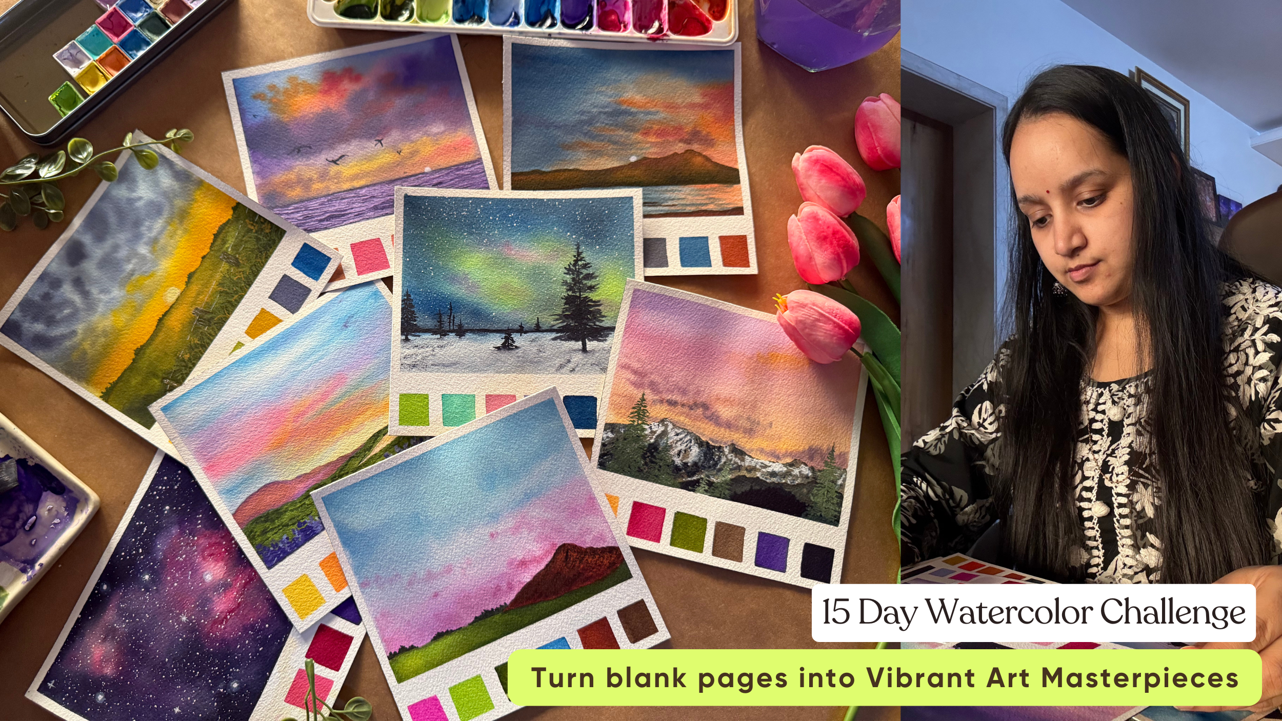
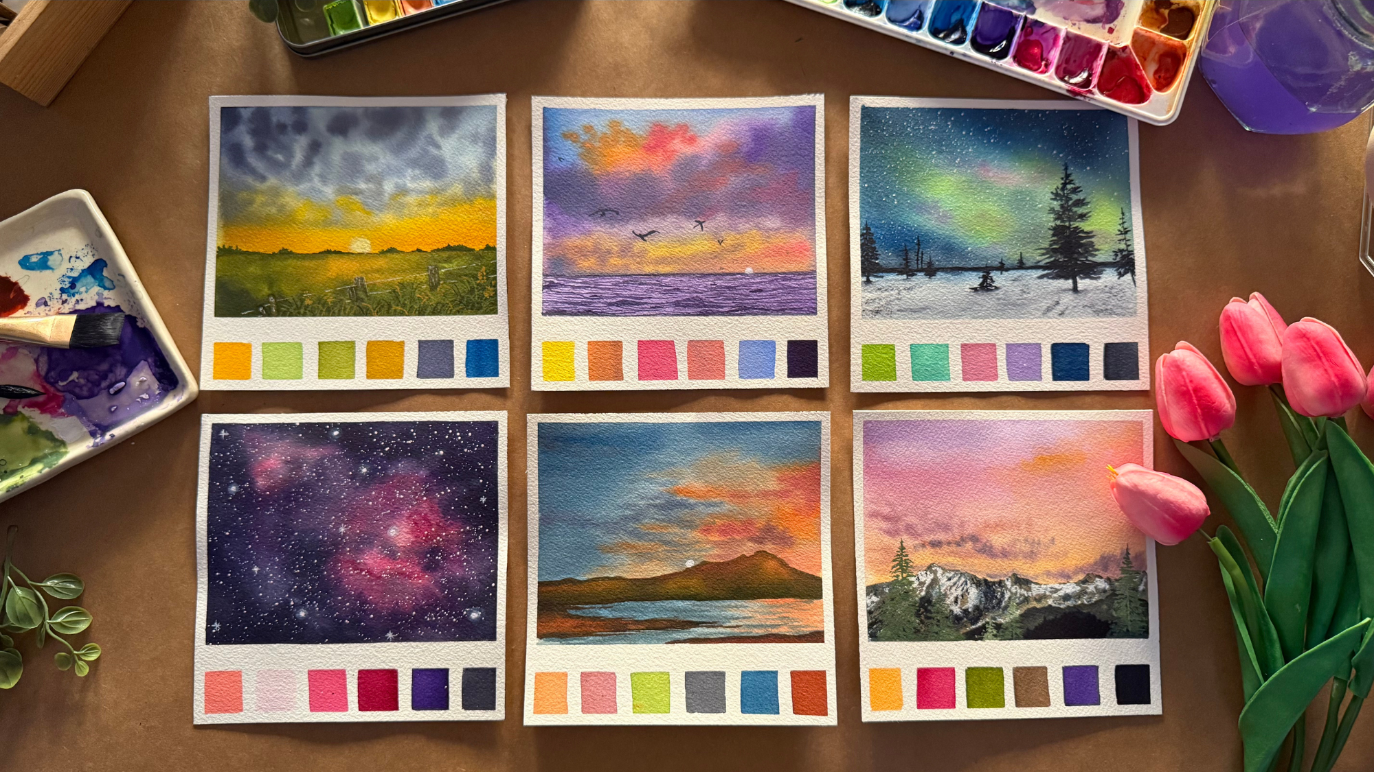
Transcripts
1. Hello & Welcome Back: Painting landscapes
with watercolor is like capturing nature's
magic in liquid light. With every brush stroke, watercolors bring
landscapes to life, soft skies, glowing sunsets
and endless horizons. Hi, everyone. Welcome to the
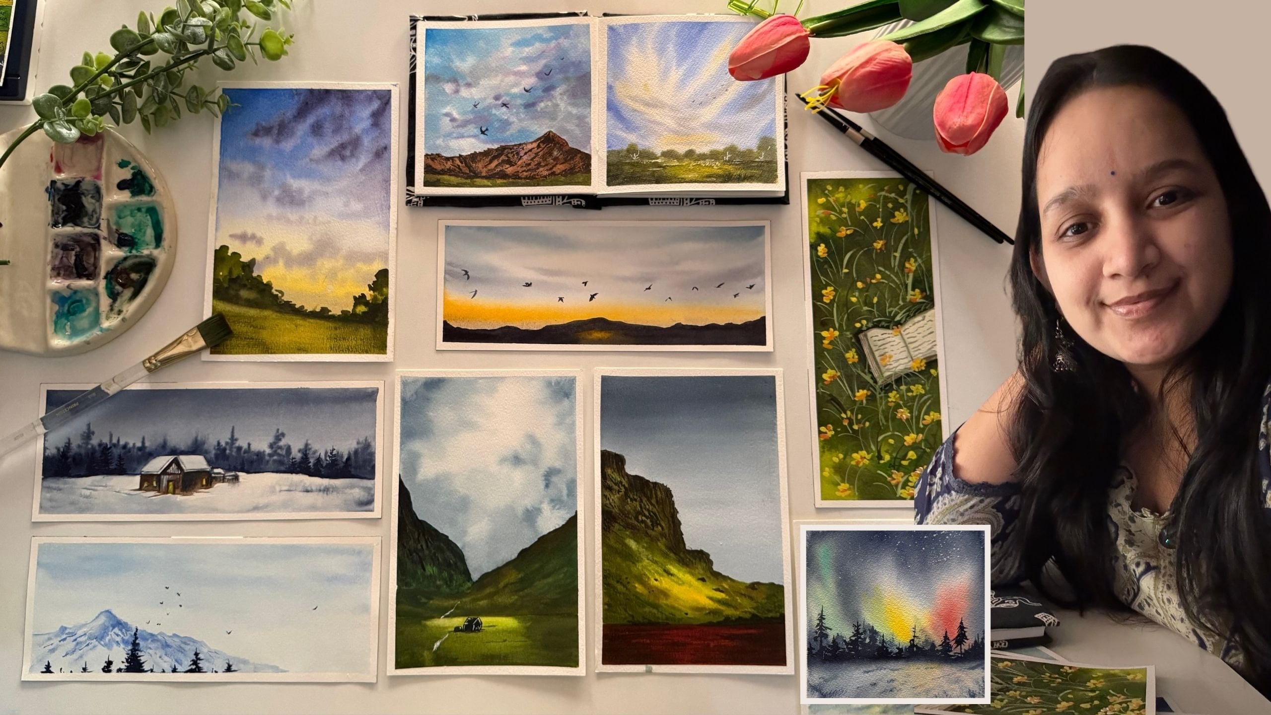
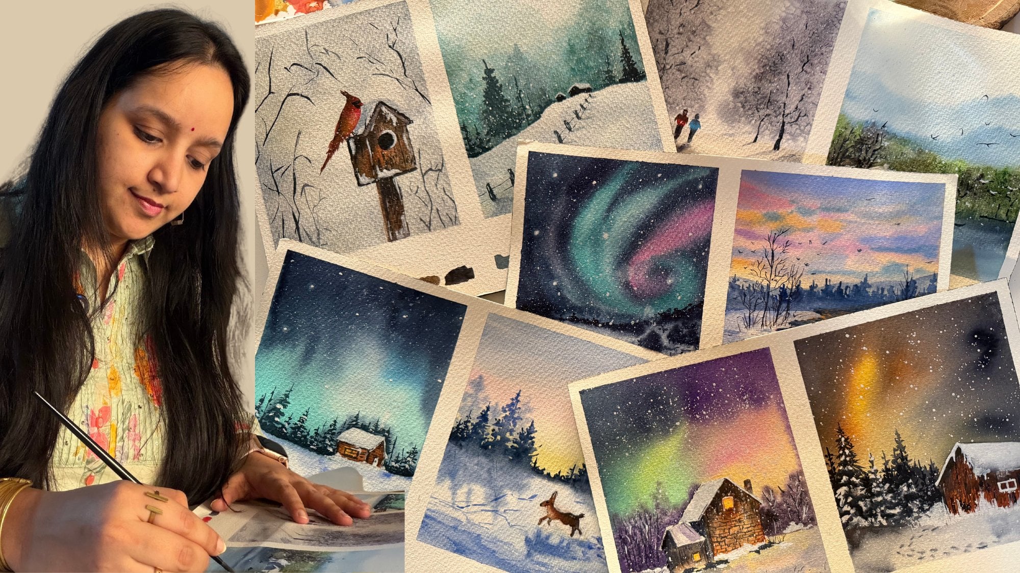
15 day Watercolor Challenge. I'm Masi Tapara, a
chartered accountant, an artist and a creative
business owner. If you want to know
more about me and some fun exciting art
challenges with my little one, then come follow me on Instagram under the handle
creating from the heart. I'm so excited to
have you join me for this journey into the magical world of
watercolor painting. A magic of watercolors lies in their fluidity and
unpredictability. As pigments dance and
blend with water, they create mesmerizing effects
that feel almost alive. Soft prudiens, bold blooms and ethereal textures that no
other medium can replicate. Worried about the materials. Don't worry. I have you covered. I will discuss all the
materials that you would need first before we type into the class projects
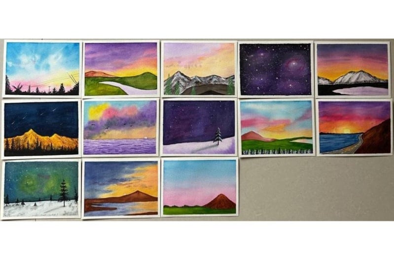
of this class. Over the next 15 days, we'll be painting 15 beautiful
landscapes together. This class is completely
bignoprienly, designed for anyone who's ever been curious
about watercolors, but didn't know where to start. No pair experience is needed, just a willingness to play
with colors and have fun. Along the way, you'll learn all these social watercolor
techniques like leering, landing, controlling water or by exploring the joy of
painting landscapes. And don't worry
about perfection. This class is all about enjoying the process and discovering
your unique creative style. Whether it's a serene sunset, a misty forest, or
a tranquil beach. Every project is crafted to help you build confidence
with watercolors, while creating something
you'll be proud of. So grab your brushes, your favorite watercolor set, and let's get started. I can't wait to see the stunning landscapes
you'll create. Let's make this an
inspiring 15 days together. And without a further ado, I'll see you guys into the
next lesson of this class.
2. Materials Required: So before we tie into the
class project for day one, let's quickly have a look at the materials
that you would be needing through this
15 day challenge to go ahead smoothly. First and foremost is
a watercolor paper. I'm using args, 300 GSM, cold press, 100% cotton paper. This is approximately 65, six inch size that I've cut it down from an
imperial size sheet. So this is approximately 15
centimeter by 15 centimeter, which I will be taping down like this on a movable surface, which is a cardboard
using this masking tape. So you can see at the bottom, I've left a small
space where I'll be creating in a color grade
for each class project, giving in an aesthetic
look to your paintings. So here, as you could see, we are going to
keep on adding in some color grids like these
to each of our paintings, creating in the colors
watch each day with the colors that we'll be
using in that specific class. So if you want, you can
create more grade by creating smaller colour
slots if you want, you can just go ahead with
six different color plots. And at the top, we'll be going ahead with
our main painting. Now you can see the texture of my paper is a
little rough green. It has this beautiful
grainy texture, but it's cold pressed. It's 100% cotton, so
it helps the paper stay wet for a longer time
for me to work wet on wet. I would recommend using
any paper which is at least 100% cotton for
your watercolor paintings. It will help you work better. Next up, the most important
thing, watercolor paints. I will be using my
ShenanrPWC brand watercolor. These are professional
grad watercolors, but you don't need
so many shades. I have removed my
18 most used shades from this entire 34 color set, and I have squeezed
them out into this watercolor
palette out here, wherein I have my
most used colours jotting down some
yellow, orange, red, blues, violets, greens
and brown with this, you can create multiple shades. So even if you just have
a basic set of 12 colors, it will be enough for
you to move ahead mixing your own colors and
create the required tones. I will be using
this mixing palette as well to keep on creating in more tones as and when we move ahead into
the class project. Apart from this, I also will be using in this spray bottle to easily reactivate the
paints on my palette which dry out so that I do
not have to waste them out. Also, for the paints, I'm going to use in this pastel color palette
which I have, these are handmade paints by a brand called Marbo
watercolors in India. So I will be using these
handmade watercolors as well. These are all pastel
colors as you can see, but do not worry if you do
not have these pastel tones. I will quickly be showing you in each class project how you can go ahead and create
your own pastel colors. With each color, I will keep guiding you the mix that
you need to form to get in these pastel tones with your basic 12 to 24
shades watercolor. You would need a white
quash for adding in some opaque look with
white, say moon, stars or some details
that you need in an opaque consistency or for
creating in pastel colors, quash works much
better giving in that opacity to your
pastel watercolors because pastel watercolors are a little opaque and not transparent
like the normal watercolors. Next, you would be ing
in a few round brushes, flat brushes, and some
detailer brushes. I will be using in
these flatbush from PrinstonRund brush from
silver Brush Limited, Buetow mop brush, and
some detailer brush. Of course, you would not be
kneading in so many brushes, even if you have
just a flat brush, two to three different size round brush and a
detailer brush, you can go ahead and create each painting with the
available brushes. I will keep sharing different
tips and tricks how you can use the limited
available brushes. You would need a
jar of clean water for each class project to, you know, begin your painting with the wet on wet technique. You would be needing
a rough cloth or some tissue papers to keep on dabbing your
brush and removing off the excess paint
from your brush so that you can go ahead
with some dry brush strokes, giving in some detailed wet on wet using in the wet
on wet technique. So here is this
little guide about the materials that you would be needing for this
class project. You can just begin in with the very basic materials
available at your end, and I will keep guiding you
with how you can create your own color mixing using
in limited palette as well. So grab all your supplies
and I'll see you guys into the class
project for day one.
3. Day 1 - Blue Sky: So let's begin with our
class project for day one, we are going to begin with a very simple blue sky with
a very simple silo head. We're going to begin with
the wet on bed technique. So let's begin adding
in a layer of water. At the bottom part, as
I discussed with you, we'll be adding in a color grade with the colors that
we use for the class. So at the bottom layer, I'm not going to add
in any water for now. And just at the top sky, I'm going to go ahead add in
the entire layer of water. Now, you can use masking tape, washi tape, whatever
you wish to, and try adding it on
a movable surface because at times it
helps you with moving the pants as for your
need by just tilting in the board or the movable surface on which you take
down your paper. So I usually prefer taping down my paper on a
movable surface. It helps with water control, creating in flows while painting galaxies
on nothern skies, getting in soft blends as well. So I've added in
a beer of water. I run my brush
multiple times so that my paper stays wet for
me to work wet on wet. Now I've shifted
into my mop brush, which is size, you know. Since I'm working on
a small sized paper, this size is enough, I'm mixing in a little hint of the Serlian blue with a little tint of the
Brushinbu color very little. And using this,
I'm going to begin adding in the first
color into the sky. Now we're going to have a lot of white cloud details
as well into the sky. So you can see I'm going
ahead very roughly with just some wet paints onto the wet paper that
we already have. Now, make sure the
mop brush usually holds a lot of water and paint. So by pin, adding in the paints, you need to be sure that you have those white
caps perfectly. Otherwise, the paints will begin to flow in there as well. Now you can see how
dark the color was when I just dropped it from
the mop brush directly. So just lifting in
color from there again, dropping in the darker
spots onto these spaces. So you see, I first began in
with a light consistency so that we have two to
three color variations as well off the gl color. At the top of the sky, I moved in a little diagonally so that I can get
in some diagonal strokes. And now moving down, I'm going to shift
into a pink color, add in at the bottom layer. At the bottom space,
we are going to have a simple siloeat as well. So that space will naturally get covered up with
a black color. So just giving in little pink
hues and on the right side, I'm going to add in a
little sunset effect with the help of
the yellow color. Now, yellow and green blended together will give
you green tones. So make sure that when you begin adding in
the yellow color, there is no blue color around. You leave a little white gap
between the blue and the yellow so that you do not have any green tones forming in. So using a dam brush, you can see I created in the
blend between the blue and yellow in such a way that
the green does not appear. And I also just quickly
ran, you know, a dam brush, so you can see we got a little lighter shade of yellow and blue in between
for their blending. Now picking up a little
of the indigo color. Now, this indigo color is almost equal to a
pains gray color. So if you want, you can
use the pain screen in a very light diluted
consistency. You can see it's almost water
with just a little into the color and just add in little cloud details
here and there randomly, giving in some darker tips. Twing the scene way,
I'm going to begin adding in the darker
details with a pink colour, just some little
darker highlights, but you can see the
mop brush quickly holds in so much
paint and pigment. So I quickly clean my brush, and using the damp brush, I'm spreading in
that pink which was onto my paper
already by my brush. So just blending in, creating in the smooth flow as you can see, at the top, as well, just
adding in little highlight. Now again, here, you
can see the mess that happens because the pigment
picked up is too much. So quickly clean my brush and quickly just
overhead blend these, creating in itch and
more cloud effect with the pink tone at the top. Now, pink and blue mixed together will
automatically give you little violet
highlights when they begin to blend and
create in the day. Now again, lifting a little
of the erin blue color, adding in little spots between the pinsc or the indigo
highlights that we've added. Giving in little
more darker hints with a blue color at the top, creating in a little more
depth and drama into the sky. You can see my
paper is still wet. I'm still working wet on wet, creating in all of the
details into my sky, giving in the cloud
details step by step. We did not go ahead with
one place altogether. We first went ahead
with a light layer, then the darker layer
of now giving in some more darker cloud
highlights added in the yellow, pink, and the paints
gray highlight. Now just using the
tip of my brush, I dropped in some
paint water droplets. You can see how the
water droplets are creating in that
effective clouds. The colors are dispersing, creating in the patchy details. So you just use the tip of your brush, drop in water there. Automatically, it will
disperse the color and create in that
beautiful cloud effect. Now adding a little orange highlight over the pink as well. But again, remember, orange and blue mixed together
gives you a muddy tone. So closer to the blue, blending with the orange very carefully. Now, again, I'm just
going to quickly go ahead and add in some further
details into the sky. So for that, I'm just
going to go ahead, lift in some strokes closer
to the yellow color. So I'm just using a smaller sized round brush and lifting some strokes
with the damp brush, moving a little diagonal,
as you can see. I'm down lifting in some strokes from the yellow colour space, creating in that flowing spots. Now again, I'm going to go
ahead with the blue color and given some more cloud
details onto this space. And we'll just have very little rays coming
out from the yellow space. Presently, you can see
it's a lot covered up. So quickly using the
darker blue tone, I'm going to go ahead adding
some more cloud details, giving the highlights and
keeping the highlights. You know, very minimal
closer to the yellow colour, trying to show in that light emersing from the sunset effect. Now, you can see when I want to use the color in a
darker consistency, I do not add much water. I directly lift up the
paint from my palette, and when I kneaded it in
a lighter consistency, I mixed it with
water on my palette to create diluted
lighter consistency. That's how you can go
ahead and create in darker and lighter
tones of your paints. Now, of course, the
flow of colors will be very different on
each of your paper and, you know, at the timing
that you spread in. So do not worry
about the result. Every result in itself
will be beautiful. Now using in water,
you can see it just dropped in some more
cloud effect at the top, creating in that dip so
we are done with the sky. Now we'll wait for
the sky to dry till then we'll
quickly go ahead, create in the color
grid at the bottom. So so far, I've used
the erlene blue color, the indigo color, yellow,
orange, pink color. So I'll quickly go ahead and
keep watching these colors. Now, you can roughly create a size idea as to how much
length or width this, um grid should have in depending on the size of paper that you're
working in with. So I'm roughly going ahead with almost a three fourth inch size of each of the grid
that I'm creating. So first, I add it
in a blue color, now I'm adding in
the pink color, leaving in a little cap. So in this way, you
can go ahead with your own style of adding in this color plate
if you wish to. But I think this just gives a free look to the painting once we remove in
the masking tape. That makes it easier to remember the colors that you're
going ahead, now, of course, if you do not
have this in blue color, you can use in the
sky blue color. You can use in the
tuition blue color in a diluted consistency. You could use in the
peacock blue color, whichever blue you wish to use. For the pinks, you
can use pinatnose, scarlet, carmine or
whichever pink color is available in your palette. For yellow, you could use a
light yellow, medium yellow. Or permanent yellow light. By whatever name it's
available in your palette. For the orange color, even
if you do not have it, you could even use
a little hint of the vermilion color or
orange by whatever name. Again, it's available
in your palette. I'm just adding that
little highlight that we added over the pink to give
in that sunset effect. For the indigo color,
if you do not have, you can simply mix in a
little hint of black to your blue to get in
that taco tone effect that we gave in between. Or if you want, you
can directly even use a very diluted consistency
of the paint's gray color. So we've added all
of these so far. Now, last pala, I'm
going to pick in the darkest consistency of black which we'll be
adding in the sil head. So for black, I usually use
pains gray and not black, so I'll quickly squeeze out a little bit of the
pains gray color on my palette so that we can use it for our future class
projects as well. I guess this last grid
looks a little small as compared to all other colored grids that we've added so far, but I feel it looks absolutely
fine, as well. It's okay. It's all about learning because I had rough measurements
in my mind. I had not go ahead with any
specified measurements. Now my sky is completely dried. I'm going to go ahead with the paints gray color in
the pool consistency. Using in my round brush,
quickly go ahead, creating a very simple silt of the bush details
at the bottom space. A Now, use it in the black color
or the paints gray color, and I'm using my
size four on brush, which has a pointed tip. I'm going to add in
some bush details and some simple pine trees
at the bottom space, but I'm going to add
them in such a way that we have little
of the pink orange, yellow highlights still visible. Now, you can go ahead
with a combination of the pine trees
and the bush both, or you can simply just
go ahead with a range of pine trees or just
simple bushes. And then we'll be adding in some lines as well into the sky, and we'll be ready with our
class project for day one. To begin in and to give in some muscle training to
your paints and brushes. I just went ahead with a very simple class
project for day one, which will help you getting in a hang off the
watercolor techniques, watercolor paper, the flow of
colors, the flow of water, and some simple silat
so that it's not too overwhelming for you to
begin in this challenge. Believe me, by the
end of day 15, you would be in love
with watercolors, and you would want to create more and more magic with the flow of the
colors and water, seeing how each project
turns out differently for each one because of the magic of the flow of the
water and the pins. You can see now towards
the right side again. I'm going ahead with
some pine trees in between and at the top and taking in some
bush till the top. Now for the pushes, you can see I'm using a very
simple technique. At the top, I'm just using
the tip of my brush, adding in some
simple data details. And at the bottom, I'm
just simply filling it with the dark consistency
of the paint streak color. See me till the
left side as well. I quickly go ahead and
fill in the space. So at the left
side, you can see I went ahead with little
more details at the edge, but making sure we
still have little of the orange as well as the pink highlights visible
on the left as well. Now, randomly at spots, I'm just going to
vary the length of these bush details that we've added because in
the center space, you can see, we have a little monotonous
detail because of the length
having osame range. So just try to
vary the length as well so that you haven't
that natural effect. Now, from the left
sorry, the right side, I'm just going to go ahead, add in some more details of
the city light out here. I'm using my detailer
liner brush. You can see I'm
just going ahead, adding in some simple strokes in between somewhere and plating
in some pole details. On the right side, I added in two of the branch
kind of a detail. On the left side, I'm adding in some more detailed look to the branch that
we've added here, giving in some things to some
more detailed the center, I'll just go ahead add in some more pine trees in between the details
that we created. Somewhere pulling out some
simple leaf strokes as well. As I told you, you just need
to go ahead using a mix of are things that are
some leaves, bushes, grass strokes, pine
trees, bushes, detail, and just creating
that radiated look to this entire simple silo head that we are
going ahead with. And now, lastly, I'm
going to quickly go ahead adding some
lines into the sky. For that, again, I'm using
in the paint scray color in a little lighter consistency and using in my
thin liner brush, I'm adding in these
details as well. In case if you're
not confident about adding in these details
with the brush directly, you can go ahead using a
fine tip waterproof pen. Make sure you use
a waterproof pen. So if by chance, you have to overdo any of the paint part, pen ink does not spread and
create the plaque patch. So it's important
to go ahead with a waterproof black ink pen that will help you get
in the details, right. So we are ready with a
class project for tap one. Let's remove in
the masking tape. Make sure your edges
are completely dried before you begin
peeling off the masking tape. And always peel off the
masking tape against the paper so that you do
not tear off the edges. You can see I'm going against my paper step by step
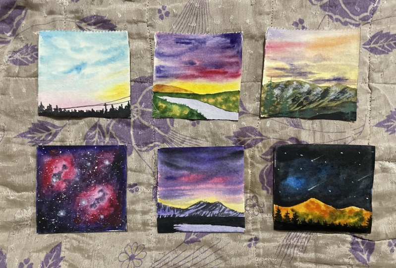
peeling of the masking tape. So here's a closer look at
our painting from day one. Of this 15 days
watercolor challenge, you can see how the colours
of shades of blue in the sky are creating in that entire depth and effect into the cloud
part of the sky. I hope you guys enjoyed painting this simple
one with me today for Dave Bar and see you guy soon into the Day
two class p here.
4. Day 2 - Flow through the Field: Hello, everyone. Welcome back to day two of this 15 day
watercolor challenge. Let's begin in with a very basic pencil sketch for day two. We are going to be painting
a simple field side view with a simple water
flowing by the field. So just marking out
the top field area, which is going to be kind of a small mountain greenery
kind of thing. In between that, just below it, we are going to have in
this water body area flowing in between the field. And the bottom again is
going to be the field area. So the top and the
bottom will be field, the sky at the top, and the water in the
center between the field. We're going to go ahead with a beautiful sunset sky this time. So first, we'll
begin in wet on wet, beginning in with a
layer of water first. I'm making sure that
my masking tape is perfectly sealed on all
the four edges so that, you know, the water
does not flow over the edges and then come
back while painting. The first pitch is going
to be painting in the sky. I'm just running ahead with
a clean layer of water going ahead very carefully along the field outline that
we have gone ahead with. One important tip
is make sure that your pencil lines are
quite, quite, quite light. If needed, just erase them with a kneadable eraser before
you begin adding in water because as
soon as you add in water over the charcoal masks, it becomes permanent
and then they will be perfectly visible because
watercolors are transparent. So if they are too dark, they may be visible even
after the pants are applied. So it's very important
that you go ahead with a very light pencil outline
if you ever have to. Now, first, I'm beginning in
with a light yellow color closer to the horizon line that is closer to
the field area. So I'm using in my mop brush
size zero for the same. M next closer to the yellow, I'm just adding in
a very light hint of the Vermeilon color. It's a beautiful, bright orange
shade that I'm using in. You can use any shade which is closer to
the orange color, by the name vermilion, orange or any other name that's available
in your palette. Next, I'm shifting into this beautiful
magenta pink color, which is a bright bold pink, closer to the orange
that I'm adding in. And at the top, we are
going to go ahead with a little of the violet
and the blue tones. So first, I'm adding in
some violet highlights moving in from the top randomly. So this is just the first layer that we are going ahead with. We're going to build
in the sky layers on layers, adding
in more detail. As we go ahead further,
creating in the darker dips. Now I'm just going
to pick up a little of the indigo color
from this set, which is equal to, like, a pains gray color, but not
exactly pains gray also. So just mixing in that with
a little bit of the violet. So indigo mixed in
with violet getting in that bluish violet stone
at the top of the sky. Now I'm just going to tilt
my board in, you know, all directions so
that the paints flow from top to
bottom a little, and then we go ahead with the
next layer on top of this. So this is, again, just the first layer
that I'm painting. As I told you, we are
still going to go ahead with a lot of
layers on top of this. Now, I've picked
up the pink color again in a bold consistency, adding it below the violet and the indigo tones
that we added in, creating in that smooth blend. You can see my
paper is still wet. That is the reason the
colors are flowing and having that smooth
blend with each other. Again, adding in little
orange just below the pink. The orange will actually blend in with the
pinks and yellow. We just need little highlight of the yellowish orange closer to the field area trying to
show in that sunset if wet. I again, added in the yellow
to get in the right blends. Now, towards the left side, I'm majorly going to fill it up with the pink over
the yellow as well. We just want little
yellow highlights on the right side to get
in that sunset effect. Now, with the indigo color, adding in more
details at the top, mixing it with a
violet color as well, and just going to add
in some more paints dropping in from the top. And again, I lift my board, and soon they will begin to, you know, just flow
towards the bottom side. It's very important to
understand that watercolors flow because of the
water that you lie underneath while
painting wet on wet. So in the angle
that you will hold your paper for the
flow of the paints. It's in that angle that the paints will flow and
the blends will happen. Now, just adding in
some cloud highlights over the pink and the
yellow as well with this violet mixed with indigo to create some details
into the sky. So I'm still working wet on wet, adding in some
more darker depths into the cloud at the top. You can see. So you can
see my paper is still wet. I'm using an Archie 300
GSM, 100% cotton paper. So that is the reason
my paper is able to hold so many
layers on layers. It is not buckling up. It
is still staying wet for a longer time because of the 100% cotton
property of the paper. So with watercolors,
if you want to work on layers,
creating in depth, it's very important to
choose 100% cotton paper and at least 300 GSM weight so
that it holds the paints, and it does not buckle up
or fold while painting. As well as it's very important
that your paper stays wet for enough time for you to
keep on working wet on wet. So I've now further added
in some more cloud details, as you can see with
the dark tones of the violet mixed in
with the indigo color. Now, in case if you do
not have an indigo color, you can just add in a
little hint of black or you can even use pain screy color little to
your violet color. Get this grayish violet tint that we've got with the
help of the indigo color. As I told you
previously, as well, the indigo color from
this Michelo PWC set is actually almost equal
to a pains gray color. So I at times even
use this as an, you know, pains gray color instead of using a
separate pains gray. Now I've just added a
little pink highlight towards the top left side, as you can see of the sky. Now I'm just going ahead, creating in some soft
blends into the sky, adding in some more details with the pink color before we let the sky to dry out completely. So we're done with the sky now, I'll quickly go ahead and add
in the water area as well first because we need
to wait for the sky to dry before adding in
the field closer to it. So for the water area,
I'm just going ahead with the ton dry technique
because it's going to be a simple
reflection of the sky. So I'm just using the pink
and the violet color. In a very liquid
watery consistency, you can see it's
basically just water with just a little hint of the colors and adding them into
the water body space, which is flowing in
between the field area. It's a very simple field
that we're going ahead with, adding in some little blue highlight to give
it a little more of that water fields because of the color look that
it will get into. Just a little of the
serine blue highlight over the violet and
the pink tones. You can see it's again, such
a transparent color look that we've given
to the water body in between the field out there. Now I'm going to
quickly squeeze out a little of the naples
yellow color from the brand Michello
mission and just add in some bright yellow
highlight into the sky before my sky dries
out because I feel in the center I want a
little bright yellow color. Now, don't worry if you do not have this naples yellow color. You can simply quickly add in a little of
the white quash to your yellow color or your medium yellow tone to get
this naples yellow colour. And just add this little
highlight out there. So it's basically kind of
a pastel yellow color. So using in this
smaller size brush, I'll quickly add a
little highlight towards the center space so that I get in that glowing effect
for the sunset. My sky is still wet so I'm
quickly adding in this in case if your sky has
dried out and if you feel you have
enough glow already, you did not do this step, and you can quickly
skip this step. So I'm done giving in that
bright glowing effect to the sky just in the
center, as I told you, because the violet color over the yellow was giving
in that muddy tone, which I wanted to hide. So I used in the past
and yellow color. You can simply mix in white to your yellow and get this effect. Now, let's quickly create in the color grade till our sky and the water body dries so that then we can go ahead
into the field area. The first I've used in
the bright yellow color, then the magenta color, then I'll go ahead
with some violet, indigo, and some greens into
this colors watching area. Now, this colors watching, you can add in many more colors. You can create it in
different formats. You can use the lightest or
the darkest consistency, depending on the color
tones that you're using. You can use them in
the same color tone that you're using
into your paintings. It's absolutely customizable
as per your choice and liking to get in that little aesthetic
view to your paintings. And plus, it will
help you you know, create a simple color chart for the painting
that you've used, helping you understand the
color tones that you use, the warm tones, the dark tones, the hues that you've used. So all of this is just
basically helping you more whenever you revisit a project as to which colours
you used and how. So for the greens,
I'm going ahead with the Saturn and
the olive green color, which we will be using
in the field space. So I'm just watching them
before only so that, you know, this watch area also dries out by the time the sky and
the water dries out. And the last color, I'm just using in a little of
the yellow aqua color, which we'll be using
in the field as well. So we are done with
the basics for now. Now everything dries out, then we go ahead
into the field area. So now my entire painting
is completely dried, and I'm going to begin in with
the field area one by one. So for that, we are going to go ahead again with the
wet on dry technique. So very carefully, I'm
adding in a layer of pater. Now, when you add
this layer of photo, you have to be careful
that you do not run into the sky
or the water area. Otherwise, the paint, the green tones that
you will be adding into the field space will begin to spread into the sky
or the water area. Creating in an
entire messy look. And with watercolors, it's difficult to correct
your mistakes, whereas with quash
anacrylic it's quite easy. So that is the reason you need to go ahead very carefully with these details now so
that you do not run into the sky or into
the water space. So I'm beginning ahead with the sabren color mixed in with a little bit of
the yellow ochre. And towards the bottom side, I'm going to use in
the olive green color. And then I'm going to add in
little pinscrey highlight, creating in the
darker shadow effect closer to the water body area. So as I told you, I use the indigo color from this set
equal to pains gray color. So I've just mixed
in that indigo with a little of
the satn colour, creating in this darker green, which is almost equal to, you know, the darkest
tren possible. Or you can even simply use a
darker green color directly. You can mix in black,
pains gray with your green you can mix in
a little hint of crowns. You can use in hookers
green, viridian green, whichever darker shade of green you wish to use and create in this little wet on wet
texture into your field space. So towards the top
and the bottom edge, you can see I dropped
in this darker green, creating in some details and
depth into the field space, and also creating in that shadow effect across
the water body area. Now, I'll again
pick up a little of the yellow aqua color
and just drop it in between the greens here so as to create in a
little more depth. So I'm still playing wet on wet. So you can see as soon as I'm dropping the yellow ochre color, it's automatically spreading in and blending in with the greens, creating in this beautiful
natural looking field area. So this is how you get the blends and the
flow with watercolors, creating in the soft
smooth blend because of the wetness of the paper and
the wetness of the paints. Now, this bottom area where I had added in the
layer of water is actually a little dry by the time I was adding
in the top details. So I quickly added in a
layer of water again, but again, very carefully. First adding in little
light green here now again, I'm going to go ahead with
some sad treen, yellow ochre, and dark green, creating
in the same kind of patchy detail as we've created
on the top field area. Again, these colors, the placement will be different for each
one of you because, you know, it's the natural flow of colors that will happen, and it will be different on
each of your strokes because how you add these greens where you drop the
lighter greens, where you drop the
darker greens, where you drop in
that little yellow qua effect will vary
for each one of you. So it's not important to
always compare whether your drawing is an exact replica
of what we are creating. You rather need to understand whether you are able to
learn the technique, whether you're able to
understand the flow of colors, whether you are getting in the blends happening
in smoothly, understanding the
wetness of the paper. It's always important to learn
rather than to replicate. So focus on learning, and I'm sure, with that, you will get beautiful results and we'll be happy
to see how much your learning is
helping you create your own beautiful
masterpieces each day. So towards the bottom side, you can see I let that little light green highlight be there into the field space, whereas at the top, it's more of the yellow Ocha
and the dark green because of the sunset
effect coming in there of the darker
tones of the sky. Now here, I'm going to add in one small mountain
range because here, what actually had
happened was because of the purple color mixed
in with the yellow. We had a little muddy
tone bean formed there, which I tried to hid almost with the help
of the pastel yellow, but I still feel a little, you know, muddy tone there. So I'll quickly add in a simple mountain range
here and hide that. Which will just add in one
more element to your painting, but will help me be satisfied that that muddy tone
in the sky is hidden. So these are, again,
simple tricks that you can use to hide in such
small errors which, you know, you can add in an
element and hide them out. So quickly using in the Bern sienna color with a little of the yellow to
show in that sunset effect. I've added in this
simple mountain range at the back of the
field as well. So if you observe my mountain
range in the center, it has that glowing
yellow effect to show that sunset highlight
falling in and on the edges, it has the dark brown effect. So here's a closer look at
a painting from day two. I hope you guys enjoyed painting this simple sunset feel with a water body in
between the field, simple details, but
such beautiful outcome. If you like this class so far, do not forget to
drop a review so that it can help me
reach maximum students.
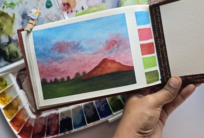
5. Day 3 - Snowcapped Mountains: 1031. Welcome back to day three of the 15 day
watercolor challenge. Today we are going to go ahead with a beautiful mountainscape, with a beautiful peas till
sunset kind of a view. I'm beginning with
a pencil sketch first and marking out
the mountain area. So towards the bottom side, we are going to have a
beautiful mountain range in front of which we're going to have some pine trees coming in with some other
details as well. Basically, we are
going to be having in three mountain ranges of
different color tones. I've marked these out here. The biggest one that
we marked out first, we'll be showing it as
a snow caped mountain. First, let's begin with the sky, and then we'll begin with
the details one by one. In this class project, I'll be teaching
you the snow caped mountain with a
different method, and then in one of the
further class projects, I'll show you another method. So in this class project, what we are going to do
is we are going to cover the entire mountain and
then add the snow details. In the other class project, we'll let the entire
mountain be like a snow and we'll just add in little color
details to that, so you can understand
both methods and which suits you the best and
how you want to use it. First, beginning
in with the sky, adding in a layer of
water completely. Now, for the sky,
I'm going to be using in this John
brilliant color. Now, in case if you
do not have it, you can simply create a peach
tone by mixing in orange, yellow, white, and a little
hint of red if needed. It's going to be more of
white, more of yellow, little bit of the orange tint and little hint
of the red color. Now, with this John
Billion color, I'm going to be, you know, mixing in pinks and
violets, as well. So you can see this is
kind of a pastel orange, basically, or a peach shade
that you can call it. You just need to go
ahead with color mixing. If you do not have
ready colours, you can simply mix
in orange, yellow, white to get a similar
looking peach tone. And if needed, you can add in a little hint of
the red, as well. Now, at the top, I'm going
ahead with the purple color, and then I'll shift
into the pink color. So I'm using the violet and the pink from
my set directly, not making these
into pastel colors, but I'm using them in light
consistency, as you can see. Now, the John Brilliant and the violet mixed together
may give you muddy tones. That is the reason I've used pink in between for blending so that the transition between the colors is smooth and easy. It's very important
to understand the color wheel and the
colors which are, you know, complimentary colors when mixed together will give
you muddy tones, and orange and violet
are complimentary tones. So when mixed together, they will give you muddy tones. So it's important in between, you have a color which either blends
both of them together or you use in white for
easier and smooth blending. Now using the violet color, I'm going to begin adding
in some cloud details. So I'm just mixing in a
little of the John brilliant, and you'll see I get, you know, greyish violet color here. Now using in my smaller
size toothbrush and using the tip of it, I'm just beginning to add in simple cloud details
into the sky. I'm still working wet on wet. My sky is wet into which I'm adding in these
cloud details. So you see the paper plays an important role
with what colors because you need the
wetness of the paper to work wet on wet,
adding the details. If your paper will begin
to dry out quickly, and if you need to work a lot with the wet on wet technique, it will be quite difficult because then you
will begin to having very rough uneven patches which will not give you
a pleasant view. Now, I've picked up
the violet color in a little darker consistency, and I'll just add in some more darker highlights of the clouds. You can see I've
added major clouds towards the bottom part of
the sky towards the top. I've gone ahead with
very limited details. Now with this violet color, I just mixed in a little hint of the blue that was on my
palette the indigo blue, and that is the reason I've got this beautiful light dark
tone of the violet color. Now, from behind the
mountains as well, I'm just giving in little
of the cloud details. And then once we
have the mountains, you will see the clouds from behind the mountains as well. Now, for the top
part of the sky, I'm going to pick up the
John Brilliant color with a clean brush and add in a little of the
cloud detail or a little of the orange
highlight at the top here. You can see my paper is still
wet. That is the reason. As soon as I add the color, it's automatically having that
soft blend onto the paper, and it's dispersing and blending with the
pasteler colours. So that is why I told
you the wetness of the paper plays an important
role when you want to work wet on wet and
need soft details into your skies or for other
elements of your painting. Now, till the time
the sky dries out, let's quickly create in the
color swatch at the bottom. So the colors that I'm
moving to swatch are first is going to be this
John Brilliant color. Next, I'm going to be using in some brown tones into
the mountain range, so I'll quickly pick
up the Bonsiena color. Before that, I'll just
quickly add in a little of the pink highlight that
we've used in the sky. I'll go with the browns
towards the end side. Now, I'm adding in the
indigo color here at the end because this we are going to be using in
the mountain range. As I told you, my indigo from this set is almost equal
to a pains gray color, so I'm using this as
equivalent to pains gray. You can use a pains
gray color or a black color as well
instead of this dark tone, but just make sure that you use a very dark tone because we'll be needing that
in the mountain range. Next, I'm swatching
out the violet color that we used in the sky. For the brown, I'm using
in this bone tumbo color, which we'll be using
in the mountain range. So I'm swatching out all the
colors beforehand only so that this area
also dries because I'm waiting for the
sky to dry out. Only then I can go ahead with the mountain
ranges one by one. So by that time, even
these will dry out helping me finish the
painting quicker. So this is how you can, you know, work on two elements, while the other
element is drying out depending on which do
not blend with each other. The last color that I've
swatched is the satrene color which we'll be using in for
the pine trees into the sky. So now let's wait for
everything to dry out first. Now, everything is dried and
I'm going to go ahead with a layer of water into this
entire first mountain range. Now, you can either go ahead, paint in all of the mountain ranges and then wait
for each of them to dry or be very careful of just painting one
mountain range at a time. But to make it easier for me, I'm going to go ahead with the colors in all of the mountain ranges because watercolors
are transparent. And then, if the
second mountain range will have a little
color here and there, then when you add in
the colors there, the background color shows
up in a very uneven manner. That is the reason I
prefer painting in the entire parts with
the layers one by one. So I first added in a little of the John brilliant
color to show a little of the sky highlight falling onto the mountain range. And now I'm going ahead with the burn tamber color and adding it trandibly
and blending in there. The bottom two mountain
ranges are still going to be dark with the next two layers
that we'll be adding in. We just need to first get in ready with the first
layer of mountain ur. Now I'm picking up
the indigo color, you can either use indigo
pains grey, depending. If your indigo has a
lot of bluish tin, prefer using a pains
grey or a black color. And at the top,
I'm just outlining properly the mountain range
and then going ahead, adding in the details. So you can see I'm adding
in the pinks gray color in such a way that we still
have the brown and the jonblin color a little
visible now using in a damp brush and
blending and creating in the soft blend for
all of these stones. And towards the bottom
right side, as I told you, we are going to have two more overlaying of the mountains, so I'm just giving you a
simple layer out there. Now let's wait for this
layer to dry again. Now, the first layer of
mountain is completely dried, and I'm going ahead
with the second layer. For that, I'm directly using, again, the brown color, but in a little pool
consistency and just outlining the entire space and filling in here completely. I'm just adding in a little of the John bullion color into the second mountain
range as well, giving in little highlights
of the sky colors coming in. And now picking up a little
of the painsty color again, I'm going to give in some
highlights on the edges. Make sure that you have
all the colors visible, not completely hide all of the colors with just
the darkest tones. You need little highlights of the sky colors reflecting
onto the mountain ranges. That is the reason
I've been using the John Billion to create
in those little highlights. Now till the second
mountain range dries, let's quickly go ahead
with the white quash and adding the snow details on
the first mountain range. So this is one
technique wherein we've colored the entire mountain with the paste color
of the mountain. Now on top of it, we
are going to show in the snow details
with a white quash. For that, you will
need a white quash, white watercolors will not
do the work that opaque. You can use white acrylic, if not quash, or white
poster colors as well. Now, I've picked up
the white quash in a thick consistency using
in my smaller size brush, I'm just beginning to create in some rough patches
with a white quash, trying to show them as the snow patches onto
the mountain range. For this, you need to be sure. You do not add in any
water to your whitewash. You do not add any
water to your brush. You just pick up the clear of the white quash and
begin adding in some drybra strokes like these to create in the texture of
the snow on the mountain. You can see I'm
going very roughly, very light handedly so that I do not have a simple
patch of color. I need little textures onto the mountain
to make them look like the snow deposits
onto the mountain range. So you can see I'm
going ahead in different angles and
different motions to create in this texture. You need to be careful
about one thing, as well. You do not have to cover the entire mountain
with the snow. Otherwise, it will be pointless, adding in the base layer
at the first place that we added to create in
the background mountain. So it's important to make
sure that you have little of the John Brilliant color
highlight of the sky visible, the brown tones visible so that you can understand
that that's a mountain behind on which you have
the entire snow deposit look that you're trying
to create in your Now across the second
range of mountain, go very carefully
with the white color because your second
range may still be wet. Otherwise, you can
wait for it to dry and then go ahead and
add in a little of the, you know, snow
details just about that mountain range for the
first mountain range there. Now, along with this,
I'm going to give in little dry brush texture
with the pains gray color. So I've picked up the pains
grey color on my dry brush, and you can see I'm just moving my brush a little diagonally. I'm even holding it at a 45
degree angle, as you can see, and very light handedly, I'm just creating a
little dry brush texture. This will basically act in as the texture on the
mountain ranges, plus giving it a little
more natural look. It's for the try
brush technique, again, the important thing is, you do not add in any
water to your color, nor do you add water
to your brush. You need to pick
up little paint, dab off even if you
have excess paint, and then just begin creating
in simple, you know, glides onto the paper to
create in that texture of snow or texture of the mountain as you're
going ahead way. Now, with the painscay
color itself, I'll just add in a
little more highlights, creating in some more darker
stone kind of patches onto the mountain range
along with the snow. So now you can see the snow is looking kind of deposited
onto the mountain, plus we have a blend of the darker spots of
the mountain range, plus some lighter
highlights with the base color that
we already added in. So this is how we've created
in the mountain this time. Next in one of the
future class projects, I'll show you a different
approach which is going to be opposite of this approach
that we've gone ahead with. Now, my second mountain
range is completely dried, and I'm going to go ahead with the paint's gray
color directly and going to add in that third layer of mountain just
in front of this. So this is going to
be the darkest range. You need to make
sure that each of these mountain ranges are visible separately
from each other, so you accordingly need to
build the color step by step. Now on top of this, I'm just giving in simple
strokes at the top to show it as little kind of trees on top of
this mountain range, giving it that little more depth Now, let's go ahead, add
in some pine trees in front of these
mountain ranges. Make sure that all of these the dry brush texture
and everything is completely dried before
you begin with this. So for the pine trees, I've
picked up the aapkne color. To this, I'm going to mix in the white quash and create
in an opaque green colour. It's just having
in a white quash, you can create multiple
opaque colours with your watercolors as well, whenever you want
to add in details on the darker tones
with a lighter color. In quash, even the
lighter tones are automatically visible
on the darker tones because of the opacity. Same way with watercolors, the darker colors
the lighter colors will not be visible
on the darker tones. So for that, you need to
create opaque watercolors for which white quash is the perfect
use to create in simple, quick, opaque light colors. So now you can see,
even the green will be visible on
the black because of the opacity of the panes with the help of the white
gouache that we've created. So now in front of
the mountain ranges, I'm going to begin adding
in some pine trees. Now, the pine trees are
going to be simple. We just going to move
from left to right, and from top to bottom, as you keep moving downwards, you need to keep on
increasing the length to create it into a
triangular shape. You can see how the green
is beautifully visible on the black color also because of the white quash
that we added in. If you would have simply gone ahead with the sabren
color directly, it wouldn't have given you
this beautiful bright look because watercolors are transparent and
the light colours will not be visible on
the dark ones easily. Now I'm going to quickly go ahead add in a few
more pine trees. Make sure that you
vary the length of the pine trees throughout and do not keep them of the simple
same length everywhere. Can vary the tones of the green color with the
help of the white and create some lighter tones
as well to get in some more brighter pine trees in front of these
mountain ranges, creating in the
highlighting spots. So I'm just going
to mix in a little more of the white
to my green color. And using this one
tone lighter green, I'm going to create in
some highlighting spots, as I told you. So this is one method
you can use that you can create two to three
tonal variations, creating in some
highlighting spots, trying to show where the light is falling more
because of which, you know, the tree is visible
more bright and clear. I will add one year
on the right side, make sure that your mountain
ranges are completely dried. Otherwise, the green colour
will begin to spread out and also make sure that, you know, you go ahead with
different heights of the tree so that you have that natural effect and the natural look. Otherwise, if you
will keep all of the pine trees in the
same height range, it will look like a
monotoneous thing and not given that nature's
beauty effect. One last thing before I remove in the masking tape, this patch out here had
a little messed up. So I'm just going to give
in a little more dry brush with the pains grey color
here and cover up there. So I left that to dry first. And now, once everything
is dried out, I'm just adding in this
little darker depth with the pains grey color. And you can see how
quickly we could cover up that and fix that messy area. We're ready with
our class project. Let's remove in the masking tape and see our kind of painting. Make sure you remove
in the masking tape once your edges are
completely dried and always pull up the
masking tape against the paper so that you do
not tear off the edges. It's very important for the
edges to be dried completely. Here's a final look at our
painting for Day three, a beautiful sunset
with a snow cape view, some pasiltnes, creating
in opaque watercolors, giving in that snow cape
look to the mountain. I hope you guys enjoyed
painting this with me. If you like this class,
make sure to drop a review and upload your
class projects as well. I will see you guys soon into
the day four class project.
6. Day 4 - Galaxy Glow (Using the Rewetting Technique): Hello, everyone.
Welcome back to day four of the 15 day
Watercolor Challenge. Today we are going to be
painting a beautiful galaxy. So it's going to
be a dark purple, pinkish tone of galaxy, which we are going
to paint in layers. So today, you know, you will even get
a little insight about the revetting technique because in this class project, we are going to be exploring
the revetting technique. And I'll show you how
you can easily revet your surface on completely try to add in more
layers and details. So first I'm going ahead with a quick layer of water
onto the entire paper. I'm making sure we have a good wet layer
because for the galaxy, we want a little extra
wet surface so that the colors flow naturally and blend with
each other easily. As well as for the galaxy, we are going to be
using the colors in a little diluted consistency. So I've just picked out
my pastel palette set. So first I'm picking
up the white color. You can see my normal palette does not have white watercolor, so I'm just lifting the
white watercolor from this set which I keep
separately with my pasteles. Now for any pastel color, you can simply mix in
a little bit of white squash to create a beautiful
opaque pastel color. So I first added in roughly a
little of the white paints. Now I'm going ahead with
this peach color for this. You can just mix in a
little bit of orange, pink and white to get in
this similar looking tone. Or you can directly
just mix in or use in a pastel pink color
if you have it readily. It's not necessary
for you to have in the same exact
pastel tone as mine. It's more important
to, you know, have in the flow and the
texture setting in well. Now I'm going ahead with
a dark pastel pink color. You can see this is still pastel because it
has white in it. And if you have a look, pastel watercolurs will have a little opacity as compared to normal watercolors because
pastel watercolors take white pigment in them, which makes them a little
opaque when laid on paper. So prefer the
pastel watercolors, which are little
opaque that will give you a beautiful
look into your galaxy. So I first begin
in with the white, then I went with the peach, and now I'm going ahead
with this dark pink color. You can see I'm just
laying down strokes randomly wherein in between, we'll be adding in the dark
pink and the violet strokes. So you can just go ahead with any random strokes as you
wish to into your galaxy. For the galaxy,
remember, you know, it's not going to be the
same galaxy for everyone. Because the colors are
going to flow differently. The blends are going
to have differently. Every galaxy is different. No matter even if you or me viewing the same
galaxy at one point, it will be a different view for you and a different view for me. Now I'm going ahead with
the quinacin rose color. Now, you can see this
is a dark watercolor. It is not opaque. It is a little transparent. But again, you will see that
this is not um you know, light consistency
that I'm using it in. Now, randomly, I'm just going ahead in
between the pastels, adding in some strokes, just using in the tip of my brush, dropping in the pins. Now, this is just
the first layer that we are beginning in weight. We'll still be
building the depth of the galaxy with
a lot of layers. So just begin randomly
placing in the colors. Now, wherever I have
the white spots left, I'll just go ahead, add
in this violet tone. To this violet, also, I'm not
adding in any white colour. I'm using it in a
dark consistency. But you will see I'm using it in a little liquidy consistency so that they flow and
blend with the pink, peach and white randomly. Now again, I'll pick up the
pink color and place them again closer to the violet color so that the blends
happen more smoothly. Now again, you will see
this time my strokes of the pink are quite different as compared to
what I began with. Now I'll move to the pastel
pink color that we used, and again, keep on placing them in between the
violets and the pinks. And then I'll move on
to the peach colour and add in little peach
highlight as well. You can see as soon
as you are beginning to add in the second
layer of the paints, the blends are
beginning to happen more smoothly with each other. Now picking up the white color, and I'm just going to add in little highlighting spots
into our galaxy randomly. So you can see it's such a
watery consistency that I'm using and just using the tip of the brush, I'm dropping them. And you can see how beautifully
they are dispersing and blending into the pink
tones that we've added. Same way, going to pick
up the peach color, add it in between white. Now, as I told
you, for a galaxy, the way of painting can
be different for anyone. It's all going to be the show
of colors, how they blend, the consistency that you use in, your timing, your placement, the wetness of the paper. So it's very important
for painting a galaxy that you always
have a perfect wet paper. Now, here I'm going ahead with
the indigo on the edges to give in some darker depths as
well with the purple color. I will go ahead with a little
more of the violet tone. So basically, we
are going to have two glowing spots of the pink
and whites into our galaxy, and the rest will be all
violets and indigos coming in. So you can see randomly
I'm dropping these in Now I'm just going to lift up
my paper and just keep rotating it
in all directions. Now, when you do this,
you can just keep a look if you know there is excess water or paint
coming onto the edges. Then keep a tissue or
a rough cloth handy and keep on lifting all
of that excess water and pigment from the
edges so that it does not flow back into your painting when you keep it too dry. So I gave it one good swirl, now going to go ahead with
another layer of the pins. So again, now I'm
going to use in the same colour tones
that we've used so far, but just a placement, creating in that little
swirls into your galaxy, some random circular motions, that is how you have to go and get in the depth
into your galaxy. Now adding a little more
indigo on the edges. Again, this is just
the first layer that we are still working on. We'll wait for
everything to dry, and then we are even going to go ahead with the
reutting technique, adding in more depth
into this galaxy. I know the outcome may
look simple or just, you know, not with
too many elements, but the process of creating that outcome is going to help you learn a lot
of new techniques, a lot of new details, how you need to, you know, control the water on your brush, what places need water control, what places need, thick
pigments coming in. How you need to lay them down, how you need to blend
them by, you know, giving these soft turns to
your paper and how you can see placing your paper on a movable surface is so helpful, especially while painting
galaxies or soft skies. I'm done with the first layer. Now we'll wait for this layer
to dry and then we'll go ahead with the vetting technique and add in further details. Till then I'm going
to quickly go ahead and add in the color swatches
at the bottom space. So so far, I've used
the peach color, pastel pink color, the
quinacin rose color, violet color, and
the indigo color. So I'm going to quickly
go ahead and swatch out these colors here into our colour bar at
the bottom space. Now, you can also do one thing for the colours watching
is that you can, you know, create in different
shapes if you want. You can just create
small circle dots of these paint
colors that you use, or you can create a
small square boxes, or you can create in
different elements, or say, if you're painting a galaxy, you can create all
the colours watches in moon shape or a star shape. If you're painting a landscape
or with a field detail, you can create all
of the colours watches in simple grasstove. So those are all little
creative ways that you can make your painting
look more creative and, you know, give it that little aesthetic
touch if you wish to. One Now, the last color that
I'm swatching is going to be this white color
that we've used. Now, to this white, my brush
had a little hint of pink, so it's going to
be like a peachish white color that is
going to be here. But I'm just going ahead and adding in this white
swatch because this was one of the important paints
that we used into our painting to create in that glow in the center
space of our galaxy. Now, we'll wait for
this to dry and go ahead with the
vetting technique. Now, everything is tried, and we are going to go ahead
and re wet our surface. For re wetting, take a bigger
size brush that you have, run from one end to other
without lifting up. Go ahead into the next
strokes in the same way. You can see I'm just cleaning my brush after every stroke, picking up fresh water because when you go ahead
with the revetting technique, as soon as you add one stroke, some color gets lifted
onto your brush. So it's important that you clean your brush after every stroke so that the colors do not lay when you're adding in the
next stroke of water. So I just added a simple
layer of water onto the entire space and
got the entire surface. Now I'm going to go ahead
with the same tones, create in some more depth. Now, you may feel
that we could have done this in the first
layer itself, but no, when you go ahead with the revetting
technique and do this, it adds kind of a
different three D effect to your painting because
the first layers are dry. They have taken out their place. Now, they're not going
to move out much. So adding in these details later on creates
much more depth and beautiful effect
and also gives in that little more dimension
to your painting. So I added in the
peach colour spots. Now you can see, I added the peach color spots
in other spaces as well to create little, you know, small,
small glowing spots. Now I'm going ahead
with the violet color, and then we are going to
move on to the indigo color again and the pink tones as
well to add in more depth. Now, when I'm adding
the pink colour, I've lifted my paper. So you can see automatically
when I lifted it downwards, the paints of the pink tones
began to move downwards, creating in that
simple flow into the violet color that's
moving in there. On the edges going ahead with
the indigo color, again, you can see my paints are in a wet consistency so that
they spread out easily and, you know, easily just move onto my paper and create
in that blend. Now, using the indigo color, I'm just going to
add some splatters into the pink spots
so that we have that beautiful breakdown in between creating in that more
beautiful glowing space. Make sure you use a smaller
size brush if you do not have the perfect brush control with a bigger size brush because if too much of the
splatters will come in, the entire pink glowing spots of your galaxy will
just move away. Same way, adding in little
splatters with a violet color. Again, brush control
is very important. Use a smaller size brush if you're not too confident
about doing it with a bigger size brush or
covering up the entire space. Same way, adding in little
white glowing spots. Now, when you add these
kind of splatters, it gives you a very, you know, unexpected or nothing
in your control, kind of a glow because you don't know at what spot this
platter is going to go. It's going to be
different for each one. Plus the sizes of the splatters
vary, and automatically, you can see how the pants
just disperse and create in that beautiful spots of glow
into your dark galaxy sky. Now, again, I'm
just going to keep tilting my paper in
some random directions, adding some more
glowing spots randomly, and make all of
these colors blend and flow into each
other seamlessly. Now I've again picked
up the violet color, and I'm just going ahead
with some violet spools. If you notice my strokes
since the first color, I've not gone ahead
with simple strokes. I've always kept, you know, rotating my brush in random
spools and giving in that, you know, different textures or movements to the paints
that I'm adding in. Now using in plain
water and just dropping in some droplets of potter
to create more glow. So you will see as
soon as you drop a drop of water onto
the wet paints, it automatically
disperses from there and makes a little glowing space
in between the colors. So you can randomly do this at certain spots
where you'll drop in more water glow and the
dispersement will be more. Plus, again, this
is not going to be in your control, how
it will disperse, the glow, the shape, the, you know, soft glowing
that comes in. So all of these
again and creates such a beautiful depth
into your painting. Now, at the bottom left side, this glowing space
that we created with the help of water there
I'm going to drop in a little of the peach
colored drop so that it creates a little
glowing spot randomly. After this layer dries out, we are going to go ahead adding some star details
into the galaxy, plus in the third layer, we are going to give in
some wet on dry details. That is, we are not
going to go ahead with the re wetting technique
after this layer. But we'll just add in some wet
details on this dry galaxy and blend them with
simple strokes to create a little more or, you know, texture
into the galaxy. Now, randomly, you can see I'm still dropping in the pinks and the peach tones with my
brush strokes here and there, creating in those spots. So this is how you
build a galaxy with layers. Creating in depth. So, you know, if you
think in just one layer, you'll get that beautiful
glowing galaxy effect with different swirls
and different motions. It won't happen. In
between the paints, again, I used water
and dropped in. There's so many
different techniques we used in this class project. We went ahead with the
re wetting technique. We went ahead with dropping these color droplets and then creating in glowing spaces
with water as well. Now, everything is
completely dried here. Now, if you see the spots
at which we drop the water, it's creating in such
light glowy spaces of the violet tones. Now for the wet on dry details, I'm going ahead with
the pink color, and I'm just going to add in simple random
strokes like these, and then using a tambush, we are going to blend it into the base layer that
we've already painted. You can go ahead with these
strokes randomly at spots. So I am going with simple
swirls randomly here and there. Majorly at the bottom space
here, I'm going to create in. Now, using a second
brush, which is damp, I'm just going to go ahead
and run on top of this around the top and
bottom edges and create a blend with it
into the base layer. You need to go ahead
very carefully to give in these little
highlighting spots. Now, I'm just using a
tam brush with water, no pigment on the second brush, and I'm just running across the bottom and top side
of this and blending in. Make sure you do
not have a lot of water on this brush with
which you are blending. Otherwise, it will not create
that effect, and it will, you know, also reactivate your basio because we are
working with water colors. You can see, I've just blended these strokes that I
added in, and now, again, that is creating in a little more depth
into the galaxy. Now you can see I'm pulling
out these strokes on the outer edges at places where I feel
the colors are dark, creating in that little
disbursement, little texture. So again, this is in layers that you need to work to
get in this depth. This is wet on dry that we are going ahead with because you could see our paint
is completely dried. O layer was dried on which we
went ahead with wet paints. Now, instead of going
at watercolors, go ahead with white quash
for the star details. So I'm just squeezing out
some fresh white quash onto my palette so that we can add in some star details
into our galaxy. Now, holding the brush
a little far from your paper begins flattering
in these white quash. Make sure you do not
add in a lot of potter, because if you will
add in a lot of photo, it will not give you
that opaque look after drying to your stars. Plus white quash is going
to be a little thick, so it may take you a
little while to get in all of the stars flatters
coming in perfectly. Also, while splattering
in these stars, make sure that you cover up that bottom space of your
colour patches because, you know, the flatters
may go anywhere then you may either
have to redo or, you know, correct
in those patches. So go ahead carefully. Plus, make sure you
keep your brush a little far because if you
will keep it too close, you may get in blobs of
colors which you do not want. So it's important to keep
the distance also right and make sure the paints are
thick because it's very important to get in that
opaque look to your stars. Now, you can see a
corner head randomly. You can even keep on
dabbing with the help of a second brush if you do not
want to go ahead with this. You can even use a
toothbrush to add in more tiny star details. Now, after this, we
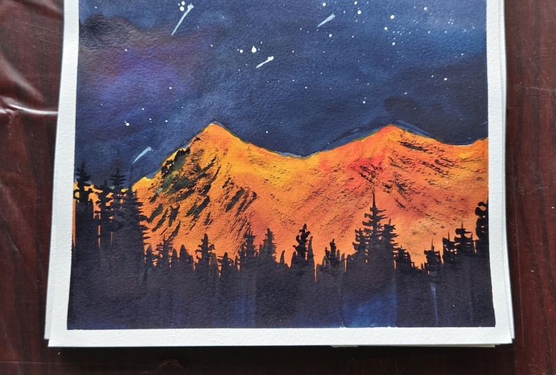
are going to add in a few glowing stars
into our galaxy, and we'll be ready with our
class project for day four. H. So from the splatters
wherever I feel that, you know, splatters have
gone in a little too big, I'm just going to
blend them into the base layer and create in the glowing spots for
our glowing stars. Now, basically, if you've been following me on Skillshare, you would know this technique, how we creating
the glowing stars, glowing moon effect,
glowing light effect. So basically, you add
in this white spot, you blend it with a small brush and create a dull white spot. So you can see on the edges, I'm blending it into
the base layer, and I've created in
this dull white spot. Same way, I'm just going to
go ahead at other spots. You add in a small white patch, then keep on blending it with water and create a
dull white patch. So basically, now
this is going to be your glowing spot
for the background. And then once this dries out
to the center of this spot, we're just going to add
in bold white pigment. So in the background, you'll
have this glowing spot, and then in front of
it, you are going to have that glowing
white star coming in. So randomly, I'm just going to add a few of these wherever I feel that either the pigment is big or we need a
little more detail. So you can see now
these dull spots are looking white dull spots, and they are going to act
in as the glowing space as soon as you add in the center
details in front of this. So now I'm picking
up the white quash in a thick consistency. And first, I'll just add in some shooting or the shining
star details as well, simple, you know, the star
kind of detail that we add in. Very minute, very fine. I'm using a detail or brush, so I'm getting in these
fine details perfectly. Now, all my dull spots are dry. So to the center of these, just add in small white spots. You can see as soon as you
add in that white dot, the background dull
layer begins to give a glowing effect
to these stars. So that is how you create
in the glowing star detail, all the glowing spots into your galaxies are
giving in so much debt. You can use these for your
night skies, galaxies, northern skies for creating
in moon, light details. So as I always tell you, it's important to understand
the technique of creating anything and then applying it for your landscape projects. We are done with our class
project for day four as well, just adding in a few more
star detail here at the top, where we did not get much of
the platter, and that is it. We are ready with our class
project for Day four. Let's peel off the
masking tape and see the beautiful
outcome together. You can see the depth because of those pink dry strokes that
we added at the bottom space, and then we added that glowing
star on that peach color. All of that is giving
such a realistic look. You can see it just took
us around 25 minutes, but the outcome is so realistic. Plus, we went ahead with a new technique that we learned today. So here's a final look
at our painting from day four with those clean edges, the colour grid
that we've created. I love, love, love how the glowing spots in the
galaxy have turned out. If you like this
painting, make sure to upload your class project
and do drop a review. Thank you so much
for joining me into this class and painting
along with me. I will see you guys soon into
the Day five class project. Thank you once again
for coming in.
7. Day 5 - Winter Sunset: Llo, everyone. Welcome back to day five of the 15 day
Water colour challenge. Today we are going
to go ahead with a beautiful winter
landscape sunset view. So let's go ahead with
the basic pencil sketch. So the bottom is going
to be the snow space. In between, we are going to have a little water flowing effect. And on top of it, we
are going to have in a beautiful snow
caped mountain look, and the top area is going to
be our winter sunset sky. So make sure you go ahead with light sketch of the pencil marks because charcoal marks become permanent as soon as you
add in a layer of water. And then with the
transparency of water, all of these marks will be
visible since we are going to go ahead with light
tones at the bottom space. Now the top is going to be a beautiful sunset sky
that we'll be painting. So first we begin
in with the sky. Let's go ahead with a layer
of water onto our sky. Across the edge of the mountain. Go ahead very
carefully so that you do not run with the water into your mountain space because
a mountain is going to be of a very light shadow tone of the sky that
we'll be painting. In the class project
of Day three, I had shown you a
technique for adding in the mountain details the
snow caped effect. Same way. Today we are going to go ahead, add in the snowcape
mountain detail in a different method. This is going to be the
second way of dating in the snow cape textures
onto the mountains. So today, we are going
to go ahead with a very light layered peace color for the snow and then add
in the dry Brush technique. And then in one of the
future class projects, I'll even show you a third way of adding in these details. Now, beginning in with
the colors for the sky, first, I'm going
to go ahead with this beautiful John
Brilliant color. I showed you the color mix of this already in the
previous class perche. You can mix sil yellow,
orange and white to get in this beautiful pastel skin
color that we have in here. Or if you readily have
pastel skin tone, you can use that as well. Make sure you use
in white wash while creating in your pastel
tones because white gives in that opacity to your
pastel colors and given that depth to your tones
because pastel colors, if too transparent, it will not give you that pastel
effect that we needed. Across the mountain
space, you can see I went ahead very carefully. Now, I'm going to create in the other pastel colors
with the white quash on my palette
already because I do not want to waste in
that white quash. So as I told you, you can create in your own pastel tones. You don't necessarily need to have a separate pastel palette. So I'm picking up the
pink from my palette, mixing it with the white quash, and I'm going to
add this beautiful medium tone pastel pink color closer to the Jundlint color. This is, again, just
the first layer. Basically, we are just
color blocking the pieces. Then we'll go ahead
with the second layer, which will create
in the blends in between the paints
happening smoothly. Now, to the pink, I'm just adding in a little
of the violet tint, so you'll get a violet pinkish
tone, which is, again, peatul because of the white, adding it closer to the pink. At this pace, you see the
blends are not smooth, the colors are not
that bold enough, not giving in that depth
and the simple plain. Now at the top, pinning in
with a violet color directly. And at the top to give in the dark moot space
to a sunset effect, I'm going to go ahead
with the indigo color. Now, at this point, if you
just look at our painting, all of the sky colors are
not that well blended. So going ahead with the second layer of paint from the top, I added in the second
layer of indigo violet. Now going to pick up the
pastel violet color and add in and then move on
to the pastel pink and the John brindant color. Now, you can see, as soon as we begin adding in
the second layer, the colours begin to flow,
blend into each other. Now, I do not want
the dark colors of my sky to flow towards
the bottom space. So for that, I'm just
going to keep my paper a little tilted towards
the top side so that the colours flow towards
the top again and do not flow towards the
lightest part of the sky. So I added in the second
layer of each of the tones, and you can see how beautiful the blends are
beginning to happen. Now I'm going to
pick up a little of the pastel violet
color and begin adding in some
strokes into the sky. Now, make sure you just using the tip of the brush to
add in these strokes, and you do not have excess
pigment on your brush. Otherwise, it will cover up all of the spaces
that you are trying to add in these cloud or
movements into your sky. Now the reason of using
pastel violet closer to the John villint is because
if you use a direct pistil, the John llant has yellow
and orange tints in it, which will create in muddy
tones because violet and the orange color are two
complimentary colors, and they do not you know, they are opposite in the
color wheel to each other. So it's very important to remember that while
tnding these colors, you use in a color which fits
well with both the colors so that the blends happen smooth or you use in white so that, again, you do not get in
any muddy or colors that are unpleasant in painting
or avoiding the muddy tons. Now using in the violet color, I'm just adding in
some highlights into the sky closer to the
Jean Bill and pink color. For this, I'm just using
the tip of the brush. You can see I'm
holding the brush so close to the bristle so
that I have more control. These are again techniques
how you can have more brush control by holding
the brush accordingly. Now, with the pastel
pink color as well, you can see I'm creating
in little cloud strokes at the top spaces as well. Again, the brush control
is very important, and you can see I'm holding the brush so close
to the bristle, just using the tip of the brush, adding in the details. Now we are ready with our sky. Now, by the time the sky dries, we cannot paint in the mountain, so we'll quickly paint in the water body area or let's paint in the snow
space at the bottom first. So just going to go ahead with a very light layer of
the pastel violet color, it's going to be like
kind of water with just a little hint
of the violet color that you need to add in here. H So what I'll do is I'll quickly
add in a layer of this light color into the mountain space as
well and let it all dry. Now, across the edge, I'm going very carefully
because my sky is still wet. I'm kind of leaving
in a small gap only because there we are
as it is going to go ahead with the textures so that
this space will also dry out by the time the sky and everything
dries out together. You can see that
fine white line, but still you can see at spots where the water is meeting in, the color from the sky is flowing into the mountain space. So if you are not too confident
about adding it directly, wait for everything
to dry first. I'll quickly lift
up these colors and make this space dry. Now, you can see the violet
color that I've used for the mountain is a
very light layer of the color that I've used in. It's just basically a washed
layer that I've given you. Now, I'm just going to
randomly drop in some spots of a little darker tint than this
and let it just, you know, disperse into the
mountain space, creating in that
patchy darker effects to show in that
color of the sky, the shadow falling onto
the mountain space. All right, so that is it
for the mountain, as well. Even if a little of the peach color goes into the mountain, it's okay because it
will create in that, you know, shadow effect. And then when we go ahead
with the dry brush technique, it will all get covered up. So now we'll wait for all of
this to dry till then let's quickly go ahead and creating the color grade at
the bottom space. So far, the colors
that we've used, the John Brilliant color,
pastel pink color, we are going to paste
in the pink color that we used in while adding
in the second layer, pastel violet color,
violet color, indigo color, paints gray color that we'll be using for
the dry pressure as well. So you can, again, absolutely vary the color grade that you want to create in
whatever colors you want to choose
from your painting, you can create in a color grade with just four of the tones that you used or eight of the tones that you
use depends on you, how you wish to go ahead with this color grade method here. So for the violet, I've
added in the pastel violet, and I'm even going to add in the dark violet color
because both of those are the most
prominent things into our painting that
we've used so far. Now, before letting this to dry, I'm just going to go ahead, pick up my brush quickly and add in a little more violet on the top of the mountain here because a lot of
beach has flown in. So I'll just quickly add
in little violet on top of it so that we do not have
a lot of the peach color. And then we'll wait for all
of this to dry out now. So now everything is
completely dried and we are going to go ahead and add
in the further details. So one thing that
I miscommunicated was that the bottom space is
actually the water space, and this top area is
actually, you know, between field kind of space or the stone muddy kind of
space that we're adding in. So here I'm going ahead
with the pains gray color. See. So you can see I'm
not going ahead with a simple straight line at the
top of the mountain space, even towards the water space. I'm going ahead with
a very rough line. Now I'm going to fill
this entire space with this dark
paints gray color. Make sure you use this color
in a bold consistency. Now, towards the left
bottom side here, I'm going to give
in more details moving into the water space. So just using in the
tip of the brush, I will move simple
lines moving in here. You can see just using
the tip of the brush, I've moved in these details
into the water space. Now let's go ahead, add in the details of tribush
onto the mountain. So in the class Project three, we had painted in that
entire mountain space with a dark mountain
color and then added in the snow color
with the white quash. For today's class project, we've gone ahead with a
layer of entire snow. Now, the snow is of the purple
color here because we are adding in the shadow effect
of the sky on the snow. Now with a black color or
the paints gray color, we are going to
begin creating in the details of the mountain
in between the slow. So at the bottom,
I'm pulling out these dry brush strokes
from the bottom space. You can see I'm
moving diagonally. So from the bottom left,
towards the top right, and from the bottom
right towards the top left, you
can see diagonally. So the right side,
I'm showing in more of the mountain
space that is visible. And on the left side,
we are going to give in more of the snow area. So on the left,
I'll go ahead with very little details of
the debush further. So first, the right
side, I've given in a lot of dry brush
at the bottom space, showing in very
little snow here, more of the mountain visible. Oh. Now, towards
the left side here, let's go ahead using in
the tip of the brush. I'm just going to
begin adding in very simple strokes at the top area and given
little dry brush. So we're just creating in
little mountain details in between this entire snow
space that we created. Now, make sure you do not have excess pigment
on your brush. Use a smaller size brush so that you can get in
these fine details. The dry brush
technique here plays a very important role to showing the textures
on the mountain. You can see I'm using my
brush a little tigonaly. I'm using my size two silver
black velvet round brush, which is helping me get in
all of these details, right? Oh Across the edge of the mountain, you can see I've created these fine lines
for the mountain. And then I'm just adding in
very light dry brush detail. You will see that this
dye brush is, in fact, light in colour as compared
to the dry brush that we added towards the
bottom right side. Here, I'm using a little diluted consistency
of paints gray, but I'm dabbing off the
excess water and pigment and then beginning in with
the die Brush here, h Very beautifully, we've created
in the entire mountain. Now, towards the water space, I'm just going to add in a
little more darker depth with the purple color here, and we are almost ready
with our class project. So this was the second method of adding in these
details of the snow. Here, we went ahead with the entire snow first and
then showing in the mountain. In one of the further
class projects, I'll show you using
just the white color first and then adding in
the details that is keeping in the entire space white
and then going ahead with directly the paint
details to show in the mountain details
on our white paper with just the texture effect. Now you are adding
in little depth carefully because we already
have in the black color, so I do not want it to begin
flowing and get reactivated. That is it. We are ready
with our class pressure. Let's begin peeling
off the masking tape. Make sure your edges
are completely dried before you begin peeling
off the masking tape. Remember to always peel off your masking tape
against the paper, and once your edges
are completely dried, or else it may lift
up the pains from the edges and may tear
off your edges as well, giving you uneven white edges. So that is it. We are ready
peeling off the masking tape. So here's a closer look at
our painting from day five, a beautiful winter sunset with the beautiful
snow caped mountains. I hope you guys enjoyed creating
in these little details and learned the new way of creating in the mountains here. Thank you so much
for joining me into this class and painting
along with me. I will see you guys soon into the day six class
project till then, make sure to upload
your class projects and drop a review if you
like this class.
8. Day 6 - Warm Mountain: Hello, Eyvonne. Welcome
back to day six of the 15 day
watercolor challenge. Today we are going
to be painting a beautiful night sky with
a fiercy mountain range. So let's begin in
with a pencil sketch for the mountain range first. I'm just marking
out the mountain that will be there
at the bottom. So the mountain
basically is going to be of beautiful warm tones, and the sky is going to be
of beautiful blue tones. Alright, Def just
marked the outline. You can see at Conner head
with a very rough shape. So we'll begin in
with the sky first. Sanford pining in with a
layer of water into the sky. We'll first be painting the sky, then waiting for
it to dry and then go ahead with our
warm mountain range. This time into the
mountain range, we're going to go ahead with beautiful warm
tones of yellow or orange and then given some dry pash detail with
the paints gray color. And then in front of that, we'll add in a small range
of the pine trees. I'm going ahead with even layer of water onto the entire sky across
the mountain range, I've marked it out carefully because the mountain range is going to be of different
tones than the sky color, so we need to be very careful this time while painting the sky such that the sky colors do not go into the mountain range. So for the sky, first, I'm picking in with this
Prutian loop color. I'm going ahead with a
medium tone consistency. This is just the very base layer that we are going into the sky. We are going to build
it into a dark tone. But the reason we
need to begin in with light tones is so that we
can add in darker colors, create in different
tonal variations. At the top, I'm going ahead
with the indigo color. We'll even be using the
same water technique to create the lighter spots
later on into the sky. So make sure you first use in lighter tone so that when
you add that drop of water, you get that glowing space
coming into your night sky. Across the mountain
range, I'm going ahead carefully so that we do not
run into the mountain range. You can see I quickly held the brush closer to the bristle so that I have more control, and I can just use in
the pointed end of my brush to just add
in these details. Now, over the Prusian
blue color as well, you can see I gave in
that indigo layer. But the reason that I've added that light Prusian blue colour
first so that when we go ahead dropping in
drops of water to create in that glowing
spots into a night sky, we get in the beautiful
glowing spots. You can see on the left,
I've left that little space. Now I'm going to quickly
pick up clean brush, use in some more lighter colour. That's a Prusian blue colour
and drop it here first. So basically just a
small glowing space into a night sky that I'm
trying to create in here. Again, using the indigo color, I will just drop in
some darker spots across this glueing space
that I'm trying to create in. So we are done with a sky. You can see I've created
in that glowing spot. I will just drop in a
little more water drops here to get in
that glowing spot, but along with the indigo
and the blue spots. So on the Prucian blue as well, I've dropped in small hints
of the indigo so that we have in the beautiful color variations
coming in into our sky. Now, till the time
the sky dries out, let's quickly go ahead and create in our color grid
at the bottom space. So first, I'm beginning it with the Prusian blue color
from my rightmost edge, and then I'll move on
to the indigo color. For the mountains, we
are going to be using in shades of yellow
or orange shade. So I'll even quickly
swash those out, as well. After the pushing on
the indico color, now I'm swatching out the
permanent yellow deep colour, which I will be using
for the mountain range. So this is going to give in that warmth effect
to a mountain. Next I'm shing out
the vermilion color, or you can go ahead with the orange color
or any other color that is with the same orange
kind of hue in your palette. Now, along with the
yellow and orange, I'm going to be
using a little bit of the born sienna color. So I've just shed
out the born Sienna colorized well here closer
to the indigo color. And lastly, I'm going to be using in this Indian gold color. Now, this color is basically
a brownish yellow tint. So you can even, you know, use in yellow ocher if you
want in place of this, or you can mix in yellow ocher to your boon
sienna color and get a similar tone or you add in a little hint
of yellow as well. But now everything
is completely dried, my sky, my colors
watch, everything. Go ahead with a base
layer for the mountain first and then go ahead with
the next leg of details. So I first begin with a layer of water for the mountain
range as well, completely. Now, make sure you go
ahead very carefully closer to the sky so that
the sky colors do not begin to bleed into the mountain range
because watercolors get reactivated as soon as in contact with
the water again. So you need to go ahead very
carefully here as well. At first, I'm beginning in with the permanent yellow deep color. I'm beginning to drop in
the permanent yellow deep, and I'll just begin
dropping these slowly and then move on
to the shades of orange. I dropped at the peak,
the yellow tones. Now I'm going ahead with the orange color closer
to the yellow. Across the outline
of the mountain, you need to go ahead
very carefully, such that you do not run
into the sky space at all. At certain peaks, I just want that glowing
yellow highlight. So I'm going very carefully
with the orange color, such that at peak, I have that little glowing effect of
the yellow color coming in. I'm picking up the
Indian gold color. I'm going to drop it in between the orange and the yellow tones that I've gone ahead with. You can see I'm just
randomly dropping in these colors in a little
liquidy consistency. So they are automatically
blending into each other, creating that soft
fiery burning effect. And now, lastly, picking up the paint's gray
color, adding it, sorry, the burned sienna color and adding it at
the bottom space. But you can see I have
enough water control in such a way that I do not, you know, hide the colors
that I've already added. Now I mixed in the
burned Siena with the indigo color
on my palette to get this little
darker brown tint, as well, and add that at
the bottommost space, creating in all of
the plans out here. I'm at the bottom here. You can see I'm just giving
some effects diagonally. I know you may feel that how will it make a
difference about, you know, adding in the strokes diagonally or straight or how. But here we are trying to create an flow into
a mountain range. So when you move diagonally, these paints will dry out and blend a little in
a diagonal manner, giving in shape
to your mountain, the flow of the mountain, the structure of the mountain. Again, with these darker tones, you need to have
purple water control such that the paints
do not spread out. Now, lifting up a little orange, adding in some more highlights in between these darker tones, giving in more of the warmth
into the mountain range. W I'm still working better
on wet into the mountain, but you can see now I'm
closer to the tip of my brush because I'm adding
in some fine details, creating in small details
at the top, wet on wet. All of these, we are
working wet on wet. Remember, we began in
with a layer of water. And since then, we've just
been working better on wet, creating in the base
layer for the mountain. On top of this, we
are going to go ahead with a little dry
brush technique with a dark bold paints
gray color and then add in a range of pine
tree at the bottommost face. I'm just going to lift up a little white colour
from my palette here. I'm just cleaning up
the purple color on top of my white so that I can
pick up fresh white wash. I'm mixing in a little bit of the white, along
with the orange, and I'm going to add in little lighter highlights
at the top here, along with the
yellow to create in that glowing spots into
the mountain range, giving in that light effect
coming into the mountain. You can say soon as I add
in these lighter spots, the colors are still blending,
bleeding into each other, creating in that beautiful
soft blends coming in. So that is it. We are
ready with the base layer. Now let's wait for this
as well to try and then move ahead
with the last leg of details for this painting. So now everything is
completely tried, and we are going
to begin adding in firstly the tripas texture. You can see the darker tones are not dark as black
that we used in. They are in beautiful warm
brown tones that have come in. Now, we are going to go ahead, begin adding in the details
onto the mountain first. I've shifted into my size
to round brush and I'm beginning to add in simple
dry brush texture here. You can see I'm beginning diagonally again with
the tri Brush strokes. For dry Brush technique, it's very important to
keep two things in line. You need to have
perfect water control. You need not have
any excess water onto your brush or
into your pigment. You need to use or
pick up the paints in a very dry consistency so that you can get in these
texture effects just, you know, moving your brush wherever you wish to add
in these texture details. Now I'm mixing in a little
bit of the brown as well, along with the paint
scray to give in some lighter texture
onto the left side. You can see, I'm going
ahead very slowly, creating in rough
lines and creating in very random textures out there
onto the mountain range. Now, at the top space where I'm going to be adding
in the tiebrush, there I'm using in a
beautiful warm brown tone. I'm not using in the pain screen or dark consistency
here because I want the glowing effect of the orange and the
yellow tones be there. So I'm using in the
pin sienna color to add in the texture
here at the top, very little at the top space so that we haven't
that glowing effect. Now at the bottommost
space, as I told you, I'm going to be adding
in the pine tree range. That is the reason I'm not going ahead with a lot of
textures out there. But now at the
bottom space using in the pain screen
a bold consistency, I'm first marking out
the entire outline. I'm going to fill this
entire bottom space quickly with the bold color. And on top of this,
I'll just give in simple pine tree
structure details. Oh now on top of this, using in my fine liner brush, I'm just pulling out
simple strokes to act in as the cluster of pine
trees that were wanting. So you can see such
a simple technique, but it is giving such
a detailed look, trying to show that
these pine trees are far off from our view. In between to some
of these strokes, I'll quickly add in a
little of the fooliage as well for the pine trees to give it a more realistic effect. Now, one important thing to
keep in mind while adding in these strokes is
that you keep on varying the heights of
these foliage throughout. Do not keep them of single
straight length throughout. You need to make sure that you
have in that variations to create in that natural effect to your range of pine trees. I'm almost done adding in
the range of pine trees. You can see even adding in such simple strokes takes
around two to 3 minutes. So just imagine adding in
detailed pine trees throughout. So these are simple trips and tricks that make it
actually look even beautiful and even saves
you time when you are short on time or want to create in that
realistic details. Now, as I told you,
in between these, I'm just going to go ahead with some detailed random pine trees. I'm just pulling out some
bigger strokes and adding in some simple foliage,
just moving left to right. We just making sure
that these come into a triangular shape at
the end of it all. In between some pine trees, I'm taking it longer crossing
the mountain range as well, basically majorly on the
edges that I'll do that. So that in the center,
we have that glowing beautiful orange mountain
range still being there. Across the entire
range, roughly, I've added in these pine trees, some detailed ones,
and then in between, there are those strokes
that are still visible. U Now, lastly, using in
the white gouache, I'll quickly add in little
details into the sky. I will pull out some
simple sky strokes, giving in some
simple details into this beautiful blue sky that
we created for the sky, can you believe we just used in the Buhulu and the intego color. But still, we can see so
many colour variations of these two colors because of the water technique
that we use to create in the glowing spaces
and the layers that we use into the colors to build in
the depth of the colors. Just using in the
tip of the brush, I'm going to drop in
some droplets of stars. If you want, you can even
go ahead with splatters. But for that, you need to
be sure that you cover up your mountain range
and the pine trees so that you do not splatter
the stars out there. So that is it. We are ready with our class project
for day's sake. Let's quickly remove in the masking tape and
see a final painting. I absolutely love how warm
the mountain range is in this painting and that glowing space into the sky
on the left side, the glow of page is falling onto the peak of that mountain, creating in that lighter yellow orange tip of the mountain. Here's a closer look at
our painting from D six. I absolutely love that
blowing spot into the sky and the warm
mountain that we created in. I hope you guys enjoyed
painting this with me. I will see you guys into the
D seven class project soon. Till then, make sure to upload your class projects and
keep painting with us. Also, if you like this
class, dodop a review.
9. Day 7 - Seascape: Hello, everyone.
Welcome back to day seven of the 15 days
watercolor Challenge. Today, I'm going to
do some pastel tones, naples yellow, shell pink. I have the peach color
here, orange color here, the royal blue colour, the
lilac tones, peach tones. I have all of these
pastel colors ready on my palette already. But I'll even show you
the color mixes that you can use if you do not
have these pastel colors. You do not have even a
single pastel color. Yet you can just use whitewash and create in all of the color
tones that you want. We are going to be painting
a simple seascape. So I've just marked
out the horizon line. That is all the pencil sketch that you need for
this class project. Let's begin with the sky first. So we'll begin with a clean
layer of water into a sky. Make sure your tapes
are taped down perfectly on all the edges
so that you do not have the water spilling through across the edges and
ruining your white edge. Now, I'm just going
to go ahead with an even layer of water
throughout into the sky first. Make sure that you know, if you're working with a paper
which is not 100% cotton, what you can do is add
in a layer of pater, wait for it to dry a bit. And then, again, add in a
layer of water that way. Or cotton in the paper will absorb the first
layer of water, stay wet, and on top of it, you add in a wet layer. This technique will
help your papers stay wet for a little extra time
for you to work wet on wet. First, I'm beginning in with this pastel royal blue color. Now for this color, you
can simply add in white to your Cerlean blue and add in a little hint of the ultramare
blue to that, as well. For pastel colors, I recommend
mixing in your paints with white wash. That will help you create beautiful opacity
to your pastel paints. Which will move like dreamy, soft pastel colors, creating in very smooth soft blends
into your paints. Avoid using white watercolors because they will not give in that pastel opacity to your
paints that we needed. They will still look like little transparent
bold watercolors. Now, same way going ahead
with the pastel orange color. Now, when the colors
are pastel yellow, orange or blue, orange
placed together, they will not create
in any kind of muddy tones because of
the white or you know, pigment that the
pastel tones include. Now for the orange color,
you can simply mix in white quash to your
basic orange color. For the pink, you can mix in white quash to your pink colors. So the technique to create in pastel colors is just
playing with white quash, along with your basic
watercolor pigments to create in the pastel tones. So in center, I've gone ahead with the orange and
the pink tones. Now across it, again, going ahead with little
of the lilac tone. Now I'm going to
pick up a little of this pastel cerule blue color. So for this color, you can just mix in a little of your serlem blue with the white to get
in that beautiful sky color. Now I've just picked up a
little of the violet color from the palette directly
and just going ahead with little
violet strokes as well. At the bottom space,
I have mixed in a very little hint of
white on my palette to the purple color and added
in this entire line of this. Now I'm going ahead with this beautiful bluish
violet tone again, which is in pastel consistency, adding it completely
at the bottom space. Now I'm just giving in random little darker violets highlights in between as well
so that, you know, the blends keep on having
in different color tones and do not have one
pastel color only. Now at the bottom of space, I'm using in this
beautiful yellow color. You can just mix in
you can either use directly a very
bright yellow colour or mix in a little
of white, as well. Now, same way, going ahead with the orange closer
to this and just creating in that
smooth blend till the white spaces that
we have into our sky. Now, going ahead with little of the pink between
the violet and the yellow so that the blends look more smooth
because at the moment, I don't find the blends so
smooth and soft flowing. So using pink in
between because pink goes well with yellow as
well, as well as purple. So you need to use such
shades in between, which go well with both
the colours that you're trying to blend in to create
in that beautiful blends. Now I'll just go ahead with some more layer of
the paints that we use in the first layer so
that we have bold effect. Remember, watercolors
dry one tone lighter. So always make
sure that you have such a tone such that
when they dry out, they dry out beautiful, bold and do not try
out very transparent. Now with the violet color, I'm just playing around with, you know, random
strokes to create in that cloud depth into my sky. Now on top of the entire
yellow orange space as well, I'm just using the
tip of my brush, creating in these
beautiful cloud details in such a way that
we have little of the yellow and orange
highlights in between visible the violet
strokes that we add in. Now, next, using in
the indigo color, I'm going to create in little highlights onto
the violet color. So just lifting in very little of the indigo
color and going to create some more cloud details here on top of the violet space. All of these, we are
still working wet on wet. You can see my paints
are still having that soft blend and
they're able to create in um that beautiful blend very easily because my paper is still wet and I'm using
100% cotton paper, which will help me stay
wet for a longer time so that I can add in all of the details that I
wish into my sky, sing in the orange color, I'm just running and creating in some more depth at
the top of the sky, closer to the blue and the
orange colour tones because the orange was a
little hidden because of the pink and the
violet colored tones. Now, using the dark
pink color here, I'm going to add in little
detail at the bottom here. You can see the pastel tones
with the white pigment in it spread so beautifully and so gorgeously and just
having that smooth, soft flow coming in. Now, randomly going to add in some pink highlights
on the violet as well to create a little
pink effect into the sky. The sea is going to be
pretty, pretty simple. We'll just go ahead
with a base layer, add in some wave details using in the fine brush
moving further. Now, using in a tam brush, I'm just lifting
up little colours, creating in some lighter spot
here in the center space. So using a tam brush,
I'm lifting color, cleaning my brush
onto a rough cloth, again, going ahead,
lifting in some color. You can see I'm
lifting the color in random cloud shapes to create in that soft cloud effect in between creating in
those light or patch between the violet clouds and the yellow space of the sky, you can only lift the colors while your paints are still wet. If your paints have dried out, do not go ahead with
the lifting technique because then you may get in very uneven rough patches
of the colors instead of getting in these beautiful
soft blended clouds. So in the time my sky dries out, let's quickly go ahead creating that color grade at
the bottom space. I've used in the pastel
yellow color, pastel orange, pastel pink, pastel blue
violet, indigo color. So we'll quickly go ahead and swatch all of these
colours one by one. It seems when watching
this orange color, my brush still had little of the violet figment
that I watched before. You can see that little brownish muddy tone
coming in because of the violet color was
not pastel inconsistency. So that is the reason that
little brownish effect, but that's okay. It's okay. It still looks beautiful. So the last color
here, I by mistake, picked up almost a similar tone, so I'll quickly pick
up the peach color that we've used here. So I'll just quickly
swatch this color on top of this little spot that
I already added in. So that is it now,
let's wait for all of this to dry and
then move ahead with the details into the C. Everything is
completely dried, and now we'll begin adding
in with the C layer. So I'm going ahead with
the wet on dry layers. I'm just beginning in
with a very light layer of the violet color
for the entire C. So this is the base layer of our C. And then at the bottom, I'll begin adding
in the darker depth with the violet tones as well. And then we'll create in simple
wave details into our C. So this was the past layer. Now I'll keep on picking up the violet color and
begin creating in little darker depth at the bottom spaces to give
in more depth to the sea. So I added in the darker color
again at the bottom space, and now just very simply dragging it to the top and
blending it out all there. Until the time this
base layer dries out, I'll just add in little
birds into a sky, and then I'll add in some
wet on dry waves as well. So for birds, I'm using
my smaller size brush, and I'm using in the bold indico colour or
paints grey color, whichever you wish
to use it and add in simple bod structures
into your sky. You can see whenever
I want to add in details with precision
which are fine, I hold my brush very
close to my bristle. This helps me having more
control over my brush, as well as helps me add
in fine strokes easily. So I'm going ahead with
very simple silhouettes of the birds, as you can see. You can go ahead
with any silhouette that you like simple
easy strokes. Now, I'm going ahead with
one huge bird out here. You can see I'm just spreading
out the wings of the bird, adding in the body
at the bottom space, trying to show in that beautiful
fly off the bird gear. So I'm almost done adding
in the bot details. Now, using the white quash, I'm adding a very
small setting sun towards the most site this time, a very small tiny
one, as you can see, it is going to look beautiful as soon as you add in
the wave details. Now, I'll just add in a few more birds closer to this
setting sun effect. Then we'll wait
for all of this to dry out and then go ahead with the waves detail once our pastlaer of the sea
is completely dried. And it's wait for everything to dry out and then move further. Now my paste layer of the
sea is completely dried, as you can see,
now we're going to go ahead with the ase retail. For that, I'm going
to use one to darker violet colour that
we use for the sea layer. Using in my fine liner brush, I'll begin with very simple, small lines closer
to each other. Some of them will be straight, some of them will
be overlapping. Some of them will be early, some of them will just
have small twisting turns to them to create in the depth into the moving water. You can see with the
tip of my brush, I'm just adding in small simple lines closer
to each other. They're not exactly straight, not exactly curvy, just a mix of everything
that you want. It's the most tndom thing that you can play ahead here for the wave details because the more crooked your
strokes are or the more, you know, variations
that you use, the more natural effect you'll
get into your sea space. So as you can see, I'm holding my brush closer to the
bristle so that I have more control over the precision and I can add in
these fine lines. Now, closer to the horizon line, I added the waves in
very small tiny length because of the perspective view. The horizon line is
very far from our view, so we need to have in very
fine lines out there. But as we move towards the bottom side that
is closer to our view, the waves are more
clearly visible to us. So we'll keep increasing
the length of these waves as we move
towards the bottom side. Now, as I'm moving bottom side, you can see I'm increasing
the length of the waves. I'm just giving the waves
crisscross to each other. I'm also using
little darker hints in between to give
in more depth, as well as you can see my wave lines are not
going straight. They're a little
curvy, circular, little bent a little U shape, getting in more
depth in between, giving in some
dark or bold waves as well to show in some
crashing wave effect. Now, as I told you, as we
move towards the bottom side, these waves will have
little more longer length because these are more
clearly visible to us. And in between, I'm adding in some darker bold thick waves to show some crashing
wave effect. That is where the
water is crashing, creating in more of
that detailed wave. You can see my lines are going very criss cross
and very, you know, roughly moving, and
they are not in a specific pattern or a
specific shape followed. I'm just randomly
moving my brush, giving in that stroke details. So we're almost through
the waves as well. You can see such a
simple technique, but the darker depths
are showing that crashing effect of
the water coming in. Now, wherever at the
top, I feel that the waves have dried
out very light. I'm just giving in a little more overlapping details
at the top, as well. So as I told you, watercolors
dry your tone lighter, so at times the strokes
that you add in may dry out lighter than what
you may have imagined. So you can quickly go ahead and overt and add in a
little more details. I want to the horizon line. I'm just giving a beautiful
purple line effect so that we have that horizon
line perfectly visible. So just giving a very fine line on top of the horizon line. No Now, we quickly, use a little of the
wipe squash and give it one more layer to the
sun and just take it one stroke bicker and add a little blend into the horizon line to give it a
perfect setting sun effect. Blending the bottom
into the bottom space, creating that soft
blend into the sun, blending into the horizon
line. And that is it. We are ready with our class
project for day seven, a beautiful seascape with beautiful birds
flying into a sky. Let's remove in the
masking tape and see a kind of painting
with the screen edges. Make sure your edges
are completely tried before you begin
peeling off the masking tape, and always peel off the masking
tape against the paper. So here's a closer look at
a painting from Day seven. I absolutely love the
setting sound effect and the crashing weaves
trick that we've given. Also, the bird silhouette
of this painting are my favorite because of
the flying motions that they turned out into. Thank you so much
for joining me into this class and painting
along with me. I'll see you guys soon into
the Day eight class project.
10. Day 8 - Winterland: He llo, everyone.
Welcome back to Day eight of the 15 days
Watercolor Challenge. Today, we are going to paint
a beautiful Winterland again with a beautiful
night galaxy kind of sky. So let's go ahead with the
layer of water into our sky. I just gave you a
simple pencil sketch, giving you an ink
and diagonal line from the bottom left
to the top right, creating again, the sky and
the snow space distinction. Now just going
ahead with a layer of water into the entire sky. I'm going to go ahead, add an even layer of water. Make sure you add a little
wet extra layers so that, you know, because as I told you, it's going to be kind of a
galaxy sky or a night sky. So we'll be playing ahead
with a lot of glowing spots. So for that, you need
the wetness of the paper so that you can have
the paints flowing, creating in that
smooth soft lense. From my pastel palette, I'm first picking up this
bluish violet color. You can just mix in
little serle blue violet with a lot of white and get it this or you can simply
just mix in violet with a lot of white and
use the same color here. In the center, I've added
in this color almost. Now on the edges,
I'm going to go ahead with the raw violet color. Before moving ahead
to the violet color, what I'll do is I'll
quickly add in a layer of this color into
the entire sky, so that when we go
ahead and just drop in droplets of water to create
in the glowing spots, we'll in the beautiful blue of this light pastel color that we're using in the past layer. Oh Now, I'll use in some pink
colour from my palette, so I'm going to use
this pina and rose color and drop in
randomly in between. Now, these spots of topping
in these paints can be completely random and
different for each one of you. You just need to create
a beautiful pink, light violet blowing spots into your sky for which we
are adding in these as the pasteler colour
so that we can use the colour water
dropping method later on. Now going ahead with a violet
in the rest of the species. So you can see with
the violet color, I've covered up the pink
and the pastel tone of the bluish violet that
we use because that will later on help us in
getting that flowing spots. So basically, now
those colors have settled onto the paper
a little already. So when you add in
drops of water, the top violet indigo layers
will begin to spread. And given that glowing
effect of the pink and the violet color that you've
used in the bottom layer, that is the reason we've used those colors in
the bottom layer. Now with the indigo color, beginning to create
in the darker tones at the edges as well. I've given in the
indigo taco deet. Now using in this fatal color, I'll use it in a very liquid, watery consistency
and begin to drop in. You can see my mop brush
holds so much of the pigment, so much of the water, making it easier to drop
in these colors. So dropping in this
color randomly technally you can see
the paper is wet, so it's automatically
beginning to spread out, randomly giving
in some splatters to create in that flowing spots. If you want, you can
give in these splatters with a little of the
water as well directly. Now, I'm just beginning to
move my paper little in all directions to creating those glowing spots
into the sky. So you can see the paint, the lighter color flowing in, waiting in the
random glowing spot. I'm going to drop
in some pink as well randomly at spots
wherever I feel like. Now, as I told you again, when you're painting in
a galaxy or a night sky, the colors can go
randomly at spots, but just you need
to be careful about a few things as to where you
want in the glowing spots, how you want the
colours to flow. Accordingly, you
need to drop them. So I'm just dropping in some
opera pink colour as well. If you do not have it,
it's absolutely okay. You can just create a pastel
pink colour and drop that. Now here, you can
see a little of the paint has seeped
into the snow space. I'm quickly trying to lift
it up as much possible. I'm using the white color, I'll drop in some growing spots again into the sky
and then again, we'll go ahead just
tilting our board randomly in all directions
to create the depth. Thank you. Now, you can see I'm just tilting my board in all
directions quickly. I'm not letting it stay at
one spot for a longer time. So automatically, the
pins are slowing, creating that soft blend. Now, in between
these lighter tones, I'll drop in some
darker violet color because we don't want, you know, a patch of white in between and a patch of
violet on the edges. We want a blend of
each of them well. That is the reason I'm
adding in some darker tones again in the center of these lighter spots that we created. We have that beautiful
dark light mismatch coming in together beautifully. Now, from the top here, can you see the pains flowing downwards, creating in such
beautiful in effects, giving in so much depth.
That is it for a sky. We'll wait for it to dry completely and then
move ahead further. My sky's completely dried. Can you see the beautiful
glue that has come in, the lighter spots having
such soft blends. Now using the white wash, I'm just plattering in some
stars into my sky quickly. So very random stars
that I'm dropping in. Now, let's quickly paint in
the base layer of the snow. For that, I'm going to use in a very light consistency
of the violet color. So it's basically
more a fight with just a little hint
of the violet that I'm using in here
and dropping in. Now, I'll quickly paint in
the in the entire base layer. I'm into the snow as well. Diagonally, I will create in some shadow effect of
the dark sky colors. So using in my
smaller size brush diagonally from
the bottom right, moving towards the top left, I'm adding in some
darker strokes of the violet color,
as you can see. Here we are going to have
in one pine tree coming in, so I'll quickly add in a
shadow of that as well. For that, I'm using
the indigo color in a very light consistency, and diagonally adding
in a shadow wet on wet. So my snow area is still wet. On that I'm adding
in this shadow so that when we add
in the pine tree, we do not have to worry much about the shadow
blending because it's already blended
with the softness of the snow area at the moment. So if you know the placement
of your pine tree, you can quickly add in such
shadows while your areas are still wet that will help you
save your blending later on. Now, till the snow a dries out, let's quickly go
ahead, create in the entire colour
swatch that we want. So first, creating
in the swatch of the beautiful lilac
color that we used in. Then we've used in
shades of pink indico, pastel tones of
the pink colours. So I'll quickly go
ahead and swatch these colors out here
into my colour gray. So the corner most color is the indigo color in
a bold consistency, then the violet color in a bold consistency that I've used. Now I'm going to
swatch out a little of the white colour as
well here, basically, or you can add in
a little hint of violet if you're creating
in such a color grit, so it will give that little
colored effect pop as well. But it's majorly white. You can see just a little
hint of the violet, because we used
in multiple tones of violet into this
class project. And lastly, one dark tone
of pink, and that is it. We'll wait for everything to dry now and then move ahead further. So now, everything
is completely dried. Let's go ahead and
add in the pine tree. Make sure that
everything is completely dried before you begin
with the pine tree. So on the pine tree,
we are going to add in a lot of snow
patches later on. So we need to wait, add in the
first flavor of pine tree, and then wait for it to dry. So first, adding in
the pine tree here. Remember to add it accordingly
to the shadow space that you've added so that you do
not have to mess up later on. For the pine tree, you
can see I'm adding the foliage majorly moving
towards the bottom side, leaving in little gaps in
between, because as I told you, I'm going to add
in some snow cape look on top of these
pine trees as well. Now we'll have to wait
for everything to dry before you can add in
the lighter snow details. So quickly add these and
wait for it to dry as well. Till then we'll add in some more style details
into our galaxy. You can see my pine tree has
taken the triangular shape, bottom top towards from
top tip to a bottom or, you know, triangular end. Now, let's quickly add in some more star details
into our galaxy. So using a pointed tip brush, I'm adding in some
more fine details of stars randomly
here and there, using the tip of my
fine tip brush and, you know, using the white quash, creating in small splatters, more of the star details into this beautiful
winter night sky. Now, also, let's add in
some shining star details. So very simple stars. We'll create it as the star
shape with a few strokes. You can see these pop
out so beautifully among these tiny stars that
we've already added in. So that is it for our stars. Now my pine tree is
completely dried. Now I'll mix in violet
to this whiteqh to add in the snow detail
on top of the pine tree. Using my smaller
sized down brush, I'll begin adding
in the snow detail. Now, you need to add
in the snow detail in such a way that the foliage
black color is still visible. And on top of that, you have
that little snow effect. So randomly in between
on the fooliage, I'll create foliage again
with this violet color. After this, I'll use a
little lighter tint as well to create in that
snow caped effect. So I'm going to add major snow towards the right side
of this pine tree. But you can see in between the black foliage is still visible, so you need to add in the
snow detail in such a way. The black foolage in
between is still visible. Now on the left
side, I've added in very little foliage with
this snow caped effect. So I'll quickly just add in a little shadow
here again with the indigo color because
the shadow was not looking that perfect
with the pine tree. So just adding in a little more and bending
it on the edges, giving that soft blend into
the paste layer of the snow. Now, using the
white pastel color, I'll quickly add in some more snow cape detail
onto the pine tree. For that, make sure
that your black layer and the first layer
of the snow cape is completely dried
and make sure that when you're adding in the
details with a white colour, you still let the black and the first layer of
the snow be visible. Because otherwise it will
make no sense of adding in those two layers previously and waiting for them to dry out. So make sure you add
in very little detail. So every next layer of
detail will be minimal as compared to the previous
layer. And that is it. We are ready with our class
project for day eight, as well, a beautiful
winter scape painting. Let's peel off the
masking tape and see our final painting
with the clean edges. Make sure you begin peeling off the masking tape once your
paper is completely dried, especially the edges so that you do not lift up the
colors from the edge, tearing off your painting. So here's a closer look at our winter wonderland
from day eight. I hope you guys enjoy creating in the snow details
on the pine tree. I absolutely love the glow into the sky of
this one, as well. Thank you so much
for joining me to this class and painting
along with me.
11. Day 9 - Lavender Field: Hello, everyone.
Welcome back to Day nine of the 15 day
Watercolor challenge. Today we are going
to be painting a beautiful field with a beautiful mountain
view by the sunset. So let's begin with a
very simple petal sketch. I'm going to mark
out the mountain range, the field space, and a small water body between the mountain and the field we'll be having on
the right side. So at the top of
the horizon line, I'm just adding a small mountain only towards the left side. And then at the bottom, we are going to be having the
field and the water space. Make sure you go ahead with very light pencil sketch
because as I told you, the charcoal marks
become permanent as soon as you add in
the layer of water. And then those pencil
marks will be visible because watercolors are a little transparent, as you know. So you know the transparency of the water colors will make the charcoal marks be
visible very distinctively. So the mountain on the left,
the water on the right, and the rest of the bottom
space will be the field Aa, and top is going to
be a beautiful sky. Let's begin with the sky first. We'll begin with a layer of
water onto our entire sky. And for the sky, we are
going to go ahead with beautiful mix of pastel
and regular watercolors. So as I told you, you've already known my pastel palette
that I'm using. Now, for pastel colors, as I told you in the previous
class projects as well, try mixing in white gauche with your basic
watercolors because pastel watercolors are a little better when
they are opaque. They give you soft,
dreamy finish and blends. If you will use
white watercolor, it will not give
you that vibrancy, as well as it will not give you that soft look that you
need for your pastel tones. So I always recommend using in white gauche for creating in
that beautiful, you know, pastel tones, which will
give you that opacity to your colors and given
that soft dreamy finish, I'm going ahead with layer of water into the entire sky first. I'm done adding in
the layer of water. Now, first, I'm bringing in with this beautiful blue
color of the sky. For this color,
you can just pick up Cerulinblue with
a little hint of white or the serlein
blue color in a light consistency if you do not have the pastel
colors ready. Now, at the top, I'm going to leave that beautiful
white cap for, you know, letting in
some white cloud effect be visible into a sky. Now, next I'm shifting into this beautiful royal blue
lilac kind of a tone, and I'm going to add in little
details with this color. If you do not have
this ready color, you can just mix
in a little bit of violet along with white and get a beautiful lilac
color like this. Next, I'm going ahead with this pink color out
here, you can see, or as soon as the pink and the blue are
blending together, they are automatically
giving you that little lilac tone itself again. Now, at the bottom most space, I'm going to go ahead with
bright pastel yellow color. That is the reason. I left little white caps between the blue and the yellow so that we do not have
any muddy tones. Plus, since I'm already using these colors in a
pastel consistency, I will have beautiful
soft blends because of the white in each
of these pigments already. Now, using a little
bit of orange, I'm adding little highlights. You can see to add
in these strokes, I'm holding my brush so close to the bristle
so that I have more control and
just trying to use in the tip and add
in these details. Remember, mop brushes hold
a lot of paint and water. So if you're giving in
some detailed looks, always and always hold it
closer so that you have more control over the outcome of the pigments and
water from your brush. Now, this layer was
just the first layer wherein we've just
blocked in the colors. Now I'm going to go ahead
with the same color tones and begin creating the
details into the sky. I added in a layer
of pink again, now adding in a layer of this pastel lilac color
which I'm creating here. So I had white gouache on my palette and a little
of the purple color. So just using in this little
dark pastel violet color to add in some
highlights into the sky. Now, at the top here as
well, along with the blue, I'll just add in a
little highlight of this violet color and
blend all of these, but you can still
see I'm trying to maintain that wide glowing
spot into the sky out there showing in a
little cloud effect coming in there of
a bright sky look. Now, I'm just going to go ahead
with some more details of the colors into the sky to
create a little cloud stroke. So picking up the
blue colour over the pink closer to
the horizon line, I laid over a little extra blue, so I quickly cleaned my
brush and lifted a little more of the color and
adding in the strokes, again, if you notice, my brush is held so
close to the bristle. So when I hold my brush
more close to the bristles, you can see I have more control, more precision in
adding these strokes, plus the water control because
we are working wet on wet. And remember, with watercolors, they will spread
quickly because of the wetness of the
paper and the paints. Now, at the top, using a little darker
consistency of the blue, adding in some highlighting
strokes at the top, as well. I am so in love with this beautiful sky with
how it has turned out, the beautiful strokes,
blend, the softness, the dreamy effect of these
pastel tones that we've used. Now, let's go ahead and
paint this water body. For that, I'm going to
be simply just using in this violet color with a little
hint of the blue as well. But first, I'll just
quickly pick up a little hint of
the pink and adding a little pink
strokes into the sky here because before
my sky dries out, I have to add in these
strokes here as well. So quickly just adding in
some pink highlights again. Now, here in the water space, I'm blending in with the
layer of complete pink. Now I'll just pick
up a little of the yellow highlight and add in a little yellow highlight into the water space as well
towards the left side. And towards the right side, I'll give in little blue highlights. So basically, you just
added in an undertone of the pink tone in a
pastel consistency, and then on top of it, given in little highlights of
the yellow and blue tones. Now, till we wait for the
sky and the water to dry, let's quickly create in the color grid at
the bottom space. Then we'll go ahead with
the rest of the details. You can see between my
sky and the water line. I have a very fine line gap. That is the reason
the colors from the sky and the
water are not moving into each other to make sure you leave that
little gap out there. Otherwise, since
it's watercolors, the colors will begin to
flow into each other, which will create
unpleasant blinks. So make sure you
be careful about these small small tips when
it comes to watercolors. Now at the bottom, I'm going
to swatch in the colors that we've used the pastel
yellow, orange, pink, lilac, blue, and we are
going to be using in some browns and greens for the bottom space of mountains
and the field area. So I'll watch those
colors as well. I'm going to be using
the sap green colors. I'm swatching it out here
on the right most side. I like keeping my dark tones
towards the right side, the bright colors
on my left side. So accordingly, I'm just swatching them out
so that I can have an equal placement for
the six to seven colors that you want to swatch out. You can see the pastel colour
swatches that I've given. They are so opaque. You are hardly able to see
the underneath white paper. That is why the white pigment in your pastel pines is very important to giving
that opacity, the softness, the smooth
blends that happen into your sky because of these
soft lo opaque pastel panes. Now, my sky is completely dried, so I'll go ahead with
the mountain range. For the mountain range, I'm going to show
a little highlight of the sky colors as well. So I'm going to first
give in an underlayer of the pink and the violet tones
that we used in the sky. And then on top of
it, I'm going to use in bon Siena and
create in that plane. Now, see, make sure that
your color grade is also dried because I
completely forgot about it, and I just laid my hand
over the color patch, and the pink colour is a
little bit ruined out there, so you need to be careful
about everything to be dry. Otherwise, you will
lift up colours on your hand and place
it on wrong places. Now mixing in the violet with the white quash out
here on my palette, I'm going to add it to the rest of the mountain space first. Now, since this mountain
space is a very small area, I'm going ahead with the wet
on dry technique directly. I'm not going ahead with a
wet layer of water because, you know, the pins are wet. They will stay wet
for enough time for me to just blend in the colors and get the details there in such a small space. I've blended both
of these colors well here, as you can see. Now I'm going to pick up the
Bonsiena color and begin adding on top of these and
create a little mountain look. But with that, you will
even see the glow of the, you know, sky colours
falling onto the mountain, creating in that beautiful glom So here you can see I'm
adding the brown color only on the edges majorly in such
a way that in the center, we still have little of the violet and the pink highlights, trying to show the reflection
of the sky colours, spawning onto the
mountain space as well. Now, we'll wait for the mountain to dry and then go ahead with the field so that we do not mess up the colours and
run into each other. So just on the edge on
the right side as well, very carefully using the tip. I'm giving in little
brown highlights. You can see the purple and
pink glow still being there. Now, everything is
completely dry and we're going to go ahead and
painting the field space. For the field, I'm
first going to go ahead with the green tones. Now for the field as
well, I'm just going ahead with wet on dry
technique because, again, we do not have
much details wet on wet. We want the layers to
dry out quickly so that we can go ahead with
the details wet on dry. So first, closer to
the mounting space, I'm going ahead with
the sacrene color and adding in a beautiful
layer of the sacrene. And towards the bottom side, I'm going to use light yellowish green color
that we've swatched out. Now, this yellowish green
colour is directly from my set, which is already a
little pastel because of the yellow pigment
with this green colour. Now I'm going to go ahead and add this yellowish green
colour at the bottom, blend it with the
satren at the top. And then at the bottom
most space, again, I'm going to use
the Satrine colour. Now across the water space, you can see I'm going ahead very carefully so that
I do not run out there giving in fine lines
and the perfect outline. Now, towards the bottom side
of the water space as well, I'm going to give in
the darker highlights to show in the shadow and create that distinction for the water space
with a field area. At the bottom again, I used in a little of the sabren color, and you can see the
colors are free flowing, blending into each
other very smoothly, even though we are
working wet on dry, but since the paints are wet and I'm working quickly
in a small space, you can see the blends
happening smoothly. Under the water space,
I just gave him that dark green line so that we have that beautiful
shadow effect there. Now you can see in between, I have the lighter green spots
visible at random spaces, but with soft blends with the dark green color
that we are using. Now I'm just giving a little
lighter green highlights in the center a little more. Now I'm going to mix in
the olive green color, or you can mix in the
sabrene color with a little bit of the painstrey
or indigo and given little darker highlights at
the bottom space to create the shadow for the green and the flower details
that we'll be adding. So I'm just adding this at the bottommost line,
as you can see. Of course, all of
these details will vary according to the size of the paper that we use again. Even across the water space, I'm adding in this little dark, fine line to create in that shadow effect
for the water area, and given that three
D look dimension, now you can see, I'm
still working wet on wet. Despite we started wet on
dry for the field space. My pint clear was
wet with which I'm able to still work wet on wet and din all of these details. So I'm done with the
paste layer of the field. Now we'll wait for this
to dry and then go ahead with the details
of floorls on top of it. So now everything is dried and I'm beginning to
add in the floorls. We're going to go ahead
with a lavender field. So first I'm using a very
light consistency of white quash mixed in with a little hint of
the violet color. To add in the first
layer of the floorls. This is just the first
layer that I'm adding in, so I'm using my detailer brush
and just using in the tip, I'm creating in a
triangular shape with simple dots to act in as
the lavender flowers. This is the first
layer of flails. We are going to go
ahead with darker violet colors on top of it. But just go on creating
it in layers so that you have
different color loops into your field as well. So I'm done adding
in the white layer, it was just a little hint
of the violet that I added. Now I'm going to use in this past lilac
color that I have. In case if you do not
have this lilac color, make sure to mix in violet, along with a lot of white quash to get in a lilac tone ds. Now, you need to be careful that for getting in this opaque
look of the floorl, you need to mix it with white
quash because, you know, the darker green layer
with watercolors, the dark colors and the light colors will
make a difference. So the light colours will not
stand out on the dark tones if you do not have an opaque consistency to your
lighter tones. So for that, make sure to mix in white quash to get in
that opaque consistency. Now here you can see even
this lighter lilac tone is visible so perfectly onto the green tones
that we've added. Now, on some of
the white flowers, I have overlaid this
with the lilac tone. Somewhere I'm
overlaying it across so that we have little white
spots as well visible. So this white layer also
adds to one layer of opacity for your
lavender flowers that you're trying
to add in here. So I'm almost done
with this lila layer. Now I'm going to create one more darker re of
the violet color. For that, I'm going to mix in my violet with a white
gouache on palette and create a darker violet
colour and add in the third layer of lavender
field detail here. Catered in this taco
pastel color and now using the same pointed
lid brush and going ahead with the third layer
of plurals on top of it. You can see the color
variation of each of the three layer of
colors that we've used to create in
the lavender field. Also, make sure that
your previous layers are a little dry before you
begin with the next layer. Only then you will
get in the look of each color or else the
colors will just keep on blending with each other
and will not give you that distinctive look of each color layer that you're
trying to add in here. So now, quickly across
this entire space, I'm just going to go ahead with this third dark aller of the paint for the
lavender field. For the last layer
of the floorls, I'm going ahead with one more darker color of
the violet color, so I mixed in more violet to my white coat meat and adding in this last
layer of floorls Now, you have a close look. You can see four different color of the lavender
florals coming in. I've added the florals majorly at the bottom
side, as you can see. We're almost through
this class project. Just at the top of
it, I'm going to give little details
into the top field with some dry brrush textures with a dark green colour onto
the green field space. So now shifting into
the green color. I'm going to quickly add in little textures onto the field, so I'll give you a closer
view of how I'm adding those. So just pgning in with
a dark green colour and this smaller size brush, I've mixed in sabren with the paint screen and indigo
color on my palette, and just giving in simple
dry brush texture here, creating in some grass details
into the field and some, you know, field
patches out here. Now, at the right
most side here, giving it a distinction
line, as I told you, between the sky and
the water space, having in a small field line that we had left the gap for. Otherwise, the sky and the water space were
of the same colors. Hence, you know, you
would not be able to see the distinctive line and creating in that
distinction point. I will quickly add in a few more lines here
with the green color. You can see I'm going
ahead very randomly creating in this field detail. We are ready with
our class project for day nine, as well. We'll quickly peel
off the masking tape and see our final
project for day nine. So let's peel off the skin tape and see your final painting. Make sure to peel off the
masking tape against the paper. And once your field is
completely dried, otherwise, you may tear off the
lavender spaces and create that uneven white patches of your painting by
lifting the colors. Here's a closer look at a
painting from day nine. I absolutely love to simple
details in the field, giving it such a realistic
detail to the field and the simple flowdles that we created with this
beautiful pastel sky. I hope you guys enjoyed
painting this with me. I will see you guys soon into
the day ten class project.
12. Day 10 - Sunrise: Hello, everyone.
Welcome back to date ten of the 15 day
watercolor challenge. Let's go ahead with
a pencil sketch for today's class project. We are going to be painting another beautiful
sunrise wherein we'll be having it
by the water area, along with a beautiful
sunlit mountain. So I'm just marking
out the pencil sketch. So in between, we
are going to have a moving road between the water and the mountains
that we're going to add in. On the right, we
have the mountain. In the center, we
have the pathway for the road, and on the left, we have the water
space, and the top is going to be a
beautiful sunrise sky. Now, let's go ahead,
painting in the sky first. So for that, I'm going
to go ahead with a layer of water
into the entire sky. Make sure that your masking tape is perfectly tape on the edges, and there are no loopholes left for the water
to seep through. I'm going to add the water
only into the sky space first marking the
perfect outline towards the mountain
area as well. I'm running my brush multiple
times so that my paper will stay wet for enough time
for me to work wet on wet. I'm using 100% cotton paper, so it will obviously stay well for much longer time than what 100% not 100%
cotton paper would. So make sure that
if you're using a paper which does not stay
wet for a longer time, you can first rewet the paper, wait for it to dry a bit, and then go ahead with
another layer of water again. That way your paper will stay wet for a little longer time. Now begin in with
the yellow color, closer to the horizon line, I've just dropped in the yellow. Now closer to the yellow, I'll begin in with the orange tones. So I'm just going to show a beautiful sunrise
effect wherein we are just going to have
a very light hint of the yellow closer
to the horizon line, and the rest of the
sky is going to be pink orange and violet tones. Now, this orange
presently is too bold, so I'm just going to lighten this up with the help of water and going to just lift up a little color as
well if needed. So I'll just go ahead and spread this color
at the top space, and then I'm going
to still use in more yellow so that
that area which we want to show as
the sunrise place stays bold and bright. So I'm just adding in more
water here at the yellow spot. You can see so that
it stands out. So you can see the water
droplet soon creates that beautiful glowing space
on the yellow color because of the technique that
we're using of water. Now using in the
opera pink colour. Now, in case if you do not
have an opera pink color, you can simply use in any pink. I'm shifting into the
magenta pink with just a little hint
of the opera that I added closer to
the orange color. At the topmost space, I'm
going to go ahead with the violet color and
blend in with the pink. This is just the first layer. We are going to add in a lot of details into the sky still, and we're going to create in many more layers
of clouds as well. So I'm running in with a
second layer of the colors. You can see I have
tilted my boat towards the bottom side so
that the colors flow towards the bottom side. I don't want more of the pinks and purples
to flow towards the yellow orange
space because I want that beautiful sunrise
effect on the horizon line. Now again, I'm going to pick up water and drop it here
in the center space. You can see as soon as you
again drop a drop of water, it creates a pluming spot out there and feels that
disposion of paints, creating the brightness
effect out there. I'm going to do the
same technique with a little bit of the
white quash, as well. So dropping in a few
drops of white quash in a liquid consistency out there so that we have that
glowing spot coming in. You can see the
blends are smooth, soft because of the
wetness of the paper. Now I'm going to go ahead
with the yellow color again. I'm using the bright light yellow and going to
drop it along with the white so that we don't
have that only white spot. We have that lightish
yellow spot coming in. You just need to
repeat this step with a little bit of water, white and yellow to create in that flowing spot for the
sun area that we need. Now, next, I'm going to
use in the pink color in a little darker
consistency and begin adding in some cloud
strokes into the sky. So I'm going to
begin in adding in some strokes using
in my round brush. I'm just using in the
tip of the brush, moving diagonally from
bottom left to top right and just giving in
random strokes into the sky, you can see, simple techniques, simple strokes, yet giving in
that beautiful soft blend. You need to be sure that you do not add in
a lot of water. Otherwise, the colors
will spread and cover up the entire space and will not give you that beautiful
glowing effect. Also, you need to be sure
that your paper is still wet. Otherwise, you may get
in rough dry patches of the color instead of getting
in smooth soft blends. Now I've mixed in the purple and the pink color and adding
in little cloud strokes towards the bottom side as well on the yellow orange
spots as well. So that is it for our sky. Now we're going to go ahead
and paint in the pathways. For the pathway, I'm
going to pick up and drop a little of the yellow
orange color just below that glowing sunspot to show the light of the sun falling
onto the pathway as well. And across that, I've added in a little of
the violet color, and now I'm going
to go ahead and use in either pains green color
or a little hint of browns, as well on the pathway space to create in the
base of the road. Now, in the rest of the space, I'm going ahead with the pains grey color in a medium
tone consistency, not too dark and not too light. We are going ahead with
a wet or dry space here because there's not much to add in the first layer out here. But if you want, you
can even go wet on wet. So I've added a huge spot
of the yellow orange and the purple area just
below the sun's space. And in the rest of the space, you need to add in this pains grey color in a grayish
tone and blend them all well with the
glowing spot so that it does not look like
a patchy space on the road. Now, on top of it here,
you can slowly see how I go ahead with blending on
the edge at the top here, very carefully going
in slowly running over the yellow orange spot in
such a way that we still have that undertone yellow
light orange light falling onto the pathway to
show the sun effect light. So now we need to wait for
everything to dry till then we'll quickly go ahead and paint in the color
grid at the bottom. So I'm going to go ahead
with some orange, yellow, pink, violets and some browns that we'll be using in
the mountain range. So I'll quickly swatch all of these colors here
into the color grid. The last flour that
I'm swatching out here is the pains gray color, which I'm going to
swatch out here. I'm mixing pains gray
with a little bit of the prussian blue because
for the water area, we'll be using this
grayish blue colour mix to add on the left side. Now, let's go ahead and
paint in the mounted space. Everything is completely dried. That is the reason I'm going
ahead with this leona. Into the mountain range,
I'm going ahead with a pull layer of the
Posiana color first. Now, I want to this
Bonsiana color. I'm going to go ahead
with a little bit of the burnt amber color or you can go ahead with any
dark brown color which is available in your palette and begin dropping in some drops of these colors randomly so that we have a
color variation, some darker spots of
the brown coming in. You can be an adit in such a booth that I still
have the glowing spots of the born sienna color
into my mountain space. Now, next thing you
going ahead with a little bit of the pins
grey colour on two things. Now, the pins grey
color will be quite less as compared to the
pod Sienna and darker brown color that
we've already used because we want all the
colours to be visible. Basically, we're just building in depth into a mountain range, a pretty simple one. I'm working wet on
dry here as well. You could see we began
with a dry layer, but the pines are wet, so we are able to work wet on
wet and get in the details. Now I'm just going to lift up
a little color from your to show that little sunlight stroke falling onto the
mountain range as well. So if you want you can
just quickly lift up a little color from your
using another brush. I picked up a little
of the yellow, and I'm going to
drop a yellow stroke into this wet paint
so that this will also create that
little disposion into the mountain and create in
that little gluing spot. So just very little
you can add in, or you can even use in water to create in that gluing
highlighting spot just as we used water into the sunspace to create in that disposion
of paints happening in. I'm using a tam brush, I'll quickly lift
up two stops from the mountaining sure and creating that litting
highlighting spot. You can see it's creating
in that light spot because we underneath
used Burnsiena color, which will give you that
light warmth effect on the bottom when you go ahead
lifting up these acad tombs. Now, let's paint
in the paste layer of the sea area as well. For that, I've mixed
in the Phen blue along with a little
bit of the pains gray. I'm just going to lift
up the blue and mixing your out on my paper directly. So ping up lucienblue and pains gray and adding in the
paste layer for the sea, go ahead very
carefully so that it will not run into the skyspace. The mountain space you
can see is drying out, has that flowing space. Once it dries out, I will see if we need to correct
it a little bit, or I'll add in a little
dry brrush technique and give it that perfect
flowing effect up there. Into the mountain range, I just added in a layer of water again, and I'm adding layer of
paints again because the color lifting dried out very rough, which
I was not liking. So I'm quickly adding in color onto that spot which
has turned out gluing and I'm going
to go ahead with a very light gluing gray
effect again there. So in this way, you
can see how you can correct your mistakes with the help of forgetting technique. So I just added the layer of water to the entire
mountain range, giving the color
corrections again. And now using the
smaller size crush, I will quickly just
lift up one ray from your and show in
that lifting effect. So you can see it takes
multiple times to lift up the color and
get that flowing effect. So I'm running on
that same spot, lifting up the color again and again and creating
that blowing spot, and that is it that one
wreath that I needed. And this time I've got it dried. Now I'm going to go ahead, adding the details
into the C area. My base layer of
the sea is dried, and I'll go ahead adding
the details there. So I've picked up the
taker consistency of the same bluish gray color, and I'm going ahead with
very dark random strokes. You can see the base
layer of the sea. I had painted it in a very light watery colour consistency because I wanted
to go ahead with these huge strapes on top of it, giving it little dry brush and the thicker strokes with this darker mix of the same color. So this is Plucianblue
mixed in with paints gray. Now I'm going to pick
up the same color in one more tone darker
consistency and add the depth on the edges to creating that
distinction point, giving in that, you know, shadow effect to the
pathway as well, and adding in some
darker layer of strokes. So always build your colours from lighter to darker
when working with watercolors so that you have in that perfect glow of all
the colors coming in. Now, you can see, I'm adding one more taco lar on the edge, as I told you to show in that dec tet to the
pathway as well, and I'm going to pull it
towards the waterside inside and give him some darker strokes with this darker color as well. Now, first quickly with a
white pel, I will mark, you know, markings on the road, and then I will use in white
coal and darken this up. I'm just quickly giving in a
rough idea with the pencil. Now, I'm using the white wash in a pool consistency and using in my retailer brush
I'm going ahead, adding in this line of cloth. Now, make sure that
you do not add in a lot of water
to your white cash. Use it in a dark
pool consistency so that you get in
these details, right? If you will add a lot of
water into the white wash, then after it dries out, it will not give you that
top group. It will dry dull. So to make sure that you having that beautiful bold
effect of these lines, make sure that you
use the whitewash in bold consistency and
in a thick consistency without too much
water so that it dries out good bold consistency. Now I'm darkening
up the center line as well with the
white cash itself. I'm using in the
pains grey color, I'm going to add in very small fine mountain range out here at the top on the left of the
grisel lines very fine one. Now, leaving the gap
in the sun area. I'm going to add in a small one, matching to the or sorry, meeting to the brown mountain range on the
right side as well, and quickly fill this up as
well with the pinscray color. Now, the last detail
that I'm going to correct is this mountain
space this again, dried out very rough and
patchy that gluing space line, which I'm not liking. So I'm going ahead
with a layer of the posina colon to the
entire mountain range again. And this time, what I'll do
for the glowing spot is, I'll quickly add in a
watery consistency of the yellow and orange pins on the glowing tip where I warm the glue on the
mountain space as well. So now here first, I'm going to drop in some water so that we get that disposion of the darker paint of
the browns coming in. And then I will quickly use in yellow and orange and drop in at the peak point here to show the effect of the light of the sun falling on
the mountain as well. You can see I just dropped
in the yellow color. Now I'll quickly pick up orange as well and drop in here and blend it with the browns creating that little
glowing spot out there. So I'm just going ahead, tending the browns and
the orange well with each other so that we have in that perfect flowing
spot out there, and you can see so easily we could correct this again time. And since my paper is 100% utmPaper 300 JSM you can
see it did not buckle up. It is helping me
correct my error and creating that flowing spot with so many layers as well. So the paper plays a
very important role while working wet on wet. And if you want to,
you know, correct in mistakes like this, Now, lastly, I just pick up some yellow again
and dropping here at the top and blend it with the orange glueing spot
that we've created, and then we'll be ready with our class project for
day ten, as well. So that is it. I've got in that glowing spot with
the other technique. The lifting technique
was giving in dry patches which I was
not satisfied with. So I went ahead creating this glowing spot onto
the mountain range, and you can see how beautiful
this has turned out. Now, let's remove
in the masking tape and see how fining painting. We used a very ntchque for painting in the sea
as well in this form, a base near and then
some thick strokes with a tacato of the same color. Make sure that your edges
are completely dried before you begin to pick
up the masking tape. Otherwise, you may up the
colors and tear off your edges. So here's a closer look at
a painting from day ten. I love how to grow
in the Mountain has turned out now
after three trials. It's always a learning process. Thank you so much
for joining me into this class and painting
along with me. I would synchioom into
the day 11 class project.
13. Day 11 - Northern Lights: Heian. Welcome back to D 11
after 14 day, W k challenge? Today, we are going
to be painting a beautiful northern sky. It's going to be a
pretty simple but. Getting that you know and
that blends into the sky is going to be a part of learning that you'll
do for today. So just mark the horizon line to distinguish the sky
and the water space. Oh, sorry, the snow space. Now, we're first going to
begin looking at the colors. So I'm going to be using in this beautiful pastel green now. Now this pastel green is
nothing but cobalt green hue. You can directly use a cobalt
green colour if you have. Or you can create one by mixing in a little bit of
green, blue and white. This is kind of a
greenish blue colour, but you mute it in a
pastel consistency to get that smooth glow. So if you go and have a look at the cobalt blue
hue of any plant, it will have white
pigment in it, creating that opaque look
with the pastel touch to it. Now, I'm just going
ahead with a layer of water to the entire sky
first and running my brush multiple times because we
need our paper to stay wet for enough time so that
we can work wet on wet, creating that glow into
our northern bites. Now, first, I'm
going to begin with this light pastel green colour. This is kind of a
yellowish green color. If you do not have this, also, you can simply pick up
your yellow green colour and mix in white or you can mix in sap green with a lot of permanent yellow
light and white. For white, make sure to use
in white quarter so that you get little opaque consistency
to your pastel colours, which will give you
the soft dreamy blend. Now I'm picking up this
cobalt green color out here and I'm going to
just drop it closer to this. Into the rest of the sky, we are going to use in pink, violet, and the indigo color
to create in the blends. This is just the first layer that I'm laying down the paints, and then we'll go ahead and keep on blending all of these. Now picking up
Pushin blue color, going to drop it here at the
top into the entire space. Now, after the Prusienbue color, I'm going to pick up a little of the indigo color
and drop it onto the edges so that the blending with the
Pushan blue color, we're still going to have a lot of layers of
the colors coming in. This is just the first layer. You can see the blends are
not that smooth than fine. Because we're
beginning to lay down the colors where which
color would be going. I want the horizon line as well. I'm adding the indigo
color very casb Again, as I told you, this is tutor
pose that I'm dropping in, we are going to go
ahead with a lot of layers on top of this
to create the blends, at the top, again, using in a little bit of the
cushion blue colour. Now, at this point, if you see, you can see the blends
are not smooth, the colours are not bleeding
well into each other. There is no vibrancy yet. Plus, the colors still
look dull for a night sky. They are not that bold and up. So that is why I told you you
need to build it in layers. Now, with every
layer, I will keep rotating my bone and keep blending the colors
with each layer. So with every layer, you will
see the colors getting in the soft blend because of the flowing consistency
that we are using them in. Now I'm picking up the
cobaltrin color again. I'm going to begin dropping the here closer to the
motion blue color. Then I will shift
into a little bit of the pastel pink color. You can simply mix in
a little bit of red, pink and white and get this
pastel pinkish peach color. Using this, I'm going to
begin dropping it here. Now, again, using the blue
tones and the indigo color, I will begin dropping
on the edges, creating in the darker
t. You will see the indigo color is
majorly on all the edges. And now with every paint stroke, I'm trying to create and blends. So dropping in colour, creating in that smooth flu and blend, you can see from the
top left side how beautifully the indigo color
is flowing into the greens, creating in that
soft blend between the greens and the indigo tones. Now, again, I can pick up a little of the pastel
green colour, the yellowish green
colour and drop it in between the indigo
strokes that we added so that we have that warmth and that vibrancy to our
green tones as well. You can see I'm
using the paints in a little watery consistency so that they have that
smooth blends coming in. You can see how they are
flowing into each other, just flowing into the direction that I'm tilting my board, creating that soft smooth
blend and glow into a sky. Now, I'm going to
pick up this peace still purple color
from my palette, which is basically a mix of the violet and the white quash, and I'm going to drop
little highlights of this closer to the
blue and the greens. And then I'll drop in little highlights of the pink again, and we'll blend them well, and we'll wait for our
sky to dry out then. Now, I'm dropping
in a little bit of the pinks, as you can see. You need to make sure
that your paper is still wet and you
need to drop them in a little flowy consistency so that they blend
flow and create that smooth blend between the colors that are
already on your proofer, which is the blue
and the green tones. So I'm just dropping
some more pinks and you can see how quickly
I'm rotating my board. I'm using a little bit
of the water to make the pints flow and have
that smooth soft blend. Now, lastly, I'll pick up little indigo color at the bottom here. You can see the color was
disposing a lot and not having that warmth and the bold effect to just dropping in
little indigo again. Again, we will see as soon
as I drop in some paint, I want that soft flowy blend, so just quickly tinting my boat towards the
top side so that the blends go smooth and do not have very
sharp lines anywhere. So that is it. We'll
wait for our sky to dry. Always make sure your
watercolurs will dry or ton lighter so you keep the
darkness accordingly. So now biting is dried. Now let's go ahead,
paint in this snow area. So there I'm going ahead
with a layer of water. And you can see here
a little of the color from the sky peek
into the snow space. So I'll quickly, you know, very carefully
rewet that space so that my water does not
run into the sky again. And I'm going to pick up
very light consistency of the indigo color and give a light wash of
the indigo color. Basically, our
snow is just going to have little reflections
of the sky colors, which is going to be
the indico Pushienblue. If you want, you can
even add in a little of the yellow or sorry,
the green highlights. I'm just dropping in a little of this Putien blue color
onto the horizon line, and I'll quickly blend this into the rest
of the bottom space. We don't need such a dark
highlight into our snow. It's just first I'm defining
the horizon line well. Now, you can see quickly
using in the tan brush, I blended this entire thing
into the bottom space. Again, picked up a
little indigo color, giving it some highlights
at the bottom space. You can see I'm
majorly using water, just a little tip of the color to give it that glue
effect like water. After the time snow
area dries out, I'll quickly create
in the color grid here at the bottom space. I've used the indigo color. I've used the
plucian blue colour. I've used cobalt green and
the yellowish green color. I've used in pink
and violet tones. I'll swath them all
out one by one. Now, in case if you do not
have the bal green color, you can see I've created such a beautiful
glowy light with the help of this
yellowish green color as well into my Northern sky. So you don't always need
the exact same shade like the Kobal
green or, you know, any green like that, you can simply create in
your own pastel greens like teas and create in that
growing effect as well. Now, the remaining two colors that I'll swatch is going to be the pinks and the violets and we'll be ready with our
color plate, as well. Then we'll wait for everything
to try it before giving in the iid detail
into another di sky. I'm going to squeeze
out some fresh paint gray color for adding in the details into the
sky and the snow area. The first on the horizon line, I'm going to go ahead adding
very fine range of mountain, so as to given
that distinct view to the horizon line as well. Alright, tell me to use the paint screen in
bold consistency. I'm not going to add ich
water I'm just going to add enough to get the paint
in the right consistency. At the top, I mark the outline, and now in the horizon line, I'm just filling it with the
paints gray color lightly. Make sure you use the color, bold consistency so that you get in that bold
effect out there. Make sure your sky and the
snow area both are dried. Only then you go ahead with these details because if
your snow space will be wet, this color on the horizon
line will begin to flow into your snow area and create a
very dark line out there. So you need to be careful
with your, you know, dryness of the petro otherwise, the paints will bleed
into each other. I'm using some
fresh fied squash. I'm going to splatter some
skies into my sky first. Now, make sure you
use the white gouache in a thick consistency so that you get in
the bold effect to these stars that
you're adding in. I know it may be a
little difficult task to splatter this thick
consistency of the paint. It may take two to three tries, but you need to get them in a good bold consistency so that they dry out
bold and opaque. Try using white
gouache or acrylic for this because white
watercolurs will dry down and will not give you
this opacity to your stars that you will get in with
the help of ah and acrylics. Now, even onto the
mountain space, where I've got these
white splatters. I'll quickly cover this up, and then we'll go ahead and begin adding in the
pine trees to this. I'm using the pain
spray color itself, I'm beginning to add
in simple pine trees into my snow area. It's going to be pretty simple, so I'm just adding in
that small root kind of a detail at the bottom, which I will blend
it with a heap of water into the snow space, trying to show snow collected
over there as well. Now for the pine
trees, I'm going ahead with very simple ones. You need to keep one thing in mind that your pine
tree needs to have that triangular shape
by the time you reach towards the bottom side to
give it that natural effect. You can go ahead with
any kind of pine tree, some dents, filled with filage. So just having him
loose branches, some in dried consistency. At the bottom here, I'm
just using a damp brush and bending a paint gray color into the snow space quickly. You can see how I'm trying
to create that effect, trying to show that the tree is, you know, deep under
the snow space, and the snow is about the
roots of the tree as well. Same way, I'm just
going to go ahead add in some random pine
trees here and there. Now, when I add
these pine trees, I'll keep oneing in
mind to vary the height and not keep each of the
pine tree looking similar. I'm going to add
some gline branches and some too much with foiage, some very scarce foolage detail. But to each of the roots, I'm just going to give in this
little blended effect into the snow trying to show it beautifully dug into
the snow space. Now here, I'm adding
one huge pine tree, which is almost still
the center of the snow, but towards the bottom again, I'm going to do the same
technique here as well. Now, you can see to
the other pine tree, I'm even beginning to
add in shadow effect, trying to show the reflection of the pine tree falling
onto the snow. I'm trying to show
that the light is falling from the right side. When the light is falling
from the top height, the reflection is moving towards the bottom left
space diagonally. Now here, you can see how
sharp the blend is looking. So you quickly need to
use in some more water to create in that
beautiful soft edge blend. Now, first, I'm adding
in the shadow as well. So basically, as I told you, the light is falling
from the top right side. So automatically, the reflection
of this pine tree will fall towards the bottom left
side moving diagonally. Soquily using a damp brush, I'm wetting up this
entire half space so that I can add in
the details, right. So just using water, I deactivated this p. Now I'll quickly
use a little pains gray highlight and create
that shadow effect. Now you can see because the
paper is wet, automatically, the shadow has got that
soft smooth texture and the soft smooth blend. Now when everything will dry, I will not add any
sharp edges to the bottom pains gray space
that I've already added. Now, we quickly adding the foliage to
things pan out here. Now, again, as I told you, you can go ahead with any kind of pine tree that you like. It not necessarily be the
same placement as mine. All the same kind of
pine tree is like mine. I'm going ahead with a
detailed pine tree here. You can see I'm trying to pull out some detailed foolish look, and I'm going ahead just
using the tip of the brush and a bold paints gray colour
to give in the details. We're almost through
this class project just a little more detail of the pine tree and a few glowing stars into Northern sky. And then we'll be ready
with the class project for day in deepen as well. One, I'm adding on
the rightmost side, but onto this, you
will see that I've been adding very little foliage, leaving in huge gaps in between, trying to show that
simple branch of the pine tree with very
limited filiage left onto it. Around the at spots, I will quickly go ahead add in some smaller ones
here and there, and then we'll go ahead with the details into the sky
for the glowing stars. This small one as well, I'll quickly creating
this smooth bottom space. Now again, you will see
it has sharp edges. I will quickly pick
up a damp brush with water and vet a lot of space closer to this
so that it does not have that sharp
edge after drying out. Now, I'll just add in
little dry brush technique. So just using a dry brush and adding in some
dry brush texture. Now, that piece was little dry, so you can see, instead
of getting the dry brush, I've gotten two patches
of the color at the bottom center side
and the bottom left side. Now do this again, I'll
quickly pick up some water onto my mop brush and blend these and pick
up the excess color. So yes, you can lift up the colors quickly
and correct it. And you can see Now, I'll just add in little
dry brush technique. So just using a dry brush and adding in some
dry brush texture. Now, that piece was little dry, so you can see, instead
of getting the drybush, I've gotten two patches
of the color at the bottom center side
and the bottom left side. Now, do this, again, I'll
quickly pick up some water onto my mop brush and blend these and pick
up the excess color. So, yes, you can lift up the colors quickly
and correct it. And you can see for
the drybush technique, you need your paper to
be dried completely. So that is it. We are ready
with our class project. I'm not adding in
any glowing stars, which I thought I
will be adding in, but I'm happy and satisfied with those stars at the top space, giving that view into the sky. Now, I'll quickly peel
off the masking tape, make sure you peel off the masking tape
against the paper. And once your edges are
completely dried, otherwise, you may lift up the colors
and create an uneven edges. Give us a closer look at
a painting from day 11. I love that glow into
the sky with that little of the liquid touch
in the center between the chins, as well. If you like this class,
make sure to drop a review so that it can help me
reach maximum students. Thank you so much for joining me to this class and
painting along with Moon. I will soon be there with
the D 12 class project, and thank you so
much for joining me to this class and
painting along with me.
14. Day 12 - Let the Sky Shine: Hello, everyone. Welcome back to day 12 of the 15 day watercolor challenge. Today, we are going
to be painting another beautiful seascape. So I'll just quickly
go ahead adding the pencil sketch for
today's class project. So I'm marking out
the horizon line quite at the below space. On top of it, we
are going to have a small mountain and
at the bottom space, we are going to having
a small water area and the field kind of area. So at the bottom space here, I'll just distinguish
this point as well. So just giving out the
pencil sketch for now, so the top is going
to be the sky. Then we have the mountain, then we have the water space, and towards in the
water body area, we are going to having
these two small rock or kind of space. So we'll first begin
with the sky here. So let's begin
with the sky here. I'm going to go ahead,
add in a layer of water into the entire sky first
before we move ahead further. Make sure you have the water even layer so that you do not, you know, have some
patches of paper drying out early than
the rest of your paper. Also, I'm going to go ahead
very carefully across the mountain outline and just add in the water layer
into the sky only. Now, first, I'm picking
up the orange color, mixing it with a little bit of the John brilliant
already on my palette. You can simply mix it
with white quash a little and use a little
pastel orange tint. Now, we're going to be mixing in blue and the
orange into our sky, but blue and orange
standing out, you know, opposite into the color wheel will actually give
you muddy tones. So to avoid that muddy tones, we'll leave in little gaps in between and let the colours
blend naturally into each other and have
in that soft smooth blend goving in the transition
of these colors itself. Towards the right of the sky, I have added in the
layer of orange. Now, towards the left,
I'm going to begin with the Prussian blue color and
begin adding in the layer. Now, this is just the first layer
that I'm beginning in with. I'm going to be adding in a
lot of cloud details into this on top of these and
creating layers and depth. Now, here you can see
when I'm adding in the blue color in between the
gaps of the orange color, I'm going ahead
carefully leaving in those little white
lines for the colors to flow and naturally bleed
and create in the depth. Now I'm going to begin
adding in some darker depth. So I'm going ahead with
the second layer of the Prcian blue color
from the left edge, moving it inside till the center space and
closer to the orange, again, going ahead
carefully so that I do not create any muddy tones. I'll still darken
up this color with one more layer because
remember what colors dry, one tone lighter, so you need the colors to dry out
vibrant and bold. So accordingly, you need
to add in the paints. Now I'm going to go ahead,
pick up the orange color in a little darker consistency and begin adding in
some cloud details. For that, I've shifted into
my smaller size round brush, and using the tip of this brush, I'm going to begin adding in simple strokes out here and
creating the depth out there. Now, again, you can
see when I'm adding in the cloud strokes closer
to the blue color, I'm going carefully because when the blue and the orange
are mixing together, it's giving you a
little brownish hint, a muddy kind of color coming in. But at certain blending points, I'm purposely creating
in that little hint to show a smooth blend
happening in there as well, but you need to
go carefully that your entire paint does
not turn out muddy. Now, I'm mixing in
a little bit of the quinacnrose color with the white quash on
my palette here, and I'm going to use this
little pastel pink color and add in details into the sky. You can simply mix in pink
along with the, you know, John Brilliant color as well, or just simply mix in with white quash to get in
this kind of a layer. I'm lifting up a little of the violet color from
my palette as well, adding in little details. Now, violet on orange, again, is a tricky combination, so make sure to mix it with a
little bit of white. So I mixed in the violet, along with the pink on my brush. Hence, you can see and I'm laying it over
the orange color, it's not giving me
that muddy look. It's giving me that
highlight into the sky. So these are little
tips and tricks which are very
important while working with such complimentary
colors which stand opposite to each
other into the color viel. Now mixing in violet
along with the blue and beginning to add in details
into the sky out there. Now picking up a little
darker blue hint, I'm going to begin adding in some more details
into the cloud. For that, I mixed in a
little hint of the indigo, along with the
Putian blue colour. Now, again, the water control is a very important
part because, you know, if you will not have in the right water control, the colors with excess water will begin to spread
onto paper and create patches on your paper instead of giving you
these soft smooth blends. So we are ready with our sky. Now, what I'll go ahead is, I'll first go ahead and paint in this water
space as well, because we need to wait
for the sky to dry to paint the mountains and the water and the sky
is not connected, so we can paint
that out quickly. So for that, I'm going ahead with a layer of water out there. Now the water body is going to be a reflection
of the sky color. So where we have
blue in the sky, we are going to place in blue, and towards the right side, we have the orange
and the pink tones, and we're going
to go ahead place in the same tones here as well. Even into the water space, you can see I'm building
it layer on layer, not going ahead with one layer of the dark color directly. With watercolors, it's always recommended to work with layers, building in the depth
of your painting, beginning in with a very
light wash kind of a layer, then going ahead
one layer darker so that you'll have
color variations also. And it will also give
depth to your painting. Using in the orange
color, I'm adding some wet on dry wave details. Sorry, wet on wet wave details. So my sea area is wet. On top of it just like we
added clouds into the sky. I'm adding waves
into the sea here, using in water control on
my brush because, again, if I will not have
the water control, these waves will
spread completely and, you know, blend in
with the base layer of the sea because my
paper is still wet. So in order to make them have that soft look like the
clouds are looking right now, it's very important to have in that water control
while adding in these. Otherwise, you will not get
in these smooth strokes. Just as we built in the
layers into the sky, same way I'm building in the
layers into the sea as well, moving one color darker every
time to add in sea strokes. With every layer, you'll see
I'm darkening the color, I'm giving in lesser strokes as compared to the
previous one so that each of the colors have the visible look and are
visible distinctively. Oh Now, as I told you to
paint the mountain, we need to wait for the
sky to dry completely, which is not yet
completely dried. So I'll quickly go ahead and create in the color
grid till then. So, into the color grid,
I'm first going to go ahead with the orange
and the Joplint mix. That is a pastel orange that
you can swatch out there. Then I'm going to swatch out the pastel pink colour,
indigo color, Prussian blue colour, a little
hint of the brown tones, which I may be using into the
mountain range out there. So I'll swatch them out as well. So far, I'm done swatching
in three colors, and I'm going to pick
up this pink colour, mix it with the pastel
tones on my palette, and add in this pastel pink, which we've used into the
clouds for the highlights. Then I'm going to go ahead with the indigo color as
well and swatch it out. The sixth color
that I'm swatching out is going to be
this green color. I know I'm yet left to
swatch the fifth color, which is going to be
the indigo color. So the green color I'm
going to be using into the mountain and the bottom patches between
the sea out there. So I'm swatching
that out as well. I've used the yellowish
green color for that. Now, instead of swatching
the indigo color, I'll go ahead and swash in the pains gray color
because as I told you, the pains gray and indigo color are both similar
from this palette. The Migellomon
indigo is equivalent to the pains gray from Neva
palette, white knights. So I'm using to swatch the
pains gray color out here. Tom sky is completely dry, and I'm going to quickly go ahead and paint
the mountain area. I'm going with a better and
dry detail into the mountain. For the mountain, make
sure that noise is also completely dry because that is also connected
to the mountain. Now I'm going ahead with
the bone sienna color first into the mountain space. Onto the tip of the mountain, you can see I've added
in the Bern Siena color. Now I'm going to go ahead and switch into the green tones. So I'm going to use the light green and the sap cream color. So first, begging in with
the sap cream closer to the brown tones and adding
in the layer out here. Now, at the horizon line, I'm going ahead very carefully, blending all of the browns and the greens together
and also making sure that I do not run into the sea space and define
a beautiful horizon line. Very carefully, I'm pulling out the greens into the
mountain space, trying to show in
those green spots coming onto the
mountain space as well. We are walking wet on dry, but the brown colour
paint is still wet, so that is the reason
the blends with the green is happening
smooth and pretty. Now, again, towards
the leftmost side, I'm using in a little bit
of the brown color again. Towards the horizon line, I'm giving in a little darker
hint of the brown color at the bottom side and before
this dries out completely, while this is still wet,
I will drop in a little more of the greens onto the
browns in the mountain space. So basically, this is
kind of, you know, we're not adding in that
definite grass kind of look onto the mountain, but we're creating in
that greenery effect, which is there into the
mountain space or, you know, those far off details which do not have to look in
complete detailed look. So just dropping in some more
greens at the bottom here. At the tip, also, just adding in very little highlights
of the grease so that we have that
beautiful effect coming in. And then we'll move on to the bottom two spaces out there, and we're almost ready
with our class project, another two to 3 minutes, and we'll be ready to peel off the masking tape and have a
final look at our painting. Now, to give a little highlight of the sky onto the mountain, I'm going ahead
with a little bit of the John brilliant or the pastel orange color in a little watery consistency and dropping it onto
the wet mountain. So you can see that
this is dispersing and creating in that glowing effect
into the mountain space. I'm basically doing this
to show a little of the light reflection of the sky falling
onto the mountain. You can see how beautiful
glow it has created onto the mountain using in
that pastel orange tint. I'm going to use the
same tint a little towards the center or the
left side of the mountain, as well, quickly and create that little glowing highlight. You need to spot where you need to add the glowing
space because if you see the glowing of our
sky is on the right side. So accordingly, you need to place these glowing
spots also to show the exact reflection of the sky falling into
the mountain space. My mountain is still
wet and wet on wet. I've added in these details. That is the reason you
can see the soft plints, the glowing effect, and that beautiful glow
coming into the mountain. Now, into these two
spaces out here, I'm going ahead with
the brown color again. And same way, I'm going
to use in a little of the green highlight and
create in the depth. If needed, I will use a little of the paints
grey on the edges to create in that
depth and show in, you know, the shadow effect
into the water space as well. Now, I've just picked up a little of the pains gray color. I'm just blending
the mountain and this space here with the help
of the pains grey color, giving in some fine lines, moving into the water space. And on the edges of the bottom brown space
that we've created, I'm going to add in
the highlights with the pains grey colour as I told you to show in that shadow
and the reflection effect. Same way, I'm going to fill in this bottom space
here as well quickly. We're almost through
the class project. We're just going to add in one pretty small moon into the sky. You're also using the pains
gray color on the edge, creating in that blend
with the brown color, giving in that darker depth to create in that shadow effect. On this top one here, I'm
giving in a little more of the pains gray depth
because this parch was drying out a
little too extra dull. So just giving in some
more bold vibrant pains colour look out there as well. The one last thing using
in the white quash, I'm going to add in
a small mountain, sorry, small moon closer
to the mountain out here. So very small moon. I'll add it towards
the right side here, preferably or closer to
the pink sky that we have, the pink clouds, basically. So it's not exactly the
center space. You can see. It's a little towards the
right line going into the, you know, just as if the moon is rising from behind
this mountain range. So that is it. Let's peel off the masking tape, see
our final painting. This is one of my
favorite class projects from this 15 day
Watercolor challenge. I love how the clouds have
turned out in this one, those smooth blends without the muddy tones, beautiful
complimentary colors. And everything
about this painting is so overwhelming for me. I can't believe that this has turned out so pretty
and beautiful, especially the glow
in that mountain on the right side
that we've created. I hope you guys enjoyed
painting this with me. I will see you guys soon into the day 13 class project
of this challenge. Thank you so much
for joining me and painting along with me
into this challenge.
15. Day 13 - Calming Sunset: Hello, everyone.
Welcome back to date 13 of the 15 day Water
kind of challenge. Today we are going
to be painting a simple evening sunset sky. So let's begin with a
simple pencil sketch. I'm just going to begin
marking out the outline first. We're going to have a very small mountain range towards
the right side, and top is going
to be the sky and very simple field at the
bottom of the mountain. So the mountain will basically just be masally on
the right side. I'm just going ahead
with very rough lines. You can see it's not a
simple straight line, giving in those curves
to make it look natural. So first beginning
with a clean layer of water into the entire sky, make sure you have an even
layer of water throughout. Also make sure that you do not have excess water on the edges. Run your brush
multiple times so that your paper stays wet
for enough time for you to work wet on wet and
to get the details right into the sky to get into
soft smooth clouds as well. I'm almost done with
the der of water. You can see I've run
my brush multiple times and making sure
that I have an even layer of water so that my
paper does not dry in between or any patch
does not dry out uneven. Now, beginning with the colors. So for this sky
I'm first going to begin with this beautiful
cobalt blue color. So I'm lifting up a
little of the color, and I'll just take it
up on my palette first. First on the top,
we'll begin with this little hint of the Kobalt blue color and moving downwards, we'll blend it with the pink. When the pink and the
blue is blend together, you'll automatically get in a beautiful soothing
purple tone in between, kind of an undertone or the blending tone that
would be happening. So you can see I've created in a gradient for the blue color, beginning in from
dark at the top, moving towards the light tones. Now, picking up
the magenta color, I'm going to begin in
from the bottom space, closer to the mountain space, moving through the blue color. I'm using a little of
the opera mix as well. You can just simply use in a scarlet carmine or any tone of fing that's
available in your palette. You can see, because
of the blues and the pinks blending together, you get in a very soft, beautiful purple in between, creating in that harmony between the pinks and the
blues into your sky. Into this, we're
going to be adding in wet on wet a lot of
cloud details as well. So now using in the
smaller size brush, I'm going to begin
adding in the wet on wet cloud details. So first, I'm using in the same salian blue color and
beginning at the top, beginning to add in
simple cloud details. Now, when you begin
with this wet on wet, you need to be careful
about a few things. Your brush shouldn't have
excess pigment or water. Plus, your paper shouldn't be dried only then you'll be able to achieve in these soft
details into your clouds. You can see I'm going ahead very carefully with a
smaller size brush, dropping in the color slowly drop by drop, not
rushing with this. Over the pink tones, I'll give in a little of
the blue details, and then I'll shift on
to the pink color in a darker consistency to
add in some cloud details. You can see the
water control that I have while adding
in these clouds. They're having the
soft blend with the base layer because
of the wetness, but they're retaining the shape and the stroke in which I'm adding them giving in that
soft subtle cloud details. Now for the pink
color, I've picked up this beautiful
quinaculin rose color. So at the base layer,
we had used in a little of the opera pink
to make it a light tone. For giving this
dark cloud detail, I've mixed in the
quinacin rose color. You can go ahead with
any darker pink, or you can even slightly use in a violet color if you do
not have a dark pink color. That is how you
can mix and match. Need not be the exact
same shades as mine, but it's important to understand the technique and the
way of going ahead with now you can see the blue clouds have
got such a soft blend. Same way. Even the pink clouds, they are getting
in the soft blend because my paper is still wet, but they are also, you know, spreading across very smoothly retaining the shape in
which I'm adding them, giving in the daker depth. I'll just stand in a
little more cloud details here on the left side, and then we'll be
ready with our sky. It's a pretty simple sky. But again, the technique
is very important. The water control in your
brush while adding the clouds, the wetness of the paper,
the brush control, the water control, all of these plays a very important role while getting these soft yet subtle cloud
details into your sky. So that is it. We are
ready with our sky. Now we'll have to
wait for the sky to dry out and then
move ahead further. Oh now my sky is completely dried and I'm going to go ahead and paint in the mountain space for that I'm using in the
burn sienna color. So the top of my mountain will
have a little glowy spot, and at the bottom, I'll give in the little darker brown tones. So beginning in with the
outline very carefully of the mountain so that I do
not run into the sky space. For the mountain, I'm simply going ahead with the
wet on dry technique. My paper is dried on which I'm going ahead
with wet panes. Reason being, you know, it's a very small space, not much details to
add in so we can quickly go ahead with the
wet on dry technique. So towards the right side, top, I'm going to keep the
mountain glowing and light, and towards the bottom
side, I'm going to add in the darker brown pins
into the mountain space. So towards the bottom side, now I'm going to mix
in a little bit of the bone tumber colour to give in the darker brown effect. As soon as I'll add
in the darker hints, you'll see the lowing spot at the top right side that
I'm talking about. Now here, I'm going ahead
very carefully with a smaller size brush so that the dark and the light
still blend together, but still having that
distinct effect. At the tip here
on the left side, I'm just dropping in a little of the darker
paints as well. Now, picking up the
darker brown consistency, I'm just going to drop in some
wet on wet droplets here, creating in some more depth and blends into the
mountain space, creating in those darker
highlights at the bottom. And at the top, we'll let in that glowing space having
that beautiful light effect. That is it for our mountain.
You can see at the bottom, we've got the dark and
towards the top right side, we have the glowing light
effect of the Poinciana color. Now, till this dries out,
let's quickly just go ahead and add in the
detail of our color grade. So we're going to go ahead with the pink blue browns and
we'll add in the greens, which we'll be using in
the bottom field space. So let's begin swatching
in the colours one by one, beginning in with the
opera pink first. So the dakmos color,
I've added it as the bone tumba color now going ahead with the bone
sienna color here, and then I'll move
on to the brown, sorry, the blue is
closer to the browns. A Now, the remaining two colors, I'm going to be using the shades of green into the field area. For that, I'm watching in
the sapren color here, and I'll watch the
pastel green colour or you can even use a
yellowish green colour, which is a beautiful opaque, light, pastel,
yellowish green colour. If you do not have such a color, you can simply mix
in your base colour, base green colour with yellow
and a little bit of fib to get this beautiful
greenish yellow or a pastel green colour, which is opaque and beautiful. You can see how beautiful
and opaque this colour is. It's so bright, giving
in that freshness. And, you know, as soon as you add this into your
field space as well, you'll get that freshness
into the field. Now, my mountain is
completely dried, so let's begin adding in
the details into the field. So we'll move ahead
with the green tones. So first, I'm beginning in with this beautiful
opaque green color, which is a yellowish
green pastel color. As I told you, you can
simply just mix in your base green along with yellow and white to get this beautiful
opaque green colour. For the field, as well, you
can see I'm going ahead with a very simple
wet on dry technique, not much details to
add in simple way, but so much depth well add in. Next I shifting into
the sap creen color. I'll add it just below this light green
colour and blend both of these well
with each other. I've added the sapne color. Now, you can see between the
lighten and the saptrene the transition is
not looking that smooth and easy flowing. So I'll quickly pick
up a dam brush, run the water onto
the lighten color, and move towards
the saptne color and blend the light and
the dark greens together, making them overlap
onto each other. You can see as soon as I just added in this
layer of water, the colors are blended,
flowing into each other, creating beautiful
transitions and different tones
because of the mix of both the colors that's
happening in smoothly. On the right most edge here, I'm just going to add
in the sacreen color in a medium tone consistency. Now, to add the darker hints
towards the right side here, I'm using in a little bit of the paints gray
color mixed in with the green to create in this very dark green
colored effect. You can mix in indigo
to your greens as well, or you can directly use in a dark green colour from
your palette if available. I Now, I'll just create the blends into the greens one more time, a little smoother, so I'll
quickly use in a little of the greens on the leftmost edge as well and blend it
with the light green. And now quickly using
in a damp brush, and I'll again just go ahead and blend in these greens
with a damp brush and create in that transition smooth and soft yet retaining
distinctive colors. So towards the left
side, I've got the lighter effects towards
the rightmost side. I'm going and making
it darker and darker, moving in towards a very dark green towards the rightmost end. Now onto the mountain space, let's quickly add in little diebush detail to
create in the texture. For that, you can use in little dark brown color or you can use in the
Pain's gray color. I'm using in a very
smaller size brush. You can say I'm holding
my brush tightenal. First, I'm moving with
some very random thin, fine lines, and
then I'll quickly drag my brush to give in
the dry brush texture. The dry brush texture,
the important thing to notice your brush should
be a little diagonal. You shouldn't have
excess pigment on your brush, nor excess water. Pick up the paints, tap it onto a rough cloth or
a paper towel to remove off all of the
excess water and paint and then drag it onto
your dried space. Make sure your base
layer mountain is completely dried
before you begin this. Otherwise, you will not get in this dry brush texture detail
that you try to achieve in. You can see I'm moving
diagonally from the top right towards
the bottom left, creating in the flow into
the mountain, as well. You can create this texture with two to three
different tones. You can use one dark brown tone, and then use in
black or paints cray to give in the texture details. I Now, after the dark brown, I'm going ahead with little
of the pains grey color and adding in little more
darker texture details. So first, I added the first
layer with the brown tone, and now adding in little
with the pains gray color. So you can see how beautifully
it creates more depth and detail into your painting with just a very
simple technique. Before you begin with
the second layer, make sure that your first
layer of the texture is tried. Otherwise, again, the colours
will bleed and blend into each other without giving
you that distinctive views. Now, onto the left side
over the field space, I'm going to go ahead with
the dark green color and add in little detail on
top of the field area. So that I'm going ahead
with my round brush using a smaller
sized round brush and a dark green colour. I'll just begin adding
in simple bush detail on top of the field space. Again, for this, make sure that your field is completely dried. Otherwise, these
colors will begin to bleed into your wet field space. Now, in between the bushes, you can see I'm giving in
little cuts and gaps to give it that natural effect and not connecting all of
the bushes together. I'm using my brush so close
to the bristle to get in more precision and control and get in the fine details. That's how you get in
the brush control, depending on the
kind of technique or detail that you
want to add in. You need to accordingly adjust the whole of your
brushes as well. Oh So that is it. I'm done. Adding in the
simple push detail, you can see, we added such simple details into
this painting. Yet the painting has turned
out so beautiful, delicate, giving in those beautiful
evening sunset pie. Now, let's remove
in the masking tape and see a final painting. Make sure you peel off the masking tape
once your edges are completely dried and always peel off the masking tape
against the paper. Also remember what colours
dry or tone lighter. So depending on the kind
of look that you need, you need to create in the depth into your painting
with the tones. So that when they
try out, they try out beautiful and bold. So here's a final
look at our painting from day 13 of this
15 days challenge. I love the simple mountain and this beautiful simple
field that we've created. Thank you so much
for joining me into this class and painting
along with me. I'll see you guys soon into
the day 14 class project.
 Umashree Taparia, Artist, Art Instructor, Entrepreneur